Making Great iOS Experiences

Welcome message from author
This document is posted to help you gain knowledge. Please leave a comment to let me know what you think about it! Share it to your friends and learn new things together.
Transcript

Making Great iOS Experiences

What we will cover
• Prerequisites • Process steps • Specific examples • Common pitfalls

What is an
experience?
What happens to a user while he or she interacts with your product

Entire experiences…


Small experiences…

In the case of your iOS product…

Overall experience will be remembered

And it is made of all the little experiences

What makes an experience
great?

Simplicity
Simplicity (helps with usability)
Transparency
Transparency Tell what’s happening and why (creates comfort and trust)

Depth
Depth (makes it lovable)

Unity

Unity (makes each little experience add to the main experience)
Prerequisites

Know Your User
Common Tools
• Personas
• User Stories

It’s not about - tons of info - unnecessary context

The point is to really… truly…
understand who is using your
product and why
This is an absolute requirement. If you don’t have this, stop everything until you do.
Knowing your user influences every other aspect of design

Common pitfalls

Need some help from…
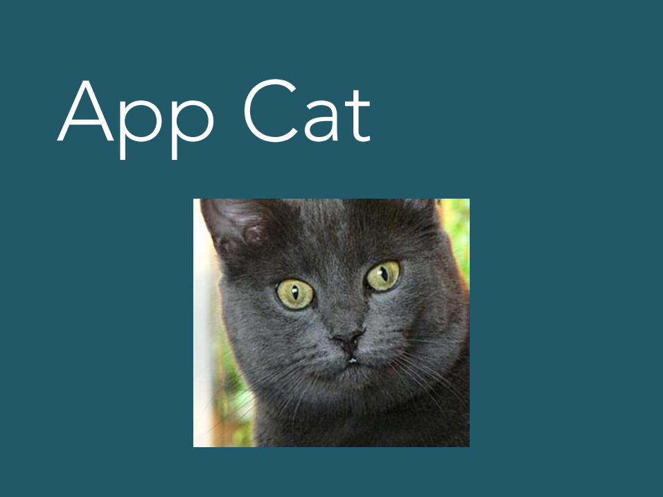
App Cat

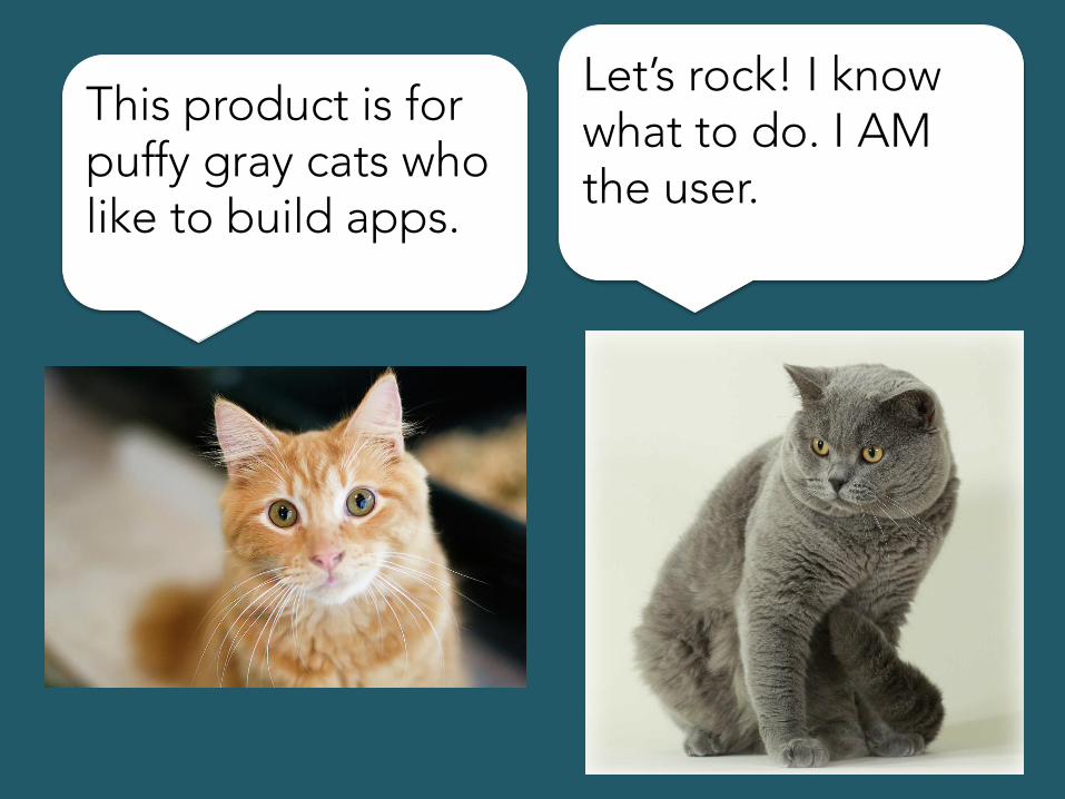
This product is for puffy gray cats who like to build apps.
This product is for puffy gray cats who like to build apps.
Let’s rock! I know what to do. I AM the user.

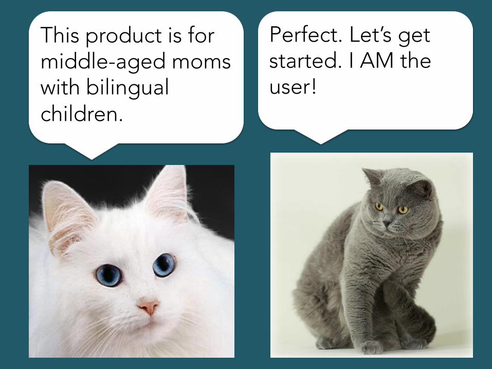
This product is for middle-aged moms with bilingual children.
This product is for middle-aged moms with bilingual children.
Perfect. Let’s get started. I AM the user!

I’ve been in this industry for 8 years. I know what the user wants.
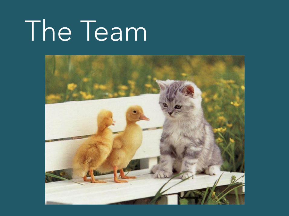
The Team


Understand Key Value
Key value: The thing your user gets that is important to them.
Key values differ from one little experience to the next
They are often (but not always) things about your product that are unique.

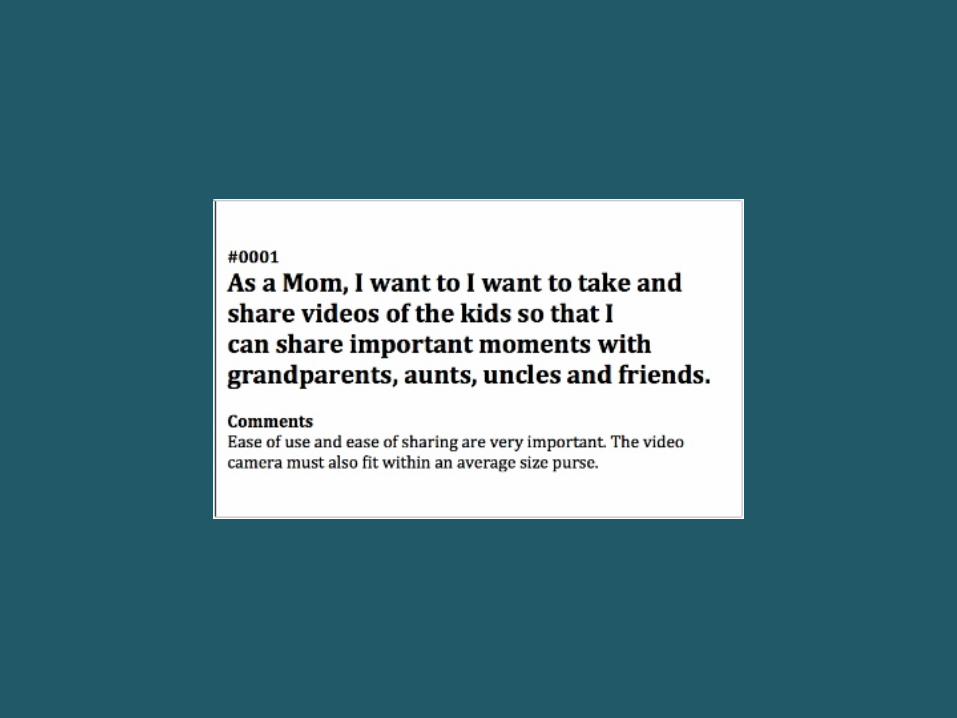
Key value: Seeing things you said you wanted to read later.
If you have a clear key value, you can coordinate everything around it.
The way you describe a key value should be clear and constant.
Everyone should talk about it the same way.
Have a Design Theme
A design theme is a concept that sets the overall tone…
… and also defines how little details are going to work.
Sounds like it would be a big, detailed thing with lots of specifications and rules
It’s totally the opposite
A good design theme can be described in 1 or 2 sentences.


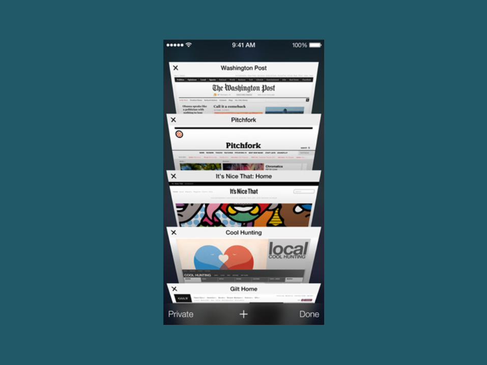
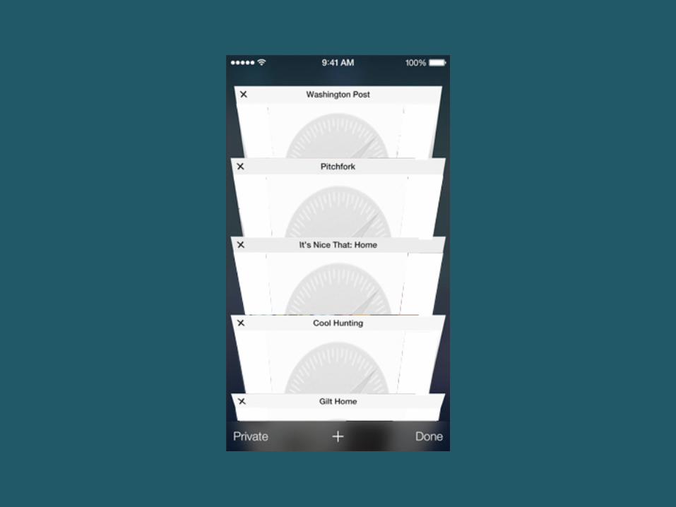
Safari in iOS 7 design theme: “Floating cards”

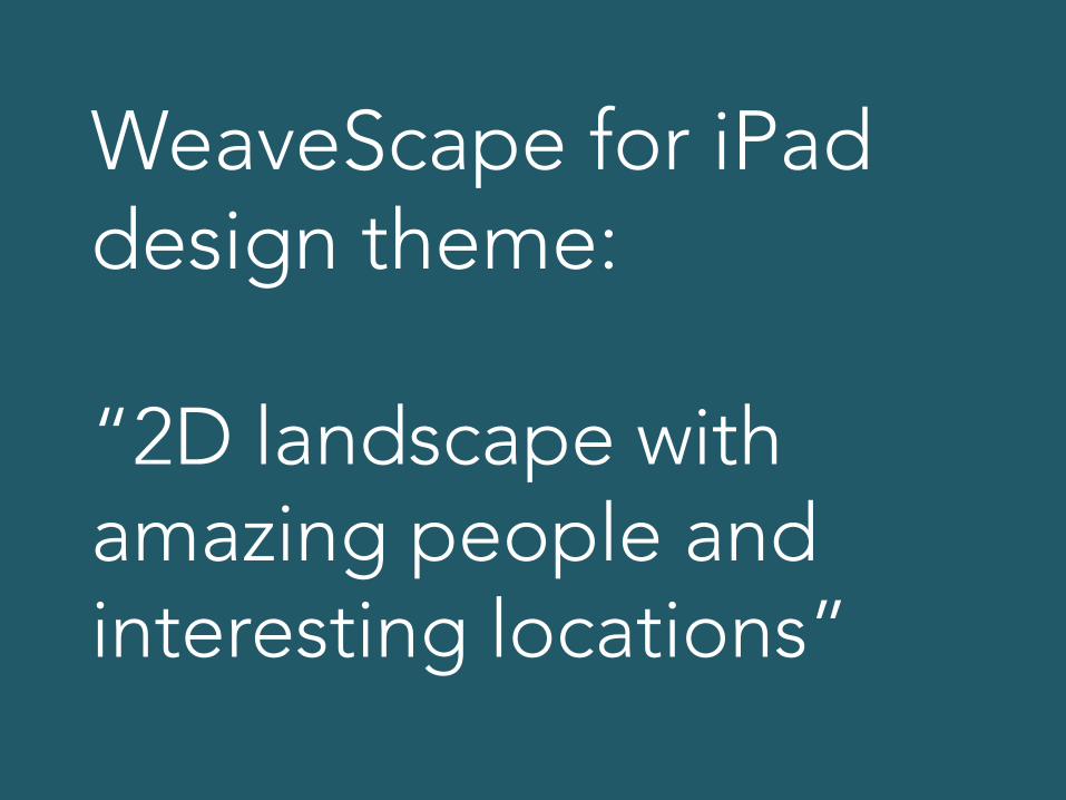
WeaveScape for iPad design theme: “2D landscape with amazing people and interesting locations”

The design theme sets up a real space… a miniature world in which things make sense together.
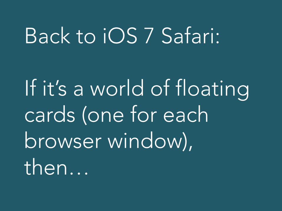
Back to iOS 7 Safari: If it’s a world of floating cards (one for each browser window), then…
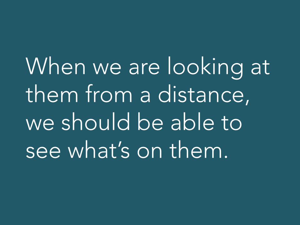
When we are looking at them from a distance, we should be able to see what’s on them.
Could have been like this
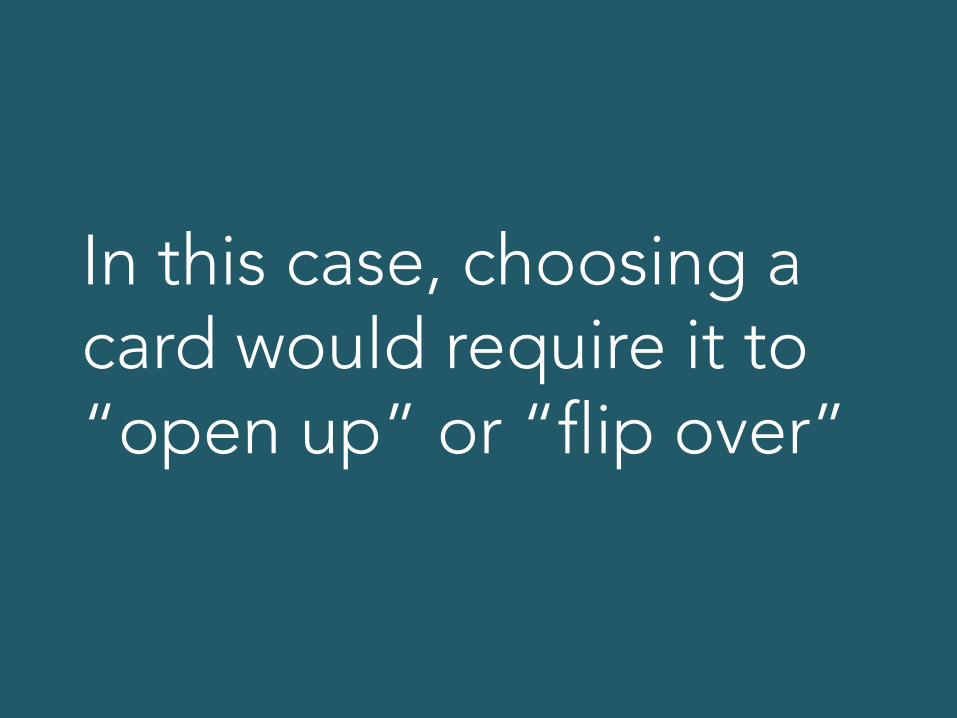
In this case, choosing a card would require it to “open up” or “flip over”
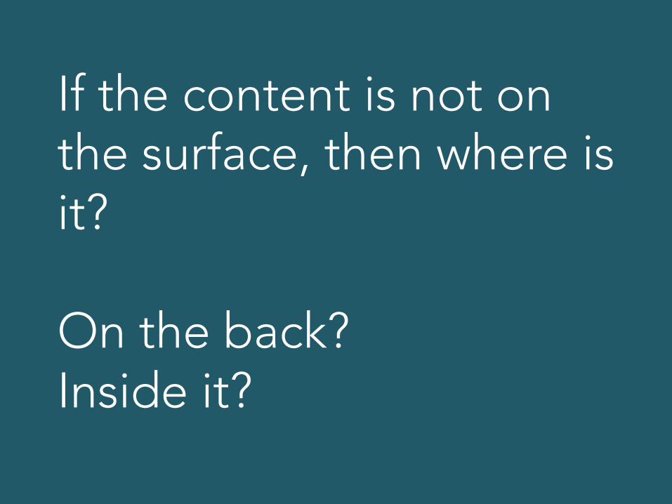
If the content is not on the surface, then where is it? On the back? Inside it?

In the real version, tapping a card makes it flip up and fill our whole view… and that makes sense. We are now looking at a card more closely.

In addition, we have the parallax effect… looking behind cards or seeing them angle as they roll by.
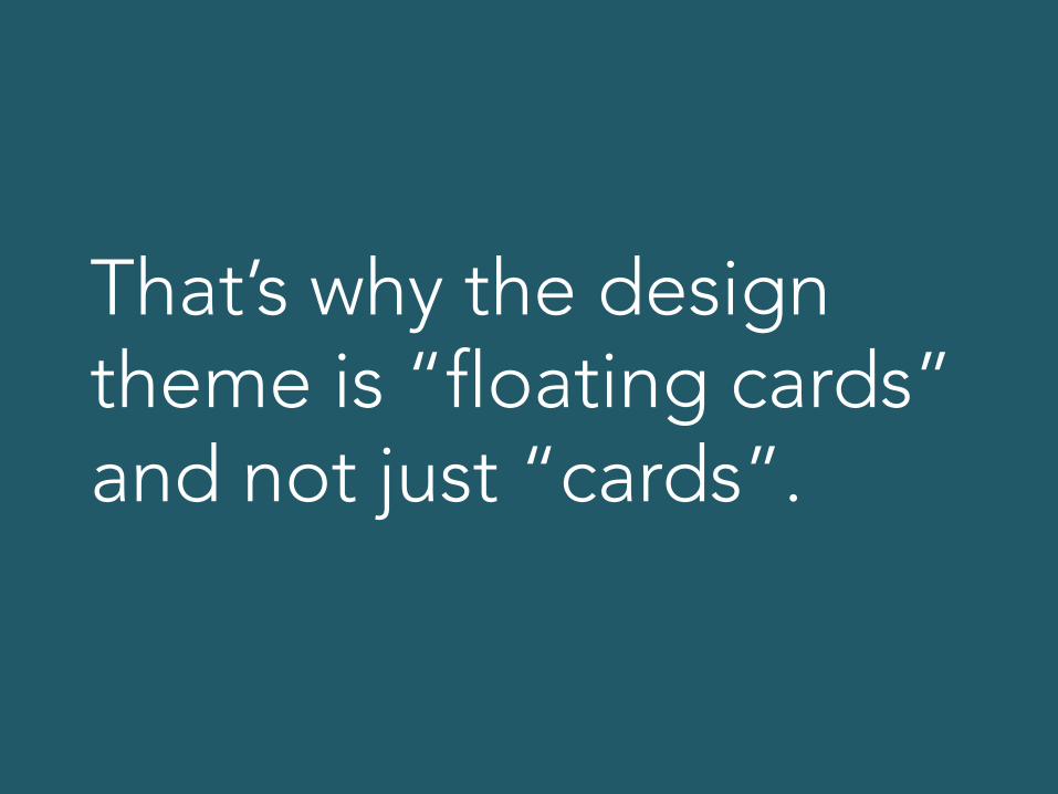
That’s why the design theme is “floating cards” and not just “cards”.
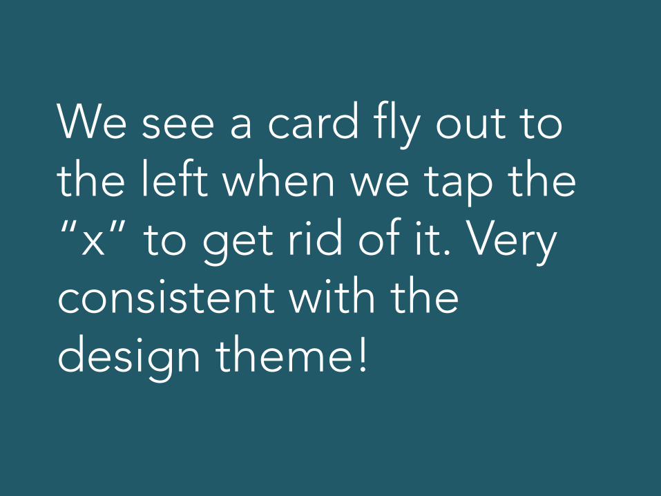
We see a card fly out to the left when we tap the “x” to get rid of it. Very consistent with the design theme!
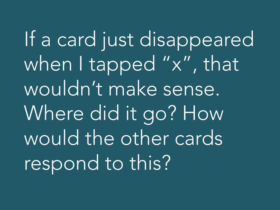
If a card just disappeared when I tapped “x”, that wouldn’t make sense. Where did it go? How would the other cards respond to this?
Process steps
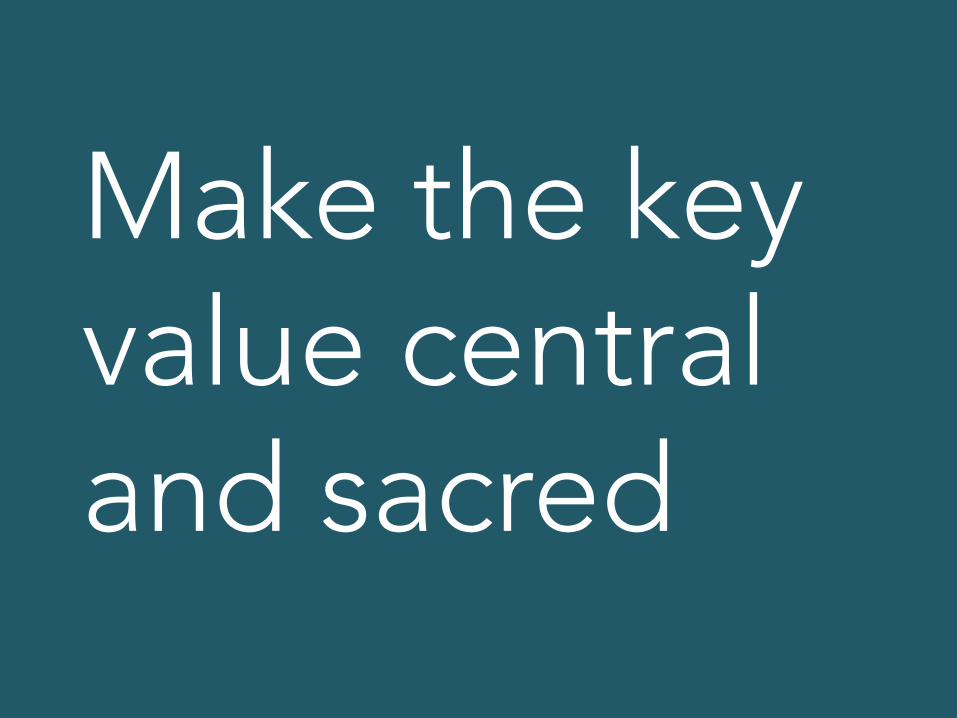
Make the key value central and sacred
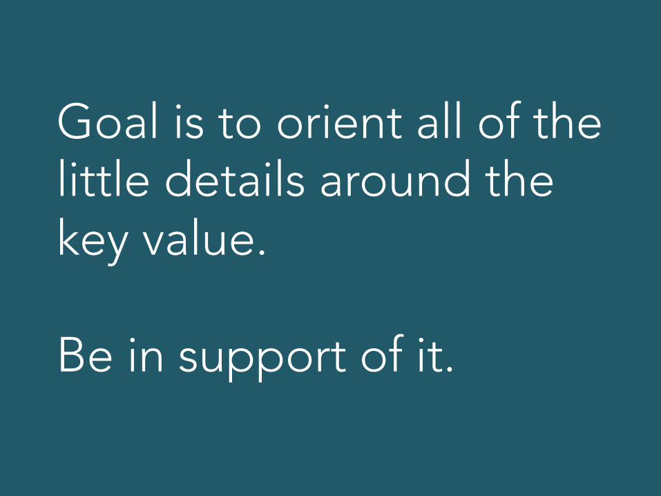
Goal is to orient all of the little details around the key value. Be in support of it.
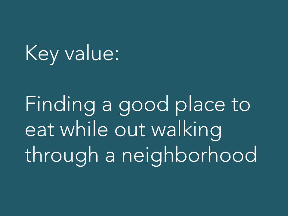
Key value: Finding a good place to eat while out walking through a neighborhood

What’s important here?
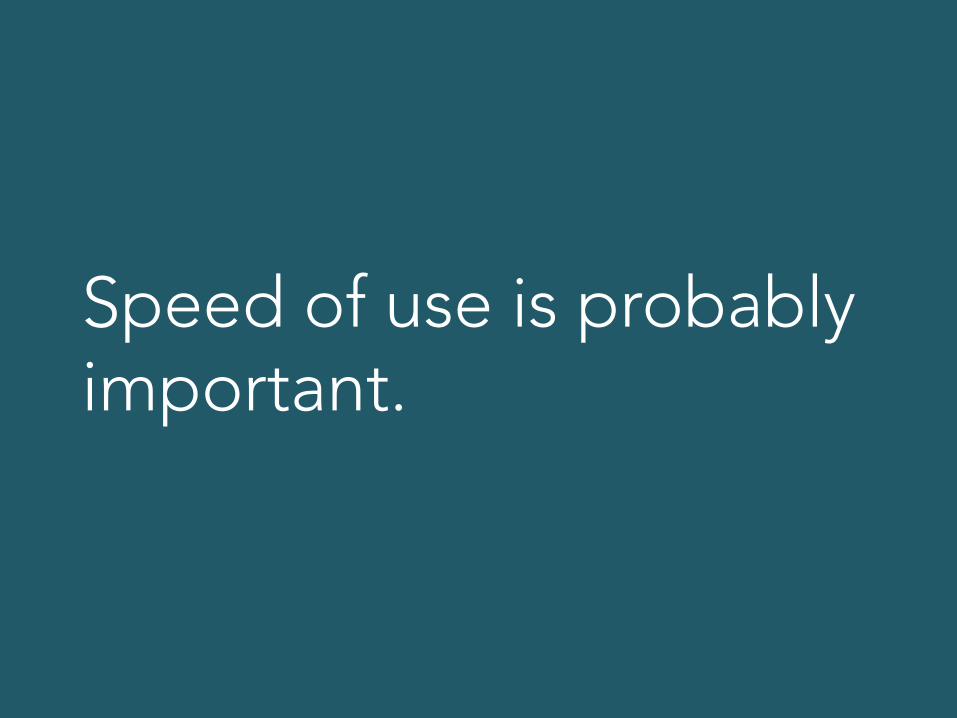
Speed of use is probably important.

Should we ask the user to create an account before we allow them to find a place to eat?

No! That interferes with the key value. Either they already have an account or they create one later… but not now!

Use design theme to create depth
This is where you go beyond the purely functional to create some magic.

A design theme allows you to brainstorm interesting ways that interactions can take place… that fit with the theme.
Some actual depth examples in a moment… Still some more steps…
Design with someone else

Anyone.

Review the design theme together… then talk about the interactions that need to happen between the user and the product.
You should have already filtered out any interactions that don’t support the key value… so now it’s just the good stuff!
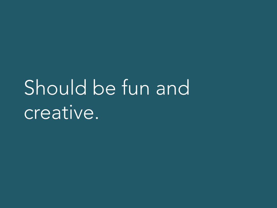
Should be fun and creative.
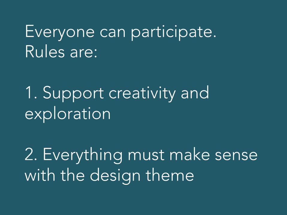
Everyone can participate. Rules are: 1. Support creativity and exploration 2. Everything must make sense with the design theme

Why do you have to design with someone else, by the way?

Simplicity and quality
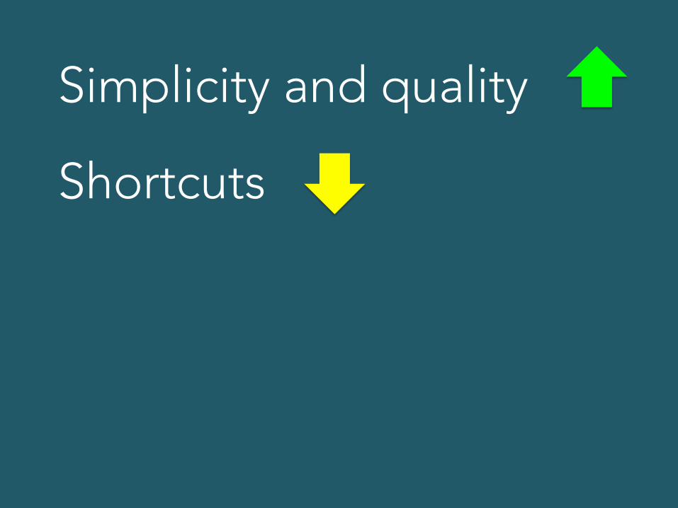
Simplicity and quality
Shortcuts
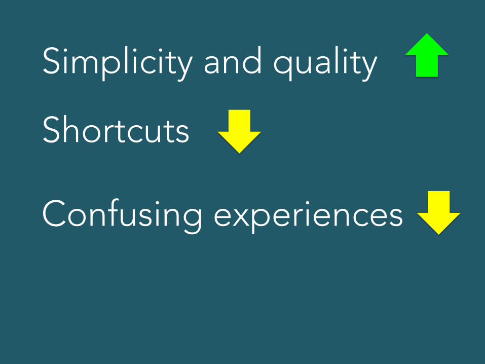
Simplicity and quality
Shortcuts
Confusing experiences
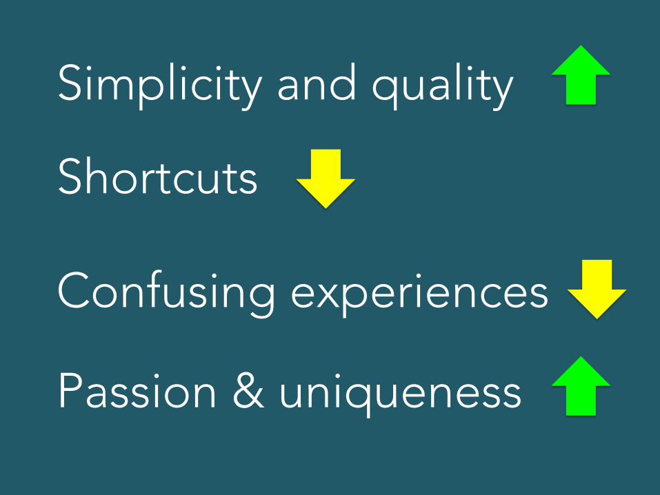
Simplicity and quality
Shortcuts
Confusing experiences
Passion & uniqueness
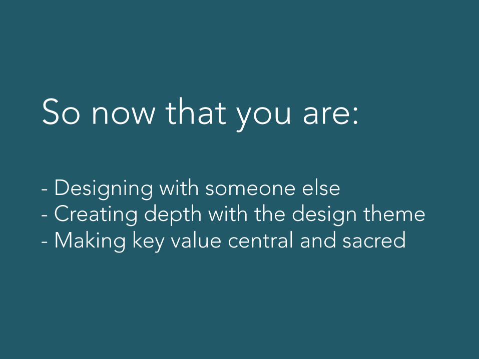
So now that you are: - Designing with someone else - Creating depth with the design theme - Making key value central and sacred
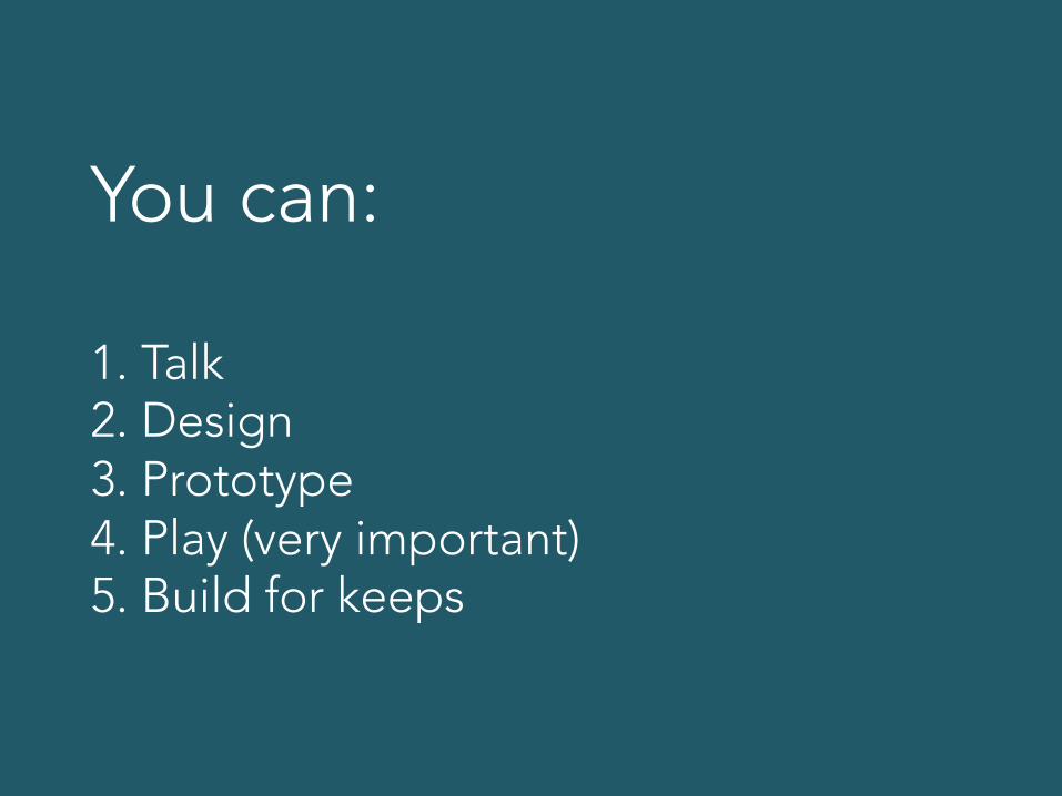
You can: 1. Talk 2. Design 3. Prototype 4. Play (very important) 5. Build for keeps
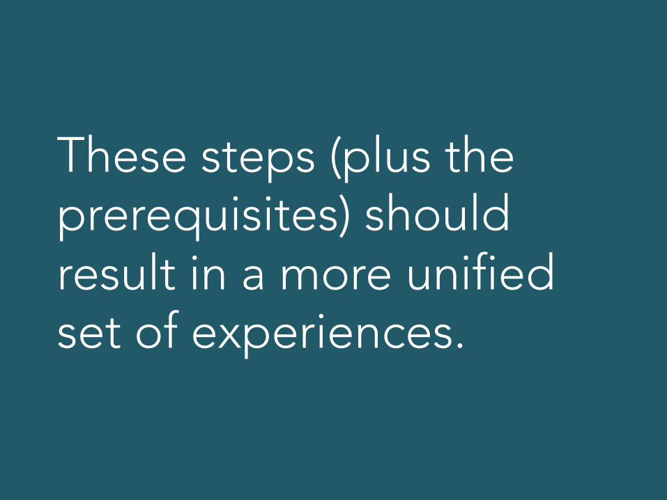
These steps (plus the prerequisites) should result in a more unified set of experiences.

Depth techniques
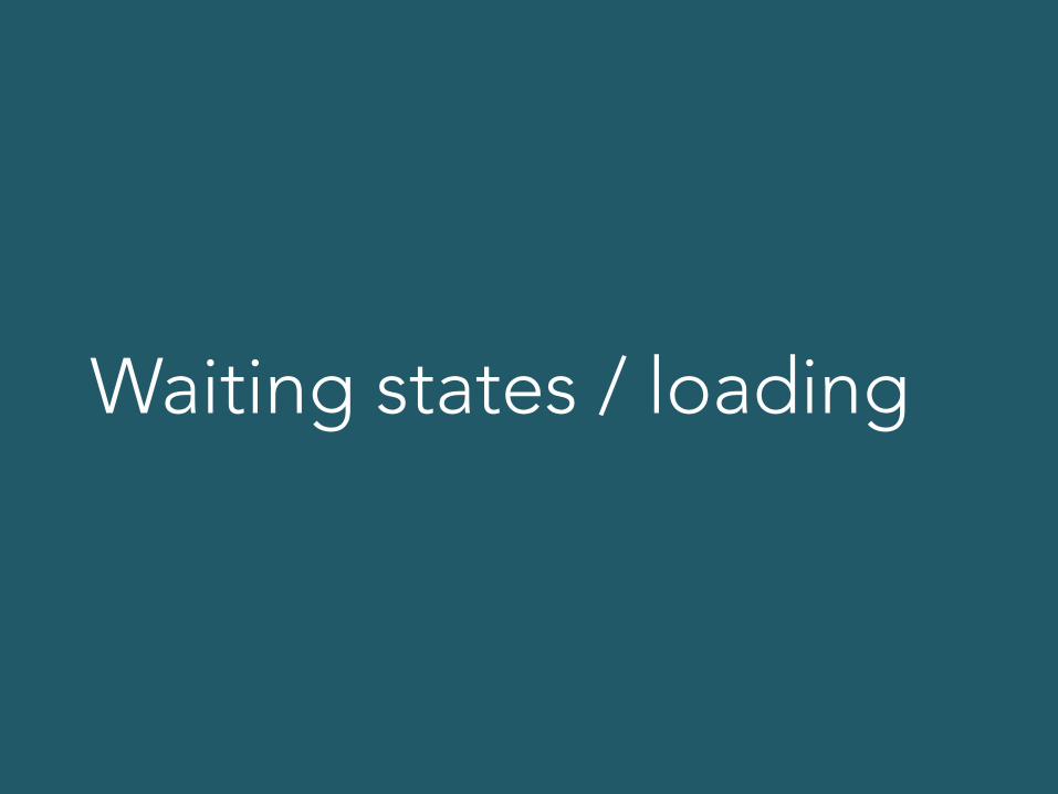
Waiting states / loading


I needed 1.2 seconds to load stuff. How can that be tied into the design theme to create depth?
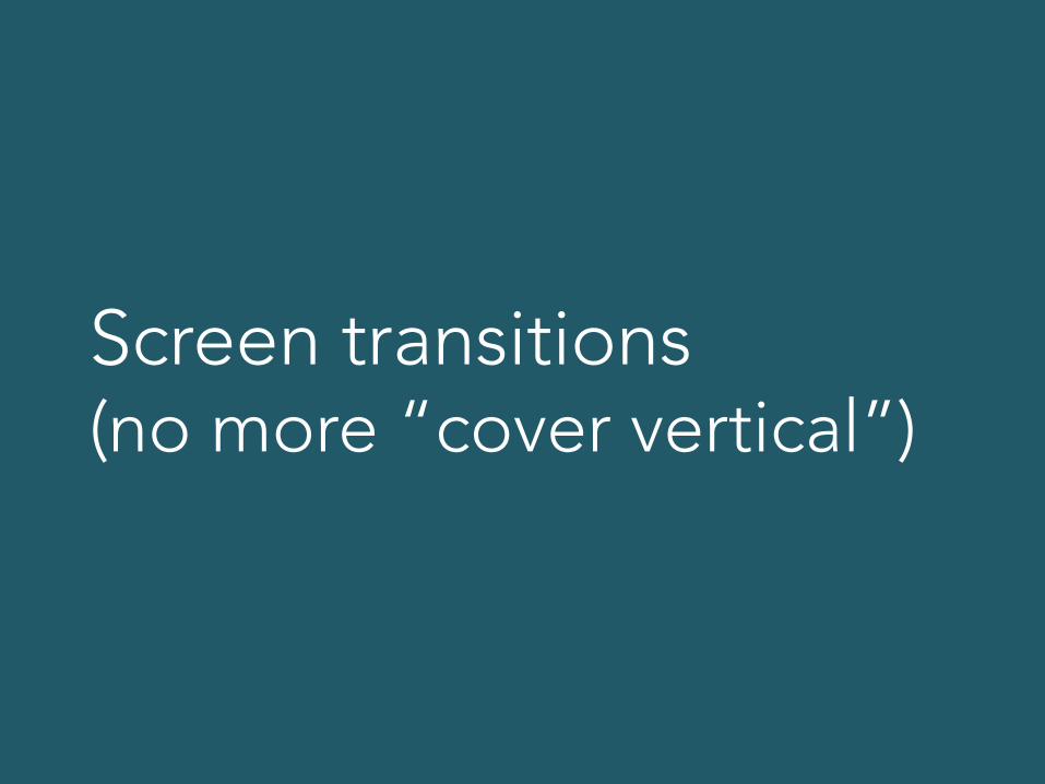
Screen transitions (no more “cover vertical”)

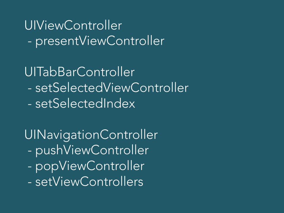
UIViewController - presentViewController UITabBarController - setSelectedViewController - setSelectedIndex UINavigationController - pushViewController - popViewController - setViewControllers
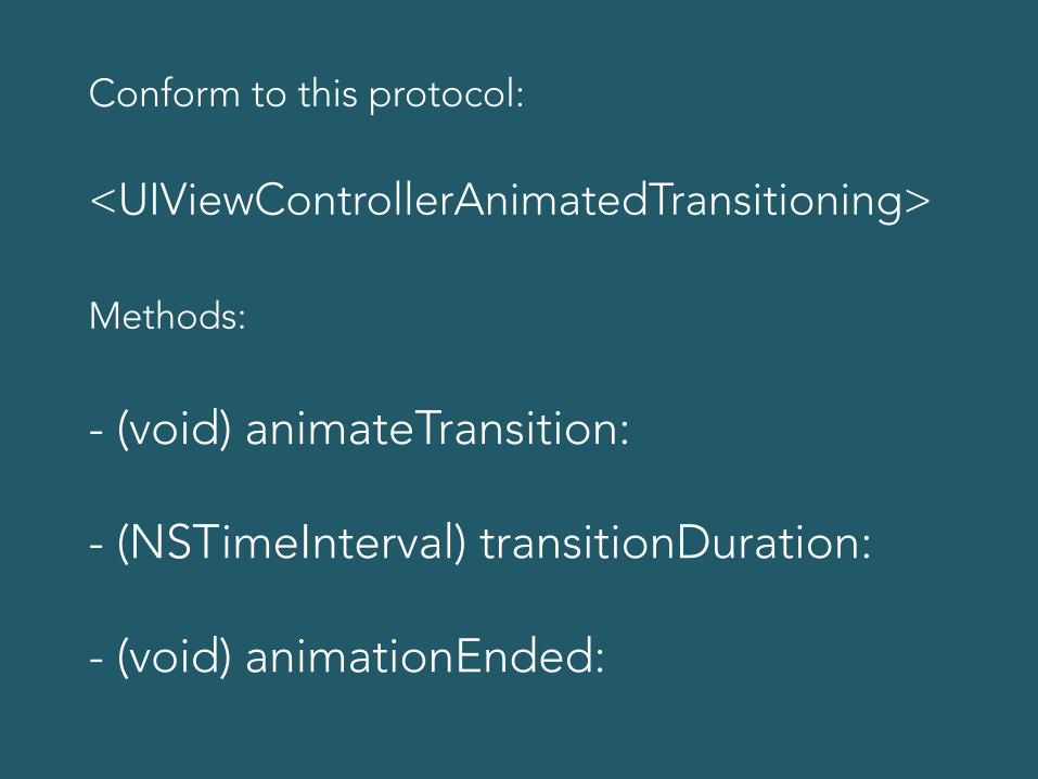
Conform to this protocol: <UIViewControllerAnimatedTransitioning> Methods: - (void) animateTransition: - (NSTimeInterval) transitionDuration: - (void) animationEnded:
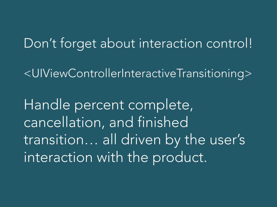
Don’t forget about interaction control! <UIViewControllerInteractiveTransitioning> Handle percent complete, cancellation, and finished transition… all driven by the user’s interaction with the product.

UICollectionView inserts and deletes (default fade is shallow)
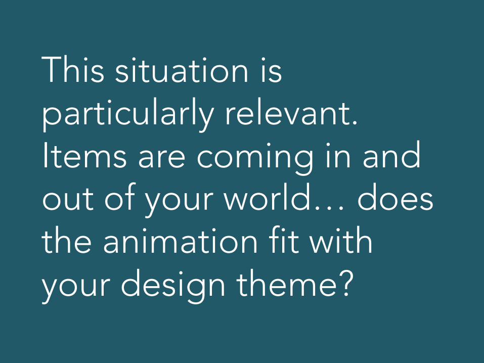
This situation is particularly relevant. Items are coming in and out of your world… does the animation fit with your design theme?
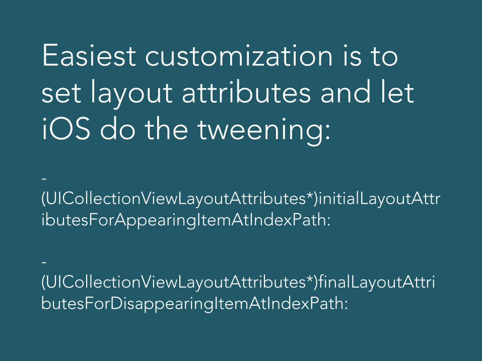
Easiest customization is to set layout attributes and let iOS do the tweening: - (UICollectionViewLayoutAttributes*)initialLayoutAttributesForAppearingItemAtIndexPath: -(UICollectionViewLayoutAttributes*)finalLayoutAttributesForDisappearingItemAtIndexPath:

Example: Our new photo app. Design theme is “stacks of family pictures”
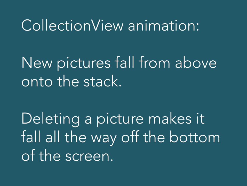
CollectionView animation: New pictures fall from above onto the stack. Deleting a picture makes it fall all the way off the bottom of the screen.

Add some physics with UIKit Dynamics and you’ve got a great experience with depth!

More pitfalls

Branding


Feature defense

We love the app. It would be cool if it auto-posted to Facebook, though.

And I’m all about Google Calendar integration. You planning that soon?

Oh, yeah. Definitely! You’re using the beta. In the full version we got all that.


Simplicity is hard.
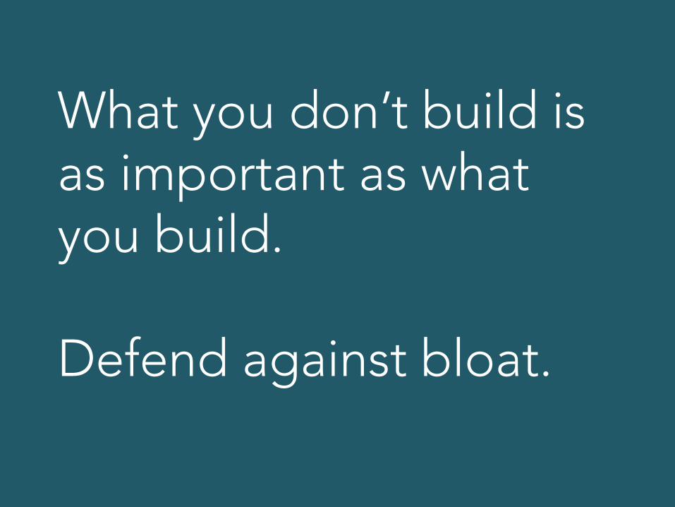
What you don’t build is as important as what you build. Defend against bloat.
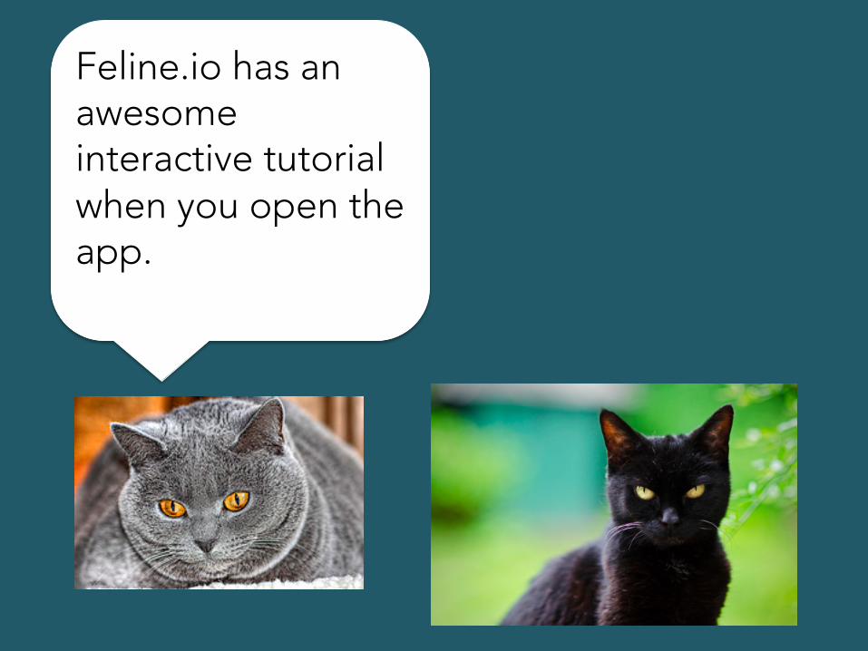
Feline.io has an awesome interactive tutorial when you open the app.

And Mice.me has a parallax video on the background of their mobile Website and it knows your location.
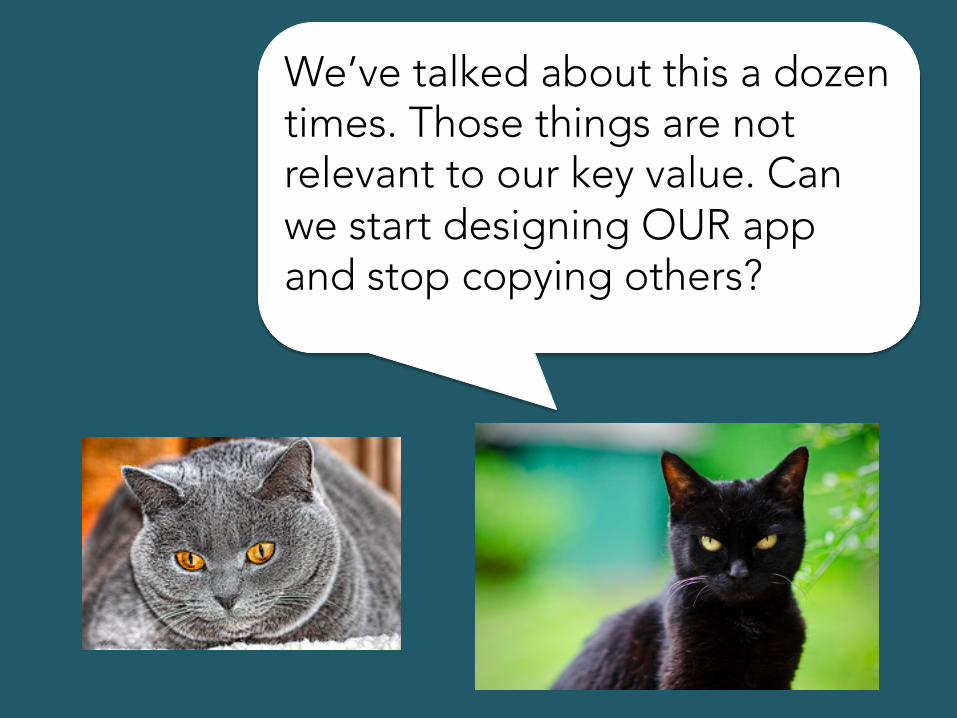
We’ve talked about this a dozen times. Those things are not relevant to our key value. Can we start designing OUR app and stop copying others?


App Cat took one for the team here.
Looking around for inspiration and keeping up to date is important.
But all that really matters – in the end – is delivering your key value in the form of a great experience.

You won’t find that anywhere except within your own amazing talent.

What we covered
• Prerequisites - Know your user - Understand key value - Have a design theme

What we covered • Process steps
- Make key value center & sacred - Use design theme to make depth - Design with someone else - Talk, design, prototype, play - Then finally build for keeps
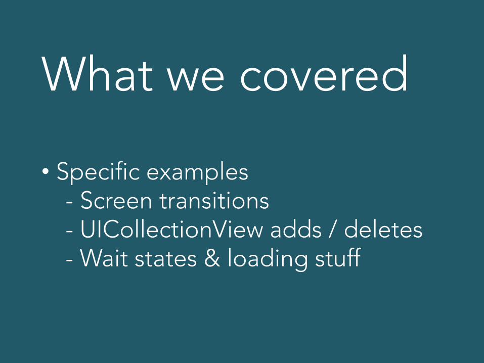
What we covered
• Specific examples - Screen transitions - UICollectionView adds / deletes - Wait states & loading stuff
thx!
Related Documents