FASHION MARKETING COMMUNICATION

maggi ads comparative study
Dec 13, 2015
comparative study
Welcome message from author
This document is posted to help you gain knowledge. Please leave a comment to let me know what you think about it! Share it to your friends and learn new things together.
Transcript

FASHION MARKETING COMMUNICATION
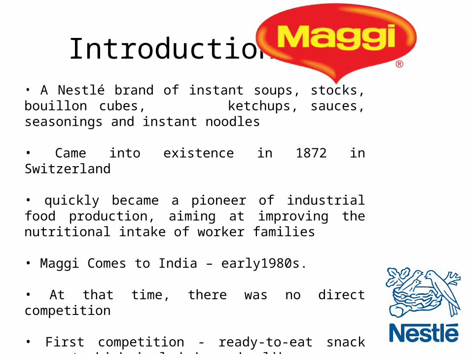
Introduction To• A Nestlé brand of instant soups, stocks, bouillon cubes, ketchups, sauces, seasonings and instant noodles
• Came into existence in 1872 in Switzerland
• quickly became a pioneer of industrial food production, aiming at improving the nutritional intake of worker families
• Maggi Comes to India – early1980s.
• At that time, there was no direct competition
• First competition - ready-to-eat snack segment which included snacks like samosas, biscuits or maybe peanuts.
• Second competition came from the homemade snacks like pakoras or sandwiches.

• Both competitors had certain drawbacks in comparison.
• Snacks like samosas - bought out - outside food is
generally considered unhygienic and unhealthy.
• The other competitor, ‘homemade’ snacks - disadvantage
of extended preparation time at home.
Maggi was positioned as the only hygienic homemade
snack !!

• Despite this, Nestlé faced difficulties with their sales after the initial phase.
The reason being, the positioning of the product with the wrong target group.
• Nestle had positioned Maggi as a convenience food product aimed at the target group of working women who hardly found any time for cooking.
•
Unfortunately this could not hold the product for
very long.

• In the course of many market researches and surveys, the firm found that children were the biggest consumers of Maggi noodles.
• Quickly they repositioned it towards the kids segment with various tools of sales promotion like color pencils, sketch pens, fun books, Maggi clubs which worked wonders for the brand.

Positioned as ‘2- minute noodles’ with punchline-
“FAST TO COOK GOOD TO EAT”
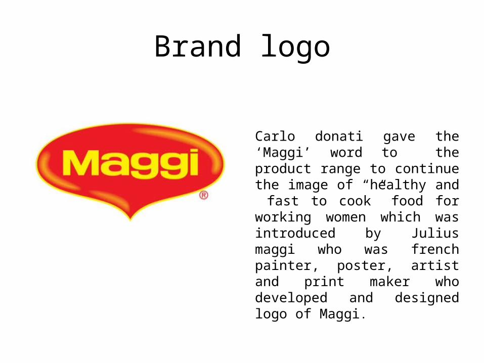
Brand logo
Carlo donati gave the ‘Maggi’ word to the product range to continue the image of “healthy and fast to cook” food for working women which was introduced by Julius maggi who was french painter, poster, artist and print maker who developed and designed logo of Maggi.

JINGLE
“MUMMY BHOOK LAGI, BAS DO MINUTE MAGGI MAGGI MAGGI
- Understanding to the consumer that it was “ between meals” snack

PRESENCE OF MAGGI IN

PRINT MEDIA
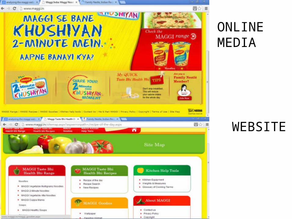
ONLINE MEDIA
WEBSITE

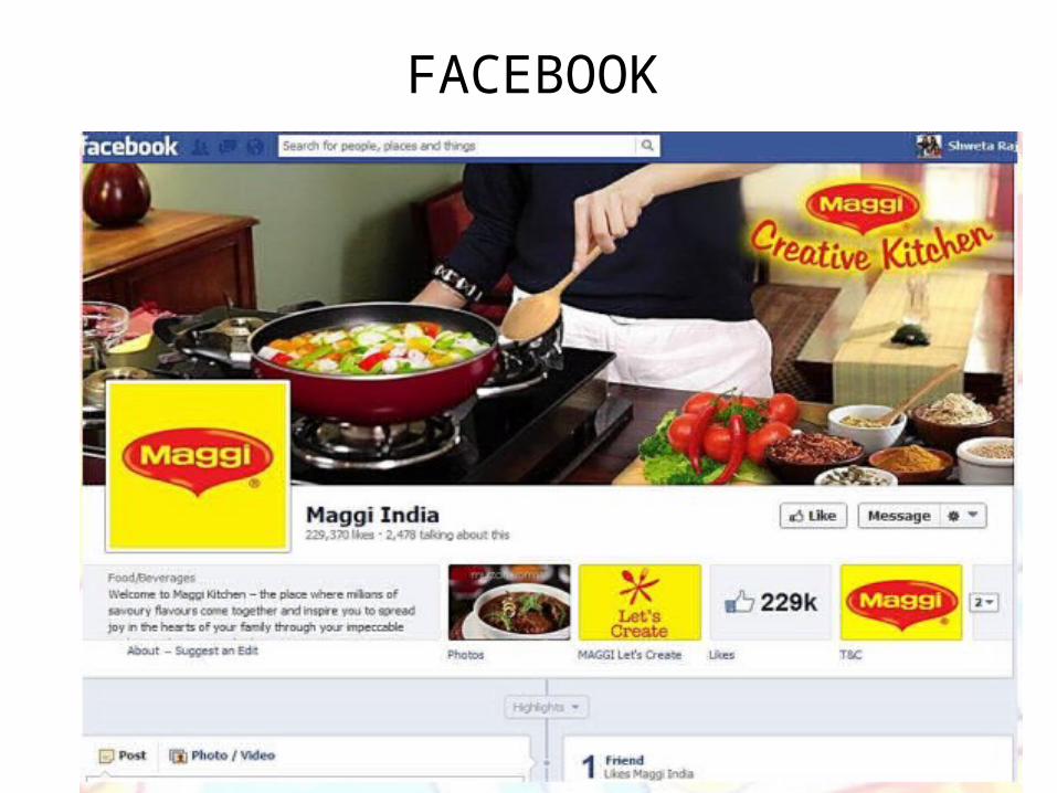
User generated content• User Generated Content (UGC) marked its initial
traces with product reviews and blogs.
• However, the arrival of social media took it to a completely new level with the support of the picture and video economy
•Maggi created crowd sourced campaigns. Involving fans and users to contribute to their campaign giving these fans a sense of belonging and an opportunity to talk about and engage with the brand.
• One of the stand out example has been Nestlé’s Maggi Noodles’ ‘Meri Maggi’ campaign.
•The campaign urged users to take pictures of their special moments with Maggi and share their experiences and different recipes they try with the noodles. The stories were then printed on the packets, thus creating storytellers out of their fans.

COMPARATIVE STUDY - Advertisements
VIDEO 1
VIDEO 2
1980’s

First Advertisement:
• Emphasis on Logo, Introduction of the Brand
• Tag line: Fast to cook , Good to Eat
• Process of cooking Maggi
• 2 minutes concept of cooking
• Jingle : Maggi maggi…. In English
• Red and yellow color Packaging
Second Advertisement:
• More kids focused
• The ad was story based
• Adding of vegetables
• kids demand for maggi

Video 3
• Gets more creative – animations
• Jingle changed to more of a song and in Hindi
• Tagline Changed
• Packaging change
• Story of kids involvement and Concept of 2 mins remains same
• Red and Yellow color also visible in advertisement rather than just on Packets
Early 2000
Video 4
• Concept of Healthy food • Story changed: No more animation • Emphasis to whole family rather than just Kids – Segment changed• Jingle same• Subsitute of snacks from pakoras to maggi for old generation•Packaging changed : including ingredients like fibre and protein• Tag line : Taste Bhi, Health Bhi

Late 2000’s
• Celeb used• Target youth• Jingle less used more concentration on the celeb• Packaging changed - Hungroooo• Tagline: Badi Bhook badi masala maggi
Video 5

2009
Video 6
• 25 years Campaign• Targeting each and every age group• Strong consumer interaction – emotional connect• Relating from child to youth•Packaging changed: Me and Meri Maggi
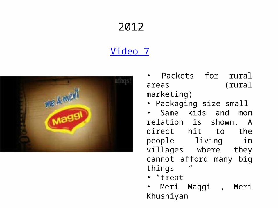
2012
Video 7
• Packets for rural areas (rural marketing)• Packaging size small• Same kids and mom relation is shown. A direct hit to the people living in villages where they cannot afford many big things• “treat”• Meri Maggi , Meri Khushiyan
ADVERTISEMENT CONSISTENCY
•Consistent message to potential customers, which in turn creates “top of mind awareness” for their business.
•Have an identifying logo that has remained same all through out.
•Utilize the same type of graphics and elements in all marketing materials and advertising.
• Kept color scheme consistent, i.e. red and yellow
• Have Used the same style of font in all materials, and limit the use to only 1 font typeface.

• Deliver a consistent, unified message with similar verbiage in all campaigns.
• By keeping imagery unified and delivering a consistent message, have ensured that whomever encounters multiple pieces of material or advertising “gets” the continuity of the message.
• A lot of companies are tempted to change up their message and imagery frequently, but this can actually destroy cohesion and create a sense of chaos and instability.

Brand Significance
To Customers
• Reduces the time needed for purchase
• It has helped reduced buyers’ perceived risk of purchase
• The customers has derived a psychological reward of owning Maggi out of trust
To Seller
• Totally differentiated from other competitors
• Has also helped the brand to introduce new products like Maggi Oats
• Helps in fostering brand loyalty
Branding Benefits To Maggi
• The brand identity is very clear
• Easy to recognize
• The brand name has suggested a clear product image• Has attracted attention
• Very easy to remember
• Very easy to pronounce

THANK YOU
Presented By:
Aditi SoniMandeep KhuralRajvee ParmarPriyanshu Sharma
MFM - III
Related Documents