Analysis of magazines:

Welcome message from author
This document is posted to help you gain knowledge. Please leave a comment to let me know what you think about it! Share it to your friends and learn new things together.
Transcript
Analysis of magazines:

They have dressed Justin Bieber up in a rock and roll type of way, to appeal to both Justin Bieber fans but also to make non fans think that he is not all about signing for teen girls, but also likes a bit of rock n roll.
The word super boy in large letters show that he is very super. The words stand out very easily. This may also mean that he has done a ‘heroic’ deed, and so he has been called ‘super’. It doesn’t give away much in order for the audience to want to buy the magazine.
Colours only include red, black and white throughout the whole front cover.
Masthead/title- part of this is covered by Justin's hair, yet as it is such a well known name people can still read it without even needing to see the full word. The way they have dressed him up links to the rolling stones band themselves as he is sort of dressed the way they use to.
Main image/ focal point. Lead/cover story
Second story.
Date/ issue number and websites.
Straplines – advertising other artists which will be featured throughout the magazine (not giving to much away)
The picture of him is a medium shot. Medium shots are generally used to display characters actions, and we can see that Justin looks like he's just been in a fight and could be classed as are ‘hard boy’.
Justin Bieber is a pop artist. He has been put onto a non-pop magazine to advertise his new and upcoming music into other music tasted people.

Background is created to look old, which would represent the fact the bob Marley is in the past as he is
dead.
Stating that maybe “the ghost” of Marley could be the next biggest movie.
Connotation:
• We could say that the reason that the words are faded to the point where you can see through them to image behind, could represent the fact that it at the bottom said “is the GHOST of Marley the next blockbuster brand?”, which could mean that the text represents the ghost of bob Marley.
• The way bob is looking not into the camera, but above could represent him looking into the light, or looking at Jesus.
This shot is a medium close up. This shot shows the face more clearly, without getting uncomfortably close.
Masthead/ title- this is important in order to have a recognisable title. And with this being such a simple name and a simple title, people will remember it for the future.
Other stories- not to much are given away. Questions may be used to get predictions running trough the audiences head, and this will make more people want to buy it.
Barcode
The company- showing that it has done well in its time. We can see this as it says, the “fourth major”, stating that it has sold very well, or that it was on very high demand.
Genre- bob Marley's genre is reggae, this magazine would more be seen as a pop magazine originally, but due to the death of bob, it is a dedication to a brilliant artist.

Pink and flowery theme may show that it is targeted to a female audience.
Katy Perry in bold letters show that this magazine may be focused mainly on her.
Connotations:
• We could say that by the way Katy Perry is dressed in this magazine front cover, that she enjoys nature. She's hugging flower and her dress has little flowers on it which could show that maybe her favourite season is spring, when all the flowers bloom. We could go more in-depth and say she is representing nature in itself.
Title/ masthead- this is partially covered by Katy's head, yet we can still understand what it is saying. This is because it is such a well know magazine with such a simplistic name, so it is easy to remember.
Katy Perry is a pop artist, and she is covering on the front of a pop magazine, this is where we would find an artist like this. She is named the queen of pop, which could show how highly this magazine company think about her, and trying to entice readers to thing the same.
Second stories/ strap like- this is saying what else will be in the magazine but not giving away too much so the audience still want to buy it.

Suggested that if you love it then we as an audience will love it too. The word we, kind of makes us think that both the creators of the magazine, and us as an audience love it collectively.
People that will be previewed inside. The number are big and bold in order to make it easier for the audience to read.
Lots of images in order for there o be recognisable faces for the audience to see, as once they see the faces they may want to either learn more about the person or if you are a fan, read about the celebrity in which you love.
Letter from the author. This is to feel a connection between you and the author, and to get a little insight about the person writing the stories.
A free gift (in this magazine it is posters) of all different pop celebrities such as Justin Bieber and one direction. This is done in order to entice the readers to want to buy the magazine due to the free gift also included inside.
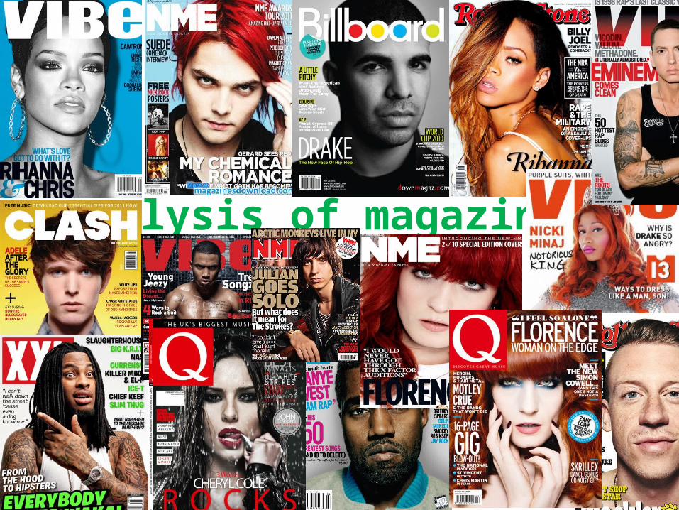
The logo is placed in the left corner of the context page. This is to once again to re-enforced which magazine they are reading. The more times this logo is placed throughout the magazine, the more it becomes recognisable to the reader.
the fact the James blunt is second on the list of ‘features, may show that on the front cover is stereophonics, due to the fact that they are number one on the featured list , then second is James blunt (and he is on the context page), so it may go in a chronological order.
The date and title is shown very clearly in the header to be able to easily locate both what page they are on, and what issue date he magazine is.
This is a section in which tells you what is in this magazine, but what will also be in future magazines so that the reader can understand and know a few things of what will be in the next issue.
The edges of this image (medium close up) have been cut off the page. This could be solved by simple things such as making the image smaller or on the left side you could send the text to the back, in order for you to see the rest of his hair.
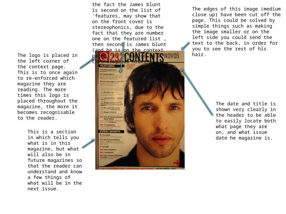
The v in the background is to continue to advertisement for their magazine. The vibe magazine is represented by a massive ‘v, and on the contents page it is seen again, there for re-enforcing the fact that the reader is reading a vibe magazine.
The colours of this context page is very dull, consisting of only shades of grey and black. This is porously done in order for the red colour to stand out. We could see many connotations of this such as that is a poppy, and this is a magazine representing the ones who have fought for our country. Or we could also see it as brining in the first hint to the theme of the rest of the magazine.
This image of Kanye west could be portrayed in many ways. For example, we could see it as women trying to climb over him, but he does not care and is not amused. We could also see it as Kanye being a dull person (that’s why he is grey) but when a woman touches his heart, it puts colour into his life.
Different fonts used throughout to funk it up and give ‘variety’ to the reader.
Fashion shows Kayne to be quite a classy guy, and by the arm across the chest we could say that women like classy men.

Bright coloured page with lots of pinks. This gives off a vibrant and happy feel towards the audience.
The ‘icon’ ring in which she is wearing, and holding up against her face is to remind the audience that she is an icon. The quirky dress sense in which she is wearing strange necklaces and a zebra print shirt, shows individuality and that individuality is good. The word ‘icon’ just re-enforces that although Nicki Minaj is weird and different she is still a public icon, and if she can be weird then so can you.
Main image is a picture of Nicki Minaj and the 2 biggest words across the double spread page is her name, so even for the readers who don’t know her very well they can put a name to a face or vice-versa.
The gospel according to Nicki is written in quite a fancy font to deliver across the though of an old fashion sort of look. The fact that it is saying the gospel according to Nicki Minaj cold make us believe many things such as “she must be a catholic” or she believes in god, and what she says must be right, so its almost as if she is the new figure head of the gospel.
Target audience would be to a ‘younger’ audience from teenagers to people in the early/mid 20s.
Artists name.
Floating quote.Opening quote.

Main image goes so well with the name of their band. The main image is what looks like 3 teenagers sitting in a bedroom watching TV, and the name of the band is the teenagers. This can help the audience to relate to them (teenage audience) and saying that it is a norm to do that as celebrities do it too. Secondary image.
Information given about the band. This is so people who want to become fans can begin to learn about them, and people who are already fans can learn more about them.
Floating quote.
Tagline: the tagline is pretty much they definition of a stereotypical teenage boy. Young, dumb, and full of filthy tunes
The colours are all basically white, black, and blue. These colours would stereotypically be a direction towards men. So we could say this is directed to more of a male audience that a female audience.
Telling the audience what other music is popular at the moment, also giving a little description about the band, and an image of them to so that you can put a name to a face.

This image of Justin Bieber makes the audience feel as if they are actually connecting with Justin. This is because he is looking directly into the cameras lense, with a mid smile, and eyebrows raised. This may entice a female audience as they may find him attractive and want to read more about him.
The dress sense, the tattoos and the chain around his neck show the audience that he has grownup and is not a little boy anymore, but a grown man.
The fact that it is an exclusive interview shows that it doesn’t happen very often and that they (the magazine company) is very lucky to interview him.
Main image.
Secondary image.
We could see this title in two different ways. 1. Justin Bieber could be having troubles in his relationship with Selena Gomez, which is why the title states girls give me a headache, meaning that girls confuse him so much he gets a headache. Or 2. It could mean that he is happily in a relation ship with Selena (as seen in the picture) and all the other girls apart form her give him a headache.
Floating quote is also used as the title, this is because it is a very confusing thing for a celebrity to say, so it will entice more people to read it.
Related Documents


![Evaluation: [Music Magazine]](https://static.cupdf.com/doc/110x72/54b34a1c4a795942708b4603/evaluation-music-magazine-5584a7eceda98.jpg)