Alice Stone MAGAZINE ANALYSIS

Welcome message from author
This document is posted to help you gain knowledge. Please leave a comment to let me know what you think about it! Share it to your friends and learn new things together.
Transcript

Alice Stone
MAGAZINE ANALYSIS
The brief was to make a magazine front cover for a college magazine, I chose to do a college magazine that involved a
lot of music influences and was mainly about music for college students.
THE BRIEF

I think on my front cover the picture worked really well because it suits the music and college genre really well.
I think the masthead and name worked really well because it is short and snappy but because of the black on red it draws
attention.
I also really like the red, black and white colour scheme because everyone knows that those colours go well together and I think
that they are common colours and colours that people look towards particularly the bright red.
WHAT WORKED
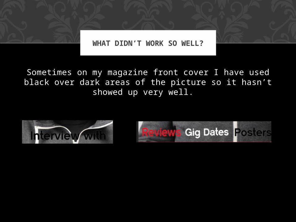
Sometimes on my magazine front cover I have used black over dark areas of the picture so it hasn’t showed up very
well.
WHAT DIDN’T WORK SO WELL?

The part I found most difficult was the amount of layers and making sure they were all right for
example I cut the head out of the body and moved it about the writing at the top so it stood out, but I
found that part very difficult to get it lined up correctly.
MOST DIFFICULT?
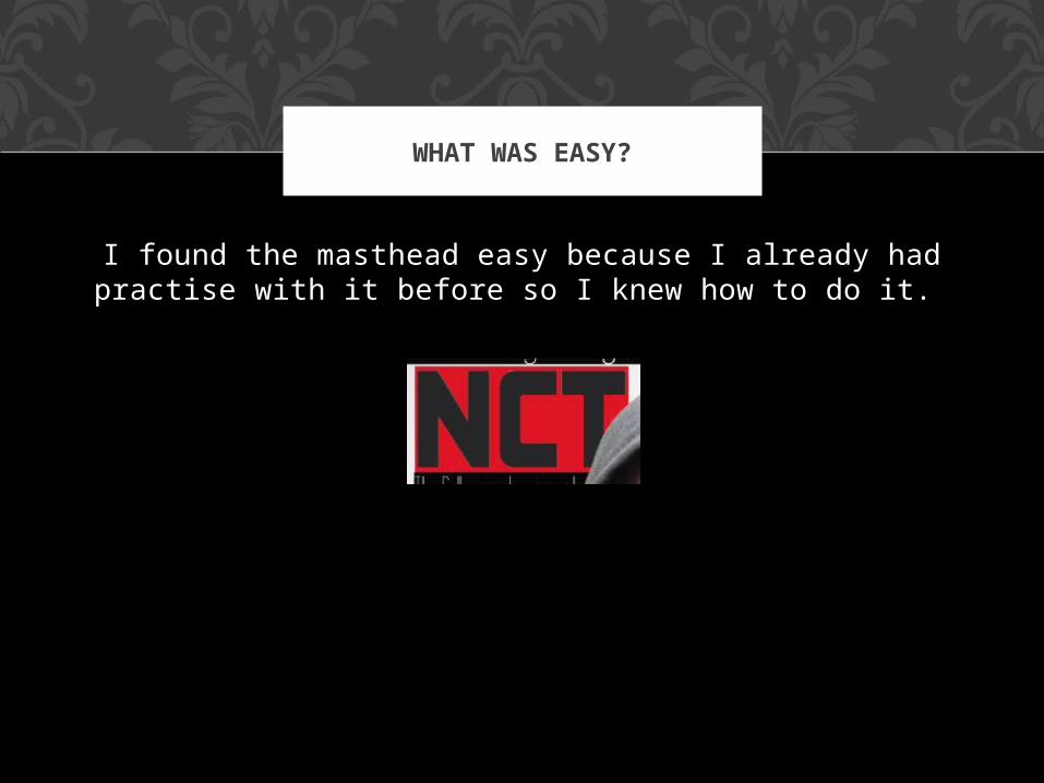
I found the masthead easy because I already had practise with it before so I knew how to do it.
WHAT WAS EASY?

I learnt –
how to put effects onto a picture.
Use text effectively on a magazine
A lot about the layout of a magazine
Colours that work on a magazine to get attention
Conventions of a magazine
Things that have to be on a magazine
New things on Photoshop
Good idea of what works and what doesn’t for future work.
WHAT I LEARNT

If I was to do my whole magazine front cover again I would use a picture of a band with their instruments and make it
look very professional.
I would also change my layout slightly so that things were clearer but I would mostly keep it the same because I am very pleased with it overall and I think that it looks good
and will appeal to the target audience of students particularly ones with an interest in music.
IF I WAS TO DO IT AGAIN I WOULD…

I would compare my magazine to a magazine like ‘Q’ because I got my idea for the masthead from this magazine and it would appeal to the same audience as my magazine
COMPARISON…

Overall I am very pleased with my magazine front cover, I think that it is perfect for the audience that I am appealing
to and has a lot of variety from a musical point of view within it.
OVERALL…
Related Documents