DOCUMENTARY ARTICLE ANALYSIS. TV & SATELLITE

Welcome message from author
This document is posted to help you gain knowledge. Please leave a comment to let me know what you think about it! Share it to your friends and learn new things together.
Transcript

D O C U M E N TA RY A RT I C L E A N A LY S I S .
TV & SATELLITE

There is a grid in the magazine article which separates all the different stories to make it clear and easier to read. The main story has the biggest section in the top left, drawing on the convention of rule of thirds with the eye of the reader being drawn to the left. This is where I would hope the article about my documentary would feature on this page as it makes it the man attraction.

The image for the main article takes up a third of the left page so it is large and noticeable. It is a still directly related to and taken from the actual documentary. E hope to adapt this by taking a still from our documentary and relating it to the the written article.
At the top of the page there is a title for the page and the convention is that there is a coloured strip behind the title which carries on over the double page spread. The use of the soft warm green color used on this particular example suggests that this will be a warm documentary that will make you feel good about life. I feel our documentary is more hard hitting and reflective so we would want a more harsh and serious colour which has more heavy connotations, possible a blue colour as it is the colour socila media has adopted (eg facebook and Twitter.) The use of the bold font catches the eye of the reader as it is to the point
On the still there is a small tag line which explains the still as it is out of context of the documentary so it could be confusing for a reader.
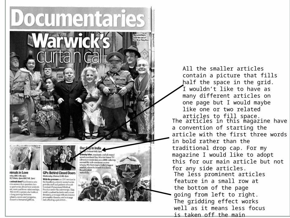
The less prominent articles feature in a small row at the bottom of the page going from left to right. The gridding effect works well as it means less focus is taken off the main article and it is easy to read.
The articles in this magazine have a convention of starting the article with the first three words in bold rather than the traditional drop cap. For my magazine I would like to adopt this for our main article but not for any side articles.
All the smaller articles contain a picture that fills half the space in the grid. I wouldn’t like to have as many different articles on one page but I would maybe like one or two related articles to fill space.

The main article is the only one to feature two pictures. One main one and one within the actual written article. This could be seen as adapting and enhancing the convention of using a interesting quote in the middle of the article. I like the idea of using this instead of a quote as I feel it would be more effective in gaining interest for the documentary.
Instead of using the convention of the drop cap, this magazine has put the first three words of each article in bold. This is most likely because of the amount of different articles on the pages. For our magazine we will stick to the drop cap as we are advertising only one documentary

The use of vibrant colours on the double page spread catch the eye of and create interest for the reader. However there is one black and white image used on a picture related to a documentary on the holocaust. This is an effective technique in setting the tone for the documentary, but I feel this would not work with our target audience of teenagers/young adults as a slightly depressing colour could put them off with its connotations.

Text wrap – The written article itself wraps around the picture placed in the middle of the two columns. We will use text wrapping in our double page spread as I have learnt that it gives a professional look to the article, however, we will be wrapping the text around a larger font quote rather than another image.
Related Documents