Lost in Information Tomomi Maezawa

Lost in Information
Mar 28, 2016
Research papaer on how graphic design can make information literacy more arguable. It was written on 5th December, 2012. The question has been slightly changed but it still shows the process of my research.
Welcome message from author
This document is posted to help you gain knowledge. Please leave a comment to let me know what you think about it! Share it to your friends and learn new things together.
Transcript

Lost in Information
Tomomi Maezawa
2
How can graphic design
make the information
literacy more arguable?
3
Timeline and Mind MapIntroductionThe Existing Design ResponsesExperimentsReflection on the Previous ProjectsAnalysing ReferenceGenerating IdeasConclusion and EvaluationReferences
478
101820222425
Contents
4
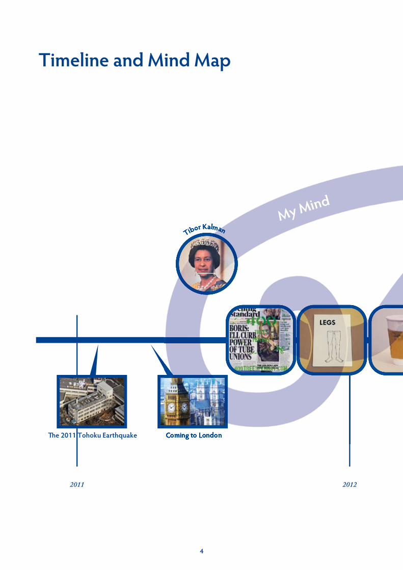
Timeline and Mind Map

5

6
7
Introduction
“Information literacy is defined as the ability to know when there is a need for information, to be able to identify, locate, evaluate, and effectively use that
information for the issue or problem at hand.”
- The National Forum on Information Literacy
It became the topic because of my experience of the 2011 Tohoku Earthquake. The earthquake revealed a lack of the literacy and dependence on the information technology. The important information was skewed by many false rumours, which we hardly recognised. While the advancement has made communication more accessible, it has also deteriorated our ability to communicate by hand.
This project began from this conflict. It is highly important to learn the information literacy; However, the first thing to do is to think of the problem more seriously. Nothing can be solved without motivation. We need to voluntarily realise the urgent situation and discuss the solution. The project aims not to give an answer but to encourage people to discuss it on their own initiative.
In this research report, the first chapter will discuss research on the existing design solutions after the crisis. Through some design experiments the paper will move onto reflection on the previous projects and then an analysis of reference in order to generate the idea.
Introduction
8
Earthquake, Electric power and Transport Information by Ramny Project It shows those information in one apps.
Safe Area Checker by Cactus Apps. It displays the distance from nuclear power plants Fukushima and the radiation.
A Poster by Takamasa Matsumoto This poster was released just after the crisis. It shows the minimum of hoarding in the mergency, and calling to share things. The poster was widespreaded via twitter and voluntarily printed by the citizens.
Apps
for t
he U
urge
nI in
form
atio
nSt
op P
anic
Buyi
ng P
oster
The Existing Design Responses
There are already some solutions designed for emergency situations. For example, some posters were produced to educate actions of saving electricity or to stop panic buying whilst there are smartphone apps created to organise the information.
They are useful first aids, however, it is doubtful that they can tackle the radical problem. When information is a matter of life and death we can be too mad for information to be critical. The internal training is more urgently needed than the external support.
The Existing Design Responses

9
The Existing Design Responses

10
Expe
rimen
tsTw
o Diff
eren
t New
spap
er
Experiments
Newspaper design
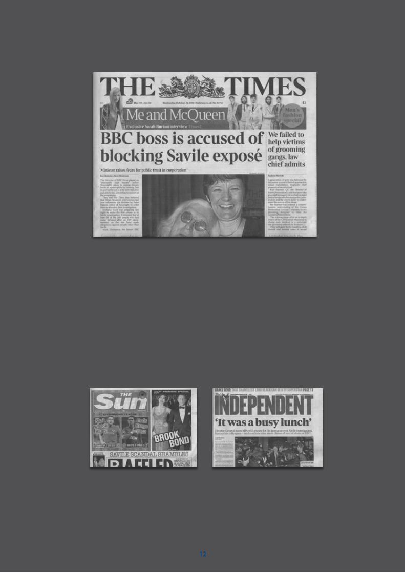
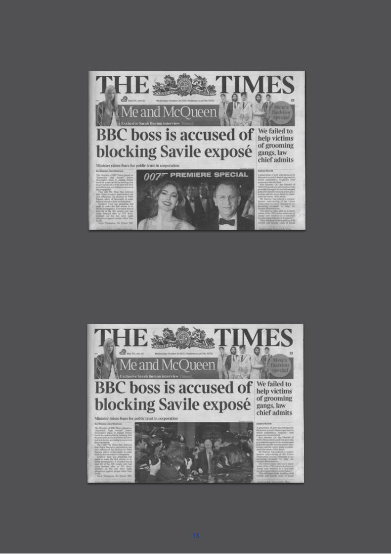
Because credibility from reputation affects our information literacy, experiments were undertaken to explore how to challenge our dependency.
Firstly, in order to have an obvious result, I began with newspaper designs that I thought to be credible. Two British newspapers, both the same date but produced by different companies, had varying degrees of elements such as pictures and texts from each other. However, the choice of British newspaper was problematic because there are too complex problems such as politics lurking behind them. Furthermore, each paper has their certain audience who is already aware of the bias in the papers, so it would be slightly out of the question.
Experiments

11
Experiments
12
13

14
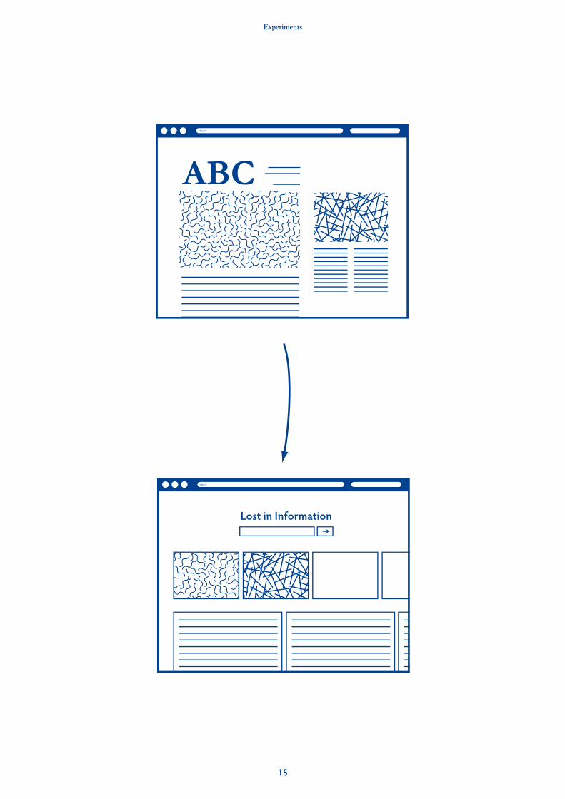
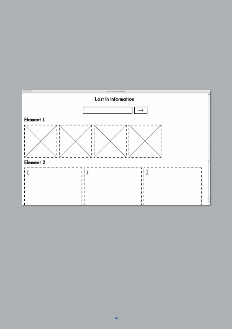
Web layout
Compared to newspapers, web design seems to have had much more space to grow. There were experiments by two approaches; Simplifying and Messing up.
Simplifying removes CSS from a website submitted and simplifies the contents. On the other hand, Messing up applies different design to the contents to see a change in the style. Those experiments indicated that they could not achieve the aim proposed. What they showed was a change of the meaning depending on the style. They did not achieve the internal change of the dependence on information. It digressed from the aim and was necessary to reshape the direction.
Sim
plifi
edEx
istin
g Web
site
Experiments
15
Experiments
16

17
18
Legs
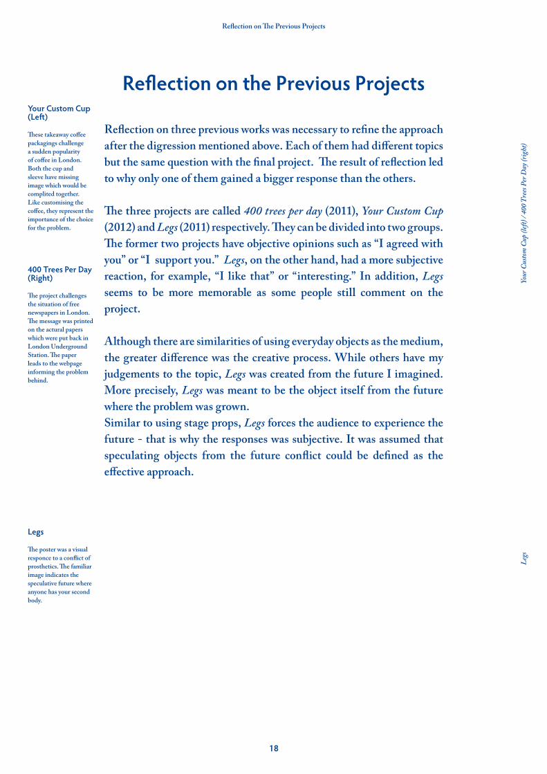
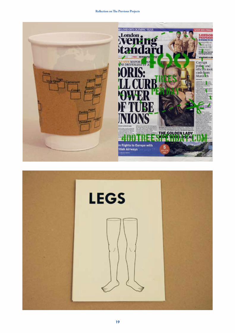
The poster was a visual responce to a conflict of prosthetics. The familiar image indicates the speculative future where anyone has your second body.
Your Custom Cup (Left) These takeaway coffee packagings challenge a sudden popularity of coffee in London. Both the cup and sleeve have missing image which would be complited together. Like customising the coffee, they represent the importance of the choice for the problem.
400 Trees Per Day (Right) The project challenges the situation of free newspapers in London. The message was printed on the actural papers which were put back in London Underground Station. The paper leads to the webpage informing the problem behind.
Legs
Your
Cus
tom
Cup
(left
) / 4
00 T
rees
Per D
ay (r
ight
)
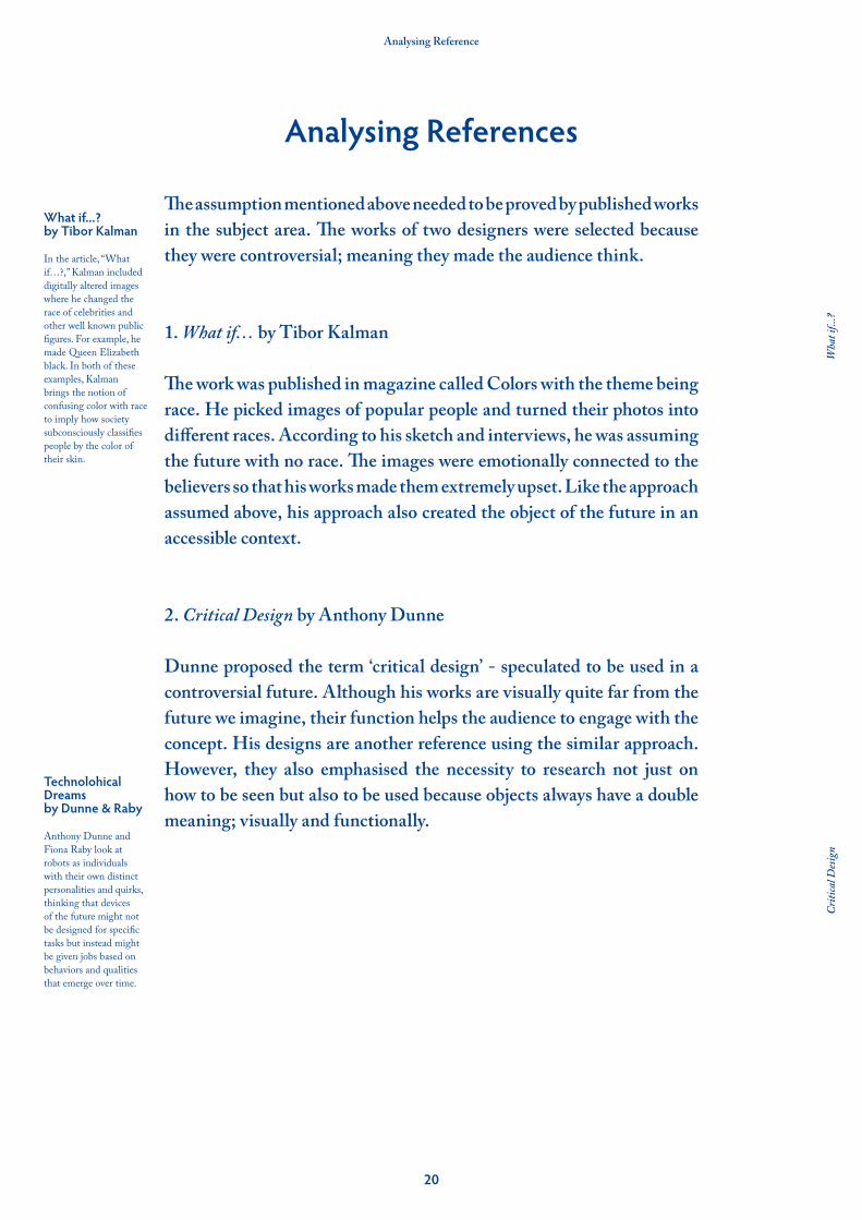
Reflection on The Previous Projects
Reflection on three previous works was necessary to refine the approach after the digression mentioned above. Each of them had different topics but the same question with the final project. The result of reflection led to why only one of them gained a bigger response than the others.
The three projects are called 400 trees per day (2011), Your Custom Cup (2012) and Legs (2011) respectively. They can be divided into two groups. The former two projects have objective opinions such as “I agreed with you” or “I support you.” Legs, on the other hand, had a more subjective reaction, for example, “I like that” or “interesting.” In addition, Legs seems to be more memorable as some people still comment on the project.
Although there are similarities of using everyday objects as the medium, the greater difference was the creative process. While others have my judgements to the topic, Legs was created from the future I imagined. More precisely, Legs was meant to be the object itself from the future where the problem was grown. Similar to using stage props, Legs forces the audience to experience the future - that is why the responses was subjective. It was assumed that speculating objects from the future conflict could be defined as the effective approach.
Reflection on the Previous Projects
19
Reflection on The Previous Projects
20
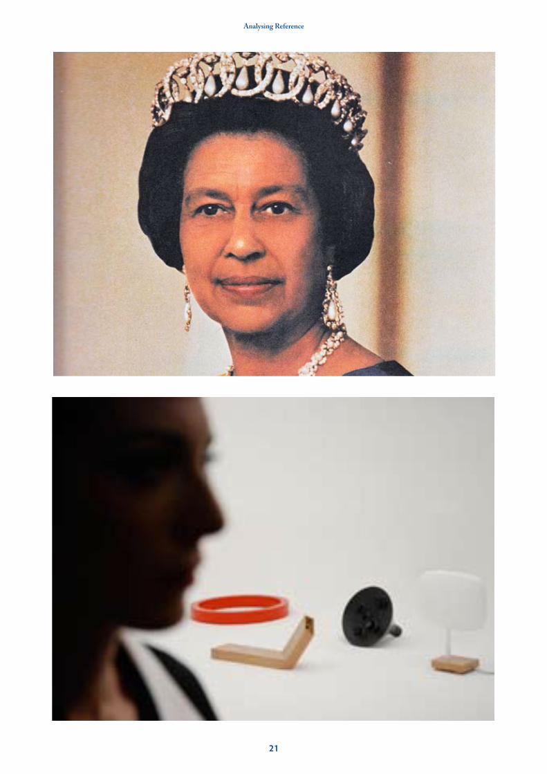
Technolohical Dreamsby Dunne & Raby Anthony Dunne and Fiona Raby look at robots as individuals with their own distinct personalities and quirks, thinking that devices of the future might not be designed for specific tasks but instead might be given jobs based on behaviors and qualities that emerge over time.
What if...? by Tibor Kalman In the article, “What if…?,” Kalman included digitally altered images where he changed the race of celebrities and other well known public figures. For example, he made Queen Elizabeth black. In both of these examples, Kalman brings the notion of confusing color with race to imply how society subconsciously classifies people by the color of their skin.
Criti
cal D
esign
Wha
t if..
.?
Analysing Reference
The assumption mentioned above needed to be proved by published works in the subject area. The works of two designers were selected because they were controversial; meaning they made the audience think.
1. What if… by Tibor Kalman
The work was published in magazine called Colors with the theme being race. He picked images of popular people and turned their photos into different races. According to his sketch and interviews, he was assuming the future with no race. The images were emotionally connected to the believers so that his works made them extremely upset. Like the approach assumed above, his approach also created the object of the future in an accessible context.
2. Critical Design by Anthony Dunne
Dunne proposed the term ‘critical design’ - speculated to be used in a controversial future. Although his works are visually quite far from the future we imagine, their function helps the audience to engage with the concept. His designs are another reference using the similar approach. However, they also emphasised the necessity to research not just on how to be seen but also to be used because objects always have a double meaning; visually and functionally.
Analysing References
21
Analysing Reference
22
The Idea Generation
After analysing a collection of half baked ideas, I began to analyse them in order to create a clearer aim. I concluded, from my analysis, that the process was heading the wrong way. The idea is an information survival kit, which contains a collection of the ironic objects questioning the dependence on digital communication. For example, one of the objects in the kit would be a small bag labelled "Route Planner" that works in place of Google map system.
However, the idea has been developed by only the negative side to the problem. The creative process should not affected by my judgement as the analysis discovered. The further research on the advantage of the information technology is needed to generate the future of the conflict.
Generating Ideas

23
The Idea Generation

24
Recommendation
The research on the existing solutions cemented the direction of the challenge of changing perceptions for the information technology. The design experiments highlighted that a change of the style can not challenge the preconception. Finally, analysis of both my works and references refined my approach and led to the generation of ideas, which need more research on the information advancement.
The problems encountered from the research process was my subjectivity, which was prone to digressing from the project aim. I tended to give in to emotions, rather than stay neutral. Subjectivity can make the project into a piece of propaganda. It is highly recommended to listen to the arguments of opponents and third parties.
Conclusion and Evaluation

25
Reference
Barthes, Roland. (1980). Camera Lucida: Reflections on Photography.Bochner, Mel. (1970). Theory of Paintings.Dunne & Raby. (2007). Technological Robots.Dunne, Anthony. (2001). Design Noir.Hall, Peter. (2000). Tibor Kalman, Perverse Optimist.Kosuth, Joseph. (1965). One and Three Chairs. Kalman, Tibor. (1993). What if...?Madden, Matt. (2006). 99 ways to Tell a Story: Exercises in Style.National Forum on Information Literacy. What is the NFIL?. Available: http://infolit.org/about-the-nfil/what-is-the-nfil/. Last accessed 22nd Nov 2012.Queneau, Raymond. (1947). Exercises in Style. Sterling, Bruce. (2002). Tomorrow Now: Envisioning The Next Fifty Years.
References
Related Documents