
Welcome message from author
This document is posted to help you gain knowledge. Please leave a comment to let me know what you think about it! Share it to your friends and learn new things together.
Transcript


logoGood logos are
instantly recognized.
They are the focal point
for a company’s visual
identity; the symbol that
distinguishes you from
the competition.
They raise the profile of
a company and its
products or services
and, ultimately, build a
brand awareness in the
mind of your audience.

Western Logistics
This company transports furniture from
manufacturers in eastern North American to
distributors and retailers in the West.
designer: Ian McSorleyGraphex: award for design excellence

Propellor
These consultants assist social enterprises with
feasibility studies, business plans and 90-day road
maps and help them get their initiatives launched or
advanced to the next level. Our branding work for
them included the name development, identity,
marketing communications and website.
designer: Ian McSorley

exchangenergy
The double 'e' infinite loop captures the unlimited
potential of geothermal exchange systems. This
technology is described by the US EPA as the most
energy efficient method available for heating and
cooling buildings. Cool! Hot! Yes, you can have it all!
designer: Ian McSorley

Tiny Travels
“Your guide to eco-conscious travels with kids.”
This travel documentary series looks at meandering,
small-footprint trips (literally) for young families.
designer: Ian McSorley

A Dozen Days: A Dozen Ways
This community challenge blog was created as part of
Homelessness Action Week, 2008.
The blog invites you to join the conversation about
solutions to homelessness. Selected solutions will be
profiled as part of Homelessness Action Week.
designer: Ian McSorley

Surrey Homelessness & Housing Society
This society grows and manages a fund dedicated to
filling the affordable housing void in the City of Surrey
— a community near Vancouver, British Columbia
where the highest housing prices in Canada have
contributed to an affordable housing crisis.
designer: Ian McSorley

Homelessness Action Week
Launched in 2006, this Metro Vancouver initiative’s
site (stophomelessness.ca) has become the go-to
source of information on causes and solutions to
homelessness in British Columbia and the Yukon.
Information on the ubiquitous corrugated cardboard is
updated annually.
designer: Ian McSorley

Toxic Free Canada
Creating a positive, hopeful identity for an initiative
whose name starts with “toxic” was a bit of a
challenge! The child releasing Canada’s national
symbol on the breeze seemed to capture the essence
of hope for a healthy world for future generations.
designer: Ian McSorley

Adaptive Welding
The simplified, chunky letter forms suggest heavy
steel plate and the arc flash and welding rod make the
perfect separation. The suggestion of the bead and
weld joining the two letter forms conveys this
company’s focus even before you read the name.
designer: Ian McSorley

Madcore Conditioning
Think sports bootcamp.
The client came to us with this great name in need of
a brand identity. Originally conceived as conditioning
camp for youth sports, the venture has now
expanded to offer the same training/conditioning for
adults.
designer: Kelly Brooks

EcoBuyer
EcoBuyer is a resource tool that makes it as easy as
possible for you to find environmentally preferable
products and services, so you can buy green.
Whether you need to meet your corporate agenda,
government’s requirements, or for your personal
preference, EcoBuyer helps you buy green.
designer: Ian McSorley

Lombardo’s
Pizza afficionados have savoured Patti Lombardo’s
award winning pizza on Commercial Drive since 1986.
Their 20th anniversary in 2006, prompted this simple,
concise update.
designer: Ian McSorley

ecomarkets
The EcoMarkets research project is an annual
three-part survey of the important patterns in B2B and
B2G “green” procurement. It surveys a proprietary
EcoBuyer database of 7,000 environmentally-inclined
companies across North America.
Green procurement is good business.
designer: Ian McSorley

Corner Office
Originally called “Hotel Business Centres”, we
renamed this London, UK venture “Corner Office” to
play off the coveted corporate corner office while
suggesting the discrete work station available to
visitors during their hotel stay – reinforced further
with the tag “stay connected”.
designer: Ian McSorley & Kelly Brooks

Commercial Drive
This destination shopping district in Vancouver, BC
was once ‘Little Italy’. Today it boasts the second
highest concentration of heritage commercial
buildings in the city. The ‘cornice’ of our identity for
this neighbourhood pays hommage to its roots with a
clean, contemporary spin.
designer: Ian McSorley

Commercial Drive
This seal has become a secondary graphic element
for the Commercial Drive business improvement area
and is used on all their communications.
It has even been immortalized in their concrete
sidewalks. Who says graphic design is ephemeral?!
designer: Ian McSorley

Urban Wilderness
The primary audience for this contract landscaping
company includes design professionals, property
managers and high-end residences.
The organic, hand-drawn simplicity of the logo
combines the urban geometry of the grid with
flourishing plant forms.
designer: Ian McSorley

Surrey Memorial Hospital Foundation
Projecting a professional image without appearing
cold and clinical was our primary challenge. Additional
qualities we wanted to suggest included “dynamic”,
“organic”, “growth” and “cooperation”.
designer: Kelly Brooks

Advantage Bars
This product identity was developed for Korion
Communications. The Advantage Bar is a grocery
store advertising fixture that separates customer
purchases at the check-out. The logo gives an
impression of how the product works.
designer: Ian McSorley
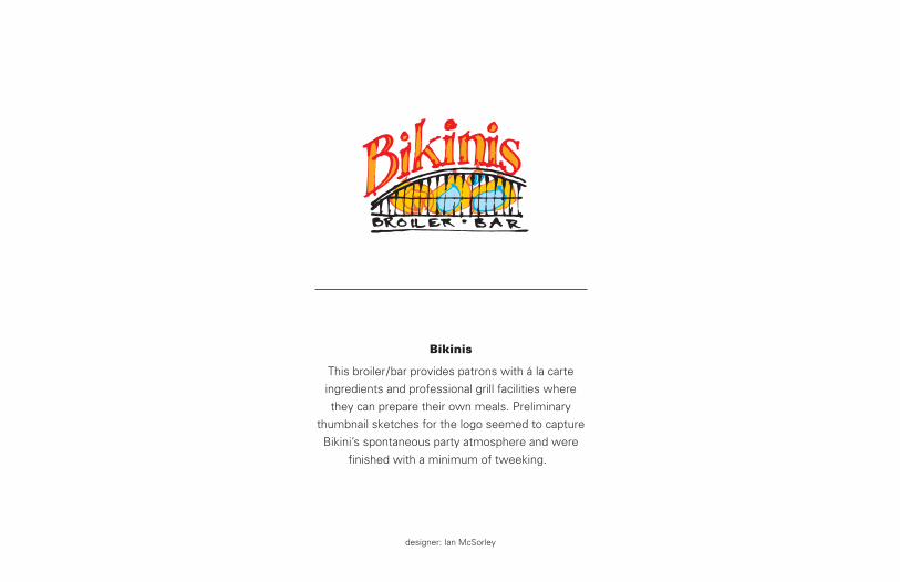
Bikinis
This broiler/bar provides patrons with á la carte
ingredients and professional grill facilities where
they can prepare their own meals. Preliminary
thumbnail sketches for the logo seemed to capture
Bikini’s spontaneous party atmosphere and were
finished with a minimum of tweeking.
designer: Ian McSorley

The Bridges Initiative
This Web site provides job market information to
students, teachers and career counselors, while
also providing a forum for industry input to school
curriculums. The objective is to match skill sets to
opportunities – seldom as obvious as it appears.
designer: Ian McSorley

Capilano Suspension Bridge
Despite diversifying with restaurants, gift shops,
hiking trails and native carving exhibits, this
Vancouver tourist attraction’s appeal is still the
adrenalin pumping walk across the cable suspension
bridge 120 feet above the river canyon below.
This bold logo type is applied to print, signage,
billboards and advertising.
designer: Ian McSorley

Charitable Returns
Benefactors have always supported worthy causes.
Charitable Returns finds the best match for both
parties and ensures that the donor receives more
than a pat on the back. The drop in the pool, ripples in
every direction, effecting everything it touches – the
perfect metaphor for this venture.
designer: Ian McSorley

Sensational Cinemotion
The logo and name for BC Showcase motion
simulator theatres embody the sense of movement
and excitement generated by these entertainment
vehicles. Synchronizing the audience‘s sight and
sound with physical movement of the theatre
provides an unmatched sensory experience.
designer: Ian McSorley

Clean Up America!
This product identity is for a US state specific
information program.
It provides a comprehensive index to all
environmental regulatory agencies and an advertising
medium for related products and services.
designer: Ian McSorleyGraphex: award for design excellence

Lance P. Davis, CA
This word mark fully integrates Davis’ professional
designation with his name.
designer: Ian McSorley

Davis Cup
This Davis Cup is a Vancouver charity event that
supports the Giant Steps program for autism.
Participants play 18 holes then attend a dinner and
auction with proceeds going to to Giant Steps.
A horizontal variation of this logotype was applied to
golf tees and the version shown here went on balls,
caps, golf shirts and collateral.
designer: Ian McSorley
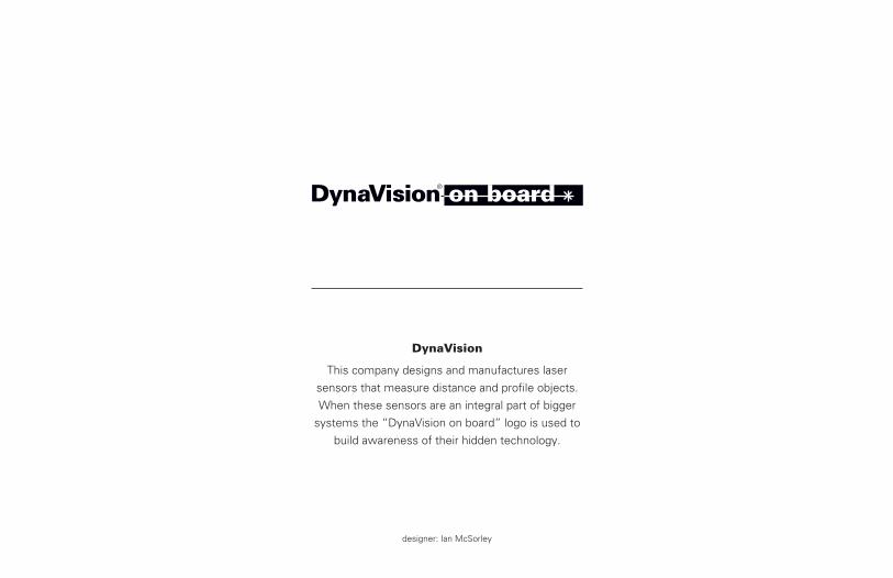
DynaVision
This company designs and manufactures laser
sensors that measure distance and profile objects.
When these sensors are an integral part of bigger
systems the “DynaVision on board” logo is used to
build awareness of their hidden technology.
designer: Ian McSorley

Electro Systems
This electronics firm designs, manufactures and
distributes consumer and industrial products
worldwide. The acronym says “electronics”,
is easily applied to products and transcends
language barriers.
designer: Ian McSorleyGraphex: award for design excellence

Enterprising Non Profits
This partnership of financial institutions,
foundations and Industry Canada provides funding
to non-profit social enterprises to assist in the
development of business plans, market research
and marketing plans – activities that progressively
help sharpen their focus and develop strategies.
designer: Ian McSorley

Ethos Strategy Group
Ethos provides research, communications and
strategic planning services that help define the
culture of organizations – that spontaneously
circled, unknown quantity that is unique to each
enterprise they work with.
designer: Ian McSorley

euro events
This on-line service provides information and booking
services for events of interest throughout Europe.
This festive identity incorporates landmarks for
several countries in one, cohesive icon
designer: Kelly Brooks

Vancouver Flower & Garden Show
Don Fraser’s long-term active involvement in the
Vancouver horticultural industry was taken even
farther with the establishment of this biennial show
for garden enthusiasts.
This 2 day event provides a forum for every type of
product and service catering to one of the fastest
growing market segments in the Pacific Northwest.
designer: Ian McSorley

Gemcom Software International
Gemcom’s software lets mining companies view
underground ore deposits in 3D – effectively giving
you a transparent view of the world.
The logo reinforces their global distribution and
product support.
designer: Ian McSorleyIdentity was one component of client’s BC Export Excellence Award for Excellence in Marketing Innovation and Canadian Export Development Award of Excellence

GemTeck
Teck Corporation initially developed environmental
monitoring software for use in their mining
operations. This joint venture will capitalize on
Gemcom’s ability to enhance the product and market
it through their established distribution channels.
designer: Ian McSorley

Hairdex.com
This web portal brought together salon owners,
product manufacturers and distributors.
The Warhol inspired identity appealed to the chic,
stylish, creative sensibility of the industry.
It’s a dot-bomb. Still like the identity though!
designer: Ian McSorley

Infoflip Systems
This patented reference book format uses a vertical
page that flips up and down. Information is cross
referenced using colour and imposition. The reader
can start anywhere in the book and use links to flip
to any relevant portion of the publication.
designer: Ian McSorley

InTıme Solutions Inc.
The void of the circular element can be filled
perfectly by the “i” of inTime which suggests a
person. This scheduling software puts the right
person in the right place at the right time and
generates subsantial savings in administrative time
and payroll costs for the companies using it.
designer: Ian McSorley

Kelly Brooks, Illustrator
Rendered in Kelly’s graphic style,
this combination of hand and eye communicates
her distinctive method of working
– loose and interpretive.
designer: Kelly Brooks

Trevor Linden Foundation
“The Captain With Heart” formalized his commitment
to charities in 1997 with the Trevor Linden Foundation.
The combination of Trevor’s hand print with the
stylized heart integrates “giving” and “compassion”.
designer: Ian McSorley

Laser Measurement International
LMI manufactures equipment that is used to measure
and profile objects in industrial process applications.
This logotype raises the profile of this hidden
technology by branding the equipment that it is
incorporated in.
designer: Ian McSorley

Nightline Backup
This firm provides secure, reliable, remote computer
backup to PC users. The infinite loop, which forms
the “N”, is also a symbol for data and illustrates the
unlimited capacity this method of archiving provides.
designer: Ian McSorleyGraphex: award for design excellence

Ocean Salmon Adventures
For years our old friend, Wayne Laughren, catered
our summer barbecue. Clients and friends enjoyed an
amazing feast of fresh, BC wild salmon.
In exchange, we designed the identity for his sports
fishing charter business and provided design services
for his marketing materials. Wayne now has a B&B
and charter business in Sooke, BC.
designer: Ian McSorley

Pacifica
Organized by the Canada Pacific Publishing Society,
Pacifica is a biennial trade show for the Pacific Rim
publishing industry.
Launched in Vancouver in the spring of ‘93, this brain
child of Scott McIntyre was established to foster the
expansion of the Pacific region book market.
designers: Ian McSorley & Phil Copithorne

Point No Point
Evocative of the classic CP travel image established
in the 1930s, this Vancouver Island Resort offers
accommodation ranging from the nostalgic
Canadiana of the 50s to lavishly appointed
contemporary duplexes.
designer: Ian McSorley

RainDogs
This Vancouver band might be howlin’ at the moon
if they lived almost anywhere else on the globe.
Not one to let their spirits be dampened by the
weather, they howl at the next best thing.
designer: Ian McSorley

Rep Art
The identity for Rep Art consisted of a group of four
separate logos. Each stationery item used its own
graphic element. The seal with the aircraft was
applied to envelopes, a steam ship went on shipping
labels, the postie was on the letterhead, and the
telephone was on business cards.
designer: Kelly BrooksGraphex: award for design excellence

The Opera Round Table
This special group of patrons provide significant
financial support to the Vancouver Opera.
The coin bouncing across the musical staff merges
the concepts of funding and music.
designer: Ian McSorleyGraphex: award for design excellence

SelfCare Home Health Products
This company provides products and services to
help people care for themselves in their homes.
designer: Ian McSorley

Speed Shift
InTıme Solutions develops staff scheduling software
for specific industries in vertical markets.
Speed Shift supplies the same ease of use and
scheduling control to a broader user base. The
checker flag reinforces the name and associations
with high performance, speed and winning.
designer: Ian McSorley

Naomi Stevens Photographer
This expressive depiction of the 35mm camera
conveys the sense of energy Naomi wanted her logo
to communicate.
The two colour design provides a striking graphic
solution with an economy of means.
designer: Kelly Brooks

Taste Music Productions
Despite the impact of the digital revolution, creativity
still relies on the talent of the individual.
Bill Sample wanted a mark for his music production
company that was obviously high touch, low tech.
The spiral at once suggests energy, sound waves,
the human ear and hints at the treble clef.
designer: Kelly Brooks

BC Trade Corporation
Every 2 years the Abbotsford Air Show hosts an
aerospace industry trade show.
BC Trade provides a venue for any aerospace
company pursuing new opportunities.
“Touch Down in BC” merges an industry icon with
the welcoming posture of our aerospace companies.
designer: Ian McSorley

Transportation Synergies
This long-haul freight provider distinguishes
themselves by providing services to a vertical market.
Their thorough understanding of logistics for office
furnishing manufacturers allows them to dominate
this niche. The open road and “Synergies”reinforce
their unique position.
Transportation
Synergies
designer: Ian McSorley

Tubular Track
This method of rail construction almost eliminates
track maintenance by supporting each rail on a
continuous foundation “tube” of steel reinforced grout.
The logo depicts every rail owners dream of
uninterrupted track from here to the horizon.
designer: Ian McSorley

Undersea Adventures
This film title for British Columbia Showcase was
designed to work equally well in black & white or full
colour. The simple split fountain colour treatment
shown here was used on screen printed garments
and production signage.
designer: Ian McSorley

Waterworks
This software product from Synex Systems is used
in the design and analysis of water pipe networks.
designer: Ian McSorley

brand
Design HQ Inc.
1740 McSpadden Avenue
Vancouver, BC
Canada V5N 1L4
T 604.255.0699
F 604.255.4764
www.designhq.com
Like what you see?
We would be glad to show
you some complete
programs. Give us a call.
Related Documents
![Compiler Design in C [HQ]](https://static.cupdf.com/doc/110x72/55cf93dd550346f57b9e9a62/compiler-design-in-c-hq.jpg)

