Practical Typography “Rule the Typography” By Ravi Bhadauria ADMEC MULTIMEDIA INSTITUTE www.admecindia.co.in #9811-818-122, #9911-782-350

Learn more About Typography Art Technique
Jul 15, 2015
Welcome message from author
This document is posted to help you gain knowledge. Please leave a comment to let me know what you think about it! Share it to your friends and learn new things together.
Transcript
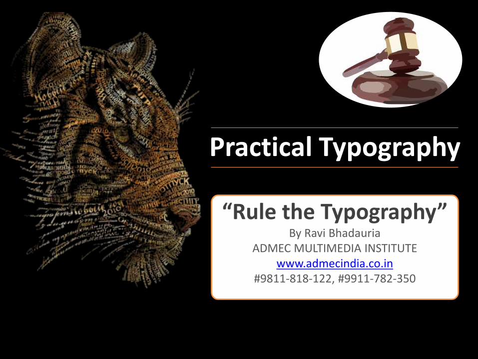
Practical Typography
“Rule the Typography”By Ravi Bhadauria
ADMEC MULTIMEDIA INSTITUTEwww.admecindia.co.in
#9811-818-122, #9911-782-350
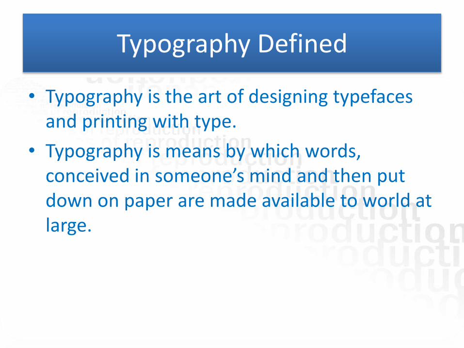
Typography Defined
• Typography is the art of designing typefaces and printing with type.
• Typography is means by which words, conceived in someone’s mind and then put down on paper are made available to world at large.
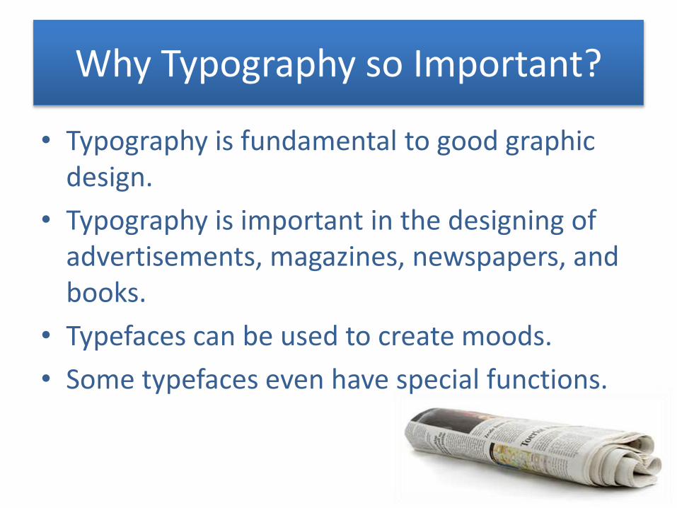
Why Typography so Important?
• Typography is fundamental to good graphic design.
• Typography is important in the designing of advertisements, magazines, newspapers, and books.
• Typefaces can be used to create moods.
• Some typefaces even have special functions.
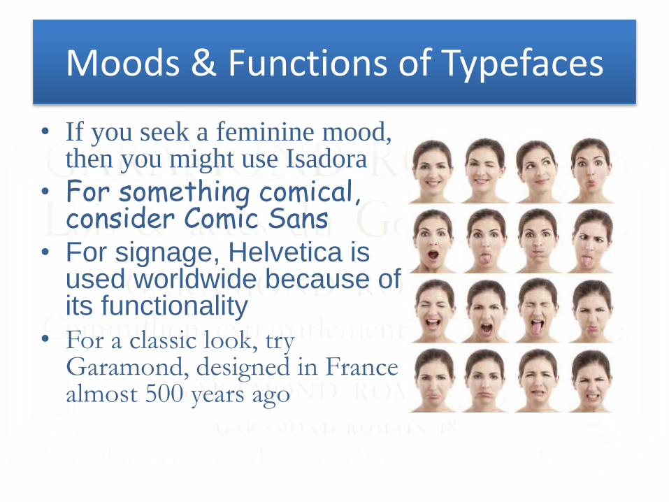
Moods & Functions of Typefaces
• If you seek a feminine mood, then you might use Isadora
• For something comical, consider Comic Sans
• For signage, Helvetica is used worldwide because of its functionality
• For a classic look, try Garamond, designed in France almost 500 years ago
A Few Definitions
• Type family- a number of different fonts based on the same fundamental design.
• Type series- the many sizes that a type font is available in.
• Font- a font is a collection of characters of the alphabet of one size and series.
Members of a type family have distinguishing names such as Century Light, Century
Light Italic, Century Bold, Century Bold Italic, and so on.
A standard type series is: 5.5, 6, 7, 8, 8.5, 9, 9.5, 10, 11, 12, 14, 18, 24, 30,
36, 48, 60, 72, 96, 108
Classification of Typefaces
• There are several systems for classification of typefaces, but the various systems have elements in common
• All such schemes, for example, recognize roman types as a major category
• All such schemes also have a special category called miscellaneous for typefaces that do not fall in some other category
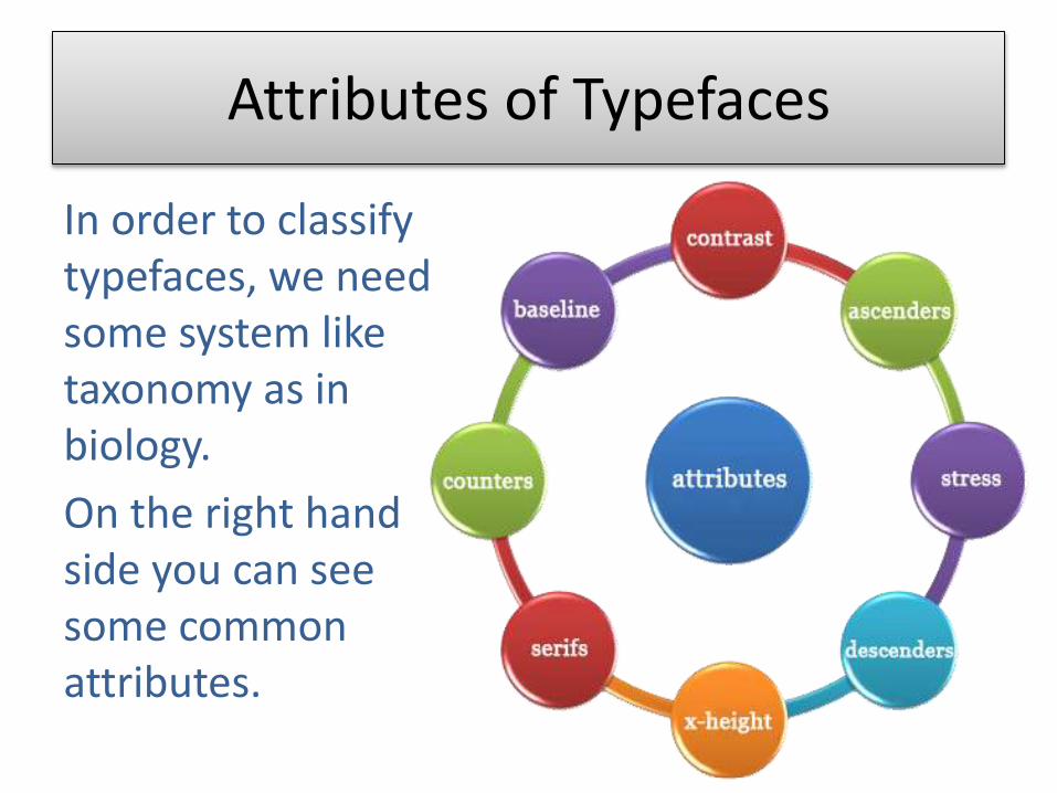
Attributes of Typefaces
In order to classify typefaces, we need some system like taxonomy as in biology.
On the right hand side you can see some common attributes.
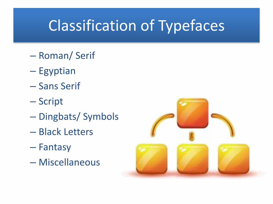
Classification of Typefaces
– Roman/ Serif
– Egyptian
– Sans Serif
– Script
– Dingbats/ Symbols
– Black Letters
– Fantasy
– Miscellaneous
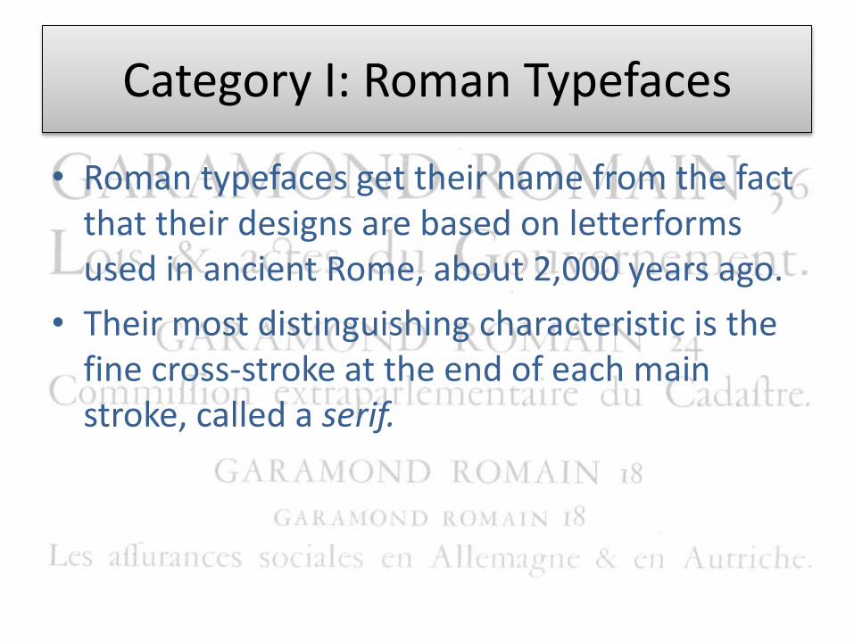
Category I: Roman Typefaces
• Roman typefaces get their name from the fact that their designs are based on letterforms used in ancient Rome, about 2,000 years ago.
• Their most distinguishing characteristic is the fine cross-stroke at the end of each main stroke, called a serif.
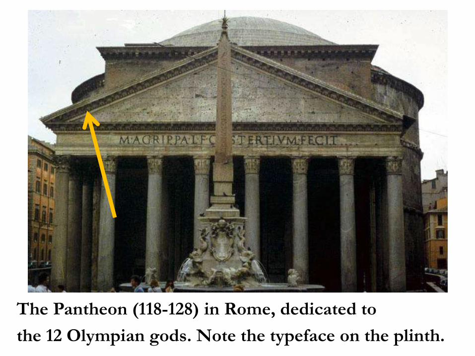
The Pantheon (118-128) in Rome, dedicated to
the 12 Olympian gods. Note the typeface on the plinth.
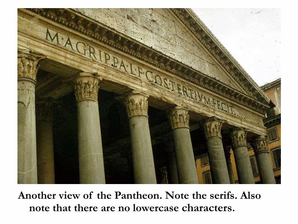
Another view of the Pantheon. Note the serifs. Also note that there are no lowercase characters.
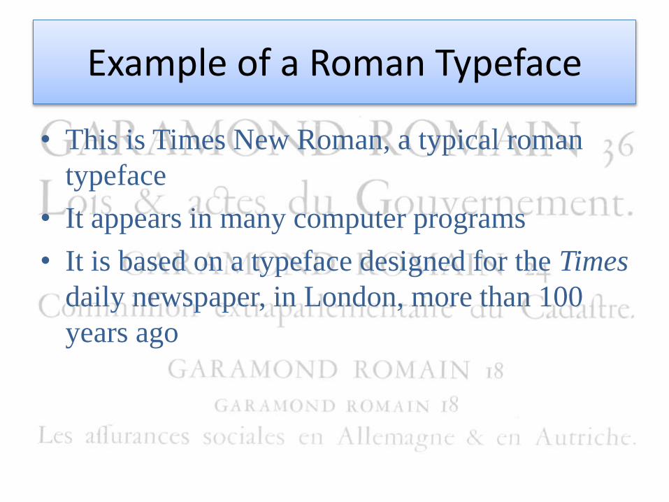
Example of a Roman Typeface
• This is Times New Roman, a typical roman
typeface
• It appears in many computer programs
• It is based on a typeface designed for the Times
daily newspaper, in London, more than 100
years ago
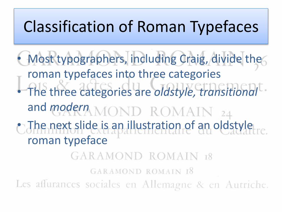
Classification of Roman Typefaces
• Most typographers, including Craig, divide the roman typefaces into three categories
• The three categories are oldstyle, transitionaland modern
• The next slide is an illustration of an oldstyleroman typeface
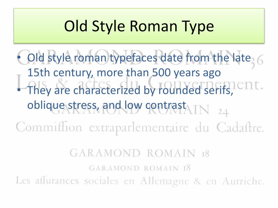
Old Style Roman Type
• Old style roman typefaces date from the late 15th century, more than 500 years ago
• They are characterized by rounded serifs, oblique stress, and low contrast
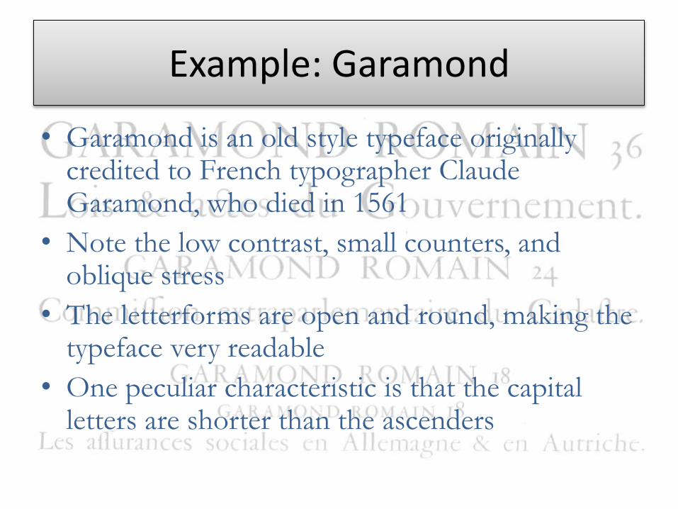
Example: Garamond
• Garamond is an old style typeface originally credited to French typographer Claude Garamond, who died in 1561
• Note the low contrast, small counters, and oblique stress
• The letterforms are open and round, making the typeface very readable
• One peculiar characteristic is that the capital letters are shorter than the ascenders
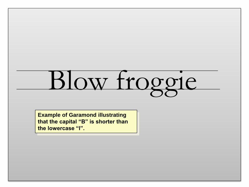
Blow froggieExample of Garamond illustrating
that the capital “B” is shorter than
the lowercase “l”.
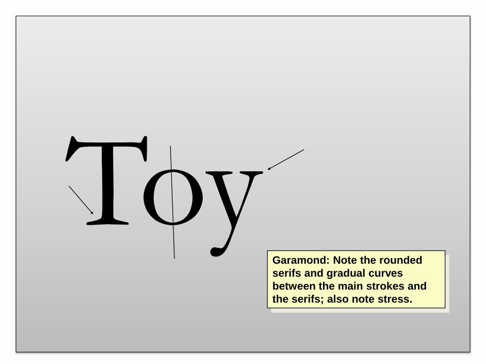
ToyGaramond: Note the rounded
serifs and gradual curves
between the main strokes and
the serifs; also note stress.
Transitional Roman Type
• Now that we have finished examining in
detail an oldstyle roman typeface, let’s turn
to a transitional roman typeface
• For this example, let’s use Baskerville
Example: Baskerville
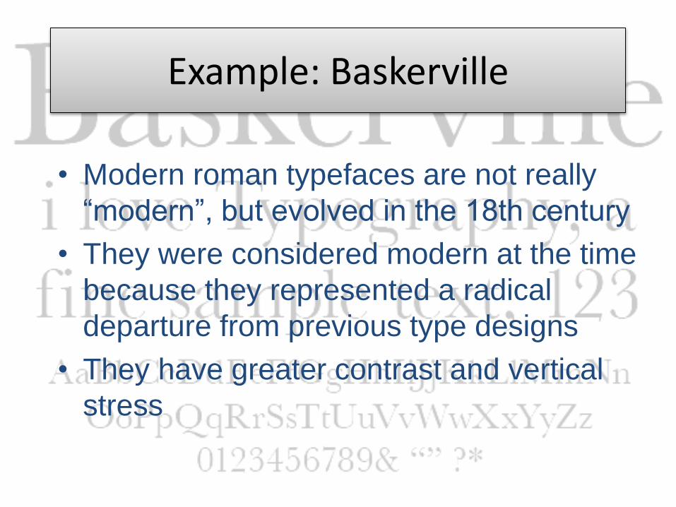
• Modern roman typefaces are not really
“modern”, but evolved in the 18th century
• They were considered modern at the time
because they represented a radical
departure from previous type designs
• They have greater contrast and vertical
stress
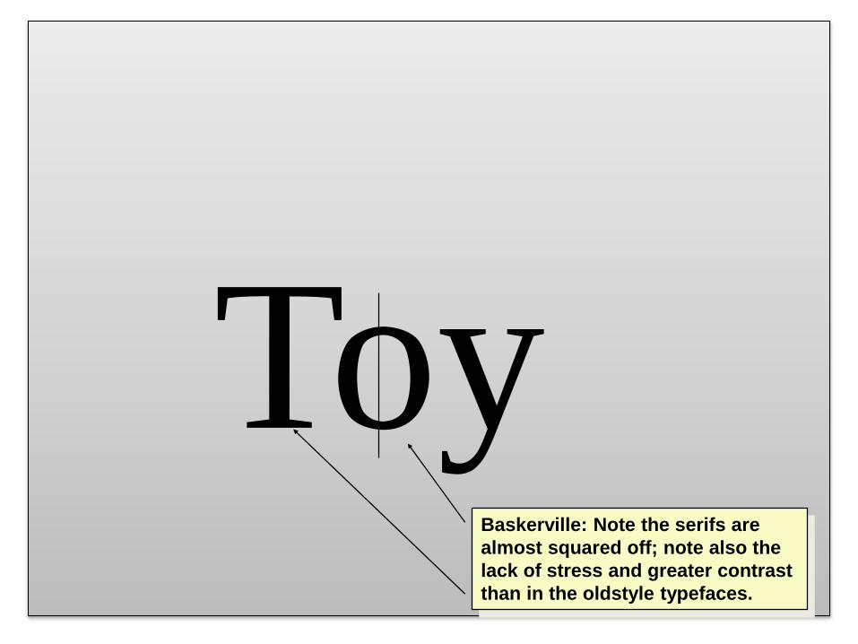
ToyBaskerville: Note the serifs are
almost squared off; note also the
lack of stress and greater contrast
than in the oldstyle typefaces.
Modern Roman Type
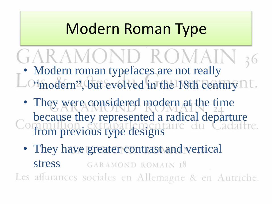
• Modern roman typefaces are not really
“modern”, but evolved in the 18th century
• They were considered modern at the time
because they represented a radical departure
from previous type designs
• They have greater contrast and vertical
stress
Example: Fenice
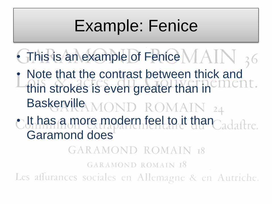
• This is an example of Fenice
• Note that the contrast between thick and
thin strokes is even greater than in
Baskerville
• It has a more modern feel to it than
Garamond does
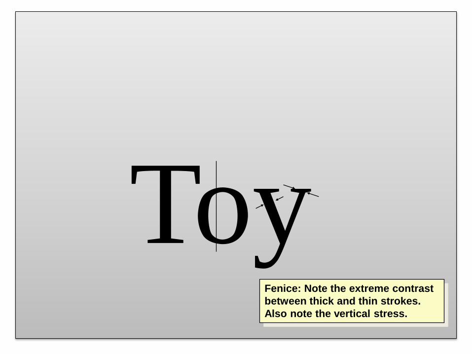
ToyFenice: Note the extreme contrast
between thick and thin strokes.
Also note the vertical stress.
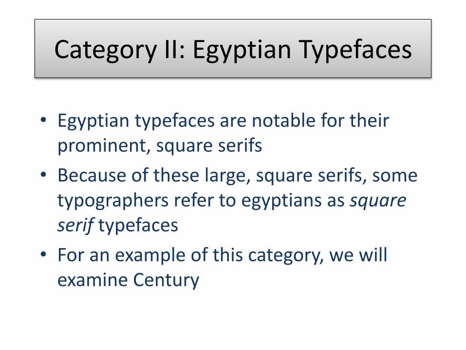
Category II: Egyptian Typefaces
• Egyptian typefaces are notable for their prominent, square serifs
• Because of these large, square serifs, some typographers refer to egyptians as square serif typefaces
• For an example of this category, we will examine Century
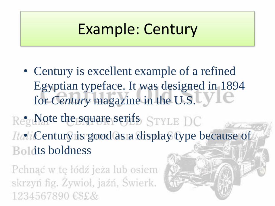
Example: Century
• Century is excellent example of a refined
Egyptian typeface. It was designed in 1894
for Century magazine in the U.S.
• Note the square serifs
• Century is good as a display type because of
its boldness
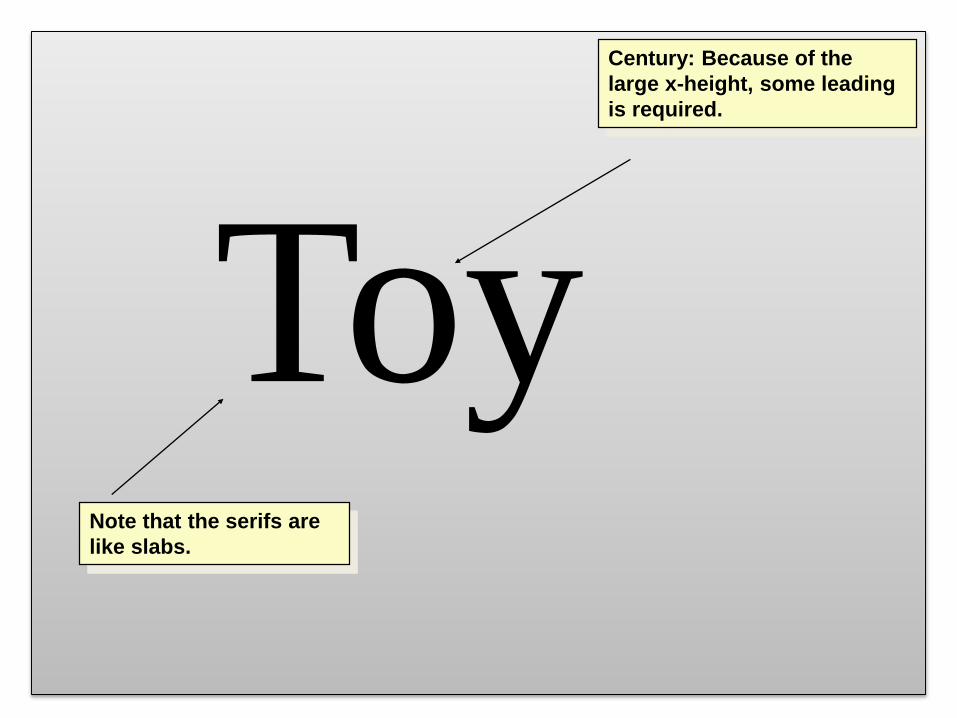
ToyNote that the serifs are
like slabs.
Century: Because of the
large x-height, some leading
is required.
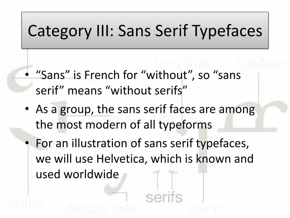
Category III: Sans Serif Typefaces
• “Sans” is French for “without”, so “sans serif” means “without serifs”
• As a group, the sans serif faces are among the most modern of all typeforms
• For an illustration of sans serif typefaces, we will use Helvetica, which is known and used worldwide
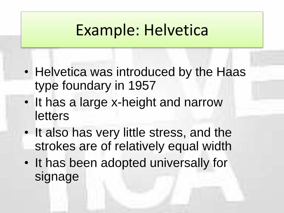
Example: Helvetica
• Helvetica was introduced by the Haas type foundary in 1957
• It has a large x-height and narrow letters
• It also has very little stress, and the strokes are of relatively equal width
• It has been adopted universally for signage
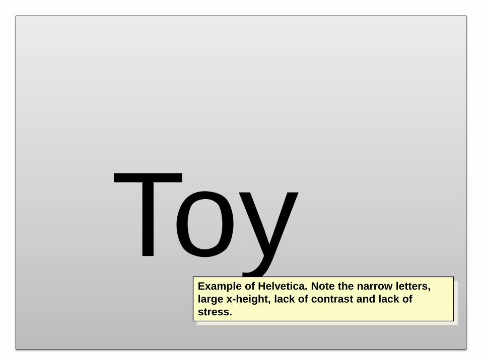
ToyExample of Helvetica. Note the narrow letters,
large x-height, lack of contrast and lack of
stress.
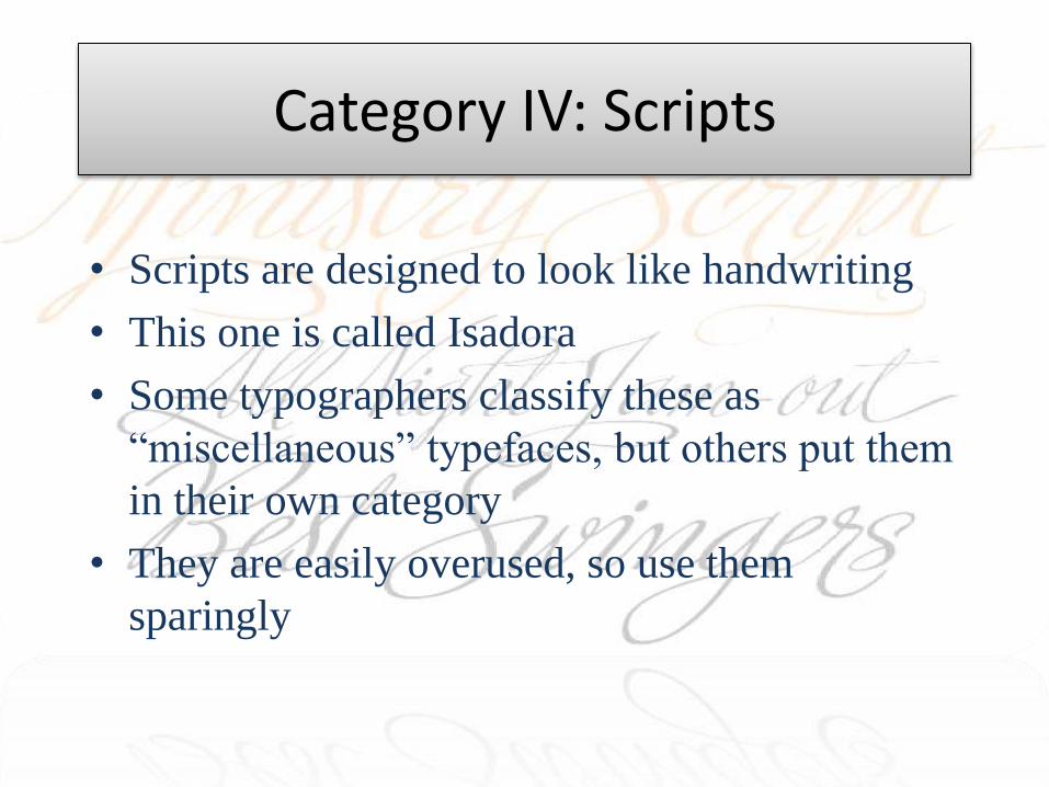
Category IV: Scripts
• Scripts are designed to look like handwriting
• This one is called Isadora
• Some typographers classify these as
“miscellaneous” typefaces, but others put them
in their own category
• They are easily overused, so use them
sparingly
Category V: Miscellaneous
• In this category go all those typefaces that do not fit into the first four categories
• The following slides will illustrate some of the more interesting typefaces
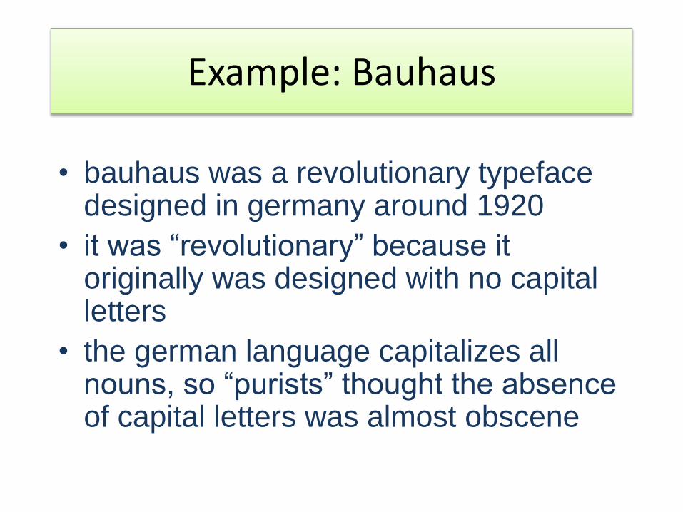
Example: Bauhaus
• bauhaus was a revolutionary typeface designed in germany around 1920
• it was “revolutionary” because it originally was designed with no capital letters
• the german language capitalizes all nouns, so “purists” thought the absence of capital letters was almost obscene
Rules of Thumb
Seriously there are some rules of thumb to make easy typography to you to understand!. Whatever I have learnt in my designing career of 15 years here I am describing as rules of typography for you.
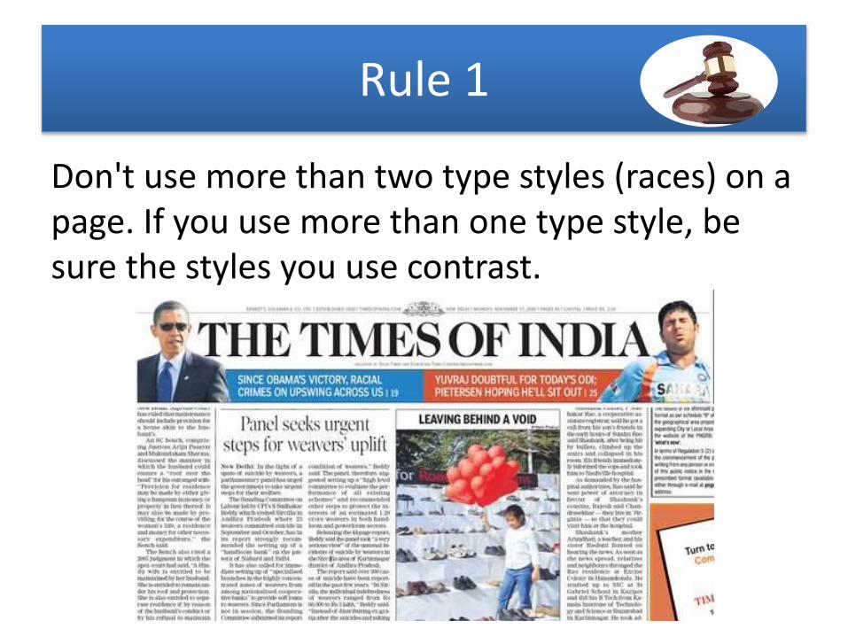
Rule 1
Don't use more than two type styles (races) on a page. If you use more than one type style, be sure the styles you use contrast.
Rule 2
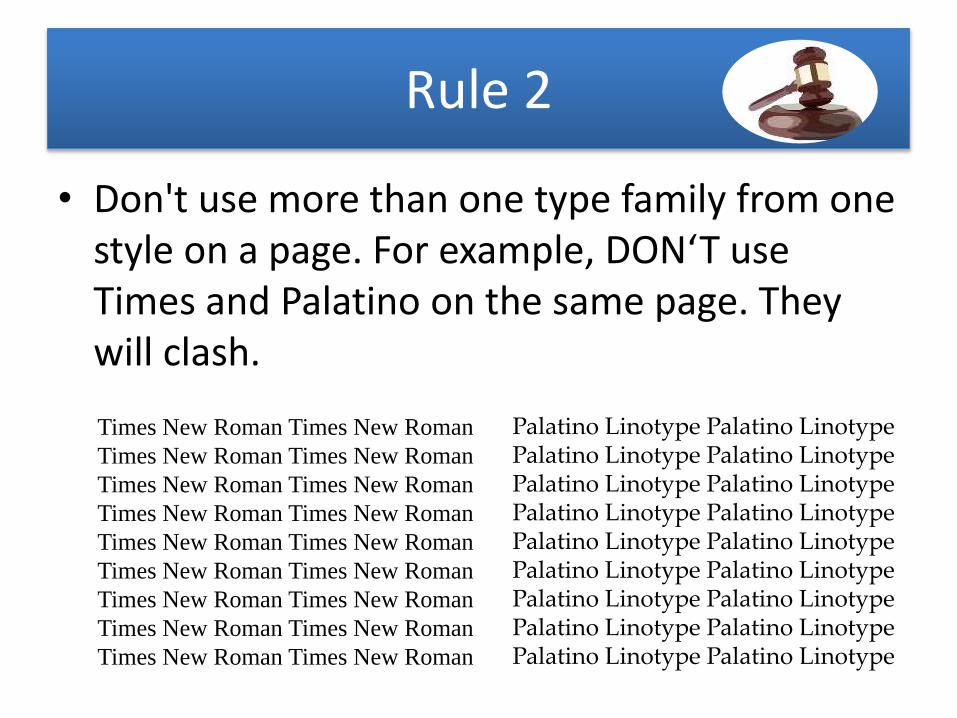
• Don't use more than one type family from one style on a page. For example, DON‘T use Times and Palatino on the same page. They will clash.
Times New Roman Times New Roman
Times New Roman Times New Roman
Times New Roman Times New Roman
Times New Roman Times New Roman
Times New Roman Times New Roman
Times New Roman Times New Roman
Times New Roman Times New Roman
Times New Roman Times New Roman
Times New Roman Times New Roman
Palatino Linotype Palatino Linotype Palatino Linotype Palatino Linotype Palatino Linotype Palatino Linotype Palatino Linotype Palatino Linotype Palatino Linotype Palatino Linotype Palatino Linotype Palatino Linotype Palatino Linotype Palatino Linotype Palatino Linotype Palatino Linotype Palatino Linotype Palatino Linotype
Rule 3
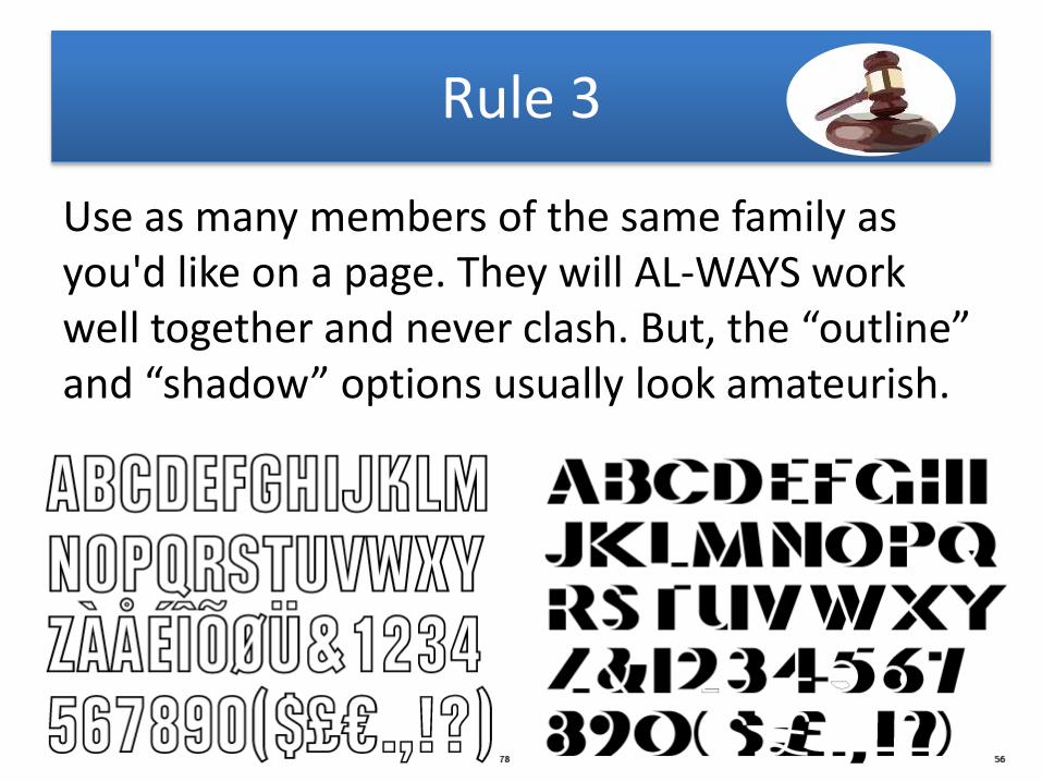
Use as many members of the same family as you'd like on a page. They will AL-WAYS work well together and never clash. But, the “outline” and “shadow” options usually look amateurish.
Rule 4
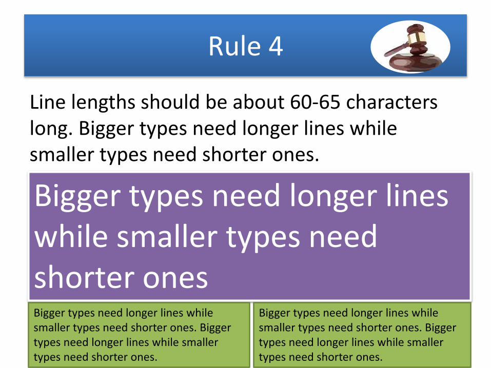
Line lengths should be about 60-65 characters long. Bigger types need longer lines while smaller types need shorter ones.
Bigger types need longer lines while smaller types need shorter onesBigger types need longer lines while smaller types need shorter ones. Bigger types need longer lines while smaller types need shorter ones.
Bigger types need longer lines while smaller types need shorter ones. Bigger types need longer lines while smaller types need shorter ones.
Rule 5
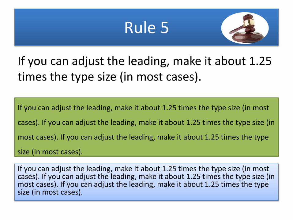
If you can adjust the leading, make it about 1.25 times the type size (in most cases).
If you can adjust the leading, make it about 1.25 times the type size (in most
cases). If you can adjust the leading, make it about 1.25 times the type size (in
most cases). If you can adjust the leading, make it about 1.25 times the type
size (in most cases).
If you can adjust the leading, make it about 1.25 times the type size (in most cases). If you can adjust the leading, make it about 1.25 times the type size (in most cases). If you can adjust the leading, make it about 1.25 times the type size (in most cases).
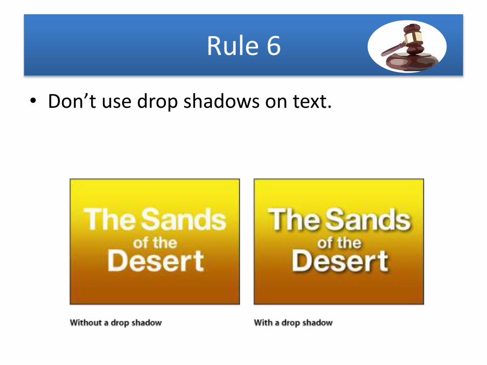
Rule 6
• Don’t use drop shadows on text.
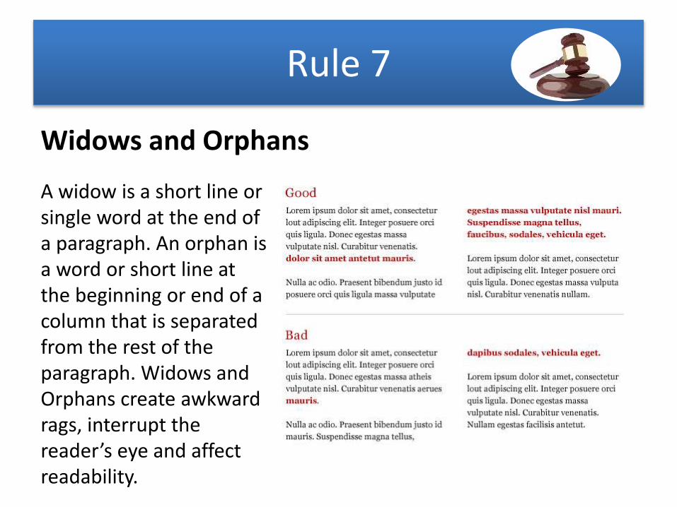
Rule 7
Widows and Orphans
A widow is a short line or single word at the end of a paragraph. An orphan is a word or short line at the beginning or end of a column that is separated from the rest of the paragraph. Widows and Orphans create awkward rags, interrupt the reader’s eye and affect readability.
Rule 8
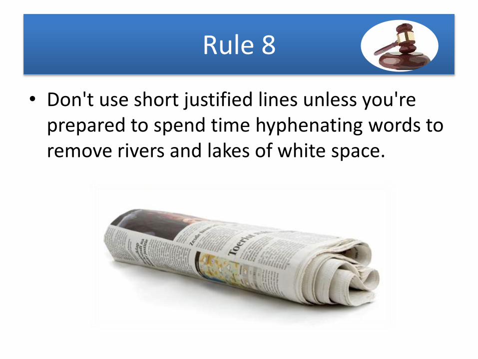
• Don't use short justified lines unless you're prepared to spend time hyphenating words to remove rivers and lakes of white space.
Rule 9
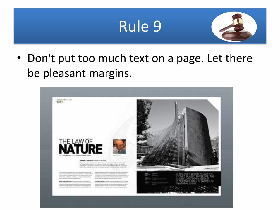
• Don't put too much text on a page. Let there be pleasant margins.
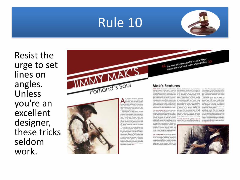
Rule 10
Resist the urge to set lines on angles. Unless you're an excellent designer, these tricks seldom work.
Rule 11
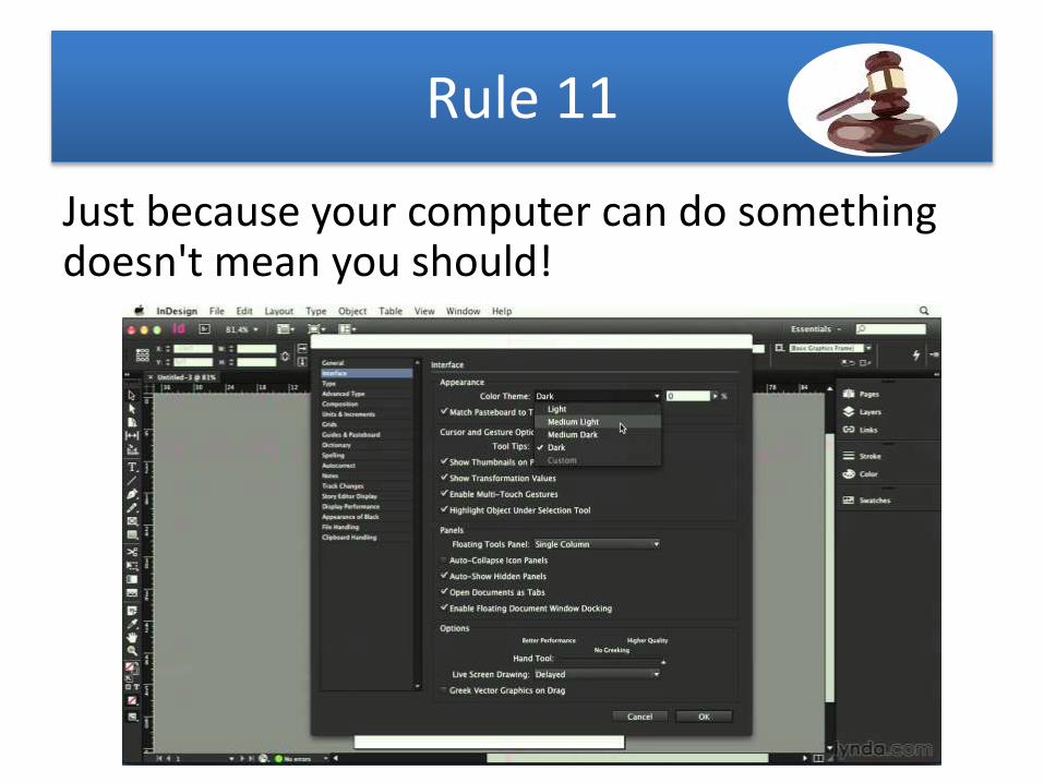
Just because your computer can do something doesn't mean you should!
Rule 12
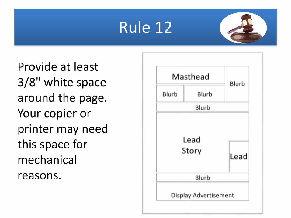
Provide at least 3/8" white space around the page. Your copier or printer may need this space for mechanical reasons.
Rule 13
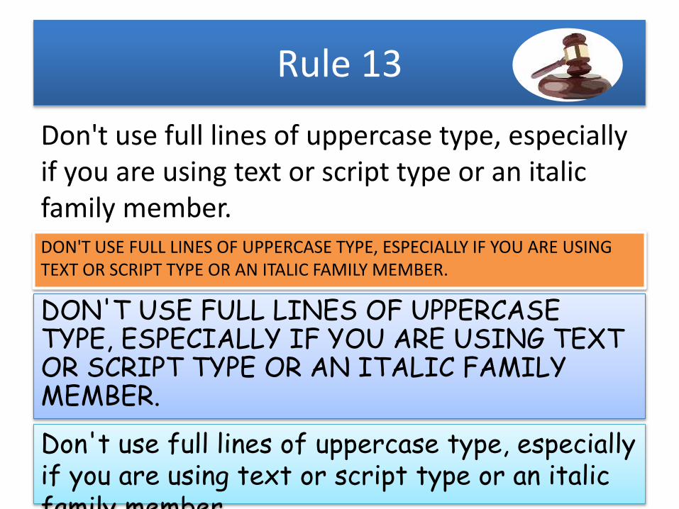
Don't use full lines of uppercase type, especially if you are using text or script type or an italic family member.DON'T USE FULL LINES OF UPPERCASE TYPE, ESPECIALLY IF YOU ARE USING TEXT OR SCRIPT TYPE OR AN ITALIC FAMILY MEMBER.
DON'T USE FULL LINES OF UPPERCASE TYPE, ESPECIALLY IF YOU ARE USING TEXT OR SCRIPT TYPE OR AN ITALIC FAMILY MEMBER.
Don't use full lines of uppercase type, especially if you are using text or script type or an italic family member.

Rule 14
Long lines of text are hard to read. Generally, a line should have 55 to 60 characters, or 9 to 10 words. Try multiple columns or, if you are stuck with a long line length, increase the leading slightly to make it easier for the eye to move from line to line
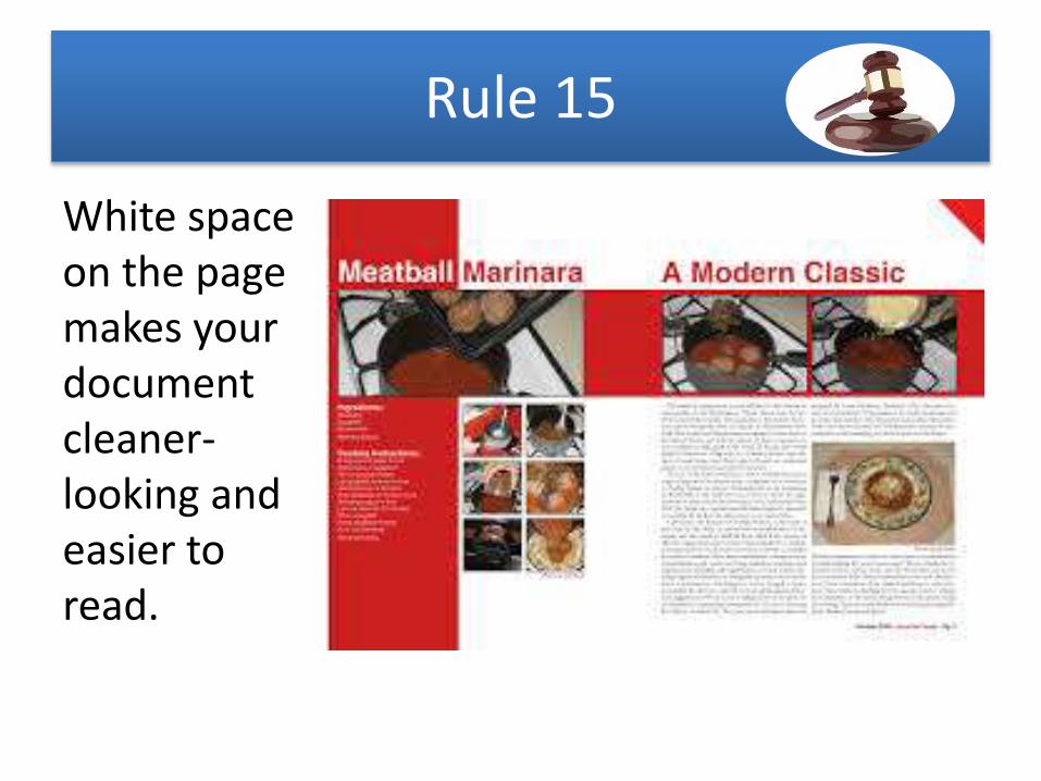
Rule 15
White space on the page makes your document cleaner-looking and easier to read.
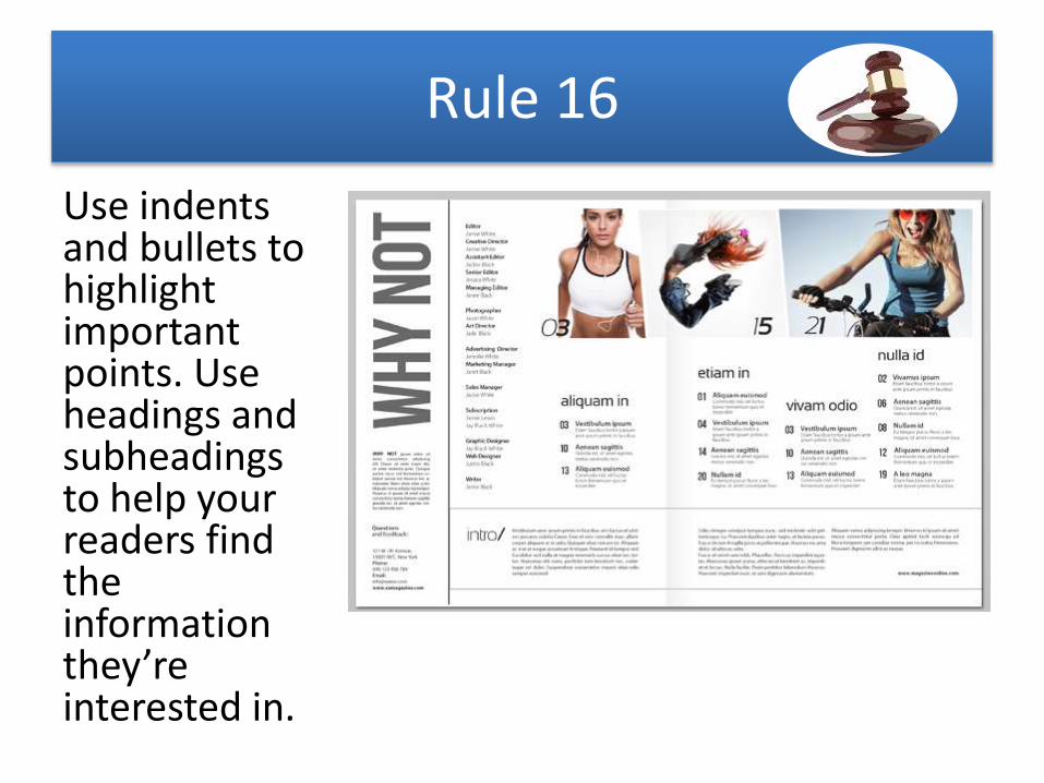
Rule 16
Use indents and bullets to highlight important points. Use headings and subheadings to help your readers find the information they’re interested in.
Rule 17
• Avoid using more than two type families on a page. Generally one serif and one sans serif make a nice mix. Using the sans serif for head lines and the serif for body text is a common and effective formula.
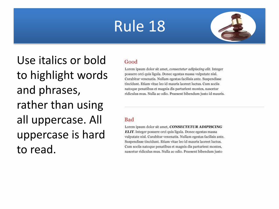
Rule 18
Use italics or bold to highlight words and phrases, rather than using all uppercase. All uppercase is hard to read.
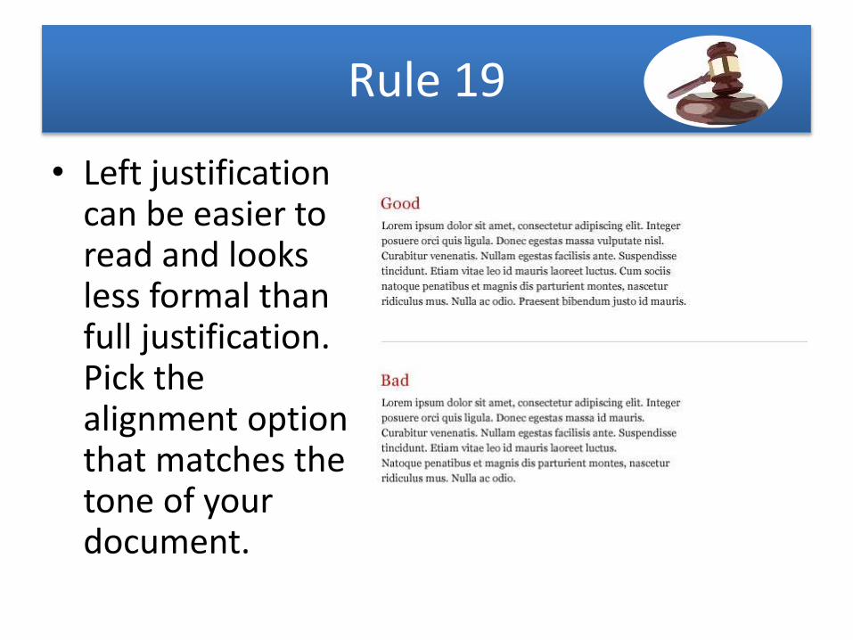
Rule 19
• Left justification can be easier to read and looks less formal than full justification. Pick the alignment option that matches the tone of your document.
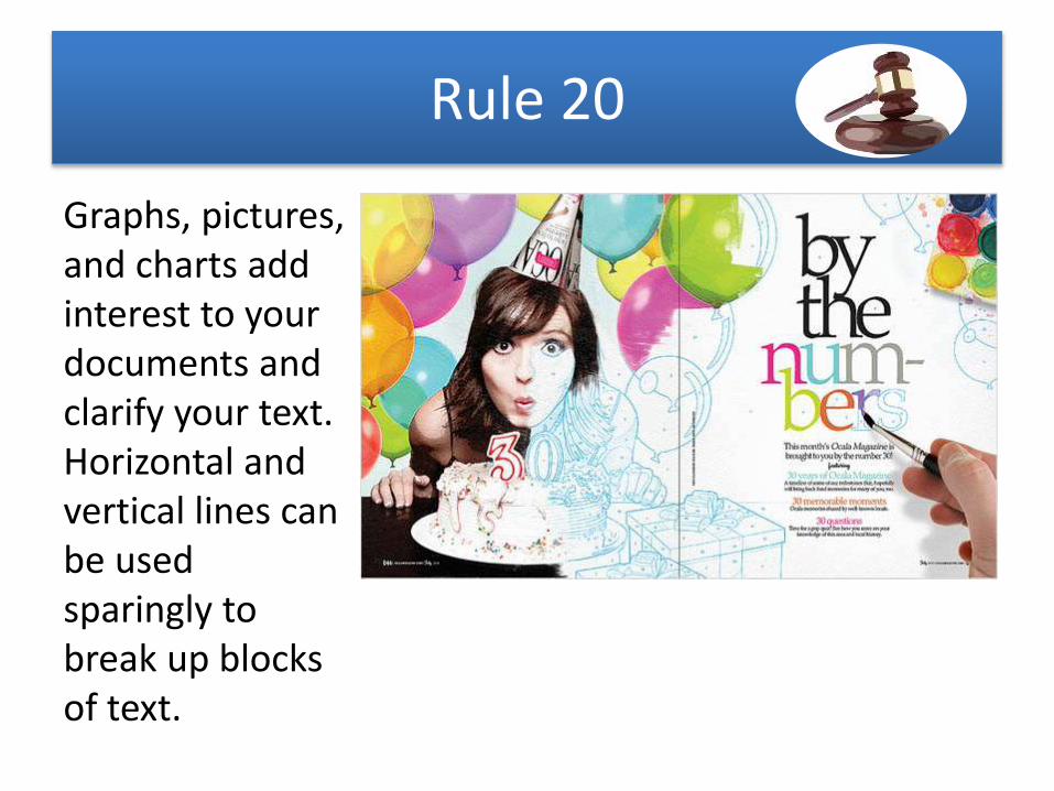
Rule 20
Graphs, pictures, and charts add interest to your documents and clarify your text. Horizontal and vertical lines can be used sparingly to break up blocks of text.
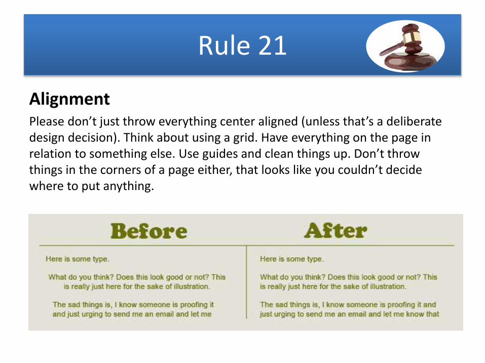
Rule 21
AlignmentPlease don’t just throw everything center aligned (unless that’s a deliberate design decision). Think about using a grid. Have everything on the page in relation to something else. Use guides and clean things up. Don’t throw things in the corners of a page either, that looks like you couldn’t decide where to put anything.
Thanks
Can you rule typography now!
ADMEC MULTIMEDIA INSTITUTEC-7/114, 1st Floor, Sector-7, Rohini
Delhi- 110085
www.admecindia.co.in
Related Documents