Within Lava people from brand strategy, digital, motion and print design backgrounds collaborate to create concepts that enable brands and organisations to communicate in ever more digital environments. Lava designs for digital v. 1.0 - 20140530

Lava designs for digital 2014
Jul 24, 2015
Welcome message from author
This document is posted to help you gain knowledge. Please leave a comment to let me know what you think about it! Share it to your friends and learn new things together.
Transcript

Within Lava people from brand strategy, digital, motion and print design backgrounds collaborate to create concepts that enable brands and organisations to communicate in ever more digital environments.
Lava designs
for digital
v. 1.0 - 20140530

Toneelschuur
Toneelschuur has a lot of interesting stories to tell, but visitors to its website, especially the mobile ones, really want to buy a ticket. Therefor the responsive website discloses all information on all platforms but focuses on the daily calender when visited on a smartphone.
For over forty years the Toneelschuur in Haarlem has been a leading contemporary home for the Dutch theater, dance and film.
Visual identityThe visual identity of Toneelschuur that first was created with a focus on print now also found its way to online !
Responsive designThe new Toneelschuur website provides acces to all of its content to every user on every type of internet enabled device.
Ticket System integrationThis website shows a complex integration between webbased ticket booking software and a custom cash register application that runs locally.
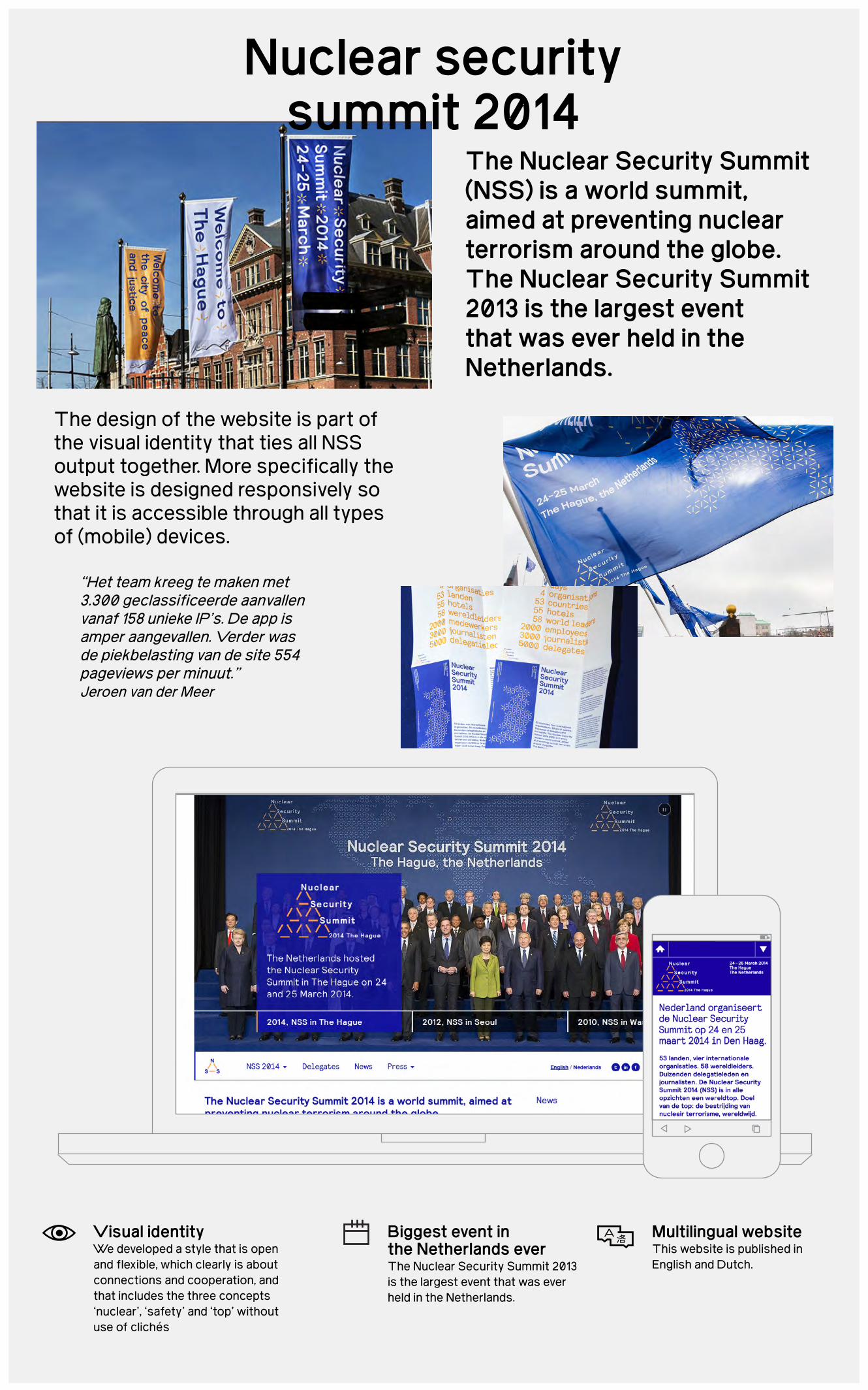
“Het team kreeg te maken met 3.300 geclassificeerde aanvallen vanaf 158 unieke IP’s. De app is amper aangevallen. Verder was de piekbelasting van de site 554 pageviews per minuut.”Jeroen van der Meer
The design of the website is part of the visual identity that ties all NSS output together. More specifically the website is designed responsively so that it is accessible through all types of (mobile) devices.
The Nuclear Security Summit (NSS) is a world summit, aimed at preventing nuclear terrorism around the globe. The Nuclear Security Summit 2013 is the largest event that was ever held in the Netherlands.
Nuclear security summit 2014
Visual identityWe developed a style that is open and flexible, which clearly is about connections and cooperation, and that includes the three concepts ‘nuclear’, ‘safety’ and ‘top’ without use of clichés
Multilingual websiteThis website is published in English and Dutch.
Biggest event in the Netherlands everThe Nuclear Security Summit 2013 is the largest event that was ever held in the Netherlands.

“The 13th Istanbul Biennial has ended on October 20 with a record number visitors. A total of 337,429 people visited this year’s biennial.”Hürriyet Daily News - October/21/2013
The Istanbul Biennial website is an example of a more experimental design approach: the interface of the website plays with the concept of tensions between spaces, just like the underlying concept of the visual identity.
13th Istanbul Biennial
The International Istanbul Biennial is a contemporary art exhibition, held every two years in Istanbul, Turkey, since 1987.
Responsive designThe webdesign responds to the available screen estate offering users of multiple devices.
Award winning design The website design is part of the visual identity that won gold at the European Design Awards 2013.
Multilingual websiteThis website is published in English and Turkish.

Spoorbeeld sets the guidelines for the design of all the trainstation surroundings in the Netherlands.
“This utility, structure and systems based approach fused with subtle humanistic interactive qualities feels appropriate for the study of people within rail transport infrastructure.”Richard Baird - 2012/10/25
The digital publication for Spoorbeeld is an example of a comprehensive digital publication that offers optimal navigation and legibility on tablet computers.
Spoorbeeld
Visual identityWithin the new visual identity all shapes and elements togetherform the new Spoorbeeld logo. They resemble the vision that all impressions of the traveller should make up for one unified travel experience independent from which station you start or finish.
Smart printing options Spoorbeeld enables visitors to print specific pages through optimized print stylesheets. Next to this you can also order specific sections in print through print on demand services.
Crosslinking of informationSpoorbeeld shows a flexible layout system that allows editors to link the guidelines to inspirational stories.

“Werkblad Magazine is designed and build according to the ‘Webrichtijnen’ of the Dutch government and therefore accessible to everyone, including people with disabilities.” arbeidsdeskundigen.nl
Werkblad Magazine shows a combination between interviews and practical roadmaps that will enhance unemployed people to their potential to find a new job.
Werkblad magazine, published by the Dutch national insurances service “UWV”, is a digital publication that inspire and help jobseekers to find new employment.
Werkblad Magazine
Webrichtlijnen proofThe design and construction of the website is qualified as ‘webrichtlijnen-proof’ which means the Dutch national accessibility guidelines are met..
Editorial conceptBy connecting personal interviews with practical stepping stones that lead to related information jobseekers are encouraged to enhance their jobsearch.
Information ArchitectureThe content plan of Werkblad magazine helps people find meaningful articles and the editors to maintain the right balance between sections.

14:10
“The app is seeing the biggest growth rate in Japan than any other country and region, perhaps signifying the value of promises in the local culture in the country.”J. Angelo Racoma
The visual design integrates the concept of victory and failure and maybe more importantly helps to navigate the app.
PromiseUp is an iOS app that gives you incentives so you are motivated to keep your word.
PromiseUP
Feautured on TechCrunch PromiseUp was presented in Moscow to an international audience.
Mobile appWe collaborated with a Russian development partner RZLTT to create a fully featured app.

Elevate is an accredited online academy that educates international health professionals.
The online brand Elevate helps a consortium of content partners to collectively offer a growing set of digital courses to a worldwide audience.
Elevate
Brand conceptAn unambiguous name that indicates exactly what it does and that can be used perfectly within digital environments.
Worldwide communityElevate enables health professionals from all over the world.
E-learning systemThe e-learning concept combines the concept of the virtual classroom and the individuals learning path in a clear and user friendly manner.

Since 2007, Klik! Amsterdam Animation Festival is one of the city’s most exciting film festivals, featuring a massive selection of top-quality animated films.anim’est
The Klik! identity shows a playful graphic concept that was translated into a full event style including a website with a complex festival agenda.
KLIK! Animation Festival is a fun festival that aims to bring the art of animation, in all its forms, to a wider audience.
Klik AnimationFestival
Visual identityThe visual identity......The visual identity......The visual identity......The visual identity......
Complex Festival agendaThe animation festival consists of many many short film clips. We designed a single page interface that provides an easy overview to all.English and Dutch.
Responsive designA flexible layout system that responds to all devices that people carry around the festival.

AMSTERDAM BEIJING
Brand StrategyDigital strategyBrand concepts Visual identy designCampaignGraphic Design User Experience design Mobile ApplicationsDigital magazinesBook designAnimation & Motion DesignResponsive websitesSignage & WayfindingDesign for ExhibitionsEvent style
Let’s connect! Lava’s UX strategist: Thijs de Boer
[email protected] or +31 20 6222640
More about Lava at www.lava.nl
‡
Services & projects
Related Documents