Lab 5 Introduction to Matplotlib Lab Objective: Matplotlib is the most commonly-used data visualization library in Python. Being able to visualize data helps to determine patterns, to communicate results, and is a key component of applied and computational mathematics. In this lab we introduce techniques for visualizing data in 1, 2, and 3 dimensions. The plotting techniques presented here will be used in the remainder of the labs in the manual. Line Plots The quickest way to visualize a simple 1-dimensional array is via a line plot. The following code creates an array of outputs of the function f (x)= x 2 , then visualizes the array using the matplotlib module. 1 >>> import numpy as np >>> from matplotlib import pyplot as plt >>> y = np.arange(-5,6)**2 >>> y array([25, 16, 9, 4, 1, 0, 1, 4, 9, 16, 25]) # Visualize the plot. >>> plt.plot(y) # Draw the line plot. [<matplotlib.lines.Line2D object at 0x1084762d0>] >>> plt.show() # Reveal the resulting plot. The result is shown in Figure 5.1a. Just as np is a standard alias for NumPy, plt is a standard alias for matplotlib.pyplot in the Python community. The call plt.plot(y) creates a figure and draws straight lines connecting the entries of y relative to the y-axis. The x-axis is by default the index of the array, namely the integers from 0 to 10. Calling plt.show() then displays the figure. 1 Like NumPy, Matplotlib is not part of the Python standard library, but it is included in most Python distributions. 63

Welcome message from author
This document is posted to help you gain knowledge. Please leave a comment to let me know what you think about it! Share it to your friends and learn new things together.
Transcript
Lab 5
Introduction to Matplotlib
Lab Objective: Matplotlib is the most commonly-used data visualization library
in Python. Being able to visualize data helps to determine patterns, to communicate
results, and is a key component of applied and computational mathematics. In this
lab we introduce techniques for visualizing data in 1, 2, and 3 dimensions. The
plotting techniques presented here will be used in the remainder of the labs in the
manual.
Line Plots
The quickest way to visualize a simple 1-dimensional array is via a line plot. Thefollowing code creates an array of outputs of the function f(x) = x
2, then visualizesthe array using the matplotlib module.1
>>> import numpy as np
>>> from matplotlib import pyplot as plt
>>> y = np.arange(-5,6)**2
>>> y
array([25, 16, 9, 4, 1, 0, 1, 4, 9, 16, 25])
# Visualize the plot.
>>> plt.plot(y) # Draw the line plot.
[<matplotlib.lines.Line2D object at 0x1084762d0>]
>>> plt.show() # Reveal the resulting plot.
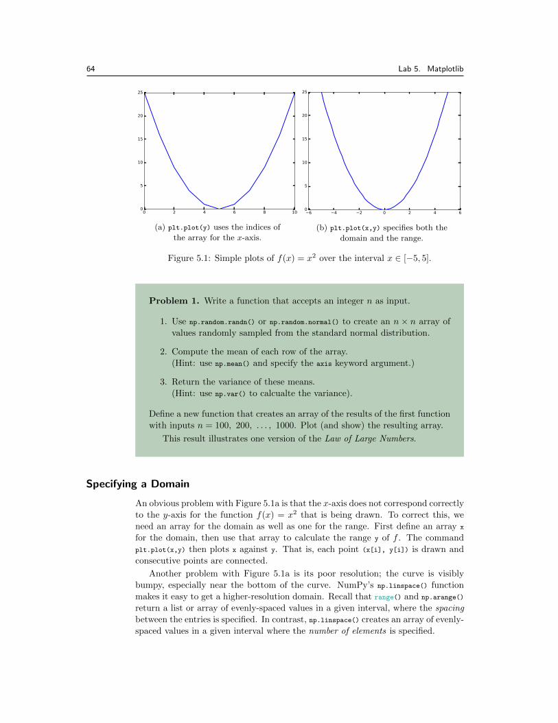
The result is shown in Figure 5.1a. Just as np is a standard alias for NumPy,plt is a standard alias for matplotlib.pyplot in the Python community.
The call plt.plot(y) creates a figure and draws straight lines connecting theentries of y relative to the y-axis. The x-axis is by default the index of the array,namely the integers from 0 to 10. Calling plt.show() then displays the figure.
1Like NumPy, Matplotlib is not part of the Python standard library, but it is included in most
Python distributions.
63
64 Lab 5. Matplotlib
(a) plt.plot(y) uses the indices of
the array for the x-axis.
(b) plt.plot(x,y) specifies both the
domain and the range.
Figure 5.1: Simple plots of f(x) = x
2 over the interval x 2 [�5, 5].
Problem 1. Write a function that accepts an integer n as input.
1. Use np.random.randn() or np.random.normal() to create an n ⇥ n array ofvalues randomly sampled from the standard normal distribution.
2. Compute the mean of each row of the array.(Hint: use np.mean() and specify the axis keyword argument.)
3. Return the variance of these means.(Hint: use np.var() to calcualte the variance).
Define a new function that creates an array of the results of the first functionwith inputs n = 100, 200, . . . , 1000. Plot (and show) the resulting array.
This result illustrates one version of the Law of Large Numbers.
Specifying a Domain
An obvious problem with Figure 5.1a is that the x-axis does not correspond correctlyto the y-axis for the function f(x) = x
2 that is being drawn. To correct this, weneed an array for the domain as well as one for the range. First define an array x
for the domain, then use that array to calculate the range y of f . The commandplt.plot(x,y) then plots x against y. That is, each point (x[i], y[i]) is drawn andconsecutive points are connected.
Another problem with Figure 5.1a is its poor resolution; the curve is visiblybumpy, especially near the bottom of the curve. NumPy’s np.linspace() functionmakes it easy to get a higher-resolution domain. Recall that range() and np.arange()
return a list or array of evenly-spaced values in a given interval, where the spacing
between the entries is specified. In contrast, np.linspace() creates an array of evenly-spaced values in a given interval where the number of elements is specified.
65
# 4 evenly-spaced values between 0 and 32 (including endpoints).
>>> np.linspace(0, 32, 4)
array([ 0. , 10.66666667, 21.33333333, 32. ])
# Get 50 evenly-spaced values from -5 to 5 (including endpoints).
>>> x = np.linspace(-5, 5, 50)
>>> y = x**2 # Calculate the range of f(x) = x**2.
>>> plt.plot(x, y)
>>> plt.show()
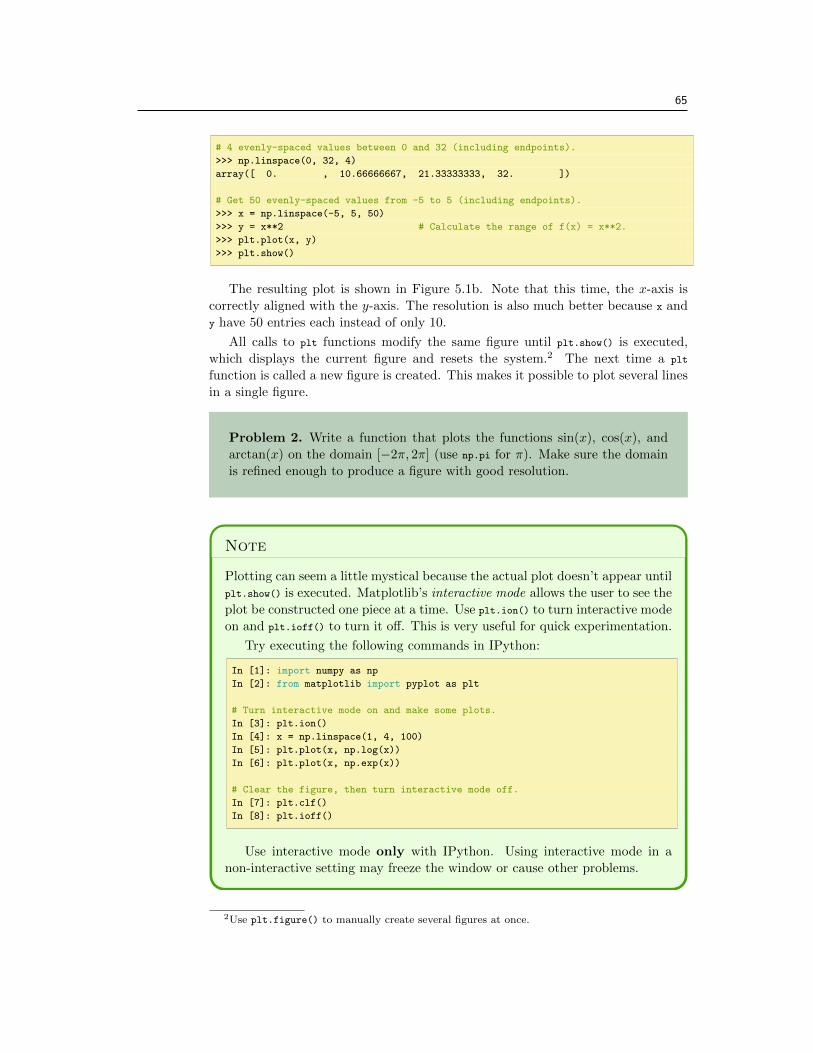
The resulting plot is shown in Figure 5.1b. Note that this time, the x-axis iscorrectly aligned with the y-axis. The resolution is also much better because x andy have 50 entries each instead of only 10.
All calls to plt functions modify the same figure until plt.show() is executed,which displays the current figure and resets the system.2 The next time a plt
function is called a new figure is created. This makes it possible to plot several linesin a single figure.
Problem 2. Write a function that plots the functions sin(x), cos(x), andarctan(x) on the domain [�2⇡, 2⇡] (use np.pi for ⇡). Make sure the domainis refined enough to produce a figure with good resolution.
Note
Plotting can seem a little mystical because the actual plot doesn’t appear untilplt.show() is executed. Matplotlib’s interactive mode allows the user to see theplot be constructed one piece at a time. Use plt.ion() to turn interactive modeon and plt.ioff() to turn it o↵. This is very useful for quick experimentation.
Try executing the following commands in IPython:
In [1]: import numpy as np
In [2]: from matplotlib import pyplot as plt
# Turn interactive mode on and make some plots.
In [3]: plt.ion()
In [4]: x = np.linspace(1, 4, 100)
In [5]: plt.plot(x, np.log(x))
In [6]: plt.plot(x, np.exp(x))
# Clear the figure, then turn interactive mode off.
In [7]: plt.clf()
In [8]: plt.ioff()
Use interactive mode only with IPython. Using interactive mode in anon-interactive setting may freeze the window or cause other problems.
2Use plt.figure() to manually create several figures at once.
66 Lab 5. Matplotlib
Plot Customization
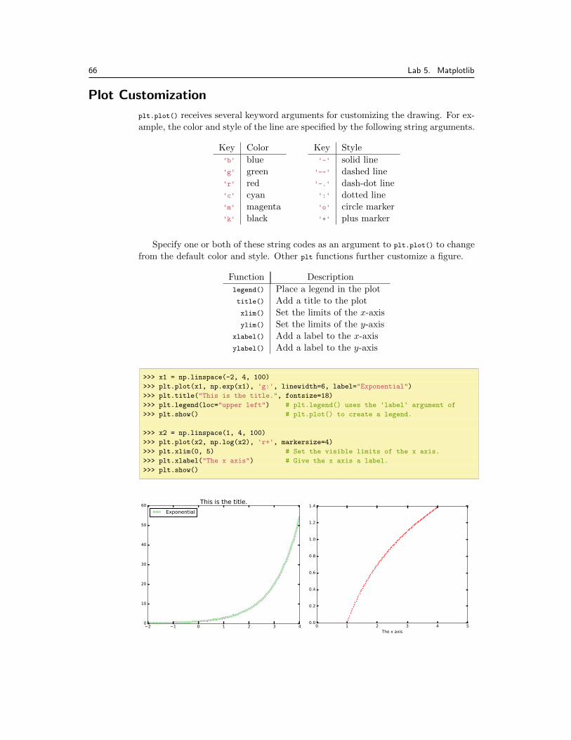
plt.plot() receives several keyword arguments for customizing the drawing. For ex-ample, the color and style of the line are specified by the following string arguments.
Key Color'b' blue'g' green'r' red'c' cyan'm' magenta'k' black
Key Style'-' solid line
'--' dashed line'-.' dash-dot line':' dotted line'o' circle marker'+' plus marker
Specify one or both of these string codes as an argument to plt.plot() to changefrom the default color and style. Other plt functions further customize a figure.
Function Descriptionlegend() Place a legend in the plottitle() Add a title to the plotxlim() Set the limits of the x-axisylim() Set the limits of the y-axis
xlabel() Add a label to the x-axisylabel() Add a label to the y-axis
>>> x1 = np.linspace(-2, 4, 100)
>>> plt.plot(x1, np.exp(x1), 'g:', linewidth=6, label="Exponential")
>>> plt.title("This is the title.", fontsize=18)
>>> plt.legend(loc="upper left") # plt.legend() uses the 'label' argument of
>>> plt.show() # plt.plot() to create a legend.
>>> x2 = np.linspace(1, 4, 100)
>>> plt.plot(x2, np.log(x2), 'r+', markersize=4)
>>> plt.xlim(0, 5) # Set the visible limits of the x axis.
>>> plt.xlabel("The x axis") # Give the x axis a label.
>>> plt.show()
67
See Appendix ?? for more comprehensive lists of colors, line styles, and figurecustomization routines.
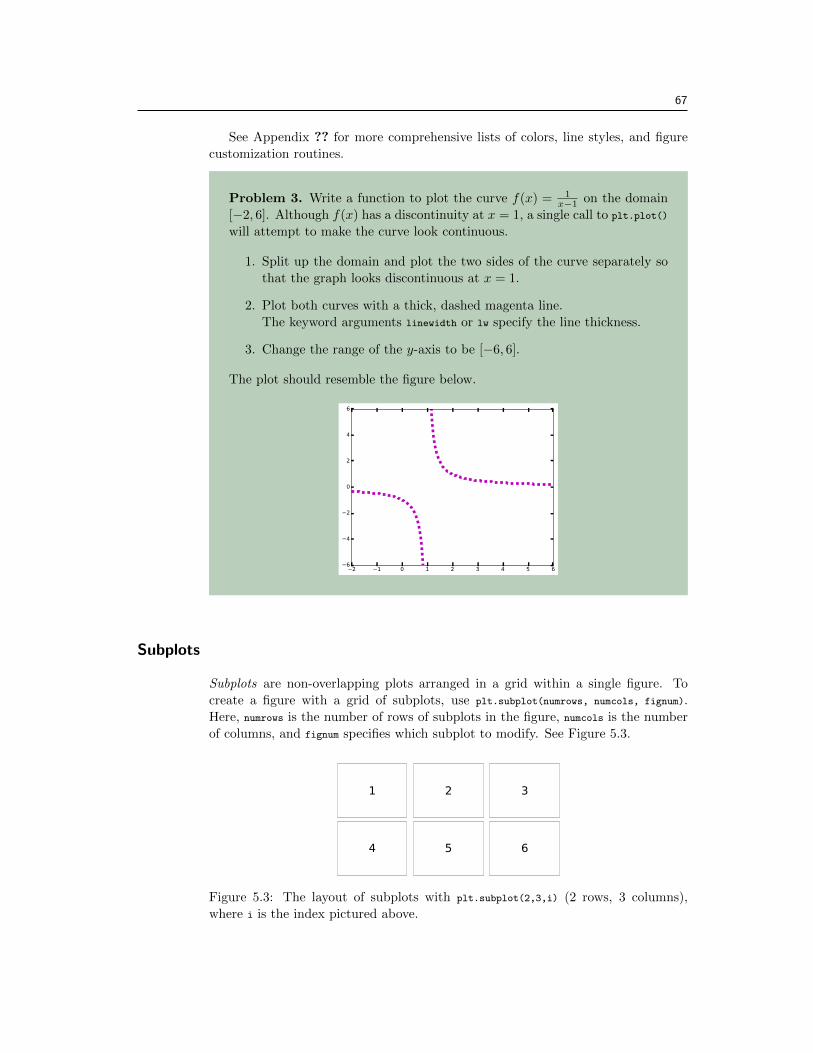
Problem 3. Write a function to plot the curve f(x) = 1x�1 on the domain
[�2, 6]. Although f(x) has a discontinuity at x = 1, a single call to plt.plot()
will attempt to make the curve look continuous.
1. Split up the domain and plot the two sides of the curve separately sothat the graph looks discontinuous at x = 1.
2. Plot both curves with a thick, dashed magenta line.The keyword arguments linewidth or lw specify the line thickness.
3. Change the range of the y-axis to be [�6, 6].
The plot should resemble the figure below.
Subplots
Subplots are non-overlapping plots arranged in a grid within a single figure. Tocreate a figure with a grid of subplots, use plt.subplot(numrows, numcols, fignum).Here, numrows is the number of rows of subplots in the figure, numcols is the numberof columns, and fignum specifies which subplot to modify. See Figure 5.3.
Figure 5.3: The layout of subplots with plt.subplot(2,3,i) (2 rows, 3 columns),where i is the index pictured above.
68 Lab 5. Matplotlib
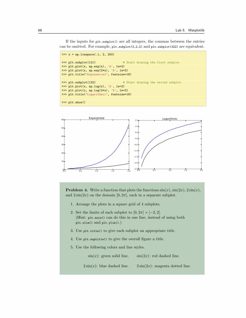
If the inputs for plt.subplot() are all integers, the commas between the entriescan be omitted. For example, plt.subplot(3,2,2) and plt.subplot(322) are equivalent.
>>> x = np.linspace(.1, 2, 200)
>>> plt.subplot(121) # Start drawing the first subplot.
>>> plt.plot(x, np.exp(x), 'k', lw=2)
>>> plt.plot(x, np.exp(2*x), 'b', lw=2)
>>> plt.title("Exponential", fontsize=18)
>>> plt.subplot(122) # Start drawing the second subplot.
>>> plt.plot(x, np.log(x), 'k', lw=2)
>>> plt.plot(x, np.log(2*x), 'b', lw=2)
>>> plt.title("Logarithmic", fontsize=18)
>>> plt.show()
Problem 4. Write a function that plots the functions sin(x), sin(2x), 2 sin(x),and 2 sin(2x) on the domain [0, 2⇡], each in a separate subplot.
1. Arrange the plots in a square grid of 4 subplots.
2. Set the limits of each subplot to [0, 2⇡]⇥ [�2, 2].(Hint: plt.axis() can do this in one line, instead of using bothplt.xlim() and plt.ylim().)
3. Use plt.title() to give each subplot an appropriate title.
4. Use plt.suptitle() to give the overall figure a title.
5. Use the following colors and line styles.
sin(x): green solid line. sin(2x): red dashed line.
2 sin(x): blue dashed line. 2 sin(2x): magenta dotted line.

69
Other Kinds of Plots
Line plots are not always the most illuminating choice graph to describe a set ofdata. Matplotlib provides several other easy ways to visualize data.
• A scatter plot plots two 1-dimensional arrays against each other without draw-ing lines between the points. Scatter plots are particularly useful for data thatis not inherently correlated or ordered.
To create a scatter plot, use plt.plot() and specify a point marker (such as'o' or '+') for the line style.3
• A histogram groups entries of a 1-dimensional data set into a given number ofintervals, called bins. Each bin has a bar whose height indicates the numberof values that fall in the range of the bin. Histograms are best for displayingdistributions, relating data values to frequency.
To create a histogram, use plt.hist() instead of plt.plot(). Use the argumentbins to specify the edges of the bins, or to choose a number of bins. The range
argument specifies the outer limits of the first and last bins.
# Get 500 random samples from two normal distributions.
>>> x = np.random.normal(scale=1.5, size=500)
>>> y = np.random.normal(scale=0.5, size=500)
# Draw a scatter plot of x against y, using a circle marker.
>>> plt.subplot(121)
>>> plt.plot(x, y, 'o', markersize=10)
# Draw a histogram to display the distribution of the data in x.
>>> plt.subplot(122)
>>> plt.hist(x, bins=np.arange(-4.5, 5.5)) # Or, equivalently,
# plt.hist(x, bins=9, range=[-4.5, 4.5])
>>> plt.show()
3plt.scatter() can also be used to create scatter plots, but it accepts slightly di↵erent argu-
ments than plt.plot(). We will explore the appropriate usage of this function in a later lab.
70 Lab 5. Matplotlib
Problem 5. The Fatality Analysis Reporting System (FARS) is a nation-wide census providing yearly data regarding fatal injuries su↵ered in motorvehicle tra�c crashes.a The array contained in FARS.npy is a small subset ofthe FARS database from 2010–2014. Each of the 148,206 rows in the arrayrepresents a di↵erent car crash; the columns represent the hour (in militarytime, as an integer), the longitude, and the latitude, in that order.
Write a function to visualize the data in FARS.npy. Use np.load() to loadthe data, then create a single figure with two subplots:
1. A scatter plot of longitudes against latitudes. Because of the largenumber of data points, use black pixel markers (use "k," as the thirdargument to plt.plot()). Label both axes.(Hint: Use plt.axis("equal") to fix the axis ratio on the scatter plot).
2. A histogram of the hours of the day, with one bin per hour. Set thelimits of the x-axis appropriately. Label the x-axis.
aSee http://www.nhtsa.gov/FARS.
Visualizing 3-D Surfaces
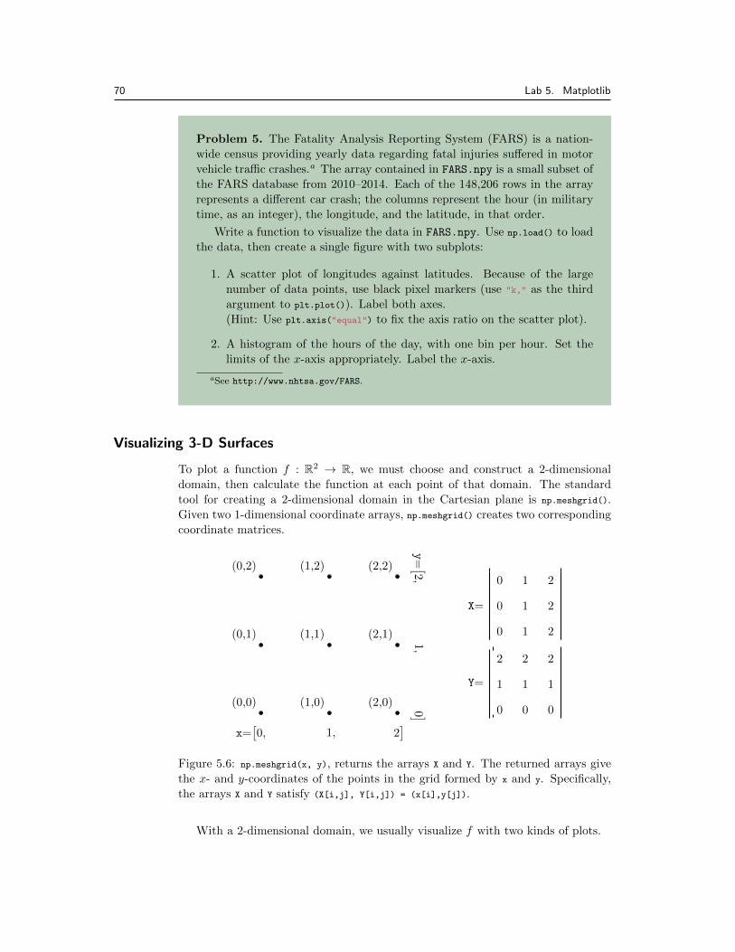
To plot a function f : R2 ! R, we must choose and construct a 2-dimensionaldomain, then calculate the function at each point of that domain. The standardtool for creating a 2-dimensional domain in the Cartesian plane is np.meshgrid().Given two 1-dimensional coordinate arrays, np.meshgrid() creates two correspondingcoordinate matrices.
(0,0)
(0,1)
(0,2)
(1,0)
(1,1)
(1,2)
(2,0)
(2,1)
(2,2)
0
1
2
0
1
2
0
1
2
0
0
0
1
1
1
2
2
2
Y=
X=
x=⇥0, 1, 2
⇤
y=⇥2,
1,0 ⇤
Figure 5.6: np.meshgrid(x, y), returns the arrays X and Y. The returned arrays givethe x- and y-coordinates of the points in the grid formed by x and y. Specifically,the arrays X and Y satisfy (X[i,j], Y[i,j]) = (x[i],y[j]).
With a 2-dimensional domain, we usually visualize f with two kinds of plots.
71
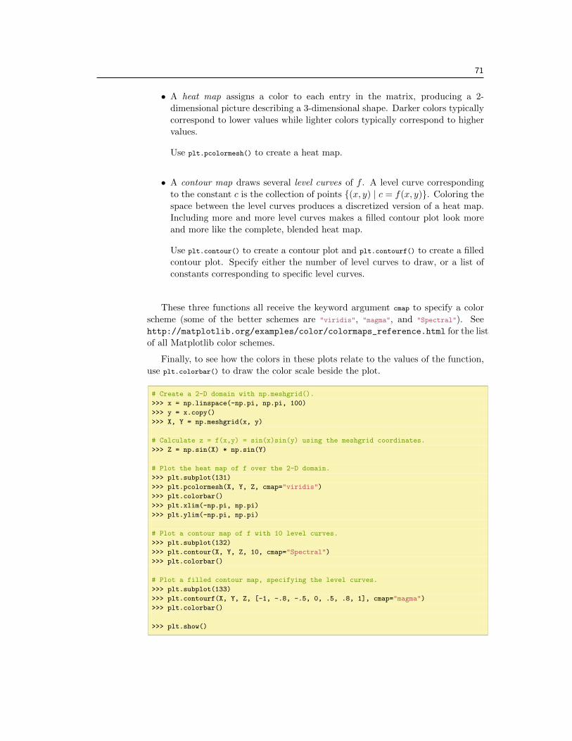
• A heat map assigns a color to each entry in the matrix, producing a 2-dimensional picture describing a 3-dimensional shape. Darker colors typicallycorrespond to lower values while lighter colors typically correspond to highervalues.
Use plt.pcolormesh() to create a heat map.
• A contour map draws several level curves of f . A level curve correspondingto the constant c is the collection of points {(x, y) | c = f(x, y)}. Coloring thespace between the level curves produces a discretized version of a heat map.Including more and more level curves makes a filled contour plot look moreand more like the complete, blended heat map.
Use plt.contour() to create a contour plot and plt.contourf() to create a filledcontour plot. Specify either the number of level curves to draw, or a list ofconstants corresponding to specific level curves.
These three functions all receive the keyword argument cmap to specify a colorscheme (some of the better schemes are "viridis", "magma", and "Spectral"). Seehttp://matplotlib.org/examples/color/colormaps_reference.html for the listof all Matplotlib color schemes.
Finally, to see how the colors in these plots relate to the values of the function,use plt.colorbar() to draw the color scale beside the plot.
# Create a 2-D domain with np.meshgrid().
>>> x = np.linspace(-np.pi, np.pi, 100)
>>> y = x.copy()
>>> X, Y = np.meshgrid(x, y)
# Calculate z = f(x,y) = sin(x)sin(y) using the meshgrid coordinates.
>>> Z = np.sin(X) * np.sin(Y)
# Plot the heat map of f over the 2-D domain.
>>> plt.subplot(131)
>>> plt.pcolormesh(X, Y, Z, cmap="viridis")
>>> plt.colorbar()
>>> plt.xlim(-np.pi, np.pi)
>>> plt.ylim(-np.pi, np.pi)
# Plot a contour map of f with 10 level curves.
>>> plt.subplot(132)
>>> plt.contour(X, Y, Z, 10, cmap="Spectral")
>>> plt.colorbar()
# Plot a filled contour map, specifying the level curves.
>>> plt.subplot(133)
>>> plt.contourf(X, Y, Z, [-1, -.8, -.5, 0, .5, .8, 1], cmap="magma")
>>> plt.colorbar()
>>> plt.show()
72 Lab 5. Matplotlib
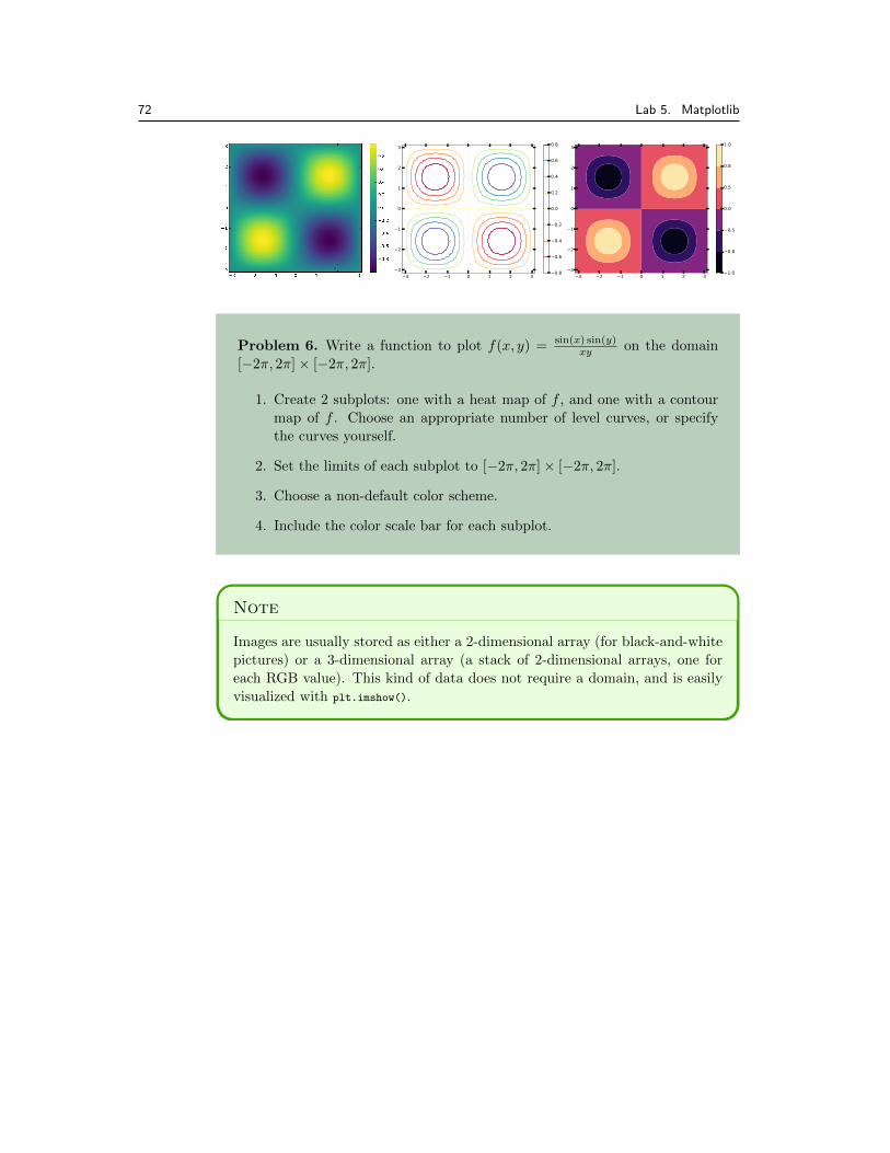
Problem 6. Write a function to plot f(x, y) = sin(x) sin(y)xy
on the domain[�2⇡, 2⇡]⇥ [�2⇡, 2⇡].
1. Create 2 subplots: one with a heat map of f , and one with a contourmap of f . Choose an appropriate number of level curves, or specifythe curves yourself.
2. Set the limits of each subplot to [�2⇡, 2⇡]⇥ [�2⇡, 2⇡].
3. Choose a non-default color scheme.
4. Include the color scale bar for each subplot.
Note
Images are usually stored as either a 2-dimensional array (for black-and-whitepictures) or a 3-dimensional array (a stack of 2-dimensional arrays, one foreach RGB value). This kind of data does not require a domain, and is easilyvisualized with plt.imshow().
73
Additional Material
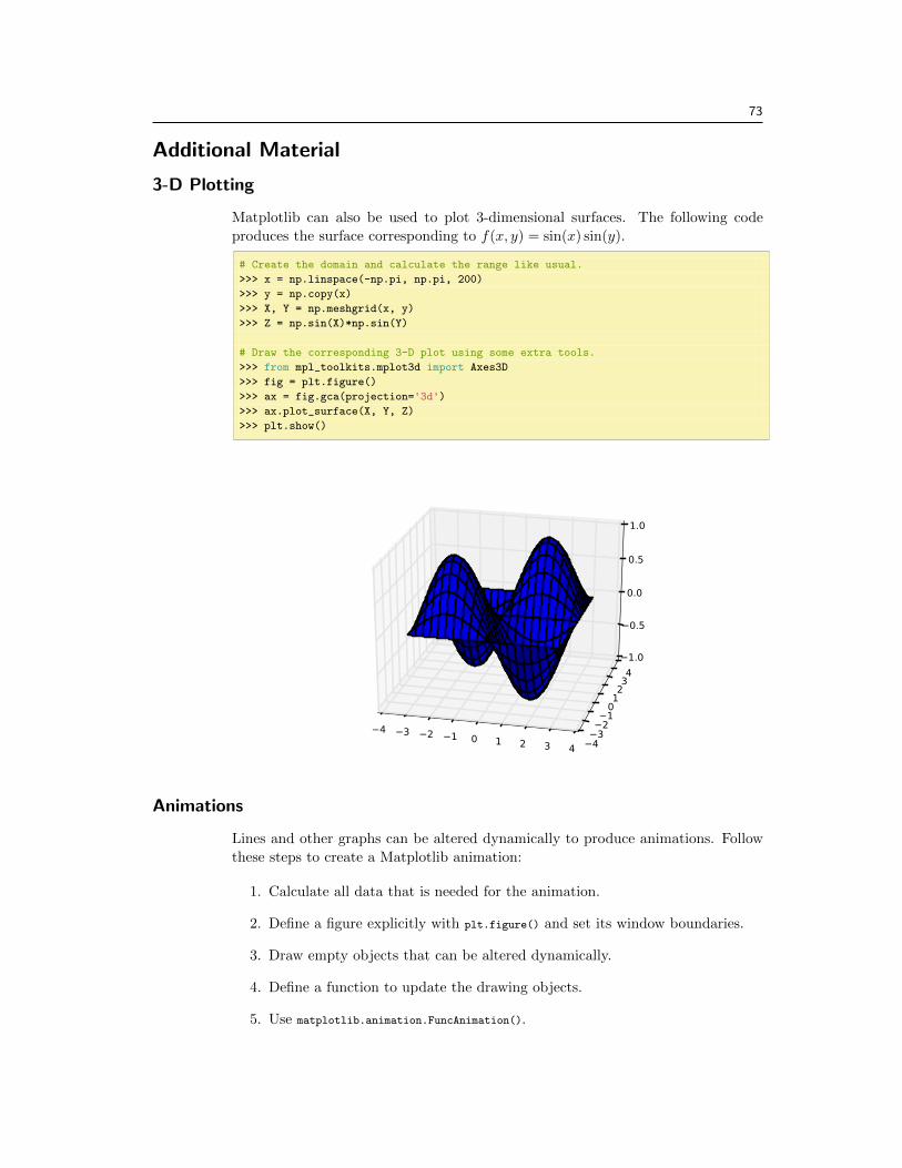
3-D Plotting
Matplotlib can also be used to plot 3-dimensional surfaces. The following codeproduces the surface corresponding to f(x, y) = sin(x) sin(y).
# Create the domain and calculate the range like usual.
>>> x = np.linspace(-np.pi, np.pi, 200)
>>> y = np.copy(x)
>>> X, Y = np.meshgrid(x, y)
>>> Z = np.sin(X)*np.sin(Y)
# Draw the corresponding 3-D plot using some extra tools.
>>> from mpl_toolkits.mplot3d import Axes3D
>>> fig = plt.figure()
>>> ax = fig.gca(projection='3d')>>> ax.plot_surface(X, Y, Z)
>>> plt.show()
Animations
Lines and other graphs can be altered dynamically to produce animations. Followthese steps to create a Matplotlib animation:
1. Calculate all data that is needed for the animation.
2. Define a figure explicitly with plt.figure() and set its window boundaries.
3. Draw empty objects that can be altered dynamically.
4. Define a function to update the drawing objects.
5. Use matplotlib.animation.FuncAnimation().
74 Lab 5. Matplotlib
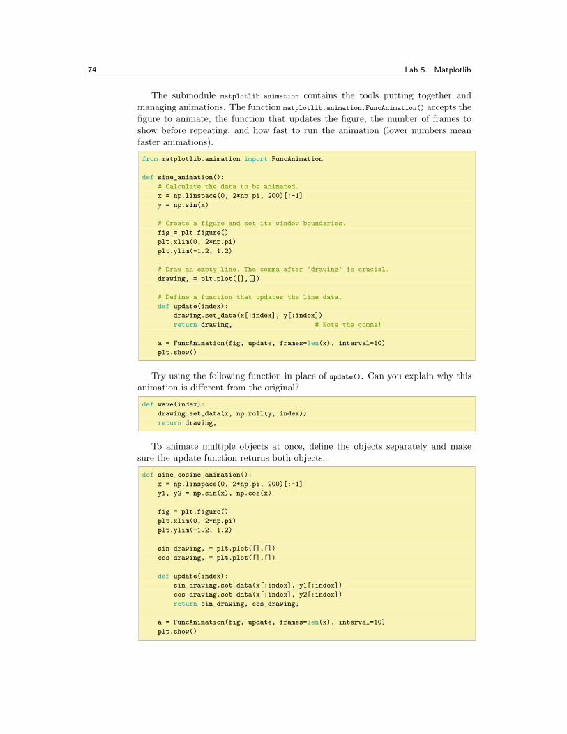
The submodule matplotlib.animation contains the tools putting together andmanaging animations. The function matplotlib.animation.FuncAnimation() accepts thefigure to animate, the function that updates the figure, the number of frames toshow before repeating, and how fast to run the animation (lower numbers meanfaster animations).
from matplotlib.animation import FuncAnimation
def sine_animation():
# Calculate the data to be animated.
x = np.linspace(0, 2*np.pi, 200)[:-1]
y = np.sin(x)
# Create a figure and set its window boundaries.
fig = plt.figure()
plt.xlim(0, 2*np.pi)
plt.ylim(-1.2, 1.2)
# Draw an empty line. The comma after 'drawing' is crucial.
drawing, = plt.plot([],[])
# Define a function that updates the line data.
def update(index):
drawing.set_data(x[:index], y[:index])
return drawing, # Note the comma!
a = FuncAnimation(fig, update, frames=len(x), interval=10)
plt.show()
Try using the following function in place of update(). Can you explain why thisanimation is di↵erent from the original?
def wave(index):
drawing.set_data(x, np.roll(y, index))
return drawing,
To animate multiple objects at once, define the objects separately and makesure the update function returns both objects.
def sine_cosine_animation():
x = np.linspace(0, 2*np.pi, 200)[:-1]
y1, y2 = np.sin(x), np.cos(x)
fig = plt.figure()
plt.xlim(0, 2*np.pi)
plt.ylim(-1.2, 1.2)
sin_drawing, = plt.plot([],[])
cos_drawing, = plt.plot([],[])
def update(index):
sin_drawing.set_data(x[:index], y1[:index])
cos_drawing.set_data(x[:index], y2[:index])
return sin_drawing, cos_drawing,
a = FuncAnimation(fig, update, frames=len(x), interval=10)
plt.show()

75
Animations are very useful for describing parametrized curves, as the “speed”of the curve is displayed. The code below animates the rose curve, parametrized bythe angle ✓ 2 [0, 2⇡], given by the following equations:
x(✓) = cos(✓) cos(6✓), y(✓) = sin(✓) cos(6✓)
def rose_animation():
# Calculate the parametrized data.
theta = np.linspace(0, 2*np.pi, 200)
x = np.cos(theta)*np.cos(6*theta)
y = np.sin(theta)*np.cos(6*theta)
fig = plt.figure()
plt.xlim(-1.2, 1.2)
plt.ylim(-1.2, 1.2)
plt.gca().set_aspect("equal") # Make the figure exactly square.
drawing, = plt.plot([],[])
# Define a function that updates the line data.
def update(index):
drawing.set_data(x[:index], y[:index])
return drawing,
a = FuncAnimation(fig, update, frames=len(x), interval=10, repeat=False)
plt.show() # repeat=False freezes the animation at the end.
Animations can also be 3-dimensional. The only major di↵erence is an extraoperation to set the 3-dimensional component of the drawn object. The code belowanimates the space curve parametrized by the following equations:
x(✓) = cos(✓) cos(6✓), y(✓) = sin(✓) cos(6✓), z(✓) = ✓
10
def rose_animation_3D():
theta = np.linspace(0, 2*np.pi, 200)
x = np.cos(theta) * np.cos(6*theta)
y = np.sin(theta) * np.cos(6*theta)
z = theta / 10
fig = plt.figure()
ax = fig.gca(projection='3d') # Make the figure 3-D.
ax.set_xlim3d(-1.2, 1.2) # Use ax instead of plt.
ax.set_ylim3d(-1.2, 1.2)
ax.set_aspect("equal")
drawing, = ax.plot([],[],[]) # Provide 3 empty lists.
# Update the first 2 dimensions like usual, then update the 3-D component.
def update(index):
drawing.set_data(x[:index], y[:index])
drawing.set_3d_properties(z[:index])
return drawing,
a = FuncAnimation(fig, update, frames=len(x), interval=10, repeat=False)
plt.show()
Related Documents