Kent Academic Repository Full text document (pdf) Copyright & reuse Content in the Kent Academic Repository is made available for research purposes. Unless otherwise stated all content is protected by copyright and in the absence of an open licence (eg Creative Commons), permissions for further reuse of content should be sought from the publisher, author or other copyright holder. Versions of research The version in the Kent Academic Repository may differ from the final published version. Users are advised to check http://kar.kent.ac.uk for the status of the paper. Users should always cite the published version of record. Enquiries For any further enquiries regarding the licence status of this document, please contact: [email protected] If you believe this document infringes copyright then please contact the KAR admin team with the take-down information provided at http://kar.kent.ac.uk/contact.html Citation for published version Rodgers, Peter and Stapleton, Gem and Chapman, Peter (2015) Visualizing Sets with Linear Diagrams. ACM Transactions on Computer-Human Interaction, 22 (6). 27:1-27:39. ISSN 1073-0516. DOI https://doi.org/10.1145/2810012 Link to record in KAR http://kar.kent.ac.uk/50020/ Document Version Author's Accepted Manuscript

Welcome message from author
This document is posted to help you gain knowledge. Please leave a comment to let me know what you think about it! Share it to your friends and learn new things together.
Transcript

Kent Academic RepositoryFull text document (pdf)
Copyright & reuse
Content in the Kent Academic Repository is made available for research purposes. Unless otherwise stated all
content is protected by copyright and in the absence of an open licence (eg Creative Commons), permissions
for further reuse of content should be sought from the publisher, author or other copyright holder.
Versions of research
The version in the Kent Academic Repository may differ from the final published version.
Users are advised to check http://kar.kent.ac.uk for the status of the paper. Users should always cite the
published version of record.
Enquiries
For any further enquiries regarding the licence status of this document, please contact:
If you believe this document infringes copyright then please contact the KAR admin team with the take-down
information provided at http://kar.kent.ac.uk/contact.html
Citation for published version
Rodgers, Peter and Stapleton, Gem and Chapman, Peter (2015) Visualizing Sets with LinearDiagrams. ACM Transactions on Computer-Human Interaction, 22 (6). 27:1-27:39. ISSN1073-0516.
DOI
https://doi.org/10.1145/2810012
Link to record in KAR
http://kar.kent.ac.uk/50020/
Document Version
Author's Accepted Manuscript

-
Visualizing Sets with Linear Diagrams
PETER RODGERS, University of Kent
GEM STAPLETON, University of Brighton
PETER CHAPMAN, University of Brighton
This paper presents the first design principles that optimize the visualization of sets using linear diagrams.These principles are justified through empirical studies that evaluate the impact of graphical features ontask performance. Linear diagrams represent sets using straight line segments, with line overlaps corre-sponding to set intersections. This work builds on recent empirical research which establishes that lineardiagrams can be superior to prominent set visualization techniques, namely Euler and Venn diagrams. Weaddress the problem of how to best visualize overlapping sets using linear diagrams. To solve the problem,we investigate which graphical features of linear diagrams significantly impact user task performance. Tothis end, we conducted seven crowd-sourced empirical studies involving a total of 1760 participants. Thesestudies allowed us to identify the following design principles, which significantly aid task performance: usea minimal number of line segments, use guide-lines where overlaps start and end, and draw lines that arethin as opposed to thick bars. We also evaluated the following graphical properties which did not signifi-cantly impact task performance: colour, orientation, and set-order. The results are brought to life througha freely available software implementation that automatically draws linear diagrams with user-controlledgraphical choices. An important consequence of our research is that users are now able to create effectivevisualizations of sets automatically, thus improving human-computer interaction.
General Terms: 500 Human-centered computing Empirical studies in HCI
Additional Key Words and Phrases: Sets, Visualization, Linear Diagrams
ACM Reference Format:
Peter Rodgers, Gem Stapleton, Peter Chapman, 2014. Visualizing Sets with Linear Diagrams. ACM Trans.
Comput.-Hum. Interact. -, -, Article - (March 2015), 39 pages.DOI:http://dx.doi.org/10.1145/0000000.0000000
1. INTRODUCTION
The volume of data available to society has rapidly risen over recent years and, con-sequently, so has the level of interest in analyzing it. As a reflection of this interest,research into information visualization is both important and timely [Alsallakh et al.2014]. In this paper, we are concerned with data whose items lie in overlapping sets,which arises in many situations [Ahn et al. 2010]. For instance, this data arises incriminal investigations where those people under investigation (the data items) maybelong to multiple organizations or frequent common locations (the sets). Similar dataoccur in biological settings [Dinkla et al. 2014] where sets represent shared featuresof genes. Overlapping sets also arise in social networks where, for example, sets areformed of people with common interests [Wasserman and Faust 1994].
Linear diagrams represent overlapping sets and were introduced by Leibniz in1686 [Couturat 1903], with parallel bargrams [Wittenburg et al. 2001] double decker
Author’s addresses: Peter Rodgers, University of Kent; Gem Stapleton and Peter Chapman, University ofBrighton.Permission to make digital or hard copies of part or all of this work for personal or classroom use is grantedwithout fee provided that copies are not made or distributed for profit or commercial advantage and thatcopies show this notice on the first page or initial screen of a display along with the full citation. Copyrightsfor components of this work owned by others than ACM must be honored. Abstracting with credit is per-mitted. To copy otherwise, to republish, to post on servers, to redistribute to lists, or to use any componentof this work in other works requires prior specific permission and/or a fee. Permissions may be requestedfrom Publications Dept., ACM, Inc., 2 Penn Plaza, Suite 701, New York, NY 10121-0701 USA, fax +1 (212)869-0481, or [email protected]© 2015 ACM 1073-0516/2015/03-ART- $15.00DOI:http://dx.doi.org/10.1145/0000000.0000000
ACM Transactions on Computer-Human Interaction, Vol. -, No. -, Article -, Publication date: March 2015.

-:2 P. Rodgers et al.
plots [Hofmann et al. 2000] and UpSet [Lex et al. 2014] being similar. Each set is repre-sented as one or more line segments, with all sets drawn in parallel. Where lines over-lap, the corresponding intersection of sets contains an element that is not in any of theremaining sets. Moreover, between them the overlaps represent all of the non-emptyset intersections. As an example, consider the linear diagram in Fig. 1 which displaysinformation about languages spoken by a group of people. This diagram displays in-formation about seven sets: French, German, Hungarian, Italian, Spanish, Turkish,and Welsh. Because there is an overlap in the linear diagram that involves just thelines for Italian and Spanish (on the righthand side of the figure), there is someonethat speaks both of these two languages but none of the others. Set complements arerepresented by the absence of line segments. For instance, the overlap including justthe lines for Italian and Spanish formally represents the set
Italian ∩ Spanish ∩ French ∩ German ∩ Hungarian ∩ Turkish ∩ Welsh,
where French represents the complement of French, and so forth. In this overlap, thelines for the complemented sets are absent. Linear diagrams do not, however, repre-sent other properties of sets such as their cardinality or provide information about thesets’ elements1.
French
German
Hungarian
Italian
Spanish
Turkish
Welsh
Fig. 1. Visualizing sets: linear diagrams.
French
German
Hungarian
Italian
Spanish
Turkish
Welsh
Fig. 2. Visualizing sets: Euler diagrams.
Some other visualizations of sets, such as LineSets [Alper et al. 2011] and BubbleSets [Collins et al. 2009], place lines or contours over existing data items. Therefore,the existence of embedded items is required for these techniques. As such, membersof this class of techniques are not direct competitors for linear diagrams, which do notdisplay any individual items. Node-link techniques, such as PivotPaths [Dork et al.2012] also rely on the existence of items, using links between items to indicate sharedset membership. Matrix based methods exploiting Karnaugh maps have been devel-oped, such as KMVQL [Huo 2008], but they are typically considered to be restrictedto 6 sets or fewer [Alsallakh et al. 2014] meaning that they lack general applicabil-ity. Some aggregation techniques cope better with larger number of sets, including
1Formally, the expressiveness of linear diagrams is equivalent to a fragment of monadic first-order logicwithout equality. They are capable of expressing the emptiness or non-emptiness of sets, including setsformed by using the intersection, union and complement operators. Through this, linear diagrams directlyexpress set-theoretic properties such as subset, equality, and disjointness.
ACM Transactions on Computer-Human Interaction, Vol. -, No. -, Article -, Publication date: March 2015.

Visualizing Sets with Linear Diagrams -:3
Set’o’grams [Freiler et al. 2008] and Radial Sets [Alsallakh et al. 2013]. Set’o’gramsare designed to be used in an interactive environment, only revealing set intersectionson user input. Radial Sets represent set intersections by hyperedges connecting thesets of interest, which can rapidly increase the clutter in the diagram even with arelatively small number of sets.
The most common methods for visualizing overlapping sets are based on Euler dia-grams (or variants, such as Venn diagrams), which employ overlapping closed curvesto represent overlapping sets [Collins et al. 2009; Riche and Dwyer 2010; Rodgers et al.2008; Set Visualiser 2014; Simonetto et al. 2009; Stapleton et al. 2011; Stapleton et al.2009]. An example Euler diagram can be seen in Fig. 2, which visualizes the same setsas the linear diagram in Fig. 1. Since there is a region inside both Italian and Spanish,but outside the remaining curves, the diagram asserts that somebody speaks these twolanguages but not the remaining languages.
There are well-known difficulties when representing sets using Euler diagrams.Their automated layout is computationally complex and even for relatively simpledata sets (in the sense that few overlapping sets are to be visualized) the resultinglayouts can compromise users’ ability to perform tasks. This is because the automatedtechniques produce diagrams that possess properties that are known to hinder cogni-tion [Rodgers et al. 2012]. These properties, sometimes called well-formedness condi-tions, include concurrency between curves, points that are passed through more thantwice by the curves (called triple points), points at which curves meet but do not cross,and representing each set by more than one curve; the Euler diagram in Fig. 2 has twotriple-points. Indeed, any Euler-diagram-based technique that is capable of visualizingan arbitrary collection of sets necessarily produces some diagrams that break one ormore well-formedness condition [Flower and Howse 2002].
It has been established, empirically, that users can perform set-theoretic tasks sig-nificantly more accurately and significantly faster using linear diagrams than whenusing Euler diagrams [Chapman et al. 2014; Gottfried 2015]. In Chapman et al.’sempirical study, the Euler diagrams were drawn to adhere to as many of the well-formedness conditions as possible, whilst accurately visualizing the sets, to ensuretask performance was not overly compromised. Moreover, other graphical choices wereadopted for the study’s Euler diagrams that are known to aid task performance [Blakeet al. 2014a; Blake et al. 2014b]. By contrast, there are no known results about howthe graphical choices made when drawing linear diagrams affect task performance. Aschoices necessarily have to be made when drawing linear diagrams, [Chapman et al.2014] made assumptions about what constituted effective layouts.
In order to take full advantage of the cognitive benefits of using linear diagrams,in this paper we address the problem of how to best visualize overlapping sets usinglinear diagrams. In particular, we identify graphical choices that should be made whendrawing linear diagrams in order to significantly improve task performance, in termsof accuracy and time. The paper makes the following specific contributions:
— We applied Bertin’s Semiology of Graphics to linear diagrams. This allowed us toidentify six graphical features that could impact on task performance in the contextof linear diagrams, namely: size, colour, texture, orientation, relative horizontal po-sitioning, and relative vertical positioning.
— We developed hypotheses about the impact of these graphical features. We performedsix studies, one for each graphical feature, and have provided corresponding statisti-cal analysis.
— We derived a set of design principles for linear diagrams, corresponding to the graph-ical features that led to improved task performance.
ACM Transactions on Computer-Human Interaction, Vol. -, No. -, Article -, Publication date: March 2015.

-:4 P. Rodgers et al.
— We established the combined effect of the design principles, by conducting a final,seventh, study performed with various combinations of graphical choices. We estab-lished that adhering to all or most of the design principles significantly improves taskperformance.
— We have ensured that our results have practical benefit by implementing an onlinesoftware tool that automatically draws linear diagrams. The freely available tool al-lows users to select their preferred graphical choices, including those that meet all ofthe design principles.
As a consequence of our work, human-computer interaction is improved: linear dia-grams can now be automatically drawn, following empirically validated design princi-ples that lead to significantly more accurate and significantly faster task performance.
All of the diagrams used in the studies, along with the questions and details of thereal-world data from which the diagrams were derived, can be found in the supple-mentary material associated with the paper. The anonymised data collected duringthe studies is also included with the supplementary material. The studies themselvescan be taken on-line at www.eulerdiagrams.com/linear, where our freely availablesoftware can also be found.
The paper is structured as follows: In section 2, we present our analysis of Bertin’sSemiology of Graphics in relation to linear diagrams. In section 3 we present hypothe-ses about the impact of the six graphical features derived from the analysis. Section 4overviews how the six studies, one for each graphical feature, are executed. Sections 5to 10 present the statistical analysis of the data collected in the six studies. The re-sults are summarized in section 11, from which a set of design principles for lineardiagrams are derived. The seventh study is presented in section 12 which evaluatedvarious combinations of graphical choices. Section 13 discusses the threats to the va-lidity of our studies. The software implementation is discussed in section 14. Finally,section 15 gives our conclusions and discusses further work.
2. PERCEPTUAL THEORIES AND GRAPHICAL CHOICES
There are many graphical features of linear diagrams that can be varied. The purposeof this section is to identify a set of graphical choices for linear diagrams that mayimpact on user comprehension. In order to make such an identification, it is importantto take account of set-theoretic tasks that users will perform when interpreting lineardiagrams. Considering the task taxonomy in [Alsallakh et al. 2014], we have identifiedthree major set-theoretic tasks that can be performed using linear diagrams:
(1) Subset: establish whether one set is a subset of another, i.e. all members of oneset are also members of another set. In Fig. 3, the linear diagram represents infor-mation about social media topics and the sets represent the interests of people. Indetail, this linear diagram expresses that Games is a subset of Android: everyonewith interests in Games is also interested in Android. To extract this information,the user has to identify that each of the overlaps that include the set Games alsoincludes the set Android.
(2) Intersection: establish whether two sets intersect, i.e. the two sets share a mem-ber. In Fig. 3, the linear diagram expresses that someone has interests in bothAndroid and Hifi. To extract this information, the user has to identify that one ofthe line segments that represents the set Android overlaps with one of the linesegments that represents Hifi.
(3) Disjoint: establish whether two sets are disjoint, i.e. the two sets do not shareany members. In Fig. 3, the linear diagram expresses that Games and Internet aredisjoint: nobody has interests in both Games and Internet. To extract this informa-
ACM Transactions on Computer-Human Interaction, Vol. -, No. -, Article -, Publication date: March 2015.
Visualizing Sets with Linear Diagrams -:5
tion, the user has to identify that the line segments that represent the set Gamesnever overlap with the line segments that represent the set Internet.
Fig. 4 shows an alternative linear diagram, where different choices have been made,that represents the same information as Fig. 3. It may be easier to perform the tasksjust described with Fig. 4, since the number of line segments has been reduced and,so, fewer comparisons need to be made. This is just one graphical feature that can bevaried.
Fig. 3. Performing tasks with linear diagrams. Fig. 4. A different layout with fewer line segments.
Bertin divides graphical features into elements and their properties, with his Semi-ology of Graphics [Bertin 1983] being widely regarded as one of the classical worksof graphical visualization. In linear diagrams, line segments are graphical elements.Their properties include orientation, length, width and colour. Bertin highlights oursensitivity to properties such as these, calling them retinal variables. In terms ofBertin’s theory, manipulating these retinal variables impacts on the effectiveness ofa visualization. Bertin’s retinal variables are: size, colour value, colour hue, texture,shape, and orientation. In addition, Bertin recognizes that we are also sensitive toplanar variables, which correspond to the relative position of graphical elements.
We exploit Bertin’s work as a source for identifying important graphical choices forlinear diagrams. Whilst there is not always a direct correspondence between Bertin’sgraphical properties and those exploited by linear diagrams (for instance, colour valueand texture do not readily apply), they provide significant motivation for the graphicalchoices studied in this paper.
We also make reference to the Gestalt principle of good form [Koffka 1935]. Thisprinciple tells us that there is a tendency for people to group together graphical objectsthat share some feature, like colour or shape.
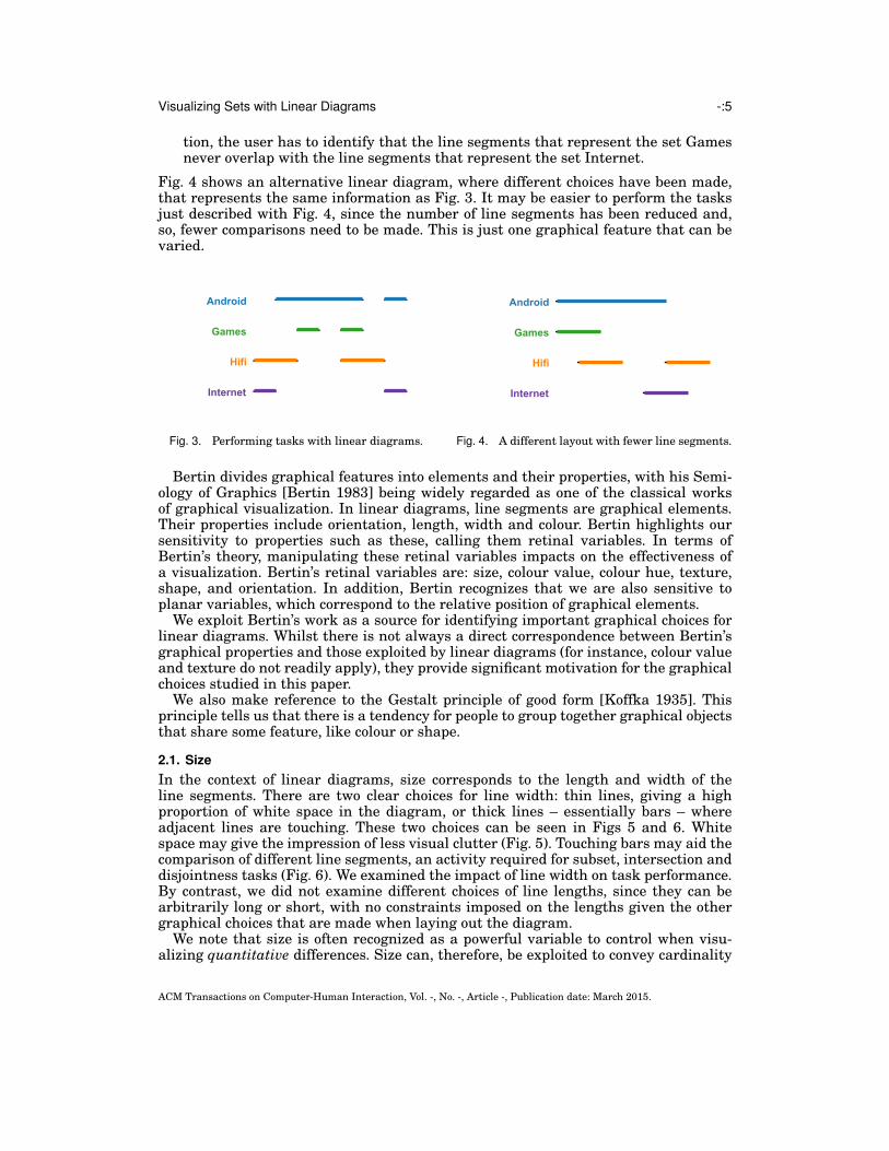
2.1. Size
In the context of linear diagrams, size corresponds to the length and width of theline segments. There are two clear choices for line width: thin lines, giving a highproportion of white space in the diagram, or thick lines – essentially bars – whereadjacent lines are touching. These two choices can be seen in Figs 5 and 6. Whitespace may give the impression of less visual clutter (Fig. 5). Touching bars may aid thecomparison of different line segments, an activity required for subset, intersection anddisjointness tasks (Fig. 6). We examined the impact of line width on task performance.By contrast, we did not examine different choices of line lengths, since they can bearbitrarily long or short, with no constraints imposed on the lengths given the othergraphical choices that are made when laying out the diagram.
We note that size is often recognized as a powerful variable to control when visu-alizing quantitative differences. Size can, therefore, be exploited to convey cardinality
ACM Transactions on Computer-Human Interaction, Vol. -, No. -, Article -, Publication date: March 2015.
-:6 P. Rodgers et al.
information (i.e. to indicate how many members each set contains): line length or widthcould correspond, proportionally, to set cardinality. However, reflecting the fact that nostudies have been undertaken to ascertain how to effectively draw linear diagrams atall, we are focussed on the simpler case where cardinality information is not visual-ized. As such, one could argue that it is misleading to use a range of line widths torepresent the sets or to vary the lengths of the overlaps: this could wrongly imply dif-ferent set cardinalities or set intersection cardinalities respectively. Therefore, thereis a good reason to use a fixed line thickness and fixed overlap length.
We therefore have the following question:
QUESTION 1. Should linear diagrams be drawn with thin lines or with thick touch-ing lines (bars)?
Fig. 5. A linear diagram drawn with thin lines. Fig. 6. A linear diagram drawn with thick bars.
2.2. Colour Hue and Colour Value
Colour hue (different hues have different colours) is recognized as important whenvisualizing qualitative differences [Card et al. 1999; Leborg 2006; Mazza 2009], backedup by the Gestalt principle of good form. Therefore, varying colour hue could impacton task performance in the case of linear diagrams. The following discussion identifiesthree colour hue treatments that we investigated.
In our case, each set is represented by a collection of collinear line segments. As-signing unique colours to each set, rather than just using black say, could reinforce thefact that collinear line segments are being used to represent a single set. It is, how-ever, unclear whether such a colour treatment is a secondary irrelevant variable asthe collinearity of the line segments already indicates the common property of repre-senting the same set. Thus, we chose to evaluate the following colour treatments: allsets assigned the colour black (i.e. black line segments) versus each set being assigneda unique colour (i.e. coloured line segments).
An alternative way of treating linear diagrams with colour is to assign uniquecolours to the overlaps. In this way, the collinearity of line segments indicates thatthey represent the same set and colour is used to aid the set-theoretic tasks describedabove, where it is necessary to determine whether line segments overlap. With thisway of treating linear diagrams with colour, two line segments overlap if and only ifthey share a common colour. Again, this alternative colour treatment is consistent withthe principle of good form, at least for the set intersections, and may aid with perform-ing tasks. For instance, if two groups of line segments share a common colour then itis perhaps easier to see that the sets they represent have a non-empty intersection.Likewise, having no common colour may aid the detection of a disjointness relation-ship. This colour treatment is not, therefore, using colour as a secondary variable but
ACM Transactions on Computer-Human Interaction, Vol. -, No. -, Article -, Publication date: March 2015.

Visualizing Sets with Linear Diagrams -:7
as a visual clue that sets share elements. There is the potential, however, with thisthird colour treatment that the use of multiple colours assigned to each set actuallycounters the advantage of exploiting collinearity to indicate line segments representthe same set: it breaks the principle of good form at the set-level.
The three colour treatments can be seen in Figs 7, 8, and 9. There is clear tensionbetween these uses of colour. The set-theoretic tasks require the relevant sets andthe relevant intersections (or their absence) to be identified. It is unclear whether theprinciple of good form, and corresponding colour treatments, applies more strongly tothe line segments or the line overlaps.
Fig. 7. A linear diagram drawn with blacklines.
Fig. 8. A linear diagram drawn with coloured line seg-ments.
Fig. 9. A linear diagram drawn with coloured overlaps.
Colour value (brightness) is recognized as being an important variable when rep-resenting quantitative, as opposed to qualitative, data. As such, there does not seemto be any motivation to empirically establish the impact of varying colour value whendrawing linear diagrams given the tasks we used in our studies. However, this use ofcolour could be an important extension to the design of linear diagrams if we wish toincrease their expressiveness to convey cardinality information.
We therefore posit a further question about colour hue:
QUESTION 2. How should we treat linear diagrams with colour: assign black toeach set, assign a unique colour to each set, or assign a unique colour to each set inter-section (i.e. overlap)?
2.3. Texture and Guide-Lines
It is possible to augment the syntax of linear diagrams to indicate where overlapsbegin and end. Figs 10 and 11 show how guide-lines can be used. Guide-lines appearto have an advantage over the suggested use of colour to group overlaps: it still allowscolour to be used to promote the identification of line segments representing the samesets (Fig. 8). Using guide-lines allows the principle of good form to be met by the sets(collinear line segments have a unique colour) and met by the set intersections (each
ACM Transactions on Computer-Human Interaction, Vol. -, No. -, Article -, Publication date: March 2015.

-:8 P. Rodgers et al.
overlap is in a unique vertical column formed by the guide-lines). However, guide-linesincrease the visual complexity of diagrams so their actual benefit remains unclear.
Texture is normally recognized as a useful variable when representing both quali-tative and quantitative differences. Linear diagrams could be extended to use texturefor encoding additional information, such as indicating relative set cardinality. Usingtexture in this way, whilst interesting, does not apply to the tasks identified for ourstudies.
Fig. 10. A linear diagram drawn without guide-lines.
Fig. 11. A linear diagram drawn with guide-lines.
Thus, we have the following question:
QUESTION 3. Should we use guide-lines to indicate the start and end of overlaps?
2.4. Shape
Shape is a variable that can be exploited to visualize qualitative data [Card et al. 1999;Leborg 2006; Mazza 2009]. In linear diagrams, each line segment is straight and it maybe misleading to assign different shapes to different lines (e.g. using wiggly vs straightlines). Indeed, an important feature of linear diagrams is the fact that the collinearline segments for pair of each sets are drawn in parallel (and, thus, have the sameshape), allowing easy identification of the overlaps. This is evidenced by [Wagemanset al. 2012], who cite [Feldman 2007] as the source of this insight:
“[the] comparison of features lying on pairs of line segments is significantlyfaster if the segments are parallel or mirror symmetric suggesting fastergrouping of the segments based on these cues.”
Thus, there seems to be little value in empirically testing whether using differentshapes for the lines impacts user understanding.
2.5. Orientation
Bertin argued that we are also perceptually sensitive to the orientation of visualiza-tions. Varying the orientation of a linear diagram corresponds to choosing the directionin which to draw the lines. For example, the horizontal or vertical orientation of a lin-ear diagram could impact on the ease with which sets and the overlaps are identified.Two contrasting orientations are shown in Figs 12 and 13; notice that both diagramspreserve the alphabetic order of the sets and the order in which colours are assigned.Thus, we ask:
QUESTION 4. How should we orientate a linear diagram, horizontally or vertically?
ACM Transactions on Computer-Human Interaction, Vol. -, No. -, Article -, Publication date: March 2015.

Visualizing Sets with Linear Diagrams -:9
Fig. 12. A linear diagram drawn horizontally.
Android
GamesHifi
Internet
Fig. 13. A linear diagram drawn vertically.
2.6. Planar Variables
As well as the retinal variables just discussed, Bertin also identified that planar vari-ables impact perception. For visualizations drawn in two dimensions, including lin-ear diagrams, the choice of planar variables correspond to the relative positioning ofsyntactic items in the plane. Given a linear diagram with line segments drawn hori-zontally, the order in which the sets are visualized is a vertical positioning choice. Itmay be beneficial to represent the sets in alphabetical order, since this could aid theidentification of the relative position of sets in the list. However, other orders may besensible in terms of aiding task performance. In particular, it may be helpful to have noother sets drawn between two sets that have collinear end-points: diagram semanticsare, in part, determined by the line end-points.
Taking the distance between two sets to be the number of sets drawn in betweenthem, we ask whether we should minimize the distance between sets represented byline segments that have collinear end-points. A layout with these characteristics, asopposed to alphabetic order, has an adjacency-driven set-order. These two differentchoices of set-orders are shown in Figs 14 and 15; the order of sets has changed, butthe order in which the colours are assigned has remained fixed. In Fig. 15, Androidis drawn between Hifi and Games: Android has line segments that share end-pointswith those representing these other two sets. Hence this layout minimizes the distancebetween Android and Hifi as well as Android and Games.
Fig. 14. A linear diagram drawn with alphabet-ical set-order.
Fig. 15. A linear diagram drawn withadjacency-driven set-order.
So, we ask the following question:
QUESTION 5. Should we represent the sets in alphabetical order or use adjacency-driven set-order?
ACM Transactions on Computer-Human Interaction, Vol. -, No. -, Article -, Publication date: March 2015.

-:10 P. Rodgers et al.
With a horizontal layout, the order in which the overlaps are visualized is a horizon-tal positioning choice. We are free to choose any order of the overlaps, without alteringthe semantics of the linear diagram. This order has a profound effect on the number ofline segments required. Choosing a layout that minimizes the number of line segmentsmay be beneficial because fewer line segments need to be compared when performingtasks. As illustrated above with Figs 3 and 4, fewer comparisons need to be made to es-tablish set theoretic relationships, possibly improving accuracy and reducing the timetaken to perform set-theoretic tasks. This leads to our final question:
QUESTION 6. Should we minimize the number of line segments?
Producing linear diagrams with a minimal number of line segments is computation-ally complex. In our empirical studies, we adopted a heuristic approach to producediagrams with a reduced number of line segments; further details are given in sec-tion 14.
2.7. Summary
By varying the choices made when drawing linear diagrams, we could positively or neg-atively impact users’ ability to perform set-theoretic tasks. Through an examination ofBertin’s characterization of graphical features, we have posed six questions concerningchoices made when laying out linear diagrams. Whilst Bertin’s work, and in some casesthe Gestalt principle of good form, may lead us to hypothesize which graphical choiceslead to more effective linear diagrams, we have no empirical insight into the impactof these choices on task performance. As such, we proceeded to empirically evaluatethese choices, yielding answers to the posed questions.
3. HYPOTHESES AND METHODOLOGY
Our aim was to determine a set of design principles for linear diagrams that allowusers to effectively obtain information about sets. We did this by measuring task per-formance in terms of accuracy and time. Of these two performance measures we viewedaccuracy as more important than completion time, consistent with other researchers,such as [Alper et al. 2011]. We judged ‘most effective’ as follows: one graphical choice ismore effective than another if users perform tasks significantly more accurately with itor, when no significant difference in accuracy exists, perform tasks significantly fasterwith it.
To formulate our hypotheses, we started by considering how one may perform set-based tasks. Users may be attempting to answer one of the following three types ofquestions, given a set X:
Subset: Which sets are subsets of X? This corresponds to the syntactic problem ofidentifying all of the sets where each line segment is drawn concurrently with theline segments for X.Intersection: Which sets intersect with X? This corresponds to the syntactic problemof identifying all of the sets that have a line segment which overlaps with at leastone line segment for X.Disjointness: Which sets are disjoint with X? This corresponds to the syntactic prob-lem of identifying all of the sets that have only line segments which do not overlapwith any of the line segments for X.
The actual wording of the tasks that we asked participants to perform in our studiesis given in section 3.1.
Answering any one of these questions required two activities to be undertaken:
(i) find the names of the sets specified in the question, written in the diagram, and
ACM Transactions on Computer-Human Interaction, Vol. -, No. -, Article -, Publication date: March 2015.

Visualizing Sets with Linear Diagrams -:11
(ii) compare the line segments to determine their relationship, as necessary for thequestion type.
Fig. 16. Performing set-theoretic tasks.
In Fig. 16, suppose we wish to determine whether Bands and Elephants are disjoint.In the diagram we need to find, therefore, the words Bands and Elephants (activity (i)).Scanning the first line segment for Bands – assigning ‘primary attention’ to Bands – wecan see that it does not overlap with any part of a line segment for Elephants (activity(ii)). The same holds for the second line segment. The third line segment for Bandsdoes overlap with a line segment for Elephants, establishing that these two sets arenot disjoint. Other reading orders could be followed, such as giving primary attentionto Elephants instead of Bands or, after looking at the first two line segments for Bands,switching one’s primary attention to Elephants as the next x-coordinate to containeither a Bands or an Elephants line segment arises with Elephants. Other ways ofreading the diagram also exist, but the semantics of the diagram always require thetwo activities as described above to be undertaken in order to perform the task. Thereis potentially a frequent need to perform activity (ii), leading us to posit that graphicalchoices that could impact users’ ability to do so are more likely to have a significantimpact on task performance.
Activities (i) and (ii), along with our discussions in section 2 on perception, led us tothe following hypotheses, presented in the same order as their corresponding questionin section 2. In each case, we conjecture whether the graphical feature under discus-sion would have a high, medium, or low impact on task performance, relative to theother graphical features under consideration.
H1 Linear diagrams should be drawn with bars as opposed to lines. Whilst we conjec-ture that white space is important, leading to lower visual clutter, having touchingbars may aid activity (ii). When wishing to ascertain whether Games is a subset ofAndroid, Fig. 6 may be more helpful than Fig. 5 due to the touching bars. However,when bars are not adjacent, it is unclear whether there is any significant benefitover lines. We, thus, conjecture that using bars may have a low impact on assistingwith activity (ii).
H2 Linear diagrams should not be drawn with black lines. Whilst it is unclear whichcolour treatment is preferable, we believe that using colour in some way will aidtask performance. First, performing activity (i) does not appear to be aided by anyone of the three proposed colour treatments. Moreover, using black lines does notappear to aid with activity (ii).If the sets are assigned a unique colour then the relative start and end points ofthe line segments still need to be compared, activity (ii). However, the colours canbe used to ‘keep track’ of where the sets are relatively positioned, rather than hav-ing to refer back to the set names if the relative position is forgotten, reducing
ACM Transactions on Computer-Human Interaction, Vol. -, No. -, Article -, Publication date: March 2015.

-:12 P. Rodgers et al.
the need to repeatedly undertake activity (i) whilst undertaking activity (ii). Thismotivates our hypothesis that assigning colours to sets, therefore, aids task perfor-mance relative to black lines, since it is conjectured to reduce the cognitive load onthe user.If unique colours are assigned to overlaps, performing set-theoretic tasks no longerrequires the start and end points of line segments to be compared. Activity (ii) canbe reduced to seeing whether, for each task type, the following occur in the lineardiagram:(a) subset: the line segments for one set use only colours assigned to the other set,(b) intersection: line segments share a common colour, and(c) disjointness: line segments share no common colours.The user still needs to be aware of the relative position of the sets – related toactivity (i) – but no longer has to compare the start and end points of the linesegments – activity (ii). This second way of using of colour appears to reduce thecognitive load on users, aiding task performance relative to black lines.Since the coloured sets and coloured overlaps treatments impact on the two ac-tivities, it is unclear which allows users to perform best overall. In summary, it ispossible that using colour, as opposed to black lines, will have a high impact onassisting with activity (ii).
H3 Linear diagrams should be drawn with guide-lines assigned to the ends of the over-laps. The use of guide-lines is thought to assist with activity (ii) relative to theabsence of guide-lines. However, we anticipated that guide-lines do not aid activity(ii) as much as using colour, since the guide-lines give rise to visual clutter (i.e.linear diagrams drawn with guide-lines contain more syntax). Moreover, since theguide-lines could help compare sets regardless of whether they are adjacent in thediagram, we expect them to be more useful than using bars instead of lines. Insummary, we conjectured that guides-lines have a medium impact on task perfor-mance.
H4 The vertical or horizontal orientation of linear diagrams does not impact on userperformance. It is possible that reading the labels, activity (i), is easier with a hor-izontal orientation, at least for people who read left to right. We conjectured thatorientation has a low impact on task performance.
H5 Linear diagrams should be drawn with adjacency-driven set-order. Placing setnames in alphabetical order is likely to aid users when finding them in thediagram, embodied in activity (i). However, using adjacency-driven set-order isthought to aid activity (ii), since the sets are drawn closer to each other when theyhave line segments with collinear end-points. To justify this, consider the line seg-ments for Android and Hifi in Figs. 14 and 15. The second line segment of Hifi hasan end-point that is collinear with an end-point of the line segment for Android.There is more white space between these two end points in Fig. 14 than in Fig. 15,potentially increasing the difficulty of determining that these two line segments donot overlap. However, in general such a layout may not make other comparisonseasier than an alphabetic layout. Thus, an adjacency-driven choice may not assistwith activity (ii) as much as the use of colour. We therefore conjectured that thisgraphical choice has a medium impact on task performance.
H6 Linear diagrams should be drawn using a minimal number of line segments. Asindicated above, using a minimal number of line segments reduces the number ofcomparisons that need to be made when performing activity (ii). As fewer com-parisons need to be made, task accuracy and time taken should be assisted. Thenumber of overlaps is a global property of the diagram, so it aids with the compar-ison of many sets, not just the comparison of sets drawn in close proximity as wasthe case with bars versus lines and adjacency-driven set-order. Also, minimizing
ACM Transactions on Computer-Human Interaction, Vol. -, No. -, Article -, Publication date: March 2015.

Visualizing Sets with Linear Diagrams -:13
the number of the line segments reduces visual clutter, unlike bars which increasevisual clutter. These two reasons are why we argue that the number of line seg-ments could have a high impact on task performance.
Our experiment design, described below, allowed us to determine which graphicalchoices significantly impact performance in terms of accuracy and time taken.
3.1. Tasks
We felt that it was important that each study had a diversity of tasks in order to pro-vide a rounded insight into the relative overall performance of each graphical choice.With this in mind, we also used ‘simple’ and ‘complex’ versions of each task type:
Subset(a) Simple: identify all of the subsets of X(b) Complex: identify all of the subsets of X ∪ Y .Intersection(a) Simple: identify all of the sets that intersect with X.(b) Complex: identify all of the sets that intersect with X ∪ Y .Disjointness
(a) Simple: identify all of the sets that are disjoint from X.(b) Complex: identify all of the sets that are disjoint from X ∩ Y .
There is a notable difference between the complex questions for subset and intersec-tion and the complex questions for disjointness: the former use union and the latteruses intersection. This differing choice was made to reduce the number of occurrencesfor which ‘none’ was the answer. Moreover, asking participants to identify all of thesets in the diagram for which the particular set-theoretic relationship holds ensuresthat the question requires participants to look at parts of the diagram that have beenaffected by the graphical choice.
The participants could select their answers using check boxes in our data collectionsoftware. The check boxes for each question included all of the sets in the associatedlinear diagram, except for those stated in the question, alongside a ‘none of the above’option. A complex instance of each task type is as follows, which could be asked ofFig. 16:
Subset: Tick the check boxes where all of the people are also interested in eitherBands or Elephants. (Boxes to be ticked: none of the above.)Intersection: Tick the check boxes where some of the people are also interestedin either Computers or Digital Media. (Boxes to be ticked: Android, Bands, andElephants.)Disjointness: Tick the check boxes where none of the people are also interested inboth Computers and Elephants. (Boxes to be ticked: Bands.)
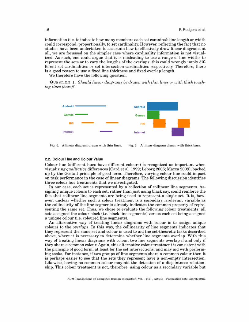
Fig. 17 shows how questions were displayed to participants.Each study that we ran included four of each type of task (two simple, two com-
plex), giving 12 questions in total. In addition, the linear diagrams used in our studiesincluded either six or ten sets, to ensure that the data to be visualized were not triv-ial. Within each task type, one simple and one complex task was assigned to a six-setlinear diagram, likewise with respect to the ten-set linear diagrams. As well as thesemain study questions, a further four questions were used to train the participants (asimple subset task with three sets, a simple intersection task with six sets, a complexdisjoint task with ten sets, and a complex intersection task with ten sets). The sametraining questions were used for each study, but the linear diagrams were tailored tothe study being undertaken. A further two questions were asked of participants in or-
ACM Transactions on Computer-Human Interaction, Vol. -, No. -, Article -, Publication date: March 2015.
-:14 P. Rodgers et al.
Fig. 17. A screenshot showing how the tasks were displayed.
der to identify whether they were inattentive; this is further discussed in section 3.3.So, in total, each participant was asked 18 questions: four training questions, 12 mainstudy questions, and two inattentive participant identifiying questions.
The participants were given the following instructions on starting the study:
You should maintain concentration on the HIT and answer questions with-out delay, unless a question explicitly allows you to take a break, in whichcase you can have a rest before continuing.
The terminology HIT is explained in section 3.3.
3.2. Data for Visualization
To perform our studies, we required diagrams for training participants and for collect-ing performance data during the main study phase. The questions used in the mainphases of the studies were asked of linear diagrams generated from real-world data. Inparticular, we derived 84 data sets from Twitter, obtained from the SNAP data set col-lection [Leskovec 2011]. This collection contains ego-networks of 1000 Twitter users.For each Twitter list, a set is formed comprising the users that subscribe to that list. Asstudy participants need not be familiar with Twitter, the questions used in the studymade no reference to Twitter. Moreover, to avoid any possibility of previous knowledgeof the data impacting the results, all set names were changed, but keeping a real-worldscenario: the interests of people. The set names were chosen so that no two sets in anyone linear diagram started with the same letter to reduce the potential for misreadingset names.
For the main questions in each study, 12 of these 84 data sets were randomly se-lected; different data sets were used for each study to ensure that participants couldnot obtain information on the correct answers from those who took part in earlierstudies. If the data set included more sets than required (i.e. six or ten) then the appro-priate number of sets were removed. This removal process selected sets that reducedthe number of overlaps minimally, thus maintaining the complexity of the data set asmuch as possible. In addition, we required that the six-set and ten-set diagrams had atleast seven overlaps and 11 overlaps respectively, and at most 30 overlaps in total. Thelower bound on set overlaps ensured the diagrams were not completely trivial, whilstthe upper bound was necessary to limit their size from a pragmatic perspective: thediagrams needed to comfortably fit on computer screens without the need for scrolling.This consideration was important for the study, but does not reflect an inherent limita-tion of linear diagrams. The linear diagrams were then generated from these data sets;
ACM Transactions on Computer-Human Interaction, Vol. -, No. -, Article -, Publication date: March 2015.

Visualizing Sets with Linear Diagrams -:15
later, we present a profile of the data sets for each study, to convey their complexityfurther.
The linear diagrams used for the training questions and for identifying inattentiveparticipants were generated from randomly produced data sets that were not derivedfrom the Twitter data. This allowed us to ensure that the diagrams were suitable fortraining and for identifying inattentive participants.
3.3. Data Collection Methods
We adopted a crowdsourcing approach, using Amazon Mechanical Turk (MTurk) [Chenet al. 2011; Paolacci et al. 2010] to automatically out-source tasks to participants. Thetasks, called HITs (Human Intelligence Tasks) are completed by anonymous partic-ipants who are paid on successfully completing the HIT. Crowdsourcing is becomingmore popular as a method for conducting research-oriented studies. There is evidencethat crowdsourcing is a valid approach for collecting data and it has gained recogni-tion within the scientific community [Heer and Bostock 2010; Paolacci et al. 2010]. TheHITs were based on the templates provided by [Micallef et al. 2012]2. Every question,in both the training and the main study, was displayed on a separate page of the HIT.Previous pages could not be viewed and subsequent pages were not revealed until thequestion on the current page was answered. Unlike the training questions, in the mainstudy the questions were randomly sequenced.
There is little control, in MTurk, over who participates in the study and, so, someparticipants may fail to give questions their full attention [Chen et al. 2011] or havedifficulties with the language; we call these participants inattentive. To reduce theimpact of language issues, a system qualification was used, allowing only participationfrom people based in the USA with a HIT approval rate of 95%.
Another recognized technique for identifying participants who cannot understandthe language used, or who are not giving the tasks sufficient attention, is to includequestions that require careful reading, yet are very simple to answer [Oppenheimeret al. 2009]. In our study, we included two such questions which asked participants tosimply click on the diagram, whilst still presenting them with redundant check boxesas seen for the 12 main study questions; these catch questions appeared as the thirdand ninth questions after the training phase. Participants were classified as inatten-tive if they clicked check boxes on either of the two inattentive participant identifyingquestions. All data obtained from inattentive participants was removed before analy-sis.
4. EXECUTION OF THE STUDIES AND DATA COLLECTED
Each of our six hypotheses relate to different graphical choices, so to test all combina-tions (of which there are 2×3×2×2×2×2 = 96) of choices is clearly not practical. Ourapproach, therefore, is to test them in sequence, ordered by those which we conjectureto have the most significant effect first3.
We identified H2 (on the use of colour) and H6 (on the number of line segments) aspotentially having a high impact on task performance. Therefore, we prioritized testingthese two hypotheses. We believed that minimizing the number of line segments wouldbring more performance benefits than using colour because of the substantial impactthe number of line segments has on diagram clutter. Therefore, we tested H6 first,
2Available from http://www.aviz.fr/bayes.3One could make many different choices about the order in which to determine the effect of graphical choiceson linear diagrams. We do not argue that our approach is the only way, just that it is a reasonable method.One could choose alternative orders in which to evaluate the graphical choices, possibly with different re-sults.
ACM Transactions on Computer-Human Interaction, Vol. -, No. -, Article -, Publication date: March 2015.

-:16 P. Rodgers et al.
then H2. For the first test, we had to choose the graphical features of the linear dia-grams. Given that linear diagrams are already used, we adopted the graphical choicesalready seen in the literature [Chapman et al. 2014] and varied only the number ofline segments, as required for H6. As the tests proceeded in sequence, we adopted thegraphical choices implied by our studies, in order to reach a final design.
After conducting the first two studies, we then focused on the two hypotheses relatedto graphical choices that we conjectured to have a medium impact on task performance:H3 (the use of guide-lines), and H5 (the order of sets). We believed that using guide-lines would have more impact than set-order, since they are thought to aid the taskperformance when comparing any pair of line-segments. By contrast, an adjacency-driven set-order more naturally aids the comparison of line segments drawn close toeach other. Therefore, our third study tested H3 and our fourth study tested H5.
Our final two studies focused on graphical choices that we conjectured to have a lowimpact on task performance: H1 (the use of bars versus lines) and H4 (orientation).We anticipated that there could be an effect of using bars over lines. H4, by contrast,predicted that there would be no significant difference between diagram orientations.Thus, our fifth study investigated H1 and our sixth study focused on H4.
The major goal of each study was to determine whether there are overall differencesin performance between treatments. To this end, for each question asked in the study,we recorded the check boxes selected (accuracy data) and the time taken to submit ananswer. A correctly selected check box was counted as one correct answer. A check boxthat was correctly not selected was also counted as one correct answer. The remainingresponses were incorrect answers. This provided us with categorical data which wassubjected to chi-square tests. The time data allowed us to compare time performanceacross treatments. In all of our studies, the time data collected was not normal. In eachcase, using log
10(time) results in data that, whilst still not normal, has little skewness
and, thus, could be used to conduct a robust ANOVA. For both the ANOVA and chi-square tests we take p-values of less than 0.05 to be significant.
Each of the six studies included a pilot phase, with 10 participants per group. Anyadjustments that were necessary to the study materials are detailed in the relevantsections below; we do not discuss the pilot studies if no problems came to light. Eachmain study included 100 participants per group, less any identified as inattentive.Each participant was paid $1 for taking part and randomly allocated to a treatmentgroup. Participants could only take part in a study once and could not take part in morethan one study. This was enforced by recording participant identifiers (called workerIDs).
The next six sections correspond to the studies for hypotheses 1 to 6. We presenta comprehensive account for the first study, on line segments, as follows: an examplequestion from the study, information on diagram complexity, participant demograph-ics, analysis of errors, analysis of time, and summary of results. For the remainingstudies, the information on diagram complexity and participant demographics can befound in the appendix. A full set of diagrams used in the studies, along with the ques-tions asked, can be found in the supplementary material. The studies can be foundonline at www.eulerdiagrams.com/linear.
5. LINE SEGMENTS
Hypothesis H6 indicates that using a minimal number of line segments could signifi-cantly improve task performance. For the study, we compared using a minimal num-ber of line segments with a randomly chosen number of line segments. Two lineardiagrams used in this study can be seen in Figs 18 and 19. Participants were askedto ‘Tick the check boxes where none of the people are also interested in Music’. Thecorrect solution was to tick the check boxes for Android, Bands, Design, Games, Jour-
ACM Transactions on Computer-Human Interaction, Vol. -, No. -, Article -, Publication date: March 2015.

Visualizing Sets with Linear Diagrams -:17
nalism, Stars, and Technology. Table I indicates the level of complexity of the lineardiagrams used in this study, stating the number of line segments used in both the min-imal and random visualizations. It also states which data set was randomly assignedto which task (I=intersection, S=subset, D=disjoint, C=complex). Figs 18 and 19 arefor data set 6.
Fig. 18. A minimal number of line segments.
Fig. 19. A random number of line segments.
Of the 100 participants recruited to each of the two groups (which we call the ‘min-imal group’ and the ‘random group’), three were inattentive and they were all in therandom group. The demographics of the participants were as follows:
— gender: 93M, 104F, 0 other, 0 not stated
ACM Transactions on Computer-Human Interaction, Vol. -, No. -, Article -, Publication date: March 2015.

-:18 P. Rodgers et al.
Table I. Diagram Complexity for Study 1: Minimal versus Random Numbers of Line Segments
Data Set 1 2 3 4 5 6 7 8 9 10 11 12Sets 6 6 6 10 10 10 6 6 6 10 10 10
1-set overlaps 2 3 4 8 7 9 6 6 5 4 3 42-set overlaps 4 1 2 7 7 8 3 10 4 10 8 33-set overlaps 4 2 1 1 2 2 0 7 0 5 5 14-set overlaps 3 1 0 0 0 3 0 0 0 1 0 15-set overlaps 1 0 0 0 0 1 0 1 0 3 0 26-set overlaps 0 0 0 0 0 1 0 0 0 1 0 1> 6-set overlaps 0 0 0 0 0 0 0 0 0 0 0 1× 9, 1× 10
Total number of overlaps 14 7 7 16 16 24 6 24 9 24 16 13
Minimal Line Segments 10 8 6 12 12 18 6 15 6 20 12 17Random Line Segments 21 11 11 19 25 45 10 38 9 40 20 32
Task Type I S D I S D CI CS CD CI CS CD
— age range, in years: 19 to 73 (mean: 34)— qualification level: 1 not stated, 1 some high school, 18 high school graduate, 49
some college, 12 associates degree, 89 Bachelors degree, 23 Masters degree, 4 doc-torate degree.
5.1. Analysis
The major goal of this first study was to establish whether significant differences ex-ist in task performance when using a minimal number of line segments as comparedto a random number of line segments. As there were three inattentive participants,the following results are based on 200 − 3 = 197 participants each answering twelvequestions, thus the total number of questions answered was 197× 12 = 2364.
5.1.1. Accuracy. Each of the 12 questions had either five, six, nine or ten check boxes.For instance, a complex six-set question involves two sets in the question, leaving foursets corresponding to check boxes along with a ‘none of the above’ check box: such aquestion has five check boxes. Likewise, a simple six-set question has six check boxesand so forth. Twenty five percent of the questions correspond to each number of checkboxes. Therefore, since there were 2364 questions answered, each number of checkboxes occurred 2364
4= 591 times. This gives a total of 591×(5+6+9+10) = 17730 check
boxes. Some of these check boxes were correctly selected, and some were not, whichallowed us to compute the accuracy rate.
In this study, the total number of correct responses was 15474 and there were 2256incorrect responses. Table II shows the breakdown of responses by treatment, withproportionally fewer errors being accrued by the minimal group. Participants from theminimal group had error rate of 11.4% whereas this increased to 13.5% for the randomgroup. Thus, we saw approximately two more errors for every 100 answers from therandom group. Performing a chi-square test reveals significant differences between thetwo graphical choices (p = 0.003). Therefore, using a minimal number of line segmentsallows participants to perform significantly more accurately than those using a randomnumber of line segments.
Table II. Accuracy for Line Segments: Minimal versus Random
Treatment Correct Incorrect Total Error RateMinimal group 7920 1080 9000 11.4%Random group 7554 1176 8730 13.5%Total 15474 2256 17730 12.7%
ACM Transactions on Computer-Human Interaction, Vol. -, No. -, Article -, Publication date: March 2015.

Visualizing Sets with Linear Diagrams -:19
5.1.2. Time. The grand mean for the time taken to answer questions in this studywas 35.81 seconds per question (standard deviation: 33.50). The average completiontime for questions for the minimal group was 33.23 seconds (SD: 34.61) and for the ran-dom group the mean was 38.47 seconds (SD: 32.12). Overall, on average each questiontook over 6 seconds longer to complete when using a random number of line segments(an increase of 19.4%). Performing an ANOVA with log
10(time) data (skewness: 0.24),
revealed a significant effect (p = 0.002). Therefore, using a minimal number of linesegments allows participants to perform significantly faster than those using a randomnumber of line segments.
5.1.3. Summary of Analysis. Our analysis of both the accuracy data and time data hasrevealed that participants perform significantly better when using a minimal numberof line segments as opposed to a random number of line segments. We note that therelative benefit of using a minimal number of line segments in terms of errors accruedis, in our opinion, relatively small from a practical perspective (respective error rates of11.4% and 13.5%). However, increasing time taken by nearly 20% (over six seconds perquestion) we believe represents a substantial increase when using a random number ofline segments. Overall, the data support our conjecture that task performance is aidedwhen using fewer line segments, particularly with regard to time taken. In conclusion,our statistical analysis allows us to accept hypothesis 6: using a minimal number ofline segments significantly improves task performance. Thus, the next five studies wereall performed using diagrams drawn with a minimal number of line segments.
6. COLOUR
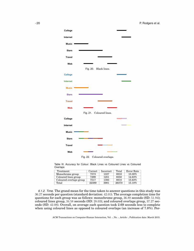
Hypothesis H2 conjectured that using black lines significantly decreases task perfor-mance. Three linear diagrams used to study the effect of colour treatment can be seenin Figs 20, 21, and 22. Participants were asked to ‘Tick the check boxes where none ofthe people are also interested in both Stars and Travel’. The correct solution was totick the check boxes for College, Internet, Music, and Web.
Of the 300 participants recruited (100 to each of the three groups – which wecall the ‘monochrome group’, the ‘coloured lines group’ and the ‘coloured overlaps’group – seven were inattentive. The remaining number of participants per group was:monochrome group 99, coloured lines group 95, and coloured overlaps group 99.
6.1. Analysis
The major goal of this second study was to establish whether significant differencesexist in task performance when using black lines, coloured lines or coloured over-laps. There were seven inattentive participants, so the following results are based on300 − 7 = 293 participants each answering twelve questions, thus the total number ofquestions answered was 293× 12 = 3516.
6.1.1. Accuracy. The total number of correct responses was 22389 and there were 3981incorrect responses, giving an overall error rate of 15.10%. Table III shows the break-down of responses by treatment, with proportionally fewer errors being accrued by thecoloured lines group. Approximately one fewer error for every 100 answers was accruedby the coloured lines group over the coloured overlaps group and 1 fewer error versusthe monochrome group for every 200 answers. Performing a chi-square test revealsno significant differences between the three choices (p = 0.129). Similarly, conductingpairwise chi-square tests also reveals no significant differences, with the smallest p-value being 0.065, between the coloured lines group and the coloured overlaps group.Performing the same analysis with the six colour-blind participants removed does notalter the results. Therefore, the three colour treatments do not lead to significant differ-ences in task performance in terms of accuracy.
ACM Transactions on Computer-Human Interaction, Vol. -, No. -, Article -, Publication date: March 2015.
-:20 P. Rodgers et al.
College
Internet
Music
Stars
Travel
Web
Fig. 20. Black lines.
College
Internet
Music
Stars
Travel
Web
Fig. 21. Coloured lines.
College
Internet
Music
Stars
Travel
Web
Fig. 22. Coloured overlaps.
Table III. Accuracy for Colour: Black Lines vs Coloured Lines vs ColouredOverlaps
Treatment Correct Incorrect Total Error RateMonochrome group 7573 1337 8910 15.00%Coloured lines group 7299 1251 8550 14.63%Coloured overlaps group 7517 1393 8910 15.63%Total 22389 3981 26370 15.10%
6.1.2. Time. The grand mean for the time taken to answer questions in this study was36.27 seconds per question (standard deviation: 42.01). The average completion time forquestions for each group was as follows: monochrome group, 36.88 seconds (SD: 51.94);coloured lines group, 34.58 seconds (SD: 28.03); and coloured overlaps group, 37.27 sec-onds (SD: 42.08). Overall, on average each question took 2.69 seconds less to completewhen using coloured lines as opposed to coloured overlaps (an increase of 7.8%). Per-
ACM Transactions on Computer-Human Interaction, Vol. -, No. -, Article -, Publication date: March 2015.
Visualizing Sets with Linear Diagrams -:21
forming an ANOVA using log10(time) data (skewness: 0.33) found no significant effect
of visualization technique (p = 0.829). Similarly, conducting pairwise comparisons re-veals no significant differences between treatments, with the smallest p-value being0.544. Performing the same analysis with the colour-blind participants removed doesnot alter the results. Therefore, the three colour treatments do not lead to significantdifferences in task performance in terms of time taken.
6.1.3. Summary of Analysis. Our analysis of the accuracy and time data revealed nosignificant differences in performance between the three colour treatments. In conclu-sion, our statistical analysis does not allow us to reject H2: we have no evidence thatusing black lines significantly decreases task performance.
In order to perform the remaining studies, we need to assign one of these colourtreatments to linear diagrams. Absent of any other evidence, we picked the colouredlines treatment since this had the lowest point estimate for the error rate in thisexperiment. In any case, colour can be used without harming task performance andthose who prefer a non-colour option can, in practice, display the diagram usingmonochrome.
7. GUIDE-LINES
Hypothesis H3 conjectured that using guide-lines significantly improves task perfor-mance. We compared using guide-lines with no guide-lines. For this study, the guide-lines were drawn at the beginning and end of each overlap. Moreover, they were drawnunderneath the lines used to represent sets. To further differentiate them from thelines representing sets, they were drawn in grey, as this was not used for any of thesets. Two linear diagrams used in this study can be seen in Figs 23 and 24. Partici-pants were asked to ‘Tick the check boxes where all of the people are also interestedin Economics’. The correct solution was to tick the check box for Bands.
Of the 100 participants recruited to each of the two groups, which we call the ‘guide-lines group’ and the ‘no guide-lines group’, there was one inattentive participant in thelatter group. The number of participants per group was, thus: guide-lines group 100,and the no guide-lines group 99.
7.1. Analysis
The major goal of this third study was to establish whether task performance is sig-nificantly improved using guide-lines. There was one inattentive participant, so thefollowing results are based on 200− 1 = 199 participants each answering twelve ques-tions, thus the total number of questions answered was 199× 12 = 2388.
7.1.1. Accuracy. The total number of correct responses was 14681 and there were 3229incorrect responses, giving an overall error rate of 18.03%. Table IV shows the break-down of responses by treatment, with proportionally fewer errors being accrued by theguide-lines group. Almost three fewer errors for every 100 answers were accrued by theguide-lines group over the no guide-lines group. Performing a chi-square test revealssignificant differences between the two groups (p = 0.000). Therefore, using guide-linesallows participants to perform significantly more accurately than using no guide-lines.
Table IV. Accuracy for Guides: Guide-Lines versus No Guide-Lines
Treatment Correct Incorrect Total Error RateGuide-lines group 7500 1500 9000 16.67%No guide-lines group 7181 1729 8910 19.41%Total 14681 3229 17910 18.03%
ACM Transactions on Computer-Human Interaction, Vol. -, No. -, Article -, Publication date: March 2015.

-:22 P. Rodgers et al.
Fig. 23. Guide-lines.
Fig. 24. No guide-lines.
7.1.2. Time. The grand mean for the time taken to answer questions in this studywas 36.90 seconds per question (standard deviation: 33.345). The average completiontime for questions for each group was as follows: guide-lines group, 36.90 seconds (SD:30.39); and no guide-lines group, 37.52 seconds (SD: 36.09). Overall, on average eachquestion took 0.62 seconds less to complete when using guide-lines (a decrease of un-der 2%). The ANOVA performed using log
10(time) data (skewness: 0.38) revealed no
significant effect of treatment (p = 0.713). Therefore, using guide-lines leads to no sig-nificant differences in performance with respect to time taken.
7.1.3. Summary of Analysis. Our analysis of the accuracy data revealed that partici-pants perform significantly better when using guide-lines. No significant differenceswere observed in the time data. Overall, the data support our conjecture that activity(ii) is aided when using guide-lines. In conclusion, our statistical analysis allows us toaccept H3: linear diagrams should be drawn with guides-lines assigned to the ends ofthe overlaps. Thus, the next three studies were all performed using diagrams drawnwith guide-lines.
8. SET-ORDER
Our next study had the goal of determining whether set-order has a significant impacton task performance. This study compares alphabetic ordering against an adjacency-driven set-order, which places two sets near to each other when their line segmentshave collinear end-points. H5 conjectures that the adjacency-driven set-order outper-forms alphabetic order. An example can be seen in Figs 25 and 26. Participants were
ACM Transactions on Computer-Human Interaction, Vol. -, No. -, Article -, Publication date: March 2015.

Visualizing Sets with Linear Diagrams -:23
asked to ‘Tick the check boxes where all of the people are also interested in either Hifior Journalism’ with the correct answer being to tick ‘none of the above’.
Fig. 25. Alphabetic set-order. Fig. 26. Adjacency-driven set-order.
Of the 100 participants recruited to each of the two groups, which we call the ‘al-phabetic group’ and the ‘adjacency-driven group’, there were seven inattentive partic-ipants in the latter group. The number of participants per group is, thus: alphabeticgroup 100, adjacency-driven group 93.
8.1. Analysis
This fourth study’s goal was to establish whether significant differences exist in taskperformance when altering the order of the sets. There were seven inattentive partici-pants, so the following results are based on 200− 7 = 193 participants each answering12 questions, thus the total number of questions answered was 2316.
8.1.1. Accuracy. In this study into the effect of set-order, the total number of correctresponses was 15490 and there were 1880 incorrect responses, giving an overall errorrate of 10.8%. Table V shows the breakdown of responses by treatment, with propor-tionally fewer errors being accrued by the adjacency-driven group, although the differ-ence is very marginal. Performing a chi-square test reveals no significant differencesbetween the two groups (p = 0.965). Therefore, the two set-order treatments do not leadto significant differences in task performance in terms of accuracy.
Table V. Accuracy for Set-Order: Alphabetic versus Adjacency-Driven
Treatment Correct Incorrect Total Error RateAlphabetic group 8025 975 9000 10.83%Adjacency-driven group 7465 905 8370 10.81%Total 15490 1880 17370 10.82%
8.1.2. Time. The grand mean for the time taken to answer questions in this studywas 33.41 seconds per question (standard deviation: 37.56). The average completiontime for questions for each group was as follows: alphabetic group, 33.87 seconds (SD:37.29); and adjacency-driven group, 32.91 seconds (SD: 37.84). Overall, on average eachquestion took 0.96 seconds less to complete when adjacency-driven set-order (a de-crease of under 3.5%). To establish whether significant differences existed between thetwo treatments we conducted an ANOVA. The analysis is performed using log
10(time)
data (skewness: 0.52). We found no significant effect of treatment (p = 0.391). Therefore,
ACM Transactions on Computer-Human Interaction, Vol. -, No. -, Article -, Publication date: March 2015.

-:24 P. Rodgers et al.
there is no significant difference between the two set-order treatments in terms of timetaken to perform tasks.
8.1.3. Summary of Analysis. Our analysis of both the accuracy and time data revealedthat no significant differences in performance exist between the two set-orders. To con-clude, we cannot reject H5: set-order does not significantly impact on task performance.In order to perform the remaining studies, we need to assign one of these set-ordertreatments to linear diagrams. In the absence of any other evidence, we opt for usingadjacency-driven set-order in the next two studies, since this treatment had the lowestpoint estimates for the error rate and mean time.
9. LINE WIDTH
Our next study had the goal of determining whether lines or bars should be used torepresent the sets. H1 conjectured that bars outperform lines. An example can be seenin Figs 27 and 28. Participants were asked to ‘Tick the check boxes where some ofthe people are also interested in Web’ with the correct answer being to tick Design,Economics, Hifi, Internet, and Travel.
In the pilot study, two questions were identified as too easy (with error rates of 0%and 3% and mean times both under 20 seconds). For the corresponding diagrams, newquestions were generated to increase the difficulty. One of the questions was too hard(error rate 42.8% and mean time 56.17 seconds). On inspection, it was felt that thiswas due to the diagram and it was not possible to create a simpler question of thecorrect task type. As a result a new diagram was generated along with a new question.In all three cases we noted that the ease or difficulty of the question did not appear toalter across the two treatments.
Of the 100 participants recruited to each of the two groups, which we call the ‘barsgroup’ and the ‘lines group’, there were eight inattentive participants (four in eachgroup). The number of participants per group was, thus: bars group 96, and lines group96.
9.1. Analysis
This fifth study aimed to establish whether significant differences exist in task per-formance when altering line width. There were eight inattentive participants, so thefollowing results are based on 200− 8 = 192 participants each answering 12 questions,thus the total number of questions answered was 2304.
9.1.1. Accuracy. In this study into the effect of line width, the total number of correctresponses was 15380 and there were 1900 incorrect responses, giving an overall errorrate of 10.99%. Table VI shows the breakdown of responses by graphial choice, withproportionally fewer errors being accrued by the lines group. Approximately 1.5 moreerrors were made out of every 100 answers by the bars group. Performing a chi-squaretest reveals significant differences between the two groups (p = 0.003). Therefore, usinglines significantly reduces the error rate as compared to using bars.
Table VI. Accuracy for Set-Order: Lines versus Bars
Treatment Correct Incorrect Total Error RateBars group 7628 1012 8640 11.71%Lines group 7752 888 8640 10.26%Total 15380 1900 17280 10.99%
ACM Transactions on Computer-Human Interaction, Vol. -, No. -, Article -, Publication date: March 2015.

Visualizing Sets with Linear Diagrams -:25
Fig. 27. Lines.
Fig. 28. Bars.
9.1.2. Time. The grand mean for the time taken to answer questions in this studywas 35.76 seconds per question (standard deviation: 26.66). The average completiontime for questions for each group was as follows: lines group, 35.94 seconds (SD: 26.21);and bars group, 35.59 seconds (SD: 27.12). The ANOVA performed using log
10(time)
ACM Transactions on Computer-Human Interaction, Vol. -, No. -, Article -, Publication date: March 2015.

-:26 P. Rodgers et al.
data (skewness 0.03) revealed no significant effect of treatment (p = 0.584). Therefore,there is no significant difference between the two treatments in terms of time taken toperform tasks.
9.1.3. Summary of Analysis. Our analysis of the accuracy data revealed that using linesis preferable to using bars. We cannot accept H1, which conjectured that bars werepreferable to lines and instead deduce that lines are significantly better than bars. Thissuggests that white space, and therefore less visual clutter, is more helpful in termsof accuracy when performing tasks than using touching bars. However, in this casethe benefits of using lines over bars is relatively small. In terms of time performance,there was no significant difference between the bars group and the lines group. Ournext study uses lines instead of bars due to the significantly lower error rate.
10. ORIENTATION
This study had the goal of determining whether diagram orientation had a significantimpact on task performance, comparing vertical and horizontal orientations. H4 con-jectured that there would be no significant difference in performance4. An examplecan be seen in Figs 29 and 30. Participants were asked to ‘Tick the check boxes wheresome of the people are also interested in either Relaxation OR Stars’ with the correctsolution being to tick Food and Web.
Fig. 29. Horizontal orientation.
WebFood
Relaxation
Programming
ComputersStars
Fig. 30. Vertical orientation.
In the pilot study, the two simple intersection questions were noted as being easy(error rates of around 1%, mean times of 21.07 seconds and 17.65 seconds). There wasno obvious reason why one of these questions (with the mean time of 21.07 seconds)was easy so it was not changed. For the other question, participants were asked toidentify sets that intersected with Health. The only correct answer was a line drawn
4We acknowledged earlier that the order in which people naturally read (e.g. left to right) may impactwhich orientation is most effective. We have used participants from the US, which would imply that mostparticipants are speakers of languages written left to right, even if that is not their native language. In anycase, the study was performed in English.
ACM Transactions on Computer-Human Interaction, Vol. -, No. -, Article -, Publication date: March 2015.
Visualizing Sets with Linear Diagrams -:27
immediately next to Health, which we felt made the question easy. The question waschanged to make it more challenging.
One question was noted as being particularly hard (error rate of over 50%). Thisquestion asked participants to identify subsets of Games. The line for Games com-prised four segments, and it was felt that this contributed to the difficulty of the ques-tion. An alternative set was chosen for the question. Finally, there was one questionwhich nobody got completely correct, so this was also deemed difficult. In this case, par-ticipants were asked to identify the sets that were disjoint with iPhone. In this case,all of the sets were disjoint with iPhone, so all check boxes except ‘none of the above’should have been selected. This was the potential cause of difficulty, so the questionwas changed to reduce the difficulty.
Of the 100 participants recruited to each of the two groups, which we call the ‘hor-izontal group’ and the ‘vertical group’, there were four inattentive participants. Theremaining number of participants per group was: horizontal group 99, and verticalgroup 97.
10.1. Analysis
This sixth study aimed to establish whether significant differences exist in task perfor-mance when altering diagram orientation. There were four inattentive participants, sothe following results are based on 200− 4 = 196 participants each answering 12 ques-tions, thus the total number of questions answered was 2352.
10.1.1. Accuracy. In this study into the effect of orientation, the total number of cor-rect responses was 15331 and there were 2309 incorrect responses, giving an over-all error rate of 13.09%. Table VII shows the breakdown of responses by treatment,with proportionally fewer errors being accrued by the horizontal group. Performing achi-square test revealed no significant differences between the two groups (p = 0.223).Therefore, the two orientations do not lead to significant differences in task performancein terms of accuracy.
Table VII. Accuracy for Orientation: Horizontal versus Vertical
Treatment Correct Incorrect Total Error RateHorizontal group 7771 1139 8910 12.78%Vertical group 7560 1170 8730 13.40%Total 15331 2309 17883 13.09%
10.1.2. Time. The grand mean for the time taken to answer questions in this studywas 35.56 seconds per question (standard deviation: 37.14). The average completiontime for questions for each group was as follows: horizontal group, 34.71 seconds (SD:20.56); and vertical group, 36.44 seconds (SD: 42.18). Overall, on average each questiontook 1.73 seconds less to complete with the horizontal orientation (a decrease of 4.75%).Conducting an ANOVA using log
10(time) data (skewness 0.31) revealed no significant
effect of treatment (p = 0.162). Therefore, there is no significant difference between thetwo treatments in terms of time taken to perform tasks.
10.1.3. Summary of Analysis. Our analysis revealed no significant performance differ-ences between horizontal and vertical orientation. Thus, we cannot reject H4: orienta-tion does not impact on task performance. As we need to choose one of the two treat-ments for our final study, in the absence of any other evidence, we pick the horizontaltreatment because it had the lowest point estimates of the error rate and mean time.
ACM Transactions on Computer-Human Interaction, Vol. -, No. -, Article -, Publication date: March 2015.

-:28 P. Rodgers et al.
11. SUMMARY OF INDIVIDUAL STUDIES
Having performed six empirical studies focusing on individual graphical features, theresults are summarized as a set of design principles in table VIII, presented in theorder in which the studies were undertaken. As such, we are now in a position toanswer the six question posed in section 2:
— Question 1 asked whether we should use bars or lines. In our study, lines signifi-cantly outperform bars in terms of accuracy. Therefore, the answer to question 1 isthat we should draw linear diagrams with thin lines.
— Question 2 asked how we should treat linear diagrams with colour. No significanteffect was found in terms of accuracy or time performance. Therefore, the answer toquestion 2 is that any of the considered colour treatments is suitable.
— Question 3 asked whether guide-lines would assist task performance. Using guide-lines led to significantly improved accuracy. Therefore, the answer to question 3 isthat we should use guide-lines to indicate the start and end points of overlaps.
— Question 4 focused on diagram orientation. Our study found there to be no signifi-cant difference between horizontal and vertical orientation. Therefore, the answerto question 4 is that either a horizontal or vertical orientation can be chosen withoutimpacting task performance.
— Question 5 was concerned with set-order. Again, we found no significant differencebetween alphabetic set-order and adjacency-driven set-order. Therefore, the answerto question 5 is that either an alphabetic or an adjacency-driven set-order can bechosen without impacting task performance.
— Question 6 focused on the number of line segments used. We found that using aminimal number of line segments significantly improved accuracy and completiontime. Therefore, the answer to question 6 is that we should minimize the number ofline segments.
Table VIII. Summary of Individual Studies
Graphical Prop. Lowest Error Rate Lowest Mean Time Design Principleline segments minimal minimal use a minimal number of line segmentscolour no sig. diff. no sig. diff. –guide-lines guide-lines no sig. diff. use perpendicular guide-linesset-order no sig. diff. no sig. diff. –line width lines no sig. diff. use thin linesorientation no sig. diff. no sig. diff. –
We now present a final study aimed at determining whether applying the designprinciples identified through our first six studies leads to significantly improved per-formance over other combinations of graphical choices. In particular we now comparethe following three combinations, that we call ‘guided’, ‘original’ and ‘anti-guided’:
(1) Guided: these graphical choices correspond with those found either significantlybetter than others or those with the lowest error rates and completion times. Thesechoices are:(a) line segments: minimal,(b) colour: lines,(c) guide-lines: yes,(d) set-order: adjacency-driven,(e) width: lines,(f) orientation: horizontal.
ACM Transactions on Computer-Human Interaction, Vol. -, No. -, Article -, Publication date: March 2015.

Visualizing Sets with Linear Diagrams -:29
(2) Original: these graphical choices correspond with those that were made in a previ-ous empirical study comparing linear diagrams to Euler diagrams [Chapman et al.2014]. These choices are:(a) line segments: minimal,(b) colour: lines,(c) guide-lines: no,(d) set-order: alphabetic,(e) width: lines,(f) orientation: horizontal.Here, there are only two graphical choices that are different from ‘guided’, namelythe use of guide-lines (which we found to significantly improve performance) andset-order.
(3) Anti-guided: these graphical choices correspond with those found either signifi-cantly worse than others or those with the highest error rates and completiontimes. These choices are:(a) line segments: random,(b) colour: overlaps,(c) guide-lines: no,(d) set-order: alphabetic,(e) width: bars,(f) orientation: vertical.By design, all graphical choices differ from ‘guided’. Four choices are different from‘original’.
The next section provides the details of this final study, which used the same approachas the first six studies. Thus, we only include the same details as seen in sections 6to 10.
12. OVERALL STUDY
Our next study had the goal of determining whether applying the guidance derivedfrom the first six studies aids comprehension, using guided, original and anti-guidedlayouts. An example can be seen in Figs 31, 32 and 33. Participants were asked to‘Tick the check boxes where some of the people are also interested in Books ’ with thecorrect solution being to tick Android, Cars, Media, News, and Stars.
Fig. 31. Guided.
ACM Transactions on Computer-Human Interaction, Vol. -, No. -, Article -, Publication date: March 2015.

-:30 P. Rodgers et al.
Fig. 32. Original.
AndroidBooks
CarsMedia
NewsStars
Fig. 33. Anti-guided.
Of the 100 participants recruited to each of the three groups, which we call the‘guided group’, the ‘original group’ and the ‘anti-guided group’, there were 13 inatten-tive participants. The remaining number of participants per group was: guided group95, original 100 group, and anti-guided group 92.
ACM Transactions on Computer-Human Interaction, Vol. -, No. -, Article -, Publication date: March 2015.

Visualizing Sets with Linear Diagrams -:31
12.1. Analysis
This final study aimed to establish whether significant differences exist in task perfor-mance when applying different combinations of the guides. There were 13 inattentiveparticipants, so the following results are based on 300 − 13 = 287 participants eachanswering 12 questions, thus the total number of questions answered was 3444.
12.1.1. Accuracy. The total number of correct responses was 21920 and there were 3910incorrect responses, giving an overall error rate of 15.14%. Table IX shows the break-down of responses by treatment, with proportionally fewer errors being accrued by theguided group. Performing a chi-square test revealed significant differences betweenthe three groups (p = 0.000). To distinguish the three groups, pairwise chi-square testswere performed, establishing the following significant differences: guided versus anti-guided (p = 0.000), original versus anti-guided (p = 0.000). Therefore both guided andoriginal layouts significantly improve accuracy over using anti-guided layouts. How-ever, there was no significant difference in accuracy between the guided and originallayouts (p = 0.100). Therefore, both the guided and original layouts lead to significantlyimproved accuracy over using the anti-guided layout.
Table IX. Accuracy for Final Study: Guided versus Original versus NotGuided
Treatment Correct Incorrect Total Error RateGuided group 7544 1006 8550 11.77%Original group 7868 1132 9000 12.58%Anti-guided group 6508 1772 8280 21.40%Total 21920 3910 25830 15.14%
12.1.2. Time. The grand mean for the time taken to answer questions in this studywas 41.34 seconds per question (standard deviation: 36.84)5. The average completiontime for questions for each group was as follows: guided group, 38.34 seconds (SD:38.63); original group, 37.52 seconds (SD: 29.48), and anti-guided group, 48.59 seconds(SD: 41.47). Conducting an ANOVA using log
10(time) data (skewness 0.20) revealed
significant effect of treatment (p = 0.001). Therefore, there is a significant differencebetween the three treatments in terms of time taken to perform tasks. Performing aTukey test yields the following ranking of treatments: guided and original are bothsignificantly faster than anti-guided. However, the mean times for guided and originalare not significantly different.
12.1.3. Summary of Analysis. Our analysis of both the accuracy and time data estab-lished that adhering to all of our design principles is significantly better than adheringto none of them. Moreover, using the original set of guides also significantly aids per-formance as compared to the anti-guided treatment. We conclude that the graphicalfeatures of linear diagrams significantly impact on task performance.
13. THREATS TO VALIDITY
As we have already acknowledged, the order in which the first six studies were con-ducted could impact on the results. Different orders may give a different set of designprinciples. For example, in Fig. 28 it could be argued that the use of guide-lines ontop of bars may be considered problematic as they appear to divide up the bars. By
5We observe that this mean is somewhat higher than the grand means of the six earlier studies. However,this is likely to be due to the inclusion of the anti-guided treatment, which has a relatively high mean timeof 48.59 seconds.
ACM Transactions on Computer-Human Interaction, Vol. -, No. -, Article -, Publication date: March 2015.

-:32 P. Rodgers et al.
contrast, this effect is not noticeable on the lines (see Fig. 27). As a result, evaluatingline thickness before guide-lines could have yielded different design principles.
The following discusses further threats to validity, focusing primarily on thosearising from using a crowd-sourcing approach, that were considered and addressed toensure the study is robust and fit-for-purpose. The following factors were consideredin our study design:
Laboratory: ideally, all participants would be exposed to the same environment whenthe study took place. This would ensure that each participant was exposed to thesame hardware, in an environment that was free from noise and interruption. Byadopting a crowd-sourcing approach, we had no control over the environment in whicheach participant took part. To reduce the effect of this compromise, a large numberof participants were recruited to each treatment group. In total, our seven studiesinvolved 1760 participants.
Time: to ensure the rigour of time measurements, consideration was paid to theprecise duration elapsed interpreting a diagram as well as the units employed tomeasure time. As we used a crowd-sourcing approach, there was little control overany distractions impacting the time taken by each participant on each question. Tomanage this, a large sample size was used.
Question: it was considered a threat if participants did not spend time reading and un-derstanding the questions and diagrams. To manage this threat, non-trivial real-worlddata were used to generate the diagrams, resulting in diagrams that participantshad to read and understand before being able to answer the posed question. It wasalso considered a threat if the diagrams were regarded as trivial; having only a fewsets was deemed insufficient to yield noticeable differences in response times, shouldthey exist. To manage this, diagrams represented six or ten sets in order to demandcognitive effort. In addition, our questions required participants to look at all of thesets visualized in the diagrams. This was to ensure that differences in diagramsarising from the graphical properties being varied would be reflected in the task beingundertaken. Lastly, the study included questions to allow inattentive participants tobe identified, catching those who did not read questions carefully.
Participant: participants were representative of the wider population as indicated bythe demographic information given (roughly even splits between male and female,large age ranges and diverse qualification levels). They were all from the USA andhad a high HIT approval rate.
Thus, the results should be taken to be valid within these constraints.
14. AUTOMATED LAYOUT
To enable linear diagrams to be used effectively, we have implemented a tool that sup-ports their automated layout. The top lefthand panel in the screen shot, Fig. 34, showshow users describe the diagram they require. Each line in the text entry box containsa description of the required overlap, so the first entry indicates that there should bean overlap containing just the set Android. Likewise, the second entry asserts that anoverlap should contain Android and Games, and so forth. The selected options deter-mine the graphical features to be possessed by the diagram. By default, the softwareis set to draw diagrams following the design principles identified in this paper.
Automatically generating linear diagrams is relatively straightforward as the dia-grams simply consist of labels and straight line segments. Tailoring their layout, when
ACM Transactions on Computer-Human Interaction, Vol. -, No. -, Article -, Publication date: March 2015.

Visualizing Sets with Linear Diagrams -:33
Fig. 34. A screenshot of our software.
choosing graphical properties that correspond to Bertin’s retinal variables (whichcorrespond to four of the graphical properties), is unproblematic: only minor layoutchanges are required. This includes switching between bars and lines, the variouscolour variants, adding guide-lines, and changing orientation.
However, more detailed algorithmic processes are required when choosing anadjacency-driven set-order and for reducing line breaks. In our implementation, thecorresponding algorithms are approximate, as optimal solutions which minimize thedistance between sets (for choosing a set-order) and minimize the number of linebreaks (thus ordering the overlaps) are required to consider all possible orderings.Thus, such minimizations cannot be achieved with a polynomial algorithm.
With regard to adjacency-driven set-order, a greedy method has been implemented.The task is to order the sets so that pairs of sets which have more collinear end-pointsare neighbours. First, given the required set of overlaps in some order, our algorithmdraws the line segments for a set with the greatest number of segments; such a set isrepresented by line segments with the most end-points. This choice is motivated by thelikelihood that, because this set has the most end-points, there are going to be manyother sets whose line segments’ end-points are collinear with those for the drawn set.Sets are added to the diagram iteratively, with a next set to be drawn being that withthe most collinear end-points with either the first-ordered or last-ordered set that hasalready been drawn. The to-be-drawn set is then added next to the set against whichit scored highest. When there is a choice of sets to be drawn next, the tie is broken bychoosing the set whose name comes first alphabetically.
A greedy method is also applied for line break minimization. Here we are choosing anorder for the overlaps. We use a measure of closeness between two overlaps to reducethe number of line breaks. First, we observe that, for a pair of overlaps O1 and O2, the
ACM Transactions on Computer-Human Interaction, Vol. -, No. -, Article -, Publication date: March 2015.

-:34 P. Rodgers et al.
number of sets that they have in common is the same as the number of lines that arenot broken if they are drawn next to each other. Likewise, the number of sets that arein exactly one of O1 and O2 corresponds to the number of lines that are broken whenthey are drawn adjacent to each other (in other words, this is the number of collinearend-points that lie ‘between’ O1 and O2). Our measure of distance between a pair ofoverlaps calculates the number of sets in common and subtracts the number of setsthat appear in exactly one of the two overlaps.
The greedy algorithm then attempts to maximise this measure. First, the algorithmdraws the overlap containing the largest number of sets. Overlaps are added to thediagram iteratively. The next overlap, Onext, to be drawn is one with the largest valueof the measure with either the left-most, Ol, or right-most, Or, drawn overlap, of thecurrently drawn diagram; so, the distance between Onext and Ol or Or is the largest ofall still-to-be-drawn overlaps. When there is a choice of overlap to be drawn next, thetie is broken by choosing that which was first entered into the linear generator by theuser.
The linear diagram generator is implemented in Javascript, with the diagram outputin svg format. It is available on the web: www.eulerdiagrams.com/linear.
15. CONCLUSION
Using perceptual theories relating to graphical choices, we identified graphical fea-tures, such as colour and size, that could impact users’ ability to perform set-theoretictasks using linear diagrams. These insights led to a number of hypotheses about theeffect of these graphical features which we tested through a series of seven controlledempirical studies. The three statistically significant results from the first six studiesare summarized as follows, each of which gives rise to three design principles:
— Line Segments Using a minimal number of line segments allows participants toperform significantly more accurately and significantly faster than using a randomnumber of line segments.Design Principle 1: draw linear diagrams with a minimal number of line segments.
— Guide-Lines Using guide-lines at the beginning and end of each overlap allowedparticipants to perform faster and significantly more accurately.Design Principle 2: draw linear diagrams with guide-lines at the beginning and end
of each overlap.— Line Width Altering line width led to significant performance differences in accu-
racy: thin lines gave rise to significantly fewer errors. No significant time differenceswere found.Design Principle 3: draw linear diagrams with thin lines.
To tie these six individual studies together, we empirically compared various combi-nations of the principles: meeting all principles versus meeting most of the principlesversus meeting none of the principles. We found that performance was significantly im-proved when most or all of the principles were met. This seventh study thus supportsthe adoption of the principles when using linear diagrams to perform set-theoretictasks. Interestingly, the final study did not distinguish the guided treatment from theoriginal treatment. We conjecture that there may be some interaction between thedesign principles and other graphical features. This effect is worthy of further investi-gation, to tease out the impact of each graphical property on the others. Indeed, whilstwe have covered a major part of the design space for linear diagrams, more focussedstudies could be conducted to further fine-tune their design.
To enable people to take advantage of the benefits of using linear diagrams to per-form such tasks, we have provided a freely available software implementation that
ACM Transactions on Computer-Human Interaction, Vol. -, No. -, Article -, Publication date: March 2015.

Visualizing Sets with Linear Diagrams -:35
allows any combination of the design principles to be enforced; the software is avail-able from www.eulerdiagrams.com/linear. It would be useful, in the future, to imple-ment improved algorithms that more closely approximate the minimal number of linesegments and desired set-order, whilst taking care to ensure that the run-time perfor-mance is acceptable.
We note that our empirical results are valid within the constraints imposed by thestudy, just as with any empirical study. In our case, the results are valid for the tasktypes undertaken by our pool of participants drawn from the general population. Fu-ture work might examine whether these results hold when the participants are froma pool of technically trained people or with different levels of education. Differences ingender and age on task performance could also be examined. In addition, it would bepossible to further explore options such as the choice of colours used and the preciseshade of grey used for the guide-lines. Moreover, the result on line thickness could belinked to the presence of more white space in the diagrams, an aspect that may beworthy of further investigation.
A major avenue of future work is to extend linear diagrams to include the repre-sentation of data items and network relations, which can be represented by node-linkdiagrams. Complex data such as this arises in many areas, perhaps most prominentlyin social networks. We believe that linear diagrams augmented with node-link dia-grams are likely to bring significant usability benefits over Euler-diagrams augmentedwith node-link diagrams, such as [Collins et al. 2009; Mutton et al. 2004; Riche andDwyer 2010; Simonetto 2012]. It would be interesting to explore how to draw lineardiagrams and node-link diagrams in combination, aiming to optimize, with respect totask performance, the layout of both notations.
Exploring interaction with linear diagrams, and extensions of them, is also a valu-able avenue for further research. Examples for interactive features include zoom-ing, filtering, highlighting and providing details on demand, which is congruent withShneiderman’s visual information-seeking mantra [Shneiderman 1996]. The ability ofvisualization techniques to support these features will be important for their wide-scale applicability, allowing one to exploit the value of interaction and enable newanalysis possibilities.Acknowledgements We would like to thank the participants who took part in theseven studies reported in this paper. Thanks are due to to John Howse and Jim Burtonfor their comments on drafts of this paper. We also thank the anonymous reviewers andthe editor for their detailed and constructive comments which have greatly improvedthe paper.
REFERENCES
Y. Y. Ahn, J. Bagrow, and S. Lehmann. 2010. Link communities reveal multiscale complexity in networks.Nature 466 (2010), 761–764.
B. Alper, N. Henry Riche, G. Ramos, and M. Czerwinski. 2011. Design study of LineSets, a novel set visu-alization technique. IEEE Transactions on Visualization and Computer Graphics 17, 12 (2011), 2259–2267.
B. Alsallakh, W. Aigner, S. Miksch, and H. Hauser. 2013. Radial Sets: Interactive Visual Analysis of LargeOverlapping Sets. Visualization and Computer Graphics, IEEE Transactions on 19, 12 (2013), 2496–2505.
B. Alsallakh, L. Micallef, W. Aigner, H. Hauser, S. Miksch, and P. Rodgers. 2014. Visualizing Sets andSet-typed Data: State-of-the-Art and Future Challenges. In Eurographics Conference on Visualization(EuroVis). 124–138.
J. Bertin. 1983. Semiology of Graphics: Diagrams, Networks, Maps. University of Wisconsin Press.
A. Blake, G. Stapleton, P. Rodgers, L. Cheek, and J. Howse. 2014b. The Impact of Shape on the Perception ofEuler Diagrams. In 8th International Conference on the Theory and Application of Diagrams. Springer,124–138.
ACM Transactions on Computer-Human Interaction, Vol. -, No. -, Article -, Publication date: March 2015.

-:36 P. Rodgers et al.
A. Blake, G. Stapleton, P. Rodgers, and J. Howse. 2014a. How Should We Use Colour in Euler Diagrams. In7th International Symposium on Visual Information Communication and Interaction. ACM.
S.K Card, J.D Mackinlay, and B. Shneiderman. 1999. Readings in Information Visualisation: Using Visionto Think. Academic Press.
P. Chapman, G. Stapleton, P. Rodgers, L. Michallef, and A. Blake. 2014. Visualizing Sets: An EmpiricalComparison of Diagram Types. In Diagrams 2014. Springer, 146–160.
J. Chen, N. Menezes, A. Bradley, and T. North. 2011. Opportunities for Crowdsourcing Research on AmazonMechanical Turk. Human Factors 5, 3 (2011).
C. Collins, G. Penn, and M. Sheelagh T. Carpendale. 2009. Bubble Sets: Revealing Set Relations with Iso-contours over Existing Visualizations. IEEE Transactions on Visualization and Computer Graphics 15,6 (2009), 1009–1016.
L. Couturat. 1903. Opuscules et fragments inedits de Leibniz. Felix Alcan.
K. Dinkla, M. El-Kebir, C.-I. Bucur, M. Siderius, M. Smit, M. Westenberg, and G. Klau. 2014. eXamine:Exploring annotated modules in networks. BMC bioinformatics 15, 1 (2014), 201.
M. Dork, N.H. Riche, G. Ramos, and S. Dumais. 2012. PivotPaths: Strolling Through Faceted InformationSpaces. IEEE Transactions on Visualization and Computer Graphics 18, 12 (2012), 2709–2718.
J. Feldman. 2007. Formation of visual “objects” in the early computation of spatial relations. Perception andPsychophysics 69, 5 (2007), 816–827.
J. Flower and J. Howse. 2002. Generating Euler Diagrams. In 2nd International Conference on the Theoryand Application of Diagrams. Springer, Georgia, USA, 61–75.
W. Freiler, K. Matkovic, and H. Hauser. 2008. Interactive Visual Analysis of Set-Typed Data. IEEE Trans-actions on Visualization and Computer Graphics 14, 6 (2008), 1340–1347.
B. Gottfried. 2015. A Comparative Study of Linear and Region Based Diagrams. Journal of Spatial Infor-mation Science 2015, 10 (2015), 3–20.
J. Heer and M. Bostock. 2010. Crowdsourcing Graphical Perception: Using Mechanical Turk to Assess Vi-sualization Design. In 28th SIGCHI Conference on Human Factors in Computing Systems (CHI). ACM,203–212.
H. Hofmann, A. Siebes, and A. Wilhelm. 2000. Visualizing Association Rules with Interactive Mosaic Plots.In Proceedings of the sixth ACM SIGKDD international conference on Knowledge discovery and datamining. ACM, 227–235.
J. Huo. 2008. KMVQL: a Visual Query Interface Based on Karnaugh Map. In Proceedings of the WorkingConference on Advanced Visual Interfaces (AVI2008). ACM, 243–250.
K. Koffka. 1935. Principles of Gestalt Pschology. Lund Humphries.
S. Leborg. 2006. Visual Grammar. Princeton Architectural Press.
J. Leskovec. 2011. Stanford large network dataset collection. URL http://snap. stanford. edu/data/index.html (2011).
A. Lex, N. Gehlenborg, H. Strobelt, R. Vuillemot, and H. Pfister. 2014. UpSet: Visualization of IntersectingSets. IEEE Transactions on Visualization and Computer Graphics 20, 12 (2014), 1983–1992.
R. Mazza. 2009. Introduction to Information Visualisation. Springer.
L. Micallef, P. Dragicevic, and J.-D. Fekete. 2012. Assessing the Effect of Visualizations on Bayesian Reason-ing through Crowdsourcing. IEEE Transactions on Visualization and Computer Graphics 18, 12 (2012),2536–2545.
P. Mutton, P. Rodgers, and J. Flower. 2004. Drawing Graphs in Euler Diagrams. In 3rd International Con-ference on the Theory and Application of Diagrams, Vol. 2980. Springer, 66–81.
D. Oppenheimer, T. Meyvis, and N. Davidenko. 2009. Instructional manipulation checks: Detecting satisfic-ing to increase statistical power. Journal of Experimental Social Psychology 45, 4 (2009), 867–872.
G. Paolacci, J. Chandler, and P. G. Ipeirotis. 2010. Running experiments on Amazon Mechanical Turk. Judg-ment and Decision Making 5, 5 (2010), 411–419.
N. Riche and T. Dwyer. 2010. Untangling Euler diagrams. IEEE Transactions on Visualization and Com-puter Graphics 16, 6 (2010), 1090–1099.
P. Rodgers, , L. Zhang, and H. Purchase. 2012. Wellformedness Properties in Euler Diagrams: Which Shouldbe Used? IEEE Transactions on Visualization and Computer Graphics 18, 7 (2012), 1089–1100.
P. Rodgers, L. Zhang, and A. Fish. 2008. General Euler Diagram Generation. In 5th International Conferenceon the Theory and Application of Diagrams. Springer, 13–27.
Set Visualiser. accessed March 2014. http://www-edc.eng.cam.ac.uk/tools/set visualiser/. (accessed March2014).
ACM Transactions on Computer-Human Interaction, Vol. -, No. -, Article -, Publication date: March 2015.

Visualizing Sets with Linear Diagrams -:37
Ben Shneiderman. 1996. The Eyes Have it: A Task by Data Type Taxonomy for Information Visualizations.In IEEE Symposium Visual Languages. 336–343.
P. Simonetto. 2012. Visualisation of Overlapping Sets and Clusters with Euler Diagrams. Ph.D. Dissertation.Universite Bordeaux.
P. Simonetto, D. Auber, and D. Archambault. 2009. Fully Automatic Visualisation of Overlapping Sets.Computer Graphics Forum 28, 3 (2009), 967–974.
G. Stapleton, P. Rodgers, J. Howse, and L. Zhang. 2009. Inductively Generating Euler Diagrams. acceptedfor IEEE Transactions on Visualization and Computer Graphics (2009).
G. Stapleton, L. Zhang, J. Howse, and P. Rodgers. 2011. Drawing Euler Diagrams with Circles: The Theoryof Piercings. IEEE Transactions on Visualization and Computer Graphics 17, 7 (2011), 1020–1032.
J. Wagemans, J. Elder, M. Kubovy, S. Palmer, M. Peterson, and M. Singh. 2012. A Century of Gestalt Psy-chology in Visual Perception: I. Perceptual Grouping and Figure-Ground Organisation. Psychol Bull.138, 6 (2012), 1172–1217.
S. Wasserman and K. Faust. 1994. Social Network Analysis. Cambridge Univ. Press.
K. Wittenburg, T. Lanning, M. Heinrichs, and M. Stanton. 2001. Parallel Bargrams for Consumer-based In-formation Exploration and Choice. In Proceedings of the 14th annual ACM symposium on User interfacesoftware and technology. ACM, 51–60.
APPENDIX
In what follows, there is one subsection for each empirical study, except for the firststudy, presenting a table on diagram complexity and information on participant demo-graphics.
A.1. Colour Study
Table X indicates the level of complexity of the linear diagrams used in this study.
Table X. Diagram Complexity for Study 2: Black lines versus Coloured Lines versus Coloured Overlaps
Data Set 1 2 3 4 5 6 7 8 9 10 11 12Sets 6 6 6 10 10 10 6 6 6 10 10 10
1-set overlaps 6 5 6 3 4 9 2 4 6 3 9 42-set overlaps 4 4 2 8 9 5 5 4 5 8 6 103-set overlaps 0 0 2 10 0 1 1 2 1 5 2 54-set overlaps 0 0 0 3 0 0 0 2 0 0 2 15-set overlaps 0 0 0 2 0 0 0 0 0 0 1 36-set overlaps 0 0 0 2 0 0 0 0 0 0 0 1
Total number of overlaps 10 9 10 28 13 15 8 12 12 16 20 24
Task Type I S D I S D CI CS CD CI CS CD
The demographics of the participants were as follows:
— gender: 128M, 164F, 0 other, 1 not stated— age range, in years: 19 to 70 (mean: 34)— qualification level: 0 not stated, 2 some high school, 16 high school graduate, 84
some college, 29 associates degree, 117 Bachelors degree, 34 Masters degree, 11doctorate degree.
There were six colour blind participants, two in the monochrome group and four in thecoloured overlaps group.
A.2. Guide-Lines
Table XI indicates the level of complexity of the linear diagrams used in this study.The demographics of the participants were as follows:
— gender: 95M, 104 F, 0 other, 0 not stated— age range, in years: 18 to 71 (mean: 35)
ACM Transactions on Computer-Human Interaction, Vol. -, No. -, Article -, Publication date: March 2015.

-:38 P. Rodgers et al.
Table XI. Diagram Complexity for Study 3: Perpendicular Guides versus No Guides
Data Set 1 2 3 4 5 6 7 8 9 10 11 12Sets 6 6 6 10 10 10 6 6 6 10 10 10
1-set overlaps 6 4 5 10 3 9 5 5 6 9 8 42-set overlaps 5 6 3 13 8 9 7 6 8 6 7 53-set overlaps 0 3 0 0 5 1 2 3 1 0 0 54-set overlaps 0 3 0 0 0 0 0 0 0 0 0 15-set overlaps 0 1 0 0 0 0 0 1 0 0 0 06-set overlaps 0 0 0 0 0 0 0 0 0 0 0 0> 6-set overlaps 0 0 0 0 0 0 0 0 0 0 0 0
Total number of overlaps 11 17 8 23 16 19 14 14 15 15 15 15
Task Type I S D I S D CI CS CD CI CS CD
— qualification level: 0 not stated, 1 some high school, 22 high school graduate, 54some college, 18 associates degree, 73 Bachelors degree, 28 Masters degree, 3 doc-torate degree.
A.3. Set-Order
Table XII indicates the level of complexity of the linear diagrams used in this study.
Table XII. Diagram Complexity for Study 4: Alphabetic versus Adjacency-Driven Set-Order
Data Set 1 2 3 4 5 6 7 8 9 10 11 12Sets 6 6 6 10 10 10 6 6 6 10 10 10
1-set overlaps 5 5 6 9 5 9 3 6 5 5 7 102-set overlaps 2 2 2 6 2 9 2 4 2 10 7 123-set overlaps 0 0 2 0 4 1 3 0 2 2 2 44-set overlaps 0 0 0 0 3 0 1 0 0 2 0 25-set overlaps 0 0 0 0 0 0 1 0 0 0 0 06-set overlaps 0 0 0 0 0 0 1 0 0 0 0 0> 6-set overlaps 0 0 0 0 0 0 0 0 0 0 0 0
Total number of overlaps 7 7 10 15 14 19 11 10 9 19 16 28
Task Type I S D I S D CI CS CD CI CS CD
The demographics of the participants were as follows:
— gender: 102 M, 89 F, 1 other, 1 not stated— age range, in years: 18 to 69 (mean: 32)— qualification level: 0 not stated, 3 some high school,14 high school graduate, 66
some college, 16 associates degree, 75 Bachelors degree, 16 Masters degree, 3 doc-torate degree.
A.4. Line Width
Table XIII indicates the level of complexity of the linear diagrams used in this study.The demographics of the participants were as follows:
— gender: 97 M, 94 F, 1 other, 0 not stated— age range, in years: 18 to 71 (mean: 32)— qualification level: not stated, 1 some high school, 9 high school graduate, 65 some
college, 20 associates degree, 71 Bachelors degree, 22 Masters degree, 4 doctoratedegree.
A.5. Orientation
Table XIV indicates the level of complexity of the linear diagrams used in this study.The demographics of the participants were as follows:
ACM Transactions on Computer-Human Interaction, Vol. -, No. -, Article -, Publication date: March 2015.

Visualizing Sets with Linear Diagrams -:39
Table XIII. Diagram Complexity for Study 5: Bars versus Lines
Data Set 1 2 3 4 5 6 7 8 9 10 11 12Sets 6 6 6 10 10 10 6 6 6 10 10 10
1-set overlaps 6 3 6 7 4 6 5 5 6 9 5 12-set overlaps 3 2 6 7 10 7 7 2 6 6 2 43-set overlaps 0 3 0 2 4 2 2 0 7 2 2 54-set overlaps 0 1 0 0 2 3 0 0 1 2 4 45-set overlaps 0 1 0 0 0 1 0 0 0 1 0 36-set overlaps 0 1 0 0 0 0 0 0 0 0 0 0> 6-set overlaps 0 0 0 0 0 0 0 0 0 0 0 1× 7, 1× 10
Total number of overlaps 9 11 12 16 20 20 14 7 20 20 13 19
Task Type I S D I S D CI CS CD CI CS CD
Table XIV. Diagram Complexity for Study 6: Vertical versus Horizontal Orientation
Data Set 1 2 3 4 5 6 7 8 9 10 11 12Sets 6 6 6 10 10 10 6 6 6 10 10 10
1-set overlaps 5 4 5 4 7 10 6 4 6 9 4 22-set overlaps 7 9 7 9 7 6 2 4 6 9 10 103-set overlaps 2 6 6 4 2 1 2 2 7 1 4 34-set overlaps 0 1 1 0 0 0 0 2 1 0 2 35-set overlaps 0 0 1 0 0 0 0 0 0 0 0 2
Total number of overlaps 14 20 20 13 16 17 10 12 20 19 20 20
Task Type I S D I S D CI CS CD CI CS CD
— gender: 95 M, 101 F, 0 other, 0 not stated— age range, in years: 18 to 66 (mean: 33)— qualification level: 0 not stated, 2 some high school, 20 high school graduate, 61
some college, 15 associates degree, 70 Bachelors degree, 22 Masters degree, 6 doc-torate degree.
A.6. Final Study
Table XV indicates the level of complexity of the linear diagrams used in this study.
Table XV. Diagram Complexity for the Final Study
Data Set 1 2 3 4 5 6 7 8 9 10 11 12Sets 6 6 6 10 10 10 6 6 6 10 10 10
1-set overlaps 5 2 5 6 9 9 5 6 2 5 7 32-set overlaps 7 5 3 7 6 9 7 5 4 2 7 83-set overlaps 6 2 0 2 2 1 2 7 4 2 2 54-set overlaps 1 0 0 0 2 0 0 1 3 4 0 05-set overlaps 1 0 0 0 1 0 0 0 1 0 0 0
Total number of overlaps 20 9 8 15 20 19 14 19 14 13 16 16
Task Type I S D I S D CI CS CD CI CS CD
The demographics of the participants were as follows:
— gender: 113 M, 174 F, 0 other, 0 not stated— age range, in years: 18 to 80 (mean: 33)— qualification level: 1 not stated, 4 some high school, 20 high school graduate, 78
some college, 33 associates degree, 87 Bachelors degree, 57 Masters degree, 7 doc-torate degree.
ACM Transactions on Computer-Human Interaction, Vol. -, No. -, Article -, Publication date: March 2015.
Related Documents