Hello! I’m Karine Day, a London based Art Director and Graphic Designer. This is my work.

Welcome message from author
This document is posted to help you gain knowledge. Please leave a comment to let me know what you think about it! Share it to your friends and learn new things together.
Transcript
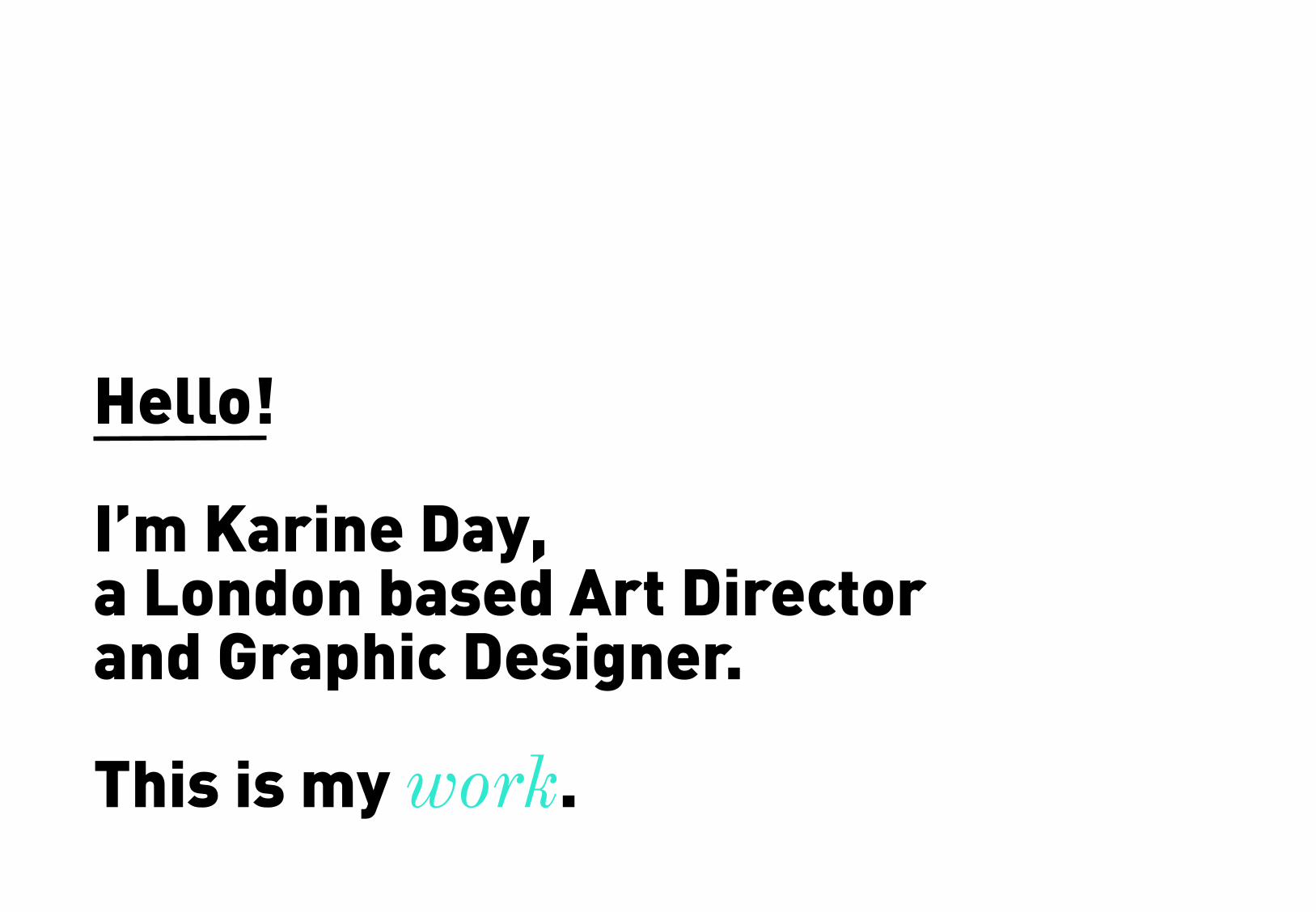
Hello!
I’m Karine Day, a London based Art Director and Graphic Designer. This is my work.

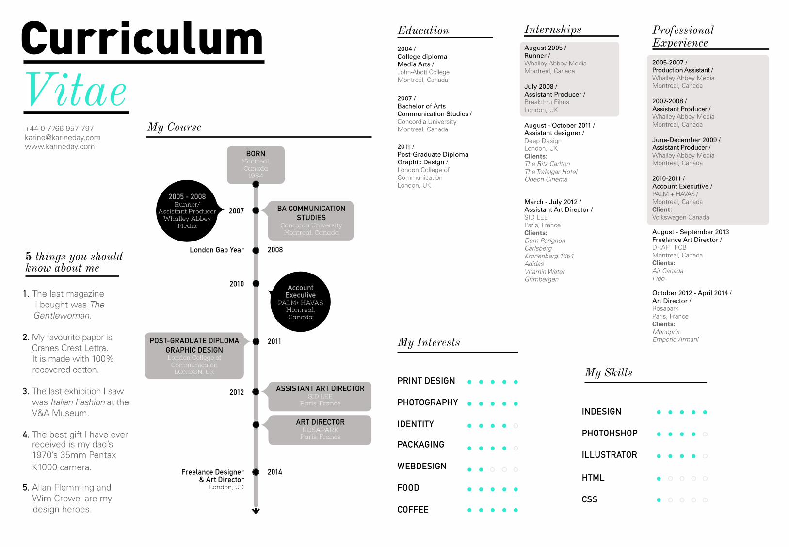
I specialize in editorial, identity and advertising design for all digital and printed medias. I have a working knowledge of print production with strong attention to print materials and effective design processes. My goal is to create beautiful design that serves its purpose, but also visually communicates beyond the brief.
Prior to working as a designer, I worked in television production for over 4 years as a production coordinator and assistant producer.
After I graduated from the London College of Communication in 2011 with a Post-Graduate Diploma in Graphic Design, I moved to Paris where I worked as an Assistant Art Director at Sid Lee and afterwards as Art Director at Rosapark. In April 2014, I re-located to London where I am currently working as a freelance designer.
Karine Day
I like to bake. I love typography and reading spy novels. And I also speak French.
Curriculum Vitae
1. The last magazine I bought was The Gentlewoman.
2. My favourite paper is Cranes Crest Lettra.
It is made with 100% recovered cotton.
3. The last exhibition I saw was Italian Fashion at the V&A Museum.
4. The best gift I have ever received is my dad’s 1970’s 35mm Pentax K1000 camera.
5. Allan Flemming and Wim Crowel are my design heroes.
PRINT DESIGN
PHOTOGRAPHY
IDENTITY
PACKAGING
WEBDESIGN
FOOD
COFFEE
5 things you should know about me
My Course
My Interests
2004 /College diploma Media Arts /John-Abott College Montreal, Canada
2007 /Bachelor of ArtsCommunication Studies / Concordia University Montreal, Canada
2011 /Post-Graduate DiplomaGraphic Design /London College of Communication London, UK
EducationAugust 2005 /Runner /Whalley Abbey Media Montreal, Canada
July 2008 /Assistant Producer /Breakthru Films London, UK
August - October 2011 /Assistant designer /Deep Design London, UK Clients: The Ritz CarltonThe Trafalgar Hotel Odeon Cinema
March - July 2012 /Assistant Art Director /SID LEE Paris, France Clients: Dom Pérignon Carlsberg Kronenberg 1664 Adidas Vitamin WaterGrimbergen
Internships
2005-2007 /Production Assistant /Whalley Abbey Media Montreal, Canada
2007-2008 /Assistant Producer /Whalley Abbey Media Montreal, Canada
June-December 2009 /Assistant Producer /Whalley Abbey Media Montreal, Canada
2010-2011 /Account Executive /PALM + HAVAS /Montreal, CanadaClient: Volkswagen Canada
August - September 2013Freelance Art Director /DRAFT FCB Montreal, Canada Clients: Air CanadaFido
October 2012 - April 2014 /Art Director /Rosapark Paris, France Clients: MonoprixEmporio Armani
ProfessionalExperience
+44 0 7766 957 [email protected]
BORNMontreal,Canada
1984
BA COMMUNICATION STUDIES
Concorda UniversityMontreal, Canada
ASSISTANT ART DIRECTORSID LEE
Paris, France
ART DIRECTORROSAPARK
Paris, France
POST-GRADUATE DIPLOMAGRAPHIC DESIGNLondon College of
CommunicaionLONDON, UK
2005 - 2008Runner/
Assistant ProducerWhalley Abbey
Media
Account Executive
PALM+ HAVASMontreal, Canada
2007
2012
London Gap Year
Freelance Designer & Art Director
London, UK
2010
2008
2011
2014
INDESIGN
PHOTOHSHOP
ILLUSTRATOR
HTML
CSS
My Skills

Client:Monoprix

Monoprix / Le quotidien a du bon
Agency: RosaparkCreative Director: Mathilde Carpentier Senior Art Director: Stéphane FiauArt Director: Karine DayPhotographer: Nathalie CarnetFood Stylist & Writer: Catherine Moreau
--
Overview
Every week, Monoprix publishes “Le Quotidien A Du Bon”; a food supplement magazine highlighting fresh produce from local suppliers. Every issue has a feature on a fresh produce group, whilst presenting recipe ideas.
My role consists in the visual conception of the cover, main double spread, and other special featured recipes. I work closely with the food stylist and photographer in executing/approving the artwork. Once the artwork has been implemented in the layout, I perform any general editorial upkeep until files are sent to printers.


Monoprix / Food Newsletter
Agency: RosaparkCreative Director: Mathilde CarpentierArt Director: Karine Day Photographer/food stylist: Cyrielle Thomas
--
Overview
Monoprix’s monthy e-cuisine newsletter introduces inspiring recipes & up and coming food trends.
My role consisted in creating a main visual for the newsletter’s highlighted recipe. Once the concept is sold, I then work closely with the food photographer/ food stylist in executing/approving the artwork. In the final stages, the newsleter is taylored within brand guidelines according to the artwork, editorial content and featured products.


Monoprix / Brazil 2014 Campaign
Agency: RosaparkCreative Director: Mathilde Carpentier Art Directors: Karine Day, Caroline GoutalCopywiter: Lucile Briotet
--
Overview
In light of the 2014 World Cup, the brief was to create a key visual to promote Monoprix’s Brazil-inspired fashion and home decoration collection. The creative aim was to focus on the cultural, artistic and visual side of Brazil.
My role involved in working closely with a Copywriter and Art Director in the creative conception of the artwork and slogan. I then took charge in finding and briefing potential Illustrators and Touch-up Studios for the artwork execution.
This concept was initially bought by Monoprix, but the brief changed once the final Brazil collection was revealed.
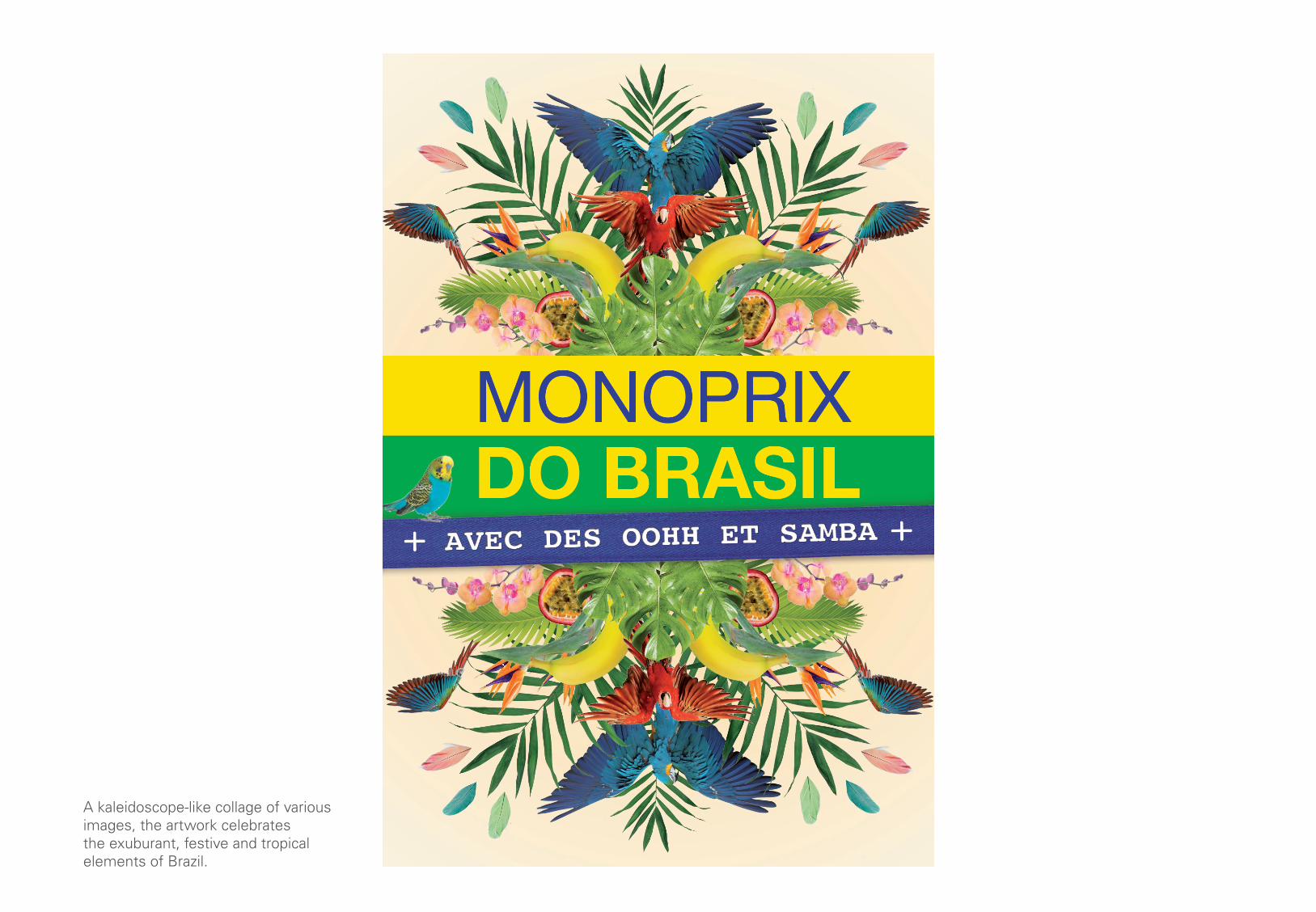
A kaleidoscope-like collage of various images, the artwork celebrates the exuburant, festive and tropical elements of Brazil.


Client:Air Canada

Air Canada / Altitude Booklet
Agency: Draftfcb- MontrealCreative Director: Anne-Marie BlouinArt Director: Karine Day, Caroline HamelPaper supplier: Spicers Canada
--
Overview
Air Canada’s Altitude booklet informs new members of the benefits and details of the program.
While the main identiy had already been conveived by Caroline Hamel, I came along a bit later in the project to create the editorial layouts and manage the general print production side of the project.


Client:Dom Pérignon
TREBOR WILSON
ALEXANDRETALPSED
LANG LANG
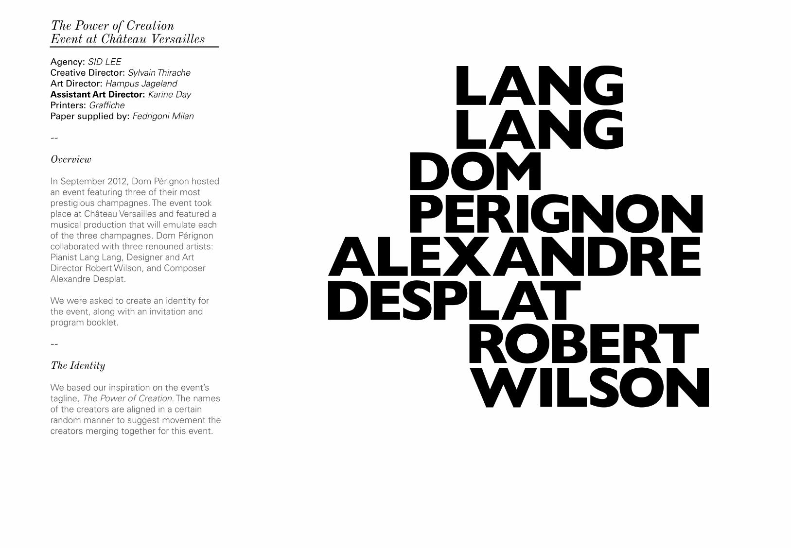
The Power of CreationEvent at Château Versailles
Agency: SID LEECreative Director: Sylvain ThiracheArt Director: Hampus JagelandAssistant Art Director: Karine DayPrinters: GraffichePaper supplied by: Fedrigoni Milan
--
Overview
In September 2012, Dom Pérignon hosted an event featuring three of their most prestigious champagnes. The event took place at Château Versailles and featured a musical production that will emulate each of the three champagnes. Dom Pérignon collaborated with three renouned artists: Pianist Lang Lang, Designer and Art Director Robert Wilson, and Composer Alexandre Desplat.
We were asked to create an identity for the event, along with an invitation and program booklet.
--
The Identity
We based our inspiration on the event’s tagline, The Power of Creation. The names of the creators are aligned in a certain random manner to suggest movement the creators merging together for this event.
--
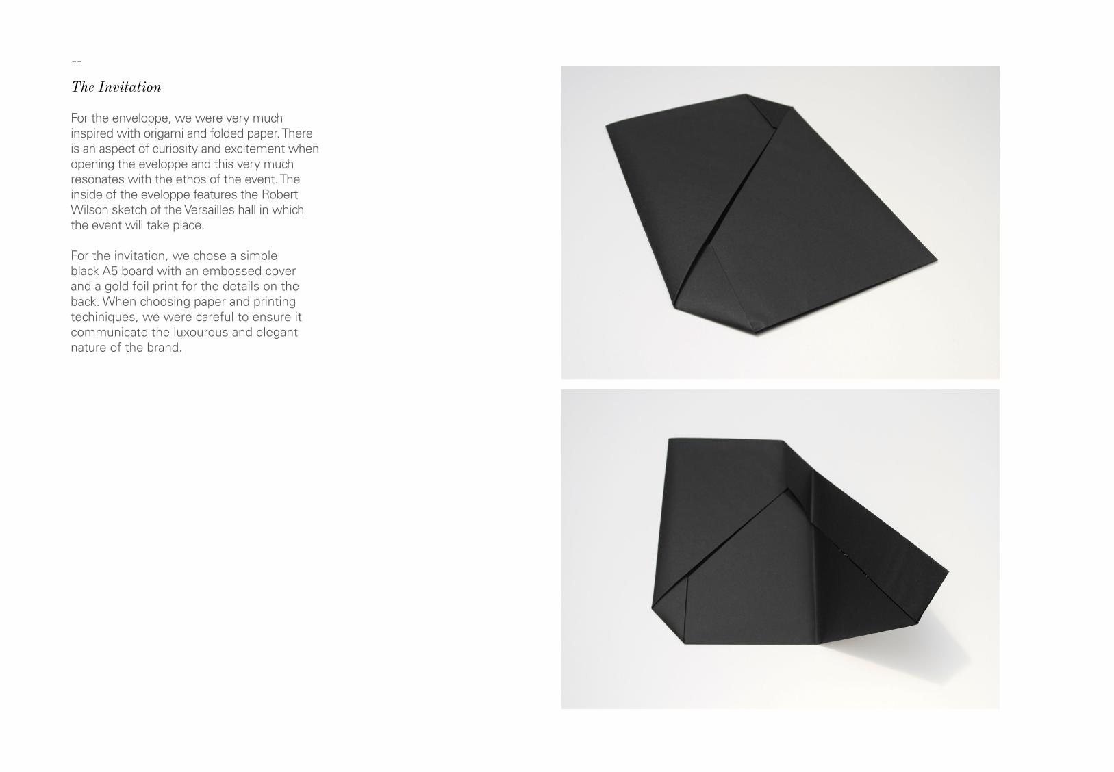
The Invitation
For the enveloppe, we were very much inspired with origami and folded paper. There is an aspect of curiosity and excitement when opening the eveloppe and this very much resonates with the ethos of the event. The inside of the eveloppe features the Robert Wilson sketch of the Versailles hall in which the event will take place.
For the invitation, we chose a simple black A5 board with an embossed cover and a gold foil print for the details on the back. When choosing paper and printing techiniques, we were careful to ensure it communicate the luxourous and elegant nature of the brand.


--
The Program Booklet
The client requested the program to have similar attributes to an Opera program, which meant there would be a lot of editorial content. With only 500 copies to print in both French and English, this project requested a lot of research in print, paper and binding processes to we could make this program as luxiorious as we could, all while within budget constraints.
The layout is to work in conjuction with the event’s very swiss-like identity and consistent to the invitation sent. We opted to go for an embossed cover and gold foil-printing for the logo.
As for the paper, we chose a cover paper that was soft, almost rubber-like (Ispira black). It gives it that luxiourious touch where you can’t help but want to feel the texture. Singer sewn with black thread, we opted for a crafty, hand-made feel.


London College of CommunicationStudent work

Printers: F.E. Burman & The Newspaper ClubPaper supplied by: G.F. Smith
--
Overview
Final project for Post Graduate Diploma at the London College of Communication.
The goal of the Stitch awareness pack is to generate a change of attitude and behaviour towards clothing care. While fast fashion machine continues to expand, there is a growing need to slow it down and extending the life-cycle of our clothes. Reversing quantity for quality.
The pack includes a newspaper publication and a Stitch Kit. These would potentially be distributed to customers at participating shops and organizations in London.
The Stitch identity was created by digitally stitching the Bodoni typeface. An extensive research on sustainable papers was conducted to mark the ethos of the project. Thesis publication is printed on 100% recovered cotton (Cranes Crest Letra). The Stitch Kit is printed on specialty brew paper from made with malt, yeast and hops leftovers from brewing, recycled beer labels and totally chlorine free pulp (Gmund de Bier).
Stitch Campaign / Final ProjectLondon College of Communication

Printers: F.E. Burman Paper supplied by: G.F. Smith
--
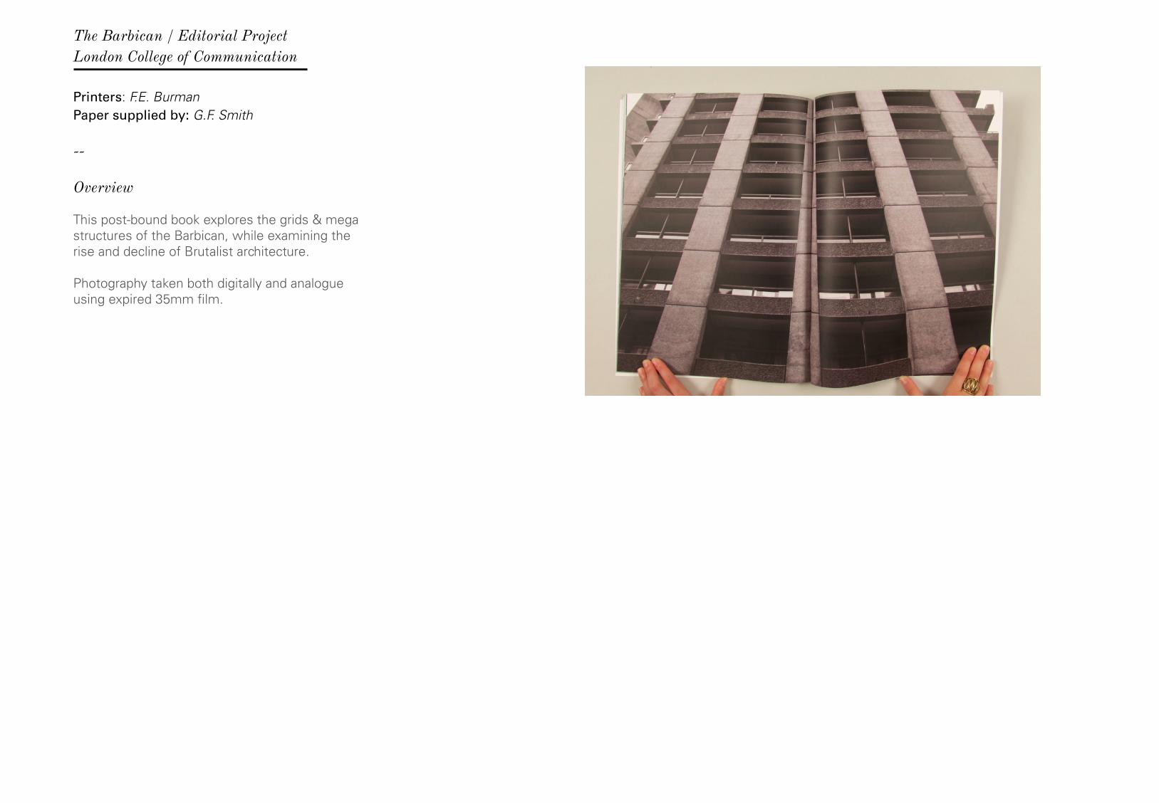
Overview
This post-bound book explores the grids & mega structures of the Barbican, while examining the rise and decline of Brutalist architecture. Photography taken both digitally and analogue using expired 35mm film.
The Barbican / Editorial ProjectLondon College of Communication


Printers: F.E. Burman Paper supplied by: G.F. Smith
--
Overview
Eight A5 promotional cards for GF Smith’s Colorplan paper series, based on colour theory. Each card is to feature primary, secondary, complementary, tertiary. juxtaposition, analogous, receding and advancing colours.
I found inspiration from the Montreal 1976 Olympic posters which featured cylindrical shapes as patterns.
1. 2.1-2. 1976 Montreal Olympics logos designed by Georges Huel. The logo represents a podium, a running track, and the letter M for Montreal.
G.F. Smith Colour CardsLondon College of Communication

Thank youI look forward to your response.All opinions & observations are welcome and encouraged.
Karine Day
Related Documents