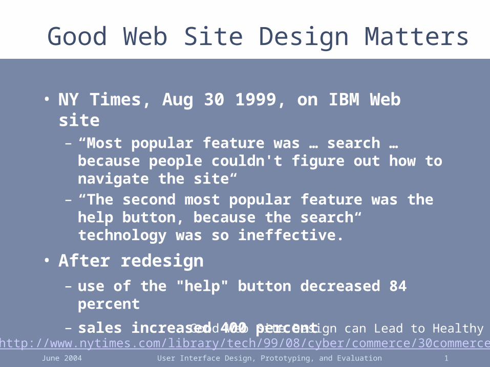
June 2004 User Interface Design, Prototyping, and Evaluation 1 Good Web Site Design Matters Good Web Site Design can Lead to Healthy http://www.nytimes.com/library/tech/99/08/cyber/commerce/30commerce • NY Times, Aug 30 1999, on IBM Web site – “Most popular feature was … search … because people couldn't figure out how to navigate the site“ – “The second most popular feature was the help button, because the search technology was so ineffective.” • After redesign – use of the "help" button decreased 84 percent – sales increased 400 percent

June 2004User Interface Design, Prototyping, and Evaluation1 Good Web Site Design Matters Good Web Site Design can Lead to Healthy Sales .
Jan 11, 2016
Welcome message from author
This document is posted to help you gain knowledge. Please leave a comment to let me know what you think about it! Share it to your friends and learn new things together.
Transcript
June 2004 User Interface Design, Prototyping, and Evaluation 1
Good Web Site Design Matters
Good Web Site Design can Lead to Healthy Saleshttp://www.nytimes.com/library/tech/99/08/cyber/commerce/30commerce.html
• NY Times, Aug 30 1999, on IBM Web site– “Most popular feature was … search …
because people couldn't figure out how to navigate the site“
– “The second most popular feature was the help button, because the search technology was so ineffective.”
• After redesign– use of the "help" button decreased 84 percent
– sales increased 400 percent
June 2004 User Interface Design, Prototyping, and Evaluation 2
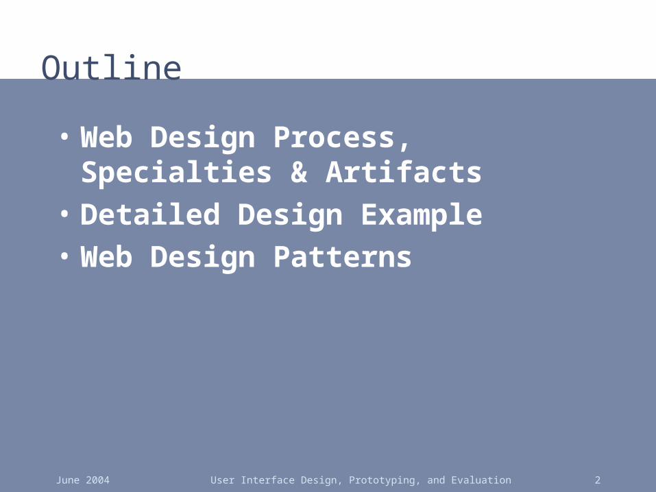
Outline
• Web Design Process, Specialties & Artifacts
• Detailed Design Example
• Web Design Patterns
June 2004 User Interface Design, Prototyping, and Evaluation 3
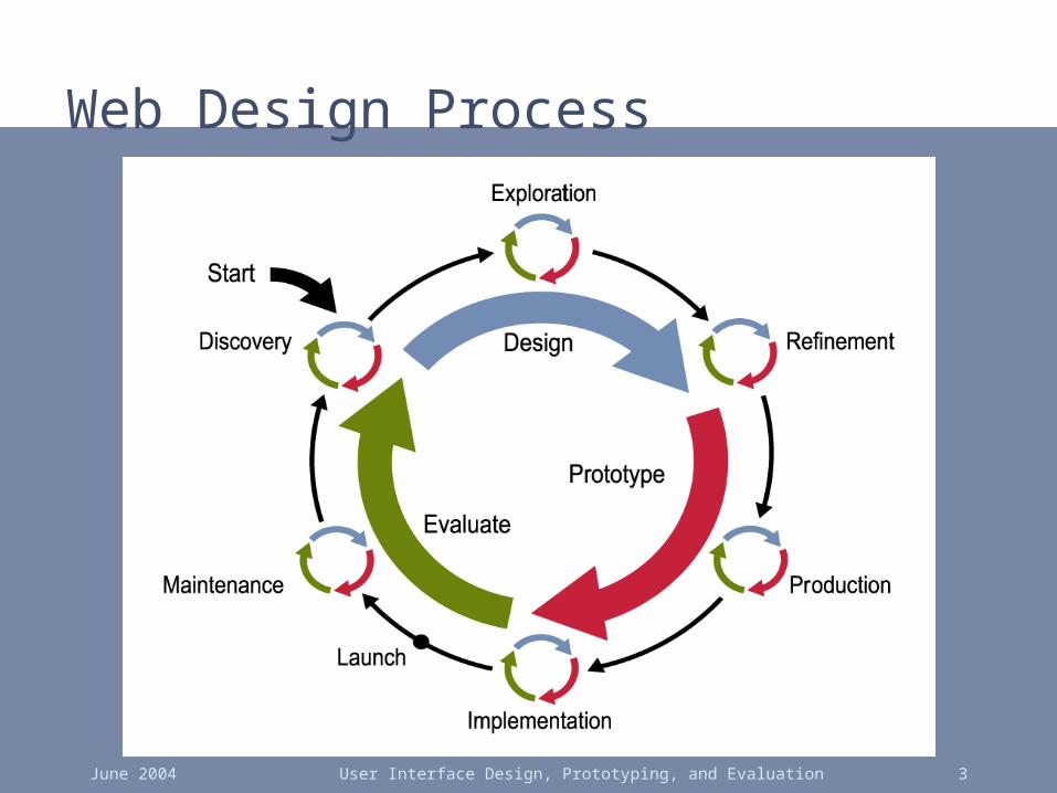
Web Design Process

June 2004 User Interface Design, Prototyping, and Evaluation 4
Design Specialties
• Information Architecture– encompasses
information & navigation design
• User Interface Design– also includes
testing & evaluation
Information Architecture
User InterfaceDesign
Information Design
Navigation Design
Graphic Design
Usability Evaluation
June 2004 User Interface Design, Prototyping, and Evaluation 5
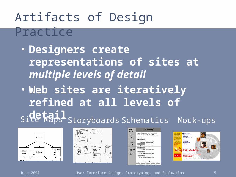
Artifacts of Design Practice
• Designers create representations of sites at multiple levels of detail
• Web sites are iteratively refined at all levels of detail
Site Maps Storyboards Schematics Mock-ups
June 2004 User Interface Design, Prototyping, and Evaluation 6
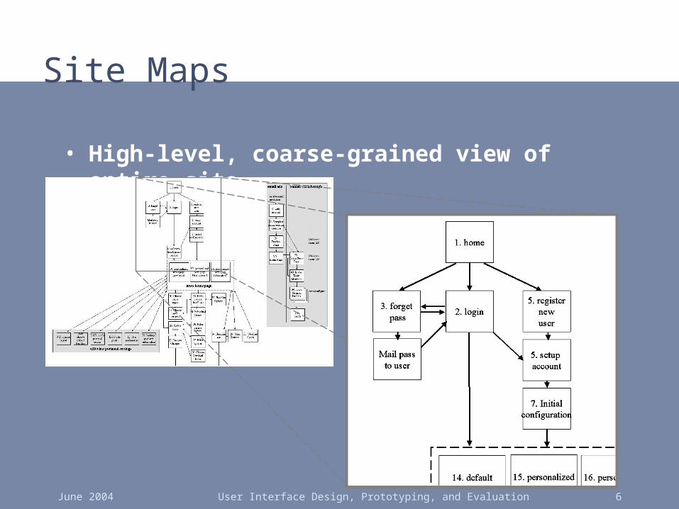
Site Maps
• High-level, coarse-grained view of entire site
June 2004 User Interface Design, Prototyping, and Evaluation 7
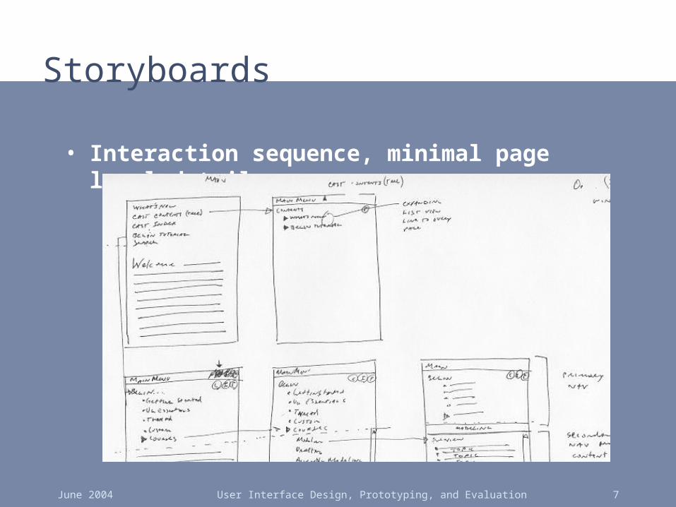
Storyboards
• Interaction sequence, minimal page level detail

June 2004 User Interface Design, Prototyping, and Evaluation 8
Schematics
• Page structure w/ respect to information & navigation
June 2004 User Interface Design, Prototyping, and Evaluation 9
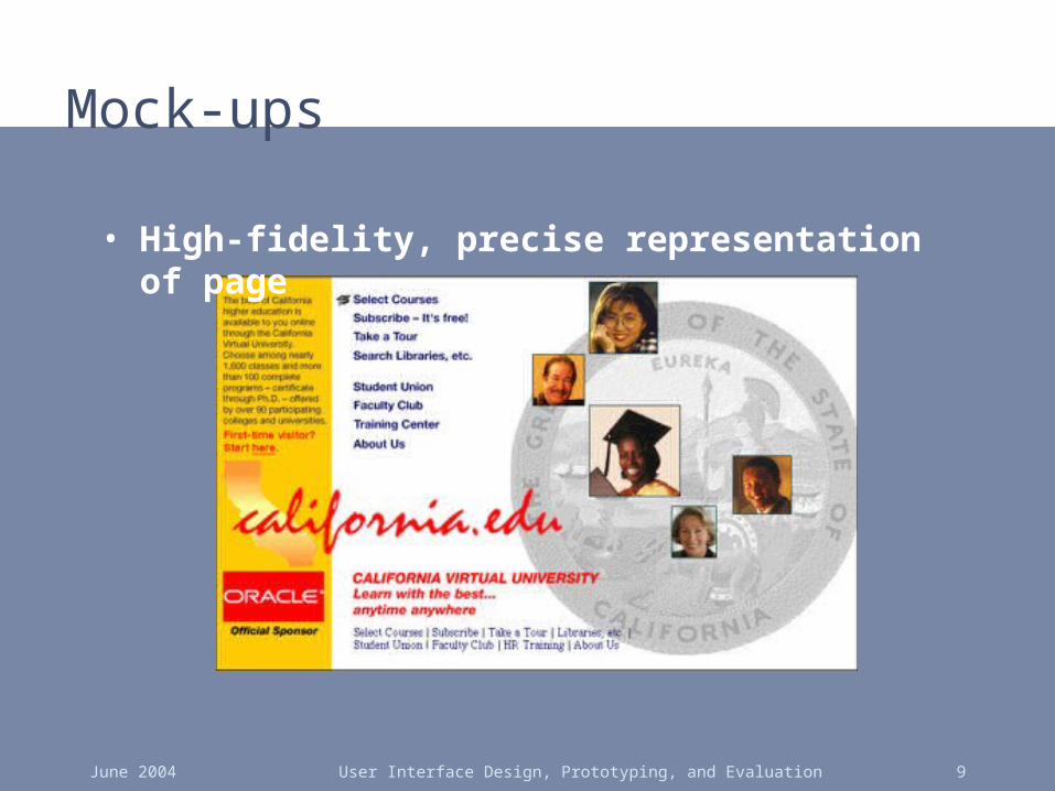
Mock-ups
• High-fidelity, precise representation of page
June 2004 User Interface Design, Prototyping, and Evaluation 10
1

June 2004 User Interface Design, Prototyping, and Evaluation 11
2

June 2004 User Interface Design, Prototyping, and Evaluation 12
3

June 2004 User Interface Design, Prototyping, and Evaluation 13
4
June 2004 User Interface Design, Prototyping, and Evaluation 14
5

June 2004 User Interface Design, Prototyping, and Evaluation 15
Quick-Flow Checkouts6

June 2004 User Interface Design, Prototyping, and Evaluation 16
Basic Web Design
• Let's take a closer look page by page
June 2004 User Interface Design, Prototyping, and Evaluation 17
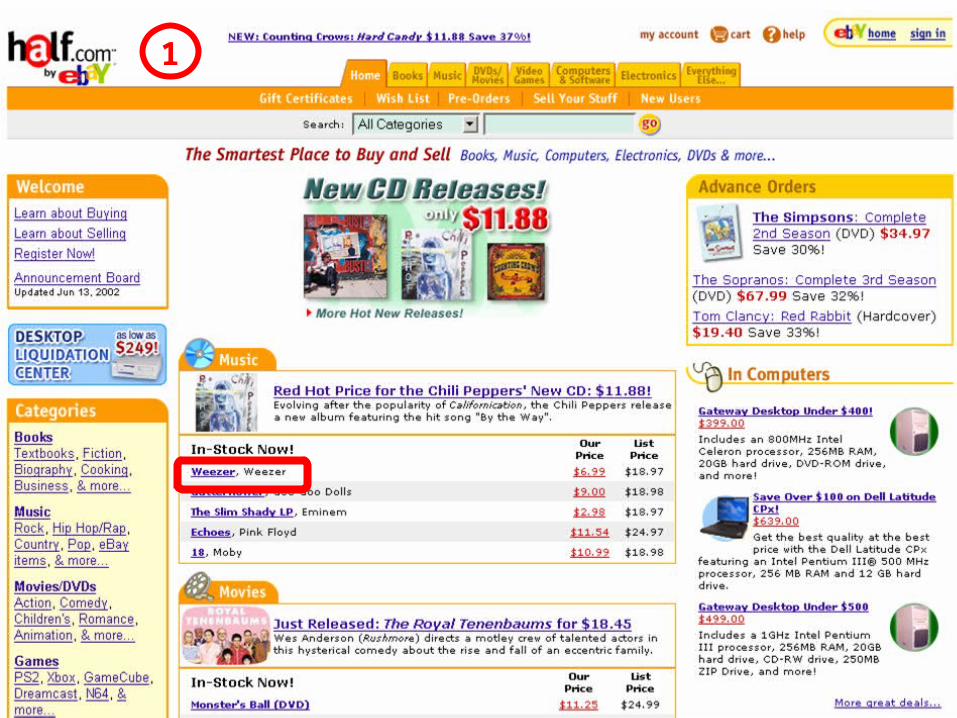
1
June 2004 User Interface Design, Prototyping, and Evaluation 18
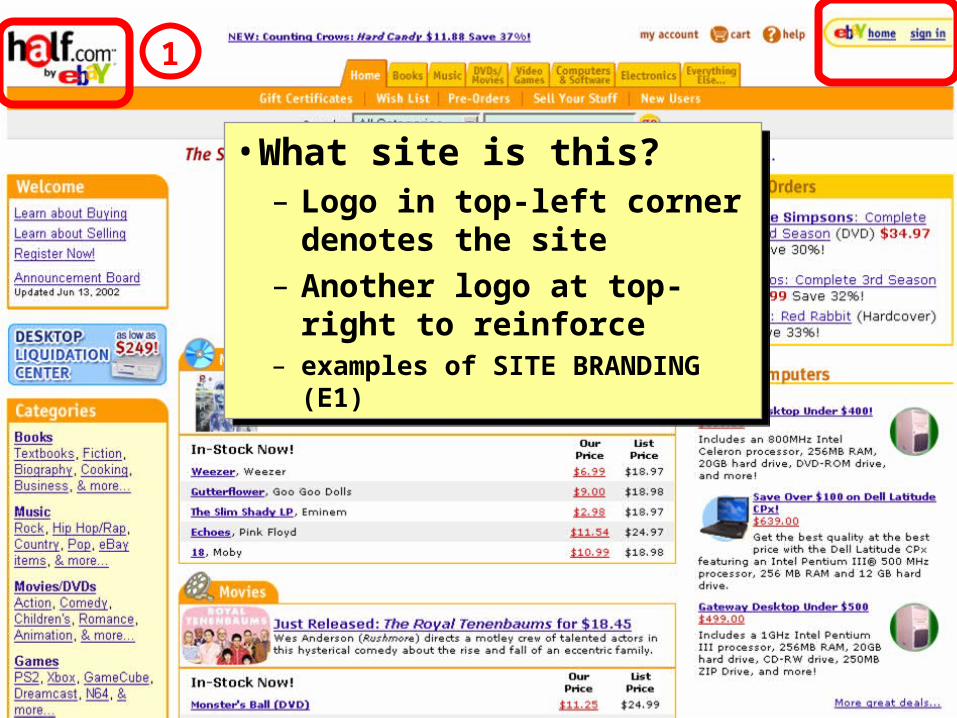
• What site is this?– Logo in top-left corner
denotes the site– Another logo at top-right to
reinforce– examples of SITE BRANDING (E1)
• What site is this?– Logo in top-left corner
denotes the site– Another logo at top-right to
reinforce– examples of SITE BRANDING (E1)
1

June 2004 User Interface Design, Prototyping, and Evaluation 19
• What kind of site is this?– Shopping cart icon– Tab row content– Categories on left– Prices in content area– example of PERSONAL E-
COMMERCE (A1)
• What kind of site is this?– Shopping cart icon– Tab row content– Categories on left– Prices in content area– example of PERSONAL E-
COMMERCE (A1)
1

June 2004 User Interface Design, Prototyping, and Evaluation 20
• What can I do here?– Welcome for new visitors– Tab row / Search on top– “Categories”– Prices– Examples of OBVIOUS LINKS (K10)
• What can I do here?– Welcome for new visitors– Tab row / Search on top– “Categories”– Prices– Examples of OBVIOUS LINKS (K10)
1

June 2004 User Interface Design, Prototyping, and Evaluation 21
• Most important info visible without scrolling
• ABOVE THE FOLD (I2)
• Most important info visible without scrolling
• ABOVE THE FOLD (I2)
1
June 2004 User Interface Design, Prototyping, and Evaluation 22
2
June 2004 User Interface Design, Prototyping, and Evaluation 23
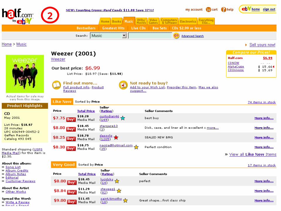
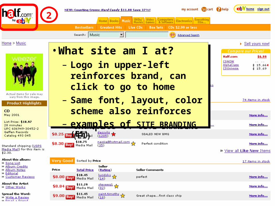
• What site am I at?– Logo in upper-left reinforces
brand, can click to go to home– Same font, layout, color
scheme also reinforces– examples of SITE BRANDING (E1)
• What site am I at?– Logo in upper-left reinforces
brand, can click to go to home– Same font, layout, color
scheme also reinforces– examples of SITE BRANDING (E1)
2

June 2004 User Interface Design, Prototyping, and Evaluation 24
• Where am I in the site?– “Home > Music” are
LOCATION BREAD CRUMBS (K6)
– TAB ROW (K3) says “Music”– Album cover, “Product
Highlights”, and CD cover
• Where am I in the site?– “Home > Music” are
LOCATION BREAD CRUMBS (K6)
– TAB ROW (K3) says “Music”– Album cover, “Product
Highlights”, and CD cover
2

June 2004 User Interface Design, Prototyping, and Evaluation 25
• Can I trust these sellers? – Who am I buying from?– Are they reputable?– What about shipping?
• Can I trust these sellers? – Who am I buying from?– Are they reputable?– What about shipping?
2

June 2004 User Interface Design, Prototyping, and Evaluation 26
• The Fold– Hmm, what’s below here?
• The Fold– Hmm, what’s below here?
2
June 2004 User Interface Design, Prototyping, and Evaluation 27
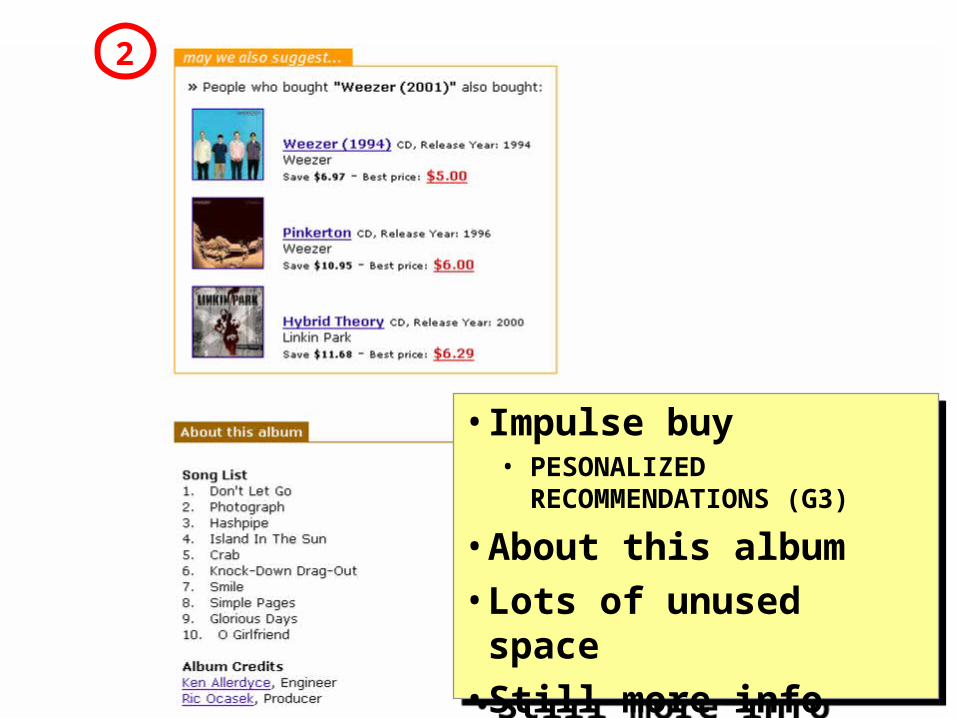
• Impulse buy• PESONALIZED
RECOMMENDATIONS (G3)
• About this album• Lots of unused space• Still more info below…
• Impulse buy• PESONALIZED
RECOMMENDATIONS (G3)
• About this album• Lots of unused space• Still more info below…
2
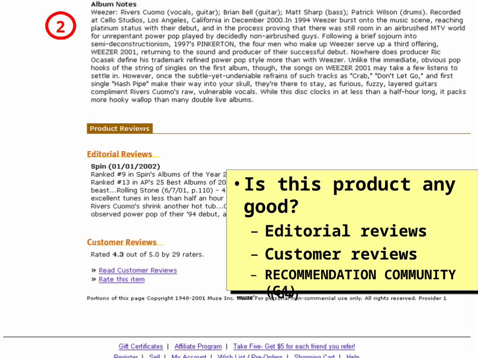
June 2004 User Interface Design, Prototyping, and Evaluation 28
• Is this product any good?– Editorial reviews– Customer reviews– RECOMMENDATION
COMMUNITY (G4)
• Is this product any good?– Editorial reviews– Customer reviews– RECOMMENDATION
COMMUNITY (G4)
2
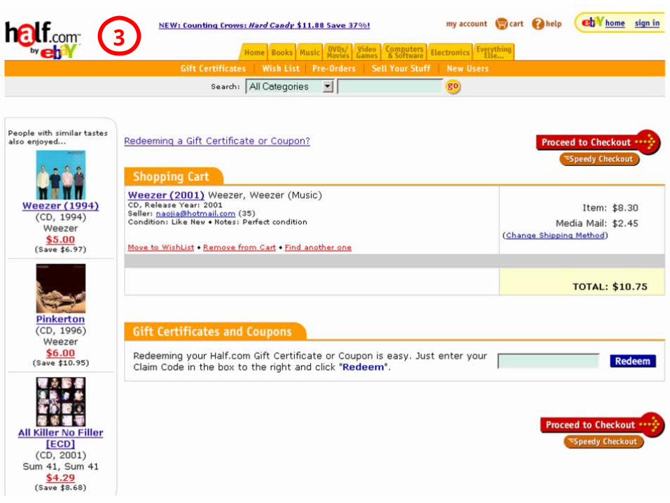
June 2004 User Interface Design, Prototyping, and Evaluation 29
3
June 2004 User Interface Design, Prototyping, and Evaluation 30
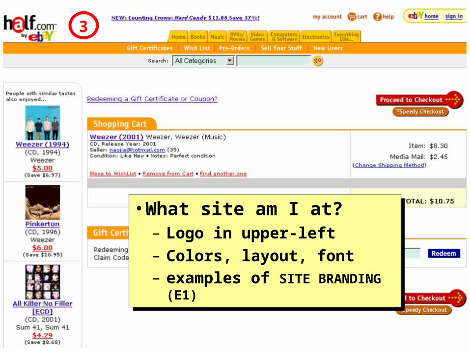
• What site am I at? – Logo in upper-left– Colors, layout, font– examples of SITE BRANDING (E1)
• What site am I at? – Logo in upper-left– Colors, layout, font– examples of SITE BRANDING (E1)
3
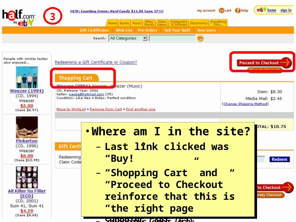
June 2004 User Interface Design, Prototyping, and Evaluation 31
• Where am I in the site?– Last link clicked was “Buy!”– “Shopping Cart” and “Proceed
to Checkout” reinforce that this is “the right page”
– SHOPPING CART (F3)
• Where am I in the site?– Last link clicked was “Buy!”– “Shopping Cart” and “Proceed
to Checkout” reinforce that this is “the right page”
– SHOPPING CART (F3)
3
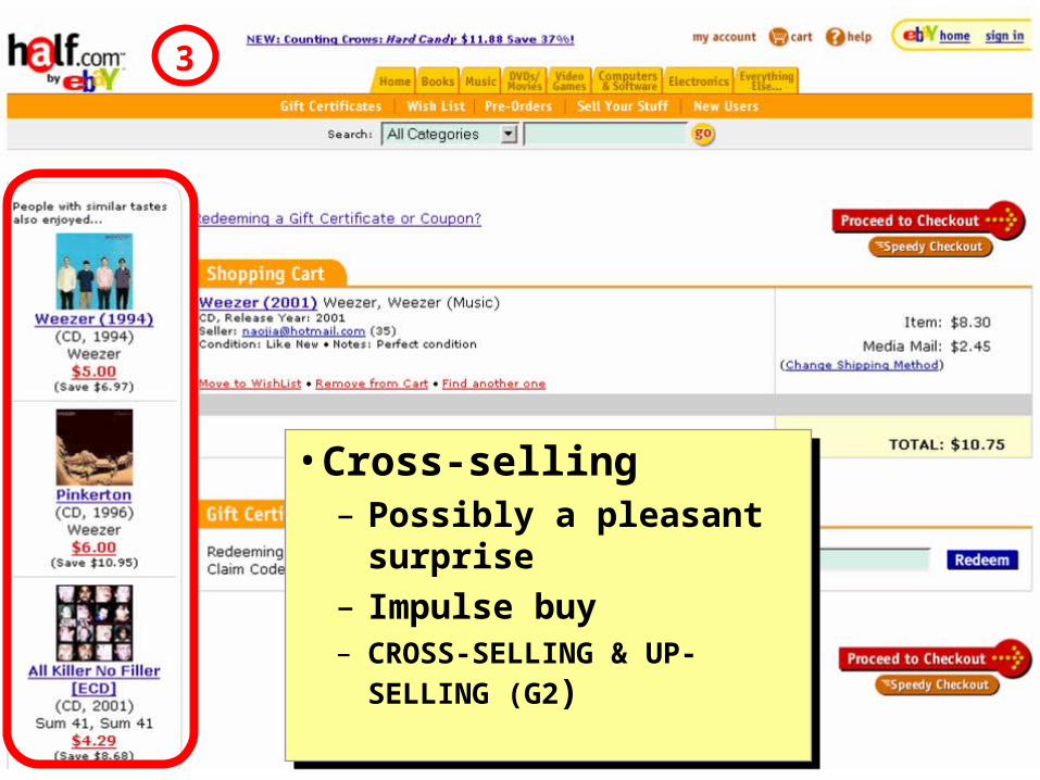
June 2004 User Interface Design, Prototyping, and Evaluation 32
• Cross-selling– Possibly a pleasant
surprise– Impulse buy– CROSS-SELLING & UP-
SELLING (G2)
• Cross-selling– Possibly a pleasant
surprise– Impulse buy– CROSS-SELLING & UP-
SELLING (G2)
3

June 2004 User Interface Design, Prototyping, and Evaluation 33
• What am I going to buy?– Easy to remove– Easy to move to wishlist
• How much will it cost?– Shipping costs there, no
nasty surprises• SHOPPING CART (F3)
• What am I going to buy?– Easy to remove– Easy to move to wishlist
• How much will it cost?– Shipping costs there, no
nasty surprises• SHOPPING CART (F3)
3
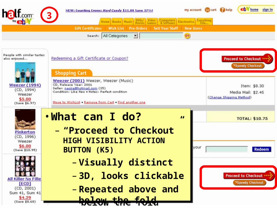
June 2004 User Interface Design, Prototyping, and Evaluation 34
• What can I do?– “Proceed to Checkout” HIGH
VISIBILITY ACTION BUTTON (K5)
– Visually distinct– 3D, looks clickable– Repeated above and
below the fold
• What can I do?– “Proceed to Checkout” HIGH
VISIBILITY ACTION BUTTON (K5)
– Visually distinct– 3D, looks clickable– Repeated above and
below the fold
3

June 2004 User Interface Design, Prototyping, and Evaluation 35
4

June 2004 User Interface Design, Prototyping, and Evaluation 36
• What if I don’t have a User ID?
• What if I forgot my password?
• SIGN-IN/NEW ACCOUNT (H2)
• What if I don’t have a User ID?
• What if I forgot my password?
• SIGN-IN/NEW ACCOUNT (H2)
4
June 2004 User Interface Design, Prototyping, and Evaluation 37
5
June 2004 User Interface Design, Prototyping, and Evaluation 38
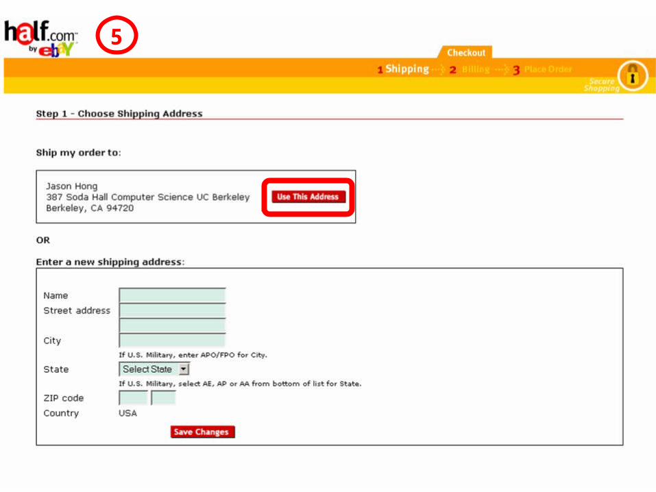
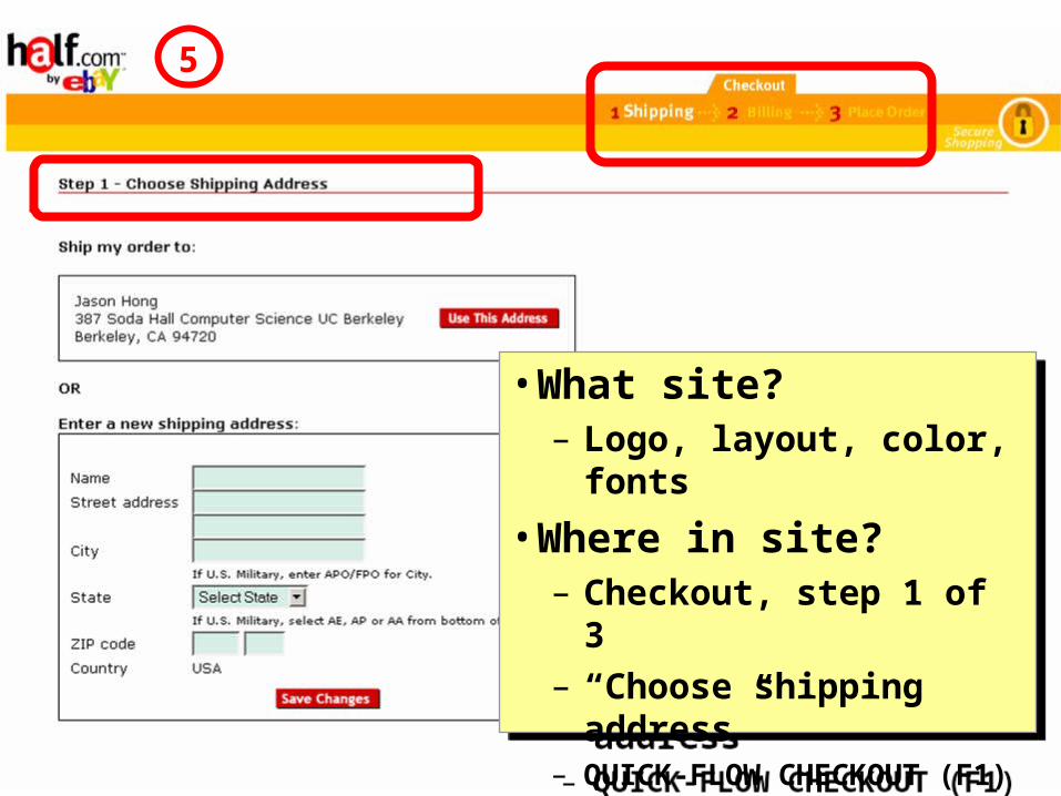
• What site?– Logo, layout, color, fonts
• Where in site?– Checkout, step 1 of 3– “Choose shipping
address”– QUICK-FLOW CHECKOUT (F1)
• What site?– Logo, layout, color, fonts
• Where in site?– Checkout, step 1 of 3– “Choose shipping
address”– QUICK-FLOW CHECKOUT (F1)
5
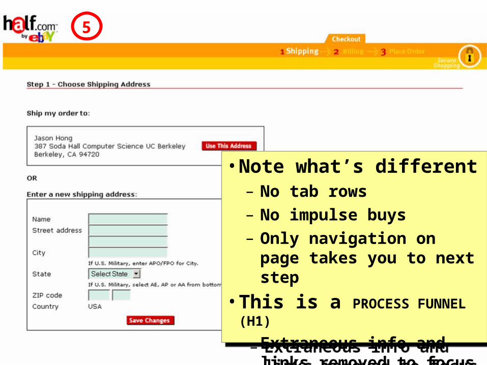
June 2004 User Interface Design, Prototyping, and Evaluation 39
• Note what’s different– No tab rows– No impulse buys– Only navigation on page
takes you to next step
• This is a PROCESS FUNNEL (H1)
– Extraneous info and links removed to focus users
• Note what’s different– No tab rows– No impulse buys– Only navigation on page
takes you to next step
• This is a PROCESS FUNNEL (H1)
– Extraneous info and links removed to focus users
5

June 2004 User Interface Design, Prototyping, and Evaluation 40
Quick-Flow Checkouts6

June 2004 User Interface Design, Prototyping, and Evaluation 41
Quick-Flow Checkouts
• Last step of process– Step 3, “Place Order”– “Place my order” button
• Two HIGH-VISIBILITY ACTION
BUTTONS (K5) for fold
• Last step of process– Step 3, “Place Order”– “Place my order” button
• Two HIGH-VISIBILITY ACTION
BUTTONS (K5) for fold
6
June 2004 User Interface Design, Prototyping, and Evaluation 42
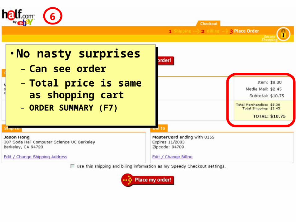
Quick-Flow Checkouts
• No nasty surprises– Can see order– Total price is same as
shopping cart– ORDER SUMMARY (F7)
• No nasty surprises– Can see order– Total price is same as
shopping cart– ORDER SUMMARY (F7)
6

June 2004 User Interface Design, Prototyping, and Evaluation 43
Quick-Flow Checkouts
• Easy to change shipping and billing
• Easy to save this info– Easier to setup info in
context of specific task– Clearer to users why this
info is needed
• Easy to change shipping and billing
• Easy to save this info– Easier to setup info in
context of specific task– Clearer to users why this
info is needed
June 2004 User Interface Design, Prototyping, and Evaluation 44
Outline
• Web Design Process, Specialties & Artifacts
• Detailed Design Example
• Web Design Patterns

June 2004 User Interface Design, Prototyping, and Evaluation 45
Design = Solutions
• Design is about finding solutions
• Unfortunately, designers often reinvent• Hard to know how things were done before• Why things were done a certain way• How to reuse solutions

June 2004 User Interface Design, Prototyping, and Evaluation 46
Design Patterns• Design patterns communicate common design
problems and solutions– First used in architecture [Alexander]
• Ex. How to create a beer hall where people socialize?

June 2004 User Interface Design, Prototyping, and Evaluation 47
Using Design Patterns
• Not too general and not too specific– Use a solution “a million times over, without
ever doing it the same way twice”
• Design patterns are a shared language – for “building and planning towns,
neighborhoods, houses, gardens, & rooms.”– Ex. Beer hall is part of a center for public
life…– Ex. Beer hall needs spaces for groups to be
alone… ALCOVES
June 2004 User Interface Design, Prototyping, and Evaluation 48
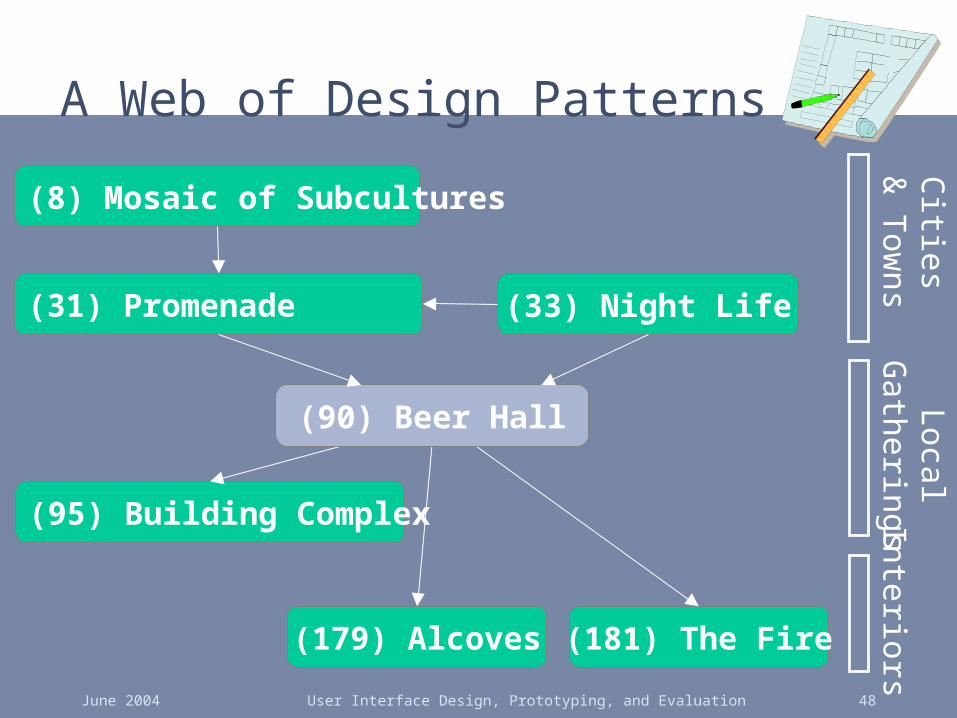
A Web of Design Patterns
(181) The Fire
(8) Mosaic of Subcultures
(179) Alcoves
(95) Building Complex
(33) Night Life(31) Promenade
(90) Beer Hall
Cities
& T
owns
InteriorsLocal
Gatherings
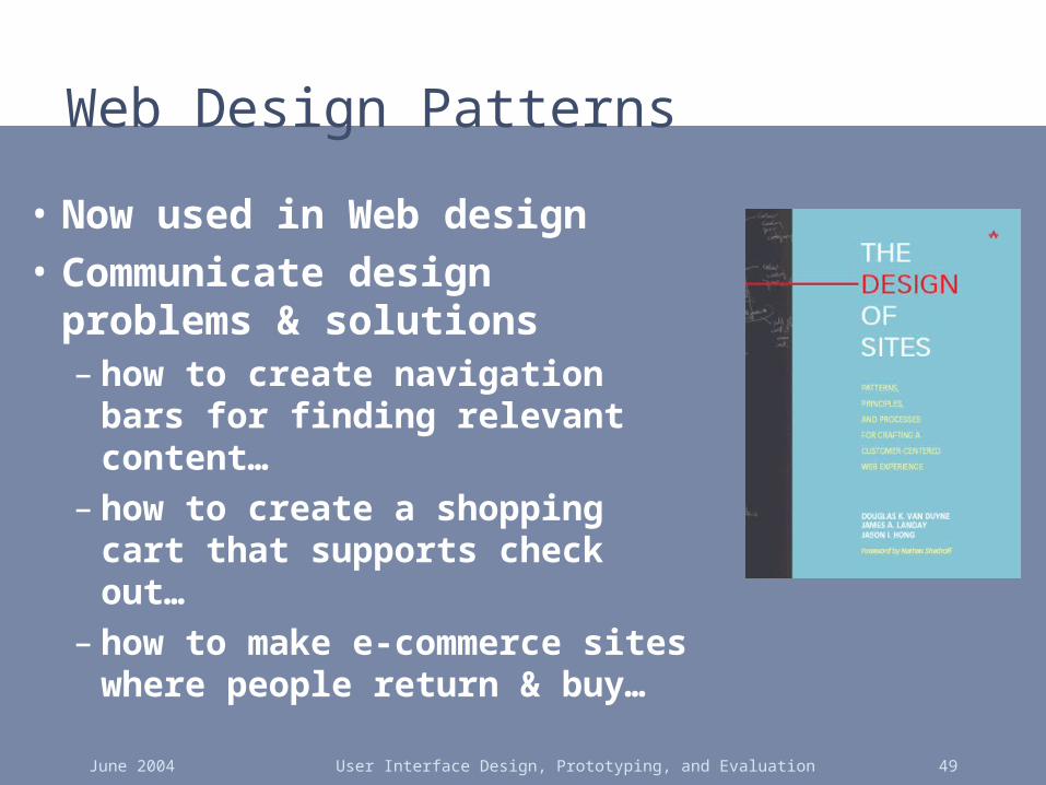
June 2004 User Interface Design, Prototyping, and Evaluation 49
Web Design Patterns
• Now used in Web design
• Communicate design problems & solutions– how to create navigation bars
for finding relevant content…– how to create a shopping cart
that supports check out…– how to make e-commerce
sites where people return & buy…

June 2004 User Interface Design, Prototyping, and Evaluation 50
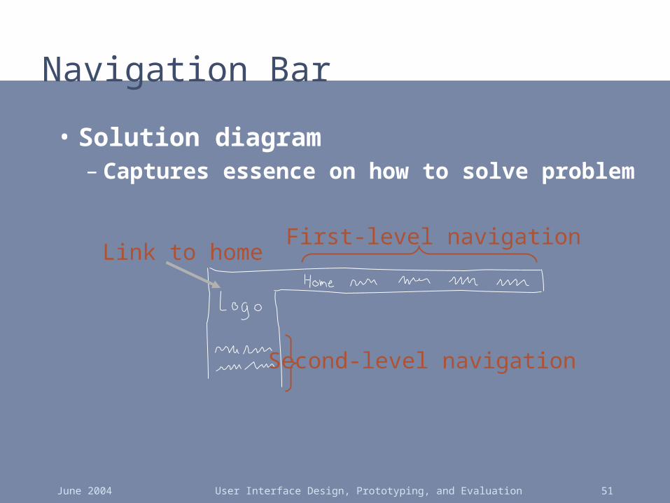
Navigation Bar
• Problem: Customers need a structured, organized way of finding the most important parts of your Web site
June 2004 User Interface Design, Prototyping, and Evaluation 51
Navigation Bar
• Solution diagram– Captures essence on how to solve problem
First-level navigation
Second-level navigation
Link to home
June 2004 User Interface Design, Prototyping, and Evaluation 52
Patterns Support Creativity
• Patterns come from successful examples– sites that are so successful that lots of users are
familiar with their paradigms (e.g., Yahoo)– interaction techniques/metaphors that work well
across many sites (e.g., shopping carts)
• Not too general & not too specific– you need to specialize to your needs
• Patterns let you focus on the hard, unique problems to your design situation– every real design will have many of these

June 2004 User Interface Design, Prototyping, and Evaluation 53
Pattern Groups
Our patterns organized by groupSite genres
Navigational framework
Home page
Content management
Trust and credibility
Basic ecommerce
Advanced ecommerce
Completing tasks
Page layouts
Search
Page-level navigation
Speed
June 2004 User Interface Design, Prototyping, and Evaluation 54
Process Funnel
• Problem: Need a way to help people complete highly specific stepwise tasks– Ex. Create a new account– Ex. Fill out survey forms – Ex. Check out
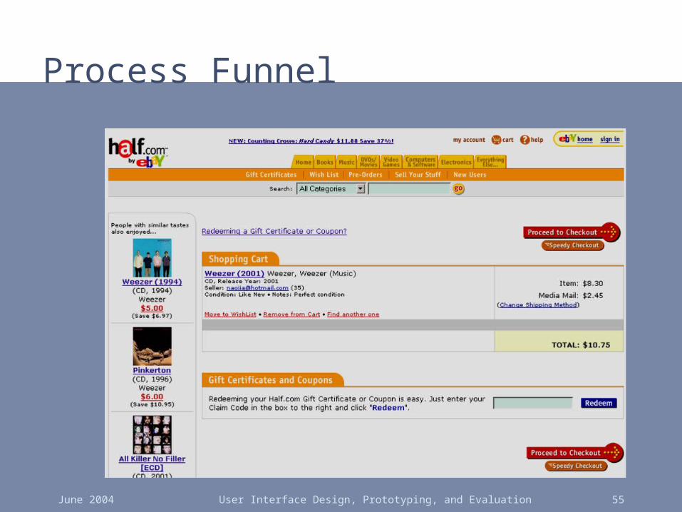
June 2004 User Interface Design, Prototyping, and Evaluation 55
Process Funnel
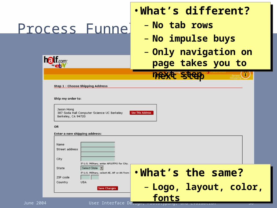
June 2004 User Interface Design, Prototyping, and Evaluation 56
Process Funnel• What’s different?
– No tab rows– No impulse buys– Only navigation on page
takes you to next step
• What’s different?– No tab rows– No impulse buys– Only navigation on page
takes you to next step
• What’s the same?– Logo, layout, color, fonts
• What’s the same?– Logo, layout, color, fonts
June 2004 User Interface Design, Prototyping, and Evaluation 57
Process Funnel
• Problem: What if users need extra help?

June 2004 User Interface Design, Prototyping, and Evaluation 58
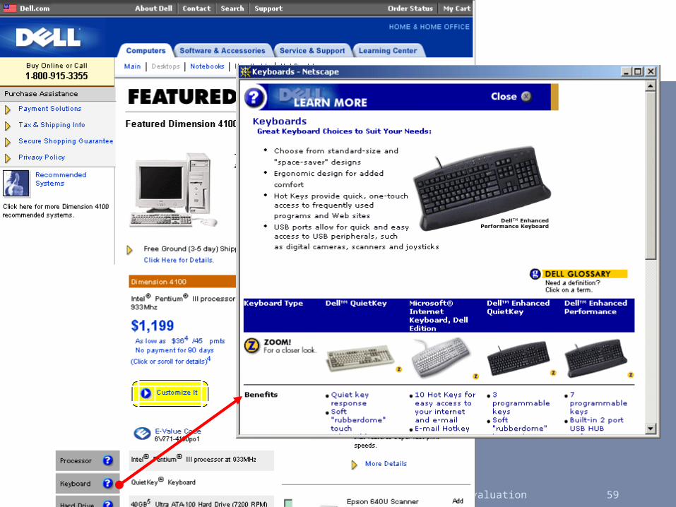
Process Tunnel
June 2004 User Interface Design, Prototyping, and Evaluation 59
June 2004 User Interface Design, Prototyping, and Evaluation 60
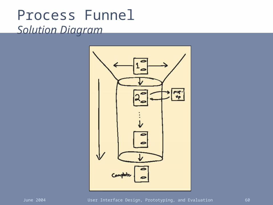
Process FunnelSolution Diagram
June 2004 User Interface Design, Prototyping, and Evaluation 61
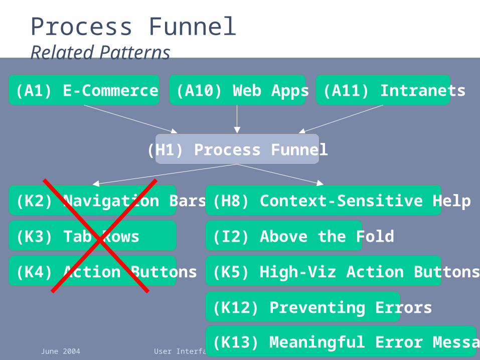
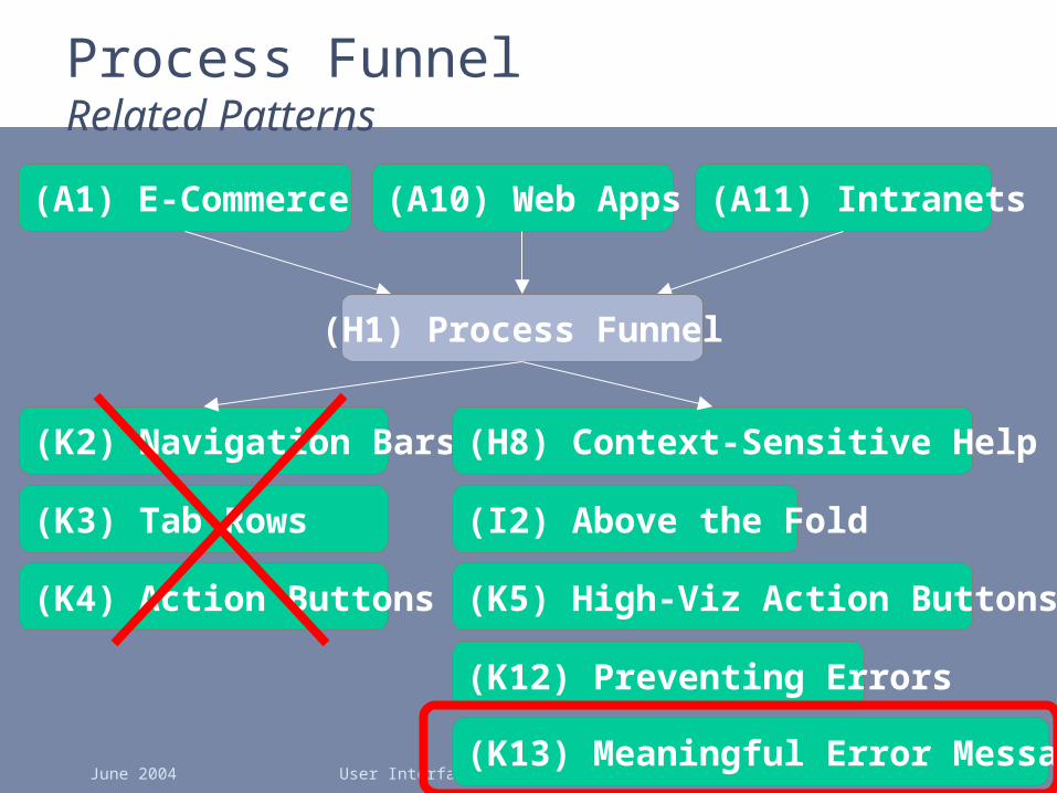
Process FunnelRelated Patterns
(A10) Web Apps
(K5) High-Viz Action Buttons
(A1) E-Commerce (A11) Intranets
(H1) Process Funnel
(K2) Navigation Bars
(K3) Tab Rows
(K4) Action Buttons
(K12) Preventing Errors
(H8) Context-Sensitive Help
(I2) Above the Fold
(K13) Meaningful Error Messages
June 2004 User Interface Design, Prototyping, and Evaluation 62
Patterns Offer the Best of Principles, Guidelines, & Templates
• Patterns help you get the details right, without over-constraining your solution– unlike principles, patterns not too general, so will
apply to your situation– unlike guidelines, patterns discuss tradeoffs,
show good examples, & tie to other patterns– unlike style guides, patterns not too specific, so
can still be specialized – unlike templates, patterns illustrate flows among
different pages
• Patterns can serve as documentation for team-oriented environments
June 2004 User Interface Design, Prototyping, and Evaluation 63
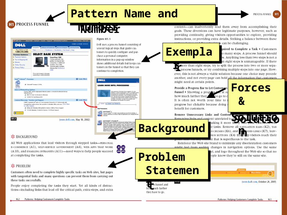
Format of Web Design Patterns
• Pattern Name and Number
• Exemplar
• Background
• Problem
• Forces
• Solution
• Solution Diagram
• Related Patterns
June 2004 User Interface Design, Prototyping, and Evaluation 64
Pattern Name and NumberPattern Name and Number
ExemplarExemplar
BackgroundBackground
Problem Statement
Problem Statement
Forces &
Solution
Forces &
Solution

June 2004 User Interface Design, Prototyping, and Evaluation 65
Bus StopsBus StopsSolution
Diagram
Solution
Diagram
Related
Patterns
Related
Patterns
Solution
Summary
Solution
Summary
June 2004 User Interface Design, Prototyping, and Evaluation 66
Process FunnelRelated Patterns
(A10) Web Apps
(K5) High-Viz Action Buttons
(A1) E-Commerce (A11) Intranets
(H1) Process Funnel
(K2) Navigation Bars
(K3) Tab Rows
(K4) Action Buttons
(K12) Preventing Errors
(H8) Context-Sensitive Help
(I2) Above the Fold
(K13) Meaningful Error Messages
June 2004 User Interface Design, Prototyping, and Evaluation 67
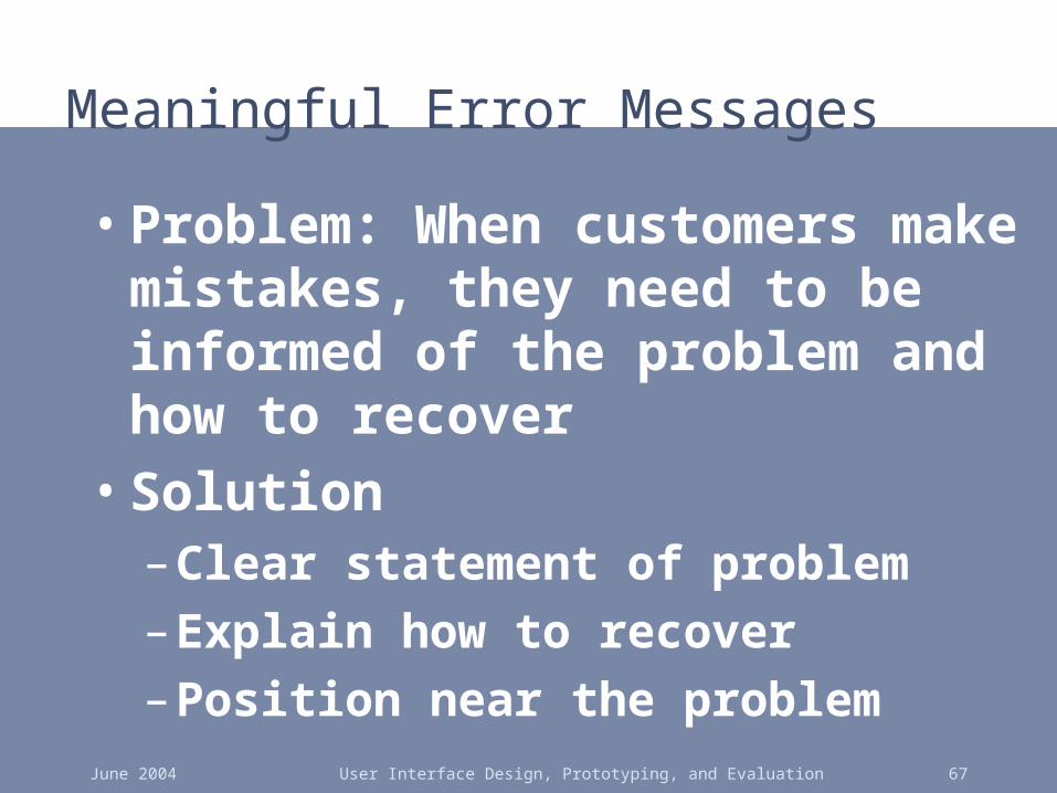
Meaningful Error Messages
• Problem: When customers make mistakes, they need to be informed of the problem and how to recover
• Solution– Clear statement of problem
– Explain how to recover
– Position near the problem

June 2004 User Interface Design, Prototyping, and Evaluation 68
June 2004 User Interface Design, Prototyping, and Evaluation 69
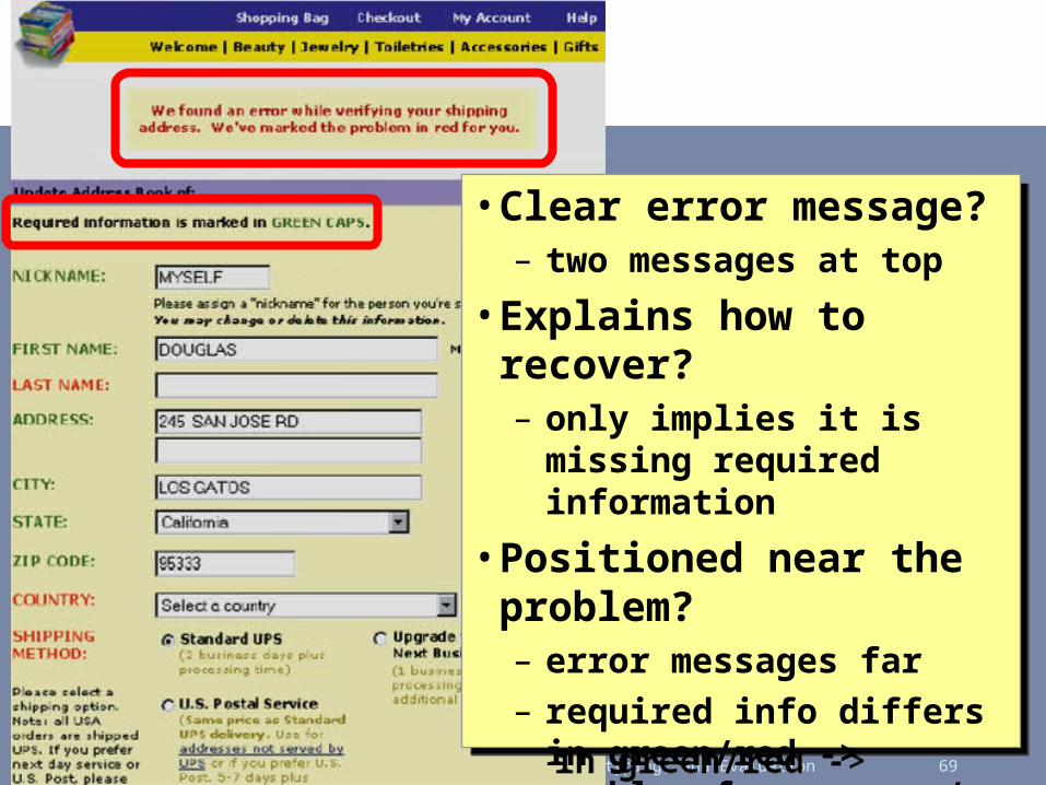
• Clear error message?– two messages at top
• Explains how to recover?– only implies it is missing
required information
• Positioned near the problem?– error messages far– required info differs in
green/red -> problem for users w/ color deficiency
• Clear error message?– two messages at top
• Explains how to recover?– only implies it is missing
required information
• Positioned near the problem?– error messages far– required info differs in
green/red -> problem for users w/ color deficiency

June 2004 User Interface Design, Prototyping, and Evaluation 70

June 2004 User Interface Design, Prototyping, and Evaluation 71
• Clear error message• Explains how to recover• Positioned near the
problem
• Clear error message• Explains how to recover• Positioned near the
problem

June 2004 User Interface Design, Prototyping, and Evaluation 72
Meaningful Error Messages Solution Diagram
June 2004 User Interface Design, Prototyping, and Evaluation 73
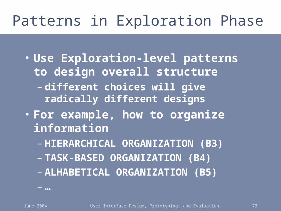
Patterns in Exploration Phase
• Use Exploration-level patterns to design overall structure– different choices will give radically
different designs
• For example, how to organize information– HIERARCHICAL ORGANIZATION (B3)– TASK-BASED ORGANIZATION (B4)– ALHABETICAL ORGANIZATION (B5)– …
June 2004 User Interface Design, Prototyping, and Evaluation 74
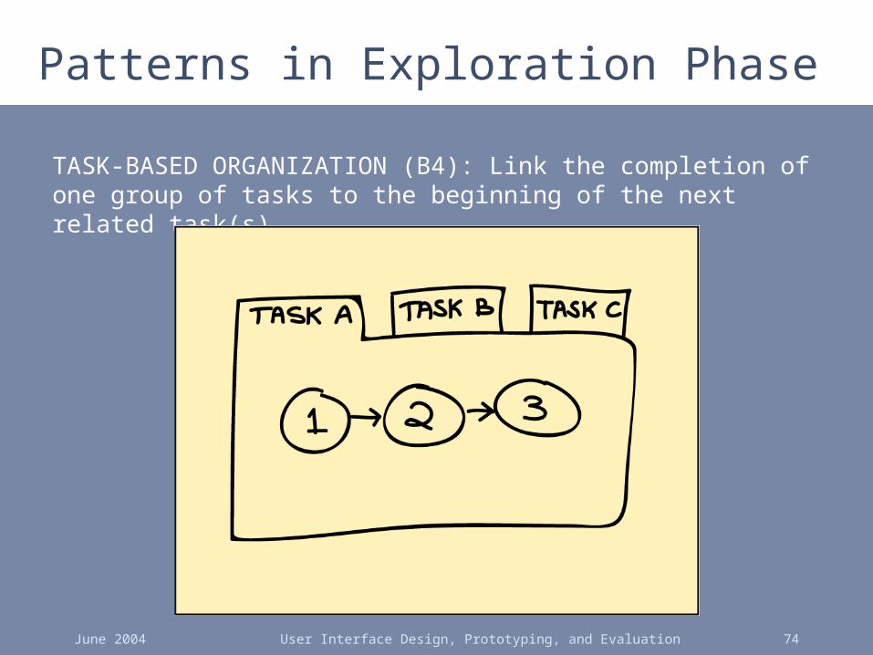
Patterns in Exploration Phase
TASK-BASED ORGANIZATION (B4): Link the completion of one group of tasks to the beginning of the next related task(s)

June 2004 User Interface Design, Prototyping, and Evaluation 75
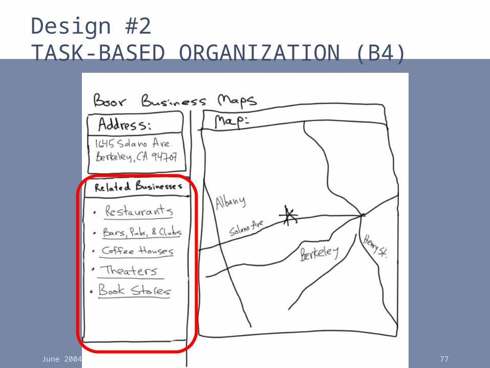
Design Exploration Example
• John given the task of designing a new subsite for showing maps to businesses– listings found by typing in address– key feature: show nearby businesses
• John comes up with two design sketches– Design #1 uses ALPHABETICAL ORGANIZATION
(B5) for list of all nearby businesses– Design #2 uses TASK-BASED ORGANIZATION (B4)
for list of related nearby businesses

June 2004 User Interface Design, Prototyping, and Evaluation 76
Design #1ALPHABETICAL ORGANIZATION (B5)
June 2004 User Interface Design, Prototyping, and Evaluation 77
Design #2TASK-BASED ORGANIZATION (B4)
June 2004 User Interface Design, Prototyping, and Evaluation 78
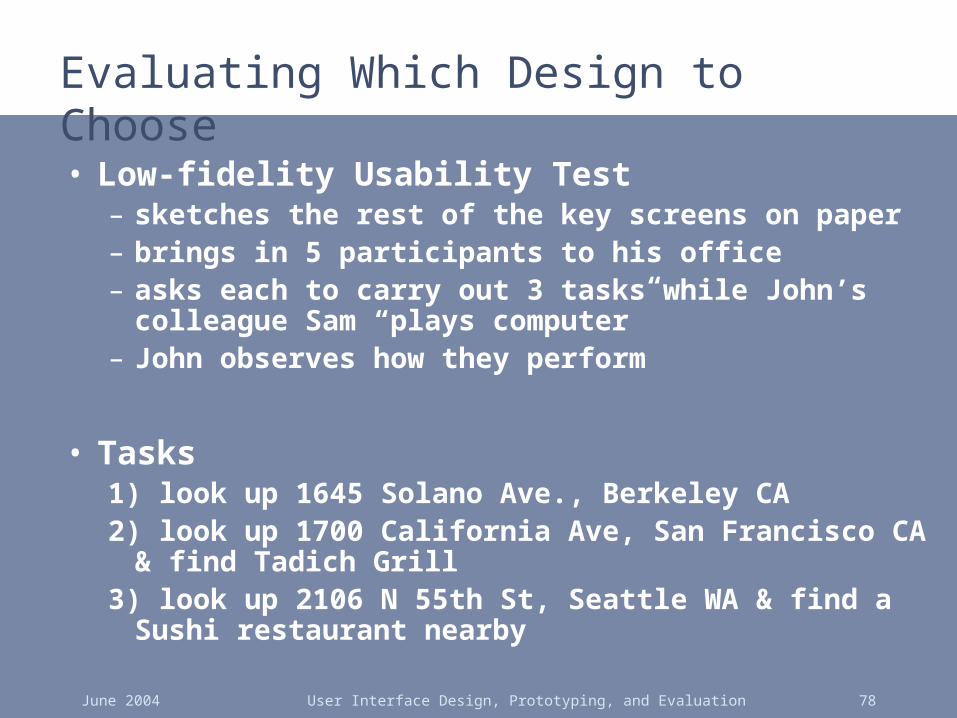
Evaluating Which Design to Choose
• Low-fidelity Usability Test– sketches the rest of the key screens on paper– brings in 5 participants to his office– asks each to carry out 3 tasks while John’s colleague
Sam “plays computer”– John observes how they perform
• Tasks1) look up 1645 Solano Ave., Berkeley CA2) look up 1700 California Ave, San Francisco CA & find
Tadich Grill3) look up 2106 N 55th St, Seattle WA & find a Sushi
restaurant nearby

June 2004 User Interface Design, Prototyping, and Evaluation 79
Evaluating Which Design to Choose
• Results with Design #1 (Alphabetical)– Task 1: look up 1645 Solano Ave
• no difficulties encountered – warm-up task!
– Task 2: look up 1700 California & find Tadich Grill• several users didn’t notice that the list of nearby businesses
was scrollable (due to paper affordances?)• those that scrolled took awhile to find in list of over 500
– Task 3: look up 2106 55th St & find nearby Sushi restaurant
• 3 users only picked restaurants that had “restaurant” in the name & thus couldn’t find “Kisaku”
June 2004 User Interface Design, Prototyping, and Evaluation 80
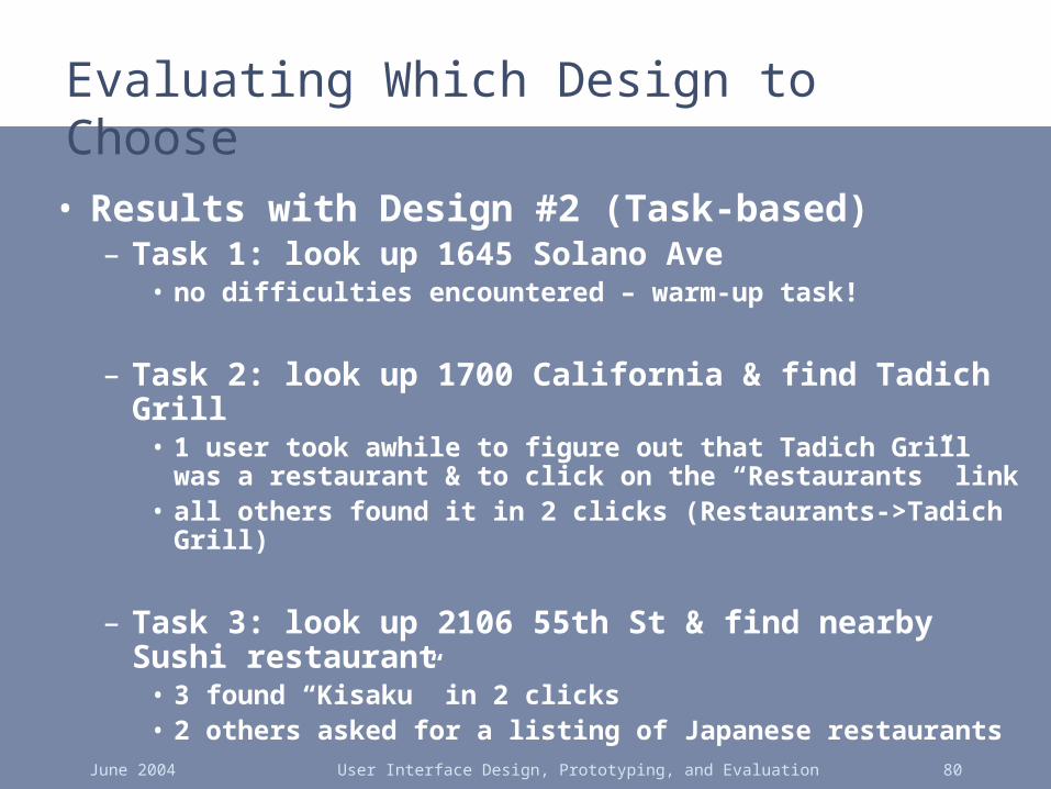
Evaluating Which Design to Choose
• Results with Design #2 (Task-based)– Task 1: look up 1645 Solano Ave
• no difficulties encountered – warm-up task!
– Task 2: look up 1700 California & find Tadich Grill• 1 user took awhile to figure out that Tadich Grill was a
restaurant & to click on the “Restaurants” link• all others found it in 2 clicks (Restaurants->Tadich Grill)
– Task 3: look up 2106 55th St & find nearby Sushi restaurant
• 3 found “Kisaku” in 2 clicks• 2 others asked for a listing of Japanese restaurants

June 2004 User Interface Design, Prototyping, and Evaluation 81
Evaluating Which Design to Choose
• General comments– 2 users said they often want to email maps to
friends who they will be meeting (task-based)– 3 users wanted driving directions (task-
based)
→ TASK-BASED ORGANIZATION (B4) worked better, but still had some minor problems
June 2004 User Interface Design, Prototyping, and Evaluation 82
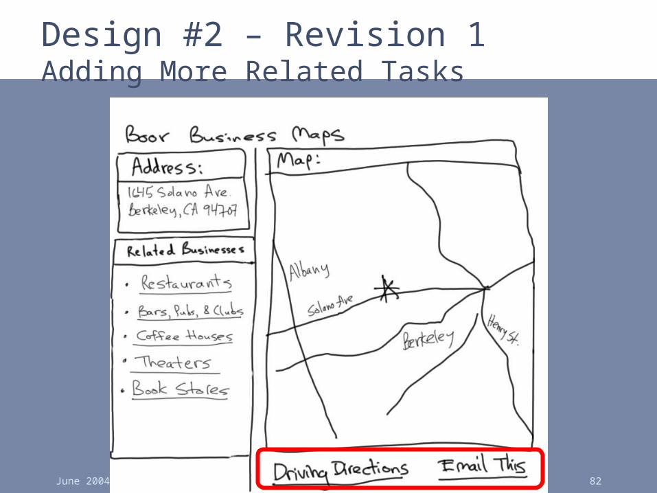
Design #2 – Revision 1Adding More Related Tasks

June 2004 User Interface Design, Prototyping, and Evaluation 83
Design #2 – Revision 2Adding HIERARCHICAL ORGANIZATION (B3) &
LOCATION BREAD CRUMBS (K6)

June 2004 User Interface Design, Prototyping, and Evaluation 84
Design #2 – Revision 3 Hi-Fi Prototype Adding SEARCH ACTION MODULE (J1)0
June 2004 User Interface Design, Prototyping, and Evaluation 85
Summary
• Lots of issues involved in designing web sites
• Design patterns one way of capturing good design knowledge

June 2004 User Interface Design, Prototyping, and Evaluation 86
Further ReadingBooks on Web Design
• Web Design in a Nutshell. Jennifer Niederst. O'Reilly , 1999.
• Design of Sites. Doug Van Duyne, James Landay, Jason Hong. Addison-Wesley. 2003.
• Information Architecture for the World Wide Web. Louis Rosenfeld and Peter Morville. O'Reilly, 1998.
• Don’t Make Me Think! Steven Krug. Que, 2000.
June 2004 User Interface Design, Prototyping, and Evaluation 87
Further ReadingBooks on Web Design
• Community Building on the Web. Amy Jo Kim. Peachpit Press, 2000.
• Designing Visual Interfaces: Communication Oriented Techniques. Kevin Mullet and Darrell Sano. Prentice Hall / SunSoft Press. 1994.
• Understanding Comics. Scott McCloud. Kitchen Sink Press, 1994.
• Designing Web Usability. Jakob Nielsen. New Riders Publishing, 1999.
June 2004 User Interface Design, Prototyping, and Evaluation 88
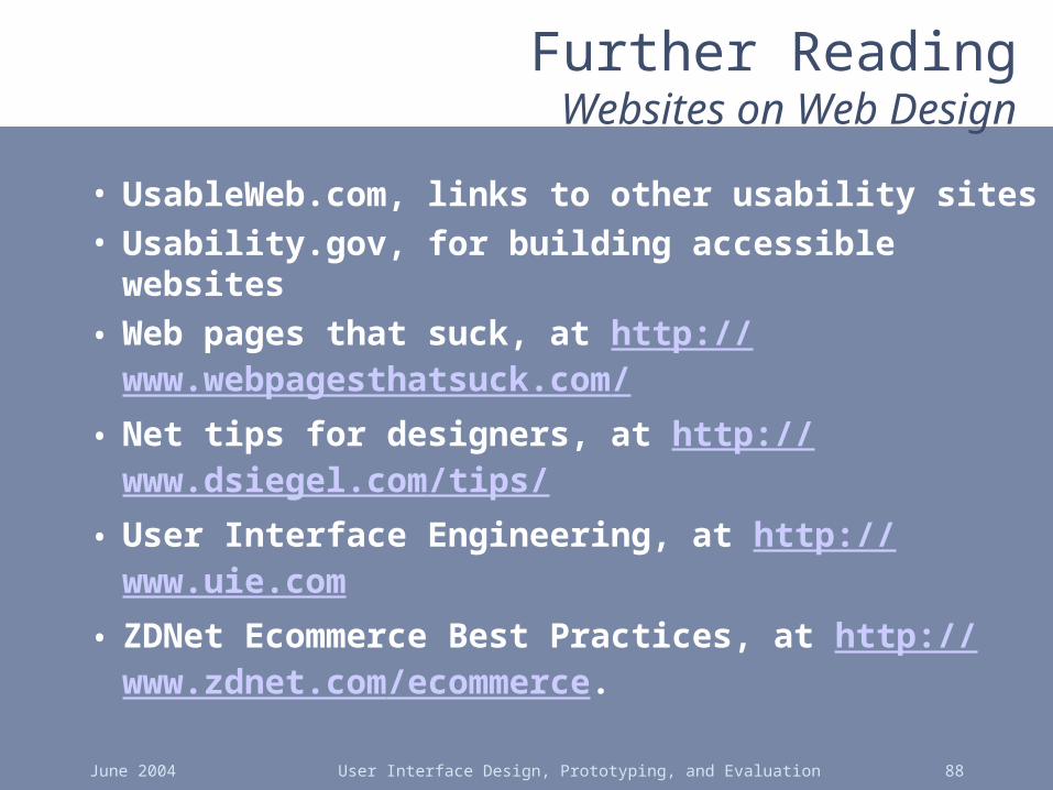
Further ReadingWebsites on Web Design
• UsableWeb.com, links to other usability sites• Usability.gov, for building accessible websites• Web pages that suck, at http://
www.webpagesthatsuck.com/• Net tips for designers, at http://
www.dsiegel.com/tips/• User Interface Engineering, at http://
www.uie.com• ZDNet Ecommerce Best Practices, at http://
www.zdnet.com/ecommerce.

June 2004 User Interface Design, Prototyping, and Evaluation 89
Further ReadingWebsites on Web Design
• New York Times Ecommerce Times, at – http://www.nytimes.com/pages-technology/c
ybertimes/commerce/
• Webword.com usability log• CNet Builder.com, info on building sites• ACM’s CHI-Web Mailing List
– http://www.acm.org/sigchi/web/chi-web.html
• Goodexperience.com web log• Jakob Nielsen useit.com
Related Documents