WINDOWS PRESENTATION FOUNDATION (WPF) John Korondy Software Development Manager, Core User Interfaces Right Now Technologies [email protected]

John Korondy Software Development Manager, Core User Interfaces Right Now Technologies [email protected].
Dec 19, 2015
Welcome message from author
This document is posted to help you gain knowledge. Please leave a comment to let me know what you think about it! Share it to your friends and learn new things together.
Transcript

WINDOWS PRESENTATION FOUNDATION (WPF)
John KorondySoftware Development Manager, Core User InterfacesRight Now [email protected]

Benefits of WPF Quicker time to market Reduced cost Increased life span of product Reduced cost of maintenance Ease of branding

WPF at a glance Consumers
Unified view of all UI Variety of layout and navigation modes Deployment options
Infrastructure Full use of hardware graphics capability DirectX, vector- rather than pixel-based Future oriented
Developers Declarative and event based Different tools for different roles Highly customizable
Framework choice WPF is the future of Windows presentation technology
Other technologies are often still better choices today ISVs often need to be ahead of the curve
Recommended WPF 3.5 SP1 usage Web sites that want to push the limits of user
experiences Windows applications with complex data visualization
scenarios New UI applications
• Windows Forms – legacy apps and mobile devices• DirectX - platform for intensive graphics (games, CAD
applications)• ASP.NET - reach solution for server-based platform-agnostic
applications• Silverlight 3 – Rich web based applications
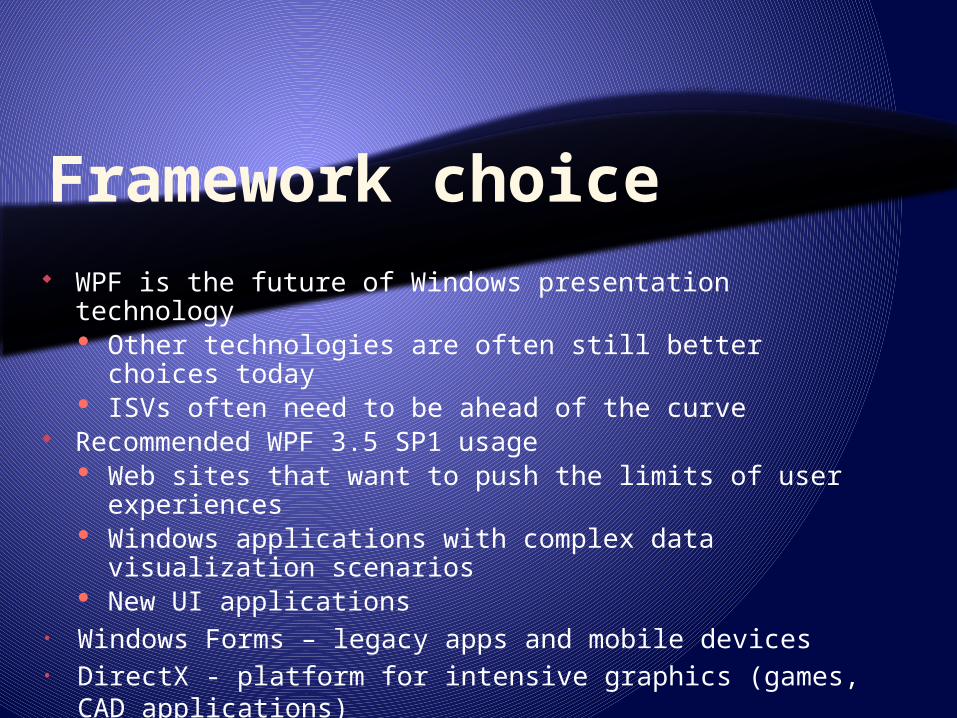
Features Programming model
Rich: 100s of classes: controls to 3D lights Containment-friendly Expressed as declarative or procedural code Powerful customization capabilities
Built-in support for Layout Navigation Data binding Animation Ink Transformation
Interop Bi-directional WinForms, ActiveX, Win32
Deployment Push Pull (ClickOnce) Browser-based
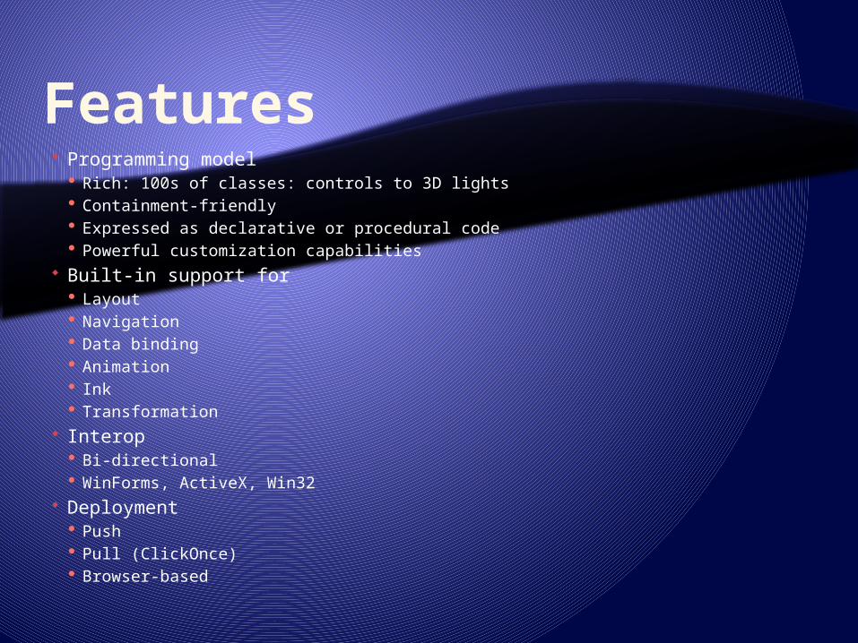
.NET code - process Instantiate and manipulate all classes Provide procedural event code Reference XAML instantiated classes Strong on sequence
XAML - design Instantiate some CLR classes Assign property values Reference other existing (in XAML or code) instances Strong on containment
<Button Width="100“ Name=“b1”> OK <Button.Background> LightBlue </Button.Background></Button>
Button b1 = new Button();b1.Content = "OK";b1.Background = new SolidColorBrush(Colors.LightBlue);b1.Width = 100;
Dim b1 As New Buttonb1.Content = "OK"b1.Background = New _ SolidColorBrush(Colors.LightBlue)b1.Width = 100
Procedural and declarative
<Button Name=“b1” />
b1.Content = "OK";b1.Background = new SolidColorBrush(Colors.LightBlue);b1.Width = 100;
b1.Content = "OK"b1.Background = New _ SolidColorBrush(Colors.LightBlue)b1.Width = 100

Future WPF Features DataGrid (!)
Ribbon, Date controls, MaskedTextBox… Text rendering
East Asian rendering Video
Quality, Stability, Performance Deployment
Framework install is too big, takes too long, fails too often
App Cold Start: Too slow Bitmap Effects

Layout system Negotiation between parent and children Coordinates expressed as double Generally, controls size to content User can specify:
min/max/actual size Margins (outside area) Padding (inside area) Horizontal/Vertical alignment
The less is fixed, the better (Double.NaN)
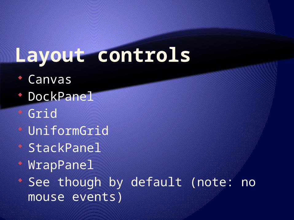
Layout controls Canvas DockPanel Grid UniformGrid StackPanel WrapPanel See though by default (note: no mouse
events)

Layout controls specials Basic customization: override
ArrangeOverride and MeasureOverride Or, custom Panel-derived class Localization/globalization:
FlowDirection based on user culture prefs Window sizing may be adjustable to content

Common features Classes (XAML elements or CLR classes) Properties Methods (code only) Events Control content patterns Each control has a Composition Tree
May be modified for customization
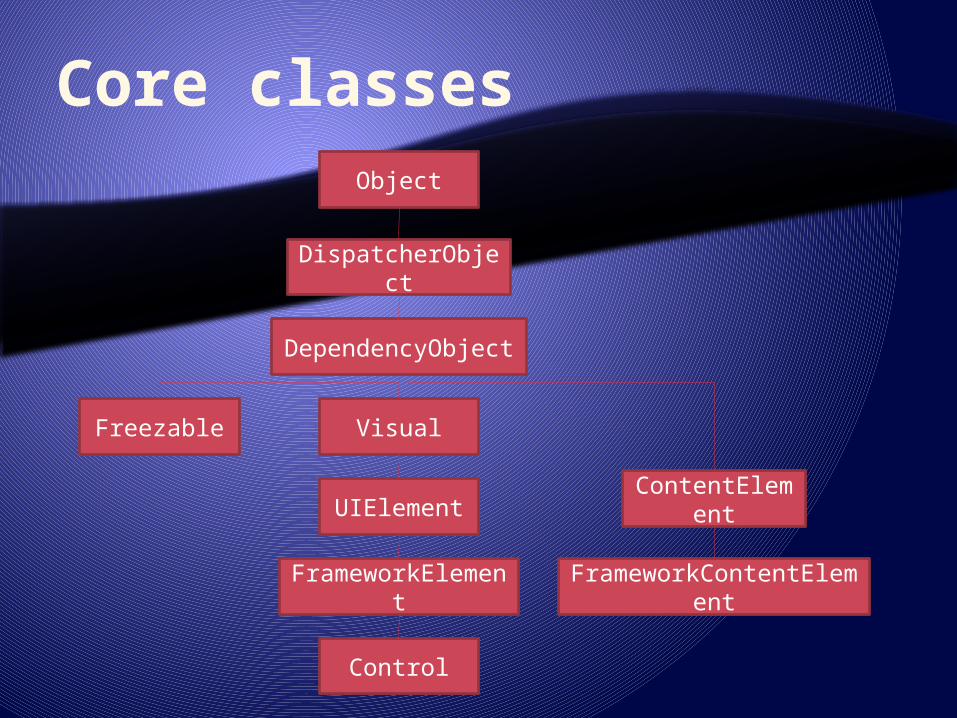
Core classesObject
DispatcherObject
DependencyObject
Visual
UIElement
FrameworkElement
Control
Freezable
ContentElement
FrameworkContentElement

Content models Content (contains a single item; Button,
Border) Headered content (header and item;
GroupBox) Items (Ordered collection; ListBox) Headered items (Header and Items;
MenuItem) Decorator (applies effect onto and
around controls; ViewBox, Ink)
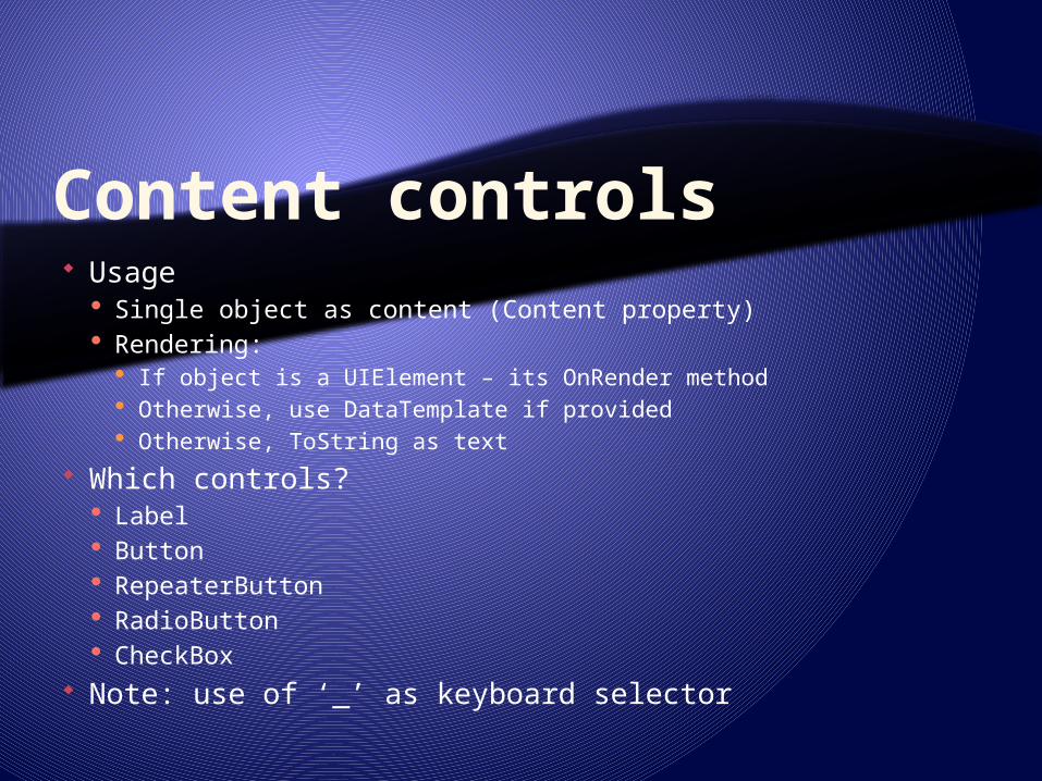
Content controls Usage
Single object as content (Content property) Rendering:
If object is a UIElement – its OnRender method Otherwise, use DataTemplate if provided Otherwise, ToString as text
Which controls? Label Button RepeaterButton RadioButton CheckBox
Note: use of ‘_’ as keyboard selector

Headered content controls Controls with:
Header object Content object
Which controls? Expander GroupBox TabItem
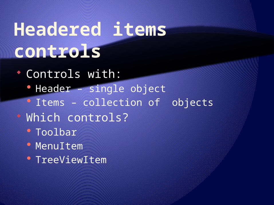
Headered items controls Controls with:
Header – single object Items – collection of objects
Which controls? Toolbar MenuItem TreeViewItem
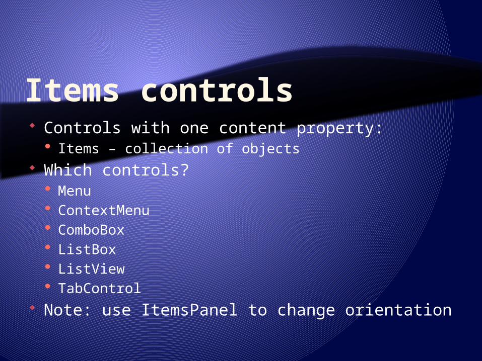
Items controls Controls with one content property:
Items – collection of objects Which controls?
Menu ContextMenu ComboBox ListBox ListView TabControl
Note: use ItemsPanel to change orientation
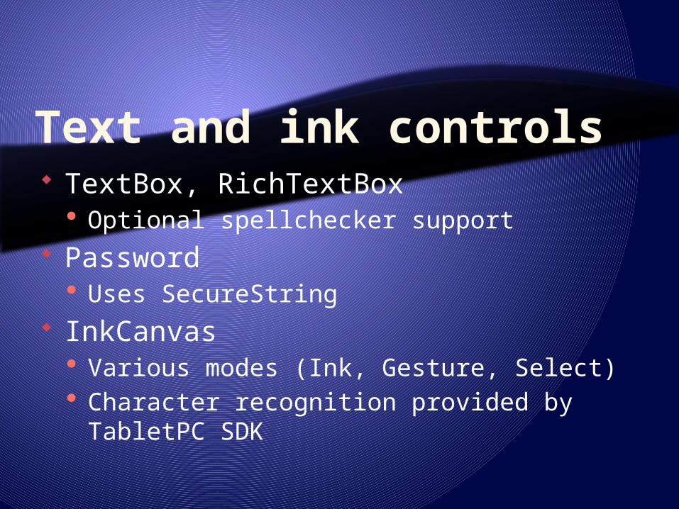
Text and ink controls TextBox, RichTextBox
Optional spellchecker support Password
Uses SecureString InkCanvas
Various modes (Ink, Gesture, Select) Character recognition provided by TabletPC
SDK

Decorators Single Content Applies effects unto or around the child:
Border ViewBox InkPresenter Adorner
Validation Adorner

Adorners Specialized element linked to a
UIElement Derived from abstract Adorner
References UIElement(s) it adorns Rendered on top-most AdornerLayer
Receives input (e.g. mouse) events first Unless IsHitTestVisible = false May re-direct event to adorned element

Properties CLR Dependency
Property of DependencyObject-derived classes Usually backed by a CLR property Support run-time computation Meta defines how change affects rendering engine Identified by static instance of DependencyProperty
Attached Specialized Dependency Property May be used by any type Usually describes relationship between the two objects E.g. layout information (Grid.Column, Canvas.Left)

Property setting – direct As an attribute
As an element (required if value not a simple scalar)
<Button Name=“MyButton” Width=“200"/>
myButton.Width = 200;
<Button> <Button.Background> <HorizontalGradient StartColor="Blue" EndColor="White"/> </Button.Background></Button>

Property setting – direct (attached) Attached property
Property of a relationship between two objects
Dock is a property of DockPanel Used by CheckBox to tell DockPanel where
to render it
<DockPanel> <CheckBox DockPanel.Dock="Top">Hello</CheckBox></DockPanel>
DockPanel dp = new DockPanel();CheckBox c = new CheckBox();c.Content = “Hello”;DockPanel.SetDock(c, Dock.Top);dp.Children.Add(c);

Property setting - databinding To resource
To a datasource
More about databinding later
<Text Foreground="{StaticResource MyBrush}" TextContent="Text" />
<Button Background="{Binding Path=BoundColor}" Width="150" Height="30">I am bound to be RED!</Button>

Property propagation Dependency properties are evaluated at
run-time Some properties are inheritable
E.g. Background, FlowDirection Can be overridden by children Are referenced in code using class’
static property, e.g. TextBox.TextProperty

Events Types
Life-cycle E.g. Initialized
User interaction E.g. Clicked
Databinding E.g. PropertyChanged
Exposed as CLR events Virtual functions

Events Use CLR event-delegate model
Delegate may be assigned in XAML or code
<Button Click="b1SetColor">button</Button>
void b1SetColor(object sender, RoutedEventArgs args) { //logic to handle the Click event
void MakeButton2(){ Button b2 = new Button(); b2.Click += new RoutedEventHandler(Onb2Click2);}void Onb2Click2(object sender, RoutedEventArgs e){

Event propagation Bubbled: handled by parent
object E.g. MouseDown
Tunneled: handled by a child object E.g. PreviewMouseDown
Direct E.g.
[Preview]MouseLeftButtonDown Use event’s Handled property
to stop further processing
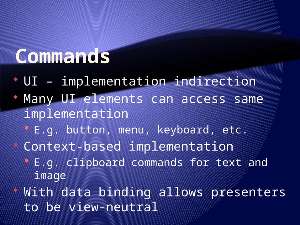
Commands UI – implementation indirection Many UI elements can access same
implementation E.g. button, menu, keyboard, etc.
Context-based implementation E.g. clipboard commands for text and image
With data binding allows presenters to be view-neutral

Command pattern
ICommand e.g.
RoutedUICommand
Execute
CanExecuteUI
element
Execution logic
Execution logic
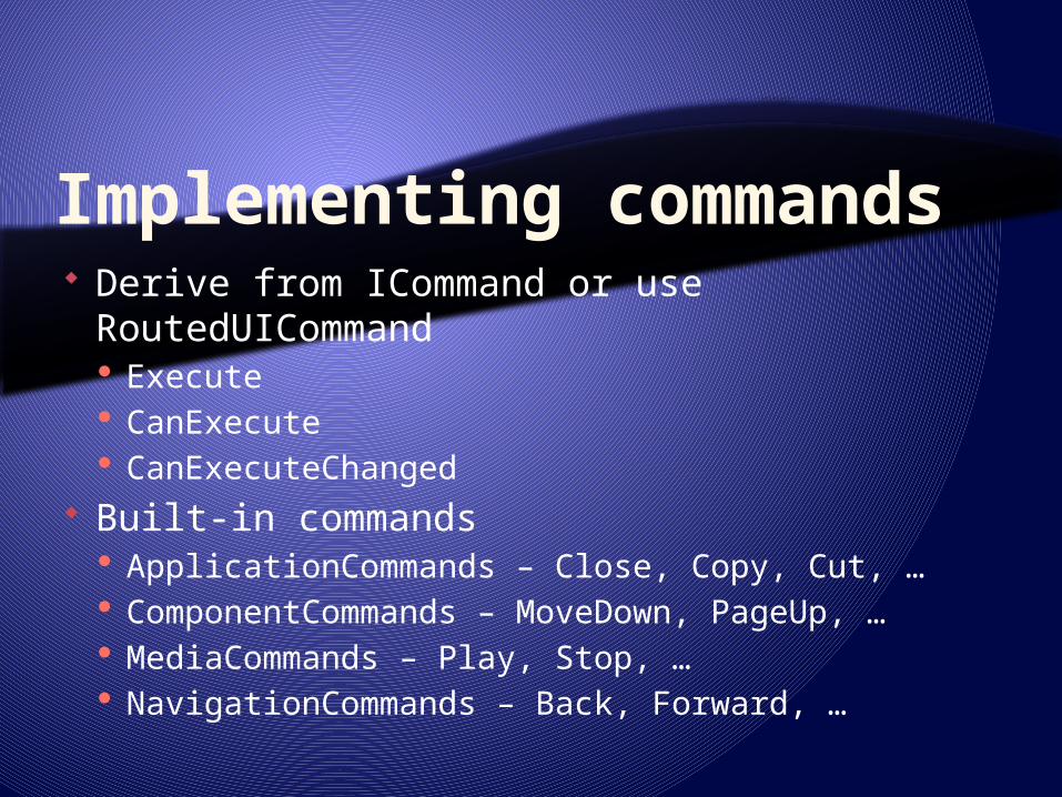
Implementing commands Derive from ICommand or use
RoutedUICommand Execute CanExecute CanExecuteChanged
Built-in commands ApplicationCommands – Close, Copy, Cut, … ComponentCommands – MoveDown, PageUp, … MediaCommands – Play, Stop, … NavigationCommands – Back, Forward, …

Text Handling Text rendering
ClearType sub-pixel Smooth text animation by char or glyph
Typography OpenType fonts with TrueType glyph
definitions Resolution independent layout and
rendering International text Enhanced fonts
Unicode Beyond italic and bold
Text APIs Layout and user interface Lightweight drawings with text Advanced text formatting
Culture: en_US
Culture: ar_SA

Customization Customizing properties
E.g. ArrangeOverride Overriding behaviors Specifying control styles Modifying control templates Sub-classing or aggregating existing
controls
A Slider
A ListBox
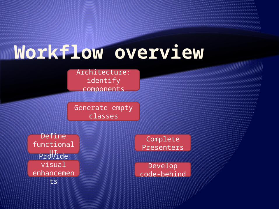
Workflow overviewArchitecture:
identify components
Generate empty classes
Define functional
UI
Complete Presenters
Develop code-behind
Provide visual
enhancements
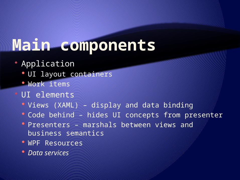
Main components Application
UI layout containers Work items
UI elements Views (XAML) – display and data binding Code behind – hides UI concepts from presenter Presenters – marshals between views and
business semantics WPF Resources Data services

Roles Architect
Creates solutions, projects, classes Defines ‘connection points’: properties and events
Designer Defines Views (presentation objects)
Container layouts Controls
Defines the ViewModel (bindable business objects) Defines the Model (data layer abstraction) Defines common styles, templates (different skill set!)
Programmer Implements code behind, presentation classes and business
object classes

Roles and tools Architect - VS.NET Class designer Designer – Expression Blend Developer - VS.NET code editor
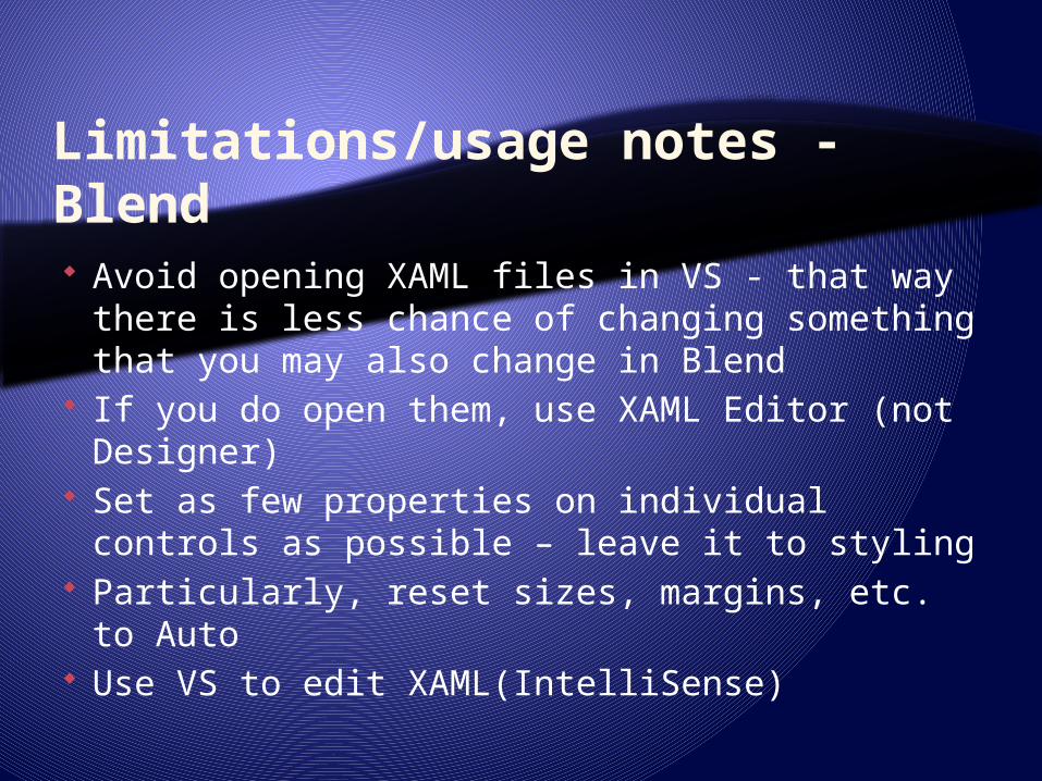
Limitations/usage notes - Blend Avoid opening XAML files in VS - that way
there is less chance of changing something that you may also change in Blend
If you do open them, use XAML Editor (not Designer)
Set as few properties on individual controls as possible – leave it to styling
Particularly, reset sizes, margins, etc. to Auto Use VS to edit XAML(IntelliSense)

Blend limitations DataTemplate - needs to be created in VS Unable to style TreeViewItem Unable to style invisible items, e.g.
TreeViewItem Bug in Blend: DisplayMemberBinding for
GridView requires manual expression entry Multi-part namespaces not handled When using project dependency in VS, include
ALL dependent projects (otherwise VS compiles OK, Blend does not)

WPF Application Components
Development
XAML
Code-behind
Settings
Build
Assembly
ApplicationManifest
Project
Configuration
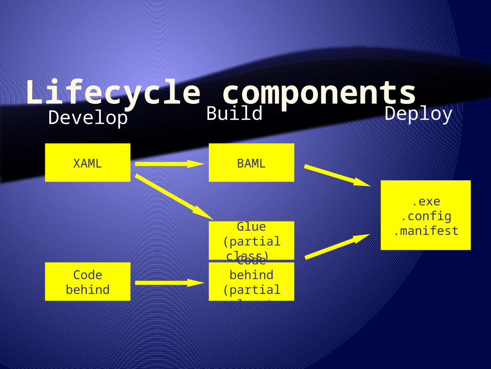
Lifecycle components
XAML
Code behind
BAML
Develop
Glue(partial class) Code behind(partial class)
Build Deploy
.exe.config
.manifest

XAML basics XML serialization format XamlReader and XamlWriter (partial
serializer)<Window x:Class="Dialogs.Window1" xmlns="http://schemas.microsoft.com/winfx/2006/xaml/presentation" xmlns:x=“http://schemas.microsoft.com/winfx/2006/xaml” xmlns:myCtrl=“clr-namespace:XYZ.MyCtrls;assembly=MyCtrls” Title="Main Window" Height="545" Width="580" > <Grid> <Grid.ColumnDefinitions> <ColumnDefinition Width="0.318181818181818*" /> <ColumnDefinition Width="0.681818181818182*" /> </Grid.ColumnDefinitions> <myCtrl:SomCtrl Width=“20” …
Instantiate class of type …
Set simple
property value
Define namespac
es
Set complex property
value
Create object
from non-default
namespace

XAML basics: x:Name extension Name applies to objects with Name
property Also translates as CLR object instance
name x:Name can be used for all objects Blend always generates as x:Name

Deployment Windows installer
Full trust Full control As application As control
Through WPF/WinForm/Win32 interop Through 3.5 AddIn
Web deployment Partial trust – governed by CAS Isolated code and storage Partially connected (ClickOnce technology)
Added to Start Programs Includes version update policy Add/Remove or Revert to previous version support
Browser (always online) Standalone (Xbap)
IE or Firefox (IETab, V3.5 only) Navigation integrated with browser navigation
As control using 3.5 AddIn support As XAML fragment (Frame)

Execution Logical, visual and composition trees Rendering based on capabilities
‘Hardware’ or ‘software’ Can be detected using RenderCapability
Controls entire visual airspace

VS.NET Application types Windows application
Own Window Modal and modeless dialogs
Browser based application (Xbap) Hosted in browser Built-in navigation support
User control library Custom control library Add-in (3.5 only)

Common application features Application object
Accessible through Application.Current Starts or identifies (StartupUri) initial window Provides startup/shutdown events Contains the Main method Starts message pump - single threaded apartment Contains a resource bag or add properties to App
Multithreading Use Dispatcher property to marshal across threads Invoke supports thread priorities New UI threads possible

Creating secondary windows Modeless, does not close when main
window closes
Modeless, closes with main window
Modal
Window2 win = new Window2();win.Show();
Window2 win = new Window2();win.Owner = this;win.Show();
Window2 win = new Window2();win.ShowDialog();
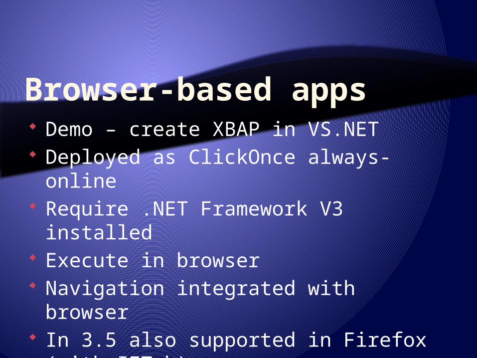
Browser-based apps Demo – create XBAP in VS.NET Deployed as ClickOnce always-online Require .NET Framework V3 installed Execute in browser Navigation integrated with browser In 3.5 also supported in Firefox (with
IETab)

Resources Compiled as objects into logical tree
Brush definitions Style definitions
Loaded from data Media files (jpg, gif) Resource dictionaries
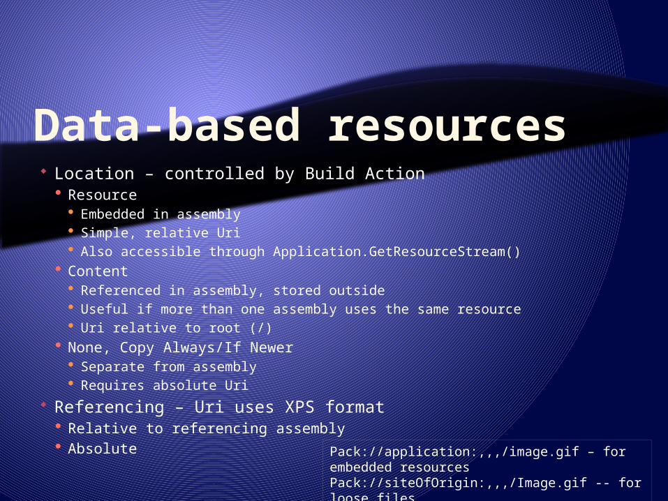
Data-based resources Location – controlled by Build Action
Resource Embedded in assembly Simple, relative Uri Also accessible through Application.GetResourceStream()
Content Referenced in assembly, stored outside Useful if more than one assembly uses the same resource Uri relative to root (/)
None, Copy Always/If Newer Separate from assembly Requires absolute Uri
Referencing – Uri uses XPS format Relative to referencing assembly Absolute Pack://application:,,,/image.gif – for embedded
resourcesPack://siteOfOrigin:,,,/Image.gif -- for loose files
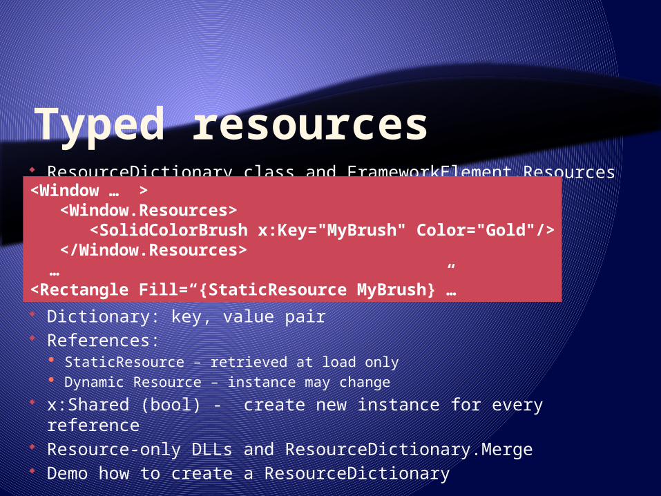
Typed resources ResourceDictionary class and FrameworkElement.Resources
Dictionary: key, value pair References:
StaticResource – retrieved at load only Dynamic Resource – instance may change
x:Shared (bool) - create new instance for every reference Resource-only DLLs and ResourceDictionary.Merge Demo how to create a ResourceDictionary
<Window … > <Window.Resources> <SolidColorBrush x:Key="MyBrush" Color="Gold"/> </Window.Resources> …<Rectangle Fill=“{StaticResource MyBrush}”…

Resource HierarchySystem Resources
Application Resources
ElementResources
ElementResources
ElementResources
Window/PageResources
Window/PageResources
ElementResources
Application Resources
<Window> <Window.Resources> ... </Window.Resources>
<Grid> <Grid.Resources> ... </Grid.Resources>
<ListBox> <ListBox.Resources> ... </ListBox.Resources> </ListBox> </Grid></Window>

Application Resources Common styles Shared graphics
<Application x:Class="ResourcePlay.MyApp" xmlns="http://schemas.microsoft.com/winfx/avalon/2005" xmlns:x="http://schemas.microsoft.com/winfx/xaml/2005">
<Application.Resources> <Style x:Key="dapper"> <SolidColorBrush x:Key="MyBrush" Color="Gold"/> </Style> </Application.Resources></Application>

Page/Window Resources Utility elements
Data sources Converters
Page-specific templates

Element-Specific Resources Locally-scoped Styles
<Window ...> ... <Grid> <Grid.Resources> <SolidColorBrush x:Key="MyBrush"
Color="Gold"/> </Grid.Resources>
... </Grid> ...</Window>
Related Documents