Nevada Department of Correction Ten Year Prison Population Projections 2015-2025 by Wendy Ware Dr. James Austin Gillian Thomson February 2015 JFA Associates Washington, D.C. Conducting Justice and Corrections Research for Effective Policy Making 5 Walter Houpe Court, NE Washington, D.C. 20002 Ph. 202-544-4454 www.JFA-Associates.com

Welcome message from author
This document is posted to help you gain knowledge. Please leave a comment to let me know what you think about it! Share it to your friends and learn new things together.
Transcript
Nevada Department of Correction
Ten Year Prison Population Projections
2015-2025
by
Wendy Ware
Dr. James Austin
Gillian Thomson
February 2015
JFA Associates Washington, D.C.
Conducting Justice and Corrections Research for Effective Policy Making
5 Walter Houpe Court, NE Washington, D.C. 20002 Ph. 202-544-4454 www.JFA-Associates.com
ii
TABLE OF CONTENTS
I. INTRODUCTION ........................................................................................................................................... 4
II. BACKGROUND ............................................................................................................................................. 4
III. TRENDS IN POPULATION AND CRIME IN NEVADA ............................................................................ 6
A. Population ....................................................................................................................................................... 6
B. Crime ............................................................................................................................................................... 8
C. Putting Population and Crime Together: Crime Rates .................................................................................... 8
D. Comparison of Nevada and the United States ................................................................................................. 9
IV. INMATE POPULATION LEVELS AND ACCURACY OF THE APRIL 2014 PROJECTION ................ 11
V. INMATE POPULATION TRENDS ............................................................................................................. 13
A. Trends in Admissions .................................................................................................................................... 13
1. Males Admitted to Prison ......................................................................................................................... 13
2. Females Admitted to Prison ..................................................................................................................... 14
B. Trends in Parole Release Rates ..................................................................................................................... 17
C. Trends in the Prison Inmate Population ........................................................................................................ 21
D. Trends in Releases from Prison ..................................................................................................................... 23
VI. KEY POPULATION PROJECTION ASSUMPTIONS ............................................................................... 25
A. Future Release Rates ..................................................................................................................................... 25
B. Future Admissions Composition ................................................................................................................... 25
C. Future Parole Revocation Rates .................................................................................................................... 26
D. Future Admissions Counts ............................................................................................................................ 27
VII. PRISON POPULATION PROJECTIONS .................................................................................................... 31
A. Projected Male Inmate Population ................................................................................................................ 31
B. Projected Female Inmate Population ............................................................................................................. 33
APPENDIX A: FIGURES .......................................................................................................................................... 36
APPENDIX B: PROJECTIONS ................................................................................................................................. 51
iii
TABLE OF TABLES
TABLE 1: ESTIMATES OF NEVADA’S POPULATION: 2000 – 2014 .................................................................... 7
TABLE 2: COMPARISON BETWEEN UNITED STATES AND NEVADA ON POPULATION, CRIME AND
CORRECTIONS MEASURES ................................................................................................................................... 10
TABLE 3: ACCURACY OF THE APRIL 2014 FORECAST:................................................................................... 12
TABLE 4: HISTORICAL ADMISSIONS TO PRISON BY ADMISSION TYPE: MALES: 2004 –2014 ................ 15
TABLE 5: HISTORICAL ADMISSIONS TO PRISON BY ADMISSION TYPE: FEMALES: 2004 –2014 ........... 16
TABLE 6: PAROLE RELEASE RATES 2004 –2014 ................................................................................................ 19
TABLE 7: INMATE PAROLE RELEASE HEARINGS HELD: MALES 2014 ........................................................ 20
TABLE 8: INMATE PAROLE RELEASE HEARINGS HELD: FEMALES 2014 ................................................... 20
TABLE 9: HISTORICAL INMATE POPULATION: 2004 – 2014 ........................................................................... 22
TABLE 10: AVERAGE LENGTH OF STAY FOR MALE INMATES BY RELEASE TYPE: 2011-2014 ............. 24
TABLE 11: AVERAGE LENGTH OF STAY FOR FEMALE INMATES BY RELEASE TYPE: 2011-2014 ......... 24
TABLE 12: PAROLE VIOLATORS ADMITTED BY YEAR: 2000-2014 ............................................................... 26
TABLE 13: NEW COURT COMMITMENT ADMISSION CHARACTERISTICS BY CATEGORY: MALES:
2012^ ........................................................................................................................................................................... 28
TABLE 14: NEW COURT COMMITMENT ADMISSION CHARACTERISTICS BY CATEGORY: MALES:
2013^ ........................................................................................................................................................................... 28
TABLE 15: NEW COURT COMMITMENT ADMISSION CHARACTERISTICS BY CATEGORY: MALES:
2014^ ........................................................................................................................................................................... 28
TABLE 16: NEW COURT COMMITMENT ADMISSION CHARACTERISTICS BY CATEGORY: FEMALES:
2012^ ........................................................................................................................................................................... 29
TABLE 17: NEW COURT COMMITMENT ADMISSION CHARACTERISTICS BY CATEGORY: FEMALES:
2013^ ........................................................................................................................................................................... 29
TABLE 18: NEW COURT COMMITMENT ADMISSION CHARACTERISTICS BY CATEGORY: FEMALES:
2014^ ........................................................................................................................................................................... 29
TABLE 19: HISTORICAL AND PROJECTED NEW COMMITMENTS: 2004-2025 ............................................. 30
TABLE 20: HISTORICAL AND PROJECTED INMATE POPULATION: MALES: 2004 – 2025 ........................ 32
TABLE 21: HISTORICAL AND PROJECTED INMATE POPULATION: FEMALES: 2004 – 2025 ................... 34
TABLE 22: ACTUAL AND PROJECTED INMATE POPULATION: 2014 – 2025 ................................................ 35
4
NEVADA DEPARTMENT OF CORRECTIONS
TEN-YEAR PRISON POPULATION PROJECTIONS
I. INTRODUCTION
The Nevada State Budget Office has asked JFA Associates, LLC (JFA) to produce three separate forecasts for the
state prison population to be completed in April 2014, October 2014, and February 2015. JFA, under the direction
of Ms. Wendy Ware, utilized the Wizard 2000 simulation model to produce prison population projections for male
and female offenders. This briefing document represents the results of the analysis and simulation for the third and
final forecast cycle, February 2015.
For the current forecast, JFA reviewed current inmate population trends and analyzed computer extract files
provided by the Nevada Department of Corrections (NDOC). This briefing document contains a summary of
projections of male and female inmates through the year 2025, a summary of recent offender trends, and an
explanation of the primary assumptions on which the projections are based. The contents that follow are based on
the analysis of computer extract files provided by the Department of Corrections in January 2015 as well as general
population and crime trend data. All figures are contained in Appendix A of this document.
Accuracy of Past Forecast
Overall, the April 2014 forecast of the total Nevada state prison population generated by JFA very accurately
estimated the actual population from January through December 2014, with an average monthly difference of -0.3
percent between the projected and actual populations (an average accuracy of ±2.0 percent is considered accurate).
The April 2014 forecast of male inmates differed from the actual male population by an average of -28 offenders per
month, or just -0.2 percent, from January through December 2014. At no point in 2014 did the male forecast differ
from the actual male population by more than 0.5 percent.
For female inmates, the April 2014 forecast closely tracked the actual female population throughout 2014, with an
average monthly difference of -0.5 percent between the projected and actual populations. Only in July 2014 and
December did the forecasted population differ by more than 0.6 percent from the actual female population. (In July
2014, the female population exhibited a small spike, increasing by 2.4 percent from June, but then declining by -1.7
percent in August. In December, the female population ticked up 1.8 percent.)
II. BACKGROUND
The forecast of correctional populations in Nevada was completed using Wizard 2000 projection software. This
computerized simulation model mimics the flow of offenders through the state’s prison system over a ten-year
forecast horizon and produces monthly projections of key inmate groups. Wizard 2000 represents a new version of
the previously used Prophet Simulation model and introduces many enhancements over the Prophet Simulation
model. The State of Nevada utilized the Prophet Simulation software to produce its prison population forecast for
more than ten years. JFA upgraded the existing Nevada model into the latest Wizard 2000 software in order to take
full advantage of the model’s newest features.
Prior to 1995, sentenced inmates in Nevada received a maximum sentence and were required by law to serve at least
one-third of the maximum sentence before a discretionary parole release hearing was held. Those offenders not
granted discretionary parole release were released on mandatory parole three months prior to their maximum
sentence expiration date. Under SB 416, offenders in Nevada are assigned both a maximum and a minimum
sentence as recommended by Nevada State Parole and Probation officers. A complex grid was developed to
recommend these sentences. The grid was revised several times between July 1995 and March 1996 before a final
formula was agreed upon. The resulting statute-mandated offenders are not eligible for discretionary parole release
until they have served their entire minimum sentence (less jail credits). Monthly good-time earned credits are no
longer applied to the reduction of the time until discretionary parole eligibility. The system of mandatory parole
release remained unchanged under the new statute. In addition to these sentence recommendation changes, SB 416
also put in place the diversion of all E felony offenders from prison.
5
The current simulation model mimics the flow of inmates admitted under two sentencing policies: 1) inmates
admitted to prison with “old law” sentences and 2) inmates admitted under SB 416. Within the simulation model,
all inmates admitted to prison are assigned minimum and maximum sentences for their most serious admitting
offenses. The model performs time calculations, simulates the parole hearing process, and releases offenders from
prison based on existing laws and procedures.
In July 2007, the State of Nevada passed AB 510 which changed three main aspects of a prisoner’s good time credit
calculations. First, under AB 510 the monthly earning of good time for an offender who engages in good behavior
increased from 10 days to 20 days. Second, AB 510 increased the amount of good time awarded for all education,
vocations training and substance abuse treatment programs completed while incarcerated. Credits for program
completion would apply to both the minimum and maximum sentences. Lastly, AB 510 provided that certain credits
to the sentence of an offender convicted of certain category C, D or E felonies (that do not involve violence, a sexual
offense or a DUI that caused death) will be deducted from the minimum term imposed by the sentence until the
offender becomes eligible for parole and from the maximum term imposed by the sentence. Previously, these
credits could not be applied to the minimum term imposed, only the maximum.
AB 510 was passed and went into effect on all offenders to be admitted to the NDOC in July 2007. Also, offenders
housed within the NDOC at that time were made retroactively eligible for all credits listed in the bill. This caused an
immediate and dramatic increase in the number of offenders who were parole eligible reflected in the 2007-2008
data.
6
III. TRENDS IN POPULATION AND CRIME IN NEVADA
Significant Finding: The Nevada population grew at an astonishing rate for over two decades through
2007. The average annual rate of growth from 2000 to 2007 was estimated at 3.8 percent by the U.S.
Census and 4.3 percent by the Nevada State Demographer. Since 2007, the state’s population has grown at
a much slower rate (an average annual rate of 1.3 percent from 2007 to 2014 according to the U.S.
Census). The Nevada State Demographer projects that the state’s population will grow at an average
annual rate of 0.9 percent from 2015 to 2025, and projects that the population ages 20-39 will grow at an
average annual rate of 0.7 percent over the same timeframe.
Significant Finding: Levels of serious crime in Nevada rose in the first part of the 1990s (average annual
increases of 6.8 percent for UCR Part I crimes from 1990 to 1995), fell in the latter part of that decade
(average annual decreases of -4.2 percent from 1995 to 1999), and then increased every year from 2000 to
2006 (average annual increases of 6.0 percent). From 2006 through 2011, UCR Part I crimes in Nevada
declined each year with an average decrease of -6.7 percent. From 2011 to 2012, UCR Part I crimes in
Nevada rose by 10.9 percent, and again by 1.5 percent from 2012 to 2013, departing from the steady
declines observed since 2006.
Significant Finding: Rates of UCR Part I crimes in Nevada rose slightly for the early part of the 1990s
and then fell distinctly the latter part of the decade. The UCR Part I crime rate rose substantially from
2001 to 2003 (at an average annual rate of 7.2 percent), and remained fairly level from 2003 through
2006. From 2006 through 2011, the state’s serious crime rate decreased each year at an average rate of -
8.3 percent per year. In a distinct departure from that trend, the UCR Part I crime rate in Nevada rose 9.4
percent from 2011 to 2012, and was essentially unchanged from 2012 to 2013. However, the serious crime
rate in Nevada in 2013 remains below the serious crime rate observed for more than two decades (with the
exception of 2011 and 2012).
A. Population
The U.S. Census Bureau conducts a decennial census and the Census Bureau’s Population Estimates Program
publishes population numbers between censuses. After each decennial census, the Census Bureau examines its
estimates and revises them, where necessary. In September 2011, the U.S. Census undertook such a revision, and the
new estimates for 2001 to 2009 appear in TABLE 1. The decennial census results for Nevada for 2000 and 2010 are
shown in bold in TABLE 1, while the remainder of the column shows the US Census estimates for July 1 of each
year. We also present population estimates issued by Nevada’s State Demographer (which has not yet issued an
estimate for 2014).
For over two decades through 2007, Nevada experienced a phenomenal growth in population and was the nation’s
fastest-growing state between 2000 and 2010.1 That growth has slowed, but from 2011 to 2012, Nevada returned to
the top 10 fastest growing states, coming in at #62; from 2013 to 2014, Nevada was the 2nd fastest growing state in
the nation.3
1 U.S. Census Bureau. Press Release 12/21/2011
[http://www.census.gov/newsroom/releases/archives/population/cb11-215.html] 2 U.S. Census Bureau. Press Release 12/20/2012
[http://www.census.gov/newsroom/releases/archives/population/cb12-250.html] 3 U.S. Census Bureau Press Release 12/23/2014
[http://www.census.gov/newsroom/press-releases/2014/cb14-232.html]
7
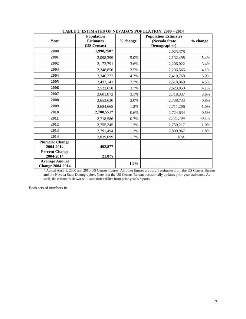
TABLE 1: ESTIMATES OF NEVADA’S POPULATION: 2000 – 2014
Year
Population
Estimates
(US Census)
% change
Population Estimates
(Nevada State
Demographer)
% change
2000 1,998,250* 2,023,378
2001 2,098,399 5.0% 2,132,498 5.4%
2002 2,173,791 3.6% 2,206,022 3.4%
2003 2,248,850 3.5% 2,296,566 4.1%
2004 2,346,222 4.3% 2,410,768 5.0%
2005 2,432,143 3.7% 2,518,869 4.5%
2006 2,522,658 3.7% 2,623,050 4.1%
2007 2,601,072 3.1% 2,718,337 3.6%
2008 2,653,630 2.0% 2,738,733 0.8%
2009 2,684,665 1.2% 2,711,206 -1.0%
2010 2,700,551* 0.6% 2,724,634 0.5%
2011 2,718,586 0.7% 2,721,794 -0.1%
2012 2,755,245 1.3% 2,750,217 1.0%
2013 2,791,494 1.3% 2,800,967 1.8%
2014 2,839,099 1.7% N/A
Numeric Change
2004-2014 492,877
Percent Change
2004-2014 21.0%
Average Annual
Change 2004-2014 1.9%
* Actual April 1, 2000 and 2010 US Census figures. All other figures are July 1 estimates from the US Census Bureau
and the Nevada State Demographer. Note that the US Census Bureau occasionally updates prior year estimates. As
such, the estimates shown will sometimes differ from prior year’s reports.
Both sets of numbers in
8
TABLE 1 demonstrate a staggering rate of growth in Nevada’s population between 2000 and 2007, with average
annual growth estimates of 3.8 and 4.3 percent from the U.S. Census and the Nevada State Demographer,
respectively. From 2000 to 2010, Nevada’s population increased by over 700,000 people to exceed 2.7 million
people in 2010. However, since 2007, the pace of growth has slowed substantially. According to the U.S. Census,
from 2007 to 2014, the average annual rate of growth was 1.3 percent, with the increase in Nevada’s population
from July 2013 to July 2014 at 1.7 percent.
In October 2014, the Nevada State Demographer issued population projections. From 2015 to 2025, average annual
growth for the total state population is expected to be 0.9 percent; while the projected average annual growth for the
population ages 20-39 is 0.7 percent. (See Figure 1.)
B. Crime
Although no statistical significance can be found between crime rates and prison admissions, observing these rates
can provide some anecdotal evidence that allows some insight into state prison admission trends. Observing
historical levels of crime can provide some guidance in projecting future admissions to prison. During the 1990s, the
level of the most serious violent and property crimes (defined by the FBI’s Uniform Crime Reports Part I Crime
category) in Nevada increased steadily during the first part of the decade and displayed a generally decreasing trend
during the latter. From 1990 to 1995, the number of UCR Part I crimes in Nevada increased each year, rising at an
average annual rate of 6.8 percent. From 1995 to 1999, the number of UCR Part I crimes fell at an average annual
rate of -4.2 percent. Serious crime increased each year from 2000 to 2006 at an average of 6.0 percent per year.
From 2006 to 2011, UCR Part I crimes in Nevada fell at an average of -6.7 percent per year. Bucking the downward
trend, UCR Part I crimes in Nevada rose by 10.9 percent from 2011 to 2012, and by 1.5 percent from 2012 to 2013.
(See Figure 2). While the number of UCR Part I crimes in Nevada has risen in the past two years, the current level is
still lower than what was reported in 2002 through 2009.
The area served by the Las Vegas Metropolitan Police Department (LVMPD) has generally exhibited similar
changes in crime levels as the state as a whole. This area represents approximately half of the state’s population and
over half of the state’s Part I crime. The area served by the LVMPD experienced a decline in UCR Part I crimes
from 1995 to 2000, but posted increases each year from 2000 to 2006. The average annual increase from 2000 to
2006 was 7.9 percent. Like the statewide trend, serious crime in the LVMPD’s jurisdiction fell each year from 2006
to 2011 with an average annual decrease of -6.8 percent. From 2011 to 2012, serious crime increased by 11.1
percent in the LVMPD’s jurisdiction, and from 2012 to 2013, it increased by 2.3 percent. (See Figure 2A). Similar
to the state picture, despite the increases in UCR Part I crimes in the past two years in the LVMPD’s jurisdiction, the
level of serious crime is still below the levels observed from 2003 through 2009.
Unfortunately, we do not have access to the numbers of UCR Part II crimes for Nevada. As the Part II crime
category includes many crimes that can result in prison sentences (especially drug offenses), the absence of these
data substantially limits our capacity to use crime data to guide prison admissions projections.4
C. Putting Population and Crime Together: Crime Rates
The decline in serious crime in the later part of the 1990’s occurred as the state population continued its dramatic
increase -- resulting in a distinct shift in crime rates. From 1990 to 1997, the UCR Part I crime rate in Nevada
remained fairly steady, while from 1997 to 2001, the rate fell significantly at an average annual rate of -8.3 percent.
After notable increases from 2001 to 2003, there was little movement in the overall Part I crime rate from 2003 to
2006. However, each year from 2006 to 2011, Nevada experienced a sharp decline in its UCR Part I crime rate. The
average annual decrease in UCR Part I crime rate from 2006 to 2011 was -8.3 percent. From 2011 to 2012, the UCR
Part I crime rate in Nevada rose 9.4 percent, while from 2012 to 2013 it was essentially unchanged.
4 The FBI publishes data that include Part II arrest data, however, those data are missing for certain years.
Additionally, the number of law enforcement jurisdictions from Nevada (like many other states) reporting arrests to
the FBI changes from year to year resulting in changes in the number of arrests reported by the FBI that may not
reflect actual and overall changes in the number of arrests in the state.
9
In the area served by the LVMPD, the crime rate dropped by an average annual rate of -8.2 percent from 1995 to
2001.5 Like the statewide trends, the large percentage declines in the crime rates for the LVMPD jurisdiction in the
late 1990s did not continue with the serious crime rate rising notably from 2001 to 2003. After remaining largely
unchanged from 2003 to 2006, the LVMPD crime rate declined each year from 2006 to 2011 dropping at an average
annual rate of -8.7 percent. From 2011 to 2012, the UCR Part I crime rate in the LVMPD’s jurisdiction rose 9.5
percent, and rose a slight 0.8 percent from 2012 to 2013.
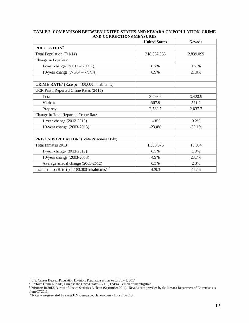
D. Comparison of Nevada and the United States
In the discussion above, the population and crime data are observed in terms of changes over time within Nevada. In
5 The FBI did not show the reported crime for the LV MPD for 1997. For the 1995-2000 average, it was assumed
that the 1997 figure was the average of the 1996 and 1998 figures.

10
TABLE 2, we present Nevada’s population and crime data compared to the national levels and trends.

11
TABLE 2 makes clear the striking increases in Nevada’s population relative to the national trends over the past
decade. From 2004 to 2014, Nevada’s population growth (21.0 percent) far outpaced the national population growth
(8.9 percent). However, from 2013 to 2014, the increase in population for Nevada (1.7 percent) was far closer to the
rise in the nation’s population (0.7 percent).
In terms of crime rates in 2013, Nevada had notably higher serious violent crime rates per 100,000 inhabitants as
compared to the nation, while it had quite similar serious property crime rates to the nation as a whole. The long
term trends in the crime rates for Nevada and the nation over the past 10 years were similar, although Nevada posted
a larger ten-year decline than the entire country, with Nevada’s serious crime rate dropping -30.1 percent compared
to the nationwide decline of -23.8 percent from 2003 to 2013. In the shorter term, Nevada’s crime rates were almost
unchanged from 2012 to 2013, while the national crime rate edged lower, falling by -4.8 percent.
In terms of state prison populations, Nevada has seen much larger growth than the nation as a whole since 2000, but
more recently is showing signs of slower growth and reductions in state prison population. From 2003 to 2012,
Nevada’s prison population grew at an average annual rate of 2.3 percent, while the nationwide state prison
population grew at an average annual rate of 0.5 percent. From 2012 to 2013, the Nevada state prison population
grew by 1.3 percent, while the nationwide state prison population rose by just 0.5 percent.6
The 2013 state prisoner incarceration rate in Nevada (467.6 per 100,000 residents) exceeded that of the nation
(429.3 per 100,000).
6 Prisoners in 2013, Bureau of Justice Statistics Bulletin (September 2014). Nevada data provided by the Nevada Department of Corrections is
from CY2013.
12
TABLE 2: COMPARISON BETWEEN UNITED STATES AND NEVADA ON POPULATION, CRIME
AND CORRECTIONS MEASURES
United States Nevada
POPULATION7
Total Population (7/1/14) 318,857,056 2,839,099
Change in Population
1-year change (7/1/13 – 7/1/14) 0.7% 1.7 %
10-year change (7/1/04 – 7/1/14) 8.9% 21.0%
CRIME RATE8 (Rate per 100,000 inhabitants)
UCR Part I Reported Crime Rates (2013)
Total 3,098.6 3,428.9
Violent 367.9 591.2
Property 2,730.7 2,837.7
Change in Total Reported Crime Rate
1-year change (2012-2013) -4.8% 0.2%
10-year change (2003-2013) -23.8% -30.1%
PRISON POPULATION9 (State Prisoners Only)
Total Inmates 2013 1,358,875 13,054
1-year change (2012-2013) 0.5% 1.3%
10-year change (2003-2013) 4.9% 23.7%
Average annual change (2003-2012) 0.5% 2.3%
Incarceration Rate (per 100,000 inhabitants)10 429.3 467.6
7 U.S. Census Bureau, Population Division. Population estimates for July 1, 2014. 8 Uniform Crime Reports, Crime in the United States – 2013, Federal Bureau of Investigation. 9 Prisoners in 2013, Bureau of Justice Statistics Bulletin (September 2014). Nevada data provided by the Nevada Department of Corrections is
from CY2013. 10 Rates were generated by using U.S. Census population counts from 7/1/2013.
13
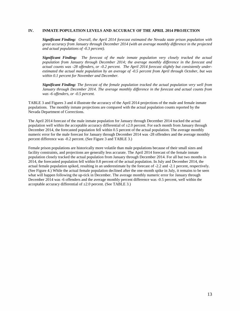
IV. INMATE POPULATION LEVELS AND ACCURACY OF THE APRIL 2014 PROJECTION
Significant Finding: Overall, the April 2014 forecast estimated the Nevada state prison population with
great accuracy from January through December 2014 (with an average monthly difference in the projected
and actual populations of -0.3 percent).
Significant Finding: The forecast of the male inmate population very closely tracked the actual
population from January through December 2014; the average monthly difference in the forecast and
actual counts was -28 offenders, or -0.2 percent. The April 2014 forecast slightly but consistently under-
estimated the actual male population by an average of -0.5 percent from April through October, but was
within 0.1 percent for November and December.
Significant Finding: The forecast of the female population tracked the actual population very well from
January through December 2014. The average monthly difference in the forecast and actual counts from
was -6 offenders, or -0.5 percent.
TABLE 3 and Figures 3 and 4 illustrate the accuracy of the April 2014 projections of the male and female inmate
populations. The monthly inmate projections are compared with the actual population counts reported by the
Nevada Department of Corrections.
The April 2014 forecast of the male inmate population for January through December 2014 tracked the actual
population well within the acceptable accuracy differential of ±2.0 percent. For each month from January through
December 2014, the forecasted population fell within 0.5 percent of the actual population. The average monthly
numeric error for the male forecast for January through December 2014 was -28 offenders and the average monthly
percent difference was -0.2 percent. (See Figure 3 and TABLE 3.)
Female prison populations are historically more volatile than male populations because of their small sizes and
facility constraints, and projections are generally less accurate. The April 2014 forecast of the female inmate
population closely tracked the actual population from January through December 2014. For all but two months in
2014, the forecasted population fell within 0.8 percent of the actual population. In July and December 2014, the
actual female population spiked, resulting in an underestimate by the forecast of -2.2 and -2.1 percent, respectively.
(See Figure 4.) While the actual female population declined after the one-month spike in July, it remains to be seen
what will happen following the up-tick in December. The average monthly numeric error for January through
December 2014 was -6 offenders and the average monthly percent difference was -0.5 percent, well within the
acceptable accuracy differential of ±2.0 percent. (See TABLE 3.)

14
TABLE 3: ACCURACY OF THE APRIL 2014 FORECAST:
TOTAL INMATE POPULATION JANUARY – DECEMBER 2014
Male Female Total
Actual Projected # Diff % Diff Actual Projected # Diff % Diff Actual Projected # Diff % Diff
2014
January 11,898 11,909 11 0.1% 1,098 1,091 -7 -0.6% 12,996 13,000 4 0.0%
February 11,886 11,905 19 0.2% 1,089 1,092 3 0.3% 12,975 12,997 22 0.2%
March 11,901 11,910 9 0.1% 1,088 1,093 5 0.5% 12,989 13,003 14 0.1%
April 11,972 11,923 -49 -0.4% 1,089 1,092 3 0.3% 13,061 13,015 -46 -0.4%
May 11,982 11,927 -55 -0.5% 1,099 1,099 0 0.0% 13,081 13,026 -55 -0.4%
June 11,979 11,935 -44 -0.4% 1,101 1,098 -3 -0.3% 13,080 13,033 -47 -0.4%
July 11,981 11,938 -43 -0.4% 1,127 1,102 -25 -2.2% 13,108 13,040 -68 -0.5%
August 12,012 11,946 -66 -0.5% 1,108 1,104 -4 -0.4% 13,120 13,050 -70 -0.5%
September 12,011 11,951 -60 -0.5% 1,111 1,102 -9 -0.8% 13,122 13,053 -69 -0.5%
October 12,016 11,955 -61 -0.5% 1,105 1,100 -5 -0.5% 13,121 13,055 -66 -0.5%
November 11,973 11,963 -10 -0.1% 1,110 1,103 -7 -0.6% 13,083 13,066 -17 -0.1%
December 11,961 11,969 8 0.1% 1,130 1,106 -24 -2.1% 13,091 13,075 -16 -0.1%
Numeric Change
Jan – Dec ’14 63 60 32 15 -9 -0.8% 95 75 -69 -0.5%
Average Monthly
Difference
Jan – Dec ’14 -28 -0.2% -6 -0.5% -35 -0.3%

15
V. INMATE POPULATION TRENDS
A. Trends in Admissions
Significant Finding: From 2003 to 2006, male admissions grew significantly at an average annual rate of
7.3 percent. From 2007 to 2010, however, male admissions were either virtually unchanged from the prior
year or showed distinct declines. After increasing in 2011, male admissions exhibited further declines in
2012 and 2013, and in 2013 were at their lowest level in the past decade. However, in 2014, male
admissions rose by 4.1 percent. And while that was the largest increase since 2006, the number of male
admissions in 2014 was less than that observed from 2005 to 2011.
Significant Finding: Male new commitment admissions declined or held steady from 2007 to 2013,
changing at an average annual rate of -2.6 percent. In 2014, male new commitment admissions increased
by 3.9 percent. Conversely, after decreasing substantially each year from 2003 through 2008, male parole
violator admissions increased at an average annual rate of 13.1 percent from 2008 through 2012. In 2013,
male parole violator admissions dropped -13.2 percent, followed by an increase of 4.9 percent in 2014.
Significant Finding: For the past decade, female admissions have been quite erratic. After growing at an
average annual rate of 15.3 percent from 2003 to 2006 – rising from 535 females admitted in 2003 to 815
in 2006 – female admissions declined notably for two years and then largely erased those declines with
increases over the following two years. In 2011, female admissions dropped by -6.4 percent, only to grow
by 5.2 percent in 2012, by 0.3 percent in 2013, and by 7.9 percent in 2014.
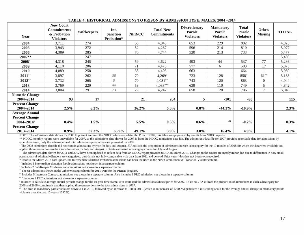
TABLE 4 and TABLE 5 present the male and female admissions to prison from 2004 to 2014. The NDOC
provided a data file of admissions to prison in 2014.
Figures 5 and 6 show the male and female admissions to prison over the past decade, distinguishing the new
court commitments from the parole violators (except for 2007 when only total admissions are shown).
After reaching a high of nearly 6,300 in 2006 and 2007, total admissions to NDOC declined notably over the
next two years to approximately 5,800 in 2009. After two years of modest increases, total admissions declined
by -3.5 percent in 2012 and by -1.7 percent in 2013 to 5,617 – the lowest level since 2004. In 2014, total
admissions posted an increase of 4.6 percent.
1. Males Admitted to Prison
From 2004 to 2014, the average annual change in the number of males admitted to prison for any reason
was 0.3 percent.11 From 2003 to 2006, male admissions to NDOC grew at an average annual rate of 7.3
percent. From 2006 to 2010, male admissions either held steady or declined with an average annual rate of
-1.8 percent. From 2010 to 2011, male admissions grew by 2.1 percent, but they declined by -4.7 percent in
2012 and again by -2.1 percent in 2013. In 2012 and 2013, male admissions were below 5,000 for the first
time since 2004. In 2014, total male admissions to NDOC were 5,040, an increase of 4.1 percent.
Male new commitment admissions declined at an average annual rate of -3.2 percent from 2007 to 2012.
After being almost unchanged in 2013, male new commitment admissions rose by 3.9 percent in 2014.
Male parole violator admissions increased at an average annual rate of 17.2 percent from 2008 through
2011 (after decreasing at an average annual rate of -10.8 percent from 2003 through 2008). After being
11 In order to calculate average annual percent change for the 10-year time frame, JFA estimated the admissions
subcategories for 2007. To do so, JFA utilized the proportion of admissions in each subcategory for 2006 and 2008
(combined), and then applied those proportions to the total admissions in 2007.
16
largely unchanged in 2012, male parole violator admissions exhibited a sharp decline of -13.2 percent in
2013. In 2014, male parole violator admissions rose by 4.9 percent.
Note that male new commitment admissions have ranged from 82 to 88 percent of total male admissions to
NDOC each year throughout the past decade. In 2014, male new commitment admissions accounted for
84.3 percent of all male admissions.
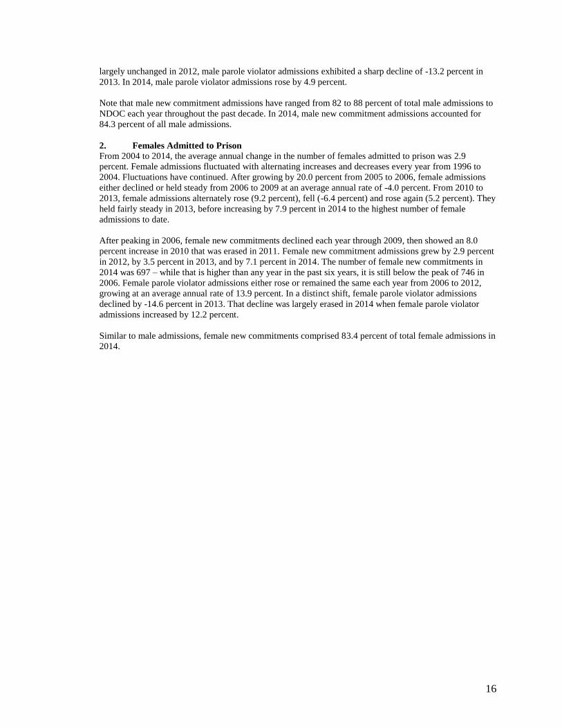
2. Females Admitted to Prison
From 2004 to 2014, the average annual change in the number of females admitted to prison was 2.9
percent. Female admissions fluctuated with alternating increases and decreases every year from 1996 to
2004. Fluctuations have continued. After growing by 20.0 percent from 2005 to 2006, female admissions
either declined or held steady from 2006 to 2009 at an average annual rate of -4.0 percent. From 2010 to
2013, female admissions alternately rose (9.2 percent), fell (-6.4 percent) and rose again (5.2 percent). They
held fairly steady in 2013, before increasing by 7.9 percent in 2014 to the highest number of female
admissions to date.
After peaking in 2006, female new commitments declined each year through 2009, then showed an 8.0
percent increase in 2010 that was erased in 2011. Female new commitment admissions grew by 2.9 percent
in 2012, by 3.5 percent in 2013, and by 7.1 percent in 2014. The number of female new commitments in
2014 was 697 – while that is higher than any year in the past six years, it is still below the peak of 746 in
2006. Female parole violator admissions either rose or remained the same each year from 2006 to 2012,
growing at an average annual rate of 13.9 percent. In a distinct shift, female parole violator admissions
declined by -14.6 percent in 2013. That decline was largely erased in 2014 when female parole violator
admissions increased by 12.2 percent.
Similar to male admissions, female new commitments comprised 83.4 percent of total female admissions in
2014.
17
TABLE 4: HISTORICAL ADMISSIONS TO PRISON BY ADMISSION TYPE: MALES: 2004 –2014
Year
New Court
Commitments
& Probation
Violators
Safekeepers
Int.
Sanction
Probation*
NPR/CC
Total New
Commitments
Discretionary
Parole
Violators
Mandatory
Parole
Violators
Total
Parole
Violators
Other/
Missing
TOTAL
2004 3,711 274 58 4,043 653 229 882 4,925
2005 3,943 272 52 4,267 596 214 810 5,077
2006 4,389 285 70 4,744 520 213 733 5,477
2007** 247 5,489
2008^ 4,318 245 59 4,622 493 44 537 77 5,236
2009 4,118 286 71 4,475 577 6 583 17 5,075
2010 4,089 258 58 4,405 663 1 664 11 5,080
2011++ 3,897 262 38 70 4,269 723 128 858+ 61^^ 5,188
2012++ 3,732 265 8 70 4,081 743 120 863 0 4,944
2013 3,769 220 44 53 4,088 639 110 749 5 4,842
2014 3,804 291 73 79 4,247 658 128 786 7 5,040
Numeric Change
2004–2014 93 17
21 204 5 -101 -96 115
Percent Change
2004–2014 2.5% 6.2%
36.2% 5.0% 0.8% -44.1% -10.9% 2.3%
Average Annual
Percent Change
2004–2014 0.4% 1.5%
5.5% 0.6% 0.6% -0.2% 0.3%
Percent Change
2013–2014 0.9% 32.3%
65.9% 49.1% 3.9% 3.0% 16.4% 4.9% 4.1% NOTE: The admissions data shown for 2008 to present are from the NDOC admissions data file. Prior to 2007, this table was populated by counts from NDOC reports. ** NDOC monthly reports were unavailable for 2007, so the admissions data shown for 2007 is from the NDOC admissions data file. The admissions data file for 2007 provided unreliable data for admissions by
type. As a result, only the safekeeper and total admissions populations are presented for 2007. ^ The 2008 admissions datafile did not contain admissions by type for July and August. JFA utilized the proportion of admissions in each subcategory for the 10 months of 2008 for which the data were available and applied those proportions to the total admissions for July and August to obtain estimated subcategory counts for July and August. ++ The admissions data shown for 2011 and 2012 have been updated to reflect data from an NDOC report provided to JFA in March 2013. Changes to the counts are mostly minor, but due to differences in how small
populations of admitted offenders are categorized, past data is not fully comparable with data from 2011 and beyond. Prior years’ data has not been re-categorized. * Prior to the March 2013 data update, the Intermediate Sanction Probation admissions had been included in the New Commitment & Probation Violator column. Includes 2 Intermediate Sanction Parole admissions not shown in a separate column. + Includes 7 SafeKeeper Misdemeanor admissions not shown in a separate column. ^^ The 61 admissions shown in the Other/Missing column for 2011 were for the PRIDE program. Includes 5 Interstate Compact admissions not shown in a separate column. Also includes 1 PRC admission not shown in a separate column. Includes 2 PRC admissions not shown in a separate column. # In order to calculate average annual percent change for the 10-year time frame, JFA estimated the admissions subcategories for 2007. To do so, JFA utilized the proportion of admissions in each subcategory for
2006 and 2008 (combined), and then applied those proportions to the total admissions in 2007. ## The drop in mandatory parole violators down to 1 in 2010, followed by an increase to 128 in 2011 (which is an increase of 12700%) generates a misleading result for the average annual change in mandatory parole violators over the past 10 years (1242%).

18
TABLE 5: HISTORICAL ADMISSIONS TO PRISON BY ADMISSION TYPE: FEMALES: 2004 –2014
Year
New Court
Commitments &
Probation
Violators
Safekeepers NPR/CC Total New
Commitments
Discretionary
Parole
Violators
Mandatory
Parole
Violators
Total
Parole
Violators
Other/
Missing
TOTAL
2004 564 2 4 570 60 19 79 649
2005 601 0 3 604 55 20 75 679
2006 734 1 11 746 46 23 69 0 815
2007** 0 792
2008^ 615 3 3 621 72 3 75 21 708
2009 603 2 6 611 104 2 106 2 719
2010 646 5 9 660 117 1 118 7 785
2011++ 605 0 5 611 108 9 118+ 6^^ 735
2012++ 623 2 3 629 138 6 144 0 773
2013 644 2 5 651 114 9 123 1 775
2014 685 4 8 697 123 15 138 1 836
Numeric Change
2004–2014 121 2 4 127 63 -4 59 187
Percent Change
2004–2014 21.5% 100.0% 100.0% 22.3% 105.0% -21.1% 74.7% 28.8%
Average Annual
Percent Change
2004–2014 2.3% -- 34.1% 2.5% 9.4% 70.1% 6.8% 2.9%
Percent Change
2013–2014 6.4% 100.0% 60.0% 7.1% 7.9% 66.7% 12.2% 7.9% NOTE: The admissions data shown for 2008 to present are from the NDOC admissions data file. Prior to 2007, this table was populated by counts from NDOC reports.
** NDOC monthly reports were unavailable for 2007, so the admissions data shown for 2007 is from the NDOC admissions datafile. The admissions datafile for 2007 provided unreliable data for admissions by type.
As a result, only the safekeeper and total admissions populations are presented. ^ The 2008 admissions datafile did not contain admissions by type for July and August. JFA utilized the proportion of admissions in each subcategory for the 10 months of 2008 for which the data were available and
applied those proportions to the total admissions for July and August to obtain estimated subcategory counts for July and August. ++ The admissions data shown for 2011 and 2012 have been updated to reflect data from NDOC reports provided to JFA in March 2013. Changes to the counts are minor, but due to differences in how small populations of admitted offenders are categorized, past data is not fully comparable with 2011/2012 data. Prior years’ data has not been re-categorized. Includes one Intermediate Sanction Probationer admission not shown in a separate column. ^^ The 6 admissions shown in the Other/Missing column for 2011 were for the PRIDE program. Includes one Interstate Compact admission not shown in a separate column. + Includes one SafeKeeper Misdemeanor admission not shown in a separate column. # In order to calculate average annual percent change for the 10-year time frame, JFA estimated the admissions subcategories for 2007. To do so, JFA utilized the proportion of admissions in each subcategory for
2006 and 2008 (combined), and then applied those proportions to the total admissions in 2007.
19
B. Trends in Parole Release Rates
Significant Finding: In 2014, overall discretionary and mandatory release rates for male offenders
declined as compared to 2013; for female offenders, overall discretionary and mandatory release rates
rose. The overall release rate in 2014 was 56.2 – the lowest rate since 2008.
Significant Finding: Overall discretionary release rates for 2014 increased very slightly to 55.9 compared
to 2013. Male discretionary release rates (which make up the majority of discretionary release rates)
dropped by 0.3 percentage points compared to 2013, while female discretionary release rates rose by 2.0
percentage points. The discretionary release rates for males and females are still below the higher rates
observed from 2010 to 2012.
Significant Finding: Overall mandatory release rates for 2014 fell to 57.0 driven by a decline of -2.6
percentage points in the male mandatory release rate (the female rate increased by 6.1 percentage points).
TABLE 6 compares parole release rates from 2004 through 2014 by type of parole hearing.
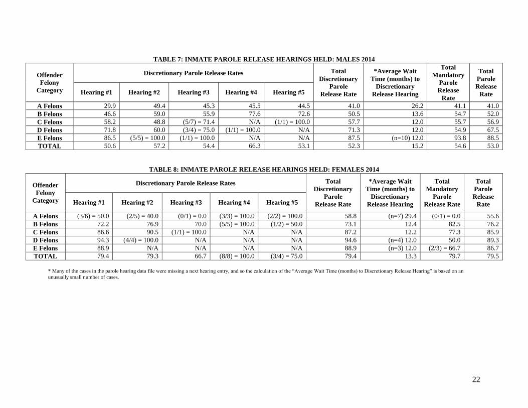
TABLE 7 and TABLE 8 present the parole release rate characteristics for male and female inmates 2014.
Figures 7 and 8 present recent parole release rate data: Figure 7 shows the overall release rates from 2009 to
2014 by type of hearing while Figure 8 presents the data from 2011 to 2014 disaggregated by gender. Since
1999, JFA has generated release rate statistics disaggregated by gender. The simulation model utilizes these
gender-based release rates. For discretionary release hearings, the release rates for female offenders are higher
than for male offenders. The rates for mandatory release hearings used to be fairly similar for males and
females, but have become consistently higher for females as well.
Release rates issued in the report are actually release rates rather than grant rates. If an offender is temporarily
granted parole and then it is rescinded before an offender is released, it is counted in JFA’s statistics as one
denial. Parole board statistics would label this as a grant and then a denial. To avoid confusion, all rates
presented in this report are labeled release rates rather than grant rates.
For male inmates in 2014, the total discretionary release rate ranged from 41.0 for A felons to 50.5 for
B felons to 87.5 percent for E felons. The 2014 discretionary release rates for males are lower than
those observed in 2013 for all felony categories, except B felons (which rose by 0.8 percentage points).
From 2004 to 2007, the overall male discretionary release rate hovered around 47 to 48 percent. In
2008, the male discretionary release rate fell to 43.5, before jumping to 51.3 in 2009, and to 60.4 in
2010. Since then, they have declined each year, hitting 52.3 in 2014.
For female inmates in 2014, the total discretionary release rates ranged from 58.8 for A felons to 73.1
percent for B felons to 94.6 percent for D felons. Female inmates experienced higher discretionary
release rates in 2014 in the A, B and C felony levels and lower rates for D and E felons as compared to
2013.
In 2005, the total discretionary release rate for female offenders was 57.2 percent (the lowest it had
been in the prior five years). The female discretionary release rate jumped to 68.9 in 2006. After
dipping in 2007, female discretionary release rate rose markedly each year to reach 84.8 in 2010. They
declined for the next three years to 77.4 in 2013. In 2014, the female discretionary release rate rose to
79.4.
The mandatory parole release rate for male offenders in 2014 was 54.6 percent – having declined each
year since 2009. The mandatory parole release rate for female offenders in 2013 hit its lowest level
(73.6) since 2005, but rebounded in 2014 to 79.7.

20
As presented in TABLE 6, the total discretionary release rate for males and females together was in the
high-40/low-50 range from 2004 to 2007. The total discretionary release rate fell to 46.3 in 2008, and
then shot up to 54.4 in 2009. It rose to 63.1 in 2010 – the highest level observed in the past decade –
before declining for three years to hit 55.7 in 2013. In 2014, the total discretionary release rate ticked
upward slightly to 55.9.
The mandatory release rate for males and females combined was around 60 for 2003 to 2005, before
jumping to around 70 for 2006 and 2007. In 2008, the mandatory release rate dropped significantly to
55.6, and then it too rebounded to 69.2 in 2009. For the past five years the mandatory release rate has
declined each year, hitting 57.0 in 2014. (See Figures 7 and 8.)

21
TABLE 6: PAROLE RELEASE RATES 2004 –2014
Discretionary
Release Rate
Mandatory
Release Rate
Total
Release Rate
Males
2004 48.3 58.7 51.2
2005 47.1 59.3 50.4
2006 48.5 69.4 54.7
2007 47.9 70.0 52.2
2008 43.5 53.0 46.8
2009 51.3 66.9 55.3
2010 60.4 64.4 61.4
2011 59.7 62.7 60.5
2012 55.6 59.8 56.8
2013 52.6 57.2 54.0
2014 52.3 54.6 53.0
Females
2004 58.5 60.0 58.9
2005 57.2 57.1 57.1
2006 68.9 84.1 73.4
2007 63.1 76.4 65.0
2008 67.2 78.4 70.7
2009 75.9 88.0 78.7
2010 84.8 81.6 84.0
2011 84.3 82.8 84.0
2012 79.9 82.4 80.4
2013 77.4 73.6 76.5
2014 79.4 79.7 79.5
Total
2004 49.5 58.9 52.0
2005 48.4 59.0 51.2
2006 50.9 71.1 56.9
2007 50.0 70.6 53.9
2008 46.3 55.6 49.5
2009 54.4 69.2 58.2
2010 63.1 65.9 63.9
2011 62.7 64.2 63.1
2012 58.7 61.7 59.5
2013 55.7 58.7 56.6
2014 55.9 57.0 56.2
22
TABLE 7: INMATE PAROLE RELEASE HEARINGS HELD: MALES 2014
Offender
Felony
Category
Discretionary Parole Release Rates Total
Discretionary
Parole
Release Rate
*Average Wait
Time (months) to
Discretionary
Release Hearing
Total
Mandatory
Parole
Release
Rate
Total
Parole
Release
Rate Hearing #1 Hearing #2 Hearing #3 Hearing #4 Hearing #5
A Felons 29.9 49.4 45.3 45.5 44.5 41.0 26.2 41.1 41.0
B Felons 46.6 59.0 55.9 77.6 72.6 50.5 13.6 54.7 52.0
C Felons 58.2 48.8 (5/7) = 71.4 N/A (1/1) = 100.0 57.7 12.0 55.7 56.9
D Felons 71.8 60.0 (3/4) = 75.0 (1/1) = 100.0 N/A 71.3 12.0 54.9 67.5
E Felons 86.5 (5/5) = 100.0 (1/1) = 100.0 N/A N/A 87.5 (n=10) 12.0 93.8 88.5
TOTAL 50.6 57.2 54.4 66.3 53.1 52.3 15.2 54.6 53.0
TABLE 8: INMATE PAROLE RELEASE HEARINGS HELD: FEMALES 2014
Offender
Felony
Category
Discretionary Parole Release Rates Total
Discretionary
Parole
Release Rate
*Average Wait
Time (months) to
Discretionary
Release Hearing
Total
Mandatory
Parole
Release Rate
Total
Parole
Release
Rate Hearing #1 Hearing #2 Hearing #3 Hearing #4 Hearing #5
A Felons (3/6) = 50.0 (2/5) = 40.0 (0/1) = 0.0 (3/3) = 100.0 (2/2) = 100.0 58.8 (n=7) 29.4 (0/1) = 0.0 55.6
B Felons 72.2 76.9 70.0 (5/5) = 100.0 (1/2) = 50.0 73.1 12.4 82.5 76.2
C Felons 86.6 90.5 (1/1) = 100.0 N/A N/A 87.2 12.2 77.3 85.9
D Felons 94.3 (4/4) = 100.0 N/A N/A N/A 94.6 (n=4) 12.0 50.0 89.3
E Felons 88.9 N/A N/A N/A N/A 88.9 (n=3) 12.0 (2/3) = 66.7 86.7
TOTAL 79.4 79.3 66.7 (8/8) = 100.0 (3/4) = 75.0 79.4 13.3 79.7 79.5
* Many of the cases in the parole hearing data file were missing a next hearing entry, and so the calculation of the “Average Wait Time (months) to Discretionary Release Hearing” is based on an
unusually small number of cases.
23
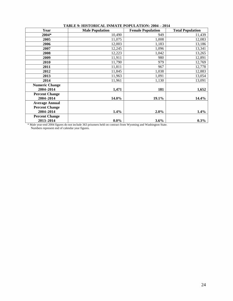
C. Trends in the Prison Inmate Population
Significant Finding: From year-end 2013 to 2014, the Nevada State prison population rose by 37
offenders, or 0.3 percent, to 13,091. Since its year-end high of 13,341 in 2007, the population declined
through 2010, and has posted modest increases in the years since.
Significant Finding: Looking at the population since 2000, the Nevada prison population exhibited modest
growth from 2000 to 2003, followed by strong growth from 2004 to 2006 (posting average annual
increases of 7.7 percent). From 2007 to 2012, the population increased or decreased by about 1 percent or
less each year with the exception of a -2.8 percent decline from 2008 to 2009. Again, from year-end 2013
to 2014, the population increased by a slight 0.3 percent.
Significant Finding: From year-end 2013 to 2014, the male prison population remained virtually
unchanged, while the female prison population increased by 3.6 percent. However, as noted earlier, the
female population exhibited a distinct up-tick in December 2014.
TABLE 9 and Figure 9 present the year-end inmate populations for male and female inmates from 2004 to
2014.
The male prison population increased by 1,471 offenders from end of year 2004 to 2014 – a total increase
of 14.0 percent with an average increase of 1.4 percent per year. From year-end 2013 to 2014, the male
inmate population decreased by -2 offenders, or essentially 0.0 percent, for a total of 11,961 male inmates.
The female prison population increased by 181 offenders from end of year 2004 to 2014 – a total increase
of 19.1 percent with an average increase of 2.0 percent per year. From year-end 2013 to 2014, the female
confined population increased by 39 offenders, or 3.6 percent, for a total of 1,130 female inmates.
Females made up 8.6 percent of the state prison population at the end of 2014. In the past decade, the
percentage of the prison population that is female has ranged from 7.6 to 9.0 percent.
When looking at the changes in the population over the past decade, the population grew rapidly from 2004
to 2006 before showing a mix of much slower growth and declines since then. The male population grew at
an average annual rate of 7.0 percent from 2004 to 2006. After growing by 2.0 percent from 2006 to 2007,
the male population declined or remained almost unchanged from 2007 to 2012 – declining at an average
annual rate of -0.7 percent. From 2012 to 2013, the male population grew by 1.0 percent; while from year-
end 2013 to 2014, the male population was essentially unchanged.
The female population has shown greater fluctuation: the average annual rate of change was +11.8 percent
from 2004 to 2006, and -6.1 percent from 2006 to 2009. In 2010 and 2011, the female population continued
to decline, but at a slower pace. The 7.3 percent increase in the female population in 2012 and the
subsequent increase of 5.1 percent in 2013 stand in stark contrast to the yearly declines from 2007 to 2011.
From year-end 2013 to 2014, the female population grew by 3.6 percent.
24
TABLE 9: HISTORICAL INMATE POPULATION: 2004 – 2014
Year Male Population Female Population Total Population
2004* 10,490 949 11,439
2005 11,075 1,008 12,083
2006 12,003 1,183 13,186
2007 12,245 1,096 13,341
2008 12,223 1,042 13,265
2009 11,911 980 12,891
2010 11,790 979 12,769
2011 11,811 967 12,778
2012 11,845 1,038 12,883
2013 11,963 1,091 13,054
2014 11,961 1,130 13,091
Numeric Change
2004–2014 1,471 181 1,652
Percent Change
2004–2014 14.0% 19.1% 14.4%
Average Annual
Percent Change
2004–2014 1.4% 2.0% 1.4%
Percent Change
2013–2014 0.0% 3.6% 0.3% * Male year-end 2004 figures do not include 363 prisoners held on contract from Wyoming and Washington State.
Numbers represent end of calendar year figures.

25
D. Trends in Releases from Prison
Important Note: The average length of stay calculations have been modified from past reports. Within this
release analysis, offenders sentenced to Life With Parole are now included in their appropriate felony
categories. In addition, parole violators with no new conviction have been excluded from the length of stay
analysis. Results presented in the tables for prior years have been re-analyzed and updated using the new
criteria, and will not be comparable to results presented in prior reports.
Significant Finding: The average lengths of stay for male inmates paroled in 2014 were lower compared
to the past three years. The average lengths of stay for female inmates paroled in 2014 were higher than in
2013, but similar to levels observed in 2011 and 2012.
Significant Finding: For males discharged from prison, average lengths of stay have alternately
decreased and increased from 2011 to 2014, including a small decrease from 2013 to 2014. The average
length of stay for females discharged from prison remained fairly steady from 2011 through 2013, but rose
significantly in 2014.
TABLE 10 and TABLE 11 present the average length of stay for male and female inmates by release type (parole or
discharge) for 2011 to 2014.
The average length of stay for males released to parole (again, excluding parole violators with no new
convictions, but now including offenders sentenced to Life With Parole) was 28.3 months in 2011,
increasing to 29.0 months in 2012 and to 30.2 months in 2013. In 2014, the average length of stay for
males released to parole declined to 27.8 months. Note that if the A Felons are not considered, then the
average length of stay for the remaining males released to parole in 2014 is actually slightly higher
than what was observed in 2012 and 2013.
The average length of stay for females released to parole was 15.2 months in 2011, increasing slightly
to 15.4 months in 2012. In 2013, the average length of stay for females released to parole fell to 14.4
months, before rebounding to 15.4 months in 2014. When the small number of A felons is excluded,
the average length of stay of females released to parole shows similar trends over the past two years.
The average length of stay for males discharged from prison was 30.7 months in 2011 before falling to
28.2 months in 2012. That decrease was largely erased the following year when the average length of
stay for males discharged from prison rose to 30.3 months in 2013. In 2014, the average length of stay
for males discharged from prison declined to 29.5 months. The analysis that excludes the A felons in
the total shows similar movement in the average lengths of stay for males discharged from prison.
The average length of stay for female inmates discharged from prison remained fairly steady over the
past three years from 21.5 months in 2011 to 21.9 months in 2012 to 21.6 months in 2013. In 2014, the
average length of stay for female inmates discharged from prison increased substantially to 25.5
months. If the small number of A felons is excluded, the average length of stay for female inmates
discharged from prison tells the same story – with consistent levels from 2011 through 2013, followed
by a notable increase in 2014.

26
TABLE 10: AVERAGE LENGTH OF STAY FOR MALE INMATES BY
RELEASE TYPE: 2011-2014
Offender
Felony
Category
LENGTH OF STAY
(months)
2011 2012 2013 2014
Parole Discharge Parole Discharge Parole Discharge Parole Discharge
A Felons 113.2 49.7 117.4 42.7 150.6 49.8 117.4 42.3
B Felons 27.8 34.3 29.1 31.1 29.6 32.7 29.9 32.4
C Felons 10.1 17.0 9.8 18.5 9.8 18.9 9.5 18.6
D Felons 7.3 14.8 6.9 14.8 7.7 15.7 7.7 16.9
E Felons 6.0 13.3 5.6 9.3 5.6 11.5 6.7 12.5
TOTAL 28.3 30.7 29.0 28.2 30.2 30.3 27.8 29.5
TOTAL
(No A Felons)
22.6
29.9
23.4
27.5
23.8
29.3
24.0
28.8
TABLE 11: AVERAGE LENGTH OF STAY FOR FEMALE INMATES
BY RELEASE TYPE: 2011-2014
Offender
Felony
Category
LENGTH OF STAY
(months)
2011 2012 2013 2014
Parole Discharge Parole Discharge Parole Discharge Parole Discharge
A Felons 124.2
(n=10)
47.3
(n=1)
82.5
(n=7)
55.4
(n=1)
175.0
(n=4)
14.6
(n=1)
88.5
(n=7)
210.6
(n=1)
B Felons 19.5 25.2 20.4 26.2 18.8 25.3 20.6 27.8
C Felons 6.7 16.6 8.6 14.5 7.4 14.6 8.5 14.1
D Felons 6.0 12.3 6.4 12.4 (n=9) 6.5 13.0 6.1 14.0
E Felons 5.1 10.9 (n=5) 5.2 9.5 (n=5) 5.4 11.1 (n=7) 5.2 8.9 (n=4)
TOTAL 15.2 21.5 15.4 21.9 14.4 21.6 15.4 25.5
TOTAL
(No A Felons)
13.2
21.2
14.4
21.6
13.0
21.6
14.5
23.9
IMPORTANT NOTE ABOUT THESE TABLES: If comparing this table to previous iterations of this report, please note that offenders sentenced
to Life With Parole are now included in the analysis in their appropriate Felony Category. The very small number of offenses with a Life or Death sentenced who are released continue to be excluded from this table. Safekeepers discharged from prison also continued to be excluded
from this table.
Prior year data has been re-analyzed using the same criteria listed above so that the results are comparable across the years shown. These tables,
however, are not comparable to the ones in prior reports.
27
VI. KEY POPULATION PROJECTION ASSUMPTIONS
The inmate population projections contained in this report were completed using the Wizard 2000 simulation model.
The model simulates the movements of inmates through the prison system based on known and assumed policies
affecting both the volume of admissions into the system and the lengths of stay for inmates who are housed in
prison. It simulates the movements of individual cases, by felony class subgroup, and projects each separately.
Males and females, as well as inmates sentenced under different sentencing policies, move through the system
differently. JFA has made the following key assumptions that have a significant impact on the projection results.
A. Future Release Rates
Future discretionary release rates will reflect what was observed in 2014 (52.3 percent for males and
79.4 percent for females). Future mandatory parole release rates will be consistent with release rates
associated with hearings held at that time. During this time frame, the mandatory release rate for
males was 54.6 percent and the female rate was 79.7 percent.
For the baseline projections presented in this document, probabilities of parole release are assumed to be
the same as those observed in 2014. The release rates associated with each gender and felony class
subgroup, for each of five hearings, are assumed to remain unchanged over the forecast horizon. As noted
earlier in the report, these assumed release rates are lower than what was observed from 2010 to 2012, but
the discretionary rates in particular are still higher when compared with most of those in the decade prior to
2010.
In 2014, release rates for male inmates decreased from 2013 levels, with declines observed for males in all
but the B felony level for discretionary releases, and declines for the male A and B felon mandatory
releases. Overall female discretionary and mandatory rates rose from 2013 to 2014. After dipping in 2013,
both the discretionary and mandatory release rates for females rebounded in 2014.
It is assumed that parole grant rates will maintain the levels observed in 2014 throughout the forecast
horizon.
B. Future Admissions Composition
The composition of future new commitment admissions is assumed to be the same as the composition
of new commitment admissions during 2014.
Projections in this report are based on admission and release data provided to JFA Associates by the NDOC
for 2014. Future admissions are assumed to “look like” these admissions in terms of the proportion of
admitting charges, sentences received, jail credit days earned, good time credit awards, and serving times to
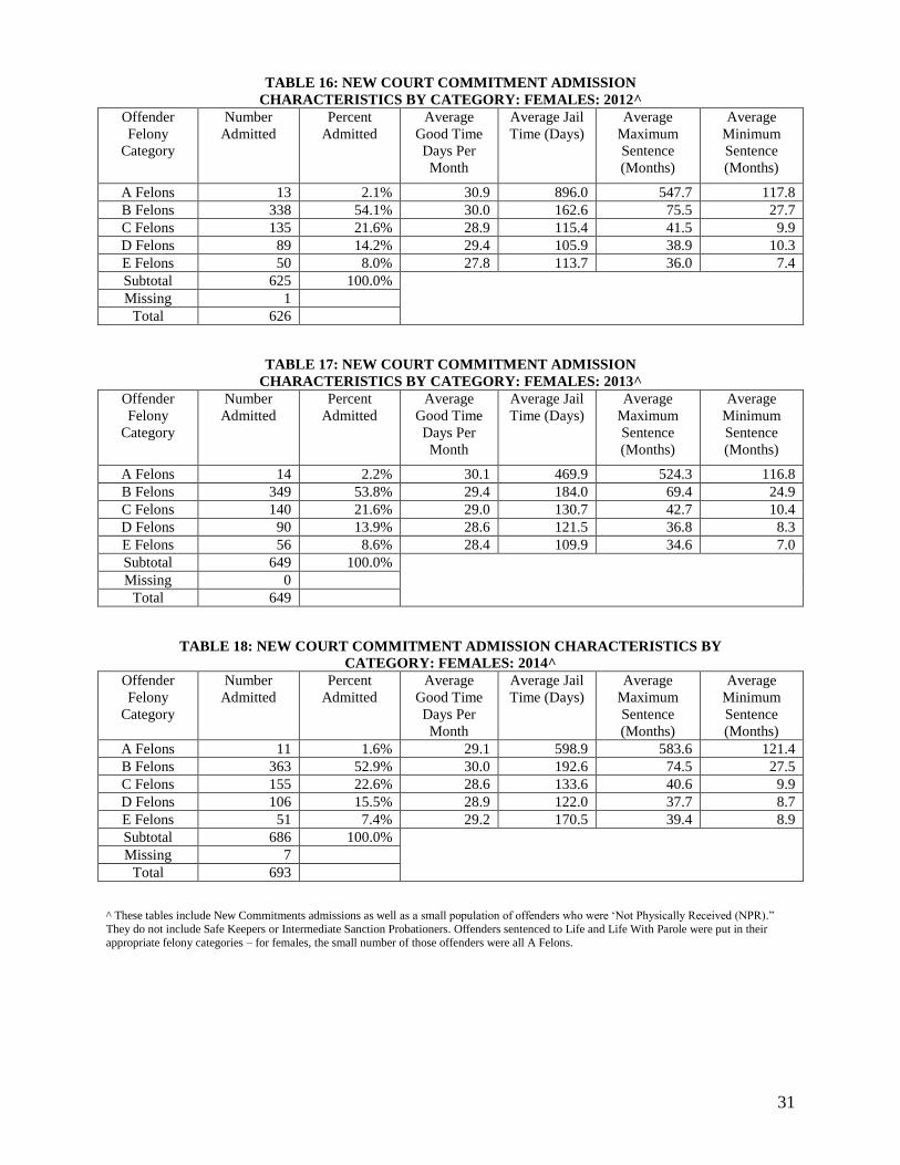
parole eligibility. (See TABLE 15 and TABLE 18.)
Both the male and female newly admitted populations from 2013 and 2014 appear to look quite similar in
composition and sentence length. For both the males and females, we see a slightly lower percentage of
new commitment admissions in 2014 who are A and B felons and a correspondingly higher percentage of C
and D felons, as compared to 2013. For male new commitments, the average maximum sentences in 2014
were higher for all but the B felons (the felony group that accounted for 62.1 percent of all male new
commitments in 2014), and the average minimum sentence was higher for A and B felons, as compared to
2013. For female new commitments, the average maximum and minimum sentences were higher for all but
C felons, as compared to 2013.

28
C. Future Parole Revocation Rates
We assume that both male and female parole violators will remain at levels observed in 2014 over the
forecast horizon.
From 2004 to 2006, the number of parole violators declined by approximately -8 percent each year. (See
TABLE 12.) Then from 2006 to 2008, parole violator admissions declined by -23.7 percent. The decrease
in parole violations was a result of AB 510 which shortened the time on parole for most offenders. With
less time on parole, there is less opportunity for revocation. In 2009, we observed the first increase in
parole violators returned to prison since 2003 – an increase of 12.6 percent from 2008 to 2009, followed by
an increase of 13.5 percent from 2009 to 2010, but the actual number of parole violators returned in 2010
was still far lower than the levels observed a decade earlier. In 2011, parole violator admissions jumped
dramatically by 24.8 percent to 976. In 2012, parole violator admissions grew by a much smaller 3.2
percent, before declining by -13.4 percent in 2013. In 2014, parole violator returns increased by 6.0
percent. (See TABLE 12.)
TABLE 12: PAROLE VIOLATORS ADMITTED BY YEAR: 2000-2014
Year Total Parole
Violators
Percent Change
2000 1,006
2001 972 -3.4
2002 1,021 +5.0
2003 1,048 +2.6
2004 961 -8.3
2005 885 -7.9
2006 802 -9.4
2007*
2008 ** 612 -23.7
(change from 2006)
2009 689 +12.6
2010 782 +13.5
2011^ 976 +24.8
2012^ 1,007 +3.2
2013 872 -13.4
2014 924 +6.0 Prior to 2007, this table utilized counts from the NDOC monthly reports. After 2008, this table was populated using counts from the NDOC admissions datafiles.
* The admissions data file for 2007 from NDOC provided unreliable data for admissions by type, so the parole violator admissions
could not be established. ** The admissions data file for 2008 did not contain admissions by type for July and August 2008. JFA utilized the proportion of
admissions in each subcategory for the 10 months of 2008 for which the data were available and applied those proportions to the total
admissions for July and August to obtain estimated subcategory counts for July and August. ^ 2011 and 2012 counts were populated from NDOC monthly reports provided in March 2013.
29
D. Future Admissions Counts
Male new commitment admissions are projected to increase by an average of 0.6 percent per year
and female new court commitments an average of 0.7 percent through the year 2025.
Male new commitment admissions increased each year from 2002 to 2006, at an average annual rate of 8.9
percent. JFA does not know the count of male new commitments in 2007, but male new commitment
admissions declined approximately12 -2.6 percent from 2006 to 2008. Male new commitment admissions
continued a fairly steady decline from 2008 to 2012, falling at an average annual rate of -3.1 percent. In
2013, male new admissions increased a very slight 0.2 percent from 2012. In 2014, male new commitment
admissions increased by 3.9 percent.
Over the past two decades, female new commitment admissions have fluctuated widely with several years
of increases and decreases of varying magnitudes. From 2004 to 2006, female new commitments grew at
an average annual rate of 14.7 percent. Again, JFA does not know the count of female new commitments
in 2007, but female new commitment admissions declined approximately -16.8 percent from 2006 to 2008,
and dropped by another -1.6 percent from 2008 to 2009. Altering course, the female new commitment
admissions grew by 8.0 percent from 2009 to 2010, before declining by -7.4 percent from 2010 to 2011.
From 2011 to 2013, female new court commitments increased at an average annual rate of 3.2 percent
before rising by 7.1 percent in 2014. To smooth out annual fluctuation, a weighted average of female new
court commitments from 2012-2014 was utilized for the female new court commitment assumption.
The male inmate population forecast assumes that the number of annual male new commitment admissions
will increase by 0.6 percent per year through 2025. (See TABLE 19.)
The female inmate population forecast assumes that the number of annual female new commitment
admissions will increase by an average of 0.7 percent per year through 2025. (See TABLE 19.)
12 Again, since the admissions datafile for 2008 did not contain admissions by type for July and August 2008. JFA utilized the proportion of
admissions in each subcategory for the 10 months of 2008 for which the data were available and applied those proportions to the total admissions
for July and August to obtain estimated subcategory counts for July and August. Thus, the full count of new commitments for 2008 is an estimate.
30
TABLE 13: NEW COURT COMMITMENT ADMISSION
CHARACTERISTICS BY CATEGORY: MALES: 2012^
Offender
Felony
Category
Number
Admitted
Percent
Admitted
Average
Good Time
Days Per
Month
Average Jail
Time (Days)
Average
Maximum
Sentence
(Months)
Average
Minimum
Sentence
(Months)
A Felons 260 6.9% 28.4 740.3 476.0 112.0
B Felons 2,563 67.6% 28.9 238.1 86.5 31.0
C Felons 568 15.0% 27.7 138.4 44.1 12.2
D Felons 283 7.5% 27.9 123.0 39.4 10.2
E Felons 118 3.1% 29.1 122.7 36.2 7.7
Subtotal 3,792 100.0%
Missing 0
Total 3,792
TABLE 14: NEW COURT COMMITMENT ADMISSION
CHARACTERISTICS BY CATEGORY: MALES: 2013^
Offender
Felony
Category
Number
Admitted
Percent
Admitted
Average
Good Time
Days Per
Month
Average Jail
Time (Days)
Average
Maximum
Sentence
(Months)
Average
Minimum
Sentence
(Months)
A Felons 206 5.4% 27.9 987.1 467.0 110.6
B Felons 2,586 67.6% 29.0 237.9 84.8 30.9
C Felons 609 15.9% 27.8 161.6 44.0 12.4
D Felons 287 7.5% 28.1 135.3 38.9 10.0
E Felons 136 3.6% 28.7 141.9 37.0 8.3
Subtotal 3,824 100.0%
Missing 0
Total 3,824
TABLE 15: NEW COURT COMMITMENT ADMISSION CHARACTERISTICS
BY CATEGORY: MALES: 2014^
Offender
Felony
Category
Number
Admitted
Percent
Admitted
Average
Good Time
Days Per
Month
Average Jail
Time (Days)
Average
Maximum
Sentence
(Months)
Average
Minimum
Sentence
(Months)
A Felons* 192 5.0% 28.0 1,118.9 478.9 148.6
B Felons 2,405 62.1% 29.3 235.7 86.1 32.4
C Felons 765 19.7% 28.8 152.7 44.8 11.8
D Felons 374 9.7% 29.0 119.7 38.2 8.9
E Felons 139 3.6% 29.8 159.1 37.4 8.3
Subtotal 3,875 100.0%
Missing 8
Total 3,883
^ These tables include New Commitments admissions as well as a small population of offenders who were ‘Not Physically Received (NPR).’
They do not include Safe Keepers or Intermediate Sanction Probationers. The A Felon category includes all offenders sentenced to Life. All but 2 or 3 offenders sentenced to Life With Parole each year from 2012 to 2014 were A Felons, the other 2 or 3 were B felons and are represented in
the B felon category. (The tables for 2012 and 2013 have been updated to reflect the movement of those 2 or 3 B felons.)
31
TABLE 16: NEW COURT COMMITMENT ADMISSION
CHARACTERISTICS BY CATEGORY: FEMALES: 2012^
Offender
Felony
Category
Number
Admitted
Percent
Admitted
Average
Good Time
Days Per
Month
Average Jail
Time (Days)
Average
Maximum
Sentence
(Months)
Average
Minimum
Sentence
(Months)
A Felons 13 2.1% 30.9 896.0 547.7 117.8
B Felons 338 54.1% 30.0 162.6 75.5 27.7
C Felons 135 21.6% 28.9 115.4 41.5 9.9
D Felons 89 14.2% 29.4 105.9 38.9 10.3
E Felons 50 8.0% 27.8 113.7 36.0 7.4
Subtotal 625 100.0%
Missing 1
Total 626
TABLE 17: NEW COURT COMMITMENT ADMISSION
CHARACTERISTICS BY CATEGORY: FEMALES: 2013^
Offender
Felony
Category
Number
Admitted
Percent
Admitted
Average
Good Time
Days Per
Month
Average Jail
Time (Days)
Average
Maximum
Sentence
(Months)
Average
Minimum
Sentence
(Months)
A Felons 14 2.2% 30.1 469.9 524.3 116.8
B Felons 349 53.8% 29.4 184.0 69.4 24.9
C Felons 140 21.6% 29.0 130.7 42.7 10.4
D Felons 90 13.9% 28.6 121.5 36.8 8.3
E Felons 56 8.6% 28.4 109.9 34.6 7.0
Subtotal 649 100.0%
Missing 0
Total 649
TABLE 18: NEW COURT COMMITMENT ADMISSION CHARACTERISTICS BY
CATEGORY: FEMALES: 2014^
Offender
Felony
Category
Number
Admitted
Percent
Admitted
Average
Good Time
Days Per
Month
Average Jail
Time (Days)
Average
Maximum
Sentence
(Months)
Average
Minimum
Sentence
(Months)
A Felons 11 1.6% 29.1 598.9 583.6 121.4
B Felons 363 52.9% 30.0 192.6 74.5 27.5
C Felons 155 22.6% 28.6 133.6 40.6 9.9
D Felons 106 15.5% 28.9 122.0 37.7 8.7
E Felons 51 7.4% 29.2 170.5 39.4 8.9
Subtotal 686 100.0%
Missing 7
Total 693
^ These tables include New Commitments admissions as well as a small population of offenders who were ‘Not Physically Received (NPR).”
They do not include Safe Keepers or Intermediate Sanction Probationers. Offenders sentenced to Life and Life With Parole were put in their
appropriate felony categories – for females, the small number of those offenders were all A Felons.

32
TABLE 19: HISTORICAL AND PROJECTED NEW COMMITMENTS: 2004-2025
Year Males Females Total
2004 4,043 570 4,613
2005 4,267 604 4,871
2006 4,744 746 5,490
2007**
2008^ 4,622 621 5,243
2009 4,475 611 5,086
2010 4,405 660 5,065
2011# 4,269 611 4,880
2012# 4,081 629 4,710
2013 4,088 651 4,739
2014 4,247 697 4,944
2015 4,311 706 5,017
2016 4,354 715 5,069
2017 4,393 725 5,118
2018 4,415 730 5,145
2019 4,437 735 5,172
2020 4,459 738 5,198
2021 4,482 742 5,224
2022 4,504 746 5,250
2023 4,526 750 5,276
2024 4,549 753 5,302
2025 4,572 757 5,329
Numeric Change
2004–2014 204 127 331
Percent Change
2004–2014 5.0% 22.3% 7.2%
Average Annual
Percent Change
2004–2014 0.6% 2.5% 0.8%
Percent Change
2013–2014 3.9% 7.1% 4.3%
Numeric Change
2015 – 2025 261 51 312
Percent Change
2015 – 2025 6.1% 7.2% 6.2%
Average Annual
Percent Change
2015 – 2025 0.6% 0.7% 0.6% ** NDOC monthly reports were unavailable for 2007, and the admissions data file for 2007 provided unreliable data for admissions by type, so JFA could not report the count of new commitment admissions for 2007. ^ The 2008admissions datafile did not contain admissions by type for July and August. JFA utilized the proportion of admissions in each
subcategory for the 10 months of 2008 for which the data were available and applied those proportions to the total admissions for July and August to obtain estimated subcategory counts for July and August. # 2011 and 2012 counts were populated from NDOC monthly reports provided in March 2013 ## In order to calculate average annual percent change for the 10-year time frame, JFA estimated the admissions subcategories for 2007. To do so, we utilized the proportion of admissions in each subcategory for 2006 and 2008 (combined), and then applied those proportions to the total
admissions in 2007.
33
VII. PRISON POPULATION PROJECTIONS
This section contains the inmate population projections based on the assumptions set forth above. Projections are
presented for male and female inmates, and the total inmate population.
TABLE 22 presents the summary table of male, female and total population projections from 2015 to 2025.
A. Projected Male Inmate Population
TABLE 20 displays a summary of the historical and projected male inmate population for the period 2004
to 2025. Neither the actual population count for 2004 nor the forecasted population through 2025 includes
inmates transferred into Nevada and held on contract from Wyoming and Washington State.
Figure 12 presents the February 2015 forecasts of male new commitment admissions and stock population.
Baseline Forecast
In 2025, 12,436 male offenders are projected to be housed in the Nevada Department of
Corrections system.
The male inmate prison population was 11,961 at the end of 2014. The population is projected to
increase to 12,237 in 2020 and to 12,436 inmates by the end of 2025. The projected growth
represents average increases of 41 inmates, or 0.3 percent per year through the year 2020.
Through the year 2025, this projected growth also represents average increases of 41 inmates, or
0.3 percent, per year.
The male forecast is very close to the April 2014 forecast although there has been an increase in
total new commitments in 2014. Looking at the individual admitting groups that make up new
commitments, the majority of the 2014 increase is within shorter serving groups, safekeepers and
intermediate probations sanctions, having a negotiable effort of the overall confined population.
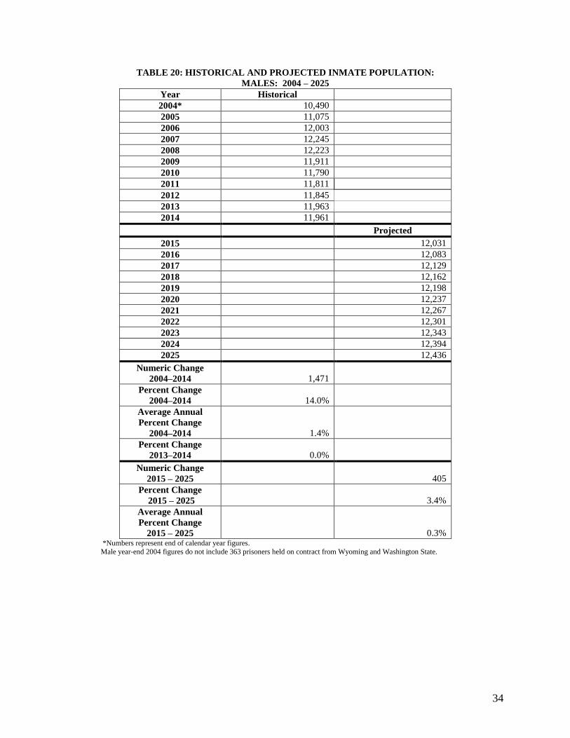
34
TABLE 20: HISTORICAL AND PROJECTED INMATE POPULATION:
MALES: 2004 – 2025
Year Historical
2004* 10,490
2005 11,075
2006 12,003
2007 12,245
2008 12,223
2009 11,911
2010 11,790
2011 11,811
2012 11,845
2013 11,963
2014 11,961
Projected
2015 12,031
2016 12,083
2017 12,129
2018 12,162
2019 12,198
2020 12,237
2021 12,267
2022 12,301
2023 12,343
2024 12,394
2025 12,436
Numeric Change
2004–2014 1,471
Percent Change
2004–2014 14.0%
Average Annual
Percent Change
2004–2014 1.4%
Percent Change
2013–2014 0.0%
Numeric Change
2015 – 2025 405
Percent Change
2015 – 2025 3.4%
Average Annual
Percent Change
2015 – 2025 0.3% *Numbers represent end of calendar year figures.
Male year-end 2004 figures do not include 363 prisoners held on contract from Wyoming and Washington State.

35
B. Projected Female Inmate Population
TABLE 21 displays a summary of the historical and projected female inmate population for the period
2004 to 2025.
Figure 13 presents the February 2015 forecasts of female new commitment admissions and stock
population.
Baseline Forecast
In 2025, 1,256 female offenders are projected to be housed in the Nevada Department of
Corrections system.
The female inmate prison population was 1,130 inmates at the end of 2014. The population is
projected to increase to 1,199 in 2020 and 1,256 inmates by the end of 2025. This projected
growth represents average increases of 12 inmates, or 1.0 percent, per year through the year 2025.
The female forecast is slightly higher than the April 2014 forecast, forecast due to an increase in
new commitments. Differing from the male population, the majority of the increase in female new
commitments is in straight commitments form court. These type of commitment carries a standard
sentence serving time which will directly increase the female prison population projection. The
increase in new commitment has been mitigated to some extent by an increase in both female
mandatory and discretionary grant rates making the resulting forecast only slightly higher.
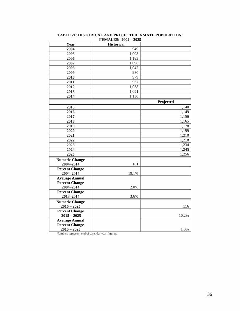
36
TABLE 21: HISTORICAL AND PROJECTED INMATE POPULATION:
FEMALES: 2004 – 2025
Year Historical
2004 949
2005 1,008
2006 1,183
2007 1,096
2008 1,042
2009 980
2010 979
2011 967
2012 1,038
2013 1,091
2014 1,130
Projected
2015 1,140
2016 1,149
2017 1,156
2018 1,165
2019 1,178
2020 1,199
2021 1,210
2022 1,218
2023 1,234
2024 1,245
2025 1,256
Numeric Change
2004–2014 181
Percent Change
2004–2014 19.1%
Average Annual
Percent Change
2004–2014 2.0%
Percent Change
2013–2014 3.6%
Numeric Change
2015 – 2025 116
Percent Change
2015 – 2025 10.2%
Average Annual
Percent Change
2015 – 2025 1.0% Numbers represent end of calendar year figures.
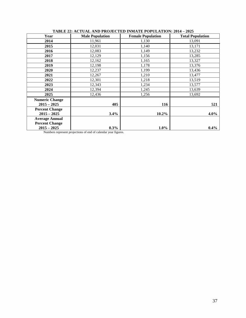
37
TABLE 22: ACTUAL AND PROJECTED INMATE POPULATION: 2014 – 2025
Year Male Population Female Population Total Population
2014 11,961 1,130 13,091
2015 12,031 1,140 13,171
2016 12,083 1,149 13,232
2017 12,129 1,156 13,285
2018 12,162 1,165 13,327
2019 12,198 1,178 13,376
2020 12,237 1,199 13,436
2021 12,267 1,210 13,477
2022 12,301 1,218 13,519
2023 12,343 1,234 13,577
2024 12,394 1,245 13,639
2025 12,436 1,256 13,692
Numeric Change
2015 – 2025 405 116 521
Percent Change
2015 – 2025 3.4% 10.2% 4.0%
Average Annual
Percent Change
2015 – 2025 0.3% 1.0% 0.4% Numbers represent projections of end of calendar year figures.

38
APPENDIX A: FIGURES
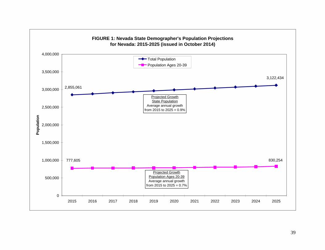
39
FIGURE 1: Nevada State Demographer's Population Projections
for Nevada: 2015-2025 (issued in October 2014)
3,122,434
2,855,061
830,254777,605
0
500,000
1,000,000
1,500,000
2,000,000
2,500,000
3,000,000
3,500,000
4,000,000
2015 2016 2017 2018 2019 2020 2021 2022 2023 2024 2025
Po
pu
lati
on
Total Population
Population Ages 20-39
Projected Growth
State Population
Average annual growth
from 2015 to 2025 = 0.9%
Projected Growth
Population Ages 20-39
Average annual growth
from 2015 to 2025 = 0.7%
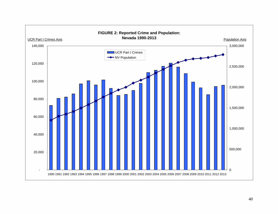
40
FIGURE 2: Reported Crime and Population:
Nevada 1990-2013
-
20,000
40,000
60,000
80,000
100,000
120,000
140,000
1990 1991 1992 1993 1994 1995 1996 1997 1998 1999 2000 2001 2002 2003 2004 2005 2006 2007 2008 2009 2010 2011 2012 2013
0
500,000
1,000,000
1,500,000
2,000,000
2,500,000
3,000,000
UCR Part I Crimes
NV Population
UCR Part I Crimes Axis Population Axis
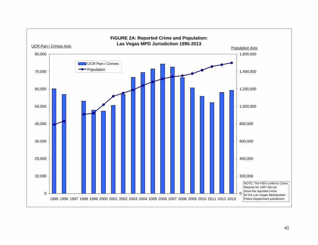
41
FIGURE 2A: Reported Crime and Population:
Las Vegas MPD Jurisdiction 1995-2013
0
10,000
20,000
30,000
40,000
50,000
60,000
70,000
80,000
1995 1996 1997 1998 1999 2000 2001 2002 2003 2004 2005 2006 2007 2008 2009 2010 2011 2012 2013
0
200,000
400,000
600,000
800,000
1,000,000
1,200,000
1,400,000
1,600,000
UCR Part I Crimes
Population
UCR Part I Crimes AxisPopulation Axis
NOTE: The FBI's Uniform Crime
Reports for 1997 did not
show the reported crime
for the Las Vegas Metropolitan
Police Department jurisdiction.
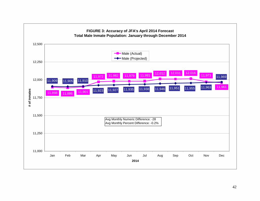
42
FIGURE 3: Accuracy of JFA's April 2014 Forecast
Total Male Inmate Population: January through December 2014
11,961
11,97312,01612,01112,012
11,98111,979
11,898 11,88611,901
11,972 11,982 11,969
11,96311,95511,95111,94611,938
11,909 11,905
11,93511,92711,923
11,910
11,000
11,250
11,500
11,750
12,000
12,250
12,500
Jan Feb Mar Apr May Jun Jul Aug Sep Oct Nov Dec
2014
# o
f in
ma
tes
Male (Actual)
Male (Projected)
Avg Monthly Numeric Difference: -28
Avg Monthly Percent Difference: -0.2%
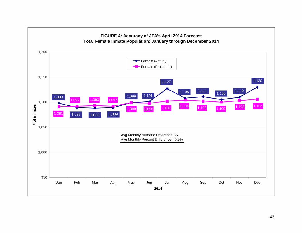
43
FIGURE 4: Accuracy of JFA's April 2014 Forecast
Total Female Inmate Population: January through December 2014
1,099
1,0891,0881,089
1,098 1,101
1,127
1,108 1,1111,105
1,110
1,130
1,099
1,0921,0931,092
1,091
1,098 1,1021,104 1,102 1,100
1,103 1,106
950
1,000
1,050
1,100
1,150
1,200
Jan Feb Mar Apr May Jun Jul Aug Sep Oct Nov Dec
2014
# o
f in
mate
s
Female (Actual)
Female (Projected)
Avg Monthly Numeric Difference: -6
Avg Monthly Percent Difference: -0.5%
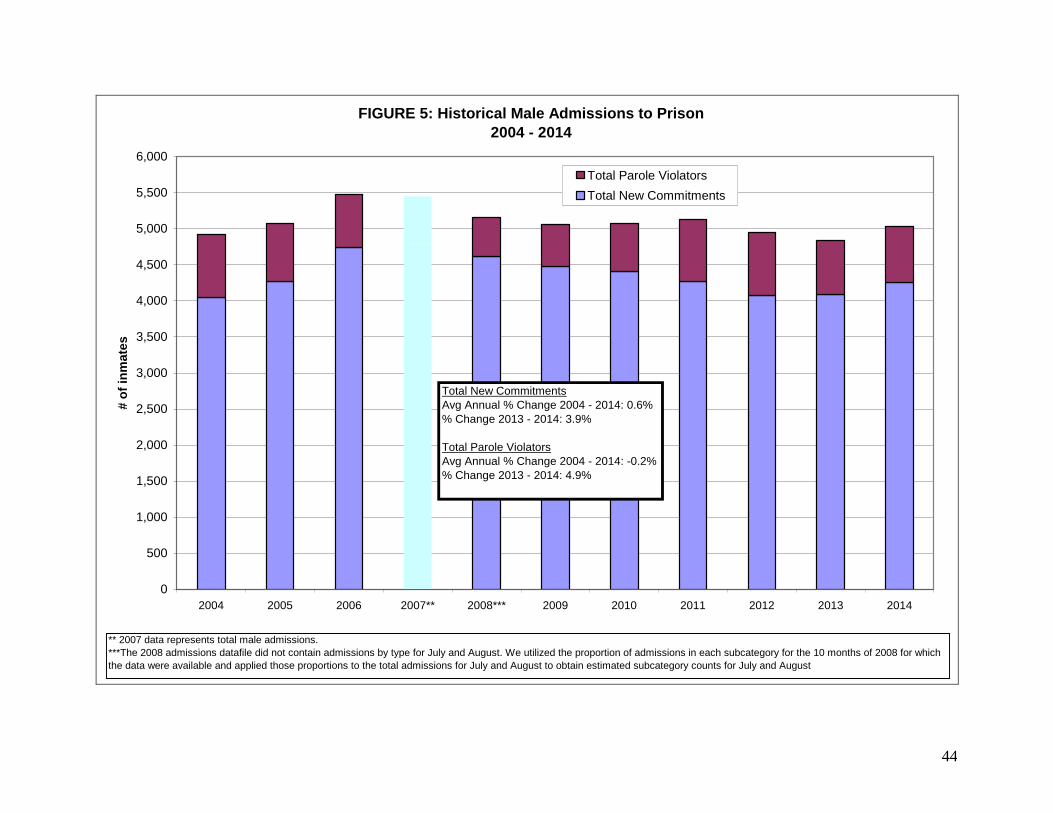
44
FIGURE 5: Historical Male Admissions to Prison
2004 - 2014
0
500
1,000
1,500
2,000
2,500
3,000
3,500
4,000
4,500
5,000
5,500
6,000
2004 2005 2006 2007** 2008*** 2009 2010 2011 2012 2013 2014
# o
f in
mate
s
Total Parole Violators
Total New Commitments
** 2007 data represents total male admissions.
***The 2008 admissions datafile did not contain admissions by type for July and August. We utilized the proportion of admissions in each subcategory for the 10 months of 2008 for which
the data were available and applied those proportions to the total admissions for July and August to obtain estimated subcategory counts for July and August
Total New Commitments
Avg Annual % Change 2004 - 2014: 0.6%
% Change 2013 - 2014: 3.9%
Total Parole Violators
Avg Annual % Change 2004 - 2014: -0.2%
% Change 2013 - 2014: 4.9%

45
FIGURE 6: Historical Female Admissions to Prison
2004 - 2014
0
100
200
300
400
500
600
700
800
900
2004 2005 2006 2007** 2008*** 2009 2010 2011 2012 2013 2014
# o
f in
mate
s
Total Parole Violators
Total New Commitments
** 2007 data represents total female admissions.
*** The 2008 admissions datafile did not contain admissions by type for July and August. We utilized the proportion of admissions in each subcategory for the 10 months of 2008 for which
the data were available and applied those proportions to the total admissions for July and August to obtain estimated subcategory counts for July and August.
Total New Commitments
Avg Annual % Change 2004 - 2014: 2.5%
% Change 2013 - 2014: 7.1%
Total Parole Violators
Avg Annual % Change 2004 - 2014: 6.8%
% Change 2013 - 2014: 12.2%
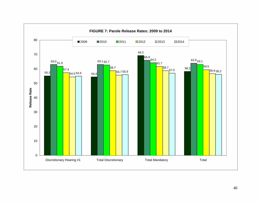
46
FIGURE 7: Parole Release Rates: 2009 to 2014
55.2 54.4
69.2
58.2
63.0 63.1
65.963.9
61.9 62.764.2
63.1
57.458.7
61.759.5
54.555.7
58.756.6
54.955.9
57.0 56.2
0
10
20
30
40
50
60
70
80
Discretionary Hearing #1 Total Discretionary Total Mandatory Total
Rele
ase R
ate
2009 2010 2011 2012 2013 2014
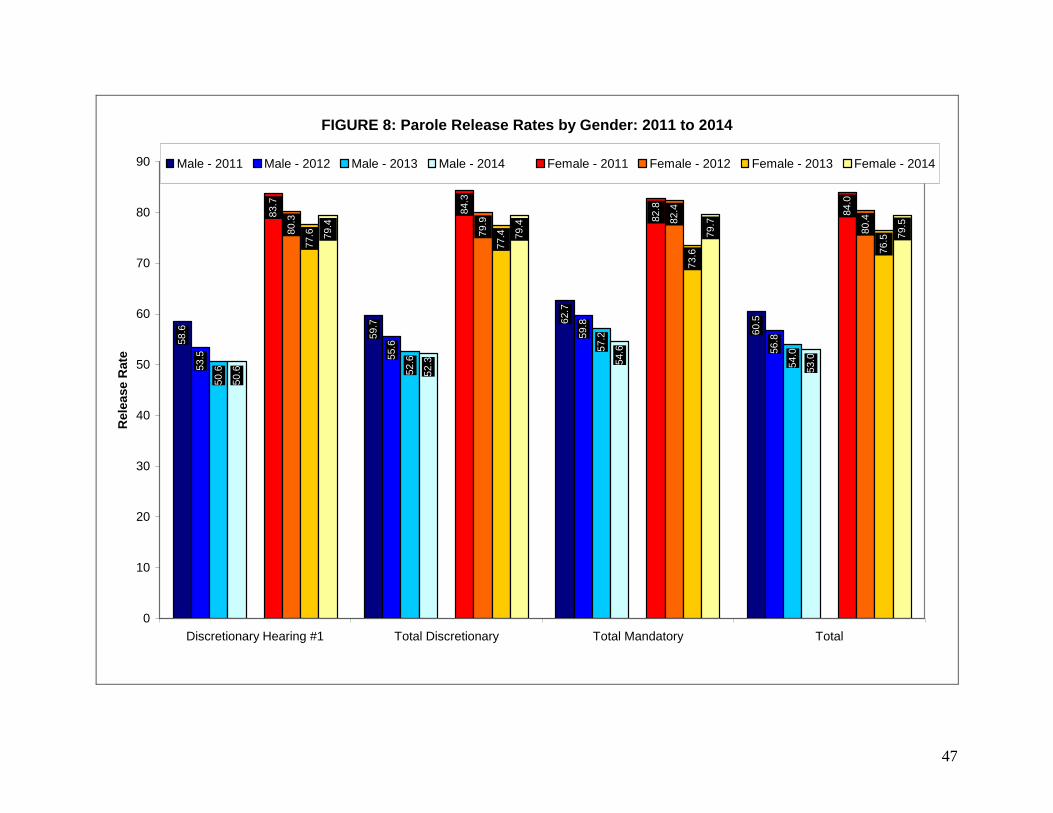
47
FIGURE 8: Parole Release Rates by Gender: 2011 to 2014
58.6
59.7 6
2.7
60.5
53.5
59.8
52.3 5
4.6
53.0
83.7
84.3
82.8
84.0
80.3
79.9 8
2.4
80.4
77.6
77.4
73.6 7
6.57
9.4
79.4
79.7
79.5
55.6
56.8
54.0
57.2
52.6
50.6
50.6
0
10
20
30
40
50
60
70
80
90
Discretionary Hearing #1 Total Discretionary Total Mandatory Total
Rele
ase R
ate
Male - 2011 Male - 2012 Male - 2013 Male - 2014 Female - 2011 Female - 2012 Female - 2013 Female - 2014
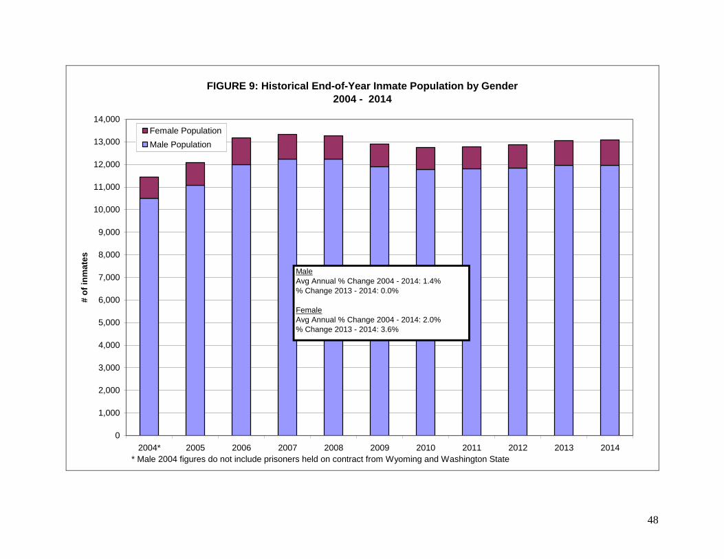
48
FIGURE 9: Historical End-of-Year Inmate Population by Gender
2004 - 2014
0
1,000
2,000
3,000
4,000
5,000
6,000
7,000
8,000
9,000
10,000
11,000
12,000
13,000
14,000
2004* 2005 2006 2007 2008 2009 2010 2011 2012 2013 2014
# o
f in
ma
tes
Female Population
Male Population
Male
Avg Annual % Change 2004 - 2014: 1.4%
% Change 2013 - 2014: 0.0%
Female
Avg Annual % Change 2004 - 2014: 2.0%
% Change 2013 - 2014: 3.6%
* Male 2004 figures do not include prisoners held on contract from Wyoming and Washington State

49
FIGURE 10: Average Minimum and Maximum Sentences by Felony Category
Male New Commitment Admissions to Prison: 2012 - 2014
37.4
38.3
44.8
86.1
8.3
8.9
11.8
32.4
37.0
38.6
44.0
84.8
8.3
10.0
12.4
30.9
36.2
39.4
44.1
7.7
10.2
12.2
31.0
86.5
0 10 20 30 40 50 60 70 80 90 100
E Felons
D Felons
C Felons
B Felons
Average Sentence in Months
2012 Avg. Min.
2012 Avg. Max.
2013 Avg. Min.
2013 Avg. Max.
2014 Avg. Min.
2014 Avg. Max.
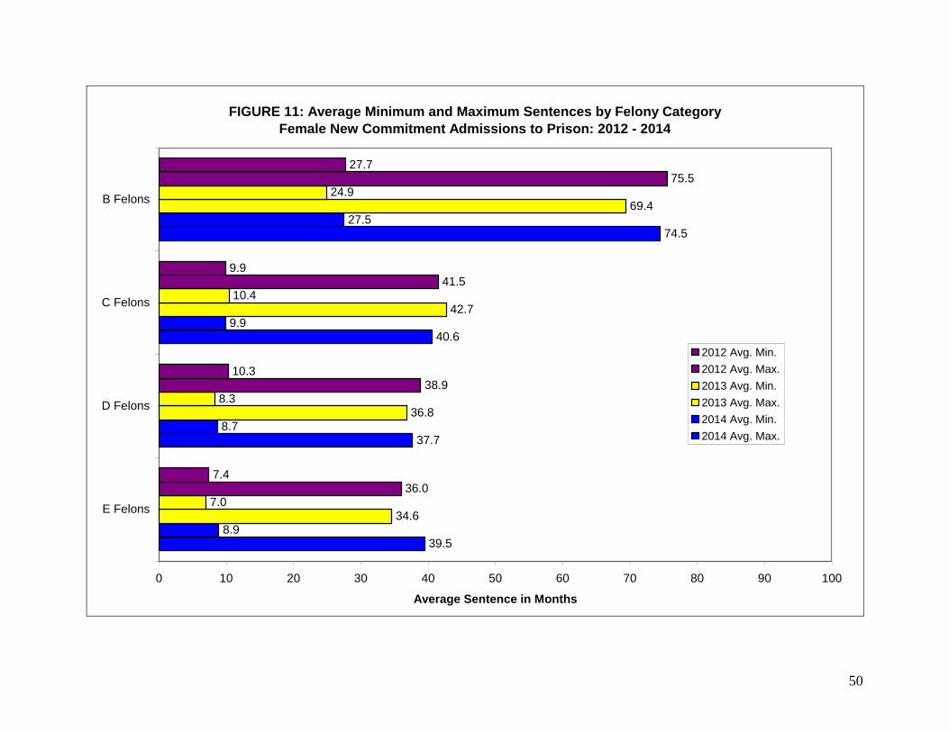
50
FIGURE 11: Average Minimum and Maximum Sentences by Felony Category
Female New Commitment Admissions to Prison: 2012 - 2014
39.5
37.7
74.5
8.9
8.7
9.9
27.5
34.6
36.8
42.7
69.4
7.0
8.3
10.4
24.9
36.0
38.9
41.5
75.5
7.4
10.3
9.9
27.7
40.6
0 10 20 30 40 50 60 70 80 90 100
E Felons
D Felons
C Felons
B Felons
Average Sentence in Months
2012 Avg. Min.
2012 Avg. Max.
2013 Avg. Min.
2013 Avg. Max.
2014 Avg. Min.
2014 Avg. Max.
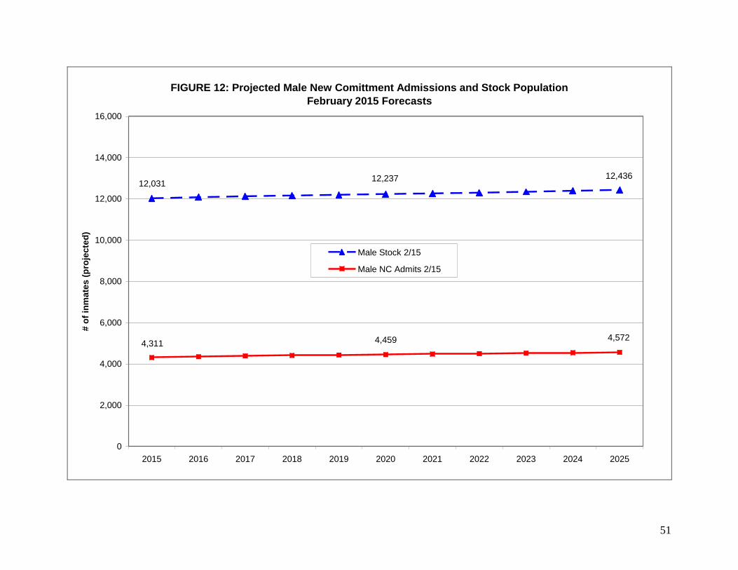
51
FIGURE 12: Projected Male New Comittment Admissions and Stock Population
February 2015 Forecasts
12,23712,031
12,436
4,3114,5724,459
0
2,000
4,000
6,000
8,000
10,000
12,000
14,000
16,000
2015 2016 2017 2018 2019 2020 2021 2022 2023 2024 2025
# o
f in
ma
tes
(p
roje
cte
d)
Male Stock 2/15
Male NC Admits 2/15
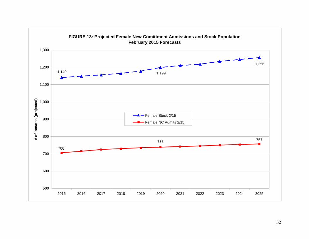
52
FIGURE 13: Projected Female New Comittment Admissions and Stock Population
February 2015 Forecasts
1,140 1,199
1,256
706
738 757
500
600
700
800
900
1,000
1,100
1,200
1,300
2015 2016 2017 2018 2019 2020 2021 2022 2023 2024 2025
# o
f in
ma
tes
(p
roje
cte
d)
Female Stock 2/15
Female NC Admits 2/15

53
APPENDIX B: PROJECTIONS
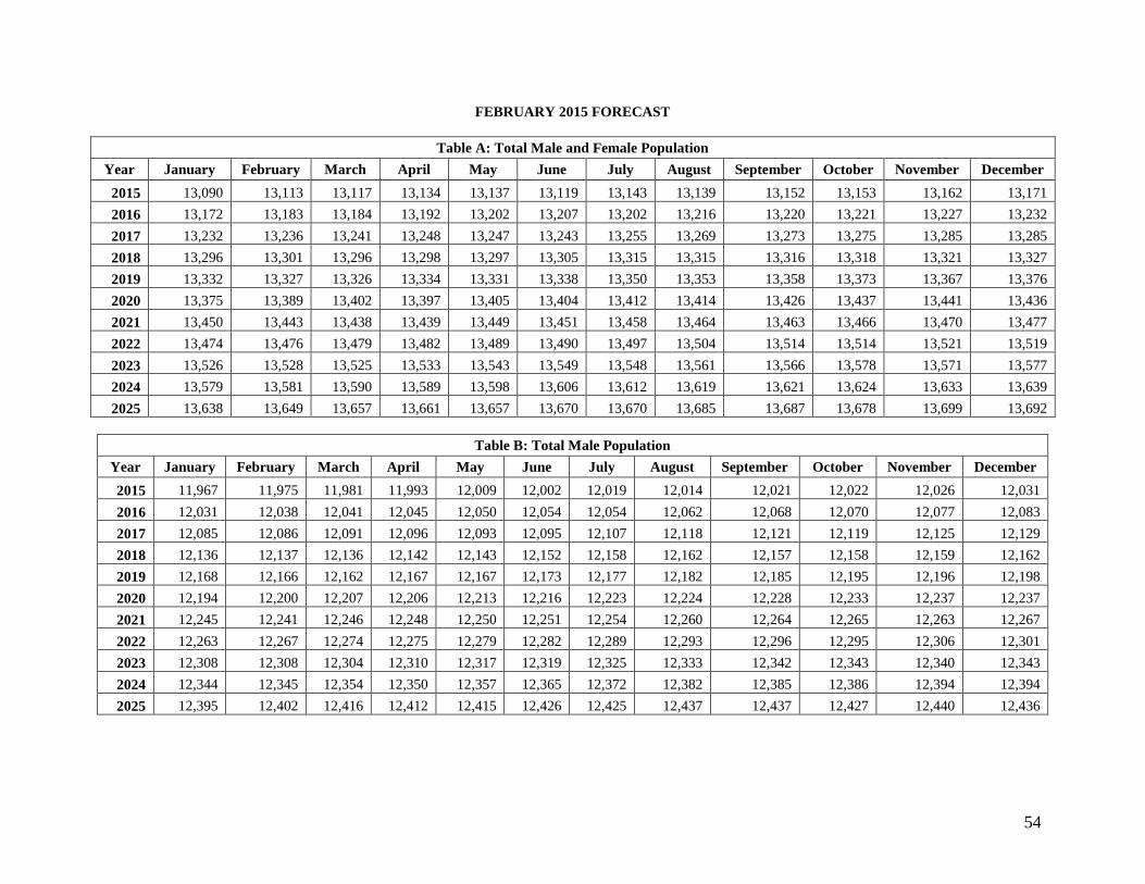
54
FEBRUARY 2015 FORECAST
Table A: Total Male and Female Population
Year January February March April May June July August September October November December
2015 13,090 13,113 13,117 13,134 13,137 13,119 13,143 13,139 13,152 13,153 13,162 13,171
2016 13,172 13,183 13,184 13,192 13,202 13,207 13,202 13,216 13,220 13,221 13,227 13,232
2017 13,232 13,236 13,241 13,248 13,247 13,243 13,255 13,269 13,273 13,275 13,285 13,285
2018 13,296 13,301 13,296 13,298 13,297 13,305 13,315 13,315 13,316 13,318 13,321 13,327
2019 13,332 13,327 13,326 13,334 13,331 13,338 13,350 13,353 13,358 13,373 13,367 13,376
2020 13,375 13,389 13,402 13,397 13,405 13,404 13,412 13,414 13,426 13,437 13,441 13,436
2021 13,450 13,443 13,438 13,439 13,449 13,451 13,458 13,464 13,463 13,466 13,470 13,477
2022 13,474 13,476 13,479 13,482 13,489 13,490 13,497 13,504 13,514 13,514 13,521 13,519
2023 13,526 13,528 13,525 13,533 13,543 13,549 13,548 13,561 13,566 13,578 13,571 13,577
2024 13,579 13,581 13,590 13,589 13,598 13,606 13,612 13,619 13,621 13,624 13,633 13,639
2025 13,638 13,649 13,657 13,661 13,657 13,670 13,670 13,685 13,687 13,678 13,699 13,692
Table B: Total Male Population
Year January February March April May June July August September October November December
2015 11,967 11,975 11,981 11,993 12,009 12,002 12,019 12,014 12,021 12,022 12,026 12,031
2016 12,031 12,038 12,041 12,045 12,050 12,054 12,054 12,062 12,068 12,070 12,077 12,083
2017 12,085 12,086 12,091 12,096 12,093 12,095 12,107 12,118 12,121 12,119 12,125 12,129
2018 12,136 12,137 12,136 12,142 12,143 12,152 12,158 12,162 12,157 12,158 12,159 12,162
2019 12,168 12,166 12,162 12,167 12,167 12,173 12,177 12,182 12,185 12,195 12,196 12,198
2020 12,194 12,200 12,207 12,206 12,213 12,216 12,223 12,224 12,228 12,233 12,237 12,237
2021 12,245 12,241 12,246 12,248 12,250 12,251 12,254 12,260 12,264 12,265 12,263 12,267
2022 12,263 12,267 12,274 12,275 12,279 12,282 12,289 12,293 12,296 12,295 12,306 12,301
2023 12,308 12,308 12,304 12,310 12,317 12,319 12,325 12,333 12,342 12,343 12,340 12,343
2024 12,344 12,345 12,354 12,350 12,357 12,365 12,372 12,382 12,385 12,386 12,394 12,394
2025 12,395 12,402 12,416 12,412 12,415 12,426 12,425 12,437 12,437 12,427 12,440 12,436
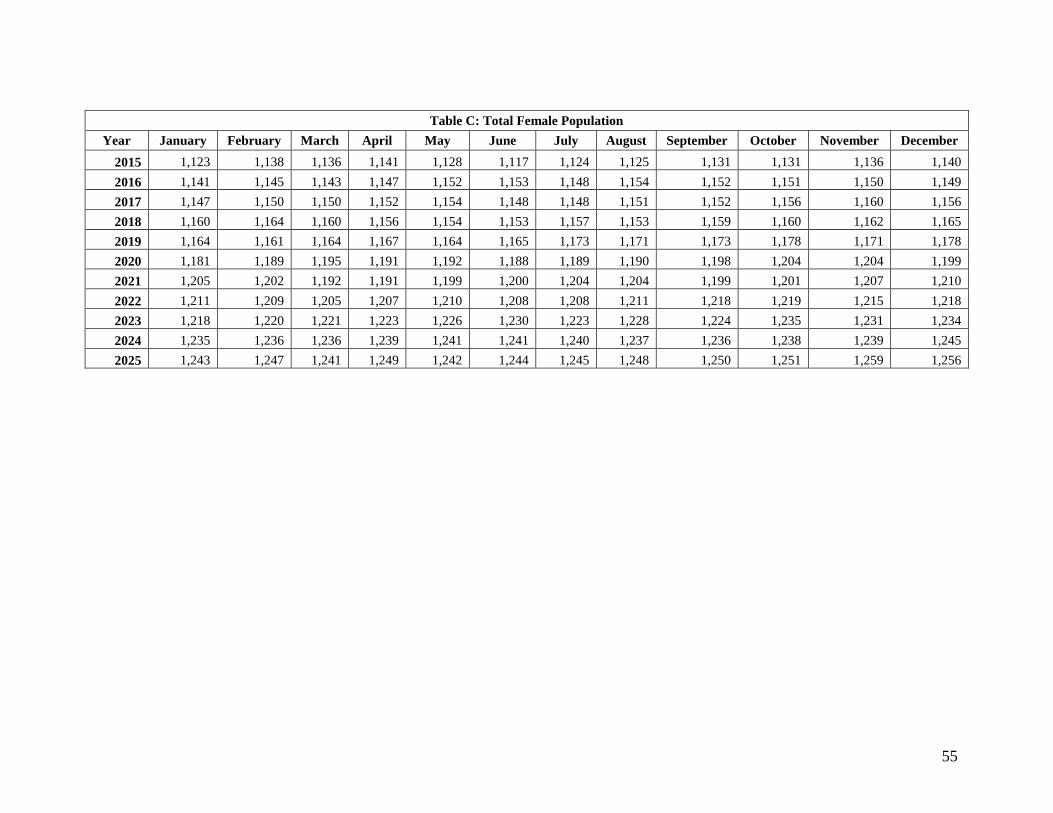
55
Table C: Total Female Population
Year January February March April May June July August September October November December
2015 1,123 1,138 1,136 1,141 1,128 1,117 1,124 1,125 1,131 1,131 1,136 1,140
2016 1,141 1,145 1,143 1,147 1,152 1,153 1,148 1,154 1,152 1,151 1,150 1,149
2017 1,147 1,150 1,150 1,152 1,154 1,148 1,148 1,151 1,152 1,156 1,160 1,156
2018 1,160 1,164 1,160 1,156 1,154 1,153 1,157 1,153 1,159 1,160 1,162 1,165
2019 1,164 1,161 1,164 1,167 1,164 1,165 1,173 1,171 1,173 1,178 1,171 1,178
2020 1,181 1,189 1,195 1,191 1,192 1,188 1,189 1,190 1,198 1,204 1,204 1,199
2021 1,205 1,202 1,192 1,191 1,199 1,200 1,204 1,204 1,199 1,201 1,207 1,210
2022 1,211 1,209 1,205 1,207 1,210 1,208 1,208 1,211 1,218 1,219 1,215 1,218
2023 1,218 1,220 1,221 1,223 1,226 1,230 1,223 1,228 1,224 1,235 1,231 1,234
2024 1,235 1,236 1,236 1,239 1,241 1,241 1,240 1,237 1,236 1,238 1,239 1,245
2025 1,243 1,247 1,241 1,249 1,242 1,244 1,245 1,248 1,250 1,251 1,259 1,256
Related Documents


