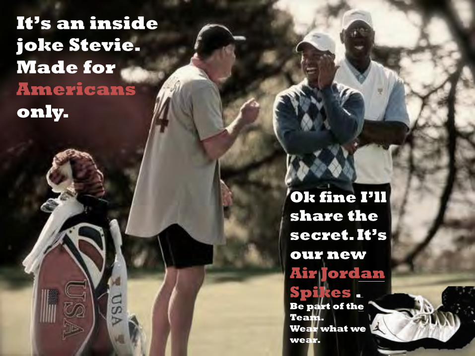
Ok fine I’ll share the secret. It’s our new Air Jordan Spikes . Be part of the Team. Wear what we wear. It’s an inside joke Stevie. Made for Americans only.

Welcome message from author
This document is posted to help you gain knowledge. Please leave a comment to let me know what you think about it! Share it to your friends and learn new things together.
Transcript
Ok fine I’ll share the secret. It’s our new Air Jordan Spikes . Be part of the Team. Wear what we wear.
It’s an inside joke Stevie. Made for Americans only.
Air Jordan .
Be part of the
Wear what we
Project 2 Ad Analysis- Air Jordan Spikes
Marketing Niche:
African American Males
‘The buying power of African Americans/Blacks rose 166% in 17 years, from $318 billion in 1990 to $845 billion in 2007. By 2012, the buying power of African Americans/Blacks is projected to grow to more than $1 trillion, according to the University of Georgia’s Selig Center for Economic Growth.’ (MPA Market Profile on African Americans)
Specifically for teens, they have been reported to spend 20% more than the average teen while being very brand loyal. They also have the most influence on household purchasing in the area of Athletic shoes at 43.6%. Furthermore, they have been earmarked by research agencies to be at the forefront and play a huge role in urban mainstream culture.
Product:
Nike Air Jordan Golf Shoes
These shoes are part of the Michael Jordan Golf Collection specially created for Jordan himself and are not actually for commercial sale in the market today. Nike plans on introducing these shoes as part of their Air Jordan collection eventually, partly due to PGA Tour player Keegan Bradley, a neighbor and long time friend of Jordan, who is known for his very athletic, almost basketball like approach to golf (he literally has a short sequence of steps that TV commentators call the ‘Keegan Dance’ that has footwork similar to basketball players). More importantly though, he is a huge fan of Jordan and is the only player on tour to wear Air Jordan golf shoes. He is extremely proud of them, features them a lot on his Instagram account and even has them customized for special events. This has garnered a lot of attention within the golfing and sports circles, creating huge demand for those shoes. The Air Jordan shoe collection is extremely popular with African American males, especially amongst the teens, and in 2011, they accounted for 71% of the basketball shoe market share (Forbes). Thus, I feel that this product will be really well received for both adults or teens plus it has the potential to reach out to the younger age group, showing them that golf is cool and is something to explore.
Persuasion Angle:
I will not be narrowing the scope to a specific archetype, mainly because I believe the product can appeal to African American males in general. The angle I am deciding to take is one that portrays the ‘golf’ shoe as something more than that. It is a ‘golf’ shoe that is as cool as any Air Jordan sneaker. More importantly, the shoe will be used as a symbol of the emerging growth in popularity of the game of golf for African Americans, who previously had very restricted access but now can enjoy it after Tiger Woods came about. Ad Analysis Deconstruction of Nonverbal Behavior
Facial expression § Tiger Woods and Michael Jordan both wear wide smiles, laughter that shows not only joy but also a certain playfulness, or cheekiness in relation to the joke that they are referring to.
§ Steve Williams’ (Tiger’s Caddy) face is covered because his expressions are not crucial in this ad since he is the guy who does not get the joke, who is not in the inner circle
§ Michael is also not looking directly at Steve,

emphasizing the previous point Body Posture, Language
§ Both Tiger and Michael have their arms folded, which indicates a sense of control over the situation as well as confidence
Gestures § Tiger has one arm up and with his wide grin, is
attempting to not let Steve into the joke by almost signaling that ‘well you’ve got to figure it out on your own’
Focus § The focus is on the commanding position that both
Tiger and Michael have over Steve and the situation, with regards to the joke
Destruction of Copy
Headline ‘It’s an Inside Joke. Made for Americans only’
§ When the reader first sees the inside joke, the contents of it is unknown which piques the reader’s curiosity.
§ When the reader is given a hint that it is ‘Made for Americans only’, which for the targeted community of African American teens, can give them a sense of pride and further their interest in finding out what this joke is about because they are American and they would surely want to know.
Copy ‘Ok fine I’ll share the secret. It’s our new Air Jordan Spikes’
§ Finally the beans are spilled on what the joke is all about and it brings immediate attention to the Air Jordan Spikes.
§ At this point the reader will be able to make the connection between the feelings of the joke being made for Americans and the shoes, and the exclusivity of it becomes very attractive by invoking national pride
Call-to-action ‘Be part of the Team. Wear what we wear.’
§ The concept of this call-to-action is straightforward and plays on the emotions and thoughts previously brought out in the headline and copy.
§ The immediate follow-up of urges viewers to be part of that exclusive ‘club’ of Americans, by wearing the same as probably the 2 most successful and iconic African American sportsmen ever
Thus, the message that is being communicated to the viewer is not complicated and can be implied rather easily by the formation of a linear connection in the viewer’s mind
→ ‘What is the inside joke?’ → ‘It’s made for Americans. That’s me!’ → ‘I want to know the secret!’ → ‘OK Tiger says it’s those shoes…get those shoes and join them’ → ‘I want to get them so bad! I’m American so I can be part of their Team!! :)’
Marketing Analysis
Magazine coverage
§ Sports magazines- Sports Illustrated, ESPN, § Men’s/Urban magazines- Jet, Ebony, Vibe
Target audience- § Placement of the ads in these magazines are
African American males, in particular the teenage population
appropriate and important to capture the wide viewership of the African American males since these are the most frequently read magazines in their community (MPA market profile)
§ The ad appeals to their culture and can be positively viewed
Artistic Composition Analysis
Visual message- the setting of the ad is on the golf course, during a competitive round of golf
§ If the reader is familiar with golf, he should know this is the Ryder Cup- a biannual team style competition against the Europeans) which automatically can be related to Team USA
§ If not, the Team USA bag on the left will show the viewer that it is a team event where national pride comes into play
§ Therefore, the connection can be made by viewers that if you wear these shoes, you are part of the team like on the golf course itself
Colors- mostly black and white with shades of red, white and blue
§ The red, white and blue automatically conjures up American pride
§ Red font used for ‘American’ as well as ‘Air Jordan Spikes’ allows readers to link those 2 terms in their mental image, helping to emphasize the message
Composition
§ Since readers tend to view ads in a left to right, top
to bottom sequence, it makes most sense to put the headline in the top left hand corner followed by the main images to evoke ideas/thoughts then the copy to confirm those thoughts
§ The picture of the shoe plus the call-to-action is placed side by side at the bottom right corner (last thing viewers will see) so that readers can make that connection immediately after getting the message.
§ By the recency effect, the viewer will also most likely remember the image of the shoe and the thought to buy the shoe to ‘be part of the team’ because it’s the last thing he sees, and this is the main purpose of the ad
Narrative Past frame § Tiger makes 3 birdies in a row to start then hits
another great shot and Steve says to Tiger, ‘Wow man you really are lighting it up today. What do you think is the difference? I mean we all know you can get it going but I’m seeing something totally new here.’
Present frame § Tiger and Michael just laugh with their hands
crossed as they wait for the other guy to hit. Tiger lifts one hand up and says with a smirk, ‘It’s an inside joke Stevie. Made for Americans only’ with an emphasis on only. Michael just stands at the side and laughs because Steve just asks a seemingly serious question and only both of them know that the answer is nothing but. It’s the shoes!
Future frame § Steve replies Tiger, ‘It’s not funny guys. Just because I’m not American and I’m Kiwi I don’t get a pair???’
How the Ad works Mixture of Symbolism
and Emotions to invoke a Sales response
§ The ad attempts to get the reader to make a connection between Tiger and Michael as star sportsmen who are immensely proud to be representing the Americans, specifically the African Americans, and the shoes. Readers will feel that pride and hopefully be drawn into buying the shoes in order to belong to that exclusive ‘club’ together with Tiger and Michael.
References
1. Magazine Publishers of America- Market Profile for African Americans 2. Profile on Keegan Bradley- http://www.pgatour.com/players/player.33141.keegan-bradley.html 3. Air Jordan 2012 Golf shoes- http://www.kicksonfire.com/2012/04/05/air-jordan-2012-golf-shoes/ 4. Air Jordans- http://www.forbes.com/sites/kurtbadenhausen/2011/09/22/the-business-of-michael-
jordan-is-booming/ Source Credits for Pictures
1. Main picture (Telegraph UK)- http://blogs.telegraph.co.uk/sport/mikenorrish/100002355/tiger-woods-ass-slapping-antics-will-be-a-ryder-cup-worry-for-colin-montgomerie/
2. Picture of shoes (Keegan Bradley)- http://instagram.com/p/mi5Zc3Mi-O/

!
AD
PROJECT 2: AD ANALYSIS By Holly Zierden
GC/MCS 115 Graphics and Media July 22, 2014
OVERVIEW
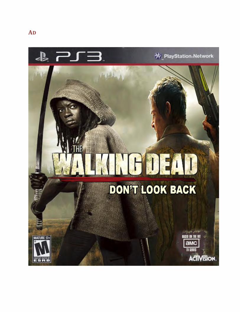
Marketing Niche: Females of all ethnicities Product: The Walking Dead: Don’t Look Back video game for the PlayStation 3 console Angle: We learned in Module 5 that 40% of women play video games. This is a large market that can be tapped into since typically first person shooter games are targeted towards males. According to our text, research shows that females have specific characteristics and preferences that can and should be incorporated into games.” I want to take a popular video game, for a popular television show among men and women, and market towards women. Image: The character of Daryl Dixon with his back turned away from the audience, holding his crossbow is on the right. The character of Michonne, facing the audience, holding her favorite weapon, a katana, is on the left. Ad copy: The Walking Dead: Don’t Look Back Analysis:
A: Process: The ad will be for the cover of a video game. The character of Michonne is a strong, female, African-‐American character that is a fan favorite among women and men. She will be the primary focus since she is facing the audience. She will be a playable character in the game to appeal to females. Ad copy will be placed in the center of the cover, below the faces of the characters.
B. Message: The message is that it’s a new world they are living in (the zombie apocalypse) and there is no going back. They need to keep moving forward. Both are considered strong characters, especially Michonne, who has proven to be able to fight and survive on her own.
C. Graphics: Two characters who appear to be “on alert” ready for a fight. Colors will be black, white, gray, and red. The font of the message will be in white in block sans-‐serf to draw attention to the message.

ANALYSIS
1. Deconstruction Of Nonverbal Behavior a. Facial Expression: Strong, confident, and ready for action. b. Body Posture/Language: Standing upright, confident, and attentive. c. Gestures: Eyes show they are ready for what is to come and arms and hands
hold weapons if needed
2. Deconstruction Of Copy a. Headline Analysis/Subtitle: “The Walking Dead” is a title famous to comic
book and television fans. Fans will immediately realize it is a game based on characters in the books and television show. The subtitle “Don’t Look Back” is the title for this game because there are other titles in the video game franchise.
b. Message Communicated to the Consumer: In a dangerous new world, you must always be prepared.
3. Marketing Analysis a. Target Audience: Women of all ethnicities, fans of the comic book and
television series. b. Seasonal Ad: No, this ad can be used year round. c. Ad Placement: This ad would be featured in gaming magazines, comic book
stores, and entertainment magazines.
4. Artistic Composition Analysis a. Visual Meaning: Women may be placed in dangerous scenarios, but they
can fight, and defend themselves to survive. b. Colors: Grays, blacks, and yellow hues, highlighted by a small amount of red
symbolizing blood. c. Composition: The character of Daryl Dixon with his back turned away from
the audience, holding his crossbow is on the right. The character of Michonne, facing the audience, holding her favorite weapon, a katana, is on the left. I purposely wanted Michonne to face the audience and to show her strength and her eyes.
d. Type of Font Used and Why: The font used in The Walking Dead title is Tungsten Black. I did not deviate from this font since it is the title that is recognized. For the subtitle, I used Arial Black. It is easy to read and it went well with the Tungsten font.
5. Narrative
a. Past: There has been an outbreak of a zombie virus and few have survived. b. Present: Players assume the roles of Michonne and Daryl Dixon who are on a
mission to survive or sneak past the walkers. Through traveling, they meet other survivors who can help or hurt them. Either way, they must keep moving forward to survive and “don’t look back.”
c. Future: What difficult life and death choices will the survivors make in order to survive the harsh new world?
6. How The Ad Works a. Sales Response: Based on the hit AMC series, buyers will want to play as
their characters and make their own choices. b. Emotions: Draws on the intense emotions of life and death. c. Likeability: The character of Michonne is a strong, female, African-‐American
character that is a fan favorite among women and men. Daryl Dixon is also tough, and considered a fan favorite. Consumers will really want to play the characters.
IMAGE SOURCES
PlayStation 3 Logo, Walking Dead Cover Art and Logo, ESRB Rating, and AMC Logo: http://us.playstation.com/games/the-‐walking-‐dead-‐survival-‐instinct-‐ps3.html
Michonne Image: http://www.tvqc.com/wp-‐content/uploads/2012/10/The_Walking_Dead_Michonne_1.jpg

!
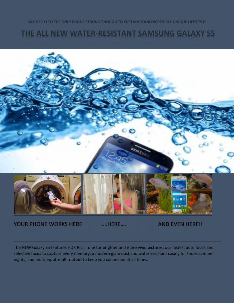
SAY HELLO TO THE ONLY PHONE STRONG ENOUGH TO SUSTAIN YOUR INCREDIBLY UNIQUE LIFESTYLE:
THE ALL NEW WATER-RESISTANT SAMSUNG GALAXY S5
YOUR PHONE WORKS HERE ….HERE…. AND EVEN HERE!!
The NEW Galaxy S5 features HDR Rich Tone for brighter and more vivid pictures; our fastest auto focus and selective focus to capture every memory; a modern glam dust and water-resistant casing for those summer nights; and multi-input-multi-output to keep you connected at all times.
AD PROJECT: THE NEW WATER RESISTANT GALAXY S5
My ad is directed at teenage girls and guys, with emphasis on black teens who love technology. I chose to incorporate several images that portray the water-resistance of the new Galaxy S5 so that teens could see that this phone can literally travel with them wherever they go and help them stay connected.
1. Deconstruction of Nonverbal Behavior
A, Facial Expression There is only one image of a girl in the ad and she is looking down at her phone in the shower. She seems pleased.
B. Body Posture, Body Language, Touch
She is focused and seems pleased with her water-resistant phone.
C. Gestures N/A
D. Focus Her focus is directly on the phone, which emphasizes its ability to capture attention.
1. Youth She looks youthful and radiant.
2. Sexual Allure N/A
3. Flawless The picture of the girl is flawless. The pictures of the phone submerged in water are also flawless.
4. Good looking/Beautiful Yes.
2. Deconstruction of Copy
A. Analyze headline, subheads, written description
The headline points to a tough phone that keeps up with your unique lifestyle, which aims at teens who want to stand out.
B. What is the message communicated to the consumer?
The message is that buying this phone is a good investment for your fun and busy lifestyle.
C. Is there a double meaning? Contrast literal meaning with implied, actual, or assumed meaning.
There is no double-meaning in this ad.
D. Target audience: African-American teens.
4. Artistic Composition Analysis
A. What is the visual message or meaning?
The visual message says that this is an awesome water-resistant phone that can keep up with you and sustain anything you throw at it (or drop it in!)
B. Colors Grey, blue, and black
C. 1. What color combinations is used and why?
Grey, blue, and black. This color combination was used to focus on the “water” resistant part of the ad.
2. What color is dominant and why?
Blue. The blue stands out for the purpose of emphasizing the phone as water resistant.
3. Composition (arrangement of objects in ad)
The phone fully submerged in water is the largest image at the top of the page, because it really drives the point home. The next one is the phone in the
washer, as a reminder that we can still use the phone after it’s been washed. The next is the phone being used in the shower, the impress young ladies who either like to text constantly or listen to music while in the shower. The last is the phone in a fish bowl to put a funny spin on the truthful fact that a lot of us drop our phones in water, and this phone can resist the fall!
4. What type of font is used and why?
A mixture of soft and bold blue and black fonts were used to blend with the pictures.
3. How the ad works (select one of the following models that describes the ad)
A. Sales response (“buy now”)
B. Persuasion This ad is meant to persuade the buyer to make this purchase so that they can have a phone that cankeep up with them and sustain the error of being dropped in water or having things spilled on it. Flygirls and Flyguys who love glam, clubs, technology, and social life will appreciate this persuasion.
C. Involvement (Emotion/Product personality)
D. Awareness (Differentiate from other brands)
E. Emotions (Brand loyalty)
F. Likeability (Like story/entertaining ad = Like brand)
This ad supplies a mixture of likeability and persuasion. Most teens like the latest and greatest phone, and the ad is entertaining.
G. Symbolism (Cultural metaphors, etc.)
PHOTOS AND SPECS FOR PHONE FEATURES BY:
Ron Amadeo: http://arstechnica.com/gadgets/2014/04/samsungs-galaxy-s5-has-plenty-of-upgrades-so-why-does-it-feel-so-meh/
Chris Chavez: http://phandroid.com/2014/03/24/samsung-galaxy-s5s-water-resistance-put-to-the-test-video/
Samsung Gear Website: http://www.samsung.com/global/microsite/galaxys5/features.html

!

Ingrid Holmeide
Professor Payn
GC 115
07.23.2014
PROJECT 2: AD
1: Ad
v Marketing Niche: US Latinos
v Product/Service: United Airlines
v Angle: Spanish-‐language ad, with focus on culture values and strong family
relationships
v Images: United Airlines airplane & group picture of people from Ecuador
v Ad Copy: “Reunirse con tu familia y amigos! United Airlines le llevár dondequiera
que estén.” (Reunite with your family and friends! United Airlines will take you
wherever they are)
v Analysis
• Process: The ad will be for United Airlines. I will analyze it using the
evaluation form, as well as adding an extra section about why and how it
would work. The focus will be both on the service itself, United, but also on
the Latino culture values and family bonds. The written description will be
analyzed, along with giving a reason for the choice of images.
• Messages: The message of the ad is to give an opportunity for the consumers
to become united with their friends and family who are living in another
country. Since U.S. Latinos are originating from a different country, they may

still have family and friends who are not living in the U.S. Flying to see them is
a way to connect with them, wherever they are.
• Graphics: There are two images in the ad; there is one picture of an airplane,
with the symbol “United” on it, and another picture of a group of a Latino
looking group of people (mostly children) waving and greeting those who are
flying in.
2: Ad Analysis
v Deconstruction of Copy
• Analyze headline, subheads, written description: The written description in
this ad is “Reunirse con tu familia y amigos! United Airlines le llevár
dondequiera que estén.” It is written in Spanish, and in English it means
“Reunite with your family and friends! United Airlines will take you wherever
they are.” U.S. Hispanics spend an average of 2 hours reading Spanish-‐
language newspapers and magazines each week according to table 6.6 in our
Module 7 Study Guide. This is much more compared to the other ethnic
groups in America who prefer English-‐language newspapers and magazines.
Through putting the text in the ad in Spanish, United Airlines has adapted to
the Hispanic/Latino subculture. United is an airline company, which make it
possible for consumers to fly across the world to see there loved ones. The
name itself, United, indicates that they will help you become united with
whom you wish to see. Latino cultures are very collectivist, meaning that they
focus more on family and the group over personal and individual ambitions
(Jones, 2014). They value family and personal relationships, and the text in
the ad is complying to this by saying that they can become reunited with their
families and friends. Since U.S. Latinos are originating from a different
country, they may still have family and friends who are not living in the U.S.
Flying to see them is a way to connect with them, wherever they are.
However, it does not only apply to the Hispanic Americans who have family
and friends abroad, but also to those who want to see different places of the
world. Flying with United will help them get where they want to go.
• What is the message communicated to the consumer?
The message communicated to the consumer is, as indicated above, an
opportunity for the consumers to become united with their friends and family
who are living in another country.
v Deconstruction of Nonverbal Behavior
• Images used: there are two images in the ad; there is one picture of an
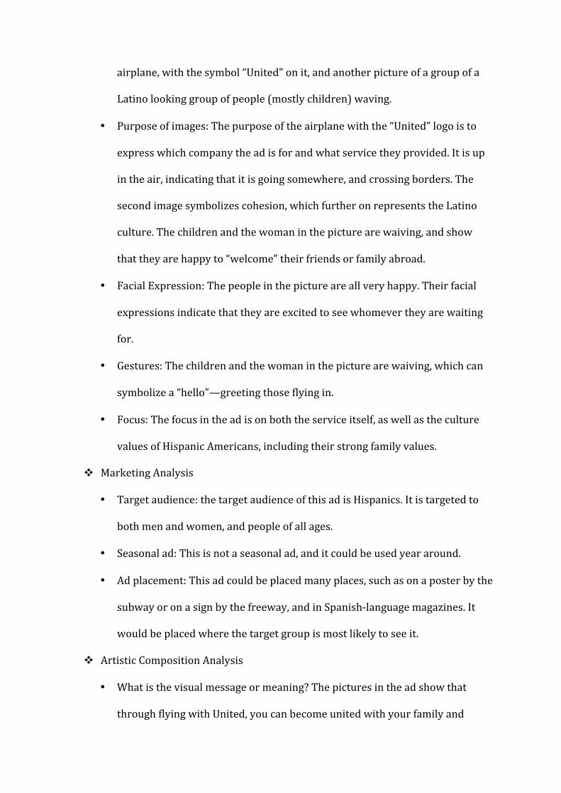
airplane, with the symbol “United” on it, and another picture of a group of a
Latino looking group of people (mostly children) waving.
• Purpose of images: The purpose of the airplane with the “United” logo is to
express which company the ad is for and what service they provided. It is up
in the air, indicating that it is going somewhere, and crossing borders. The
second image symbolizes cohesion, which further on represents the Latino
culture. The children and the woman in the picture are waiving, and show
that they are happy to “welcome” their friends or family abroad.
• Facial Expression: The people in the picture are all very happy. Their facial
expressions indicate that they are excited to see whomever they are waiting
for.
• Gestures: The children and the woman in the picture are waiving, which can
symbolize a “hello”—greeting those flying in.
• Focus: The focus in the ad is on both the service itself, as well as the culture
values of Hispanic Americans, including their strong family values.
v Marketing Analysis
• Target audience: the target audience of this ad is Hispanics. It is targeted to
both men and women, and people of all ages.
• Seasonal ad: This is not a seasonal ad, and it could be used year around.
• Ad placement: This ad could be placed many places, such as on a poster by the
subway or on a sign by the freeway, and in Spanish-‐language magazines. It
would be placed where the target group is most likely to see it.
v Artistic Composition Analysis
• What is the visual message or meaning? The pictures in the ad show that
through flying with United, you can become united with your family and
friends.
• What color is dominant and why? Blue is the dominant color, and it is
symbolizing the sky—which is where the Airplane has to go through before
reaching the destination.
• Composition: The picture of the airplane is the largest, for the reason that it is
the main focus and purpose of the ad. The picture of the Hispanic looking
group of people is about half the size, but it is still big enough to make the
consumers see it.
• What type of font is used and why? The font is in capital letters to bring out
the message clearly. The letters are black and bold. They´re big enough for the
consumer to see it, but it still doesn´t take up all of the space in the ad—
making each object in focus.
v Narrative (“tell the story”)
• Past: US Latinos/Hispanics long to see their families and friends who have not
yet migrated to the United States.
• Present: Trough the ad, they see an opportunity to fly and see them again, and
finally become reunited.
• Future: After purchasing tickets from United Airlines, the consumers will be
greeted by their families and friends at the airport, after having a great flight
with United.
v How the ad works (select one of the following models that describes the ad)
• Involvement (Emotion/Product personality): The picture of the happy people
waiving in the ad, can make the consumer sentimental and emotional, and
realize how much they would love to see their friends and families again.
• Symbolism (Cultural metaphors, etc.): Through using the picture of the
Latino-‐looking people and putting the text in the ad in Spanish, consumers
may recognize their culture values and strong family relationships.
3. Why this ad works
I think the reason this ad will work is because it the target group, U.S. Latinos/Hispanics,
can relate to it. Through using the Spanish text, it is focused especially on them, and
those who prefer Spanish-‐language newspapers/ads are able to read what it says. The
symbolism of the Hispanic looking people and the loving group of people who look
attached to each other, may bring back memories and give the consumer a need to
reconcile with their families and friends. Through using a large picture of United
Airlines, the company has managed to put a focus on the service and the company, in
addition to the culture values of US Latinos. In addition to this, U.S. Hispanics is the
minority group in the United States that has the highest increase, and according to the
article “Generation N,” about one in six Americans is of Hispanic descent or origin
(Matthews, 2010). Considering how large proportion they take up in the market place,
the importance of advertising to this ethnicity group is very big. The article “How to
Market to Minorities” further explains that "The Hispanic market alone, at $1 trillion [in
2010], is larger than the entire economies of all but 14 countries in the world" (Tugend,
2011). Their large purchasing power is therefore something to take into consideration
when creating an ad, and by adapting it to the Hispanic subculture companies can reach
a very large segment in the U.S.
4. Images used
v Picture #1: United Airlines
Credit:
http://www.underconsideration.com/brandnew/archives/the_united_and_conti
nental_airline_mashup.php#.U8bQ_Ra9yAA
v Picture #1: Group of children and a woman
Credit: Ingrid Holmeide. Taken at a daycare center in Quito, Ecuador.
Works Cited
Jones, Rick. "Collectivist & Individualist ." drcardenas.com. N.p., 2014. Web. 23 July 2014.
Matthews, Richie, and Lucia. "Generation N, The New General Market.". N.p., 16 Dec. 2010.
Web. 23 July 2014.
Tugend, Alina. "How to Market to Minorities." ebscohost.com. N.p., 2 June 2011. Web. 23
July 2014.

!
Reilly 6
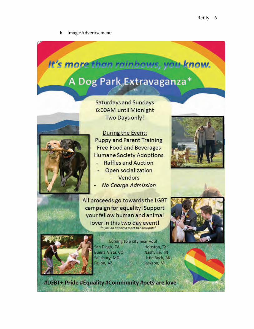
h. Image/Advertisement:

Reilly 1
Rachel Reilly
MCS 115 -- Payne
Project Two -- FINAL
July 21, 2014
I. It’s More Than Just Rainbows, You Know.
a. Marketing Niche(s): Gender
b. Product/Service: Weekend Pet and Pet Parent Get Togethers at
predetermined locations around the nation to help support the LGBT+
Equality Campaign
c. Service Details:
i. This offers a safe-place for pet parents and pets to get together and
socialize, offer training opportunities, and advice, along with
communal advice and personal preferences.
ii. Vendors will be located throughout the event to sell and promote
organic and healthier options for the pet parents and their pets.
iii. Educators will be located throughout the event to help educate
surrounding interested persons on the importance of general
equality, gender equality, and overall how acceptance can cause an
increase in one’s self and in one’s community.
iv. There will be courses to sign up for training opportunities for pets
of all ages, including teaching puppy socialization skills and mode
in depth training courses.

Reilly 2
v. Adoptions will be held (depending on the location) from various
shelters and rescues to help pet parents find the perfect new pet and
all of these proceeds will go towards local shelters and humane
societies.
vi. Various raffles and auctions will be held and all of these proceeds
will go towards the LGBT+ equality campaign.
vii. In light of all of these offers and events, any potential proceeds
will go towards the shelters, rescues, and the LGBT+ equality
campaign.
1. Mission: Promote wellbeing and equality for all pets and
people.
2. Vision: A Freer World, a Stronger Community.
3. Values: The Four H’s: Honesty, Health, Happiness, &
Heterogeneity
d. Angle:
i. To break the barriers of stereotypes, to allow a community as a
whole to partake in one of the most cherished life-choices around
the globe—owning a pet. You don’t have to be a certain race,
certain gender, or even certain age to take a part in this event, you
don’t even need to own a pet, and you just need to be yourself.
ii. These events and various services will be held over the weekend
(Saturday through Sunday) to allow for everyone to join in on the
fun. Any services found can be found in the nearby vicinity and
Reilly 3
more details can be given upon the request of the consumer. This is
not a one-city and done sort of event. We will make return trips,
we will go all across the nation promoting equality and wellbeing.
You do not need to only partake in these events, be inspired and
start your own! Become a stronger community. This is for people
of all walks of life, regardless of past, future, present, or archetype.
We want to see you there. Every person there makes a difference.
e. Analysis:
i. Nonverbal: This ad will display happy families or individuals, with
and without children, enjoying the company of their pet, whether
they are playing with toys, exercising, being groomed, or even
training. It will be an easy-going, fun-loving feeling that promotes
love and adoration for animals of all kinds. Main focus on images
above is dogs.
ii. Marketing: This ad will target pet owners, this ad specifically will
be for dogs, but all animals apply to the core value of this ad. This
is not a seasonal thing. If this ad was a print out, it would be in
health magazines, pet magazines, and other animal-specific written
pieces, maybe potentially used as fliers.
iii. Artistic: This ad is promoting heath of pets and their families. All
backgrounds of all images must be proper, clean, and well
maintained (green grass, beautiful landscape, etc). The families
themselves should look active and social, linking the idea that
Reilly 4
happy pets make happy people. Dominant colours would be green
and blue, and of course the rainbow.
iv. Narrative: The advertisement’s story is telling the viewer that by
taking part in their pet’s lives, they will also benefit by being more
active and social.
1. Past: It is saying that without taking part in your pet’s life,
there is not this light-hearted healthy vibe to your, or your
pet’s, life.
2. Present: By taking a vested interest in the life and health of
your pet, you will be benefiting from it as well.
3. Future: With healthier pets, you and your family become
healthier, and in turn everyone will be happier.
v. Ad Model: This ad is using involvement, emotionally, to lure the
viewer to take in the details from the advertisement. This ad is also
using Awareness and Loyalty, seeing that by using the service, it
promotes activity, happiness, and overall better wellbeing.
f. The General Message: The idea behind these weekly meetings for pets
and their pet parents is to ensure that the pets are able to socialize, but the
parents as well. People have a huge tendency to believe that all the pets
need is some attention in the morning, afternoon (maybe), and evening,
when in reality, they need more than just a few hours with their pet
parents. These weekly events cause the pet parents to involve themselves
in their pet’s lives more closely, hopefully in turn creating friendships, but
Reilly 5
most importantly creating a better understanding of what is needed in the
life of their pet. Promoting healthy living, healthy mindsets, and a way for
pet and pet parent to de-stress and detox from a busy week.
g. The Image’s Message: The image below portrays the happiness,
wellbeing, and safety that the event states. It is a safe-haven place for all
animal lovers to join forces and become a stronger bias-free community.
By using the image of a same-sex couple, I help solidify the fact that this
is pro-equality. By using the image of the elderly couple, I hope to fully
open the even to more than just the younger generation. And by using the
image of a non-white couple, I help reiterate that the event is not colour
specific. This event is about happiness and equality and the happiest thing
in the world is the love and adoration a pet parent gives and shares with
their pet. The rainbow and rainbow hearty were chosen to help solidify the
fact that this is a LGBT+ Equality Campaign promoting event. The image
used as the background is to help convey that this is an outdoor, pet
orientated event. This image is meant to be displayed as a type of flier, or
full-page advertisement in local wellness and animal magazines to be
found in many different places around each community. This event is to
promote acceptance, equality, and community.
Reilly 7
i. Above Image Source:
i. Rainbow Image:
http://clubpenguin.wikia.com/wiki/File:Emoticons_Rainbow_2013
.png
ii. Background Image: http://www.albany.com/dog-talk/2013/02/q-
are-dog-parks-safe.html
iii. Equality & Dog Image:
http://www.canada.com/life/cms/binary/9888247.jpg?size=620x40
0s
iv. Older Couple & Dog Image:
http://www.care2.com/greenliving/17-wonderful-dog-quotes-to-
make-you-smile.html/dog-and-couple
v. Young Couple & Dog Image:
http://www.shutterstock.com/video/clip-3105163-stock-footage-
an-attractive-couple-are-walking-through-the-forest-in-the-early-
morning-light-and-exercising-their.html
vi. Two Dogs Running Image:
http://www.petresortwillowwood.com/for-dogs/dog-lodging-
columbus-ohio/
vii. Equality Heart: http://streamlyner.com/wp-
content/uploads/2014/06/yellow-heart-clipartviewing-gallery-for---
green-heart-clip-art-vk5ggxc6.png

!
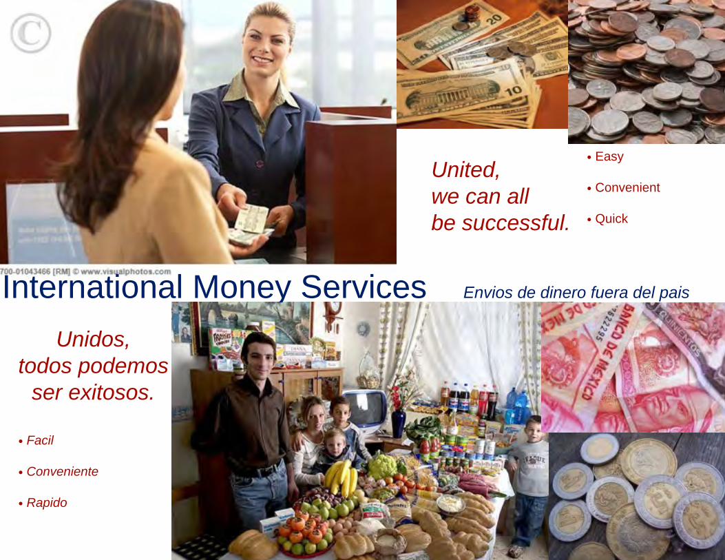
International Money Services!! Envios de dinero fuera del pais
!! United, ! we can all ! be successful.
Unidos,todos podemos
ser exitosos.
• Facil
• Conveniente
• Rapido
• Easy
• Convenient
• Quick
1. Mexican American
2. Money transferring services outside of the US
3. Families take care of each other and look out for each other. You can contribute to your families even if they are in another country. Mainly the Backboners, Buppees, and Devouts will be targeted.
4. Pictures of bank tellers and customers exchanging money; a united family; and a family holding money
5. On one side, “United we can all be successful.” On the opposite side, “Unidos, todos podemos ser existosos.”
6. This ad works because many Mexican families do, indeed, send money to family in Mexico. Latin-American culture itself values interdependence of people. Family support is also a very big factor in the culture. I think it is effective because it advertises a service that is heavily sought. Millions of dollars a year are sent to Latin-America.
ADVERTISING EVALUATION: Product__Money transferring services outside of the country__ in Publication___magazines and on the sides of buses___
2. Deconstruction of Copy2. Deconstruction of Copy2. Deconstruction of CopyA. Analyze
headline,subheads,writtendescription
One one side where the family member in the US is, “United we can all be successful.” and on the opposite side with the family member in Mexico, “Unidos todos podemos ser existosos.”
The product name will be at the bottom of the page.
B. What is the messagecommunicated to the consumer?
You should use our service to help your family. It will grow and unite your family.
3. Marketing Analysis3. Marketing Analysis3. Marketing Analysis
2. Deconstruction of Copy2. Deconstruction of Copy2. Deconstruction of CopyA. Analyze
headline,subheads,writtendescription
One one side where the family member in the US is, “United we can all be successful.” and on the opposite side with the family member in Mexico, “Unidos todos podemos ser existosos.”
The product name will be at the bottom of the page.
B. What is the messagecommunicated to the consumer?
You should use our service to help your family. It will grow and unite your family.
3. Marketing Analysis3. Marketing Analysis3. Marketing AnalysisA. Magazine
title and date (month , year, and if possible, day
Hispanic magazines and newsletters and sides of buses.
B. Target audience of magazine
Hispanic Americans with family out of the country
E. Where is the ad placed in themagazine?(Back cover, inside front cover, opposite a black and white ad, etc.)
It is placed in the center or at the front of the page, ideally.
5. Narrative (“tell the story”)5. Narrative (“tell the story”)5. Narrative (“tell the story”)A. Past Before, it was tough to conveniently send money to your family
out of the state and you would have to go out of your way to do so.
B. Present (frame frozen in ad)
Now you can conveniently send money to your family members out of your bank that they can pick up at one of many institutions out of the country minutes after you send it.
C. Future Now your family outside of the U.S. can live a more comfortable lifestyle thanks to the ease of instantly receiving money through our service.
Photos attained from:
Visual Photos, Saturday, 12 May 2012 <http://www.visualphotos.com/image/1x6997425/bank_teller_serving_customer>
12 May 2012 <http://blog.bookingbuddy.com/images/2008/08/13/currencyusbills.jpg>
12 May 2012 <http://yourdailyfacts.com/wp-content/uploads/2010/03/uscoins.jpg>
12 May 2012 <http://img.ehowcdn.com/article-new/ehow/images/a06/77/h3/send-money-mexico-paypal-800x800.jpg>
12 May 2012 <http://www.foreignexchangeservice.co.uk/mexican-peso/wp-content/uploads/2011/07/mexican-peso-coins.jpg>
12 May 2012 <http://www.greatdreams.com/food/sicily-food-2008.jpg>

!

PROJECT 2: AD (FULL PAGE MAGAZINE AD SCALED TO FIT.)
Deconstruction of CopyA. Headline, subheads, copy Used font Deva uses in their product line, used additional ‘curly’ looking font, mimiced
their ‘tone’ in the copy (light hearted, play on words)B. Message communicated? Use DevaCurl products and celebrate you, release who you are, be fun (bounce to the
ounce), you’re invited to join the revolution (calling all curly girls).C. Double meaning? Contrast literal meaning with implied, actual, or as-sumed meaning.
“More bounce to the ounce” refers to curls and large butt and breasts (per the song). If you use these products you will be who you are on the inside (release your inner spirit) and you and others will celebrate with you.
Marketing AnalysisA. Magazine Ebony, Essence, ‘O’B. Target audience of magazine, Demo-graphics
‘O’: 95% Female and 86.6% white, Age 38Ebony, Essence: African-American Female
C. Seasonal ad Focus on the time of the year when Women are ready for a change: December/January (resolution time), March/April (Spring and fresh start time, get ready for Summer), Au-gust/September (kids go back to school, now I have more time for me time)
D. Why these magazines? Target Audience that buys the magazine will probably have curly hair.E. Ad placement Ad placement ideas: I would like the ad to be placed near articles or photos of celebrities
and beautiful women with curly hair. Or... not so beautiful women with “straightened” hair.F. What is the visual message or mean-ing? In Ad Placement...
You can be just like them.... or you can be the opposite of the second
G. Colors White, “Deva” green, black copyH. Color combination and why? What color is dominant and why? Composi-tion
Use the product colors (‘Deva’ green), white clean background (dominant color).Focus on the curls (girls) in the ad. Smaller product photos.
Narrative (“tell the story”)A. Past In the past you have had to straighten or relax your hair. You fought with your hair all of
your life. You felt like a prisoner to your curls. You just don’t know what to do with your hair. Tired of �ghting the curls.
B. Present (frame frozen in ad) Give in to your natural beauty. Be you! Don’t �ght it. Accept it. Be successful. Befun to be around and happy! All you have to do is use DevaCurl.
C. Future You are the best you that you can be. Happy, ful�lled, satis�ed and free. You will be cel-ebrated. You will be a celebrity. You’ll be bouncy and fun. You will feel free because you have released your inner spirit. You are part of a new curl revolution.
NOTES: Wish I had photos that didn’t enlarge so grainy. I scanned the photos in from the Curly Girl Handbook. To use the same ad in di�erent magazines I would switch the photos around. Place some white girls larger and black girls smaller. I’m a curly girl and I love this product line.
1.) Supporting research that gives credibility to your pitch and 2.) Why this ad works for your audience.
According to “African-Origin” beliefs from Module 11 citings: Music is important, emotional expression and expressive unique stule. �e advertisement references the song “More Bounce to the Ounce” originally published by the Zapp band. �e song has strong African-American in�uences. �e text and photos in the ad are emotion-al and express a unique, independent style. Referencing �e Journal of Consumer Cutlure – Black women spend money! (Especially on their hair, I know this from personal experience.) According to the African-American/Black Market Pro�le the top magazine categories are News and Entertainment, General and Women’s maga-zines. Essence and Ebony are in the top four magazines for the target market. �e most magazine launches for the African-American market were Women’s and Fashion, Beauty and Grooming. Focus in African-American market is Women’s grooming!!

!
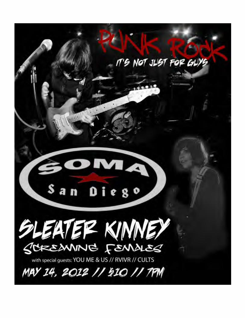

1. Gender: Women. More specifically women who are interested in live music events.
2. Flyer for a rock show at SOMA San Diego ft. bands with female performers.
3. Having fun at a punk rock show is fun for everyone, no matter their gender.
4. Images include live shots of women in rock bands and the venue’s logo.
5. Tagline: “Punk Rock” Sub-heading: “It’s not just for guys” (I changed this a little from my planned “It’s not just for teenage boys” to reflect a more realistic show flyer.)
6. Advertising Info: Deconstruction of Copy A. Tagline(a.) & Sub-head(b.)
a. Punk Rockb. It’s not just for guys
B. Message communicated? a. No matter what gender you are, you can have fun and go wild at a concert.
C. Double meaning? a. The sub-head “It’s not just for guys” implies that it is aimed at both male and female audiences.
Marketing Analysis A. Platform a. The web, specifically social networking sites and music oriented sites. b. Printed posters/flyers handed out at other musical events leading up to it. B. Target audience a. Women ages 16-25 specifically(but also men and women ages 25+)C. Seasonal ad a. This ad will be aimed at one specific event but shows like this can be put on all year long.
D. Why these platforms? a. Many women use sites such as Facebook and Skype to communicate(as do men) b. For the less tech savvy audience, these printed flyers will provide a hard copy of all the details for the event.
E. Ad placement a. Along the side of the Facebook dashboard as well as promoting it in other similar events. b. Place the posters outside of venues and areas with heavy foot traffic and hand out the flyers at schools and as other musical events are getting out.
F. What is the visual message or meaning? a. Appealing to everyone in the sense that everyone can come together and enjoy some good music, no matter your age or gender.
G. Colors a. Darker colors such as black, gray, and red will be used along with white over top.
H. Color combination and why? What color is dominant and why? a. Black and white will contrast nicely to give the lettering a nice pop. b. Black will be the dominant because inside of the venue it’s always dark to block out any distractions. That way the performers are the main focus.
Narrative (“tell the story”) A. Past a. Not many women attend punk rock shows
B. Present (frame frozen in ad) a. More and more punk bands are featuring women because they are just as big a part of the movement as men are.
C. Future a. The attendance and participation of women to these types of events will grow
Screaming females image source:http://www.flickr.com/shantycheryl/
Sleater Kinney image source:http://www.flickr.com/julius_seizure/
SOMA logo source:http://www.somasandiego.com/

!
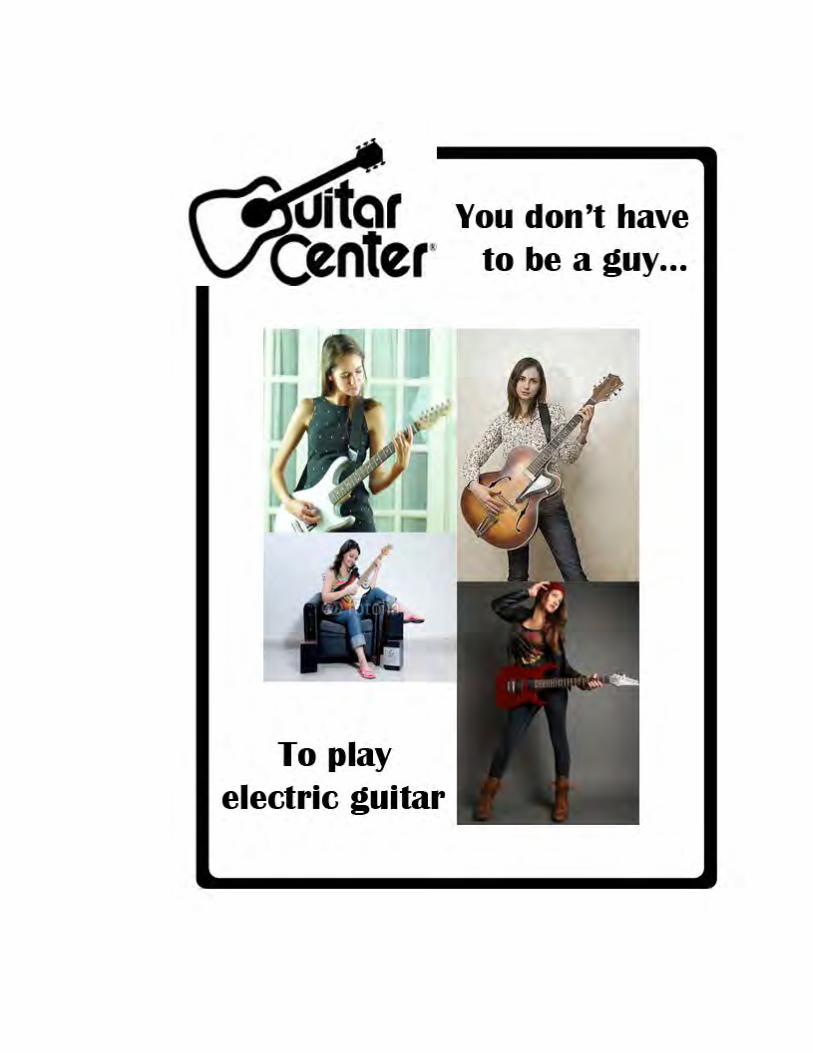
Guitar Center Ad
I. Gender
1. Marketing Niche Focus: Gender, girls and woman.
2. Product: Electric Guitars aren’t only a man thing.
3. Angle of Persuasion: This ad will appeal and encourage young woman that you don’t have to be a man to play the electric guitar.
4. Ad Slogan: “You don’t have to be a guy… To play electric guitar.”
II. Analysis
5. Facial Expressions: Focused and feeling happy.
6. Youth: All women are young teens - 20 years old.
7. Gestures: Relaxed and not tensed up.
8. Dominate Ad Color: Colors are brighter than normal men or stereotyped woman electric guitar ad that has darker colors.
9. Composition: All are looking relaxed, not intense facial looks. One woman holds
her guitar with pride. III. Telling the Story
1. Past: You're a young woman, but to you electric guitar is only a man thing.
2. Present: You noticed that other young woman like you are playing.
3. Future: You feel confident also to play electric guitar for fun. IV. Deconstruction of Ad The ads start out at the top with the store logo “Guitar Center” on the left of the page. Next the ad slogan across says, “You don’t have to be a guy… I do this because next the reader will look at all the photos of the woman guitar players. Then to finish off the slogan I inserted by saying, “To play electric guitar”. V. Marketing Analysis
This Ad would most likely be in a magazine, newspaper, Internet or mail ad.
VI. Artistic Composition Analysis The artistic composition shows that any girl or woman can play electric guitar and that the Guitar Center welcomes this audience into their store. VII. How this Ad works
This would be an Ad for Guitar Center; All Ads I have seen only have men in them or some rebellious girl playing the electric guitar, not a normal young woman. I wish I could have found a good picture of a young Black American woman playing the guitar for a multicultural feeling. I did see only one Black American photo, but it had the copyright logo on it.
Resources:
1. Top left: http://ak.picdn.net/shutterstock/videos/5864897/preview/stock-footage-woman-playing-or-practicing-on-a-guitar.jpg
2. Top right:
http://image.shutterstock.com/display_pic_with_logo/294886/294886,1237280357,12/stock-photo-attractive-young-woman-playing-guitar-standing-at-wall-26818669.jpg
3. Bottom left:
http://t1.ftcdn.net/jpg/00/16/70/32/400_F_16703260_E14pDAhIwDWhnVWJwDorFOHf1jOm7FmC.jpg
4. Bottom right: This photo is a picture of my sister who actually plays electric
guitar.

!

I. Project II Ad Analysis--Roots Ends Hair Care Line
A. Marketing Niche: Males/Females of multiple ethnicities (mixed)B. Product: Hair care line designed for multi-racial individualsC Angle: The ad will have to appeal to several demographics (Hispanic, Asian, African-American, Caucasian, etc.) due to the nature of the products.D. Image(s): Hair with multiple textures/colors; the product line (shampoo, conditioner, styling cream, oil, etc.)
II. Deconstruction of CopyA. Analyze headline, subheads, written description, etc.: Headline: “You are one of a kind.” This line appears at the top of the ad and grabs the consumer’s attention first by directly addressing them and instills pride in them for having a diverse cultural background.Subhead: “And so are we.” Roots Ends will help the consumer further celebrate their individuality all the while helping them maintain their hair!Written Description: “You are a unique combination of individuality and harmonious cultural balance. We are a blend of silk amino oils, soy protein, avocado and argan oils. Together? A match made in heaven.” This description once again acknowledges the parallels between the consumer and Roots Ends--both are one of a kind, and together are even stronger.Product name/tag line: “Roots Ends. One unique recipe for another.” The idea is that the Roots Ends hair line utilizes a revolutionary hair care recipe that is specialized and unique--just like its consumer.B. What is the message being communicated to the consumer? Hair requires maintenance and time in order to retain its health, and being of mixed descent can interfere with easily choosing what types

of products to use. A hair care line devoted to multi-racial consumers with varying textures and needs eliminates having to purchase multiple products with different specified intentions in favor of one line that does it all!C. Is there a double meaning? Contrast literal meaning with implied, actual, or assumed meaning: Implied: Being of multi-racial descent can produce a hair type all one’s own, unique in it’s appearance and touch.Actual: One can develop an even more confident sense of individualism and pride in their ethnicity through the maintenance of one of ethnicity’s most visual indicators--hair!
III. Marketing AnalysisA. Magazine title and date: A women’s magazine would probably be the most effective since women are probably more popular consumers of hair products (Glamour, Cosmopolitan, In Style, etc.); year-aroundB. Target audience, demographics: Multi-racial individuals, but women are probably more susceptible; 18-49 age rangeC. Seasonal ad? Not necessarily. Hair care products are used year around for proper care and maintenance.D. Reason for this particular magazine: It is evident by the number of hair product lines that are sold and their specific target audiences that women consume a lot more of them than men, so that is a reason why a woman’s magazine might be more advantageous than a mens’ magazine or a tabloid (even though women probably read those more than men, too!)E. Ad placement: Somewhere in the beauty section, or near an article about hair/personal care
IV. Artistic Composition AnalysisA. Visual Message/Meaning: We are all unique in our hair types, but unified under the desire for hair products that we feel are designed for usB. Color combinations/ Font: Warm, rich tones that pay homage to the neutral natural hair colors of most individuals; Rockwell/Sketch Block/Levitee (fonts used)
V. How the Ad WorksAwareness, through the identification of all of the unique ethnic combinations that people can be and that a hair care line that caters to any combination is more current and forward in the 21st century; Emotional, in that those who react to the ad feel that they are not alone in their hair woes and they can take pride in their individuality
VI. Why the Ad WorksThe images of hair textures and written descriptors/lines all tie together to reach the consumer on an emotional level, and inspires them to wear their racial ambiguity and diverse cultural background as a badge of honor and individuality. The ad also addresses its multicultural audience by speaking directly to them in a relaxed manner that allows them to see the importance of maintaining their cultural identity, not through strict marketing language or anything that tries to be overly politically correct.
VII. Images Used, CreditsImages for this advertisement were taken from the following source(s):http://aimi-stock.deviantart.com/http://enchantedgal-stock.deviantart.com/http://racehorse87-stock.deviantart.com/http://charcoalink.files.wordpress.com/2009/06/back-11.jpg

http://ftextures.com/textures/Light-brown-hair-texture.jpghttp://www.probeauty-supply.com/images/mixed_chicks_brand_image.jpgFonts for this advertisement were taken from the following source(s):http://www.dafont.com/

This ad works for African American audience because what woman doesnot want god hair? According to USA today “The poll showed that 44%of women say their mood has been affected by a bad hair day. A fourth(26%) have cried after getting a haircut, and a third have regretted a stylechange.” So women care very much about their hair. The fly girlarchetypes that we learned about, fits this ad perfectly, because fly girlswant to look “fly”. These hair products show that you can have perfect,healthy, fly looking hair if you used these products.

!
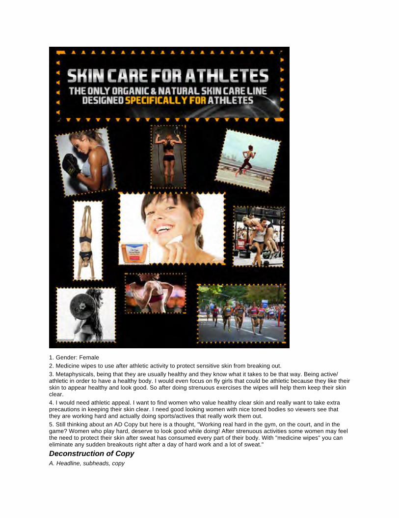
1. Gender: Female2. Medicine wipes to use after athletic activity to protect sensitive skin from breaking out.3. Metaphysicals, being that they are usually healthy and they know what it takes to be that way. Being active/athletic in order to have a healthy body. I would even focus on fly girls that could be athletic because they like their skin to appear healthy and look good. So after doing strenuous exercises the wipes will help them keep their skin clear.4. I would need athletic appeal. I want to find women who value healthy clear skin and really want to take extra precautions in keeping their skin clear. I need good looking women with nice toned bodies so viewers see that they are working hard and actually doing sports/actives that really work them out.5. Still thinking about an AD Copy but here is a thought, "Working real hard in the gym, on the court, and in the game? Women who play hard, deserve to look good while doing! After strenuous activities some women may feel the need to protect their skin after sweat has consumed every part of their body. With "medicine wipes" you can eliminate any sudden breakouts right after a day of hard work and a lot of sweat."Deconstruction of CopyA. Headline, subheads, copy
B. Message communicatedI want women to have a product that they can use right away after playing sports or working out so that acne can be stopped even before it starts. These medicine wipes will be easy to carry around and available anytime women need to wipe the sweat away. It can be used anywhere on the body, especially for problem areas such as face and back.C. Double meaning? Contrast literal meaning with implied, actual, or assumed meaning. actual/implied: active women can have healthier skinimplied: every woman wants to feel confident, and having clear skin is apart of that confidenceMarketing AnalysisA. MagazineAthletic magazines, "Sports Illustrated", health magazines, even "Cosmo"B. Target audience of magazine, DemographicsYoung athletic women between the ages of 16-25, young women who already experience acneC. Seasonal ad?During the summer months when women show off their skin a lot May-Aug, but mostly all year round it will be available because sports are year roundD. Why these magazines?Because most women who deal with skin problems are young women, and most young women read Cosmo to keep up to date. "Sports Illustrated" and "Health" because women who enjoy sports and live a healthy life indulge in these magazinesE. Ad PlacementNext to other health products in magazines or advertisements, like vitamins or sports drinksF. What is the visual message or meaning? In Ad PlacementThat just because women are in a mans dominate world of sports doesn't mean they still cant feel and act like a lady. I want people to know that there are beautiful tom boy women out there that like sports but also care about their appearance as far as having healthy skin.G. ColorsNeutral, serious colors, bold Dark blue, but with a hint of femininity, light purple or pink somewhere.H. Color combination and why? What color is dominant and why?Bold colors with hints of feminine color because I want it to be taken seriously and because I don't want it to be too girly but I want consumers to know its for women.Narrative ("tell the story")A. Past Most women would rely on their shower afterwards to protect their skin from break outs, or morning or night washB. PresentBut now because the medicine wipes can go with you anywhere women can stop those breakouts before they even startC. FutureNow woman can always have good looking skin on or off the court
1) Supporting Research that gives creditability to your pitch and 2) Why this ad works for your audience
I found an audience and used appealing marketing tools to capture my audiences attention. I used the American mainstream approach as far as being diverse with the people I used in the ad. I also showed each women individuality by highlighting something they were good at as an athlete. Whether it was running, lifting weights, ect. I used very little writing and a lot of visual effects.This ad works for my audience because it shows a lot of athletic women who are sweating but have good skin. I wanted to put more women wiping their faces with the wipes but they didn't have any that went with what I was trying to portray. I made the ad from scratch, I just took pictures from the internet and put it all together. There were no pre maid ads for this, but I did the best that I could. But ultimately I think that the ad portrays what I was trying to say.
The websites I used for the images are

http://www.skincareforathletes.com/
http://hit-it-smartfitness.tumblr.com/
Related Documents