Minitab ® Technology Manual to Accompany Introduction to Statistics & Data Analysis FIFTH EDITION Roxy Peck California Polytechnic State University, San Luis Obispo, CA Chris Olsen Grinnell College Grinnell, IA Jay Devore California Polytechnic State University, San Luis Obispo, CA Prepared by Melissa M. Sovak California University of Pennsylvania, California, PA Australia • Brazil • Mexico • Singapore • United Kingdom • United States © Cengage Learning. All rights reserved. No distribution allowed without express authorization.

Welcome message from author
This document is posted to help you gain knowledge. Please leave a comment to let me know what you think about it! Share it to your friends and learn new things together.
Transcript

Minitab® Technology Manual
to Accompany
Introduction to Statistics & Data
Analysis
FIFTH EDITION
Roxy Peck California Polytechnic State University,
San Luis Obispo, CA
Chris Olsen Grinnell College
Grinnell, IA
Jay Devore California Polytechnic State University,
San Luis Obispo, CA
Prepared by
Melissa M. Sovak California University of Pennsylvania, California, PA
Australia • Brazil • Mexico • Singapore • United Kingdom • United States
© C
engag
e L
earn
ing.
All
rig
hts
res
erv
ed.
No
dis
trib
uti
on
all
ow
ed w
ith
ou
t ex
pre
ss a
uth
ori
zati
on
.

Printed in the United States of America
1 2 3 4 5 6 7 17 16 15 14 13
© 2016 Cengage Learning ALL RIGHTS RESERVED. No part of this work covered by the copyright herein may be reproduced, transmitted, stored, or used in any form or by any means graphic, electronic, or mechanical, including but not limited to photocopying, recording, scanning, digitizing, taping, Web distribution, information networks, or information storage and retrieval systems, except as permitted under Section 107 or 108 of the 1976 United States Copyright Act, without the prior written permission of the publisher except as may be permitted by the license terms below.
For product information and technology assistance, contact us at
Cengage Learning Customer & Sales Support, 1-800-354-9706.
For permission to use material from this text or product, submit
all requests online at www.cengage.com/permissions Further permissions questions can be emailed to
ISBN-13: 978-1-305-26891-3 ISBN-10: 1-305-26891-1 Cengage Learning 20 Channel Center Street, 4th Floor Boston, MA 02210 USA Cengage Learning is a leading provider of customized learning solutions with office locations around the globe, including Singapore, the United Kingdom, Australia, Mexico, Brazil, and Japan. Locate your local office at: www.cengage.com/global. Cengage Learning products are represented in Canada by Nelson Education, Ltd. To learn more about Cengage Learning Solutions, visit www.cengage.com. Purchase any of our products at your local college store or at our preferred online store www.cengagebrain.com.
NOTE: UNDER NO CIRCUMSTANCES MAY THIS MATERIAL OR ANY PORTION THEREOF BE SOLD, LICENSED, AUCTIONED, OR OTHERWISE REDISTRIBUTED EXCEPT AS MAY BE PERMITTED BY THE LICENSE TERMS HEREIN.
READ IMPORTANT LICENSE INFORMATION
Dear Professor or Other Supplement Recipient: Cengage Learning has provided you with this product (the “Supplement”) for your review and, to the extent that you adopt the associated textbook for use in connection with your course (the “Course”), you and your students who purchase the textbook may use the Supplement as described below. Cengage Learning has established these use limitations in response to concerns raised by authors, professors, and other users regarding the pedagogical problems stemming from unlimited distribution of Supplements. Cengage Learning hereby grants you a nontransferable license to use the Supplement in connection with the Course, subject to the following conditions. The Supplement is for your personal, noncommercial use only and may not be reproduced, or distributed, except that portions of the Supplement may be provided to your students in connection with your instruction of the Course, so long as such students are advised that they may not copy or distribute any portion of the Supplement to any third party. Test banks, and other testing materials may be made available in the classroom and collected at the end of each class session, or posted electronically as described herein. Any
material posted electronically must be through a password-protected site, with all copy and download functionality disabled, and accessible solely by your students who have purchased the associated textbook for the Course. You may not sell, license, auction, or otherwise redistribute the Supplement in any form. We ask that you take reasonable steps to protect the Supplement from unauthorized use, reproduction, or distribution. Your use of the Supplement indicates your acceptance of the conditions set forth in this Agreement. If you do not accept these conditions, you must return the Supplement unused within 30 days of receipt. All rights (including without limitation, copyrights, patents, and trade secrets) in the Supplement are and will remain the sole and exclusive property of Cengage Learning and/or its licensors. The Supplement is furnished by Cengage Learning on an “as is” basis without any warranties, express or implied. This Agreement will be governed by and construed pursuant to the laws of the State of New York, without regard to such State’s conflict of law rules. Thank you for your assistance in helping to safeguard the integrity of the content contained in this Supplement. We trust you find the Supplement a useful teaching tool.
Minitab® is a registered trademark of Minitab, Inc., in the United States and other countries.

Table of Contents
Introduction to MINITAB ....................................................................................................... 4
Chapter 1: The Role of Statistics and the Data Analysis Problem ............................ 6
Chapter 2: Collecting Data Sensibly.................................................................................... 9
Chapter 3: Graphical Methods for Describing Data ....................................................11
Chapter 4: Numerical Methods for Describing Data ...................................................20
Chapter 5: Summarizing Bivariate Data .........................................................................25
Chapter 6: Probability ...........................................................................................................28
Chapter 7: Random Variables and Probability Distributions .................................29
Chapter 8: Sampling Variability and Sampling Distributions .................................31
Chapter 9: Estimation Using a Single Sample ...............................................................32
Chapter 10: Hypothesis Testing Using a Single Sample ............................................34
Chapter 11: Comparing Two Populations or Treatments ........................................37
Chapter 12: The Analysis of Categorical Data and Goodness-of-Fit Tests ..........41
Chapter 13: Simple Linear Regression and Correlation: Inferential Methods ..43
Chapter 14: Multiple Regression Analysis .....................................................................53
Chapter 15: Analysis of Variance ......................................................................................61
Chapter 16: Nonparametric (Distribution-Free) Statistical Methods ..................73
4
Introduction To MINITAB
Getting Started with MINITAB
This chapter covers the basic structure and commands of MINITAB 17 for Windows.
After reading this chapter you should be able to:
1. Start MINITAB
2. Identify the Main Menu Bar
3. Enter Data in MINITAB
4. Save the Data File
5. Print the Session Window
6. Exit MINITAB
Starting MINITAB
MINITAB is a computer software program initially designed as a system to help in the
teaching of statistics, and over the years has evolved into an excellent system for data
analysis. You can start MINITAB by finding the program within the Program menu or
double clicking on the icon for MINITAB. When you start MINITAB, you should see a
screen this like:
You will see that the MINITAB screen is separated into two parts. The top part is the
Session window. This is where many results will appear after running analyses. The
bottom window is called the Worksheet window, this window is where you will enter and
manipulate data.

5
Across the top of the screen, there are several menu options that lead to submenus to run
data analysis. These menus are
File Edit Data Calc Stat Graph Editor Tools Window Help
Entering Data
MINITAB’s worksheet window is like a spreadsheet. Typically, a column contains the
data for one variable with each individual observation being in a row. Columns are
designated C1, C2, C3, .. by default. In the space below these labels, you can enter your
own labels for the columns by clicking on this space and typing. You can then type data
in directly by inputting values into a particularly cell and pressing Enter.
You can also read in datasets from the text by using the File>Open Worksheet
command. This will open a dialog box from which you can navigate to the file, select it
and click Open to display it in the Worksheet.
Saving Files To save a Worksheet, select the worksheet to make it active. Then choose File>Save
Current Worksheet As…
This will open a dialog box that will allow you to navigate to the appropriate folder to
save the file. Once you have found the appropriate folder, type a filename into the box
title File name: and click Save.
MINITAB uses the file extension .mtw to save files.
Printing the Session Window
To print the session window, first, make the session window active. Then
choose File>Print Session Window… then choose OK to print.
Exiting MINITAB
To exit MINITAB, choose File>Exit.

6
Chapter 1
The Role of Statistics and the Data Analysis
Problem
One of the most useful ways to begin an initial exploration of data is to use techniques
that result in a graphical representation of the data. These can quickly reveal
characteristics of the variable being examined. There are a variety of graphical
techniques used for variables.
In this chapter, we will learn how to create a frequency bar chart for categorical data. We
will use the menu commands
Graph>Bar Chart
to create the bar chart.
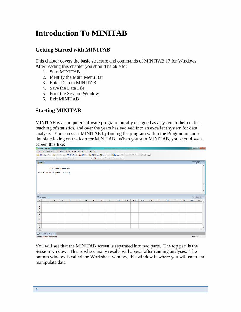
Example 1.8 – Bar Chart
The U.S. Department of Transportation establishes standards for motorcycle helmets. To
ensure a certain degree of safety, helmets should reach the bottom of the motorcyclist’s
ears. The report “Motorcycle Helmet Use in 2005 – Overall Results” (National Highway
Traffic Safety Administration, August 2005) summarized data collected in June of 2005
by observing 1700 motorcyclists nationwide at selected roadway locations. In total, there
were 731 riders who wore no helmet, 153 who wore a noncompliant helmet, and 816 who
wore a compliant helmet.
In this example, we will use the motorcycle helmet data to create a bar chart. Begin by
entering the data into the MINITAB worksheet. Enter the categories for helmet use into
C1 and title it Helmet_Use. Enter the frequencies into C2, titling it Count. Once the
dataset is entered, you screen should look like the image below.

7
Next, we will create the bar chart. Click Graph>Bar Chart and select Simple then click
OK. Input C1 Helmet_Use into the box for Categorical variables. Click Data Options
and select the Frequency tab. Input Count into the box for Frequency variable(s).
Click OK. Click OK. You should see the following bar chart.
8
9
Chapter 2
Collecting Data Sensibly
Section 2.2 of the text discusses random sampling. We can use MINITAB to create a
random sample of data. We can create many types of random samples using the
command
Calc>Random Data
Example 2.3 – Selecting a Random Sample
Breaking strength is an important characteristic of glass soda bottles. Suppose that we
want to measure the breaking strength of each bottle in a random sample of size n = 3
selected from four crates containing a total of 100 bottles (the population).
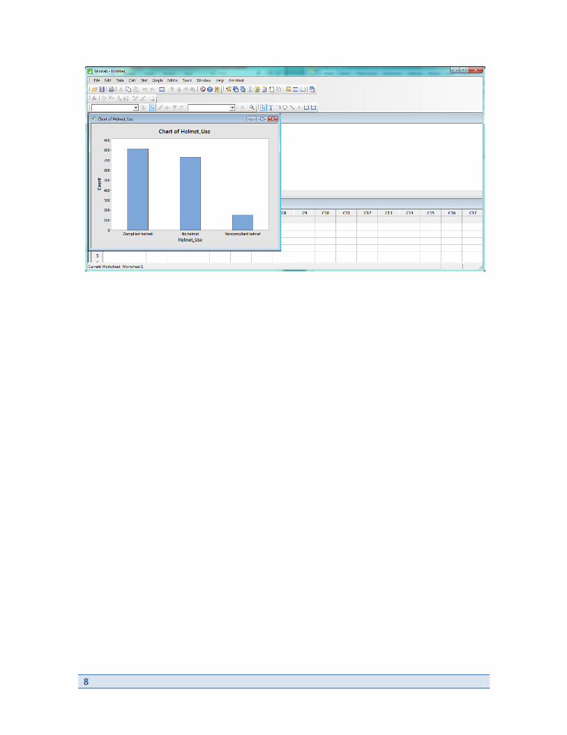
We will start by numbering each bottle from 1 to 100 and entering this data into
MINITAB. The easiest way to do this is using the menu commands Calc>Make
Patterned Data>Simple Set of Numbers. Input C1 into the Store patterned data in box.
Input 1 into From first value and 100 into To last value. Click OK.
Now, we’ll choose a random sample of 3 from these values. We use the menu command
Calc>Random Data>Sample From Columns. Input 3 into the Number of rows to
sample box and select C1 for the From columns box. We will store the samples in C2,
enter this into the Store samples in box. Click OK.
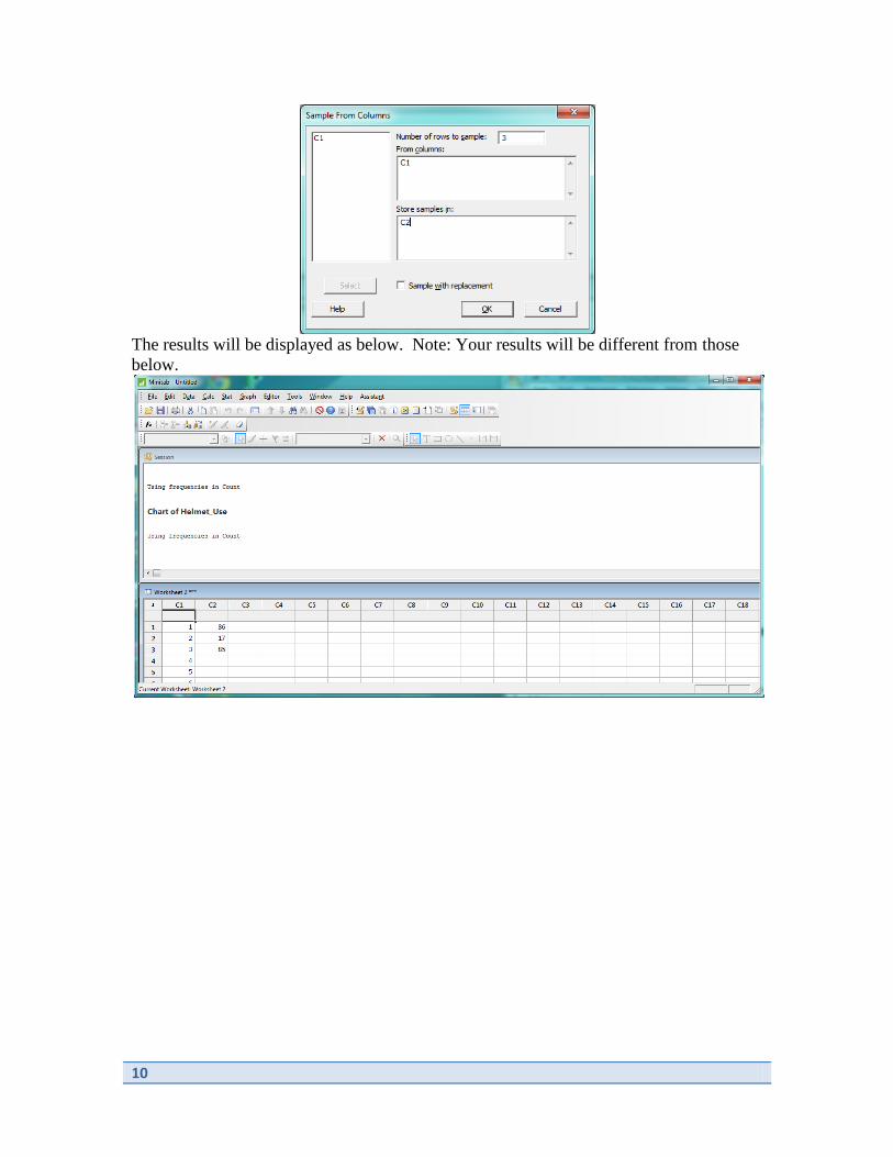
10
The results will be displayed as below. Note: Your results will be different from those
below.

11
Chapter 3
Graphical Methods for Describing Data
Chapter 3 describes a number of graphical displays for both categorical and quantitative
data. In this chapter, we will use the Graph menu to create several different types of
graphs.
Example 3.1 – Comparative Bar Charts
Each year The Princeton Review conducts a survey of high school students who are
applying to college and parents of college applicants. The report “2009 College Hopes &
Worries Survey Findings”
(www.princetonreview.com/uploadedFiles/Test_Preparation/Hopes_and_Worries/colleg_
hopes_worries_details.pdf) included a summary of how 12,715 high school students
responded to the question “Ideally how far from home would you like the college you
attend to be?” Also included was a summary of how 3007 parents of students applying to
college responded to the question “How far from home would you like the college your
child attends to be?”
We begin by entering the data table. Enter Group into C1 and enter values “Student and
Parent”. Enter into C2-C5 the variable titles “<250”, “250-500”, “500-1000” and
“>1000”. Input the data into each cell. Your worksheet should appear as below.
Click Graph>Bar Plot. From the dropdown menu for Bars represent, select Values from
a table. Under Two-way table, select Cluster and click OK. Enter columns C2-C5 into
the box for Graph variables and C1 into the box for Row labels.

12
Click OK.
The comparative bar chart is output as below.
Example 3.3 – Pie Charts
Typos on a resume do not make a very good impression when applying for a job. Senior
executives were asked how many typos in a resume would make them not consider a job
candidate (“Job Seekers Need a Keen Eye,”, USA Today, August 3, 2009).
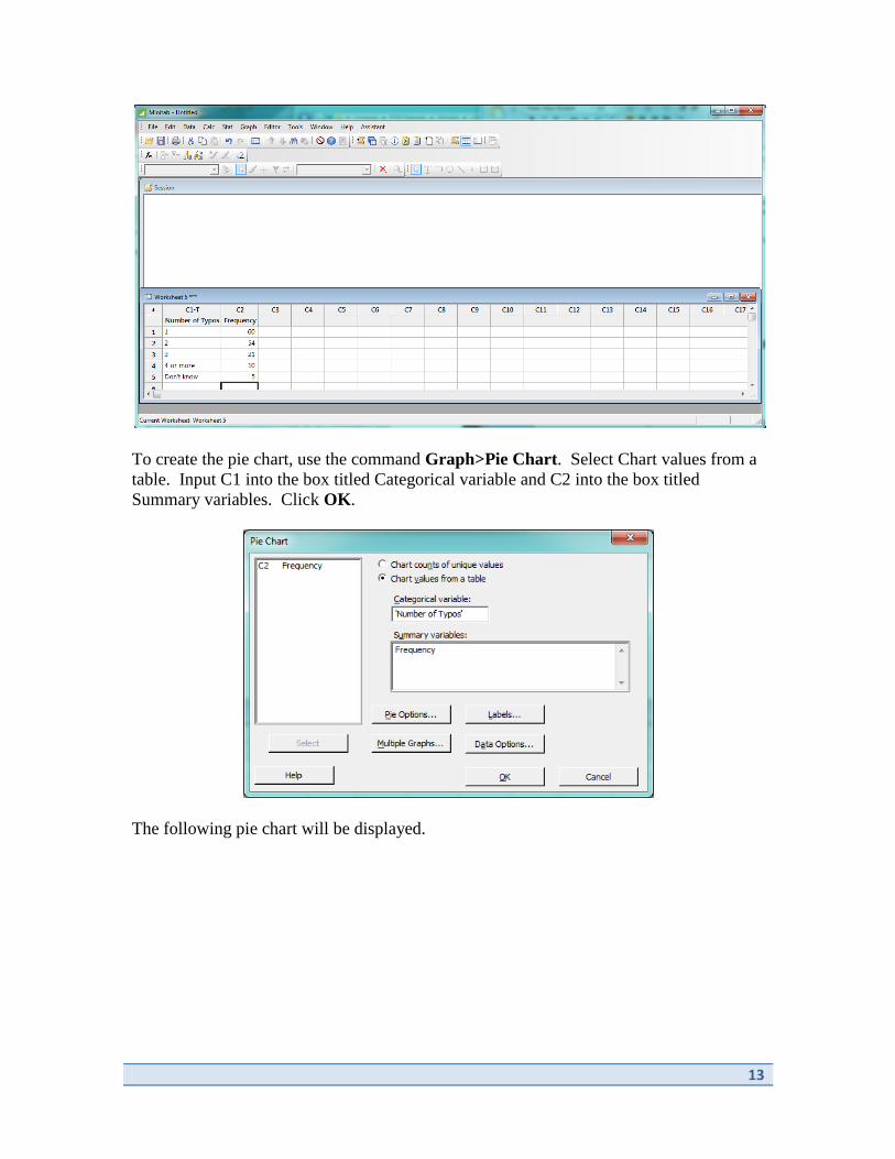
Begin by inputting the dataset by entering Number of Typos into C1 and the Frequency
for each into C2.
Your worksheet should look like the one below.
13
To create the pie chart, use the command Graph>Pie Chart. Select Chart values from a
table. Input C1 into the box titled Categorical variable and C2 into the box titled
Summary variables. Click OK.
The following pie chart will be displayed.

14
Example 3.8 – Stem-and-Leaf Displays
The article “Going Wireless” (AARP Bulletin, June 2009) reported the estimated
percentage of U.S. households with only wireless phone service (no land line) for the 50
states and the District of Columbia.
Begin by opening or entering the data as shown below.
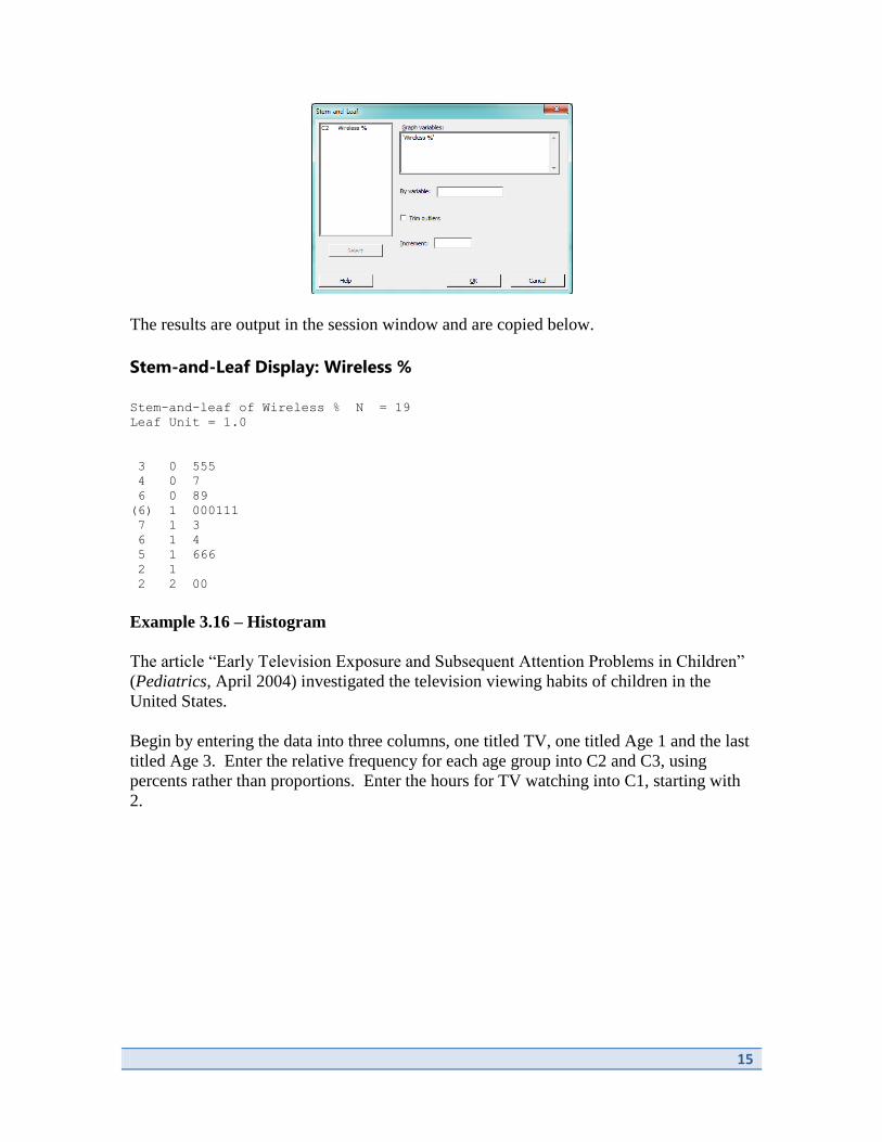
To create the stem-and-leaf display, we use Graph>Stem-and-Leaf. Input C2 into the
Graph variables box. Click OK.
15
The results are output in the session window and are copied below.
Stem-and-Leaf Display: Wireless %
Stem-and-leaf of Wireless % N = 19
Leaf Unit = 1.0
3 0 555
4 0 7
6 0 89
(6) 1 000111
7 1 3
6 1 4
5 1 666
2 1
2 2 00
Example 3.16 – Histogram
The article “Early Television Exposure and Subsequent Attention Problems in Children”
(Pediatrics, April 2004) investigated the television viewing habits of children in the
United States.
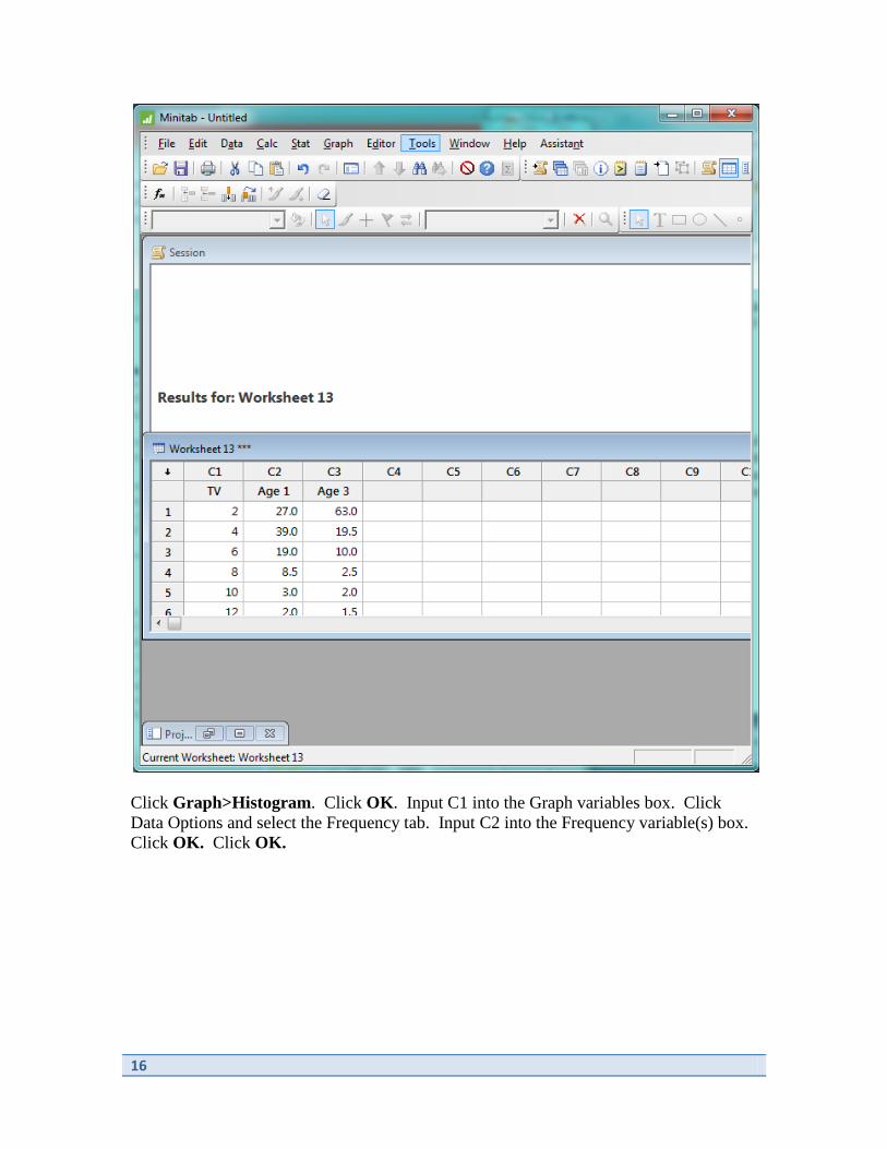
Begin by entering the data into three columns, one titled TV, one titled Age 1 and the last
titled Age 3. Enter the relative frequency for each age group into C2 and C3, using
percents rather than proportions. Enter the hours for TV watching into C1, starting with
2.
16
Click Graph>Histogram. Click OK. Input C1 into the Graph variables box. Click
Data Options and select the Frequency tab. Input C2 into the Frequency variable(s) box.
Click OK. Click OK.

17
The results follow.
18
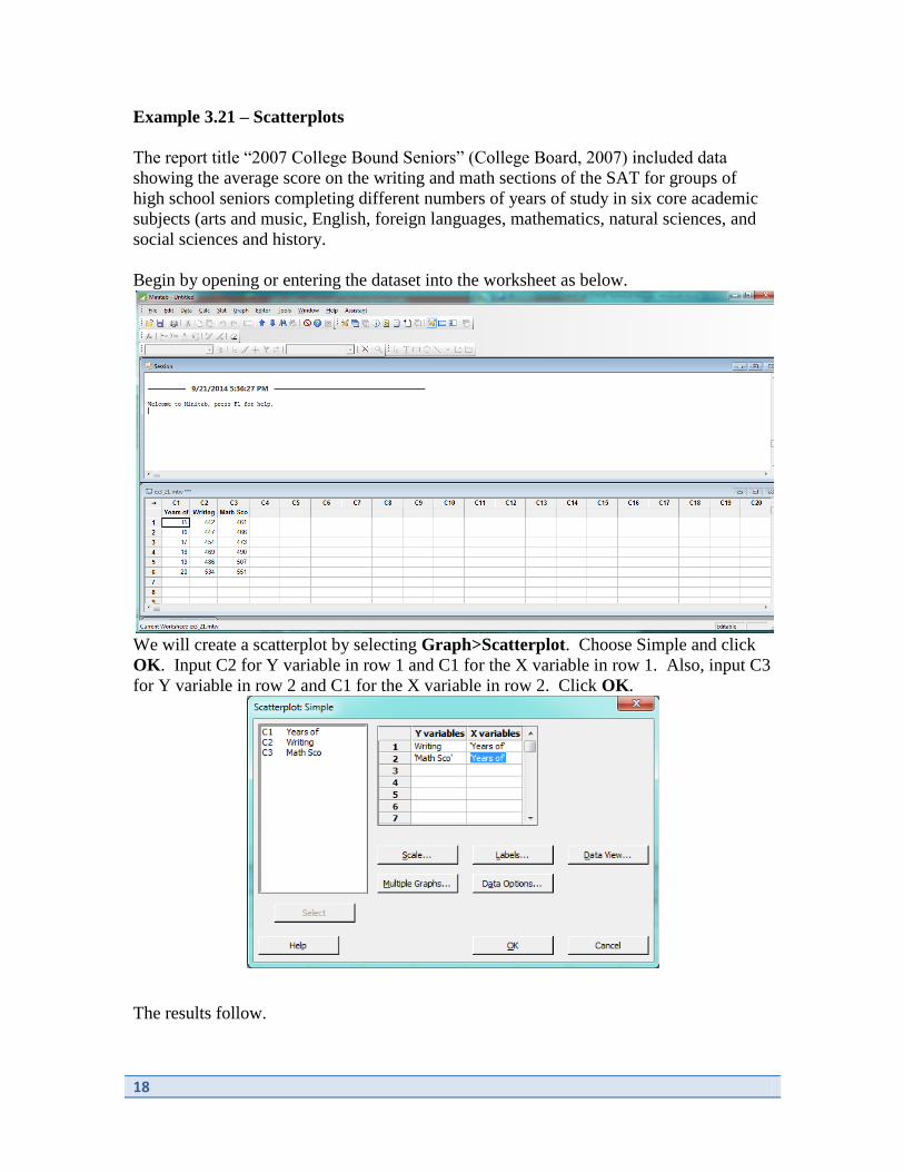
Example 3.21 – Scatterplots
The report title “2007 College Bound Seniors” (College Board, 2007) included data
showing the average score on the writing and math sections of the SAT for groups of
high school seniors completing different numbers of years of study in six core academic
subjects (arts and music, English, foreign languages, mathematics, natural sciences, and
social sciences and history.
Begin by opening or entering the dataset into the worksheet as below.
We will create a scatterplot by selecting Graph>Scatterplot. Choose Simple and click
OK. Input C2 for Y variable in row 1 and C1 for the X variable in row 1. Also, input C3
for Y variable in row 2 and C1 for the X variable in row 2. Click OK.
The results follow.

19

20
Chapter 4
Numerical Methods for Describing Data
In previous chapters, we examined graphical methods for displaying data. These provide
a visual picture of the data, but do not provide any numerical summaries. In this chapter,
we compute numerical summaries for quantitative data. We use the menu command
Data>Basic Statistics>Display Descriptive Statistics
Example 4.3 – Calculating the Mean
Forty students were enrolled in a section of a general education course in statistical
reasoning during one fall quarter at Cal Poly, San Luis Obispo. The instructor made
course materials, grades and lecture notes available to students on a class web site, and
course management software kept track of how often each student accessed any of the
web pages on the class site. One month after the course began, the instructor requested a
report that indicated how many times each student had accessed a web page on the class
site. The 40 observations are listed in the text.
We begin by entering or opening the dataset in MINITAB.
Click Calc>Basic Statistics>Display Descriptive Statistics. Select C1 for Variables
and click OK.

21
The results are displayed in the session window and are copied below. The mean is listed
under Mean.
Descriptive Statistics: Accesses
Variable N N* Mean SE Mean StDev Minimum Q1 Median Q3 Maximum
Accesses 40 0 23.10 8.27 52.33 0.00 4.25 13.00 20.75 331.00
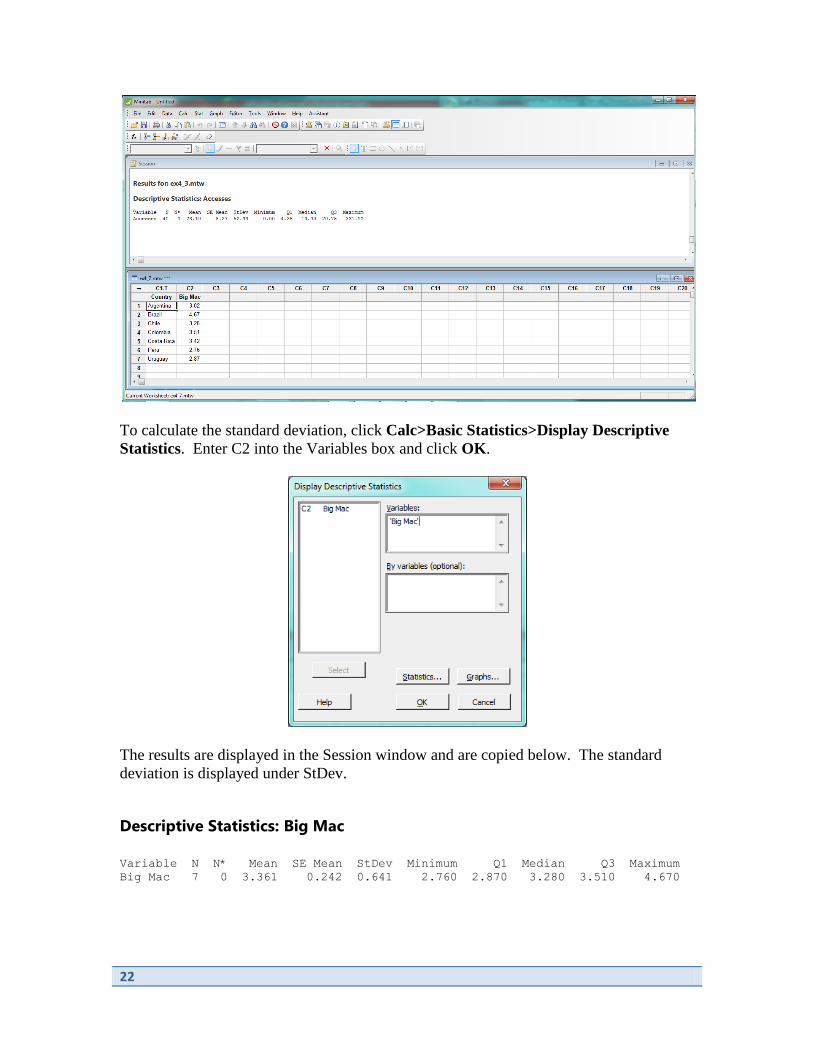
Example 4.8 – Calculating the Standard Deviation
McDonald’s fast-food restaurants are now found in many countries around the world.
But the cost of a Big Mac varies from country to country. Table 4.3 in the text shows
data on the cost of a Big Mac taken from the article “The Big Mac Index” (The
Economist, July 11, 2013).
We begin by entering this data or opening the dataset in MINITAB.
22
To calculate the standard deviation, click Calc>Basic Statistics>Display Descriptive
Statistics. Enter C2 into the Variables box and click OK.
The results are displayed in the Session window and are copied below. The standard
deviation is displayed under StDev.
Descriptive Statistics: Big Mac
Variable N N* Mean SE Mean StDev Minimum Q1 Median Q3 Maximum
Big Mac 7 0 3.361 0.242 0.641 2.760 2.870 3.280 3.510 4.670

23
Example 4.11 – Quartiles and IQR
The accompanying data from Example 4.11 of the text came from an anthropological
study of rectangular shapes (Lowie’s Selected Papers in Anthropology, Cora Dubios, ed.
[Berkeley, CA: University of California Press, 1960]: 137-142). Observations were made
on the variable x = width/length for a sample of n = 20 beaded rectangles used in
Shoshani Indian leather handicrafts.
Begin by opening or entering the data.
To find the quartiles and IQR, click Calc>Basic Statistics>Display Descriptive
Statistics. Input C1 into the Variables box. Click on the Statistics button. Select
Interquartile range and click OK. Click OK.

24
The results are displayed in the Session window and are copied below.
Descriptive Statistics: ratio (b
Variable N N* Mean SE Mean StDev Minimum Q1 Median Q3
Maximum IQR
ratio (b 20 0 0.6605 0.0207 0.0925 0.5530 0.6060 0.6410 0.6855
0.9330 0.0795
25
Chapter 5
Summarizing Bivariate Data
This chapter introduces methods for describing relationships among variables. The goal
of this type of analysis is often to predict a characteristic of the response or dependent
variable. The characteristics used to predict the response variable are called the
independent or predictor variables.
In this chapter, we will learn how to compute the correlation and least squares regression
fit to bivariate data in MINITAB. We will be using the commands
Stat>Basic Statistics>Correlation
and
Stat>Regression>Fitted Line Plot.
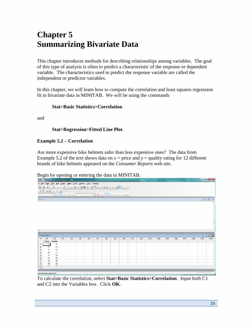
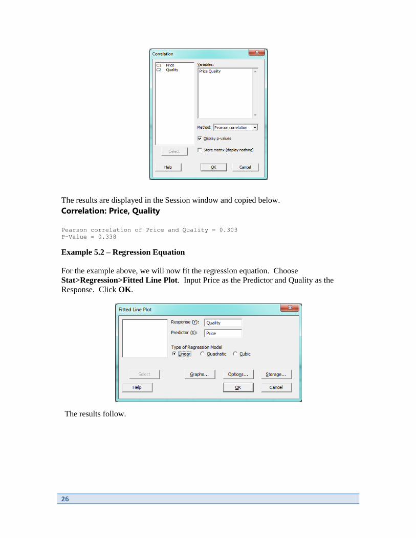
Example 5.2 – Correlation
Are more expensive bike helmets safer than less expensive ones? The data from
Example 5.2 of the text shows data on x = price and y = quality rating for 12 different
brands of bike helmets appeared on the Consumer Reports web site.
Begin by opening or entering the data in MINITAB.
To calculate the correlation, select Stat>Basic Statistics>Correlation. Input both C1
and C2 into the Variables box. Click OK.
26
The results are displayed in the Session window and copied below.
Correlation: Price, Quality
Pearson correlation of Price and Quality = 0.303
P-Value = 0.338
Example 5.2 – Regression Equation
For the example above, we will now fit the regression equation. Choose
Stat>Regression>Fitted Line Plot. Input Price as the Predictor and Quality as the
Response. Click OK.
The results follow.

27
Notice that this also outputs the ANOVA table for assessing the fit of the line.

28
Chapter 6
Probability
There are no examples or material from Chapter 6.
29
Chapter 7
Random Variables and Probability Distributions
Chapter 7 explores further the concepts of probability, expanding to commonly used
probability distributions. These distributions will be closely liked to the processes that
we use for inference.
In this chapter, we learn how to use MINITAB to compute probabilities from the Normal
distribution. We will use the command
Calc>Probability Distributions>Normal
to compute probabilities.
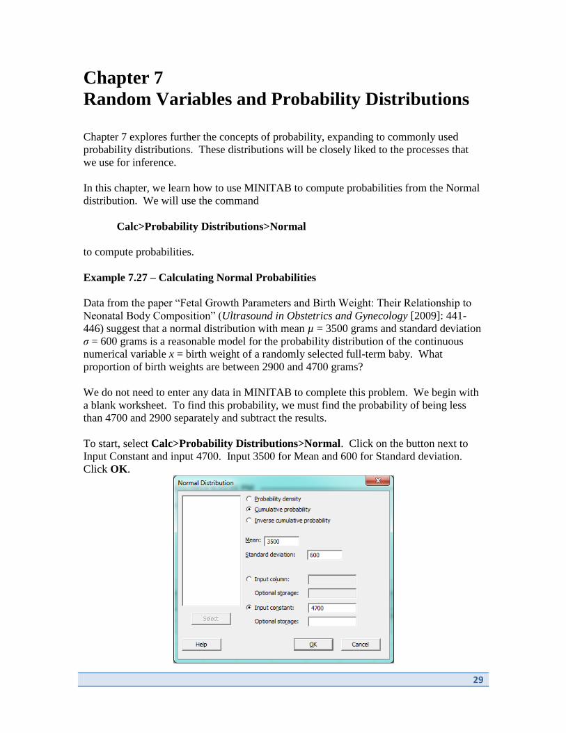
Example 7.27 – Calculating Normal Probabilities
Data from the paper “Fetal Growth Parameters and Birth Weight: Their Relationship to
Neonatal Body Composition” (Ultrasound in Obstetrics and Gynecology [2009]: 441-
446) suggest that a normal distribution with mean µ = 3500 grams and standard deviation
σ = 600 grams is a reasonable model for the probability distribution of the continuous
numerical variable x = birth weight of a randomly selected full-term baby. What
proportion of birth weights are between 2900 and 4700 grams?
We do not need to enter any data in MINITAB to complete this problem. We begin with
a blank worksheet. To find this probability, we must find the probability of being less
than 4700 and 2900 separately and subtract the results.
To start, select Calc>Probability Distributions>Normal. Click on the button next to
Input Constant and input 4700. Input 3500 for Mean and 600 for Standard deviation.
Click OK.
30
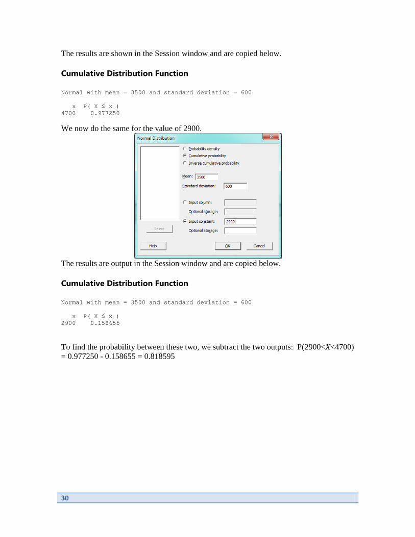
The results are shown in the Session window and are copied below.
Cumulative Distribution Function
Normal with mean = 3500 and standard deviation = 600
x P( X ≤ x )
4700 0.977250
We now do the same for the value of 2900.
The results are output in the Session window and are copied below.
Cumulative Distribution Function
Normal with mean = 3500 and standard deviation = 600
x P( X ≤ x )
2900 0.158655
To find the probability between these two, we subtract the two outputs: P(2900<X<4700)
= 0.977250 - 0.158655 = 0.818595

31
Chapter 8
Sampling Variability and Sampling Distributions
There are no examples or material from Chapter 8.

32
Chapter 9
Estimation using a Single Sample
The objective of inferential statistics is to use sample data to decrease our uncertainty
about the corresponding population. We can use confidence intervals to provide
estimation for population parameters.
In this chapter, we will use MINITAB to create confidence intervals for the population
mean. We will use the menu commands
Stat>Basic Statistics>One sample t
to find a confidence interval for the population mean.
Example 9.10 – Confidence Interval for the Mean
The article “Chimps Aren’t Charitable” (Newsday, November 2, 2005) summarizes the
results of a research study published in the journal Nature. In this study, chimpanzees
learned to use an apparatus that dispensed food when either of the two ropes was pulled.
When one of the ropes was pulled, only the chimp controlling the apparatus received
food. When the other rope was pulled, food was dispensed both to the chimp controlling
the apparatus and also to a chimp in the adjoining cage. The data (listed in the text)
represents the number of times out of 36 trials that each of the seven chimps chose the
option that would provide food to both chimps (the “charitable” response).
To begin, we open or enter the dataset in MINITAB.
To compute the confidence interval for the mean, we choose Stat>Basic Statistics>One

33
Sample t. Input C1 into the box and click Options. Input 99 as the Confidence level and
click OK. Click OK.
Results are output in the Session window and are copied below.
One-Sample T: Charitab
Variable N Mean StDev SE Mean 99% CI
Charitab 7 21.286 1.799 0.680 (18.764, 23.807)
34
Chapter 10
Hypothesis Testing using a Single Sample
In the previous chapter, we considered one form of inference in the form of confidence
intervals. In this chapter, we consider the second form of inference: inference testing.
Now we use sample data to create a test for a set of hypotheses about a population
parameter.
This chapter addresses producing hypothesis tests for a population proportion or
population mean. We use the commands
Stat>Basic Statistics>1 Proportion
and
Stat>Basic Statistics>1-Sample t
to compute inference tests for the proportion and mean, respectively.
Example 10.11 – Testing for a Single Proportion
The article “7 Million U.S. Teens Would Flunk Treadmill Tests” (Associated Press,
December 11, 2005) summarized the results of a study in which 2205 adolescents age 12
to 19 took a cardiovascular treadmill test. The researchers conducting the study indicated
that the sample was selected in such a way that it could be regarded as representatives of
adolescents nationwide. Of the 2205 adolescents tested, 750 showed a poor level of
cardiovascular fitness. Does this sample provide support for the claim that more than
30% of adolescents have a low level of cardiovascular fitness? We carry out a hypothesis
test to determine this.
We begin the computational piece of the test with no data in MINITAB. To calculate the
test statistic and p-value matching the hypotheses from the text, we choose Stat>Basic
Statistics>1 Proportion. From the dropdown menu at the top of the dialog box, choose
Summarized data. Input 750 for Number of events and 2205 for Number of trials. Check
the box next to Perform hypothesis test. Input 0.3 into the box for Hypothesized
proportion. Click Options and select Proportion > hypothesized proportion for
Alternative hypothesis. Click OK. Click OK.

35
The results are output in the Session
window and are copied below.
Test and CI for One Proportion
Test of p = 0.3 vs p > 0.3
Exact
Sample X N Sample p 95% Lower Bound P-Value
1 750 2205 0.340136 0.323479 0.000
Example 10.14 – Testing for a Single Mean
A growing concern of employers is time spent in activities like surfing the Internet and e-
mailing friends during work hours. The San Luis Obispo Tribune summarized the
findings from a survey of a large sample of workers in an article that ran under the
headline “Who Goofs Off 2 Hours a Day? Most Workers, Survey Says” (August 3,
2006). Suppose that the CEO of a large company wants to determine whether the
average amount of wasted time during an 8-hour work day for employees of her company
is less than the reported 120 minutes. Each person in a random sample of 10 employees
was contacted and asked about daily wasted time at work. (Participants would probably
have to be guaranteed anonymity to obtain truthful responses!). The resulting data are
the following:
108 112 117 130 111 131 113 113 105 128
We begin by opening or entering the data in MINITAB.

36
To calculate the test statistic and p-value, select Stat>Basic Statistics>1-Sample t. Input
C1 into the box. Check the box next to Perform hypothesis test. Input 120 for
Hypothesized mean. Click Options and select Mean < hypothesized mean from the
Alternative hypothesis dropdown menu. Click OK. Click OK.
The results are output in the Session window and are copied below.
One-Sample T: time_was
Test of μ = 120 vs < 120
Variable N Mean StDev SE Mean 95% Upper Bound T P
time_was 10 116.80 9.45 2.99 122.28 -1.07 0.156

37
Chapter 11
Comparing Two Populations or Treatments
In many situations, we would like to compare two groups to determine if they behave in
the same way. We may want to compare two groups to determine if they have the same
mean value for a particular characteristic or to determine if they have the same success
proportion for a particular characteristic.
We continue to use the inference procedures of interval estimation and inference testing
for these situations. In this chapter, we perform both types of inference for comparing
two groups’ population means and proportions. We will use the commands
Stat>Basic Statistics>2-Sample t
to perform inference for two population means and
Stat>Basic Statistics>2 Proportions
for comparing two population proportions.
We also can use the command
Stat>Basic Statistics>Paired t
for inference for population means when the two groups are dependent.
Example 11.1 – Confidence Interval and Inference Test for Two Population Means
In a study of the ways in which college students who use Facebook differ from college
students who do not use Facebook, each person in a sample of 141 college students who
use Facebook was asked to report his or her college grade point average (GPA). College
GPA was also reported by each person in a sample of 68 students who do not use
Facebook (“Facebook and Academic Performance,” Computers in Human Behavior
[2010]: 1237-1245). One question that the researchers were hoping to answer is whether
the mean college GPA for students who use Facebook is lower than the mean college
GPA of students who do not use Facebook. Summarized data is listed in the text. We
will produce a confidence interval and inference test for the difference of the means.
Begin with a blank worksheet in MINITAB. Select Stat>Basic Statistics>2-Sample t.
Choose Summarized data from the dropdown menu at the top of the dialog box. Input for
Sample 1: 141 for Sample size, 3.06 for Sample mean and .95 for Standard deviation.
For Sample 2, input 68 for Sample size, 3.82 for Sample mean and .41 for Standard
deviation. Click OK.

38
Both confidence interval and hypothesis test are output in the Session window and are
copied below.
Sample N Mean StDev SE Mean
1 141 3.060 0.950 0.080
2 68 3.820 0.410 0.050
Difference = μ (1) - μ (2)
Estimate for difference: -0.7600
95% CI for difference: (-0.9457, -0.5743)
T-Test of difference = 0 (vs ≠): T-Value = -8.07 P-Value = 0.000 DF = 205
Example 11.8 – Confidence Interval and Inference Test for Paired Means
Ultrasound is often used in the treatment of soft tissue injuries. In an experiment to
investigate the effect of an ultrasound and stretch therapy on knee extension, range of
motion was measured both before and after treatment for a sample of physical therapy
patients. A subset of the data appearing in the paper “Location of Ultrasound Does Not
Enhance Range of Motion Benefits of Ultrasound and Stretch Treatment” (University of
Virginia Thesis, Trae Tashiro, 2003) is given in the text.
Begin by opening or entering the data into MINITAB as below.
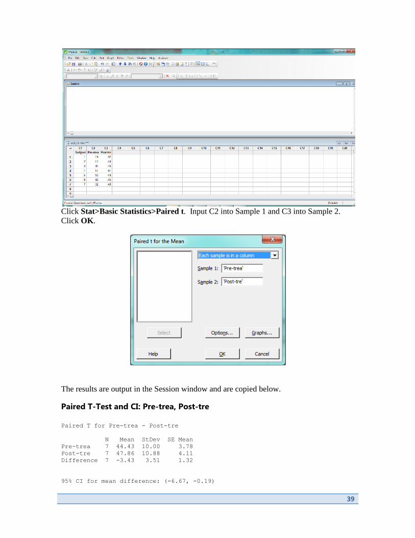
39
Click Stat>Basic Statistics>Paired t. Input C2 into Sample 1 and C3 into Sample 2.
Click OK.
The results are output in the Session window and are copied below.
Paired T-Test and CI: Pre-trea, Post-tre
Paired T for Pre-trea - Post-tre
N Mean StDev SE Mean
Pre-trea 7 44.43 10.00 3.78
Post-tre 7 47.86 10.88 4.11
Difference 7 -3.43 3.51 1.32
95% CI for mean difference: (-6.67, -0.19)

40
T-Test of mean difference = 0 (vs ≠ 0): T-Value = -2.59 P-Value = 0.041
Example 11.10 – Confidence Interval and Inference Tests for Difference of Two
Proportions
Do people who work long hours have more trouble sleeping? This question was
examined in the paper “Long Working Hours and Sleep Disturbances: The Whitehall II
Prospective Cohort Study” (Sleep [2009]: 737-745). The data in text are from two
independently selected samples of British civil service workers, all of whom were
employed full-time and worked at least 35 hours per week. The authors of the paper
believed that these samples were representative of full-time British civil service workers
who work 3 to 40 hours per week and of British civil service workers who work more
than 40 hours per week. We will produce an inference test and confidence interval for
this data.
We begin with a blank worksheet in MINITAB. Click Stat>Basic Statistics>2
Proportions. Select Summarized data from the dropdown menu. For Sample 1, input
750 for Number of events and 1501 for Number of trials. For Sample 2, input 407 for
Number of events and 958 for Number of trials. Click OK.
The results are output in the Session window and are copied below.
Test and CI for Two Proportions
Sample X N Sample p
1 750 1501 0.499667
2 407 958 0.424843
Difference = p (1) - p (2)
Estimate for difference: 0.0748235
95% CI for difference: (0.0345788, 0.115068)
Test for difference = 0 (vs ≠ 0): Z = 3.64 P-Value = 0.000
Fisher’s exact test: P-Value = 0.000
41
Chapter 12
The Analysis of Categorical Data and Goodness-
of-Fit Tests
The information in this chapter is specifically designed to explore the relationship
between two categorical variables. MINITAB does not easily compute goodness-of-fit
tests, so these are not addressed in this manual.
However, MINITAB does compute the Chi-squared Test for Independence. To compute
this, we will use the commands
Stat>Tables>Chi-Square Test for Association
to complete analysis of this type.
Example 12.7 – Chi-squared Test for Independence
The paper “Facial Expression of Pain in Elderly Adults with Dementia” (Journal of
Undergraduate Research [2006]) examined the relationship between a nurse’s
assessment of a patient’s facial expression and his or her self-reported level of pain. Data
for 89 patients are summarized in the text. We use this data to test for independence.
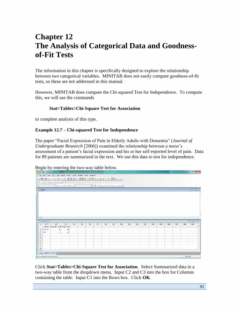
Begin by entering the two-way table below.
Click Stat>Tables>Chi-Square Test for Association. Select Summarized data in a
two-way table from the dropdown menu. Input C2 and C3 into the box for Columns
containing the table. Input C1 into the Rows box. Click OK.
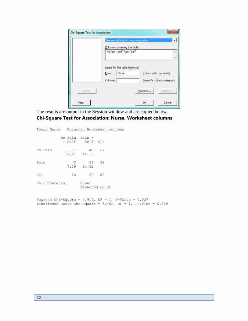
42
The results are output in the Session window and are copied below.
Chi-Square Test for Association: Nurse, Worksheet columns
Rows: Nurse Columns: Worksheet columns
No Pain Pain -
- Self Self All
No Pain 17 40 57
12.81 44.19
Pain 3 29 32
7.19 24.81
All 20 69 89
Cell Contents: Count
Expected count
Pearson Chi-Square = 4.919, DF = 1, P-Value = 0.027
Likelihood Ratio Chi-Square = 5.461, DF = 1, P-Value = 0.019

43
Chapter 13
Simple Linear Regression and Correlation:
Inferential Methods
Regression and correlation were introduced in Chapter 5 as techniques for describing and
summarizing bivariate data. We continue this discussion in this chapter, moving into
prediction and inferential methods for bivariate data.
We will use the commands
Stat>Regression>Regression>Fit Regression Model
and
Stat>Regression>Regression>Predict
in this chapter.
Example 13.2 – Prediction (Regression)
Medical researchers have noted that adolescent females are much more likely to deliver
low-birth-weight babies than are adult females. Because low-birth-weight babies have
higher mortality rates, a number of studies have examined the relationship between birth
weight and mother’s age for babies born to young mothers.
One such study is described in the article “Body Size and Intelligence in 6-Year-Olds:
Are Offspring of Teenage Mothers at Risk?” (Maternal and Child Health Journal [2009]:
847-856). The data in the text on x = maternal age (in years) and y = birth weight of
baby (in grams) are consistent with the summary values given in the referenced article
and also with data published by the National Center for Health Statistics.
To predict baby weight for an 18-year-old mother, begin by opening the dataset in
MINITAB.
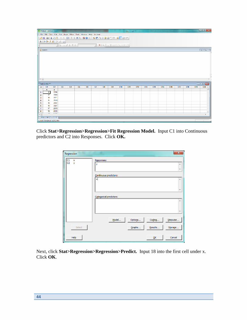
44
Click Stat>Regression>Regression>Fit Regression Model. Input C1 into Continuous
predictors and C2 into Responses. Click OK.
Next, click Stat>Regression>Regression>Predict. Input 18 into the first cell under x.
Click OK.
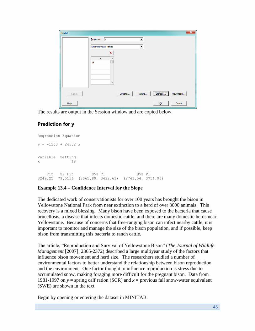
45
The results are output in the Session window and are copied below.
Prediction for y
Regression Equation
y = -1163 + 245.2 x
Variable Setting
x 18
Fit SE Fit 95% CI 95% PI
3249.25 79.5156 (3065.89, 3432.61) (2741.54, 3756.96)
Example 13.4 – Confidence Interval for the Slope
The dedicated work of conservationists for over 100 years has brought the bison in
Yellowstone National Park from near extinction to a herd of over 3000 animals. This
recovery is a mixed blessing. Many bison have been exposed to the bacteria that cause
brucellosis, a disease that infects domestic cattle, and there are many domestic herds near
Yellowstone. Because of concerns that free-ranging bison can infect nearby cattle, it is
important to monitor and manage the size of the bison population, and if possible, keep
bison from transmitting this bacteria to ranch cattle.
The article, “Reproduction and Survival of Yellowstone Bison” (The Journal of Wildlife
Management [2007]: 2365-2372) described a large multiyear study of the factors that
influence bison movement and herd size. The researchers studied a number of
environmental factors to better understand the relationship between bison reproduction
and the environment. One factor thought to influence reproduction is stress due to
accumulated snow, making foraging more difficult for the pregnant bison. Data from
1981-1997 on y = spring calf ration (SCR) and x = previous fall snow-water equivalent
(SWE) are shown in the text.
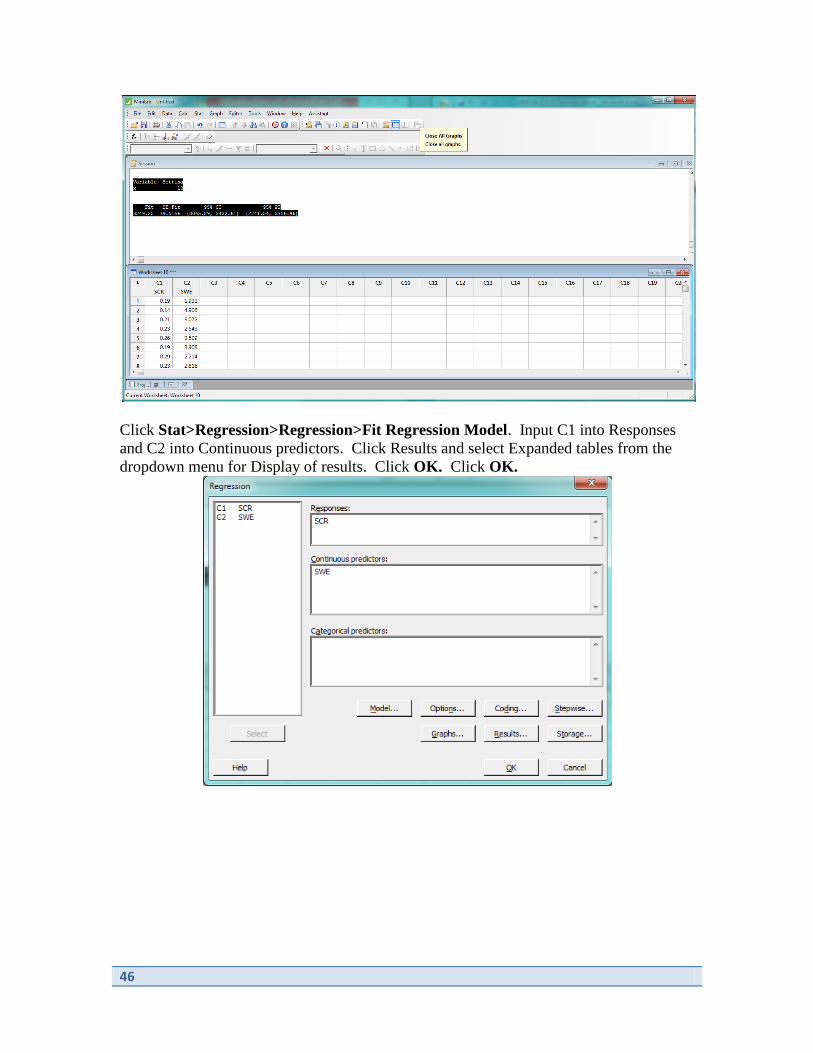
Begin by opening or entering the dataset in MINITAB.
46
Click Stat>Regression>Regression>Fit Regression Model. Input C1 into Responses
and C2 into Continuous predictors. Click Results and select Expanded tables from the
dropdown menu for Display of results. Click OK. Click OK.

47
The results are output in the Session window and are copied below.
Regression Analysis: SCR versus SWE
Analysis of Variance
Source DF Seq SS Contribution Adj SS Adj MS F-Value P-Value
Regression 1 0.005847 25.76% 0.005847 0.005847 5.21 0.038
SWE 1 0.005847 25.76% 0.005847 0.005847 5.21 0.038
Error 15 0.016847 74.24% 0.016847 0.001123
Total 16 0.022694 100.00%
Model Summary
S R-sq R-sq(adj) PRESS R-sq(pred)
0.0335133 25.76% 20.82% 0.0222992 1.74%
Coefficients
Term Coef SE Coef 95% CI T-Value P-Value VIF
Constant 0.2607 0.0239 ( 0.2097, 0.3116) 10.91 0.000
SWE -0.01366 0.00599 (-0.02643, -0.00090) -2.28 0.038 1.00
Regression Equation
SCR = 0.2607 - 0.01366 SWE
Fits and Diagnostics for Unusual Observations
Std Del
Obs SCR Fit SE Fit 95% CI Resid Resid Resid HI
Cook’s D
17 0.1700 0.1612 0.0226 (0.1129, 0.2095) 0.0088 0.36 0.35 0.456410
0.05
Obs DFITS
48
17 0.316735 X
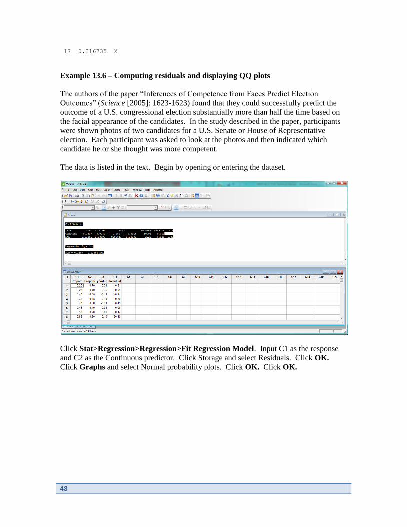
Example 13.6 – Computing residuals and displaying QQ plots
The authors of the paper “Inferences of Competence from Faces Predict Election
Outcomes” (Science [2005]: 1623-1623) found that they could successfully predict the
outcome of a U.S. congressional election substantially more than half the time based on
the facial appearance of the candidates. In the study described in the paper, participants
were shown photos of two candidates for a U.S. Senate or House of Representative
election. Each participant was asked to look at the photos and then indicated which
candidate he or she thought was more competent.
The data is listed in the text. Begin by opening or entering the dataset.
Click Stat>Regression>Regression>Fit Regression Model. Input C1 as the response
and C2 as the Continuous predictor. Click Storage and select Residuals. Click OK.
Click Graphs and select Normal probability plots. Click OK. Click OK.

49
The results follow.
50
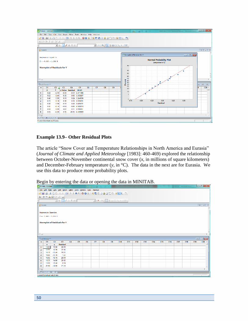
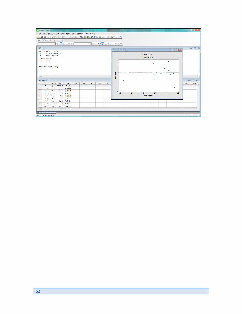
Example 13.9– Other Residual Plots
The article “Snow Cover and Temperature Relationships in North America and Eurasia”
(Journal of Climate and Applied Meteorology [1983]: 460-469) explored the relationship
between October-November continental snow cover (x, in millions of square kilometers)
and December-February temperature (y, in °C). The data in the next are for Eurasia. We
use this data to produce more probability plots.
Begin by entering the data or opening the data in MINITAB.

51
Select Stat>Regression>Regression>Fit Regression Model. Input C2 as Response and
C1 as Continuous predictors. Click Graphs and select Residuals versus fits. Click OK.
Click OK.
The results follow.
52

53
Chapter 14
Multiple Regression Analysis
In this chapter, we consider multiple predictors in regression analysis. There are many
similarities between multiple regression analysis and simple regression analysis. There is
also a great deal more to consider when multiple predictors are involved.
In this chapter, we use MINITAB to estimate regression coefficients and consider the
problem of model selection.
We use the commands
Stat>Regression>Regression>Fit Regression Model
and
Stat>Regression>Regression>Best Subsets.
Example 14.6 – Estimating Regression Coefficients
One way colleges measure success is by graduate rates. The Education Trust publishes
6-year graduation rates along with other college characteristics on its web site
(www.collegeresults.org). We will consider the following variables:
y = 6-year graduation rate
x1 = median SAT score of students accepted to the college
x2 = student-related expense per full-time student (in dollars)
x3 = 1 if college has only female students or only male students; 0 if college has
both male and female students
Begin by entering or opening the dataset in MINITAB.

54
Select Stat>Regression>Regression>Fit Regression Model. Input C2 as Response and
C3, C4 and C5 as Continuous predictors. Click OK.
The results follow.

55
Example 14.17 – Model Selection
The paper “Using Multiple Regression Analysis in Real Estate Appraisal” (The Appraisal
Journal [2001]: 424-430) reported a study that aimed to relate the price of a property to
various other characteristics of the property. The variables were
y = price per square foot
x1 = size of building (square feet)
x2 = age of building (years)
x3 = quality of location (measured on a scale of 1 [very poor location] to 4 [very
good location])
x4 = land to building ratio.
We will consider all possible subsets. Begin by entering the data or opening the dataset
in MINITAB.

56
Select Stat>Regression>Regression>Best Subsets. Input C1 into the Response box.
Input C2, C3, C4 and C5 into the Free predictors box. Click OK.
The results are displayed in the Session window and are copied below.
Best Subsets Regression: y versus x1, x2, x3, x4
57
Response is y
R-Sq R-Sq Mallows x x x x
Vars R-Sq (adj) (pred) Cp S 1 2 3 4
1 32.4 22.8 0.0 2.8 1.4130 X
1 24.7 14.0 0.0 3.7 1.4913 X
2 52.3 36.3 0.0 2.5 1.2830 X X
2 40.2 20.2 0.0 3.9 1.4365 X X
3 58.6 33.7 0.0 3.8 1.3091 X X X
3 52.3 23.7 0.0 4.5 1.4048 X X X
4 65.3 30.6 0.0 5.0 1.3398 X X X X
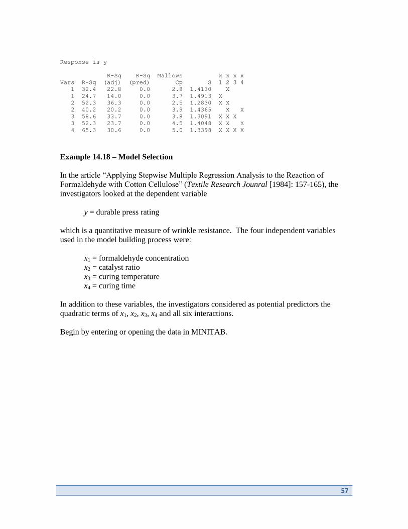
Example 14.18 – Model Selection
In the article “Applying Stepwise Multiple Regression Analysis to the Reaction of
Formaldehyde with Cotton Cellulose” (Textile Research Jounral [1984]: 157-165), the
investigators looked at the dependent variable
y = durable press rating
which is a quantitative measure of wrinkle resistance. The four independent variables
used in the model building process were:
x1 = formaldehyde concentration
x2 = catalyst ratio
x3 = curing temperature
x4 = curing time
In addition to these variables, the investigators considered as potential predictors the
quadratic terms of x1, x2, x3, x4 and all six interactions.
Begin by entering or opening the data in MINITAB.

58
Next, we will calculate the quadratic predictors and the interactions. Select
Calc>Calculator. Input C6 into Store result in variable. Select C2 for Expression, press
the ^ button and click 2. Click OK.
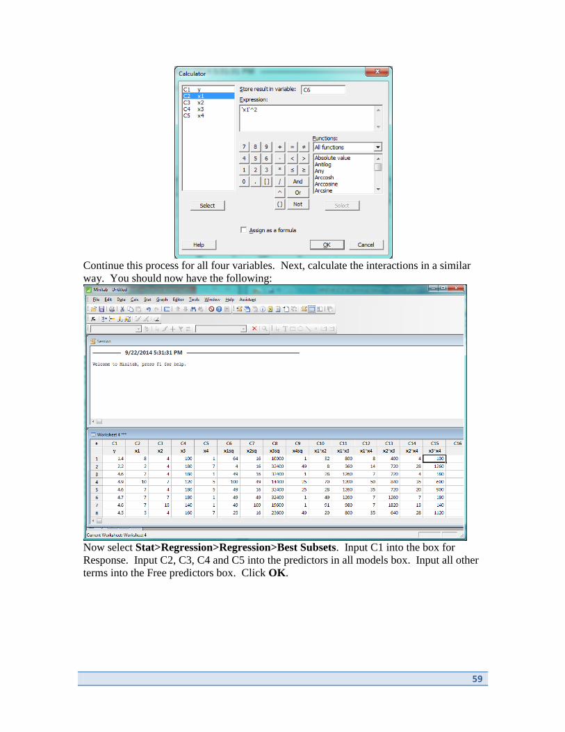
59
Continue this process for all four variables. Next, calculate the interactions in a similar
way. You should now have the following:
Now select Stat>Regression>Regression>Best Subsets. Input C1 into the box for
Response. Input C2, C3, C4 and C5 into the predictors in all models box. Input all other
terms into the Free predictors box. Click OK.

60
The results are output in the Session window and are copied below.
Best Subsets Regression: y versus x1sq, x2sq, ...
Response is y
The following variables are included in all models: x1 x2 x3 x4
x x x x x x
x x x x 1 1 1 2 2 3
1 2 3 4 * * * * * *
R-Sq R-Sq Mallows s s s s x x x x x x
Vars R-Sq (adj) (pred) Cp S q q q q 2 3 4 3 4 4
1 82.4 78.7 72.1 15.5 0.64598 X
1 72.7 67.1 58.4 33.9 0.80370 X
2 85.7 82.0 75.1 11.3 0.59478 X X
2 85.5 81.7 75.3 11.6 0.59885 X X
3 88.5 84.8 78.1 8.0 0.54615 X X X
3 87.7 83.8 76.0 9.5 0.56425 X X X
4 90.1 86.3 79.1 6.9 0.51785 X X X X
4 90.0 86.1 78.2 7.1 0.52119 X X X X
5 91.7 87.9 80.8 5.9 0.48650 X X X X X
5 90.6 86.3 79.1 8.0 0.51810 X X X X X
6 91.8 87.4 80.1 7.7 0.49670 X X X X X X
6 91.7 87.4 79.0 7.7 0.49720 X X X X X X
7 91.9 86.9 78.3 9.5 0.50682 X X X X X X X
7 91.9 86.9 79.1 9.5 0.50724 X X X X X X X
8 92.0 86.4 74.6 11.2 0.51717 X X X X X X X X
8 92.0 86.3 77.3 11.3 0.51823 X X X X X X X X
9 92.1 85.7 73.2 13.1 0.53006 X X X X X X X X X
9 92.0 85.6 66.7 13.2 0.53222 X X X X X X X X X
10 92.1 84.8 64.1 15.0 0.54639 X X X X X X X X X X

61
Chapter 15
Analysis of Variance
In previous chapters, we have discussed comparison of means for two groups. We now
consider comparison of means for more than two groups. Analysis of variance provides a
method to compare means amongst multiple groups.
In this chapter, we use MINITAB to produce ANOVA results using the commands
Stat>ANOVA>One-way.
We also consider the creation of multiple comparisons. We use the command
Stat>ANOVA>General Linear Model>Fit General Linear Model
to fit ANOVA models with more complex designs.
Example 15.4 – ANOVA
The article “Growth Hormone and Sex Steroid Administration in Healthy Aged Women
and Men” (Journal of the American Medical Association [2002]: 2282-2292) described
an experiment to investigate the effect of four treatments on various body characteristics.
In this double-blind experiment, each of 57 female subjects age 65 or older was assigned
at random to one of the following four treatments:
1. Placebo “growth hormone” and placebo “steroid” (denoted by P + P);
2. Placebo “growth hormone” and the steroid estradoil (denoted by P + S);
3. Growth hormone and placebo “steroid” (denoted G + P); and
4. Growth hormone and the steroid estradoil (denoted by G + S).
We perform an ANOVA to determine if the mean change in body fat mass differs for the
four treatments.
Begin by opening or inputting the data in MINITAB.

62
Select Stat>ANOVA>One Way. Select Response data are in a separate column for each
factor from the dropdown menu at the top of the dialog box. Input C1, C2, C3 and C4
into the Responses box. Click OK.
The results follow.

63
Example 15.6 – Multiple Comparisons
A biologist wished to study the effects of ethanol on sleep time. A sample of 20 rats of
the same age was selected, and each rate was given an oral injection having a particular
concentration of ethanol per body weight. The rapid eye movement (REM) sleep time
for each rat was then recorded for a 24-hour period, with which the results are shown in
the text.
We will create multiple comparisons between each of the treatment means. Begin by
inputting the data or opening the dataset in MINITAB.

64
Select Stat>ANOVA>One-Way. Select Response data are in a separate column for each
factor level. Input C1, C2, C3 and C4 into Responses. Click Comparisons and select
Tukey. Click OK. Click OK.

65
Output is displayed in the Session window and two graphs and is shown below.
66
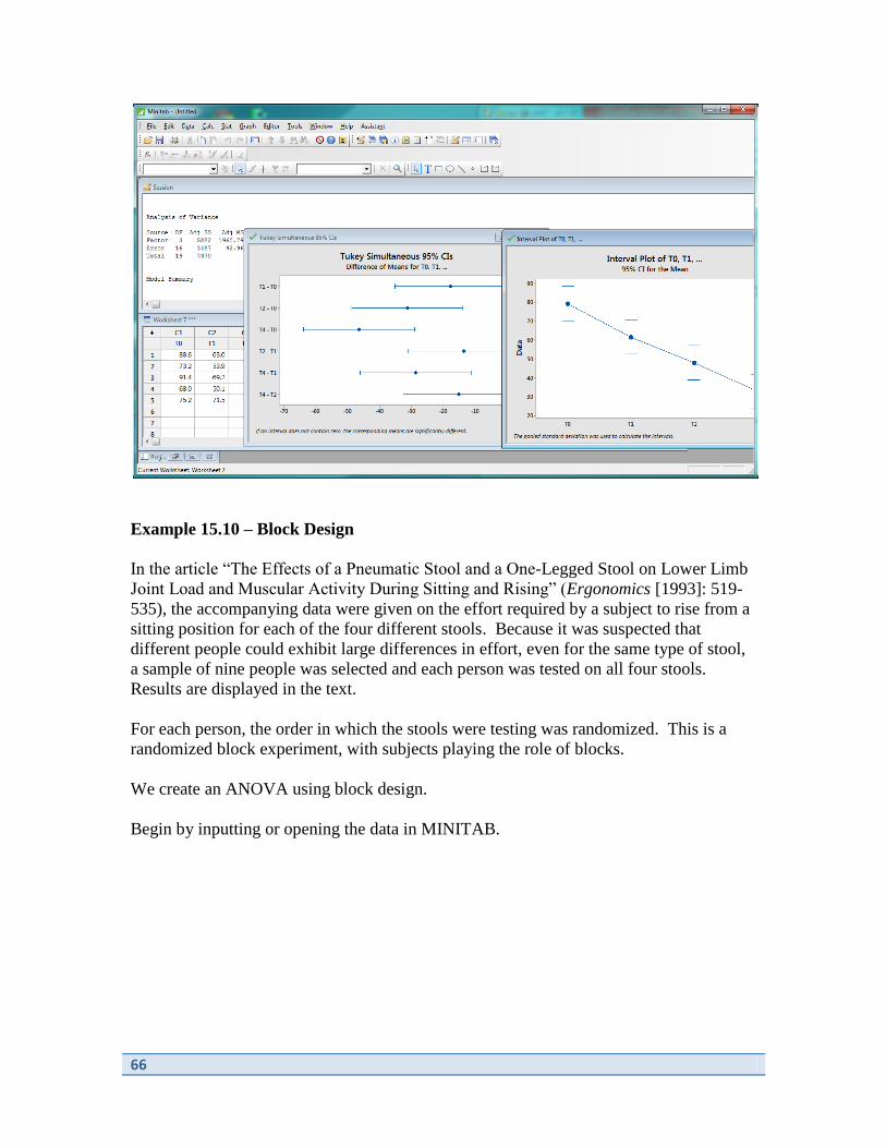
Example 15.10 – Block Design
In the article “The Effects of a Pneumatic Stool and a One-Legged Stool on Lower Limb
Joint Load and Muscular Activity During Sitting and Rising” (Ergonomics [1993]: 519-
535), the accompanying data were given on the effort required by a subject to rise from a
sitting position for each of the four different stools. Because it was suspected that
different people could exhibit large differences in effort, even for the same type of stool,
a sample of nine people was selected and each person was tested on all four stools.
Results are displayed in the text.
For each person, the order in which the stools were testing was randomized. This is a
randomized block experiment, with subjects playing the role of blocks.
We create an ANOVA using block design.
Begin by inputting or opening the data in MINITAB.
67
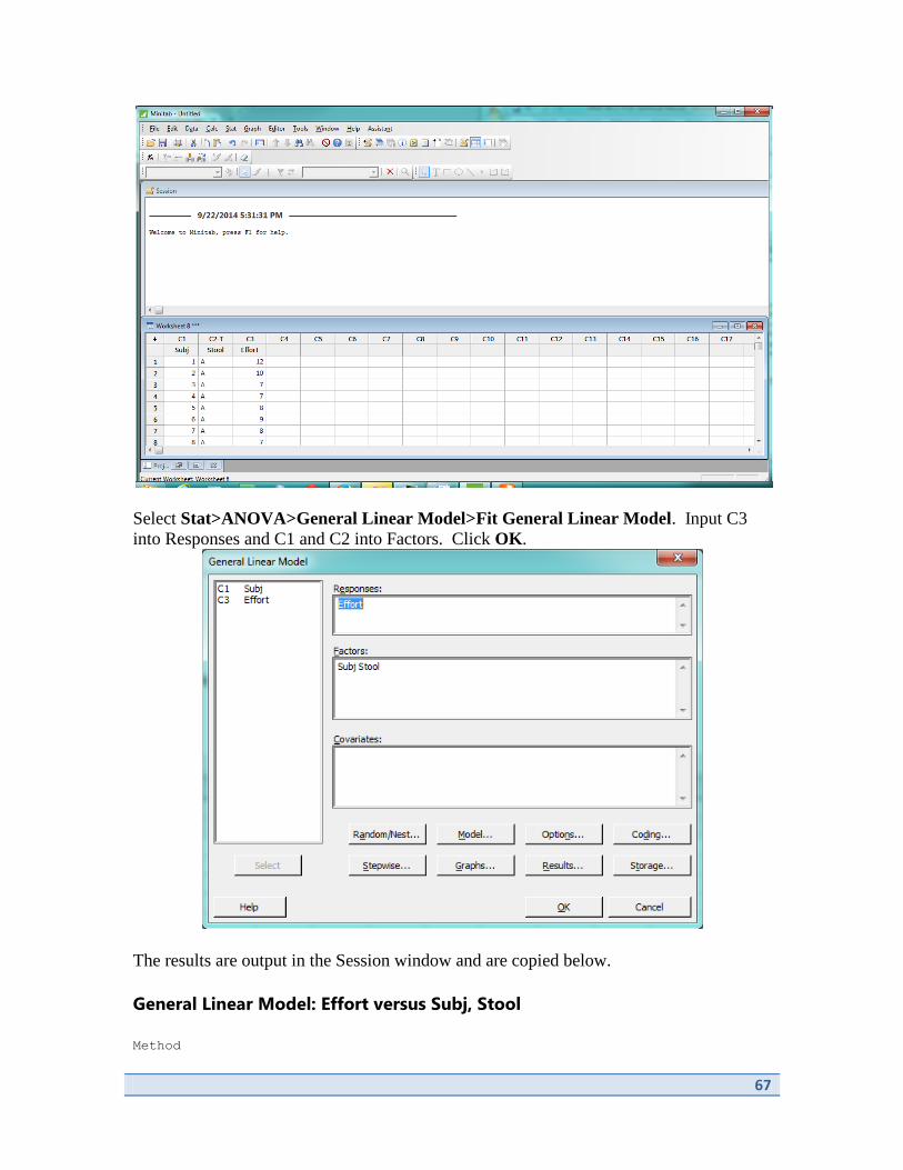
Select Stat>ANOVA>General Linear Model>Fit General Linear Model. Input C3
into Responses and C1 and C2 into Factors. Click OK.
The results are output in the Session window and are copied below.
General Linear Model: Effort versus Subj, Stool
Method
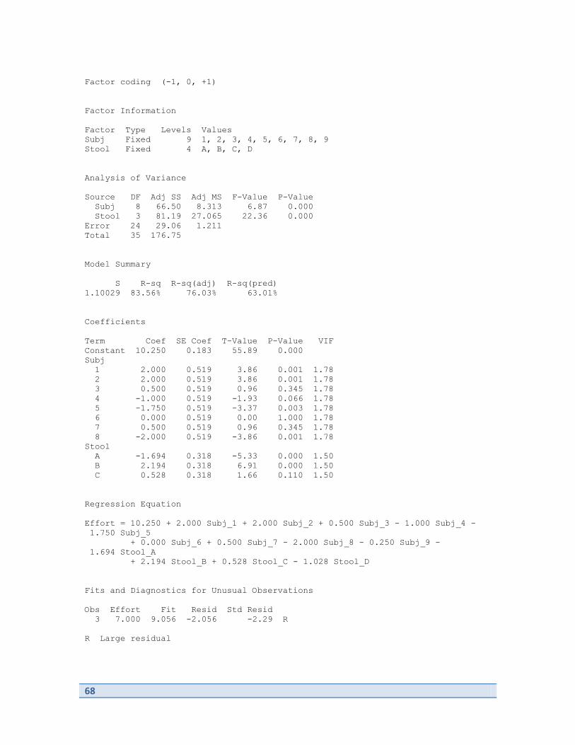
68
Factor coding (-1, 0, +1)
Factor Information
Factor Type Levels Values
Subj Fixed 9 1, 2, 3, 4, 5, 6, 7, 8, 9
Stool Fixed 4 A, B, C, D
Analysis of Variance
Source DF Adj SS Adj MS F-Value P-Value
Subj 8 66.50 8.313 6.87 0.000
Stool 3 81.19 27.065 22.36 0.000
Error 24 29.06 1.211
Total 35 176.75
Model Summary
S R-sq R-sq(adj) R-sq(pred)
1.10029 83.56% 76.03% 63.01%
Coefficients
Term Coef SE Coef T-Value P-Value VIF
Constant 10.250 0.183 55.89 0.000
Subj
1 2.000 0.519 3.86 0.001 1.78
2 2.000 0.519 3.86 0.001 1.78
3 0.500 0.519 0.96 0.345 1.78
4 -1.000 0.519 -1.93 0.066 1.78
5 -1.750 0.519 -3.37 0.003 1.78
6 0.000 0.519 0.00 1.000 1.78
7 0.500 0.519 0.96 0.345 1.78
8 -2.000 0.519 -3.86 0.001 1.78
Stool
A -1.694 0.318 -5.33 0.000 1.50
B 2.194 0.318 6.91 0.000 1.50
C 0.528 0.318 1.66 0.110 1.50
Regression Equation
Effort = 10.250 + 2.000 Subj_1 + 2.000 Subj_2 + 0.500 Subj_3 - 1.000 Subj_4 -
1.750 Subj_5
+ 0.000 Subj_6 + 0.500 Subj_7 - 2.000 Subj_8 - 0.250 Subj_9 -
1.694 Stool_A
+ 2.194 Stool_B + 0.528 Stool_C - 1.028 Stool_D
Fits and Diagnostics for Unusual Observations
Obs Effort Fit Resid Std Resid
3 7.000 9.056 -2.056 -2.29 R
R Large residual

69
Example 15.14 – Two Way ANOVA
When metal pipe is buried in soil, it is desirable to apply a coating to retard corrosion.
Four different coatings are under consideration for use with pipe that will ultimately be
buried in three types of soil. An experiment to investigate the effects of these coatings
and soils was carried out by first selecting 12 pipe segments and applying each coating to
3 segments. The segments were then buried in soil for a specified period in such a way
that each soil type received on piece with each coating. The resulting table is shown in
the text. Assuming there is no interaction, test for the presence of separate coating and
soil effects.
Begin by inputting or opening the dataset in MINITAB.

70
Select Stat>ANOVA>General Linear Model>Fit General Linear Model. Input C3
for Responses and C1 and C2 for Factors. Click OK.
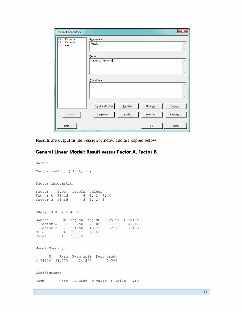
71
Results are output in the Session window and are copied below.
General Linear Model: Result versus Factor A, Factor B
Method
Factor coding (-1, 0, +1)
Factor Information
Factor Type Levels Values
Factor A Fixed 4 1, 2, 3, 4
Factor B Fixed 3 1, 2, 3
Analysis of Variance
Source DF Adj SS Adj MS F-Value P-Value
Factor A 3 83.58 27.86 1.36 0.342
Factor B 2 91.50 45.75 2.23 0.189
Error 6 123.17 20.53
Total 11 298.25
Model Summary
S R-sq R-sq(adj) R-sq(pred)
4.53076 58.70% 24.29% 0.00%
Coefficients
Term Coef SE Coef T-Value P-Value VIF
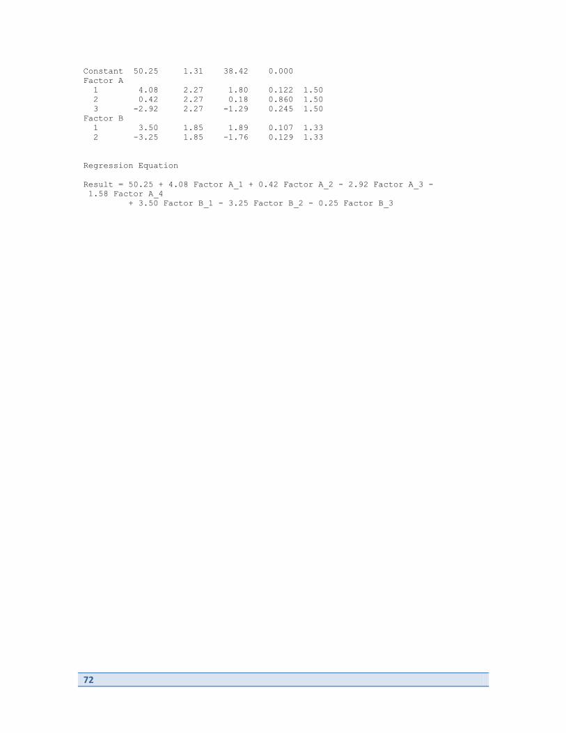
72
Constant 50.25 1.31 38.42 0.000
Factor A
1 4.08 2.27 1.80 0.122 1.50
2 0.42 2.27 0.18 0.860 1.50
3 -2.92 2.27 -1.29 0.245 1.50
Factor B
1 3.50 1.85 1.89 0.107 1.33
2 -3.25 1.85 -1.76 0.129 1.33
Regression Equation
Result = 50.25 + 4.08 Factor A_1 + 0.42 Factor A_2 - 2.92 Factor A_3 -
1.58 Factor A_4
+ 3.50 Factor B_1 - 3.25 Factor B_2 - 0.25 Factor B_3

73
Chapter 16
Nonparametric (Distribution-Free) Statistical
Methods
There are no examples or material from Chapter 16.

74
Related Documents