Introduction to Basic Data Analysis and Interpretation for Health Programs Developed by MEASURE Evaluation, funded by the U.S. Agency for International Development 1 Adapted for the Malawi Translating Research into Action (TRAction) - CCM: Improving Data to Improve Programs (CCM-IDIP) Malawi MOH, IIP-JHU and Save the Children 20 Jan 2012 1 http://www.cpc.unc.edu/measure/tools/data-demand-use/data-demand-and-use-training-resources/basic-data- analysis-for-health-programs

Welcome message from author
This document is posted to help you gain knowledge. Please leave a comment to let me know what you think about it! Share it to your friends and learn new things together.
Transcript

Introduction to Basic Data Analysis and Interpretation for Health Programs
Developed by MEASURE Evaluation, funded by the U.S. Agency for International Development1
Adapted for the Malawi Translating Research into Action (TRAction) - CCM: Improving Data to Improve Programs (CCM-IDIP)
Malawi MOH, IIP-JHU and Save the Children
20 Jan 2012
1http://www.cpc.unc.edu/measure/tools/data-demand-use/data-demand-and-use-training-resources/basic-data-analysis-for-health-programs
2 | P a g e
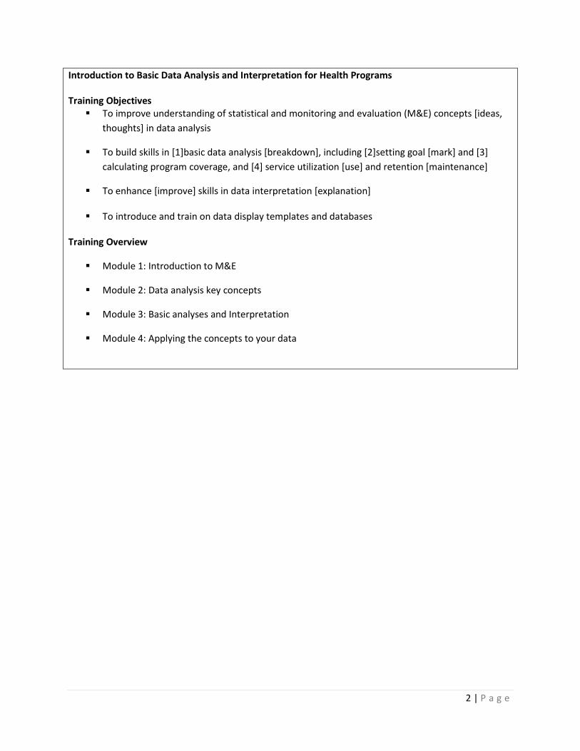
Introduction to Basic Data Analysis and Interpretation for Health Programs Training Objectives To improve understanding of statistical and monitoring and evaluation (M&E) concepts [ideas,
thoughts] in data analysis
To build skills in [1]basic data analysis [breakdown], including [2]setting goal [mark] and [3] calculating program coverage, and [4] service utilization [use] and retention [maintenance]
To enhance [improve] skills in data interpretation [explanation]
To introduce and train on data display templates and databases
Training Overview
Module 1: Introduction to M&E
Module 2: Data analysis key concepts
Module 3: Basic analyses and Interpretation
Module 4: Applying the concepts to your data

3 | P a g e
Module 1: Introduction to Monitoring and Evaluation M&E systems underpin [support/strengthening] the data-informed decision-making process. The data allow us to track progress [growth, development, steps forward] in the delivery of health services and evaluate [calculate, weigh up, estimate] the outcome and impact of these services on the health status of our communities.
MonitoringTrack changes in program performance over time
EvaluationAttribute [point, spot, mark] program outcomes to their causes
1.1. Data Sources There are many data sources that contribute to the M&E system. Common data sources include:
• Service delivery data – This is a data source that you are all very familiar with, as you are the primary data collectors. Service delivery data reflect the services you provide such as immunization, delivery attendance, sick child consultations and treatments, and growth monitoring. Service delivery data are recorded routinely, usually at the time that the service is provided. At the end of the month, information on the number of services provided is usually summarized and reported to the next level (e.g. the HSA reports to the health facility and the health facility reports to the district). During this module, most of our discussions will rely on service delivery data as a data source.
• Census – A census is a counting of the people in a specific geographic area. You are all probably familiar with the 2008 census that counts the numbers of people in your country. This is also an important data source in the health field because it allows us to calculate the numbers of people in need of specific services.
• Surveys, evaluations, research studies – Capture information on specific topics and populations. These data sources help us to answer specific questions and provide information that can help us to improve our programs.
• Surveillance – Tracks the occurrence of specific diseases in a target population over time. Prevalence refers to the total number of cases of a disease in a given population at a specific time. These data help us to estimate the burden of specific diseases.
• Budget – Last, there are other sources of data that we don’t often consider. For example: budget information can help us track our expenditures and illuminate what specific program elements cost.

4 | P a g e
1.3. What is the purpose of monitoring and evaluation? M&E is an essential process in providing effective and efficient services and ensuring that programs are relevant and successful. For example, it helps us to make informed decisions about such questions as appropriate staffing and other necessary resources.
M&E helps us know whether a program is meeting its goals and objectives. Is the program having the desired impact? If we want to know how a program is performing, we might assess it against targets that have been set for specific indicators by the program or funding agency or government. For instance, we might assess how the CCM program is reaching sick children by measuring the number of sick children treated in the village clinic compared to the estimated number of sick children in the communities.
M&E helps us to generate new knowledge about underserved populations or the need for new services around an emerging health issue. We can also discover factors that influence health outcomes, as well as other important information.
However, for M&E to improve program delivery, M&E data and information must be used strategically by programs, service delivery organizations, policymakers, and other stakeholders. Not only at the national level but at the district and health facility levels as well.
Oftentimes people see M&E as policing or as a process meant to criticize and undermine their work. In other situations, an M&E unit is only established for the purpose of reporting. Policymakers, program managers, and M&E specialists can be partners in progress—designing new programs, making improvements to plans and programs, policymaking and, at the facility level, identifying gaps and opportunities.
Strong decision making and management rely on high-quality M&E or strategic information. Without information, it is difficult to make an effective and successful decision or manage shifts in a program.
Finally, data quality is linked to data use. As increased attention is being paid to data quality, especially at the sub-district levels, it’s important to know that data quality naturally improves as individuals and organizations understand how useful the data and information can be to them.
The use of monitoring and evaluation data allows providers to make data-informed decisions to design and manage health programs, which results in better health outcomes.
We can use data and information to:
• Inform policies and plans
• Raise additional resources
• Strengthen programs and improve results
• Ensure accountability and reporting

5 | P a g e
• Improve quality of services provided
• Contribute to global lessons learned
Module 2: Data analysis key concepts In the previous module, we discussed the importance of using data to make decisions. For data to be useful, they need to be processed and summarized to become meaningful as they relate to the program.
The focus on this session is to present key concepts in data analysis. This session will review the most common data analysis terms and techniques used for descriptive data analysis. Then, in the next session, we’ll apply these techniques to the monitoring of health service delivery.
2.1. Data Analysis It is important to note that, while the terms ‘data’ and ‘information’ are often used interchangeably, there is a distinction.
Data refers to raw, unprocessed numbers, measurements, or text.
Information refers to data that are processed, organized, structured, or presented in a specific context.
The process of transforming data into information is data analysis or turning raw data into useful information. The purpose is to provide answers to questions being asked by program implementers. Even the greatest amount and best quality data mean nothing if not properly analyzed—or if not analyzed at all
Data analysis does not necessarily mean using a complicated computer analysis package. It means taking the data that you collect and looking at them in the context of the questions that you need to answer.
For example, if you need to know whether your program is meeting its objectives, or if it’s on track – you would look at your program targets and compare them to the actual program performance. This is analysis. Later, we will take this one step further and talk about interpretation (e.g., through analysis, you find that your program achieved only 10% of its target; now you have to figure out why).
2.2. Answering programmatic questions With regard to data analysis, we talk a lot about answering programmatic questions. Let’s take a minute to discuss what that means.
Suppose you need to know if your program is on track – you probably would look at your program targets and compare them to the actual program performance. This is analysis.
Interpretation is using the analysis to further explore your findings and understand the implications for your program. In many cases, this means using additional information, such as vital statistics, population-based surveys, and qualitative data, to supplement the routine service statistics. We will talk more about this later in the workshop.

6 | P a g e
Question: Is my program meeting its objectives?
Analysis: Compare program targets and actual program performance to learn how far you are from target.
Interpretation: Why you have or have not achieved the target and what this means for your program.
May require more information.
2.3. Descriptive analysis The world of data analysis is vast and can be complex. Here, we focus on descriptive analyses that will be most helpful in the health facility setting. This unit reviews the most common data analysis terms and techniques used for descriptive analysis. In the next session, we’ll apply these techniques to M&E.
Describes the sample/target population (demographic & clinic characteristics)
Does not define causality – tells you what, not why
Example – average number of sick children treated per month
Ratio
A ratio is a comparison of two numbers and is expressed as “a to b” or “a per b.” In the health sector, we commonly use ratios to look at the number of clinicians to patients, or beds to clients.
To calculate a ratio, divide the first item you are looking at by the second. So, if you were to say that there are 3 staff per clinic, the ratio is expressed numerically as 3:1. It is not the same as saying 1 to 3 or 1:3. The order of the numbers matters.
Note the example here, where we see in Thyolo district that there are 60 nurses and 20 health clinics. To find the ratio of nurses to clinics we divide 60 by 20 and come up with 3, or 3 nurses per clinic.
60 20 = 3 nurses per clinic, a ratio of 3:1
Proportion
A proportion is a ratio in which all individuals included in the numerator must also be included in the denominator. We frequently use a proportion to compare part of the whole, such as proportion of all children diagnosed with malaria who completed the full course of their antimalarial treatment.
For example: If 80 of 100 children treated with antimalarials complete the full course, what is the proportion of children who completed treatment to all treated?

7 | P a g e
80_ 100 = 4/5 children treated completed full course of antimalarials
Percentage
A percentage is a way to express a proportion multiplied by 100. It expresses a number in relation to the whole. A percentage allows us to express a quantity relative to another quantity. It allows us to compare different groups, facilities, or countries that may have different denominators – it represents a fraction of 100.
For instance, let’s say 90 out of 110 HSAs in Kasungu district were trained in CCM. To make this a percentage, we convert the fraction to a decimal (90/110 = 0.81) and then multiply by 100 (0.81 x 100 = 81%).
90_ 110 = 0.81 x 100 = 81% of HSAs are trained in CCM
Rate
Let’s look specifically at infant mortality rate. The calculation for a mortality rate is the number of deaths in the population at risk, divided by the population at risk in the same time period, and then multiplied by 1,000. Mortality rate is always expressed in units of death per 1,000 individuals (except for maternal mortality, which is expressed per 100,000 live births).
Example: In 2010, 4,000 infants were born. Of these infants, 75 died during that year.
So, to calculate this, divide 75 by 4,000 = .0187 x 1,000 = 18.7
The infant mortality rate in 2010 is nearly 19 deaths per 1,000 live births.
Module 3: Basic analyses and Interpretation Now that we have discussed some concepts of basic analysis and their supporting calculations, we will move on to discussing two basic analyses that can facilitate the monitoring of service delivery.
3.1. Indicators An indicator measures one aspect of a program and shows how close it is to the programmatic goal. An indicator is often expressed as a number or percentage.
The indicator could be any element of the program that needs tracking.
Let’s take a moment to go over each piece of this definition. The purpose of indicators typically is to show that program activities are carried out as planned or that a program activity has caused a change or difference in something else. Therefore, the value of an indicator will change over time, from the

8 | P a g e
level at the start of the program to another value after the program activities are implemented for a sufficient period of time.
Second, an indicator is a measurement. It measures the value of the change in meaningful units for program management – a measurement that can be compared to past and future units and values.
Third, an indicator focuses on a single aspect of a program or project. Objectives will include at least one indicator for each significant aspect of program activities.
In Malawi, the MOH has identified standard indicators that measure the progress of the CCM program. These are known as IMPLEMENTATION STRENGTH INDICATORS.
Definition Numerator Denominator 1. HSAs available (deployed)
No of HSAs working at the time of the assessment in the district
Total population of under-fives
2a. HSAs trained in CCM No of HSAs trained in CCM No of all HSAs working at the time of the assessment
2b. Hard-to reach areas with CCM trained HSAs
No of hard to reach areas with a trained HAS
Number of hard to reach areas
2c. CCM-trained HSAs providing CCM services
No of CCM -trained CHWs who have seen a sick child in the past seven days
No of CCM trained HSAs working at the time of the assessment
3a. CCM trained HSAs with supply of key CCM drugs in the last 3 months (items reported individually)
No of CCM trained HSAs with no stockouts of more than 7 days of key medicines within the last 3 months (AB, ACT, ORS, ZN, Timer)
No of CCM trained HSAs working at the time of the assessment
3b. No of CCM trained HSAs with no stockouts of life saving medicines within the last 3 months (AB, ACT, ORS)
No of CCM trained HSAs working at the time of the assessment
4. CCM trained supervised in the last 3 months
CCM-trained HSAs supervised in CCM in the last 3 months
No of CCM trained HSAs working at the time of the assessment
5. CCM trained supervised in the last 3 months with reinforcement of clinical practice
CCM-trained HSAs supervised in CCM in the last 3 months with reinforcement of clinical practice (case observation; case scenarios, mentoring at health facility)
No of CCM trained HSAs working at the time of the assessment
6. CCM trained HSAs residing in their catchment area
No of CCM trained HSAs residing in their catchment area
No of CCM trained HSAs
7a. No of sick children assessed each month by major condition 7b. No of sick children treated each month by major condition

9 | P a g e
Some definitions to consider:
Numerator= Refers to the number who have received the intervention of interest
Denominator = Refers to the number who are eligible to receive the intervention of interest
For instance, in the previous example of HSAs trained in CCM. 90_ 110 = 0.81 x 100 = 81% of HSAs are trained in CCM
90=numerator 110=denominator
3.2. Targets Let’s take a look at this definition of a target. Essentially, a target is a number that you set (specified level of performance) for a given indicator by a certain period of time. There are two types of targets.
An overall target measures expected performance for the life of the program – whether it is one year, three years, or five years. It defines what you want to accomplish for an indicator by the end of the program. For example, the government of Malawi would like to have all HSAs stationed in a hard-to-reach area to be trained in CCM. The target is 100%.
Annual targets measure the expected performance for each year of the program. For example, in the above scenario, it is very difficult to reach 100% coverage of CCM trained HSAs overnight! So the government will set annual targets are set to measure “intermediate” progress. The target for year 1 may be 50%, year 2 - 75% and year 3-100%.
3.3. Comparison of time periods Once you have your indicators you want to measure and your targets set, you can begin to look at your indicators over time in relation to your target. And you can also compare the indicators by different HSAs, health facilities or districts. Looking at these differences can help you to evaluate your program’s progress over time or in comparison to similar programs in your area.
Example: In January at Bowe health facility, 10 of the 22 HSAs are residing in their catchment areas full-time (10/22 = 45%). The facility would like to have 80% of the HSAs living full-time in their catchment area by the end of the year. In June, when the indicator is measured again, 16 of the 22 HSAs are now residing full-time in their catchment area (16/22=73%).
In terms of comparing time periods, it also can be helpful to calculate the rate of increase for your program. If you wanted to know the rate of increase per month January to June, you would use the calculation we discussed in Part 1. You would subtract the number living in their catchment area in January from the number living in their catchment area in June (16 – 00 = 6). Then you would divide that number (6) by the number of months over which the change took place (in this case 6 months) (6÷ 6 =

10 | P a g e
1). So you see that the number of HSAs living in their catchment area was increasing by approximately 1 HSA per month between January and June. If this rate of increase continues, the facility will reach its target of 80% (18/22) in just two months (by August).
3.4. Data Display The two main ways of summarizing data are by using tables and charts or graphs.
A table is the simplest way of summarizing a set of observations. A table has rows and columns containing data, which can be in the form of absolute numbers or percentages, or both.
Charts and graphs are visual representations of numerical data and, if well designed, will show the general patterns of the data. There are several different types of charts and graphs. Some are better at showing certain data than others.
Bar chart: comparisons, categories of data
Line graph: display trends over time
Pie chart: show percentages or proportional share
Chart and graph templates have been developed for your use. In the final module we will review the templates and practice filling them.
3.5. Data Interpretation Data interpretation is the process of making sense of the information. It allows us to ask: What does this information tell me about the program?
Here, you see a flow chart of the steps involved in interpreting data:
Relevance of the finding
We start by wanting to know the relevance of our findings. Seeking the relevance of a finding is to add meaning to information by making connections and comparisons and exploring causes and consequences. When interpreting data and seeking the relevance of our findings, we may ask these questions:
Does the indicator meet the target?
How far from the target is it?

11 | P a g e
How does it compare (to other time periods, other facilities)?
Are there any extreme highs and lows in the data?
When seeking potential reasons for the finding, we often will need additional information that will put our findings into the context of the program.
Reasons for the finding
Supplementing the findings with expert opinion is a good way to do this. For example, talk to others with knowledge of the program or target population, who have in-depth knowledge about the subject matter, and get their opinions about possible causes.
For example, if your data show that HSAs are not treating as many diarrhea cases in the community as you would expect, you may want to explore potential reasons such as:
• Perhaps the community is not aware that HSAs are able to provide treatment for diarrhea through the village clinics? Or the community is aware, but the services are not provided at convenient times? Or perhaps the HSAs do not have stocks of ORS? Or perhaps ORS is not considered an effective treatment for diarrhea by community members? To better understand the reasons for low treatment levels, you could talk to community leaders or other providers to get their opinions. You could also look at data on availability of ORS among HSAs.
Sometimes ad hoc conversations with experts are insufficient. To get a more accurate explanation of your findings, you often will have to consider other data resources.
Consider other data
For instance in the previous quarter, one of the HSAs has treated much fewer children than other HSAs in his catchment area, can we understand why this is happening by looking at other program indicators? It may be that he has had frequent stock-outs that interrupt services. Or if a new health center has opened near to his village clinic, it could be that many parents are taking their children there instead.
Conduct further research
Once you review additional data, it may become apparent that these data are not sufficient to explain the reasons for your findings – that a data gap exists. In these instances, it may be necessary to conduct further research.
The types of research designs that are applied will depend on the questions that need to be answered, and of course the feasibility and expense involved with obtaining the new data.
12 | P a g e
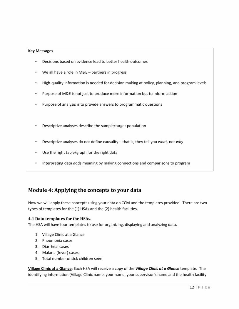
Key Messages
• Decisions based on evidence lead to better health outcomes
• We all have a role in M&E – partners in progress
• High-quality information is needed for decision making at policy, planning, and program levels
• Purpose of M&E is not just to produce more information but to inform action
• Purpose of analysis is to provide answers to programmatic questions
• Descriptive analyses describe the sample/target population
• Descriptive analyses do not define causality – that is, they tell you what, not why
• Use the right table/graph for the right data
• Interpreting data adds meaning by making connections and comparisons to program
Module 4: Applying the concepts to your data Now we will apply these concepts using your data on CCM and the templates provided. There are two types of templates for the (1) HSAs and the (2) health facilities.
4.1 Data templates for the HSAs. The HSA will have four templates to use for organizing, displaying and analyzing data.
1. Village Clinic at a Glance 2. Pneumonia cases 3. Diarrheal cases 4. Malaria (fever) cases 5. Total number of sick children seen
Village Clinic at a Glance: Each HSA will receive a copy of the Village Clinic at a Glance template. The identifying information (Village Clinic name, your name, your supervisor’s name and the health facility

13 | P a g e
name) only need to be filled in one time. The background information includes total catchment population (children and adults) and estimated number of under-five children. This is the same information that you enter in the Form 1A.
There is a support and supervision monthly summary. At the end of each month, tick whether you received a supervision visit on sick child care or mentoring at the health facility. This will help you track the supervision and mentoring you have received.
Analysis You should receive a supervisory visit or mentoring session once every quarter. Use the table to track the months and visits.
Action If it has been two or more months since your last supervision/mentoring, then let your supervisor know that you are due for a supervision visit in the upcoming month so that they can schedule you in .
An example of a Village Clinic at a Glance template is shown below. For example, at the end of October or in early November, Precious would notify her supervisor that she has not received supervision visit and ask if she can make an appointment for mentoring the next time she travels to the health center.
Number of Malaria Cases: This template has two sections, a graph and a table. The graph shows the number of new malaria cases that came to your village clinic for each month. Include both boys and girls and all under-five children. This information will be taken from your Form 1A for that month. The circle below on Form 1A shows where you will get this information.
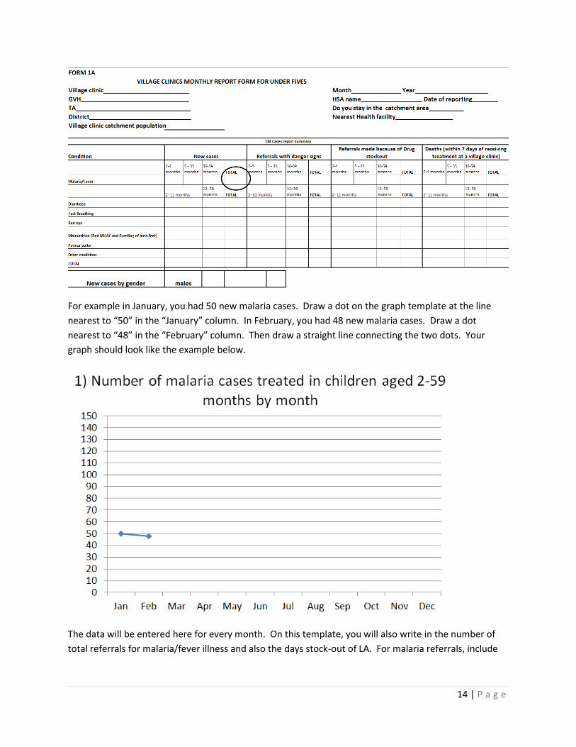
14 | P a g e
For example in January, you had 50 new malaria cases. Draw a dot on the graph template at the line nearest to “50” in the “January” column. In February, you had 48 new malaria cases. Draw a dot nearest to “48” in the “February” column. Then draw a straight line connecting the two dots. Your graph should look like the example below.
The data will be entered here for every month. On this template, you will also write in the number of total referrals for malaria/fever illness and also the days stock-out of LA. For malaria referrals, include

15 | P a g e
all ages, boys and girls and those referred due to stockout. For LA, stock-outs, only write in the days you had a stockout of all LA – both 6x1 and 6x2 packets.
Referrals for malaria/fever:
Stockouts for LA:

16 | P a g e
When you have completed your malaria/fever cases would look something like this example:
This shows you the time-trend of malaria/fever cases in your community. For instance, if you notice a large increase in cases, you could remind community members that young children should sleep under mosquito nets. It is helpful to look at the number of cases with referral due to stockouts and stockout information. This helps you interpret the information. For instance, it might look like there was a decrease in malaria cases from April to August. However there was also a stockout of LA at the village clinic during this time. It could be that since the HSA had to refer all cases, the mothers stopped bringing their children for illness because they knew there was no medicine. When mothers heard that medicine was available again, they started bringing in their sick children for treatment. It’s useful to look at the whole picture when analyzing data.
Discussion point What are some other reasons that illness cases could increase or decrease? What actions could you take to address this?
Number of Diarrhoea and Pneumonia cases: There are also templates for diarrhea and pneumonia (fast breathing) cases that are very similar to the malaria/fever example.
Pneumoniayou will record and graph the number of fast breathing cases (all ages and for boys and girls) each month. The number of days stock-out of cotrimoxazole and referrals for fast breathing due to stockouts of cotrimoxazole.

17 | P a g e
Diarrhoea you will record and graph the number of diarrhea cases (all ages and for boys and girls) each month. The number of days stock-out of ORS and total referrals for diarrhea because of stock-outs of ORS .
Total number of sick child cases: Finally, there is a template that displays the total cases of sick children seen at your village clinic, along with the number of days the village clinic operated and child deaths.
The total number of sick child cases will be graphed each month. This information is available on the Form 1A. Under the graph you will record the number of total child deaths in your community. Record deaths among all under-five children including infants and babies that died shortly after delivery. See example Form 1A below:
The number of days your village clinic is not currently recorded on Form 1A. You will have to look back on your records to determine how many days each month you held a village clinic. An example of a completed Total number of sick child cases template is below.
Discussion point What are some actions that could be taken if you notice an increase in child deaths in your catchment area?
4.2 Data templates for the health facilities The HSA supervisors will have a summary sheet and six templates to use for organizing, displaying and analyzing data. The summary sheet will show monthly and quarterly summary data by HSA for five indicators. The data display templates will show six indicators by quarter along with targets and action thresholds. Finally all the information will be displayed in a CCM Implementation Strength Quarterly Dashboard.

18 | P a g e
The six HSA indicators are:
1. Percent of CCM-trained HSAs residing in their catchment area 2. Percent of CCM-trained HSAs submitting reports complete and on time 3. Percent of CCM trained HSAs with medicines 4. Percent of CCM trained HSAs receiving routine supervision 5. Percent of CCM-trained HSAs receiving clinical supervision (mentoring) 6. Number of cases treated by CCM-trained HSAs
Summary sheet: Each HSA will be listed with the name of their village clinic, under-five population, whether or not they work in a hard-to-reach area (HTR) and whether they are trained in CCM. This information will only need to be entered once per quarter. For indicators 1-5 listed above, you will enter “Yes” or “No” in the columns for each HSA. You will be given one sheet for each quarter with space for 20 HSAs and you will be provided with two coloured markers to clearly mark a green check for “Yes” and a red X for “No”. The data for indicators can be pulled from the Form 1As and your records.
1. Percent of CCM-trained HSAs residing in their catchment area: This is found on the Forms 1A submitted by each HSA. See example below: Note that should also verify or cross-check with other sources that the HSA is residing full-time in their catchment area to confirm.
2. Percent of CCM-trained HSAs submitting reports complete and on time: You will enter whether each HSA submitted their Form 1A complete and on time for each month. If a HSA submitted a report on time but it was not complete, then you would enter a “No” for that month.
3. Percent of CCM trained HSAs with medicines: This can be entered from column H in the supplies management table in Form 1A for each HSA. Include all CCM drugs in the summary sheet. For instance, if the HSA has all drugs except for ORS then enter “No”. LA 6x1 and LA 6x2 can be combined. For instance, if the HSA has all drugs except for LA 6x2 BUT has LA 6x1, then enter “Yes” for that HSA. Also see the example Form 1A below.
4. Percent of CCM trained HSAs receiving routine supervision: This is found on Form 1A for each HSA. You can also cross-check with your records as well. See the example Form 1A below.
5. Percent of CCM-trained HSAs receiving clinical supervision (mentoring): This is found on Form 1A for each HSA. You can also cross-check with your records as well. See the example Form 1A below.
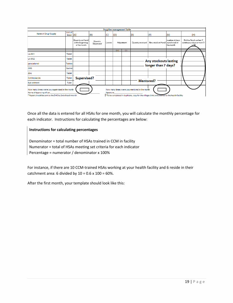
19 | P a g e
Once all the data is entered for all HSAs for one month, you will calculate the monthly percentage for each indicator. Instructions for calculating the percentages are below:
Instructions for calculating percentages Denominator = total number of HSAs trained in CCM in facility Numerator = total of HSAs meeting set criteria for each indicator Percentage = numerator / denominator x 100%
For instance, if there are 10 CCM-trained HSAs working at your health facility and 6 reside in their catchment area: 6 divided by 10 = 0.6 x 100 = 60%.
After the first month, your template should look like this:

20 | P a g e
Calculating the quarterly indicators: Once the three months have been completed, enter the data for each HSA by quarter. Just tally up each month. What you enter in the quarterly summary varies by indicator.
For Residing in the CA, Reported Regularly and No Stockouts: if all three months are a “Yes” then enter “Yes” in the quarterly summary. If there is one “No” then enter “No” for the quarterly summary, even if the other two months are “Yes”. So if a HSA reported regularly for months 1 and 2 but did not for month 3, then you would enter a “No” in the QT summary.
For supervision and mentoring: Each HSA should be mentored and supervised once per quarter. If all three months are “No” then enter “No” for the QT summary. If at least one month is “Yes”, then enter “Yes” for the QT summary.
Village clinic functional: The QT summary has an additional indicator. Is the village clinic functional? This should be marked as ‘Yes’ if all indicators are marked green (yes) in the quarterly summary.
Once you have completed the QT summary, you will calculate the percentages like you did for each month previously. This is the data that you will graph on the templates.
An example of a completed month and quarterly summary form is shown below:

21 | P a g e
Graph templates: There are six graph templates that show the five CCM program indicators and also the number of cases at the village clinic.
Percent of CCM trained HSAs with medicines: This graph shows the percent of HSAs with all medicines during the quarter, the number that did not have all the medicines, a target and action threshold. The target shows the ideal percentage for HSAs who have all drugs during the quarter and the level at which some action should be taken. For instance, if the percentage of HSAs with all drugs falls below 75%, you may need to take some action to help increase the percentage. You will set a target and action threshold during the training with help from the facilitators.
Take the percent of HSAs with no stockouts>7days from the QT summary on the summary sheet. Enter the percentage for the column corresponding to the correct quarter. Draw in the bar graph for that quarter. In the box below you will enter the number of HSAs that had a stockout longer than seven days during the quarter.
During this training, you will decide on both a target and an action threshold for each indicator and draw them on the graph.
Below shows an example of the percent of HSAs who received supervision during the quarter. In this example, the target is set to 80% and the action threshold is set to 60%

22 | P a g e
A similar procedure will be done for the other four indicators. The templates include one graph that does not pull information from the summary sheet. The Number of malaria, diarrhea and pneumonia cases treated by CCM-trained HSAs graph shows the total number of all cases (boys and girls, all ages and all illness) treated by village clinics within the health facility catchment area. This information by month can be pulled from the Form 1B. Each illness total for all three months will need to be summed before entering into the graph.
Each quarter has three bars, separate for malaria, diarrhea and pneumonia (fast-breathing). Draw in the bar with the appropriate color for all three illnesses in the correct quarter column.

23 | P a g e
Now you will calculate the averages for each illness per quarter. You will calculate the average “per HSA” and “per under-five”. For example, if there are 500 malaria cases treated by 15 CCM-trained HSAs in your health facility catchment area.
500/15 = 33.3 malaria cases seen by a HSA in every quarter (or 33.3/3 months in a quarter = 5 malaria cases seen by a HSA every month)
And if there are 1610 under-five children in the health facility catchment area.
500/1610 x 1000 = 311 malaria cases seen per 1000 under-five children
This process will be done every quarter for malaria, diarrhea and pneumonia.
CCM Implementation Strength Quarterly Dashboard: All this templates along with some background information on the health facility catchment area will be shown on this dashboard. Display this dashboard at the health facility to quickly observe and interpret the data.
Related Documents