Intro to Visual Communication - Colour Theory • Colour Spectrum • Colour Wheel • Primary Colours • Secondary Colours • Complementary Colours • Analogous Colours • Split Complementary Colours • Tints, Shades and Tones • Simultaneous Contrast • Successive Contrast • Subtractive Colour • Printing Primary Colours • Additive Colour Colour Matters Colour, Contrast & Dimension Web Links Colour Theory Colour Test Colour Test Answers

Welcome message from author
This document is posted to help you gain knowledge. Please leave a comment to let me know what you think about it! Share it to your friends and learn new things together.
Transcript

Intro to Visual Communication - Colour Theory
• Colour Spectrum• Colour Wheel• Primary Colours• Secondary Colours• Complementary Colours• Analogous Colours• Split Complementary Colours• Tints, Shades and Tones• Simultaneous Contrast• Successive Contrast• Subtractive Colour• Printing Primary Colours• Additive Colour
Colour Matters Colour, Contrast & Dimension
Web Links
Colour Theory
Colour Test
Colour Test Answers

Colour
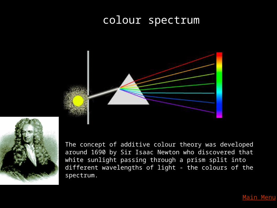
colour spectrum
The concept of additive colour theory was developed around 1690 by Sir Isaac Newton who discovered that white sunlight passing through a prism split into different wavelengths of light - the colours of the spectrum.
Main Menu

Colour Wheel
Hue
pure colour
Main Menu

primary colours Next

primary colours
primarycolours can be found
equally spaced onthe twelve partcolour wheel
Main Menu

secondary colours
each secondarycolour is a mixture of two primary colours
Main Menu

complementary colours
Complementarycolours can be found
opposite each other onthe twelve partcolour wheel
Next

complementary colours
complementary coloursprovide maximum
visual contrastof hue
Next

complementary colours
The sum of any twoprimary colours makesthe complement of the
remaining primary
Main Menu

analogous colours
colours which areclose to each other on
the colour wheel
Next
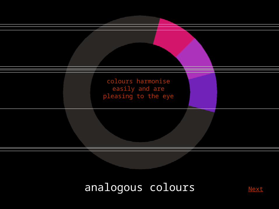
analogous colours
colours harmoniseeasily and are
pleasing to the eye
Next

analogous colours
they can include tones,tints and shades
Main Menu

split complementary colours
this complementaryvariation introducesslight variations of
the contrastingcolour
Next

split complementary colours
using adjacentcolours to theopposite hue
Next

split complementary colours
the effectis vibrant and exciting
but less harsh thantwo straight
complementary colours
Main Menu
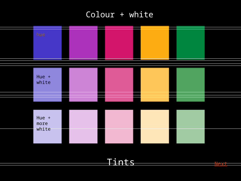
Tints
Colour + white
hue
Hue +white
Hue +more white
Next
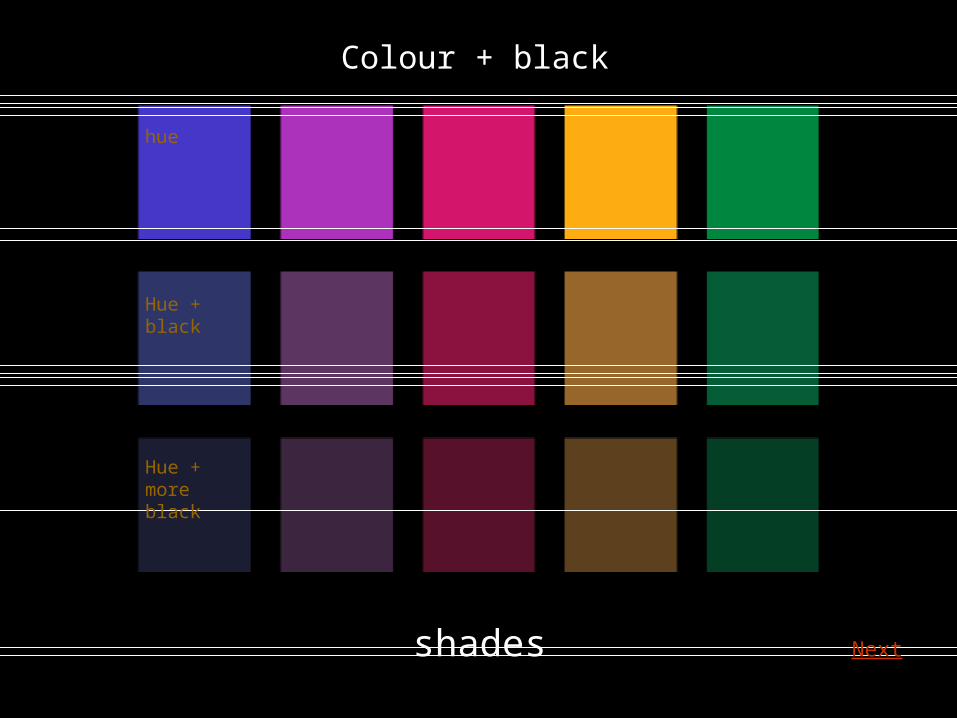
shades
Colour + black
hue
Hue +black
Hue +more black
Next
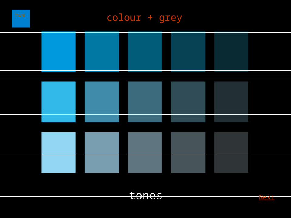
tones
colour + greyhue
Next

hue
70% tint
50% tint
30% tint
+light grey
+dark grey
Main Menu

simultaneous contrast
of tone
the same grey, shown as a central square, gives
the illusion of being lighter set against a dark tone
and darker when set against a light tone
Next

simultaneous contrast
the same effect occurs when the same grey
is set against colours of different value
Next
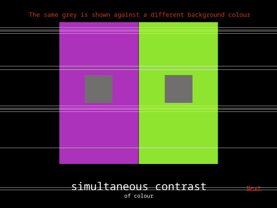
simultaneous contrast
of colour
The same grey is shown against a different background colour
Next
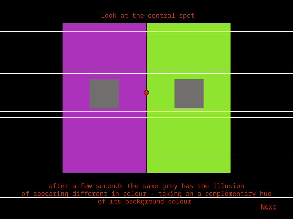
look at the central spot
after a few seconds the same grey has the illusionof appearing different in colour - taking on a complementary hue of its background colour
Next

simultaneous contrast
of colour
The same yellow is shown against a different background colour
Next

look at the central spot
after a few seconds the same yellow has the illusionof appearing different in colour - it appears more intense set against a contrasting hue
Main Menu
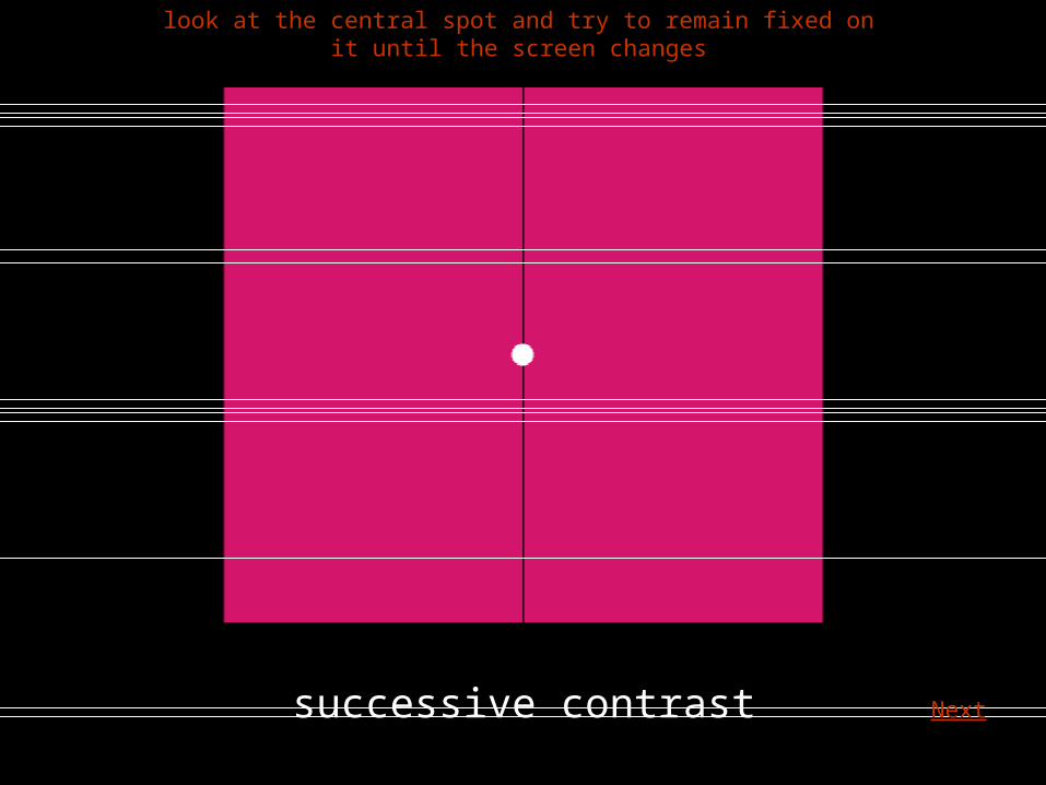
successive contrast
look at the central spot and try to remain fixed on it until the screen changes
Next

successive contrast
the complementary colour appears as an afterillusion as your eyes adjusted to the loss of colour
Next

successive contrast
try the illusion againwhat colour will appear?
Next

purple / mauve
Main Menu

subtractive colour
i.e. using colour pigments
primary colours
red
yellow blue
Next

subtractive colour
secondary colours
two pigment primaries mixed together create a secondary colour
purpleorange
green
Next

subtractive colour
secondary coloursWhen mixing paint it is often proves difficult to mix an intense
colour hue using the traditional primaries. Some colours appear dull.
purpleorange
green
Next
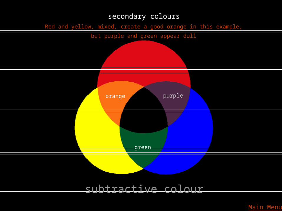
subtractive colour
secondary colours
purpleorange
green
Red and yellow, mixed, create a good orange in this example,
but purple and green appear dull
Main Menu

printing primary colours
yellow
magenta
cyan
Next

to reproduce the widest range of colours printersuse four process colours - magenta, yellow and cyan + black
yellow
magenta
cyan
+ black
Next

printing primariesprinting primaries mixed together create good secondary colours
Next

theoretically, all are mixed to create black but in practice this is impossible to achieve
Next
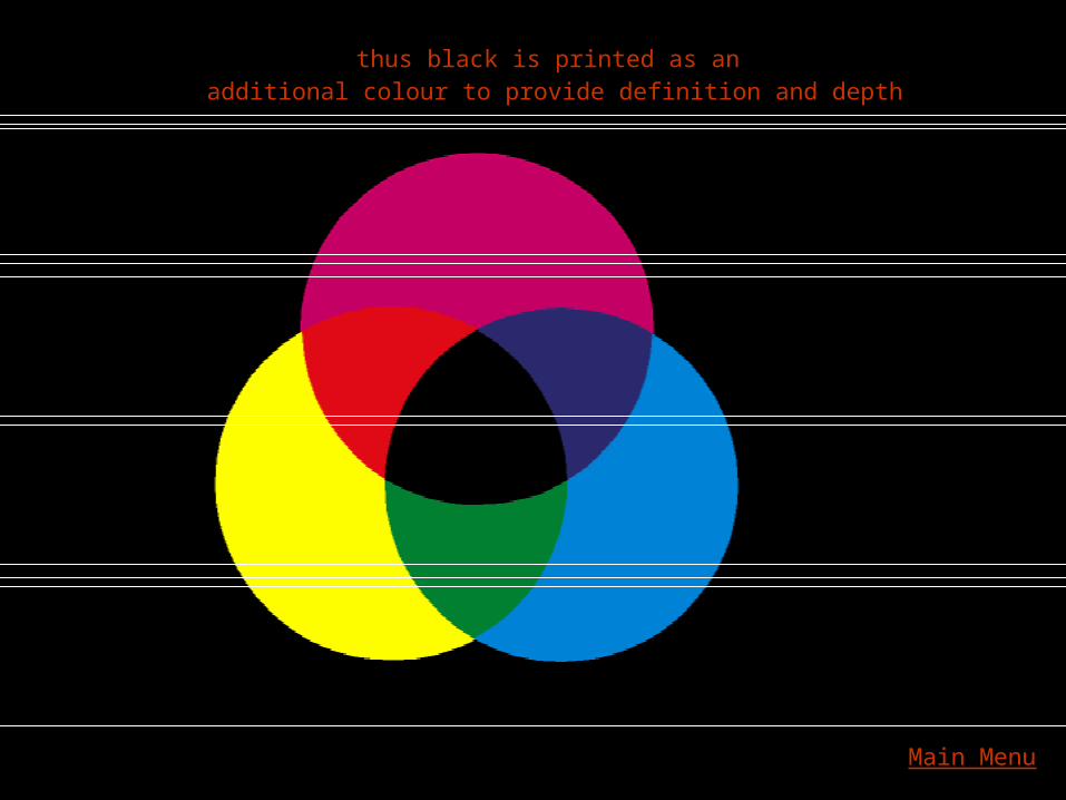
thus black is printed as an additional colour to provide definition and depth
Main Menu

additive primary colours Next

additive colour
i.e. using light
when all light primaries are mixedwe see white
Main Menu
Related Documents