Statistics 15 437 That looks like a pretty normal distribution Chapter Contents 15:01A Review: Representing data 15:01B Review: Analysing data Investigation: Comparing sets of data 15:02 Using the standard deviation 15:03 The normal distribution 15:04 Statistics with two variables Mathematical Terms, Diagnostic Test, Revision Assignment Learning Outcomes Students will be able to: • Work with data arranged in unequal intervals. • Use standard deviation and the mean to compare sets of data. • Understand the normal distribution. • Find a line of best fit for a set of data. • Use correlation to compare sets of data. Areas of Interaction Approaches to Learning (Knowledge Acquisition, Logical Thinking, Communicating, Reflection), Human Ingenuity, Environments

Welcome message from author
This document is posted to help you gain knowledge. Please leave a comment to let me know what you think about it! Share it to your friends and learn new things together.
Transcript

Statistics
15
437
That looks like a prettynormal distribution
Chapter Contents
15:01A
Review: Representing data
15:01B
Review: Analysing data
Investigation: Comparing sets of data15:02
Using the standard deviation
15:03
The normal distribution
15:04
Statistics with two variables
Mathematical Terms, Diagnostic Test, Revision Assignment
Learning Outcomes
Students will be able to:• Work with data arranged in unequal intervals.• Use standard deviation and the mean to compare sets of data.• Understand the normal distribution.• Find a line of best fit for a set of data.• Use correlation to compare sets of data.
Areas of Interaction
Approaches to Learning (Knowledge Acquisition, Logical Thinking, Communicating, Reflection), Human Ingenuity, Environments

438
INTERNATIONAL MATHEMATICS
5
15:01A
| Review: Representing Data
In Book 4 you learnt how to represent data in a number of ways:
Frequency Distribution Tables
worked exampleThe percentage results for sixty students in an examination were:
78 63 89 55 92 74 62 69 43 90 91 83 49 37 58
73 78 65 62 87 95 77 69 82 71 60 61 53 59 42
43 33 98 88 73 82 75 63 67 59 57 48 50 51 66
73 68 46 69 70 91 83 62 47 39 63 67 74 52 78
To organise this data into a table we use class intervals or groups: 29–37, 38–46 etc.
Class Class centre(c.c.)
Tally Frequency(f)
Cumulative frequency
29–37 33 | | 2 2
38–46 42 | | | | 5 7
47–55 51 | | | | | | | 8 15
56–64 60 | | | | | | | | | | 12 27
65–73 69 | | | | | | | | | | | | 14 41
74–82 78 | | | | | | | | 9 50
83–91 87 | | | | | | 7 57
92–100 96 | | | 3 60
Totals: 60

CHAPTER
15
STATISTICS
439
Frequency Histograms and Polygons
To give a visual representation of the data we can arrange it into a column graph called a
frequency histogram
, and a line graph called a
frequency polygon
.
In these graphs the class centres are used for the middle of the column and to plot the line.
When constructing frequency diagrams for grouped data,the only point to note is that the columns are indicatedon the horizontal axis by the class centres. The diagrams for the worked example above would look like these.
• The modal class 65–73 is represented by the classcentre 69.
• The
frequency polygon
can be drawn by joiningthe midpoints of the tops of columns. To completethe polygon, assume that the classes on either sideof the columns have zero members.
Cumulative Frequency Histograms and Polygon
The cumulative frequency histogram is plotted in the same way using the respective numbers from the table. The polygon in this case, however, is a little different.
• The
cumulative frequency polygon
can be drawnby joining the top right corners of each column.
• There are 60 scores altogether so to find the median class we come across from 30 until we meet the polygon and then down to the horizontal axis.
• Clearly the median class is 65–73.
• An estimate of the median mark can be read from the horizontal axis, ie 67.
• The inter-quartile range can be calculated from the horizontal axis by calculating Q3 – Q1
=
78 – 56
=
22.
Box and Whisker Plots
A box and whisker plot gives a visual representation of the spread of the scores by showing the median and the inter-quartile range as shown:
33 42 51 60 69 78 87 96Exam mark
23456789
101112131415
1
Fre
quen
cy
0
Frequency histogram and polygon
Note: the area under the columns is the same as the area under the
line — this is important as it represents the total number of
pieces of data — in this case 60.
You need to usethe original marksto calculate the
range.
33
Q1
Q3
42 51 60 69 78 87 96Exam mark
812162024283236404448525660
4
Cum
ulat
ive
freq
uenc
y
0
Cumulative frequencyhistogram and
polygon
33 42 51 60 69 78 87 96

440
INTERNATIONAL MATHEMATICS
5
The following table shows the distribution of marks in a mathematics test.
a
Complete the table.
b
Construct a frequency histogram and polygon.
c
Construct a cumulative frequency histogram and polygon.
d
Use your cumulative frequency polygon to estimate:
i
the median
ii
the first quartile Q1
iii
the third quartile Q3
iv
the inter-quartile range.
e
Construct a box and whisker plot of this data.
The following table shows the heights of 50 Grade 10 boys when measured to the nearest centimetre.
a
Complete the table.
b
Construct a frequency histogram and polygon.
c
Construct a cumulative frequency histogram and polygon.
d
Use your cumulative frequency polygon to estimate:
i
the median
ii
the first quartile Q1
iii
the third quartile Q3
iv
the inter-quartile range
e
Construct a box and whisker plot of this data.
Class Class centre
Frequency Cumulative frequency
30–34 1
35–39 3
40–44 6
45–49 7
50–54 6
55–59 5
60–64 2
Height (cm)
Class centre
Frequency Cumulative frequency
146–150 2
151–155 9
156–160 18
161–165 36
166–170 44
171–175 49
176–180 50
Exercise 15:01A
1
2

CHAPTER
15
STATISTICS
441
The cumulative frequency histogram below shows the time taken for students in Keishi’s grade to travel to school in the morning.
a
How many students are in Keishi’s grade?
b
Complete the following table from the information in the histogram.
c
This table has described the groups differently than in the previous two questions. Explain why this might be the case.
d
Using the graph, estimate
i
the median
ii
the first quartile Q1
iii
the third quartile Q3
iv
the inter-quartile range
e
Construct a box and whisker plot of the data.
Time (min) Class centre Frequency Cumulative frequency
5
!
x
<
15 10
15
!
x
<
25
3
10 20 30 40Time (minutes)
50 60
120
100
80
60
40
20
0
Cum
ulat
ive
freq
uenc
y
442
INTERNATIONAL MATHEMATICS
5
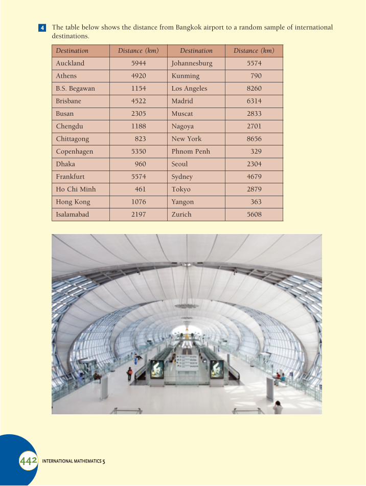
The table below shows the distance from Bangkok airport to a random sample of international destinations.
Destination Distance (km) Destination Distance (km)
Auckland 5944 Johannesburg 5574
Athens 4920 Kunming 790
B.S. Begawan 1154 Los Angeles 8260
Brisbane 4522 Madrid 6314
Busan 2305 Muscat 2833
Chengdu 1188 Nagoya 2701
Chittagong 823 New York 8656
Copenhagen 5350 Phnom Penh 329
Dhaka 960 Seoul 2304
Frankfurt 5574 Sydney 4679
Ho Chi Minh 461 Tokyo 2879
Hong Kong 1076 Yangon 363
Isalamabad 2197 Zurich 5608
4

CHAPTER
15
STATISTICS
443
a
Complete this frequency distribution table to summarise the distances.
b Draw a cumulative frequency polygon to estimate:i the median.ii the lower quartile Q1iii the upper quartile Q3iv the inter-quartile range.
A telephone exchange records the length (in minutes) of all international phone calls.The cumulative frequency polygon below shows the length of 500 international calls made from Singapore on Christmas Day.
a Arrange this information into a frequency distribution table.b From the polygon, estimate values for
i the median.ii The lower quartile Q1iii The upper quartile Q3iv The inter-quartile range.
c Construct a box and whisker plot of the data.
Distance (km)
Class centre
Frequency Cumulative frequency
0–
1000–
2000–
3000–
4000–
5000–
6000–
7000–
8000–
5
2 4 6 8 10 12 14 16 18 20Length of call (minutes)
500
400
300
200
100
0
Cum
ulat
ive
freq
uenc
y

444 INTERNATIONAL MATHEMATICS 5
15:01B | Review: Analysing DataAs covered in Book 4, there are a number of measures which help us analyse and interpret data.
Some of these give us information about the location of the middle of the data. These are called measures of central tendency. These are:
Mean ( ) = =
Median = middle score when they are arranged in ascending order
Mode = the score (or group of scores) with the highest frequency
Other measures tell us about the spread of the scores. Some of these are better than others:
Range = highest score ! lowest scoreThis only uses 2 scores and does not take into account outlying scores
Inter-quartile range = 3rd quartile ! 1st quartileAlthough this only measures the spread of the middle 50 per cent of the scores, it still only uses two scores in its calculation.
Standard deviation ("n) = average distance of the scores from the mean.This is the best measure of spread since it uses every score in its calculation.
Measures of central tendency
x Sum of the scoresThe number of scores------------------------------------------------------ fx#
n---------
worked exampleConsider the following sets of scores:
Set A: 16, 12, 13, 11, 13, 14, 9, 15, 15, 12
To find the mean of the scores we need to find the sum of the scores and the number of scores (n)
For set A
=
= 13
For set B
=
= 40·6 (3 significant figures)
Set B: Score 38 39 40 41 42 43 44
Frequency 1 4 8 9 4 1 1
x#( )
x n#n
-------= 16 12 13 11 13 14 9 15 15 12+ + + + + + + + +10
--------------------------------------------------------------------------------------------------------------------
x fx#n
---------= 1 38 4 39 8 40 9 41 4 42 1 43 1 44$+$+$+$+$+$+$28
---------------------------------------------------------------------------------------------------------------------------------------------------

CHAPTER 15 STATISTICS 445
These can also be done on your calculator. The steps required depend on the calculator you use. Here are the steps for the TI-83 or the TI-84.1 Choose statistics by pressing STAT and choosing 1:Edit
2 This will take you to a table where you need to enter the individual scores. These are for set A.
3 Now go back to STAT and highlight CALC and choose 1: 1-var stat as there is only 1 column of information. You then need to input the column where the information is located. In this case it is in column L1 – or list 1.
4 By scrolling through the next window we can read off the following data:the mean = 13the sum of the scores = 130the sum of the scores squared = 1730the standard deviation of the sample Sx = 2·11the standard deviation of the population "x = 2the number of scores n = 10the minimum score min X = 9the first quartile Q1 = 12the median Med = 13the third quartile Q3 = 15the maximum score max X = 16
We can do the same for set B by using 2 columns.
xx#
x2#
Input scores and frequency in two columns.
This time you need to input two columns, the first the score and the second the frequency.
The output is in the same format as before.
continued !!!

446 INTERNATIONAL MATHEMATICS 5
This also works for grouped scores; however, the centres must be put in the score column.To find the mode: This is the score with the highest frequency.
In the case of set A, the mode = 12, 13 and 15 as they all have a frequency of 2.In the case of set B, the mode = 41 as it has a frequency of 9.
To find the median: This is the middle score when the scores are arranged in ascending order.In the case of set A: 16, 12, 13, 11, 13, 14, 9, 15, 15, 12
Becomes 9, 11, 12, 12, 13, 13, 14, 15, 15, 16
As there are 10 scores, there are two middle scores: the 5th and 6th.The median is the mean of these two scores: 13.
In the case of set B the scores are already arranged in order.By adding the cumulative frequency column we get
As there are 28 scores, the 14th and 15th are the middle scores.Both of these are 41. So the median = 41The median can also be obtained from the calculator as shown above.For grouped scores, the median must be found from the cumulative frequency polygon as shown in the previous section.
Measures of spreadSuppose we take the same two sets of data:Set A: 16, 12, 13, 11, 13, 14, 9, 15, 15, 12
To find the range: Subtract the lowest score from the highest scoreFor set A the range = 16 – 9 For set B the range = 44 ! 38
= 7 = 14To find the inter-quartile range: Subtract the lower quartile (Q1) from the upper quartile (Q3).
For set A: we must find the scores which mark the quarters
9, 11, 12, 12, 13, 13, 14, 15, 15, 16
Inter-quartile range = 15 – 12= 3
Score 38 39 40 41 42 43 44
Frequency 1 4 8 9 4 1 1
C. frequency 1 5 13 22 26 27 28
Set B: Score 38 39 40 41 42 43 44
Frequency 1 4 8 9 4 1 1
The 14th to the 22nd scores are here.
Q1 Q2 Q3or median
CHAPTER 15 STATISTICS 447
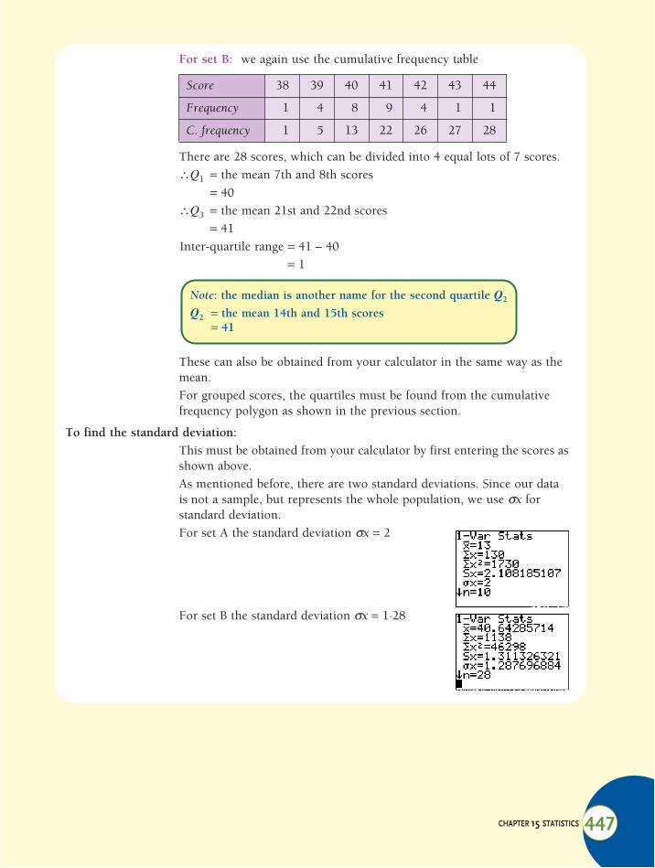
For set B: we again use the cumulative frequency table
There are 28 scores, which can be divided into 4 equal lots of 7 scores.%Q1 = the mean 7th and 8th scores
= 40%Q3 = the mean 21st and 22nd scores
= 41Inter-quartile range = 41 – 40
= 1
These can also be obtained from your calculator in the same way as the mean.For grouped scores, the quartiles must be found from the cumulative frequency polygon as shown in the previous section.
To find the standard deviation: This must be obtained from your calculator by first entering the scores as shown above.As mentioned before, there are two standard deviations. Since our data is not a sample, but represents the whole population, we use "x for standard deviation.For set A the standard deviation "x = 2
For set B the standard deviation "x = 1·28
Score 38 39 40 41 42 43 44
Frequency 1 4 8 9 4 1 1
C. frequency 1 5 13 22 26 27 28
Note: the median is another name for the second quartile Q2
Q2 = the mean 14th and 15th scores= 41
448 INTERNATIONAL MATHEMATICS 5
For each of the questions in exercise 15:01A find
a the mean b the mode c the range d the standard deviation.
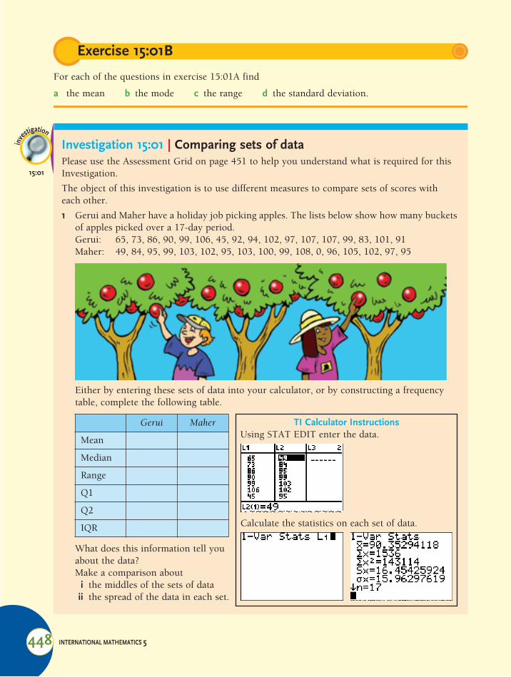
Investigation 15:01 | Comparing sets of dataPlease use the Assessment Grid on page 451 to help you understand what is required for this Investigation.
The object of this investigation is to use different measures to compare sets of scores with each other.
1 Gerui and Maher have a holiday job picking apples. The lists below show how many buckets of apples picked over a 17-day period.Gerui: 65, 73, 86, 90, 99, 106, 45, 92, 94, 102, 97, 107, 107, 99, 83, 101, 91Maher: 49, 84, 95, 99, 103, 102, 95, 103, 100, 99, 108, 0, 96, 105, 102, 97, 95
Either by entering these sets of data into your calculator, or by constructing a frequency table, complete the following table.
Exercise 15:01B
inve
stigation
15:01
What does this information tell you about the data?Make a comparison about
i the middles of the sets of dataii the spread of the data in each set.
Gerui Maher
Mean
Median
Range
Q1
Q2
IQR
TI Calculator InstructionsUsing STAT EDIT enter the data.
Calculate the statistics on each set of data.

CHAPTER 15 STATISTICS 449
Construct box and whisker plots of both sets of data. This can be done on the TI calculator following the steps below:
Explain how the box and whisker plots together give a good visual comparison of the sets of data.Which is a better measure of the spread of data in this case, the range or the inter-quartile range? Why?
TI Calculator InstructionsYou have the data entered into two lists.
Use STAT PLOT Turn the plot ON Choose Box and Whisker
Choose an appropriate window Graph
Repeat for the other set of data and you will have two box plots, one on top of the other.

450 INTERNATIONAL MATHEMATICS 5
2 Consider the following sets of data.
i Describe the spread of the scores from the histograms provided.Complete the following table using your calculator or otherwise and construct box and whisker plots to represent this information visually.
ii Describe the spread of the scores from the box and whisker plots you constructed.iii Do you think the range or the inter-quartile are a good measure of the spread of the
scores in this case?Now calculate the standard deviation of each set of scores using your calculator as shown in section 15:01B.Do you think the standard deviation is a better measure of the spread of these sets of scores? Why?You might want to refer back to section 15:01B to help with your answer.
3 Suppose the height of an object dropped from a tall building is modelled by the quadratic function y = 180 ! 9·8x2, where y is the height after x seconds. Find the equation of the inverse of this function and use it to find:a when the height is 100 m.b how long the object is in the air.
2 3 4 5 6
4
3
2
1
0
Score2 3 4 5 6
Score
Freq
uenc
y
3
2
1
0
Freq
uenc
ySet BSet A
Set A Set B
Mean
Median
Range
Q1
Q2
IQR

CHAPTER 15 STATISTICS 451
Assessment Grid for Investigation 15:01 | Comparing sets of dataThe following is a sample assessment grid for this investigation. You should carefully read the criteria before beginning the investigation so that you know what is required.
Assessment Criteria (C, D) for this investigation Achieved "
Cri
teri
on C
Com
mun
icat
ion
in M
athe
mat
ics
a None of the following descriptors have been achieved. 0
bThere is a basic use of mathematical language and representation. Lines of reasoning are insufficient.
1
2
c
There is satisfactory use of mathematical language and representation. Graphs, tables and explanations are clear but not always logical or complete. Calculations are easy to follow.
3
4
d
A good use of mathematical language and representation. Graphs and tables are accurate, to scale and fully labeled. Explanations are complete and concise. Mathematical arguments are well written with explicit terminology and support.
5
6
Cri
teri
on D
Ref
lect
ion
in M
athe
mat
ics
a None of the following descriptors have been achieved. 0
bAn attempt has been made to explain whether the results make sense and are consistent, and to use them to make comparisons between data sets.
1
2
cThere is a correct but brief explanation of whether results make sense and how they can be used to make meaningful comparisons between different groups.
3
4
d
All comparisons of data sets are well written and detailed, showing reflection on the statistical results from analyses. Measures of centre and spread are calculated to an appropriate degree of accuracy and critically compared to each other, considering pros and cons. All statistics are combined used effectively to draw meaning and relevance to the groups being compared.
5
6

452 INTERNATIONAL MATHEMATICS 5
15:02 | Using the Standard DeviationInvestigation 15:01 demonstrated that the range and inter-quartile range, although useful in some cases, do not always give a good indication of the spread of the data.
To find the standard deviation we first of all work out the distance between each score and the mean:• Since some of these are negative, each is squared.• These are now added.• The mean of these is now calculated.• Now we need to find the square root as the distances were squared in the first place.
This is the formula for standard deviation.
However, we rely on the calculator to calculate the standard deviation by entering the scores.
# The standard deviation is better because it measures the average distance of scores from the mean, or the middle of the data.
# The greater the standard deviation, the more spread out the scores are from the mean.
worked examplesThe last 10 assignment results for Thilo and Sabrina are shown below.Thilo: 40, 60, 60, 58, 50, 55, 61, 90, 71, 75Sabrina: 60, 40, 58, 68, 58, 59, 61, 65, 90, 57a Complete the table:
b Whose scores were spread least from the mean?c Who performed most consistently?
Solution
b Sabrina, since the standard deviation of her scores is less.c Sabrina. Her scores are less spread out.
Thilo Sabrina
Mean
Maximum score
Minimum score
Standard deviation
a Thilo Sabrina
Mean 62 61·4
Maximum score 90 90
Minimum score 40 40
Standard deviation 13·2 11·4
Measures of spread.

CHAPTER 15 STATISTICS 453
Ted and Anna have been keeping a record of the time (in seconds) it takes them to swim one length of the school’s 25-metre pool. Their last eight times are shown below:Ted: 25·0, 26·1, 21·4, 22·8, 24·7, 25·6, 27·0, 28·9Anna: 28·3, 30·3, 23·2, 26·0, 27·5, 27·9, 28·0, 28·2a Complete the table
b What is the range of scores for each swimmer?c Who is the most consistent swimmer based on these statistics?d Explain the last two answers.
The school’s soccer coach has kept records of the number of shots at goal players have made per game. Below are the results for the team’s top two players in the first 14 games of the season:Mattheus: 1, 1, 3, 2, 3, 2, 5, 4, 6, 7, 4, 5, 6, 7Emil: 5, 2, 5, 4, 3, 7, 6, 4, 2, 6, 1, 4, 3, 4a Calculate the mean and standard deviation for each player.b Which player is more likely to have close to 4 shots at goal in the next game?c If the coach had to pick just one of these two players, why might he pick Mattheus?
What allows him to make this decision?
Two mini marts on opposite sides of the street record how many customers they have per hour over a 10-day period. The results are shown below:Max’s mini-mart: 5, 6, 5, 8, 9, 8, 7, 6, 7, 9Sam’s mini-mart: 7, 8, 5, 6, 7, 8, 9, 6, 7, 7a Calculate the mean and inter-quartile range for each mini-mart.b Is it possible to tell from these statistics which mini-mart has the most regular number
of customers? Why?c Use the standard deviation to decide which has the most regular number of customers.
Hillary and Bron are comparing their end-of-semester reports They score grades out of 7 in each of their six subjects (a grade of 7 is the highest). Their scores are shown below.
Hillary Bron
English 4 3
Mathematics 5 4
History 3 4
IT 4 5
Science 3 6
Mandarin 7 4
Exercise 15:02
1
Ted Anna
Mean
Maximum time
Minimum time
Standard deviation
2
3
4
a Calculate their grade point average (the mean of their grades).
b By looking at their scores, who do you think is most consistent between subjects?
c Show this using standard deviation.

454 INTERNATIONAL MATHEMATICS 5
Huy has two places where he sets traps to catch crabs. To find out which produces more consistent results, he graphed the results of each place over 12 days. The results are shown in the dot plots below. Each day Huy put a dot above the number of crabs in each trap.
a Calculate the mean and standard deviation for each place.b Which place gives the most consistent results?c Why might Huy choose to use the other place regardless of the statistics?
15:03 | The Normal DistributionUsually, when a large sample is taken and the results graphed, a normal or bell-shaped curve is obtained.
Examples of statistics which might produce a normal curve come from populations or samples:• The mass of Grade 10 boys in the country• The number of matches in a box produced by a factory• The length of 10 cm nails produced by a machine• The results of a statewide spelling test.
5
1 2 3 4 5 6 7 8 9
In the estuary
1 2 3 4 5 6 7 8 9
Off the beach
y
xµ
The normal distribution

CHAPTER 15 STATISTICS 455
Although some will be less than the mean and some will be more than the mean, the distribution of the population should be symmetrical about the mean.
This suggests that the standard deviation is important when using, measuring and defining a normal distribution.
# Definition: In a normal distribution:Approximately 68% of the scores lie within one standard deviation of the mean.Approximately 95% of the scores lie within two standard deviations of the mean.Approximately 99·7% of the scores lie within three standard deviations of the mean.
Percent of normal distribution scores in each interval
0·15% 0·15%x
2·35% 2·35%13·5% 13·5%
34% 34%
worked examplesA machine is used to fill 2-litre tins with paint. It has been found that the amount of paint in the tins has a mean of 2 litres, with a standard deviation of 10 mL.
Approximately what proportion of the tins containa between 1·990 litres and 2·010 litres of paint?b between 1·980 litres and 2·020 litres of paint?c more than 2·010 litres of paint?d less than 1·970 litres of paint?
I’ll almost certainly run out of paint
here.
continued !!!

456 INTERNATIONAL MATHEMATICS 5
A machine is producing 5 cm screws. It is found that the screws it produces are in normal distribution with a mean of 5 cm and a standard deviation of 0.8 mm.i Approximately what percentage of the screws produced have a length:
a between 4·84 cm and 5·16 cm?b between 47·6 mm and 50 mm?c greater than 50·8 mm?
ii All screws with length greater than 51·6 mm are rejected. What percentage of screws are rejected?
In a Grade 10 test, the results were in normal distribution with a mean score is 60% with a standard deviation of 12·5%.i What proportion of Grade 10 students scored between
a 60% and 85%?b 22·5% and 35%?c 72·5% and 85%?
ii If 400 students sat the test and Jeremy scored 85%, how many students scored higher than Jeremy?
SolutionUsing the diagram of a normal distribution on which the percentages are marked:
a between 1·990 litres and 2·010 litres = 34% + 34% = 68% of the tinsb between 1·980 litres and 2·020 litres = 13·5% + 34% + 34% + 13·5% = 95% of tinsc more than 2·010 litres = 100% ! (50% + 34%) = 16%d less than 1·970 litres = 0·15%
When considering the probability of choosing a score at random, the following terminology is usually used.
0·15% 0·15%2·35% 2·35%13·5%
2 + 0·012·010 L
2 litres 2 + 0·022·020 L
2 + 0·032·030 L
13·5%
34% 34%
# If a score is chosen at random from a normal distribution:It will most probably lie within one standard deviation of the mean.It will be very likely that it lies within two standard deviations of the mean.It will almost certainly lie within three standard deviations of the mean.
Exercise 15:03
1
2

CHAPTER 15 STATISTICS 457
The heights of one-month-old saplings in a new park form a normal distribution. It is known that the middle 68% of the saplings have heights between 0·75 metres and 1·15 metres.a What is the mean height?b What is the approximate maximum height of a sapling?c What is the approximate minimum height of a sapling?d What is the minimum height of the tallest 2·5% of saplings?
The fully charged battery life of a new brand of laptop computer is in normal distribution with a mean life of 2 hours. It is found that only 2·5% of the computers have a battery life of longer than 2 hours and 30 minutes.a What is the standard deviation?b What is the approximate maximum battery life?c What is the approximate minimum battery life?d If a computer was selected at random, between what two times would the battery life almost
certainly lie?
A machine produces metal rods, the length of which forms a normal distribution with a mean length of 85 cm. It is found that out of every 500 metal rods that are produced, 170 are between 85 cm and 88 cm long.a What is the standard deviation of the length of the rods?b How many rods have a length greater than 88 cm?c If a rod is chosen at random, between what two lengths will it most probably lie?d What proportion of the rods have a length under 82 cm?
3
4
5

458 INTERNATIONAL MATHEMATICS 5
15:04 | Statistics with Two VariablesOften data is collected which contains two types of data that may, or may not be related. This is known as bivariate data.
worked examples1 The table below shows the mathematics and science grades for a group of Grade 10 students.
When graphed against each other, a series of points is obtained as shown. This type of graph is called a scatter graph or a scatter plot.
It can be seen that there seems to be a relationship between the mathematics and science grades. As the mathematics grades get higher, so do the science grades.
We call such a relationship a correlation between variables.
If a student does well in mathematics, it seems he/she also does well in science.
A relationship such as this is called a positive correlation.
2 The scatter graph shows the percentage of car accidents for drivers of a given age in a particular town.
It seems that here there is also a relationship between the variables. However, as one variable increases, the other decreases.
A relationship such as this is called a negative correlation.
• A point for discussion: Do you think this trend would continue? Why or why not?
Mathematics 2 7 6 5 4 5 5 3 2 6
Science 1 6 7 6 3 7 6 4 3 5
Mathematics and science grades
0 2 4 6 8
876543210
Mathematics gradeS
cien
ce g
rade
y
x
Accidents and driver age
0 20 40 60
200
150
100
50
0
Driver age
No.
of a
ccid
ents
y
x
CHAPTER 15 STATISTICS 459
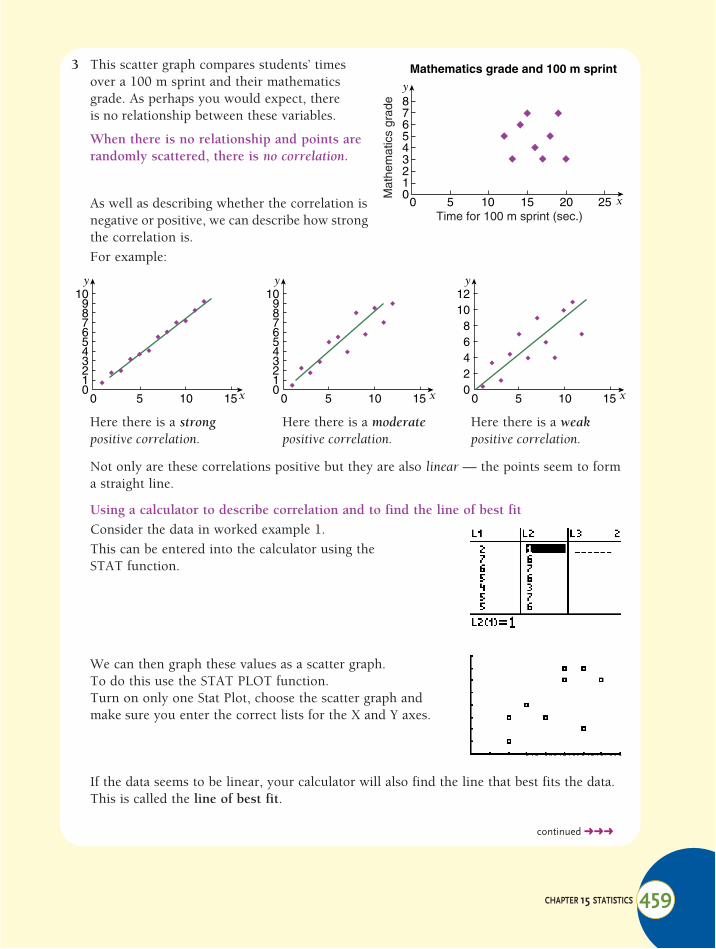
3 This scatter graph compares students’ times over a 100 m sprint and their mathematics grade. As perhaps you would expect, there is no relationship between these variables.
When there is no relationship and points are randomly scattered, there is no correlation.
As well as describing whether the correlation is negative or positive, we can describe how strong the correlation is.For example:
Not only are these correlations positive but they are also linear — the points seem to form a straight line.
Using a calculator to describe correlation and to find the line of best fitConsider the data in worked example 1.This can be entered into the calculator using the STAT function.
We can then graph these values as a scatter graph.To do this use the STAT PLOT function.Turn on only one Stat Plot, choose the scatter graph and make sure you enter the correct lists for the X and Y axes.
If the data seems to be linear, your calculator will also find the line that best fits the data. This is called the line of best fit.
Here there is a strong positive correlation.
Here there is a moderate positive correlation.
Here there is a weak positive correlation.
Mathematics grade and 100 m sprint
0 5 10 15 20 25
876543210
Time for 100 m sprint (sec.)
Mat
hem
atic
s gr
ade
y
x
0 5 10 15
109876543210
y
x x x0 5 10 15
109876543210
y
0 5 10 15
121086420
y
continued !!!
460 INTERNATIONAL MATHEMATICS 5
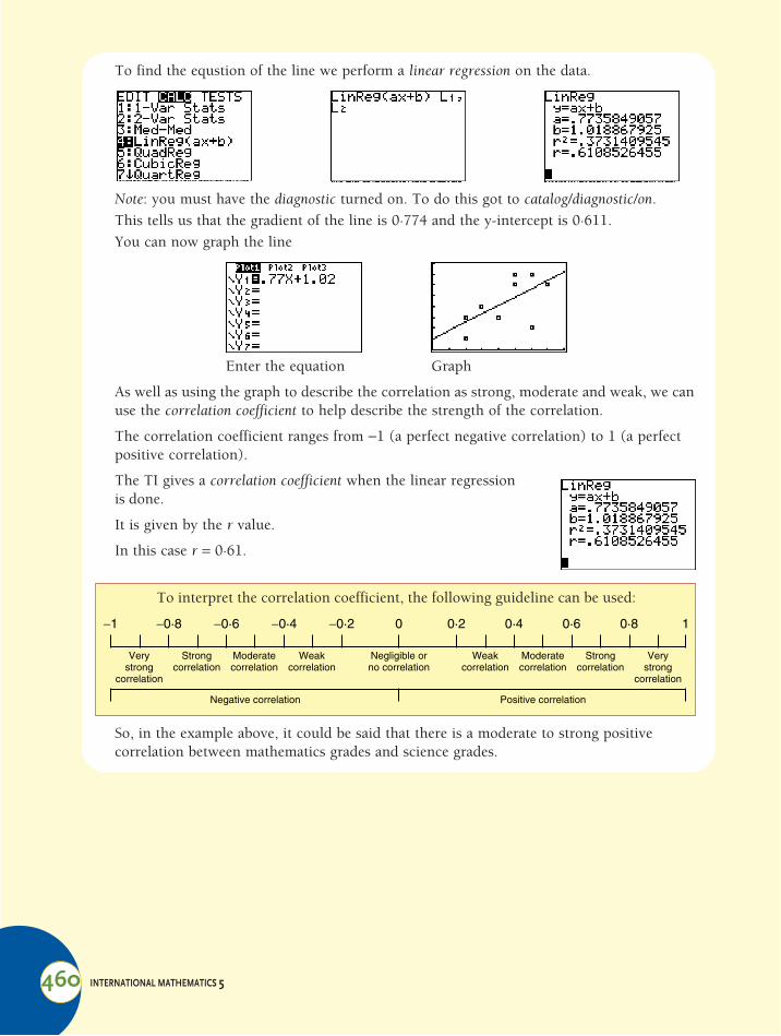
To find the equstion of the line we perform a linear regression on the data.
Note: you must have the diagnostic turned on. To do this got to catalog/diagnostic/on.This tells us that the gradient of the line is 0·774 and the y-intercept is 0·611.You can now graph the line
Enter the equation Graph
As well as using the graph to describe the correlation as strong, moderate and weak, we can use the correlation coefficient to help describe the strength of the correlation.
The correlation coefficient ranges from !1 (a perfect negative correlation) to 1 (a perfect positive correlation).
The TI gives a correlation coefficient when the linear regression is done.
It is given by the r value.
In this case r = 0·61.
So, in the example above, it could be said that there is a moderate to strong positive correlation between mathematics grades and science grades.
To interpret the correlation coefficient, the following guideline can be used:
!1 !0·8 !0·6 !0·4 !0·2 0 1
Verystrong
correlation
Strongcorrelation
Moderatecorrelation
Weakcorrelation
Negligible orno correlation
Negative correlation Positive correlation
Weakcorrelation
Moderatecorrelation
Strongcorrelation
Verystrong
correlation
0·2 0·4 0·6 0·8

CHAPTER 15 STATISTICS 461
From the following sets of data, determine the correlation coefficient and describe the type and strength of the correlation using the information above.a The table shows the number of days of rain in the months of a particular year and the
number of student absences in the same months in a large international school.
b The table shows the history and mathematics marks scored by 10 students in recent tests.
c The table shows the number of hours students spent playing computer games and the average grade they scored in their semester report.
d The table shows the percentage capacity at a football ground when games are played in different temperatures.
Jan Feb Mar Apr May June July Aug Sept Oct Nov Dec
Days of rain in the month
5 4 1 0 8 17 15 20 18 11 6 3
Student absences from school
25 22 7 5 46 89 85 100 95 60 30 22
History mark 50 65 82 98 43 20 68 72 75 69
Mathematics mark 88 90 64 70 60 45 90 65 78 95
Temperature (°C) 5 !5 8 12 !1 10 !8 9 7 8
Capacity (%) 75 80 85 60 78 85 80 100 88 90
Exercise 15:04
1
Hours on computer per week
Averagegrade
0 6
2 4
14 3
17 3
10 4
5 6
3 4
18 3
8 4
11 4

462 INTERNATIONAL MATHEMATICS 5
e The graph shows the results of an experiment in which 10 subjects were asked to drink a prescribed number of alcoholic drinks and complete a multiple choice IQ test with 10 questions.
For each of those examples in question 1, find the equation of the line of best fit. Use 3 significant figures.
The table shows the yield in tonnes of produce on farms when sprayed with different amounts of insecticide concentrate.
a Find the correlation coefficient.b Describe the correlation between the variables.c Find the equation of the line of best fit (use 3 significant figures).d Use the line of best fit to predict the yield if 35 mL of insecticide was used.e Use the line of best fit to estimate the yield if no insecticide was used.
On the same farm, samples of pests were taken and numbers recorded below:
a Find the correlation coefficient.b Describe the correlation between the variables.c Find the equation of the line of best fit (use 3 significant figures).d Use the line of best fit to predict the number of pests if 35 mL of insecticide was used.e Explain your answer in d.
The table shows the amount of fuel left in the tank of a car during a trip, compared to the time travelled. The car started the trip with a full tank of fuel.
a Find the correlation coefficient.b Describe the correlation in words.c Find the equation of the line of best fit (use 3 significant figures).d Use the line of best fit to approximate how much fuel the tank holds when full.e Approximate how long the car will last on a tank of fuel if the same pattern of driving
continues.f Give possible reasons why the rate of fuel consumption changes throughout the trip.
Insecticide (mL) 5 10 15 20 25 30
Yield (tonnes) 220 380 400 320 360 480
Insecticide (mL) 5 10 15 20 25 30
No of pests per plant 62 52 28 15 10 9
Length of trip (minutes) 30 90 180 210 270 315
Fuel in tank (litres) 55 32 30 15 14 5
Alcohol vs questions correct
0 2 4 6 8 10
109876543210
No. of alcoholic drinks
No.
of q
uest
ions
cor
rect
y
x
2
3
4
5
CHAPTER 15 STATISTICS 463
Mathematical Terms 15bivariate data• data collected that has two variables.
class interval• The size of the groups into which the
data is organised.eg 1–5 (5 scores); 11–20 (10 scores).
class centre• The middle outcome of a class.
eg The class 1–5 has a class centre of 3.
correlation• a connection between sets of data. This
can be negative or positive, linear or non linear.
cumulative frequency• The number of scores less than or equal
to a particular outcome.eg For the data 3, 6, 5, 3, 5, 5, 4, 3, 3, 6
the cumulative frequency of 5 is 8 (there are 8 scores of 5 or less).
cumulative frequency histogram (and polygon)• These show the
outcomes and their cumulative frequencies.
frequency• The number of times an outcome occurs
in the data.eg For the data 3, 6, 5, 3, 5, 5, 4, 3, 3, 6
the outcome 5 has a frequency of 3.
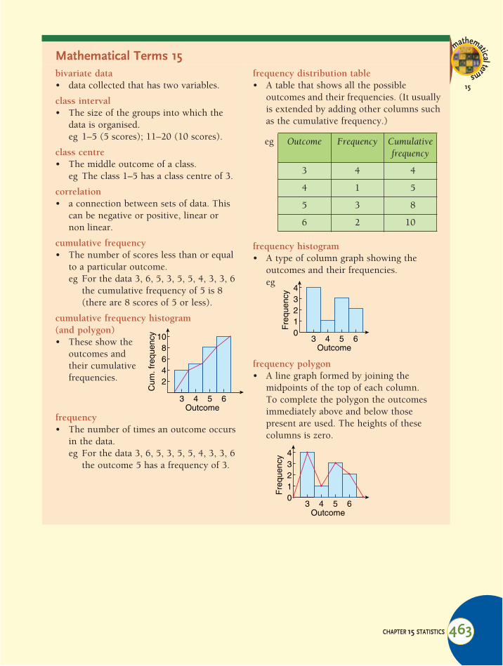
frequency distribution table• A table that shows all the possible
outcomes and their frequencies. (It usually is extended by adding other columns such as the cumulative frequency.)
frequency histogram• A type of column graph showing the
outcomes and their frequencies.eg
frequency polygon• A line graph formed by joining the
midpoints of the top of each column.To complete the polygon the outcomes immediately above and below those present are used. The heights of these columns is zero.
mathematicalterms
15
3 4 5 6Outcome
468
10
2
Cum
. fre
quen
cyeg Outcome Frequency Cumulative
frequency
3 4 4
4 1 5
5 3 8
6 2 10
3 4 5 6Outcome
234
10
Fre
quen
cy
3 4 5 6Outcome
234
10
Fre
quen
cy

464 INTERNATIONAL MATHEMATICS 5
Mathematical terms 15
grouped data• The organisation of data into groups or
classes.
inter-quartile range• 3rd quartile – 1st quartile
line of best fit• the line that best fits the data when
graphed
mean• The number obtained by ‘evening out’ all
the scores until they are equal.eg If the scores 3, 6, 5, 3, 5, 5, 4, 3, 3, 6
were ‘evened out’ the number obtained would be 4·3.
• To obtain the mean use the formula:
median• The middle score for an odd number of
scores or the mean of the middle two scores for an even number of scores.
mode (modal class)• The outcome or class that contains the
most scores.
median class• In grouped data the class that contains the
median.
normal distribution• when the data forms a bell shaped curve
in which:– Approximately 68% of the scores lie
within one standard deviation of the mean.
– Approximately 95% of the scores lie within two standard deviations of the mean.
– Approximately 99.7% of the scores lie within three standard deviations of the mean.
ogive• This is another name for the cumulative
frequency polygon.
outcome• A possible value of the data.
range• The difference between the highest and
lowest scores.
range• highest score – lowest score
standard deviation ("n)• average distance of the scores from
the mean.
statistics• The collection, organisation and
interpretation of numerical data.
Mean sum of scorestotal number of scores-------------------------------------------------------=

CHAPTER 15 STATISTICS 467
Chapter 15 | Revision Assignment1 The data below gives the average monthly
minimum daily temperatures of two Australian cities. The months are in order: January to December.Adelaide: 15·5, 15·7, 14·3, 11·6, 9·4, 7·4,
6·8, 7·5, 8·6, 10·4, 12·3, 14·3Alice 21·2, 20·6, 17·4, 12·5, 8·2, 5·1, Springs: 4, 5·9, 9·7, 14·8, 17·9, 20·2a Calculate the mean and standard
deviation for each city.b Construct grouped frequency
distribution tables with the classes 0!<5, etc. for both cities’ distributions.
c Draw a cumulative frequency polygon of the each distribution to estimate:i the median
ii Q1iii Q3iv the interquartile range
d Construct a box and whisker plot of each cities’ distributions.
e Compare the measures of centre for each distribution.
f Discuss the spread of each distribution.g In which city would you rather live?
Why?
2 Bags of cement are labelled 25 kg. The bags are filled by machine and the actual weights are normally distributed with mean 25·5 kg. It is known that 16% of bags have less than 25 kg.a What is the standard deviation?b What is the approximate maximum
weight of a bag?
c What is the approximate minimum weight of a bag?
d What proportion of the bags weigh between 24 and 26 kg?
3 It is decided to take a random sample of 10 students to see if there is any linear relationship between height and shoe size. The results are given in the table below.
a Find the correlation coefficient. b Describe the correlation between height
and shoe size.c Find the equation of the line of best fit.d Predict the shoe size of a student who is
162 cm in height.e Predict the height of someone with a
shoe size of 13.f Why is your answer for e less reliable
than your answer for d?
assignment
15A
Height (cm) Shoe size
175 8
160 9
180 8
155 7
178 10
159 8
166 9
185 11
189 10
173 9
Related Documents