Interactive Visual Analysis of Hierarchical Enterprise Data Yu-Hsuan Chan University of California, Davis Email: [email protected] Kimberly Keeton Hewlett-Packard Labs Email: [email protected] Kwan-Liu Ma University of California, Davis Email: [email protected] Abstract—In this paper, we present an interactive visual technique for analyzing and understanding hierarchical data, which we have applied to analyzing a corpus of technical reports produced by a corporate research laboratory. The analysis begins by selecting a known entity, such as a topic, a report, or a person, and then incrementally adds other entities to the graph based on known relations. As this bottom- up knowledge building process proceeds, meaningful graph structure may appear and reveal previously unknown relations. The ontology of the data, which represents the types of entities in the data and all possible relations among them, is displayed as a guide to the analyst in the process. The analyst may interact with the ontology graph or the data graph directly. In addition, we provide a set of filtering, searching, and abstraction methods for the analyst to manage the complexity of the graph. In contrast to a top-down approach, which usually starts with an overview of the whole data set for exploration, a bottom-up approach is generally more efficient, because it often only touches a very small fraction of the data. We present several case studies to demonstrate the efficacy of this interactive graph-based analysis technique for both intra- and inter-hierarchy analysis. Keywords-Visual Analytics, Social networks, Knowledge Management, Business Intelligence I. I NTRODUCTION The desire to understand how people interact, relative to the content of their interactions, arises in many contexts. For instance, we may want to understand who is emailing whom about a particular set of topics or to understand who comments vocally on blog posts about particular topics. Other examples include understanding collaboration patterns in writing technical reports or developing source code. These applications possess two logical hierarchies: a content-based hierarchy and a people-oriented hierarchy. Each hierarchy possesses multiple levels, which correspond to an aggregation of the adjacent lower level. For example, email messages may be aggregated into threads, which may be clustered together based on common themes. An organization’s organization chart describes the hierarchy of people belonging to the organization. Relationships exist between levels of the hierarchies. In particular, for a given level in each hierarchy, multiple types of relationships may be meaningful. For instance, we can consider both sender and receiver relationships for email messages. In addition, different relationships may exist at different levels of the hierarchy. For example, if the content hierarchy represents documents and their content, people may own copies of the document, whereas they may be authors of the content. Users want to ask a variety of questions in this space. They want to see summarized views of the hierarchies, to understand which entities are most important. They want to ask questions about semantically meaningful subsets of the hierarchies: interactions on a particular set of topics, or the contributions of an organizational unit. They may even want to compare the relationships at different points in time. Enterprise data can present additional challenges. The geographic distribution of global enterprises means that information may be replicated and distributed across dif- ferent data centers, leading to data integration challenges. Additionally, the organizational structure of an enterprise can be very dynamic. A corporation may have undergone several reorganizations over time, and an organizational unit may be renamed, merged with others, removed, or assigned to different functionalities. Such organizational dynamics present another challenge to analysis. Understanding the complex relations embedded in enter- prise data thus requires advanced analysis techniques beyond what conventional database query methods can offer. We have developed visualization-directed analysis techniques for making sense of network data. Most existing visual- izations for social network analysis employ a top-down approach, providing structural overviews of the entire net- work to apply Shneiderman’s Visual Information-Seeking Mantra [1], ”overview first, zoom and filter, then details- on-demand.” However, in some cases the analyst is not interested in a global view of the whole data set, but rather wants to find specific information based on a known subject or event. In these cases the user has a specific question, and a bottom-up approach may be more suitable. The analysis becomes a knowledge building process, where the analyst begins by selecting a known entity such as a topic, a report, or a person, and then incrementally adds other entities based on known relationships. As the process proceeds, meaningful graph structure may appear and reveal previously unknown relations. In this paper, we present an interactive visual tech- nique for analyzing and understanding hierarchical data. To demonstrate and evaluate the efficacy of the technique, we use several case studies based on technical reports produced by a corporate research laboratory. The resulting 12th IEEE International Conference on Commerce and Enterprise Computing 1530-1354/10 $26.00 © 2010 IEEE DOI 10.1109/CEC.2010.37 180 12th IEEE International Conference on Commerce and Enterprise Computing 1530-1354/10 $26.00 © 2010 IEEE DOI 10.1109/CEC.2010.37 180

Welcome message from author
This document is posted to help you gain knowledge. Please leave a comment to let me know what you think about it! Share it to your friends and learn new things together.
Transcript
Interactive Visual Analysis of Hierarchical Enterprise Data
Yu-Hsuan Chan
University of California, Davis
Email: [email protected]
Kimberly Keeton
Hewlett-Packard Labs
Email: [email protected]
Kwan-Liu Ma
University of California, Davis
Email: [email protected]
Abstract—In this paper, we present an interactive visualtechnique for analyzing and understanding hierarchical data,which we have applied to analyzing a corpus of technicalreports produced by a corporate research laboratory. Theanalysis begins by selecting a known entity, such as a topic,a report, or a person, and then incrementally adds otherentities to the graph based on known relations. As this bottom-up knowledge building process proceeds, meaningful graphstructure may appear and reveal previously unknown relations.The ontology of the data, which represents the types of entitiesin the data and all possible relations among them, is displayedas a guide to the analyst in the process. The analyst mayinteract with the ontology graph or the data graph directly.In addition, we provide a set of filtering, searching, andabstraction methods for the analyst to manage the complexityof the graph. In contrast to a top-down approach, which usuallystarts with an overview of the whole data set for exploration,a bottom-up approach is generally more efficient, becauseit often only touches a very small fraction of the data. Wepresent several case studies to demonstrate the efficacy of thisinteractive graph-based analysis technique for both intra- andinter-hierarchy analysis.
Keywords-Visual Analytics, Social networks, KnowledgeManagement, Business Intelligence
I. INTRODUCTION
The desire to understand how people interact, relative to
the content of their interactions, arises in many contexts.
For instance, we may want to understand who is emailing
whom about a particular set of topics or to understand who
comments vocally on blog posts about particular topics.
Other examples include understanding collaboration patterns
in writing technical reports or developing source code.
These applications possess two logical hierarchies: a
content-based hierarchy and a people-oriented hierarchy.
Each hierarchy possesses multiple levels, which correspond
to an aggregation of the adjacent lower level. For example,
email messages may be aggregated into threads, which
may be clustered together based on common themes. An
organization’s organization chart describes the hierarchy of
people belonging to the organization. Relationships exist
between levels of the hierarchies. In particular, for a given
level in each hierarchy, multiple types of relationships may
be meaningful. For instance, we can consider both sender
and receiver relationships for email messages. In addition,
different relationships may exist at different levels of the
hierarchy. For example, if the content hierarchy represents
documents and their content, people may own copies of the
document, whereas they may be authors of the content.
Users want to ask a variety of questions in this space.
They want to see summarized views of the hierarchies, to
understand which entities are most important. They want to
ask questions about semantically meaningful subsets of the
hierarchies: interactions on a particular set of topics, or the
contributions of an organizational unit. They may even want
to compare the relationships at different points in time.
Enterprise data can present additional challenges. The
geographic distribution of global enterprises means that
information may be replicated and distributed across dif-
ferent data centers, leading to data integration challenges.
Additionally, the organizational structure of an enterprise
can be very dynamic. A corporation may have undergone
several reorganizations over time, and an organizational unit
may be renamed, merged with others, removed, or assigned
to different functionalities. Such organizational dynamics
present another challenge to analysis.
Understanding the complex relations embedded in enter-
prise data thus requires advanced analysis techniques beyond
what conventional database query methods can offer. We
have developed visualization-directed analysis techniques
for making sense of network data. Most existing visual-
izations for social network analysis employ a top-down
approach, providing structural overviews of the entire net-
work to apply Shneiderman’s Visual Information-Seeking
Mantra [1], ”overview first, zoom and filter, then details-
on-demand.” However, in some cases the analyst is not
interested in a global view of the whole data set, but rather
wants to find specific information based on a known subject
or event. In these cases the user has a specific question, and
a bottom-up approach may be more suitable. The analysis
becomes a knowledge building process, where the analyst
begins by selecting a known entity such as a topic, a report,
or a person, and then incrementally adds other entities based
on known relationships. As the process proceeds, meaningful
graph structure may appear and reveal previously unknown
relations.
In this paper, we present an interactive visual tech-
nique for analyzing and understanding hierarchical data.
To demonstrate and evaluate the efficacy of the technique,
we use several case studies based on technical reports
produced by a corporate research laboratory. The resulting
12th IEEE International Conference on Commerce and Enterprise Computing
1530-1354/10 $26.00 © 2010 IEEE
DOI 10.1109/CEC.2010.37
180
12th IEEE International Conference on Commerce and Enterprise Computing
1530-1354/10 $26.00 © 2010 IEEE
DOI 10.1109/CEC.2010.37
180
visualizations show sets of relevant documents or people,
ordered by relevance and organized by attributes (e.g., topics
or time), and facilitate navigation of different sets of related
results.
II. RELATED WORK
A. Social Network Analysis
Many aspects of network visualization and social network
analysis are relevant to our work, which is mainly about
the visual exploration of relationships that exist among
inherently hierarchical data sets. One prominent type of
hierarchies we consider in our work is people networks. Un-
derstanding social networks and their relationships with, for
example, people performance or purchasing trends, is cur-
rently of strong interest in many areas, such as the study of
software developer networks and software evolution [2], [3],
[4]. Typical social network analysis uses mathematical graph
theories and linkage mining to characterize the structural
properties of networks and understand the dynamic behavior
of systems built upon them. It aims at many tasks, including
centrality evaluation [5], network modeling [6], community
finding [7], and link prediction [8]. More comprehensive
reviews can be found in [9], [10], [11] and at the INSNA
website [12]. Our work considers some of these measures
for filtering and ranking operations.
B. Visualizing Hierarchical Data
Hierarchies are one of the most commonly used infor-
mation structures. Over the last twenty years, there has
been much research on effective display and interaction
with a homogeneous hierarchy. Common ways to graphically
represent a hierarchy are a treemap and a node-link graph.
The former shows how an entity at higher layers of the
hierarchy contains an subset of lower layer entities, and
optimizes the screen space [13]. The latter explicitly shows
the depth of entities, making it easy to compare the height
of different layers. Fisheye [14], Hyperbolic Browser [15],
H3 [16], Cone Trees [17], FSViz [18], Disk Trees [19], and
many others fall into this category. However, it deals with
only a single hierarchy and focuses on the efficient use of
screen space, the readability, and the graph layout.
Visualizing multiple hierarchies has been studied as an
enterprise wide problem in recent years. Time Tube [19]
examines a single hierarchy changing over time and high-
lights changes. However, users are forced to integrate these
changes in Time Tube cognitively across time, putting a
strain on short-term memory.A botanical taxonomy visual-
ization [20] examines multiple overlapping hierarchies and
highlights the correlated entities in them, and thus reveals
interesting patterns. However, it does not scale well, and
it shows only inter-hierarchy relations between leaf nodes.
MultiTrees [21] merge multiple hierarchies that share sub-
trees into a directed acyclic graph, and visualizes a focal
node of interest with several parent layer nodes and children
layer nodes. However it works only for hierarchies that
share large enough common sub-trees. Similarly, Polyarchy
Visualization [22] adresses multiple intersecting hierarchies
that share at least one node, rather than sharing sub-trees.
In both [21] and [22], the hierarchies are homogeneous
ones, meaning that nodes in the different hierarchies are
of the same type, but organized differently. Binary Tangle-
grams [23] is an intuitive representation to show the rela-
tionship between two side-by-side binary trees. Nollenburg
et al. [24] experiment with several heuristics on the tan-
glegram layout problem. Following that, the authors apply
edge bundling to tanglegrams [25], in which bundled edges
show inter-hierarchy relationships with higher readability.
However, the representation suffers from edge crossings,
especially for flat trees of large width.
C. Non-overview Visualization
In some cases users are more interested in local critical
areas in the graph, instead of the overall graph topology.
Therefore, providing a holistic view of the entire graph,
like Shneiderman’s Visual Information-Seeking Mantra [1],
”overview first, zoom and filter, then details-on-demand,” is
not best for answering their specific questions.
Some previous work starts the navigation from a focal
node of interest, and then explores the surrounding subgraph
of adjacent entities that are related to the current focus, as
the idea ”plant a seed and watch it grow” in [26]. Touch-
graph [27], Palantir [28], Treeplus [26], and ”search, show
context, expand on demand” [29] fall into this category.
Other work starts by computing the importance of each
subgraph followed by removing those less relevant sub-
graphs, and then visualizes the remaining graph. SocialAc-
tion [30] uses attribute ranking and coordinated views to
allow users to define metrics of interest for identifying im-
portant nodes, clusters and outliers in graphs. NodeXL [31]
also follows this computational approach by integrating the
statistical and visual capabilities of Excel with graph visu-
alizations. These approaches allow users to target specific
features when exploring, but the computational complexity
of the metrics prohibits application to large graphs.
III. TECHNICAL APPROACH
Our objective is to develop a visual-based query method
for finding hidden or complex relations that are difficult to
identify with text-based queries. Visualization also makes it
much easier for the user to ”see” any structure, pattern, or
trend in the returned results. Although the popular top-down,
overview-to-detail visualization methods are usable, they are
not the most efficient way to answer specific questions about
a particular topic, document, or employee. We thus advocate
a bottom-up approach to visual query construction. That
is, an answer is obtained by incrementally building up a
query from a known subject of interest and based on visual
181181
feedback that shows either a partial answer or a suggestion
– just enough for the user to expand the current query.
In contrast to the top-down approach, which usually starts
with an overview of the whole data set for exploration,
the bottom-up method only touches a small fraction of
the data set, so it is generally more efficient. The analysis
generally starts by presenting to the user the information she
already knows. By subsequently adding a little bit of new
information at a time, the user should not be overwhelmed
by too much unrelated information (as often shown in an
overview graph), nor confused by any abstraction done
automatically to reduce clutter in the graph. While such a
bottom-up approach is not new, the need to analyze data
that contains multiple hierarchies with heterogeneous data
demands further study and evaluation.
Our design uses the ontology of the data graph, which may
contain multiple hierarchies. Because the ontology graph is
generally small (e.g., only a few nodes), it provides the user
a succinct view of the data, through which the user selects
the entities and relations to examine. In the analysis process,
users repeatedly add or remove entities or relations until they
can make sense of the resulting visualization. As such, the
development of interactive filtering, abstraction, aggregation,
and linking operations is also essential to more effective
sense making.
IV. AN ENTERPRISE DATA SET
The data set used in our study is obtained from a corporate
research lab. It contains information about technical reports
produced in that lab from 1999 to 2008. It also contains
information about the authors of the technical reports and the
organization each author was affiliated with while producing
a particular report. Two hierarchies are used to store this
collection of information. The content hierarchy is organized
into three levels: topically related groups of documents
(GRP), unique documents (DOC, where a unique document
may have multiple copies), and copies of documents (CPY,
e.g., different copies of the same report may reside on differ-
ent people’s laptops). In our study, we ignore multiple copies
of the same report (i.e., the CPY level). The people hierarchy
is essentially an organization chart, including laboratories
(LAB), departments (DEP), and persons (PSN). Note that
there is a dummy root node on top of each hierarchy,
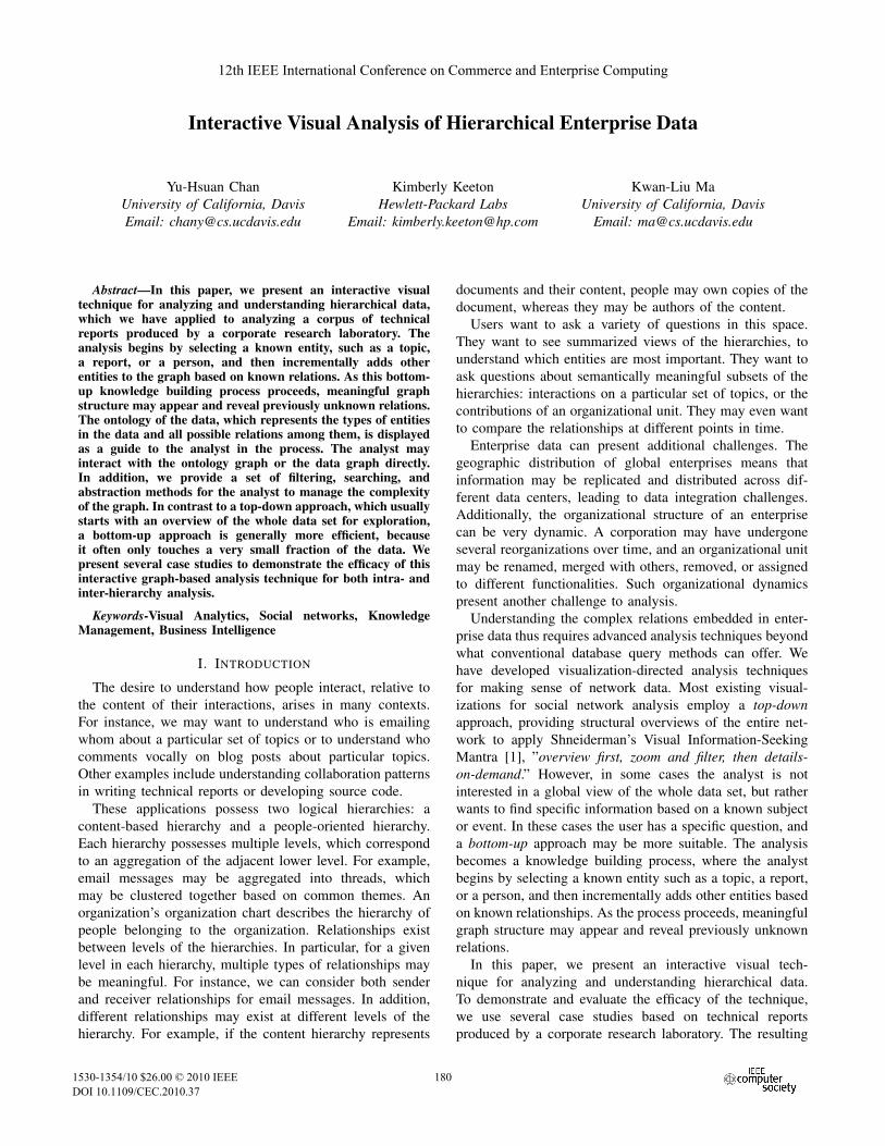
ROOTPPL and ROOTDOC, respectively. Figure 1 shows the
ontology of the data set. The link between PSN and DOC
connects the people and content hierarchies, representing the
authorship of the technical reports.
Reports are organized into twenty groups based on the
topics they contain, using basic syntactic analysis and clus-
tering precomputed by the CLUTO clustering library [32].
Thus, reports with similar contents are in the same group.
Based on this analysis, each group has two sets of terms:
descriptive (DES) terms summarizing the key content of
Figure 1. Ontology graph of the people hierarchy and the content hierarchy.
documents in the group, and discriminating (DIS) terms,
which differentiate the group from other groups.
Authorship information, including author names and affil-
iations at the time a technical report is published, is reported
by the corporate research library for each of the technical
reports in the data set. Authors’ affiliations may change over
time, due to job transfers or corporate reorganizations. In
order to present a single people hierarchy, we processed
the data to associate each author with the department and
laboratory to which their latest technical report is attached.
This most closely approximates the current people hierarchy,
with the caveat that employees who are no longer with the
company are affiliated with their last organization (which
may no longer exist in the current organization chart).
The author and affiliation information provided by the
corporate research library does not always allow us to per-
fectly disambiguate individuals or organizations, however.
Ambiguity in a name can arise from variations in how an
entity is referenced (e.g., University of California at Davis
vs. UC Davis) or from the existence of several entities
with the same name (e.g., George Bush and George W.
Bush), or even from spelling mistakes in the name (e.g.,
Kimberly vs. Kimberley). As a result of this ambiguity,
our data processing occasionally produced duplicates of
individuals or organizational units in the data set, and the
relations between such duplicates are not explicitly defined,
potentially leading to confusing visualizations. However, as
shown in our case studies, during interactive visual analysis,
one can easily identify duplicates in the data. Our system
provides operations to merge duplicates into a single node.
V. CASE STUDIES
In this section, we present three case studies on this
enterprise data set to show how interactive visual analysis
can be helpful to reveal trends, patterns, and information
that conventional database queries do not provide.
A. Person-Oriented Analysis
In the first case study, we consider a particular employee
of interest and see how this person worked within the
organization and collaborated with others.
182182
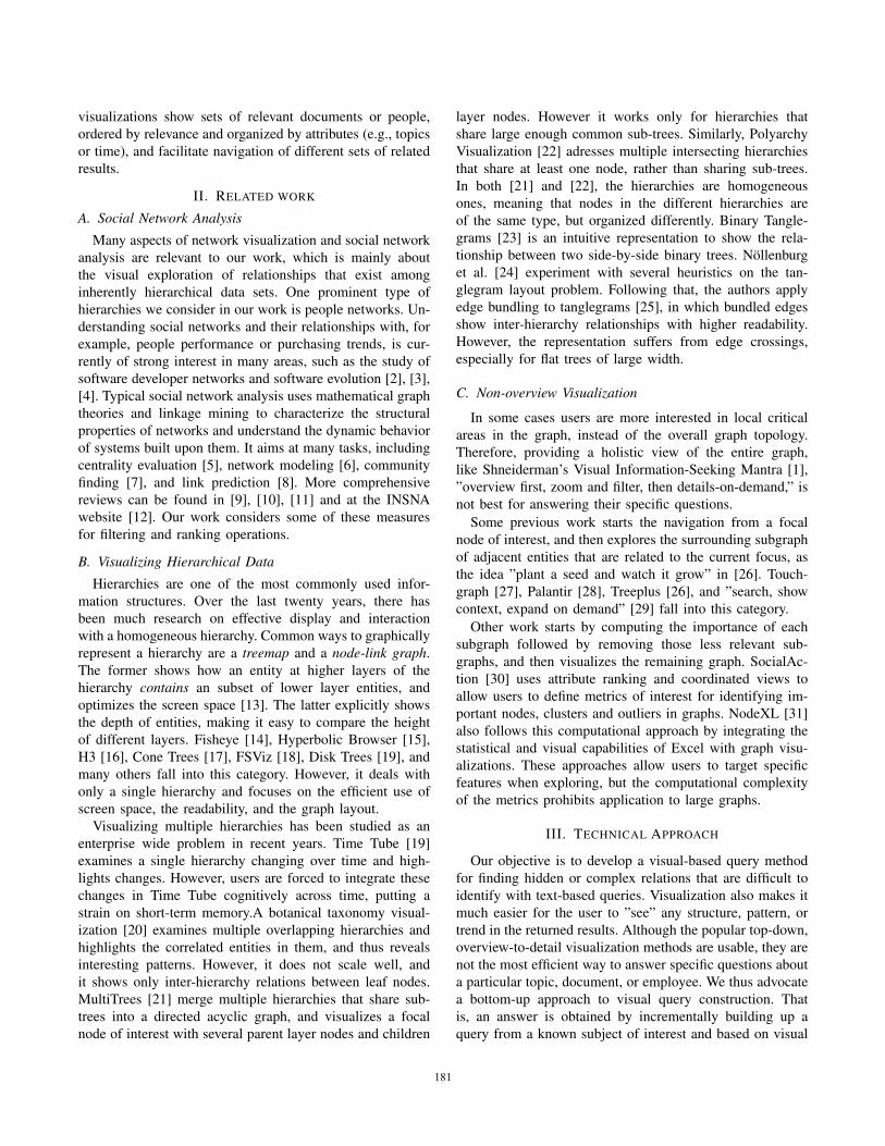
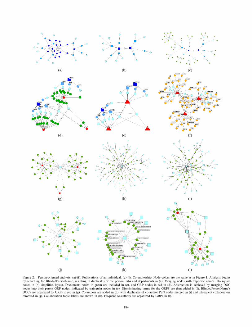
1) PUBLICATIONS OF AN INDIVIDUAL: We start by se-
lecting the PSN node from the ontology graph, and enter the
name of the individual ”BlindedPersonName” as keyword
for searching. (In all graphs of this paper, we hide names of
individuals for privacy reasons.) This gives us twelve PSN
nodes scattered in the display space. They are duplicates of
the same employee. Next, we select the relation between
PSN and DEP, followed by adding relations between DEP,
LAB, and ROOTPPL nodes. Figure 2(a) displays the result-
ing graph, in which we see the employee’s department and
laboratory affiliations. As new nodes are added to the graph,
its force-directed layout is redone, placing all nodes around
the ROOTPPL node.
The graph becomes somewhat cluttered, so we merge
LAB nodes (in dark blue) with identical names, all of which
are represented by a squared node, as shown in Figure 2(b).
Note that the corresponding merged edges are drawn thicker.
We can now better see the relationships between the LAB,
DEP, and PSN nodes.
The presence of duplicate individuals illustrates several
insights about the data set. Duplicate PSNs linking to
the same DEP/LAB nodes likely indicate variations in the
person’s name. Duplicates with different DEPs but the same
LAB may indicate that the department has been renamed, or
that the individual switched groups within the lab. Duplicates
with different DEPs and different LABs indicate either a
reorganization or a transfer of the individual to a new lab.
Accordingly, the organizational changes can be identified
in Figure 2(a)(b) by observing the intra-hierarchy relations
between the duplicates of an individual and the the higher
layer nodes of organizational units.
To examine information in the content hierarchy related
to BlindedPersonName, we add DOC nodes (in green)
to the current graph. Figure 2(c) shows the result where
all DOC nodes and other nodes are centered around the
collapsed LAB nodes. Next we add GRP nodes in red and re-
layout. The resulting graph becomes GRP-centered instead
of LAB-centered, such that we can better see how many
technical reports are in each group, as shown in Figure 2(d).
To continue our analysis by adding other information, we
collapse all DOC nodes to GRP nodes to free some space.
The new triangular nodes in Figure 2(e), to which PSN nodes
directly connect, represent the collapsed results, allowing us
to see PSN and GRP relations. We find five PSN nodes
contribute to GRP node #13 only, five PSN nodes contribute
on to GRP node #8 only, and two PSN nodes contribute to
all three GRP nodes (#7, #8, and #13).
Finally, to find out what these groups of technical reports
are about, we add DIS nodes (in orange) to the graph. We
also remove the DEP and LAB nodes to make the graph
even more GRP-centered. The resulting graph is shown in
Figure 2(f), from which we can see that the three groups
share ideas and interests. In particular, two particular occur-
rences of BlidedPersonName are clearly associated to those
discriminating term nodes (DIS) in the middle, as a result
of the force-directed layout. This sequence demonstrates
how our interactive system enables the user to incrementally
build up knowledge about an entity and manage complexity
with simple abstraction methods. One interesting next step
is to encode time information into the visualization, which
is covered in the third case study.
2) CO-AUTHORSHIP: After seeing BlindedPersonName’s
publications, now we want to look at how this individual
collaborated with others. To start from the result in Fig-
ure 2(e), we merge these twelve PSN nodes since they are
duplicates of BlindedPersonName, expand collapsed GRP
nodes to show DOC nodes, and remove DEP and LAB nodes
to show only this individual and all his documents, as shown
in Figure 2(g). Then we select the relation between DOC
and PSN in the ontology to include all co-authors that also
contributed to these documents, as shown in Figure 2(h).
However, the redundancy of individuals remains for these
newly included PSN nodes. Therefore we label these blue
PSN nodes with their names to identify duplicates, and
merge duplicates if any. The initial clean-up result is in
Figure 2(i), in which merged PSN nodes are in squared
shape. After merging duplicates of co-authors, the graph
is still quite complicated, because of the edge crossings
around co-authors that frequently collaborated with Blinded-
PersonName, as indicated by the multiple documents they
share with BlindedPersonName in the graph. To highlight
these important collaborators, we compute the degree of
the nodes in the graph, and filter out those co-authors with
low degree. The degree of a node is the number of edges
that link to or from this node. After filtering, the number
of collaborators becomes more manageable, as shown in
Figure 2(j). We re-layout these PSN and DOC nodes by
putting people who share documents closer to each other.
DOC nodes are labeled by keywords to reveal the topics
of the collaboration, as show in Figure 2(k). The keyword
labels of the green DOC nodes show that these important
collaborators mostly worked with BlindedPersonName on
the following topics:
• Performance: performance evaluation, performance
analysis, and performance models.
• Resources: system’s resource requirements, resource
usage optimization, shared resource pools, and capacity
management.
• Others: case studies, web differentiated services, and
admission control.
Another alternative for visually organizing these collabo-
rations is to make use of GRP nodes, as shown in Figure 2(l),
and to switch to a content-oriented graph. BlindedPerson-
Name is the square node in the center with the dark outline.
These important collaborators are pulled to GRP nodes
indirectly by DOC nodes they co-authored. We see that these
collaborative documents fall in two clusters (GRP #8 at the
183183
(a) (b) (c)
(d) (e) (f)
(g) (h) (i)
(j) (k) (l)
Figure 2. Person-oriented analysis. (a)-(f): Publications of an individual. (g)-(l): Co-authorship. Node colors are the same as in Figure 1. Analysis beginsby searching for BlindedPersonName, resulting in duplicates of the person, labs and departments in (a). Merging nodes with duplicate names into squarenodes in (b) simplifies layout. Documents nodes in green are included in (c), and GRP nodes in red in (d). Abstraction is achieved by merging DOCnodes into their parent GRP nodes, indicated by traingular nodes in (e). Discriminating terms for the GRPS are then added in (f). BlindedPersonName’sDOCs are organized by GRPs in red in (g). Co-authors are added in (h), with duplicates of co-author PSN nodes merged in (i) and infrequent collaboratorsremoved in (j). Collaboration topic labels are shown in (k). Frequent co-authors are organized by GRPs in (l).
184184
top left and #13 at bottom right). Some collaborators worked
on only one of the clusters, while others contributed to both
clusters (e.g., the two square nodes at the top right in the
middle of the two GRP nodes).
(a) (b)
(c)
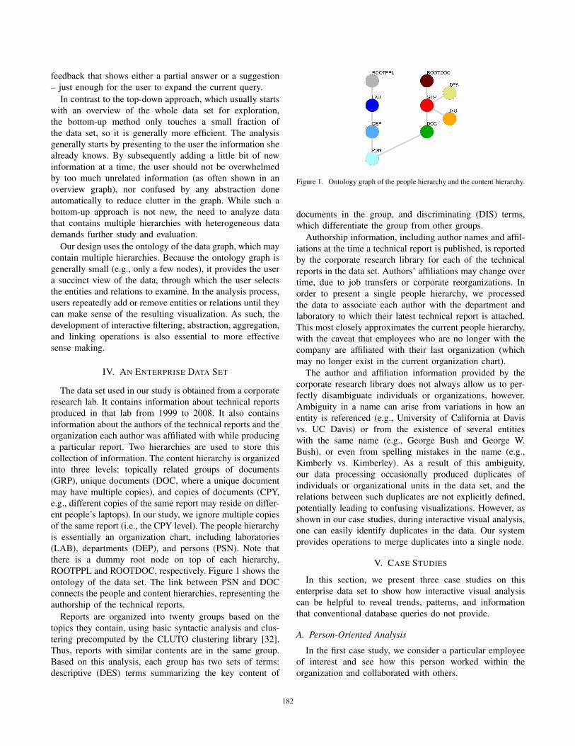
(d)
Figure 3. Content-oriented analysis, searching for “storage.” (a) Docu-ments (DOCs in green) about “storage,” with their authors (PSNs in lightblue) and affiliations (DEPs in blue and LABs in dark blue). (b) Graphreorganized by clusters (GRPs in red) at a higher layer in the contenthierarchy. (c) Discriminating terms (DISs in orange) that shows semanticinformation. (d) Revised layout results in a bipartite-like graph.
B. Content-Oriented Analysis
Users may want to start the exploration from the content
rather than an individual. For example, users may have
some topics of interest in mind, or they may want to find
all technical documents associated with a product. This
exploration is especially useful for electronic discovery, to
quickly identify all of the documents that are potentially
relevant to a legal case, as well as all individuals who
contributed to these documents, so they can be interviewed.
We start by searching documents that have the keyword
”storage,” and it results in nine DOC nodes in green for this
topic. Next, we select the relations in the ontology graph
to incorporate nodes into the graph. We start from the link
from DOC to PSN in light blue, followed by DEP in blue,
LAB in deep blue, and finally ROOTPPL in gray, in order
to reveal the people hierarchy about the ”storage” topic.
Figure 3(a) displays the resulting graph, and shows that
authors contribute to this topic are from four LAB nodes
in deep blue: ESSL, CSTL, EEL and TESL. Note that there
is a strong intra-lab collaboration in CSTL lab at the bottom
left, where four square PSN nodes and the four documents
they co-author are strongly connected. In this graph, we can
see who works on documents about a particular topic, and
which organizational units they belong to.
With the ontology graph, users can choose to look at
higher layers of hierarchies to abstract the details. Therefore
at this point we decide to navigate up a layer in the content
hierarchy to gain more insight about this topic. This time,
we select the relation between DOC and GRP (in red) to
show clusters, and remove the root node of the people
hierarchy to relax the ties between LAB nodes, as shown in
Figure 3(b). Then we select the relation between GRP and
DIS (discriminating terms of clusters, in orange) to show the
semantic meanings of the clusters, as shown in Figure 3(c).
This graph is a little overwhelming because all 25 DIS nodes
of a GRP node are shown. We can avoid this by showing
only those DIS nodes shared by multiple GRP nodes after
filtering out DIS nodes with low degree.
Then we manipulate the node positions according to the
nodes’ layers in the hierarchy, as shown in Figure 3(d).
This gives a bipartite-graph-like view between DOC nodes
related to ”storage” and the PSN nodes of their authors,
along with higher layers of the hierarchies aside for visual
abstraction. By DEP and LAB nodes at the left, we know
what organizational units have worked on this topic. By GRP
and DIS nodes with labels at the right, users can quickly get
a sense about the content of these documents.
In this case study, we have shown that with the ontology
defining both intra-hierarchy and inter-hierarchy relations,
users are able to explore the large data set easily and quickly.
It guides users by suggesting the next possible relations and
entities to examine, and facilitates exploration within the
same hierarchy, as well as between hierarchies. When we
185185
switch to higher layers in hierarchies for abstraction, the
contextual information of the original lower layers remains,
and thus mitigates the loss of information.
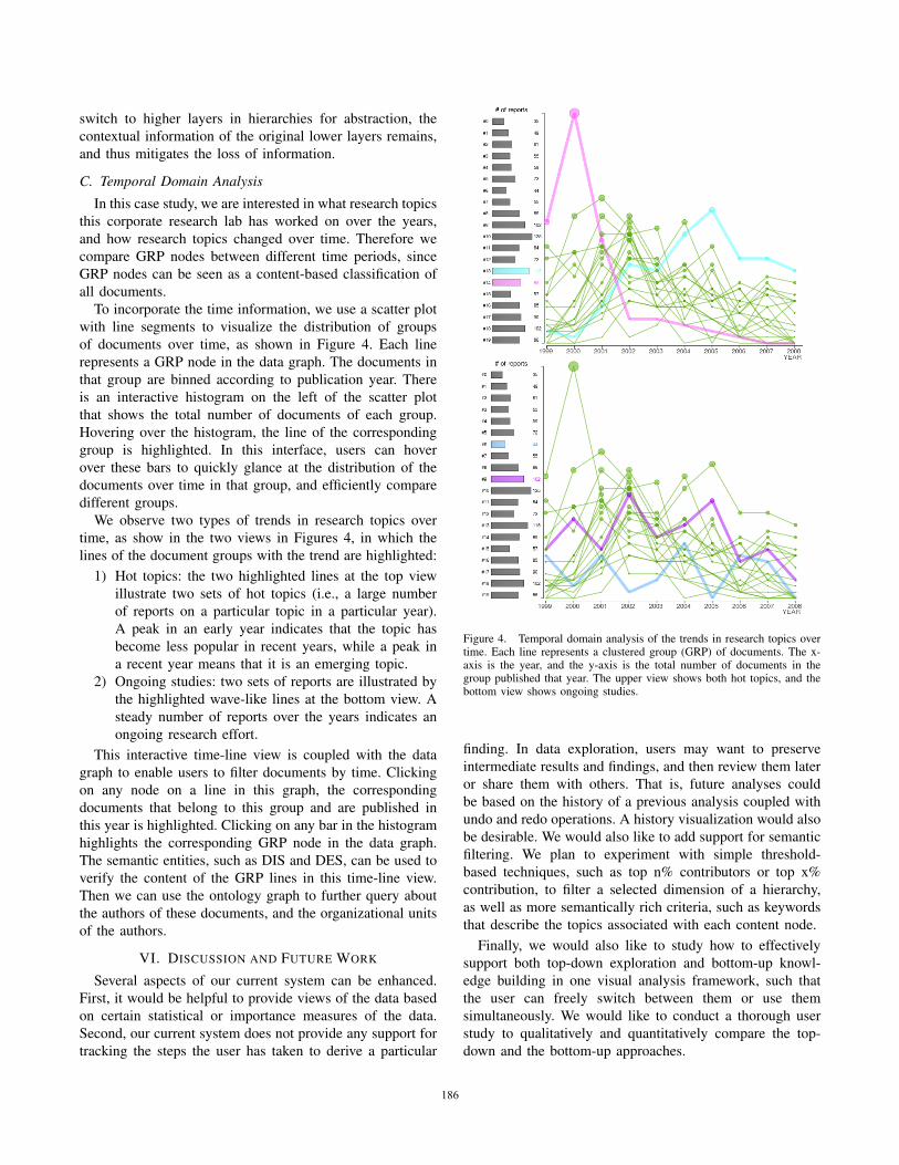
C. Temporal Domain Analysis
In this case study, we are interested in what research topics
this corporate research lab has worked on over the years,
and how research topics changed over time. Therefore we
compare GRP nodes between different time periods, since
GRP nodes can be seen as a content-based classification of
all documents.
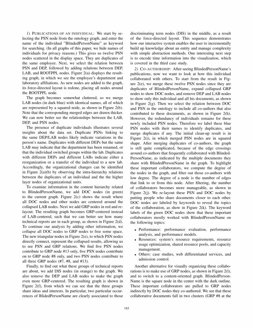
To incorporate the time information, we use a scatter plot
with line segments to visualize the distribution of groups
of documents over time, as shown in Figure 4. Each line
represents a GRP node in the data graph. The documents in
that group are binned according to publication year. There
is an interactive histogram on the left of the scatter plot
that shows the total number of documents of each group.
Hovering over the histogram, the line of the corresponding
group is highlighted. In this interface, users can hover
over these bars to quickly glance at the distribution of the
documents over time in that group, and efficiently compare
different groups.
We observe two types of trends in research topics over
time, as show in the two views in Figures 4, in which the
lines of the document groups with the trend are highlighted:
1) Hot topics: the two highlighted lines at the top view
illustrate two sets of hot topics (i.e., a large number
of reports on a particular topic in a particular year).
A peak in an early year indicates that the topic has
become less popular in recent years, while a peak in
a recent year means that it is an emerging topic.
2) Ongoing studies: two sets of reports are illustrated by
the highlighted wave-like lines at the bottom view. A
steady number of reports over the years indicates an
ongoing research effort.
This interactive time-line view is coupled with the data
graph to enable users to filter documents by time. Clicking
on any node on a line in this graph, the corresponding
documents that belong to this group and are published in
this year is highlighted. Clicking on any bar in the histogram
highlights the corresponding GRP node in the data graph.
The semantic entities, such as DIS and DES, can be used to
verify the content of the GRP lines in this time-line view.
Then we can use the ontology graph to further query about
the authors of these documents, and the organizational units
of the authors.
VI. DISCUSSION AND FUTURE WORK
Several aspects of our current system can be enhanced.
First, it would be helpful to provide views of the data based
on certain statistical or importance measures of the data.
Second, our current system does not provide any support for
tracking the steps the user has taken to derive a particular
Figure 4. Temporal domain analysis of the trends in research topics overtime. Each line represents a clustered group (GRP) of documents. The x-axis is the year, and the y-axis is the total number of documents in thegroup published that year. The upper view shows both hot topics, and thebottom view shows ongoing studies.
finding. In data exploration, users may want to preserve
intermediate results and findings, and then review them later
or share them with others. That is, future analyses could
be based on the history of a previous analysis coupled with
undo and redo operations. A history visualization would also
be desirable. We would also like to add support for semantic
filtering. We plan to experiment with simple threshold-
based techniques, such as top n% contributors or top x%
contribution, to filter a selected dimension of a hierarchy,
as well as more semantically rich criteria, such as keywords
that describe the topics associated with each content node.
Finally, we would also like to study how to effectively
support both top-down exploration and bottom-up knowl-
edge building in one visual analysis framework, such that
the user can freely switch between them or use them
simultaneously. We would like to conduct a thorough user
study to qualitatively and quantitatively compare the top-
down and the bottom-up approaches.
186186
VII. CONCLUSION
The successes of an enterprise largely rely on its ability to
make critical business decisions by effectively utilizing the
vast amounts of information acquired from diverse sources.
Traditional information management and knowledge dis-
covery tools fail to cope with the information explosion
facing many major enterprises. In this paper, we demonstrate
that visualization is a promising solution for this pressing
problem. Our bottom-up approach effectively supports goal-
oriented, interactive analysis of enterprise data in terms of
a people hierarchy and a content hierarchy.
The contributions of this work are summarized as follows:
1) We perform a preliminary study on a bottom-up
approach for exploring a data set with multiple hi-
erarchies. This method starts with a known subject
or entity of interest and then visually adds relations
and other entities, in order to derive the answer we
are looking for, or simply to explore the data. An
ontology graph facilitates the addition of entities.
The primary benefits of this approach in comparison
with a top-down approach include: answering specific
questions more efficiently, avoiding confusing users
with extraneous nodes, and reducing clutter in the
graph by abstraction.
2) We provide techniques for interactive operations on
multiple hierarchies, such as searching, filtering, and
aggregating for abstraction, to manage the complexity
of the graph.
3) We demonstrate the merits of our approach to inter-
active visual sense making using several case studies
exploring authorship and collaboration patterns in a
technical report data set from a corporate research lab.
ACKNOWLEDGMENT
This research was supported in part by the U.S. Na-
tional Science Foundation through grants CCF-0938114,
CCF-0808896, CNS-0716691, and CCF-1025269, the U.S.
Department of Energy through the SciDAC program with
Agreement No. DE-FC02-06ER25777, and HP Labs and
AT&T Labs Research.
REFERENCES
[1] B. Shneiderman, “The eyes have it: a task by data
type taxonomy for information visualizations,” Proc.
of 1996 IEEE Symposium on Visual Languages, 1996.
[2] C. Bird et al., “Mining email social networks,” in
Proc. of MSR ’06.
[3] M. Ogawa et al., “Visualizing social interaction in open
source software projects,” in Proc. of APVIS ’07.
[4] M. Ogawa et al., “StarGate: A Unified, Interactive
Visualization of Software Projects,” in PacificVis ’08.
[5] L. Freeman, “Centrality in social networks conceptual
clarification,” Social Networks, 1979.
[6] A.-L. Barabasi et al., “Linked: The New Science of
Networks,” American Journal of Physics, 2003.
[7] M. Newman, “Finding community structure in net-
works using the eigenvectors of matrices,” Physical
Review E, 2006.
[8] D. Liben-Nowell et al., “The link-prediction problem
for social networks,” Journal of the American Society
for Information Science and Technology, 2007.
[9] S. Wasserman et al., Social network analysis.
[10] J. P. Scott, Social Network Analysis: A Handbook.
[11] M. Huisman et al., Software for social network
analysis.
[12] INSNA. http://www.insna.org/
[13] Treemaps for space-constrained visualization of hier-
archies. http://www.cs.umd.edu/hcil/treemap-history
[14] G. W. Furnas, “Generalized fisheye views,” ACM
SIGCHI Bulletin, 1986.
[15] J. Lamping et al., “Laying out and visualizing large
trees using a hyperbolic space,” in Proc. of UIST ’94.
[16] T. Munzner, “Exploring large graphs in 3D hyperbolic
space,” IEEE Comput. Graphics and Appl., 1998.
[17] G. Robertson et al., “Cone trees: animated 3D visual-
izations of hierarchical information,” in CHI ’91.
[18] J. Carriere et al., “Interacting with huge hierarchies:
Beyond cone trees,” in Proc. of InfoVis ’95.
[19] E. H. Chi et al., “Visualizing the evolution of Web
ecologies,” in Proc. of CHI ’98.
[20] M. Graham et al., “A comparison of set-based and
graph-based visualisations of overlapping classification
hierarchies,” in Proc. of AVI ’00.
[21] G. W. Furnas et al., “Multitrees: enriching and reusing
hierarchical structure,” in Proc. of CHI ’94.
[22] G. Robertson et al., “Polyarchy visualization: visualiz-
ing multiple intersecting hierarchies,” in CHI ’02.
[23] N. Sheth et al., “Treemap, Radial Tree, and 3D Tree
Visualizations,” in Proc. of InfoVis ’03.
[24] M. Nollenburg et al., “Drawing binary tanglegrams: An
experimental evaluation,” in Proc. of ALENEX ’09.
[25] D. Holten et al., “Visual Comparison of Hierarchically
Organized Data,” Computer Graphics Forum, 2008.
[26] B. Lee et al., “TreePlus: interactive exploration of
networks with enhanced tree layouts,” IEEE Trans. Vis.
Comput. Graphics, 2006.
[27] TouchGraph. http://www.touchgraph.com
[28] Palantir. http://www.palantirtech.com
[29] F. van Ham et al., “Search, show context, expand on de-
mand: supporting large graph exploration with degree-
of-interest.” IEEE Trans. Vis. Comput. Graphics, 2009.
[30] A. Perer et al., “Balancing systematic and flexible
exploration of social networks.” IEEE Trans. Vis. Com-
put. Graphics, 2006.
[31] M. A. Smith et al., “Analyzing (social media) networks
with NodeXL,” in Proc. of C&T ’09.
[32] CLUTO. http://glaros.dtc.umn.edu/gkhome/views/cluto/
187187
Related Documents