Improving the Usability of Social Media Management Applications MASTER THESIS zur Erlangung des akademischen Grades "Master of Science" im Studiengang Wirtschaftsinformatik eingereicht bei Frau Ass.-Prof. Dr. Anna Fensel Institut für Wirtschaftsinformatik, Produktionswirtschaft und Logistik Fakultät für Betriebswirtschaft der Leopold-Franzens-Universität Innsbruck von Christina Eberharter, BSc Innsbruck, März 2019

Welcome message from author
This document is posted to help you gain knowledge. Please leave a comment to let me know what you think about it! Share it to your friends and learn new things together.
Transcript
Improving the Usability of Social Media
Management Applications
MASTER THESIS
zur Erlangung des akademischen Grades
"Master of Science"
im Studiengang Wirtschaftsinformatik
eingereicht bei Frau
Ass.-Prof. Dr. Anna Fensel
Institut für Wirtschaftsinformatik, Produktionswirtschaft und Logistik
Fakultät für Betriebswirtschaft
der Leopold-Franzens-Universität Innsbruck
von
Christina Eberharter, BSc
Innsbruck, März 2019
DECLARATION OF AUTHORSHIP
I, Christina Eberharter, certify that the work presented here is, to the best of my knowledge and
belief, original and the result of my own investigations, except as acknowledged. Where I have
consulted the work of others, this is always clearly stated. It has not been submitted, either in part
or whole, for a degree at this or any other university. I agree to the archiving of the presented master
thesis.
Innsbruck, March 29, 2019
Signature________________________________
Christina Eberharter
ACKNOWLEDGMENT
Thank you to…
…my supervisor Priv.-Doz. Dr. Anna Fensel for her expertise, guidance and patience to
successfully complete my master thesis.
…Onlim GmbH for providing me the opportunity and willingness to collaborate with me and a
special thanks to Ioan Toma, COO of Onlim, who made the collaboration possible.
…my co-worker Thomas Misch for his support and encouragement to complete my master thesis.
…my family, partner in life and friends for their endless love, support and patience in everything I
do.
ABSTRACT
The letter press, steam engine and personal computer are some of the greatest inventions of
all time. One of the more modern invention is the Internet, which transformed not only the way we
communicate today but also whole business areas such as commerce, entertainment, marketing and
many more. The Internet itself evolved over time in the Web 2.0 or better known under its synonym
social media. It allows the creation and exchange of user generated content (UGC). One specific
area of social media are social networks such as Facebook, Twitter or LinkedIn. These social
networks opened the door for new ways of online marketing—social media marketing. In order to
use social networks efficiently for marketing purposes and reach (potential) customers, marketers
rely on social media marketing software (SMMS). These web-based applications support
companies or individuals with publishing, engaging, promoting or listening on social media
networks. In order to have a competitive SMMS, one of the most important quality factors are
usability and user experience. For 48% of visitors the number one credibility factor is the design
of a Web site and 38% of visitors would stop using a Web site if the layout is unattractive.
Based on the use case of the social media management tool Onlim (www.onlim.com), it
was explored to which extant usability tests can detect user experience issues and consequently
improvements by conducting a usability lab. Often only user interface (UI) experts are used for
design updates as usability tests can be time intensive and costly. Furthermore, Onlim was also
benchmarked against competitor tools, mostly industry leaders, in terms of functionality and user
experience in order get insights on value-adding features and usability. The thesis’ results of the
benchmark analysis provide a clear indication that in general Onlim is behind leading industry
applications such as Hootsuite and Buffer. Mainly in terms of functionality, shortcomings were
identified. However, two main strengths of Onlim are the simultaneous post creation and a
sophisticated RSS reader functionality. In terms of user experience, Onlim performed moderately.
Furthermore, the data set of 20 participants of the conducted usability lab were used for an in-depth
analysis. The analysis identified fifteen usability problems whereas five are system and ten
operational problems. Overall 40% of the problems were resolved through the implementation of
a new user interface design and 60% of the problems still remain in the new interface or are only
partly solved. Overall the findings of the thesis can help Onlim to further improve the application,
not only regarding usability but also in terms of feature extensions that were a by-product of the
applied benchmark analysis.
Table of Contents I
Christina Eberharter, Innsbruck 2019
Table of Contents
Table of Figures ................................................................................................................. III
List of Tables ..................................................................................................................... IV
List of Abbreviations ........................................................................................................... V
1. Introduction ................................................................................................................... 1
2. Theoretical Foundation .................................................................................................. 4
2.1. The Rise of Social Media Marketing ...................................................................... 5
2.1.1. Web 2.0 & social media marketing .................................................................. 5
2.1.2. Social media management software ............................................................... 12
2.2. The Role of Usability in Web Applications ........................................................ 17
2.2.1. Usability, web usability & user experience .................................................... 18
2.2.2. Usability evaluation methods ......................................................................... 22
3. Use Case ...................................................................................................................... 28
4. Methodology ............................................................................................................... 33
4.1. Benchmarking ....................................................................................................... 34
4.2. Usability Lab ........................................................................................................ 41
5. Results ......................................................................................................................... 46
5.1. Benchmarking ....................................................................................................... 46
5.2. Usability Lab ........................................................................................................ 53
5.2.1. Usability lab results based on metrics ............................................................ 53
5.2.2. Open-ended questions .................................................................................... 58
5.2.3. Discovered usability problems ....................................................................... 62
5.3. Result Summary ................................................................................................... 71
6. Proposed Usability Improvements .............................................................................. 76
6.1. Usability Improvements for Onlim ....................................................................... 76
Table of Contents II
Christina Eberharter, Innsbruck 2019
6.2. General Recommendations for SMM Tools ......................................................... 82
7. Discussion ................................................................................................................... 84
References ......................................................................................................................... VI
Appendix A: Benchmark Analysis ...................................................................................... X
A.1 Summary of criteria and weight for heuristic evaluation ......................................... X
A.2 Criteria usability – measuring of the subcategories based on Seffah et al. (2006) . XI
A.3 Benchmark analysis: Final results ......................................................................... XII
Appendix B: Usability Lab ............................................................................................. XIII
B.1 Mean time per task including confidence interval ................................................ XIII
B.2 Task success perceived by user ............................................................................. XIV
B.3 Level of success ..................................................................................................... XV
B.4 Single Ease Question ............................................................................................ XVI
B.5 Open-Ended Questions – Answers ..................................................................... XVII
B.6 Open-Ended Questions - Code system .................................................................. XX
Table of Figures III
Christina Eberharter, Innsbruck 2019
Table of Figures
Figure 1: Derived from the social media types by Minazzi (2015) and assigned to the social
media zones defined by Tuten (2013) .................................................................................. 9
Figure 2: Seven Use Cases for SMMS derived from Alan Cook (2013, p. 3) ................... 13
Figure 3: Social Media Management Tools TrustMap (TrustRadius, 2018) ..................... 16
Figure 4: Usability framework according to Bevan (1995, p. 886) ................................... 19
Figure 5: Usability as part of user experience derived from Jacobsen & Meyer (2017, p. 60)
............................................................................................................................................ 22
Figure 6: Overview of usability studies based on Tullis and Albert (2013, p. 54) ............ 25
Figure 7: Onlim offerings (https://onlim.com/preise/) ....................................................... 29
Figure 8: Post Creation Window ........................................................................................ 31
Figure 9: Calendar View .................................................................................................... 31
Figure 10: Draft View ........................................................................................................ 32
Figure 11: News Feed Section ........................................................................................... 32
Figure 12: Overview of mixed method approach ............................................................... 34
Figure 13: Eight steps of Web benchmarking (Hassan and Li, 2005) ............................... 35
Figure 14: Applied process for utility analysis .................................................................. 36
Figure 15: Total scores of applications from the benchmark analysis ............................... 47
Figure 16: Benchmark analysis - performance per criterion .............................................. 48
Figure 17: Mean time per task ............................................................................................ 54
Figure 18: Percentage of participants who completed task below mean time ................... 55
Figure 19: Task success perceived by user vs. actual level of success .............................. 56
Figure 20: Successful completion rate by task based on level of success measure ........... 56
Figure 21: Level of success by task ................................................................................... 57
Figure 22: Average SEQ and mean time per task .............................................................. 58
Figure 23: Code-Matrix with frequency of codes per answer ............................................ 59
Figure 24: Connecting social media accounts .................................................................... 63
Figure 25: New post section with page guide and help icon .............................................. 63
Figure 26: Final step for connecting social media accounts and chatbot message ............ 64
Figure 27: Suggestions section (news feed) with RSS feed and Facebook pages ............. 65
Figure 28: Example suggested post in new post section .................................................... 66
List of Tables IV
Christina Eberharter, Innsbruck 2019
Figure 29: Suggest post detailed view in Onlim vs. preview in Facebook ........................ 67
Figure 30: Detailed view of suggested post with like, comment and share icon from
Facebook ............................................................................................................................ 67
Figure 31: Calendar and draft section in Onlim ................................................................. 68
Figure 32:Example of participant's 4 attempt to schedule the post 6pm sharp (18:00) ..... 69
Figure 33: Detailed view in the calendar section (example from participant 14) .............. 70
Figure 34: View of available actions for a planned post (example from participant 14) ... 70
Figure 35: New iconography in News Feed and Calendar section (horizontal ellipsis) .... 79
Figure 36: Example of "Self-Help" option in Salesforce .................................................. 81
List of Tables
Table 1: Classification of Social Media by social presence/media richness and self-
presentation/self-disclosure by Minazzi (2015, p. 6) based on the original matrix of Kaplan
and Haenlain (2010, p. 62) ................................................................................................... 7
Table 2: Types of Media (Tuten & Solomon, 2013, p. 17) ................................................ 11
Table 3: Ten common usability study scenarios and the metrics that may be most
appropriate for each. Derived from Tullis and Albert (2013) ............................................ 23
Table 4: Sample size related to the percentage of usability problem findings, derived from
Jacobsen and Meyer (2017) ................................................................................................ 24
Table 5: Summary of criteria and weights ......................................................................... 38
Table 6: Weight and weight distribution for multiple content sources .............................. 39
Table 7: Weight and weight distribution for multiple-channel communication ................ 39
Table 8: Weight and weight distribution for usability ....................................................... 40
Table 9: Task description ................................................................................................... 45
Table 10: Benchmark analysis - evaluated performance overview .................................... 48
Table 11: Usability problem summary ............................................................................... 75
Table 12: Overview of detected usability problems counted by problem type and solved vs.
unsolved usability problems ............................................................................................... 76
Table 13: Suggested usability improvements ..................................................................... 78
Table 14: Summary of additional recommendations for SMM tools ................................. 83
List of Abbreviations V
Christina Eberharter, Innsbruck 2019
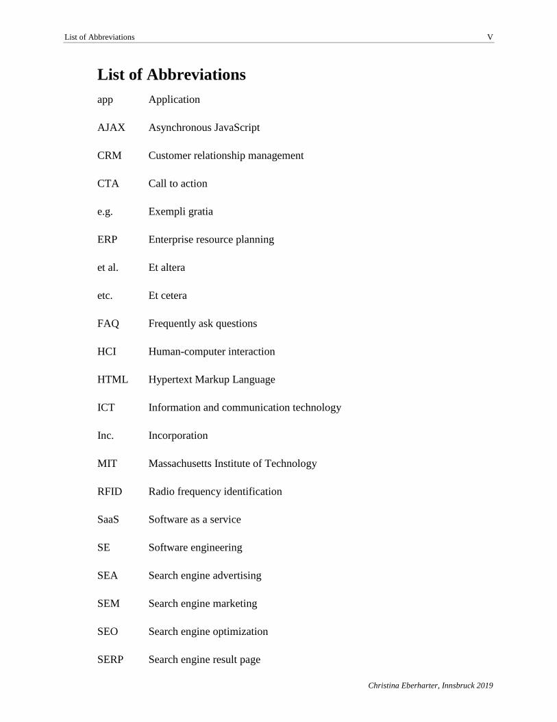
List of Abbreviations
app Application
AJAX Asynchronous JavaScript
CRM Customer relationship management
CTA Call to action
e.g. Exempli gratia
ERP Enterprise resource planning
et al. Et altera
etc. Et cetera
FAQ Frequently ask questions
HCI Human-computer interaction
HTML Hypertext Markup Language
ICT Information and communication technology
Inc. Incorporation
MIT Massachusetts Institute of Technology
RFID Radio frequency identification
SaaS Software as a service
SE Software engineering
SEA Search engine advertising
SEM Search engine marketing
SEO Search engine optimization
SERP Search engine result page
List of Abbreviations VI
Christina Eberharter, Innsbruck 2019
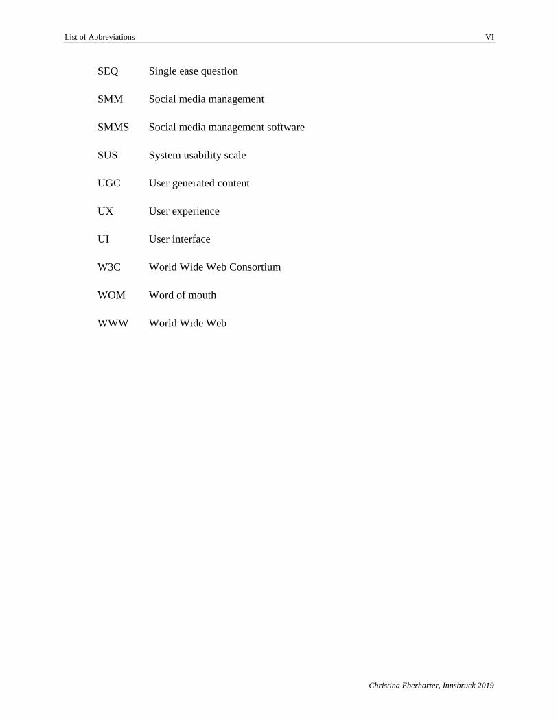
SEQ Single ease question
SMM Social media management
SMMS Social media management software
SUS System usability scale
UGC User generated content
UX User experience
UI User interface
W3C World Wide Web Consortium
WOM Word of mouth
WWW World Wide Web
Introduction 1
Christina Eberharter, Innsbruck 2019
1. Introduction
“It’s not the customer’s job to know what they want.”
(Steve Jobs)
The roots of the World Wide Web and therefore of social media go back to the 1970s when
the first email in history was sent from one computer to another. After the millennium the social
media era began with the first platform, Friendster, which allowed people to connect online to real
world friends (O’Dell, 2011). Today, users communicate on a regular basis with each other via
online social platforms. According to Constine (2017)from Tech Crunch, by June 2017 Facebook
had 2 billion monthly active users and was one of the largest social networks with a global reach.
Other popular social networks like Twitter and Instagram reported 328 million and 700 million
monthly active users, respectively (Constine, 2017). Besides general social media networks,
business social networks gained attractiveness. LinkedIn, for example, had over 106 million active
users per month in 2017 (Aslam, 2017).
These numbers indicate that with the high penetration rate on social platforms there is an
urge for organizations to adapt to social media. This is also confirmed by the 2008 Cone et al. study
in which over 80% of the participants said that companies should have a social media presence and
use those platforms to interact with the customers (Cone Inc., 2008; Mousavi & Demirkan, 2013,
p. 718). This growing importance of social media and the resulting opportunity to reach out to
target groups, publish information, and engage with customers in a bi-directional way signals an
immense value for companies of all sizes and types of businesses. Utilizing social media as part of
a company’s online marketing strategy often means not only using one social platform but being
present on several platforms simultaneously to increase a firm’s online visibility. Managing and
monitoring online presence can be a time-consuming task, therefore most organizations make use
of online social media management tools to manage their social media accounts.
One well recognized social media management tool is Hootsuite, which allows scheduling
posts in advance, monitoring, and posting to multiple platforms. Other providers of similar
management tools include Buffer, TweetDeck, and Sprinkler.
Competitors don’t sleep and, as a result, competition among social media management tools
is substantial. Since it is easy to switch providers of such Web applications, these providers have
Introduction 2
Christina Eberharter, Innsbruck 2019
the obvious goal of pleasing their users to keep them using the application. One important factor
in achieving user satisfaction is ensuring an application’s high usability. If applications are poorly
designed and lack ease of use, users will reject them. Therefore a main objective of Web
applications is that the user achieve his or her goal effectively, efficiently, and satisfactorily
(Kappel, Pröll, Reich, & Retschitzegger, 2006, p. 219). According to Bevan et al. (1991, p. 651)
usability can be defined as “the ease of use and acceptability of product for a particular class of
users carrying out specific tasks in a specific environment”.
Usability is not a onetime task conducted in the Web application, it is more an iterative
process throughout development and beyond. To ensure well-specified usability of the final
product, usability itself must be seen as an ongoing series of actions.(Kappel et al., 2006, p. 221)
In the domain of information systems, the term usability is mostly associated with software
development and Web applications. As social media management tools can be assigned to the
category of Web applications as well, usability also plays a decisive role for these tools. Therefore,
based on the example use case of the social media management tool Onlim (www.onlim.com), this
master thesis will aim to identify how usability of social media management tools can be improved
in order to make them more efficient. This leads to the following research question:
➢ To what extent can usability tests detect user experience issues and consequently
improvements for the use case of a social media management tool?
The following working questions will be answered through the practical part of this master
thesis as applied to the use case:
➢ How does the social media management tool compete against competitors in terms
of functionality and user experience?
➢ Where do weaknesses exist in previous user experiences? Where did users have
problems when performing tasks in Onlim? Were the issues resolved over time
through a regular software development process without having explicit feedback
from a usability test?
➢ How can the social media management tools’ user experience be improved?
This master thesis begins with a theoretical analysis that aims to establish a better
understanding of the main research fields: social media marketing, usability and common usability
Introduction 3
Christina Eberharter, Innsbruck 2019
tests. This shall allow the reader to establish a basic knowledge of the relevant topics as applied to
the use case and the purpose of such software. In Chapter 3, the use case will be briefly explained
with some background information about the company, including a description of the software’s
features and the current user interface. Chapter 4 than introduces the applied methodology for the
practical application of a benchmark analysis and a usability lab. Chapter 5 directly examines into
evaluation of the results of both applied methods that form the basis for Chapter 6, which uses the
findings of the previous chapter and proposes usability improvements for Onlim as well as some
general recommendations for social media management tools. This master thesis closes with a
discussion about the applied benchmark analysis and usability lab. It also discusses the limitations
of the thesis and a retrospective view of both methods.
Theoretical Foundation 4
Christina Eberharter, Innsbruck 2019
2. Theoretical Foundation
“The Internet has revolutionized the computer and communications world like nothing before.”
(Leiner, Cerf, & Clark, 1997, p. 102)
The “Galactic Network” concept written 1962 by J.C.R. Licklider of MIT (Massachusetts
Institute of Technology) is one of the first recorded discussions of social interactions enabled by
networking. His work convinced DARPA (Defense Advanced Research Project Agency)
researchers of the significance of the networking concept. Leonard Kleinrock, also of MIT, wrote
in 1961 the first paper on package switching, which lead to a rethinking of the currently used circuit
switch. Another milestone was set when MIT’s XT-2 computer was connected with a Q-32
computer in California by a telephone line–creating the first ever wide-area computer network. The
outcome of this experiment was the proof that connected computers could work together, retrieve
data and run programs. These three incidents were the first milestones in the creation of the Internet.
(Leiner et al., 1997, pp. 102–103)
The above-described beginnings of the Internet’s development should be a reminder that
without the Internet a whole sector of the economy and many new research fields would not exist.
Today’s society could not live without the Internet, whether at work where people use cloud
computing on a daily basis or at home for blogging, “Facebooking” or “tweeting”. Therefore it can
be said, “Today the Internet is the backbone of our society” as Tuten and Solomen (Tuten &
Solomon, 2013, p. 2) state in their book, Social Media Marketing.
In the following theoretical foundation sections, two relevant topics are discussed to
provide a better understanding of the subject of this work. The first section deals with content and
social media marketing, a field that emerged through the evolution of the Internet, to provide a
landscape overview of social media and content marketing tools. The second section explains
usability and user experiences within Web applications. Furthermore, an overview is provided for
usability evaluation methods.
Theoretical Foundation 5
Christina Eberharter, Innsbruck 2019
2.1. The Rise of Social Media Marketing
About a decade ago it was impossible to imagine the impact the Web 2.0, podcasts, search
engine marketing (SEM), search engine optimization (SEO), blogs, wikis, social media platforms
and many other digital trends would have on marketing management. A new field has emerged,
online marketing, that has had a great impact on traditional marketing. (Valos, Ewing, & Powell,
2010, p. 361)
2.1.1. Web 2.0 & social media marketing
The development of the Internet and its related information and communication
technologies (ICTs) made today’s social media possible. The early Internet, often called Web 1.0,
was known as an unidirectional medium with static Web sites where information is published by
Web site owners and read by Web site visitors. Subsequently the Internet has moved to its next
stage, Web 2.0, the current version of the World Wide Web. Web 2.0 is not a technical update of
the Internet, but it is rather a new way of using the already existing platform. Even though there
are no fundamental changes to the Internet itself, some new functionalities are needed, like Adobe
Flash to add video streams or animation to Web pages and AJAX (Asynchronous Java Script)
which has helped evolve the Web into an interactive social system (Kaplan & Haenlein, 2010, p.
61; Minazzi, 2015, p. 3; Tuten & Solomon, 2013, p. 2).
Web 2.0
Kaplan and Haenlein (2010, p. 61) consider Web 2.0 as “the platform for the evolution of
Social Media”. Tim O’Reilly, CEO of O’Reilly Media Inc. and computer book publisher, was the
first to propose this new buzzword. Even though the term Web 2.0 was not new to the software
industry, it was for marketers who integrated this concept into their marketing strategies
(Constantinides & Fountain, 2008, p. 234).
O’Reilly (2005) defines the Web 2.0 as a platform based on a network encompassing all
connected devices that provide continuously updated software as a service (SaaS). Furthermore, he
states that SaaS efficiency improves as more people participate and use the service. This includes
individual users who share their data in a form that makes it possible to be consumed and remixed
by others to create “network effects through an ‘architecture of participation’” (O’Reilly, 2005).
This master thesis uses the following definition of Web 2.0 provided by Constantinides and
Fountain (2008):
Theoretical Foundation 6
Christina Eberharter, Innsbruck 2019
Web 2.0 is a collection of open-source, interactive and user-controlled online
applications expanding the experiences, knowledge and market power of the users
as participants in business and social processes. Web 2.0 applications support the
creation of informal users’ networks facilitating the flow of ideas and knowledge
by allowing the efficient generation, dissemination, sharing and editing/refining of
informational content. (2008, pp. 232–233)
Web 2.0 will eventually evolve into Web 3.0, but there are different assumptions about the
direction of this development. Minazzi (2015, p. 5) identified two different streams of opinions in
this research field: that some believe the focus will be on semantic Web technologies linking data
and artificial intelligence, while others believe the trend will go in the direction of information
technology features like increased Internet speed and graphic improvements.
Social media
Social media is often used as a synonym for Web 2.0. According to Kaplan and Haenlein
(2010, p. 61), social media is “a group of Internet-based applications that build on the ideological
and technological foundations of Web 2.0, and that allow the creation and exchange of User
Generated Content”. In general, social media allows people to connect to each other, form
communities and share knowledge, experience and user generated content (UGC). In addition, the
authors (Kaplan & Haenlein, 2010, p. 61) state that UGC describes “the various forms of media
content that are publicly available and created by end-users”. A more open definition for self-
interpretation is given by Tuten and Solomon (2013, p. 2) who define social media as “the online
means of communication, conveyance, collaboration, and cultivation among interconnected and
interdependent networks of people, communities, and organizations enhanced by technological
capabilities and mobility”. As Kaplan and Haenlein’s definition for social media is more specific
than the one from Tuten and Solomon, this master thesis will apply Kaplan and Haenlein’s
definition when referring to social media.
Social media can be seen as an umbrella term for many different applications and tools
which fall in this category. Kaplan and Haenlein (2010, pp. 61–62) proposed a matrix derived from
media research and social process, both topics include theories which are essential elements of
social media. Out of the media research field two theories form the first dimension of the matrix—
the social presence theory and the media richness theory. Social presence is low when the
communication between two persons is asynchronous (e.g., conversation through emails) or
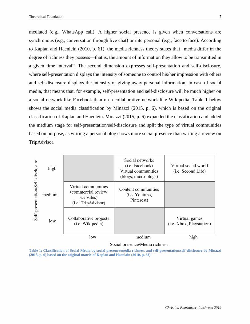
Theoretical Foundation 7
Christina Eberharter, Innsbruck 2019
mediated (e.g., WhatsApp call). A higher social presence is given when conversations are
synchronous (e.g., conversation through live chat) or interpersonal (e.g., face to face). According
to Kaplan and Haenlein (2010, p. 61), the media richness theory states that “media differ in the
degree of richness they possess—that is, the amount of information they allow to be transmitted in
a given time interval”. The second dimension expresses self-presentation and self-disclosure,
where self-presentation displays the intensity of someone to control his/her impression with others
and self-disclosure displays the intensity of giving away personal information. In case of social
media, that means that, for example, self-presentation and self-disclosure will be much higher on
a social network like Facebook than on a collaborative network like Wikipedia. Table 1 below
shows the social media classification by Minazzi (2015, p. 6), which is based on the original
classification of Kaplan and Haenlein. Minazzi (2015, p. 6) expanded the classification and added
the medium stage for self-presentation/self-disclosure and split the type of virtual communities
based on purpose, as writing a personal blog shows more social presence than writing a review on
TripAdvisor.
Table 1: Classification of Social Media by social presence/media richness and self-presentation/self-disclosure by Minazzi
(2015, p. 6) based on the original matrix of Kaplan and Haenlain (2010, p. 62)
Theoretical Foundation 8
Christina Eberharter, Innsbruck 2019
The above social media classification includes the main types of social media, which can
be described as follows according to Minazzi (2015, pp. 5–7):
• Collaborative projects are Web sites where content is provided, added, changed and
removed by users. Such examples for collaboration Web sites are Wikipedia or
Stack Overflow.
• Virtual communities is a broad term for platforms where information, opinions, and
reviews can be shared with other users. Communities can be used for commercial
purposes, as in the case of TripAdvisor where users can review holiday destinations,
hotels or restaurants or discuss specific topics and ask questions as on Quora. In
both examples, the self-presentation is medium. Another type of virtual community
is a blog which can be a personal blog where authors write about his/her life or
relevant information about a specific topic. Blogs are usually managed by a single
person and visitors or subscribers of a blog can read the content and interact with
the blog author through the comment section. As a blog has a higher self-
presentation than other subtypes of virtual communities as well as a higher media
richness through photos and videos added to the blog, the social media classification
above rates blogs as “high” when compared with different types of communities.
• Content communities are Web sites where users can share with other users various
forms of content such as photos (e.g., Pinterest, Flickr), videos (e.g., YouTube,
Vimeo) or presentations (e.g., SlideShare). Even though personal profiles on
content communities include basic personal information such as user name,
platforms like YouTube and Pinterest are moving more in the direction of social
media and show increasing self-presentation as users share more private content.
• Social network Web sites are the most popular form of social media. Currently, the
largest social network with 2 billion monthly active users (Constine, 2017) is
Facebook. Only registered users have access to the platform where they have a
profile with personal information or, in case of a business, company information.
The social network sites allow users to connect with friends and stay in touch
through email and chat functionalities.
• Virtual games and virtual social worlds are platforms where users appear as avatars
and can play in a three-dimensional world. The virtual games are played with game
Theoretical Foundation 9
Christina Eberharter, Innsbruck 2019
consoles like PlayStation or Xbox and allow users to join with other users on
missions and complete tasks, as in the games Battlefield or Destiny.
• Virtual social worlds focus more on real-life scenarios and allow users to choose
their behavior more freely, as in the virtual world of the Second Life.
An additional type of social media not specifically considered by Minazzi (2015) and
Kaplan and Haenlein (2010) is social commerce. In this form of social media, social platforms also
function as marketplace or assist in the process of buying or selling items or services. One form of
social commerce are social storefronts which allow online retailers to operate inside a social
network. This functionality is provided by Facebook, for example, which allows users to create
business profiles that include a shop. Another option provided by Facebook is a marketplace where
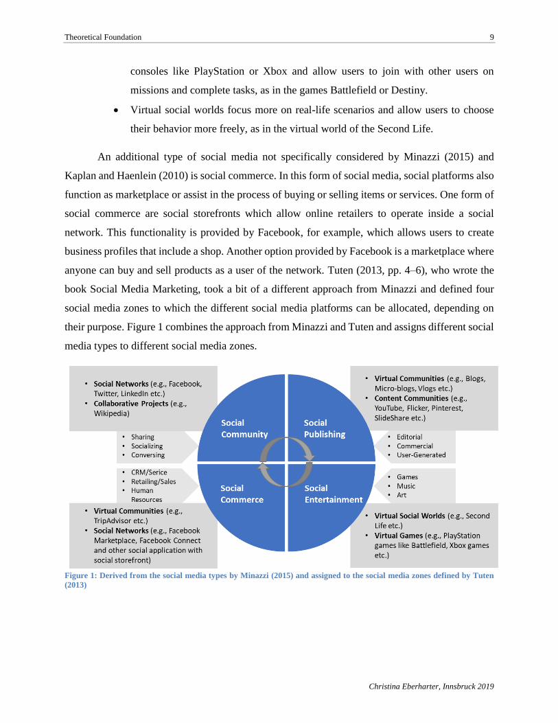
anyone can buy and sell products as a user of the network. Tuten (2013, pp. 4–6), who wrote the
book Social Media Marketing, took a bit of a different approach from Minazzi and defined four
social media zones to which the different social media platforms can be allocated, depending on
their purpose. Figure 1 combines the approach from Minazzi and Tuten and assigns different social
media types to different social media zones.
Figure 1: Derived from the social media types by Minazzi (2015) and assigned to the social media zones defined by Tuten
(2013)
Theoretical Foundation 10
Christina Eberharter, Innsbruck 2019
Social media marketing
Web 2.0 and all its forms of social media created a shift in market power and also changed
the consumer behavior of individuals. Market power shifted from producers toward the direction
of consumers. The main reasons for such a power transfer include that through the new functions
of Web 2.0, such as bi-directional communication between users, new created communities and
social networks, users are allowed to access more information and knowledge than before
(Constantinides & Fountain, 2008, p. 232). Furthermore, brand information is not only provided
through corporate Web sites or mass media, but information and experiences about products are
shared by the consumers themselves (Constantinides & Fountain, 2008, p. 239).
Prior to Web 2.0, market power was centralized on the producer side and only traditional
and tradigital marketing was applied. Organizations made use of the marketing mix to reach their
goals of creating, communicating and delivering offers that have value to customers. The marketing
mix consists of the 4Ps which stand for product, price, promotion and place (Tuten & Solomon,
2013, p. 14). Through the emergence of social media marketing, Tuten and Solomon (2013, p. 14)
state that a fifth P, which stands for participation, should be added to the marketing mix. The
authors argue that consumers’ daily lives are changed through social media and therefore marketers
also need to reshape how they are doing marketing. Using social media for business and marketing
purposes means to take part in it and, particularly if it is to create brand awareness, maintain
relationships with customers or promote new products (Tuten & Solomon, 2013, p. 14). Consumers
empowered through social media and social media marketing allows them to interact with brands
and collaborate with other users to create and share content about brands as well as receive
information from brands. The influence which communities create on social media leads Tuten and
Solomon (2013, p. 15) to their conclusion that the “purpose of a business is to create customers
who create other customers” and therefore the fifth marketing P represents participation.
Social media marketing gained a lot of attention in the last couple of years—it is not only
a cost-friendly way to reach out to consumers but also an efficient way of interacting with potential
future customers. Depending on the social media zone (see Figure 1) businesses can reach the
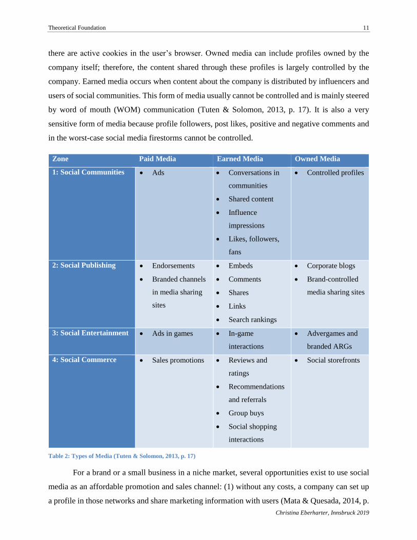
consumers through different methods. Table 2 from Tuten and Solomon (2013, p. 17) shows the
main three types of media (paid, earned and owned media) as well as the four social zones with
possible marketing activities. One example for paid media is advertising on social networks that
only appear for a targeted group of users whose profiles fulfill certain advertiser criteria or when
Theoretical Foundation 11
Christina Eberharter, Innsbruck 2019
there are active cookies in the user’s browser. Owned media can include profiles owned by the
company itself; therefore, the content shared through these profiles is largely controlled by the
company. Earned media occurs when content about the company is distributed by influencers and
users of social communities. This form of media usually cannot be controlled and is mainly steered
by word of mouth (WOM) communication (Tuten & Solomon, 2013, p. 17). It is also a very
sensitive form of media because profile followers, post likes, positive and negative comments and
in the worst-case social media firestorms cannot be controlled.
Zone Paid Media Earned Media Owned Media
1: Social Communities • Ads • Conversations in
communities
• Shared content
• Influence
impressions
• Likes, followers,
fans
• Controlled profiles
2: Social Publishing • Endorsements
• Branded channels
in media sharing
sites
• Embeds
• Comments
• Shares
• Links
• Search rankings
• Corporate blogs
• Brand-controlled
media sharing sites
3: Social Entertainment • Ads in games • In-game
interactions
• Advergames and
branded ARGs
4: Social Commerce • Sales promotions • Reviews and
ratings
• Recommendations
and referrals
• Group buys
• Social shopping
interactions
• Social storefronts
Table 2: Types of Media (Tuten & Solomon, 2013, p. 17)
For a brand or a small business in a niche market, several opportunities exist to use social
media as an affordable promotion and sales channel: (1) without any costs, a company can set up
a profile in those networks and share marketing information with users (Mata & Quesada, 2014, p.
Theoretical Foundation 12
Christina Eberharter, Innsbruck 2019
61); (2) some networks even offer business profiles with enhanced analytics for tracking profile
performance and the option to create vanity URLs, like https://www.facebook.com/nike; (3)
companies can use the network’s message service to send free messages to their connected users;
(4) targeted campaigns are another very popular service for brands and companies in which the
profile owner pays a fee to target specific groups of social network users based on gender,
education, geographic location and many more criteria (Mata & Quesada, 2014, p. 61); and (5)
viral marketing, another powerful online marketing tool, is frequently used by influencers as
revenue generators to use WOM where users recommend buying or using certain products to other
users (Mata & Quesada, 2014, p. 61).
Maintaining the social media presence of a brand or company takes a lot of time and effort.
It is no wonder that with the rise of social media and content marketing, new jobs are created, such
as social media manager, online marketing manager and even leadership roles like chief digital
marketing officer.
The next section provides an overview about what tools are available to manage social
media accounts more effectively.
2.1.2. Social media management software
Marketers rely more and more on content and social media marketing in order to reach
consumers. In 2017 social advertising totaled $22.2 billion revenue in the U.S. according to PwC
Advisory Service LLC (Silverman, 2018), representing 25.2% of total ad revenue generated
through Internet advertising. This number clearly shows that ever larger marketing budgets are
focusing on social media. According to Fraser Voigt (2017, p. 3), by 2022, 18.5% of the overall
marketing budget will be spend on social media. This growing attention on social media marketing
also requires investing in support tools.
Being a good marketer means to be a good storyteller. Compelling and innovative content
is required for creating brand awareness and generate leads. Since it can be challenging to create
and distribute engaging content, content marketing tools can streamline the process (Kennedy,
2016). The term content marketing tool is a broad concept encompassing different software that
supports marketers’ online and social media marketing efforts. One type is social media
management software (SMMS), which provides functionality in managing social network
Theoretical Foundation 13
Christina Eberharter, Innsbruck 2019
accounts. In his 2013 released buyers guide for SMMS, Alan Cook (2013, p. 2) from TrustRadius
Inc. defines social media management software as:
…a set of tools to manage or analyze interactions through multiple social media
accounts from a single dashboard. Most systems permit listening for brand
mentions, posting to multiple channels and running marketing campaigns. They
include analytics packages to measure the relative success of campaigns. Within
this broad definition, there are distinct use cases which emphasize different feature
sets...
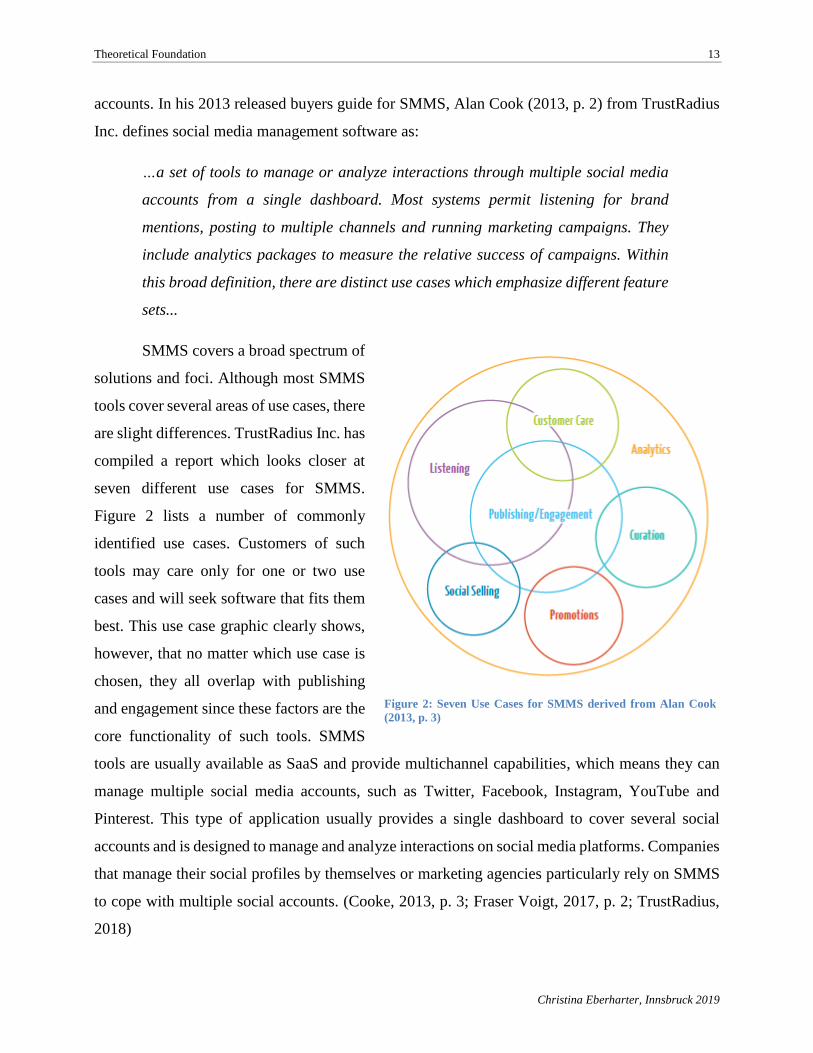
SMMS covers a broad spectrum of
solutions and foci. Although most SMMS
tools cover several areas of use cases, there
are slight differences. TrustRadius Inc. has
compiled a report which looks closer at
seven different use cases for SMMS.
Figure 2 lists a number of commonly
identified use cases. Customers of such
tools may care only for one or two use
cases and will seek software that fits them
best. This use case graphic clearly shows,
however, that no matter which use case is
chosen, they all overlap with publishing
and engagement since these factors are the
core functionality of such tools. SMMS
tools are usually available as SaaS and provide multichannel capabilities, which means they can
manage multiple social media accounts, such as Twitter, Facebook, Instagram, YouTube and
Pinterest. This type of application usually provides a single dashboard to cover several social
accounts and is designed to manage and analyze interactions on social media platforms. Companies
that manage their social profiles by themselves or marketing agencies particularly rely on SMMS
to cope with multiple social accounts. (Cooke, 2013, p. 3; Fraser Voigt, 2017, p. 2; TrustRadius,
2018)
Figure 2: Seven Use Cases for SMMS derived from Alan Cook
(2013, p. 3)
Theoretical Foundation 14
Christina Eberharter, Innsbruck 2019
The latest TrustRadius report (2018) on social media management tools stated that
companies often use more than one tool to manage their social media presence. The report also
clearly stated that SMMS products have different strengths, but that most tools have the following
features in common:
• Social listening (brand mentioning on social platforms)
• Scheduling and posting (multiple-channel coverage)
• Creating social marketing campaigns
• Answering inquiries
• Providing analytics to measure engagement
Depending on the SMMS use case, features will differ slightly. Social media marketing is
mostly about increasing brand awareness to increase lead conversion and revenue. Although the
main focus is on creating and posting content on social media, it is also concerned with posting
relevant content, listening and engaging with the audience, and creating brand loyalty. Therefore,
the following features and activities are to be consider relevant for SMMS (Finances Online, 2018;
TrustRadius, 2018):
Platform integration
Managing multiple social accounts from different platforms from a single dashboard is the
main requirement of a SMMS product.
Publishing
Maintaining social media accounts includes sharing content with the target audience and
followers. Companies leverage social media platforms in order to communicate with their
customers. These features are relevant for publishing content through SMMS:
• Scheduling posts for multiple social media accounts from one interface
• Viewing scheduled or upcoming posts in a calendar format
• Option for suggesting the best times to publish content
• Content libraries
Content suggestion engine (also known as content curation) for leveraging existing
social content (e.g., through an RSS reader)
Theoretical Foundation 15
Christina Eberharter, Innsbruck 2019
Community management
• Tracking posts and mentions
• Ability to respond to comments and questions
• Audience history of conversations
• Communication and collaboration feature inside the SMMS
Analytics
• Measuring of social media performance (e.g., likes, retweets/shares, comments,
views)
• Generating reports
The use cases social selling and promotion would require strong marketing capabilities,
such as campaign creation, user profiling or managing paid social media posts. For social listening,
other features are required for listening to social conversations through natural language processing
or keyword filtering to gain insights from the social communities, including sentiment analysis or
key word searchers, for example. Depending on the specific requirements and the applicable use
case, a particular SMMS can be selected from a wide variety of freemium, premium and enterprise
solutions. Beside the provided features of the social media management (SMM) tool, other criteria
also have a strong impact on buying decisions. According to the TrustRadius report (2018) on
SMMS, usability is a key factor. For users of SMMS it is important to have a user-friendly interface
and a good user experience. Other key SMMS buying decision factors include a mobile version or
app, capability for integrating with other systems (e.g., customer relationship management systems
also called CRM), and the impact of a potential acquisition by a larger SMMS or software vendor.
(Finances Online, 2018; TrustRadius, 2018)
SMM tools have several advantages. All existing social media accounts on different social
platforms can be managed from a single dashboard at anytime and anywhere. Posts can be planned
and scheduled ahead. Draft posts can be saved and later on approved by other collaborators.
Furthermore, SMMS provide overall aggregated analytics across social media platforms and
provides data that can be used for online marketing strategies. Sharing a single post across social
media platforms saves time and simultaneously allows a direct comparison of content success.
Another advantage is social listening that allows tracking a brand or key word mentioned on
platforms that provides insights on brand popularity and other positive and negative company
related conversations.
Theoretical Foundation 16
Christina Eberharter, Innsbruck 2019
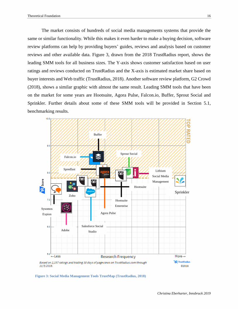
The market consists of hundreds of social media managements systems that provide the
same or similar functionality. While this makes it even harder to make a buying decision, software
review platforms can help by providing buyers’ guides, reviews and analysis based on customer
reviews and other available data. Figure 3, drawn from the 2018 TrustRadius report, shows the
leading SMM tools for all business sizes. The Y-axis shows customer satisfaction based on user
ratings and reviews conducted on TrustRadius and the X-axis is estimated market share based on
buyer interests and Web traffic (TrustRadius, 2018). Another software review platform, G2 Crowd
(2018), shows a similar graphic with almost the same result. Leading SMM tools that have been
on the market for some years are Hootsuite, Agora Pulse, Falcon.io, Buffer, Sprout Social and
Sprinkler. Further details about some of these SMM tools will be provided in Section 5.1,
benchmarking results.
Sprinkler
Hootsuite
Enterprise
Sprout Social
Lithium
Social Media
Management
Agora Pulse
Buffer
Falcon.io
Spredfast
Salesforce Social
Studio Adobe
Social
Zoho
Social
Sysomos
Expion
Hootsuite
Figure 3: Social Media Management Tools TrustMap (TrustRadius, 2018)
Theoretical Foundation 17
Christina Eberharter, Innsbruck 2019
2.2. The Role of Usability in Web Applications
The World Wide Web is a constant companion in daily life. The most office jobs require
working with Web applications. When using an ERP (enterprise resource planning) or CRM
(customer relationship management) system, there is no way around Web-based applications. In
today’s globalized world, it is only natural to have friends abroad. Social media platforms allow
users to stay in contact with friends even over large distances. Be it in private sector, public sector
or voluntary sector, the Web, short for World Wide Web, is part of almost every area. The main
reason for this phenomenon can be found in the Web’s characteristics—worldwide and permanent
availability as well as unified access to massive amount of information which can be produced by
anyone. (Kappel, Pröll, Reich, & Retschitzegger, 2006, p. 1)
The Web started out as a pure information medium without any software components and
consisted of static HTML pages that evolved over time into an application medium. Web
applications are sophisticated software systems and provide data intensive and interactive services.
These services are accessible through different devices and Web browsers, allowing user
transactions as well as data storage in a back-end database. (Kappel et al., 2006, p. 1) According
to the authors (Kappel et al., 2006) of the book, Web Engineering, the main difference between a
traditional software application and a Web-based application is how the Web is used
simultaneously as a user platform and a development platform. Kappel et al. (2006, p. 2) define a
Web application as “a software system based on technologies and standards of the World Wide
Web Consortium (W3C) that provides Web specific resources such as content and services through
a user interface, the Web browser”. Creating Web applications or apps running on mobile phones
and tablets is easier than ever before. As start-up e-business companies flood the market, of the
most important quality factors for Web applications are usability and a good user experience. A
study about trust and mistrust of health Web sites (Sillence, Briggs, Fishwick, & Harris, 2004, p.
666) showed that 94% of participants mistrusted Web sites when design features such as layout,
site complexity, navigation and colors are inappropriate or boring. Other study statistics on
usability and user experience produced similar results (Yousuf, 2017): for 48% of visitors the
number one credibility factor for a Web site is the design, while 38% of visitors would stop using
a site if the layout is unattractive. Therefore, gaining the trust of potential users requires having a
good design for the Web site or Web application.
Theoretical Foundation 18
Christina Eberharter, Innsbruck 2019
The following sub-sections provide an overview of usability and user experience and
explains the difference between the two terms and methods to test usability.
2.2.1. Usability, web usability & user experience
The competitive environment among Web applications doesn’t allow room for poor
usability since it is an important acceptance criterion for users. People really don’t notice usability
when using a Web application, but, when usability is absent, it leads to frustration and dislike. If
alternative solutions exist, as in the case of many Web applications such as SMM tools, they are
just a click away for the user. (Kappel et al., 2006, pp. 219–220)
Usability
Usability is a broad term originating in the 80s to replace the term user friendly. Previous
definitions were derived from the different views on usability (Bevan, 1991, p. 1). According to
Bevan (1991, p. 1) there were three views relating to measurable usability:
• Product-oriented view: measuring usability on the basis of ergonomic product
attributes
• User-oriented view: measuring usability on the basis of user attitude and mental
effort
• User performance view: measuring usability on the basis of the interaction of user
with the product when the focus can be distinguished between ease of use (easiness
of product use) and acceptability (acceptance of product in the market)
As the term usability is widely used in different research fields, there are many definitions.
In the field of Human-Computer Interaction (HCI) the most common definition is provided by the
International Organization for Standardization (ISO). The standard ISO 9241-11 for human-system
interaction (ISO, 2018) defines usability as “the extent to which a system, product or service can
be used by specified users to achieve specified goals with effectiveness, efficiency and satisfaction
in a specified context of use”. According to Fernandez, Insfran, and Abrahao (2011, p. 790) this
definition applies best to the perspective of human interaction, as it focuses on the interaction of
users with software products and the capability to meet customer expectations. Another widely-
accepted definition comes from the Software Engineering (SE) field. ISO 9126-1, the predecessor
of ISO 25000, provides the following definition (Fernandez et al., 2011, p. 790): “the capability of
the software product to be understood, learned, operated, attractive to the user, and compliant to
Theoretical Foundation 19
Christina Eberharter, Innsbruck 2019
standards/guidelines, when used under specific conditions”. This definition sees usability as an
attribute of the software product quality and doesn’t necessarily imply the interaction with users as
usability is a characteristic that just needs to conform to predefined specifications (Fernandez et
al., 2011, p. 790). As standards define usability in different ways, Bevan (Bevan, 1995, pp. 885–
886) defined two categories, the “top-down” approach which defines usability as a quality objective
with reference to ISO 9241-11 and the “bottom-up” approach which focuses on a product-oriented
view where usability is seen as an attribute of software quality with reference to standard ISO 9126.
For the purpose of this paper the usability definition from ISO 9241-11 applies throughout.
The concept of usability as a quality objective means to evaluate usability in terms of user
satisfaction and performance as well as to design usability to enable users to achieve specific goals.
The main types of usability measures, based on ISO 9241-11 are effectiveness, efficiency and
satisfaction. Effectiveness is measured by the degree to which intended goals of use are achieved
by the user’s performance. Efficiency looks at resources required to achieve the goal; such
resources can be mental efforts, time or money. Satisfaction examines the degree of product
acceptability by the user. (Bevan, 1995, p. 886)
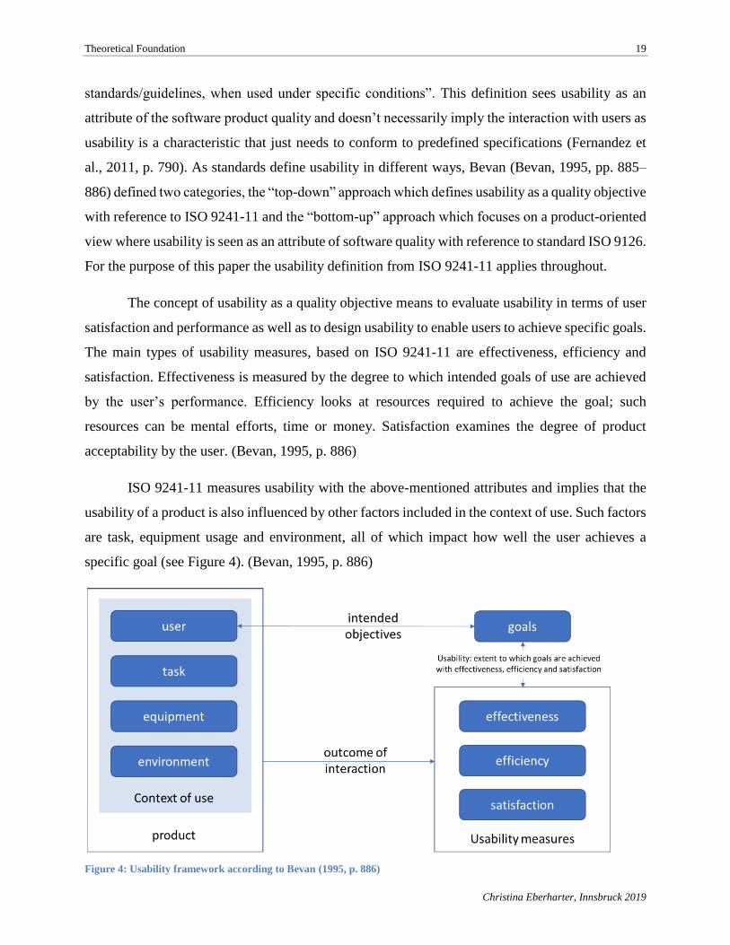
ISO 9241-11 measures usability with the above-mentioned attributes and implies that the
usability of a product is also influenced by other factors included in the context of use. Such factors
are task, equipment usage and environment, all of which impact how well the user achieves a
specific goal (see Figure 4). (Bevan, 1995, p. 886)
Figure 4: Usability framework according to Bevan (1995, p. 886)
Theoretical Foundation 20
Christina Eberharter, Innsbruck 2019
Web usability
Web applications are widely used to provide access to specific services or information. One
application area includes social media platforms and SMM tools. Users only reuse such
applications if the information provided was found useful, easy to access and the navigation and
layout was well designed. Such described factors reflect the user’s acceptance of the Web
application and reflects the usability of the application. A traditional SE approach following the
top-down method (e.g., waterfall model), doesn’t explicitly address usability. Although testing was
conducted at the end of the development lifecycle process, these were mainly checks conducted to
see if high-level requirements were fulfilled. In order to achieve a usable Web application, a
different approach gained popularity, the so-called bottom-up method—an iterative design that is
part of the whole development lifecycle and verifies usability throughout the design phase and the
end-product by applying evaluation methods at every stage of the process. To ensure the
effectiveness of a design decision, iterative design allows evaluation of application prototypes,
design modification, inclusion of new requirements and detection of misassumptions throughout
the software lifecycle by repeatedly applying design, evaluation and redesign processes to the
existing cycle. (Matera, Rizzo, & Toffetti Carughi, 2006, p. 144)
In Web engineering, usability is seen as a quality factor. Usability describes the product
quality from a user standpoint and provides answers to occurring problems between people and
technology interaction (Matera et al., 2006, p. 146). Web usability as it is also called in web
engineering recognizes the usability definition provided by ISO 9241-11, but also states that the
usability definition provided by Nielsen (1994) is commonly used. Nielsen (1994, p. 26) states,
that usability must be “systematically approached, improved and evaluated” in order to have
measurable criteria which support the goal to move toward “an engineering discipline where
usability is not just argued about”. Matera et al. listed Nielsen’s (Matera et al., 2006, p. 146)
usability attributes as follows:
• Learnability: the ease of learning the functionality and behavior of the system.
• Efficiency: the level of attainable productivity once the user has learned the system.
• Memorability: the ease of remembering the system functionality so that the casual user can
return to the system after a period of non-use without needing to learn again how to use it.
Theoretical Foundation 21
Christina Eberharter, Innsbruck 2019
• Few errors: the capability of the system to feature a low error rate to support users making
few errors during the use of the system and, in case they make errors, to help them recover
easily.
• Users’ satisfaction: the measure in which the user finds the system pleasant to use.
(Matera et al., 2006, p. 146)
Nielsen (1994, p. 27) further explains that usability can be measured through user tests
conducted either in the field by real users or by test users performing predefined tasks. A further
explanation about usability evaluation methods follows in section 2.2.2.
User experience
User experience and usability are two terms that, while often interchangeable and
misinterpreted, are also closed interlinked. According to Jacobsen and Meyer (2017, p. 33), it is
the aim of usability to make applications like Web sites or apps as easy as possible to use. This
includes an intuitive and user-friendly design that allows the user to reach his goal. The objective
of user experience is much broader than the one of usability. The user should leave the application
as happy and satisfied as possible and ideally will return to use the application again. Furthermore,
the user should not only show an emotional responsiveness during application usage but also before
and after using the application. (Jacobsen & Meyer, 2017, p. 33)
ISO 9241 Part 210 for human-centered design of interactive systems (ISO, 2010) defines
user experience as a “person’s perceptions and responses resulting from the use and/or anticipated
use of a product, system or service”. The end goal of user experience goes beyond effectiveness,
efficiency and satisfaction of usability as it includes many different kinds of user responses before,
during, and after the application use, including emotions, perception, preferences, beliefs, and
physical and psychological responses as well as accomplishments (ISO, 2010).
Before the usage of a product, expectations such as brand image are already influencing the
users. A positive brand image also influences the user experience. The actual interaction with the
product or application are important aspects which influence the experience, such as easy usage,
good design and accomplishments without encountering problems. Figure 5 shows how user
experience includes all aspects before, during and after usage, whereas usability is more
concentrated on the actual use with a special focus on the user interface. Additional partial aspects
included in the user experience encompass:
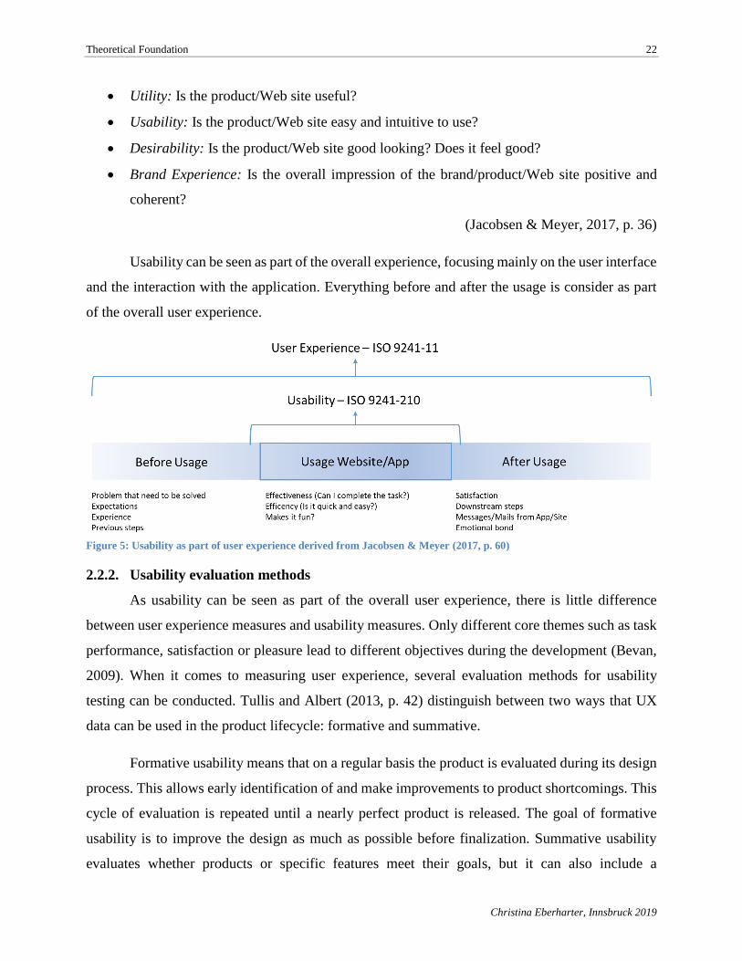
Theoretical Foundation 22
Christina Eberharter, Innsbruck 2019
• Utility: Is the product/Web site useful?
• Usability: Is the product/Web site easy and intuitive to use?
• Desirability: Is the product/Web site good looking? Does it feel good?
• Brand Experience: Is the overall impression of the brand/product/Web site positive and
coherent?
(Jacobsen & Meyer, 2017, p. 36)
Usability can be seen as part of the overall experience, focusing mainly on the user interface
and the interaction with the application. Everything before and after the usage is consider as part
of the overall user experience.
Figure 5: Usability as part of user experience derived from Jacobsen & Meyer (2017, p. 60)
2.2.2. Usability evaluation methods
As usability can be seen as part of the overall user experience, there is little difference
between user experience measures and usability measures. Only different core themes such as task
performance, satisfaction or pleasure lead to different objectives during the development (Bevan,
2009). When it comes to measuring user experience, several evaluation methods for usability
testing can be conducted. Tullis and Albert (2013, p. 42) distinguish between two ways that UX
data can be used in the product lifecycle: formative and summative.
Formative usability means that on a regular basis the product is evaluated during its design
process. This allows early identification of and make improvements to product shortcomings. This
cycle of evaluation is repeated until a nearly perfect product is released. The goal of formative
usability is to improve the design as much as possible before finalization. Summative usability
evaluates whether products or specific features meet their goals, but it can also include a
Theoretical Foundation 23
Christina Eberharter, Innsbruck 2019
comparison of products. The main focus of the summative method is an evaluation against a series
of criteria. (Tullis & Albert, 2013, pp. 42–43)
Planning a usability study also implies choosing the right metrics based on the goal of the
study, available equipment to gather data, budget and time. Although many metrics exist, there
exists no exact pre-set metrics that can be applied. Based on a situation and usability study, metrics
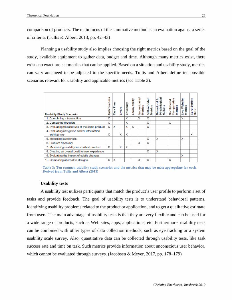
can vary and need to be adjusted to the specific needs. Tullis and Albert define ten possible
scenarios relevant for usability and applicable metrics (see Table 3).
Usability tests
A usability test utilizes participants that match the product’s user profile to perform a set of
tasks and provide feedback. The goal of usability tests is to understand behavioral patterns,
identifying usability problems related to the product or application, and to get a qualitative estimate
from users. The main advantage of usability tests is that they are very flexible and can be used for
a wide range of products, such as Web sites, apps, applications, etc. Furthermore, usability tests
can be combined with other types of data collection methods, such as eye tracking or a system
usability scale survey. Also, quantitative data can be collected through usability tests, like task
success rate and time on task. Such metrics provide information about unconscious user behavior,
which cannot be evaluated through surveys. (Jacobsen & Meyer, 2017, pp. 178–179)
Table 3: Ten common usability study scenarios and the metrics that may be most appropriate for each.
Derived from Tullis and Albert (2013)
Theoretical Foundation 24
Christina Eberharter, Innsbruck 2019
According to Tullis and Albert (2013, p. 52), collecting UX metrics is not limited to a
specific method of usability testing and it is possible to collect metrics with almost every method.
What is important is that the selected evaluation method defines the estimate number of participants
and the type of metrics which can be measured. Jacobsen and Meyer referred to Sarodnick and
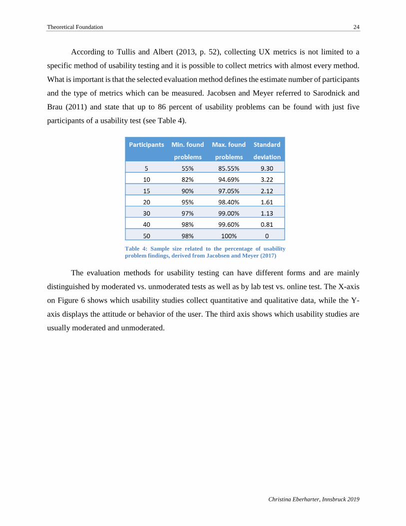
Brau (2011) and state that up to 86 percent of usability problems can be found with just five
participants of a usability test (see Table 4).
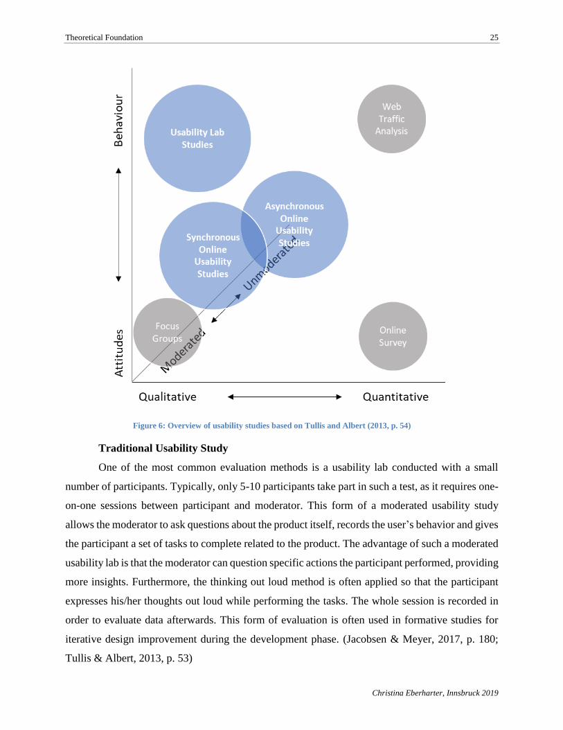
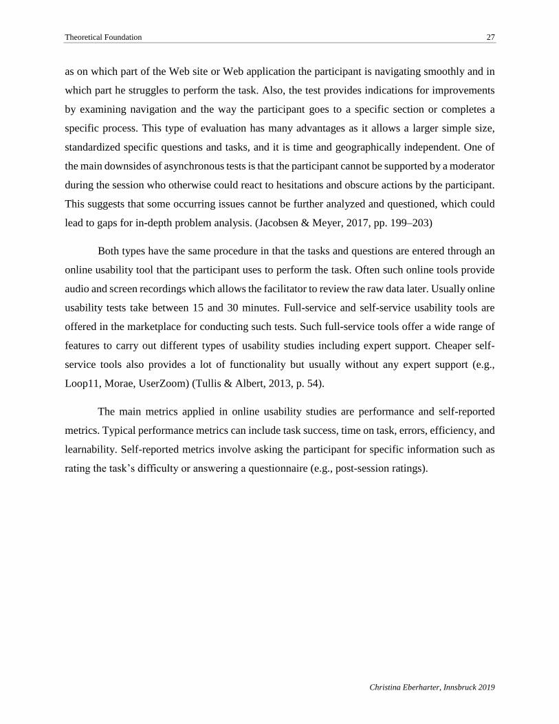
The evaluation methods for usability testing can have different forms and are mainly
distinguished by moderated vs. unmoderated tests as well as by lab test vs. online test. The X-axis
on Figure 6 shows which usability studies collect quantitative and qualitative data, while the Y-
axis displays the attitude or behavior of the user. The third axis shows which usability studies are
usually moderated and unmoderated.
Table 4: Sample size related to the percentage of usability
problem findings, derived from Jacobsen and Meyer (2017)
Theoretical Foundation 25
Christina Eberharter, Innsbruck 2019
Traditional Usability Study
One of the most common evaluation methods is a usability lab conducted with a small
number of participants. Typically, only 5-10 participants take part in such a test, as it requires one-
on-one sessions between participant and moderator. This form of a moderated usability study
allows the moderator to ask questions about the product itself, records the user’s behavior and gives
the participant a set of tasks to complete related to the product. The advantage of such a moderated
usability lab is that the moderator can question specific actions the participant performed, providing
more insights. Furthermore, the thinking out loud method is often applied so that the participant
expresses his/her thoughts out loud while performing the tasks. The whole session is recorded in
order to evaluate data afterwards. This form of evaluation is often used in formative studies for
iterative design improvement during the development phase. (Jacobsen & Meyer, 2017, p. 180;
Tullis & Albert, 2013, p. 53)
Figure 6: Overview of usability studies based on Tullis and Albert (2013, p. 54)
Theoretical Foundation 26
Christina Eberharter, Innsbruck 2019
The main metrics collected focus on issues, their frequency, severity and type. Other
metrics that are also tracked include performance metrics, such as success rate, task success, error
rates, time on task, or efficiency.
Often focus groups are believed to use the same evaluation method as a usability lab, which
is completely wrong. The only thing both methods have in common is the participants. When focus
groups are used for software or Web application development, a potential new product is described
or a wireframe is presented. Participants can then react to it and provide their feedback and thoughts
about it. In a usability lab the participants actually interact with the product. (Tullis & Albert, 2013,
p. 53)
Online Usability Study
Another very popular form is the online usability study which allows testing with a bigger
participant group than with the traditional usability lab. The moderator, or in this case facilitator,
and the participants are spatially divided. Since online usability tools are used to perform the test,
participants can attend a study easily from home or their work place. Such an online study allows
the collection of a large amount of usability data in a short period of time and provides a wider
geographical participant distribution. Two types of online usability tests exist: synchronous
usability tests, which are almost the same as the traditional usability lab, and asynchronous usability
tests. (Jacobsen & Meyer, 2017, p. 199; Tullis & Albert, 2013, p. 54)
Synchronous usability tests are moderated and the participant and the moderator are
connected through an online screen-sharing and meeting tool. The moderator is able to follow the
participant’s screen activities and can support the participant through the test phase. Although this
type of method allows asking additional questions and identifying directly potential improvements
and issues by talking with the participants, it requires also more organizational effort and time and
demands good technical equipment for the moderator and participant. (Jacobsen & Meyer, 2017,
p. 201)
Asynchronous usability tests are unmoderated and participants complete the test by
themselves without the guidance or support of a moderator and interacts only with the online
usability tool. As test times are not limited to the workweek and can be conducted on the evening
as well as on weekends, the test can be performed anywhere and at any time, providing more
flexibility to the researcher. Asynchronous usability tests are suitable for answering such questions
Theoretical Foundation 27
Christina Eberharter, Innsbruck 2019
as on which part of the Web site or Web application the participant is navigating smoothly and in
which part he struggles to perform the task. Also, the test provides indications for improvements
by examining navigation and the way the participant goes to a specific section or completes a
specific process. This type of evaluation has many advantages as it allows a larger simple size,
standardized specific questions and tasks, and it is time and geographically independent. One of
the main downsides of asynchronous tests is that the participant cannot be supported by a moderator
during the session who otherwise could react to hesitations and obscure actions by the participant.
This suggests that some occurring issues cannot be further analyzed and questioned, which could
lead to gaps for in-depth problem analysis. (Jacobsen & Meyer, 2017, pp. 199–203)
Both types have the same procedure in that the tasks and questions are entered through an
online usability tool that the participant uses to perform the task. Often such online tools provide
audio and screen recordings which allows the facilitator to review the raw data later. Usually online
usability tests take between 15 and 30 minutes. Full-service and self-service usability tools are
offered in the marketplace for conducting such tests. Such full-service tools offer a wide range of
features to carry out different types of usability studies including expert support. Cheaper self-
service tools also provides a lot of functionality but usually without any expert support (e.g.,
Loop11, Morae, UserZoom) (Tullis & Albert, 2013, p. 54).
The main metrics applied in online usability studies are performance and self-reported
metrics. Typical performance metrics can include task success, time on task, errors, efficiency, and
learnability. Self-reported metrics involve asking the participant for specific information such as
rating the task’s difficulty or answering a questionnaire (e.g., post-session ratings).
Use Case 28
Christina Eberharter, Innsbruck 2019
3. Use Case
A Tyrolian based start-up providing an SMM solution builds the fundament of this work.
The main purpose of this master thesis will be to evaluate the usefulness of usability tests based on
a conducted usability lab on the Onlim user interface. The results will be compared with a new user
interface solution to discover if all usability problems are solved through the new user interface
created by user experience specialists without more extensive user experience testing with users.
Onlim was founded in 2015 as a spin-off by former University of Innsbruck students and
professors. Currently the company consists of 17 employees, including the heads of the company
and three advisors with backgrounds in teaching proficiency on universities, computer science and
business growth (“Onlim GmbH,” 2018). The company currently has office in Austria and operates
mainly in the DACH (Germany [D], Austria [A], Switzerland [CH]) region.
The company provides a solution for managing social media profiles. As this market is
already well served with Software as a Service (SaaS) applications from competitors, the company
started out by targeting the Austrian Tourism sector and made use of semantically-enabled online
communication in their application (Fensel, Toma, García, Stavrakantonakis, & Fensel, 2014, p.
901). The innovative tool set based on semantics, learning algorithms, and rules is the foundation
of Onlim and therefore provides an easy-to-use platform for creating, managing and distributing
content to several social media channels such as Facebook, Twitter and LinkedIn. An additional
new feature is the chatbot which operates on the same platform. The Onlim team creates
customized chatbots for customers which can be integrated into corporate Web sites and Web-
based applications. Figure 7 provides a comprehensive overview of the three available customer
package offerings.
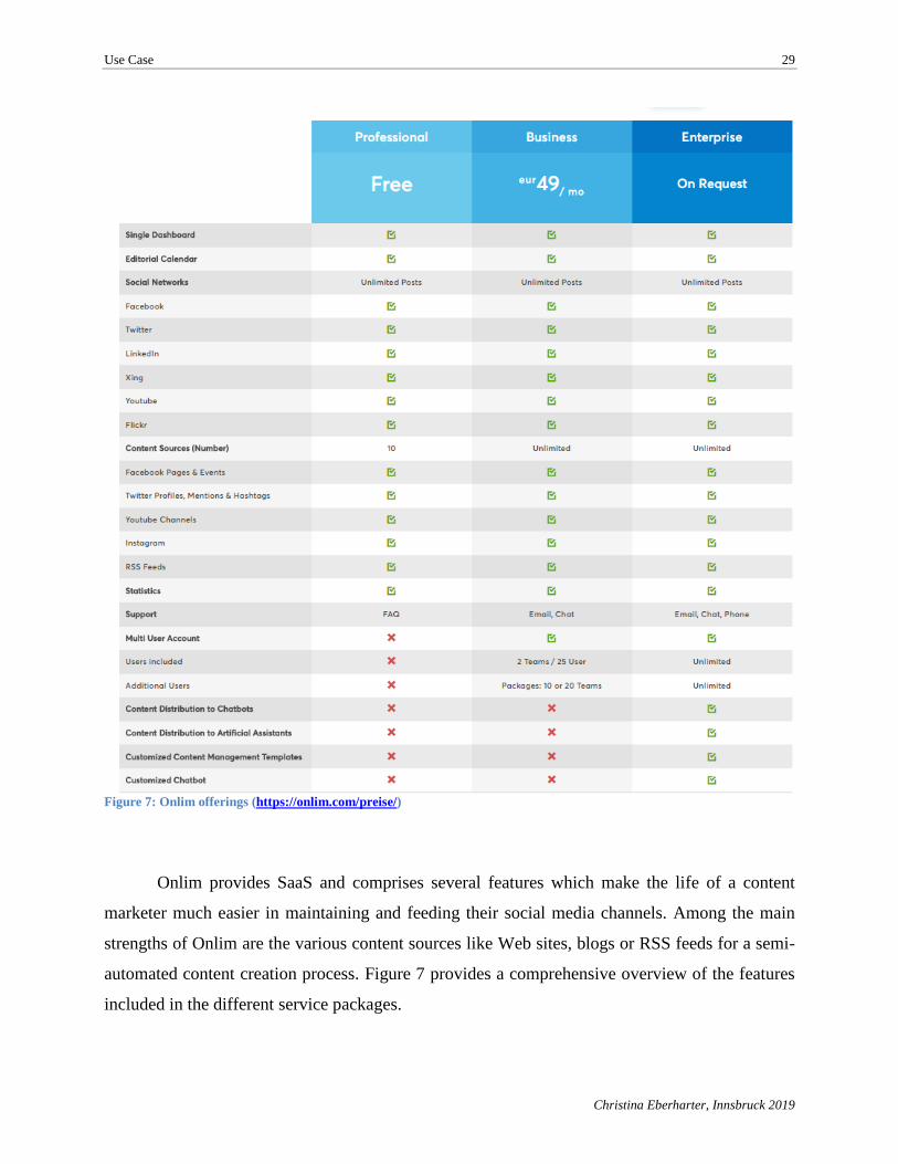
Use Case 29
Christina Eberharter, Innsbruck 2019
Figure 7: Onlim offerings (https://onlim.com/preise/)
Onlim provides SaaS and comprises several features which make the life of a content
marketer much easier in maintaining and feeding their social media channels. Among the main
strengths of Onlim are the various content sources like Web sites, blogs or RSS feeds for a semi-
automated content creation process. Figure 7 provides a comprehensive overview of the features
included in the different service packages.
Use Case 30
Christina Eberharter, Innsbruck 2019
Below is a short description to the available functions:
• Dashboard: Overview of feedback on each of the social media channels, latest
comments, most popular posts, scheduling overview and latest news feed.
• New Post: Create new posts for one or several social media channels.
• Calendar: Provides an overview of past and scheduled posts. Drafts, prepared posts or
articles on the news feed are available in a sub-section of the calendar.
• News Feed: RSS feeds and Facebook pages that provide articles for re-posting.
• Statistics: Overview of analytical metrics of the social media channels. This includes
an overview about the posts and the average feedback (e.g., comments, views).
• Channels: Add and removal of connected social media channels/accounts.
• Chatbot LiveChat: Customized chatbot service for Web sites (available only for
enterprise users).
• Chatbot Content: Managing and creation of content for connected chatbots.
• Tutorials: Redirection to Onlim Tutorials on YouTube.
Of all the functionalities, the most relevant functions for creating content and managing
social media channels were selected for testing the user experience: (1) post creation, (2) calendar,
(3) drafts, and (4) news feed. These features are explained and illustrated in more detail below to
facilitate a deeper understanding of each of the functions.
1) Creating posts
Onlim allows creating a post for several social media channels simultaneously. Rules
are in place for creating posts depending on restrictions of the respective social media
channel (e.g., number of characters for a Twitter post or adding a video to the post when
the selected channel is YouTube).
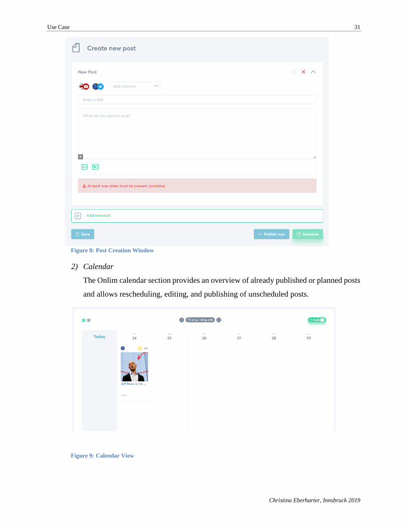
Use Case 31
Christina Eberharter, Innsbruck 2019
Figure 8: Post Creation Window
2) Calendar
The Onlim calendar section provides an overview of already published or planned posts
and allows rescheduling, editing, and publishing of unscheduled posts.
Figure 9: Calendar View
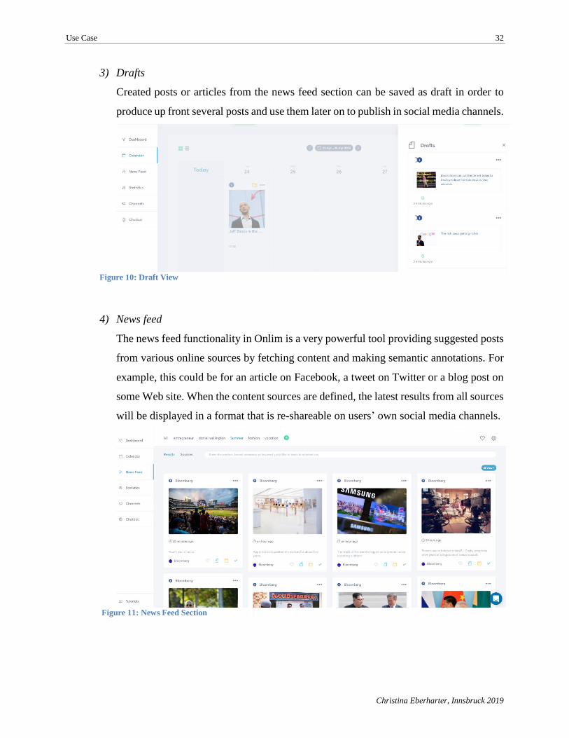
Use Case 32
Christina Eberharter, Innsbruck 2019
3) Drafts
Created posts or articles from the news feed section can be saved as draft in order to
produce up front several posts and use them later on to publish in social media channels.
Figure 10: Draft View
4) News feed
The news feed functionality in Onlim is a very powerful tool providing suggested posts
from various online sources by fetching content and making semantic annotations. For
example, this could be for an article on Facebook, a tweet on Twitter or a blog post on
some Web site. When the content sources are defined, the latest results from all sources
will be displayed in a format that is re-shareable on users’ own social media channels.
Figure 11: News Feed Section
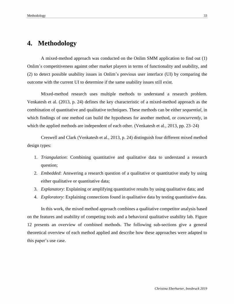
Methodology 33
Christina Eberharter, Innsbruck 2019
4. Methodology
A mixed-method approach was conducted on the Onlim SMM application to find out (1)
Onlim’s competitiveness against other market players in terms of functionality and usability, and
(2) to detect possible usability issues in Onlim’s previous user interface (UI) by comparing the
outcome with the current UI to determine if the same usability issues still exist.
Mixed-method research uses multiple methods to understand a research problem.
Venkatesh et al. (2013, p. 24) defines the key characteristic of a mixed-method approach as the
combination of quantitative and qualitative techniques. These methods can be either sequential, in
which findings of one method can build the hypotheses for another method, or concurrently, in
which the applied methods are independent of each other. (Venkatesh et al., 2013, pp. 23–24)
Creswell and Clark (Venkatesh et al., 2013, p. 24) distinguish four different mixed method
design types:
1. Triangulation: Combining quantitative and qualitative data to understand a research
question;
2. Embedded: Answering a research question of a qualitative or quantitative study by using
either qualitative or quantitative data;
3. Explanatory: Explaining or amplifying quantitative results by using qualitative data; and
4. Exploratory: Explaining connections found in qualitative data by testing quantitative data.
In this work, the mixed method approach combines a qualitative competitor analysis based
on the features and usability of competing tools and a behavioral qualitative usability lab. Figure
12 presents an overview of combined methods. The following sub-sections give a general
theoretical overview of each method applied and describe how these approaches were adapted to
this paper’s use case.
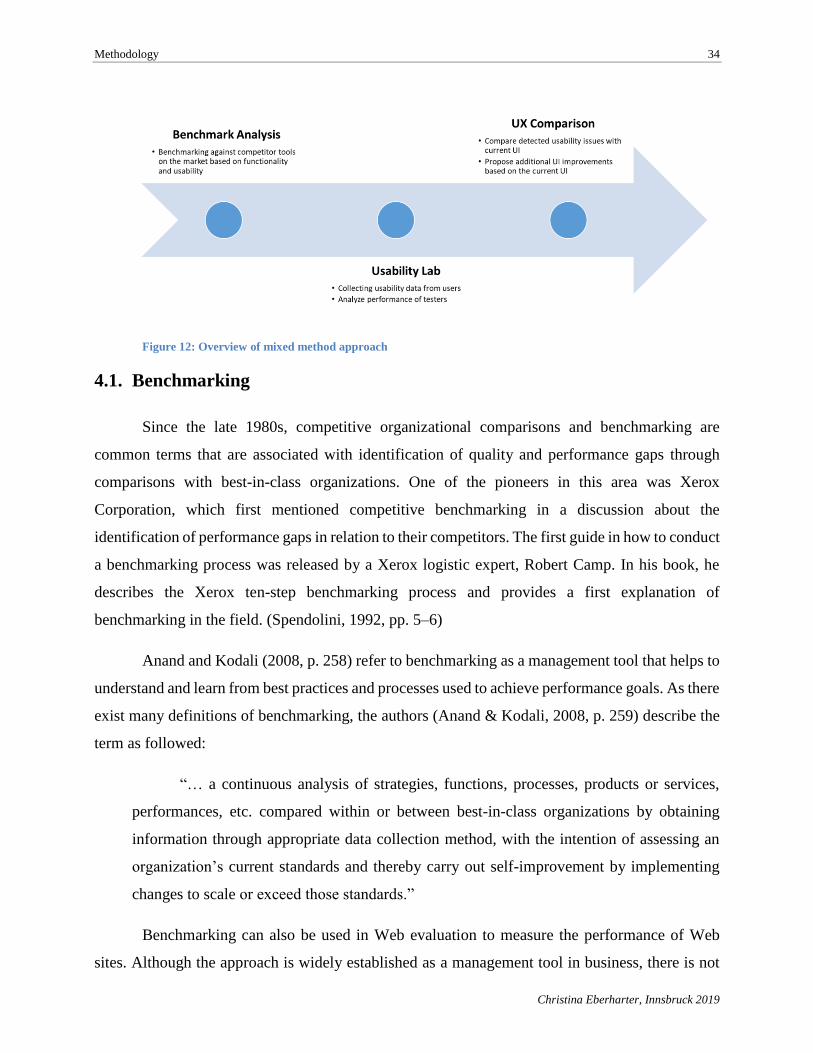
Methodology 34
Christina Eberharter, Innsbruck 2019
Figure 12: Overview of mixed method approach
4.1. Benchmarking
Since the late 1980s, competitive organizational comparisons and benchmarking are
common terms that are associated with identification of quality and performance gaps through
comparisons with best-in-class organizations. One of the pioneers in this area was Xerox
Corporation, which first mentioned competitive benchmarking in a discussion about the
identification of performance gaps in relation to their competitors. The first guide in how to conduct
a benchmarking process was released by a Xerox logistic expert, Robert Camp. In his book, he
describes the Xerox ten-step benchmarking process and provides a first explanation of
benchmarking in the field. (Spendolini, 1992, pp. 5–6)
Anand and Kodali (2008, p. 258) refer to benchmarking as a management tool that helps to
understand and learn from best practices and processes used to achieve performance goals. As there
exist many definitions of benchmarking, the authors (Anand & Kodali, 2008, p. 259) describe the
term as followed:
“… a continuous analysis of strategies, functions, processes, products or services,
performances, etc. compared within or between best-in-class organizations by obtaining
information through appropriate data collection method, with the intention of assessing an
organization’s current standards and thereby carry out self-improvement by implementing
changes to scale or exceed those standards.”
Benchmarking can also be used in Web evaluation to measure the performance of Web
sites. Although the approach is widely established as a management tool in business, there is not
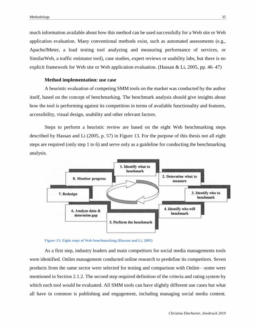
Methodology 35
Christina Eberharter, Innsbruck 2019
much information available about how this method can be used successfully for a Web site or Web
application evaluation. Many conventional methods exist, such as automated assessments (e.g.,
ApacheJMeter, a load testing tool analyzing and measuring performance of services, or
SimilarWeb, a traffic estimator tool), case studies, expert reviews or usability labs, but there is no
explicit framework for Web site or Web application evaluation. (Hassan & Li, 2005, pp. 46–47)
Method implementation: use case
A heuristic evaluation of competing SMM tools on the market was conducted by the author
itself, based on the concept of benchmarking. The benchmark analysis should give insights about
how the tool is performing against its competition in terms of available functionality and features,
accessibility, visual design, usability and other relevant factors.
Steps to perform a heuristic review are based on the eight Web benchmarking steps
described by Hassan and Li (2005, p. 57) in Figure 13. For the purpose of this thesis not all eight
steps are required (only step 1 to 6) and serve only as a guideline for conducting the benchmarking
analysis.
Figure 13: Eight steps of Web benchmarking (Hassan and Li, 2005)
As a first step, industry leaders and main competitors for social media managements tools
were identified. Onlim management conducted online research to predefine its competitors. Seven
products from the same sector were selected for testing and comparison with Onlim—some were
mentioned in Section 2.1.2. The second step required definition of the criteria and rating system by
which each tool would be evaluated. All SMM tools can have slightly different use cases but what
all have in common is publishing and engagement, including managing social media content.
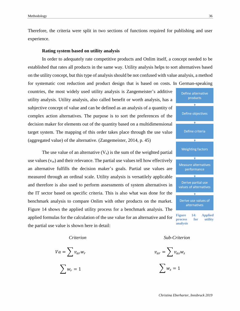
Methodology 36
Christina Eberharter, Innsbruck 2019
Therefore, the criteria were split in two sections of functions required for publishing and user
experience.
Rating system based on utility analysis
In order to adequately rate competitive products and Onlim itself, a concept needed to be
established that rates all products in the same way. Utility analysis helps to sort alternatives based
on the utility concept, but this type of analysis should be not confused with value analysis, a method
for systematic cost reduction and product design that is based on costs. In German-speaking
countries, the most widely used utility analysis is Zangemeister’s additive
utility analysis. Utility analysis, also called benefit or worth analysis, has a
subjective concept of value and can be defined as an analysis of a quantity of
complex action alternatives. The purpose is to sort the preferences of the
decision maker for elements out of the quantity based on a multidimensional
target system. The mapping of this order takes place through the use value
(aggregated value) of the alternative. (Zangemeister, 2014, p. 45)
The use value of an alternative (Va) is the sum of the weighted partial
use values (var) and their relevance. The partial use values tell how effectively
an alternative fulfills the decision maker’s goals. Partial use values are
measured through an ordinal scale. Utility analysis is versatilely applicable
and therefore is also used to perform assessments of system alternatives in
the IT sector based on specific criteria. This is also what was done for the
benchmark analysis to compare Onlim with other products on the market.
Figure 14 shows the applied utility process for a benchmark analysis. The
applied formulas for the calculation of the use value for an alternative and for
the partial use value is shown here in detail:
Criterion
𝑉𝑎 =∑𝑣𝑎𝑟𝑤𝑟
∑𝑤𝑟 = 1
Sub-Criterion
𝑣𝑎𝑟 =∑𝑣𝑎𝑠𝑤𝑠
∑𝑤𝑠 = 1
Figure 14: Applied
process for utility
analysis
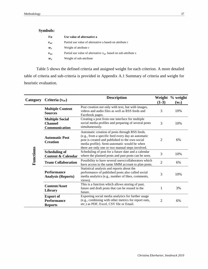
Methodology 37
Christina Eberharter, Innsbruck 2019
Symbols:
Table 5 shows the defined criteria and assigned weight for each criterion. A more detailed
table of criteria and sub-criteria is provided in Appendix A.1 Summary of criteria and weight for
heuristic evaluation.
Category Criteria (var) Description Weight
(1-3)
% weight
(wr)
Fu
nct
ion
s
Multiple Content
Sources
Post creation not only with text, but with images,
videos and audio files as well as RSS feeds and
Facebook pages. 3 10%
Multiple Social
Channel
Communication
Creating a post from one interface for multiple
social media profiles and preparing of several posts
simultaneously. 3 10%
Automatic Post
Creation
Automatic creation of posts through RSS feeds.
(e.g., from a specific feed every day an automatic
post is created and published to the own social
media profile). Semi-automatic would be when
there are only one or two manual steps involved.
2 6%
Scheduling of
Content & Calendar
Scheduling of post for a future date and a calendar
where the planned posts and past posts can be seen. 3 10%
Team Collaboration Possibility to have several users/collaborators which
have access to the same SMM account to plan posts. 2 6%
Performance
Analysis (Reports)
Statistical analysis and reports about the
performance of published posts also called social
media analytics (e.g., number of likes, comments,
views).
3 10%
Content/Asset
Library
This is a function which allows storing of past,
future and draft posts that can be reused in the
future. 1 3%
Export of
Performance
Reports
Exporting social media analytics for further usage
(e.g., combining with other metrics for report outs,
etc.) as PDF, Excel, CSV file or Email. 2 6%
𝑽𝒂 Use value of alternative a
𝒗𝒂𝒓 Partial use value of alternative a based-on attribute r
𝒘𝒓 Weight of attribute r
𝒗𝒂𝒔 Partial use value of alternative 𝑣𝑎𝑟 based on sub-attribute s
𝒘𝒔 Weight of sub-attribute
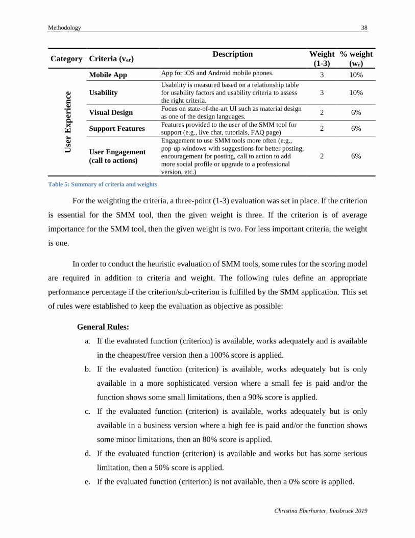
Methodology 38
Christina Eberharter, Innsbruck 2019
Category Criteria (var) Description Weight
(1-3)
% weight
(wr) U
ser
Ex
peri
ence
Mobile App App for iOS and Android mobile phones. 3 10%
Usability Usability is measured based on a relationship table
for usability factors and usability criteria to assess
the right criteria. 3 10%
Visual Design Focus on state-of-the-art UI such as material design
as one of the design languages. 2 6%
Support Features Features provided to the user of the SMM tool for
support (e.g., live chat, tutorials, FAQ page) 2 6%
User Engagement
(call to actions)
Engagement to use SMM tools more often (e.g.,
pop-up windows with suggestions for better posting,
encouragement for posting, call to action to add
more social profile or upgrade to a professional
version, etc.)
2 6%
Table 5: Summary of criteria and weights
For the weighting the criteria, a three-point (1-3) evaluation was set in place. If the criterion
is essential for the SMM tool, then the given weight is three. If the criterion is of average
importance for the SMM tool, then the given weight is two. For less important criteria, the weight
is one.
In order to conduct the heuristic evaluation of SMM tools, some rules for the scoring model
are required in addition to criteria and weight. The following rules define an appropriate
performance percentage if the criterion/sub-criterion is fulfilled by the SMM application. This set
of rules were established to keep the evaluation as objective as possible:
General Rules:
a. If the evaluated function (criterion) is available, works adequately and is available
in the cheapest/free version then a 100% score is applied.
b. If the evaluated function (criterion) is available, works adequately but is only
available in a more sophisticated version where a small fee is paid and/or the
function shows some small limitations, then a 90% score is applied.
c. If the evaluated function (criterion) is available, works adequately but is only
available in a business version where a high fee is paid and/or the function shows
some minor limitations, then an 80% score is applied.
d. If the evaluated function (criterion) is available and works but has some serious
limitation, then a 50% score is applied.
e. If the evaluated function (criterion) is not available, then a 0% score is applied.
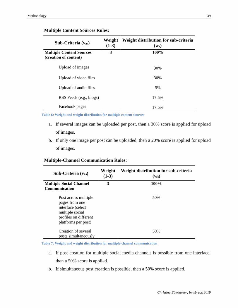
Methodology 39
Christina Eberharter, Innsbruck 2019
Multiple Content Sources Rules:
Sub-Criteria (vas) Weight
(1-3)
Weight distribution for sub-criteria
(ws)
Multiple Content Sources
(creation of content)
3 100%
Upload of images 30%
Upload of video files 30%
Upload of audio files 5%
RSS Feeds (e.g., blogs)
17.5%
Facebook pages 17.5%
Table 6: Weight and weight distribution for multiple content sources
a. If several images can be uploaded per post, then a 30% score is applied for upload
of images.
b. If only one image per post can be uploaded, then a 20% score is applied for upload
of images.
Multiple-Channel Communication Rules:
Sub-Criteria (vas) Weight
(1-3)
Weight distribution for sub-criteria
(ws)
Multiple Social Channel
Communication
3 100%
Post across multiple
pages from one
interface (select
multiple social
profiles on different
platforms per post)
50%
Creation of several
posts simultaneously
50%
Table 7: Weight and weight distribution for multiple-channel communication
a. If post creation for multiple social media channels is possible from one interface,
then a 50% score is applied.
b. If simultaneous post creation is possible, then a 50% score is applied.
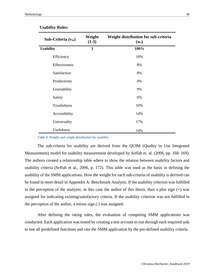
Methodology 40
Christina Eberharter, Innsbruck 2019
Usability Rules:
Sub-Criteria (vas) Weight
(1-3)
Weight distribution for sub-criteria
(ws)
Usability 3 100%
Efficiency
10%
Effectiveness
8%
Satisfaction
8%
Productivity
4%
Learnability
9%
Safety
6%
Trustfulness
10%
Accessibility
14%
Universality
17%
Usefulness 14%
Table 8: Weight and weight distribution for usability
The sub-criteria for usability are derived from the QUIM (Quality in Use Integrated
Measurement) model for usability measurement developed by Seffah et. al. (2006, pp. 168–169).
The authors created a relationship table where to show the relation between usability factors and
usability criteria (Seffah et al., 2006, p. 172). This table was used as the basis in defining the
usability of the SMM applications. How the weight for each sub-criteria of usability is derived can
be found in more detail in Appendix A: Benchmark Analysis. If the usability criterion was fulfilled
in the perception of the analyzer, in this case the author of this thesis, then a plus sign (+) was
assigned for indicating existing/satisfactory criteria. If the usability criterion was not fulfilled in
the perception of the author, a minus sign (-) was assigned.
After defining the rating rules, the evaluation of competing SMM applications was
conducted. Each application was tested by creating a test account to run through each required task
to test all predefined functions and rate the SMM application by the pre-defined usability criteria.
Methodology 41
Christina Eberharter, Innsbruck 2019
4.2. Usability Lab
Usability tests are seen as one of the most effective method to detect potential obstacles and
problems for users when interacting with the application. It is recommended to start usability tests
as early as possible during the product development life cycle since detecting usability problems
at an early stage of development will save time and money. (Jacobsen & Meyer, 2017, pp. 177–
178) Two types of usability data collection can be distinguished for tests, formative usability and
summative usability. The formative usability study is conducted periodically during the design
process with the goal of implementing design improvements before product release. A summative
usability study is conducted after the product is released with the objective of evaluating specific
functionalities to see if the product meets the expectations. A summative study can answer
questions about meeting the project’s usability goal, the overall usability of the product or where
improvements made from one product are applied to another product release. (Tullis & Albert,
2013, pp. 42–43) As the evaluation methods are explained in more detail in Section 2.2.2, the
following subsection describes the procedure of the usability lab based on the use case.
Method implementation: use case
The lab test is a qualitative user test conducted with the support of an online usability tool
that allows background or screener questions, tasks and follow-up questions to be set up. The
usability lab is based on the usability study scenarios of Tullis and Albert (2013, p. 45), a more
precise combination of “completing a transaction”, “evaluating navigation and/or information
architecture” and “problem discovery” scenarios. Completing transactions and navigation
evaluation make use of task success and efficiency metrics. Tasks are defined through a clear
beginning and end, and are measured for task success, failures and efficiency. Problem discovery
is often used for already existing products in order to identify significant usability issues.
Participants of the study use the live product and their own account while performing tasks.
According to Tullis and Albert (Tullis & Albert, 2013, p. 50), issue-based metrics are the most
appropriate for problem discovery such as navigation issues or misleading terminology. (Tullis &
Albert, 2013, pp. 45–50)
Participants go through a predefined script of tasks and questions. In order to understand
the participants thoughts as they interact with the tool, the concurrent thinking-aloud technique was
applied (Jacobsen & Meyer, 2017, p. 182), and the participants were asked to think out loud and
Methodology 42
Christina Eberharter, Innsbruck 2019
give comments during performing the tasks. During the entire session, audio and screen activities
were recorded. At the end of the session, participants answered four questions about the tested
application, Onlim. The goal of the usability lab was to identify design improvements for an
increased user satisfaction and ease of use before comparing it to the latest UI design of Onlim.
The following functions/sections were examined:
• Registration and connecting of social media accounts
• Help function/demo: page guide for new post section
• Use of suggested RSS feeds and Facebook pages
• Use of calendar and draft function
• Creation and scheduling of posts
As support tool for the evaluation of the usability lab, a Web tool for recording the user
interaction was used in order to capture participants’ screen movements and oral comments. The
usability testing platform used for the lab was Try My UI (www.trymyui.com), selected because
of a limited budget; other tools, such as Morae from TechSmith (www.techsmith.com/morae),
would have exceeded the study’s budget.
Planning a usability lab also requires determining what to measure to get an accurate,
overall picture of the user experience. It is crucial to look on performance as well as on satisfaction
metrics. Performance focuses on the user’s interaction with the product, whereas satisfaction deals
with the user’s thoughts and words about his product interaction. Most of the time, performance
and satisfaction go hand-in-hand, although, according to Tullis and Albert, performance and
satisfaction does not always correlate (Tullis & Albert, pp. 44). The following metrics selected to
be measured in the usability study were based on Tullis and Albert’s (2013, pp. 63–158)
performance and satisfaction metrics:
• Time on task
Task time, also called task completion time, is a performance metric that measures the time
elapsed between the start of a task and the end of a task.
Methodology 43
Christina Eberharter, Innsbruck 2019
• Task success
This is one of the most common performance metrics and can be applied to almost every
product. Instead of using the simple type of binary success (0 = failure, 1= success), the
level of success was measured by a three-point scoring method for each task:
1 = No problem. The user was able to complete the task successfully without any
problems.
2 = Some problems. The user didn't fulfill every part of the task, but reached the overall
goal; or the user succeeded in completing the task but did not take the direct way in
completing the task by taking a detour.
3 = Failure/Quit. The user thought the task was completed but it wasn't; the user gave
up or moved on to the next task; or the user ran out of time due to the usability support
tool’s maximum recording length of 30 minutes.
• Task completion perceived by user
Task completion is the same as task success, and in the case of this usability lab, the users
themselves were able to rate if they completed a task successfully or not. By answering
“yes” or “no” to the question regarding completion of the task, the answers capture the
users’ perceptions.
• Single Ease Question (SEQ)
This is one of self-reported post-task rating metrics which ask the user after each task to
rate how difficult or easy the task was using a seven-point scale (1 = very difficult to 7 =
very easy).
• Open-ended questions
Including open-ended questions in a usability study is very commonly used. Instead of only
providing a general field for comments, four relatively open questions were asked.
Although it is more difficult to analyze and summarize responses from such questions, they
can be very important and helpful for identifying needed product improvements (Tullis &
Albert, 2013, p. 158). The following four standard questions provided by the online
usability support tool were used in the Onlim usability lab:
o What was the worst thing about your experience?
Methodology 44
Christina Eberharter, Innsbruck 2019
o What other aspects of the experience could be improved?
o What did you like about the Web site?
o What other comments do you have for the owner of the Web site?
For analyzing the participants feedback, the MAXQDA software for qualitative and mixed
methods research (www.maxqda.com) was used in order to summarize and segment the verbatim
comments. The code system for segmenting the answers to open-ended questions is derived from
the answers itself. Furthermore, the codes are based on the tested functionalities of Onlim and the
tasks performed through the usability lab (e.g., post, scheduling, draft, calendar, account creation,
registration, etc.). In addition to the codes based on the functionalities, further codes were defined
based on answers related to potential improvements and satisfaction as well as codes for related
text segments to the usability lab support tool (for recording the session) and organizational
problems. The detailed code book can be found in the Appendix B.6 Open-Ended Questions - Code
system.
After defining performance and satisfaction metrics for the usability study, the tasks were
further defined based on the main functionality and Onlim’s user goals. Table 9 lists the defined
tasks which were performed by all participants. In addition to the tasks, each participant was asked
to answer four open-ended questions, listed above, after completing the usability lab.
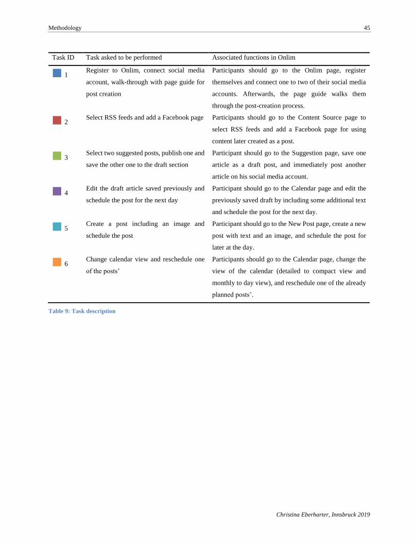
Methodology 45
Christina Eberharter, Innsbruck 2019
Table 9: Task description
Task ID Task asked to be performed Associated functions in Onlim
■ 1 Register to Onlim, connect social media
account, walk-through with page guide for
post creation
Participants should go to the Onlim page, register
themselves and connect one to two of their social media
accounts. Afterwards, the page guide walks them
through the post-creation process.
■ 2 Select RSS feeds and add a Facebook page Participants should go to the Content Source page to
select RSS feeds and add a Facebook page for using
content later created as a post.
■ 3 Select two suggested posts, publish one and
save the other one to the draft section
Participant should go to the Suggestion page, save one
article as a draft post, and immediately post another
article on his social media account.
■ 4 Edit the draft article saved previously and
schedule the post for the next day
Participant should go to the Calendar page and edit the
previously saved draft by including some additional text
and schedule the post for the next day.
■ 5 Create a post including an image and
schedule the post
Participant should go to the New Post page, create a new
post with text and an image, and schedule the post for
later at the day.
■ 6 Change calendar view and reschedule one
of the posts’
Participants should go to the Calendar page, change the
view of the calendar (detailed to compact view and
monthly to day view), and reschedule one of the already
planned posts’.
Results 46
Christina Eberharter, Innsbruck 2019
5. Results
Chapter 3 provided an overview of Onlim’s SMM application and Chapter 4 described the
methods used in this study. Chapter 5 will examine the results of both applied approaches and
provide insights for answering the research and working questions. Section 5.1, Benchmarking,
outlines the results of the benchmark analysis and provides insights about how successfully Onlim
is competing against others. Section 5.2 will than look at the results of the conducted usability lab
in order to find potential obstacles and user problems when using Onlim. The findings are then
summarized in chapter 5.3.
5.1. Benchmarking
In order to answer the working question—how Onlim ranks against its competition in terms
of functionalities and usability—a benchmark analysis was conducted to get better insights on
competitors and the SMM landscape. A detailed description of the applied benchmark method and
the rating system based on utility analysis was discussed in section 4.1. Onlim was tested against
seven other SMM tools for the main use case of publishing to social media platforms. The selected
applications from competitors mostly include industry leaders such as Hootsuite or Sprout Social
that were mentioned in Section 2.1.2. This will allow the identification of the strength of specific
features but also Onlim’s potential shortcomings. The following applications were tested:
• Onlim
• Buffer
• Hootsuite
• Sprout Social
• MavSocial
• Agora Pulse
• Sendible
• Socioboard
All applications were tested based on defined criteria and evaluation rules described in
section 4.1. In order to compare the applications by each criterion, all applications were tested by
the author of this thesis through test accounts. However, since the tests were conducted over a year
ago, the applications might have developed further and may have removed certain shortcomings.
Total scores for the benchmark analysis results can be seen in Figure 15, which illustrates the
reached performance and resulting weighted scores per criteria and application. The exact numbers
in the analysis can be viewed in Appendix A.3 Benchmark analysis: Final results. The results
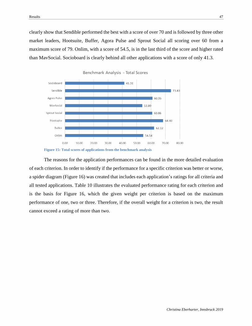
Results 47
Christina Eberharter, Innsbruck 2019
clearly show that Sendible performed the best with a score of over 70 and is followed by three other
market leaders, Hootsuite, Buffer, Agora Pulse and Sprout Social all scoring over 60 from a
maximum score of 79. Onlim, with a score of 54.5, is in the last third of the score and higher rated
than MavSocial. Socioboard is clearly behind all other applications with a score of only 41.3.
Figure 15: Total scores of applications from the benchmark analysis
The reasons for the application performances can be found in the more detailed evaluation
of each criterion. In order to identify if the performance for a specific criterion was better or worse,
a spider diagram (Figure 16) was created that includes each application’s ratings for all criteria and
all tested applications. Table 10 illustrates the evaluated performance rating for each criterion and
is the basis for Figure 16, which the given weight per criterion is based on the maximum
performance of one, two or three. Therefore, if the overall weight for a criterion is two, the result
cannot exceed a rating of more than two.
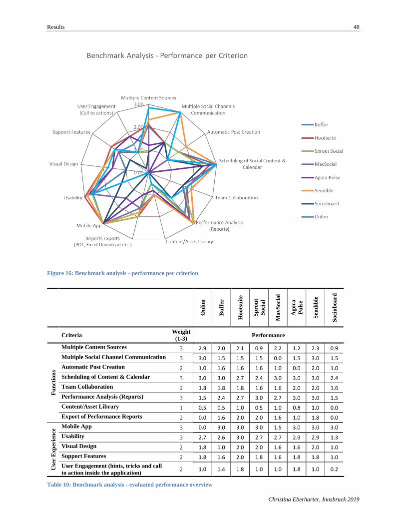
Results 48
Christina Eberharter, Innsbruck 2019
Figure 16: Benchmark analysis - performance per criterion
On
lim
Bu
ffer
Ho
ots
uit
e
Sp
rou
t
So
cia
l
Ma
vS
oci
al
Ag
ora
Pu
lse
Sen
dib
le
So
cio
bo
ard
Criteria
Weight
(1-3) Performance
Fu
nct
ion
s
Multiple Content Sources 3 2.9 2.0 2.1 0.9 2.2 1.2 2.3 0.9
Multiple Social Channel Communication 3 3.0 1.5 1.5 1.5 0.0 1.5 3.0 1.5
Automatic Post Creation 2 1.0 1.6 1.6 1.6 1.0 0.0 2.0 1.0
Scheduling of Content & Calendar 3 3.0 3.0 2.7 2.4 3.0 3.0 3.0 2.4
Team Collaboration 2 1.8 1.8 1.8 1.6 1.6 2.0 2.0 1.6
Performance Analysis (Reports) 3 1.5 2.4 2.7 3.0 2.7 3.0 3.0 1.5
Content/Asset Library 1 0.5 0.5 1.0 0.5 1.0 0.8 1.0 0.0
Export of Performance Reports 2 0.0 1.6 2.0 2.0 1.6 1.0 1.8 0.0
Use
r E
xp
erie
nce
Mobile App 3 0.0 3.0 3.0 3.0 1.5 3.0 3.0 3.0
Usability 3 2.7 2.6 3.0 2.7 2.7 2.9 2.9 1.3
Visual Design 2 1.8 1.0 2.0 2.0 1.6 1.6 2.0 1.0
Support Features 2 1.8 1.6 2.0 1.8 1.6 1.8 1.8 1.0
User Engagement (hints, tricks and call
to action inside the application) 2 1.0 1.4 1.8 1.0 1.0 1.8 1.0 0.2
Table 10: Benchmark analysis - evaluated performance overview
Results 49
Christina Eberharter, Innsbruck 2019
Figure 16 shows the evaluation outcome where it clearly can be seen that Onlim’s main
strength is located in its multiple content sources feature that provides the ability to create posts
and add different kind of files such as images and video as well as use RSS feeds or content from
Facebook pages. The only missing file support Onlim has is audio but since it is very uncommon
for social media networks to use audio files, it is weighted with a very low percentage. Also,
Sendible and MavSocial are very good in providing multiple content sources. Sendible allows to
upload images and videos in different file types (e.g., MOV, MP4 etc.). Furthermore, it is possible
to use RSS feeds for post creation (also called content creation). Two Sendible shortcomings
include a missing option to access content from Facebook pages and the audio file option. While
the former also applies for MavSocial, use of audio files for content creation is possible.
Another area where Onlim showed its strength was in the multiple social channel
communication, which means publishing the post to multiple social media networks from one
interface and create several posts simultaneously. Only Onlim and Sendible offer both features to
users. Other applications, such as Buffer, Hootsuite, Sprout Social, Agora Pulse and Socioboard,
provide only the option to select several different social profiles for a post but do not allow
simultaneous creation of multiple posts. MavSocial allows its users to select only one social media
network per post.
Automatic post creation, also known as a content suggestion engine, leverages existing
social content through an RSS reader and other social content readers accessing content from
specific Facebook pages or related to specific Twitter hashtags. It uses existing social content and
automatically posts the content to a social profile without any manual steps. This feature is best
implemented in Sendible where it is possible to use RSS feeds both for manual post creation and
for auto-creation of posts where only the feed, social profile, publishing time and update frequency
need to be set. Sendible even offers an inclusion and exclusion filter for specific text or words
which should be considered when using existing social content pulled through the RSS reader.
Buffer, Hootsuite and Sprout Social allow auto-creation of posts with some limitations on filtering
incoming social content by interest, channel or specific text. Onlim allows users to create semi-
automated posts, and provides news feed functionality and usage of social content from several
different incoming channels. It is even possible in Onlim to define news feed categories by interest
areas and filter content sources by hashtags and mentions. However, the user still needs to manually
select a suggested content (e.g., blog post, article, etc.) from the news feed and publish it.
Results 50
Christina Eberharter, Innsbruck 2019
Socioboard only provides a very basic automation function with major limitations restricting its
use for publishing social content since there is no filter or selection option available or an option
for predefining publishing times or frequency. Agora Pulse was the only application which didn’t
offer this functionality at all.
Scheduling of content and calendar functionality are two other important features required
for properly maintaining social media profiles through one SMM tool. This is completely fulfilled
by five SMM tools, including Onlim. Several competitor tools had a calendar sub-section under
the top-level menu item “Publishing”. Sprout Social shows only future posts in the calendar,
whereas most of the other applications provide both a past and future view of historically published
posts and scheduled future posts. Hootsuite provided some nice features for scheduling social
content in which a user can choose between a 12-hour clock showing a.m. and p.m. or a 24-hour
clock. Furthermore, Hootsuite provides the option to auto-schedule the post for an optimal impact,
by defining when to publish the post based on analysis of the highest impact for posts on a particular
social media platform. MavSocial provided the option to choose a specific time zone in addition to
a clock-type option. Such a feature would be relevant for international companies who target
different customer segments spread over several time zones.
Team collaboration is another feature that should be provided by a SMM tool. All tested
SMM applications provided such a feature, although this function is not available in freemium
versions; therefore, the feature was only evaluated if it was available in both freemium and
premium versions. Only Agora Pulse and Sendible offered the team collaboration feature in the
free version.
Performance analysis is a critical feature for measuring social media performances on all
social platforms as well as exporting those analytics for further use. Therefore, it is essential to
show the social media performance data in a satisfactory and easy way. Sprout Social, Agora Pulse
and Sendible provide customized options to the user, such as reports per social profile, Google
Analytics integration or custom layouts for reports. Onlim lacked customizing and filter options. It
also offered very limited social media metrics, such as posts over time or average views per post.
To use the performance data, at least a CSV or PDF export function should be offered. Six of the
application have such an option, but Onlim doesn’t currently provide any export option.
Results 51
Christina Eberharter, Innsbruck 2019
Content libraries allow the storing of existing social assets, images or videos. MavSocial
has the most sophisticated content library and provides a digital library with 100 gigabytes for
images, videos and existing social content. Hootsuite and Sendible provide a section where past
scheduled posts and draft posts are stored. Such a sophisticated library is not available in Onlim,
and, although draft posts are saved in the draft section, there is no option to filter the results by
social profile or topic. Past-scheduled posts can be found directly in the calendar.
As explained in Section 2.2.1, user experience is a broad term and not only comprises
usability but also utility, desirability and brand experience. In order to get an impression of the user
experience with the tested applications, the below five criteria were defined:
Mobile App: This is essential for managing and preparing posts while on the go.
Usability: In order to measure usability, usability factors and related usability
criteria are examined to make usability quantifiable and as objective
as possible even though the evaluation is of a subjective nature.
Visual Design: The focus is on UI design, such as modern design, like material
design, consistency of color, font size, menu structure and brand
incorporation.
Support Features: This includes helpful information for the user, such as a live chat, a
walk-through with a page guide, video tutorials or a FAQ page.
User Engagement: Engaging the user to use the application more could include a pop-
up window with hints for better creating posts, advice on the best
publishing time, a call to action when the application recognizes no
posts had been published in a long time for a particular social profile
(another engagement can be a call to action (CTA) to upgrade to a
higher version of the application).
Mobile version and usability in the user experience category were weighted with three
points, while visual design, support features and user engagement were weighted with two points.
Overall, Hootsuite was rated with the best user experience because of its exceptional UI design and
use of material design. Also, Hootsuite scored high thanks to an impressive helpdesk page and
inclusion of several page guides. Furthermore, the application provides an ever-present CTA for
upgrading to the pro version and a CTA to add more social profiles. Agora Pulse Also scored high
Results 52
Christina Eberharter, Innsbruck 2019
with a total weighted score of 28.1 for all five criteria for user experience. Beside a modern and
consistent design, menu structure and incorporated brand, Agora Pulse provided strong support
features such as an FAQ page, video tutorials and a contact button. User engagement was also
represented very well by Agora Pulse’s CTA for adding additional social profiles and invitations
on the daily calendar for scheduling a post.
Utility as part of user experience and examines whether the product is useful. Therefore, in
addition to strong features, to make the product even more useful it is necessary to provide mobility
functionality. All competitor applications are available as mobile version. Unfortunately, this is a
major shortcoming of Onlim not providing a mobile app version, in addition to the missing export
function for performance reports. However, Onlim scored a weighted score of 8.2 out of 9.0 for
usability and is just under the top four best benchmark analysis regarding usability. Also, the visual
design of Onlim is highly rated and shows consistency in colors and brand incorporation. In terms
of support options, Onlim also kept up with the competition by providing a live chat, video tutorials
and page guides. Areas that could be improved included user engagement either through CTAs to
add more social profiles or by offering invitations or messaging about scheduling a post. Overall,
Onlim’s user experience scores quite highly, according the benchmark analysis. But because of a
missing mobile app version of Onlim, the summed score for all five criteria in the user experience
category remains in the bottom half.
Results 53
Christina Eberharter, Innsbruck 2019
5.2. Usability Lab
Section 4.2 described how the usability lab method was applied on Onlim a SMM tool use
case. Three small usability labs were conducted in Innsbruck, Vienna and Dublin. In addition to
the real-life usability study, an online usability study also was performed through crowdsourcing.
In total, 20 out of 27 participants could be used for the analysis. Seven participants were excluded
due to incomplete data sets. Eleven participants were from the online tester community of the
usability testing platform and nine participants performed the real-life usability lab. Fifteen (75%)
participants were male and five (25%) were female, all ranging from 18 to 54 years old. All
participants were located in North America or Europe, had a college or university degree, and were
daily social media users. The maximum length of the usability test was set at 30 minutes, as this
was the maximum per-session recording time offered by the support tool, try my UI, for individual
sessions. Therefore, the six tasks for the usability test, described in Section 4.2 (Table 9), were
defined in a way that an average experienced Web user could manage all tasks within 30 minutes.
5.2.1. Usability lab results based on metrics
The following usability lab results are based on the predefined metrics. Related tables for
each of the metrics can be found in Appendix B: Usability Lab and sub-sections.
Time on task
Time on task measures the time spent per task for each task the participants completed. The
support tool to record the sessions included a time-stamp feature which allows easy capture of the
time per task for each user. Figure 17 shows the mean time per task with a 95% confidence interval.
The confidence interval is used for all graphs that show the mean data of all participants. It
is displayed as an error bar and a 95% or 90% confidence interval shows the variability of the data.
(Tullis & Albert, 2013, p. 33)
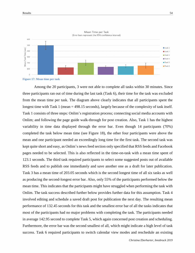
Results 54
Christina Eberharter, Innsbruck 2019
Figure 17: Mean time per task
Among the 20 participants, 3 were not able to complete all tasks within 30 minutes. Since
three participants ran out of time during the last task (Task 6), their time for the task was excluded
from the mean time per task. The diagram above clearly indicates that all participants spent the
longest time with Task 1 (mean = 498.15 seconds), largely because of the complexity of task itself.
Task 1 consists of three steps: Onlim’s registration process; connecting social media accounts with
Onlim; and following the page guide walk-through for post creation. Also, Task 1 has the highest
variability in time data displayed through the error bar. Even though 14 participants (70%)
completed the task below mean time (see Figure 18), the other four participants were above the
mean and one participant needed an exceedingly long time for the first task. The second task was
kept quite short and easy, as Onlim’s news feed section only specified that RSS feeds and Facebook
pages needed to be selected. This is also reflected in the time-on-task with a mean time spent of
123.1 seconds. The third task required participants to select some suggested posts out of available
RSS feeds and to publish one immediately and save another one as a draft for later publication.
Task 3 has a mean time of 203.05 seconds which is the second longest time of all six tasks as well
as producing the second-longest error bar. Also, only 55% of the participants performed below the
mean time. This indicates that the participants might have struggled when performing the task with
Onlim. The task success described further below provides further data for this assumption. Task 4
involved editing and schedule a saved draft post for publication the next day. The resulting mean
performance of 132.45 seconds for this task and the smallest error bar of all the tasks indicates that
most of the participants had no major problems with completing the task. The participants needed
in average 142.95 second to complete Task 5, which again concerned post creation and scheduling.
Furthermore, the error bar was the second smallest of all, which might indicate a high level of task
success. Task 6 required participants to switch calendar view modes and reschedule an existing
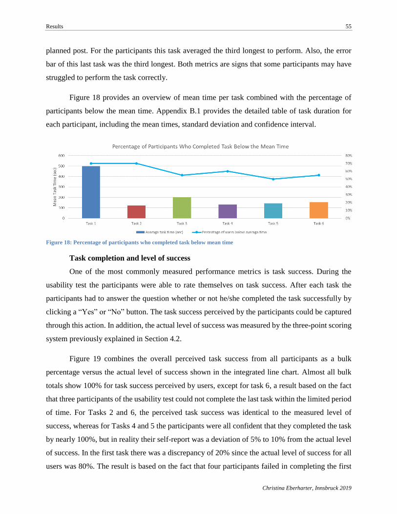
Results 55
Christina Eberharter, Innsbruck 2019
planned post. For the participants this task averaged the third longest to perform. Also, the error
bar of this last task was the third longest. Both metrics are signs that some participants may have
struggled to perform the task correctly.
Figure 18 provides an overview of mean time per task combined with the percentage of
participants below the mean time. Appendix B.1 provides the detailed table of task duration for
each participant, including the mean times, standard deviation and confidence interval.
Figure 18: Percentage of participants who completed task below mean time
Task completion and level of success
One of the most commonly measured performance metrics is task success. During the
usability test the participants were able to rate themselves on task success. After each task the
participants had to answer the question whether or not he/she completed the task successfully by
clicking a “Yes” or “No” button. The task success perceived by the participants could be captured
through this action. In addition, the actual level of success was measured by the three-point scoring
system previously explained in Section 4.2.
Figure 19 combines the overall perceived task success from all participants as a bulk
percentage versus the actual level of success shown in the integrated line chart. Almost all bulk
totals show 100% for task success perceived by users, except for task 6, a result based on the fact
that three participants of the usability test could not complete the last task within the limited period
of time. For Tasks 2 and 6, the perceived task success was identical to the measured level of
success, whereas for Tasks 4 and 5 the participants were all confident that they completed the task
by nearly 100%, but in reality their self-report was a deviation of 5% to 10% from the actual level
of success. In the first task there was a discrepancy of 20% since the actual level of success for all
users was 80%. The result is based on the fact that four participants failed in completing the first
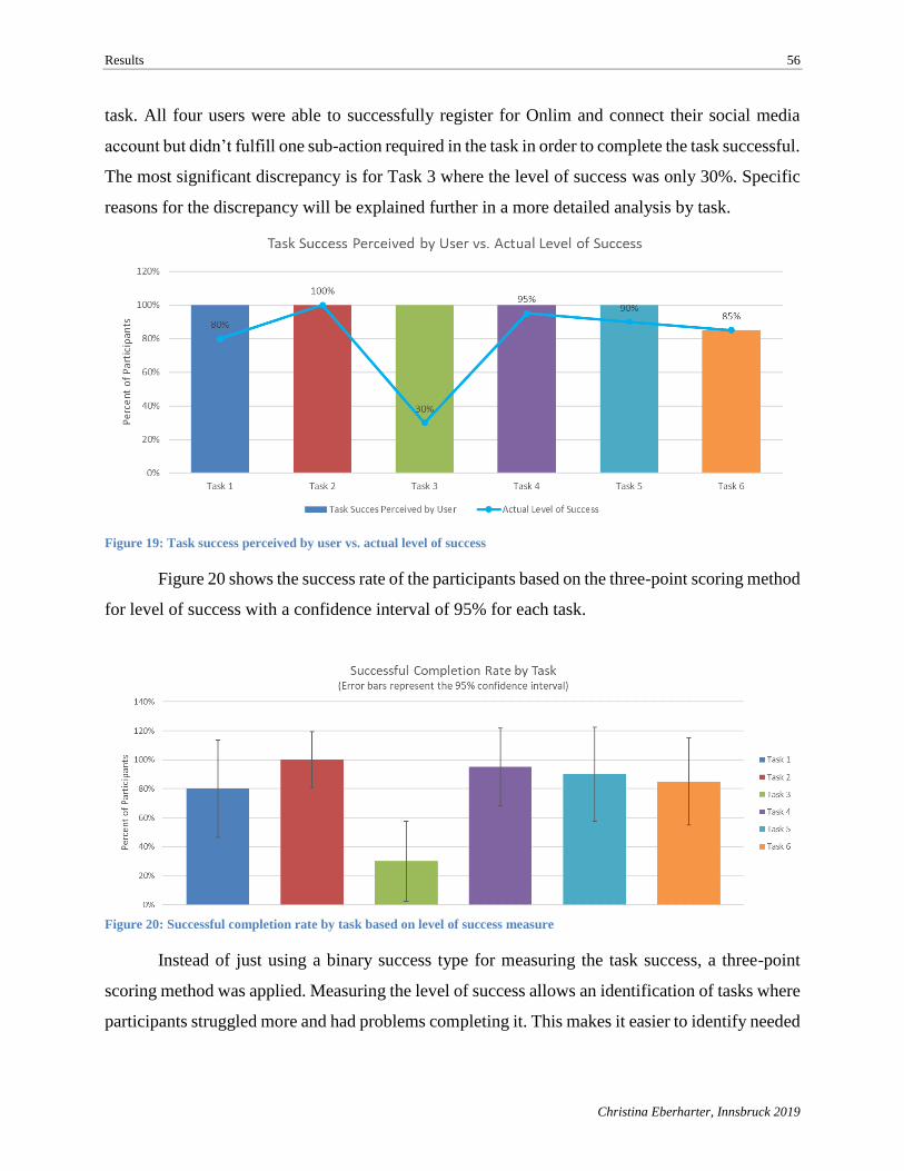
Results 56
Christina Eberharter, Innsbruck 2019
task. All four users were able to successfully register for Onlim and connect their social media
account but didn’t fulfill one sub-action required in the task in order to complete the task successful.
The most significant discrepancy is for Task 3 where the level of success was only 30%. Specific
reasons for the discrepancy will be explained further in a more detailed analysis by task.
Figure 19: Task success perceived by user vs. actual level of success
Figure 20 shows the success rate of the participants based on the three-point scoring method
for level of success with a confidence interval of 95% for each task.
Figure 20: Successful completion rate by task based on level of success measure
Instead of just using a binary success type for measuring the task success, a three-point
scoring method was applied. Measuring the level of success allows an identification of tasks where
participants struggled more and had problems completing it. This makes it easier to identify needed
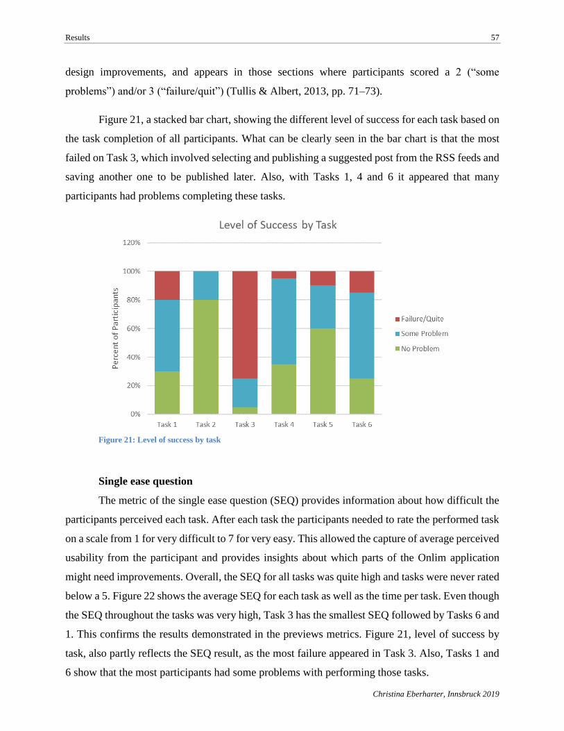
Results 57
Christina Eberharter, Innsbruck 2019
design improvements, and appears in those sections where participants scored a 2 (“some
problems”) and/or 3 (“failure/quit”) (Tullis & Albert, 2013, pp. 71–73).
Figure 21, a stacked bar chart, showing the different level of success for each task based on
the task completion of all participants. What can be clearly seen in the bar chart is that the most
failed on Task 3, which involved selecting and publishing a suggested post from the RSS feeds and
saving another one to be published later. Also, with Tasks 1, 4 and 6 it appeared that many
participants had problems completing these tasks.
Figure 21: Level of success by task
Single ease question
The metric of the single ease question (SEQ) provides information about how difficult the
participants perceived each task. After each task the participants needed to rate the performed task
on a scale from 1 for very difficult to 7 for very easy. This allowed the capture of average perceived
usability from the participant and provides insights about which parts of the Onlim application
might need improvements. Overall, the SEQ for all tasks was quite high and tasks were never rated
below a 5. Figure 22 shows the average SEQ for each task as well as the time per task. Even though
the SEQ throughout the tasks was very high, Task 3 has the smallest SEQ followed by Tasks 6 and
1. This confirms the results demonstrated in the previews metrics. Figure 21, level of success by
task, also partly reflects the SEQ result, as the most failure appeared in Task 3. Also, Tasks 1 and
6 show that the most participants had some problems with performing those tasks.
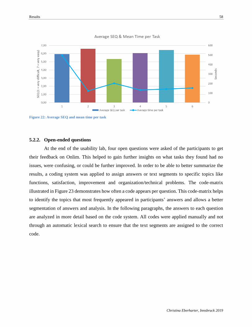
Results 58
Christina Eberharter, Innsbruck 2019
Figure 22: Average SEQ and mean time per task
5.2.2. Open-ended questions
At the end of the usability lab, four open questions were asked of the participants to get
their feedback on Onlim. This helped to gain further insights on what tasks they found had no
issues, were confusing, or could be further improved. In order to be able to better summarize the
results, a coding system was applied to assign answers or text segments to specific topics like
functions, satisfaction, improvement and organization/technical problems. The code-matrix
illustrated in Figure 23 demonstrates how often a code appears per question. This code-matrix helps
to identify the topics that most frequently appeared in participants’ answers and allows a better
segmentation of answers and analysis. In the following paragraphs, the answers to each question
are analyzed in more detail based on the code system. All codes were applied manually and not
through an automatic lexical search to ensure that the text segments are assigned to the correct
code.
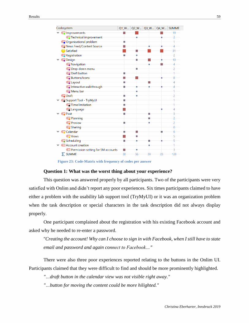
Results 59
Christina Eberharter, Innsbruck 2019
Figure 23: Code-Matrix with frequency of codes per answer
Question 1: What was the worst thing about your experience?
This question was answered properly by all participants. Two of the participants were very
satisfied with Onlim and didn’t report any poor experiences. Six times participants claimed to have
either a problem with the usability lab support tool (TryMyUI) or it was an organization problem
when the task description or special characters in the task description did not always display
properly.
One participant complained about the registration with his existing Facebook account and
asked why he needed to re-enter a password.
"Creating the account! Why can I choose to sign in with Facebook, when I still have to state
email and password and again connect to Facebook…"
There were also three poor experiences reported relating to the buttons in the Onlim UI.
Participants claimed that they were difficult to find and should be more prominently highlighted.
"…draft button in the calendar view was not visible right away."
"…button for moving the content could be more hilighted."
Results 60
Christina Eberharter, Innsbruck 2019
"The worst thing was that the buttons with the options were not very intuitive, so many times
they were hard to find."
Three of the participants claimed that the calendar section and the different views in the
calendar were confusing.
"When I didn't know, how I change the layout of the calendar from day- to month-view"
"…calendar was confusing with the "Detailed" and "Compact" view."
"…was to changing the calendar to monthly even though I knew it had to be at the top."
Question 2: What other aspects of the experience could be improved?
A total of twenty text parts were found in the participants responses that included
suggestions for improvements. The most of them related to design improvements, more specifically
to the iconography and buttons used in Onlim (mentioned seven times). Below are some statements
from participants relating to potential improvements.
"In the section "new post" the button "save" should be replaced by "schedule" and "share""
"Look at sizing of iconography in some parts such as reschedule task. Very small for an
older"
"Split save button into two or three buttons"
Others mentioned room for improvement at the calendar section as the two different viewer
modes and the provided fixed set of date ranges caused some problems.
"I think the one thing that could be improved would be having the ability to change from
weekly view to monthly view by being able to click on the 10may-13may section at the top
of the calendar as that is where I wanted to click."
"The detailed view didn't show a very useable view of all my postings. Probably would be
best of having a combination of both modes - compact mode was better but could just do
with a bit more of the detail view features."
Question 3: What did you like about the Web site?
The general feedback about Onlim was very positive and eighteen of the participants
provided positive feedback about the SMM tool. In particular, the clean and user-friendly design
was mentioned several times as well as the layout and structure of the applications.
"Nice clean design, easy to view/ navigate."
Results 61
Christina Eberharter, Innsbruck 2019
"User- friendly, clean GUI, fast and has search inside it (Searching fb pages for example
is nice)"
"I did like the structure of the website a lot."
"Nice design, logical and clear allocation of tabs, focus lies on the essentials"
Also mentioned were the post creation functionality to create one post for several social media
accounts and the ability to schedule them for future posting. Positive feedback was also received
for the post preview which allowed participants to see how the post would look on a specific social
media platform.
"I liked the ability to do multiple different types of posts with different accounts, and the
tabbed format for doing that."
"to post various different media to many different platforms and accounts is very powerful."
"The "live preview" of a post as I was writing it,"
Question 4: What other comments do you have for the owner of the Web site?
The last question was kept more general so that participants could share additional thoughts.
One participant mentioned again his struggle with the calendar when rescheduling a post. Another
mentioned that in the preview for the Facebook post it always showed the public icon even though
his settings were set that published posts could only be seen by himself.
"It's not that intuitive. I found it hard to reschedule for the monthly post (task 6/7)"
"I suggest working on small parts and tweak some simple functions (Publishing, Time
format, make the preview more accurate "for now everything is shown as public") and of
course a tutorial in each section would be nice"
"The calendar is obviously a critical tool and I think it could be made more intuitive to
understand."
Overall, the feedback from the participants in the usability lab was very positive, but at the
same time it also became evident that some improvements were required from the user’s point of
view.
"I liked the design of the website ( matching colours, structure of labels), and how easily
you plan posts and change their date again."
Results 62
Christina Eberharter, Innsbruck 2019
5.2.3. Discovered usability problems
The following in-depth analysis is based on the results of the usability lab and the recorded
material from each participant. This exercise will help to achieve a closer look at how the
participants performed at each task and where they experienced problems with Onlim’s functions
and UI.
■ Task 1: This task required performing the registration process for Onlim, connecting
social media accounts, and using the page guide to walk through the application and learn how to
create posts. When the user took a detour in performing the task or struggled with one of the sub-
tasks, such as with following the page guide, the level of success was defined as 2 (“some
problems”). The task was rated as failure only when the participant didn’t start or try to start the
walk-through with the page guide. The 50% of participants who struggled with the first task had
their main problem performing the walkthrough. All were able to register for Onlim and connect
their social media accounts. Some small issues appeared for some users. For example, when
entering the password, it was not shown that the password was too short and one participant had to
start all over again. Two other participants, English natives who used the English Onlim version,
clicked on the registration confirmation email link and were redirected to Onlim’s German page.
Connecting to their social media accounts was done correctly by all participants. An error message
appeared only one time for one participant when he didn’t allow Onlim to manage his page. When
he returned to Onlim the error message “services.account.save_error” appeared on the window.
The participant just ignored the message and moved on with connecting to another social media
account. The greatest struggle appeared during the last part of Task 1 when following the page
guide to learn how to create a post. When the participants finished the connection of their social
media accounts, they were instructed to click on “Create your first post” in order to get to the page
guide (see Figure 24).
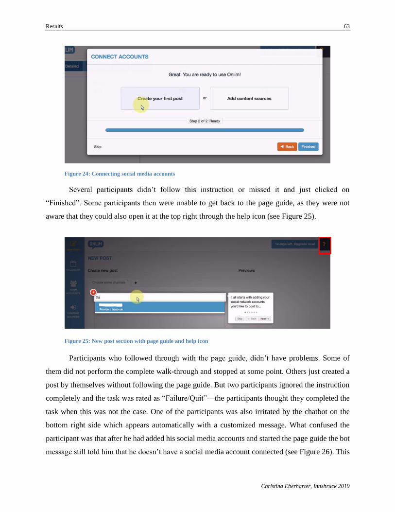
Results 63
Christina Eberharter, Innsbruck 2019
Several participants didn’t follow this instruction or missed it and just clicked on
“Finished”. Some participants then were unable to get back to the page guide, as they were not
aware that they could also open it at the top right through the help icon (see Figure 25).
Participants who followed through with the page guide, didn’t have problems. Some of
them did not perform the complete walk-through and stopped at some point. Others just created a
post by themselves without following the page guide. But two participants ignored the instruction
completely and the task was rated as “Failure/Quit”—the participants thought they completed the
task when this was not the case. One of the participants was also irritated by the chatbot on the
bottom right side which appears automatically with a customized message. What confused the
participant was that after he had added his social media accounts and started the page guide the bot
message still told him that he doesn’t have a social media account connected (see Figure 26). This
Figure 25: New post section with page guide and help icon
Figure 24: Connecting social media accounts
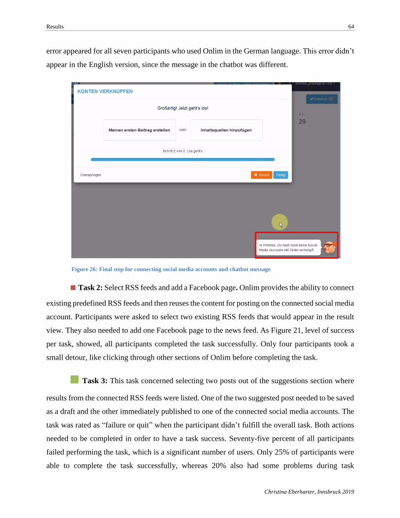
Results 64
Christina Eberharter, Innsbruck 2019
error appeared for all seven participants who used Onlim in the German language. This error didn’t
appear in the English version, since the message in the chatbot was different.
■ Task 2: Select RSS feeds and add a Facebook page. Onlim provides the ability to connect
existing predefined RSS feeds and then reuses the content for posting on the connected social media
account. Participants were asked to select two existing RSS feeds that would appear in the result
view. They also needed to add one Facebook page to the news feed. As Figure 21, level of success
per task, showed, all participants completed the task successfully. Only four participants took a
small detour, like clicking through other sections of Onlim before completing the task.
■ Task 3: This task concerned selecting two posts out of the suggestions section where
results from the connected RSS feeds were listed. One of the two suggested post needed to be saved
as a draft and the other immediately published to one of the connected social media accounts. The
task was rated as “failure or quit” when the participant didn’t fulfill the overall task. Both actions
needed to be completed in order to have a task success. Seventy-five percent of all participants
failed performing the task, which is a significant number of users. Only 25% of participants were
able to complete the task successfully, whereas 20% also had some problems during task
Figure 26: Final step for connecting social media accounts and chatbot message
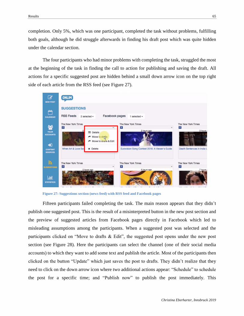
Results 65
Christina Eberharter, Innsbruck 2019
completion. Only 5%, which was one participant, completed the task without problems, fulfilling
both goals, although he did struggle afterwards in finding his draft post which was quite hidden
under the calendar section.
The four participants who had minor problems with completing the task, struggled the most
at the beginning of the task in finding the call to action for publishing and saving the draft. All
actions for a specific suggested post are hidden behind a small down arrow icon on the top right
side of each article from the RSS feed (see Figure 27).
Fifteen participants failed completing the task. The main reason appears that they didn’t
publish one suggested post. This is the result of a misinterpreted button in the new post section and
the preview of suggested articles from Facebook pages directly in Facebook which led to
misleading assumptions among the participants. When a suggested post was selected and the
participants clicked on “Move to drafts & Edit”, the suggested post opens under the new post
section (see Figure 28). Here the participants can select the channel (one of their social media
accounts) to which they want to add some text and publish the article. Most of the participants then
clicked on the button “Update” which just saves the post to drafts. They didn’t realize that they
need to click on the down arrow icon where two additional actions appear: “Schedule” to schedule
the post for a specific time; and “Publish now” to publish the post immediately. This
Figure 27: Suggestions section (news feed) with RSS feed and Facebook pages
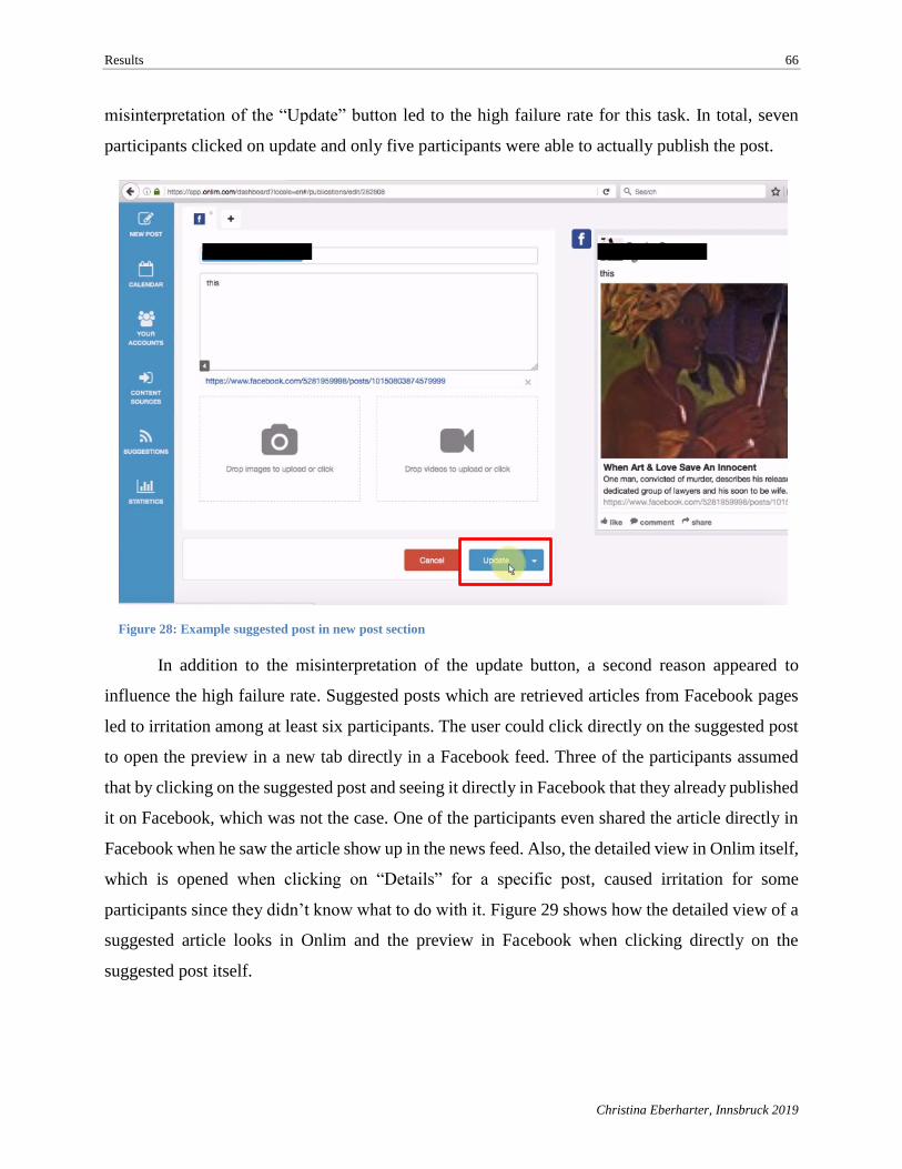
Results 66
Christina Eberharter, Innsbruck 2019
misinterpretation of the “Update” button led to the high failure rate for this task. In total, seven
participants clicked on update and only five participants were able to actually publish the post.
In addition to the misinterpretation of the update button, a second reason appeared to
influence the high failure rate. Suggested posts which are retrieved articles from Facebook pages
led to irritation among at least six participants. The user could click directly on the suggested post
to open the preview in a new tab directly in a Facebook feed. Three of the participants assumed
that by clicking on the suggested post and seeing it directly in Facebook that they already published
it on Facebook, which was not the case. One of the participants even shared the article directly in
Facebook when he saw the article show up in the news feed. Also, the detailed view in Onlim itself,
which is opened when clicking on “Details” for a specific post, caused irritation for some
participants since they didn’t know what to do with it. Figure 29 shows how the detailed view of a
suggested article looks in Onlim and the preview in Facebook when clicking directly on the
suggested post itself.
Figure 28: Example suggested post in new post section
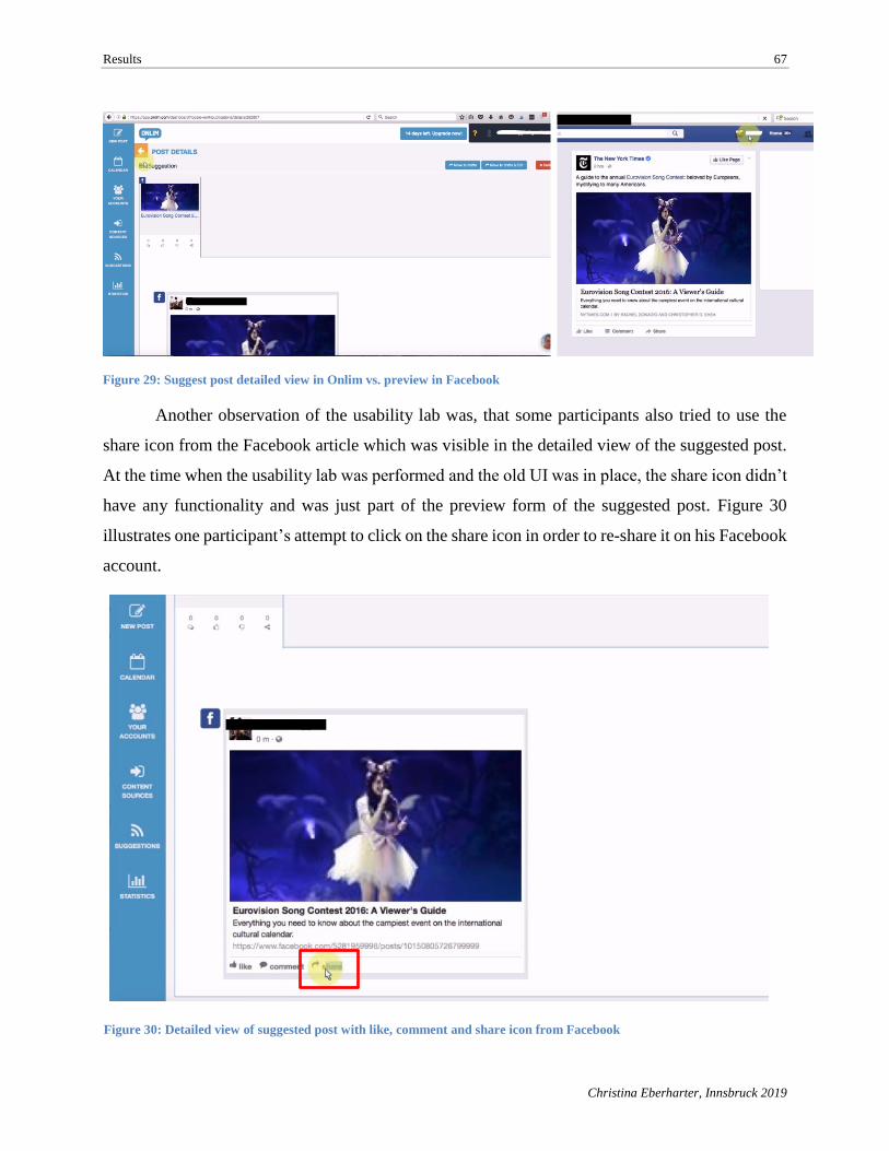
Results 67
Christina Eberharter, Innsbruck 2019
Another observation of the usability lab was, that some participants also tried to use the
share icon from the Facebook article which was visible in the detailed view of the suggested post.
At the time when the usability lab was performed and the old UI was in place, the share icon didn’t
have any functionality and was just part of the preview form of the suggested post. Figure 30
illustrates one participant’s attempt to click on the share icon in order to re-share it on his Facebook
account.
Figure 30: Detailed view of suggested post with like, comment and share icon from Facebook
Figure 29: Suggest post detailed view in Onlim vs. preview in Facebook
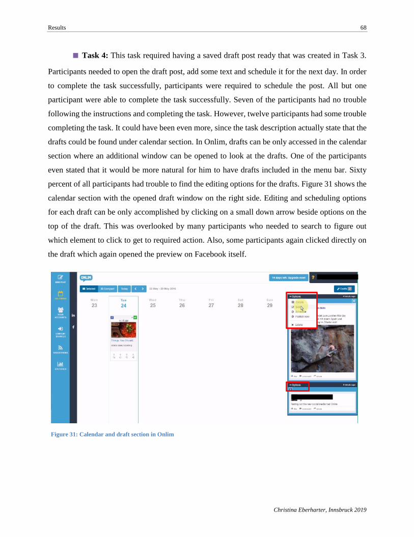
Results 68
Christina Eberharter, Innsbruck 2019
■ Task 4: This task required having a saved draft post ready that was created in Task 3.
Participants needed to open the draft post, add some text and schedule it for the next day. In order
to complete the task successfully, participants were required to schedule the post. All but one
participant were able to complete the task successfully. Seven of the participants had no trouble
following the instructions and completing the task. However, twelve participants had some trouble
completing the task. It could have been even more, since the task description actually state that the
drafts could be found under calendar section. In Onlim, drafts can be only accessed in the calendar
section where an additional window can be opened to look at the drafts. One of the participants
even stated that it would be more natural for him to have drafts included in the menu bar. Sixty
percent of all participants had trouble to find the editing options for the drafts. Figure 31 shows the
calendar section with the opened draft window on the right side. Editing and scheduling options
for each draft can be only accomplished by clicking on a small down arrow beside options on the
top of the draft. This was overlooked by many participants who needed to search to figure out
which element to click to get to required action. Also, some participants again clicked directly on
the draft which again opened the preview on Facebook itself.
Figure 31: Calendar and draft section in Onlim
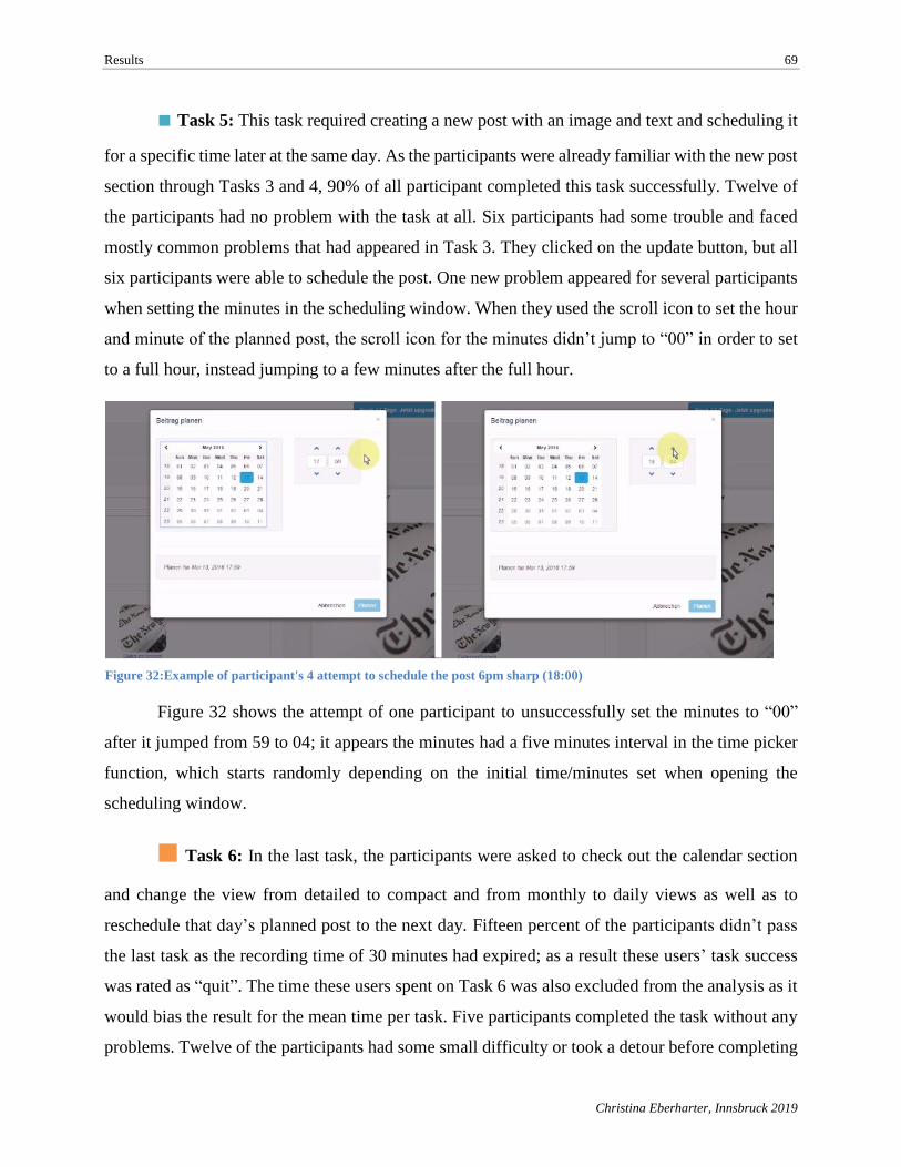
Results 69
Christina Eberharter, Innsbruck 2019
■ Task 5: This task required creating a new post with an image and text and scheduling it
for a specific time later at the same day. As the participants were already familiar with the new post
section through Tasks 3 and 4, 90% of all participant completed this task successfully. Twelve of
the participants had no problem with the task at all. Six participants had some trouble and faced
mostly common problems that had appeared in Task 3. They clicked on the update button, but all
six participants were able to schedule the post. One new problem appeared for several participants
when setting the minutes in the scheduling window. When they used the scroll icon to set the hour
and minute of the planned post, the scroll icon for the minutes didn’t jump to “00” in order to set
to a full hour, instead jumping to a few minutes after the full hour.
Figure 32 shows the attempt of one participant to unsuccessfully set the minutes to “00”
after it jumped from 59 to 04; it appears the minutes had a five minutes interval in the time picker
function, which starts randomly depending on the initial time/minutes set when opening the
scheduling window.
■ Task 6: In the last task, the participants were asked to check out the calendar section
and change the view from detailed to compact and from monthly to daily views as well as to
reschedule that day’s planned post to the next day. Fifteen percent of the participants didn’t pass
the last task as the recording time of 30 minutes had expired; as a result these users’ task success
was rated as “quit”. The time these users spent on Task 6 was also excluded from the analysis as it
would bias the result for the mean time per task. Five participants completed the task without any
problems. Twelve of the participants had some small difficulty or took a detour before completing
Figure 32:Example of participant's 4 attempt to schedule the post 6pm sharp (18:00)
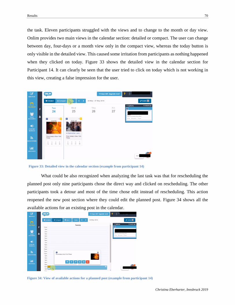
Results 70
Christina Eberharter, Innsbruck 2019
the task. Eleven participants struggled with the views and to change to the month or day view.
Onlim provides two main views in the calendar section: detailed or compact. The user can change
between day, four-days or a month view only in the compact view, whereas the today button is
only visible in the detailed view. This caused some irritation from participants as nothing happened
when they clicked on today. Figure 33 shows the detailed view in the calendar section for
Participant 14. It can clearly be seen that the user tried to click on today which is not working in
this view, creating a false impression for the user.
What could be also recognized when analyzing the last task was that for rescheduling the
planned post only nine participants chose the direct way and clicked on rescheduling. The other
participants took a detour and most of the time chose edit instead of rescheduling. This action
reopened the new post section where they could edit the planned post. Figure 34 shows all the
available actions for an existing post in the calendar.
Figure 33: Detailed view in the calendar section (example from participant 14)
Figure 34: View of available actions for a planned post (example from participant 14)
Results 71
Christina Eberharter, Innsbruck 2019
5.3. Result Summary
In the following section, all discovered results of the analysis are summarized to provide a
better overview of the findings from the benchmark analysis and usability lab.
The benchmark analysis evaluated how Onlim was competing against other SMM tools in
terms of main functionality for publishing and usability. When comparing the total scores, the
outcome of the analysis indicated that Onlim is definitely behind the industry leaders. However, it
was in the last third of the scores and ranked higher then Socioboard and MavSocial. One of
Onlim’s main strengths was identified as the ability to use multiple content sources for post
creation, such as several images, videos, RSS feeds and Facebook pages. Also, an Onlim strength
was the simultaneous creation of several posts and the ability to select several social profiles per
post. This feature is a real advantage, as only Onlim and Sendible offered this functionality.
Automated post creation was another feature that was tested. Sendible stood out with the best
functionality for automated post creation as it provided the option to create automatic or manual
posts from RSS feeds. When choosing automatic post creation only the settings needed to be
defined, such as the social profile, publishing time and update frequency. Furthermore, it allowed
determining which content could be used through an inclusion/exclusion filter for specific terms.
Onlim performed moderately when testing this feature, but only because a complete automation
process was not in place. However, in terms of the integrated RSS readers, structuring the incoming
news feed by categories (interests) and allowing to filter content by hashtags and mentions, it is
very well developed. Only one competitor application, Agora Pulse, didn’t have this feature at all
at the time of the application testing. Scheduling content is perhaps the most important feature as
it allows users to plan and schedule posts ahead of the actual publishing time. Also, the calendar
plays an essential role as it contains all planned posts. Five SMM tools, including Onlim, have both
features in place. For these two features, Hootsuite, provided an excellent usability as a 12- and 24-
hour clock was available as well as an auto-schedule functionality in which the application itself
determines when to publish the post based on analysis of when the post would make the highest
impact on the social platform. An evaluation of team collaboration was not really possible as in
almost every tool it was not available in the freemium version. Therefore, it was evaluated if it was
available in freemium or premium versions. Shortcomings were detected in the area of performance
analysis and export options. Onlim lacked any option to export statistics (e.g., CSV or PDF) of
published posts also called performance analysis. Also, only basic metrics and reports were
Results 72
Christina Eberharter, Innsbruck 2019
currently available to track performance. Other SMM tools such as Sprout Social or Agora Pulse
provided customized reports, reports per social profile, or even Google Analytics integration. A
true content library was only provided by MavSocial; others like Hootsuite and Sendible provided
a section to access past-scheduled posts and drafts. Onlim also had a section where drafts were
saved, but the shortcoming detected here was that it was not possible when many drafts were saved
to filter the drafts, such as by topic or social profile.
The Onlim user experience was rated quite good if all five criteria are examined separately
and not by the overall score for user experience. This is a result of the defined weight which was
three for mobile app and two for usability, visual design, support features and user experience.
Beside the performance reports, the missing mobile app was the greatest shortcoming. In terms of
usability, visual design and support features, Onlim scored very high and is ranked just short of
Hootsuite, Sprout Social and Sendible.
Although the usability lab was conducted through real-life and online usability studies with
a total of 27 participants, only the data set for 20 participants could be used in the analysis. The
following metrics were measured for the usability lab: time on task, task completion, level of
success, and single easy questions. In addition to these metrics, four open-ended questions were
asked at the end of the usability lab. The first metric to be measured was the time on task, providing
a first impression of the overall performance of the participants for each task. The three longest
times were measured for Tasks 1, 3 and 6. These are also the tasks with the longest error bars,
indicating a broader range of participant time per task results. It was also the first indication that
the participants struggled the most with these specific tasks. This was then confirmed through the
results of the successful completion rate by task and the level of success metrics. The biggest failure
rate was detected in Task 3, involving the selection, publishing, and saving as drafts of suggested
posts. Also, a quite high rate of problems appeared in the level of success analysis for tasks 1, 4
and 6. The SEQ allowed the participants to rate the level of difficulty for each task (1= very
difficult, 7 = very easy). For all tasks the average SEQ was above 5 and three tasks were rated with
a 6 or higher, indicating that overall the tasks were not perceived as very difficult by participants.
Beside measuring the above-mentioned usability metrics, an in-depth analysis was
conducted on the video recording material from each participant to further explore and analyze
Onlim’s UI for usability problems. Section 5.2.3 described these findings in detail. Table 11 lists a
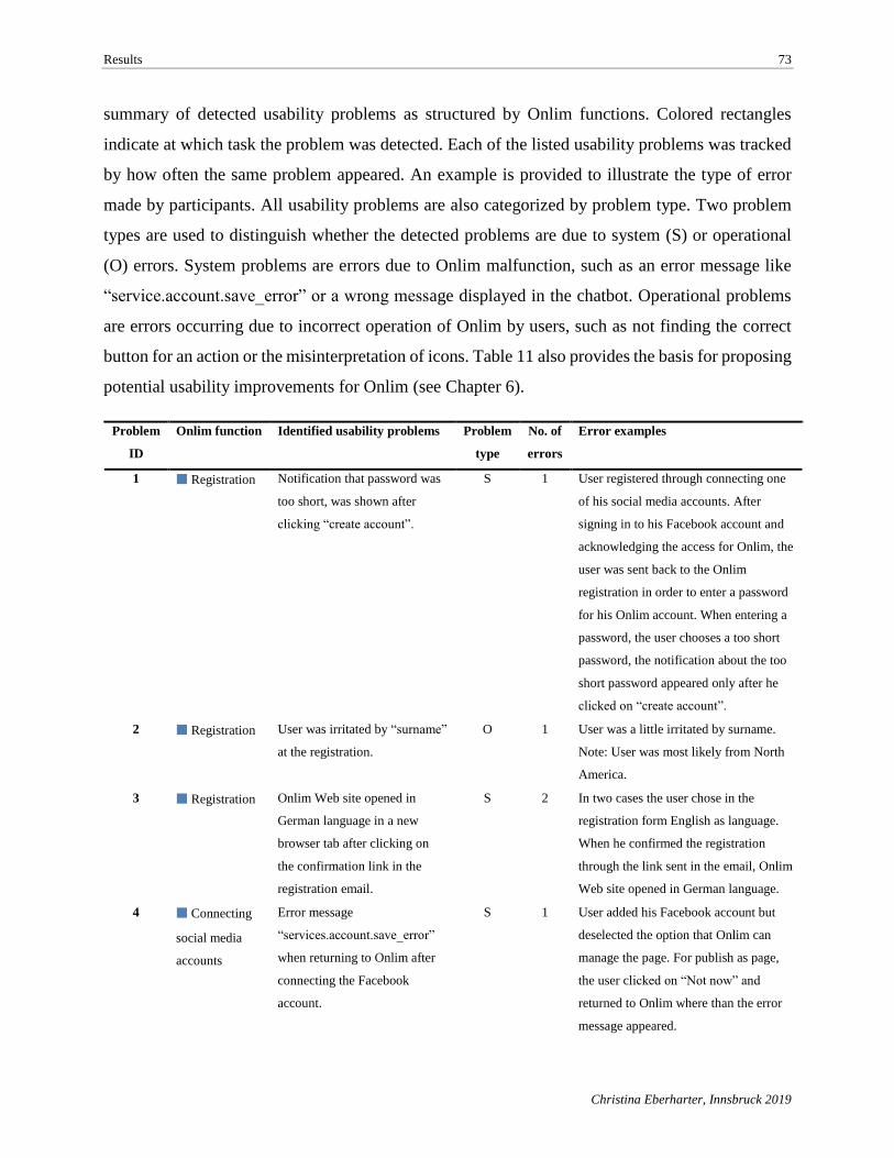
Results 73
Christina Eberharter, Innsbruck 2019
summary of detected usability problems as structured by Onlim functions. Colored rectangles
indicate at which task the problem was detected. Each of the listed usability problems was tracked
by how often the same problem appeared. An example is provided to illustrate the type of error
made by participants. All usability problems are also categorized by problem type. Two problem
types are used to distinguish whether the detected problems are due to system (S) or operational
(O) errors. System problems are errors due to Onlim malfunction, such as an error message like
“service.account.save_error” or a wrong message displayed in the chatbot. Operational problems
are errors occurring due to incorrect operation of Onlim by users, such as not finding the correct
button for an action or the misinterpretation of icons. Table 11 also provides the basis for proposing
potential usability improvements for Onlim (see Chapter 6).
Problem
ID
Onlim function Identified usability problems Problem
type
No. of
errors
Error examples
1 ■ Registration Notification that password was
too short, was shown after
clicking “create account”.
S 1 User registered through connecting one
of his social media accounts. After
signing in to his Facebook account and
acknowledging the access for Onlim, the
user was sent back to the Onlim
registration in order to enter a password
for his Onlim account. When entering a
password, the user chooses a too short
password, the notification about the too
short password appeared only after he
clicked on “create account”.
2 ■ Registration User was irritated by “surname”
at the registration.
O 1 User was a little irritated by surname.
Note: User was most likely from North
America.
3 ■ Registration Onlim Web site opened in
German language in a new
browser tab after clicking on
the confirmation link in the
registration email.
S 2 In two cases the user chose in the
registration form English as language.
When he confirmed the registration
through the link sent in the email, Onlim
Web site opened in German language.
4 ■ Connecting
social media
accounts
Error message
“services.account.save_error”
when returning to Onlim after
connecting the Facebook
account.
S 1 User added his Facebook account but
deselected the option that Onlim can
manage the page. For publish as page,
the user clicked on “Not now” and
returned to Onlim where than the error
message appeared.
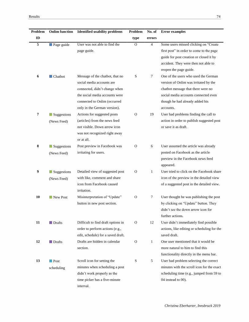
Results 74
Christina Eberharter, Innsbruck 2019
Problem
ID
Onlim function Identified usability problems Problem
type
No. of
errors
Error examples
5 ■ Page guide User was not able to find the
page guide.
O 4 Some users missed clicking on “Create
first post” in order to come to the page
guide for post creation or closed it by
accident. They were then not able to
reopen the page guide.
6 ■ Chatbot Message of the chatbot, that no
social media accounts are
connected, didn’t change when
the social media accounts were
connected to Onlim (occurred
only in the German version).
S 7 One of the users who used the German
version of Onlim was irritated by the
chatbot message that there were no
social media accounts connected even
though he had already added his
accounts.
7 ■ Suggestions
(News Feed)
Actions for suggested posts
(articles) from the news feed
not visible. Down arrow icon
was not recognized right away
or at all.
O 19 User had problems finding the call to
action in order to publish suggested post
or save it as draft.
8 ■ Suggestions
(News Feed)
Post preview in Facebook was
irritating for users.
O 6 User assumed the article was already
posted on Facebook as the article
preview in the Facebook news feed
appeared.
9 ■ Suggestions
(News Feed)
Detailed view of suggested post
with like, comment and share
icon from Facebook caused
irritation.
O 1 User tried to click on the Facebook share
icon of the preview in the detailed view
of a suggested post in the detailed view.
10 ■ New Post Misinterpretation of “Update”
button in new post section.
O 7 User thought he was publishing the post
by clicking on “Update” button. They
didn’t see the down arrow icon for
further actions.
11 ■ Drafts Difficult to find draft options in
order to perform actions (e.g.,
edit, schedule) for a saved draft.
O 12 User didn’t immediately find possible
actions, like editing or scheduling for the
saved draft.
12 ■ Drafts Drafts are hidden in calendar
section.
O 1 One user mentioned that it would be
more natural to him to find this
functionality directly in the menu bar.
13 ■ Post
scheduling
Scroll icon for setting the
minutes when scheduling a post
didn’t work properly as the
time picker has a five-minute
interval.
S 5 User had problem selecting the correct
minutes with the scroll icon for the exact
scheduling time (e.g., jumped from 59 to
04 instead to 00).
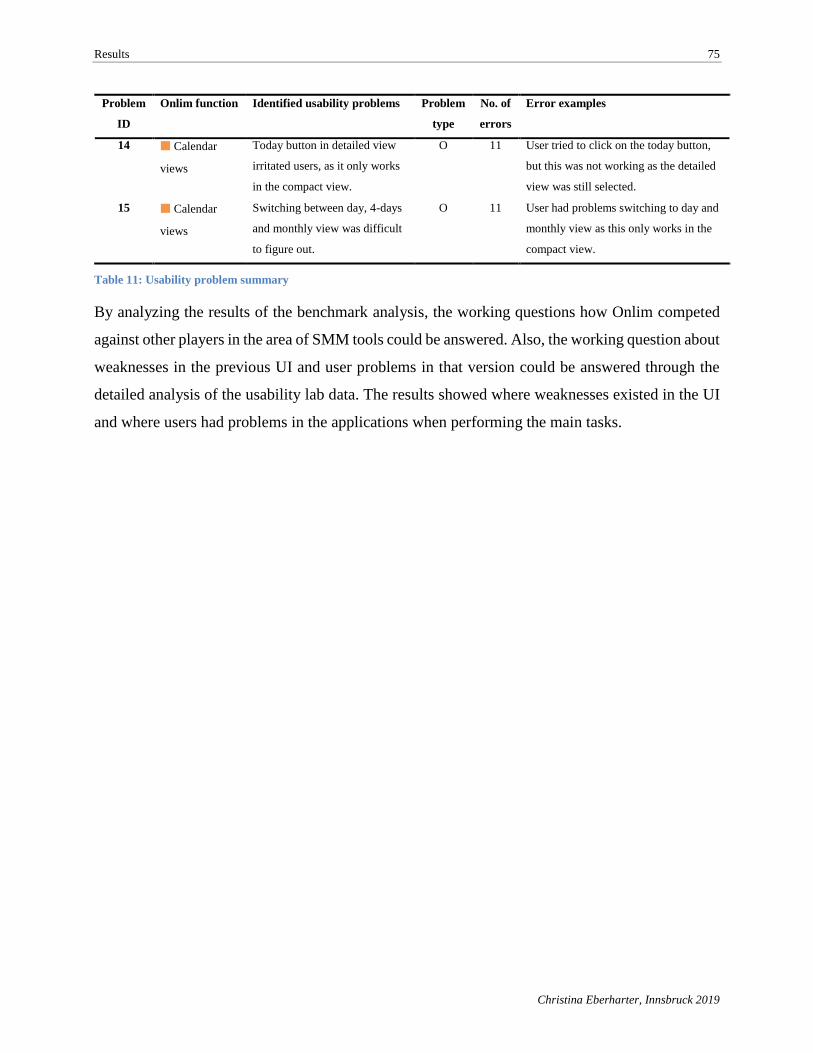
Results 75
Christina Eberharter, Innsbruck 2019
Problem
ID
Onlim function Identified usability problems Problem
type
No. of
errors
Error examples
14 ■ Calendar
views
Today button in detailed view
irritated users, as it only works
in the compact view.
O 11 User tried to click on the today button,
but this was not working as the detailed
view was still selected.
15 ■ Calendar
views
Switching between day, 4-days
and monthly view was difficult
to figure out.
O 11 User had problems switching to day and
monthly view as this only works in the
compact view.
Table 11: Usability problem summary
By analyzing the results of the benchmark analysis, the working questions how Onlim competed
against other players in the area of SMM tools could be answered. Also, the working question about
weaknesses in the previous UI and user problems in that version could be answered through the
detailed analysis of the usability lab data. The results showed where weaknesses existed in the UI
and where users had problems in the applications when performing the main tasks.
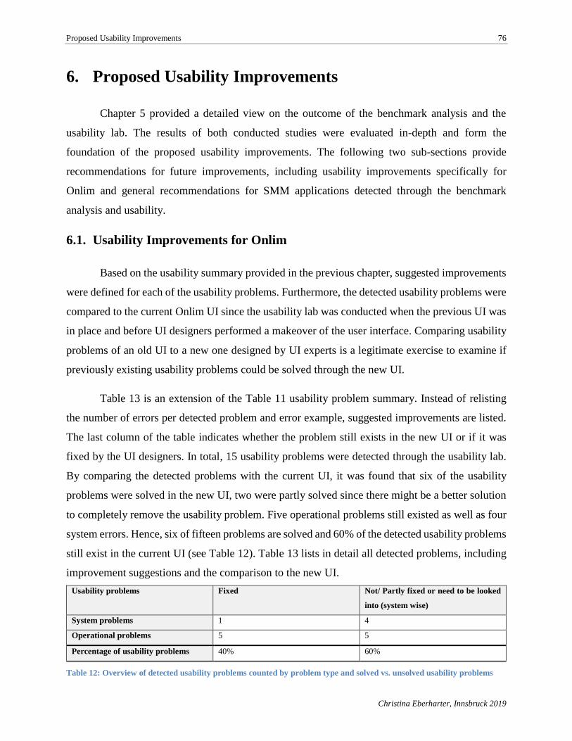
Proposed Usability Improvements 76
Christina Eberharter, Innsbruck 2019
6. Proposed Usability Improvements
Chapter 5 provided a detailed view on the outcome of the benchmark analysis and the
usability lab. The results of both conducted studies were evaluated in-depth and form the
foundation of the proposed usability improvements. The following two sub-sections provide
recommendations for future improvements, including usability improvements specifically for
Onlim and general recommendations for SMM applications detected through the benchmark
analysis and usability.
6.1. Usability Improvements for Onlim
Based on the usability summary provided in the previous chapter, suggested improvements
were defined for each of the usability problems. Furthermore, the detected usability problems were
compared to the current Onlim UI since the usability lab was conducted when the previous UI was
in place and before UI designers performed a makeover of the user interface. Comparing usability
problems of an old UI to a new one designed by UI experts is a legitimate exercise to examine if
previously existing usability problems could be solved through the new UI.
Table 13 is an extension of the Table 11 usability problem summary. Instead of relisting
the number of errors per detected problem and error example, suggested improvements are listed.
The last column of the table indicates whether the problem still exists in the new UI or if it was
fixed by the UI designers. In total, 15 usability problems were detected through the usability lab.
By comparing the detected problems with the current UI, it was found that six of the usability
problems were solved in the new UI, two were partly solved since there might be a better solution
to completely remove the usability problem. Five operational problems still existed as well as four
system errors. Hence, six of fifteen problems are solved and 60% of the detected usability problems
still exist in the current UI (see Table 12). Table 13 lists in detail all detected problems, including
improvement suggestions and the comparison to the new UI.
Usability problems Fixed Not/ Partly fixed or need to be looked
into (system wise)
System problems 1 4
Operational problems 5 5
Percentage of usability problems 40% 60%
Table 12: Overview of detected usability problems counted by problem type and solved vs. unsolved usability problems
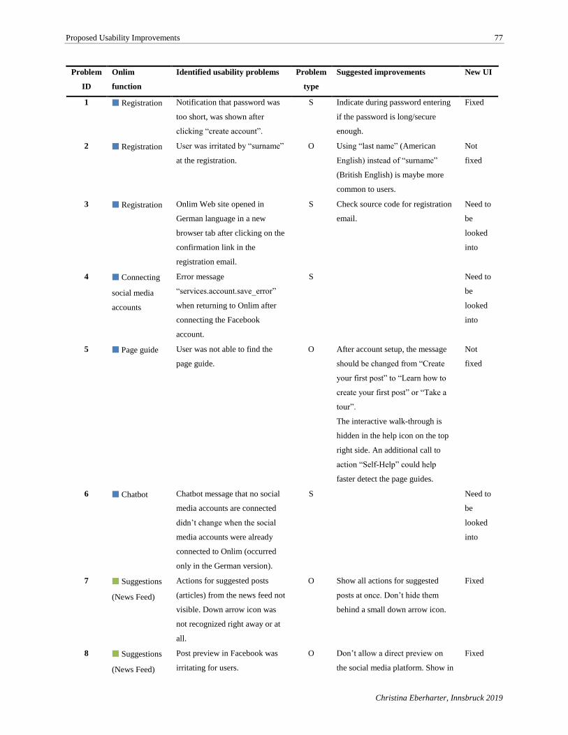
Proposed Usability Improvements 77
Christina Eberharter, Innsbruck 2019
Problem
ID
Onlim
function
Identified usability problems Problem
type
Suggested improvements New UI
1 ■ Registration Notification that password was
too short, was shown after
clicking “create account”.
S Indicate during password entering
if the password is long/secure
enough.
Fixed
2 ■ Registration User was irritated by “surname”
at the registration.
O Using “last name” (American
English) instead of “surname”
(British English) is maybe more
common to users.
Not
fixed
3 ■ Registration Onlim Web site opened in
German language in a new
browser tab after clicking on the
confirmation link in the
registration email.
S Check source code for registration
email.
Need to
be
looked
into
4 ■ Connecting
social media
accounts
Error message
“services.account.save_error”
when returning to Onlim after
connecting the Facebook
account.
S Need to
be
looked
into
5 ■ Page guide User was not able to find the
page guide.
O After account setup, the message
should be changed from “Create
your first post” to “Learn how to
create your first post” or “Take a
tour”.
The interactive walk-through is
hidden in the help icon on the top
right side. An additional call to
action “Self-Help” could help
faster detect the page guides.
Not
fixed
6 ■ Chatbot Chatbot message that no social
media accounts are connected
didn’t change when the social
media accounts were already
connected to Onlim (occurred
only in the German version).
S Need to
be
looked
into
7 ■ Suggestions
(News Feed)
Actions for suggested posts
(articles) from the news feed not
visible. Down arrow icon was
not recognized right away or at
all.
O Show all actions for suggested
posts at once. Don’t hide them
behind a small down arrow icon.
Fixed
8 ■ Suggestions
(News Feed)
Post preview in Facebook was
irritating for users.
O Don’t allow a direct preview on
the social media platform. Show in
Fixed
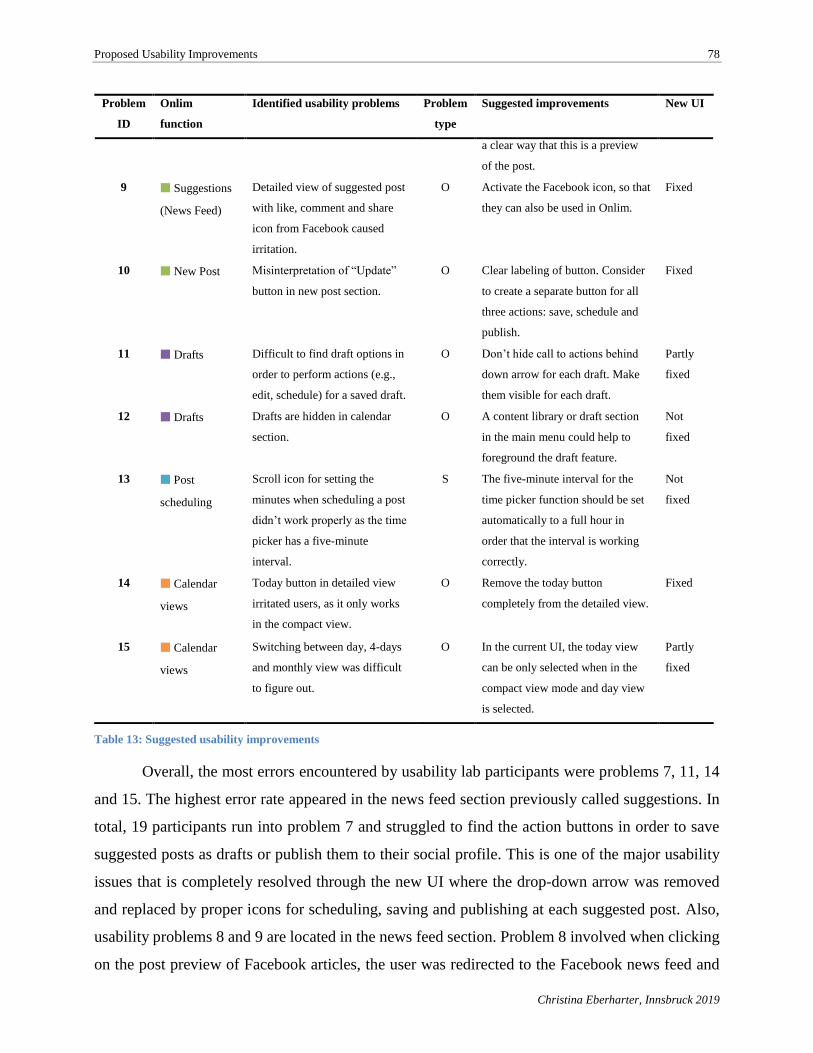
Proposed Usability Improvements 78
Christina Eberharter, Innsbruck 2019
Problem
ID
Onlim
function
Identified usability problems Problem
type
Suggested improvements New UI
a clear way that this is a preview
of the post.
9 ■ Suggestions
(News Feed)
Detailed view of suggested post
with like, comment and share
icon from Facebook caused
irritation.
O Activate the Facebook icon, so that
they can also be used in Onlim.
Fixed
10 ■ New Post Misinterpretation of “Update”
button in new post section.
O Clear labeling of button. Consider
to create a separate button for all
three actions: save, schedule and
publish.
Fixed
11 ■ Drafts Difficult to find draft options in
order to perform actions (e.g.,
edit, schedule) for a saved draft.
O Don’t hide call to actions behind
down arrow for each draft. Make
them visible for each draft.
Partly
fixed
12 ■ Drafts Drafts are hidden in calendar
section.
O A content library or draft section
in the main menu could help to
foreground the draft feature.
Not
fixed
13 ■ Post
scheduling
Scroll icon for setting the
minutes when scheduling a post
didn’t work properly as the time
picker has a five-minute
interval.
S The five-minute interval for the
time picker function should be set
automatically to a full hour in
order that the interval is working
correctly.
Not
fixed
14 ■ Calendar
views
Today button in detailed view
irritated users, as it only works
in the compact view.
O Remove the today button
completely from the detailed view.
Fixed
15 ■ Calendar
views
Switching between day, 4-days
and monthly view was difficult
to figure out.
O In the current UI, the today view
can be only selected when in the
compact view mode and day view
is selected.
Partly
fixed
Table 13: Suggested usability improvements
Overall, the most errors encountered by usability lab participants were problems 7, 11, 14
and 15. The highest error rate appeared in the news feed section previously called suggestions. In
total, 19 participants run into problem 7 and struggled to find the action buttons in order to save
suggested posts as drafts or publish them to their social profile. This is one of the major usability
issues that is completely resolved through the new UI where the drop-down arrow was removed
and replaced by proper icons for scheduling, saving and publishing at each suggested post. Also,
usability problems 8 and 9 are located in the news feed section. Problem 8 involved when clicking
on the post preview of Facebook articles, the user was redirected to the Facebook news feed and
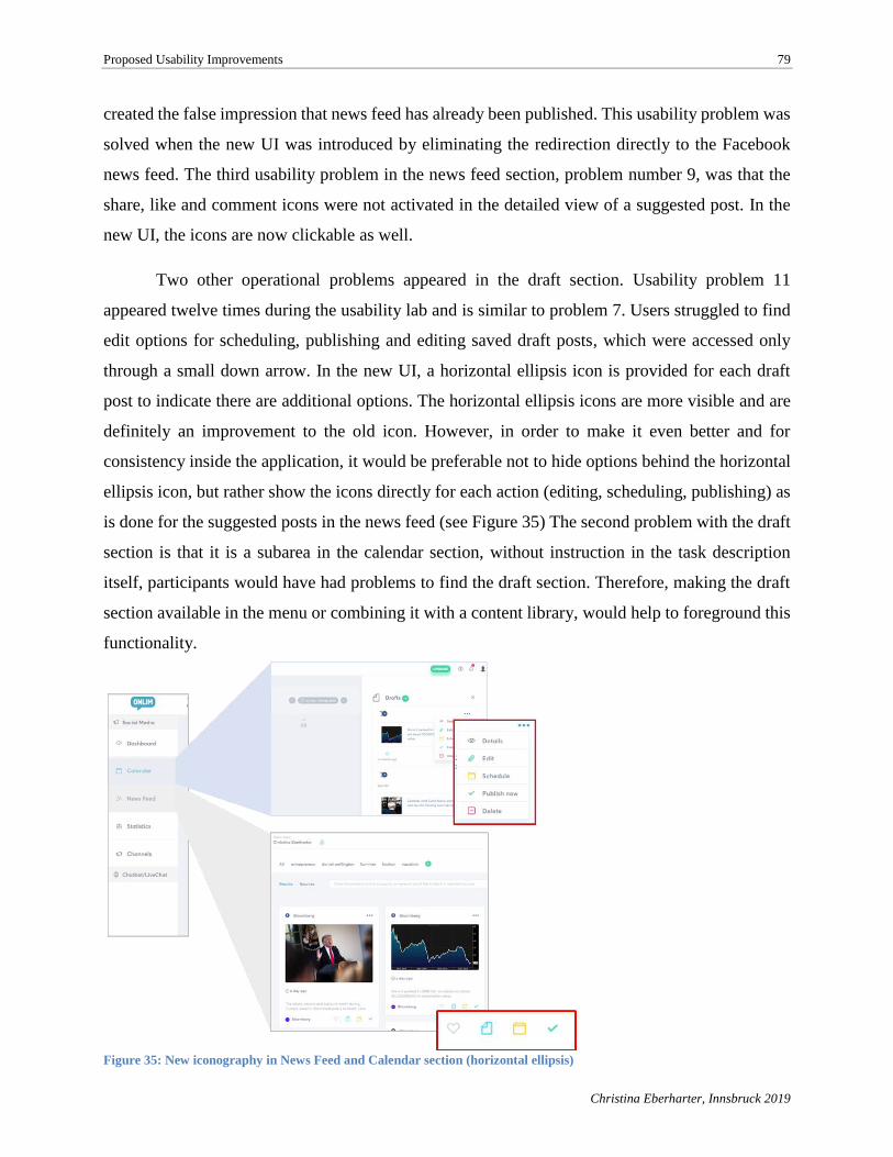
Proposed Usability Improvements 79
Christina Eberharter, Innsbruck 2019
created the false impression that news feed has already been published. This usability problem was
solved when the new UI was introduced by eliminating the redirection directly to the Facebook
news feed. The third usability problem in the news feed section, problem number 9, was that the
share, like and comment icons were not activated in the detailed view of a suggested post. In the
new UI, the icons are now clickable as well.
Two other operational problems appeared in the draft section. Usability problem 11
appeared twelve times during the usability lab and is similar to problem 7. Users struggled to find
edit options for scheduling, publishing and editing saved draft posts, which were accessed only
through a small down arrow. In the new UI, a horizontal ellipsis icon is provided for each draft
post to indicate there are additional options. The horizontal ellipsis icons are more visible and are
definitely an improvement to the old icon. However, in order to make it even better and for
consistency inside the application, it would be preferable not to hide options behind the horizontal
ellipsis icon, but rather show the icons directly for each action (editing, scheduling, publishing) as
is done for the suggested posts in the news feed (see Figure 35) The second problem with the draft
section is that it is a subarea in the calendar section, without instruction in the task description
itself, participants would have had problems to find the draft section. Therefore, making the draft
section available in the menu or combining it with a content library, would help to foreground this
functionality.
Figure 35: New iconography in News Feed and Calendar section (horizontal ellipsis)
Proposed Usability Improvements 80
Christina Eberharter, Innsbruck 2019
Several system problems were detected in the first usability lab task. Problem 1 was the
lack of an immediate notification that the password was too short that instead was displayed after
clicking on the create account button. This was not very user-friendly as the user had to start all
over again in setting up the password. Fortunately, the problem was fixed with the introduction of
the new UI. The second detected problem was a very small one and concerned the language used
in the registration form. Instead of writing “surname”, one of the more experienced participants of
the usability lab mentioned that it might be more common to say “last name”.
Problem 3 was also detected during the registration process and was experienced by two
participants from English-speaking countries. Both encountered a system problem when the Onlim
page opened in a new browser tab in German when clicking on the registration confirmation link
inside the received email. This is a problem which needs to be checked by the application
developers in order to ensure the right language is displayed to the user. Another system error was
encountered in Problem 4, when one of the participants received an error message while connecting
his Facebook account. Problem 6 is also a system problem as the chatbot message in the German
version failed to change the message text after the social profiles were connected. The message of
the chatbot continued to state that no social media accounts were connected. Both system problems
need to be looked into by the application developers.
Problem 5 was also detected during performance of the first task and is an operational
problem. Four of the participants didn’t follow the instructions exactly in the first task and didn’t
start the page guide through clicking on “Create the first post”. Even though the participants were
aware of their mistake they couldn’t find the page guides that were available on the top right of the
application under the help icon. In order to prevent this usability problem, the message could be
changed from “Create your first post” to “Learn how to create your first post”. Also, the help icon
could be made more visible, for example through an always-present tab on the right called “Self-
Help” with a drop-down showing the available page walk-through options. A good example for
this provides Salesforce in their CRM UI (see Figure 36).
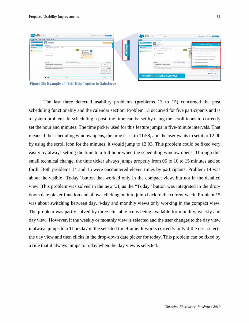
Proposed Usability Improvements 81
Christina Eberharter, Innsbruck 2019
Figure 36: Example of "Self-Help" option in Salesforce
The last three detected usability problems (problems 13 to 15) concerned the post
scheduling functionality and the calendar section. Problem 13 occurred for five participants and is
a system problem. In scheduling a post, the time can be set by using the scroll icons to correctly
set the hour and minutes. The time picker used for this feature jumps in five-minute intervals. That
means if the scheduling window opens, the time is set to 11:58, and the user wants to set it to 12:00
by using the scroll icon for the minutes, it would jump to 12:03. This problem could be fixed very
easily by always setting the time to a full hour when the scheduling window opens. Through this
small technical change, the time ticker always jumps properly from 05 to 10 to 15 minutes and so
forth. Both problems 14 and 15 were encountered eleven times by participants. Problem 14 was
about the visible “Today” button that worked only in the compact view, but not in the detailed
view. This problem was solved in the new UI, as the “Today” button was integrated in the drop-
down date picker function and allows clicking on it to jump back to the current week. Problem 15
was about switching between day, 4-day and monthly views only working in the compact view.
The problem was partly solved by three clickable icons being available for monthly, weekly and
day view. However, if the weekly or monthly view is selected and the user changes to the day view
it always jumps to a Thursday in the selected timeframe. It works correctly only if the user selects
the day view and then clicks in the drop-down date picker for today. This problem can be fixed by
a rule that it always jumps to today when the day view is selected.
Proposed Usability Improvements 82
Christina Eberharter, Innsbruck 2019
Additional recommendations for Onlim’s new UI
Due to an in-depth analysis of the videos from the usability lab and the comparison of the
results to the current UI, additional recommendations were identified that are worth considering in
a next software release:
➢ Currently, only Facebook pages can be added to Onlim. It would be valuable
if personal Facebook profiles also could be added to Onlim.
➢ The new post button appears only in the calendar section. Many competitor
applications have an ever-present “New post” button.
➢ Instagram is currently only available for accessing existing content via the
news feed option. It would add additional value to the Onlim SMM tool if
Instagram profiles could be actively managed from the application.
➢ Multi-user account: In order to make it more collaborative and team-
friendly. It is necessary that each user of a team, to see who did which action
in Onlim like an activity history. Additionally, it should be possible to assign
tasks within Onlim to other members of the team to increase team efficiency.
6.2. General Recommendations for SMM Tools
By conducting a benchmark analysis of Onlim and competitor SMM tools based on
available features, their distinctness, and their usability, it was possible to gather insights into
relevant functionality and usability. Based on the use case of SMM tools the required features
varied. In the particular use case of social publishing features, the most relevant functionality was
described in Section 2.1.2. According to TrustRadius (2018), those features include platform
integration, publishing that includes scheduling of posts, and calendar views that contain scheduled
posts, content suggestion engines, content libraries, a community management function and
analytics. Most of these features were examined during the benchmark analysis, facilitating the
gathering of more intel on value-adding features and usability recommendations for SMM tools.
Table 14 shows a list of additional recommendations identified during the benchmark performance.
These recommendations could be considered when creating or enhancing SMM tools.
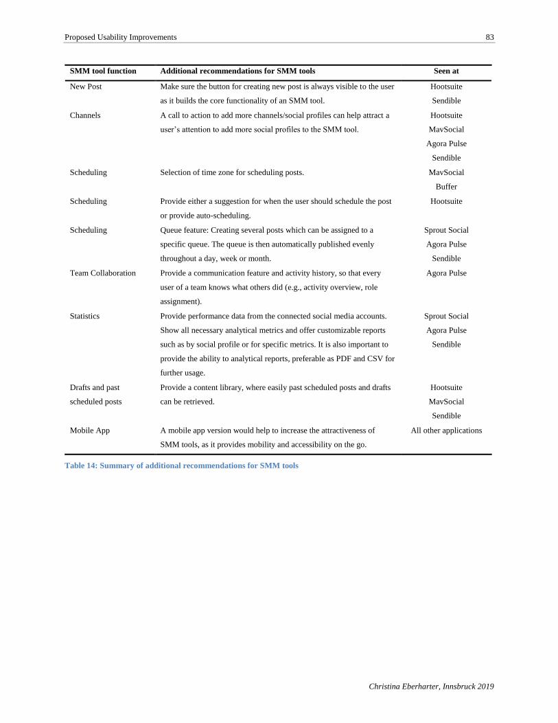
Proposed Usability Improvements 83
Christina Eberharter, Innsbruck 2019
SMM tool function Additional recommendations for SMM tools Seen at
New Post Make sure the button for creating new post is always visible to the user
as it builds the core functionality of an SMM tool.
Hootsuite
Sendible
Channels A call to action to add more channels/social profiles can help attract a
user’s attention to add more social profiles to the SMM tool.
Hootsuite
MavSocial
Agora Pulse
Sendible
Scheduling Selection of time zone for scheduling posts. MavSocial
Buffer
Scheduling Provide either a suggestion for when the user should schedule the post
or provide auto-scheduling.
Hootsuite
Scheduling Queue feature: Creating several posts which can be assigned to a
specific queue. The queue is then automatically published evenly
throughout a day, week or month.
Sprout Social
Agora Pulse
Sendible
Team Collaboration Provide a communication feature and activity history, so that every
user of a team knows what others did (e.g., activity overview, role
assignment).
Agora Pulse
Statistics Provide performance data from the connected social media accounts.
Show all necessary analytical metrics and offer customizable reports
such as by social profile or for specific metrics. It is also important to
provide the ability to analytical reports, preferable as PDF and CSV for
further usage.
Sprout Social
Agora Pulse
Sendible
Drafts and past
scheduled posts
Provide a content library, where easily past scheduled posts and drafts
can be retrieved.
Hootsuite
MavSocial
Sendible
Mobile App A mobile app version would help to increase the attractiveness of
SMM tools, as it provides mobility and accessibility on the go.
All other applications
Table 14: Summary of additional recommendations for SMM tools
Discussion 84
Christina Eberharter, Innsbruck 2019
7. Discussion
Among the key factors in making a buying decision for a SMM tool is a good user
experience and usability. In order to identify to which extant usability tests can detect user
experience improvements for a social media management tool, a usability evaluation was
conducted on the use case of the Onlim SMM tool and a benchmark analysis was performed based
on available features and user experience. Both applied methods allowed deeper insights on SMMS
and a broad spectrum of use cases as well as on user behavior and required usability.
The result of the benchmark analysis presented in Section 5.1 provided a strong impression
of how Onlim is competing against industry leaders. Onlim was compared against seven other
SMM tools including the most known applications, Hootsuite and Buffer. With a total score in the
benchmark analysis of 54.54 out of 79 possible points, Onlim ranked at the sixth place. However,
several strengths in Onlim’s features and user experience categories were identified. Simultaneous
post creation and a sophisticated RSS reader functionality are Onlim’s main strengths in terms of
user experience. Onlim scored high for usability, visual design and support feature and is only just
behind Hootsuite, Sprout Social and Sendible in those categories. The largest identified
shortcomings included a missing mobile app version as well as weak analytic reports for measuring
social media performance.
In order to create a quantifiable outcome of the benchmark analysis, the concept of the
utility analysis was used. The scoring model is based on Zangemeister’s (Bensberg, 2018) additive
utility analysis which allowed evaluation of alternative SMM tools based on defined criteria with
corresponding criteria weights. The utility clearly had some advantages since the breakdown of
criteria into sub-criteria provided a better overview of the evaluated segments and the
schematization of the evaluation process made the evaluation itself more transparent. Also, when
several evaluators were included in the evaluation, deviations in the evaluation could be more
easily detected. (Zangemeister, 1976, p. 34) One of the disadvantages of the utility analysis was
that ordinal scaled data is transformed to metric scaled data. Furthermore, the analysis assumed
that a single criteria could be completely compensated so that if one alternative has a deficit in one
criterion, it could be compensated for by over-fulfillment of another criterion. (Bensberg, 2018)
Another critical factor was the adequate justification of criteria selection, weighting, criteria
evaluation, type of scales and valuation principles. If there exists no adequate justification, then
Discussion 85
Christina Eberharter, Innsbruck 2019
even the formal transparency of the utility analysis as well as the inclusion of several evaluators
would fail to create meaningful results. (Zangemeister, 1976, p. 35) Consequently, the results of
the benchmark analysis carried out in this master thesis is a subjective result and may differ if more
than one evaluator had been considered for the evaluation of the SMM tools. The selection of the
criteria was based on the theoretical foundation about SMMS and only the relevant features of
SMM tools required for scheduling and posting were considered. The effort in establishing the
complete method for the benchmark analysis, based on the utility analysis and the execution of the
method with eight SMM tools, was quite an intensive workload. Furthermore, the results of the
analysis were already outdated as such Web applications like the SMM tools are constantly being
further developed. Rather, the results of this thesis can be seen as a snapshot that provide insights
for Onlim as to how they compete against others as well as providing some general
recommendations that can be considered when improving the functionality of SMM tools.
There are several limitations for both applied methods. For the benchmark analysis a
completely new form of the utility analysis had to be created for the specific Onlim use case. Also,
the utility analysis itself contains some weaknesses in terms of providing adequate justification for
criteria and weighting for the specific case SMM tool. No scientific literature was found to create
a baseline, therefore the literature that was used came from online portals that provide buyers’
guides for this specific type of Web application. Another limitation of the benchmark analysis is
that only one evaluator performed the analysis. Therefore, the detection of any kind of deviation in
the results was not possible.
To discover to which extent usability tests can detect user experience improvements, a
usability lab was conducted with 27 participants who used the previous UI version that existed
before the introduction of a new and improved UI design. By identifying usability problems in the
older version of the Onlim UI, it was possible to compare the findings against the new UI to see
how many problems had been solved without considering the outcome of a usability test. The
collected data consisted of video material taken from participants’ screens while they performed
six predefined tasks. The task ratings included time per task and SEQ as well as answers to four
open-ended questions. The participants were also asked to think aloud to provide a better
understanding of the reasoning for their performed actions. In the end, a data set for 20 of the
participants was used for the analysis. Usability metrics were also measured in addition to an in-
depth analysis of the video material to discover exactly where participants made errors and to
Discussion 86
Christina Eberharter, Innsbruck 2019
identify the actions that caused them to struggle while performing the tasks. The performance
metrics of time on task, task completion, and level of success were measured. Furthermore, the
self-reported SEQ metrics rated the task difficulty perceived by the users, also task success
perceived by user and provided answers to open-ended questions were analyzed. The time on task
provided a first indication that participants struggled the most at Tasks 1, 3 and 6. These results
were confirmed through the task completion rate and level of success. The latter metric was based
on a three-scale metric from 1 to 3, where a score of 1 meant task completion without problems, a
score of 2 meant there were some problems (e.g., the overall goal was reached but included a detour
in completing the task) and a score of 3 meant failure or quitting before the task completion. The
highest failure rate was detected in Task 3 and was confirmed through the found usability problems
in the in-depth video analysis. The SEQ indicated that overall the participants found the tasks
mostly easy or very easy. This provided a strong indication that the tasks were not too difficult and
that there existed actual usability problems in Onlim.
After completing the usability lab analysis, 15 usability problems were detected. Of these
detected problems, five were system related problems and ten were operational problems. By
comparing the identified usability problems with the new UI of Onlim, it was found that six
problems (one system and five operational problems) were solved. That is a fix rate of 40%, and
60% of the detected usability problems still exist. However, that 60% includes partly solved
problems and four system problems that the Onlim development team needs to examine whether
they still exist.
The conducted usability lab involved a qualitative user test categorized as a summative
usability study that was described in Section 2.2.2. The applied method was based on the usability
study scenarios of Tullis and Albert (Tullis & Albert, 2013, p. 45) with a focus on completed
transactions, navigation evaluation, problem detection and information architecture. According to
Sarodnik and Brau (2011), as cited in the book Usability and UX by Jacobsen and Meyer (2017, p.
189), usability tests with 20 participants can detect between 95% and 98.40% of usability problems.
Other methods to find usability problems would include a cognitive walk-through or heuristic
evaluation. According to Sarodnick and Brau (2011, p. 197), a heuristic evaluation would be more
successful on the level of skill-based and rule-based user performance whereas a usability test is
advantageous at a knowledge-based level. In the conducted comparison of heuristic evaluation and
user testing by Fu et al. (2010), the heuristic evaluation found 34 out of 39 usability problems while
Discussion 87
Christina Eberharter, Innsbruck 2019
the usability test found only 21 problems. A possible reason for the result can be that usability
experts are specialized in usability problems that are independent from domains. Sarodnick and
Brau (2011, p. 198) state that it becomes apparent that these different methods identify partly
different information and, therefore, they cannot be compared against each other.
For this master thesis the conducted usability lab was the best choice since usability experts
were not available when the usability study was conducted. However, Sarodnick and Brau (2011,
p. 198) would recommend applying several methods during the evaluation process to cover all
usability aspects. This is also one of the limitations of this master thesis in that no other usability
tests were applied and there was no repetitive testing. Also, no systematic usability scale (SUS)
questionnaire was provided to the participants after completing the usability lab. The resulting
scores of this survey would have provided another metric about the systems’ usability. Another
limitation of the conducted usability lab was the support tool used to record each participant session
and provide the task instructions. There were better tools on the market for conducting usability
testing, but due to a limited budget it was not possible to use a more advanced support software
such as Morae. The main problem of the usability testing tool was that the recording time was
limited to 30 minutes. Therefore, the length of the testing and the tasks itself needed to be defined
in a way that the participants are able to complete all tasks in time, otherwise the data of the
participants could not be used. Also, the first task of the test was too long since it included too
many sub-tasks. In retrospect, Task 1 should have been split into two tasks. The concurrent think
aloud technique didn’t work as expected. Around half of the participants performed the usability
test remotely with good audio sound, but the participants who performed the usability test in the
labs didn’t really think aloud all the time and the audio was rather poor. Other critical aspects of
the usability lab included the material and time effort (Sarodnick & Brau, 2011, p. 200). It required
a lot of effort to plan, organize, conduct, and evaluate the usability lab. As the evaluator was a non-
professional person conducting and evaluating the results, the usability problem findings and
resulting improvement proposal could be questioned.
Overall, this master thesis includes valuable outcome findings for Onlim that can help to
further improve the application, not only regarding usability but also in terms of feature extensions
that were a sub-result of the applied benchmark analysis. Furthermore, the identified usability
problems and their comparison to the new UI indicated that not all problems were solved through
Discussion 88
Christina Eberharter, Innsbruck 2019
the new UI. In fact, 60% of the detected usability problems still exist, although some are partly
fixed or are system problems.
References VI
References
Anand, G., & Kodali, R. (2008). Benchmarking the benchmarking models. Benchmarking, 15(3),
257–291. https://doi.org/10.1108/14635770810876593
Aslam, S. (2017). • Linkedin by the Numbers (2017): Stats, Demographics & Fun Facts.
Retrieved November 8, 2017, from https://www.omnicoreagency.com/linkedin-statistics/
Bensberg, F. (2018). Nutzwertanalyse. Retrieved August 28, 2018, from http://enzyklopaedie-der-
wirtschaftsinformatik.de/lexikon/is-management/Management-von-
Anwendungssystemen/Beschaffung-von-Anwendungssoftware/Nutzwertanalyse
Bevan, N. (1991). What is usability. Proceedings of the 4th International Conference on HCI.
Stuttgart.
Bevan, N. (1995). Human-computer interaction standards. Advances in Human
Factors/Ergonomics, 20(B), 885–890. https://doi.org/10.1016/S0921-2647(06)80326-6
Bevan, N. (2009). What is the difference between the purpose of usability and user experience
evaluation methods? Proceedings of the Workshop UXEM, 9, 1–4. Retrieved from
www.nigelbevan.com
Cone Inc. (2008). 2008 Business in Social Media Study. New York City. Retrieved from
http://www.conecomm.com/2008-cone-communications-business-in-social-media-study-
pdf/
Constantinides, E., & Fountain, S. J. (2008). Special Issue Papers Web 2.0: Conceptual foundations
and marketing issues. Journal of Direct, 9, 231–244.
https://doi.org/10.1057/palgrave.dddmp.4350098
Constine, J. (2017). Facebook now has 2 billion monthly users… and responsibility | TechCrunch.
Retrieved November 8, 2017, from https://techcrunch.com/2017/06/27/facebook-2-billion-
users/
Cooke, A. (2013). The Buyers Guide for Social Media Management Software. Retrieved from
https://www.slideshare.net/trustradius/buyers-guide-for-social-media-management-software-
2013?from_action=save
Fensel, A., Toma, I., García, J. M., Stavrakantonakis, I., & Fensel, D. (2014). Enabling customers
engagement and collaboration for small and medium-sized enterprises in ubiquitous multi-
channel ecosystems. Computers in Industry, 65(5), 891–904.
https://doi.org/10.1016/j.compind.2014.02.001
Fernandez, A., Insfran, E., & Abrahão, S. (2011). Usability evaluation methods for the web: A
systematic mapping study. Information and Software Technology, 53(8), 789–817.
Finances Online. (2018). What Is Social Media Management Software? Analysis of Features,
Pricing, Types and Benefits - Financesonline.com. Retrieved November 5, 2018, from
https://financesonline.com/social-media-management-software-analysis-features-pricing-
types-benefits/
References VII
Fraser Voigt, E. (2017). Enterprise Social Media Management Software: A Marketer’s Guide.
Retrieved from http://downloads.digitalmarketingdepot.com/rs/727-ZQE-
044/images/MIR_1505_EntSocMdia.pdf?mkt_tok=3RkMMJWWfF9wsRojsqzMZKXonjHp
fsX56OglXKG0hokz2EFye%2BLIHETpodcMTcZlMbHYDBceEJhqyQJxPr3CLtcNwMR4
RhHmDA%3D%3D
Fu, L., Salvendy, G., Turley, L., Fu{, L., Salvendy{, G., & Turley{, L. (2010). Effectiveness of
user testing and heuristic evaluation as a function of performance classification.
https://doi.org/10.1080/02699050110113688
G2 Crowd. (2018). Best Social Media Management Software in 2018. Retrieved November 16,
2018, from https://www.g2crowd.com/categories/social-media-mgmt
Hassan, S., & Li, F. (2005). Evaluating the Usability and Content Usefulness of Web Sites: A
Benchmarking. Journal of Electronic Commerce in Organizations, 3(2), 46–67.
ISO. (2010). ISO 9241-210:2010(en), Ergonomics of human-system interaction — Part 210:
Human-centred design for interactive systems. Retrieved October 22, 2018, from
https://www.iso.org/obp/ui#iso:std:iso:9241:-210:ed-1:v1:en
ISO. (2018). ISO 9241-11:2018(en), Ergonomics of human-system interaction — Part 11:
Usability: Definitions and concepts. Retrieved July 17, 2018, from
https://www.iso.org/obp/ui#iso:std:iso:9241:-11:ed-2:v1:en
Jacobsen, J., & Meyer, L. (2017). Praxisbuch Usability et UX : was jeder wissen sollte, der
Websites und Apps entwickelt.
Kaplan, A., & Haenlein, M. (2010). Users of the world, unite! The challenges and opportunities of
Social Media. Business Horizons. Retrieved from
http://www.sciencedirect.com/science/article/pii/S0007681309001232,
Kappel, G., Pröll, B., Reich, S., & Retschitzegger, W. (2006). Web engineering : the discipline of
systematic development of web applications. West Sussex: John Wiley & Sons Ltd.
Kennedy, K. (2016). Content Marketing Tools: The 9 Best on the Market (According to Users).
Retrieved August 7, 2017, from http://www.curata.com/blog/content-marketing-tools-9-best/
Leiner, B., Cerf, V., & Clark, D. (1997). The past and future history of the Internet.
Communications of the ACM. Retrieved from http://dl.acm.org/citation.cfm?id=253741
Mata, F. J., & Quesada, A. (2014). Web 2.0, Social Networks and E-commerce as Marketing Tools,
(1), 56–69. https://doi.org/10.4067/S0718-18762014000100006
Matera, M., Rizzo, F., & Toffetti Carughi, G. (2006). Web Usability: Principles and Evaluation
Methods. In N. M. Emilia Mendes (Ed.), Web Engineering (pp. 143–180). Springer. Retrieved
from https://www.researchgate.net/publication/262234352
Minazzi, R. (2015). Social Media Marketing in Tourism and Hospitality. Cham: Springer
International Publishing. Retrieved from http://link.springer.com/10.1007/978-3-319-05182-
6
Mousavi, S., & Demirkan, H. (2013). The Key to Social Media Implementation: Bridging
References VIII
Customer Relationship Management to Social Media. 46th Hawaii International Conference
on System Sciences, 718–727. Retrieved from
http://www.computer.org/csdl/proceedings/hicss/2013/4892/00/4892a718-abs.html
Nielsen, J. (1994). Usability Engineering. Elsevier.
O’Dell, J. (2011). The History of Social Media [INFOGRAPHIC]. Mashable. Retrieved from
http://mashable.com/2011/01/24/the-history-of-social-media-infographic/#tX7DFdHfpkq2
O’Reilly, T. (2005). Web 2.0: compact definition.
Onlim GmbH. (2018). Retrieved April 23, 2018, from https://onlim.com/en/company/
Sarodnick, F. 1974-, & Brau, H. (2011). Methoden der Usability Evaluation wissenschaftliche
Grundlagen und praktische Anwendung. Huber.
Seffah, A., Donyaee, M., Kline, R. B., & Padda, H. K. (2006). Usability measurement and metrics:
A consolidated model. Software Quality Journal, 14(2), 159–178.
https://doi.org/10.1007/s11219-006-7600-8
Sillence, E., Briggs, P., Fishwick, L., & Harris, P. (2004). Trust and mistrust of online health sites.
In Proceedings of the 2004 conference on Human factors in computing systems - CHI ’04 (pp.
663–670). New York, New York, USA: ACM Press. https://doi.org/10.1145/985692.985776
Silverman, D. (2018). IAB internet advertising revenue report 2017 full year results. Retrieved
from https://www.iab.com/wp-content/uploads/2018/05/IAB-2017-Full-Year-Internet-
Advertising-Revenue-Report.REV2_.pdf
Spendolini, M. (1992). The benchmarking book. New York: AMACON.
TrustRadius. (2018). Social Media Managment Tools. Retrieved from
https://www.trustradius.com/social-media-management
Tullis, T., & Albert, W. (2013). Measuring the user experience: collecting, analyzing, and
presenting usability metrics (2nd ed.). Elsevier. Retrieved from
https://books.google.de/books?hl=en&lr=&id=bPhLeMBLEkAC&oi=fnd&pg=PP1&dq=Me
asuring+the+user+experience&ots=R8QhksVZxN&sig=PZ4fp4jprhWY_StO0dYp6-vJ26k
Tuten, T. L., & Solomon, M. R. (2013). Social media marketing. Boston: Pearson Education.
Valos, M., Ewing, M., & Powell, I. (2010). Practitioner prognostications on the future of online
marketing. Journal of Marketing Management. Retrieved from
http://www.tandfonline.com/doi/abs/10.1080/02672571003594762
Venkatesh, V., Brown, S., & Bala, H. (2013). Bridging the qualitative-quantitative divide:
Guidelines for conducting mixed methods research in information systems. MIS Quarterly.
Retrieved from http://aisel.aisnet.org/cgi/viewcontent.cgi?article=3083&context=misq
Yousuf. (2017). 30 Insanely Elevated Website Design Stats for 2017 - 15792 | MyTechLogy [Blog
post]. Retrieved July 15, 2018, from https://www.mytechlogy.com/IT-blogs/15792/30-
insanely-elevated-website-design-stats-for-2017/#.W0uJPNIzaUk
References IX
Zangemeister, C. (1976). Nutzwertanalyse in der Systemtechnik : eine Methodik zur
multidimensionalen Bewertung und Auswahl von Projektalternativen (4th ed.). Wittemann.
Zangemeister, C. (2014). Nutzwertanalyse in der Systemtechnik : eine Methodik zur
multidimensionalen Bewertung und Auswahl von Projektalternativen (5th ed.). Retrieved
from
https://books.google.at/books?hl=en&lr=&id=odvxAwAAQBAJ&oi=fnd&pg=PA6&dq=za
ngemeister+nutzwertanalyse+in+der+systemtechnik&ots=MNX3iXLAHx&sig=wYRLkGw
SHVqfuqPeWmS4HU_VasQ#v=onepage&q=zangemeister nutzwertanalyse in der
systemtechnik&f=false
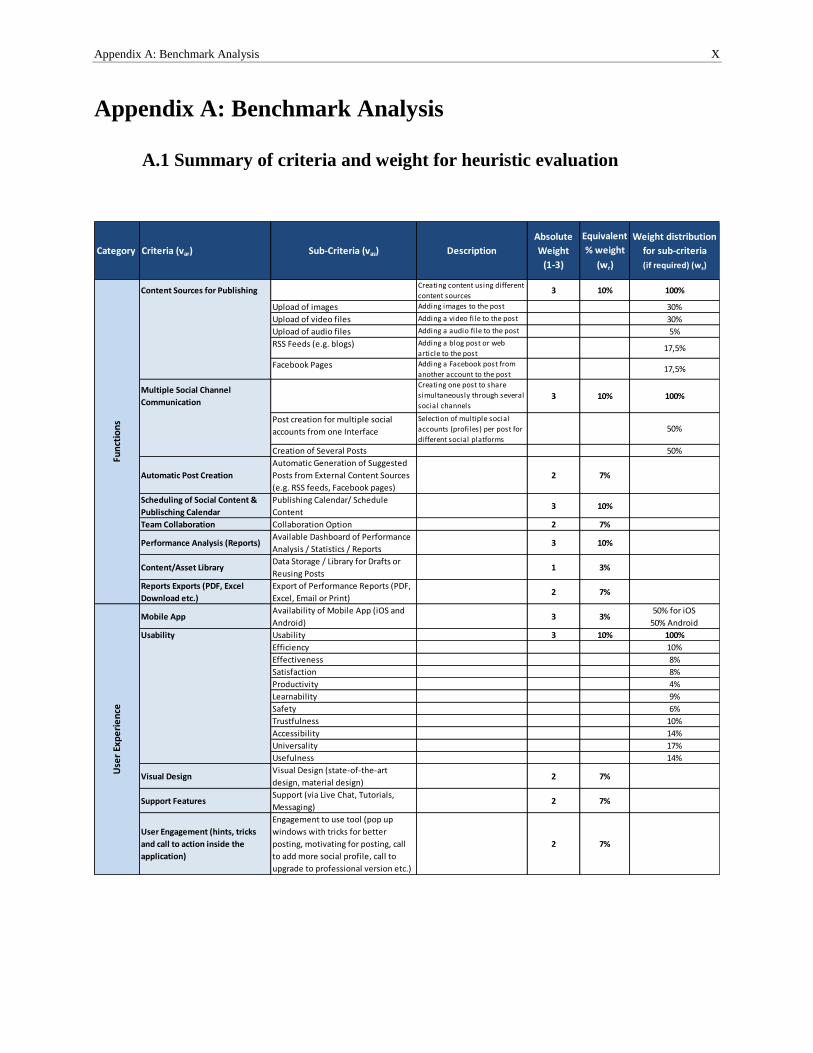
Appendix A: Benchmark Analysis X
Appendix A: Benchmark Analysis
A.1 Summary of criteria and weight for heuristic evaluation
Category Criteria (var) Sub-Criteria (vas) Description
Absolute
Weight
(1-3)
Equivalent
% weight
(wr)
Weight distribution
for sub-criteria
(if required) (ws)
Content Sources for PublishingCreating content using different
content sources3 10% 100%
Upload of images Adding images to the post 30%
Upload of video files Adding a video fi le to the post 30%
Upload of audio files Adding a audio fi le to the post 5%
RSS Feeds (e.g. blogs) Adding a blog post or web
article to the post17,5%
Facebook Pages Adding a Facebook post from
another account to the post17,5%
Multiple Social Channel
Communication
Creating one post to share
simultaneously through several
social channels3 10% 100%
Post creation for multiple social
accounts from one Interface
Selection of multiple social
accounts (profiles) per post for
different social platforms
50%
Creation of Several Posts 50%
Automatic Post Creation
Automatic Generation of Suggested
Posts from External Content Sources
(e.g. RSS feeds, Facebook pages)
2 7%
Scheduling of Social Content &
Publisching Calendar
Publishing Calendar/ Schedule
Content3 10%
Team Collaboration Collaboration Option 2 7%
Performance Analysis (Reports)Available Dashboard of Performance
Analysis / Statistics / Reports3 10%
Content/Asset LibraryData Storage / Library for Drafts or
Reusing Posts1 3%
Reports Exports (PDF, Excel
Download etc.)
Export of Performance Reports (PDF,
Excel, Email or Print)2 7%
Mobile AppAvailability of Mobile App (iOS and
Android)3 3%
50% for iOS
50% Android
Usability Usability 3 10% 100%
Efficiency 10%
Effectiveness 8%
Satisfaction 8%
Productivity 4%
Learnability 9%
Safety 6%
Trustfulness 10%
Accessibility 14%
Universality 17%
Usefulness 14%
Visual DesignVisual Design (state-of-the-art
design, material design)2 7%
Support FeaturesSupport (via Live Chat, Tutorials,
Messaging)2 7%
User Engagement (hints, tricks
and call to action inside the
application)
Engagement to use tool (pop up
windows with tricks for better
posting, motivating for posting, call
to add more social profile, call to
upgrade to professional version etc.)
2 7%
Fun
ctio
ns
Use
r Ex
pe
rie
nce
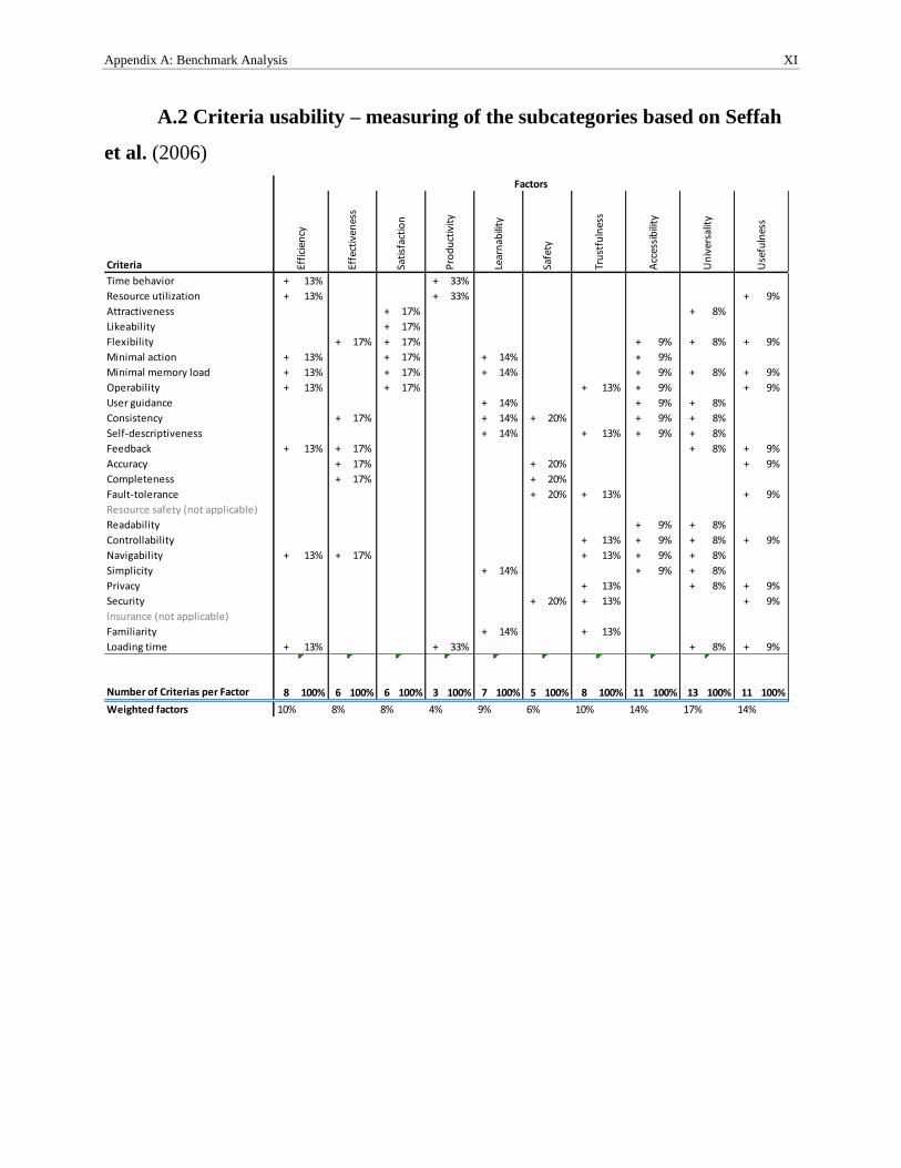
Appendix A: Benchmark Analysis XI
A.2 Criteria usability – measuring of the subcategories based on Seffah
et al. (2006)
Criteria
Time behavior + 13% + 33%
Resource utilization + 13% + 33% + 9%
Attractiveness + 17% + 8%
Likeability + 17%
Flexibility + 17% + 17% + 9% + 8% + 9%
Minimal action + 13% + 17% + 14% + 9%
Minimal memory load + 13% + 17% + 14% + 9% + 8% + 9%
Operability + 13% + 17% + 13% + 9% + 9%
User guidance + 14% + 9% + 8%
Consistency + 17% + 14% + 20% + 9% + 8%
Self-descriptiveness + 14% + 13% + 9% + 8%
Feedback + 13% + 17% + 8% + 9%
Accuracy + 17% + 20% + 9%
Completeness + 17% + 20%
Fault-tolerance + 20% + 13% + 9%
Resource safety (not applicable)
Readability + 9% + 8%
Controllability + 13% + 9% + 8% + 9%
Navigability + 13% + 17% + 13% + 9% + 8%
Simplicity + 14% + 9% + 8%
Privacy + 13% + 8% + 9%
Security + 20% + 13% + 9%
Insurance (not applicable)
Familiarity + 14% + 13%
Loading time + 13% + 33% + 8% + 9%
Number of Criterias per Factor 8 100% 6 100% 6 100% 3 100% 7 100% 5 100% 8 100% 11 100% 13 100% 11 100%
Weighted factors 10% 8% 8% 4% 9% 6% 10% 14% 17% 14%
Use
fuln
ess
Factors
Effi
cien
cy
Effe
ctiv
enes
s
Sati
sfac
tio
n
Pro
du
ctiv
ity
Lear
nab
ility
Safe
ty
Tru
stfu
lnes
s
Acc
essi
bili
ty
Un
iver
salit
y
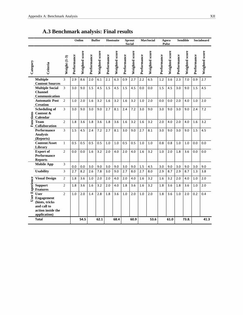
Appendix A: Benchmark Analysis XII
A.3 Benchmark analysis: Final results
Onlim Buffer Hootsuite Sprout
Social
MavSocial Agora
Pulse
Sendible Sociaboard
Ca
teg
ory
Cri
teri
a
Wei
gh
t (1
-3)
Per
form
an
ce
Wei
gh
ted
sco
re
Per
form
an
ce
Wei
gh
ted
sco
re
Per
form
an
ce
Wei
gh
ted
sco
re
Per
form
an
ce
Wei
gh
ted
sco
re
Per
form
an
ce
Wei
gh
ted
sco
re
Per
form
an
ce
Wei
gh
ted
sco
re
Per
form
an
ce
Wei
gh
ted
sco
re
Per
form
an
ce
Wei
gh
ted
sco
re
Fu
nct
ion
s
Multiple
Content Sources
3 2.9 8.6 2.0 6.1 2.1 6.3 0.9 2.7 2.2 6.5 1.2 3.6 2.3 7.0 0.9 2.7
Multiple Social
Channel
Communication
3 3.0 9.0 1.5 4.5 1.5 4.5 1.5 4.5 0.0 0.0 1.5 4.5 3.0 9.0 1.5 4.5
Automatic Post
Creation
2 1.0 2.0 1.6 3.2 1.6 3.2 1.6 3.2 1.0 2.0 0.0 0.0 2.0 4.0 1.0 2.0
Scheduling of
Content &
Calendar
3 3.0 9.0 3.0 9.0 2.7 8.1 2.4 7.2 3.0 9.0 3.0 9.0 3.0 9.0 2.4 7.2
Team
Collaboration
2 1.8 3.6 1.8 3.6 1.8 3.6 1.6 3.2 1.6 3.2 2.0 4.0 2.0 4.0 1.6 3.2
Performance
Analysis
(Reports)
3 1.5 4.5 2.4 7.2 2.7 8.1 3.0 9.0 2.7 8.1 3.0 9.0 3.0 9.0 1.5 4.5
Content/Asset
Library
1 0.5 0.5 0.5 0.5 1.0 1.0 0.5 0.5 1.0 1.0 0.8 0.8 1.0 1.0 0.0 0.0
Export of
Performance
Reports
2 0.0 0.0 1.6 3.2 2.0 4.0 2.0 4.0 1.6 3.2 1.0 2.0 1.8 3.6 0.0 0.0
Use
r E
xp
erie
nce
Mobile App 3 0.0 0.0 3.0 9.0 3.0 9.0 3.0 9.0 1.5 4.5 3.0 9.0 3.0 9.0 3.0 9.0
Usability 3 2.7 8.2 2.6 7.8 3.0 9.0 2.7 8.0 2.7 8.0 2.9 8.7 2.9 8.7 1.3 3.8
Visual Design 2 1.8 3.6 1.0 2.0 2.0 4.0 2.0 4.0 1.6 3.2 1.6 3.2 2.0 4.0 1.0 2.0
Support
Features
2 1.8 3.6 1.6 3.2 2.0 4.0 1.8 3.6 1.6 3.2 1.8 3.6 1.8 3.6 1.0 2.0
User
Engagement
(hints, tricks
and call to
action inside the
application)
2 1.0 2.0 1.4 2.8 1.8 3.6 1.0 2.0 1.0 2.0 1.8 3.6 1.0 2.0 0.2 0.4
Total 54.5 62.1 68.4 60.9 53.6 61.0 73.8. 41.3
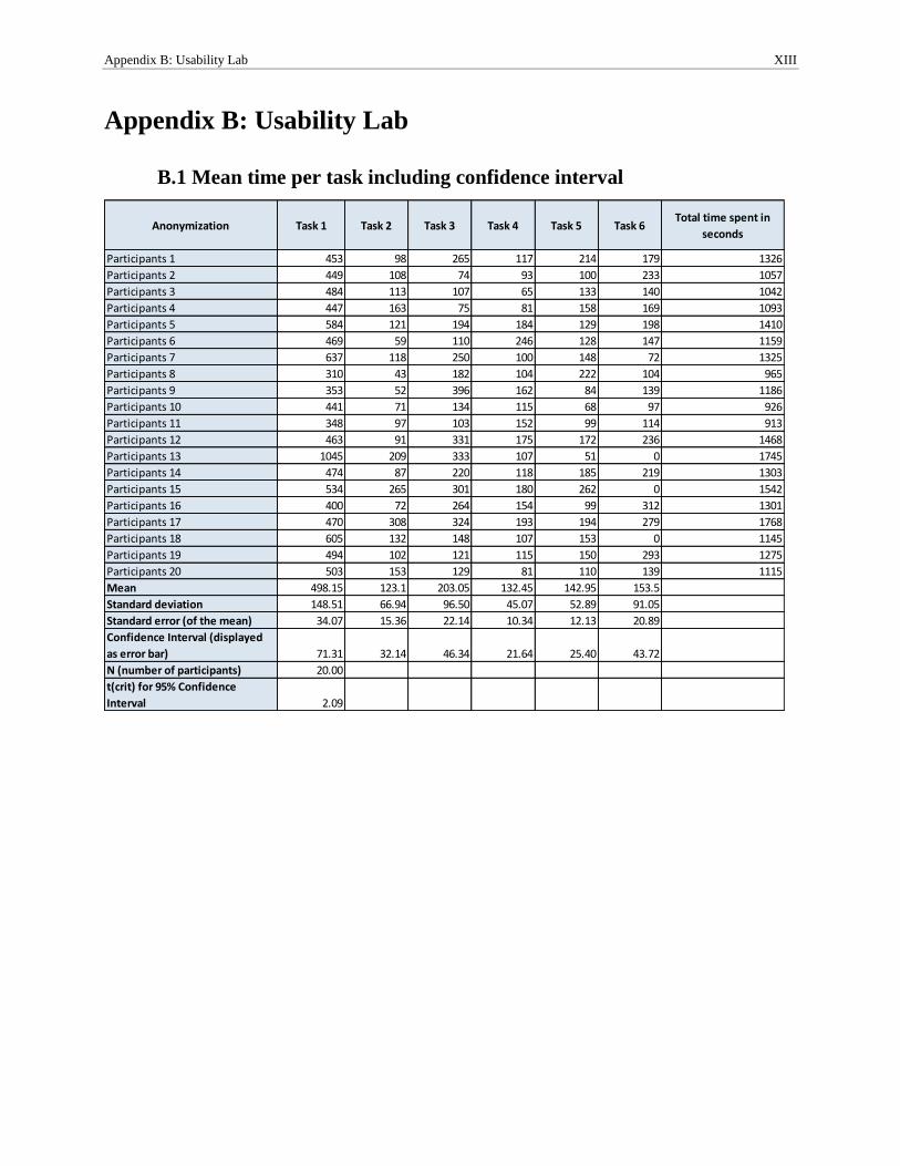
Appendix B: Usability Lab XIII
Appendix B: Usability Lab
B.1 Mean time per task including confidence interval
Anonymization Task 1 Task 2 Task 3 Task 4 Task 5 Task 6Total time spent in
seconds
Participants 1 453 98 265 117 214 179 1326
Participants 2 449 108 74 93 100 233 1057
Participants 3 484 113 107 65 133 140 1042
Participants 4 447 163 75 81 158 169 1093
Participants 5 584 121 194 184 129 198 1410
Participants 6 469 59 110 246 128 147 1159
Participants 7 637 118 250 100 148 72 1325
Participants 8 310 43 182 104 222 104 965
Participants 9 353 52 396 162 84 139 1186
Participants 10 441 71 134 115 68 97 926
Participants 11 348 97 103 152 99 114 913
Participants 12 463 91 331 175 172 236 1468
Participants 13 1045 209 333 107 51 0 1745
Participants 14 474 87 220 118 185 219 1303
Participants 15 534 265 301 180 262 0 1542
Participants 16 400 72 264 154 99 312 1301
Participants 17 470 308 324 193 194 279 1768
Participants 18 605 132 148 107 153 0 1145
Participants 19 494 102 121 115 150 293 1275
Participants 20 503 153 129 81 110 139 1115
Mean 498.15 123.1 203.05 132.45 142.95 153.5
Standard deviation 148.51 66.94 96.50 45.07 52.89 91.05
Standard error (of the mean) 34.07 15.36 22.14 10.34 12.13 20.89
Confidence Interval (displayed
as error bar) 71.31 32.14 46.34 21.64 25.40 43.72
N (number of participants) 20.00
t(crit) for 95% Confidence
Interval 2.09
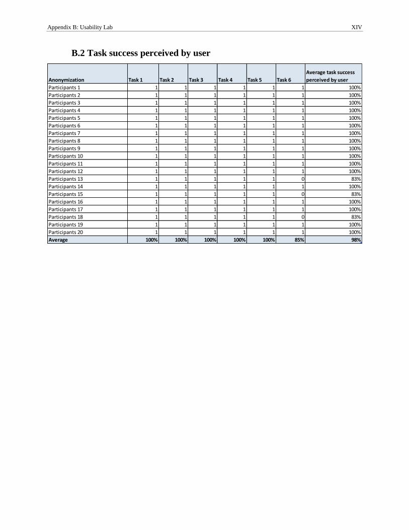
Appendix B: Usability Lab XIV
B.2 Task success perceived by user
Anonymization Task 1 Task 2 Task 3 Task 4 Task 5 Task 6
Average task success
perceived by user
Participants 1 1 1 1 1 1 1 100%
Participants 2 1 1 1 1 1 1 100%
Participants 3 1 1 1 1 1 1 100%
Participants 4 1 1 1 1 1 1 100%
Participants 5 1 1 1 1 1 1 100%
Participants 6 1 1 1 1 1 1 100%
Participants 7 1 1 1 1 1 1 100%
Participants 8 1 1 1 1 1 1 100%
Participants 9 1 1 1 1 1 1 100%
Participants 10 1 1 1 1 1 1 100%
Participants 11 1 1 1 1 1 1 100%
Participants 12 1 1 1 1 1 1 100%
Participants 13 1 1 1 1 1 0 83%
Participants 14 1 1 1 1 1 1 100%
Participants 15 1 1 1 1 1 0 83%
Participants 16 1 1 1 1 1 1 100%
Participants 17 1 1 1 1 1 1 100%
Participants 18 1 1 1 1 1 0 83%
Participants 19 1 1 1 1 1 1 100%
Participants 20 1 1 1 1 1 1 100%
Average 100% 100% 100% 100% 100% 85% 98%
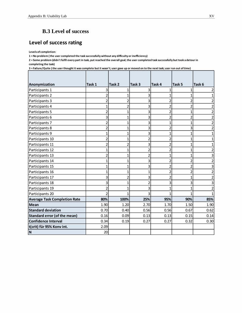
Appendix B: Usability Lab XV
B.3 Level of success
Level of success rating
Anonymization Task 1 Task 2 Task 3 Task 4 Task 5 Task 6
Participants 1 3 1 3 1 1 2
Participants 2 2 1 3 1 1 1
Participants 3 2 2 3 2 2 2
Participants 4 1 2 3 2 2 2
Participants 5 2 1 3 2 1 2
Participants 6 3 1 3 2 2 2
Participants 7 2 1 3 1 1 2
Participants 8 2 1 3 2 3 2
Participants 9 1 1 3 1 1 1
Participants 10 2 1 2 2 1 1
Participants 11 2 2 3 2 1 1
Participants 12 1 1 2 2 1 2
Participants 13 2 1 2 1 1 3
Participants 14 1 1 3 2 2 2
Participants 15 1 1 3 2 2 3
Participants 16 1 1 1 2 2 2
Participants 17 3 2 3 2 1 2
Participants 18 3 1 2 3 3 3
Participants 19 2 1 3 1 1 2
Participants 20 2 1 3 1 1 1
Average Task Completion Rate 80% 100% 25% 95% 90% 85%
Mean 1.90 1.20 2.70 1.70 1.50 1.90
Standard deviation 0.70 0.40 0.56 0.56 0.67 0.62
Standard error (of the mean) 0.16 0.09 0.13 0.13 0.15 0.14
Confidence Interval 0.34 0.19 0.27 0.27 0.32 0.30
t(crit) für 95% Konv int. 2.09
N 20
Levels of completion:
1 = No problem ( the user completed the task successfully without any difficulty or inefficiency)
2 = Some problem (didn't fulfil every part in task, put reached the overall goal; the user completed task successfully but took a detour in
completing the task)
3 = Failure/Quite ( the user thought it was complete but it wasn't; user gave up or moved on to the next task; user run out of time)
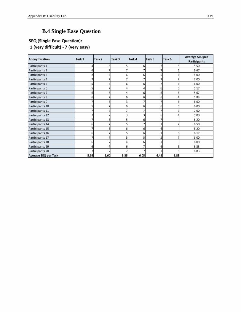
Appendix B: Usability Lab XVI
B.4 Single Ease Question
Anonymization Task 1 Task 2 Task 3 Task 4 Task 5 Task 6Average SEQ per
Participants
Participants 1 4 6 5 6 7 5 5.50
Participants 2 6 7 7 7 7 6 6.67
Participants 3 2 5 6 6 5 6 5.00
Participants 4 7 7 7 7 7 7 7.00
Participants 5 5 6 6 6 7 6 6.00
Participants 6 5 7 4 4 6 5 5.17
Participants 7 6 6 4 6 6 6 5.67
Participants 8 6 7 6 6 6 4 5.83
Participants 9 7 6 3 7 7 6 6.00
Participants 10 5 7 6 6 6 6 6.00
Participants 11 7 7 7 7 7 7 7.00
Participants 12 7 7 3 3 6 4 5.00
Participants 13 7 6 5 6 7 6.20
Participants 14 6 7 5 7 7 7 6.50
Participants 15 7 6 6 6 6 6.20
Participants 16 6 7 5 6 7 6 6.17
Participants 17 7 7 5 5 5 7 6.00
Participants 18 6 7 4 6 7 6.00
Participants 19 6 7 6 7 6 6 6.33
Participants 20 7 7 7 7 7 6 6.83
Average SEQ per Task 5.95 6.60 5.35 6.05 6.45 5.88
SEQ (Single Ease Question):
1 (very difficult) - 7 (very easy)
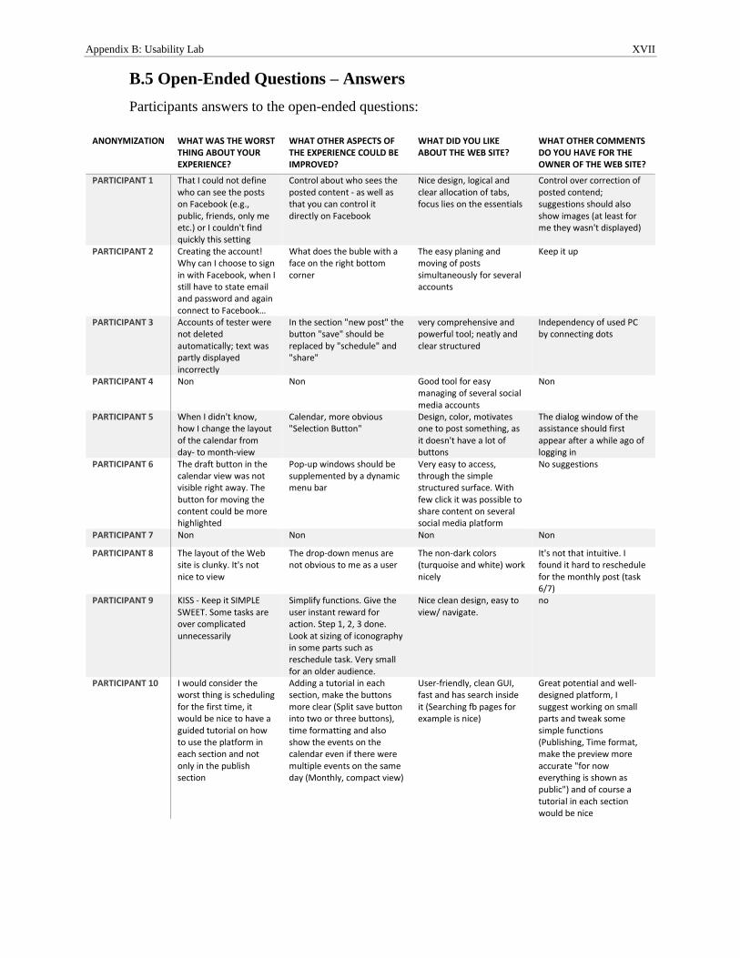
Appendix B: Usability Lab XVII
B.5 Open-Ended Questions – Answers
Participants answers to the open-ended questions:
ANONYMIZATION WHAT WAS THE WORST THING ABOUT YOUR EXPERIENCE?
WHAT OTHER ASPECTS OF THE EXPERIENCE COULD BE IMPROVED?
WHAT DID YOU LIKE ABOUT THE WEB SITE?
WHAT OTHER COMMENTS DO YOU HAVE FOR THE OWNER OF THE WEB SITE?
PARTICIPANT 1 That I could not define who can see the posts on Facebook (e.g., public, friends, only me etc.) or I couldn't find quickly this setting
Control about who sees the posted content - as well as that you can control it directly on Facebook
Nice design, logical and clear allocation of tabs, focus lies on the essentials
Control over correction of posted contend; suggestions should also show images (at least for me they wasn't displayed)
PARTICIPANT 2 Creating the account! Why can I choose to sign in with Facebook, when I still have to state email and password and again connect to Facebook…
What does the buble with a face on the right bottom corner
The easy planing and moving of posts simultaneously for several accounts
Keep it up
PARTICIPANT 3 Accounts of tester were not deleted automatically; text was partly displayed incorrectly
In the section "new post" the button "save" should be replaced by "schedule" and "share"
very comprehensive and powerful tool; neatly and clear structured
Independency of used PC by connecting dots
PARTICIPANT 4 Non Non Good tool for easy managing of several social media accounts
Non
PARTICIPANT 5 When I didn't know, how I change the layout of the calendar from day- to month-view
Calendar, more obvious "Selection Button"
Design, color, motivates one to post something, as it doesn't have a lot of buttons
The dialog window of the assistance should first appear after a while ago of logging in
PARTICIPANT 6 The draft button in the calendar view was not visible right away. The button for moving the content could be more highlighted
Pop-up windows should be supplemented by a dynamic menu bar
Very easy to access, through the simple structured surface. With few click it was possible to share content on several social media platform
No suggestions
PARTICIPANT 7 Non Non Non Non
PARTICIPANT 8 The layout of the Web site is clunky. It's not nice to view
The drop-down menus are not obvious to me as a user
The non-dark colors (turquoise and white) work nicely
It's not that intuitive. I found it hard to reschedule for the monthly post (task 6/7)
PARTICIPANT 9 KISS - Keep it SIMPLE SWEET. Some tasks are over complicated unnecessarily
Simplify functions. Give the user instant reward for action. Step 1, 2, 3 done. Look at sizing of iconography in some parts such as reschedule task. Very small for an older audience.
Nice clean design, easy to view/ navigate.
no
PARTICIPANT 10 I would consider the worst thing is scheduling for the first time, it would be nice to have a guided tutorial on how to use the platform in each section and not only in the publish section
Adding a tutorial in each section, make the buttons more clear (Split save button into two or three buttons), time formatting and also show the events on the calendar even if there were multiple events on the same day (Monthly, compact view)
User-friendly, clean GUI, fast and has search inside it (Searching fb pages for example is nice)
Great potential and well-designed platform, I suggest working on small parts and tweak some simple functions (Publishing, Time format, make the preview more accurate "for now everything is shown as public") and of course a tutorial in each section would be nice
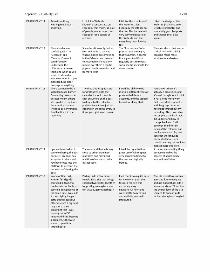
Appendix B: Usability Lab XVIII
PARTICIPANT 11 Actually nothing. Nothing really was annoying.
I think the Web site shouldn't concentrate on Facebook that much, as a lot of people, me included quit Facebook for a couple of reasons.
I did like the structure of the Web site a lot. Especially the left bar on the site. This bar made it very easy to navigate on the Web site and find everything I was looking for.
I liked the design of the Web site (matching colors, structure of labels), and how easily you plan posts and change their date again.
PARTICIPANT 12 The calendar was confusing with the "Detailed" and "Compact" view. I couldn't really understand the difference between them and when to use what. If I clicked an article to zoom in it just didnt load, no error message or anything.
Some functions only had an icon and no text, such as when I clicked on something in the Calendar and wanted to reschedule. If I hold my mouse over them a tooltip pops up but it seems it could be more clear.
The "live preview" of a post as I was writing it, that was great. It seems like a great tool if you regularly post to several social media sites with the same content.
The calendar is obviously a critical tool and I think it could be made more intuitive to understand.
PARTICIPANT 13 There seemed to be a slight language barrier. Connecting how some phrases meant others ate up a lot of my time, for a service that was trying to be convenient. You'll notice it in the recording.
The drag-and-drop feature for draft posts onto the calendar. I should be able to click anywhere on the post to drag it to the calendar position I want. Not just by clicking on the cross arrow in it's upper right hand corner.
I liked the ability to do multiple different types of posts with different accounts, and the tabbed format for doing that.
You know, I think it's actually a great idea, and it's well thought out. I think it has a little more work that is needed, especially with language. You can note that throughout my recording. Also, I was able to complete the final task. I did understand how to change back and forth between the different views of the calendar and reschedule posts. So, just consider the language element of how users should be using this tool, to make it more effective.
PARTICIPANT 14 I got confused when it came to sharing the post because Facebook has an option to share and you have to go into the platform to perform the same task of sharing the post.
The color and theme is very close to other prominent platforms and may need addition of colors to really attract users.
I liked the organization, great use of white space, very accommodating to the user and logically framed.
It is a very interesting thing because it makes the process of social media interaction efficient.
PARTICIPANT 15 In one of final tasks where I felt slightly confused in trying to reschedule the feeds to coincide being posted at the same time. As result, it took slightly longer to carry out this task but otherwise not a big deal, only due to time constraint that I was running out of 30 minutes did this become a problem. Otherwise smooth operation throughout :)
Perhaps add a few more visuals. It's a site that brings social network sites together for posting so maybe some fun visuals, games perhaps?
I felt that it was quite easy for me to carry out the tasks so the site was extremely easy to navigate. All functions were pretty easy to find and well site was well structured.
The site overall was rather easy and fun to navigate and use but perhaps add a few more visuals? I felt that the overall look of the site seemed to appear quite technical maybe or maybe?
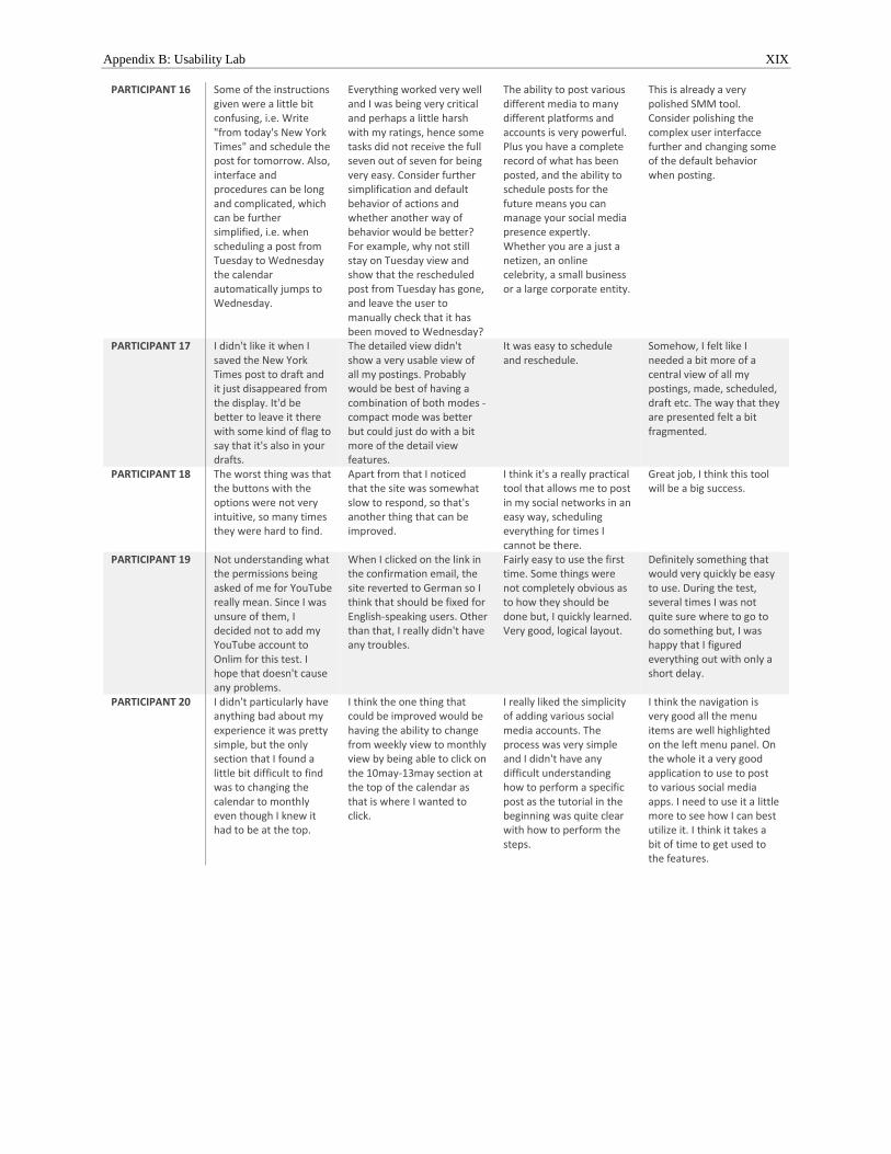
Appendix B: Usability Lab XIX
PARTICIPANT 16 Some of the instructions given were a little bit confusing, i.e. Write "from today's New York Times" and schedule the post for tomorrow. Also, interface and procedures can be long and complicated, which can be further simplified, i.e. when scheduling a post from Tuesday to Wednesday the calendar automatically jumps to Wednesday.
Everything worked very well and I was being very critical and perhaps a little harsh with my ratings, hence some tasks did not receive the full seven out of seven for being very easy. Consider further simplification and default behavior of actions and whether another way of behavior would be better? For example, why not still stay on Tuesday view and show that the rescheduled post from Tuesday has gone, and leave the user to manually check that it has been moved to Wednesday?
The ability to post various different media to many different platforms and accounts is very powerful. Plus you have a complete record of what has been posted, and the ability to schedule posts for the future means you can manage your social media presence expertly. Whether you are a just a netizen, an online celebrity, a small business or a large corporate entity.
This is already a very polished SMM tool. Consider polishing the complex user interfacce further and changing some of the default behavior when posting.
PARTICIPANT 17 I didn't like it when I saved the New York Times post to draft and it just disappeared from the display. It'd be better to leave it there with some kind of flag to say that it's also in your drafts.
The detailed view didn't show a very usable view of all my postings. Probably would be best of having a combination of both modes - compact mode was better but could just do with a bit more of the detail view features.
It was easy to schedule and reschedule.
Somehow, I felt like I needed a bit more of a central view of all my postings, made, scheduled, draft etc. The way that they are presented felt a bit fragmented.
PARTICIPANT 18 The worst thing was that the buttons with the options were not very intuitive, so many times they were hard to find.
Apart from that I noticed that the site was somewhat slow to respond, so that's another thing that can be improved.
I think it's a really practical tool that allows me to post in my social networks in an easy way, scheduling everything for times I cannot be there.
Great job, I think this tool will be a big success.
PARTICIPANT 19 Not understanding what the permissions being asked of me for YouTube really mean. Since I was unsure of them, I decided not to add my YouTube account to Onlim for this test. I hope that doesn't cause any problems.
When I clicked on the link in the confirmation email, the site reverted to German so I think that should be fixed for English-speaking users. Other than that, I really didn't have any troubles.
Fairly easy to use the first time. Some things were not completely obvious as to how they should be done but, I quickly learned. Very good, logical layout.
Definitely something that would very quickly be easy to use. During the test, several times I was not quite sure where to go to do something but, I was happy that I figured everything out with only a short delay.
PARTICIPANT 20 I didn't particularly have anything bad about my experience it was pretty simple, but the only section that I found a little bit difficult to find was to changing the calendar to monthly even though I knew it had to be at the top.
I think the one thing that could be improved would be having the ability to change from weekly view to monthly view by being able to click on the 10may-13may section at the top of the calendar as that is where I wanted to click.
I really liked the simplicity of adding various social media accounts. The process was very simple and I didn't have any difficult understanding how to perform a specific post as the tutorial in the beginning was quite clear with how to perform the steps.
I think the navigation is very good all the menu items are well highlighted on the left menu panel. On the whole it a very good application to use to post to various social media apps. I need to use it a little more to see how I can best utilize it. I think it takes a bit of time to get used to the features.
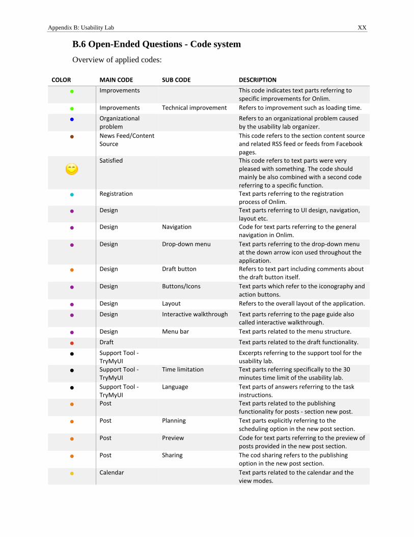
Appendix B: Usability Lab XX
B.6 Open-Ended Questions - Code system
Overview of applied codes:
COLOR MAIN CODE SUB CODE DESCRIPTION
● Improvements
This code indicates text parts referring to specific improvements for Onlim.
● Improvements Technical improvement Refers to improvement such as loading time.
● Organizational problem
Refers to an organizational problem caused by the usability lab organizer.
● News Feed/Content Source
This code refers to the section content source and related RSS feed or feeds from Facebook pages.
Satisfied
This code refers to text parts were very pleased with something. The code should mainly be also combined with a second code referring to a specific function.
● Registration
Text parts referring to the registration process of Onlim.
● Design
Text parts referring to UI design, navigation, layout etc.
● Design Navigation Code for text parts referring to the general navigation in Onlim.
● Design Drop-down menu Text parts referring to the drop-down menu at the down arrow icon used throughout the application.
● Design Draft button Refers to text part including comments about the draft button itself.
● Design Buttons/Icons Text parts which refer to the iconography and action buttons.
● Design Layout Refers to the overall layout of the application.
● Design Interactive walkthrough Text parts referring to the page guide also called interactive walkthrough.
● Design Menu bar Text parts related to the menu structure.
● Draft
Text parts related to the draft functionality.
● Support Tool - TryMyUI
Excerpts referring to the support tool for the usability lab.
● Support Tool - TryMyUI
Time limitation Text parts referring specifically to the 30 minutes time limit of the usability lab.
● Support Tool - TryMyUI
Language Text parts of answers referring to the task instructions.
● Post
Text parts related to the publishing functionality for posts - section new post.
● Post Planning Text parts explicitly referring to the scheduling option in the new post section.
● Post Preview Code for text parts referring to the preview of posts provided in the new post section.
● Post Sharing The cod sharing refers to the publishing option in the new post section.
● Calendar
Text parts related to the calendar and the view modes.
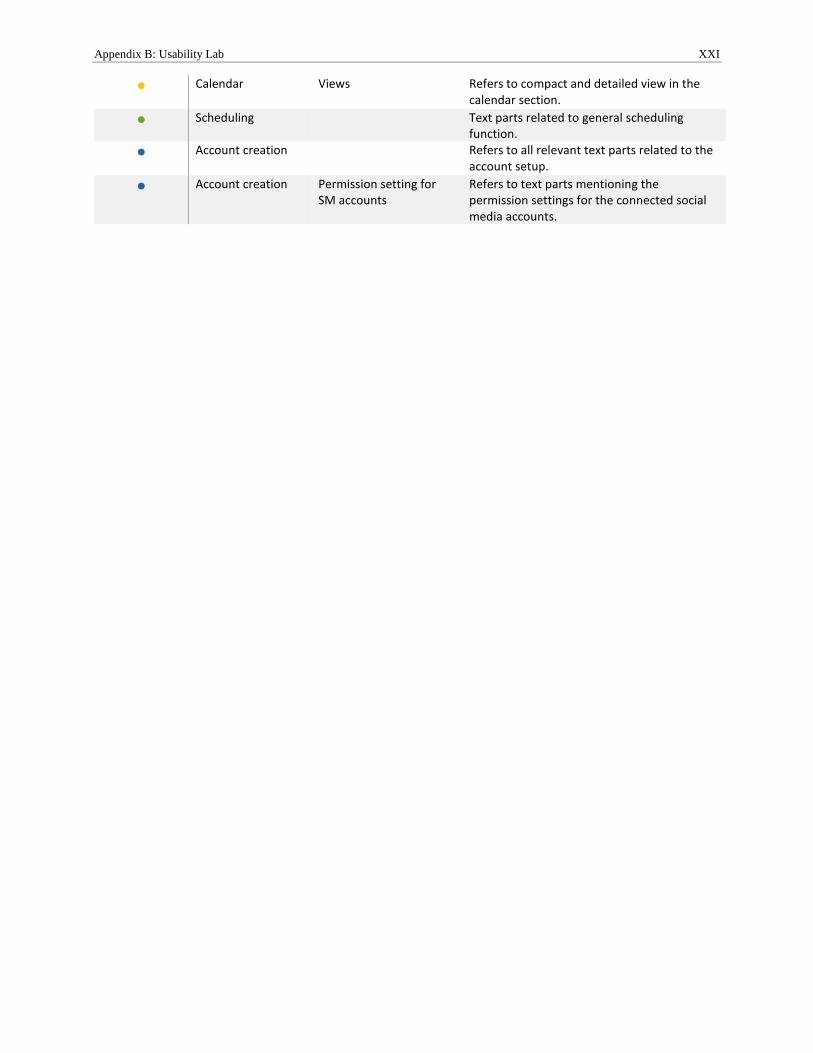
Appendix B: Usability Lab XXI
● Calendar Views Refers to compact and detailed view in the calendar section.
● Scheduling
Text parts related to general scheduling function.
● Account creation
Refers to all relevant text parts related to the account setup.
● Account creation Permission setting for SM accounts
Refers to text parts mentioning the permission settings for the connected social media accounts.
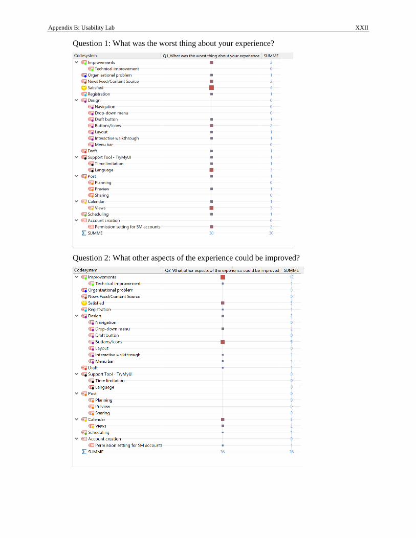
Appendix B: Usability Lab XXII
Question 1: What was the worst thing about your experience?
Question 2: What other aspects of the experience could be improved?
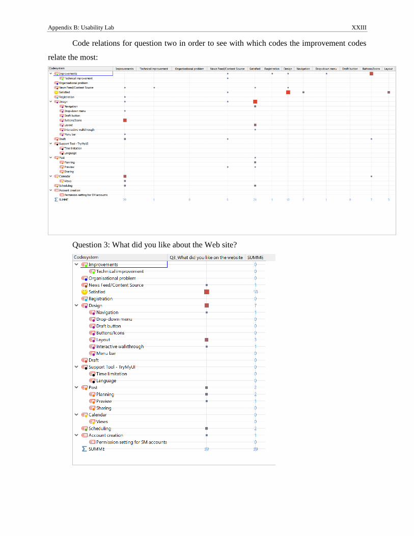
Appendix B: Usability Lab XXIII
Code relations for question two in order to see with which codes the improvement codes
relate the most:
Question 3: What did you like about the Web site?
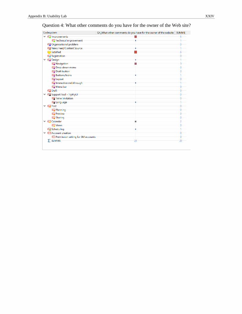
Appendix B: Usability Lab XXIV
Question 4: What other comments do you have for the owner of the Web site?
Related Documents