Improving Clustering of Gene Expression Patterns Per Jonsson Department of Computer Science University College of Skövde S-54128 Skövde, SWEDEN HS-IDA-MD-00-005

Welcome message from author
This document is posted to help you gain knowledge. Please leave a comment to let me know what you think about it! Share it to your friends and learn new things together.
Transcript

Improving Clustering ofGene Expression Patterns
Per Jonsson
Department of Computer Science
University College of Skövde
S-54128 Skövde, SWEDEN
HS-IDA-MD-00-005

Improving Clustering of
Gene Expression Patterns
Per Jonsson
Submitted by Per Johnson to Högskolan Skövde as a
dissertation for the degree of M.Sc., by examination and
dissertation in the Department of Computer Science.
I certify that all material in this dissertation which is not my
own work has been identified and that no material is
included for which a degree has previously been conferred
upon me.
October 2000
Signed:
Per Jonsson

Improving Clustering of Gene Expression Patterns
Abstract
The central question investigated in this project was whether clustering of gene
expression patterns could be done more biologically accurate by providing the
clustering technique with additional information about the genes as input besides the
expression levels. With the term biologically accurate we mean that the genes should
not only be clustered together according to their similarities in expression profiles,
but also according to their functional similarity in terms of functional annotation and
metabolic pathway. The data was collected at AstraZeneca R&D Mölndal Sweden
and the applied computational technique was self-organizing maps. In our
experiments we used the combination of expression profiles together with enzyme
classification annotation as input for the self-organising maps instead of just the
expression profiles. The results were evaluated both statistically and biologically.
The statistical evaluation showed that our method resulted in a small decrease in
terms of compactness and isolation. The biological evaluation showed that our
method resulted in clusters with greater functional homogeneity with respect to
enzyme classification, functional hierarchy and metabolic pathway annotation.
Keywords: gene expression analysis | functional annotation | clustering techniques |
self-organizing maps

I
Contents
1 Introduction ........................................................................................... 11.1 The project and its perspective............................................................................ 3
1.2 The structure of the thesis ................................................................................... 5
2 Background............................................................................................ 62.1 Biological concepts ............................................................................................. 6
2.1.1 DNA transcription ....................................................................................... 7
2.1.2 Protein synthesis.......................................................................................... 9
2.1.3 Gene annotation......................................................................................... 11
2.2 Gene expression analysis .................................................................................. 14
2.2.1 Gene expression ........................................................................................ 15
2.2.2 Measuring techniques for mRNA levels ................................................... 16
2.2.3 Measuring techniques for protein levels ................................................... 19
2.3 Statistical and computational analysis techniques ............................................ 19
2.3.1 Self-organizing maps................................................................................. 21
2.4 Related Work .................................................................................................... 26
2.4.1 Gene expression clustering........................................................................ 26
2.4.2 Classification of annotation....................................................................... 30
3 Thesis statement .................................................................................. 333.1 Motivating the aim ............................................................................................ 33
3.2 The objectives of the project ............................................................................. 35
4 Method and experiments .................................................................... 384.1 What dataset should be used? ........................................................................... 38
4.1.1 Choice of clustering technique and implementation thereof..................... 41
4.2 What annotation should be used?...................................................................... 42
4.2.1 Enzyme classification................................................................................ 43
4.3 How can the annotation be used?...................................................................... 45
4.3.1 Construction of input vectors for the SOM............................................... 46
4.4 How to set the parameters for the self-organising maps? ................................. 49
4.4.1 Experimental design .................................................................................. 55
4.5 How to measure “biological correctness”? ....................................................... 55
4.6 How to evaluate the results? ............................................................................. 56

II
4.6.1 Statistical evaluation.................................................................................. 56
4.6.2 Biological evaluation................................................................................. 61
5 Results and analysis ............................................................................ 63Topology ............................................................................................................ 63
6 Conclusion............................................................................................ 76
7 Discussion............................................................................................. 787.1 Future work ....................................................................................................... 78
Acknowledgements................................................................................. 80
Bibliography ............................................................................................ 81
Appendix A ............................................................................................. 85

1 Introduction
1
1 Introduction
Bioinformatics is a rather new scientific discipline that has not been around for more
than a decade or so, and it encompasses all aspects of biological information
acquisition, processing, analysis and storage (Attwood et al. 1999). It is a science
that combines mathematics, computer science and biology with the aim of
understanding life from the biological point of view. The science of bioinformatics
has emerged because of the rapidly growing amount of biological data produced
(Bassett et al. 1999).
In the past, investigations of the genome, i.e. the entire set of genes for a species,
were focused on one gene at a time. In the past decade, however, new and
sophisticated techniques have made it possible to map out entire genomes, e.g. yeast
and several bacteria (Lipshutz et al. 1999). In 1990, the Human Genome Project
(HUGO) was started with the goal of mapping the entire human genome1, which is
estimated by the HUGO foundation to contain somewhere between 70,000 – 100,000
genes.
There are four different kinds of building blocks, called nucleotides, in a gene and
the number of nucleotides needed to code for a gene varies from a few hundred to
several hundred thousands. If we look upon the genes as “blueprints” (Brown and
Botstein, 1999), the proteins are the finished building structure. Proteins are large
1 Although the goal is set to the year of 2003, a “working draft” was already accomplished in June thisyear. Human Genome Project Information Site: http://www.ornl.gov/hgmis/home.html

1 Introduction
2
molecules that we are dependent on to perform all tasks necessary for life, such as
for example the regulation of blood sugar levels, Insulin, and enzymes that are
organic catalysts that speed up chemical reactions. An overview of the Human
Genome project and other related information can be found at
http://www.ornl.gov/hgmis/home.html.
Some of the computational contributions to bioinformatics include the development
of database methods suitable for storing and maintaining genomic information. This
is information such as gene sequences, three dimensional protein structures and
additional information, annotation, about the genes. Annotation can be anything that
is known about a gene, e.g. name, length of sequence and what is known about its
function. Other important contributions are algorithms for searching and analysing
large numbers of sequences (Durbin et al. 1998). For instance, we may want to
compare several sequences from different species for equality and see if they belong
to the same gene family. Furthermore, prediction algorithms (Sterberg, 1996) that are
applied to try to predict what three-dimensional structure the protein of a certain
gene sequence will fold into and how to visualise and modell all kinds of biological
information are other important issues.
It is a fact that not all genes in each cell are expressed, or put more simply – not all
kinds of protein are produced in all cells all the time, but only a small part
(Waterman 1995). The Insulin protein for example, is only produced in the cells of
the pancreas. Furthermore, the same amount of protein is not produced all the time,
e.g. it can vary with the cell’s lifecycle or with the organism’s state of health. To

1 Introduction
3
help understand the activity of a certain gene in a certain cell, the expression level of
that gene is measured, i.e. is it expressed very often the expression level is high.
By measuring expression levels very useful information can be collected. Suppose
for example, that we have two organisms of the same species, one treated with some
substance and the other untreated. Then the expression levels of all the genes in both
organisms are measured. The expression level data from the two organisms can then
be compared and the, by the substance, affected genes can be determined
(Gwynne et al. 1999). If an expression level is increased it is said to be up-regulated
and if it is decreased it is down-regulated.
With traditional methods the work was carried out on one gene in one experiment at
a time, but recently a new technology for measuring thousands of genes at a time
was developed, the so called microarrays (Shi, 1998). Nowadays, these microarrays
are used in laboratories around the world for measuring thousands of genes at several
timesteps creating large datasets that have to be analysed and understood, (Brown
and Botstein, 1999).
1.1 The project and its perspective
The computational algorithms applied to this domain of data are essentially different
kinds of clustering techniques, such as for example hierarchical clustering (Jobson,
1992; Hartigan, 1975; Gordon, 1981) or self-organising maps (Kohonen, 1997). In
experiments carried out with clustering techniques, the expected outcome is clusters
of genes with similar expression profiles, i.e. genes that are regulated in a similar
manner, and with similar biological function (Michaels et al., 1998; Eisen et al.,

1 Introduction
4
1998; Wen et al., 1998; Tamayo et al., 1999). In reality, the resulting clusters only
contain genes with similar expression profiles. The reason for this is that the input
data only consists of gene expression profiles and genes with different functions can
have the same expression profile. Biologically, the clusters are not accurate since
they lack functional coherence among the genes.
In other experiments as in Tamames et al. (1998), it has been tried to automatically
categorise the proteins in functional classes by considering the annotation stored
about them in the databases. With this method the outcome is “clusters” that reflect
genes with similar function, but they do not reflect which genes with a certain
function are up- or down-regulated. The reason for this is obvious since expression
profiles are not stored in databases as annotation and therefore not included in the
categorisation. Although these clusters are in some sense biologically accurate, they
do not identify the affected genes we would be looking for in experiments such as in
the example above.
In this project the aim was to find a technique that combines previous techniques of
clustering expression profiles on one hand, and annotation on the other. The
hypothesis was that a combination of these techniques gives more biologically
accurate results. The experiments were concentrated on investigating if the use of
both gene expression patterns and annotation as input for the clustering technique
could provide the improvements in biological accuracy we were looking for.
Gene expression data was collected at AstraZeneca R&D Mölndal Sweden and we
were also provided with additional data containing gene annotation from them.
Because of time constraints, we delimited the project and worked only with self-

1 Introduction
5
organising maps (Kohonen, 1997). We chose to work with self-organising maps
because it has been used in previous works such as, for instance, the work by
Tamayo et al., 1999 and since we have been using the technique before and are
familiar with it. The results are validated in collaboration with biologists at
AstraZeneca R&D Mölndal Sweden.
The annotation used in the experiments as input besides the expression profiles is
called enzyme classification, which is an annotation that divides the genes into
categories according to their enzymatic function. The results are evaluated both
statistically and biologically and both evaluation methods indicate that expression
profiles should not be clustered alone, but together with annotation.
1.2 The structure of the thesis
Chapter two contains necessary background information - such as the biological
concepts, measuring techniques for gene expressions, techniques for clustering and
computational analysis such as self-organising maps - and aims at giving the reader
an introduction to the problem area of the thesis. Furthermore, related work is
discussed in chapter 2.4. In chapter three the thesis statement is described. First the
hypothesis is presented and discussed and in chapter 3.1 the reader will find a
summary of the objectives needed for the fulfilment of the aim of the project.
Further, methods and experiments are described in chapter 4 with chapters dealing
with each objective separately and a chapter describing the experimental design. All
results are presented and analysed in chapter 5. Drawn conclusions are presented in
chapter 6 and finally, an overall discussion along with future work is found in
chapter 7.

2 Background
6
2 Background
This chapter describes the background of the problem area and elaborates on both
the biological and the computational foundation of this project. First, in chapter 2.1,
the basic biological concepts underlying gene expression analysis are presented.
These are concepts such as DNA transcription, protein synthesis and annotation. In
chapter 2.2 the concept of gene expression and how it can be measured is discussed.
Here, the reader will be introduced to techniques such as microarrays, genechips and
RT-PCR. Chapter 2.3 comprises a description of the computational techniques used
in the problem area, self-organising maps in particular, but other techniques such as
hierarchical clustering are also mentioned. The last chapter (2.4), lists related work
and thus also puts this project in its context.
2.1 Biological concepts
All higher lifeforms depend on cells to produce proteins and enzymes in order to
become a living organism and stay alive (Waterman, 1995). This is true for all
organisms except for certain viruses. Cells in the liver, for instance, produce
enzymes that detoxify poisons, and pancreas cells produce insulin, which regulate
the blood sugar levels. Responsible for the production of these specific proteins and
enzymes, which is a highly complex process, are the genes transcribed in each cell.
The way the cells produce protein and enzymes, called protein synthesis, is
commonly referred to as the central dogma of biology (Waterman, 1995), the dogma

2 Background
7
is illustrated in figure 1. In this chapter, we first explain the steps in this process and
start with DNA transcription.
Figure 1. Schematic picture of the central dogma of biology.
2.1.1 DNA transcription
There is a loop from DNA to DNA, which means that DNA molecules can be
copied, which is called replication. This makes it possible for a cell to be divided and
become two new cells with their own copy of the entire DNA. DNA is transcribed
into RNA and the RNA in turn is then translated into protein. Deoxyribonucleic acid
(DNA) sequences store the genetic information, called the genome, for any given
organism. The genome can be looked upon as the “blueprint” of that organism
(Brown and Botstein, 1999). The only exceptions are some viruses, which instead of
DNA transcribe RNA and retroviruses that can transcribe RNA to DNA, which is
called reverse transcription (Waterman, 1995).
The DNA sequences are made up of molecules, called nucleotides, which contain
one of the four bases: adenine (A), cytosine (C), guanine (G), and thymine (T). All
DNA sequences can therefore be considered as strings comprised of only these four
letters, e.g. “ATGGCA”. However, not all DNA codes for protein. For example, it is
believed that only about 5% of the human genome is used, but in some bacteria over
RNADNA PROTEIN

2 Background
8
90% of the genome is used (Attwood et al. 1999). The coding parts that code for
certain proteins have themselves intermediate regions that appear to be non-coding
DNA. These non-coding regions are called introns and the actual coding parts are
called exons. See Figure 2 for further explanation. What function the introns have is
not yet fully understood (Waterman, 1995).
Figure 2. DNA is transcribed into RNA with both the exons E1-3 and the
introns I1-2. The introns are spliced out and discarded from the RNA and the
finished, uninterrupted exon-sequence is called messenger-RNA, or mRNA.
The mRNA, which now only contains the gene, is then translated into some
protein or enzyme.
E3E2E1
DNA
RNA
I1 I2
mRNA

2 Background
9
2.1.2 Protein synthesis
DNA is transcribed into messenger ribonucleic acid (mRNA), which after the
filtering process, where the introns are spliced out and discarded, only contains the
exons of the DNA. The information in the mRNA is interpreted in the form of
codons, which basically are triplets of nucleotides. In the ribosome, the codons of the
mRNA are translated into polypeptide chains. The transfer RNA (tRNA) provides
anticodons for the codons of the mRNA and in the interaction between these
molecules the codons are translated into amino acids. Each codon corresponds to a
single amino acid (Brown, 1998). In the last step of the protein synthesis these
chains, sometimes with the help of other enzymes called chaperons (Attwood et al.
1999), fold into various proteins (see Figure 3).
It is not a fact that without the chaperons the polypeptide chain could fold in a
different way and become a different protein, but with the chaperons many dead ends
in the folding process are avoided and thus the efficiency of the folding process is
increased (Attwood et al. 1999).
The polypeptide chains are assembled from twenty amino acids. Similar to the DNA
sequences, these polypeptide chains can be viewed as words or strings over this
amino acid “alphabet”, where every amino acid is tokened by a certain letter, e.g.
“ANCWMP”. One specific polypeptide chain can only fold into one specific protein
(Attwood et al. 1999). The protein can have several different conformations
depending on, for instance, its environment and energy state.

2 Background
10
Figure 3. The process of protein synthesis. From the DNA the introns are spliced out
and the resulting mRNA contains only the exons, i.e. the gene. This mRNA sequence
is then translated three nucleotides at a time, a codon, with the help of transfer RNA
(tRNA) into a polypeptide chain. This chain in turn, folds into a protein.
TRANSCRIPTION
TRANSLATION
FOLDING
DNA
mRNA
POLYPEPTIDE CHAIN
PROTEIN
TAGGCAT
GUGAUUCAUCCGUA
CACTAAG
MKP NADMWY

2 Background
11
2.1.3 Gene annotation
Gene annotation can be anything that says something about a gene. For example, the
length of the DNA sequence corresponding to the gene, on what chromosome it is
located, in which tissue it is expressed and something as simple as its name.
Furthermore, genes are divided into functional categories. The enzymes, that
constitute a subset of all the genes, are classified according to their enzymatic
function. Examples of other classifications are which metabolic pathway or process
the genes are involved in, or where in the functional hierarchy they belong. Below
follows a couple of examples of different types of annotation that are stored in
databases. Most of the databases are publically available on the Internet. The data in
table 1 exemplifies the type of annotation that can be found in a database2. Figure 4
illustrates one type of information, metabolic pathways, that can be found in the
KEGG database. Examples of other information that can be found in KEGG are
regulatory pathways and gene- and disease catalogs.
2 This set of annotation should only be viewed as an example and comprises annotation from severaldifferent databases.

2 Background
12
PROBESET Msa.1022.0_at
EMBL_ID L09104
EMBL_DESCMus musculus glucose phosphate
isomerase mRNA, 3' end.
LSG_DEINCY:Human neuroleukin mRNA,
complete cds.
LSG_AI A.5.3.1.0
LSG_AD
Enzyme hierarchy>Isomerases>
Intramolecular oxidoreductases>
Interconverting aldoses and ketoses>
KEGG_MAPNO MAP00030
KEGG_DESCMetabolism; Carbohydrate Metabolism;
Pentose phosphate cycle
UNIGENE_ACCNO Mm.589
UNIGENE_GENE Gpi1
UNIGENE_CHR 7
UNIGENE_BAND 7 11.0 cM
Table 1. In this table we see annotation about the gene Gpi1. From this
information we can see, for example, that it is an enzyme and that it is
involved in carbohydrate metabolism.

2 Background
13
Figure 4. This figure shows an example of a metabolic pathway and is taken from
the KEGG database3. This map is also an example of an annotation. The numbers in
the squares are enzyme classification numbers and they represent the genes that are
in this particular pathway.
3 The KEGG database can be accessed at http://www.genome.ad.jp/kegg/kegg2.html.

2 Background
14
A final example of different kinds of annotation is the GeneCards database 4 where
several different databases have been linked together for easy access. The listed
annotation for each gene is in fact a set of hyperlinks and each link leads to
information in other databases such as PubMed for example, which contains
publications on the subject, such as research articles about the specified gene.
A problem with the annotation stored in databases is that it is very often incomplete
and can even sometimes be wrong, e.g. misclassification of enzymes. The following
citation from Bassett et al. (1999) presses on this problem:
“It is important to remember, however, that for even the best
characterized organisms, functional information is usually incomplete
and exists for only a fraction of the genes.” (p. 54).
2.2 Gene expression analysis
Through some process, still unknown to scientists, different cells activate only some
of their genes, producing different proteins so that each cell specializes on specific
tasks in an organism (Waterman, 1995). To come to an understanding on how cells
specialize, scientists need to somehow identify which genes each type of cell
activates, also known as a cell’s gene expression profile. Furthermore, by studying
gene expressions, we can find out how the organism reacts to external stimulus. It is
also believed that the expression pattern of a gene provides indirect information
about its function (Debouck and Goodfellow, 1999). In chapter 2.2.2 and 2.2.3
different techniques for extracting the gene expression profile of a gene are
4 The GeneCards database can be accessed at http://bioinformatics.weizmann.ac.il/cards/.

2 Background
15
discussed. The expression levels can be measured both on the mRNA level and the
protein level. It is important to recognise that not all mRNA is translated into protein
and thus, the mRNA levels may not reflect the protein levels. Taking it further, it is
not always true that the expression of a protein has a physiological consequence
(Debouck and Goodfellow, 1999). In chapter 2.2.1 we first elaborate on the concept
and use of gene expression.
2.2.1 Gene expression
By preparing some test tissue with certain substances, it is possible to measure what
effect these substances have on the tissue (Debouck and Goodfellow, 1999). This is
done by studying which genes are expressed and how much, giving a measure of the
amount of protein produced in the cell. By comparing the test tissue with normal
tissue, the deviations from the normal protein production can be calculated and
possible drug targets can be identified (Gwynne et al. 1999). These assumptions are
based on the concept that a protein’s function is strictly determined by the structure
and activity of the gene that encodes it (Wen et al., 1998).
Traditional methods in molecular biology generally work with one gene in one
experiment at a time, which led to only limited amounts of data on a small group of
genes (Shi, 1998), and these methods are time consuming (Debouck and
Goodfellow, 1999). In the past several years a new technology called microarrays
has emerged which helps researchers analyse more of the genome and under several
different conditions, e.g. using different stimulus (D’haeseleer et al. 1999). This
technique is a potentially powerful tool for investigating the mechanism of drug
action (Debouck and Goodfellow, 1999). A microarray makes it possible to monitor
a massive number of genes simultaneously and thus gives the researcher a better

2 Background
16
picture of the effect of the interactions between genes in a specific gene group (Shi,
1998). Another advantage is that, as the microbiologists used to spend years studying
bacteria one gene at a time in vitro, in test tubes, they now can study and identify
genes that are turned on in vivo, in living tissue. Not all genes that are turned on in
vitro are turned on in vivo - and the other way around, not all genes are turned on in
vitro when in vivo (Debouck and Goodfellow, 1999).
Different terminologies have been used for these microarrays in literature, such as:
bio chip, DNA chip and gene chip. Affymetrix’ chips are called gene chips and this
is the terminology that will be used from now on in this report when referring to a
single chip. With the traditional methods, the researcher produced only small
amounts of data which could be analysed manually, e.g. compare a couple of genes
and rank them according to their relative expression level regulation. With this
microarray technology, a new challenge has arrived, namely: How to make sense of
the massive amounts of data? Each dataset can contain from hundreds to several
thousands of gene samples and each gene sample can be comprised of the complete
developmental time series for that specific gene (Bassett et al. 1999;
Tamayo et al. 1999; Eisen et al., 1998). As mentioned, gene expression data can be
extracted on the mRNA and the protein level. In the next chapter we discuss the
mRNA techniques.
2.2.2 Measuring techniques for mRNA levels
There are several different techniques for measuring gene expression levels as
reported in D’haeseleer et al. (1999), e.g. cDNA microarrays, DNA chips, Reverse
Transcriptase Polymerase Chain Reaction (RT-PCR), Serial Analysis of Gene
Expression (SAGE).

2 Background
17
The technology of cDNA microarrays was first developed at Stanford University and
consist basically of glass slides upon which cDNA has been attached. The
measurements are carried out by flushing the microarray simultaneously with mRNA
from two different sources. One sample contains control mRNA and the second
sample contains drug treated mRNA. The two samples are labelled with differently
coloured fluorescent dyes. The flourescence levels of the two samples are measured
independently and the ratio between them can be calculated (D’haeseleer et al.,
1999). At Stanford University, these microarrays have been used to measure gene
expression levels for the entire yeast genome and there are also arrays for parts of
human, mouse and plant genomes available from Incyte Pharmaceuticals, Inc.
DNA chips are produced by Affymetrix, Inc., called GeneChip®, among others and
are glass slides with millions of short oligonucleotides, i.e. short DNA sequences
complementary to the target DNA sequences, each of which identifies a given gene
(Southern et al., 1999). This array can be flooded with a solution containing
fluorescently tagged cDNA samples from test cells, so that sequences
complementary to the probed samples will hybridise. Hybridisation is the process in
which the nucleotides of two DNA strands pair up and results in a double strand.
After hybridisation, the amount of fluorescence on any given gene can be measured,
so that the abundance of the sequence of each gene can be measured (Brown and
Botstein, 1999). Among the different GeneChips Affymetrix is manufacturing, there
is one that can measure 42,000 human genes simultaneously, one with 11,000 mouse
genes and another one that contains the entire yeast genome5.
5 See http://www.affymetrix.com/ for more information.

2 Background
18
When measuring gene expression levels with reverse transcriptase polymerase chain
reaction (RT-PCR)6, the probed mRNA is reverse transcribed into cDNA. The
cDNA is amplified many times through the polymerase chain reaction (PCR) and
coloured with fluorescent dyes. In the process of amplification, the flourescence
levels of the target genes, i.e. the genes that are studied, will increase and these genes
can then be easily detected against the background noise because of the intensity
differences in the fluorescence (D’haeseleer et al., 1999). This method requires that
PCR-primers, which are short oligonucleotides that match the beginning of the genes
they are to prime in the RT-PCR, are available for all the genes that we want to
measure. The RT-PCR method is very accurate, but the amplification is very time
consuming. It is accurate because if the genes of interest are present the primers will
amplify them. The process is time consuming because the steps of RT-PCR include
heating of the DNA strands, cooling, and reaction with the primers over and over
again (Diaz and Sabino, 1998).
With the serial analysis of gene expression method (SAGE), double stranded cDNA
sequences are created from the mRNA. Then, from each cDNA a short sequence is
cut. This short sequence should be long enough to uniquely identify the gene it
comes from (D’haeseleer et al., 1999). The short sequences are concatenated into a
long double stranded DNA, which can be amplified and then sequenced. Because the
mRNA sequence does not have to be known a priori, new genes can be discovered in
the analysis. This technique has, for example, been used to monitor the expression
levels of over 45,000 human genes (D’haeseleer et al., 1999).
6 On http://hepatitis-c.de/pcr.htm a step-by-step description on how to perform RT-PCR is given.

2 Background
19
2.2.3 Measuring techniques for protein levels
It is a much harder task to quantify protein levels than mRNA levels (D’haeseleer et
al., 1999). Proteins can be separated on a two-dimensional sheet of gel. First, the
proteins are applied on the sheet in one direction separating the different proteins
according to their isoelectric point7 and then in the opposite direction, which
separates the proteins in accordance with their molecular weight. The result is an
image with a number of protein spots. The more intense the spot is, the larger
amount of the specific protein is present, and thus the higher the expression level is
(D’haeseleer et al., 1999).
Some of the problems with this technique are that it is not known beforehand which
protein each spot represents, this has to be investigated afterwards, but the position
of known proteins can be estimated. Another problem is that results are hard to
reproduce due to the sensitivity to operating parameters (D’haeseleer et al., 1999).
2.3 Statistical and computational analysis techniques
Statistical techniques can be used to detect and extract the internal structure of a
dataset (Bassett et al., 1999). Many gene expression studies make the assumption
that important information about a gene’s function is carried in expression profiles.
The first step is thus to organise the genes based on similarities in their profiles.
7 The pH at which a protein or peptide has zero charge.
2 Background
20
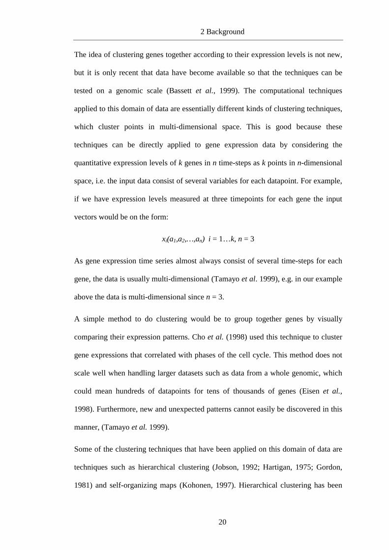
The idea of clustering genes together according to their expression levels is not new,
but it is only recent that data have become available so that the techniques can be
tested on a genomic scale (Bassett et al., 1999). The computational techniques
applied to this domain of data are essentially different kinds of clustering techniques,
which cluster points in multi-dimensional space. This is good because these
techniques can be directly applied to gene expression data by considering the
quantitative expression levels of k genes in n time-steps as k points in n-dimensional
space, i.e. the input data consist of several variables for each datapoint. For example,
if we have expression levels measured at three timepoints for each gene the input
vectors would be on the form:
xi(a1,a2,…,an) i = 1…k, n = 3
As gene expression time series almost always consist of several time-steps for each
gene, the data is usually multi-dimensional (Tamayo et al. 1999), e.g. in our example
above the data is multi-dimensional since n = 3.
A simple method to do clustering would be to group together genes by visually
comparing their expression patterns. Cho et al. (1998) used this technique to cluster
gene expressions that correlated with phases of the cell cycle. This method does not
scale well when handling larger datasets such as data from a whole genomic, which
could mean hundreds of datapoints for tens of thousands of genes (Eisen et al.,
1998). Furthermore, new and unexpected patterns cannot easily be discovered in this
manner, (Tamayo et al. 1999).
Some of the clustering techniques that have been applied on this domain of data are
techniques such as hierarchical clustering (Jobson, 1992; Hartigan, 1975; Gordon,
1981) and self-organizing maps (Kohonen, 1997). Hierarchical clustering has been

2 Background
21
used more frequently (Michaels et al., 1998; Eisen et al., 1998; Wen et al., 1998)
than self-organising maps (Tamayo et al., 1999). Further clustering techniques that
have been applied are k-means clustering (Soukas et al., 2000), decision trees,
bayesian networks and affinity grouping (Friedman et al., 2000; D’haeseleer et al.,
1999; Bassett et al., 1999).
There are basically two types of hierarchical clustering, the splitting and the merging
method. The splitting method first splits the dataset into two subsets trying to
maximise the distance between these two. Then each subset is further divided into
subsets and a binary tree structure is built (Kohonen, 1997). The more commonly
used merging method starts with the two datapoints that are the most similar and at
each iteration step more datapoints are added according to how similar they are, i.e.
what distance they have to the first datapoints (Kohonen, 1997).
In this work, self-organising maps will be used and this technique is therefore further
elaborated in the next chapter.
2.3.1 Self-organizing maps
Self-organizing maps (SOMs) have several features that make them well suited to
clustering and analysis of gene expression patterns: they are scalable to large datasets
and the technique is fast (Kohonen, 1997). Furthermore, SOMs have been studied in
a large variety of problem domains (Kohonen et al., 1998). Next, a general view of
the SOM algorithm is given and thereafter a more thorough explanation of the
underlying functions in the method.

2 Background
22
Construction and training of SOMs
First, the number of nodes must be decided. Depending on the size of the data set,
i.e. the number of input vectors xi(a1,a2,…,an), the number of nodes should be chosen
so that clearly separable clusters can be formed, i.e. the more datapoints and less
nodes we have, the less compact clusters we get. This is obvious, because the more
datapoints that are mapped to a certain node, the more generalised the node gets. The
geometry itself, or topology, can vary from a single line to a multidimensional grid
of nodes. Through an iterative process, the nodes are mapped into the n-dimensional
space of the dataset, see figure 5. Each node consists of a codebook vector that is of
the same dimensionality as the input vectors. The nodes can be randomly initialised
or with values taken directly from the dataset.
In each iteration, the dataset is scanned one data point at a time and the map nodes
are moved towards this point. The closest node Nj, according to some distance
measure, is moved the most and the surrounding nodes, the neighbours of Nj, are
moved depending on their distance from Nj. The larger the distance, ||Nj – Nc||, the
lesser they move toward the data point, i.e. this is regulated with a smoothing kernel
called neighbourhood function. The smoothing means that we get a smooth
transition between two neighbouring nodes regarding what datapoints they are
mapping, i.e. the closest neighbour to Nj will map very similar datapoints, and the
further away in the map, the less similar datapoints it will map. In this way,
neighbouring nodes on the map are mapped to close data points in the n-dimensional
space, where the closest datapoints are mapped to the same node Nj. When the
process is finished, the final map can be said to define clusters of the data points
(Kohonen, 1997).

2 Background
23
Figure 5. Illustration of self-organising maps. The nodes are arranged in a two
dimensional lattice at the bottom of the picture. During training each node is mapped
to a corresponding reference vector in the dataspace, above in the picture. One single
node can map several datapoints and thus we get clusters.
Underlying function and algorithm of SOMs
For every input vector xi(t), at iteration step t, the distance to each node Nj is
measured to find the closest node, called “the winner”. The distance measure that is
used mostly in self-organising maps is the Euclidean distance (Kohonen, 1997) and
is defined as:
DE(x,y) = ||x – y|| = ( )∑=
−n
iii
1
2ηξ (2.1)

2 Background
24
Another measure that has been widely used is the Minkowski metric (Kohonen,
1997), or Minkowski norm (Mirkin, 1996), which is a generalisation of (2.1). The
distance in the Minkowski metric is defined as:
DM(x,y) =λλ
ηξ1
1⎟⎟
⎠
⎞
⎜⎜
⎝
⎛−∑
=
n
iii , λ∈ℜ (2.2)
If λ = 1, we get yet another popular distance measure, namely the City-block
distance (Mirkin, 1996; Kohonen, 1997).
When the winner is located, its codebook vector is updated according to the
following algorithm8 (Kohonen, 1997):
N(t+1) = Nj(t) + α(t)hci(t)[xi(t) – Nj(t)] (2.3)
Where Nj(t) is the codebook vector at iteration t, xi(t) is the input vector and α(t) is a
learning rate factor that usually decreases monotonically for each iteration, e.g.
α(t) = A/(B+t) where A and B are constants. The neighbourhood function, denoted
by hci(t) can vary between application, but a widely used kernel can be written in
terms of the Gaussian function (Kohonen, 1997):
hci = α(t) * exp ( ) ⎟⎟⎟
⎠
⎞
⎜⎜⎜
⎝
⎛ −−
t
rr ic
2
2
2σ(2.4)
Where α(t) is the learning rate factor and the parameter σ(t) defines the width of the
kernel, which also decreases through time, i.e. in every iteration step. This means
that the farther the ordering process has come, the smaller the neighbourhood will be
8 This is the original SOM algorithm (Kohonen, 1997).

2 Background
25
that is updated and the smaller the learning rate will be. A simpler neighbourhood
kernel that is called “bubble” (Kohonen, 1997) is defined as:
hci = α(t) if i∈ Nc(t) and hci = 0 if i∉ Nc(t) (2.5)
This kernel updates every neighbour in the specified neighbourhood Nc with the
same learning rate factor and results in a less smooth transition than the Gaussian
based kernel.
Because the neighbouring nodes are learning from the same input vector as the
winning node, we get a relaxation effect or smoothing effect on these nodes that in
the continuation leads to a global ordering of the nodes (Kohonen, 1997). As
Kohonen (1997) points out, if the network is not very large9 the choice of process
parameters is not very crucial when it comes to learning rate factor or neighbourhood
function. The choice of neighbourhood size must be treated with a little caution
though. If the size is too small the map will not be globally ordered.
9 The author speaks of “a few hundred nodes at most” as being small (Kohonen, 1997).

2 Background
26
2.4 Related Work
In this chapter, the reader will get acquainted with other work that is somehow
related to our problem statement. Foremost, the work by Tamayo et al. (1999) will
be discussed, because they used self-organising maps in their experiments when
clustering expression profiles, and the work by Tamames et al. (1998) where they
categorised proteins in functional classes on the basis of the annotation stored about
them in databases.
2.4.1 Gene expression clustering
Tamayo et al. (1999) were the first to use self-organising maps to cluster gene
expression profiles. They note a couple of shortcomings with other clustering
techniques. Hierarchical clustering, for example, they mean is best suited for datasets
that have true hierarchical order and expression profiles are not included in that list.
They developed their own computer package which implements the SOM algorithm,
called “Genecluster”, which is publically available at the website of the
Whitehead/Massachusetts Institute of Technology Center for Genome Research. The
datasets they used involved the yeast cell cycle and hematopoietic differentiation and
was preprocessed by excluding genes that did not change significantly across
samples or genes that did not show a significant relative change, i.e. up- or
downregulation.
In their results, they report clusters that contain genes that are known to be regulated
at different phases of the cell cycle, e.g. G1, S, G2 and M. When comparing with
results from the visual inspection of the same dataset by Cho et al. (1998), Tamayo
et al. (1999) reports to identify the same clusters.

2 Background
27
For a dataset containing 828 genes they recognised a SOM of 6X5 nodes to be
suitable for their needs, as cited from (Tamayo et al., 1999):
“Although there is no strict rule governing such exploratory data
analysis, straightforward inspection quickly identified an appropriate
SOM geometry in each of the examples below.” (p. 2909).
It is very hard, if not impossible, to gain information from their report about how the
other process parameters of the SOM were set. Figure 6 illustrates the interface of
the Genecluster program.
Eisen et al. (1998) used hierarchical clustering, according to the merging method, to
cluster data from budding yeast Saccharomyces cerevisiae and human fibroblasts.
The gene similarity metric they used is a form of correlation coefficient:
22 )()(
))((
jkjiki
jkjikiij
xxxx
xxxxc
−−
−−=
∑
∑ (2.6)
The coefficient is a variant of the Pearson correlation coefficient (Eisen et al., 1998).
Their clustering approach resulted in clusters with genes that share similar
functionality, e.g. genes that are known to be regulated and transcribed at a particular
point of the cell cycle. Thus, the results show to some extent that expression data in
some cases has tendency to organise genes into functional classes. Figure 7
illustrates the output from the software implementation by Eisen et al. (1998) of the
hierarchical clustering method.
In a study by Wen et al. (1998) they examined the profiles of gene expression of 112
genes during development of the rat spinal cord. They used the FITCH software
from the PHYLIP package (Felsenstein, 1993), which implements the hierarchical

2 Background
28
clustering method, in order to cluster gene expression time series. This study resulted
in the five “waves” of gene expression that correspond to the different phases in
spinal cord development of rats.

2 Background
29
Figure 6. A 6X5 SOM has been trained. On the left, the clusters are visualised with
the codebook vectors of the SOM illustrated as the lines in the middle and the
standard deviation is also marked with lines. On the right the genes of some selected
cluster are presented. When saving the result, two files are generated. One that
contains the codebook vectors for the nodes and the other contains the datapoints
together with their respective cluster number. The picture is a snapshot taken from a
fictive training with the Genecluster program10.
10 The GeneCluster program can be found at http://www.genome.wi.mit.edu/MRP/software.html.

2 Background
30
Figure 7. Results from a hierarchical clustering obtained from
the Cluster and TreeView implementation11. The tree is taken
from Eisen et al. (1998) by courtesy of Eisen.
2.4.2 Classification of annotation
Tamames et al. (1998) presents the construction of the EUCLID system, which uses
the functional information provided by databases to classify proteins according to
their major functionality such as transcription or intra-cellular communication. A
problem with this method that they have come across is that the annotation in the
11 The software can be found at http://rana.stanford.edu/clustering.

2 Background
31
databases often is very specialised and not on the major functional level. They write
for example:
“…annotated as a cdc2 kinase, but not as being involved in intra-cellular
communication.” (p. 542).
So, instead of using the annotation directly, they extracted characteristic keywords
for each functional group from a set of proteins that had been classified by a human
expert. These keywords, constituting a dictionary, were then used to extract from the
database other proteins that matched with the keywords. These new proteins were
analysed and additional keywords were added to the dictionary. This is an iterative
process that finishes when there is no increase in classification quality. In their
experiments they created a dictionary for three functional classes, i.e. ENERGY,
INFORMATION and COMMUNICATION. With this method, they managed to
correctly classify over 90% of the proteins.
Biologically, the gene expression clusters that are produced with some clustering
technique are not completely accurate since they lack functional coherence among
the genes. It is, for example, possible for a housekeeping gene and a target gene to
have the same expression profile. Housekeeping genes perform the functions that are
required for the viability for the cells, such as making cell membranes and
controlling cell division. That they have the same expression profiles means that they
are clustered together, even though this is something we do not want. We want to
discard the housekeeping genes because they are of no interest. Although the clusters
obtained through some annotation classification method are in some sense
biologically accurate, they do not identify the affected genes we would be looking
for in experiments where we compare sick to healthy tissue for instance.

2 Background
32
In Ben-Dor et al. (2000), they note that clustering methods such as hierarchical
clustering or self-organising maps do not use any tissue annotation as input to the
learning algorithm. Further, they point out that the annotation is only used to assess
the success of the clustering technique.
The central question investigated in this project is whether gene expression profiles
can be clustered together with annotation as input and produce the more biologically
correct clusters we want as a result. We will confine our studies to one clustering
technique and it will be the self-organizing maps (SOMs). Next chapter holds the
thesis statement where the aim is defined along with the objectives that have to be
met in order to fulfil the aim.

3 Thesis statement
33
3 Thesis statement
The aim of this project is to investigate whether clustering of gene expression
patterns can be done more biologically accurate by providing the clustering
technique with additional information, annotation, about the genes besides the
expression profiles. This aim lets us formulate the following hypothesis, which will
be tested in this thesis:
Hypothesis
By providing the clustering technique with not only data on the gene expression
levels, but also annotation about the genes, the clusters formed will show a higher
biological accuracy, than when just the expression levels are used as in the
approach of Tamayo et al.,(1999).
The hypothesis will be falsified if no clear improved correlation to the biological
reality can be shown regarding the clusters.
3.1 Motivating the aim
In chapter 2.4 two different approaches to clustering, or classification of genes were
presented. The gene expression clustering on one hand and the annotation
classification on the other. Clearly, both approaches contribute with something
important to the area of gene function analysis. Clustering techniques on expression
data help us identify clusters of genes that have changed their expression levels in a
similar way over a certain time interval due to, for instance, some drug treatment.
The classifying method that worked on functional annotation stored in databases

3 Thesis statement
34
helps us classify genes in functional categories by comparing keywords in its
annotation with what is stored for the different classes.
A problem with the first method is that there are always ”unwanted” genes in the
good clusters found, e.g. with housekeeping genes, or with genes where the function
is unknown. Nothing can be said about these genes of unknown function. Maybe
they really should belong to the cluster and have something to do with the
functionality of the other, interesting genes. Or maybe, by coincidence, they just
have the same expression profile as the other genes, but not as an effect of the drug
treatment. A problem with the latter method is that it cannot identify genes that have
changed their expression profile due to some treatment, or health condition.
Therefore, we believe that a combination of both these methods, where we cluster
genes on the basis of both expression profiles and annotation, can produce clusters
that are more informative. Informative in such a way that when an interesting cluster
is found, it can be assumed that all the genes that are in it really should be there and
have some functional coherence with each other.

3 Thesis statement
35
3.2 The objectives of the project
For the fulfilment of the aim, six objectives have been identified and they can be
summarised in the following six questions:
• What datasets should be used?
• What annotation should be used?
• How can the annotation be used?
• How to set the parameters for the SOM?
• How to measure “biological correctness”?
• How to evaluate the results?
Datasets must be decided upon. There are numerous datasets publically available to
use. Most of them contain gene expression profiles collected from yeast or mouse
cells. The more the dataset has been studied, the more data we can use in the
evaluation process of our method. A problem with the publically available datasets
on gene expression profiles is that they do not contain annotation. This is
information that has to be extracted separately from databases.
When it comes to the choice of annotation, it must say something about the gene’s
specific function to help in the clustering. It must be an annotation that helps divide
the genes in natural categories. Gene name, or sequence length are surely too
individual annotations that cannot help group genes together according to their
functionality. Some description field that elaborates on a gene’s function could be
used, but the problem is how to encode it to an acceptable form that SOMs can take
as input.

3 Thesis statement
36
This means that it has to be encoded into real numbers, or vectors of real numbers.
These vectors should not vary in size and should not impose an internal order on the
annotation. For example, if the annotation identifies four totally different categories,
we should not come up with a coding scheme that turns the category names into one,
two, three and four. That would mean that category one and two are more similar
than one and four since Euclidean distance is used in the training algorithm. The
similarities of the function of the genes in the categories might be the other way
around.
As explained in chapter 2.3.1, when training SOMs, there are many parameters that
have to be taken into consideration. Some parameters, for example the topology of
the map, can be empirically tested and decided upon early in the project, while other
parameters can vary from experiment to experiment throughout the project.
Although desirable, there will be no need to find an optimal map, defining which
would probably be an entire project by itself, since we only want to show relative
improvements regarding the clustering with more detailed data on a map with the
same parameter values.
The results can be evaluated both statistically and biologically. Statistical measures
such as standard deviation, compactness and isolation of the clusters can be applied.
Furthermore, correlations between clusters and annotation can be computed. While
the former measures belong strictly to the statistical evaluation process and nothing
can be said about biological validity, the latter measure does and can perhaps be used
to measure the biological correctness of a clustering. An important component in the
biological evaluation is to use current knowledge of metabolic pathways, functional
categories and known gene clusters where it is known which genes are clustered

3 Thesis statement
37
together and should be clustered that way. This evaluation has to mostly be done
manually. The annotation of the genes that are clustered together, (other annotation
than the one used in the clustering of course), can be compared and scanned for
similarities. The similarities, in turn, could indicate that they are biologically alike
and thus that, the clusters are biologically accurate to some extent. In addition,
interesting clusters can, in this project, be sent to AstraZeneca R&D Mölndal
Sweden for evaluation in order to see if the results make biological sense.

4 Method and experiments
38
4 Method and experiments
This chapter discusses the methods used and how the objectives are met.
Furthermore, it deals with the experiments carried out in this project. Each objective
is discussed in a separate chapter in the same order that they were presented in
chapter 3.2. First, in chapter 4.1, the choice of what dataset to use is discussed and
what implementation of the SOM algorithm to use. In chapter 4.2 the choice of
annotation is made clear along with a thorough explanation of the chosen annotation.
Chapter 4.3 elaborates on how the annotation was used and presents the form of the
input vectors. In chapter 4.4 decisions are made regarding how to set the parameters
for SOMs, chapter 4.5 presents the experimental design and finally chapter 4.6
describes the measures that were used in the statistical evaluation and how the
qualitative, or biological, evaluation was done.
4.1 What dataset should be used?
There are numerous datasets publically available to use. Most of them contain gene
expression profiles collected from yeast or mouse cells and contain data collected at
several time points, e.g. often nine or even fifteen. They have been widely studied
and used in previous experiments on gene expression clustering, e.g. (Tamayo et al.,
1999; Eisen et al., 1998). Since this project aimed to improve clustering of gene
expression data, it would have been ideal to use a well-studied dataset. The more it
has been studied, the more data could we use in the evaluation of our method.

4 Method and experiments
39
There are, however, some disadvantages with using previous findings in the
evaluation process that takes the advantages away from using the well-studied
datasets. In previous experiments (Tamayo et al., 1999; Eisen et al., 1998), they
report only positive findings in their results and not bad, such as misplaced genes,
i.e. genes that are clustered together with other genes that have totally different
functionality. When evaluating against such results, we cannot use the results
themselves as the right answers. We would have to compare their results with ours,
with some kind of method that takes advantage of the annotation about the genes.
Only then could we show if our method has improved the clustering.
A big problem with the method above is how to collect the annotation for the genes
in these datasets. There are no finished and preparated datasets that contain both
expression profiles and every annotation that is known about the genes in it. We
would have to compile our own dataset by extracting the information we need from
public databases for each gene. Depending on what annotation we use and since the
annotation might be spread between different databases, we could end up needing
something from every database. This could turn out to be inefficient and
timeconsuming.
Through AstraZeneca R&D Mölndal Sweden we have gained access to a dataset that
is not public and thus less well studied, but it has another, big advantage instead. The
dataset already contains plenty of annotation, e.g. enzyme classification, functional
hierarchy and metabolic hierarchy. With this dataset it could be a problem to
evaluate the results, because it has not been studied before, but as it turns out we still
have enough foundation for the evaluation process in the study of the annotation.
Furthermore, as mentioned above, results from other experiments could not be used

4 Method and experiments
40
as right answers. The evaluation process is further discussed in chapter 4.6. Another
advantage is that since this project is in collaboration with AstraZeneca R&D
Mölndal Sweden we have help from their experts to evaluate our results. This dataset
will be used in this project.
The dataset consists of data from several different mouse tissues: liver, brown fat,
epididymus, mesenterial fat and white quadriceps. Each contains expression profiles
for ~6500 genes12 collected with GeneChips from Affymetrix. Since genes have
diverse behaviour in different tissues we have made the assumption that genes would
be clustered differently in each of the above datasets. To evaluate all these different
clusters and keep track of when and where the genes are up- or down-regulated
would be very time consuming and beyond the scope of this dissertation. Thus, we
have decided to delimit ourselves and only conduct our experiments on the data from
the mesenterial fat. The tissue has been treated with a substance called Rosiglitazone
(Barman Balfour et al. 1999), which is a thiazolidinedione. This is a new class of
antidiabetic agents, which enhances sensitivity to insulin in the liver, adipose tissue
and muscle. The result is improved glucose disposal, i.e. reduction of bloodsugar.
Insulin resistance often underlies type 2 diabetes mellitus (non-insulin-dependent
diabetes) (Barman Balfour et al. 1999).
Expression levels have been collected at three timepoints: day zero, three and seven.
The expression levels from day zero indicate the expression levels under normal
conditions, i.e. the tissue is yet untreated. Day three and seven indicates the
expression levels after the mice have been treated for three and seven days
12 A mouse has somewhere between 50,000 and 100,000 genes in total.

4 Method and experiments
41
respectively with the substance. The target genes, i.e. the genes we are expecting to
be affected by the substance, are genes that are related to leptin and obesity and also
food-intake.
A noteworthy disadvantage regarding the amount of datapoints compared to other
datasets is that we only have three timepoints to build the profiles on. Since they are
spread over seven days, we pretty much catch the trends of up- and down-
regulations, but the more fine-grained the time-series, the more fine-grained clusters
we would get with the SOMs. This disadvantage is not so serious, since in the
resulting clustering we are looking for clusters of genes that are up- or down
regulated at least two-fold in their expression levels. Only these genes are considered
to be affected by the substance according to personal communication with
AstraZeneca R&D Mölndal Sweden. Thus minor changes, or variations, in between
the time-points can be disregarded (Tamayo et al. 1999).
4.1.1 Choice of clustering technique and implementation thereof
As earlier mentioned, we have delimited ourselves to use SOMs in our experiments.
We chose to work with the implementation by Tamayo et al. (1999) that is publically
available and can be found at their website13. This choice was made mainly because
it saved us time on not having to implementing the algorithm by ourselves and that it
had a built-in visualisation tool.
13 The Genecluster program can be found at http://www.genome.wi.mit.edu/MRP/software.htm.

4 Method and experiments
42
4.2 What annotation should be used?
From chapter 2.1.3 we know that there are all kinds of annotation. To help in the
clustering the annotation must say something about the gene’s function. It must be an
annotation that helps divide the genes into natural categories. Furthermore, the
annotation should be known for all, or sufficiently many of the genes in the dataset.
It would be no point in using an annotation that is known for only 1% of the genes,
this would not help the clustering in large. If it is too little it could be either that the
annotation is known for only one category of genes and thus only help making one
cluster with these genes. The other possibility would be that only a few, one or two,
genes are known to belong to each category and it seems it would be difficult for
those to direct the other genes into meaningful clusters.
The enzyme classification (EC) annotation is known for about 10% of the genes in
the mesenterial fat dataset. Now, 10% may seem to be low, but it is as good as it
gets, because the reality is that most functional annotation is known for only a
fraction of the genes as explained in Bassett et al. (1999). So, these 10% is a set of
609 genes, which we considered to be large enough for our experiments.
Furthermore, because it is a functional annotation it helps divide the genes into
natural categories. Next chapter contains a detailed description of the enzyme
classification annotation.

4 Method and experiments
43
4.2.1 Enzyme classification
The enzymes are classified according to the catalytic reaction they are involved in.
There are six main classes of enzymes14 and these are:
1. Oxidoreductases
2. Transferases
3. Hydrolases
4. Lyases
5. Isomerases
6. Ligases
Each classified enzyme has an EC number, but this number is not unique. This is
because several different ezymes can have the same catalytic function. The number
is on the form EC 1.2.3.4, where the first number stands for which of the main
classes above the enzyme belongs to: the 1 in 1.2.3.4 denotes that this enzyme is an
oxidoreductase. The next two numbers are subclasses and the last number is the
serial number of the enzyme in its sub-subclass. The subclasses stand for different
things depending on which main class it is under. To complete the example above,
the first subclass (2 in the example) stands for which molecule is oxidated, and the
sub-subclass (3 in the example) indicates which acceptor that is involved in the
process. The last figure in the code number is the serial number (4) of the enzyme in
its class.
14 The information on EC is taken from Nomenclature Committee of the International Union ofBiochemistry and Molecular Biology (NC-IUBMB) website, www.chem.qmw.ac.uk/iubmb/enzyme/.

4 Method and experiments
44
For the second class – the transferases – the first subclass stands for which group that
is transferred and the sub-sublevel gives further information on the transferred group.
Common for the six classes is that it is mainly the main class belonging that decides
the function of the enzyme.
In our mesenterial fat dataset the distribution of the enzymes in the classes is shown
in table 2.
Enzyme
main class
Number
of enzymes
percentage of
whole set
EC 1 120 20%
EC 2 217 36%
EC 3 200 33%
EC 4 29 5%
EC 5 21 3%
EC 6 22 4%
SUM 609 100%
Table 2. The distribution of the enzymes.
To recapitulate, this is a functional annotation that we had for about 10% of the
genes, which gave us a dataset of 609 genes for experiments testing the hypothesis. It
divides genes in six functional classes, which seems to be sufficient, i.e. not too
many and not too few. If there were too many classes it could be hard to keep track
of all of them and if there were too few, e.g. two classes, they would be too general
for the purpose of functional categorisation. Moreover, the annotation is based on
numbers, which seems to be easier to encode into SOM input than a description field
would have been. Next chapter elaborates on how this was done.

4 Method and experiments
45
4.3 How can the annotation be used?
The EC numbers must be coded in such a way that any order between the classes is
lost. This is because SOM uses the Euclidean distance as similarity measure and thus
class 1 and 2 would be considered more similar to each other than class 1 and 5.
Since EC 1.1.1.1 is not a numeric value, it first has to be converted to a value.
Otherwise we cannot use it as input for the SOMs, since we cannot measure the
Euclidean distance directly between symbols. The easiest way would be to just cut
the last two sublevels of the EC number and encode the example into 1.1 and we
would still have the overall function of the enzyme included in the encoded
annotation. By doing so, we would get potentially about 60 categories that we could
divide the genes into. As explained in chapter 4.2.1 the first number stands for the
overall function of the enzyme and the second number, the first sublevel, stands for
on what kind of molecule it functions. This indicates that it could be enough to just
use the first number, i.e. we would get six categories instead of sixty.
Since the enzyme classes are not intentionally ordered, but defined in an order, we
have to encode each of the classes 1-6 into some other representation that does not
reflect order among them. This can be done by encoding each class into a vector of
three random real numbers between 0-1, e.g. <0,24521; 0,98332; 0,44304>. If each
attribute in the vector is considered as a dimension, we get a three dimensional space
and the classes can be represented in such way that they have near to equal distance
between each other in the three dimensional space and we would lose the order
between them. Table 3 shows the Euclidean distances between the coding vectors
used in the experiments of this project.

4 Method and experiments
46
EC-number
2 3 4 5 6
1 0.72266 0.39744 0.62093 0.57456 0.58787
2 - 0.70934 0.39561 0.58364 0.44393
3 - - 0.51519 0.4498 0.81371
4 - - - 0.66715 0.6371
5 - - - - 0.71997
4.3.1 Construction of input vectors for the SOM
We prepared three different sets of input vectors for the SOM.
Set 1. Only the expression profiles
Set 2. Expression profiles and their slopes
Set 3. Expression profiles, their slopes and the encoded EC numbers
Set 1 consisted of only expression profiles. In order to minimise the effects of the
large variations in the expression levels, we did not use the raw data directly. We
used the 2-logarithm of the expression levels and normalised them to be in the
interval 0 < x <1, for an example see table 4. The relative variation between each
gene was, of course, still preserved in the data, but the interval is smaller and the
Table 3. The distances between the vectors coding for the
annotation. The largest distance is ~0.81 and the smallest
distance is ~0.40 between the vectors.

4 Method and experiments
47
concentration is more on similarities between the actual profiles and not between the
actual levels.
Gene Day 0 Day 3 Day 7
1 0.771346017 0.779162098 0.792259907
2 0.772803864 0.76874314 0.774173496
3 0.766410688 0.765115896 0.774163847
4 0.791746196 0.801860519 0.796274477
5 0.766040194 0.750149866 0.751099564
6 0.773106583 0.772519855 0.76380967
7 0.762513435 0.775424828 0.768936377
Table 4. Example of input vectors for set 1.
Set 2 consisted of the same set as above except for that the slopes between the
timepoints were added, see figure 8. This set was prepared mainly for the reason of
comparing it with set 1. When the slopes are added more attention is put on the
profile itself, than the expression levels at each timepoint. Basically, we added
information about whether the gene was down- or up-regulated. Table 5 shows how
the input vectors in set 2 looked like.

4 Method and experiments
48
Gene Day 0 Slope 1 Day 3 Slope 2 Day 7
1 0.771 0.003 0.779 0.003 0.792
2 0.773 -0.001 0.769 0.001 0.774
3 0.766 0.000 0.765 0.002 0.774
4 0.792 0.003 0.802 -0.001 0.796
5 0.766 -0.005 0.750 0.000 0.751
6 0.773 0.000 0.773 -0.002 0.764
7 0.763 0.004 0.775 -0.002 0.769
Table 5. Example of input vectors for set 2.
Figure 8. Calculation of the slopes.
Set 3 was the same as set 2 with the annotation added to it. Table 6 shows the input
vectors for set 3. The annotation was inserted in between the timepoints and the
slopes so that all features, i.e. timepoints, slopes and annotation, were mixed and not
treated separately.

4 Method and experiments
49
Gene Day 0 EC# 1 Slope 1 Day 3 EC# 2 Slope 2 Day 7 EC# 3
1 0.771 0.499 0.003 0.779 0.051 0.003 0.792 0.594
2 0.773 0.448 -0.001 0.769 0.438 0.001 0.774 0.517
3 0.766 0.058 0.000 0.765 0.062 0.002 0.774 0.039
4 0.792 0.627 0.003 0.802 0.021 -0.001 0.796 0.164
5 0.766 0.448 -0.005 0.750 0.438 0.000 0.751 0.517
6 0.773 0.014 0.000 0.773 0.003 -0.002 0.764 0.427
7 0.763 0.058 0.004 0.775 0.062 -0.002 0.769 0.039
Table 6. Example of input vectors for set 3.
4.4 How to set the parameters for the self-organising maps?
As discussed in chapter 2.3.1 there are a few parameters that have to be set when
training SOMs, such as learning rate and the map’s topology. Since there is no
analytic solution on how to set them to give an optimal clustering, this had to be
empirically tested. We trained a series of SOMs15 with different parameter settings,
and to evaluate how much they differed depending on the settings we calculated the
number of genes that had been clustered differently between two clusterings. That is,
if two genes are clustered together in one clustering and not in another – 1 point is
added to the score. This means that the higher the score, the less similar, or
dissimilar, the two compared clusterings are. We refer to this score as the similarity
15 These experiments were conducted on set 1, see chapter 4.3.1.

4 Method and experiments
50
score between two clusterings. The effects of the following process parameters were
tested, see Appendix A for extensive results:
1. Learning rate
2. Learning radius (size of neighbourhood)
3. Neighbourhood function (gaussian and bubble)
4. Topology of map (number of nodes)
The baseline for how many genes that changed clusters between clusterings was
approximately 2,000-3,000. Since we in fact count how many pairs of genes that are
clustered together in both clusterings, the maximum score would be
(609*608)/2=185,136. This gives a baseline of approximately 1% genes that ‘jump’
clusters in the different clusterings.
The results from these experiments showed that changing learning rate and
neighbourhood function only produced changes in the clusterings that were around
the baseline, see figure 9. As mentioned in chapter 2.3.1, learning radius has a little
more effect on the result. The mean score when comparing clusterings with high
learning radius, half the map for instance, was well below baseline. These results can
be found in figure 10 .

4 Method and experiments
51
Number of genes changing cluster comparing learning rates
0
10
20
30
40
50
60
70
80
0-1,000 1,000-2,000 2,000-3,000 3,000-4,000
Similarity scores
Nu
mb
ero
fco
mp
aris
on
s
Figure 9. The similarity scores when comparing different learning rate
settings. The x-axis shows the similarity scores and the y-axis shows the
number of comparisons in a certain interval. 13 clusterings were
compared, generating 12*13=156 similarity scores. For example, 74 of
the comparisons generated scores in the interval 2,000-3,000 and 4 of the
comparisons generated scores under 1,000. The mean score between the
compared clusterings was 2,461 genes changing cluster, which is around
the baseline.

4 Method and experiments
52
Number of genes changing cluster comparing learning radius
0
20
40
60
80
100
120
140
0-1,000 1,000-2,000 2,000-3,000
Similarity scores
Nu
mb
ero
fco
mp
aris
on
s
Figure 10. This figure illustrates the scores when comparing different
learning radius settings. 15 clusterings were compared. In most of the
clusterings the genes are clustered in the same way with scores of the
comparisons below the baseline The mean score was 1,692 genes
changing cluster, which is below the approximative baseline.

4 Method and experiments
53
Number of genes changing cluster comparing smalltopologies
0
5
10
15
20
25
30
35
0-10,000 10,000-20,000 20,000-30,000
Similarity scores
Nu
mb
ero
fco
mp
aris
on
s
Figure 11. This diagram shows that when using small topologies, 9-25
nodes, the clusters are very generalised and genes often jump to different
clusters between different clusterings. Eight clusterings were compared
and the bigger the topology got, the smaller the score. Thus the clusters
get more stable and fewer genes jump clusters as the topology grows.
The mean score of 11,140 gives that on average 6% of the genes are
clustered differently between the clusterings.
When testing different topologies, the results varied drastically between small and
large topologies. On small topologies, approximately 6% of all the genes were
clustered differently between clusterings. On large topologies, approximately 2% of
the genes were clustered differently, see figures 11 and 12.

4 Method and experiments
54
Number of genes changing cluster comparing large topologies
0
5
10
15
20
25
30
35
0-2,000 2,000-4,000 4,000-6,000 6,000-8,000
Similarity scores
Nu
mb
ero
fco
mp
aris
on
s
Figure 12. In this diagram, eight clusterings with large topologies, 30-60
nodes, are compared. The mean score of 4,018 is more or less a third of the
mean score for the small topology comparison. It means that 98% of the
genes are clustered the same way in all clusterings on large topologies, see
Appendix A for extensive testing results.
Thus, after having tested the different parameter settings it was clear that, under the
premises of this project, neighbourhood function and learning rate did not affect the
resulting clustering significantly and the default settings of the software were used.
The learning radius parameter was set high, which was approximately half the
topology size, in order to help the global ordering as discussed in chapter 2.3.1. The
only parameter that really affected the outcome was the topology of the SOMs.
Tamayo et al. (1999), for example, states nothing about the impact of other

4 Method and experiments
55
parameters than the amount of nodes. With very small topologies, we get large and
messy clusters and the larger we make the map, the smaller and tighter the clusters
get. After enough nodes have been added, adding more nodes do not contribute to
other results, i.e. 99% of the genes are clustered in the same way. There is a limit at
which point nodes are starting to be left empty and the more nodes that are added,
the more empty nodes we get. The drawn conclusion is that the map topology must
be adjusted according to the size of the dataset and the rest of the parameters are of
relatively small importance and therefore the default settings in the Genecluster
program were used except for the adjustment of the learning radius.
4.4.1 Experimental design
When clustering on sets 1-3 (see chapter 4.3.1), 30-60 nodes were found to be
sufficient because with this ~98.5% of the genes were clustered in the same way in
all our experiments. Twelve clusterings were performed on each of the three sets 1-3
with varied topology, e.g. 36 nodes. The evaluation was done on all of these
clusterings.
4.5 How to measure “biological correctness”?
The approach to evaluate the biological correctness of a clustering that often is used
in gene expression studies is visual inspection of clusters in order to find clusters of
interest. This is often performed in an ad hoc manner and the validation is performed
by investigating the functional annotations of the genes. If genes that are clustered
together also share the same functionality we can say that the cluster is biologically
correct.

4 Method and experiments
56
4.6 How to evaluate the results?
In this chapter we present the evaluation methods that were used. The first
subchapter explains the statistical measures and the second subchapter deals with
how the biological evaluation was performed.
4.6.1 Statistical evaluation
We have used the following statistical measures in the evaluation:
1. Standard deviation within the clusters as a measure of compactness
2. Similarity score (as explained in chapter 4.4)
3. Compactness and Isolation
4. Conditional entropy
5. Mutual information
The standard deviation is defined as:
SD =( )
1
2
−−Χ∑
N
µ(4.1)
Where X is the sample set, µ is the mean value of the sample set and N is the number
of samples. The standard deviation was calculated for each of the time points of the
genes in a cluster, giving three standard deviations per cluster. The standard
deviation gave a measure of the variation of the expression profiles within a cluster,
i.e. how compact the cluster was. The standard deviation measure let us compare the
clusterings done on sets 1 and 2 with the clusterings done on set 3 to see how the use
of annotation affected the compactness of the clusters. The standard deviation was
calculated for all clusterings and the results are presented in chapter 5.

4 Method and experiments
57
The similarity score measure that was introduced in chapter 4.4 was calculated for
the different clusterings. Clusterings with datasets 1 and 2 were compared to see if it
was basically the same genes that were clustered together, despite the use of slopes
as extra information in set 2. The assumption was that adding the slope information
would result in more compact clusters. Clusterings with datasets 2 and 3 were
compared for the same reason. We wanted to see if the use of annotation in set 3
would affect which genes that were clustered together.
As explained in Jain and Dubes (1988), the two main properties of a cluster are
compactness and isolation. Compactness measures the cohesion of the data points in
a cluster and isolation measures the separation between the cluster and the other
patterns in the dataspace. The measures are illustrated in figure 13.

4 Method and experiments
58
Figure 13. Illustration of compactness and isolation. Not all edges between the
datapoints are drawn. The cluster in the top left corner exhibits both high
compactness and isolation. The inner edges of the cluster are short and the edges
linking the cluster to the other points in the dataspace are longer. The other two
depicted clusters are less compact and isolated. This is because their inner edges are
longer, relatively speaking, and the linking edges to other datapoints are shorter.
The compactness index is defined as the mean of the number of edges between the
datapoints internal to a cluster, as a proportion of all inner edges of the cluster, at
each level of proximity. Each level of proximity means that all edges between all the
genes in the dataset are ordered in a vector of proximities. These edges, or distances,
are taken one by one, starting with the shortest, to see if it corresponds to a pair of
genes in the cluster we are calculating the index for. At the first level of proximity

4 Method and experiments
59
we look to see if the shortest edge is internal to the cluster. If it is, we increase the
compactness index. At the second level of proximity we look to see if the second
from shortest edge is internal to the cluster and so on and so forth.
Compactness Index =N
k
eN
i
i∑=1 (4.2)
Here, ei is the number of inner edges of a certain cluster at proximity i and k is the
total number of inner edges of the cluster. N is the total number of edges, or
distances, between the genes, i.e. 609*608/2=185,136 edges in our dataset. The
higher the compactness index, the more compact the cluster is.
The isolation index is defined as:
Isolation Index =N
l
bN
i
i∑=
⎟⎠
⎞⎜⎝
⎛ −1
1(4.3)
Where bi is the number of linking edges from the cluster to other patterns in the
dataspace at proximity i, and l is the total number of linking edges from the cluster.
N is the total number of edges. The higher the isolation index, the more isolated the
cluster is.
As the question investigated was to find out if we could obtain more biologically
correct clusters when clustering with both expression profiles and annotation, we
used conditional entropy and mutual information measures. This to find out how
well our different datasets, sets 1-3, were correlated to the biological annotation we
used in the biological evaluation, see chapter 4.6.2.

4 Method and experiments
60
The conditional entropy is defined as (Pierce, 1980):
( ) ( ) ( ) ( )∑∑= =
−=m
x
m
yxxx ypypxpyH
1 1
log (4.4)
Where x is the datapoint in the set 1, 2 or 3 and y is the annotation that corresponds
to the certain gene and m is the total number of samples. The conditional entropy
gives us a measure of how good the input to the SOM for a gene is on predicting the
annotation, i.e. is there a correlation between the expression profiles of a gene and its
annotation.
The mutual information is a measure of the reduction of the entropy of the
annotation if we know the expression profile for the gene, i.e. how much information
do we acquire about the annotation from the expression profile of a gene (Durbin et
al., 1998). It is defined as (Durbin et al., 1998):
( ) ( ) ( )( ) ( )∑∑
= =
=m
x
m
y ypxp
yxpyxpyxMI
1 1
,log,, (4.5)
Where x is the datapoint in the set 1, 2 or 3 and y is the annotation of a certain gene
and m is the total number of samples. The annotation we tried to ‘predict’ was on the
same form as the EC-numbers, i.e. B1.2.3.4 and C4.3.2.1. The first is a functional
annotation and the second is a metabolic pathway classifying annotation.
Experiments were performed on trying to predict the two annotations separately and
together.

4 Method and experiments
61
The conditional entropy and mutual information were calculated for the following
combinations:
1. Expression profiles, i.e. set 1, against the functional annotation.
2. Expression profiles against the metabolic pathway annotation.
3. Expression profiles against a combination of the functional and the pathway
annotation.
4. Expression profiles in combination with the EC annotation, i.e. set 3, against
the functional annotation and the pathway annotation separately and in
combination.
5. EC annotation against the functional- and the pathway annotation separately
and combined.
If the expression profile in combination with the EC annotation gives better results
than the other two inputs, it supports our hypothesis that the expression profiles
really should be clustered together with annotation and not by themselves.
4.6.2 Biological evaluation
We used Hubert’s Γ statistics in normalised form (see equation 4.6) to measure the
correlation between how the genes were clustered and what annotation they had (Jain
and Dubes, 1988). The more the annotation agrees among the genes of a cluster, the
higher the correlation.

4 Method and experiments
62
The correlation coefficient was computed for the following combinations:
1. Clustering of expression profiles – EC annotation.
2. Clustering of expression profiles – functional annotation.
3. Clustering of expression profiles – metabolic pathway annotation.
As with the statistical measures, a higher correlation between set 3 and the
annotation, than between set 1-2 and the annotation would support our hypothesis.
As explained in Jain and Dubes (1988), the Hubert’s Γ is applicable if we have two
n by n matrices, X=[x(i, j)] and Y=[y(i, j)], of the same n objects. There should be no
implied relationship between the matrices. In our case, X denotes the observed
similarities in the clusterings and Y denotes the annotations:
( )⎪⎩
⎪⎨
⎧
=otherwise0
clustersngneighbouriinarejandiobjectsif0.5
clustersamein thearejandiobjectsif1
, jix
( )⎩⎨⎧
=otherwise0
annotationsamethehavejandiobjectsif1, jiy
Hubert’s Γ in normalised form is defined as (Jain and Dubes, 1988):
( ) [ ][ ] yx
n
i
n
ijyx ssmjiymjixM /),(),(/1
1
1 1 ⎭⎬⎫
⎩⎨⎧
−−=Γ ∑ ∑−
= +=(4.6)
M is the number of entries in the matrices, mx and my are the mean values of the
entries, sx and sy are the standard deviations of the entries. The coefficient is between
–1 and 1. A perfect correlation would give a coefficient of 1 and a perfect negative
correlation would give a coefficient of –1. If there is no correlation the coefficient is
zero (0).

5 Results and analysis
63
5 Results and analysis
All results from the experiments are presented in this chapter. Twelve clusterings
were performed on datasets 1, 2 and 3 each. Table 7 shows the results from the
standard deviation calculations (see equation 4.1). As explained in chapter 4.6.1, the
standard deviation was calculated for each timepoint separately, but the figures
presented in table 7 are averages over all clusters over all timepoints in a certain
clustering.
Topology Set 1 Set 2 Set 3
5 x 6 0.00829 0.00810 0.01939
5 x 6 0.0085 0.00757 0.01765
5 x 6 0.0082 0.00797 0.01985
6 x 6 0.00738 0.007 0.01573
6 x 6 0.00749 0.00679 0.01548
6 x 6 0.00756 0.0073 0.01728
5 x 8 0.007 0.00643 0.01408
5 x 8 0.00698 0.0065 0.01098
5 x 8 0.0074 0.00696 0.01661
6 x 8 0.00605 0.0065 0.0102
6 x 8 0.00599 0.00593 0.01134
6 x 8 0.00653 0.0059 0.01534
Table 7. Standard deviations for topologies between 30
and 50 nodes in size.
In figure 14 the averages of the standard deviations for each topology are presented.
The standard deviations for the clusterings made on set 3, the one with annotation, is

5 Results and analysis
64
twice as high as for the other two sets. This indicates that we lose compactness when
clustering with annotation.
Standard deviation
0
0,002
0,004
0,006
0,008
0,01
0,012
0,014
0,016
0,018
0,02
5 x 6 6 x 6 5 x 8 6 x 8
Topologies
Sta
nd
ard
dev
iati
on
Set 1
Set 2
Set 3
Figure 14. The average standard deviation for each topology. The deviation
decreases as the size of the map grows. This is because the more nodes that are
added the more specialised they get and map fewer datapoints. The higher
standard deviations for the clusterings made on set 3 indicates that clusters of
genes with larger variations in expression profiles are generated.
The mean values of the similarity score measure are presented in table 8. The
similarity scores are decreasing as more nodes are added to the topology. As
discussed in chapter 4.4 this was expected and the scores are still around or just
above the baseline (~2,500 genes changing cluster) when comparing clusterings on
set 1 and 2. The much higher scores when comparing set 2 and 3 indicates that the
genes are clustered differently when using annotation as extra information in the
clustering than just the profiles. Nothing can be said about whether these clusterings

5 Results and analysis
65
are more biologically correct or not just comparing similarity scores. The histograms
in figure 15-18 show the results from the similarity calculations for each clustering.
Number of nodes Comparing set 1 and 2 Comparing set 2 and 3
30 4,113 10,488
40 3,191 7,792
36 3,034 8,243
48 2,573 6,113
Table 8. The mean similarity scores for the different comparisons. It shows
that clusterings on set 1 and 2 are similar and the added slope information in
set 2 does not change the way the genes are clustered together. The last
column shows that the genes are clustered differently when using annotation
in set 3 than when just using the expression profiles.
Similarity scores 30 nodes
0
5
10
15
20
25
0-3,000 3,000-6,000 6,000-9,000 9,000-12,000 12,000-15,000 15,000-18,000
Similarity scores
Nu
mb
ero
fco
mp
aris
on
s
Figure 15. The comparisons of clusterings made on set 1 and 2, the leftmost
piles, generates similarity scores that lay just above the baseline (~2,500).
The two rightmost piles show the higher scores when comparing clusterings
made on set 2 and 3.

5 Results and analysis
66
Similarity scores 36 nodes
0
2
4
6
8
10
12
14
16
18
20
0-3,000 3,000-6,000 6,000-9,000 9,000-12,000 12,000-15,000 15,000-18,000
Similarity scores
Nu
mb
ero
fco
mp
aris
on
s
Figure 16. Histogram showing the similarity scores when comparing
clusterings made on topologies with 36 nodes.
Similarity scores 40 nodes
0
5
10
15
20
25
0-3,000 3,000-6,000 6,000-9,000 9,000-12,000 12,000-15,000 15,000-18,000
Similarity scores
Nu
mb
ero
fco
mp
aris
on
s
Figure 17. Histograms showing the similarity scores when comparing
clusterings made on topologies with 40 nodes. The scores from the
comparisons of set 2 and 3 are decreasing (all scores are in the interval 9,000-
12,000) and this indicates that when more nodes are added, the effect of using
annotation in the input is decreasing.

5 Results and analysis
67
Similarity scores 48 nodes
0
2
4
6
8
10
12
14
16
0-3,000 3,000-6,000 6,000-9,000 9,000-12,000 12,000-15,000 15,000-18,000
Similarity scores
Nu
mb
ero
fco
mp
aris
on
s
Figure 18. The histogram for the similarity scores when comparing clusterings
on topologies with 48 nodes. The trend is similar as with the other topologies,
the nodes are getting more specialised.
The compactness and isolation indices for the clusterings were all in the same range.
We cannot say that the clusterings on set 3 resulted in more compact, or more
isolated clusters in general. The indices also turned out to have an almost perfect
negative correlation. In figures 19-21 the indices are shown for the clusterings on 36
nodes.

5 Results and analysis
68
36 nodes: Compactness and Isolation indices for set 1
0,0000,1000,2000,3000,4000,5000,6000,7000,8000,9001,000
1 3 5 7 9 11 13 15 17 19 21 23 25 27 29 31 33 35
Cluster number
Ind
ex
Compactness
Isolation
Correlationcoefficient: -0.98
Figure 19. Compactness and isolation indices for one of the clusterings on
set 1. Both the compactness and isolation indices are around 0.5 for every
cluster, which is neither good nor bad since the interval is 0-1. The
correlation coefficient between the two indices is –0.98. Cluster number 36
contained only two genes, which is the biggest reason for the low
compactness index (0.018) for that cluster.

5 Results and analysis
69
36 nodes: Compactness and Isolation indices for set 2
0,0000,1000,2000,3000,4000,5000,6000,7000,8000,9001,000
1 3 5 7 9 11 13 15 17 19 21 23 25 27 29 31 33 35
Cluster number
Ind
exCompactness
Isolation
Correlationcoefficient: -0.98
Figure 20. Compactness and isolation indices for one of the clusterings on set
2. The results are much the same as in the previous example. The difference
was that it was cluster 1 that contained only two genes and not cluster 36. A
closer inspection revealed that the genes in cluster 1 in this figure, were the
same two genes as in cluster 36 in figure 19.
36 nodes: Compactness and Isolation indices for set 3
0,0000,1000,2000,3000,4000,5000,6000,7000,8000,9001,000
1 3 5 7 9 11 13 15 17 19 21 23
Cluster number
Ind
ex
Compactness
Isolation
Correlationcoefficient: -0.13
Figure 21. Compactness and isolation indices for clustering on set 3. In this
clustering, only 24 clusters were formed. The last cluster contains only one
gene, one of the same two genes that were clustered separately in the
previous examples. The low correlation coefficient is a result of this single
gene cluster and without cluster 24 the coefficient would be 0.99.

5 Results and analysis
70
In tables 9-11 the results from the biological evaluation are presented. Hubert’s Γ
was measured for each clustering with respect to the EC annotation, functional
annotation and metabolic pathway annotation. Clusterings with set 3 are of course
expected to have higher correlation with the EC annotation than set 1 and 2, since
this annotation was already used in the clustering process.
Topology Set 1 Set 2 Set 3
5x6 0.010 0.007 0.470
5x6 0.009 0.008 0.328
5x6 0.013 0.007 0.399
6x6 0.013 0.012 0.422
6x6 0.013 0.011 0.428
6x6 0.010 0.014 0.440
5x8 0.007 0.000 0.171
5x8 -0.001 0.004 0.202
5x8 -0.004 -0.003 0.212
6x8 0.004 0.005 0.200
6x8 0.000 0.002 0.251
6x8 0.003 0.002 0.257
Table 9. Hubert’s Γ with respect to the EC annotation. As
expected, the clusterings with set 3 have higher correlation
with the annotation.

5 Results and analysis
71
Topology Set 1 Set 2 Set 3
5x6 0.011 0.005 0.111
5x6 0.006 0.017 0.070
5x6 0.004 0.016 0.089
6x6 0.018 0.013 0.096
6x6 0.022 0.021 0.098
6x6 0.023 0.024 0.104
5x8 0.000 -0.010 0.059
5x8 0.008 0.005 0.049
5x8 0.008 0.006 0.048
6x8 0.003 0.009 0.063
6x8 0.004 0.002 0.060
6x8 0.006 0.009 0.063
Table 10. Hubert’s Γ with respect to the functional
annotation. The higher values in the last column, the
correlations between the clusterings on dataset 3 and the
functional annotation, indicates that the clusters formed
when using the EC annotation as extra input for the SOM
are more biologically correct than when just using the
expression levels for the clustering.

5 Results and analysis
72
Topology Set 1 Set 2 Set 3
5x6 0.007 0.014 0.109
5x6 0.006 0.021 0.042
5x6 0.005 0.023 0.081
6x6 0.014 0.015 0.107
6x6 0.012 0.011 0.104
6x6 0.012 0.017 0.088
5x8 0.018 0.002 0.081
5x8 0.005 0.008 0.067
5x8 0.002 0.001 0.054
6x8 0.015 0.015 0.090
6x8 0.007 0.013 0.050
6x8 0.008 0.011 0.062
Table 11. Hubert’s Γ with respect to the metabolic pathway
annotation. The correlation between the clustering with
dataset 3 and this annotation is consequently higher than the
clusterings on dataset 1 and 2.
In figure 22-24 we have plotted the correlations against each other for each
annotation. It can clearly be seen that the clusterings made with dataset 3 are
consistently more correlated to the annotations than the clusterings made on the other
two datasets (that only contain the expression profiles).

5 Results and analysis
73
Correlation with EC annotation
0,000
0,050
0,100
0,150
0,200
0,250
0,300
0,350
0,400
0,450
0,500
5x6 5x6 5x6 6x6 6x6 6x6 5x8 5x8 5x8 6x8 6x8 6x8
Clusterings
Co
rrel
atio
nin
dex
Set 1
Set 2
Set 3
Figure 22. The relative high correlation between the clusterings
with dataset 3 and the EC annotation is no surprise since the same
annotation was used as part of the dataset. It should be noticed that
the correlation between the clusterings with dataset 1 and 2 and the
annotation is very low. This suggests that these clusterings does not
produce biologically accurate clusters.
Correlation with functional annotation
0,000
0,020
0,040
0,060
0,080
0,100
0,120
0,140
0,160
0,180
0,200
5x6 5x6 5x6 6x6 6x6 6x6 5x8 5x8 5x8 6x8 6x8 6x8
Clusterings
Co
rrel
atio
nin
dex
Set 1
Set 2
Set 3
Figure 23. The correlation is very low, but clusterings with set 3
always produces a higher correlation with respect to the functional
annotation.

5 Results and analysis
74
Correlation with metabolic pathway annotation
0,000
0,020
0,040
0,060
0,080
0,100
0,120
0,140
0,160
0,180
0,200
5x6 5x6 5x6 6x6 6x6 6x6 5x8 5x8 5x8 6x8 6x8 6x8
Clusterings
Co
rrel
atio
nin
dex
Set 1
Set 2
Set 3
Figure 24. As with the other two annotations, the most correlated
clusterings are the ones done on dataset 3.
The results from the conditional entropy and mutual information calculations are
presented in tables 12 and 13, respectively.
Conditional
entropy
Functional
annotation
Metabolic
pathway
annotation
Combination
of both
annotations
EC
annotation1.1549 1.3742 1.8867
Expression
profiles1.8537 2.1281 2.6459
EC annotation
and
expression
profiles
0.7393 0.8299 1.1115
Table 12. The conditional entropy. The smaller the value the more
correlated the input is with the annotation. In each case, the EC annotation
in combination with the expression profiles are best correlated with the
annotation.

5 Results and analysis
75
Mutual
Information
Functional
annotation
Metabolic
pathway
annotation
Combination
of both
annotations
EC
annotation1.0137 1.1263 1.6757
Expression
profiles0.3148 0.3725 0.9164
EC annotation
and
expression
profiles
1.4292 1.6706 2.4509
Maximum
entropy6.0113 6.1821 5.8406
Table 13 The mutual information indices. The higher the index the more
correlated the input is with the annotation. In each case, the EC annotation
in combination with the expression profiles yields the best correlation with
the annotation. The maximum entropy is calculated as the logarithm of the
number of possible outcomes.

6 Conclusion
76
6 Conclusion
The aim of this project was to investigate whether clustering of gene expression
patterns could be done more biologically accurate by providing the clustering
technique with additional information, annotation, about the genes besides the
expression profiles. Our hypothesis was:
By providing the clustering technique with not only data on the gene
expression levels, but also annotation about the genes, the clusters formed will
show a higher biological accuracy, than when just the expression levels are
used.
We also stated that the hypothesis would be falsified if no clear improved
correlation to the biological reality could be shown regarding the clusterings. Our
statistical evaluation indicated that when using annotation the compactness and
isolation of the clusters were negatively affected. The standard deviation measure,
for instance, showed that the compactness was decreased, see figure 14 for an
example. The decrease in compactness and isolation was relatively small, see
figures 19-21, and these are pure statistical measures that cannot say anything
about the biological relevance of the clusters. Thus, more weight should be put on
the results from the biological evaluation.
The biological evaluation showed that the clusterings made with the dataset that
contained the annotation were more biologically accurate clusterings. This
conclusion is drawn from the fact that the correlation between the clusterings and

6 Conclusion
77
the three different annotations was consistently higher than the correlation
obtained when just clustering with the expression profiles, see figures 22-24.
Furthermore, the conditional entropy and the mutual information indices, see
tables 12 and 13, also showed that the expression profiles together with the EC
annotation were more correlated with the functional and metabolic pathway
annotation than by themselves.
Thus, we consider our aim fulfilled and our conclusion is that expression profiles
should be clustered together with annotation and not alone.

7 Discussion
78
7 Discussion
The intention of this work was to find a method to improve clustering of gene
expression profiles. In our experiments we used the enzyme classification annotation
as additional input for the clustering technique. When using the EC annotation we
came to the conclusion that the clusterings were improved. Further investigations
will show if different kinds of annotation, such as functional hierarchy or metabolic
pathway information, can be used instead and what effect it would have on the
clustering. We used self-organising maps and cannot say that the result would be the
same with a different clustering technique and the drawn conclusion holds, of course,
only for the tested dataset and it could be that we would get different results using
another dataset.
The evaluation showed that when using statistical measures, we have to be careful
about how we interpret the results. Negative results coming from a statistical
measure does not necessarily mean that the clustering is bad in terms of biological
accuracy.
7.1 Future work
Other clustering techniques, such as hierarchical clustering and k-means, must be
applied to see if we would get the same result with them. It would be interesting to
see if the method of using annotation as extra input would improve the results of the
clusterings with these clustering techniques too. We have to test our method on other
datasets. For instance, datasets that have been treated with other substances.

7 Discussion
79
Furthermore, it would be interesting to see what effect the additional annotation have
when clustering datasets that contain more genes than there is annotation for. We
used enzyme classification annotation and a possible continuation would be to use
other annotations such as functional annotation or metabolic pathway information, or
a combination of these.

Acknowledgements
80
Acknowledgements
I thank my supervisors Kim Laurio and Björn Olsson for their inspiration and help
during this project. Thank you so very much! I am grateful for all help provided by
Magnus L. Andersson at AstraZeneca R&D Mölndal Sweden. Thank you Zelmina
for the moral support – our talks were of great importance to me.

Bibliography
81
Bibliography
Attwood, T. K. and Parry-Smith, D. J. (1999) Introduction to Bioinformatics,
Chapter 1: Introduction. Addison-Wesley Longman.
Barman Balfour, J. A., Plosker G. L. (1999) Rosiglitazone, Drugs, 57 (6):921-930.
Bassett Jr, D. E., Eisen, M. B., Boguski, M. S. (1999) Gene expression informatics –
it’s all in your mine, Nature Genetics, 21:51-60.
Ben-Dor, A., Bruhn, L., Friedman, N., Nachman, I., Schummer, M., Yakhini, Z.
(2000) Tissue Classification with Gene Expression Profiles, Proceedings 4’Th
Annual International Conference on Computational Molecular Biology
(RECOMB'00): 54-64.
Brown, A. (1998) Genetics: A molecular approach, Stanley Thornes.
Brown, P.O. and Botstein, D. (1999) Exploring the new world of the genome with
DNA microarrays, Nature Genetics, 21: 33-37.
Cho, R. J., Campbell, J. J., Winzeler, E. A., Steinmetz, L., Conway, A., Wodicka, L.,
Wolfsberg, T. G., Gabrielian, A. E., Landsman, D., Lockart, D. J., et al. (1998)
Molecular Cell, 2: 65-73.
Debouck, C. and Goodfellow, P.N. (1999) DNA microarrays in drug discovery and
development, Nature genetics 21:48-50.
D’haeseleer, P., Liang, S., Somogyi, R. (1999) Gene Expression Data Analysis and
Modeling, Pacific Symposium on Biocomputing, Hawaii, January 4-9, 1999.

Bibliography
82
Diaz, R. S. and Sabino, E.C. (1998) Accuracy of replication in the polymerase chain
reaction. Comparison between Thermotoga maritime DNA polymerase and Thermus
aquaticus DNA polymerase, Braz J Med Biol Res, Volume 31(10): 1239-1242.
Durbin, R., Eddy, S., Krogh, A., Mitchison, G. (1998) Biological sequence analysis:
Probabilistic models of proteins and nucleic acids, Cambridge University
Press.
Eisen, M. B., Spellman P. T., Brown P. O., Botstein, D. 1998 Cluster analysis and
display of genome-wide expression patterns, Proceedings of the National
Academy of Science, USA, 95: 14863-14868.
Felsenstein, J. (1993) PHYLIP (Phylogeny Interface Package), version 3.5c,
Department of Genetics, University of Washington, Seattle.
Friedman, N., Linial, M., Nachman, I. and Pe’er, D. (2000) Using Bayesian networks
to analyze expression data, Proceedings 4’Th Annual International Conference
on Computational Molecular Biology (RECOMB’00): 127-135.
Gordon, A. E. (1981) Classification: methods for the exploratory analysis of
multivariate data, Chapman and Hall, New York.
Gwynne, P., Page, G. (1999) Microarray analysis: the next revolution in molecular
biology, Advertising supplement in Science, 6 August.
Hartigan, J. (1975) Clustering algorithms, Wiley, New York.
Jain, A.K. and Dubes, R.C. (1988) Algorithms for clustering data, Prentice Hall.
Jobson, J. (1992) Applied multivariate data analysis: categorical and multivariate
methods, Springer-Verlag, NY.

Bibliography
83
Kohonen, T. (1997) Self-Organizing Maps, Springer-Verlag, Berlin.
Kohonen, T., Kaski, S., Kangas, J. (1998) Bibliography of Self-Organizing Map
(SOM) Papers: 1981-1997, Neural Computing Surveys, 1: 102-350.
Lander, E.S. (1999) Array of hope, Nature Genetics, 21: 3-4.
Lipshutz, R. J., Fodor, S. P.A., Gingeras, T. R., Lockhart, D. J. (1999) High density
synthetic oligonucleotide arrays, Nature Genetics, 21:20-24.
Michaels, G. S., Carr, D.B., Askenazi, M., Fuhrman, S., Wen, X., Somogyi, R.
(1998) Cluster analysis and data visualization of large-scale gene expression
data, Pacific Symposium of Biocomputing, 3: 42-53.
Mirkin, B. (1996) Mathematical Classification and Clustering, Kluwer Academic
Publisher, Dordrecht.
Pierce, J. R. (1980) An Introduction to Information Theory: Symbols, Signals and
Noise, second revised edition, Dover Publications Inc.
Shi, L. (1998) Gene Chips (DNA Microarrays) – Monitoring the Genome on a Chip,
Website reviewed in Science magazine, BioMedNet. http://www.gene-
chips.com/ accessed on 2000-03-09.
Soukas, A., Cohen, P., Socci, N. D., Friedman, J. M. (2000) Leptin-specific patterns
of gene expression in white adipose tissue, Genes & Development, 14:963-980.
Southern, E., Kalim, M., Shchepinov, M. (1999) Molecular interactions on
microarrays, Nature Genetics, 21: 5-9.

Bibliography
84
Sternberg, M. J. E. (1996) Protein Structure Prediction: A Practical Approach,
Oxford University Press.
Tamames, J., Casari, G., Ouzounis, C., Sander, C., Valencia, A. (1998) Automatic
classification of proteins in functional classes using database annotations,
Bioinformatics, 14: 542-543.
Tamayo, P., Slonim, D., Mesirov, J., Zhu, Q., Kitareewan, S., Dmitrovsky, E.,
Lander, E.S., Golub, T. R. (1999) Interpreting Patterns of Gene Expression
with Self-Organizing Maps: Methods and Application to Hematopoietic
Differentiation, Proceedings of the National Academy of Sciences, USA,
96:2907-2912.
Waterman, M. S. (1995) Some Molecular Biology, Introduction to Computational
Biology, Chapman & Hall.
Wen, X., Fuhrman, S., Michaels, G.S., Carr, D.B., Smith, S., Barker, J.L. Somogyi,
R. (1998) Large-scale temporal gene expression mapping of central nervous
system development, Proceedings of the National Academy of Sciences, USA
95(1): 334-339.

Appendix A
85
Appendix A
Here are the results from the comparisons that were made between different
parameter settings for the SOMs. To compare how similar two different clusterings
are, we calculated the number of gene pairs that were clustered differently between
the two clusterings. The experiments were performed on dataset 1, see chapter 4.3.1
for further information on this set. The total number of gene pairs is 185,136.
Learning- rate and radius and neighbourhood function did not affect the outcome
significantly, although learning radius can be chosen with a little caution to improve
the global ordering of the SOMs. Each graph below shows the distribution of how
many genes that changed cluster between clusterings.
For most of the process parameters over 98% of the genes were clustered in the same
way despite of the variation of the parameter setting. Variation of topology size did,
as expected, have greater effect on the outcome. The x-axis shows similarity score
intervals and the y-axis how many of the comparisons that had similarity scores in
the given intervals.

Appendix A
86
Number of genes changing cluster comparing neighbourhood functions
0
1
2
3
4
5
6
7
0-1,000 1,000-2,000 2,000-3,000 3,000-4,000
Similarity scores
Nu
mb
ero
fco
mp
aris
on
s
Number of genes changing cluster comparing small topologies
0
5
10
15
20
25
30
35
0-10,000 10,000-20,000 20,000-30,000
Similarity scores
Nu
mb
ero
fco
mp
aris
on
s
Number of genes changing cluster comparing large topologies
0
5
10
15
20
25
30
35
0-2,000 2,000-4,000 4,000-6,000 6,000-8,000
Similarity scores
Nu
mb
ero
fco
mp
aris
on
s

Appendix A
87
Number of genes changing cluster comparing learning radius
0
20
40
60
80
100
120
140
0-1,000 1,000-2,000 2,000-3,000
Similarity scores
Nu
mb
ero
fco
mp
aris
on
s
Number of genes changing cluster comparing learning rates
0
10
20
30
40
50
60
70
80
0-1,000 1,000-2,000 2,000-3,000 3,000-4,000
Similarity scores
Nu
mb
ero
fco
mp
aris
on
s
Related Documents