Bethany Yates | OUGD205 | IMAGE BRIEF 2 BRIEF 2 TYPE AS IMAGE BRIEF: Visually communicate the quotes “real life” “solid statistical evidence” and “the latte factor” using letterform only. AUDIENCE: Designers interested in type as image. The audience need to know the what the words are, they need to be clearly communicated. This will help reinforce the message of the quotes. The type will be legible and constructed in a way that communicates each of the words. 2

Image brief 2
Mar 15, 2016
asdfhghjkl;'\'o;ilukyjthrgefawd
Welcome message from author
This document is posted to help you gain knowledge. Please leave a comment to let me know what you think about it! Share it to your friends and learn new things together.
Transcript

Bethany Yates | OUGD205 | IMAGE BRIEF 2
BRIEF 2TYPE AS IMAGE
BRIEF: Visually communicate the quotes “real life” “solid statistical evidence” and “the latte factor” using letterform only.
AUDIENCE: Designers interested in type as image.
The audience need to know the what the words are, they need to be clearly communicated. This will help reinforce the message of the quotes. The type will be legible and constructed in a way that communicates each of the words. 2

Bethany Yates | OUGD205 | IMAGE BRIEF 2

Bethany Yates | OUGD205 | IMAGE BRIEF 2

BRIEF 2Bethany Yates | OUGD205 | IMAGE
Bethany Yates | OUGD205 | IMAGE BRIEF 2
Planned to use these as masks for an image of nature - made some mock ups from an image from the internet. - Plan was to go take a picture of some trees or grass
--Then realised it was winter and there’s not a lot of green
could have used a stock image!!! never even thought about that

BRIEF 2Bethany Yates | OUGD205 | IMAGE

Bethany Yates | OUGD205 | IMAGE BRIEF 2
wasnt really loving thse at the time. decided to try a different idea.

BRIEF 1Bethany Yates | OUGD205 | IMAGE
Didn’t know how far i could push the ‘Type as image’ constraint - used letter form only in these but i had another idea that would be much more illustrative.

Bethany Yates | OUGD205 | IMAGE BRIEF 1

BRIEF 2Bethany Yates | OUGD205 | IMAGE
this one worked much better in terms of looking like a bar graph. still wanted to try my other idea

Bethany Yates | OUGD205 | IMAGE BRIEF 2
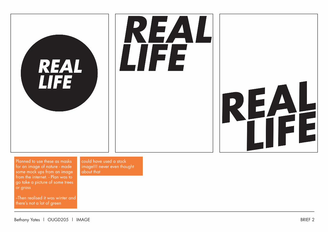
The plan with this one was to make the letters using statistical maths symbols. Experimented with a few versions of some letters - seeing how abstract I could make them while still maintaining their legibility.

BRIEF 2Bethany Yates | OUGD205 | IMAGE
Tried 2 versions with different representations of the letter A. Went for the more abstract one - it worked in the context of the other letters and added another visual element to the words- i already has a few letters using the line graph styling.

Bethany Yates | OUGD205 | IMAGE BRIEF 2
Tried a couple of different colours - the orange one is my favourite, but the red one works better at communicating the maths- its quite masculine and a lot colder than this one.
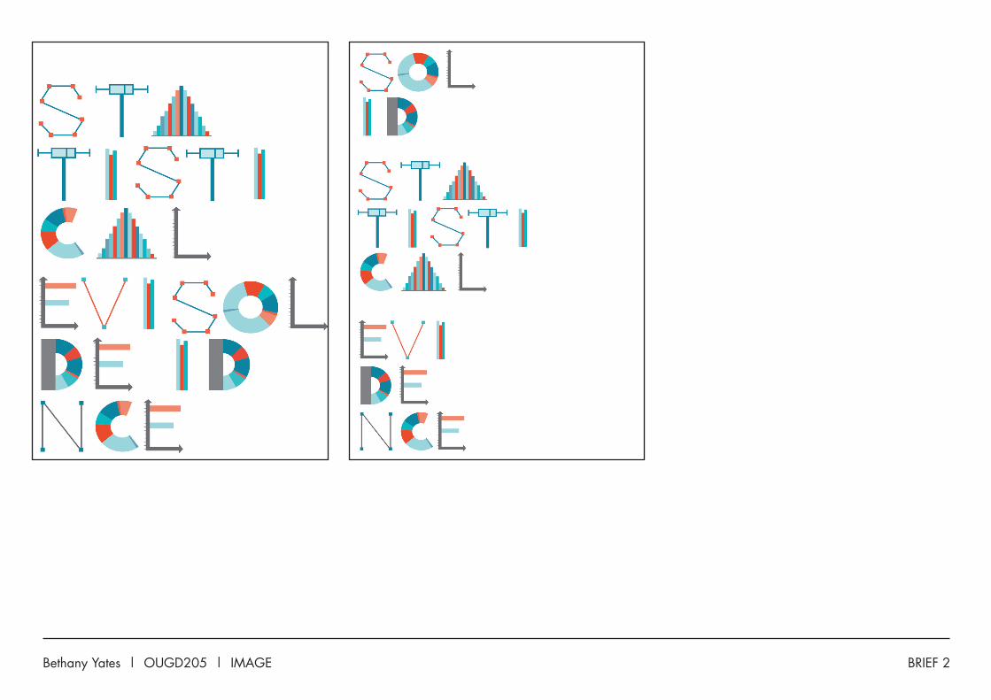
Threw together some more unusual layouts just to see how they looked. Not as successful as the first, but it was a good experiment in seeing how readable things were when you break them up.

BRIEF 2Bethany Yates | OUGD205 | IMAGE
Bethany Yates | OUGD205 | IMAGE BRIEF 2
BRIEF 2Bethany Yates | OUGD205 | IMAGE

Bethany Yates | OUGD205 | IMAGE BRIEF 2
Painted this using coffee - it was really boring. Tried a different phrase instead.

BRIEF 2Bethany Yates | OUGD205 | IMAGE
RealLife
Photoshop mock-up. Went off the idea.
Bethany Yates | OUGD205 | IMAGE BRIEF 2
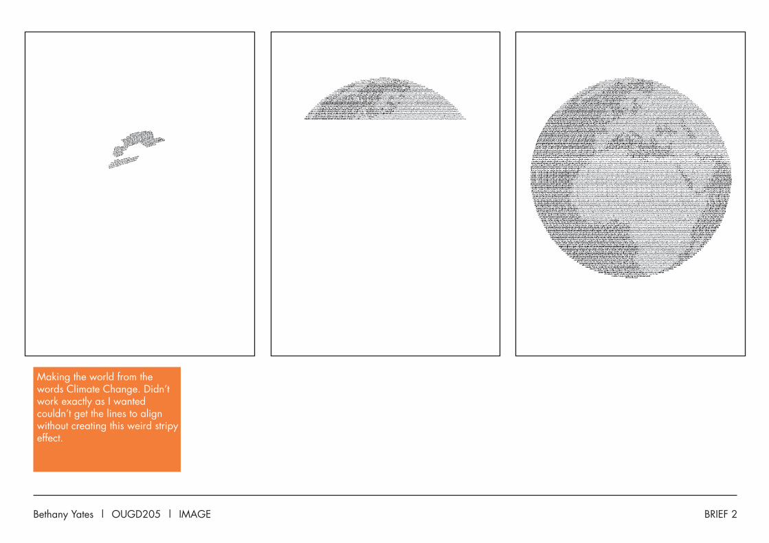
Making the world from the words Climate Change. Didn’t work exactly as I wanted couldn’t get the lines to align without creating this weird stripy effect.

BRIEF 2Bethany Yates | OUGD205 | IMAGE
Colour looked iffy This looked a bit too much like the moon.

Bethany Yates | OUGD205 | IMAGE BRIEF 2
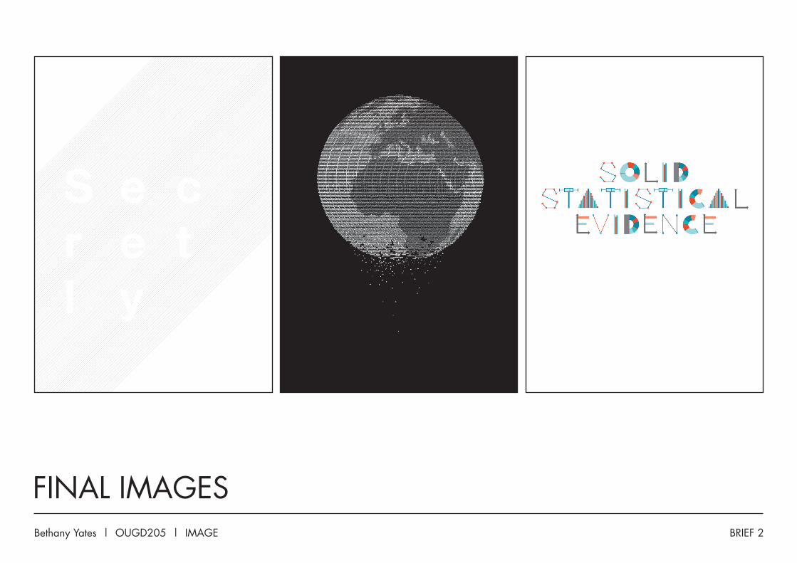
Stuck with simple black and white - gave the best contrast between the type weights. Black background made the continents stand out more.

BRIEF 1Bethany Yates | OUGD205 | IMAGE
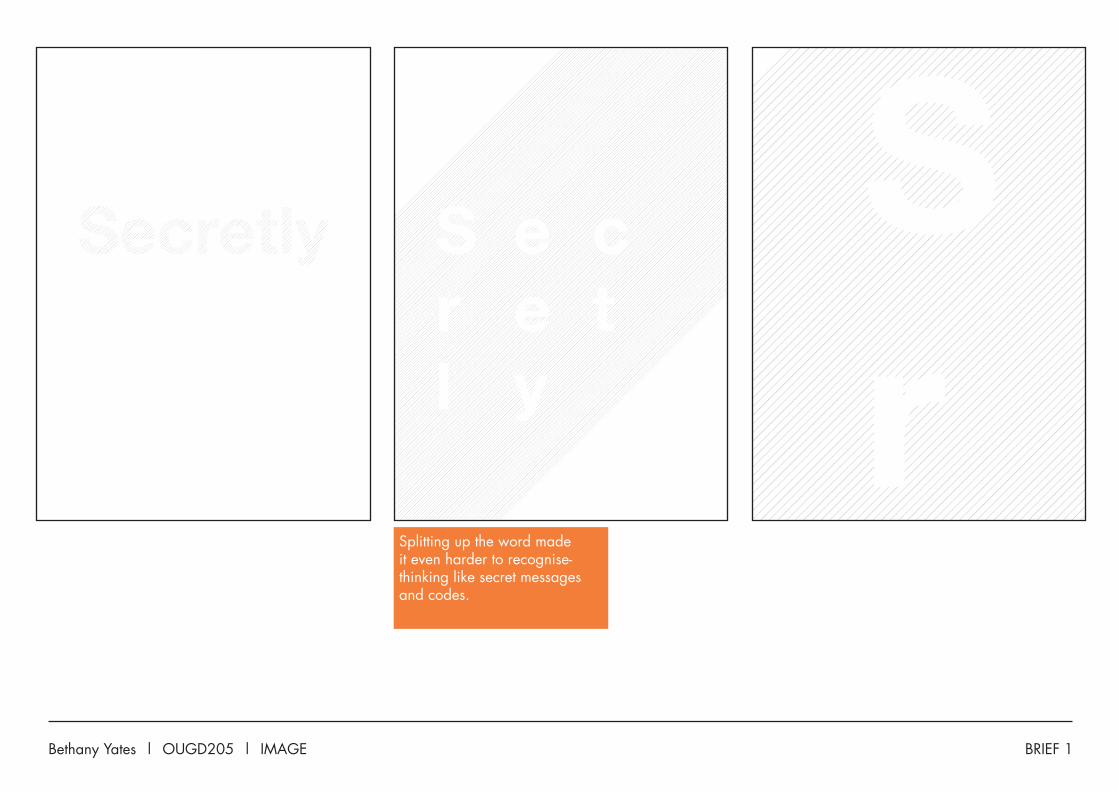
This was a really last minute idea - wanted to make the word really subtle, hard to read almost - you had to look closely to be able to read it.
Bethany Yates | OUGD205 | IMAGE BRIEF 1
Splitting up the word made it even harder to recognise- thinking like secret messages and codes.
BRIEF 2Bethany Yates | OUGD205 | IMAGE
FINAL IMAGES
Related Documents