IMAGE AND TEXT IN NINETEENTH-CENTURY BRITAIN AND ITS AFTER-IMAGES A Dissertation by GINA OPDYCKE TERRY Submitted to the Office of Graduate Studies of Texas A&M University in partial fulfillment of the requirements for the degree of DOCTOR OF PHILOSOPHY May 2010 Major Subject: English

Welcome message from author
This document is posted to help you gain knowledge. Please leave a comment to let me know what you think about it! Share it to your friends and learn new things together.
Transcript
IMAGE AND TEXT IN NINETEENTH-CENTURY BRITAIN AND ITS
AFTER-IMAGES
A Dissertation
by
GINA OPDYCKE TERRY
Submitted to the Office of Graduate Studies of Texas A&M University
in partial fulfillment of the requirements for the degree of
DOCTOR OF PHILOSOPHY
May 2010
Major Subject: English
IMAGE AND TEXT IN NINETEENTH-CENTURY BRITAIN AND ITS
AFTER-IMAGES
A Dissertation
by
GINA OPDYCKE TERRY
Submitted to the Office of Graduate Studies of Texas A&M University
in partial fulfillment of the requirements for the degree of
DOCTOR OF PHILOSOPHY
Approved by:
Chair of Committee, Terence Hoagwood Committee Members, Susan Egenolf Victoria Rosner Cynthia Bouton Head of Department, M. Jimmie Killingsworth
May 2010
Major Subject: English
iii
ABSTRACT
Image and Text in Nineteenth-Century Britain and Its After-Images. (May 2010)
Gina Opdycke Terry, B.A., University of North Carolina-Chapel Hill;
M.A., Texas A&M University
Chair of Advisory Committee: Dr. Terence Hoagwood
“Image and Text” focuses on the consequences of multi-media interaction on the
concept of a work’s meaning(s) in three distinct publishing trends in nineteenth-century
Britain: graphic satire, the literary annuals, and book illustration. The graphic satire of
engravers James Gillray and George Cruikshank is replete with textual components that
rely on the interaction of media for the overall satirical impact. Literary annuals
combine engravings with the ekphrastic poetry of writers including William
Wordsworth, Samuel Taylor Coleridge, Robert Southey, and Letitia Elizabeth Landon.
Book illustrations provided writers Sir Walter Scott and Alfred, Lord Tennyson a means
to recycle previously published works as “new” texts; the engravings promote an illusion
of textual originality and reality by imparting visual meanings onto the text. In turn, the
close proximity of text to image changes visual meanings by making the images
susceptible to textual meanings. Many of the theoretical implications resulting from the
pairing of media resound in modern film adaptations, which often provide commentary
about nineteenth-century visual culture and the self-reflexivity of media.
iv
The critical heritage that has responded to the pairing of media in nineteenth-
century print culture often expresses uneasiness with the relationship between text and
mechanically produced images, and this uneasiness has often resulted in the treatment of
text and image as separate components of multi-media works. “Image and Text”
recovers the dialogue between media in nineteenth-century print forms often overlooked
in critical commentary that favors the study of an elusive and sometimes fictional
concept of an original work; each chapter acknowledges the collaborative nature of the
production of multi-media works and their ability to promote textual newness,
originality (or the illusion of originality), and (un)reality. Multi-media works challenge
critical conventions regarding artistic and authorial originality, and they enter into battles
over fidelity of meaning. By recognizing multi-media works as part of a diverse genre it
becomes possible to expand critical dialogue about such works past fidelity studies.
Text and image cannot faithfully represent the other; what they can do is engage in
dialogue: with each other, with their historical and cultural moments, and with their
successors and predecessors.
v
DEDICATION
To my Parents,
Ann and Don Opdycke
vi
ACKNOWLEDGEMENTS
Much of this dissertation focuses on the collaborative nature of literary and
artistic works; likewise, these acknowledgements celebrate the often collaborative nature
of academic work. While I have spent long solitary hours researching and writing, I
could not have done so without the moral and academic support of my friends, family,
and colleagues.
I would like to thank Dr. Terence Hoagwood who has been a mentor to me for
over seven years. His unfailing belief in my work, his patience as I’ve jabbered on about
ideas, and his perseverance in encouraging me to be a better writer have all
contributed—and continue to contribute—to my growth as a scholar. To the rest of my
committee, Dr. Susan Egenolf, Dr. Victoria Rosner, and Dr. Cynthia Bouton, I am
thankful for their guidance and constructive criticism. To Dr. Egenolf, in particular, I
am thankful for her helpful feedback in meetings that often included my daughter vying
for our attention. To Rona Glasser, my high school art teacher, I am thankful for years
of encouragement that I find a way to join my two loves: art and literature. I’m happy to
say that I have found a way.
Thank you to the English Department for a Dissertation Fellowship that allowed
me some much-needed time to read and write, and to so many faculty members who
actively demonstrate their support of graduate students. Thank you to the College of
Liberal Arts for a generous Dissertation Fellowship that helped fund research trips to the
Harry Ransom Center at the University of Texas and to the University of Edinburgh,
vii
British Museum, and British Library. Many thanks as well to Dr. James Rosenheim and
the Melbern G. Glasscock Center for hosting so many rewarding interdepartmental
colloquiums and for a stipendiary fellowship and travel award that also made my
research trip to the United Kingdom possible. I am thankful for Dr. Peter Garside’s
willingness to meet at the University of Edinburgh with a strange American graduate
student to discuss illustrations of Sir Walter Scott’s work. Thank you as well to Teri
Czajowski at Texas A&M for helping me to coordinate all of the necessary paperwork
for my research trips.
For the willingness of my writing partner Amy Montz to read so many drafts and
to discuss so many ideas I am eternally thankful. Going forward I know that I can rely
on Amy as a sounding board for new projects and I always look forward to reading her
impressive work. To Dana Lawrence, Nick Lawrence, Sarah Peters, Miranda Green-
Barteet, Cody Barteet, Meghan Gilbert-Hickey and Jeremiah Hickey, thank you for
demonstrating that we can be many things at once (graduate student, scholar, spouse,
and parent).
To my family, I am thankful not only for your encouragement, but also for your
help watching Alison while I work. I am thankful for Larry and Judy Terry’s trips to
help on the home front while I traveled. I owe this dissertation to my parents, Ann and
Don Opdycke, whose frequent treks to Texas to watch their granddaughter, fix
computers, proofread drafts, and cook delicious meals guaranteed that I stayed on track
personally and professionally. Thank you for believing in me.
viii
To my husband Steve, I send my heartfelt thanks for years of encouragement, for
long conversations about everything and nothing, and for countless trips to the library to
transport books to and from the house. He and Alison remind me to enjoy life outside of
the study, and they fill my life with love and laughter.
ix
NOMENCLATURE
BMC British Museum Catalog
BL British Library
x
TABLE OF CONTENTS
Page
ABSTRACT .............................................................................................................. iii
DEDICATION .......................................................................................................... v
ACKNOWLEDGEMENTS ...................................................................................... vi
NOMENCLATURE .................................................................................................. ix
TABLE OF CONTENTS .......................................................................................... x
LIST OF FIGURES ................................................................................................... xii
CHAPTER
I INTRODUCTION: ARTFUL INTERACTIONS: TEXT, IMAGE, AND MASS-MEDIA .............................................................................. 1
II “READ O’ER THIS!”: TEXT AND IMAGE IN ROMANTIC- PERIOD GRAPHIC SATIRE ................................................................ 22 III “POETICAL ILLUSTRATIONS”: TEXT AND IMAGE IN THE LITERARY ANNUALS ....................................................................... 85 IV “APPROPRIATE EMBELLISHMENTS”: ILLUSTRATED SUPPLEMENTS TO SIR WALTER SCOTT’S WORK ...................... 153 V THE IMPLICATIONS OF LOOKING: TEXT AND IMAGE IN THE MOXON TENNYSON .......................................................................... 222 VI NINETEENTH-CENTURY AFTER-IMAGES AND TWENTIETH- CENTURY MEDIA ............................................................................... 278
VII CONCLUSION: SIGNPOSTS: THE PRESERVATION OF NINETEENTH- CENTURY AFTER-IMAGES ................................... 319 WORKS CITED ........................................................................................................ 331

xi
Page
VITA ......................................................................................................................... 366
xii
LIST OF FIGURES
Page Figure 1.1 William Hogarth, The Invasion—England, 1756, Engraving. © Trustees of the British Museum, BMC. 3454 ............................... 27 Figure 1.2 George Cruikshank, Scene in the R—L Bed-Chamber; or, A SLIT in the Breeches!, 1816, Hand-Colored Etching, Published by John Fairburn. © Trustees of the British Museum, BMC. 12771. ............. 44
Figure 1.3 James Gillray, The Blood of the Murdered Crying for Vengeance,
1793, Hand-Colored Etching and Engraving, Published by Hannah Humphrey. © Trustees of the British Museum, BMC. 8304. ...................................................................................... 51 Figure 1.4 James Gillray, Stealing Off,-or-Prudent Secession, 1798, Hand-Colored Etching, Published by Hannah Humphrey. © Trustees of the British Museum BMC. 9263. ................................................. 56 Figure 1.5 James Gillray, Lieut Goverr Gall-stone, Inspired by Alecto; -or-
the Birth of Minerva, 1790, Etching and Aquatint, Published by Hannah Humphrey. © Trustees of the British Museum, BMC. 7721. ...................................................................................... 58 Figure 1.6 George Cruikshank, The Genius of France Expounding her Laws to
the Sublime People, 1815, Hand-Colored Etching, Published by Hannah Humphrey. © Trustees of the British Museum, BMC. 12524. .................................................................................... 63 Figure 2.1 James Holmes, “The Country Girl,” Engraved by Charles Heath. The Keepsake, 1829. Collection of the Author. ............................... 106 Figure 2.2 Thomas Stothard, “Garden of Boccacio,” Engraved by Francis Englehart. The Keepsake, 1829. Collection of the Author.. ............. 109 Figure 2.3 J. M. W. Turner, “Lago Maggiore,” Engraved by William Smith. The Keepsake, 1829. Collection of the Author. ............................... 121 Figure 2.4 William Purser, “The Hindoo Palace and Temple at Madura,” Engraved by William Floyd. Fisher’s Drawing Room Scrapbook, 1836. Collection of the Author.. ....................................................... 128 Figure 2.5 William H. Bartlett, “The Upper Lake Killarney, Ireland,”
xiii
Page Engraved by William Le Petit. Fisher’s Drawing Room Scrapbook, 1832. Collection of the Author.. ..................................... 130 Figure 3.1 J. M. W. Turner, “Edinburgh—March of the Highlanders,” Engraved by Thomas Higham, Landscape-Historical Illustrations, 1836. Collection of the Author.. ....................................................... 181 Figure 3.2 Henry Melville, “Loch Lomond,” Engraved by Robert Sands. Landscape-Historical Illustrations, 1836. Collection of the Author ................................................................................................ 186 Figure 3.3 Copley Fielding, “Branksome Tower,” Engraved by W. Radclyffe, Landscape Illustrations of the Waverley Novels, 1833. Collection of the Author. .................................................................................... 197 Figure 3.4 J. M. W. Turner, “Crichtoun Castle,” Engraved by W. B. Cooke. Landscape Historical Illustrations of the Waverley Novels, 1833. Collection of the Author. ................................................................... 198 Figure 3.5 George Cattermole, “Queen Mary’s Closet: Holyrood House,” Engraved by J. Lewis. Scott and Scotland, 1835. Collection of the Author. ......................................................................................... 200 Figure 3.6 George Cruikshank, “Gape, Sinner, and Swallow!” Engraving. Landscape-Historical Illustrations, 1836. Collection of the Author. 204 Figure 3.7 J. R. Herbert, “Flora MacIvor,” Engraved by Thomas Hollis. The Waverley Gallery, 1866. Collection of the Author. .................. 209 Figure 4.1 Daniel Maclise, “Morte D’Arthur,” Engraved by J. Thompson. Poems, 1857. Collection of the Author. ........................................... 239 Figure 4.2 J. C. Horsley, “Circumstance,” Engraved by J. Thompson. Poems, 1857. Collection of the Author. ........................................................ 243 Figure 4.3 J. C. Horsley, “Circumstance,” Engraved by J. Thompson. Poems, 1857. Collection of the Author. ........................................... 245 Figure 4.4 Dante Gabriel Rossetti, “Lady of Shalott,” Engraved by the Dalziel brothers. Poems, 1857. Collection of the Author. ............... 248 Figure 4.5 William Holman Hunt, “Lady of Shalott,” Engraved by J.
xiv
Page Thompson. Poems, 1857. Collection of the Author. ....................... 251 Figure 4.6 John Everett Millais, “Mariana,” Engraved by the Dalziel brothers. Poems, 1857. Collection of the Author. ........................... 257 Figure 4.7 John Everett Millais, “The Sisters,” Engraved by the Dalziel brothers, Poems, 1857. Collection of the Author. ............................ 259 Figure 4.8 J. C. Horsley, “The Gardener’s Daughter; or, The Pictures,” Engraved by J. Thompson. Poems, 1857. Collection of the Author. 265
1
CHAPTER I
INTRODUCTION
ARTFUL INTERACTIONS: TEXT, IMAGE, AND MASS-MEDIA
In an 1807 Lecture at the Royal Academy, artist John Landseer declares that
“Engraving is no more an art of copying Painting than the English language is an art of
copying Greek or Latin” (Lecture III, 177, original emphasis). Landseer argues that
“Engraving is a distinct language of Art” (III, 177); he suggests that an engraving based
on a painting is no more a copy “than the same composition, if sculptured or modelled
[sic] in low relief, would be a copy. In both cases they would be, not copies, but
translations from one language of Art, into another language of Art” (178, original
emphasis). Landseer’s claims fell on resistant ears; engravers had been striving
unsuccessfully to gain access to the Royal Academy as full members since 1767. The
Academy’s Council replied with hostility to the efforts of Landseer and others working
for the formal acceptance of engravers within Academy ranks. The Council argued that
since engraving is “wholly devoid” of any “intellectual qualities of Invention and
Composition,” that the admission of engravers as “first rank” Academy members would
“be incompatible with justice and a due regard to the dignity of the Royal Academy”
(qtd. in Hutchison 89). To the Council, the Royal Academy’s purpose was to bring
forward “original Artists, who alone are capable of supplying sufficient novelty, and
____________ This dissertation follows the style of the Modern Language Association.
2
interest to excite public attention without which ... the Establishment itself must fail”
(qtd. in Hutchison 88, original emphasis). Despite the need to appeal to public tastes, the
reason for denying engravers was “grounded” in a “more abstract, permanent and
immutable nature” based on a desire to preserve traditional definitions of artistic
originality (qtd. in Hutchison 89).
A critical concern about the mechanical arts’ ability to change an idolized and
idealized original work resounds in both discussions of nineteenth-century works pairing
text and engraving and in discussions of modern film adaptations. Discussions of these
multi-media works tend to revolve around rhetorical details, romantic notions of
originality, prejudices against mass-produced works, and concepts about a work’s
mysterious spirit; it would seem from such criticism that a change in a work’s form
necessitates a change in its aesthetic value. From Sir Joshua Reynolds’ labeling of the
mechanical arts as “capricious changelings” (49) in his Discourses on Art (1769-1790),
to Walter Benjamin’s concept of an original and its aura in The Work of Art in the Age of
Mechanical Reproduction (1936), mechanical arts, like engraving, have suffered under
notions of artistic hierarchy and originality.1 Eager to maintain the notion that viewing
original artwork is “an act of devotion performed at the Shrine of Art” (Hazlitt, Sketches
6) and that writing poetry is the result of a “spontaneous overflow of powerful feelings”
(Wordsworth 393),2 many artists and writers attempt to distance themselves from the
mechanical arts and their commercial associations. Even Landseer, an active proponent
of the formal recognition of engraving as an art, had strong words for those involved in
3
the business of engraving; he proves highly critical of print sellers, whom he felt were
responsible for the trend of focusing on the “quantity” not the “quality” of engraved
productions (321). Debased to a commercial form, “Art is necessarily retrograde” the
moment an artist agrees to tailor his work for a print dealer (Landseer 321).
The mechanical arts face condemnation for their associations with the mass-
market, and text, caught up in the fray, often faces similar critical disapproval. While
editors and publishers advertise text as a willing partner to visual counterparts, the
critical heritage that has responded to this pairing often expresses uneasiness with the
relationship between text and mechanically produced images. As such, text and image
in multi-media works are often treated as separate entities of a work, and the interaction
of text and image on the page and the production methods that paired them are
overlooked. Rather than create a single meaning, dependent on placing one art in a
secondary relationship to another, the interaction of the arts on the printed page suggests
a multiplicity of meanings dependent on an ongoing dialogue between media. The
dialogue that ensues when text and image appear in close proximity to each other allows
for a reciprocal, but not necessarily equivocal, transfer of meaning between media.
The connections between media highlight the complex relationship between text
and image in an increasingly commoditized culture where writers and artists alike found
pleasure, profit, and new meaning by combining the arts. While acknowledging
theoretical debates surrounding mass-produced works, “Image and Text in Nineteenth-
Century Britain and Its After-Images” argues for the importance of studying text and
image together by focusing on the consequences of multi-media interaction on the
4
concept of a work’s meaning(s). “Image and Text” seeks to recapture the dialogue
between media so often overlooked in critical commentary that favors the study of an
elusive and sometimes fictional concept of an original work. Multi-media publications
flourished in nineteenth-century Britain, and this flourishing underscores the variety of
ways text and image encountered each other in print culture. “Image and Text” rejoins
art and text within a critical discussion of three distinct publishing trends in nineteenth-
century Britain: graphic satire, the literary annuals, and book illustration. The discourse
between text and image constructs meaning in graphic satire, it activates an ekphrastic
connection between media in the literary annuals, and it is complicit in the construction
of an illusion of newness in illustrated editions of preexisting works. In the process of
rejoining art and text in critical discussions of multi-media works, the idea of a coherent
and original text is challenged and the inherent multiplicities of multi-media works
emerges. The discourse between text and image moves both forms forward, both into
new forms for new generations of readers and through the translation of textual meaning
into visual meaning and vice versa.
Many of the theoretical implications resulting from the pairing of image and text
continue to resound throughout the twentieth century; accordingly, “Image and Text”
concludes in the twentieth century by discussing nineteenth-century after-images in film
adaptation. All of the forms discussed in the study reveal that multi-media works enter a
discourse of meaning through an ongoing interaction between text and pictorial image.
Whether the connection is thematic, explicit, or merely spatial, it is a connection with
consequences for visual and textual meaning. “Image and Text” is concerned with the
5
methods of production that form these connections and the multiplicity of meaning that
ensues when text and image are paired.
The first four chapters of “Image and Text” study the interaction of media in
works combining text and engraving. Engravings are complicit in the creation of a
persistent façade of textual newness, originality, and reality. As “translations” of
paintings or drawings, engravings enter the marketplace promoting an illusion of
originality—they are often advertised as an artist’s work when they are in reality the
product of an engraver’s hand. Despite the Royal Academy’s refusal to admit engravers
as part of their ranks, graphic reproductions of the work of Academy artists like J. M. W.
Turner were “a most potent force in spreading a taste for art, making the public aware of
the style and achievement of individual painters” (Denvir 23). Engraving enabled the
Sister Arts to enter the marketplace together, which, according to Daniel Riess,
“transformed” art and poetry into “marketplace commodities” (Riess 824). A multi-
media work pairing text and engraving is a “marketplace commodity,” but it is also a
signifier of the complexity of artistic and literary works. Industrial changes allowed for
the mass-production of literature, and writers, artists, and publishers found innovative
ways to exploit the power of new technology to represent original pieces of work. The
resulting works challenge traditional notions of a work’s coherence and singular
authorship.
The collaborative nature of print culture necessitates awareness about production
methodologies: recognizing how and why text and image are paired clarifies our
understanding of how meaning is constructed. Disparities between production processes
6
that rely on the ability for technology to reproduce an original work and the public’s
acceptance of that original work often contribute to the ongoing critical anxiety about
mass-produced works. John O. Jordan and Robert L. Patten concede that the very nature
of print culture contributes to an absence of theoretical cohesion in discussions of print
culture (1). While much of printing history is about tangible technological advances, it
is also about intangibles: time, place, people, and culture (Jordan and Patten 12).
Likewise, Jerome J. McGann argues that the “the critical analysis of such forms is an
invaluable key to understanding the most elusive types of human phenomena, social and
historical patterns” (81). Accordingly, “Image and Text” is not just about meaning in
multi-media works but also about the artists, engravers, publishers, and writers who
endeavor to create them.
McGann also observes that the “influence of [a] work’s own production history
on the work itself grows more important with the passage of time” (81); accordingly,
each chapter of “Image and Text” begins with an overview of production methodologies,
and this overview demonstrates that the critical distance between a mass-produced work
and its meaning often begins with the work’s inception. From William Wordsworth’s
designation of the annuals as “greedy receptacles of trash” (Letters 2:275-276), to Dante
Gabriel Rossetti’s labeling of “illustrated editions of poets” as “quite hateful things”
(Letters 14), authors and artists often encourage a distancing of their work from the
commercial implications of the collaborative work in which they published. Such
attempts strive to preserve artistic and authorial control over meaning, a control that is
7
lost the moment the work interacts with its textual or visual counterpart. Production,
then, appears to destroy authorial and artistic singularity.
Wary of the commercial associations that arise with literature’s foray into the
burgeoning engraving market, many critics have argued that the consequences for
literature paired with engravings are disastrous. Lee Erickson recognizes the benefits of
stereotype printing, but he condemns it for its relationship to modern connotations of the
word “stereotype” and associations with “mass conformity” (30). The literary annuals,
with their engravings, poetry, and mass appeal, serve as Erickson’s prime target. To
Erickson, the annuals destroyed Romanticism and poetry (40, 43), and he faults the
annuals with forcing poets, especially the emerging Victorian poets, to conform to a
“purely pictorial aesthetic” (41), thus overlooking the historical tradition of
incorporating visual references within poetry. Rather than celebrate the marriage of the
arts in the annuals, Erickson suggests that the “Annuals lowered poetic standards and
provided an inadequate shelter for poetry against the ever-rising tide of the periodicals”
(31). Erickson is equally harsh with writers who participate in the annuals, particularly
with Letitia Elizabeth Landon, who was an active writer and editor for the annuals.
Erickson states that Landon “was reduced to writing poems as commentary upon
pictures. It is no wonder that the quality of and the payment for poetry in the Annuals
soon declined” (31). While Erickson is quick to condemn Landon for her role with the
annuals, he dismisses the participation of traditional canonical writers, such as
Wordsworth, for their participation in the same publications.3
8
While literary critics often prove wary of the intrusion of visual media into text’s
domain in print, art critics often react with disdain to literature’s influence over artistic
trends. Gerard Curtis argues that the binding of text and image in print media had
negative consequences for the fine arts, which had become “ensnared as literature’s
hieroglyphic handmaid” (57-58). Illustrated works, according to Curtis, “denied artists
both their own narrative voice, and the use of their medium as commentary beyond the
voice of the author” (57). Art, in such a view, is enslaved by textual after-images.
Literary critics often echo their art historian counterparts by suggesting that the format of
multi-media works reduces poems to mere “commentary upon pictures” and requires the
subordination of literary “art” to the “pictorial” image (Erickson 31; Manning 63).
Multi-media works are thus suspect, and André Bazin argues that it is “possible to
imagine that we are moving toward a reign of adaptation in which the notion of the unity
of the work of art, if not the very notion of the author himself, will be destroyed” (26).
Robert Stam, an active proponent for leaving fidelity studies behind, suggests that film
and novels have “consistently cannibalized other genres and media. […] repeatedly
plundering or annexing neighboring arts” (61). Such language reinforces a hierarchy
between the arts and implies that violence shapes and defines the relationship between
media. Literature, it would seem, is constantly at risk of being overtaken by tyrannical
forms of visual media; like the art of Painting and Engraving, the Sister Arts, it would
appear, squabble frequently.
The tendency to become tangled up in debates over authorial intention, artistic
originality, and aesthetic hierarchies means that the dialogue between media is often
9
overlooked. The instability of meaning that ensues when text and image interact does
not imply that one medium assumes dominance over the other, but rather that meaning in
literary and visual works is fluid, evolving, and never singular. Furthermore, the ways in
which editors, authors, artists, and engravers promote multi-media works suggests a
heightened cultural awareness of the ways in which visual media change and enhance
text. As Terence Hoagwood and Kathryn Ledbetter make clear in their work on British
women writers, the “study of text production is the study of cultural artifacts, and it is
inseparable from the study of literature” (11). The study of print meaning and print
culture are thus fundamentally connected.
Chapter II, “‘Read O’er This’: Text and Image in Romantic-Period Graphic
Satire,” argues that a recognition of the intricate interplay between text and image within
graphic satire is worthy of attention from literary scholars. This chapter works to move
critical discussions about graphic satire forward to include a more nuanced study of the
interaction of text and image in the genre. Graphic satires incorporate textual allusions
to literary giants and use text as an important design element; text plays an active role in
the construction of meaning in graphic satire. The complex use of text by artists such as
James Gillray and George Cruikshank suggests that contemporary readership was
prepared to read the image in conjunction with the text and to read the text in
conjunction with the image. Historically, studies of graphic satire have striven to
preserve meaning rather than focus on the creation of that meaning. In Rowlandson the
Caricaturist (1880), Joseph Grego observes that “buyers and readers of books, all
admirers of pictures, drawings, and engravings—in a word, the intelligent” can find
10
books on artists, but laments that caricaturists have been “passed over” (1-2). Grego
finds no “fitting memorial” for the caricaturists (2); yet from William Thackeray’s
lecture on Cruikshank (1823), to Thomas Wright and R. H. Evans’ Historical and
Descriptive Account of the Caricatures of James Gillray (1851), to J. P. Malcolm’s 1813
historical overview of caricature, there exists an assortment of works that translate
graphic satire for contemporary audiences. These works suggest that to understand
graphic satire we must have an interpreter—a translator to reinterpret and recapture
meaning presumably lost through time. Modern critical work on the graphic satirists is
limited, and it follows trends set in the nineteenth-century by focusing on the
sociopolitical meaning of the work rather than the rhetoric of the images and text.4
In a way, however, Grego is correct; recognition of the sophisticated interplay of
textual and visual meaning in a seemingly crude genre has been “passed over.” The
study of the sociopolitical importance of graphic satire is an important process in
preserving meaning, but so too is the study of the visual and textual rhetoric that create
this meaning. While it is necessary to acknowledge that the images are designed to
catch a viewer’s eye, the complicated use of text in the genre suggests that we should
also be prepared to read the images. In the work of Gillray and others, text is meant to
be seen and read. A focus solely on pictorial representation and sociopolitical meaning
within caricature overlooks the use of large textual spaces within graphic satire. Most of
the caricaturists’ works are replete with speech balloons, captions, and large textual
spaces; as active components of the engravings, the text interacts and engages with the
graphics, often enhancing or contradicting the engravings’ visual image. Work by critics
11
such as Richard Volger, Robert L. Patten, and Eirwen Nicholson has drawn attention to
the topic of readability in graphic satire, but no critic has yet provided a lengthy study of
the topic. This chapter moves the critical conversation about graphic satire forward by
studying the use of text in both single-sheet and bound volumes of graphic satire.
While Chapter II reinstates the images in graphic satire with their textual
counterparts, the third chapter, “‘Poetical Illustrations’: Text and Image in the Literary
Annuals,” works to resituate the annuals’ poetry in conjunction with their visual
counterparts. In critical discussions of the literary annuals, the engravings are often
subordinated to the accompanying poetry or omitted from critical discussion altogether.
The tendency to subordinate poetry to pictures overlooks the relationship between art
and literature and alienates each from the other. An ekphrastic connection between
media emerges when the literature in the annuals is reengaged with the engravings with
which they were paired, for the text in some way relates to the graphic representation of
the engravings. The maintenance of the link between media suggests that ekphrasis does
not necessarily depend on absence; instead, in the literary annuals, it is the text’s
proximity to its accompanying artwork that maintains an ekphrastic connection. In this
chapter, I depart from W. J. T. Mitchell’s influential definition of ekphrasis to argue that
much of the poetry in the literary annuals is ekphrastic. Mitchell argues that the “textual
Other” can never be present, but must be “conjured up as a potent absence or a fictive,
figural presence” (699); however, in the annuals the “textual Other” is ever present and
activates the ekphrastic connection. The ekphrastic responses in the annuals take on a
variety of forms, adding to the variable ways that meaning in the annuals is produced.
12
While some writers, such as Wordsworth and Sir Walter Scott, attempted to
distance their work from the engravings, the engravings’ appearance alongside the
annuals’ text invites our recognition of an ekphrastic connection. In the annuals, the
spatial pairing of media maintains the illusion of ekphrasis, even if the image and text
were produced independently. Works including Robert Southey’s “Stanzas, Addressed
to J. M. W. Turner, ESQ. R. A. on his View of the Lago Maggiore From the Town of
Arona,” and Mary Shelley’s “The Elder Son,” thematically incorporate the engravings
into their text’s narrative; readers are directed to the illustrations. Landon’s use of
supplementary material (poems and prefaces) in Fisher’s Drawing Room Scrapbook,
also instructs her readers on how to approach the engravings. The interaction of media
within the annuals is multifarious; literature in the annuals often uses the engraving as a
point of departure, as a brief reference illustrative of the text’s narrative or theme, or as a
visual counterpart to a textual description of a scene. Once we reconnect the text in the
annuals with their visual counterparts, it becomes possible to study the text by writers
such as Landon, Wordsworth, and Scott, as “poetical illustrations” (Landon n.p.), as
ekphrastic texts that enter a discourse of meaning through their interaction with the
engravings.
Critics including Terence Hoagwood, Kathryn Ledbetter, and Margaret Linley
have begun the process of resituating the annuals within the context of print culture.
This process has revealed an inherent duplicity in the annuals’ form. Glennis
Stephenson notes that the “annuals are always marked, above all, by cultural and
13
ideological tension and contradiction” in terms of content and production (172).
Ledbetter observes that the “ultimate irony” of the literary annuals
Was that their material production involved the latest technology in
bookbinding, paper manufacturing, engraving, and aggressive marketing
while their producers advertised the book in terms of genteel elegance,
grace, class, and feminine domesticity that contrasts with such
competitive modern tactics. (19)
The annuals’ editors relied on the interaction of form and content to fashion an illusion
of cultural and aesthetic worth. Furthermore, the fiction of “personal feeling” that
begins with the advertisements of the annuals and continues in the annuals’ content
promotes the illusion that “literary commodities are themselves thoughts and feelings,
rather than manufactured ones” (Hoagwood and Ledbetter 5). The mass-produced status
of nineteenth-century literary annuals leaves little semblance of originality in terms of
authorial and artistic singularity, but the inclusion of editorial comments and the use of
design elements assist in maintaining an illusion of originality. Hoagwood and
Ledbetter observe that editors often undertook a “massive public relations job” during
the elaborate process of securing contributions to the annuals (82); this “public relations
job” extends to the promotion of the literature and the art in the annuals as existing in a
symbiotic relation to each other. Editorial comments in the annuals’ prefaces often
provide instructions on how readers are to interpret the relationship between text and
image.
14
The annuals emerge in the literary market at a time in which editors, writers,
artists, and engravers had begun to explore the full potential of the aesthetic and
commercial possibilities of pairing visual and textual media. Within Western literary
tradition, the illustration and ornamentation of books has a long history, but during the
nineteenth century, advances in printing allowed for a wider distribution of books. In
contrast to their Medieval and Renaissance predecessors, nineteenth-century book
illustrations reached a wide audience and often shared little narrative cohesion with their
texts. The period’s invention of stereotyping, in which plates are made into reusable
casts, allowed books to be produced more cheaply and in larger quantities (Feather 9).
The shift from woodcuts to wood engravings and from copper plates to steel plates made
it faster and more affordable for publishers to reproduce image and text (Feather 10).
With a growing audience eager for multi-media works and the ability to produce higher
quality illustrations, editors, writers, engravers, and artists recognized the advantages of
employing the new technology available for illustration to fashion the illusion of a
“new” visual and textual work.
Perhaps taking their cue from the literary annuals’ successful coffee-table book
appeal, supplemental illustrated editions began to appear in the 1820s pairing engravings
with previously published texts; these supplements, however, spatially alienate the
source text from the illustrations, thus freeing the images to communicate meaning
without being held accountable to the entirety of the source text. While a variety of
illustrated supplements appeared, Richard Altick argues that
15
It was Scott … who, almost singlehandedly among authors, touched off
the century-long fashion of literary landscapes—paintings whose
association with a poem or novel was not contrived and remote … but
intentional and direct. (69)
These “literary landscapes” appeared in numerous illustrated editions, and throughout
the nineteenth century, Sir Walter Scott’s work in particular was repeatedly illustrated.
Richard Maxwell uses the term “illustrated supplements” to refer to illustrated editions
of Scott’s work (3), but I am taking his definition a bit further: for the purposes of
Chapter IV, “illustrated supplements” refers to those works published independently of
Scott’s novels and poems. Before Robert Cadell’s ambitious Magnum Opus edition of
Scott’s work, illustrated supplements containing engravings of Scottish landscapes,
Scottish regalia, and portraits of characters from Scott’s novels, began to enter the
market. The editors of these collections advertise their editions as meant to “bind to” or
“embellish” Scott’s work, thereby acknowledging and encouraging a supplementary
relationship to Scott’s work, even if this relationship was often indirect and created
without Scott’s participation.
The fourth chapter, “‘Appropriate Embellishments’: Illustrated Supplements to
Sir Walter Scott’s Work,” examines the expansion of a text through supplemental
illustrated editions. To make Scott’s work new, editors promise readers access to real
scenes from Scott’s novels and real landscapes from Scotland. The promise of new
realities makes Scott’s work new by transferring visual meaning back to the text and
vice versa, and the editors’ constant promotion of visual reality validates Scott’s text.
16
Through a study of illustrated supplements including Charles Tilt’s Landscape
Illustrations of the Waverley Novels (1832), Rev. G. N. Wright’s Landscape-Historical
Illustrations of Scotland, and the Waverley Novels (1836-1838), and Charles Heath’s
Waverley Gallery of the Principal Female Characters in Sir Walter Scott’s Romances
(1841), I argue that the concept of reality supplants originality in illustrated supplements
of Scott’s work. Editors position “illustrations of Scott” as “identical with those of
Scotland” (Wright n.p.), thereby creating a triad of references—Scott’s work, the
illustrations, and Scotland—that work together to validate Scott’s texts. By allowing
readers to “see” Scott’s texts, the illustrated supplements change the way we read Scott’s
narratives.
The separation of source text and image in illustrated supplements requires
readers and viewers to recall Scott’s works in order to understand the relationship
between text and image. The relationship between the illustrations and Scott’s text
evolves, and several editions, such as Tilt’s Portraits of the Principal Female
Characters in the Waverley Novels (1833), have less to do with Scott’s works than they
do with publishing trends involving exotic portraits of women and the ability for
technology to repeatedly cast text and image anew. To justify their radical departure
from Scott’s work, such supplements often introduce an editorial voice or a new
authorial presence. These intertextual moments sustain an implied dialogue between the
illustrations and Scott’s original text. Additionally, an explicit dialogue between the
editorial text, the illustrations, and excerpts from the source text directs readers on how
to interpret the multi-media relationship: text acts as a guide to the images. The dialogue
17
between the editorial text and the illustrations reinforces the presence of an after-image
of Scott’s original work in the illustrations. In other illustrated works, the absence of
this dialogue leaves the meaning between text and image open to other interpretations,
interpretations that are often driven by a search for textual fidelity.
In contrast to the spatial boundaries within illustrated supplements to Scott’s
work, Edward Moxon’s 1857 illustrated edition of Alfred, Lord Tennyson’s Poems
presents a simultaneous encounter with text and image—image and text share the same
page. As with illustrations of Scott’s work, the illustrations move Tennyson’s
Romantic-period poems into the Victorian era repackaged and newly visualized. The
addition of wood engravings, also a newly revitalized form, to collections of Tennyson’s
poems, makes the poems appear new. The spatial paring of media within the Moxon
Tennyson invites a literal reading of the relationship between media and alerts readers to
the limits of representation and to the implications of viewing image and text together.
The act of producing a work that combines text and image encourages recognition of
these meta-textual moments, and many of the poems encourage multi-media reflexivity
by incorporating visual themes. My fifth chapter, “The Implications of Looking: Text
and Image in the Moxon Tennyson,” argues that the pictures’ placement next to, below,
and above the poems asks readers to read the poem in the images and the images in the
poem. Vignettes act as bookends to many of the poems, and they encourage readers to
slow down to read the poem and illustrations as a singular work within the edition.
Other designs, such as William Holman Hunt’s “The Lady of Shalott,” incorporate
visual elements that force the viewer’s eye to the text. The edition is thus about
18
movement—the movement of Tennyson’s poems into new forms, the movement of
paintings into illustrations, and the movement of meaning between text and image.
The Moxon Tennyson, as it is commonly called, provides none of the editorial
directions that feature so prominently in the literary annuals and in the illustrated
supplements of Scott’s work; consequently, critics have often judged the relationship
between media in terms of the images’ perceived fidelity to an elusive and fictional
essence in Tennyson’s work. Tennyson, like Scott, Wordsworth, and so many others,
often attempted to distance himself from the commercial literary market but was also
willing to use the market to move his work forward to new readers and to repackage his
work for his established readers. Many of the edition’s contributing artists also attempt
to maintain the autonomy of their work without confining their approach to the context
of Tennyson’s poems, and art historians often appear reluctant to approach the Moxon
Tennyson without acknowledging the artists’ general oeuvre. The impressive oeuvres of
contributing artists such as Rossetti and Hunt and the overt literariness of Pre-Raphaelite
art encourage us to look outside the Moxon Tennyson for meaning. The immediacy of
the relationship between text and image diminishes if we continue to look only outside
the work for meaning; by looking within the work for meaning, the variable ways that an
illustration can adapt, translate, and change textual meaning becomes apparent.
In the sixth chapter, “Nineteenth-Century After-Images and Twentieth-Century
Media,” I avoid chasing spirits and essences, and I argue instead for the acceptance of
markers of difference between media and for an acknowledgement of the new meaning
created when text encounters new media. Stam notes that “each medium has its own
19
specificity deriving from its respective materials of expression” (59); the concluding
chapter brings this argument to the twentieth century by looking at nineteenth-century
after-images in film adaptation. In the twentieth century, film replaces engraving as the
salient visual representation of literature. Like engraving, it moves a text forward into
new forms for consumption by new audiences; accordingly, film adaptations, like
illustrations, are judged in terms of faithfulness to the source text. A telling example of
the ability for nineteenth-century after-images to linger in the twentieth century is in
Karel Reisz’s 1981 film adaptation of John Fowles’ The French Lieutenant’s Woman
(1969). Fowles’ novel is a pastiche of nineteenth-century literary forms, demonstrating
the movement of the Victorian novel to the modern times. The film proves to be
hyperaware of the movement of a form by incorporating a subplot about the creation of
an adaptation of the novel and demonstrating a reliance on visual themes and visual
scenes from Victorian paintings. Seemingly innocuous moments involving costume,
character, and mirrors work with their textual counterparts to create commentary about
nineteenth-century gender roles and the self-reflexivity of twentieth-century media.
A recurring theme throughout all of the chapters is that text paired with image is
somehow suspect in terms of quality and meaning. In his seminal work The Work of Art
in the Age of Mechanical Reproduction, Benjamin notes that “the presence of the
original is the prerequisite to the concept of authenticity” (733). The absence of a true
original and a singular meaning in nineteenth-century multi-media works becomes a sign
of authenticity; the inherently collaborative nature of these works creates meaning rather
than destroys it. In Aesthetic Theory (1970), Adorno argues that there is no “coherence
20
of meaning […] unity—is contrived by art because it does not exist…Every artifact
works against itself” (106). “Image and Text” demonstrates that while there may be no
“coherence of meaning” in literary and visual artifacts that media often collaborate to
create meaning. The dialogue between media becomes its own distinct language, and
meaning, as Landseer’s opening comments suggests, moves.
Henry Howard, R.A., contributing an essay on art criticism to the Cabinet of
Modern Art, and Literary Souvenir, and Literary Souvenir (1836), suggests that while a
painter may be “indebted to the Poet or Historian” for his “theme,” the “invention of the
picture must be as much his own as if the whole had originally proceeded from his own
conception” (59). After he acknowledges that “graphic descriptions will scarcely ever
place the circumstances of the story in such a light as will suit the wants of Painting,”
Howard argues that textual meaning should be “translated into another language” in
visual media (59). Textual and historical meaning should be “remoulded in the mind of
the Artist, and cast afresh; and no one can do this for him—in this he must be his own
Poet” (Howard 59). In nineteenth-century print culture, the Artist and Poet are replaced
with a diverse group of collaborating individuals who often have differing interpretations
of a work’s meaning; whatever their motivations for creating the work, the resulting
work is autonomous. Meaning, rather than being destroyed by commercial implications
or overpowered by a perceived visual or textual combatant, is created and “cast afresh.”

21
Notes
1. Daniel Rix laments that the modern “emphasis on the original print” is
responsible for the overlooking of the “history of the reproductive print” (11).
2. Hazlitt observes that “a print shop has but a mean, cold, meager, petty
appearance after coming out of a fine collection of Pictures, […] Good prints are no
doubt, better than bad pictures; for we have more prints of good pictures than of bad
ones! Yet they are for the most part but hints, loose memorandums, outlines in little of
what the painter has done” (Hazlitt 5).
3. The tendency to condemn writers for their role in mass-produced culture also
occurs within the art world, and for its role in popular culture engraving has maintained
an “ambivalent art historical status” (Patten 35). However, engravers found themselves
in high demand and competed with painters for recognition in the volatile publishing
market. Well-established painters, such as J. M. W. Turner, recognized the publicity
value of having their work—and imitations of their work—engraved and distributed
through avenues like the annuals.
4. Work by critics such as Vincent Carretta ensures that the meaning of graphic
satire is not lost as we move further away from the historical and social events that
prompted the designs.
22
CHAPTER II
“READ O’ER THIS!”: TEXT AND IMAGE IN ROMANTIC-PERIOD
GRAPHIC SATIRE
In his 1819 Lectures on the English Comic Writers, William Hazlitt (1778-1830)
observes of William Hogarth’s (1696-1764) work that “Other pictures we see, Hogarth’s
we read” (267). Many of Hogarth’s works, such as England/France, Marriage á la
Mode (1743), and The Four Stages of Cruelty (1751), rely on the narrative power of
visual imagery to create their biting commentary on eighteenth-century London society.
The repetition of visual symbolism throughout each series contributes to a larger
moralistic narrative, thereby creating a story for viewers to “read.”1 Text appended to
the bottom of many of the engravings of his paintings provides an explanation of the
narrative itself and directs the reader on how to read the visual imagery. Reading
Romantic-period graphic satire is in some aspects similar to reading the visual narratives
in Hogarth’s work, for to “read” graphic satire successfully we need to recognize the
multiple levels of communication at work, levels that include not only visual symbolism
but also textual symbolism. While satire is traditionally associated with a poem or prose
form in which “prevailing vices or follies are held up to ridicule” (OED), in graphic
form, satire relies both on the exaggerated tradition of caricature and its literary
counterpart. As a visual encapsulation of the satiric literary tradition, graphic satire in
the Romantic period takes on many forms—from the single sheet graphic satire of James
Gillray (1757-1815), to the published pamphlets of William Hone and George
23
Cruikshank (1792-1878), and the serial Dr. Syntax series by Thomas Rowlandson (1756-
1827) and William Combe. The combination of forms and styles emphasizes the
multiplicity of meaning constructed by the visual and textual components of graphic
satire.
As three of Hogarth’s artistic heirs, Gillray, Cruikshank, and Rowlandson owe
much to Hogarth, but their work also demonstrates that by the Romantic period graphic
satire had become more complex in its use of visual and textual components. In contrast
to Hogarth’s serial narratives, much of the work of graphic satirists such as Gillray and
Cruikshank makes its satirical impact on one printed sheet. 2 Unlike Hogarth’s work
where verses were “inserted under each print, and subjoined to this account” (Trusler
116), in most single sheet graphic satire, text is integrated with the visual components.3
Steven E. Jones argues that text and images exist in the form as “separable units
opportunistically combined” (79), but as this chapter argues, text and image are often
combined as a single unit and their integration and interaction play an integral role in the
construction of meaning in the form. The integration of media seals the relationship
between text and image, reinforcing their connection, even if at first glance a
relationship between the two media is not apparent. The simplicity of the form of this
graphic satire belies its complexity. Similarly, in bound works of graphic satire, text and
image are purposefully paired together in order to sustain a lengthy visual and textual
narrative. In both forms of graphic satire, meaning forms through the interaction of
textual and visual intertexts, aggressive subtexts, and the recycling of preexisting visual
and textual works. With dueling and dual meanings, the meaning of text and image in
24
graphic satire is complicated.4 A network of creators, such as publishers, patrons,
artists, engravers, writers, and colorists further complicate the relationship between te
and image and print and meaning. The relationship between media is made more
complex by issues involved in production, shifts in printing forms, and by the con
challenge to our concept of an original work. Often the most powerful meaning in
graphic satire appears in what is not stated explicitly but rather in what is implied—in
the dialogue that ensues when text and image interact.
xt
tinuous
Hazlitt’s advice about reading Hogarth’s visual satire is relevant to discussions of
Romantic-period graphic satire; yet contemporary criticism of graphic satire tends to
focus on sociopolitical meanings rather than the aesthetic form or the rhetoric of the
images and text.5 However, several modern critics have begun to bring attention to the
use of language in studies of caricature. Eirwen Nicholson recognizes that graphic
political satire is a “verbal/visual genre, in which some relationship between word and
image is normative,” and she laments the lack of critical attention paid to the verbal
within the genre (28). Likewise, in Richard Volger’s work on Cruikshank he admits,
“the use of language in Cruikshank’s art has never been given the attention it deserves”
(vxi). Volger says further, “one could almost say that Cruikshank […] is an artist who is
dependent on language” (xvi). Ronald Paulson discusses the tradition of comic
illustration carried on by Hogarth and his contemporaries, noting that the “intricate
relationship of words and images, of verbal and visual structures” was something that
they knew well (45, Cruikshank). These observations serve as reminders to read both
the visual and linguistic communicators at work in graphic satire. As a normative
25
feature of graphic satire, language, like its visual counterpart, participates in the
construction of meaning. A focus solely on pictorial representation and social meaning
within caricature overlooks the sophisticated use of large textual spaces within graphic
satire. It is time to fill in the critical gaps pointed out by critics like Nicholson and
Volger and read graphic satire.
It is difficult to discuss Romantic-period graphic satire without first looking back
to Hogarth. Hogarth’s popularity continued after his death, and the resurgence of
interest in his work is cited as originating the “furor” surrounding caricature in the
Romantic period (Donald 1). Indeed, Diane Donald estimates that Hogarth’s “influence
on his heirs in the graphic field was incalculable” (34). Frédéric Ogée and Olivier
Neslay suggest that Hogarth gave the genre of caricature “new artistic and commercial
credibility” (35), and they credit the resurgence of Hogarth’s popularity in the 1780s as
beginning a “golden age” of graphic satire that lasted until the 1820s (35). By the
Romantic period, however, the social and political moments depicted in Hogarth’s satire
had passed. To help recapture meaning lost through time, writers such as Rev. John
Trusler strove to reinterpret the visual satire of the past in the context of the present. In
The Works of William Hogarth (1800), Trusler reunites many of Hogarth’s engravings
with the text that accompanied them upon publication, adding “anecdotes of the Author
and his Works” (n.p.). Trusler, however, does not include the text in its original
placement beneath the prints, but rather incorporates the text with his own writing,
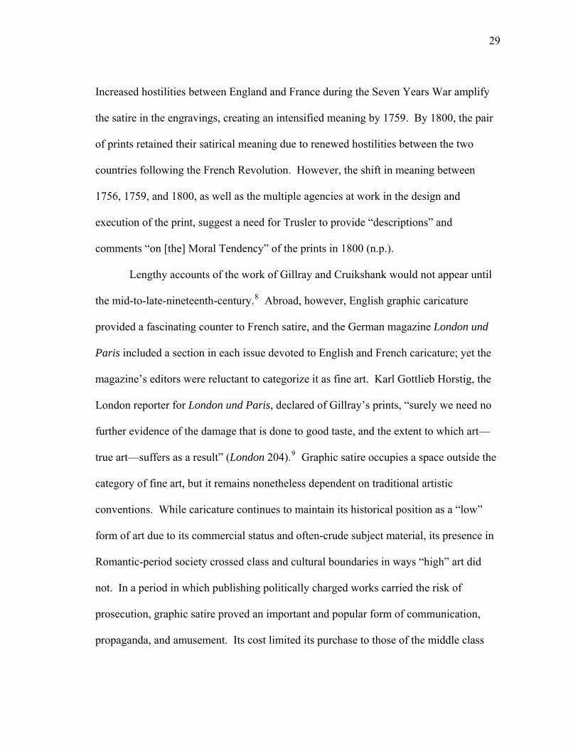
explaining the text with his own anecdotes on Hogarth’s prints. In The Invasion--
England, the second of a 1756 two-plate series of contrasting images depicting English
26
and French preparations for a French invasion, a short accompanying poem invites the
reader to “see” and “read” the engraving: “See John the Soldier, Jack the Tar,/With
sword and pistol arm’d for war […]” (BMC 3454).6 The text urges the reader to look to
at the engraving and supplies a description of the scene in verse; the engraving responds
by drawing the viewer’s eye to the creation of text and art within the engraving
[Figure1.1].
Hogarth, who in The Analysis of Beauty (1753) demonstrated his awareness of
the power of linear design, arranges swords, arms, and legs in the image to form lines
that direct the viewer’s attention to the caricature on the wall. The image depicts a
“gentleman artist, who to common eyes must pass for a grenadier […] making caricature
of le grand monarque” (Trusler 115-116). Trusler continues his description of the
monarch, whom the “gentleman artist” has depicted with
[…] a label from his mouth worth the speaker and worthy observation,
‘You take a my fine ships; you be da pirate; you be de teer: send my
grand armies, and hang you all.’ The action is suited to the word, for
with his left hand this most Christian potentate grasps his sword and in
his right hand poises a gibbet. The figure and motto united produce a roar
of approbation from the soldier and sailor, who are criticising the work.
(115-116)
Rather than finding text and image competing to establish meaning, Trusler finds text
and image to be compatible; each is “suited” to the other, and “figure and motto” unite to
produce a reaction from their audience. Graphic satire is at once created and consumed
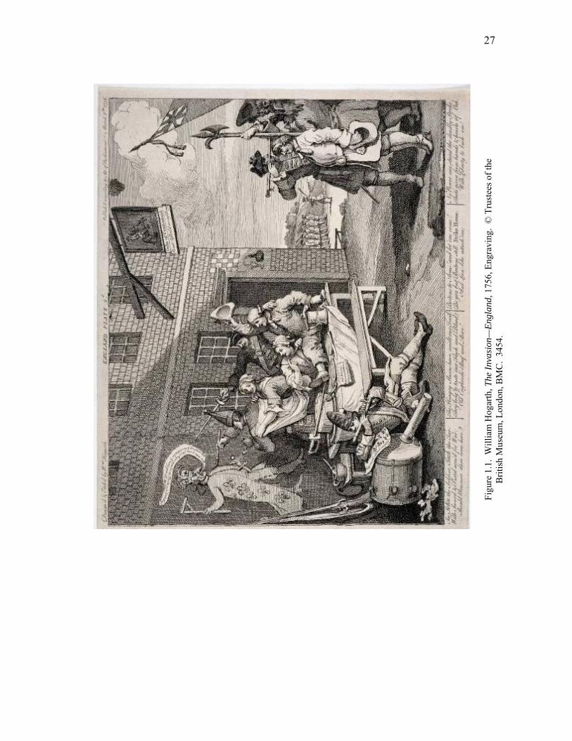
27
Figu
re 1
.1.
Will
iam
Hog
arth
, The
Inva
sion
—En
glan
d, 1
756,
Eng
ravi
ng.
© T
rust
ees o
f the
Brit
ish
Mus
eum
, Lon
don,
BM
C.
3454
.
28
in the plate; the soldier and sailor respond to the caricature on the wall and the reader of
the engraving consumes the image and text as a whole.
The simplicity of the print’s depiction of the production of graphic satire is
deceptive. While the artist in the print is at once drawing and writing, Hogarth did not
write the accompanying text; instead, the actor David Garrick wrote the “coarse” verses
(Trusler 116). The “gentleman” artist may work alone in creating the caricature of the
French monarch, but Hogarth was not alone in creating the text and image that comprise
the print. Furthermore, readers of Trusler’s work view not an original print by Hogarth,
but rather a later engraving by T. Phillibrown based on Hogarth’s etching. Garrick’s
poems, which originally appeared beneath Hogarth’s print, are removed spatially from
the accompanying image and are surrounded by Trusler’s own writing. Therefore,
readers of Trusler’s work are removed from the original print by time and production.
The original prints were published in 1756, but they were republished in the London
Chronicle in 1759 with an accompanying advertisement encouraging the public display
of the prints:
This day are republished, two prints designed and etched by William
Hogarth, one representing the preparations on the French coast for an
intended invasion, the other, a view of the preparations making in
England to oppose the wicked designs of our enemies; proper to be stuck
up in public places, both in town and country at this juncture. (Trusler
116)7
29
Increased hostilities between England and France during the Seven Years War amplify
the satire in the engravings, creating an intensified meaning by 1759. By 1800, the pair
of prints retained their satirical meaning due to renewed hostilities between the two
countries following the French Revolution. However, the shift in meaning between
1756, 1759, and 1800, as well as the multiple agencies at work in the design and
execution of the print, suggest a need for Trusler to provide “descriptions” and
comments “on [the] Moral Tendency” of the prints in 1800 (n.p.).
Lengthy accounts of the work of Gillray and Cruikshank would not appear until
the mid-to-late-nineteenth-century.8 Abroad, however, English graphic caricature
provided a fascinating counter to French satire, and the German magazine London und
Paris included a section in each issue devoted to English and French caricature; yet the
magazine’s editors were reluctant to categorize it as fine art. Karl Gottlieb Horstig, the
London reporter for London und Paris, declared of Gillray’s prints, “surely we need no
further evidence of the damage that is done to good taste, and the extent to which art—
true art—suffers as a result” (London 204).9 Graphic satire occupies a space outside the
category of fine art, but it remains nonetheless dependent on traditional artistic
conventions. While caricature continues to maintain its historical position as a “low”
form of art due to its commercial status and often-crude subject material, its presence in
Romantic-period society crossed class and cultural boundaries in ways “high” art did
not. In a period in which publishing politically charged works carried the risk of
prosecution, graphic satire proved an important and popular form of communication,
propaganda, and amusement. Its cost limited its purchase to those of the middle class
30
and higher,10 but the display of caricatures in print-shop windows allowed the general
public access to the latest satire and in larger galleries, patrons could view caricature for
a small fee (Patten 77).11 Graphic satire’s display in spaces gendered male, such as
studies, billiard rooms, taverns, barbershops and brothels (Donald 19), contrasts to the
feminine drawing room appeal of the literary annuals. Yet even within the domestic
sphere, caricatures were objects for discussion; consumers of graphic caricatures could
rent circulating portfolios for perusal and discussion at parties (Patten, “Conventions”
333). Graphic satire’s ability to refer to contemporary artists such as J. M. W. Turner,
and literary figures such as John Milton and William Shakespeare, and bawdily
capitalize on contemporary scandal, of which the royal family provided many, ensured
its appeal and accessibility to a wide audience.
Despite the commercialization of graphic satire and its position beneath painting
in terms of artistic hierarchy, its place in Romantic-period culture is a secure one.
Indeed, Mark Hallet notes that “Georgian satirical engraving, far from being an obscure
or little-regarded art form, was a regularly encountered and widely discussed product of
urban culture” (27). England’s satirists had a European following, and prints often
reappeared in Germany and Switzerland (George vx). In an 1806 edition of London und
Paris, editor Karl Böttiger depicts Gillray as firmly rooted in English art culture:
“English art collectors already place Gillray’s original prints among the finest pieces in
their portfolios, and they will continue to grow in value in the future” (London 247). To
Böttiger, Gillray’s works are for collection rather than consumption. While their
immediate satirical impact relies on an awareness of contemporary politics and scandals,
31
collectors recognized their long-term value, even if critics did not. In the biographical
preface to Thomas Wright and R. H. Evan’s 1851 account of Gillray’s work, George
Stanley suggests that his works “have been always highly esteemed; some time since
they were produced in a collected form, and have lately […] been republished at a price
that renders them generally attainable” (x). The ability to collect, reproduce, and recycle
Gillray’s prints also occurred within the artist’s lifetime. The German editors of London
und Paris, for example, hired etchers to make smaller versions of Gillray’s work for
publication in their magazine (Banerji and Donald 2-3).12 The reduced engravings bore
only Gillray’s name, not the names of the additional set of workers who endeavored to
produce them. The industry provided the means to reproduce Gillray’s work for greater
circulation, and his work entered Europe not through his own prints, but through the
replication of his prints.
As with Hogarth’s England/France prints, similar works by Gillray and
Rowlandson provide a fitting example of the thematically collaborative nature of graphic
satire. Following a widely distributed and recycled design of contrasting England and
France (Donald 152), Rowlandson’s The Contrast 1792/Which is Best was engraved
after a design by Lord George Murray and published on behalf of the Association of
Liberty and Property against Republicans and Levellers (BMC. 8284, 1 Jan. 1793).
Unlike Hogarth’s dual prints, in Rowlandson’s single print, Britannia (British Liberty)
and Lady Liberty (French Liberty) square off in facing circles. Text is incorporated into
the print and provides a literal and exaggerated explanation of the differences between
English and French concepts of liberty. Should the text not be enough, the image pits
32
Britannia against an aggressive, Medusa-like interpretation of French “Liberty,” giving
the viewer no doubt as to which concept of liberty personified is best. The design allows
for the maximum impact of meaning, and text and image collaborate in communicating
the overall message: that France threatens British liberty. Donald notes of Rowlandson’s
The Contrast that it is a
[…] visual synopsis of the content of loyalist pamphlets and was
dispatched by Reeves in batches of five hundred to the Association’s
provincial branches, which distributed it ‘with orders to be pasted up in
conspicuous places, particularly Public Houses, and Barbers’ Shops.’
(152)
Like Hogarth’s England/France prints, the political impact of Rowlandson’s work
depends on its conspicuous public placement, and the print’s compact design ensures
that the Association’s message is delivered efficiently and economically.
Like Rowlandson’s The Contrast, Gillray’s The Blessings of Peace/The Curses of
War uses a similar design of two medallion-shaped illustrations depicting the possible
consequences of a French invasion, and it was also published on behalf of the
Association of Liberty and Property against Republicans and Levellers (BMC. 8609, 12
Jan. 1795). Gillray’s print capitalizes on the trend in painting for sentimental pastoral
scenes established by artists like Francis Wheatley (1747-1801) and Thomas
Gainsborough (1727-1788), and this adaptation of preexisting artistic styles makes the
print an “odd hybrid” of traditional art and loyalist propaganda (Donald 156). Indeed,
M. Dorothy George considers the print as a “manner of genre, not satire” (VII, 150).
33
Gillray depicts a scene of English domestic tranquility against a facing image of a
European family suffering from the consequences of war. As with Rowlandson’s print,
the two images face off in contrasting scenes, with opposing images of domestic
harmony and domestic mourning. The accompanying text warns England’s populace of
a dismal future following a French invasion. The phrase, “Such Britain was,”
accompanies the scene of “domestick [sic] happiness,” and “Such Flanders, Spain, and
Holland, now is!” refers to the “massacre and desolation” depicted in the European
scene. The similarities in the scenes—both scenes depict a family of five with a family
dog—link the English and European families. The circles almost overlap, and the table
and fence exist on the same visual plane, linking the two scenes together. Like
Rowlandson’s print, the text provides a literal counterpart to the image, with “PEACE”
and “WAR” in extended boldface letters. Text in-between the two plates links the
images: “from such a sad reverse O GRACIOUS GOD, preserve Our Country.” Like
Hogarth and Rowlandson’s work, Gillray’s print is a visual call to arms; a warning of
what could become of England should war with France ensue or should England
embrace concepts of French liberty.
It is tempting in a critical climate often bent on speculating about authorial
intention to suggest that Gillray stood behind the message of The Blessings of Peace,
particularly as he receives artistic credit for the print. However, George’s work
catalogues many of Gillray’s political patrons and she notes that Gillray was often
“pestered” with suggestions by outside parties (VIII, xxxvii). Donald suggests that in
this sponsored print Gillray was “tightly controlled” by the conservative John Reeves
34
who founded the Association (VIII, 156). As a product of Reeve’s propaganda
campaign, Gillray’s print was designed for the public visual promotion of the
Association’s views. Thus, Rowlandson and Gillray’s prints bespeak the commercialism
of graphic satire and its use as political propaganda; furthermore, they both recycle
already popular designs combining text and image. The recycling of images facilitates
the artists’ efficient and popular contrasting of England and France. While each
caricaturist provides his own interpretation of the concept of a contrast between England
and France and war and peace, the prints nonetheless rely on pre-existing visual motifs,
even while offering individually inflected interpretations.
Satire’s relevance is most pertinent when it is distributed to a contemporary and
immediately receptive audience; the mechanization of print technology facilitates
satire’s appeal to current topics. This reliance on commercialism for the creation and
dispersion of graphic satire works against romantic notions of authorship. Robert L.
Patten notes that while “the nineteenth century reintroduced the criterion of ‘sincerity’ as
a measure of an author’s or artist’s work […] it is a concept inappropriate to apply to
Georgian-era satirists” (“Politics,” 107). This inappropriateness is driven by the inherent
collaboration involved in the production and publication of caricature. Far from a poetic
“spontaneous overflow of powerful feelings” (Wordsworth 393),13 graphic satire is
instead a calculated work of art relying, like literature, on the print industry to bring the
designer’s idea to fruition. In the quest for meaning, collaboration clouds the ability to
discern intentionality or to trust a print’s message as that of its engraver.
35
Gillray in particular is often victim of the tendency to romanticize the role of the
artist in an attempt to separate art from commerce. 14 Henry Angelo (1756-1835), one of
Gillray’s few contemporaries to write about his work, states that Gillray “would exert his
faculties more to win a bowl of punch than to gain ten pounds” (300). Angelo refuses to
acknowledge Gillray’s financial motivation, noting, “the acquirement of wealth,
however, it seems, on the authority of those who knew him most intimately, was the
least object of his consideration” (301). Angelo idealizes the role of the caricaturist,
painting a portrait of a carefree lover of drink who enjoyed his work rather than a
talented and shrewd businessman. Gillray accepted numerous commissions, and his role
in propaganda in works like The Blessing and the Anti-Jacobin suggest that he was an
active participant in the literary market.15 Gillray proved to be a perceptive
businessman, capable of adapting his work to conform to market trends or his patrons’
requests. He paid close attention to the public’s taste for satire and potential consumers,
writing in 1798, “the Opposition are poor, they do not buy my prints and I must draw on
the purses of the larger parties” (BL. ADD 27337). Many of Gillray’s patrons were
aristocrats or members of the prime minister’s inner circle (Patten, “Politics,” 90), and
the “larger parties” were government officials who paid Gillray to avoid representing the
King or key political figures (Godfrey 19). Some degree of the romanticizing of
Gillray’s work may be tempting due to the impressive speed at which he completed
highly complex graphic designs, but his patronage by “larger parties” serves as a
reminder that he, like many artists, strove to make a living by his art.
36
Cruikshank too proved to be an astute artist who capitalized on following market
trends, specifically taking advantage of Gillray’s success.16 After Gillray died in 1815,
Cruikshank finished many of his works-in-progress, and while working for Gillray’s
publisher Hannah Humphrey, Cruikshank worked in the manner of his predecessor
(Volger x). It did not take long for Cruikshank to distinguish his own work from
Gillary’s, and he was soon the leading caricaturist in London with over twenty
publishers distributing his work (Jones 19). The comparison of Cruikshank’s early work
to Gillray’s is a difficult one to avoid, but Cruikshank’s career would later lead him
away from the caricature that defined his early career. 17 In his “Lectures on the Fine
Arts No.1 on George Cruikshank” (1823), William Thackeray celebrates this shift away
from Gillray’s style:
Cruikshank may, if he pleases, be a second Gilray [sic], but, once more,
this should not be his ambition. He is fitted for a higher walk. Let him
play Gilray, if he will, at leisure hours – let him even pick up his pocket
money by Gilrayizing; but let him give his days and his nights to labour
that Gilray’s shoulders were not meant for, and rear (for he may) a
reputation, such as Gilray was too sensible a fellow to dream of aspiring
after. (23)18
Unlike Angelo’s romantic portrait of Gillray, Thackeray identifies Gillray as a
commercial artist and differentiates Gillray’s commercialism, his earning of “pocket
money,” from the “higher walk” for which Cruikshank seemed destined.
37
Like Thackeray, some critics have proved dismissive of Cruikshank’s early
work, differentiating his collaborative caricature from his later collaborative book
illustrations and favoring the latter over the former. Hilary and Mary Evans dismiss
Cruikshank’s early work due to his collaboration with the editors of The Scourge; they
argue, “we must not look for much distinction in this early work of his. He was drawing
what he was told to draw, on subjects selected by others, and his techniques and styles
were those of prevailing fashions or past masters” (22). The inclusion of Cruikshank’s
prints in The Scourge was one of its primary selling points, and they were included in the
form of colored, folding broadsheets, which could also be removed and sold as separate
prints (Jones 14). In the first edition of the magazine (1811), the editors explain their
approach to the relationship between text and image:
[…] of the Caricature we would wish to explain neither too little nor too
much. Something should be intimated even to the most intelligent, and
something left to the most intelligent, and something left for the
conjecture of the most illiterate. (W. Jones n.p.)
The editors use text to describe the print sparingly, providing explanation where
warranted and otherwise letting the image communicate what meaning it can to the
magazine’s readership. In early editions of the magazine, Cruikshank’s engravings work
as a visual introduction to the opening article’s theme, but by 1815, his engravings
operated independently of the magazine (Patten 101). The magazine’s focus on
Cruikshank’s engravings emphasizes his role in the promotion of the publication; his art
38
became a selling point for the magazine, and Cruikshank’s name became a sought-after
addition to published works.
By 1810, Cruikshank’s style achieved brand-name identification, and, like
Gillray, his style attracted his own following of copyists (Patten, “Politics” 83).
Cruikshank’s appropriation of Gillray’s style is only one example of many in the
historical trend of copying and adapting pre-existing artistic styles. Yet graphic satire
continues to challenge concepts of originality and meaning as a single print of graphic
satire is in fact a copy of an original engraving, which may in turn be a copy of a work of
art. Once it leaves the printer, an engraving is no longer a plate of copper, steel, or wood
block, but rather a distributable commodity in the form of a single sheet of paper. Once
circulating amongst the public, a single sheet of graphic satire may find itself posted for
public display or bound in a circulating portfolio and brought out for amusement at
dinner parties. The mere commercialism and production of caricature challenges
concepts of originality and proprietorship.
In terms of the period’s copyright laws, the “original” refers to a print from the
original engraved plate, not subsequent copies from other print runs; the owner of the
plate, who was not necessarily the artist, held the copyright for twenty-eight years from
the date of publication (Clayton 198). While a 1777 revision of the Engraver’s Act of
1735 protected the original proprietor of prints from unauthorized copying (Rose 65),
artists have historically adapted each other’s styles. Yet the revised act extended to
“every ‘print taken from any picture, drawing, model, or sculpture either ancient or
modern’” (Clayton 198); therefore, an engraver who copied an existing painting

39
maintained rights over his engraved version of the painting. The original might exist in
multiples; the demand for originals printed from Cruikshank’s plates often numbered
500 or more, with each print from the original plate considered an “original” (Patten,
“Politics” 83). The production of copies makes identifying a single or original print
difficult, and Patten observes of the politics of copying that variants between facsimiles
and the original often provide a distinction in determining originality
The originality of a graphic satire inhered more in the characteristic visual
language (line, gesture, topics, and imagery) of particular artists than in
the uniqueness of the print; but reduced facsimiles produced by
journeymen etchers, or copies hastily manufactured by rival dealers, do
generally lack the touch, the brio, of the artist’s own execution.
(“Politics” 83)
Patten implies that there is an element of uniqueness maintained by the original artist
rather than the “journeymen etchers” reproducing the work; the concept of an original
work of art is preserved. Yet discerning who created the original often proves
complicated.
To unravel the identity of the original designer and engraver, one must learn to
read the subtle coding of various engravers. Cruikshank signed “Fec” if he engraved
someone else’s design and “IV” and “FEC” indicated he both designed and etched the
caricature (Volger ix). Bamber Gascoigne observes that when there are names in the
lower corners of a print, the convention is that the “name on the left is that of the original
artist while the right is the craftsman who has created the printed page” (48b).
40
Unfortunately, not all engravings include such identifying features, and even in those
that do, their marks cannot always be trusted. Cruikshankiana, an 1835 publication by
Thomas McLean, promises original work by Cruikshank; however, the “Cruikshank”
caricatures McLean includes had been previously published. Furthermore, McLean adds
work by other artists, such as Cruikshank’s student Frederick W. Pailthorpe, while
attributing them to Cruikshank (Volger n.p.). George notes that Gillray often imitated
other artists and would parody the “voice” of an elderly woman or the “pseudo-
childishness of line” to imitate a young draftsman (George xliii).
The multiple hands that worked on an engraving at most printing houses further
complicate the concept of originality; the involvement of many on a single work allows
for the possibility for variations to exist between copies, which create the potential for
slight shifts in meaning. Even in prints created by the original artist and engraver,
variants serve as a reminder of the corporate nature of graphic satire. The application of
color increased a work’s “commercial and aesthetic value” (Bentley, Writings lv), but a
printing house’s employment of a “stable of colorists” (Hill, Etchings xxv) meant that
various individuals had a hand in coloring the final print.19 Godfrey finds fault with
Thomas Tegg’s publication of Rowlandson’s prints, arguing that they “are coloured with
crudely applied and garish tints, scarcely redeemed by the interest of the imagery” (Print
76). For Godfrey color garishly applied by hands other than the artist’s weakens the
overall value of Rowlandson’s prints.
Engravers usually supplied a master-colored print supplied by the artist from
which colorists would work, but even small variations in color can slightly alter a print’s
41
meaning by shifting the focal point of the image. In Gillray’s The Corsican Pest, or
Bezelbub Going to Supper (1803), red unties the image; the red on Bezelbub’s and his
minion’s liberty caps draws the viewer’s eyes in a circle around Napoleon (BMC. 10107,
6 Oct. 1803). Red in the French tricolor of the flag, tablecloth, and red on the knife
further connect the image. In one version of the print, the flames over which Napoleon
is being roasted are a vibrant orange, providing a brilliant contrast to Napoleon’s blue
breeches, and reinforcing his placement as the subject of the print. In contrast, color in a
subsequent print is less saturated, and the absence of the contrast of blue and orange
diminishes the visual focus on the miniscule Napoleon, who is, after all, Bezelbub’s
supper. While Cruikshank’s work provides a minor example of how color can shift the
focus of a print, variations in color placement between copies creates the potential for
shifts in meaning. Intentionality is irrelevant, for regardless of the reason for the change
in color, the impact of color on the reader’s eye is immediate.
Color heightens an awareness of the subject of a print by drawing the viewer’s
eye to an image; color, like text, interacts with the visual imagery. Graphic satire is an
art form dependent on interaction, be it through color and image, text and image, and/or
through an implied interaction with other works. These interactions work on
independent and dependent planes to contribute to a print’s overall meaning; the degree
to which a viewer recognizes the interaction of these dimensions is dependent on an
overall understanding of each individual plane of meaning at work.20 Karen Domenici’s
article on Gillray’s influence on Jacques-Louis David’s Les Sabines (1799) focuses on
the interaction between the arts, or what Mark Hallet calls “artistic cross-fertilization”
42
(34). Domenici looks specifically at Gillray’s caricature Sin, Death, and the Devil
(1792), which parodies Hogarth’s painting Satan, Sin, and Death (1735-1740), which in
turn illustrates a scene from Milton’s Paradise Lost (1667). Reversing the tradition that
recognizes the influence of painting on caricature, Domenici suggests that Gillray’s
caricature influenced the composition of David’s painting. Further complicating the
artistic overlapping occurring in David’s painting, Gillray knew Hogarth’s work only
through Rowlandson’s engraving of the painting (Domenici 493). Domenici’s argument
seems weakened by the uncertainty of knowing whether David was indeed familiar with
Gillray’s work, but visually her argument works. Each work of art depicts a woman
with outstretched arms caught between two shield and spear-wielding combatants. The
similarities in composition between the works are apparent and hint at the continual
interactions between “high” and “low” art. Examples of recycled designs are endless;
Cruikshank’s Boney’s Meditations (1815) adapts the style of Gillray’s Gloria Mundo
(1784), which in turn alludes to Book IV of Paradise Lost. Viewers even remotely
familiar with the work of Henry Fuseli (1741-1825) and Hogarth will notice their artistic
influence on each satirist in prints that both parody and emulate their work.21
Gillray’s The Weird Sisters: Ministers of Darkness; Minions of the Moon,
provides an instructive example of how meaning is layered in graphic satire (BMC.
7937, 23 Dec. 1791). Gillray’s adaptation of Fuseli’s The Three Sisters (1783), the
allusion to Shakespeare, the association of the moon with madness and the political
implications regarding King George III all contribute to the print’s political commentary
regarding contemporary politics. Jonathan Bate notes that the political implications of
43
the print build “suggestively” and “subtly” on the audience’s ability to put the
Shakespeare quotation “back in its context” (210). Bate suggests that the success of the
Shakespeare allusion in contributing meaning to the print relies on the “economy” of
Gillray’s art (210). In a small amount of space, the reader must “work” through not only
the interaction of text and image, but also the references to Fuseli, Shakespeare, and
associations of the moon with madness to discern the engraving’s critical commentary
on the Regency Crisis.
Canonical British literary figures such as Milton and Shakespeare make countless
appearances in the period’s graphic satire. Overt references to contemporary works also
play a crucial role in creating meaning. In this way, graphic satire expands upon a
preexisting and separately published work’s meaning by providing a visual counterpart.
Cruikshank’s print Scene in the R—L Bed-Chamber, or, A SLIT in the Breeches! depicts
Princess Charlotte and Prince Leopold fighting over a pair of breeches (BMC. 12771, ?
May 1816). The breeches’ slit is both literal (the pants are tearing) and metaphorical (a
woman wants to wear them) [Figure 1.2]. Despite the smallness of the pants and their
subsequent tearing, Charlotte declares that she is “resolved to wear the pants” although
she must mend “ten Thousand stitches” afterwards. Prince Leopold, just waking up in
bed, questions “vare is she gone?” before cursing that “Got dam, she’s got my Breeches
on!” Beneath the print is appended an extract from Peter Pindar’s (John Wolcott) poem
on the same topic. Wolcott’s poem “Who Wears the Breeches? To Co---gh
Honeymoon; or R---l Love Lyrics” attempts to render “undrawn” the curtain separating
the readers from the Royal couple’s honeymoon (Wolcott 2). The narrator
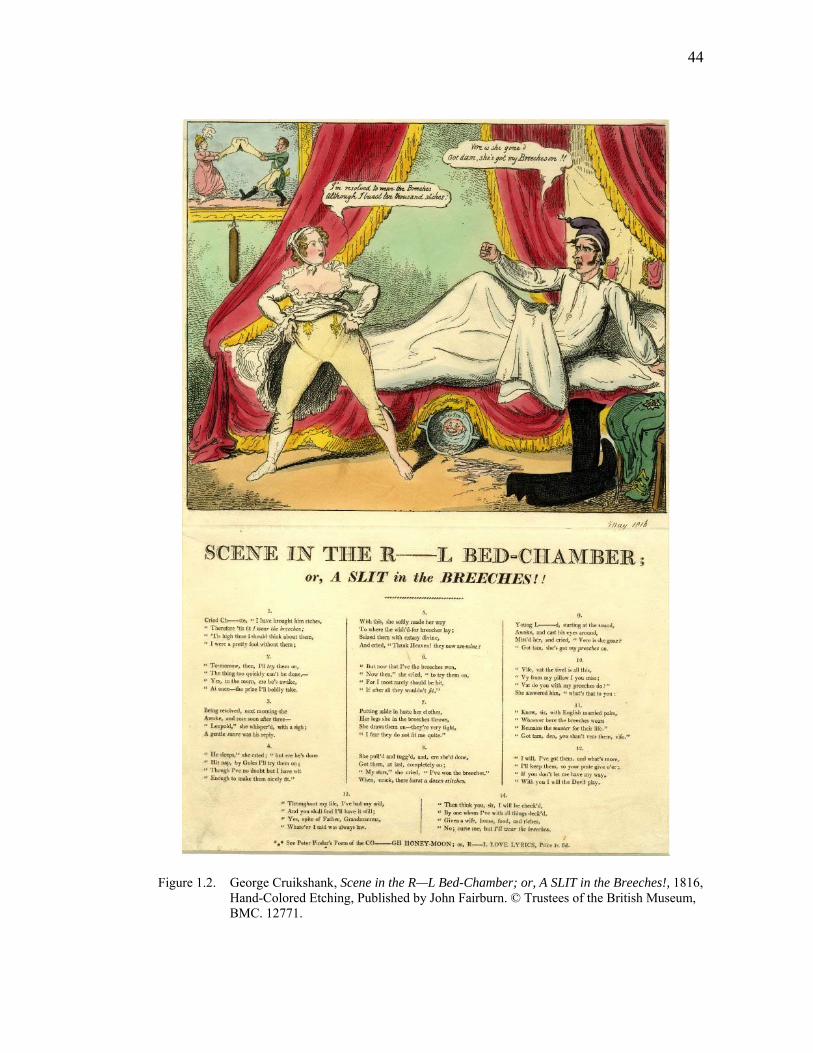
44
Figure 1.2. George Cruikshank, Scene in the R—L Bed-Chamber; or, A SLIT in the Breeches!, 1816, Hand-Colored Etching, Published by John Fairburn. © Trustees of the British Museum, BMC. 12771.
45
admits that he “drew the curtain” between the reader and the honeymooning couple but
must now “undraw” it (Wolcott 2). “Yes,” he declares, “we must have a peep behind”
the curtain (Wolcott 7); behind the curtain, Charlotte decides that since Leopold receives
“wife and riches” it is “fit” that she “wear the breeches” (Wolcott 11). “Hastily”
undressing, Charlotte pulls the breeches on, only to find that they are “very tight” (13);
as a result, the breeches tear.
The exact publication date of Pindar’s poem and Cruikshank’s print are
uncertain, but Cruikshank’s inclusion of the stanzas from Pindar’s poem indicates that
the poem predates the engraving. In this way, Cruikshank’s engraving is an illustration
of the poem. The inclusion of a lengthy extract from the poem ensures that readers
unfamiliar with the entirety of the text can still understand the narrative. In essence,
Cruikshank “undraws” the curtain mentioned in the poem. In the engraving, the bed’s
curtains are pulled back, revealing a tipped over chamber pot on the floor and an angry
Prince Leopold in bed. In a painting hanging in the left background of the print, the
prince and princess fight over a pair of britches, whose “slit” appears more suggestive
than literal. Combined, Cruikshank’s image and Pindar’s poem contribute to an ongoing
social commentary about the popular and assertive Princess’ marriage; they exist in
dialogue with each other, even if their entrance into the print market occurred at separate
intervals.
The references to outside works so prevalent in graphic satire place high
demands on readers by assuming a large shared body of knowledge. For readers of the
German magazine London und Paris, this body of knowledge often needed some
46
explaining. The “serial ekphrasis” within the nineteenth-century German magazine
described, elaborated upon, and analyzed Gillray’s work (Nicholson 29). To Böttiger,
the magazine’s editor, Gillray’s satire requires such explanations.22 There is no
contemporary English equivalent to the magazine’s account of Gillray, and indeed
Gillray received little critical attention during his lifetime despite his popularity (Donald
35). The German magazine, unlike modern literary criticism, paid ample attention to
Gillray’s text, reminding their readers to read Gillray’s engravings. Of Stealing Off,-or-
Prudent Secession (1798), Böttiger observes that Gillray “uses the English metaphor
[…] to aim a sharp and poisoned arrow at the Opposition party he hates so much”
(London 75). In responding to the engraving, Böttiger encourages his German readers to
look at the caption: “But for Germans who are not as familiar with Milton as the British
are, a brief glance at the quotation in the caption might be appropriate at this point”
(London 78). Böttiger provides more than a “brief glance,” including excerpts from
Paradise Lost and explaining Gillray’s use of Milton within the political context of the
engraving. Of English readers, Böttiger dismisses a need for such explanations: “A
Briton would only have to read the central words ‘Courageous Chief’ under the print to
grasp the whole situation immediately” (London 79).23 An earlier article explains
Böttiger’s assumption about English readership: “In England, every respectable
paterfamilias has Milton and Shakespeare on his shelves beside the Bible. Milton’s
Paradise Lost is like a sacred national poem in the hearts and on the lips of everyone”
(London 57). To the German reading public the text does not provide enough
information to understand the image, but Böttiger assumes British readers would
47
instantly understand the textual references within the print. Like the editors of London
und Paris, Angelo also notes Gillray’s use of language and describes his work in terms
of literature and art, likening Gillray’s work to artistic genius and rhetorical hyperbole
(298).
In setting a basic rubric for the study of text and image within graphic satire,
Nicholson provides an historical overview of the use of text in graphic satire, and
identifies three categories of verbal representation: words within the frame of the image,
words within the physical boundary of the frame, and ekphrastic responses (28). Each
placement of text within Nicholson’s categories requires forethought on the part of the
engraver. An annotated proof of Gillray’s Blessings of Peace/Curses of War reveals that
at least in this engraving the image came before the text. In a proof of the engraving that
includes only the images, Gillray’s handwriting scrawls across the page experimenting
with both space and content. However, unlike Blessings, in which separate plates of text
and image are joined through printing, most of Gillray’s work incorporates text and
image into the same space. The use of conversation bubbles, scrolls, frames,
manuscripts, and books in Gillray’s images suggests that he spatially mapped out the
placement of text and image in each print.24
Within individual plates, Gillray’s engraved images are often inseparable from
his text, and while he engraved the text, he did not always write it. Instead, many of his
works are the result of a community of artists and patrons involved in the creation
process. In the series of four engravings constituting Consequences of a Successful
French Invasion, each engraving is divided into two distinct sections—the image and the
48
text (BMC. 9183, 6 March 1798). The visual division of the two media is complicated
by conflicts inherent in their construction and the multiple agencies at work in the
engravings. While Gillray receives credit for the engravings, the idea for the prints was
not his own. Sir John Dalrymple commissioned a series of twenty engravings and
composed the text to accompany the work; he wanted “his legends to appear below the
completed prints” (Hill 74). Dalrymple’s choice of employing Gillray to create graphic
satire was a conscious one due to Gillray’s reputation as a caricaturist, and Donald notes
that he “was certainly aware of the problems of fixing meaning in caricatures: the
combination of words with pictures, he wrote in his pamphlet, provided the best
‘Vehicles for Information’” (174). As “vehicles,” Gillray’s engravings could serve a
variety of communicative functions, such as propaganda for political parties.
Draper Hill dismisses the text in Consequences as “impersonal tableaux” (74),
and indeed Dalyrmple does little more than describe the scenes. Text within the
engraving is minimal, allowing Dalyrmple authorial control over what limited text there
is. While Gillray did not design the engravings, Evans and Wright note, “in transferring
the designs to copper, he seems to have given them much of his own spirit and manner”
(111). To Evans and Wright, the engravings in their new copperplate form became a
separate item from their original drawings; there is no need to dwell on the individuals
who commissioned the work, or even the text, as what matters is Gillray’s role in
engraving the plate (112). Dalyrmple’s name is in the left hand corner of the engraving
and Gillray’s name is in the center of the engraving and right corner. If we follow
Gascoigne’s observation about convention, Dalyrmple receives complete artistic credit
49
for the design. Visually, the engraving reveals none of the tensions inherent in its
construction, for the interaction of engraver and patron was far from harmonious.
As Gillray’s patron for the series, Dalrymple attempted to assert control over the
engravings’ style and content, a control Gillray fought. In a heated exchange of letters in
1798, Gillray wrote Dalrymple: “And I as I took it up for ye sake of ye credit which I
hoped it might gain me as an Artist I cannot agree to permit another person having a
share in the execution” (BL Add. 27337). Dalrymple had his own interests in mind and
the issue of time justified the need for additional engravers: “I thought Getting you a
helper for four of the plates merely to hurry the work on” (BL ADD. 27337). Part of
satire’s power relies on its timely response to the social and political issues to which it
refers, and in this regard, Dalrymple’s concern about timing is a valid one. Gillray,
however, insisted not only on artistic control of the plates but also proved reluctant to
continue with so timely and costly an endeavor without the security of a list of
subscribers for the series. Gillray persisted with his concerns and received artistic
control, but eventually lost the commission, creating only four prints out of the twenty
engravings planned.25 In March of 1798, Gillray writes to Dalyrmple declaring that he
“must decline” having any more to do with the work and “can by no means agree” to go
on with the other plates (BL Add. 27337).
Dalrymple, in possession of only a few of the intended plates, took out a public
advertisement clarifying his business breakdown with the period’s leading caricature.
Declaring that he had “intended by myself and friends to scatter them [the engravings]
through the Coffee-houses, Ale houses, &c. of Britain,” but he admits that only “some of
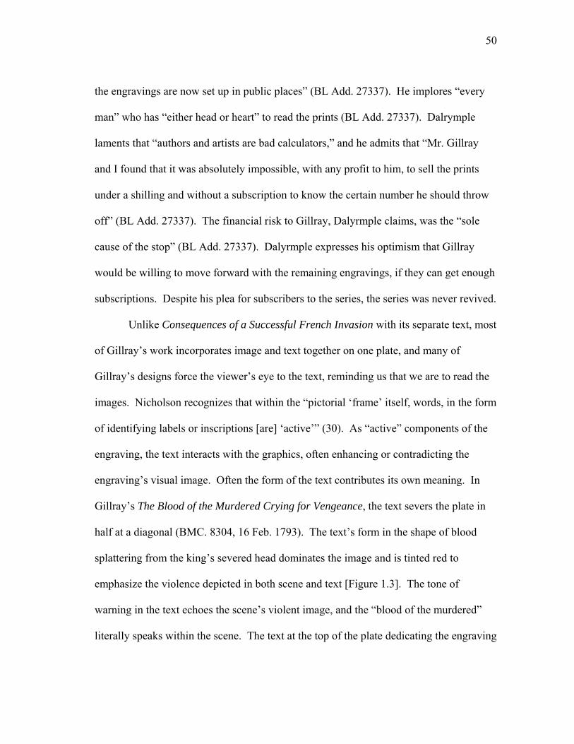
50
the engravings are now set up in public places” (BL Add. 27337). He implores “every
man” who has “either head or heart” to read the prints (BL Add. 27337). Dalrymple
laments that “authors and artists are bad calculators,” and he admits that “Mr. Gillray
and I found that it was absolutely impossible, with any profit to him, to sell the prints
under a shilling and without a subscription to know the certain number he should throw
off” (BL Add. 27337). The financial risk to Gillray, Dalyrmple claims, was the “sole
cause of the stop” (BL Add. 27337). Dalyrmple expresses his optimism that Gillray
would be willing to move forward with the remaining engravings, if they can get enough
subscriptions. Despite his plea for subscribers to the series, the series was never revived.
Unlike Consequences of a Successful French Invasion with its separate text, most
of Gillray’s work incorporates image and text together on one plate, and many of
Gillray’s designs force the viewer’s eye to the text, reminding us that we are to read the
images. Nicholson recognizes that within the “pictorial ‘frame’ itself, words, in the form
of identifying labels or inscriptions [are] ‘active’” (30). As “active” components of the
engraving, the text interacts with the graphics, often enhancing or contradicting the
engraving’s visual image. Often the form of the text contributes its own meaning. In
Gillray’s The Blood of the Murdered Crying for Vengeance, the text severs the plate in
half at a diagonal (BMC. 8304, 16 Feb. 1793). The text’s form in the shape of blood
splattering from the king’s severed head dominates the image and is tinted red to
emphasize the violence depicted in both scene and text [Figure 1.3]. The tone of
warning in the text echoes the scene’s violent image, and the “blood of the murdered”
literally speaks within the scene. The text at the top of the plate dedicating the engraving
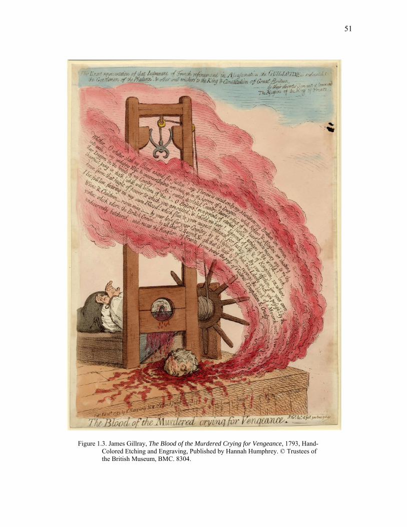
51
Figure 1.3. James Gillray, The Blood of the Murdered Crying for Vengeance, 1793, Hand- Colored Etching and Engraving, Published by Hannah Humphrey. © Trustees of the British Museum, BMC. 8304.
52
to the “King and Constitution of Great Britain” is distinct for its lack of color.
Accompanying the dedication is an announcement that the engraving is an “exact
representation of that instrument of French refinement in Assassination.” The irony of
the guillotine as an object of “refinement” and the lack of color on the dedication
contradict the goriness and violence of the image and bloody text.
Gillray’s text alludes to the recent beheading of Louis XVI in January 1793, but
it also alludes to events contributing to the fall of Rome. The text spilling forth from
Louis XVI’s head is adapted from Adherbal’s speech to the Roman Senate in 112BC.26
Adherbal implored the Roman Senate for protection against his stepbrother Jugurtha,
who had seized his deceased father’s throne by treacherous means and would later
execute both of his brothers in an attempt to maintain his illegitimate hold on the
Numidian throne. Adherbal’s speech appeals to his audience’s “affection” for their
families and to the “love of [their] own country” (qtd. in Murray 117). Despite his
emotional appeal, Rome proved slow to react, and Roman historian Gaius Crispus
Sallust (96-34 BC) attributed Rome’s gradual decline to the corruption of the nobility,
noting that “there was nothing money could not do at Rome” (63). 27 Elocution books
and English Readers, such as those compiled by Lindley Murray (1745-1826), often
included Adherbal’s speech, and numerous publications of Sallust’s Jugurthine War
circulated in England throughout the eighteenth century; several English translations of
the text were published in 1789 and 1793.28 Many of the elements involved in
instigating the Jugurthine war—corruption in the nobility, fratricide, etc.—were realized

53
in the French Revolution, and, in this respect, the engraving warns of the repetition of
history.
Adherbal’s execution, not his speech, caused Rome to react. Rome’s failure to
“deliver a wretched Prince” had consequences for the country (qtd. in Murray 117); as
Adherbal suffered, so too did Numidia. In Gillray’s print, the murdered King’s speech
also comes too late, and the print links his death directly to the “desolated Country” of
France. Gillray’s text departs from Adherbal’s speech by contemporizing it. Unlike
Adherbal, the King speaks posthumously, lamenting that his “unhappy Wife and
innocent Infants are shut up in the horrors of a dungeon while Robbers & Assassins are
Sheathing their Daggers.” Gillray depicts the King “festering” in his blood, which itself
speaks. The blood, according to the King, “flies” to his audience’s “august tribunal for
Justice!” Gillray’s text acts dually as a call to vengeance on behalf of the murdered
king, and as a warning to Britain’s “vicegerents of eternal justice” that their actions
could have potentially devastating consequences for the nation, for Britain, like Rome
and the French nobility, could fall from its “height of power.” History, text, image, and
color unite in Gillray’s print to form a dramatic visual and textual call to action
following Louis XVI’s beheading.
As active components of engravings, text interacts and engages with the
graphics, often enhancing or contradicting an engraving’s visual image. While the
location of text at the bottom of an engraving may be the most traditional use of
language in graphic satire, the use of speech balloons as a visual representation of
conversation is prevalent. In Political Candour, Gillray allows Charles James Fox to
54
“defend” the reputation of Pitt, who is depicted only in profile at the edge of the page
(BMC. 10414, 21 June 1805). Wright and Evans devote five pages to discussing the
print, declaring that within the scene “Pitt is delighted with the generous testimony of his
rival” (249). Yet Pitt is almost visually absent, represented only in physiognomic
profile. A large textual bubble gives voice to Fox’s elaborate and bumbling speech, and
the visual emphasis of the engraving is more on Fox’s speech rather than Pitt’s supposed
transgression or reaction to his opponent’s speech. Fox’s speech is anything but
eloquent:
I do say Sir, that during my whole life, I never did suspect, I never had
the least suspicion of any thing dishonorable in the Right Hon. ‘Gent’—
and from every species of Corruption I do declare most solemnly my
mind has always most completely acquitted him!
Fox’s unconvincing speech emphasizes the unlikely alliance between the two rivals, but
he receives accolades from the members of parliament behind him. Evans and Wright
wax eloquently of Pitt’s reputation as a spokesman, noting the “magnificent flow of his
language, the beautiful structure of his unpremeditated sentences enchained the
attention, and captivated the minds of his hearers” (251). The image’s humor derives in
part from who speaks, how they speak, and what they say.29 The virulent elocutionist is
relatively silent, and his large rival makes a humorous but politically significant attempt
to speak on his behalf.
While words within the pictorial frame come in a variety of forms, text as an
object carries representational significance in graphic satire. In Gillray’s Stealing Off,
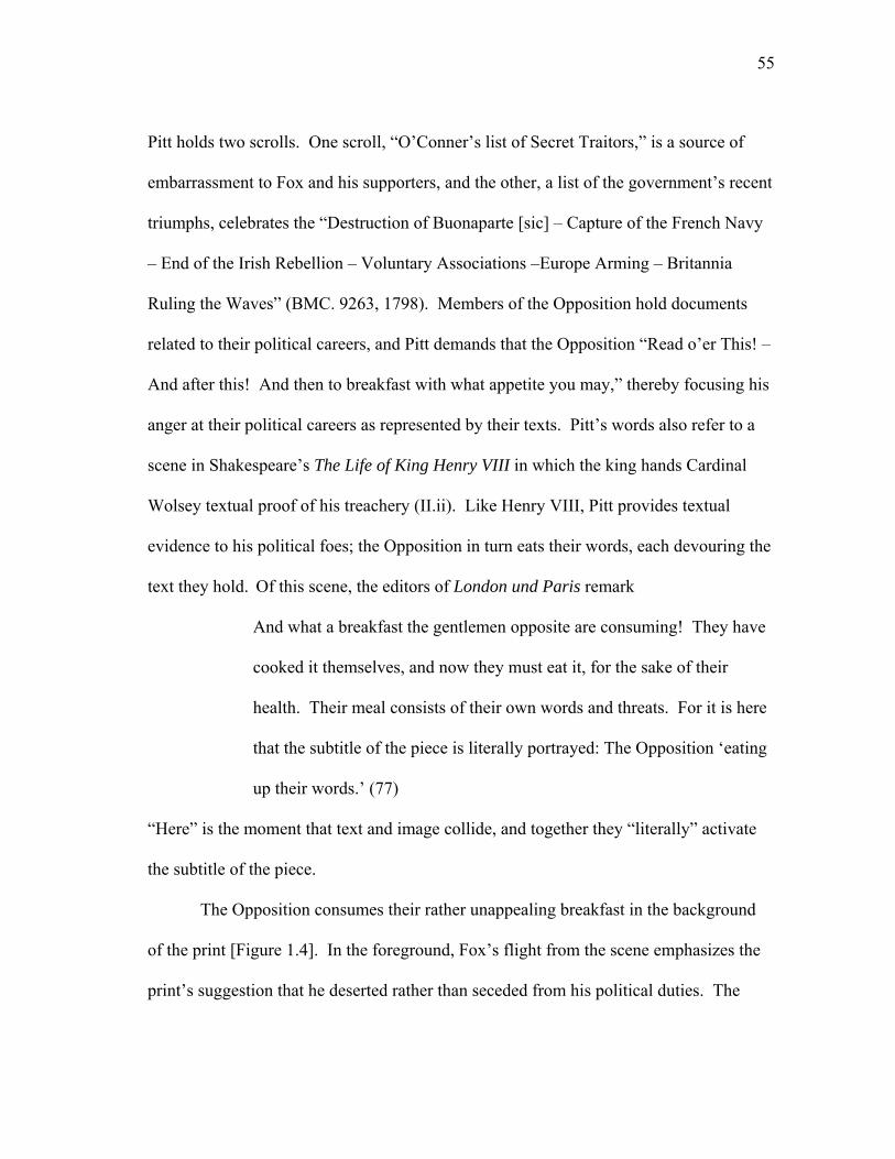
55
Pitt holds two scrolls. One scroll, “O’Conner’s list of Secret Traitors,” is a source of
embarrassment to Fox and his supporters, and the other, a list of the government’s recent
triumphs, celebrates the “Destruction of Buonaparte [sic] – Capture of the French Navy
– End of the Irish Rebellion – Voluntary Associations –Europe Arming – Britannia
Ruling the Waves” (BMC. 9263, 1798). Members of the Opposition hold documents
related to their political careers, and Pitt demands that the Opposition “Read o’er This! –
And after this! And then to breakfast with what appetite you may,” thereby focusing his
anger at their political careers as represented by their texts. Pitt’s words also refer to a
scene in Shakespeare’s The Life of King Henry VIII in which the king hands Cardinal
Wolsey textual proof of his treachery (II.ii). Like Henry VIII, Pitt provides textual
evidence to his political foes; the Opposition in turn eats their words, each devouring the
text they hold. Of this scene, the editors of London und Paris remark
And what a breakfast the gentlemen opposite are consuming! They have
cooked it themselves, and now they must eat it, for the sake of their
health. Their meal consists of their own words and threats. For it is here
that the subtitle of the piece is literally portrayed: The Opposition ‘eating
up their words.’ (77)
“Here” is the moment that text and image collide, and together they “literally” activate
the subtitle of the piece.
The Opposition consumes their rather unappealing breakfast in the background
of the print [Figure 1.4]. In the foreground, Fox’s flight from the scene emphasizes the
print’s suggestion that he deserted rather than seceded from his political duties. The
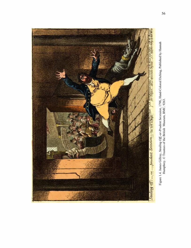
56
Figu
re 1
.4. J
ames
Gill
ray,
Ste
alin
g O
ff,-o
r-Pr
uden
t Sec
essi
on, 1
798,
Han
d-C
olor
ed E
tchi
ng, P
ublis
hed
by H
anna
h
Hum
phre
y. ©
Tru
stee
s of t
he B
ritis
h M
useu
m, B
MC
. 926
3.
57
brown columns and the brown wall divide the print into two distinct spaces—the House
of Commons and the space into which Fox flees. The fleeing Fox, compared by the
print’s sub-title to Milton’s fallen Satan, may dominate the foreground, but angles
created by Fox’s arms and legs draw the viewer’s eye back to the House of Commons.
The text at the bottom of the print also directs the reader’s eye to the background, while
also reiterating the print’s theme: “the back-ground contains, a corner of the House next
Session; with the Reasons for Secession; - also a democratic Déjuéne – ie. Opposition
Eating up their Words.” Text, in this single print, exists in conversation balloons, a title
and subtitle, inscriptions on the images (the dog collar), and it activates allusions to other
works (Milton’s Paradise Lost).
Of the work of the three main caricaturists in the period, Gillray’s work in
particular is rich with textual references. Gillray’s Lieut. Govrr. Gall-Stone, Inspired by
Alecto; or the Birth of Minerva is another example of a print symbolically incorporating
text (BMC. 7221, 15 Feb. 1790). The print enters into dialogue with a series of similar
graphic caricatures and becomes part of an aggressive and vicious advertising campaign
that targets Philip Thicknesse and promotes Gillray’s print. In the print, Philip
Thicknesse is depicted seated at a writing desk, pen poised in hand as Alecto whispers
slyly in his ear [Figure 1.5]. Textual representations of his work surround Thicknesse,
and the image incorporates song sheets, books, letters, elegies, memoirs, medicinal
tracts, poetry, and “Acts of Courage and Wisdom.” Yet while the breadth of the textual
references to Thicknesse’s work appear impressive, as they do indeed represent much of
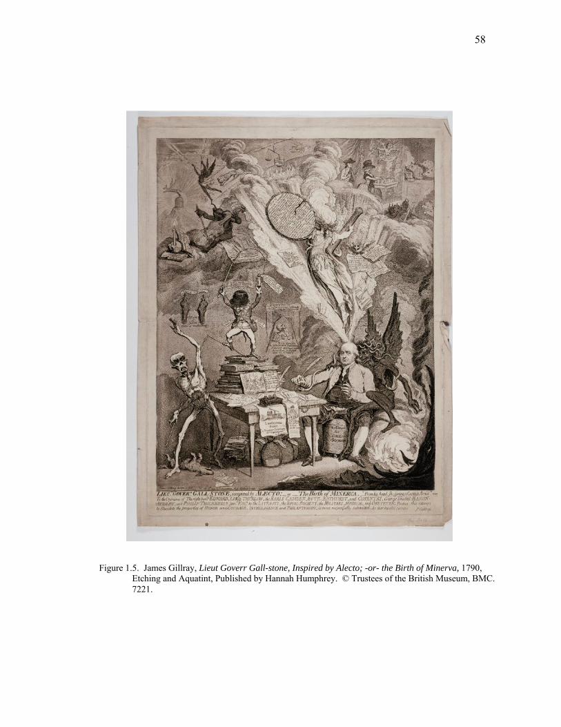
58
Figure 1.5. James Gillray, Lieut Goverr Gall-stone, Inspired by Alecto; -or- the Birth of Minerva, 1790, Etching and Aquatint, Published by Hannah Humphrey. © Trustees of the British Museum, BMC. 7221.
59
his own writing, they each support the brutal satirical attack levied against him, whom
Godfrey identifies as an “exceptionally rancorous and unpleasant man” (84). On closer
glance, “Minerva’s Acts of Courage and Wisdom” are actually stories of cowardice and
corruption, in which Thicknesse relays accounts of
Running away from my Command in Jamaica, for fear of the Black-a-
moors Refusing to fight Lord Orwell, after belying him, & afterwards
begging pardon. Extorting pr Annum from my eldest Son by a Pistol –
Swindling my youngest son […] Debauching my own Niece […]
Horsewhipping my own Daughter to death […].
The damning list goes on. Other texts include an “Elegy” on the death of Thicknesse’s
favorite dog, with the subtitle noting that the dog was “Horsewhipped to death for
Barking while I was kissing my Wife.” Demons, skeletons, pigs and smoke crowd the
print, whose imagery and text work together to form a harsh visual and textual attack.
The print’s publication corresponds with an aggressive campaign to maintain a satiric
attack on the “world’s most quarrelsome man” (Gosse 257). In November 1789, Isaac
Cruikshank published The Quarrelsome Fellow, which depicts Thicknesse at a writing
desk about to begin his memoirs (BMC. 7588). Though the print is much cruder than
Gillray’s later design, it reiterates both textually and visually the association of
Thicknesse with scandal and scandalous texts. Ten months after Gillray’s print appears,
J. Aiken publishes The cutter cut up, or, the monster at full length (15 Dec. 1790) by
William Dent. Dent, like Cruikshank and Gillray, depicts Thicknesse with his pen in
hand. Lacking the visual richness of Gillray’s print, the print is nonetheless brutal. The
60
print exposes Thicknessse by stripping him down to his britches and dissecting his body.
Each body part is labeled; for example, his writing hand is labeled “assassination” and
his heart “cowardice.” Thicknesse is doubly exposed, through both the literal rendering
of him half-nude and through the association with the text written on his body with his
reputation as an antagonistic writer. Philip Gosse outlines at length Thicknesse’s “wars
of words” with individuals such as George Thicknesse (his son), Captain Crookshanks,
and Dr. James Makittrick Adair, to whom Thicknesse included a fourteen-page
“dedication to his enemy” in the first volume of his memoir (258).
Gillray’s print, like so many of his designs, enters into dialogue with preexisting
and subsequent works. His print of Thicknesse is part of a 1790 advertising campaign
that works to discredit Thicknesse, while it simultaneously solicits business for Gillray
and Humphrey. In February 1790, an advertisement appears which denies that Gillray’s
print is directed at Thicknesse; it claims to respond to the “Ridiculous Insinuations”
circulating about the print’s intention to satirize Thicknesse (BMC. 7221). In response,
the
Author will only Remark, that as the Engraving is intended merely as an
attempt to gibbet Meanness, Vice, and Empiricism, it therefore cannot
possibly allude to respectable a Personage as PHILIP THICKNESSE,
Esq.
Thicknesse, associated with “Meanness” and “Vice,” remains the focal point of the
attack. An advertisement in June 1790 continues the assault and it remarks that the
61
“Prodigious Cockade” has arrived in town to “devour all Editors of Newspapers,
Engravers and Publishers of Satiric Prints” (BMC. 7221).
In July 1790, the attack continues, but it shifts in its approach by appearing to
appeal to Thicknesse’s allies. Addressing the “NOBILITY, and FRIENDS of PHILIP
THICKNESE, Esq.,” the advertisement celebrates Gillray’s print by denouncing it:
Whereas a ridiculous Card has been lately distributed by way of
Advertisement, for a Satiric Print, Designed, and now Engraved by James
Gillray […]. Which Print, it is avowed […] ‘will bear no allusion
whatever to Mr. Thickenesse’ thereby plainly insinuating against whom
the Satire is particularly pointed; and at the same time taking shelter
under an evasion, to calumniate the brightest ornament of the British
Nation; and as upwards of Three Hundred of the Nobility from respect to
the eminent Virtue against which the shaft is leveled, have already signed
a resolution never to admit the injurious scandal into their houses; it is
therefore hoped that every person […] will join in suppressing a Print
[…] and in bringing the Author to Condign punishment. This insolent
Lampoon, it is said, will be vended by a person of the name of
HUMPHREYS, in Old Bond-street, who has long been noted for
productions of this tendency. (BMC. 7221)
The advertisement provides the title of the print, the artist, and the exact location of the
printer from whom the print could be purchased. Thematically, it works in conjunction
with the print itself. The print, declaring that it does not depict Thicknesse, reiterates
62
through text and image that it does indeed depict Thicknesse. The advertisement,
declaring the print a malicious piece of scandal, works to inflame rather than control
public interest.30 Godfrey calls Gillray’s print “one of the most sustained, complex and
savage visual attacks ever sustained by a single individual” (84), and this savagery is
bolstered by Gillray’s detailed and repetitive use of text and through the engraving’s
dialogue with the advertisements circulating in print.
Text in Gillray’s Thicknesse print has both symbolic and representational
meaning, what it says and what it visually represents (elegies, memoirs, tracts, etc.) is
important. This textual duality occurs in a variety of the period’s prints. In the heated
political climate during and following the Napoleonic Wars, the use of political texts
such as the Napoleonic Code and the English Magna Carta in graphic satire was also
symbolic. In Cruikshank’s Liberty Suspended! – With the Bulwark of the Constitution
(March 1817), “Liberty” is hung holding the Magna Carta, Bill of Rights, and Habeas
Corpus; Lady Liberty hangs from a printing press, further emphasizing restrictions
placed on printing rights. The suspension of British rights is depicted through the
symbolic representation of English texts. In Cruikshank’s The Genius of France
Expounding her Laws to the Sublime People, the Napoleonic Code is the subject of the
satire (BMC. 12524, 4 April 1815). The “Genius” is a devilish monkey wearing a
liberty cap and holding up the French Code of Laws [Figure 1.6]. The French Code of
Laws dominates the print and is centered on the page; the French tri-color of red, white,
and blue highlights the text and stands in contrast to the dull, brown, foppish monkeys.

63
Figure 1.6. George Cruikshank, The Genius of France Expounding her Laws to the Sublime People, 1815, Hand-Colored Etching, Published by Hannah Humphrey. © Trustees of the British Museum, BMC. 12524.
64
The image reinforces the subject of the satire by depicting the Code in scroll form. The
Code, held by the monkey, reads:
Ye Shall be Vain, Fickle & foolish .- Ye shall Kill your King one Day
and Crown his Relative the next -- Ye shall get tired of Him in a few
weeks - & recal a TYRANT who has made suffering hum-anity bleed at
every pore – because it will be truly Nouvelle – Lastly – ye shall abolish
& destroy all virtuous Society, & Worship the Devil – as for Europe or
that little Dirty Nation the English let them be d—d FRANCE the
GREAT NATION against the whole WORLD!
The print’s code reverses the actual Napoleonic Code. Rather than represent the original
document’s establishment of civil law, the monkey and his Code represent incivility and
disorder, serving as a visual reminder of the political and social chaos following the
French Revolution. The representation of text in Cruikshank and Gillray’s work serves
as a reminder to read the text and to look for the representation of text as a visual image
in its own right.
Text in graphic satire reminds us not only of the symbolic nature of words as
images, but also directs us in how to read the images themselves. The dominance of
visual imagery in single-sheet graphic satire often overpowers the text, which in scale
and style is often secondary to the more noticeable colors and lines of the image. In
contrast, multi-page graphic satire reinforces the connection between text and image by
confronting the reader with the traditional format of the book. Wendy Steiner argues
that the structure of the book serves as a model for visual narrative, and she refers to
65
works like The Rake’s Progress and Marriage á la Mode to support her argument that
Hogarth’s series would be unimaginable without the structural model of the book (17).
Steiner continues by observing that in visual narrative “the repetition of a subject is the
primary means for us to know that we are looking at a narrative at all” (17). In
Hogarth’s visual narratives, the repetition of images aids in the creation of narrative. In
a single sheet of graphic satire, however, space limits the possible amount of visual or
textual repetition, and the satirical impact relies on an immediate recognition of the
narrative power of the interaction of media. In contrast to the visual repetition and
progressive storytelling at work in Hogarth’s narratives, in Cruikshank’s work with
publisher William Hone (1815-1821) in The Political House that Jack Built (1819), the
repetition of text rather than image reinforces the book’s narrative, and textual repetition
unites the somewhat-disparate images.
During Cruikshank’s partnership with Hone, both the artist and political radical
proved adept at adapting preexisting literary and visual forms to establish satirical
narratives. Accounts of the conception of The Political House that Jack Built vary, with
Hone and Cruikshank taking credit for differing degrees of the project.31 Hone claims
that he stayed up all night writing the text and that he later translated his imagistic
expectations to Cruikshank by putting himself “into the attitudes of the figures” he
wanted drawn, claiming that “some of the characters Cruikshank had never seen but I
gave him the likeness as well as the attitude” (qtd. in Rickwood 24).32 Patten counters
Hone’s claim of needing to put himself “into character” for Cruikshank, noting that all
“the portraits were of men the artist etched often” (157). Hone encourages the
66
romanticization of the text’s creation by identifying himself as the sole creator, struck by
a spontaneous moment of inspiration late at night. Yet the form and content of the text
are in fact a calculated attempt at parody in the politically charged climate following the
Peterloo Massacre in August 1819. Political House is one of many satiric responses to
the Peterloo Massacre and the passing of the Six Acts, both of which instigated a furor
regarding, among other issues, the increased restrictions imposed on the press.33
Despite the simplicity of its design as a children’s book, Political House requires
multiple levels of reading and appropriates multiple literary forms for its design. Marcus
Wood notes that the work parodies a long list of texts, with Political House drawing its
form from “sacred texts, almanacs, press advertisements, chapbooks, children’s books,
nursery rhymes, games, poems, songs, last wills, dying confessions, playbills, and
showman’s notices” (3). Wood argues that the act of parody when “commandeered by
radical propagandists may become an act of linguistic acquisition and simultaneous
subversion” (13). The affordability of the pamphlet, with its less-expensive woodcuts,
mirrored the apparent simplicity of its design and guaranteed large sales (Donald 198).
The design of Political House as a parody of children’s literature reinforces the
relationship between text and image. At once a picture book and a political pamphlet,
the repetition of the word “this” as a header on each page draws the reader’s eye to the
engraving and subsequently to the quotations from William Cowper’s The Task (1785).
The dialogue between image, text, and quotations generates an “ironic context” in the
work (Grimes n.p.). For example, the engraving of “The Wealth” is depicted as a
treasure box overflowing with textual representations of British liberty and rights: the
67
Magna Charta, Bill of Rights, and Habeas Corpus are each clearly marked. Yet the
quotation from Cowper’s poem refers to the absence of wealth:
Not to understand a treasure’s worth,
Till time has stolen away the slighted good,
Is cause of […] half the poverty we feel,
And makes the world the wilderness it is.34 (qtd. in Hone)
While the illustration makes literal the “treasure” by depicting a treasure box, the loss of
the treasure—political and social texts—has moral rather than fiscal implications.
Hone’s text is much more direct than the excerpt from Cowper’s poem, claiming only,
“This is the Wealth that lay in the House that Jack Built.” “This” links the three
components of the print, but “this” does not link the components thematically, for the
image’s depiction of wealth works in opposition to the poem’s lament of lost treasure.
The popularity of the form of Political House ensured subsequent variations of
the theme and design by Hone and others.35 Unlike Political House where image, text,
and quotations often work against each other to create an ironic sub-text, in Hone’s 1820
publication of The Queen’s Matrimonial Ladder, a National Toy with Fourteen Step
Scenes; and Illustrations in Verse, the toy, the text, the engravings, and the text’s
accompanying quotations reinforce the theme of sympathy for Queen Caroline.36
Cruikshank receives title page credit for the engravings, allowing Hone to capitalize on
Cruikshank’s established reputation as artist and engraver. As with Political House,
accompanying quotations appear underneath Cruikshank’s engravings and include
quotations from Her Majesty, Shakespeare, the Bible, Cavendish’s Memoirs of Cardinal
68
Wolsey, Cowper, Phillip’s “Lament,” Robert Southey, Coriolanus, Richard Sheridan,
Lord Byron, and a verse from a traditional English Cry. The subtext of the quotations
suggests that Queen Caroline finds support from a variety of authoritative national,
classic, and religious texts. As the quotations work with the images rather than against
them, the reader’s knowledge of the source texts is not crucial to a comprehension of the
work. The engravings in The Queen’s Matrimonial Ladder further unite the story by
providing a visual narrative of Caroline’s marriage to the king, including the birth of
Princess Charlotte, his affairs, her banishment and return, and the ensuing drama of her
attempt to maintain her position as Queen. The engravings support the text by
repeatedly showing the King in various states of debauchery, such as having liaisons
with other women, gambling, and suffering from a hangover. In contrast to the King’s
actions, Caroline’s indiscretions are overlooked, and she is painted as a suffering,
scorned wife.
The pamphlet reverses the very public campaign by the King’s supporters against
Caroline by placing the King, rather than the Queen, on trial. Additional visual and
textual allusions reiterate this reversal. In the book’s final engraving, “Degradation,” the
king stands in front of the Ten Commandments, but only a few commandments appear
legible: those regarding adultery, calling false witness, and coveting a neighbor’s wife.
King George IV stands with his head down, with his alleged crimes spelled out in the
Commandments centered purposefully above his head. Beneath the engraving of
“Degradation,” Hone edits a quotation from Lord Byron’s (1788-1824) The Curse of
Minerva (1811), quoting only “So let him stand” and substituting asterisks for the
69
remainder of the stanza’s lines. The asterisks are not a random representation of the
absence of text, but rather they visually represent the remainder of the two lines from
Byron’s poem. The absent lines reiterate the theme of shame: “So let him stand,
through ages yet unborn,/ Fix’d statue on the pedestal of scorn” (Byron 455).37 The
quotation also links the King to one of the period’s notorious adulterers, Lord Byron
himself. Cruikshank’s engraving “let[s] him stand” by depicting the king standing on a
pedestal and as the object of scorn to those that surround him. Hone’s text unites
Byron’s poem and Cruikshank’s image by exclaiming, “to this have they brought thee, at
last!” (184). “This” refers to the pamphlet’s depiction of the King as the royal figure on
trial.
Political House and Matrimonial Ladder were designed with a large, public
audience in mind and both works denote a shift in the form of graphic satire from single-
sheet publication to book form. This shift marks a turning point in publishing that
“confirmed the obsolescence of Georgian caricature print” (Donald 197). Despite the
wane in graphic satire’s popularity, publishers continued to capitalize on the growing
book trade and the established reputation of the caricaturists. Indeed, the recycling of
graphic caricature in book form heralded renewed profitability for publishers. In the
preface to Kidd’s Comic Scrap Book or Book of Symptoms (1836), a “Parlor Portfolio,”
the editor notes that,
It having fallen to the lot of the Proprietor of this Work to publish the
greater, and by far the best, portion of the Wood Engravings of the
Messrs. Cruikshank […] -- he is thereby enabled to detach from the more
70
expensive works in which they have hitherto appeared, a variety of
Specimens, setting forth the varied talents of the respective artists, and, at
the same time, suiting the pockets of the humblest of their admirers; an
advantage, in this age for cheap literature, that can hardly fail to be
appreciated by many thousands of the reading public. (1)
W. Kidd “detaches” the engravings from their original and more costly context,
repackaging them for a new audience. The small, pocket-size book reduces
Cruikshank’s larger engravings to a portable and affordable size, and the theme of
“symptoms” links Cruikshank’s work to the engravings by his brother Robert
Cruikshank and the late Robert Seymour. The editor foresees a continued financial
advantage from future publications of similar form:
As the Engravings, herein, contain, form scarcely a hundredth part of the
whole number in the proprietor’s possession, he purposes, if his patrons
should so determine to produce a second part of this Comic Scrap book,
at some future period; but they will be so selected as not to injure the
original works from which they are taken, and which will still remain on
sales, as usual. (Kidd 2)
Kidd acknowledges the breadth of his collection of prints and the potential dual role this
collection serves; the collection holds the potential to enter the market as affordable
scrapbooks and/or as expensive collector prints distributed in their original form. Kidd
implies that the replication of the prints does not lessen the value of the original by
71
appealing to two types of connoisseurs: those who prize the more expensive original
and those who cannot afford them.
Rowlandson’s work also entered the marketplace in new forms. Like Cruikshank
and Gillray, Rowlandson often aligned himself with publishers, an arrangement Samuel
Redgrave attributes to Rowlandson’s “thoughtlessness” rather than any business sense
(371). Yet his lengthy partnership with Rudolph Ackermann (1764-1834) suggests that
the artist recognized the economic potential in working with a publisher to combine
caricature with lengthier text. The pair capitalized on Rowlandson’s popularity as an
artist and William Combe’s (1741-1823) reputation as a writer in several publication
ventures. One such endeavor, the Tour of Dr. Syntax in Search of the Picturesque
(1812), was originally published in serial form in the Poetical Magazine, a publication
spearheaded by Ackermann to provide a publication outlet to “afford an obvious and
encouraging facility to poets of every denomination and character” (Ackermann 1). As
“Poetry and Design are intimately connected” (Ackermann 3), Ackermann included
engravings by artists like Rowlandson. In the Dr. Syntax installments, Rowlandson’s
engravings present the clergyman in a variety of misadventures that are united by the
narrative progression of the accompanying poem. Rowlandson depicts Dr. Syntax in
caricature; the clergyman’s exaggerated white wig and elongated chin and nose make
him an immediately identifiable part of the engravings in each edition of the magazine.
While each image is a caricature of Dr. Syntax’s adventures, the story’s
cohesiveness relies on the text. As Dr. Syntax strikes out for his tour, he speaks of his
goals for the journey:
72
I’ll make a TOUR—and then I’ll WRITE IT.
You well know what my pen can do,
And I’ll employ my pencil too:--
I’ll ride and write, and sketch and print,
And thus create a real mint;
I’ll prose it here, I’ll verse it there,
And picturesque it ev’rywhere. (Combe 5)
Combe’s poem, coupled with each engraving’s background, pays homage to the same
picturesque literary and artistic trends that the work satirizes. In one such satirical
moment, Rowlandson’s engraving depicts Dr. Syntax pausing at a crossroads while
riding Grizzle. The engraving is the first image of Dr. Syntax on his journey, and the
title of “Dr. Syntax Losing his Way” suggests that the clergyman’s adventures are off to
a troublesome start. Alone, the engraving is less a satire on the picturesque and more a
commentary about the awkwardness of the story’s hero; however, combined with
Combe’s text, the image’s meanings multiply. Combe’s text transforms the scene into a
satire of the picturesque by adding dialogue in which the clergyman makes a “Landscape
of a Post” by generously shifting the actual scenery to suit his tastes (11). Dr. Syntax
notes that:
He ne’er will as an artist shine,
Who copies nature line by line;
Whoe’er from nature takes a view,
Must copy and improve it too. (Combe 11)
73
Combe, like his artistic clergyman, improves upon Rowlandson’s engraving, taking the
post and landscape from the engraving and transforming the scene into a satiric
commentary on the aesthetic trend of the picturesque.
Dr. Syntax embarks on a Gilpinesque adventure through the countryside, and
while he may write and then employ his pencil for sketching, the reverse proves true of
the creation of his story.38 Combe in a lengthy passage describes his relationship with
Rowlandson in terms of absence:
The following Poem […] was written under circumstances, whose
peculiarity may be thought to justify a communication of them. – I
undertook to give metrical Illustrations of the prints with which Mr.
Ackermann decorated the Poetical Magazine […]. Many of these
engravings were miscellaneous, and those, which were, indeed, the far
greater part of them, whose description was submitted to such a Muse as
mine, represented views of interesting objects, and beautiful Scenery, or
were occasional decorations appropriate to the work. Those designs
alone to which this volume is so greatly indebted, I was informed would
follow in a Series, and it was proposed to me to shape out a story from
them. – An Etching or a Drawing was accordingly sent to me every
month, and I composed a certain proportion of pages in verse, in which,
of course, the subject of the design was included […] When the first print
was sent to me, I did not know what would be the subject of the second;
and in this manner, in a great measure, the Artist continued designing,
74
and I continued writing, every month for two years, ‘till a work,
containing near ten thousand Lines was produced: the Artist and the
Writer having no personal communication with, or knowledge of each
other. (i-iii)39
Combe and Rowlandson’s work was published together, giving the illusion of a cohesive
work; however, their lack of interaction suggests two narratives to Dr. Syntax—a visual
and textual narrative working independently and dependently throughout the overall text.
In Dr. Syntax the clergyman plays the fool, but Ackermann sought to keep the
satire relatively tame, and he exerted editorial control over the work by rejecting several
of Rowlandson’s cruder designs for the expanded book form of the story (Ford 54).
Combe, like Ackermann, sought to distance himself from Rowlandson’s lewder prints,
stating that if the ridicule of the clergy was the intention, he determined not to “turn the
edge of the weapon which I thought was leveled against them” (qtd. in Ford 240).
Rowlandson’s power over the text as a commercial illustrator was limited, and “it was
the publisher not the writer [or artist] who made the choice” of what made it into the
final publication (Ford 59). Yet despite the disjointedness of the relationship between
publisher, artist, and writer, the relationship worked. Grego notes that the trio rejoined
in 1822 “under their well-defined relations, to venture on a farther extension of the
familiar framework, and a fresh volume was produced in monthly installments” (43).
Ackermann, Rowlandson, and Combe would continue their relationship as publisher,
artist, and poet, jointly—but distantly—producing two additional Dr. Syntax works.
75
As the nineteenth century progressed, the “well-defined” relationship between
writer and engraver was becoming a long-distance relationship, one defined by absence
rather than collaboration, and the disjointedness of this relationship was realized in the
emerging literary annuals. While the demise of graphic satire by no means gave birth to
the literary annuals, the decline of the former, combined with improved printing
technology, marked the emergence of new publications that sought to profit from the
pairing of text and image. John Feather argues that the “most important single
consequence of technological changes in book production in the nineteenth century” is
the wider availability of types of printed material (9). Patricia Anderson also notes a
shift in publication forms as publishers sought to profit from the realization that “culture
was a marketable commodity” (11). Publishers harnessed visual and literary culture in
new marketable forms, or, in the case of book illustrations, improved upon old forms
with new techniques. The consequences of such changes are evident in the variety of
literary forms available in the early nineteenth century. From bound books of graphic
satire to the literary annuals, publishers found innovative ways for exploiting the power
of new technology to represent “original” and creative pieces of art and literature. As
with graphic satire, these new forms would continue to challenge the concept of
originality and meaning within multi-media works, often placing writer and engraver at
odds within the evolving literary market.
76
Notes
1. Each print in these series is accompanied by text added at the bottom of the
plate, thereby continuing the narration of the story between plates.
2. Rowlandson and Cruikshank’s work in particular often relied on visual
imagery alone to create a narrative, but this chapter will be concerned with their work
that includes textual spaces.
3. With the advent of movable type in the fifteenth-century, printers were able to
lock text and image together (Gascoigne 5a). The ability to join moveable type and
woodcuts increased the variety of ways text and image could be paired, and the ability to
separate text from image allowed printers to recycle both in other contexts.
4. In J. P. Malcolm’s 1813 historical overview of caricature, he observes that
caricatures are a “bloodless duel” (134). While Malcolm refers to caricature’s
antagonistic relationship to its subject material, his allusion to a violent relationship
within caricature also pertains to the struggle between text and image within the context
of meaning. Yet just as text and image often work against each other, they often work
with each other.
5. As the subject of graphic satire is based on specific historical, political, or
social events, publishers strove to distribute timely publications, ensuring that the satire
made the greatest impact on its readers. Recognizing the subject of graphic satire within
the context of its historical parameters is therefore important, but to appreciate the
overall meaning of the work, or, as is often the case, the lack of singular meaning, an
understanding of the multiple levels of communication in graphic satire is necessary.
77
For criticism focusing on the subject of satire, see Vincent Carretta’s work on Georgian
satire.
6. The first plate depicts France preparing for war, and similar verses by Garrick
invite the viewer to “see” the print.
7. Ronald Paulson notes that while sales figures of the prints are uncertain, the
prints were quite popular and were copied for recruiting posters (178).
8. Successful Royal Academy members such as Sir Joshua Reynolds and
Benjamin West routinely hired engravers to promote their work, recognizing the access
to publicity and profit offered through engraved reproductions of their paintings (Brewer
456). While many of the caricaturists also dabbled in commercial engraving, most
strove to establish a distinctive style of their own, and were not primarily copyists.
Furthermore, despite the dismissive attitude towards caricature, engravers of graphic
satire were in high demand and were embedded in the popular and artistic culture of the
period.
9. Editions of London und Paris did not always acknowledge the author of their
articles; thus, for the sake of this chapter the title of the book will receive parenthetical
credit when an article is cited.
10. Satirical prints ran between 1s and 6s, with color raising the cost and market
value of the print (Clayton 232).
11. Many of Gillray’s engravings were enclosed in portfolios and albums to hide
their possibly offensive content, which allowed them to “be removed at will from the
public and especially from female gaze” (Donald 19).
78
12. The etchings were based on prints bought in London by a London und Paris
correspondent and then reproduced in Germany; thus the “illustrations represent the
work of many hands, with the end result at a remove from the source material supplied
by the correspondent” (Banerji and Donald 19).
13. Wordsworth’s famous lines are followed by an encouragement to think long
and deeply, yet his lines from The Preface to Lyrical Ballads nonetheless embody many
of the romantic notions of authorship that prevailed for years in literary scholarship.
14. While nineteenth-century biographical accounts credit Gillray for his
engraving skills, they also focus on his possible drinking habits, his relationship with his
publisher and proprietor, Mrs. Humphrey, and his mental deterioration.
15. From 1791 until his death in 1815, Gillray lived above his place of work on
Old Bond Street, Mrs. Hannah Humphrey’s print shop, and this decision to work for and
live with Mrs. Humphrey proved advantageous to both. Gillray had access to the tools
of his trade, and Mrs. Humphrey gained “exclusive rights to the work of the world’s
leading caricaturist” (Godfrey 17). Gillray’s living arrangement also proved to be a
source of gossip, as despite what her title might suggest, “Mrs.” Humphrey was
unmarried.
16. Cruikshank’s father Isaac was also a successful artist and caricaturist, and
similarities between the work of father and son are easily found; however, while
working for Mrs. Humphrey, Cruikshank’s work follows Gillray’s style.
17. Cruikshank receives his fair share of romanticism in regards to his work. In
the Maclise Portrait Gallery (1871), William Bates argues that:
79
[…] by his example and influence he emancipated Comic Art from the
grossness and brutality with which […] it had been associated […]. He
never transgressed the narrow line that separates wit from buffoonery,
pandered to sensuality, glorified vice, or raised a laugh at the expense of
decency. Satire never in his hands degenerated into savagery or
scurrility. A moral purpose ever underlaid his humour; he sought to
instruct or improve when he amused. (197)
In his 1885 work on English Caricaturists, Graham Everitt responds to such opinions
with disdain: “in answer to those who tell us he never produced a drawing which could
call a blush into the cheek of modesty, and never raised a laugh at the expense of
decency, we will only say that we can produce at least a score of instances to the
contrary” (4).
18. Everitt observes that Cruikshank “pursued the path indicated by James
Gillray, until his career of caricaturist merged into his later employment of a designer
and etcher” (4).
19. As is well known, in William Blake’s privately produced illuminated works,
Catherine Blake did much of the coloring (Bentley, Writings lv).
20. While in a collaborative sense the interaction of text and image suggests a
degree of harmony, the interaction between high art and low art is often referred to in
terms of violence. For example, of Gillray’s The Death of the Great Wolf (1795), a
parody of Benjamin West’s The Death of Wolfe (1770), Hallet remarks that it is “a
sustained form of pictorial vandalism” (33).
80
21. In addition to emulating contemporary artists, many caricaturists parodied
particular art movements. Gillray’s treatment of the bedroom scene in The Morning
After Marriage (1788) is reminiscent of Rococo’s attention to romance and luxurious
fabrics (see Fragonard’s The Bolt 1778 for comparison). Godfrey suggests that Gillray
was influenced by Rubens, and was interested in the “excesses of movement and form”
in High Baroque art (14). Bernard Falk observes that Rowlandson’s artistic borrowings
“were enormous,” and he traces the influence of Rubens, Titian, Gainsborough, and
Watteau on the artist’s work (85-86).
22. London und Paris devoted a section to caricature in each edition, discussing
the merits of English and French caricature; as a supplement to the discussion,
reproduced engravings were etched and bound in as “folding plates” (Banerji and
Donald 2). English prints made up the bulk of the section and contrasted the
neoclassical style of the French prints (Banerji and Donald 2-3). Correspondent Hüttner
makes the editor’s preference for English caricatures clear: “Paris may boast of its
talented artists, but our readers know how pointless, dull and feeble all Parisian
caricatures are when compared with those of Gillray” (London 245).
23. Böttiger assumes that by quoting Book IV of Paradise Lost, when Gabriel
mocks Satan, he provides enough information needed for German audiences to
understand the print: “Now that the verse has been completed, our German readers can
do this [‘grasp the whole situation’] too” (79).
24. Gillray’s satire differs from many of his contemporaries in the quality of his
line. Gillray etched with aquatint and used a needle and an echoppe to “imitate the
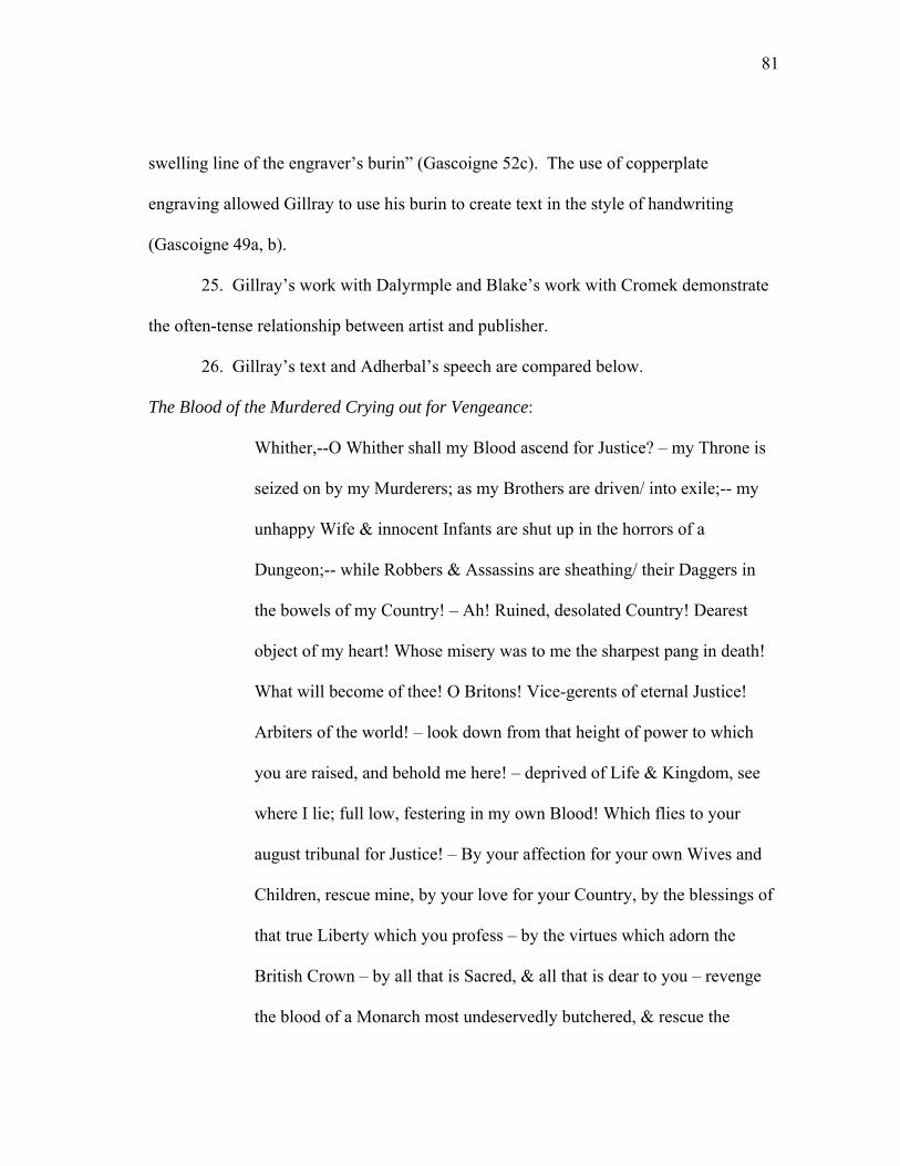
81
swelling line of the engraver’s burin” (Gascoigne 52c). The use of copperplate
engraving allowed Gillray to use his burin to create text in the style of handwriting
(Gascoigne 49a, b).
25. Gillray’s work with Dalyrmple and Blake’s work with Cromek demonstrate
the often-tense relationship between artist and publisher.
26. Gillray’s text and Adherbal’s speech are compared below.
The Blood of the Murdered Crying out for Vengeance:
Whither,--O Whither shall my Blood ascend for Justice? – my Throne is
seized on by my Murderers; as my Brothers are driven/ into exile;-- my
unhappy Wife & innocent Infants are shut up in the horrors of a
Dungeon;-- while Robbers & Assassins are sheathing/ their Daggers in
the bowels of my Country! – Ah! Ruined, desolated Country! Dearest
object of my heart! Whose misery was to me the sharpest pang in death!
What will become of thee! O Britons! Vice-gerents of eternal Justice!
Arbiters of the world! – look down from that height of power to which
you are raised, and behold me here! – deprived of Life & Kingdom, see
where I lie; full low, festering in my own Blood! Which flies to your
august tribunal for Justice! – By your affection for your own Wives and
Children, rescue mine, by your love for your Country, by the blessings of
that true Liberty which you profess – by the virtues which adorn the
British Crown – by all that is Sacred, & all that is dear to you – revenge
the blood of a Monarch most undeservedly butchered, & rescue the
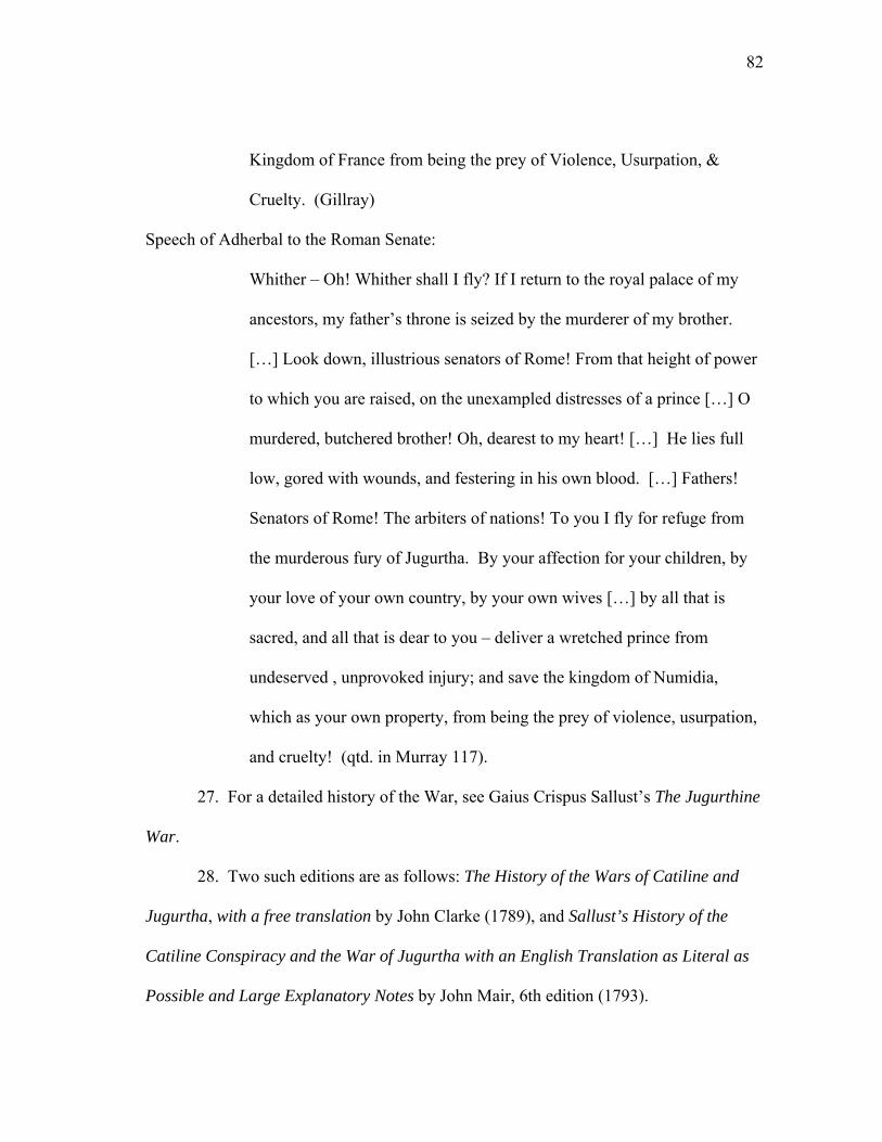
82
Kingdom of France from being the prey of Violence, Usurpation, &
Cruelty. (Gillray)
Speech of Adherbal to the Roman Senate:
Whither – Oh! Whither shall I fly? If I return to the royal palace of my
ancestors, my father’s throne is seized by the murderer of my brother.
[…] Look down, illustrious senators of Rome! From that height of power
to which you are raised, on the unexampled distresses of a prince […] O
murdered, butchered brother! Oh, dearest to my heart! […] He lies full
low, gored with wounds, and festering in his own blood. […] Fathers!
Senators of Rome! The arbiters of nations! To you I fly for refuge from
the murderous fury of Jugurtha. By your affection for your children, by
your love of your own country, by your own wives […] by all that is
sacred, and all that is dear to you – deliver a wretched prince from
undeserved , unprovoked injury; and save the kingdom of Numidia,
which as your own property, from being the prey of violence, usurpation,
and cruelty! (qtd. in Murray 117).
27. For a detailed history of the War, see Gaius Crispus Sallust’s The Jugurthine
War.
28. Two such editions are as follows: The History of the Wars of Catiline and
Jugurtha, with a free translation by John Clarke (1789), and Sallust’s History of the
Catiline Conspiracy and the War of Jugurtha with an English Translation as Literal as
Possible and Large Explanatory Notes by John Mair, 6th edition (1793).
83
29. George’s explication of this print provides a useful overview of the political
implications of the various aspects of text in the print.
30. A July 1790 advertisement continues this approach and states that the that
missing “mongrel” Lieut. Gallstone has got a “sore Tail, occasioned by a Copper
Platter, cruelly tied to it” and asks that he be returned to “J.G at No. Old Bond street” so
that “he may be found and muzzled.” Rather than encourage the public to find and
muzzle the print, the advertisement encourages those interested to find and purchase the
print.
31. Cruikshank and Hone copy a previously successful version of The House
that Jack Built engraved by Rowlandson (Patten 66-67).
32. Furthermore, Patten challenges Hone’s claim to originality of form by
crediting Rowlandson and Isaac Cruikshank with previous use of the parody and design
(157).
33. Cruikshank responded with several caricatures lamenting the restrictions of
the press, such as A Free Born Englishman (1819).
34. Hone draws this quote from Book VI, “The Winter Walk at Noon,” where
Cowper’s speaker laments the loss of his father.
35. The Real or Constitutional House that Jack Built was published in
opposition to Hone’s work, and in it the image, text, and subsequent quotes work
together rather than against each other. As with Political House, Constitutional House
incorporates quotes, this time from works “chiefly selected from Shakespeare, Cowper,
and Dr. Young.” The infusion of the work with Shakespearean language melds high art
84
with low art and creates a subtext of legitimization; the book may be in the form of a
children’s book but its subject is substantiated by authoritative English texts.
36. The toy, with engravings by Cruikshank, is a small paper ladder the size of a
standard bookmark. When folded like a ladder, the Queen appears at the top. Each step
of the latter corresponds with headings in the text itself and the accompanying images
reiterate the King’s fall from grace. BM Satires 13808.
37. Bryon had already left England by the publication of Matrimonial Ladder,
leaving behind a wake of scandal involving his various affairs.
38. In Three Essays on Picturesque Painting, Picturesque beauty; On
Picturesque Travel; and on Sketching Landscape: To which is added a Poem, on
Landscape Painting (1792), Gilpin encourages tourists to sketch and write impressions
of the picturesque scenes they encounter during their travels.
39. Combe does not acknowledge that his occasional imprisonment in debtor’s
prison necessitated a long-distance relationship, but even when he was out of prison, the
two did not meet (Ford 53).
85
CHAPTER III
“POETICAL ILLUSTRATIONS”:
TEXT AND IMAGE IN THE LITERARY ANNUALS
The preface to the 1832 edition of Fisher’s Drawing Room Scrapbook by Letitia
Elizabeth Landon (1802-1838), who published her work with her initials L. E. L., attests
to the artistic challenge of pairing art and text within nineteenth-century print culture.
In the preface, Landon admits that “it is not an easy thing to write illustrations to prints,
selected rather for their pictorial excellence than their poetic capabilities” (n.p.).
Admitting, “mere description is certainly not the most popular species of composition,”
Landon endeavors “to give as much variety as possible.” Landon’s continual references
to her poetry as “poetical illustrations” in prefaces of Fisher’s places her poems in a
direct referential relation to the engravings, which, as she reminds readers, can
nonetheless “plead and win the cause” on their own. Yet the deeming of her poems as
illustrations also serves as a reminder that to read only the poems is not enough; within
the literary annuals, they are paired with visual partners and must be read accordingly.
The typical production process for the literary annuals included sending engravings to
writers with the expectation that they would respond textually to the image.1 Regardless
of whether or not the engravings act as a source of inspiration or a cause of artistic
constraint for writers such as Landon, the engravings’ appearance alongside their textual
companions invites readers to recognize and investigate the relationship between media.

86
By acknowledging her works’ counterparts (the engravings), Landon acknowledges the
commercial nature of her work, a nature that depends on the joining of the two art forms
for the annual’s aesthetic and financial success. Engravings in Fisher’s were one of the
annual’s primary selling points, with sales bolstered by Landon’s popularity as
contributing poet and editor.2
Terence Hoagwood and Kathryn Ledbetter succinctly describe the literary
annuals as “elegant anthologies of original poetry and prose” (77). The elaborately
bound literary annuals paired literature with engravings and often capitalized on the
celebrity status of writers, painters, and engravers. Despite the literary and visual appeal
of the annuals, the engravings are often subordinated to the accompanying poetry or
omitted from critical discussion altogether. The removal of the poems from their visual
partners shifts the meaning of the annuals’ literature and overlooks the annuals’ primary
commercial and aesthetic appeal. The proliferation of engravings in the annuals makes
it difficult to escape the art-literature comparison and the tendency to subordinate poetry
to pictures overlooks the relationship between art and literature and alienates each from
the other. An ekphrastic connection between media emerges when the literature in the
annuals is reengaged with the engravings with which they were paired, for the text in
some way relates to the graphic representation of the engravings. W.J.T. Mitchell’s
influential definition of ekphrasis hinges on the absence of a text from its visual partner,
but by expanding the definition of ekphrastic poetry to the “verbal representation of
graphic representation” (Heffernan, “Representation” 299), the poems in the literary
annuals enter the realm of ekphrasis. A formal designation of many of the annuals’
87
poems as ekphrastic invites us to acknowledge these connections and to study the
multiplicities of meanings inherent in the genre.
The ekphrastic responses in the annuals take on a variety of forms, adding to the
already variable ways that meaning in the annuals is produced. Despite repeated
descriptions in the prefaces of the annuals of poetry as “illustrative,” not all literature in
the annuals is illustrative of the engravings. Within the annuals, literature often uses the
engraving as a point of departure, as a brief reference illustrative of the text’s narrative
or theme, or as a visual counterpart to a textual description of a scene. In other poems
and prose works, the text may have little relationship to the engraving besides the
relationship forced by spatial proximity. Whether the connection between media is
thematic (with text and image sharing similar narratives), explicit (with shared titles or
direct references), or merely spatial and implied, it is an active connection with
consequences for visual and textual meaning. To examine the annuals’ poems and
stories with their accompanying engravings is to see that both text and image enter a
discourse about meaning in print culture together through interaction and collaboration.
At the same time, this interaction and collaboration has historically ensured the annuals’
secondary status due to traditional critical biases against mass-produced art and
literature.
Beginning with the annuals’ conception in the early-nineteenth century, the
poetry in the annuals has been discussed in relation to its accompanying engravings in
terms of hostility. In a review of the poetry in the literary annuals, William Thackeray
declares the “feeble verse[s]” to be examples of “miserable mediocrity” (757), and in the

88
1837 edition of Fraser’s Magazine, he proclaims of the annuals: “the poetry is quite
worthy of the picture, and a little sham sentiment is employed to illustrate a little sham
art” (758).3 Thackeray’s disdain for the annuals’ content applies to the engravings as
well, and he describes the “the pictorial illustrations” of Fisher’s as “humbug” (762).4
Thackeray labels the artists and engravers involved in creating the annuals’ art “the
publisher’s slave[s],” catering “for the public inclination” and thus, “[their] art is little
better than a kind of prostitution” (758).5 By 1837, the reviewers of the annuals at The
Monthly Review struggled to differentiate worthy annuals from the other “gaudy and
glittering butterfly beauties” that saturated the market (126). Gaudiness was only one
criticism of the annuals, for William Wordsworth rather famously described the annuals
as “those greedy receptacles of trash, those bladders upon which the boys of poetry try to
swim” (Letters 2:275-276).
Modern critics are often equally harsh. Alison Adburgham observes that the
“prostitution of the pen to the picture was the usual practice of the annuals” (254) and
Peter Manning argues that William Wordsworth “subordinated his art to the pictorial
aesthetics fostered by the steel plate” (63). Angela Leighton describes Landon’s annual
poems as “no more than […] colorful illustration[s] of a theme” (50),6 and Lee Erickson
states that Landon “was reduced to writing poems as commentary upon pictures” (31).
Erickson suggests that the “Annuals lowered poetic standards and provided an
inadequate shelter for poetry against the ever-rising tide of the periodicals” (31). Poets,
in Erickson’s vision of poetry, become victims to an overpowering literary machine
driven by technology and consumerism, and while he recognizes that literary forms are
89
“materially and economically embedded in the reality of the publishing marketplace”
(8), he does not see writers as active participants in the changes in book trends. While
the quality of the literature in the annuals is at times debatable, the annuals’ popularity
during the nineteenth century is not; accordingly, recent criticism is beginning to pay
attention to the literary annuals as a publishing phenomenon of the period. The
willingness of writers to submit their work to the annuals—whatever the motivating
factor—and the profusion of annuals in the market suggests instead a need to approach
the annuals with an appreciation of their role in the evolving literary market.7
Viewing the annuals as cultural artifacts allows for a less-biased approach.
Through recognition of the annuals as tangible “cultural artifacts” (Hoagwood and
Ledbetter 11), we are encouraged to look at and read the annuals with an awareness of
the industry that produced them. The numerous individuals involved in the annuals’
production, coupled with the pairing of art and literature, produce a finished product that
is not an individual poem or engraving, but rather a collection of works that enter a
dialogue with each other. The annuals are, after all, multi-media works. This is not to
say that one medium dominates another; however, it does imply that the two forms of
art—literature and engraving—are connected both intrinsically and symbiotically in the
annuals.
The annuals’ popularity began with the publication of Rudolph Ackermann’s
Forget Me Not in 1823, and the number of annuals soon increased. Ralph Griffiths,
editor of The Monthly Review, expressed surprise in 1828 with the “number of new
Annuals which have started during the present year” (541). In 1828, Robert Southey
90
wrote Caroline Bowles in reaction to solicitations by Charles Heath for contributions to
his annual with a similar reaction to the success of the annual: “Will you believe that of
this Keepsake, which is bought merely for presents, or for the sake of the engravings, he
has sold fifteen thousand copies!” (Letters 324). Southey appears surprised that a book
sold “merely” as a gift or “for the engravings” would sell so well, but sell it did. By
1832, there were sixty-three annuals in circulation, with that number steadily increasing
to more than two-hundred by 1840 (Linley 54).
The literary annuals’ marketplace success was due in part to early-nineteenth-
century technological advances that allowed for the innovative pairing of art and text in
high-quality publications. Simon Eliot notes that there is not a simple “climb from the
lowlands of preindustrial printing to the sunny uplands of powered mass production”
(28), but a number of technological improvements made the production of the annuals
on a mass scale possible. The mechanization of papermaking with the Fourdrinier
Machine, the advent of stereotype printing, and the iron press all had a profound impact
on the ability to produce and distribute printed products in the early-nineteenth century.8
For the book trade, stereotyping had an immediate impact on the industry; stereotyping,
in which plates are made into casts that can be reused, allowed books to be made
affordably and in larger quantities (Feather 9). For engraving techniques, mezzotint
replaced stipple and aquatint by 1839 (Ledbetter, Heath 23), and as mezzotint allows for
rich tonal variations, it became the preferred method for “interpreting” oil paintings (Rix
16). The annuals emerged at a time when technology allowed ample opportunity for the
91
pairing of text and image in high-quality publications—or at least publications giving the
appearance of high quality.
Designed as decorative books for the Christmas gift-giving market, the annuals’
success had its foundation in a long English history of giving collections of poetry as
gifts at the year-end (Currie xiii-xiv). The annuals departed from their predecessors by
pairing poetry with engravings, capitalizing on the popularity of the expanding market
for art. Successful annuals sold from 6000 to 15000 copies per year, in contrast to the
300 to 500 copies per edition of the collection of works by Samuel Taylor Coleridge
(1772-1834) and Wordsworth (Sonada 60). As a “status gift” (Manning 45), the literary
annuals were meant for public display, even if their content’s sentimentality bespoke
private thoughts and feelings.9 In an 1837 review of the upcoming annuals, The Monthly
Review acknowledged of Fisher’s that it was “the choicest of gems that garnish the
tables of the polished circles of British society” (405), and the writers of the Literary
Gazette celebrated the virtues of the 1831 edition of Fisher’s as a “most pleasant
ornament” (803). The annuals were designed to “garnish” the drawing room tables of
their owners, and are thus often compared to the modern coffee-table book.10 The
emphasis on display “appealed to the bourgeois desire for possessions displaying their
owners’ refined taste and sophistication” (Riess 819). The annuals served as codified
objects that suggested, but did not necessarily denote, both wealth and status
(Stephenson 137).11 The inclusion of popular writers in the annuals was meant to
bolster sales, and the aggressiveness of editors in securing the participation of well-
known writers has been well documented.
92
Lavish binding and the inclusion of high-quality engravings increased the visual
appeal of the annuals, and the annuals included an average of eight to twelve engravings
per issue, with Fisher’s boasting thirty-six plates (Hootman 56). The subjects for
engravings range from landscapes (British and foreign), to portraits of historical,
fictional, and contemporary figures, to literary scenes. Stylistically, the engravings
range from grandiose landscapes that seem to mimic the work of J. M. W. Turner, to
more simplistic, linear figures. Publishers chose work by celebrity painters for their
engravings (Riess 820), and engravings of the work of well-established artists like
Turner and Thomas Stothard appear repeatedly throughout the annuals. The annuals’
inclusion of engravings came at an opportune time in the market as the public’s desire
for affordable art grew, and engravings became “a most potent force in spreading a taste
for art, making the public aware of the style and achievement of individual painters”
(Denvir 23). With a continual emphasis on visual appeal, the annuals were posited not
only as books to be read, but also as books to be seen, both in the context of their
placement in the drawing room as objects for display and in regards to the engravings
within.
The books not only provided their owners an object for display, but their contents
could be reused and redisplayed as “new” visual objects.12 This newness, however, is
illusionary, and in some regards, Thackeray’s observation about the literary annuals as
“sham art” is warranted. As Hoagwood and I have noted elsewhere, “the annuals relied
on the illusion of art, promoting engravings of paintings and not the paintings
themselves” (4). Many publishers recycled remnant prints from print shops (Sypher
93
122), and others, such as The Keepsake, even used leftover dress fabric for the “fine
satin” cover of the book (Hoagwood and Ledbetter, Keepsake). The use of remnant
prints allowed publishers access to affordable, accessible, and recyclable art.13
Katherine Harris observes that in keeping the reverse side of the print page blank,
engravings could be removed from the annuals as “portable artwork” (134),14 and
Ledbetter notes that print sellers “hawking proofs from the annuals” often sold “free-
standing portfolio supports to display prints in one’s drawing room” (Heath 22).
Publishers, aware of the possibilities inherent in recycling their prints, advertised
their prints independently of the annuals, but the prints’ sales were nonetheless
dependent on the annuals’ success. Publisher Alaric Alexander Watts (1797-1864)
strove to capitalize on the publicity of his annual and the growing market for engravings
by publishing the engravings of the 1827 Literary Souvenir “without letterpress, in
portfolios” (Watts 250). Publisher and editor Samuel Carter Hall (1800-1889) also
sought to profit from the recycling of his annual’s engravings, advertising in the preface
to The Amulet (1828) that “a limited number of proofs of the engravings have been
taken, and may be had of the Publishers of the volume” (14). By 1829, Watts could
boast that the Literary Souvenir’s plates were “selling for more than twice the price of
the original volumes containing the entire set” (vii). Both Watts and Hall hoped that the
popularity of their literary annual would entice their readers to purchase the annuals’ art
in its recycled form.
The independent advertising of the annuals’ art emphasizes the publishers’
reliance on the engraving trade, and this reliance in turn emphasizes that the annuals
94
were a collaborative endeavor between individuals involved in both the literary and
artistic markets. Annuals like Fisher’s Drawing Room Scrapbook are as much the result
of a collaborative effort as they are the product of the editor’s ingenuity. The production
of a single edition required coordination between publisher, editor, artist, engraver, and
writers; consequently, editorial planning often began six months before publication
(Erickson 31). Landon worked as Fisher’s editor and primary contributor from 1832-
1838, and her letters provide ample evidence of the time and collaboration involved in
preparing an annual. In preparing for the 1836 edition, Landon wrote publisher Robert
Fisher soliciting his feedback:
I enclose the remainder of the poems. The Norham Castle. The aisle of
Tombs. Fountain’s Abbey-Warkworth Hermitage—and another
Christmas. It is livelier and I hope will meet your ideas – I am always
very happy to make any alteration you wish—and should never dream of
any offense in any suggestions; only glad to adopt it. (Letters 134)
Without Fisher’s response, it is difficult to know whether Landon received feedback, but
her letter nonetheless attests to the collaborative nature of the poems. As “poetical
illustrations,” they are written to accompany the engravings and are therefore not only
products of Landon’s pen, but also products of art and by association, the engraving
trade.
The process of producing an annual was a year-round endeavor, often beginning
with the procurement of engravings. In his 1827 journal, Watts outlined the process of
securing engravings, a process that began by finding
95
Suitable works of art for engraving, to be bought or borrowed, which
became more difficult every year; good copies of the picture to be made
for the engraver, where the work, though allowed by the owner to be
engraved, could be spared from the walls for the purpose; the engraver to
be set to work and very carefully looked after, for these were golden days
for the line-engravers, and those who were of any eminence had almost
more work than they could fairly do justice to […]. (qtd. in Watts 254-
255)
Watts’ journal entry attests to the difficulty in procuring pictures from which to have
engravings made. Editors competed over contributing artists just as they competed over
writers, and the process of securing agreements with artists and art owners was a time-
consuming endeavor.15 When Watts called on Mr. Hilton, R.A., he found he was not the
only editor seeking paintings for engravings:
He [Hilton] told me he had declined four similar propositions from the
editors of the other annuals—Hall, Ackermann, Heath, and Blamanno—
so that I suppose I must regard his willingness to suggest a picture for my
purposes as a compliment. (qtd. in Watts 257)
For artists, it was a sellers market. As the market became saturated with emerging
literary annuals, publishers scrambled to secure work by reputable (and contemporary)
artists to be engraved by reputable engravers. For painters, participation in the annuals
proved beneficial financially and provided them with instant publicity through the
96
circulation of engravings of their work.16 For engravers, the annuals provided an avenue
for a reliable income.
An engraving’s inherent multiplicity begins in its production. The production of
engravings is also highly collaborative, and this is made apparent in the attribution of
most engravings to at least two individuals—painter and engraver.17 However, even the
acknowledgement of the original artist and the print’s engraver disguises the
collaborative nature of engraving and the varying degrees of transformation required to
change a painting into an engraving. By the time an engraving was printed, it might be
several degrees removed from the original artwork. Once publishers received
permission to use an artist’s work in the annual, they then had to have a suitable copy
made of which the engraving would be based. The production of each engraving relied
on an original painting, a drawing of the original work, and the engraving itself; each
component often was created by a different individual, who did not necessarily work in
conjunction with the others involved in the production of the plate. In order to meet fast-
approaching publishing deadlines, a drawing would often be reduced to multiple squares
of smaller drawings, with various engravers taking a section from which to engrave
(Heath 58). The final product reveals little of this multiplicity besides crediting an artist
and engraver.
By the 1820s, Charles Heath (1785-1848) had established himself as a highly
sought-after master engraver, and he spent much of his time overseeing his publication
ventures such as the annual Heath’s Book of Beauty. While Heath oversaw the work at
his atelier and received credit for its work, he did little engraving of his own after 1826
97
(Heath 57-58).18 Nonetheless, Heath maintained an active role in the engraving process,
supervising retouches and overseeing the work as a whole in order to ensure that any
plate with his name on it would be of high quality (Heath 57). A steel engraving of Mrs.
Peel for the 1829 Keepsake bears Heath’s name, but a proof copy reveals the
collaborative nature of the print, “Lane reduced, Goodyear etcd figure, Webb etchd fur
and feathers, J.H. Watt drapery and hat, Rhodes worked up hat feathers, D. Smith
background, and C. Heath flesh” (qtd. in Heath 58).19 Heath, who only engraved Mrs.
Peel’s flesh, receives full credit for the engraving. The quality of Heath’s engravings
cemented his reputation as an engraver, and, like Heath, other engravers soon gained the
“celebrity status of artists, earning high fees for their work” (Hoagwood and Ledbetter,
Keepsake). Yet as the annual market became more competitive, publishers were faced
with the need to distinguish their annual from the others.
The growing number of literary annuals diminished the novelty of the literary
form, and as a result, publishers and engravers were always on the look out for
innovative ways to market their wares in an increasingly competitive market.20
Landon’s letters are a testament to her active involvement not only in editing and writing
for the annuals, but also in suggesting new ideas to the publishers with whom she
worked. In 1834, Landon wrote publisher William Jerdan (1782-1869) to suggest that
they collaborate on a new annual created entirely from remnant prints:
Every great print seller has I believe on hand—a number of engravings
more than the actual demand. What I propose is to make a selection from
98
the prettiest of these and form them into an Annual to be called “The
Choice.” (Letters 100)
Landon continues, noting since “those who buy books, and those who buy prints, are two
different classes [that] the engravings would in nine cases out of ten—be new to the
readers” (Letters 100). Like William Kidd’s observation about the two connoisseurs of
graphic satire, Landon identifies two separate connoisseurs of literature and art, and she
banks the success of her proposed annual on the assumption that the two classes do not
overlap. The dual market for literature and art proved ideal for the annuals, and while
Landon notes that “people like pretty pictures,” she also proposes to Jerdan a more
discerning literary annual, aiming for “higher literary ground” (Letters 100). Editor
Frederic Mansel Reynolds’ preface to the 1829 Keepsake proposes a similar balance, and
he promises an annual as “perfect as possible” in both “literary matter” and “pictorial
illustration” (iii).
While Landon’s proposed annual aimed to cater to a literary-minded consumer,
Watts’ prefaces depict a struggle to maintain the interest of an increasingly diverse
readership’s interest in art. Watts, in the preface to the 1836 edition of the Cabinet of
Modern Art, and Literary Souvenir, suggests that there are two connoisseurs of art:
To those friendly critics, who […] have expressed their fears that the
lovers of art among the purchasers of illustrated works in this country, are
too limited in number to render such a speculation prudent or profitable,
he replies, by reminding them that his book is by no means exclusively
addressed to amateurs […]. (v)
99
For the discerning art critic Watts provides a detailed index of engravings, listing not
only the artist and engraver, but also the whereabouts of the original work of art. For the
amateur art critic, Watts seeks to enlighten, and he argues that his annual will excite
“public curiosity respecting British Art” (vi). Furthermore, Watts seeks to distinguish
his annual from the others, and he proposes that in adding “criticism on Art and records
of the notices of this description,” he adds more “fitting accompaniments to the
Embellishments” of the annual than the traditional inclusion of only poetry and short
stories (vi).
In 1836, Watts, realizing that the “hold” the annuals had on the market was based
on the “Art which they had been instrumental in so widely popularizing,” changed the
structure of the Literary Souvenir, increasing the number of engravings from ten to
twenty-five (qtd. in Watts 164).21 The increase occurred simultaneously with the
content’s shift from poetry to a more eclectic collection of critical essays, prose, poetry,
and biographies. In this way, Watts brings to fruition Landon’s unrealized idea of an
annual that includes “light criticism, pleasant essays to be mingled with tales and
poems” and biographies of popular poets (Landon, Letters 100). The preface to the 1835
edition of the annual explains Watts’ change:
[…] instead of associating these pictures with stories to be written for
them, but to which they were to appear to be illustrations, short notices
were appended to them of the works of the artists. The susceptibility of
art to be illustrated by poetry, was, however, recognised; but there was no
100
mistake about the fact that the poem was suggested by the picture, not the
picture by the poem. (vi)
By making it clear that the “poem was suggested by the picture, not the picture by the
poem,” Watts places art as the primary medium in the annual, and by shifting the focus
of the annual to art rather than poetry, Watts makes poetry the embellishment, not art. In
this way, Watts attempts to differentiate his collection from other annuals that often
provided illustrations of pre-existing literary works by established writers.22
Watts dedicates the 1835 edition of his annual to avid art collector and patron Sir
John Soane (1757-1837) as a “mark of respect for his patronage of British Art” (n.p.).
Other editions of his annual likewise include dedications to major figures in the
promotion of British art; thus, from the dedication forward, Watts strives to emphasize
the annuals’ artistic endeavors. Yet while Watts’ preface promises textual originality
and art-inspired poetry, much of this promise is a mere illusion. For despite the addition
of essays on art and biographies of artists, the annuals’ inclusion of random poems
unrelated and unattached to the engravings is similar to the format of the annuals’
contemporaries. Nonetheless, detailed essays on art criticism and biographies of painters
make up the bulk of the volume and continue the annuals’ thematic focus on art. To add
credibility to this endeavor, Watts includes essays on art by Royal Academy artists.
Watts’ declaration that the art in his annual precedes the literature forces the ekphrastic
connection between media by reminding the reader that the poetry is inspired by the art.
The continued inclusion of poetry without a visual partner—such as the edition’s
101
random sonnets by Eleanor Louisa Montague—reiterates that Watts realized that he
needed to cater to both the literary and the art-minded reader.
By openly welcoming an acknowledgement of the visual focus of many of the
annuals, the editors invite recognition of the collaborative nature of each edition. The
annuals are, after all, works comprised of many works. The collaborative nature of the
annuals undermines traditional notions of the solitary writer and individual artistic
genius. Despite the critical clamor against such commercial publication outlets, the
annuals provided a literary arena in which women writers such as Landon could
participate (Hoagwood and Ledbetter 75), and a legitimate avenue for publicity and
financial gain for writers such as Wordsworth, Coleridge, Robert Southey (1774-1843),
Mary Shelley (1797-1851), and Sir Walter Scott (1771-1832). Yet, while Landon and
other editors of the annuals appear willing to engage with the engravings that made the
annuals so popular (perhaps out of necessity), established authors such as Wordsworth
sought to distance themselves from the commercial art that appeared alongside their
poems.23 Yet, as Southey observes, “money makes the mare to go” (Letters 324), and
few writers could initially decline the generous offers put forth by the annuals’
publishers. The financial prospect of publishing in the annuals presented writers like
Wordsworth with a quandary: they could potentially debase their name by publishing in
such a commercial venue, or they could benefit financially and otherwise from reaching
such a wide audience.
The inclusion of popular writers in the annuals was meant to bolster sales, and
Manning notes that when publishers bartered with writers, the “article of exchange” was
102
“the name itself, not a work” (49).24 Hall boasts of the 1828 edition of the Amulet, that
the annual “has received the sanction and support of many of the most distinguished
writers of the age” (5), and Reynolds in the 1829 Keepsake promises with a few
exceptions that “a list of authors has been obtained as perhaps never before graced the
pages of any one volume of original contributions” (iv). As an additional selling point,
publishers routinely advertised Shelley as the “Author of Frankenstein,” well after her
identity as the author had been revealed, thereby relying on the name recognition of the
author’s market-proven novel to help garner sales of the annuals. The use of established
writers and excerpts from successful literary works suggests that the annuals’ artistic
appeal was not enough; instead, the annuals relied on a purposeful blending of engraving
with the names of market-proven authors. Watts, in the preface to the 1830 edition of
the Literary Souvenir, states that he did not need to enact the “fallacy” of impressing
names upon the public; instead, he vows that his literary selection was determined “less
by the importance of the name than the intrinsic value of the production” (xi). Watts
proudly boasts of the quality of his collection, quality that did not depend alone on the
celebrity status of participating writers. The “intrinsic value” of the collection decreased
as fewer established writers participated. As the market became more saturated with
literary annuals, established writers proved harder to secure and the quality of the
annuals’ literature became less consistent.
A variety of successful and established writers participated in the annuals, but
perhaps no other name has become as associated with the annuals than Landon’s.25 The
mass-produced annuals allowed Landon, “performing as L. E. L. the poet,” access to a
103
large reading public that helped sustain her literary and editing career (Hoagwood and
Opdycke 4). Publishers sought out Landon for her name, and “if they couldn’t get
Landon, they at least wanted Landon’s style. She became widely imitated” (Stephenson
126). Yet popularity had its price. For the women involved as writers and editors of the
annuals—such as Landon, Margurite Gardiner (the Countess of Blessington, 1789-
1849), and Lady Caroline Norton (1808-1877)—the implications of participating so
actively in the literary market presented a potential risk to their already tenuous
reputations as working women.26 Appearing publicly in textual form often meant a
perceived conflation of the women’s public lives with the themes of their poetry. The
inclusion of sensual and exotic images of women in the annuals worked to encourage
this conflation.27
While the annuals provided women such as Landon with access to a career,
established male poets often worked to disassociate their names with the annuals.
Despite their participation in the annuals, Wordsworth, Coleridge, and Scott proved
anxious to distance themselves from the commercial nature of the annuals, thus striving
to maintain romantic and individualistic—rather than corporate and commercial—
associations with their name and work.28 In some regards, their attempts worked, for
modern criticism often dismisses the canonical writers’ work in the annuals due to the
mass produced nature of the annuals and the works’ perceived secondary status to the
writers’ general oeuvre.29 The production process, according to Gregory O’Dea,
“privileges image over narrative” (66), thereby reducing a writer’s work as secondary to
the art in the annual. Sonia Hofkosh takes a similar approach to the writers’ relationship
104
to the annuals’ engravings, and she argues that the engravings “often constrained the
writers” (208). The process of requiring writers—specifically prominent writers—to
respond to art is part of the controversy surrounding the quality of the literature in the
annuals. Many writers did respond with difficulty to images, or at least the content of
many of their poems suggest a tension between text and image bordering on
indifference. Yet the interaction between text and image in other pairings encourages a
perception of art as inspirational rather than merely commercial, thereby avoiding the
invocation of a hostile relationship between text and image. The suggestion that in
writing for the annuals writers prostituted their talents in favor of a visual rather than
literary aesthetic overlooks the concept of art as a fitting accompaniment to literature, as
a potential source of inspiration for writers, and as a cultural artifact in print culture.
Inspirational or not, some Romantic-period contributors to the annuals attempted
to distance their text from its accompanying image in an attempt to maintain an illusion
of artistic individuality. For a contribution to The Keepsake (1829), Heath provided an
engraving to which Wordsworth was to respond, but Wordsworth instead claimed to be
inspired by reality rather than art (Moorman 453). Wordsworth wrote Mary
Wordsworth: “I have written one little piece […] on the Picture of a beautiful Peasant
Girl bearing a Sheaf of Corn. The Person I had in mind lives near the Blue Bell,
Fillingham—a Sweet Creature, we saw her going to Hereford” (qtd. in Moorman 453).
In identifying a real girl, Wordsworth attempts to avoid association with the primary
appeal of the annuals—the engravings. Wordsworth’s reference to a specific place—
Blue Bell, Fillingham—and moment in time—a recent trip to Hereford—further
105
distances his poem from the fictional representation of the girl in the engraving.
Wordsworth inserts himself between the artist and the inspiration, and he identifies
nature as his inspiration, not art. However, his poem reinforces the connection to the
engraving by questioning the source of inspiration for the picture:
What mortal form, what earthly face,
Inspired the pencil, lines to trace,
And mingle colours that could breed
Such rapture, nor want power to feed? (Wordsworth 50)
While the poem questions what “mortal form” inspired the image, thus referencing
reality rather than fiction, a later line reinforces the poem’s link to the engraving and the
fiction implied by representation rather than reality. By referring specifically to the
girl’s “tell-tale sheaf of corn” (50), the speaker invites the reader to look at the image
[Figure 2.1]. The image does not disappoint, and a young woman smiles wistfully, as
she stands by a wall holding a sheaf of corn. There is no mention of Fillingham or
Hereford in the poem to suggest a foundation in reality rather than art. Despite
Wordsworth’s attempt to free his poem from association with the engraving, his
published poem’s proximity to its accompanying engraving reinforces its commercialism
and undermines Wordsworth’s attempt to maintain the uniqueness of his poem. Bound
within The Keepsake, “The Country Girl” becomes one of many poems paired with
engravings.
Accounts of Coleridge’s participation in the annuals also reflect a distancing of
his work from the commercial nature of the annuals; however, unlike Wordsworth who
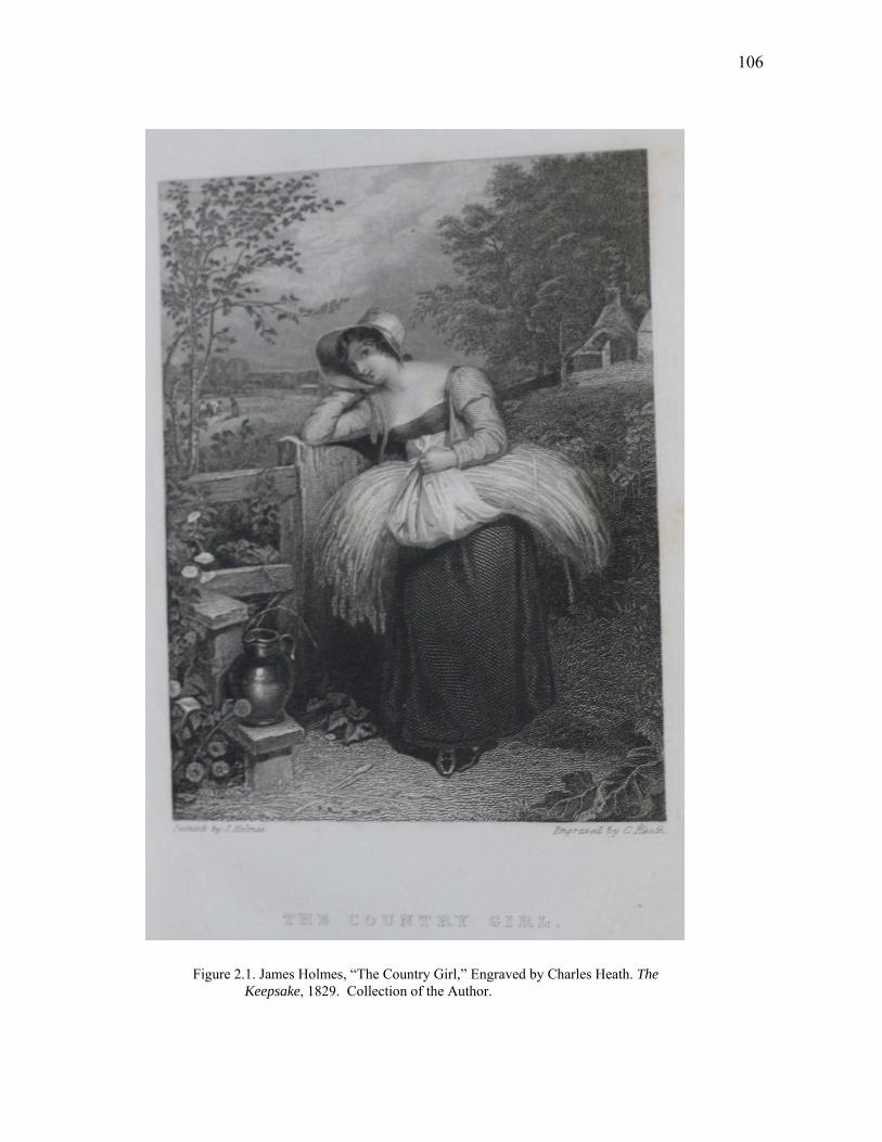
106
Figure 2.1. James Holmes, “The Country Girl,” Engraved by Charles Heath. The Keepsake, 1829. Collection of the Author.
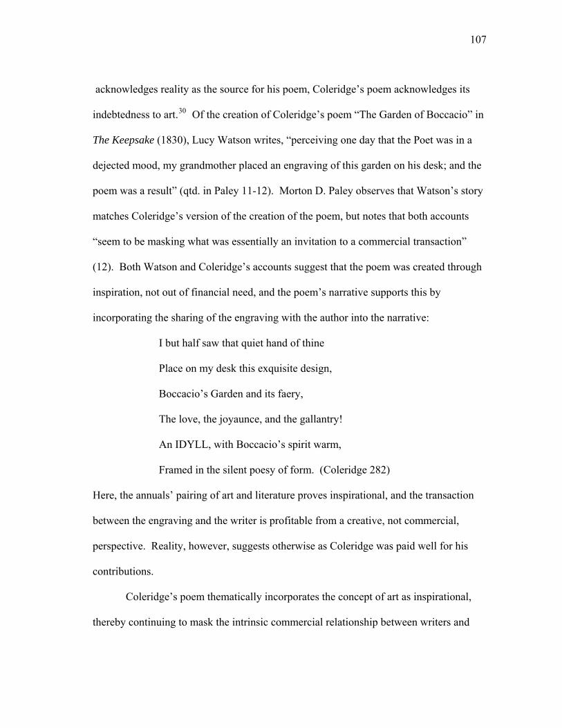
107
acknowledges reality as the source for his poem, Coleridge’s poem acknowledges its
indebtedness to art.30 Of the creation of Coleridge’s poem “The Garden of Boccacio” in
The Keepsake (1830), Lucy Watson writes, “perceiving one day that the Poet was in a
dejected mood, my grandmother placed an engraving of this garden on his desk; and the
poem was a result” (qtd. in Paley 11-12). Morton D. Paley observes that Watson’s story
matches Coleridge’s version of the creation of the poem, but notes that both accounts
“seem to be masking what was essentially an invitation to a commercial transaction”
(12). Both Watson and Coleridge’s accounts suggest that the poem was created through
inspiration, not out of financial need, and the poem’s narrative supports this by
incorporating the sharing of the engraving with the author into the narrative:
I but half saw that quiet hand of thine
Place on my desk this exquisite design,
Boccacio’s Garden and its faery,
The love, the joyaunce, and the gallantry!
An IDYLL, with Boccacio’s spirit warm,
Framed in the silent poesy of form. (Coleridge 282)
Here, the annuals’ pairing of art and literature proves inspirational, and the transaction
between the engraving and the writer is profitable from a creative, not commercial,
perspective. Reality, however, suggests otherwise as Coleridge was paid well for his
contributions.
Coleridge’s poem thematically incorporates the concept of art as inspirational,
thereby continuing to mask the intrinsic commercial relationship between writers and
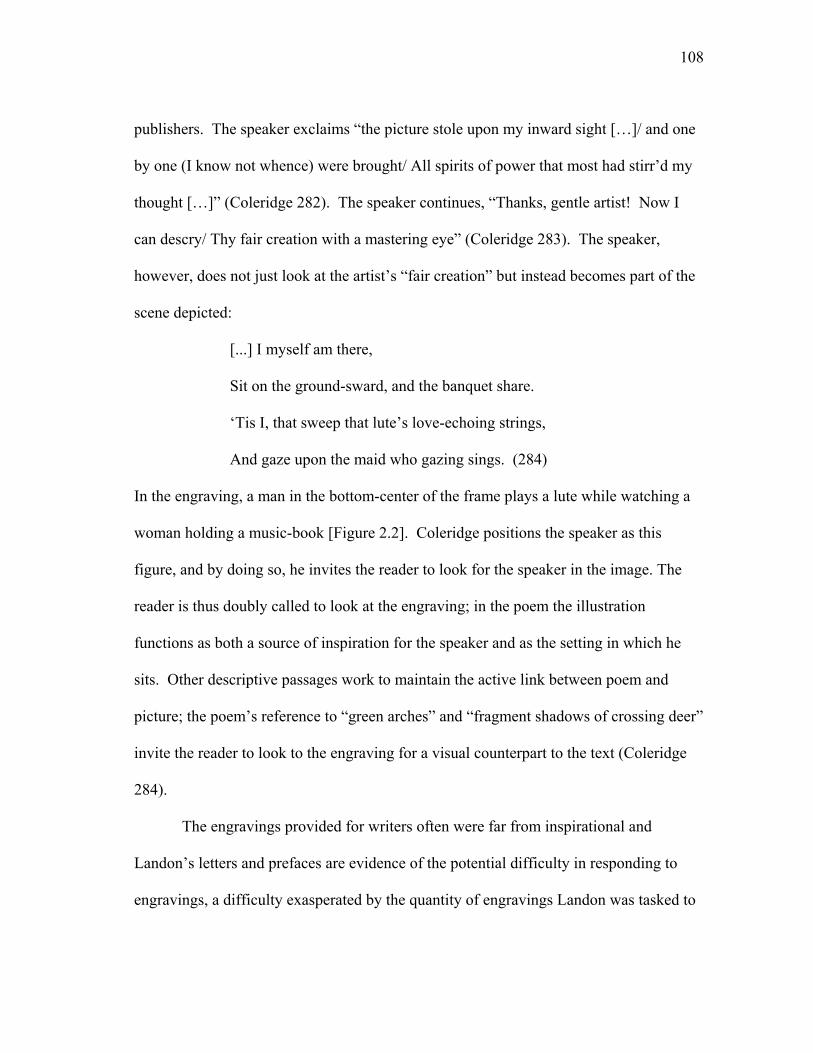
108
publishers. The speaker exclaims “the picture stole upon my inward sight […]/ and one
by one (I know not whence) were brought/ All spirits of power that most had stirr’d my
thought […]” (Coleridge 282). The speaker continues, “Thanks, gentle artist! Now I
can descry/ Thy fair creation with a mastering eye” (Coleridge 283). The speaker,
however, does not just look at the artist’s “fair creation” but instead becomes part of the
scene depicted:
[...] I myself am there,
Sit on the ground-sward, and the banquet share.
‘Tis I, that sweep that lute’s love-echoing strings,
And gaze upon the maid who gazing sings. (284)
In the engraving, a man in the bottom-center of the frame plays a lute while watching a
woman holding a music-book [Figure 2.2]. Coleridge positions the speaker as this
figure, and by doing so, he invites the reader to look for the speaker in the image. The
reader is thus doubly called to look at the engraving; in the poem the illustration
functions as both a source of inspiration for the speaker and as the setting in which he
sits. Other descriptive passages work to maintain the active link between poem and
picture; the poem’s reference to “green arches” and “fragment shadows of crossing deer”
invite the reader to look to the engraving for a visual counterpart to the text (Coleridge
284).
The engravings provided for writers often were far from inspirational and
Landon’s letters and prefaces are evidence of the potential difficulty in responding to
engravings, a difficulty exasperated by the quantity of engravings Landon was tasked to
109
Figure 2.2. Thomas Stothard, “Garden of Boccacio,” Engraved by Francis Englehart. The Keepsake, 1829. Collection of the Author.
110
respond to with each edition of Fisher’s (up to thirty-six engravings per edition). The
reviewers for the Literary Gazette of the 1831 edition of Fisher’s recognized the
difficulty of Landon’s task: “To sit down and write to a single picture is a task of no
slight difficulty, as many who have tried well know; but to sit down and write for thirty-
six, of all kinds of characters—it takes away our breath to contemplate it” (803). In
August 1833, Landon writes to a friend, “How my ingenuity has been taxed to introduce
the different places!” (Letters 91). In 1837, Landon returns prints to Fisher, wondering,
“what in the world can be said about them in the way of poetry” (Letters 169). Landon
was not alone in lamenting the difficulty of the process of responding textually to
engravings. In the preface to the 1835 edition of the Literary Souvenir, Watts
acknowledges that “the inconvenience of appending elaborate tales, written for the
purpose, to engravings from the most celebrated pictures of the day has been admitted on
all hands” (vi). Many of Landon’s prefaces to Fisher’s reflect her attempt “to respond
thoughtfully to the engravings and the public’s desire for something more than
representation” (Hoagwood and Opdycke 5). In Landon’s prefaces she often voices her
recognition of the necessity to enact poetic license in response to the illustrations, and
thus incorporates the liberty to depart from the engravings that ekphrasis allows.
The prefaces of many of the annuals celebrate the Sister Arts and function as
advertisements for the annuals’ desired appearance of a successful literary venture
pairing text and image. Such prefaces promote an illusion of a harmonious relationship
between media that disguises many of the tensions inherent in the production of the
111
annuals and in the production of meaning. In the 1835 edition to Fisher’s, Landon takes
a poetic approach to her preface that celebrates the “power” of “pictured lines”:
And has my heart enough of song
To give these pictured lines
The poetry that must belong
To what such art designs?
The landscape, and the ruined tower,
The temple’s stately brow—
Methinks I never felt their power
As I am feeling now. (n.p.)
Landon questions whether she has enough “song” to provide the poetry that “must”
belong with the engravings, suggesting a forced relationship between text and image.
Nonetheless, she acknowledges the “power” of the engravings of landscapes and
architecture. Watts’ lengthy prefaces often boast of his artful pairing of text and
literature, and Reynolds claims that the all of the Keepsake’s “departments” had been
rendered “perfect” (v, original emphasis). Many prefaces take the opportunity to explain
changes in the annuals’ format and thematic departures from prior years, but the overall
impact of the prefatory material is to present the pairing of literature and art as
successful, harmonious, and in keeping with the public’s desire for such works.
O’Dea notes that in an effort to appear compliant with the annuals’ artistic
requirements authors would occasionally change the name of their characters in pre-
existing tales to match an engraving’s figures (66). The addition of an engraving to a
112
pre-existing work provided the illusion that the work was new, or at least newly
illustrated. Excerpts from Scott’s Waverley novels were a popular subject material for
engravings and provided readily accessible and recognizable literary accompaniments to
images of Scottish landscapes and scenes. For example, in 1838, Fisher’s included an
engraving from Ivanhoe (1819) titled “Ivanhoe Rescued by the Black Night,” and in the
same year, Friendship’s Offering included an engraving of Flora MacDonald from
Waverley (1814). The use of the work of popular deceased writers also provided the
editors with fodder for the annuals. Percy Bysshe Shelley’s (1792-1822) and Lord
Byron’s (1784-1824) works appear repeatedly throughout the annuals after their deaths.
Watts recycled Landon’s work, and in the 1836 Literary Souvenir, he paired an
engraving of H. Howard’s painting Fairies on the Sea Shore with a similarly titled poem
by Landon. A brief editorial remark notes that the poem’s “beautiful lines are extracted
from an early volume of Miss Landon’s Poems (‘The Troubadour’). They were written
a short time after the picture was painted” (75). Whether or not Landon based her poem
on the painting is not mentioned, although Watts notes that the painting was exhibited at
the Royal Academy in 1825 (75), thus inviting speculation about the relationship
between poem and painting due to the public availability of the original work.
Regardless of the origination of the text or the availability of the writer, publishers relied
on the illusion that there is a relationship between text and image, and on the illusion that
the recycled work would appear new and original when paired with an engraving.
Just as publishers recycled engraved plates and used poetry written by deceased
writers, writers recycled their own work for use within the annuals. In 1828, Scott
113
“amused” himself by “converting ‘The Tale of the Mysterious Mirror’ into ‘Aunt
Margaret’s Mirror’ designed for Heath’s what’d’ye call it” (Scott, Journal 457).
Originally rejected by Heath, the revised and re-titled story was approved for publication
(Heath 50). In the introduction to an 1831 collection of short stories from the annuals,
Scott elaborated on his story’s creation, noting, “it is a mere transcript, or at least with
very little embellishment, of a story I remembered as a boy” (n.p.). Scott recounts a
fireside tale told by Mrs. Swinton, and he claims to “tell the tale as it was told to me”
(n.p.). Scott’s journal substantiates this: “the tale is a good one and is said actually to
have happened to Lady Primrose, my great grand-mother having attended her sister on
the occasion” (457). Scott’s continued efforts to identify the origins of his story works
as a narrative ploy to validate the authenticity of the narrative as an overheard tale.
Scott’s assertions about the tale’s origination work to maintain the originality of
his piece by making the creation of the story personal rather than commercial; he also
attempts to distance himself from the overtly commercial nature of the pairing of
engraving and text. However, despite Scott’s claim that he cleverly reworked an
existing story for the Keepsake, “My Aunt Margaret’s Mirror” is associated with an
engraving in the annual. A descriptive passage on an adjacent page to the engraving
provides details that serve as a textual echo to the engraving’s image. From the “two or
three low broad steps,” to the “two naked swords laid crosswise,” “large open book,”
and “human skull” (32), Scott appears to provide detailed descriptions of aspects of the
engraving of the “Magic Mirror.” Scott’s account of the “tall and broad mirror […]
illuminated by the lighted torches” seals the text’s relationship to the engraving within
114
the annual (32). Despite Scott’s claims about the text’s origin as preexisting the
engraving, the reader’s perception of the tale is tied directly to the presence of the
engraving. The subject of the engraving reflects the tale’s thematic focus on the magical
and mysterious mirror.
While production may appear to privilege “image over narrative” (O’Dea 66),
the resulting pairing of poetry and picture does not betray this preference. On the
printed page, the reader is confronted with only the immediacy of the relationship
between media, not with the process in producing the relationship. Knowledge of the
production process increases our understanding of the meaning of a work, but we are not
dependent on this knowledge to appreciate the capability for multiplicity of meaning
within the work itself. The relationship between media has often been dismissed due to
the observation that “almost any poem will do so long as it allows the reader to identify
with the engraving’s theme” (Pascoe 181). Yet, as evidenced by editors scrambling to
get celebrity writers, “any poem” would not always do. Instead, most of the poetry in
the annuals was required in some way to interact with the imagery, even if this
interaction was only spatially based, or if the aesthetic quality of this interaction was
debatable; when paired together text and poem enter into a dialogue, even if they
otherwise appear to share little in common.31
Dismissing the relationship between text and image, or removing the text from its
visual partner shifts the meaning of the work and removes its ekphrastic connotations.
Mitchell argues that the absence of the picture is essential to ekphrastic work. To
Mitchell, the ekphrastic encounter is “[…] purely figurative. The image, the space of
115
reference, projection, or formal patterning, cannot literally come into view” (699).
Mitchell continues, “the Textual Other” can “never be present, but must be conjured up
as a potent absence or a fictive, figural presence” (699). Mitchell’s theory of ekphrasis
centers on absence, with the poem’s ekphrastic meaning reliant on the absence of the
work of art. However, to be designated as ekphrastic, a poem is dependent on the
reader’s awareness of the artwork’s existence, and with this awareness, the link between
text and image is never fully severed by the artwork’s potential absence. The
maintenance of this link suggests that ekphrasis does not necessarily depend on absence,
but rather depends on the reader’s awareness or memory of a work of art. In the literary
annuals, the reader’s awareness of the ekphrastic connection is heightened by the text’s
proximity to its accompanying artwork, and this proximity ensures the maintenance of
an ekphrastic connection.
A broader approach to ekphrasis opens up the possibility that ekphrastic texts can
share the same space with their visual partner. Heffernan defines ekphrasis as the
“verbal representation of graphic representation” (Heffernan, “Representation” 299) and
argues that:
[…] the availability of a painting represented by a poem should make no
difference to our experience of the poem, which—like any specimen of
notional ekphrasis—is made wholly of words. But the availability of the
painting allows us to see how the poem reconstructs it, how the poet’s
word seeks to gain its mastery over the painter’s image. (7)
116
Regardless of whether a poem works to reconstruct, represent, rebuff, ignore, or master
an image, a relationship between media exists in ekphrastic poems. Much to the reader’s
advantage, the availability of the engravings in the annuals allows us to see the
complexity of the relationship between art and text firsthand. Shimon Sandbank
suggests that ekphrasis is based on such knowledge: “Ekphrastic poetry wants to
supersede art, but first needs the art it wants to supersede. There is a double movement
of attraction and suppression, dependence and negation” (238). The proximity of text
and image in the annuals allows us to witness this movement and assess whether the
relationship between media is one of attraction, suppression, dependence, or negation.
Ekphrasis then is not one mode of representing art, but many.
Poems do not always gain “mastery” over the images, nor do they always
“reconstruct” an image; the relationship between media is not always defined by an
attempt at one medium to gain dominance over another. The desire to place one art form
over another in a hierarchical relationship is common within theoretical discussions of
ekphrasis, but Andrew Becker suggests that the assumption that “all ecphrasis [sic] is
implicated in a rivalry between the media does not allow for the particular rhetoric and
the particular stance of a given ecphrasis to have its voice” (12). For meaning,
ekphrastic writing relies on its relationship to art and on one medium speaking about, to,
and for another (Heffernan 7). In the annuals, this relationship is cemented by the text’s
proximity to its source art. Bose notes that in the annuals the “twofold representations of
a poem”—poem and engraving—may have served a purpose by increasing
117
[…] the average reader’s capacity to appreciate the interrelation between
the two arts by accustoming his sensibilities to glide easily from the
appeal of a plate to that of the illustrative poem even though the appeal in
either case might be crude and elaborately obvious. (39)
The ability for the reader to “glide” from engraving to text makes obvious the ekphrastic
connection, and the evocation of the ekphrastic form opens the door to a variety of ways
in which media can interact. Within the annuals, these interactions usually occur
spatially, with an engraving appearing within close proximity to its textual partner. The
spatial relationship between forms allows the reader to “easily” glide from text to plate
and assess any transformation of meaning that occurs with an awareness of the dialogue
between media.
The dialogue between media builds upon two narrative systems—that of visual
and textual communication. Mitchell argues that there is “semantically speaking, no
difference between texts and image” (702). He continues, “from the standpoint of
referring, expressing intentions, and producing effects in a viewer/listener, there is no
essential difference between texts and images” (701). In contrast, O’Dea suggests that
the “unspeaking image must be narrated towards meaning” (66). For O’Dea, an image
relies on words for meaning, and Heffernan likewise suggests that one medium speaks
for another (7). Yet both text and image communicate independently and differently
within the annuals, and indeed within any form combining media. Ekphrasis works to
bridge this difference by sealing the relationship between media and encouraging the
text to speak for or about art. However, in speaking “for” art, ekphrasis speaks
118
differently than its visual partner. The engravings suggest their own narratives, contain
their own symbolism, and follow their own artistic trends. Lines rather than words
direct the viewer’s eye and subtle shading and expressions suggest—but do not
declare—tone. Art historians have long recognized the narrative power of art, and the
critical history of studying visual symbolism suggests that art is very capable of speaking
for itself.32 Within the annuals, text provides an additional semantic dimension to the
images, narrating the images not “towards” meaning but adding, expanding upon, and
even departing from preexisting visual meaning.
Glenn Dibert-Himes’ example of the differences of meaning—and the resulting
tension—between text and image in Landon’s “Cottage Courtship” reveals the complex
relationship between media and the often-divergent narratives active in each. While the
narratives of text and image are joined by theme, space, and title, their meanings
intensify and diversify when studied together; separated, the tension between media
deflates and the multiple meanings diminish. During Dibert-Himes’ exercise on
teaching “Cottage Courtship,” his students expressed their “surprise at the congruities
between the engraving and the poem” (171). Their study of the engraving—projected on
a screen at the front of the class—and the poem—provided as a handout—reveals that
when poem and engraving are viewed together the engraving “sets up expectations that
the verbal text undermines” (Dibert-Himes 171). By undermining the engraving’s
narrative, the poem embarks on its own agenda, one that for Dibert-Himes provides an
opening to discuss nineteenth-century gender roles with his class (172-173). Dibert-
Himes completes his students’ multi-media interaction with Landon’s text by providing
119
a recording of Henry Russell’s score written to accompany the poem and engraving.
While Dibert-Himes’ students encounter both engraving and poem together, their
encounter depends on modern technology to join the media. However, for nineteenth-
century readers of the annuals the spatial proximity of media allows for an immediate
analysis of the interaction of media.
The ability for the engravings to be removed from the annuals and sold
independently is evidence that their visual narratives were perceived as capable of
working independently from their text. Watts suggests that images do not need text to
communicate meaning, and he argues that poetry “without entering into minute detail,
may illustrate, in a page, the true spirit of a picture” (vi). He continues, noting, “the
embellishments will speak, or rather have spoken, for themselves” (vii).33 Likewise,
Frederic Schoberl, editor of the Forget-me-Not, argues that the “graphic
embellishments” in his annual, “will speak for themselves” (iii). The editors posit the
annuals’ engravings as fully capable of operating independently of the text; the
engravings do not need the poetry to speak for them. However, a reviewer of the
annuals in the 1829 Monthly Review takes a different approach to the engravings:
They are all, without any material exceptions finished in the first style of
art. But then they are mere engravings. If they had not been connected
with narrative or descriptive matter, we do not know but that they would
have had prodigious success. Being married to verse or prose, they must
take their companions for better or for worse, and we fear that in most
cases the latter must be their lot. (597)
120
The “mere engravings” are only successful after being “married to verse or prose” (597).
To the reviewer, the quality of the engravings is dependent on the quality of the text with
which they are paired. Second-rate poetry thus has the power to reduce the perceived
success of the engravings, regardless of an engraving’s own merit.
By pairing poetry with engravings of the work of popular artists, the editors
strove to make the “marriage” between poetry and engraving a harmonious one by
providing readers with instantly recognizable names. In Southey’s “Stanzas, Addressed
to J. M. W. Turner, ESQ. R. A. on his View of the Lago Maggiore From the Town of
Arona,” the acknowledgement in the title of Turner as the artist is a purposeful
recognition of a popular artist—it is not just any depiction of Lago Maggiore, but it is
Turner’s depiction [Figure 2.3]. Likewise, it is not just any poem about a Turner
painting, but a poem by a Poet Laureate. The reference to Turner’s work instructs the
reader to view W. R. Smith’s engraving. The opening line continues the reference to the
engraving by again naming the artist; “Turner, thy pencil brings to mind a day” (Southey
238), but the poem quickly departs from the scene in the engraving. The engraving
reminds the speaker of an actual day, rather than a frozen moment captured in ink; the
poem differentiates experience from the temporality of the engraving. The poem is
about the speaker’s recollection of the view, not Turner’s depiction of the view.
Contrary to the cloudiness of the engraving, the speaker remembers, that “no storm
threaten’d on that summer-day” (Southey 239). Despite these moments of difference,
the closing stanza compares reality to the scene in the engraving, and seems to approve
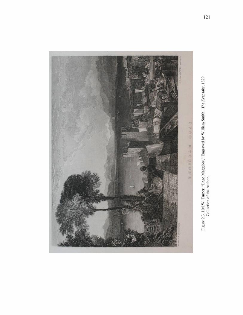
121
Figu
re 2
.3. J
.M.W
. Tur
ner,
“Lag
o M
aggi
ore,
” En
grav
ed b
y W
illia
m S
mith
. Th
e K
eeps
ake,
182
9.
Col
lect
ion
of th
e A
utho
r.
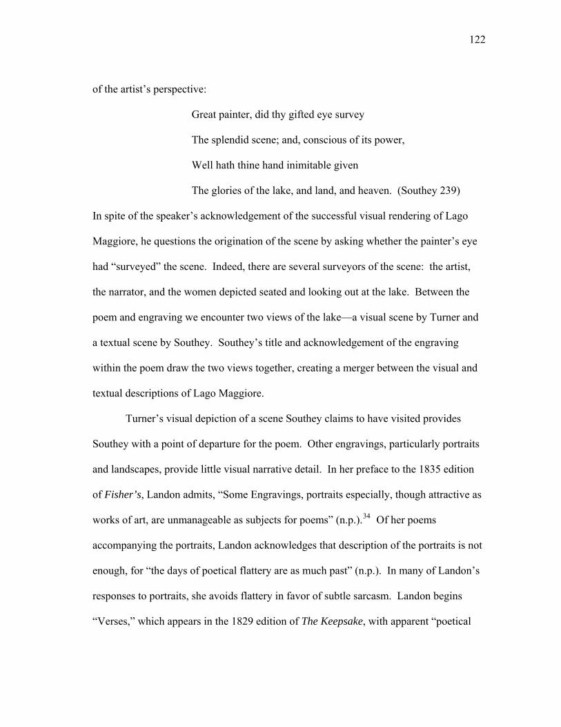
122
of the artist’s perspective:
Great painter, did thy gifted eye survey
The splendid scene; and, conscious of its power,
Well hath thine hand inimitable given
The glories of the lake, and land, and heaven. (Southey 239)
In spite of the speaker’s acknowledgement of the successful visual rendering of Lago
Maggiore, he questions the origination of the scene by asking whether the painter’s eye
had “surveyed” the scene. Indeed, there are several surveyors of the scene: the artist,
the narrator, and the women depicted seated and looking out at the lake. Between the
poem and engraving we encounter two views of the lake—a visual scene by Turner and
a textual scene by Southey. Southey’s title and acknowledgement of the engraving
within the poem draw the two views together, creating a merger between the visual and
textual descriptions of Lago Maggiore.
Turner’s visual depiction of a scene Southey claims to have visited provides
Southey with a point of departure for the poem. Other engravings, particularly portraits
and landscapes, provide little visual narrative detail. In her preface to the 1835 edition
of Fisher’s, Landon admits, “Some Engravings, portraits especially, though attractive as
works of art, are unmanageable as subjects for poems” (n.p.).34 Of her poems
accompanying the portraits, Landon acknowledges that description of the portraits is not
enough, for “the days of poetical flattery are as much past” (n.p.). In many of Landon’s
responses to portraits, she avoids flattery in favor of subtle sarcasm. Landon begins
“Verses,” which appears in the 1829 edition of The Keepsake, with apparent “poetical
123
flattery.” The poem begins, “Lady, thy face is very beautiful,” but quickly shifts to a
subtly sarcastic tone that notes “there is nought/About thee for the dreaming minstrel’s
thought” (Landon 121). The woman’s beauty becomes nothing worth the minstrel’s, and
perhaps even the poet’s, time. Hoagwood and Ledbetter note that Landon’s treatment of
the engraving of the Duchess of Bedford in “Verses” “amounts to sarcasm” (Keepsake
n.p.). The sarcasm is apparent textually in several of the poem’s lines and is enhanced
by the engraving’s representation of a contemporary and scandalous woman. Ekphrasis
strengthens the sarcasm in the poem through the relationship between poem and
engraving, and the engraving and the real Duchess.
Landon has the benefit of reality in trying to construct a poetical response to the
portrait of the Duchess of Bedford. Numerous portraits in the annuals are of historical or
contemporary figures, thereby providing writers with a history from which to build their
poetic response. Other engravings depicting anonymous exotic women in exotic locales
provide writers with enough suggestion of a visual narrative from which to build a
textual response. Most anonymous portraits provide writers with no history to build
upon save any intimation made by the engraving’s title. For example, the simplicity of
the engraving of “The Sisters” in the 1835 edition Heath’s Book of Beauty stands in stark
contrast to the annual’s images of beautiful women in luxurious fabrics captured in detail
in mezzotint prints. Other portraits in the edition at least provide creative titles or
information regarding the pictured woman’s rank, title, location, etc. In contrast, “The
Sister’s” drawing-like quality provides few details—visual or otherwise—for the author.
Blessington, with little visual detail to go on, weaves a conversation between the two
124
sisters about a woman who “sinned—and suffered, loved—and died” (78). The
narrative bears little relevance to the engraving besides its reference to two sisters.
Many poems invite the reader to acknowledge the engraving as the thematic
starting place for the narrative. In the 1836 edition of the Literary Souvenir, Eleanor
Louisa Montague’s “The Discovery” faces an engraving of the same title. The
engraving captures a moment of suspended action, with a mother leaning into her
daughter. A small dog runs into the room, emphasizing the suddenness of the mother’s
arrival and the daughter’s surprise at being discovered with a letter in hand. The poem
uses the scene as a point of departure and builds a narrative based on the suspended
action—the moment of discovery:
Her hands are o’er the paper folded;
She looks not in her mother’s eye;
Her lip into a smile is moulded;
Her cheek the conscious blushes die […]. (Montagu 219)
The poem builds its story upon the visual stasis of the imagery but also the action
implied in the engraving.35 The visual image communicates both stasis and movement,
and the women are frozen in an implicit rather than explicit plot. The poem actively
engages the image with an expanded story, thereby activating any narrative potential
within the image. The engraving’s own narrative is both stagnant and pregnant with
thematic potential, and it provides enough visual details to relay a story of a daughter
caught by her mother with a letter.

125
In poems accompanying landscapes, the image often provides the framework for
a story rather than a narrative to expand. To view Landon’s poem the “Hindoo Temples
and Palace at Madura” in the 1836 edition of Fisher’s with its engraving, as nineteenth-
century audiences would have, is to recognize the absence of Avyia from the engraving,
for Landon writes the Indian poet into the scene. Landon encourages the reader to view
the engraving and calls for the reader to “look on these temples” (50, my emphasis). The
engraving focuses on the Indian landscape, but even the temples in which “a woman’s
triumph mid them is imprest” (Landon 50) are overshadowed by the natural landscape.
Avyia is absent and the temples visually insignificant. To assume that Landon’s
inclusion of the Tamil poet is a “sophisticated formulation in the context of Imperial
aesthetics” (Fernandez, n.p.), as Jean Fernandez does, is to overlook the format of the
annuals and to speculate about authorial intention at the cost of the reality of the poem
and engraving.36 Such an approach also overlooks the role of the artist and engraver
within the “formulation” of “Imperial aesthetics.” Fernandez ignores the construction of
the poem in its relationship to the engraving:
When L. E. L. chose to write of a South Indian poetess, she was therefore
entering into the highly contested territory of Indian-ness. L. E. L.
recognizes the value of this poetess figure for her mission of resistance to
patriarchal aesthetic traditions. […] L. E. L.’s text reads the inadequacies
of the picturesque. The visual text cannot “represent” the hidden, secret,
and feminine power of Indian art. (n.p.)
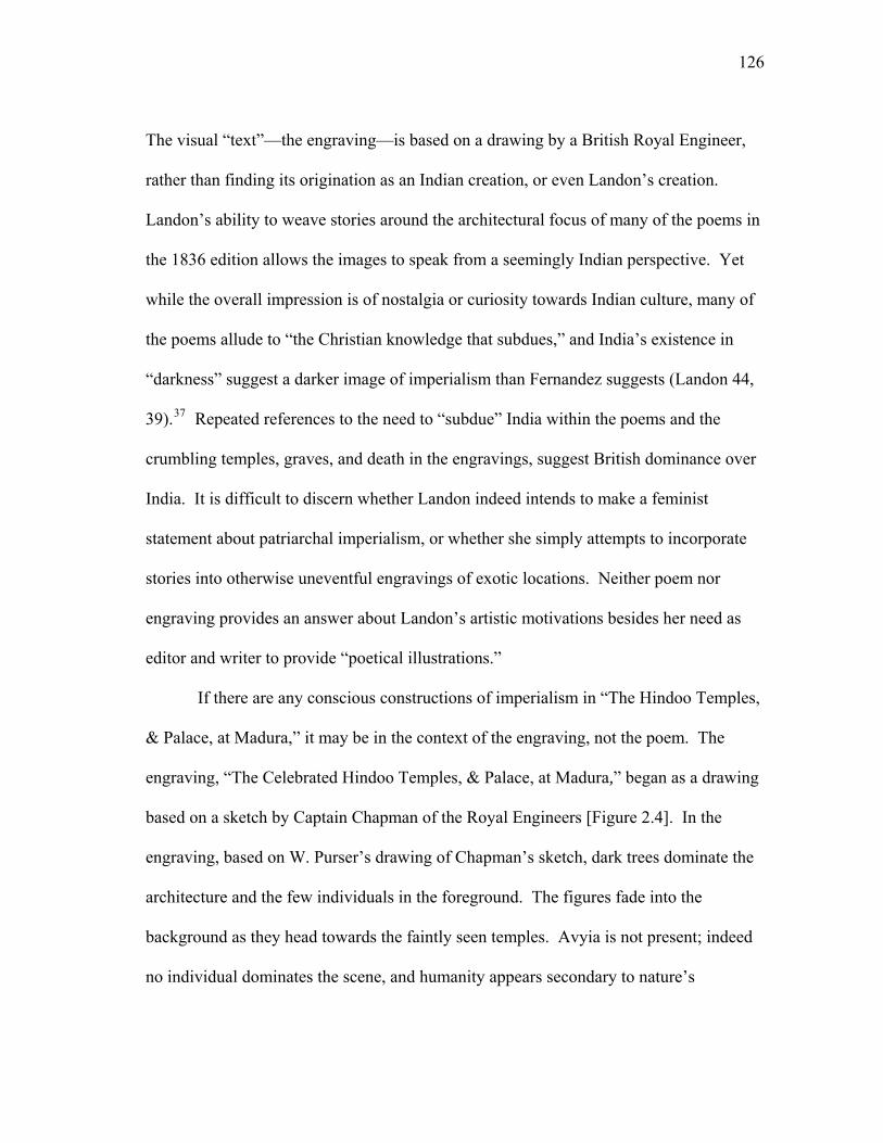
126
The visual “text”—the engraving—is based on a drawing by a British Royal Engineer,
rather than finding its origination as an Indian creation, or even Landon’s creation.
Landon’s ability to weave stories around the architectural focus of many of the poems in
the 1836 edition allows the images to speak from a seemingly Indian perspective. Yet
while the overall impression is of nostalgia or curiosity towards Indian culture, many of
the poems allude to “the Christian knowledge that subdues,” and India’s existence in
“darkness” suggest a darker image of imperialism than Fernandez suggests (Landon 44,
39).37 Repeated references to the need to “subdue” India within the poems and the
crumbling temples, graves, and death in the engravings, suggest British dominance over
India. It is difficult to discern whether Landon indeed intends to make a feminist
statement about patriarchal imperialism, or whether she simply attempts to incorporate
stories into otherwise uneventful engravings of exotic locations. Neither poem nor
engraving provides an answer about Landon’s artistic motivations besides her need as
editor and writer to provide “poetical illustrations.”
If there are any conscious constructions of imperialism in “The Hindoo Temples,
& Palace, at Madura,” it may be in the context of the engraving, not the poem. The
engraving, “The Celebrated Hindoo Temples, & Palace, at Madura,” began as a drawing
based on a sketch by Captain Chapman of the Royal Engineers [Figure 2.4]. In the
engraving, based on W. Purser’s drawing of Chapman’s sketch, dark trees dominate the
architecture and the few individuals in the foreground. The figures fade into the
background as they head towards the faintly seen temples. Avyia is not present; indeed
no individual dominates the scene, and humanity appears secondary to nature’s
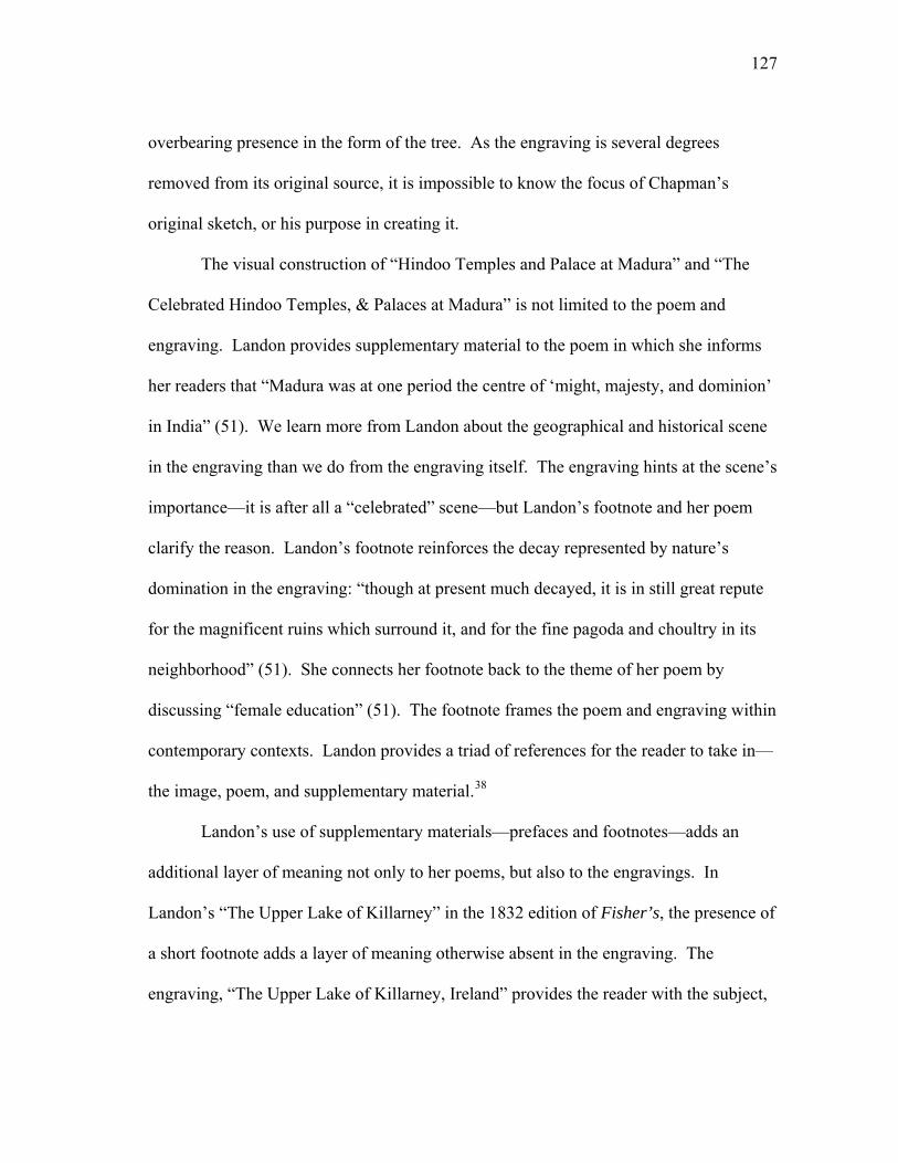
127
overbearing presence in the form of the tree. As the engraving is several degrees
removed from its original source, it is impossible to know the focus of Chapman’s
original sketch, or his purpose in creating it.
The visual construction of “Hindoo Temples and Palace at Madura” and “The
Celebrated Hindoo Temples, & Palaces at Madura” is not limited to the poem and
engraving. Landon provides supplementary material to the poem in which she informs
her readers that “Madura was at one period the centre of ‘might, majesty, and dominion’
in India” (51). We learn more from Landon about the geographical and historical scene
in the engraving than we do from the engraving itself. The engraving hints at the scene’s
importance—it is after all a “celebrated” scene—but Landon’s footnote and her poem
clarify the reason. Landon’s footnote reinforces the decay represented by nature’s
domination in the engraving: “though at present much decayed, it is in still great repute
for the magnificent ruins which surround it, and for the fine pagoda and choultry in its
neighborhood” (51). She connects her footnote back to the theme of her poem by
discussing “female education” (51). The footnote frames the poem and engraving within
contemporary contexts. Landon provides a triad of references for the reader to take in—
the image, poem, and supplementary material.38
Landon’s use of supplementary materials—prefaces and footnotes—adds an
additional layer of meaning not only to her poems, but also to the engravings. In
Landon’s “The Upper Lake of Killarney” in the 1832 edition of Fisher’s, the presence of
a short footnote adds a layer of meaning otherwise absent in the engraving. The
engraving, “The Upper Lake of Killarney, Ireland” provides the reader with the subject,
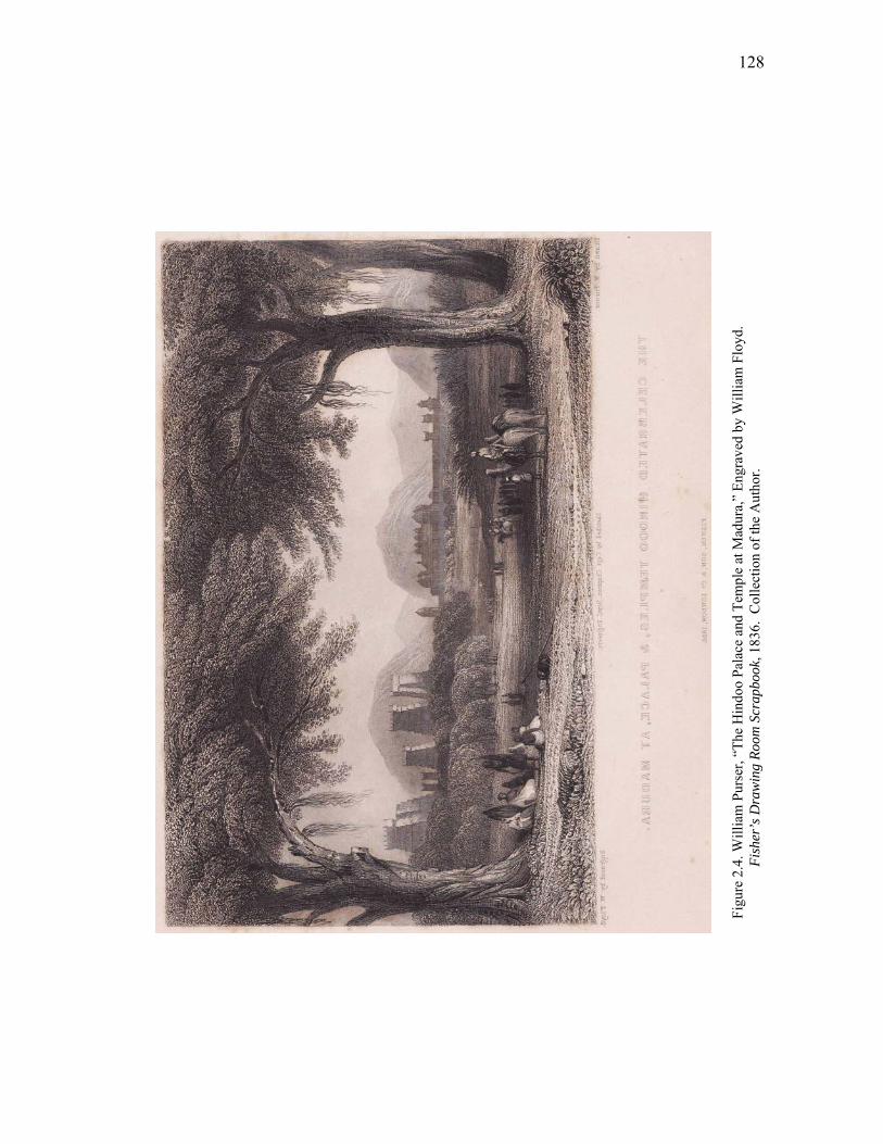
128
Figu
re 2
.4. W
illia
m P
urse
r, “T
he H
indo
o Pa
lace
and
Tem
ple
at M
adur
a,”
Engr
aved
by
Will
iam
Flo
yd.
Fish
er’s
Dra
win
g Ro
om S
crap
book
, 183
6. C
olle
ctio
n of
the
Aut
hor.
129
and the engraving’s subtitle provides the specific vantage point from which the view is
taken, “near the tunnel on the Kenmare Road—Carran Tual in the Distance.” Despite
the specificity of place, Landon avoids a description of the scene and instead weaves a
narrative around the story of Kate Kearney, who is neither identified nor named in the
engraving or poem. The poem questions, “why doth the maiden turn away” (Landon,
“Killarney” 17), but the engraving depicts no maiden; the only human form in the scene
is that of a man pointing his cane towards the lake [Figure 2.5]. Landon’s footnote
justifies her story’s reference to a narrative not depicted in the engraving: “The romantic
story of Kate Kearney, ‘who dwelt by the shore of Killarney,’ is too well known to need
repetition” (“Killarney” 17). Landon does not name Kate in the poem, and she neither
retells the tale nor embarks on a description of the engraving. The poem questions of
Kate’s fate, “how many share such destiny” (Landon, “Killarney” 17), but the answer
relies on the reader’s knowledge of Kate’s destiny. The poem builds its meaning upon
the assumption that readers will associate the location of both the engraving and the
poem with Kate’s well-known story. In addition, the footnote’s proximity to the poem
and engraving transfers its own intertextual references to poetry, song, drama, history,
and art to both the poem and the engraving.
The tale of Kate Kearney, who “lived on the banks of Killarney” (Owenson, lines
1-2), underwent a multi-media revival in the period. Lady Morgan (Sydney Owenson,
1776-1859) popularized Kate’s story in her ballad “Kate Killarney,” which was
published in Twelve Original Hibernian Melodies (1805) and various other collections
of Irish ballads. Thomas Crofton Croker’s (1798-1854) Popular Songs of Ireland (1839)
130
Figu
re 2
.5. W
illia
m H
. Bar
tlett,
“Th
e U
pper
Lak
e K
illar
ney,
Irel
and,
” En
grav
ed b
y W
illia
m L
e Pe
tit.
Fish
er’s
D
raw
ing
Room
Scr
apbo
ok, 1
832.
C
olle
ctio
n of
the
Aut
hor.
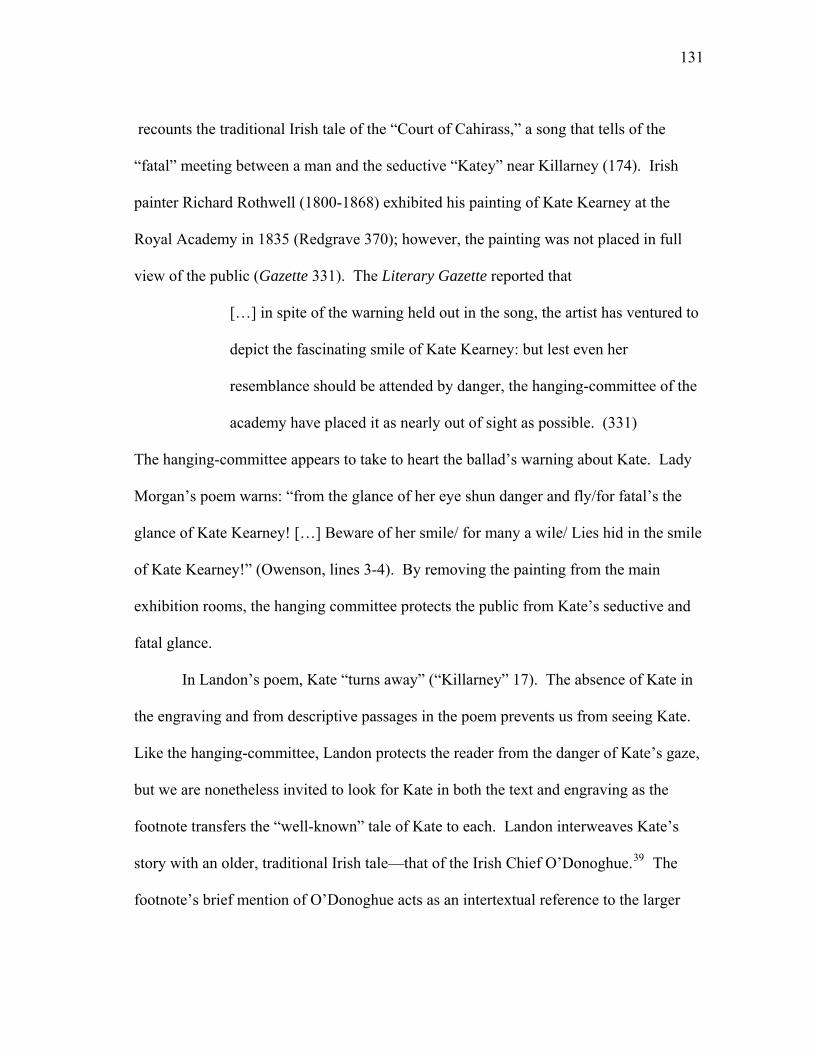
131
recounts the traditional Irish tale of the “Court of Cahirass,” a song that tells of the
“fatal” meeting between a man and the seductive “Katey” near Killarney (174). Irish
painter Richard Rothwell (1800-1868) exhibited his painting of Kate Kearney at the
Royal Academy in 1835 (Redgrave 370); however, the painting was not placed in full
view of the public (Gazette 331). The Literary Gazette reported that
[…] in spite of the warning held out in the song, the artist has ventured to
depict the fascinating smile of Kate Kearney: but lest even her
resemblance should be attended by danger, the hanging-committee of the
academy have placed it as nearly out of sight as possible. (331)
The hanging-committee appears to take to heart the ballad’s warning about Kate. Lady
Morgan’s poem warns: “from the glance of her eye shun danger and fly/for fatal’s the
glance of Kate Kearney! […] Beware of her smile/ for many a wile/ Lies hid in the smile
of Kate Kearney!” (Owenson, lines 3-4). By removing the painting from the main
exhibition rooms, the hanging committee protects the public from Kate’s seductive and
fatal glance.
In Landon’s poem, Kate “turns away” (“Killarney” 17). The absence of Kate in
the engraving and from descriptive passages in the poem prevents us from seeing Kate.
Like the hanging-committee, Landon protects the reader from the danger of Kate’s gaze,
but we are nonetheless invited to look for Kate in both the text and engraving as the
footnote transfers the “well-known” tale of Kate to each. Landon interweaves Kate’s
story with an older, traditional Irish tale—that of the Irish Chief O’Donoghue.39 The
footnote’s brief mention of O’Donoghue acts as an intertextual reference to the larger
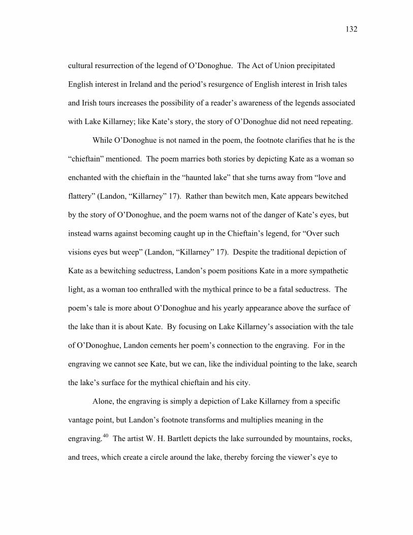
132
cultural resurrection of the legend of O’Donoghue. The Act of Union precipitated
English interest in Ireland and the period’s resurgence of English interest in Irish tales
and Irish tours increases the possibility of a reader’s awareness of the legends associated
with Lake Killarney; like Kate’s story, the story of O’Donoghue did not need repeating.
While O’Donoghue is not named in the poem, the footnote clarifies that he is the
“chieftain” mentioned. The poem marries both stories by depicting Kate as a woman so
enchanted with the chieftain in the “haunted lake” that she turns away from “love and
flattery” (Landon, “Killarney” 17). Rather than bewitch men, Kate appears bewitched
by the story of O’Donoghue, and the poem warns not of the danger of Kate’s eyes, but
instead warns against becoming caught up in the Chieftain’s legend, for “Over such
visions eyes but weep” (Landon, “Killarney” 17). Despite the traditional depiction of
Kate as a bewitching seductress, Landon’s poem positions Kate in a more sympathetic
light, as a woman too enthralled with the mythical prince to be a fatal seductress. The
poem’s tale is more about O’Donoghue and his yearly appearance above the surface of
the lake than it is about Kate. By focusing on Lake Killarney’s association with the tale
of O’Donoghue, Landon cements her poem’s connection to the engraving. For in the
engraving we cannot see Kate, but we can, like the individual pointing to the lake, search
the lake’s surface for the mythical chieftain and his city.
Alone, the engraving is simply a depiction of Lake Killarney from a specific
vantage point, but Landon’s footnote transforms and multiplies meaning in the
engraving.40 The artist W. H. Bartlett depicts the lake surrounded by mountains, rocks,
and trees, which create a circle around the lake, thereby forcing the viewer’s eye to
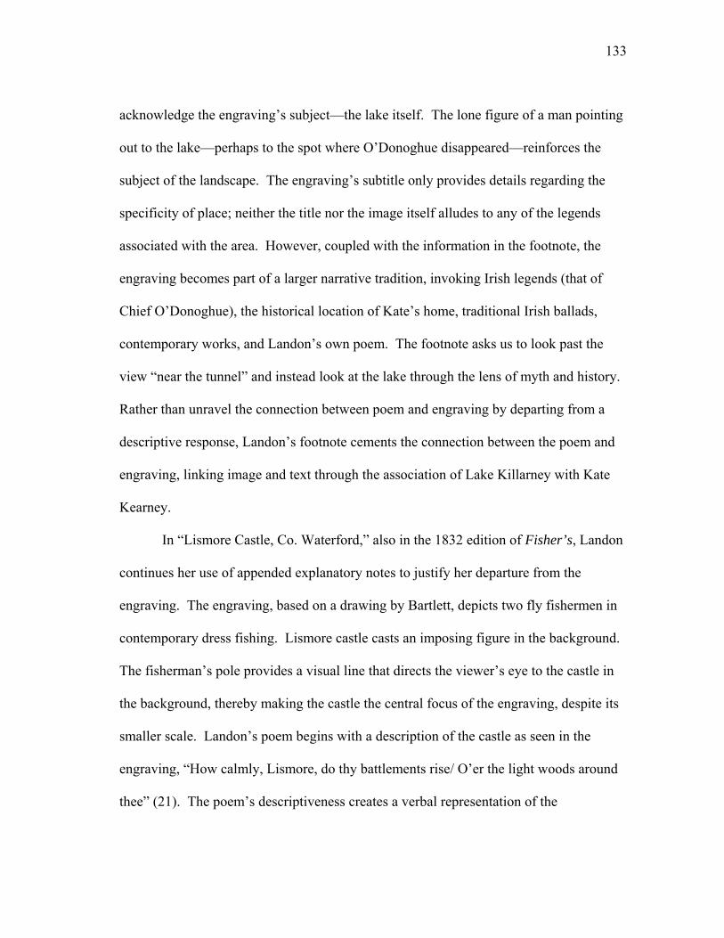
133
acknowledge the engraving’s subject—the lake itself. The lone figure of a man pointing
out to the lake—perhaps to the spot where O’Donoghue disappeared—reinforces the
subject of the landscape. The engraving’s subtitle only provides details regarding the
specificity of place; neither the title nor the image itself alludes to any of the legends
associated with the area. However, coupled with the information in the footnote, the
engraving becomes part of a larger narrative tradition, invoking Irish legends (that of
Chief O’Donoghue), the historical location of Kate’s home, traditional Irish ballads,
contemporary works, and Landon’s own poem. The footnote asks us to look past the
view “near the tunnel” and instead look at the lake through the lens of myth and history.
Rather than unravel the connection between poem and engraving by departing from a
descriptive response, Landon’s footnote cements the connection between the poem and
engraving, linking image and text through the association of Lake Killarney with Kate
Kearney.
In “Lismore Castle, Co. Waterford,” also in the 1832 edition of Fisher’s, Landon
continues her use of appended explanatory notes to justify her departure from the
engraving. The engraving, based on a drawing by Bartlett, depicts two fly fishermen in
contemporary dress fishing. Lismore castle casts an imposing figure in the background.
The fisherman’s pole provides a visual line that directs the viewer’s eye to the castle in
the background, thereby making the castle the central focus of the engraving, despite its
smaller scale. Landon’s poem begins with a description of the castle as seen in the
engraving, “How calmly, Lismore, do thy battlements rise/ O’er the light woods around
thee” (21). The poem’s descriptiveness creates a verbal representation of the
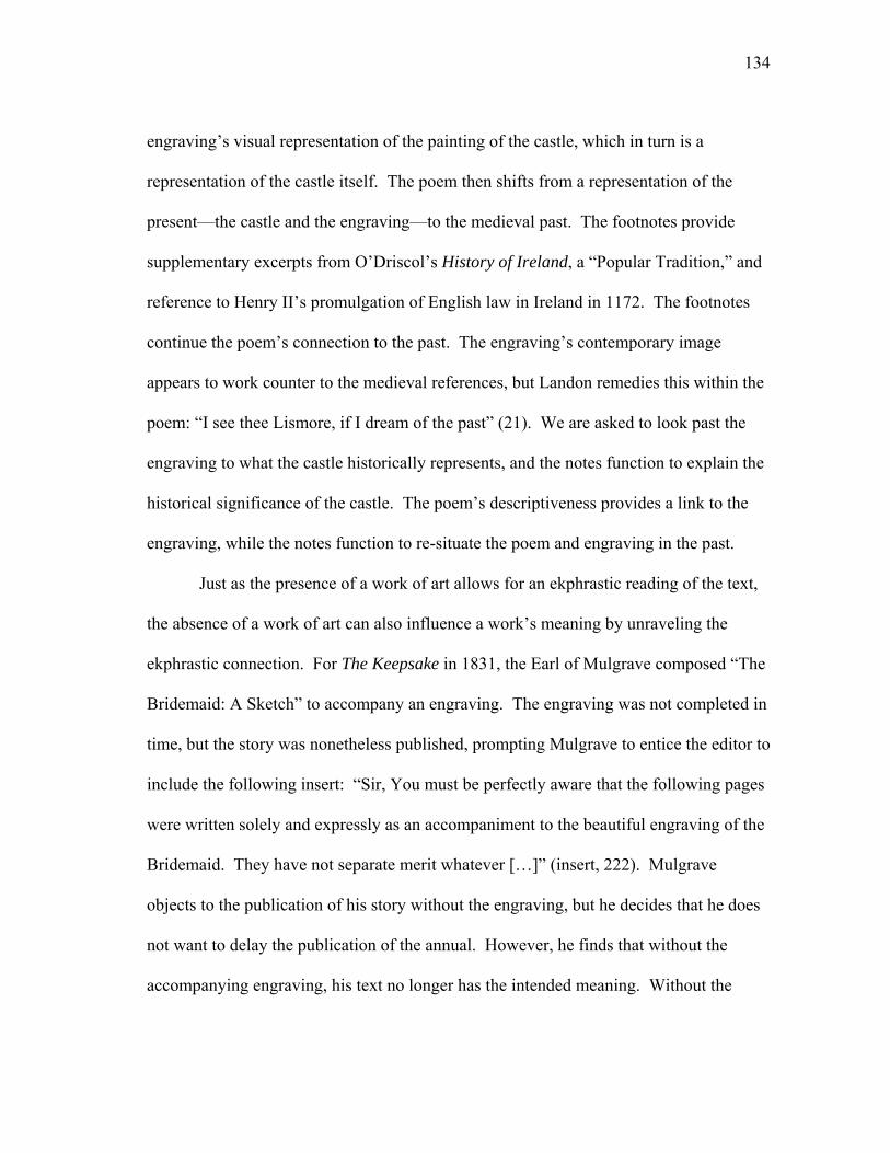
134
engraving’s visual representation of the painting of the castle, which in turn is a
representation of the castle itself. The poem then shifts from a representation of the
present—the castle and the engraving—to the medieval past. The footnotes provide
supplementary excerpts from O’Driscol’s History of Ireland, a “Popular Tradition,” and
reference to Henry II’s promulgation of English law in Ireland in 1172. The footnotes
continue the poem’s connection to the past. The engraving’s contemporary image
appears to work counter to the medieval references, but Landon remedies this within the
poem: “I see thee Lismore, if I dream of the past” (21). We are asked to look past the
engraving to what the castle historically represents, and the notes function to explain the
historical significance of the castle. The poem’s descriptiveness provides a link to the
engraving, while the notes function to re-situate the poem and engraving in the past.
Just as the presence of a work of art allows for an ekphrastic reading of the text,
the absence of a work of art can also influence a work’s meaning by unraveling the
ekphrastic connection. For The Keepsake in 1831, the Earl of Mulgrave composed “The
Bridemaid: A Sketch” to accompany an engraving. The engraving was not completed in
time, but the story was nonetheless published, prompting Mulgrave to entice the editor to
include the following insert: “Sir, You must be perfectly aware that the following pages
were written solely and expressly as an accompaniment to the beautiful engraving of the
Bridemaid. They have not separate merit whatever […]” (insert, 222). Mulgrave
objects to the publication of his story without the engraving, but he decides that he does
not want to delay the publication of the annual. However, he finds that without the
accompanying engraving, his text no longer has the intended meaning. Without the
135
insert, the reader would be none the wiser, for despite descriptive passages in the story,
there is nothing in the text to direct the reader’s attention to a visual counterpart to the
text. Without the public’s access to or awareness of the engraving, the ekphrastic-type
meaning of the story falters, and the story becomes just a story, rather than a story with a
visual partner.
Within the annuals, poetry is the most prevalent textual companion to
engravings, but short stories are numerous in annuals like The Keepsake. The annuals’
short stories are not ekphrastic in the poetic tradition, but their relationship to their visual
counterpart is not that of text to illustration. Rather, as the image predates the story in
most cases, the text in the annuals’ short stories provides a “verbal representation” of the
“graphic representation” of the engraving. Through thematic similarities, descriptive
passages, and through its mere placement near an engraving, the annuals’ prose, like its
poetic sister, enters into dialogue with its accompanying images. The presence of short
stories in the annuals is in itself significant, as the annuals “allowed for the development
of the short story at a time when the genre was not yet fully shaped” (Ledbetter,
“Lucrative” 215). As with ekphrastic poetry, the relationship between prose and picture
is a complicated one, and the relationship triggers a dialogue between media that is
reminiscent of that in ekphrastic texts. The traditional placement of engraving and poem
in close proximity within the annuals seals the ekphrastic relationship between media.
Shared titles between engraving and poetry rhetorically enforce this relationship.
Despite this spatial relationship, the connection between text and image is not always
136
clear. The static in conversation between text and image is especially evident in the
annuals’ short stories and longer poems.
Shelley’s short story “The Elder Son” in Heath’s Book of Beauty (1835) has, at
first glance, a questionable relationship to its accompanying engraving. The story is
paired with an engraving titled “Ellen” that depicts a young woman holding a book.41
The title of the story and the engraving share no similarities and there is nothing in the
opening paragraphs to aid the reader in making a connection between text and image. A
textual reference to the engraving does not occur until after fifteen pages of the story
have passed, and Ellen—the subject of the engraving—is not named as the first-person
speaker of the narrative until thirteen pages after the start of the story.42 When Shelley
does refer to the engraving, she weaves its creation into the story, thus inviting the reader
to make the connection between image and text. Ellen recounts that “as I indulged in
reverie, my head resting on my hand, my book falling from my fingers, my eyes closed;
and I passed from the agitated sense of life and sorrow into the balmy forgetfulness of
sleep” (Shelley 109). The passage aptly describes the posture of the woman in the
engraving, but it occurs at a spatial distance from the image. Shelley remedies this
distant association by weaving the creation of the image into the narrative. Clinton,
witness to Ellen’s repose, makes a “hasty sketch” of her sleeping which is reminiscent of
the image of Ellen in the engraving (Shelley 109); Clinton’s sketch provides a textual
cue to the reader to remember the engraving. When Ellen awakes, she finds the sketch
“beyond [their] contract” and asks Clinton to relinquish the sketch (Shelley 109-110).
Clinton willingly does so, and he parts from Ellen with “no memorial beyond a
137
remembrance which he could not destroy” (Shelley 109). In reclaiming the sketch, Ellen
seeks to preserve the privacy and uniqueness of her image. In contrast, the annual’s
engraving is very much a public and distributable work of art.43
The placement of the engraving in other annuals does not occur at the beginning
of the story or poem but rather near a relevant passage of the text. In the preface to
Friendship’s Offering (1832), the editor Thomas Pringle (1789-1834) specifically refers
to one of his own contributions. Pringle notes of “The Fairy of the Lake” that the
[…] design, so far as it can claim originality, is exclusively the Artist’s
own; the corresponding passage of the poem which accompanies it,
having been introduced on purpose, and very recently—although some
parts of the same poem were written many years ago. The ‘Dream of
Fairy-Land,’ in truth, was originally a mere juvenile flight of fancy—a
school-boy’s reverie—without any definite aim, but […] the idea of an
allegorical application was suggested by this picture; and thus flutters
forth with painted wings […]. (vii)
Pringle tries to distance himself from the contemporary engraving by noting that the
poem’s creation spans twenty years, and while he acknowledges the originality of the
artist’s design, he invites a connection to the artwork by providing a “corresponding
passage.” The poem precedes the engraving by several pages, thus establishing itself as
the primary medium. The delayed placement of the engraving appears purposeful, as it
appears adjacent to a passage of the poem that describes the scene depicted. Regardless
of which medium came first, the passage’s proximity to the engraving invites an
138
ekphrastic reading of the poem. Pringle’s mention of his poem in the preface encourages
this connection, and he admits that his poem fluttered “forth with painted wings” only
after the “idea of an allegorical application” was suggested by the picture. As with
Coleridge in the “Garden of Boccacio,” Pringle does not shy away from his poem’s
indebtedness to art.
With Pringle’s “Fairy of the Lake” and Scott’s “My Aunt Margaret’s Mirror,” the
placement of the engraving alongside a relevant portion of text encourages the reader to
acknowledge both text and picture. Other poems use rhetoric to invite the reader to look
upon the engraving. Landon’s “Henry IV to the Fair Gabrielle” begins with a
description of the engraving by referring to the scene’s action. The king appears to put
aside Gabrielle’s veil in the engraving, and the poem begins accordingly, “Nay, fling
back that veil” (75). Felicia Hemans’ “Evening Prayers” not only incorporates the
setting of its accompanying engraving into the narrative, but also repeatedly asks the
reader to “Gaze on” (156). The poem’s repetition of the word “gaze” invites the reader
to “gaze” upon the engraving. The concept of looking is a prevalent theme in many of
the annuals. In the 1836 edition of Fisher’s, many of Landon’s poems invoke the
tradition of looking from the perspective of a tourist, and this theme begins with the
frontispiece depicting a gathering of tourists at Niagara Falls. 44 The continuation of the
theme of looking is apparent in the engraving of The Cloisters, Fountain’s Abbey, which
likewise depicts a gathering of contemporarily dressed tourists exploring. A footnote to
Landon’s poem provides a textual tour of the abbey complete with architectural details
(41). In the engraving “Warkworth Hermitage, Northumberland,” a tour guide is
139
depicted pointing the hermitage out to a group of individuals. Landon’s poem balances
description with a narrative of the hermitage’s history, and her supplementary footnote
provides everything from architectural details to the hermitage’s location on the Coquet
River (13). These moments make the connection between media explicit and difficult to
overlook. Just as Hemans’ poem invites the reader to “gaze on,” Landon’s poems and
explanatory notes encourage the reader to look, and accordingly, to be like the
individuals in the images tourists of the scene.
Whether the text bids us to look or whether the spatial proximity of text and
image forces us to look, the relationship between picture and text within the literary
annuals is difficult to avoid. Whether in a poem that reluctantly responds to yet another
portrait or in a short story that incorporates descriptive prose to refer to a landscape,
most of the annuals’ literature works in conjunction—but not necessarily in harmony—
with its accompanying image. The ekphrastic tradition thrives in the annuals’ poetry,
and the annuals’ inclusion of art provides the reader with the benefit of witnessing the
interaction between media firsthand. The focus on the visual within the annuals reminds
readers of the multiplicities of meanings inherent in the genre, for text, image, and the
combination of text and image all contribute to the overall meaning of the work. To
overlook the relationship between text and engraving is to look for meanings that may
not exist, as the relationship between the two media may undermine definitive meanings
or generate new ones. The annuals’ text exists in a format that invites the reader to both
see and read the work, and in doing so, we may learn to celebrate rather than ignore the
tensions within.
140
Perhaps the true originality of the annuals is their successful façade of originality.
The illusionary nature of the genre—the promotion of recycled works, copies of original
works, the bindings’ faux silk covers, etc—requires that we look carefully at the annuals
and that we look with an awareness of the production processes that create the illusion of
originality. Indeed, the production of the annuals relies on the ability of the finished
product to represent what it is not—an original work of art. In this unoriginality is the
undeniable reality of the annuals as a prevalent and powerful cultural artifact of the
nineteenth century. Rather than dismiss the annuals as products of mass-production and
popular culture, our designation of the annuals as cultural artifacts opens up the
opportunity to study further the interaction of text and image within print culture.
Despite flashier trappings and an increase in the number of engravings per
edition of most of the annuals, by the 1850s, the public had seen too much of the
annuals. By the 1830s, the quality of the engravings began to decline and the annuals’
readership shifted to a primarily female audience (Hootman, Index). As early as 1828, a
reviewer in the Monthly Review observed that the market was heading towards
saturation:
[…] the competition cannot be but useful to the public, but we apprehend
it will not be equally so to all the publishers, for it is almost impossible
that an adequate sale can be found for each of the works of this
description which have lately issued from the press. (541)
Publishers would make adequate sales well into the Victorian era, but by the 1850s, the
annuals’ popularity fizzled out. Harry Hootman observes that in 1832 the annuals sold
141
7,078 copies, but that by 1847 the annuals’ sales declined to only 1,587 (Index). Edged
out of the market by changing tastes and an emerging tide of Victorian magazines and
literary miscellanies (Hutchison 474), the annuals disappeared from readership and
critical view for decades. As the annuals became less of a reputable outlet for
established writers, writers like Scott sought other means to position their work in a
marketplace that still expressed an interest in visual materials. As the literary annuals
began their decline, the rise of the novel prompted an increasing demand for illustrated
books. Illustrated books, like the annuals, present an element of illusion by promising
originality through the pairing of text and image. For some texts, this promise proves
profitable; for others, the power of visual imagery to communicate its own meaning
presents consequences for the text as a whole. Like the literary annuals, illustrated
books invite us to read and see the work and as we look, to question the consequences of
the interaction of media upon the meaning of the work.
142
Notes
1. The Flowers of Loveliness proves to be an exception to the usual format of
engraving preceding the text. In Flowers, the engravings were designed after the poems
(Hawkins 21). Furthermore, not all of the literature in the annuals is accompanied by an
engraving.
2. Margaret Linley suggests that Landon “recontextualizes and embellishes” the
engravings, and as a result of this recontextualization she argues that Landon’s poems
give the engravings new life (63). Yet this “new life” depends on the existence of the
engraving. Lee Erickson also dismisses the contextual relationship between poems and
engraving and observes, “much of the poetry in the Annuals simply described the
engraved plates” (41). Landon’s work may show some apathy to the multitude of
engravings to which she was tasked with responding to, but her poetic “illustrations”
demonstrate the complexity of meaning within ekphrastic works.
3. As he did with Gillray and Cruikshank, Thackeray distinguishes between
“genius” and the commercial artist, decrying of Landon that “An inferior talent […]
must sell itself to live—a genius has higher duties; and Miss Landon degrades hers”
(763). The writers of the Literary Gazette, however, expressed their appreciation of the
“exhaustless versatility” of Landon’s “genius” (803).
4. Daniel A. Bose’s echoes Thackeray and declares that there is “hardly a
memorable instance in the Annuals of a first-rate illustration to a first-rate poem” (39).
5. Daniel Riess suggests that Landon later felt that she “prostituted her poetic
talents for money and fame by publishing in the annuals” (820); however, he also notes
143
that “her willingness to participate in degraded or commercialized literary venues fills
many with antipathy and disgust, yet that very willingness defines her importance in
English literary history” (824).
6. Margaret Linley argues that Landon’s poems seem to “have little affinity with
engravings,” but concedes that her poems demonstrate “an astonishing ability to turn the
adversities of the book trade into creative material” (64).
7. It is difficult to believe that the annuals single-handedly “lowered poetic
standards,” or that by including engravings the annuals forced the subordination or
prostitution of a writer’s talent. Such judgments reflect not only stereotypes about the
commercial nature of the relationship between media in the annuals, but also present a
critical perspective blinded by biases against mass-produced literary products. Rather
than condemn the annuals for their commercial appeal, it is relevant to question why the
annuals and engravings were so popular. While the public acceptance of a work does
not denote its aesthetic value, it does suggest the need to evaluate the work in terms of
its cultural importance. The reader’s perspective of encountering text and image together
is a valid—and valuable—subject to study for what it reveals about the period’s print
culture. Accordingly, recent work by Hoagwood, Ledbetter, and O’Dea has begun to
turn attention to the relationship between text and image within the annuals.
8. In the early-nineteenth century, several factors—such as the cost of
papermaking, the Napoleonic Wars, the Book Trade Crisis (1826), the Great Reform Bill
(1832), and changes in taxation—influenced the overall cost of the production of books
(Eliot 28). As the cotton industry became mechanized, there was an increase in the
144
availability of rags for paper, and as supply increased, the cost of books decreased
(Erickson 7). The invention of the Fourdrinier Machine further mechanized
papermaking, allowing for faster and cheaper production of paper (Feather 6). The iron
press increased book-making productivity, but publishers were still faced with the need
to composite type—a time consuming and expensive project (Feather 7). Seeking faster
ways to get news in print, newspapers embraced the steam-powered press by 1814, but
the book industry was slower to embrace the new technology (Feather 7).
9. Several critics, such as Linley, have embarked on the study of the act of
giving and receiving literary annuals. Linley notes that “bestowing a present of a gift
book allows for the self-conscious staging of sympathy and affection as a semiotic
dynamic at play in the performance and intervention in the fantastic world of beautiful
things” (57).
10. Sypher notes that the annuals “displayed the wealth and taste of the host and
hostess, and offered a subject at hand for conversation with visitors and guests” (122).
While circulating portfolios of graphic satire likewise provided fodder for conversation,
their portfolio format allowed them to be removed at will when discriminating company
entered. In contrast, the annuals were meant to be displayed and seen in the in public
receiving room of the house.
11. Stephenson notes that the annuals “were designed, like a piece of furniture,
for a particular space in the early nineteenth-century home, a space that was specifically
coded feminine, and, since intended not for use and entertainment of the family but for
the entertainment of visitors, a space that became the main stage upon which to act out
145
the rituals of middle-class social life” (132). The annuals, then, become major actors in
the staged domestic sphere.
12. Despite the prints’ appearance as a new decorative object, Basil Hunnisett
observes, “the very proliferation of engravings made them commonplace” (3).
13. In this light, Ann Hawkins considers the annuals’ engravings the “nineteenth
century equivalent of clip art” (21).
14. The separation of text and image on the page is a conventional arrangement
as letterpress and engravings were printed separately.
15. While Watts was negotiating with Henry William Pickersgill (1782-1875)
for permission to have his painting the Oriental Loveletter (1824) engraved, Pickersgill
sold the painting (Watts 255), leaving Watts with the need to look elsewhere for suitable
art.
16. For contemporary artists, a mention in a poem by Landon provided a highly
sought after publicity opportunity. Eric Adams notes that “the rendering of successful
exhibition pictures into verse was Miss Landon’s specialty; her attentions were the surest
sign that a painter had arrived” (51).
17. Many engravings also include information about the publishers of the
engravings. The “publishing line” usually appears centered underneath the title in small
letters (Hunnisett 52).
18. While the art of engraving has been criticized for this practice, Hunnisett
reminds readers that painters often practiced the same division of labor within their
studios (55).
146
19. The division of labor in engraving ateliers allowed engravers to develop
specializations and sped up the overall engraving process (Heath 58).
20. Bernard Denvir notes that “never before had the public been able to avail
themselves of so many books about art, and never before had there been so many
anxious to do so” (14).
21. Observing that many annuals are “deteriorating” in the “quantity and
quality” of their illustrations, Watts strove to refocus his annual on art while also
boasting of the quality of his annual’s engravings.
22. For example, the 1832 Forget-Me-Not includes an engraving of Don Juan
and Haidee from Byron’s Don Juan and the 1834 Friendship’s Offering provides an
engraving of “The Chieftain’s Daughter” accompanying an excerpt from Scott’s
Waverley novels.
23. Moorman suggests that growing financial demands prompted Wordsworth to
publish in The Keepsake (453). In a letter to a friend, Dora Wordsworth notes that:
“Father […] could not feel himself justified in refusing a so advantageous offer—
degrading enough I confess but necessity has no law, and galling enough but we must
pocket our pride sometimes and it is good for us” (qtd. in Moorman 453). In
“pocketing” his pride, Wordsworth also pocketed money. Wordsworth eventually
disentangled his name from the annuals, and Manning suggests that this decision was
based on a “contractual disagreement” with the editors, rather than his disdain of the
annuals (60).
147
24. The aggressiveness of editors in securing the participation of well-known
writers has been well documented. For details of Heath and Reynolds’s tour through the
country courting authors, see Scott’s journal and the letters of Coleridge and Southey.
25. Sypher notes that Landon’s “initialist signature” is “almost part of the genre”
(121).
26. The Countess of Blessington served as editor and contributor for the
following annuals: Heath’s Book of Beauty’s (1834-1849), Gems of Beauty (1836-
1840), Flowers of Loveliness (1836-1837), and The Keepsake (1841-1850) (Hootman
33-34). Norton assumed editorial duties for Fisher’s after Landon’s death in 1838
(Hootman, Index), and she also edited and contributed to The English Annual (1835-
1838), and The Keepsake (1836) (Hootman 33-34).
In an attempt to disassociate her business—and public—identity from her
personal self, Harriet Devine Jump suggests that Gardiner worked to separate her public
scandals from her professional role as writer and editor by writing “moralistic” poems in
the annuals (9). In contrast to Gardiner’s attempt to disassociate herself from her work,
Landon’s sentimental and emotional poems invite a comparison to her life; however,
Leighton reminds us that Landon was a “drawing room attraction by night and a hack
journalist by day,” writing for hours, not out of inspiration, but out of the necessity to
financially survive (52). For a detailed discussion of women writers and the annuals, see
work by Patricia Pulham, Jump, and Hoagwood and Ledbetter.
27. Pulham argues that “when women write of women” the subject and the poet
“blur into one” (28). To Pulham, this process is “exacberated by the presence of the
148
female body […] there is little distinction to be made between the female poet and the
female ‘object’ depicted in the engravings for both are essentially ‘on display’ and
eroticized in the process” (28).
28. Hoagwood and Ledbetter note that the tendency to equate the “page with the
person” and to insert a “supplement of personal feeling” into texts is detrimental to our
understanding of works as cultural artifacts (12). The fiction of “[…] personal feeling
[…] disguises commodity-production as personal feeling. A related critical fiction is the
illusion that literary commodities are themselves thoughts and feelings, rather than
manufactured ones” (Hoagwood and Ledbetter 5). Landon’s poems, in particular, often
disguise the commodity nature of her work by participating in the period’s trend for
sentimental women’s writing. Many of her poems are quite sentimental, even if the
accompanying engraving communicates little emotion. Landon’s poems respond to the
expectations of her role as a woman writer in a market with an expanding female
readership, and “the love, passion and suffering that became associated with L.E.L.
through her poems became entangled with the life of Landon” (Hoagwood and Opdycke
6).
29. The financial needs of writers like Coleridge, Scott, and Shelley are often
cited as the basis for their participation in the annuals in an effort to excuse their
participation in such a commercial venture. Yet differentiating between a writers’
individual work with that of the annuals on the basis of profit is difficult, for each
product entered the marketplace designed to garner profits and publicity for its creator.
149
30. Coleridge’s letters are a testament to the volatile publishing atmosphere
surrounding the annuals. Hall printed poems in the Amulet without Coleridge’s
permission (752), and Reynolds attempted to secure Coleridge’s employment as a writer
by offering him a financial arrangement pending Coleridge’s agreement to “contribute to
no other Annual” (Coleridge, Letters 754). When Reynolds learned that Coleridge
provided poems to Watts, he amended the condition (Coleridge, Letters 639). Watts,
like Reynolds, attempted to secure Coleridge exclusively. Coleridge’s letters cite
financial need and family responsibilities as his reason for accepting the offers of Heath
and Reynolds (Coleridge, Letters 777).
31. Hoagwood and Ledbetter observe, “sometimes the text has little in common
with the picture except a title, but together they produce a subtext in two languages—
first the engraved art, and then the textual after-image of the visible object” (101). The
dialogue of art and literature communicating together creates an additional subtext.
32. Wendy Steiner’s Pictures of Romance: Form against Content in Painting and
Literature, provides an overview of the narrative power of pictures and text.
33. Admittedly, it is in Watts’ interest to have both poetry and picture speak for
themselves, for if the “embellishments” successfully speak for themselves, they can also
potentially sell for themselves too.
34. Portraits in the annuals ranged from historical figures to contemporary
figures of fashionable society.
35. O’Dea argues that when a “mood” or “scene” is depicted, more is required of
the writer, and he notes “the potential degree of intersection between the verbal and
150
visual texts is implicitly more acute; the ‘scene’ or ‘mood’ the image suggests in itself
that it has been severed from a beginning and a end, cut off from a narrative to which it
naturally belongs” (66). Yet the image’s own narrative builds on this severing and thus
asks the viewer to create their own version of the narrative to which the scene belongs.
36. Fernandez is not alone in writing “personal feeling” into Landon’s poetry in
the 1836 edition. Writing about the “Immolation of Hindoo Widow,” Linley argues,
“Landon expresses an affiliation with the colonized woman that sensationalizes and
universalizes the condition of female oppression” (69). It is prudent to heed Hoagwood
and Ledbetter’s advice against equating the “page with the person” (12).
37. The multiple references to India and South Asia in the 1836 edition
capitalize on the public’s curiosity with the country’s growing empire, a curiosity that
presented an avenue for publishers to make profits. An advertisement at the end of the
annual heralds an upcoming edition of the “Views in the Himalayan Mountains, India”
complete with twenty-five “line engravings on steel” and dedicated to the queen. Eight
additional poems in the 1836 edition refer to Asia or India and alternate between
references to foreign and English scenes.
38. Harris notes that in providing supplementary notes, Landon offers a “well-
rounded” illustration of the engraving (150).
39. The story of the Irish Chieftain O’Donoghue, whose “memory [had] been
cherished by successive generations with affectionate reverence” (Croker, Fairy 172),
was relayed in a recent 1834 republication of Croker’s Fairy Legends and Traditions of
the South of Ireland (1825) and in Hannah Bourke’s poem, “O’Donoghue, Prince of
151
Killarney, a Poem” (1830). In 1829, O’Donoghue’s story was brought to the stage by
playwright James Robinson Planché (1796-1880) in Thierna-Na-Oge, which opened on
Drury Lane to positive reviews (Dramatic Magazine, 68). The 1829 Keepsake includes
a story of “The Legend of Killarney” by Thomas Haynes Bayley.
40. In concert with the rest of the annual, “The Upper Lake of Killarney,
Ireland” participates in the annual’s inclusion of numerous depictions of Irish
landscapes.
41. Hoagwood and Ledbetter suggest that “mimetic images of reading women
become a frequent feature of Keepsake art throughout the years, in a thinly disguised and
conventional advertisement for itself” (120-121).
42 . Of Shelley’s story “The Trial of Love,” O’Dea notes that Shelley
Does not […] overemphasize the engraving in her own tale in an attempt
to force the connection between them. To describe the scene in minute
detail would inflate it out of proportion with the duration of the scene in
the tale […]. Instead, Shelley allows the momentum of the preceding
action to carry the moment, using” visual cues. (68)
Shelley may not “overemphasize” the engraving, but the editor’s placement of the
engraving in the middle of the story next to its textual counterpart does emphasize the
engraving.
43. The contrast between the private nature of the content and the public nature
of the literary form is part of the thematic nature of the annuals.
152
44. Additional poems in the 1836 edition of Fisher’s, such as the “Scenes in
London” series, are also visually based but have no accompanying engraving.
153
CHAPTER IV
“APPROPRIATE EMBELLISHMENTS”:
ILLUSTRATED SUPPLEMENTS TO SIR WALTER SCOTT’S WORK
In a letter dated February 1829, Charles Heath advises Sir Walter Scott that the
success of his republished works depends on the inclusion of images. Heath recognizes
that illustrating Scott’s work would make them “certain of a great sale,” but he reminds
Scott that as his works are “not new works the Plates will be a great attraction” (qtd. in
Heath 54). Heath continues, noting that the “extensiveness” of the sale of Scott’s
“Novels and Tales […] will depend on their excellence both as to design and Engraving”
(qtd. in Heath 54). As Heath was well aware, the reprinting of texts with illustrations
expands the meaning of the existing text by introducing a multi-media dialogue. The
“new” meaning created by expanding the text to include visual images has implications
for the text as a whole. Despite creative marketing and the expansion of the text through
the inclusion of visual counterparts, the finished product is not a new text because it has
entered the market once before. Nonetheless, the republished text depends on the
illusion of originality created through the addition of illustrations for its new success. A
text reissued as an illustrated work must offer some premise of originality in order to
distinguish it from its previously published form.1
The saturation of the market with copies of visual works endangers a work’s
perceived originality, and instead of promoting the originality of their illustrated
154
collections, editors promote visual reality. To make Scott’s work new, editors promise
readers access to real scenes from Scott’s novels and real landscapes from Scotland.
Editors assure readers that the illustrations depict “real life” and “true” views of Scotland
(Wright n.p.), that the illustrations “record real scenes, and not imaginary subjects” (Tilt
n.p.), and that the illustrations relate with “perfect authenticity to the corresponding
relations between the real existing scenes, and their introduction into the Waverley
Novels” (Skene 5-6). In illustrated supplements to Scott’s work, the concept of reality
supplants originality.2 The promise of new realities makes Scott’s work new by
transferring visual meaning back to the text and vice versa, and the editors’ constant
promotion of visual reality works to validate the realities of place, history, and
personages in Scott’s text. At the same time, the illustrations attempt to make Scott’s
work real through representations of fictional characters and actual Scottish locations,
thereby conflating fictional representations with true representations. Detailed histories
of topics ranging from medieval armor to castle halls add validity and reality to the
fiction of Scott’s text. Editorial comments, quotations from Scott’s work, and histories
of places and personages provide ongoing commentaries that seek to justify the
relationship between text and image. In this sense, it is the text—not the images—that
promotes the façade of visual reality.
Text in the illustrated supplements binds the illustrations to the original source
text and to the other illustrations in the supplemental editions. The illustrations, in turn,
represent both the accompanying text and the source text. As with ekphrastic texts, the
dialogue between text and image communicates new and multiple meanings. This
155
dialogue further serves as a reminder of the limits of visual representation and the
tensions inherent in the construction of multimedia works. The format of the
supplemental illustrated works divides images from the entirety of the source text; the
distancing of media increases the risk of ekphrastic alienation. Yet the addition of text—
excerpts from Scott’s work, editorial comments, and shared titles—maintains and
encourages an ekphrastic connection between text and image. The reality-effect
between text and image becomes important in preserving meaning in the supplemental
illustrations.
By boasting of the appropriateness and the reality of the images in relation to the
source text and in relation to Scotland itself, the editors of supplemental illustrated
editions encourage the illusion of textual and visual harmony. The success of this façade
relies on an illustration’s ability to offer something new to the text, and Scott’s
publication history encourages the trend of continually making his work appear original.
When Scott emerged as the “author of Waverley,” he republished authoritative editions
of his novels, editions made new through the addition of supplementary material
(illustrations, revised prefaces, appended introductions, detailed notes and appendices,
etc.) bearing his name.3 Scott understood the period’s demand for visual works, noting
in his journal that “the taste of the town will not be satisfied” without engravings (489).
Scott’s repeated endeavors to illustrate his work—both textually and visually—multiply
our understanding of illustrative material, and Richard Maxwell suggests that Scott’s
works are doubly illustrative—illustrated works and works illustrative of “venerable
tomes or newly written commentary” (2). Scott’s addition of material to his pre-existing
156
works provided new fodder for artists, and Maxwell identifies a “revolution in book
design” that allowed for the illustration of a “supplemental commentary to a poem” that
would have been inconceivable in earlier periods but was “entirely plausible and urgent”
in the 1820s (45).4
Illustrations of Scott’s work are found in traditional illustrated editions—with
frontispieces and vignettes comprising the visual material of the book—and in books
produced independent from the original text. The illustrated editions present picturesque
landscape engravings, portraits, dramatic narrative scenes, and engravings of historical
Scottish regalia that related to Scott and his work. With or without Scott’s participation,
supplemental works including Charles Tilt’s Landscape Illustrations of the Waverley
Novels, with Descriptions of the Views (1832), Rev. G. N. Wright’s Landscape-
Historical Illustrations of Scotland, and the Waverley Novels (1836-1838), and Heath’s
Waverley Gallery of the Principal Female Characters in Sir Walter Scott’s Romances
(1841) rely in part on Scott’s reputation for their publishing success.5 Many of the
editions make liberal use of Scott’s text, and their images illustrate the primary source
and excerpts from Scott’s notes, appendices, and introductions. Several factors, such as
the inclusion of quotations from the novels, the appearance of characters in landscapes,
and the knowledge that we are viewing illustrations tied in some way to Scott’s texts,
work to maintain inescapable connections between text and image.
The republication of writers’ works with illustrations challenges the notion of the
existence of a single authoritative text by expanding the concept of an author’s work to
encompass visual materials. Publishers used the expanding printing industry to generate
157
a Waverley industry, an industry that grew to such an extent that it “becomes difficult to
distinguish the popularity of his [Scott’s] writings from the plethora of Scott-related art
and sub-artistic merchandising” (Wood, “Holiday” 84). Gillen D’Arcy Wood observes
that Scott “tribute industries—sightseeing at Scott locales, and the collection of
Waverley paintings, prints, and even crockery” work to combine our “perception of
Scott the author with ‘Scott’ the visual media brand name,” and he notes that this began
in Scott’s lifetime (174). Nicola Watson argues that Scott designed Abbotsford as “the
site of the writer’s work,” and he “consciously designed” his home to “display his
income and status derived from authorship” and “to exemplify and epitomize his
writing” (91). By positing Abbotsford as a visual representation of himself and his
work, Scott encouraged the designation of Abbotsford as a destination of the “literary
tourist” (Watson 93). Watson suggests that Scott designed Abbotsford as a location
where visitors could see the “Minstrel of the North within the Border landscapes and
settings” of his poetry (93-94).6 The association of his texts with specific places, such as
the enormously successful The Lady of the Lake (1810) with Loch Katrine, contributed
to a growing tourist industry that sought to make connections between literature and
place (Watson 161), and, in doing so, to make literature visible. Scott’s determination
that Scotland, his family (both canine and human), and his work should be represented
accurately further emphasizes his complicit role in establishing a visual tradition
surrounding himself and his work.7 The establishment of Scott as a “brand name”
occurs in part due to the blending of text and image—whether on crockery or in
illustrated books. Scott—the Wizard of the North—becomes larger than his texts
158
through the pairing of text and image. The publication of supplemental illustrated
editions separate from Scott’s work is indicative of the expanding Waverley industry.
Illustrated supplements to Scott’s work owe their existence in part to
technological advances in the printing industry that improved the ability to pair high-
quality engravings with text. The public’s demand for illustrated works intensified as
illustrated works became more readily available, and by the 1820s the general
expectation was that “every publication … should be illustrated” (Houfe 16). The
expense of copper-plate engravings had previously made illustrated works unaffordable
to the general reading populace due to the limited number of impressions allowed by the
material (Houfe 12).8 Luke Herrmann attributes the financial failure of Scott’s
Provincial Antiquities and Picturesque Scenery of Scotland (1825, 1826), lavishly
illustrated by J. M. W. Turner, to the book’s cost, which was high due to its large
copper-plate engravings (110). The advent of steel-plate engraving allowed for a “new
type of book” (Hunnisett 3)—affordable illustrated books that could meet large
production demands.9 In contrast to the high cost of Provincial Antiquities, which sold
for ₤15 on India paper and ₤8 on regular paper, Robert Cadell’s edition of Scott’s
Poetical Works (1833-1834) with steel engravings sold for 1₤ 15s (Herrmann 196).
Steel engraving, stereotype printing, and cheaper paper heralded a new era of illustrated
works, and these technological improvements helped to make possible the variety of
illustrated editions of Scott’s work. In 1829, the Literary Gazette reports that in
subsequent copies of the Magnum Opus “all of the steel-engraved plates were being cut
in duplicate so that there would be no loss in definition” (886). Duplicity preserves the
159
façade of originality. By duplicating the plates, the publisher promotes the quality of the
work, thereby promising high quality despite its mass-produced status.
During the Romantic period, the definition of “illustration” expands from a form
of textual “elucidation” and “enlightenment” to include “pictorial elucidation of any
subject” and an “embellishment of a literary…book by pictorial embellishment” (OED).
The two forms of illustration—textual and visual—are apparent in much of Scott’s work,
and both forms of illustration ask us to search for what is being illustrated. Gerald
Finley differentiates Turner’s watercolors from his illustrations by suggesting that
illustrations “demand the support of other illustrations” (28). Similarly, Jonathan
Harthan defines illustration “proper” as “a picture tied to a text” (12), and Edward
Hodnett argues that the “primary function of the illustration of literature is to realize
significant aspects of the text, and it must be judged first of all as it succeeds in this
function” (13). Illustrations in supplemental illustrated editions of Scott’s work are
doubly tied to the text—they are tied to their accompanying text, which usually includes
excerpts from Scott’s works, and tied to the absent but omnipresent source text.
By the 1820s, illustrations could determine the success or failure of a work
(Finley 27), and editors sought celebrity artists to help further the success of illustrated
works. The “wide circulation” of the engravings of artists “opened the eyes of a new
generation of artists to the seemingly limitless artistic potentiality of literature” (Altick
41). As contemporary literature became a valid subject for the fine arts, artists began to
have an impact on the literary market, and artists like Thomas Stothard and Robert
Westall “determined the way English literature was to be presented in visual form to
160
readers of illustrated books” (Altick 41). Accordingly, illustrated editions marketed not
only the celebrated name of the “Author of Waverley,” but also the names of the artists,
who were often members of the Royal Academy. Engravers, despite their exclusion
from the Royal Academy, also reached celebrity status, and of his choice of engravers
for The Waverley Album: Containing Fifty-One Line Engravings to Illustrate the Novels
and Tales of Sir Walter Scott (1832), Heath claims that “of their merit, it is superfluous
to say more than” their names (ii). Heath also includes the names of the artists and notes
that their “names are a sufficient guarantee of excellence” (Heath, Waverley ii). 10
It perhaps comes as no surprise that the pairing of literature and engraving in
illustrated books received critical disdain similar to that of the literary annuals. Wood
suggests that for writers the increase in illustrated books “symbolized the spread of an
infantilizing visual medium to the domestic sphere and, more seriously still, the
encroachment of the visual arts into literature’s sovereign domain, the printed book”
(173). Literature’s hold on its sovereignty in the printed medium had been slipping for
centuries, and writers like Scott recognized a future in sharing the throne—at least
temporarily—with their artistic counterparts.11 In negotiations with Cadell on the
subject of Turner’s illustrations, Scott states that if
Mr Turner is to have his way in the illustrations the work will be void of
that propriety which gives interest to an illustrated poem which I conceive
to be the propriety of the union between the press and pencil which like
the parties in a well chosen marriage should be well considered before
hand. (Vol. 11, 493)
161
Scott attempts to maintain his control of the work while recognizing that the work
depends on the union of “press and pencil.” Like a “well chosen marriage,” the pairing
of the arts requires negotiation and compromise between the individuals enjoined in the
commercial and artistic enterprise of producing an illustrated work.
Publishers faced the task of keeping the relationship between writers, artists, and
engravers as harmonious as possible, which proved to be an exhausting endeavor. Of
Cadell’s coordination of the Magnum Opus release,12 Scott observes that the “poor
fellow [Cadell] … looks like one who had been overworked,” and he notes that “keeping
paper makers up to printers, print[er]s up to draughtsmen, artists to engravers, and the
whole party to time, requires the utmost exertion” (Journal 576). Despite his sympathy
for Cadell’s task and his willingness to cooperate with his publisher, Scott sought to
maintain separate spheres for the separate facets of a work: art, engraving, literature,
and publishing. Nonetheless, Scott recognized that each individual needed the other,
proposing that
We should lay our heads together on the subjects as each has his
particular province in which he will have an especial claim to be
consulted. Mr Turner is unquestionably [the] best judge of everything
belonging to art. Your opinion will be necessary with regard to roads
travelling and the arrangement of time …. [and the] Author may be held
the fittest judge of the adaptation of the scenery to the composition. (qtd.
in Holcomb 203-204)

162
In Scott’s plan, each individual maintains his own area of expertise, and his letters
repeatedly reiterate the desire to maintain control over his text.
Scott’s negotiations with Cadell over Turner’s visit to Scotland demonstrate
Scott’s attempt to control visual representations of his work.13 While he concedes that
each of the individuals involved in the work brought his own expertise to the enterprise,
Scott asserts his authority by requiring that he, not Turner or Cadell, choose the Scottish
locations for illustrations. Scott argues that “on this occasion no one but myself perhaps
can make him [Turner] fix on fit subjects … I naturally must know best what will be
apposite to the subject although in the point of art in general I am a poor advisor”
(Letters, Vol. 11, 486). Scott justifies his assertion through his identity as the author of
the text and his firsthand knowledge of Scotland. Scott submits that Turner maintains
the artistic authority in their endeavor, but he proves wary of Turner’s recent
experiments with color and urges modesty in the artist’s addition of color to the
illustrations (Letters, Vol. 11, 493). While Scott maintained some distance from the
artists who adapted his work to visual media, he knew that accurate and appropriate
depictions of his work required that he be at the artist’s “elbow when at work” if
possible (Letters, Vol. 1, 226-227).
Artists clamored for Scott’s patronage, but Scott’s financial situation often
limited the amount of influence he had over the publication of his texts. John Landseer,
writing to recommend his son Charles as a potential artist for “preparing the
embellishments for the forthcoming edition of the Waverley Novels,” can only “guess at
how far” Scott has “deputed to the booksellers” or “retained in [his] own hands the
163
power and responsibility of superintending the accompaniments to this new edition”
(Private Letter-books 248). Landseer vows to be silent if Scott still holds “the reins,”
but he advises Scott to maintain his authority over “those mercenary publishing gentry”
who are “most ignorant of what they’re most assured, namely, the Science of adapting
Fine Art to Literature” (Private Letter-books 248). Landseer places the publisher outside
the process of adaptation and identifies the author and artist as the authority figures for
the illustrated text. Scott’s letters attest to his continued attempts to maintain some
semblance of authorial control over publications carrying his name, and John Sutherland
suggests that despite Scott’s financial shortfalls and the loss of control over his
copyrights, he “kept his publisher [Cadell] on a very tight rein” (204).
While Landseer bypasses the publisher in soliciting Scott for work for Charles,
the publisher, not the author, usually chose the illustrators for a work (Hodnett 10). An
artist’s involvement in the relationship between publisher and author often pitted them
against varying purposes and egos, and many artists resented the intermediary role of the
professional engraver. The desire to preserve control over a work and receive credit for
an original work of art meant that an increasing number of artists learned to engrave
their own work, and in doing so appear to preserve some impression of originality
(Hunnisett 35).14 However, Basil Hunnisett notes that “any engraving is but a copy of
an original, even if the exemplar originates with the engraver, i.e. he has both drawn an
engraved the work” (34). Since an engraving is no longer the original work it represents,
but rather something new, issues of artistic ownership often arise.
d
164
For artists like Turner, the engraving trade provided a reliable income source, but
the market also carried a set of risks involving the distribution of artists’ works. Turner’s
struggles to maintain control over copper-plate engravings of his work epitomize the
difficulty in identifying an original work of art in illustrated editions. Tilt purchased
Turner’s original copper plates from Provincial Antiquities and then republished
Turner’s work on a smaller scale, without Turner’s permission. The new engravings
appeared in Illustrations, Landscape, Historical, and Antiquarian to the Poetical Works
of Sir Walter Scott (c. 1834). Turner, incensed at his lack of control over the new
distribution of his work, published advertisements in the papers clarifying that the prints
had “NOT been engraved from his Drawings, or touched by Mr. Turner” (qtd. in
Herrmann 202). Turner considered the new work “plagiarism…calculated to deceive the
public and to diminish the reputation of the painter” and “his profits” (qtd. in Herrmann
202). Despite Turner’s assertion that the work was not engraved from “his Drawings,”
the engravings represent his work and are copied from his copper plates. Tilt maintained
that as he owned the copyright and the plates, the right to reduce, engrave, and republish
the plates was his (Herrmann 202). The issue went to court, with Turner arguing that the
“moment the plate had been used for the specified number of copies there was an end of
it, and could be no longer used in any way against the interest and consent of the artist”
(qtd. in Herrmann 202). Tilt, however, claimed that as he had “purchased the plates he
then had the right to use the plates” (Herrmann 202). Turner lost the case.
John Martin’s introduction to Tilt’s collection acknowledges his “strong opinion”
of the matter, but while he claims to “decline any expression of it,” he elaborates on the
165
publisher’s negotiations with Turner (n.p.). Martin clarifies that Tilt had originally
sought Turner for original contributions, but as the “application was refused” he
“determined to copy on a smaller scale two or three of the plates that were appropriate”
(n.p.). Martin boasts that the new plates “were engraved by an artist whose masterly
execution of Mr. Turner’s designs, in unquestionably the finest work amongst the
number that have appeared from him, is the best test of the proprietor’s wish to do him
justice” (n.p.).15 The three engravings in Tilt’s collection based on Turner’s copper-
plate engravings bear Turner’s name, not the artist who reduced the plates to
accommodate their transformation from copper plate to steel plate. Martin gives Turner
credit for the image, thereby acknowledging the original source of the image.16 Text
underneath the engravings identifies the illustrations as “drawn by J. M. W. Turner
A., for the Provincial Antiquities of Scotland.” Yet Turner’s designation of the si
as plagiarism is somewhat warranted—the illustrations in Tilt’s collection are not done
by Turner
, R.
tuation
.
Turner’s frustration over the use of the original copper-plate engravings for
Provincial Antiquities demonstrates the fragility of the concept of an original work in the
expanding print market. As portable and reusable objects, engravings supplant an
original work of art. An original multiplies in the transformation in form from one
medium to another and an engraving’s inherent multiplicity—not its originality—is what
makes it unique as an object in the print market. Nonetheless, editors rely on an
engraving’s ability to represent and preserve original artwork. Cadell, in writing to Scott
about securing Turner for Poetical Works, remarks that he “has no alarm for imitators,”
166
for Cadell felt that “no one can take the scenes—no one can take the descriptions of the
scenes” like Turner (qtd. in Finley 79-80). To Cadell, the engravings, despite their
identification as mass-produced objects, maintain some appearance of originality
because of the work they represent. The engravings maintain a link to their creator—
they are Turner’s “scenes.” Realizing the commercial value of having Turner’s name
associated with the work, Cadell proves anxious to reassure Scott that Turner’s work,
however engraved, maintains its artistic uniqueness.
Similar to the critical reaction to the pairing of canonical writers’ text in the
literary annuals, the addition of illustrations to a writer’s work is often seen as diluting
textual meaning and as being symptomatic of the commercial nature of publishing. As
such, critics often dismiss Scott’s willingness to pair his work with illustrations as a
decisions based on financial necessity. The 1826 collapse of John Ballantyne’s printing
firm had left Scott with a debt of £121,000 and with few options for maintaining his
honor and his livelihood (Sutherland 292-293). John Sutherland observes that after the
collapse, Scott began the “very complex business of setting up a trust” in order to avoid
appearing to “‘dabble in trade’” (293-294). Edgar Johnson suggests that Scott
determined that “all his major literary efforts” would be “devoted to wiping out his
debts” (967) and that he thus “sentenced himself to a lifetime of servitude, driving
himself to toil at his desk” (971). Despite Scott’s attempts to avoid appearing as a
tradesman, the obvious financial motivation of his writing makes it easy to read much of
Scott’s oeuvre as purely commercial.
167
Whatever the motivating factors for the creation of illustrated editions, critics
have been quick to separate Scott from illustrated editions of his work and from art in
general. Catherine Gordon argues that “Scott had no pretensions towards a serious
appreciation of the visual arts; his concern for the success of the engravings was
commercial” (310). Adele Holcomb agrees with this approach, suggesting that Scott
“regarded the illustrations of his poems and novels as a concession to popular taste; the
obligation was not one in which he took keen personal interest” (199). Wood states that
Scott “was indifferent to art” (174), and he argues that Scott “distrusted the commercial
union of word and image” (“Holiday” 84). The dismissal of Scott’s participation in the
fine arts attempts to separate the author from the growing commercial art and engraving
business. This separation maintains distinct spheres for literature and art, and for writers
and artists.
In a letter to the artist David Wilkie, Scott expresses a “deep personal interest” in
illustrated editions of his novels (Vol. 11, 73).17 Scott recognizes that Wilkie’s name is
a “tower of strength” and hopes he can count on Wilkie’s “inimitable pencil […] to
ornament” his novels (Vol. 11, 73).
18 Contrary to critical assertions about his
ambivalence to art, Scott’s “deep personal interest” in his work encompassed visual
representations of his work, and Wilkie remarks that Scott had a “known love for the
Arts” (Private Letter-books 251).19 Scott’s letters demonstrate a certain level of
ambivalence about paintings and painters, but they simultaneously demonstrate his
knowledge of the art world and his desire to maintain control over his work. In a letter
to the Earl of Elgin, Scott admits that his “own acquaintance with art is so very small”
168
(Vol. 11, 97), and in his acknowledgement of Tilt’s recent publication of illustrated
works, Scott claims to “pretend no knowledge of art” (Vol. 12, 471). Yet Scott’s letters
to Elgin and the Duke of Buccleuch are full of his assessments of contemporary artists
and art.20 Scott sat for numerous portraits by well-established artists and his social circle
included artists James Skene, Sir Edwin Landseer, and Wilkie. There is little evidence
to suggest that Scott fought the use of his text in illustrated editions, although his letters
to Cadell indicate some difficulty in his dealings with Turner.
J. D. W. Murdoch argues that Scott’s hesitancy in working with Turner stemmed
from Scott’s opinion that the artist’s work in the “reissue of Samuel Roger’s Italy”
(1830) eclipsed the text (38). In Italy, the illustrations’ placement directly onto the page
of text implied “parity between picture and poem that Scott, a dying man trying
desperately to save his self-respect, found hard to bear” (Murdoch 38). Murdoch
suggests that Scott and Cadell reached a compromise that included the placement of
Turner’s images outside textual boundaries (38). However, Turner’s images on the
facing page, rather than the same page as the text, demonstrate a conventional pairing of
text and engraving within Romantic-period steel-engraved illustrated works.
Instead of demonstrating an apparent concern over the parity of text and image,
Scott’s negotiations with Cadell over Turner’s illustrations are illustrative of Scott’s
awareness of the importance of a carefully timed publication. Scott remarks to Cadell
that “the difficulty appears to…be in time. There is no fear of finding plenty of subjects
but how we are to get time to engrave them so well as we wish seems doubtful” (Letters
Vol. 11, 493). In the same letter, Scott reiterates his sense of urgency:
169
Time strikes me as valuable on many accounts. The success of Mr
Rogers by dint of beautiful illustrations will not have escaped the Trade
who will make eager attempts to imitate it & it is in such a race that the
Devil catches the hindmost. If you agree with me in this measure you
will start as soon as you can for the publick tire of illustrated books & of
[illegible] in printing & of every thing. Therefore Carpe diem. (Letters
Vol. 11, 493)
Scott perceives that the success of Roger’s poem occurs “by dint of illustration” rather
than through the merit of the text alone. Scott does not express any wariness towards the
interaction of text and image in Roger’s market-proven illustrated work; instead, Scott
expresses his eagerness to have his work enter the market before the inevitable
movement of other illustrated works into the market.
Cadell justifies the inclusion of engravings with the ambitious Magnum Opus
project by noting that “without plates […] 5,000 less of the Waverley Novels would
have sold” (qtd. in Wood 175).21 Cadell knew that the period “was the age of
graphically illustrated Books” (qtd. in Finley 184). It was also the age of multiple
versions of a work. The market allowed for a multifaceted distribution of a text and
many of the handsomely bound collections of illustrations from Scott’s work began as
serial publications, providing an affordable form for buyers and promising future and
reliable sales for publishers as bound works.22 The ability to dissect, append, and
redistribute a work creates a seemingly endless array of publishing possibilities. The
prospectus for Cadell’s 1834 publication of Scott’s Miscellaneous Prose Works promises
170
“a new, extended, and corrected [edition] to be continued in Monthly volumes; with
notes, and illustrations. Embellished with Portraits, Frontispieces, Vignette Titles, and
Maps” (n.p.). Cadell makes Scott’s work “new” through the addition of supplemental
material, but he and Scott also recognize the commercial profit gained through the
dissection of a text from supplemental materials. Cadell advertises proof impressions of
engravings from the Waverley Novels “sold separately, to suit any Edition of the
Novels” (n.p.). Similar to the sales of prints from the literary annuals, the engravings
from illustrated editions become new objects, and their connection to the text—to “any
Edition”—makes them marketable products in their own right.
Scott’s letters to Cadell demonstrate the variety of ways the author envisioned
the distribution of his work. Scott suggests that selling his novels with vignettes will aid
in competing against “inferior editions being forced into the market” and will open the
“Waverley novels to the lowest purchaser in the new Edition” (Vol. 11, 78-79).
Illustrations, in this case vignettes, aid in expanding the class of purchasers of Scott’s
work. The ability to make a “new edition superior by illustrations & embellishments,”
allows an old text to appear new, or at least younger, just “as a faded beauty dresses and
lays on [a] prudent touch of rouge to compensate for want of her juvenile graces” (Scott,
Letters Vol. 11, 7). Furthermore, Scott recognizes that a “proposed sale without
engravings would suit a numerous class of purchasers who have engravings already and
being satisfied with them would only desire the improved and illustrated text” (Vol. 11,
78-79).23 In 1828, Scott proposes to Cadell a republication of his text separate from the
latest illustrated edition. He accepts Cadell’s earlier proposal to sell the prints
171
independent of the letterpress but further proposes selling the text independent of the
“expensive embellishments” (Vol. 11, 78-79). Scott severs his already printed text from
their newest embellishments, pinning the success of the new work on the assumption
that the revised text will appeal to new buyers. The illustrations, having gained merit
through their previous attachment to the text, become an additional product to sell
independently as prints.
While each reissued and ornamented edition of Scott’s work enters the market as
its own entity, no work with Scott’s name ever escapes the looming presence of the
author and his work. Skene, a longtime friend of Scott, banks the success of his book A
Series of Sketches of the Existing Localities alluded to in the Waverley Novels (1829) on
the “aegis” of Scott’s “powerful name” (n.p.). Skene calls upon Scott for the “protection
of an attempt” which Scott’s “encouragement alone could excuse” (n.p.). Skene states
that without Scott’s “aid and countenance” he could “lay little claim to notice” (n.p.),
and he recognizes that his work’s existence stems from the aid of the “habitual
indulgence of nearly forty years’ uninterrupted intimacy and friendship” and “the favor
of [Scott’s] name” (n.p.). Skene demonstrates a degree of humility in his introduction,
but his submissiveness to Scott’s “powerful name” works to legitimatize his artwork.
Skene continues this rhetorical strategy in his Memories of Sir Walter Scott by crediting
Scott with the idea for the collection of sketches (159). Illustrated supplements like
Skene’s advertise their relationship to Scott and/or the source text(s). Through such
references, Scott maintains a staunch authorial presence over even posthumous
illustrated editions.
172
Just as publishers rely on the power of Scott’s name for publicity, they also vie
with similar publications for success. Rather than compete with other publications
outright, many editions use others to promote their work, demonstrating the often-
symbiotic relationship between works. The publication of Tilt’s publication of the
Landscape Illustrations of the Waverley Novels came shortly after Skene’s Series of
Sketches. Scott, who was loyal to his friend but aware of the potential of Tilt’s larger
work, negotiated with Tilt to add an acknowledgement to Skene (Murdoch 33). In the
preface to Tilt’s publication, John Martin acknowledges Skene for his assistance in the
“liberal” lending of his etchings, and he advertises Skene’s collection as one “necessary
to every illustrator of the novels of the Author of ‘Waverley’” (n.p.).24 By
acknowledging Skene, Martin promotes Skene’s work.
Other publishers bank the success of their illustrated books on preexisting or
forthcoming editions of Scott’s novels and poems. Tilt advertises Landscape and
Portrait Illustrations of the Waverley Novels (1832) to “bind with the new edition of the
Waverley novels” (the Magnum Opus edition, 1829-1834). Skene claims that Scott
proposed that the publication of Sketches coincide with the publication of “each volume
of the new series of novels” (Memories 159). In his collection of portraits of women in
the Waverley novels, Heath acknowledges his indebtedness to the Magnum Opus “now
in the course of publication, which they [the portraits] are peculiarly adapted to
embellish” (Waverley, i-ii). Robert Fisher also advertises his book Landscape-Historical
Illustrations of Scotland, and the Waverley Novels as “designed to serve as
embellishments to the various editions, or as a separate work” (qtd. in Hunnisett 136).
173
The illustrated supplements embellish and bind to previously published work, and they
invite us to acknowledge a relationship between the illustrations and the original source
texts.
Fisher, Tilt, and Heath fully capitalize on the growing demand for illustrated
books and on Scott’s fame. Heath, always the entrepreneur, acknowledges that his
Waverley Album plates had “already appeared appended to the beautiful duodecimo
edition of Novels, Tales, and Romances published” (i). Despite the previous appearance
of the plates, Heath recognizes a continued advantage to repackaging Scott’s work, for
[The] edition having long been out of print, and the Plates having passed
into other hands, the present proprietor hopes their re-appearance in a
collected form, at a price unexampled even in this age of cheap
publications, will not be deemed unacceptable to the lovers of Fine Arts,
the admirers of departed Genius, and the new numerous subscribers to the
new and complete edition of the Waverley Novels. (Album, i-ii)
Like so many of his fellow publishers involved in the literary annuals, Heath recognizes
the market for books for “lovers of Fine Arts” and literature, and he expresses his intent
to capitalize on both. Rather than exist solely as embellishments or as separate works as
Fisher advertises, Heath’s illustrated supplements exist as embellishments to previously
published works and as separate works; they are tied to and separate from the revised
and rereleased Waverley novels. In this way, illustrated editions enter the market
determined to sell on their own merits—with advertisements about the latest technology
and work from the best artists—and on their link to Scott.
174
Even in a market inundated with illustrated works the pretence of originality
remains important. In a reversal of the usual format for the literary annuals, the success
of the illustrated supplements depended on the illustrations’ ability to accompany the
text, rather than the texts’ ability to accompany the illustrations. Scott writes to Cadell
hoping that he is “aware that it is from the happy adaptation of the works of [an] Artist
to the poetry that the publick will judge that the illustrations have been actually designed
for the publication” (qtd. in Holcomb 204). To Scott, the success of the adaptation
depends on the artist’s ability to make his work appear as if it has been designed solely
for the purposes of the edition. The images’ fidelity to the source text determines this
definition of originality. The issue of originality presupposes the ability to transfer
meaning from a textual to a visual medium. Yet the question of what original work to
represent and what corresponding meaning to capture—the artist’s or the writer’s—
creates an additional tension between text and image that is compounded by traditional
divisions between the arts.
Westall, writing to Scott, admits that Scott is “more difficult to paint from” for he
has “embodied” his “own ideas and presented them to the mind so completely that little
is left for the pencil to perform” (qtd. in Gordon 301). Scott also recognizes the
difficulty in adapting a textual work to a visual medium, and he observes that “nothing is
more difficult than for a painter to adopt the author’s ideas of an imaginary character,
especially when it is founded on traditions to which the artist is a stranger” (Letters, Vol.
1, 226-227). Both Westall and Scott observe that it is difficult to transfer meaning from
one medium to another. Yet publishers rely on the illusion of the ease of this transfer for
175
successful publications. The difficulty in adapting an author’s ideas speaks to the
limitations of representation, and many illustrated editions are less concerned with being
original than they are with the illusion of reality.
Thematically speaking, Scott’s texts often depict a struggle between reality and
fiction. In Waverley, or ‘Tis Sixty Years Since (1814), Scott blends history and fiction.
While the story is characterized as a historical novel, it is less about historical actions—
Scott provides a limited view of the events—and more about the individual’s navigation
of the historical events. James Kerr describes Waverley as “an evasion of history” where
the “real is visible in the novel only in its effects” (2-3), and James Buzard defines
Waverley as a “translation without an original” (34). Of Scott’s historical fiction, Sadee
Makdisi suggests that Scott’s “image of the Highlands has in cultural terms virtually
taken over from and supplanted the ‘real thing’” (n.p). The Waverley novels lose some
of their fictional power when associated with real places, real history, and real
landscape. In illustrations, we are asked to see the Waverley novels and to accept the
images as true representations of the novels and of Scotland itself. Yet text, image, fact,
and fiction blur in such a way that to discern the “true” reality of either textual or visual
representation is difficult. Illustrations of Scott’s work depict narrative realities and
actual realities of place, thereby demonstrating what Adele Holcomb identifies as two
categories of illustrations: “real” illustrations that depict “actual scenes described in
literature” and “ideal” illustrations that depict narrative incidents (211). We can expand
these categories to encompass a third category of “real” illustration that includes “actual
scenes” from nature.
176
Holcomb’s concept of “real” illustrations presupposes our ability to identify them
as such. This identification relies on the reader’s acknowledgement that the scene
depicted is from a literary text and not from the artist’s imagination. To aid readers in
making this connection between text and image, editors pair engravings with excerpts
from Scott’s text that correspond to the scene in the engraving. The placement of Scott’s
text adjacent to the illustration asks us to accept the engraving as real due to the
availability of the source text. While the illustrated editions draw upon readers’
understanding of the text for meaning, they also acknowledge the limitations of readers’
imaginations. Catherine Jones argues that the “experience of likeness” in viewing
illustrations “is dependent upon the process of recognition” (212), but this recognition is
limited in the depiction of fictional events and fictional characters. In a review of
Wright’s collection, the editors of the Gentleman’s Magazine (1837) note that
The illustrations, most of which are here beautifully delineated, and over
some of which the pencil of Turner has thrown its magic hues of light and
shade…afford the readers of the Waverley Novels…that delight which
results from seeing realized the pictures which the fancy and imagination
had imperfectly sketched. All men may read the matchless works of the
great Wizard of the North—few, comparatively, can visit the scenes over
which his wand of enchantment waved. To them it will be great value to
have beside them mountains which they cannot climb, rivers they dare
not ford, and districts they are doomed never to behold. (637)
177
The illustrations attempt to bridge the gap between fiction and reality, which positions
the text as an authoritative work that nonetheless faces limitations in its ability to
communicate meaning. The illustrations provide access to inaccessible landscapes and
to the text itself—they make real Scott’s text. The readers can only “imperfectly” see
“realized” pictures in the novel and are “doomed” not to behold the actual places; thus,
the illustrated edition picks up where “fancy and imagination” fail.
Despite his liberal departure from history, Scott strove for accuracy in the visual
representation of his work. In August 1831, Scott scolds Cadell on his choice of an
engraving, arguing that
[I] cannot see how you can make Bowes Castle pass from Mortham a
place totally unlike it in situation & appearance and so far separate […] I
conceive you are still mistaken about Flodden of which you cannot have a
view that will illustrate the text for you can from no corner see both the
north & south side of the hill at once. (qtd. in Holcomb 206)
Scott proves critical of an artist’s willingness to alter a scene’s reality to fit prevailing
picturesque tastes, and he significantly notes that the text illustrates a visual perspective
that art cannot. Scott proves equally fickle regarding the representations of his
characters. In response to John Masquerier’s illustrations for the Lay of the Last
Minstrel, Scott addresses the issue of costume: “The Minstrel should wear over his dress
what we call a Maud or Low Country plaid […] The Minstrels other clothes should have
an antique cast…A broad belt about his waist is also part of his costume” (Letters, Vol.
12, 378-379). In a letter to Thomas Eagles in 1811, Scott provides ample details about
178
the costume and armory for specific Border paintings, and he reiterates his adamancy
about the correctness of dress (Letters, Vol. 12, 413). In an additional letter to Cadell,
Scott approves the latest proofs of his illustrated work, but he remarks that while “Mr
Kidds picture is capital … Rob Roy should have breeches & leggings instead of a dress
which is neither a kilt nor a lowland dress” (Letters, Vol. 11, 7). In an additional letter,
to George Ellis in 1804 regarding Ballantyne’s possession of Lay of the Last Minstrel,
Scott remarks that he “should have liked very much to have had appropriate
embellishments” (Vol. 1, 263). Scott repeatedly urges for the accuracy and
appropriateness of the embellishments, and he argues that if one is to “have illustrations
at all you must have them appropriate” (qtd in Holcomb 206). While Scott does not
define his meaning of “appropriate” illustrations, his letters nonetheless make obvious
his desire that text and image should represent as accurately as possible his texts.
The editors’ assertions about the reality of the engravings’ depictions of actual
places infuse reality into the text; furthermore, the illustrations verify the realities in his
fiction. Cadell’s 1834 prospectus for Prose Works advertises “The Designs of the
Landscapes from Real Scenes, by J. M. W. Turner, RA” (Cadell, my emphasis).
Likewise, Skene’s introduction notes that his task “coincides with the wishes of Sir
Walter Scott” who is
desirous that the illustrations of the pencil may be added to those of
description to render as intelligible as possible the localities on which his
fictitious narratives have been founded; and this circumstance ensures the
179
most perfect authenticity to the corresponding relations between the real
existing scenes, and their introduction into the Waverley Novels. (5-6)
Skene asserts the authenticity of the engravings and the text by reminding the reader that
Scott has given him his blessing. He continues, noting that the “Sketches do not
presume to claim any merit beyond that of strict fidelity” to the texts (6). In his journal,
Skene claims that Scott had dictated “the identity of the subjects to be etched”
(Memories 159); therefore, the illustrations’ “appearance obtained the advantage of
perfect authenticity” (Memories 159). Skene based most of the etchings on drawings
completed during tours through Scotland with Scott, and he notes that “many of the real
localities of the Waverley Novels were connected with my collection of drawings, of
which a part had been taken at his suggestion, many during the various excursions we
made together” (Memories 159). Tilt’s publication also advertises his adherence to
textual reality, and he notes that the edition is “intended to illustrate the novels of Sir
Walter Scott” and that the edition’s object is to “record real scenes, and not imaginary
subjects, and this plan … has been rigidly adhered to” (n.p.). Cadell, Skene, and Tilt
advertise their work as somehow real, either in relation to Scott’s works and/or in
relation to “real existing scenes.”
An illustration has a limited ability to represent text and place. The reality in
many of the engravings stems from the source text, fictional narratives, and actual
locations. There is no single reality represented in the illustrated supplements; instead,
each illustrated edition represents multiple realities from Scott’s text. The fictional
nature of Scott’s work and the limitations of visually representing text threaten the
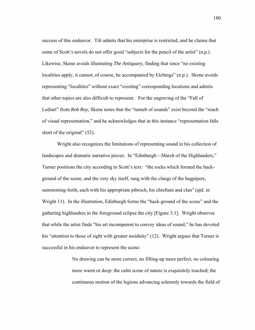
180
success of this endeavor. Tilt admits that his enterprise is restricted, and he claims that
some of Scott’s novels do not offer good “subjects for the pencil of the artist” (n.p.).
Likewise, Skene avoids illustrating The Antiquary, finding that since “no existing
localities apply, it cannot, of course, be accompanied by Etchings” (n.p.). Skene avoids
representing “localities” without exact “existing” corresponding locations and admits
that other topics are also difficult to represent. For the engraving of the “Fall of
Lediart” from Rob Roy, Skene notes that the “tumult of sounds” exist beyond the “reach
of visual representation,” and he acknowledges that in this instance “representation falls
short of the original” (52).
Wright also recognizes the limitations of representing sound in his collection of
landscapes and dramatic narrative pieces. In “Edinburgh—March of the Highlanders,”
Turner positions the city according to Scott’s text: “the rocks which formed the back-
ground of the scene, and the very sky itself, rang with the clangs of the bagpipers,
summoning-forth, each with his appropriate pibroch, his chieftain and clan” (qtd. in
Wright 11). In the illustration, Edinburgh forms the “back-ground of the scene” and the
gathering highlanders in the foreground eclipse the city [Figure 3.1]. Wright observes
that while the artist finds “his art incompetent to convey ideas of sound,” he has devoted
his “attention to those of sight with greater assiduity” (12). Wright argues that Turner is
successful in his endeavor to represent the scene:
No drawing can be more correct, no filling-up more perfect, no colouring
more warm or deep: the calm scene of nature is exquisitely touched; the
continuous motion of the legions advancing solemnly towards the field of
181
Figu
re 3
.1. J
. M. W
. Tur
ner,
“Edi
nbur
gh—
Mar
ch o
f the
Hig
hlan
ders
,” E
ngra
ved
by T
hom
as H
igha
m,
Land
scap
e-H
isto
rica
l Illu
stra
tions
, 183
6. C
olle
ctio
n of
the
Aut
hor.
182
battle powerfully narrated; the sound of the departing feet seems to
vibrate on the ear. (12)
Yet the image is historically incorrect. Edinburgh’s North Bridge did not exist when
Charles Edward Stuart marched with his Highlanders (Garside n.p.). Nonetheless,
Turner’s “correct” representation of the scene validates the image’s connection to
Waverley.
When no original exists from which to base an engraving, artists and editors
often choose to create their own reality. Wright’s collection includes an engraving of
“The Antiquary and Lovel,” which Wright identifies as a “sketch from the romantic
coast of Aberdeen, in the vicinity of the supposed site of Monkbarns” (26). Wright
imparts to the illustration as “much reality as it is susceptible of” representing (26).
Scott’s text does not provide an actual location for Monkbarns; therefore, the engraving
does not depict textual reality, but rather creates it, transferring to the text the possibility
of a real place. Likewise, Skene offers a sketch of Craignethan Castle as an example of
the castle Tillietudlem from Old Morality. Skene offers the plate “not as the actual
original of the imaginary Tillietudlem … for that mansion was the pure creation of
fancy” but as a visual representation of “the intimate knowledge possessed by the author
of the characteristic features which distinguished baronial towers of the higher class of
the Scottish nobility” (63). The image is a visual incarnation of Scott’s knowledge of
Scottish baronial castles. An engraving of Mirkwood Mere, the subject of one of
Edward Waverley’s poems, also depicts a fictional place, but Tilt hopes that the “beauty
of the lines here quoted, will, it is hoped, be an excuse for the illustration of a subject,
183
the scene of which is entirely the creation of the fertile imagination of the Author” (2).
Scott’s text provides the reality for the illustration, and Tilt credits the “Author”—not
the artist or engraver—with the “creation” of the engraving.
Scott’s works do not always identify specific places, leaving editors the option of
fabricating a location or inventing a relationship between text and place that may not
exist in the novels. When faced with a fictional place, Wright speculates about an actual
place, thereby forcing a visual reality onto fictional passages. The first Waverley
engraving in Landscape-Historical Illustrations is of “The Pass of Bally-Brough,” a
fictional pass with no exact corresponding location in Scotland. Scott describes the
“tremendous” pass that
was extremely steep and rugged, winded up a chasm between two
tremendous rocks, following the passage which a foaming stream, that
brawled fare below…The descent from the path to the stream was a mere
precipice, with here and there a projecting fragment of granite or a
scathed tree, which had warped its twisted roots into the fissure of the
rock … ‘This,’ said Evan, ‘is the pass of Bally-Brough…’ (135)
The engraving depicts Evan precariously perched on the precipice overlooking the
stream, and the image includes all of the visual details from Scott’s passage. Yet despite
the descriptiveness of his language, Scott does not name the location of the pass.
Wright, however, chooses to speculate, noting that
If the author had any precise mountain glen in his ‘mind’s eye,’ when he
described the Pass of Bally-Brough, his picture is such an exact copy of a
184
dark defile in the wild vale of Glencoe, that, in conjunction with popular
opinion, we have concluded that this gloomy spot must have been his
original. (8)
Realizing that his speculation carries some risk of refutation, Wright challenges “let the
description be compared with our illustration, which is faithful to nature, and the identity
will immediately appear” (8). Wright encourages a comparison between the engraving
and the text for the actual location of the Pass of Bally-Brough, but since he reiterates
that the image is faithful to “nature,” he imparts the “reality” of Glencoe onto the text.
Wright challenges readers to deny the accuracy of the engraving’s depiction of both
Glencoe and the Pass of Bally-Brough. Scott’s description of the pass becomes
secondary to nature and to the visual representation of Glencoe as the Pass of Bally-
Brough. Nature dominates fiction, and “popular opinion” trumps authorial intention.
Wright deviates from his assuredness about the Glencoe—Bally-Brough
connection in his discussion of Tully Veolan. He admits that the location of the mansion
“is applicable to many [mansions], but peculiar to no individual mansion. The delighted
imagination of the readers of Waverley determined to establish an identity the author
never meant, and applied the description to Warrender-house, upon Burnstfield Links”
(8). Wright shifts from his earlier determination to establish a location for Bally-Brough
and pits readers’ desire for the identification for specific locations against authorial
intention, recognizing that the author perhaps “never meant” to compare Tully Veolan to
Warrender House. Accordingly, there is no illustration of Tully Veolan.
185
Many of the landscapes attempt to enhance the reader’s understanding of place
within Scott’s work, but other landscapes attempt to represent what words cannot. In the
text accompanying the illustration for Rob Roy, Wright quotes Frank Osbaldistone, who
upon visiting Roy’s retreat refrains from describing the scene: “I will spare you the
attempt to describe what you would hardly comprehend without going to see it” (qtd. in
Wright 38). Osbaldistone’s comment speaks to the limits of textual representation—
words cannot describe the view. Unlike Osbaldistone, Wright makes an attempt at
descriptive representation by describing Loch Lomond in detail. His description goes
into elaborate detail; Wright notes the size of the lake—“twenty-three miles in a
direction north and south”—and labels it as the “most picturesque of Scottish Lakes”
(39). Wright’s factual details make real both the illustration and the text, and the
engraving visually represents what Osbaldistone could not put into words and allows the
reader to see the Loch. The engraving imparts reality back onto Scott’s text.
Melville’s drawing depicts Osbaldistone and Bailie Jarvie leaving Rob Roy’s
hide out, but their small forms allow the landscape to dominate the image. Rob Roy and
his men appear as diminutive forms standing on a cliff at the edge of the lake in the right
background of the frame [Figure 3.2]. Clouds form an arch above the lake that direct the
viewer’s eyes back down to the lake and the men in the boat, and the circular shape of
the lake itself helps keep the frame tight. Overall, the engraving appears to be less about
Rob Roy and more about Loch Lomond. Yet this is not just any portrayal of Loch
Lomond, but a portrayal of the loch linked back to Scott’s novels; thus, no matter how
diminutive the human forms, their presence maintains the illustration’s link to the
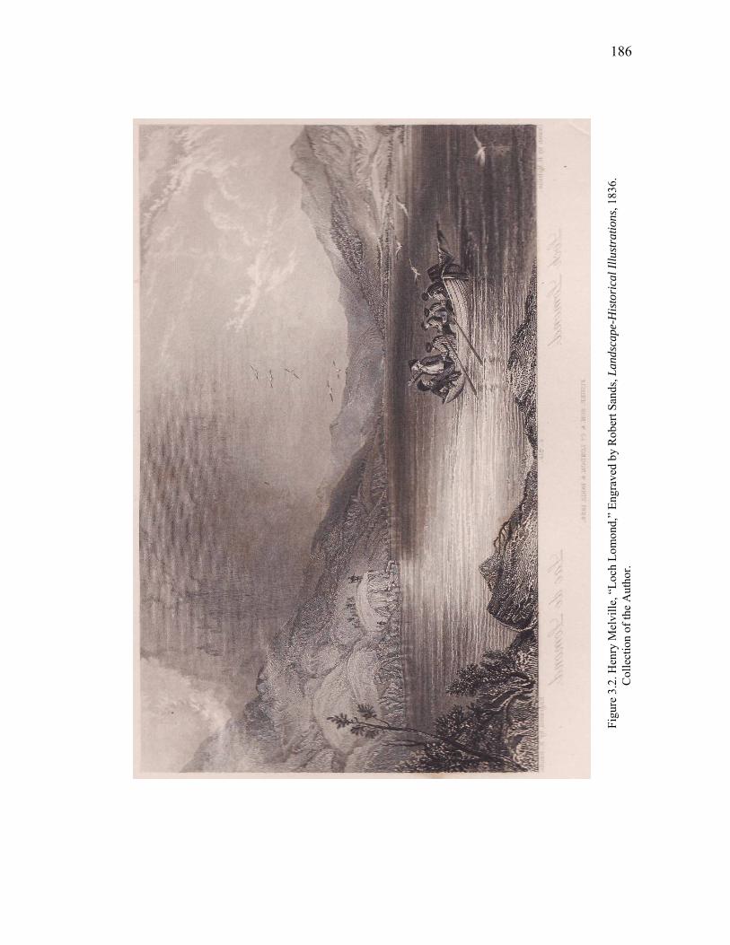
186
Figu
re 3
.2. H
enry
Mel
ville
, “Lo
ch L
omon
d,”
Engr
aved
by
Rob
ert S
ands
, Lan
dsca
pe-H
isto
rica
l Illu
stra
tions
, 183
6.
Col
lect
ion
of th
e A
utho
r.
187
literary text. The engraving’s depiction of an actual scene in the novel strengthens this
link, and the presence of excerpts from the text further reinforces this connection.
Despite the visual representation of scenes from the novels that favor image over text,
the text remains the predominant tie that connects the illustrated collection to the source
text(s). After all, the landscapes are not just of Scotland, but also of Scott’s Scotland,
and in particular Waverley’s Scotland.
In Waverley, Edmund Waverley is the reader’s guide through the Jacobite
rebellion of 1745 and through the Scottish landscape. Waverley makes “a work of art
out of the landscape,” bringing “to the landscape a taste for the picturesque and the
romantic which leads him to transform reality into pictures, to render the world into an
occasion for aesthetic experience, as a scene in a painting or a work of literature” (Kerr
24). Illustrations of scenes from Waverley make literal this transformation, making a
“work of art” out of the novel and making the novel real through the engravings. The
images render the fictional story into non-fictional representations of real places,
allowing the reader to access and to experience the landscape as Waverley does. The
illustrations from Waverley make literal Waverley’s consumption of the Scottish
landscape, and the landscapes become literary references and markers of tourist
possibilities in Scotland.25 The text is thus imprinted onto the landscape. While
fictional places and fictional characters limit the possible modes of representation, the
ability to provide visual representations of real places from the novels position many of
the illustrations within the larger context of travel literature.
188
In the Landscape-Historical collection, Wright decrees that the publisher’s goal
has been to depict an authentic view of Scotland, which is not just any view but Scott’s
view:
Perhaps Scott’s greatest powers are displayed in scenic descriptions—his
haunted glen, his ruined abbey, and deserted hall, are all sketched with
the hand of a master. The original of these he studied early from life, in
his native land: and wherever it was possible to ascertain the precise
locality which constituted the original of the Novelist, our Landscape
Illustration has been designed from it; exhibiting, therefore, at the same
moment, a true characteristic View in Scotland. (Wright n.p.)
Wright equates Scott’s view of Scotland with the “true” view of Scotland, and as Wright
draws upon the novels for the descriptions to the images, he equates the illustrations with
also being a “true characteristic View in Scotland.” Wright argues that Scott’s
“unconfined topographical knowledge” which has “wandered, with the most varied
fancy, over the romantic portions of every country in Caledonia,” makes it possible to
view “Illustrations of Scott” as “identical with those of Scotland” (n.p.). The engravings
are not depictions of places from fictional novels, but rather, according to Wright’s
logic, accurate portrayals of Scotland itself.
In Wright’s edition, the illustrations’ fidelity to Scott’s work furthers the
equation between Scott and Scotland. Likewise, in the introduction to Heath’s
Picturesque Annual for 1836: Scott and Scotland, Leitch Ritchie argues that the edition’s
purpose has been to “illustrate, at the same moment, SCOTT and SCOTLAND” (iii,
189
original capitalization). The edition strives with the “utmost possible fidelity” to depict
“existing scenes, and yet to superadd a moral interest, by peopling them with the
creation of genius” (Ritchie iii-iv). The engravings are not depictions of places from
fictional novels, but rather, according to the logic of Wright and Ritchie, accurate
portrayals of Scotland itself. The editors’ continued assertions that Scott and Scotland
can be so equivocally compared magnify Scott’s role as a national writer. For the
potential tourist and the armchair travel enthusiast, the illustrations allow readers visual
access to places mentioned in the text. Watson argues that a place does not produce an
author’s works but rather that an author’s works produce concepts of place; text “invents
and solicits tourism” (12).26 In this light, the entirety of Scott’s oeuvre acts as a virtual
advertisement for Scotland. Illustrated supplements do more than create an idea of
place—they also preserve preexisting concepts of place. Regarding an engraving of
Scott’s study at Abbotsford, Martin remarks that while “the room may be altered and
destroyed” the “hand of the artist will transmit remembrance of it to the latest posterity”
(n.p.). The illustration solicits interest in Scott’s home and preserves Scott’s study for
posterity.
Time complicates the possibility of representing place. Most of Scott’s
Waverley novels are historical fiction; they separate the past from the present. Yet by
arguing that their editions represent “real” and “true” illustrations of Scotland, the
editors invite comparisons of the illustrations to contemporary notions of place, and
illustrations often vary in their depictions of the past and the present. The focus of
Skene’s etching of the “Grassmarket” from the Heart of Midlothian is the architecture of
190
the buildings on the winding street, which, he laments, will soon be among the “past
memorabilia of the ancient city” due to contemporary plans to improve the street (84).
The scene’s depiction of a gathering mob links the illustration to its textual counterpart,
but the illustration’s focus is primarily the area’s architecture, not the building tension in
the textual narrative. The second chapter of Midlothian begins with a lengthy
description of the Grassmarket’s “large open street” and “high houses,” and Scott relates
Edinburgh’s execution place to Tyburn in England, thereby allowing English readers a
contextual sense of place (Midlothian 26). Skene’s etching visually preserves a place
soon to be transformed by modern improvements. Likewise, Wright’s depiction of the
Grassmarket depicts the location as “it now appears” rather than during the violent riot
“detailed by the novelist with the most exact fidelity” (51). Rather than represent the
historical past as depicted in Scott’s novel, Skene and Wright present the Grassmarket
within the context of the present, thus preserving contemporary notions of a real place.
At the same time, the accompanying text encourages our recognition of the Grassmarket
within the context of the novel, which seals the illustrations’ connection to the history of
the actual Grassmarket.
Many of the engravings depict conflicting moments of time—such as the
Grassmarket of Midlothian’s past and the Grassmarket of contemporary Edinburgh—and
juxtapose prevailing stylistic tastes against realistic representations. In Illustrations of
Walter Scott’s Lay of the Last Minstrel (1808), J. C. Schetky departs from the
picturesque in order to differentiate the illustrations in his collection from previous
depictions of the same view. Of the “View of Harwick,” an “object passed by William
191
of Deloraine,” he differentiates his view of the bridge from William Gilpin’s (1724-
1804) earlier portrayal, noting that Gilpin, “for the sake of the picturesque effect,” has
“annihilated all the houses in the vicinity, and part of the battlements of the bridge itself”
(17). In contrast, Schetky avoids such “fanciful and whimsical delineation” and portrays
the modern town (17). For Schetky’s purposes, reality trumps the picturesque. By
alluding to Gilpin’s earlier work, Schetky widens the source of the image to encompass
multiple realities. The image draws upon the text’s depiction of the scene, Harwick
itself. In differentiating his drawing from Gilpin’s, Schetcky invites a comparison
between the two depictions and a comparison between his depiction and reality.
By placing the reader at the scene, the illustrated collections serve as virtual
travel guides by allowing readers access to specific locations. To emphasize the reality
of actual locations, many editors provide specific details related to the scene depicted.
Of the Illustrations of Walter Scott’s Lay of the Last Minstrel, Schetky strives repeatedly
to establish specific vantage points from which the views were drawn. The subtitle of
the work advertises this approach, for the illustrations consist of “Twelve Views of the
Rivers Bothwick, Ettrick, Yarrow, Tiviot, and Tweed.” Schetcky justifies each
illustration’s perspective by quoting Scott’s poem. Martin also provides specific details
about locations, noting that the Castle of Crichton is “ten miles south of Edinburgh” on
the “banks of the Tyne” (n.p.). Martin provides not only a detailed history of the castle,
but also a detailed description of the castle from the vantage point of a tourist. These
visual and textual details make it possible for potential tourists to identify the exact
location represented in both text and image, while also reiterating the editors’ desire to
192
make the illustrations appear as authentic as possible. Of Branksome Castle, Schetky
notes, “the present View of Branksome is taken from the opposite bank of the Teviot.
To the left of the Castle is a level field, probably the lawn distinguished as the scene of
the duel in the Lay” (Schetky 10). The reader receives not only the view of the
engraving, but also the reality of the location itself. The text imparts enough details for
potential tourists to seek out the specific location of the river, the castle, and the lawn.
Contemporary interpretations of place often intersect with an illustration’s
depiction of specific localities. Skene’s sketch of “The Clachan of Aberfoyle” from Rob
Roy shows a “wild and picturesque scene,” a scene he claims remains unaltered with the
exception of a “more civilized-looking mansion” in the landscape (45). Skene asserts
that any “stranger who visits it is at no loss to discover the real or supposed localities of
the various incidents of the Tale of which it has been made the theatre” (45). Whether
the scene represents reality or fiction is irrelevant; instead, what is relevant to visitors of
the area is the larger concept of representation and place within the context of Scott’s
work. The area may be picturesque, but it is not just any picturesque place, the mansion
sits on ground made hallow through its association with Scott’s text. Indeed, according
to Skene, the improvement in the mansion is due in part to the “newly-acquired celebrity
of this retired spot” (45).27 The innkeeper and household of the modern mansion ensure
that visitors to the area are not disappointed with what they see; with the “usual license
of commentators” they “enlarge upon the text, and to heighten the effect of their
narrative, by a few illustrations and particulars drawn from other sources than what the
Tale affords” (Skene 45-46). Skene’s illustration also enlarges upon the text by
193
providing a visual counterpoint to the text’s depiction of the Clachan of Aberfoyle. The
illustration, like the extraneous stories of the innkeeper, heightens the effect of Scott’s
narrative by making it “real” to the reader. Just as a the innkeeper, acting as tour guide,
directs visitors around the village and surrounding hills to views associated with Scott’s
works, Skene’s illustration makes visible the picturesque area. The vantage point of the
illustration positions the viewer as a tourist coming upon the town from the road.
Viewers, like tourists traveling along the “hill road” notable for its “picturesque beauty”
(Black 218), encounter the town as a small part of a scene made famous through its
association with Scott.
As viewers of illustrations, readers are participants in the scenes depicted, and
figures appearing as tourists or participants in a scene encourage the recognition of the
tourist potential of the location depicted in an engraving. In many of the illustrations for
Scott’s Poetical Works, Turner places small figures in the foreground that act as tourists
of the scene or representations of the artist and the author during their travels. Such
figures often point to the subject of the illustration, thereby directing the viewer’s eye to
the print’s focal point. Of Turner’s illustration of Loch Coriskin for the Lord of the
Isles, George Dekker notes that
The decision to depict the scene as if from the viewpoint of a contemporary
tourist-artist sketching a tourist-artist sketching, draws attention to the acts of
seeing and imagining: of creating a narrative or pictorial image in response to
the powerful impression made by a particular site. (171)
194
In accordance with Dekker’s observation, Wood considers the placement of tourists in a
scene the “standard signifier of Romantic tourism” (Wood 182). The placement of a
“tourist-artist sketching” reminds us that we are looking at an image directly inspired
from a scene, and tourist figures direct attention to the focal point of the image.
However, text and image often depict conflicting perspectives, and these conflicting
perspectives place the reader and viewer in varying and contrasting positions to each
medium’s subject.
The view depicted in the engraving of “Edinburgh Castle” in Tilt’s Landscape
Illustrations differs from the view described in the text accompanying the engraving,
which in turn departs from the view described in the corresponding passage in the novel.
In The Abbot, Scott positions the page, the falconer, and their companions at a distance
from the castle, and the falconer points out: “see, yonder is the old castle” (qtd. in Martin
46). Clarkson Stanfield’s illustration places the castle in the background—the castle is
“yonder,” not near. Stanfield places rocks on either side of the frame, thereby narrowing
the visual plane to direct the viewer’s eye towards the castle. A lone sheep perched on
the rocks looks towards the castle; however, the shepherd and his flock in the foreground
look away from the castle. The shepherd and his sheep are unaccounted for in the
corresponding passage from Scott’s novel. The text accompanying the illustration
further changes the perspective. Instead of describing the view in the engraving or
describing the moment in the narrative when the travelers first come upon Edinburgh,
Martin describes the view from the castle itself. He places the viewer at the vantage
point of the castle. Martin notes that from the castle is “obtained a most extensive and
195
varied prospect—the New Town, the Firth of Forth, and the shores of Fife” (46).28
Image and text present the viewer and reader with two conflicting views of the castle:
one from afar and one from the castle itself.
Stanfield’s inclusion of a shepherd and his flock endangers the thematic
connection to Scott’s work by transforming a potentially narrative image into a pastoral
landscape. Stansfield’s image is illustrative of the competing realities in many of the
collections’ depictions of actual places. The illustrations depict multiple realities, and
many illustrations, like “Branksome Castle,” strive to balance views from Scott’s texts
with actual views of Scotland. Historical connotations associated with real places and
contemporary artistic trends complicate the two competing views—views based on
fiction and reality. These competing realities are realized in varying depictions of the
same scenes. James Duffield Harding depicts Doune Castle after its heyday as an
“extensive pile” (n.p.), and Martin’s text provides a brief history of the castle. Despite
the accompanying text’s thematic focus on the castle and its role in Scott’s novel, the
image depicts the castle off-center. The subject of the engraving is a picturesque
landscape—not the castle. The two figures in the foreground are not tourists or figures
from the novel, but stylized figures in a pastoral landscape. The figures gaze away from
the castle towards the cattle grazing on the banks of the river, and direct our eyes to do
the same. In contrast to figures in Harding’s illustration that look away from the castle,
Skene’s illustration of the same scene depicts places figures walking towards the castle
to create a visual line directing the viewer’s eye to the stately castle. The “stately
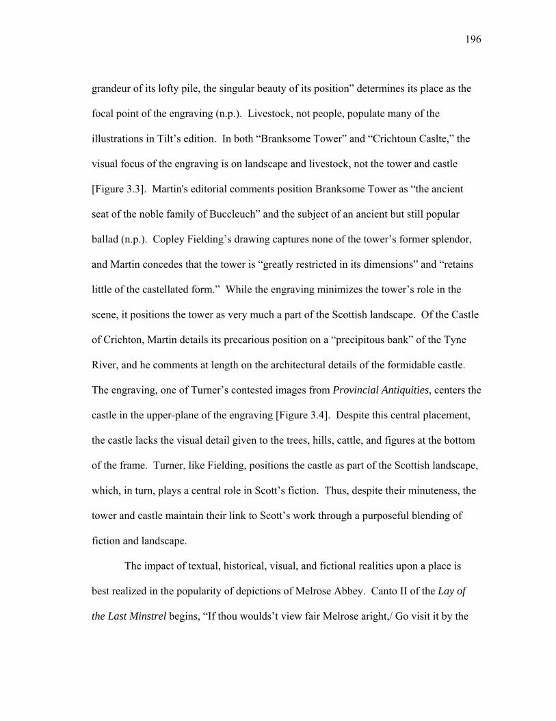
196
grandeur of its lofty pile, the singular beauty of its position” determines its place as the
focal point of the engraving (n.p.). Livestock, not people, populate many of the
illustrations in Tilt’s edition. In both “Branksome Tower” and “Crichtoun Caslte,” the
visual focus of the engraving is on landscape and livestock, not the tower and castle
[Figure 3.3]. Martin's editorial comments position Branksome Tower as “the ancient
seat of the noble family of Buccleuch” and the subject of an ancient but still popular
ballad (n.p.). Copley Fielding’s drawing captures none of the tower’s former splendor,
and Martin concedes that the tower is “greatly restricted in its dimensions” and “retains
little of the castellated form.” While the engraving minimizes the tower’s role in the
scene, it positions the tower as very much a part of the Scottish landscape. Of the Castle
of Crichton, Martin details its precarious position on a “precipitous bank” of the Tyne
River, and he comments at length on the architectural details of the formidable castle.
The engraving, one of Turner’s contested images from Provincial Antiquities, centers the
castle in the upper-plane of the engraving [Figure 3.4]. Despite this central placement,
the castle lacks the visual detail given to the trees, hills, cattle, and figures at the bottom
of the frame. Turner, like Fielding, positions the castle as part of the Scottish landscape,
which, in turn, plays a central role in Scott’s fiction. Thus, despite their minuteness, the
tower and castle maintain their link to Scott’s work through a purposeful blending of
fiction and landscape.
The impact of textual, historical, visual, and fictional realities upon a place is
best realized in the popularity of depictions of Melrose Abbey. Canto II of the Lay of
the Last Minstrel begins, “If thou woulds’t view fair Melrose aright,/ Go visit it by the
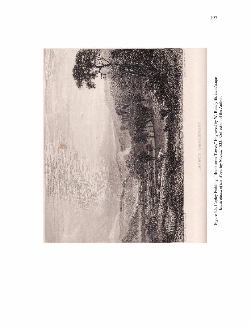
197
Figu
re 3
.3. C
ople
y Fi
eldi
ng, “
Bra
nkso
me
Tow
er,”
Eng
rave
d by
W. R
adcl
yffe
. Lan
dsca
pe
Illus
trat
ions
of t
he W
aver
ley
Nov
els,
1833
. C
olle
ctio
n of
the
Aut
hor.
198
Figu
re 3
.4. J
. M. W
. Tur
ner,
“Cric
htou
n C
astle
,” E
ngra
ved
by W
. B. C
ooke
. Lan
dsca
pe Il
lust
ratio
ns o
f the
W
aver
ley
Nov
els,
1833
. C
olle
ctio
n of
the
Aut
hor.
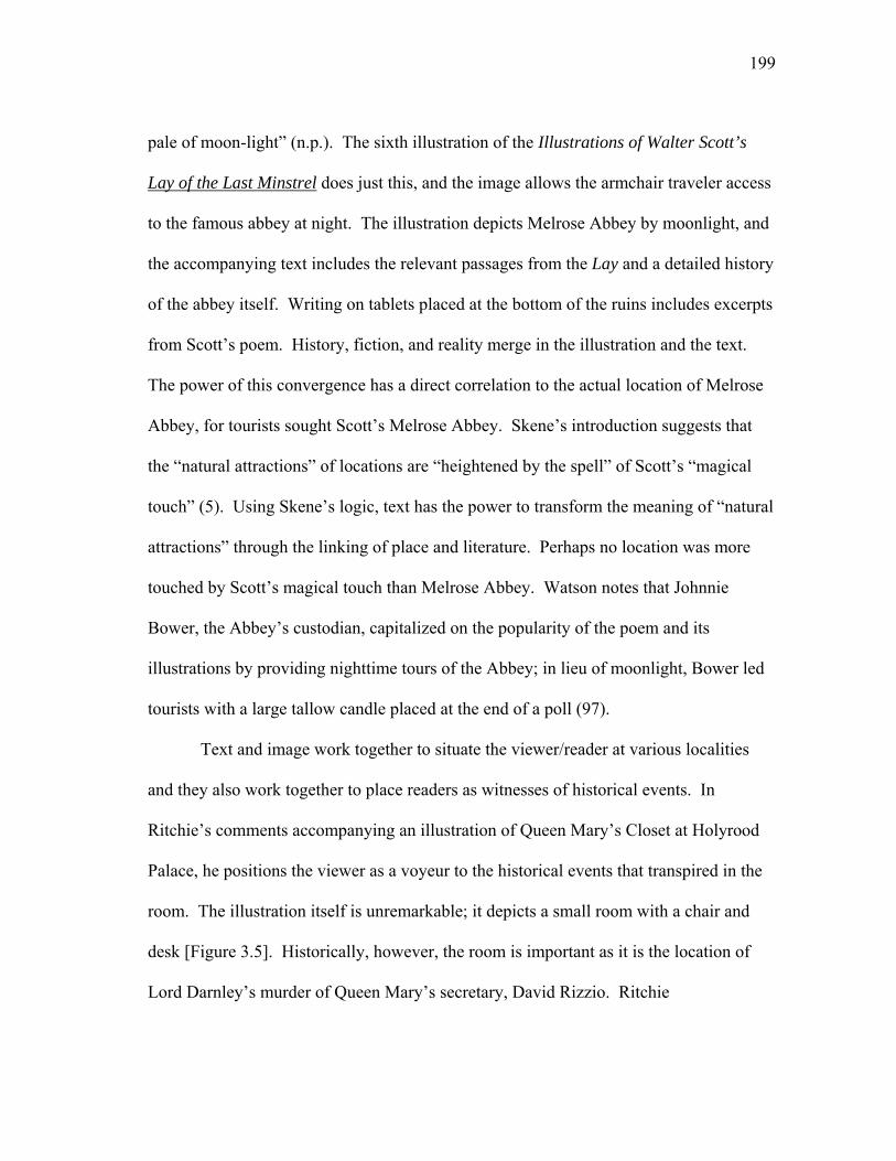
199
pale of moon-light” (n.p.). The sixth illustration of the Illustrations of Walter Scott’s
Lay of the Last Minstrel does just this, and the image allows the armchair traveler access
to the famous abbey at night. The illustration depicts Melrose Abbey by moonlight, and
the accompanying text includes the relevant passages from the Lay and a detailed history
of the abbey itself. Writing on tablets placed at the bottom of the ruins includes excerpts
from Scott’s poem. History, fiction, and reality merge in the illustration and the text.
The power of this convergence has a direct correlation to the actual location of Melrose
Abbey, for tourists sought Scott’s Melrose Abbey. Skene’s introduction suggests that
the “natural attractions” of locations are “heightened by the spell” of Scott’s “magical
touch” (5). Using Skene’s logic, text has the power to transform the meaning of “natural
attractions” through the linking of place and literature. Perhaps no location was more
touched by Scott’s magical touch than Melrose Abbey. Watson notes that Johnnie
Bower, the Abbey’s custodian, capitalized on the popularity of the poem and its
illustrations by providing nighttime tours of the Abbey; in lieu of moonlight, Bower led
tourists with a large tallow candle placed at the end of a poll (97).
Text and image work together to situate the viewer/reader at various localities
and they also work together to place readers as witnesses of historical events. In
Ritchie’s comments accompanying an illustration of Queen Mary’s Closet at Holyrood
Palace, he positions the viewer as a voyeur to the historical events that transpired in the
room. The illustration itself is unremarkable; it depicts a small room with a chair and
desk [Figure 3.5]. Historically, however, the room is important as it is the location of
Lord Darnley’s murder of Queen Mary’s secretary, David Rizzio. Ritchie

200
Figu
re 3
.5. G
eorg
e C
atte
rmol
e, “
Que
en M
ary’
s Clo
set:
Hol
yroo
d H
ouse
,” E
ngra
ved
by J.
Lew
is.
Scot
t
and
Scot
land
, 183
5. C
olle
ctio
n of
the
Aut
hor.
201
distinguishes between what viewers of the room (both in person and through print) see
and what the room would have looked like in the past. Ritchie notes that in March 1556
the “arrangements of that little room were somewhat different. The heavy table which
you see on the right was in the middle of the floor […]” (169). He then departs on an
elaborate process of setting the scene for the murder. Ritchie asks the reader to picture
the evening: “It is seven o’clock in the evening. The song, the tale, the jest have gone
around […] the beautiful queen is happy…Hark! There is a noise without—a dull, harsh,
yet quick disagreeable sound. Look towards the door. Who is there?” (169-170).
Ritchie’s storytelling transforms an otherwise uneventful engraving into a suspenseful
crime scene; by directly addressing the reader, Ritchie places the reader as a witness to
the murder. Yet before Ritchie reveals the identity of the figures behind the door, he
laments that “Shadows” prevent him from revealing any more of the tale; rather than
continue with the familiar narrative of Rizzio’s murder, Ritchie relinquishes the tale to
the “master-seer, to whom is given, not only to behold, but to command, the specters of
history” (170). The text shifts to Scott, whose narrative takes over the story of Darnley’s
murder of Rizzio.
Continuing to invite readers to “see” Scott’s texts, the illustrated editions also
provide depictions of the characters that inhabit the landscapes of Scott’s works. In
Wright’s Landscape-Historical Illustrations of Scotland, and the Waverley Novels, itself
a blending of “real” and “narrative” illustrations, George Cruikshank’s crude caricatures
stand in stark contrast to Turner’s dramatic and picturesque scenes. Cruikshank’s
engravings are employed to distinguish the collection from others:
202
The Publishers assume the merit of having been the first to illustrate the
scenes of mirth, of merriment, of humour, that often sparkle on and
relieve the calm and beautiful narratives of human life which fill the
pages of the Waverley Novels; and of having insured the success of the
attempt by the quality of the talent employed in its execution. (n.p.)
Wright justifies the inclusion of Cruikshank’s work by arguing that while the caricaturist
may appear to capture “rather strange notions of Highland hospitality… in this
representation he does not stand alone” (n.p.). Wright turns to another Scottish writer to
support his claim that Cruikshank’s representations of “Highland hospitality” are
authentic and quotes a poem from Robert Burns at the end of the preface. In this way,
Wright uses fiction—not reality—to exemplify Highland hospitality, and through
fictional representations of the Highlanders he imparts reality onto the images.
Wright proves uncharacteristically silent in the text accompanying Cruikshank’s
engravings, and he leaves the caricatures and excerpts from Scott’s texts to speak for
themselves. Cruikshank’s caricatures isolate moments from the text, but the textual
excerpts from the novels move the meaning of the illustrations past their singular
moment to include the larger narrative. Cruikshank’s etchings are narrative illustrations,
but they are simpler than his graphic satire, and they are not narrative in the Hogarthian
tradition. The illustrations’ allusion to the larger textual narrative depends on the
placement of quotations from Scott’s texts in proximity to the illustrations. Alone, the
scenes are merely comic caricatures, but when paired with the text accompanying them,
the illustrations enact the novels’ narrative. Many of the illustrations are of Scottish
203
characters accompanied by text that demonstrates Scott’s use of the Scottish dialect.
The dialogue in the textual excerpts—and not the image itself—creates narrative
movement.
In his postscript to Waverley, Scott claims that it has been his “object to describe
these persons, not by a caricatured and exaggerated use of the national dialect, but by
their habits, manners, and feelings” (493). Ironically, Scott’s use of colloquial language
merges with Cruikshank’s images to create an exaggerated and comic depiction of
Scott’s characters. One of many examples of this appears in Cruikshank’s depiction of
Meg Merriles from Guy Mannering. Cruikshank depicts the moment when Meg insists
that the preacher eat her stew, and the accompanying text provides Scott’s dialogue of
the scene [Figure 3.6]. Meg scolds the preacher, yelling: “If ye dinna eat instantly, and
put some saul in ye, by the bread and the salt I’ll put it down your throat wi’ the cutty-
spoon, scaulding as it is, and whether ye will or no. Gape sinner, and swallow” (n.p.).
The preacher appears to have acquiesced and cowers before Meg who is forcefully
offering her “goodly stew” from the “witch’s cauldron” (n.p.). A brief note—not by
Wright but rather from Scott’s novel—adds validation to the scene by noting that “A
savory stew, or potage a la Meg Merillies de Derncleugh, has been added to the
Almanach des Gourmands by Monsieur Florence, cook to Henry and Charles, late Dukes
of Buccleuch” (n.p.). The stew’s reality—albeit a reality created from fiction—works to
legitimatize the fictional scene.29
Unlike Cruikshank’s caricatures and Turner’s dramatic landscapes, other
collections offer portrait galleries that pair text and image into a virtual “who’s who” of
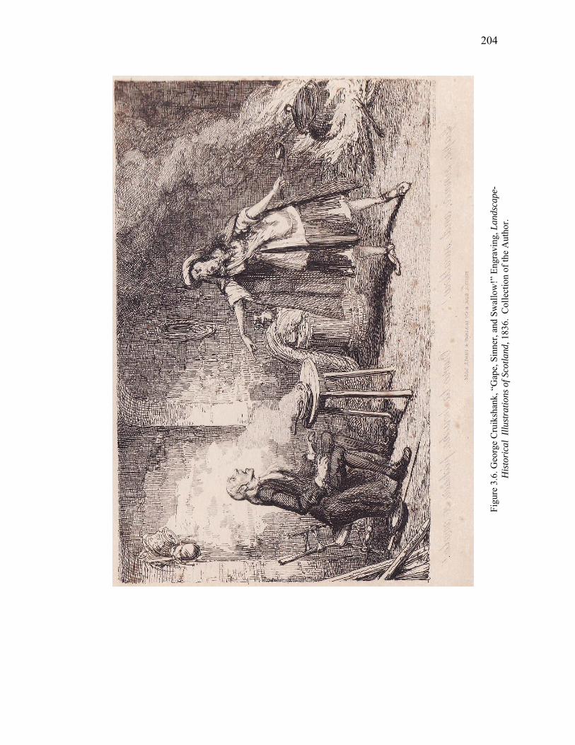
204
Figu
re 3
.6. G
eorg
e C
ruik
shan
k, “
Gap
e, S
inne
r, an
d Sw
allo
w!”
Eng
ravi
ng, L
ands
cape
- H
isto
rica
l Ill
ustr
atio
ns o
f Sco
tland
, 183
6. C
olle
ctio
n of
the
Aut
hor.
205
Scott’s work. In particular, the women in Scott’s novels prove a popular subject for
illustrations. Like the landscapes, the portraits respond to and depart from the reality
represented in Scott’s novels, for the portraits represent real textual characters that are
nonetheless fictional; we are asked to “see” Scott’s women in his descriptions and then
recognize our vision in the portraits.
Women in the illustrated collections are commodities in the larger context of
illustrated books and their stylized forms are highly reminiscent of women from Heath’s
Book of Beauty. Heath notes that his collection is “deemed a most appropriate Holiday
Offering” (6), and like the annuals, the edition enters the market in time for holiday gift
giving. The introduction of Heath’s Waverley Gallery of the Principal Female
Characters in Sir Walter Scott’s Romances (1841) decrees that the Waverley women
“form a family of beauties interesting to us for almost every reason that can render
women interesting” (5). Yet these are no ordinary beauties, for they
Are beings with whom we have hoped and feared with a reality too
intense, they have become part of the experience of our lives. Taken
quite simply as the studies of a great literary master, they appeal to all our
gentler feelings with a warmth unequalled by any other imaginary
sisterhood. This has always been regarded as one of the sun-shiny walks
of art. (Heath 5)
According to Heath’s introduction, the women are a real “experience” of everyday life.
To this end, Heath vows to “please our natural love of pictures with a glimpse at the
possible faces of these women—to show the ideas that artists skilled in all the niceties of
206
plastic expression form from the great master’s descriptions—is the object of this
gallery” (Gallery 6). The evocation of Scott’s name—the “great master”—cements the
connection to Scott’s work. By making the women “real,” Heath positions the edition as
a book whose purpose aligns itself with the higher purpose of art. Lengthy excerpts
from Scott’s novels position the women within the larger context of the stories and
remind readers that they are viewing Waverley women.
In their new form as bound illustrations, Scott’s fictional female characters
become marketable objects. Terence Hoagwood and Kathryn Ledbetter note that in
literary annuals like The Keepsake that images of women are designed to “excite the
middle-class female reader’s desire for romance and satisfy her yearning to demonstrate
a sophisticated knowledge of art” (95). The illustrations present a “mirage of
emancipation” by seemingly challenging “conventional notions about women”
(Hoagwood and Ledbetter 96). The annual “explored female sexual fantasies,” but the
“artists distanced their subjects by making them exotic eastern maids, mythological
characters, or medieval rustics” (Hoagwood and Ledbetter 96). Similarly, the
illustrations of women in Heath’s gallery evoke sensuality and sexuality, while their
identification as fictional women—despite Heath’s claim to their reality—positions them
at a safe distance from the reader.
Lengthy textual excerpts from Scott’s novels activate an additional level of
meaning that positions the sensual images within the larger context of the novels. In the
illustration of “Effie Deans” from The Heart of Midlothian, Effie stands tall and proud as
she glances defiantly out of the frame. As the novel’s fallen woman, much of Effie’s
207
behavior represents the antithesis of “conventional notions” of nineteenth-century
women’s behavior. Heath’s choice of text to accompany the engraving invites us to
pause with “pleasure” when viewing the illustration:
[Effie’s] growing charms…had no power to shake the steadfast mind, or
divert the fixed gaze, of the constant Laird of Dumbiedikes. But there
was scarce another eye that could behold this living picture of health and
beauty, without pausing on it with pleasure. (87)
Scott’s text, positioned appropriately adjacent to the image, enhances and justifies any
overt sexuality apparent in the engraving. Together, text and image invite the reader to
explore “sexual fantasies” in the image and to take pleasure in doing so.
Like the landscape collections, most illustrated portrait galleries begin with
Waverley. In Heath’s The Waverley Album (1832) and the Waverley Gallery, Flora is
the first woman portrayed. In the Waverley Gallery, she appears as the frontispiece.
Without the accompanying title, the image is nondescript; her stylized form suggests that
she could be any woman in the literary annuals. Flora appears seated at a window with
one hand raised to her brow and the other holding her sewing. Unlike many of the
engravings of Scott’s heroes and heroines there is nothing about the scene to designate
the woman as Flora or the setting as Scottish. There is no narrative action in the image,
and there is nothing in the portrait or the background to invite the reader to make a
connection between Flora and Waverley. Only the engraving’s title and the excerpt from
Scott’s novel explain her identity and justify the portrait’s inclusion in the collection.
208
For readers of text, the lack of visual detail in Flora’s engraving is pertinent. The
excerpt from the novel included with the engraving begins with Waverley’s first meeting
of Flora:
There was no appearance of this parsimony in the dress of the lady
herself, which was in texture elegant, and even rich, and arranged in a
manner which partly of the Parisian fashion, and partly of the more
simple dress of the Highlands, blended together with great taste. Her hair
was not disfigured by the art of the friseur, but fell in jetty ringlets on her
neck confined only by a circlet richly set with diamonds. (qtd. in
Waverley Gallery 11)
Flora’s adoption of French mannerisms and fashion seems to distance her from her
otherwise staunchly Jacobite political views (which in 1745 are also views with French
associations), but in the novel, descriptions of the complicated heroine always return to
her Scottish identity. The image depicts nothing that we can discern to be indicative of
the “simple dress of the Highlands.” Instead, she appears as any woman seated at a
window [Figure 3.7].
In contrast to the simplicity of the Flora’s portrait in the Waverley Gallery, in the
Waverley Album, details in the portrait readily identify Flora as Scott’s heroine. The
setting is distinctly Scottish—the Glen of Glennaquioch—and Flora’s nationality is
immediately identifiable by the tartan worn around her shoulders. The editors include an
excerpt from the novel to describe the scene: “here, like one of those lovely forms which
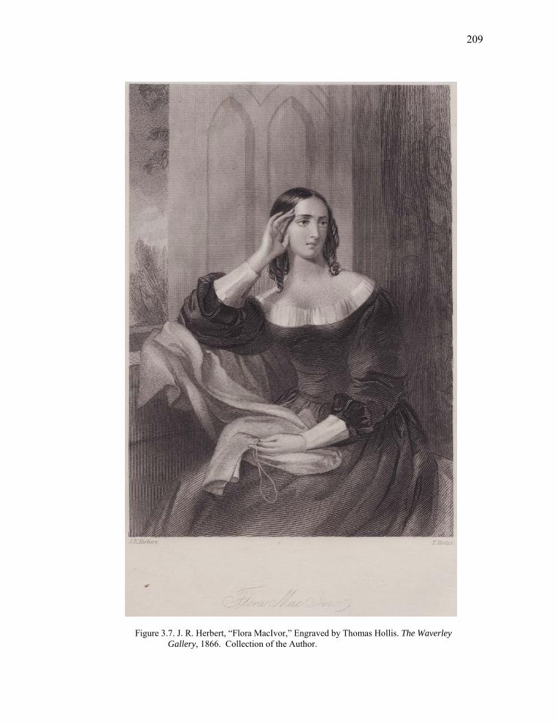
209
Figure 3.7. J. R. Herbert, “Flora MacIvor,” Engraved by Thomas Hollis. The Waverley Gallery, 1866. Collection of the Author.
210
decorate the landscape of Pouissin, Waverley found Flora gazing at the waterfall; two
paces farther back stood Cathleen, holding a small Scottish harp” (Scott 235). Flora’s
“lovely form” does not gaze at the waterfall, but rather away from it; she gives a
sidelong glance out of the frame of the engraving towards the reader. Flora’s glance acts
to invite the reader into the scene and allows the reader to experience the scene from
Waverley’s perspective. Cathleen looks towards the waterfall, and lines created by the
curved lines of her harp and the angle of her body guide the viewer’s eyes to Flora,
reinforcing Flora’s status as the focal point of the engraving and the accompanying text.
Flora is very much a part of the landscape; the tartan flowing from her shoulders runs
parallel to the waterfall’s flow. She is, in this way, a form decorating the landscape and
the subject of Waverley and the reader’s gaze.
Flora’s portrait also begins Tilt’s Portraits of the Principal Female Characters in
the Waverley Novels; to which are added, Landscape Illustrations of The Highland
Widow, Anne of Geirstein, Fair Maid of Perth, Castle Dangerous (1833). A brief
excerpt from the novel describes Flora’s “jetty ringlets,” but the text then shifts from
Scott’s description of Flora to a longer, unrelated quotation from John Wilson’s “An
Evening in Furness Abbey.” The excerpt from Wilson’s poem designates the woman as
“fine and pious” and having “designed,/ In her own brain and her own heart, his tomb!”
(n.p). The excerpt from Wilson’s poem shifts the textual description from a purely
physical description (Scott’s text) to a more psychological portrayal of a woman. The
use of additional authors continues throughout the collection. A descriptive excerpt
from Waverley describes Rose Bradwardine’s “profusion of hair of paley gold” (n.p.),
211
but the additional accompanying text shifts to another poem. Excerpts from a poem by
Burns describe a woman with “flaxen ringlets” and “eyebrows of a darker hue” that are
“Bewitchingly o’er-arching” (n.p.). A quotation from Alexander Pope’s Rape of the
Lock accompanies the portrait of Julia Mannering from Guy Mannering. Diana Vernon
from Rob Roy is accompanied by an excerpt from Roger’s Italy that decries the “mirth”
and “arch” of the “overflowing …innocent heart” of a woman (n.p.). A warning about
women’s love from Lord Byron’s Don Juan accompanies the portrait of Lucy Ashton
from the Bride of Lammermoor:
Alas, the love of woman! It is known
to be a lovely and a fearful thing;
For all of theirs upon that die is thrown,
And if ‘tis lost, life hath no more to bring
To them but mockeries of the past alone. (n.p.)
Byron, not Scott, tells Lucy’s tragic tale.
Tilt’s portrait collection is emblematic of the fragility of a text when paired with
images. The inclusion of additional texts relegates Scott’s authorial presence to the
sidelines. Descriptions of women by Burns, Byron, and Rogers, among others, stand in
for Scott’s descriptions of his heroines. Significantly, the editor does not acknowledge
the additional authors or their works; recognition of the supplemental texts relies on the
reader’s knowledge of other popular literary works and other popular fictional women.
The only factor differentiating the additional text from Scott’s work is a larger font size
that visually separates the other works from Scott’s work. In both placement and size,
212
Scott’s text appears as little more than an epigraph to each portrait—the other literary
works overshadow Scott’s text. Shared titles between the engravings and excerpts from
Scott’s text work to maintain the connection to the novels, but the authorial presence of
other writers weakens the women’s connection to Scott. Furthermore, the additional
quotations transform our understanding of the characters. Wilson’s text makes Flora
appear more calculating and Burns’ poem makes Rose appear more emblematic of a
“Scotch cast of beauty” (Scott 93). The association of Scott’s women with other literary
women magnifies each character’s strengths and weaknesses.
The inclusion of additional texts in Tilt’s work alienates the illustrations from
their association with Scott’s texts. Later illustrated works also alienate images from
overt associations with Scott’s work. In his 1881 publication of Royal Characters from
the Works of Sir Walter Scott Historical and Romantic, William T. Dobson declares that
his book’s purpose is to “awaken an interest in and create a desire for a more thorough
and personal knowledge of the Royal Characters portrayed by Scott.” Dobson positions
the book as one “acceptable to be placed in the hands of youth,” and he continues the
educational approach by including detailed and documented histories of the major Royal
figures in Scott’s work (n.p.). The images are classic in style; technologically, the
images represent new improvements in illustration and photography. The illustrations
and Dobson’s text, however, have little to do with Scott. Scott becomes a hook for
Dobson to use to catch the attention of a younger readership, and through Scott’s fiction
and with the aid of illustrations Dobson hopes to renew an interest in history, but not
necessarily Scott’s version of history.
213
The spatial separation of text and image in the supplemental collections allows
media to communicate meaning independently to some degree; however, the inclusion
of additional texts encourages our recognition of connections between media. While
many illustrations force realities upon fictional narratives and fictional places, the
images nonetheless preserve their link to Scott’s works through text. Editorial
comments justify the illustrations’ representations of Scott’s work by turning to Scott’s
texts. The combination of an editorial voice with text from Scott’s works reminds
readers that they are viewing Scott’s world; text works to validate the illustrations. The
illustrations make Scott’s text real by including images of Scottish scenery, and editorial
comments make both text and image real through the inclusion of detailed histories of
castles, battlefields, and landscapes. Furthermore, the editorial comments establish
connections that promote an illusion of coherence between the supplemental illustrations
and the original source texts and between reality and fiction. Thematic similarities
between the illustrations and text bind even Cruikshank’s caricatures to Turner’s
picturesque landscapes, and editorial comments offer logical explanations for possible
stylistic disharmony. The circumstances and scenes of the illustrations may vary, but the
inclusion of text maintains a thematic link to the work of the Wizard of the North.
Tilt’s gallery of women departs from this pattern. Unlike the other supplemental
collections, there is no editorial voice in Tilt’s collection to wax poetically about the
women’s status as Waverley women or to assert synchronized meaning between text and
image.30 The women become interchangeable with other literary women; they are
literary types rather than Waverley women. The distancing of source text and
214
illustration threatens the synchronicity of meaning between text and image, and the
absence of editorial comments weakens the link between media. Tilt’s collection does
not attempt to promote a façade of originality. Instead, a new reality emerges—the
reality that Scott’s fictional women share commonalities with a myriad of other literary
women, and, as such, they are commodities in the print market. Tilt’s collection serves
as a reminder that all the collections, regardless of their approach, are cultural artifacts in
the larger context of the print market. They, like the texts themselves, are designed to
sell, and this design builds in part on illustrations’ ability to transform a text—or to
transform our perception of a text.
Each illustrated edition capitalizes on the newness of the illustrations or revisions
to reinvent and recycle Scott’s texts. Similarly, editors today seek to compile
authoritative versions of Scott’s text, thereby challenging the authority and authenticity
of earlier versions of Scott’s work.31 Illustrations are complicit in this process, and they,
like Scott’s text, reappear in new ways. In the multi-part Plates to Illustrate the People’s
Edition of Sir Walter Scott’s Novels (Corson H.PEO.3 184?), Fisher resells many of the
plates from Tilt’s Landscape collection. Readers could purchase the small, chapbook-
size collections of illustrations (usually containing two illustrations each) and paste the
illustrations into their own copies of Scott’s work. The first batch of illustrations is
advertised for “every purchaser of the People’s Edition” so that readers may “enrich”
their copies. The editors advertise the fifth release of illustrations, however, to illustrate
“All Editions of Sir Walter Scott’s novels,” not just the People’s edition. Remnant
plates are made new again through their removal from the larger supplemental

215
collections. The illustrations, like Scott’s work, thus move from one generation to the
next, continually edited, repackaged, and made “new.”
216
Notes
1. Scott was not the only author in the period to republish his works with
illustrations nor was he the only author to have his work illustrated in supplemental
collections. For instance, Byron’s work was also the subject of supplemental works such
as Finden’s Illustrations to the Life and Work of Lord Byron (1833).
2. Richard Maxwell uses the term “illustrated supplements” to refer to
illustrations of Scott’s work (3). I am taking his definition a bit further. For the
purposes of this chapter, “illustrated supplements” refers to those works published
independently of Scott’s novels and poems.
3. Scott published his original Waverley novels anonymously and published the
Tales of my Landlord series (later grouped with the Waverley Novels) under the
pseudonym Jedediah Cleisbotham. For a detailed overview of Scott’s revisions, see Jane
Millgate’s “The Interleaved Waverley Novels” in Scott’s Interleaved Waverley Novels:
an Introduction and Commentary.
4. Illustrated supplements are full of examples of the use of illustrative material;
for example, Copley Fielding’s illustration of Branksome Tower is based on the notes to
the poem, not the poem itself (Martin n.p.).
5. Maxell suggests that the “illustrative supplement” becomes a “magical sign of
authorial presence” (3).
6. Watson notes that not long after Scott’s death in 1832, Abbotsford became a
tourist attraction, receiving up to 1500 visitors in 1833 (100).
217
7. Maida, one of Scott’s beloved dogs, was the subject of so many portraits that
Scott wryly comments, “he [Maida] has sate to so many artists that whenever he sees
brushes & a pallet, he gets up & leaves the room” (Vol. 6, 252).
8. Bamber Gascoigne notes that while copper was easier to work with, “its
relative softness meant that a plate began to show signs of wear after a few hundred
impressions, giving an anaemic appearance with total loss of the more delicate lines in
the printed result” (12c).
9. Steel’s durability ensured its affordability, which in turn made it an
immensely popular engraving medium from 1825-1845 (Hunnisett 3).
10. In addition to the influence professional artists wielded over the market,
novice artists also fueled the expanding industry. The engravings made from the
sketches of the legions of tourists drawn to Scottish scenery helped to “feed the appetite
for illustrated books” (Altick 69). The engravings of various locales linked to Scott’s
work tapped into an expanding market of visual material linked to Scott’s texts. Richard
Altick finds it “reasonable to suppose every representation of Scottish scenery owed at
least part of its saleability to its association, however faintly implicit, with the Wizard of
the North” (69).
11. Text and image have been sharing space for centuries. Harthan traces the
history of illustrated books to ancient Egypt, and he notes that the adoption of the codex
form in 100-500 AD increased the possibilities for combining text and image on the
same page (12).
218
12. The Magnum Opus collection is a forty-eight volume illustrated collection of
all of Scott’s novels released between 1829-1833 (Todd and Bowden 348). For the
edition, Cadell employed thirty-five artists and thirty-eight engravers (Todd and Bowden
886). For information on the publishing history of the edition, see Millgate’s Scott’s
Last Edition: A Study in Publishing History.
13. Work by Alastair Durie, Gerald Finley, and Wood provide detailed accounts
of Scott’s tour of Scotland with Turner.
14. Skene endeavored to act as artist and engraver for his A Series of Sketches of
the Existing Localities Alluded to in the Waverley Novels, an enterprise that proved too
taxing for the artist. Skene notes that as he was the
Engraver as well as draughtsman, the minuteness of the work necessary
to bring the scale of the engravings to the size of the novels, made it too
severe a strain upon the eyes, so that it was discontinued at the close of
the first volume. (Memories 160)
The second volume remains unpublished in manuscript form (Memories 160).
15. Martin asserts that he and the publishers acted “with all possible courtesy” to
Turner (n.p.).
16. Martin credits Skene for many of the drawings. For example, W. B. Cooke’s
engraving of the “Brig. of Bracklin” from the Lady of the Lake is credited to J. Bentley
who drew the image “from a sketch by J. Skene, Esq.”

219
17. In general, Scott expressed an active interest in most of his work. In 1817,
Scott wrote to Joanna Baillie expressing that he has “reserved a very great interest in my
works which I have found highly advantageous” (Letters, Vol. 5, 25).
18. When soliciting Wilkie for work, Scott appeals to his reputation as an artist:
“you, who are beset by the sin of modesty, will be least of all men aware what a tower of
strength your name must be in a work of this nature” (Vol. 11, 73). Scott continues,
intimating that the artist “if possible, contribute a sketch or two from your inimitable
pencil, to ornament an edition of the Waverley novels which I am publishing with
illustrations of every kind, and in the success of which I have a deep personal interest”
(Vol. 11, 73).
19. In 1827, Sir Thomas Lawrence invited Scott to become an honorary
Professor of the Royal Academy (Private Letters, 247).
20. In letters to Buccleuch, Scott reviews auction paintings by Correggio and
Watteau in a manner that distinguishes him as a discriminating purchaser for his patron.
Scott proves capable of distinguishing originals from copies. He criticizes the number of
copies posing as originals and notes, “a picture should be as unsuspected as Caesar’s
wife” (Vol. 11, 134).
21. For a record of illustrations to Scott’s Magnum Opus edition of the Waverley
Novels, see Peter Garside and Ruth M. McAdams, Illustrating Scott: A Database of
Printed Illustrations to the Waverley Novels, 1814-1901.
220
22. For example, Tilt’s Landscape Illustrations was originally issued as a series
of plates from April 1830 to December 1831 with “four plates to a part in twenty parts”
(Todd and Bowden 880). It was then bound as a three-volume set in 1832.
23. The newly “illustrated” text had a revised introduction and appendices.
24. Several engravings from Tilt’s collection expand upon Skene’s sketches.
Skene’s original drawing is adapted to an additional drawing by G. Cattermole, which is
in turn engraved by William Finden.
25. Of Turner’s work on Provincial Antiquities and Picturesque Scenery in
Scotland, Wood argues that Turner’s pictures do not “illustrate” Scott’s work, rather
Instead of pictorially dramatizing Scott, the illustrations effectively
document the Romantic tourist industry, with the author, artist, and
publisher—the triumvirate of the illustrated book trade—as emblematic
consumers of trademark Waverley landscapes. (179)
The “triumvirate” of author, artist, and publisher are producers rather than “consumers”
of Waverley locations. The images identify and verify Scottish localities for readers and
tourists. The tourist and/or reader, not the producer, becomes the consumer. Makdisi
notes that within the texts “people and land are reduced not only to one another, but to
the level of aesthetic objects to be taken in and consumed by the eager eye of the
‘tourist:’ the character, the narrator—and the reader” (n.p.).
26. For critical discussions of Scott and tourism, see work by Dekker, Susan
Oliver and Watson.
221
27. James Hunnewell, in his 1871 book The Lands of Scott, notes that the Baillie
Nichol Jarvie Inn (whose name is linked to Scott’s novel), is “easily reached from
Glasgow” (180). In Adam and Charles Black’s Picturesque Tour of Scotland (1842),
they provide specific directions for tourists to get from Bucklyvie Station to the Clachan
of Aberfoyle (218).
28. For more information on the view and the castle, the editor directs readers to
Scott’s Provincial Antiquities (46).
29. Peter Garside’s article on Guy Mannering and the Picturesque provides an
extensive study of Meg Merrilies as a ‘Picturesque’ figure, and he traces the various
transformations of depictions of her character in early illustrated versions of the novel.
30. In the Waverley Gallery, Heath’s preface provides the only editorial voice,
but detailed passages from the novels situate the portraits within the context of the
stories.
31. A 1999 edition of the Waverley novels, the Edinburgh Edition, claims that it
is the “first reliable text of Scott’s fiction” (Hewitt xvi). The edition “aims to recover the
lost Scott, the Scott which was misunderstood as the printers struggled to set and print
novels at high speed in often difficult circumstances” (Hewitt xvi).
222
CHAPTER V
THE IMPLICATIONS OF LOOKING:
TEXT AND IMAGE IN THE MOXON TENNYSON
By the Victorian age, illustrated works saturated the market; in 1844, the editors
of the Quarterly Review remarked with disdain that “‘Illustration,’ as now used by
booksellers and printsellers is incapable of being defined. Every engraving, every wood-
cut, every ornamented letter, however meaningless, however absurd, is an illustration”
(192). While the editors prove critical of the market’s saturation with illustrated works,
their comments also demonstrate the variety of means available to illustrate a work. The
continued advent of new technology, new techniques, and new concepts ensured that
publishers and authors could continue to recycle text through the inclusion of visual
media. For Sir Walter Scott, illustrated supplements with elaborate engravings expanded
the dialogue about his work; for other authors, the integration of text and image
permitted by improved wood-engraving techniques provided innovative ways to revise
old texts. Edward Moxon’s 1857 republication of Alfred, Lord Tennyson’s Poems, with
illustrations by celebrity artists and engravers, provides a telling example of illustrations’
ability to aid in the evolution of textual meaning. The spatial proximity between media
in the Moxon Tennyson ensures that the connection between media remains active.1
Several illustrations interrupt their poetic counterpart by appearing in the middle of the
poem. Other illustrations, such as those for “The Lady of Shalott,” act as bookends that
223
contain the poems, thereby encouraging the reader to slow down to read image and text.
The placement of illustrations at the top of the page, such as John Everett Millais’
“Mariana,” creates linear movement that directs our eye to the text. From the symbolic
resonances of the Lady of Shalott’s wild hair in William Holman Hunt’s illustration of
the “Lady of Shalott” to the looming trees in J. C. Horsley’s illustrations for
“Circumstance,” the images impart meaning to the text; in turn, the text imparts meaning
to the images. Our immediate encounter with text and image occurs regardless of our
awareness of the intention and attribution of their pairing; this encounter is therefore
most relevant in studying the multi-media dialogue in illustrated works like the Moxon
Tennyson.
Contributing artists to the Moxon edition adapted their work from Tennyson’s
text and from their own pre-existing works.2 The revised poems invite comparison to
earlier poems; the illustrations invite comparisons to drawings and paintings; the
symbolic nature of the poems and the engravings invites intertextual readings of both.3
With such a rich literary and visual history, it is tempting to approach the Moxon
Tennyson looking for points of textual and visual fidelity. Unlike the spatial alienation
that occurs between source text and image in illustrated supplements, in illustrated
editions of poetry, text and image square off in an apparent battle over meaning. Yet
what is at stake in discussing meaning within illustrated works has less to do with an
image’s narrative fidelity and more to do with multi-media interaction. W. J. T. Mitchell
argues that “comparison itself is not a necessary procedure in the study of image-text
relations. The necessary subject matter is, rather, the whole ensemble of relations
224
between media” (Picture 89, original emphasis). Regardless of how an illustration
represents a text, the ensuing multi-media dialogue creates meaning, in turn, this
meaning fashions an illusion of originality and newness that extends to both the
illustrations and the poems. In Moxon’s illustrated edition of Tennyson’s Poems, the
placement of media alerts readers to the limits of representation and to the implications
of viewing text and image together. The act of producing a work that combines media
encourages recognition of these meta-textual moments, and many of Tennyson’s poems
encourage this reflexivity by incorporating visual themes.
Moxon’s edition of Tennyson’s poems is a republication with revisions of Poems
(1830), Poems (1832), and English Idylls and Other Poems (1842). 4 Richard Herne
Shepherd, an early Tennyson bibliographer, suggests that textually the 1857 edition has
“no special or peculiar” value since it is a republication of earlier editions (33).
Shepherd argues that the edition relies on the illustrations for “significance and
importance” (33). Despite the recycling of early poems, Poems (1857) is made to appear
new through Tennyson’s revisions and Moxon’s addition of fifty-four illustrations by
nine well-known artists which were engraved by six well-established engravers.5 The
book is divided into sections according to the original publication date of each text.
These dates are deceptive. For example, “The Lady of Shalott” appears in the section
designated “Poems 1832”; however, the text of the poem is that from the 1842 version of
the poem, not the 1832 version. The edition gains its “significance and importance” not
only through the illustrations, which alone would make for a peculiar book, but rather
225
through the interaction of text and image. This interaction makes “The Lady of Shalott”
appear new yet again in 1857.
We can trace Tennyson’s “Lady of Shalott” through multiple editions in the
Romantic-period and in the Victorian era in order to understand more fully the
interchange of meaning in the illustrated edition of the poem. In Tennyson’s 1832
version of “The Lady of Shalott,” the poem moves from an external description of the
bower’s “four gray walls” to a description of the Lady’s life. Confined in a tower, she
“leaneth on a velvet bed” and is “fully royally appareled” (10). Restricted by a curse
that requires that she weave images of the outside world reflected in a mirror, she “lives
with little joy or fear” and has “no time” to “sport and play” (11, 10). Despite her
inevitable death that comes when she decides to look at Camelot directly, the Lady
maintains some control over her fate; by acting, the Lady “becomes a person instead of
an automaton” (Shannon 216). Clothed in “snowy white” with her hair encircled in a
“cloudwhite crown of pearl,” the Lady braves the “squally east-wind” to make her way
on the river to Camelot (16-17); chanting loudly a “longdrawn carol, mournful, holy,”
she dies before reaching Camelot (18). The Lady leaves her tale on parchment laid on
her breast that declares the “charm…broken utterly” and invites the onlookers to “draw
near and fear not” (18) The onlookers, “knight, minstrel, abbot, squire, and guest,” cross
themselves, bless the stars, and read with wonder the Lady’s final words (19).
A revised version of the poem appears in 1842 in which Tennyson limits the
descriptive language in the beginning of the poem to the “shadows of the world” outside
rather than to the cloistered Lady herself (69). Tennyson reveals that the Lady is “half
226
sick of shadows,” but otherwise he discloses few details about the Lady. The 1842 poem
renders the Lady silent both in death and in the removal of the textual apparatus—the
parchment—that tells her tale. When the Lady’s lifeless body appears at the water’s
edge, Lancelot muses “a little space,” thus granting the lady only a brief
acknowledgement. Her audience shrinks to the knights of Camelot, who cross
themselves with fear. Rather than conclude with the Lady’s words on the piece of
parchment, the poem concludes with Lancelot remarking that “she has a lovely face/
God in his mercy lend her grace” (75). Lancelot, rather than the Lady, becomes the
focus of the poem’s conclusion, and he, rather than the Lady of Shalott, gets in the
metaphorical last word.
In the 1842 version of the poem, appearing in English Idylls and Other Poems,
the only acknowledgement of Tennyson’s revisions appears in a small printer's note in
the book’s back matter.6 The new version of the poem supplants its predecessor, but it
is, according to the attributions at the beginning of the book, the 1832 version.
Tennyson’s revisions shift the role of the Lady from an empowered (albeit cursed)
woman capable of telling her own tale to a woman reduced to exist almost exclusively as
the recipient rather than the holder of the gaze. These differences, significant in their
implications about gender and about the role of the artist, reposition the 1842 poem as a
new poem entirely, which, in essence, shares only a title and theme with the earlier
version.7 In 1857, the poem appears again with two illustrations that situate both the
reader and Lancelot as voyeurs of the Lady’s life. Both versions of the poem ask: “But
who hath seen her weave her hand?/ Or at the casement seen her stand?” (68). The 1857
227
poem makes visible the unseen world of the “fairy Lady of Shalott” through William
Holman Hunt’s illustration of the Lady at her loom. Dante Gabriel Rossetti’s
illustration, appearing at the end of the poem, situates the Lady as the recipient of
Lancelot’s musing gaze; Lancelot dominates the image, peering curiously at the passive
image of the Lady in the boat before him. When the 1857 poem is paired with Hunt and
Rossetti’s illustrations, it is neither the 1832 nor the 1842 version but a new version.
For the Lady of Shalott, the repercussion for looking is death. Fortunately, for
readers, the implications involved in looking require only that we acknowledge the
active dialogue between the image that we see and the text we read. Yet this dialogue is
overlooked in favor of critical discussions centering on an illustration’s perceived
fidelity to a text rather than its interaction with the text. The presence of a poem within
full view of an illustration requires a rereading of the text itself. Likewise, the close
proximity of the poems in the Moxon edition to their visual partners changes the
illustrations’ visual meanings by making them susceptible to interpretations based on
textual meanings. Elizabeth Prettejohn notes that the arrangement of text and image in
the edition allows for an “interpretative strategy where we may decode the pictures by
reference to the poetic source” (Art 223). The reverse is also true. Kathryn Kruger notes
that by choosing different aspects of the poems to work with, the artists create “meta-
texts” within the work (109). The pictures’ placement next to, below, and above the
poems asks us not only to read the poem in the images, but the images in the poem. The
work as a whole is thus highly self-reflexive and meta-textual.
228
The Moxon Tennyson is celebrated as a “landmark in the history of illustrations”
(Dalziel 681), as a work of “total art” (Helsinger 171), and as an exemplification of
“aesthetic triumph” (Lewis 175). Gregory R. Suriano suggests that Pre-Raphaelite
participation in Victorian illustrated books like Moxon’s artistically changes “the course
of graphic art” (15). Stylistic differences between the illustrations, however, have
historically resulted in a critical approach concerned with the edition’s cohesion or lack
thereof. Unlike Shepherd, who views the book’s success in terms of its illustrations,
others view the book’s illustrations as cause for its commercial and aesthetic failure.
Percy Muir calls the edition an “unfortunate aberration” that “perpetuated the
unfortunate fashion of employing a variety of artists in one volume—always dangerous
and here disastrous” (132, 131). Jack Harris attributes the commercial failure of the
edition in part to the “disparate” styles of the illustrators that create an “odd amalgam” of
a work (26). Thomas Jeffers suggests that the edition’s commercial failing is due to the
combination of Pre-Raphaelite art with “banalities by Landseer, Mulready, and
Creswick, who didn’t truly understand the spirit of Tennyson’s medievalism” (235).8
Elizabeth Helsinger describes the edition as a “visually discordant volume” (160), and
Richard L. Stein considers the collection “as a whole … uneven and slightly
disappointing” (279).9
Moxon’s choice of a rather eclectic mix of older Royal Academy artists and
younger members of the Pre-Raphaelite Brotherhood results in a variety of artistic
approaches to Tennyson’s poetry.10 Pre-Raphaelite artists like Millais,11 Rossetti, and
Hunt share space in the volume with Academy artists like Clarkson Stanfield, Thomas
229
Creswick, and Daniel Maclise. Theoretically, stylistic similarities among the artists
should form some sort of visual cohesion to the work; however, the juxtaposition of
allegorical Pre-Raphaelite works against the more traditional vignette style of many of
the Academy works prevents stylistic homogeneity. The varying artistic styles make it
easy to separate the illustrations into two categories: Academy art and Pre-Raphaelite
art.12 While there are distinct differences in how the artists interpret and adapt textual
meaning, there are also many similarities in how the illustrations enter into dialogue with
the text. These similarities cross the two categories of Academy and Pre-Raphaelite art
and remind us not to dismiss either artistic style too readily. The complex exchange of
visual and textual meaning remains active regardless of the illustrations’ aesthetic
approach, for both traditional vignettes and Pre-Raphaelite allegorical scenes are capable
of imparting meaning to the text. While predating the illustrations, the text echoes this
transfer of meaning by imparting meaning and narrative to the illustrations.
The process of requiring artists to respond to the various texts invites us to read
the images as illustrations. This reversal of the ekphrastic tradition results in an
unavoidable acknowledgement that a text precedes the image. As discussed in the
previous chapter, the very definition of “illustration” encourages us to look to the text for
visual meaning. Yet in the Moxon Tennyson, many of the illustrations refuse to act as
traditional illustrations—they do not bind to the text in the same way illustrations of
Scott’s work bind to his novels.13 The absence of concrete realities (of place, of history,
of personages) in Tennyson’s poems limits the possible amount of reality available to
anchor the images to the text. Without specific localities or specific objects to pull from,
230
the artists are open to visually representing the poems in a variety of ways. Stylistically,
the overt literariness of Pre-Raphaelite art makes it a fitting accompaniment to text in
illustrated works. Elizabeth Helsinger suggests that Pre-Raphaelite strategies for making
poetry new include acts of “repetition,” and “translation” (Poetry 2). Repetition and
translation imply the existence of an original to which to respond, and in illustrated
books, the implied original is the text
The literariness of the Pre-Raphaelite’s work makes it tempting for critics to
make comparisons between the Pre-Raphaelite’s illustrations and their paintings, a
temptation that several of the artists also struggled to overcome. By recognizing the
engraving process as one that can transform and adapt visual and textual meaning, the
issue of artistic and authorial originality arises. For Rossetti, the engraving process
weakens artistic power. In a letter to William Allingham in 1856, Rossetti complains
that his work has been “hewn in pieces” by engravers working to transform his drawings
into illustrations (Letters 146). Rossetti, at work on several illustrations for the edition,
identifies the engravers of his work as “ministers of wrath” (Letters 146).14 After taking
“more pains with one block” than he had “with anything for a long while,” Rossetti is
dismayed to find that engraver George Dalziel has performed his “cannibal jig in the
corner” (Letters 146). The process of working with the engravers leaves Rossetti feeling
“like an invalid” (Letters 146).15 In Rossetti’s complaint, the act of engraving weakens
the artist. In an appendix to The Elements of Drawing (1857), John Ruskin echoes
Rossetti’s sense of loss by decreeing that that the edition’s illustrations are “terribly
231
spoiled in the cutting, and generally the best part, the expression of the feature, entirely
lost” (224).
Just as Rossetti and Ruskin lament the loss of meaning in the process of
transforming a drawing into an engraving, other critics lament the loss of meaning
incurred by pairing the poems with illustrations. In his 1894 study of Tennyson’s
illustrators, George Somes Layard argues that Rossetti has “unhesitatingly attempted to
overpower the text” (9).16 Likewise, in a 2001 critical discussion of the edition, Kruger
suggests that the artists in the edition “efface” parts of the poems when choosing one
portion of the poem to illustrate over another (112). A recurring sentiment in these
arguments, among others, is that an element of visual and textual meaning is lost in the
illustration process.
When paired with the artist’s initials, the engraver’s initials (their “jig”) remind
us of the commercial and collaborative nature of illustrated works and of the multiplicity
of meaning inherent in multi-media works. The engraving process that consumes the
singularity of the original drawing has implications for the text as well.17 For example,
Ledbetter argues that Tennyson’s poems in the periodicals acquire meaning dependent
on its “material package,” for “each reproduction of the text in a new publishing format
gathers its own set of meanings because of the material package unique to the particular
format” (Tennyson, 1). Gerard Curtis also argues for the importance of the form of the
book; he argues that
Thanks in part to the emphasis supplied by the sister-arts tradition,
Victorians were keenly aware that the act of reading involved an
232
acknowledgement of the visual value and semiotics of material signifiers:
print (typography) and the book itself. (104)
Furthermore, the material package represents trends in book publishing, a continued
public interest in the sister arts, and technological advances in printing techniques. In
particular, the edition marks an important trend in Victorian illustrated books—that of
the resurgence in the popularity of wood engraving.
In the late-eighteenth century, Thomas Bewick (1753-1828) revived wood
engraving by innovatively cutting the design on the end grain of the block rather than on
the plank, thereby allowing for the production of high quality images, which in turn
elevated the medium (Buchanan-Brown 19).18 Printers can lock up wood blocks with
the letterpress, which allows the illustrations and text to be printed on the same page,
“thus providing an intimate design relationship which had not normally been possible
when the medium was either copper or steel” (Finley 186). The intimate relationship
between text and image makes the work susceptible to criticism from a society that
remained wary of the value of mass-produced work and mass-produced art.19 John
Buchanan-Brown responds to Victorian criticism about wood engravers by reiterating
that it is “irrelevant” to compare a print with an original drawing because the two are not
the same (288). Engravers act as “an extension of the artist” to “translate” the artist’s
and the draughtsman’s line (Buchanan-Brown 288). As an “interpreter of the artist’s
idea” (Faxon 65), the engraver, like modern screenwriters, must interpret, translate, and
adapt visual and textual meaning into new forms.

233
The use of wood engravings in the edition complicates the topic of artistic
originality. In some cases, the wood-engraving process eliminates the role of the
engraver as an interpreter of an artistic piece and resituates the artist, or at least the
artists willing to draw on the wood block themselves, as the primary creator of the
engraving.20 The Dalziels had “perfected the art of facsimile” by having the artist draw
directly on a wood block that had been painted white (Suriano 25). Yet it is the
engraver’s hands, not the artist’s, that perform the “cannibal jig” (Letters 146).
Engravers used a burin and graver to cut away the image, had the artist review the
process, and then made a mold from the block to make a metal electrotype (Suriano 25).
Layard interprets this process as highly destructive, for no original drawings survive the
process (24). The original artistic source—the drawing—is consumed in the process. In
an effort to preserve the original, artists would often have photographs of the woodblock
taken (Suriano 26), but the photograph is itself a facsimile. As Rossetti’s letter to
Allingham attests, the consumption of a work begins with its inception and execution,
not its entrance into the market. The engraving process destroys originality defined by
artistic singularity and creates new originality by transforming a work into a
distributable product.
The active role of the engravers in the overall production of a work has
consequences in the perception of a work’s meaning, a consequence of which Rossetti
was fully aware. Rossetti’s violent tone in reaction to the process of engraving his work
continues in an additional letter to Allingham in March 1855:
234
That wood-block! Dalziel has made such an incredible mull of it in the
cutting that it cannot possibly appear. The fault however is no doubt in
great measure mine—not of deficient care, for I took the very greatest,
but of over-elaboration of parts, perplexing them for the engraver.
However some of the fault is his too, as he has not always followed my
lines … In short it is such a production as could give no idea of anything
like care or skill on the part of the designer … (Letters 24-25)21
Rossetti appears willing to take some of the blame for the work’s perceived flaws, but
his statement implies that his design is too complicated—perplexing even—for the
engraver. Again, Rossetti implies that something is lost in the engraving process, and he
suggests that the production process itself denies the “idea” of the artist’s skill.22
Rossetti fears that the impact of the transformation of his work into an engraving
relegates the role of the artist to the margins. There appears to be little love lost between
Rossetti and the Dalziel brothers, for the Dalziels share his frustration with the
illustration process, albeit for different reasons. In response to Rossetti’s expressed
dissatisfaction with the engraving of his work for Allingham’s the “Maids of Elfin-
Mere,” the Dalziels suggest that the
Drawing was a remarkable example of the artist being altogether
unacquainted with the necessary requirements in making a drawing on
wood for the engraver’s purposes. In this Rossetti made use of wash,
pencil, coloured chalk, and pen and ink, producing a very nice effect, but
the engraved reproduction of this many tinted drawing, reduced to the
235
stern realities of black and white by the printers’ ink, failed to satisfy him.
(86)23
The stern reality of the engraving medium is that an engraving simply cannot be a
drawing.24
It is the relationship between engravers and editors, with artists playing an
important role, which drives the production of the illustrated text. The Dalziels’ active
role in the production of the edition exemplifies this relationship. The Dalziels note that
Previous to Mr. Moxon entrusting Millais’ drawing to us, he had placed
all the subjects with different artists, but found great difficulty in getting
the work from them. He gave us a list of those waited for, and placed the
completion of the engravings in our hands, asking us to look up the
artists, which brought us in close communication with those engaged
upon the work. (82)
Moxon asks the brothers to “superintend the printing of the book” and no sheet went to
the press without their approval (Dalziel 82). While the Dalziels did not engrave all of
the illustrations in the edition, their role in the production of the work reiterates the
active role engravers played in the coordination and production of an illustrated work. In
the production process, the writer, like the artists, takes on a marginal role. Layard notes
that while the subject of various illustrations was discussed between the artists and
Moxon, the designs were “never seen by the poet until in a completed state—some of
them, indeed, not until they had already cut upon the wood” (5). Scholars such as June
Steffenson Hagen and Allan Dooley have traced Tennyson’s active and almost obsessive
236
role in the production of publications of his work. Hagen notes that the poet exercised
“great control” over previous major editions, and oversaw everything from the color and
type of cloth of for binding to the spacing of the lines of text within the book (Hagen
101).25 Hagen notes that Tennyson was particularly concerned that the spacing of the
type “attract…the eye and facilitate…reading” (26). While it appears Tennyson met
with Moxon during the edition’s publication month (Hagen 102), there is little evidence
in Tennyson’s journal or surviving letters to suggest that he was as active in this
illustrated edition of his poems as he had been with previous and subsequent editions.
In their 1901 record of their fifty years of working with “distinguished artists”
such as Rossetti, engravers and brothers George and Edward Dalziel predict that
Tennyson’s 1857 illustrated edition of his poems will “always be known as ‘Moxon’s
Tennyson’” (83).26 They were right in their prediction. The very designation in critical
discussions of the edition as “Moxon’s Tennyson” or the “Moxon edition” reiterates the
commercial and collaborative nature of the work,27 which overshadows Tennyson’s
singular text(s), creating a larger text defined by the multiplicity of visual and textual
meaning. Yet despite what the collaborative nature of illustrated books reveals about the
materiality of texts, the author’s and the artists’ participation, or lack thereof, is
superfluous to the reader’s understanding of the work. The only aspect of the final
product that reveals its inherent multiplicity is the attribution of the illustrations to
various artists and engravers, and these attributions only appear at the beginning of the
edition and in the corner of many of the engravings in the form of small, barely legible
initials. While Moxon’s name is inextricably linked to the edition, Tennyson’s poems
237
are the binding force for the entire work. The illustrations share an important element—
they all illustrate Tennyson’s poems.
In Scott’s illustrated supplements and in the prefaces to the literary annuals,
editorial comments help to establish an approach to the work. Text acts as a multi-media
guide; it describes the images and explains possible stylistic disharmony between media.
The Moxon Tennyson does not provide these guidelines for reading and instead leaves
the reader to encounter to the multi-media dialogue unaided. With text predating the
illustrations (and in some cases, paintings predating the illustrations), it becomes
tempting to want to establish a hierarchy for interpretation. After all, the reality of visual
design is that readers are likely to notice the illustration before reading the poems. The
poems, however, determine how readers are to look at and read the multi-media
interaction. Roger Gaskell identifies three “principal ways in which a text can refer to
images” (233): text refers to images by their placement on the page, through reference
systems (plates, figures, numbers), and through explanatory captions attached to the
plate or page (233). Alternatively, if “the image is not keyed to the text, this tells us that
it is probably not necessary for a linear reading of the text, but has some other function”
(Gaskell 233). The Moxon Tennyson’s only reference system occurs in the table of
illustrations, not on the pages in which we encounter text and image.
Without the guidance of editorial text or a formal keying system, the direct and
immediate relationship between text and image drives the creation of meaning. For
example, Daniel Maclise’s second illustration to “Morte D’Arthur” defies Gaskell’s
categories. The keying device is space, not text. The illustration’s placement mid-poem
238
keys it to the text, for its placement occurs near the corresponding moment in the
narrative. Maclise’s illustration dominates the page, and its placement allows enough
room for only two lines of the poem. The text’s relegation to the bottom of the page
makes it possible to overlook it in favor of the image looming large above it. The
illustration interrupts the text, forcing the reader to switch from reading a text to reading
an image. Maclise depicts the queen as she leans over the dying Arthur, and the
corresponding passage in the text appears in the middle of the facing page. An
understanding of the picture depends on the assumption that the reader has read the
facing page or is familiar with Arthurian legends. In this way, the image illustrates the
poem, making visible the text’s description of the dying king.
As with other opening illustrations in the collection, the placement of the poem’s
title between the text and Maclise’s first illustration links the media and alerts the reader
to potential thematic and narrative similarities between them. Yet as with the second
illustration for the poem, Maclise’s first illustration assumes visual dominance over the
text by allowing only two lines of the poem to fit on the page. The text on the same page
as the illustration decries that “So all day long the noise of battle roll’d/Among the
mountains by the winter sea” (Tennyson 191). The illustration does not depict a battle;
instead, it depicts Sir Bevidere returning Excalibur to the lake. In the illustration, Sir
Bevidere is on the “winter sea” and the mountains make up the background, but the
illustration’s narrative moment foreshadows the text’s narrative [Figure 4.1]. In the
poem, Bevidere makes two attempts to return Excalibur before he finally does as the
dying King Arthur bids him to do and tosses the sword into the lake. Only on his third
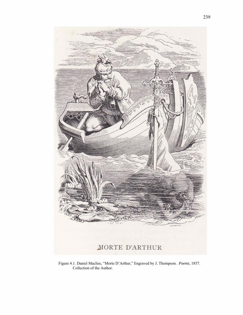
239
Figure 4.1. Daniel Maclise, “Morte D’Arthur,” Engraved by J. Thompson. Poems, 1857. Collection of the Author.
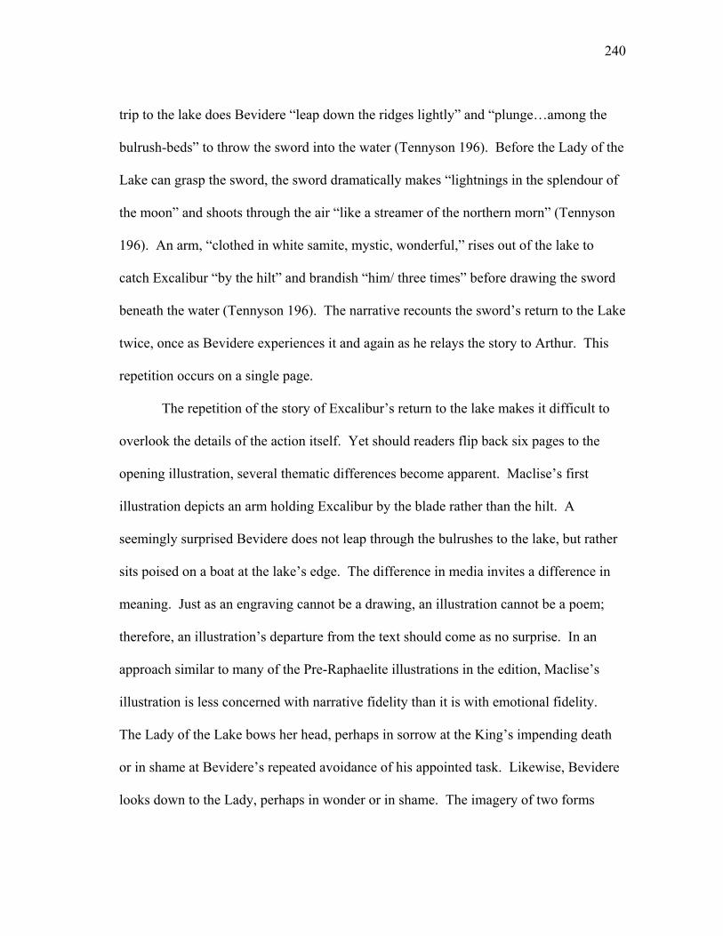
240
trip to the lake does Bevidere “leap down the ridges lightly” and “plunge…among the
bulrush-beds” to throw the sword into the water (Tennyson 196). Before the Lady of the
Lake can grasp the sword, the sword dramatically makes “lightnings in the splendour of
the moon” and shoots through the air “like a streamer of the northern morn” (Tennyson
196). An arm, “clothed in white samite, mystic, wonderful,” rises out of the lake to
catch Excalibur “by the hilt” and brandish “him/ three times” before drawing the sword
beneath the water (Tennyson 196). The narrative recounts the sword’s return to the Lake
twice, once as Bevidere experiences it and again as he relays the story to Arthur. This
repetition occurs on a single page.
The repetition of the story of Excalibur’s return to the lake makes it difficult to
overlook the details of the action itself. Yet should readers flip back six pages to the
opening illustration, several thematic differences become apparent. Maclise’s first
illustration depicts an arm holding Excalibur by the blade rather than the hilt. A
seemingly surprised Bevidere does not leap through the bulrushes to the lake, but rather
sits poised on a boat at the lake’s edge. The difference in media invites a difference in
meaning. Just as an engraving cannot be a drawing, an illustration cannot be a poem;
therefore, an illustration’s departure from the text should come as no surprise. In an
approach similar to many of the Pre-Raphaelite illustrations in the edition, Maclise’s
illustration is less concerned with narrative fidelity than it is with emotional fidelity.
The Lady of the Lake bows her head, perhaps in sorrow at the King’s impending death
or in shame at Bevidere’s repeated avoidance of his appointed task. Likewise, Bevidere
looks down to the Lady, perhaps in wonder or in shame. The imagery of two forms
241
looking down to the water at the bottom of the visual frame form visual lines that direct
the reader’s eye down to the text itself. The second illustration also establishes a parallel
relationship to the first illustration by also depicting the lake. The repetition of the
image of the lake establishes continuity between the illustrations and reiterates the
central role the lake plays in Tennyson’s narrative.
Maclise’s illustrations are indicative of a recurring juxtaposition in the edition
between some illustrations’ adherence to textual narrative and others’ reliance on visual
symbolism. Many of the illustrations from artists outside the Pre-Raphaelite
Brotherhood are literal visual interpretations of the text, and they bind to the text in
identifiable ways. Rather than liberally depart from the poems or attempt to evoke a
mood rather than a narrative, such illustrations provide specific visual counterparts to
textual moments. Like Stansfield’s adherence to textual details in “Edwin Morris,”
Thomas Creswick’s illustration to “A Farewell” includes the “lawn and lea,” the “river,”
the “alder tree,” and the “aspen” mentioned in the poem (Tennyson 348). Rather than
strive to strike a moral or emotional chord in sync with the poem, these illustrations
provide a visual checklist of imagery from the poem. Meaning in such illustrations is
internal—we need look no further than the text for insight into the illustration’s
meaning.
Illustrations like “A Farewell” are stylistically similar to vignettes, a stylistic
choice that several critics find out of place in the edition. Allan Life implies that the
“picturesque motifs” of the vignettes fail as illustrations due to their dependence on the
text for “what little iconographic meaning they possess” (493). However, this
242
dependence on the text is what makes the vignettes illustrations, for the literalness of
many of the vignettes makes them adhere to traditional expectations associated with
illustrations. The common stylistic choice of pairing vignettes with text also establishes
an “illusion of homogeneity among the works of different artists” (Lewis 177). For the
Academy artists, the vignettes join their work together and make it possible to
distinguish their work from much of the Pre-Raphaelite artists’ work. According to
Becky Winegard Lewis, when the Pre-Raphaelite artists chose to depart from the
vignette style, they “put their illustrations on a more equal footing with the poetry”
(177). The vignettes should not be dismissed so lightly.
Horsley’s illustrations for “Circumstance” are stylistically vignettes that provide
a visual narrative parallel to textual narrative. In the foreground of the first illustration
appear “two lovers” whispering by “an orchard wall,” while in the background children
play and a couple dotes on an infant (Tennyson 62). The illustration on the facing page
depicts a funeral procession passing “two graves grass-green … beside a gray church-
tower” (Tennyson 63).28 Both of the illustrations follow the poem’s narrative. The
poem encourages the shift in the illustrations’ depiction of scenes of life to scenes of
death; the closing lines announce the inevitability of death, for “so runs the round of life
from hour to hour” (Tennyson 63). The second illustration echoes the poem’s shift in
tone: a forlorn couple follows a funeral procession and a woman and child stand beside
two gravesites. The over-reaching branches of a tree tower over both scenes. In the first
illustration, delicate lines form the shape of the tree and a significant amount of the
wood block has been removed to leave the tree’s leaves primarily white [Figure 4.2].
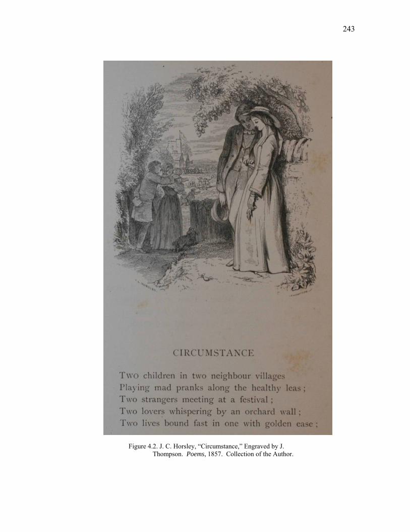
243
Figure 4.2. J. C. Horsley, “Circumstance,” Engraved by J. Thompson. Poems, 1857. Collection of the Author.
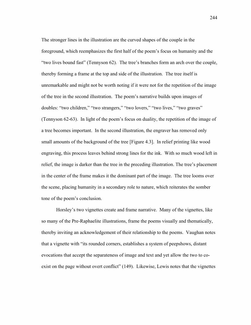
244
The stronger lines in the illustration are the curved shapes of the couple in the
foreground, which reemphasizes the first half of the poem’s focus on humanity and the
“two lives bound fast” (Tennyson 62). The tree’s branches form an arch over the couple,
thereby forming a frame at the top and side of the illustration. The tree itself is
unremarkable and might not be worth noting if it were not for the repetition of the image
of the tree in the second illustration. The poem’s narrative builds upon images of
doubles: “two children,” “two strangers,” “two lovers,” “two lives,” “two graves”
(Tennyson 62-63). In light of the poem’s focus on duality, the repetition of the image of
a tree becomes important. In the second illustration, the engraver has removed only
small amounts of the background of the tree [Figure 4.3]. In relief printing like wood
engraving, this process leaves behind strong lines for the ink. With so much wood left in
relief, the image is darker than the tree in the preceding illustration. The tree’s placement
in the center of the frame makes it the dominant part of the image. The tree looms over
the scene, placing humanity in a secondary role to nature, which reiterates the somber
tone of the poem’s conclusion.
Horsley’s two vignettes create and frame narrative. Many of the vignettes, like
so many of the Pre-Raphaelite illustrations, frame the poems visually and thematically,
thereby inviting an acknowledgement of their relationship to the poems. Vaughan notes
that a vignette with “its rounded corners, establishes a system of peepshows, distant
evocations that accept the separateness of image and text and yet allow the two to co-
exist on the page without overt conflict” (149). Likewise, Lewis notes that the vignettes
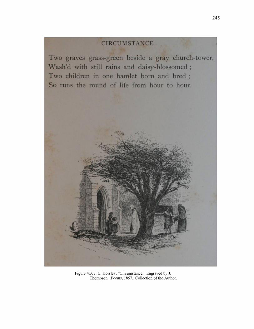
245
Figure 4.3. J. C. Horsley, “Circumstance,” Engraved by J. Thompson. Poems, 1857. Collection of the Author.

246
“tend to lean backward away from the words, and prevent any conflict or integration
with the passage” (177).29 The blurred lines of a vignette’s borders blend the visual
frame of the illustration with the page, which in turn creates a visual integration with the
page that extends to the text. The combination of this blending with the overt literalness
of many of the vignettes makes it easy to overlook them in favor of the tightly framed
and highly allegorical Pre-Raphaelite illustrations. Missing from the vignettes are the
hard lines that define the frame in most of the Pre-Raphaelite illustrations (for example,
Rossetti’s “Mariana in the South” and “The Palace of Art”). Even the lines in Millais’
“Mariana,” which have softly tapered edges, reinforce the separation of text and image.
Lines from the walls, ceiling and floor create architectural details that frame the
illustration and add to the claustrophobic atmosphere of the image. The room closes in
on Mariana, and as it does so, it closes out the text. Thus, in contrast to many of the Pre-
Raphaelite illustrations, the vignettes invite us to acknowledge the text rather than
prevent visual integration with the text.
Just as visual lines create or destroy borders between media, they also direct the
reader’s eye away from or towards the text. In Millais’s illustration of “Mariana,”
Mariana’s bent form creates an arch that encourages the eye to move past the visual
frame and down towards the text. The arbor in Mulready’s illustration of “The
Gardner’s Daughter; or The Pictures” forms a similar arch at the top of the illustration.
The placement of Hunt’s illustration at the beginning of the “The Lady of Shalott”
creates a visual hierarchy favoring the image literally above the text. Rossetti’s
engraving of Lancelot concludes the poem, creating a virtual bookend to the poem.
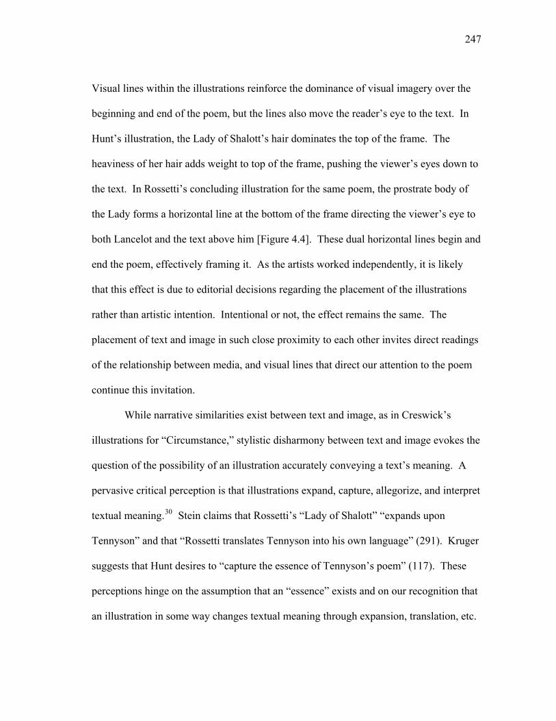
247
Visual lines within the illustrations reinforce the dominance of visual imagery over the
beginning and end of the poem, but the lines also move the reader’s eye to the text. In
Hunt’s illustration, the Lady of Shalott’s hair dominates the top of the frame. The
heaviness of her hair adds weight to top of the frame, pushing the viewer’s eyes down to
the text. In Rossetti’s concluding illustration for the same poem, the prostrate body of
the Lady forms a horizontal line at the bottom of the frame directing the viewer’s eye to
both Lancelot and the text above him [Figure 4.4]. These dual horizontal lines begin and
end the poem, effectively framing it. As the artists worked independently, it is likely
that this effect is due to editorial decisions regarding the placement of the illustrations
rather than artistic intention. Intentional or not, the effect remains the same. The
placement of text and image in such close proximity to each other invites direct readings
of the relationship between media, and visual lines that direct our attention to the poem
continue this invitation.
While narrative similarities exist between text and image, as in Creswick’s
illustrations for “Circumstance,” stylistic disharmony between text and image evokes the
question of the possibility of an illustration accurately conveying a text’s meaning. A
pervasive critical perception is that illustrations expand, capture, allegorize, and interpret
textual meaning.30 Stein claims that Rossetti’s “Lady of Shalott” “expands upon
Tennyson” and that “Rossetti translates Tennyson into his own language” (291). Kruger
suggests that Hunt desires to “capture the essence of Tennyson’s poem” (117). These
perceptions hinge on the assumption that an “essence” exists and on our recognition that
an illustration in some way changes textual meaning through expansion, translation, etc.
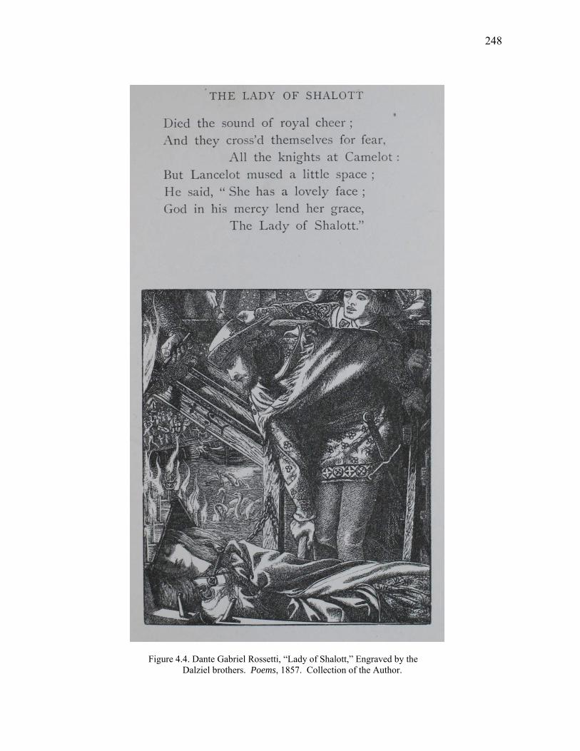
248
Figure 4.4. Dante Gabriel Rossetti, “Lady of Shalott,” Engraved by the Dalziel brothers. Poems, 1857. Collection of the Author.
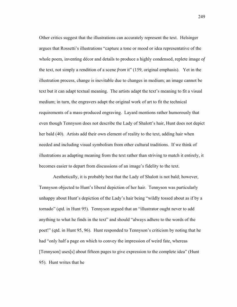
249
Other critics suggest that the illustrations can accurately represent the text. Helsinger
argues that Rossetti’s illustrations “capture a tone or mood or idea representative of the
whole poem, inventing décor and details to produce a highly condensed, replete image of
the text, not simply a rendition of a scene from it” (159, original emphasis). Yet in the
illustration process, change is inevitable due to changes in medium; an image cannot be
text but it can adapt textual meaning. The artists adapt the text’s meaning to fit a visual
medium; in turn, the engravers adapt the original work of art to fit the technical
requirements of a mass-produced engraving. Layard mentions rather humorously that
even though Tennyson does not describe the Lady of Shalott’s hair, Hunt does not depict
her bald (40). Artists add their own element of reality to the text, adding hair when
needed and including visual symbolism from other cultural traditions. If we think of
illustrations as adapting meaning from the text rather than striving to match it entirely, it
becomes easier to depart from discussions of an image’s fidelity to the text.
Aesthetically, it is probably best that the Lady of Shalott is not bald; however,
Tennyson objected to Hunt’s liberal depiction of her hair. Tennyson was particularly
unhappy about Hunt’s depiction of the Lady’s hair being “wildly tossed about as if by a
tornado” (qtd. in Hunt 95). Tennyson argued that an “illustrator ought never to add
anything to what he finds in the text” and should “always adhere to the words of the
poet!” (qtd. in Hunt 95, 96). Hunt responded to Tennyson’s criticism by noting that he
had “only half a page on which to convey the impression of weird fate, whereas
[Tennyson] uses[s] about fifteen pages to give expression to the complete idea” (Hunt
95). Hunt writes that he
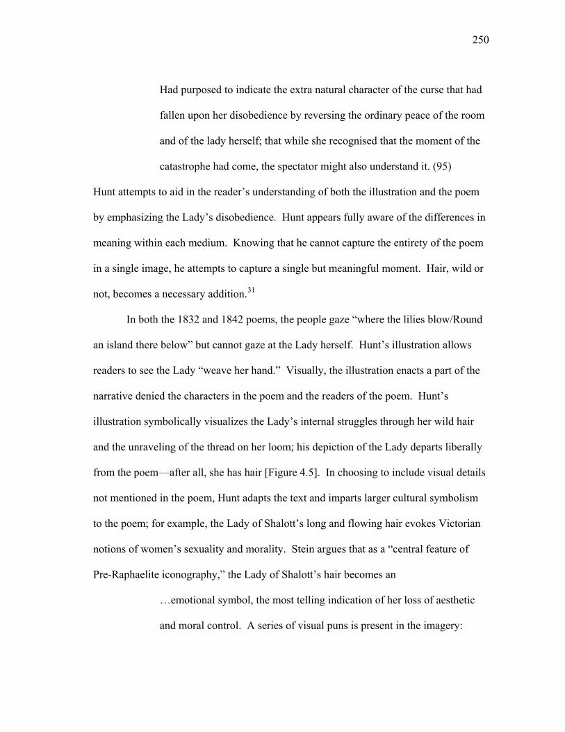
250
Had purposed to indicate the extra natural character of the curse that had
fallen upon her disobedience by reversing the ordinary peace of the room
and of the lady herself; that while she recognised that the moment of the
catastrophe had come, the spectator might also understand it. (95)
Hunt attempts to aid in the reader’s understanding of both the illustration and the poem
by emphasizing the Lady’s disobedience. Hunt appears fully aware of the differences in
meaning within each medium. Knowing that he cannot capture the entirety of the poem
in a single image, he attempts to capture a single but meaningful moment. Hair, wild or
not, becomes a necessary addition.31
In both the 1832 and 1842 poems, the people gaze “where the lilies blow/Round
an island there below” but cannot gaze at the Lady herself. Hunt’s illustration allows
readers to see the Lady “weave her hand.” Visually, the illustration enacts a part of the
narrative denied the characters in the poem and the readers of the poem. Hunt’s
illustration symbolically visualizes the Lady’s internal struggles through her wild hair
and the unraveling of the thread on her loom; his depiction of the Lady departs liberally
from the poem—after all, she has hair [Figure 4.5]. In choosing to include visual details
not mentioned in the poem, Hunt adapts the text and imparts larger cultural symbolism
to the poem; for example, the Lady of Shalott’s long and flowing hair evokes Victorian
notions of women’s sexuality and morality. Stein argues that as a “central feature of
Pre-Raphaelite iconography,” the Lady of Shalott’s hair becomes an
…emotional symbol, the most telling indication of her loss of aesthetic
and moral control. A series of visual puns is present in the imagery:
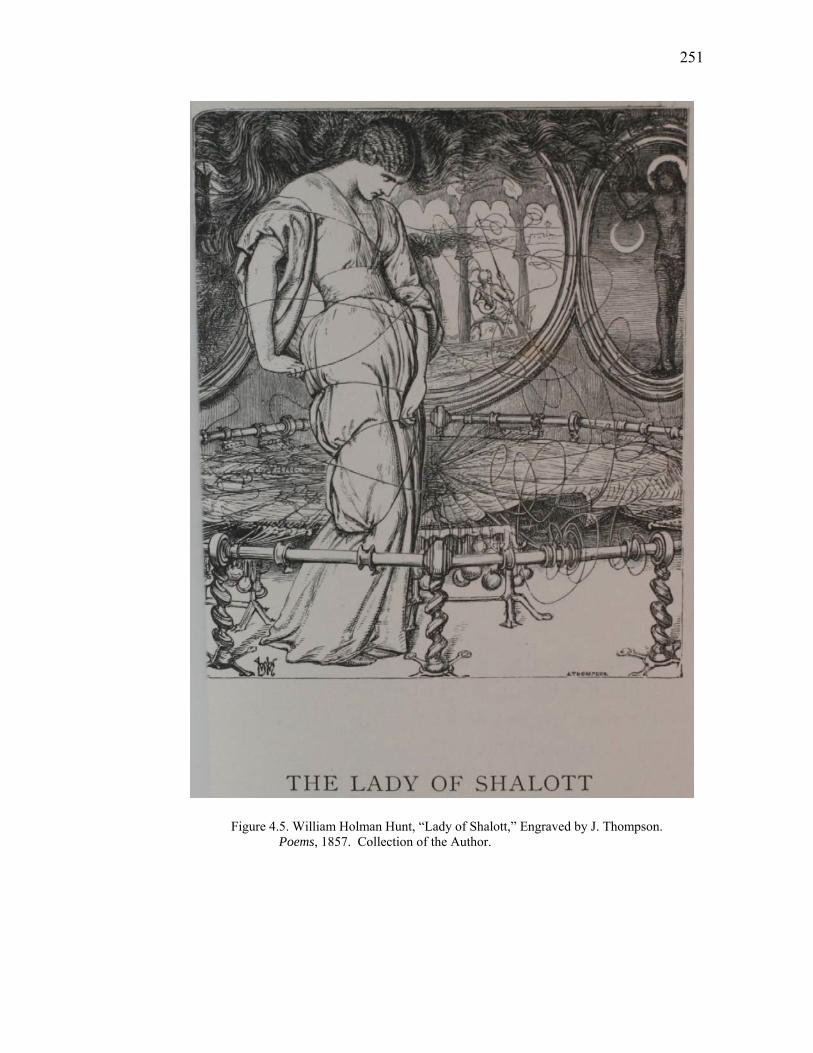
251
Figure 4.5. William Holman Hunt, “Lady of Shalott,” Engraved by J. Thompson. Poems, 1857. Collection of the Author.
252
coming undone, moral looseness, and not keeping one’s hair on (the
related American idiom is letting one’s hair down). (292)
Carol Rifelj notes that nineteenth-century visual and textual representations of women’s
loose hair are often associated with eroticism and sexuality (88). Rifelj suggests that
loose hair signifies distress and “disheveled hair became a traditional sign of general
physical or emotional disarray” (89). In the revised poem, Tennyson provides few
details as to the Lady’s emotional state; far from providing just an aesthetic element to
the image of the Lady, the Lady’s wild hair is suggestive of her emotional state. Hunt’s
depiction of the Lady’s loose hair and the unraveling threads on her loom are
emblematic of her internal distress and the implied loss of her virtue. Victorian readers
well versed in such iconography could transfer the visual symbolism of the Lady’s hair
onto the poem, thereby inflecting sexual and moral undertones from the illustration into
the text itself.
In the version of the poem in the Moxon Tennyson, the poem’s descriptiveness is
limited to the Lady’s surroundings and to the world she cannot access:
Four gray walls, and four gray towers,
Overlook a space of flowers,
And the silent isle imbowers
The Lady of Shalott. (68)
The 1832 version of the poem is even more descriptive of the bower. The poem
describes “the little isle is all inrail'd/ With a rose-fence, and overtrail'd/With roses” (9).
The text’s descriptive passages in the revised poem are limited to the world outside the
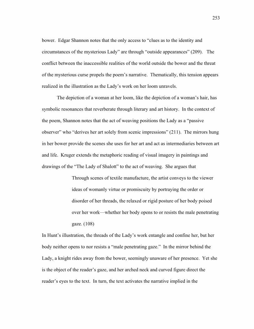
253
bower. Edgar Shannon notes that the only access to “clues as to the identity and
circumstances of the mysterious Lady” are through “outside appearances” (209). The
conflict between the inaccessible realities of the world outside the bower and the threat
of the mysterious curse propels the poem’s narrative. Thematically, this tension appears
realized in the illustration as the Lady’s work on her loom unravels.
The depiction of a woman at her loom, like the depiction of a woman’s hair, has
symbolic resonances that reverberate through literary and art history. In the context of
the poem, Shannon notes that the act of weaving positions the Lady as a “passive
observer” who “derives her art solely from scenic impressions” (211). The mirrors hung
in her bower provide the scenes she uses for her art and act as intermediaries between art
and life. Kruger extends the metaphoric reading of visual imagery in paintings and
drawings of the “The Lady of Shalott” to the act of weaving. She argues that
Through scenes of textile manufacture, the artist conveys to the viewer
ideas of womanly virtue or promiscuity by portraying the order or
disorder of her threads, the relaxed or rigid posture of her body poised
over her work—whether her body opens to or resists the male penetrating
gaze. (108)
In Hunt’s illustration, the threads of the Lady’s work entangle and confine her, but her
body neither opens to nor resists a “male penetrating gaze.” In the mirror behind the
Lady, a knight rides away from the bower, seemingly unaware of her presence. Yet she
is the object of the reader’s gaze, and her arched neck and curved figure direct the
reader’s eyes to the text. In turn, the text activates the narrative implied in the
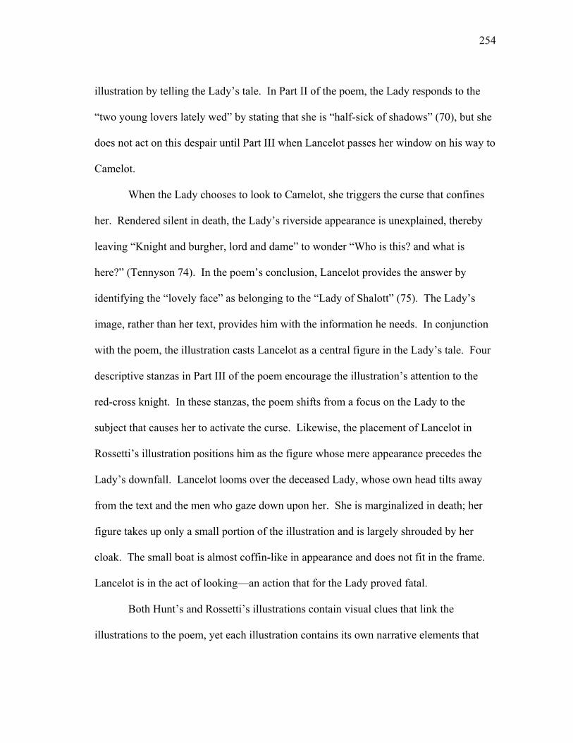
254
illustration by telling the Lady’s tale. In Part II of the poem, the Lady responds to the
“two young lovers lately wed” by stating that she is “half-sick of shadows” (70), but she
does not act on this despair until Part III when Lancelot passes her window on his way to
Camelot.
When the Lady chooses to look to Camelot, she triggers the curse that confines
her. Rendered silent in death, the Lady’s riverside appearance is unexplained, thereby
leaving “Knight and burgher, lord and dame” to wonder “Who is this? and what is
here?” (Tennyson 74). In the poem’s conclusion, Lancelot provides the answer by
identifying the “lovely face” as belonging to the “Lady of Shalott” (75). The Lady’s
image, rather than her text, provides him with the information he needs. In conjunction
with the poem, the illustration casts Lancelot as a central figure in the Lady’s tale. Four
descriptive stanzas in Part III of the poem encourage the illustration’s attention to the
red-cross knight. In these stanzas, the poem shifts from a focus on the Lady to the
subject that causes her to activate the curse. Likewise, the placement of Lancelot in
Rossetti’s illustration positions him as the figure whose mere appearance precedes the
Lady’s downfall. Lancelot looms over the deceased Lady, whose own head tilts away
from the text and the men who gaze down upon her. She is marginalized in death; her
figure takes up only a small portion of the illustration and is largely shrouded by her
cloak. The small boat is almost coffin-like in appearance and does not fit in the frame.
Lancelot is in the act of looking—an action that for the Lady proved fatal.
Both Hunt’s and Rossetti’s illustrations contain visual clues that link the
illustrations to the poem, yet each illustration contains its own narrative elements that
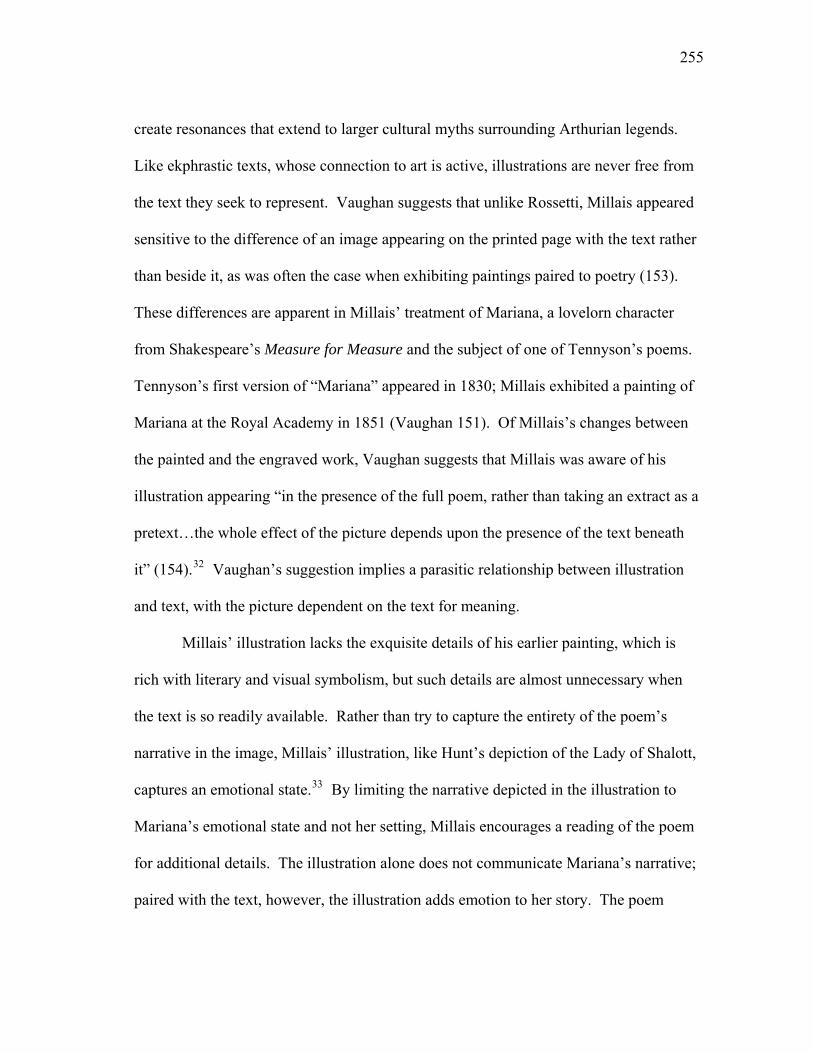
255
create resonances that extend to larger cultural myths surrounding Arthurian legends.
Like ekphrastic texts, whose connection to art is active, illustrations are never free from
the text they seek to represent. Vaughan suggests that unlike Rossetti, Millais appeared
sensitive to the difference of an image appearing on the printed page with the text rather
than beside it, as was often the case when exhibiting paintings paired to poetry (153).
These differences are apparent in Millais’ treatment of Mariana, a lovelorn character
from Shakespeare’s Measure for Measure and the subject of one of Tennyson’s poems.
Tennyson’s first version of “Mariana” appeared in 1830; Millais exhibited a painting of
Mariana at the Royal Academy in 1851 (Vaughan 151). Of Millais’s changes between
the painted and the engraved work, Vaughan suggests that Millais was aware of his
illustration appearing “in the presence of the full poem, rather than taking an extract as a
pretext…the whole effect of the picture depends upon the presence of the text beneath
it” (154).32 Vaughan’s suggestion implies a parasitic relationship between illustration
and text, with the picture dependent on the text for meaning.
Millais’ illustration lacks the exquisite details of his earlier painting, which is
rich with literary and visual symbolism, but such details are almost unnecessary when
the text is so readily available. Rather than try to capture the entirety of the poem’s
narrative in the image, Millais’ illustration, like Hunt’s depiction of the Lady of Shalott,
captures an emotional state.33 By limiting the narrative depicted in the illustration to
Mariana’s emotional state and not her setting, Millais encourages a reading of the poem
for additional details. The illustration alone does not communicate Mariana’s narrative;
paired with the text, however, the illustration adds emotion to her story. The poem
256
includes an epigraph from Measure for Measure that further keys the text to the
engraving and alerts us to the setting of both the poem and the illustration [Figure 4.6].
Millais depicts Mariana in the “moated grange”; through the windows of her bower, we
can see the “blacken’d waters” of the moat and the poplar shaken so hard by the wind
(9). The poem’s title, epigraph, and content invite readers to recognize a larger textual
and visual history, while also imparting emotional tension to the illustration.
If Millais was aware that his illustration’s appearance within full view of the text
had implications for visual meaning, we must recognize that the same is true for the
poem. The absence of visual details in the illustration allows the poem to speak for
itself. The poem is rich with details that invoke the senses: Mariana feels “cold winds”
(8), watches “gusty” shadows (9), cries tears “with the dews at even” (9), and hears the
ominously “slow clock ticking” (10).34 Millais’ painting of Mariana similarly depicts
such minute details. The painting requires, Prettejohn suggests, a “half-an-hour—
perhaps more” for the viewer to take “the responsibility of looking seriously” (11). In
contrast to the “heavy demands” the painting makes on the viewer (Prettejohn 11), the
illustration requires little interpretative work. The poem, not the illustration, details
Mariana’s tedious and emotional wait for her lover. In the illustration, Mariana’s
collapsed form on the window seat visualizes her total emotional collapse. Mariana has
turned away from the window, and she has turned from the decaying imagery so
eloquently described in the poem.
Millais’ illustration for “The Sisters,” a tragic tale of love and revenge, also
demonstrates his awareness of the implications of an image appearing within full view of
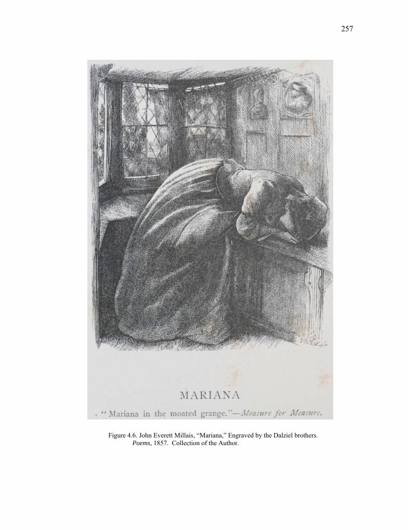
257
Figure 4.6. John Everett Millais, “Mariana,” Engraved by the Dalziel brothers. Poems, 1857. Collection of the Author.
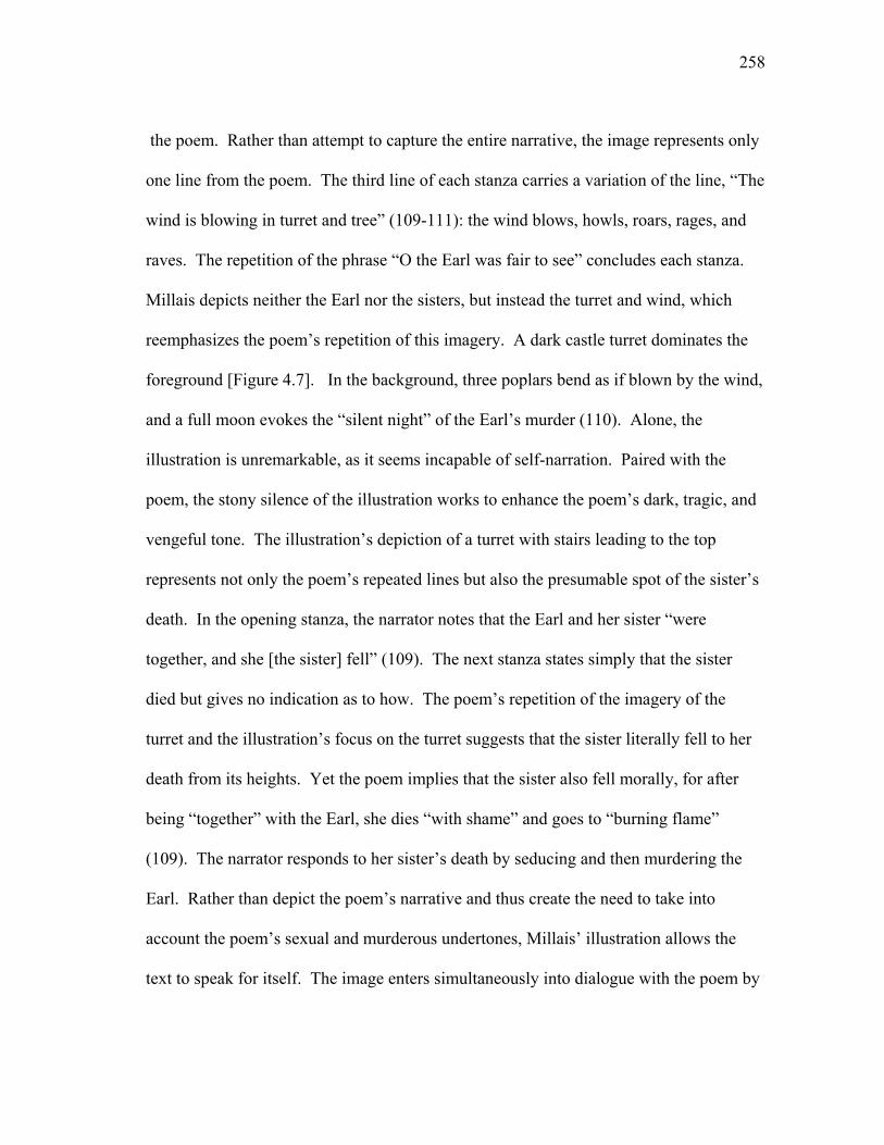
258
the poem. Rather than attempt to capture the entire narrative, the image represents only
one line from the poem. The third line of each stanza carries a variation of the line, “The
wind is blowing in turret and tree” (109-111): the wind blows, howls, roars, rages, and
raves. The repetition of the phrase “O the Earl was fair to see” concludes each stanza.
Millais depicts neither the Earl nor the sisters, but instead the turret and wind, which
reemphasizes the poem’s repetition of this imagery. A dark castle turret dominates the
foreground [Figure 4.7]. In the background, three poplars bend as if blown by the wind,
and a full moon evokes the “silent night” of the Earl’s murder (110). Alone, the
illustration is unremarkable, as it seems incapable of self-narration. Paired with the
poem, the stony silence of the illustration works to enhance the poem’s dark, tragic, and
vengeful tone. The illustration’s depiction of a turret with stairs leading to the top
represents not only the poem’s repeated lines but also the presumable spot of the sister’s
death. In the opening stanza, the narrator notes that the Earl and her sister “were
together, and she [the sister] fell” (109). The next stanza states simply that the sister
died but gives no indication as to how. The poem’s repetition of the imagery of the
turret and the illustration’s focus on the turret suggests that the sister literally fell to her
death from its heights. Yet the poem implies that the sister also fell morally, for after
being “together” with the Earl, she dies “with shame” and goes to “burning flame”
(109). The narrator responds to her sister’s death by seducing and then murdering the
Earl. Rather than depict the poem’s narrative and thus create the need to take into
account the poem’s sexual and murderous undertones, Millais’ illustration allows the
text to speak for itself. The image enters simultaneously into dialogue with the poem by

259
Figure 4.7. John Everett Millais, “The Sisters,” Engraved by the Dalziel brothers. Poems, 1857. Collection of the Author.
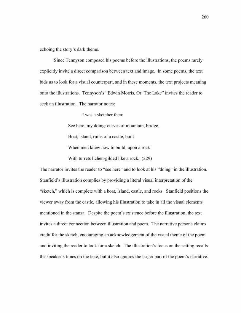
260
echoing the story’s dark theme.
Since Tennyson composed his poems before the illustrations, the poems rarely
explicitly invite a direct comparison between text and image. In some poems, the text
bids us to look for a visual counterpart, and in these moments, the text projects meaning
onto the illustrations. Tennyson’s “Edwin Morris, Or, The Lake” invites the reader to
seek an illustration. The narrator notes:
I was a sketcher then:
See here, my doing: curves of mountain, bridge,
Boat, island, ruins of a castle, built
When men knew how to build, upon a rock
With turrets lichen-gilded like a rock. (229)
The narrator invites the reader to “see here” and to look at his “doing” in the illustration.
Stanfield’s illustration complies by providing a literal visual interpretation of the
“sketch,” which is complete with a boat, island, castle, and rocks. Stanfield positions the
viewer away from the castle, allowing his illustration to take in all the visual elements
mentioned in the stanza. Despite the poem’s existence before the illustration, the text
invites a direct connection between illustration and poem. The narrative persona claims
credit for the sketch, encouraging an acknowledgement of the visual theme of the poem
and inviting the reader to look for a sketch. The illustration’s focus on the setting recalls
the speaker’s times on the lake, but it also ignores the larger part of the poem’s narrative.
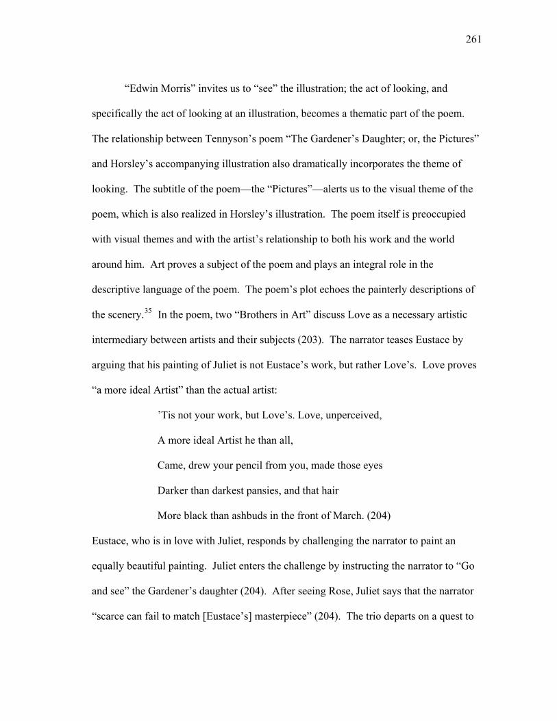
261
“Edwin Morris” invites us to “see” the illustration; the act of looking, and
specifically the act of looking at an illustration, becomes a thematic part of the poem.
The relationship between Tennyson’s poem “The Gardener’s Daughter; or, the Pictures”
and Horsley’s accompanying illustration also dramatically incorporates the theme of
looking. The subtitle of the poem—the “Pictures”—alerts us to the visual theme of the
poem, which is also realized in Horsley’s illustration. The poem itself is preoccupied
with visual themes and with the artist’s relationship to both his work and the world
around him. Art proves a subject of the poem and plays an integral role in the
descriptive language of the poem. The poem’s plot echoes the painterly descriptions of
the scenery.35 In the poem, two “Brothers in Art” discuss Love as a necessary artistic
intermediary between artists and their subjects (203). The narrator teases Eustace by
arguing that his painting of Juliet is not Eustace’s work, but rather Love’s. Love proves
“a more ideal Artist” than the actual artist:
’Tis not your work, but Love’s. Love, unperceived,
A more ideal Artist he than all,
Came, drew your pencil from you, made those eyes
Darker than darkest pansies, and that hair
More black than ashbuds in the front of March. (204)
Eustace, who is in love with Juliet, responds by challenging the narrator to paint an
equally beautiful painting. Juliet enters the challenge by instructing the narrator to “Go
and see” the Gardener’s daughter (204). After seeing Rose, Juliet says that the narrator
“scarce can fail to match [Eustace’s] masterpiece” (204). The trio departs on a quest to
262
find Rose, and Eustace, the first to spy the Gardener’s daughter, prompts the narrator to
“Look! Look!” (207). The narrator looks.
After introducing Rose into the narrative, the narrator begins a lengthy
description of both the Gardener’s daughter and nature, establishing what Tennyson
called the “central picture” of the poem” (qtd. in Hallam Tennyson 197).36 The narrator
describes Rose’s “One arm aloft,” her dress that “fitted to the shape,” and the
“bounteous wave” of her hair “as never pencil drew” (208). Eustace encourages the
narrator to “climb the top of Art” and to paint Rose, a painting that will prove “Love,/ A
more ideal artist he than all” (209). What the narrator sees colors his response to the
world around him. Rose becomes the source of “Love at first sight” (209) and the
inspiration for his masterpiece. After looking upon Rose, the narrator “could not sleep
for joy” (Tennyson 209); Rose consumes his thoughts and enhances his awareness of the
sights and sounds around him.
At the poem’s conclusion, the narrator turns to the recipient of the story,
observing that the listener’s eyes have “been intent/ On that veil’d picture” (Tennyson
212). The veil, the narrator admits, is drawn because the painting “May not be dwelt on
by the common day” (Tennyson 212). Lawrence J. Starzyk suggests that the narrator’s
hesitancy in unveiling the portrait stems from his realization that he cannot achieve a
“verbal rendering” or “painted representation that actually squares in the present with
what Rose represented years earlier” (50). This hesitancy, Starzyk argues, reflects the
narrator’s opposition “to the idea of contrast or fundamental difference between object
and its artistic representation” (50). Yet the listener is not susceptible to this opposition;
263
unable to view Rose in life, the listener can only compare the narrator’s verbal
description of Rose with the painting of Rose. Poetry and painting must stand in for
Rose herself. To aid in making the connection between art and life, the narrator
positions Love as the intermediary; he advises the viewer to “Raise thy soul;/ Make thine
heart ready with thine eyes” (Tennyson 212). The narrator removes the veil and invites
the listener to “behold her there” (Tennyson 212).37
The speaker never describes the painting that the listener sees. Instead, the final
stanza describes Rose in relation to the narrator; the speaker denies readers a descriptive
passage that unveils the painting. We learn what Rose represents, not what the painting
represents. She is the “idol” of the speaker’s “youth,” his “first, last love,” the “darling”
of his “manhood,” and the “most blessed memory” of his “age” (212). She is also silent;
Rose’s only comment in the poem positions her entirely in relation to the speaker: “I am
thine” (211). Love, as the intermediary between the artist, his subject, and his work,
further distances Rose from the painting of Rose. The listener, after all, does not
actually behold Rose but rather a painting of Rose. Yet Rose’s reality—or unreality—is
irrelevant once she has been captured in paint because the listener cannot view her as a
referent. The earlier reference to the exaggerations in Eustace’s painting of Juliet
reinforces the poem’s thematic acknowledgement of Art’s inability to depict reality.
Love may prove a more “ideal Artist,” but love creates artistic fiction (204). The poem
positions Love, veils, landscape, and memory as intermediaries and boundaries between
the artist and his subject. In this way, we can never truly see what the
painting/illustration represents. The painting’s referent becomes an abstract identity, a
264
possession, a memory, and a symbol rather than an actual woman. Furthermore, as a
copy of Rose and not Rose herself, the painting is decidedly fiction.
While “never [a] pencil” had drawn Rose before her meeting with the narrator,
she is doubly captured on canvas and page in the poem and the illustration. The reader,
like the listener in the poem, beholds a picture of Rose [Figure 4.8]. Horsley’s
illustration unveils Rose, and it depicts her suspended in the initial moment in which the
narrator first sees her. While the narrator notes that his “prelude” (the poem) has
“prepared” the viewer for the sight of Rose, Horsley’s illustration precedes the poem; the
reader becomes privy to the painting in the light of the “common day,” before the
narrator allows the listener/reader access to the image. In this way, Horsley’s illustration
undermines the narrative of the text; the reader cannot prepare their eyes for the
speaker’s vision of Rose because the reader encounters the illustration before the text.
Horsley’s illustration makes visible the inaccessible and positions the reader as a voyeur
in relation to a beautiful and mysterious woman. The illustration is implicated in the
poem’s positioning of Love (and Rose) as an intermediary between life and art. This
allows the reader, not the listener, to judge the success or failure of this relationship early
on in the poem. Yet the inability of the reader to judge the illustration/poem/painting in
relation to the gardener’s daughter herself renders such judgment moot. The illustration,
itself an engraving based on a drawing based on a poem, reinforces and participates in
the poem’s acknowledgement of the fictionality of representation.
The narrative voice in Tennyson’s “Miller’s Daughter” also invites a comparison
between text and image, and this comparison binds the media together. In the opening
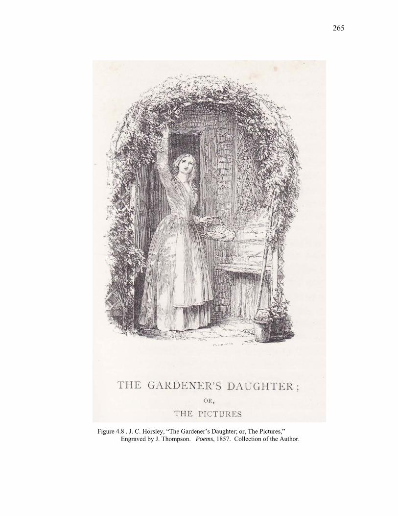
265
Figure 4.8 . J. C. Horsley, “The Gardener’s Daughter; or, The Pictures,” Engraved by J. Thompson. Poems, 1857. Collection of the Author.
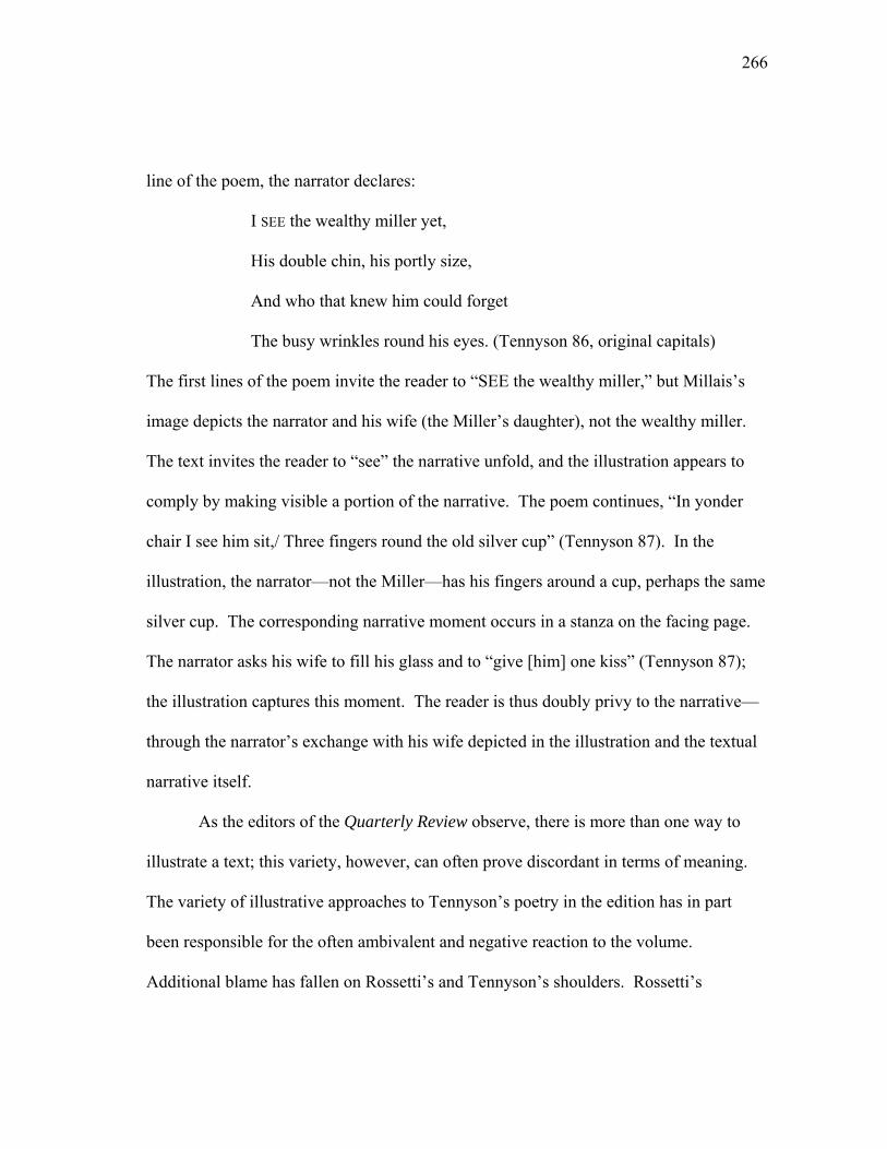
266
line of the poem, the narrator declares:
I SEE the wealthy miller yet,
His double chin, his portly size,
And who that knew him could forget
The busy wrinkles round his eyes. (Tennyson 86, original capitals)
The first lines of the poem invite the reader to “SEE the wealthy miller,” but Millais’s
image depicts the narrator and his wife (the Miller’s daughter), not the wealthy miller.
The text invites the reader to “see” the narrative unfold, and the illustration appears to
comply by making visible a portion of the narrative. The poem continues, “In yonder
chair I see him sit,/ Three fingers round the old silver cup” (Tennyson 87). In the
illustration, the narrator—not the Miller—has his fingers around a cup, perhaps the same
silver cup. The corresponding narrative moment occurs in a stanza on the facing page.
The narrator asks his wife to fill his glass and to “give [him] one kiss” (Tennyson 87);
the illustration captures this moment. The reader is thus doubly privy to the narrative—
through the narrator’s exchange with his wife depicted in the illustration and the textual
narrative itself.
As the editors of the Quarterly Review observe, there is more than one way to
illustrate a text; this variety, however, can often prove discordant in terms of meaning.
The variety of illustrative approaches to Tennyson’s poetry in the edition has in part
been responsible for the often ambivalent and negative reaction to the volume.
Additional blame has fallen on Rossetti’s and Tennyson’s shoulders. Rossetti’s
267
difficulty in working with the engravers resulted in a “tardy delivering of the drawings”
that delayed the edition by several months (Jeffers 233). The delay caused the edition to
miss the Christmas book season, which resulted in disappointing sales (Hagen 24). By
1863, 5,000 unsold copies of the book remained; of these books, Moxon was only able
to sell 2,210 (Hagen 24). The leftover stock and wood blocks were eventually sold to
Routledge and Co., who then reduced the cost of the book and sold the remaining copies
for 1₤ 1s (Dalziel 86). According to the Dalziels, Routledge wanted to produce a new
illustrated edition of the poems but could not meet Tennyson’s terms, which were “too
high to leave any margin of profit for the publisher” (86). To the Dalziels, Tennyson is
responsible for “the book being so long out of print” (86). Rossetti’s quest for artistic
perfection and Tennyson’s desire to regain authorial control over the work (or at least
the work’s profits) directly influenced the text’s sales.
While the work gathered dust on publisher’s shelves, Tennyson continued to
publish new poems. Many of the contributing artists to the Moxon edition continued to
recast their contributions from the edition into the market in new forms.38 The Moxon
Tennyson is one of many illustrated works in the nineteenth-century that demonstrate the
movement of a text through several generations via visual materials. An image’s ability
to move a text forward into new generations is perhaps nowhere more apparent than in
film adaptations, where our encounter with the text is limited, if it exists at all. Text and
image are isolated and no longer share a page or space, but adaptations nonetheless
encourage and often force the connection between image and text. These shared

268
moments, no matter how brief, remind viewers that a text predates the image. At the
same time, visual meaning in film struggles to escape the constraints of textual meaning.
269
Notes
1. Of the illustrations’ placement, William Vaughan proposes that “technically
… the images almost invariably occur outside the poem’s space, rather than integrating
with it” (149). While the images do not integrate with the text in the same manner that
William Blake’s illuminated works do, they nonetheless invite the reader’s eye to
acknowledge the poem’s space, thereby integrating the image with the text.
2. Other artists exhibited earlier versions of works based on Tennyson’s poems.
Suriano notes that “nearly every Pre-Raphaelite painting and drawing is related to
literature” (32). For this reason, Helsinger proposes that literary critics should pay more
attention to the “uniquely active role of visual and material arts practices in making
poetry new” (Poetry 3).
3. The use of larger cultural myths, such as Arthurian legends, and direct
allusions to other poems, such as John Keats’s “Eve of St. Agnes” and Sir Thomas
Malory’s Le Morte de Arthur, expands meaning in the poems to other texts.
4. Poems (1857) is a “reproduction of the Tenth Edition of the Poems, though
some of the pieces are arranged in different order” (Wise 98).
5. The artists were Thomas Creswick, John Everett Millais, William Holman
Hunt, William Mulready, J. C. Horsley, Dante Gabriel Rossetti, Clarkson Stanfield, and
Daniel Maclise. The engravers were the Dalziel Brothers (George, Edward, John, and
Thomas), W.J. Linton, T. Williams, John Thompson, W. T. Green, and D. T. Thomson.
270
6. A printer’s note declares that “the second division of this volume was
published in the winter of 1832. Some of the poems have been considerably altered.
Others have been added” (n.p).
7. Much critical attention has been paid to the gender and artistic implications of
the poem. Erik Gray views the Lady as a poet figure who becomes an artist when she
“willfully” enters a “state in which she cannot assert her will” (Gray 47). He notes that
the 1842 revisions “downplay the defiant perversity of the Lady’s choice, in order to
emphasize that the choice is in fact an aesthetic one” (Gray 52). David Goslee argues
that she is “defined almost exclusively by negation” in the 1842 version (55). Shifting to
the gendered implications of the poem’s aesthetics, Carla Plasa argues that in choosing
to act the Lady attempts to cross “from private/‘feminine’ to public/‘masculine’ worlds”
(250). Kathy Alexis Psomiades notes that the poem constructs the opposition between
the Lady’s “private artistic activity to the real world outside her tower” as a “problem”
(27, original emphasis).
For a close reading of gender in the poem, see Edgar F. Shannon’s article “Poetry
as Vision: Sight and Insight in ‘The Lady of Shalott.’”
8. Landseer does not appear in the volume.
9. The Moxon Tennyson shares much with Romantic-period literary annuals that
also combined a variety of texts with a variety of engravings. In Charles Tilt’s edition of
scenes from Scott’s work, George Cruikshank’s crude characters coexist, seemingly in
harmony, with picturesque landscapes by J. M. W. Turner.
271
10. Vaughan dates the end of the Pre-Raphaelite Brotherhood as 1855 (152).
Due to aesthetic and thematic similarities between their works, most historical accounts
tend to continue to group the artists together under the umbrella term of “Pre-
Raphaelite” even after 1855.
11. Millais was also a member of the Royal Academy, but he is most often
associated with the Pre-Raphaelite movement. For example, in his overview of
nineteenth-century art, Robert Rosenblum groups Millais with the Pre-Raphaelites,
rather than with Millais’ fellow Royal Academy artists.
12. In general, the continuous cross-referencing at work in much of the Pre-
Raphaelites’ oeuvres encourages us to identify their work as “self-conscious effort[s] to
develop a distinctive collaborative approach” (Stein 103). Most of the members of the
group used a common color palette of vibrant jewel tones in their paintings and worked
with similar themes (primarily literary, biblical, and medieval subjects). The group’s
aesthetic goals include an adherence to the “absolute truth to nature” (Rosenblum 263),
which, according to Richard Humphreys, “involved both a precise naturalism and a
commitment to historical exactitude” (126).
13. Julia Thomas suggests that many of the illustrations mark a “movement
away from the Hogarthian narratives produced by Cruikshank…to the more abstract
designs associated with the Pre-Raphaelites” (71).
14. Rossetti provided illustrations for “The Lady of Shalott,” “The Palace of
Art,” and “Sir Galahad.”
272
15. Rossetti writes to Hunt in 1855 noting that he thinks “illustrated editions of
poets however good (and this will be far from uniformly so) quite hateful things”
(Letters 14). Rossetti claims that he does not “feel easy as an aider or abettor” in the
process (Letters 14). Despite Rossetti’s disdainful opinion, his letter continues by
offering ideas for illustrations for the “Lady of Shalott.” Helsinger suggests that
Rossetti was anxious to defend his status as a creative artist even when
working for a commercial publisher and a popular audience to sell other
poets’ poems. (The myth of an artist’s detachment from commerce itself
was not without important market value, an irony with which artists since
at least the beginning of the nineteenth century had been struggling).
(155)
16. Layard does not appear to think the overpowering always has negative
consequences, noting that in some cases Rossetti’s illustrations are successful and
sometimes brilliant (9).
17. Critical discussions of Tennyson tend to distance the poet from art, or at least
art associated with commercialism. Layard argues that Tennyson displayed a “general
insensibility to pictorial art” (7) and had a “curious indifference” towards the “pictorial
and plastic arts” (6). Hagen suggests that Tennyson’s aversion to the “illustrated and
lavishly bound ‘coffee-table books’” demonstrates his dissociation from “the
predominant taste of his times” (22). However, Tennyson’s participation in commercial
ventures like the literary annuals and illustrated books suggests that the Poet Laureate
was willing to conform to the “taste of his times.” Kathryn Ledbetter finds the
273
discrepancy between Tennyson’s actions and his expressed disdain for popular
publications ironic (9). While he was by no means an active participant in the
production of the illustrations for the Moxon edition, Tennyson did travel with Moxon to
meet Creswick, Mulready, Horsley and Millais to discuss the project (Tennyson, Letters
89).
18. Improved impression rates allowed by the newer steam presses also made
the wood engraving process an economic one (Buchanan-Brown 14).
19. In the Victorian period, illustrated materials included illustrated books, serial
magazines, and a growing number of illustrated newspapers, such as the London
Illustrated News.
20. The process also required a distinct set of skills on the part of the engraver
and encouraged the continuation of the tradition of established engraving firms.
21. In an effort to preserve control over the engraving of his work, Rossetti
enlisted the help of other Pre-Raphaelite artists. While in Bath in 1856, Rossetti writes
to Ford Madox Brown in London to express his hope that Brown could save his St.
Cecily block “a dig or two” and to ask him to impress upon the engraver that “none of
the work is to be left out” (Letters 143). Rossetti encloses a letter for Brown to pass on
to Dalziel. The letter expresses his knowledge that Dalziel is “cutting a
drawing…that…will soon be finished,” and Rossetti requests that the proof be sent
directly to him for retouching (143). Despite his absence from London, Rossetti proves
determined to remain a part of the illustration process.
274
22. Alicia Faxon suggests that some of Rossetti’s unhappiness with the
illustrations is due to the “distortion of Rossetti’s extremely individualistic
representations by conventional Victorian pictorial modes and figural types” (64).
23. The Dalziel brothers note that Rossetti was a “man difficult to please in his
literary work as well as in his art” (89).
24. In contrast to Rossetti’s approach, Millais appears to understand the tonal
limitations of the engraving medium, and he formats his corrections to W.J. Linton’s
proofs for the engraving of “Dream of Fair Women” accordingly. Millais sends a sketch
marked with white paint, rather than with pen and ink, chalk, and color-wash (Marsh
12). His efforts to make Linton “understand [his] wishes,” results in his satisfaction that
the new proof is “quite a facsimile” of his original drawing (qtd. in Marsh 13).
25. In a letter to Moxon before the publication of the 1832 edition of his poems,
Tennyson asserted his interest in arranging, correcting, and ensuring a correct type of his
poems in the volume (80).
26. The Dalziel brothers also engraved many of the illustrations in the
Abbotsford edition of the Waverley novels.
27. A small sampling of critical references to the work are as follows: Jeffers
refers to the work as the “Moxon edition” (232), and Faxon and Lewis each call the
work the “Moxon Tennyson.”
28. Andrew Leng suggests that Millais’s painting, A Huguenot, was “originally
planned as an illustration to the line, ‘Two lovers whispering by a wall’” from
“Circumstance” (64).
275
29. Lewis’s article is conceptually and verbally repetitive of Vaughan’s earlier
work.
30. Julian Treuherz, Elizabeth Prettejohn and Edwin Becker acknowledge that
Rossetti “evoked the spirit of poetry” in “highly original” art, while also acknowledging
his homage to Flemish painting and medieval manuscript illuminations (176). As the
Dalziel brothers, not Rossetti, engraved the illustrations, the corporate nature of
Rossetti’s work challenges the concept of “highly original” art. In discussing his
illustrations of Tennyson’s poems, Rossetti emphasizes the importance of illustrations
“where one can allegorize on one’s own hook on the subject of the poem, without
killing, for oneself and everyone, a distinct idea of the poet’s” (qtd. in Stein 284). As a
visual “interpreter” of Tennyson (Stein 298), Rossetti encourages the viewer to look to
the text and not to the illustrations alone. In Rossetti’s logic, the poet’s original meaning
is not lost in the illustrations.
31. While Tennyson provides little in the way of describing the lady, multiple
generations of artists would try to represent the Lady and her story. Kruger suggests that
it is this position of the Lady as “both subject and object” that “contributes to the poem’s
popularity, suggesting why so many artists became preoccupied with its theme” (114).
Lynne pierces observes that by the end of the nineteenth-century the Lady had become
“a concept rather than even a narrative archetype” (71). Indeed, she became a popular
“concept.” Richard Altick estimates that over three hundred paintings exist from
Tennyson’s work (449), and each painting maintains an implied link to Tennyson’s text.
276
These implied connections encourage us to read images through the lens of textual
meaning and a brand name.
32. Lewis echoes Vaughan’s sentiment and argues that Millais “understood
more clearly the accepted and traditional role of the illustrator to make visible the
meanings and descriptions of the author’s intent” (178).
33. The focus on “personal emotion was to remain a constant goal of Pre-
Raphaelite art” (Stein, Ritual 130).
34. Herbert Tucker argues that the concluding stanzas of “Mariana” challenge
John Keats’ “To Autumn” by enacting a “point-for-point reversal” of Keats’ poem” (76).
Tennyson’s poem rehearses “several of the leading images in Keats…backwards”
(Tucker 76).
35. Tennyson admits that a Titian painting influenced many of the autumnal
descriptions in the narrative (Jordan 38). Stopford Augustus Brooke celebrates the
“changing scene[s] painted” throughout the poem (103).
36. Tennyson claims that the passage “describing the girl, must be full and rich.
The poem is so, to a fault, especially the descriptions of nature, for the lover is an artist,
but this being so, the central picture must hold its place” (Hallam Tennyson 197)
37. Tennyson’s poem proves to be a happier story than that of the Duchess in
Robert Barrett Browning’s “My Last Duchess,” whose portrait is similarly veiled. Both
poems, however, position the narrators as men in possession of veiled paintings of
women. Starzyk argues that “both men regard the veil as a sign of the property that they
277
possess but choose to hide. The unveiling in each case reminds the spectator admitted to
vision that the possession is ‘mine,’ the speaker’s, not the listener’s” (44).
38. Many of the artists, such as Hunt and Millais, would paint works based on
their illustrations. Suriano suggests that this “interchangeability of sources between
paintings and illustrations was so obvious that most Victorian artists had no hesitation
about basing important canvases upon previously published illustrations” (32).
278
CHAPTER VI
NINETEENTH-CENTURY AFTER-IMAGES AND
TWENTIETH-CENTURY MEDIA
In his 1807 lectures at the Royal Academy, John Landseer tries to alter the
perception of engraving as a visual form secondary to painting by changing the language
used to discuss it. Wishing to distinguish engraving as a “distinct language of Art”
(3.177), Landseer must nonetheless explain engraving’s relationship to its visual
predecessors and does so by acknowledging that while engraving may share “a
resemblance to Painting in the construction of its grammar,” that “its alphabet and
idiom” and “mode of expression” are “totally different” (3.177). To bolster his
argument, Landseer states that a “Statue is to be looked at as being a statue—not a real
Figure; a Picture, not as a portion of actual Nature; a Print, not as a copy of Painting”
(3.178); an engraving, he reminds his audience, is just that—an engraving, not a
painting. Two hundred years later, Landseer’s argument about what language to use to
discuss the movement of a medium from one form to another continues in modern
discussions of film adaptations.1 Landseer’s argument for the formal recognition of
engraving as an art builds upon the assumption that engravers and painters share a
common goal of representation, albeit representation communicated through different
artistic languages. The goal of representation may be the same between media, but the
final project remains remarkably different. Unlike a painting, an engraving exists in
279
multiple;2 as a translation of a painting, an engraving serves to disseminate the work of
art, and it moves a previously singular work into new forms and to new audiences. By
terming an engraving a translation, Landseer implies such a movement. The debate over
how to study film adaptation also revolves around an ongoing linguistic battle over
rhetorical details, a battle that finds its root in several centuries’ worth of debate about
the relationship between visual and textual arts and the relationship between an idolized
original and its seemingly subpar successors.
In a 2006 critical work on film adaptation, Linda Cahir proposes seeing film
adaptations as “translations of the source material” rather than adaptations (14). Cahir
distinguishes between adaptation, which moves an “entity into a new environment,” and
translation, which moves “text from one language to another” (14). Linda Hutcheon,
also addressing the topic of film adaptation, makes a similar distinction about adapted
texts. According to Hutcheon, they are not something to be reproduced but rather
something to be “interpreted and recreated” in a new medium; the resulting film is an
autonomous work (64). Like Landseer’s argument about engraving, Cahir and Hutcheon
make potentially contentious claims by moving away from fidelity-based studies of the
adaptation of media. By openly acknowledging markers of difference, Cahir and
Hutcheon encourage a shift in the approach to studying adaptations; as we have seen in
the preceding chapters, the approach to multi-media works has as its heritage a long
history of critical analysis that places value on originality, singularity, and the
preservation of a work’s elusive spirit.
280
Film adaptations of nineteenth-century works move texts forward for proceeding
generations to encounter them in ways that Sir Walter Scott and his enterprising
publishers could not have imagined. The roles of producers, directors, screenwriters,
actors, cinematographers, etc. amplify the collaborative nature of film adaptation; film
studios replace engraving ateliers and publishing firms. Repackaged for visual
consumption rather than a general readership, adapted films seem spatially alienated
from their textual ancestors. Cahir suggests that when translating a text to film a “new
text emerges—a unique entity—not a mutation of the original matter, but a fully new
work, which in form and in function, is independent from its literary source” (47). The
lineage between works, however, proves that this independence is a façade. The
moment a film announces (explicitly or otherwise) a relationship to a pre-existing work,
an implied connection between text and image emerges.3 As with ekphrastic texts, the
relationship between media invites viewers to seek out an intermedia connection, a
connection that exists regardless of the spatial alienation between film and text. Many
films invite recognition of the connection between text and image by employing filmic
devices that work to remind viewers of their status as constructed works and of their
lineage in previous visual and textual works. Film adaptations encourage viewers to
acknowledge, with varying degrees of recognition, film’s textual heritage; accordingly,
Gary Bortolotti and Linda Hutcheon suggest a rethinking of the study of film adaptation
to recognize biological “lineages of descent” between media (445). As with the
implications involved with rethinking adaptations as translations, the concept of a
“lineage of descent” invites critics to look back to past forms without forgetting that the
281
past and present forms of a work are different. Taking a biological approach to
adaptations means stepping away from judging adaptations in “terms of fidelity to the
‘original,’” and instead, means celebrating the “diversity” of forms, while also
recognizing that the forms “come from a common origin” (Bortolotti and Hutcheon
445). The act of looking back seems to invite a continuation of fidelity studies.
A telling example of the active connection between film and its visual and textual
predecessors appears in the film adaptation of John Fowles’ The French Lieutenant’s
Woman (1969, 1981).4 While the text is a twentieth-century work, it pays homage
stylistically and thematically to the nineteenth century; it is, in its way, a textual
adaptation of nineteenth-century novels. Using costumes, mirrors, and nineteenth-
century visual motifs, the film also exhibits a hyperawareness of its existence as a
constructed work, thereby creating a meta-commentary about the construction of media.
In FLW, the film expresses an awareness of its instability as a single text due to visual
references to Victorian paintings and the interjection of the novel into the text of the
film. Seemingly innocuous moments involving costume, character, and mirrors work
with their textual counterparts to create commentary about nineteenth-century gender
roles and the self-reflexivity of twentieth-century media.
In discussions of the adaptation of his novel, Fowles addresses the issue of
textual fidelity; in the preface to Harold Pinter’s screenplay, Fowles insists that the film
does not provide a new version of the novel but acts rather as a “blueprint of a brilliant
metaphor for it” (“Forward” xii). Susan Lorsch argues that the metaphor is
unsuccessful; she suggests that the film “ultimately fails to fully exploit the promise of
282
the metaphor” and fails “to do justice to the spirit” of the novel (n.p.). Lorsch asserts
that there is a “spirit” of a work to be identified, thereby inviting a reading of the film
that looks to the novel for points of intersection and moments of fidelity. Film theorists
such as Robert Stam, however, warn against the assumption that novels have an
“originary core” (57). Stam suggests that “there is no transferable core: a single
novelistic text comprises a series of verbal signals that can generate a plethora of
possible readings, including even readings of the narrative itself” (57). Novels “generate
a plethora of possible readings” that film can then multiply further. Likewise,
illustrations multiply meaning in the revised and republished poems of Alfred, Lord
Tennyson and verify the narratives in Scott’s texts in illustrated supplements.
Fidelity-based studies of film adaptations reflect a fear that visual meaning can
somehow overpower or weaken textual meaning; faithfulness to a text means that the
text holds its own in a battle of meaning against its visual opponent. Indeed, Fowles
acknowledges that “novelists have an almost archetypal fear that illustration will
overstamp text” (‘Preface xiv), and he playfully labels screenwriters “demon barber[s]”
(“Preface” viii). Screenwriters thus perform their own “cannibal jigs” (Rossetti 146),
and their purpose of reducing and translating textual material for a visual medium
reflects the inevitable loss of meaning and material in adaptations. Despite his
recognition of the uneasy relationship between media, Fowles expresses his willingness
to have his work visualized; he argues that
If the text is worth its salt, it will survive being ‘visualised.’ If it meets its
match, then word and image will marry…and enhance each other. If
283
image does ‘drown’ the text, then the latter was never going to survive
anyway. (“Preface” xiv)
The success of a film adaptation for a text, according to Fowles’ logic, relies on the
overall quality of the text itself; a high-quality text has the power to hold its own against
visual media. The implied imagery in this comparison, like so many discussions of the
Sister Arts, involves violence; unless text and image are well matched, the “marriage”
between the two media ends with the destruction of the text. In this scenario, it would
behoove authors and screenwriters to play careful matchmakers with their work, lest an
image “drown” the text’s value. Once the match is made, Fowles acknowledges that
each person involved has their “proper domain” in the ongoing relationship (“Preface”
x). Just as Fowles recognizes a hierarchal relationship between media, he also falls prey
to traditional aesthetic prejudices by differentiating between “cinema” and “true
cinema.” “True cinema,” Fowles suggests, is “conceived and executed by artists as an
art, or at least as a craft by sincere craftsmen” (“Preface xiii). He, like so many before
him (Landseer, Thackeray, Wordsworth, etc.), appears uncomfortable with the
commercial implications of mass-produced media.
Whether a film acts as a “metaphor” for a text or strives to represent a director’s
vision of a novel’s elusive core, finding the language to discuss adaptation often results
in a continued debate over issues of textual fidelity and artistic singularity. In these
discussions, an underlying assumption emerges regarding film’s ability to adapt text—an
assumption that film can be faithful to text and that word and image can marry
harmoniously. This assumption overlooks markers of difference between media, and as
284
Richard Stromgren and Martin Norden note, “two things can be quite similar and at the
same time completely different” (167). Film, after all, contains multiple after-images
rather than any single after-image; as a medium, it is neither fully visual nor fully
textual, and it can, in a single frame, communicate meaning visually, aurally and
textually.
In an attempt to put an end to fidelity-based studies, Dudley Andrew urges critics
to give up “battles over the essence of the media or the inviolability of individual
artworks” (37). Andrew acknowledges that film and literature employ different
“semiotic systems” but nonetheless advocates a search for similarities in narrative or
character between the media that echoes André Bazin’s search for the “spirit” of a work
(20). Andrew encourages a search for “equivalent narrative units in the absolutely
different semiotic systems of film and language” (34). Andrew draws on E. H.
Gombrich’s semiotic theories and observes that a “tuba sound is more like a rock than
like a piece of string” (Andrew 33). However, a tuba sound is not a rock; an engraving
is not a painting; an image is not a text; a film is not a novel. The search for “two
systems of communication for elements of equivalent position” (Andrew 33) is
problematic if one accounts for the different meanings inherent in visual and textual
products and the elusive definition of an “equivalent position.” Karel Reisz, FLW’s
director, notes that he and Pinter “tried to find a filmic, not an equivalent—you can’t
find an equivalent—but a filmic notion that would give us this double view” (qtd. in
Kennedy 28). A “notion” may be an apt word for discussing adaptation, as it
acknowledges moments of similarity while also recognizing that the film is not the text.
285
Similar to the interchange of meaning between illustrations and text, film and text do not
communicate meaning equally; it is worthwhile to accept the differences between text
and image, differences that do not exist in binary form but rather in a multiplicity of
meanings and representations.
Perhaps, then, Fowles’ suggestion that the film adaptation of his novel acts as a
metaphor for the novel is an appropriate approach to the film. Metaphors invite
comparisons without insisting on absolute equivalence; likewise, Brian MacFarlane
notes that film’s “frame-following-frame is not analogous to the word-following-word
experience of the novel” and argues that the two separate signifying systems—one visual
and aural, the other verbal—in each media create different meanings (26-27). By
recognizing and accepting differences between media, critical approaches to film
adaptations are free to discuss more fully how film adaptations appropriate and adapt
textual and visual meaning. As with the study of ekphrastic texts, it is possible to study
the relationship between text and film without continually seeking equivalent meaning or
a faithfulness to the original or source work. By looking for “notions” and “metaphors,”
instead of “essences” and “spirits,” we are encouraged to recognize that film
communicates meaning in a manner different from text, yet this very difference—at once
audible, textual, and visual—often works to maintain rather than sever a lineage of
meaning between media. Again, Bortolotti and Hutcheon’s biological theory proves
useful—films look back to a common ancestor without being that ancestor. Charles
Smithson, the novel’s representative Darwinian, might agree with this approach.
286
In the film adaptation of FLW, an emphasis on the construction of self—
emphasized through long scenes focusing on dress and mirrors—works to establish a
kinship with the novel’s preoccupation with Victorian identity and Victorian texts.
These moments announce the film’s lineage to the novel by reemphasizing the self-
reflexive narrative voice so prevalent in the text; the film never strives to recreate this
narrative voice, but it thematically acknowledges its own construction through the
modern plot line centering on the making of the film adaptation of the novel. From the
opening scene viewers are alerted to the movie’s structure as a film-within-a film; the
film opens with Anna applying make-up, and a man with a clapboard interrupts the
scene to identify the “film” as The French Lieutenant’s Woman. An additional subtext
about the performance of identity forms through the repetition of key images, such as ivy
and mirrors, which work to underscore the film’s awareness of its own inherent
fictitiousness and to activate nineteenth-century visual meaning in a twentieth-century
visual form. Visual meaning is inherently different from textual meaning due to
differences in semiotics, yet the allusions to nineteenth-century visual media work with
textual meaning rather than against it. By juxtaposing two prevalent nineteenth-century
art styles—Victorian narrative painting and Pre-Raphaelite painting—the film
announces its heritage in preexisting works. The visual allusions are, in their own way,
the film’s footnotes, epigraphs, and illustrations; they create a series of visual narratives
that communicate meaning to the film’s overall narrative. The two distinct art styles
also work to differentiate between and link together two of the film’s main characters—
Sarah Woodruff and Ernestina Freeman.
287
The film reflects the novel’s focus on characterization in triplicate through the
Sarah/Anna/Streep and Charles/Mike/Irons relationships; the continued emphasis on the
construction of their identities reiterates their role as characters. Lest viewers forget this,
Anna and Mike are filmed reading scripts in several scenes, and the actors playing Sam,
Mary, Mrs. Poultney, and others appear repeatedly (as actors) in scenes from the modern
set. In the opening scene of FLW, Meryl Streep (playing an actress named Anna, who is
portraying Sarah from the novel) is being made up as the character she is about to
portray. Later, Anna pauses in front of a mirror in wardrobe to express her approval of
the next costume chosen for her character. In moments that mirror these twenty-first
century scenes of performativity, Ernestina flits about in her nineteenth-century bedroom
in her crinoline, conferring with her maid over which dress to wear to receive Charles.
In another nineteenth-century scene, the camera lingers on Sarah, who after arranging a
shawl purposefully over her nightgown, pauses in front of a mirror. Viewers watch
women dressing themselves for the characters they are about to portray, respectively, a
twentieth-century actress, a suitable bride for a Victorian gentleman, and a nineteenth-
century “woman.” While these moments are loaded with what they have to say about
gender roles, they also echo larger thematic concerns of both the novel and the film, that
of the construction of meaning and the performativity of identity.
The novel constructs Charles and Sarah as characters representative of an era.
As a neo-Victorian novel, Fowles’ text emulates its textual predecessors; in both plot
and narrative structure, the novel employs techniques “typical of the Victorian novel”
(Salami 107). The novel is both a melodramatic romance and a refutation of nineteenth-
288
century tropes. The “literally intrusive author” (Dodson 296), inserts himself into the
narrative using material from a variety of sources; epigraphs from the works of Alfred,
Lord Tennyson, Thomas Hardy, Jane Austen, Matthew Arnold, and other nineteenth-
century literary and historical giants precede each chapter, thereby reiterating the
historical, literary, and social heritage of the novel.5 Footnotes with statistics,
terminology, and historical facts dot the pages of the book, constantly reminding the
reader that to read the story alone is not enough. Like Landon and Scott, Fowles
supplements his text; by doing so, he continually changes the meaning of the central
narrative. In her work on the use of glosses and paratexts in nineteenth-century works,
Susan Egenolf observes that the “gloss and the central text often exist incompatibly” (5);
the gloss “provides a theoretical means of understanding the decentralization of an
authoritative historical voice” (7).6 Egenolf argues that the “explicit differentiation of
editorial commentary from the central narrative illustrates the continuing instability, or,
more positively characterized, maleability of the print narrative, as well as the blurring
of literature and history” (187). The narrator's intrusion into the text, especially in
Chapter Thirteen, also decentralizes the “authoritative” historical voice that he employs
in the footnotes. The narrator seems to suggest that modern readers need such
supplements in order to picture the novel’s narrative within the context of Victorian
England. Furthermore, the footnotes and epigraphs reiterate the narrator’s role as a
twentieth-century assimilator of nineteenth-century meaning and nineteenth-century
forms.7
289
The emphasis on a Victorian literary heritage has important implications for the
novel’s characters. Ernestina, in particular, seems to be a stock character straight out of
a Victorian melodrama; she appears to be “so very nearly one of the prim little moppets,
the Georginas, Victorias, Albertinas, Matildas, and the rest who sat in the closely
guarded dozens at every ball” (Fowles 27). In her first dialogue in the novel, she
remarks to Charles that they stand on the Cobb near the “very steps that Jane Austen
made Louisa Musgrove fall down in Persuasion” (Fowles 13). Multiple under-handed
compliments by the narrator, however, make it clear that Ernestina is more Becky Sharp
than the humbled Louisa Musgrove. The narrator compares Ernestina’s pretty face to
the “drawings of the great illustrators of the time—in Phiz’s work, in John Leech’s”
(Fowles 26). The reference to Phiz (Hablot Knight Browne) and Leech situates
Ernestina within the illustrated pages of Punch and Charles Dickens’ novels, both of
which are quintessential examples of Victorian comedy and drama; however, Phiz and
Leech were primarily comic and narrative illustrators, so the compliment has a tinge of
sarcasm to it;8 Ernestina, for all her femininity and fashion, is more caricature than
character. The narrator informs readers that “at first meetings she could cast down her
eyes very prettily, as if she might faint”; however, he also warns that this fragility is in
part a façade as in her eyes appeared the “imperceptible hint of a Becky Sharp” (Fowles
27). Like William Thackeray’s Becky Sharp, Ernestina proves a calculating woman
who relies on artifice to navigate her society.
In the screenplay and film, Ernestina’s understanding of feminine wiles occurs in
scenes depicting her in the act of dressing; the film renders her as “pretty as a picture”
290
(Pinter 5) through a series of framing devices. The viewer’s first glimpse of Ernestina in
the film is as she prepares to greet Charles; hurriedly dressing to greet her beloved,
Ernestina confers with Mary regarding which dress suits her best. Mary suggests that
she looks “as pretty as a picture” in her “pink” dress. Ernestina agrees, replying, “Yes,
yes … I’ll wear that.”9 The emphasis on “that” reflects her awareness that the pink
dress flatters her best; her decision is a calculated one. When she goes downstairs to
greet Charles, the camera lingers on the details of Mrs. Tranter’s house, and the
constructs a series of frames for Ernestina’s “pretty” picture. Ernestina is filmed framed
by doorways, windows, and the sides of the conservatory; she appears, amongst all the
Victorian splendor of the house, as the Angel in the House. The window through which
Mary and Sam watch the engagement take place also works to enclose Ernestina, placing
her as a central figure in the Victorian romance unfolding in the conservatory and on the
screen. The visual details of Mrs. Tranter’s house—the framed engravings, doilies,
candlesticks, picture frames, flowers, etc.—paint a picture of their own. In contrast to
the wild greenery of the Undercliff, Aunt Tranter’s house appears as the subject of a
highly staged still-life depicting Victorian domesticity.
film
Within the domestic sphere of her aunt’s house, Ernestina proves to be somewhat
of a contradiction. In the novel, she engages in behavior deemed acceptable for
Victorian women; she keeps a journal, presses flowers, and reads sentimental poetry.
Yet the home is where much of Ernestina’s artifice is revealed, and Ernestina, like Sarah
and Anna, lingers in front of mirrors. In one such scene, she evaluates her body in front
of a mirror and loosens her hair, something she knew to be “vaguely sinful” (Fowles 29).
291
In these private moments, Ernestina flirts with sexuality in ways she cannot downstairs
in the more public rooms of the house. Likewise, the film distinguishes her behavior in
the private sphere of her room from that in the public drawing room; she composes her
“pretty picture” above the stairs but enacts it downstairs. While Charles is off hunting
for artifacts, Ernestina, with her long hair let down, lounges on a chaise in her bedroom
wearing only her crinoline. Mary brings in flowers, and Ernestina looks up from her
reading to direct Mary on the placement of the flowers; Mary’s first choice of a location
is unacceptable, and with Ernestina’s direction, Mary places them in front of a dressing-
table mirror. While the note accompanying the flowers designates the flowers as from
Ernestina’s “beloved,” Sam, not Charles, picked and delivered them. Ernestina is
unaware of this detail; after she approves of the flower’s placement, she chides Mary for
her interest in Sam, who is from London and thus suspect as a suitor. The tone in her
voice provides a sharp contrast to the soft, feminine voice she uses in the public rooms
of the house. Ernestina’s hair is literally down, and the assertive tone she uses with
Mary hints both at Victorian class divisions and Ernestina’s hidden resolve.
Just as Ernestina is “so very nearly” the “little moppets” of Victorian novels, she
is also “not quite” as prim as she appears (Fowles 27). After a meeting with Sarah in the
Undercliff, Charles ponders over whether to inform Ernestina that he encountered Lyme-
Regis’s notorious woman. His choice not to do so stems not from his fear of offending
his fiancée’s sensibility, but rather from his awareness that Ernestina was too distracted
for such a conversation. Charles becomes the “arbitrator” in a “material dispute” over
the wearing of “grenadine” when it “was still merino weather” (Fowles 106). For
292
Ernestina, always in the “height of fashion” (Fowles 10), this oversight in her wardrobe
is a social transgression worthy of self-reproach. Slightly dismayed with his fiancée’s
behavior, Charles admits that “her humor did not exactly irritate him, but it seemed
unusually and unwelcomely artificial to him, as if it were something she had put on with
her French hat and her new pelisse” (Fowles 106). In both the film and novel, Ernestina
plays the part of a demure Victorian woman, but it is a role she “puts on” with her
clothing.
In the novel, Ernestina uses fashion, fainting, and Victorian poetry to her
advantage;10 she manipulates gender conventions to advance herself, just as Sarah
manipulates her supposed gender transgressions to maintain her social freedom. After
his meeting with Sarah in the Undercliff, Charles announces to Ernestina that he must
depart for London to address “legal and contractual” matters related to their upcoming
marriage (Pinter 59). Ernestina, aware of the details of their marriage contract and
realizing that Charles has no real reason to depart, declares “Fiddlesticks!” In the novel,
this scene occurs indoors. Ernestina protests and briefly puts aside her usual submissive
role. Charles interprets Ernestina’s protestations as somewhat “mutinous” (Fowles 208);
her assertive tone and demure image do not harmonize, and Charles “did not like her
when she was willful: it contrasted too strongly with her elaborate clothes, all designed
to show a total inadequacy outside the domestic interior” (Fowles 209). Ernestina
concedes temporary defeat, but only because she realizes that she can use her
submissiveness to her advantage. Eyes appropriately downcast, Ernestina relinquishes
her suitor to London with the knowledge that as a woman she could use “obedience to
293
have the ultimate victory. A time would come when Charles should be made to pay for
his cruelty” (Fowles 209). Placing her hands in his waistcoat pocket, Ernestina refuses
to let go until she has been kissed; Charles does so, admitting that she was “very prettily
dressed” (Fowles 210).
In the film, Ernestina shouts “Fiddlesticks” in the setting of a Victorian semi-
walled garden. The viewer’s first glimpse of Ernestina in this scene is from Charles’
vantage point inside the conservatory. Against the backdrop of an ivy-covered wall,
Ernestina aims and shoots an arrow from her bow. Playing archery, and proving rather
good at it, Ernestina looks every bit the height of fashion; she is, from Charles’ vantage
point, as pretty as a picture. Outside of the domestic sphere, Ernestina loses some of her
submissive façade; in the garden, she does not act demurely but rather boldly, and after
demonstrating her archery skills, she proceeds to look Charles in the eyes. Charles, who
had earlier kissed Sarah, struggles under her gaze. As the couple walks to retrieve
Ernestina’s arrows, the background shifts from that of a walled garden to a forest. In
both the film and novel, the forest is associated with Sarah and clandestine encounters,
thus, its presence as the backdrop to Charles and Ernestina’s conversation is significant.
The forest recalls Charles’ earlier meeting with Sarah in the Undercliff and also suggests
that Ernestina is not as caged as she might appear; the garden is, after all, not completely
walled. Rather than settle for a conservative kiss on the cheek, Ernestina insists on a
kiss on the lips and pulls Charles to her. Ernestina appears less docile and more
assertive when removed from the domestic sphere and the watchful eye of her
chaperone.
294
Aesthetically, exchanges between Charles and Ernestina pay homage to Pre-
Raphaelite paintings depicting love and longing. In contrast to the primarily green, blue,
and red color palette associated with scenes containing Sarah, scenes with Ernestina play
off a predominately green, pink, and purple palette. The repetition of this color scheme
proves reminiscent of several of Arthur Hughes’ (1832-1915) paintings, such as April
Love (1855), Amy (1857), and The Long Engagement (1859), which relate thematically
and aesthetically to the film. The Long Engagement, depicts “the true-life ardors and
frustrations of a Victorian couple” (Rosenblum 264). In the painting, a couple stands
underneath a tree, the man pulls down a leaf from the tree to place over his lover’s head
as a sign of their engagement. The couple does not make eye contact; the man looks up
to the tree and the woman, who is dressed primarily in purple and pink, leans into him.
Several visual clues suggest that the long engagement will continue; neither couple
appears young, the woman wears no engagement ring, and her name, carved in the tree,
is covered in ivy. Ivy trails up the tree, and it proves significant as a symbol of
“steadfastness and fidelity” (Rosenblum 264). The painting includes, as do many Pre-
Raphaelite paintings, a “fanatical pursuit of truth to nature”; its depiction of the
surrounding greenery is so detailed that “a botany lesson could be given from a
microscopic of any passage” (Rosenblum 264). Likewise, the greenery in the
conservatory is highly detailed, and ivy serves as a sprig of mistletoe for Ernestina and
Charles’ first kiss.
The ivy in the engagement scene might not be worth mentioning if it were not for
the repetition of the imagery in the film and in Pre-Raphaelite painting. In the film, ivy
295
features prominently in the semi-walled garden, in the conservatory, and in the woods of
the Undercliff. When Charles breaks off his engagement to Ernestina, the sides of the
conservatory once again frame her and recall the earlier engagement scene. In a purple
dress instead of pink, she stands against the backdrop of the conservatory expressing her
anger at Charles. Like the ivy in Philip Calderon’s Broken Vows (1856), a painting in
which ivy represents broken promises rather than promised love, ivy proves
representative of falsehood rather than fidelity. The ivy motif appears again during
Sarah’s “confession” to Charles in the Undercliff; in the scene, ivy trails up the trunks of
many of the surrounding trees. While the color palette in the scene is almost
monochromatically green, the ivy stands out against the brown-gray bark of the trees;
Sarah, in turn, stands out against the trees. While it may be tempting to contrast the
planned wildness of the conservatory with the actual wilderness of the Undercliff, the
ivy creates a link between the two locations. In neither location does the ivy represent
fidelity and steadfastness; instead, the film inverts ivy’s traditional iconography within
Victorian visual media to alert viewers to elements of deception occurring in the scenes.
Charles lies to Ernestina, just as Sarah lies to Charles, and each becomes increasingly
entangled in their lies. As a recurring visual motif, the ivy connects the scenes; ivy
appears in the Victorian scenes and in the dilapidated conservatory in which Mike and
Anna practice their lines.
The contrast between Ernestina’s behavior in indoor and outdoor spaces figures
prominently in the film’s treatment of the break-up scene. In the novel, Ernestina reacts
to the end of her engagement the way any earnest Victorian heroine would act—she
296
faints. Charles, however, interprets Ernestina’s faint as another moment of artifice: “his
first instinctive move was to go to her. But something in the way she had fallen, the
rather too careful way her knees had crumpled and her body slipped sideways onto the
carpet, stopped him” (Fowles 300). In the film, the scene happens in the drawing room,
and a lingering shot of Charles and Ernestina sitting in front of the fireplace pays
homage to Victorian narrative painting. Victorian narrative paintings, like William
Hogarth’s work, are loaded with visual clues and demand to be read; such paintings
relay a “story, idea, or anecdote” with a “moral import” and do so “with a degree of
representational realism” (Lister 9-10). Likewise, Reisz crowds the interior shot with
symbolism, creating a mise-en-scène that communicates a narrative about a failed
romance.
From August Leopold Egg’s Past and Present series (1858), to Robert
Braithwaite Martineau’s The Last Day in the Old Home (1862), to William Powell
Frith’s The Road to Ruin series (1887), to Sir William Orchardson’s The First Cloud
(1887), many Victorian narrative paintings depict the demise of a relationship occurring
within domestic interiors. In these paintings, relationships fail due to a transgression on
the part of one partner, and in almost all of these works, the interior, usually rendered in
some detail, becomes symbolic of the doomed relationship and the domestic harmony
that could have been. The body language of the couples is likewise important in these
paintings, and the distance of the couples from each other implies an increasing degree
of alienation. In The Last Day in the Old Home and the first painting in the Past and
Present series, the men seem out of tune with their wives’ emotional anguish. The
297
domestic space emphasizes the emotional distance between the couple in Orchardson’s
The First Cloud: a large amount of space appears between the couple, and the woman’s
position with her back to the viewer and to her husband communicates the tension in the
scene. The film, like such paintings, emphasizes the emotional distance between
Ernestina and Charles through a medium shot that captures them sitting in separate
chairs by a fireplace in the drawing room of Aunt Tranter’s house.11 The fireplace,
decked out in a variety of Victorian trimmings, becomes an imposing barrier between
the couple. The camera pauses briefly, capturing Charles’ anxious expression and
Ernestina’s curious look, and the discomfort in their faces contrasts the domestic
harmony of the highly staged room. The carefully arranged relics of Victorian
domesticity (a fire screen, vases, family pictures, etc.) suddenly become empty signifiers
of the domestic life Ernestina sought with Charles.
The conservatory, once a setting for courtship, glares back at the viewer from the
mirror hanging above the fireplace and between the couple. The mirror participates in
the unfolding narrative by reflecting the conservatory, which is a space associated with
Charles’s earlier proposal. The conservatory also provides an additional framing device
for Ernestina, echoing the film’s earlier portrayal of her as a pretty picture in the
engagement scene. Rather than crumple near her chair as she does in the novel,
Ernestina walks away from Charles towards the conservatory; she is not a fainting
romantic heroine, but an angry and jilted woman. She, like the wife in Orchardson’s
painting, turns her back on Charles and the viewer; Ernestina’s movement away from
Charles and away from the viewer heightens the tension in the scene by increasing the
298
physical space separating her and Charles. Framed by the doorway to the conservatory,
Ernestina is at first plaintive but then expresses her determination to enact revenge
through the same legalistic measures she dismissed during her conversation with Charles
in the garden; the law, not blushes, tears, or swoons, becomes her weapon. Ivy appears
once again in the scene, as do the pale roses and birdcages that also featured prominently
in the background of the engagement scene. In Victorian paintings, ivy carries
additional meaning as a “symbol of memory” (Marsh 68); in this sense, the ivy, like the
mirror, serves as a harsh reminder to Ernestina that Charles has lied.
The earlier scene in the conservatory provided a more detailed overview of the
space’s decorative trimmings, but shots of the conservatory in the break-up scene repeat
several key elements from the earlier use of the setting. The pale flowers and hanging
birdcages add an additional narrative to the scene that is reminiscent of Walter Howell
Deverlle’s A Pet (1853), a painting in which a woman in a pink dress pauses in the
doorway of a conservatory to kiss a caged bird. Although the painting is seemingly
innocent in its composition, Jan Marsh argues that it is less about a woman kissing a bird
in a cage and more about “the ‘keeping’ of young women within the domestic enclosure
of the home” (64). Likewise, Ernestina’s pause in the doorway of the conservatory
carries additional weight when the scene’s context is broadened. Ernestina’s first
reaction to Charles’ news is to flee, but the presence of her aunt in the hallway forces her
back into the drawing-room; trapped, she heads to the conservatory but pauses in the
doorway. Ernestina stands neither fully inside the drawing room nor outside in the
conservatory; she stands at the threshold of the domestic sphere. Accordingly, her
299
attitude fluctuates from submissive and plaintive to aggressive and assertive; her
presence on the threshold becomes symbolic of the novel’s focus on changing Victorian
gender norms. Ernestina is not an Angel in the House, but she is not quite a New
Woman either. Ernestina exists on the edge of these roles, and she is, therefore,
representative of the novel’s chronicle of the changing attitudes towards gender roles;
after all, the narrator reminds readers, “only one week before” John Stuart Mills had
argued at Westminster for women’s right to the ballot (Fowles 95). Readers are urged to
remember March 30, 1867 as the “point from which we can date the beginning of
feminine emancipation in England” (Fowles 95), and the narrator observes that Ernestina
cannot be “exonerated” from this process (Fowles 96). That Ernestina reacts by
promising to destroy Charles rather than fainting suggests that she is no docile
wallflower but is instead a woman aware of her rights.
Unlike Ernestina, who is filmed mostly indoors, Sarah is filmed primarily in
outdoor settings. These exterior spaces establish a series of contrasts between her and
Ernestina. Like Ernestina, Sarah exists as an archetype of Victorian heroines; she “is a
composite figure, reminiscent of a good many Victorian heroines” (Lovell 116) and
representative of “different literary images of Victorian governesses” (Struggs 24). She
also appears to be a foil to the chaste Ernestina; Sarah is Eve in Lyme-Regis’ Garden of
Eden (Raaberg 531), “a figure from myth” (Fowles 11), Diana the “chaste huntress”
(Scruggs 20), the novel’s heroine, and a consummate actress. The narrator informs
readers that Sarah had no interest in the “artificial aids” of the burgeoning Victorian
fashion industry (Fowles 136), and Charles’ initial perception of Sarah is that she
300
contains “no artifice” (Fowles 14); however, Sarah, like Ernestina, spends much of the
novel and film acting. While it takes Charles the duration of the narrative to realize this,
he begins to see glimpses of Sarah’s façades during the afternoon tea with Ernestina,
Aunt Tranter, and Mrs. Poultney; it is then that Charles realizes that “the girl’s silent
meekness ran contrary to her nature; that she was therefore playing a part” (Fowles 87).
Sarah plays many parts, and the novel constructs Sarah’s identity through how others see
her; described as the French Lieutenant’s “woman,” she is, for the purposes of Lyme-
Regis, his whore. Her appearances prove deceptive and she does not live up to the
legacy of her supposed sexual transgression until her encounter with Charles in Exeter.
Initially, the wildness of the outdoor scenes, particularly of the Undercliff, seems
to contrast the highly staged interior scenes; however, the outdoor scenes are also highly
staged. Outdoors, the film’s lighting and color scheme shift to richer, vibrant, jewel
tones consisting of deep greens, rich reds, and a wide range of blues. The lighting style
becomes more shadowed, although it is several degrees brighter than the indoor scenes,
it is a lighting style that attempts to emulate natural light. Reisz notes that they strove
for “high definition” lighting in the film, such as that seen in “Victorian paintings,”
specifically a “front and side light—a pre-Impressionistic kind of light—to paint the
object. We had our own shorthand motto for this: ‘Constable, not Monet’” (qtd in
Kennedy 30).12 John Constable’s lush paintings capture the English countryside, not
domestic interiors, and his Romantic-period paintings use muted light sources and
provide a limited number of visual contrasts. The plein air style of light in Constable’s
paintings differs dramatically from the light in the interior scenes and the bright use of
301
color and light in Pre-Raphaelite art. Given the film’s use of jewel tones and direct light,
a better motto for the film’s lighting might be “Rossetti and Hunt, not Monet.” The
color palette and vibrant light of the Victorian sequences pay homage, purposefully or
not, to Pre-Raphaelite paintings. The film encourages the connection between Sarah and
art through the use of a Pre-Raphaelite color scheme that plays off contrasts and through
a series of framing devices that position Sarah as a central figure in a posed portrait. The
novel makes the connection between Sarah and the Pre-Raphaelites explicit through
direct comparisons of Sarah to Pre-Raphaelite art and in the story’s conclusion in Dante
Gabriel Rossetti’s home.
For viewers well versed in Victorian-period painting, the paintings multiply the
visual meaning in the scene through their own visual and textual histories. Pre-
Raphaelite painting is itself highly literary, both thematically and through the inclusion
or incorporation of text into picture frames. Likewise, Victorian narrative paintings are
“visual literature” (Lister 15), requiring viewers to process symbols, allusions, and active
narratives in a single image. The novel can, and does, make explicit connections
between art and life, and art and text. The film’s implicit connections are not as explicit,
and the connection between film and art relies on the viewer’s ability to process and
internalize the meaning communicated through visual clues. To aid in this processing,
the film relies on the repetition of key colors and key images, such as ivy and mirrors,
which add an additional level of symbolic meaning to the film.
The film, like the novel, affords viewers multiple views of Sarah, and she, more
than any character in the film, is the subject of multiple portrait shots. Yet rather than
302
clarify Sarah’s identity, the repetitive shots only work to emphasize her duplicity. The
first glimpse of Sarah occurs after she has been introduced as Anna, whom viewers
recognize as the actress Meryl Streep. The final glimpse of “Sarah” is not of Sarah, but
of a red wig in front of a mirror, a scene that reminds viewers of her inherent
fictitiousness. A series of evolving portraits of Sarah that invoke the image of countless
women in Pre-Raphaelite paintings occurs between these two scenes. While these shots
reinforce her status as one of the central characters of the film, they also highlight the
rather complex ways in which others interpret her character. She is never one Sarah, but
rather several Sarahs; the film’s employment of mirrors reiterates this multiplicity by
reflecting back to the audience multiple Sarahs at once. Such scenes work with the
film’s color scheme and visual homage to Victorian paintings to create a series of
contrasts between Sarah and the world around her.
The film’s opening sequence lingers on a series of images that establish a visual
contrast between Sarah and the sea. The opening sequence of her walking along the
Cobb invites a comparison to John Waterhouse’s paintings of Miranda from
Shakespeare’s The Tempest. However, thematically and visually, Sarah is not Miranda
from Waterhouse’s 1875 painting, where Shakespeare’s heroine sits demurely on a rock
with her yellow frock only slightly fussed by the wind; instead, Sarah is Miranda from
Waterhouse’s 1912 painting in which a red-haired woman stares expectantly out to a
violent and monochromatic sea. Like Miranda, Sarah’s pale skin and red hair present a
stark contrast to the sea, and the use of this visual contrast—cream and red against deep
colors—continues throughout the film in most of the scenes in which Sarah figures. In
303
such scenes, her dress, usually dark green or blue, appears to blend in with the
background, but Sarah’s pale face and red hair position her as somehow out of sync with
her environment.
For the inhabitants of Lyme-Regis, Sarah’s daily walks on the Cobb link her to
the French Lieutenant for whom she supposedly pines; her presence by the sea carries
strong sexual connotations. The image of a woman at the wharf also recalls Rossetti’s
unfinished painting of Found (1853-1862), which also establishes a visual contrast
between a woman’s flaming red hair and the earthier colors of the wharf.13 The film
echoes the painting’s depiction of a netted lamb in a cart and the hint of ships in the
wharf through the careful placement of a ship and several carts that appear in the
background of the opening sequence.14 In both the film and the painting, a man attempts
to rescue a fallen woman who is resistant to rescue. Sarah responds to Charles’ gallantry
with a cold stare, and the woman in the painting seems unwilling to move despite the
man’s attempts to do so. The film’s visual homage to Rossetti’s painting adds an
additional level of sexual subtext to the scene; the woman in the painting is a prostitute,
and Ernestina, whose sense of self-decorum restricts her from explicitly identifying what
the town considers Sarah to be, can only tell Charles that Sarah is called the French
Lieutenant’s “woman” (Pinter 13). Unlike the prostitute in Rossetti’s painting, Sarah’s
gaze expresses no shame, and she is not the fallen woman she appears to be.
In the novel, Charles notes that the eyes of the woman on the Cobb contain “no
artifice…no hysteria, no mask; and above all, no sign of madness” (Fowles 14).
Charles’ inability to read Sarah correctly precipitates part of his social downfall. The
304
film, like the novel, suggests that Sarah wears a mask, and it communicates Sarah’s
complexity as a character through a series of close-up shots. These shots pay homage to
Pre-Raphaelite paintings while also demonstrating film’s ability to establish a sustained
narrative through the repetition of such shots. While painting can also frame individuals
in close spaces, thereby creating tension and narrative, it cannot juxtapose a series of
portraits over an expanding and yet immediate period of time. Since the camera lingers
repeatedly on Sarah’s face, much of her body language appears staged and invites a
comparison to the stationary medium of painting.
Critics have noticed this staging; Charles Scruggs argues that Sarah’s pose at the
foot of a tree in the Undercliff echoes the work of three famous French artists that depict
the female nude (Sarah, however, is clothed). Scruggs argues that the figures in Anne-
Louis Girodet’s The Sleep of Endymion (1791), Pierre Narcisse Guerin’s Iris and
Morpheus (1811), and Theodore Chasseriau’s Esther (1842) “exude a sexuality
deliberately un-Victorian, and all convey this sexuality through the position of the arm,
which hints at wistful abandonment” (24). Scruggs equates sexuality with the French
without acknowledging that sexuality was, in its way, a very Victorian preoccupation.
By the 1860s, the nude in art had seen a “dramatic revival,” and depictions of nudes
“acquired unprecedented respectability in England” (Smith 101). One need only peruse
the works of Frederick Leighton, George Frederic Watts, and most of the Pre-
Raphaelites to realize that “wistful abandonment” with a touch of deliberate “sexuality”
existed in abundance in Victorian art. Many of the artists’ paintings, such as Watt’s A
Study with the Peacock Feathers (1862-1865), include poses reminiscent of Sarah’s,
305
with a woman lounging with an arm raised over her head. Scruggs, however, continues
with his continental focus to suggest that “by linking Sarah with the sensuality of
Continental art (mostly French), Reisz casts doubt from the beginning of the story she
tells Charles about Varguennes” (Scruggs 24). There is no need to cross the channel to
look for visual clues that Sarah’s story contains its own fiction.
In addition to visual allusions to Victorian paintings, the film depicts Sarah
creating art, thus creating her own fictional representation of herself. Departing from
Pinter’s screenplay in which Sarah cries “softly” as she draws (Pinter 46), the film
depicts Sarah drawing a series of self-portraits. A lingering shot focuses in on Sarah as
she sits poised in front of a mirror while she draws. The viewer receives three views of
Sarah in this single shot: Sarah in the portrait, Sarah in the mirror, and Sarah’s figure in
front of the mirror. The three views are not synchronized in meaning. In the mirror,
Sarah wears her “usual mask of resigned sadness” (Fowles 193); in her sketches, the
same pose in the mirror is repeated but with a hint of increasing madness in her eyes.15
The third view, from the audience’s perspective, highlights the viewer’s awareness that
Sarah has purposefully set events into motion that will have consequences for her and
for Charles. A fourth view of Sarah occurs audibly when Mrs. Fairley interrupts the
stillness of the scene by yelling that Mrs. Poultney wants to “see” Sarah; with this
interruption, prompted by Sarah’s visibility at the dairy near the Undercliff, the camera
moves even closer to Sarah’s reflection in the mirror. The visual discordance in the
scene between the multiple views of Sarah is complimented by the dramatic string
306
music, and the scene concludes having provided few answers as to which of the Sarahs
depicted is the real Sarah.
Close-up shots of Sarah and her red hair are evocative of Rossetti’s paintings of
Fair Rosamund (1861), Bocca Caciata (1859), Fazio’s Mistress (1863), and Lady Lilith
(1868), which all depict women with masses of red hair and contemplative expressions.
The film’s use of a set color scheme for Sarah’s clothes (also used in the novel) also
proves reminiscent of Rossetti’s many portraits of Elizabeth Siddal; indeed, Sarah’s
body language often mimics that of many women in Rossetti’s paintings. The portrait
shots of Sarah are expressive and evocative, but like Rossetti’s redheaded women, her
eyes and her face betray little of her motives or meaning. In the film and in many of
Rossetti’s paintings, the presence of mirrors does little to clarify the motivations or the
identity of the women depicted. Elizabeth Prettejohn comments on the expressions of
Rossetti’s depiction of such women, noting that they
Seem to make eye contact with the viewer…but there is often a sense of
distraction, or a lack of focus in the eye. The figures are so close and
vivid that the sense of engagement is strong, yet this is partly frustrated
by our inability to fathom their psychology. (“Rossetti” 62)
Edwin Becker observes that in Lady Lilith, Fazio’s Mistress, and Fair Rosamund “there
is no action and no specific emotion dramatized” in the women’s eyes (69); each
painting’s literary associations are only hints and “are flexible” to “allow the viewer to
take a role in constructing their meanings” (Becker 72). Becker argues that in none of
the paintings “does the picture ‘illustrate’ the story associated with the woman named in
307
the title. The pictures move resolutely away from Victorian conventions for narrative
painting” (9). Close-up shots of Sarah only work to amplify her complexity, and while
she is also surrounded with a variety of Victorian iconography, it does little to unravel
the mysteries surrounding her motivations. The scenes with Sarah invoke painting and
pay homage to visual symbolism without overtly communicating a clarified narrative; as
with Sarah’s portrayal in the novel, she is both a stock Victorian heroine and an anti-
heroine.
The shot of Sarah in the mirror reiterates that she plays a part in the construction
of her story; likewise, she manipulates Charles’ sympathy through an elaborate tale of
seduction and abandonment. Visual clues in the “confession” scene with Charles
underscore the constructiveness of her tale. Pinter and Reisz interpret the scene in the
Undercliff as a definite seduction of Charles: “Partly, it’s a story she is making up for
herself while looking back at us over her shoulder—us and Charles—to see what effect
it’s having” (Reisz 30). In the scene, Sarah appears surprisingly collected for the
emotional and socially unacceptable story she tells. Sarah’s long red hair, itself infused
with visual symbolism as an “emblem of female sexuality” in Pre-Raphaelite art (Marsh
23), stands in stark contrast to the lush greenery of the Undercliff. The act of taking her
hair down appears purposeful, and Sarah must even give her head a good shake to
encourage her locks to come down. Sarah moves freely amongst the trees, casually
relaying the story of her supposed seduction, but Charles sits with his knees drawn up to
his chest, clearly uncomfortable with Sarah and her story; the camera frames Charles
308
tightly between tree trunks and branches to further emphasize his growing emotional
discomfort.
The ivy motif returns in the confession scene; ivy winds its way up a tree that
divides Sarah and Mike. Sarah appears against a backdrop of green trees; the color
scheme and her body language mimic several of Rossetti’s paintings of women against
backdrops of greenery, such as Proserpine, La Pia de Tolomei (1868), La Donna della
Firesta (1870) and The Day Dream. Prettejohn argues the connection between women
and trees in these paintings links the women to Eve (216), and like Eve, Sarah’s fruit of
knowledge—the details of her alleged seduction—prove to have dire consequences for
her male companion. Sarah’s dress blends with the natural greenery, and her red lips
and pale skin contrast the woods’ deep greens. That Sarah’s hair looks almost unnatural
amongst so much green becomes even more symbolic when the film’s conclusion
reminds viewers that the hair is actually a wig. It, like the story she tells, is false.
Sarah weaves a story for Charles in the Undercliff and stages a story in Exeter.
The novel provides a brief clue as to Sarah’s scheme by noting that she unpacked a roll
of bandage at the hotel in Exeter (Fowles 221). Her falsely sprained ankle has the
desired effect, and Charles “could not take his eyes from her—to see her so pinioned, so
invalid (though her cheeks were a deep pink), helpless. And after that eternal indigo
dress—the green shawl, the never before fully revealed richness of that hair” (Fowles
271). In the novel, Sarah does not reveal the “richness of that hair” until the hotel room
in Exeter, and its revelation has the desired effect. Finding her with her hair down,
Charles becomes enamored: “her hair, already enhanced by the green shawl, was
309
ravishingly alive where the firelight touched it; as if all her mystery, this most intimate
self, was exposed before him” (Fowles 272). By revealing Sarah’s red hair earlier in the
narrative, the film highlights Sarah’s slightly dangerous sexuality without revealing her
“most intimate self.” Sarah lets her hair down during the confession scene; when
Charles later finds her curled up in a tight ball in the barn, her hair spills over and around
her in a manner reminiscent of Leighton’s Flaming June (1885). The sexual undertones
of these scenes are explicit when considered in terms of Victorian associations of
sexuality with loose hair.
Lest viewers think that Sarah is vulnerable in the Exeter scene, the film employs
an additional mirror to reflect the constructiveness of the scene. After purposefully
staging the room in Exeter and choosing her costume (the green shawl over a cream
nightgown) for Charles’ expected arrival, Sarah pauses briefly in front of a mirror to
adjust her hair. The camera centers Sarah and her reflection in the frame, but we do not
receive a close-up of either Sarah or her reflection. Instead, the distance between the
viewer and Sarah is magnified by a series of framing devices. The viewer’s vantage
point is from the bedroom looking into the sitting room through a doorway. The parallel
vertical lines of the doorway create one frame, and the mirror over the fireplace creates a
second frame; Sarah is thus doubly framed. Sarah’s reflection in the mirror as she
adjusts her hair reiterates that she is fabricating a narrative; additionally, the doorway
resituates her as a character framed within a filmic narrative.
The screenplay, itself an important piece in the lineage from novel to film,
emphasizes more fully the relationship between dress, artifice, and character. In an
310
excised scene, Mike comments that when Anna swished her skirt (as Sarah) it was “very
provocative,” and he asks Anna if she meant for it to appear so; Anna replies, “Well, it
worked. Didn’t it?” (Pinter 26). This brief exchange parallels Sarah’s seduction of
Charles through the use of body language and dress with Anna’s seduction of Mike. An
additional excised scene reemphasizes that Sarah is a constructed character, one who is
not a comfortable fit for the modern actress portraying her. Before Sarah’s
uncomfortable Bible reading session with Mrs. Poultney, Anna stands with her back to
the camera in a corset: “her dresser is unlacing the corset. It comes off. Anna rubs her
waist. She sighs with relief” (Pinter 18). Anna murmurs “Christ” before the film cuts
back to the Victorian age (Pinter 18). The excised scene is loaded with meaning and
humor; Anna removes what had become an uncomfortable and painful costume—that of
Sarah’s Victorian dress—and her profane use of religion precedes a scene extolling
Victorian religiosity. The removal of the corset also parallels Anna’s later rejection of
Mike and Mike’s association of Anna with Sarah.
Phones, trains, and helicopter noises provide jarring reminders that viewers are
watching a film, not a nineteenth-century romance, and jump cuts move the film back
and forth between the centuries. A placard announcing that the nineteenth-century
segment has moved forward three years (to a period after Charles’ disgrace) is succeeded
by a visual shift in the film’s lighting style. An artistic shift in the use of color and light
moves the film forward in time away from the Pre-Raphaelites to the Impressionists. A
distant shot of Charles sitting by the sea makes strong use of shadows and harsh black
lines; shadowed primary colors and dappled light replace the softer lighting and jewel
311
tone color scheme of the previous scene. The image is reminiscent of Claude Monet’s
Terrace at Sainte Addresse (1867), which also depicts a man staring wistfully out to sea.
Yet the film’s scene departs from the holiday atmosphere of Monet’s painting by
visually emphasizing Charles’ predicament. Two looming cliffs frame the shot, and
dark shadows on either side of the frame reiterate that Charles’ seaside sojourn is tainted
by unhappiness. The film cuts to this scene after a lingering shot of Mike on the couch
contemplating his faltering affair with Anna; the clash of colors and discordant patterns
on the couch where Mike sits echoes the awkwardness of the cast party at which
Anna/David and Mike/Sonia all mingle.
The contrast in color and light from the modern scene to the Victorian scene
depict the passage of time and Charles’ emotional state; an additional visual shift moves
the film even further forward in plot and narrative. When Charles responds to the news
that Sarah has been found, he travels to the Lake District to meet her; in contrast to the
shadows that dominate the image of his seaside wait, the Lake District scenes are
warmly and directly lit. Sarah, with her hair entirely down, appears as an emancipated
woman who has obtained both gainful employment and the social freedom she had for
so long sought. Stylistically, it is an Impressionist moment; the color scheme shifts to
warm creams and golds, and the light appears undeniably natural and sunny. After
reconciling, the two lovers row off into the sunset.
The film conflates the novel’s three endings into two by overlapping the
Mike/Anna and Charles/Sarah romance; Charles and Sarah receive the happy ending,
Mike and Anna go their separate ways. The film’s conclusion additionally echoes
312
Sarah’s desire to destroy what she saw as a failed relationship. In the novel, Sarah
justifies her decision to disappear from Charles by comparing her relationship with him
to that of an artist to a work of art: “if an artist is not his own sternest judge he is not fit
to be an artist. I believe that is right. I believe I was right to destroy what had begun
between us. There was a falsehood in it” (Fowles 351). Art, in Sarah’s logic, proves a
fitting metaphor for her relationship with Charles, and she establishes herself as a
credible creator—and destroyer—of their relationship. After agreeing to meet with
Mike, Anna leaves the wrap-up party without saying a word to him. Mike finds himself
in her dressing room; near the dressing table sits Sarah’s wig, and Mike pauses to touch
it before continuing his search for Anna. The mirror reflects the falseness of Sarah’s
hair, and the reflection reiterates that not only were Charles and Sarah fiction, but the
relationship between Mike and Anna was as well. The dressing-room mirror and Anna’s
retired wig provide a visual bookend to the clapboard scene at the beginning of the film.
The viewer is left with Mike calling after “Sarah,” who exists only as an after-image in
the rejected red wig.
From its homage to Victorian painting and its use of artistic tropes and
symbolism, the film accrues meaning. Film’s ability to adapt and translate textual
meaning creates new meaning, meaning that is independent from the textual nature of
the novel; we read Fowles’ text and view Reisz’s film differently due to the meanings
inherent in the media. At the same time, however, intersections of meaning and the
presence of visual and textual after-images connect text and image, and painting and
film. By incorporating direct lines from the text and establishing a plot line that revolves
313
around the creation of an adaptation, FLW reminds readers of the active connection
between media; the film is self-reflexive about its status as a film, and, in particular, its
status as a film with narrative and textual roots in the nineteenth century. The film never
strives to be the text or its spirit but rather strives to be its own medium, while it also
invites acknowledgement of its textual and visual histories. Rather than become caught
up in looking for harmony in a false binary system that divorces image from text by
repeatedly seeking fidelity, it is useful to approach adaptation with a recognition of the
internalization of the variant meanings between media.
Film adaptations, like illustrated texts, are an important reminder that there is no
singular meaning in textual or visual works; adaptations such as FLW also work with
narrative and form to remind viewers that an adaptation itself is an autonomous work.
Landseer argues for a similar recognition of the inherent uniqueness of visual copies by
observing that an engraving of
The death of General Wolfe, for example, is no more a copy of Mr.
West’s picture, than the same composition, if sculptured or modelled [sic]
in low relief, would be a copy. In both cases they would be, not copies,
but translations from one language of Art, into another language of Art.
(3, 178)
Landseer’s example about engravings of Benjamin West’s painting provides an apt
example of the ability for visual media to move meaning into new forms, while also
retaining the after-image of the original work. West’s painting of General Wolfe depicts
a historical event, the engraving depicts the painting, and Thomas Paine’s poem on the
314
same subject provides its own memorial; separated by space and time, each form is
nonetheless interconnected and in dialogue with each other. The singular event—
Wolfe’s death—exists as the elusive, authentic, and deceased original; its visual and
textual predecessors exist as perpetual after-images that move through form and time
into new media and new meanings. Reisz’s film and Pinter’s screenplay move Fowles’
novel into new forms to reach new audiences. Instead of anchoring each medium to a
fixed concept of originality, it is important instead to recognize a fluidity of authenticity
and originality, recognizing, as Landseer and Cahir do, that adapted media act as
translations of each other. By accepting that text and image cannot actually be the other,
readers and viewers receive the opportunity to examine multi-media works, not for
faithfulness to each other, but rather for their own meanings and their own dialogue, a
dialogue activated the moment a relationship between text and image emerges.
315
Notes
1. Kamilla Elliott observes that the rhetoric in discussions of film adaptation is
similar to that used in criticism of illustrations of novels (54); this observation can easily
be expanded to include criticism of any visual form that relates to text in some way.
2. Walter Benjamin notes that “painting simply is in no position to present an
object for simultaneous collective experience” (745).
3. Hutcheon notes that “when we call a work an adaptation we announce its
relationship to other works” (6).
4. For purposes of clarity, the film adaptation will be referred to as FLW in the
remainder of this chapter; the novel will be referred to by its full title.
5. Peter Conradi notes of the narrative voice that
in substantiating and colonising the mid-Victorian world this authorial
voice exhibits an earnest grasp of the efficacy of epigraphs from diverse
sources, advertises a conspicuous range of intellectual goods and services,
is always ready for energetic and polymathic digressions, shows a keenly
fashionable awareness of appropriate socio-historical décor, has a
Peacockian relish for cultural free enterprise and is much given to the
historical transaction in which it explains each epoch to its neighbor. (46)
The film, likewise, attempts to “advertise” its own “intellectual goods.” Mike and
Anna’s exchange regarding the percentage of women to men in Victorian England
advertises the film’s lineage to the text by incorporating data directly from the text. The
316
scene works additionally to substantiate the text by historicizing and contextualizing
Victorian women’s limited economic choices and Victorian men’s sexual freedom.
6. Egenolf concludes her work noting that a study of the “self-conscious
technique of rhetorical varnishing” can apply to “any group of texts independent of time
period or country of origin” (186).
7. Fowles’ use of glosses and textual supplements aids in the construction of a
narrative persona and pays homage to nineteenth-century texts that employ the same
devices.
8. The narrator admits that Ernestina even “giggled” after viewing an edition of
Punch with Charles (Fowles 95); this “giggle,” the narrator suggests, links her to the
beginning of the “female emancipation” movement in 1867 (95).
9. In the screenplay, Mary and Ernestina choose a green dress (Pinter 5); by
shifting the color to pink, the film establishes a set color scheme for Ernestina. Ernestina
is shot in pinks, purples; Sarah in dark blue, and cream.
10. While Ernestina reads to Charles from the “bestseller of the 1860s,” Caroline
Norton’s The Lady of la Garaye,” the narrator interrupts her recitation to provide a
review of the work: “You may think that Mrs. Norton was a mere insipid poetastrix of
the age. Insipid her verse is, as you will see in a minute; but she was far from an insipid
person” (Fowles 95). The narrator provides a few stanzas from Norton’s poem as
Ernestina reads; however, Norton stops being insipid when Ernestina appropriates
Norton’s text for her own purposes. Ernestina adds her own twist to the poem, and she
yells at the “hateful mutton-bone” who had fallen asleep during her recitation (Fowles
317
96). With her hands on her hips and her voice raised, Ernestina is no longer a picture of
quiet, submissive domesticity. In her hands, the poem becomes a “missile,” but it only
lands a “glancing blow” since the intended victim was too lost in reverie about Sarah to
mind the hit (Fowles 97).
11. Throughout the film, Ernestina and Charles share little space together. The
camera often cuts back and forth between the two characters; when they do share space
together, one of the two usually has their back to the camera. By contrast, Sarah and
Charles often share space together in the same shot. While the camera cuts back and
forth between their faces, their surroundings often emphasize the emotion in the scene
rather than the cuts themselves.
12. Simonetti interprets color shifts in terms of the time period filmed; the
Victorian characters wear
costumes of intense colors that coordinate with the sets (dark green outfits
match the vivid, green scenery in the forest; in Mrs. Poulteney’s hall,
Sarah’s dress reflects the deep red hues of the stained glass; and costumes
worn on the Cobb are dark grey, like the rough sea. On the other hand,
modern clothes seem washed out and ordinary. (n.p.).
Modern clothes seem modern rather than “washed out and ordinary.” The modern
scenes also invert the color palette allocated to Sarah and Ernestina in the film; Anna,
like Ernestina, wears pinks, purples, and stripes. Anna, much like Ernestina in the novel,
is fashionably dressed.
318
13. As Anna/Sarah walks through the set (a car must depart before the filming
continues), the film shifts visually from the allusion to Rossetti’s painting to the allusion
to Waterhouse’s painting. The film, in many ways, is a series of such visual shifts.
Jump cuts move the plot between centuries, and sound works with the visuals to make
the transition between centuries more noticeable. Staged scenes within the narrative
itself also work to hint at the constructiveness of the overall story and provide an
ongoing commentary about Victorian society.
14. Pinter’s script invites further comparison between Rossetti’s painting and the
scene. When Charles and Ernestina walk along the Cobb, Pinter’s script notes that the
“woman sways, clutches a cannon bollard” (13). In Rossetti’s Found, the woman, a
prostitute, is “found” by the wharf. There is no cannon bollard, but instead a cannon’s
barrel appears.
15. Sarah clutches her hand tightly to her chest, a pose that evokes Frederick
Sandys’ Medea (1866-1868), in which Medea, “crazed by rejection and impossible
love,” begins to prepare the instrument she will use to enact revenge on Jason (Hawksley
302).
319
CHAPTER VII
CONCLUSION
SIGNPOSTS: THE PRESERVATION OF NINETEENTH-CENTURY
AFTER-IMAGES
Still memory’s halo, lingering pensively,
Shall steep my soaring visions as they climb; Till many an aim, wish, feeling, hope shall be To brighter issues touched by thoughts of thine and thee!
From “The Painter’s Dream” by Alaric Watts
In “The Painter’s Dream,” Alaric Watts waxes eloquently about poetry’s ability
to visualize painting. When the speaker has “ceased to gaze” upon the works of the
Masters that appear so vividly before him, he finds comfort in knowing that poetry—
”memory’s halo”—will help to keep aloft his “soaring visions” (5). The painter speaks
to art and for art as he celebrates the diversity of forms he encounters. The poem is the
first literary piece in Watt’s revitalized Literary Souvenir, an annual that reentered the
market in 1835 as the Literary Souvenir, and Cabinet of Modern Art. Watts’ preface to
the annual identifies poetry as a branch of “the Fine Arts” (vi).1 Watts argues that a
poem can “illustrate, in a page, the true spirit of a picture” (vi) and the poem realizes his
desire to establish an annual in which the poems are “suggested by the picture, not the
picture by the poem” (Narrative 166). The poem draws inspiration from a variety of
artistic works and provides a virtual roll call of established artistic Masters—the works
320
of Correggio, Rubens, Vandyke, Rafael, Watteau, Lorrain, and others all make an
appearance in the painter’s dream. While unaccompanied by a visual counterpart, the
poem is inspired by visual works; the poem reiterates, however, that the harmonious
union between painting and poetry is often just a “dream.”
In his 1884 biography of Watts, Alaric Alfred Watts introduces his father’s poem
as one in which the poet, “representing his age,” uses his poem to “apostrophize” art
(169). However, the poem cannot speak for art unassisted. Watts appends a detailed list
of notes to his poem that expand upon the poem’s references to specific artists and
specific paintings. Each note begins with the poem’s corresponding stanza and line
number as well as an excerpt from the poem itself. The notes provide an astounding
amount of contextual information (biographical, historical, and critical) with which to
interpret the poem.2 The notes function here as a form of an “ekphrastic gloss” (Egenolf
6-7), and they work to resituate the painter’s dream within the realm of art. The poem
spans five pages and consists of seven stanzas; in contrast, the notes span fourteen pages.
The disproportionate length of the poem in comparison to its supplementary material
suggests that poetry cannot illustrate painting in just “a page.” The poem cannot visually
represent the work of the Masters, and Watts relies on the notes to reflect visual meaning
onto his poem.
The other works in Watts’ 1835 annual include engravings, an essay on “Poetry
and Painting” by a Royal Academy artist, several ekphrastic poems, and a poem
celebrating the “Spirit of Poetry.” These works all contribute to an illusion of multi-
media harmony, thereby functioning as textual advertisements of the literary and artistic
321
endeavors of the Literary Souvenir, and Cabinet of Modern Art. The annual, like so
many other illustrated books circulating in the expanding market, combines text and
image with the promise of newness. In this sense, Watts is correct in asserting that his
father’s poem is representative of an age; placed within the larger context of print
culture, the poem speaks to the limitations of representation. The illusion of originality
in such works builds on the premise that text can represent the “true spirit” of an image
and that an illustration can be faithful to a text. Neither text nor image can do so.
Contrary to W. J. T. Mitchell’s assertion that there is “semantically speaking, no
difference between texts and images” (702), there are inherent semantic differences
between text and image that form through the variable ways that media interact. Watts’
poem simply cannot represent the paintings it honors. However, the poem can activate
an implied dialogue between itself and the absent art; the notes activate an ekphrastic
connection between Watts’ poem and the artists’ paintings.
“Image and Text” has argued that text and image cannot faithfully represent the
other. I argue that what they can do is engage in dialogue: with each other, with their
historical and cultural moments, and with their successors and predecessors. In the
works studied in “Image and Text,” the immediate relationship between engravings and
text make visible these connections. The dialogue between text and image differs from
singular textual or visual meaning—the dialogue is active, fluid, and reflexive. The
pairing of engraving and text, as this study has demonstrated, multiplies meaning and
challenges the ever-changing and debatable continuum of aesthetic hierarchies. Our
choice as literary critics is either to shun the unrealities promoted by mass-produced
322
works or to explore these unrealities as signifiers of the ways in which meaning
multiplies and changes in print culture.
In the biography of his father, Alaric Alfred Watts is philosophical about the
demise of the quality of the text and image in the literary annuals based on the
illusionary nature of the genre. Watts suggests that
Taste is the touchstone of unreality, for with that which is artificial or
inharmonious it cannot exist side by side. Now the “annuals” all started
with a distinct fundamental unreality in them, which could not long
conceal itself from the eye of taste; and they began to lose their hold upon
the public when that unreality began to be fully apprehended. (162)
Watts notes that editors and publishers of the annuals became “less careful and
discriminative” of the practice of pairing any text to any illustration (163). For an
example of this trend, Watts identifies the practice of recycling illustrations of Sir Walter
Scott’s work. Scott, Watts argues, is someone whose works were “universally known by
all intelligent persons” (164); thus, the unreality of pairing an illustration from a
preexisting text with a new and unrelated text was transparent. According to Watts, the
practice was “surely … an outrage upon the taste and common sense of the judicious
reader” (163-164). The public was not too outraged, for the annuals flourished for
several more decades.
Only three years after Watts’ attempt at legitimizing the annuals’ content, Letitia
Elizabeth Landon writes to Charles Heath proposing an idea for a “new sort of annual”
that has a “fair chance of popularity” (qtd. in Heath 181); her suggestion would have
323
made Watts cringe. Landon notes that since Heath has “published under various forms
an infinity of female portraits” they should make
a selection from them (avowing in the preface that such is the case)
publishing one—two or even three successive volumes—and giving them
a completely new literary character—Short tales and poems have had
their day—make this work both for drawing room and library—Call the
different portraits by the name of some heroine of all our great modern
authors—and accompany each for five or six (more or less) pages of
letter press to critical and anecdotical—amusing—and yet thoughtful—I
am induced to make this proposal by the general praise and popularity of
three papers of mine in the new monthly magazine called ‘Female
Portraits of Sir W. Scott.’ […] The cost of the engravings would be
comparatively small—the idea is new […] (qtd. in Heath 181)
Landon strikes on several possibilities for the remnant prints, but each possibility relies
on the illusion that the prints will appear “new” through the addition of a literary status
and a critical voice. Landon’s signature, she suggests, will “give popularity” to the
collection (qtd. in Heath 181), thereby validating the endeavor and enticing readers to
accept the recycled prints in their new form. Landon’s death in October 1838 prevented
her from pursuing her plans.
Landon’s proposal to Heath directly acknowledges the duplicitous nature of the
annuals of which Watts proves so critical, but her suggestion also highlights the
complexity of works pairing text and engraving. Despite their recycled status, the prints
324
gain a “completely new literary character” when paired with new text. The ensuing
multi-media dialogue transforms meaning. Illustrated supplements of Scott’s work
recycle text with a seemingly endless array of visual works; they, like the recycled plates
in the annuals, work to promote the illusion of originality. Other illustrated editions
promote themselves not as supplemental to Scott’s work, but rather as new works
altogether. One such example of this is the Cabinet of Poetry and Romance: Female
Portraits from the Writings of Byron and Scott, an 1845 publication that paired
illustrations based on the work of Scott and Lord Byron with “poetical illustrations” by
Charles Swain (n.p.). At first glance, the edition’s link to Scott categorizes it as another
supplemental illustrated edition in a growing industry surrounding the Wizard of the
North, but Scott, like Byron, is almost entirely absent from the collection. Unlike the
illustrated supplements to Scott’s work, the edition is not meant to “bind to” or
“embellish” Scott’s work; instead, it moves Scott’s work into a new form—Swain’s
“poetical illustrations.”
Swain’s poems “illustrate” not only the portraits of women from Scott and
Byron’s narratives, but also the accompanying engravings. Excerpts from the works of
Scott and Byron appear in snippet-form in Swain’s poetic interpretations. Illustrations of
women from Byron and Scott alternate throughout the edition: Haidee from Don Juan
follows Rebecca from Ivanhoe; Catharine Seyton from the Abbot precedes Zuleika from
Bride of Abydos; Hermione from Anne of Gerstein precedes Medora from The Corsair.
The edition has no narrative cohesion, but the women in the edition share two
commonalities: they are highly stylized and sexualized representations of literary
325
women, and they are representative of an age. The edition’s use of a triad of
references—the images, Swain’s poems, and the original texts—establishes a
metacommentary about nineteenth-century illustrated works. The edition is less an
interpretation of Scott’s and Bryon’s works than a visual and textual adaptation of their
work.
Swain’s edition, like so many others, appears in the market as a bastardized
descendent of original works. Original and singular meaning appears diluted by the
addition of supplementary texts, poetic adaptations, and stylized illustrations. Like the
annuals that Watts denounced, such editions promote unreality. Yet before we denounce
such works for their unfaithfulness to source texts and their perceived unfaithfulness to
textual and visual meaning, it is important to pause and recognize the cultural relevance
of the work. The production processes involved in creating multi-media works play an
important role in the destabilization of singular meaning. The multiplicity of multi-
media works reflects larger cultural and aesthetic trends that are complicit in the creating
a façade of originality. A future study of Swain’s edition might research the interplay of
meaning between Swain’s poems and the works of Bryon and Scott, the identities of the
engravers and illustrators, the motivations of the publisher, and Swain’s own literary
history. The Cabinet of Poetry and Romance: Female Portraits from the Writings of
Byron and Scott, after all, is not just about Byron and Scott, but rather about the
movement of their work forward into new forms. The sensual illustrations depict
portraits of fictional women and impart sexuality onto the original texts; Swain’s poems
recast Scott’s and Byron’s heroines into new poetic narratives. The illustrations in such
326
works do not illustrate the text any more than the text can provide an accurate “poetical
illustration” of the image. Meaning in nineteenth-century multi-media works, like
meaning in its imagistic successors in film and photography, is amplified and expanded.
I began “Image and Text” with John Landseer’s argument for a rethinking of the
language used to describe the art of engraving. Landseer argues that “Engraving is a
distinct language of Art” (III, 177), but he also warns that “no Art has ever flourished, or
ever can flourish as an Art … unless … it be HONOURED as an Art – unless it be
cherished and respected as a mode of refined mental operation” (VI, 331, original
emphasis).3 Landseer observes that the neglect of an art form has consequences:
The sure way ... to degrade any Art; to break down its pretensions to that
honourable denomination; and to annihilate the benefits that, as an art, it
is capable of imparting to Society; would be to ordain or contrive that it
should be exercised for money, and for no higher reward. (VI, 320,
original emphasis)
While multi-media works flourished in the nineteenth century, they were not and are still
not “cherished and respected” as modes of “refined mental operation.” Instead, they are
debased as mass-produced products and are accused of prostituting writers’ talents and
taking hostage artistic freedom.4
Landseer sought to move discussions of engravings past the notion that they are
simply copies of other visual works; “Image and Text” has also sought a movement
away from studies that focus on fidelity to meaning or form. In this way, Landseer’s
rhetorical analysis of the language used to discuss art echoes throughout this study.
327
Multi-media works are, I argue, are a “distinct language” of art. They are works that are
neither entirely visual nor entirely textual; they challenge critical conventions regarding
artistic and authorial originality, and they enter into contested battles over fidelity of
meaning. The willingness of critics to engage in this battle results in the loss of an
opportunity to study the exchange of meaning in the rewardingly diverse assortment of
nineteenth-century multi-media works. If we recognize multi-media works as part of a
diverse and distinct genre we might be able to expand critical dialogue about such works
past fidelity studies.
Once again, Landseer, the energetic proponent of engravers, may provide some
valuable insight into how literary criticism should proceed in its approach to multi-media
works. The strong reaction to his lectures by Academy members was prompted by the
implication of the institution in many of Landseer’s accusations about its role in
upholding artistic standards for the commercial arts.5 Landseer proves particularly
critical of print dealers, whom he faults for their role in promoting the commercialization
of engraving, but he places his final blame on the Royal Academy for allowing dealers
to prosper. After comparing print dealers to dogs on a hunt, Landseer argues that the
“Royal Academy had cleared no roads, and set up no directing posts, and even those
among the well-intending public who were fondest of the sport – following these
hounds, lost their way in the intricate and desultory chase” (III, 129). Had the Royal
Academy addressed engraving as an art sooner, the Academy “would have conferred on
Engraving a degree of relative honour and importance to Art” (VI, 318).
328
Over two-hundred years after Landseer’s speech, the “desultory chase”
continues. In “The Sister Arts in British Romanticism,” Morris Eaves laments the fact
that only a “small circle of scholars” provide adequate attention to literature and the
visual arts, and he argues that
The study of literature and the visual arts will not be much more
satisfying than it now generally is until it more often enlarges its purview
to take in histories of institutions, including the histories of crafts,
technologies, and social groupings. (268)
Eaves proposes the establishment of directing posts within literary criticism of visual
works; rather than focus on the “one-way logic” of studying exclusively text or image,
Eaves suggests that literary scholars need to establish “bridges” that “acknowledge the
abyss” of meaning, “offer views of it, and give us somewhere to go” (Eaves 269). It is
time to set up critical “directing posts” that legitimatize the study of the construction of
meaning in multi-media works within literary scholarship; it is time to read graphic
satire, to look at the literary annuals, to recapture dialogue between text and image in
illustrated works, and to move past fidelity studies of film adaptations.
“Image and Text” has striven to recover the multi-media dialogue in nineteenth-
century print forms that have often been dismissed for their commercial status; each
chapter has acknowledged the collaborative nature of such work and the ability of multi-
media dialogue to promote newness, originality (or the illusion of originality), and
(un)reality. Works such as the literary annuals and graphic satire challenge traditional
notions of a work’s coherence and singular authorship; they are unabashedly corporate
329
works that nonetheless establish a façade of originality. The final chapter on film
adaptation demonstrates that the issue of textual fidelity and the biases against visual
translations of textual meaning remain an active concern of literary criticism. The surest
way to degrade multi-media forms is to ignore them, and I argue for a continued
recognition of the valuable dialogue between media in works pairing text and image.
“Memory’s halo,” the pervasive after-image of visual and textual media, lingers in
multi-media works (Watts 5). Rather than linger on questions of textual and visual
fidelity or engage in a “desultory chase” for essences and spirits, “Image and Text”
encourages a movement towards new studies of multi-media works. As Landon notes in
the preface to the 1836 edition of Fisher’s Drawing Room Scrapbook, “we still go on:
for how many beautiful scenes yet remain” (3).
330
Notes
1. Watts’ changes to the annual are discussed in some detail in Chapter III.
2. For example, Watts identifies Poussin as “one of the earliest painters of the
historical landscape” and declares Poussin’s “finest work” to be the Bacchanalian
Triumph located in the National Gallery (8). In other notes, Watts discusses the use of
chiaroscuro in Correggio’s paintings and the influence of Watteau on contemporary
British art (11, 9).
3. Landseer argues that the admission of engravers into the Academy “would
have conferred on Engraving a degree of relative honour and importance to Art” (VI,
318).
4. Such dismissals overlook the concept of the genealogy of meaning advanced
by film scholars such as Gary Bortolotti and Linda Hutcheon (445).
5. Landseer acknowledges the controversial nature of his lectures’ content; in an
aside that appears in the published version as a footnote, Landseer expresses his
awareness that “a literary blunderbuss is loading against” him (VI, 289).
331
WORKS CITED Ackermann, Rudolph. The Poetical Magazine. London: Ackermann, 1809. Print.
Adams, Eric. Francis Danby: Varieties of Poetic Landscape. Yale U P, 1973. Print.
Adburgham, Alison. Silver Fork Society: Fashionable Life and Literature, 1814-1840.
London: Constable, 1983. Print.
Adherbal. “Speech to the Roman Senate.” English Grammar. 1795. Ed. Lindley
Murray. Rpt. in English Linguistics, 1500-1800, A Collection of Facsimile
Reprints, no. 106. Ed. R.C. Alston. Menston, Yorkshire: Scolar P, 1968. Print.
Adorno, Theodor W. Aesthetic Theory. Ed. and trans. Robert Hullot-Kentor. U of
Minnesota P, 1997. Print.
Altick, Richard D. Painting from Books: A rt and Literature in Britain, 1760-1900.
Ohio State U P, 1985. Print.
Anderson, Patricia. The Printed Image and the Transformation of Popular Culture:
1790-1860. Oxford: Clarendon Press, 1991. Print.
Angelo, Henry. Reminisces of Henry Angelo. 1830. London: Benjamin Blom, 1904.
Print.
Andrew, Dudley. “Adaptation.” Film Adaptation. Ed. James Naremore. Rutgers U P,
2000. 28-37. Print.
“Annuals for 1829.” Monthly Review. Vol. IX. Ed. Ralph Griffiths. London: G.
Henderson, 1828. 377-401. Google Book Search. Web. 12 Nov. 2007.
“Annuals for 1830.” Monthly Review Vol. IX. Eds. Ralph Griffiths and George
332
Edward Griffiths. London: Ralph Griffiths, 1829. 597. Google Book Search.
Web. 12 Nov. 2007.
“Annuals for 1837.” The Monthly Review Vol. III. Ed. Charles William Wason.
London: G. Henderson, 1836. 402-410. Google Book Search. Web. 12 Nov.
2007.
Banerji, Christiane and Diane Donald, trans. and eds. Gillray Observed: The Earliest
Accounts of his Caricatures in London und Paris. Cambridge U P, 1999. Print.
Bate, Jonathan. “Shakespearean Allusion in English Caricature in the Age of Gillray.”
Journal of the Warburg and Courtauld Institutes 49 (1986): 196-210. Print.
Bates, William. The Maclise Portrait Gallery of Illustrious Literary Characters, with
Memoirs, Biographical, Critical, Bibliographical, and Ancedotal Illustrative of
the Literature of the Former Half of the Present Century. 1871. A New Edition.
London: Chatto & Windus, 1898. Print.
Bayley, Thomas Haynes. “The Legend of Killarney.” The Keepsake. Ed. Frederick
Mansel Reynolds. London: Hurst, Chance, and Co., 1829. Print.
Bazin, André. “Adaptation, or the Cinema as Digest.” Film Adaptation. Ed. James
Naremore. Rutgers U P, 2000. 19-27. Print.
Becker, Andrew. “Contest or Concert? A Speculative Essay on Ecphrasis and Rivalry
Between the Arts,” Classical and Modern Literature 13.1 (2003): 1-14. Print.
Becker, Edwin. “Sensual Eroticism or Empty Tranquility: Rossetti’s Reputation around
1900.” Dante Gabriel Rossetti. Eds. Julian Treuherz, Elizabeth Prettejohn, and
Edwin Becker. London: Thames & Hudson, 2003. 11-129. Print.
333
Bentley, G. E., Jr. William Blake’s Writings. Oxford: Clarendon P, 1978. Print.
Benjamin, Walter. “The Work of Art in the Age of Mechanical Reproduction.” Film
Criticism. Eds. Leo Braudy and Marshall Cohen. Oxford U P, 1999. 731-751.
Print.
Black, Adam and Charles. Black’s Picturesque Tourist of Scotland. 2nd Edition.
Edinburgh: Adam and Charles Black, 1842. Print.
Blessington, Marguerite. “The Sisters.” Heath’s Book of Beauty. Ed. Countess of
Blessington. London: Longman, Rees, Orme, Brown, Green & Longmans, 1835.
76-79. Print.
Bortolotti, Gary R. and Linda Hutcheon. “On the Origin of Adaptations: Rethinking
Fidelity Discourse and ‘Success’—Biologically.” New Literary History 38
(2007): 443-458. Print.
Bose, A. “The Verse of the English ‘Annuals.’” The Review of English Studies 4.13
(1953): 38-51. Print.
Brewer, John. The Pleasures of the Imagination: English Culture in the Eighteenth
Century. New York: Farrar Straus Giroux, 1997.
Brooke, Stopford Augustus. Tennyson: His Art and Relation to Modern Life. London:
Isbister & Co., 1900. Print.
Buchanan-Brown, John. Early Victorian Illustrated Books: Britain, France and
Germany, 1820-1860. British Library and Oak Knoll P, 2005. Print.
Buzard, James. “Translation and Tourism: Scott’s Waverley and the Rendering of
Culture.” The Yale Journal of Criticism 8.2 (1995): 31-59.
334
Byron, Lord George Gordon. “The Curse of Minerva.” The Poetical Works of Lord
Byron. London: John Murray, 1859. 453-457. Google Book Search. Web. 2
February 1008.
Cadell, Robert. “Advertisement.” SD 5437. Corson Collection, U of Edinburgh. Print.
Cahir, Linda Costanza. Literature Into Film: Theory and Practical Approaches.
Jefferson, NC: McFarland & Co, 2006. Print.
Clayton, Timothy. The English Print: 1688-1802. Paul Mellon Centre for Studies in
British Art, Yale UP, 1997. Print.
Coleridge, Samuel Taylor. “The Garden of Boccacio.” The Keepsake. Ed. Frederick
Mansel Reynolds. London: Hurst, Chance, and Co., 1829. 282-285. Print.
---. Collected Letters of Samuel Taylor Coleridge. Ed. Earl Leslie Griggs.
Vol. VI, 1826-1834. Oxford: Clarendon P, 1971. Print.
Combe, William. The Tour of Dr. Syntax in Search of the Picturesque. London: R.
Ackermann’s Repository of Art, 1812. Print.
Conradi, Peter J. “The French Lieutenant’s Woman: Novel, Screenplay, Film.” The
Critical Quarterly 24.1 (1982): 41-57. Print.
“Court of Cahirass.” Popular Songs of Ireland, Collected by Thomas Crofton Croker.
1839. Ed. Henry Morley. London: George Routledge, 1886. 172-175. Print.
Croker, Thomas Crofton. Fairy Legends and Traditions of the South of Ireland.
London: John Murray, 1834. Print.
Currie, Janette. Introduction. Contributions to the Literary Annuals, James Hogg. Ed.
Janette Currie. Edinburgh U P, 2003. xiii-xiv. Print.

335
Curtis, Gerard. Visual Words: Art and the Material Book in Victorian England.
Aldershot, England: Ashgate, 2002. Print.
Dalrymple, John. “Letters to James Gillray.” MS. ADD 27337 ff. 17, 20, 22. British
Lib., London.
Dalziel, George and Edward. The Brothers Dalziel: A Record Fifty Year’s Work in
Conjunction with Many of the Most Distinguished Artists of the Period, 1840-
1890. London: Methuen and Co., 1901. Print.
Dekker, George G. The Fictions of Romantic Tourism: Radcliffe, Scott, and Mary
Shelley. Stanford U P, 2005. Print.
Denvir, Bernard. The Early Nineteenth-Century: Art, Design, and Society: 1789-1852.
New York: Longman Group, Ltd., 1984. Print.
Dibert-Himes, Glenn T. “Sight, Sound, and Sense: L.E.L.’s Multimedia Productions.”
Approaches to Teaching British Women Poets of the Romantic Period. Eds.
Stephen C. Behrendt and Harriet Kramer Linkin. New York: Modern Language
Association, 1997. 170-174. Print.
Dobson, William T. Royal Characters From the Works of Sir Walter Scott: Historical
and Romantic; With Twelve Illustrations in Permanent Photography. London:
Bickers 1881. Print.
Dodson, Mary Lyon. “The French Lieutenant’s Woman: Pinter and Reisz’s Adaptation
of John Fowles’ Adaptation.” Literature/Film Quarterly 26.4 (1998): 296-303.
Wilson Index. Web. 2 May 2009.
Domenici, Karen. “James Gillray: An English Source for David’s Les Sabines.” The
336
Art Bulletin 65.3 (1983): 493-495. Print.
Donald, Diana. The Age of Caricature: Satirical Prints in the Reign of George III. Yale
U P, 1996. Print.
Dooley, Allan C. Author and Printer in Victorian England. U P of Virginia, 1992.
Print.
Durie, Alastair. “‘Scotland is Scott-Land’: Scott and the Development of Tourism.”
The Reception of Sir Walter Scott in Europe. Ed. Murray Pittock. London:
Continuum, 2007. 313-322. Print.
Eaves, Morris. “The Sister Arts in British Romanticism.” The Cambridge Companion to
British Romanticism. Ed. Stuart Curran. Cambridge U P, 1993. 236-270. Print.
Egenolf, Susan B. The Art of Political Fiction in Hamilton, Edgeworth, and Owenson.
Surrey, England: Ashgate, 2009. Print.
Eliot, Simon. “Some Trends in British Book Production: 1800-1919.” Literature in the
Marketplace: Nineteenth-Century British Publishing and Reading Practices.
Eds. John O. Jordan and Robert L. Patten. Cambridge U P, 1995. 19-43. Print.
Elliott, Kamilla. Rethinking the Novel/Film Debate. Cambridge U P, 2003. Print.
Erickson, Lee. The Economy of Literary Form: English Literature and the
Industrialization of Publishing, 1800-1850. Baltimore: Johns Hopkins UP, 1996.
Print.
Evans, Hilary and Mary Evans. The Man Who Drew the Drunkard’s Daughter: The Life
and Art of George Cruikshank, 1792-1878. London: Frederick Muller Ltd.,
1978. Print.
337
Everitt, Graham. English Caricaturists and Graphic Humourists of the Nineteenth
Century. 1885. London: Swan Sonnenschein, & Co. 1893. Print.
Falk, Bernard. Thomas Rowlandson: His Life and Art. New York: Beechurst, 1952.
Print.
Faxon, Alicia. “The Medium is NOT the Message: Problems in the Reproduction of
Rossetti’s Art.” Victorian Periodicals Review 24.2 (1991): 64-70. Academic
Search Premier. Web. 2 Jan. 2009.
Feather, Johan. “Technology and the Book in the Nineteenth Century.” Critical Survey
2.1 (1990): 5-13. Print.
Feldman, Paula R. “The Poet and the Profits: Felicia Hemans and the Literary
Marketplace.” Women’s Poetry, Late Romantic to Late Victorian: Gender and
Genre, 1830-1900. Eds. Isobel Armstrong and Virginia Blain in association with
the University of London. London: Macmillan, 1999. 71-101. Print.
Fernandez, Jean. “Graven Images: The Woman Writer, the Indian Poetess and Imperial
Aesthetics in L.E.L.’s ‘Hindoo Temples and Palaces at Madura.’” Victorian
Poetry 43.1 (2005): 35-52. Academic Search Complete. 4 Feb. 2006 Web.
“Fine Arts—Exhibition of the Royal Academy.” The London Literary Gazette:
Journal of Belles Lettres, Arts, Sciences, &c. 954 (23 May 1835): 330-331.
Google Book Search. Web. 3 June. 2008.
“Fine Arts.” Gentleman’s Magazine 161 (1837): 637.
Finley, Gerald. Landscapes of Memory: Turner as Illustrator to Scott. U of California
Press, 1980. Print.
338
Ford, John. Ackermann 1783-1983: The Business of Art. London: Ackermann, 1983.
Print.
Fowles, John. The French Lieutenant’s Woman. 1969. New York: Signet, 1970. Print.
---. Foreword. The Screenplay of The French Lieutenant’s Woman, Based on the Novel
by John Fowles. United Artists, 1981. vii-xv. Print.
The French Lieutenant’s Woman. Screenplay by Harold Pinter. Dir. Karel Reisz. Perf.
Meryl Streep and Jeremy Irons. MGM, 1981. Film.
Garard, Charles. Point of View in Fiction and Film: Focus on John Fowles. English
Language and Literature, Series IV. 133. New York: Peter Lang, 1991. Print.
Garside, Peter. “Picturesque Figure and Landscape: Meg Merrilies and the Gypsies.”
The Politics of the Picturesque: Literature, Landscape, and Aesthetics Since
1770. Eds. Stephen Copley and Peter Garside. Cambridge U P, 1994.
Garside, Peter and Ruth M. McAdams. Illustrating Scott: A Database of Printed
Illustrations to the Waverley Novels, 1814-1901. U of Edinburgh. Web. 15 Aug.
2009.
Gascoigne, Bamber. How to Identify Prints: A Complete Guide to Manual and
Mechanical Processes from Woodcut to Inkjet. 2nd. edition. London: Thames &
Hudson, 2004. Print.
Gaskell, Roger. “Printing House and Engraving Shop: A Mysterious Collaboration.”
Book Collector 53.2 (2004): 213-252. Print.
George, M. Dorothy. Hogarth to Cruikshank: Social Change in Graphic Satire. New
York: Walker and Co., 1967. Print.
339
---. Catalogue of Political and Personal Satires Preserved in the Department of Prints
and Drawings in the British Museum. Vol. VII-IX. London: British Museum,
1949. Print.
Gillray, James. “Letters to John Dalrymple.” MS ADD 27337 ff. 17, 20, 22. British
Lib., London.
Godfrey, Richard T. Printmaking in Britain: A General History from its Beginnings to
the Present Day. Oxford: Phaidon, 1978. Print.
---. Introduction. James Gillray: The Art of Caricature. London: Tate Publishing,
2001. 10-21. Print.
Gordon, Catherine. “The Illustration of Sir Walter Scott: Nineteenth-Century
Enthusiasm and Adaptation.” Journal of the Warburg and Courtauld Institute 34
(1971): 297-317. Academic Search Premier. Web. 10 Nov. 2008.
Goslee, David. Tennyson’s Characters: ‘Strange Faces, Other Minds.’ U of Iowa P,
1989. Print.
Gosse, Philip. Dr. Viper: The Querulous Life of Philip Thicknesse. London: Casell &
Co., 1952. Print.
Gray, Erik. “Getting it Wrong in ‘The Lady of Shalott.’” Victorian Poetry 47.1 (Spring
2009): 45-59. Academic Search Premier. Web. 3 Feb. 2009.
Grego, Joseph. Rowlandson the Caricaturist: A Selection from his works with Anecdotal
Descriptions of his Famous Caricatures and A Sketch of His Life, Times, and
Contemporaries. London: Chatto and Windus, 1880. Print.
Grimes, Kyle. “Introduction and Commentary.” The Political House that Jack Built: A
340
Hypertext Edition. Kyle Grimes, ed.1998. Romantic Circles, U of Maryland.
February 2008. Web.
Hagen, June Steffensen. Tennyson and His Publishers. Pennsylvania State U P, 1979.
Print.
---.“Tennyson’s Troubled Years with Moxon & Co.: A Publishing Relationship.”
Browning Institute Studies 7 (March 1979): 21-30. Print.
Hall, Samuel Carter. Preface. The Amulet, or Christian and Literary Remembrancer.
Ed. Samuel Carter Hall. London: W. Baynes & Son, and Wightman & Cramp,
1828. 5-14. Print.
Hallet, Mark. “James Gillray and the Language of Graphic Satire.” James Gillray: The
Art of Caricature. Tate Publishing, 2001. 22-40. Print.
---. “Patriotism, Portraiture and Politics.” Hogarth: The Artist and the City. London:
Tate, 2007. 215-241. Print.
Harris, Jack. “The Pre-Raphaelites and the Moxon Tennyson.” The Pre-Raphaelite
Review 3.2 (May 1983): 26-37. Academic Search Premier. Web. 2 Feb. 2009.
Harris, Katherine. The Nineteenth-Century British Literary Annual: A Genre’s Journey
from Nineteenth-Century Popularity to Twenty-first Century Re-presentation.
Diss. City of University of New York, 2005. ProQuest. Web. 20 June 2008.
Harthan, John. The History of the Illustrated Book: The Western Tradition. London:
Thames and Hudson, 1981. Print.
Harvey, J.R. Victorian Novelists and Their Illustrators. New York U P, 1971. Print.
Hawkins, Ann. “‘Delectable’ Books for ‘Delicate’ Readers: The 1830s Giftbook
341
Market, Ackermann, and Co., and the Countess of Blessington.” The Kentucky
Philological Review 16 (2002): 20-26. Academic Search Premier. Web. 3 May
2006.
Hawksley, Lucinda. Essential Pre-Raphaelites. Bath, England: Dempsey Parr, 1999.
Print.
Hazlitt, William. “On the works of Hogarth.” Lectures on the English Comic Writers.
1819. New York: Russell and Russell, 1969. 268-301. Print.
---. Criticisms on Art: And Sketches of the Picture Galleries of England. 2nd Edition.
Ed. W. Hazlitt. London: C. Templeman, 1856. Google Book Search. Web. 10
Oct. 2008.
Heath, Charles, ed. The Waverley Album: Containing Fifty-One Line Engravings to
Illustrate the Novels and Tales of Sir Walter Scott. London: Charles Heath,
1832. Print.
---. The Waverley Gallery of the Principal Female Characters in Sir Walter Scott’s
Romances. From Original Paintings by Eminent Artists—Engraved under the
Superintendence of Charles Heath. 1841. New York: D. Appleton and Co.,
1866. Print.
Heath, John. The Heath Family Engravers, 1779-1878. Vol. 2. Brookfield, VT:
Ashgate, 1993. Print.
Heffernan, James A. W. “Ekphrasis and Representation.” New Literary History 22.2
(1991): 297-316. Academic Search Premier. Web. 12 March 2003.
---. Museum of Words: The Poetics of Ekphrasis from Homer to Ashbury. U of Chicago
342
P, 1993. Print.
Helsinger, Elizabeth K. “Rossetti and the Art of the Book.” Book Illustrated: Text,
Image, and Culture 1770-1930. Ed. Catherine J. Golden. New Castle, DE: Oak
Knoll, 2000. 147-194. Print.
---. Poetry and the Pre-Raphaelite Arts: Dante Gabriel Rossetti and William Morris.
Yale U P, 2008. Print.
Hemans, Felicia. “Evening Prayer at School.” Forget Me Not, A Christmas and New
Year’s Present for 1827. Ed. Frederick Shoberl. London: Ackermann, 1826.
156-159. Print.
Herrmann, Luke. Turner Prints: The Engraved Work of J. M. W. Turner. New York U
P, 1990. Print.
Hewitt, David. “The Waverley Novels in Penguin.” Guy Mannering. Ed. P. D. Garside.
London: Penguin, 1999. viii-x. Print.
Hill, Draper. Mr. Gillray the Caricaturist: A Biography. New York: Phaidon, 1965.
Print.
Hoagwood, Terence Allan and Kathryn Ledbetter. “Colour’d Shadows” Contexts in
Publishing, Printing, and Reading Nineteenth-Century British Women Writers.
New York: Palgrave, MacMillan, 2005. Print.
---. “Production of The Keepsake for 1829.” L.E.L.’s “Verses” and The Keepsake for
1829: A Hypertext Edition. Eds. Terence Hoagwood, Kathryn Ledbetter, and
Martin M. Jacobson. Romantic Circles, U of Maryland. n.d. Web. 1 Nov. 2003
Hodnett, Edward. Image and Text: Studies in the Illustration of English Literature.

343
London: Scolar P, 1982. Print.
Hofkosh, Sonia. “Disfiguring Economies: Mary Shelley’s Short Stories.” The Other
Mary Shelley: Beyond Frankenstein. Eds. Audrey Fisch, Anne K. Mellor, and
Esther H. Schor. Oxford U P, 1993, 204-219. Print.
Holcomb, Adele M. “Scott and Turner.” Scott Bicentenary Essays. Ed. Alan Bell.
Edinburgh: Scottish Academic P, 1973. 199-212. Print.
Hone, William. The Political House that Jack Built. 1819. Radical Squibs and Loyal
Ripostes: Satirical Pamphlets of the Regency Period, 1819-1821 Illustrated by
George Cruikshank and Others. Ed. Edgell Rickword. Bath: Adams & Dart,
1971. 35-58. Print.
---. The Queen’s Matrimonial Ladder. 1820. Radical Squibs and Loyal Ripostes:
Satirical Pamphlets of the Regency Period, 1819-1821 Illustrated by George
Cruikshank and Others. Ed. Edgell Rickword. Bath: Adams & Dart, 1971.
167-192. Print.
---. The Queen’s Matrimonial Ladder; A National Toy with Fourteen Step Scenes.
London: Hone, 1820. BM Satires 13790.
Hootman, Harry Edward. British Literary Annuals and Giftbooks, 1823-1861. Diss. U
of South Carolina, 2004. ProQuest. Web. 20 June 2008.
---. “An Index of British Annuals.” British Annuals and Gift Books. n.p. n.d. Web. 30
July 2008.
---. “Characterizing the Annuals.” British Annuals and Gift Books. n.p. n.d. Web. 30
July 2008.
344
Houfe, Simon. The Dictionary of 19th Century British Book Illustrators and
Caricaturists. Woodbridge, Suffolk: Antique Collector’s Club Ltd. 1996. Print.
Howard, Henry. Cabinet of Modern Art, and Literary Souvenir. Ed. Alaric Watts.
London: Whittaker & Co., 1836. 49-71. Print.
Humphreys, Richard. The Tate Britain Companion to British Art. London: Tate P,
2001. Print.
Hunnewell, James Frothingham. The Lands of Scott. Edinburgh: Adam and Charles
Black, 1871. Print.
Hunnisett, Basil. Steel-engraved Book Illustration in England. Boston: David R.
Godine, 1980. Print.
Hunt, John Dixon. The Pre-Raphaelite Imagination, 1848-1900. U of Nebraska P,
1968. Print.
Hunt, William Holman. Pre-Raphaelitism and the Pre-Raphaelite Brotherhood. 2nd
Edition. Vol. II. New York: E. P. Dutton & Co., 1914. Print.
Hutcheon, Linda. A Theory of Adaptation. New York: Routledge, 2006. Print.
Hutchison, Earl R. “Giftbooks and Literary Annuals: Mass Communication
Ornaments.” The Journalism Quarterly 44 (1967): 470-474. Print.
Hutchison, Sydney C. The History of the Royal Academy, 1768-1986. London: Robery
Royce Ltd., 1986. Print.
“Illustrated Books.” Quarterly Review 74 (June 1844): 167-194. Google Book Search.
Web. 2 April 2009.
“illustration, n.” The Oxford English Dictionary. 2nd ed. 1989. Oxford U P. OED
345
Online. Web. 4 Feb. 2009.
Jeffers, Thomas L. “Tennyson’s Lady of Shalott and Pre-Raphaelite Renderings:
Statement and Counter-Statement.” Religion and the Arts 6.3 (2002): 231-256.
Academic Search Premier. Web. 3 March 2009.
Johnson, Edgar. Sir Walter Scott: The Great Unknown. Vol. I-II. New York: The
Macmillan, Co., 1970. Print.
Jones, Catherine. “Scott, Wilkie, and Romantic Art.” Scotland Ireland and the
Romantic Aesthetic. Lewisburg, PA: Bucknell U P, 2007. 208-235. Print.
Jones, Michael Wynn. George Cruikshank, His Life and London. London: Macmillan,
1978. Print.
Jones, Steven E. “Combinatoric Form in Nineteenth-century Satiric Prints.”
Romanticism and Form. Ed. Alan Rawes. New York: Palgrave MacMillan,
2007. 78-94.
Jordan, John O., and Robert L. Patten, eds. “Introduction.” Literature in the
Marketplace: Nineteenth-Century British Publishing and Reading Practices.
Cambridge University Press, 1995. Print.
Joseph, Gerhard. Tennyson and the Text: The Weaver’s Shuttle. Cambridge U P, 1992.
Print.
Jump, Harriet Devine. “‘The False Prudery of Taste’: Scandalous Women and the
Annuals, 1820-1850.” Feminist Readings of Victorian Popular Texts: Divergent
Femininities. Eds. Emma Liggins and Daniel Duffy. Aldershot, England:
Ashgate, 2001. 1-17. Print.
346
Kennedy, Harlan. “The Czech Director’s Woman.” Film Comment 7.5 (1981): 26-28.
Wilson Index. Web. 2 July 2009.
Kerr, James. Fiction against History: Scott as Storyteller. Cambridge U P, 1989. Print.
Kidd, William. Kidd’s Comic Scrap Book, or Book of Symptoms: A Parlor Portfolio,
Consisting of a Variety of Beautiful Engravings by G. and R. Cruikshank and the
Late Robert Seymour. London: W. Kidd, 1836. Print.
Knapp, Stephanie. “The Transformation of a Pinter Screenplay: Freedom and
Calculators in The French Lieutenant’s Woman.” Modern Drama. 28.1 (1985):
55-70. Wilson Index. Web. 2 July 2009.
Kruger, Kathryn Sullivan. Weaving the Word: The Metaphorics of Weaving and Female
Textual Production. London: Associated U P, 2001. Print.
Landon, Letitia Elizabeth. “Fountain’s Abbey.” Fisher’s Drawing Room Scrap Book.
Ed. Letitia Elizabeth Landon. London: Fisher, Son, & Co., 1836. 41. Print.
---. “Hindoo Temples and Palace at Madura.” Fisher’s Drawing Room Scrapbook.
Ed. Letitia Elizabeth Landon. London: Fisher, Son, & Co., 1836. 51-52. Print.
---. Letters by Letitia Elizabeth Landon. Ed. F. J. Sypher. Ann Arbor, MI: Scholars’
Facsimiles & Reprints, 2001. Print.
---. “Lismore Castle.” Fisher’s Drawing Room Scrap Book. Ed. Letitia Elizabeth
Landon. London: Fisher, Son, & Co., 1832. 21. Print.
---. “Preface.” Fisher’s Drawing Room Scrap Book. Ed. Letitia Elizabeth
Landon. London: Fisher, Son, & Co., 1835. n.p. Print.
---. “Preface.” Fisher’s Drawing Room Scrap Book. Ed. Letitia Elizabeth Landon.
347
London: Fisher, Son, & Co., 1836. n.p. Print.
---. “The Upper Lake of Killarney.” Fisher’s Drawing Room Scrap Book. Ed. Letitia
Elizabeth Landon. London: Fisher, Son, & Co., 1832. 17. Print.
---. “Warkworth Hermitage.” Fisher’s Drawing Room Scrap Book. Ed. Letitia
Elizabeth Landon. London: Fisher, Son, & Co., 1836. 13. Print.
Landseer, John. Lecture On the Art of Engraving Delivered At the Royal Institution of
Great Britain. London: Longman, Hurst, Rees, & Orme, 1807. Print.
Lawford, Cynthia. “Bijoux Beyond Possession: The Prima Donnas of L.E.L.’s Album.”
Women’s Poetry, Late Romantic to Late Victorian: Gender and Genre, 1830-
1900. Eds. Isobel Armstrong and Virginia Blain in association with the
University of London. London: Macmillan, 1999. 102-144. Print.
Layard, George Somes. Tennyson and His Pre-Raphaelite Illustrators: A Book about A
Book. Folcroft, PA: Folcroft P, 1894. Print.
Ledbetter, Kathryn. “‘White Vellum and Gilt Edges’: Imaging The Keepsake.” Studies
in the Literary Imagination 30.1 (1997): 35-47. Academic Search Premier. Web.
3 Mar. 2003.
---. “‘The Copper and Steel Manufactory’ of Charles Heath.” Victorian Review
(2002) 28.2 21-30. Academic Search Premier. Web. 3 Mar. 2003.
---. Tennyson and Victorian Periodicals: Commodities in Context. Burlington, VT:
Ashgate, 2007. Print.
---. “Lucrative Requests: British Authors and Gift Book Editors.” Papers of the
Bibliographical Society of America 88.2 (1994): 207-216. Academic Search
348
Premier. Web. 3 Mar. 2003.
Leighton, Angela. Victorian Women Poets: Writing Against the Heart. U P of Virginia,
1992. Print.
Leitch, Thomas. “Twelve Fallacies in Contemporary Adaptation Theory.” Criticism
45.2 (2003): 149-171. Academic Search Premier. Web. 3 July 2009.
Leng, Andrew. “Millais’s Mariana: Literary Painting, the Pre-Raphaelite Gothic, and
the Iconology of the Mariana Artist.” The Journal of Pre-Raphaelite and
Aesthetic Studies 1.1 (1988): 63-74. Academic Search Premier. Web. 12 Jan.
2009.
Lewis, Becky Winegard. “A Conflict of Intentions: Tennyson versus Pre-Raphaelite
Illustrators.” Collecting the Pre-Raphaelites: The Anglo-American Enchantment.
Ashgate, 1997. Print.
Life, Allan R. “The Art of Not ‘Going Halfway’: Rossetti’s Illustrations for ‘The Maids
of Elfen-Mere.’” A History of Book Illustration: 29 Points of View. Ed. Bill
Katz. The History of the Book, No. 1 Metuchen, NJ: The Scarecrow P, 1994.
488-513. Print.
Linkin, Harriet, “Romantic Aesthetics in Mary Tighe and Letitia Landon: How Women
Poets Recuperate the Gaze.” European Romantic Review 7.2 (1997): 159-188.
Academic Search Premier. Web. 1 Oct. 2003.
Linley, Margaret. “A Centre that Would Not Hold: Annuals and Cultural Democracy.”
Nineteenth-Century Media and the Construction of Identities. Eds. Laurel Brake,
Bill Bell, and David Finkelstein. New York: Palgrave, 2000. 54-76. Print.
349
Lister, Raymond. Victorian Narrative Painting. New York: Clarkson N. Potter, 1966.
Print.
Lorsch, Susan E. “Pinter Fails Fowles: Narration in The French Lieutenant’s Woman.”
Literature Film/Quarterly 16.3 (1988): 144-154. Wilson Index. Web. 3 June
2009.
Lovell, Terry. “Feminism and Form in the Literary Adaptation: The French
Lieutenant’s Woman.” Criticism and Critical Theory (1984): 112-126. Wilson
Index. Web. 3 June 2009.
McGann, Jerome J. The Beauty of Inflections: Literary Investigations in Historical
Method and Theory. Oxford: Clarendon P, 1985. Print.
Malcolm, J. P., F.S.A. An Historical Sketch of the Art of Caricaturing with Graphic
Illustrations. London: Longman, Hurst, Rees, Orme, and Brown, 1813. Print.
Manning, Peter. “Wordsworth in The Keepsake, 1829.” Literature in the Marketplace:
Nineteenth-Century Publishing and Reading Habits. Eds. John O. Jordan and
Robert L. Patten. Cambridge U P, 2003. 44-73. Print.
Marsh, Jan. “‘Hoping You Will Not Think Me Too Fastidious’: Pre-Raphaelite Artists
and the Moxon Tennyson.” The Journal of Pre-Raphaelite and Aesthetic Studies
2.1 (1989): 11-17. Academic Search Premier. Web. 2 Feb. 2009.
Martin, John, ed. Landscape Illustrations of the Waverley Novels, with Descriptions of
the Views. Vol. I-II. London: Charles Tilt, 1832. Print.
---. Illustrations; Landscape, Historical, and Antiquarian, to the Poetical Works of Sir
Walter Scott, Bart. London: Charles Tilt, 1834. Print.
350
Makdisi, Saree. “Colonial Space and the Colonization of Time in Scott’s Waverley.”
Studies in Romanticism 34 (1995): 155-187. Academic Search Premier. Web. 2
Feb. 2009.
Marsh, Jan. Pre-Raphaelite Women: Images of Femininity. New York: Harmony
Books, 1987. Print.
Maxwell, Richard. “Walter Scott, Historical Fiction, and the Genesis of the Victorian
Illustrated Book.” The Victorian Illustrated Book. Ed. Richard Maxwell. U P of
Virginia, 2002. 1-51. Print.
Mitchell, W. J. T. Picture Theory: Essays on Verbal and Visual Representation. U of
Chicago P, 1994. Print.
---. “Ekphrasis and the Other.” South Atlantic Quarterly 91.3 (Summer 1992): 695-719.
Academic Search Premier. Web. 4 Nov. 2003.
Montagu, Eleanor Louisa. “The Discovery.” Cabinet of Modern Art, and Literary
Souvenir. Ed. Alaric Watts. London: Whittaker & Col, 1836. 219. Print.
Moorman, Mary. William Wordsworth: A Biography, the Later Years, 1803-1850.
Oxford: Clarendon P, 1965. Print.
Muir, Percy. Victorian Illustrated Books. New York: Praeger Pub., 1971. Print.
Murdoch, J. D. W. “Scott, Pictures, and Painters.” The Modern Language Review 67.1
(1972): 31-43. Academic Search Premier. 3 Jan. 2009.
Nicholson, Eirwen. “Soggy Prose and Verbiage: English Graphic Political Satire as a
Visual/Verbal Construct.” Word & Image 20.1 (2004): 28-38. Academic Search
Premier. Web. 1 Nov. 2005.
351
Normanby, Lord Constatine H. P. Insert to “The Bridemaid, a Tale.” The Keepsake.
Ed. Frederic Mansel Reynolds. London: Longman, Rees, Orme, Brown, and
Green, 1831. 222. Print.
O’Dea, Gregory. “‘Perhaps a Tale You’ll Make It’: Mary Shelley’s Tales for The
Keepsake.” Iconoclastic Departures: Mary Shelley after Frankenstein. Eds.
Syndy M. Conger, Frederick S. Frank, and Gregory O’Dea. London: Associated
U P, 1997. 62-80. Print.
Ogée, Frédéric and Olivier Neslay. “William Hogarth and Modernity.” Hogarth: The
Artist and the City. London: Tate, 2007. 23-32. Print.
Owenson, Sydney, Lady Morgan. “Kate Kearney.” 1805. The Songs of Ireland. Ed.
Michael Joseph Barry. Dublin: James Duffy, 1854. 120-121. Print.
Paley, Morton D. “Coleridge and the Annuals.” The Huntington Library Quarterly 57.1
(1994): 1-24. Academic Search Premier. Web. 12 Sept. 2007.
Partington, Wilfred, ed. The Private Letter-Books of Sir Walter Scott. London: Hodder
and Stoughton, 1930. Print.
Patten, Robert L. George Cruikshank’s Life, Times, and Art. Volume 1: 1792-1835.
Rutgers U P, 1992. Print.
---.“The Politics of Humor in George Cruikshank’s Graphic Satire.” Book
Illustrated: Text, Image, and Culture 1770-1930. Ed. Catherine J. Golden. New
Castle, DE: Oak Knoll, 2000. 83-116. Print.
---. “Conventions of Georgian Caricature.” Art Journal 43.4 (1983): 331-338. Print.
Pascoe, Judith. “Poetry as Souvenir: Mary Shelley in the Annuals.” Mary Shelley in
352
Her Times. Eds. Betty T. Bennet and Stuart Curran. John Hopkins U P, 2000.
173-184. Print.
Paulson, Ronald. Hogarth: Art and Politics, 1750-1764. Rutgers U P, 1993. Print.
---. “The Tradition of Comic Illustration from Hogarth to Cruikshank.” George
Cruikshank: A Revaluation. Ed. Robert L. Patten. Princeton UP, 1974. 35-60.
Print.
Pinter, Harold. The Screenplay of The French Lieutenant’s Woman, based on the novel
by John Fowles. United Artists, 1981. Print.
Plasa, Carl. “‘Cracked from Side to Side’: Sexual Politics in ‘The Lady of Shalott.’”
Victorian Poetry 30 (1992): 247-263. Academic Search Premier. Web. 3 March
2009.
Plates to Illustrate the People’s Edition of Sir Walter Scott’s Novels. H. PEO.3. Corson
Collection, U of Edinburgh. Print.
Prettejohn, Elizabeth. The Art of the Pre-Raphaelites. London: Tate Publishing, 2000.
Print.
---. “‘Beautiful Women with Floral Adjuncts’: Rossetti’s New Style.” Dante Gabriel
Rossetti. Eds. Julian Treuherz, Elizabeth Prettejohn, and Edwin Becker.
London: Thames & Hudson, 2003. 51-110. Print.
Pringle, Thomas. Introduction. Friendship’s Offering. London: Smith, Elder, &
Co., 1832. Print.
Psomiades, Kathy Alexis. “‘The Lady of Shalott’ and the Critical Fortunes of Victorian
353
Poetry.” Victorian Poetry. 2000. 25-45. Academic Search Premier. Web. 4
March 2009.
Pulham, Patricia. “‘Jewels-delights-perfect loves’: Victorian Women Poets and the
Annuals.” Victorian Women Poets. Ed. Alison Chapman. Rochester, NY:
Boydell & Brewer, 2003. 9-31. Print.
Raaberg, Gwen. “Against ‘Reading’: Text and/as Other in John Fowles’ The French
Lieutenant’s Woman.” Women’s Studies 30 (2001): 521-542. Wilson Index.
Web. 30 June 2009.
Rappoport, Jill. “Buyer Beware: The Gift Poetics of Letitia Elizabeth Landon.”
Nineteenth Century Literature 58.4 (2004): 441-473. Academic Search Premier.
Web. 3 Oct. 2007.
Redgrave, Samuel. A Dictionary of Artists of the English School: From the Middle Ages
to the Nineteenth Century Painters, Sculptors, Architects, Engravers and
Ornamentists, with Notices of their Lives and Work. 1870. Amsterdam: G. W.
Hissink, 1970. Print.
Reed, James. Sir Walter Scott: Landscape and Locality. London: Athlone P, 1980. Print.
Reynolds, Frederick Mansel. Preface. The Keepsake. Ed. Frederick Mansel Reynolds.
London: Hurst, Chance, and Co., 1829. iii-v. Print.
Reynolds, Sir Joshua. “Discourse III.” 1770. Discourses on Art. Ed. Robert R. Wark.
Paul Mellon Centre for the Study of British Art, Yale U P, 1997. Print.
“Review of New Books.” The London Literary Gazette: Journal of Belles
Lettres, Arts, Sciences, &c. 778 (17 Dec. 1831): 801-808. Google Book Search.
354
Web. 3 Jan. 2009.
“Review of The Cabinet of Modern Art and Literary Souvenir.” The Monthly Review.
Vol. 1. London: G. Henderson, 126-128. Google Book Search. 3 Oct. 2007.
Rickword, Edgell. “Introduction.” Radical Squibs and Loyal Ripostes: Satirical
Pamphlets of the Regency Period, 1819-1821 Illustrated by George Cruikshank
and Others. Ed. Edgell Rickword. Bath: Adams & Dart, 1971. Print.
Riess, Daniel. “Laetitia Landon and the Dawn of English Post-Romanticism.” Studies
in English Literature, 1500-1900 36.4 (1996): 807-827. Academic Search
Premier. Web. 4 Oct. 2003.
Rifelj, Carol. “The Language of Hair in the Nineteenth-Century Novel.” Nineteenth-
Century French Studies 32.1-2 (Fall-Winter 2003-2004): 83-96. Academic
Search Premier. Web. 5 Nov. 2006.
Ritchie, Leitch, Scott and Scotland. London: Longmans, Rees, Orme, Brown, Green,
and Longman, 1835. Print.
Rix, Brenda D. Pictures for the Parlour: The English Reproductive Print from 1775-
1900. Toronto: Art Gallery of Ontario, 1983. Print.
Rose, Mark. “Technology and Copyright in 1735: The Engraver’s Act.” The
Information Society 21 (2005): 63-66. Academic Search Premier. Web. 8 Aug.
2007.
Rosenblum, Robert. “Painting.” 19th-Century Art. Eds. Robert Rosenblum and H. W.
Janson. Upper Saddle River, NJ: Pearson/Prentice Hall, 2005. Print.
Ruskin, John. The Elements of Drawing. 1857. Lawrence Cambell, Ed. New York:
355
Dover, 1974. Print.
Sandbak, Shimon. “Poetic Speech and the Silence of Art.” Comparative Literature 46.3
(1994): 225-239. Academic Search Premier. Web. 28 Oct. 2005.
“satire, n.” The Oxford English Dictionary. 2nd ed. 1989. Oxford U P. OED Online.
Web. 3 Mar. 2008.
The Scourge, or, Literary, Theatrical and Miscellaneous Magazine. 1 January 1811.
London: W.N. Jones, 1814. Print.
Schetky, John Christian, Ed. Illustrations of Walter Scott’s Lay of the Last Minstrel:
Consisting of Twelve Views of the Rivers Bothwick, Ettrick, Yarrow, Tiviot, and
Tweed. With Anecdotes and Descriptions. London: Longman, Hurst, Rees, and
Orme, 1808. Print.
Scott, Walter, Esq. The Journal of Sir Walter Scott. Ed. W. E. K. Anderson. Oxford:
Clarendon P, 1972. Print.
---. Waverley; Or, ‘Tis Sixty Years Since. 1814. London: Penguin, 1972. Print.
---. The Heart of Midlothian. 1818. Edinburgh: T. and A. Constable, 1901. Print.
---. The Abbot. 1820. Edinburgh: T. and A. Constable, 1902. Print.
---. The Poetical Works. Edinburgh: Robert Cadell, 1833. Print.
---. Lay of the Last Minstrel: A Poem, in Six Cantos. 1805. Ed. Margaret Andrew Allen.
Boston, MA: 1897.
---. “Letters.” The Letters of Sir Walter Scott. Ed. H. J. C. Grierson. Vol. 1-12.
London: Constable & Co, Ltd., 1936. Print.
---. “My Aunt Margaret’s Mirror.” The Keepsake. Ed. Frederic Mansel Reynolds.

356
London: Hurst, Chance, & Co., 1829. 1-44. Print.
---. “Introduction.” The Keepsake Stories. 1831. Project Gutenberg. Ed. Michael Hart.
Web. 6 July 2008.
Scruggs, Charles. “Ethical Freedom and Visual Space: Filming The French Lieutenant’s
Woman.” Mosaic: A Journal for the Interdisciplinary Study of Literature 20.2
(1987): 13-28. Wilson Index. Web. 23 May 2009.
Shakespeare, William. The Famous History of the Life of King Henry the Eighth. 1613.
The Riverside Shakespeare. 2nd Edition. New York: Houghton Mifflin, 1997.
1026-1064. Print.
Shannon, Edgar Finley, Jr. Tennyson and the Reviewers: A Study of His Literary
Reputation and of the Influence of the Critics Upon His Poetry, 1827-1851.
Archon Books, 1967. Print.
---. “Poetry as Vision: Sign and Insight in ‘The Lady of Shalott.’” Victorian Poetry 19.3
(1981): 207-223. Academic Search Premier. Web. 23 Jan. 2009.
Shelley, Mary. “The Elder Son.” Heath’s Book of Beauty. Ed. Countess of
Blessington. London: Longman, Rees, Orme, Brown, Green & Longmans, 1835.
83-124. Print.
Shepherd, Richard Herne. The Bibliography of Tennyson. 1896. New York: Haskell
House, 1970. Print.
Shoberl, Frederic. Preface. Forget-Me-Not. London: Ackermann, 1826. Print.
Simonetti, Marie-Claire. “The Blurring of Time in The French Lieutenant’s Woman, the
Novel, and the Film.” Literature/Film Quarterly 24.3 (1996): 301-308. Wilson
357
Index. Web. 23 June 2009.
Skene, James. A Series of Sketches of the Existing Localities Alluded to in the Waverley
Novels. Edinburgh: Cadell and Co., 1829. Print.
---. The Skene Papers: Memories of Sir Walter Scott. Ed. Basil Thomson. London:
John Murray, 1909. Print
Smith, Alison. The Victorian Nude: Sexuality, Morality, and Art. Manchester U P,
1996. Print.
Sonoda, Akiki. “Coleridge’s Later Poetry and the Rise of the Literary Annuals.”
Journal of the Friends of Coleridge 26 (Winter 2005): 58-74. Academic Search
Premier. Web. 12 May 2008.
Southey, Robert. “Stanzas, Addressed to J. M. W., Esq. R. A. on his View of the Lago
Maggiore from the Town of Arona.” The Keepsake. Ed. Frederic
Mansel Reynolds. London: Hurst, Chance, and Co., 1829. 238-239. Print.
---. New Letters of Robert Southey. Vol. II: 1811-1838. Ed. Kenneth Curry. Columbia
U P, 1965. Print.
Stam, Robert. “Beyond Fidelity: The Dialogics of Adaptation.” Film Adaptation. Ed.
James Naremore. Rutgers U P, 2000. 54-78. Print.
Stanley, George. “Life of Gillray: Extracted From the Sketch Given in Stanely’s New
Edition of Bryan’s Dictionary of the Painters.” Historical and Descriptive
Account of the Caricatures of James Gillray: Comprising a Political and
Humorous History of the Latter Part of the Reign of George the Third. 1851.
358
Eds. Thomas Wright and R. H. Evans. London: Benjamin Blom, 1968. v-xii.
Print.
Starzyk, Lawrence J. “Tennyson’s ‘The Gardener’s Daughter’: The Exegesis of an
Icon.” MOSAIC: A Journal for the Interdisciplinary Study of Literature 32.3
(1999): 41-58. Academic Search Premier. Web. 3 March 2009.
Stein, Richard L. The Ritual of Interpretation: The Fine Arts as Literature in Ruskin,
Rossetti, and Pater. Harvard U P, 1975. Print.
---.“The Pre-Raphaelite Tennyson.” Victorian Studies 24.3 (Spring 1981): 279-
301. Academic Search Premier. Web. 3 March 2009.
Steiner, Wendy. Pictures of Romance: Form against Context in Painting and Literature.
U of Chicago P, 1988. Print.
Stephenson, Glennis. Letitia Landon: The Woman Behind L.E.L. Manchester U P, 1995.
Print.
Stromgren, Richard L. and Martin F. Norden. Movies: A Language in Light. New York:
Prentice Hall, 1984. Print.
Suriano, Gregory R. The British Pre-Raphaelite Illustrators: A History of their
Published Prints. British Library: Oak Knoll P, 2005. Print.
Sutherland, John. Victorian Fiction: Writers, Publishers, Readers. New York: St.
Martin’s P, 1995. Print.
---. The Life of Sir Walter Scott: A Critical Biography. Oxford: Blackwell
P, 1997. Print.
Swain, Charles. Cabinet of Poetry and Romance: Female Portraits from the Writings of
359
Byron and Scott with Poetical Illustrations by Charles Swain. London: David
Bogue, 1845. Print.
Sypher, F. J. Letitia Elizabeth Landon: A Biography. Ann Arbor, MI: Scholars’
Facsimiles & Reprints, 2004. Print.
Tennyson, Lord Alfred. The Letters of Alfred Lord Tennyson. Eds. Cecil Y. Lang and
Edgar F. Shannon, Jr. 3 Vols. Harvard U P, 1987. Print.
---. Poems, Chiefly Lyrical. 1830. Ed. Clyde de L. Ryals. Philadelphia: U of P, 1966.
Print.
---. Poems, 1832-1842. Ed. Margaret Willy. London, Macmillan 1967. Print.
---. Poems. 1832. London: Moxon, 1833. Print.
---. Poems. London: Moxon and Co., 1842. Print.
---. Poems. London: Moxon, 1857. Print.
---. Poems. 1857. London: Macmillan, 1893. Print.
Tennyson, Hallam. Alfred Lord Tennyson: A Memoir by His Son. London: Macmillan,
1911. Print.
Thackeray, William. “Lectures on the Fine Arts No.1 on George Cruikshank.”
Blackwood’s Edinburgh Magazine 14.78 (1823): 18-23. Google Book Search. 25
March 2008.
---. “A Word on the Annuals.” Fraser’s Magazine 16 (1837): 757-763. Google
Book Search. 25 March 2008.
“Theatrical Journal: Drury Lane.” The Dramatic Magazine London: Whittaker & Co.,
1829. Google Book Search. Web. 12 July 2008.
360
Thomas, Julia. Pictorial Victorians: The Inscription of Values in Word and Image.
Ohio U P, 2004. Print.
Tilt, Charles, ed. Portraits of the Principal Female Characters in the Waverley Novels;
To Which are Added, Landscape Illustrations of The Highland Widow, Anne of
Geirstein, Fair Maid of Perth, Castle Dangerous. Vol. II. London: Charles Tilt,
1833. Print.
Todd, William B. and Ann Bowden. Sir Walter Scott: A Bibliographical History, 1796-
1832. New Castle, DE: Oak Knoll P, 1998. Print.
Treuherz, Julian. “‘The most startling original living’: Rossetti’s Early Years.” Dante
Gabriel Rossetti. Eds. Julian Treuherz, Elizabeth Prettejohn, and Edwin Becker.
London: Thames & Hudson, 2003. 11-49. Print.
Treuherz, Julian, Elizabeth Prettejohn, and Edwin Becker. “Catalog.” Dante Gabriel
Rossetti. Eds. Julian Treuherz, Elizabeth Prettejohn, and Edwin Becker. London:
Thames & Hudson, 2003. 141-234. Print.
Trusler, John, Rev. The Works of William Hogarth: In a Series of One Hundred and
Fifty Steel Engravings, By the first Artists: With Descriptions and a Comment On
their Moral Tendency. London: E. T. Brain, 1800. Print.
Tucker, Herbert F. Tennyson and the Doom of Romanticism. Harvard U P, 1988. Print.
Tucker, Stephanie. “Despair Not, Neither to Presume: The French Lieutenant’s Woman:
A Screenplay.” Literature/Film Quarterly 22.1 (1996): 63-69. Wilson Index.
Web. 24 March 2009.
Turner, J. M. W. “Letters.” Collected Correspondence of J. M. W. Turner. Ed. John
361
Gage. Oxford: Clarendon P, 1980. Print.
Udall, Sharyn R. “Between Dream and Shadow: William Holman Hunt’s ‘Lady of
Shalott.’” Woman’s Art Journal 11.1 (Spring-Summer 1990): 34.38. Academic
Search Premier. Web. 2 Feb. 2009.
Vaughan, William. “Incongruous Disciples: The Pre-Raphaelites and the Moxon
Tennyson.” Imagination on a Long Rein: English Literature Illustrated. 1988.
148-160. Print.
---. British Painting: The Golden Age. London: Thames and Hudson, 1999. Print.
Volger, Richard A. “Introduction.” Graphic Works of George Cruikshank. Ed. Richard
A. Volger. New York: Dover, 1979. vii-xviii. Print.
Walker, Eric G. Scott’s Fiction and the Picturesque. Romantic Reassessment 108 Ed.
James Hogg. Salzburg, Austria: Institüt fur Anglistick und Amerikanistik, 1982.
Print.
Wark, Robert R. “Introduction.” Rowlandson’s Drawings for The English Dance of
Death. Ed. Robert R. Wark. San Marino, CA: Huntington Library P, 1966. Print.
Warner, Richard. Illustrations, Critical, Historical, Biographical, and Miscellaneous, of
the Novels by the Author Waverley. London: Longman, Hurst, Rees, Orme,
Browne, and Green, 1824. Print.
Watson, Nicola J. The Literary Tourist: Readers and Places in Romantic & Victorian
Fiction. New York: Palgrave Macmillan, 2006. Print.
Watts, Alaric Alfred. Alaric Watts: A Narrative of His Life. London: Richard Bentley
and Son, 1884. Print.
362
Watts, Alaric Alexander. Preface. Literary Souvenir, or Cabinet of Poetry and
Romance. London: Whittaker & Co.,1830. Print.
---. Preface. Literary Souvenir, or Cabinet of Poetry and Romance. London:
Whittaker & Co., 1835. iii-viii. Print.
---. Preface. Cabinet of Modern Art and Literary Souvenir. London: Whittaker &
Co., 1836. Print.
---. “The Painter’s Dream.” Alaric Watts: A Narrative of his Life. London: Richard
Bentley and Son, 1884. Print.
Whall, Tony. “Karel Reisz’s The French Lieutenant’s Woman: Only the Name Remains
the Same.” Literature/Film Quarterly 10.2 (1982): 75-81. Wilson Index. Web.
20 June 2009.
Wise, Thomas J. A Bibliography of the Writings of Alfred, Lord Tennyson. Vol. I & II.
1929. London: Dawsons of Pall Mall, 1967. Print.
Wollcott, John. Who Wears the Breeches? To Co---gh Honey-moon; or R---l Love
Lyrics!! A Poem, by the Real Peter Pindar, Exq. London; John Fairburn. 1816?
Wood, Gillen D’Arcy. The Shock of the Real: Romanticism and Visual Culture, 1760-
1860. New York: Palgrave, 2001. Print.
---. “Working Holiday: Turner as Waverley Tourist.” The Wordsworth Circle 31.2
(2000): 83-88. Print.
Wood, Marcus. Radical Satire and Print Culture, 1790-1822. Oxford: Clarendon P,
1994. Print.
Wordsworth, William. “Preface to Lyrical Ballads.” 1802. Lyrical Ballads and Related
363
Writings. Eds. William Richey and Daniel Robinson. Boston: Houghton
Mifflin, 2002. 390-411. Print.
---. “The Country Girl.” The Keepsake. Ed. Frederic Mansel Reynolds. London: Hurst,
Chance, and Co., 1829. 50-51. Print.
Wright, Rev. G. N., ed. Landscape-Historical Illustrations of Scotland, and the
Waverley Novels: From Drawings by J. M. W. Turner, Professor, R. A., Balmer,
Bentley, Chisholm, Hart, A.R.A., Harding, McClise, A.R.A., Meliville, &C.
Comic Illustrations by G. Cruikshank. Descriptions by the Rev. G. N. Wright,
M.A., &c. Vol I. London: Fisher, Son, & Co. 1836. Print.
Wright, Thomas and R. H. Evans, eds. Historical and Descriptive Account of the
Caricatures of James Gillray: Comprising a Political and Humorous History of
the Latter Part of the Reign of George the Third. 1851. London: Benjamin
Blom, 1968. Print.
364
Works Referenced
Blackwood’s Edinburgh Magazine. “Satires and Caricatures of the Eighteenth Century.”
64.397 (1848): 544. Google Book Search. Web. 2 Jan. 2009.
Carretta, Vincent. The Snarling Muse: Verbal and Visual Political Satire from Pope to
Churchill. U of Pennsylvania P, 1983. Print.
---. George III and the Satirists from Hogarth to Byron. Athens, GA: U of Georgia P,
1990. Print.
“Gillray’s Obituary.” Gentleman’s Magazine 85.1 (June 1815): 571. Print.
George, Dorothy M. English Political Caricature, 1793-1832: A Study of Opinion and
Propaganda. Oxford: Clarendon, 1959. Print.
Hogarth, William. The Analysis of Beauty. 1753 Ed. Ronald Paulson. New Haven, CT:
Paul Mellon Centre for British Art, Yale U P, 1997. Print.
Le Clerc, Jean and John Clarke, trans. C. Crispi Sallustii Bellum Catilinarium Et
Jugurthinum: Cum Versione Libera. ... : I.E. The History of the Wars of Catiline
and Jugurtha. Glocester: R. Raikes, 1789. Google Book Search 3 Jan. 2009.
Mair, John trans. C. Crispi Sallustii Bellum Catilinarium et Jugurthinum ex optima ...
Gottlieb Cortii editione expressum; or Sallust's History of Catiline's Conspiracy
and the War With Jugurtha. Edinburgh: Bell & Bradfute, and W. Creech, 1793.
Google Book Search 3 Jan. 2009.
Millgate, Jane. “The Interleaved Waverley Novels.” Scott’s Interleaved Waverley
Novels: An Introduction and Commentary. Ed. Iain Gordon Brown. Aberdeen,
365
UK: Aberdeen U P in association with the National Library of Scotland, 1987. 3-
10. Print.
---. Scott’s Last Edition: A Study in Publishing History. Edinburgh, UK: Edinburgh U
P, 1987. Print.
Pearce, Lynne. Woman/Image/Text: Readings in Pre-Raphaelite Art and Literature. U
of Tornoto P, 1991. Print.
Rowe, John, trans., ed. The History of Caius Crispus Sallustius. S.l: S.n, 1789. Print.
Samuels, Allen. “Thomas Rowlandson and the Business of Art.” Word and Visual
Imagination: Studies in the Interaction of English Literature and the Visual Arts
(1988): 209-222. Print.
Scott, Sir Walter. The Border Antiquities of England and Scotland; Comprising
Specimens of Architecture and Sculpture, and other Vestiges of Former Ages,
Accompanied By Descriptions together with Illustrations of Remarkable
Incidents in Border History and Tradition, and Original Poetry. London:
Longman, Hurst, Reese, Orme, and Brown, 1814. Print.
Wardroper, John. The Caricatures of George Cruikshank. London: Gordon Fraser,
1977. Print.
Whiting, Charles. The Works of James Gillray, from the Original Plates, With the
Addition of Many Subjects Not Before Collected. London, Henry G. Bohn, 1851.
Print.
366
VITA
Name: Gina Opdycke Terry Address: English Department, Texas A&M University, 4227 TAMU, College
Station, Texas 77843-4227 Email: [email protected] Education: B.A. English, University of North Carolina-Chapel Hill, 1997 M.A. English, Texas A&M University, 2004 Ph.D., English, Texas A&M University, 2010
Related Documents