Heuristic Analysis of 25 Australian and New Zealand Adult General Observation Charts Human Factors and Observation Chart Research Project: Phase 1.1 Report prepared for the Australian Commission on Safety and Quality in Health Care’s program for Recognising and Responding to Clinical Deterioration Megan Preece, Mark Horswill, Andrew Hill, Rozemary Karamatic, David Hewett, & Marcus Watson September 2009

Welcome message from author
This document is posted to help you gain knowledge. Please leave a comment to let me know what you think about it! Share it to your friends and learn new things together.
Transcript
Heuristic Analysis of 25
Australian and New
Zealand Adult General
Observation Charts Human Factors and Observation Chart Research Project: Phase 1.1 Report prepared for the Australian Commission on Safety and Quality in Health Care’s program for Recognising and Responding to Clinical Deterioration Megan Preece, Mark Horswill, Andrew Hill, Rozemary Karamatic, David Hewett, & Marcus Watson September 2009

Heuristic Analysis of 25 Adult General Observation Charts
ii
Preface
Team Leader: Project Manager:
Dr Mark Horswill Ms Megan Preece
School of Psychology School of Psychology
The University of Queensland The University of Queensland
Research Team:
Associate Professor Marcus Watson Mr Andrew Hill
Queensland Health School of Psychology
Skills Development Centre The University of Queensland
Dr Rozemary Karamatic Dr David Hewett
Queensland Health Queensland Health
Skills Development Centre Skills Development Centre
School of Medicine
The University of Queensland
Contact: Dr Mark Horswill at [email protected]
Acknowledgments
First, we would like to thank all of the interested parties who provided us with observation charts
from their hospital or area health service for inclusion the current study.
Second, our thanks go to the Project’s Reference Group, who made suggestions regarding the
content of the report.
Finally, we would also like to thank Nicola Dunbar from the Commission for her support throughout
the Project, Alexandra Sonsie for assembling the majority of the observation charts, John Manly for
research assistance, and Kelly Ryan for administrative support.
Heuristic Analysis of 25 Adult General Observation Charts
iii
Table of Contents Preface .................................................................................................................................................... ii
Acknowledgments ................................................................................................................................... ii
List of Tables .......................................................................................................................................... iv
List of Figures ......................................................................................................................................... iv
Executive Summary ................................................................................................................................. 1
1. Project Background ......................................................................................................................... 2
2. Heuristic Analysis ............................................................................................................................ 3
2.1 General procedure for a heuristic analysis ............................................................................... 4
2.2 General usability principles used in heuristic analyses ............................................................. 4
2.3 Usability analyses in health care ............................................................................................... 6 3. Method ........................................................................................................................................... 7
3.1 Description of evaluators .......................................................................................................... 7
3.2 Representative sampling of observation charts ....................................................................... 8
3.3 Procedure for heuristic analysis of 25 observation charts ....................................................... 9 4. Results ........................................................................................................................................... 10
4.1 Page layout .............................................................................................................................. 11
4.2 Information layout .................................................................................................................. 12
4.3 Recording of vital signs ........................................................................................................... 16
4.4 Integration of track and trigger systems ................................................................................. 20
4.5 Language and labelling ............................................................................................................ 23
4.6 Cognitive and memory load .................................................................................................... 25
4.7 Use of fonts ............................................................................................................................. 28
4.8 Use of colour ........................................................................................................................... 28
4.9 Photocopying legibility ............................................................................................................ 30
4.10 Low light legibility ................................................................................................................. 31 5. Discussion...................................................................................................................................... 31
6. References .................................................................................................................................... 34
Appendix A: List of Organisations that Supplied Observation Charts................................................... 36
Appendix B: Usability Principles Used in the Current Analysis with the Rationale for Their Use
Explained ............................................................................................................................................... 38
Appendix C: Copies of the Materials Developed for the Heuristic Analysis ......................................... 42
Microsoft Excel© spreadsheet listing the usability principles for the heuristic analysis ............. 42
Instructional briefing for the heuristic analysis ............................................................................ 48
Font size guide .............................................................................................................................. 49
Physiological data for the case of patient deterioration .............................................................. 50
Heuristic Analysis of 25 Adult General Observation Charts
iv
List of Tables Table 1: Profile of the 5 Evaluators ......................................................................................................... 7
Table 2: List of 25 Observation Charts in the Heuristic Analysis ............................................................. 8
Table 3: Proportion of the 25 Charts Affected by Usability Problems Related to Page Layout............ 12
Table 4: Proportion of the 25 Charts Affected by Usability Problems Related to Information Layout 13
Table 5: Proportion of the 25 Charts Affected by Usability Problems Related to Recording Vital Signs
.............................................................................................................................................................. 16
Table 6: Proportion of the 25 Charts Affected by Usability Problems Related to Track and Trigger
Systems ................................................................................................................................................. 21
Table 7: Proportion of the 25 Charts Affected by Usability Problems Related to Language and
Labelling ................................................................................................................................................ 24
Table 8: Terms Used in the 25 Charts for 8 Vital Signs ......................................................................... 25
Table 9: Proportion of the 25 Charts Affected by Usability Problems Related to Cognitive and
Memory Load ........................................................................................................................................ 26
Table 10: Proportion of the 25 Charts Affected by Usability Problems Related to the Use of Fonts ... 28
Table 11: Proportion of the 25 Charts Affected by Usability Problems Related to the Use of Colour . 29
Table 12: Proportion of the 25 Charts Affected by Usability Problems Related to Photocopying ....... 31
Table 13: Proportion of the 25 Charts Affected by Usability Problems Related to Low Light Legibility
.............................................................................................................................................................. 31
List of Figures Figure 1: Mixture of vertically-oriented and horizontally-oriented data points .................................. 12
Figure 2: Poor information layout ......................................................................................................... 14
Figure 3: Inclusion of redundant information ....................................................................................... 15
Figure 4: The potential for pain and level of consciousness to be confused ........................................ 17
Figure 5: Three vital signs (temperature, blood pressure, and pulse) plotted on the same graph ...... 17
Figure 6: Three vital signs (temperature, blood pressure, and pulse) plotted on separate graphs ..... 17
Figure 7: Thick vertical lines prevent 'column shift' ............................................................................. 18
Figure 8: A chart with tabular display of data ....................................................................................... 18
Figure 9: A chart displaying data via graphs or 'quasi-graphs' ............................................................. 19
Figure 10: A thick normative line obscuring data points ...................................................................... 20
Figure 11: A chart with no instructions as to how to use its colour-coded system .............................. 22
Figure 12: Potentially confusing use of colour in a track and trigger system ....................................... 23
Figure 13: Language and labelling that could be improved .................................................................. 24
Figure 14: Example of the multiple cognitive and memory loads present in filling in a chart ............. 27
Figure 15: A chart with no progression of colouring ............................................................................ 30
Heuristic Analysis of 25 Adult General Observation Charts
1
Executive Summary
The current study was the first stage of a project aimed at developing an evidence-based adult
general observation chart for Queensland and for national use. The project aim is to generate an
evidence base regarding the design and use of observation charts in recognising and managing
patient deterioration.
Improving the recognition and management of patients who deteriorate whilst in hospital is a
frequently cited goal for patient safety. Changes in physiological observations or ‘vital signs’
commonly precede serious adverse medical events. Paper-based observation charts are the chief
means of recording and monitoring changes to patients’ vital signs. One approach to improve the
recognition and management of deteriorating patients is to improve the design of paper-based
observation charts.
There is considerable variation in the design of observation charts in current use in Australia and a
lack of empirical research on the performance of observation charts in general. Consequently, the
aim of the current study was to evaluate the quality and extent of design problems in a sample of 25
existing observation charts from Australia and New Zealand.
The evaluation was completed using a technique for systematically identifying design problems
known as heuristic analysis. In such an analysis, the main output is a list of usability problems
identified by evaluators’ expert judgment. A total of 1,189 usability problems were identified in the
25 observation charts. Usability problems were identified as affecting the observation charts’ page
layout, information layout, recording of vital signs, integration of track and trigger systems, language
and labelling, cognitive and memory load, use of fonts, use of colour, photocopying legibility, and
night-time legibility.
In compiling lists of the various usability problems present in the observation charts reviewed, this
report has produced a de facto manual for designing better observation charts. No such guide
presently exists to help those charged with designing observation charts. The next step in the project
will be to design a user-friendly adult general observation chart that adheres to the usability
principles developed through the current study.
The observation charts included in the heuristic analysis are listed in Table 2. Common usability
problems identified in the observation charts are listed in Tables 3 to 13 in the Results Section. The
Results section also includes Figures 1 to 15 illustrating common design problems taken from the
(de-identified) observation charts.
Heuristic Analysis of 25 Adult General Observation Charts
2
1. Project Background
Improving the recognition and management of patients who deteriorate whilst in hospital is a
priority both at the national and state level. The Australian Commission on Safety and Quality in
Health Care (ACSQHC) has launched a national program for ‘Recognising and Responding to Clinical
Deterioration’*1+. In Queensland, Queensland Health’s Patient Safety Centre recently released a
discussion paper highlighting gaps in the recognition and management of the deteriorating patient
[2].
Changes in physiological observations or ‘vital signs’ commonly precede serious adverse events such
as cardiac or respiratory arrest, unplanned Intensive Care Unit (ICU) admission, or unexpected death
[3-8]. Several studies report that derangements in vital signs are observable up to 48 hours before
the adverse event [3, 5, 6, 9]. This suggests that if deterioration is recognised early and
appropropriately managed, then complications arising from delayed diagnosis could be reduced (e.g.
morbidity, unexpected ICU admissions, extended length of stays in hospital), and some serious
adverse events could potentially be avoided altogether [2, 10-12].
Paper-based observation charts are the principal means of recording and monitoring changes to
patients’ vital signs. However, vital signs are not always correctly recorded or appropriately acted
upon [2, 3, 6, 9]. The design of the observation charts themselves may contribute to failures in the
ability of medical and nursing staff to record vital signs and recognise deterioration.
There is considerable variation in the design of observation charts in current use in Australia. They
vary in both the number and selection of vital signs monitored. Observation charts also display
diversity in the way in which they display information. For instance, respiration rate may be
displayed on one chart as a row with boxes for writing the number of breaths taken by a patient per
minute for each time-point, while on another chart it may be plotted as a graph over time. Finally,
observation charts also vary in the degree to which they incorporate track and trigger systems based
on clinical criteria to help users recognise a deteriorating patient and respond appropriately.
There is presently a lack of empirical research on the design and use of observation charts. In
Australia, observation charts tend to be designed at the local hospital or individual health service
area level (resulting in a nationwide duplication of effort) [2]. Some observation charts appear to
have been trialled in specific wards before full implementation or evaluated by means of a staff
survey. Rigorous empirical evaluation is lacking in most cases.
There are indicative findings that efforts to improve the design of observation charts can produce
benefits for patients, staff, and the hospital. In the United Kingdom, Chatterjee et al. carried out an
empirical evaluation of 5 observation charts in use at a district general hospital [13]. They reported
that the design of the charts had a significant effect on the ability of staff to recognise patient
deterioration (with a detection rate as low as 0% for one vital sign), and that no single existing chart
was best for all vital signs. As a result, they designed and implemented a new chart incorporating a
track and trigger system. They found that there was a significant improvement in staff’s ability to
recognise deterioration (all detection rates over 90%), after the re-design and implementation of the
new chart. Their new chart produced improvements in the detection of four forms of deterioration,
Heuristic Analysis of 25 Adult General Observation Charts
3
hypoxia (45% increase in detection), tachypnoea (41% increase in detection), tachycardia (29%
increase in detection), and fever (16% increase in detection). Similarly, a recent Australian effort to
improve the design of observation charts has produced statistically significant gains in the frequency
of recording vital signs, as well as decreasing unplanned ICU admissions, decreasing the rate of
cardiac arrests, and decreasing rate of hospital deaths [14].
The current study was the initial phase of a project aimed at developing an evidence-based adult
general observation chart for Queensland and for national use. The project aim is to generate new
knowledge regarding the design and use of observation charts in recognising and managing patient
deterioration. It is part of the ACSQHC’s programme ‘Recognising and Responding to Clinical
Deterioration’. The findings of the project will inform the development of a nationally agreed upon
adult general observation chart for Australia.
Before designing a new observation chart, it was important to gauge the quality and extent of design
problems in existing observation charts. This was completed using a technique for systematically
identifying design problems known as heuristic analysis. Existing observation charts were collected
by the ACSQHC or provided directly to the Research Team by interested parties. Out of the 45
observation charts received, a representative subset of 25 observation charts were subjected to a
systematic heuristic analysis by 5 trained evaluators.
2. Heuristic Analysis
Heuristic analysis is a form of usability inspection in which evaluators examine the usability-related
aspects of a system or how well the average user can successfully interact with the system [15, 16].
It is also frequently referred to as a type of “discount usability engineering” as it is easy to learn (one
can be trained as an evaluator in a half-day workshop) [17], quick to do (one can evaluate a system
in 1 day), and relatively inexpensive to run [18]. Consequently, it is frequently employed in the
information technology domain, including in the design life-cycle of new electronic devices,
computer software and corporate websites.
Heuristic analysis relies on evaluators’ expert judgment as the primary source of feedback [15, 16].
In judging the usability of a system, the evaluators consider a number of points, including: how easy
it is for new users to learn to use the system, how efficiently the system can be used, how pleasant it
is to use the system, and how frequent and severe user errors are likely to be. In sum, how “user-
friendly” the system appears to be.
The analysis is usually conducted by a number of evaluators. This is because evidence exists that
while a single evaluator finds about 35% of the usability problems in a system, five evaluators
identify 60% to 75% of the problems (with additional evaluators finding fewer and fewer additional
problems; i.e. the best cost/benefit ratio is achieved with five evaluators) [17, 19].
Heuristic Analysis of 25 Adult General Observation Charts
4
2.1 General procedure for a heuristic analysis1
In a heuristic analysis the evaluators independently examine the system and, in the main, decide for
themselves how they undertake the analysis. However, the evaluators are required to determine the
system’s compliance with a set of general usability principles (or “the heuristics”). The usability
principles are usually derived from published lists.
If the system under investigation is domain-dependent (i.e. requires some level of specialised
knowledge) or some of the evaluators are not domain experts, then the heuristic analysis can benefit
from the inclusion of a typical usage scenario. For example, observation charts are arguably domain-
dependent systems as a layperson would not necessarily know how to use or interpret a chart
correctly. Therefore, providing the evaluators with the steps users would take to record information
on the observation chart or representative physiological data plotted on a chart can facilitate the
evaluators’ task.
The output generated from a heuristic analysis comprises a list of usability problems identified by
the evaluators. Each usability problem identified is also usually characterised in terms of which
usability principles it violated. In a heuristic analysis, it is not sufficient for an evaluator to identify an
aspect of the system as problematic just because he or she does not like it, an evaluator must always
justify problems identified with reference to usability principles.
After all evaluations are completed, evaluators communicate with each other about the heuristic
analysis and the individual analyses are aggregated. It is at this point that a debriefing session can be
conducted with all the evaluators present. Debriefing sessions usually seek to mediate any
disagreements between the evaluators (e.g. Evaluator A rated feature 1 as a usability problem when
Evaluator B saw feature 1 as an advantageous feature), and such sessions can act as a brainstorming
session to produce re-designs to address the major problems identified.
2.2 General usability principles used in heuristic analyses2
In heuristic analysis, the evaluators are required to determine a system’s compliance with a set of
general usability principles derived from published lists. The usability principles all aim to promote a
satisfying experience with the system for the average user [19].
This section presents a summary of published usability principles. Please note that some usability
principles are not relevant to observation charts and so have been excluded (for example, “clearly
marked exits” is relevant to software but not a paper-based chart).
1 This section summarises relevant information taken from Nielsen’s book chapter ‘Heuristic Evaluation’ *18+
2 This section summarises relevant information taken from Nielsen’s book chapter ‘Heuristic Evaluation’ *18]
with supplementary information from Nielsen’s book ‘Usability Engineering’ [20]
Heuristic Analysis of 25 Adult General Observation Charts
5
Simple and natural ‘dialogue’
The aim of any system should be to present exactly the information the user needs (and no
more) at exactly the time and place that it is needed.
The system should match the user’s task in as natural a way as possible. Operations should
be in a sequence that matches the way the user does things if appropriate.
Information that will be used together should be displayed close together.
Aesthetic and minimalist design
The system should not contain information that is rarely needed (as such information
competes with relevant information for the user’s attention).
The system’s graphic design and colour should be carefully considered, e.g.:
o Avoid unrelated elements being formatted in a such a way that they seem to belong
together and vice versa (otherwise the user will need more search time) [21]
o Information presented in the top left of a display normally gets more attention
o Avoid over-using upper-case text, it attracts attention, but is 10% slower to read
than mixed-case text
o Avoid more than seven colours (on a webpage), or the display will look too “busy”
o If colour is to be used, the system requires redundant cues so that colour-blind users
are able to use the system with ease.
Speak the users’ language
Words, phrases, and concepts used should be familiar to the user.
The system should have a good match between the display of information and the user’s
mental model of the information.
Minimise the users’ cognitive and memory load
Reduce the time spent assimilating raw data [21].
Automate unwanted workload, i.e. eliminate mental calculations, estimations, comparisons,
and unnecessary thinking, to free cognitive resources for high-level tasks [21].
Bring together lower level data into a higher-level summation if appropriate [21].
Present new information with meaningful aids to interpretation [21].
The system should be memorable. Users should be able to use the system easily even after a
period of not using it [19].
The system should be based on a limited number of pervasive rules that apply throughout.
The system should allow the user to rely on recognition rather than recall memory.
Users should not have to remember information from one part of the system to another (i.e.
avoid mental comparisons).
When users are asked to provide input, the system should describe the required format and,
if possible, provide an example.
Basic functionality should be understandable in 1 hour.
Heuristic Analysis of 25 Adult General Observation Charts
6
Consistency
Users should not have to wonder whether different words or actions mean the same thing.
Prevent errors
The system should produce minimal errors.
Practice judicious redundancy [21].
Precise and constructive error messages
Messages should be phrased in clear language and avoid obscure codes (the user should not
have to refer to elsewhere, e.g. the manual).
Messages should help the user solve the problem.
Consider multi-level messages; it is possible to use shorter messages that will be faster to
read, as long as the user has access to a more elaborate message.
Help and documentation
Any such information should be easy to search, focused on the user’s task, list concrete
steps to be carried out, and not be too large.
Consider different levels of documentation, e.g. short reference cards vs. introductory
manual for new users.
2.3 Usability analyses in health care
Despite their apparent applicability to improving patient safety, usability inspections have seldom
been used in the health care domain. When such methods have been employed, it has usually been
to assess the usability of a mechanical medical device or new computer software [22]. Martin et al.
reviewed the literature on usability testing in medical device development [22]. Though they noted
that there was little published work in this field, they report that several successful usability tests
have been carried out in health care, including a heuristic analysis of the design and development of
an infusion pump and the development of design principles for medication packaging [17, 23].
Martin et al. highlight several conditions that might make usability inspections in the health care
domain particularly challenging [22]. First, medical devices differ from many other devices in that
the needs of multiple types of users in varying environments must be considered. Second,
purchasers or commissioners of new medical devices are rarely the primary users of the device,
resulting in the risk that important factors such as usability and user satisfaction may be overlooked
when procuring or commissioning a new device. Third, one study reviewed reported that novice
users may generate more useful suggestions for system requirements for initial learning [24],
whereas another study found that experienced users may be more critical of new devices but
simultaneously provide more suggestions for improvements [25]. This suggests that it may be
important to include users with a range of experience.
Heuristic Analysis of 25 Adult General Observation Charts
7
Zhang et al. successfully adapted heuristic analysis to evaluate the patient safety of infusion pumps
[17]. They developed 14 usability principles (from the information technology domain), which they
applied to two infusion pumps. Their four evaluators found 142 usability problems for the two
infusion pumps. However, infusion pumps are computer-based devices and Zhang et al. noted that
many of the usability problems they found were generic human-computer interaction issues rather
than issues unique to the health care domain [17]. The applicability of heuristic analysis to non-
computer-based medical systems is still yet to be determined [22].
A collaboration in the United Kingdom between the National Patient Safety Agency and the Helen
Hamlyn Research Centre at the Royal College of Art resulted in a set of design principles in order to
maximise patient safety in medication packaging [23]. The guidelines resulted from a review of
existing guidelines, consultation of experts in graphic design and patient safety design, consultation
of key stakeholders and end-users, observational research in users’ environments, and a review of
common problems evident in a sample of currently available medication packaging. The guidelines
include a packaging design checklist, annotated with good and bad examples of each principle.
3. Method
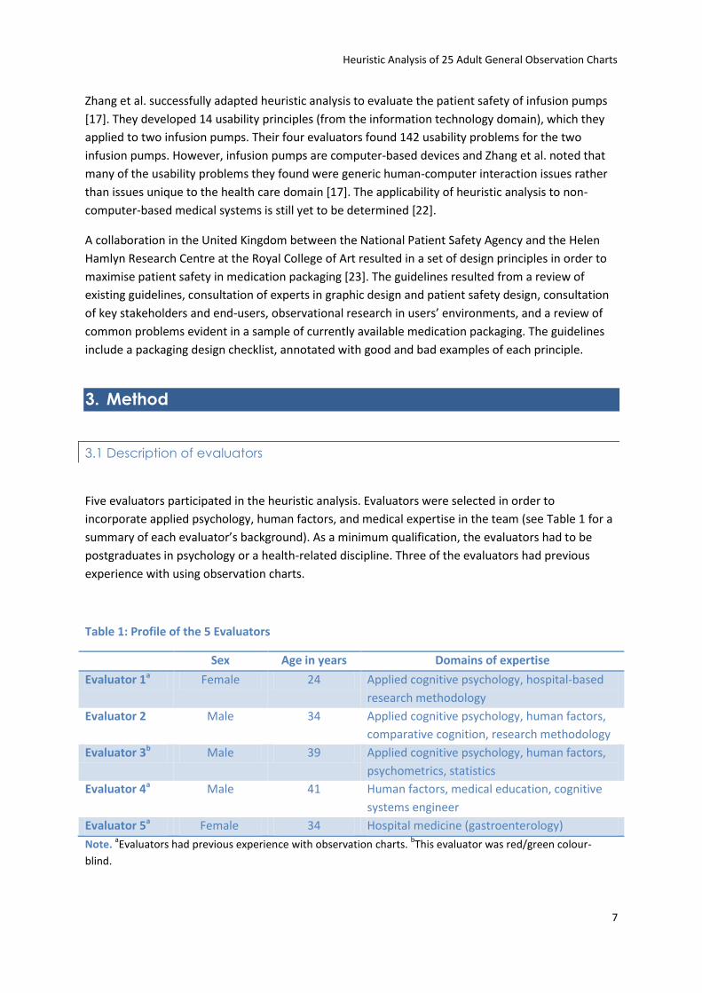
3.1 Description of evaluators
Five evaluators participated in the heuristic analysis. Evaluators were selected in order to
incorporate applied psychology, human factors, and medical expertise in the team (see Table 1 for a
summary of each evaluator’s background). As a minimum qualification, the evaluators had to be
postgraduates in psychology or a health-related discipline. Three of the evaluators had previous
experience with using observation charts.
Table 1: Profile of the 5 Evaluators
Sex Age in years Domains of expertise
Evaluator 1a Female 24 Applied cognitive psychology, hospital-based
research methodology
Evaluator 2 Male 34 Applied cognitive psychology, human factors,
comparative cognition, research methodology
Evaluator 3b Male 39 Applied cognitive psychology, human factors,
psychometrics, statistics
Evaluator 4a Male 41 Human factors, medical education, cognitive
systems engineer
Evaluator 5a Female 34 Hospital medicine (gastroenterology)
Note. aEvaluators had previous experience with observation charts.
bThis evaluator was red/green colour-
blind.
Heuristic Analysis of 25 Adult General Observation Charts
8
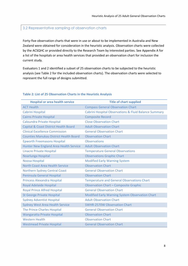
3.2 Representative sampling of observation charts
Forty-five observation charts that were in use or about to be implemented in Australia and New
Zealand were obtained for consideration in the heuristic analysis. Observation charts were collected
by the ACSQHC or provided directly to the Research Team by interested parties. See Appendix A for
a list of the hospitals or area health services that provided an observation chart for inclusion the
current study.
Evaluators 1 and 2 identified a subset of 25 observation charts to be subjected to the heuristic
analysis (see Table 2 for the included observation charts). The observation charts were selected to
represent the full range of designs submitted.
Table 2: List of 25 Observation Charts in the Heuristic Analysis
Hospital or area health service Title of chart supplied
ACT Health Compass General Observation Chart
Cabrini Hospital Cabrini Hospital Observations & Fluid Balance Summary
Cairns Private Hospital Composite Record
Caloundra Private Hospital Close Observation Chart
Capital & Coast District Health Board Adult Observation Chart
Clinical Excellence Commission General Observation Chart
Counties Manukau District Health Board Observation Chart
Epworth Freemasons Hospital Observations
Hunter New England Area Health Service Adult Observation Chart
Linacre Private Hospital Temperature General Observations
Noarlunga Hospital Observations Graphic Chart
Noosa Hospital Modified Early Warning System
North Coast Area Health Service Observation Chart
Northern Sydney Central Coast General Observation Chart
Peninsula General Hospital Observation Chart
Princess Alexandra Hospital Temperature and General Observations Chart
Royal Adelaide Hospital Observation Chart – Composite Graphic
Royal Prince Alfred Hospital General Observation Chart
St George Private Hospital Modified Early Warning System Observation Chart
Sydney Adventist Hospital Adult Observation Chart
Sydney West Area Health Service SWHR-2570W Observation Chart
The Prince Charles Hospital General Observation Chart
Wangaratta Private Hospital Observation Chart
Western Health Observation Chart
Westmead Private Hospital General Observation Chart
Heuristic Analysis of 25 Adult General Observation Charts
9
3.3 Procedure for heuristic analysis of 25 observation charts
Preparation
Evaluator 1 prepared the procedural requirements and materials for the heuristic analysis. Usability
principles are usually derived from published lists [18]. However, no such published usability
principles exist either for observation charts or even for the health care domain generally (note that
the usability principles used by Zhang et al. [17] were not adapted to the health care domain). In
light of this, Evaluator 1 (in discussion with the other evaluators) developed a set of specific
principles sensitive to the usability challenges posed by paper-based observation charts. Before the
main analysis, Evaluators 1, 2, and 3 each trialled the new set of usability principles on 4 observation
charts. Evaluator 1 reviewed their analyses and any additional principles that were identified in the
trials were added to the set. The trial of the new set of usability principles took each evaluator about
4 hours. The final set of 67 usability principles included in the current analysis and the rationale for
their use are listed in Appendix B.
The materials for the heuristic analysis comprised (see Appendix C for copies of the materials):
A Microsoft Excel© spreadsheet listing the usability principles to be used by the evaluators. Each
column in the spreadsheet was framed as a question about a specific usability problem, to which
evaluators could reply Yes, No, or Not applicable. Underneath their reply, the evaluators could
type in a comment describing the problem in more detail. There was also room in the
spreadsheet for additional comments if a unique problem was found that was not reflected in
the set of principles.
An instructional briefing detailing the procedure that evaluators were to follow
A font size guide
The 25 observation charts
The observation charts were each presented in two formats, a full-size ‘blank’ colour copy and
another full-size colour copy with a case of patient deterioration plotted on the chart. The Research
Team decided that since the observation charts were domain-dependent systems (i.e. their use
required a level of specialised knowledge), the heuristic analysis would benefit from a typical usage
scenario [18]. A Staff Specialist gastroenterologist provided a representative case of patient
deterioration due to a post-operative infection plotted across 30 time-points for 8 vital signs. The 8
vital signs were: respiration rate, oxygen saturation, blood pressure, pulse, temperature, urine
output, pain, and level of consciousness. Evaluator 1 transcribed this case by hand on to the 25
observation charts using a black pen (unless the chart specified the use of a different colour).
Heuristic analysis
The materials listed above were distributed to the 5 evaluators. The evaluators independently
performed the heuristic analysis for each of the 25 charts. The evaluators were encouraged to draw
on their knowledge of cognition, human factors, and health care, not just confining themselves to
the set of usability principles provided. The length of time spent analysing an individual observation
Heuristic Analysis of 25 Adult General Observation Charts
10
chart varied from 0.5 to 1.5 hours depending on the chart’s complexity. The average length of time
spent on the whole analysis was 30 hours per evaluator.
Debriefing
After all evaluators returned their individual analyses, a combined heuristic analysis was produced
for each observation chart. Then, a 2 hour debriefing session was held with all 5 evaluators present.
The main aim of the debriefing session was to identify and discuss instances of evaluator
disagreement in the heuristic analyses. For example, 1 evaluator rating an aspect of an observation
chart’s design as a problem (i.e. answering Yes in a certain column of the spreadsheet), whereas the
other evaluators did not consider it problematic. Such an instance could be a false positive (i.e. a
typo) on the part of the dissenting evaluator or a true positive that the other evaluators had not
indentified.
After reviewing potential false positives in 5 representative analyses of charts, it was decided that
Evaluator 1 should go through all the combined analyses and ask for clarification from sole or dual
evaluators who identified a problem but did not provide a commentary on what the problem was.
Such an approach reduced the number of false positives in the results. The data-cleaning took 9
hours for Evaluator 1 and approximately 1 hour each for the other evaluators.
Additional usability tests
The Research Team decided to conduct several other usability tests on the observation charts
alongside the heuristic analysis. These tests are described below.
Count of labels and abbreviations. A research assistant identified all the labels used in the sample of
25 observation charts for 8 vital signs. The 8 vital signs were: respiration rate, oxygen saturation,
blood pressure, pulse, temperature, urine output, pain, and level of consciousness. The research
assistant also counted the number of abbreviations used in each observation chart.
Test of charts’ ability to be photocopied. A research assistant photocopied all master-copies of the
25 observation charts (i.e. the copies which included the physiological data plotted by hand) at
several light/dark settings on a Fuji Xerox Document Centre 336. The photocopied charts were first
inspected to determine if all chart elements photocopied legibly at the various settings. When it was
decided that a chart’s elements were not reproduced legibly, the specific vital signs’ data or labels
that were illegible were recorded.
Night-time hospital light level simulation. Evaluator 1 and a research assistant tested legibility of
the 25 observation charts in realistic night-time hospital light levels. All charts were viewed at < 1
metre reading distance by Evaluator 1 at an illuminance of 9 lux [26].
4. Results
A total of 1,189 usability problems were identified in the heuristic analysis and other usability tests
of the 25 observation charts. The number of usability problems identified in an individual
Heuristic Analysis of 25 Adult General Observation Charts
11
observation chart ranged from a minimum of 35 to a maximum of 63 problems. The average
(arithmetic mean) number of usability problems identified in a particular chart was 48 problems. The
following divisions in this section will describe the main types of problems identified in the charts.
It should be stressed that heuristic analysis is a problem-focused usability inspection and it only
raises negative issues regarding the systems under investigation. Consequently, the following sub-
sections will appear to be highly critical of the observation charts.
4.1 Page layout
Well-designed observation charts should incorporate principles of good page layout. The main
usability problems identified regarding the charts’ page layout are presented in Table 3.
The majority of charts used too much space for the hospital name or logo and contained
bureaucratic codes (e.g. form numbers). Compared to the importance of correctly recording vital
signs, the hospital name and bureaucratic codes are less relevant to the clinical care of a patient.
Including and formatting such items in a prominent fashion causes such ‘irrelevant’ information to
compete with the relevant information for a user’s attention. It is acknowledged that from an
organisational perspective, such ‘clinically irrelevant’ items usually need to be displayed on charts.
However, such items should be presented in such a way that they are not prominent or overly
distracting.
Mixing vertical and horizontal data points affected the legibility of the data. For example, one chart
required oxygen saturation to be entered vertically, while all other data were plotted horizontally
(see Figure 1). This made the oxygen saturation data more difficult to read than it would otherwise
have been.
Several charts included either the hospital or the printer’s address and contact numbers. Again, such
irrelevant information will compete with relevant data for attention. Also, one chart placed a graph’s
legend in the binding margin (i.e. information about the graph would not be visible if the chart was
bound in a medical file).

Heuristic Analysis of 25 Adult General Observation Charts
12
Table 3: Proportion of the 25 Charts Affected by Usability Problems Related to Page Layout
Usability problem Percentage of charts affected
Too much space used for hospital name or logo 92%
Bureaucratic codes present that do not relate to the chart’s clinical
usage
92%
Portrait orientation 72%
Page margins too small (left 2 cm, all others 1 cm) 64%
Page margins too big (left 2 cm, all others 1 cm) 64%
Mixture of vertically-oriented & horizontally-oriented data points 52%
Page not A4 size 24%
Figure 1: Mixture of vertically-oriented and horizontally-oriented data points
4.2 Information layout
As with page layout, well-designed observation charts should order information in a logical manner
and format such information appropriately. The most frequently identified usability problems
regarding the charts’ layout of information are presented in Table 4. All 25 charts were seen as
having problems with using the available space to present information in a logical order and an
appropriately formatted manner. Common examples of this general problem include important vital
signs being placed towards the bottom of a page (see Figure 2) or even on side two of a double-sided
chart. The formatting of vital signs’ labels was often inconsistent.
Similarly, the evaluators concluded that all the charts included redundant or irrelevant information.
For instance, one chart included information on paediatric vital signs even though it is generally
accepted that adult and paediatric charts should be treated separately. In other charts (including the
example shown in Figure 3), the same information or required action was sometimes repeated up to
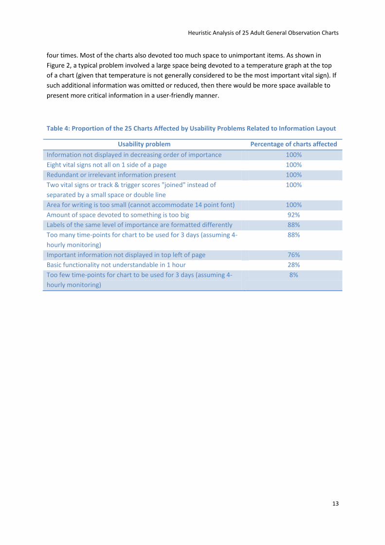
Heuristic Analysis of 25 Adult General Observation Charts
13
four times. Most of the charts also devoted too much space to unimportant items. As shown in
Figure 2, a typical problem involved a large space being devoted to a temperature graph at the top
of a chart (given that temperature is not generally considered to be the most important vital sign). If
such additional information was omitted or reduced, then there would be more space available to
present more critical information in a user-friendly manner.
Table 4: Proportion of the 25 Charts Affected by Usability Problems Related to Information Layout
Usability problem Percentage of charts affected
Information not displayed in decreasing order of importance 100%
Eight vital signs not all on 1 side of a page 100%
Redundant or irrelevant information present 100%
Two vital signs or track & trigger scores "joined" instead of
separated by a small space or double line
100%
Area for writing is too small (cannot accommodate 14 point font) 100%
Amount of space devoted to something is too big 92%
Labels of the same level of importance are formatted differently 88%
Too many time-points for chart to be used for 3 days (assuming 4-
hourly monitoring)
88%
Important information not displayed in top left of page 76%
Basic functionality not understandable in 1 hour 28%
Too few time-points for chart to be used for 3 days (assuming 4-
hourly monitoring)
8%
Heuristic Analysis of 25 Adult General Observation Charts
14
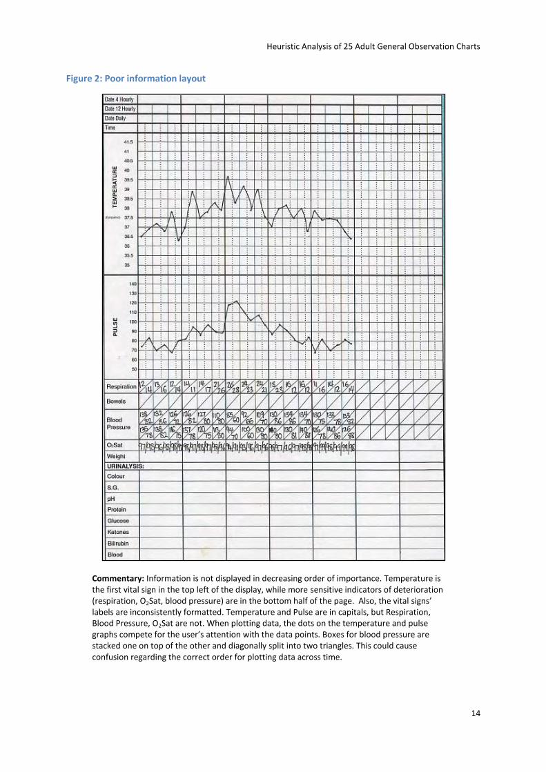
Figure 2: Poor information layout
Commentary: Information is not displayed in decreasing order of importance. Temperature is the first vital sign in the top left of the display, while more sensitive indicators of deterioration (respiration, O2Sat, blood pressure) are in the bottom half of the page. Also, the vital signs’ labels are inconsistently formatted. Temperature and Pulse are in capitals, but Respiration, Blood Pressure, O2Sat are not. When plotting data, the dots on the temperature and pulse graphs compete for the user’s attention with the data points. Boxes for blood pressure are stacked one on top of the other and diagonally split into two triangles. This could cause confusion regarding the correct order for plotting data across time.
Heuristic Analysis of 25 Adult General Observation Charts
15
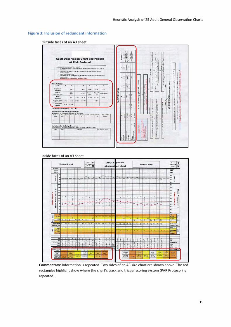
Figure 3: Inclusion of redundant information
Outside faces of an A3 sheet
Inside faces of an A3 sheet
Commentary: Information is repeated. Two sides of an A3 size chart are shown above. The red
rectangles highlight show where the chart’s track and trigger scoring system (PAR Protocol) is
repeated.
Heuristic Analysis of 25 Adult General Observation Charts
16
4.3 Recording of vital signs
Perhaps most important facet of observation charts in helping users to recognise a deteriorating
patient is how the the vital signs are to be recorded and displayed. Table 5 lists the most commonly
identified usability problems regarding the recording of vital signs on the 25 observation charts.
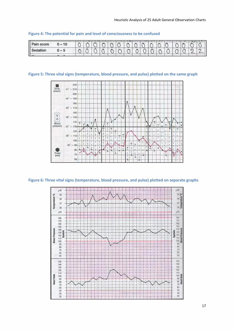
All of the charts were seen as having the potential for two vital signs’ data to be confused. A
common example of this was pain and level of consciousness scales being placed on consecutive
rows (see Figure 4). As both scales usually employ some identical values (e.g. 0 to 5), a user could
confuse the information unless he or she paid careful attention to the row’s label and position.
Another common issue was for two or more vital signs to be plotted on the same graph. This led to
both the potential for the vital signs to be confused (or at least for reading to be slowed) and for
deterioration to be obscured (see Figure 5 for an example of problematic design in which multiple
plots are presented the same graph and Figure 6 an example of good practice in which the plots are
kept separate).
Table 5: Proportion of the 25 Charts Affected by Usability Problems Related to Recording Vital Signs
Usability problem Percentage of charts affected
Data points for 2 vital signs could be confused 100%
Label does not specify unit of measurement 100%
Label is not clear & descriptive 96%
Graph looks too small or cramped 96%
Thick vertical lines not placed every 3-4 columns 96%
Time boxes too small (cannot accommodate 14 point font) 96%
Date boxes too small (cannot accommodate 14 point font) 92%
Information is not displayed as a graph 92%
Vertical axis of a graph not labelled on the left & right of the page 88%
Label does not provide an example of how data are to be recorded
(e.g. • or x)
80%
More than 1 vital sign recorded on the same graph or area 72%
Graph label formatting exactly the same as the vertical axis values’
formatting
72%
Scale of the vertical axis values changes 52%
Vertical axis values are misaligned 52%
Date is a blank row, instead of ruled off every 24 hours 52%
Instructions specify the use of different coloured pens 28%
Vertical axis values are not mutually exclusive 24%
Label is written vertically with upright letters 8%
Heuristic Analysis of 25 Adult General Observation Charts
17
Figure 4: The potential for pain and level of consciousness to be confused
Figure 5: Three vital signs (temperature, blood pressure, and pulse) plotted on the same graph
Figure 6: Three vital signs (temperature, blood pressure, and pulse) plotted on separate graphs
Heuristic Analysis of 25 Adult General Observation Charts
18
Two features of chart layout were considered to be important to prevent a user from losing her or
his place in the display. First, thick vertical lines should be placed every three to four columns (as in
Figure 7). This prevents ‘column shift’, i.e. a user placing a data point to the left or right of the
correct column. Thick vertical lines every 3 columns mean a user can track down a column to the
correct row relatively easily as the column will either have a thick line on the left or right, or no line
at all (and columns on either side will look different to the correct column). Second, the vertical axis
of a graph should be labelled on the left and right of the page (such as in Figure 6). This reduces the
chance of ‘row shift’ (and may allow left-handed users to plot data more quickly).
Figure 7: Thick vertical lines prevent 'column shift'
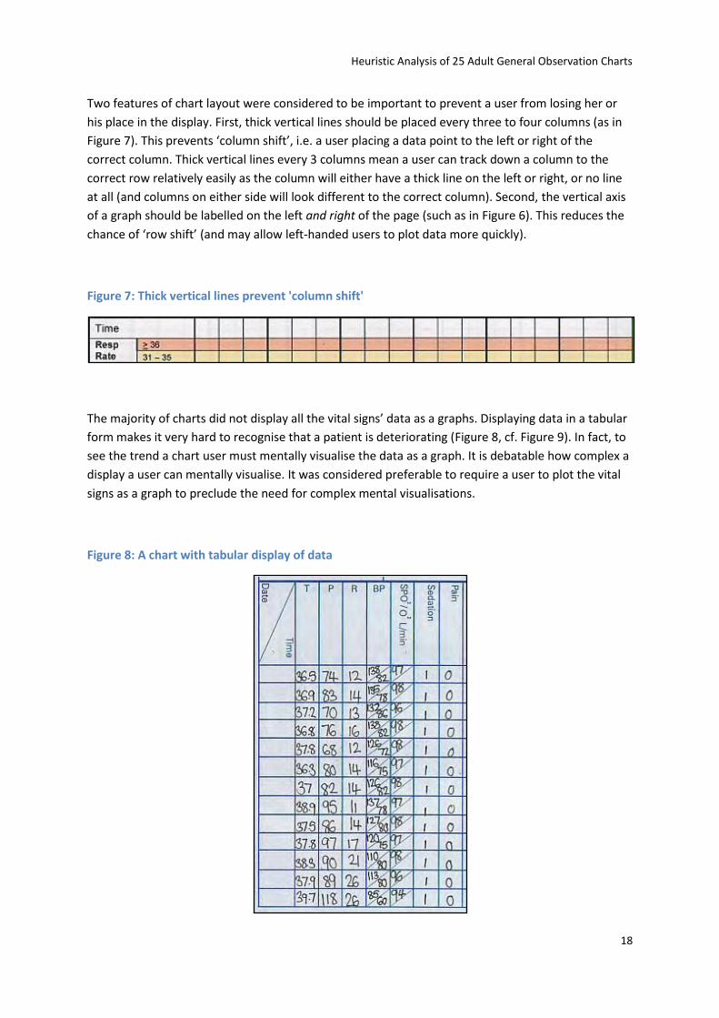
The majority of charts did not display all the vital signs’ data as a graphs. Displaying data in a tabular
form makes it very hard to recognise that a patient is deteriorating (Figure 8, cf. Figure 9). In fact, to
see the trend a chart user must mentally visualise the data as a graph. It is debatable how complex a
display a user can mentally visualise. It was considered preferable to require a user to plot the vital
signs as a graph to preclude the need for complex mental visualisations.
Figure 8: A chart with tabular display of data
Heuristic Analysis of 25 Adult General Observation Charts
19
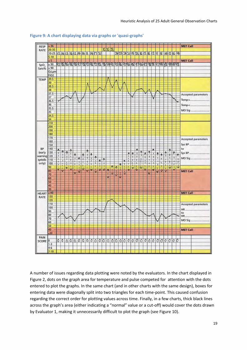
Figure 9: A chart displaying data via graphs or 'quasi-graphs'
A number of issues regarding data plotting were noted by the evaluators. In the chart displayed in
Figure 2, dots on the graph area for temperature and pulse competed for attention with the dots
entered to plot the graphs. In the same chart (and in other charts with the same design), boxes for
entering data were diagonally split into two triangles for each time-point. This caused confusion
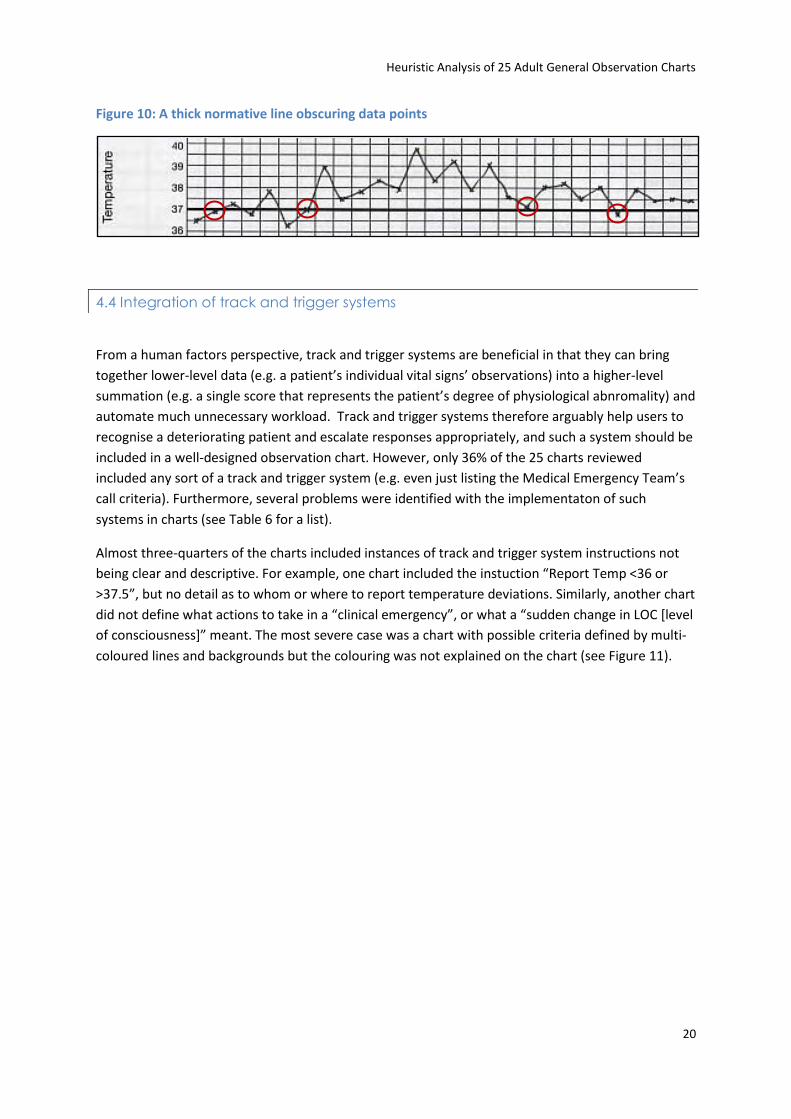
regarding the correct order for plotting values across time. Finally, in a few charts, thick black lines
across the graph’s area (either indicating a “normal” value or a cut-off) would cover the dots drawn
by Evaluator 1, making it unnecessarily difficult to plot the graph (see Figure 10).
Heuristic Analysis of 25 Adult General Observation Charts
20
Figure 10: A thick normative line obscuring data points
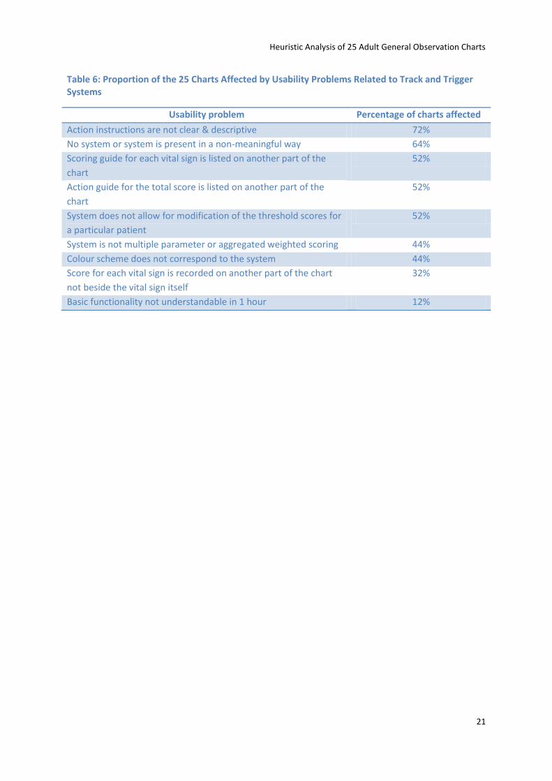
4.4 Integration of track and trigger systems
From a human factors perspective, track and trigger systems are beneficial in that they can bring
together lower-level data (e.g. a patient’s individual vital signs’ observations) into a higher-level
summation (e.g. a single score that represents the patient’s degree of physiological abnromality) and
automate much unnecessary workload. Track and trigger systems therefore arguably help users to
recognise a deteriorating patient and escalate responses appropriately, and such a system should be
included in a well-designed observation chart. However, only 36% of the 25 charts reviewed
included any sort of a track and trigger system (e.g. even just listing the Medical Emergency Team’s
call criteria). Furthermore, several problems were identified with the implementaton of such
systems in charts (see Table 6 for a list).
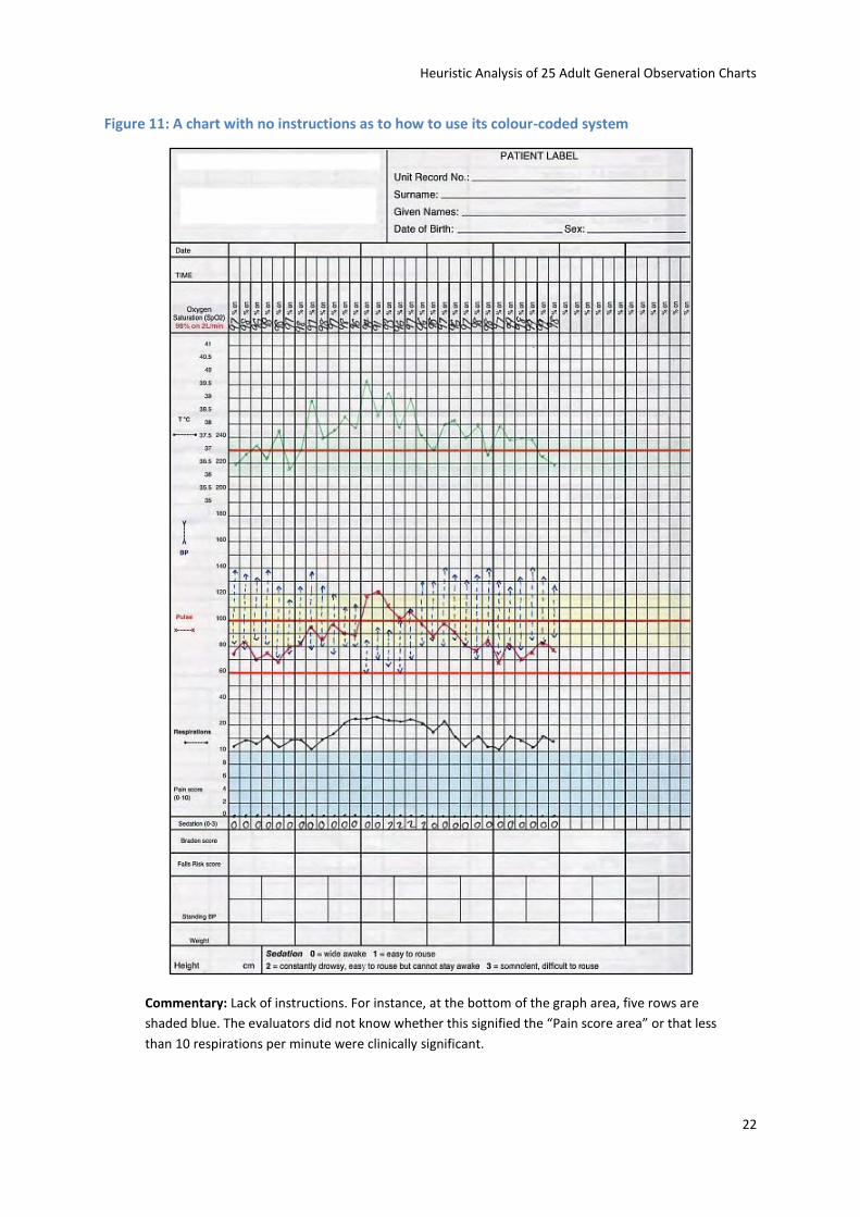
Almost three-quarters of the charts included instances of track and trigger system instructions not
being clear and descriptive. For example, one chart included the instuction “Report Temp <36 or
>37.5”, but no detail as to whom or where to report temperature deviations. Similarly, another chart
did not define what actions to take in a “clinical emergency”, or what a “sudden change in LOC *level
of consciousness+” meant. The most severe case was a chart with possible criteria defined by multi-
coloured lines and backgrounds but the colouring was not explained on the chart (see Figure 11).
Heuristic Analysis of 25 Adult General Observation Charts
21
Table 6: Proportion of the 25 Charts Affected by Usability Problems Related to Track and Trigger Systems
Usability problem Percentage of charts affected
Action instructions are not clear & descriptive 72%
No system or system is present in a non-meaningful way 64%
Scoring guide for each vital sign is listed on another part of the
chart
52%
Action guide for the total score is listed on another part of the
chart
52%
System does not allow for modification of the threshold scores for
a particular patient
52%
System is not multiple parameter or aggregated weighted scoring 44%
Colour scheme does not correspond to the system 44%
Score for each vital sign is recorded on another part of the chart
not beside the vital sign itself
32%
Basic functionality not understandable in 1 hour 12%
Heuristic Analysis of 25 Adult General Observation Charts
22
Figure 11: A chart with no instructions as to how to use its colour-coded system
Commentary: Lack of instructions. For instance, at the bottom of the graph area, five rows are
shaded blue. The evaluators did not know whether this signified the “Pain score area” or that less
than 10 respirations per minute were clinically significant.
Heuristic Analysis of 25 Adult General Observation Charts
23
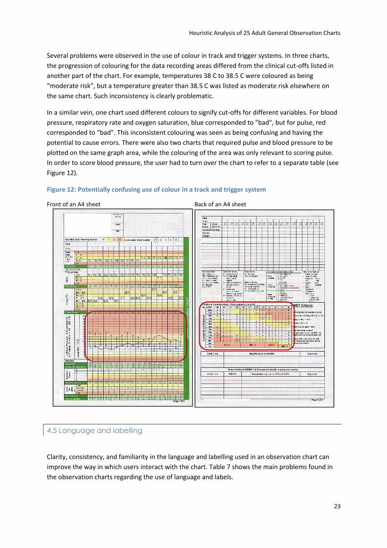
Several problems were observed in the use of colour in track and trigger systems. In three charts,
the progression of colouring for the data recording areas differed from the clinical cut-offs listed in
another part of the chart. For example, temperatures 38 C to 38.5 C were coloured as being
“moderate risk”, but a temperature greater than 38.5 C was listed as moderate risk elsewhere on
the same chart. Such inconsistency is clearly problematic.
In a similar vein, one chart used different colours to signify cut-offs for different variables. For blood
pressure, respiratory rate and oxygen saturation, blue corresponded to "bad", but for pulse, red
corresponded to “bad". This inconsistent colouring was seen as being confusing and having the
potential to cause errors. There were also two charts that required pulse and blood pressure to be
plotted on the same graph area, while the colouring of the area was only relevant to scoring pulse.
In order to score blood pressure, the user had to turn over the chart to refer to a separate table (see
Figure 12).
Figure 12: Potentially confusing use of colour in a track and trigger system
Front of an A4 sheet Back of an A4 sheet
4.5 Language and labelling
Clarity, consistency, and familiarity in the language and labelling used in an observation chart can
improve the way in which users interact with the chart. Table 7 shows the main problems found in
the observation charts regarding the use of language and labels.
Heuristic Analysis of 25 Adult General Observation Charts
24
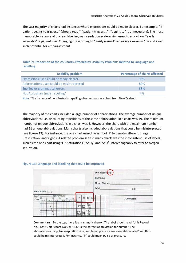
The vast majority of charts had instances where expressions could be made clearer. For example, “If
patient begins to trigger…” (should read “If patient triggers…”, “begins to” is unnecessary). The most
memorable instance of unclear labelling was a sedation scale asking users to score how “easily
arousable” a patient was. Changing the wording to “easily roused” or “easily awakened” would avoid
such potential for embarrassment.
Table 7: Proportion of the 25 Charts Affected by Usability Problems Related to Language and Labelling
Usability problem Percentage of charts affected
Expressions used could be made clearer 96%
Abbreviations used could be misinterpreted 80%
Spelling or grammatical errors 68%
Not Australian English spellinga 4%
Note. aThe instance of non-Australian spelling observed was in a chart from New Zealand.
The majority of the charts included a large number of abbreviations. The average number of unique
abbreviations (i.e. discounting repetitions of the same abbreviation) in a chart was 19. The minimum
number of unique abbreviations in a chart was 3. However, the chart with the maximum number
had 51 unique abbreviations. Many charts also included abbreviations that could be misinterpreted
(see Figure 13). For instance, the one chart using the symbol ‘R’ to denote different things
(‘respiration’ and ‘right’). A related problem seen in many charts was the inconsistent use of labels,
such as the one chart using ‘O2 Saturations’, ‘SaO2’, and ‘SaO2’ interchangeably to refer to oxygen
saturation.
Figure 13: Language and labelling that could be improved
Commentary: To the top, there is a grammatical error. The label should read “Unit Record
No.” not “Unit Record No”, as “No.” is the correct abbreviation for number. The
abbreviations for pulse, respiration rate, and blood pressure are ‘over abbreviated’ and thus
could be misinterpreted. For instance, “P” could mean pulse or pressure.
Heuristic Analysis of 25 Adult General Observation Charts
25
When considering the labelling used in the observation charts as a whole, many differing terms were
used for the one vital sign. Table 8 shows the terms used for eight main vital signs. Pain, pulse and
temperate tended to be appropriately labelled. On the other hand, oxygen saturation and level of
consciousness had many permutations (with some being incorrect).
Table 8: Terms Used in the 25 Charts for 8 Vital Signs
Vital sign Terms used in charts Total number of terms used
Respiration rate R, RESP, Resp Rate, Respiration, Respirations,
Respiratory Rate, Resps, RR
8
Oxygen saturation O² saturation (%),O2 Saturations, O₂Sat, O₂Sat%, O₂Sat.,
Oxygen - Saturation %, Oxygen Saturation, Oxygen
Saturation (SpO2), SaO₂, Sat O₂, SATS (SpO2),
Saturation, SpO Sats%, Sp02, SpO2, SpO2 Sats, SpO2%,
SPO²
18
Blood pressure B.P., Blood Pressure, BP, SBP, Systolic Blood Pressure,
Systolic BP
6
Pulse Heart Rate, HR, P, Pulse 4
Temperature T, T˚C, TEMP, Temp (˚C), Temp ˚C, Temp Score,
Temperature, Temperature (˚C), Temperature ˚C,
Temperature C˚
10
Urine output 4 Hour Urine Output, HOURLY URINE FOR PAST 2
HOURS IN CATHERISED PATIENTS, Other, Output Urine,
Urinary Output, Urine, Urine for 4hrs, Urine Output,
Urine Score
9
Pain Pain, Pain Scale, Pain Score, Pain Score – M, Pain Score –
R, Pain Score (0-10), Pain Score 0- 10
7
Level of consciousness Alertness, CNS, Conscious Level (AVPUC), Levels of
Alertness, LOC, Neurological, Sedation, Sedation Score
8
4.6 Cognitive and memory load
Minimising the cognitive and memory requirements for the user of an observation chart is necessary
to promote user satisfaction and decrease the number of errors made. Cognitive and memory load
problems that were frequently identified in the 25 charts are listed in Table 9. Comparing
information over different areas of the one page or even comparing information over two pages
requires a mental comparison (i.e. at least 1 piece of information must be held in the mind, as all the
required information for the comparison is not visible on one area of the page). See Figure 14 for a
flow chart overlaid on a chart showing the memory loads present in recording observations. Also,
wherever possible, the need to write in data should also be avoided (e.g. hospital name, sex) as
chart users must think about the required response format and recall from memory the correct
Heuristic Analysis of 25 Adult General Observation Charts
26
response, rather than just recognising and circling the correct datum. Additional problems cited
regarding the cognitive and memory loads associated with charts were the inclusion of vague
directives such as “check unit policy” (omitting detail regarding what specific policy was to be
checked or where it could be found, and directing the user away from the chart itself), or not
providing any instructions for cut-off lines on graphs for vital signs (again requiring users to know or
remember what the lines signified, as in the chart shown in Figure 11).
Table 9: Proportion of the 25 Charts Affected by Usability Problems Related to Cognitive and Memory Load
Usability problem Percentage of charts affected
Information must be compared over different areas of the 1 page 80%
Writing is required when chart could provide response options to
circle
72%
Information must be transcribed or compared over 2 pages 48%
Heuristic Analysis of 25 Adult General Observation Charts
27
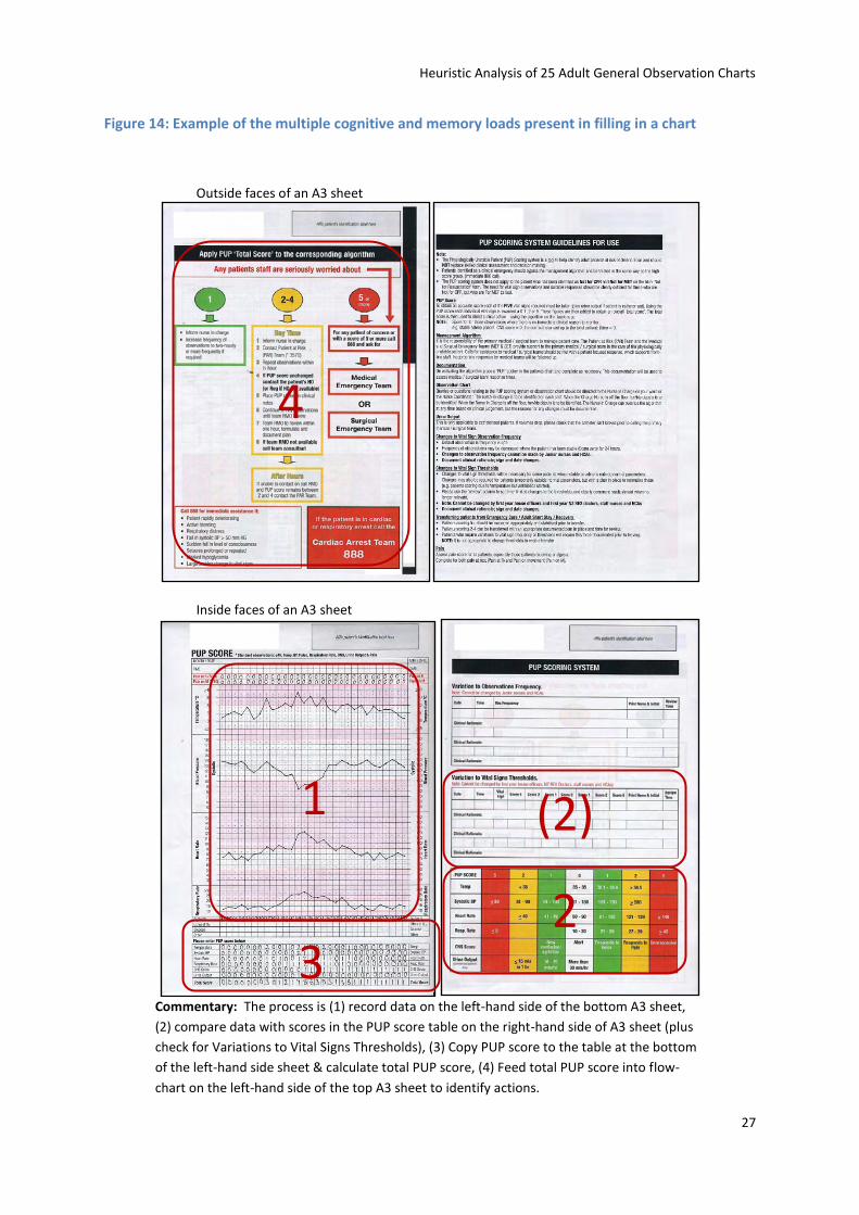
Figure 14: Example of the multiple cognitive and memory loads present in filling in a chart
Outside faces of an A3 sheet
Inside faces of an A3 sheet
Commentary: The process is (1) record data on the left-hand side of the bottom A3 sheet,
(2) compare data with scores in the PUP score table on the right-hand side of A3 sheet (plus
check for Variations to Vital Signs Thresholds), (3) Copy PUP score to the table at the bottom
of the left-hand side sheet & calculate total PUP score, (4) Feed total PUP score into flow-
chart on the left-hand side of the top A3 sheet to identify actions.
1
2 3
(2)
4
Heuristic Analysis of 25 Adult General Observation Charts
28
4.7 Use of fonts
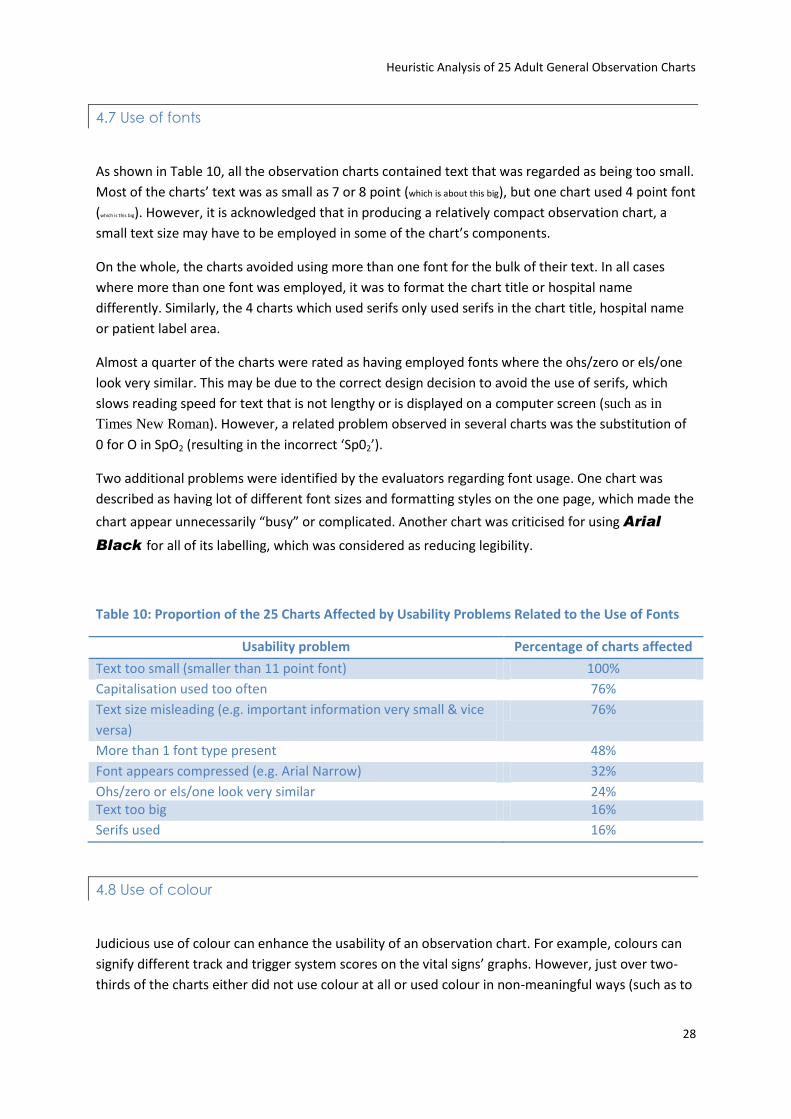
As shown in Table 10, all the observation charts contained text that was regarded as being too small.
Most of the charts’ text was as small as 7 or 8 point (which is about this big), but one chart used 4 point font
(which is this big). However, it is acknowledged that in producing a relatively compact observation chart, a
small text size may have to be employed in some of the chart’s components.
On the whole, the charts avoided using more than one font for the bulk of their text. In all cases
where more than one font was employed, it was to format the chart title or hospital name
differently. Similarly, the 4 charts which used serifs only used serifs in the chart title, hospital name
or patient label area.
Almost a quarter of the charts were rated as having employed fonts where the ohs/zero or els/one
look very similar. This may be due to the correct design decision to avoid the use of serifs, which
slows reading speed for text that is not lengthy or is displayed on a computer screen (such as in
Times New Roman). However, a related problem observed in several charts was the substitution of
0 for O in SpO2 (resulting in the incorrect ‘Sp02’).
Two additional problems were identified by the evaluators regarding font usage. One chart was
described as having lot of different font sizes and formatting styles on the one page, which made the
chart appear unnecessarily “busy” or complicated. Another chart was criticised for using Arial
Black for all of its labelling, which was considered as reducing legibility.
Table 10: Proportion of the 25 Charts Affected by Usability Problems Related to the Use of Fonts
Usability problem Percentage of charts affected
Text too small (smaller than 11 point font) 100%
Capitalisation used too often 76%
Text size misleading (e.g. important information very small & vice
versa)
76%
More than 1 font type present 48%
Font appears compressed (e.g. Arial Narrow) 32%
Ohs/zero or els/one look very similar 24% Text too big 16%
Serifs used 16%
4.8 Use of colour
Judicious use of colour can enhance the usability of an observation chart. For example, colours can
signify different track and trigger system scores on the vital signs’ graphs. However, just over two-
thirds of the charts either did not use colour at all or used colour in non-meaningful ways (such as to
Heuristic Analysis of 25 Adult General Observation Charts
29
indicate progressively more deranged vital signs). Table 11 presents the results of the heuristic
analysis on the use of colour in the 25 observation charts. Common problems were colour schemes
not accommodating for colour-blind users (i.e. using green and red colours with very similar
densities), not providing redundant cues if the track and trigger system was colour-based (Figure 9
shows a chart that does use redundant cues), and not using pastel colouring. In general, there were
few problems with the use of too many colours (where it is generally considered that using more
than five colours can lead to a cluttered design) and using colours in ways that could lead to
confusion (e.g. green signalling “moderate deterioration” cf. a more logical warning colour such as
yellow, orange, or red).
Several additional problems related to the use of colour were cited by the evaluators. For one chart,
a lack of the use of colour as part of a track and trigger system was considered to make the scoring
of the vital signs difficult. Another chart, which did use colour for a track and trigger system, was
described as “cluttered and confusing” due to a lack of progression of colouring between the
different levels of severity (for example, an appropriate progression, where severity is correlated
with choice of colour could be yellow orange red purple black; see Figure 15 for an
example of what was considered an inappropriate colour scheme, where colour choice was less
obviously related to severity). Two charts were formatted entirely in dark or medium blue. This was
seen as advantageous if users used a black ink to write on the charts (entered data would stand out
against the chart background), but the value of such formatting would be negated if a blue ink was
used. Finally, one chart used a pink colour to show when a vital sign’s value was outside the normal
range. However, using one colour to signify “value is outside the normal range” meant users would
still have to refer to a scoring table to enter a track and trigger score for the value (see Figure 14).
Using a progression of colouring could eliminate this unnecessary step. Furthermore, it was argued
that the pink colour could be confused with the red colour in the table that indicated a score of 5.
Table 11: Proportion of the 25 Charts Affected by Usability Problems Related to the Use of Colour
Usability problem Percentage of charts affected
No colour or colour present in a non-meaningful way (e.g. in logo
only)
68%
Colour-blind users will perhaps struggle with the colour scheme 56%
No redundant cues, scheme cannot be used without the colours 44%
Colours not pastel 36%
More than 5 colours in chart as a whole (including white space,
text, logos)
32%
One or more colours could be deceptive 28%
More than 5 colours in vital signs' area (including white space) 12%

Heuristic Analysis of 25 Adult General Observation Charts
30
Figure 15: A chart with no progression of colouring
Commentary: This chart has no logical progression in its colouring, though each colour does correspond to a different track and trigger score. There is no convention whereby pink is considered more serious than blue, and blue is considered more serious than yellow.
4.9 Photocopying legibility
When photocopied, just under half of the 25 observation charts were legible at a number of
light/dark settings. As seen in Table 12, a few charts tended to have illegible data for vital signs when
photocopied. However, only one chart had an instance of illegible labelling for vital signs when
photocopied. In addition to the figures reported in Table 12, a few charts were reported as being
less legible or harder to read when photocopied, but without becoming completely illegible.
Heuristic Analysis of 25 Adult General Observation Charts
31
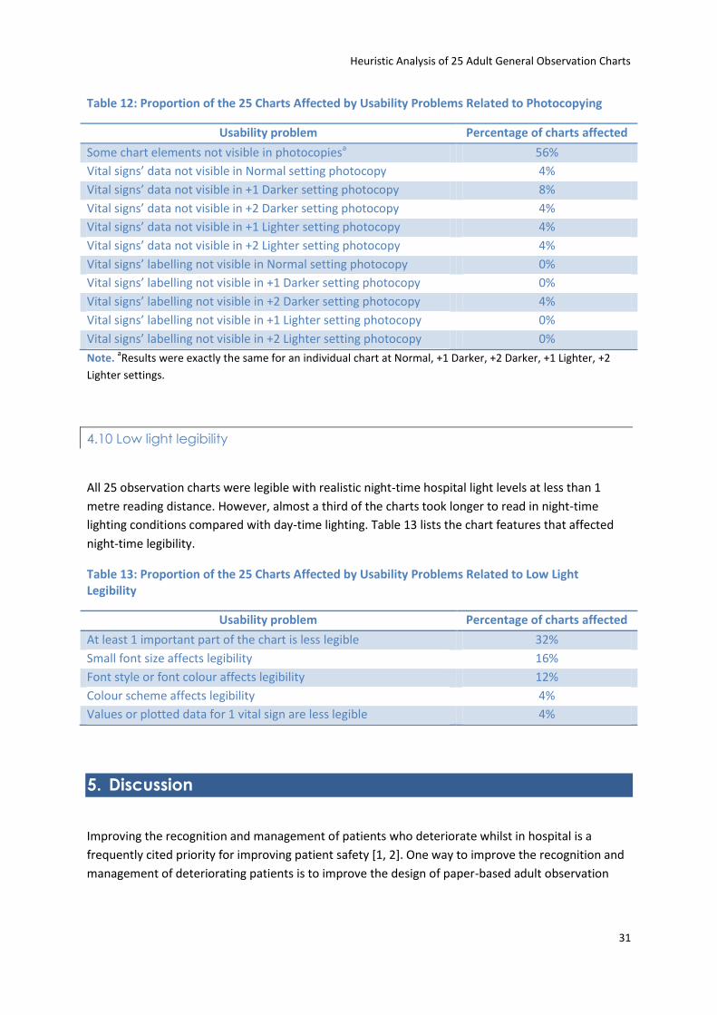
Table 12: Proportion of the 25 Charts Affected by Usability Problems Related to Photocopying
Usability problem Percentage of charts affected
Some chart elements not visible in photocopiesa 56%
Vital signs’ data not visible in Normal setting photocopy 4%
Vital signs’ data not visible in +1 Darker setting photocopy 8%
Vital signs’ data not visible in +2 Darker setting photocopy 4%
Vital signs’ data not visible in +1 Lighter setting photocopy 4%
Vital signs’ data not visible in +2 Lighter setting photocopy 4%
Vital signs’ labelling not visible in Normal setting photocopy 0%
Vital signs’ labelling not visible in +1 Darker setting photocopy 0%
Vital signs’ labelling not visible in +2 Darker setting photocopy 4%
Vital signs’ labelling not visible in +1 Lighter setting photocopy 0%
Vital signs’ labelling not visible in +2 Lighter setting photocopy 0%
Note. aResults were exactly the same for an individual chart at Normal, +1 Darker, +2 Darker, +1 Lighter, +2
Lighter settings.
4.10 Low light legibility
All 25 observation charts were legible with realistic night-time hospital light levels at less than 1
metre reading distance. However, almost a third of the charts took longer to read in night-time
lighting conditions compared with day-time lighting. Table 13 lists the chart features that affected
night-time legibility.
Table 13: Proportion of the 25 Charts Affected by Usability Problems Related to Low Light Legibility
Usability problem Percentage of charts affected
At least 1 important part of the chart is less legible 32%
Small font size affects legibility 16%
Font style or font colour affects legibility 12%
Colour scheme affects legibility 4%
Values or plotted data for 1 vital sign are less legible 4%
5. Discussion
Improving the recognition and management of patients who deteriorate whilst in hospital is a
frequently cited priority for improving patient safety [1, 2]. One way to improve the recognition and
management of deteriorating patients is to improve the design of paper-based adult observation
Heuristic Analysis of 25 Adult General Observation Charts
32
charts. The aim of the current study was to evaluate the quality and extent of design problems in a
sample of 25 existing observation charts from Australia and New Zealand.
Heuristic analysis was chosen as the methodological approach, as it quickly and easily generates
information regarding design problems for a chosen system [17, 18]. In heuristic analysis, the main
output is a list of usability problems identified by evaluators’ expert judgment. The five evaluators in
the current study had expertise in applied psychology, human factors, and medicine; and three had
previously used observation charts.
The 25 observation charts were each analysed in two formats, a full-size ‘blank’ colour copy and
another full-size colour copy with a case of patient deterioration plotted on the chart. A total of
1,189 usability problems were identified in the observation charts. Usability problems were
identified as affecting the observation charts’ page layout, information layout, recording of vital
signs, integration of track and trigger systems, language and labelling, cognitive and memory load,
use of fonts, use of colour, photocopying legibility, and low light legibility.
While the nature of heuristic analyses means that they tend to raise negative issues, there are
positive facets to this particular analysis that should be mentioned. First, the material presented in
the Results section may give the impression that the evaluators were highly critical of all of the
observation charts. This is not true. The evaluators acknowledge that many of the observation charts
demonstrated good design practice. Second, this report has generated valuable material that could
be used to produce a manual for designing more user-friendly observation charts. To the Research
Team’s best knowledge, no such guide presently exists to help those charged with designing
observation charts, apart from very general guidelines such as Queensland Health’s Clinical Form
Design Standard Guidelines [27].
This analysis has also highlighted that it may well be impossible to produce an observation chart that
conforms to all usability principles. For instance, accommodating graphical displays for all vital signs
on a landscape A4 page may be very difficult to achieve. Similarly, a small text size may be a
necessary evil in producing a compact chart. However, problems that were frequently identified in
the 25 observation charts analysed such as making spelling or grammatical errors, including vague
instructions, not using colour, and using more than one font, can and should be avoided. In
designing a user-friendly observation chart, instances of usability problems should be minimised as
much possible. Furthermore, when considering breaking a usability “rule”, there should be careful
consideration of the relative importance of the competing usability principles and what the
alternative chart designs would actually look like.
With regards to the usability testing literature, this study demonstrated three important points.
First, heuristic analysis can be successfully implemented in a usability test of up to 25 separate
systems (i.e. the 25 observation charts). Second, usability principles can be specifically developed for
paper-based systems, as opposed to computer systems or mechanical devices. Third, heuristic
analysis can be successfully employed to evaluate paper-based observation charts in the health care
domain. As mentioned previously, previous to this study the potential applicability of heuristic
analysis to non-computer-based medical systems had yet to be determined [22].
Heuristic Analysis of 25 Adult General Observation Charts
33
This study also complements other nascent efforts to improve the design of observation charts. In
line with Chatterjee et al. [13] and Australian efforts led by ACT Health [14], the heuristic analysis
showed that many usability problems are present in current observation charts. While the previous
two studies focused on improving their hospital’s particular observation chart, this study reports on
the type and quantity of design problems present in a sample of Australian and New Zealand
observation charts.
In the near future, the project will emulate Chatterjee et al. [13] and ACT Health [14] in designing a
user-friendly adult general observation chart. A draft of the new observation chart’s design will be
initially evaluated against eight other observation charts by means of an online survey of relevant
health professionals. The survey will also gather data on general issues related to observation charts,
for example what terms health professional prefer for various vital signs (out of the correct terms
found in Table 8). After the survey, the new observation chart will be empirically evaluated (again,
by comparison against a number of other observation charts) in terms of how well staff perform at
recognising simulated patient deterioration (Simulation Study 1), and recording simulated
deteriorating physiological data and responding appropriately (Simulation Study 2).
Heuristic Analysis of 25 Adult General Observation Charts
34
6. References
1. Australian Commission on Safety and Quality in Health Care, Recognising and responding to
clinical deterioration: Background paper. 2009, Australian Commission on Safety and Quality
in Health Care, Department of Health and Ageing, Commonwealth of Australia.
2. Lim, P., Reconition and management of the deteriorating patient. 2009, Patient Safety
Centre, Queensland Health.
3. Franklin, C. and J. Mathew, Developing strategies to prevent inhospital cardiac arrest:
Analyzing responses of physicians and nurses in the hours before the event. Critical care
medicine 1994. 22(2): p. 189-191.
4. Buist, M., et al., Association between clinically abnormal observations and subsequent in-
hospital mortality: A prospective study. Resuscitation, 2004. 62(2): p. 137-141.
5. Hillman, K.M., et al., Antecedents to hospital deaths. Internal Medicine Journal, 2001. 31(6):
p. 343-348.
6. Goldhill, D.R., S.A. White, and A. Sumner, Physiological values and procedures in the 24 h
before ICU admission from the ward. Anaesthesia, 1999. 54: p. 529-534.
7. McQuillan, P., et al., Confidential inquiry into quality of care before admission to intensive
care. British Medical Journal, 1998. 316(1853-1858).
8. Kause, J., et al., A comparison of antecedents to cardiac arrests, deaths and emergency
intensive care admissions in Australia and New Zealand, and the United Kingdom-the
ACADEMIA study. Resuscitation, 2004. 62: p. 275-282.
9. Endacott, R., et al., Recognition and communication of patient deterioration in a regional
hospital: A multi-methods study. Australian Critical Care, 2007. 20(3): p. 100-105.
10. Bristow, P.J., et al., Rates of in-hospital deaths and intensive care admissions: the effect of a
medical emergency team. Medical Journal of Australia, 2000. 173: p. 236-240.
11. Bellomo, R., et al., A prospective before-and-after trial of a medical emergency team.
Medical Journal of Australia, 2003. 179(6): p. 283-287.
12. Bellomo, R., et al., Prospective controlled trial of medical emergency team on postoperative
morbidity and mortality rates. Critical Care Medicine, 2004.
13. Chatterjee, M.T., et al., The "OBS" chart: An evidence based approach to re-design of the
patient observation chart in a district general hospital setting. Postgraduate Medical Journal,
2005. 81: p. 663-666.
14. ACT Health. Compass - background. No date 26/8/09 [cited; Available from:
http://www.health.act.gov.au/c/health?a=&did=11026450.
15. Mack, R.L. and J. Nielsen, Executive summary, in Usability inspection methods, J. Nielsen and
R.L. Mack, Editors. 1994, John Wiley & Sons: New York.
16. Nielsen, J. and R.L. Mack, eds. Usability inspection methods. 1994, John Wiley & Sons: New
York.
17. Zhang, J., et al., Using usability heuristics to evaluate patient safety of medical devices.
Journal of Biomedical Informatics, 2003. 36: p. 23-30.
18. Nielsen, J., Heuristic Evaluation, in Usability inspection methods, J. Nielsen and R.L. Mack,
Editors. 1994, John Wiley & Sons: New York.
Heuristic Analysis of 25 Adult General Observation Charts
35
19. Zhu, W., K.-P.L. Vu, and R.W. Proctor, Evaluating web usability, in Handbook of human
factors in web design, R.W. Proctor and K.-P.L. Vu, Editors. 2005, Lawrence Erlbaum
Associates: Mahwah, NJ. p. 321-337.
20. Nielsen, J., Usability engineering. 1994, San Diego, CA: Morgan Kaufmann.
21. Gerhardt-Powals, J., Cognitive engineering principles for enhancing human-computer
performance [Abstract]. International Journal of Human-Computer Interaction, 1996. 8(2): p.
189-211.
22. Martin, J.L., et al., Medical device development: The challenge for ergonomics. Applied
Ergonomics, 2008. 39(3): p. 271-283.
23. Swayne, T., Design for patient safety: A guide to the graphic design of medication packaging.
2007, National Patient Safety Agency.
24. Garmer, K., J. Ylvén, and I.C.M. Karlssona, User participation in requirements elicitation
comparing focus group interviews and usability tests for eliciting usability requirements for
medical equipment: A case study. International Journal of Industrial Ergonomics, 2004. 33(2):
p. 85-98.
25. Garmer, K., et al., Application of usability testing to the development of medical equipment.
Usability testing of a frequently used infusion pump and a new user interface for an infusion
pump developed with a Human Factors approach. International Journal of Industrial
Ergonomics, 2002. 29(3): p. 145–159.
26. Higgins, P.A., et al., Light measurement in the hospital: A comparison of two methods.
Research in Nursing & Health, 2007. 30: p. 120-128.
27. Queensland Health data management policy: Queensland Health clinical form design
standard guidelines. 2003, Queensland Health.
28. Yu, D., et al., Reading horizontal and vertical english text [Abstract]. Journal of Vision, 2008.
8(6): p. 629a.
29. Australian Institute of Health and Welfare, Australian hospital statistics 2007–08, in Health
Services Series. 2009, Australian Institute of Health and Welfare, Australian Government:
Canberra.
30. Bernard, M.L., et al., Comparing the effects of text size and format on the readability of
computer-displayed Times New Roman and Arial text. International Journal of Human-
Computer Studies, 2003. 59(6): p. 823-835
31. Lorch Jr. , R.F., E. Pugzles Lorch, and M.A. Klusewitz, Effects of typographical cues on reading
and recall of text. Contemporary Educational Psychology, 1995. 20(1): p. 51-64.
32. Frascara, J., Typography and the visual design of warnings, in Handbook of Warnings, M.S.
Wogalter, Editor. 2005, Lawrence Erlbaum Associates: Mahwah, NJ. p. 385-406.
33. Pelli, D.G., et al., Crowding and eccentricity determine reading rate. Journal of Vision, Journal
of Vision. 7(2): p. 1-36.
34. Tinker, M.A. and D.G. Paterson, Studies of typographical factors influencing speed of reading.
V. Simultaneous variation of type size and line length. Journal of Applied Psychology, 1931.
15(1): p. 72-78.
35. Yager, D., K. Aquilante, and R. Plass, High and low luminance letters, acuity reserve, and font
effects on reading speed. Vision Research, 1998. 38(17): p. 2527-2531.
Heuristic Analysis of 25 Adult General Observation Charts
36
Appendix A: List of Organisations that Supplied Observation Charts
Hospital or area
health service
Title of chart supplied Hospital or area
health service
Title of chart supplied
ACT Health Compass General
Observation Chart
Northern Sydney
Central Coast
General Observation
Chart
Cabrini Hospital Cabrini Hospital
Observations & Fluid
Balance Summary
Northside Clinic General Observation
Chart
Cairns Private
Hospital
Composite Record Peninsula General
Hospital
Observation Chart
Caloundra Private
Hospital
Close Observation Chart Pindara Private
Hospital
Observation Chart &
General Observations
Capital & Coast
District Health
Board
Adult Observation Chart Prince of Wales
Private Hospital
Observation Chart
Clinical Excellence
Commission
General Observation Chart Princess Alexandra
Hospital
Temperature and General
Observations Chart
Counties Manukau
District Health
Board
Observation Chart Royal Brisbane &
Women's Hospital
Observation Chart With
Medical Emergency Call
Criteria
Epworth
Freemasons
Hospital
Observations Royal Adelaide
Hospital
Observation Chart –
Composite Graphic
Figtree Private
Hospital
Four Hour Temperature &
Observation Charts
Royal Prince Alfred
Hospital
General Observation
Chart
Greater Southern
Area Health
Service
Colour Coded Observation
Chart (Adult)
Southern Highlands
Private Hospital
General Observation
Chart
Hillcrest Hospital Observation Chart St George Private
Hospital
Modified Early Warning
System Observation Chart
Hunter New
England Area
Health Service
Adult Observation Chart Sydney Adventist
Hospital
Adult Observation Chart
Kareena Private
Hospital
Observation Chart Sydney West Area
Health Service
SWHR-2570W
Observation Chart
Lake Macquarie
Private Hospital
4 Hourly Temperature
Observation Chart &
General Observation
Sheet
Sydney West Area
Health Service
SWHR-2570EC
Observation Chart
Linacre Private
Hospital
Temperature General
Observations
Sydney West Area
Health Service
SWHR-2570bm General
Observation Chart
Lyell McEwin Observation Chart Tamara Private Clinical Observation Chart
Heuristic Analysis of 25 Adult General Observation Charts
37
Hospital Hospital & EWS and Escalation
Protocol
Mitcham Private
Hospital
Frequent Observation
Chart & Temperature
General Observations
The Avenue Hospital Observations Chart
Noarlunga
Hospital
Observations Graphic
Chart
The Prince Charles
Hospital
General Observation
Chart
Noosa Hospital Special Observation Sheet Wangaratta Private
Hospital
Observation Chart
Noosa Hospital Modified Early Warning
System
Western Health Observation Form
Noosa Private
Hospital
Special Observation Sheet Western Health Observation Chart
North Coast Area
Health Service
Observation Chart Westmead Private
Hospital
General Observation
Chart
North Shore
Private Hospital
Observation Chart
Heuristic Analysis of 25 Adult General Observation Charts
38
Appendix B: Usability Principles Used in the Current Analysis with
the Rationale for Their Use Explained
Each usability principle specific to paper-based observation charts that was used in the current
analysis is listed below. In order to be relatively concise, only the most applicable rationales
(adapted from the more general published usability principles listed in Section 2.2 of the report) are
listed for each usability principle. For some principles related to formatting (page margin size, pastel
colouring, and font size), Queensland Health’s Clinical Form Design Standard Guidelines were used
[27].
Usability principle Rationale
Page layout Minimal space should be used for hospital name or logo
The system should not contain information that is rarely needed
Bureaucratic codes that do not relate to the chart’s clinical usage should not be present
The system should not contain information that is rarely needed
Landscape orientation preferred Increases the size of the display that a user can simultaneously attend to
Page margins should be: left 2 cm, all others 1 cm
Queensland Health’s Clinical Form Design Standard Guidelines
Should not have mixture of vertically-oriented & horizontally-oriented data points
The system’s graphic design & colour should be carefully considered – chart should not have to be turned during use & vertically-oriented text takes longer to read [28]
Page should be A4 size The system should match the user’s task in as natural a way as possible
Information layout Information should be displayed in decreasing order of importance
Information presented in the top left of a display normally gets more attention
Eight vital signs should all be on 1 side of a page
The aim of any system should be to present exactly the information the user needs at exactly the time & place that it is needed
No redundant or irrelevant information The system should not contain information that is rarely needed
Two vital signs or track & trigger scores should be clearly separated
Avoid unrelated elements being formatted in a such a way that they seem to belong together
Areas for writing should accommodate 14 point font
Queensland Health’s Clinical Form Design Standard Guidelines
Amount of space devoted to something should not be too big
The system should not contain information that is rarely needed
Labels of the same level of importance should be formatted the same
Avoid related elements being formatted in a such a way that they seem to belong to different categories
Enough time-points for chart to be used for 3 days (assuming 4-hourly monitoring)
The system should match the user’s task in as natural a way as possible (i.e. average length of stay in hospital = 3.3 days) [29]
Heuristic Analysis of 25 Adult General Observation Charts
39
Important information should be displayed in top left of page
Information presented in the top left of a display normally gets more attention
Basic functionality should be understandable in 1 hour
Basic functionality should be understandable in 1 hour
Recording vital signs Data points for 2 vital signs should not be able to be confused
The system should produce minimal errors
Labels should specify unit of measurement The aim of any system should be to present exactly the information the user needs at exactly the time and place that it is needed
Labels should be clear & descriptive The system should have a good match between the display of information and the user’s mental model of the information
Graph should not be too small or cramped The system’s graphic design and colour should be carefully considered – smaller or cramped graphs may be less legible (i.e. trends flattened)
Thick vertical lines should be placed every 3-4 columns
Reduce the time spent assimilating raw data
Time boxes should accommodate 14 point font Queensland Health’s Clinical Form Design Standard Guidelines
Date boxes should accommodate 14 point font Queensland Health’s Clinical Form Design Standard Guidelines
Information should be displayed as a graph Bring together lower level data into a higher-level summation
Vertical axis of a graph should be labelled on the left & right of the page
Reduce the time spent assimilating raw data
Labels should provide an example of how data are to be recorded
When users are asked to provide input, the system should describe the required format and, if possible, provide an example
More than 1 vital sign should not be recorded on the same graph or area
The system should produce minimal errors
Graph label formatting should differ from vertical axis values’ formatting
The system’s graphic design and colour should be carefully considered – graph label should stand out from the graph values
Scale of the vertical axis values should not change
Reduce the time spent assimilating raw data
Vertical axis values should not be misaligned The system should produce minimal errors Date should be ruled off every 24 hours Reduce the time spent assimilating raw data Chart should not require the use of different coloured pens
Reduce the time spent assimilating raw data
Vertical axis values should be mutually exclusive
The system should produce minimal errors
Labels should not be written vertically with upright letters
The system’s graphic design and colour should be carefully considered - vertically-oriented text takes longer to read [28]
Integration of track and trigger systems Action instructions should be clear & descriptive
Messages should be phrased in clear language and avoid obscure codes (the user should not have to refer to elsewhere, e.g. the manual). Messages should help the user solve the
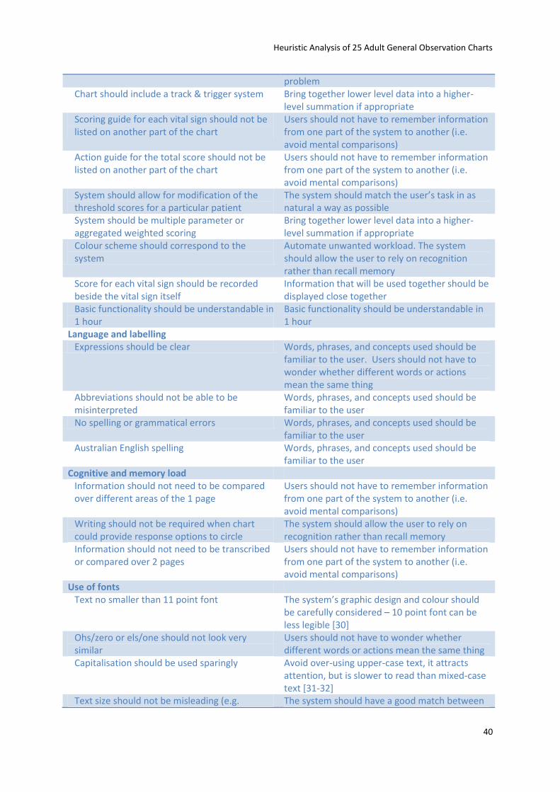
Heuristic Analysis of 25 Adult General Observation Charts
40
problem Chart should include a track & trigger system Bring together lower level data into a higher-
level summation if appropriate Scoring guide for each vital sign should not be listed on another part of the chart
Users should not have to remember information from one part of the system to another (i.e. avoid mental comparisons)
Action guide for the total score should not be listed on another part of the chart
Users should not have to remember information from one part of the system to another (i.e. avoid mental comparisons)
System should allow for modification of the threshold scores for a particular patient
The system should match the user’s task in as natural a way as possible
System should be multiple parameter or aggregated weighted scoring
Bring together lower level data into a higher-level summation if appropriate
Colour scheme should correspond to the system
Automate unwanted workload. The system should allow the user to rely on recognition rather than recall memory
Score for each vital sign should be recorded beside the vital sign itself
Information that will be used together should be displayed close together
Basic functionality should be understandable in 1 hour
Basic functionality should be understandable in 1 hour
Language and labelling Expressions should be clear Words, phrases, and concepts used should be
familiar to the user. Users should not have to wonder whether different words or actions mean the same thing
Abbreviations should not be able to be misinterpreted
Words, phrases, and concepts used should be familiar to the user
No spelling or grammatical errors Words, phrases, and concepts used should be familiar to the user
Australian English spelling Words, phrases, and concepts used should be familiar to the user
Cognitive and memory load Information should not need to be compared over different areas of the 1 page
Users should not have to remember information from one part of the system to another (i.e. avoid mental comparisons)
Writing should not be required when chart could provide response options to circle
The system should allow the user to rely on recognition rather than recall memory
Information should not need to be transcribed or compared over 2 pages
Users should not have to remember information from one part of the system to another (i.e. avoid mental comparisons)
Use of fonts Text no smaller than 11 point font The system’s graphic design and colour should
be carefully considered – 10 point font can be less legible [30]
Ohs/zero or els/one should not look very similar
Users should not have to wonder whether different words or actions mean the same thing
Capitalisation should be used sparingly Avoid over-using upper-case text, it attracts attention, but is slower to read than mixed-case text [31-32]
Text size should not be misleading (e.g. The system should have a good match between
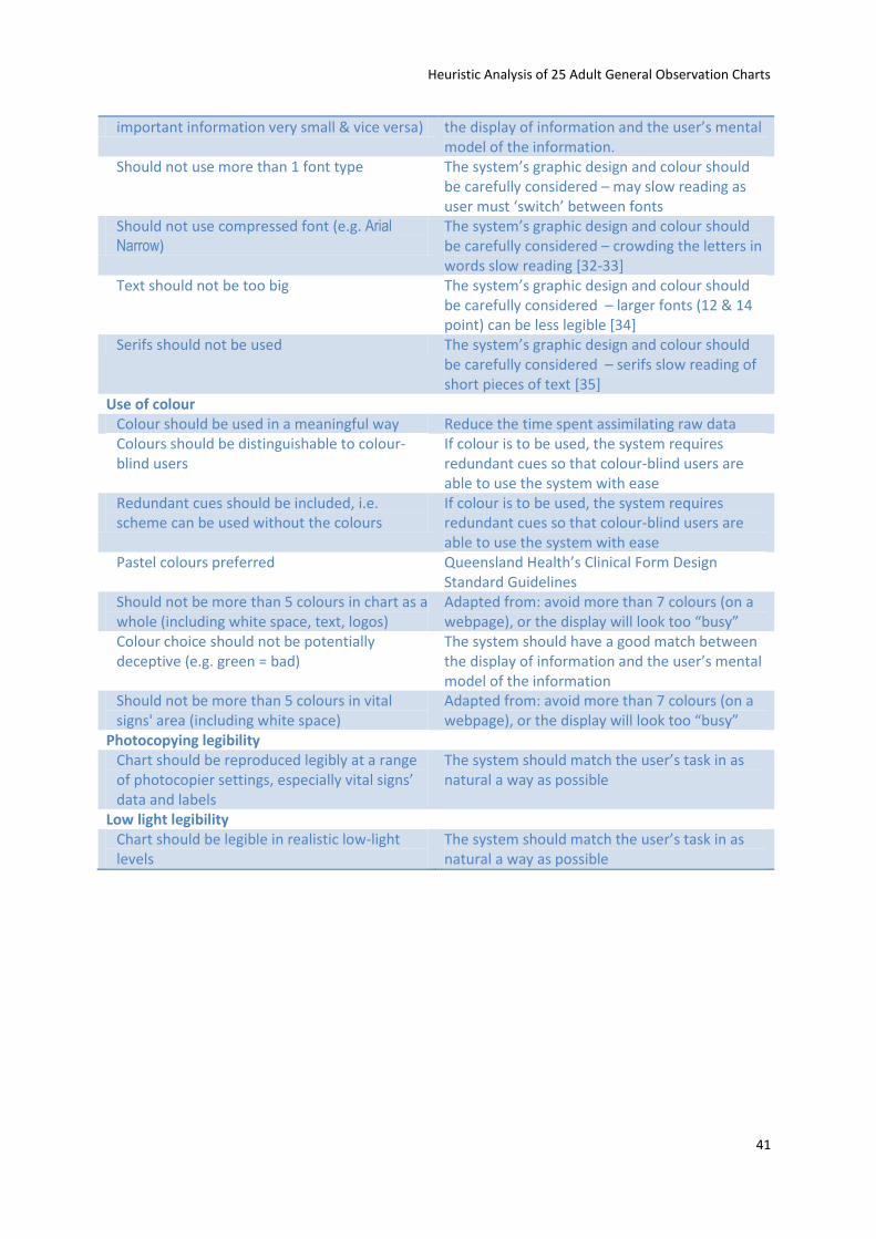
Heuristic Analysis of 25 Adult General Observation Charts
41
important information very small & vice versa) the display of information and the user’s mental model of the information.
Should not use more than 1 font type The system’s graphic design and colour should be carefully considered – may slow reading as user must ‘switch’ between fonts
Should not use compressed font (e.g. Arial
Narrow) The system’s graphic design and colour should be carefully considered – crowding the letters in words slow reading [32-33]
Text should not be too big The system’s graphic design and colour should be carefully considered – larger fonts (12 & 14 point) can be less legible [34]
Serifs should not be used The system’s graphic design and colour should be carefully considered – serifs slow reading of short pieces of text [35]
Use of colour Colour should be used in a meaningful way Reduce the time spent assimilating raw data Colours should be distinguishable to colour-blind users
If colour is to be used, the system requires redundant cues so that colour-blind users are able to use the system with ease
Redundant cues should be included, i.e. scheme can be used without the colours
If colour is to be used, the system requires redundant cues so that colour-blind users are able to use the system with ease
Pastel colours preferred Queensland Health’s Clinical Form Design Standard Guidelines
Should not be more than 5 colours in chart as a whole (including white space, text, logos)
Adapted from: avoid more than 7 colours (on a webpage), or the display will look too “busy”
Colour choice should not be potentially deceptive (e.g. green = bad)
The system should have a good match between the display of information and the user’s mental model of the information
Should not be more than 5 colours in vital signs' area (including white space)
Adapted from: avoid more than 7 colours (on a webpage), or the display will look too “busy”
Photocopying legibility Chart should be reproduced legibly at a range of photocopier settings, especially vital signs’ data and labels
The system should match the user’s task in as natural a way as possible
Low light legibility Chart should be legible in realistic low-light levels
The system should match the user’s task in as natural a way as possible
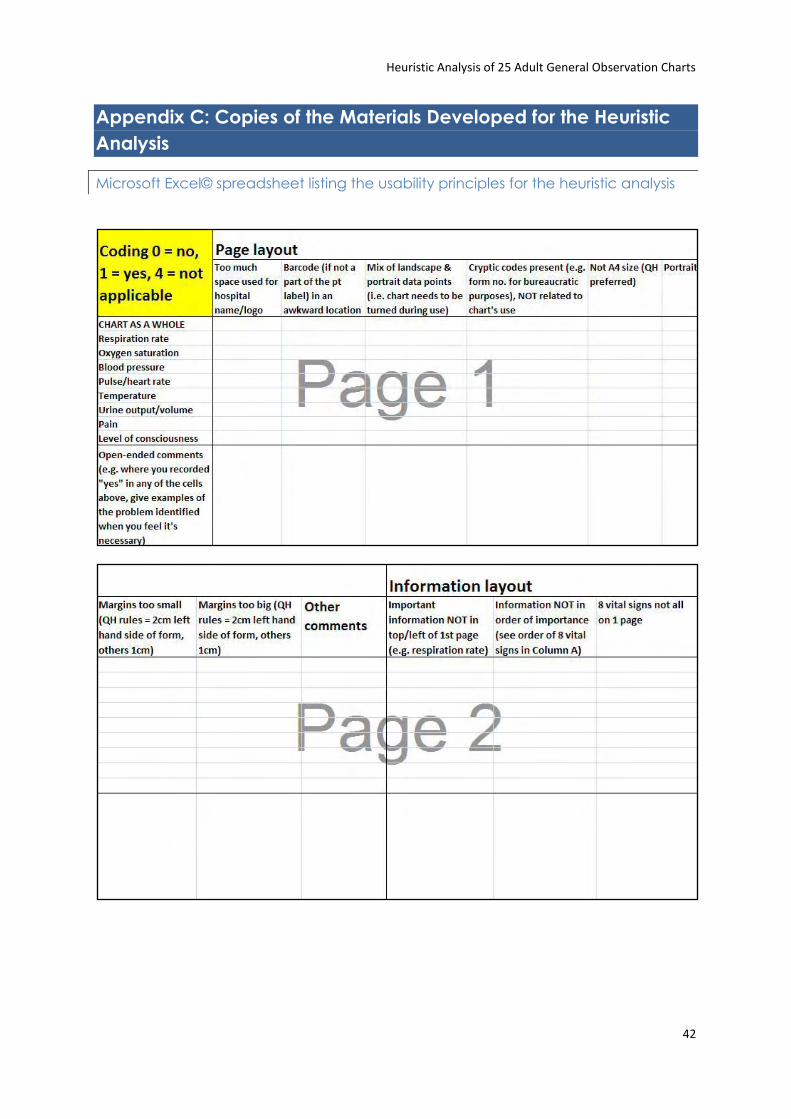
Heuristic Analysis of 25 Adult General Observation Charts
42
Appendix C: Copies of the Materials Developed for the Heuristic
Analysis
Microsoft Excel© spreadsheet listing the usability principles for the heuristic analysis
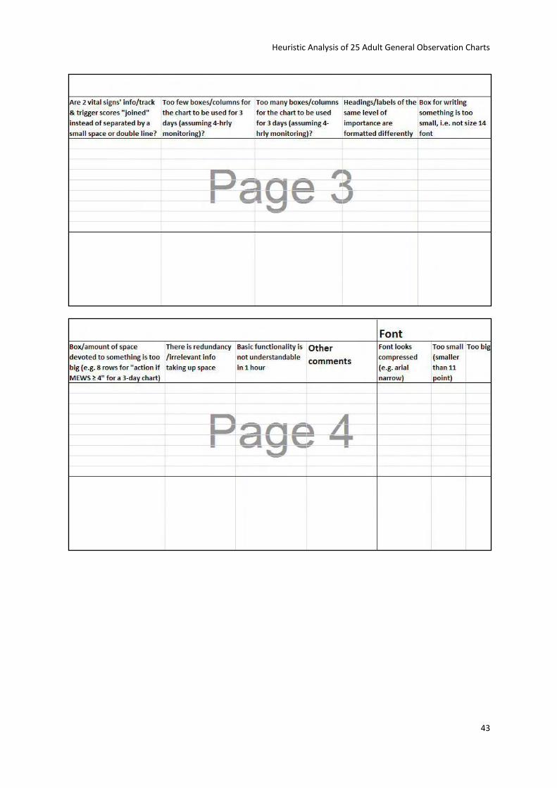
Heuristic Analysis of 25 Adult General Observation Charts
43
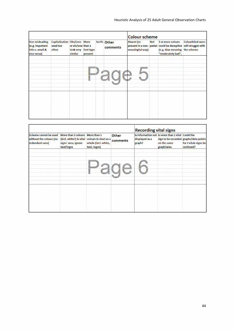
Heuristic Analysis of 25 Adult General Observation Charts
44
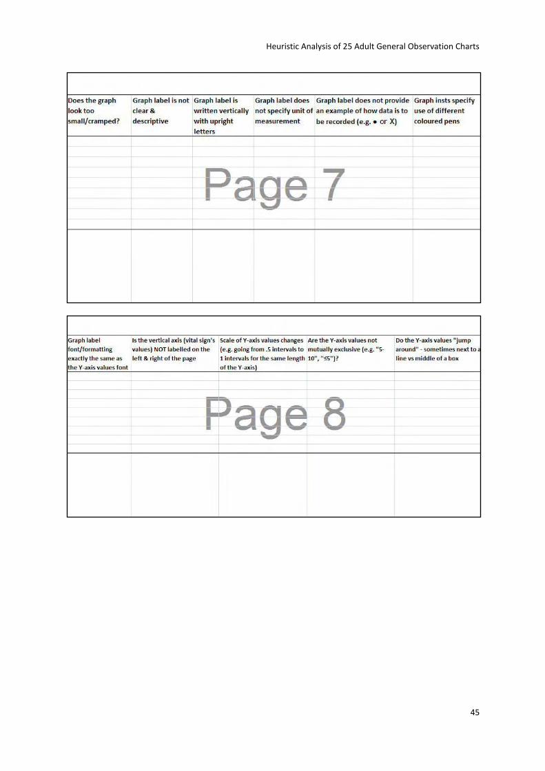
Heuristic Analysis of 25 Adult General Observation Charts
45
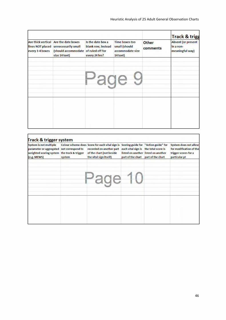
Heuristic Analysis of 25 Adult General Observation Charts
46
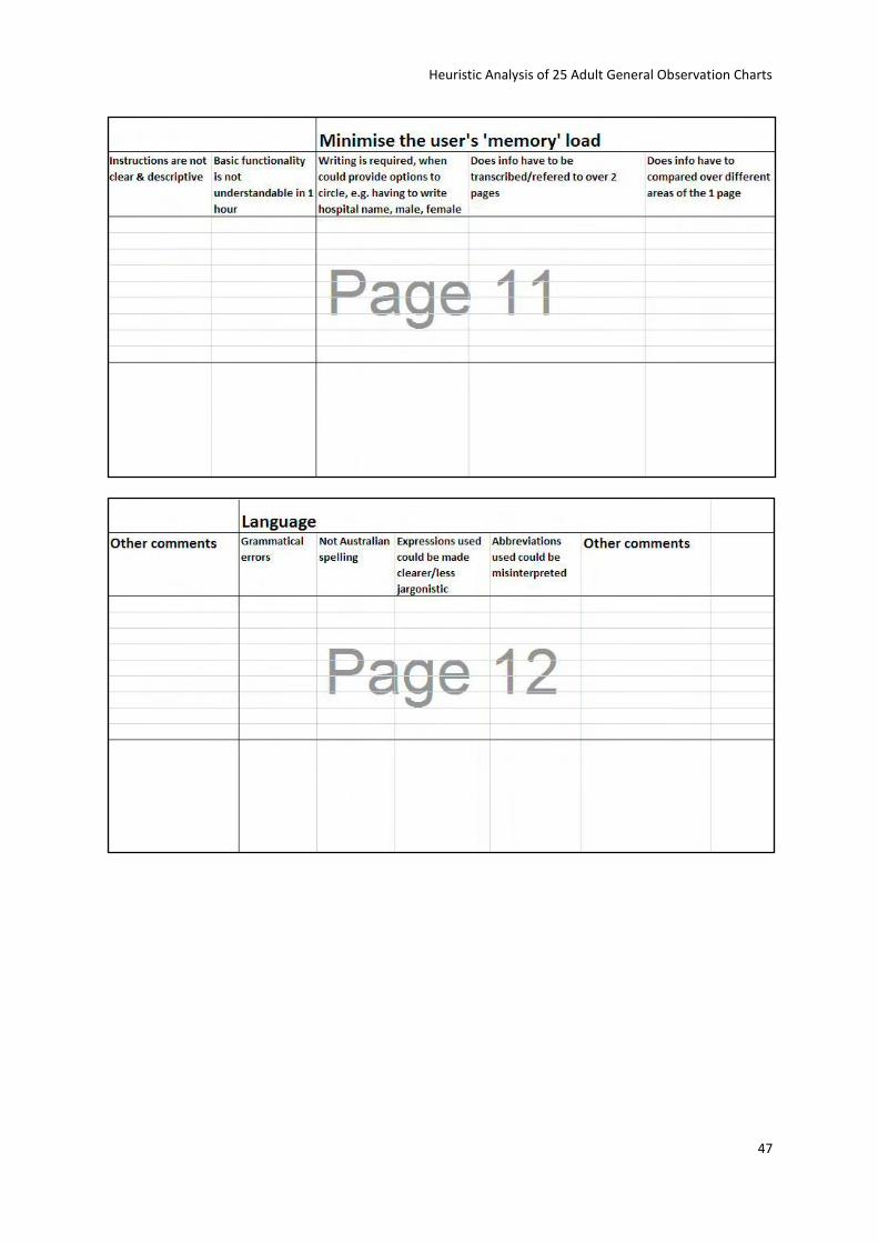
Heuristic Analysis of 25 Adult General Observation Charts
47
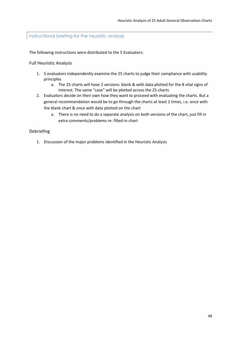
Heuristic Analysis of 25 Adult General Observation Charts
48
Instructional briefing for the heuristic analysis
The following instructions were distributed to the 5 Evaluators:
Full Heuristic Analysis
1. 5 evaluators independently examine the 25 charts to judge their compliance with usability principles
a. The 25 charts will have 2 versions: blank & with data plotted for the 8 vital signs of interest. The same “case” will be plotted across the 25 charts
2. Evaluators decide on their own how they want to proceed with evaluating the charts. But a
general recommendation would be to go through the charts at least 2 times, i.e. once with
the blank chart & once with data plotted on the chart
a. There is no need to do a separate analysis on both versions of the chart, just fill in
extra comments/problems re: filled-in chart
Debriefing
1. Discussion of the major problems identified in the Heuristic Analysis
Heuristic Analysis of 25 Adult General Observation Charts
49
Font size guide
This is size 14 in Arial
This is size 14 in Arial Narrow
This is size 14 in Arial Black
This is size 12 in Arial
This is size 12 in Arial Narrow
This is size 12 in Arial Black
This is size 11 in Arial
This is size 11 in Arial Narrow
This is size 11 in Arial Black
This is size 10 in Arial
This is size 10 in Arial Narrow
This is size 10 in Arial Black
This is size 9 in Arial
This is size 9 in Arial Narrow
This is size 9 in Arial Black
This is size 8 in Arial
This is size 8 in Arial Narrow
This is size 8 in Arial Black
This is size 7 in Arial
This is size 7 in Arial Narrow
This is size 7 in Arial Black
This is size 6 in Arial
This is size 6 in Arial Narrow
This is size 6 in Arial Black
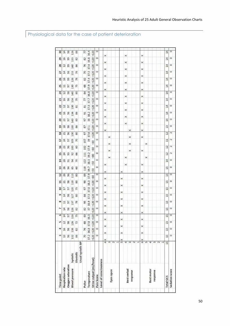
Heuristic Analysis of 25 Adult General Observation Charts
50
Physiological data for the case of patient deterioration
Related Documents