Health Figures: An Open Source JavaScript Library for Health Data Visualization*. Andres Ledesma 1 , Hannu Nieminen 1 , Mohammed Al-Musawi 1 Abstract— The way we look at data has a great impact on how we can understand it, particularly when the data is related to health and wellness. Due to the increased use of self-tracking devices and the ongoing shift towards preventive medicine, better understanding of our health data is an important part of improving the general welfare of the citizens. Electronic Health Records, self-tracking devices and mobile applications provide a rich variety of data but it often becomes difficult to understand. We implemented the hFigures library inspired on the hGraph visualization with additional improvements. The purpose of the library is to provide a visual representation of the evolution of health measurements in a complete and useful manner. We researched the usefulness and usability of the library by building an application for health data visualization in a health coaching program. We performed a user evaluation with Heuristic Evaluation, Controlled User Testing and Usability Questionnaires. In the Heuristics Evaluation the average response was 6.3 out of 7 points and the Cognitive Walkthrough done by usability experts indicated no design or mismatch errors. In the CSUQ usability test the system obtained an average score of 6.13 out of 7, and in the ASQ usability test the overall satisfaction score was 6.64 out of 7. We developed hFigures, an open source library for visualizing a complete, accurate and normalized graphical representation of health data. The idea is based on the concept of the hGraph but it provides additional key features, including a comparison of multiple health measurements over time. We conducted a usability evaluation of the library as a key component of an application for health and wellness monitoring. The results indicate that the data visualization library was helpful in assisting users in understanding health data and its evolution over time. I. I NTRODUCTION The ongoing shift from reactive to preventive medicine requires that citizens have the skills and means to take an active role in developing and maintaining their wellness. Use of self-tracking devices and personal wellness applications is more and more common, ranging from sports tracking applications to personal genome sequence analysis services. These services and devices produce large amounts of data. *This research was supported jointly by TEKES (the Finnish Funding Agency for Technology and Innovation) as part of the Digital Health Revolu- tion and FiDiPro (Finland Distinguished Professor Programme) projects and the European Commission and TEKES under the ARTEMIS-JU WithMe project. 1 Andres Ledesma, Hannu Nieminen and Mohammed Al-Musawi are with the Personal Health Informatics research group as part of the Department of Signal Processing, Tampere University of Technology, Tampere, Finland [email protected], [email protected], [email protected] In addition, Electronic Health Records are increasingly re- placing paper records in hospitals and clinics around the world. The combination of these large and heterogeneous data sources is expected to provide a “predictive, preventive, personalized and participatory” ecosystem for the benefit of the general welfare [1]. To better understand our health, we need to combine heterogeneous data sources and present the information to the user in a complete and accurate manner. In order to accom- plish this, health information technologies and visualization design need to be integrated [2]. The goal is to provide tools for individuals to take better decisions regarding their health. Similarly, doctors and other medical experts need tools and solutions for getting a complete and accurate view of the patients health, combining together patient’s own measurements and clinical data. An innovative approach for health data visualization is the Health Graph (hGraph), released publicly by MITRE corporation [3]. In an earlier study [4], it was found that the hGraph-type radial plot can enhance deep understanding of health data and enable the user to create meaningful health insights based on the interrelationships between the measurements. However, the hGraph shows a static overview of a persons wellness. Disease and wellness are processes that change over time. It is also essentially important to be able to follow up the trajectories in the different parameters, what is the rate of the change and how they respond to events such as medical care actions and interventions. Thus, in addition to a static snapshot such as in hGraph, a temporal way of presenting the data is also needed. While hGraph visualization is useful for the purpose of understanding with a quick glance the overall situation, it lacks features such as a clear division of measurements according to their category, a distribution of the labels to avoid clutter and the notion of time or evolution of the data [4]. In this article we present a visualization library based on extending the core ideas of the hGraph. Aim of the library is to provide tools to assist experts and non-experts in the decision making process of assessing the situation of a patient and its evolution over time. To test the user satis- faction, ease-of-use and usefulness of the solution, we built an application for health monitoring using the visualization library. The application is a visualization tool that shows a health coaching program and its effects on the evolution of health and wellness of a modeled patient. We evaluated the software solution using usability tests (Heuristic Evaluation, Controlled User Testing and Usability Questionnaires). First in this article we review the state-of-the-art on health arXiv:1605.06043v2 [cs.HC] 20 May 2016

Welcome message from author
This document is posted to help you gain knowledge. Please leave a comment to let me know what you think about it! Share it to your friends and learn new things together.
Transcript
Health Figures:An Open Source JavaScript Library for Health Data Visualization*.
Andres Ledesma1, Hannu Nieminen1, Mohammed Al-Musawi1
Abstract— The way we look at data has a great impact onhow we can understand it, particularly when the data is relatedto health and wellness. Due to the increased use of self-trackingdevices and the ongoing shift towards preventive medicine,better understanding of our health data is an important partof improving the general welfare of the citizens. ElectronicHealth Records, self-tracking devices and mobile applicationsprovide a rich variety of data but it often becomes difficult tounderstand. We implemented the hFigures library inspired onthe hGraph visualization with additional improvements. Thepurpose of the library is to provide a visual representation ofthe evolution of health measurements in a complete and usefulmanner.
We researched the usefulness and usability of the libraryby building an application for health data visualization in ahealth coaching program. We performed a user evaluationwith Heuristic Evaluation, Controlled User Testing andUsability Questionnaires. In the Heuristics Evaluation theaverage response was 6.3 out of 7 points and the CognitiveWalkthrough done by usability experts indicated no designor mismatch errors. In the CSUQ usability test the systemobtained an average score of 6.13 out of 7, and in the ASQusability test the overall satisfaction score was 6.64 out of 7.
We developed hFigures, an open source library for visualizinga complete, accurate and normalized graphical representationof health data. The idea is based on the concept of the hGraphbut it provides additional key features, including a comparisonof multiple health measurements over time. We conducted ausability evaluation of the library as a key component of anapplication for health and wellness monitoring. The resultsindicate that the data visualization library was helpful inassisting users in understanding health data and its evolutionover time.
I. INTRODUCTION
The ongoing shift from reactive to preventive medicinerequires that citizens have the skills and means to take anactive role in developing and maintaining their wellness. Useof self-tracking devices and personal wellness applicationsis more and more common, ranging from sports trackingapplications to personal genome sequence analysis services.These services and devices produce large amounts of data.
*This research was supported jointly by TEKES (the Finnish FundingAgency for Technology and Innovation) as part of the Digital Health Revolu-tion and FiDiPro (Finland Distinguished Professor Programme) projects andthe European Commission and TEKES under the ARTEMIS-JU WithMeproject.
1Andres Ledesma, Hannu Nieminen and Mohammed Al-Musawi are withthe Personal Health Informatics research group as part of the Departmentof Signal Processing, Tampere University of Technology, Tampere, [email protected],[email protected],[email protected]
In addition, Electronic Health Records are increasingly re-placing paper records in hospitals and clinics around theworld. The combination of these large and heterogeneousdata sources is expected to provide a “predictive, preventive,personalized and participatory” ecosystem for the benefit ofthe general welfare [1].
To better understand our health, we need to combineheterogeneous data sources and present the information to theuser in a complete and accurate manner. In order to accom-plish this, health information technologies and visualizationdesign need to be integrated [2]. The goal is to providetools for individuals to take better decisions regarding theirhealth. Similarly, doctors and other medical experts needtools and solutions for getting a complete and accurate viewof the patients health, combining together patient’s ownmeasurements and clinical data.
An innovative approach for health data visualization isthe Health Graph (hGraph), released publicly by MITREcorporation [3]. In an earlier study [4], it was found thatthe hGraph-type radial plot can enhance deep understandingof health data and enable the user to create meaningfulhealth insights based on the interrelationships between themeasurements. However, the hGraph shows a static overviewof a persons wellness. Disease and wellness are processesthat change over time. It is also essentially important to beable to follow up the trajectories in the different parameters,what is the rate of the change and how they respond toevents such as medical care actions and interventions. Thus,in addition to a static snapshot such as in hGraph, a temporalway of presenting the data is also needed. While hGraphvisualization is useful for the purpose of understanding witha quick glance the overall situation, it lacks features such asa clear division of measurements according to their category,a distribution of the labels to avoid clutter and the notion oftime or evolution of the data [4].
In this article we present a visualization library basedon extending the core ideas of the hGraph. Aim of thelibrary is to provide tools to assist experts and non-expertsin the decision making process of assessing the situation ofa patient and its evolution over time. To test the user satis-faction, ease-of-use and usefulness of the solution, we builtan application for health monitoring using the visualizationlibrary. The application is a visualization tool that shows ahealth coaching program and its effects on the evolution ofhealth and wellness of a modeled patient. We evaluated thesoftware solution using usability tests (Heuristic Evaluation,Controlled User Testing and Usability Questionnaires).
First in this article we review the state-of-the-art on health
arX
iv:1
605.
0604
3v2
[cs
.HC
] 2
0 M
ay 2
016
data visualizations and describe the hGraph and resultsrelated to its usability and usefulness, which motivated us todevelop hGraph further. We named the new library built ontop of the hGraph core ideas as hFigures. The article detailsthe design and implementation of the hFigures library, thefeatures we implemented and how they address the users’needs. We also describe the usability test process we utilizedto assess the library in the context of an application for healthmonitoring. We present the results and discuss the furtherimprovements of the library and its pitfalls. We also discusshow this library can be used in Personal Health Informaticsand in the Health Care processes.
II. BACKGROUND
Visualization tools have mostly focused on Healthcare In-formation Systems and Electronic Health Records (EHR) [2].For instance, TimeLine is a software developed to retrievedata from several sources and presented in a hierarchicaland timeline based structure where clinicians can browsechronologically through existing EHRs including MRI [5].
Additionally, the growing market for mobile health appli-cations (mHealth) have drawn the attention of researchers,developers and investors [6]. These applications provide largevolumes of personal health data. While the market anddemand are expected to grow, the use of the data has thepotential to contribute to a better understanding of our health.
Goetze [7] demonstrated the impact of data visualizationas means to represent health data in a complete and accuratemanner. He conducted a project that redesigned laboratorytest results from numerical tables into colored graphics. Hedemonstrated that the patients were able to understand bettertheir health situation when presented with the new designs.
Data integration for health monitoring as a Big Data pro-cess for personalized medicine has been approached by Idriset al. [8]. The visualization of this information uses tradi-tional bar and pie charts to report to the user a historical viewof a variety of data including mental, social, physical aspects.The novelty of this work is the integration of heterogeneousdata sources while the presentation of the information wasdone following existing graphical representations.
An extensive choice of graphical representation is listedand explained by S. Few [9]. These techniques have beenstudied and used widely among researchers and individualsalike. Examples include: bar, stacked bar, line and bulletgraphs. These visualizations can be combined to providea personalized wellness indicator system, as proposed bySoomlek and Benedicenti [10].
DeRidder et al. developed a combined approach thatretrieves data from Personal Health Records (PHRs), andpresents them to individual patients using a “3D medicalgraphical avatar” [11]. The solution is built using HTML5and WebGL to render 3D graphics using the web browser.Patients can browse “regions of interests” on their avatar andexplore further the information contained in EHRs as wellas in PHRs.
As stated by Shneiderman et al. [12], new visual represen-tations are needed for “systematic yet flexible visual analytics
processes”. We present an existing tentative solution knownas the hGraph, released publicly by MITRE corporation. Wedescribe its main advantages and how they can address thesechallenges. In a previous study [4] we identified possibleimprovements and based on our own implementation weaddressed these issues and extended the features of thehGraph to better address large data sources.
However, a data visualization is only as good as the abilityof the intended audience to decode graphical objects intonumerical values which conveys a clear message. Therefore,we have to consider the graphical perception of the users whowill benefit from the data visualization. Graphical perceptionis the ability of an individual to decode the informationdisplayed as graphical objects [13], it has been a widelyresearched field [14]. Graphical perception affect how weunderstand visualized information. In the context of healthdata, it remains a challenge to design graphical representa-tions for non-medical experts. Graphical representations inthis context should enhance the users’ ability to understandtheir health situation and take informed decisions. With this“deep” understanding on the health situation, individuals canmove towards healthier behaviors.
The graphical representation of health data requires acomplete and accurate overview of a patient often includinglarge amounts of measurements, which in turn translates tolarge datasets. Therefore, health data visualizations need toscale to accommodate large datasets.
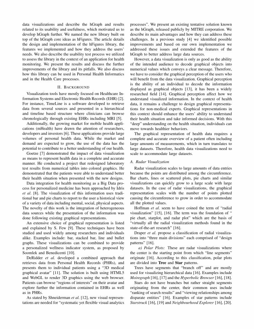
A. Radar Visualization
Radar visualization scales to large amounts of data entriesbecause the points are distributed among the circumference.Bar charts, lines or scattered plots, pie charts and similarvisualizations can quickly grow to a large scale with largedatasets. In the case of radar visualizations, the graphicalrepresentation scales with the number of points plottedcausing the circumference to grow in order to accommodateall the plotted values.
Hoffman et al. seem to have coined the term of “radialvisualization” [15], [16]. The term was the foundation of “pie chart, starplot, and radar plot” which are the basis of“virtually all the radial visualization methods found in thestate-of-the-art research” [16].
Draper et al. propose a classification of radial visualiza-tions into “three main divisions” each comprised of “designpatterns” [16].
a) Polar Plots: These are radar visualizations wherethe center is the starting point from which “line segments”originate [16]. According to this classification, polar plotsare divided into Tree and Star patterns.
Trees have segments that “branch off” and are mostlyused for visualizing hierarchical data [16]. Examples includeMoiregraph [16], [17] and the Hyperbolic Browser [16], [18].
Stars do not have branches but rather straight segmentsoriginating from the center, their common uses include“ranking of search results” and “viewing relationships amongdisparate entities” [16]. Examples of star patterns includeStarstruck [16], [19] and Neighbourhood Explorer [16], [20].
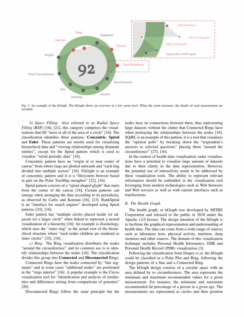
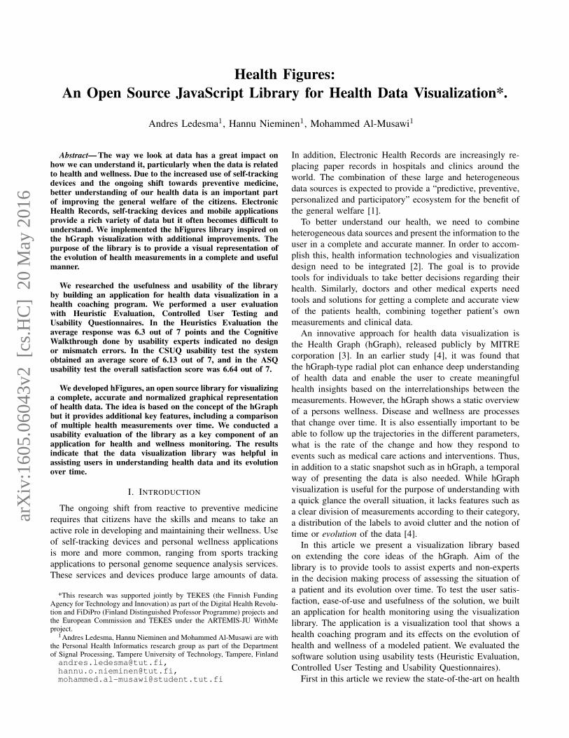
Fig. 1: An example of the hGraph. The hGraph shows an overview at a low zoom level. When the zoom increases, the details of each measurement arerevealed.
b) Space Filling: Also referred to as Radial SpaceFilling (RSF) [16], [21], this category comprises the visual-izations that fill “most or all of the area of a circle” [16]. Theclassification identifies three patterns: Concentric, Spiraland Euler. These patterns are mostly used for visualizinghierarchical data and “viewing relationships among disparateentities”, except for the Spiral pattern which is used tovisualize “serial periodic data” [16].
Concentric pattern have an “origin at or near center ofcanvas” from where rings are plotted outwards and “each ringdivided into multiple sectors” [16]. Filelight is an exampleof concentric pattern and it is a “filesystem browser basedin part on the Polar TreeMap metaphor” [22], [16].
Spiral pattern consists of a “spiral-shaped glyph” that startsfrom the center of the canvas [16]. Certain patterns canemerge when arranging the data according to its periodicity,as observed by Carlis and Konstan [16], [23]. RankSpiralis an “interface for search engines” developed using Spiralpatterns [24], [16].
Euler pattern has “multiple circles placed inside (or ad-jacent to) a larger circle” often linked to represent a nestedvisualization of a hierarchy [16]. An example is Zoomology,which uses the “outer ring” as the actual root of the hierar-chical structure where “each nodes children are rendered asinner circles” [25], [16].
c) Ring: The Ring visualization distributes the nodes“around the circumference” and its common use is to iden-tify relationships between the nodes [16]. The classificationdivides this group into Connected and Disconnected Rings.
Connected Rings have the nodes connected by “line seg-ments” and in some cases “additional nodes” are positionedin the “rings interior” [16]. A popular example is the Circosvisualization tool for “identification and analysis of similar-ities and differences arising from comparisons of genomes”[26].
Disconnected Rings follow the same principle but the
nodes have no connections between them, thus representinglarge datasets without the clutter that Connected Rings havewhen portraying the relationships between the nodes [16].SQiRL is an example of this pattern, it is a tool that visualizesthe “opinion polls” by breaking down the “respondent’sanswers to selected questions” placing them “around thecircumference” [27], [16].
In the context of health data visualization, radar visualiza-tions have a potential to visualize large amount of datasetsdue to their clarity in the data representation. However,the potential use of interactivity needs to be addressed bythese visualization tools. The ability to represent relevantinformation should be embedded in the visualization toolleveraging from modern technologies such as Web browsersand Web services as well as with current interfaces such astouchscreens.
B. The Health Graph
The health graph, or hGraph was developed by MITRECorporation and released to the public in 2010 under theApache v2.0 license. The design intention of the hGraph isto facilitate the graphical representation and understanding ofhealth data. The data can come from a wide-range of sourcessuch as laboratory tests, physical activity, nutrition, sleepmonitors and other sources. The domain of this visualizationtechnique includes Personal Health Informatics, EHR andPersonal Health Record (PHR) visualization [3].
Following the classification from Draper et al, the hGraphcould be classified as a Polar Plot and Ring, following thedesign patterns of a Star and a Connected Ring.
The hGraph design consists of a circular space with anarea defined by to circumferences. The area represents theminimum and maximum recommended values for a givenmeasurement. For instance, the minimum and maximumrecommended fat percentage of a person in a given age. Themeasurements are represented as circles and their position
Fig. 2: A simple example of hFigures. The measurements are separated by groups in sectors.
in the circular space represents how far or close they arefrom the recommended values. The position is normalizedaccording to the recommended values.
The values are distributed in a circular space. A graphis formed by joining the data points around the circulararea. This polygon or graph reveals a pattern and its shapeprovides a quick overview of the general situation of allthe values and how they deviate from the recommenda-tions. The hGraph design highlights values outside of therecommendation by using the red color on the data pointsand by modifying the shape of the graph. The rationale ofthe hGraph is that if the same measurements are plotted inthe same order for various cases, then the graph patternscan reveal similar shapes associated with certain healthconditions.
d) Web-based Solution: Web-based solutions for datavisualization provide flexibility, as they can be accessedby any web browser, either from mobile devices or per-sonal computers. The hGraph uses a web approach viaHyperText Markup Language (HTML) and Scalable VectorGraphics (SVG). The programming language of the libraryis JavaScript and is built using the Data-Driven Documentslibrary. Data-Driven Documents (D3.js) library provides freeaccess to the Document Object Model (DOM), which is thesubstrate that enables the programmer to interface with thegraphical representations in a web browser [28].
e) hGraph as an Insightful Visualization: Based on theapproach proposed by C. North [29], a previous study [4]compared visualizations based on how well users derivedmeaningful insights. The study compared the hGraph visu-alization along with four alternatives based on the GraphicalPerception Framework proposed by Cleveland McGill [14].The study compared the same data plotted with these fivealternatives plus a control group which had the numeri-cal data with no visualization. The data was comprisedby a set of measurements of two modelled patients. Thefirst patient had an elevated at risk of developing TypeII Diabetes and the second one had a low risk due to ahealthy lifestyle (regular exercise and a balanced diet). Theevaluation followed the insight-based methodology similar toother experiments for visualizing genetic expressions [30].The experiment determined how these visualizations canenable users to understand the overall health situation of themodelled patient with poor health, as well as the possiblecauses behind that patient’s situation. The hGraph was foundto be the most effective solutions for creating meaningfulinsights and to help users to better understand the data.
Figure 1 is an example of the hGraph visualization. Thefigure was extracted as a snapshot as the library generatesan SVG document structure that cannot be exported outsidethe browser. We address this issue in the next section of thearticle. The hGraph hides the measurements when the zoom

level is low, meaning that the user has zoomed out. Theshape is an average of the deviation of each measurementunder the same category. When the user zooms in, the detailsare revealed and the rest of the information becomes visible,that is the numerical values and positions (with respect tothe recommendation) of the measurements.
III. IMPLEMENTATION
In this chapter we detail the implementation methodologyand the key features implemented in the library. We namedthe library Health Figures (hFigures) because it is basedon the design principles of the hGraph. hFigures makes anemphasis on multiple graphs, or figures, in order to providea graphical representation of evolution of the data over time(multiple snapshots of the data at certain points in time).
A. Methodology
The implementation of the hFigures followed the ExtremeProgramming methodology [31], [32]. The main key re-quirement was to provide a visualization which representsthe changes in the overall health situation. In addition,the implementation addressed the features that the usersrequested in a previous study [4].
Extreme Programming focuses on releasing and reviewingfunctional software continuously [32]. Often these require-ments change and the programming practice is to addressthis changes by prioritizing them at the top of the changelist.
During the implementation of the library, our researchgroup provided the continuous review process of the soft-ware. The research group has expertise in Health Sciences,Signal Processing, User Design, Software Engineering andMachine Learning. Requirements often changed and newreleases were assessed by the group. The development of thehealth monitoring application followed the practice of pairprogramming, as it is often the case in Extreme Programming[31].
B. Data Source
We use a JSON (JavaScript Object Notation) format toread the data, in which the measurements are groupedaccording to their categories. The groups contain an arrayof samples, which represent the values obtained from ameasurement (steps per day, cholesterol, triglycerides, bloodsugar or depression level using [33]). The samples containa timestamp in Unix Epoch format and the value of themeasurement. The Unix Epoch format is the number ofseconds since the first of January 1970, Greenwich MeridianTime (GMT). An example of the data source is in figure3, it shows the first measurement of the group ”BloodPressure” which in this case is comprised by Systolic andDiastolic measurements and each of them have two samplestaken at two particular times, Friday 9th of January 2015at 10:10:24 GMT (1420798224 — seconds) and Thursday12th of February 2015 at 12:05:20 GMT (1423742720 —seconds).
Fig. 3: JSON data source file. The data source file structured as a JSONfile.
C. SVG Document Export
The SVG document structure we designed in our imple-mentation can be exported to a separate file outside theweb browser. The short-term objective is to build a tool-kit that enables researchers to visualize their data with ourimplementation so they can use the generated SVG filein articles, posters, presentations or other applications. Forinstance, figure 2 has been exported as an SVG documentfrom the browser into this article. SVG export is possible dueto the rendering of our algorithm which does not depend onJavaScript or Cascade Style Sheet (CSS) styling propertiesto produce a finalized document. The library build theentire image as a stand-alone document. The hGraph libraryunfortunately does not produce a complete document butinstead depends on CSS and JavaScript code to make theimage visible.
D. Constant Graph Shape
Figure 1 shows an hGraph example and figure 2 shows anhFigures example. The hGraph computes the average of thedeviation of the measurements in order to show the polygonor graph, as a representation of the overall health assessment.However, some measurement might deviate towards a lowervalue and while others towards a higher one, thus the averageposition would be roughly the middle recommended area.For this reason, hFigures does not change the shape of thegraph if the user zooms in or out. Showing and hidingthe measurement labels is the only reaction to the zoomingevents from the user at the moment. This avoids clutter whenthe user wished to have a quick glance at the picture butkeeps the graph with the same shape.
E. Layout Construction
The measurement groups are represented using a circularlayout divided in sectors. The goal is to have a clear divisionbetween the groups as they represent the different aspectsof the overall health. hFigures uses the d3 pie chart layoutand modifies the data source provided to the layout. All themeasurements have the same numerical value and at the endof the group, we insert an extra value in order to leave ablank space between the circular area sectors. The resultis visible in the hFigures example shown in figure 2 andthe code that produced this visualization is in figure 4. Thepie layout constructs the sectors of the circular area based

on a data source. When we provide an array of numbers,the layout uses the numbers to calculate the proportionsof the area. In order to achieve the layout constructionthat we have designed, the array has the same constantnumber multiple times, the number of measurements plusan additional number for each group.
Fig. 4: Layout construction code. The layout for distributing the measure-ments is build using d3 pie layout leaving spaced between the measurementgroups.
F. Color-coded Entries
The data source can contain additional sets of valueranges. For instance a warning range of values can let theusers know when a value has reached a level that requiresattention but has not yet reached a critical point. We followedthe users’ feedback that recommends a traffic light-basedapproach. The green color means that the values are withinthe recommended, yellow suggest a warning or follow-upaction needed and the red indicated a critical threshold hasbeen passed.
In the implementation, the library verifies if these addi-tional ranges are present in the measurement definition. Inorder to verify if the property of the object exists, JavaScriptprovides a qualifier method, typeof. The returned valuemust be compared with the keyword definition for propertiesthat are not present in an object, the keyword undefinedhas been suggested by Mozilla Developer Network [34], ahighly reputable source for Web development. The code isshown in figure 5.
Fig. 5: JavaScript code to determine if additional ranges are provided.In JavaScript the data source could contain additional ranges, these areproperties in an object that need to be checked beforehand and if the exists,compare the values accordingly.
G. Multiple Graph
The dataset is structured as a set of measurements whereeach has its own collection of samples. In order to comparethe evolution of these measurements, the hFigures libraryallows the graphical representation of any number of sam-ples. The result is a set of graphs or polygons overlappingor stacking with each other. In order to differentiate them,we use a lighter set of colors so that the users can see thedifference between two points in time. As an example, figure2 shows two different samples for each measurement. Thisexample portrays a modeled person that has been active ina health coach program. Some measurements have improvedand are closer to the recommendation. Users repeatedlyexpressed that it would be very helpful to visualize two ormore different points in time so as to compare how the personhas evolved.
Including multiple graphs has implications in the struc-ture and procedures of the visualization construction. Forinstance, we structured the SVG document such that eachmeasurement includes one or many plotted circles that mapto each sample. The measurement labels need to be posi-tioned considering that a plotted circles can (and probablywill) overlap. This is challenge that we address in the nextsection by finding an optimal label space distribution to avoidlabels from overlapping and also to reduce the clutter in thevisualization space.
H. Label Space Distribution
After the measurements are plotted, the labels are addedto increase readability. The position of the label needs to bedefined within a given range to avoid overlaps and clutter.
Fig. 6: JavaScript code for label positioning. The function in JavaScriptdistributed the positioning of the label to avoid overlapping and clutter.
Labels need to avoid overlapping with each other and withtheir measurements. To solve the label overlapping problemwe implemented an algorithm that starts by ordering thelabels by their angular position, that is the angle at whichthe measurement is positioned. The next step is to calculatethe height of the label and position it over the previous onein the direction that goes from the center of the visualizationarea upwards or downwards (depending on the angle). Theidea is to begin with the center of the area, either to the leftor to the right of the circles, then we work our way up ordown drawing the labels into the SVG document. We addthe labels as SVG elements and the use the transform
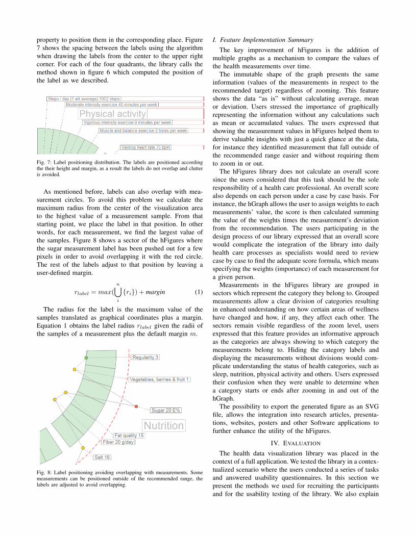
property to position them in the corresponding place. Figure7 shows the spacing between the labels using the algorithmwhen drawing the labels from the center to the upper rightcorner. For each of the four quadrants, the library calls themethod shown in figure 6 which computed the position ofthe label as we described.
Fig. 7: Label positioning distribution. The labels are positioned accordingthe their height and margin, as a result the labels do not overlap and clutteris avoided.
As mentioned before, labels can also overlap with mea-surement circles. To avoid this problem we calculate themaximum radius from the center of the visualization areato the highest value of a measurement sample. From thatstarting point, we place the label in that position. In otherwords, for each measurement, we find the largest value ofthe samples. Figure 8 shows a sector of the hFigures wherethe sugar measurement label has been pushed out for a fewpixels in order to avoid overlapping it with the red circle.The rest of the labels adjust to that position by leaving auser-defined margin.
rlabel = max(
n⋃i
{ri}) + margin (1)
The radius for the label is the maximum value of thesamples translated as graphical coordinates plus a margin.Equation 1 obtains the label radius rlabel given the radii ofthe samples of a measurement plus the default margin m.
Fig. 8: Label positioning avoiding overlapping with measurements. Somemeasurements can be positioned outside of the recommended range, thelabels are adjusted to avoid overlapping.
I. Feature Implementation Summary
The key improvement of hFigures is the addition ofmultiple graphs as a mechanism to compare the values ofthe health measurements over time.
The immutable shape of the graph presents the sameinformation (values of the measurements in respect to therecommended target) regardless of zooming. This featureshows the data “as is” without calculating average, meanor deviation. Users stressed the importance of graphicallyrepresenting the information without any calculations suchas mean or accumulated values. The users expressed thatshowing the measurement values in hFigures helped them toderive valuable insights with just a quick glance at the data,for instance they identified measurement that fall outside ofthe recommended range easier and without requiring themto zoom in or out.
The hFigures library does not calculate an overall scoresince the users considered that this task should be the soleresponsibility of a health care professional. An overall scorealso depends on each person under a case by case basis. Forinstance, the hGraph allows the user to assign weights to eachmeasurements’ value, the score is then calculated summingthe value of the weights times the measurement’s deviationfrom the recommendation. The users participating in thedesign process of our library expressed that an overall scorewould complicate the integration of the library into dailyhealth care processes as specialists would need to reviewcase by case to find the adequate score formula, which meansspecifying the weights (importance) of each measurement fora given person.
Measurements in the hFigures library are grouped insectors which represent the category they belong to. Groupedmeasurements allow a clear division of categories resultingin enhanced understanding on how certain areas of wellnesshave changed and how, if any, they affect each other. Thesectors remain visible regardless of the zoom level, usersexpressed that this feature provides an informative approachas the categories are always showing to which category themeasurements belong to. Hiding the category labels anddisplaying the measurements without divisions would com-plicate understanding the status of health categories, such assleep, nutrition, physical activity and others. Users expressedtheir confusion when they were unable to determine whena category starts or ends after zooming in and out of thehGraph.
The possibility to export the generated figure as an SVGfile, allows the integration into research articles, presenta-tions, websites, posters and other Software applications tofurther enhance the utility of the hFigures.
IV. EVALUATION
The health data visualization library was placed in thecontext of a full application. We tested the library in a contex-tualized scenario where the users conducted a series of tasksand answered usability questionnaires. In this section wepresent the methods we used for recruiting the participantsand for the usability testing of the library. We also explain
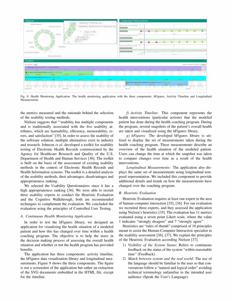
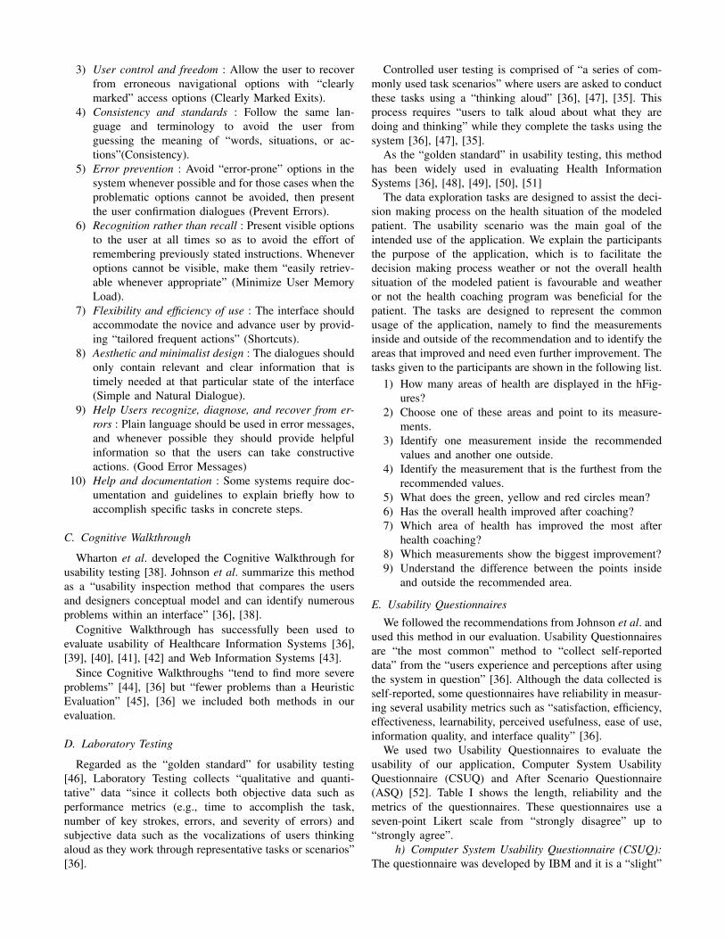
Fig. 9: Health Monitoring Application. The health monitoring application with the three components: hFigures, Activity Timeline and LongitudinalMeasurements.
the metrics measured and the rationale behind the selectionof the usability testing methods.
Nielsen suggests that “‘usability has multiple componentsand is traditionally associated with the five usability at-tributes, which are learnability, efficiency, memorability, er-rors, and satisfaction” [35]. In order to assess the usability ofthe software solution, multiple alternatives exist in industryand research. Johnson et al. developed a toolkit for usabilitytesting of Electronic Health Records commissioned by theAgency for Healthcare Research and Quality of the U.S.Department of Health and Human Services [36]. The toolkitis built on the basis of the assessment of existing usabilitymethods in the context of Electronic Health Records andHealth Information systems. The toolkit is a detailed analysisof the usability methods, their advantages, disadvantages andappropriateness ranking.
We selected the Usability Questionnaires since it has ahigh appropriateness ranking [36]. We were able to recruitthree usability experts to conduct the Heuristic Evaluationand the Cognitive Walkthrough, both are recommendedtechniques to complement the evaluation. We concluded theevaluation using the principles of Controlled User Testing.
A. Continuous Health Monitoring Application
In order to test the hFigures library, we designed anapplication for visualizing the health situation of a modeledpatient and how this has changed over time within a healthcoaching program. The objective is to help the users inthe decision making process of assessing the overall healthsituation and whether or not the health program has providedbenefits.
The application has three components: activity timeline,the hFigures data visualization library and longitudinal mea-surements. Figure 9 shows the three components. The figureis not a screenshot of the application but rather an extractionof the SVG documents embedded in the HTML file, exceptfor the timeline.
f) Activity Timeline: This component represents thehealth interventions (particular actions) that the modeledpatient has done during the health coaching program. Duringthe program, several snapshots of the patient’s overall healthare taken and visualized using the hFigures library.
g) hFigures: The developed hFigures library is uti-lized to display the set of measurements taken during thehealth coaching program. These measurements describe anoverview of the health situation of the modeled patient.Users can change the time at which the snapshot was takento compare changes over time as a result of the healthinterventions.
Longitudinal Measurements: The application also dis-plays the same set of measurements using longitudinal tem-poral representation. We included this component to provideadditional details and trends on how the measurements havechanged over the coaching program.
B. Heuristic Evaluation
Heuristic Evaluation requires at least one expert in the areaof human-computer interaction [35], [36]. For our evaluationwe recruited three experts, and they assessed the applicationusing Nielsen’s heuristics [35]. The evaluation has 11 metricsevaluated using a seven point Likert scale, where the value1 indicates “strongly disagree” and 7 “strongly agree”
Heuristics are “rules of thumb” comprised of 10 principlesmeant to assist the Human-Computer Interaction specialist inthe usability assessment [36], [37]. We explain the principlesof the Heuristic Evaluation according Nielsen [37].
1) Visibility of the System Status: Refers to continuousfeedback on the status of the system “within reasonabletime” (Feedback).
2) Match between system and the real world: The use ofthe language should be familiar to the user so that con-versations follow a “natural and logical order” avoidingtechnical terminology unfamiliar to the intended useraudience (Speak the User’s Language).
3) User control and freedom : Allow the user to recoverfrom erroneous navigational options with “clearlymarked” access options (Clearly Marked Exits).
4) Consistency and standards : Follow the same lan-guage and terminology to avoid the user fromguessing the meaning of “words, situations, or ac-tions”(Consistency).
5) Error prevention : Avoid “error-prone” options in thesystem whenever possible and for those cases when theproblematic options cannot be avoided, then presentthe user confirmation dialogues (Prevent Errors).
6) Recognition rather than recall : Present visible optionsto the user at all times so as to avoid the effort ofremembering previously stated instructions. Wheneveroptions cannot be visible, make them “easily retriev-able whenever appropriate” (Minimize User MemoryLoad).
7) Flexibility and efficiency of use : The interface shouldaccommodate the novice and advance user by provid-ing “tailored frequent actions” (Shortcuts).
8) Aesthetic and minimalist design : The dialogues shouldonly contain relevant and clear information that istimely needed at that particular state of the interface(Simple and Natural Dialogue).
9) Help Users recognize, diagnose, and recover from er-rors : Plain language should be used in error messages,and whenever possible they should provide helpfulinformation so that the users can take constructiveactions. (Good Error Messages)
10) Help and documentation : Some systems require doc-umentation and guidelines to explain briefly how toaccomplish specific tasks in concrete steps.
C. Cognitive Walkthrough
Wharton et al. developed the Cognitive Walkthrough forusability testing [38]. Johnson et al. summarize this methodas a “usability inspection method that compares the usersand designers conceptual model and can identify numerousproblems within an interface” [36], [38].
Cognitive Walkthrough has successfully been used toevaluate usability of Healthcare Information Systems [36],[39], [40], [41], [42] and Web Information Systems [43].
Since Cognitive Walkthroughs “tend to find more severeproblems” [44], [36] but “fewer problems than a HeuristicEvaluation” [45], [36] we included both methods in ourevaluation.
D. Laboratory Testing
Regarded as the “golden standard” for usability testing[46], Laboratory Testing collects “qualitative and quanti-tative” data “since it collects both objective data such asperformance metrics (e.g., time to accomplish the task,number of key strokes, errors, and severity of errors) andsubjective data such as the vocalizations of users thinkingaloud as they work through representative tasks or scenarios”[36].
Controlled user testing is comprised of “a series of com-monly used task scenarios” where users are asked to conductthese tasks using a “thinking aloud” [36], [47], [35]. Thisprocess requires “users to talk aloud about what they aredoing and thinking” while they complete the tasks using thesystem [36], [47], [35].
As the “golden standard” in usability testing, this methodhas been widely used in evaluating Health InformationSystems [36], [48], [49], [50], [51]
The data exploration tasks are designed to assist the deci-sion making process on the health situation of the modeledpatient. The usability scenario was the main goal of theintended use of the application. We explain the participantsthe purpose of the application, which is to facilitate thedecision making process weather or not the overall healthsituation of the modeled patient is favourable and weatheror not the health coaching program was beneficial for thepatient. The tasks are designed to represent the commonusage of the application, namely to find the measurementsinside and outside of the recommendation and to identify theareas that improved and need even further improvement. Thetasks given to the participants are shown in the following list.
1) How many areas of health are displayed in the hFig-ures?
2) Choose one of these areas and point to its measure-ments.
3) Identify one measurement inside the recommendedvalues and another one outside.
4) Identify the measurement that is the furthest from therecommended values.
5) What does the green, yellow and red circles mean?6) Has the overall health improved after coaching?7) Which area of health has improved the most after
health coaching?8) Which measurements show the biggest improvement?9) Understand the difference between the points inside
and outside the recommended area.
E. Usability Questionnaires
We followed the recommendations from Johnson et al. andused this method in our evaluation. Usability Questionnairesare “the most common” method to “collect self-reporteddata” from the “users experience and perceptions after usingthe system in question” [36]. Although the data collected isself-reported, some questionnaires have reliability in measur-ing several usability metrics such as “satisfaction, efficiency,effectiveness, learnability, perceived usefulness, ease of use,information quality, and interface quality” [36].
We used two Usability Questionnaires to evaluate theusability of our application, Computer System UsabilityQuestionnaire (CSUQ) and After Scenario Questionnaire(ASQ) [52]. Table I shows the length, reliability and themetrics of the questionnaires. These questionnaires use aseven-point Likert scale from “strongly disagree” up to“strongly agree”.
h) Computer System Usability Questionnaire (CSUQ):The questionnaire was developed by IBM and it is a “slight”
TABLE I: Standard Questionnaires Table. The table lists the standardquestionnaires we used for the user evaluation of the system with theirlength, reliability and metrics.
Items Reliability Metrics
CSUQ 19
0.93 Usefulness0.91 Information Quality0.89 Interface Quality0.95 Overall Usability
ASQ 3 0.93Ease of Task CompletionTime Required to Completethe TaskSatisfaction
modification of the Post-Study System Usability Question-naire (PSSUQ) [53]. Table I shows the reliability of thisquestionnaire. The questionnaire has high “ coefficient alpha”with a reliability 0.95 in total and “0.93 for system useful-ness, 0.91 for informational quality, and 0.89 for interfacequality” [36], [52], [53]. We selected this questionnaire sinceit has been successfully used in the Healthcare domain [36],[54] and in the evaluation of “of a guideline-based decisionsupport system” [36], [55].
i) After Scenario Questionnaire (ASQ): An additionalquestionnaire developed by IBM [36], [52], [56] and de-signed to measure the user satisfaction after scenario us-ability studies have been completed [36], [53], [57]. Thisquestionnaire measures the “ease of task completion, timerequired to complete the tasks, and satisfaction with supportinformation” [36]. Since we already designed the scenario forthe evaluation of the system, we included this questionnairein our study.
F. Data Model
Similar to the study we conducted in the insight-basedmethodology [4], we modeled a patient using clinical exper-tise of a physician along with the most common symptomsfor developing Type II Diabetes. The modeled patient con-sisted of a set of measurements over time comprised of thefollowing parameters:
• Blood pressure: systolic and diastolic blood pressure• Physical activity: weekly active days[58], [59], steps per
day [60]• Body composition: Body Mass Index (BMI), waist
diameter and fat percentage• Sleep: time in bed, time asleep• Fitness: resting heart rate, fitness index [61], [62],
muscular force, muscular endurance and balance [63]• Lab Tests: hemoglobin, fB-Gluc, cholesterol, HDL,
LDL, triglycerides• Nutrition: meal regularity, type of meals (vegetables and
fruits), sugar intake, fat quality, fiber and salt intake.• Drugs: tobacco (cigarettes per day), alcohol abuse, drug
abuse (narcotics), medication abuse• Emotional wellbeing: depression level [33], stress level
and stress recovery [64], [65] and optimism [66].
G. Recruitment
We recruited a total of 14 participants following similarusability studies and Faulkner’s [67] recommendation of
conducting usability tests with 10 to 20 users “in order tofind 90 to 95% of usability problems” [68]. Among the14 participants we were able to recruit 3 usability experts,following the recommendations from Nielsen and a numberof previous studies stating that 3 to 5 experts are needed toconduct the Heuristics Evaluation [36], [69], [35], [70], [71],[72].
Participants were recruited through the university’s studentemail lists, self-study groups, lectures and workshops. Aftercompleting the usability tests, the participants received amovie ticket.
H. Ethics
The study we conducted was a usability evaluation usingsimulated data not belonging to a real person. The resultsof the usability tests were kept anonymous and the collecteddata does not include sensitive information from the par-ticipants. According to the ethical principles applied by theFinnish Advisory Board on Research Integrity, our study didnot need ethics approval [73].
The experimental procedures described in this paper com-plied with the principles of Helsinki Declaration of 1975,as revised in 2000. All subjects gave informed consent toparticipate and they had a right to withdraw from the studyat any time. The informed consent also explained that theirnames and identities will be kept confidential, that the resultswill not be linked to their identities, the sessions will berecorded using a Web camera and microphone for furtherstudy and that the clinical data visualized did not belong toa real person.
I. Experiment Protocol
The testing process started with the signature of an in-formed consent where we explained the participants thepurpose of the test. Afterwards we proceed to explain ausability scenario and the tasks that the participants wereasked to complete. The participants were allowed to askquestions at any time. After performing the tasks we askedthe participants to fill in the Usability Questionnaires. Weclose the session with a briefing interview where we askedthe users what they liked and disliked about the applicationas well as what were their recommendations for furtherimprovements. The sessions were recorded for further studyand to find the correct timing of the task completion.
J. Materials and Tools
We conducted the usability tests in our laboratory. We useda computer with a local HTTP server running our serverapplication and Google Chrome as the browser running ourfront-end application. The computer was a laptop with acamera and microphone which were used to record thesession for later study. The computer was connected to a23 inch display and a separate keyboard and mouse. Theusability questionnaires were filled out using the Web portaldeveloped by Perlman and available at the following addresshttp://garyperlman.com/quest/ .
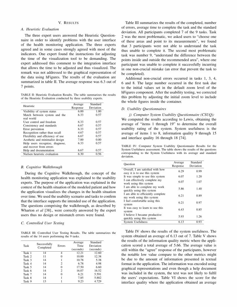
V. RESULTS
A. Heuristic Evaluation
The three expert users answered the Heuristic Question-naire in order to identify problems with the user interfaceof the health monitoring application. The three expertsagreed and in some cases strongly agreed with most of theindicators. One expert found the instructions for adjustingthe time of the visualization tool to be demanding. Theexpert addressed this comment to the integration interfacethat allows the time to be adjusted and thus visualized. Theremark was not addressed to the graphical representation ofthe data using hFigures. The results of the evaluation aresummarized in table II. The average response was 6.3 out of7 points.
TABLE II: Heuristic Evaluation Results. The table summarizes the resultsof the Heuristic Evaluation conducted by three usability experts.
Heuristic AverageResponse
StandardDeviation
Visibility of system status 6.00 1.00Match between system and thereal world
6.33 0.57
User control and freedom 6.33 0.57Consistency and standards 6.67 0.57Error prevention 6.33 0.57Recognition rather than recall 4.67 0.57Flexibility and efficiency of use 6.67 0.57Aesthetic and minimalist design 7.00 0.00Help users recognize, diagnose,and recover from errors
6.33 0.57
Help and documentation 6.67 0.57Nielsen heuristic evaluation 6.30 0.56
B. Cognitive Walkthrough
During the Cognitive Walkthrough, the concept of thehealth monitoring application was explained to the usabilityexperts. The purpose of the application was explained in thecontext of the health situation of the modeled patient and howthe application visualizes the changes in the health situationover time. We used the usability scenario and tasks to confirmthat the interface supports the intended use of the application.The questions comprising the walkthrough, as described byWharton et al [38]., were correctly answered by the expertusers thus no design or mismatch errors were found.
C. Controlled User Testing
TABLE III: Controlled User Testing Results. The table summarizes theresults of the 14 users performing the 9 tasks.
Task SuccessfullyCompleted Errors
AverageTime
(seconds)
StandardDeviation(seconds)
Task 1 14 4 12.21 12.60Task 2 11 0 10.00 12.38Task 3 14 1 10.78 5.38Task 4 14 2 6.78 4.98Task 5 14 0 17.50 6.60Task 6 14 2 16.07 16.52Task 7 14 0 6.21 5.591Task 8 14 1 7.85 5.882Task 9 13 1 9.23 4.729
Table III summarizes the results of the completed, numberof errors, average time to complete the task and the standarddeviation. All participants completed 7 of the 9 tasks. Task2 was the most problematic, we asked users to “choose oneof these areas and point to its measurements”, we foundthat 3 participants were not able to understand the taskthus unable to complete it. The second most problematictask was number 9, “understand the difference between thepoints inside and outside the recommended area”, where oneparticipant was unable to complete it successfully incurringin one non-crucial mistake (an error that prevent the task tobe completed).
Additional non-crucial errors occurred in tasks 1, 3, 4,6 and 8. The large number occurred in the first task dueto the initial values set in the default zoom level of thehFigures component. After the usability testing, we correctedthis problem by adjusting the initial zoom level to includethe whole figures inside the container.
D. Usability Questionnaires
j) Computer System Usability Questionnaire (CSUQ):We computed the results according to Lewis, obtaining theaverage of “items 1 through 19” to determine the overallusability rating of the system. System usefulness is theaverage of items 1 to 8, information quality 9 through 15and interface quality 16 through 18 [74].
TABLE IV: Computer System Usability Questionnaire Results for theSystem Usefulness assessment. The table shows the results of the questionscorresponding to the System Usefulness with its average and standarddeviation.
Question AverageResponse
StandardDeviation
Overall, I am satisfied with howeasy it is to use this system 6.29 0.99
It was simple to use this system 6.07 1.20I can effectively complete mywork using this system 6.07 1.07
I am able to complete my workquickly using this system 5.86 1.40
I am able to efficiently completemy work using this system 6.21 0.89
I feel comfortable using thissystem 6.21 0.97
It was easy to learn to use thissystem 6.43 0.85
I believe I became productivequickly using this system 5.93 1.26
System Usefulness 6.13 0.93
Table IV shows the results of the system usefulness. Thesystem obtained an average of 6.13 out of 7. Table V showsthe results of the information quality metric where the appli-cation scored a total average of 5.66. The average value isstill within the “agree” response of the participants, howeverthe notable low value compare to the other metrics mightbe due to the amount of information presented in textualformat in the application. The information was encoded usinggraphical representations and even though a help documentwas included in the system, the text was not likely to fulfilthe users’ expectations. Table VI shows the score for theinterface quality where the application obtained an average

TABLE V: Computer System Usability Questionnaire Results for Informa-tion Quality.
Question AverageResponse
StandardDeviation
The system gives error messagesthat clearly tell me how to fixproblems
4.50 2.44
Whenever I make a mistakeusing the system, I recovereasily and quickly
5.43 1.95
The information (such as onlinehelp, on-screen mes-sages, andother documentation) providedwith this system is clear
5.29 1.90
It is easy to find the informationI needed 6.07 1.27
The information provided for thesystem is easy to un-derstand 5.93 1.39
The information is effective inhelping me complete the tasksand scenarios
6.14 1.17
The organization of informationon the system screens is clear 6.29 1.14
Information Quality 5.66 1.20
TABLE VI: Computer System Usability Questionnaire Results for InterfaceQuality.
Question AverageResponse
StandardDeviation
The interface of this system ispleasant 6.36 1.00
I like using the interface of thissystem 6.36 0.92
This system has all the functionsand capabilities I expect it tohave
6.00 1.18
Interface Quality 6.24 0.99
TABLE VII: Computer System Usability Questionnaire Results for OverallUsability, System Usefulness, Information and Interface Quality.
Metric Questions AverageResponse
StandardDeviation
Overall Usability 1-19 6.02 1.04System Usefulness 1-8 6.13 0.93Information Quality 9-15 5.66 1.20Interface Quality 16-18 6.24 0.99
of 6.24 out of 7. The combined results are shown in tableVII. The score of the overall usability is 6.02 with a standarddeviation of 1.04. We can determine that all the participantsat least “agreed” in the Likert scale that the application wasuseful for the decision making process of assessing the healthsituation and evolution of the modeled patient.
k) After Scenario Questionnaire (ASQ): The averageresponse for the ease of task completion was 6.64 with astandard deviation of 0.842 and for the time required tocomplete the task 6.64 and a standard deviation of 0.497.The overall satisfaction was 6.46 and a standard deviationof 0.53. The usability of the system had a high score in theASQ results meaning that the system was suitable for thescenario in the context of the health data visualization of themodeled patient and its evolution over time.
TABLE VIII: After Scenario Questionnaire Results.
QuestionAverage
Time(seconds)
StandardDeviation(seconds)
Overall, I am satisfied with theease of completing the tasks inthis scenario
6.64 0.84
Overall, I am satisfied with theamount of time it took tocomplete the tasks in thisscenario
6.64 0.49
Overall Satisfaction of thesystem 6.46 0.53
E. Identified Issues and Suggested Improvements
The feedback shows that the main problem was the incom-plete visibility of the hFigures in the application componentwindow. Users also requested to show the detailed infor-mation as a hovering pop up window in the second figure(measurements before the coaching program). Currently onlythe latest measurements have the hovering window howeverusers requested that both measurements (the before and after)should contain the same functionality. Additional informationwas needed in the measurements that contained numericalscales, such as the depression index. A more contextualizedapproach explaining the meaning of the values can help theuser understand the measurements and thus the overall healthsituation of the patient better.
VI. DISCUSSION
The value of a data visualization depends on the knowl-edge that it can convey to the public. In this section, weclaim that hFigures has the potential to be used both in theclinical and personal wellness applications. Large amountsof measurements do not clutter the visualization area as aresult of our implementation, figure 10 shows an example ofa large visualization of a modeled patient. The comparisonof multiple graphs can provide a meaningful visualizationto individuals and clinicians alike. The implementation ofhFigures follows an extensible approach and even though itwas designed to be used for health data visualization, anydataset that has a target range of values as a reference canbe visualized.
A. Translation to Health Care
The wide variety of EHR formats and data sources fromself monitoring applications comprise a challenge in unifyingthe data in order to provide an overview of a patient.Currently, most of the data sources contain the date whenthe sample was extracted, whether it is a tracking device ora blood test. This sample date already provides the timestamprequired by the hFigures data source file. The values of thesamples are the main object of study in a measurement, forinstance the levels of cholesterol or sugar at a given time,the number of steps per day, the percentage of body fatand several others. This information can be transformed ina simple process to build the hFigures data source followingthe JSON structure.
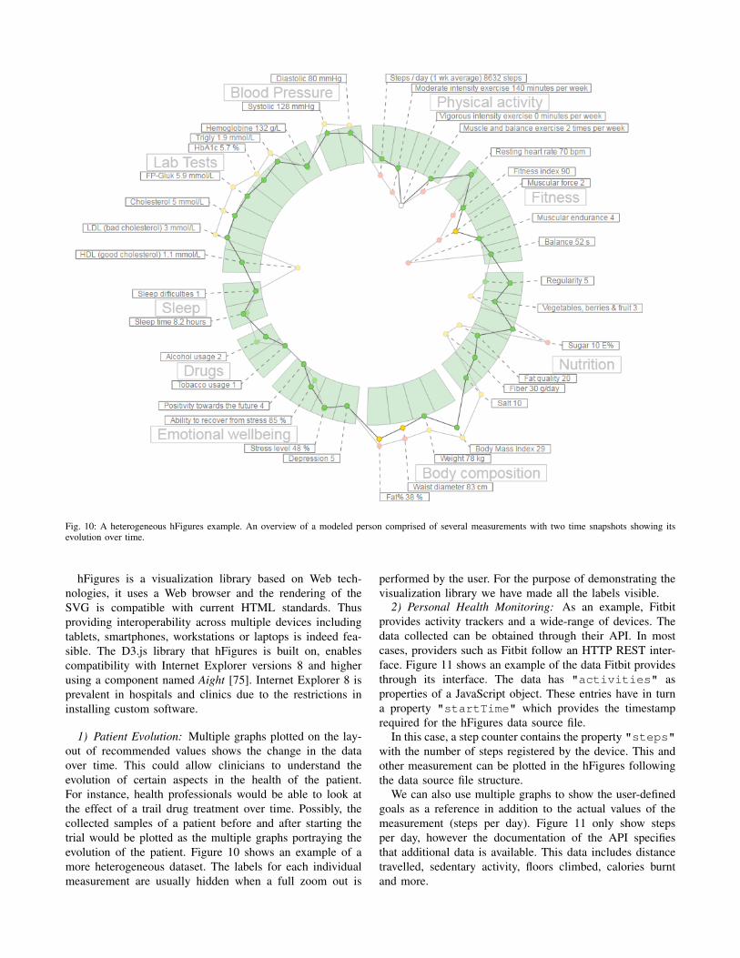
Fig. 10: A heterogeneous hFigures example. An overview of a modeled person comprised of several measurements with two time snapshots showing itsevolution over time.
hFigures is a visualization library based on Web tech-nologies, it uses a Web browser and the rendering of theSVG is compatible with current HTML standards. Thusproviding interoperability across multiple devices includingtablets, smartphones, workstations or laptops is indeed fea-sible. The D3.js library that hFigures is built on, enablescompatibility with Internet Explorer versions 8 and higherusing a component named Aight [75]. Internet Explorer 8 isprevalent in hospitals and clinics due to the restrictions ininstalling custom software.
1) Patient Evolution: Multiple graphs plotted on the lay-out of recommended values shows the change in the dataover time. This could allow clinicians to understand theevolution of certain aspects in the health of the patient.For instance, health professionals would be able to look atthe effect of a trail drug treatment over time. Possibly, thecollected samples of a patient before and after starting thetrial would be plotted as the multiple graphs portraying theevolution of the patient. Figure 10 shows an example of amore heterogeneous dataset. The labels for each individualmeasurement are usually hidden when a full zoom out is
performed by the user. For the purpose of demonstrating thevisualization library we have made all the labels visible.
2) Personal Health Monitoring: As an example, Fitbitprovides activity trackers and a wide-range of devices. Thedata collected can be obtained through their API. In mostcases, providers such as Fitbit follow an HTTP REST inter-face. Figure 11 shows an example of the data Fitbit providesthrough its interface. The data has "activities" asproperties of a JavaScript object. These entries have in turna property "startTime" which provides the timestamprequired for the hFigures data source file.
In this case, a step counter contains the property "steps"with the number of steps registered by the device. This andother measurement can be plotted in the hFigures followingthe data source file structure.
We can also use multiple graphs to show the user-definedgoals as a reference in addition to the actual values of themeasurement (steps per day). Figure 11 only show stepsper day, however the documentation of the API specifiesthat additional data is available. This data includes distancetravelled, sedentary activity, floors climbed, calories burntand more.
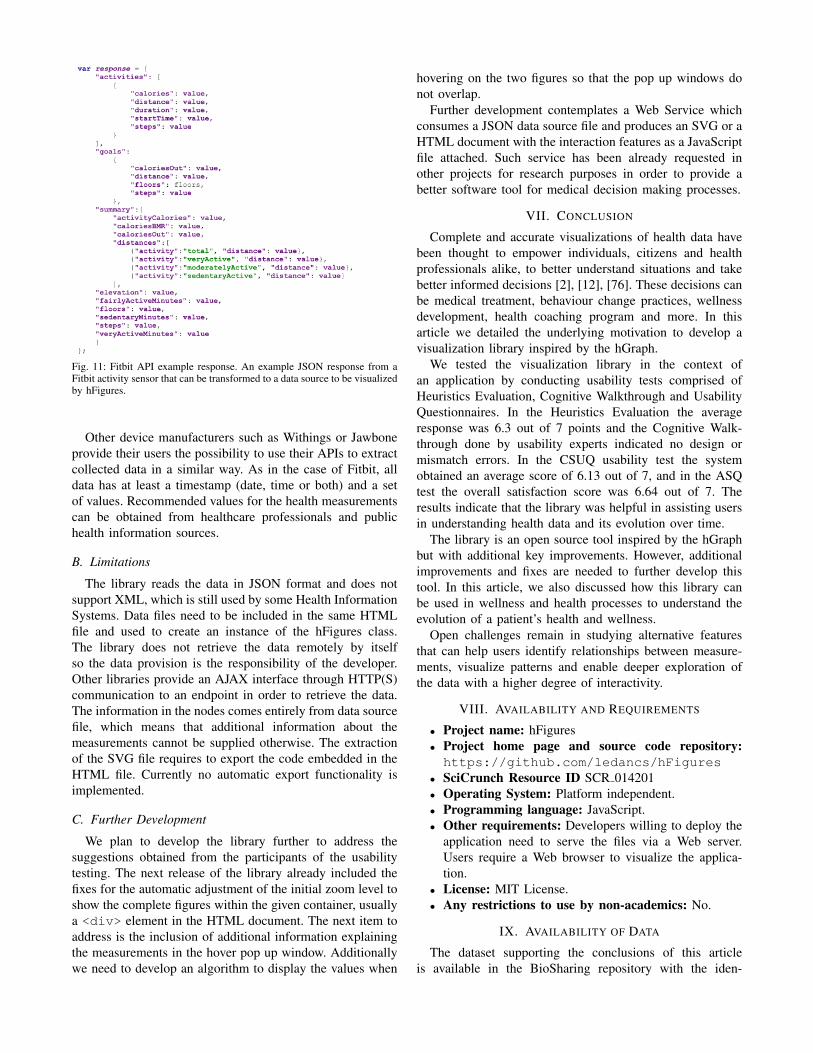
Fig. 11: Fitbit API example response. An example JSON response from aFitbit activity sensor that can be transformed to a data source to be visualizedby hFigures.
Other device manufacturers such as Withings or Jawboneprovide their users the possibility to use their APIs to extractcollected data in a similar way. As in the case of Fitbit, alldata has at least a timestamp (date, time or both) and a setof values. Recommended values for the health measurementscan be obtained from healthcare professionals and publichealth information sources.
B. Limitations
The library reads the data in JSON format and does notsupport XML, which is still used by some Health InformationSystems. Data files need to be included in the same HTMLfile and used to create an instance of the hFigures class.The library does not retrieve the data remotely by itselfso the data provision is the responsibility of the developer.Other libraries provide an AJAX interface through HTTP(S)communication to an endpoint in order to retrieve the data.The information in the nodes comes entirely from data sourcefile, which means that additional information about themeasurements cannot be supplied otherwise. The extractionof the SVG file requires to export the code embedded in theHTML file. Currently no automatic export functionality isimplemented.
C. Further Development
We plan to develop the library further to address thesuggestions obtained from the participants of the usabilitytesting. The next release of the library already included thefixes for the automatic adjustment of the initial zoom level toshow the complete figures within the given container, usuallya <div> element in the HTML document. The next item toaddress is the inclusion of additional information explainingthe measurements in the hover pop up window. Additionallywe need to develop an algorithm to display the values when
hovering on the two figures so that the pop up windows donot overlap.
Further development contemplates a Web Service whichconsumes a JSON data source file and produces an SVG or aHTML document with the interaction features as a JavaScriptfile attached. Such service has been already requested inother projects for research purposes in order to provide abetter software tool for medical decision making processes.
VII. CONCLUSION
Complete and accurate visualizations of health data havebeen thought to empower individuals, citizens and healthprofessionals alike, to better understand situations and takebetter informed decisions [2], [12], [76]. These decisions canbe medical treatment, behaviour change practices, wellnessdevelopment, health coaching program and more. In thisarticle we detailed the underlying motivation to develop avisualization library inspired by the hGraph.
We tested the visualization library in the context ofan application by conducting usability tests comprised ofHeuristics Evaluation, Cognitive Walkthrough and UsabilityQuestionnaires. In the Heuristics Evaluation the averageresponse was 6.3 out of 7 points and the Cognitive Walk-through done by usability experts indicated no design ormismatch errors. In the CSUQ usability test the systemobtained an average score of 6.13 out of 7, and in the ASQtest the overall satisfaction score was 6.64 out of 7. Theresults indicate that the library was helpful in assisting usersin understanding health data and its evolution over time.
The library is an open source tool inspired by the hGraphbut with additional key improvements. However, additionalimprovements and fixes are needed to further develop thistool. In this article, we also discussed how this library canbe used in wellness and health processes to understand theevolution of a patient’s health and wellness.
Open challenges remain in studying alternative featuresthat can help users identify relationships between measure-ments, visualize patterns and enable deeper exploration ofthe data with a higher degree of interactivity.
VIII. AVAILABILITY AND REQUIREMENTS
• Project name: hFigures• Project home page and source code repository:https://github.com/ledancs/hFigures
• SciCrunch Resource ID SCR 014201• Operating System: Platform independent.• Programming language: JavaScript.• Other requirements: Developers willing to deploy the
application need to serve the files via a Web server.Users require a Web browser to visualize the applica-tion.
• License: MIT License.• Any restrictions to use by non-academics: No.
IX. AVAILABILITY OF DATA
The dataset supporting the conclusions of this articleis available in the BioSharing repository with the iden-
tifier biodbcore-000734 at the following url: https://biosharing.org/biodbcore-000734.
The dataset is also available at Tampere University ofTechnology Personal Health Informatics website in the fol-lowing url: http://www.tut.fi/phi/?p=319.
X. ADDITIONAL FILES
• File name: laboratory.csv.• Title of data: Results from laboratory testing.• Description of data: The data contains the task
identifier, the average time to completion, number oftimes the task was successfully completed and the totalnumber of errors.
• File name: tasks.csv.• Title of data: Laboratory testing tasks.• Description of data: The data contains the task
identifier and the instructions given to the participantsto complete the task.
• File name: heuristic.csv.• Title of data: Nielsen’s Heuristic Evaluation.• Description of data: The data contains the results
form Nielsen’s Heuristic Evaluation conducted by threeusability experts.
• File name: csuq.csv.• Title of data: Computer System Usability Question-
naire Results.• Description of data: The data contains the results of
the Computer System Usability Questionnaire answeredby 14 participants.
• File name: asq.csv.• Title of data: After Scenario Questionnaire Results.• Description of data: The data contains the results
of the After Scenario Questionnaire answered by 14participants.
XI. ABBREVIATIONS
hGraph: Health graph; hFigures: Health figures; JSON:JavaScript object notation; EHR: Electronic health record;PHR: Personal health record; HTML: Hypertext markuplanguage; SVG: Scalable vector graphics; D3: Data-drivendocuments; API: Application programming interface.
XII. COMPETING INTERESTS
The authors declare that they have no competing interests.
XIII. AUTHOR’S CONTRIBUTIONS
AL developed the hFigures library. AL and HN wrotejointly this article. HN suggested several use cases thathelped shaped the design process. HN contributed in thedesign and conception of the library. AL, HN and MAMdesigned the application for health coaching. AL and MAMimplemented the application. AL and MAM integrated the
application into a Web service. MAM conducted the usertesting and analysed the results. HN and AL wrote jointly theintroduction and background. AL wrote the implementationand discussion. MAM and AL wrote jointly the evaluationand results section. HN and AL wrote jointly the conclusion.
XIV. ACKNOWLEDGEMENTS
This research was supported jointly by TEKES (theFinnish Funding Agency for Technology and Innovation) aspart of the Digital Health Revolution project, as well as theEuropean Commission and TEKES under the ARTEMIS-JUWithMe project.
XV. AUTHOR’S INFORMATION
AL and HN are part of the Personal Health Informaticsresearch group from the Department of Signal Processingof Tampere University of Technology. AL is a SoftwareEngineer pursuing PhD studies in Health Data Visualizationwith a strong background in Web Engineering and HealthInformation Systems. HN is a PhD senior researcher withbackground in biomedical engineering, signal processing,electrical engineering, user interface design and service de-sign.
REFERENCES
[1] L. Hood and M. Flores, “A personal view on systems medicine andthe emergence of proactive {P4} medicine: predictive, preventive,personalized and participatory,” New Biotechnology, vol. 29, no. 6, pp.613 – 624, 2012, molecular Diagnostics and Personalised Medicine.[Online]. Available: http://www.sciencedirect.com/science/article/pii/S1871678412000477
[2] B. J. Lesselroth and D. S. Pieczkiewicz, “Data visualization strategiesfor the electronic health record,” in Advances in Medicine and Biology,L. V. Berhardt, Ed. New York: Nova Science Publishers, Inc, 2012,vol. 16, pp. 107–140.
[3] J. Follett and J. Sonin, “hGraph: An Open System for VisualizingPersonal Health Metrics,” http://hgraph.org/docs/hGraph Whitepaper.pdf, Involution Studios, Arlington, Massachusetts, Tech. Rep., April2012, accessed 25 Mar 2015.
[4] A. Ledesma, H. Nieminen, P. Valve, M. Ermes, H. Jimison, andM. Pavel, “The shape of health: A comparison of five alternativeways of visualizing personal health and wellbeing,” in Engineeringin Medicine and Biology Society (EMBC), 2015 37th Annual Interna-tional Conference of the IEEE, Aug 2015.
[5] A. Bui, D. Aberle, and H. Kangarloo, “Timeline: Visualizing inte-grated patient records,” Information Technology in Biomedicine, IEEETransactions on, vol. 11, no. 4, pp. 462–473, July 2007.
[6] mHealth App Developer Economics 2014, research2guidance, Berlin,2014.
[7] T. Goetz. It’s time to redesign medical data. [On-line]. Available: http://www.ted.com/talks/thomas goetz it s time toredesign medical data?language=en
[8] M. Idris, S. Hussain, M. Ahmad, and S. Lee, “Big data serviceengine (bise): Integration of big data technologies for human centricwellness data,” in Big Data and Smart Computing (BigComp), 2015International Conference on, Feb 2015, pp. 244–248.
[9] S. Few, Information dashboard design. North Sebastopol, California:O’Reilly, 2006.
[10] C. Soomlek and L. Benedicenti, “An agent-based wellness indicator:Experimental results and future directions,” J. Inf. Technol.Res., vol. 6, no. 2, pp. 1–23, Apr. 2013. [Online]. Available:http://dx.doi.org/10.4018/jitr.2013040101
[11] M. de Ridder, L. Constantinescu, L. Bi, Y. H. Jung, A. Kumar,J. Kim, D. D. Feng, and M. Fulham, “A web-based medical multimediavisualisation interface for personal health records,” in Computer-BasedMedical Systems (CBMS), 2013 IEEE 26th International Symposiumon. IEEE, 2013, pp. 191–196.

[12] B. Shneiderman, C. Plaisant, and B. W. Hesse, “Improving healthand healthcare with interactive visualization methods,” Citeseer, Tech.Rep., 2013.
[13] J. C. Baird and E. J. Noma, Fundamentals of scaling and psy-chophysics. New Jersey: John Wiley & Sons Canada, Limited, 1978.
[14] W. Cleveland and R. McGill, “Graphical perception: Theory, experi-mentation, and application to the development of graphical methods,”Journal of the American statistical association, vol. 79, no. 387, pp.531–554, 1984.
[15] P. Hoffman, G. Grinstein, K. Marx, I. Grosse, and E. Stanley, “Dnavisual and analytic data mining,” in Visualization’97., Proceedings.IEEE, 1997, pp. 437–441.
[16] G. M. Draper, Y. Livnat, and R. F. Riesenfeld, “A survey of radialmethods for information visualization,” Visualization and ComputerGraphics, IEEE Transactions on, vol. 15, no. 5, pp. 759–776, 2009.
[17] T. Jankun-Kelly and K.-L. Ma, “Moiregraphs: Radial focus+ contextvisualization and interaction for graphs with visual nodes,” in Informa-tion Visualization, 2003. INFOVIS 2003. IEEE Symposium on. IEEE,2003, pp. 59–66.
[18] J. Lamping and R. Rao, “The hyperbolic browser: A focus+ contexttechnique for visualizing large hierarchies,” Journal of Visual Lan-guages & Computing, vol. 7, no. 1, pp. 33–55, 1996.
[19] B. Hetzler, P. Whitney, L. Martucci, and J. Thomas, “Multi-facetedinsight through interoperable visual information analysis paradigms,”in Information Visualization, 1998. Proceedings. IEEE Symposium on.IEEE, 1998, pp. 137–144.
[20] R. Spence, “Information visualization.” New York: ACM Press, 2001,pp. 85–88.
[21] J. Yang, M. O. Ward, E. Rundensteiner, et al., “Interring: An in-teractive tool for visually navigating and manipulating hierarchicalstructures,” in Information Visualization, 2002. INFOVIS 2002. IEEESymposium on. IEEE, 2002, pp. 77–84.
[22] M. Howell. Filelight. [Online]. Available: http://www.methylblue.com/filelight/
[23] J. V. Carlis and J. A. Konstan, “Interactive visualization of serialperiodic data,” in Proceedings of the 11th annual ACM symposiumon User interface software and technology. ACM, 1998, pp. 29–38.
[24] A. Spoerri, “Rankspiral: Toward enhancing search results visual-izations,” in Information Visualization, 2004. INFOVIS 2004. IEEESymposium on. IEEE, 2004, pp. p18–p18.
[25] J. Y. Hong, J. DAndries, M. Richman, and M. Westfall, “Zoomology:comparing two large hierarchical trees,” Posters Compendium ofInformation Visualization, pp. 120–121, 2003.
[26] M. Krzywinski, J. Schein, I. Birol, J. Connors, R. Gascoyne, D. Hors-man, S. J. Jones, and M. A. Marra, “Circos: an information aestheticfor comparative genomics,” Genome research, vol. 19, no. 9, pp. 1639–1645, 2009.
[27] G. M. Draper and R. F. Riesenfeld, “Who votes for what? a visualquery language for opinion data,” Visualization and Computer Graph-ics, IEEE Transactions on, vol. 14, no. 6, pp. 1197–1204, 2008.
[28] M. Bostock, V. Ogievetsky, and J. Heer, “D3 data-driven documents,”Visualization and Computer Graphics, IEEE Transactions on, vol. 17,no. 12, pp. 2301–2309, 2011.
[29] N. Chris, “Toward measuring visualization insight,” Computer Graph-ics and Applications, IEEE, vol. 26, no. 3, pp. 6–9, 2006.
[30] P. Saraiya, C. North, and K. Duca, “An evaluation of microarrayvisualization tools for biological insight,” in Information Visualization,2004. INFOVIS 2004. IEEE Symposium on. IEEE, 2004, pp. 1–8.
[31] K. Roebuck, Agile Software Development: High-impact Strategies-What You Need to Know: Definitions, Adoptions, Impact, Benefits,Maturity, Vendors. Brisbane, Australia: Emereo Publishing, 2012.
[32] K. Beck, Extreme programming explained: embrace change. Boston,Massachusetts: Addison-Wesley Professional, 2000.
[33] O. Poutanen, A.-M. Koivisto, S. Kaaria, and R. K. Salokangas, “Thevalidity of the depression scale (deps) to assess the severity ofdepression in primary care patients,” Family practice, vol. 27, no. 5,pp. 527–534, 2010.
[34] The Mozilla Developer Network (MDN). The typeof operator -javascript reference. [Online]. Available: https://developer.mozilla.org/en-US/docs/Web/JavaScript/Reference/Operators/typeof
[35] J. Nielsen, Usability Engineering. Amsterdam, The Netherlands:Elsevier, 1994.
[36] C. Johnson, D. Johnston, P. Crowle, et al., “Ehr usability toolkit:A background report on usability and electronic health records,”Rockville, MD: Agency for Healthcare Research and Quality, 2011.
[37] J. Nielsen. (1995) 10 usability heuristics for user interfacedesign. [Online]. Available: http://www.nngroup.com/articles/ten-usability-heuristics/
[38] C. Wharton, J. Rieman, C. Lewis, and P. Polson, “The cognitivewalkthrough method: A practitioner’s guide,” in Usability inspectionmethods. John Wiley & Sons, Inc., 1994, pp. 105–140.
[39] L. W. Peute and M. W. Jaspers, “The significance of a usability eval-uation of an emerging laboratory order entry system,” Internationaljournal of medical informatics, vol. 76, no. 2, pp. 157–168, 2007.
[40] A. Karahoca, E. Bayraktar, E. Tatoglu, and D. Karahoca, “Informationsystem design for a hospital emergency department: A usabilityanalysis of software prototypes,” Journal of biomedical informatics,vol. 43, no. 2, pp. 224–232, 2010.
[41] T. Cohen, D. Kaufman, T. White, G. Segal, A. B. Staub, V. Patel,and M. Finnerty, “Cognitive evaluation of an innovative psychiatricclinical knowledge enhancement system,” Medinfo, vol. 11, no. Pt 2,pp. 1295–9, 2004.
[42] R. Khajouei, D. de Jongh, and M. W. Jaspers, “Usability evaluationof a computerized physician order entry for medication ordering.” inMIE, 2009, pp. 532–536.
[43] M. H. Blackmon, P. G. Polson, M. Kitajima, and C. Lewis, “Cognitivewalkthrough for the web,” in Proceedings of the SIGCHI conferenceon human factors in computing systems. ACM, 2002, pp. 463–470.
[44] A. Sears, “Heuristic walkthroughs: Finding the problems without thenoise,” International Journal of Human-Computer Interaction, vol. 9,no. 3, pp. 213–234, 1997.
[45] M.-C. Beuscart-Zephir, P. Elkin, S. Pelayo, R. Beuscart, et al.,“The human factors engineering approach to biomedical informaticsprojects: state of the art, results, benefits and challenges,” IMIAYearbook, vol. 2, pp. 109–127, 2007.
[46] W. M. Newman, “10. on simulation, measurement, and pfeeewiaie us-ability evaluation,” Commentary on” Damaged Merchandise?, vol. 13,p. 316, 1998.
[47] K. A. Ericsson and H. A. Simon, “Verbal reports as data.” Psycholog-ical review, vol. 87, no. 3, p. 215, 1980.
[48] E. M. Borycki, L. Lemieux-Charles, L. Nagle, and G. Eysenbach,“Novice nurse information needs in paper and hybrid electronic-paperenvironments: a qualitative analysis.” in MIE, 2009, pp. 913–917.
[49] L. M. Currie, M. Graham, M. Allen, S. Bakken, V. Patel, and J. J.Cimino, “Clinical information needs in context: an observational studyof clinicians while using a clinical information system,” in AMIAAnnual Symposium proceedings, vol. 2003. American MedicalInformatics Association, 2003, p. 190.
[50] A. Hasman et al., “Development of methods for usability evaluationsof ehr systems,” in Ubiquity: Technologies for Better Health in AgingSocieties: Proceedings of MIE2006, vol. 124. IOS Press, 2006, p.341.
[51] R. C. Wu, M. S. Orr, M. Chignell, and S. E. Straus, “Usabilityof a mobile electronic medical record prototype: a verbal protocolanalysis,” Informatics for Health and Social Care, vol. 33, no. 2, pp.139–149, 2008.
[52] J. R. Lewis, “Ibm computer usability satisfaction questionnaires: psy-chometric evaluation and instructions for use,” International Journalof Human-Computer Interaction, vol. 7, no. 1, pp. 57–78, 1995.
[53] ——, “Psychometric evaluation of the post-study system usabilityquestionnaire: The pssuq,” in Proceedings of the Human Factorsand Ergonomics Society Annual Meeting, vol. 36, no. 16. SAGEPublications, 1992, pp. 1259–1260.
[54] M. W. Jaspers, L. W. Peute, A. Lauteslager, and P. J. Bakker, “Pre-post evaluation of physicians’ satisfaction with a redesigned electronicmedical record system,” Studies in health technology and informatics,vol. 136, p. 303, 2008.
[55] R. Goud, M. W. Jaspers, A. Hasman, and N. Peek, “Subjective usabil-ity of the cardss guideline-based decision support system.” Studies inhealth technology and informatics, vol. 136, p. 193, 2008.
[56] J. R. Lewis, “Psychometric evaluation of an after-scenario question-naire for computer usability studies: the asq,” ACM SIGCHI Bulletin,vol. 23, no. 1, pp. 78–81, 1991.
[57] A. Bangor, P. T. Kortum, and J. T. Miller, “An empirical evaluationof the system usability scale,” Intl. Journal of Human–ComputerInteraction, vol. 24, no. 6, pp. 574–594, 2008.
[58] U. D. of Health, H. Services, et al., “Physical activity guidelinesfor americans: Be active, healthy, and happy! odphp publication no.u0036. october 2008,” 2008.
[59] P. A. G. A. Committee et al., “Physical activity guidelines advisorycommittee report, 2008,” Washington, DC: US Department of Healthand Human Services, vol. 2008, p. A5, 2008.
[60] C. Tudor-Locke and D. R. Bassett Jr, “How many steps/day areenough?” Sports Medicine, vol. 34, no. 1, pp. 1–8, 2004.
[61] P. Oja, A. Manttari, T. Pokki, K. Kukkonen-Harjala, R. Laukkanen,and J. Malmberg, “Tester’s guide: Ukk walk test,” 2013. [Online].Available: http://www.ukkinstituutti.fi/filebank/1118-UKK walk testtesters guide.pdf
[62] R. Laukkanen, P. Oja, M. Pasanen, and I. Vuori, “Validity of atwo kilometre walking test for estimating maximal aerobic powerin overweight adults.” International journal of obesity and relatedmetabolic disorders: journal of the International Association for theStudy of Obesity, vol. 16, no. 4, pp. 263–268, 1992.
[63] J. Suni, P. Husu, and M. Rinne, “Fitness for health: the alpha-fittest battery for adults aged 18–69,” 2009. [Online]. Available: http://www.ukkinstituutti.fi/filebank/500-ALPHA FIT Testers Manual.pdf
[64] Firstbeat Technologies Ltd. (2014) Stress and recovery analysismethod based on 24-hour heart rate variability. whitepaper. [Online]. Available: http://www.firstbeat.com/userData/firstbeat/research-publications/Stress-and-recovery white-paper 2014.pdf
[65] T. Teisala, S. Mutikainen, A. Tolvanen, M. Rottensteiner, T. Leskinen,J. Kaprio, M. Kolehmainen, H. Rusko, and U. M. Kujala, “Associationsof physical activity, fitness, and body composition with heart ratevariability-based indicators of stress and recovery on workdays: across-sectional study,” J Occup Med Toxicol, vol. 34, pp. 26–40, 2014.
[66] M. F. Scheier, C. S. Carver, and M. W. Bridges, “Distinguishingoptimism from neuroticism (and trait anxiety, self-mastery, and self-esteem): a reevaluation of the life orientation test.” Journal of person-ality and social psychology, vol. 67, no. 6, p. 1063, 1994.
[67] L. Faulkner, “Beyond the five-user assumption: Benefits of increasedsample sizes in usability testing,” Behavior Research Methods, Instru-ments, & Computers, vol. 35, no. 3, pp. 379–383, 2003.
[68] D. L. Berry, B. Halpenny, J. L. Bosco, J. Bruyere, and M. G. Sanda,“Usability evaluation and adaptation of the e-health personal patientprofile-prostate decision aid for spanish-speaking latino men,” BMCmedical informatics and decision making, vol. 15, no. 1, p. 56, 2015.
[69] J. Zhang, T. R. Johnson, V. L. Patel, D. L. Paige, and T. Kubose, “Us-ing usability heuristics to evaluate patient safety of medical devices,”Journal of biomedical informatics, vol. 36, no. 1, pp. 23–30, 2003.
[70] B. Shneiderman, Designing the user interface: strategies for effec-tive human-computer interaction. Boston, Massachusetts: Addison-Wesley Reading, MA, 1992, vol. 3.
[71] R. Molich and J. Nielsen, “Improving a human-computer dialogue,”Communications of the ACM, vol. 33, no. 3, pp. 338–348, 1990.
[72] B. Tognazzini. (2014) First principles of information design. [Online].Available: http://www.asktog.com/basics/firstPrinciples.html
[73] Ethical principles of research in the humanities and social andbehavioural sciences and proposals for ethical review, FinnishAdvisory Board on Research Integrity, Helsinki, 2009. [Online].Available: http://www.tenk.fi/en/ethical-review-human-sciences
[74] J. R. Lewis, “Psychometric evaluation of the pssuq using data from fiveyears of usability studies,” International Journal of Human-ComputerInteraction, vol. 14, no. 3-4, pp. 463–488, 2002.
[75] S. Allen. Aight – JavaScript shims and shams for making IE8-9 behavereasonably. [Online]. Available: https://github.com/shawnbot/aight
[76] A. Rind, T. D. Wang, A. Wolfgang, S. Miksch, K. Wongsuphasawat,C. Plaisant, and B. Shneiderman, “Interactive information visualizationto explore and query electronic health records,” Foundations andTrends in Human-Computer Interaction, vol. 5, no. 3, pp. 207–298,2011.
Related Documents