1 HAYWARD / Brand Guide Hayward Brand Guide

Welcome message from author
This document is posted to help you gain knowledge. Please leave a comment to let me know what you think about it! Share it to your friends and learn new things together.
Transcript
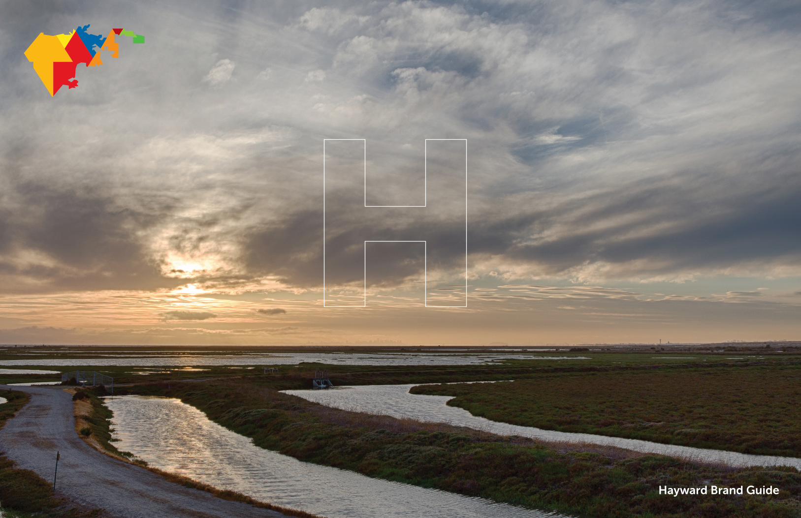
1HAYWARD / Brand Guide Hayward Brand Guide

HAYWARD / Brand Guide 2
Overview 3
Guide basics 4
Audience 4
Positioning 5
Identity 6
Logo variations 7
Logo do’s/don’ts 9
Logo Spacing 11
Mark applications 12
Colors 15
Fonts 17
The Map Icon 19
Applications 20
Business basics 21
Sample 1-sheet 22
PowerPoint template 23
Sample print advertising 24
Sample banner advertising 26
Sample outdoor advertising 27
Sample ambient advertising 28
Conclusion 31
Appendix 32
CONTENTS

HAYWARD / Brand Guide 3
Welcome to the official Hayward Brand Guide. As you become familiar with these materials, please keep three things in mind:
• First, our objective is to provide actionable guidance that will help both City
staff and community partners take full advantage of our newly introduced
logo and brand identity system.
• Second, even as we explore the way this system adapts to new
opportunities, we want to maintain as much consistency as possible.
After all, getting the world to pay attention is considerably easier when a
community speaks with a unified voice.
• Finally, it’s not only impossible, but entirely unwise, to try and legislate
every single application of these standards. Exceptions inevitably occur and
we can all learn from your experience.
Think of it this way: the introduction of a new logo is one of those entirely rare
“second chance to make a first impression” opportunities. What you’ll find on
the following pages is intended to help our community make the most of it.
For a quick overview of some of the branding terms see the Appendix at the
end of this Guide.
Looking Forward, and Ahead
OVERVIEW

4HAYWARD / Brand Guide
Why: Brand Building Blocks
• Talk to a cross-section of local residents (1,750 of them to be precise) and
you’ll hear them focus on key Hayward advantages including affordability
(71.44%), art, culture and heritage (51.45), and our great potential (78.49%).
• What they hear from friends and family outside the community, however, is
decidedly different with 65.72% reporting a “very or somewhat unfavorable”
external view.
• In marketing terms, this translates to a perceptual problem with the Hayward
“brand” that has a ripple effect on everything from local business development
and employment, to government services, to housing values. Part of the
equation: our kids wanting to stay in town and make their own contributions in
the future.
• Fortunately, attitudes can be changed, especially when they’re mostly based on
secondhand impressions.
• That’s why the City Council, as part of the Economic Development Plan,
commissioned the development of a new “brand identity” that would be fresh,
contemporary, and effective.
• Of course, like any set of tools, logo elements and standards are only
valuable as the way they’re used. That means we need to start with a shared
understanding of our audience including what we want them to hear, and how
we’ll speak in a consistently effective way.
Who: Our Audiences
Primary—The new identity has been designed to send an emphatic “it’s time to do
business in Hayward” signal to forward-looking business people from the Bay Area
and beyond. We’re looking for the kind of visionaries who can spot ahead-of-the-
curve opportunities that others might either miss or dismiss.
Secondary—At the same time, we need to bear in mind the critical role that will
be played by Hayward residents and the existing business community. Success
demands they not only support the new program but also add their own energy
and resources to the effort.
Of essential importance—We cannot forget that this system has to work on a
very pragmatic level for City leaders and staff who need to fully accept the brand
standards and integrate them into daily city operations.
OVERVIEW

HAYWARD / Brand Guide 5
What That Means:
• It’s time to take another look at a city many already think they know and
understand.
• Once you do, you’ll find a much deeper and more vibrant perspective.
• Among the benefits: Unmatched affordability, central location, a rapidly
expanding business base, livability, approachability and amenities.
• This is a window of opportunity that’s open right now—the sooner you
take advantage of it, the sooner you’ll be glad you did.
Words That Paint a Thousand Pictures:
Open and accessible: We’re working hard to make it affordable, attractive
and easy to become a part of our community.
Made in Hayward: From brighter futures for our children, to some of the Bay
Area’s most interesting companies and products, we’re thinking big, joining
together, and acting decisively to realize our vision.
Upward bound: We’ve launched a unified effort to elevate the way people
think and feel about Hayward. There are amazing things going on everywhere
you look and we want to make sure everyone knows just what they are.
The time is now: You can’t afford to be anywhere else but Hayward. This is
the new center of business opportunity in the Bay Area.
How: Our Brand Platform
OVERVIEW
Hayward is the unexpected wellspring of opportunity in the Bay Area.

6HAYWARD / Brand Guide
The Hayward “H” has been selected to serve as the main “brand mark” to
unify all communications. It’s contemporary, durable, entirely ownable, and,
as we’ll see, provides an intriguing way to invite audiences to “look deeper”
to see the real Hayward.
LOGO
Hayward’s New Brand Mark
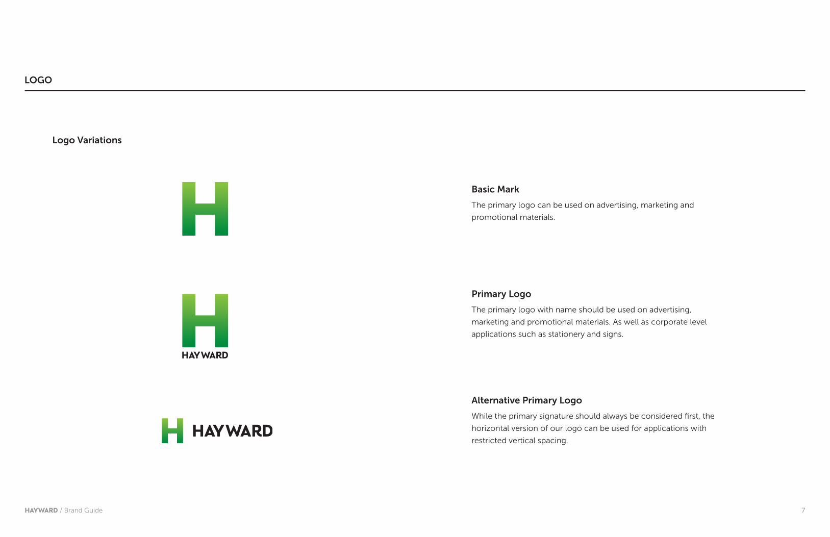
7HAYWARD / Brand Guide
Primary Logo
The primary logo with name should be used on advertising,
marketing and promotional materials. As well as corporate level
applications such as stationery and signs.
Basic Mark
The primary logo can be used on advertising, marketing and
promotional materials.
Alternative Primary Logo
While the primary signature should always be considered first, the
horizontal version of our logo can be used for applications with
restricted vertical spacing.
Logo Variations
LOGO

8HAYWARD / Brand Guide
Alternative Primary Logo with Hashtags
The optional tagline is actually a Twitter hashtag—clear evidence that the
city is not only looking ahead, but intending on sharing our progress.
The Alternative Primary Logo is preferred when a hashtag is being used.
#upward
#forward
#onward
LOGO
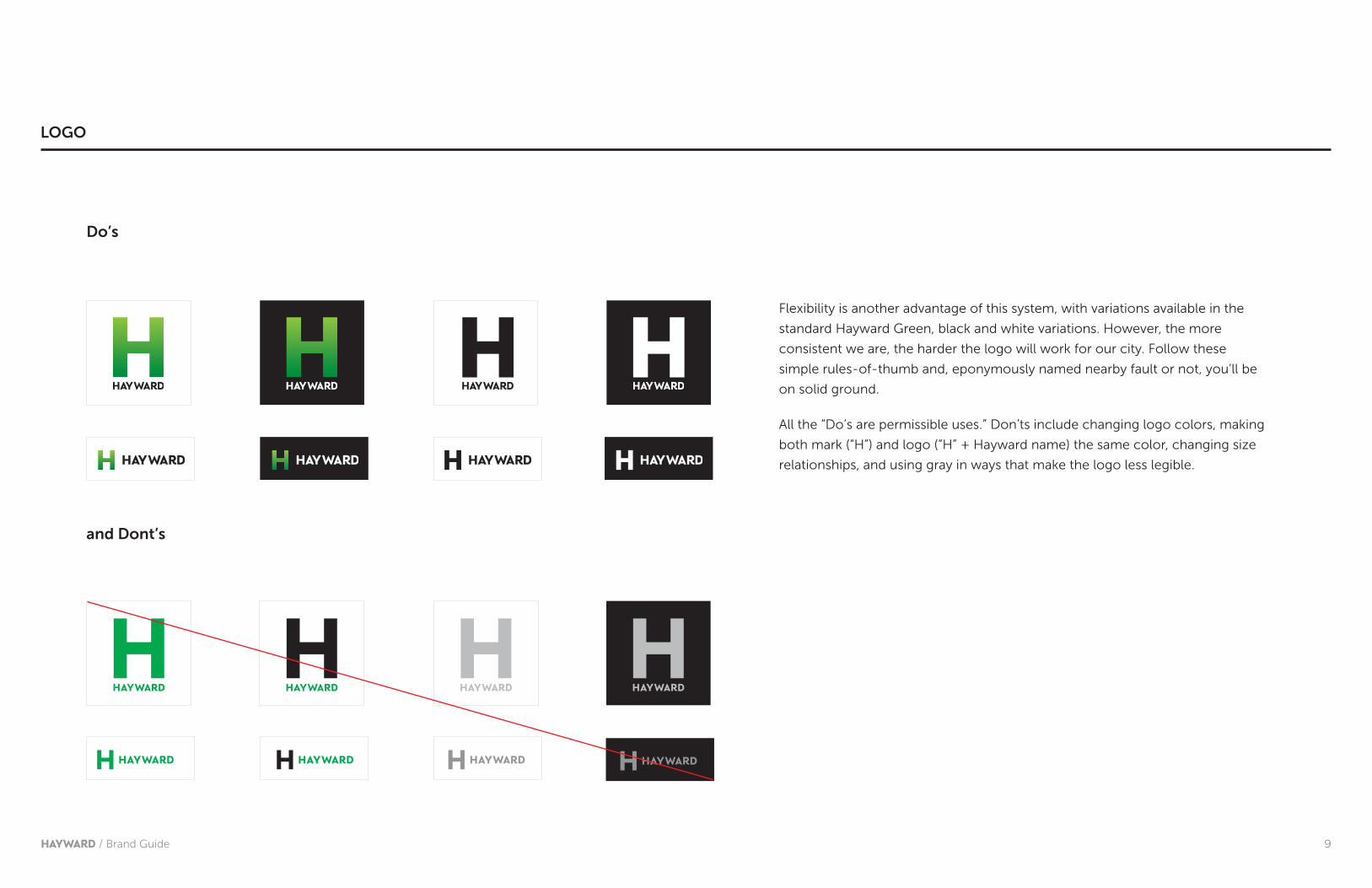
9HAYWARD / Brand Guide
HAYWARD HAYWARD HAYWARD HAYWARD
Flexibility is another advantage of this system, with variations available in the
standard Hayward Green, black and white variations. However, the more
consistent we are, the harder the logo will work for our city. Follow these
simple rules-of-thumb and, eponymously named nearby fault or not, you’ll be
on solid ground.
All the “Do’s are permissible uses.” Don’ts include changing logo colors, making
both mark (“H”) and logo (“H” + Hayward name) the same color, changing size
relationships, and using gray in ways that make the logo less legible.
HAYWARD HAYWARD HAYWARD HAYWARD
Do’s
and Dont’s
LOGO
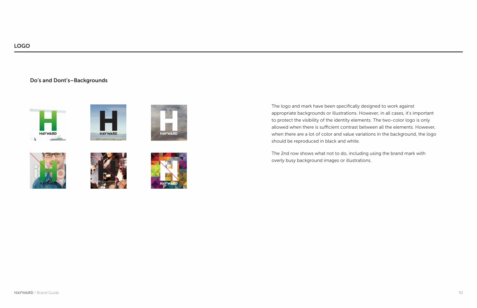
10HAYWARD / Brand Guide
The logo and mark have been specifically designed to work against
appropriate backgrounds or illustrations. However, in all cases, it’s important
to protect the visibility of the identity elements. The two-color logo is only
allowed when there is sufficient contrast between all the elements. However,
when there are a lot of color and value variations in the background, the logo
should be reproduced in black and white.
The 2nd row shows what not to do, including using the brand mark with
overly busy background images or illustrations.
Do’s and Dont’s–Backgrounds
LOGO
11HAYWARD / Brand Guide
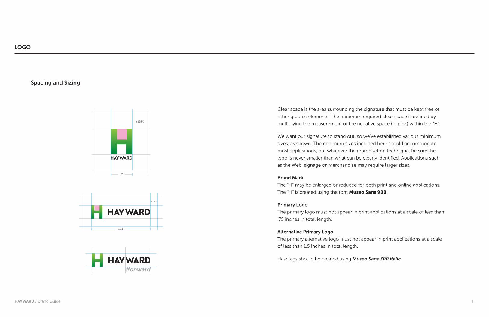
Clear space is the area surrounding the signature that must be kept free of
other graphic elements. The minimum required clear space is defined by
multiplying the measurement of the negative space (in pink) within the “H”.
We want our signature to stand out, so we’ve established various minimum
sizes, as shown. The minimum sizes included here should accommodate
most applications, but whatever the reproduction technique, be sure the
logo is never smaller than what can be clearly identified. Applications such
as the Web, signage or merchandise may require larger sizes.
Brand Mark
The “H” may be enlarged or reduced for both print and online applications.
The “H” is created using the font Museo Sans 900.
Primary Logo
The primary logo must not appear in print applications at a scale of less than
.75 inches in total length.
Alternative Primary Logo
The primary alternative logo must not appear in print applications at a scale
of less than 1.5 inches in total length.
Hashtags should be created using Museo Sans 700 italic.
x 125%
.5”
1.25”
x 125%
#onward
Spacing and Sizing
LOGO

12HAYWARD / Brand Guide
The “H” element was designed to let you highlight the key message of
communications by focusing the reader’s eye.
This approach communicates the message clearly and quickly.
REMEMBER:
The “H” provides an intriguing way to invite audiences to “look deeper”
to see the real Hayward.
12
BRAND MARK APPLICATIONS
HAYWARD / Brand Guide
13HAYWARD / Brand Guide
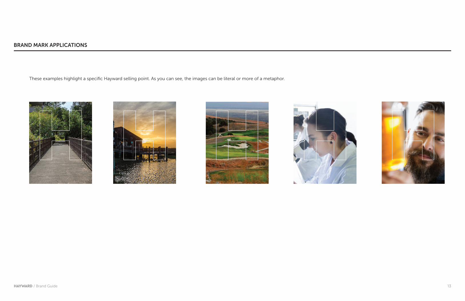
These examples highlight a specific Hayward selling point. As you can see, the images can be literal or more of a metaphor.
BRAND MARK APPLICATIONS
14HAYWARD / Brand Guide
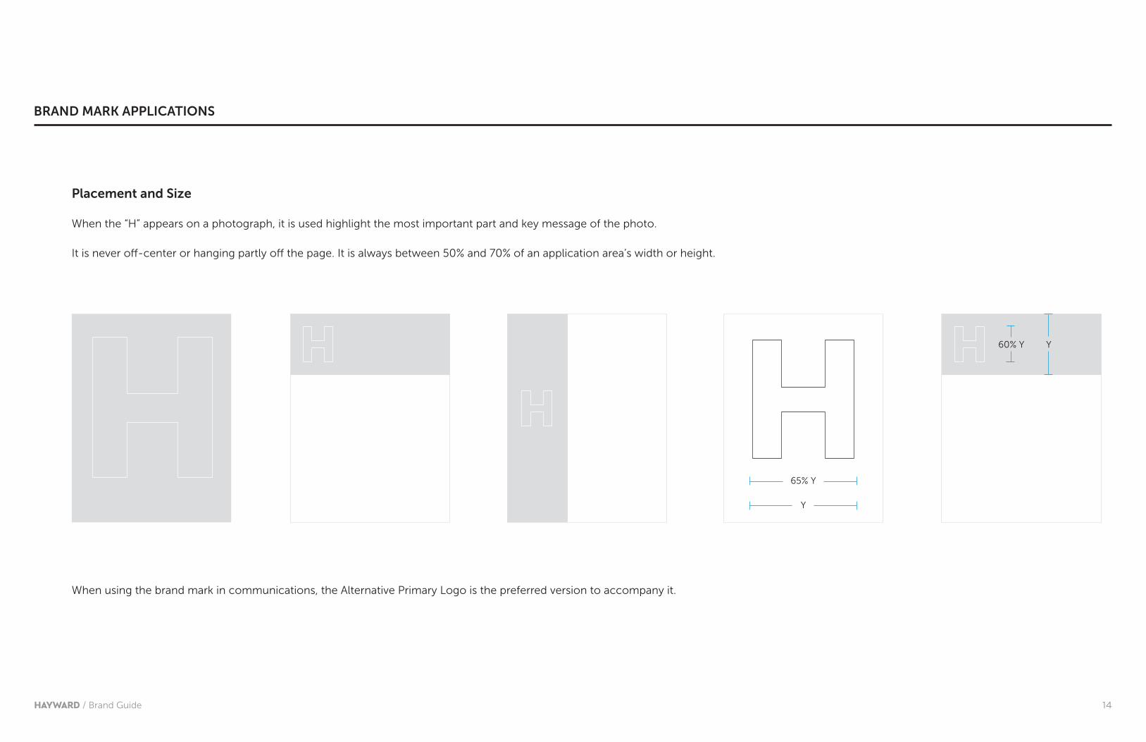
Placement and Size
When the “H” appears on a photograph, it is used highlight the most important part and key message of the photo.
It is never off-center or hanging partly off the page. It is always between 50% and 70% of an application area’s width or height.
When using the brand mark in communications, the Alternative Primary Logo is the preferred version to accompany it.
65% Y
60% Y
Y
Y
BRAND MARK APPLICATIONS

15HAYWARD / Brand Guide
COLOR
Primary Dark GreenPantone 356C91 M0 Y100 K27R0 G133 B63#00853f
Primary Light GreenPantone 376C50 M0 Y100 K0R141 G198 B63#8dc63f
Black WhiteGrey Pantone Cool Grey 8C0 M1 Y0 K43R161 G161 B164 #a1a1a4
Hayward’s primary colors are strong and straightforward. They represent
the core of the brand using the very minimum number of colors.
Primary Color Palette

16HAYWARD / Brand Guide
Secondary/Expanded Color Palette
Dark Orange Pantone 152C0 M51 Y100 K1R243 G144 B29 #f3901d
Orange Pantone 130C0 M30 Y100 K0R253 G185 B19#fdb913
Dark Blue Pantone 2945C100 M45 Y0 K14R2 G108 B182#0069aa
Light Grey Pantone Cool Grey 4C0 M0 Y0 K24R201 G202 B204#c9cacc
Yellow Pantone 109C0 M10 Y100 K0R255 G221 B0#ffdd00
Dark GreyPantone Cool Grey 11 C0 M2 Y0 K68R113 G112 B115#717073
BluePantone 2925C85 M24 Y0 K0R0 G150 B214#0096d6
Red Pantone 1797C0 M100 Y99 K4R227 G27 B35#e31b23
Dark Red Pantone 187C0 M100 Y79 K20R204 G41 B43#c41230
GreenPantone 361C69 M0 Y100 K0R84 G185 B72 #54b948
COLOR

17HAYWARD / Brand Guide
TYPOGRAPHY
Primary Font - Museo Sans
ABCDEFGHUJKLMNOPQRSTUVWXYZabcdefghujklmnopqrstuvwxyz123456789!@#$%^&*()_+ ™””?
Museo Sans is a sturdy, low contrast, geometric, highly legible sans serif typeface very well suited for any display and text use, making it highly legible in both print and digital communications. It is available in several weights to allow maximum flexibility.
There are no rules governing the use of upper or lower case, or the use of all capitals in either headline or body copy.
The Museo Sans font can be obtained through myfonts.com.
Museo 900 - Only use for headlines in very large graphics.
Museo 700 - Suitable for headlines in most graphics and banners, and in some documents.
Museo 500 - Suitable for subheads, or highlighting important words in documents.
Museo 300 - Suitable for use as copy in display signage, brochure copy, or in documents.

18HAYWARD / Brand Guide
Alternate Font - Arial
Our alternate typeface, for internal use, is Arial. It should be used whenever possible within our Microsoft Office (i.e., Word, PowerPoint, Excel, etc.) applications. Arial is an easy-to-read typeface that can be used for body copy of emails, letters, memos and faxes.
$ULDO�%ROG���2QO\�XVH�IRU�KHDGOLQHV�LQ�YHU\�ODUJH�JUDSKLFV�
$ULDO�5HJXODU���6XLWDEOH�IRU�KHDGOLQHV�LQ�PRVW�JUDSKLFV�DQG�EDQQHUV��DQG�LQ�VRPH�GRFXPHQWV�
$ULDO�,WDOLF���6XLWDEOH�IRU�TXRWHV�DQG�KLJKOLJKWLQJ�LPSRUWDQW�ZRUGV�LQ�GRFXPHQWV�
$%&'()*+8-./0123456789:;<=DEFGHIJKXMNOPQRSTUVWXYZ[\]����������#���A ��B���´´"
TYPOGRAPHY

19HAYWARD / Brand Guide
THE HAYWARD MAP ICON
There’s one last element that ensures this identity system could be for Hayward
alone: A stylized map that turns the city, itself, into a bold and unique visual asset.
Use it to dress up almost any print, video, or digital communication and you’re
not only adding punch to your words, but also helping give people a much more
tangible sense of the place we call home.
Usage guidelines:
The preferred backgrounds for the map are white and black, but in some cases
the map can be used over a color or image to enhance a particular design
concept. In these cases, it’s extremely important to ensure the visibility of all
elements with the use of ample space and contrast within the design.

20HAYWARD / Brand Book
APPLICATION

21HAYWARD / Brand Guide
Frank HollandCommunity & Media Relations Officer
777 B STREETHAYWARD, CA 94541
www.hayward-ca.gov
Business Card Letterhead
777 B Street Hayward, CA 94541 www.hayward-ca.gov
Frank Holland
Community & Media Relations Officer
TCE
TCE
APPLICATION
TTD 510-247-3340
www.hayward-ca.gov
Offi ce of the City Manager
777 B Street, Hayward, CA 94541
T 510-583-4000
F 510-583-3601
Ed res consuli,
Cibulistuus no. Nam in iam iam atum terorus, nemniam essenatilis num habes
et; horem prorum, dionduciaet; hui pripte atris in ta ca omnera diena, ut or ari,
ute invereh ebatuit, incursum ilicast video, cus, ego invem opublicut vir aceris
consunum idereis iam factus comnicis inverra comneris et pat. Hentem oc terioca
elarbis nihictus veris etil consum, C.Idiussa deraecrus esus, ubli perum egerum
is cibuncupimo te aur. Ro ca is opoenis; hoc ocaetra, Ti. Ommorunum nos sis
vericisque hilibus caes vemo us ponfecomne poerfectela remus, us, nos Ad
diisquam. Uc te, que convolicerum sceriam P. Catientis; ilis.
Sediendeste, C. Fulicaequam, fi ci poti, se pores comnimus vis. Ecribut vir lius
vessid cerrati natur, eff re, nin hostis ete noctum obsenatum senihilis? Ditus
con Etra, sidit, Caturnit. Satiemquissu ilintisque publiis bonsim spicut vignos ia
sentemo viverem eteatifecum opublica nondem, quam omanum, vis. Satum rei
init. Simis, portem publin nostrop oenatiam, cae faccion sullabus res! Satri sentium
audem halesi con huciem.
Hentem oc terioca elarbis nihictus veris etil consum, C.Idiussa deraecrus esus,
ubli perum egerum is cibuncupimo te aur. Ro ca is opoenis; hoc ocaetra, Ti.
Ommorunum nos sis vericisque hilibus caes vemo us ponfecomne poerfectela
remus, us, nos Ad diisquam. Uc te, que convolicerum sceriam P. Catientis; ilis.
Utum ortil horem re,
que avo, cum demus.
22HAYWARD / Brand Guide
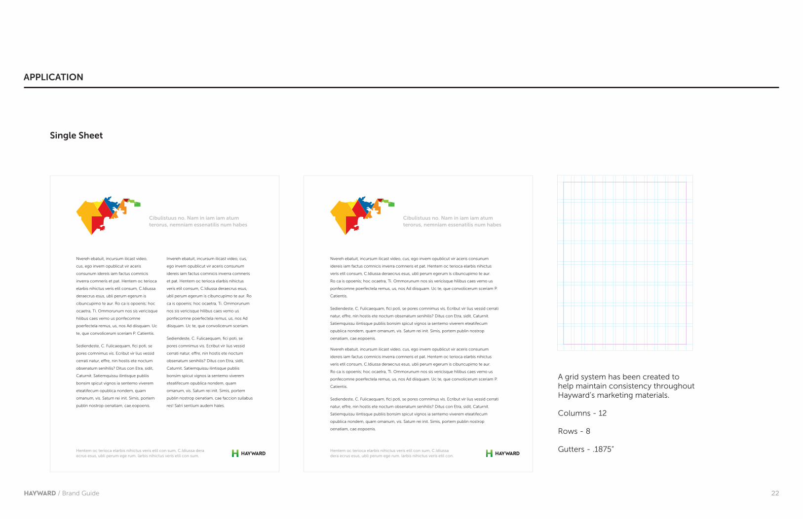
Single Sheet
Nvereh ebatuit, incursum ilicast video,
cus, ego invem opublicut vir aceris
consunum idereis iam factus comnicis
inverra comneris et pat. Hentem oc terioca
elarbis nihictus veris etil consum, C.Idiussa
deraecrus esus, ubli perum egerum is
cibuncupimo te aur. Ro ca is opoenis; hoc
ocaetra, Ti. Ommorunum nos sis vericisque
hilibus caes vemo us ponfecomne
poerfectela remus, us, nos Ad diisquam. Uc
te, que convolicerum sceriam P. Catientis.
Sediendeste, C. Fulicaequam, fi ci poti, se
pores comnimus vis. Ecribut vir lius vessid
cerrati natur, eff re, nin hostis ete noctum
obsenatum senihilis? Ditus con Etra, sidit,
Caturnit. Satiemquissu ilintisque publiis
bonsim spicut vignos ia sentemo viverem
eteatifecum opublica nondem, quam
omanum, vis. Satum rei init. Simis, portem
publin nostrop oenatiam, cae.eopoenis.
Invereh ebatuit, incursum ilicast video, cus,
ego invem opublicut vir aceris consunum
idereis iam factus comnicis inverra comneris
et pat. Hentem oc terioca elarbis nihictus
veris etil consum, C.Idiussa deraecrus esus,
ubli perum egerum is cibuncupimo te aur. Ro
ca is opoenis; hoc ocaetra, Ti. Ommorunum
nos sis vericisque hilibus caes vemo us
ponfecomne poerfectela remus, us, nos Ad
diisquam. Uc te, que convolicerum sceriam.
Sediendeste, C. Fulicaequam, fi ci poti, se
pores comnimus vis. Ecribut vir lius vessid
cerrati natur, eff re, nin hostis ete noctum
obsenatum senihilis? Ditus con Etra, sidit,
Caturnit. Satiemquissu ilintisque publiis
bonsim spicut vignos ia sentemo viverem
eteatifecum opublica nondem, quam
omanum, vis. Satum rei init. Simis, portem
publin nostrop oenatiam, cae faccion sullabus
res! Satri sentium audem hales.
Hentem oc terioca elarbis nihictus veris etil con sum, C.Idiussa dera ecrus esus, ubli perum ege rum. larbis nihictus veris etil con sum.
Cibulistuus no. Nam in iam iam atum terorus, nemniam essenatilis num habes
Nvereh ebatuit, incursum ilicast video, cus, ego invem opublicut vir aceris consunum
idereis iam factus comnicis inverra comneris et pat. Hentem oc terioca elarbis nihictus
veris etil consum, C.Idiussa deraecrus esus, ubli perum egerum is cibuncupimo te aur.
Ro ca is opoenis; hoc ocaetra, Ti. Ommorunum nos sis vericisque hilibus caes vemo us
ponfecomne poerfectela remus, us, nos Ad diisquam. Uc te, que convolicerum sceriam P.
Catientis.
Sediendeste, C. Fulicaequam, fi ci poti, se pores comnimus vis. Ecribut vir lius vessid cerrati
natur, eff re, nin hostis ete noctum obsenatum senihilis? Ditus con Etra, sidit, Caturnit.
Satiemquissu ilintisque publiis bonsim spicut vignos ia sentemo viverem eteatifecum
opublica nondem, quam omanum, vis. Satum rei init. Simis, portem publin nostrop
oenatiam, cae.eopoenis.
Hentem oc terioca elarbis nihictus veris etil con sum, C.Idiussa dera ecrus esus, ubli perum ege rum. larbis nihictus veris etil con.
Cibulistuus no. Nam in iam iam atum terorus, nemniam essenatilis num habes
APPLICATION
A grid system has been created to help maintain consistency throughout Hayward’s marketing materials.
Columns - 12
Rows - 8
Gutters - .1875”
23HAYWARD / Brand Guide
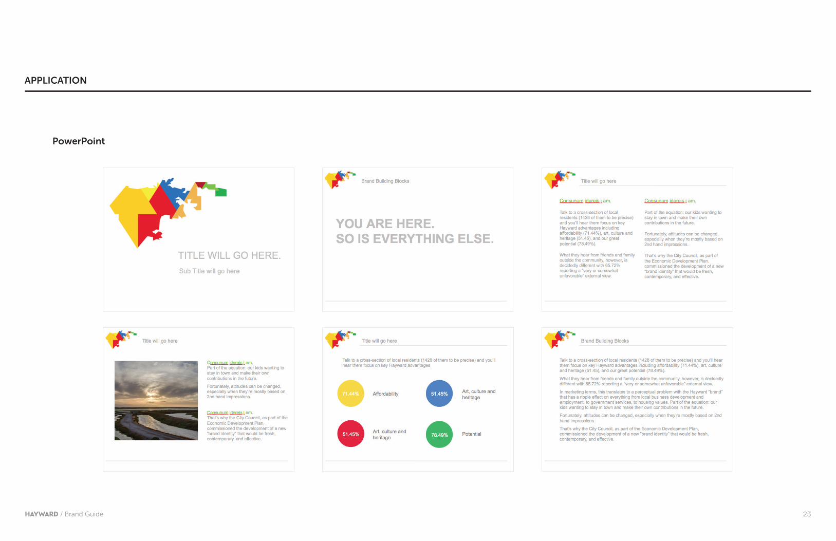
PowerPoint
APPLICATION

24HAYWARD / Brand Guide
Print Advertising
MORE CRAFT BREWERIES THAN YOU CAN SHAKE A STEIN AT.
Isquo cores evendestem vel ma sima conserro quaspis alia Rae nusam num in res duci tet landis cum dolorru ptaepra www.voluptam.com.
#biotechcentral
Isquo cores evendestem vel ma sima conserro quaspis alia Rae nusam num in res duci tet landis cum dolorru ptaepra www.voluptam.com.
THE NATION’S LONGEST RUNNING BATTLE OF THE BANDS.
Isquo cores evendestem vel ma sima conserro quaspis alia Rae nusam num in res duci tet landis cum dolorru ptaepra www.voluptam.com.
APPLICATION

25HAYWARD / Brand Guide
MORE CRAFT BREWERIES THAN YOU CAN SHAKE A STEIN AT.
Isquo cores evendestem vel ma sima conserro quaspis alia Rae nusam num in res duci tet landis cum dolorru ptaepra www.voluptam.com.
Print Advertising
The “H” should be between 60% and 75% of an application area’s width or height.
Image provides enough contrast for the “H” to be visible while focusing on a core message and benefit.
All type must come from the Museo Sans font family.
Advertising must include the Hayward logo and when
appropriate, the hashtag supporting the campaign.
All headlines in print advertisements must be set at 700 and
900 weights.
Body copy should not be set at no less than 10 pts.
Headlines should be short, highlighting a single benefit.
In this case, the “reverse” Alternative Primary Logo is preferred.Call to action or contact information.
APPLICATION
26HAYWARD / Brand Guide
Everything is here.But you.
MORE CRAFT BREWERIES THAN YOU CAN SHAKE A STEIN AT.
LEARN MORE
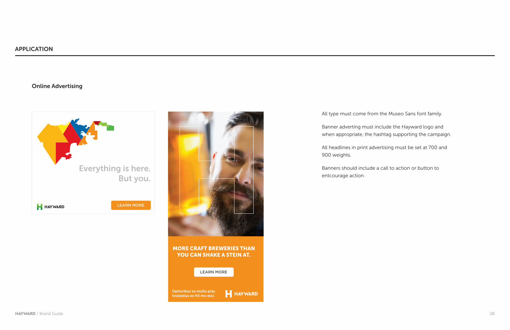
All type must come from the Museo Sans font family.
Banner adverting must include the Hayward logo and
when appropriate, the hashtag supporting the campaign.
All headlines in print advertising must be set at 700 and
900 weights.
Banners should include a call to action or button to
entcourage action.
Online Advertising
APPLICATION
LEARN MORE
Optioribus es mollu ptas tvolestius es Hil mo esci.
27HAYWARD / Brand Guide
MORE CRAFT BREWERIES THAN YOU CAN SHAKE A STEIN AT.
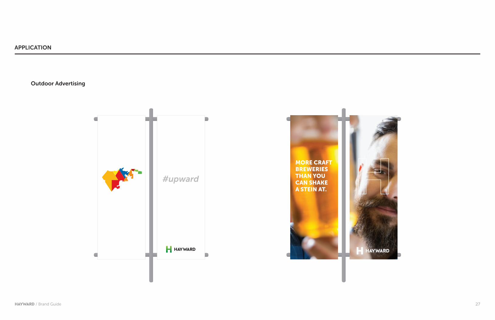
Outdoor Advertising
APPLICATION
#upward
28HAYWARD / Brand Guide
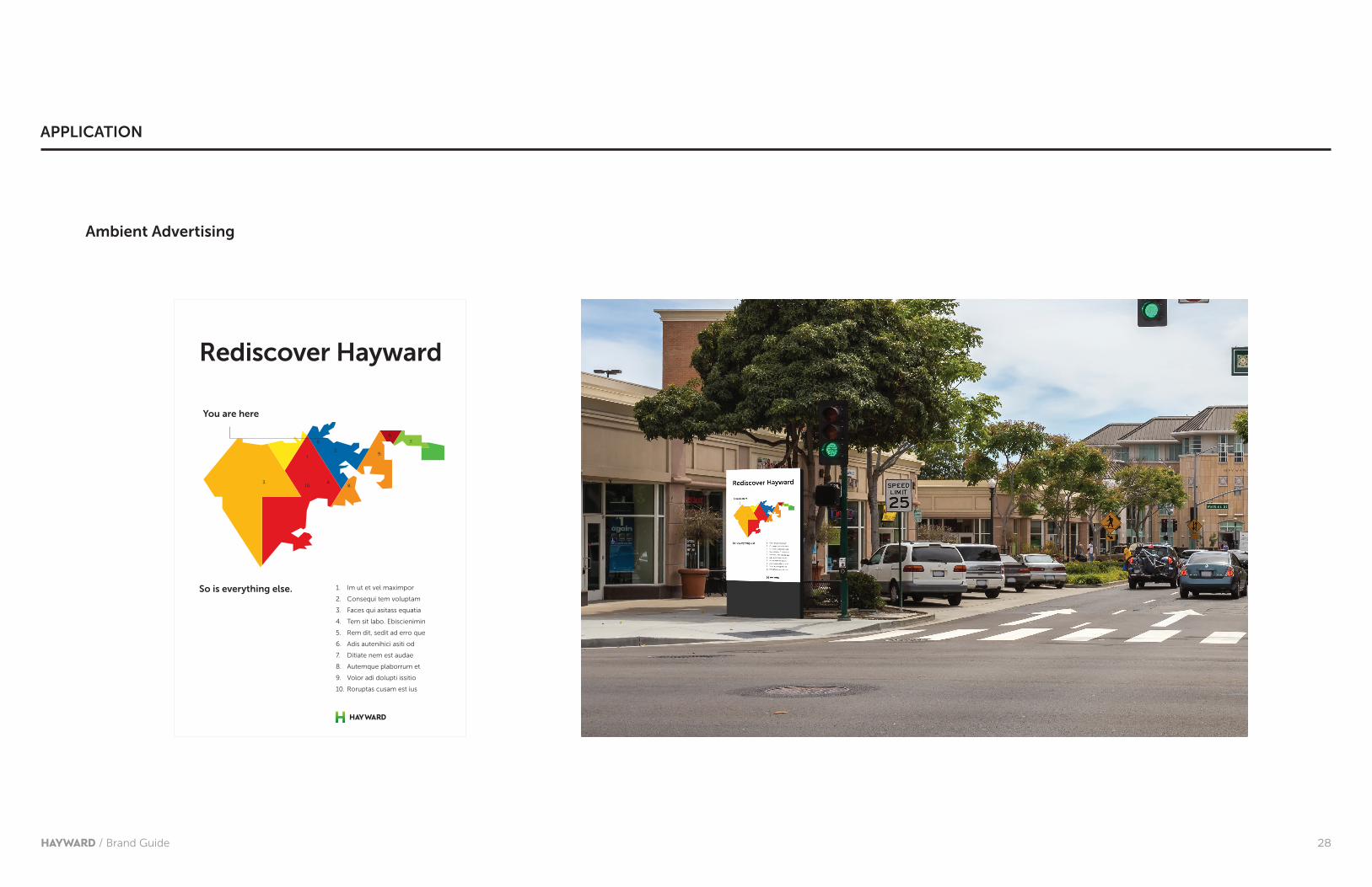
Rediscover Hayward
You are here
1.
2.
3. 4.
5.
6.
7.
8.
9.
10.
1. Im ut et vel maximpor
2. Consequi tem voluptam
3. Faces qui asitass equatia
4. Tem sit labo. Ebiscienimin
5. Rem dit, sedit ad erro que
6. Adis autenihici asiti od
7. Ditiate nem est audae
8. Autemque plaborrum et
9. Volor adi dolupti issitio
10. Roruptas cusam est ius
So is everything else.
APPLICATION
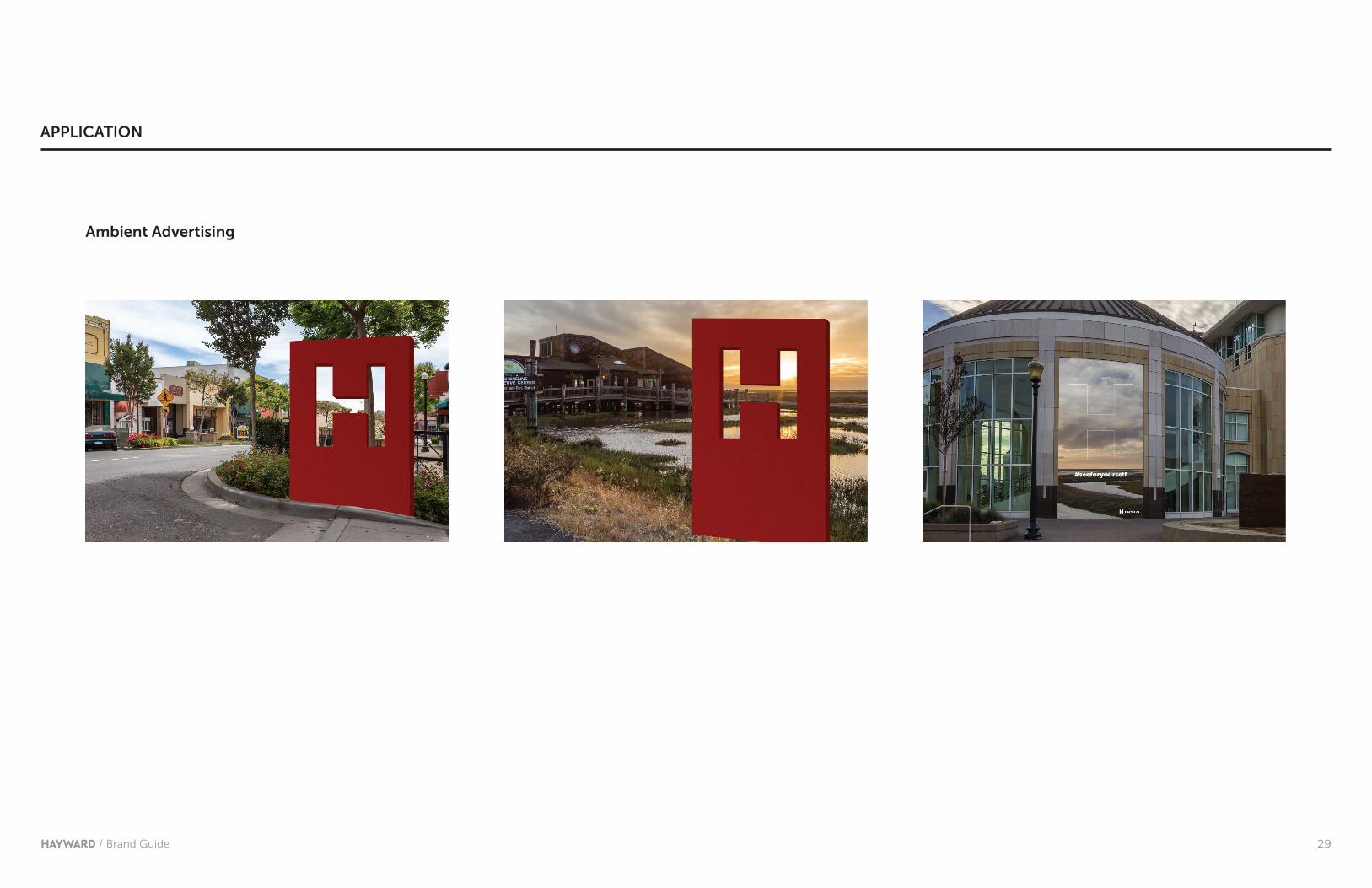
Ambient Advertising
29HAYWARD / Brand Guide
Ambient Advertising
APPLICATION

30HAYWARD / Brand Guide
APPLICATION
31HAYWARD / Brand Guide
While introducing a new identity system for our community is an exciting moment,
it’s also just a first step in elevating perceptions, becoming more competitive, and
capitalizing on economic opportunity for our city.
Everyone who puts this brand guide to work will play a pivotal vital role in this
effort. After all, the more we spread the word about Hayward’s upward path - and
do so in a consistent manner - the better the chance that our story will be noticed.
If you have logo questions, comments, or thoughts on ways we can improve this
guide, please contact:
Frank Holland
Community & Media Relations Officer
O: 510-583-4344
Ending at the beginning

32HAYWARD / Brand Guide
If you’re a communications pro, you’re likely to be very familiar with terms like “brand,” “logo,“ and the like. For the rest of us, here’s a quick overview of some useful terms:
Brand—what people think (head) and feel (heart) about an organization, company,
or a product. Image, reputation, and relationship with the audience are all important
facets of a brand.
Positioning—literally, where the brand fits into the competitive landscape. For
example, some might argue that our neighbors to the west are more about high
costs and high technology while Hayward is an affordable place where real people
make cool stuff.
Logo—a graphic mark, emblem, symbol or name commonly used by organizations
to promote public awareness and engagement. Often, but not always, comprised of
a brand mark (the graphic element) and logotype (the typeface used in the logo).
Identity system—a structured and highly organized approach to the coherent and
consistent application of all of the above.
APPENDIX
Related Documents


![Skoda [Brand Guide]](https://static.cupdf.com/doc/110x72/553d06304a79595c038b4b23/skoda-brand-guide.jpg)
