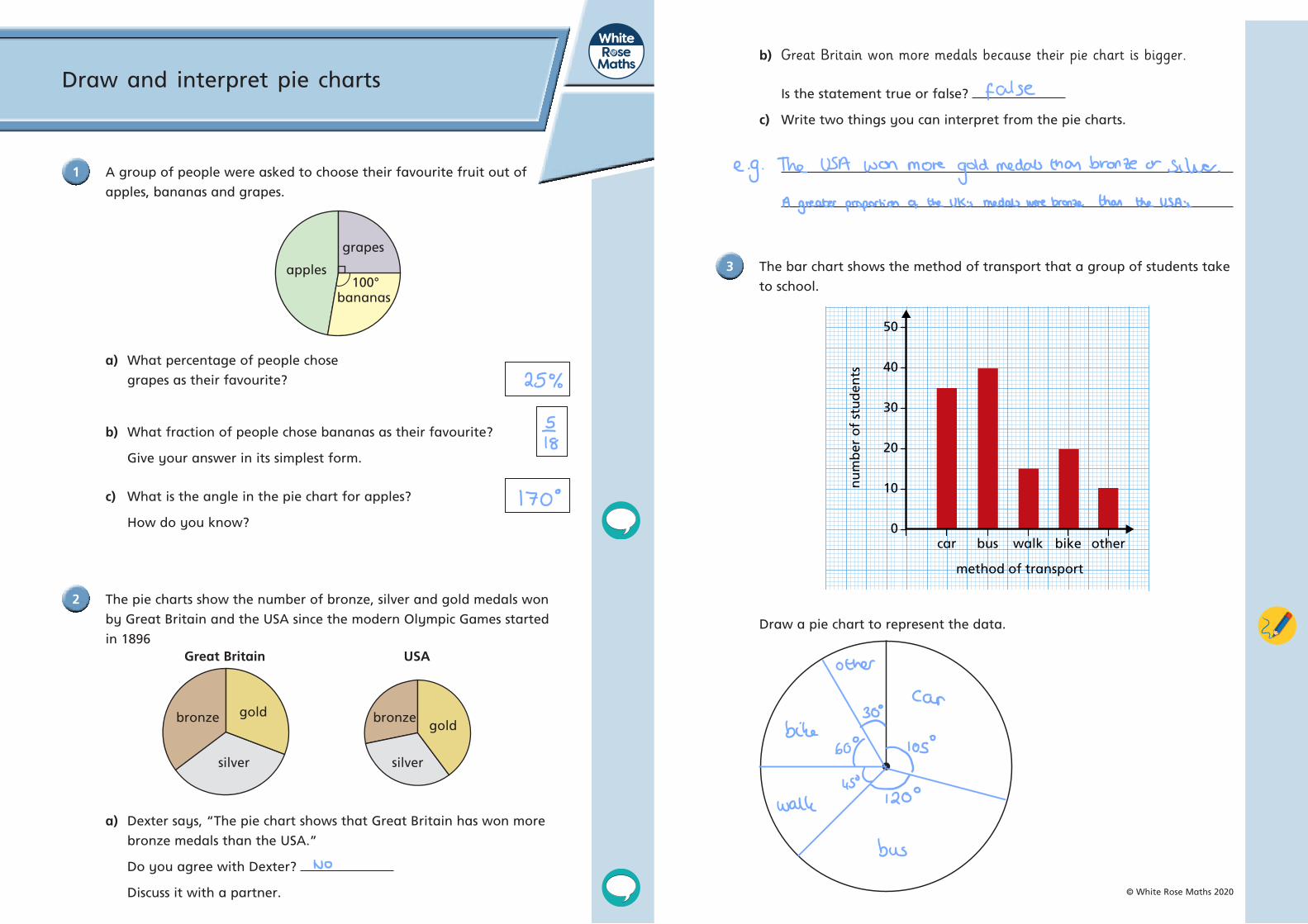
grapes apples 100° Draw and interpret pie charts 1 A group of people were asked to choose their favourite fruit out of apples, bananas and grapes. a) What percentage of people chose grapes as their favourite? b) What fraction of people chose bananas as their favourite? Give your answer in its simplest form. c) What is the angle in the pie chart for apples? How do you know? 2 The pie charts show the number of bronze, silver and gold medals won by Great Britain and the USA since the modern Olympic Games started in 1896 a) Dexter says, “The pie chart shows that Great Britain has won more bronze medals than the USA.” Do you agree with Dexter? Discuss it with a partner. b) Great Britain won more medals because their pie chart is bigger. Is the statement true or false? c) Write two things you can interpret from the pie charts. 3 The bar chart shows the method of transport that a group of students take to school. Draw a pie chart to represent the data. © White Rose Maths 2020 Great Britain USA gold gold bronze bronze silver silver method of transport car bus walk bike other 0 10 20 30 40 50 number of students bananas

Welcome message from author
This document is posted to help you gain knowledge. Please leave a comment to let me know what you think about it! Share it to your friends and learn new things together.
Transcript
grapes
apples100°
Draw and interpret pie charts
1 A group of people were asked to choose their favourite fruit out of
apples, bananas and grapes.
a) What percentage of people chose
grapes as their favourite?
b) What fraction of people chose bananas as their favourite?
Give your answer in its simplest form.
c) What is the angle in the pie chart for apples?
How do you know?
2 The pie charts show the number of bronze, silver and gold medals won
by Great Britain and the USA since the modern Olympic Games started
in 1896
a) Dexter says, “The pie chart shows that Great Britain has won more
bronze medals than the USA.”
Do you agree with Dexter?
Discuss it with a partner.
b) Great Britain won more medals because their pie chart is bigger.
Is the statement true or false?
c) Write two things you can interpret from the pie charts.
3 The bar chart shows the method of transport that a group of students take
to school.
Draw a pie chart to represent the data.
© White Rose Maths 2020
Great Britain USA
goldgold
bronze bronze
silver silver
method of transport
car bus walk bike other0
10
20
30
40
50
nu
mb
er o
f st
ud
ents
bananas

6 A group of students in Years 7 and 8 voted for their favourite colour.
The results are shown in the pie charts.
12 students in Year 7 said yellow was their favourite colour.
The number of students in Year 8 who said red was their favourite colour
is the same as the number of students in Year 7 who said green was their
favourite colour.
How many Year 8 students said that green or yellow was their
favourite colour?
4 The pie chart is drawn accurately, and shows how Teddy spent his money
in January.
He spent £90 in total.
How much money did he spend on each thing?
5 There are some animals in a zoo.
• There are twice as many monkeys as there are giraffes.
• There are 8 more elephants than giraffes.
• There are 2 fewer lions than monkeys.
• There are 56 lions.
Draw a pie chart to show the number of monkeys, giraffes, elephants and
lions in the zoo.
© White Rose Maths 2020
games food
cinema clothes
games
food
clothes
cinema
redred
blue blue
green
green
yellowyellowother
other
72° 48°
96°
66°
78°
Year 7 Year 8
24°
104°
112°
56°
64°
Related Documents