Graphical Modeling Pictorial Method for Representation of Numerical Data

Welcome message from author
This document is posted to help you gain knowledge. Please leave a comment to let me know what you think about it! Share it to your friends and learn new things together.
Transcript

Graphical Modeling
Pictorial Method for
Representation of
Numerical Data

TYPES OF INFORMATIONAL GRAPHICS
A diagram that shows how a numerical quantity has changed over time.
The y axis has numbers usually representing a quantity.
The x axis has numbers usually representing time that can be years, months, hours, nanoseconds, etc.
Normally, a line represents the data.
GRAPHS

Line Graph

TYPES OF INFORMATIONAL GRAPHICS
A diagram that shows a relationship between two or more numerical quantities.
There are a variety of charts available. Which one you use depends on the type of data, quantity of data, and the impact you wish to represent.
CHART

TYPES OF INFORMATIONAL GRAPHICS
Different types of Charts:
Column Charts use lines or bars, placed vertically, to compare one quantity to another.
TYPES OF INFORMATIONAL GRAPHICS
Different types of Charts:
Bar Charts use lines or bars, placed horizontally, to compare one quantity to another.
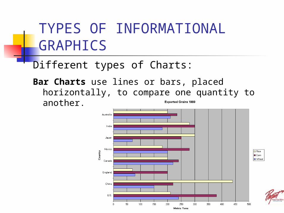
TYPES OF INFORMATIONAL GRAPHICS
Different types of Charts: Pie Charts are useful when you are representing percentages
of a whole.
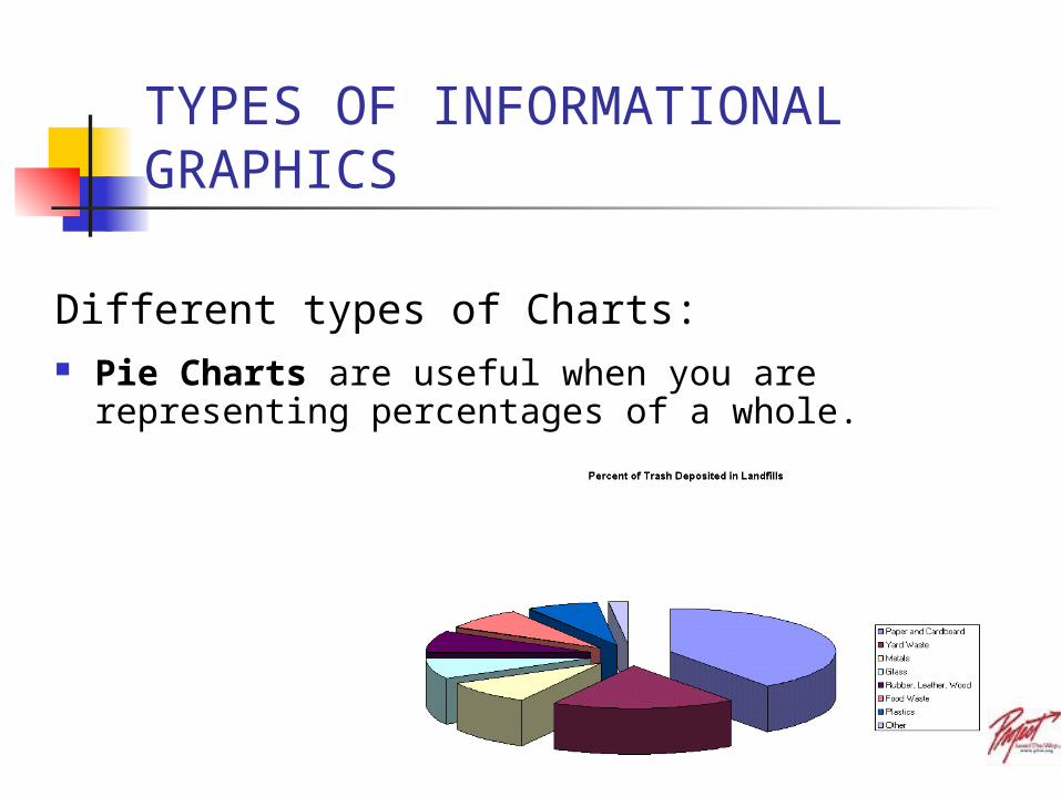
CREATING A CHART USING EXCEL SPREADSHEET
Data Collection
•Chart must compare two types of data
•http://www.infoplease.com/ipa/A0762524.html
(World's 50 Most Populous Cities)

Internet Search for Data
© Project Lead The Way, Inc.

MAKING A CHART USING EXCEL SPREADSHEET
OPEN EXCEL
Copy the data you want from data source and paste information into Excel.
Place cursor in first cell block and choose paste. If the information was collected in columns (tabular format), EXCEL will place each piece of data in each cell in the correct column.
OR
Place cursor in each cell block and type in each piece of data individually.
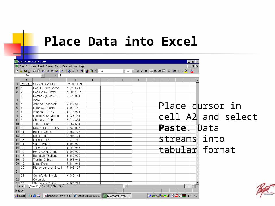
Place Data into Excel
Place cursor in cell A2 and select Paste. Data streams into tabular format

CREATING A CHART USING EXCEL SPREADSHEET
Starting the Chart:•Choose INSERT
•Select CHART
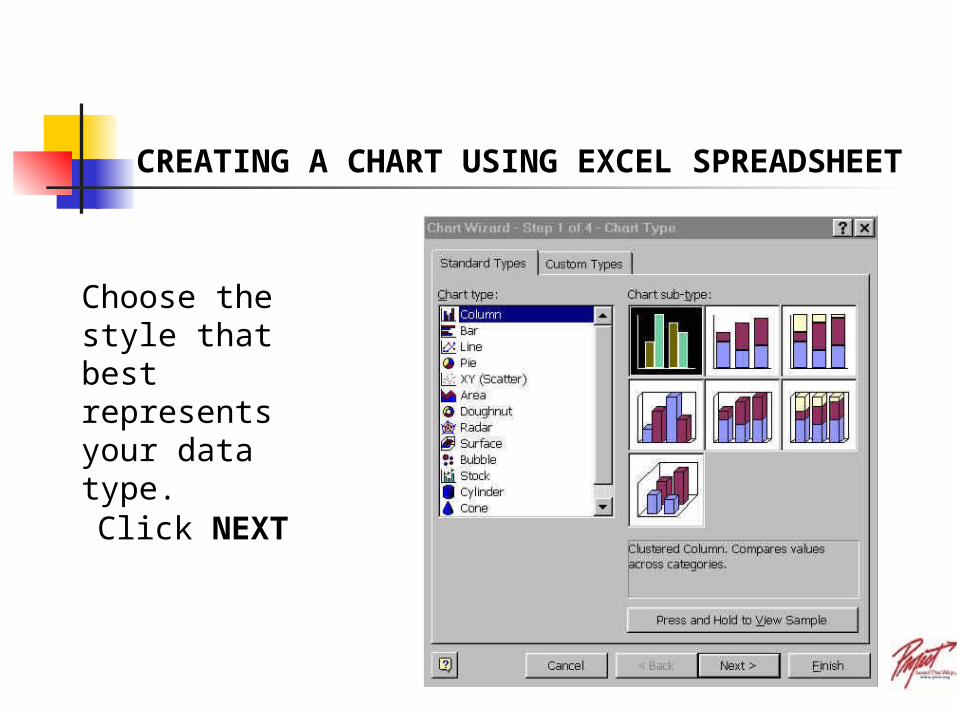
Choose the style that best represents your data type.
Click NEXT
CREATING A CHART USING EXCEL SPREADSHEET
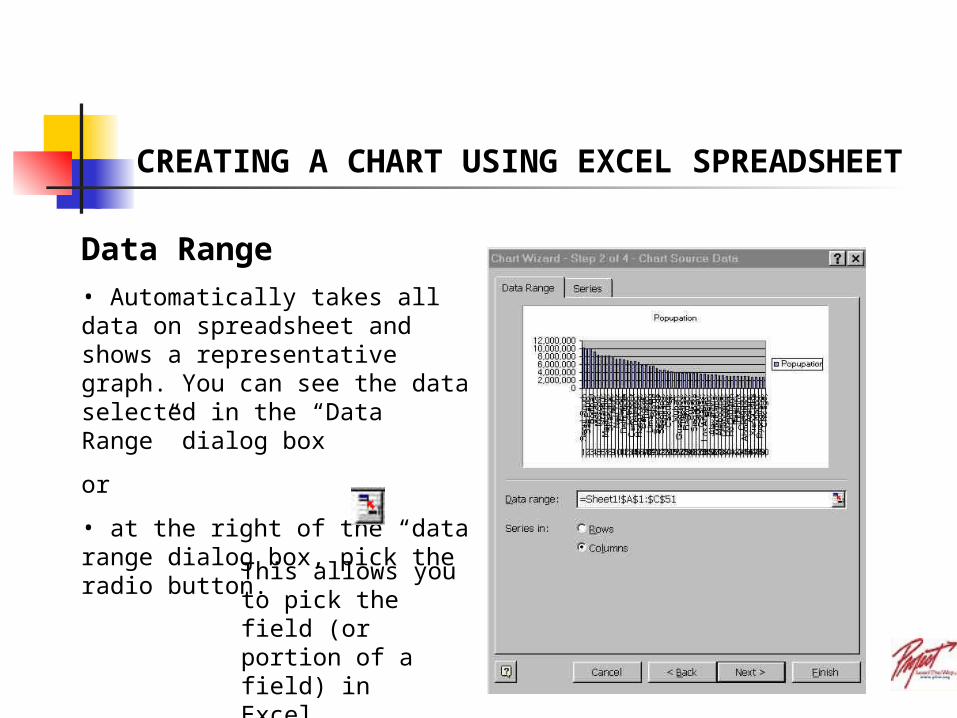
Data Range• Automatically takes all data on spreadsheet and shows a representative graph. You can see the data selected in the “Data Range” dialog box
or
• at the right of the “data range dialog box, pick the radio button.
This allows you to pick the field (or portion of a field) in Excel.
Click NEXT
CREATING A CHART USING EXCEL SPREADSHEET

Click Next
By selecting just the first 20 data cells the chart wizard shows you the results of your query.
CREATING A CHART USING EXCEL SPREADSHEET
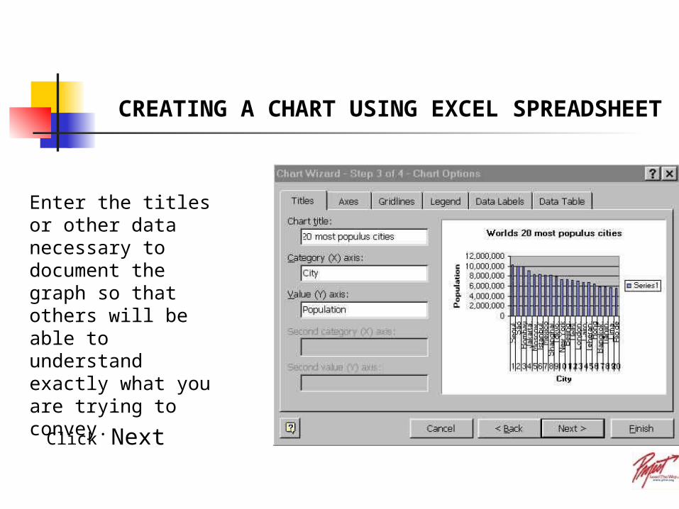
Enter the titles or other data necessary to document the graph so that others will be able to understand exactly what you are trying to convey.
Click Next
CREATING A CHART USING EXCEL SPREADSHEET
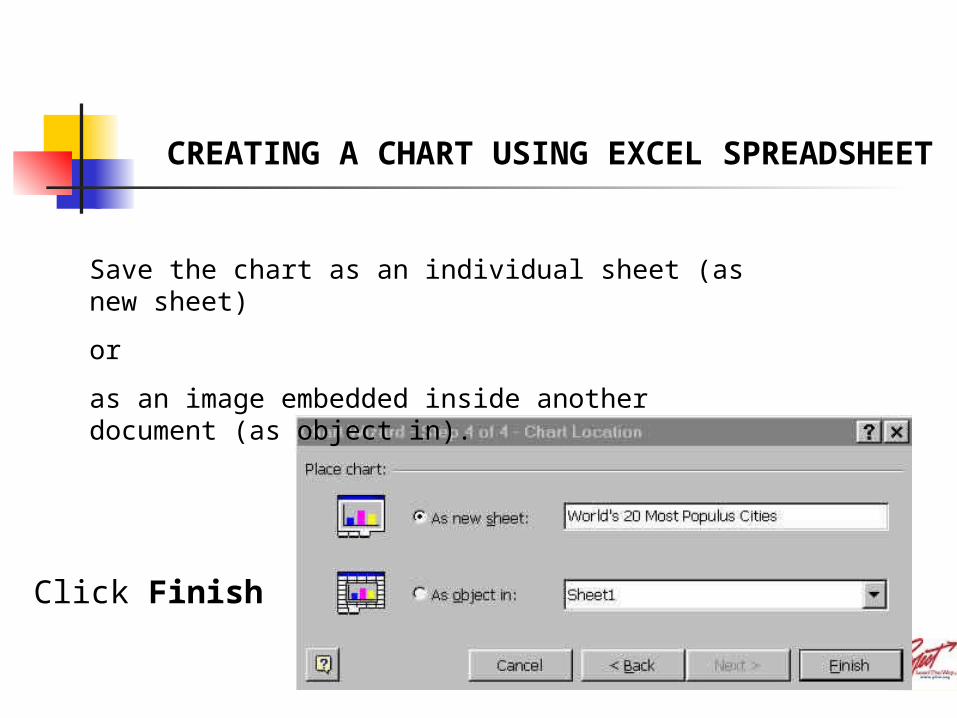
Save the chart as an individual sheet (as new sheet)
or
as an image embedded inside another document (as object in).
Click Finish
CREATING A CHART USING EXCEL SPREADSHEET
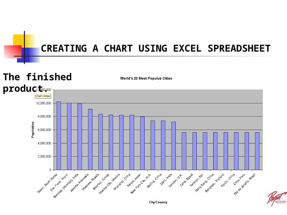
The finished product.
CREATING A CHART USING EXCEL SPREADSHEET
Related Documents