. . Laird Research - Economics July 16, 2015 Where we are now ........................ 1 Indicators for US Economy ................... 2 Global Financial Markets .................... 3 US Key Interest Rates ...................... 8 US Inflation ............................. 9 QE Taper Tracker ......................... 10 Exchange Rates .......................... 11 US Banking Indicators ...................... 12 US Employment Indicators ................... 13 US Business Activity Indicators ................ 15 US Consumption Indicators .................. 16 US Housing ............................. 17 Global Housing .......................... 19 Global Business Indicators ................... 21 Canadian Indicators ....................... 24 European Indicators ....................... 26 Chinese Indicators ........................ 28 Global Climate Change ..................... 29 Where we are now Welcome to the Laird Report. We present a selection economic data from around the world to help figure where we are today. The first half of the year seems to have disappointed in North Amer- ica and Europe with lackluster GDP reports. The cold snap in the US was blamed for poor Q1 performance in particular. The US is driven by a much stronger consumer sector - better unemployment numbers will do that. But the economy has many moving parts and the collapse in oil prices has made a massive impact on capital expenditures and corporate investment - the energy sector isn’t as big as the consumer sector, but the downturn there was much sharper. Canada is an interesting case because of the size of the energy in- dustry in the west. Canada’s GDP in Q1 was negative and it seems Q2 is also likely negative (isn’t that a recession?). Canada has a two speed economy: a struggling, western focused energy industry and a slower growing consumer products/manufacturing industry in the east. These two are not balanced out - the Bank of Canada was wrongly assuming that manufacturing would pick up the slack with lower energy prices and a favourable exchange rate. There’s also the Sturm und Drang of the Eurozone. Clearly Ger- many just doesn’t belong and should be kicked out of the Eurozone - the idea that Germany was going to impose financial discipline on Spain, Italy, France and the other rabble has been shown to be unsup- portable. Germany simply isn’t Greece. The Eurozone is not about European unity - it is really about lowering the value of the Deutsche mark (aka the Euro) and the Germans don’t want to pay too much for that service. Note: contagion was invented in the Balkans. Formatting Notes The grey bars on the various charts are OECD recession indicators for the respective countries. In many cases, the last available value is listed, along with the median value (measured from as much of the data series as is available). Subscription Info For a FREE subscription to this monthly re- port, please visit sign up at our website: www.lairdresearch.com Laird Research, July 16, 2015

Welcome message from author
This document is posted to help you gain knowledge. Please leave a comment to let me know what you think about it! Share it to your friends and learn new things together.
Transcript
....Laird Research - Economics
July 16, 2015
Where we are now . . . . . . . . . . . . . . . . . . . . . . . . 1
Indicators for US Economy . . . . . . . . . . . . . . . . . . . 2
Global Financial Markets . . . . . . . . . . . . . . . . . . . . 3
US Key Interest Rates . . . . . . . . . . . . . . . . . . . . . . 8
US Inflation . . . . . . . . . . . . . . . . . . . . . . . . . . . . . 9
QE Taper Tracker . . . . . . . . . . . . . . . . . . . . . . . . . 10
Exchange Rates . . . . . . . . . . . . . . . . . . . . . . . . . . 11
US Banking Indicators . . . . . . . . . . . . . . . . . . . . . . 12
US Employment Indicators . . . . . . . . . . . . . . . . . . . 13
US Business Activity Indicators . . . . . . . . . . . . . . . . 15
US Consumption Indicators . . . . . . . . . . . . . . . . . . 16
US Housing . . . . . . . . . . . . . . . . . . . . . . . . . . . . . 17
Global Housing . . . . . . . . . . . . . . . . . . . . . . . . . . 19
Global Business Indicators . . . . . . . . . . . . . . . . . . . 21
Canadian Indicators . . . . . . . . . . . . . . . . . . . . . . . 24
European Indicators . . . . . . . . . . . . . . . . . . . . . . . 26
Chinese Indicators . . . . . . . . . . . . . . . . . . . . . . . . 28
Global Climate Change . . . . . . . . . . . . . . . . . . . . . 29
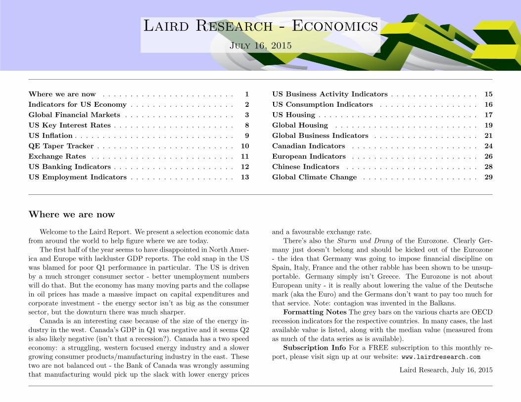
Where we are now
Welcome to the Laird Report. We present a selection economic datafrom around the world to help figure where we are today.
The first half of the year seems to have disappointed in North Amer-ica and Europe with lackluster GDP reports. The cold snap in the USwas blamed for poor Q1 performance in particular. The US is drivenby a much stronger consumer sector - better unemployment numberswill do that. But the economy has many moving parts and the collapsein oil prices has made a massive impact on capital expenditures andcorporate investment - the energy sector isn’t as big as the consumersector, but the downturn there was much sharper.
Canada is an interesting case because of the size of the energy in-dustry in the west. Canada’s GDP in Q1 was negative and it seems Q2is also likely negative (isn’t that a recession?). Canada has a two speedeconomy: a struggling, western focused energy industry and a slowergrowing consumer products/manufacturing industry in the east. Thesetwo are not balanced out - the Bank of Canada was wrongly assumingthat manufacturing would pick up the slack with lower energy prices
and a favourable exchange rate.There’s also the Sturm und Drang of the Eurozone. Clearly Ger-
many just doesn’t belong and should be kicked out of the Eurozone- the idea that Germany was going to impose financial discipline onSpain, Italy, France and the other rabble has been shown to be unsup-portable. Germany simply isn’t Greece. The Eurozone is not aboutEuropean unity - it is really about lowering the value of the Deutschemark (aka the Euro) and the Germans don’t want to pay too much forthat service. Note: contagion was invented in the Balkans.
Formatting Notes The grey bars on the various charts are OECDrecession indicators for the respective countries. In many cases, the lastavailable value is listed, along with the median value (measured fromas much of the data series as is available).
Subscription Info For a FREE subscription to this monthly re-port, please visit sign up at our website: www.lairdresearch.com
Laird Research, July 16, 2015
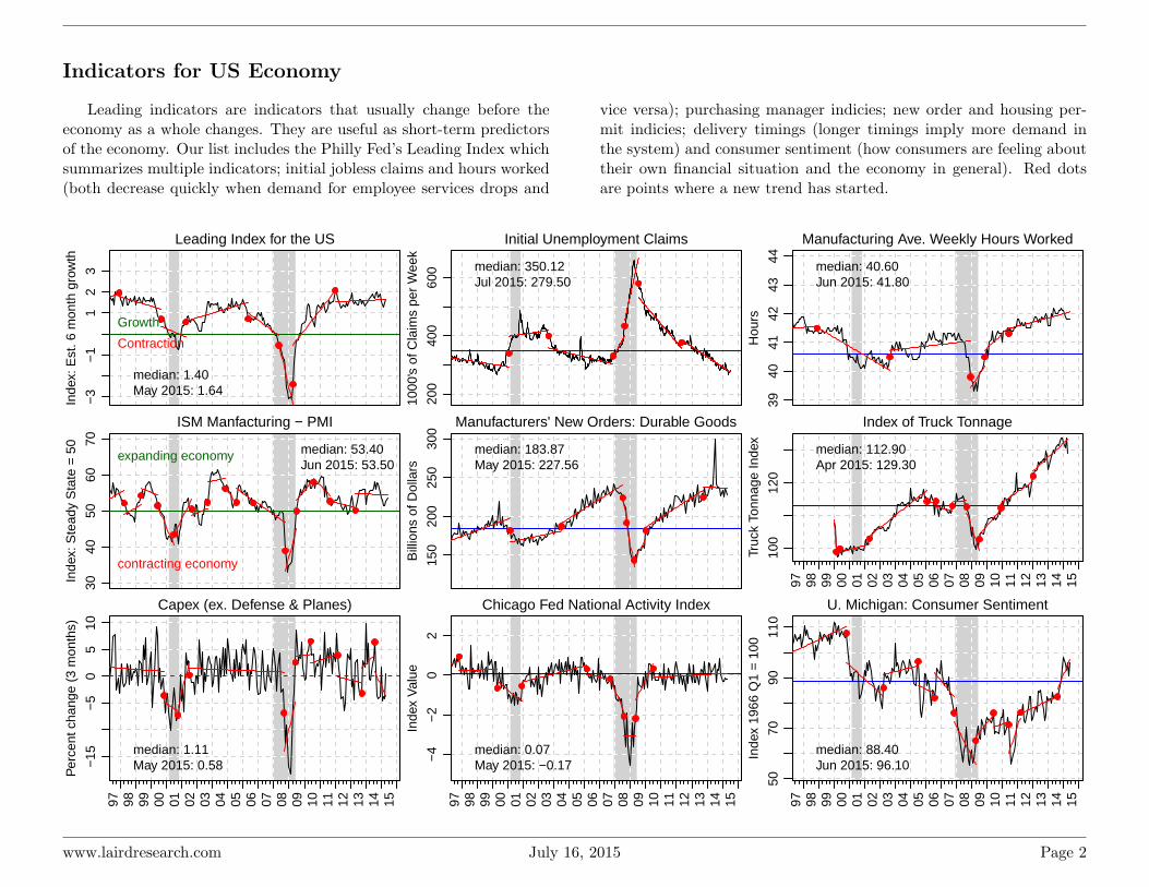
Indicators for US Economy
Leading indicators are indicators that usually change before theeconomy as a whole changes. They are useful as short-term predictorsof the economy. Our list includes the Philly Fed’s Leading Index whichsummarizes multiple indicators; initial jobless claims and hours worked(both decrease quickly when demand for employee services drops and
vice versa); purchasing manager indicies; new order and housing per-mit indicies; delivery timings (longer timings imply more demand inthe system) and consumer sentiment (how consumers are feeling abouttheir own financial situation and the economy in general). Red dotsare points where a new trend has started.
Leading Index for the US
Inde
x: E
st. 6
mon
th g
row
th
−3
−1
12
3
median: 1.40May 2015: 1.64
Growth
Contraction
Initial Unemployment Claims
1000
's o
f Cla
ims
per
Wee
k
200
400
600 median: 350.12
Jul 2015: 279.50
Manufacturing Ave. Weekly Hours Worked
Hou
rs
3940
4142
4344 median: 40.60
Jun 2015: 41.80
ISM Manfacturing − PMI
Inde
x: S
tead
y S
tate
= 5
0
3040
5060
70 median: 53.40Jun 2015: 53.50
expanding economy
contracting economy
Manufacturers' New Orders: Durable GoodsB
illio
ns o
f Dol
lars
150
200
250
300
median: 183.87May 2015: 227.56
Index of Truck Tonnage
Truc
k To
nnag
e In
dex
97 98 99 00 01 02 03 04 05 06 07 08 09 10 11 12 13 14 15
100
120
median: 112.90Apr 2015: 129.30
Capex (ex. Defense & Planes)
Per
cent
cha
nge
(3 m
onth
s)
97 98 99 00 01 02 03 04 05 06 07 08 09 10 11 12 13 14 15
−15
−5
05
10
median: 1.11May 2015: 0.58
Chicago Fed National Activity Index
Inde
x V
alue
97 98 99 00 01 02 03 04 05 06 07 08 09 10 11 12 13 14 15
−4
−2
02
median: 0.07May 2015: −0.17
U. Michigan: Consumer Sentiment
Inde
x 19
66 Q
1 =
100
97 98 99 00 01 02 03 04 05 06 07 08 09 10 11 12 13 14 15
5070
9011
0
median: 88.40Jun 2015: 96.10
www.lairdresearch.com July 16, 2015 Page 2

Global Financial Markets
Global Stock Market Returns
Country Index Name Close Date CurrentValue
WeeklyChange
MonthlyChange
3 monthChange
YearlyChange
Corr toS&P500
Corr toTSX
North AmericaUSA S&P 500 Jul 15 2,107.4 3.0% s 1.1% s 0.0% s 6.8% s 1.00 0.72USA NASDAQ Composite Jul 15 5,098.9 3.9% s 1.4% s 1.8% s 15.5% s 0.94 0.71USA Wilshire 5000 Total Market Jul 15 22,252.6 2.9% s 0.8% s -0.4% t 6.6% s 1.00 0.72Canada S&P TSX Jul 15 14,662.3 1.7% s -0.6% t -5.1% t -2.8% t 0.72 1.00Europe and RussiaFrance CAC 40 Jul 15 5,047.2 8.8% s 4.8% s -3.9% t 17.2% s 0.51 0.48Germany DAX Jul 15 11,539.7 7.4% s 5.0% s -5.7% t 18.7% s 0.54 0.45United Kingdom FTSE Jul 15 6,753.8 4.1% s 0.6% s -4.8% t 0.6% s 0.58 0.49Russia Market Vectors Russia ETF Jul 15 17.8 5.3% s -3.7% t -13.2% t -29.5% t 0.43 0.45AsiaTaiwan TSEC weighted index Jul 15 9,054.2 0.9% s -2.2% t -5.1% t -5.4% t 0.33 0.31China Shanghai Composite Index Jul 13 3,970.4 5.2% s -21.6% t -3.7% t 92.1% s 0.15 0.23Japan NIKKEI 225 Jul 15 20,463.3 3.7% s 0.4% s 3.0% s 32.9% s 0.31 0.37Hong Kong Hang Seng Jul 15 25,055.8 6.5% s -6.7% t -9.3% t 6.8% s 0.29 0.30Korea Kospi Jul 15 2,072.9 2.8% s 1.5% s -2.2% t 3.0% s 0.11 0.23South Asia and AustrailiaIndia Bombay Stock Exchange Jul 15 28,198.3 1.8% s 6.1% s -2.1% t 11.8% s 0.28 0.32Indonesia Jakarta Jul 15 4,869.8 -0.0% t 0.7% s -10.1% t -4.0% t 0.14 0.09Malaysia FTSE Bursa Malaysia KLCI Jul 15 1,715.6 1.2% s -0.4% t -6.8% t -9.1% t 0.25 0.25Australia All Ordinaries Jul 15 5,609.7 2.8% s 1.2% s -4.6% t 2.1% s 0.15 0.22New Zealand NZX 50 Index Gross Jul 15 5,806.0 0.7% s -0.2% t -0.9% t 13.5% s -0.10 0.01South AmericaBrasil IBOVESPA Jul 15 52,902.0 2.2% s -0.4% t -3.7% t -5.5% t 0.44 0.45Argentina MERVAL Buenos Aires Jul 15 12,301.9 6.9% s 9.6% s 1.4% s 42.6% s 0.44 0.45Mexico Bolsa index Jul 15 45,107.1 1.4% s 1.6% s -0.3% t 2.6% s 0.62 0.51MENA and AfricaEgypt Market Vectors Egypt ETF Jul 15 45.8 8.2% s -8.0% t -16.3% t -30.4% t 0.32 0.22(Gulf States) Market Vectors Gulf States ETF Jul 15 27.7 3.7% s -0.0% t -1.5% t -12.3% t 0.32 0.31South Africa iShares MSCI South Africa Index Jul 15 64.2 6.2% s 3.2% s -7.2% t -5.0% t 0.55 0.46(Africa) Market Vectors Africa ETF Jul 15 23.1 1.8% s -7.0% t -12.7% t -27.9% t 0.36 0.27CommoditiesUSD Spot Oil West Texas Int. Jul 13 $52.2 -0.6% t -12.3% t 0.5% s -48.7% t 0.10 0.15USD Gold LME Spot Jul 15 $1,154.8 0.0% s -2.0% t -2.9% t -12.0% t 0.09 0.07
Note: Correlations are based on daily arithmetic returns for the most recent 100 trading days.
www.lairdresearch.com July 16, 2015 Page 3
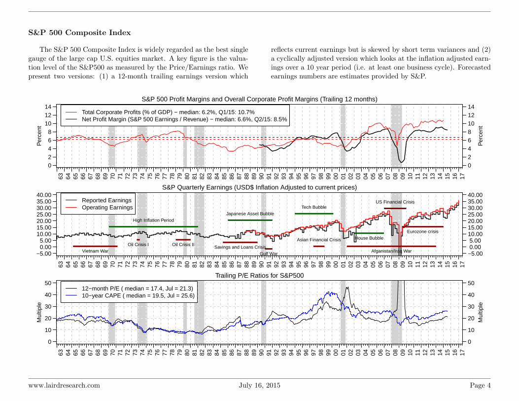
S&P 500 Composite Index
The S&P 500 Composite Index is widely regarded as the best singlegauge of the large cap U.S. equities market. A key figure is the valua-tion level of the S&P500 as measured by the Price/Earnings ratio. Wepresent two versions: (1) a 12-month trailing earnings version which
reflects current earnings but is skewed by short term variances and (2)a cyclically adjusted version which looks at the inflation adjusted earn-ings over a 10 year period (i.e. at least one business cycle). Forecastedearnings numbers are estimates provided by S&P.
S&P 500 Profit Margins and Overall Corporate Profit Margins (Trailing 12 months)
Per
cent
63 64 65 66 67 68 69 70 71 72 73 74 75 76 77 78 79 80 81 82 83 84 85 86 87 88 89 90 91 92 93 94 95 96 97 98 99 00 01 02 03 04 05 06 07 08 09 10 11 12 13 14 15 16 17
02468
101214
02468101214
Per
cent
Total Corporate Profits (% of GDP) − median: 6.2%, Q1/15: 10.7%Net Profit Margin (S&P 500 Earnings / Revenue) − median: 6.6%, Q2/15: 8.5%
S&P Quarterly Earnings (USD$ Inflation Adjusted to current prices)
63 64 65 66 67 68 69 70 71 72 73 74 75 76 77 78 79 80 81 82 83 84 85 86 87 88 89 90 91 92 93 94 95 96 97 98 99 00 01 02 03 04 05 06 07 08 09 10 11 12 13 14 15 16 17
−5.00 0.00 5.0010.0015.0020.0025.0030.0035.0040.00
−5.00 0.00 5.0010.0015.0020.0025.0030.0035.0040.00
Tech BubbleJapanese Asset Bubble
House BubbleAsian Financial Crisis
US Financial Crisis
Eurozone crisis
Oil Crisis I Oil Crisis II
Gulf WarSavings and Loans Crisis
High Inflation Period
Afganistan/Iraq WarVietnam War
Reported EarningsOperating Earnings
Trailing P/E Ratios for S&P500
63 64 65 66 67 68 69 70 71 72 73 74 75 76 77 78 79 80 81 82 83 84 85 86 87 88 89 90 91 92 93 94 95 96 97 98 99 00 01 02 03 04 05 06 07 08 09 10 11 12 13 14 15 16 17
0
10
20
30
40
50
0
10
20
30
40
50
Mul
tiple
Mul
tiple
12−month P/E ( median = 17.4, Jul = 21.3)10−year CAPE ( median = 19.5, Jul = 25.6)
www.lairdresearch.com July 16, 2015 Page 4

S&P 500 Composite Distributions
This is a view of the price performance of the S&P 500 index com-panies. The area of each box is proportional to the company’s marketcap, while the colour is determined by the percentage change in price
over the past month. In addition, companies are sorted according totheir industry group.
AAPL−3.8%
GOOG+5.1%
MSFT−3.4%
FB+12%
ORCL−6.9%
V+1.4%
IBM−0.92%
CSCO−3.9%
INTC−13%
MA+2.9%
QCOM EBAY
ACN
HPQ
TXN
CRM
NFLX
ADBE
ADP
CTSH
YHOO
INTU TEL
EA
MU
ADI ADS
FIS
CA
XRXWU
BRK−A−1.7%
WFC+2.2%
JPM+4.5%
BAC+3.8%
C+2.7%
GS
AIG AXP
MS USB
MET
BLK
SPG
PNC
COF
BK
AMT
PRU
PSA ACE
CME TRV
STT
MMC
BEN
BBT
MHFI
CB ALL
EQR
CCI
AFLICE
DFS HCN
STI
HIG
BXP
VNO
FITB
MTB
IVZ
WY L
RF
XL O
JNJ−0.26%
PFE+1.5%
GILD+2.9%
MRK−4.2%
AGN+3.9%
AMGN+1.5%
UNH+4.3%
BMY+5.4%
ABBV+4.3%
MDT−1.1%
CELG LLY
BIIB ABT
ESRX REGN
TMO MCK
AET
CI
HCA
SYK
MYL
VRTX
BDX
PRGO BSX
ZTS
ZBH
ISRG
DVA
EW
HSP
MNK
A
AMZN+8%
DIS+6.2%
CMCSA+7.6%
HD+3.9%
NKE+10%
MCD+2.7%
SBUX+6.8%
TWX+6.6%
FOXA LOW
PCLN F
TGT
TWC
GM
TJX
DTV CCL YUM
JCI
CBS
LB
VIAB
ORLY
DG
M MARAZO
CMG
UA
HOT
MHK
KMX
HBI
TIF
RL
DRI
SNIHAR
WMT−1.3%
PG+4%
KO+0.56%
PEP+2%
PM−0.61%
CVS+7.1%
WBA MO
MDLZ
COST+1.1%
CL
KHC
RAI
KMB GIS
EL
K
HSY
KR TSN
GE−2.3%
BA
MMM−1.4%
UTX−4.7%
UPS−1.6%
UNP−5%
HONDHR LMT
CAT
FDX
GD
EMR
DAL
ITW NOC DE
CSX
ETN
RTN
AAL
PCP
NSC
GLW
CMI
LUV
WM IR
ROP
APH
ROK
TYC
PH
PLL
LLL
XOM−2.4%
CVX−6.9%
SLB−5.9%
KMI COP
OXY EOG
PSX WMB
APC HAL
VLO
BHI
DVN
SE
APA
PXD
HES
NOV
MRO
HP
DOW
DD
MON
LYB
PX
ECL
APD
SHWIP
WRK
FCX SIAL
CFNUE
AA SEE
DUK
NEE
D
SO
PPL
EIX ED
XEL
ESFE
NI
VZ−3.7%
T+2.2%
Information Technology
Financials
Health Care
Consumer Discretionary
Consumer Staples
Industrials
Energy Materials
Utilities
TelecommunicationsServices
<−25.0% −20.0% −15.0% −10.0% −5.0% 0.0% 5.0% 10.0% 15.0% 20.0% >25.0%
% Change in Price from Jun 1, 2015 to Jul 14, 2015
Average Median Median MedianSector Change P/Sales P/Book P/EConsumer Discretionary 3.1% s 1.8 4.3 21.6Health Care 2.0% s 3.6 4.2 27.3Financials 1.8% s 3.1 1.6 18.9Consumer Staples 1.5% s 2.3 6.1 25.9Telecommunications Services -1.4% t 1.4 2.1 31.7
Average Median Median MedianSector Change P/Sales P/Book P/EIndustrials -1.7% t 1.6 3.8 19.1Information Technology -1.9% t 3.5 4.5 21.5Utilities -3.8% t 1.5 1.6 16.8Energy -5.1% t 1.5 1.6 14.4Materials -8.4% t 1.6 4.2 22.1
www.lairdresearch.com July 16, 2015 Page 5
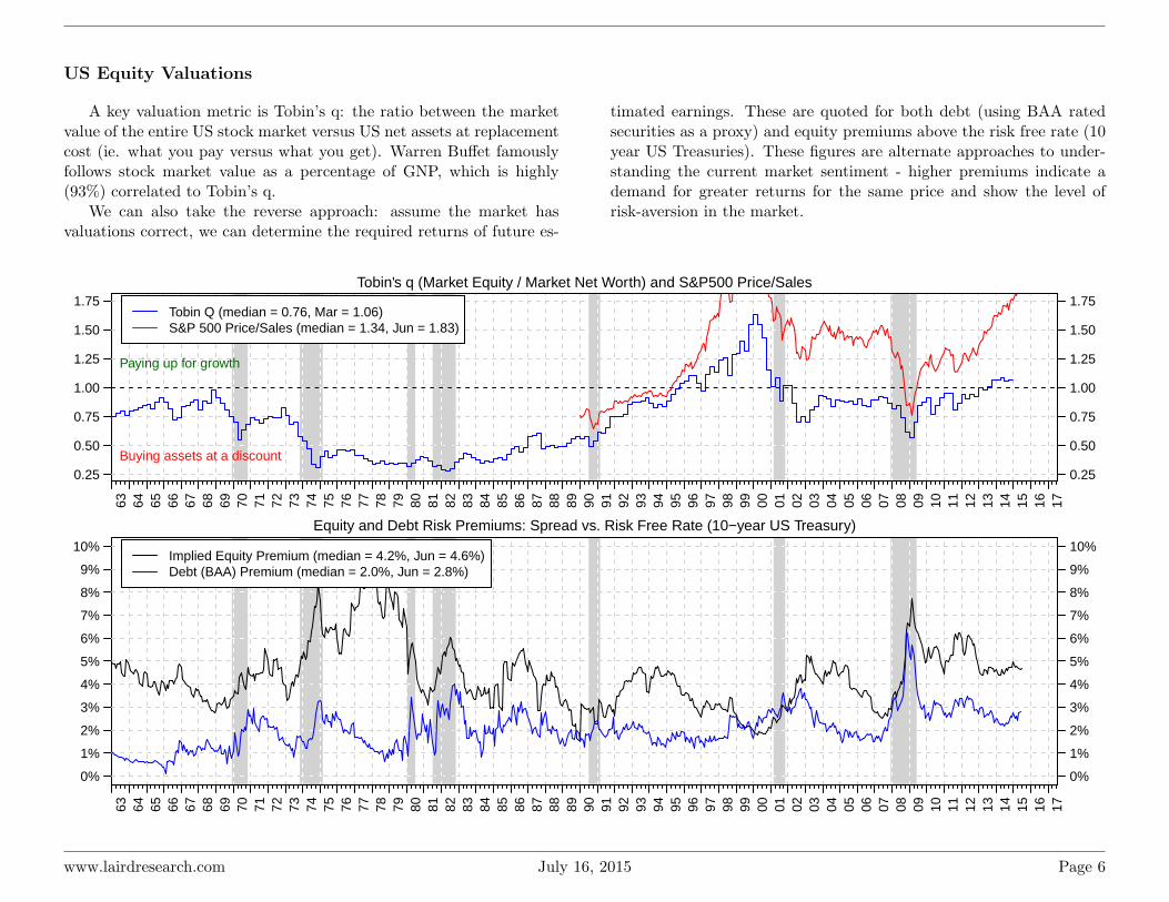
US Equity Valuations
A key valuation metric is Tobin’s q: the ratio between the marketvalue of the entire US stock market versus US net assets at replacementcost (ie. what you pay versus what you get). Warren Buffet famouslyfollows stock market value as a percentage of GNP, which is highly(93%) correlated to Tobin’s q.
We can also take the reverse approach: assume the market hasvaluations correct, we can determine the required returns of future es-
timated earnings. These are quoted for both debt (using BAA ratedsecurities as a proxy) and equity premiums above the risk free rate (10year US Treasuries). These figures are alternate approaches to under-standing the current market sentiment - higher premiums indicate ademand for greater returns for the same price and show the level ofrisk-aversion in the market.
Tobin's q (Market Equity / Market Net Worth) and S&P500 Price/Sales
63 64 65 66 67 68 69 70 71 72 73 74 75 76 77 78 79 80 81 82 83 84 85 86 87 88 89 90 91 92 93 94 95 96 97 98 99 00 01 02 03 04 05 06 07 08 09 10 11 12 13 14 15 16 17
0.25
0.50
0.75
1.00
1.25
1.50
1.75
0.25
0.50
0.75
1.00
1.25
1.50
1.75
Buying assets at a discount
Paying up for growth
Tobin Q (median = 0.76, Mar = 1.06)S&P 500 Price/Sales (median = 1.34, Jun = 1.83)
Equity and Debt Risk Premiums: Spread vs. Risk Free Rate (10−year US Treasury)
63 64 65 66 67 68 69 70 71 72 73 74 75 76 77 78 79 80 81 82 83 84 85 86 87 88 89 90 91 92 93 94 95 96 97 98 99 00 01 02 03 04 05 06 07 08 09 10 11 12 13 14 15 16 17
0%
1%
2%
3%
4%
5%
6%
7%
8%
9%
10%
0%
1%
2%
3%
4%
5%
6%
7%
8%
9%
10%Implied Equity Premium (median = 4.2%, Jun = 4.6%)Debt (BAA) Premium (median = 2.0%, Jun = 2.8%)
www.lairdresearch.com July 16, 2015 Page 6

US Mutual Fund Flows
Fund flows describe the net investments in equity and bond mutualfunds in the US market, as described in ICI’s “Trends in Mutual FundInvesting” report. Note however that this is only part of the story as
it does not include ETF fund flows - part of the changes are investorsentering or leaving the market, and part is investors shifting to ETF’sfrom mutual funds.
US Net New Investment Cash Flow to Mutual Funds
US
$ bi
llion
s (m
onth
ly)
2007 2008 2009 2010 2011 2012 2013 2014 2015
−40
−20
020
40
Domestic EquityWorld EquityTaxable BondsMunicipal Bonds
US Net New Investment Cash Flow to Mutual Funds
US
$ bi
llion
s (M
onth
ly)
2007 2008 2009 2010 2011 2012 2013 2014 2015
−60
−40
−20
020
4060
Flows to EquityFlows to BondsNet Market Flows
www.lairdresearch.com July 16, 2015 Page 7
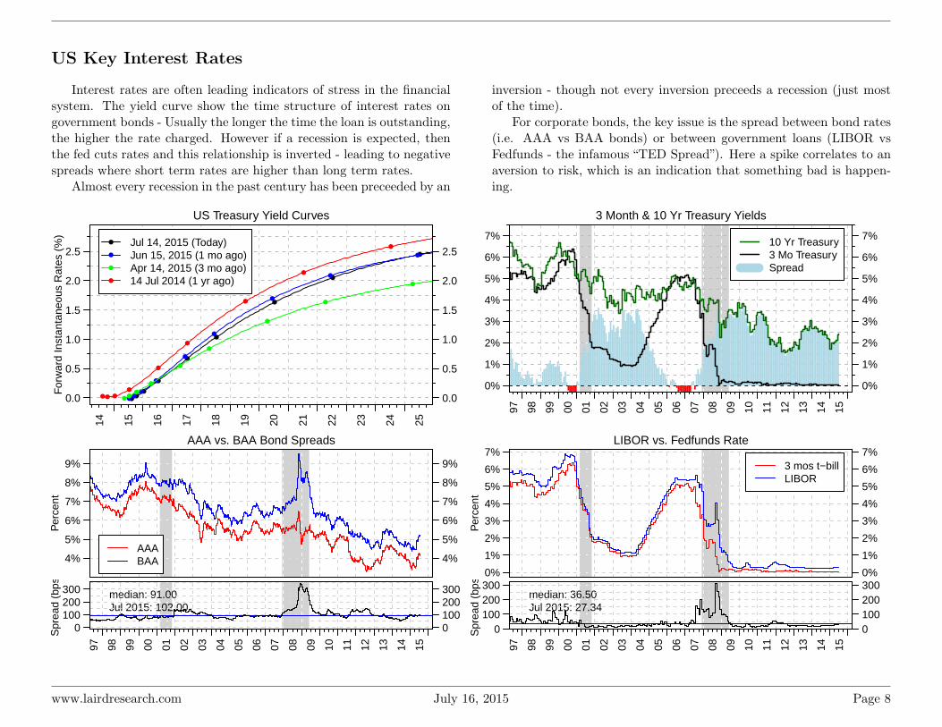
US Key Interest Rates
Interest rates are often leading indicators of stress in the financialsystem. The yield curve show the time structure of interest rates ongovernment bonds - Usually the longer the time the loan is outstanding,the higher the rate charged. However if a recession is expected, thenthe fed cuts rates and this relationship is inverted - leading to negativespreads where short term rates are higher than long term rates.
Almost every recession in the past century has been preceeded by an
inversion - though not every inversion preceeds a recession (just mostof the time).
For corporate bonds, the key issue is the spread between bond rates(i.e. AAA vs BAA bonds) or between government loans (LIBOR vsFedfunds - the infamous “TED Spread”). Here a spike correlates to anaversion to risk, which is an indication that something bad is happen-ing.
US Treasury Yield Curves
For
war
d In
stan
tane
ous
Rat
es (
%)
14 15 16 17 18 19 20 21 22 23 24 25
0.0
0.5
1.0
1.5
2.0
2.5
0.0
0.5
1.0
1.5
2.0
2.5Jul 14, 2015 (Today)Jun 15, 2015 (1 mo ago)Apr 14, 2015 (3 mo ago)14 Jul 2014 (1 yr ago)
3 Month & 10 Yr Treasury Yields
97 98 99 00 01 02 03 04 05 06 07 08 09 10 11 12 13 14 15
0%
1%
2%
3%
4%
5%
6%
7%
0%
1%
2%
3%
4%
5%
6%
7%10 Yr Treasury3 Mo TreasurySpread
AAA vs. BAA Bond Spreads
4%
5%
6%
7%
8%
9%
4%
5%
6%
7%
8%
9%
Per
cent
AAABAA
97 98 99 00 01 02 03 04 05 06 07 08 09 10 11 12 13 14 15
median: 91.00Jul 2015: 102.00
0100200300
0100200300
Spr
ead
(bps
)
LIBOR vs. Fedfunds Rate
0%
1%
2%
3%
4%
5%
6%
7%
0%
1%
2%
3%
4%
5%
6%
7%
Per
cent
3 mos t−billLIBOR
97 98 99 00 01 02 03 04 05 06 07 08 09 10 11 12 13 14 15
median: 36.50Jul 2015: 27.34
0100200300
0100200300
Spr
ead
(bps
)
www.lairdresearch.com July 16, 2015 Page 8
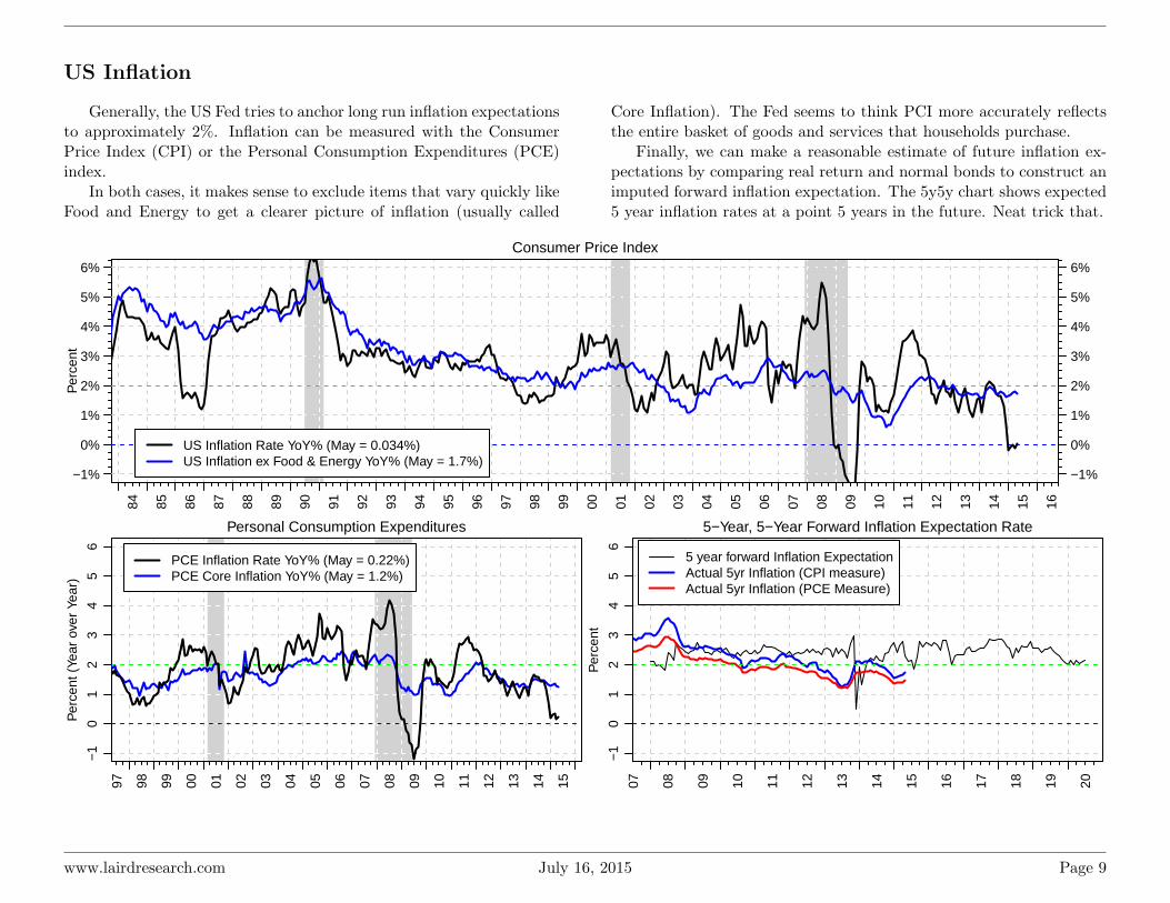
US Inflation
Generally, the US Fed tries to anchor long run inflation expectationsto approximately 2%. Inflation can be measured with the ConsumerPrice Index (CPI) or the Personal Consumption Expenditures (PCE)index.
In both cases, it makes sense to exclude items that vary quickly likeFood and Energy to get a clearer picture of inflation (usually called
Core Inflation). The Fed seems to think PCI more accurately reflectsthe entire basket of goods and services that households purchase.
Finally, we can make a reasonable estimate of future inflation ex-pectations by comparing real return and normal bonds to construct animputed forward inflation expectation. The 5y5y chart shows expected5 year inflation rates at a point 5 years in the future. Neat trick that.
Consumer Price Index
Per
cent
84 85 86 87 88 89 90 91 92 93 94 95 96 97 98 99 00 01 02 03 04 05 06 07 08 09 10 11 12 13 14 15 16
−1%
0%
1%
2%
3%
4%
5%
6%
−1%
0%
1%
2%
3%
4%
5%
6%
US Inflation Rate YoY% (May = 0.034%)US Inflation ex Food & Energy YoY% (May = 1.7%)
Personal Consumption Expenditures
Per
cent
(Ye
ar o
ver
Year
)
97 98 99 00 01 02 03 04 05 06 07 08 09 10 11 12 13 14 15
−1
01
23
45
6
PCE Inflation Rate YoY% (May = 0.22%)PCE Core Inflation YoY% (May = 1.2%)
5−Year, 5−Year Forward Inflation Expectation Rate
Per
cent
07 08 09 10 11 12 13 14 15 16 17 18 19 20
−1
01
23
45
6
5 year forward Inflation ExpectationActual 5yr Inflation (CPI measure)Actual 5yr Inflation (PCE Measure)
www.lairdresearch.com July 16, 2015 Page 9
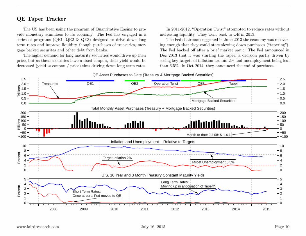
QE Taper Tracker
The US has been using the program of Quantitative Easing to pro-vide monetary stimulous to its economy. The Fed has engaged in aseries of programs (QE1, QE2 & QE3) designed to drive down longterm rates and improve liquidity though purchases of treasuries, mor-gage backed securites and other debt from banks.
The higher demand for long maturity securities would drive up theirprice, but as these securities have a fixed coupon, their yield would bedecreased (yield ≈ coupon / price) thus driving down long term rates.
In 2011-2012, “Operation Twist” attempted to reduce rates withoutincreasing liquidity. They went back to QE in 2013.
The Fed chairman suggested in June 2013 the economy was recover-ing enough that they could start slowing down purchases (“tapering”).The Fed backed off after a brief market panic. The Fed announced inDec 2013 that it was starting the taper, a decision partly driven byseeing key targets of inflation around 2% and unemployment being lessthan 6.5%. In Oct 2014, they announced the end of purchases.
QE Asset Purchases to Date (Treasury & Mortgage Backed Securities)
Trill
ions
0.00.51.01.52.02.5
0.00.51.01.52.02.5
QE1 QE2 Operation Twist QE3 TaperTreasuries
Mortgage Backed Securities
Total Monthly Asset Purchases (Treasury + Mortgage Backed Securities)
Bill
ions
−100−50
050
100150200
−100−50050100150200
Month to date Jul 08: $−14.1
Inflation and Unemployment − Relative to Targets
Per
cent
02468
10
0246810
Target Unemployment 6.5%Target Inflation 2%
U.S. 10 Year and 3 Month Treasury Constant Maturity Yields
Per
cent
012345
012345
2008 2009 2010 2011 2012 2013 2014 2015
Short Term Rates:Once at zero, Fed moved to QE
Long Term Rates:Moving up in anticipation of Taper?
www.lairdresearch.com July 16, 2015 Page 10

Exchange Rates
10 Week Moving Average CAD Exchange Rates
97 98 99 00 01 02 03 04 05 06 07 08 09 10 11 12 13 14 15
0.62
0.71
0.81
0.90
1.00
1.09
US
A /
CA
D
0.55
0.61
0.66
0.72
0.77
0.82
Eur
o / C
AD
59.
16 7
4.71
90.
2610
5.81
121.
3613
6.91
Japa
n / C
AD
0.38
0.44
0.49
0.55
0.61
0.67
U.K
. / C
AD
0.59
0.99
1.39
1.79
2.19
2.58
Bra
zil /
CA
D
CAD Appreciating
CAD Depreciating
Change in F/X: Jun 1 2015 to Jul 10 2015(Trade Weighted Currency Index of USD Trading Partners)
−3.0%
−1.5%
1.5%
3.0%
Euro−2.2%
UK−2.1%
Japan−1.6%
South Korea 0.9%
China 0.1%
India−0.5%
Brazil 0.5%
Mexico 1.6%
Canada 1.2%
USA 0.1%
Country vs. Average
AppreciatingDepreciating
% Change over 3 months vs. Canada
<−10.0% −8.0% −6.0% −4.0% −2.0% 0.0% 2.0% 4.0% 6.0% 8.0% >10.0%
CAD depreciatingCAD appreciating
ARG−0.3%
AUS 0.3%
BRA 0.2%
CHN 2.7%
IND 1.0%
RUS−8.9%
USA 2.7%
EUR6.2%
JPY0.0%
KRW0.0%
MXN0.0%
ZAR0.3%
www.lairdresearch.com July 16, 2015 Page 11

US Banking Indicators
The banking and finance industry is a key indicator of the healthof the US economy. It provides crucial liquidity to the economy in theform of credit, and the breakdown of that system is one of the exac-erbating factors of the 2008 recession. Key figures to track are the
Net Interest Margins which determine profitability (ie. the differencebetween what a bank pays to depositors versus what the bank is paidby creditors), along with levels of non-performing loans (i.e. loan lossreserves and actual deliquency rates).
US Banks Net Interest Margin
Per
cent
3.0
3.5
4.0
4.5
median: 3.942015 Q1: 2.95
Repos Outstanding with Fed. Reserve
Bill
ions
of D
olla
rs
010
030
050
0
median: 55.83Jul 2015: 301.86
Bank ROE − Assets between $300M−$1B
Per
cent
05
1015
median: 12.822015 Q1: 9.50
Consumer Credit Outstanding
% Y
early
Cha
nge
−5
05
1015
20
median: 7.62May 2015: 6.51
Total Business Loans%
Yea
rly C
hang
e
−20
010
20median: 8.59Jun 2015: 12.45
US Nonperforming Loans
Per
cent
12
34
5
median: 2.262015 Q1: 1.83
St. Louis Financial Stress Index
Inde
x
97 98 99 00 01 02 03 04 05 06 07 08 09 10 11 12 13 14 15
02
46
median: 0.074Jul 2015: −0.92
Commercial Paper Outstanding
Trill
ions
of D
olla
rs
97 98 99 00 01 02 03 04 05 06 07 08 09 10 11 12 13 14 15
1.0
1.4
1.8
2.2
median: 1.34Jul 2015: 1.02
Residential Morgage Delinquency Rate
Per
cent
97 98 99 00 01 02 03 04 05 06 07 08 09 10 11 12 13 14 15
24
68
10
median: 2.312015 Q1: 6.14
www.lairdresearch.com July 16, 2015 Page 12

US Employment Indicators
Unemployment rates are considered the “single best indicator ofcurrent labour conditions” by the Fed. The pace of payroll growth ishighly correlated with a number of economic indicators.Payroll changesare another way to track the change in unemployment rate.
Unemployment only captures the percentage of people who are inthe labour market who don’t currently have a job - another measure
is what percentage of the whole population wants a job (employed ornot) - this is the Participation Rate.
The Beveridge Curve measures labour market efficiency by lookingat the relationship between job openings and the unemployment rate.The curve slopes downward reflecting that higher rates of unemploy-ment occur coincidentally with lower levels of job vacancies.
Unemployment Rate
Per
cent
79 80 81 82 83 84 85 86 87 88 89 90 91 92 93 94 95 96 97 98 99 00 01 02 03 04 05 06 07 08 09 10 11 12 13 14 15 16
median: 6.15Jun 2015: 5.304
56789
1011
4567891011
Per
cent
4 5 6 7 8 9 10
2.0
2.5
3.0
3.5
4.0
Beveridge Curve (Unemployment vs. Job Openings)
Unemployment Rate (%)
Job
Ope
ning
s (%
tota
l Em
ploy
men
t)
Dec 2000 − Dec 2008Jan 2009 − Apr 2015May 2015
Participation Rate
Per
cent
97 98 99 00 01 02 03 04 05 06 07 08 09 10 11 12 13 14 15
6364
6566
67
median: 66.00Jun 2015: 62.60
Total Nonfarm Payroll Change
Mon
thly
Cha
nge
(000
s)
97 98 99 00 01 02 03 04 05 06 07 08 09 10 11 12 13 14 15
−50
00
500
median: 165.00Jun 2015: 223.00
www.lairdresearch.com July 16, 2015 Page 13

There are a number of other ways to measure the health of employ-ment. The U6 Rate includes people who are part time that want afull-time job - they are employed but under-utilitized. Temporary helpdemand is another indicator of labour market tightness or slack.
The large chart shows changes in private industry employment lev-els over the past year, versus how well those job segments typically pay.Lots of hiring in low paying jobs at the expense of higher paying jobsis generally bad, though perhaps not unsurprising in a recovery.
Median Duration of Unemployment
Wee
ks
510
1520
25 median: 8.70Jun 2015: 11.30
(U6) Unemployed + PT + Marginally Attached
Per
cent
810
1214
16
median: 9.70Jun 2015: 10.50
4−week moving average of Initial Claims
Jan
1995
= 1
00
97 98 99 00 01 02 03 04 05 06 07 08 09 10 11 12 13 14 15
5010
015
020
0
median: 107.65Jul 2015: 85.93
Unemployed over 27 weeks
Mill
ions
of P
erso
ns
97 98 99 00 01 02 03 04 05 06 07 08 09 10 11 12 13 14 15
01
23
45
67
median: 0.79Jun 2015: 2.05
Services: Temp Help
Mill
ions
of P
erso
ns
97 98 99 00 01 02 03 04 05 06 07 08 09 10 11 12 13 14 15
1.5
2.0
2.5
median: 2.25Jun 2015: 2.91
0 200 400 600
15
20
25
30
35
40
Annual Change in Employment Levels (000s of Workers)
Ave
rage
wag
es (
$/ho
ur)
Private Industry Employment Change (Jun 2014 − Jun 2015)
ConstructionDurable Goods
Education
Financial Activities
Health Services
Information
Leisure and Hospitality
Manufacturing
Mining and Logging
Nondurable GoodsOther Services
Professional &Business Services
Retail Trade
Transportation
Utilities
Wholesale Trade
Circle size relative to total employees in industry
www.lairdresearch.com July 16, 2015 Page 14

US Business Activity Indicators
Business activity is split between manufacturing activity and non-manufacturing activity. We are focusing on forward looking business
indicators like new order and inventory levels to give a sense of thecurrent business environment.
Manufacturing Sector: Real Output
YoY
Per
cent
Cha
nge
−10
010
20
median: 6.222015 Q1: 9.12
ISM Manufacturing − PMI
Inde
x
3040
5060
70
Jun 2015: 53.50
manufac. expanding
manufac. contracting
ISM Manufacturing: New Orders Index
Inde
x
3040
5060
7080 Jun 2015: 56.00
Increase in new orders
Decrease in new orders
Non−Manufac. New Orders: Capital Goods
Bill
ions
of D
olla
rs
4050
6070
median: 57.75May 2015: 67.80
Average Weekly Hours: Manufacturing
Hou
rs
3940
4142
43
median: 41.10Jun 2015: 41.80
Industrial Production: Manufacturing
YoY
Per
cent
Cha
nge
−15
−5
05
10
median: 3.31Jun 2015: 2.07
Total Business: Inventories to Sales Ratio
Rat
io
97 98 99 00 01 02 03 04 05 06 07 08 09 10 11 12 13 14 15
1.1
1.2
1.3
1.4
1.5
1.6
median: 1.36May 2015: 1.36
Chicago Fed: Sales, Orders & Inventory
Inde
x
97 98 99 00 01 02 03 04 05 06 07 08 09 10 11 12 13 14 15
−0.
50.
00.
5 May 2015: 0.00Above ave growth
Below ave growth
ISM Non−Manufacturing Bus. Activity Index
Inde
x
97 98 99 00 01 02 03 04 05 06 07 08 09 10 11 12 13 14 15
3545
5565
Jun 2015: 61.50
Growth
Contraction
www.lairdresearch.com July 16, 2015 Page 15
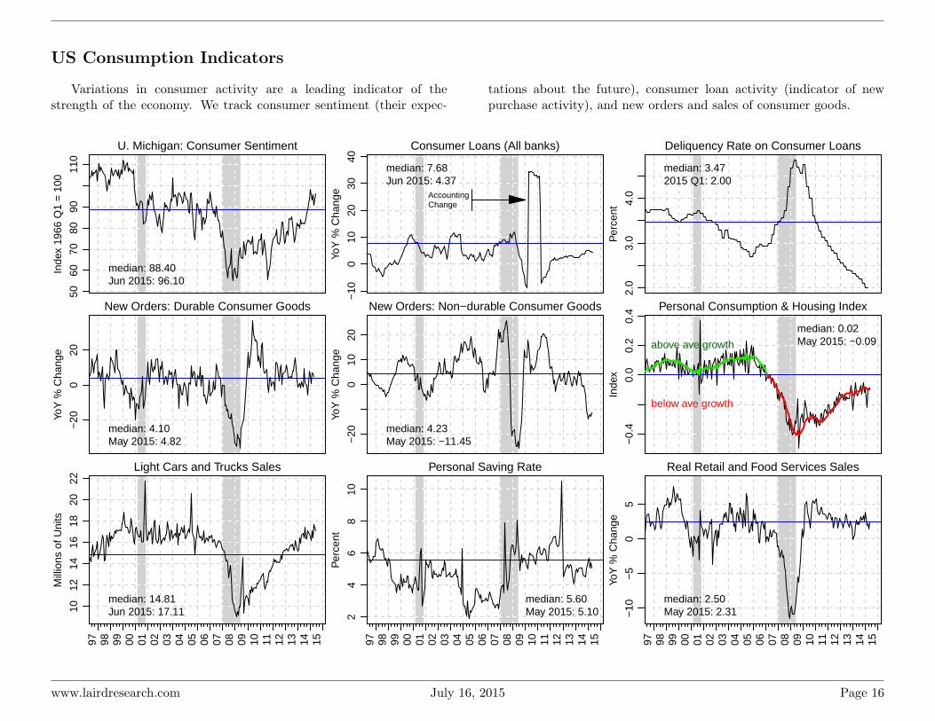
US Consumption Indicators
Variations in consumer activity are a leading indicator of thestrength of the economy. We track consumer sentiment (their expec-
tations about the future), consumer loan activity (indicator of newpurchase activity), and new orders and sales of consumer goods.
U. Michigan: Consumer Sentiment
Inde
x 19
66 Q
1 =
100
5060
7080
9011
0
median: 88.40Jun 2015: 96.10
Consumer Loans (All banks)
YoY
% C
hang
e
−10
010
2030
40
median: 7.68Jun 2015: 4.37
AccountingChange
Deliquency Rate on Consumer Loans
Per
cent
2.0
3.0
4.0
median: 3.472015 Q1: 2.00
New Orders: Durable Consumer Goods
YoY
% C
hang
e
−20
020
median: 4.10May 2015: 4.82
New Orders: Non−durable Consumer Goods
YoY
% C
hang
e
−20
010
20
median: 4.23May 2015: −11.45
Personal Consumption & Housing Index
Inde
x
−0.
40.
00.
20.
4
median: 0.02May 2015: −0.09above ave growth
below ave growth
Light Cars and Trucks Sales
Mill
ions
of U
nits
97 98 99 00 01 02 03 04 05 06 07 08 09 10 11 12 13 14 15
1012
1416
1820
22
median: 14.81Jun 2015: 17.11
Personal Saving Rate
Per
cent
97 98 99 00 01 02 03 04 05 06 07 08 09 10 11 12 13 14 15
24
68
10
median: 5.60May 2015: 5.10
Real Retail and Food Services Sales
YoY
% C
hang
e
97 98 99 00 01 02 03 04 05 06 07 08 09 10 11 12 13 14 15
−10
−5
05
median: 2.50May 2015: 2.31
www.lairdresearch.com July 16, 2015 Page 16
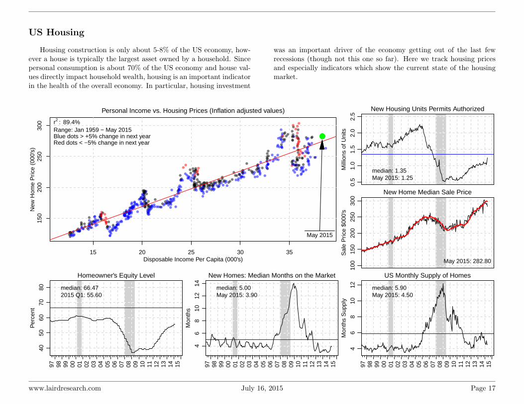
US Housing
Housing construction is only about 5-8% of the US economy, how-ever a house is typically the largest asset owned by a household. Sincepersonal consumption is about 70% of the US economy and house val-ues directly impact household wealth, housing is an important indicatorin the health of the overall economy. In particular, housing investment
was an important driver of the economy getting out of the last fewrecessions (though not this one so far). Here we track housing pricesand especially indicators which show the current state of the housingmarket.
15 20 25 30 35
150
200
250
300
Personal Income vs. Housing Prices (Inflation adjusted values)
New
Hom
e P
rice
(000
's)
Disposable Income Per Capita (000's)
May 2015
r2 : 89.4%Range: Jan 1959 − May 2015Blue dots > +5% change in next yearRed dots < −5% change in next year
New Housing Units Permits Authorized
Mill
ions
of U
nits
0.5
1.0
1.5
2.0
2.5
median: 1.35May 2015: 1.25
New Home Median Sale Price
Sal
e P
rice
$000
's
100
150
200
250
300
May 2015: 282.80
Homeowner's Equity Level
Per
cent
97 98 99 00 01 02 03 04 05 06 07 08 09 10 11 12 13 14 15
4050
6070
80 median: 66.472015 Q1: 55.60
New Homes: Median Months on the Market
Mon
ths
97 98 99 00 01 02 03 04 05 06 07 08 09 10 11 12 13 14 15
46
810
1214 median: 5.00
May 2015: 3.90
US Monthly Supply of Homes
Mon
ths
Sup
ply
97 98 99 00 01 02 03 04 05 06 07 08 09 10 11 12 13 14 15
46
810
12 median: 5.90May 2015: 4.50
www.lairdresearch.com July 16, 2015 Page 17
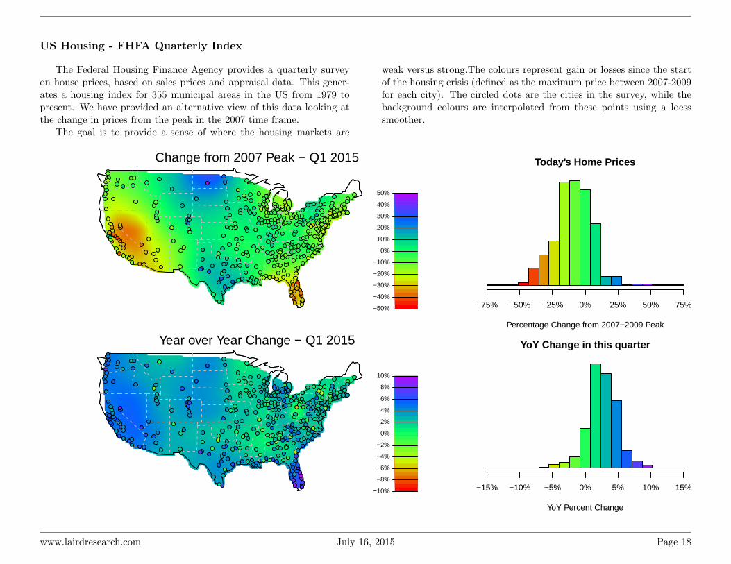
US Housing - FHFA Quarterly Index
The Federal Housing Finance Agency provides a quarterly surveyon house prices, based on sales prices and appraisal data. This gener-ates a housing index for 355 municipal areas in the US from 1979 topresent. We have provided an alternative view of this data looking atthe change in prices from the peak in the 2007 time frame.
The goal is to provide a sense of where the housing markets are
weak versus strong.The colours represent gain or losses since the startof the housing crisis (defined as the maximum price between 2007-2009for each city). The circled dots are the cities in the survey, while thebackground colours are interpolated from these points using a loesssmoother.
Change from 2007 Peak − Q1 2015
−50%
−40%
−30%
−20%
−10%
0%
10%
20%
30%
40%
50%
Today's Home Prices
Percentage Change from 2007−2009 Peak
Fre
quen
cy
−75% −50% −25% 0% 25% 50% 75%
Year over Year Change − Q1 2015
−10%
−8%
−6%
−4%
−2%
0%
2%
4%
6%
8%
10%
YoY Change in this quarter
YoY Percent Change
Fre
quen
cy
−15% −10% −5% 0% 5% 10% 15%
www.lairdresearch.com July 16, 2015 Page 18

Global Housing
The Bank for International Settlements has begun collecting globalhousing indicies, which are useful for showing what has been happeningwith global house prices. Note that these are not all the same data set -
each country measures housing prices in slightly different ways, so theyare only broadly comparable. Black lines are the data series, blue barson the right axis show the year over year percent change.
Brazil − Metro All Dwellings
Q1
2011
= 1
00
6080
100
140 Jan 2015: 148.01
Chile − All Dwellings
Sep 2014: 123.11
Peru (Lima) − All Dwellings
Dec 2014: 177.50
−40
020
40
Mexico − All Dwellings
Q1
2011
= 1
00
6080
100
140 Mar 2015: 115.42
China (Beijing) − All Dwellings
Apr 2015: 120.10
Hong Kong − Residential Prices
Apr 2015: 165.74
−40
020
40
Indonesia − Major Cities housing
Q1
2011
= 1
00
02 03 04 05 06 07 08 09 10 11 12 13 14 15
6080
100
140 Mar 2015: 131.43
India − Major Cities housing
02 03 04 05 06 07 08 09 10 11 12 13 14 15
Dec 2014: 185.55
Singapore − All Dwellings
02 03 04 05 06 07 08 09 10 11 12 13 14 15
Mar 2015: 102.25
−40
020
40
www.lairdresearch.com July 16, 2015 Page 19

Philippines (Manila) − FlatsQ
1 20
11 =
100
6080
120
Mar 2015: 142.72
Japan − All Dwellings
Dec 2014: 102.50
Australia − All Dwellings
Dec 2014: 117.14
−40
020
40
New Zealand − All Dwellings Big Cities
Q1
2011
= 1
00
6080
120
Dec 2014: 134.35
Turkey − All Dwellings
Mar 2015: 171.45
South Africa − Residential
May 2015: 106.18
−40
020
40
Israel − All Dwellings
Q1
2011
= 1
00
6080
120
Feb 2015: 126.45
Korea − All Dwellings
May 2015: 110.72
Russia − All Dwellings (Urban)
Dec 2014: 125.83
−40
020
40
Euro zone − All Dwellings
Q1
2011
= 1
00
02 03 04 05 06 07 08 09 10 11 12 13 14 15
6080
120
Dec 2014: 97.02
Canada − New Houses
02 03 04 05 06 07 08 09 10 11 12 13 14 15
Apr 2015: 107.97
US − New Single Family Houses
02 03 04 05 06 07 08 09 10 11 12 13 14 15
Mar 2015: 122.31
−40
020
40
www.lairdresearch.com July 16, 2015 Page 20

Global Business Indicators
Global Manufacturing PMI Reports
The Purchasing Managers’ Index (PMI) is an indicator reflectingpurchasing managers’ acquisition of goods and services. An index read-ing of 50.0 means that business conditions are unchanged, a numberover 50.0 indicates an improvement while anything below 50.0 suggests
a decline. The further away from 50.0 the index is, the stronger thechange over the month. The chart at the bottom shows a moving av-erage of a number of PMI’s, along with standard deviation bands toshow a global average.
Global M−PMI − June 2015
<40.0 42.0 44.0 46.0 48.0 50.0 52.0 54.0 56.0 58.0 >60.0
Steady ExpandingContracting
Eurozone52.5
Global PMI51.0
TWN46.3MEX
52.0
KOR46.1
JPN50.1
VNM52.2
IDN47.8
ZAF46.4
AUS44.2
BRA46.5
CAN51.3
CHN49.4
IND51.3
RUS48.7
SAU56.1
USA53.6
Global M−PMI Monthly Change
<−5.0 −4.0 −3.0 −2.0 −1.0 0.0 1.0 2.0 3.0 4.0 >5.0
PMI Change ImprovingDeteriorating
Eurozone0.3
Global PMI−0.2
TWN−3.0MEX
−1.3
KOR−1.7
JPN−0.8
VNM−2.6
IDN0.7
ZAF−3.1
AUS−8.1
BRA 0.6
CAN 1.5
CHN 0.2
IND−1.3
RUS 1.1
SAU−0.9
USA−0.4
Purchase Managers Index (Manufacturing) − China, Japan, USA, Canada, France, Germany, Italy, UK, Australia
04 05 06 07 08 09 10 11 12 13 14 15
3040
5060
70
3040
5060
70
Business Conditions Contracting
Business Conditions Expanding
www.lairdresearch.com July 16, 2015 Page 21

Global Manufacturing PMI Chart
This is an alternate view of the global PMI reports. Here, we lookat all the various PMI data series in a single chart and watch theirevolution over time.
Red numbers indicate contraction (as estimated by PMI) whilegreen numbers indicate expansion.
Jun
13
Jul 1
3
Aug
13
Sep
13
Oct
13
Nov
13
Dec
13
Jan
14
Feb
14
Mar
14
Apr
14
May
14
Jun
14
Jul 1
4
Aug
14
Sep
14
Oct
14
Nov
14
Dec
14
Jan
15
Feb
15
Mar
15
Apr
15
May
15
Jun
15
Australia
India
Indonesia
Viet Nam
Taiwan
China
Korea
Japan
South Africa
Saudi Arabia
Turkey
Russia
United Kingdom
Greece
Germany
France
Italy
Czech Republic
Spain
Poland
Ireland
Netherlands
Eurozone
Brazil
Mexico
Canada
United States
Global PMI 50.6 50.8 51.6 51.8 52.1 53.1 53.3 53.0 53.2 52.4 51.9 52.2 52.6 52.4 52.6 52.2 52.2 51.8 51.6 51.7 52.0 51.7 51.0 51.2 51.0
52.0 53.7 53.1 52.8 51.8 54.7 55.0 53.7 57.1 55.5 55.4 56.4 57.3 55.8 57.9 57.5 55.9 54.8 53.9 53.9 55.1 55.7 54.1 54.0 53.6
52.4 52.0 52.1 54.2 55.6 55.3 53.5 51.7 52.9 53.3 52.9 52.2 53.5 54.3 54.8 53.5 55.3 55.3 53.9 51.0 48.7 48.9 49.0 49.8 51.3
51.3 49.7 50.8 50.0 50.2 51.9 52.6 54.0 52.0 51.7 51.8 51.9 51.8 51.5 52.1 52.6 53.3 54.3 55.3 56.6 54.4 53.8 53.8 53.3 52.0
50.4 48.5 49.4 49.9 50.2 49.7 50.5 50.8 50.4 50.6 49.3 48.8 48.7 49.1 50.2 49.3 49.1 48.7 50.2 50.7 49.6 46.2 46.0 45.9 46.5
48.8 50.3 51.4 51.1 51.3 51.6 52.7 54.0 53.2 53.0 53.4 52.2 51.8 51.8 50.7 50.3 50.6 50.1 50.6 51.0 51.0 52.2 52.0 52.2 52.5
48.8 50.8 53.5 55.8 54.4 56.8 57.0 54.8 55.2 53.7 53.4 53.6 52.3 53.5 51.7 52.2 53.0 54.6 53.6 54.1 52.2 52.5 54.0 55.5 56.2
50.3 51.0 52.0 52.7 54.9 52.4 53.5 52.8 52.9 55.5 56.1 55.0 55.3 55.4 57.3 55.7 56.6 56.2 56.9 55.1 57.5 56.8 55.8 57.1 54.6
49.3 51.1 52.6 53.1 53.4 54.4 53.2 55.4 55.9 54.0 52.0 50.8 50.3 49.4 49.0 49.5 51.2 53.2 52.8 55.2 55.1 54.8 54.0 52.4 54.3
50.0 49.8 51.1 50.7 50.9 48.6 50.8 52.2 52.5 52.8 52.7 52.9 54.6 53.9 52.8 52.6 52.6 54.7 53.8 54.7 54.2 54.3 54.2 55.8 54.5
51.0 52.0 53.9 53.4 54.5 55.4 54.7 55.9 56.5 55.5 56.5 57.3 54.7 56.5 54.3 55.6 54.4 55.6 53.3 56.1 55.6 56.1 54.7 55.5 56.9
49.1 50.4 51.3 50.8 50.7 51.4 53.3 53.1 52.3 52.4 54.0 53.2 52.6 51.9 49.8 50.7 49.0 49.0 48.4 49.9 51.9 53.3 53.8 54.8 54.1
48.4 49.7 49.7 49.8 49.1 48.4 47.0 49.3 49.7 52.1 51.2 49.6 48.2 47.8 46.9 48.8 48.5 48.4 47.5 49.2 47.6 48.8 48.0 49.4 50.7
48.6 50.7 51.8 51.1 51.7 52.7 54.3 56.5 54.8 53.7 54.1 52.3 52.0 52.4 51.4 49.9 51.4 49.5 51.2 50.9 51.1 52.8 52.1 51.1 51.9
45.4 47.0 48.7 47.5 47.3 49.2 49.6 51.2 51.3 49.7 51.1 51.0 49.4 48.7 50.1 48.4 48.8 49.1 49.4 48.3 48.4 48.9 46.5 48.0 46.9
52.9 54.8 57.2 56.3 56.5 58.4 57.3 56.7 56.2 55.3 57.3 57.0 57.5 55.4 52.5 51.6 53.2 53.5 52.5 53.1 54.1 54.4 51.9 52.0 51.4
51.7 49.2 49.4 49.4 51.8 49.4 48.8 48.0 48.5 48.3 48.5 48.9 49.1 51.0 51.0 50.4 50.3 51.7 48.9 47.6 49.7 48.1 48.9 47.6 48.7
51.2 49.8 50.9 54.0 53.3 55.0 53.5 52.7 53.4 51.7 51.1 50.1 48.8 48.5 50.3 50.4 51.5 52.2 51.4 49.8 49.6 48.0 48.5 50.2 49.0
56.6 56.6 57.5 58.7 56.7 57.1 58.7 59.7 58.6 57.0 58.5 57.0 59.2 60.1 60.7 61.8 59.1 57.6 57.9 57.8 58.5 60.1 58.3 57.0 56.1
51.6 52.2 56.5 49.1 51.5 51.6 50.5 50.3 51.5 50.3 47.4 44.3 46.6 45.9 49.0 50.7 52.7 50.5 50.2 49.8 50.0 51.6 51.5 49.5 46.4
52.3 50.7 52.2 52.5 54.2 55.1 55.2 56.6 55.5 53.9 49.4 49.9 51.5 50.5 52.5 51.7 52.4 52.0 52.0 52.2 51.6 50.3 49.9 50.9 50.1
49.4 47.2 47.5 49.7 50.2 50.4 50.8 50.9 49.8 50.4 50.2 49.5 48.4 49.3 50.3 48.8 48.7 49.0 49.9 51.1 51.1 49.2 48.8 47.8 46.1
48.2 47.7 50.1 50.2 50.9 50.8 50.5 49.5 48.5 48.0 48.1 49.4 50.7 51.7 50.2 50.2 50.4 50.0 49.6 49.7 50.7 49.6 48.9 49.2 49.4
49.5 48.6 50.0 52.0 53.0 53.4 55.2 55.5 54.7 52.7 52.3 52.4 54.0 55.8 56.1 53.3 52.0 51.4 50.0 51.7 52.1 51.0 49.2 49.3 46.3
46.4 48.5 49.4 51.5 51.5 50.3 51.8 52.1 51.0 51.3 53.1 52.5 52.3 51.7 50.3 51.7 51.0 52.1 52.7 51.5 51.7 50.7 53.5 54.8 52.2
51.0 50.7 48.5 50.2 50.9 50.3 50.9 51.0 50.5 50.1 51.1 52.4 52.7 52.7 49.5 50.7 49.2 48.0 47.6 48.5 47.5 46.4 46.7 47.1 47.8
50.3 50.1 48.5 49.6 49.6 51.3 50.7 51.4 52.5 51.3 51.3 51.4 51.5 53.0 52.4 51.0 51.6 53.3 54.5 52.9 51.2 52.1 51.3 52.6 51.3
49.6 42.0 46.4 51.7 53.2 47.7 47.6 46.7 48.6 47.9 44.8 49.2 48.9 50.7 47.3 46.5 49.4 50.1 46.9 49.0 45.4 46.3 48.0 52.3 44.2
www.lairdresearch.com July 16, 2015 Page 22

OECD International Trade Data
The OECD calculates import and export values for member coun-tries. Figures are seasonally adjusted and measured in billions of USdollars. Red lines indicate exports, while blue lines indicate imports.Green lines indicate the zero level.
The top part of the graph shows the changes in exports and importson a year-over-year basis, while the bottom part shows the differencebetween exports and imports for that given month (i.e. the trade bal-ance)
China (Mar 2015)
YoY
Cha
nge
−40−20
020406080
Bal
ance
08 09 10 11 12 13 14 15
020406080
100
US (Feb 2015)
YoY
Cha
nge
−60−40−20
02040
Bal
ance
08 09 10 11 12 13 14 15
−60−40−20
0
Canada (Dec 2014)
YoY
Cha
nge
−15−10−5
05
10
Bal
ance
08 09 10 11 12 13 14 15
−20246
Germany (Feb 2015)
YoY
Cha
nge
−40
−20
0
20
Bal
ance
08 09 10 11 12 13 14 15
05
1015202530
Japan (Feb 2015)Yo
Y C
hang
e
−30−20−10
01020
Bal
ance
08 09 10 11 12 13 14 15
−15−10−5
05
10
South Korea (Feb 2015)
YoY
Cha
nge
−15−10−5
05
1015
Bal
ance
08 09 10 11 12 13 14 15
−4−2
02468
10
India (Feb 2015)
YoY
Cha
nge
−10−5
05
1015
Bal
ance
08 09 10 11 12 13 14 15
−15−10−5
0
Australia (Jan 2015)
YoY
Cha
nge
−6−4−2
0246
Bal
ance
08 09 10 11 12 13 14 15
−2−1
01234
Eurozone (Nov 2013)
YoY
Cha
nge
−80−60−40−20
02040
Bal
ance
08 09 10 11 12 13 14 15
−100
1020
www.lairdresearch.com July 16, 2015 Page 23
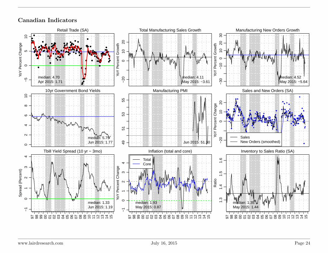
Canadian Indicators
Retail Trade (SA)
YoY
Per
cent
Cha
nge
−5
05
10
median: 4.70Apr 2015: 1.71
Total Manufacturing Sales Growth
YoY
Per
cent
Gro
wth
−20
010
20
median: 4.11May 2015: −3.61
Manufacturing New Orders Growth
YoY
Per
cent
Gro
wth
−30
−10
010
2030
median: 4.52May 2015: −5.64
10yr Government Bond Yields
02
46
810
median: 5.75Jun 2015: 1.77
Manufacturing PMI
4951
5355
Jun 2015: 51.30
Sales and New Orders (SA)
YoY
Per
cent
Cha
nge
−20
010
20
SalesNew Orders (smoothed)
Tbill Yield Spread (10 yr − 3mo)
Spr
ead
(Per
cent
)
97 98 99 00 01 02 03 04 05 06 07 08 09 10 11 12 13 14 15
−1
01
23
4
median: 1.33Jun 2015: 1.19
Inflation (total and core)
YoY
Per
cent
Cha
nge
97 98 99 00 01 02 03 04 05 06 07 08 09 10 11 12 13 14 15
−1
01
23
4
median: 1.93May 2015: 0.87
TotalCore
Inventory to Sales Ratio (SA)
Rat
io
97 98 99 00 01 02 03 04 05 06 07 08 09 10 11 12 13 14 15
1.3
1.4
1.5
1.6
median: 1.35May 2015: 1.44
www.lairdresearch.com July 16, 2015 Page 24

6.6 6.8 7.0 7.2 7.4 7.6
1.3
1.4
1.5
1.6
1.7
1.8
1.9
Beveridge Curve (Mar 2011 − Mar 2015)
as.numeric(can.bev$ui.rate)
as.n
umer
ic(c
an.b
ev$v
acan
cies
) Mar 2011 − Dec 2012Jan 2013 − Feb 2015Mar 2015
Unemployment Rate
Job
Vac
ancy
rat
e (I
ndus
tria
l)
Ownership/Rental Price Ratio
Rat
io o
f Acc
omod
atio
n O
wne
rshi
p/R
ent R
atio
97 98 99 00 01 02 03 04 05 06 07 08 09 10 11 12 13 14 15
9010
011
012
013
014
015
0
CalgaryMontrealVancouverToronto
Note: Using prices relative to 2002 as base year
Ownership relatively moreexpensive vs 2002
Rent relatively more expensive vs 2002
Unemployment Rate (SA)
Per
cent
34
56
78
910
Canada 6.8%Alberta 5.7%Ontario 6.5%
Debt Service Ratios (SA)
Per
cent
46
810
Total Debt: 6.7%Mortgage: 3.4%Consumer Debt: 6.4%
Housing Starts and Building Permits (smoothed)
YoY
Per
cent
Cha
nge
97 98 99 00 01 02 03 04 05 06 07 08 09 10 11 12 13 14 15
−40
−20
020
40
PermitsStarts
www.lairdresearch.com July 16, 2015 Page 25
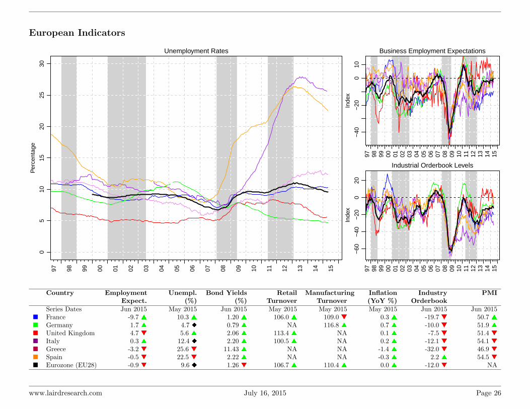
European Indicators
Unemployment Rates
Per
cent
age
97 98 99 00 01 02 03 04 05 06 07 08 09 10 11 12 13 14 15
05
1015
2025
30
Business Employment Expectations
Inde
x
97 98 99 00 01 02 03 04 05 06 07 08 09 10 11 12 13 14 15
−40
−20
010
Industrial Orderbook Levels
Inde
x
97 98 99 00 01 02 03 04 05 06 07 08 09 10 11 12 13 14 15
−60
−40
−20
020
Country EmploymentExpect.
Unempl.(%)
Bond Yields(%)
RetailTurnover
ManufacturingTurnover
Inflation(YoY %)
IndustryOrderbook
PMI
Series Dates Jun 2015 May 2015 Jun 2015 May 2015 May 2015 May 2015 Jun 2015 Jun 2015� France -9.7 s 10.3 s 1.20 s 106.0 s 109.0 t 0.3 s -19.7 t 50.7 s� Germany 1.7 s 4.7 u 0.79 s NA 116.8 s 0.7 s -10.0 t 51.9 s� United Kingdom 4.7 t 5.6 s 2.06 s 113.4 s NA 0.1 s -7.5 t 51.4 t� Italy 0.3 s 12.4 u 2.20 s 100.5 s NA 0.2 s -12.1 t 54.1 t� Greece -3.2 t 25.6 t 11.43 s NA NA -1.4 s -32.0 t 46.9 t� Spain -0.5 t 22.5 t 2.22 s NA NA -0.3 s 2.2 s 54.5 t� Eurozone (EU28) -0.9 t 9.6 u 1.26 t 106.7 s 110.4 s 0.0 s -12.0 t NA
www.lairdresearch.com July 16, 2015 Page 26
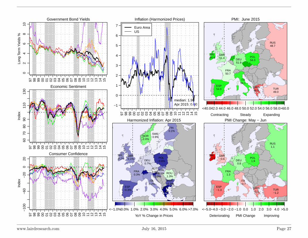
Government Bond YieldsLo
ng T
erm
Yie
lds
%
97 98 99 00 01 02 03 04 05 06 07 08 09 10 11 12 13 14 15
02
46
810
Economic Sentiment
Inde
x
97 98 99 00 01 02 03 04 05 06 07 08 09 10 11 12 13 14 15
6070
8090
110
130
Consumer Confidence
Inde
x
97 98 99 00 01 02 03 04 05 06 07 08 09 10 11 12 13 14 15
−10
0−
60−
200
20Inflation (Harmonized Prices)
97 98 99 00 01 02 03 04 05 06 07 08 09 10 11 12 13 14 15
median: 1.90Apr 2015: 0.00−1
0
1
2
3
4
5
6
7 Euro AreaUS
Harmonized Inflation: Apr 2015
AUT 0.9%
BGR−0.3%
DEU 0.7%
ESP−0.3%
FIN 0.1%
FRA 0.3%
GBR 0.1%
GRC−1.4%
HRV 0.0%
HUN 0.6%
IRL 0.2%
ISL 0.3%
ITA 0.2%
NOR 2.0%
POL−0.6%
ROU 1.3%
SWE 0.9%
<−1.0%0.0% 1.0% 2.0% 3.0% 4.0% 5.0% 6.0% >7.0%
YoY % Change in Prices
PMI: June 2015
<40.042.0 44.0 46.0 48.0 50.0 52.0 54.0 56.0 58.0>60.0
Steady ExpandingContracting
BRA46.5
CAN51.3
DEU51.9
ESP54.5
FRA50.7
GBR51.4
GRC46.9
IRL54.6
ITA54.1
MEX52.0
POL54.3
SAU56.1
TUR49.0
USA53.6
RUS48.7
PMI Change: May − Jun
<−5.0−4.0 −3.0 −2.0 −1.0 0.0 1.0 2.0 3.0 4.0 >5.0
PMI Change ImprovingDeteriorating
CAN 1.5
DEU 0.8
ESP−1.3
FRA 1.3
GBR−0.6
GRC−1.1
IRL−2.5
ITA−0.7
POL 1.9
TUR−1.2
USA−0.4
RUS1.1
www.lairdresearch.com July 16, 2015 Page 27

Chinese Indicators
Tracking the Chinese economy is a tricky. As reported in the Fi-nancial Times, Premier Li Keqiang confided to US officials in 2007 thatgross domestic product was “man made” and “for reference only”. In-stead, he suggested that it was much more useful to focus on three alter-native indicators: electricity consumption, rail cargo volumes and bank
lending (still tracking down that last one). We also include the PMI- which is an official version put out by the Chinese government anddiffers slightly from an HSBC version. Finally we include the ShanghaiComposite Index as a measure of stock performance.
Manufacturing PMI
99 00 01 02 03 04 05 06 07 08 09 10 11 12 13 14 15
4045
5055
60
Jun 2015: 49.40
Shanghai Composite Index
Inde
x V
alue
(M
onth
ly H
igh/
Low
)
99 00 01 02 03 04 05 06 07 08 09 10 11 12 13 14 15
010
0030
0050
00
Jul 2015: 3970.39
Electricity Generated
100
Mill
ion
KW
H (
log
scal
e)
99 00 01 02 03 04 05 06 07 08 09 10 11 12 13 14 15
1000
2000
3000
5000
May 2015: 4562.00
Electricity GeneratedLong Term TrendShort Term Average
Consumer Confidence Index
Inde
x
99 00 01 02 03 04 05 06 07 08 09 10 11 12 13 14 15
9810
010
210
410
610
811
0
median: 103.70May 2015: 109.90
Exports
YoY
Per
cent
Cha
nge
99 00 01 02 03 04 05 06 07 08 09 10 11 12 13 14 15
−20
020
4060
80
median: 18.60Jun 2015: 2.80
Retail Sales Growth
YoY
Per
cent
Cha
nge
99 00 01 02 03 04 05 06 07 08 09 10 11 12 13 14 15
1015
20
median: 13.00Jun 2015: 10.60
www.lairdresearch.com July 16, 2015 Page 28
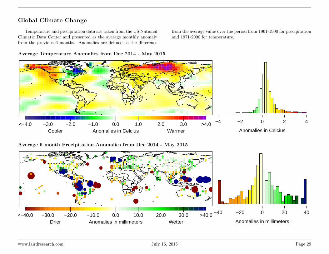
Global Climate Change
Temperature and precipitation data are taken from the US NationalClimatic Data Center and presented as the average monthly anomalyfrom the previous 6 months. Anomalies are defined as the difference
from the average value over the period from 1961-1990 for precipitationand 1971-2000 for temperature.
Average Temperature Anomalies from Dec 2014 - May 2015
<−4.0 −3.0 −2.0 −1.0 0.0 1.0 2.0 3.0 >4.0Anomalies in Celcius WarmerCooler Anomalies in Celcius
−4 −2 0 2 4
Average 6 month Precipitation Anomalies from Dec 2014 - May 2015
<−40.0 −30.0 −20.0 −10.0 0.0 10.0 20.0 30.0 >40.0Anomalies in millimeters WetterDrier Anomalies in millimeters
−40 −20 0 20 40
www.lairdresearch.com July 16, 2015 Page 29
Related Documents