GILL SANS

Gill Sans
Mar 30, 2016
Gill sans basic typographic specimen.
Welcome message from author
This document is posted to help you gain knowledge. Please leave a comment to let me know what you think about it! Share it to your friends and learn new things together.
Transcript

GILL SANS

Biografía y obraEric Gill nació el 22 de febrero de 1882 en Brighton (Inglaterra). Estudió en la escuela de arte de Chichester y a la edad de 17 años se emplea como aprendiz de W. H. Caroë arquitecto de la Comisión Ecle-siastica en Westminster. En la Escuela Central de Artes y Oficios asiste a clases de caligrafía impartidas por Edward Johnston y en un corto período de tiempo se convierte en un reputado artesano. En 1906 se casa con Ethel Moore; él y su familia se mudaron a una comunidad de artistas en Ditchling, Sussex. En 1914 Gill conoce a Stanley Morison, con quien colabora haciendo trabajos en la editorial Burns & Oates. Durante 1925 Morison se encontraba trabajando para Monotype como consejero tipográfico, fue entonces cuando éste se acerca a Gill para así crear una nueva tipografía, a pesar de que éste último decía que su conocimiento en tipografía era nulo y que no formaba parte de su campo laboral. Después de un largo periodo de trabajo, Gill creó su primer tipo al cual se le conoce como Perpetua, que en 1929 fue edita-da por Monotype. En 1931 Gill publica su libro Essay on Typography en el cuál utiliza su propio tipo, Joanna. Aquí, Gill describe sus puntos de vista en tipografía y sobre el humanismo en plena era industrial.
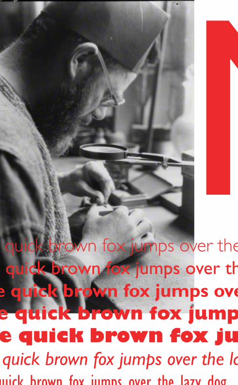
Gill esculpe letras en piedra y también en madera para los títulos de las portadas de los libros, y llegó a ser conocido en todo el país por sus trabajos escultóricos para la sede de la BBC en Portland Place y para la catedral de Westminster. Eric Gill comienza a diseñar tipos para imprenta solamente después de una gran labor de persuasión ejercida sobre él por Stanley Morison, ya que como el decía la tipografía no era su campo de actuación y no tenía ninguna experiencia sobre el tema.
El primer tipo que diseño, que más tarde se conocería como Perpetua, tardó cinco años en convertirse en realidad ya que para Gill era difícil resolver los problemas que se presentaban en la creación de tipos para producción mecánica. Charles Malin un grabador que Stanley Morison introdujo en el proyecto fue el que resolvió estos problemas y Perpetua después de algún cambio en su diseño fue editada por Monotype en 1929. Aunque durante su vida activa diseñó otros tipos sus dos más conocidos son Gill Sans y Perpetua.
En 1931 crea el tipo Golden Cockerel Roman y unos grabados de ma-dera que son utilizados para la producción de Four Gospels que es una pieza maestra de la imprenta inglesa. Durante el mismo año publica su Essay on Typography usando su propio tipo Haghe & Gill Joanna. Eric Gill fallece el 17 de noviembre de 1940 y en su lápida se describe él mismo como un escultor.
1

En el campo de la tipografía se le recuerda por su combinación entre la disciplina del grabador y la finura de los trazos que provenía de su forma-ción caligráfica. En términos de diseño Gill dotó de humanidad a la era de la máquina.
Algunos de los tipos que diseñó Eric Gill son:Gill Sans series 231 (1928) Perpetua (1929) Solus (1929) Golden Cockerel Roman (1930) Hague & Gill Joanna (1930) Bunyan (1934)
Gill sansDiseñado por Eric Gill e introducido por Monotype en 1928, Gill Sans fue un éxito inmediato, en pocos años, Monotype extendió la serie de Gill Sans en variantes light, bold, condensed y extra bold cortado en la mayoría de tamaños desde 8 a 72 puntos. Con mas variantes que qualquier otra ti-pografía, hasta la llegada de Univers, Gill sans continua siendo hoy en dia la tipografia mas versatil y usada de la historia del diseño. Simple, functional e imprime bien en la mayoria de papeles.
Light Gill Sans 9ptItalic Gill Sans 9pt
Regular Gill Sans 9ptBold Gill Sans 9pt
Extra Bold Gill Sans 9pt
2

Gill Sans is among one of the unique typefaces we have in typography. Gill Sans is a true hybrid, carrying characteristic of both serif and san serif fonts. A further exploration into the history, characteristic, pros and cons and personal opinions will allow for further understanding of this typeface and its uses in our society even in the present day.
Gill Sans is the product of an artist turned typographer Eric Gill. The font was released through the Monotype Corporation in 1928. During this pe-riod in time, many fonts of Gill Sans similarity were being produced such as Futura and Kabel, which are both san serif fonts. Gill Sans is classified as a humanist san serif font. San Serif fonts are fonts that are void of having small features at the end of the stroke. However, a slight serif is evident in Gill’s lower case and uppercase letters. This is what allows for this font to be a hybrid font incorporating classical versions of Roman Type. An apprentice of Edward Johnston, designer of the London Underground font, Gill Sans is practically a mere reflection of Johnston’s typeface.
Characteristics of Gill Sans are unique to the artist himself. Containing hard-sculpted forms, this is also a likely representation of Gill carrying his artistic sculpting knowledge and applying that basis to the creation of this typeface. Each weight retains a distinct character of its own. The light font, with its heavily kerned ‘f ’ and tall ‘t’, has an open, elegant look. The regular font has a more compact and muscular appearance, with its flat-bottomed ‘d’, flat-topped ‘p’ and ‘q’, and short, triangular-topped ‘t.’ The bold font tends to echo the softer, more open style of the light, while the extra bold and ultra bold have their own vivid personalities.
F f T td p q tabpfoe
Gill Sans Light 48pt.
Regular 48pt.Bold 48pt.
3

Although Gill Sans is a Sans serif typeface, there is also a pronounced contrast in the strokes which caracterizes these forms, giving it a Serif
font touch. This is seen primarily in the letter “r” and “a”.
The lighter weight of this font is seen to be the best example of Gill Sans. This is mainly due by the legibility factor of the stroke weights within the font. The Bolder the font becomes the more illegible the font is. There is a complete juxtaposition of letterforms from Regular to Bold.
There are stark contrasts between Gill Sans Regular and Gill Sans Italic. For instance, the counter on the lowercase letter “a” is completely different. Notice the letter “a” in Gill Sans Regular and the letter in Gill Sans Italic. Notice how the there is no swooping stroke at the end of the letter “a” in Italic and how the counter is much more prominent. Also the lowercase letter “f” in Gill Sans Italic goes below the baseline of the font itself. The Italic “p” actually overlaps each other where the counter and stem meet. This could possibly be another reason why people felt it had a more human feel to it.
Among other examples is the Alt of Gill Sans, which numerals contain a different capline; as well the numerals become descenders. In the Bolder faces of this type the lowercase “r” loses its stroke to a more bulbous rounded end. The signature elongated uppercase “R” and lowercase “g” resembling eyeglasses are exemplary of the Futuristic movement in which Gill was a part of. There is a rule in determining whether or not a typeface is considered to be legible. Gill Sans defies the standard because the x-height of this font face is slightly smaller than your average face that’s
p p a a f f
4

Gill Sans is among one of the unique typefaces we have in typography. Gill Sans is a true hybrid, carrying characteristic of both serif and san serif fonts. A further exploration into the history, characteristic, pros and cons
and personal opinions will allow for further understanding of this typeface and its uses in our society even in the present day.
Gill Sans is the product of an artist turned typographer Eric Gill. The font was released through the Monotype Corporation in 1928. During this pe-riod in time, many fonts of Gill Sans similarity were being produced such as Futura and Kabel, which are both san serif fonts. Gill Sans is classified as a humanist san serif font. San Serif fonts are fonts that are void of having small features at the end of the stroke. However, a slight serif is evident in Gill’s lower case and uppercase letters. This is what allows for this font to be a hybrid font incorporating classical versions of Roman Type. An apprentice of Edward Johnston, designer of the London Underground font, Gill Sans is practically a mere reflection of Johnston’s typeface.
Characteristics of Gill Sans are unique to the artist himself. Containing hard-sculpted forms, this is also a likely representation of Gill carrying his artistic sculpting knowledge and applying that basis to the creation of this typeface. Each weight retains a distinct character of its own. The light font, with its heavily kerned ‘f ’ and tall ‘t’, has an open, elegant look. The regular font has a more compact and muscular appearance, with its flat-bottomed ‘d’, flat-topped ‘p’ and ‘q’, and short, triangular-topped ‘t.’ The bold font tends to echo the softer, more open style of the light, while the extra bold and ultra bold have their own vivid personalities.
Although Gill Sans is a Sans serif typeface, there is also a pronounced contrast in the strokes which caracterizes these forms, giving it a Serif font touch. This is seen primarily in the letter “r” and “a”.
The lighter weight of this font is seen to be the best example of Gill Sans. This is mainly due by the legibility factor of the stroke weights within the font. The Bolder the font becomes the more illegible the font is. There is a complete juxtaposition of letterforms from Regular to Bold. There are stark contrasts between Gill Sans Regular and Gill Sans Italic. For instance, the counter on the lowercase letter “a” is completely different. Notice the letter “a” in Gill Sans Regular and the letter in Gill Sans Italic. Notice how the there is no swooping stroke at the end of the
Ravatarx height
5

letter “a” in Italic and how the counter is much more prominent. Also the lowercase letter “f” in Gill Sans Italic goes below the baseline of the font itself. The Italic “p” actually overlaps each other where the counter and stem meet. This could possibly be another reason why people felt it had a more human feel to it. Among other examples is the Alt of Gill Sans, which numerals contain a different capline; as well the numerals become descenders. In the Bolder faces of this type the lowercase “r” loses its stroke to a more bulbous rounded end. The signature elongated uppercase “R” and lowercase “g” resembling eyeglasses are exemplary of the Futuristic movement in which Gill was a part of. There is a rule in determining whether or not a typeface is considered to be legible. Gill Sans defies the standard because the x-height of this font face is slightly smaller than your average face that’s awarded on the fact of legibility alone. Probably one of the greatest qualities Gill Sans has is that it is space efficient when used in body text therefore giving the designer knowledge that they can work well incorporating this font into wordy body copy.
Gill Sans is feature in much of the British Culture. It is the font used for all the street signs in the United Kingdom. The font was practically adopted by the U.K. as the type of the mid 19th century. Terror Island an online magazine uses this font as its cover and body text. Among more notable things Gill Sans is also featured as the Title for Wine and Dine Magazine (Ultra Bold), Popular children’s animated film Chicken Little (ultra bold), Local Retail Eyeglasses store Eyeglass World they incorporate the “g” and use it as eyeglasses, Popular British Act Bloc Party use Gill sans as their main text in the first two album release as well as making it the font to signify the band Bloc Party. Among others include Mega hardware store Home Depot which use the font in various signage around the store. Leo-nardo DiCaprio directed Environmental Documentary :An Inconvenient Truth which contained Gill Sans Bold. Gill Sans has played a significant role this year especially in the two thousand and nine presidential election. President Barack Obama used Gill Sans for his presidential logo during the running of his campaign for presidency.
The font is unique and a hybrid amongst a plethora of futuristic typefaces. However there are still qualities about the bold typeface that do work. In a more signage design format the font has it’s playful qualities. Moreover, the term novelty could be used for the bold typeface of this font. It is also very interesting how many different variations of the font there are out for the public to ascertain. That is why the font should be reworked. I do not know to what extent. There is a great discrepancy in the typeface that needs to be corrected perhaps changing the bulbous lower case “r”, even condensing some of the typeface or creating a proper x-height instead of it’s slightly smaller size, these are simply three ideas to try and work out.
6


Humanist TypefaceSculpted by Eric Gill between
1928 and 1930

GILL SANSDISEÑADA POR ERIC GILL Y PUBLICADA POR MONOTYPE ENTRE
LIGHT - LightBOLD - boldITALIC - italic CONDENSED - condensedEXTRA BOLD - extra bold
An artist turned typographer
SHADOWEdSHADOWED
Gill Sans Light 48pt.
Regular 48pt.Bold 48pt.
3

Many other notable companies (particularly in England) adopted Gill Sans as a corporate typeface by the
mid-1900’s, including the BBC, British Railways, and ultimately Monotype themselves, making the typeface Monotype's fifth best seller of the twentieth century.


Benjamin James Barber
2011
Related Documents