ggplot2 displaying spatial & temporal data

Welcome message from author
This document is posted to help you gain knowledge. Please leave a comment to let me know what you think about it! Share it to your friends and learn new things together.
Transcript

ggplot2displaying spatial & temporal data

Credit
• ‘White’ slides are taken directly from Dianne Cook’s “IMAGe STATMOS Course on Visualization of Climate Data”
• http://streaming.stat.iastate.edu/~dicook/NCAR/
• Creative Commons Attribution-Noncommercial 3.0 United States License

ggplot2

• “ggplot2 is a plotting system for R, based on the grammar of graphics, which tries to take the good parts of base and lattice graphics and none of the bad parts. It takes care of many of the fiddly details that make plotting a hassle (like drawing legends) as well as providing a powerful model of graphics that makes it easy to produce complex multi-layered graphics.”
ggplot2
http://ggplot2.org/

ggplot2
• “ease of use” vs. “customization”• user’s time is more important than
customization• grammar rules reduce amount of small decisions
• made for fast iterations

Workshop on Visualization of Climate Change, May 13-17, 2013
GrammarUnderlying*ggplot2*is*a*formal*structure*for*defining*a*
data*plot
Provides*enormous*flexibility**in*producing*data*plots,*
how*different*plots*are*related
Elegant*nature*of*plots*is*due*to*defaults*based*on*
good*cognitive*principles.
Based*initially*on*Wilkinson*(2001)’s*grammar*of*
graphics*I*“gg”*stands*for*grammar*of*graphics
2
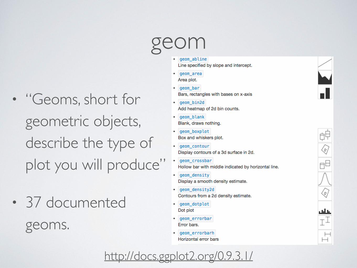
geom
• “Geoms, short for geometric objects, describe the type of plot you will produce”
• 37 documented geoms.
http://docs.ggplot2.org/0.9.3.1/

geom statistics
• statistical transformations
• most common: identity
• common geoms: bin, boxplot, qq, quantile, smooth
http://docs.ggplot2.org/0.9.3.1/

• Parts:• data and aesthetic mapping,• a statistical transformation (stat)• a geometric object (geom)• a position adjustment
• typically display other columns within the same data
• can display completely new data
geom layer(s)
http://vita.had.co.nz/papers/layered-grammar.pdf

layer examples

ggplot2 objects
• ggplot2 plots are fully defined R objects
• have a special print method
• objects may be altered many times before printing

‘qplot’ function
• qplot( vars, # ‘x’ and/or ‘y’. Depends on geom data, [geom = “point”, [other options]]) + [more layers]

ggplot2 object example• p <-‐ qplot(Sepal.Length, Sepal.Width, data = iris)
p

• > str(p)List of 9 $ data :'data.frame': 150 obs. of 5 variables: ..$ Sepal.Length: num [1:150] 5.1 4.9 4.7 4.6 5 5.4 4.6 5 4.4 4.9 ... ..$ Sepal.Width : num [1:150] 3.5 3 3.2 3.1 3.6 3.9 3.4 3.4 2.9 3.1 ... ..$ Petal.Length: num [1:150] 1.4 1.4 1.3 1.5 1.4 1.7 1.4 1.5 1.4 1.5 ... ..$ Petal.Width : num [1:150] 0.2 0.2 0.2 0.2 0.2 0.4 0.3 0.2 0.2 0.1 ... ..$ Species : Factor w/ 3 levels "setosa","versicolor",..: 1 1 1 1 1... $ layers :List of 1 ..$ :Classes 'proto', 'environment' <environment: 0x7fa9d48e8b48> $ scales :Reference class 'Scales' [package "ggplot2"] with 1 fields ..$ scales: list() ..and 21 methods, of which 9 are possibly relevant: .. add, clone, find, get_scales, has_scale, initialize, input, n, .. non_position_scales $ mapping :List of 2 ..$ x: symbol Sepal.Length ..$ y: symbol Sepal.Width $ theme : list() $ coordinates:List of 1 ..$ limits:List of 2 .. ..$ x: NULL .. ..$ y: NULL ..-‐ attr(*, "class")= chr [1:2] "cartesian" "coord" $ facet :List of 1 ..$ shrink: logi TRUE ..-‐ attr(*, "class")= chr [1:2] "null" "facet" $ plot_env :<environment: R_GlobalEnv> $ labels :List of 2 ..$ x: chr "Sepal.Length" ..$ y: chr "Sepal.Width" -‐ attr(*, "class")= chr [1:2] "gg" "ggplot

• > str(p)List of 9…$ layers :List of 1 ..$ :Classes 'proto', 'environment' <environment: 0x7fa9d48e8b48> …
• > p$layers[[1]]geom_point: stat_identity: position_identity: (width = NULL, height = NULL)

print plot:base vs. ggplot2
• dt <-‐ dataBeingUsed
• ## base# start graphics deviceplot( x, y, data=dt)points(x2, y2, data=dt)lines( x, y, data=dt)lines( x2, y2, data=dt)#… more plot procedures# stop graphics device
• ## ggplot2p <-‐ qplot( x, y, data = dt, geom = c(“point”, “line”))p <-‐ p + geom_point(aes(x=x2,y=y2))+ geom_line(aes(x=x2,y=y2))#… more plot procedures# start graphics devicep# stop graphics device

ggplot2: spatial & temporal data

Workshop on Visualization of Climate Change, May 13-17, 2013
About"the"NASA"dataMeasurements$recorded$by$NASA$using$remote$sensing$on$temperature,$pressure,$ozone,$clouds$over$Central$America$1995L2000.For$ASA$Data$Expo$2006
http://stat-computing.org/dataexpo/2006/

Workshop on Visualization of Climate Change, May 13-17, 2013
Checking"the"dataNumerical$summaries
> summary(nasa) time y x lat Min. : 1.00 Min. : 1.00 Min. : 1.00 Min. :-21.20 1st Qu.:18.75 1st Qu.: 6.75 1st Qu.: 6.75 1st Qu.: -6.85 Median :36.50 Median :12.50 Median :12.50 Median : 7.50 Mean :36.50 Mean :12.50 Mean :12.50 Mean : 7.50 3rd Qu.:54.25 3rd Qu.:18.25 3rd Qu.:18.25 3rd Qu.: 21.85 Max. :72.00 Max. :24.00 Max. :24.00 Max. : 36.20 long date cloudhigh cloudlow Min. :-113.8 1995-01-01: 576 Min. : 0.0 Min. : 0.50 1st Qu.: -99.4 1995-02-01: 576 1st Qu.: 1.5 1st Qu.: 15.00 Median : -85.0 1995-03-01: 576 Median : 8.5 Median : 23.50 Mean : -85.0 1995-04-01: 576 Mean :12.0 Mean : 26.24 3rd Qu.: -70.6 1995-05-01: 576 3rd Qu.:18.5 3rd Qu.: 34.50 Max. : -56.2 1995-06-01: 576 Max. :62.5 Max. : 84.50 (Other) :38016 NA's :110.00 ....

Workshop on Visualization of Climate Change, May 13-17, 2013
5

Workshop on Visualization of Climate Change, May 13-17, 2013qplot(date, ozone, data = nasa, group = id, geom = "line", alpha = I(0.1))
5

Workshop on Visualization of Climate Change, May 13-17, 2013
Time"trendOzone*is*plotted*against*time*(month*and*year)*separately*but*overlapping*for*each*spatial*locationSeasonality*is*visible*&*but*there*is*a*double*peak.*We'd*guess*that*this*correspond*to*northern*and*southern*latitude*differences.*How*can*we*check?
6

Workshop on Visualization of Climate Change, May 13-17, 2013
7

Workshop on Visualization of Climate Change, May 13-17, 2013qplot(date, ozone, data = nasa, geom = "line") + facet_grid(lat ~ long)
7

Workshop on Visualization of Climate Change, May 13-17, 2013
Space4time"trendOzone*is*plotted*against*time*(month*and*year)*separately*for*each*spatial*locationSeasonality*is*visible*across*the*region,*more*so*at*the*higher*latitudes.
This*last*plot*took*a*minute*to*draw!
8

Workshop on Visualization of Climate Change, May 13-17, 2013
What"is"a"map?
long
lat
40.5
41.0
41.5
42.0
42.5
43.0
43.5
-96 -95 -94 -93 -92 -91
Set+of+points+specifying+latitude+and+longitude
long
lat
40.5
41.0
41.5
42.0
42.5
43.0
43.5
-96 -95 -94 -93 -92 -91
Polygon:+connect+dots+in+correct+order
4

Workshop on Visualization of Climate Change, May 13-17, 2013long
lat
30
35
40
-95 -90 -85
What"is"a"map?
Polygon:+connect+only+the+correct+dots
5

Workshop on Visualization of Climate Change, May 13-17, 2013long
lat
30
35
40
-95 -90 -85
What"is"a"map?
long
lat
30
35
40
-95 -90 -85
Polygon:+connect+only+the+correct+dots
5

states data• > library(maps)> states <-‐ map_data(“state")> str(states)'data.frame': 15537 obs. of 6 variables: $ long : num -‐87.5 -‐87.5 -‐87.5 -‐87.5 -‐87.6 ... $ lat : num 30.4 30.4 30.4 30.3 30.3 ... $ group : num 1 1 1 1 1 1 1 1 1 1 ... $ order : int 1 2 3 4 5 6 7 8 9 10 ... $ region : chr "alabama" "alabama" "alabama" "alabama" ... $ subregion: chr NA NA NA NA ...

Workshop on Visualization of Climate Change, May 13-17, 2013
> head(states)
long lat group order region subregion
1 -87.46201 30.38968 1 1 alabama <NA>
2 -87.48493 30.37249 1 2 alabama <NA>
3 -87.52503 30.37249 1 3 alabama <NA>
4 -87.53076 30.33239 1 4 alabama <NA>
5 -87.57087 30.32665 1 5 alabama <NA>
6 -87.58806 30.32665 1 6 alabama <NA>
6

Workshop on Visualization of Climate Change, May 13-17, 2013
Maps"in"ggplot2
> qplot(data = states, x = long, y=lat, order = order, group = group, geom = “path”/“polygon”)
Geoms:+polygon+or+path+for+filled+polygons+or+outlines+only
7

Workshop on Visualization of Climate Change, May 13-17, 2013
long
lat
30
35
40
45
-120 -110 -100 -90 -80 -70
long
lat
30
35
40
45
-120 -110 -100 -90 -80 -70
long
lat
30
35
40
45
-120 -110 -100 -90 -80 -70
long
lat
30
35
40
45
-120 -110 -100 -90 -80 -70
lat
30
35
40
45
qplot(long, lat, geom="point", data=states)
qplot(long, lat, geom="path", data=states, group=group, order = order)
qplot(long, lat, geom="polygon", data=states, group=group, order = order)
8

Workshop on Visualization of Climate Change, May 13-17, 2013
Making$Maps$look$like$Maps> theme(axis.title.x=element_blank(), # remove x and y label
axis.title.y=element_blank(),
axis.line=element_blank(), # no axis at the bottom and the left
axis.ticks=element_blank(), # don’t show ticks
axis.text.y = element_blank(), # no tick marks
axis.text.x = element_blank(),
panel.grid.minor=element_blank(), # don’t show any gridlines
panel.grid.major=element_blank(),
panel.background=element_blank(), # invisible background
panel.border = element_blank(), # no border around plot space
panel.margin = unit(0, "lines")
)
read%up%on%this%in%the%ggplot2%book,%wrapped%into%function%theme_nothing()
13

Workshop on Visualization of Climate Change, May 13-17, 2013
RGoogleMapsLoad$a$satellite$image:$> library("ggmap")> nasa_center <- c(lon=-85.0, lat=7.50)> nasamap <-get_googlemap(center = nasa_center, zoom=4)Map from URL : http://maps.googleapis.com/maps/api/staticmap?center=7.5,-85&zoom=4&size=%20640x640&maptype=terrain&sensor=falseGoogle Maps API Terms of Service : http://developers.google.com/maps/terms> ggmap(nasamap)
21

Workshop on Visualization of Climate Change, May 13-17, 2013
Adding$to$satellite$images> ggmap(nasamap) + geom_point(data=nasa, aes(x = long, y = lat))
22

Workshop on Visualization of Climate Change, May 13-17, 2013
Adding$to$satellite$images> ggmap(nasamap) + geom_line(data=nasa.gly, aes(x=gx, y=gy, group = gid))
23


Links• http://docs.ggplot2.org/
• http://streaming.stat.iastate.edu/~dicook/NCAR/
• http://vita.had.co.nz/papers/glyph-maps.pdf
• http://vita.had.co.nz/papers/layered-grammar.pdf
• Displaying time series, spatial and space-time data with R (not ggplot2) http://oscarperpinan.github.io/spacetime-vis/
Related Documents