FUTURA
Mar 18, 2016
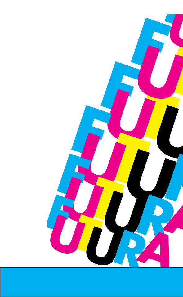
Typeface book done for the Futura typeface done by Paul Renner. Done with a cmyk color scheme, wanted to do a simplistic color pallete.
Welcome message from author
This document is posted to help you gain knowledge. Please leave a comment to let me know what you think about it! Share it to your friends and learn new things together.
Transcript


Futura*Ascenders.
*Geometric circular counter.*baseline where the letterssit.
*X-H
eight.
*The counters in this typeface intersectthe stem.
*Futura was designed as an Geometric typefacenote the right angles.
that cookie.*futura’s noteable characteristics are it’s perfect strokedO’s.
*all of Futura’slowercase lettershave tall ascenders,
*Simplisticno decorations.
*caplinedistance frombaseline totop of capital letter.
Dirty bits.
Fun Stuff.
*

*Futura was created by Paul renner in the 1920’s
*was created with geometric-forms in mind influenced -
by German BAUHAUS design*The typefaces strokes are almost perfect, for example the “O” is beautiful.
*Still used widely today in-many coporate logos, ex:
Dominoes, IKEA, and Adobe.

*

*24CASES*24
CASES

*24CASES*24
CASES
*

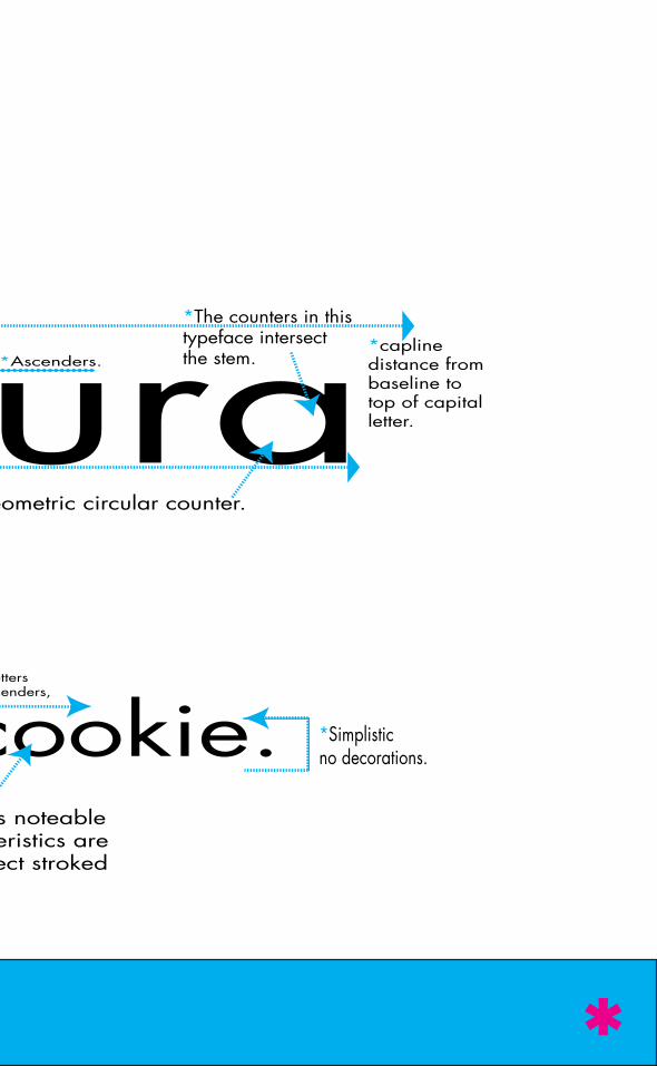
“It’s time for Art Directors the world over to boycott the use of Futura Ex-tra Bold Condensed – the most over-used typeface in advertising history. Destroy the Great Satan of clichés and the Little Satan of convenience, and rally to the cause of a better type selection.Please fill out the enclosed petition and mail it to our headquarters. It will be used to sway the opinion-makers of our industry toward our just and worthy cause.Together, we can whip this mother.”Art directors against FUTURA EXTRA BOLD CONDENSED. -1992
*

*
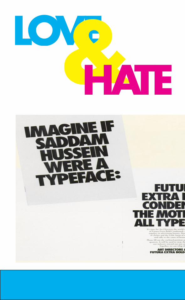
*Futura was the first and so far onlytypeface to be sent to the moon.In 1969 it was selected to be on official typeface of the Apollo 11 moon landing, i was branded on a plaque that was left on the moon spreading a message of peace.

Futura’s lower case J, has no finial. The curved part on J’s and other lower case letters.

*
*Futura features some details other typefaces-don’t utilize.
Futura’s O has a perfect circular stroke another quirk that seperates it from other typfaces. And adds geometric flair.

*

Related Documents