TYPOGRAPHY

franklinportolio
Mar 13, 2016
Â
Welcome message from author
This document is posted to help you gain knowledge. Please leave a comment to let me know what you think about it! Share it to your friends and learn new things together.
Transcript
TYPOGRAPHY

12-4
18-1916-17
5-67-15
Ubiquitous Type
TYPOGRAPHY


Ubiquitous Type
Typography makes at least two kinds of sense, if it makes any
sense at all. It makes visual sense and historical sense. The visual
side of typography is always on display, and materials for the
study of its visual form are many and widespread. The history of
letter-forms and their usage is visible too, to those with access to manu-
scripts, inscriptions and old books, but from others it is largely hidden.
This book has therefore grown into some-thing more than a short
manual of typographic etiquette. It is the fruit of a lot of long walks
in the wilderness of letters: in part a pocket field guide to the living
wonders that are found there, and in part a meditation on the ecologi-
cal principles, survival techniques, and ethics that apply. The principles
of typography as I understand them are not a set of dead conventions
but the tribal customs of the magic forest, where ancient voices speak
from all directions and new ones move to unremembered forms.
One question, nevertheless, has been often in my mind. When
all right thinking human beings are struggling to remember that
other men and women are free to be different, and free to be-
come more different still, how can one honestly write a rulebook?
What reason and authority exist for these commandments, sug-
gestions, and instructions? Surely typographers, like others, ought
to be at liberty to follow or to blaze the trails they choose.
Typography thrives as a shared concern and there are no paths at
all where there are no shared desires and directions. A typographer
determined to forge new routes must move, like other solitary trav-
elers, through uninhabited country and against the grain of the land,
crossing common thoroughfares in the silence before dawn. The sub-
ject of this book is not typographic solitude, but the old, well trav-
eled roads at the core of the tradition: paths that each of us is free
to follow or not, and to enter and leave when we choose if only we
know the paths are there and have a sense of where they lead. That
freedom is denied us if the tradition is concealed or left for dead.
Originality is everywhere, but much originality is blocked if the
way back to earlier discoveries is cut or overgrown. If you use this
book as a guide, by all means leave the road when you wish. That is
precisely the use of a road: to reach individually chosen points of
departure. By all means break the rules, and break them beautifully,
deliberately, and well. That is one of the ends for which they exist.
Letterforms change constantly, yet differ very little, because they are alive. The principles of typographic clarity have also scarcely altered since the second half of the fifteenth century, when the first books were printed in roman type. Indeed, most of the principles of legibility and design explored in this book were known and used by Egyptian scribes writing hieratic script with reed pens on papyrus in 1000 B.C. Samples of their work sit now in museums in Cairo, London and New York, still lively, sub-tle, and perfectly legible thirty centuries after they were made.
Writing systems vary, but a good page is not hard to learn to recognize, whether it comes from Tang Dynasty China, The Egyp-tian New Kingdom typographers set for themselves than with the mutable or Renaissance Italy. The principles that unite these distant schools of design are based on the structure and scale of the hu-man body - the eye, the hand, and the forearm in particular and on the invisible but no less real, no less demanding, no less sensuous anatomy of the human mind. I don’t like to call these principles universals, because they are largely unique to our species. Dogs and ants, for example, read and write by more chemical means. But the underlying principles of typography are, at any rate, sta-ble enough to weather any number of human fashions and fads.
"Typography is the craft of endowing human language with a durable visual form, and thus with an independent existence.
Typography is the craft of endowing human language with a durable visual form, and thus with an independent ex-istence. Its heartwood is calligraphy - the dance, on a tiny stage. It is true that typographer’s tools are presently chang-ing with considerable force and speed, but this is not a manual in the use of any particular typesetting system or medium.
I suppose that most readers of this book will set most of their type in digital form, using computers, but I have no preconceptions about which brands of computers, or which versions of which proprietary software, they may use. The essential elements of style have more to do with the goals the living, speaking hand - and its roots reach into liv-ing soil, though its branches may be hung each year with new machines. So long as the root lives, typography remains a source of true delight, true knowledge, true surprise.the presence of typography, both good and bad, can be seen everywhere.

My pre-school picture. rockin the two braids and plaid skirt. Wait until high school... All-girls, catholic, uniform.
Ticket from seussical. A friends preformance I attended in highschool.

Postcards from a gallery show-ing of “MR. BRAINWASH” one of my favorite artists that made a documentary with Banksy.
I’m sick way too much. Low immune system makes me miss so much school.
Ticket from LACMA.
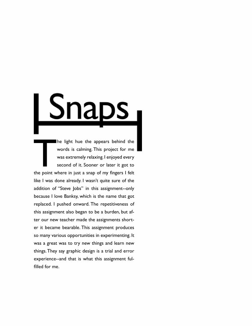
T he light hue the appears behind the
words is calming. This project for me
was extremely relaxing. I enjoyed every
second of it. Sooner or later it got to
the point where in just a snap of my fingers I felt
like I was done already. I wasn’t quite sure of the
addition of “Steve Jobs” in this assignment--only
because I love Banksy, which is the name that got
replaced. I pushed onward. The repetitiveness of
this assignment also began to be a burden, but af-
ter our new teacher made the assignments short-
er it became bearable. This assignment produces
so many various opportunities in experimenting. It
was a great was to try new things and learn new
things. They say graphic design is a trial and error
experience--and that is what this assignment ful-
filled for me.

journal of linguistics
volume six
issue three
in this issue
joseph campbell
noam chomsky
yoko onosteve jobs
roland young
snap

jou
rnal
of
lin
guis
tics
v o l u m e s i x
i s s u e t h r e e
in this issue
joseph campbellnoam chomsky
yoko onosteve jobs
roland young
snap

jou
rnal
of
lin
guis
tics
v o l u m e s i x
i s s u e t h r e e
in this issue
joseph campbellnoam chomsky
yoko onosteve jobs
roland young
snap

jou
rnal
of
lin
guis
tics
v o l u m e s i x
i s s u e t h r e e
in this issue
joseph campbellnoam chomsky
yoko onosteve jobs
roland young
snap

jou
rnal
of
lin
guis
tics
v o l u m e s i x
i s s u e t h r e e
in this issue
joseph campbellnoam chomsky
yoko onosteve jobs
roland young
snap

jou
rnal
of
lin
guis
tics
v o l u m e s i x
i s s u e t h r e e
in this issue
joseph campbellnoam chomsky
yoko onosteve jobs
roland young
snap

jou
rnal
of
lin
guis
tics
v o l u m e s i x
i s s u e t h r e e
in this issue
joseph campbellnoam chomsky
yoko onosteve jobs
roland young
snap

jou
rnal
of
lin
guis
tics
v o l u m e s i x
i s s u e t h r e e
in this issue
joseph campbellnoam chomsky
yoko onosteve jobs
roland young
snap

jou
rnal
of
lin
guis
tics
v o l u m e s i x
i s s u e t h r e e
in this issue
joseph campbellnoam chomsky
yoko onosteve jobs
roland young
snap

jou
rnal
of
lin
guis
tics
v o l u m e s i x
i s s u e t h r e e
in this issue
joseph campbellnoam chomsky
yoko onosteve jobs
roland young
snap