Fonts and Typography Section 7.3

Fonts and Typography Section 7.3. Typography Typography: the style, arrangement, and appearance of text Well designed text makes your page more readable.
Jan 04, 2016
Welcome message from author
This document is posted to help you gain knowledge. Please leave a comment to let me know what you think about it! Share it to your friends and learn new things together.
Transcript
Fonts and Typography
Section 7.3
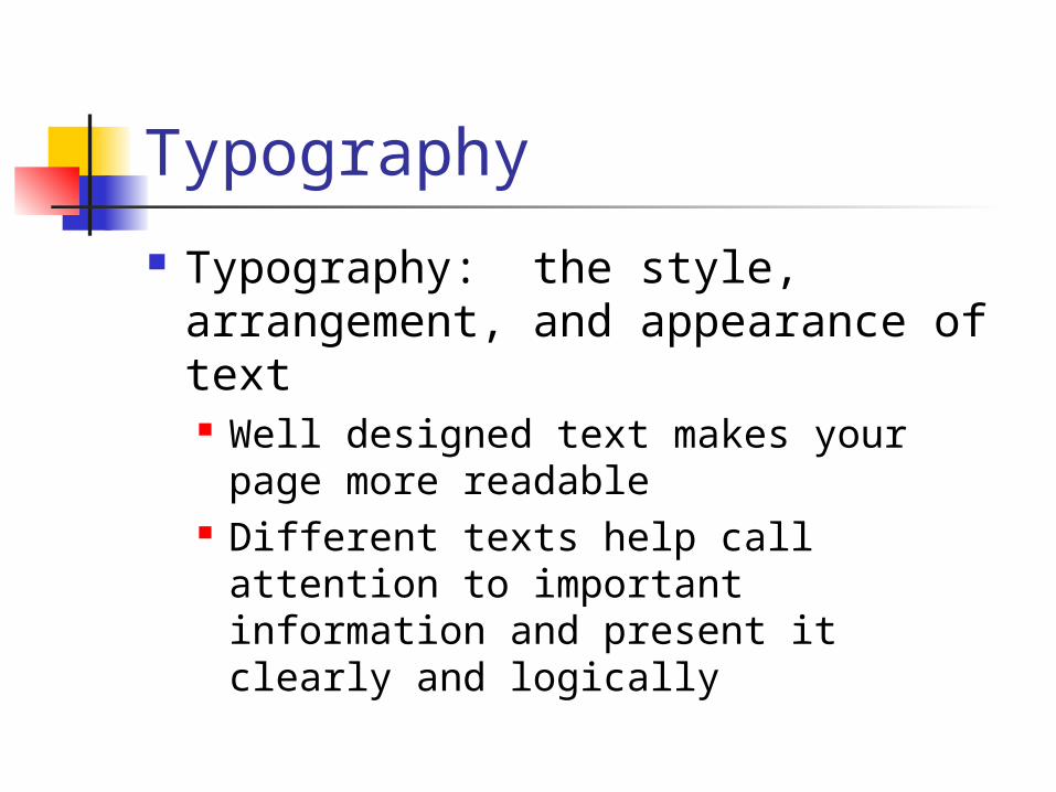
Typography
Typography: the style, arrangement, and appearance of text Well designed text makes your page
more readable Different texts help call attention to
important information and present it clearly and logically
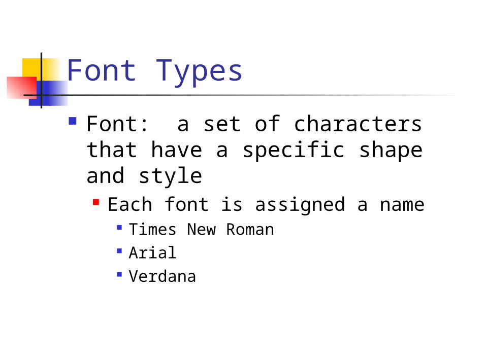
Font Types
Font: a set of characters that have a specific shape and style Each font is assigned a name
Times New Roman Arial Verdana

Font Size
Fonts can be displayed in different sizes
A point is a traditional unit of type measurement The larger the point size, the bigger
the text appears on the screen
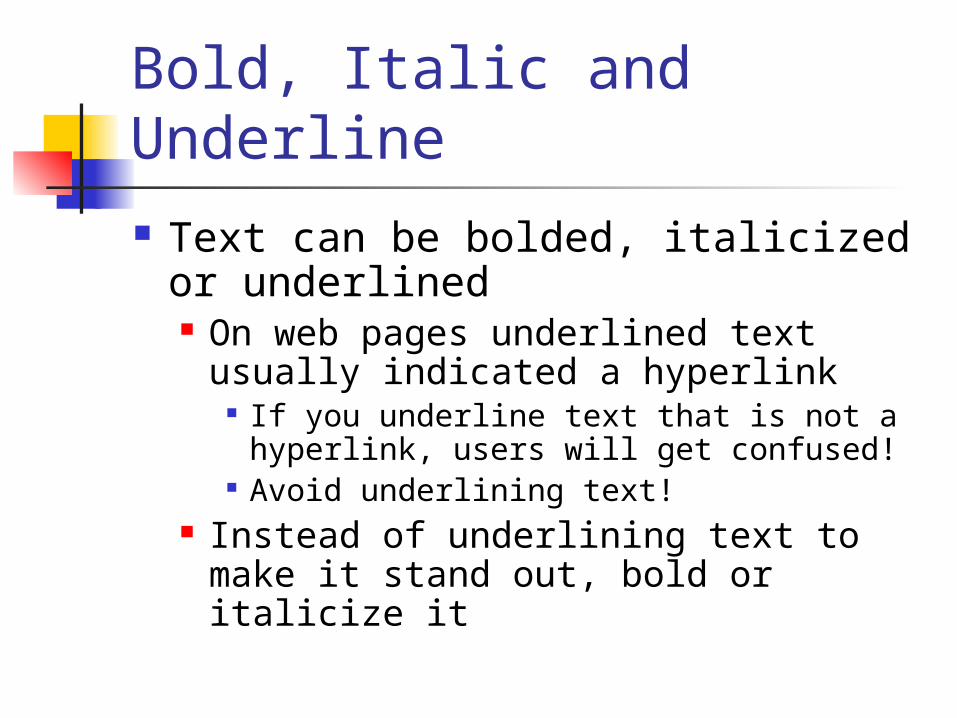
Bold, Italic and Underline Text can be bolded, italicized or
underlined On web pages underlined text usually
indicated a hyperlink If you underline text that is not a
hyperlink, users will get confused! Avoid underlining text!
Instead of underlining text to make it stand out, bold or italicize it
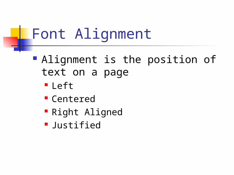
Font Alignment
Alignment is the position of text on a page Left Centered Right Aligned Justified

Left Aligned Text
Left aligned text is positioned with theleft edge of the page.
Text is usually left aligned automatically when you enter it on a page
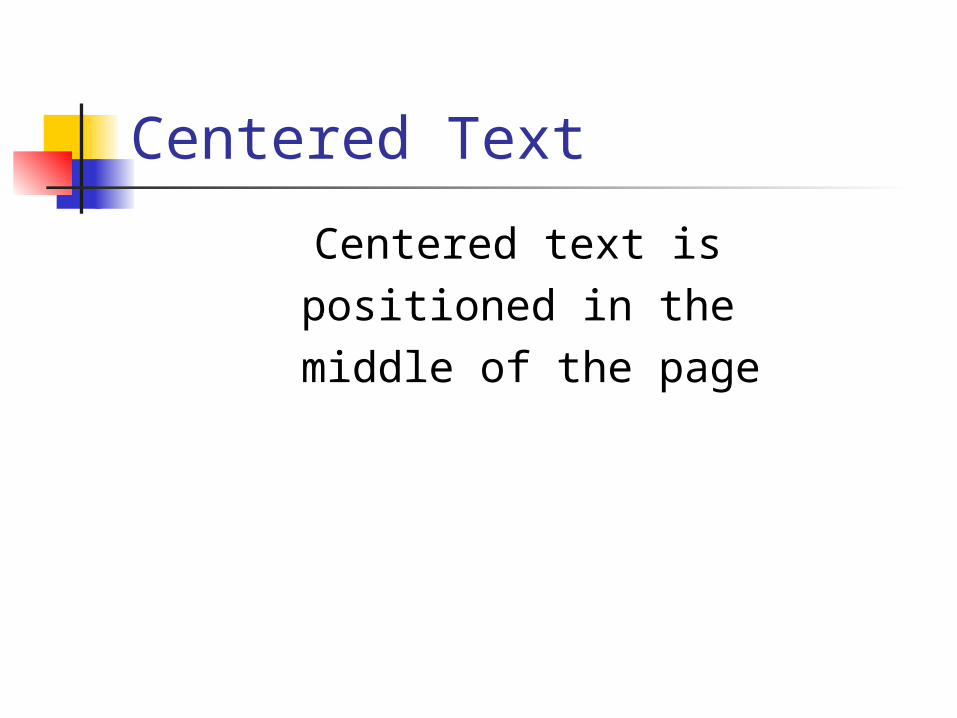
Centered Text
Centered text is positioned in the
middle of the page
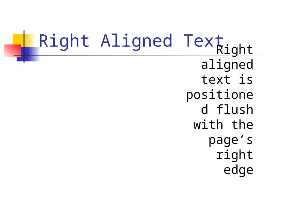
Right Aligned TextRight aligned text is
positioned flush with
the page’s right edge
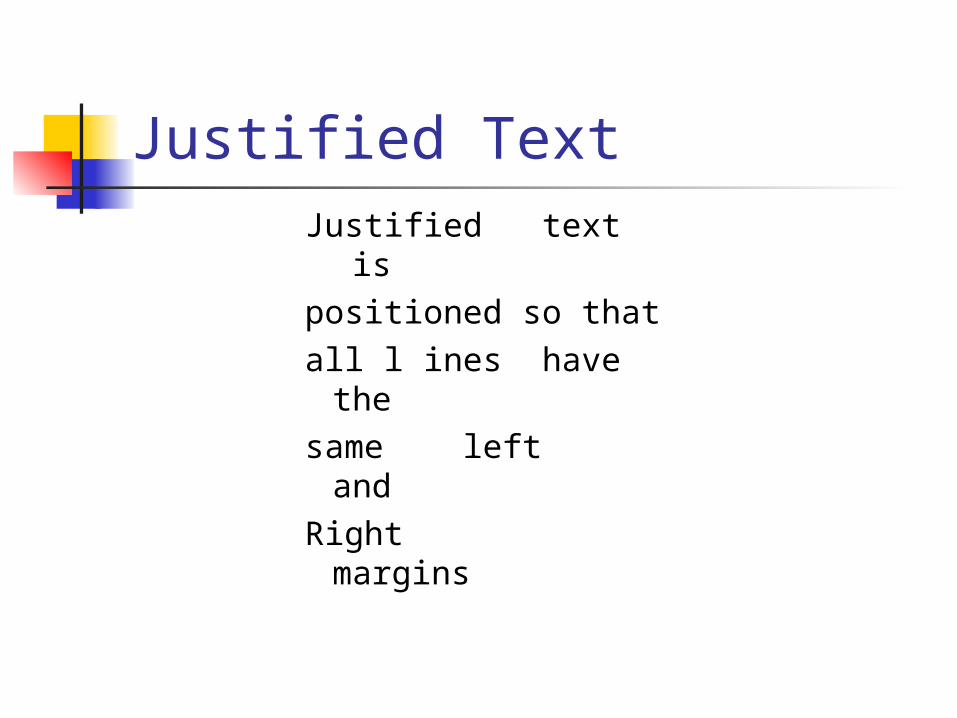
Justified Text
Justified text ispositioned so thatall l ines have thesame left and Right margins
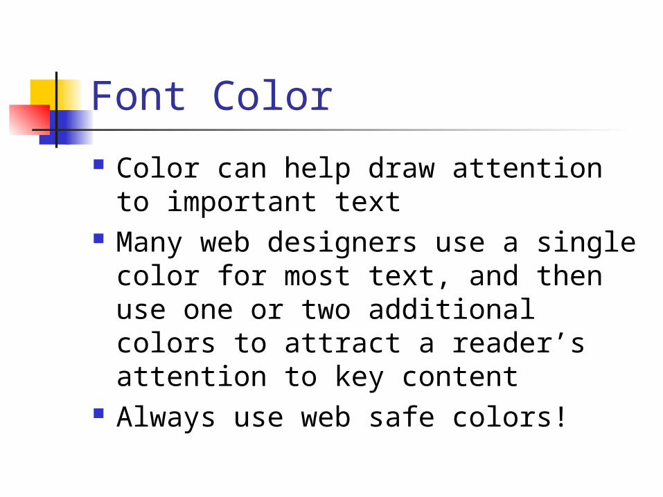
Font Color
Color can help draw attention to important text
Many web designers use a single color for most text, and then use one or two additional colors to attract a reader’s attention to key content
Always use web safe colors!
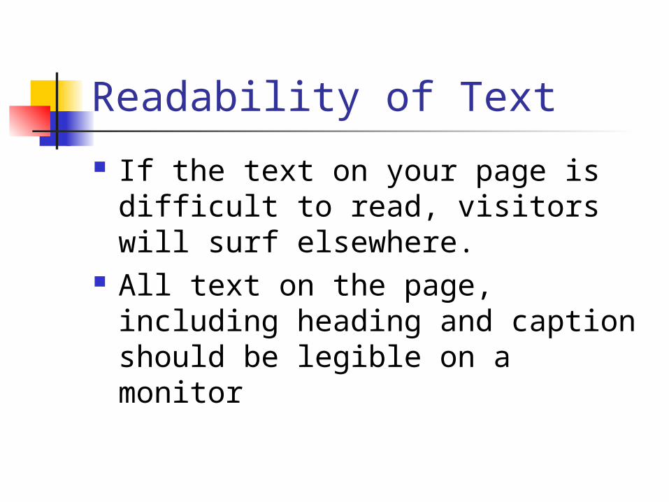
Readability of Text
If the text on your page is difficult to read, visitors will surf elsewhere.
All text on the page, including heading and caption should be legible on a monitor
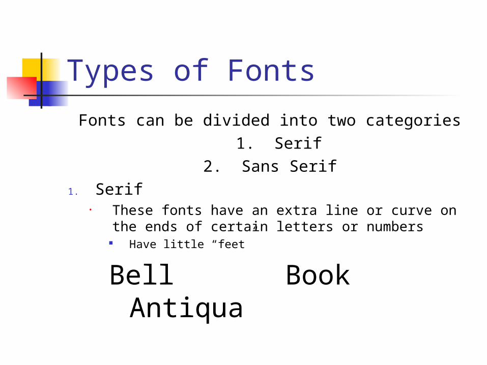
Types of Fonts
Fonts can be divided into two categories1. Serif
2. Sans Serif1. Serif
• These fonts have an extra line or curve on the ends of certain letters or numbers
Have little “feet”
Bell Book Antiqua
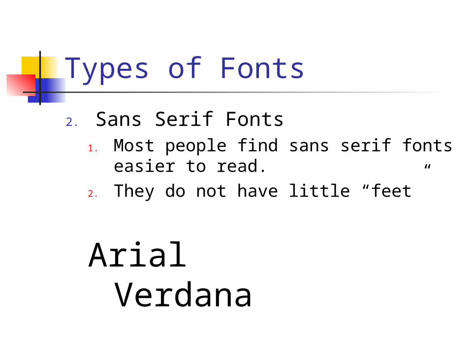
Types of Fonts
2. Sans Serif Fonts1. Most people find sans serif fonts
easier to read.2. They do not have little “feet”
Arial Verdana

High Contrast Fonts and Backgrounds
You must always consider your page’s background when choosing font colors.
Make certain that there is enough contrast between your text color and your background to make the text readable
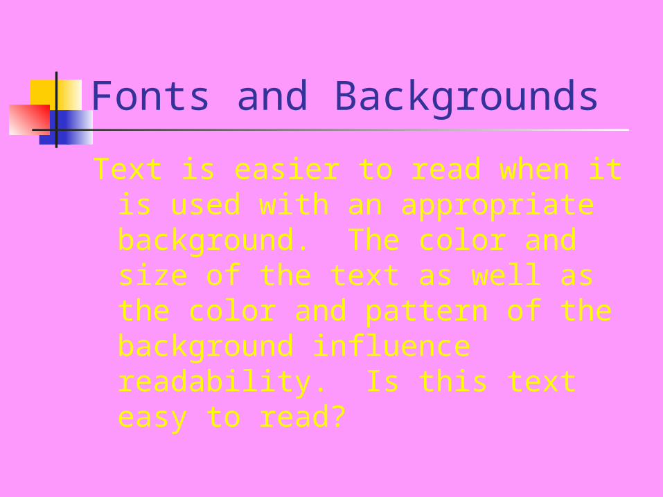
Fonts and Backgrounds
Text is easier to read when it is used with an appropriate background. The color and size of the text as well as the color and pattern of the background influence readability. Is this text easy to read?
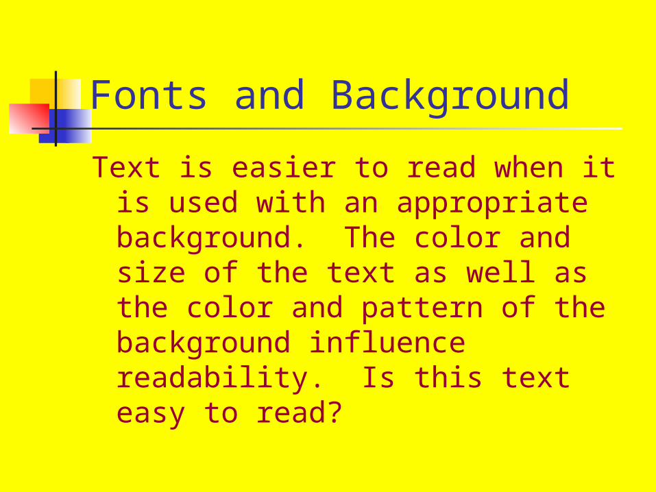
Fonts and Background
Text is easier to read when it is used with an appropriate background. The color and size of the text as well as the color and pattern of the background influence readability. Is this text easy to read?

Use Styles and Colors Sparingly
Too much bold or italic makes text difficult to read.
Use different styles and colors to emphasize important items, but do not emphasize too many things on one page
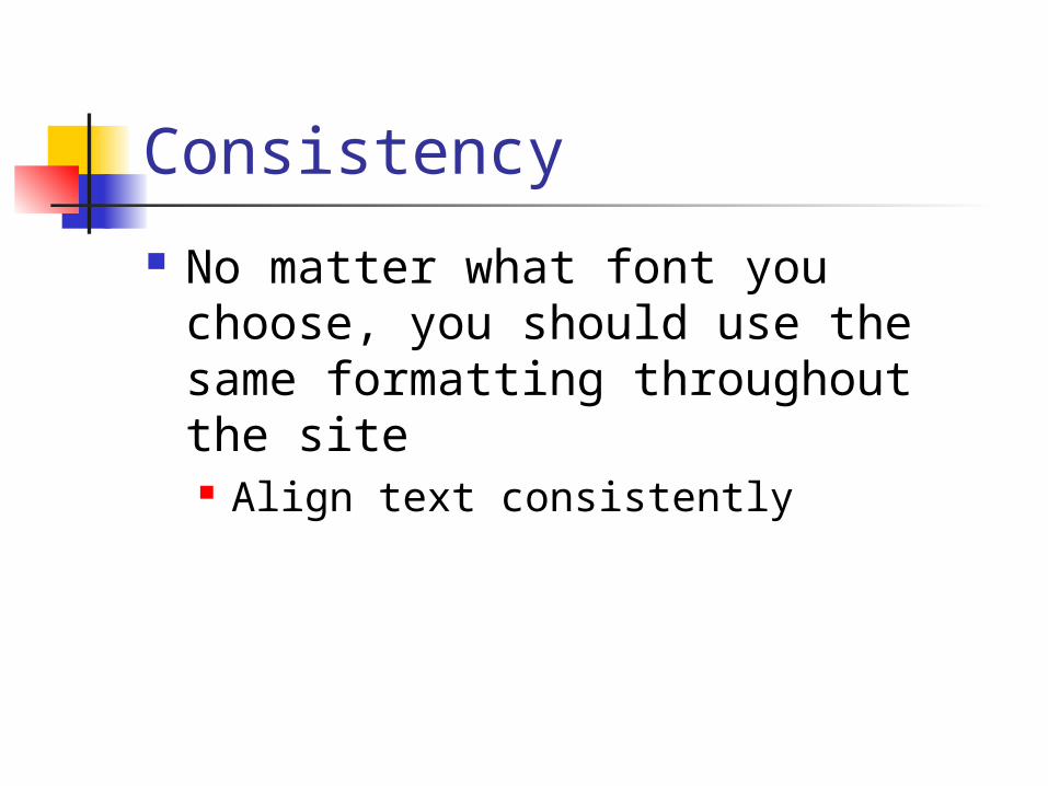
Consistency
No matter what font you choose, you should use the same formatting throughout the site Align text consistently
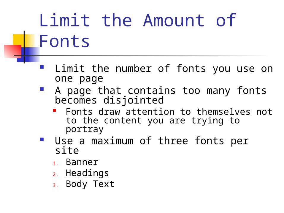
Limit the Amount of Fonts Limit the number of fonts you use on
one page A page that contains too many fonts
becomes disjointed Fonts draw attention to themselves not
to the content you are trying to portray Use a maximum of three fonts per site
1. Banner2. Headings3. Body Text
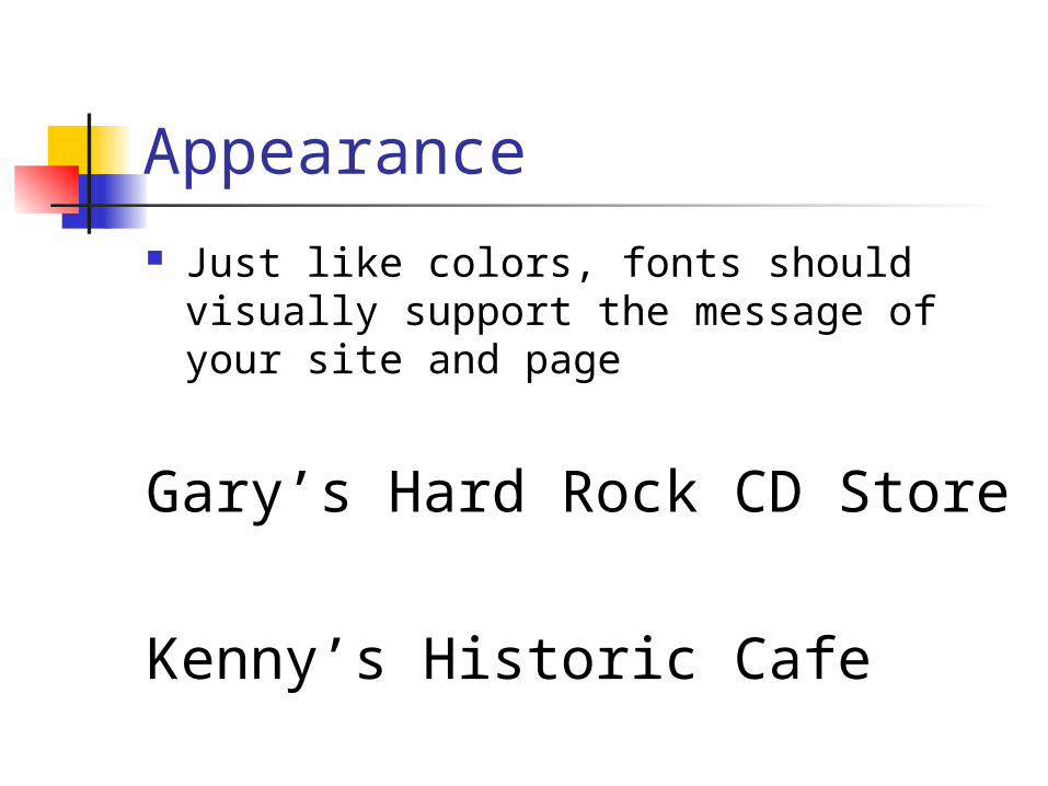
Appearance Just like colors, fonts should visually
support the message of your site and page
Gary’s Hard Rock CD Store
Kenny’s Historic Cafe
Related Documents