5 First steps ( ) 5.1 Introduction This exercise introduces geostatistical tools that can be used to analyze various types of environmental data. It is not intended as a complete analysis of the example data set. Indeed some of the steps here can be questioned, expanded, compared, and improved. The emphasis is on seeing what and some of its add-in packages can do in combination with an open source GIS such as GIS. The last section demonstrates how to export produced maps to . This whole chapter is, in a way, a prerequisite to other exercises in the book. We will use the data set, which is a classical geostatistical data set used frequently by the creator of the package to demonstrate various geostatistical analysis steps (Bivand et al., 2008, §8). The data set is documented in detail by Rikken and Van Rijn (1993), and Burrough and McDonnell (1998). It consists of 155 samples of top soil heavy metal concentrations (ppm), along with a number of soil and landscape variables. The samples were collected in a flood plain of the river Meuse, near the village Stein (Lat. 50° 58’ 16", Long. 5° 44’ 39"). Historic metal mining has caused the widespread dispersal of lead, zinc, copper and cadmium in the alluvial soil. The pollutants may constrain the land use in these areas, so detailed maps are required that identify zones with high concentrations. Our specific objective will be to generate a map of a heavy metal (zinc) in soil, and a map of soil liming requirement (binary variable) using point observations, and a range of auxiliary maps. Upon completion of this exercise, you will be able to plot and fit variograms, examine correlation between various variables, run spatial predictions using the combination of continuous and categorical predictors and visualize results in external GIS packages/browsers (SAGA GIS, ). If you are new to syntax, you should consider first studying some of the introductory books (listed in the section 3.4.2). 5.2 Data import and exploration Download the attached script from the book’s homepage and open it in Tinn-R. First, open a new session and change the working directory to where all your data sets will be located ( ). This directory will be empty at the beginning, but you will soon be able to see data sets that you will load, generate and/or export. Now you can run the script line by line. Feel free to experiment with the code and extend it as needed. Make notes if you experience any problems or if you are not able to perform some operation. Before you start processing the data, you will need to load the following packages: 117

Welcome message from author
This document is posted to help you gain knowledge. Please leave a comment to let me know what you think about it! Share it to your friends and learn new things together.
Transcript

5 1
First steps (meuse) 2
5.1 Introduction 3
This exercise introduces geostatistical tools that can be used to analyze various types of environmental data. It 4
is not intended as a complete analysis of the example data set. Indeed some of the steps here can be questioned, 5
expanded, compared, and improved. The emphasis is on seeing what R and some of its add-in packages can 6
do in combination with an open source GIS such as SAGA GIS. The last section demonstrates how to export 7
produced maps to Google Earth. This whole chapter is, in a way, a prerequisite to other exercises in the book. 8
We will use the meuse data set, which is a classical geostatistical data set used frequently by the creator of 9
the gstat package to demonstrate various geostatistical analysis steps (Bivand et al., 2008, §8). The data set is 10
documented in detail by Rikken and Van Rijn (1993), and Burrough and McDonnell (1998). It consists of 155 11
samples of top soil heavy metal concentrations (ppm), along with a number of soil and landscape variables. 12
The samples were collected in a flood plain of the river Meuse, near the village Stein (Lat. 50° 58’ 16", Long. 13
5° 44’ 39"). Historic metal mining has caused the widespread dispersal of lead, zinc, copper and cadmium 14
in the alluvial soil. The pollutants may constrain the land use in these areas, so detailed maps are required 15
that identify zones with high concentrations. Our specific objective will be to generate a map of a heavy metal 16
(zinc) in soil, and a map of soil liming requirement (binary variable) using point observations, and a range of 17
auxiliary maps. 18
Upon completion of this exercise, you will be able to plot and fit variograms, examine correlation between 19
various variables, run spatial predictions using the combination of continuous and categorical predictors and 20
visualize results in external GIS packages/browsers (SAGA GIS, Google Earth). If you are new to R syntax, 21
you should consider first studying some of the introductory books (listed in the section 3.4.2). 22
5.2 Data import and exploration 23
Download the attached meuse.R script from the book’s homepage and open it in Tinn-R. First, open a new 24
R session and change the working directory to where all your data sets will be located (C:/meuse/). This 25
directory will be empty at the beginning, but you will soon be able to see data sets that you will load, generate 26
and/or export. Now you can run the script line by line. Feel free to experiment with the code and extend it as 27
needed. Make notes if you experience any problems or if you are not able to perform some operation. 28
Before you start processing the data, you will need to load the following packages: 29
> library(maptools)> library(gstat)> library(rgdal)> library(lattice)> library(RSAGA)> library(geoR)> library(spatstat)
117

118 First steps (meuse)
You can get a list of methods in each package with the help method, e.g.:1
> help(package="maptools")
The meuse data set is in fact available in the installation directory of the gstat package. You can load the2
field observations by typing:3
> data(meuse)> str(meuse)
'data.frame': 155 obs. of 14 variables:$ x : num 181072 181025 181165 181298 181307 ...$ y : num 333611 333558 333537 333484 333330 ...$ cadmium: num 11.7 8.6 6.5 2.6 2.8 3 3.2 2.8 2.4 1.6 ...$ copper : num 85 81 68 81 48 61 31 29 37 24 ...$ lead : num 299 277 199 116 117 137 132 150 133 80 ...$ zinc : num 1022 1141 640 257 269 ...$ elev : num 7.91 6.98 7.80 7.66 7.48 ...$ dist : num 0.00136 0.01222 0.10303 0.19009 0.27709 ...$ om : num 13.6 14 13 8 8.7 7.8 9.2 9.5 10.6 6.3 ...$ ffreq : Factor w/ 3 levels "1","2","3": 1 1 1 1 1 1 1 1 1 1 ...$ soil : Factor w/ 3 levels "1","2","3": 1 1 1 2 2 2 2 1 1 2 ...$ lime : Factor w/ 2 levels "0","1": 2 2 2 1 1 1 1 1 1 1 ...$ landuse: Factor w/ 15 levels "Aa","Ab","Ag",..: 4 4 4 11 4 11 4 2 2 15 ...$ dist.m : num 50 30 150 270 380 470 240 120 240 420 ...
Zn
meuse$zinc
Fre
quen
cy
500 1000 1500
05
1015
2025
Fig. 5.1: Histogram plot for zinc (meuse data set).
which shows a table with 155 observations of 14 variables.4
To get a complete description of this data set, type:5
> ?meuse
Help for 'meuse' is shown in the browser
which will open your default web-browser and show the6
Html help page for this data set. Here you can also find7
what the abbreviated names for the variables mean. We8
will focus on mapping the following two variables: zinc9
— topsoil zinc concentration in ppm; and lime — the log-10
ical variable indicating whether the soil needs liming or11
not.12
Now we can start to visually explore the data set. For13
example, we can visualize the target variable with a his-14
togram:15
> hist(meuse$zinc, breaks=25, col="grey")
which shows that the target variable is skewed towards16
lower values (Fig. 5.1), and it needs to be transformed17
before we can run any linear interpolation.18
To be able to use spatial operations in R e.g. from the19
gstat package, we must convert the imported table into a SpatialPointDataFrame, a point map (with at-20
tributes), using the coordinates method:21
# 'attach coordinates' - convert table to a point map:> coordinates(meuse) <- ∼ x+y> str(meuse)
Formal class 'SpatialPointsDataFrame' [package "sp"] with 5 slots..@ data :'data.frame': 155 obs. of 12 variables:.. ..$ cadmium: num [1:155] 11.7 8.6 6.5 2.6 2.8 3 3.2 2.8 2.4 1.6 ..... ..$ copper : num [1:155] 85 81 68 81 48 61 31 29 37 24 ...

5.2 Data import and exploration 119
.. ..$ lead : num [1:155] 299 277 199 116 117 137 132 150 133 80 ...
.. ..$ zinc : num [1:155] 1022 1141 640 257 269 ...
.. ..$ elev : num [1:155] 7.91 6.98 7.80 7.66 7.48 ...
.. ..$ dist : num [1:155] 0.00136 0.01222 0.10303 0.19009 0.27709 ...
.. ..$ om : num [1:155] 13.6 14 13 8 8.7 7.8 9.2 9.5 10.6 6.3 ...
.. ..$ ffreq : Factor w/ 3 levels "1","2","3": 1 1 1 1 1 1 1 1 1 1 ...
.. ..$ soil : Factor w/ 3 levels "1","2","3": 1 1 1 2 2 2 2 1 1 2 ...
.. ..$ lime : Factor w/ 2 levels "0","1": 2 2 2 1 1 1 1 1 1 1 ...
.. ..$ landuse: Factor w/ 15 levels "Aa","Ab","Ag",..: 4 4 4 11 4 11 4 2 2 15 ...
.. ..$ dist.m : num [1:155] 50 30 150 270 380 470 240 120 240 420 ...
..@ coords.nrs : int [1:2] 1 2
..@ coords : num [1:155, 1:2] 181072 181025 181165 181298 181307 ...
.. ..- attr(*, "dimnames")=List of 2
.. .. ..$ : NULL
.. .. ..$ : chr [1:2] "x" "y"
..@ bbox : num [1:2, 1:2] 178605 329714 181390 333611
.. ..- attr(*, "dimnames")=List of 2
.. .. ..$ : chr [1:2] "x" "y"
.. .. ..$ : chr [1:2] "min" "max"
..@ proj4string:Formal class 'CRS' [package "sp"] with 1 slots
.. .. ..@ projargs: chr NA
Note that the structure is now more complicated, with a nested structure and 5 ‘slots’1 (Bivand et al., 2008, 1
§2): 2
(1.) @data contains the actual data in a table format (a copy of the original dataframe minus the coordinates); 3
(2.) @coords.nrs has the coordinate dimensions; 4
(3.) @coords contains coordinates of each element (point); 5
(4.) @bbox stands for ‘bounding box’ — this was automatically estimated by sp; 6
(5.) @proj4string contains the definition of projection system following the proj42 format. 7
The projection and coordinate system are at first unknown (listed as NA meaning ‘not applicable’). Coordi- 8
nates are just numbers as far as it is concerned. We know from the data set producers that this map is in the 9
so-called “Rijksdriehoek” or RDH (Dutch triangulation), which is extensively documented3. This is a: 10
stereographic projection (parameter +proj); 11
on the Bessel ellipsoid (parameter +ellps); 12
with a fixed origin (parameters +lat_0 and +lon_0); 13
scale factor at the tangency point (parameter +k); 14
the coordinate system has a false origin (parameters +x_0 and +y_0); 15
the center of the ellipsoid is displaced with respect to the standard WGS84 ellipsoid (parameter +towgs84, 16
with three distances, three angles, and one scale factor)4; 17
It is possible to specify all this information with the CRS method; however, it can be done more simply if 18
the datum is included in the European Petroleum Survey Group (EPSG) database5, now maintained by the 19
International Association of Oil & Gas producers (OGP). This database is included as text file (epsg) in the 20
rgdal package, in the subdirectory library/rgdal/proj in the R installation folder. Referring to the EPSG 21
registry6, we find the following entry: 22
1This is the S4 objects vocabulary. Slots are components of more complex objects.2http://trac.osgeo.org/proj/3http://www.rdnap.nl4The so-called seven datum transformation parameters (translation + rotation + scaling); also known as the Bursa Wolf method.5http://www.epsg-registry.org/6http://spatialreference.org/ref/epsg/28992/

120 First steps (meuse)
# Amersfoort / RD New <28992> +proj=sterea +lat_0=52.15616055555555+lon_0=5.38763888888889 +k=0.999908 +x_0=155000 +y_0=463000 +ellps=bessel+towgs84=565.237,50.0087,465.658,-0.406857,0.350733,-1.87035,4.0812+units=m +no_defs <>
This shows that the Amersfoort / RD New system is EPSG reference 28992. Note that some older instal-1
lations of GDAL do not carry the seven-transformation parameters that define the geodetic datum! Hence,2
you will need to add these parameters manually to your library/rgdal/proj/epsg file. Once you have set3
the correct parameters in the system, you can add the projection information to this data set using the CRS4
method:5
> proj4string(meuse) <- CRS("+init=epsg:28992")> meuse@proj4string
CRS arguments:+init=epsg:28992 +proj=sterea +lat_0=52.15616055555555+lon_0=5.38763888888889 +k=0.9999079 +x_0=155000 +y_0=463000 +ellps=bessel+towgs84=565.237,50.0087,465.658,-0.406857,0.350733,-1.87035,4.0812+units=m +no_defs
so now the correct projection information is included in the proj4string slot and we will be able to transform6
this spatial layer to geographic coordinates, and then export and visualize further in Google Earth.7
Once we have converted the table to a point map we can proceed with spatial exploration data analysis,8
e.g. we can simply plot the target variable in relation to sampling locations. A common plotting scheme used9
to display the distribution of values is the bubble method. In addition, we can import also a map of the river,10
and then display it together with the values of zinc (Bivand et al., 2008):11
# load river (lines):> data(meuse.riv)# convert to a polygon map:> tmp <- list(Polygons(list(Polygon(meuse.riv)), "meuse.riv"))> meuse.riv <- SpatialPolygons(tmp)> class(meuse.riv)
[1] "SpatialPolygons"attr(,"package")[1] "sp"
> proj4string(meuse.riv) <- CRS("+init=epsg:28992")# plot together points and river:> bubble(meuse, "zinc", scales=list(draw=T), col="black", pch=1, maxsize=1.5,+ sp.layout=list("sp.polygons", meuse.riv, col="grey"))
which will produce the plot shown in Fig. 5.2, left7. Alternatively, you can also export the meuse data set to12
ESRI Shapefile format:13
> writeOGR(meuse, ".", "meuse", "ESRI Shapefile")
which will generate four files in your working directory: meuse.shp (geometry), meuse.shx (auxiliary file),14
meuse.dbf (table with attributes), and meuse.prj (coordinate system). This shapefile you can now open in15
SAGA GIS and display using the same principle as with the bubble method (Fig. 5.2, right). Next, we import16
the gridded maps (40 m resolution). We will load them from the web repository8:17
# download the gridded maps:> setInternet2(use=TRUE) # you need to login on the book's homepage first!> download.file("http://spatial-analyst.net/book/system/files/meuse.zip",+ destfile=paste(getwd(), "meuse.zip", sep="/"))> grid.list <- c("ahn.asc", "dist.asc", "ffreq.asc", "soil.asc")
7See also http://r-spatial.sourceforge.net/gallery/ for a gallery of plots using meuse data set.8This has some extra layers compared to the existing meusegrid data set that comes with the sp package.

5.2 Data import and exploration 121
zinc
330000
331000
332000
333000
178500 179500 180500 181500
●●● ●
●●
●●●
●●
●
●●●
●●
●●
●●●●
●●●●
●●
●
●●●
●●●
●●●●●
●●
●
●●●●
●
●●
●●●●●●
●●
●●●●
●●
●●
●
●●●●
●●●●●
●●●●
●
●
●
●
●
●●
●
● ●●●
●●
●
●●●
●●
●
●
●
●
●
●
●
●
●●
●
●
●●
●
●
●
●
●
●●
●●
●
●
●
●
●
●
●
●
●
●
●
●
●
●●●
● ●
●
●●
●●●
●
●
●
●●●
●
●
●
●
●
●
113198326674.51839
Fig. 5.2: Meuse data set and values of zinc (ppm): visualized in R (left), and in SAGA GIS (right).
# unzip the maps in a loop:> for(j in grid.list){> fname <- zip.file.extract(file=j, zipname="meuse.zip")> file.copy(fname, paste("./", j, sep=""), overwrite=TRUE)> }
These are the explanatory variables that we will use to improve spatial prediction of the two target vari- 1
ables: 2
(1.) ahn — digital elevation model (in cm) obtained from the LiDAR survey of the Netherlands9; 3
(2.) dist — distance to river Meuse (in metres). 4
(3.) ffreq — flooding frequency classes: (1) high flooding frequency, (2) medium flooding frequency, (3) 5
no flooding; 6
(4.) soil — map showing distribution of soil types, following the Dutch classification system: (1) Rd10A, 7
(2) Rd90C-VIII, (3) Rd10C (de Fries et al., 2003); 8
In addition, we can also unzip the 2 m topomap that we can use as the background for displays (Fig. 5.2, 9
right): 10
# the 2 m topomap:> fname <- zip.file.extract(file="topomap2m.tif", zipname="meuse.zip")> file.copy(fname, "./topomap2m.tif", overwrite=TRUE)
We can load the grids to R, also by using a loop operation: 11
> meuse.grid <- readGDAL(grid.list[1])
ahn.asc has GDAL driver AAIGridand has 104 rows and 78 columns
9http://www.ahn.nl

122 First steps (meuse)
# fix the layer name:> names(meuse.grid)[1] <- sub(".asc", "", grid.list[1])> for(i in grid.list[-1]) {> meuse.grid@data[sub(".asc", "", i[1])] <- readGDAL(paste(i))$band1> }
dist.asc has GDAL driver AAIGridand has 104 rows and 78 columnsffreq.asc has GDAL driver AAIGridand has 104 rows and 78 columnssoil.asc has GDAL driver AAIGridand has 104 rows and 78 columns
# set the correct coordinate system:> proj4string(meuse.grid) <- CRS("+init=epsg:28992")
Note that two of the four predictors imported (ffreq and soil) are categorical variables. However they1
are coded in the ArcInfo ASCII file as integer numbers, which R does not recognize automatically. We need to2
tell R that these are categories:3
> meuse.grid$ffreq <- as.factor(meuse.grid$ffreq)> table(meuse.grid$ffreq)
1 2 3779 1335 989
> meuse.grid$soil <- as.factor(meuse.grid$soil)> table(meuse.grid$soil)
1 2 31665 1084 354
If you examine at the structure of the meuse.grid object, you will notice that it basically has a similar4
structure to a SpatialPointsDataFrame, except this is an object with a grid topology:5
Formal class 'SpatialGridDataFrame' [package "sp"] with 6 slots..@ data :'data.frame': 8112 obs. of 4 variables:.. ..$ ahn : int [1:8112] NA NA NA NA NA NA NA NA NA NA ..... ..$ dist : num [1:8112] NA NA NA NA NA NA NA NA NA NA ..... ..$ ffreq: Factor w/ 3 levels "1","2","3": NA NA NA NA NA NA NA NA NA NA ..... ..$ soil : Factor w/ 3 levels "1","2","3": NA NA NA NA NA NA NA NA NA NA .....@ grid :Formal class 'GridTopology' [package "sp"] with 3 slots.. .. ..@ cellcentre.offset: Named num [1:2] 178460 329620.. .. .. ..- attr(*, "names")= chr [1:2] "x" "y".. .. ..@ cellsize : num [1:2] 40 40.. .. ..@ cells.dim : int [1:2] 78 104..@ grid.index : int(0)..@ coords : num [1:2, 1:2] 178460 181540 329620 333740.. ..- attr(*, "dimnames")=List of 2.. .. ..$ : NULL.. .. ..$ : chr [1:2] "x" "y"..@ bbox : num [1:2, 1:2] 178440 329600 181560 333760.. ..- attr(*, "dimnames")=List of 2.. .. ..$ : chr [1:2] "x" "y".. .. ..$ : chr [1:2] "min" "max"..@ proj4string:Formal class 'CRS' [package "sp"] with 1 slots.. .. ..@ projargs: chr " +init=epsg:28992 +proj=sterea +lat_0=52.15616055+lon_0=5.38763888888889 +k=0.999908 +x_0=155000 +y_0=463000 +ellps=bess"|__truncated__
Many of the grid nodes are unavailable (NA sign), so that it seems that the layers carry no information. To6
check that everything is ok, we can plot the four gridded maps together (Fig. 5.3):7
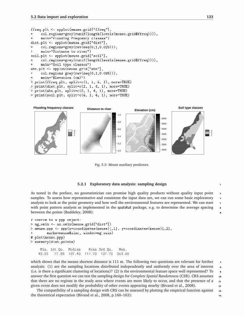
5.2 Data import and exploration 123
ffreq.plt <- spplot(meuse.grid["ffreq"],+ col.regions=grey(runif(length(levels(meuse.grid$ffreq)))),+ main="Flooding frequency classes")dist.plt <- spplot(meuse.grid["dist"],+ col.regions=grey(rev(seq(0,1,0.025))),+ main="Distance to river")soil.plt <- spplot(meuse.grid["soil"],+ col.regions=grey(runif(length(levels(meuse.grid$ffreq)))),+ main="Soil type classes")ahn.plt <- spplot(meuse.grid["ahn"],+ col.regions=grey(rev(seq(0,1,0.025))),+ main="Elevation (cm)")> print(ffreq.plt, split=c(1, 1, 4, 1), more=TRUE)> print(dist.plt, split=c(2, 1, 4, 1), more=TRUE)> print(ahn.plt, split=c(3, 1, 4, 1), more=TRUE)> print(soil.plt, split=c(4, 1, 4, 1), more=TRUE)
Flooding frequency classes
123
Distance to river
0.0
0.2
0.4
0.6
0.8
1.0
Elevation (cm)
3000
3500
4000
4500
5000
5500
6000
Soil type classes
123
Fig. 5.3: Meuse auxiliary predictors.
5.2.1 Exploratory data analysis: sampling design 1
As noted in the preface, no geostatistician can promise high quality products without quality input point 2
samples. To assess how representative and consistent the input data are, we can run some basic exploratory 3
analysis to look at the point geometry and how well the environmental features are represented. We can start 4
with point pattern analysis as implemented in the spatstat package, e.g. to determine the average spacing 5
between the points (Baddeley, 2008): 6
# coerce to a ppp object:> mg_owin <- as.owin(meuse.grid["dist"])> meuse.ppp <- ppp(x=coordinates(meuse)[,1], y=coordinates(meuse)[,2],+ marks=meuse$zinc, window=mg_owin)# plot(meuse.ppp)> summary(dist.points)
Min. 1st Qu. Median Mean 3rd Qu. Max.43.93 77.88 107.40 111.70 137.70 353.00
which shows that the means shortest distance is 111 m. The following two questions are relevant for further 7
analysis: (1) are the sampling locations distributed independently and uniformly over the area of interest 8
(i.e. is there a significant clustering of locations)? (2) is the environmental feature space well represented? To 9
answer the first question we can test the sampling design for Complete Spatial Randomness (CSR). CRS assumes 10
that there are no regions in the study area where events are more likely to occur, and that the presence of a 11
given event does not modify the probability of other events appearing nearby (Bivand et al., 2008). 12
The compatibility of a sampling design with CRS can be assessed by plotting the empirical function against 13
the theoretical expectation (Bivand et al., 2008, p.160–163): 14
124 First steps (meuse)
> env.meuse <- envelope(meuse.ppp, fun=Gest)
Generating 99 simulations of CSR ...1, 2, 3, 4, 5, 6, 7, 8, 9, 10, 11, 12, 13, 14, 15,... 91, 92, 93, 94, 95, 96, 97, 98, 99.
> plot(env.meuse, lwd=list(3,1,1,1), main="CSR test (meuse)")
0 50 100 1500.
00.
20.
40.
60.
81.
0
CSR test (meuse)
r
G((r))
Fig. 5.4: Comparison of the confidence bands for the G func-tion (Complete Spatial Randomness) and the actual observeddistribution (bold line). Derived using the envelope methodin spatstat.
which will run 100 simulations using the given point1
pattern and derive confidence bands for a CSR using2
the so called G function — this measures the distri-3
bution of the distances from an arbitrary event to its4
nearest event (Diggle, 2003). The plot of distribu-5
tions, actual versus expected CSR (Fig. 5.4), shows6
that the sampling design is somewhat clustered at7
shorter distances up to 75 m. Although the line of the8
observed distribution is in >80% of distance range9
outside the confidence bands (envelopes), we can say10
that the sampling plan is, in general, representative11
relative to geographical space.12
Next we look at the feature space coverage. For13
example, we can check whether there is a significant14
difference in the distribution of values at sampling15
locations and in the whole area of interest. To run16
this type of analysis we need to overlay sampling17
points and predictors to create an object10 with just18
the sample points, values of the target variable and19
of the feature-space predictors. We use the overlay20
method of the sp package to extract the values from21
the grid maps:22
> meuse.ov <- overlay(meuse.grid, meuse)> meuse.ov@data <- cbind(meuse.ov@data, meuse[c("zinc", "lime")]@data)> str(meuse.ov@data)
'data.frame': 155 obs. of 6 variables:$ ahn : int 3214 3402 3277 3563 3406 3355 3428 3476 3522 3525 ...$ dist : num 0.00136 0.01222 0.10303 0.19009 0.27709 ...$ ffreq: Factor w/ 3 levels "1","2","3": 1 1 1 1 1 1 1 1 1 1 ...$ soil : Factor w/ 3 levels "1","2","3": 1 1 1 2 2 2 2 1 1 2 ...$ zinc : num 1022 1141 640 257 269 ...$ lime : Factor w/ 2 levels "0","1": 2 2 2 1 1 1 1 1 1 1 ...
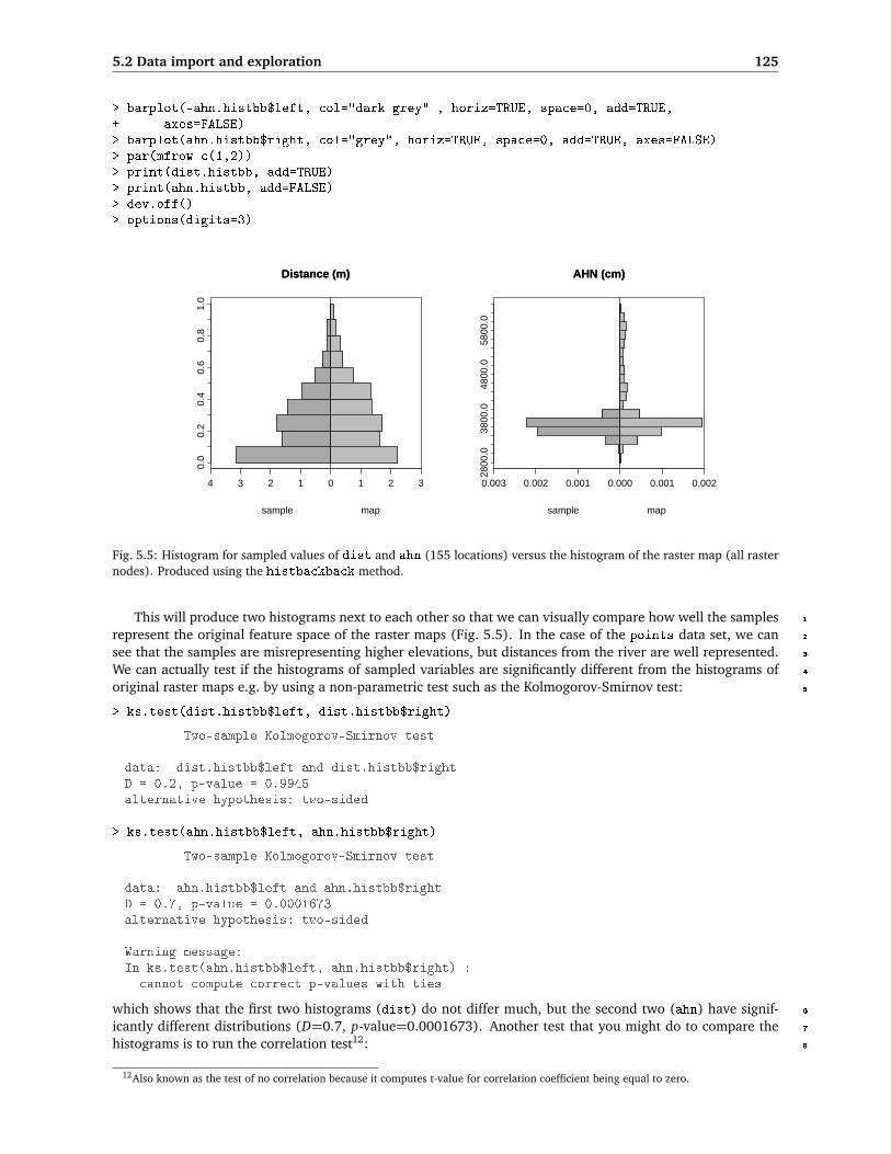
Now we can run some explanatory analyzes that focus on the feature space. First, we can visually compare23
the histograms of the maps with the histograms of values at point locations, e.g. by using a back to back24
histogram11:25
> library(Hmisc)> options(digits=1)> dist.histbb <- histbackback(meuse.ov$dist, meuse.grid$dist, prob=TRUE,+ xlab=c("sample","map"), main="Distance (m)")> barplot(-dist.histbb$left, col="dark grey" , horiz=TRUE, space=0, add=TRUE,+ axes=FALSE)> barplot(dist.histbb$right, col="grey", horiz=TRUE, space=0, add=TRUE, axes=FALSE)> ahn.histbb <- histbackback(meuse.ov$ahn, meuse.grid$ahn, prob=TRUE,+ xlab=c("sample","map"), main="AHN (cm)")
10Often refer to as the “regression matrix”.11This requires installation of the package Hmisc.
5.2 Data import and exploration 125
> barplot(-ahn.histbb$left, col="dark grey" , horiz=TRUE, space=0, add=TRUE,+ axes=FALSE)> barplot(ahn.histbb$right, col="grey", horiz=TRUE, space=0, add=TRUE, axes=FALSE)> par(mfrow=c(1,2))> print(dist.histbb, add=TRUE)> print(ahn.histbb, add=FALSE)> dev.off()> options(digits=3)
Distance (m)Distance (m)
4 3 2 1 0 1 2 3
0.0
0.2
0.4
0.6
0.8
1.0
sample map
AHN (cm)AHN (cm)
0.003 0.002 0.001 0.000 0.001 0.00228
00.0
3800
.048
00.0
5800
.0
sample map
Fig. 5.5: Histogram for sampled values of dist and ahn (155 locations) versus the histogram of the raster map (all rasternodes). Produced using the histbackback method.
This will produce two histograms next to each other so that we can visually compare how well the samples 1
represent the original feature space of the raster maps (Fig. 5.5). In the case of the points data set, we can 2
see that the samples are misrepresenting higher elevations, but distances from the river are well represented. 3
We can actually test if the histograms of sampled variables are significantly different from the histograms of 4
original raster maps e.g. by using a non-parametric test such as the Kolmogorov-Smirnov test: 5
> ks.test(dist.histbb$left, dist.histbb$right)
Two-sample Kolmogorov-Smirnov test
data: dist.histbb$left and dist.histbb$rightD = 0.2, p-value = 0.9945alternative hypothesis: two-sided
> ks.test(ahn.histbb$left, ahn.histbb$right)
Two-sample Kolmogorov-Smirnov test
data: ahn.histbb$left and ahn.histbb$rightD = 0.7, p-value = 0.0001673alternative hypothesis: two-sided
Warning message:In ks.test(ahn.histbb$left, ahn.histbb$right) :
cannot compute correct p-values with ties
which shows that the first two histograms (dist) do not differ much, but the second two (ahn) have signif- 6
icantly different distributions (D=0.7, p-value=0.0001673). Another test that you might do to compare the 7
histograms is to run the correlation test12: 8
12Also known as the test of no correlation because it computes t-value for correlation coefficient being equal to zero.

126 First steps (meuse)
> cor.test(ahn.histbb$left, ahn.histbb$right)
In the step of geographic analysis of the sampling design we will assess whether the sampling density1
within different soil mapping units (soil) is consistent. First, we look at how many points fall into each zone:2
> summary(meuse.ov$soil)
1 2 397 46 12
then we need to derive the observed inspection density using:3
# observed:> inspdens.obs <- summary(meuse.ov$soil)[1:length(levels(meuse.ov$soil))]/+ (summary(meuse.grid$soil)[1:length(levels(meuse.grid$soil))]+ *meuse.grid@grid@cellsize[[1]]^2)# expected:> inspdens.exp <- rep(length(meuse.ov$soil)/+ (length(meuse.grid$soil[!is.na(meuse.grid$soil)])+ *meuse.grid@grid@cellsize[[1]]^2), length(levels(meuse.ov$soil)))# inspection density in no./ha:> inspdens.obs*10000
1 2 30.364 0.265 0.212
> inspdens.exp*10000
[1] 0.312 0.312 0.312
which can also be compared by using the Kolmogorov-Smirnov test:4
> ks.test(inspdens.obs, inspdens.exp)
Two-sample Kolmogorov-Smirnov test
data: inspdens.obs and inspdens.expD = 0.667, p-value = 0.5176alternative hypothesis: two-sided
Warning message:In ks.test(inspdens.obs, inspdens.exp) :cannot compute correct p-values with ties
In this case, we see that inspection density is also significantly inconsistent considering the map of soil,5
which is not by chance (p-value=0.5176). We could also run a similar analysis for land cover types or any6
other factor-type predictors.7
So in summary, we can conclude for the meuse sampling design that:8
the average distance to the nearest neighbor is 111 m and the size of the area is 496 ha;9
the sampling intensity is 3 points per 10 ha, which corresponds to a grid cell size of about 15 m (Hengl,10
2006);11
the sampling density varies in geographical space — sampling is significantly clustered for smaller dis-12
tance (<75 m);13
the sampling is unrepresentative considering the maps of ahn and soil — higher elevations and soil14
class 3 are significantly under-sampled;15
These results do not mean that this data set is unsuitable for generating maps, but they do indicate that it16
has some limitations considering representativeness, independency and consistency requirements.17

5.3 Zinc concentrations 127
5.3 Zinc concentrations 1
5.3.1 Regression modeling 2
The main objective of regression-kriging analysis is to build a regression model by using the explanatory 3
gridded maps. We have previously estimated values of explanatory maps and target variables in the same 4
table (overlay operation), so we can start by visually exploring the relation between the target variable and 5
the continuous predictors e.g. by using a smoothed scatterplot (Fig. 5.6): 6
> par(mfrow = c(1, 2))> scatter.smooth(meuse.ov$dist, meuse.ov$zinc, span=18/19,+ col="grey", xlab="Distance to river (log)", ylab="Zinc (ppm)")> scatter.smooth(meuse.ov$ahn, meuse.ov$zinc, span=18/19,+ col="grey", xlab="Elevation (cm)", ylab="Zinc (ppm)")
which shows that the values of zinc decrease as the distance from (water) streams and elevation increases. 7
This supports our knowledge about the area — the majority of heavy metals has been originated from fresh 8
water deposition. The relation seems to be particulary clear, but it appears to be non-linear as the fitted lines 9
are curved. 10
●
●
●
● ● ●●
●●
●●●
●
●
●
●
●
●●
●
●
●●
● ● ●●●●
●●●●
●●
●
●
●●
●
●
●●●
● ●
●●
●●
●
●
●
●
●
●
●
●
●
●
●
●●●
●●
●
●
●● ●
●
●●●
●
●●
●
●
●
●
●
●●●
●●●
●●
●●
●●
●●●● ●●
●●
● ● ● ●●●●●
●●●●● ●
●
●●●
●
●
●
●
● ● ●
●●
●●●
●●● ●●
●
●
●●●
●●
● ●
●
●●
●
●
●
●
●
0.0 0.2 0.4 0.6 0.8
500
1000
1500
Distance to river (log)
Zin
c (p
pm)
●
●
●
●●●●
●●
●●●
●
●
●
●
●
●●
●
●
●●
●●●●●●
● ●●●●●
●
●
●●
●
●
●●●
●●
●●
●●
●
●
●
●
●
●
●
●
●
●
●
●●●
●●
●
●
●●●
●
●●●
●
●●
●
●
●
●
●
● ●●
●●●●●
●●
●●
●●● ● ●●
●●
●●● ●●●
●●● ●●●
● ●
●
●●●
●
●
●
●
● ●●
●●
●●●
● ●●●●
●
●
●●●
●●
●●
●
●●
●
●
●
●
●
3200 3400 3600 3800
500
1000
1500
Elevation (cm)
Zin
c (p
pm)
Fig. 5.6: Scatterplots showing the relation between zinc and distance from river, and elevation.
Another useful analysis relevant for the success of regression modeling is to look at the multicolinearity of 11
predictors. Some predictors show the same feature, i.e. they are not independent. For example, dist.asc and 12
ahn.asc maps are correlated: 13
> pairs(zinc ∼ ahn+dist, meuse.ov)> cor(meuse.grid$ahn, meuse.grid$dist, use="complete.obs")
[1] 0.294
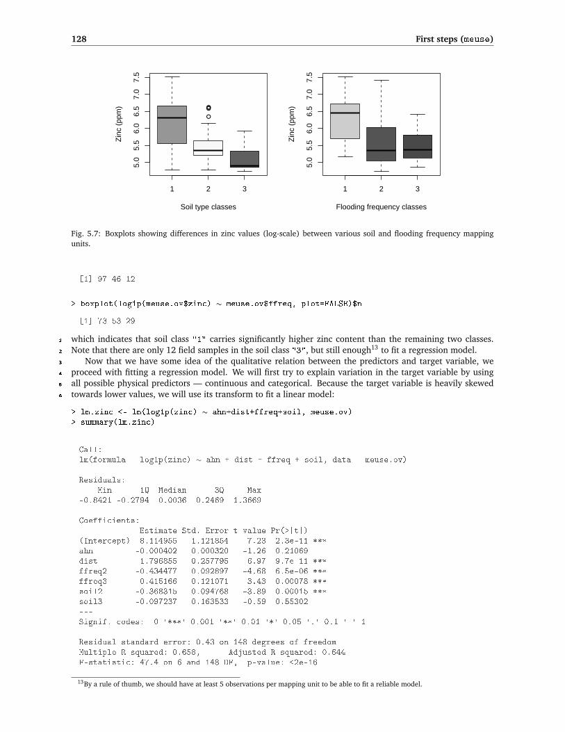
To visualize the relationship between the target variable and the classified predictors we used a grouped 14
boxplot; this also allows us to count the samples in each class (Fig. 5.7): 15
> par(mfrow=c(1,2))> boxplot(log1p(meuse.ov$zinc) ∼ meuse.ov$soil,+ col=grey(runif(length(levels(meuse.ov$soil)))),+ xlab="Soil type classes", ylab="Zinc (ppm)")> boxplot(log1p(meuse.ov$zinc) ∼ meuse.ov$ffreq,+ col=grey(runif(length(levels(meuse.ov$soil)))),+ xlab="Flooding frequency classes", ylab="Zinc (ppm)")> dev.off()> boxplot(log1p(meuse.ov$zinc) ∼ meuse.ov$soil, plot=FALSE)$n
128 First steps (meuse)
●
●●●
1 2 3
5.0
5.5
6.0
6.5
7.0
7.5
Soil type classes
Zin
c (p
pm)
1 2 3
5.0
5.5
6.0
6.5
7.0
7.5
Flooding frequency classes
Zin
c (p
pm)
Fig. 5.7: Boxplots showing differences in zinc values (log-scale) between various soil and flooding frequency mappingunits.
[1] 97 46 12
> boxplot(log1p(meuse.ov$zinc) ∼ meuse.ov$ffreq, plot=FALSE)$n
[1] 73 53 29
which indicates that soil class "1" carries significantly higher zinc content than the remaining two classes.1
Note that there are only 12 field samples in the soil class "3", but still enough13 to fit a regression model.2
Now that we have some idea of the qualitative relation between the predictors and target variable, we3
proceed with fitting a regression model. We will first try to explain variation in the target variable by using4
all possible physical predictors — continuous and categorical. Because the target variable is heavily skewed5
towards lower values, we will use its transform to fit a linear model:6
> lm.zinc <- lm(log1p(zinc) ∼ ahn+dist+ffreq+soil, meuse.ov)> summary(lm.zinc)
Call:lm(formula = log1p(zinc) ∼ ahn + dist + ffreq + soil, data = meuse.ov)
Residuals:Min 1Q Median 3Q Max
-0.8421 -0.2794 0.0036 0.2469 1.3669
Coefficients:Estimate Std. Error t value Pr(>|t|)
(Intercept) 8.114955 1.121854 7.23 2.3e-11 ***ahn -0.000402 0.000320 -1.26 0.21069dist -1.796855 0.257795 -6.97 9.7e-11 ***ffreq2 -0.434477 0.092897 -4.68 6.5e-06 ***ffreq3 -0.415166 0.121071 -3.43 0.00078 ***soil2 -0.368315 0.094768 -3.89 0.00015 ***soil3 -0.097237 0.163533 -0.59 0.55302---Signif. codes: 0 '***' 0.001 '**' 0.01 '*' 0.05 '.' 0.1 ' ' 1
Residual standard error: 0.43 on 148 degrees of freedomMultiple R-squared: 0.658, Adjusted R-squared: 0.644F-statistic: 47.4 on 6 and 148 DF, p-value: <2e-16
13By a rule of thumb, we should have at least 5 observations per mapping unit to be able to fit a reliable model.

5.3 Zinc concentrations 129
The lm method has automatically converted factor-variables into indicator (dummy) variables. The sum- 1
mary statistics show that our predictors are significant in explaining the variation in log1p(zinc). However, 2
not all of them are equally significant; some could probably be left out. We have previously demonstrated 3
that some predictors are cross-correlated (e.g. dist and ahn). To account for these problems, we will do the 4
following: first, we will generate indicator maps to represent all classes of interest: 5
> meuse.grid$soil1 <- ifelse(meuse.grid$soil=="1", 1, 0)> meuse.grid$soil2 <- ifelse(meuse.grid$soil=="2", 1, 0)> meuse.grid$soil3 <- ifelse(meuse.grid$soil=="3", 1, 0)> meuse.grid$ffreq1 <- ifelse(meuse.grid$ffreq=="1", 1, 0)> meuse.grid$ffreq2 <- ifelse(meuse.grid$ffreq=="2", 1, 0)> meuse.grid$ffreq3 <- ifelse(meuse.grid$ffreq=="3", 1, 0)
so that we can convert all grids to principal components to reduce their multi-dimensionality14: 6
> pc.predmaps <- prcomp( ∼ ahn+dist+soil1+soil2+soil3+ffreq1+ffreq2+ffreq3,+ scale=TRUE, meuse.grid)> biplot(pc.predmaps, xlabs=rep(".", length(pc.predmaps$x[,1])), arrow.len=0.1,+ xlab="First component", ylab="Second component")
After the principal component analysis, we need to convert the derived PCs (10) to grids, since they have 7
lost their spatial reference. This will take few steps: 8
> pc.comps <- as.data.frame(pc.predmaps$x)# insert grid index:> meuse.grid$nrs <- seq(1, length(meuse.grid@data[[1]]))> meuse.grid.pnt <- as(meuse.grid["nrs"], "SpatialPointsDataFrame")# mask NA grid nodes:> maskpoints <- as.numeric(attr(pc.predmaps$x, "dimnames")[[1]])# attach coordinates:> pc.comps$X <- meuse.grid.pnt@coords[maskpoints, 1]> pc.comps$Y <- meuse.grid.pnt@coords[maskpoints, 2]> coordinates(pc.comps) <- ∼ X + Y# convert to a grid:> gridded(pc.comps) <- TRUE> pc.comps <- as(pc.comps, "SpatialGridDataFrame")> proj4string(pc.comps) <- meuse.grid@proj4string> names(pc.comps)
[1] "PC1" "PC2" "PC3" "PC4" "PC5" "PC6" "PC7" "PC8"
overlay the points and PCs again, and re-fit a regression model: 9
> meuse.ov2 <- overlay(pc.comps, meuse)> meuse.ov@data <- cbind(meuse.ov@data, meuse.ov2@data)
Because all predictors should now be independent, we can reduce their number by using step-wise regres- 10
sion: 11
> lm.zinc <- lm(log1p(zinc) ∼ PC1+PC2+PC3+PC4+PC5+PC6+PC7+PC8, meuse.ov)> step.zinc <- step(lm.zinc)> summary(step.zinc)
Call:lm(formula = log1p(zinc) ~ PC1 + PC2 + PC3 + PC4 + PC6, data=meuse.ov)
Residuals:Min 1Q Median 3Q Max
-0.833465 -0.282418 0.000112 0.261798 1.415499
14An important assumption of linear regression is that the predictors are mutually independent (Kutner et al., 2004).

130 First steps (meuse)
Coefficients:Estimate Std. Error t value Pr(>|t|)
(Intercept) 5.6398 0.0384 146.94 < 2e-16 ***PC1 -0.3535 0.0242 -14.59 < 2e-16 ***PC2 -0.0645 0.0269 -2.40 0.01756 *PC3 -0.0830 0.0312 -2.66 0.00869 **PC4 0.0582 0.0387 1.50 0.13499PC6 -0.2407 0.0617 -3.90 0.00014 ***---Signif. codes: 0 '***' 0.001 '**' 0.01 '*' 0.05 '.' 0.1 ' ' 1
Residual standard error: 0.426 on 149 degrees of freedomMultiple R-squared: 0.661, Adjusted R-squared: 0.65F-statistic: 58.2 on 5 and 149 DF, p-value: <2e-16
The resulting models shows that there are only two predictors that are highly significant, and four that are1
marginally significant, while four predictors can be removed from the list. You should also check the diagnostic2
plots for this regression model to see if the assumptions15 of linear regression are met.3
5.3.2 Variogram modeling4
We proceed with modeling of the variogram, which will be later used to make predictions using universal5
kriging in gstat. Let us first compute the sample (experimental) variogram with the variogram method of the6
gstat package:7
> zinc.svar <- variogram(log1p(zinc) ∼ 1, meuse)> plot(zinc.svar)
This shows that the semivariance reaches a definite sill at a distance of about 1000 m (Fig. 5.8, left). We8
can use the automatic fitting method16 in gstat to fit a suitable variogram model. This method requires some9
initial parameters. We can set them using the following rule of thumb:10
Nugget is zero;11
Sill is the total (nonspatial) variance of the data set;12
Range is one-quarter of the diagonal of the bounding box.13
In R, we can code this by using:14
> zinc.vgm <- fit.variogram(zinc.svar, model=zinc.ivgm)> zinc.vgm
model psill range1 Nug 0.000 02 Exp 0.714 449
> zinc.vgm.plt <- plot(zinc.svar, zinc.vgm, pch="+", pl=TRUE,+ col="black", main="log1p(zinc)")
The idea behind using default values for initial variogram is that the process can be automated, without15
need to visually examine each variogram; although, for some variograms the automated fit may not converge16
to a reasonable solution (if at all). In this example, the fitting runs without a problem and you should get17
something like Fig. 5.8.18
In order to fit the regression-kriging model, we actually need to fit the variogram for the residuals:19
15Normally distributed, symmetric residuals around the regression line; no heteroscedascity, outliers or similar unwanted effects.16The fit.variogram method uses weighted least-squares.
5.3 Zinc concentrations 131
log1p(zinc)
distance
sem
ivar
ianc
e
0.2
0.4
0.6
500 1000 1500
+
+
+
+
+
+ +
++
+ +
+
+
+ +
57
299
419
457547
533574564
589543500
477452
457415
Residuals
distance
sem
ivar
ianc
e
0.2
0.4
0.6
500 1000 1500
+
++ + +
++
+ + + + ++
+ +
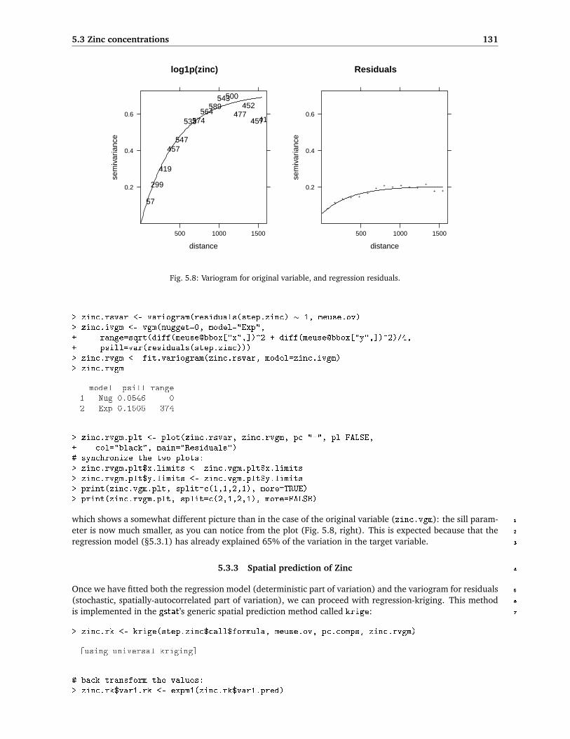
Fig. 5.8: Variogram for original variable, and regression residuals.
> zinc.rsvar <- variogram(residuals(step.zinc) ∼ 1, meuse.ov)> zinc.ivgm <- vgm(nugget=0, model="Exp",+ range=sqrt(diff(meuse@bbox["x",])^2 + diff(meuse@bbox["y",])^2)/4,+ psill=var(residuals(step.zinc)))> zinc.rvgm <- fit.variogram(zinc.rsvar, model=zinc.ivgm)> zinc.rvgm
model psill range1 Nug 0.0546 02 Exp 0.1505 374
> zinc.rvgm.plt <- plot(zinc.rsvar, zinc.rvgm, pc="+", pl=FALSE,+ col="black", main="Residuals")# synchronize the two plots:> zinc.rvgm.plt$x.limits <- zinc.vgm.plt$x.limits> zinc.rvgm.plt$y.limits <- zinc.vgm.plt$y.limits> print(zinc.vgm.plt, split=c(1,1,2,1), more=TRUE)> print(zinc.rvgm.plt, split=c(2,1,2,1), more=FALSE)
which shows a somewhat different picture than in the case of the original variable (zinc.vgm): the sill param- 1
eter is now much smaller, as you can notice from the plot (Fig. 5.8, right). This is expected because that the 2
regression model (§5.3.1) has already explained 65% of the variation in the target variable. 3
5.3.3 Spatial prediction of Zinc 4
Once we have fitted both the regression model (deterministic part of variation) and the variogram for residuals 5
(stochastic, spatially-autocorrelated part of variation), we can proceed with regression-kriging. This method 6
is implemented in the gstat’s generic spatial prediction method called krige: 7
> zinc.rk <- krige(step.zinc$call$formula, meuse.ov, pc.comps, zinc.rvgm)
[using universal kriging]
# back-transform the values:> zinc.rk$var1.rk <- expm1(zinc.rk$var1.pred)
132 First steps (meuse)
where step.zinc$call$formula is the regression model estimated in the previous section:1
> step.zinc$call$formula
log1p(zinc) ∼ PC1 + PC2 + PC3 + PC4 + PC6
where zinc.rvgm is the fitted residual variogram, and expm1 is back-transformation function. For a compari-2
son, we can make predictions at all locations of interest also using ordinary kriging:3
> zinc.ok <- krige(log1p(zinc) ∼ 1, meuse, meuse.grid["soil"], zinc.vgm)
[using ordinary kriging]
> zinc.ok$var1.rk <- expm1(zinc.ok$var1.pred)
OK predictions (zinc)
++ + +
++
+++
+++
+++
++
++
+ +++
++++
++
+
+++ +
+++
+++
+++
+
+++
+
+++
++++++
++
++
++
++
++
++
+++
+ ++++
++
++
+
+
+
++
++
+
+ ++
+
++
+
+++
++
+
+
+
++
+
+
+++
++
+++
+
+
++
++
+
+
+
++
+
+
+
+
+
+
+
++
+
+++
+ ++
++
+++
+
++
+++
+
200
400
600
800
1000
1200
1400
1600
1800
RK predictions (zinc)
++ + +
++
+++
+++
+++
++
++
+ +++
++++
++
+
+++ +
+++
+++
+++
+
+++
+
+++
++++++
++
++
++
++
++
++
+++
+ ++++
++
++
+
+
+
++
++
+
+ ++
+
++
+
+++
++
+
+
+
++
+
+
+++
++
+++
+
+
++
++
+
+
+
++
+
+
+
+
+
+
+
++
+
+++
+ ++
++
+++
+
++
+++
+
200
400
600
800
1000
1200
1400
1600
1800
Fig. 5.9: Ordinary kriging vs regression-kriging: spatial prediction of zinc.
and compare the two maps side-by-side:4
# display limits:> at.zinc <- seq(min(meuse$zinc),max(meuse$zinc),sd(meuse$zinc)/5)> zinc.ok.plt <- spplot(zinc.ok["var1.rk"],+ col.regions=grey(rev(seq(0,0.97,1/length(at.zinc)))), at=at.zinc,+ main="OK predictions (zinc)", sp.layout=list("sp.points",pch="+",+ col="black", meuse))> zinc.rk.plt <- spplot(zinc.rk["var1.rk"],+ col.regions=grey(rev(seq(0,0.97,1/length(at.zinc)))), at=at.zinc,+ main="RK predictions (zinc)", sp.layout=list("sp.points", pch="+",+ col="black", meuse))> print(zinc.ok.plt, split=c(1,1,2,1), more=T)> print(zinc.rk.plt, split=c(2,1,2,1), more=F)
Visually, there are some clear differences between the two maps. The regression-kriging map shows much5
more local detail (the maps showing distance from river and soil and flooding frequency classes are reflected6
in the output map); the locations of hot-spots on both maps are, on the other hand, very similar. But visual7
comparison is not enough. Hence, we also would like to see which technique is more accurate. To achieve8
this, we use use the leave-one-out cross validation method, as implemented in the krige.cv method of gstat9
package (Pebesma, 2004). To run cross-validations, we simply use the built-in krive.cv method:10

5.4 Liming requirements 133
> cross.zinc.ok <- krige.cv(log1p(zinc) ∼ 1, meuse.ov,+ zinc.vgm, verbose=FALSE) # show no output> cross.zinc.rk <- krige.cv(step.zinc$call$formula, meuse.ov,+ zinc.rvgm, verbose=FALSE)
You will notice that the kriging system is solved once for each input data point. To evaluate the cross- 1
validation, we can compare RMSE summaries (§1.4), and in particular the standard deviations of the errors 2
(field residual of the cross-validation object). To estimate how much of variation has been explained by the 3
two models, we can run: 4
# amount of variation explained by the models:> 1-var(cross.zinc.ok$residual, na.rm=T)/var(log1p(meuse$zinc))
[1] 0.701
> 1-var(cross.zinc.rk$residual, na.rm=T)/var(log1p(meuse$zinc))
[1] 0.773
which shows that OK is not much worse than RK — RK is a better predictor, but the difference is only 7%. This 5
is possibly because variables dist and soil are also spatially continuous, and because the samples are equally 6
spread in geographic space. Indeed, if you look at Fig. 5.9 again, you will notice that the two maps do not 7
differ much. Note also that amount of variation explained by RK geostatistical model is about 80%, which is 8
satisfactory. 9
5.4 Liming requirements 10
5.4.1 Fitting a GLM 11
In the second part of this exercise, we will try to interpolate a categorical variable using the same regression- 12
kriging model. This variable is not as simple as zinc, since it ranges from 0 to 1 i.e. it is a binomial variable. 13
We need to respect that property of the data, and try to fit it using a GLM (Kutner et al., 2004): 14
E(Pc) = µ= g−1(q · β) (5.4.1)
15
where E(P) is the expected probability of class c (Pc ∈ [0,1]), q ·β is the linear regression model, and g is the 16
link function. Because the target variable is a binomial variable, we need to use the logit link function: 17
g(µ) = µ+ = ln�
µ
1−µ
�
(5.4.2)
18
so the Eq.(5.4.1) becomes logistic regression (Kutner et al., 2004). How does this works in R? Instead of fitting 19
a simple linear model (lm), we can use a more generic glm method with the logit link function (Fig. 5.10, 20
left): 21
> glm.lime <- glm(lime ∼ PC1+PC2+PC3+PC4+PC5+PC6+PC7+PC8, meuse.ov,+ family=binomial(link="logit"))> step.lime <- step(glm.lime)# check if the predictions are within 0-1 range:> summary(round(step.lime$fitted.values, 2))
Min. 1st Qu. Median Mean 3rd Qu. Max.0.000 0.010 0.090 0.284 0.555 0.920
What you do not see from your R session is that the GLM model is fitted iteratively, i.e. using a more 22
sophisticated approach than if we would simply fit a lm (e.g. using ordinary least square — no iterations). To 23
learn more about the GLMs and how are they fitted and how to interpret the results see Kutner et al. (2004). 24
Next, we can predict the values17 at all grid nodes using this model: 25
17Important: note that we focus on values in the transformed scale, i.e. logits.

134 First steps (meuse)
> p.glm <- predict(glm.lime, newdata=pc.comps, type="link", se.fit=T)> str(p.glm)
List of 3$ fit : Named num [1:3024] 2.85 2.30 2.25 1.83 2.77 .....- attr(*, "names")= chr [1:3024] "68" "144" "145" "146" ...$ se.fit : Named num [1:3024] 1.071 0.813 0.834 0.729 1.028 .....- attr(*, "names")= chr [1:3024] "68" "144" "145" "146" ...$ residual.scale: num 1
which shows that the spatial structure of the object was lost. Obviously, we will not be able to display the1
results as a map until we convert it to a gridded data frame. This takes few steps:2
# convert to a gridded layer:> lime.glm <- as(pc.comps, "SpatialPointsDataFrame")> lime.glm$lime <- p.glm$fit> gridded(lime.glm) <- TRUE> lime.glm <- as(lime.glm, "SpatialGridDataFrame")> proj4string(lime.glm) <- meuse.grid@proj4string
5.4.2 Variogram fitting and final predictions3
The remaining residuals we can interpolate using ordinary kriging. This is assuming that the residuals follow4
an approximately normal distribution. If the GLM we use is appropriate, this should indeed be the case. First,5
we estimate the variogram model:6
> hist(residuals(step.lime), breaks=25, col="grey")# residuals are normal;> lime.ivgm <- vgm(nugget=0, model="Exp",+ range=sqrt(diff(meuse@bbox["x",])^2 + diff(meuse@bbox["y", ])^2)/4,+ psill=var(residuals(step.lime)))> lime.rvgm <- fit.variogram(variogram(residuals(step.lime) ∼ 1, meuse.ov),+ model=lime.ivgm)
GLM fit (logits)
predicted (logits)
mea
sure
d
0.0
0.2
0.4
0.6
0.8
1.0
−10 −5 0
●●●
●●● ● ●●●● ●
●
●●
●●●●●●●●
●● ● ●● ●●● ●●● ● ● ●
● ●●
●● ●● ●●●●●●●
●●●●●
●●
●● ●●● ●●●
●
●
●
●●
●●
●
●●●
●● ● ●● ●
●
●
●●●●●
● ●
●●● ● ● ●●● ●●● ●● ●● ●●● ● ●●● ●●
●
●●● ●
●
● ●●●●● ● ●
●
●●● ● ● ● ● ●●● ● ●●● ●● ●●●●● ●● ●
Variogram for residuals
distance
sem
ivar
ianc
e
0.2
0.4
0.6
500 1000 1500
+
+
+ ++
+
++
+
+
+
+
+
+
+
57
299
419457547
533574
564589
543500
477
452457
415
Fig. 5.10: Measured and predicted (GLM with binomial function) values for lime variable (left); variogram for the GLMresiduals (right).

5.4 Liming requirements 135
Liming requirements
330000
331000
332000
333000
179000 180000 181000
0.1
0.2
0.3
0.4
0.5
0.6
0.7
0.8
0.9
1.0
Fig. 5.11: Liming requirements predicted using regression-kriging; as shown in R (left) and in SAGA GIS (right).
which shows that the variogram is close to pure nugget effect (Fig. 5.10, right)18. We can still interpolate the 1
residuals using ordinary kriging: 2
> lime.rk <- krige(residuals(step.lime) ∼ 1, meuse.ov, pc.comps, lime.rvgm)
[using ordinary kriging]
and then add back to the predicted regression part of the model: 3
> lime.rk$var1.rk <- lime.glm$lime + lime.rk$var1.pred> lime.rk$var1.rko <- exp(lime.rk$var1.rk)/(1 + exp(lime.rk$var1.rk))# write to a GIS format:> write.asciigrid(lime.rk["var1.rko"], "lime_rk.asc", na.value=-1)> lime.plt <- spplot(lime.rk["var1.rko"], scales=list(draw=T),+ at=seq(0.05, 1, 0.05), col.regions=grey(rev(seq(0, 0.95, 0.05))),+ main="Liming requirements", sp.layout=list("sp.polygons",+ col="black", meuse.riv))
After you export the resulting map to SAGA GIS, a first step is to visually explore the maps to see how well 4
the predicted values match the field observations (Fig. 5.11). Note that the map has problems predicting the 5
right class at several isolated locations. To estimate the accuracy of predicting the right class, we can use: 6
> lime.ov <- overlay(lime.rk, meuse)> lime.ov@data <- cbind(lime.ov@data, meuse["lime"]@data)> library(mda)> library(vcd) # kappa statistics> Kappa(confusion(lime.ov$lime, as.factor(round(lime.ov$var1.rko, 0))))
value ASEUnweighted 0.678 0.0671Weighted 0.678 0.0840
which shows that in 68% of cases the predicted liming requirement class matches the field records. 7
18The higher the nugget, the more the algorithm will smooth the residuals. In the case of pure nugget effect, it does not make anydifference if we use only results of regression, or if we add interpolated residuals to the regression predictions.
136 First steps (meuse)
5.5 Advanced exercises1
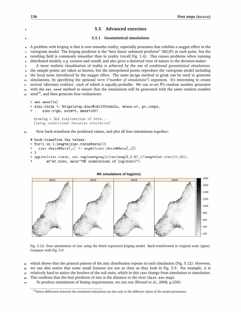
5.5.1 Geostatistical simulations2
A problem with kriging is that it over-smooths reality; especially processes that exhibits a nugget effect in the3
variogram model. The kriging predictor is the “best linear unbiased predictor” (BLUP) at each point, but the4
resulting field is commonly smoother than in reality (recall Fig. 1.4). This causes problems when running5
distributed models, e.g. erosion and runoff, and also gives a distorted view of nature to the decision-maker.6
A more realistic visualization of reality is achieved by the use of conditional geostatistical simulations:7
the sample points are taken as known, but the interpolated points reproduce the variogram model including8
the local noise introduced by the nugget effect. The same krige method in gstat can be used to generate9
simulations, by specifying the optional nsim (“number of simulations”) argument. It’s interesting to create10
several ‘alternate realities’, each of which is equally-probable. We can re-set R’s random number generator11
with the set.seed method to ensure that the simulations will be generated with the same random number12
seed19, and then generate four realizations:13
> set.seed(25)> zinc.rksim <- krige(step.zinc$call$formula, meuse.ov, pc.comps,+ zinc.rvgm, nsim=4, nmax=100)
drawing 4 GLS realisations of beta...[using conditional Gaussian simulation]
Now back-transform the predicted values, and plot all four simulations together:14
# back-transform the values:> for(i in 1:length(zinc.rksim@data)){> zinc.rksim@data[,i] <- expm1(zinc.rksim@data[,i])> }> spplot(zinc.rksim, col.regions=grey(c(rev(seq(0,0.97,1/length(at.zinc))),0)),+ at=at.zinc, main="RK simulations of log(zinc)")
RK simulations of log(zinc)
sim1 sim2 sim3 sim4
200
400
600
800
1000
1200
1400
1600
1800
Fig. 5.12: Four simulations of zinc using the fitted regression kriging model. Back-transformed to original scale (ppm).Compare with Fig. 5.9.
which shows that the general pattern of the zinc distribution repeats in each simulation (Fig. 5.12). However,15
we can also notice that some small features are not as clear as they look in Fig. 5.9. For example, it is16
relatively hard to notice the borders of the soil units, which in this case change from simulation to simulation.17
This confirms that the best predictor of zinc is the distance to the river (dist.asc map).18
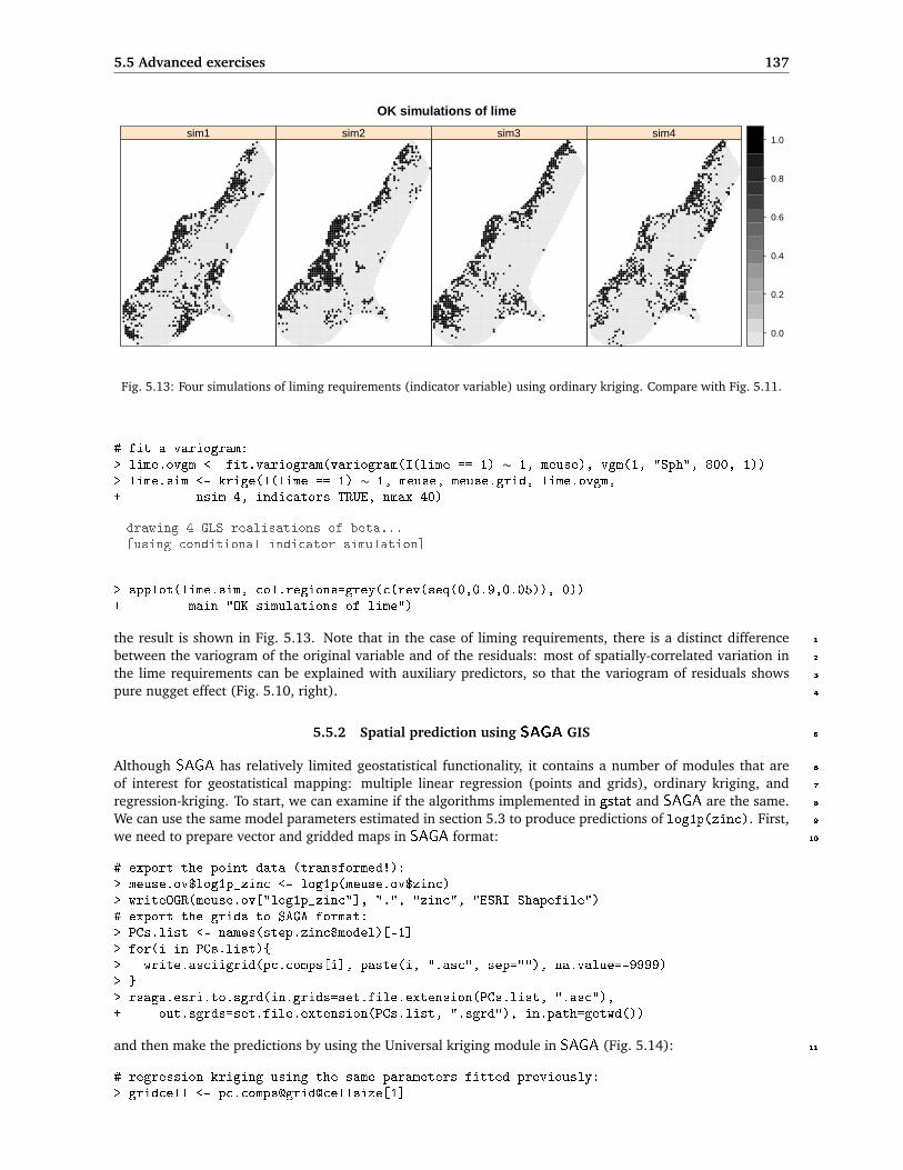
To produce simulations of liming requirements, we can run (Bivand et al., 2008, p.230):19
19Hence differences between the simulated realizations are due only to the different values of the model parameters.
5.5 Advanced exercises 137
OK simulations of lime
sim1 sim2 sim3 sim4
0.0
0.2
0.4
0.6
0.8
1.0
Fig. 5.13: Four simulations of liming requirements (indicator variable) using ordinary kriging. Compare with Fig. 5.11.
# fit a variogram:> lime.ovgm <- fit.variogram(variogram(I(lime == 1) ∼ 1, meuse), vgm(1, "Sph", 800, 1))> lime.sim <- krige(I(lime == 1) ∼ 1, meuse, meuse.grid, lime.ovgm,+ nsim=4, indicators=TRUE, nmax=40)
drawing 4 GLS realisations of beta...[using conditional indicator simulation]
> spplot(lime.sim, col.regions=grey(c(rev(seq(0,0.9,0.05)), 0))+ main="OK simulations of lime")
the result is shown in Fig. 5.13. Note that in the case of liming requirements, there is a distinct difference 1
between the variogram of the original variable and of the residuals: most of spatially-correlated variation in 2
the lime requirements can be explained with auxiliary predictors, so that the variogram of residuals shows 3
pure nugget effect (Fig. 5.10, right). 4
5.5.2 Spatial prediction using SAGA GIS 5
Although SAGA has relatively limited geostatistical functionality, it contains a number of modules that are 6
of interest for geostatistical mapping: multiple linear regression (points and grids), ordinary kriging, and 7
regression-kriging. To start, we can examine if the algorithms implemented in gstat and SAGA are the same. 8
We can use the same model parameters estimated in section 5.3 to produce predictions of log1p(zinc). First, 9
we need to prepare vector and gridded maps in SAGA format: 10
# export the point data (transformed!):> meuse.ov$log1p_zinc <- log1p(meuse.ov$zinc)> writeOGR(meuse.ov["log1p_zinc"], ".", "zinc", "ESRI Shapefile")# export the grids to SAGA format:> PCs.list <- names(step.zinc$model)[-1]> for(i in PCs.list){> write.asciigrid(pc.comps[i], paste(i, ".asc", sep=""), na.value=-9999)> }> rsaga.esri.to.sgrd(in.grids=set.file.extension(PCs.list, ".asc"),+ out.sgrds=set.file.extension(PCs.list, ".sgrd"), in.path=getwd())
and then make the predictions by using the Universal kriging module in SAGA (Fig. 5.14): 11
# regression-kriging using the same parameters fitted previously:> gridcell <- pc.comps@grid@cellsize[1]

138 First steps (meuse)
> rsaga.geoprocessor(lib="geostatistics_kriging", module=8,+ param=list(GRID="zinc_rk_SAGA.sgrd", SHAPES="zinc.shp",+ GRIDS=paste(set.file.extension(PCs.list, ".sgrd"), collapse=";", sep=""),+ BVARIANCE=F, BLOCK=F, FIELD=1, BLOG=F, MODEL=1, TARGET=0,+ USER_CELL_SIZE=gridcell, NUGGET=zinc.rvgm$psill[1], SILL=zinc.rvgm$psill[2],+ RANGE=zinc.rvgm$range[2], INTERPOL=0,+ USER_X_EXTENT_MIN=pc.comps@bbox[1,1]+gridcell/2,+ USER_X_EXTENT_MAX=pc.comps@bbox[1,2]-gridcell/2,+ USER_Y_EXTENT_MIN=pc.comps@bbox[2,1]+gridcell/2,+ USER_Y_EXTENT_MAX=pc.comps@bbox[2,2]-gridcell/2))
SAGA CMD 2.0.4library path: C:/Progra∼1/saga_vc/moduleslibrary name: geostatistics_krigingmodule name : Universal Kriging (Global)author : (c) 2003 by O.Conrad
Load shapes: zinc.shp...ready
Load grid: PC1.sgrd...ready
...
Load grid: PC6.sgrd...ready
Parameters
Grid: [not set]Variance: [not set]Points: zinc.shpAttribute: log1p_zincCreate Variance Grid: noTarget Grid: user definedVariogram Model: Exponential ModelBlock Kriging: noBlock Size: 100.000000Logarithmic Transformation: noNugget: 0.054588Sill: 0.150518Range: 374.198454Linear Regression: 1.000000Exponential Regression: 0.100000Power Function - A: 1.000000Power Function - B: 0.500000Grids: 5 objects (PC1.sgrd, PC2.sgrd, PC3.sgrd, PC4.sgrd, PC6.sgrd))Grid Interpolation: Nearest Neighbor
Save grid: zinc_rk_SAGA.sgrd...
Visually (Fig. 5.14), the results look as if there is no difference between the two pieces of software. We can1
then load back the predictions into R to compare if the results obtained with gstat and SAGA match exactly:2
> rsaga.sgrd.to.esri(in.sgrds="zinc_rk_SAGA",+ out.grids="zinc_rk_SAGA.asc", out.path=getwd())> zinc.rk$SAGA <- readGDAL("zinc_rk_SAGA.asc")$band1> plot(zinc.rk$SAGA, zinc.rk$var1.pred, pch=19, xlab="SAGA", ylab="gstat")> lines(3:8, 3:8, col="grey", lwd=4)

5.5 Advanced exercises 139
which shows that both software programs implement the same algorithm, but there are some small differences 1
between the predicted values that are possibly due to rounding effect. 2
Fig. 5.14: Comparing results from SAGA (left map) and gstat (right map): regression-kriging using the same modelparameters estimated in section 5.3.
Next, we want to compare the computational efficiency of gstat and SAGA, i.e. the processing time. To 3
emphasize the difference in computation time, we will use a somewhat larger grid (2 m), and then re-run 4
ordinary kriging in both software packages: 5
> meuse.grid2m <- readGDAL("topomap2m.tif")
topomap2m.tif has GDAL driver GTiffand has 1664 rows and 1248 columns
> proj4string(meuse.grid2m) <- meuse.grid@proj4string
Processing speed can be measured from R by using the system.time method, which measures the elapsed 6
seconds: 7
> system.time(krige(log1p(zinc) ∼ 1, meuse, meuse.grid2m, zinc.vgm))
[using ordinary kriging]user system elapsed
319.14 7.96 353.44
and now the same operation in SAGA: 8
> cellsize2 <- meuse.grid2m@grid@cellsize[1]> system.time(rsaga.geoprocessor(lib="geostatistics_kriging", module=6,+ param=list(GRID="zinc_ok_SAGA.sgrd", SHAPES="zinc.shp", BVARIANCE=F, BLOCK=F,+ FIELD=1, BLOG=F, MODEL=1, TARGET=0, USER_CELL_SIZE=cellsize2,+ NUGGET=zinc.vgm$psill[1], SILL=zinc.vgm$psill[2], RANGE=zinc.rvgm$range[2],+ USER_X_EXTENT_MIN=meuse.grid2m@bbox[1,1]+cellsize2/2,+ USER_X_EXTENT_MAX=meuse.grid2m@bbox[1,2]-cellsize2/2,+ USER_Y_EXTENT_MIN=meuse.grid2m@bbox[2,1]+cellsize2/2,+ USER_Y_EXTENT_MAX=meuse.grid2m@bbox[2,2]-cellsize2/2)))
user system elapsed0.03 0.71 125.69

140 First steps (meuse)
We can see that SAGA will be faster for processing large data sets. This difference will become even larger1
if we would use large point data sets. Recall that the most ‘expensive’ operation for any geostatistical mapping2
is the derivation of distances between points. Thus, by limiting the search radius one can always increase3
the processing speed. The problem is that a software needs to initially estimate which points fall within the4
search radius, hence it always has to take into account location of all points. Various quadtree and similar5
algorithms then exist to speed up the neighborhood search algorithm (partially available in gstat also), but6
their implementation can differ between various programming languages.7
Note also that it is not really a smart idea to try to visualize large maps in R. R graphics plots grids as8
vectors; each grid cell is plotted as a separate polygon, which takes a huge amount of RAM for large grids,9
and can last up to few minutes. SAGA on other hand can handle and display grids �10 million pixels on a10
standard PC without any delays (Fig. 5.14). When you move to other exercises you will notice that we will11
typically use R to fit models, SAGA to run predictions and visualize results, and Google Earth to visualize and12
explore final products.13
5.5.3 Geostatistical analysis in geoR14
We start by testing the variogram fitting functionality of geoR. However, before we can do any analysis, we15
need to convert our point map (sp) to geoR geodata format:16
> zinc.geo <- as.geodata(meuse.ov["zinc"])> str(zinc.geo)
List of 2$ x , y : num [1:155, 1:2] 181072 181025 181165 181298 181307 .....- attr(*, "dimnames")=List of 2.. ..$ : chr [1:155] "300" "455" "459" "540" ..... ..$ : chr [1:2] "x" "y"$ data : num [1:155] 1022 1141 640 257 269 ...- attr(*, "class")= chr "geodata"
0 500 1000
0.0
0.2
0.4
0.6
0.8
1.0
distance
sem
ivar
ianc
e
0°°45°°90°°135°°
●●
●
●
●
●
●
● ●●
●●
●
0 500 1000
0.0
0.2
0.4
0.6
0.8
1.0
1.2
1.4
distance
sem
ivar
ianc
e
Fitted variogram (ML)
Fig. 5.15: Anisotropy (left) and variogram model fitted using the Maximum Likelihood (ML) method (right). The con-fidence bands (envelopes) show the variability of the sample variogram estimated using simulations from a given set ofmodel parameters.

5.5 Advanced exercises 141
which shows much simpler structure than a SpatialPointsDataFrame. A geodata-type object contains only: 1
a matrix with coordinates of sampling locations (coords), values of target variables (data), matrix with coor- 2
dinates of the polygon defining the mask map (borders), vector or data frame with covariates (covariate). 3
To produce the two standard variogram plots (Fig. 5.15), we will run: 4
> par(mfrow=c(1,2))# anisotropy ("lambda=0" indicates log-transformation):> plot(variog4(zinc.geo, lambda=0, max.dist=1500, messages=FALSE), lwd=2)# fit variogram using likfit:> zinc.svar2 <- variog(zinc.geo, lambda=0, max.dist=1500, messages=FALSE)> zinc.vgm2 <- likfit(zinc.geo, lambda=0, messages=FALSE,+ ini=c(var(log1p(zinc.geo$data)),500), cov.model="exponential")> zinc.vgm2
likfit: estimated model parameters:beta tausq sigmasq phi
" 6.1553" " 0.0164" " 0.5928" "500.0001"Practical Range with cor=0.05 for asymptotic range: 1498
likfit: maximised log-likelihood = -1014
# generate confidence bands for the variogram:> env.model <- variog.model.env(zinc.geo, obj.var=zinc.svar2, model=zinc.vgm2)
variog.env: generating 99 simulations (with 155 points each) using grfvariog.env: adding the mean or trendvariog.env: computing the empirical variogram for the 99 simulationsvariog.env: computing the envelops
> plot(zinc.svar2, envelope=env.model); lines(zinc.vgm2, lwd=2);> legend("topleft", legend=c("Fitted variogram (ML)"), lty=c(1), lwd=c(2), cex=0.7)> dev.off()
where variog4 is a method that generates semivariances in four directions, lambda=0 is used to indicate the 5
type of transformation20, likfit is the generic variogram fitting method, ini is the given initial variogram, 6
and variog.model.env calculates confidence limits for the fitted variogram model. Parameters tausq and 7
sigmasq corresponds to nugget and sill parameters; phi is the range parameter. 8
In general, geoR offers much richer possibilities for variogram modeling than gstat. From Fig. 5.15(right) 9
we can see that the variogram fitted using this method does not really go through all points (compare with 10
Fig. 5.8). This is because the ML method discounts the potentially wayward influence of sample variogram at 11
large inter-point distances (Diggle and Ribeiro Jr, 2007). Note also that the confidence bands (envelopes) also 12
confirm that the variability of the empirical variogram increases with larger distances. 13
Now that we have fitted the variogram model, we can produce predictions using the ordinary kriging 14
model. Because geoR does not work with sp objects, we need to prepare the prediction locations: 15
> locs <- pred_grid(c(pc.comps@bbox[1,1]+gridcell/2,+ pc.comps@bbox[1,2]-gridcell/2), c(pc.comps@bbox[2,1]+gridcell/2,+ pc.comps@bbox[2,2]-gridcell/2), by=gridcell)# match the same grid as pc.comps;
and the mask map i.e. a polygon showing the borders of the area of interest: 16
> meuse.grid$mask <- ifelse(!is.na(meuse.grid$dist), 1, NA)> write.asciigrid(meuse.grid["mask"], "mask.asc", na.value=-1)# raster to polygon conversion;> rsaga.esri.to.sgrd(in.grids="mask.asc", out.sgrd="mask.sgrd", in.path=getwd())> rsaga.geoprocessor(lib="shapes_grid", module=6, param=list(GRID="mask.sgrd",
20geoR implements the Box–Cox transformation (Diggle and Ribeiro Jr, 2007, p.61), which is somewhat more generic than simplelog() transformation.

142 First steps (meuse)
+ SHAPES="mask.shp", CLASS_ALL=1))> mask <- readShapePoly("mask.shp", proj4string=CRS("+init=epsg:28992"),+ force_ring=T)# coordinates of polygon defining the area of interest:> mask.bor <- mask@polygons[[1]]@Polygons[[1]]@coords> str(mask.bor)
num [1:267, 1:2] 178880 178880 178760 178760 178720 ...
Ordinary kriging can be run by using the generic method for linear Gaussian models krige.conv21:1
> zinc.ok2 <- krige.conv(zinc.geo, locations=locs,+ krige=krige.control(obj.m=zinc.vgm2), borders=mask.bor)
krige.conv: results will be returned only for locations inside the borderskrige.conv: model with constant meankrige.conv: performing the Box-Cox data transformationkrige.conv: back-transforming the predicted mean and variancekrige.conv: Kriging performed using global neighborhood
# Note: geoR will automatically back-transform the values!> str(zinc.ok2)
List of 6$ predict : num [1:3296] 789 773 756 740 727 ...$ krige.var : num [1:3296] 219877 197718 176588 159553 148751 ...$ beta.est : Named num 6.16..- attr(*, "names")= chr "beta"$ distribution: chr "normal"$ message : chr "krige.conv: Kriging performed using global neighbourhood"$ call : language krige.conv(geodata = zinc.geo, locations = locs,
borders = mask.bor, krige = krige.control(obj.m = zinc.vgm2))- attr(*, "sp.dim")= chr "2d"- attr(*, "prediction.locations")= symbol locs- attr(*, "parent.env")=<environment: R_GlobalEnv>- attr(*, "data.locations")= language zinc.geo$coords- attr(*, "borders")= symbol mask.bor- attr(*, "class")= chr "kriging"
To produce plots shown in Fig. 5.16, we use:2
> par(mfrow=c(1,2))> image(zinc.ok2, loc=locs, col=gray(seq(1,0.1,l=30)), xlab="Coord X",+ ylab="Coord Y")> title(main="Ordinary kriging predictions")> contour(zinc.ok2, add=TRUE, nlev=8)> image(zinc.ok2, loc=locs, value=sqrt(zinc.ok2$krige.var),+ col=gray(seq(1,0.1,l=30)), xlab="Coord X", ylab="Coord Y")> title(main="Prediction error")> krige.var.vals <- round(c(quantile(sqrt(zinc.ok2$krige.var),0.05),+ sd(zinc.geo$data), quantile(sqrt(zinc.ok2$krige.var), 0.99)), 0)> legend.krige(x.leg=c(178500,178800), y.leg=c(332500,333500),+ values=sqrt(zinc.ok2$krige.var), vert=TRUE, col=gray(seq(1,0.1,l=30)),+ scale.vals=krige.var.vals)> points(zinc.geo[[1]], pch="+", cex=.7)
To run regression-kriging (in geoR “external trend kriging”) we first need to add values of covariates to the3
original geodata object:4
21Meaning “kriging conventional” i.e. linear kriging.
5.5 Advanced exercises 143
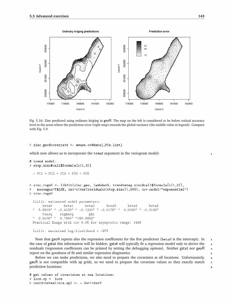
Fig. 5.16: Zinc predicted using ordinary kriging in geoR. The map on the left is considered to be below critical accuracylevel in the areas where the prediction error (right map) exceeds the global variance (the middle value in legend). Comparewith Fig. 5.9.
> zinc.geo$covariate <- meuse.ov@data[,PCs.list]
which now allows us to incorporate the trend argument in the variogram model: 1
# trend model:> step.zinc$call$formula[c(1,3)]
∼ PC1 + PC2 + PC3 + PC4 + PC6
> zinc.rvgm2 <- likfit(zinc.geo, lambda=0, trend=step.zinc$call$formula[c(1,3)],+ messages=FALSE, ini=c(var(residuals(step.zinc)),500), cov.model="exponential")> zinc.rvgm2
likfit: estimated model parameters:beta0 beta1 beta2 beta3 beta4 beta5
" 5.6919" " -0.4028" " -0.1203" " -0.0176" " 0.0090" " -0.3199"tausq sigmasq phi
" 0.0526" " 0.1894" "499.9983"Practical Range with cor=0.05 for asymptotic range: 1498
likfit: maximised log-likelihood = -975
Note that geoR reports also the regression coefficients for the five predictors (beta0 is the intercept). In 2
the case of gstat this information will be hidden: gstat will typically fit a regression model only to derive the 3
residuals (regression coefficients can be printed by setting the debugging options). Neither gstat nor geoR 4
report on the goodness of fit and similar regression diagnostics. 5
Before we can make predictions, we also need to prepare the covariates at all locations. Unfortunately, 6
geoR is not compatible with sp grids, so we need to prepare the covariate values so they exactly match 7
prediction locations: 8
# get values of covariates at new locations:> locs.sp <- locs> coordinates(locs.sp) <- ∼ Var1+Var2
144 First steps (meuse)
> PCs.gr <- overlay(pc.comps, locs.sp)# fix NAs:> for(i in PCs.list){> PCs.gr@data[,i] <- ifelse(is.na(PCs.gr@data[,i]), 0, PCs.gr@data[,i])> }
which allows us to run predictions using the same trend model as used in section 5.3.1:1
# define the geostatistical model:> KC <- krige.control(trend.d = step.zinc$call$formula[c(1,3)],+ trend.l = ∼ PCs.gr$PC1+PCs.gr$PC2+PCs.gr$PC3+PCs.gr$PC4+PCs.gr$PC6,+ obj.m = zinc.rvgm2)# run predictions (external trend kriging):> zinc.rk2 <- krige.conv(zinc.geo, locations=locs, krige=KC, borders=mask.bor)
krige.conv: results will be returned only for prediction inside the borderskrige.conv: model with mean defined by covariates provided by the userkrige.conv: performing the Box-Cox data transformationkrige.conv: back-transforming the predicted mean and variancekrige.conv: Kriging performed using global neighbourhood
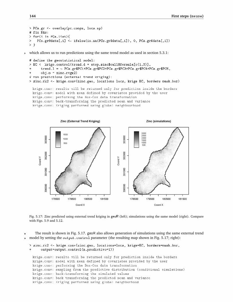
Fig. 5.17: Zinc predicted using external trend kriging in geoR (left); simulations using the same model (right). Comparewith Figs. 5.9 and 5.12.
The result is shown in Fig. 5.17. geoR also allows generation of simulations using the same external trend2
model by setting the output.control parameter (the resulting map shown in Fig. 5.17; right):3
> zinc.rk2 <- krige.conv(zinc.geo, locations=locs, krige=KC, borders=mask.bor,+ output=output.control(n.predictive=1))
krige.conv: results will be returned only for prediction inside the borderskrige.conv: model with mean defined by covariates provided by the userkrige.conv: performing the Box-Cox data transformationkrige.conv: sampling from the predictive distribution (conditional simulations)krige.conv: back-transforming the simulated valueskrige.conv: back-transforming the predicted mean and variancekrige.conv: Kriging performed using global neighborhood

5.6 Visualization of generated maps 145
which shows a somewhat higher range of values than the simulation using a simple linear model (Fig. 5.12). In 1
this case geoR seems to do better in accounting for the skewed distribution of values than gstat. However such 2
simulations in geoR are extremely computationally intensive, and are not recommended for large data sets. 3
In fact, many default methods implemented in geoR (Maximum Likelihood fitting for variograms, Bayesian 4
methods and conditional simulations) are definitively not recommended with data sets with�1000 sampling 5
points and/or over �100,000 new locations. Creators of geoR seem to have selected a path of running only 6
global neighborhood analysis on the point data. Although the author of this guide supports that decision (see 7
also section 2.2), some solution needs to be found to process larger point data sets because computing time 8
exponentially increases with the size of the data set. 9
Finally, the results of predictions can be exported22 to some GIS format by copying the values to an sp 10
frame: 11
> mask.ov <- overlay(mask, locs.sp)> mask.sel <- !is.na(mask.ov$MASK.SGRD)> locs.geo <- data.frame(X=locs.sp@coords[mask.sel,1],+ Y=locs.sp@coords[mask.sel,2], zinc.rk2=zinc.rk2[[1]],+ zinc.rkvar2=zinc.rk2[[2]])> coordinates(locs.geo) <- ∼ X+Y> gridded(locs.geo) <- TRUE> write.asciigrid(locs.geo[1], "zinc_rk2.asc", na.value=-1)
5.6 Visualization of generated maps 12
5.6.1 Visualization of uncertainty 13
The following paragraphs explain how to visualize results of geostatistical mapping to explore uncertainty in 14
maps. We will focus on the technique called whitening, which is a simple but efficient technique to visualize 15
mapping error (Hengl and Toomanian, 2006). It is based on the Hue-Saturation-Intensity (HSI) color model 16
(Fig. 5.18a) and calculations with colors using the color mixture (CM) concept. The HSI is a psychologically 17
appealing color model — hue is used to visualize values or taxonomic space and whiteness (paleness) is used to 18
visualize the uncertainty (Dooley and Lavin, 2007). For this purpose, a 2D legend was designed to accompany 19
the visualizations. Unlike standard legends for continuous variables, this legend has two axis (Fig. 5.18b): 20
(1) vertical axis (hues) is used to visualize the predicted values and (2) horizontal axis (whiteness) is used to 21
visualize the prediction error. Fig. 5.19 shows an example of visualization using whitening for the meuse data 22
set. 23
Visualization of uncertainty in maps using whitening can be achieved using one of the two software pro- 24
grams: ILWIS and R. In ILWIS, you can use the VIS_error script that can be obtained from the author’s 25
homepage. To visualize the uncertainty for your own case study using this technique, you should follow these 26
steps (Hengl and Toomanian, 2006): 27
(1.) Download the ILWIS script (VIS_error23) for visualization of prediction error and unzip it to the default 28
directory (C:\Program Files\ILWIS\Scripts\). 29
(2.) Derive the predictions and prediction variance for some target variable. Import both maps to ILWIS. The 30
prediction variance needs to be then converted to normalized prediction variance by using Eq.(1.4.4), 31
so you will also need to determine the global variance of your target variable. 32
(3.) Start ILWIS and run the script from the left menu (operations list) or from the main menu 7→ Operations 33
7→ Scripts 7→ VIS_error. Use the help button to find more information about the algorithm. 34
(4.) To prepare final layouts, you will need to use the legend2D.tif legend file24. 35
A more interesting option is to visualize maps using whitening in R25. You will need to load the following 36
additional package: 37
22Note that the results of prediction in geoR is simply a list of values without any spatial reference.23http://spatial-analyst.net/scripts/24http://spatial-analyst.net/scripts/legend2D.tif; This legend is a Hue-whitening legend: in the vertical direction only
Hue values change, while in the horizontal direction amount of white color is linearly increased from 0.5 up to 1.0.25http://spatial-analyst.net/scripts/whitening.R
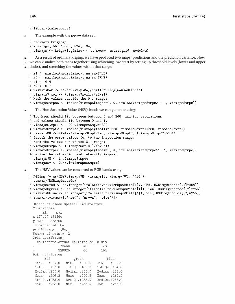
146 First steps (meuse)
> library(colorspace)
The example with the meuse data set:1
# ordinary kriging:> m <- vgm(.59, "Sph", 874, .04)> vismaps <- krige(log(zinc) ∼ 1, meuse, meuse.grid, model=m)
As a result of ordinary kriging, we have produced two maps: predictions and the prediction variance. Now,2
we can visualize both maps together using whitening. We start by setting up threshold levels (lower and upper3
limits), and stretching the values within that range:4
> z1 <- min(log(meuse$zinc), na.rm=TRUE)> z2 <- max(log(meuse$zinc), na.rm=TRUE)> e1 <- 0.4> e2 <- 0.7> vismaps$er <- sqrt(vismaps$e)/sqrt(var(log(meuse$zinc)))> vismaps$tmpz <- (vismaps$z-z1)/(z2-z1)# Mask the values outside the 0-1 range:> vismaps$tmpzc <- ifelse(vismaps$tmpz<=0, 0, ifelse(vismaps$tmpz>1, 1, vismaps$tmpz))
The Hue-Saturation-Value (HSV) bands we can generate using:5
# The hues should lie between between 0 and 360, and the saturations# and values should lie between 0 and 1.> vismaps$tmpf1 <- -90-vismaps$tmpzc*300> vismaps$tmpf2 <- ifelse(vismaps$tmpf1<=-360, vismaps$tmpf1+360, vismaps$tmpf1)> vismaps$H <- ifelse(vismaps$tmpf2>=0, vismaps$tmpf2, (vismaps$tmpf2+360))# Strech the error values (e) to the inspection range:# Mask the values out of the 0-1 range:> vismaps$tmpe <- (vismaps$er-e1)/(e2-e1)> vismaps$tmpec <- ifelse(vismaps$tmpe<=0, 0, ifelse(vismaps$tmpe>1, 1, vismaps$tmpe))# Derive the saturation and intensity images:> vismaps$S <- 1-vismaps$tmpec> vismaps$V <- 0.5*(1+vismaps$tmpec)
The HSV values can be converted to RGB bands using:6
> RGBimg <- as(HSV(vismaps$H, vismaps$S, vismaps$V), "RGB")> summary(RGBimg@coords)> vismaps$red <- as.integer(ifelse(is.na(vismaps@data[1]), 255, RGBimg@coords[,1]*255))> vismaps$green <- as.integer(ifelse(is.na(vismaps@data[1]), 255, RGBimg@coords[,2]*255))> vismaps$blue <- as.integer(ifelse(is.na(vismaps@data[1]), 255, RGBimg@coords[,3]*255))> summary(vismaps[c("red", "green", "blue")])
Object of class SpatialGridDataFrameCoordinates:
min maxx 178440 181560y 329600 333760Is projected: NAproj4string : [NA]Number of points: 2Grid attributes:cellcentre.offset cellsize cells.dim
x 178460 40 78y 329620 40 104Data attributes:
red green blueMin. : 0.0 Min. : 0.0 Min. : 0.01st Qu.:153.0 1st Qu.:183.0 1st Qu.:194.0Median :255.0 Median :255.0 Median :255.0Mean :206.2 Mean :220.5 Mean :219.23rd Qu.:255.0 3rd Qu.:255.0 3rd Qu.:255.0Max. :255.0 Max. :255.0 Max. :255.0

5.6 Visualization of generated maps 147
Fig. 5.18: Design of the special 2D legend used to visualize the prediction variance using whitening: (a) the HSI colormodel, (b) the 2D legend and (c) the common types of Hues. After Hengl et al. (2004a).
178440 181560
178440 181560
333760
329600
178440 181560
178440 181560
333760
329640
333760
329640
ordinary kriging
4.72
7.51
40% 70%universal kriging
333760
329600
Fig. 5.19: Mapping uncertainty for zinc visualized using whitening: ordinary kriging (left) and universal kriging (right).Predicted values in log-scale. See cover of this book for a color version of this figure.

148 First steps (meuse)
which is now a spatial object with three RGB bands. To display a true RGB image in R, use the SGDF2PCT1
method26:2
> RGBimg <- SGDF2PCT(vismaps[c("red", "green", "blue")], ncolors=256, adjust.bands=FALSE)> vismaps$idx <- RGBimg$idx> image(vismaps, "idx", col=RGBimg$ct)> plot(meuse, pch="+", add=TRUE)
In the last step (optional), we can set the right georeference and export the map to e.g. GeoTIFF format:3
> proj4string(vismaps) <- CRS("+init=epsg:28992")# Export as geoTIFF / or any other format:> writeGDAL(vismaps[c("red", "green", "blue")], "vismap.tif", drivername="GTiff",+ type="Byte", options="INTERLEAVE=PIXEL")
A comparison of uncertainty for maps produced using ordinary kriging and universal kriging in gstat can4
be seen in Fig. 5.19. In this case, the universal kriging map is distinctly more precise. You can manually change5
the lower and upper values for both prediction and error maps depending on your mapping requirements. By6
default, thresholds of 0.4 and 0.8 (max 1.0) are used for the normalized prediction error values. This assumes7
that a satisfactory prediction is when the model explains more than 85% of the total variation (normalized8
error = 40%; see p.23). Otherwise, if the value of the normalized error get above 80%, the model accounts9
for less than 50% of variability at calibration points and the prediction is probably unsatisfactory.10
To prepare the 2D legend shown in Fig. 5.19 (100×100 pixels), we use:11
> legend.2D <- expand.grid(x=seq(.01,1,.01),y=seq(.01,1,.01))# Hues> legend.2D$tmpf1 <- -90-legend.2D$y*300> legend.2D$tmpf2 <- ifelse(legend.2D$tmpf1<=-360, legend.2D$tmpf1+360,+ legend.2D$tmpf1)> legend.2D$H <- ifelse(legend.2D$tmpf2>=0, legend.2D$tmpf2, (legend.2D$tmpf2+360))# Saturation:> legend.2D$S <- 1-legend.2D$x# Intensity:> legend.2D$V <- 0.5+legend.2D$x/2> gridded(legend.2D) <- ∼ x+y> legend.2D <- as(legend.2D, "SpatialGridDataFrame")> legendimg <- as(HSV(legend.2D$H, legend.2D$S, legend.2D$V), "RGB")> legend.2D$red <- as.integer(legendimg@coords[,1]*255)> legend.2D$green <- as.integer(legendimg@coords[,2]*255)> legend.2D$blue <- as.integer(legendimg@coords[,3]*255)# Write as a RGB image:> legend.2Dimg <- SGDF2PCT(legend.2D[c("red", "green", "blue")], ncolors=256,+ adjust.bands=FALSE)> legend.2D$idx <- legend.2Dimg$idx> writeGDAL(legend.2D[c("red", "green", "blue")], "legend2D.tif",+ drivername="GTiff", type="Byte", options="INTERLEAVE=PIXEL")
Another sophisticated option to visualize the results of (spatio-temporal) geostatistical mapping is the12
stand-alone visualization software called Aquila27 (Pebesma et al., 2007). Aquila facilitates interactive ex-13
ploration of the spatio-temporal Cumulative Distribution Functions (CDFs) and allows decision makers to14
explore uncertainty associated with attaching different threshold or its spatial distribution in the area of in-15
terest. It is actually rather simple to use — one only needs to prepare a sample (e.g. 12 slices) of quantile16
estimates, which are then locally interpolated to produce CDFs.17
5.6.2 Export of maps to Google Earth18
To export maps we have produced to Google Earth, we first need to reproject the maps to the WGS84 coordi-19
nate system (the native system for Google Earth). We can first reproject the map of sample points, using the20
26Note that the results might differ slightly between ILWIS and R, which is mainly due to somewhat different HSI–RGB conversionalgorithms. For example, the SGDF2PCT method is limited to 256 colors only!
27http://pcraster.geo.uu.nl/projects/aguila/

5.6 Visualization of generated maps 149
spTransform method of the sp package, and then export them using writeOGR: 1
> meuse.ll <- spTransform(meuse, CRS("+proj=longlat +datum=WGS84"))> writeOGR(meuse.ll, "meuse.kml", "meuse", driver="KML")
You can examine these in Google Earth by opening the KML file meuse.kml which you just wrote. Next, 2
we want to export the predictions of zinc, which means that we first need to reproject the interpolated values 3
onto geographic coordinates. The most efficient way to achieve this is by using the SAGA proj4 module28: 4
> rsaga.geoprocessor(lib="pj_proj4", 2, param=list(SOURCE_PROJ=paste('"',+ proj4string(meuse.grid), '"', sep=""), TARGET_PROJ="\"+proj=longlat+ +datum=WGS84\"", SOURCE="zinc_rk.sgrd", TARGET="zinc_rk_ll.sgrd",+ TARGET_TYPE=0, INTERPOLATION=1))
SAGA CMD 2.0.4library path: C:/Progra∼1/saga_vc/moduleslibrary name: pj_proj4module name : Proj.4 (Command Line Arguments, Grid)author : O. Conrad (c) 2004-8
Load grid: zinc_rk.sgrd...ready
Parameters
Inverse: noSource Projection Parameters: +init=epsg:28992 +proj=sterea+lat_0=52.15616055555555 +lon_0=5.38763888888889 +k=0.999908 +x_0=155000+y_0=463000 +ellps=bessel +towgs84=565.237,50.0087,465.658,-0.406857,0.350733,-1.87035,4.0812 +units=m +no_defsTarget Projection Parameters: +proj=longlat +datum=WGS84Grid system: 40; 77x 104y; 178500x 329620ySource: zinc_rk.sgrdTarget: [not set]Shapes: [not set]X Coordinates: [not set]Y Coordinates: [not set]Create X/Y Grids: noTarget: user definedInterpolation: Bilinear Interpolation
Source: +init=epsg:28992 +proj=sterea +lat_0=52.15616055555555+lon_0=5.38763888888889 +k=0.999908 +x_0=155000 +y_0=463000+ellps=bessel +towgs84=565.237,50.0087,465.658,-0.406857,0.350733,-1.87035,4.0812 +units=m +no_defs
Target: +proj=longlat +datum=WGS84
readySave grid: zinc_rk_ll.sgrd...
Once we have created this gridded result, we can plot the maps and export the plots to Google Earth. First 5
we need to set up metadata in the form of a SpatialGrid object for defining the size and placing of a PNG 6
image overlay in Google Earth; this is the job of the GE_SpatialGrid method of the maptools package: 7
# read back into R:> rsaga.sgrd.to.esri(in.sgrds="zinc_rk_ll.sgrd", out.grids="zinc_rk_ll.asc",+ out.path=getwd())> zinc_rk.ll <- readGDAL("zinc_rk_ll.asc")
28SAGA will automatically estimate both the grid cell size and the bounding box in geographical coordinates. Compare with sec-tion 10.6.3.

150 First steps (meuse)
zinc_rk_ll.asc has GDAL driver AAIGridand has 105 rows and 122 columns
> proj4string(zinc_rk.ll) <- CRS("+proj=longlat +datum=WGS84")> zinc_rk.kml <- GE_SpatialGrid(zinc_rk.ll)
Fig. 5.20: RK predictions of zinc for Meuse area — as visualized in Google Earth.
where zinc_rk.kml is the name of R object, which carries only a definition of the ground overlay frame and1
not the data to be exported. Next we create a PNG (Portable Network Graphics) file (the format recognized as2
an overlay by Google Earth) using the png graphics device:3
> png(file="zinc_rk.png", width=zinc_rk.kml$width, height=zinc_rk.kml$height, bg="transparent")> par(mar=c(0,0,0,0), xaxs="i", yaxs="i")> image(as.image.SpatialGridDataFrame(zinc_rk.ll[1]),+ col=grey(rev(seq(0,0.95,1/length(at.zinc)))),+ xlim=zinc_rk.kml$xlim, ylim=zinc_rk.kml$ylim)
which will plot the map over the whole area of the plotting space, so that border coordinates exactly match4
the borders of the plot. We then create the overlay itself, from the PNG file, with the kmlOverlay method,5
specifying the SpatialGrid object that orients the map in Google Earth:6
> kmlOverlay(zinc_rk.kml, kmlfile="zinc_rk.kml", imagefile="zinc_rk.png", name="zinc")
[1] "<?xml version='1.0' encoding='UTF-8'?>"[2] "<kml xmlns='http://earth.google.com/kml/2.0'>"[3] "<GroundOverlay>"

5.6 Visualization of generated maps 151
[4] "<name>zinc (RK)</name>"[5] "<Icon><href>zinc_rk.png</href><viewBoundScale>0.75</viewBoundScale></Icon>"[6] "<LatLonBox><north>50.992973</north><south>50.955488</south>+ <east>5.76502299201062</east><west>5.721466</west></LatLonBox>"[7] "</GroundOverlay></kml>"
> dev.off()
When you open the resulting KML in Google Earth, you will see a display shown in Fig. 5.20. This allows 1
you to orient yourself and make an interpretation of the produced maps. Open the final map in Google Earth 2
and visually explore how many areas next to the populated areas show high concentrations of zinc. 3
Self-study exercises: 4
(1.) How many pixels in the meuse.grid are available for spatial prediction? (HINT: Number of pixels that 5
do not have missing values for any of the variables.) 6
(2.) What is the correlation coefficient between maps dist and ahn? (HINT: use the cor method.) Is the 7
default Pearson’s parametric correlation appropriate? (HINT: Make a scatterplot of the two maps using 8
the plot method. Compute also a non-parametric Spearman correlation.) 9
(3.) How much of the variation in Zinc does the RK model explains, and which are the most significant 10
predictors? (HINT: Look at the R-square and the Pr(>|t|).) 11
(4.) Up to which distance from the points are the predictions improved by the ordinary kriging model (rather 12
than just by using an average of all the observations)? (HINT: look at the original variance, and then 13
find at which distance does the semivariance exceeds the original variance.) 14
(5.) Up to which distance is zinc spatially auto-correlated based on this model? Provide R code to support 15
your answer. 16
(6.) Is there significant difference in the accuracy of the predictions between OK and RK? 17
(7.) Up to which distance from the points are the predictions improved by the model? (HINT: At which 18
distance does the regression-kriging prediction variance exceed the global variance?) 19
(8.) Generate geostatistical simulations of zinc by using only ordinary kriging model and compare your 20
results with Fig 5.12. Which simulation produces higher variability of values (HINT: derive standard 21
deviation and range) — with RK or OK model? 22
(9.) Randomly split the meuse points in two data sets. Then repeat OK and RK using the same procedure 23
explained in section 5.3.1 and see if the difference in accuracy at validation points is still the same? 24
(10.) If you had more funds available to locate additional 50 points, and then sample soil again, where would 25
you put them? (HINT: use the sampling optimization algorithm implemented in the intamapInteractive 26
package.) 27
Further reading: 28
Æ Bivand, R., Pebesma, E., Rubio, V., 2008. Applied Spatial Data Analysis with R. Use R Series. Springer, 29
Heidelberg. 30
Æ Ribeiro Jr, P. J., Christensen, O. F. and Diggle, P. J., 2003. geoR and geoRglm: Software for Model-Based 31
Geostatistics. In: Hornik, K. and Leisch, F. and Zeileis, A. (eds) Proceedings of the 3rd International 32
Workshop on Distributed Statistical Computing (DSC 2003), Technical University Vienna, pp. 517– 33
524. 34

152 First steps (meuse)
Æ Kutner, M. H., Nachtsheim, C. J., Neter, J., Li, W. (Eds.), 2004. Applied Linear Statistical Models, 5th1
Edition. McGraw-Hill.2
Æ Pebesma, E. J., 2004. Multivariable geostatistics in S: the gstat package. Computers & Geosciences3
30(7), 683–691.4
Æ http://leg.ufpr.br/geoR/ — The geoR package project.5
Æ http://www.gstat.org — The gstat package project.6
Related Documents


