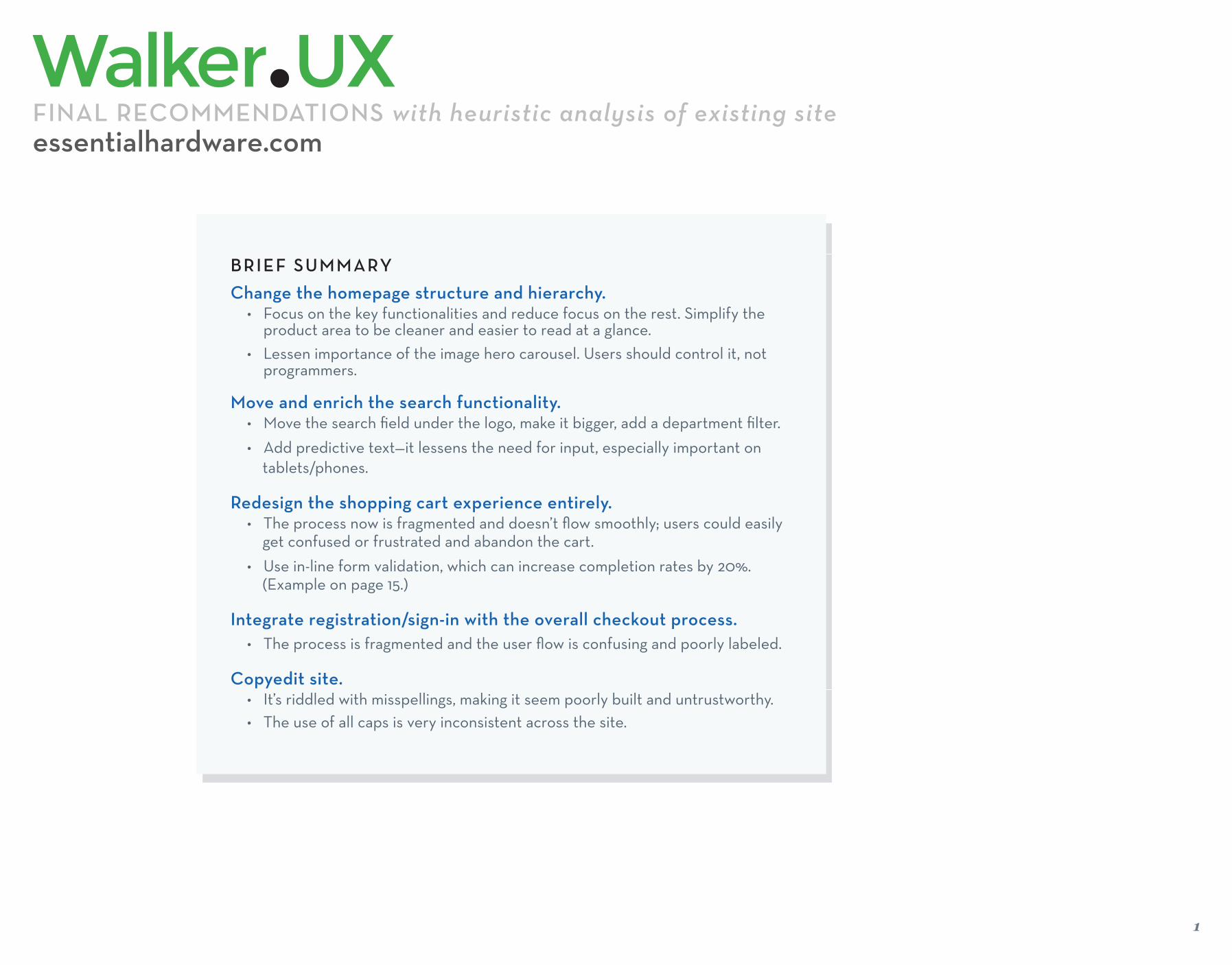
1 BRIEF SUMMARY Change the homepage structure and hierarchy. • Focus on the key functionalities and reduce focus on the rest. Simplify the product area to be cleaner and easier to read at a glance. • Lessen importance of the image hero carousel. Users should control it, not programmers. Move and enrich the search functionality. • Move the search field under the logo, make it bigger, add a department filter. • Add predictive text—it lessens the need for input, especially important on tablets/phones. Redesign the shopping cart experience entirely. • The process now is fragmented and doesn’t flow smoothly; users could easily get confused or frustrated and abandon the cart. • Use in-line form validation, which can increase completion rates by 20%. (Example on page 15.) Integrate registration/sign-in with the overall checkout process. • The process is fragmented and the user flow is confusing and poorly labeled. Copyedit site. • It’s riddled with misspellings, making it seem poorly built and untrustworthy. • The use of all caps is very inconsistent across the site. essentialhardware.com FINAL RECOMMENDATIONS with heuristic analysis of existing site

Welcome message from author
This document is posted to help you gain knowledge. Please leave a comment to let me know what you think about it! Share it to your friends and learn new things together.
Transcript
1
BRIEF SUMMARY
Change the homepage structure and hierarchy.• Focus on the key functionalities and reduce focus on the rest. Simplify the
product area to be cleaner and easier to read at a glance. • Lessen importance of the image hero carousel. Users should control it, not
programmers.
Move and enrich the search functionality.• Move the search fi eld under the logo, make it bigger, add a department fi lter.
• Add predictive text—it lessens the need for input, especially important on tablets/phones.
Redesign the shopping cart experience entirely.• The process now is fragmented and doesn’t fl ow smoothly; users could easily get confused or frustrated and abandon the cart.
• Use in-line form validation, which can increase completion rates by 20%. (Example on page 15.)
Integrate registration/sign-in with the overall checkout process.• The process is fragmented and the user fl ow is confusing and poorly labeled.
Copyedit site.• It’s riddled with misspellings, making it seem poorly built and untrustworthy.• The use of all caps is very inconsistent across the site.
essentialhardware.comFINAL RECOMMENDATIONS with heuristic analysis of existing site

2
Focus 1: Homepage
essentialhardware.com Comparative Audit & Recommendations

Homepage OverviewCurrent Implementation
• The logo and tagline take up too much space.
• There is too much functionality tucked away in the corner. Sign in/register and shopping carts are regularly found here, but the Search function is de-emphasized and out of place.
• The navigation bar doesn’t have the correct information hierarchy: the Shop functions are almost equal to About Us in emphasis. Essential functions users immediately want to use should be more distinct from secondary information they’ll seek later.
• The hero carousel images are huge. Does current usage support giving this so much real esate? Users don’t like auto-rotating carousels in general, and this one gives no indication of how many items there are or if users can scroll through them.
• What are the usage stats for Shop by Project, Project Help, Your Projects and Featured Projects? These are eating up prime real estate and perhaps should be moved and consolidated under the Shop by Project navigation option. Or turned into a single DIY Projects box with clickable tabs.
• By making these changes, the home page could display at least 6 more items. But these items need a label(s): are these Best Sellers, Seasonal Needs etc? Maybe each row is a different category. Use labels to explain to users how they’re organized.
• Only the photos are clickable—the product name should also be clickable.
• Why expose the SKU information here? Give users information when they actually need it. Overall, the item information layout seems ineffi cient—it’s too spaced out to read at a glance.
• Quick View popups move the browser window to the top of the site--away from the user’s previous context, annoyingily forcing users to rescroll to fi nd their position.
3
• 1
• 2
3
1 2
• 3
essentialhardware.com Comparative Audit & Recommendations
• 4
4
• 5
• 6
56
7
• 7
5
5
5
8
• 8
• 9
9
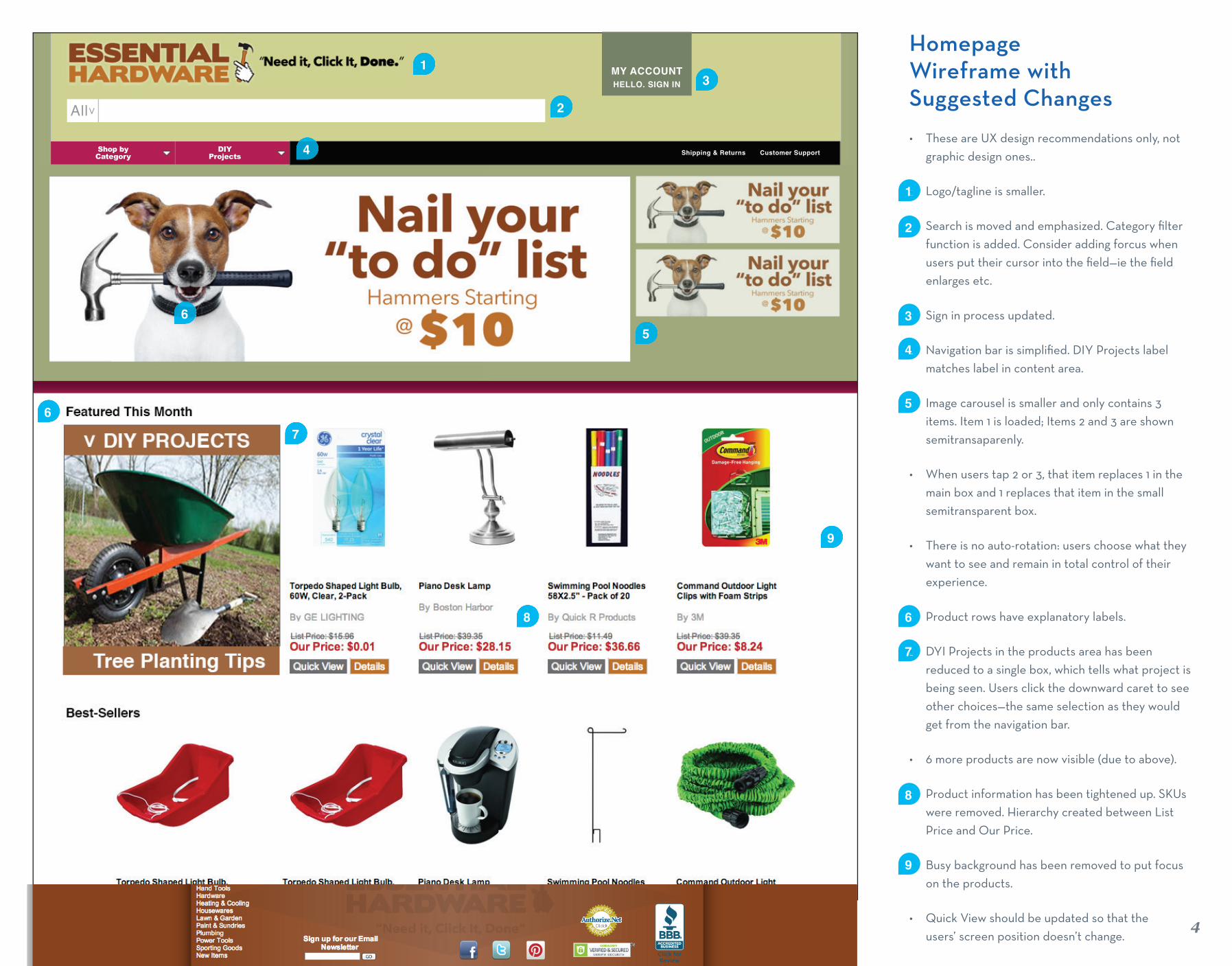
HomepageWireframe with Suggested Changes
• These are UX design recommendations only, not graphic design ones..
• Logo/tagline is smaller.
• Search is moved and emphasized. Category fi lter function is added. Consider adding forcus when users put their cursor into the fi eld—ie the fi eld enlarges etc.
• Sign in process updated.
• Navigation bar is simplifi ed. DIY Projects label matches label in content area.
• Image carousel is smaller and only contains 3 items. Item 1 is loaded; Items 2 and 3 are shown semitransaparenly.
• When users tap 2 or 3, that item replaces 1 in the main box and 1 replaces that item in the small semitransparent box.
• There is no auto-rotation: users choose what they want to see and remain in total control of their experience.
• Product rows have explanatory labels.
• DYI Projects in the products area has been reduced to a single box, which tells what project is being seen. Users click the downward caret to see other choices—the same selection as they would get from the navigation bar.
• 6 more products are now visible (due to above).
• Product information has been tightened up. SKUs were removed. Hierarchy created between List Price and Our Price.
• Busy background has been removed to put focus on the products.
• Quick View should be updated so that the users’ screen position doesn’t change.
4
• 1
• 2
1
• 3
• 4
• 5
• 6
• 7
• 8
MY ACCOUNTHELLO. SIGN IN 3
Shipping & Returns Customer SupportDIY Projects 4
5
7
6
• 9
9
2All >
Shop by Category
6
8
5
Focus 2: Search Field
essentialhardware.com Comparative Audit & Recommendations

Search FieldSuggested Changes
Use any existing information about what users type into the search fi eld to make sure you’re labeling things as people expect and that you’re emphasizing the products people are most searching for.
• The Search fi eld needs to be relocated so that it’s easier for new users to fi nd at a glance: it should be one of fi rst thing users fi nd visually/architecturally.
• The Search fi eld also needs to be much taller—to emphasize it overall but also to make it usable on tablets (it’s not very usable now).
• Predictive text would be helpful—especially on tablets where input is diffi cult. But it needs to be robust—innacurate predictive text is worse than none at all since it makes the whole website seem untrustworthy (whereas lack of predictive text is a little annoying but probably won’t cause users to question the overall site quality).
• Suggestive text would also be helpful (ie return a search query for “hamer” with “Did you mean “hammer?”)
• Consider adding a category fi lter to the Search fi eld itself. It provides users with a quick way to narrow results and also gives them a quick overview of the website’s structure. The category list should match the list from the Shop by Category dropdown menu.
• It’s fi ne to have both Search by Department and Shop by Department—some users prefer to search via the Search text fi eld while others prefer to search via the navigation. Both methods should be easy to fi nd and use. BUT users are twice as likely to fi nd the right item via navigation search than via text search so keep navigation prominent.
• Burton.com has a unique search functionality: when users click into the Search fi eld, a huge search fi eld takes over the top of the site. Not perfectly implemented (I was confused by it at fi rst) but I think it has interesting possiblities.
66
• 1
2
• 3
1
essentialhardware.com Comparative Audit & Recommendations
• 2
3
• 4
4
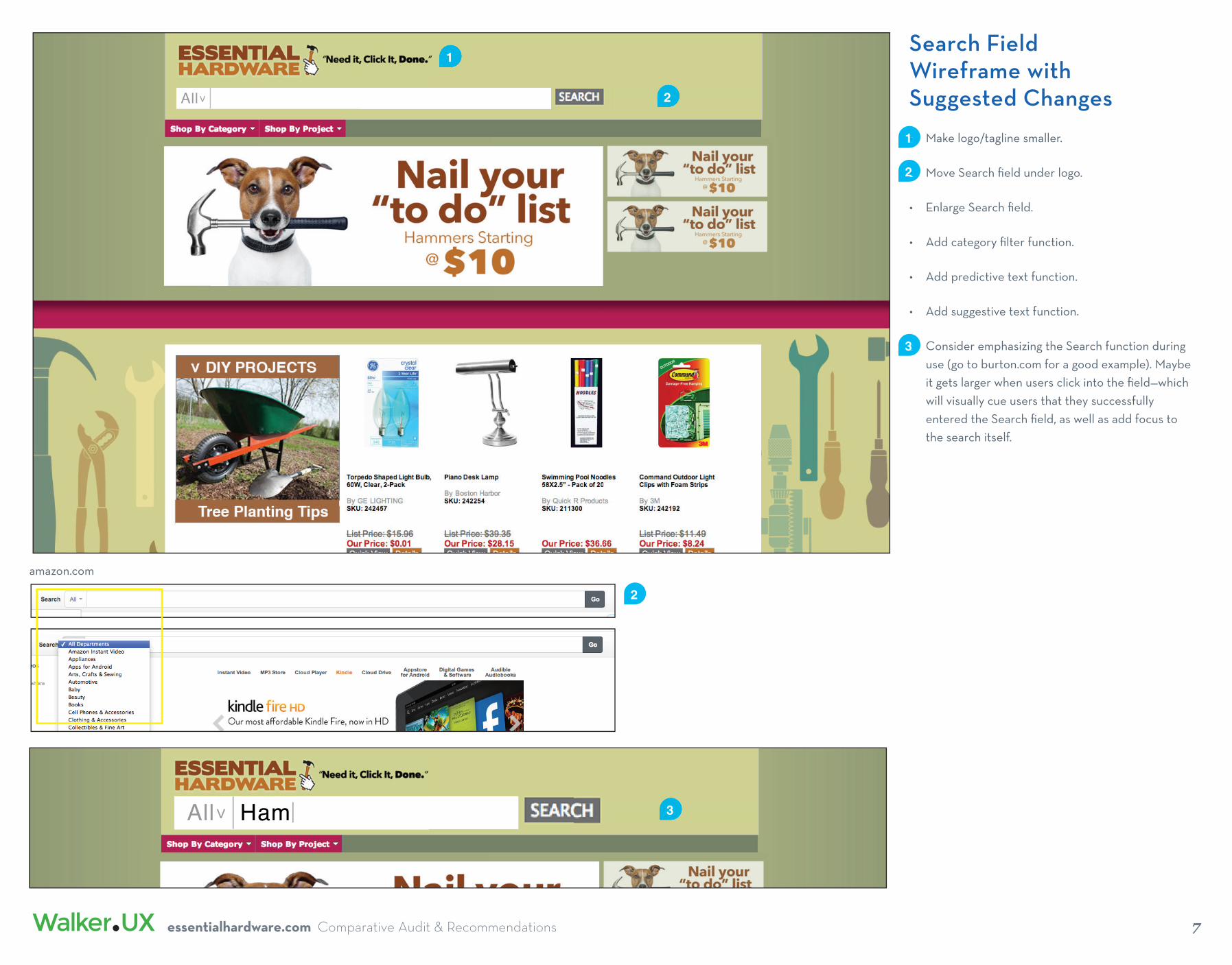
Search FieldWireframe with Suggested Changes
• Make logo/tagline smaller.
• Move Search fi eld under logo.
• Enlarge Search fi eld.
• Add category fi lter function.
• Add predictive text function.
• Add suggestive text function.
• Consider emphasizing the Search function during use (go to burton.com for a good example). Maybe it gets larger when users click into the fi eld—which will visually cue users that they successfully entered the Search fi eld, as well as add focus to the search itself.
77
• 1
2
• 3
1
essentialhardware.com Comparative Audit & Recommendations
• 2
All >
amazon.com
2
All >AllAll >All > Ham 3
8
Focus 3: Navigation Bar
essentialhardware.com Comparative Audit & Recommendations

Navigation BarSuggested Changesand Wireframe
• The navigation bar doesn’t have the correct information hierarchy: the Shop functions are almost equal to About Us in emphasis.
• Separate essential functions users immediately want to use from secondary information they’ll seek later.
• Consider changing the “Shop by Project” label. I think users are more likely to click this tab if its label sounds instructive rather than like a sales pitch—”DIY Projects”, “How-to Projects”, “Ideas/Projects” etc.
• The subcategories under Shop by Project need rethinking. Look under Painting and you’ll fi nd caulking stories. Look under Seasonal and you’ll fi nd a hose story (if you live in Florida/California, hose usage is year-round). What’s Around the House mean?
• I would suggest listing all the projects in the dropdown unless you expect to add a lot more. Show them in alphabetical order by subcategory, keeping the titles very short—ie:Plumbing>INSTALL SINK TRAP>SOLDERING BASICS
• Delete Home from the navigation bar. Users know to click the logo or click Home in the breacrumb to go to the homepage.
• Change breadcrumb to always start with “Home”. Insert more space between the navigation bar and the breadcrumb: its functionality often gets taken over by the Navigation function
• Change “Store Policies” (this label doesn’t give any actual information) to “Shipping & Returns”. Make the label smaller.
• Change “Customer Service” to “Customer Support”— more accurate. Make the label smaller.
• Move About Us to the footer.99
• 12
• 3
1
essentialhardware.com Comparative Audit & Recommendations
• 2
All >
3
Home > General Automotive > Air Compressors
• 4
• 5
• 6
5
Shipping & Returns Customer Support
4
• 7
7
5 56

10
Focus 4: Sign In and Registration
essentialhardware.com Comparative Audit & Recommendations

Sign In / Register Current Implementation
• Users click on Sign In or Register. The product content area is replaced with Returning Users Login and New Users Register Here boxes.
• Returning users enter text in 2 required fi elds and select LOGIN. They can also set a new password if they’ve forgotten it.
• New users fi ll in 4 required fi elds and select Register Now.
• After clicking either the LOGIN button or the Register Now button, users are taken to a Shipping Profi le form screen. (Well, sometimes. Sometimes I get taken to a random page.) This defi es logic and is confusing—users didn’t log into or register now for a shipping form.
• NOTE the password requirement is just 6 characters of any type. A) This security doesn’t seem strong enough for a site storing credit card information. B) As a user, I would consider this—and therefore the whole site—to be untrustworthy. I would go to another site immediately.
1111
• 1
• 2
• 3
1
essentialhardware.com Comparative Audit & Recommendations
2 3
• 4
4
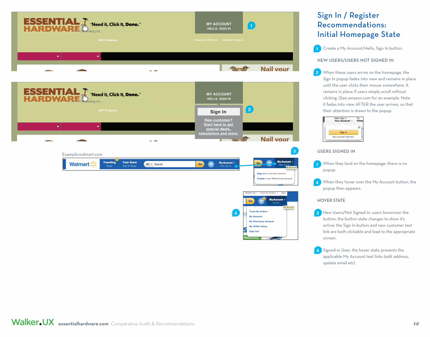
USERS SIGNED IN
• When they land on the homepage, there is no popup.
• When they hover over the My Account button, the popup then appears.
HOVER STATE
• New Users/Not Signed In: users hoverover the button; the button state changes to show it’s active; the Sign In button and new customer text link are both clickable and lead to the appropriate screen.
• Signed-in User: the hover state presents the applicable My Account text links (edit address, update email etc)
MY ACCOUNTHELLO. SIGN IN
Shipping & Returns Customer SupportDIY Projects
All > I’m looking for...
MY ACCOUNTHELLO. SIGN IN
Shipping & Returns Customer SupportDIY Projects
All > I’m looking for...
New customer? Start here to get
special deals, newsletters and more.
Sign In
Sign In / Register Recommendations:Initial Homepage State
• Create a My Account/Hello, Sign In button.
NEW USERS/USERS NOT SIGNED IN
• When these users arrive on the homepage, the Sign In popup fades into view and remains in place until the user clicks their mouse somewhere. It remains in place if users simply scroll without clicking. (See amazon.com for an example. Note it fades into view AFTER the user arrives, so that their attention is drawn to the popup.
1212
• 1
2
essentialhardware.com Comparative Audit & Recommendations
1
• 2
• 1
• 4
3Example:walmart.com
• 34
• 4
Sign In / Register Recommendations:Login Process
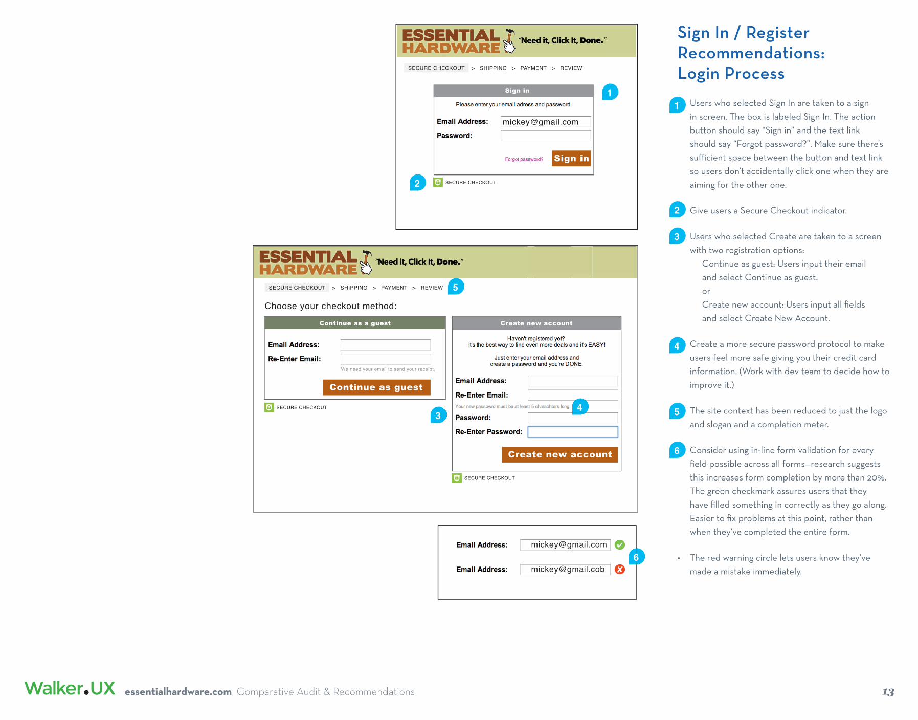
• Users who selected Sign In are taken to a sign in screen. The box is labeled Sign In. The action button should say “Sign in” and the text link should say “Forgot password?”. Make sure there’s suffi cient space between the button and text link so users don’t accidentally click one when they are aiming for the other one.
• Give users a Secure Checkout indicator.
• Users who selected Create are taken to a screen with two registration options: Continue as guest: Users input their email and select Continue as guest. or Create new account: Users input all fi elds and select Create New Account.
• Create a more secure password protocol to make users feel more safe giving you their credit card information. (Work with dev team to decide how to improve it.)
• The site context has been reduced to just the logo and slogan and a completion meter.
• Consider using in-line form validation for every fi eld possible across all forms—research suggests this increases form completion by more than 20%. The green checkmark assures users that they have fi lled something in correctly as they go along. Easier to fi x problems at this point, rather than when they’ve completed the entire form.
• The red warning circle lets users know they’ve made a mistake immediately.
1313
• 1
• 3
essentialhardware.com Comparative Audit & Recommendations
• 4
1
Sign inForgot password?
Create new account
Create new account
Continue as a guest
We need your email to send your receipt.
Continue as guest
Choose your checkout method:
SECURE CHECKOUT
Sign in
2
SECURE CHECKOUT
SECURE CHECKOUT
• 2
43 • 5
5
SECURE CHECKOUT > SHIPPING > PAYMENT > REVIEW
SECURE CHECKOUT > SHIPPING > PAYMENT > REVIEW
• 6

14
Focus 5: Shopping Cart
essentialhardware.com Comparative Audit & Recommendations

Shopping Cart Current Implementation
• Users input their zip code to get a shipping quote.
• The quote shows various options.
• Users can’t select an option. They can choose to Keep Shopping or Continue to Checkout.
• Users are taken to a login screen.
• There is no indication that this is part of the checkout process: users hit a button that says “Continue to Checkout” and they are brought to a screen without the word “Checkout”—poor user fl ow.
• Both login and registration functions are presented side by side. Now users have to consider which set of functionalities to use—focus is entirely taken off the checkout process. Users may abandon here as the user fl ow is unclear.
1515
• 1
• 2
essentialhardware.com Comparative Audit & Recommendations
• 31
3
Shopping Cart Current Implementation
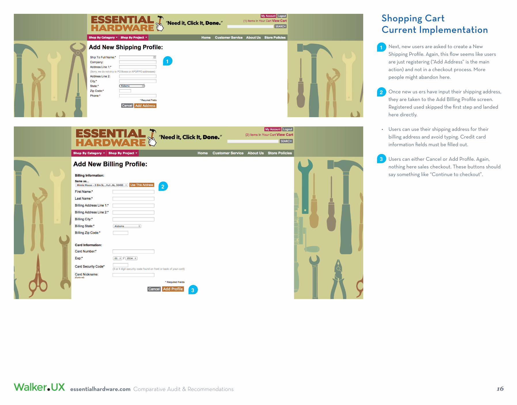
• Next, new users are asked to create a New Shipping Profi le. Again, this fl ow seems like users are just registering (“Add Address” is the main action) and not in a checkout process. More people might abandon here.
• Once new us ers have input their shipping address, they are taken to the Add BIlling Profi le screen. Registered used skipped the fi rst step and landed here directly.
• Users can use their shipping address for their billing address and avoid typing. Credit card information fi elds must be fi lled out.
• Users can either Cancel or Add Profi le. Again, nothing here sales checkout. These buttons should say something like “Continue to checkout”.
1616
• 1
• 2
essentialhardware.com Comparative Audit & Recommendations
• 3
1
2
3
Shopping Cart Current Implementation
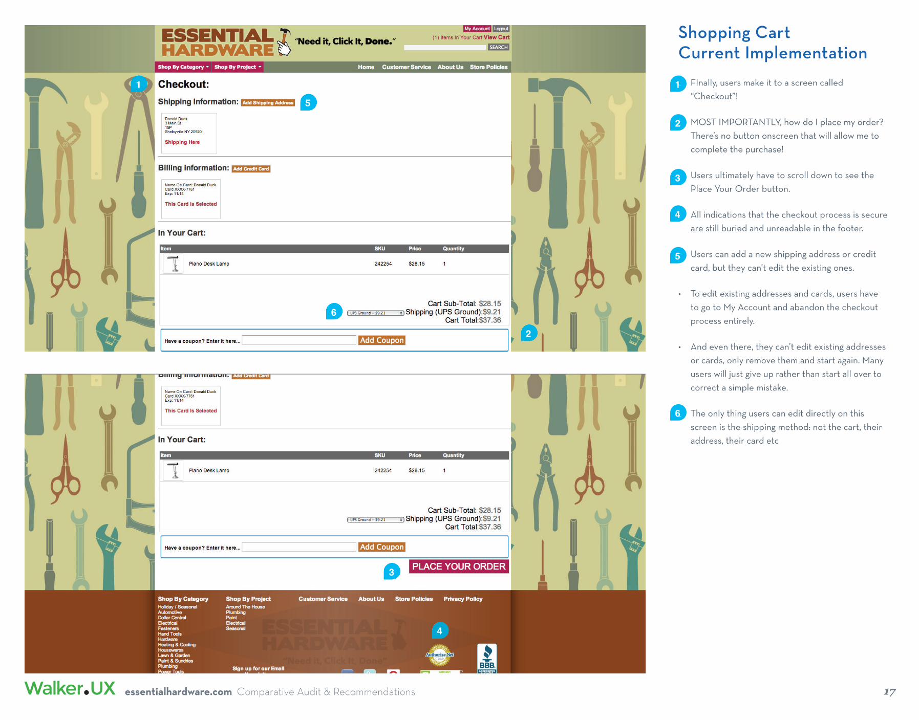
• FInally, users make it to a screen called “Checkout”!
• MOST IMPORTANTLY, how do I place my order? There’s no button onscreen that will allow me to complete the purchase!
• Users ultimately have to scroll down to see the Place Your Order button.
• All indications that the checkout process is secure are still buried and unreadable in the footer.
• Users can add a new shipping address or credit card, but they can’t edit the existing ones.
• To edit existing addresses and cards, users have to go to My Account and abandon the checkout process entirely.
• And even there, they can’t edit existing addresses or cards, only remove them and start again. Many users will just give up rather than start all over to correct a simple mistake.
• The only thing users can edit directly on this screen is the shipping method: not the cart, their address, their card etc
1717
• 1
• 2
essentialhardware.com Comparative Audit & Recommendations
• 3
1
2
3
4
• 4
• 5
5
6
• 6

18
Shopping CartRecommendation:Complete Redesign
SHIPPING ADDRESS CREATION
• Completion meter shows which step in the process users are currently at.
• Continue buttons are at the top and bottom of the form area for easy access.
• Consider using an address verifi cation API
• Users input their zip code and the city and state appear automatically.
• There is a dropdown which allows users to select another city or Other, which turns the box into an editable text fi eld.
• Phone number format is shown.
• Users click the radio button to use this address for billing.
• Standard shipping is automatically selected.
• Users cannot edit shopping cart, though all details are shown and there’s a clear link back to the cart.
• Note the callout for help at the top of the cart.
• Users can select a text link for Tax & Shipping info.
• Users can apply a promo code.
• Again, consider using in-line form validation throughout the shopping cart process.
• 1
• 2
• 3
• 4
SECURE CHECKOUT > SHIPPING > PAYMENT > REVIEW
Continue
Continue
First Name
Last Name
Company
Address Line 1
Address Line 2
ZIP Code
Phone
Use for billing address also
Enter ZIP code for city and state
optional
optional
(___) ___-____
Choose shipping method
Standard-$9.21 Arrives 1/27-1//29
Two Day Express-$31.62 Arrives 1/27-1//29
Next Day Rush-$66.01 Arrives 1/27-1//29
✔
Return to Cart
Enter a shipping address
2
2
3
ZIP Code City and state80120 Littleton, CO
4
4
5
• 5
6
• 6
Order SummaryProduct Quantity TotalName First Item Goes 1 $8.99In Two Lines
Name First Item Goes 1 $8.99In Two Lines
Name First Item Goes 1 $8.99In Two Lines
Subtotal (3 items): $26.97Tax $3.00Shipping: $9.21
Order total: $39.18
SECURE CHECKOUT
Enter promotional code Apply
Need help? Call 1-888-839-8909?
Tax & shipping info
1
• 7
7
• 8
• 9
• 10
8
Order total: $39.18
9
10
>
Littleton, CO>
Littleton, CO
Denver, CO
Other
|>
• 11
essentialhardware.com Comparative Audit & Recommendations
19
Shopping CartRecommendations:New Customer Flow
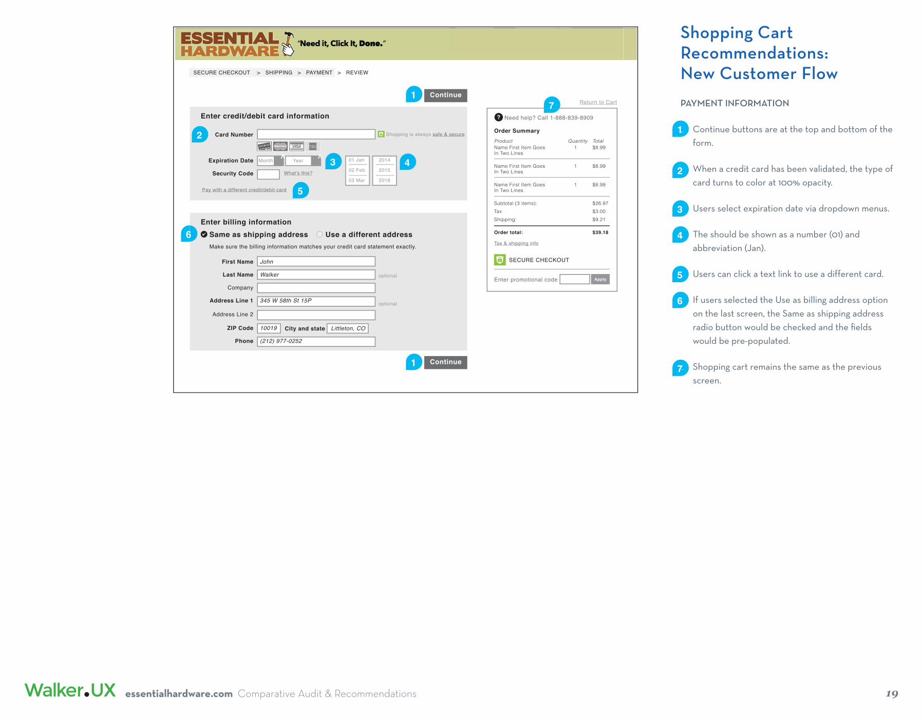
PAYMENT INFORMATION
• Continue buttons are at the top and bottom of the form.
• When a credit card has been validated, the type of card turns to color at 100% opacity.
• Users select expiration date via dropdown menus.
• The should be shown as a number (01) and abbreviation (Jan).
• Users can click a text link to use a different card.
• If users selected the Use as billing address option on the last screen, the Same as shipping address radio button would be checked and the fi elds would be pre-populated.
• Shopping cart remains the same as the previous screen.
• 1
• 2
• 3
• 4
Continue
Same as shipping address✔
Return to Cart
Enter billing information
1
1
3
• 5
• 6
Card Number
Expiration Date
Security Code What’s this?
Pay with a different credit/debit card
Enter credit/debit card information
3
Use a different address
optional
optional
First Name
Last Name
Company
Address Line 1
Address Line 2
ZIP Code
Phone
City and state Littleton, CO
John
Walker
345 W 58th St 15P
10019
(212) 977-0252
Continue
Shopping is always safe & secure Order SummaryProduct Quantity TotalName First Item Goes 1 $8.99In Two Lines
Name First Item Goes 1 $8.99In Two Lines
Name First Item Goes 1 $8.99In Two Lines
Subtotal (3 items): $26.97Tax $3.00Shipping: $9.21
Order total: $39.18
SECURE CHECKOUT
Enter promotional code Apply
Need help? Call 1-888-839-8909?
Tax & shipping info
2
1
Month>
Year> 01 Jan
02 Feb
03 Mar
2014
2015
2016
5
4
6
• 7
7
Make sure the billing information matches your credit card statement exactly.
SECURE CHECKOUT > SHIPPING > PAYMENT > REVIEW
essentialhardware.com Comparative Audit & Recommendations
20
Shopping CartRecommendations:Review
REVIEW & PLACE ORDER
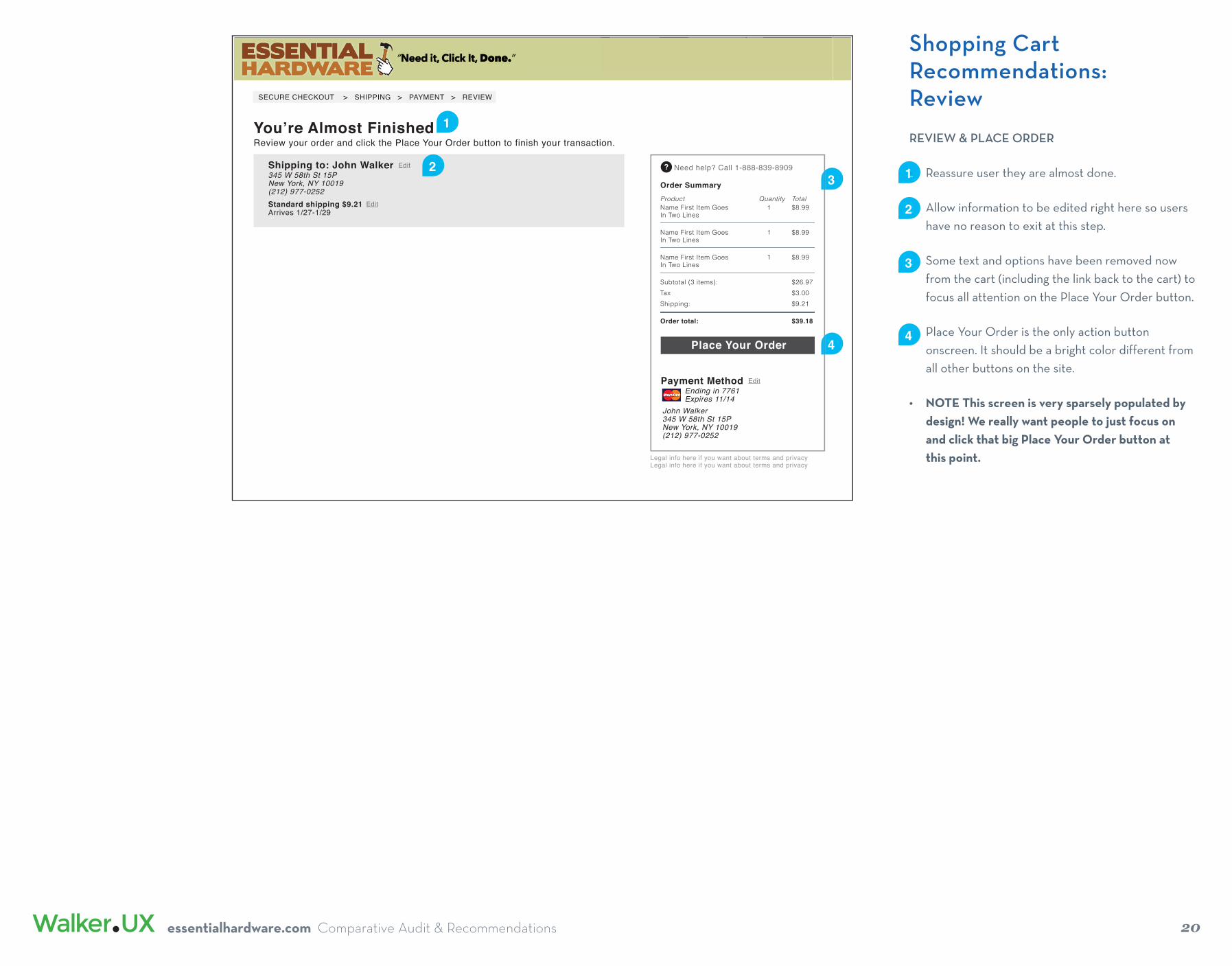
• Reassure user they are almost done.
• Allow information to be edited right here so users have no reason to exit at this step.
• Some text and options have been removed now from the cart (including the link back to the cart) to focus all attention on the Place Your Order button.
• Place Your Order is the only action button onscreen. It should be a bright color different from all other buttons on the site.
• NOTE This screen is very sparsely populated by design! We really want people to just focus on and click that big Place Your Order button at this point.
• 1
• 2
• 3
• 4
1You’re Almost FinishedReview your order and click the Place Your Order button to finish your transaction.
Order SummaryProduct Quantity TotalName First Item Goes 1 $8.99In Two Lines
Name First Item Goes 1 $8.99In Two Lines
Name First Item Goes 1 $8.99In Two Lines
Subtotal (3 items): $26.97Tax $3.00Shipping: $9.21
Order total: $39.18
Need help? Call 1-888-839-8909?
SECURE CHECKOUT > SHIPPING > PAYMENT > REVIEW
Shipping to: John Walker345 W 58th St 15PNew York, NY 10019(212) 977-0252Standard shipping $9.21Arrives 1/27-1/29
Edit
Edit
Place Your Order
Payment Method Ending in 7761 Expires 11/14
Edit
John Walker345 W 58th St 15PNew York, NY 10019(212) 977-0252
Legal info here if you want about terms and privacy Legal info here if you want about terms and privacy
23
4
essentialhardware.com Comparative Audit & Recommendations
Related Documents


![No201[Assessment of Existing Steel Structures Recommendations for Estimation of Remaining Fatigue Life]](https://static.cupdf.com/doc/110x72/557209e5497959fc0b8bf89d/no201assessment-of-existing-steel-structures-recommendations-for-estimation-of-remaining-fatigue-life.jpg)
