Poster creation final. Tiffany Malcolm

Final poster shots
Jul 28, 2015
Welcome message from author
This document is posted to help you gain knowledge. Please leave a comment to let me know what you think about it! Share it to your friends and learn new things together.
Transcript
Poster creation final.
Tiffany Malcolm
• I first decided to look at 2 different types of eyes. The reason I decided to look at different eyes was to see how much detail is present. At first I was going to just an image I found off the internet; I did come to the conclusion that taking an observational picture would be more beneficial as people would be able to see that I had tried to imitate the different eyes I looked at. As you can see from that photo I used a Cannon’ camera and took a close up image of my friends eye which I would then use on my poster.
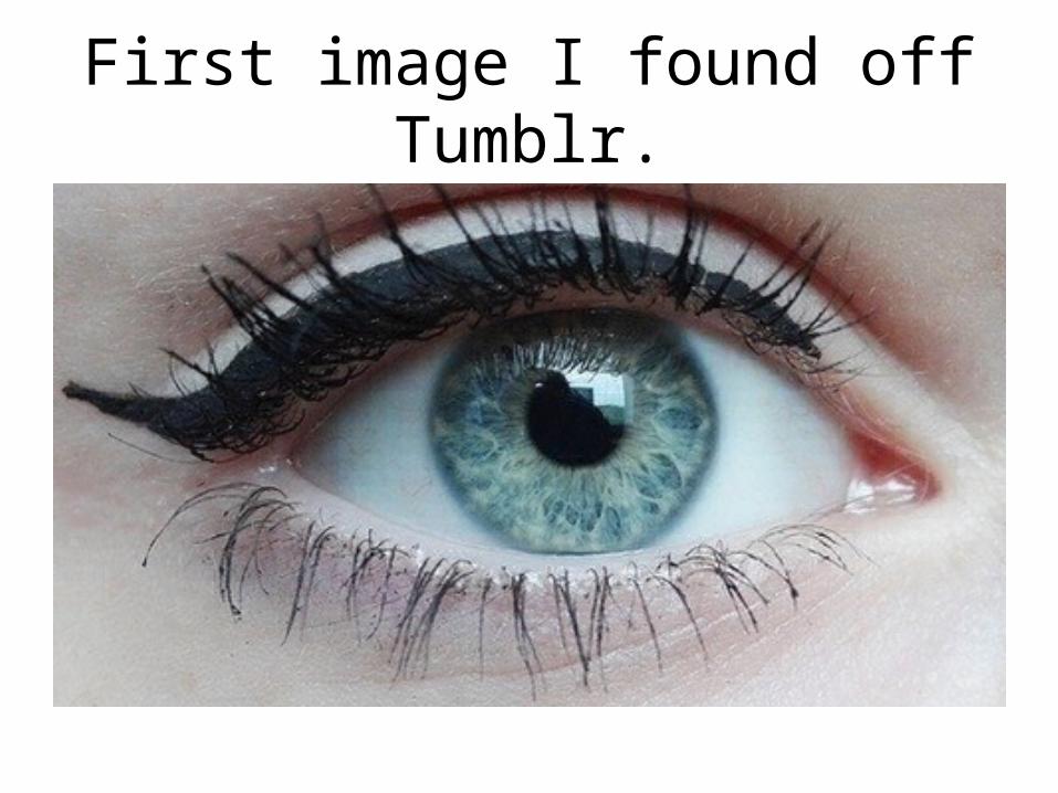
First image I found off Tumblr.

Second image I found off Tumblr.

This is the image of my friends eye which I then decided to use on my poster.
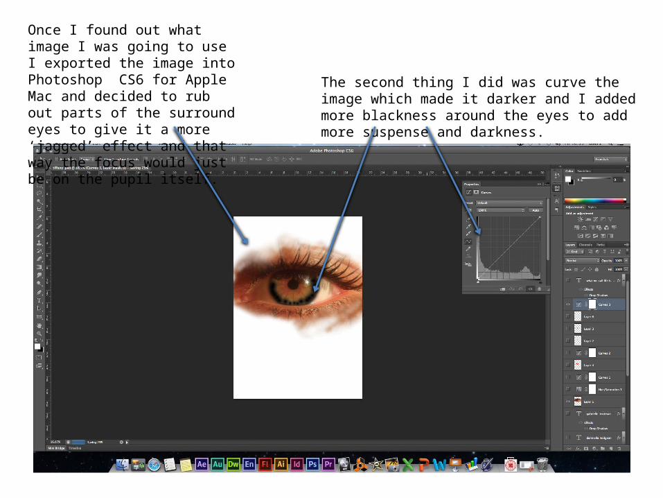
Once I found out what image I was going to use I exported the image into Photoshop CS6 for Apple Mac and decided to rub out parts of the surround eyes to give it a more ‘jagged’ effect and that way the focus would just be on the pupil itself.
The second thing I did was curve the image which made it darker and I added more blackness around the eyes to add more suspense and darkness.
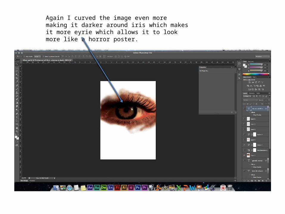
Again I curved the image even more making it darker around iris which makes it more eyrie which allows it to look more like a horror poster.

Changing the whole background from a colour image to black and white was risky. The way I did this was by changing the Hue/Saturation and then clicking on the black and white setting. After I had changed it to black and white however I realised that it needed some element of colour as it didn’t look scary enough and the black and white colours was boring.

Adding colour was hard and I realised that I struggled with adding a colour to the image. This is because when I first added the red it was way to harsh and over powered the image. The way I overcome this was by changing the opacity of the colour and then noticing that it looked more effective then leaving it bulky.
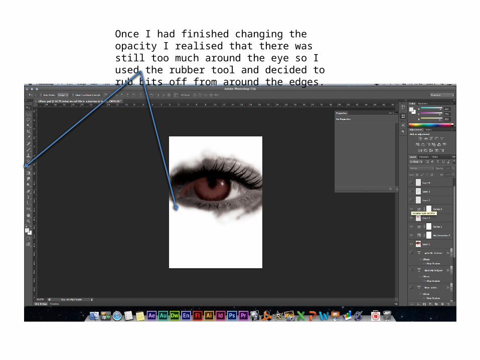
Once I had finished changing the opacity I realised that there was still too much around the eye so I used the rubber tool and decided to rub bits off from around the edges.
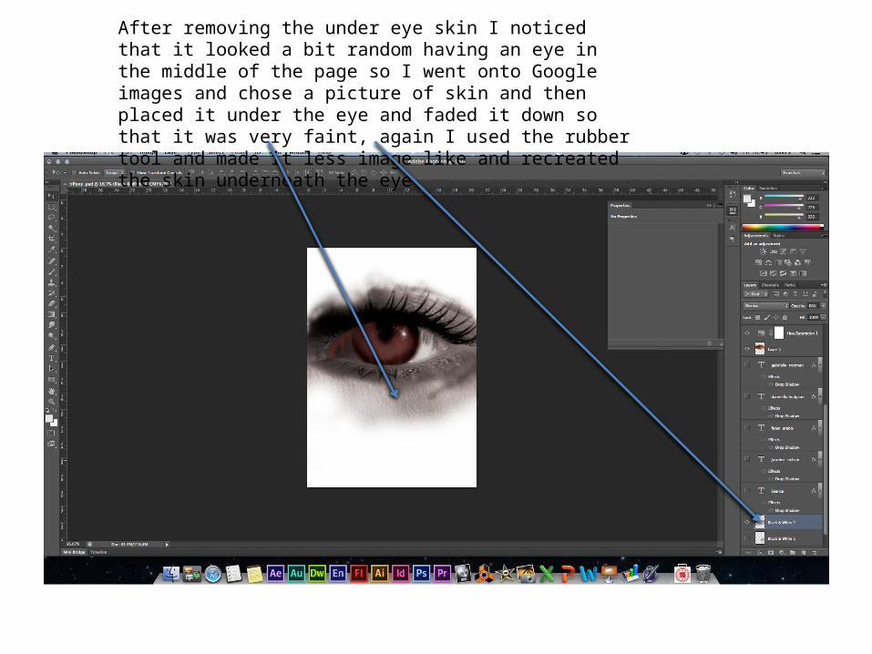
After removing the under eye skin I noticed that it looked a bit random having an eye in the middle of the page so I went onto Google images and chose a picture of skin and then placed it under the eye and faded it down so that it was very faint, again I used the rubber tool and made it less image like and recreated the skin underneath the eye.
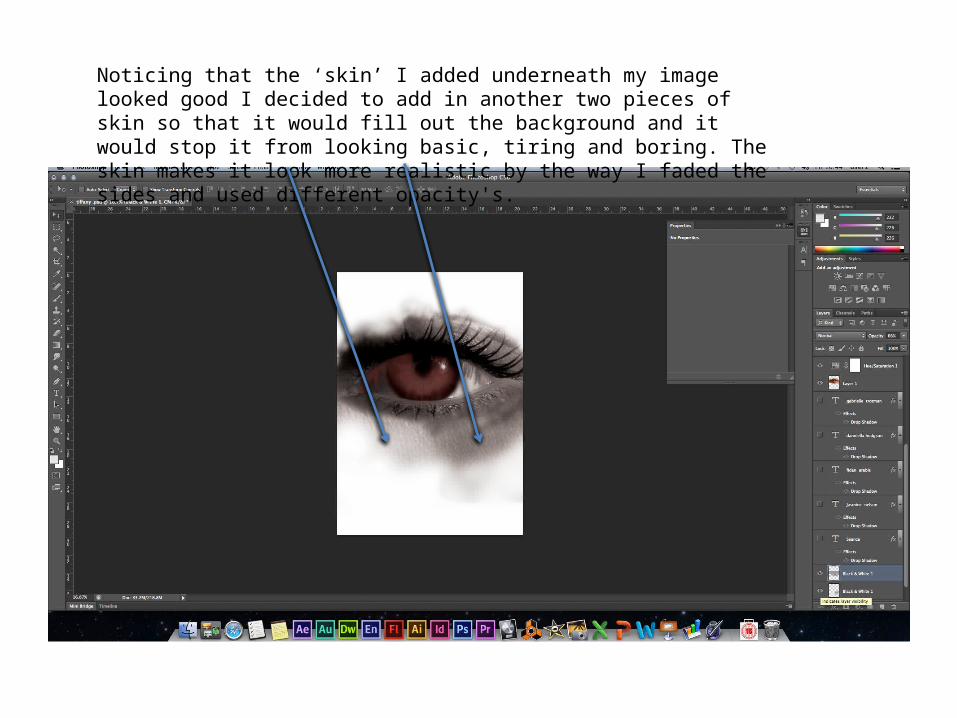
Noticing that the ‘skin’ I added underneath my image looked good I decided to add in another two pieces of skin so that it would fill out the background and it would stop it from looking basic, tiring and boring. The skin makes it look more realistic by the way I faded the sides and used different opacity's.
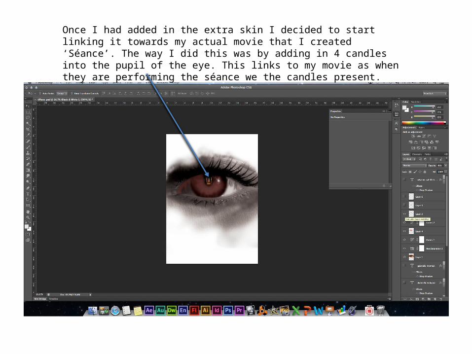
Once I had added in the extra skin I decided to start linking it towards my actual movie that I created ‘Séance’. The way I did this was by adding in 4 candles into the pupil of the eye. This links to my movie as when they are performing the séance we the candles present.

Even with the red in the eye and the black and white effects I still didn’t feel that it look that ‘scary’ so again I added a black patch in the eye but lowered the opacity so that way you can still see the red from underneath and it gave it more of an edge.

Still with no sense of direction and unable to tell what this was I added the first piece of text onto the poster. The first text piece I added was the words ‘Seance’. This was using a font which was clear and easy to read but unfortunately not scary.
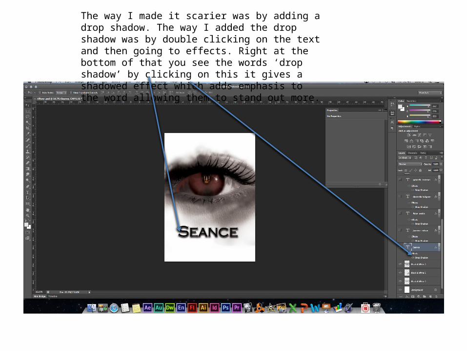
The way I made it scarier was by adding a drop shadow. The way I added the drop shadow was by double clicking on the text and then going to effects. Right at the bottom of that you see the words ‘drop shadow’ by clicking on this it gives a shadowed effect which adds emphasis to the word allowing them to stand out more.
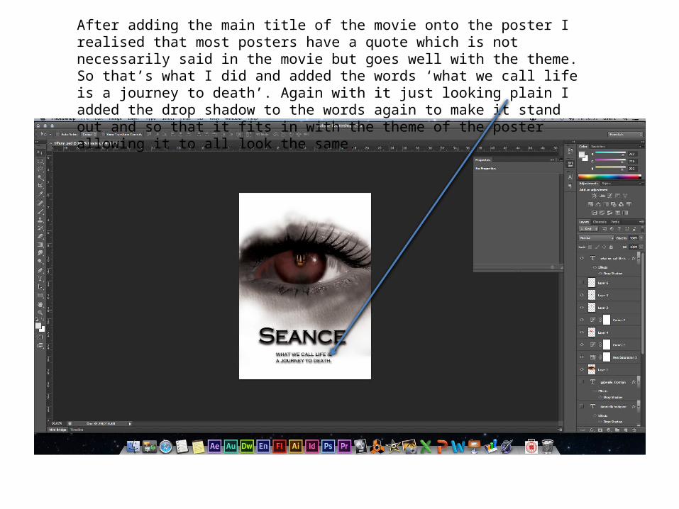
After adding the main title of the movie onto the poster I realised that most posters have a quote which is not necessarily said in the movie but goes well with the theme. So that’s what I did and added the words ‘what we call life is a journey to death’. Again with it just looking plain I added the drop shadow to the words again to make it stand out and so that it fits in with the theme of the poster allowing it to all look the same.
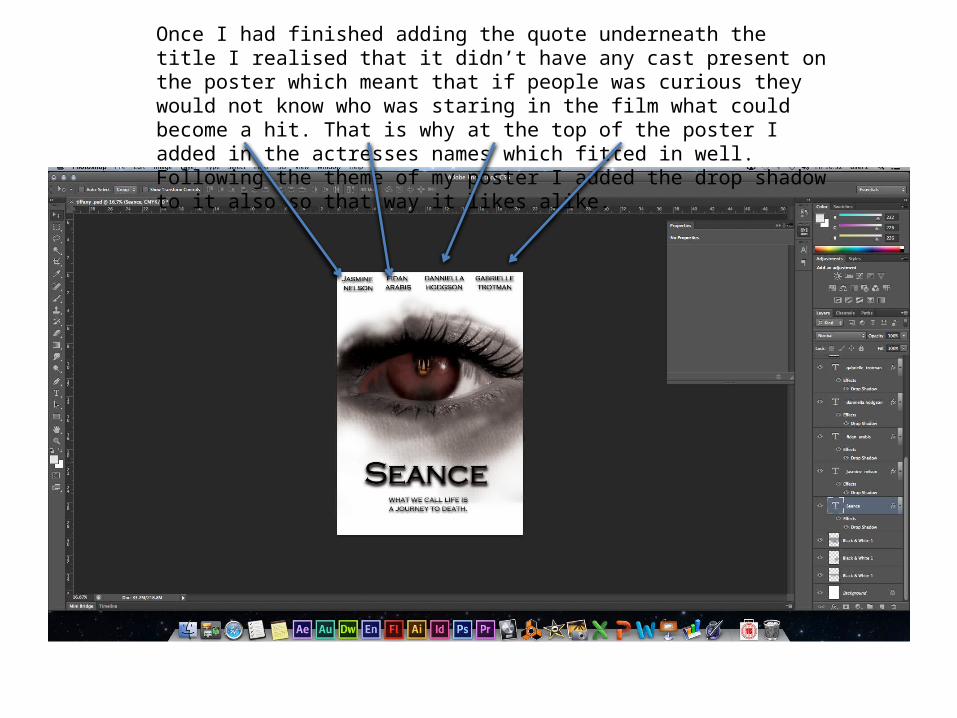
Once I had finished adding the quote underneath the title I realised that it didn’t have any cast present on the poster which meant that if people was curious they would not know who was staring in the film what could become a hit. That is why at the top of the poster I added in the actresses names which fitted in well. Following the theme of my poster I added the drop shadow to it also so that way it likes alike.

Adding the certificate logo was tricky. This was because I was trying to figure out where I would place my movie. I rated my movie a 15 because even though it did not contain words such as c*** it did contain words such as f*** and pi*s. I felt that because I wouldn’t let my 13 year old sister watch the movie I had to rate it higher so that she was unable to watch my movie. Adding the rating into the corner was a convention of most posters as that way it promotes the age and lets people know if they can or cannot watch the movie.

Once I had finished my poster I noticed that there was no release date or expected time as to when people would be able to view it from. So underneath the quote I added in the words ‘coming soon March 2014’. This let potential viewers know that they would be able to watch it anytime after March 2014.

Start and finished poster.
Related Documents