The film magazine cover uses the main image of Johnny Depp-by using this successful actor within the film industry shall make the audience want to read the magazine as he has a fan base from the audience. The magazine model uses eye contact to draw in the audience the eye contact makes the actor seem on a much more personal level. There’s a very large font for the title- so that the audience knows exactly what the magazine is about Although the barcode is in a slightly awkward position. Which isn’t a usual convention in a film magazine There are other references to films which gives people an idea of what else is going to be included in the magazine

Welcome message from author
This document is posted to help you gain knowledge. Please leave a comment to let me know what you think about it! Share it to your friends and learn new things together.
Transcript
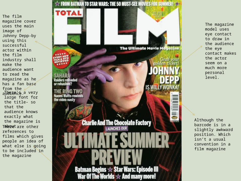
The film magazine cover uses the main image of Johnny Depp-by using this successful actor within the film industry shall make the audience want to read the magazine as he has a fan base from the audience.
The magazine model uses eye contact to draw in the audience the eye contact makes the actor seem on a much more personal level.
There’s a very large font for the title- so that the audience knows exactly what the magazine is about
Although the barcode is in a slightly awkward position. Which isn’t a usual convention in a film magazine
There are other references to films which gives people an idea of what else is going to be included in the magazine
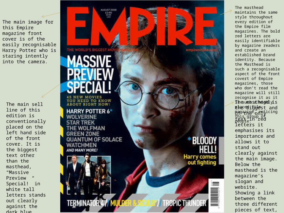
The main image for this Empire magazine front cover is of the easily recognisable Harry Potter who is staring intently into the camera.
The masthead maintains the same style throughout every edition of the Empire film magazines. The bold red letters are easily identifiable by magazine readers and create an established brand identity. Because the Masthead is such a recognisable aspect of the front covert of Empire magazines, those who don’t read the magazine will still recognise it as it is such a highly placed film magazine, enticing this group of people.
The masthead is the biggest and of the only text in red letters it emphasises its importance and allows it to stand out clearly against the main image. Below the masthead is the magazine’s slogan and website. Showing a link between the three different pieces of text, this would make the reader want to check out the website.
The main sell line of this edition is conventionally placed on the left hand side of the front cover. It is the biggest text other than the masthead, “Massive Preview Special!” in white tall letters stands out clearly against the dark blue colouring of the main image. This draws reader’s attention to this aspect of the front cover.

Very powerful, bright masthead immediately attracts the public. I must follow this convention and create a bold and attractive masthead
The title of the main film in question is displayed in an attractive and relevant font, attracting potential fans of the film. I shall use this convention on my own magazine.
Use of a self-supporting phrase implies that it is superior to other magazines, with the key word greatly emphasized. I will use take this approach with my magazine, stating why my magazine is better than others.
Strong eye contact with the main model entices the audience
The barcode is in a strange position, however the magazine makes the price obvious for possible investors of the magazine
Related Documents