Economic Policy Review Federal Reserve Bank of New York July 1997 Volume 3 Number 2 1 Creating an Integrated Payment System: The Evolution of Fedwire Adam M. Gilbert, Dara Hunt, and Kenneth C. Winch 9 The Round-the-Clock Market for U.S. Treasury Securities— Michael J. Fleming 33 Market Returns and Mutual Fund Flows Eli M. Remolona, Paul Kleiman, and Debbie Gruenstein 53 The Evolving External Orientation of Manufacturing: A Profile of Four Countries José Campa and Linda S. Goldberg 83 Credit, Equity, and Mortgage Refinancings Stavros Peristiani, Paul Bennett, Gordon Monsen, Richard Peach, and Jonathan Raiff

Welcome message from author
This document is posted to help you gain knowledge. Please leave a comment to let me know what you think about it! Share it to your friends and learn new things together.
Transcript

EconomicPolicy Review
Federal Reserve Bank of New York
July 1997
Volume 3 Number 2
1 Creating an Integrated Payment System: The Evolution of Fedwire Adam M. Gilbert, Dara Hunt, and Kenneth C. Winch
9 The Round-the-Clock Market for U.S. Treasury Securities—Michael J. Fleming
33 Market Returns and Mutual Fund FlowsEli M. Remolona, Paul Kleiman, and Debbie Gruenstein
53 The Evolving External Orientation of Manufacturing: A Profile of Four CountriesJosé Campa and Linda S. Goldberg
83 Credit, Equity, and Mortgage RefinancingsStavros Peristiani, Paul Bennett, Gordon Monsen, Richard Peach, and Jonathan Raiff

ECONOMIC POLICY REVIEW EDITORIAL BOARD
Andrew AbelWharton, University of Pennsylvania
Ben BernankePrinceton University
Charles CalomirisColumbia University
Stephen CecchettiOhio State University
Richard ClaridaColumbia University
John CochraneUniversity of Chicago
Stephen DavisUniversity of Chicago
Franklin EdwardsColumbia University
Henry S. FarberPrinceton University
Mark FlanneryUniversity of Florida, Gainesville
Mark GertlerNew York University
Gary GortonWharton, University of Pennsylvania
Richard J. HerringWharton, University of Pennsylvania
R. Glenn HubbardColumbia University
Edward KaneBoston College
Kenneth RogoffPrinceton University
Christopher SimsYale University
Stephen ZeldesColumbia University
The ECONOMIC POLICY REVIEW is published by the Research and Market Analysis
Group of the Federal Reserve Bank of New York. The views expressed in the articles are
those of the individual authors and do not necessarily reflect the position of the Federal
Reserve Bank of New York or the Federal Reserve System.
FEDERAL RESERVE BANK OF NEW YORK ECONOMIC POLICY REVIEW
Paul B. Bennett and Frederic S. Mishkin, Editors
Editorial Staff: Valerie LaPorte, Mike De Mott, Elizabeth MirandaProduction: Graphics and Publications Staff

Table of Contents July 1997
Volume 3 Number 2
Federal Reserve Bank of New York Economic Policy Review
1 CREATING AN INTEGRATED PAYMENT SYSTEM: THE EVOLUTION OF FEDWIRE
Adam M. Gilbert, Dara Hunt, and Kenneth C. Winch
Adapted from remarks given before the Seminar on Payment Systems in the European Union in Frankfurt, Germany, on February 27, 1997.
ARTICLES
9 THE ROUND-THE-CLOCK MARKET FOR U.S. TREASURY SECURITIES
Michael J. Fleming
U.S. Treasury securities are traded in London and Tokyo as well as in New York, creating a virtual round-the-clock market. The author describes that market by examining trading volume, price volatility, and bid-ask spreads over the global trading day. He finds that trading volume and price volatility are highly concentrated in New York trading hours. Bid-ask spreads are found to be wider overseas than in New York and wider in Tokyo than in London. Despite the lower liquidity of the overseas locations, the author finds that overseas price changes in U.S. Treasury securities are unbiased predictors of overnight New York price changes.
33 MARKET RETURNS AND MUTUAL FUND FLOWS
Eli M. Remolona, Paul Kleiman, and Debbie Gruenstein
With the increased popularity of mutual funds come increased concerns. Namely, could a sharp drop in stock and bond prices set off a cascade of redemptions by mutual fund investors and could the redemptions exert further downward pressure on asset markets? The authors analyze this relationship by using instrumental variables—a measuring technique previously unapplied to market returns and mutual fund flows—to determine the effect of returns on flows. Despite market observers’ fears of a downward spiral in asset prices, the authors conclude that the short-term effect of market returns on mutual fund flows typically has been too weak to sustain such a spiral.

53 THE EVOLVING EXTERNAL ORIENTATION OF MANUFACTURING: A PROFILE OF FOUR COUNTRIES
José Campa and Linda S. Goldberg
Using more than two decades of industry data, the authors profile the external orientation of manufacturing industries in the United States, Canada, the United Kingdom, and Japan. They use the term “external orientation” to describe the potential exposure of an industry’s revenues and costs to world events through exports, imports, and imported inputs. For each major manufacturing industry, the authors provide histories of the share of total revenues earned in foreign markets, the role of imports in domestic consumption, and the costs of imported inputs in total production. In addition, they construct a measure of net external orientation, which is intended to capture how much an industry’s use of imported inputs (a cost factor) can potentially offset exposure to the international economy through exports (a revenue factor).
83 CREDIT, EQUITY, AND MORTGAGE REFINANCINGS
Stavros Peristiani, Paul Bennett, Gordon Monsen, Richard Peach, and Jonathan Raiff
Using a unique loan level data set that links individual household credit ratings with property and loan characteristics, the authors test the extent to which homeowners’ credit ratings and equity affect the likelihood that mortgage loans will be refinanced as interest rates fall. Their logit model estimates strongly support the importance of both the credit and equity variables. Furthermore, the authors’ results suggest that a change in the overall lending environment over the past decade has increased the probability that a homeowner will refinance.
OTHER PUBLICATIONS AND RESEARCH
100 A list of recent publications and discussion papers: the ECONOMIC POLICY REVIEW, CURRENT ISSUES IN ECONOMICS AND FINANCE, and STAFF REPORTS.
Introducing Research Update
The Research and Market Analysis Group is launching Research Update, a new publication designed to
keep you informed about our current work. Research Update will offer detailed summaries of selected
studies, list all recent articles and papers appearing in our main research series, and report on news
within the Group. Research Update will be available at our web site (http://www.ny.frb.org) in late July.

FRBNY ECONOMIC POLICY REVIEW / JULY 1997 1
Creating an Integrated Payment System: The Evolution of FedwireAdam M. Gilbert, Dara Hunt, and Kenneth C. Winch
The following paper is adapted from remarks given by Adam M.Gilbert before the Seminar on Payment Systems in the EuropeanUnion. The seminar, sponsored by the European Monetary Insti-tute, was held in Frankfurt, Germany, on February 27, 1997.
On January 1, 1999, the countries participating in
the European Union are expected to adopt a single cur-
rency and monetary policy. To support the creation of an
integrated money market and the conduct of a unified
monetary policy, the European Monetary Institute (EMI)
and the national central banks in the European Union are
developing a new payment system, the Trans-European
Automated Real-Time Gross Settlement Express Transfer
(TARGET) system. TARGET will interlink the advanced
payment systems that the central banks of the European
Union have agreed to implement in their own countries.
This linkage will enable the banking sector to process
cross-border payments in the new currency, the euro.
As the European Union moves forward with
TARGET, it is an appropriate time to reconsider the U.S.
experience with Fedwire, the large-dollar funds and
securities transfer system linking the twelve district
Banks of the Federal Reserve System. (See the box for a
brief overview of Fedwire.) Just as TARGET is designed
to ease the flow of funds among financial institutions
throughout Europe, Fedwire allows U.S. financial institutions
to send and receive funds anywhere in the country
through accounts at their local Reserve Banks.
This paper traces the evolution of Fedwire from
twelve separate payment operations, linked only by an
interdistrict communications arrangement, to a more uni-
fied and efficient system. Our account highlights both the
difficulties the Federal Reserve encountered as it sought
to standardize and consolidate payment services and the
lessons it drew from its experience. These lessons may
prove useful to the European Union and to other nations
undertaking a similar integration of payment systems.
ORIGINS OF THE FEDWIRE SYSTEM The motives for linking the payment systems of the
twelve Reserve Banks in the early part of this century
were not unlike the current goals of TARGET. Prior to
and immediately following the creation of the Federal
Reserve System in 1913, exchange rates governed payments
across regions in the United States. Like foreign
exchange rates under a gold standard, the regional
exchange rates for the U.S. dollar moved in a narrow
band established by the costs of shipping gold or currency—
costs that included freight charges and the interest lost
during the time it took for payments to be received
(Garbade and Silber 1979, pp. 1-10).

2 FRBNY ECONOMIC POLICY REVIEW / JULY 1997
To address the regional differences in the value of the
U.S. dollar and their perceived negative effect on business, the
Federal Reserve took two steps shortly after its establishment.
First, to eliminate the transit costs in payments, the Federal
Reserve created the Gold Settlement Fund. Thereafter,
commercial banks could settle both intradistrict and inter-
district transfers through their local Reserve Bank, which in
turn would settle with other Reserve Banks through the Gold
Settlement Fund. The arrangement permitted interdistrict
balances to settle through book-entry transfers—a method of
effecting settlements whereby debits and credits are posted to
accounts—and made the physical shipment of gold or
currency unnecessary. Second, the Federal Reserve inaugu-
rated leased-wire communications among the Reserve Banks
and transferred funds daily over the wire at no cost to member
banks. This practice eliminated the interest losses that
occurred during the time it took to transfer funds. By 1918,
these two services helped abolish regional exchange rates and
formed the basic structure of the modern Fedwire system
(Garbade and Silber 1979, p. 10).
NEW CHALLENGES: FEDWIRE
IN RECENT DECADES
Over the years, Fedwire grew more sophisticated as advances
in technology were applied, but it remained structured as a
system that linked twelve operationally unique units. The
widely held view that each Reserve Bank could best serve the
specific needs of institutions in its district helped to
perpetuate a decentralized approach. In addition, because
statutory prohibitions on interstate banking kept banks
from crossing Federal Reserve districts, the lack of
consistency in payment services was not regarded as a prob-
lem by many Fedwire participants.
Despite these considerations, by the 1960s the need
to standardize services had become increasingly apparent to
the Federal Reserve. The existing system for the interdistrict
and intradistrict transfer of funds was inefficient. Although
the payment units at the various Reserve Banks were required
to originate and receive transfer messages using a common for-
mat, each unit maintained its own funds software, data pro-
cessing center, and computer programmers. As a consequence,
enhancements to Fedwire were time-consuming to execute;
before a change could be implemented, the twelve individual
systems and the electronic interlinks among them had to be
tested. In addition, enhancements had to be introduced on a
staggered basis, or a single cutoff date had to be worked out
among all the Reserve Banks. Coordinating these efforts
proved difficult. Along with creating inefficiencies, this mul-
tisystem environment introduced greater operational risk to
the task of revising and upgrading services.
In response to these problems, a decision was made
in the 1970s to develop standard software for each key
The Federal Reserve Fedwire system is an electronic fundsand securities transfer system. Depository institutions thatmaintain a reserve or clearing account with the FederalReserve may use the system.
Fedwire provides real-time gross settlement forfunds transfers. Each transaction is processed as it is initiatedand settles individually. Settlement for most U.S. govern-ment securities occurs over the Fedwire book-entry securi-ties system, a real-time delivery-versus-payment grosssettlement system that allows the immediate and simulta-neous transfer of securities against payments.
Operationally, Fedwire has three components:
data processing centers that process and record funds and
securities transfers as they occur, software applications
that operate on the computer systems, and a communica-
tion network that electronically links the Federal Reserve
district Banks with depository institutions.
FEDWIRE: THE FEDERAL RESERVE
WIRE TRANSFER SERVICE
Over the years, Fedwire grew more sophisticated
as advances in technology were applied, but it
remained structured as a system that linked
twelve operationally unique units.

FRBNY ECONOMIC POLICY REVIEW / JULY 1997 3
customers. Nevertheless, with twelve organizations working
independently to improve their local service, a system arose
that as a whole did not fully meet the needs of emerging
regional and national banks. Business managers tried to
address these problems by eliminating district modifications,
but their efforts met with limited success.
Turning from Fedwire’s electronic funds transfers
to its securities transfers, we find even more striking incon-
sistencies in the services provided by different Reserve
Banks. In fact, despite an effort to develop standard soft-
ware, two completely distinct applications came into oper-
ation. The New York and Philadelphia Reserve Banks used
software called BESS, designed as a high-speed application
that could handle large volumes, while the other ten
Federal Reserve districts used software called SHARE.
Because local modifications were made to these two unique
applications, the difficulties experienced for funds transfers
were exacerbated for Fedwire securities services. In addi-
tion, during the 1980s, new types of securities, such as
mortgage-backed obligations, were added to Fedwire at a
rapid pace, creating the need to update and modify the sys-
tem constantly.
The communication network linking the com-
puter systems of the Federal Reserve Banks and depository
institutions also presented problems. The network tech-
nology available in the 1960s was relatively inefficient. As
a result, all Fedwire interdistrict messages had to pass
through a single hub, in Culpeper, Virginia. In addition, if
a district temporarily lost its connection to Culpeper, it
could not communicate with the entire system.
payment service. By the early 1980s, a standard software
application had been developed for the Fedwire funds
transfer service. The individual Reserve Banks then imple-
mented copies of this application on their local mainframes. The
single common application was more efficient to develop,
maintain, and modify.
Unfortunately, during the 1980s, the standard
software applications became increasingly less standard. To
meet the perceived desires of local customers, the
Reserve Banks made modification upon modification
to the common applications. In addition to trying to
satisfy customers, the Reserve Banks made changes to
meet internal reporting and system interfacing
requirements. The components altered at the local
level ranged from peripheral aspects of Fedwire, such
as the type of reports generated, to core elements of the
system, such as communication links. The end result
was an erosion of the standard applications and the
introduction of the same problems experienced earlier.
The system became difficult to update, and the risk of
operational problems grew.
By the late 1980s, the Federal Reserve was
aware of the limitations and potential problems cre-
ated by the locally modified applications. At the same
time the operations at the Reserve Banks were becoming
more individualized, the need for standard services was
becoming more pronounced. This need was particu-
larly apparent from the perspective of Federal Reserve
customers as the boundaries and distinctions between
districts blurred. One reason for this blurring was that
bank holding companies increasingly operated separate
subsidiary banks in multiple Federal Reserve districts.
In addition, as differences in business practices and finan-
cial markets in regions throughout the United States
diminished, the demands of Fedwire customers became
more homogeneous. Customers also became increas-
ingly concerned about inequalities in the service pro-
vided to institutions in different districts.
It is important to note that the Reserve Banks
never deliberately made Fedwire less customer friendly. In
fact, the Reserve Banks modified their systems with precisely
the opposite intention—to improve the services for
With twelve organizations working
independently to improve their local service,
a system arose that as a whole did not fully
meet the needs of emerging regional and
national banks.

4 FRBNY ECONOMIC POLICY REVIEW / JULY 1997
In the 1980s, the Federal Reserve incorporated
advances in network technology to address these shortcom-
ings. A new network consisting of a common backbone with
unique local networks was implemented. Each of the
twelve Federal Reserve Banks maintained an independent
local network; switch-routing software linked the networks
for interdistrict messages. Although an improvement over
the central hub model, this network configuration had its
own weaknesses. In particular, the existence of twelve unique
local networks greatly complicated the diagnosis and reso-
lution of technical problems.
CURRENT STRATEGIES FOR CONSOLIDATING SYSTEMS
Recognizing the need for further refinements of Fedwire,
the Federal Reserve is now standardizing and consolidating
software, data processing centers, and communications net-
works for both funds and securities throughout the System.
The software applications that were modified by the
Reserve Banks to meet the needs of local customers are
being replaced by a single application for funds transfers
and a single application for book-entry securities transfers.
In addition, the twelve district data processing centers and
their four backup locations have been consolidated into three
sites: one primary processing center for Fedwire and other
critical national electronic payment and accounting systems,
and two backup sites. The individual Reserve Banks will con-
tinue to maintain their own balance sheets, and customer
relations will be handled locally. Although the conversion to a
more centralized system has gone very smoothly to date, the
relationship of Fedwire customers to the Reserve Banks and
consolidated processing sites is still in transition. Over time, it
will become more difficult for Reserve Banks to maintain their
technical expertise as responsibility for automated operations
is ceded to centralized offices.
In addition to making these changes in software and
data processing, the Federal Reserve recently converted the
network linking computer systems at the Reserve Banks and
depository institutions to a unified communications network
with common standards and equipment. The new network,
known as FEDNET, is linked with the main processing cen-
ter in New Jersey and the two contingency centers and is
used to process both transactions within a single district
and those between districts. Because FEDNET has standard
connection equipment at depository institutions, it simpli-
fies diagnostic testing and provides improved service and
enhanced disaster recovery capabilities.
BENEFITS OF CONSOLIDATION
Several important benefits should arise from the initiatives
undertaken in recent years:
• The Federal Reserve will be able to provide uniformpayment services throughout the country. Customershave repeatedly asked for standard services to eliminateunnecessary inconvenience and expense and to ensurethat institutions are treated equitably regardless oftheir location.
• Redundant resources will be eliminated, and costs will bereduced. At the start of the year, with consolidation almostcomplete, the Federal Reserve was able to reduce the feefor Fedwire funds transfers by 10 percent. Given thecompetitive environment facing both the Federal Reserveand its customers, the ability to reduce costs withoutcompromising the integrity of the system is ofutmost importance.
• In the future, it will be possible to modify paymentsystems more quickly and with less risk.
• The designation of multiple backup facilities forcritical payment systems will enhance contingencyprocessing capabilities, while the move from twelvesites to one will improve security.
The software applications that were modified by
the Reserve Banks to meet the needs of local
customers are being replaced by a single
application for funds transfers and a single
application for book-entry securities transfers.

FRBNY ECONOMIC POLICY REVIEW / JULY 1997 5
As noted, standardizing Fedwire should make it
easier to modify the system quickly. In this regard, a num-
ber of changes are currently being implemented or considered.
The message format for Fedwire funds transfers is being
modified to make it similar to both the CHIPS and the
S.W.I.F.T. message formats.1 This change should provide
significant efficiencies for customers by reducing the need
for manual intervention when transactions are processed
and by eliminating the truncation of payment-related
information when payment orders received via CHIPS and
S.W.I.F.T. are forwarded to Fedwire. Another change,
scheduled to occur in December 1997, will expand the
Fedwire funds processing day to eighteen hours. The
extended hours will give customers additional flexibility
and should create an improved environment for reducing
foreign exchange settlement risk. The Federal Reserve is
also studying extending the hours of the book-entry system.
Most important, whatever changes the Federal Reserve
elects to make, they will be easier to implement in a
standardized and consolidated environment.
Introducing changes such as these should also be
easier because the management of Fedwire services has been
centralized along with the automated operations themselves.
Payment personnel started out with a diffuse management
approach that relied on a series of committees with repre-
sentation from each Reserve Bank. They have now struc-
tured management responsibilities by establishing
systemwide product offices for wholesale payments, retail
payments, cash, and fiscal services. These offices report to a
six-member policy committee made up of presidents and
first vice presidents from the Reserve Banks. The product
offices also consult with Reserve Bank staff and staff of
the Board of Governors of the Federal Reserve System,
as well as other interested parties.
The Federal Reserve has coordinated its consolidation
of the payment system with changes in Reserve Bank risk man-
agement designed to meet the challenges of a rapidly evolving
financial landscape. For example, with the elimination of barri-
ers to interstate banking in June of this year, each interstate
bank will be given a single account at the Federal Reserve.
Thus, even though a bank based in San Francisco might have a
branch in New York City making payments and transferring
securities over Fedwire, those transfers will be posted to the
books of the San Francisco Reserve Bank. This arrangement
allows a single risk manager at the Reserve Bank with the
primary account relationship to monitor the Reserve Bank’s
credit exposure to a particular customer. In connection with this
change, efforts are also under way to improve the Reserve Banks’
risk management by developing standard operating procedures
for lending at the discount window and by setting uniform
standards on the acceptability and valuation of collateral for
securing credit from the Reserve Banks.
LESSONS FROM THE U.S. EXPERIENCE Three major lessons have emerged from the Federal
Reserve’s experience with Fedwire. First, an effective payment
system must be able to respond to changes in financial
markets and technology. It must be flexible enough to
adapt in many areas, including software applications,
data processing, networking, account relationships, risk man-
agement, and management structure. Moreover, any
modifications must be handled effectively from the
perspective of both the central bank and its customers. The
central bank’s responsiveness to change is especially important
when the bank operates in conjunction with private-
sector payment and settlement mechanisms. If the central bank
is unable to adapt its services, it may perpetuate risks and
inefficiencies in the market.
Second, central banks are likely to feel pressure
to meet the evolving demands of customers and internal
constituents. Unless these pressures are managed, central
banks may respond by modifying systems locally. The
resulting differences may compromise the effectiveness and
adaptability of the system as a whole. The local differences
may also influence where a banking organization chooses to
locate or how it elects to structure its operations.
A central bank must consider how customers will
evaluate its payment services and policies
relative to alternative payment mechanisms.

6 FRBNY ECONOMIC POLICY REVIEW / JULY 1997
Finally, a central bank must consider how customers
will evaluate its payment services and policies relative
to alternative payment mechanisms. Payment services are,
of course, a banking business. If the potential response of
customers is not given adequate consideration, a market
reaction could occur that is inconsistent with the central
bank’s business or policy objectives. If a central bank makes
its systems too expensive or difficult to use, or does not
provide the services market participants demand, cus-
tomers may well go elsewhere. The implications of such a
development must be carefully considered.
This paper has outlined some of the challenges the
Federal Reserve has faced in establishing a payment system
and the ways in which it has responded. To be sure, this
response is still evolving. As the countries participating in the
European Union develop their own integrated payment
system, they will undoubtedly find unique solutions to the
problems they confront. Nevertheless, the Federal Reserve’s
experience with Fedwire may serve as a helpful reference in the
European effort.

REFERENCES
ENDNOTES
NOTES FRBNY ECONOMIC POLICY REVIEW / JULY 1997 7
The authors would like to thank Daniel Bolwell of the Federal Reserve Bank of
New York, Robert Ashman and Dana Geen of the Wholesale Payments Product
Office of the Federal Reserve System, and Jeffrey Marquardt and Jeff Stehm of
the Board of Governors of the Federal Reserve System for their valuable comments
on the paper.
1. CHIPS (Clearing House Interbank Payments System) is aprivate funds transfer system that settles on a net basis throughthe Federal Reserve Bank of New York. S.W.I.F.T. (Society forWorldwide Interbank Financial Telecommunication) is a privatenetwork for transferring payment messages; the exchange of funds(settlement) subsequently takes place over a payment system orthrough correspondent banking relationships.
Garbade, Kenneth D., and William L. Silber, 1979. “The Payment Systemand Domestic Exchange Rates: Technology Versus InstitutionalChange.” JOURNAL OF MONETARY ECONOMICS 5: 1-22.
The views expressed in this article are those of the authors and do not necessarily reflect the position of the FederalReserve Bank of New York or the Federal Reserve System. The Federal Reserve Bank of New York provides no warranty,express or implied, as to the accuracy, timeliness, completeness, merchantability, or fitness for any particular purpose ofany information contained in documents produced and provided by the Federal Reserve Bank of New York in any form ormanner whatsoever.


FRBNY ECONOMIC POLICY REVIEW / JULY 1997 9
The Round-the-Clock Market for U.S. Treasury SecuritiesMichael J. Fleming
he U.S. Treasury securities market is one of
the most important financial markets in the
world. Treasury bills, notes, and bonds are
issued by the federal government in the pri-
mary market to finance its budget deficits and meet its
short-term cash-management needs. In the secondary mar-
ket, the Federal Reserve System conducts monetary policy
through open market purchases and sales of Treasury secu-
rities. Because the securities are near-risk-free instruments,
they also serve as a benchmark for pricing numerous other
financial instruments. In addition, Treasury securities are
used extensively for hedging, an application that improves
the liquidity of other financial markets.
The Treasury market is also one of the world’s
largest and most liquid financial markets. Daily trading
volume in the secondary market averages $125 billion.1
Trading takes place overseas as well as in New York, resulting
in a virtual round-the-clock market. Positions are bought
and sold in seconds in an interdealer market, with trade
sizes starting at $1 million for notes and bonds and $5 million
for bills. Competition among dealers and interdealer bro-
kers ensures narrow bid-ask spreads for most securities and
minimal interdealer brokerage fees.
Despite the Treasury market’s importance, size,
and liquidity, there is little quantitative evidence on its
intraday functioning. Intraday analysis of trading volume
and the bid-ask spread is valuable, however, for ascertain-
ing how market liquidity changes throughout the day.
Such information is important to hedgers and other market
participants who may need to trade at any moment and to
investors who rely on a liquid Treasury market for the pric-
ing of other securities or for tracking market sentiment.
Intraday analysis of price volatility can also reveal when
new information gets incorporated into prices and shed
light on the determinants of Treasury prices. Finally, analysis
of price behavior can be used to test the intraday efficiency
of the Treasury market by determining, for example,
whether overseas price changes reflect new information
that is subsequently incorporated into prices in New York.
This article provides the first detailed intraday
T

10 FRBNY ECONOMIC POLICY REVIEW / JULY 1997
analysis of the round-the-clock market for U.S. Treasury
securities. The analysis, covering the period from April 4
to August 19, 1994, uses comprehensive data on trading
activity among the primary government securities dealers.2
Trading volume, price volatility, and bid-ask spreads are
examined for the three major trading locations—New
York, London, and Tokyo—as well as for each half-hour
interval of the global trading day. Price efficiency across
trading locations is also tested by examining the relationship
between price changes observed overseas and overnight
price changes in New York.
The analysis reveals that trading volume and price
volatility are highly concentrated in New York trading
hours, with a daily peak between 8:30 a.m. and 9 a.m. and a
smaller peak between 2:30 p.m. and 3 p.m. Bid-ask spreads
are found to be wider overseas than in New York and wider
in Tokyo than in London. Despite lower overseas liquidity,
overseas price changes in U.S. Treasury securities emerge as
unbiased predictors of overnight New York price changes.
THE STRUCTURE OF THE SECONDARY MARKET
Secondary trading in U.S. Treasury securities occurs prima-
rily in an over-the-counter market rather than through an
organized exchange.3 Although 1,700 brokers and dealers
trade in the secondary market, the 39 primary government
securities dealers account for the majority of trading vol-
ume (Appendix A).4 Primary dealers are firms with which
the Federal Reserve Bank of New York interacts directly in
the course of its open market operations. They include
large diversified securities firms, money center banks,
and specialized securities firms, and are foreign- as well
as U.S.-owned. Over time, the number of primary dealers
can change, as it did most recently with the addition of
Dresdner Kleinwort Benson North America LLC.
Among their responsibilities, primary dealers are
expected to participate meaningfully at auction, make rea-
sonably good markets in their trading relationships with the
Federal Reserve Bank of New York’s trading desk, and supply
market information to the Fed. Formerly, primary dealers
were also required to transact a certain level of trading volume
with customers and thereby maintain a liquid secondary
market for Treasury securities. Customers include nonpri-
mary dealers, other financial institutions (such as banks,
insurance companies, pension funds, and mutual funds),
nonfinancial institutions, and individuals. Although trading
with customers is no longer a requirement, primary dealers
remain the predominant market makers in U.S. Treasury
securities, buying and selling securities for their own
account at their quoted bid and ask prices.
Primary dealers also trade among themselves,
either directly or through interdealer brokers.5 Interdealer
brokers collect and post dealer quotes and execute trades
between dealers, thereby facilitating information flows in
the market while providing anonymity to the trading dealers.
For the most part, interdealer brokers act only as agents.
For their service, the brokers collect a fee from the trade
initiator: typically $12.50 per $1 million on three-month
bills (1/2 of a 100th of a point), $25.00 per $1 million on
six-month and one-year bills (1/2 and 1/4 of a 100th of a
point, respectively), and $39.06 per $1 million on notes
and bonds (1/8 of a 32nd of a point).6 The fees are nego-
tiable, however, and can vary with volume.
The exchange of securities for funds typically
occurs one business day after agreement on the trade.
Settlement takes place either on the books of a depository
institution or between depository institutions through the
Federal Reserve’s Fedwire securities transfer system. Clear-
ance and settlement activity among primary dealers and
other active market participants occurs primarily through
the Government Securities Clearance Corporation (GSCC).
The GSCC compares and nets member trades, thereby
reducing the number of transactions through Fedwire and
decreasing members’ counterparty credit risk.
The Treasury market is . . . one of the world’s
largest and most liquid financial markets.
Daily trading volume in the secondary market
averages $125 billion.
FRBNY ECONOMIC POLICY REVIEW / JULY 1997 11
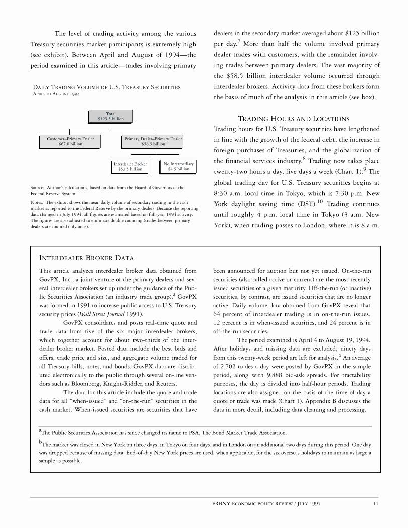
Daily Trading Volume of U.S. Treasury Securities April to August 1994
Source: Author’s calculations, based on data from the Board of Governors of the Federal Reserve System.
Notes: The exhibit shows the mean daily volume of secondary trading in the cash market as reported to the Federal Reserve by the primary dealers. Because the reportingdata changed in July 1994, all figures are estimated based on full-year 1994 activity. The figures are also adjusted to eliminate double counting (trades between primary dealers are counted only once).
Total$125.5 billion
Customer–Primary Dealer$67.0 billion
Primary Dealer–Primary Dealer$58.5 billion
Interdealer Broker$53.5 billion
No Intermediary$4.9 billion
The level of trading activity among the various
Treasury securities market participants is extremely high
(see exhibit). Between April and August of 1994—the
period examined in this article—trades involving primary
dealers in the secondary market averaged about $125 billion
per day.7 More than half the volume involved primary
dealer trades with customers, with the remainder involv-
ing trades between primary dealers. The vast majority of
the $58.5 billion interdealer volume occurred through
interdealer brokers. Activity data from these brokers form
the basis of much of the analysis in this article (see box).
TRADING HOURS AND LOCATIONS
Trading hours for U.S. Treasury securities have lengthened
in line with the growth of the federal debt, the increase in
foreign purchases of Treasuries, and the globalization of
the financial services industry.8 Trading now takes place
twenty-two hours a day, five days a week (Chart 1).9 The
global trading day for U.S. Treasury securities begins at
8:30 a.m. local time in Tokyo, which is 7:30 p.m. New
York daylight saving time (DST).10 Trading continues
until roughly 4 p.m. local time in Tokyo (3 a.m. New
York), when trading passes to London, where it is 8 a.m.
This article analyzes interdealer broker data obtained fromGovPX, Inc., a joint venture of the primary dealers and sev-eral interdealer brokers set up under the guidance of the Pub-lic Securities Association (an industry trade group).a GovPXwas formed in 1991 to increase public access to U.S. Treasurysecurity prices (Wall Street Journal 1991).
GovPX consolidates and posts real-time quote andtrade data from five of the six major interdealer brokers,which together account for about two-thirds of the inter-dealer broker market. Posted data include the best bids andoffers, trade price and size, and aggregate volume traded forall Treasury bills, notes, and bonds. GovPX data are distrib-uted electronically to the public through several on-line ven-dors such as Bloomberg, Knight-Ridder, and Reuters.
The data for this article include the quote and tradedata for all “when-issued” and “on-the-run” securities in thecash market. When-issued securities are securities that have
INTERDEALER BROKER DATA
been announced for auction but not yet issued. On-the-runsecurities (also called active or current) are the most recentlyissued securities of a given maturity. Off-the-run (or inactive)securities, by contrast, are issued securities that are no longeractive. Daily volume data obtained from GovPX reveal that64 percent of interdealer trading is in on-the-run issues,12 percent is in when-issued securities, and 24 percent is inoff-the-run securities.
The period examined is April 4 to August 19, 1994.After holidays and missing data are excluded, ninety daysfrom this twenty-week period are left for analysis.b An averageof 2,702 trades a day were posted by GovPX in the sampleperiod, along with 9,888 bid-ask spreads. For tractabilitypurposes, the day is divided into half-hour periods. Tradinglocations are also assigned on the basis of the time of day aquote or trade was made (Chart 1). Appendix B discusses thedata in more detail, including data cleaning and processing.
aThe Public Securities Association has since changed its name to PSA, The Bond Market Trade Association.
bThe market was closed in New York on three days, in Tokyo on four days, and in London on an additional two days during this period. One daywas dropped because of missing data. End-of-day New York prices are used, when applicable, for the six overseas holidays to maintain as large asample as possible.

12 FRBNY ECONOMIC POLICY REVIEW / JULY 1997
Trading Times for U.S. Treasury Securities
Chart 1
Notes: The chart shows the breakdown by location of interdealer trading over the global trading day. Crossover times are approximate because interdealer trading occurs over the counter and may be initiated from anywhere. All timesare New York daylight saving time.
����������������������������������������������������������������������������������������������������������������������������������������������������������������
��������
��������
6 p.m.
6 a.m.
Noon Midnight
London
9 p.m.3 p.m.
3 a.m.9 a.m.
New York Tokyo
At about 12:30 p.m. local time in London, trading passes
to New York, where it is 7:30 a.m. Trading continues in
New York until 5:30 p.m.
Although it is convenient to think of trading
occurring in three distinct geographic locations, a trade
may originate anywhere. For example, business hours
among the locations overlap somewhat: traders in London
may continue to transact in their afternoon while morning
activity picks up in New York. Traders may also transact
from one location during another location’s business
hours. In fact, some primary dealers have traders working
around the clock, but all from a single location (Stigum
1990, p. 471).
Regardless of location, the trading process for
U.S. Treasuries is the same. The same securities are
traded by the same dealers through the same interdealer
brokers with the same brokerage fees. Trades agreed
upon during overseas hours typically settle as New York
trades do—one business day later in New York through
the GSCC.11
TRADING ACTIVITY BY LOCATION
Although the U.S. Treasury securities market is an over-
the-counter market with round-the-clock trading, more
than 94 percent of that trading occurs in New York, on
average, with less than 4 percent in London and less than
2 percent in Tokyo (Table 1).12 While each location’s share
of daily volume varies across days, New York hours always
comprise the vast majority (at least 87.5 percent) of daily
trading.13 This is not particularly surprising since Treasury
securities are obligations of the U.S. government: most
macroeconomic reports and policy changes of relevance
to Treasury securities are announced during New York
trading hours, and most owners of Treasury securities are
U.S. institutions or individuals.14
The share of U.S. Treasuries traded overseas,
while small, can vary substantially. London reached its
Source: Author’s calculations, based on data from GovPX, Inc.
Note: The table reports the percentage distribution of daily interdealer trading volume by location for on-the-run and when-issued securities.
Table 1 TRADING VOLUME OF U.S. TREASURY SECURITIESBY LOCATION April 4 to August 19, 1994
Tokyo London New York Mean 1.84 3.50 94.66Standard deviation 1.06 1.40 2.08Minimum 0.14 0.55 87.53Maximum 6.61 7.93 98.75
Although the U.S. Treasury securities
market is an over-the-counter market with
round-the-clock trading, more than 94 percent
of that trading occurs in New York, on
average, with less than 4 percent in London
and less than 2 percent in Tokyo.

FRBNY ECONOMIC POLICY REVIEW / JULY 1997 13
New York daylight saving time
Source: Author’s calculations, based on data from GovPX, Inc.
Notes: The chart shows the mean half-hourly interdealer trading volume as apercentage of mean daily interdealer trading volume for on-the-run and when-issued securities. The times on the horizontal axis indicate the beginning of intervals (for example, 9 a.m. for 9 a.m. to 9:30 a.m.).
6 p.m. 9 p.m. Midnight 3 a.m. 6 a.m. 9 a.m. Noon 3 p.m. 6 p.m.
Trading Volume of U.S. Treasury Securities by Half HourApril 4 to August 19, 1994
Chart 2
Percent
Tokyo New YorkLondon10
0
2
4
6
8
highest share of daily volume (7.9 percent) in the sample
period on Friday, August 19, 1994. Tokyo reached its
highest share (6.6 percent) on Friday, July 1, 1994. News
reports indicate that dollar-yen movements drove overseas
activity on both days. Overseas activity was also relatively
high on July 1 because of a shortened New York session
ahead of the July 4 weekend.
A more thorough examination of news stories on
days when the overseas locations were particularly active or
volatile suggests several reasons why U.S. Treasuries trade
overseas:
• late afternoon New York activity spills over to theoverseas trading locations (April 6);
• overnight activity in the foreign exchange marketimpacts the Treasury market (June 24);
• other overnight events occur—for example, commentsare made by a government official during overseashours (June 8);
• news is released during overnight hours—for instance,a U.S. newspaper article appears during overseas hours(June 21);
• overseas investors are active during overseas hours(August 17);
• central bank intervention occurs during overseashours (May 10).
Overseas locations thus allow traders to adjust positions in
response to overnight events and give foreign investors and
institutions the opportunity to trade during their own
business hours.
On a typical weekday, trading starts at 7:30 p.m.
New York DST with relatively low volume throughout
Tokyo hours (Chart 2). Volume picks up somewhat when
London opens at 3 a.m. (New York DST) and remains fairly
steady through London trading hours. Volume jumps higher
in the first half hour of New York trading (7:30 a.m. to
8 a.m.), then spikes upward in the next half hour of trading.
Volume reaches a daily peak between 8:30 a.m. and 9 a.m.
Except for a small peak from 10 a.m. to 10:30 a.m., volume
generally falls until the 1 p.m. to 1:30 p.m. interval.
Volume rises again to a peak between 2:30 p.m. and 3 p.m.,
then quickly tapers off, with trading ending by 5:30 p.m.
New York DST.
The pattern of U.S. Treasuries trading between
8:30 a.m. and 3 p.m. parallels that of equity markets trad-
ing. Several studies of equity securities (such as Jain and
Joh [1988] and McInish and Wood [1990]) have found
Overseas locations . . . allow traders to adjust
positions in response to overnight events and give
foreign investors and institutions the opportu-
nity to trade during their own business hours.

14 FRBNY ECONOMIC POLICY REVIEW / JULY 1997
Trading Volume of U.S. Treasury Securities by MaturityApril 4 to August 19, 1994
Chart 3
Source: Author’s calculations, based on data from GovPX, Inc.
Note: The chart shows the mean interdealer trading volume by maturity as apercentage of the mean total interdealer trading volume for on-the-run securities.
�������������������
������������������������������������������������������������������������������������������
������������������������������
����������� ��
�
Six-month bill6.4
One-year bill10.1
Thirty-year bond2.7
Three-year note7.7
Ten-year note17.4
Cash-management bill1.0
Three-month bill7.4
Two-year note21.3
Five-year note26.0
that daily volume peaks at the opening of trading, trails off
during the day, then rises again at the close. Jain and Joh
(1988) speculate that news since the prior close may drive
morning volume, while afternoon volume may reflect the
closing or hedging of open positions in preparation for the
overnight hours.
In the U.S. Treasury securities market, the daily
peak between 8:30 a.m. and 9 a.m. is at least partially
explained by the important macroeconomic reports
(including employment) released at 8:30 a.m. (Fleming
and Remolona 1996). The opening of U.S. Treasury futures
trading at 8:20 a.m. on the Chicago Board of Trade (CBT)
is probably also a factor in this peak. The slight jump in
volume between 10 a.m. and 10:30 a.m. may be a response
to the 10 a.m. macroeconomic reports. The peak in volume
between 2:30 p.m. and 3 p.m. coincides with the closing of
U.S. Treasury futures trading at 3 p.m. There is little
evidence that activity picks up during the Federal Reserve’s
customary intervention time (11:30 a.m. to 11:45 a.m.)15
or during the announcement of Treasury auction results
(typically 1:30 p.m. to 2 p.m.).
TRADING ACTIVITY BY MATURITY
To this point, the volume statistics have been examined
without regard to the particular issues making up the
total volume. However, there is significant variation in
trading activity by maturity for the most recently issued,
or on-the-run, Treasury securities (Chart 3). The five-year
note is the most actively traded security, accounting for
more than one-fourth (26 percent) of on-the-run volume.
The two- and ten-year notes are close behind, with shares
of 21 percent and 17 percent, respectively, while the
three-year note accounts for 8 percent.16 The one-year bill
accounts for 10 percent, the three-month bill for 7 percent,
the six-month bill for 6 percent, and the occasionally
issued cash-management bill for 1 percent.17 The bellwether
thirty-year bond accounts for less than 3 percent of total
on-the-run volume.18
The value of outstanding on-the-run securities by
maturity cannot explain the level of trading by maturity.
Auction sizes over the period examined were reasonably
similar by maturity with three-month, six-month, five-
year, ten-year, and thirty-year auctions running in the
There is significant variation in trading
activity by maturity for the most recently issued,
or on-the-run, Treasury securities.
A breakdown of trading volume by maturity for
each of the three locations reveals that the most
significant difference across locations is the
dearth of U.S. Treasury bill trading overseas.

FRBNY ECONOMIC POLICY REVIEW / JULY 1997 15
Trading Volume of U.S. Treasury Securities by Location and MaturityApril 4 to August 19, 1994
Chart 4
Source: Author’s calculations, based on data from GovPX, Inc.
Note: The chart shows the mean interdealer trading volume by maturity as a percentage of the mean total interdealer trading volume in each location for on-the-run securities.
���������������������������������������������������������������������
�������������������������
All bills0.7���������
������������������������������������������������������������������������������������������������������������
������������������������������
���������
������������������������������������������������������������������������������������������������������������������������������������������������
������������������������������Three-year
note11.6
Thirty-year bond7.7
Three-year note7.1
Ten-year note17.0
All bills1.3
Ten-year note17.3
Ten-year note16.2
Thirty-year bond2.6
Thirty-year bond4.1Three-year
note17.7
Tokyo
New York
London
All bills27.2
Two-year note31.2
Two-year note20.3
Two-year note36.8
Five-year note26.1
Five-year note25.6
Five-year note29.5
$11.0 billion to $12.5 billion range and one-, two-, and
three-year auctions running in the $16.5 billion to $17.5 bil-
lion range. When the auctions that were reopenings of previ-
ously auctioned securities are taken into account, volume
outstanding is actually higher for the relatively lightly
traded three-month, six-month, and thirty-year securities.
A breakdown of trading volume by maturity for
each of the three locations reveals that the most significant
difference across locations is the dearth of U.S. Treasury
bill trading overseas (Chart 4). Although Treasury bills
(the one-year, six-month, three-month, and cash-management
issues) represent 27 percent of trading in New York, they
represent just 1 percent of trading in both London and
Tokyo. On most days, in fact, not a single U.S. Treasury
bill trade is brokered during the overseas hours. The distri-
bution of overseas trading in Treasury notes is reasonably
similar to that of New York, although the two-year note is
the most frequently traded overseas (as opposed to the five-
year note in New York) and heavier relative volume is evident
in the three-year note. The thirty-year bond is traded more
intensively overseas relative to total volume—particularly
in Tokyo, where it represents nearly 8 percent of total volume.
A distributional breakdown of trading in each
maturity by location (Table 2) confirms that bill volume is
extremely low overseas. London trades less than 0.4 percent
of the total daily volume for each bill (on average) and
Tokyo trades less than 0.2 percent. In contrast, London
trades 3 to 6 percent of daily volume for the two-, five-,
ten-, and thirty-year securities, and more than 9 percent for
the three-year note. Tokyo trades 2 to 4 percent of daily

16 FRBNY ECONOMIC POLICY REVIEW / JULY 1997
volume for each of the notes, and more than 6 percent for
the thirty-year bond. Although volumes vary substantially
across trading locations, a plot of daily volume by half hour
(not shown) would reveal a very similar intraday pattern for
each of the notes and bonds. Like bill trading, when-issued
trading is low overseas and particularly so in Tokyo.
Because of the limited overseas trading in bills and when-
issued securities, the remainder of the analysis will treat
on-the-run notes and bonds exclusively.
PRICE VOLATILITY
Analyzing intraday price volatility leads to an improved
understanding of the determinants of Treasury prices. As
noted by French and Roll (1986), price volatility arises not
only from public and private information that bears on
prices but also from errors in pricing. The authors show,
however, that pricing errors are only a small component of
equity security volatility. This article contends that pricing
errors are probably an even smaller component of Treasury
security volatility because of the market’s greater liquidity.
The examination of price volatility is therefore largely an
examination of price movements caused by the arrival of
information. The process by which Treasury prices adjust
to incorporate new information is referred to in this article
as price discovery.
Price volatility is examined across days, trading
locations, and half-hour intervals of the day. Daily price
volatility is calculated as the absolute value of the differ-
ence between the New York closing bid-ask midpoint and
the previous day’s New York closing bid-ask midpoint.19
Price volatility for each trading location is calculated as the
absolute value of the difference between that location’s
closing bid-ask midpoint and the closing bid-ask midpoint
for the previous trading location in the round-the-clock
market. Half-hour price volatility is calculated as the abso-
lute value of the difference between the last bid-ask mid-
point in that half hour and the last bid-ask midpoint in the
previous half hour.20 Volatility is not calculated for two
different securities of similar maturity (there is a missing
observation when the on-the-run security changes after an
auction).
The vast majority of price discovery is found to
occur during New York hours, with relatively little price
discovery in Tokyo or London (Table 3). For example, the
five-year note’s expected price movement during Tokyo
hours is 6/100ths of a point, during London hours 6/100ths
Source: Author’s calculations, based on data from GovPX, Inc.
Note: The table reports the percentage distribution of daily interdealer trading volume by location and security type for on-the-run and when-issued securities.
Table 2 TRADING VOLUME OF U.S. TREASURY SECURITIESBY MATURITY AND LOCATION April 4 to August 19, 1994
Security Type Tokyo London New YorkCash-management bill
Mean 0.00 0.00 100.00Standard deviation 0.00 0.00 0.00
Three-month billMean 0.15 0.03 99.82Standard deviation 1.06 0.27 1.11
Six-month bill Mean 0.03 0.40 99.57Standard deviation 0.25 1.69 1.70
One-year billMean 0.01 0.23 99.76Standard deviation 0.12 1.00 1.01
Two-year noteMean 3.87 5.85 90.27Standard deviation 3.60 3.60 5.85
Three-year noteMean 3.07 9.23 87.71Standard deviation 2.67 6.33 7.27
Five-year noteMean 2.13 4.48 93.40Standard deviation 1.41 1.87 2.70
Ten-year noteMean 2.07 3.64 94.29Standard deviation 1.48 2.09 2.99
Thirty-year bondMean 6.37 5.95 87.68Standard deviation 5.99 4.72 8.81
When-issued billsMean 0.02 0.28 99.70Standard deviation 0.16 2.51 2.52
When-issued notes and bondsMean 0.92 1.80 97.28Standard deviation 1.29 2.16 2.75
The vast majority of price discovery is found to
occur during New York hours, with relatively
little price discovery in Tokyo or London.

FRBNY ECONOMIC POLICY REVIEW / JULY 1997 17
Price Volatility of U.S. Treasury Securities by Half HourApril 4 to August 19, 1994
Chart 5
Hundredths of a point
New York daylight saving time
Source: Author’s calculations, based on data from GovPX, Inc.
Notes: The chart shows the mean half-hourly price volatility for on-the-run notes and bonds. Volatility is calculated as the absolute value of the difference between the last bid-ask midpoint in that half hour and the last bid-ask midpoint in the previous half hour. For the 7:30 p.m. to 8 p.m. interval, the previous interval is considered 5 p.m. to 5:30 p.m. The times on the horizontal axis indicate the beginning of intervals (for example, 9 a.m. for 9 a.m. to 9:30 a.m.).
New YorkLondonTokyo
6 p.m. 9 p.m. Midnight 3 a.m. 6 a.m. 9 a.m. Noon 3 p.m. 6 p.m.
0
5
10
15
20
25
Three-yearnote
Ten-year note
Thirty-year bond
Two-year note
Five-yearnote
of a point, and during New York hours 27/100ths of a
point. By contrast, the daily expected price movement is
28/100ths of a point. For other securities as well, volatility is
similar for Tokyo and London but much higher for New York.
Like the findings for trading volume, these results
are not too surprising. Treasury securities are obligations of
the U.S. government, and most macroeconomic reports and
policy changes of relevance to the securities are announced
during New York trading hours. Studies of the foreign
exchange market have also found price volatility to be gen-
erally greater during New York trading hours, albeit to a
lesser extent than found here (Ito and Roley 1987; Baillie
and Bollerslev 1990).
An examination of price volatility by half-hour
interval (Chart 5) reveals that volatility is fairly steady
from the global trading day’s opening in Tokyo (7:30 p.m.
New York DST) through morning trading hours in London
(7 a.m. New York). Volatility picks up in early afternoon
London trading right before New York opens (7 a.m. to
7:30 a.m. New York). It then increases in the first hour of
New York trading (7:30 a.m. to 8:30 a.m.) and spikes
higher to reach its daily peak between 8:30 a.m. and 9 a.m.
A general decline is observed until the 12:30 p.m. to 1 p.m.
period, although there is a spike in the 10 a.m. to
10:30 a.m. period. Volatility then picks up again, reaches
a peak between 2:30 p.m. and 3 p.m., and falls off quickly
after 3 p.m. to levels comparable to those seen in the over-
seas hours. The intraday volatility pattern is similar across
maturities.
In their study of intraday price volatility in the
CBT’s Treasury bond futures market, Ederington and Lee
(1993) find that volatility peaks between 8:30 a.m. and
8:35 a.m. and is relatively level the rest of the trading day
(the trading day runs from 8:20 a.m. to 3 p.m.). The
authors observe, however, that price volatility shows no
increase between 8:30 a.m. and 8:35 a.m. on days when no
8:30 a.m. macroeconomic announcements are made. These
Source: Author’s calculations, based on data from GovPX, Inc.
Notes: The table reports price volatility for on-the-run notes and bonds. Values are in hundredths of a point. Daily price volatility is calculated as the absolute value of the difference between the New York closing bid-ask midpoint and the previous day’s New York closing bid-ask midpoint. Price volatility for each trading location is calculated as the absolute value of the difference between that location’s closing bid-ask midpoint and the closing bid-ask midpoint for the previous trading location in the round-the-clock market.
Table 3 PRICE VOLATILITY OF U.S. TREASURY SECURITIESApril 4 to August 19, 1994
Security Type Daily Tokyo London New YorkTwo-year note
Mean 10.68 2.91 2.12 9.94Standard deviation 9.91 2.61 2.00 9.39
Three-year noteMean 16.60 3.91 3.38 15.61Standard deviation 13.64 3.78 3.45 12.99
Five-year noteMean 28.08 6.10 5.69 26.63Standard deviation 23.43 5.55 5.93 22.19
Ten-year noteMean 43.40 8.00 8.73 43.10Standard deviation 37.22 8.30 8.66 35.93
Thirty-year bondMean 58.28 11.35 10.32 56.53Standard deviation 50.45 11.33 11.93 48.62
18 FRBNY ECONOMIC POLICY REVIEW / JULY 1997
findings give strong support to the hypothesis that the
8:30 a.m. to 9 a.m. volatility in the cash market is driven by
these announcements.21
The intraday pattern of price volatility has also
been studied for equity and foreign exchange markets.
Equity market studies (such as Wood, McInish, and Ord
[1985] and Harris [1986]) find volatility peaking at the
markets’ opening, falling through the day, and rising
somewhat at the end of trading. Again, we see a similar
pattern for U.S. Treasury securities if we limit our exami-
nation to the 8:30 a.m. to 3 p.m. period. Outside of this
period, price volatility is relatively low.
By contrast, the intraday volatility pattern in the
foreign exchange market is markedly different. Although
price volatility does peak in the morning in New York, the
second most notable peak is seen in the morning in Europe
and no volatility peak occurs in the New York afternoon
(Baillie and Bollerslev 1990; Andersen and Bollerslev
forthcoming). Although there is no official closing time for
the U.S. Treasury securities market, the market behaves in
some ways as if there were one, apparently because of the
fixed trading hours of Treasury futures and the predomi-
nance of U.S. news and investors in determining prices.
The similarities in the Treasury market between
intraday price volatility (Chart 5) and intraday volumes
(Chart 2) are striking. Both peak between 8:30 a.m. and
9 a.m., a period encompassing the 8:30 a.m. macroeco-
nomic announcements and following, by just ten minutes,
the opening of CBT futures trading. Both peak again
between 2:30 p.m. and 3 p.m., the last half hour of CBT
futures trading. Both show small peaks in the 10 a.m. to
10:30 a.m. period, when less significant macroeconomic
announcements are made. Volatility seems to jump
slightly in periods of Fed intervention (then 11:30 a.m.
to 11:45 a.m.) and when auction announcements are
made (typically 1:30 p.m. to 2 p.m.), but these movements
are secondary.
The relationship between trading volume and
price changes has also been studied extensively in other
financial markets.22 These studies consistently find trading
volume and price volatility positively correlated for a variety
of trading intervals. Most models attribute this relation-
ship to information differences or differences of opinion
among traders. New information or opinions become
incorporated in prices through trading, leading to the
positive volume-volatility relationship.
The volume-volatility relationship for U.S. Trea-
sury securities is depicted in Chart 6. The five-year note’s
trading volume is plotted against price volatility (as calcu-
lated in Chart 5) for every half-hour interval in the sample
period.23 The upward slope of the regression lines demon-
strates a positive relationship between volume and price
volatility. A positive relationship is also indicated by the
positive correlation coefficients (.57 for all trading locations
combined, .24 for Tokyo, .22 for London, and .51 for New
York), all of which are significant at the .01 level. The
same positive correlation between trading volume and
price volatility documented in other financial markets
holds for the U.S. Treasury market.
BID-ASK SPREADS
U.S. Treasury investors who may need to trade at any
moment or who rely on the market for pricing other
instruments or gauging market sentiment are concerned
with market liquidity. The bid-ask spread, which measures
a major cost of transacting in a security, is an important
indicator of market liquidity. The spread is defined as the
difference between the highest price a prospective buyer is
willing to pay for a given security (the bid) and the lowest
price a prospective seller is willing to accept (the ask, or
Although there is no official closing time for the
U.S. Treasury securities market, the market
behaves in some ways as if there were one,
apparently because of the fixed trading hours
of Treasury futures and the predominance of
U.S. news and investors in determining prices.

FRBNY ECONOMIC POLICY REVIEW / JULY 1997 19
Correlation of Trading Volume and Price Volatility for Five-Year U.S. Treasury NoteApril 4 to August 19, 1994
Chart 6
Volatility in hundredths of a point
Source: Author’s calculations, based on data from GovPX, Inc.
Note: The chart plots half-hourly price volatility against GovPX trading volume for the on-the-run U.S. Treasury note for all trading locations and by location.
0 200 400 600 800 1000 1200 1400 16000
18
36
54
72
0 20 40 60 80 100 120 1400
4
8
12
16Volatility in hundredths of a point
0 30 60 90 120 150 1800
5
10
15
20
Volume in millions of U.S. dollars Volume in millions of U.S. dollars0 200 400 600 800 1000 1200 1400 1600
0
18
36
54
72
All Trading Locations Tokyo
New YorkLondon
the offer). In looking across days, trading locations, and
half-hour intervals, this article calculates spreads as the
mean difference between the bid and the offer price for all
bid-ask quotes posted.24
Four components of the bid-ask spread have been
identified in the academic literature: asymmetric infor-
mation, inventory carrying, market power, and order
processing.25 Asymmetric information compensates the
market maker for exposure to better informed traders;
inventory carrying accounts for the market maker’s risk in
holding a security; market power is that part of the spread
attributable to imperfect competition among market makers;
order processing allows for the market maker’s direct costs
of executing a trade.
Treasury market bid-ask spreads are extremely
narrow and increase with maturity (Table 4). The daily
spread averages 0.8/100ths of a point for the two-year
security, 1.7/100ths for the three-year, 1.5/100ths for the
five-year, 2.5/100ths for the ten-year, and 6.3/100ths for
the thirty-year.26 The increase in spread with maturity is
not surprising given the positive relationship between
price volatility and maturity (Table 3).27 The higher
spread on more volatile securities compensates the market
Treasury market bid-ask spreads are extremely
narrow and increase with maturity.
20 FRBNY ECONOMIC POLICY REVIEW / JULY 1997
maker for increased asymmetric information and inventory-
carrying costs. The exception to this pattern—the five-year
note, which has a lower spread than the three-year note—
is likely attributable to the greater volume transacted in the
five-year note (Chart 3). Higher volume in a security leads
to economies of scale in order processing and is probably
associated with greater market maker competition.
Bid-ask spreads in the U.S. Treasury market are
comparable to those in the foreign exchange market but
significantly lower than those in the equity markets.
Bessembinder (1994) finds interbank bid-ask spreads of
0.064 percent for dollar-yen transactions and 0.062 percent
for dollar-pound transactions—roughly the size of the
spread on a thirty-year Treasury bond. Mean equity market
spreads are found to vary from 1.4 to 3.1 percent (Amihud
and Mendelson 1986; Stoll 1989; Laux 1993; Affleck-Graves,
Hegde, and Miller 1994), a range roughly 50 to 200 times
greater than that for on-the-run U.S. Treasury securities.
The substantially lower bid-ask spreads in the Treasury
market probably reflect lower asymmetric information
costs, lower order-processing costs, and lower market-power
costs. Market making for U.S. Treasuries is extremely com-
petitive, with a high number of trades, large trade sizes,
and limited private information.
New York spreads are lower than overseas spreads
for every U.S. Treasury note, and London spreads are nar-
rower than those in Tokyo. For example, the five-year note’s
spread is 1.5/100ths of a point in New York, 2.0/100ths
in London, and 2.5/100ths in Tokyo. The New York differ-
ences from Tokyo are statistically significant (at the .01 level)
for every note, and the New York differences from London
are statistically significant (at the .01 level) for the two-,
five-, and ten-year notes. The London-Tokyo differences
are statistically significant for the two- and three-year
notes (at the .01 level) and to a lesser extent for the five-
year note (at the .05 level).
Spreads are similar across trading locations for the
thirty-year bond. The mean spread is 6.4/100ths of a point
in New York, 6.3/100ths in London, and 5.9/100ths in
Tokyo. However, two cautions regarding the spreads are in
order: First, spreads are often not posted during the over-
seas hours, particularly in Tokyo.28 Second, the spreads
give no indication of the associated quantities bid or
offered, which may be lower in the overseas locations (but
are not part of this study’s data set).29 Cautions notwith-
standing, the higher relative volume of the thirty-year
bond in Tokyo might be expected to result in smaller
spread differences. Another factor may be the CBT’s
evening and overnight hours in the futures market—a
market dominated by the thirty-year bond.
Examining bid-ask spreads by half-hour intervals,
Source: Author’s calculations, based on data from GovPX, Inc.
Notes: The table reports interdealer bid-ask spreads for on-the-run notes and bonds. Values are in hundredths of a point. Spreads are calculated daily as the mean difference between the bid and the offer for all bid-ask quotes postedduring that location’s (or during all locations’) trading hours.
* Significantly different from Tokyo at the .05 level based on two-sided t-test.
** Significantly different from Tokyo at the .01 level based on two-sided t-test
# Significantly different from London at the .05 level based on two-sided t-test.
## Significantly different from London at the .01 level based on two-sided t-test.
Table 4BID-ASK SPREADS ON U.S. TREASURY SECURITIESApril 4 to August 19, 1994
Security TypeAll
Locations Tokyo London New YorkTwo-year note
Mean 0.83 1.37 1.12** 0.78 ** ##Standard deviation 0.14 0.58 0.38 0.15
Three-year noteMean 1.68 2.47 1.79** 1.65**Standard deviation 0.30 1.06 0.77 0.31
Five-year noteMean 1.53 2.48 2.04 * 1.47 ** ##Standard deviation 0.23 1.90 0.59 0.24
Ten-year noteMean 2.50 3.83 3.73 2.39 ** ##Standard deviation 0.36 1.21 1.13 0.38
Thirty-year bondMean 6.30 5.93 6.27 6.36Standard deviation 1.11 2.12 2.86 1.15
Bid-ask spreads in the U.S. Treasury market
are comparable to those in the foreign exchange
market but significantly lower than those
in the equity markets.
FRBNY ECONOMIC POLICY REVIEW / JULY 1997 21
Bid-Ask Spreads on U.S. Treasury Securities by Half HourApril 4 to August 19, 1994
Chart 7
Hundredths of a point
New York daylight saving time
Source: Author’s calculations, based on data from GovPX, Inc.
Notes: The chart shows the mean half-hourly interdealer bid-ask spread for on-the-run notes and bonds. Spreads are calculated daily as the mean difference between the bid and the offer for all bid-ask quotes posted during that half hour. The times on the horizontal axis indicate the beginning of intervals (for example, 9 a.m. for 9 a.m. to 9:30 a.m.).
New YorkLondonTokyo
6 p.m. 9 p.m. Midnight 3 a.m. 6 a.m. 9 a.m. Noon 3 p.m. 6 p.m.0
2
4
6
8
10
12
Thirty-year bond
Five-year note
Two-year note
Three-year note
Ten-year note
this article finds that the general pattern exhibited by the
three-, five-, and ten-year notes (and to a lesser extent the
two-year note) is of a triple “u” shape (Chart 7). The bid-ask
spread begins at its daily high with the start of trading in
Tokyo (7:30 p.m. New York DST). The spread drops
quickly, levels out, and rises toward the end of trading in
Tokyo (2 a.m. to 3 a.m. New York). The spread declines
from this early morning peak as London trading gets under
way, then rises again to a peak when trading passes to New
York (7 a.m. to 8 a.m.). The spread then falls again,
remains roughly level throughout the late morning and
early afternoon, and rises in the late afternoon as trading
drops off (4:30 p.m. to 5:30 p.m.).
This pattern is quite different from that found in
the foreign exchange market, but similar in some ways to
that in the equity markets. Bollerslev and Domowitz
(1993) find that the deutsche mark–dollar spread peaks
during the Far Eastern lunch break and reaches a low dur-
ing morning trading in Europe. U.S. equity market studies
(such as McInish and Wood [1992] and Brock and Kleidon
[1992]) have found that bid-ask spreads are highest at the
markets’ opening, fall through the day, and rise again at
the end of trading. U.S. Treasury notes follow the same
pattern in New York, but also seem to replicate it overseas.
The result is the triple-u-shaped pattern of Chart 7.
The pattern for the thirty-year bond is somewhat
different. Like the note spreads, the thirty-year bond
spread peaks at the opening in Tokyo and also peaks in the
morning, when New York opens. Unlike the note spreads,
however, the bond spread does not peak at the Tokyo close.
More striking is the afternoon behavior of the bond spread
in New York: it peaks between 1:30 p.m. and 2 p.m., then
declines during the rest of the afternoon. The CBT futures
market’s 3 p.m. closing may help explain this pattern.
Note, too, that the thirty-year bond is the only security
examined for which a substantial number of observations
are missing in the late afternoon of New York.30
Numerous studies have related bid-ask spreads to
trading activity and price volatility for a variety of financial
markets.31 These studies generally find a negative relation-
ship between volume and bid-ask spreads and a positive
relationship between price volatility and bid-ask spreads.
The volume-spread relationship probably reflects decreasing
order-processing costs, decreasing inventory-carrying costs,
and increasing market maker competition as volume
increases. The volatility-spread relationship likely reflects
Examining bid-ask spreads by half-hour
intervals, this article finds that the general
pattern exhibited by the three-, five-, and
ten-year notes (and to a lesser extent the
two-year note) is of a triple “u” shape.

22 FRBNY ECONOMIC POLICY REVIEW / JULY 1997
Spread in hundredthsof a point
Lowest
LowestVolume
Volatility
Highest
Highest
0
1
2
3
4
5
6All Trading Locations
Chart 8
Relationship of Bid-Ask Spread to Trading Volume and Price Volatility for Five-Year U.S. Treasury NoteApril 4 to August 19, 1994
Source: Author’s calculations, based on data from GovPX, Inc.
Notes: The chart plots the mean half-hourly mean bid-ask spread against the half-hour trading volume quintile and price volatility quintile for the on-the-run U.S. Treasury note for all trading locations and by location. Volume and volatility quintiles are defined separately for each panel.
Spread in hundredthsof a point
Lowest
LowestVolume
Volatility
Highest
Highest
0
1
2
3
4
5
6 London
Spread in hundredthsof a point
Lowest
LowestVolume
Volatility
Highest
Highest
0
0.5
1.0
1.5
2.0
2.5
3.0 New York
Spread in hundredthsof a point
Lowest
LowestVolume
Volatility
Highest
Highest
0
1
2
3
4
5
6 Tokyo
increasing inventory-carrying costs and increasing asym-
metric information costs as volatility increases.
This relationship for the U.S. Treasury securities
market is illustrated in Chart 8. Half-hour price volatility
and trading volume are grouped into quintiles as defined
for the relevant trading location. The plots show the mean
of the mean half-hourly bid-ask spread for every volume-
volatility quintile combination for the five-year note. The

FRBNY ECONOMIC POLICY REVIEW / JULY 1997 23
chart reveals that higher price volatility is associated with
higher bid-ask spreads, and higher trading volume is
associated with lower bid-ask spreads. These simple rela-
tionships are confirmed by highly significant correlation
coefficients.32
PRICE EFFICIENCY REGRESSIONS
With low overseas trading volume, low overseas price
discovery, and high overseas bid-ask spreads, it is reason-
able to ask whether the overseas trading locations are
efficient. That is, are the price changes observed over-
seas a response to new information that later becomes
incorporated in prices in New York? Or does the relative
illiquidity of the overseas markets make price changes
there an unreliable guide to the path of future prices?
Those who have studied the U.S. Treasury market report
that large trades are not easily transacted overseas with-
out significant price concessions (Madigan and Stehm
1994; Stigum 1990). Furthermore, work by Neumark,
Tinsley, and Tosini (1991) uncovers evidence that over-
seas price changes of U.S. equity securities are not
efficient.33 They argue that higher overseas transaction
costs are a barrier to the transmission of small (but not
large) price signals.
However, overseas price efficiency might be expected
for several reasons. While volume is relatively low overseas,
a typical day still sees interdealer volume of more than
$450 million during Tokyo hours and nearly $900 million
Source: Author’s calculations, based on data from GovPX, Inc.
Notes: The table reports regression estimates of New York overnight price response to price movements during Tokyo hours for on-the-run notes and bonds. Reported standard errors are heteroskedasticity-consistent.
Table 5OVERNIGHT PRICE RESPONSE OF U.S. TREASURY SECURITIES TO TOKYO PRICE MOVEMENTSApril 4 to August 19, 1994
Two-Year Note Three-Year Note Five-Year Note Ten-Year Note Thirty-Year Bond
Intercept 0.00 0.00 0.00 0.00 0.00
(Standard error) (0.00) (0.00) (0.00) (0.00) (0.00)
0.97 0.89 0.85 0.89 0.94
(Standard error) (0.14) (0.10) (0.10) (0.11) (0.05)
Adjusted R-squared 0.50 0.39 0.36 0.30 0.58
Durbin-Watson statistic 1.61 2.00 1.76 1.70 1.90
Number of observations 86 82 85 87 83
Source: Author’s calculations, based on data from GovPX, Inc.
Notes: The table reports regression estimates of New York overnight price response to price movements during London hours for on-the-run notes and bonds. Reported standard errors are heteroskedasticity-consistent.
Table 6OVERNIGHT PRICE RESPONSE OF U.S. TREASURY SECURITIES TO LONDON PRICE MOVEMENTSApril 4 to August 19, 1994
Two-Year Note Three-Year Note Five-Year Note Ten-Year Note Thirty-Year Bond
Intercept 0.00 0.00 0.00 0.00 0.00
(Standard error) (0.00) (0.00) (0.00) (0.00) (0.00)
0.98 0.95 1.05 1.10 1.04
(Standard error) (0.07) (0.06) (0.07) (0.08) (0.05)
Adjusted R-squared 0.78 0.71 0.80 0.78 0.84
Durbin-Watson statistic 1.87 1.69 1.95 1.37 1.64
Number of observations 85 87 87 88 84
EÅEÅ
EÅ
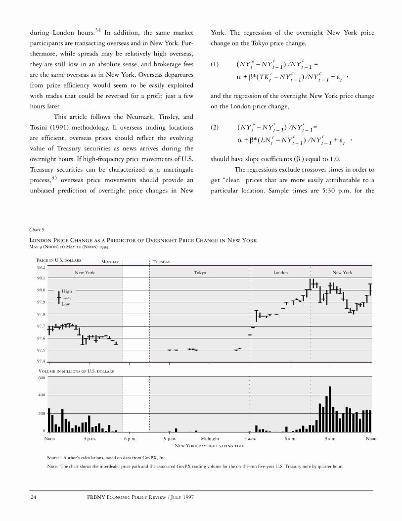
24 FRBNY ECONOMIC POLICY REVIEW / JULY 1997
London Price Change as a Predictor of Overnight Price Change in New YorkMay 9 (Noon) to May 10 (Noon) 1994
Chart 9
Price in U.S. dollars
New York
Volume in millions of U.S. dollars
Noon 3 p.m. 6 p.m. 9 p.m. Midnight 3 a.m. 6 a.m. 9 a.m. Noon
New York daylight saving time
Source: Author’s calculations, based on data from GovPX, Inc.
Note: The chart shows the interdealer price path and the associated GovPX trading volume for the on-the-run five-year U.S. Treasury note by quarter hour.
Tokyo London New York
Monday Tuesday
0
200
400
600
97.4
97.5
97.6
97.7
97.8
97.9
98.0
98.1
98.2
High
LowLast
during London hours.34 In addition, the same market
participants are transacting overseas and in New York. Fur-
thermore, while spreads may be relatively high overseas,
they are still low in an absolute sense, and brokerage fees
are the same overseas as in New York. Overseas departures
from price efficiency would seem to be easily exploited
with trades that could be reversed for a profit just a few
hours later.
This article follows the Neumark, Tinsley, and
Tosini (1991) methodology. If overseas trading locations
are efficient, overseas prices should reflect the evolving
value of Treasury securities as news arrives during the
overnight hours. If high-frequency price movements of U.S.
Treasury securities can be characterized as a martingale
process,35 overseas price movements should provide an
unbiased prediction of overnight price changes in New
York. The regression of the overnight New York price
change on the Tokyo price change,
(1)
,
and the regression of the overnight New York price change
on the London price change,
(2)
,
should have slope coefficients ( ) equal to 1.0.
The regressions exclude crossover times in order to
get “clean” prices that are more easily attributable to a
particular location. Sample times are 5:30 p.m. for the
NYto NYt 1–
c–õ ô NYt 1–
ce
D Eó+
=
TKtc NYt 1–
c–õ ô NYt 1–
c Ht+e
NYto NYt 1–
c–õ ô NYt 1–
ce
D Eó+
=
LNtc NYt 1–
c–õ ô NYt 1–
c Ht+e
E

FRBNY ECONOMIC POLICY REVIEW / JULY 1997 25
Tokyo Price Change as a Predictor of Overnight Price Change in New YorkJune 24 (Noon) to June 27 (Noon), 1994
Chart 10
Price in U.S. dollars
New York
0
100
200
300
Volume in millions of U.S. dollars
Noon 3 p.m. 9 p.m. Midnight 3 a.m. 6 a.m. 9 a.m. Noon
New York daylight saving time
99.2
99.3
99.4
99.5
99.6
99.7
99.8
99.9
Source: Author’s calculations, based on data from GovPX, Inc.
Note: The chart shows the interdealer price path and the associated GovPX trading volume for the on-the-run five-year U.S. Treasury note by quarter hour.
Tokyo London New York
WeekendFriday Monday
High
LowLast
New York close, 2:30 a.m. (3:30 p.m. Tokyo time) for the
Tokyo close, 7 a.m. (noon London time) for the London
close, and 8 a.m. for the New York opening. Observations
are included only when all prices refer to the same security
(there is a missing observation when the on-the-run
security changes).
The Tokyo price movement regressions reveal that
the slope coefficient is insignificantly different from 1.0 in
all five maturities (Table 5). There is, therefore, insufficient
evidence to reject the null hypothesis that Tokyo price
changes are unbiased predictors of overnight price changes
in New York. Furthermore, the slope coefficient is signifi-
cantly different from zero (at the .01 level) in all five
maturities. U.S. Treasury security price movements in
Tokyo thus reflect new information that is subsequently
incorporated in New York prices.
Unsurprisingly, given the Tokyo results, the slope
coefficient for the London price movement regressions is
also insignificantly different from 1.0 in all five maturities
(Table 6). There is insufficient evidence to reject the null
hypothesis that London price changes are unbiased predic-
tors of overnight price changes in New York. In addition,
the slope coefficient is significantly different from zero (at
the .01 level) in all five maturities. U.S. Treasury security
price movements in London (from the New York close)
therefore reflect new information that is later incorporated
in New York prices.
PRICE EFFICIENCY CASE STUDIES
Two case studies now illustrate how large overseas price
changes in U.S. Treasury securities may be accurate indica-
tors of overnight New York price changes. The first study

26 FRBNY ECONOMIC POLICY REVIEW / JULY 1997
examines the largest price change observed in London hours
during the sample period—Tuesday, May 10, 1994, when
news reports suggested that European central banks and
Middle Eastern investors were purchasing U.S. Treasury
securities during London trading hours.
The global trading day opened quietly on May 10
with little activity in Tokyo (Chart 9). The five-year note
then rallied in London, jumping 48/100ths of a point
from the last Tokyo price to the last London price. The
price change was thus eight times the magnitude of the
expected price change during London hours (Table 3)
and nearly twice as large as the typical daily change. The
London price change was maintained when New York
opened at 7:30 a.m. While there was some price slippage
later in the morning, it is clear that the bulk of the
London price movement was not reversed when New
York opened.
The second study examines the largest price
change observed in Tokyo hours during the sample
period—June 27, 1994. Japanese Prime Minister Tsutomu
Hata resigned on Saturday, June 25. On Monday, June 27,
the dollar declined in the foreign exchange market to a new
post–World War II low of 99.50 yen. News stories indi-
cated that U.S. Treasury securities were sold by dealers
and overseas investors on fears that the Fed would boost
interest rates to halt the dollar’s fall.
The five-year note opened on June 27 down
slightly from the June 24 close (Chart 10). The price made
two further downward jumps: in the 8:30 p.m. to 8:45
p.m. and the 11:30 p.m. to 11:45 p.m. (New York time)
intervals. The note finished in Tokyo down 25/100ths of a
point, a drop that was four times the magnitude of the
expected price change during Tokyo hours and about as
large as a typical daily change. It fell a few more hun-
dredths in late morning London before New York opened.
While the price rose slightly in early New York trading,
most of the Tokyo price movement was maintained.
CONCLUSION
Although the secondary market for U.S. Treasury securities
operates around the clock, it behaves more like U.S. equity
markets, with limited trading hours, than like the round-
the-clock foreign exchange market. Trading volume and
price volatility are highly concentrated during New York
trading hours, with a daily peak between 8:30 a.m. and 9 a.m.
and a smaller peak between 2:30 p.m. and 3 p.m. During
these hours, the u-shaped patterns of trading volume, price
volatility, and the bid-ask spread are similar to patterns
found in the equity markets (but not in the foreign
exchange market). The preponderance of relevant news
during New York trading hours and the fixed hours of the
CBT’s futures market seem to be the most likely determi-
nants of these intraday patterns.
Trading volume outside of New York hours is rela-
tively low, with less than 2 percent of round-the-clock volume
attributable to Tokyo hours and less than 4 percent attributable
to London hours. Although prices have at times moved
significantly during the overseas hours, price volatility tends
to be significantly lower overseas than in New York. Bid-ask
spreads are higher overseas than in New York and higher in
Tokyo than in London. The spreads exhibit a triple u pattern
across the global trading day corresponding to the start and stop
of trading in the three trading locations.
Despite the relatively low trading volume, low
price discovery, and high bid-ask spreads during the overseas
hours, overseas price changes of U.S. Treasury securities can
effectively predict overnight price changes in New York.
Lower liquidity notwithstanding, the overseas trading
locations provide important information on the path of
U.S. Treasury security prices.

APPENDIX A: PRIMARY GOVERNMENT SECURITIES DEALERS
APPENDIX FRBNY ECONOMIC POLICY REVIEW / JULY 1997 27
BA Securities, Inc.Bear, Stearns & Co., IncBT Securities CorporationBZW Securities Inc.Chase Securities Inc.CIBC Wood Gundy Securities Corp.Citicorp Securities, Inc.Credit Suisse First Boston CorporationDaiwa Securities America Inc.Dean Witter Reynolds Inc.Deutsche Morgan Grenfell/C.J. Lawrence Inc.Dillon, Read & Co. Inc.Donaldson, Lufkin & Jenrette Securities CorporationDresdner Kleinwort Benson North America LLC.Eastbridge Capital Inc.First Chicago Capital Markets, Inc.Fuji Securities Inc.Goldman, Sachs & Co.Greenwich Capital Markets, Inc.HSBC Securities, Inc.
Aubrey G. Lanston & Co., Inc.Lehman Brothers Inc.Merrill Lynch Government Securities Inc.J.P. Morgan Securities, Inc.Morgan Stanley & Co. Incorporated NationsBanc Capital Markets, Inc.Nesbitt Burns Securities Inc.The Nikko Securities Co. International, Inc.Nomura Securities International, Inc.Paine Webber IncorporatedParibas CorporationPrudential Securities IncorporatedSalomon Brothers Inc.Sanwa Securities (USA) Co., L.P.SBC Warburg Inc.Smith Barney Inc.UBS Securities LLCYamaichi International (America), Inc.Zions First National Bank
The primary government securities dealers as of June 6, 1997, were as follows:
Source: Federal Reserve Bank of New York (1997).
28 FRBNY ECONOMIC POLICY REVIEW / JULY 1997 APPENDIX
APPENDIX B: DATA DESCRIPTION
GovPX, Inc., supplies real-time market information through on-linevendors by sending out a digital ticker feed, daily backup copiesof which are used in this study. The data contained in the feedprovide a precise history of the trading information sent toGovPX subscribers. Any posting errors made by the interdealerbrokers that are not filtered out by GovPX are included in thebackup files. Additionally, since the purpose of the digital feed isto refresh vendors’ screens, the data must be processed beforethey can be effectively analyzed.
When a trade occurs, two pieces of information are typi-
cally transmitted by GovPX. First, during the “workup stage,”
when traders are jumping into a transaction, GovPX posts the
news that a bid is being “hit” or that an offer is being lifted
(a “take”); it also posts price and volume information. Seconds
later, the total volume of the trade(s) is posted. Transactions
occurring through the same interdealer broker at the same price
and virtually the same time are thus counted as a single transac-
tion. Occasionally, there are several lines of data per transaction,
but sometimes there is only a single line.
For this analysis, the volume data are processed to ensure
that each trade is counted only once. The aggregate daily volume
provided with each trade is helpful in this regard. Aggregate daily
volume data provided separately from the ticker feed are also useful
in ensuring data accuracy. The study identifies 243,222 unique
transactions over the ninety-day sample period, or an average of
2,702 per day.
Prices in U.S. Treasury notes and bonds are quoted in 32nds
and can be refined to 256ths. Transaction prices, as well as bids and
offers, are converted to decimal form for this analysis. Pricing errors are
also screened from the data set using a two-step procedure. First, large
trade-to-trade price movements that revert a short time later and are
clearly erroneous are screened out. Second, prices that are more than
ten standard deviations from the daily price mean or daily bid-ask
midpoint mean are screened out. Just over one price per day is
dropped, leaving an average of 2,701 prices per day.
A multistep procedure is used to screen quotes from the
data set:
• Bids are first screened for large quote-to-quote movementsthat revert a short time later. This first screen drops anaverage of 4 quotes per day.
• As offers in the data set are quoted off of the bids, largepositive spreads are indistinguishable from small negativeones. Spreads calculated to be greater than 0.9 (but lessthan 1.0) are likely to be negative spreads that existedonly momentarily when quotes arrived from two differentbrokers. These quotes (an average of 115 per day) aredropped.
• One-sided quotes (a bid or an offer, but not both) are occa-sionally posted by dealers. This study makes no use of thesebids (an average of 366 per day) or offers (an average of 287per day).
• Finally, spreads with bid-ask midpoints more than ten stan-dard deviations from the daily bid-ask midpoint mean ordaily price mean are dropped, as are spreads more than tenstandard deviations from the daily spread mean. This processscreens out an average of 9 quotes per day.
As spreads posted by the interdealer brokers do not include the
brokerage fee charged to the transaction initiator, zero spreads
are common and can persist for lengthy periods. Quotes calcu-
lated to be zero are therefore kept in the data set. The data set
retains 889,936 quotes from the sample period, or an average of
9,888 per day.
Once the data are cleaned, they are summarized by half-hour
period using the digital feed’s minute-by-minute time stamp.
The final data set contains market information on each security
for each half hour of the sample period, including volume, last
price, and mean bid-ask spread. Because information on market
participants and trading location is not available, the trading
location is assigned according to the time the information is
posted (Chart 1).

ENDNOTES
NOTES FRBNY ECONOMIC POLICY REVIEW / JULY 1997 29
The author thanks GovPX, Inc., for its data. Mitch Haviv, Jean Helwege,Frank Keane, Jim Mahoney, Amy Molach, Stavros Peristiani, AnthonyRodrigues, and Jeff Stehm provided helpful comments, as did Federal ReserveBank of New York workshop and seminar participants. The research assistanceof Ray Kottler and Irene Pedraza is gratefully acknowledged.
1. In contrast, trading volume on the New York Stock Exchangeaverages only about $9.7 billion per day (New York Stock Exchange1995).
2. Initially, data for the period March 1–August 31, 1994, wereobtained from the data provider, GovPX, Inc. However, the period wasshortened to April 4–August 19 to eliminate differences in the dataformat and to ensure that daylight saving time did not go into effectduring the sample period.
3. Although Treasuries are listed on the New York Stock Exchange,trading volume of all debt issues there (corporate bonds as well as U.S.government securities) averaged just $28.6 million per day in 1994(New York Stock Exchange 1995). Odd-lot trading of Treasuries takesplace on the American Stock Exchange, with an average volume of just$14 million per day in 1994 (American Stock Exchange 1996).
4. See U.S. Department of the Treasury et al. (1992). More informationon the structure of the secondary market can be found in this source andin Bollenbacher (1988), Madigan and Stehm (1994), Stigum (1990), andU.S. General Accounting Office (1986).
5. The major interdealer brokers are Cantor Fitzgerald Inc., GarbanLtd., Hilliard Farber & Co. Inc., Liberty Brokerage Inc., RMJ SecuritiesCorp., and Tullett and Tokyo Securities Inc.
6. These are the fees reported by Stigum (1990). Communication withmarket participants suggests that these fees are very similar today.
7. It is estimated that primary dealers also trade $18.3 billion per day inU.S. Treasury futures, $6.1 billion in forwards, and $7.8 billion in options.Primary dealers’ outstanding financing transactions (repurchase agreements,loaned securities, and collateralized loans) averaged $850 billion to$875 billion over this period.
8. The debt stood at $4,645.8 billion on June 30, 1994, $3,051.0billion of which existed in the form of marketable securities; foreigninvestors accounted for 20.5 percent ($633.2 billion) of the $3,088.2billion held by private investors (Board of Governors of the FederalReserve System 1995).
9. Trading increases to twenty-three hours per day when New Yorkswitches to eastern standard time. There is no trading on weekends.
Other sources on overseas activity in U.S. Treasury securities includeMadigan and Stehm (1994) and Stigum (1990).
10. All of the intraday data examined in this study fall within a periodwhen New York and London times are daylight saving time. Japan hasnot adopted daylight saving time.
11. Financing transactions involving U.S. Treasury securities are alsoconducted in New York, regardless of the trading time for or location ofthe associated cash trade.
12. As explained in the data description sections (see box andAppendix B), trading locations are assigned according to the time ofday a trade was made. For example, a trade at 7:45 a.m. is consideredto be a New York trade even though it may have originated in London(or elsewhere). This convention may bias the summary statistics for theindividual trading locations. The similarity of this article’s findings toearlier estimates reported by Stigum (1990)—93 percent for NewYork, 4 to 5 percent for London, 1 to 2 percent for Tokyo—suggeststhat the distribution of trading activity by location has been relativelystable in recent years.
13. Similarly, Barclay, Litzenberger, and Warner (1990) find negligibletrading volume in Tokyo for U.S. stocks listed on the Tokyo StockExchange.
14. As noted earlier, foreign investors accounted for 20.5 percent of theU.S. Treasury securities held by private investors on June 30, 1994; thisamount increased to 30.3 percent as of September 30, 1996 (Board ofGovernors of the Federal Reserve System 1995 and 1997).
15. In January 1997, the customary intervention time was movedforward one hour to around 10:30 a.m.
16. Madigan and Stehm (1994) believe that the high level ofintermediate note activity is driven by hedging activity for swaptransactions and underwritings.
17. Cash-management bills are very short-term bills (maturing in, say,fourteen days) issued on an unscheduled basis to meet immediate cashflow needs.
18. Because data from one of the six interdealer brokers are not availablefor the analysis, the figures may present a biased picture of the interdealermarket. In particular, the excluded broker is regarded as being strongerin the longer term issues than the other interdealer brokers.
19. Although volatility results based on actual trade prices are similar,use of the bid-ask midpoint results in many fewer missing observations

30 FRBNY ECONOMIC POLICY REVIEW / JULY 1997 NOTES
ENDNOTES (Continued)
Note 19 continuedin the overseas half-hour intervals. In addition, although volatility iscalculated in terms of nominal price changes, percentage price changenumbers look very similar. This similarity occurs because Treasury notesand bonds are issued at a price close to 100 and the on-the-run securitiesexamined in this study are recently issued securities, by definition.
20. For the 7:30 p.m. to 8 p.m. interval, the previous interval isconsidered to be 5 p.m. to 5:30 p.m.
21. More recent findings for the cash market also support thishypothesis (Fleming and Remolona 1996, 1997).
22. Karpoff (1987) reviews the literature. Recent studies in this areainclude Bessembinder and Seguin (1993) and Jones, Kaul, and Lipson(1994).
23. The five-year note is chosen for this and subsequent analyses becauseit is the security that is most actively traded between the primary dealers.Results are similar for other securities.
24. Although spreads are calculated as the nominal difference betweenthe bid and the ask prices, percentage bid-ask spreads look very similar.Treasury notes and bonds are issued at a price close to 100 and the on-the-run securities examined in this study are recently issued securities, bydefinition. None of the spread calculations incorporates interdealerbroker fees.
25. McInish and Wood (1992) review the components of the bid-askspread and cite much of the relevant literature.
26. As noted earlier, data from one of the six interdealer brokers are notincluded in the analysis. The daily spread averages may therefore besomewhat inaccurate—particularly in the longer term issues, in whichthe excluded broker is considered to be more active than the otherinterdealer brokers.
27. The relationship between spread and maturity for U.S. Treasurysecurities has also been documented in Tanner and Kochin (1971),Garbade and Silber (1976), and Garbade and Rosey (1977).
28. No bid-ask quote for the thirty-year bond is recorded for 40 percentof the Tokyo half-hour periods in the sample.
29. Average trade sizes for notes and bonds are similar in the threetrading locations (although slightly lower in New York), however,suggesting that bid and offer quantities are similar.
30. For example, the 4:30 p.m. to 5 p.m. mean bid-ask spread is basedon eighty-eight days of data for the two-, three-, five-, and ten-year notes,but only seventy-five days of data for the thirty-year bond.
31. Equity market studies include Demsetz (1968), Tinic (1972), Tinicand West (1972), Benston and Hagerman (1974), and Branch and Freed(1977). Foreign exchange market studies include Bollerslev andDomowitz (1993), Bollerslev and Melvin (1994), and Bessembinder(1994). Treasury market studies include Garbade and Silber (1976) andGarbade and Rosey (1977). Both Treasury market studies use daily dataand do not have volume figures.
32. The spread-volume correlation coefficients are -.26 (alllocations), -.22 (Tokyo), -.24 (London), and -.14 (New York), allsignificant at the .01 level. The spread-volatility coefficients are.00 (all locations), .27 (Tokyo), .32 (London), and .18 (New York), allsignificant at the .01 level with the exception of the “all locations”coefficient. The insignificant coefficient for “all locations” results fromlow spreads in New York in spite of high price volatility.
33. The authors regress overnight price changes in New York onoverseas price changes from the New York close. They find that overseasprice changes are generally biased predictors of overnight New Yorkprice changes, but that they were unbiased immediately after the October1987 stock market crash.
34. Mean trading volumes of $470 million (Tokyo) and $893 million(London) for on-the-run and when-issued securities were calculated usingdata from GovPX, which covers roughly two-thirds of the interdealerbroker market.
35. When each successive price observation depends only on theprevious one plus a random disturbance term, the price series is said tofollow a random walk. Generally speaking, a martingale process is arandom walk that allows price volatility to vary over time. A martingaleis therefore a process in which past prices have no information beyondthat contained in the current price that is helpful in forecasting futureprices.

REFERENCES
NOTES FRBNY ECONOMIC POLICY REVIEW / JULY 1997 31
Affleck-Graves, John, Shantaram P. Hegde, and Robert E. Miller. 1994.“Trading Mechanisms and the Components of the Bid-Ask Spread.”JOURNAL OF FINANCE 49: 1471-88.
American Stock Exchange. 1996. 1996 AMERICAN STOCK EXCHANGE FACT
BOOK.
Amihud, Yakov, and Haim Mendelson. 1986. “Asset Pricing and the Bid-Ask Spread.” JOURNAL OF FINANCIAL ECONOMICS 17: 223-49.
Andersen, Torben G., and Tim Bollerslev. Forthcoming. “DM-DollarVolatility: Intraday Activity Patterns, Macroeconomic Announcements,and Longer Run Dependencies.” JOURNAL OF FINANCE.
Baillie, Richard T., and Tim Bollerslev. 1990. “Intra-Day and Inter-MarketVolatility in Foreign Exchange Rates.” REVIEW OF ECONOMIC
STUDIES 58: 564-85.
Barclay, Michael J., Robert H. Litzenberger, and Jerold B. Warner. 1990.“Private Information, Trading Volume, and Stock-Return Variances.”REVIEW OF FINANCIAL STUDIES 3: 233-53.
Benston, George J., and Robert L. Hagerman. 1974. “Determinants of Bid-Asked Spreads in the Over-the-Counter Market.” JOURNAL OF
FINANCIAL ECONOMICS 1: 353-64.
Bessembinder, Hendrik. 1994. “Bid-Ask Spreads in the Interbank ForeignExchange Markets.” JOURNAL OF FINANCIAL ECONOMICS 35: 317-48.
Bessembinder, Hendrik, and Paul J. Seguin. 1993. “Price Volatility, TradingVolume, and Market Depth: Evidence from Futures Markets.”JOURNAL OF FINANCIAL AND QUANTITATIVE ANALYSIS 28: 21-39.
Board of Governors of the Federal Reserve System. 1994-97. FEDERAL
RESERVE BULLETIN, various issues.
Bollenbacher, George M. 1988. THE PROFESSIONAL’S GUIDE TO THE U.S.GOVERNMENT SECURITIES MARKETS: TREASURIES, AGENCIES,MORTGAGE-BACKED INSTRUMENTS. New York: New York Instituteof Finance.
Bollerslev, Tim, and Ian Domowitz. 1993. “Trading Patterns and Prices inthe Interbank Foreign Exchange Market.” JOURNAL OF FINANCE 48:1421-43.
Bollerslev, Tim, and Michael Melvin. 1994. “Bid-Ask Spreads andVolatility in the Foreign Exchange Market.” JOURNAL OF
INTERNATIONAL ECONOMICS 36: 355-72.
Branch, Ben, and Walter Freed. 1977. “Bid-Asked Spreads on the AMEXand the Big Board.” JOURNAL OF FINANCE 32: 159-63.
Brock, William A., and Allan W. Kleidon. 1992. “Periodic Market Closureand Trading Volume.” JOURNAL OF ECONOMIC DYNAMICS AND
CONTROL 16: 451-89.
Demsetz, Harold. 1968. “The Cost of Transacting.” QUARTERLY JOURNAL
OF ECONOMICS 82: 33-53.
Ederington, Louis H., and Jae Ha Lee. 1993. “How Markets ProcessInformation: News Releases and Volatility.” JOURNAL OF FINANCE
48: 1161-91.
Federal Reserve Bank of New York. 1997. “Memorandum to all PrimaryDealers and Recipients of the Weekly Press Release on DealerPositions and Transactions,” May 8.
Fleming, Michael J., and Eli M. Remolona. 1996. “Price Formation andLiquidity in the U.S. Treasuries Market: Evidence from IntradayPatterns Around Announcements.” Federal Reserve Bank of NewYork Research Paper no. 9633, October.
———. 1997. “What Moves the Bond Market?” Federal Reserve Bankof New York Research Paper no. 9706, February.
French, Kenneth R., and Richard Roll. 1986. “Stock Return Variances: TheArrival of Information and the Reaction of Traders.” JOURNAL OF
FINANCIAL ECONOMICS 17: 5-26.
Garbade, Kenneth D., and Irene Rosey. 1977. “Secular Variation in theSpread between Bid and Offer Prices on U.S. Treasury Coupon Issues.”BUSINESS ECONOMICS 12: 45-9.
Garbade, Kenneth D., and William L. Silber. 1976. “Price Dispersion in theGovernment Securities Market.” JOURNAL OF POLITICAL ECONOMY
84: 721-40.
Harris, Lawrence. 1986. “A Transaction Data Study of Weekly andIntradaily Patterns in Stock Returns.” JOURNAL OF FINANCIAL
ECONOMICS 16: 99-117.
Ito, Takatoshi, and V. Vance Roley. 1987. “News from the U.S. and Japan:Which Moves the Yen/Dollar Exchange Rate?” JOURNAL OF
MONETARY ECONOMICS 19: 255-77.
Jain, Prem C., and Gun-Ho Joh. 1988. “The Dependence between HourlyPrices and Trading Volume.” JOURNAL OF FINANCIAL AND
QUANTITATIVE ANALYSIS 23: 269-83.

32 FRBNY ECONOMIC POLICY REVIEW / JULY 1997 NOTES
REFERENCES (Continued)
Jones, Charles M., Gautam Kaul, and Marc L. Lipson. 1994. “Transactions,Volume, and Volatility.” REVIEW OF FINANCIAL STUDIES 7: 631-51.
Karpoff, Jonathan M. 1987. “The Relation between Price Changes andTrading Volume: A Survey.” JOURNAL OF FINANCIAL AND
QUANTITATIVE ANALYSIS 22: 109-26.
Laux, Paul A. 1993. “Trade Sizes and Theories of the Bid-Ask Spread.”JOURNAL OF FINANCIAL RESEARCH 16: 237-49.
Madigan, Brian, and Jeff Stehm. 1994. “An Overview of the SecondaryMarket for U.S. Treasury Securities in London and Tokyo.” Board ofGovernors of the Federal Reserve System Finance and EconomicsDiscussion Series, no. 94-17, July.
McInish, Thomas H., and Robert A. Wood. 1990. “An Analysis ofTransactions Data for the Toronto Stock Exchange.” JOURNAL OF
BANKING AND FINANCE 14: 441-58.
______. 1992. “An Analysis of Intraday Patterns in Bid/Ask Spreads forNYSE Stocks.” JOURNAL OF FINANCE 47: 753-64.
Neumark, David, P.A. Tinsley, and Suzanne Tosini. 1991. “After-HoursStock Prices and Post-Crash Hangovers.” JOURNAL OF FINANCE 46:159-78.
New York Stock Exchange. 1995. FACT BOOK FOR THE YEAR 1994.
Stigum, Marcia. 1990. THE MONEY MARKET. Homewood, Ill.:Dow Jones-Irwin.
Stoll, Hans R. 1989. “Inferring the Components of the Bid-Ask Spread:Theory and Empirical Tests.” JOURNAL OF FINANCE 44: 115-34.
Tanner, J. Ernest, and Levis A. Kochin. 1971. “The Determinants of theDifference between Bid and Ask Prices on Government Bonds.”JOURNAL OF BUSINESS 44: 375-9.
Tinic, Seha M. 1972. “The Economics of Liquidity Services.” QUARTERLY
JOURNAL OF ECONOMICS 86: 79-93.
Tinic, Seha M., and Richard R. West. 1972. “Competition and the Pricingof Dealer Service in the Over-the-Counter Stock Market.” JOURNAL
OF FINANCIAL AND QUANTITATIVE ANALYSIS 7: 1707-27.
U.S. Department of the Treasury, Securities and Exchange Commission, andBoard of Governors of the Federal Reserve System. 1992. JOINT REPORT ON
THE GOVERNMENT SECURITIES MARKET. January.
U.S. General Accounting Office. 1986. “U.S. Treasury Securities: TheMarket’s Structure, Risks, and Regulation.” GAO/GGD-86-80BR,August.
Wall Street Journal. 1991. “Several Firms Plan to Start Service on BondPrices.” June 12.
Wood, Robert A., Thomas H. McInish, and J. Keith Ord. 1985. “AnInvestigation of Transactions Data for NYSE Stocks.” JOURNAL OF
FINANCE 40: 723-39.
The views expressed in this article are those of the authors and do not necessarily reflect the position of the FederalReserve Bank of New York or the Federal Reserve System. The Federal Reserve Bank of New York provides no warranty,express or implied, as to the accuracy, timeliness, completeness, merchantability, or fitness for any particular purpose ofany information contained in documents produced and provided by the Federal Reserve Bank of New York in any form ormanner whatsoever.

FRBNY ECONOMIC POLICY REVIEW / JULY 1997 33
Market Returns and Mutual Fund FlowsEli M. Remolona, Paul Kleiman, and Debbie Gruenstein
he 1990s have seen unprecedented growth in
mutual funds. Shares in the funds now repre-
sent a major part of household wealth, and
the funds themselves have become important
intermediaries for savings and investments. In the
United States, more than 4,000 mutual funds cur-
rently hold stocks and bonds worth a total of more
than $2 trillion (Chart 1). Household investment in
these funds increased more than fivefold in the last ten
years, making it the fastest growing item on the
household financial balance sheet. Most of this growth
came at the expense of more traditional forms of savings,
particularly bank deposits.
With the increased popularity of mutual funds
come increased concerns—namely, could a sharp drop
in stock or bond prices set off a cascade of redemptions by
fund investors and could the redemptions exert further
downward pressure on asset markets? In recent years,
flows into funds have generally been highly correlated
with market returns. That is, mutual fund inflows
have tended to accompany market upturns and out-
flows have tended to accompany downturns. This cor-
relation raises the question whether a positive-
feedback process is at work here, in which market
returns cause the flows at the same time that the flows
cause the returns. Observers such as Hale (1994) and
Kaufman (1994) fear that such a process could turn a
decline in the stock or bond market into a downward
spiral in asset prices.1
In this study, we use recent historical evidence to
explore one dimension of the broad relationship between
market returns and mutual fund flows: the effect of short-
term market returns on mutual fund flows. Research on
this issue has already confirmed high correlations between
market returns and aggregate mutual fund flows (Warther
1995). A positive-feedback process, however, requires not
just correlation but two-way causation between flows and
returns, in which fund investors react to market move-
ments while the market itself moves in response to the
investors’ behavior.
T
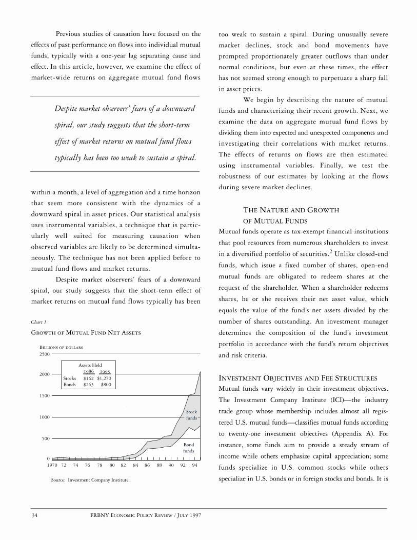
34 FRBNY ECONOMIC POLICY REVIEW / JULY 1997
Source: Investment Company Institute.
Growth of Mutual Fund Net Assets
Chart 1
0
500
1000
1500
2000
2500Billions of dollars
1970 72 74 76 78 80 82 9484 86 88 90 92
Assets Held
StocksBonds
1986 1995
$162$263
$1,270$800
Bondfunds
Stockfunds
Previous studies of causation have focused on the
effects of past performance on flows into individual mutual
funds, typically with a one-year lag separating cause and
effect. In this article, however, we examine the effect of
market-wide returns on aggregate mutual fund flows
within a month, a level of aggregation and a time horizon
that seem more consistent with the dynamics of a
downward spiral in asset prices. Our statistical analysis
uses instrumental variables, a technique that is partic-
ularly well suited for measuring causation when
observed variables are likely to be determined simulta-
neously. The technique has not been applied before to
mutual fund flows and market returns.
Despite market observers’ fears of a downward
spiral, our study suggests that the short-term effect of
market returns on mutual fund flows typically has been
too weak to sustain a spiral. During unusually severe
market declines, stock and bond movements have
prompted proportionately greater outflows than under
normal conditions, but even at these times, the effect
has not seemed strong enough to perpetuate a sharp fall
in asset prices.
We begin by describing the nature of mutual
funds and characterizing their recent growth. Next, we
examine the data on aggregate mutual fund flows by
dividing them into expected and unexpected components and
investigating their correlations with market returns.
The effects of returns on flows are then estimated
using instrumental variables. Finally, we test the
robustness of our estimates by looking at the flows
during severe market declines.
THE NATURE AND GROWTH OF MUTUAL FUNDS
Mutual funds operate as tax-exempt financial institutions
that pool resources from numerous shareholders to invest
in a diversified portfolio of securities.2 Unlike closed-end
funds, which issue a fixed number of shares, open-end
mutual funds are obligated to redeem shares at the
request of the shareholder. When a shareholder redeems
shares, he or she receives their net asset value, which
equals the value of the fund’s net assets divided by the
number of shares outstanding. An investment manager
determines the composition of the fund’s investment
portfolio in accordance with the fund’s return objectives
and risk criteria.
INVESTMENT OBJECTIVES AND FEE STRUCTURES
Mutual funds vary widely in their investment objectives.
The Investment Company Institute (ICI)—the industry
trade group whose membership includes almost all regis-
tered U.S. mutual funds—classifies mutual funds according
to twenty-one investment objectives (Appendix A). For
instance, some funds aim to provide a steady stream of
income while others emphasize capital appreciation; some
funds specialize in U.S. common stocks while others
specialize in U.S. bonds or in foreign stocks and bonds. It is
Despite market observers’ fears of a downward
spiral, our study suggests that the short-term
effect of market returns on mutual fund flows
typically has been too weak to sustain a spiral.
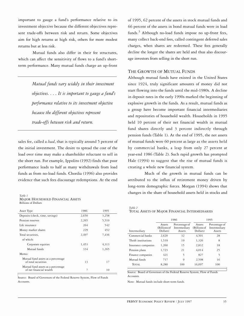
FRBNY ECONOMIC POLICY REVIEW / JULY 1997 35
important to gauge a fund’s performance relative to its
investment objective because the different objectives repre-
sent trade-offs between risk and return. Some objectives
aim for high returns at high risk, others for more modest
returns but at less risk.
Mutual funds also differ in their fee structures,
which can affect the sensitivity of flows to a fund’s short-
term performance. Many mutual funds charge an up-front
sales fee, called a load, that is typically around 5 percent of
the initial investment. The desire to spread the cost of the
load over time may make a shareholder reluctant to sell in
the short run. For example, Ippolito (1992) finds that poor
performance leads to half as many withdrawals from load
funds as from no-load funds. Chordia (1996) also provides
evidence that such fees discourage redemptions. At the end
of 1995, 62 percent of the assets in stock mutual funds and
66 percent of the assets in bond mutual funds were in load
funds.3 Although no-load funds impose no up-front fees,
many collect back-end fees, called contingent deferred sales
charges, when shares are redeemed. These fees generally
decline the longer the shares are held and thus also discour-
age investors from selling in the short run.
THE GROWTH OF MUTUAL FUNDS
Although mutual funds have existed in the United States
since 1924, truly significant amounts of money did not
start flowing into the funds until the mid-1980s. A decline
in deposit rates in the early 1990s marked the beginning of
explosive growth in the funds. As a result, mutual funds as
a group have become important financial intermediaries
and repositories of household wealth. Households in 1995
held 10 percent of their net financial wealth in mutual
fund shares directly and 3 percent indirectly through
pension funds (Table 1). At the end of 1995, the net assets
of mutual funds were 60 percent as large as the assets held
by commercial banks, a leap from only 27 percent at
year-end 1986 (Table 2). Such rapid growth has prompted
Hale (1994) to suggest that the rise of mutual funds is
creating a whole new financial system.
Much of the growth in mutual funds can be
attributed to the influx of retirement money driven by
long-term demographic forces. Morgan (1994) shows that
changes in the share of household assets held in stocks and
Source: Board of Governors of the Federal Reserve System, Flow of FundsAccounts.
Table 1MAJOR HOUSEHOLD FINANCIAL ASSETSBillions of Dollars
Asset Type 1986 1995
Deposits (check, time, savings) 2,650 3,258
Pension reserves 2,265 5,510
Life insurance 264 542
Money market shares 229 452
Total securities, 2,497 7,436
of which:
Corporate equities 1,453 4,313
Mutual funds 334 1,265
Memo:
Mutual fund assets as a percentage of total securities 13 17
Mutual fund assets as a percentage of net financial wealth 7 10
Source: Board of Governors of the Federal Reserve System, Flow of FundsAccounts.
Note: Mutual funds include short-term funds.
Table 2TOTAL ASSETS OF MAJOR FINANCIAL INTERMEDIARIES
1986 1995
Intermediary
Assets (Billions of
Dollars)
Percentage of Intermediary
Assets
Assets (Billions of
Dollars)
Percentage of Intermediary
Assets
Commercial banks 2,620 32 4,501 28
Thrift institutions 1,539 19 1,326 8
Insurance companies 1,260 15 2,832 18
Pension plans 1,723 21 4,014 25
Finance companies 421 5 827 5
Mutual funds 717 9 2,598 16
TOTAL 8,280 100 16,097 100
Mutual funds vary widely in their investment
objectives. . . . It is important to gauge a fund’s
performance relative to its investment objective
because the different objectives represent
trade-offs between risk and return.

36 FRBNY ECONOMIC POLICY REVIEW / JULY 1997
Sources of Flows: Holders of Stock and Bond Mutual Funds
Chart 2
Sources: Board of Governors of the Federal Reserve System, Flow of Funds Accounts; Investment Company Institute (1995); authors’ estimates.
Life insurance3.4%
�����������������������������������������������������������������������������������������������������������������������������������������������
������������������������������������������������������������������������������������������������������������������������������������������������������������
Households and others78.4%
Retirement plans6.2%
1986 1995
Life insurance0.7%
Households and others67.6%
Retirement plans16.4%
Total assets = $426 billion Total assets = $2,070 billion
Bank personal trusts12.0%
Bank personal trusts15.3%
bonds are explained by the proportion of workers thirty-
five years of age or older. Workers reaching thirty-five
years of age tend to earn enough to start saving for retire-
ment, and mutual fund shares represent a way to invest
their savings. Households also save through retirement
plans, life insurance policies, and trust accounts with
banks. Among these investments, retirement plans
have been acquiring mutual fund shares at the highest
rate: the share of mutual fund assets held by retirement
plans expanded from 6.2 percent in 1986 to 16.4 per-
cent in 1995 (Chart 2). Life-cycle motives for investing
in mutual funds—such as saving for retirement—can
make certain flows insensitive to short-term returns,
and much of these flows would be predictable on the
basis of past flows. Hence, this analysis will distin-
guish between long-term trends and short-term fluctu-
ations in mutual fund flows.
As large as the recent flows have been, mutual funds
still hold relatively small shares of the markets in which
they invest. At the end of 1995, they held 16 percent of the
capitalization of the municipal bond market, 12 percent of
the corporate equity market, 7 percent of the corporate
and foreign bond market, and 5 percent of the U.S.
Treasury and agency securities market (Chart 3). These
fairly small shares limit the potential impact of the
flows on asset prices. Estimates by Shleifer (1986) sug-
gest that an exogenous decline in mutual funds’
demand for stocks by one dollar would reduce the
value of the market by one dollar. Such estimates
imply that selling pressure by mutual funds alone is
unlikely to cause a sharp market decline.
As large as the recent flows have been,
mutual funds still hold relatively small
shares of the markets in which they invest.
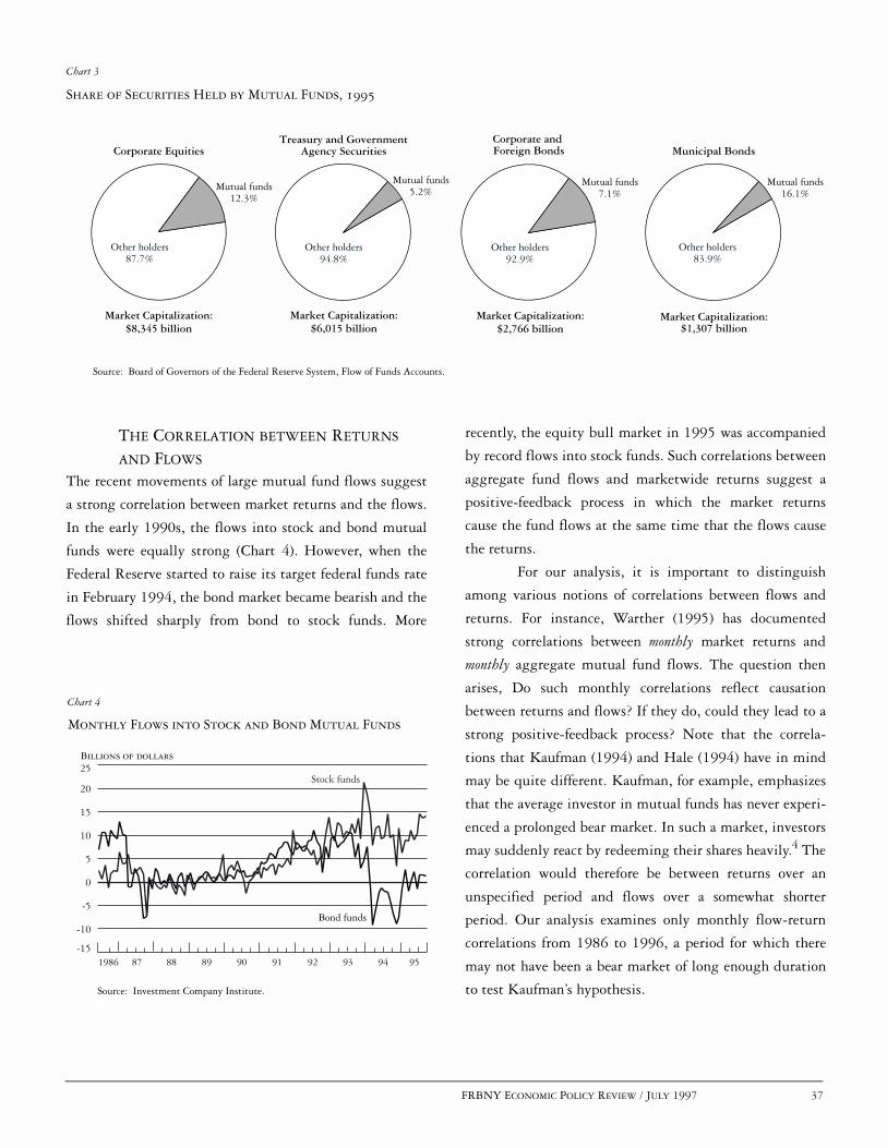
FRBNY ECONOMIC POLICY REVIEW / JULY 1997 37
Share of Securities Held by Mutual Funds, 1995
Chart 3
Source: Board of Governors of the Federal Reserve System, Flow of Funds Accounts.
Mutual funds12.3%
Other holders87.7%
Corporate Equities
Market Capitalization:$8,345 billion
Mutual funds5.2%
Other holders94.8%
Mutual funds7.1%
Other holders92.9%
Mutual funds16.1%
Other holders83.9%
Treasury and GovernmentAgency Securities
Corporate and Foreign Bonds Municipal Bonds
Market Capitalization:$6,015 billion
Market Capitalization:$2,766 billion
Market Capitalization:$1,307 billion
Monthly Flows into Stock and Bond Mutual Funds
Chart 4
Billions of dollars
Source: Investment Company Institute.
1986 87-15
-10
-5
0
5
10
15
20
25
88 89 90 91 92 93 94 95
Bond funds
Stock funds
THE CORRELATION BETWEEN RETURNS AND FLOWS
The recent movements of large mutual fund flows suggest
a strong correlation between market returns and the flows.
In the early 1990s, the flows into stock and bond mutual
funds were equally strong (Chart 4). However, when the
Federal Reserve started to raise its target federal funds rate
in February 1994, the bond market became bearish and the
flows shifted sharply from bond to stock funds. More
recently, the equity bull market in 1995 was accompanied
by record flows into stock funds. Such correlations between
aggregate fund flows and marketwide returns suggest a
positive-feedback process in which the market returns
cause the fund flows at the same time that the flows cause
the returns.
For our analysis, it is important to distinguish
among various notions of correlations between flows and
returns. For instance, Warther (1995) has documented
strong correlations between monthly market returns and
monthly aggregate mutual fund flows. The question then
arises, Do such monthly correlations reflect causation
between returns and flows? If they do, could they lead to a
strong positive-feedback process? Note that the correla-
tions that Kaufman (1994) and Hale (1994) have in mind
may be quite different. Kaufman, for example, emphasizes
that the average investor in mutual funds has never experi-
enced a prolonged bear market. In such a market, investors
may suddenly react by redeeming their shares heavily.4 The
correlation would therefore be between returns over an
unspecified period and flows over a somewhat shorter
period. Our analysis examines only monthly flow-return
correlations from 1986 to 1996, a period for which there
may not have been a bear market of long enough duration
to test Kaufman’s hypothesis.

38 FRBNY ECONOMIC POLICY REVIEW / JULY 1997
MEASURING MUTUAL FUND FLOWS
To measure mutual fund flows, we use monthly ICI data
on cash flows into and out of mutual funds from July
1986 to April 1996.5 In the ICI data, cash flows are
computed for each of the twenty-one groupings of funds
by investment objective. Within each group, cash flows
are further broken down into total sales, redemptions,
exchange sales, and exchange redemptions. Total sales
and redemptions represent outside flows, while
exchange sales and exchange redemptions represent
flows between funds within a fund family. We compute
net flows as total sales minus redemptions, plus
exchange sales minus exchange redemptions.
We make several adjustments to the mutual fund
categories by either aggregating categories or excluding
some from our study. We exclude money market mutual
funds and precious metal funds because they do not
seem to be subject to the same risks as stock and bond
funds. We also exclude various hybrid funds (flexible
portfolio, income mixed, balanced, and income bond)
because of the lack of an appropriate market price index.
We combine aggressive growth and growth stock funds,
income and growth-and-income stock funds, and global
and international stock funds. Hence, we collapse six
equity categories into three: growth, income, and global
stock funds. We also combine long-term municipal
bond and state municipal bond funds into a single cate-
gory of municipal bond funds. We retain four other
bond fund categories: government bond, corporate
bond, Government National Mortgage Association
(GNMA) bond, and high yield bond. We use growth
stock funds as the benchmark stock fund and govern-
ment bond funds as the benchmark bond fund.
To control for the flows’ strong rising trend during
the period, we normalize the flows by dividing them by
the funds’ net asset value in the previous month. Flows are
thus stated as a percentage of a fund category’s net assets.
(The data analyzed in this study are summarized in Table 3.)
Over the period, global stock funds and corporate bond
funds received the largest net flows relative to net assets,
while government bond funds received the smallest. Global
stock funds and GNMA bond funds had the most volatile
net flows, while income stock funds had the most stable
flows. All the flows exhibit high autocorrelations, with
government bond funds and GNMA bond funds showing
the most persistent flows. These autocorrelations imply
that large components of the flows are predictable on the
basis of past flows.
To divide the flows into expected and unexpected
components, we regress flows on three months of lags and
on a time trend (Appendix B).6 The predicted values from
the regressions then serve as our expected flows and the
residuals as our unexpected flows. The expected flows for
growth stock funds and government bond funds reflect a
Sources: Investment Company Institute; authors’ calculations.
Notes: Monthly flows into mutual funds over the July 1986–April 1996 period are computed as the sum of 1) total sales minus redemptions and 2) exchanges into a fund minus exchanges out of a fund. The flow into each group is divided by that fund’s net asset value from the previous month. The fund groups are drawn from the Investment Company Institute (ICI) classification of mutual funds by objective. Some groups combine two ICI categories: growth stock funds includes growth and aggressive growth stock funds; global equity funds, global equity and international stock funds; income stock funds, equity income and growth-and-income stock funds; municipal funds, national and state municipal bond funds.
Table 3SUMMARY STATISTICS FOR STOCK AND BOND MUTUAL FUND FLOWS
Fund GroupNumber of
ObservationsMean Flows
(Percent)
Standard Deviation (Percent)
First Order Autocorrelations
Stock funds
Growth 118 1.0 1.3 0.34
Global equity 118 1.4 2.2 0.70
Income 118 1.1 0.9 0.69
Bond funds
Government 118 0.4 1.8 0.90
Corporate 118 1.4 1.7 0.75
GNMA 118 0.4 2.2 0.84
High yield 118 1.1 2.0 0.36
Municipal 118 1.1 1.5 0.67
The expected flows . . . reflect a relatively smooth
and slow process, while the unexpected flows
show a great deal more short-run volatility.

FRBNY ECONOMIC POLICY REVIEW / JULY 1997 39
Comparison of Expected and Unexpected Flows
Chart 5
Billions of dollars
Source: Authors’ calculations.
-6
-4
-2
0
2
4
6
8
Unexpected net flows
1986 87 88 89 90 91 92 93 94 95
Expected net flows
Unexpected net flows
Expected net flows
Growth Stock Funds
Government Bond Funds
-4
-2
0
2
4
6
relatively smooth and slow process, while the unexpected
flows show a great deal more short-run volatility (Chart 5).7
MEASURING MARKET RETURNS
To measure market returns, we select market price indexes
to gauge the performance of the markets in which the
funds in each group invest (Table 4). Within each group,
some funds will do better than others, and flows may shift
to the best performers. However, we are more interested in
the aggregate flows, which depend not on the performance
of specific portfolios but on that of whole market sectors.
In choosing among the various market indexes, it is not
critical that we select precisely the right index because the
various stock market indexes tend to be highly correlated,
as do the bond market indexes.
We compute returns as the changes in the log-
arithms of the end-of-month market indexes and annu-
alize them by multiplying by twelve. As a result, the
annualized return for market i for month t would be given
by Rit = 12 (log Pit - log Pi,t-1), where Pit represents that
market’s index at the end of month t. We then compute
excess returns as the difference between this market return
and the yield on prime thirty-day commercial paper (CP)
in the previous month. The CP rate tracks returns on
money market mutual funds, which are the natural alternative
for an investor not wishing to invest in stock or bond funds.
CORRELATIONS BETWEEN RETURNS AND FLOWS
In general, net flows into the various mutual fund groups
are highly correlated with market performance (Table 5).
The correlations between net flows and market returns
range from 12 percent for government bond funds to
72 percent for high yield bond funds. In most cases, these
correlations can be attributed almost entirely to the unex-
pected component of net flows. The correlations between
returns and the unexpected components range from 31 per-
cent for GNMA bond funds to 71 percent for growth stock
funds. In Chart 6, we plot these correlations for govern-
ment bond funds and growth stock funds, which serve as
our benchmark bond and stock funds. In contrast, the
correlations between returns and the expected components
of net flows are by and large not statistically different
from zero. These findings are consistent with those of
Warther (1995), who looked at similar flow data cover-
ing the period from January 1984 through December
1992. Combining all the stock funds into one category,
Warther found a correlation of 73 percent between stock
returns and unexpected net flows into stock funds and a
Sources: DRI/McGraw-Hill; Datastream International Limited; Haver Analytics.
Table 4MUTUAL FUND RETURN INDEXES
Fund Group Index
Stock funds
Growth Russell 2000
Income Russell 1000
Global equity Morgan Stanley Capital International Index (World)
Bond funds
Government Lehman Brothers Composite Treasury Index
Corporate Merrill Lynch Corporate Master
GNMA Merrill Lynch GNMA Index
High yield Merrill Lynch High Yield Bond Index
Municipal Standard and Poor’s Municipal Index (One Million)

40 FRBNY ECONOMIC POLICY REVIEW / JULY 1997
Correlation between Unexpected Flowsand Market Returns
Chart 6
Source: Authors’ calculations.
Government Bond Funds
Growth Stock Funds
-40 -30 -20 -10 0 10 20 30 40 50-4
-2
0
2
4
Unexpected flows (billions of dollars)
Excess returns (percent annualized)
-500 -400 -300 -200 -100 0 100 200-6
-4
-2
0
2
4
6
correlation of -10 percent between stock returns and
expected net flows.
CORRELATION VERSUS CAUSATION
High correlations between flows and returns do not neces-
sarily mean that a strong positive-feedback process is at
work. There are at least two ways in which such correla-
tions can arise in the absence of this process. First, a third
factor—such as investor sentiment—may be driving both
flows and returns. An optimistic sentiment may encourage
investment in mutual funds at the same time that it pushes
up asset prices.8 In this case, the resulting correlation
between flows and returns would not imply any kind of
self-sustaining market mechanism. Second, the correlation
may arise from a causal relationship in only one direction:
flows may cause returns but not vice versa. Even when
flows are small relative to the size of the markets, flows
may cause returns if other investors observing the flows
take large positions in the belief that the flows convey use-
ful investment information. The correlation arising from
such one-way causation, however, still does not imply a
positive-feedback process, which requires that the causa-
tion operate in both directions.
DO SHORT-TERM RETURNS CAUSE SHORT-TERM FLOWS?
TIMING AND AGGREGATION
Previous studies of causation have typically examined the
effect of returns on current flows into individual funds
over a period longer than a month. For example, Ippolito
(1992), Sirri and Tufano (1993), and Patel, Zeckhauser,
and Hendricks (1994) use annual data to show that inves-
tors shift their money to funds that performed well in the
previous year. For our purposes, however, it is important to
examine effects with lags much shorter than a year and to
examine the flows at an aggregate level. Short lags are nec-
essary for the kind of positive-feedback process that could
lead to a self-sustaining decline. Therefore, we look at the
effects of market returns on flows within a month. This
period is too short for most investors to know precisely
Sources: Investment Company Institute; authors’ calculations.
Notes: Monthly flows into mutual funds over the July 1986–April 1996 period are computed as the sum of 1) total sales minus redemptions and 2) exchanges into a fund minus exchanges out of a fund. The flow into each group is divided by that fund’s net asset value from the previous month. The fund groups are drawn from the Investment Company Institute (ICI) classification of mutual funds by objective. Some groups combine two ICI categories: growth stock funds includes growth and aggressive growth stock funds; global equity funds, global equity and international stock funds; income stock funds, equity income and growth-and-income stock funds; municipal funds, national and state municipal bond funds. Excess market returns are computed by subtracting the thirty-day commercial paper rate from the return index.
Table 5CORRELATIONS BETWEEN MUTUAL FUND FLOWS AND EXCESS MARKET RETURNS
Fund Group Total Flow Expected Flow Unexpected FlowStock funds
Growth 0.61 0.02 0.71Income 0.36 0.05 0.49Global equity 0.31 -0.08 0.55
Bond fundsGovernment 0.12 -0.07 0.41Corporate 0.47 0.02 0.68GNMA 0.21 0.12 0.31High yield 0.72 0.19 0.70Municipal 0.48 -0.05 0.69

FRBNY ECONOMIC POLICY REVIEW / JULY 1997 41
how their own funds have performed relative to other
funds, but they will be able to surmise how the funds,
including their own, have performed on average. At the
same time, shifts in flows from one individual fund to
another that do not change aggregate flows are unlikely to
move prices in the market as a whole. Hence, we measure
the effects of market returns on aggregate flows for funds
within a given investment objective.
THE INSTRUMENTAL-VARIABLE APPROACH
To measure whether returns cause flows, we rely on so-
called instrumental variables. Such variables have not been
used before to analyze causation between mutual fund
flows and market returns. The purpose of these variables is
to isolate a component of returns that we are confident
could not have been caused by flows. We can then estimate
the effect of this component on flows to obtain a measure of
the independent effect of returns on flows. It is therefore
important to identify instrumental variables that are not
only independent of flows, but also relevant to returns.
Specifically, the instruments should be sufficiently corre-
lated with returns to capture a component large enough to
allow a reliable measure of the component’s effect on flows. If
the instruments are weak, some bias will distort the estimates.
With biased estimates, the measured effects will fall some-
where between the ordinary least squares (OLS) estimates
and the true effects.
We derive our instrumental-variable estimates in
two stages. First, we regress stock and bond market excess
returns on the instruments. The predicted values from the
first-stage regression then represent a component of returns
that we can consider not to be attributable to mutual fund
flows. Second, we regress mutual fund flows on the pre-
dicted values from the first-stage regression. The coefficients
from the second-stage regression then measure the
independent effect of returns on flows.9
Note that our application of instrumental variables
leaves two issues unaddressed. First, although we can
examine the possible effects of market returns on aggregate
mutual fund flows, we cannot measure the effects in the
opposite direction, because we lack good instrumental vari-
ables for flows. Second, our instrumental-variable analysis
does not allow us to determine the possible effects of longer
term returns on flows, such as those of bull or bear markets
that last longer than two months. Hence, this analysis is
limited to testing a positive-feedback hypothesis based on
causation from only two months of returns.
INSTRUMENTS FOR STOCK AND BOND RETURNS
We use four macroeconomic variables as instruments for
stock and bond excess returns: capacity utilization, the con-
sumer price index, domestic employment, and the Federal
Reserve’s target federal funds rate. We chose these variables
because we may reasonably assume that none are affected
by mutual fund flows in the short run. Moreover, the variables
are significantly correlated with excess stock and bond
returns.10 By their nature, such excess returns would be
hard to predict on the basis of lagged data because stock
and bond markets are so quick to reflect any available
information. Instead of using lagged data for instruments,
however, we use contemporaneous data on macroeconomic
variables—that is, data for the same month over which
we measure returns. The contemporaneous correlations
between the instruments and returns arise because the
stock and bond markets react to the macroeconomic
variables as the information is released. The F-statistics
and Nelson and Startz’s TR2 statistics all suggest that the
instruments have significant explanatory power.11 None-
theless, the coefficients may still be biased because the
first-stage F-statistics tend to be less than 10.12 If the
estimates are biased because of poor instruments, we know
that they will be biased toward the OLS estimates. It will
therefore be useful to compare the instrumental-variable
estimates with the OLS estimates.
THE EFFECT OF SHORT-TERM RETURNS ON FLOWS
Our instrumental-variable regressions control for changing
volatilities and for conditions in markets other than the
ones in which particular funds invest. (The complete
regressions are reported in Appendix C.) Specifically, each
regression includes as explanatory variables two months of
excess returns and two months of conditional volatilities in
the corresponding market and the same four variables in
the alternative market. For flows into stock funds, the

42 FRBNY ECONOMIC POLICY REVIEW / JULY 1997
alternative market is the government bond market; for
flows into bond funds, it is the market for growth stocks
(Table 4). The same-month returns are modeled using the
instrumental variables, while the lagged-month returns are
not. The conditional volatilities are based on an estimated
process that allows the volatilities to vary over time.13
Warther (1995) runs OLS regressions that include two lags
of monthly returns but not volatilities or returns in other
markets. We find that our specification of explanatory vari-
ables results in stronger estimated effects of short-term
returns on fund flows.14
Our regressions suggest that short-term market
returns have little to no effect on mutual fund flows (Table 6).
In the case of the three stock funds examined, the esti-
mated effect of market returns on flows in the same month
is statistically no different from zero at conventional signif-
icance levels. For the five bond funds examined, the estimated
same-month effect is significant for government bond, cor-
porate bond, and municipal bond funds and is insignificant
for GNMA bond and high yield bond funds. Even when
the effect is statistically significant, however, it is very
small. A market decline of 1 percentage point would lead
to outflows of less than 1/10 of 1 percent of the net assets of
funds of a given type. In most cases, market returns in the
month before have the opposite effect or no effect on flows.
The exceptions are the government bond and GNMA bond
funds, but even here the combined effect of two months of
returns remains small.
Remarkably, our instrumental-variable estimates
also suggest that the funds with the more conservative
investment objectives are also the ones most vulnerable to
outflows.15 That is, the bond funds’ flows are more sensi-
tive to market returns than the stock funds’ flows are.
Among the bond funds, the government, corporate, and
municipal bond funds show larger outflows for a given
market decline than do the GNMA and high yield bond
funds. The largest effect we find involves municipal bond
funds, for which a fall of 1 percentage point in the market
leads to unexpected outflows of 0.084 percent of these
funds’ net assets. For the stock funds, none of the estimated
effects is statistically significant, but the point estimates
suggest that income funds are more subject to outflows than
growth and global stock funds. Investors seem to self-select
in such a way that the more risk-averse ones are also more
sensitive to short-term performance.
POSSIBLE BIASES
To the extent that our instrumental-variable estimates are
still biased, the true effects would serve to strengthen our
conclusions about the relationship between the funds’ flow
reactions and the apparent riskiness of their investment
objectives. Although the standard statistical gauges suggest
that our instruments are adequate, the instruments may
still not be good enough to rule out biased estimates, which
would tend to bring the instrumental-variable estimates closer
to the OLS estimates. Interestingly, our comparison of the
estimates suggests that when the estimated effects are rela-
tively small, the true effects may be smaller still, and when
Source: Authors’ estimates.
Notes: The regressions control for excess returns in an alternative market (the government bond market for stock funds and the growth stock market for bond funds) and for conditional volatility in the markets. The t-statistics are in parentheses. * Significant at the 90 percent level.** Significant at the 95 percent level.
Table 6REGRESSION OF UNEXPECTED FLOWS ON MARKET RETURNS
DependentVariable
Instrumental-Variable
Coefficient onExcess
Returns,Same Month
Instrumental-Variable
Coefficient onExcess Returns,Two Months Combined
Ordinary Least SquaresCoefficient on
Excess Returns,
Same Month
Ordinary Least SquaresCoefficient on
Excess Returns,Two Months Combined
Stock funds Growth 0.006 0.005 0.013** 0.010**
(1.25) (12.74)
Income 0.016 0.014 0.005** 0.013(1.68) (2.20)
Global equity 0.010 0.008 0.015** 0.003(0.92) (6.27)
Bond funds Government 0.033** 0.043** 0.015** 0.027**
(2.21) (3.92)
Corporate 0.049** 0.045** 0.041** 0.038**(3.40) (9.18)
Municipal 0.084** 0.075** 0.053** 0.053(3.96) (9.08)
GNMA 0.013 0.031** 0.016** 0.042**(0.71) (2.67)
High yield 0.023 0.016 0.082** 0.065**(0.39) (10.04)

FRBNY ECONOMIC POLICY REVIEW / JULY 1997 43
the estimated effects are relatively large, the true effects
may be even larger (Table 6).
Recall that within the class of stock funds or bond
funds, the funds with the riskier investment objectives
show smaller flow reactions than the more conservative
ones. At the same time, the instrumental-variable esti-
mates for the growth and global stock funds are smaller
than the OLS estimates, suggesting that the true effects
may be even smaller than our measures indicate. For the
income stock funds, the instrumental-variable estimates
are larger than the OLS estimates, suggesting that the true
effects may be even larger. For the GNMA and high yield
bond funds, the estimates fall short of the OLS estimates,
suggesting that the true effects may be even smaller, while
the opposite holds true for the government, corporate, and
municipal bond funds.
FEE STRUCTURES AND EFFECTS OF RETURNS ON FLOWS
As we noted earlier, the mutual funds’ fee structures may
be one reason for the generally weak effects of short-term
returns on funds’ flows and for the relatively weaker effects
of returns on the more aggressive mutual funds. Although
some fund groups discourage short-run redemptions by
limiting the number of exchanges between funds within a
calendar year, for the most part, funds seem to rely on loads
and redemption fees to discourage fund investors from sell-
ing in the short run. In examining these issues, Ippolito
(1992) finds that poor returns lead to smaller outflows
from load funds than from no-load funds, while Chordia
(1996) finds that aggressive funds are more likely to rely
on these fees to discourage redemptions.
THE EFFECT OF MAJOR MARKET DECLINES
To characterize the effects of market returns on mutual
fund flows, it is important to examine whether large shocks
have special effects. Our instrumental-variable analysis
assumes that the effects on flows are proportional to the
size of the shocks. We now assess this assumption by taking
a closer look at mutual fund flows during five episodes of
unusually severe market declines (Table 7).16 We also look
for evidence that the flows perpetuated the declines. The
market declines were most pronounced in the bond market
in April 1987 and February 1994, in the stock market in
October 1987, in the stock and high yield bond markets in
October 1989, and in the municipal bond market in
November 1994.17 Although these were the markets most
affected, price movements in other markets also tended to
be significant; therefore, we also take these markets into
account. Finally, we examine whether the funds’ invest-
ment managers tended to panic and thus exacerbate the
selling in the markets.
THE BOND MARKET PLUNGE OF APRIL 1987In the spring of 1987, Japanese institutional investors
pulled out of the U.S. stock and bond markets after the
threat of a trade war between the United States and Japan
precipitated a sharp dollar depreciation (Economist 1987).
In April, government bond prices plunged an average of
2.3 percent, while stock prices and other bond prices also
fell. Taking into account the decline in the government
Mutual funds’ fee structures may be one reason
for the generally weak effects of short-term
returns on funds’ flows and for the relatively
weaker effects of returns on the more
aggressive mutual funds.
Source: Authors’ calculations.
Table 7EFFECT OF MAJOR MARKET DECLINES ON MUTUAL FUND FLOWS
Market Episode
Size of Decline
(Percentage of Net Assets)
Predicted Outflow
(Percentage of Net Assets)
Actual Outflow
(Percentage of Net Assets)
Government bond April 1987 2.27 1.23 1.79Growth stock October 1987 37.67 1.13 4.58Growth stock October 1989 6.22 0.34 1.44High yield bond October 1989 1.59 1.34 2.94Government bond February 1994 2.07 0.85 0.91Municipal bond November 1994 1.43 1.25 1.44

44 FRBNY ECONOMIC POLICY REVIEW / JULY 1997
bond and stock markets, our instrumental-variable estimates
would have predicted unexpected outflows from govern-
ment bond funds of 1.2 percent of net assets (Table 7).
Actual unexpected outflows were 1.8 percent, much
greater than predicted but still bearing little resemblance
to a run. Although there is some evidence that the flows
served to perpetuate the decline, the magnitudes were still
too small for a self-sustaining decline. In May, the unexpected
outflows from government bonds rose to 2.9 percent of net
assets, while bond prices continued to fall. However, flows
and prices recovered in June.
THE STOCK MARKET BREAK OF OCTOBER 1987The largest single market decline in our sample was the
stock market break of October 1987. The crash hit growth
stocks the hardest, with prices falling an average of
37.7 percent in the month or about seven times their vola-
tility. The Federal Reserve reacted by announcing a readi-
ness to provide liquidity, and the bond market led a
modest stock market recovery. On the basis of stock and
bond price movements, we would have predicted unex-
pected outflows from growth stock funds of 1.1 percent of
net assets. In fact, unexpected outflows were four times
greater, 4.6 percent. Even so, the outflows were still quite
manageable given the funds’ liquidity levels, which aver-
aged 9.4 percent of net assets. A moderation trend followed
as unexpected outflows from growth stock funds abated in
November and stock prices started to recover in December.
THE STOCK MARKET DECLINE OF OCTOBER 1989The decline of October 1989 signaled the end of the lever-
aged buyout wave of the 1980s. Previously, stock prices of
many companies had been boosted by premiums reflecting
the possibility of future buyouts at favorable prices.
Although the high yield bond market had been the main
source of financing for the buyouts, it had been weakened
by a series of defaults (Economist 1989). In October, the
management of United Airlines turned to several interna-
tional banks to finance their leveraged takeover of the airline.
The deal failed when some of the banks refused. Many
investors then realized that buyouts would no longer be as
likely as they had thought. Takeover premiums vanished
overnight, and prices of growth stocks fell by 6.2 percent
during the month while those of high yield bonds fell by
1.6 percent. Our estimates would have predicted unexpected
outflows of 0.3 percent of net assets from growth stock
funds and 1.3 percent from high yield bond funds. The
actual unexpected outflows were 1.4 percent and 2.9 percent,
respectively—much greater than predicted but still far
from constituting a run on mutual funds. The funds saw
flows return in November.
THE BOND MARKET DECLINE OF FEBRUARY 1994In February 1994, the Federal Reserve raised its target federal
funds rate 25 basis points. The increase, the first in a series,
was not altogether a surprise, but prices of government
bonds still fell by about 2.1 percent. Stock prices also fell.
Given these developments, we would have predicted unex-
pected outflows from government bond funds of 0.8 per-
cent of net assets, an estimate that is close to the actual
figure of 0.9 percent. Unexpected outflows rose in March
and bond prices continued to decline, but the magnitudes
remained unimpressive. Prices started to stabilize in April.
THE MARKET DECLINES OF NOVEMBER 1994In November 1994, the Federal Reserve again raised its
target federal funds rate—this time by 75 basis points, a
larger increase than most investors had anticipated. In
addition, the troubles of the Orange County municipal
investment pool came to light later in the month. Stock
Faced with heavy redemptions and the
possibility that current outflows could lead to
more outflows in the near future, the fund
managers took the reasonable step of adding
to their liquid balances.

FRBNY ECONOMIC POLICY REVIEW / JULY 1997 45
Market Declines and Mutual Fund Liquidity Ratios
Chart 7
Liquidity as a percentage of net assets
Source: Investment Company Institute (1996).
6
7
8
9
10
11
12
13
14
1986 874
5
6
7
8
9
10
11
12
88 89 90 91 92 93 94
Stock Funds
Bond Funds
10/87 10/89
4/87 2/9411/94
and bond markets experienced substantial declines, with
municipal bond prices falling by 1.4 percent during the
month. Taking these market movements into account, we
would have predicted unexpected outflows from munici-
pal bond funds of 1.2 percent of net assets, yet actual
unexpected outflows were 1.4 percent. The inflows in
December exceeded the outflows in November.
FUND MANAGERS’ REACTIONS Fund managers may react sharply to abrupt market
declines and thus could exacerbate the effects of the out-
flows. For instance, to meet redemptions, they may either
draw on their funds’ liquid balances or sell off portions of
the portfolio. Or they may go further still by selling
more securities than they need to meet the redemptions.
Indeed, in four of the five episodes summarized, average
liquidity ratios rose in the month of the market decline,
indicating that the fund managers sold more than they
needed to meet redemptions (Chart 7). In three episodes, the
liquidity ratio continued to rise in the following month.
Nevertheless, the reactions of fund managers fell well short of
a panic. Faced with heavy redemptions and the possibility
that current outflows could lead to more outflows in the
near future, the fund managers took the reasonable step of
adding to their liquid balances. Moreover, in the five episodes
of market decline, the average liquidity ratio never rose by
more than 2 percent of net assets and never exceeded the high-
est levels reached in periods without major market declines.
CONCLUSION
Can the recent high monthly correlations between
aggregate mutual fund flows and market returns be at
least partially attributed to short-term market returns’
strong effect on flows? If returns have such an effect on
flows and flows also have a strong effect on returns, then
the implied positive-feedback process may lead to a
self-sustaining decline in asset prices. However, our
instrumental-variable analysis suggests that, on average,
the effects of short-term returns on mutual fund flows
have been weak.
To the extent that the effects of returns on flows
are present, they seem to be stronger for the funds with
relatively conservative investment objectives, such as gov-
ernment bond funds and income stock funds, than for those
with relatively risky objectives, such as growth stock
funds, GNMA bond funds, and high yield bond funds. We
also find that these effects have been stronger in certain
episodes of major market declines, although still not strong
enough to sustain a downward spiral in asset prices.

46 FRBNY ECONOMIC POLICY REVIEW / JULY 1997 APPENDIX
Aggressive growth funds seek maximum capital appreciation;
current dividend income is not a significant factor. Some funds
invest in out-of-the-mainstream stocks, such as those of strug-
gling companies or stocks of companies in new or temporarily
out-of-favor industries. Some may also use specialized investment
techniques, such as option writing or short-term trading.
Balanced funds generally try to achieve moderate long-term
growth of capital, moderate income from dividend and/or
interest payments, and moderate stability in an investor’s
principal. Balanced funds invest in a mixture of stocks, bonds,
and money market instruments.
Corporate bond funds purchase primarily bonds of corpora-
tions based in the United States; they may also invest in other
fixed-income securities, such as U.S. Treasury bonds.
Flexible portfolio funds generally invest in a variety of
securities such as stocks, bonds, or money market instruments.
They seek to capture market opportunities in each of
these asset classes.
Global bond funds seek a high level of interest income by
investing in the debt securities of companies and countries
worldwide, including those of issuers in the United States.
Global equity funds seek capital appreciation by investing
in securities traded worldwide, including those of issuers in
the United States.
GNMA funds seek a high level of interest income by investing
primarily in mortgage securities backed by the Government
National Mortgage Association (GNMA).
Growth-and-income stock funds invest mainly in the com-
mon stock of companies that offer potentially increasing value
as well as consistent dividend payments. Such funds attempt
to provide investors with long-term capital growth and a
steady stream of income.
Growth funds invest in the common stock of companies that
offer potentially rising share prices. These funds aim to provide
capital appreciation, rather than steady income.
High yield bond funds seek a high level of interest income
by investing at least two-thirds of their assets in lower rated
corporate bonds (rated Baa or lower by Moody’s and BBB or
lower by Standard and Poor’s).
Income bond funds seek a high level of income by investing
in a mixture of corporate and government bonds.
Income equity funds seek a high level of income by investing
mainly in stocks of companies with a consistent history of
dividend payments.
Income mixed funds seek a high level of interest and/or
dividend income by investing in income-producing securities,
including equities and debt instruments.
International equity funds seek capital appreciation by
investing in equity securities of companies located outside the
United States (these securities at all times represent two-
thirds of the fund portfolios).
National municipal bond funds (long-term) seek dividend
income by investing primarily in bonds issued by states and
municipalities.
Precious metal funds seek capital appreciation by investing
at least two-thirds of their fund assets in securities associated
with gold, silver, and other precious metals.
State municipal bond funds (long-term) seek dividend
income by investing primarily in bonds issued by states and
by municipalities of one state.
Taxable money market mutual funds seek the highest
income consistent with preserving investment principal.
Examples of the securities these funds invest in include U.S.
APPENDIX A: TYPES OF MUTUAL FUNDS BY INVESTMENT OBJECTIVE

APPENDIX FRBNY ECONOMIC POLICY REVIEW / JULY 1997 47
Treasury bills, commercial paper of corporations, and large-
denomination bank certificates of deposit.
Tax-exempt money market funds (national) seek the
highest level of federal tax-free dividend income consistent
with preserving investment principal. These funds invest in
short-term municipal securities.
Tax-exempt money market funds (state) seek the highest
level of federal tax-free dividend income consistent with
preserving investment principal. These funds invest primarily
in short-term municipal securities from one state.
U.S. government income funds seek income by investing
in a variety of U.S. government securities, including Treasury
bonds, federally guaranteed mortgage-backed securities, and
other U.S.-government-backed issues.
APPENDIX A: TYPES OF MUTUAL FUNDS BY INVESTMENT OBJECTIVE (CONTINUED)

48 FRBNY ECONOMIC POLICY REVIEW / JULY 1997 APPENDIX
APPENDIX B
VECTOR AUTOREGRESSION RESULTS FOR CURRENT MONTHLY MUTUAL FUND FLOWS
Fund Group Constant Lag 1 Lag 2 Lag 3 Time Trend Adjusted R-Squared
Stock funds
Growth 0.00082 0.191 0.077 0.230 0.000074 0.26
(0.38) (2.16)** (0.87) (2.64)** (1.97)*
Global equity -0.00062 0.618 -0.058 0.184 0.000071 0.54
(-0.22) (6.87)** (-0.56) (2.12)** (1.54)
Income 0.00102 0.465 0.075 0.290 0.0000123 0.54
(0.75) (5.11)** (0.75) (3.23)** (0.71)
Bond funds
Government -0.00024 0.851 -0.130 0.162 0.000001 0.80
(-0.144) (9.04)** (-1.05) (1.75)* (0.03)
Corporate 0.001805 0.592 -0.039 0.238 0.000009 0.54
(0.74) (6.43)** (-0.37) (2.69)** (0.30)
GNMA -0.00075 0.665 0.114 0.085 0.000010 0.71
(-0.35) (7.27)** (1.03) (1.03) (0.34)
High yield 0.00238 0.249 0.123 0.116 0.000044 0.12
(0.64) (2.63)** (1.27) (1.27) (0.86)
Municipal 0.00460 0.511 0.040 0.131 -0.000029 0.42
(1.78)* (5.43)** (0.39) (1.45) (-0.93)
Source: Authors’ estimations.
Notes: Monthly flows into mutual funds over the July 1986–April 1996 period are computed as the sum of 1) total sales minus redemptions and 2) exchanges into a fund minus exchanges out of a fund. The flow into each group is divided by that fund’s net asset value from the previous month. The fund groups are drawn from the Investment Company Institute (ICI) classification of mutual funds by objective. Some groups combine two ICI categories: growth stock funds includes growth and aggressive growth stock funds; global equity funds, global equity and international stock funds; income stock funds, equity income and growth-and-income stock funds; municipal funds, national and state municipal bond funds. The t-statistics are in parentheses.* Significant at the 90 percent level.** Significant at the 95 percent level.

APPENDIX FRBNY ECONOMIC POLICY REVIEW / JULY 1997 49
APPENDIX C
INSTRUMENTAL VARIABLE REGRESSIONS
Dependent Variable: Unexpected Flows as a Percentage of Assets
Stock Funds Bond Funds
Independent Variable Growth Income Global Equity Government Corporate Municipal GNMA High Yield
FUNDS’ OWN MARKET
Same-month excess return 0.006 0.016 0.010 0.033** 0.049** 0.084** 0.013 0.023
(1.25) (1.68) (0.92) (2.21) (3.40) (3.96) (0.71) (0.39)
Lagged excess return -0.002 -0.001 -0.002 0.01* -0.004 -0.009 0.018** -0.007
(-0.67) (1.68) (-0.67) (1.80) (-0.72) (-0.98) (2.57) (-0.45)
Same-month conditional volatility -0.081 0.001 0.045 -0.100 -0.005 -0.005 0.030 0.016
(-0.33) (-0.53) (1.23) (-1.64) (0.06) (-0.03) (0.24) (0.45)
Lagged conditional volatility -0.040 0.001 -0.013 -0.001 0.029 0.001 0.084 -0.003
(-0.23) (1.44) (-0.40) (-1.64) (0.35) (0.52) (0.66) (-0.11)
ALTERNATIVE MARKET
Same-month excess return 0.037** -0.008 0.009 -0.004 0.001 0.000 0.002 0.009
(2.18) (0.83) (0.34) (-0.87) (0.24) (0.21) (0.42) (0.36)
Lagged excess return -0.017** 0.003 0.005 -0.004 -0.004* -0.002 -0.002 0.001
(-2.61) (-1.03) (0.49) (-0.19) (-1.75) (-0.81) (-1.06) (0.38)
Same-month conditional volatility -0.042 -0.001 -0.178* 0.341 -0.207 -0.003 0.222 0.068
(-0.62) (-0.37) (-1.67) (1.58) (-0.98) (-1.21) (0.82) (0.11)
Lagged conditional volatility -0.044 -0.000 -0.161*
0.274*-0.148 -0.002 0.132 0.114
(-0.64) (-0.08) (-1.67) (1.79) (-0.96) (-1.15) (0.67) (0.29)
Adjusted R-squared 0.350 0.050 0.251 -0.070 0.460 0.370 0.180 0.280
F-statistic 3.060 1.170 1.882 3.670 6.350 4.840 2.980 1.740
Source: Authors’ estimates.
Notes: The same-month returns are based on the following instruments: capacity utilization, the Federal Reserve’s target federal funds rate, nonfarm employment, and the consumer price index. For stock funds, the alternative market is government bond funds. For bond funds, the alternative market is growth funds. The t-statistics are in parentheses.* Significant at the 90 percent level.** Significant at the 95 percent level.

50 FRBNY ECONOMIC POLICY REVIEW / JULY 1997 APPENDIX
APPENDIX D
REGRESSIONS BASED ON WARTHER’S EXPLANATORY VARIABLES
Dependent Variable: Unexpected Flows as a Percentage of Assets
Growth Stock Funds Government Bond Funds
Independent VariableOrdinary Least Squares
RegressionsInstrumental-Variable
RegressionsOrdinary Least Squares
RegressionsInstrumental-Variable
Regressions
(1) (2) (1) (2) (1) (2) (1) (2)
FUNDS’ OWN MARKET
Same-month excess return 0.012** 0.012** 0.011** 0.011** 0.017** 0.017** 0.029** 0.029**
(11.51) (11.38) (3.73) (3.55) (4.25) (4.27) (3.16) (3.15)
Excess return lagged one month -0.003** -0.003** -0.003** -0.003** 0.012** 0.012** 0.009* 0.010**
(-2.99) (-2.99) (-2.39) (-2.36) (2.88) (2.96) (1.97) (2.11)
Excess return lagged two months -0.001 -0.001 -0.001 -0.001 -0.001 0.000 0.002 0.001
(-0.68) (-0.58) (-0.73) (-0.63) (0.14) (-0.01) (0.41) (0.24)
Excess return lagged three months 0.000 -0.001 -0.004 0.004
(-0.43) (-0.51) (0.94) (0.98)
Adjusted R-squared 0.538 0.535 0.534 0.529 0.209 0.208 0.141 0.149
F-statistic 45.240 33.730 5.711 4.474 11.048 8.497 7.972 6.147
Source: Authors’ calculations.
Notes: The ordinary least squares regressions use the same explanatory variables as in Warther (1995). The instrumental-variable regressions also use the same variables as in Warther, but include instruments for the same-month excess returns. For the instrumental-variable regressions, the same-month returns are based on the following instruments: capacity utilization, the Federal Reserve’s target federal funds rate, nonfarm employment, and the consumer price index. The t-statistics are in parentheses.* Significant at the 90 percent level.** Significant at the 95 percent level.

ENDNOTES
NOTES FRBNY ECONOMIC POLICY REVIEW / JULY 1997 51
The authors thank Richard Cantor, John Clark, and Tony Rodrigues for helpfuldiscussions. William May and Dan Nickolich provided valuable contributions atan early stage of our research.
1. The large mutual fund flows have caught the attention of the
financial press. For example, see Economist (1995), Norris (1996), and
Gasparino (1996).
2. The Internal Revenue Code of 1954 treats a mutual fund’sshareholders as investors who directly hold the securities in the fund’sportfolio. To maintain their status as tax-exempt conduits, the fundsmust satisfy certain standards for diversification and sources of income.
3. These statistics were provided by the Investment Company Institute.They are available upon request from the ICI.
4. Investors may have seen such a market in 1973 and 1974, when thestock market fell an average of 23.3 percent a year. Mutual fundsapparently saw heavy outflows from 1972 to 1979 (based on an ICI dataseries that was discontinued in 1983). In addition, Shiller (1984) cites adecline in the number of investment clubs from a peak of 14,102 in 1970to 3,642 in 1980.
5. Although the flow data are available from January 1984 on, oursample period does not begin until two and a half years later, when fulldata on market returns become available.
6. Alternatively, we could have controlled for the time trend at a laterstage of the analysis, but the conclusions would have remainedunchanged. In the analysis, we regress flows on measures of excessreturns. Since these returns are uncorrelated with the time trend,excluding the trend from this later regression does not result in anomitted variable bias.
7. Statistically, we can define these unexpected flows as a stationaryprocess that allows us to draw the appropriate inferences from regressionestimates. More specifically, augmented Dickey-Fuller tests reject thepresence of a unit root.
8. Lee, Shleifer, and Thaler (1991), for example, consider mutual fundflows and discounts on closed-end funds as measures of investorsentiment. However, Warther (1995) finds no correlation between suchflows and discounts.
9. For a good textbook treatment of the use of instrumental variables,see Davidson and MacKinnon (1993, pp. 622-51).
10. The literature on the effects of macroeconomic variables on thestock and bond markets is extensive. See Fleming and Remolona(1997) for a survey.
11. Because of correlation among the instruments, some coefficients inthe first-stage regression are individually not statistically significant. Thesignificant coefficients have the expected signs (as discussed in Flemingand Remolona [1997], for example). We did not exclude theinsignificant instruments, however, because our tests showed them to bejointly significant.
12. See Nelson and Startz (1990), Bound, Jaeger, and Baker (1993), andStaiger and Stock (1994) for discussions of the uses and limitations ofinstrumental variables.
13. More specifically, the conditional volatilities are based on an estimatedgeneralized autoregressive conditional heteroskedastic (GARCH) process.
14. We report OLS and instrumental-variable regressions in Appendix Dto show that the extra lag does not contribute explanatory power, whilethe volatilities and other-market returns serve to strengthen themeasured short-term effects of own-market returns on flows.
15. Note that the more conservative funds also exhibit less volatile flows.
16. We also tried to test this assumption econometrically by includingvariables representing returns that are more than a standard deviationfrom either side of the mean. We found that these variables contributedno significant explanatory power. There were relatively few large shocks,and their effects were apparently too different to be captured statistically.We also tried to test the possibility of asymmetric effects by includingvariables representing only negative returns. Again, we found that thesevariables contributed no significant explanatory power.
17. Marcis, West, and Leonard-Chambers (1995) also look at mutualfund flows during market disruptions in 1994 and come to conclusionssimilar to ours.

52 FRBNY ECONOMIC POLICY REVIEW / JULY 1997 NOTES
REFERENCES
Bound, John, David A. Jaeger, and Regina Baker. 1993. “The Cure Can BeWorse than the Disease: A Cautionary Tale Regarding InstrumentalVariables.” National Bureau of Economic Research TechnicalWorking Paper no. 137, June.
Chordia, Tarun. 1996. “The Structure of Mutual Fund Charges.”JOURNAL OF FINANCIAL ECONOMICS 41: 3-39.
Davidson, R., and J.G. MacKinnon. 1993. ESTIMATION AND INFERENCE
IN ECONOMETRICS. Oxford: Oxford University Press.
Economist. 1987. “Deserting the Dollar,” April 4.
———. 1989. “America’s Junk Bond Market: Shaken and Stirred,”October 21.
———. 1995. “The Seismic Shift in American Finance,” October 21.
Fleming, Michael J., and Eli M. Remolona. 1997. “What Moves the BondMarket?” Federal Reserve Bank of New York Research Paperno. 9706, February.
Gasparino, Charles. 1996. “Who Says Mutual-Fund Investors Don’tPanic?” WALL STREET JOURNAL, March 4.
Hale, David. 1994. “The Economic Consequences of America’s MutualFund Boom.” INTERNATIONAL ECONOMY, March-April: 24-64.
Investment Company Institute. 1996. MUTUAL FUND FACT BOOK. 36th ed.Washington, D.C.
Ippolito, Richard A. 1992. “Consumer Reaction to Measures of PoorQuality: Evidence from the Mutual Fund Industry.” JOURNAL OF
LAW AND ECONOMICS 35: 45-70.
Kaufman, Henry. 1994. “Structural Changes in the Financial Markets:Economic and Policy Significance.” Federal Reserve Bank of KansasCity ECONOMIC REVIEW 79, no. 2: 5-16.
Lee, Charles, Andrei Shleifer, and Richard Thaler. 1991. “InvestorSentiment and the Closed-End Fund Puzzle.” JOURNAL OF FINANCE
46: 75-109.
Marcis, Richard, Sandra West, and Victoria Leonard-Chambers. 1995.“Mutual Fund Shareholder Response to Market Disruptions.”INVESTMENT COMPANY INSTITUTE PERSPECTIVE, July.
Morgan, Donald P. 1994. “Will the Shift to Stocks and Bonds byHouseholds Be Destabilizing?” Federal Reserve Bank of Kansas CityECONOMIC REVIEW 79, no. 2: 31-44.
Nelson, C.R., and R. Startz. 1990. “Some Further Results on the ExactSmall Sample Properties of the Instrumental Variable Estimator.”ECONOMETRICA 58: 967-76.
Norris, Floyd. 1996. “Flood of Cash to Mutual Funds Helped to Fuel ’95Bull Market.” NEW YORK TIMES, January 26.
Patel, Jayendu, Richard J. Zeckhauser, and Darryll Hendricks. 1994.“Investment Flows and Performance: Evidence from Mutual Funds,Cross-Border Investments, and New Issues.” In Ryuzo Sato, RichardLevich, and Rama Ramachandran, eds., JAPAN, EUROPE, AND
INTERNATIONAL FINANCIAL MARKETS: ANALYTICAL AND EMPIRICAL
PERSPECTIVES, 51-72. Cambridge: Cambridge University Press.
Shiller, Robert J. 1984. “Stock Prices and Social Dynamics.” BROOKINGS
PAPERS ON ECONOMIC ACTIVITY, no. 2: 457-500.
Shleifer, Andrei. 1986. “Do Demand Curves for Stock Slope Down?”JOURNAL OF FINANCE 41: 579-90.
Sirri, E.R., and P. Tufano. 1993. “Buying and Selling Mutual Funds:Flows, Performance, Fees, and Services.” Harvard Business Schoolworking paper.
Staiger, Douglas, and James H. Stock. 1994. “Instrumental VariablesRegression with Weak Instruments.” National Bureau of EconomicResearch Technical Working Paper no. 151, January.
Warther, Vincent A. 1995. “Aggregate Mutual Fund Flows and SecurityReturns.” JOURNAL OF FINANCIAL ECONOMICS 39: 209-35.
The views expressed in this article are those of the authors and do not necessarily reflect the position of the FederalReserve Bank of New York or the Federal Reserve System. The Federal Reserve Bank of New York provides no warranty,express or implied, as to the accuracy, timeliness, completeness, merchantability, or fitness for any particular purpose ofany information contained in documents produced and provided by the Federal Reserve Bank of New York in any form ormanner whatsoever.

FRBNY ECONOMIC POLICY REVIEW / JULY 1997 53
The Evolving External Orientation of Manufacturing: A Profileof Four CountriesJosé Campa and Linda S. Goldberg
hanges in exchange rates, shifts in trade policy,
and other international developments can
significantly influence the profitability and
performance of a country’s manufacturing
industries. To understand and measure the exposure of
domestic manufacturing industries to international events,
one must first examine the channels that transmit such
shocks to production activity and, ultimately, to the econ-
omy as a whole. Capturing a country’s industrial reliance on
international markets—which we refer to as the “external
orientation” of its industries—involves measuring the
extent to which manufacturers sell products to foreign
markets, use foreign-made inputs, and, more indirectly,
compete with foreign manufacturers in domestic markets
through imports.
The growing internationalization of the produc-
tion process and trade means that no single measure can
capture the importance of the world economy to a given
industry. Today, the most widely used indicator of an
industry’s exposure to world events is its “openness to
trade,” typically calculated as import plus export revenues
of final products divided by domestic production revenues.
This measure has been used extensively in studies address-
ing industry exposure to external shocks such as exchange
rate movements and trade policies.
Although the openness to trade measure is useful in
some contexts (for example, in understanding the reasons for
growth in world trade),1 it can be misleading because it fails
to consider the growing use of foreign inputs in the manu-
facture of domestic goods. To some degree, the use of foreign
inputs in domestic production works to offset the revenue
exposure to foreign shocks that arises because of a manufac-
turer’s dependence on foreign sales and the presence of
import competition. Consider, for example, a shoe manufac-
turer in the United States that imports and exports small
amounts of its finished product. Such a company would
appear to have limited openness to trade. Suppose, however,
that the same manufacturer relies heavily on imported leather
as an input in production. An appreciation of the U.S. dollar
would likely lead to a drop in the price of the imported leather
C

54 FRBNY ECONOMIC POLICY REVIEW / JULY 1997
used by the manufacturer and consequently an increase in
profitability. The openness to trade measure would capture
only the negative effect of the rising dollar on the manufac-
turer’s profitability. Clearly, a broader assessment of indus-
trial external orientation will prove informative to
policymakers and economists seeking to understand the
effects of external shocks on particular manufacturing
industries.
This article presents four measures of external
orientation using industry-specific and time-varying data
for manufacturing industries in four countries—the
United States, Canada, the United Kingdom, and Japan.
For each of these countries, we report export revenue
share, imports relative to consumption, and imported
input share in production of all manufacturing industries
identified by two digits in the Standard Industrial Classi-
fication system. We also report an overall measure, net
external orientation, defined as the difference between
industry export share and imported input share in produc-
tion.2 We present approximately twenty years of data for
the industries in each country from the early 1970s to the
mid-1990s.
Our discussion of the data and methodology used
in constructing the external orientation measures is followed
by country-specific histories of the export share, import share,
imported input share, and net external orientation of each
manufacturing industry. The country sections are fol-
lowed by cross-country comparisons of industry trends in
external orientation. The results we present are useful for
predicting how particular international shocks will influ-
ence manufacturing industries over time.
MEASURES OF EXTERNAL ORIENTATION
The first of our four measures of external orientation is
export share, the ratio of industry export revenues to indus-
try shipments ( ). This measure captures the portion of a
producer’s revenues that is generated in foreign markets.
Manufacturers with high export shares are likely to have total
revenues that are more sensitive to international shocks than
producers with low export shares. Our second measure,
import share, or the ratio of imports to consumption (Mi),
captures foreign penetration in a particular industry. Reve-
χi
nues are also likely to be more sensitive to international
shocks when there is a high degree of foreign penetration
in domestic markets. Thus, a manufacturer in an industry
with a high ratio of imports to consumption may experi-
ence a larger change in its ability to compete in local mar-
kets—and have domestic revenues that are more vulnerable
to an external shock. We construct the series for export share
and import share by using industry sales, consumption, and
trade data from country sources (see the appendix for data
sources).
Imported input share—imported inputs as a share
of the value of production ( )—is our third measure.αi
Because data on imported inputs are not available from
country sources, we construct this series by combining
industry import data with country input-output data that
describe the expenditures on different categories of
inputs by each manufacturing industry in each country
(see box). In contrast to the other two measures, which
provide guidance on the vulnerability of producer reve-
nues to international forces, the imported input share
measure provides a window into the potential sensitivity of
a producer to shocks experienced through the cost side of
its balance sheet. A manufacturer that relies very heavily on
imported inputs will likely be more exposed to interna-
tional shocks through costs than a producer that relies
mostly on domestically produced inputs. Nevertheless,
since revenue and cost exposures can offset each other,
thereby smoothing the effects of external shocks on pro-
ducer profits, a manufacturer with high imported input
share will not necessarily have greater net exposure to
international shocks than a producer with low imported
input share.
The growing internationalization of the
production process and trade means that no
single measure can capture the importance of the
world economy to a given industry.

FRBNY ECONOMIC POLICY REVIEW / JULY 1997 55
Finally, we present a measure of net external orien-
tation, defined as the difference between industry export
share and imported input share ( ). An industry with
positive net external orientation has a larger export share
than imported input share. An industry with negative net
external orientation has a greater imported input share than
export share. This net measure is more indicative of the
direction of an industry’s exposure to an international
shock than any other single measure. However, net
external orientation does not provide a reliable measure of the
degree of industry exposure to international events. To arrive
at such a measure, observers should utilize, but not rely exclu-
sively on, our measures of external orientation. Each type of
shock can be expected to elicit different types of industry or
market adjustments. Moreover, in some instances, export
revenue sensitivity to a particular type of shock may differ
χi αi–
from imported input cost sensitivity to the same shock. These
sensitivities may also vary across industries and according to the
particular type of imported inputs used in each industry’s pro-
duction.
We present the measures of external orientation
from the early 1970s to the mid-1990s for all two-digit
Standard Industrial Classification manufacturing indus-
tries in the United States, Canada, the United Kingdom,
and Japan.3 The industries examined—approximately
twenty for each country—represent most manufacturing
production categories, including food, textiles, chemicals,
instruments and related products, electrical machinery,
and nonelectrical machinery.4 We identify broad external
orientation patterns in industries and changes over time
and document our findings in a series of summary tables.
These tables show both the level of the individual external
Imported inputs as a share of the value of production
provide a useful measure of an industry’s cost-side
external orientation. These data generally are not pub-
lished by country data sources. To construct the series, we
start with data drawn from the production input-output
tables for each manufacturing industry of each country.
These tables provide detailed information on industry
expenditure, within a given year, on each type of final output
of all manufacturing (and, in most cases, nonmanufacturing)
industries. We then multiply the share of total industry
expenditures attributable to specific input categories by
the respective import-to-consumption ratios. We sum the
resulting data to arrive at a measure of imported inputs in
production. The methodology for constructing our
imported input share series is based on Campa and Gold-
berg (1995).
The formula for the imported input share of an
industry i is
,α it
mtjpt
jqj t,
i
j 1=
n 1–
∑VPt
i������������������������������=
where i = index representing the output industry;
j = index representing the production input industry;
m jt = share of imports in consumption of industry j
in period t;
= value of inputs from industry j used in the
production of industry i in period t.
= value of total production cost of industry i in
period t; and
n = total number of product input categories. The nth
input is labor.
The appendix describes the specific data sources
and the features of the data used for the four countries. The
imported input share series is useful for comparing industries
within a particular country. The constructed series is not
fully comparable across countries, however. Two important
reasons exist for cross-country differences. First, for Canada
and Japan, the measure includes imported inputs from
agriculture, raw materials, and manufacturing. By con-
trast, for the United States and the United Kingdom the
measure includes only manufacturing inputs. Second, the
denominator, which represents the value of total produc-
tion, differs across countries because of data availability.
ptjqj t,
i
VPti
CALCULATING IMPORTED INPUT SHARE

56 FRBNY ECONOMIC POLICY REVIEW / JULY 1997
orientation series for select years and the similarities over time in
the ranking of industries according to particular measures. The
evolution of each external orientation measure for each
industry is shown in Charts A1-A12 in the appendix.
The similarities or differences in external orienta-
tion of industries over time, or at points in time across
countries, are captured using Spearman rank correlation
statistics. These statistics measure the correlation between
two variables on the basis of the ordinal positions of the
variables without explicitly adjusting for differences in their
levels. For example, we use Spearman rank correlations to
determine whether those industries with the highest export
shares in the 1970s remained the most export-oriented
industries across the 1980s and 1990s. Using data for spe-
cific years, we rank industries from low to high, according
to the size of their export shares. The industry rankings are
then correlated with each other across two different years.
If the resulting Spearman rank correlation statistic is high
and positive, then the industries that are relatively more
focused on exports in one year are also the industries that
are relatively export-oriented in the other year. Likewise,
those industries that do not rely heavily on exports are the
same in the different years.
Five key conclusions result from our analysis of
industry external orientation:
1. In all the countries except Japan, the levels of threemeasures of external orientation of manufacturingindustries—export share, import share, andimported input share—have increased consider-ably in the last two decades. The external orienta-tion of industries in Canada and the UnitedKingdom is considerably higher than in theUnited States and Japan.
2. The relative rankings of manufacturing industriesin terms of export share, import share, andimported input share have been very stable over timein each country. In other words, an industry withhigher export share than other industries in the early1970s remained relatively export-oriented into themid-1990s. Similarly, industries with relatively highimport share or imported input use in the early1970s remained relatively dependent on imports andimported inputs through the mid-1990s.
3. Significant changes over time and differencesacross countries are evident in the net external ori-
entation of industries. In the U.S. industries, lev-els of net external orientation shifted dramaticallybetween the early 1980s and the early 1990s. Bycontrast, in Japan the net external orientation ofindustries has been very stable over the past twodecades.
4. Export share tends to be high in the same industries—electrical machinery, nonelectrical machinery, trans-portation equipment, and instruments and relatedproducts—across the four countries. The maindifference in industry export orientation is one ofdegree: while Canadian, U.K., and U.S. exportsare produced by a broader range of manufacturingindustries, most of Japan’s exports are generatedby the small subset of industries that export a veryhigh percentage of their output.
5. Unlike export share rankings, the import shareand imported input share rankings of industriesare not highly correlated across countries. By themid-1990s, only the imported input sharerankings of manufacturing industries in theUnited States and the United Kingdom werepositively correlated. Overall, the industries thatrely most heavily on imported inputs differsharply among the four countries.
U.S. MANUFACTURING INDUSTRIES
All four measures of external orientation indicate that U.S.
manufacturing industries have become increasingly inte-
grated with the world economy in the period 1972-95.
Despite a brief dip by some industries when the dollar peaked
in 1985, the overall export share of U.S. manufacturing
roughly doubled, from about 7.5 percent in the early 1970s
to 13.4 percent by the mid-1990s (Table 1 and Chart A1).
Indeed, in three industries—apparel and other textiles, furni-
ture and fixtures, and leather and leather products—export
share more than tripled over the past two decades.
When we compare the rankings of industries by
export share at various points during the past two decades, we
find that those industries with relatively high export shares in
the mid-1970s were still the most export-oriented by the
mid-1990s (Table 1, bottom row). Thus, despite the large
increases in overall levels of export share across industries, the
relative pattern of export orientation among the manufacturing
industries in the United States has been very stable over time.

FRBNY ECONOMIC POLICY REVIEW / JULY 1997 57
U.S. manufacturing industries have also experienced
large expansions in imports as a share of consumption. The
increase in the import share of total manufacturing is com-
parable to the growth in export share. In contrast to the
developments in export shares, however, the extent to
which import penetration has increased differs greatly
across industries. In several industries, import share has
risen to more than 20 percent of domestic consumption
(that is, in apparel and other textiles, leather and
leather products, industrial machinery and equipment,
electronic and other electric equipment, transportation
equipment, and instruments and related products). By
contrast, import shares remain below 10 percent of U.S.
consumption in seven of the twenty manufacturing industries
(food and kindred products; tobacco products; textile mill
products; printing and publishing; petroleum and coal prod-
ucts; stone, clay, and glass products; and fabricated metal
products). By and large, the same industries maintained a
relatively high import share from the early 1970s through
the mid-1990s (Chart A1). But the difference in the levels
of import share across industries with low and high import
penetration has significantly widened.
U.S. manufacturing industries have also steadily
increased their use of imported inputs in production,
on average from about 4 percent in 1975 to more than
8 percent in 1995 (Table 1 and Chart A2). The increase in
imported input use across manufacturing was greatest in
the first half of the 1980s, when the U.S. dollar dramatically
appreciated and reduced the cost of foreign-produced inputs rel-
ative to inputs produced domestically. By 1985, imported
Source: Authors’ calculations, based on annual data from U.S. Department of Commerce, Bureau of the Census, Annual Survey of Manufactures, and U.S. Departmentof Commerce, Bureau of Economic Analysis, “Benchmark Input-Output Accounts for the U.S. Economy, 1982,” Survey of Current Business, July 1991.
Table 1EXPORT SHARE, IMPORT SHARE, AND IMPORTED INPUT SHARE OF U.S. MANUFACTURING INDUSTRIES IN SELECTED YEARS
1975 1985 1995
IndustryExport Share
Import Share
ImportedInput Share
Export Share
Import Share
Imported Input Share
Export Share
Import Share
ImportedInput Share
Food and kindred products 3.3 3.7 2.8 3.6 4.3 3.6 5.9 4.2 4.2
Tobacco products 6.9 0.6 1.4 8.1 0.5 1.6 14.9 0.6 2.1
Textile mill products 5.1 4.3 3.0 3.6 7.7 5.4 7.6 9.1 7.3
Apparel and other textiles 2.0 8.5 1.3 1.8 22.4 2.3 7.4 31.4 3.2
Lumber and wood products 7.2 6.9 2.2 5.3 10.5 3.5 7.6 10.3 4.3
Furniture and fixtures 1.3 3.0 3.6 1.6 9.2 5.3 5.5 14.1 5.7
Paper and allied products 5.9 5.9 4.2 4.3 7.1 5.1 9.0 10.0 6.3
Printing and publishing 1.6 1.0 2.7 1.2 1.2 3.0 2.4 1.6 3.5
Chemicals and allied products 10.1 3.6 3.0 11.7 6.5 4.5 15.8 11.0 6.3
Petroleum and coal products 1.7 9.7 6.8 3.1 9.5 6.8 3.9 5.7 5.3
Rubber and miscellaneous products 4.8 4.9 2.7 3.9 6.3 3.9 9.2 12.8 5.3
Leather and leather products 3.9 17.7 5.6 6.1 49.6 15.7 ‘ 14.4 59.5 20.5
Stone, clay, and glass products 3.4 3.4 2.1 3.4 7.6 3.6 5.6 9.5 4.7
Primary metal products 5.1 9.8 5.0 3.7 16.6 9.2 11.2 17.4 10.6
Fabricated metal products 6.3 3.0 4.7 4.7 5.5 7.8 7.9 8.5 8.7
Industrial machinery and equipment 23.3 6.3 4.1 20.1 13.9 7.2 25.8 27.8 11.0
Electronic and other electric equipment 11.1 8.5 4.5 10.1 17.0 6.7 24.2 32.5 11.6
Transportation equipment 15.8 10.4 6.4 13.0 18.4 10.7 17.8 24.3 15.7
Instruments and related products 16.8 7.4 3.8 15.5 13.7 5.4 21.3 20.1 6.3
Other manufacturing 9.9 13.4 4.6 8.1 35.0 8.5 13.5 41.1 9.9
TOTAL MANUFACTURING 8.4 6.3 4.1 7.9 11.0 6.2 13.4 16.3 8.2
INDUSTRY RANK CORRELATIONS WITH 1975 VALUES --- --- --- 0.901 0.850 0.934 0.765 0.614 0.812

58 FRBNY ECONOMIC POLICY REVIEW / JULY 1997
inputs as a share of total costs in U.S. manufacturing
industries had risen to about 6 percent. Even after the dol-
lar depreciated in the second half of the 1980s, the pres-
ence of imported inputs continued to increase in the
United States. Overall, imported input share has more
than doubled in many manufacturing industries over the
past two decades.
In the early to mid-1970s, sixteen of the twenty
U.S. manufacturing industries registered a positive net
external orientation—that is, their export shares exceeded
their imported input shares (Table 2 and Chart A3). These
sixteen industries were responsible for more than 85 percent
of all manufacturing shipments. As a result, during this
period most discussions of the effect of trade policies and
dollar value movements focused on implications for export
activity. By the early to mid-1980s, the balance of external
orientation had shifted tremendously. In 1985, only eight
U.S. manufacturing industries, accounting for slightly more
than half of manufacturing shipments, retained a positive
net external orientation. In 1986, only seven industries,
which together were responsible for 45 percent of total
shipments, had a positive net external orientation (Chart A3).
The pendulum gradually swung back over the
course of the late 1980s and early 1990s. In the late 1980s,
the growth of export share again exceeded that of imported
input share. Today, U.S. manufacturing industries are even
more exposed to international shocks through their export
market sales than through their imported input use. By
1995, only five of the twenty manufacturing industries
recorded negative net external orientation. Once again,
industries with positive net external orientation accounted
for more than 80 percent of all manufacturing shipments
to both domestic and foreign markets.
Despite the relative stability of rankings of the
export, import, and imported input shares (indicated by
the Spearman rank correlation statistics), the scale of net
external orientation for many industries has changed
considerably over time in the United States. Net external
orientation of manufacturing is a useful instrument for
thinking about changes in potential industry exposure
to exchange rate movements and other external shocks. The
greater the negative net external orientation of an industry,
for example, the more likely that a dollar appreciation will
improve, rather than worsen, the industry’s profitability.
CANADIAN MANUFACTURING INDUSTRIES
Canadian manufacturing industries have also greatly
increased all channels of external orientation and become
Source: Authors’ calculations, based on annual data from U.S. Department of Commerce, Bureau of the Census, Annual Survey of Manufactures, and U.S. Departmentof Commerce, Bureau of Economic Analysis, “Benchmark Input-Output Accounts for the U.S. Economy, 1982,” Survey of Current Business, July 1991.
Table 2NET EXTERNAL ORIENTATION OVER TIME: THE UNITED STATES
1975 1985 1995
Export Share Exceeds Imported Input Share by:
Number of Industries
Share ofManufacturing
ShipmentsNumber of Industries
Share ofManufacturing
ShipmentsNumber of Industries
Share ofManufacturing
Shipments
More than 10 percent 2 11.3 2 11.8 4 23.9
5 to 10 percent 5 27.9 2 9.4 1 10.2
0 to 5 percent 9 48.5 4 37.2 10 49.2
0 to -5 percent 3 5.6 10 36.3 4 16.3
-5 to -10 percent 1 6.8 2 5.2 1 0.3
More than -10 percent 0 0.0 0 0.0 0 0.0
Today, U.S. manufacturing industries are even
more exposed to international shocks through
their export market sales than through their
imported input use.

FRBNY ECONOMIC POLICY REVIEW / JULY 1997 59
more globally integrated. In the period 1974-93, Canada
experienced more changes than any other country in our
sample in the actual ranking of sectors according to export
shares. By contrast, import share and imported input share
rankings have been much more stable (Table 3 and Charts A4
and A5).
In most industries, growth in export share was tre-
mendous. For total manufacturing, export share rose from
23 percent in 1974 to nearly 50 percent in 1993. For two
industries, export share rose tenfold: furniture and fix-
tures grew from 4.6 percent to 49 percent, and chemicals
and chemical products expanded from nearly 3 percent
to 37 percent. In Canada, most industries that started
from low initial export shares tripled or quadrupled their
use of export markets between the mid-1970s and mid-
1990s. Industries exporting more than 37 percent of their
output in the early 1970s generally exported more than
60 percent by the mid-1990s. This shift in export orienta-
tion clearly shows that the Canadian economy is more
closely linked to the world economy.
The import share for most Canadian manufactur-
ing industries exceeded 10 percent of domestic consump-
tion in the early 1970s (averaging 25 percent of total
manufacturing). These figures rose across the board from the
mid-1970s to the early 1990s. By the early 1990s, the
minimum import penetration of Canadian manufacturing
industries was about 20 percent. In most cases, however, an
industry’s import share was 50 percent or more.5
The imported input share of manufacturing
industries in Canada has not shifted as dramatically as the
shares for the other external orientation channels. Across all
manufacturing industries, the average imported input share
rose from 16 to 20 percent from 1974 to 1993. Although
some industries did experience more rapid increases (for
Source: Authors’ calculations, based on annual data from Statistics Canada, System of National Accounts, The Input-Output Structure of the Canadian Economy.
Note: Results for 1993 are preliminary estimates.
Table 3EXPORT SHARE, IMPORT SHARE, AND IMPORTED INPUT SHARE OF CANADIAN MANUFACTURING INDUSTRIES IN SELECTED YEARS
1974 1984 1993
IndustryExportShare
ImportShare
ImportedInputShare
ExportShare
ImportShare
ImportedInputShare
ExportShare
Import Share
Imported InputShare
Food and beverages 8.2 10.3 6.6 8.0 11.0 5.7 18.6 18.4 6.6
Tobacco products 10.2 3.8 6.6 6.4 3.3 5.3 40.0 51.7 9.8
Rubber and plastic industries 6.4 29.0 11.0 16.3 25.6 10.8 34.4 41.9 16.6
Leather industries 4.7 31.3 12.6 6.2 41.3 12.3 22.8 72.4 21.8
Textile industries 6.2 34.2 14.9 9.4 33.5 14.2 25.4 49.3 20.2
Knitting mills 4.2 17.2 17.9 5.9 29.0 17.9 18.8 48.0 21.6
Wood industries 38.1 12.9 3.6 49.7 11.0 3.3 75.2 24.4 4.8
Furniture and fixtures 4.6 13.7 9.7 17.5 14.3 8.1 49.2 51.5 14.2
Paper and allied products 49.5 10.7 4.8 53.4 14.9 5.4 62.6 30.2 10.5
Printing and publishing 2.6 14.1 4.2 4.5 13.1 5.5 6.2 19.6 8.8
Primary metal products 37.2 25.9 14.7 28.4 20.7 11.6 53.2 38.1 11.4
Fabricated metal products 7.1 19.4 10.8 12.4 21.9 8.6 16.8 27.4 13.6
Machinery industries 35.2 65.9 17.7 64.5 83.6 21.9 110.8 104.0 26.6
Transportation equipment 55.8 62.1 29.1 78.1 77.7 37.0 94.4 93.5 49.7
Electrical machinery products 14.5 36.5 13.2 28.0 46.9 17.1 38.9 60.8 30.9
Nonmetallic mineral products 7.0 16.8 6.1 13.4 20.3 6.6 21.8 32.5 8.5
Petroleum and coal products 11.4 8.1 70.0 15.2 9.2 15.1 27.1 18.2 12.1
Chemicals and chemical products 2.7 26.4 9.03 3.5 25.5 8.8 37.2 46.9 15.1
TOTAL MANUFACTURING 23.0 25.5 15.9 30.3 30.6 14.4 48.4 46.7 20.2
INDUSTRY RANK CORRELATIONS WITH 1974 VALUES --- --- --- 0.841 0.957 0.938 0.688 0.687 0.754
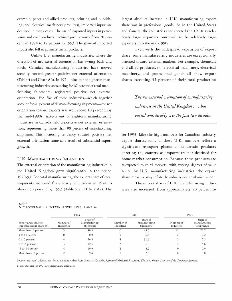
60 FRBNY ECONOMIC POLICY REVIEW / JULY 1997
example, paper and allied products, printing and publish-
ing, and electrical machinery products), imported input use
declined in many cases. The use of imported inputs in petro-
leum and coal products declined precipitously from 70 per-
cent in 1974 to 12 percent in 1993. The share of imported
inputs also fell in primary metal products.
Unlike U.S. manufacturing industries, where the
direction of net external orientation has swung back and
forth, Canada’s manufacturing industries have moved
steadily toward greater positive net external orientation
(Table 4 and Chart A6). In 1974, nine out of eighteen man-
ufacturing industries, accounting for 67 percent of total manu-
facturing shipments, registered positive net external
orientation. For five of these industries—which together
account for 40 percent of all manufacturing shipments—the net
orientation toward exports was well above 10 percent. By
the mid-1990s, sixteen out of eighteen manufacturing
industries in Canada held a positive net external orienta-
tion, representing more than 90 percent of manufacturing
shipments. This increasing tendency toward positive net
external orientation came as a result of substantial export
growth.
U.K. MANUFACTURING INDUSTRIES
The external orientation of the manufacturing industries in
the United Kingdom grew significantly in the period
1970-93. For total manufacturing, the export share of total
shipments increased from nearly 20 percent in 1974 to
almost 30 percent by 1993 (Table 5 and Chart A7). The
largest absolute increase in U.K. manufacturing export
share was in professional goods. As in the United States
and Canada, the industries that entered the 1970s as rela-
tively large exporters continued to be relatively large
exporters into the mid-1990s.
Even with the widespread expansion of export
share, some manufacturing industries are exceptionally
oriented toward external markets. For example, chemicals
and allied products, nonelectrical machinery, electrical
machinery, and professional goods all show export
shares exceeding 45 percent of their total production
for 1993. Like the high numbers for Canadian industry
export shares, some of these U.K. numbers reflect a
significant re-export phenomenon: certain products
entering the country as imports are not destined for
home market consumption. Because these products are
re-exported to third markets, with varying degrees of value
added by U.K. manufacturing industries, the export
share measure may inflate the industry’s external orientation.
The import share of U.K. manufacturing indus-
tries also increased, from approximately 20 percent to
Source: Authors’ calculations, based on annual data from Statistics Canada, System of National Accounts, The Input-Output Structure of the Canadian Economy.
Note: Results for 1993 are preliminary estimates.
Table 4NET EXTERNAL ORIENTATION OVER TIME: CANADA
1974 1984 1993
Export Share Exceeds Imported Input Share by:
Number ofIndustries
Share ofManufacturing
ShipmentsNumber ofIndustries
Share ofManufacturing
ShipmentsNumber ofIndustries
Share ofManufacturing
Shipments
More than 10 percent 5 40.5 6 45.3 12 78.7
5 to 10 percent 0 0.0 3 6.3 2 9.2
0 to 5 percent 4 26.8 4 31.9 2 5.5
0 to -5 percent 3 12.5 2 6.0 2 6.6
-5 to -10 percent 4 10.9 2 8.2 0 0.0
More than -10 percent 2 9.4 1 2.3 0 0.0
The net external orientation of manufacturing
industries in the United Kingdom . . . has
varied considerably over the past two decades.

FRBNY ECONOMIC POLICY REVIEW / JULY 1997 61
34 percent of consumption. Tobacco products, chemicals
and allied products, rubber products, nonelectrical
machinery, and electrical machinery registered large gains
in import share. The overall rise in import share, however,
largely reflects a pre-established pattern of foreign penetration
in certain domestic industries. In particular, industries
with a high import share in the 1970s were also the
industries with high import penetration in the 1990s.
Thus, although the level of external exposure for particular
industries may have increased, the United Kingdom
did not experience a major shift in the composition of
manufacturing industries facing foreign competition.
Imported input share rose in all U.K. manufactur-
ing industries over the past two decades, from an average of
more than 13 percent in 1974 to 22 percent in 1993
(Table 5 and Chart A8). The industries that exhibited the
most significant increases in imported input use were the
same ones that experienced significant gains in import share.
This finding makes sense because manufacturing industries
tend to use their own broad product groups as inputs in
their production. The finding also reflects the re-export
activity of some industries and underscores the value of
focusing attention on both the net external orientation of
manufacturing industries and the separate channels of
external orientation.
The net external orientation of manufacturing
industries in the United Kingdom, like the net orientation
of U.S. industries, has varied considerably over the past two
decades (Table 6 and Chart A9). In contrast to the strong
positive net orientation observed in the 1970s, less than
60 percent of manufacturing shipments in the 1980s were
in industries with a net external orientation favoring
Source: Authors’ calculations, based on data from Central Statistics Office of the United Kingdom, 1990 Input-Output Balances for the United Kingdom (1993), and annual data from Organization for Economic Cooperation and Development, Industrial Structure Statistics.
Table 5EXPORT SHARE, IMPORT SHARE, AND IMPORTED INPUT SHARE OF U.K. MANUFACTURING INDUSTRIES IN SELECTED YEARS
1974 1984 1993
IndustryExportShare
ImportShare
ImportedInput Share
ExportShare
ImportShare
ImportedInputShare
ExportShare
ImportShare
Imported InputShare
Food 5.8 21.4 8.4 7.3 18.1 8.6 9.6 18.9 9.1
Beverages 17.7 11.1 8.8 20.5 13.5 11.1 22.3 16.2 13.2
Tobacco products 10.6 3.4 8.3 24.9 23.2 10.0 8.0 58.7 10.0
Textiles and wearing apparel 18.3 20.1 15.7 22.5 35.8 26.7 30.9 29.1 24.2
Leather and leather products 16.7 18.0 15.0 25.7 42.0 24.7 33.8 73.2 35.6
Wood products 2.0 34.3 20.6 3.6 33.8 21.8 2.7 15.6 12.9
Furniture and fixtures 5.7 6.0 14.7 7.7 15.4 19.9 7.9 51.9 14.1
Paper and paper products 7.1 28.6 18.9 10.0 32.6 23.2 15.1 31.2 23.1
Printing and publishing 6.9 4.1 10.9 7.8 5.5 13.5 8.3 5.6 13.6
Chemicals and allied products 25.0 19.6 13.1 36.7 32.0 20.6 45.1 38.5 22.5
Petroleum and coal products 12.9 14.8 3.7 18.2 24.7 6.1 19.0 9.4 4.8
Rubber products 16.9 10.9 11.8 23.7 23.1 19.1 31.2 33.2 21.3
Plastic products 8.6 13.4 14.1 10.1 15.2 21.6 8.6 14.5 24.7
Nonmetallic products 11.7 8.3 7.8 9.8 9.8 13.0 11.8 11.7 13.8
Iron and steel 11.9 14.5 11.7 17.0 16.9 15.6 29.1 26.0 20.1
Nonferrous metals 29.1 38.6 29.1 39.6 47.7 36.9 37.6 51.8 40.1
Fabricated metal products 11.2 6.6 15.4 17.9 16.1 20.8 17.1 19.1 24.6
Nonelectrical machinery 35.6 26.9 16.1 44.5 43.1 24.9 51.1 52.5 31.3
Electrical machinery 18.4 17.6 14.9 24.0 30.0 23.6 47.0 51.7 34.6
Transport equipment 30.7 18.4 14.3 35.1 38.1 25.5 40.8 47.7 32.2
Professional goods 42.1 39.9 13.2 109.2 108.8 22.6 107.6 111.9 29.5
Other manufacturing 76.6 76.6 20.6 116.4 114.7 28.2 118.2 112.8 29.0
TOTAL MANUFACTURING 18.5 19.6 13.4 24.1 29.0 19.0 29.8 33.8 21.7
INDUSTRY RANK CORRELATIONS WITH 1974 VALUES --- --- --- 0.915 0.837 0.883 0.893 0.735 0.801

62 FRBNY ECONOMIC POLICY REVIEW / JULY 1997
exports rather than imported input use. By the mid-1990s,
the importance of industries with negative net external
orientation—measured by their weight in total manufactur-
ing shipments—declined significantly. Nonetheless, the
actual number of industries with negative net external ori-
entation actually rose. On the whole, these industries
became a smaller portion of total U.K. manufacturing.
JAPANESE MANUFACTURING INDUSTRIES
The patterns of external orientation in Japanese manufac-
turing industries are markedly different from those in
U.S., Canadian, and U.K. industries. First, both the levels
and rankings of industry export share and import share
have been very stable from 1974 to 1993 (Table 7 and
Chart A10). Second, the bulk of Japanese industrial exports
are concentrated in four industries with a heavy export ori-
entation. Third, import share and imported input share are
significantly lower in Japan than in the other countries.
Most of Japan’s exports are concentrated in durable
goods manufacturing industries, including ordinary machinery,
electrical machinery, transportation equipment, and
instruments and related products.6 In 1993, the export share
of these four industrial groups (accounting for 67 percent
of total exports from Japan) represented approximately
20 to 30 percent of industry shipments. Although for the
other countries the rank correlation of export share by industry
across time has been very stable, export activity in Japan has
actually become even more concentrated in the four main
export industries over the past twenty years.
The import share of Japanese manufacturing
industries has remained relatively low and stable. By the
mid-1990s, import penetration averaged almost 6 percent
of industrial consumption; much of this activity was
related to raw materials imports. Considering the growth
in levels of imported inputs in the other countries and the
general pattern of globalization of manufacturing,7 this
lack of movement is striking. These external orientation
measures will undoubtedly contribute to debates on whether
the Japanese economy is relatively closed and shed light on the
factors that might explain Japan’s unique structure.
Even more surprising, most Japanese manufacturing
industries have observed declines in imported input shares over
time (Table 7 and Chart A11). The two industries that are
strong users of imported inputs, and that dramatically pull up
the overall averages for Japanese industries, are petroleum and
coal products and nonferrous metal products. Without these
two industries, imported input shares generally are below
5 percent across the board.
Source: Authors’ calculations, based on data from Central Statistics Office of the United Kingdom, 1990 Input-Output Balances for the United Kingdom (1993), and annual data from Organization for Economic Cooperation and Development, Industrial Structure Statistics.
Table 6NET EXTERNAL ORIENTATION OVER TIME: THE UNITED KINGDOM
1974 1984 1993
Export Share ExceedsImported Input Share by:
Numberof Industries
Share ofManufacturing
ShipmentsNumber
of Industries
Share ofManufacturing
ShipmentsNumber
of Industries
Share ofManufacturing
Shipments
More than 10 percent 5 31.0 6 30.6 6 37.2
5 to 10 percent 3 10.7 2 12.1 5 22.4
0 to 5 percent 7 27.0 5 15.8 1 12.9
0 to -5 percent 3 20.6 4 26.6 4 7.7
-5 to -10 percent 2 2.4 1 2.9 4 15.4
More than -10 percent 2 8.3 4 12.1 2 4.4
The patterns of external orientation in
Japanese manufacturing industries are markedly
different from those in U.S., Canadian, and
U.K. industries.

FRBNY ECONOMIC POLICY REVIEW / JULY 1997 63
The net external orientation of manufacturing
industries in Japan reveals a highly stratified economy
(Table 8 and Chart A12). Five industry groups—leather and
leather products, ordinary machinery, electrical machinery,
transportation equipment, and instruments and related
products—representing 40 percent of manufacturing ship-
ments, hold a positive net external orientation exceeding
10 percent. Because many other industries export very little
of their output, about 30 percent of Japanese manufacturing
is consistently more exposed internationally through the use
of imported inputs than through exports. The absolute size
of the negative net orientation of these industries has been
declining over time because the export growth for even these
industries exceeds the growth of imported inputs in production.
These patterns of external orientation across Japanese manu-
facturing suggest that shocks to the economy—such as large
changes in the value of the yen—will likely affect individual
Japanese manufacturers in dramatically different ways.
CROSS-COUNTRY COMPARISONS
OF EXTERNAL ORIENTATION
As the previous sections show, export shares of manufacturing
industries have been growing in the United States, the United
Kingdom, Canada, and Japan. This growth, however, is
unevenly distributed across industries and countries. In all the
countries except Japan, the import share and imported input
share of the manufacturing industries have also been on the
rise. This growth may reflect an increasingly integrated
structure of production and common industry trends across
industrialized countries. In this section, we ask: Are the
countries becoming more similar over time in the degree to
which their manufacturing industries are externally oriented?
The Spearman rank correlation coefficients are
used to analyze the similarities and differences among the
four countries over time. We construct the correlation
coefficient in several steps. First, we give each manufac-
turing industry within a country a ranking (from lowest
Source: Authors’ calculations, based on annual data from Ministry of Trade and Industry, International Trade and Industry Statistics Association, Japan Input-Output Tables Extended Chart.
Table 7EXPORT SHARE, IMPORT SHARE, AND IMPORTED INPUT SHARE OF JAPANESE MANUFACTURING INDUSTRIES IN SELECTED YEARS
1974 1984 1993
IndustryExportShare
Import Share
ImportedInput Share
ExportShare
Import Share
ImportedInput Share
ExportShare
Import Share
ImportedInput Share
Food and beverages 1.1 6.4 10.0 1.11 7.0 7.1 0.6 8.0 4.3
Textile products 8.5 6.8 4.6 9.2 7.9 4.3 5.8 14.6 4.8
Lumber and wood products 0.8 5.2 7.4 1.0 6.7 5.5 0.6 12.0 6.0
Pulp, paper, and paper products 3.0 4.6 3.0 2.7 4.5 2.9 2.4 3.7 2.1
Printing and publishing 0.6 1.1 1.4 0.8 0.6 1.5 0.4 0.6 0.9
Chemical products 12.5 7.8 5.2 9.8 8.5 4.8 8.0 5.9 2.6
Petroleum and coal products 2.1 10.6 57.9 2.2 13.0 54.0 2.5 8.4 25.5
Leather and rubber products 12.5 5.5 3.6 14.8 7.2 3.5 12.6 8.2 2.6
Nonmetallic products 4.0 1.0 14.5 7.0 2.2 11.8 4.8 2.5 7.1
Iron and steel 15.0 1.5 4.6 11.0 2.3 4.9 7.4 2.3 3.1
Nonferrous metal products 10.0 17.9 24.0 8.6 25.7 18.7 7.9 18.9 9.8
Fabricated metal products 7.3 1.0 1.8 7.7 1.2 2.2 3.3 1.4 1.7
Ordinary machinery 12.3 4.3 2.1 18.3 2.7 1.9 20.8 3.9 1.8
Electrical machinery 15.5 4.0 3.1 24.6 4.0 3.4 24.9 6.9 2.9
Transportation equipment 24.4 2.5 1.8 32.8 3.2 2.4 25.0 3.7 2.8
Instruments and related products 27.7 16.7 4.7 34.0 11.9 4.1 31.9 17.3 3.7
Other manufacturing 7.8 5.7 3.3 7.6 5.1 3.2 11.9 14.8 4.4
TOTAL MANUFACTURING 10.5 4.9 8.2 13.5 5.5 7.3 12.1 6.3 4.1
INDUSTRY RANK CORRELATIONS WITH 1974 VALUES --- --- --- 0.978 0.968 0.976 0.929 0.858 0.831

64 FRBNY ECONOMIC POLICY REVIEW / JULY 1997
to highest) according to export share, import share, and
imported input share for 1974, 1984, and 1993. Then,
for each of these three measures of external orientation,
we correlate the rankings of similar industries across pairs
of countries. This comparison—or correlation—is per-
formed for each external orientation measure and for each
country pair (Table 9).8 If the correlation statistic is high,
the rankings of industries according to a particular orien-
tation measure are similar across two countries. If the cor-
relation statistic is negative, the industries with relatively
strong external orientation in one country are more likely
to have a relatively low external orientation in the sec-
ond country. If the rank correlations for the manufac-
turing industries in two countries increase between two
years, the implication is that the two countries are
becoming more alike in terms of the particular external
orientation measure.
Our main conclusion from this analysis, detailed
below, is that the external orientation patterns of U.S. and
U.K. industries are the most similar, and they are becom-
ing increasingly alike. Other cross-country comparisons of
external orientation rankings are more mixed, underscoring
the need to consider the individual measures separately. In
addition, we find that most of the external orientation rank cor-
relations—reported in the bottom row of each of the coun-
try tables (Tables 1, 3, 5, and 7)—have been stable over
time within each of the four countries.
EXPORT SHARE RANKINGS
Rankings of industries in terms of export share are highly
positively correlated in the United States and the United
Kingdom, suggesting that similar manufacturing indus-
tries in these two countries are the most oriented toward
exporting. By contrast, Canadian industry rankings have
little in common with the rankings of industries for the
United States and the United Kingdom. Industries in
Japan have moderate export share rank correlations with
industries in the other countries. Similarities in export
share across countries reflect the fact that all four coun-
tries share heavy export industries—the various machinery
and equipment industries, transportation equipment, and
instruments or professional equipment. Comparisons of
the rank correlation statistics computed at different dates
support these observations.
IMPORT SHARE RANKINGS
Industries in the United States and the United Kingdom
are also the most alike in terms of import share. Although
Canada was very similar to these countries in the 1970s,
Source: Authors’ calculations, based on annual data from Ministry of Trade and Industry, International Trade and Industry Statistics Association, Japan Input-Output Tables Extended Chart.
Table 8NET EXTERNAL ORIENTATION OVER TIME: JAPAN
1974 1984 1993
Export Share Exceeds Imported Input Share by:
Number ofIndustries
Share ofManufacturing
ShipmentsNumber ofIndustries
Share ofManufacturing
ShipmentsNumber ofIndustries
Share ofManufacturing
Shipments
More than 10 percent 5 43.7 5 39.1 5 38.8
5 to 10 percent 3 13.7 2 22.0 1 14.5
0 to 5 percent 2 9.2 2 8.5 4 18.7
0 to -5 percent 2 6.0 5 11.2 4 21.8
-5 to -10 percent 2 15.9 1 11.2 1 2.7
More than -10 percent 3 11.5 2 8.2 2 3.5
The external orientation patterns of U.S.
and U.K. industries are the most similar,
and they are becoming increasingly alike.
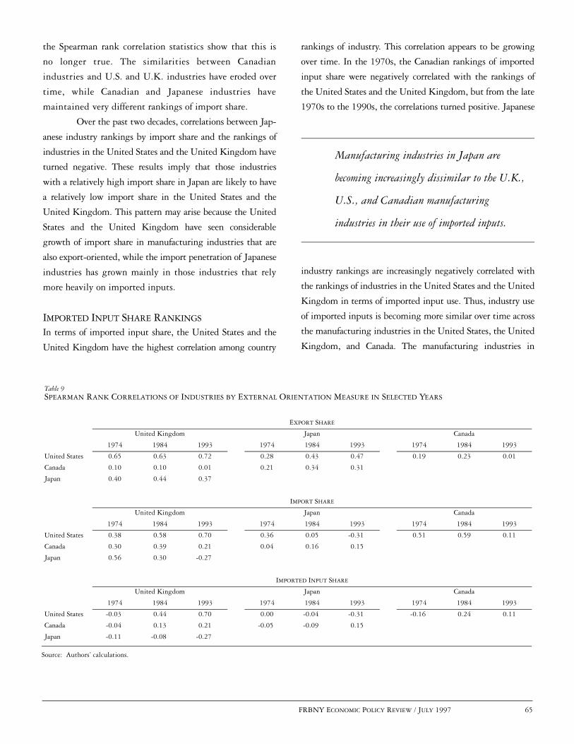
FRBNY ECONOMIC POLICY REVIEW / JULY 1997 65
the Spearman rank correlation statistics show that this is
no longer true. The similarities between Canadian
industries and U.S. and U.K. industries have eroded over
time, while Canadian and Japanese industries have
maintained very different rankings of import share.
Over the past two decades, correlations between Jap-
anese industry rankings by import share and the rankings of
industries in the United States and the United Kingdom have
turned negative. These results imply that those industries
with a relatively high import share in Japan are likely to have
a relatively low import share in the United States and the
United Kingdom. This pattern may arise because the United
States and the United Kingdom have seen considerable
growth of import share in manufacturing industries that are
also export-oriented, while the import penetration of Japanese
industries has grown mainly in those industries that rely
more heavily on imported inputs.
IMPORTED INPUT SHARE RANKINGS
In terms of imported input share, the United States and the
United Kingdom have the highest correlation among country
rankings of industry. This correlation appears to be growing
over time. In the 1970s, the Canadian rankings of imported
input share were negatively correlated with the rankings of
the United States and the United Kingdom, but from the late
1970s to the 1990s, the correlations turned positive. Japanese
industry rankings are increasingly negatively correlated with
the rankings of industries in the United States and the United
Kingdom in terms of imported input use. Thus, industry use
of imported inputs is becoming more similar over time across
the manufacturing industries in the United States, the United
Kingdom, and Canada. The manufacturing industries in
Source: Authors’ calculations.
Table 9SPEARMAN RANK CORRELATIONS OF INDUSTRIES BY EXTERNAL ORIENTATION MEASURE IN SELECTED YEARS
EXPORT SHARE
United Kingdom Japan Canada
1974 1984 1993 1974 1984 1993 1974 1984 1993
United States 0.65 0.63 0.72 0.28 0.43 0.47 0.19 0.23 0.01
Canada 0.10 0.10 0.01 0.21 0.34 0.31
Japan 0.40 0.44 0.37
IMPORT SHARE
United Kingdom Japan Canada
1974 1984 1993 1974 1984 1993 1974 1984 1993
United States 0.38 0.58 0.70 0.36 0.05 -0.31 0.51 0.59 0.11
Canada 0.30 0.39 0.21 0.04 0.16 0.15
Japan 0.56 0.30 -0.27
IMPORTED INPUT SHARE
United Kingdom Japan Canada
1974 1984 1993 1974 1984 1993 1974 1984 1993
United States -0.03 0.44 0.70 0.00 -0.04 -0.31 -0.16 0.24 0.11
Canada -0.04 0.13 0.21 -0.05 -0.09 0.15
Japan -0.11 -0.08 -0.27
Manufacturing industries in Japan are
becoming increasingly dissimilar to the U.K.,
U.S., and Canadian manufacturing
industries in their use of imported inputs.
66 FRBNY ECONOMIC POLICY REVIEW / JULY 1997
Japan, however, are becoming increasingly dissimilar to the
U.K., U.S., and Canadian manufacturing industries in their
use of imported inputs.
CONCLUSION
There are important differences in the external orientation
of industries within and across countries. Nevertheless, the
United States, Canada, Japan, and the United Kingdom
share a set of manufacturing industries that are relatively
strong exporters. These countries, however, differ substantially
in terms of the import share and imported input shares of
their manufacturing industries. Exports relative to domestic
manufacturing production and imports relative to consumption
are highest in Canada and the United Kingdom, followed
by the United States and Japan. In the United States, these
shares have increased sharply over time, whereas in Japan,
external orientation measures have stayed relatively stable.
The export share and imported input share of manufactur-
ing industries in Canada and the United Kingdom are consis-
tently greater than in the United States. Although Japan has
fewer industries geared toward exporting, these industries reg-
ister strong export shares without relying extensively on
imported inputs in production.
Industries in the United States show the most
volatile patterns in net external orientation. After
remaining, on average, primarily export-oriented in the
1970s, U.S. industries experienced increased international
exposure in the early to mid-1980s through their reliance on
imported inputs in production. In the late 1980s and in
the 1990s, export shares grew faster than imported
input shares, raising the positive net external orienta-
tion of U.S. industries.
Canadian industries are more heavily oriented toward
exporting than industries in the United States. In 1993,
80 percent of Canadian manufacturing industries held a very
high positive net external orientation, compared with 40 per-
cent of manufacturing industries in the early 1970s. U.K. and
Japanese manufacturing sectors have exhibited relatively sta-
ble patterns of net external orientation, despite substantial
changes in real exchange rates and demand conditions in these
economies over the past two decades.
Japanese manufacturing industries are distinct
from those in the other countries in a number of ways.
First, a small group of relatively large industries accounts
for the bulk of Japan’s exports. Second, Japanese industries
have relatively low import share and generally low
imported input share. Nonetheless, because some industries
export very little of their production, roughly a third of
manufacturing output in Japan is in industries with a
consistently negative net external orientation. Finally,
over time, Japan has become less like the United States and
the United Kingdom in industry import share and
imported input use.
This article has reviewed the size and composition
of the external orientation of manufacturing industries
according to four measures—export share, import share,
imported input share, and net external orientation. The
results have many potential applications. Most important,
our results can be used by analysts estimating the effects of
exchange rate changes on the profitability and activities of
manufacturing industries in these countries. Careful empiricism
can track the extent to which industry performance—as
measured by stock market returns, profits, growth, or any
other measure of industry activity—is affected by interna-
tional shocks.9 The scope of these effects is likely to depend
on the size and direction of the measures of external orien-
tation we have identified. Ultimately, our broad measures
of industry external orientation are important tools for analyz-
ing the magnitude and significance of international
shocks for economic activity within a country.
Our results can be used by analysts
estimating the effects of exchange rate
changes on the profitability and activities
of manufacturing industries.

APPENDIX: DATA SOURCES AND EXTERNAL ORIENTATION MEASURE RESULTS BY COUNTRY
APPENDIX FRBNY ECONOMIC POLICY REVIEW / JULY 1997 67
UNITED STATES
Industry sales data are from U.S. Department of Com-
merce, Bureau of the Census, Annual Survey of Manufactures.
Data on exports to shipments (export share) and imports to
new supply (import share) are from U.S. Department of
Commerce, Bureau of Economic Analysis, “Benchmark
Input-Output Accounts for the U.S. Economy, 1982,”
Survey of Current Business, July 1991 and April 1994.
Imported input share, , includes in the numerator
imported inputs from manufacturing industries, assuming
αi
for all t, andptjqj t,
i p82j qj 82,
i=
, where wti is wages and salaries
in nominal dollars from the U.S. National Income and Prod-
uct Accounts, deflated by the U.S. producer price index
reported in International Financial Statistics, International Mon-
etary Fund (Series 63), and expressed in 1982 dollars.
We construct the imported input share series
using the two most recent years of input-output data—
1982 and 1987—reported in the “Benchmark Input-Out-
put Accounts for the U.S. Economy.” Because the dollar
was unusually strong in 1987, we offer the measures using
the 1982 input-output structure as the more representative
of U.S. manufacturing. When comparing the imported
input series constructed from the two input-output years,
we see only a couple of differences: the apparel and other tex-
tile industry shifts from purchasing heavily in chemicals and
allied products to buying more semifinished textile prod-
ucts; the lumber and wood products industry reduces
inputs from chemicals and allied products, petroleum and
coal products, and rubber and miscellaneous products and
buys much more from itself.
CANADA
Data on the input-output structure of production and the
import and export shares of manufacturing are drawn from
Statistics Canada, System of National Accounts, The Input-
Output Structure of the Canadian Economy. These data cover
VPti Σj p82
jqj 82,
i wti
+=
the period 1974-93. This source also reports data on exports,
imports, employee compensation, and total production for each
industry. Canada’s imported input series, , is the ratio of
imported inputs purchased from agriculture, mining, raw mate-
rials, and manufacturing industries to total inputs purchased
from these industries plus industry labor costs.
UNITED KINGDOM
Because of data limitations, we use only one year of input-
output data in our calculations. These data are reported in
Central Statistics Office of the United Kingdom, 1990
Input-Output Balances for the United Kingdom (1993). Annual
data from 1970 to 1994 on manufacturing exports, imports,
wages and salaries, employee social security costs, and total
production are drawn from Organization for Economic
Cooperation and Development, Industrial Structure Statistics.
The imported input share, , includes in the numerator
imported inputs from manufacturing industries, assuming
for all t, and in the denominator
.
JAPAN Data on the input-output structure of manufacturing are
from Ministry of Trade and Industry, International Trade
and Industry Statistics Association, Japan Input-Output
Tables Extended Chart. Data cover the period 1974-93 and
are reported in millions of yen. This source reports annual
input-output information as well as exports, imports,
employee compensation, material costs, and total produc-
tion. Japan’s imported input series, , is the ratio of imported
inputs purchased from agriculture, mining, raw materials,
and manufacturing industries to total inputs purchased
from these industries plus industry labor costs.
Specific information on industry concordances
for the data series for each country is available on
request from the authors.
αi
αi
pjt q
ij t, p
90j qi
j 90,=
VPit Σjp90
j qi= j 90,
αi
APPENDIX: DATA SOURCES AND EXTERNAL ORIENTATION MEASURE RESULTS BY COUNTRY

68 FRBNY ECONOMIC POLICY REVIEW / JULY 1997 APPENDIX
APPENDIX: DATA SOURCES AND EXTERNAL ORIENTATION MEASURE RESULTS BY COUNTRY (Continued)
Export Share and Import Share of Manufacturing by Industry: United StatesPercent
Chart A1
0
2
4
6
8
0
5
10
15
20
0
3
6
9
12
0
10
20
30
40
0
3
6
9
12
0
5
10
15
0
3
6
9
12
0
1
2
3
0
5
10
15
20
0
5
10
15
20
0
5
10
15
0
20
40
60
80
0
3
6
9
12
0
5
10
15
20
0
3
6
9
0
10
20
30
0
10
20
30
40
0
10
20
30
0
10
20
30
0
20
40
60
1972 75 80 85 90 95 1972 75 80 85 90 95 1972 75 80 85 90 95 1972 75 80 85 90 95
1972 75 80 85 90 95 1972 75 80 85 90 95 1972 75 80 85 90 95 1972 75 80 85 90 95
1972 75 80 85 90 95 1972 75 80 85 90 95 1972 75 80 85 90 95 1972 75 80 85 90 95
1972 75 80 85 90 95 1972 75 80 85 90 95 1972 75 80 85 90 95 1972 75 80 85 90 95
1972 75 80 85 90 95 1972 75 80 85 90 95 1972 75 80 85 90 95 1972 75 80 85 90 95
Food and Kindred Products Tobacco Products Textile Mill Products Apparel and Other Textiles
Lumber and Wood Products Furniture and Fixtures Paper and Allied Products Printing and Publishing
Chemicals and Allied Products Petroleum and Coal Products Rubber and Miscellaneous Products Leather and Leather Products
Stone, Clay, and Glass Products Primary MetalProducts
Fabricated Metal Products Industrial Machineryand Equipment
Electronic and OtherElectric Equipment
Transportation Equipment Instruments and Related Products Other Manufacturing
Export ShareImport Share

APPENDIX: DATA SOURCES AND EXTERNAL ORIENTATION MEASURE RESULTS BY COUNTRY (Continued)
APPENDIX FRBNY ECONOMIC POLICY REVIEW / JULY 1997 69
Imported Input Share of Manufacturing by Industry: United StatesPercent
Chart A2
0
5
10
15
0
5
10
15
0
5
10
15
0
5
10
15
0
5
10
15
0
5
10
15
0
5
10
15
0
5
10
15
0
5
10
15
0
5
10
15
0
5
10
15
0
10
20
30
0
5
10
15
0
5
10
15
0
5
10
15
0
5
10
15
0
5
10
15
5
10
15
20
0
5
10
15
0
5
10
15
1972 75 80 85 90 95 1972 75 80 85 90 95 1972 75 80 85 90 95 1972 75 80 85 90 95
1972 75 80 85 90 95 1972 75 80 85 90 95 1972 75 80 85 90 95 1972 75 80 85 90 95
1972 75 80 85 90 95 1972 75 80 85 90 95 1972 75 80 85 90 95 1972 75 80 85 90 95
1972 75 80 85 90 95 1972 75 80 85 90 95 1972 75 80 85 90 95 1972 75 80 85 90 95
1972 75 80 85 90 95 1972 75 80 85 90 95 1972 75 80 85 90 95 1972 75 80 85 90 95
Food and Kindred Products Tobacco Products Textile Mill Products Apparel and Other Textiles
Lumber and Wood Products Furniture and Fixtures Paper and Allied Products Printing and Publishing
Chemicals and Allied Products Petroleum and Coal Products Rubber and Miscellaneous Products Leather and Leather Products
Stone, Clay, and Glass Products Primary Metal Products Fabricated Metal Products
Transportation Equipment Instruments and Related Products Other Manufacturing
Industrial Machineryand Equipment
Electronic and OtherElectric Equipment
19821987
Input-Output Structure

70 FRBNY ECONOMIC POLICY REVIEW / JULY 1997 APPENDIX
APPENDIX: DATA SOURCES AND EXTERNAL ORIENTATION MEASURE RESULTS BY COUNTRY (Continued)
Net External Orientation of Manufacturing by Industry: United StatesPercent
Chart A3
-15
-10
-5
0
5
10
15
-15
-10
-5
0
5
10
15
-15
-10
-5
0
5
10
15
-15
-10
-5
0
5
10
15
-15
-10
-5
0
5
10
15
-15
-10
-5
0
5
10
15
-15
-10
-5
0
5
10
15
-15
-10
-5
0
5
10
15
-15
-10
-5
0
5
10
15
-15
-10
-5
0
5
10
15
-15
-10
-5
0
5
10
15
-15
-10
-5
0
5
10
15
-15
-10
-5
0
5
10
15
-15
-10
-5
0
5
10
15
-15
-10
-5
0
5
10
15
-10
-5
0
5
10
15
20
-15
-10
-5
0
5
10
15
-15
-10
-5
0
5
10
15
-15
-10
-5
0
5
10
15
-15
-10
-5
0
5
10
15
1972 75 80 85 90 95 1972 75 80 85 90 95 1972 75 80 85 90 95 1972 75 80 85 90 95
1972 75 80 85 90 95 1972 75 80 85 90 95 1972 75 80 85 90 95 1972 75 80 85 90 95
1972 75 80 85 90 95 1972 75 80 85 90 95 1972 75 80 85 90 95 1972 75 80 85 90 95
1972 75 80 85 90 95 1972 75 80 85 90 95 1972 75 80 85 90 95 1972 75 80 85 90 95
1972 75 80 85 90 95 1972 75 80 85 90 95 1972 75 80 85 90 95 1972 75 80 85 90 95
19821987
Input-Output Structure
Food and Kindred Products Tobacco Products Textile Mill Products Apparel and Other Textiles
Lumber and Wood Products Furniture and Fixtures Paper and Allied Products Printing and Publishing
Chemicals and Allied Products Petroleum and Coal Products Rubber and Miscellaneous Products Leather and Leather Products
Stone, Clay, and Glass Products Primary Metal Products Fabricated Metal Products
Transportation Equipment
Instruments and Related Products
Other Manufacturing
Industrial Machinery and Equipment
Electronic and OtherElectric Equipment

APPENDIX: DATA SOURCES AND EXTERNAL ORIENTATION MEASURE RESULTS BY COUNTRY (Continued)
APPENDIX FRBNY ECONOMIC POLICY REVIEW / JULY 1997 71
Export Share and Import Share of Manufacturing by Industry: CanadaPercent
Chart A4
0
20
40
60
80
100
0
20
40
60
80
100
0
20
40
60
80
100
0
20
40
60
80
100
0
20
40
60
80
100
0
20
40
60
80
100
0
20
40
60
80
100
0
20
40
60
80
100
0
20
40
60
80
100
0
20
40
60
80
100
0
25
50
75
100
125
0
20
40
60
80
100
0
20
40
60
80
100
0
20
40
60
80
100
0
20
40
60
80
100
0
20
40
60
80
100
1974 80 85 90 93 1974 80 85 90 93 1974 80 85 90 93
Knitting Mills Wood Industries Furniture and FixturesTextile Industries
Paper and Allied Products Printing and Publishing Primary Metal Products Fabricated Metal Products
Machinery Industries Transportation Equipment Electrical Machinery Products Nonmetallic Mineral Products
Petroleum and Coal Products Chemicals and Chemical Products
Export ShareImport Share
0
20
40
60
80
100
0
20
40
60
80
100
1974 80 85 90 93
Tobacco Products Rubber and Plastic Industries Leather IndustriesFood and Beverages
1974 80 85 90 93 1974 80 85 90 93 1974 80 85 90 931974 80 85 90 93
1974 80 85 90 93 1974 80 85 90 93 1974 80 85 90 931974 80 85 90 93
1974 80 85 90 93 1974 80 85 90 93 1974 80 85 90 931974 80 85 90 93
1974 80 85 90 93 1974 80 85 90 93

72 FRBNY ECONOMIC POLICY REVIEW / JULY 1997 APPENDIX
APPENDIX: DATA SOURCES AND EXTERNAL ORIENTATION MEASURE RESULTS BY COUNTRY (Continued)
Imported Input Share of Manufacturing by Industry: CanadaPercent
Chart A5
0
10
20
30
40
0
10
20
30
40
0
10
20
30
40
10
20
30
40
50
0
10
20
30
40
0
10
20
30
40
0
10
20
30
40
0
10
20
30
40
0
10
20
30
40
0
10
20
30
40
0
10
20
30
40
10
20
30
40
50
10
20
30
40
50
10
20
30
40
50
0
10
20
30
40
0
25
50
75
100
0
10
20
30
40
1974 80 85 90 93 1974 80 85 90 93 1974 80 85 90 93 1974 80 85 90 93
0
10
20
30
40
Food and Beverages Tobacco Products Rubber and Plastic Industries Leather Industries
Knitting Mills Wood Industries Furniture and FixturesTextile Industries
Paper and Allied Products Printing and Publishing Primary Metal Products Fabricated Metal Products
Machinery Industries Transportation Equipment Electrical Machinery Products Nonmetallic Mineral Products
Petroleum and Coal Products Chemicals and Chemical Products
1974 80 85 90 93 1974 80 85 90 93 1974 80 85 90 93 1974 80 85 90 93
1974 80 85 90 93 1974 80 85 90 93 1974 80 85 90 93 1974 80 85 90 93
1974 80 85 90 93 1974 80 85 90 93 1974 80 85 90 93 1974 80 85 90 93
1974 80 85 90 93 1974 80 85 90 93
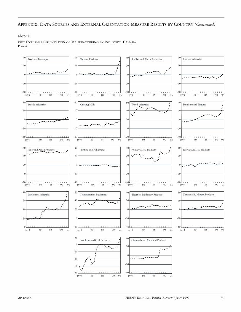
APPENDIX: DATA SOURCES AND EXTERNAL ORIENTATION MEASURE RESULTS BY COUNTRY (Continued)
APPENDIX FRBNY ECONOMIC POLICY REVIEW / JULY 1997 73
Net External Orientation of Manufacturing by Industry: CanadaPercent
Chart A6
-40
-20
0
20
40
-40
-20
0
20
40
-40
-20
0
20
40
-40
-20
0
20
40
-40
-20
0
20
40
-40
-20
0
20
40
-20
0
20
40
60
-40
-20
0
20
40
-20
0
20
40
60
-40
-20
0
20
40
-40
-20
0
20
40
-40
-20
0
20
40
0
20
40
60
80
-20
0
20
40
60
-40
-20
0
20
40
-40
-20
0
20
40
-80
-60
-40
-20
0
20
-40
-20
0
20
40
1974 80 85 90 93 1974 80 85 90 93 1974 80 85 90 93 1974 80 85 90 93
Food and Beverages Tobacco Products Rubber and Plastic Industries Leather Industries
Knitting Mills Wood Industries Furniture and FixturesTextile Industries
Paper and Allied Products Printing and Publishing Primary Metal Products Fabricated Metal Products
Machinery Industries Transportation Equipment Electrical Machinery Products Nonmetallic Mineral Products
Petroleum and Coal Products Chemicals and Chemical Products
1974 80 85 90 93 1974 80 85 90 93 1974 80 85 90 93 1974 80 85 90 93
1974 80 85 90 93 1974 80 85 90 93 1974 80 85 90 93 1974 80 85 90 93
1974 80 85 90 93 1974 80 85 90 93 1974 80 85 90 93 1974 80 85 90 93
1974 80 85 90 93 1974 80 85 90 93

74 FRBNY ECONOMIC POLICY REVIEW / JULY 1997 APPENDIX
APPENDIX: DATA SOURCES AND EXTERNAL ORIENTATION MEASURE RESULTS BY COUNTRY (Continued)
Export Share and Import Share of Manufacturing by Industry: United KingdomPercent
Chart A7
Food Beverages TobaccoTobacco Products Textiles and Wearing Apparel
Export ShareImport Share
Printing and Publishing Chemicals and Allied Products Petroleum and Coal Products Rubber Products
1970 75 80 85 90 1970 75 80 85 90 93 1970 75 80 85 90 93 1970 75 80 85 90 93
1970 75 80 85 90 93 1970 75 80 85 90 93 1970 75 80 85 90 93 1970 75 80 85 90 93
1970 75 80 85 90 93 1970 75 80 85 90 93 1970 75 80 85 90 93 1970 75 80 85 90 93
1970 75 80 85 90 93 1970 75 80 85 90 93 1970 75 80 85 90 93 1970 75 80 85 90 93
1970 75 80 85 90 93 1970 75 80 85 90 93 1970 75 80 85 90 93 1970 75 80 85 90 93
1970 75 80 85 90 931970 75 80 85 90 93
Plastic Products Nonmetallic Products Iron and Steel
Nonferrous Metals
Fabricated Metal Products Nonelectrical Machinery Electrical Machinery Transport Equipment
0
20
40
60
0
20
40
60
0
20
40
60
0
20
40
60
0
20
40
60
0
20
40
60
0
20
40
60
0
20
40
60
Professional Goods
Other Manufacturing
0
20
40
60
0
20
40
60
0
20
40
60
0
20
40
60
0
20
40
60
0
20
40
60
0
20
40
60
0
20
40
60
0
20
40
60
0
20
40
60
0
20
40
60
0
20
40
60
0
50
100
150
0
50
100
150
93
Leather and Leather Products Wood Products Furniture and Fixtures Paper and Paper Products

APPENDIX: DATA SOURCES AND EXTERNAL ORIENTATION MEASURE RESULTS BY COUNTRY (Continued)
APPENDIX FRBNY ECONOMIC POLICY REVIEW / JULY 1997 75
Imported Input Share of Manufacturing by Industry: United KingdomPercent
Chart A8
1970 75 80 85 90 1970 75 80 85 90 93 1970 75 80 85 90 93 1970 75 80 85 90 93
1970 75 80 85 90 93 1970 75 80 85 90 93 1970 75 80 85 90 93 1970 75 80 85 90 93
1970 75 80 85 90 93 1970 75 80 85 90 93 1970 75 80 85 90 93 1970 75 80 85 90 93
1970 75 80 85 90 93 1970 75 80 85 90 93 1970 75 80 85 90 93 1970 75 80 85 90 93
1970 75 80 85 90 93 1970 75 80 85 90 93 1970 75 80 85 90 93 1970 75 80 85 90 93
1970 75 80 85 90 931970 75 80 85 90 93 1970 75 80 85 90 93
0
10
20
30
40
0
10
20
30
40
0
10
20
30
40
0
10
20
30
40
0
10
20
30
40
0
10
20
30
40
0
10
20
30
40
0
10
20
30
40
0
10
20
30
40
0
10
20
30
40
0
10
20
30
40
0
10
20
30
40
0
10
20
30
40
0
10
20
30
40
0
10
20
30
40
0
10
20
30
40
0
10
20
30
40
0
10
20
30
40
0
10
20
30
40
0
10
20
30
40
0
10
20
30
40
0
10
20
30
40
93
Food Beverages Tobacco Products Textiles and Wearing Apparel
Printing and Publishing Chemicals and Allied Products Petroleum and Coal Products Rubber Products
Plastic Products Nonmetallic Products Iron and Steel Nonferrous Metals
Fabricated Metal Products Nonelectrical Machinery Electrical Machinery Transport Equipment
Professional Goods Other Manufacturing
Leather and Leather Products Wood Products Furniture and Fixtures Paper and Paper Products
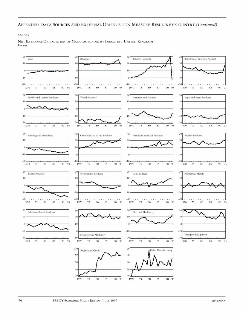
76 FRBNY ECONOMIC POLICY REVIEW / JULY 1997 APPENDIX
APPENDIX: DATA SOURCES AND EXTERNAL ORIENTATION MEASURE RESULTS BY COUNTRY (Continued)
Net External Orientation of Manufacturing by Industry: United KingdomPercent
Chart A9
1970 75 80 85 90 1970 75 80 85 90 93 1970 75 80 85 90 93 1970 75 80 85 90 93
1970 75 80 85 90 93 1970 75 80 85 90 93 1970 75 80 85 90 93 1970 75 80 85 90 93
1970 75 80 85 90 93 1970 75 80 85 90 93 1970 75 80 85 90 93 1970 75 80 85 90 93
1970 75 80 85 90 93 1970 75 80 85 90 93 1970 75 80 85 90 93 1970 75 80 85 90 93
1970 75 80 85 90 93 1970 75 80 85 90 93 1970 75 80 85 90 93 1970 75 80 85 90 93
1970 75 80 85 90 931970 75 80 85 90 93 1970 75 80 85 90 93
-20
-10
0
10
20
93-20
-10
0
10
20
-10
0
10
20
30
-20
-10
0
10
20
-20
-10
0
10
20
-20
-10
0
10
20
-20
-10
0
10
20
-20
-10
0
10
20
-20
-10
0
10
20
-10
0
10
20
30
-10
0
10
20
30
-20
-10
0
10
20
-20
-10
0
10
20
-20
-10
0
10
20
-20
-10
0
10
20
-20
-10
0
10
20
-20
-10
0
10
20
-20
-10
0
10
20
-20
-10
0
10
20
-10
0
10
20
30
20
40
60
80
100
40
60
80
100
120
Food Beverages Tobacco Products Textiles and Wearing Apparel
Printing and Publishing Chemicals and Allied Products Petroleum and Coal Products Rubber Products
Plastic Products Nonmetallic Products Iron and Steel Nonferrous Metals
Fabricated Metal Products
Nonelectrical Machinery
Electrical Machinery
Transport Equipment
Professional Goods Other Manufacturing
Leather and Leather Products Wood Products Furniture and Fixtures Paper and Paper Products

APPENDIX: DATA SOURCES AND EXTERNAL ORIENTATION MEASURE RESULTS BY COUNTRY (Continued)
APPENDIX FRBNY ECONOMIC POLICY REVIEW / JULY 1997 77
Export Share and Import Share of Manufacturing by Industry: JapanPercent
Chart A10
0
10
20
30
40
0
10
20
30
40
0
10
20
30
40
0
10
20
30
40
0
10
20
30
40
0
10
20
30
40
0
10
20
30
40
0
10
20
30
40
0
10
20
30
40
0
10
20
30
40
0
10
20
30
40
0
10
20
30
40
0
10
20
30
40
0
10
20
30
40
0
10
20
30
40
0
10
20
30
40
1974 80 85 90 93 1974 80 85 90 93 1974 80 85 90 93 1974 80 85 90 93
1974 80 85 90 93 1974 80 85 90 93 1974 80 85 90 93
1974 80 85 90 93 1974 80 85 90 93 1974 80 85 90 93 1974 80 85 90 93
1974 80 85 90 93 1974 80 85 90 93 1974 80 85 90 93 1974 80 85 90 93
1974 80 85 90 93
Food and Beverages Textile Products Lumber and Wood Products Pulp, Paper, and Paper Products
Chemical Products Petroleum and Coal Products Leather and Rubber Products
Nonmetallic Products Iron and Steel Nonferrous Metal Products Fabricated Metal Products
Ordinary Machinery Electrical Machinery Transportation Equipment
Other Manufacturing
Instruments and Related Products
1974 80 85 90 93
Printing and Publishing
Export ShareImport Share
0
10
20
30
40

78 FRBNY ECONOMIC POLICY REVIEW / JULY 1997 APPENDIX
APPENDIX: DATA SOURCES AND EXTERNAL ORIENTATION MEASURE RESULTS BY COUNTRY (Continued)
Imported Input Share of Manufacturing by Industry: JapanPercent
Chart A11
1974 80 85 90 93 1974 80 85 90 93 1974 80 85 90 93 1974 80 85 90 93
1974 80 85 90 93 1974 80 85 90 93 1974 80 85 90 93
1974 80 85 90 93 1974 80 85 90 93 1974 80 85 90 93 1974 80 85 90 93
1974 80 85 90 93 1974 80 85 90 93 1974 80 85 90 93 1974 80 85 90 93
1974 80 85 90 93
1974 80 85 90 93
0
10
20
30
40
0
10
20
30
40
0
10
20
30
40
0
10
20
30
40
0
10
20
30
40
20
30
40
50
60
0
10
20
30
40
0
10
20
30
40
0
10
20
30
40
0
10
20
30
40
0
10
20
30
40
0
10
20
30
40
0
10
20
30
40
0
10
20
30
40
0
10
20
30
40
0
10
20
30
40
0
10
20
30
40
Food and Beverages Textile Products Lumber and Wood Products Pulp, Paper, and Paper Products
Chemical Products Petroleum andCoal Products
Leather and Rubber Products
Nonmetallic Products Iron and Steel Nonferrous Metal Products Fabricated Metal Products
Ordinary Machinery Electrical Machinery Transportation Equipment
Other Manufacturing
Instruments and Related Products
Printing and Publishing
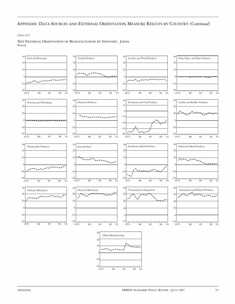
APPENDIX: DATA SOURCES AND EXTERNAL ORIENTATION MEASURE RESULTS BY COUNTRY (Continued)
APPENDIX FRBNY ECONOMIC POLICY REVIEW / JULY 1997 79
Net External Orientation of Manufacturing by Industry: JapanPercent
Chart A12
-20
-10
0
10
20
30
-20
-10
0
10
20
30
-20
-10
0
10
20
30
-20
-10
0
10
20
30
-20
-10
0
10
20
30
-60
-45
-30
-15
0
15
30
-20
-10
0
10
20
30
-20
-10
0
10
20
30
-20
-10
0
10
20
30
-20
-10
0
10
20
30
-20
-10
0
10
20
30
-20
-10
0
10
20
30
-20
-10
0
10
20
30
-10
0
10
20
30
40
-10
0
10
20
30
40
-20
-10
0
10
20
30
-20
-10
0
10
20
30
1974 80 85 90 93 1974 80 85 90 93 1974 80 85 90 93 1974 80 85 90 93
1974 80 85 90 93 1974 80 85 90 93 1974 80 85 90 93
1974 80 85 90 93 1974 80 85 90 93 1974 80 85 90 93 1974 80 85 90 93
1974 80 85 90 93 1974 80 85 90 93 1974 80 85 90 93 1974 80 85 90 93
1974 80 85 90 93
1974 80 85 90 93
Food and Beverages Textile Products Lumber and Wood Products Pulp, Paper, and Paper Products
Chemical Products Petroleum and Coal Products Leather and Rubber Products
Nonmetallic Products Iron and Steel Nonferrous Metal Products Fabricated Metal Products
Ordinary Machinery Electrical Machinery Transportation Equipment
Other Manufacturing
Instruments and Related Products
Printing and Publishing

80 FRBNY ECONOMIC POLICY REVIEW / JULY 1997 NOTES
ENDNOTES
José Campa is assistant professor of economics and international business at theStern School of Business, New York University. Linda Goldberg is an economistat the Federal Reserve Bank of New York. The authors thank Keith Crockett forexcellent research assistance. Robert Feenstra and seminar participants at theFederal Reserve Bank of New York and the Stern School of Business, New YorkUniversity, provided useful comments.
1. Harrigan (1996) provides an overview of the literature on openness
to trade and examples of the measure’s application.
2. Our net measure does not explicitly address the role of multinationalactivity and long-term licensing arrangements in each industry. A priori,the relationship between foreign production and an industry’s externalorientation (and possibly exposure to exchange rate movements) isambiguous. In some cases, foreign production substitutes for sales toforeign markets of domestically produced goods. In other cases, thepresence of foreign production activity encourages increased trade ofintermediate and related products.
3. Specific details regarding the data for each country are provided inthe appendix. We use the latest available year of data for each country inour analysis, that is, 1995 for the United States, 1994 for the UnitedKingdom, and 1993 for Canada and Japan.
4. The measures of export share, imported input share, and net externalorientation are shown in the charts in the appendix. Feenstra and Hanson(1996) combine import data and data on material purchases to calculate
an alternative, but qualitatively similar, measure of imported inputs forU.S. industries.
5. For machinery industries, the export share and import share in 1993were greater than 100 percent because of the re-export of importedgoods. The re-export phenomenon, along with the practice ofoutsourcing various components, swells the size of imports relative todomestic consumption of particular goods categories.
6. As noted earlier, these four industries also have relatively high exportshares in the United States, the United Kingdom, and Canada.
7. For Japan, one strong form of globalization occurs through foreigndirect investment. Goldberg and Klein (1997) show that Japanese directinvestment in Southeast Asian countries tends to increase both Japaneseimports from these countries and Japanese exports to these countries.Japanese direct investment in Latin American economies does not appearto have the same effect.
8. To make comparisons across countries, we convert the original datafor each country into a sample of fifteen uniformly defined industriesacross the four countries.
9. For example, see Campa and Goldberg (1995, 1996, and 1997), whoexamine the effects of real exchange rate movements on industryinvestment and labor market outcomes across the United States, theUnited Kingdom, Canada, and Japan.

REFERENCES
NOTES FRBNY ECONOMIC POLICY REVIEW / JULY 1997 81
Campa, José, and Linda S. Goldberg. 1995. “Investment, Exchange Ratesand External Exposure.” JOURNAL OF INTERNATIONAL ECONOMICS
38 (May): 297-320.
———. 1996. “Investment, Pass-Through and Exchange Rates: ACross-Country Comparison.” Federal Reserve Bank of New YorkSTAFF REPORTS, no. 14.
———. 1997. “Employment versus Wage Adjustment and ExchangeRates: A Cross-Country Comparison.” Unpublished paper, FederalReserve Bank of New York.
Feenstra, Robert, and Gordon Hanson. 1996. “Globalization, Outsourcing,and Wage Inequality.” National Bureau of Economic ResearchWorking Paper no. 5424.
Goldberg, Linda, and Michael Klein. 1997. “FDI, Trade and Real ExchangeRate Linkages in Developing Countries.” In Reuven Glick, ed. ,CAPITAL FLOWS AND EXCHANGE RATES. Cambridge: CambridgeUniversity Press. Forthcoming.
Harrigan, James. 1996. “Openness to Trade in Manufactures in theOECD.” JOURNAL OF INTERNATIONAL ECONOMICS 40: 23-39.
The views expressed in this article are those of the authors and do not necessarily reflect the position of the FederalReserve Bank of New York or the Federal Reserve System. The Federal Reserve Bank of New York provides no warranty,express or implied, as to the accuracy, timeliness, completeness, merchantability, or fitness for any particular purpose ofany information contained in documents produced and provided by the Federal Reserve Bank of New York in any form ormanner whatsoever.


FRBNY ECONOMIC POLICY REVIEW / JULY 1997 83
Credit, Equity, and Mortgage Refinancings Stavros Peristiani, Paul Bennett, Gordon Monsen, Richard Peach, and Jonathan Raiff
omeowners typically have the option to pre-
pay all or part of the outstanding balance of
their mortgage loan at any time, usually
without penalty. However, unless homeown-
ers have sufficient wealth to pay off the balance, they must
obtain a new loan in order to exercise this option. Studies
examining refinancing behavior are finding more and more
evidence that differences in homeowners’ ability to qualify for
new mortgage credit, as well as differences in the cost of that
credit, account for a significant part of the observed variation
in that behavior. Therefore, individual homeowner and prop-
erty characteristics, such as personal credit ratings and changes
in home equity, must be considered systematically, along with
changes in mortgage interest rates, in the analysis and predic-
tion of mortgage prepayments.
Early research into the factors influencing prepay-
ments focused almost exclusively on the difference between
the interest rate on a homeowner’s existing mortgage and
the rates available on new loans. This approach arose in part
because researchers most often had to rely on aggregate
data on the pools of mortgages serving as the underlying
collateral for mortgage-backed securities (for example, see
Schorin [1992]). More recent research, however, has
broadened the scope of this investigation through the uti-
lization of loan-level data sets that include individual
property, loan, and borrower characteristics.
This article significantly advances the literature on
mortgage prepayments by introducing quantitative measures
of individual homeowner credit histories to the loan-level
analysis of the factors influencing the probability that a home-
owner will refinance. In addition to credit histories, we include
in the analysis changes in individual homeowner’s equity and in
the overall lending environment. Our findings strongly support
the hypothesis that, other things being equal, the worse a home-
owner’s credit rating, the lower the probability that he or she
will refinance. We also confirm the finding of other researchers
that changes in home equity strongly influence the probability
of refinancing. Finally, we provide evidence of a change in the
lending environment that, all else being equal, has
increased the probability that a homeowner will refinance.
H

84 FRBNY ECONOMIC POLICY REVIEW / JULY 1997
Source: Administrative office of the United States Courts.
Total Personal Bankruptcies
Chart 1
0
200
400
600
800
1000
1200Thousands
1961 65 70 75 80 85 90 95
Source: Office of Federal Housing Enterprise Oversight.
Rate of Home Price Change in the United Statesand Selected Regions, 1981-96
Chart 2
Percentage change, annual rate
1981 83 85 87 89 91 93 95-5
0
5
10
15
20
25
Middle Atlantic
United States
South Atlantic
East NorthCentral
Pacific
82 84 86 88 90 92 94 96
These findings are important from an investment
risk management perspective because they confirm that the
responsiveness of mortgage cash flows to changes in inter-
est rates will also be significantly influenced by the credit
and equity conditions of individual borrowers. Moreover,
evidence overwhelmingly indicates that these conditions
are subject to dramatic changes. For example, although the
sharp rise in personal bankruptcies since the mid-1980s
(Chart 1) partly reflects changes in laws and attitudes, it
nonetheless suggests that credit histories for a growing
segment of the population are deteriorating. Furthermore,
home price movements, the key determinant of changes in
homeowners’ equity, have differed considerably over time
and in various regions of the country. Indeed, in the early to
mid-1990s home price appreciation for the United States as
a whole slowed dramatically while home prices actually fell
for sustained periods in a few regions (Chart 2).
In short, as mortgage rates fell during the first half
of the 1990s, many households likely found it difficult, if
not impossible, to refinance existing mortgages because of
poor credit ratings or erosion of home equity.1 Conse-
quently, the prepayment experience of otherwise similar pools
of mortgage loans may vary greatly depending on the pools’
proportions of credit- and/or equity-constrained borrowers.
Our findings also contribute to an understanding of
how constraints on credit availability affect the transmission of
monetary policy to the economy (for example, see Bernanke
[1993]). Fazzari, Hubbard, and Petersen (1988) and others have
found that investment expenditures by credit-constrained
businesses are especially closely tied to those firms’ cash flows
and are relatively insensitive to changes in interest rates,
reflecting constraints on their ability to obtain credit. Analo-
gously, we find credit- and/or equity-constrained homeowners
to be less sensitive to changes in interest rates because of their
limited access to new credit, thereby short-circuiting one
channel through which lower interest rates improve household
cash flows and stimulate the economy.
As mortgage rates fell during the first half of
the 1990s, many households likely found it
difficult, if not impossible, to refinance existing
mortgages because of poor credit ratings or
erosion of home equity.

FRBNY ECONOMIC POLICY REVIEW / JULY 1997 85
PREVIOUS LOAN-LEVEL RESEARCH
ON MORTGAGE PREPAYMENTS
Recognition that individual loan, property, and borrower
characteristics, in addition to changes in interest rates, play
a key role in determining the likelihood of a mortgage pre-
payment has spawned a relatively new branch of research
based on loan-level data sets. This research has generally
focused on the three major underwriting criteria that mort-
gage lenders consider when deciding whether to extend
credit: equity (collateral), income, and credit history.
However, past studies have only investigated the
effects of changes in homeowners’ equity and income on their
ability to prepay. For example, Cunningham and Capone
(1990)—using a sample of loans secured by properties
in the Houston, Texas, area—estimated post-origination
loan-to-value (LTV) ratios and post-origination payment-
to-income ratios based on changes in regional home prices
and incomes.2 They concluded that post-origination equity
was a key determinant of the termination experience of
those loans (they found an inverse relationship for defaults
and a positive relationship for refinancings and home sales),
whereas post-origination income was insignificant. Caplin,
Freeman, and Tracy (1993), using a sample of loans secured
by properties in six states, also found evidence of the
importance of home equity in influencing the likelihood of
mortgage prepayment. They assessed the effect of
post-origination equity by dividing their sample into states
with stable or weak property markets (using transaction-based
home price indexes for specific metropolitan statistical areas)
and according to whether the loans had high or low
original LTV ratios. Consistent with the hypothesis that
changes in home equity play an important role in pre-
payments, the authors found that in states with weak
property markets, prepayment activity was less respon-
sive to declines in mortgage interest rates than in states
with stable property markets.
In a related study, Archer, Ling, and McGill
(1995) found that home equity had an important effect on
the probability that a loan would be refinanced, and pro-
vided evidence that changes in borrower income are also a
significant factor. The authors matched records from the
1985 and 1987 national samples of the American Housing
Survey to derive a subsample of nonmoving owner-occupant
households with fixed-rate primary mortgages, some of
whom had refinanced, since the interest rate on their loan
in 1987 was different from that reported in 1985. The
authors’ estimate of post-origination home equity was
derived from the sum of the book value of a homeowner’s
entire mortgage debt, including second mortgages and
home equity loans, divided by the owner’s assessment of
the current value of his or her property.3 In addition,
a post-origination mortgage payment-to-income ratio,
derived from the homeowner’s recollection of total house-
hold income, was included as an explanatory variable. The
authors found that, along with changes in interest rates,
post-origination home equity and income were significant
and of the expected sign.
This article goes beyond the existing literature in
several important respects. Ours is the first study to inves-
tigate systematically the effect of the third underwriting
criterion: homeowners’ credit histories. Ours is also the
first study to estimate post-origination equity by using
county-level repeat sales home price indexes.4 These
indexes are generally regarded as the best available indica-
tor of movements in home prices over time. In addition,
we employ a unique loan-level data set that not only pro-
vides information on credit history but also identifies the
reason for prepayment: refinance, sale, or default (see box).
The size of the data set allows very large samples to be
drawn for major population centers as well as for the
nation as a whole.
Ours is the first study to investigate
systematically the effect of . . . homeowners’
credit histories. Ours is also the first study
to estimate post-origination equity by using
county-level repeat sales home price indexes.
THE DATA SET AND SAMPLE CONSTRUCTION
86 FRBNY ECONOMIC POLICY REVIEW / JULY 1997
The data for this study were provided by the Mortgage Research
Group (MRG) of Jersey City, New Jersey, which in the early
1990s entered into a strategic alliance with TRW—one of the
country’s three largest credit bureaus—to provide data for
research on mortgage finance issues. Until late 1996, MRG
maintained a data base, arranged into “tables,” of roughly
42 million residential properties located in 396 counties in
36 states. The primary table is the transaction table, which is
based on the TRW Redi Property Data data base. This table is
organized by properties, with a detailed listing of the major char-
acteristics of all transactions pertaining to each property. For the
roughly 42 million properties covered, information is provided
on 150 million to 200 million transactions. For example, if a
property is purchased, a purchase code is entered along with key
characteristics of the transaction, including date of closing, pur-
chase price, original mortgage loan balance, and maturity and
type of mortgage (such as fixed-rate, adjustable-rate, or balloon).
The characteristics of any subsequent transactions are
also recorded, such as a refinancing of the original mortgage,
another purchase of the same property, and, for some counties, a
default. The primary sources of this information are the records
of county recorders and tax assessors, which are surveyed on a
regular basis to keep the transaction data current.
A separate table contains periodic snapshots of the credit
histories of the occupants of the properties. The data on credit histo-
ries are derived from TRW Information Services, the consumer
credit information group of TRW. The data include summary mea-
sures of individuals’ credit status as well as detailed delinquency
information on numerous categories of credit sources. Individual
records in the credit table can be linked to records in the transaction
table on the basis of property identification numbers.
For our study, a sample from the larger data set was
constructed in several stages: First, we selected groups of coun-
ties representing the 4 major regions of the country. In the East,
we chose 4 counties surrounding New York City (Orange County
in New York State, and Essex, Bergen, and Monmouth Counties in
New Jersey). In the South, we chose 6 counties in central Florida
(Citrus, Clay, Escambia, Hernando, Manatee, and Marion). In the
Midwest, we chose Cook County and 5 surrounding counties in
Illinois (Dekalb, DuPage, Kane, McHenry, and Ogle). In the
West, we selected Los Angeles, Ventura, and Riverside Counties
in California. Selecting these 4 diverse areas assured us that our
statistical findings would be general rather than specific to a par-
ticular housing market. Furthermore, over the past decade, the
behavior of home prices in the 4 regions has been quite different.
In the 19 counties examined, we identified for each
property the most recent purchase transaction, going back as far as
January 1984. The mortgages on some of these properties were sub-
sequently refinanced, in some cases more than once, while other
properties had no further transactions recorded through the end of
our sample period, December 1994. (For multiple refinancings, we
considered just the first one. In addition, we excluded from the
sample loans that subsequently defaulted.) Thus, the sample con-
sisted of loans that were refinanced and loans that were not
refinanced as of the end of the sample period, establishing the
zero/one, refinance/no-refinance dependent variable we then try
to explain. (For refinanced loans, the new loan could be greater
than, equal to, or less than the remaining balance on the old loan.)
We limited our sample to fixed-rate mortgages outstanding for a
year or more; the decision to refinance alternative mortgage types is
more complex to model and is not treated in this study.
In the final step, MRG agreed to link credit records as
of the second quarter of 1995 to a random sample of these prop-
erties. (Note that any information that would enable users of this
data set to identify an individual or a property was masked by
MRG.) The resulting sample consisted of 12,855 observations,
of which slightly under one-third were refinanced.
Our sample is an extensive cross section, with each
observation representing the experience of an individual mortgage
loan over a well-defined time period. For example, assume that
an individual purchased a house in January 1991 and subse-
quently refinanced in December 1993, an interval of 36 months.
This window represents one observation or experiment in our
sample. Our approach differs from that of most other studies on
this topic in that the starting date, ending date, and time interval
between refinancings are unique for each observation. Starting
dates (purchases) range from January 1984 to December 1993,
while time intervals (loan ages) range from 12 to 120 months.
Therefore, our sample includes refinancings that occurred in the
“refi wave” from 1986 to early 1987 as well as in the wave from
1993 to early 1994, although most are from the latter period.
This diverse sample allows us to investigate whether the propensity
to refinance has changed over time.

FRBNY ECONOMIC POLICY REVIEW / JULY 1997 87
MODELING THE DECISION TO REFINANCE
When a homeowner refinances, he or she exercises the call
option imbedded in the standard residential mortgage con-
tract. In theory, a borrower will exercise this option when it
is “in the money,” that is, when refinancing would reduce
the current market value of his or her liabilities by an
amount equal to or greater than the costs of carrying out
the transaction. In fact, however, many borrowers with
apparently in-the-money options fail to exercise them
while others exercise options that apparently are not in the
money. This heterogeneity of behavior appears to be due
partly to differences in homeowners’ ability to secure
replacement financing. If an individual cannot qualify for a
new mortgage, or can qualify only at an interest rate much
higher than that available to the best credit risks, then refi-
nancing may not be possible or worthwhile even though at
first glance the option appears to be in the money.
While a decline in equity resulting from a drop in
property value may rule out refinancing for some home-
owners, refinancing may also not be possible or worthwhile
because the homeowner’s personal credit history is mar-
ginal or poor. This condition either prevents the borrower
from obtaining replacement financing or raises the cost of
that financing such that the present value of the benefits
does not offset the transaction costs. Not only might the
interest rate available exceed that offered to individuals
with perfect credit ratings, but transaction costs might also
be higher. In addition to paying higher out-of-pocket clos-
ing costs, the credit-impaired borrower may be asked to
provide substantially more personal financial information
and may face a substantially longer underwriting process.
Of course, other factors may explain this heterogeneity
of refinancing behavior. For instance, homeowners often refi-
nance when the option is not in the money in order to take
equity out of the property. After all, mortgage debt is typically
the lowest cost debt consumers can obtain, particularly on an
after-tax basis. Conversely, some homeowners who are not
equity-, credit-, or income-constrained choose not to exercise
options that appear to be in the money. There are several possi-
ble reasons for such behavior. For instance, a homeowner who
expected to move in the near future might not have enough
time to recoup the transaction costs of refinancing.
In our model of refinancing, the dependent variable
is a discrete binary indicator that assumes the value of 1
when the homeowner refinances and zero otherwise. We
use logit analysis to estimate the effect of various explanatory
variables on the probability that a loan will be refinanced.
The explanatory variables may be categorized as (1) market
interest rates and other factors in the lending environment
affecting the cost, both financial and nonfinancial, of carry-
ing out a refinancing transaction, (2) the credit history of
the homeowner, and (3) an estimate of the post-origination
LTV ratio. In addition, as in most prepayment models, we
include the number of months since origination (or the
“age” of the mortgage) to capture age-correlated effects not
stemming from equity, credit, or the other explanatory
variables. (See the appendix for further explanation of logit
analysis and how it is applied in this case.) More details on
the definition and specification of these variables follow;
Table 1 presents summary statistics.
Source: Authors’ calculations.
Table 1 SUMMARY STATISTICS FOR EXPLANATORY VARIABLES
MeanExplanatory Variable Description Refinancings NonrefinancingsWRSTNOW Worst current credit status (1=good credit, 30, 60, 90, 120, 150, 180, 400=default) 26.5 42.5WRSTEVER Worst credit status ever (1=good credit, 30, 60, 90, 120, 150, 180, 400=default) 64.9 101.0SPREAD Coupon rate minus prevailing market rate (percentage points) 1.66 1.30LTV Current loan-to-value ratio (percent) 67.6 74.3HSD Historical standard deviation (percent) 0.11 0.11AGE Loan maturity (years) 4.90 5.44LE Lending environment measured by change in transaction costs (percent) 0.24 0.13
Memo: Related variables Original purchase price of house (thousands of dollars) 150 129
Original loan balance (thousands of dollars) 104 103

88 FRBNY ECONOMIC POLICY REVIEW / JULY 1997
Source: Authors’ calculations.
Spread at Which Refinancing Typically Occurs
Chart 3
Spread (basis points)
Date of purchase
Date of refinancingTime
Seventy-fifth percentile
-200
-100
0
100
200
300
THE INCENTIVE TO REFINANCE
Theory suggests that homeowners will refinance if the
benefits of doing so—that is, the reduction in after-tax
mortgage interest payments over the expected life of the
loan—exceed the transaction costs of obtaining a new loan.
Accordingly, measuring the strength of the incentive to
refinance involves a comparison of the contract rate on the
existing mortgage with the rate that could be obtained on
a new mortgage. In addition, account should be taken of
transaction costs (such as discount points and assorted clos-
ing costs), the opportunity cost of the time spent shopping
for and qualifying for a new loan, and interest rate volatil-
ity, which influences the value of the call option.5
There are many ways to measure the strength of
the incentive to refinance, none of which is perfect (see, for
example, Richard and Roll [1989]). In this study, we
employ the simplest of them—the spread between the con-
tract rate on the existing loan (C) and the prevailing market
rate (R), that is:
SPREADt = C – Rt,
where (t) represents the time period. For all observations in
our sample, C is the Freddie Mac national average commit-
ment (contract) rate on fixed-rate loans for the month in
which the existing loan closed.6 This is the so-called
A-paper rate, or the rate available to the best credit risks.
Likewise, for those homeowners who did refinance, R is
also the national average A-paper contract rate for the
month in which the new loan closed.
While SPREAD is a simple measure and tends to
represent the way homeowners think about the refinancing
decision, it has some drawbacks. First, it does not explicitly
account for transaction costs, which are likely to vary across
borrowers and over time. However, one could imagine that
transaction costs create an implicit critical threshold of
SPREAD, say 100 to 150 basis points, that must be
exceeded to trigger a refinancing. Another drawback of
SPREAD is that it does not take into account the fact that
the financial benefit of refinancing is a function of the
expected life of the new loan. However, experimentation
with alternative measures that do explicitly account for
transaction costs and holding period revealed that the
effects of creditworthiness and home equity on the proba-
bility that a loan will be refinanced are insensitive to the
measure employed.7
An important issue that arises when using
SPREAD in cross-sectional analysis is the assignment of
the value of R to those individuals who did not refinance.
Several possible approaches exist for assigning a value, and
there is a certain amount of arbitrariness in selecting any
particular one.8 In tackling this problem, we noted that
those who did refinance rarely did so at the largest spread
(the lowest value of R) that occurred over the period from
their original purchase to the date they refinanced (Chart 3).
If all the values of SPREAD observed over that period
were ranked from highest to lowest, on average those
who refinanced did so at about the seventy-fifth percen-
tile. Accordingly, we assigned nonrefinancers the value of
R associated with the seventy-fifth percentile of spreads
observed over the period from the date of original purchase
to the end of our sample period (December 1994).
Note that by basing C and R on the A-paper rate,
we explicitly excluded from SPREAD any influences that
individual borrower characteristics might have on the
actual values of particular individuals. The effects of those
individual characteristics are captured by the credit and equity
variables, as well as by the error term. In addition, we ignored
the fact that the values of C and R for any one individual are

FRBNY ECONOMIC POLICY REVIEW / JULY 1997 89
Source: Federal Housing Finance Board.
Initial Fees and Charges on Conventional Loans Closed
Chart 4
Percentage of loan amount
0.5
1.0
1.5
2.0
2.5
3.0
1983 84 85 86 87 88 89 90 91 92 93 94 95 96
likely to deviate somewhat from the national average because
of regional differences in mortgage interest rates or differences
in the shopping and bargaining skills of refinancers.
VOLATILITY
As noted above, standard option theory suggests that there
is value associated with not exercising the option to refi-
nance that is increasing with the expected future volatility
of interest rates. Assuming that one can correctly measure
expected future volatility, theory also suggests that, when
included in a model such as ours, volatility should have a
negative sign. That is, higher volatility should reduce the
probability that a loan will be refinanced. The expected
effect of volatility has been found in some studies on this
topic. For example, Giliberto and Thibodeau (1989), who
measure volatility as the variance of monthly averages of
mortgage interest rates over their sample period, find that
greater volatility tends to increase the age of a mortgage
(and decrease prepayments). In contrast, Caplan, Freeman,
and Tracy (1993) find their measure of expected future
volatility to be insignificant and drop it from their analysis.
Although the theoretical effect of expected future
volatility on the probability that a loan will be refinanced
is negative, actual volatility during a given time period
should correlate positively with the probability of refinanc-
ing during that period. That is, if market interest rates
during the relevant interval are relatively volatile, a
homeowner will be more likely to observe an opportunity
to refinance than if rates are relatively stable.
To capture this effect, we include as an explanatory
variable the historical standard deviation (HSD) of market
rates during the time interval from purchase to refinancing
or from purchase to the end of the sample period. HSD is
measured as the standard deviation of the ten-year Treasury
bond rate. We expect this variable to be directly related to
the probability that a loan will be refinanced.
LENDING ENVIRONMENT
As noted by many industry experts, between the late 1980s
and the early 1990s, the mortgage lending industry
became more aggressive in soliciting refinancings. To
encourage refinancing, mortgage servicers began contact-
Between the late 1980s and the early 1990s,
the mortgage lending industry became more
aggressive in soliciting refinancings.
ing customers with spreads above some threshold, often as
low as 50 basis points, and informing them of the opportu-
nity and benefits of refinancing. Transaction costs declined
as competing lenders reduced points and fees (Chart 4).
Indeed, many lenders began offering loans with no
out-of-pocket costs to borrowers. “Psychic” transaction
costs were also reduced as lenders introduced mortgage
programs that minimized the financial documentation
required of borrowers (“no doc” or “low doc” programs)
and drastically shortened the periods from application to
approval and from approval to closing. This change in the
lending environment likely increased the probability of a
loan being refinanced, all else being equal.
To capture this effect, we introduce an explanatory
variable termed lending environment (LE). LE is defined as
the change in the average level of points and fees (expressed
as a percentage of the loan amount) on conventional fixed-

90 FRBNY ECONOMIC POLICY REVIEW / JULY 1997
rate loans closed between the time of the original purchase
and either refinancing or the end of the sample period.
PERSONAL CREDITWORTHINESS
Since credit history is a key determinant of mortgage loan
approval, it clearly should have some bearing on the likeli-
hood that a loan will be refinanced. However, because of a
lack of data, this effect has never before been quantified.
Our study is able to overcome this obstacle. The Mortgage
Research Group (MRG)—the source of most of our data—
has matched complete TRW credit reports to the individ-
ual property records that make up our sample of loans
(see box). Using this matched data, we are able to test our
hypothesis that, other things being equal, the worse an
individual’s credit rating, the lower the probability that he
or she will refinance a mortgage, either because the home-
owner cannot qualify for a new loan or because the interest
rate and transaction costs at which he or she can qualify are
too high to make it financially worthwhile.
The most general measure of an individual’s
credit history presented in the TRW reports is the total
number of “derogatories.”9 A derogatory results from
one of four events:
• a charge off: when a lender, after making a reasonableattempt to collect a debt, has deemed it uncollectibleand has elected to declare it a bad debt loss for taxpurposes. There are no hard and fast rules specifyingwhen a lender can elect to charge off a debt or whatrepresents a reasonable effort to collect. A charge offmay result from a bankruptcy, but most often it issimply the result of persistent delinquency.
• a collection: when a lender has enlisted the services ofa collection agency in an effort to collect the debt.
• a lien: a claim on property securing payment of adebt. A lien (for example, a tax lien or mechanics lien)is a public derogatory because it is effected throughthe courts and is a matter of public record.
• a judgment: a claim on the income and assets of anindividual stemming from a civil law suit. Like a lien,a judgment is a public derogatory.
Somewhat more specific indicators of an individ-
ual’s credit history are the worst now (WRSTNOW) and
worst ever (WRSTEVER) summary measures across all
credit lines. As the names imply, these variables capture an
individual’s worst payment performance across all sources
of credit as of some moment in time (now) and over the
individual’s entire credit history (ever). At the extremes,
either variable can take on a value of 1 (all credit lines are
current) or a value of 400 (a debt has been charged off).
Intermediate values capture the number of days a sched-
uled payment has been late: 30 (a scheduled payment on
one or more credit lines is thirty days late), 60, 90, or
120.10 Note that a 400 constitutes a derogatory, whereas
some lesser indicator of credit deterioration, such as a 90 or
120, does not.
To clarify how the WRSTNOW and WRSTEVER
measures are used to assess an individual’s credit status, we
offer the example of a homeowner who has three credit
lines—a home mortgage, a credit card, and an auto loan
(Table 2). At the beginning of the homeowner’s credit his-
tory (t-11), all three credit lines are current, giving the
Source: Authors’ calculations.
Table 2SAMPLE CREDIT HISTORY OF INDIVIDUAL HOMEOWNER
HOMEOWNER’S CREDIT LINES
Mortgage 1 1 1 30 1 30 30 30 30 1 1 1Credit card 1 30 60 90 120 400 - - - - - -Auto loan 1 1 30 60 30 60 90 60 30 30 1 1
SUMMARY MEASURE OF HOMEOWNER’S CREDIT HISTORY
Worst ever 1 30 60 90 120 400 400 400 400 400 400 400Worst now 1 30 60 90 120 400 90 60 30 30 1 1
t-11 t-10 t-9 t-8 t-7 t-6 t-5 t-4 t-3 t-2 t-1 tTIME

FRBNY ECONOMIC POLICY REVIEW / JULY 1997 91
homeowner WRSTNOW and WRSTEVER values of 1. For
some reason—perhaps loss of employment, illness, or
divorce—this individual begins to experience some diffi-
culty meeting scheduled payments on a timely basis. The
credit card payment due becomes 120 days late in period
t-7, prompting the lender to charge off that debt in period
t-6, at which point both WRSTNOW and WRSTEVER
take on a value of 400. Eventually, this individual gets all
credit lines current again, bringing WRSTNOW down to 1
by period t-1. However, WRSTEVER remains at 400
because of the charge off of the credit card debt in period t-6.
Indeed, once someone experiences credit difficulties, his or
her credit history is likely to be affected for a long time.
We now examine a cross tabulation of the
WRSTNOW and WRSTEVER values for all individuals in
our sample (Table 3). For WRSTNOW, 85.5 percent of the
sample have a value of 1 while 8.0 percent have a value of
400. Values from 30 to 120 represent just 6.5 percent of the
total. In contrast, for WRSTEVER, 18.4 percent of the sample
have a value of 400 while just 52.9 percent have a value of 1.
Thus, although at any point in time nearly nine of every ten
individuals have a perfect credit rating (WRSTNOW=1), at
some time in their credit history roughly half the population
experienced something less than a perfect credit rating
(WRSTEVER>1). In fact, 8.0 percent have a WRSTNOW
of 1 but a WRSTEVER of 400.11
The ideal data set for determining the effect of
credit history on the probability that a loan will be
refinanced would include a credit snapshot as of the date
the home was originally purchased and periodic updates,
perhaps once per quarter, as the loan ages. With this infor-
mation, the researcher could determine whether the home-
owner’s credit history had deteriorated since the purchase
of the home. Unfortunately, data sets that link property
transaction data with credit histories are a relatively new
phenomenon, so these periodic updates of the credit his-
tory are not yet available. As a second-best alternative, we
use one credit snapshot—as of the second quarter of
1995—that includes both a current (WRSTNOW) and
a backward-looking (WRSTEVER) credit measure. We
included these measures of creditworthiness in numerous
specifications of our logit model and, regardless of specifica-
tion, found that they were both statistically and economi-
cally significant in determining refinancing probability.
Moreover, by comparing WRSTNOW with WRSTEVER,
we were able to identify cases where a mortgagor’s credit his-
tory had improved over time, and found some evidence that
improvement reduced, but did not completely overcome,
the negative impact of a WRSTEVER value of 400.12
POST-ORIGINATION HOME EQUITY
In addition to a poor credit history, another factor that
could prevent a homeowner from refinancing, regardless of
how far interest rates have fallen, is a decline in property
value that significantly erodes that owner’s equity. For
example, if a homeowner originally made a 20 percent
down payment (origination LTV ratio=80 percent), a
15 percent decline in property value following the date of
purchase would push the post-origination LTV ratio to nearly
95 percent, typically the maximum allowable with conven-
tional financing. Loan underwriters would likely be concerned
that the recent downward trend in property values would con-
tinue and therefore would be reluctant to approve such a loan.
In addition, an LTV ratio exceeding 80 percent
would typically require some form of mortgage insurance,
which would increase transaction costs and reduce the
effective interest rate spread by as much as 25 to 50 basis
points. If the original LTV ratio was greater than 80 per-
cent, correspondingly smaller declines in property value
would have similar effects. In contrast, increases in prop-
Source: Authors’ calculations.
Note: Figures in table represent the percentage of the sample that has theindicated combination of worst now and worst ever measures.
Table 3CROSS TABULATION OF WORST NOW AND WORST EVER CREDIT HISTORIES FOR HOMEOWNERS IN THE SAMPLE
Worst Now
Worst Ever 1 30 60 90 120 400 Total1 52.9 0.0 0.0 0.0 0.0 0.0 52.930 15.2 1.2 0.0 0.0 0.0 0.0 16.460 5.9 0.7 0.5 0.0 0.0 0.0 7.190 1.7 0.2 0.2 0.3 0.0 0.0 2.4120 1.8 0.1 0.2 0.1 0.6 0.0 2.9400 8.0 0.8 0.4 0.5 0.7 8.0 18.4
Total 85.5 3.0 1.3 0.9 1.3 8.0 100.0

92 FRBNY ECONOMIC POLICY REVIEW / JULY 1997
erty value would likely raise the probability of refinancing.
Greater equity simply makes it easier for homeowners to
qualify for a loan since the lender is exposed to less risk. It
may also increase the incentive to refinance for homeown-
ers who wish to take equity out of their property (known as
a cash-out refinancing). Furthermore, if price appreciation
substantially lowers the post-origination LTV ratio, a bor-
rower may be able to use refinancing to reduce or eliminate
the cost of mortgage insurance, thereby increasing the
effective interest rate spread.
To capture the effect of changes in home equity on
the probability of refinancing, we enter an estimate of the
post-origination LTV ratio as an explanatory variable. The
LTV ratio’s numerator is the amortized balance of the orig-
inal first mortgage on the property, calculated by using
standard amortization formulas for fixed-rate mortgages
and the interest rate assigned to that loan, as discussed
above.13 The denominator is the original purchase price
indexed using the Case Shiller Weiss repeat sales home
price index for the county in which the property is located.
While repeat sales home price indexes are not completely
free of bias, they are superior to other indicators in tracking
the movements in home prices over time. This approach
allows us to calculate a post-origination LTV ratio for each
month from the date of purchase to either the date of refi-
nance or the end of the sample period.
For loans that were refinanced, the post-origination
LTV ratio used is the estimate for the month in which the
refinance loan closed. However, as in the case of interest
rate R, a value of the post-origination LTV ratio must be
assigned to those observations that did not refinance. We
noted that, on average, homeowners who refinanced did so at
the forty-fifth percentile of values of the LTV ratio observed
from the date of purchase to the date of refinance. On the
basis of this observation, the LTV ratio assigned to those who
did not refinance is the average over the entire period from
the date of purchase to the end of the sample period.
We should note that virtually all of the movement
in the LTV ratio is the result of changes in the value of the
home. The amount of amortization of the original balance
of a mortgage is relatively modest over the typical life of
the mortgages in our sample. In contrast, over the time
period represented by this sample, home price movements
have been quite dramatic in some regions. For example, the
Case Shiller Weiss repeat sales indexes suggest that home
prices in the California counties included in our sample
declined by roughly 30 percent from 1990 to 1995.
AGE OR “BURNOUT”The actual prepayment performance of mortgage pools typi-
cally shows an increase in the conditional prepayment rate
during roughly the first fifty to sixty months, at which point
loans are described as being “seasoned.” As the aging process
continues, the remaining loans in a pool become quite
resistant to prepayment, even with strong incentives—a
phenomenon known as burnout. To capture this effect, most
prepayment studies include the age of the loan or the number
of months since origination as an explanatory variable.
One explanation for burnout is that homeowners
prevented from refinancing by credit, equity, and/or
income constraints come to dominate mortgage pools over
time as homeowners who are not similarly constrained refi-
nance or sell their homes. To the extent that our equity and
credit variables capture this effect, the age of the loan per
se should be less important than it would be in a model
that does not include those variables. However, recognizing
that credit and equity may not capture all age-correlated
effects, we also include AGE as an explanatory variable.
Because the effect of aging may not be a simple linear one,
we also include age squared (AGESQ). In comparing the
frequency distribution of AGE for homeowners who refi-
nanced with the corresponding distribution for homeown-
In addition to a poor credit history, another
factor that could prevent a homeowner from
refinancing, regardless of how far interest rates
have fallen, is a decline in property value that
significantly erodes that owner’s equity.

FRBNY ECONOMIC POLICY REVIEW / JULY 1997 93
Source: Authors’ calculations.
Distribution of Sample of Mortgage Loans by Age
Chart 5
Frequency (percent)
0
5
10
15
20
25
30
1 2 3 4 5 6 7 8 9 10 1 2 3 4 5 6 7 8 9 10
Refinancings Nonrefinancings
Age (years)
Note: Each number on the horizontal axis represents a one-year range. That is, “1” represents one to two years of age; “2,” two to three years of age; and so on.
ers who did not, we see that the general shape of these
distributions is similar—although, as one would expect,
the proportion of higher AGE values is greater for nonrefi-
nancers than for refinancers (Chart 5).14
EMPIRICAL FINDINGS
Logit estimations of our model for the entire sample—that
is, all regions combined—appear in Table 4. We account
for the effect of credit on the probability of refinancing by
dividing the sample into three subsamples: individuals
with values of WRSTNOW equal to 1 (good credits),
individuals with WRSTNOW between 30 and 120 (mar-
ginal credits), and individuals with WRSTNOW equal
to 400 (bad credits). We then estimate our model for each
of the subsamples while dropping the credit history vari-
able. We eliminate this variable because variations in mar-
ket interest rates relative to the contract rate on a
homeowner’s existing mortgage would have a greater effect
on the refinancing probability of a borrower with a perfect
credit history than on one with serious credit difficulties.
This variability in responsiveness suggests that there
should be significant interactions between credit history
and the other explanatory variables, particularly SPREAD.
In addition, it is not clear whether the credit variables
WRSTNOW and WRSTEVER should be viewed as con-
tinuous, such as crude credit scores, or as categorical.15
Our results confirm that credit history has a marked
effect on the probability of refinancing. The coefficient on
Source: Authors’ calculations.
Note: Figures in parentheses are chi-square statistics.aPseudo R-squared is defined in Estrella (1997).* Significant at the 10 percent level.** Significant at the 5 percent level.*** Significant at the 1 percent level.
Table 4LOGIT ANALYSIS OF FACTORS INFLUENCING THE DECISIONTO REFINANCE, BY CREDIT CATEGORY: ALL REGIONS
Dependent variable: refinance=1, nonrefinance=0
Explanatory Variable WRSTNOW=1
30 WRSTNOW<400 WRSTNOW=400
CONSTANT 1.187*** 3.292*** 2.245***
(56.29) (20.51) (12.99)
SPREAD 0.585*** 0.521*** 0.266*
(233.60) (9.55) (3.30)
LTV -0.032*** -0.055*** -0.044***
(470.89) (64.29) (58.26)
AGE -0.172*** -0.548** -0.273
(10.18) (5.94) (1.77)
AGESQ -0.059*** -0.022 -0.053***
(140.52) (1.12) (7.76)
HSD 4.273*** 4.872*** 3.983**
(94.51) (8.27) (5.28)
LE 4.445*** 3.418*** 4.798***
(472.25) (15.07) (38.39)
DUM_IL -0.387*** -0.971** -1.039***
(19.65) (5.43) (7.04)
DUM_FL 0.147** 0.836*** 0.496**
(5.99) (9.65) (4.11)
DUM_CA 0.417*** 1.237*** 0.694**
(33.49) (12.35) (5.67)
Number of refinancings 3,522 177 218
Number of nonrefinancings 7,488 648 802
Pseudo R-squareda 0.248 0.259 0.244
Chi-square of model 2805.72 214.56 250.31
Concordant ratio (percent) 79.2 81.0 80.5
d

94 FRBNY ECONOMIC POLICY REVIEW / JULY 1997
Source: Authors’ calculations.
Effect of Change in House Price on Probability of Refinancing
Chart 6
0.0
0.1
0.2
0.3
0.4
0.5
0.6Probability of refinancing
20 40 60 80 100 120 140 160 180 200Current house price as a percentage
of original purchase price
Original purchase price
SPREAD for good credits is approximately twice as
large as it is for bad credits, with a corresponding siz-
able drop in statistical significance in the latter case.
Similarly, we find that the coefficients on HSD are posi-
tive and highly significant, although slightly smaller
and somewhat less significant for the WRSTNOW=400
subsample. While high values of HSD indicate more
opportunities for a mortgagor’s option to be in the money,
such values have less impact on the refinancing probability
of credit-constrained borrowers. As expected, we find that
the coefficients of the variable SPREAD are uniformly sig-
nificant and positive across the subsamples.
Changes in home equity also have an important
influence on the probability of refinancing, as evidenced by
the negative sign and high level of significance of the LTV
ratio. We demonstrate the estimated effect of changes in house
price by plotting simulated values of the probability of refi-
nancing for different levels of the post-origination house price
as a percentage of the original purchase price (Chart 6). Note
that in Table 4, the coefficient on the LTV ratio is somewhat
larger for the bad credit group, suggesting that to some extent
there is a trade-off between equity and credit rating.
Lending environment is also significant and bears
the predicted sign, suggesting that increased lender
aggressiveness and consumer financial savvy have boosted
the probability that a loan will be refinanced. Again note
that the coefficient of LE is somewhat greater for bad cred-
its than for good credits, suggesting that an important ele-
ment of increased lender aggressiveness has been the
increase in subprime credit quality lending, or lending to
borrowers with credit histories worse than that required in
the A-paper market. Finally, AGE and AGESQ are signifi-
cant with negative signs, indicating that credit and equity
do not explain all of the decline in probability of refinanc-
ing as a mortgage ages.
These results emphasize the dependence of esti-
mates of interest rate sensitivities on credit factors. Pools of
mortgages with relatively high proportions of borrowers
with poor credit histories will experience significantly
slower prepayment speeds, all else being equal. Investors in
mortgage-backed securities are affected by the credit con-
ditions of the households represented in the underlying
pools of mortgages even though they may be insulated
against homeowner default per se. Moreover, our results
suggest that a change in the overall lending environment
has occurred over the past decade, probably because lenders
have become more aggressive and borrowers more sophisti-
cated. All else being equal, this change has increased the
probability that a homeowner will refinance.
EFFECTS OF AN IMPROVEMENT IN CREDIT RATING
The summary measures of credit history used in this study sug-
gest that the credit performance of many individuals in our
sample has improved: for these individuals, WRSTNOW has a
lower value than WRSTEVER. As Table 3 shows, 8.0 per-
cent of the sample have a WRSTEVER of 400 (the worst
credit classification) and a WRSTNOW of 1 (the best
credit classification).
To investigate the extent to which improvement
in a homeowner’s credit history affects the probability of
refinancing, we first select all those cases in which
WRSTEVER is 400 (18.4 percent of the total sample). We
then divide that group into three subsamples based on the
extent of improvement: WRSTEVER=400, WRSTNOW=1;
WRSTEVER=400, 1<WRSTNOW<400; and WRSTEVER=400,
WRSTNOW=400. Next we estimate our model, absent

FRBNY ECONOMIC POLICY REVIEW / JULY 1997 95
the credit history variable, over these three subsamples. We
find that the coefficients on SPREAD and HSD are larger
for the subsample with the greatest improvement than for
the subsample with no improvement. These results provide
some support for the hypothesis that improvement in one’s
credit rating increases the probability of refinancing (Table 5).
SIMULATING THE EFFECTS OF CREDIT
AND EQUITY ON THE PROBABILITY
OF REFINANCING
Using the separately estimated equations for the WRSTNOW=1
and WRSTNOW= 400 subsamples, we simulate values for
the probability of refinancing for hypothetical individuals
with different credit histories and different values of the
post-origination LTV ratio (Table 6). The four columns of
this table represent alternative combinations of the vari-
ables WRSTNOW and the LTV ratio. Moving down each
column, we see that the variable SPREAD rises from 0 to
300 basis points, an increase that should normally motivate
refinancing. The first column, with WRSTNOW=1 and
the post-origination LTV ratio=60 percent, shows how
an individual who is neither equity- nor credit-constrained
would react to an increase in SPREAD. Note that with
SPREAD=0, the probability of refinancing is 0.29, sug-
gesting that refinancings motivated by the desire to extract
equity from the property are fairly high among this group.
As SPREAD rises to 300 basis points, the probability of
refinancing essentially doubles, reaching nearly 60 percent.
In the second column, where the LTV ratio=100 percent,
the probabilities drop sharply; at SPREAD=0, the proba-
bility is just 0.1, while at SPREAD=300, the probability is
0.32, about half of that when the LTV ratio=60 percent.
In contrast, the third and fourth columns
depict an individual who is severely credit-constrained
(WRSTNOW=400). As suggested above, having substantial
equity can overcome many of the problems associated with
Source: Authors’ calculations.
Note: Figures in parentheses are chi-square statistics.aPseudo R-squared is defined in Estrella (1997).* Significant at the 1 percent level.** Significant at the 5 percent level.*** Significant at the 10 percent level.
Table 5THE EFFECT OF CREDIT HISTORY IMPROVEMENT
Explanatory Variable
WRSTEVER=400WRSTNOW=1
WRSTEVER=4001<WRSTNOW<400
WRSTEVER=400WRSTNOW=400
CONSTANT 2.860*** 3.455*** 2.245***
(18.43) (5.76) (12.99)
SPREAD 0.540*** 0.721*** 0.266
(12.77) (4.579) (3.30)
LTV -0.050*** -0.063*** -0.044***
(65.80) (23.19) (58.26)
HSD 6.252*** 2.357 3.983***
(13.45) (0.26) (5.28)
AGE -0.536*** -0.404 -0.273
(6.64) (0.65) (1.77)
AGESQ -0.040*** -0.073 -0.053***
(4.652) (1.97) (7.76)
LE 4.981*** 3.970*** 4.798***
(38.64) (5.10) (38.39)
DUM_IL -0.703*** -0.846 -1.039***
(4.24) (0.86) (7.04)
DUM_FL 0.579*** 1.311*** 0.496***
(5.36) (5.29) (4.11)
DUM_CA 1.183*** 2.626*** 0.694***
(14.35) (11.94) (5.67)
Number of refinancings 221 55 218
Number of nonrefinancings 788 249 802
Pseudo R-squareda 0.260 0.339 0.244
Chi-square of model 264.74 101.96 250.31
Concordant ratio (percent) 81.3 86.3 80.5
Source: Authors’ calculations.
Note: The simulated probabilities were obtained using models summarized in Table 4.
Table 6PROBABILITY OF REFINANCING UNDER ALTERNATIVE COMBINATIONS OF SPREAD, CREDIT HISTORY,AND LOAN-TO-VALUE RATIO
WRSTNOW=1 WRSTNOW=400
SPREADLTV
Ratio=60LTV
Ratio=100LTV
Ratio=60LTV
Ratio=1000 0.29 0.11 0.34 0.11100 0.38 0.16 0.36 0.12200 0.48 0.23 0.37 0.13300 0.58 0.32 0.39 0.14

96 FRBNY ECONOMIC POLICY REVIEW / JULY 1997
a poor credit history, particularly because more lenders have
moved into subprime lending programs. With the LTV
ratio=60 percent, probabilities of refinancing are essen-
tially the same at SPREAD=0 and SPREAD=100 as in
the WRSTNOW=1 case. However, without substantial
equity (an LTV ratio=100 percent), the probability of
refinancing is not only low but also unresponsive to
increases in SPREAD.
Additional simulations test the marginal effect on
the probability of refinancing of relevant changes in the
model’s other explanatory variables (Table 7). We saw in Table 1
that the mean value for LE for refinancers is 24 basis points.
The results reported in Table 7 indicate that, all else being
equal, this mean value of LE results in a 0.2 increase in the
probability of refinancing. Comparing Table 7 with Table 6,
we conclude that the change in the lending environment over
the past decade has had an effect on the probability of refi-
nancing equivalent to moving from an LTV ratio of 100 per-
cent to an LTV ratio of 60 percent—a very powerful effect.
Similarly, each year in which a loan ages reduces the probabil-
ity of refinancing by 0.1, all else being equal.
CONCLUSION
Our analysis provides compelling evidence that a poor
credit history significantly reduces the probability that a
homeowner will refinance a mortgage, even when the
financial incentive for doing so appears strong. Moreover,
consistent with previous studies, we find that refinancing
probabilities are quite sensitive to the amount of equity a
homeowner has in his or her property. Homeowners with
poor credit histories and low equity positions cannot easily
meet lenders’ underwriting criteria, so they are often
blocked from obtaining the replacement financing neces-
sary to prepay their existing mortgage.
On another level, this research contributes to the
evidence that households’ financial conditions can have sig-
nificant effects on the channels through which declines in
interest rates influence the overall economy. From the
broadest viewpoint, mortgage refinancings can be
viewed as redistributions of cash flows among house-
holds or investment intermediaries. For those households
able to reduce costs by locking in a lower interest rate
on their mortgage, refinancing is likely to have a wealth
or permanent income effect that might boost overall
consumption spending. Conversely, to the extent that
households are unable to obtain replacement financing
at lower interest rates because of deteriorated credit histories
or erosion of equity, the stimulative effect on consumption
would likely be less.
Of course, refinancing decisions also affect the
investors in the various cash flows generated by pools of
mortgages. When homeowners refinance, those investors
lose above-market-rate income streams and so are keenly
interested in any factors that may have a significant bear-
ing on the probability of refinancing. This analysis demon-
strates that, in addition to monitoring changes in interest
rates and home prices, those investors should be concerned
with the credit histories of the homeowners represented in
a particular pool of mortgages as well as trends in those
credit histories over time. Despite guarantees against credit
risk, the relative proportions of credit-constrained house-
holds represented in pools of mortgages will have a signifi-
cant impact on the prepayment behavior of those pools
under various interest rate and home price scenarios.
Source: Authors’ calculations.
Note: Changes for LE and HSD are roughly equal to a change of one standard deviation.
Table 7MARGINAL EFFECT OF OTHER EXPLANATORY VARIABLESON THE PROBABILITY OF REFINANCING
Variable Change in Variable Change in Probability
LE +25 basis points +0.20HSD +5 basis points +0.04AGE +1 year -0.10

APPENDIX: MODELING THE DECISION TO REFINANCE
APPENDIX FRBNY ECONOMIC POLICY REVIEW / JULY 1997 97
A homeowner decides to refinance by comparing the
costs of continuing to hold the current mortgage with
the costs of obtaining a new mortgage, both evaluated
over some expected holding period. For simplicity, let
B* represent the difference between the cost of con-
tinuing to hold the mortgage at the original rate and
the cost of refinancing at the current rate, discounted
over the expected duration of the loan. The variable B*
represents the net benefit from refinancing; if B* is
positive, the homeowner would want to refinance.
Although this notional desire to refinance,
measured by B*, is not observable, we can observe
some of the key factors that determine it. Such factors
include the difference between the homeowner’s cur-
rent mortgage interest rate and the prevailing market
interest rate at the time this decision is being evalu-
ated (SPREAD), the homeowner’s credit history
(WRSTNOW), the amount of equity in the property
(LTV), the number of months since the origination of
the existing mortgage (AGE), the volatility of mort-
gage interest rates since origination (HSD), and any
changes in the lending environment since origination
that may have reduced the financial, psychic, or oppor-
tunity costs of obtaining a loan (LE). Thus, we can
express B* as a function of these explanatory variables:
(A1)
where the subscript (i) represents the i-th mortgage
holder and ui represents the error term. We assume for
Bió D0 D1SPREADi D2WRSTNOWi
D3LTVi
D4AGEi D5HSDi D6LEi ui
+ +
+ + + + +
=
,
simplicity that the relationship between B* and the
factors that determine it is linear.
The decision to refinance can be expressed as a
simple binary choice that assumes:
(A2) ri = 1 if (refinancing)
ri = 0 if (no refinancing).
Equations A1 and A2 jointly represent an econometric
model of binary choice. If the net benefit from refinancing
is positive, we would expect on average that the i-th
homeowner would refinance (represented by binary
outcome ri = 1); otherwise the individual would not
(outcome ri = 0). We estimate the parameters of the
binary choice model (that is, [ , , . . . . , ])
using maximum likelihood logit analysis (for more
details, see Maddala [1983] and Green [1993]).
Noting the significant interaction effects between
the creditworthiness measure and the other explanatory
variables, and the uncertainty over whether WRSTNOW
is a continuous or categorical variable, we develop an alter-
native to an estimation of equation A1 by dividing the
sample into subsamples based on the various values of
WRSTNOW, dropping WRSTNOW as an explanatory
variable, and estimating the resulting equation, A3, over
those subsamples: (A3)
Bió 0!
Bió 0d
D0 D1 D6
Bió D0 D1SPREADi D2LTV
iD3AGEi D4HSDi D5LEi ui
+ +
+ + + +
=
.

98 FRBNY ECONOMIC POLICY REVIEW / JULY 1997 NOTES
ENDNOTES
Stavros Peristiani, Paul Bennett, and Richard Peach are economists at theFederal Reserve Bank of New York. Gordon Monsen is a managing director inAsset Trading and Finance and Jonathan Raiff is a first vice president inMortgage Strategy at PaineWebber Incorporated. The authors wish to thankElizabeth Reynolds for outstanding technical support on this paper.
1. Another factor that may have impeded a borrower’s ability torefinance is a decline in household income. Unfortunately, the data setused in this study does not include information on an individualborrower’s income at the time of the initial purchase of the home orafterward.
2. In the literature on this topic, a distinction is made between thevalues of LTV ratios, income, and credit history at the time the mortgageloan is originated (the origination values) and the values of those variablesat some point in time after the origination (the post-origination values).The post-origination values are the most relevant for the decision toprepay a mortgage, but they also tend to be the most difficult on whichto obtain data.
3. Homeowners’ assessments of the current market values of theirproperties may be biased, particularly during periods when there aresignificant changes in those values. See, for example, DiPasquale andSommerville (1995) and Goodman and Ittner (1992).
4. Case Shiller Weiss, Inc., of Cambridge, Massachusetts, providedthese home price indexes.
5. See Follain, Scott, and Yang (1992) and Follain and Tzang (1988).
6. The interest rate on existing loans C is not directly observed in thedata base. An estimate of that interest rate can be derived frominformation on the original loan balance, original maturity, and periodicreadings of the amortized balance, which is reported in the TRW creditreports discussed below.
Strictly speaking, an interval of thirty to sixty days usually separatesthe date of application for a mortgage from the date of closing, althoughborrowers typically have the option of locking in the interest rate at thetime of application or letting the rate float, in some cases up to the dateof closing. We experimented with lagging the national average mortgageinterest rate by one and then two months and found that in neither casewere the results significantly different from those we obtained using theaverage rate for the month in which the loan closed.
7. In a more technical version of this study, we tested four alternative,increasingly complex measures of the incentive to refinance. Details on
the definitions and specifications of these measures, as well as theestimation results, are presented in Peristiani et al. (1996).
8. For example, Archer, Ling, and McGill (1995) assign to thoseobservations that did not refinance the lowest monthly averageFreddie Mac commitment rate on thirty-year fixed-rate mortgages overthe two-year time interval of their study.
9. In the technical version of this study (Peristiani et al. 1996), we usetotal derogatories as an explanatory variable in determining the probabilityof refinancing and find it to be highly significant with the predicted sign,although somewhat less significant than WRSTNOW or WRSTEVER.
10. In fact, each variable can take on more values than those listed. Forexample, a value of 34 indicates that an individual is persistently thirtydays late. For the purposes of this study, we have constrained WRSTNOWand WRSTEVER to take on only those values cited in the text.
11. To an increasing extent, mortgage lenders are relying on a singlecredit score summarizing the vast amount of information on anindividual’s credit report. For an overview of this issue, see Avery, Bostic,Calem, and Canner (1996). As an extension of the research on the effectof credit histories on mortgage refinancings, credit scores could also betested as an alternative measure of creditworthiness.
12. For additional information on these alternative specifications,see Peristiani et al. (1996).
13. The presence of second mortgages and home equity loansintroduces additional considerations into the issue of refinancing. Onthe one hand, second mortgages and home equity loans would tend toreduce a homeowner’s equity. On the other hand, since secondmortgages and home equity loans typically have interest rates wellabove the rates on first mortgage loans, the spread based on thehomeowner’s weighted-average cost of credit would likely be higher.Although the MRG data base indicates the presence and amount ofsecond mortgages and home equity loans taken out since the originalpurchase, we do not investigate their effect on refinancingprobabilities. This is an area for future research.
14. As noted earlier, the sample excludes observations with AGE of lessthan twelve months.
15. Dividing the sample into three subsamples based on credit rating isequivalent to estimating the model over the entire sample with dummyvariables for the three credit classifications and fully interacting thosedummy variables with the other explanatory variables of the model.

REFERENCES
NOTES FRBNY ECONOMIC POLICY REVIEW / JULY 1997 99
Archer, Wayne, David Ling, and Gary McGill. 1995. “The Effect of Incomeand Collateral Constraints on Residential Mortgage Terminations.”National Bureau of Economic Research Working Paper no. 5180, July.
Avery, Robert V., Raphael W. Bostic, Paul S. Calem, and Glenn B. Canner.1996. “Credit Risk, Credit Scoring, and the Performance of HomeMortgages.” FEDERAL RESERVE BULLETIN, July: 621-48.
Bernanke, Ben. 1993. “Credit in the Macroeconomy.” Federal ReserveBank of New York QUARTERLY REVIEW 18, no. 1: 50-70.
Caplin, Andrew, Charles Freeman, and Joseph Tracy. 1993. “CollateralDamage: How Refinancing Constraints Exacerbate RegionalRecessions.” National Bureau of Economic Research Working Paperno. 4531, November.
Cunningham, Donald F., and Charles A. Capone, Jr. 1990. “The RelativeTermination Experience of Adjustable to Fixed-Rate Mortgages.”JOURNAL OF FINANCE 45, no. 5: 1687-703.
DiPasquale, Denise, and C. Tsuriel Somerville. 1995. “Do House PriceIndexes Based on Transacting Units Represent the Entire Stock?Evidence from the American Housing Survey.” JOURNAL OF
HOUSING ECONOMICS 4, no. 3: 195-229.
Estrella, Arturo. 1997. “A New Measure of Fit for Equations withDichotomous Dependent Variables.” Federal Reserve Bank of NewYork Research Paper no. 9716. Forthcoming in JOURNAL OF
BUSINESS AND ECONOMIC STATISTICS.
Fazzari, Steven M., R. Glenn Hubbard, and Bruce C. Peterson. 1988.“Financing Constraints and Corporate Investment.” BROOKINGS
PAPERS ON ECONOMIC ACTIVITY, no.1: 141-95.
Follain, James R., James O. Scott, and TL Tyler Yang. 1992.“Microfoundations of a Mortgage Prepayment Function.” JOURNAL
OF REAL ESTATE AND ECONOMICS 5, no. 2: 197-217.
Follain, James R., and Dah-Nein Tzang. 1988. “Interest Rate Differentialand Refinancing a Home Mortgage.” APPRAISAL JOURNAL 56, no. 2:243-51.
Giliberto, S. Michael, and Thomas G. Thibodeau. 1989. “ModelingConventional Residential Mortgage Refinancings.” JOURNAL OF
REAL ESTATE FINANCE AND ECONOMICS 2, no. 4: 285-99.
Goodman, John L., and John B. Ittner. 1992. “The Accuracy of HomeOwners’ Estimates of House Value.” JOURNAL OF HOUSING
ECONOMICS 2, no. 4: 339-57.
Green, William H. 1993. ECONOMETRIC ANALYSIS. 2d ed. New York:MacMillan Publishing Company.
Maddala, G. S. 1983. LIMITED-DEPENDENT AND QUALITATIVE
VARIABLES IN ECONOMETRICS. Cambridge: Cambridge UniversityPress.
Peristiani, Stavros, Paul Bennett, Gordon Monsen, Richard Peach, andJonathan Raiff. 1996. “Effects of Household Creditworthiness onMortgage Refinancings.” Federal Reserve Bank of New York ResearchPaper no. 9622, August.
Richard, Scott F., and Richard Roll. 1989. “Prepayments on Fixed-RateMortgage-backed Securities.” JOURNAL OF PORTFOLIO MANAGEMENT 15,no. 3: 73-82.
Schorin, Charles N. 1992. “Modeling and Projecting MBS Prepayments.”In Frank J. Fabbozi, ed., HANDBOOK OF MORTGAGE-BACKED
SECURITIES. Chicago: Probus Publishing Company.
The views expressed in this article are those of the authors and do not necessarily reflect the position of the FederalReserve Bank of New York or the Federal Reserve System. The Federal Reserve Bank of New York provides no warranty,express or implied, as to the accuracy, timeliness, completeness, merchantability, or fitness for any particular purpose ofany information contained in documents produced and provided by the Federal Reserve Bank of New York in any form ormanner whatsoever.

100 FRBNY ECONOMIC POLICY REVIEW / JULY 1997
he Federal Reserve Bank of New York’s Research and Market Analysis Group produces various publications and discussion papers
of interest to policymakers, academics, business and banking professionals, and the general public. Listed below are articles appear-
ing in earlier issues of the Economic Policy Review and in Current Issues in Economics and Finance, a newsletter-style
publication. Also listed are issues of our technical paper series, Staff Reports. These publications and papers are available from the Federal
Reserve Bank of New York’s Public Information Department, 33 Liberty Street, New York, N.Y. 10045-0001.
In addition, by visiting our World Wide Web site (http://www.ny.frb.org), you can view, download, and print any article in
the Economic Policy Review or in Current Issues in Economics and Finance, as well as certain issues of Staff Reports. You can also
view abstracts for Staff Reports and order the full-length, hard-copy version of any paper in this series electronically.
OTHER PUBLICATIONS: 1997
ECONOMIC POLICY REVIEW
Volume 3, Number 1. February.
This special issue is dedicated to the proceedings of a conference—held at the Federal Reserve Bank of NewYork on November 13 and 14, 1996—on the New York metropolitan region’s economy in the national andworld arenas. It contains five papers presented by academic and Federal Reserve Bank participants, com-mentaries on two of the papers, presentations by four industry specialists, and summaries of the day’s dis-cussions.
NATIONAL AND REGIONAL FACTORS IN THE NEW YORK METROPOLITAN ECONOMY,
by Jonathan McCarthy and Charles Steindel.
SOURCES OF NEW YORK EMPLOYMENT FLUCTUATIONS, by Kenneth N. Kuttner and Argia M. Sbordone.
THE PERFORMANCE OF METROPOLITAN AREA INDUSTRIES, by Matthew P. Drennan.
INDUSTRIAL RESTRUCTURING IN THE NEW YORK METROPOLITAN AREA, by James Orr.
POTENTIAL EMPLOYMENT EFFECTS OF THE RESTRUCTURING OF RETAIL BANKING, by Lawrence J. Radecki.
BUSINESS SERVICES AND THE ECONOMIC PERFORMANCE OF THE NEW YORK METROPOLITAN REGION, by Thierry Noyelle.
THE SECURITIES INDUSTRY AND THE NEW YORK–NEW JERSEY REGION, by Richard Cantor.
TECHNOLOGICAL TRENDS AFFECTING THE MANUFACTURING SECTOR OF NEW YORK CITY,
by Mitchell L. Moss.
THE OUTLOOK FOR THE METROPOLITAN AREA, by Dick Netzer.
T

OTHER PUBLICATIONS: 1997
FRBNY ECONOMIC POLICY REVIEW / JULY 1997 101
CURRENT ISSUES IN ECONOMICS AND FINANCE
DEBT, DELINQUENCIES, AND CONSUMER SPENDING, by Jonathan McCarthy. February.The sharp rise in household debt and delinquency rates over the last year has led to speculation that con-sumers will soon revert to more cautious spending behavior. Yet an analysis of the past relationship betweenhousehold liabilities and expenditures provides little support for this view.
BAD DEBT RISING, by Donald P. Morgan and Ian Toll. March.Charge-offs on credit card loans are rising sharply. While many analysts blame this trend on an expandingsupply of credit cards, a closer look reveals the importance of two demand factors—wealth and the share ofthe population at peak borrowing age—in explaining the increase in bad debt.
FALLING RESERVE BALANCES AND THE FEDERAL FUNDS RATE, by Paul Bennett and Spence Hilton. April.The growth of “sweeps”—a banking practice in which depository institutions shift funds out of customeraccounts subject to reserve requirements—has reduced required balances held by banks in their accounts atthe Federal Reserve. This development could lead to greater volatility in the federal funds rate as banks tryto manage their accounts with very low balances. An analysis of the evidence suggests that the volatility ofthe funds rate is rising slightly, but not enough to disrupt the federal funds market or affect the implemen-tation of monetary policy.
ARE THERE GOOD ALTERNATIVES TO THE CPI? by Charles Steindel. April.Critics of the consumer price index—the most widely watched inflation measure—contend that it over-states inflation by as much as 1 percentage point a year. Some have argued that alternative indexes elimi-nate the CPI’s upward bias and offer a more accurate reading of inflation levels. A closer look at thesealternatives, however, reveals that they have substantive problems of their own, suggesting that the CPI,though flawed, is still our most reliable indicator of changes in inflation.
THE GROWING U.S. TRADE IMBALANCE WITH CHINA, by Thomas Klitgaard and Karen Schiele. May.Over the past decade, the United States has gone from enjoying a small trade surplus with China to grap-pling with an enormous deficit. Just to keep the gap from expanding in 1997, U.S. exports to China wouldneed to grow at an extraordinary rate—four times as fast as Chinese exports to the United States. Despiterecent U.S. gains and China’s efforts at trade liberalization, growth on that order appears unlikely, and thetrade imbalance can be expected to widen in the near term.

OTHER RESEARCH: 1997
102 FRBNY ECONOMIC POLICY REVIEW / JULY 1997
STAFF REPORTS
ENTRY RESTRICTIONS, INDUSTRY EVOLUTION, AND DYNAMIC EFFICIENCY: EVIDENCE FROM
COMMERCIAL BANKING, by Jith Jayaratne and Philip E. Strahan. March.The authors show that bank performance improves significantly after restrictions on bank expansion arelifted. They find that operating costs and loan losses decrease sharply after states permit statewide branch-ing and, to a lesser extent, after states allow interstate banking. The improvements following branchingderegulation appear to occur because better banks grow at the expense of their less efficient rivals. Byretarding the “natural” evolution of the industry, branching restrictions reduce the performance of the averagebanking asset. The authors also find that most of the reduction in banks’ costs is passed along to bankborrowers in the form of lower loan rates.
TESTING UNDER NON-STANDARD CONDITIONS IN FREQUENCY DOMAIN: WITH APPLICATIONS
TO MARKOV REGIME SWITCHING MODELS OF EXCHANGE RATES AND THE FEDERAL FUNDS RATE,
by Fangxiong Gong and Roberto S. Mariano. April.The authors propose two test statistics in the frequency domain and derive their exact asymptotic null dis-tributions under the condition of unidentified nuisance parameters. They show that the tests have consider-able power when applied to a class of Markov regime switching models. The authors also demonstrate that,after transforming the Markov regime switching model into the frequency domain representation, they faceunidentified nuisance parameters only in a nonlinear context. The singularity problem disappears. Com-pared with Hansen’s LR-bound test of the same Markov regime switching model, the authors’ LM test per-forms better in terms of finite sample power, except when the Markov model becomes a normal mixturemodel. The authors’ test requires only a one-dimensional grid search while Hansen’s requires a three-dimensional search. The LM test is also applied to Markov regime switching models of exchange rates andthe federal funds rate. The null of random walk is not rejected in the exchange rate model; it is rejected inthe federal funds rate model.
FOREIGN INVESTMENT FLUCTUATIONS AND EMERGING MARKET STOCK RETURNS: THE CASE OF MEXICO,
by John Clark and Elizabeth Berko. May.The authors investigate the economically and statistically significant positive correlation between monthlyforeign purchases of Mexican stocks and Mexican stock returns. They find that a surprise foreign inflowequal to 1 percent of market capitalization is associated with a 13 percent increase in Mexican stock prices.The authors explore whether this correlation might be explained by permanent reductions in conditionalexpected returns resulting from expansion of the investor base along the lines modeled by Merton (1987),or correlations with other factors causing returns, price pressures, or positive feedback strategies by foreigninvestors, and conclude that the available evidence is consistent with the base-broadening hypothesis.

THE FEDERAL RESERVE BANK OF NEW YORK ECONOMIC POLICY REVIEW
Single copy subscriptions to the ECONOMIC POLICY REVIEW
(ISSN 0147-6580) are free. Multiple copies are available foran annual cost of $12 for each additional subscription. Checksshould be made payable in U.S. dollars to the Federal ReserveBank of New York and sent to the Public InformationDepartment, 33 Liberty Street, New York, NY 10045-0001(212-720-6134). Single and multiple copies for U.S. sub-scribers are sent via third- and fourth-class mail.
ECONOMIC POLICY REVIEW subscribers also receive the Bank’sAnnual Report.
ECONOMIC POLICY REVIEW articles may be reproduced foreducational or training purposes, provided that they arereprinted in full and include credit to the author, the publica-tion, and the Bank.
Library of Congress Card Number: 77-646559
Related Documents