0 Item number FATEK FvDesigner Manual Date 5/28/2018 Version 1.5 Total number of pages 897 FATEK FvDesigner Manual FATEK The manual’s contents will change when the software updates. To find the newest version of the manual, go to http://www.fatek.com/tw/ . The download is located under the support section.

Welcome message from author
This document is posted to help you gain knowledge. Please leave a comment to let me know what you think about it! Share it to your friends and learn new things together.
Transcript

0
Item number FATEK FvDesigner
Manual Date 5/28/2018
Version 1.5
Total number of pages
897
FATEK FvDesigner Manual
FATEK
The manual’s contents will change when the software updates. To find the newest version of the manual, go to http://www.fatek.com/tw/ . The download is located under the support section.
1
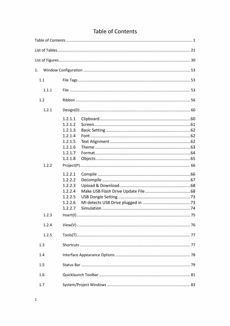
Table of Contents
Table of Contents ...................................................................................................................... 1
List of Tables ............................................................................................................................ 21
List of Figures ........................................................................................................................... 30
1. Window Configuration .................................................................................................... 53
1.1 File Tags ......................................................................................................... 53
1.1.1 File ................................................................................................................. 53
1.2 Ribbon ........................................................................................................... 56
1.2.1 Design(D) ....................................................................................................... 60
1.2.1.1 Clipboard .............................................................................. 60 1.2.1.2 Screen ................................................................................... 61 1.2.1.3 Basic Setting ......................................................................... 62 1.2.1.4 Font ...................................................................................... 62 1.2.1.5 Text Alignment ..................................................................... 62 1.2.1.6 Theme .................................................................................. 63 1.2.1.7 Format .................................................................................. 64 1.2.1.8 Objects ................................................................................. 65
1.2.2 Project(P) ....................................................................................................... 66
1.2.2.1 Compile ................................................................................ 66 1.2.2.2 Decompile ............................................................................ 67 1.2.2.3 Upload & Download ............................................................. 68 1.2.2.4 Make USB Flash Drive Update File ....................................... 68 1.2.2.5 USB Dongle Setting .............................................................. 73 1.2.2.6 MI detects USB Drive plugged in ......................................... 73 1.2.2.7 Simulation ............................................................................ 74
1.2.3 Insert(I) .......................................................................................................... 75
1.2.4 View(V) .......................................................................................................... 76
1.2.5 Tools(T) .......................................................................................................... 77
1.3 Shortcuts ....................................................................................................... 77
1.4 Interface Appearance Options ...................................................................... 78
1.5 Status Bar ...................................................................................................... 79
1.6 Quicklaunch Toolbar ..................................................................................... 81
1.7 System/Project Windows .............................................................................. 83
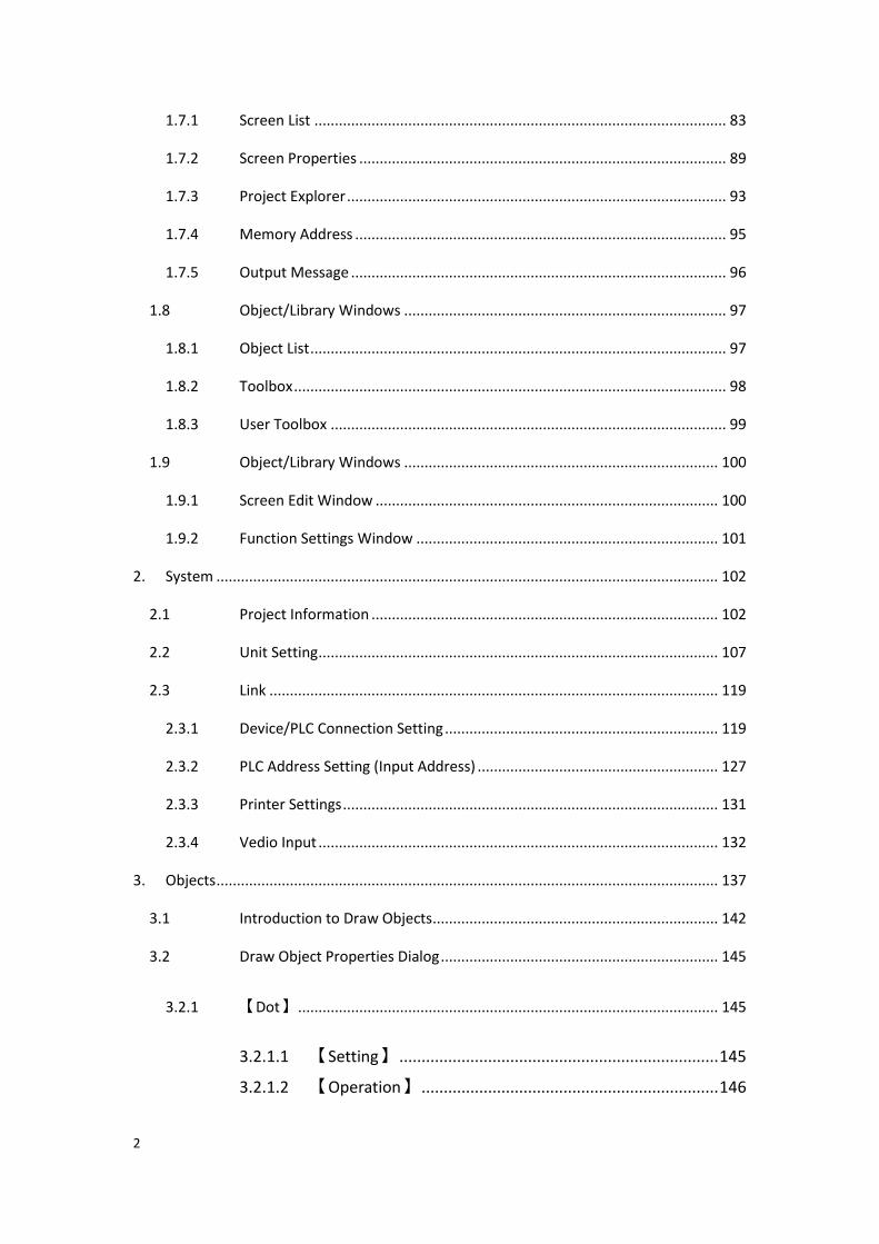
2
1.7.1 Screen List ..................................................................................................... 83
1.7.2 Screen Properties .......................................................................................... 89
1.7.3 Project Explorer ............................................................................................. 93
1.7.4 Memory Address ........................................................................................... 95
1.7.5 Output Message ............................................................................................ 96
1.8 Object/Library Windows ............................................................................... 97
1.8.1 Object List ...................................................................................................... 97
1.8.2 Toolbox .......................................................................................................... 98
1.8.3 User Toolbox ................................................................................................. 99
1.9 Object/Library Windows ............................................................................. 100
1.9.1 Screen Edit Window .................................................................................... 100
1.9.2 Function Settings Window .......................................................................... 101
2. System ........................................................................................................................... 102
2.1 Project Information ..................................................................................... 102
2.2 Unit Setting .................................................................................................. 107
2.3 Link .............................................................................................................. 119
2.3.1 Device/PLC Connection Setting ................................................................... 119
2.3.2 PLC Address Setting (Input Address) ........................................................... 127
2.3.3 Printer Settings ............................................................................................ 131
2.3.4 Vedio Input .................................................................................................. 132
3. Objects ........................................................................................................................... 137
3.1 Introduction to Draw Objects ...................................................................... 142
3.2 Draw Object Properties Dialog .................................................................... 145
3.2.1 【Dot】 ....................................................................................................... 145
3.2.1.1 【Setting】 ........................................................................ 145
3.2.1.2 【Operation】 ................................................................... 146
3
3.2.2 【Line】 ...................................................................................................... 147
3.2.2.1 【Setting】 ........................................................................ 147
3.2.2.2 【Operation】 ................................................................... 149
3.2.3 【Polyline】 ................................................................................................ 150
3.2.3.1 【Setting】 ........................................................................ 150
3.2.3.2 【Operation】 ................................................................... 152
3.2.4 【Rectangle】 ............................................................................................. 154
3.2.4.1 【Setting】 ........................................................................ 154
3.2.4.2 【Operation】 ................................................................... 156
3.2.5 【Polygon】 ................................................................................................ 158
3.2.5.1 【Setting】 ........................................................................ 158
3.2.5.2 【Operation】 ................................................................... 159
3.2.6 【Ellipse】................................................................................................... 161
3.2.6.1 【Setting】 ........................................................................ 161
3.2.6.2 【Operation】 ................................................................... 162
3.2.7 【Arc】 ....................................................................................................... 164
3.2.7.1 【Setting】 ........................................................................ 164
3.2.7.2 【Operation】 ................................................................... 165
3.2.8 【Pie】 ........................................................................................................ 167
3.2.8.1 【Setting】 ........................................................................ 167
3.2.8.2 【Operation】 ................................................................... 169
3.2.9 【Table】 .................................................................................................... 171
3.2.9.1 【Setting】 ........................................................................ 171
3.2.9.2 【Operation】 ................................................................... 173
3.2.10 【Text】 ...................................................................................................... 175
4
3.2.10.1 【Setting】 ................................................................ 175
3.2.10.2 【Operation】 ........................................................... 177
3.2.11 【Image】 ................................................................................................... 179
3.2.11.1 【Setting】 ................................................................ 179
3.2.11.2 【Operation】 ........................................................... 181
3.2.12 【Scale】..................................................................................................... 183
3.2.12.1 【Setting】 ................................................................ 183
3.2.12.2 【Operation】 ........................................................... 185
3.2.13 【Pipeline】 ................................................................................................ 186
3.2.13.1 【General】 ............................................................... 187
3.2.13.2 【Pipe Item】 ............................................................ 190
3.2.13.3 【Operation】 ........................................................... 193
3.2.13.4 Pipeline Pipe Add or Delete ....................................... 194
3.3 Base Object Properties Dialog ..................................................................... 197
3.3.1 【Lamp】 .................................................................................................... 197
3.3.1.1 【Setting】 ........................................................................ 197
3.3.1.2 【Display】 ........................................................................ 201
3.3.1.3 【Operation】 ................................................................... 204
3.3.1.4 【External Lable】 ............................................................. 205
3.3.2 【Switch】 .................................................................................................. 207
3.3.2.1 【Bit Switch】.................................................................... 207
3.3.2.2 【Word Switch】 ............................................................... 214
3.3.2.3 【Change Screen】 ............................................................ 220
3.3.2.4 【Function Switch】 .......................................................... 222
3.3.2.5 【Display】 ........................................................................ 233
3.3.2.6 【Operation】 ................................................................... 236
3.3.2.7 【External Lable】 ............................................................. 239
3.3.3 【Numeric Input/Display】 ........................................................................ 241
5
3.3.3.1 【Setting】 ........................................................................ 241
3.3.3.2 【Display】 ........................................................................ 246
3.3.3.3 【Alarm】 .......................................................................... 249
3.3.3.4 【Operation】 ................................................................... 251
3.3.3.5 【External Lable】 ............................................................. 254
3.3.4 【Text Input/Display】 ............................................................................... 256
3.3.4.1 【Setting】 ........................................................................ 256
3.3.4.2 【Display】 ........................................................................ 261
3.3.4.3 【Operation】 ................................................................... 263
3.3.4.4 【External Lable】 ............................................................. 266
3.3.5 【Date/Time Display】 ............................................................................... 268
3.3.5.1 【Setting】 ........................................................................ 268
3.3.5.2 【Display】 ........................................................................ 269
3.3.5.3 【Operation】 ................................................................... 271
3.3.6 【Window Screen Display】 ....................................................................... 273
3.3.6.1 【Setting】 ........................................................................ 273
3.3.6.2 【Operation】 ................................................................... 275
3.3.7 【Meter】 ................................................................................................... 276
3.3.7.1 【General】 ....................................................................... 276
3.3.7.2 【Display】 ........................................................................ 279
3.3.7.3 【Scale】 ........................................................................... 281
3.3.7.4 【Range】 ......................................................................... 282
3.3.7.5 【Operation】 ................................................................... 284
3.3.8 【Linear Meter】 ........................................................................................ 285
3.3.8.1 【General】 ....................................................................... 285
3.3.8.2 【Display】 ........................................................................ 287
3.3.8.3 【Scale】 ........................................................................... 288
3.3.8.4 【Range】 ......................................................................... 290
6
3.3.8.5 【Operation】 ................................................................... 291
3.3.9 【Data Block Graph】 ................................................................................. 293
3.3.9.1 【General】 ....................................................................... 293
3.3.9.2 【Curve】 .......................................................................... 295
3.3.9.3 【Display】 ........................................................................ 298
3.3.9.4 【Axis】 ............................................................................. 300
3.3.9.5 【Advanced】 .................................................................... 302
3.3.9.6 【Sub Switch】 .................................................................. 306
3.3.9.7 【Operation】 ................................................................... 310
3.3.10 【Data Block XY Scatter】 .......................................................................... 312
3.3.10.1 【General】 ............................................................... 312
3.3.10.2 【Curve】 .................................................................. 314
3.3.10.3 【Display】 ................................................................ 317
3.3.10.4 【Axis】 ..................................................................... 319
3.3.10.5 【Advanced】 ............................................................ 321
3.3.10.6 【Sub Switch】 .......................................................... 325
3.3.10.7 【Operation】 ........................................................... 329
3.3.11 【Step Switch】 .......................................................................................... 331
3.3.11.1 【Setting】 ................................................................ 331
3.3.11.2 【Display】 ................................................................ 333
3.3.11.3 【Operation】 ........................................................... 336
3.3.11.4 【External Lable】 ..................................................... 339
3.3.12 【Slide Switch】.......................................................................................... 341
3.3.12.1 【Setting】 ................................................................ 341
3.3.12.2 【Display】 ................................................................ 342
3.3.12.3 【Operation】 ........................................................... 344
3.3.12.4 【External Lable】 ..................................................... 346
3.3.13 【Selector List】 ......................................................................................... 348

7
3.3.13.1 【Setting】 ................................................................ 348
3.3.13.2 【Display】 ................................................................ 351
3.3.13.3 【Operation】 ........................................................... 353
3.3.13.4 【External Lable】 ..................................................... 356
3.3.14 【Radio Button】 ........................................................................................ 358
3.3.14.1 【Setting】 ................................................................ 358
3.3.14.2 【Display】 ................................................................ 360
3.3.14.3 【Operation】 ........................................................... 362
3.3.14.4 【External Lable】 ..................................................... 365
3.3.15 【Input Display】 ........................................................................................ 367
3.3.16 【Key】 ....................................................................................................... 369
3.3.16.1 【Setting】 ................................................................ 369
3.3.16.2 【Display】 ................................................................ 371
3.3.16.3 【Operation】 ........................................................... 373
3.3.17 【Limit Value Display】 .............................................................................. 374
3.3.18 【Animated Graphic】................................................................................ 377
3.3.18.1 【Setting】 ................................................................ 377
3.3.18.2 【Display】 ................................................................ 381
3.3.18.3 【Operation】 ........................................................... 384
3.3.19 【Rotation Indicator】 ............................................................................... 386
3.3.19.1 【Setting】 ................................................................ 386
3.3.19.2 【Operation】 ........................................................... 390
3.3.20 【Gif Display】 ............................................................................................ 392
3.3.20.1 【Setting】 ................................................................ 392
3.3.20.2 【Operation】 ........................................................... 394
3.3.21 【Historic Trend】 ...................................................................................... 396

8
3.3.21.1 【General】 ............................................................... 396
3.3.21.2 【Curve】 .................................................................. 399
3.3.21.3 【Display】 ................................................................ 401
3.3.21.4 【Axis】 ..................................................................... 404
3.3.21.5 【Advanced】 ............................................................ 406
3.3.21.6 【Sub Switch】 .......................................................... 410
3.3.21.7 【Operation】 ........................................................... 414
3.3.22 【Historic XY Scatter】 ............................................................................... 416
3.3.22.1 【General】 ............................................................... 416
3.3.22.2 【Curve】 .................................................................. 417
3.3.22.3 【Display】 ................................................................ 420
3.3.22.4 【Axis】 ..................................................................... 422
3.3.22.5 【Advanced】 ............................................................ 424
3.3.22.6 【Sub Switch】 .......................................................... 428
3.3.22.7 【Operation】 ........................................................... 432
3.3.23 【Historic Data Table】 .............................................................................. 434
3.3.23.1 【General】 ............................................................... 434
3.3.23.2 【Data Items】 .......................................................... 437
3.3.23.3 【Sub Switch】 .......................................................... 439
3.3.23.4 【Operation】 ........................................................... 445
3.3.24 【Historic Data Selector】 .......................................................................... 447
3.3.24.1 【Setting】 ................................................................ 447
3.3.24.2 【Display】 ................................................................ 449
3.3.24.3 【Operation】 ........................................................... 451
3.3.25 【Alarm Display】 ....................................................................................... 453
3.3.25.1 【Setting】 ................................................................ 453
3.3.25.2 【Header】 ................................................................ 457
3.3.25.3 【Display】 ................................................................ 458
3.3.25.4 【Sub Switch】 .......................................................... 460
9
3.3.25.5 【Operation】 ........................................................... 465
3.3.26 【Alarm Scrolling Text】 ............................................................................. 467
3.3.26.1 【Setting】 ................................................................ 467
3.3.26.2 【Display】 ................................................................ 470
3.3.26.3 【Operation】 ........................................................... 471
3.3.27 【Alarm Data Selector】............................................................................. 473
3.3.27.1 【Setting】 ................................................................ 473
3.3.27.2 【Display】 ................................................................ 476
3.3.27.3 【Operation】 ........................................................... 477
3.3.28 【Recipe Selector】 .................................................................................... 480
3.3.28.1 【General】 ............................................................... 480
3.3.28.2 【Advanced】 ............................................................ 481
3.3.28.3 【Operation】 ........................................................... 483
3.3.29 【Recipe Table】 ........................................................................................ 485
3.3.29.1 【General】 ............................................................... 485
3.3.29.2 【Data Item】 ............................................................ 489
3.3.29.3 【Sub Switch】 .......................................................... 491
3.3.29.4 【Operation】 ........................................................... 495
3.3.30 【Operation Viewer】 ................................................................................ 498
3.3.30.1 【General】 ............................................................... 498
3.3.30.2 【Content】............................................................... 500
3.3.30.3 【Sub Switch】 .......................................................... 502
3.3.30.4 【Operation】 ........................................................... 506
3.3.31 【Schedule Setting Table】 ........................................................................ 508
3.3.31.1 【General】 ............................................................... 508
3.3.31.2 【Header】 ................................................................ 510
3.3.31.3 【Operation】 ........................................................... 511

10
3.3.32 【Vedio Input Display】 ............................................................................. 514
3.3.32.1 【Setting】 ................................................................ 514
3.3.32.2 【Operation】 ........................................................... 515
4. Servers ........................................................................................................................... 517
4.1 【FTP Server】 ............................................................................................ 517
4.1.1 Deploying FTP Server using System Settings of HMI ................................... 518
4.1.2 Deploying FTP Server using Project Settings ............................................... 519
4.1.3 FTP Server Example ..................................................................................... 520
4.2 【VNC Server】 ........................................................................................... 521
4.2.1 Deploying VNC Server using System Settings of HMI .................................. 521
4.2.2 Deploying VNC Server using Project Settings .............................................. 522
4.2.3 VNC Server Example .................................................................................... 523
4.3 【SMTP】 .................................................................................................... 525
4.3.1 【SMTP】setting......................................................................................... 525
4.3.2 【SMTP】setting example .......................................................................... 529
5. Security .......................................................................................................................... 533
5.1 【Security】 Settings ................................................................................. 533
5.1.1 【Security】Basic Settings .......................................................................... 533
5.1.2 【Security】Advanced Settings .................................................................. 537
5.2 Security Settings of Objects ......................................................................... 542
5.3 Exporting/Importing CSV Files ..................................................................... 545
5.4 Security Features of the Function Switch .................................................... 546

11
5.4.1 【Log In】and【Log Out】Function Switch ............................................... 546
5.4.2 【Password Manager】Function Switch .................................................... 547
5.4.3 【Import User Accounts】Function Switch ................................................ 548
5.5 Security Features in Screen Properties ....................................................... 549
5.5.1 Screen Properties Security Level ................................................................. 549
5.5.2 Change Screen Button Change User Level .................................................. 550
5.6 Installment .................................................................................................. 551
5.6.1 Installment Basic Settings............................................................................ 552
5.6.2 Installment Advanced Setting ..................................................................... 555
5.6.3 Installment Related Function Switch........................................................... 560
5.6.3.1 【Installment: Enter Installment Password】Function ..... 560
5.6.3.2 【Installment: Modify Static Installment】 ....................... 561
6. System Message ............................................................................................................ 563
6.1 【System Message】Settings ..................................................................... 563
6.2 【System Message】Applications .............................................................. 567
6.2.1 Single Language Project and Using the System Messages .......................... 567
6.2.2 Single Language Project and Using Custom System Messages ................... 568
6.2.3 Single Language Project and Using Only Custom System Messages ........... 569
6.2.4 Multiple Language Project and Using the Default System Messages ......... 570
7. Data Log ......................................................................................................................... 574
7.1 Data Log List ................................................................................................ 574
7.2 Data Log Group Settings .............................................................................. 575
7.2.1 【Setting】 ................................................................................................. 575

12
7.2.2 【Logging Address List】 ............................................................................ 579
7.2.3 【Export Data】 .......................................................................................... 581
7.2.4 【Print Data】 ............................................................................................. 586
7.2.4.1 【Print Data】Header and Footer【Setting】 ................. 589
7.3 Data Log Related Objects ............................................................................ 594
8. Alarm ............................................................................................................................. 595
8.1 Alarm List ..................................................................................................... 595
8.2 Alarm Setting ............................................................................................... 596
8.2.1 【Setting】 ................................................................................................. 596
8.2.2 【Advanced Setting】 ................................................................................. 600
8.2.3 【Send Email Setting】 ............................................................................... 603
8.2.4 【Export】 .................................................................................................. 606
8.3 Alarm Application Example ......................................................................... 609
8.3.1 Send Email when Alarm Occurs ................................................................... 609
8.4 Alarm Related Objects ................................................................................. 619
9. Recipe ............................................................................................................................ 620
9.1 Recipe Data Flow ......................................................................................... 620
9.2 Recipe Settings ............................................................................................ 622
9.2.1 【General】 ................................................................................................ 623
9.2.2 【Advanced】 ............................................................................................. 627
9.2.3 【Recipe File List】 ..................................................................................... 634

13
9.3 【Recipe Editor】 ....................................................................................... 635
9.4 【Recipe Table】 ........................................................................................ 637
9.5 【Recipe Selector】 .................................................................................... 640
9.6 【Function Switch】 ................................................................................... 641
9.7 Example ....................................................................................................... 644
10. Operation Log .............................................................................................. 654
10.1 【Operation Log】Settings ......................................................................... 654
10.2 【Operation Log】Settings of Objects........................................................ 658
10.3 Introduction to the Operation Log CSV File ................................................ 659
11. Schedule ...................................................................................................... 660
11.1 Schedule List ................................................................................................ 660
11.2 Schedule Settings ........................................................................................ 661
11.3 Examples...................................................................................................... 669
12. Data Transfer ............................................................................................... 672
12.1 Data Transfer List (Data to Data Mode) ...................................................... 672
12.2 Data Transfer Settings (Data to Data Mode) ............................................... 673
12.3 Data Transfer List (CSV to Data Mode) ........................................................ 675
12.4 Data Transfer Settings (CSV to Data Mode) ................................................ 676
13. Script ............................................................................................................ 679
13.1 When to execute scripts .............................................................................. 679
13.2 Script Syntax ................................................................................................ 680
13.2.1 Registers ...................................................................................................... 680
13.2.2 Constants ..................................................................................................... 682
14
13.2.3 Comments ................................................................................................... 682
13.2.4 Assignment Operators ................................................................................. 683
13.2.5 Unary Operators .......................................................................................... 684
13.2.6 Binary Operators ......................................................................................... 684
13.2.7 Logical Statements ...................................................................................... 686
13.2.8 Iterative Statements .................................................................................... 688
13.2.9 Built-in Functions ......................................................................................... 690
13.2.10 Custom Functions ........................................................................................ 693
13.3 Using Scripts ................................................................................................ 695
13.3.1 Script List ..................................................................................................... 695
13.3.2 Script Editor ................................................................................................. 696
13.4 Examples...................................................................................................... 703
13.4.1 Scrolling Lamp ............................................................................................. 703
13.4.2 Load Balance ............................................................................................... 706
14. Resource ...................................................................................................... 709
14.1 【Image Library】 ....................................................................................... 709
14.1.1 Image Library Settings ................................................................................. 709
14.1.2 Image Library Usage Method ...................................................................... 711
14.1.2.1 Image Selector ........................................................... 711 14.1.2.2 Image Library Selection Window ............................... 711
14.2 【Audio Library】 ....................................................................................... 712
14.2.1 Audio Library Settings ................................................................................. 712
14.2.2 Audio Library Usage Method....................................................................... 714
14.2.2.1 Audio Selector ............................................................ 714 14.2.2.2 Audio Library Selection Window ................................ 714
14.3 【Tag Library】 ........................................................................................... 715
14.3.1 Tag Library Settings ..................................................................................... 715
15
14.3.2 Tag Library Usage ........................................................................................ 718
14.4 【Text Library】 .......................................................................................... 719
14.4.1 Text Library Settings .................................................................................... 719
14.4.2 Text Library Usage Method ......................................................................... 721
14.5 【Font Library】 ......................................................................................... 723
14.5.1 Font Library Settings .................................................................................... 723
15. User Toolbox ............................................................................................... 725
15.1 Basic Operations .......................................................................................... 725
15.1.1 Adding objects to the User Toolbox ............................................................ 727
15.1.2 Adding the objects in User Toolbox to the Work Space.............................. 728
15.1.3 Menu Introduction ...................................................................................... 729
15.2 Import and Export ....................................................................................... 731
15.2.1 Import .......................................................................................................... 731
15.2.2 Export .......................................................................................................... 732
15.3 Name Conflicts ............................................................................................ 733
15.3.1 Category Name Conflict .............................................................................. 733
15.3.2 Object Name Conflict .................................................................................. 734
16. Build Running Package and Simulation ....................................................... 736
16.1 【Download】 ............................................................................................ 736
16.1.1 Downloading the running package and operating system from a PC ......... 736
16.1.2 Write System Setting ................................................................................... 742
16.1.2.1 【Basic】 ................................................................... 742
16.1.2.2 【System】 ................................................................ 743
16.1.2.3 【Ethernet】 ............................................................. 745
16.1.2.4 【Sever】 ................................................................... 746
16.1.2.5 【Display】 ................................................................ 748

16
16.1.2.6 【Time】 ................................................................... 749
16.1.2.7 【MISC】 ................................................................... 750
16.1.3 Download Security ...................................................................................... 751
16.2 【Upload】 ................................................................................................. 751
16.2.1 Uploading running package to a computer from the HMI .......................... 751
16.2.2 Upload Security ........................................................................................... 753
16.3 【Compile】................................................................................................ 753
16.3.1 Compile Introduction .................................................................................. 753
16.3.2 Start compiling running packages ............................................................... 754
16.3.3 Ending compile and error check .................................................................. 754
16.3.4 Decompile.................................................................................................... 757
16.4 【Simulation】 ............................................................................................ 758
16.4.1 Simulation Introduction .............................................................................. 758
16.4.2 Starting Simulation ...................................................................................... 758
16.4.3 Offline Simulation ........................................................................................ 759
16.4.4 Online Simulation ........................................................................................ 760
17. Application Tool .......................................................................................... 761
17.1 【Pass Through】 ....................................................................................... 761
17.1.1 Setting Pass Through ................................................................................... 761
17.1.2 Pass Through Example ................................................................................. 764
17.2 【File Transfer】 ......................................................................................... 768
17.3 【FBF Reader】 ........................................................................................... 774
18. PLC Resource Review................................................................................... 777
18.1 Usage Methods ........................................................................................... 777

17
19. Address Registers ........................................................................................ 780
19.1 Internal Address Register Range ................................................................. 780
19.2 Index Register .............................................................................................. 782
19.2.1 Usage ........................................................................................................... 782
19.3 Special System Tags ..................................................................................... 785
19.3.1 Operations ................................................................................................... 785
19.3.2 Save File ....................................................................................................... 786
19.3.3 Time ............................................................................................................. 786
19.3.4 Touch Control Positions .............................................................................. 787
19.3.5 Network Information................................................................................... 787
19.3.6 Index Registers (16Bit) ................................................................................ 788
19.3.7 Index Registers (32Bit) ................................................................................ 790
19.3.8 Communication Parameter Settings ........................................................... 792
19.3.9 VNC Information .......................................................................................... 796
20. System Settings ........................................................................................... 798
20.1 System Setting ............................................................................................. 798
20.1.1 Run Project .................................................................................................. 799
20.1.2 【COM Port】 ............................................................................................. 799
20.1.3 【Ethernet】 ............................................................................................... 800
20.1.4 【Servers】 ................................................................................................. 801
20.1.5 【Backlight】 .............................................................................................. 804
20.1.6 【Display】 ................................................................................................. 805
20.1.7 【Calibration】 ........................................................................................... 806
18
20.1.8 【Time】 ..................................................................................................... 806
20.1.9 【System Info】 .......................................................................................... 807
20.1.10 【MISC】 .................................................................................................... 809
20.2 Remote Settings .......................................................................................... 811
20.3 System Booting Sequence ........................................................................... 811
21. HotKeys ....................................................................................................... 812
21.1 Project and File ............................................................................................ 812
21.2 Screen List ................................................................................................... 813
22. Modbus Gateway Server ............................................................................. 815
22.1 Modbus Gateway Server Settings ............................................................... 816
22.2 Modbus Gateway Server Applications ........................................................ 818
23. PLC Integration ............................................................................................ 822
23.1 Show Ladder Viewer .................................................................................... 822
23.1.1 【Show Ladder Viewer】Applications and Settings ................................... 823
23.1.2 HMI display the interface of PLC ladder diagram program ......................... 825
23.2 Update FATEK PLC Project From USB .......................................................... 830
23.3 【Fatek PLC Transfer Encrypt Tool】 .......................................................... 832
23.3.1 【Fatek PLC Transfer Project Generator】 ................................................. 832
23.3.2 【Single Pass Password Generator】 ......................................................... 836
23.4 Show Ethernet Module Configuration ........................................................ 839
23.4.1 【Ethernet Module Configuration】Application and Settings ................... 839
23.4.2 General Settings of Ethernet Module ......................................................... 841

19
23.4.3 Password Setting Page of Ethernet Module................................................ 842
23.4.4 Access Control Setting Page of Ethernet Module ....................................... 843
23.4.5 External Severs Setting Page of Ethernet Module ...................................... 844
23.4.6 Service Port Setting Page of Ethernet Module ............................................ 846
24. User-defined Protocal ................................................................................. 847
24.1 【User-defined Protocol】Interface Description ....................................... 847
24.1.1 Main Operation Interface of Protocol Setting ............................................. 850
24.1.2 Instruction Paging of Protocol Setting......................................................... 851
24.1.3 Send Data Paging of Protocol Setting .......................................................... 852
24.1.4 Return Paging of Protocol Setting ............................................................... 855
24.1.5 Checksum Paging of Protocol Setting .......................................................... 857
24.2 【User-defined Protocol】Application examples ....................................... 861
24.3 【User-defined Protocol】use Script Application Example ....................... 874
24.3.1 Communication Instructions in Script ......................................................... 874
24.3.2 Communication Instruction in Script Application Example ......................... 876
25. Multi-Link .................................................................................................... 878
25.1 【Multi-Link】 Setting ............................................................................... 879
25.1.1 Serial ............................................................................................................ 879
25.1.1.1 Multi-Link Master(Serial) setting ............................... 879 25.1.1.2 Multi-Link Slave(Serial) Setting .................................. 881
25.1.2 Ethernet ....................................................................................................... 883
25.1.2.1 Multi-Link Master(Ethernet) setting .......................... 883 25.1.2.2 Multi-Link Slave(Ethernet) setting ............................. 885
25.2 Operation Lock ............................................................................................ 887
25.2.1 Operation Lock Description ......................................................................... 887
25.3 Multi-Link Eaxmple ...................................................................................... 889
20
26. Search/Replace ............................................................................................ 891
26.1 The Use of Search/Replace.......................................................................... 891
26.2 The Result of Search/Replace ...................................................................... 894
27. Communication Error Codes ....................................................................... 896

21
List of Tables Table 1 Startup Screen Functions ................................................................................. 47 Table 2 Create New Project Steps ................................................................................ 48 Table 3 File Options ...................................................................................................... 54 Table 4 Introduction to Ribbon User Interface Functions ............................................ 56 Table 5 Design–Clipboard ............................................................................................. 60 Table 6 Design–Screen ................................................................................................. 61 Table 7 Design–Basic Setting ........................................................................................ 62 Table 8 Design–Theme ................................................................................................. 63 Table 9 Design–Format................................................................................................. 65 Table 10 Compilation Output Window Related Information ....................................... 66 Table 11 Make USB Flash Drive Update File................................................................. 69 Table 12 properties of making USB drive upgrade file ................................................ 70 Table 13 Interface Appearance Options ....................................................................... 78 Table 14 Status bar ....................................................................................................... 79 Table 15 Quicklaunch Toolbar ...................................................................................... 81 Table 16 Screen List Management Settings ................................................................. 84 Table 17 Screen Properties Items ................................................................................ 91 Table 18 Project Explorer Items ................................................................................... 93 Table 19 Object List Functions ..................................................................................... 97 Table 20 Project Information ..................................................................................... 102 Table 21 Unit Setting .................................................................................................. 107 Table 22 Device Connection Type .............................................................................. 119 Table 23 Link Property Settings .................................................................................. 121 Table 24 Access Address Settings ............................................................................... 128
Table 25【Printer】Settings ...................................................................................... 131
Table 26【Vedio Input】property settings................................................................ 133
Table 27 Image Objects and Basic Object Library Categories .................................... 137 Table 28 Draw Object objects .................................................................................... 142
Table 29 Property settings for【Dot】 ...................................................................... 145
Table 30【Dot】【Operation】Settings ..................................................................... 146
Table 31 Property settings for【Line】 ..................................................................... 148
Table 32【Line】【Operation】Settings .................................................................... 149
Table 33 Property setting for【Polyline】 ................................................................. 151
Table 34【Polyline】【Operation】Settings .............................................................. 153
Table 35 Property setting for【Rectangular】 .......................................................... 154
Table 36【Rectangle】【Operation】Settings ........................................................... 156
Table 37 Property settings for【Polygon】 ............................................................... 158
Table 38【Polygon】【Operation】Settings .............................................................. 160
Table 39 Property settings for【Ellipse】 .................................................................. 161
Table 40【Ellipse】【Operation】Settings ................................................................ 163

22
Table 41 Property settings for【Arc】 ....................................................................... 164
Table 42【Arc】【Operation】Settings ..................................................................... 165
Table 43 Property settings for【Pie】 ....................................................................... 167
Table 44【Pie】【Operation】Settings ...................................................................... 169
Table 45 Property settings for【Table】 ................................................................... 171
Table 46【Table】【Operation】Settings .................................................................. 173
Table 47 Property settings for【Text】 ..................................................................... 175
Table 48【Text】【Operation】Settings .................................................................... 177
Table 49 Property settings for【Image】 .................................................................. 179
Table 50【Image】【Operation】Settings ................................................................. 181
Table 51 Property Settings for【Scale】 ................................................................... 183
Table 52【Scale】【Operation】Settings .................................................................. 185
Table 53【General】Properties of【Pipeline】 ....................................................... 187
Table 54【Pipe Item】Properties of【Pipeline】 .................................................... 190
Table 55【Operation】Properties of【Pipeline】 .................................................... 193
Table 56【Setting】Properties of【Lamp】 ............................................................. 197
Table 57【Display】Setting Properties of【Lamp】 ................................................ 202
Table 58【Operation】Setting Properties of【Lamp】 ........................................... 204
Table 59【Lamp】【External Lable】setting properties ........................................... 206
Table 60【Setting】Properties of【Bit Switch】 ...................................................... 208
Table 61【Setting】Properties of【Word Switch】 ................................................. 214
Table 62【Setting】Properties of【Change Screen】 .............................................. 220
Table 63【Setting】Properties of【Function Switch】 ............................................ 223
Table 64【Display】Setting Properties of【Switch】 .............................................. 234
Table 65【Operation】Setting Properties of【Switch】 .......................................... 237
Table 66【Switch】【External Lable】setting properties .......................................... 239
Table 67【Setting】Properties of【Numeric Input/Display】 ................................. 241
Table 68【Display】Setting Properties of【Numeric Input/Display】..................... 246
Table 69【Alarm】Setting Properties of【Numeric Input/Display】 ...................... 249
Table 70【Operation】Setting Properties of【Numeric Input/Display】 ................ 251
Table 71【Text Input/Display】【External Lable】setting properties ....................... 254
Table 72【Setting】Properties of【Text Input/Display】 ........................................ 256
Table 73【Display】Setting Properties of【Text Input/Display】 ............................ 261

23
Table 74【Operation】Setting Properties of【Text Input/Display】 ....................... 263
Table 75【Text Input/Display】【External Lable】setting properties ....................... 266
Table 76【Setting】Properties of【Date/Time Display】 ........................................ 268
Table 77【Display】Setting Properties of【Date/Time Display】 ........................... 269
Table 78【Operation】Setting Properties of【Date/Time Display】 ....................... 272
Table 79【Setting】Properties of【Window Screen Display】 ................................ 273
Table 80【Operation】Setting Properties of【Window Screen Display】 .............. 275
Table 81【General】Setting Properties of【Meter】 .............................................. 277
Table 82【Display】Setting Properties of【Meter】 ............................................... 279
Table 83【Scale】Setting Properties of【Meter】 .................................................. 281
Table 84【Range】Setting Properties of【Meter】 ................................................. 283
Table 85【Operation】Setting Properties of【Meter】 .......................................... 284
Table 86【General】Setting Properties of【Linear Meter】 ................................... 286
Table 87【Display】Setting Properties of【Linear Meter】 .................................... 287
Table 88【Scale】Setting Screen of【Linear Meter】 ............................................. 289
Table 89【Range】Setting Properties of【Linear Meter】 ...................................... 290
Table 90【Operation】Setting Properties of【Linear Meter】 ............................... 292
Table 91【General】Setting Properties of【Data Block Graph】 ............................ 293
Table 92【Curve】Setting Properties of【Data Block Graph】 ............................... 295
Table 93【Display】Setting Properties of【Data Block Graph】 ............................. 298
Table 94【Axis】Setting Properties of【Data Block Graph】 .................................. 300
Table 95【Advanced】Setting Properties of【Data Block Graph】 ......................... 302
Table 96【Sub Switch】Setting Properties of【Data Block Graph】 ....................... 306
Table 97【Operation】Setting Properties of【Data Block Graph】 ........................ 310
Table 98【General】 Setting Properties of【Data Block XY Scatter】 .................... 312
Table 99【Curve】Setting Properties of 【Data Block XY Scatter】 ....................... 314
Table 100【Display】Setting Properties of【Data Block XY Scatter】 ..................... 317
Table 101【Axis】Setting Properties of【Data Block XY Scatter】 .......................... 319
Table 102【Advanced】Setting Properties of【Data Block XY Scatter】 ................ 321
Table 103【Sub Switch】Setting Properties of【Data Block XY Scatter】 ............... 325
Table 104【Operation】Setting Properties of【Data Block XY Scatter】 ................ 329
Table 105【Setting】Properties of【Step Switch】 ................................................. 331
Table 106【Display】Setting Properties of【Step Switch】 .................................... 333
24
Table 107【Operation】Setting Properties of【Step Switch】 ............................... 336
Table 108【Step Switch】【External Lable】setting properties................................ 339
Table 109【Setting】Properties of【Slide Switch】 ................................................ 341
Table 110【Display】Setting Properties of【Slide Switch】 .................................... 343
Table 111【Operation】Setting Properties of【Slide Switch】 ............................... 344
Table 112【Slide Switch】【External Lable】setting properties ............................... 347
Table 113【Setting】Properties of【Selector List】 ................................................ 349
Table 114【Display】Setting Properties of【Selector List】.................................... 351
Table 115【Operation】Setting Properties of【Selector List】 ............................... 353
Table 116【Selector List】【External Lable】setting properties ............................... 356
Table 117【Radio Button】【Setting】setting properties ......................................... 358
Table 118【Radio Button】【Display】setting properties ........................................ 360
Table 119【Radio Button】【Operation】setting properties .................................... 363
Table 120【Radio Button】【External Lable】setting properties ............................. 365
Table 121 Setting Properties of【Input Display】 ..................................................... 367
Table 122【Setting】Properties of【Key】 .............................................................. 369
Table 123【Display】Setting Properties of【Key】 ................................................. 371
Table 124【Operation】Setting Properties of【Key】............................................. 373
Table 125 Setting Properties of【Limit Value Display】 ........................................... 375
Table 126【Setting】Properties of【Animated Graphic】 ...................................... 377
Table 127【Display】Setting Properties of【Animated Graphic】 .......................... 382
Table 128【Operation】Setting Properties of【Animated Graphic】 ..................... 384
Table 129【Setting】Properties of【Rotation Indicator】 ...................................... 386
Table 130【Operation】Properties of【Rotation Indicator】 ................................. 391
Table 131【Setting】Properties of【GIF Display】 .................................................. 392
Table 132【Operation】Properties of【GIF Display】 ............................................. 394
Table 133【General】Setting Properties of【Historic Trend】 ............................... 396
Table 134【Curve】Setting Properties of【Historic Trend】 ................................... 399
Table 135【Display】Setting Properties of【Historic Trend】 ................................. 402
Table 136【Axis】Setting Properties of【Historic Trend】 ...................................... 404
Table 137【Advanced】Setting Properties of【Historic Trend】 ............................ 406
Table 138【Sub Switch】Setting Properties of【Historic Trend】 ........................... 410
Table 139【Operation】Setting Properties of【Historic Trend】 ............................ 414

25
Table 140【General】Setting Properties of【Historic XY Scatter】 ........................ 416
Table 141【Curve】 Setting Properties of【Historic XY Scatter】 .......................... 418
Table 142【Display】Setting Properties of【Historic XY Scatter】 .......................... 420
Table 143【Axis】Setting Properties of【Historic XY Scatter】 ............................... 422
Table 144【Advanced】Setting Properties of【Historic XY Scatter】 ..................... 424
Table 145【Sub Switch】Setting Properties of【Historic XY Scatter】 .................... 428
Table 146【Operation】Setting Properties of【Historic XY Scatter】 ..................... 432
Table 147【General】Setting Properties of【Historic Data Table】 ........................ 434
Table 148【Data Items】Setting Properties of【Historic Data Table】 ................... 437
Table 149【Sub Switch】Setting Properties of【Historic Data Table】 ................... 439
Table 150【Operation】Setting Properties of【Historic Data Table】 .................... 445
Table 151【General】Setting Properties of【Historic Data Selector】 ................... 447
Table 152【Display】Setting Properties of【Historic Data Selector】 .................... 450
Table 153【Operation】Setting Properties of【Historic Data Selector】 ............... 451
Table 154【Setting】Properties of【Alarm Display】 ............................................. 453
Table 155【Header】Setting Properties of【Alarm Display】 ................................. 458
Table 156【Display】Setting Properties of【Alarm Display】 ................................. 458
Table 157【Sub Switch】Setting Properties of【Alarm Display】 ........................... 460
Table 158【Operation】Setting Properties of【Alarm Display】 ............................ 465
Table 159【Setting】Properties of【Alarm Scrolling Text】 .................................... 467
Table 160【Display】Setting Properties of【Alarm Scrolling Text】 ....................... 470
Table 161【Operation】Setting Properties of【Alarm Scrolling Text】 .................. 471
Table 162【General】Setting Properties of【Alarm Data Table】 .......................... 473
Table 163【Display】Setting Properties of【Alarm Data Table】 ........................... 476
Table 164【Operation】Setting Properties of【Alarm Data Table】 ....................... 477
Table 165【General】Setting Properties of【Recipe Selector】 ............................. 480
Table 166【General】Setting Properties of【Recipe Selector】 ............................. 482
Table 167【Operation】Setting Properties of【Recipe Selector】 ......................... 483
Table 168【General】Setting Properties of【Recipe Table】 .................................. 486
Table 169【Data Item】Setting Properties of【Recipe Table】 .............................. 490
Table 170【Sub Switch】Setting Properties of【Recipe Table】 ............................. 491
Table 171【Operation】Setting Properties of【Recipe Table】 .............................. 495
Table 172【General】Setting Properties of【Operation Viewer】 ......................... 498

26
Table 173【Content】Setting Properties of【Operation Viewer】 ......................... 500
Table 174【Sub Switch】Setting Properties of【Operation Viewer】 .................... 503
Table 175【Operation】Setting Properties of【Operation Viewer】 ...................... 506
Table 176【Schedule Setting Table】【General】property setting ........................... 508
Table 177【Schedule Setting Table】【Header】property setting............................ 510
Table 178 【Schedule Setting Table】【Operation】property setting ..................... 512
Table 179【Vedio Input Display】【Setting】setting property ................................. 514
Table 180【Vedio Input Display】【Operation】property setting ............................ 515
Table 181 FTP Server Settings .................................................................................... 518 Table 182 VNC Server Settings ................................................................................... 522
Table 183【Sever】【SMTP】setting property .......................................................... 525
Table 184 Basic Setting Properties of【Security】 .................................................... 534
Table 185 Advanced Setting Properties of【Security】 ............................................ 537
Table 186 The relevant control address required in the【Level】mode .................. 541
Table 187 The relevant control address required in the【User】mode ................... 541
Table 188 Security Setting Properties of Objects ....................................................... 543 Table 189 Installment Attributes ................................................................................ 552
Table 190 【Installment】properties setting ........................................................... 556
Table 191【Operation Address】relevant control address required in【Static】mode
.................................................................................................................................... 559
Table 192【Modify Static Installment】 ................................................................... 561
Table 193【System Message】Settings .................................................................... 563
Table 194【Setting】Properties of【Data Log Group】 .......................................... 576
Table 195【Logging Address List】Setting Properties of【Data Log Group】 ......... 580
Table 196【Export Data】Setting Properties of【Data Log Group】 ...................... 581
Table 197【Data Log】【Export Data】【Settings】Property Settings ...................... 584
Table 198【Print Data】Setting Properties of【Data Log Group】 ......................... 587
Table 199【Export Data】Setting Properties of【Data Log Group】 ...................... 591
Table 200【Setting】Properties of【Alarm】 .......................................................... 597
Table 201【Advanced Setting】Properties of【Alarm】 ......................................... 600
Table 202【Advanced Setting】【Send Email】Properties of【Alarm】 ................. 604
Table 203【Export】Setting Properties of【Alarm】 .............................................. 606
Table 204【General】Properties of【Recipe】 ....................................................... 623
Table 205【Advanced】General Settings ................................................................. 627
Table 206【General】Properties of【Recipe】 ....................................................... 634
27
Table 207【Recipe Editor】Functions ....................................................................... 636
Table 208【Recipe Table】Functions ........................................................................ 638
Table 209【Recipe Selector】Functions ................................................................... 640
Table 210【Function Switch】Recipe Functions ....................................................... 641
Table 211 Setting Properties of【Operation Log】 ................................................... 655
Table 212 Object Setting Properties of【Operation Log】 ....................................... 658
Table 213【Schedule】Setting Properties ................................................................ 661
Table 214 Setting Properties of【Data Transfer】 .................................................... 673
Table 215【CSV to Data Transfer Mode】Setting Properties ................................... 676
Table 216 Script–Registers ......................................................................................... 680 Table 217 Script–Tag Library settings used in examples ............................................ 681 Table 218 Script–Constants ........................................................................................ 682 Table 219 Script–Comments ...................................................................................... 682 Table 220 Script–Assignment Operators .................................................................... 683 Table 221 Script–Unary Operators ............................................................................. 684 Table 222 Script–Arithmetic Operators...................................................................... 684 Table 223 Script–Logical Operators ............................................................................ 685 Table 224 Script–Operator precedence ..................................................................... 685 Table 225 Logical Statement Syntaxes ....................................................................... 686 Table 226 Iterative Statement Syntax ........................................................................ 688 Table 227 Script Built–in Functions ............................................................................ 690 Table 228 Script–Custom function-related statements ............................................. 693
Table 229【Script List】- Descriptions ...................................................................... 695
Table 230 Script List–Descriptions of the buttons on the right side .......................... 696 Table 231 Script Editor–Function Block Description .................................................. 697 Table 232 Script Editor–Script Properties Descriptions ............................................. 701 Table 233 Edit Window Setting Properties of the Image Library ............................... 709 Table 234 Edit Window Setting Properties of Audio Library ...................................... 712 Table 235 Edit Window Setting Properties of Tag Library .......................................... 716 Table 236 Edit Window Setting Properties of Text Library......................................... 719
Table 237【Font Library】Edit Properties ................................................................. 723
Table 238 Options within the menu........................................................................... 729 Table 239 Category Name Conflict options................................................................ 734 Table 240 Object Name Conflict options ................................................................... 735 Table 241 Download Manager–related parameters .................................................. 737
Table 242 【System Setting Configure】【Basic】properties setting ...................... 742
Table 243 【System Setting Configure】【System】properties setting ................... 744
Table 244 【System Setting Configure】【Ethernet】properties setting................. 745
Table 245 【System Setting Configure】【Sever】properties setting ...................... 746
Table 246 【System Setting Configure】【Display】properties setting ................... 748

28
Table 247 【System Setting Configure】【Time】properties setting ....................... 749
Table 248 【System Setting Configure】【MISC】properties setting ...................... 750
Table 249 Upload Manager-related parameters ........................................................ 752 Table 250 Decompile dialog window settings ............................................................ 757 Table 251 Pass Through related parameters .............................................................. 763
Tabel 252【File Transfer】Button descriptions ........................................................ 769
Table 253【File Transfer】After Connecting ............................................................. 770
Tabel 254【FBF Reader】menu descriptions ............................................................ 775
Tabel 255【FBF Reader】tool bar descriptions ........................................................ 776
Table 256 Introduction to internal single point and register information ................. 779 Table 257 Internal Registers Address Range .............................................................. 781 Table 258 Ethernet setting page options ................................................................... 801
Table 259 Options of【Severs Setting】【FTP】to Enable FTP Server in the Server
page ............................................................................................................................ 803
Table 260 Options of【Sever Setting】【VNC】to Enable VNC Server in the Server
page ............................................................................................................................ 804
Table 261【Sever Setting】【Pass Through】paging ................................................ 804
Table 262 Backlight setting page options .................................................................. 805 Table 263 Display setting page options ...................................................................... 806 Table 264 Time setting page options ......................................................................... 807 Table 265 System Info setting page options .............................................................. 808 Table 266 MISC settings page options ....................................................................... 809
Table 267【HotKeys】related to Project and File ..................................................... 812
Table 268【HotKeys】related to【Screen List】 ...................................................... 813
Table 269【Address Mapping Table】Settings and Related Files and Shortcuts ...... 817
Table 270 shows the attributes of the PLC ladder diagram interface on the HMI .... 825
Table 271【Fatek PLC Transfer Project Generator】properties setting .................... 833
Table 272【Single Pass Password Generator】properties setting ............................ 836
Table 273 properties of FATEK PLC ethernet configuration dialog ............................ 841 Table 274 properties of ethernet module settings .................................................... 842 Table 275 properties of password setting page of ethernet module ........................ 843 Table 276 properties of Access Setting Control page of ethernet module ................ 843 Table 277 properties of External Severs setting page of ethernet module ............... 844 Table 278 properties of service port setting page of ethernet module .................... 846
Table 279 properties of【User-defined Protocol】instruction list settings .............. 849
Table 280 properties of【User-defined Protocol】main operation interface settings
.................................................................................................................................... 850
Table 281 properties of【User-defined Protocol Setting】instruction paging setting
.................................................................................................................................... 851
Table 282 properties of【User-defined Protocol Setting】send data paging setting
29
.................................................................................................................................... 853
Table 283 properties of【User-defined Protocol Setting】return data paging setting
.................................................................................................................................... 855
Table 284 properties of【User-defined Protocol Setting】checksum paging setting
.................................................................................................................................... 858 Table 285 properties of communication instruction in script settings ...................... 875 Table 286 multi-link support number od slaves......................................................... 878 Table 287 properties of multi-link master(serial) setting .......................................... 880 Table 288 properties of multi-link slave(serial) setting .............................................. 881 Table 289 properties of multi-link master(ethernet) setting ..................................... 884 Table 290 properties of multi-link slave(ethernet) setting ........................................ 885 Table 291 properties of operation lock setting .......................................................... 888
Table 292【Search/Replace】function properties setting ........................................ 892
Table 293【Search/Replace】function properties setting ........................................ 894
Table 294 description of the communication error code .......................................... 896

30
List of Figures Figure 1 Installation Welcoming Screen ....................................................................... 44 Figure 2 User Information ............................................................................................ 45 Figure 3 Select Software Installation Path ................................................................... 45 Figure 4 Confirmation Before Installation .................................................................... 46 Figure 5 Installation Complete ..................................................................................... 46 Figure 6 Startup Screen ................................................................................................ 47 Figure 7 Create New Project: Choose Product Type .................................................... 49 Figure 8 Create New Project: Choose Controller ......................................................... 50 Figure 9 Create New Project: Controller Connection Configuration ........................... 51 Figure 10 Create New Project: Select Location ............................................................ 52 Figure 11 FATEK FvDesigner Window Configuration .................................................... 53 Figure 12 Toolbar–File .................................................................................................. 53 Figure 13 Ribbon Illustration ........................................................................................ 56 Figure 14 Design ........................................................................................................... 60 Figure 15 Design–Clipboard ......................................................................................... 60 Figure 16 the right click pop-up menu ......................................................................... 60 Figure 17 Multi-Copy window ...................................................................................... 61 Figure 18 Design–Screen .............................................................................................. 61 Figure 19 Design–Basic Setting .................................................................................... 62 Figure 20 Design-Font .................................................................................................. 62 Figure 21 Design-Text Alignment ................................................................................. 62 Figure 22 Design–Theme ............................................................................................. 63 Figure 23 Design–Format ............................................................................................. 64 Figure 24 Design–Object .............................................................................................. 65 Figure 25 Project .......................................................................................................... 66 Figure 26 Creating Running Package ............................................................................ 66 Figure 27 Compilation Result Dialog ............................................................................ 67 Figure 28 Decompile .................................................................................................... 67 Figure 29 make USB drive update file .......................................................................... 69 Figure 30 Project Update Question Dialog .................................................................. 72 Figure 31 USB Update List ............................................................................................ 73 Figure 32 IGU Setting List ............................................................................................. 73 Figure 33 HMI detects USB Drive is plugged in ............................................................ 73 Figure 34 HMI detects USB Drive is removed .............................................................. 74 Figure 35 Offline Simulation ........................................................................................ 74 Figure 36 Online Simulation ......................................................................................... 75 Figure 37 Insert ............................................................................................................ 75 Figure 38 Window ........................................................................................................ 76 Figure 39 Configure Operating Window Position ........................................................ 76 Figure 40 Tools ............................................................................................................. 77 Figure 41 Shortcuts ...................................................................................................... 77 Figure 42 Interface Appearance Options ..................................................................... 78 Figure 43 Status Bar ..................................................................................................... 79 Figure 44 Quicklaunch Toolbar .................................................................................... 81 Figure 45 Screen List Interface ..................................................................................... 83

31
Figure 46 Management Menu ..................................................................................... 84 Figure 47 Base Screen Properties ................................................................................ 89 Figure 48 Window Screen Properties .......................................................................... 90 Figure 49 Keypad Screen Properties ............................................................................ 90 Figure 50 Memory Address Operation Interface ......................................................... 96 Figure 51 Output window ............................................................................................ 96 Figure 52 Object List .................................................................................................... 97 Figure 53 Toolbox Illustration ....................................................................................... 98 Figure 54 User Toolbox Illustration .............................................................................. 99 Figure 55 Work Space–Screen Edit ............................................................................ 100 Figure 56 Work Space–Function Settings .................................................................. 101 Figure 57 System ........................................................................................................ 102 Figure 58 Device Connection Setting–Device/PLC ..................................................... 119 Figure 59 Link Properties ........................................................................................... 120 Figure 60 PLC address setting field ............................................................................ 127 Figure 61 PLC Input Address Setting Dialog ............................................................... 127 Figure 62 Address Setting Window ............................................................................ 130
Figure 63【Printer】Settings Screen ......................................................................... 131
Figure 64【Vedio Input】Setting Window ................................................................ 132
Figure 65 Ribbon workspace for Style ....................................................................... 137 Figure 66 Draw Object in the Ribbon workspace ...................................................... 142 Figure 67 Draw Object toolbox .................................................................................. 143 Figure 68 Ribbon workspace for Style ....................................................................... 143 Figure 69 Click the right mouse button for setting functions .................................... 144
Figure 70 Setting page for【Dot】 ............................................................................ 145
Figure 71【Dot】【Operation】Tab Settings ............................................................. 146
Figure 72 Setting page for【Line】 ........................................................................... 147
Figure 73【Line】【Operation】Tab Settings ............................................................ 149
Figure 74 Setting page for【Polyline】 ..................................................................... 150
Figure 75 Illustration diagram when users double-click on a【Polyline】 ............... 151
Figure 76 Illustration diagram of adding a dot on a【Polyline】 .............................. 152
Figure 77 Illustration diagram of deleting a dot on a【Polyline】 ............................ 152
Figure 78【Polyline】【Operation】Tab Settings ...................................................... 152
Figure 79 Setting page for【Rectangular】 ............................................................... 154
Figure 80【Rectangle】【Operation】Tab Settings ................................................... 156
Figure 81 Setting page for【Polygon】 ..................................................................... 158
Figure 82【Polygon】【Operation】Tab Settings ...................................................... 159
Figure 83 Setting page for【Ellipse】 ........................................................................ 161
Figure 84【Ellipse】【Operation】Tab Settings ........................................................ 162
Figure 85 Setting page for【Arc】 ............................................................................. 164

32
Figure 86【Arc】【Operation】Tab Settings ............................................................. 165
Figure 87 Setting page for【Pie】 ............................................................................. 167
Figure 88【Pie】【Operation】Tab Settings .............................................................. 169
Figure 89 Setting page for【Table】 ......................................................................... 171
Figure 90【Table】【Operation】Tab Settings .......................................................... 173
Figure 91 Settings page for【Text】 .......................................................................... 175
Figure 92【Text】【Operation】Tab Settings ............................................................ 177
Figure 93 Settings page for【Image】 ...................................................................... 179
Figure 94【Image】【Operation】Tab Settings ......................................................... 181
Figure 95 Settings Page for【Scale】 ........................................................................ 183
Figure 96【Scale】【Operation】Tab Settings .......................................................... 185
Figure 97【Pipeline】in【Toolbox】 ........................................................................ 186
Figure 98【Pipeline】in【Ribbon】 ......................................................................... 186
Figure 99 Settings Page for【Pipeline】【General】 ................................................. 187
Figure 100 Settings Page for【Pipeline】【Pipe Item】 ............................................ 190
Figure 101 Settings Page for【Pipeline】【Operation】 ........................................... 193
Figure 102【Pipeline】click the right mouse button to modify joint ....................... 195
Figure 103【Pipeline】click the right mouse button to insert pipe ......................... 195
Figure 104【Pipeline】click the right mouse button to remove pipe or joint.......... 196
Figure 105【Setting】Screen of【Lamp】 ............................................................... 197
Figure 106【Display】Setting Screen of【Lamp】................................................... 201
Figure 107【Operation】Setting Screen of【Lamp】 .............................................. 204
Figure 108【External Lable】Setting Screen of【Lamp】 ....................................... 205
Figure 109【Setting】Screen of【Bit Switch】 ........................................................ 207
Figure 110【Setting】Screen of【Word Switch】 ................................................... 214
Figure 111【Setting】Screen of【Change Screen】 ................................................ 220
Figure 112【Setting】Screen of【Function Switch】 .............................................. 222
Figure 113【Display】Setting Screen of【Switch】 ................................................. 233
Figure 114【Operation】Setting Screen of【Switch】 ............................................ 236
Figure 115【External Lable】Setting Screen of【Switch】...................................... 239
Figure 116【Setting】Screen of【Numeric Input/Display】 ................................... 241
Figure 117【Display】Setting Screen of【Numeric Input/Display】 ....................... 246
Figure 118【Alarm】Setting Screen of【Numeric Input/Display】 ......................... 249

33
Figure 119【Operation】Setting Screen of【Numeric Input/Display】 .................. 251
Figure 120【External Lable】Screen of【Numeric Input/Display】 ........................ 254
Figure 121【Setting】Screen of【Text Input/Display】 ........................................... 256
Figure 122【Display】Setting Screen of【Text Input/Display】 .............................. 261
Figure 123【Operation】Setting Screen of【Text Input/Display】 ......................... 263
Figure 124【External Lable】Setting Screen of【Text Input/Display】 ................... 266
Figure 125【Setting】Screen of【Date/Time Display】 .......................................... 268
Figure 126【Display】Setting Screen of【Date/Time Display】 .............................. 269
Figure 127【Operation】Setting Screen of【Date/Time Display】 ......................... 271
Figure 128【Setting】Screen of【Window Screen Display】 .................................. 273
Figure 129【Operation】Setting Screen of【Window Screen Display】 ................. 275
Figure 130【General】Setting Screen of【Meter】 ................................................ 276
Figure 131【Display】Setting Screen of【Meter】 ................................................. 279
Figure 132【Scale】Setting Screen of【Meter】 ..................................................... 281
Figure 133【Range】Setting Screen of【Meter】 ................................................... 282
Figure 134【Operation】Setting Screen of【Meter】 ............................................. 284
Figure 135【General】Setting Screen of【Linear Meter】 ..................................... 285
Figure 136【Display】Setting Screen of【Linear Meter】 ...................................... 287
Figure 137【Scale】Setting Screen of【Linear Meter】 .......................................... 288
Figure 138【Range】Setting Screen of【Linear Meter】 ........................................ 290
Figure 139【Operation】Setting Screen of【Linear Meter】 .................................. 291
Figure 140【General】Setting Screen on【Data Block Graph】 ............................. 293
Figure 141【Curve】Setting Screen on【Data Block Graph】 ................................. 295
Figure 142【Display】Setting Screen of【Data Block Graph】 ............................... 298
Figure 143【Axis】Setting Screen of【Data Block Graph】 .................................... 300
Figure 144【Advanced】Setting Screen of【Data Block Graph】 ........................... 302
Figure 145【Sub Switch】Setting Screen of【Data Block Graph】 ......................... 306
Figure 146【Operation】Setting Screen of【Data Block Graph】 ........................... 310
Figure 147【General】 Setting Screen of 【Data Block XY Scatter】 .................... 312
Figure 148【Curve】Setting Screen of 【Data Block XY Scatter】 ......................... 314
Figure 149【Display】Setting Screen of【Data Block XY Scatter】 ......................... 317
Figure 150【Axis】Setting Screen of【Data Block XY Scatter】 .............................. 319
Figure 151【Advanced】Setting Screen of【Data Block XY Scatter】 ..................... 321
34
Figure 152【Sub Switch】Setting Screen of【Data Block XY Scatter】 ................... 325
Figure 153【Operation】Setting Screen of【Data Block XY Scatter】 .................... 329
Figure 154【Setting】Screen of【Step Switch】 ..................................................... 331
Figure 155【Display】Setting Screen of【Step Switch】 ......................................... 333
Figure 156【Operation】Setting Screen of【Step Switch】 .................................... 336
Figure 157【External Lable】Setting Screen of【Step Switch】 ............................. 339
Figure 158【Setting】Screen of【Slide Switch】 ..................................................... 341
Figure 159【Display】Setting Screen of【Slide Switch】 ........................................ 342
Figure 160【Operation】Setting Screen of【Slide Switch】 ................................... 344
Figure 161【External Lable】Setting Screen of【Slide Switch】 ............................. 346
Figure 162【Setting】Screen of【Selector List】 .................................................... 348
Figure 163【Display】Setting Screen of【Selector List】 ........................................ 351
Figure 164【Operation】Setting Screen of【Selector List】 ................................... 353
Figure 165【External Lable】Setting Screen of【Selector List】 ............................. 356
Figure 166【Radio Button】【Setting】setting paging ............................................. 358
Figure 167【Radio Button】【Display】setting paging ............................................. 360
Figure 168【Radio Button】【Operation】setting paging ........................................ 362
Figure 169【Radio Button】【External Lable】setting paging .................................. 365
Figure 170 Setting Dialog of【Input Display】 .......................................................... 367
Figure 171【Setting】Screen of【Key】 .................................................................. 369
Figure 172【Display】Setting Screen of【Key】 ...................................................... 371
Figure 173【Operation】Setting Screen of【Key】 ................................................. 373
Figure 174 Setting Dialog of【Limit Value Display】 ................................................ 374
Figure 175【Setting】Screen of【Animated Graphic】 ........................................... 377
Figure 176【Display】Setting Screen of【Animated Graphic】 .............................. 381
Figure 177【Operation】Setting Screen of【Animated Graphic】 ......................... 384
Figure 178【Setting】Screen of【Rotation Indicator】 ........................................... 386
Figure 179【Operation】Screen of【Rotation Indicator】 ...................................... 390
Figure 180 【Setting】Screen of【GIF Display】 .................................................... 392
Figure 181【Operations】Screen of【GIF Display】 ............................................... 394
Figure 182【General】Setting Screen of【Historic Trend】 .................................... 396
Figure 183【Curve】Setting Screen of【Historic Trend】 ....................................... 399
Figure 184【Display】Setting Screen of【Historic Trend】 ..................................... 402

35
Figure 185【Axis】Setting Screen of【Historic Trend】 .......................................... 404
Figure 186【Advanced】Setting Screen of【Historic Trend】 ................................. 406
Figure 187【Sub Switch】Setting Screen of【Historic Trend】 ............................... 410
Figure 188【Operation】Setting Screen of【Historic Trend】 ................................ 414
Figure 189【General】Setting Screen of【Historic XY Scatter】 ............................. 416
Figure 190【Curve】Setting Screen of【Historic XY Scatter】 ................................ 417
Figure 191【Display】Setting Screen of【Historic XY Scatter】 .............................. 420
Figure 192【Axis】Setting Screen of【Historic XY Scatter】 ................................... 422
Figure 193【Advanced】Setting Screen of【Historic XY Scatter】.......................... 424
Figure 194【Sub Switch】Setting Screen of【Historic XY Scatter】 ........................ 428
Figure 195【Operation】Setting Screen of【Historic XY Scatter】 ......................... 432
Figure 196【General】Setting Screen of【Historic Data Table】 ............................ 434
Figure 197【Data Items】Setting Screen of【Historic Data Table】 ....................... 437
Figure 198【Sub Switch】Setting Screen of【Historic Data Table】 ....................... 439
Figure 199【Operation】Setting Screen of【Historic Data Table】 ........................ 445
Figure 200【General】Setting Screen of【Historic Data Selector】 ....................... 447
Figure 201【Display】Setting Screen of【Historic Data Selector】 ........................ 449
Figure 202【Operation】Setting Screen of【Historic Data Selector】 .................... 451
Figure 203【Setting】Screen of【Alarm Display】 .................................................. 453
Figure 204【Display】Setting Screen of【Alarm Display】 ..................................... 457
Figure 205【Display】Setting Screen of【Alarm Display】 ..................................... 458
Figure 206【Sub Switch】Setting Screen of【Alarm Display】 ............................... 460
Figure 207【Operation】Setting Screen of【Alarm Display】 ................................ 465
Figure 208【Setting】Screen of【Alarm Scrolling Text】 ........................................ 467
Figure 209【Display】Setting Screen of【Alarm Scrolling Text】............................ 470
Figure 210【Operation】Setting Screen of【Alarm Scrolling Text】 ....................... 471
Figure 211【General】Setting Screen of【Alarm Data Selector】 .......................... 473
Figure 212【Display】Setting Screen of【Alarm Data Selector】 ........................... 476
Figure 213【Operation】Settings Screen of【Alarm Data Selector】 ..................... 477
Figure 214【General】Setting Page of【Recipe Selector】 ..................................... 480
Figure 215【Advanced】Setting Page of【Recipe Selector】 ................................. 481
Figure 216【Operation】Setting Page of【Recipe Selector】 ................................. 483
Figure 217【General】Setting Page of【Recipe Table】 ......................................... 485

36
Figure 218【Data Item】Setting Page of【Recipe Table】 ...................................... 489
Figure 219【Sub Switch】Setting Page of【Recipe Table】 .................................... 491
Figure 220【Operation】Setting Page of【Recipe Table】 ...................................... 495
Figure 221【General】Setting Screen of【Operation Viewer】 .............................. 498
Figure 222【Content】Setting Screen of【Operation Viewer】 ............................. 500
Figure 223【Sub Switch】Setting Screen of【Operation Viewer】 ......................... 502
Figure 224【Operation】Setting Screen of【Operation Viewer】 .......................... 506
Figure 225【Schedule Setting Table】【General】setting paging ............................ 508
Figure 226【Schedule Setting Table】【Header】setting paging ............................. 510
Figure 227【Schedule Setting Table】【Operation】setting paging ......................... 511
Figure 228【Vedio Input Display】【Setting】setting paging ................................... 514
Figure 229【Vedio Input Display】【Operation】setting paging .............................. 515
Figure 230 FTP Application Diagram .......................................................................... 517 Figure 231 FTP Server Setting–HMI ........................................................................... 518 Figure 232 FTP Server Setting–Project ....................................................................... 519 Figure 233 Using FTP to view files stored in internal memory, SD, or USB ............... 520 Figure 234 VNC application illustration ..................................................................... 521 Figure 235 VNC Server Setting-HMI ........................................................................... 521 Figure 236 VNC Server Setting-Project ...................................................................... 522 Figure 237 VNC Viewer Connection Screen ............................................................... 523 Figure 238 VNC Viewer Password Confirmation Screen ............................................ 524 Figure 239 VNC Viewer remote monitor screen ........................................................ 524
Figure 240【Sever】【SMTP】setting paging ........................................................... 525
Figure 241 SMTP setting window .............................................................................. 529 Figure 242 SMTP sever setting window ..................................................................... 530 Figure 243 SMTP sender information setting window .............................................. 530 Figure 244 SMTP contacts setting window ................................................................ 531 Figure 245 SMTP group setting window .................................................................... 531 Figure 246 SMTP test successfully window ............................................................... 532 Figure 247 SMTP test letter send by FvDesigner ....................................................... 532
Figure 248 Basic Setting Screen for【Security】 ....................................................... 533
Figure 249 Advanced Setting Screen for【Security】【Level】 ................................. 537
Figure 250 Security Settings for Objects .................................................................... 542
Figure 251 CSV File for【Level】 ............................................................................... 545
Figure 252 CSV File for【User】 ................................................................................ 545
Figure 253【User】Mode Login Window ................................................................. 546
Figure 254【User】Mode Login Window ................................................................. 546
Figure 255【Level】Mode Password Manager Window .......................................... 547
37
Figure 256【User】Mode Password Manager Window ........................................... 547
Figure 257 Import User Account Window ................................................................. 548 Figure 258 Import User Confirmation Window ......................................................... 548 Figure 259 Security Settings in Screen Properties ..................................................... 549 Figure 260 Security Settings in Change Screen Button .............................................. 550 Figure 261 Installment application illustration .......................................................... 551
Figure 262【Installment Settings】 .......................................................................... 552
Figure 263【Static】setting window of【Installment】【Advanced】 .................... 555
Figure 264【Dynamic】setting window of【Installment】【Advanced】 ............... 556
Figure 265 Static【Installment】password input window........................................ 560
Figure 266 Dynamic【Installment】mode password input window ........................ 560
Figure 267【Modify Static Installment】Window .................................................... 561
Figure 268【System Message】Settings Screen ....................................................... 563
Figure 269 System Messages for Project Using a Single Language ............................ 568 Figure 270 Confirmation Window .............................................................................. 568 Figure 271 Customizing the System Message ............................................................ 569 Figure 272 Modified Confirmation Window .............................................................. 569
Figure 273 The【Default Message Language】is set to English ............................... 570
Figure 274 Modified Confirmation Window .............................................................. 570 Figure 275 Exporting into Language0 ........................................................................ 571 Figure 276 Exporting into Language1 ........................................................................ 571 Figure 277 Export Confirmation Window .................................................................. 572 Figure 278 Exporting into Language2 ........................................................................ 572 Figure 279 Confirmation Windows for Each Language .............................................. 573
Figure 280【Data Log List】Screen ........................................................................... 574
Figure 281【Setting】of【Data Log Group】 ........................................................... 575
Figure 282【Logging Address List】Setting Screen of【Data Log Group】 ............. 579
Figure 283【Export Data】Setting Screen of【Data Log Group】 ........................... 581
Figure 284【Data Log】【Export Data】【Settings】Properties Window ................. 584
Figure 285【Print Data】Setting Screen of【Data Log Group】 .............................. 586
Figure 286【Print Data】【Header/Footer】Setting Screen of【Data Log Group】
(Static mode) .............................................................................................................. 590
Figure 287【Print Data】【Header/Footer】Setting Screen of【Data Log Group】
(Dynamic mode) ......................................................................................................... 591
Figure 288【Alarm List】Screen ............................................................................... 595
Figure 289【Setting】Screen of【Alarm】 .............................................................. 596
Figure 290【Advanced Setting】Property Setting Dialog of【Alarm】 ................... 600
Figure 291【Advanced Setting】【Send Email】Property Setting Dialog of【Alarm】

38
.................................................................................................................................... 603
Figure 292【Export】Setting Screen of【Alarm】 ................................................... 606
Figure 293【SMTP】Setting window ........................................................................ 609
Figure 294 Server Setting Window in SMTP Setting .................................................. 610 Figure 295 Sender Information setting in SMTP Setting ............................................ 611 Figure 296 SMTP contacts setting window ................................................................ 612 Figure 297 SMTP group setting window .................................................................... 612
Figure 298【Vedio Input】setting window ............................................................... 613
Figure 299【Alarm】message editing ...................................................................... 614
Figure 300 Alarm【Advanced Setting】setting window ........................................... 615
Figure 301【Email Setting】window ........................................................................ 616
Figure 302【System Setting】window ...................................................................... 617
Figure 303【Ethernet】setting window ................................................................... 617
Figure 304 Recipient received mail when the alert occurred .................................... 618 Figure 305 Recipe Data Flow ...................................................................................... 621 Figure 306 Recipe Settings Screen ............................................................................. 622 Figure 307 Insert Recipe Screen ................................................................................. 622
Figure 308【General】Screen of【Recipe】 ............................................................ 623
Figure 309【Advanced】【Recipe】Settings ............................................................. 627
Figure 310【Recipe File List】Screen of【Recipe】 ................................................. 634
Figure 311【Recipe Editor】Screen .......................................................................... 635
Figure 312【Recipe Editor】Screen when recipe names are not used .................... 635
Figure 313【Recipe Table】Property Setting Screen ................................................ 637
Figure 314【Recipe Selector】Property Setting Screen ........................................... 640
Figure 315【Function Switch】Property Setting Screen .......................................... 641
Figure 316 Recipe Settings Example .......................................................................... 644
Figure 317【Recipe Editor】Example ....................................................................... 645
Figure 318 Example Screen ........................................................................................ 646 Figure 319 Simulation Screen 1 ................................................................................. 647 Figure 320 Simulation Screen 2 ................................................................................. 648 Figure 321 Simulation Screen 3 ................................................................................. 649 Figure 322 Simulation Screen 4 ................................................................................. 650 Figure 323 Simulation Screen 5 ................................................................................. 651 Figure 324 Simulation Screen 6 ................................................................................. 652 Figure 325 Simulation Screen 7 ................................................................................. 653
Figure 326 Setting Screen of【Operation Log】 ....................................................... 654
Figure 327 Setting Screen of Objects with Operation Behaviors ............................... 658
Figure 328【Schedule】List Screen .......................................................................... 660
Figure 329【Schedule】Setting Screen..................................................................... 661

39
Figure 330【Data Transfer】List Screen .................................................................... 672
Figure 331 Setting Dialog of【Data Transfer】 ......................................................... 673
Figure 332 CSV Data Transfer List Screen ................................................................... 675
Figure 333【CSV to Data Transfer Mode】Settings Screen ...................................... 676
Figure 334【Script List】 ........................................................................................... 695
Figure 335 Script Editor Screen .................................................................................. 696 Figure 336 Scrolling Lamp Example ........................................................................... 703 Figure 337 Scrolling Lamp Example Screen Setting ................................................... 704 Figure 338 Using Script Setting for the Screen .......................................................... 705 Figure 339 Script Setting Result ................................................................................. 705 Figure 340 Example–Load Balance ............................................................................ 706 Figure 341 Tag Library Setting–Load Balance Example .............................................. 707 Figure 342 Script Setting–Load Balance Example ...................................................... 707 Figure 343 Simulation Result–Load Balance Example ............................................... 708 Figure 344 Image Library Editing Window ................................................................. 709 Figure 345 Image Selection Window of Image Library .............................................. 711 Figure 346 Audio Library Edit Window ...................................................................... 712 Figure 347 Audio File Selection Window of Audio Library ........................................ 714 Figure 348 Tag Library Edit Window .......................................................................... 715
Figure 349 Inputting Address Tag in【Address Selector】Edit Field......................... 718
Figure 350 Selecting Address Tag in【Address Selector】Dialog ............................. 718
Figure 351 Text Library Edit Window ......................................................................... 719 Figure 352 Text Selector ............................................................................................. 721 Figure 353 Add/Edit Text Window ............................................................................. 722 Figure 354 Text Library Font Window ........................................................................ 722
Figure 355【Font Library】 ....................................................................................... 723
Figure 356 View page of the Ribbon .......................................................................... 725 Figure 357 User Toolbox............................................................................................. 726
Figure 358 add object to【User Toolbox】 ............................................................... 727
Figure 359 User Toolbox–Default name ..................................................................... 727
Figure 360 drag object from【User Toolbox】to【Work Space】 ........................... 728
Figure 361 Menu–Mouse over category (Left); Mouse over object (Middle); Mouse not over category or object (Right) ............................................................................ 729 Figure 362 Menu–Import ........................................................................................... 731 Figure 363 Select file to import.................................................................................. 731 Figure 364 Menu–Export ........................................................................................... 732 Figure 365 Select category to export ......................................................................... 732 Figure 366 Select the name and location for the file export ..................................... 732 Figure 367 Repeated category name warning ........................................................... 733 Figure 368 Category Name Conflict selection window .............................................. 733 Figure 369 Repeated object name warning ............................................................... 734 Figure 370 Object Name Conflict selection window .................................................. 734 Figure 371 Open download function ......................................................................... 736

40
Figure 372 Download Manager function interface .................................................... 737
Figure 373【System Setting Configure】【Basic】setting page ................................ 742
Figure 374【System Setting Configure】【System】setting page ............................. 743
Figure 375【System Setting Configure】【Ethernet】setting page .......................... 745
Figure 376【System Setting Configure】【Sever】setting page ............................... 746
Figure 377【System Setting Configure】【Display】setting page............................. 748
Figure 378【System Setting Configure】【Time】setting page ................................ 749
Figure 379【System Setting Configure】【MISC】setting page ................................ 750
Figure 380 Open the upload function ........................................................................ 751 Figure 381 Upload Manager function interface ......................................................... 752 Figure 382 Perform compile from the toolbar above ................................................ 754 Figure 383 Compilation process illustration .............................................................. 754 Figure 384 Compilation results illustration ................................................................ 755 Figure 385 Single click on the compile failure message window to jump to the component ................................................................................................................. 755 Figure 386 Double click on the compile failure message to open the screen setting.................................................................................................................................... 756 Figure 387 Decompile Function ................................................................................. 757 Figure 388 Decompile dialog window ........................................................................ 757 Figure 389 Simulation setting window ...................................................................... 758 Figure 390 Starting simulation ................................................................................... 758 Figure 391 Offline Simulation .................................................................................... 759 Figure 392 Online simulation connection setting ...................................................... 760 Figure 393 Online simulation illustration ................................................................... 760 Figure 394 Pass Through architecture ....................................................................... 761 Figure 395 Pass Through icon .................................................................................... 762 Figure 396 Pass Through parameter setting page ..................................................... 762 Figure 397 Pass Through parameter setting interface ............................................... 765 Figure 398 Successfully switched HMI to Pass Through mode .................................. 766 Figure 399 Open WinProLadder connection settings ................................................ 766 Figure 400 Selecting the communication protocol .................................................... 767 Figure 401 Setting the WinProLadder Ethernet communication parameters ........... 767
Figure 402【Tools】 .................................................................................................. 768
Figure 403【File Transfer】Window ......................................................................... 768
Figure 404【File Transfer】Password Prompt Window ............................................ 769
Figure 405【File Transfer】Successful Connection Window .................................... 769
Figure 406【File Transfer】Data Log File Transfer .................................................... 773
Figure 407【FBF Reader】 ........................................................................................ 774
Figure 408【FBF Reader】function dialog ................................................................ 774
Figure 409 Tools page on the ribbon ......................................................................... 777 Figure 410 PLC Resource Review ............................................................................... 778

41
Figure 411 PLC Resource Review–Select PLC manufacturer and series model ......... 778 Figure 412 Information of supported PLC driver versions ......................................... 778 Figure 413 Information on internal PLC single point and registers available for access.................................................................................................................................... 779 Figure 414 Input Address Dialog-Device Register ...................................................... 782 Figure 415 Input Address Dialog-Use Index Register 0 .............................................. 782 Figure 416 Input Address Dialog-System Tags-Index Register ................................... 783 Figure 417 Index Register Example ............................................................................ 783 Figure 418 Index Register Example $S:I0 = 0 ............................................................. 784 Figure 419 Index Register Example $S:I0 = 1 ............................................................. 784 Figure 420 Index Register Example $S:I0 = 2 ............................................................. 784 Figure 421 System Setting home page for touch control .......................................... 798 Figure 422 COM Port data page ................................................................................. 800 Figure 423 Ethernet setting page ............................................................................... 800
Figure 424【Severs Setting】【FTP】paging ............................................................. 802
Figure 425【Severs Setting】【VNC】paging ............................................................ 802
Figure 426【Servers Setting】【Pass Through】paging ............................................ 803
Figure 427 Backlight setting page .............................................................................. 805 Figure 428 Display setting page ................................................................................. 806 Figure 429 Time setting page ..................................................................................... 807 Figure 430 System Info setting page .......................................................................... 808 Figure 431 MISC setting page .................................................................................... 809 Figure 432 Remote Settings operation interface ....................................................... 811 Figure 433 Gateway Server Application Diagram ...................................................... 815
Figure 434【Address Mapping Table】Settings Screen ............................................ 816
Figure 435【Address Mapping Table】Settings Screen ............................................ 817
Figure 436 HMI Connection Page............................................................................... 818 Figure 437 New Modbus Server (TCP) Driver ............................................................ 819
Figure 438【Address Mapping Table】Configuration ............................................... 820
Figure 439 Results of the Gateway Server ................................................................. 821 Figure 440 HMI show PLC Ladder Diagram Program illustration ............................... 822
Figure 441 drag a【Function Switch】to window..................................................... 823
Figure 442 select【PLC: display ladder viewer】dialog ............................................ 823
Figure 443 The menu dialog of the linked device ...................................................... 824 Figure 444 show PLC ladder diagram program .......................................................... 824 Figure 445 The interface of the PLC ladder diagram is displayed on the HMI ........... 825
Figure 446 drag a【Function Switch】to window..................................................... 830
Figure 447 select【PLC: Update FATEK PLC Project From USB】dialog .................... 830
Figure 448 Select the dialog window to update the project ..................................... 831 Figure 449 The menu dialog of the linked device ...................................................... 831 Figure 450 ask whether to stop PLC running ............................................................. 831 Figure 451 download success than ask whether start the PLC dialog window ......... 832

42
Figure 452【Fatek PLC Transfer Project Generator】option .................................... 833
Figure 453【Fatek PLC Transfer Project Generator】setting .................................... 833
Figure 454 select to update the PLC project .............................................................. 834 Figure 455 select the transfer password .................................................................... 835 Figure 456 select device ............................................................................................. 835 Figure 457 ask whether to stop the running PLC ....................................................... 835 Figure 458 download success and ask whether to start PLC immediately ................ 835
Figure 459【Single Pass Password Generator】option ............................................ 836
Figure 460【Single Pass Password Generator】setting window .............................. 836
Figure 461 select to update the PLC project .............................................................. 837 Figure 462 select single pass password ..................................................................... 837
Figure 463【Single Pass Password Generator】window .......................................... 838
Figure 464 enter single pass password window ........................................................ 838 Figure 465 select device ............................................................................................. 838 Figure 466 ask whether to stop the running PLC ....................................................... 839 Figure 467 download success and ask whether to start PLC immediately ................ 839
Figure 468 drag a【Function Switch】to window..................................................... 839
Figure 469 select【PLC: Show Ethernet Module Configuration】dialog .................. 840
Figure 470 dialog of FATEK PLC on ethernet .............................................................. 840 Figure 471 General properties of ethernet module .................................................. 841 Figure 472 password setting page of ethernet module ............................................. 842 Figure 473 Access Control setting page of ethernet module .................................... 843 Figure 474 External Severs setting page of ethernet module ................................... 844 Figure 475 service port setting page of ethernet module ......................................... 846 Figure 476 user-defined protocol illustration ............................................................ 847
Figure 477 choose【User-defined protocol】 .......................................................... 848
Figure 478 choose【Protocol Setting】 .................................................................... 848
Figure 479【User-defined Protocol】instruction list ................................................ 849
Figure 480【User-defined Protocol】main operation interface ............................... 850
Figure 481【User-defined Protocol Setting】instruction paging ............................. 851
Figure 482【User-defined Protocol Setting】send data paging ............................... 852
Figure 483【User-defined Protocol Setting】returndata paging .............................. 855
Figure 484【User-defined Protocol Setting】checksum paging ............................... 857
Figure 485 HMI COM1 and COM4 connection page .................................................. 861 Figure 486 set User-define protocol communication format .................................... 862
Figure 487【Instruction List】dialog ......................................................................... 863
Figure 488【User-defined Protocol Setting】dialog ................................................. 864
Figure 489【Checksum】paging dialog .................................................................... 865
Figure 490【Checksum Calculation】dialog ............................................................. 866

43
Figure 491 composite result dialog ............................................................................ 867 Figure 492 return data dialog .................................................................................... 868 Figure 493 planning Numeric Input/Display object ................................................... 869
Figure 494【User-defined Protocol Setting】dialog ................................................. 870
Figure 495 switch to【Data】paging dialog .............................................................. 871
Figure 496 switch to【Checksum】paging dialog ..................................................... 872
Figure 497 planning Numeric Input/Display object ................................................... 873 Figure 498 HMI COM1 and COM4 connection page .................................................. 874 Figure 499 communication instruction in script ........................................................ 874 Figure 500 communication instruction in script ........................................................ 876 Figure 501 Read the 40001 address data script for the Modbus device ................... 877
Figure 502 Planning a new【Numeric Input/Display】object .................................. 877
Figure 503 multi-link application diagram ................................................................. 878 Figure 504 Multi-Link(Serial) connection diagram ..................................................... 879 Figure 505 multi-link master(serial) setting page ...................................................... 879 Figure 506 multi-link slave(serial) setting page ......................................................... 881 Figure 507 multi-link master(ethernet) setting page................................................. 883 Figure 508 multi-link slave(ethernet) setting page .................................................... 885 Figure 509 setting page operation lock...................................................................... 887 Figure 510 setting page of multi-link master ............................................................. 889 Figure 511 setting page of multi-link slave ................................................................ 890 Figure 512 status bar .................................................................................................. 891
Figure 513【Search/Replace】function window ...................................................... 891
Figure 514【Search/Replace】result function window ............................................ 894
Figure 515【Search/Replace】option in【View】 ................................................... 895

44
FATEK FvDesigner Manual Introduction to FATEK FvDesigner
Foreword The FATEK FvDesigner is a software tool used to design and develop FATEK FV HMI series product projects. The FvDesigner includes an easy to operate Windows interface, similar to the frequently used Microsoft Office Ribbon interface. It supports rich figure objects to design various Windows interfaces and applications, as well as multiple types of user defined databases, making the project easy to organize, manage and share. It includes recipe functions, data log, alarm processing and user operation logs, making HMI function planning more complete.
System Requirements Supported Operating Systems: Windows XP
Windows 7 (32&64 bit) Windows 8 (32&64 bit) Windows 10 (32&64 bit)
System Installation The installation instructions will appear once the installing package is executed; please follow and confirm the installation steps.
Figure 1 Installation Welcoming Screen
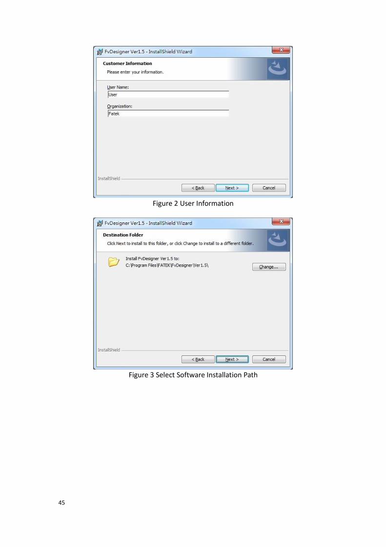
45
Figure 2 User Information
Figure 3 Select Software Installation Path
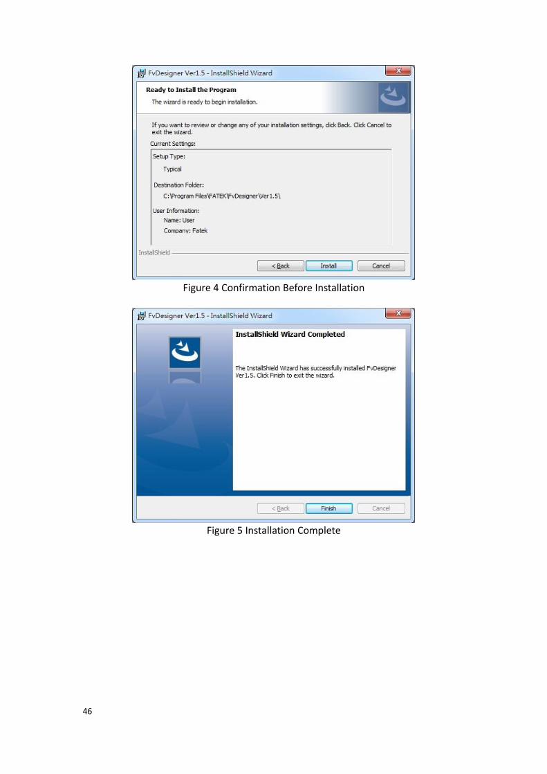
46
Figure 4 Confirmation Before Installation
Figure 5 Installation Complete

47
Startup Screen Every time FATEK FvDesigner is opened, it will first enter the startup screen. The functions provided are as follows:
Table 1 Startup Screen Functions
Function Description
【Create New
Project】
Uses a Project Wizard to guide the users to create a new project.
【Open
Project】
Opens an existing project. A recently used project list will be displayed on the right of the startup screen; the user can select a project on the list and then click the Open button at the bottom of the list to open this project. If the existing project is protected with a password, the password must be entered before it can be opened.
【Exit】 Closes the FATEK FvDesigner.
Switch the software interface to other languages including English, Traditional Chinese and Simplified Chinese.
Figure 6 Startup Screen
When Create New Project is selected, initial configurations for the project can be

48
completed by following the preset steps of the Project Wizard.
Table 2 Create New Project Steps
Function Description
【Choose HMI
Model】
Choose the FATEK FV HMI model. Images of each product model are displayed in the list below for the developer to choose from.
【Product Series】
On the lower right of the Product Sereis option, provide designers can quickly search for the desired size and model of the HMI through the drop-down menu.
【Search】
On the lower right of the Search option, provide designers can quickly search for the desired size and model of the HMI through enter words. Note: P5070VS and P5102VS supports VGA connection
【Choose
Controller】
Chose the controller to connect and the communication interface settings.
【Select Location】 Sets the project name and storage path.
First select the HMI product model to develop from the product image list below; the information field will display information on the hardware specifications and supported communication interfaces of the product.
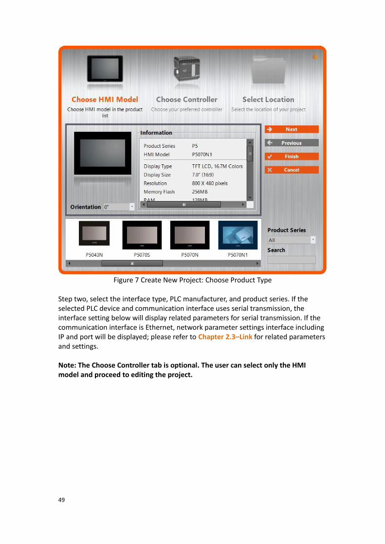
49
Figure 7 Create New Project: Choose Product Type
Step two, select the interface type, PLC manufacturer, and product series. If the selected PLC device and communication interface uses serial transmission, the interface setting below will display related parameters for serial transmission. If the communication interface is Ethernet, network parameter settings interface including IP and port will be displayed; please refer to Chapter 2.3–Link for related parameters and settings. Note: The Choose Controller tab is optional. The user can select only the HMI model and proceed to editing the project.
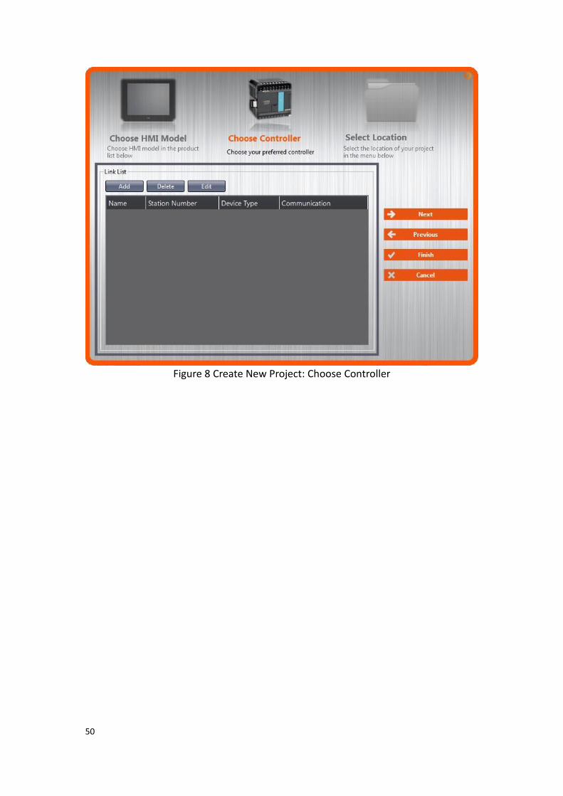
50
Figure 8 Create New Project: Choose Controller

51
Figure 9 Create New Project: Controller Connection Configuration
Finally, select the project name and storage path. Press【Finish】to complete the
Create New Project steps and start developing.

52
Figure 10 Create New Project: Select Location

53
1. Window Configuration
The default Window Configuration of FATEK FvDesigner is as shown below:
Figure 11 FATEK FvDesigner Window Configuration
1.1 File Tags 1.1.1 File
The File Window will appear after pressing the icon, as shown below.
Figure 12 Toolbar–File

54
Table 3 File Options
Function Description
【New(N)】 Close the current project and open the Project Wizard. A reminder window will appear to ask the developer to save the project if the current project was not yet saved.
【Open(O)】 Select the path and open a project. A reminder window will appear to ask the developer to save the project if the current project was not yet saved. If opening an existing project, a dialog will appear asking the user if a backup should be created. If “Yes” is selected, a backup file will be created. For example, if the file name is Project1.fpj, the backup will be created under a folder named “backup” created in the same path. The backup file will be named Project1.fpj.bak. If “No” is selected, no backup will be created.
【Save(S)】 Save the currently editing project.
【Save as(A)】 Select a path and save the current project as a new file.
【Export to RTF】 Creates a document detailing project information in an RTF file that can be opened in text editors such as Microsoft Word. Information in the RTF file includes the HMI model used, memory usage, and screen information.
【Recent
Documents】
Open recently used project. These project names will be displayed on the right of the window; if the cursor is moved on top of a file name, the file path will be displayed.
【Option(I)】
Open【Option】, to set software environment related
settings.
Function Description
【General】 Allows switching between different languages. Include English, Traditional Chinese, Simplified Chinese, Türkçe, etc.
【Icon Color】 Allows switching icon between different colors.
【Backup】 【Auto backup project from old
version of FvDesigner】
It will automatically backup the old version project when open it.
55
【Show original project backup
confirm message when startup】
It will show up a backup project dialog when open an old project.
【License】 This is for the use of advanced function, for the detail you can contact with the dealer you purchased.
【Exit(X)】 Close the current project and the program. A reminder window will appear to ask the developer to save the current project if the current project was not yet saved.

56
1.2 Ribbon The Ribbon is a user interface that uses panels and tab pages as the architecture; functions will be displayed with icons in the Window below according to different
options selected. There are five tabs in this section:【Design(D)】,【Project(P)】,
【Insert(I)】,【View(V)】, and【Tools(T)】.
Figure 13 Ribbon Illustration
Table 4 Introduction to Ribbon User Interface Functions
Function Description
【Design(D)】 Basic functions related to designing objects.
Block Description
【Clipboard】 Paste, Cut and Copy the selected object. Multi-copy function.
【Screen】 Three screen type options will be displayed when the New Screen button is pressed:
1. Base Screen 2. Window Screen 3. Keypad Screen
The screen type will be added once clicked.
【Basic
Settings】
Settings for basic object information, including object comments, locations and sizes.
【Font】 Settings for text, including font, size, and color.
【Text
Alignment】
Allow quick setting of text alignment in the object.
【Theme】 Select appearance related settings. It can change the appearance and color of the selected object or group.
【Format】 Select the figure level, location, size, alignment and group relations between objects.
【Draw】 Select a draw object to be placed on the work space.
【Object】 Select an object to be placed on the work space.

57
【Project(P)】 Information and settings related to the project.
1.【Execute】: Functions related to project execution.
Function Description
【Compile】 Generate Running Package (*.cfrp).
【Decompile】 Decompile Running Package (*.cfrp).
2.【Transfer】: Functions related to project transfer.
Function Description
【Download】 Download running package to the HMI.
【Upload】 Upload running package from the HMI.
【Make USB
Update File】
Produce a file to put on USB that can be used to update a project present on the HMI.
【USB Dongle
setting】
When FvDesigner model choose PC, will appear this option, mainly to set the customer ID of IGU-FvRT(USB Dongle).
3.【Run】: Executes the current project.
Function Description
【Simulation】 Open the simulation window; there are two modes to choose from: online simulation and offline simulation.
【Insert(I)】 Allows adding of new screens or functions.
Function Description
【Screen】 Three screen type options will be displayed when this button is pressed:
1. Base Screen 2. Window Screen 3. Keypad Screen
The screen type can be added once clicked.
【Device】 A【New Link Property】window will
appear when this button is pressed; A new connection device can be added after editing related settings.
【Data Log】 A【Data Log Group Properties】window
will appear when this button is pressed; A new data log group can be added after editing related settings.
【Alarm】 An【Alarm Group Properties】window
will appear when this button is pressed; A new alarm group can be added after editing related settings.
58
【Recipe】 A【Recipe Group Properties】window
will appear when this button is pressed; A new recipe group can be added after editing related settings.
【Schedule】 A【Schedule Group Properties】window
will appear when this button is pressed; A new schedule group can be added after editing related settings.
【Data
Transfer】
A【Data Transfer Group Properties】
window will appear when this button is pressed; A new data transfer group can be added after editing related settings.
【Script】 A【Script Editor】window will appear
when this button is pressed; a new script function can be added
【View(V)】 Settings related to windows within FvDesigner.
1.【System/Project Windows】
Function Description
【Screen List】 Display/Close Screen List window.
【Project Explorer】 Display/Close Project Explorer window.
【Memory
Address】
Display/Close Memory Address window.
【Output Message】 Displays/Close Output Message window.
【Search/Replace】 Displays/Close Search/Replace window
2.【Object/Library Windows】
Function Description
【Object List】 Display/Close Object List window.
【Toolbox】 Display/Close Toolbox window.
【User Toolbox】 Display/Close User Toolbox window.

59
3.【Window】
Function Description
【Arrange Icons】 Arrange the active function windows in the work space.
【Cascade】 Use the cascade window format in the work space.
【Switch Windows】 Switch between opened windows in the work space.
【Close All】 Close all windows in the work space.
【Tools(T)】 Tools application program; please refer to the Application Tool chapter for details.
Function Description
【File Transfer】 Through the HMI upload/download USB port connect with computer, you can transfer the file from HMI internal storage to computer or from computer to HMI.
【Pass Through】 Edit settings related to the pass through function.
【PLC Resource
Review】
Information on the various PLC devices supported by FvDesigner.
【Remote System
Setting】
Allow setting the system setting on the remote HMI.
【Fatek PLC Transfer
Encrypt Tool】
When download FATEK PLC project through HMI, can generate Fatek PLC Transfer Project or Singal Pass Password. For the detailed please refer
chapter 23.3.1-【Fatek PLC
Transfer Project Generator】
【Install USB
Drivers】
Can automatically detect the system information and install the appropriate USB drivers.

60
1.2.1 Design(D) 【Design(D)】allows developers to edit the object configurations within the work
space. It provides general clipboard functions, object format settings and provides frequently used objects to insert into the work space. Theme is used to apply settings to specifically selected objects in the window and change their appearance. Detailed descriptions of each function are as follows:
Figure 14 Design
1.2.1.1 Clipboard
Figure 15 Design–Clipboard
Table 5 Design–Clipboard
Function Description
【Cut】 Cut the object onto the clipboard.
【Paste】 Paste the cut or copied object.
【Copy】 Copy the object onto the clipboard.
【Multi-Copy】 Multi-Copy the object.
Multi-Copy function is available in the Design page of Ribbon (Figure 15) or in the pop-up menu which is showed after clicked the right button of the mouse (Figure 16).
Figure 16 the right click pop-up menu

61
In the Multi-Copy window (Figure 17), you can set the number of copied objects in the x and y direction, the sequence of adding the copied objects, whether or not to copy the comment of the object, and register settings. Multi-Copy function also supports incrementing the register address of the duplicate objects. The step size of the increment can be adjusted.
Figure 17 Multi-Copy window
1.2.1.2 Screen A design screen can be quickly added here.
Figure 18 Design–Screen
Table 6 Design–Screen
Function Description
【Base Screen】 General screen; its size is the same as the HMI resolution and cannot be changed.
【Window Screen】 This type of window screen is selected for both direct and indirect windows; the window screen size can be changed.
【Keypad Screen】 The required keypad screen can be customized here for use.

62
1.2.1.3 Basic Setting Provides basic object settings for users to edit comments, location and size of the object.
Figure 19 Design–Basic Setting
Table 7 Design–Basic Setting
Function Description
【Comment】 The user can enter the comment associated with an object here.
【Top】
【Left】
The coordinates for the top-left corner of the object: Top: The y-coordinate for the top-most point of the object. Left: The x-coordinate for the left-most point of the object.
【Width】
【Height】
The width and height of the object; uses pixel as units.
1.2.1.4 Font Provides basic settings for users to edit the font, size and color of text.
Figure 20 Design-Font
1.2.1.5 Text Alignment Provides basic settings for users to edit the position of text in an object.
Figure 21 Design-Text Alignment
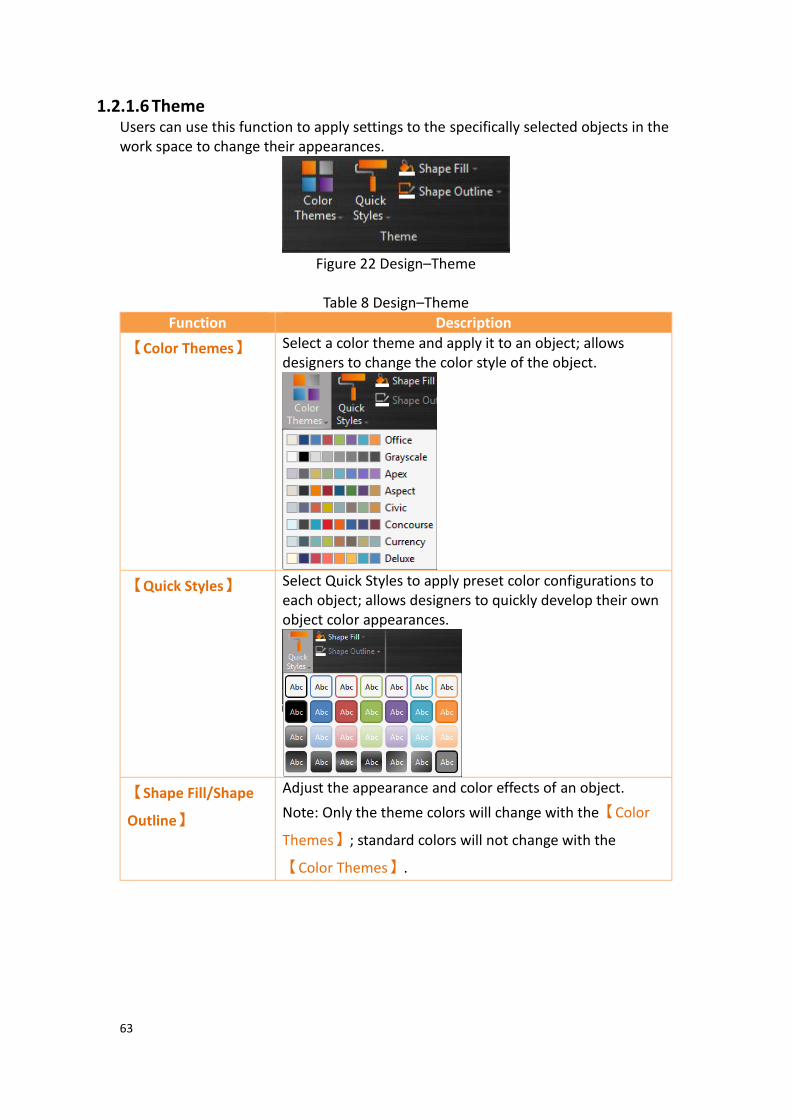
63
1.2.1.6 Theme Users can use this function to apply settings to the specifically selected objects in the work space to change their appearances.
Figure 22 Design–Theme
Table 8 Design–Theme
Function Description
【Color Themes】 Select a color theme and apply it to an object; allows designers to change the color style of the object.
【Quick Styles】 Select Quick Styles to apply preset color configurations to each object; allows designers to quickly develop their own object color appearances.
【Shape Fill/Shape
Outline】
Adjust the appearance and color effects of an object.
Note: Only the theme colors will change with the【Color
Themes】; standard colors will not change with the
【Color Themes】.

64
1.2.1.7 Format Provides object format functions to allow users to select multiple objects and organize the typesetting of the screen objects, including alignment, spacing, size adjustment functions etc.
Figure 23 Design–Format

65
Table 9 Design–Format
Function Description
【Bring to Front】 Move object to front.
【Move Forward】 Move object forward a layer.
【Send to Back】 Move object to back.
【Move Forward】 Move object down a layer.
【Group】 Multiple objects can be grouped into a single object. Movement and properties are applied to the entire group.
【Ungroup】 Restores a group into single objects.
【Make Same Size】 Resize selected objects to be the same size as the object in the lowermost layer.
【Make Same
Width】
Adjusts the width of the selected objects to be the same width as the object in the lowermost layer.
【Make Same
Height】
Adjusts the height of the selected objects to be the same height as the object in the lowermost layer.
【Align】 Eight options will appear when this button is pressed: Align Left Align Center Align Right Align Top Align Middle Align Bottom Distribute Horizontally Distribute Vertically
【Recommended
Model】
When FvDesigner model type choose PC will show up this option, and provide the IGU-FvRT level suggestion according to the amount of the used registers and links.
1.2.1.8 Objects Objects provided by this software can be added from the object field; frequently used objects are displayed here. After selecting the object to add, drag the object to the work space. Use the Toolbox in the Object/Library Window section to the right to view all available object types.
Figure 24 Design–Object

66
1.2.2 Project(P) This field provides project related function settings, and it is divided into the following three parts:
【Execute】Compiles the project file into a running package, or decompiles the
running package into a project file.
【Transfer】is related to file transfer; It can download the compiled running package
onto the HMI for running or acquire the running package from the HMI and upload it onto the computer. Users can also make an USB update file to replace the running project on HMI.
【Run】opens the simulation window to run the current project, include off-line
simulation and on-line simulation.
Figure 25 Project
1.2.2.1 Compile
Figure 26 Creating Running Package
The【Compile】function can be found in the【Project】function tab of the Ribbon
task bar on top of the FvDesigner. The running package (*.cfrp - Compress FATEK Running Package) can be generated when the project file (*.fpj - FATEK Project) has successfully compiled. The running package can be downloaded to the FATEK HMI device through the Internet/USB/Serial cable. After compilation is complete, the output window will display information concerning the compile output, memory configuration, etc. The project must be saved and compiled into a running package before a simulation can be run or downloaded onto a HMI device.
Table 10 Compilation Output Window Related Information
Information Content
【Project】 The location of the compiled project file (*.fpj).
【Date】 Compilation date and time.
【Running Package】 The location to create the running package file (*.cfrp).
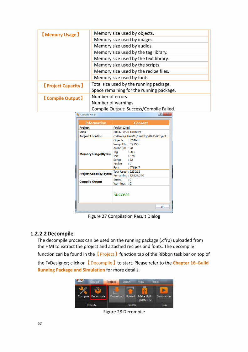
67
【Memory Usage】 Memory size used by objects.
Memory size used by images.
Memory size used by audios.
Memory size used by the tag library.
Memory size used by the text library.
Memory size used by the scripts.
Memory size used by the recipe files.
Memory size used by fonts.
【Project Capacity】 Total size used by the running package. Space remaining for the running package.
【Compile Output】 Number of errors Number of warnings Compile Output: Success/Compile Failed.
Figure 27 Compilation Result Dialog
1.2.2.2 Decompile The decompile process can be used on the running package (.cfrp) uploaded from the HMI to extract the project and attached recipes and fonts. The decompile
function can be found in the【Project】function tab of the Ribbon task bar on top of
the FvDesigner; click on【Decompile】to start. Please refer to the Chapter 16–Build
Running Package and Simulation for more details.
Figure 28 Decompile

68
1.2.2.3 Upload & Download Data transfer can be performed for projects through USB or Internet/Serial cable connection. Clicking on the Download function will automatically compile and save the project to the HMI. Clicking the Upload function will upload the running package running on the HMI onto the computer. If users want to view the contents of the running package after upload is complete, the decompile function can be used to extract contents from the running package. The HMI network IP information must be set when using Internet transfer. The auto-search function can be used if the user does not know the IP information; the software will search for FATEK HMI devices on the local network and display the device IP information found in a table. Select the target device’s IP to perform data transfer. The transfer function is password protected; the upload or download password must be set before transferring and this password will be checked during connection. Communication will only be performed if the password is correct.
Please refer to the【Upload】and【Download】sections in Chapter 16–Build
Running Package and Simulation for details.
1.2.2.4 Make USB Flash Drive Update File This function can let users generate an USB update file in the assigned path(.uferp)(V1.3.29 or V1.4.7 later version to V1.5.3, filename extension is ufrp2). Put this file in the directory folder of USB Drive and insert the USB Drive into the executing HMI. A dialog will pop up to ask if the user wants to update the running project. If the user wants to update, there is a file list the user can choose from. Click the OK button to restart HMI and replace the running project.
Please refer to the【Upload】and【Download】sections in Chapter 16–Build
Running Package and Simulation for details. Note 1: If the USB size is larger, wait a while, and then the Project Update Question Dialog will appear Note 2: In order to improve the software performance, we have done some software changes, if you are using FvDesigner V1.3.29 previous versions, please pay attention to the use of USB drive ufrp file upgrade project, it may encounter instability, solution please use FvDesigner V1.3.29 or V1.4.7 later to re-download the software, and then use USB drive update project Note 3: V1.3.29 or V1.4.7 later version, the production of USB drive update file, the filename extension is ufrp2, if you do not use FvDesigner V1.3.29 or V1.4.7 or later version of the software downloaded the HMI will not be able to identify V1.3.29 or V1.4.7 or later version, make the USB drive update file, the solution please use FvDesigner V1.3.29 or V1.4.7 later version of the software to re-download Note 4:use【Make USB Flash Drive Update File】function, please confirm the
firmware version on the HMI that would like to update, table as below, or it may cause the project damage on the HMI, in this case, update once again.

69
Table 11 Make USB Flash Drive Update File
File Build Version HMI-supported firmware version
UFRP ?-v1.3.28 v1.4.0-v1.4.6
?-v1.3.x v1.4.0-v1.4.x v1.5.0-v1.5.x *OS v1.0 only
UFRP+ UENV
v1.3.29-v1.3.x v1.3.29-v1.3.x v1.4.7-v1.4.x
v1.5.0-v1.5.x *OS v1.0 only
UFRP2v1 +UENV
v1.4.7-v1.4.x v1.3.29-v1.3.x v1.4.7-v1.4.x v1.5.0-v1.5.x
UFRP2v2 +UENV
v1.5.0-v1.5.2 v1.4.17-v1.4.x v1.5.0-v1.5.x
UFERP v1.5.0-v1.5.2 v1.4.29-v1.4.x v1.5.3-v1.5.x
Figure 29 make USB drive update file
70
Table 12 properties of making USB drive upgrade file
Options Description
【Data】 【Target Folder】
File storage path, you can browse to select the storage path.
【File Name】
Set the file name of the USB drive update file
【output files】
The filename of the output file is .uferp2
【Delete from
HMI】
This column determines whether to clear the data originally stored in the HMI. In addition to produce the update file of USB drive, you can choose to clear the original data stored in HMI, through the operation of HMI, insert the USB drive will appear USB project update list dialog, you can also select from delete item, once selected, it will delete the select item when the project download complete.
【Select All】
After checked,【Backup Memory】、【Alarm】、【Recipe】、
【Data Log】、【Print】、【Link】、【Security Password】、
【Operation Log】、【Data Transfer】、【Installment】、
【Schedule】and【Others】all of them will be selected.
【Backup Memory】
After checked, it will delete the HMI origin NV and XNV data after USB drive updated HMI file.
【Alarm】
After checked, it will delete the HMI origin alarm record after USB drive updated HMI file. That is, all files under the HMI / internal / alarm /
【Recipe】
After checked, it will delete the HMI origin recipe file after USB drive updated HMI file. That is, all files under the HMI / internal / recipe /
【Data Log】
After checked, it will delete the HMI original data log record
71
after USB drive updated HMI file. That is, all files under the HMI / internal / datalog /
【Print】
After checked, it will delete the HMI origin print data after USB drive updated HMI file. That is, all files under the HMI / internal / hardcopy /
【Link】
After checked, it will delete the HMI original parameters through the system parameters set communication after USB drive updated HMI file. That is, the controller communication reset the parameter accordind to the connection on the software
【Security Password】
After checked, after USB drive updated HMI file will delete the HMI origin password table, at this point, if the project has set the password table, the password table will be the main in the project; if unchecked will retain the origin password table that on the HMI.
【Operation Log】
After checked, it will delete the HMI origin operation log after USB drive updated HMI file. That is, all files under the HMI / internal / operationlog /
【Data Transfer】
After checked, it will delete the HMI origin transfer data after USB drive updated HMI file. That is, all files under the HMI / internal / datatransfer /
【Installment】
After checked, it will delete the HMI origin installment data after USB drive updated HMI file.
【Schedule】
After checked, it will delete the original schedule information on the HMI after USB flash drive updates the HMI data. Such as the project originally set start at 8:00:00, change to start at 9:00:00 during the HMI executing. If didn’t check this option, it will remain startup from 9:00:00, if did check this option, it will delete the modified record, and stratup from 8:00:00.

72
【Others】
After checked, it will delete the original HMI installment data in a specified location.
【Other
Settings】
【Userdefined Startup Screen】
Allows user to set the HMI start up screen. A start up screen could be the company logo, a log in screen, etc. Once the USB update is complete, the HMI boot screen will be changed. The Fatek HMI boot screen is in the given location: (under 64bit windows) C:\Program Files (x86)\FATEK\FvDesigner\Ver1.4\startup screen (under 32bit windows) C:\Program Files\FATEK\FvDesigner\Ver1.4\startup screen
【Write System Setting】
This allows designers after update HMI via USB flah drive, whether to modify the HMI system setting at the same time, so that it is not necessary for each HMI to enter the system setting adjustment when updating multiple HMIs.
【Start】
When finished adjusting your settings, press start to begin the update.
【Close】
Press this button to end and close the window.
Figure 30 Project Update Question Dialog

73
Figure 31 USB Update List
1.2.2.5 USB Dongle Setting When FvDesigner choose PC model, will appear USB Dongle seeting option, figure as shown below, this option is mainly to set the customer ID of IGFU-FvRT(USB Dongle), insert IGU-FvRT(USB Dongle) into PC USB port, then set the customer ID through this option, the customer ID in the project and the customer ID of IGU-FvRT(USB Dongle) need to be the same, then the FvRT can excute correctly. For more detailed operation step please refer to FvRT manual.
Figure 32 IGU Setting List
1.2.2.6 MI detects USB Drive plugged in When HMI detects USB Drive is plugged in, for operator to know clearly, the message will show on the screen of HMI as figure shown below, to remid operator.
Figure 33 HMI detects USB Drive is plugged in
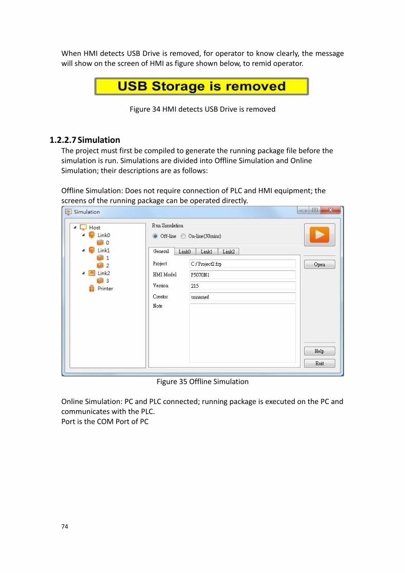
74
When HMI detects USB Drive is removed, for operator to know clearly, the message will show on the screen of HMI as figure shown below, to remid operator.
Figure 34 HMI detects USB Drive is removed
1.2.2.7 Simulation The project must first be compiled to generate the running package file before the simulation is run. Simulations are divided into Offline Simulation and Online Simulation; their descriptions are as follows: Offline Simulation: Does not require connection of PLC and HMI equipment; the screens of the running package can be operated directly.
Figure 35 Offline Simulation
Online Simulation: PC and PLC connected; running package is executed on the PC and communicates with the PLC. Port is the COM Port of PC

75
Figure 36 Online Simulation
Please refer to the simulation chapter in Chapter 16–Build Running Package and Simulation for details.
1.2.3 Insert(I) This field allows users to quickly add screens or functions; they can be added by pressing this button, in which includes:
【Screen】
【Device】
【Data Log】
【Alarm】
【Recipe】
【Schedule】
【Data Transfer】
【Script】
Figure 37 Insert

76
1.2.4 View(V) The View tab of the Ribbon contains functions related to the appearance of the
application; the【System/Project Windows】will be placed on the left except
【Search/Replace】and the【Object/Library Windows】will be placed on the right.
Figure 38 Window
Use the mouse to drag the working space and the FvDesigner will display the window configuration reminder; move the mouse to the configuration reminder and the
workung space will be placed at the position clicked. The FvDesigner has a 【User
Habit Log】function that will record the developer’s window configuration position
on the system so that the workung space configuration will be configured to the same positions as the previous development environment every time the project is opened for development.
Figure 39 Configure Operating Window Position
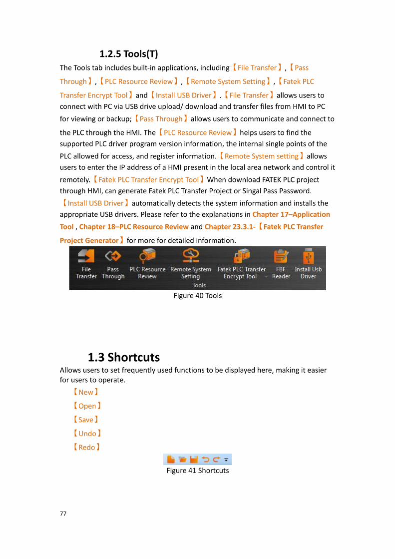
77
1.2.5 Tools(T) The Tools tab includes built-in applications, including【File Transfer】,【Pass
Through】,【PLC Resource Review】,【Remote System Setting】,【Fatek PLC
Transfer Encrypt Tool】and【Install USB Driver】.【File Transfer】allows users to
connect with PC via USB drive upload/ download and transfer files from HMI to PC
for viewing or backup;【Pass Through】allows users to communicate and connect to
the PLC through the HMI. The【PLC Resource Review】helps users to find the
supported PLC driver program version information, the internal single points of the
PLC allowed for access, and register information.【Remote System setting】allows
users to enter the IP address of a HMI present in the local area network and control it
remotely.【Fatek PLC Transfer Encrypt Tool】When download FATEK PLC project
through HMI, can generate Fatek PLC Transfer Project or Singal Pass Password.
【Install USB Driver】automatically detects the system information and installs the
appropriate USB drivers. Please refer to the explanations in Chapter 17–Application
Tool , Chapter 18–PLC Resource Review and Chapter 23.3.1-【Fatek PLC Transfer
Project Generator】for more for detailed information.
Figure 40 Tools
1.3 Shortcuts Allows users to set frequently used functions to be displayed here, making it easier for users to operate.
【New】
【Open】
【Save】
【Undo】
【Redo】
Figure 41 Shortcuts

78
1.4 Interface Appearance Options 【Interface Appearance Options】(Top Left) provides customized interface
appearance settings, allowing users to minimize or maximize the work space and change the color and text of the interface. There is also a help function and the program version information is also provided here.
Figure 42 Interface Appearance Options
Table 13 Interface Appearance Options
Display Item Description
【Maximize/Minimize
ribbon】
Pressing this button will minimize the work space and pressing it again will maximize the work space.
【Options】 Choose the style and font of the interface.
【Style】
Choose the style of the interface.
【Font】
Choose the font size of the interface.
【Restore Window Position】can restore the workung
space, you can click this option, the work window will be restored to the system default location.
【System/Project】except【Search/Replace】will on
the left, 【Objects/Resource Library】will on the right.

79
【Customize】provide customize option.
【Help】 If you want to inquire about the related settings for the use of the software, you can press this help, press it will display the user manual for the query software related functions
【About】 Displays software version information.
1.5 Status Bar The【Status Bar】displays information on the work space window, the window
resolution, HMI product specifications and type, and other information.
Figure 43 Status Bar
Table 14 Status bar
Display Item Description
【Show Name and
Address】
Pressing the gear brings up a window with the following options:
【Show Name and Address】
Overlays the name and register being controlled for each component in the project.
【Show Quicklaunch Toolbar】
Shows/hides the quicklaunch toolbar present above the editing screen.
【Search/Replace】
Whether to displays Search/Replace setting window. Please refer chapter26-Search/Replace for more detail.
【Set Name and Address Display】
Properties for the Name and Address display. User can hide/show the name or address displayed and change text properties such as address color, background color, opacity, font and size.
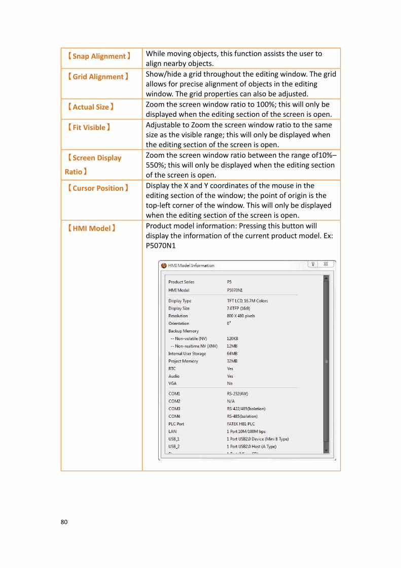
80
【Snap Alignment】 While moving objects, this function assists the user to align nearby objects.
【Grid Alignment】 Show/hide a grid throughout the editing window. The grid allows for precise alignment of objects in the editing window. The grid properties can also be adjusted.
【Actual Size】 Zoom the screen window ratio to 100%; this will only be displayed when the editing section of the screen is open.
【Fit Visible】 Adjustable to Zoom the screen window ratio to the same size as the visible range; this will only be displayed when the editing section of the screen is open.
【Screen Display
Ratio】
Zoom the screen window ratio between the range of10%–550%; this will only be displayed when the editing section of the screen is open.
【Cursor Position】 Display the X and Y coordinates of the mouse in the editing section of the window; the point of origin is the top-left corner of the window. This will only be displayed when the editing section of the screen is open.
【HMI Model】 Product model information: Pressing this button will display the information of the current product model. Ex: P5070N1

81
1.6 Quicklaunch Toolbar The【Quicklaunch Toolbar】provides quick access to common tools including
copy/paste, moving objects between layers, grouping objects, alignment options, and language and state switches. Can be displayed above or below the window edit area.
Figure 44 Quicklaunch Toolbar
Table 15 Quicklaunch Toolbar
Display Item Description
【Cut】 Copies a selected object to the clipboard and then deletes the object from the work space.
【Copy】 Copies a selected object to the clipboard.
【Multi-Copy】 Copies a selected object and pastes a set of objects. The number of items in the set is determined by the user.
【Paste】 Inserts the object(s) currently in the clipboard into the work space at the selected location.
【Delete】 Removes the selected item from the work space.
【Bring to Front】 Moves the selected object to the topmost layer of the work space.
【Move Forward】 Moves the selected object up one layer.
【Send to Back】 Moves the selected object to the bottommost layer of the work space.
【Move Backward】 Moves the selected object down one layer.
【Group】 Select several objects and group them using this option. The group allows the objects to be moved simultaneously and settings are applied to the entire group.
【Ungroup】 Groups are restored to its independent objects.
【Make Same Size】 Select several objects and resize the set such that all the objects are the same size. The size of the set is based on the object in the lowermost layer.
【Make Same
Width】
Select several objects and resize the set such that all the objects have the same width. The width of the set is based on the object in the lowermost layer.
【Make Same
Height】
Select several objects and resize the set such that all the objects have the same height. The height of the set is based on the object in the lowermost layer.
【Align Left】 Select several objects and align the leftmost points of the objects. The alignment is based on the object in the

82
lowermost layer.
【Align Center】 Select several objects and align the horizantal centers of the objects. The alignment is based on the object in the lowermost layer.
【Align Right】 Select several objects and align the rightmost points of the objects. The alignment is based on the object in the lowermost layer.
【Align Top】 Select several objects and align the topmost points of the objects. The alignment is based on the object in the lowermost layer.
【Align Middle】 Select several objects and align the vertical centers of the objects. The alignment is based on the object in the lowermost layer.
【Align Bottom】 Select several objects and align the bottommost points of the objects. The alignment is based on the object in the lowermost layer.
【Distribute
Horizontally】
Position several objects such that the horizantal distance between the objects are equal.
【Distribute
Vertically】
Position several objects such that the vertical distance between the objects are equal.
【Switch Language】 Select from the dropdown menu the displayed language of the project.
【Switch State】 Select from the dropdown menu the displayed state of the project.
【0, 1, 2, 3】 Switch the displayed state of the project for states 0, 1, 2, and 3.
【Show/Hide Toolbar
Icons】
Select the icons that are shown on the toolbar. Items that are checked will be shown.

83
1.7 System/Project Windows Descriptions of the System/Project Windows are as follows:
1.7.1 Screen List The【Screen List】is used to manage the HMI screens created by the user. The
created HMI screens can be browsed here; selecting the screen with the left mouse button will open the screen in the work space. Pressing the right mouse button will open the management menu to perform further settings. Refer to Chapter21.2-Screen List The following figure is a screen of the Screen List:
Figure 45 Screen List Interface

84
Figure 46 Management Menu
Table 16 Screen List Management Settings
Function Description
【Goto】 【Goto】provides two methods to select a
screen to view. The first is through the drop-down menus on the right, choose to jump directly to the screen which you want to view, pictured below, after a screen is clicked, it will be displayed on the work space.
The second is through the search ID or the title of the screen, as shown in the following figure
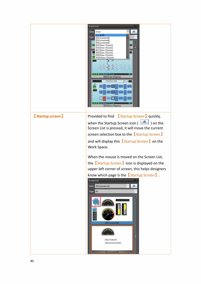
85
【Startup screen】 Provided to find 【Startup Screen】quickly,
when the Startup Screen icon ( ) on the Screen List is pressed, it will move the current
screen selection box to the【Startup Screen】
and will display this【Startup Screen】on the
Work Space. When the mouse is moved on the Screen List,
the【Startup Screen】icon is displayed on the
upper left corner of screen, this helps designers
know which page is the【Startup Screen】.
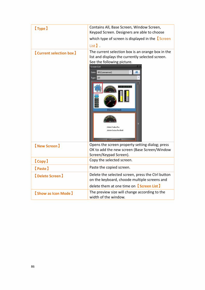
86
【Type】 Contains All, Base Screen, Window Screen, Keypad Screen. Designers are able to choose
which type of screen is displayed in the【Screen
List】.
【Current selection box】 The current selection box is an orange box in the list and displays the currently selected screen. See the following picture.
【New Screen】 Opens the screen property setting dialog; press OK to add the new screen (Base Screen/Window Screen/Keypad Screen).
【Copy】 Copy the selected screen.
【Paste】 Paste the copied screen.
【Delete Screen】 Delete the selected screen, press the Ctrl button on the keyboard, choode multiple screens and
delete them at one time on【Screen List】
【Show as Icon Mode】 The preview size will change according to the width of the window.
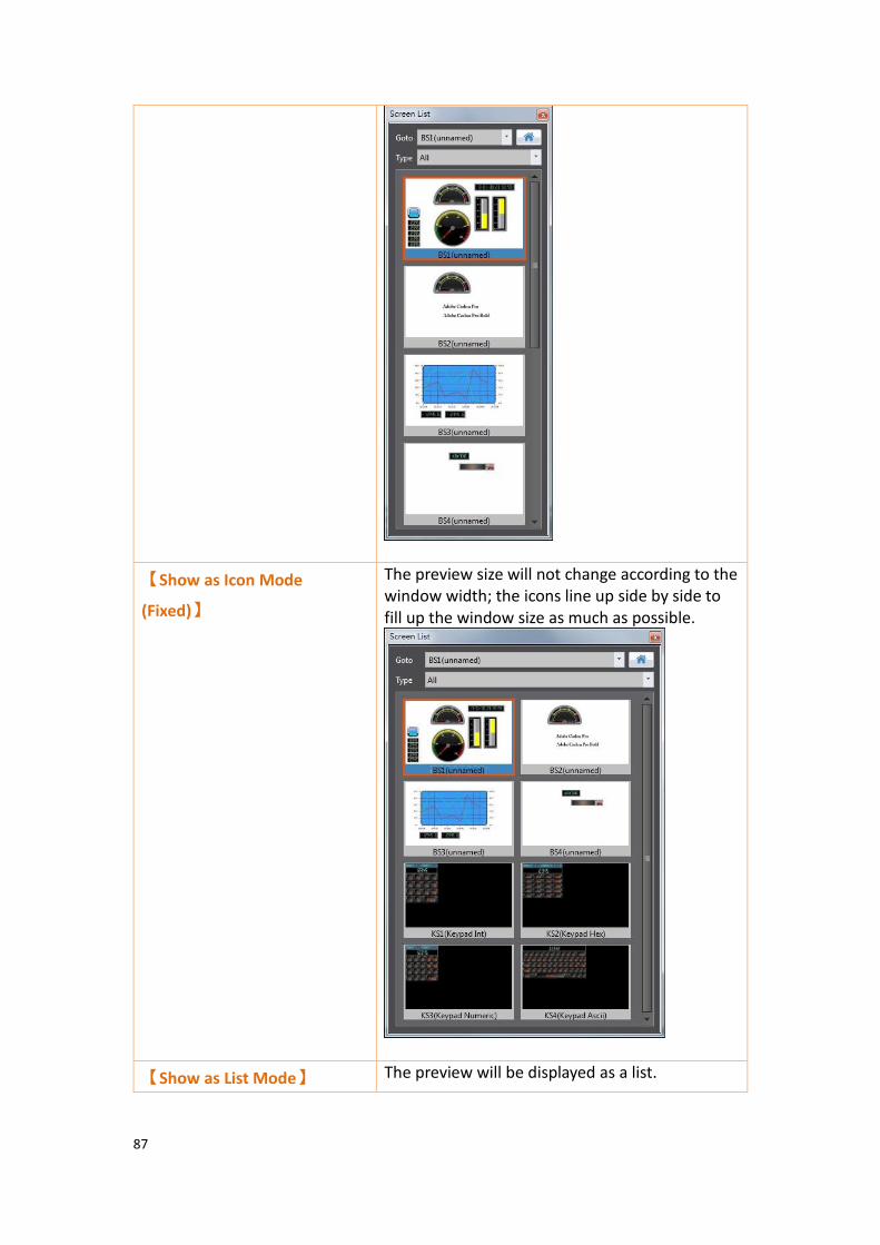
87
【Show as Icon Mode
(Fixed)】
The preview size will not change according to the window width; the icons line up side by side to fill up the window size as much as possible.
【Show as List Mode】 The preview will be displayed as a list.

88
【Set as Startup Screen】 Set the selected screen as the startup screen. The background color of this screen will be different from other screens once it is set as the startup screen.
【Properties】 Open the screen properties setting dialog.

89
1.7.2 Screen Properties Screen properties opens a window that includes screen settings, background color and print screen. This window is accessible by right clicking the work space and selecting “Properties”. It is accessible on any screen.
The following figures are Display Properties screens:
Figure 47 Base Screen Properties
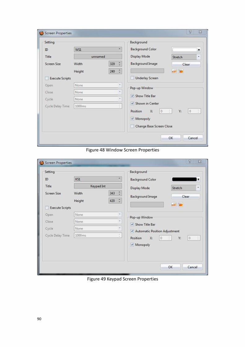
90
Figure 48 Window Screen Properties
Figure 49 Keypad Screen Properties

91
Table 17 Screen Properties Items
Display Item Description
【ID】 Work space ID. For base screens, the ID will begin with “BS” followed with a number. For window screens, the ID will begin with “WS” followed with a number. For keypad screens, the ID will begin with “KS” followed by a number. The arrows next to the text box allows a user to increment or decrement the number associated with the screen ID.
【Title】 A screen caption for the current screen can be set.
【Screen Size】 The screen and keypad screen height and width (in pixels) can be set. Note: the smallest width and height of window screen and keypad screen are 10.
【Security Level】 A security level for the current screen can be set. The security level restricts users with a lower security level than the one set from accessing the current screen unless access is granted.
【Change Screen Auto
Logout】
Logs out the current user upon switching screens.
【Execute Scripts】 Check the box to execute a script for the current screen.
【Open】 Executes the selected script when the screen is opened.
【Close】 Executes the selected script when the screen is closed.
【Cycle】 Continuously executes the selected script. Cycle is based
on the【Cycle Delay Time】.
【Cycle Delay Time】 The delay in milliseconds between cycles of the script set
in the【Cycle】option.
【Background
Color】
Set the color of the workspace background.
【Display Mode】 Select the display mode, including strech, fixed percentage stretch, fill, or original size.
【Background
Image】
Use an image as the background. The buttons allow the user to either select an image from the Image library or from the computer. Acceptable image formats are .jpg, .bmp, .png, .tif, .tiff etc.
【Underlay Screen】 Select the checkbox and select a screen to use as the underlaying screen from the dropdown menu. The underlay screen will reflect the selected screen. For example, if BS2 is selected as the underlay screen on BS1, all objects on BS2 will also be on BS1. However, those objects can only be changed on BS2.

92
【Whole Screen】 Sets the range for printing as the entire screen. For example, the the HMI used is the P5070N, the resolution will be 800x480.
【Show Screen
Image】
Clicking this will open a window where the current screen will be shown. Adjusting X and Y coordinates will be reflected through the red rectangle on the screen image.
【Left-up Corner】 Manually select the X and Y coordinates relative to the upper left corner. The red rectangle will adjust accordingly.
【Lower-right
Corner】
Manually select the X and Y coordinates relative to the bottom right corner. The red rectangle will adjust accordingly.
【Show Title Bar】 Window screen or keypad screen can set whether show title bar when pop up screen window
【Shown in Center】 Set to enable the window screen to show up in the center of the screen.
【Automatic Position
Adjustment】
Keypad screen can set whether the pop-up position is automatically adjusted.
【Position】 Manually adjust the position of the window screen. This
is enabled when the【Shown in Center】is not checked.
【Monopoly】 If checked, objects outside the window screen or keypad screen cannot be accessed while the window screen is active.
【Change Base Screen
Close】
When the window screen switch to the basic screen, whether to retain the display of this window screen, if check this option window screen will automatically shut down. This option is only supported on Windows screen.

93
1.7.3 Project Explorer Project Explorer is the window to manage the entire project.
Table 18 Project Explorer Items
Function Description
【System】 Please refer to Chapter 2–System for detailed contents. Related setting windows will appear on the work space when each button is pressed.
Function Description
【Project
Information】
Allows users to browse information concerning the project and HMI, set the project password security and non-volatile (NV) memory configuration.
【Unit
Setting】
The basic settings of the device can be set here.
【Link】 The configuration of the device/PLC connected to the HMI can be set here.
【Servers】 The settings of various types of servers, FTP , VNC and SMTP can be edited here.
【Security】 Security settings concerning the objects related to the project and user privileges can be set here.
【System
Message】
View and edit the HMI system messages.
【Functions】 Related setting windows will be displayed on the work space when this button is pressed.

94
Function Description
【Data Log】 Data log settings can be edited here; please refer to Chapter 7–Data Logfor detailed contents.
【Alarm】 Alarm settings can be edited here; please refer to Chapter 8–Alarmfor detailed contents.
【Recipe】 Recipe settings can be edited here; please refer to Chapter 9–Recipefor detailed contents.
【Operation
Log】
Operation log settings can be edited here; please refer to Chapter 10–Operation Log for detailed contents.
【Schedule】 Scheduler settings can be edited here; please refer to Chapter 11–Schedule for detailed contents.
【Data
Transfer】
Data transfer settings can be edited here; please refer to Chapter 12–Data Transfer for detailed contents.
【Script】 Script settings can be edited here; please refer to Chapter 13–Script for detailed contents.
【Resource】 Please refer to【Resource】for detailed contents. The
setting window will be displayed in the work space when each button is pressed.
Function Description
【Image Library】 Required images should be made in advance and indexed into the
【Image Library】so that they can
easily be used when editing objects. Refer to ch14-Resource for detailed explanations
【Audio Library】 Required audio files should be made and advance and indexed into the
【Audio Library】 so that they can
easily be used when editing projects.
95
Refer to ch14-Resource for detailed explanations.
【Tag Library】 Define the frequently used register addresses before designing a project to increase the system readability when designing. Refer to ch14-Resource for detailed explanations.
【Text Library】 If there is the need to switch the text displayed in real-time in order to achieve multi-language functionality or other functions, prepare the necessary text, a table in the Text Library, and use the
【Control Address】to switch the
currently displayed text group when the HMI interface is running. Refer to ch14-Resource for detailed explanations.
【Font Library】 Build the font and commonly used text in advance to avoid it can’t show correctly in the future. Refer to ch14-Resource for detailed
1.7.4 Memory Address External devices, internal HMI devices or HMI system variables usually need to be specified for the objects and functions of the HMI. It is difficult for a user to remember which resources are used for which objects or functions when there are
many objects in a project; this is when【Memory Address】can be used to display
which resources are used. This way, the user will be able to effectively plan the settings of any object or function in a project. As shown in the figure below, red represents the device registers that are occupied, green represents that registers that are not yet used; the user can arrange and set resources through this function. Left-click an item in the list to use and the corresponding screen or function list menu will open; double clicking the left mouse button on the item will open the setting dialog of that item.
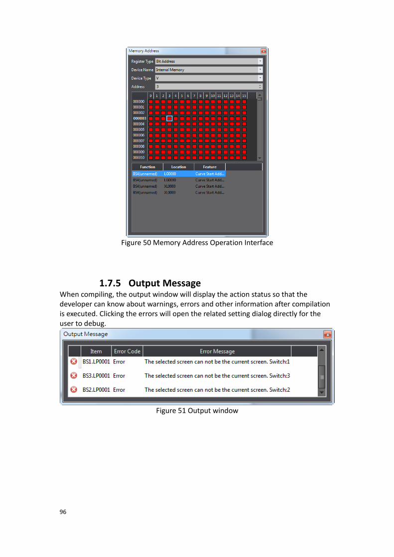
96
Figure 50 Memory Address Operation Interface
1.7.5 Output Message When compiling, the output window will display the action status so that the developer can know about warnings, errors and other information after compilation is executed. Clicking the errors will open the related setting dialog directly for the user to debug.
Figure 51 Output window
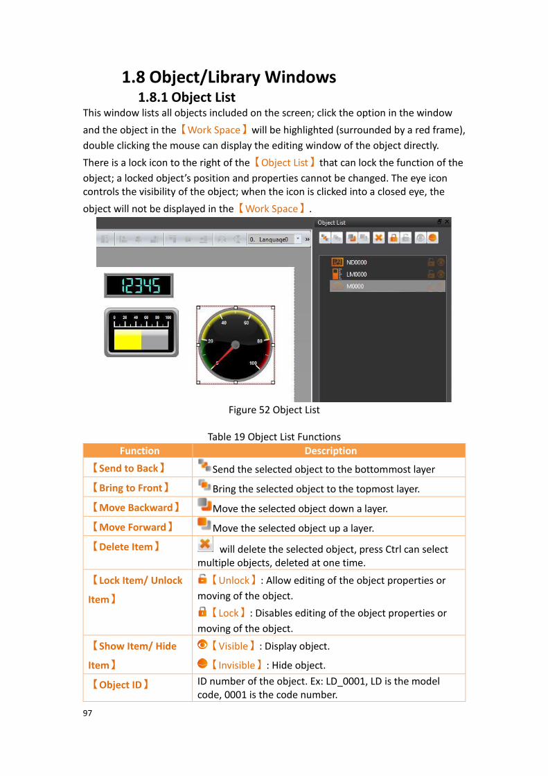
97
1.8 Object/Library Windows 1.8.1 Object List
This window lists all objects included on the screen; click the option in the window
and the object in the【Work Space】will be highlighted (surrounded by a red frame),
double clicking the mouse can display the editing window of the object directly.
There is a lock icon to the right of the【Object List】that can lock the function of the
object; a locked object’s position and properties cannot be changed. The eye icon controls the visibility of the object; when the icon is clicked into a closed eye, the
object will not be displayed in the【Work Space】.
Figure 52 Object List
Table 19 Object List Functions
Function Description
【Send to Back】 Send the selected object to the bottommost layer
【Bring to Front】 Bring the selected object to the topmost layer.
【Move Backward】 Move the selected object down a layer.
【Move Forward】 Move the selected object up a layer.
【Delete Item】 will delete the selected object, press Ctrl can select multiple objects, deleted at one time.
【Lock Item/ Unlock
Item】
【Unlock】: Allow editing of the object properties or
moving of the object.
【Lock】: Disables editing of the object properties or
moving of the object.
【Show Item/ Hide
Item】
【Visible】: Display object.
【Invisible】: Hide object.
【Object ID】 ID number of the object. Ex: LD_0001, LD is the model code, 0001 is the code number.

98
1.8.2 Toolbox The FvDesigner provides a basic【Toolbox】; The developer can expand various
types of objects provided directly from the toolbox according to the different
categories. Select an object and drag it over to the【Work Space】with the mouse to
insert the object into the work space.
Figure 53 Toolbox Illustration
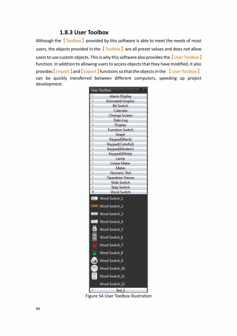
99
1.8.3 User Toolbox Although the【Toolbox】provided by this software is able to meet the needs of most
users, the objects provided in the【Toolbox】are all preset values and does not allow
users to use custom objects. This is why this software also provides the【User Toolbox】
function. In addition to allowing users to access objects that they have modified, it also
provides【Import】and【Export】functions so that the objects in the 【User Toolbox】
can be quickly transferred between different computers, speeding up project development.
Figure 54 User Toolbox Illustration
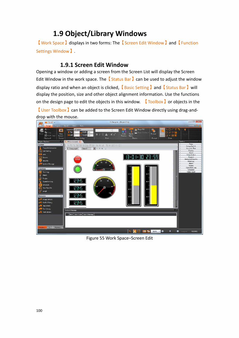
100
1.9 Object/Library Windows 【Work Space】displays in two forms: The【Screen Edit Window】and【Function
Settings Window】.
1.9.1 Screen Edit Window Opening a window or adding a screen from the Screen List will display the Screen
Edit Window in the work space. The【Status Bar】can be used to adjust the window
display ratio and when an object is clicked,【Basic Setting】and【Status Bar】will
display the position, size and other object alignment information. Use the functions
on the design page to edit the objects in this window. 【Toolbox】or objects in the
【User Toolbox】can be added to the Screen Edit Window directly using drag-and-
drop with the mouse.
Figure 55 Work Space–Screen Edit
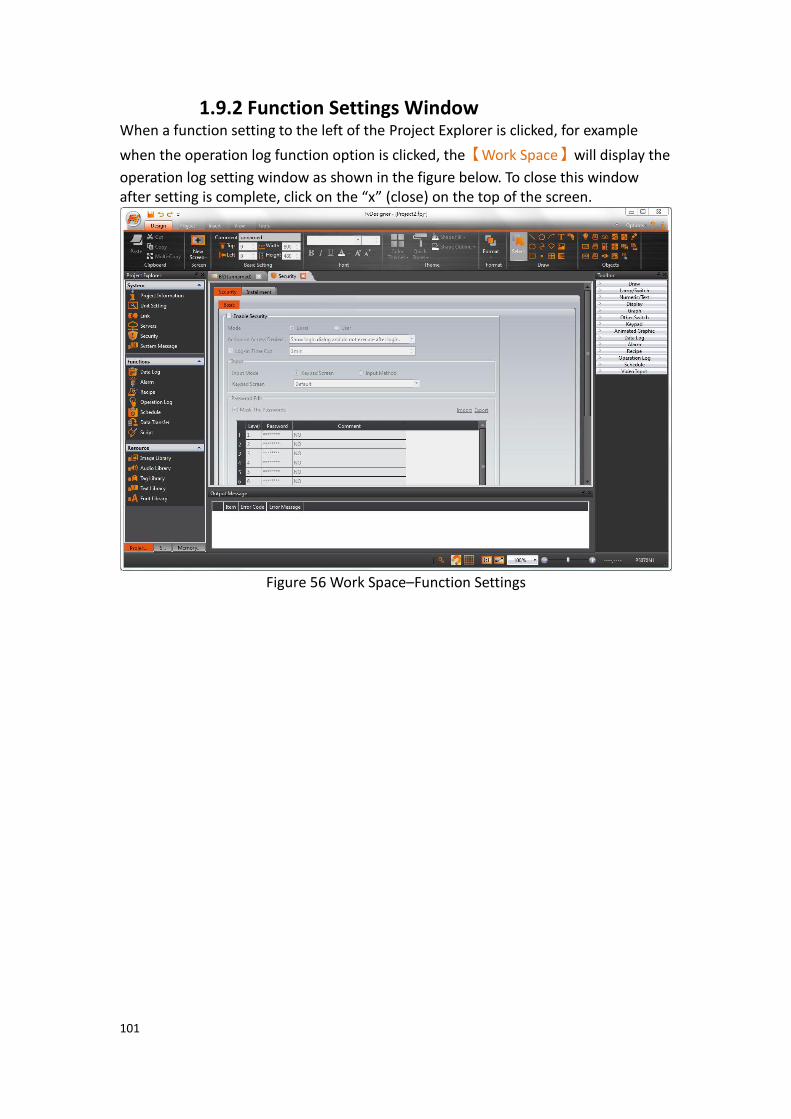
101
1.9.2 Function Settings Window When a function setting to the left of the Project Explorer is clicked, for example
when the operation log function option is clicked, the【Work Space】will display the
operation log setting window as shown in the figure below. To close this window after setting is complete, click on the “x” (close) on the top of the screen.
Figure 56 Work Space–Function Settings
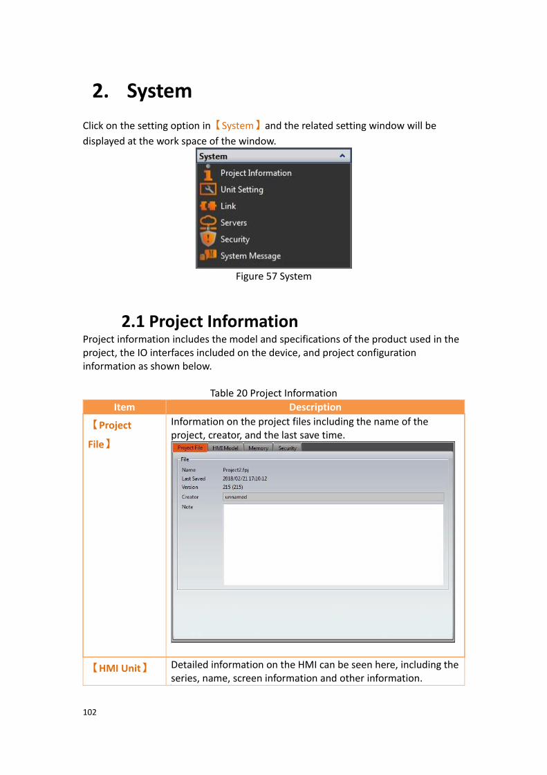
102
2. System
Click on the setting option in【System】and the related setting window will be
displayed at the work space of the window.
Figure 57 System
2.1 Project Information Project information includes the model and specifications of the product used in the project, the IO interfaces included on the device, and project configuration information as shown below.
Table 20 Project Information
Item Description
【Project
File】
Information on the project files including the name of the project, creator, and the last save time.
【HMI Unit】 Detailed information on the HMI can be seen here, including the series, name, screen information and other information.
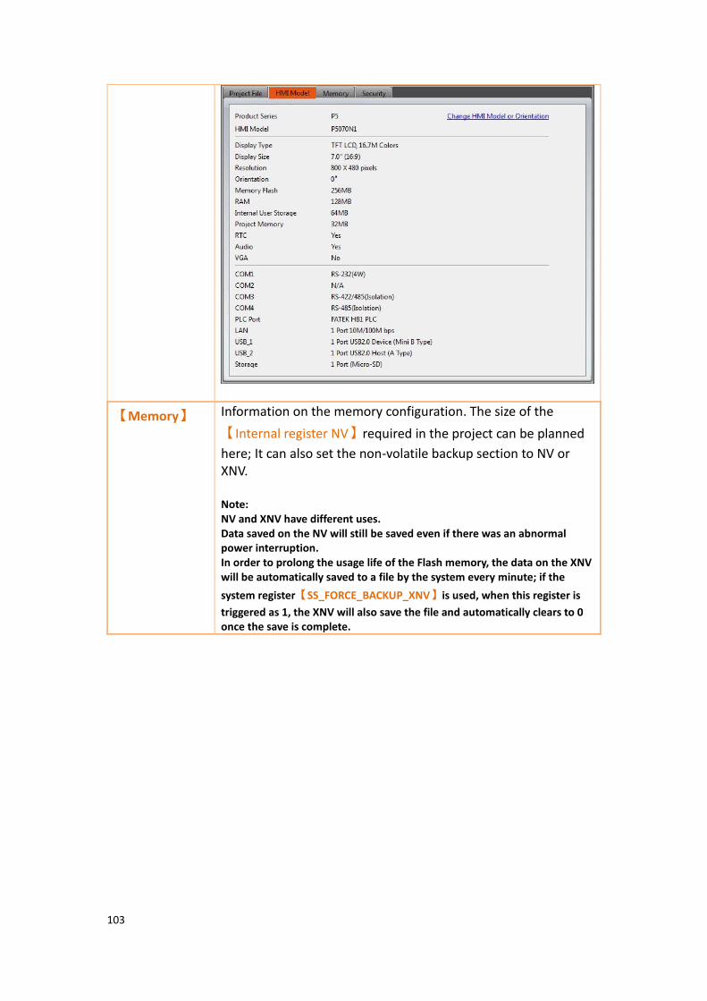
103
【Memory】 Information on the memory configuration. The size of the
【Internal register NV】required in the project can be planned
here; It can also set the non-volatile backup section to NV or XNV. Note: NV and XNV have different uses. Data saved on the NV will still be saved even if there was an abnormal power interruption. In order to prolong the usage life of the Flash memory, the data on the XNV will be automatically saved to a file by the system every minute; if the
system register【SS_FORCE_BACKUP_XNV】is used, when this register is
triggered as 1, the XNV will also save the file and automatically clears to 0 once the save is complete.
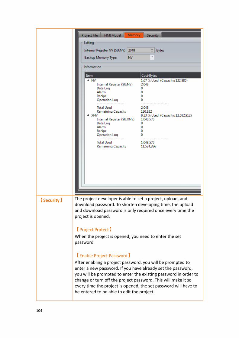
104
【Security】
The project developer is able to set a project, upload, and download password. To shorten developing time, the upload and download password is only required once every time the project is opened.
【Project Protect】
When the project is opened, you need to enter the set password.
【Enable Project Password】
After enabling a project password, you will be prompted to enter a new password. If you have already set the password, you will be prompted to enter the existing password in order to change or turn off the project password. This will make it so every time the project is opened, the set password will have to be entered to be able to edit the project.

105
【Deny Decompile】
Makes it so the user is not allowed to decompile the project after uploading to the HMI. There will be no prompt message.
【Decompile Use Project Password】
For this option to be enabled, the project password has to be set and turned on. After turning it on, the program will prompt the user to enter the project password if the user chooses to decompile the project.
【Project Execution Protect】
The implementation of this function will allow the developer to control which customer can use their project on the HMI. The customer ID set by the developer needs to be the same as the customer ID set on the HMI to allow the project to run on the HMI. If the customer ID’s do not match, the HMI will stay on the boot screen. The touch function, Ethernet port function, USB port function, and COM port function will all turn off until the next time the HMI is booted successfully.
【Enable Customer ID】
After enabling this function, you can set the customer ID required to boot up the HMI using your project.
【Upload and Download Protection】
This function allows the user to enable a password for when the user tries to upload or download the project. When the user presses download, they will be prompted to enter the download password set. When the project is already downloaded to the HMI and the user tries to upload the project, they will be prompted the upload password to be able to upload the project file onto an external device.
【Enable Upload Password】
When enabled, you can set the upload password. Once set, the HMI will prompt the user to enter the password set by the developer to be able to upload the project file.
【Deny Upload】
After enabling, the project will not be able to upload from the HMI to the computer.

106
【Enable Download Password】
After enabling, you can set the download password. Once set, when the user presses download, they will be prompted for the password set by the developer. Once the correct password is entered, the project will be downloaded. The password only has to be entered once per project use to save the developer time. Next time the project is opened, the download password must be entered once again.

107
2.2 Unit Setting
Table 21 Unit Setting
Item Description
【Basic】 The basic setting includes the Startup, Idle State, and Resume Setting. The Delay Time can be set for Startup and Screen Saver, and the Backlight Saver can be set for the Idle State. The Screen Saver can automatically switch to a preset window or turn off the Backlight Saver when the system has been idle for a certain amount of time in order to save power.
The Screen Saver can switch to a base screen or default Screen
Saver screen that includes【Time】and 【Custom Text】
mode..
【Time】mode

108
【Custom Text】mode
【Font】
Set the screen saver time or customize text font.
【Size】
Set the screen saver time or customize text size.
【Text】
Set the screen saver time or customize text.
【Resume Settings】
Settings for actions the HMI takes when exiting the Idle State are
set here. The【Change to Screen】option allows the user to
control which screen the HMI is at upon exiting from the screen
saver. The【Auto Log-out】setting can be checked if the HMI
user should be logged out upon resuming from a screen saver.
The【Show Log-in Dialog】pops up upon resuming from the
screen saver.
【Backlight Saver】
Controls settings for auto-dimming the backlight after a set
amount of time. The【Waiting Time】dropdown menu allows
users to choose the time the HMI is active before dimming the backlight.
【Switch】
The【Switch】setting allows users to control the behavior of the
HMI when switches are overlapped in the work space. Checking this option will execute the functions of the switches in order of the switch label. For example, if switches M0, M1, M2, and M3 are overlayed in the workspace, the order of execution when the stack of switches is pressed will be M0, M1, M2, and M3.

109
【PLC Sync】 HMI has built-in RTC clock. It can be synchronized with PLC RTC
by【PLC Sync】【Clock】setting.
【Write Time/Date to PLC】
Write RTC clock data of HMI to the Write Address of PLC.
【Interval】
Set how much time to write the time of HMI to PLC
【Synchronize HMI with PLC】
Read RTC clock data from the Read Address of PLC, and write the data to
【Interval】
Set how much time to read the clock data from the address specified by the PLC and write to the HMI Write Address and Read Address data format:
WORD 0 Second 0~59
WORD 1 Minute 0~59
WORD 2 Hour 0~23
WORD 3 Day 1~31
WORD 4 Month 1~12
WORD 5 Year 0~99
WORD 6 Day of Week 0~6
Note: The value of Sunday is 0, 1-6 (Sunday, Monday~Saturday)

110
【Control
Address】
【Control Address】
The following control addresses are read from PLC periodically, and set or trigger specific internal functions.
【Changing Base Screen by Register Address】
HMI changes the current screen to target screen, according to the value of register address. The value is the ID of the target screen. The value can be reset to 0 after changing screens.
【Read Current Base Screen ID by Register Address】
The current screen displayed on the HMI will have its screen ID written to the specified register. For example, if the HMI screen is base screen 3, the value of the specified register will be 3. The screen ID of the current screen can also be read by accessing the value inside the OP_BASE_SCREEN_ID register.
【Security Level】
The security level can be modified by the value of register address.
【Command Flags】
Command Flags control address format:
WORD 0 Command Flags triggered bits
WORD 1 Command Flags parameter
To enable the functions, the user has to configure control
addresses and click target items in【--- Command Flags Setting --
-】. However, the value (WORD 0) is set to【Status Response】

111
after the process if it is enabled. When each triggered bits value (WORD 0) is changed from 0 to 1, HMI will process the specific function. HMI only handles with one command process every scanning time. Command Flags includes functions as follows: Sound Buzzer (WORD 0 Bit0) WORD 1 = 0 Short Beep
WORD 1 = 1 Long Beep WORD 1 = 2 Short-Short Beep WORD 1 = 3 Long-Short Beep Backlight On (WORD 0 Bit1) WORD 1 Reserved Backlight Off (WORD 0 Bit2) WORD 1 Reserved Screen Saver On/Off (WORD 0 Bit3)
WORD 1 Reserved
【Custom】 【Output File Codec】
When the developer has set the export data to the HMI, micro SD Card, or the USB storage, the data format can be selected. The exported file’s data format (Big5, GB18030, UTF-8 encoding) can be chosen such that it satisfies the user’s computer environment. For example, as the Traditional Chinese Windows environment, open a new project by default as Big5.
【Default Keypad】
The developer can configure the preset keypad for the operating interface so that this pre-set keypad will pop up when operating text or numeric input objects. Available settings include Decimal Number, Hexadecimal Number and Character.

112
【Save Location】
When FvDesigner model choose as PC, will appear【Save
Location】setting option, figure as shown below, this option is
mainly to set the default location where FvRT is stored
【Internal】
Set when the FvRT is excuted, if setting export the file to
【Internal】in the unit setting, the file will be save to the
specified location, if this field is empty, then will save to the default location. Is use the default location to store, the system will create a folder the name is same as the project name under the same path. For example: The project save in: C:\Files\Project11.fpj
then the system defaults to the【Internal】storage location:
C:\Files\Project11\run\storage\ internal.
【USB Storage】
Set when the FvRT is excuted, if setting export the file to【USB
Storage】in the unit setting, the file will be save to the specified
location.
【microSD Card】
113
Set when the FvRT is excuted, if setting export the file to
【microSD Card】in the unit setting, the file will be save to the
specified location.
【Status Bar】 【Show Status Bar】
Set to display the status bar. When this option is selected, the rest of the options are available to configure.
【Show Status Bar By Control Address】
Set a signal to control the status bar visibility.
【Background Color】
Set the background color of the status bar.
【Position】
Select status bar to position. Positions include: up/down/left/right edges.
【Select all】
Select system, peripheral devices, notification, and communication.
【System】
Item Icon Description

114
【System
Information】
Displays the device name, station number, firmware version, OS Version, Ethernet, Screen Saver, Date/Time and other information. And you can set the HMI ethernet, screen saver and date/time through this dialog
【System
Time】
Displays the system time
【System Date】 Displays the system date
【Peripheral devices】
Item Icon Description
【HMI Free Space】 Displays the current available storage space and associated percentage. The number is white when normal and red when less than 10%.
【SD Card Free Space】 Displays the current SD card available storage space, and associated percentage The number is white when normal and red when less than 10%. If the HMI cannot detect a SD card it will be display a “?”.
【USB Storage Free
Space】
Displays USB device’s current available storage space and associated percentage. The number is white when
115
normal and red when less than 10%. If the HMI cannot detect an USB device it will be display “?”.
【Notify】
Item Icon Description
【Buzzer On/Off】
Displays the status of current buzzer on/off. The function also can turn on or turn off in HMI
【System setting】.
【Audio On/Off】
Displays the status of current audio on/off. The function also can turn on or turn off in HMI
【System setting】.
【Alarm Number】
This icon will flash when an Alarm occurs.
【Backlight level】
Shows the current HMI backlight brightness
【Communication】
Item Icon Description
【COM1】
Displays the current status of COM1 communication. The color will display green when communication is normal; the color is red when there is a communication error.(If the link is not set , the color will maintain in green not change). Detail about communication error codes, please refer ch27-Communication Error Codes
【COM3】
Displays the current status of COM3 communication. The color will display green when communication is normal; the color is red
116
when there is a communication error. (If the link is not set , the color will maintain in green not change). Detail about communication error codes, please refer ch27-Communication Error Codes
【COM4】
Displays the current status of COM4 communication. The color will display green when communication is normal; the color is red when there is a communication error. (If the link is not set , the color will maintain in green not change). Detail about communication error codes, please refer ch27-Communication Error Codes
【PLC Port】
Displays the current status of PLC Port communication. The color will display green when communication is normal; the color is red when there is a communication error. (If the link is not set , the color will maintain in green not change). Detail about communication error codes, please refer ch27-Communication Error Codes
【Lan】 Displays the current status of Lan communication. The color will display green when communication is normal; the color is red when there is a communication error. (If the link is not set , the color will maintain in green
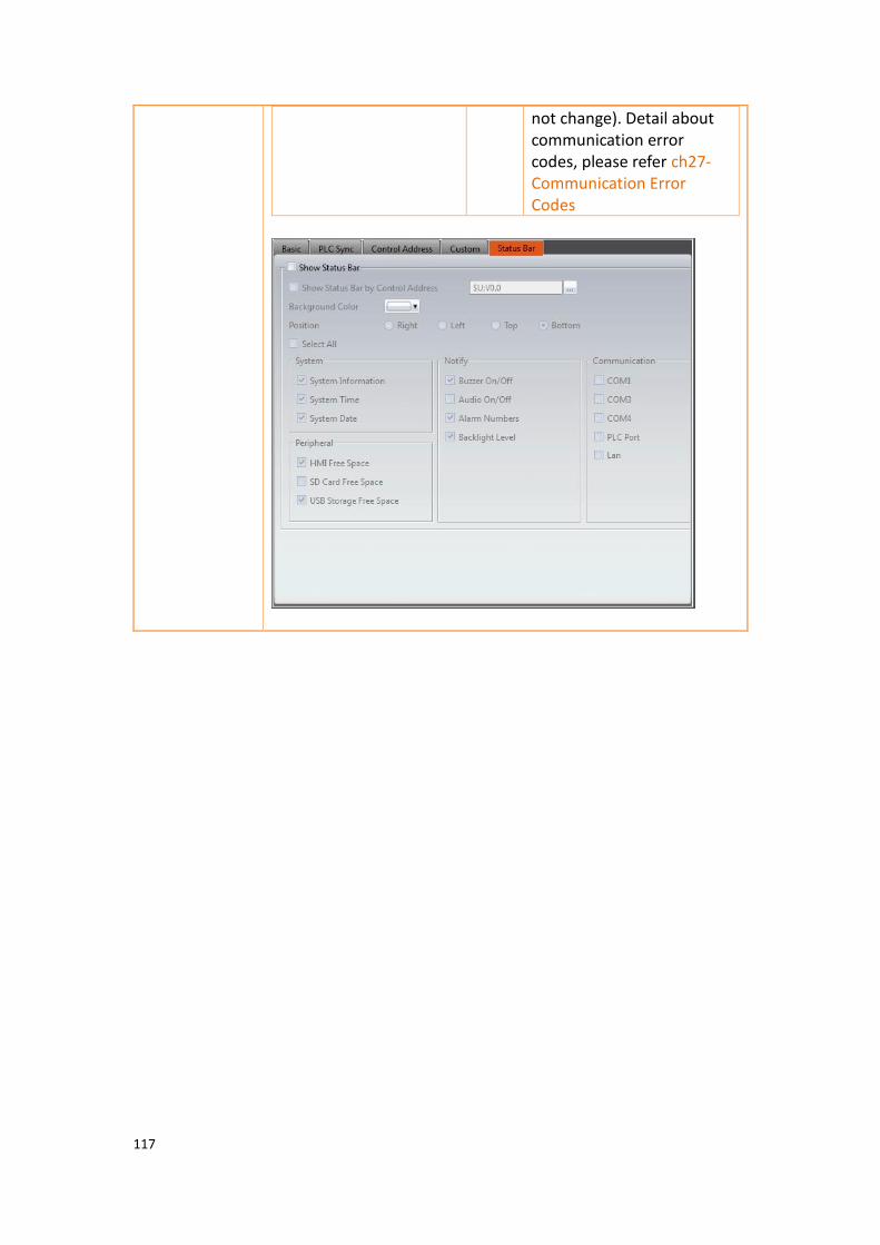
117
not change). Detail about communication error codes, please refer ch27-Communication Error Codes

118
【Index
Register】
【Enable Customize Index Register】
Enable index register to use default register or customize, you can define the corresponding address in the address field after enable, it can be HMI internal address or PLC register address, for example, I0 can correspond to PLC R100 address, for designer easy to use, please refer to ch19.2-Index Register for more details about index register.
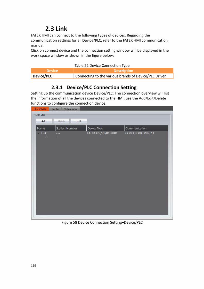
119
2.3 Link FATEK HMI can connect to the following types of devices. Regarding the communication settings for all Device/PLC, refer to the FATEK HMI communication manual. Click on connect device and the connection setting window will be displayed in the work space window as shown in the figure below:
Table 22 Device Connection Type
Device Description
Device/PLC Connecting to the various brands of Device/PLC Driver.
2.3.1 Device/PLC Connection Setting Setting up the communication device Device/PLC: The connection overview will list the information of all the devices connected to the HMI; use the Add/Edit/Delete functions to configure the connection device.
Figure 58 Device Connection Setting–Device/PLC

120
Double click on a device in the list to open the device property setting window directly for editing. The interface of sub-link is as shown below.
Figure 59 Link Properties

121
Table 23 Link Property Settings
Item Description
【Link Setting】 Basic settings for connection.
Item Description
【Name】 The name of this connection.
【Interface Type】 Transfer method; available selections include Direct Link(Serial), Direct Link(Ethernet), Mult-Link Master(Serial), Mult-Link Master(Ethernetl), Mult-Link Slave(Serial) or Mult-Link Slave(Ethernet).
【Manufacturer】 The manufacturer of the connecting device.
【Help】 Look for a detailed description of each brand driver, for example, select FATEK, then show up FATEK PLC related communication settings. Includding communication settings, memory resource review, PLC setting, HMI setting, wiring diagrams, etc. for designers easy to view and use.
【Product Series】 The product name of the connecting equipment.
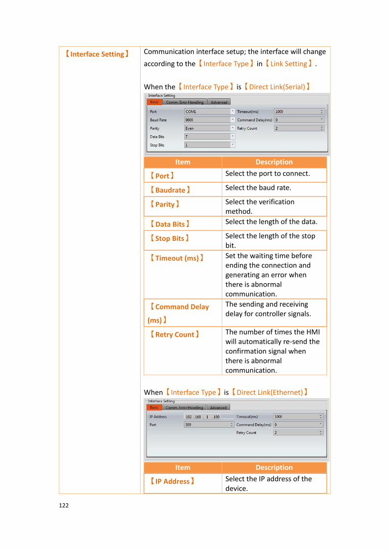
122
【Interface Setting】 Communication interface setup; the interface will change
according to the【Interface Type】in【Link Setting】.
When the【Interface Type】is【Direct Link(Serial)】
Item Description
【Port】 Select the port to connect.
【Baudrate】 Select the baud rate.
【Parity】 Select the verification method.
【Data Bits】 Select the length of the data.
【Stop Bits】 Select the length of the stop bit.
【Timeout (ms)】 Set the waiting time before ending the connection and generating an error when there is abnormal communication.
【Command Delay
(ms)】
The sending and receiving delay for controller signals.
【Retry Count】 The number of times the HMI will automatically re-send the confirmation signal when there is abnormal communication.
When【Interface Type】is【Direct Link(Ethernet)】
Item Description
【IP Address】 Select the IP address of the device.

123
【Port】 Select the port terminal.
【Timeout Time
(ms)】
Set the waiting time before ending the connection and generating an error when there is abnormal communication.
【Command Delay
(ms)】
The sending and receiving delay for controller signals.
【Retry Count】 The number of times the HMI will automatically re-send the confirmation signal when there is abnormal communication.
【Comm. Error Handling】
Select an action to handle a communication error.
There are four handling modes as follows: ⚫ Process Sequentially
Process each communication data sequentially. If the data cannot be queried this scanning time, system will re-query it again next time. The communication error window shows up when communication has failed. User can close the window and continue to operate the current screen. Show Disconnect Message: Every time a communication error has occurred, an error message window will pop up. Operation may continue once the error message is closed.
⚫ Continue The communication error window shows up when communication has failed. User can not close the window and has to stop operating the current screen. When communication is restored, the window closes automatically.
⚫ Stop The communication error window shows when communication has failed. User can not close the window and has to stop to operating the current
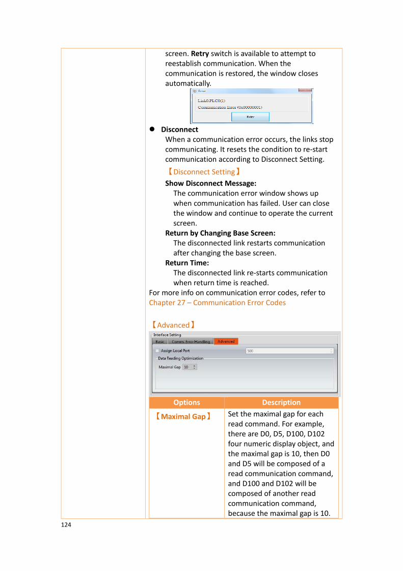
124
screen. Retry switch is available to attempt to reestablish communication. When the communication is restored, the window closes automatically.
⚫ Disconnect
When a communication error occurs, the links stop communicating. It resets the condition to re-start communication according to Disconnect Setting.
【Disconnect Setting】
Show Disconnect Message: The communication error window shows up when communication has failed. User can close the window and continue to operate the current screen.
Return by Changing Base Screen: The disconnected link restarts communication after changing the base screen.
Return Time: The disconnected link re-starts communication when return time is reached.
For more info on communication error codes, refer to Chapter 27 – Communication Error Codes
【Advanced】
Options Description
【Maximal Gap】 Set the maximal gap for each read command. For example, there are D0, D5, D100, D102 four numeric display object, and the maximal gap is 10, then D0 and D5 will be composed of a read communication command, and D100 and D102 will be composed of another read communication command, because the maximal gap is 10.
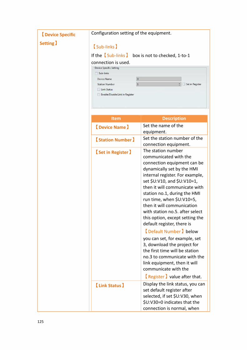
125
【Device Specific
Setting】
Configuration setting of the equipment.
【Sub-links】
If the【Sub-links】 box is not to checked, 1-to-1
connection is used.
Item Description
【Device Name】 Set the name of the equipment.
【Station Number】 Set the station number of the connection equipment.
【Set in Register】 The station number communicated with the connection equipment can be dynamically set by the HMI internal register. For example, set $U:V10, and $U:V10=1, then it will communicate with station no.1, during the HMI run time, when $U:V10=5, then it will communication with station no.5. after select this option, except setting the default register, there is
【Default Number】below
you can set, for example, set 3, download the project for the first time will be station no.3 to communicate with the link equipment, then it will communicate with the
【Register】value after that.
【Link Status】 Display the link status, you can set default register after selected, if set $U:V30, when $U:V30=0 indicates that the connection is normal, when

126
$U:V30=1 indicates that the connection is abnormal.
【Enable/Disable
Link in Register】
The connected devices can be dynamically set by HMI internal register whether to enable or disable, provide maintenance personnel or operators can decide whether to connect with the device during HMI execution. Ex: set $U:V10.0, when $U:V10.0 = ON, then it will communicate with this device, when $U:V10.0 = OFF, then it will not communicate with this device
Select【Sub-links】, supports 1-to-N connections.
Set as figure, device name 0 communicate with station
no.1 link device, device name 1 , enable【Set Station
Number in Register】dynamically decision by $U:V20, for
example, $U:V20=5, then it will communicate with station no.5 link device and enable default number as 5, device name 2 communicate with station no.3 link device
and enable link status, enable【Link Status】when
$U:V40=0 indicates that the connection is normal, when $U:V40=1 indicates that the connection is abnormal. Device name 3 communicate with station no.4, then
enable【Enable/Disable Link in Register】, when
$U:V51.0 = ON will communicate with this device, when $U:V51.0 = OFF will not communicate with this device

127
2.3.2 PLC Address Setting (Input Address) The address of the registers can be set at the address setting field in the settings window of each object. Users can enter the register address directly using the keypad
or select the address from the【Input Address】settings dialog by pressing the
button on the right. Users can also directly input a register address. The device name for the register is not necessary. For example, if the user enters R100, the software will automatically associate the register with a device name, i.e. @0:R100. When typing a string in the PLC address setting field, it shows a hint list to quickly select a specific device or tag. When mouse moves into the setting filed with Tag string, the mapping address shows on the tip.
Figure 60 PLC address setting field
The【Input Address】settings dialog is as shown below; the three source modes
available for selection are Device, System and Tag.
Figure 61 PLC Input Address Setting Dialog
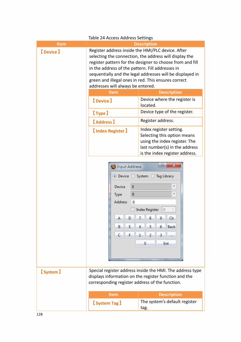
128
Table 24 Access Address Settings
Item Description
【Device】 Register address inside the HMI/PLC device. After selecting the connection, the address will display the register pattern for the designer to choose from and fill in the address of the pattern. Fill addresses in sequentially and the legal addresses will be displayed in green and illegal ones in red. This ensures correct addresses will always be entered.
Item Description
【Device】 Device where the register is located.
【Type】 Device type of the register.
【Address】 Register address.
【Index Register】 Index register setting. Selecting this option means using the index register. The last number(s) in the address is the index register address.
【System】 Special register address inside the HMI. The address type displays information on the register function and the corresponding register address of the function.
Item Description
【System Tag】 The system’s default register tag.

129
【Address】 The corresponding register address of the system tag.
【Description】 Describe the function of the system tag.
【Tag】 Use the tags defined in the custom tag library.
【Use Index
Address】
The index register is an index addressing register. The user can change the read and write addresses of the online objects on the HMI while the screen program is running without changing the contents of the object address once there is an index register. This software provides a total of 128 sets of index registers with 64 sets of 16-bit index registers and 64 sets of 32-bit registers. As shown in the example below, if the address content of the $I0 index register is 10, then this address is marked as

130
R2010 of PLC0.
Figure 62 Address Setting Window
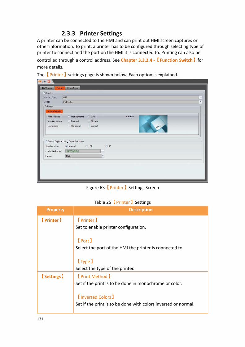
131
2.3.3 Printer Settings A printer can be connected to the HMI and can print out HMI screen captures or other information. To print, a printer has to be configured through selecting type of printer to connect and the port on the HMI it is connected to. Printing can also be
controlled through a control address. See Chapter 3.3.2.4 -【Function Switch】for
more details.
The【Printer】settings page is shown below. Each option is explained.
Figure 63【Printer】Settings Screen
Table 25【Printer】Settings
Property Description
【Printer】 【Printer】
Set to enable printer configuration.
【Port】
Select the port of the HMI the printer is connected to.
【Type】
Select the type of the printer.
【Settings】 【Print Method】
Set if the print is to be done in monochrome or color.
【Inverted Colors】
Set if the print is to be done with colors inverted or normal.

132
【Orientation】
Set if the image printed is oriented horizontally or vertically.
【Screen
Capture Using Control
Address】
Set a trigger address that controls screen captures of the current HMI screen.
【Save Location】
Select the location where the screen capture is saved to. Can be the HMI’s internal memory, USB, or SD card.
【Control Address】
Specify an address that controls the screen capture.
【Format】
Select the file format of the screen capture. Can be PNG or JPG.
2.3.4 Vedio Input When the project wants to connect to USB Camera need to set the settings here first so that the vedio input display can do action, for more detail please refer to ch3.3.32-
【Vedio Input Display】, in addition, when the alarm occurs, photos taken by the
camera can also be sent to designated person via email, for more detail please refer to ch8.3-Alarm Application Example, this function only support after OS v1.0.14 or PC version.
The【Vedio Input】settings page is shown below. Each option is explained.
Figure 64【Vedio Input】Setting Window

133
Table 26【Vedio Input】property settings
Options Description
【Basic】 【Enable USB Camera】
Set whether to enable USB camera function.
【Size】
Set the size of the vedio input display, whether the selected size is available depends on the camera support.
【Speed】
Set the screen update speed, it will take up more HMI system resources if select fast.
【Control】 【Auto Connect to Camera】
Set whether to Auto Connect to Camera function.
【Enable Control Word】
Control the vedio input display through control word, whether the control is available depends on the camera support.
【Argument Word】
When control word is enabled, argument word is the parameter to change the control of camera. When control word or argument word have changed, the setting will be written.
Function Hex Parameter
Play 0x0001 N/A
Pause 0x0002 N/A
Stop 0x0003 N/A
Adjust the Image Contrast
0x0100 0-100 : The percentage value is between the minimum and the maximum; 255:Reset
Adjust the Image Brightness
0x0101 0-100 : The percentage value is between the minimum and the maximum; 255:Reset

134
Adjust the Image Saturation
0x0102 0-100 : The percentage value is between the minimum and the maximum; 255:Reset
Adjust the Hue of the Image
0x0103 0-100 : The percentage value is between the minimum and the maximum; 255:Reset
Adjust the Gamma Value of the Image
0x0104 0-100 : The percentage value is between the minimum and the maximum; 255:Reset
Adjust the Image Gain
0x0105 0-100 : The percentage value is between the minimum and the maximum; 255:Reset
Adjust the Image Sharpness
0x0107 0-100 : The percentage value is between the minimum and the maximum; 255:Reset
Adjust the Image Backlight Compensation
0x0108 0-100 : The percentage value is between the minimum and the maximum; 255:Reset
Adjust the Image White Balance Temperature
0x0109 0-100 : The percentage value is between the minimum and the maximum; 255:Reset
Enable the Image White Balance Temperature
0x010A 1 : Enable; 0 : Disable; 255:Reset

135
Adjust the Image Exposure Value
0x010B 0-100 : The percentage value is between the minimum and the maximum; 255:Reset
Enable the Image Exposure
0x010C 1 : Enable; 0 : Disable; 255:Reset
Enable Image Flip Horizontal
0x0110 1 : Enable; 0 : Disable; 255:Reset
Enable Image Flip Vertical
0x0111 1 : Enable; 0 : Disable; 255:Reset
Reset Image 0x01FF N/A
Save Image to Internal Memory
0x0200 N/A
Save Image to USB Flash
0x0201 N/A
Save Image to SD Card
0x0202 N/A
【Enable Response Word】
Display whether the vedio iuput display was enable success or the result of control word setting.
Description Hex
Normal No Error 0x0000
connected 0x8001
Error HMI no support 0x0100
No device 0x0101
Device initialization failed 0x0102
Device disconnected 0x0103
Control_device is not initialized
0x0200
Control_Unsupported 0x0201
Control _ wrong value 0x0202
Control _ Busy 0x0203
Control _ read only 0x0204
Control _ input error 0x0205
Control _ archive failed 0x0300
unknown mistake 0x0FFF

136
【Save Image File Limit】
Access limit when using the control word to set the video iuput display archiving, over the limit will overwrite the old file.

137
3. Objects
FvDesigner provides dozens of practical objects for the users to choose from; the list of all available objects is below. Click on the hyperlink to view detailed descriptions of this object. There are two ways to place an object onto the work space:
1. Left-click the mouse on an object in the object section of the design page in the function section and then left-click the mouse on the work space.
2. Use the mouse to drag-and-drop an object in the toolbox onto the work space.
Every object added to the work space will appear in the object list and has its own unique ID. There are two ways to view and change the properties of an object:
1. Double-click on the object and the setting page of the object will appear. 2. Single-click on an object and then click on the right mouse button to
display the object menu, and then select Properties. The Monitor Address can be set for many objects. This means that the data source of this object is from the register address of the device (HMI, PLC). Details can be
viewed at the【Memory Address】section of the screen in order for the user to have
a better understanding of the usage status of the registers. The properties (such as color etc.) of all Draw Objects can be set from the Ribbon workspace on the software interface, as shown in the figure below. Note: The Ribbon only has some common settings. Detailed settings for each object must be set through another method.
Figure 65 Ribbon workspace for Style
The following is the list of objects provided by the FvDesigner; click on the hyperlink of the object’s name to view the detailed descriptions of the object.
Table 27 Image Objects and Basic Object Library Categories
Function Description
【Draw】
Function Description
【Dot】 Draw a dot
【Line】 Draw a line
【Polyline】 Draw a polyline
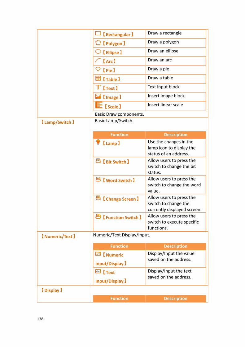
138
Basic Draw components.
【Rectangular】 Draw a rectangle
【Polygon】 Draw a polygon
【Ellipse】 Draw an ellipse
【Arc】 Draw an arc
【Pie】 Draw a pie
【Table】 Draw a table
【Text】 Text input block
【Image】 Insert image block
【Scale】 Insert linear scale
【Lamp/Switch】 Basic Lamp/Switch.
Function Description
【Lamp】 Use the changes in the lamp icon to display the status of an address.
【Bit Switch】 Allow users to press the switch to change the bit status.
【Word Switch】 Allow users to press the switch to change the word value.
【Change Screen】 Allow users to press the switch to change the currently displayed screen.
【Function Switch】 Allow users to press the switch to execute specific functions.
【Numeric/Text】 Numeric/Text Display/Input.
Function Description
【Numeric
Input/Display】
Display/Input the value saved on the address.
【Text
Input/Display】
Display/Input the text saved on the address.
【Display】
Function Description

139
Display Date/Time, Window Screen Display
【Date/Time
Display】
Display the current date and time according to the format set by the user.
【Window Screen
Display】
Display the window screens created in the project.
【Graph】 Graph
Function Description
【Meter】 Use a pointer to represent data
【Linear Meter】 Use the bar length/width changes to represent data
【Data Block
Graph】
Captures continuous data and plots it as a curve.
【Data Block XY
Scatter】
Capture continuous data and plots it as a scatter plot.
【Other Switch】 Other Switches.
Function Description
【Step Switch】 Write the values corresponding to the status set by the user sequentially into the address.
【Slide Switch】 Allow users to write the value into the address by dragging a slide.
【Selector List】 Display values with a pull-down menu allowing the user to select the value needed.
【Radio Button】 Combine multiple buttons into a group, Only one of the group buttons will be ON.
【Keypad】
Function Description
【Input Display】 Used to display the currently entered value or text on the keypad screen.
【Key】 Used to provide the functions required for

140
Keypad related objects.
entering values or text, etc. on the keypad screen.
【Show Limit
Value】
Used to display the currently allowed maximum or minimum input value on the keypad screen.
【Animated Graphic】 Animated Graphic.
Function Description
【Animated
Graphic】
Used when a dynamic display of changes in status, address and size is required.
【Rotation
Indicator】
Changing the indicator of Rotation Indicator direction and speed by register.
【Gif Display】 Select a .gif image to display.
【Data Log】 Data Log-related objects.
Function Description
【Historic Trend】 Plot the data and corresponding time
acquired by the【Data
Log】onto a curve.
【Historic XY
Scatter】
Plot the data acquired by
the【Data Log】as a
historic XY scatter.
【Historic Data
Table】
Display the data acquired
by the【Data Log】as a
table.
【Historic Data
Selector】
Read the【Historic XY
Scatter】or【Historic Data
Table】data table files. The
corresponding file can be selected from a dropdown menu.
【Alarm】 Alarm-related objects.
Function Description

141
【Alarm Display】 Use a table to display alarm-related contents including messages , levels, when the alarm occurred, if alarm was acknowledged the recovery time, etc.
【Alarm Scrolling
Text】
Use a scrolling text to display alarm-related contents including messages, levels, when the alarm occurred, if alarm was acknowledged, recovery time, etc.
【Alarm Data
Selector】
Use a dropdown menu to display alarm-related contents, including messages, levels, when the alarm occurred, if alarm was acknowledged, recovery time, etc.
【Recipe】 Recipe-related objects.
Function Description
【Recipe Selector】 Used to select the recipe.
【Recipe Table】 Used to view or edit the recipe.
【Operation Logger】 Operation Logger-related objects.
Function Description
【Operation
Viewer】
View the Operation Logger.
【Schedule】 Schedule-related objects.
Function Description
【Schedule Setting
Table】
Table of view and setting up.
142
3.1 Introduction to Draw Objects Draw Object provides a diverse number of drawing objects, as shown below:
Table 28 Draw Object objects
Item Description
【Dot】 Draw a dot
【Line】 Draw a line
【Polyline】 Draw a polyline
【Rectangular】 Draw a rectangle
【Polygon】 Draw a polygon
【Ellipse】 Draw an ellipse
【Arc】 Draw an arc
【Pie】 Draw a pie
【Table】 Insert a table
【Text】 Insert text
【Image】 Insert an image
【Scale】 Insert a scale
【Pipeline】 Draw pipeline
The drawing objects described above can all be found in Toolbox on the right side of the Ribbon workspace on the software interface, as shown in the figure below:
Figure 66 Draw Object in the Ribbon workspace

143
Figure 67 Draw Object toolbox
The properties (such as color etc.) of all Draw Object can be set through two mechanisms:
1. Set from the Ribbon workspace on the software interface, as shown in the figure below.
Hint: Ribbon only has some common settings. Detailed settings for each object must be set through the other method
Figure 68 Ribbon workspace for Style
2. Double-click the left mouse button or click the right mouse button on the
object and select【Properties】to display and the object’s property page
and settings.

144
Figure 69 Click the right mouse button for setting functions

145
3.2 Draw Object Properties Dialog
3.2.1 【Dot】
3.2.1.1 【Setting】
The 【Dot】【Setting】 page is a shown in the figure below. Each option is
explained.
Figure 70 Setting page for【Dot】
Table 29 Property settings for【Dot】
Property Description
【Preview】 Preview the appearance of the object.
【Dot】 【Type】
Set the type of dot.
【Color】
Set the color of the dot.
【Size】
Set the size of the dot.
【Blink】
Set the blinking of the dot; four blinking speeds are available for selection: None, Fast, Medium and Slow.
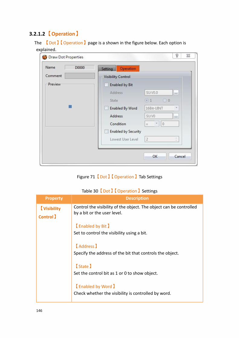
146
3.2.1.2 【Operation】
The 【Dot】【Operation】page is a shown in the figure below. Each option is
explained.
Figure 71【Dot】【Operation】Tab Settings
Table 30【Dot】【Operation】Settings
Property Description
【Visibility
Control】
Control the visibility of the object. The object can be controlled by a bit or the user level.
【Enabled by Bit】
Set to control the visibility using a bit.
【Address】
Specify the address of the bit that controls the object.
【State】
Set the control bit as 1 or 0 to show object.
【Enabled by Word】
Check whether the visibility is controlled by word.

147
【Address】
Set the visibility control word address.
【Condition】
Set the condition of word control and when it is true then show up the object, when false not show the object. The condition include’ =’,’ !=’, ‘>’, ‘<’, ‘>=’, ‘<=’.
【Enabled by Security】
Set to control the visibility using the user login level.
【Lowest User Level】
Select the minimum level of user logged in for the object to be visible.
3.2.2 【Line】
3.2.2.1 【Setting】
The【Line】【Setting】page is a shown in the figure below. Each option is explained.
Figure 72 Setting page for【Line】
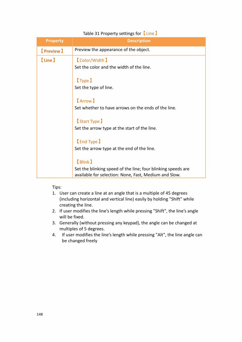
148
Table 31 Property settings for【Line】
Property Description
【Preview】 Preview the appearance of the object.
【Line】 【Color/Width】
Set the color and the width of the line.
【Type】
Set the type of line.
【Arrow】
Set whether to have arrows on the ends of the line.
【Start Type】
Set the arrow type at the start of the line.
【End Type】
Set the arrow type at the end of the line.
【Blink】
Set the blinking speed of the line; four blinking speeds are available for selection: None, Fast, Medium and Slow.
Tips: 1. User can create a line at an angle that is a multiple of 45 degrees
(including horizontal and vertical line) easily by holding "Shift" while creating the line.
2. If user modifies the line’s length while pressing "Shift", the line’s angle will be fixed.
3. Generally (without pressing any keypad), the angle can be changed at multiples of 5 degrees.
4. If user modifies the line’s length while pressing "Alt", the line angle can be changed freely
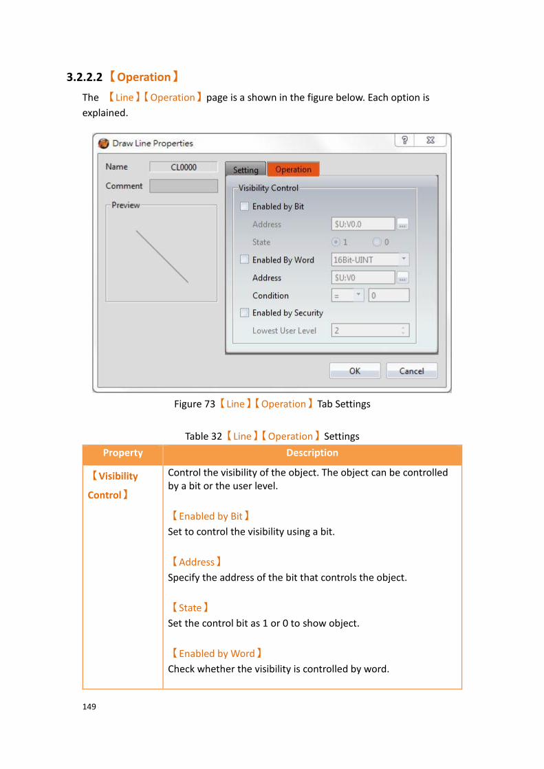
149
3.2.2.2 【Operation】
The 【Line】【Operation】page is a shown in the figure below. Each option is
explained.
Figure 73【Line】【Operation】Tab Settings
Table 32【Line】【Operation】Settings
Property Description
【Visibility
Control】
Control the visibility of the object. The object can be controlled by a bit or the user level.
【Enabled by Bit】
Set to control the visibility using a bit.
【Address】
Specify the address of the bit that controls the object.
【State】
Set the control bit as 1 or 0 to show object.
【Enabled by Word】
Check whether the visibility is controlled by word.

150
【Address】
Set the visibility control word address.
【Condition】
Set the condition of word control and when it is true then show up the object, when false not show the object. The condition include’ =’,’ !=’, ‘>’, ‘<’, ‘>=’, ‘<=’.
【Enabled by Security】
Set to control the visibility using the user login level.
【Lowest User Level】
Select the minimum level of user logged in for the object to be visible.
3.2.3 【Polyline】
3.2.3.1 【Setting】
The 【Polyline】【Setting】 page is a shown in the figure below. Each option is
explained.
Figure 74 Setting page for【Polyline】

151
Table 33 Property setting for【Polyline】
Property Description
【Preview】 Preview the appearance of the object.
【Line】 【Color/Width】
Set the color and the width of the line.
【Type】
Set the type of line.
【Arrow】
Set whether to have arrows on the ends of the line.
【Start Type】
Set the arrow type at the start of the line.
【End Type】
Set the arrow type at the end of the line.
【Blink】
Set the blinking speed of the line; four blinking speeds are available for selection: None, Fast, Medium and Slow.
Users can freely modify the corresponding dot positions for【Polyline】, as well as
add or delete a dot. 1. To modify the relative position of a dot
When the user double-clicks on an object, a dragging block will be displayed for the dots of this object; this is when you can change the position of the dots, as shown in the figure below:
Figure 75 Illustration diagram when users double-click on a【Polyline】
2. Adding a dot When the user double-clicks on an object, a dragging block will be displayed for the dots of this object; move the mouse anywhere on the line and the
cursor will change to . At this time, press and hold the left mouse button and move the mouse to insert a dot anywhere you want.
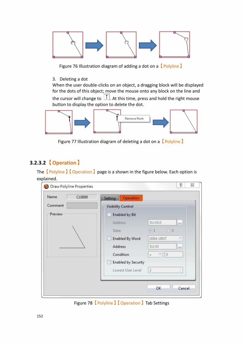
152
Figure 76 Illustration diagram of adding a dot on a【Polyline】
3. Deleting a dot When the user double-clicks on an object, a dragging block will be displayed for the dots of this object; move the mouse onto any block on the line and
the cursor will change to . At this time, press and hold the right mouse button to display the option to delete the dot.
Figure 77 Illustration diagram of deleting a dot on a【Polyline】
3.2.3.2 【Operation】
The【Polyline】【Operation】page is a shown in the figure below. Each option is
explained.
Figure 78【Polyline】【Operation】Tab Settings
153
Table 34【Polyline】【Operation】Settings
Property Description
【Visibility
Control】
Control the visibility of the object. The object can be controlled by a bit or the user level.
【Enabled by Bit】
Set to control the visibility using a bit.
【Address】
Specify the address of the bit that controls the object.
【State】
Set the control bit as 1 or 0 to show object.
【Enabled by Word】
Check whether the visibility is controlled by word.
【Address】
Set the visibility control word address.
【Condition】
Set the condition of word control and when it is true then show up the object, when false not show the object. The condition include’ =’,’ !=’, ‘>’, ‘<’, ‘>=’, ‘<=’.
【Enabled by Security】
Set to control the visibility using the user login level.
【Lowest User Level】
Select the minimum level of user logged in for the object to be visible.

154
3.2.4 【Rectangle】
3.2.4.1 【Setting】
The 【Rectangle】【Setting】 page is a shown in the figure below. Each option is
explained.
Figure 79 Setting page for【Rectangular】
Table 35 Property setting for【Rectangular】
Property Description
【Preview】 Preview the appearance of the object.
【Line】 【Color/Width】
Set the color and the width of the line.
【Type】

155
Set the type of line.
【Opacity】
Set the opacity of the line.
【Blink】
Set the blinking speed; four blinking speeds are available for selection: None, Fast, Medium and Slow.
【Fill】 【Color】
Set the color or material type of the fill.
【Opacity】
Set the opacity of the fill.
【Blink】
Set the blinking of the fill; four blinking speeds are available for selection: None, Fast, Medium and Slow.
【Corner
Type】
【Type】
Set the corner type. Supports Normal, Rounded, and Clipped.
【Corner Size(H)】
Set the horizontal size of the corner.
【Corner Size(V)】
Set the vertical size of the corner.

156
3.2.4.2 【Operation】
The【Rectangle】【Operation】page is a shown in the figure below. Each option is
explained.
Figure 80【Rectangle】【Operation】Tab Settings
Table 36【Rectangle】【Operation】Settings
Property Description
【Visibility
Control】
Control the visibility of the object. The object can be controlled by a bit or the user level.
【Enabled by Bit】
Set to control the visibility using a bit.

157
【Address】
Specify the address of the bit that controls the object.
【State】
Set the control bit as 1 or 0 to show object.
【Enabled by Word】
Check whether the visibility is controlled by word.
【Address】
Set the visibility control word address.
【Condition】
Set the condition of word control and when it is true then show up the object, when false not show the object. The condition include’ =’,’ !=’, ‘>’, ‘<’, ‘>=’, ‘<=’.
【Enabled by Security】
Set to control the visibility using the user login level.
【Lowest User Level】
Select the minimum level of user logged in for the object to be visible.

158
3.2.5 【Polygon】
【Polygon】is similar to【Polyline】. Users can freely modify the corresponding dot
positions as well as add and delete dots. The operating method is identical to
【Polyline】.
3.2.5.1 【Setting】
The 【Polygon】【Setting】page is a shown in the figure below. Each option is
explained.
Figure 81 Setting page for【Polygon】
Table 37 Property settings for【Polygon】
Property Description
【Preview】 Preview the appearance of the object.
【Line】 【Color/Width】
Set the color and the width of the line.
【Type】
Set the type of line.
【Opacity】
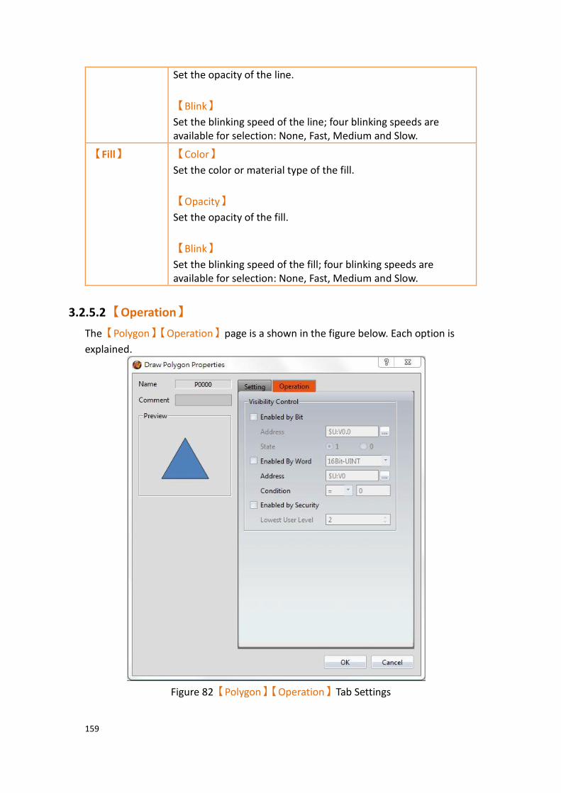
159
Set the opacity of the line.
【Blink】
Set the blinking speed of the line; four blinking speeds are available for selection: None, Fast, Medium and Slow.
【Fill】 【Color】
Set the color or material type of the fill.
【Opacity】
Set the opacity of the fill.
【Blink】
Set the blinking speed of the fill; four blinking speeds are available for selection: None, Fast, Medium and Slow.
3.2.5.2 【Operation】
The【Polygon】【Operation】page is a shown in the figure below. Each option is
explained.
Figure 82【Polygon】【Operation】Tab Settings
160
Table 38【Polygon】【Operation】Settings
Property Description
【Visibility
Control】
Control the visibility of the object. The object can be controlled by a bit or the user level.
【Enabled by Bit】
Set to control the visibility using a bit.
【Address】
Specify the address of the bit that controls the object.
【State】
Set the control bit as 1 or 0 to show object.
【Enabled by Word】
Check whether the visibility is controlled by word.
【Address】
Set the visibility control word address.
【Condition】
Set the condition of word control and when it is true then show up the object, when false not show the object. The condition include’ =’,’ !=’, ‘>’, ‘<’, ‘>=’, ‘<=’.
【Enabled by Security】
Set to control the visibility using the user login level.
【Lowest User Level】
Select the minimum level of user logged in for the object to be visible.

161
3.2.6 【Ellipse】
3.2.6.1 【Setting】
The【Ellipse】【Setting】page is a shown in the figure below. Each option is
explained.
Figure 83 Setting page for【Ellipse】
Table 39 Property settings for【Ellipse】
Property Description
【Preview】 Preview the appearance of the object.
【Line】 【Color/Width】
Set the color and the width of the line.
【Type】
Set the type of line.
【Opacity】
Set the opacity of the line.
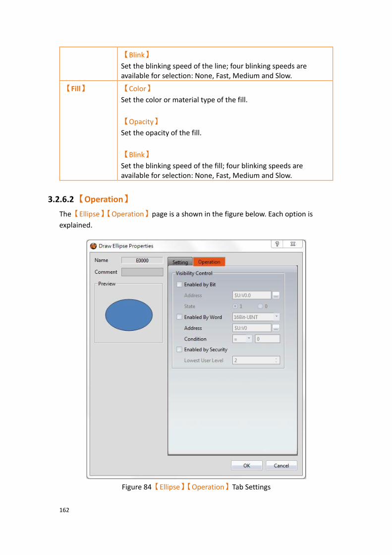
162
【Blink】
Set the blinking speed of the line; four blinking speeds are available for selection: None, Fast, Medium and Slow.
【Fill】 【Color】
Set the color or material type of the fill.
【Opacity】
Set the opacity of the fill.
【Blink】
Set the blinking speed of the fill; four blinking speeds are available for selection: None, Fast, Medium and Slow.
3.2.6.2 【Operation】
The【Ellipse】【Operation】page is a shown in the figure below. Each option is
explained.
Figure 84【Ellipse】【Operation】Tab Settings

163
Table 40【Ellipse】【Operation】Settings
Property Description
【Visibility
Control】
Control the visibility of the object. The object can be controlled by a bit or the user level.
【Enabled by Bit】
Set to control the visibility using a bit.
【Address】
Specify the address of the bit that controls the object.
【State】
Set the control bit as 1 or 0 to show object.
【Enabled by Word】
Check whether the visibility is controlled by word.
【Address】
Set the visibility control word address.
【Condition】
Set the condition of word control and when it is true then show up the object, when false not show the object. The condition include’ =’,’ !=’, ‘>’, ‘<’, ‘>=’, ‘<=’.
【Enabled by Security】
Set to control the visibility using the user login level.
【Lowest User Level】
Select the minimum level of user logged in for the object to be visible.

164
3.2.7 【Arc】
3.2.7.1 【Setting】
The【Arc】【Setting】 page is a shown in the figure below. Each option is explained.
Figure 85 Setting page for【Arc】
Table 41 Property settings for【Arc】
Property Description
【Preview】 Preview the appearance of the object.
【Line】 【Color/Width】
Set the color and the width of the line.
【Type】
Set the type of line.
【Blink】
Set the blinking speed of the line; four blinking speeds are available for selection: None, Fast, Medium and Slow.
【Arc Angle】 【Start Angle】
Set the starting angle of the arc.
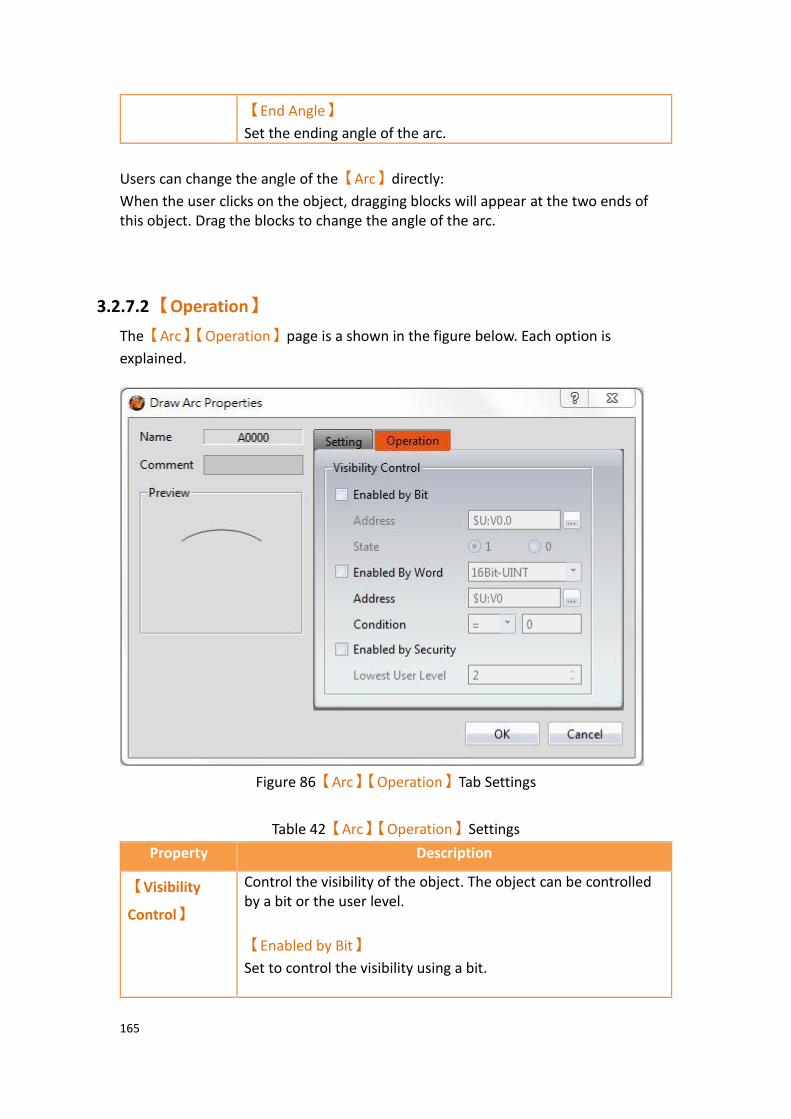
165
【End Angle】
Set the ending angle of the arc.
Users can change the angle of the【Arc】directly:
When the user clicks on the object, dragging blocks will appear at the two ends of this object. Drag the blocks to change the angle of the arc.
3.2.7.2 【Operation】
The【Arc】【Operation】page is a shown in the figure below. Each option is
explained.
Figure 86【Arc】【Operation】Tab Settings
Table 42【Arc】【Operation】Settings
Property Description
【Visibility
Control】
Control the visibility of the object. The object can be controlled by a bit or the user level.
【Enabled by Bit】
Set to control the visibility using a bit.
166
【Address】
Specify the address of the bit that controls the object.
【State】
Set the control bit as 1 or 0 to show object.
【Enabled by Word】
Check whether the visibility is controlled by word.
【Address】
Set the visibility control word address.
【Condition】
Set the condition of word control and when it is true then show up the object, when false not show the object. The condition include’ =’,’ !=’, ‘>’, ‘<’, ‘>=’, ‘<=’.
【Enabled by Security】
Set to control the visibility using the user login level.
【Lowest User Level】
Select the minimum level of user logged in for the object to be visible.
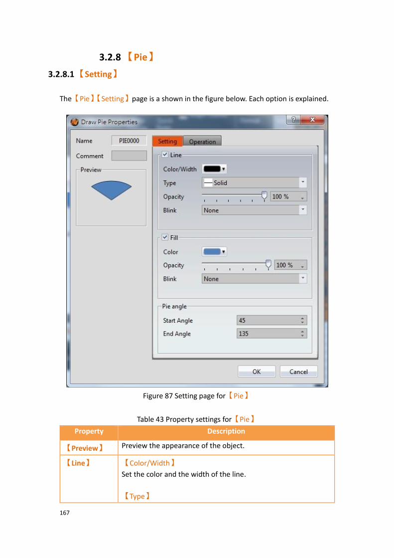
167
3.2.8 【Pie】
3.2.8.1 【Setting】
The【Pie】【Setting】page is a shown in the figure below. Each option is explained.
Figure 87 Setting page for【Pie】
Table 43 Property settings for【Pie】
Property Description
【Preview】 Preview the appearance of the object.
【Line】 【Color/Width】
Set the color and the width of the line.
【Type】
168
Set the type of line.
【Opacity】
Set the opacity of the line.
【Blink】
Set the blinking speed of the line; four blinking speeds are available for selection: None, Fast, Medium and Slow.
【Fill】 【Color】
Set the color or material type of the fill.
【Opacity】
Set the opacity of the fill.
【Blink】
Set the blinking speed of the fill; four blinking speeds are available for selection: None, Fast, Medium and Slow.
【Pie Angle】 【Start Angle】
Set the starting angle of the pie.
【End Angle】
Set the ending angle of the pie.
Users can change the angle of the【Pie】directly:
When the user clicks on the object, dragging blocks will appear at the two ends of this object. Drag the blocks to change the angle of the arc.

169
3.2.8.2 【Operation】
The【Pie】【Operation】page is a shown in the figure below. Each option is
explained.
Figure 88【Pie】【Operation】Tab Settings
Table 44【Pie】【Operation】Settings
Property Description
【Visibility
Control】
Control the visibility of the object. The object can be controlled by a bit or the user level.
【Enabled by Bit】
Set to control the visibility using a bit.

170
【Address】
Specify the address of the bit that controls the object.
【State】
Set the control bit as 1 or 0 to show object.
【Enabled by Word】
Check whether the visibility is controlled by word.
【Address】
Set the visibility control word address.
【Condition】
Set the condition of word control and when it is true then show up the object, when false not show the object. The condition include’ =’,’ !=’, ‘>’, ‘<’, ‘>=’, ‘<=’.
【Enabled by Security】
Set to control the visibility using the user login level.
【Lowest User Level】
Select the minimum level of user logged in for the object to be visible.
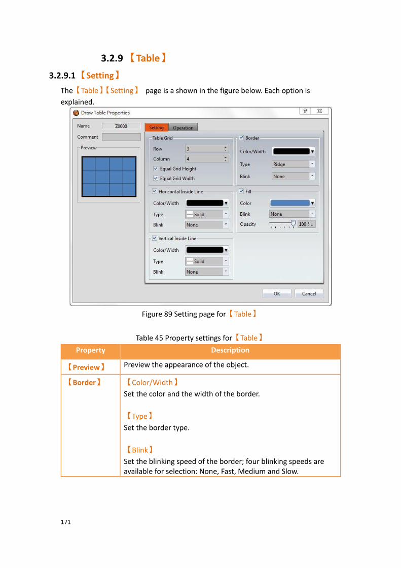
171
3.2.9 【Table】
3.2.9.1 【Setting】
The【Table】【Setting】 page is a shown in the figure below. Each option is
explained.
Figure 89 Setting page for【Table】
Table 45 Property settings for【Table】
Property Description
【Preview】 Preview the appearance of the object.
【Border】 【Color/Width】
Set the color and the width of the border.
【Type】
Set the border type.
【Blink】
Set the blinking speed of the border; four blinking speeds are available for selection: None, Fast, Medium and Slow.

172
【Table Grid】 【Row】
Set the number of rows for the table.
【Column】
Set the number of columns for the table.
【Equal Grid Height】
Set the cells in the table to have the same height.
【Equal Grid Width】
Set the cells in the table to have the same width.
Note: When【Equal Grid Height】and【Equal Grid Width】are not
selected, users can drag the border of the grids to change the size of the grids.
【Fill】 【Color】
Set the color or material type of the fill.
【Blink】
Set the blinking speed of the fill; four blinking speeds are available for selection: None, Fast, Medium and Slow.
【Opacity】
Set the opacity of the fill.
【Horizontal
Inside Line】
Select to display the horizontal grid lines.
【Color/Width】
Set the color and width of the horizontal grid lines.
【Type】
Set the type of horizontal grid line.
【Blink】
Set the blinking speed of the fill; four blinking speeds are available for selection: None, Fast, Medium and Slow.
【Vertical
Inside Line】
Select to display the vertical grid lines.
【Color/Width】
Set the color and width of the vertical grid lines.
【Type】
Set the type of vertical grid line.

173
【Blink】
Set the blinking speed of the fill; four blinking speeds are available for selection: None, Fast, Medium and Slow.
3.2.9.2 【Operation】
The【Table】【Operation】page is a shown in the figure below. Each option is
explained.
Figure 90【Table】【Operation】Tab Settings
Table 46【Table】【Operation】Settings
Property Description
【Visibility
Control】
Control the visibility of the object. The object can be controlled by a bit or the user level.
【Enabled by Bit】
Set to control the visibility using a bit.
【Address】
Specify the address of the bit that controls the object.
174
【State】
Set the control bit as 1 or 0 to show object.
【Enabled by Word】
Check whether the visibility is controlled by word.
【Address】
Set the visibility control word address.
【Condition】
Set the condition of word control and when it is true then show up the object, when false not show the object. The condition include’ =’,’ !=’, ‘>’, ‘<’, ‘>=’, ‘<=’.
【Enabled by Security】
Set to control the visibility using the user login level.
【Lowest User Level】
Select the minimum level of user logged in for the object to be visible.

175
3.2.10 【Text】
3.2.10.1 【Setting】
The【Text】【Setting】 page is a shown in the figure below. Each option is
explained.
Figure 91 Settings page for【Text】
Table 47 Property settings for【Text】
Property Description
【Preview】 Preview the appearance of the object.
【Text】 【Font】
Set the font of the text.
【Format】
Set the format of the text, bold, italics or bottom line.
【Color】
Set the color of the text.
【Size】
Set the size of the text, default is 20.

176
【Direction】
Set the direction of the text, optional left to right or right to left.
【Alignment】
Set the alignment of the text.
【Margin】
Set the margin of the text.
【Word Spacing】
Set word sapcing of the text.
【Font Size Correlates with Geometry】
The size of the object may change more or less by the font size.
【Blink】
Select to turn on the blinking function for the texts.
【Display】 Divided into two parts: borders and backgrounds; can be set individually. Border:
【Show Border】
Select to display the border. When it is checked, the color, width and blinking function of the border can be set at the bottom.
【Color/Thickness】
Set the displayed color and thickness of the border.
【Blink】
Set to turn on the blinking function of the border. Background:
【Show Background】
Select to display the background. When it is checked, the color, width and blinking function of the background can be set at the bottom.
【Color】
Set the background color of the object.
【Blink】
Set to turn on the blinking function for the background of the
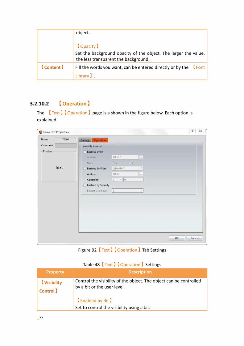
177
object.
【Opacity】
Set the background opacity of the object. The larger the value, the less transparent the background.
【Content】 Fill the words you want, can be entered directly or by the 【Font
Library】.
3.2.10.2 【Operation】
The 【Text】【Operation】page is a shown in the figure below. Each option is
explained.
Figure 92【Text】【Operation】Tab Settings
Table 48【Text】【Operation】Settings
Property Description
【Visibility
Control】
Control the visibility of the object. The object can be controlled by a bit or the user level.
【Enabled by Bit】
Set to control the visibility using a bit.

178
【Address】
Specify the address of the bit that controls the object.
【State】
Set the control bit as 1 or 0 to show object.
【Enabled by Word】
Check whether the visibility is controlled by word.
【Address】
Set the visibility control word address.
【Condition】
Set the condition of word control and when it is true then show up the object, when false not show the object. The condition include’ =’,’ !=’, ‘>’, ‘<’, ‘>=’, ‘<=’.
【Enabled by Security】
Set to control the visibility using the user login level.
【Lowest User Level】
Select the minimum level of user logged in for the object to be visible.

179
3.2.11 【Image】
3.2.11.1 【Setting】
The【Image】【Setting】 page is a shown in the figure below. Each option is
explained.
Figure 93 Settings page for【Image】
Table 49 Property settings for【Image】
Property Description
【Preview】 Preview the appearance of the object.
【Setting】 【Source】
The source location of the image, you can select from file or form library.
180
【Rotate】
Set the rotate degree of the figure, including CW 0 Degrees, CW 90 Degrees, CW 180 Degrees and CW 270 Degrees.
【Flip】
Set the degree the image is rotated, including no flip, X Axis and Y Axis.
【Size】
Set the size restrictions of the image object. When 【Original】
is selected, the size of the image object is fixed at its original size.
When【Fixed Ratio】is selected, the image object can be scaled
proportional to its original ratio. The image object can be stretched freely when neither is selected.
【Blink】
Set the blinking speed of the image object. Four blinking speeds are available for selection: None, Fast, Medium and Slow.
【Brightness】 Set the brightness of the image object. The greater the value the brighter the object will be displayed.
【Opacity】 Set the opacity of the image object. The greater the value the less transparent the object will be displayed.
【Border】 Set the border of the image object. The display appearance of the border can be set once this option is selected.
【Color/Thickness】
Set the displayed color and thickness of the border.
【Blink】
Set the blinking speed of the border. Four blinking speeds are available for selection: None, Fast, Medium and Slow.
【Remove
Background】
Set to remove the background. The transparent color can be set automatically or manually.

181
3.2.11.2 【Operation】
The【Image】【Operation】page is a shown in the figure below. Each option is
explained.
Figure 94【Image】【Operation】Tab Settings
Table 50【Image】【Operation】Settings
Property Description
【Visibility
Control】
Control the visibility of the object. The object can be controlled by a bit or the user level.
【Enabled by Bit】
Set to control the visibility using a bit.
【Address】
182
Specify the address of the bit that controls the object.
【State】
Set the control bit as 1 or 0 to show object.
【Enabled by Word】
Check whether the visibility is controlled by word.
【Address】
Set the visibility control word address.
【Condition】
Set the condition of word control and when it is true then show up the object, when false not show the object. The condition include’ =’,’ !=’, ‘>’, ‘<’, ‘>=’, ‘<=’.
【Enabled by Security】
Set to control the visibility using the user login level.
【Lowest User Level】
Select the minimum level of user logged in for the object to be visible.
183
3.2.12 【Scale】
3.2.12.1 【Setting】
The【Scale】【Setting】 page is a shown in the figure below. Each option is
explained.
Figure 95 Settings Page for【Scale】
Table 51 Property Settings for【Scale】
Property Description
【Preview】 Preview the appearance of the object.
【Line】 【Color/Width】
Set the line width and color.
【Line Type】
Select the appearance of the line.
【Sub Scale Length】
Set the length of the minor scales.
【Scale】 【Number of Major Ticks】
Set the number of major divisions of the scale.
【Number of Sub Divisions】

184
Set the number of minor divisions of the scale.
【Direction】 【Horizontal】
Set to align the scale horizontally. If the scale has text, the text is displayed above.
【Vertical】
Set to align the scale vertically. If the scale has text, the text is displayed on the right.
【Inverse】
If the scale is aligned horizontally, set to display the text below the scale. If the scale is aligned vertically, set to display the text on the left side of the scale.
【Text】 【Font】
Select the font of the text.
【Size】
Select the size of the text.
【Color】
Select the color of the text.
【Format】
Set the format of the text.
【Precision】
Set the number of decimal places for the text.
【Right Value】
Set the maximum value of the scale.
【Left Value】
Set the minimum value of the scale.

185
3.2.12.2 【Operation】
The【Scale】【Operation】page is a shown in the figure below. Each option is
explained.
Figure 96【Scale】【Operation】Tab Settings
Table 52【Scale】【Operation】Settings
Property Description
【Visibility
Control】
Control the visibility of the object. The object can be controlled by a bit or the user level.
【Enabled by Bit】
Set to control the visibility using a bit.
【Address】
Specify the address of the bit that controls the object.
【State】
Set the control bit as 1 or 0 to show object.
【Enabled by Word】
Check whether the visibility is controlled by word.
【Address】
Set the visibility control word address.

186
【Condition】
Set the condition of word control and when it is true then show up the object, when false not show the object. The condition include’ =’,’ !=’, ‘>’, ‘<’, ‘>=’, ‘<=’.
【Enabled by Security】
Set to control the visibility using the user login level.
【Lowest User Level】
Select the minimum level of user logged in for the object to be visible.
3.2.13 【Pipeline】 FvDesigner provide user can build pipeline easily and can use in different environment , such as water treatment application,display flow state and effect, etc.
The object can except drang【Pipeline】from【Toolbox】【Draw】to work space,
also can drag from【Ribbon】【Draw】, figure as shown below.
Figure 97【Pipeline】in【Toolbox】
Figure 98【Pipeline】in【Ribbon】
187
3.2.13.1 【General】
The【Pipeline】【General】page is as shown in the figure below, the meaning of
each setting item are listed below:
Figure 99 Settings Page for【Pipeline】【General】
Table 53【General】Properties of【Pipeline】
Property Description
【Preview】 Preview the appearance of this object.
【Display】 【Type】
Pipeline has 3 types to choose, right side you can click【3D
Effect】,totally 5 types.

188
Type Illustration
Right Angle Tyoe
Arc Angle Tyoe
Water Pipe Type
3D Arc Angle Tyoe
3D Water Pipe Type
【Pipe Diameter】
Set the diameter of pipe, the length of each pipe affects the maximum diameter, with a maximum diameter of 40.
【Pipe Background Color】
Set the background color of pipe, if the【Multi-State】has
checked, then set the color in the below table.

189
【Border Color/Width】
Set the color and width of border.
【Dynamic】 【Multi-State】
Check the pipeline whether to be multi-states function.
【Multi-State】【State Address】
Set the reading address of multi-state, the pipeline will read this adress to change different states, such as set the address as R30, when R30=0 display state 1, when R30=1 display state 2, when R30=2 display state 3, and so on.
【Multi-State】【State Numbers】
Set the state numbers.
【Multi-State】【Table】
Set the color of each state.
【Enable Blink】
Check whether to let pipeline blink, if checked, will show up the address and speed options to set, such as set the address set as M10, when M10=ON the pipeline will blink.
【Enable Flow】
Check whether to let pipeline show flow effect, if checked, will show up the address and speed options to set, such as set the address set as M20, when M20=ON the pipeline will show flow effect.

190
3.2.13.2 【Pipe Item】
The【Pipeline】【Pipe Item】page is as shown in the figure below, the meaning of
each setting item are listed below:
Figure 100 Settings Page for【Pipeline】【Pipe Item】
Table 54【Pipe Item】Properties of【Pipeline】
Property Description
【Insert】 Insert joint to the middle of the pipe or add at the end of the pipe.
【Delete】 Delete pipe or joint of the pipeline, the first pipe cannot be deleted and the pipe that connected to the back will be deleted.
【Table】 Display all of the pipe item, choose the pipe item , can modify
the property of【General】and【Flow Effect】modify the
property. All of the pipe items are as follows:

191
Type Illustration
Pipe_H
Pipe_V
Joint_L_LD
Joint_L_LU
Joint_L_RD
Joint_L_RU
Joint_T_L
Joint_T_R
Joint_T_D
Joint_T_U
Joint_X
【Pipe Item】 【General】【Type】
Set the type of pipe item, only joint can be modified.
【General】【Length】
Set the length of pipe item, only pipe can be modified.

192
【Flow Effect】
Set the flow effect of pipe item, only pipe can be modified.
【Flow Effect】【Type】
Set the type of all flow effect. Flow effect types as follows:
Type Illustration
Arrow Flow Solid
Arrow Flow Hollow
Triangle Flow Solid
Triangle Flow Hollow
Polygon Flow 1 Solid
Polygon Flow 1 Hollow
Polygon Flow 2 Solid
Polygon Flow 2 Hollow
Single Angle Flow Double Angle Flow
Single Line Flow
Double Line Flow
Single Wave Flow
Double Wave Flow
Rectangle Flow Solid
Rectangle Flow Hollow
【Flow Effect】【Color】
Set the color of flow effect type.
【Flow Effect】【Copy to All Items(Direction Not Included)】
Copy the flow effect to all items.
【Flow Effect】【Direction】
Set the direction of flow effect.

193
3.2.13.3 【Operation】
The【Pipeline】【Operation】page is as shown in the figure below, the meaning of
each setting item are listed below:
Figure 101 Settings Page for【Pipeline】【Operation】
Table 55【Operation】Properties of【Pipeline】
Property Description
【Visibility Control】 Visibility control of the object. It can be controlled by a specific Bit or User Level.
【Enable by Bit】
Select to control visibility by a specific Bit.
【Address】
Set the address of the visibility control Bit.
【State】
Set the control bit as 1 or 0 to show object.

194
【Enabled by Word】
Check whether the visibility is controlled by word.
【Address】
Set the visibility control word address.
【Condition】
Set the condition of word control and when it is true then show up the object, when false not show the object. The condition include’ =’,’ !=’, ‘>’, ‘<’, ‘>=’, ‘<=’.
【Enabled by Security Manager】
Select whether visibility is controlled by the level of the user logged in.
【Lowest User Level】
Set the minimum level of the user logged in to display the object.
3.2.13.4 Pipeline Pipe Add or Delete
【Pipeline】in addition to adding, inserting and deleting in【Pipe Item】of object
properties setting, also can click the right mouse botton and select the desired item to modify the pipe or joint, the quick menu will be displayed and select the item will to modify. Setting methods as follow:
1. Modify joint: First, click the object you would like to modify and will appear a red outer frame, as the left figure below. Second, click the right botton of the mouse on the joint that you want to modify, then will appear a quick menu, as the middle figure below. Third, click replace and select the joint , result as the right figure below.
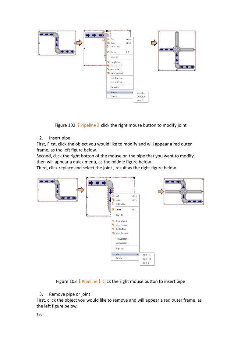
195
Figure 102【Pipeline】click the right mouse button to modify joint
2. Insert pipe:
First, First, click the object you would like to modify and will appear a red outer frame, as the left figure below. Second, click the right botton of the mouse on the pipe that you want to modify, then will appear a quick menu, as the middle figure below. Third, click replace and select the joint , result as the right figure below.
Figure 103【Pipeline】click the right mouse button to insert pipe
3. Remove pipe or joint :
First, click the object you would like to remove and will appear a red outer frame, as the left figure below.

196
Second, click the right botton of the mouse on the object that you want to remove, then will appear a quick menu, as the middle figure below. Third, click remove then the object will be removed , result as the right figure below.
Figure 104【Pipeline】click the right mouse button to remove pipe or joint

197
3.3 Base Object Properties Dialog
3.3.1 【Lamp】
When the numeric value of an address has changed, the【Lamp】object can be used
to map the changes of each numeric value of the register to a specific icon (such as bright or dim lamp) in order to allow a more intuitive understanding of the current numeric value of the register.
3.3.1.1 【Setting】
The【Lamp】【Setting】page is as shown in the figure below, the meaning of each setting
item are listed below:
Figure 105【Setting】Screen of【Lamp】
Table 56【Setting】Properties of【Lamp】
Property Description
【Preview】 Preview the appearance of this object.
【Name】 The default name of the object.
【Comment】 Set the comment of the object.
【Update】 Provide user can select a suitable speed to get the latest data under different situation, such as you would like to get the latest data or adjust the object on the screen to display first, etc. Provide three modes:
198
【once】: update once only when switch to this page or use
the system tag【OP_UPDATE_SCREEN_OBJECTS】, update
once when trigger once a time, it will keep update if the monitor address is internal address.
【normal】: normal update speed.
【fast】: the fastest update speed.
【Address】 【Type】
Set whether the monitored address of the lamp is a Bit or Word. The default setting is Bit.
【Address】
Set the address for the lamp to monitor.
【Enable Extended Lamp Feature】
Set to enable extra features for the lamp object. When set, extension options will appear to the right. The original address set in the window will no longer be read and is
replaced by the addresses【0~3】in the dialog as shown
below. After checked, the original【Type】and【Data
Type】setting value will be changed from the following
figure【Data Type】to set.
【Data Type】
Set the address type of addresses【0~3】. Data types
include Bit, 16Bit-BCD, 16Bit-INT, 16Bit-UINT, 32Bit-BCD, 32Bit-INT and 32Bit-UINT.
199
【Number of states】
Set the number of states the lamp will have.
【State Switch Condition】
Set how the state of the lamp is determined. The conditions
include【Change State by Bit Combination】and【Change
State by Bit】.
【Change State by Bit Combination】uses addresses
【0~3】in combination to switch the displayed state. For
example, the data type is set to Bit, the number of states is
4,【Address 0】is M80, 【Address 1】is M82, and
【Addresses 2 and 3】are not set, the state will be
determined as follows: M80 = OFF and M82 = OFF State 0 M80 = ON and M82 = OFF State 1 M80 = OFF and M82 = ON State 2 M80 = ON and M82 = ON State 3 If the data type is 16Bit-Uint, the number of states is 5,
【Address 0】is R40, the other addresses are not set, when
R40 = 0, the state is 0. R40 = 1, state 1. R40 = 2, state 2, R40 = 3, state 3, R40 = 4, state 4.
【Change State by Bit】refers to addresses【0~3】to switch
the displayed state. For example, the data type is set to Bit, the number of states
is 4, 【Address 0】is M80, 【Address 1】is M82,【Address
2】is M84, and【Address 3】is not set, the state will be
determined as follows: M80, M82, M84 = OFF State 0 M80 = ON, M82 = OFF, M84 = OFF State 1 M80 = OFF, M82 = ON, M84 = OFF State 2 M80 = OFF, M82 = OFF, M84 = ON State 3 If the data type is 16Bit-UINT, the number of states is 5,
【Address 0】is R40, the other addresses are not set, when
R40 = 0 the state is 0. R40 = 1, state 1. R40 = 2, state 2. R40 = 4, state 3. R40 = 8, state 4.

200
【Addresses 0~3】
Specify the address to use to determine the state of the lamp.
【Data Type】
Set the data type of the lamp; this setting item will appear when the type is set as Word.
【State】 【Number of States】
Set the number of states of the lamp. When the Lamp Type is Bit, the number of states is fixed as 2. If the Type is Word, it can be set between 2~256.
【Custom State Value】
When choose【Word】, you can check【Custom State
Value】beside the【Number of States】.
If didn’t check【Custom State Value】, for example, the
address of the lamp is R52, munber of states is two, then R52=0, state display as 0, R52=1, state display as 1.
After checked【Custom State Value】, you can press
【Detail】to set each single value and range corresponding
to the state. Setting dialog as figure below.
【Out of Range Display State】

201
Set the status to be displayed when the value exceeds the corresponding range
【Single Value】
Set the mode corresponding to the state as single value, the field will changed after checked, then you can set each value
corresponding to the state in【Value】field.
【Range】
Set the mode corresponding to the state as range, the field will changed after checked, then you can set each value
corresponding to the state in【Lower Limit】and【Upper
Limit】field.
3.3.1.2 【Display】
The【Lamp】【Display】page is as shown in the figure below, the meanings of each
setting item are listed below:
Figure 106【Display】Setting Screen of【Lamp】

202
Table 57【Display】Setting Properties of【Lamp】
Property Description
【State】 Select the state to be edited. 0 and 1 buttons are provided to enable quick switching between states 0 and 1.
【Text】 【Font】
Set the font of the text displayed for the current editing state.
【Size】
Set the size of the text displayed for the current editing state.
【Position】
Set the position of the text displayed for the current editing state.
【Blink】
Set the blinking function for the text of the current editing state. There are four blinking speeds available to choose from: None, Slow, Medium and Fast.
【Scrolling Text】
Set the scrolling text function for the text of the current editing state. There are four scrolling speeds available to choose, from slow to fast.
【Format】
Set the format of the text displayed for the current editing state, including Bold, Italics and Underline.
【Color】
Set the color of the text displayed for the current editing state.
【Copy Attributes to All States】
The text properties for the current editing state is applied to all states.
【Content】
Set the text displayed for the current editing state. It can be
inputted directly or acquired from the【Text Library】.

203
【Copy to All States】
Apply the settings of the text for the current editing state to all states.
【Background】 【Use Image】
Set whether to use an image for the displayed background of the current editing state. When this option is checked, an
【Image Selector】will appear asking the user to select an
image either from the【Image Library】or from a file.
【Color】
Set the displayed background color of the current editing
state. This setting item will appear if 【Use Image】 was
not selected.
【Blink】
Set the blinking function for the displayed background of the current editing state. There are four blinking speeds available to choose from: None, Slow, Medium and Fast.
【Remove Background】
Choose the color by setting a transparent color.
【Rotate】
Rotate the graph, includes CW 0 Degrees, CW 90 Degrees, CW 180 Degrees and CW 270 Degrees.
【Flip】
Flip the graph, includes No Flip, X-Axis and Y-Axis.
【Copy to All States】
Apply the settings of the background for the currently editing state to all states.
【Border】 Set the border of the lamp object, set the appearance after checked.
【Color/Width】
Set the color and width of the border.
【Type】
Set the type of the boder, click for more types.

204
【Copy to All States】
Apply the settings of the border for the currently editing state to all states.
3.3.1.3 【Operation】
The【Lamp】【Operation】page is as shown in the figure below, the meanings of each
setting item are listed below:
Figure 107【Operation】Setting Screen of【Lamp】
Table 58【Operation】Setting Properties of【Lamp】
Property Description
【Visibility Control】 Visibility control of the object. It can be controlled by a specific Bit or User Level.
【Enable by Bit】
Select to control visibility by a specific Bit.
【Address】
Set the address of the visibility control Bit.
【State】
Set the control bit as 1 or 0 to show object.

205
【Enabled by Word】
Check whether the visibility is controlled by word.
【Address】
Set the visibility control word address.
【Condition】
Set the condition of word control and when it is true then show up the object, when false not show the object. The condition include’ =’,’ !=’, ‘>’, ‘<’, ‘>=’, ‘<=’.
【Enabled by Security Manager】
Select whether visibility is controlled by the level of the user logged in.
【Lowest User Level】
Set the minimum level of the user logged in to display the object.
3.3.1.4 【External Lable】
The【Lamp】【External Lable】page is as shown in the figure below, the meanings of
each setting item are listed below:
Figure 108【External Lable】Setting Screen of【Lamp】

206
Table 59【Lamp】【External Lable】setting properties
Option Description
【Enable External
Lable】
Checked, the bottom will appear the external lable settings of the object.
【Direction】 Set the display direction, there are horizontal and vertical two selections.
【Space】 Set the space between external lable and the object.
【Left/Top Lable】 Fill in the text to be displayed on the left / top lable of the
object, can be directly input t or selected from【Font
Library】.
【Right/Bottom
Lable】
Fill in the text to be displayed on the right / bottom lable of the object, can be directly input t or selected from
【Font Library】.
【Text】 【Font】
Set the font of text.
【Size】
Set the size of text, the default size is 20.
【Alignment】
Set the alignment of text.
【Color】
Set the color of text.
【Format】
Set the format of text, includes Bold, Italic and Underline.
【Word Spacing】
Set the word space of text.
【Margin】
Set the margin of text.
【Background】 Check whether to display background, set the color and opacity of background after checked.
【Color】
Set the background color of external lable.
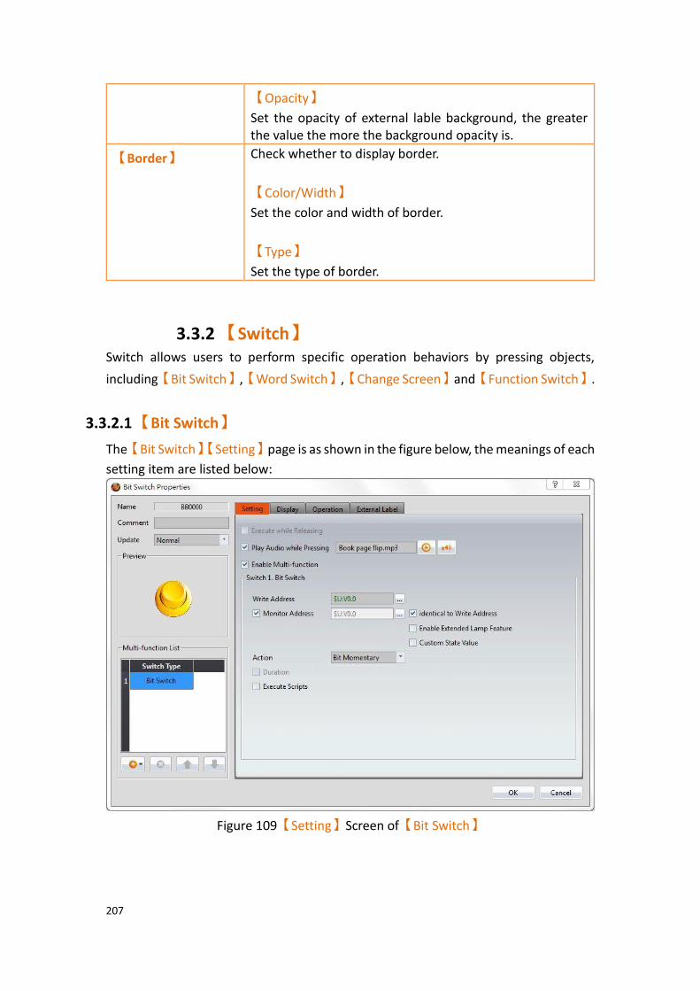
207
【Opacity】
Set the opacity of external lable background, the greater the value the more the background opacity is.
【Border】 Check whether to display border.
【Color/Width】
Set the color and width of border.
【Type】
Set the type of border.
3.3.2 【Switch】 Switch allows users to perform specific operation behaviors by pressing objects,
including【Bit Switch】,【Word Switch】,【Change Screen】and【Function Switch】.
3.3.2.1 【Bit Switch】
The【Bit Switch】【Setting】page is as shown in the figure below, the meanings of each
setting item are listed below:
Figure 109【Setting】Screen of【Bit Switch】
208
Table 60【Setting】Properties of【Bit Switch】
Property Description
【Preview】 Preview the appearance of this object.
【Name】 The default name of the object.
【Comment】 Set the comment of the object.
【Update】 Provide user can select a suitable speed to get the latest data under different situation, such as you would like to get the latest data or adjust the object on the screen to display first, etc. Provide three modes:
【once】: update once only when switch to this page or use
the system tag【OP_UPDATE_SCREEN_OBJECTS】, update
once when trigger once a time, it will keep update if the monitor address is internal address.
【normal】: normal update speed.
【fast】: the fastest update speed.
【Execute while
Releasing】
Select to execute the action set for the Bit Switch while releasing. The action will be executed immediately when the switch is pressed if this option is not selected.
【Play Audio
while Pressing】
Select to play audio when the switch is pressed; an【Audio
Selector】will appear on the right when enabled. The switch
on the right of the【Audio Selector】can be pressed to select
an audio and the switch on the left of the【Audio Selector】
can be pressed to play the selected audio.
【Enable Multi-
function】
Select to enable the Multi-function Switch. A【Multi-function
List】will appear on the left when selected.
【Multi-function
List】
This list will appear when【Enable Multi-function】 is
selected. The【Multi-function List】is used to display the list
of functions that will be executed when the switch is pressed. A maximum of 16 operations can be set, and the system will execute the operations in order when the switch is pressed.
【Add】
Add to the number of switches in【Multi-function List】. The
type of switch to add can be selected.
【Delete】

209
Delete the switch currently selected in the【Multi-function
List】.
【Up】
Move the order of the switch currently selected in the【Multi-
function List】up.
【Down】
Move the order of the switch currently selected in the【Multi-
function List】down.
Note: ➢ The order of the object itself is fixed as first and it cannot
be moved up or down.
➢ The【Multi-function List】of an object can only include
one【Change Screen】 or 【Function Switch】, and it
must be last in the list.
【Address】 Set the operating address of the Bit Switch.
【Monitor
Address】
Set the switch to change its state according to the value in the monitored address. The user will be able to set the address to monitor when this option is selected.
【Enable
Extended Lamp
Feature】
Set to enable extra features for the bit switch object. When set, extension options will appear to the right. The original address set in the window will no longer be read and is
replaced by the addresses【0~3】in the dialog as shown
below. After checked, the original【Type】and【Data Type】
setting value will be changed from the following figure【Data
Type】to set.

210
【Data Type】
Set the address type of addresses【0~3】. Data types include
Bit, 16Bit-BCD, 16Bit-INT, 16Bit-UINT, 32Bit-BCD, 32Bit-INT and 32Bit-UINT.
【Number of states】
Set the number of states the bit switch will have.
【State Switch Condition】
Set how the state of the bit switch is determined. The
conditions include【Change State by Bit Combination】and
【Change State by Bit】
【Change State by Bit Combination】uses addresses【0~3】
in combination to switch the displayed state. For example, the
data type is set to Bit, the number of states is 4,【Address 0】
is M90, 【Address 1】is M91, and【Addresses 2 and 3】are
not set, the state will be determined as follows: M90 = OFF and M91 = OFF State 0 M90 = ON and M91 = OFF State 1 M90 = OFF and M91 = ON State 2 M90 = ON and M91 = ON State 3 If the data type is 16Bit-Uint, the number of states is 5,
【Address 0】is R50, the other addresses are not set, when
R50 = 0, the state is 0. R50 = 1, state 1. R50 = 2, state 2, R50 =

211
3, state 3, R50 = 4, state 4.
【Change State by Bit】refers to addresses【0~3】to switch
the displayed state. For example, the data type is set to Bit, the number of states is
4,【Address 0】is M00, 【Address 1】is M91,【Address 2】
is M92, and【Address 3】is not set, the state will be
determined as follows: M90, M91, M92 = OFF State 0 M90 = ON, M91 = OFF, M92 = OFF State 1 M90 = OFF, M91 = ON, M92 = OFF State 2 M90 = OFF, M91 = OFF, M92 = ON State 3 If the data type is 16Bit-UINT, the number of states is 5,
【Address 0】is R50, the other addresses are not set, when
R50 = 0 the state is 0. R50 = 1, state 1. R50 = 2, state 2. R50 = 4, state 3. R50 = 8, state 4.
【Addresses 0~3】
Specify the address to use to determine the state of the bit switch.
【Custom State
Value】
After check【Custom State Value】, you can click【Detail】at
the back, set the value and range of each state. Setting dialog as below:
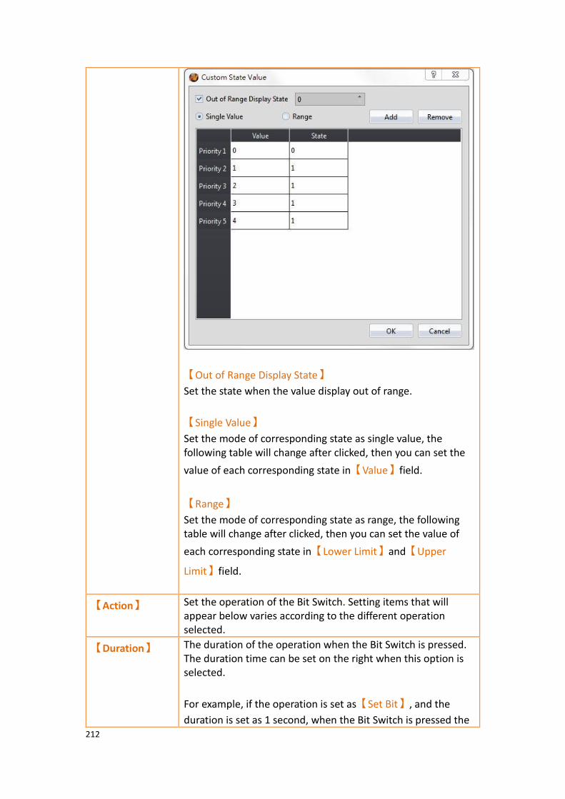
212
【Out of Range Display State】
Set the state when the value display out of range.
【Single Value】
Set the mode of corresponding state as single value, the following table will change after clicked, then you can set the
value of each corresponding state in【Value】field.
【Range】
Set the mode of corresponding state as range, the following table will change after clicked, then you can set the value of
each corresponding state in【Lower Limit】and【Upper
Limit】field.
【Action】 Set the operation of the Bit Switch. Setting items that will appear below varies according to the different operation selected.
【Duration】 The duration of the operation when the Bit Switch is pressed. The duration time can be set on the right when this option is selected.
For example, if the operation is set as【Set Bit】, and the
duration is set as 1 second, when the Bit Switch is pressed the

213
【Address】will change to 1 and then automatically change to
0 after 1 second.
【Execute
Scripts】
Set to execute scripts when the Bit Switch is pressed. The ID of the script to execute can be set on the right when this option is selected.
If the【Action】is set as【Bit Momentary】,【Bit Invert】or
【Periodic Switch】, individual scripts can be set to execute
when the【Address】is 1 or 0.
【Set Bit】 The【Address】will change to 1 when the Bit Switch is
pressed.
【Reset Bit】 The【Address】will change to 0 when the Bit Switch is
pressed.
【Bit
Momentary】
The【Address】will change to 1 when the Bit Switch is
pressed, and the【Address】will change to 0 when the Bit
Switch is released.
【Bit Invert】 The current state of the【Address】will change from 1 to 0 or
0 to 1 according to its current state.
【Comparison】 If the numeric value of the【Reference Address】read by
【Data Type】satisfies the【Condition】and【Constant】set
when the Bit Switch is pressed, the【Address】will change to
1.
【Periodic
Switch】
The state of the【Address】will change periodically according
to the【Time Interval】and【Number of Times】set for the
【Address】when the Bit Switch is pressed.

214
3.3.2.2 【Word Switch】
The【Word Switch】【Setting】page is as shown in the figure below, the meanings of
each setting item are listed below:
Figure 110【Setting】Screen of【Word Switch】
Table 61【Setting】Properties of【Word Switch】
Property Description
【Preview】 Previews the appearance of this object.
【Name】 The default name of the object.
【Comment】 Set the comment of the object.
【Update】 Provide user can select a suitable speed to get the latest data under different situation, such as you would like to get the latest data or adjust the object on the screen to display first, etc. Provide three modes:
【once】: update once only when switch to this page or use
the system tag【OP_UPDATE_SCREEN_OBJECTS】, update
once when trigger once a time, it will keep update if the monitor address is internal address.
【normal】: normal update speed.
【fast】: the fastest update speed.

215
【Execute while
Releasing】
Select to execute the action set for the Word Switch while releasing. The action will be executed immediately when the switch is pressed if this option is not selected.
【Play Audio
while Pressing】
Select to play audio when the switch is pressed. An【Audio
Selector】will appear on the right when enabled. The switch
on the right of the【Audio Selector】can be pressed to select
an audio and the switch on the left of the【Audio Selector】
can be pressed to play the selected audio.
【Enable Multi-
function】
Select whether to enable the Multi-function Switch. A【Multi-
function List】will appear on the left when selected.
【Multi-function
List】
This list will appear when【Enable Multi-function】is
selected. The【Multi-function List】is used to display the list
of functions that will be executed when the switch is pressed. A maximum of 16 operations can be set, and the system will execute the operations in order when the switch is pressed.
【Add】
Add to the number of switches in【Multi-function List】. The
type of switch to add can be selected.
【Delete】
Delete the switch currently selected in the【Multi-function
List】.
【Up】
Move the order of the switch currently selected in the【Multi-
function List】up.
【Down】
Move the order of the switch currently selected in the【Multi-
function List】down.
Note: ➢ The order of the object itself is fixed as first and it cannot
be moved up or down.
➢ The【Multi-function List】of an object can only include
one【Change Screen】or【Function Switch】, and it
must be last in the list

216
【Address】 Set the operating address of the Word Switch.
【Monitor
Address】
Set the switch to change its state according to the value in the monitored address. The user will be able to set the address to monitor when this option is selected.
【Data Type】 Set the data type of the Word Switch.
【Action】 Set the operate actionof word switch, following will show different options according different action.
【Write Data】 When pressing word switch,【Address】value will be set as
the set of【Data Type】and【Constant】.
【Add Data】 Press the word switch each time,【Address】value will add
【Constant】base on the current value according to the set of
the【Data Type】. The【Max】can control the upper limit of
the word switch adding value operation.
【Continuously Add】
If check this option, when pressing the word switch and
unrelease, word switch will excute【Add Data】continuously,
and after wait for【Time Delay】will excute【Add Data】
according to【Interval】time.
【Cyclically Add】
If check this option, when the value has add to【Max】, press
this word switch then will write【Min】to【Address】.
【Subtract
Data】
Press the word switch each time,【Address】value will
subtract【Constant】base on the current value according to
the set of the【Data Type】. The【Min】can control the
lower limit of the word switch subtracting value operation.
【Continuously Subtract】
If check this option, when pressing the word switch and
unrelease, word switch will excute【Subtract Data】
continuously, and after wait for【Time Delay】will excute
【Subtract Data】according to【Interval】time.
【Cyclically Subtract】
If check this option, when the value has subtract to【Min】,

217
press this word switch then will write【Max】to【Address】.
【Enable
Extended Lamp
Feature】
Set to enable extra features for the word switch object. When set, extension options will appear to the right. The original address set in the window will no longer be read and is
replaced by the addresses【0~3】in the dialog as shown
below. After checked, the original【Type】and【Data Type】
setting value will be changed from the following figure【Data
Type】to set.
【Data Type】
Set the address type of addresses【0~3】. Data types include
Bit, 16Bit-BCD, 16Bit-INT, 16Bit-UINT, 32Bit-BCD, 32Bit-INT and 32Bit-UINT.
【Number of states】
Set the number of states the word switch will have.
【State Switch Condition】
Set how the state of the word switch is determined. The
conditions include【Change State by Bit Combination】and
【Change State by Bit】.
【Change State by Bit Combination】uses addresses【0~3】
in combination to switch the displayed state. For example, the
data type is set to Bit, the number of states is 4,【Address 0】

218
is M90, 【Address 1】is M91, and【Addresses 2 and 3】are
not set, the state will be determined as follows: M90 = OFF and M91 = OFF State 0 M90 = ON and M91 = OFF State 1 M90 = OFF and M91 = ON State 2 M90 = ON and M91 = ON State 3 If the data type is 16Bit-Uint, the number of states is 5,
【Address 0】is R50, the other addresses are not set, when
R50 = 0, the state is 0. R50 = 1, state 1. R50 = 2, state 2, R50 = 3, state 3, R50 = 4, state 4.
【Change State by Bit】refers to addresses【0~3】to switch
the displayed state. For example, the data type is set to Bit, the number of states is
4, 【Address 0】is M00, 【Address 1】is M91,【Address
2】is M92, and【Address 3】is not set, the state will be
determined as follows: M90, M91, M92 = OFF State 0 M90 = ON, M91 = OFF, M92 = OFF State 1 M90 = OFF, M91 = ON, M92 = OFF State 2 M90 = OFF, M91 = OFF, M92 = ON State 3 If the data type is 16Bit-UINT, the number of states is 5,
【Address 0】is R50, the other addresses are not set, when
R50 = 0 the state is 0. R50 = 1, state 1. R50 = 2, state 2. R50 = 4, state 3. R50 = 8, state 4.
【Addresses 0~3】
Specify the address to use to determine the state of the word switch.
【Custom State
Value】
After check【Custom State Value】, you can click【Detail】at
the back, set the value and range of each state. Setting dialog as below:

219
【Out of Range Display State】
Set the state when the value display out of range.
【Single Value】
Set the mode of corresponding state as single value, the following table will change after clicked, then you can set the
value of each corresponding state in【Value】field.
【Range】
Set the mode of corresponding state as range, the following table will change after clicked, then you can set the value of
each corresponding state in【Lower Limit】and【Upper
Limit】field.
【State】 Set the number of states, set whether the word switch changes its status according to the value of the set monitor address.

220
3.3.2.3 【Change Screen】
The【Change Screen】【Setting】page is as shown in the figure below, the meanings
of each setting item are listed below:
Figure 111【Setting】Screen of【Change Screen】
Table 62【Setting】Properties of【Change Screen】
Property Description
【Preview】 Previews the appearance of this object.
【Name】 The default name of the object.
【Comment】 Set the comment of the object.
【Execute while Releasing】 Select to execute the action set for Change Screen while releasing; the action will be executing immediately when the switch is pressed if this option is not selected.
【Play Audio while Pressing】 Select to play audio when the switch is
pressed; an【Audio Selector】will appear on
the right when enabled. The switch on the
right of the【Audio Selector】can be pressed
to select an audio and the switch on the left
of the【Audio Selector】can be pressed to
play the audio selected.

221
【Enable Multi-function】 Select whether to enable the Multi-function
Switch. A【Multi-function List】will appear
on the left when selected.
【Multi-function List】 This list will appear when【Enable Multi-
function】is selected. The【Multi-function
List】is used to display the list of functions
that will be executed when the switch is pressed. A maximum of 16 operations can be set, and the system will execute the operations in order when the switch is pressed.
【Add】
Add to the number of switches in【Multi-
function List】. The type of switch to add can
be selected.
【Delete】
Delete the switch currently selected in the
【Multi-function List】.
【Up】
Move the order of the switch currently
selected in the【Multi-function List】up.
【Down】
Move the order of the switch currently
selected in the【Multi-function List】down.
Note: ➢ The order of the object itself is fixed as
first and it cannot be moved up or down.
The【Multi-function List】of an object can
only include one【Change Screen】 Or
【Function Switch】, and it must be last in
the list
【Type】 Set the operation type of Change Screen; setting items that will appear below varies according to the different operation selected.

222
【Screen Change】 The displayed screen of the human machine interface will change to the screen set in
【Screen】when Change Screen is pressed.
【Previous Screen】 The displayed screen of the human machine interface will change to the previous screen displayed when Change Screen is pressed.
【Pop-up Window Screen】 When the button is pressed, the HMI display will pop up the selected window screen.
【Close Pop-up Window
Screen】
When the button is pressed, the pop-up window screen containing the button will close.
【Close Pop-up Window Screen
and Switch Screen】
When the button is pressed, the pop-up window screen containing the button will close and the screen set to switch will appear.
【Change User Level】 When the button is pressed, security level of the user will be changed to the selected value.
3.3.2.4 【Function Switch】
The【Function Switch】【Setting】page is as shown in the figure below, the meanings
of each setting item are listed below:
Figure 112【Setting】Screen of【Function Switch】
223
Table 63【Setting】Properties of【Function Switch】
Property Description
【Preview】 Previews the appearance of this object.
【Name】 The default name of the object.
【Comment】 Set the comment of the object.
【Execute
while
Releasing】
Select to execute the action set for the Function Switch while releasing. The action will be executed immediately when the switch is pressed if this option is not selected.
【Play Audio
while
Pressing】
Select to play audio when the switch is pressed; an【Audio
Selector】will appear on the right when enabled. The switch on
the right of the【Audio Selector】can be pressed to select an
audio and the switch on the left of the【Audio Selector】can
be pressed to play the audio selected.
【Enable Multi-
function】
Select whether to enable the Multi-function Switch. A【Multi-
function List】will appear on the left when selected.
【Multi-
function List】
This list will appear when【Enable Multi-function】is selected.
The【Multi-function List】is used to display the list of functions
that will be executed when the switch is pressed. A maximum of 16 operations can be set, and the system will execute the operations in order when the switch is pressed.
【Add】
Add to the number of switches in【Multi-function List】. The
type of switch to add can be selected.
【Delete】
Delete the switch currently selected in the【Multi-function
List】.
【Up】
Move the order of the switch currently selected in the【Multi-
function List】up.
【Down】
Move the order of the switch currently selected in the【Multi-

224
function List】down.
Note: ➢ The order of the object itself is fixed as first and it cannot
be moved up or down.
The【Multi-function List】of an object can only include one
【Change Screen】 Or 【Function Switch】, and it must be
last in the list
【Function】 Set the operation function of the Function Switch. Setting items that will appear below varies according to the different functions selected.
【System:
Restart HMI】
The human machine interface will restart when the Function Switch is pressed.
【System:
Increase
Brightness】
The brightness of the human machine interface display will increase when the Function Switch is pressed.
【System:
Decrease
Brightness】
The brightness of the human machine interface display will decrease when the Function Switch is pressed.
【System: Turn
Backlight OFF】
The brightness of the human machine interface display will decrease to the lowest brightness level when the Function Switch is pressed.
【System:
Show System
Configuration】
The system will pop-up system configuration when Function
Switch is pressed, including four paging【General】,
【Ethernet】,【Screen Saver】and【Date/Time】.
【General】paging including device name, station number, OS
Version, Firmware Version.
【Ethernet】paging set whether to enable ethernet, whether
to use DHCP, display or set HMI IP Address, display or set HMI Netmask, display , DNS setting or set HMI Gateway.
【Screen Saver】paging set whether to enable screen saver,
waiting time.
【Date/Time】paging display or set HMI date and time.

225
【Security: Log
in】
The system will display the log in window for the operator to log in when Function Switch is pressed.
【Security: Log
Out】
The operator will be logged out when Function Switch is pressed.
【Security:
Password
Manager】
The password table will be displayed for the operator to view. For example, if the security level of the operator is 5, the level 5 password table will appear. For more details refer to Chapter 5 -Security.
【Security:
Import User
Accounts】
Update the username and user passwords, or passwords only, it
depends on the setting in 【Security】.
【Overwrite】
If【Overwrite】is selected, the usernames and user passwords
currently saved on the human machine interface will be overwritten. If it is not selected, the new username and user password will be added to the human machine interface.
【Script:
Execute
Script】
The system will execute the selected【Script】when Function
Switch is pressed.
226
【Recipe:
Import Recipe Group from
File】
Import the file contents of the recipe group; user will be able to see the complete contents of the recipe group if recipe tables are available. Users will also be able to see the changes in the numeric value of the displayed components if the register addresses of the displayed components are the same as the current recipe address set in the recipe. A drop-down list will appear below when this function is used for the user to decide which recipe group will be used.
【Recipe Group】
The recipe group ID and recipe group name can be seen here if the user adds new recipe groups with the recipe setting function. Note: the index of this recipe group will become 0 when this function is used, so the current recipe collection will have an index value of 0.
【Recipe:
Export Recipe Group back to
File】
Export the contents of the recipe group into a recipe group file. The user can choose to export a new file or overwrite the original recipe group file. A drop-down list will appear below when this function is used for the user to decide which recipe group will be used.
【Recipe Group】
The recipe group ID and recipe group name can be seen here if the user adds new recipe groups with the recipe setting function.
【Recipe: Write
Current Recipe to Target
Address】
A drop-down list will appear below when this function is used for the user to decide which recipe group will be used. The contents of the parameter in the HMI current recipe will be written to the register of the target address according to the setting of this recipe group.
【Recipe Group】
The recipe group ID and recipe group name can be seen here if the user adds new recipe groups with the recipe setting function.
【Recipe: Read
From Target Address to Current
A drop-down list will appear below when this function is used for the user to decide which recipe group will be used. The register contents of the target address will be read and the value will be written to the current recipe of the HMI according to the setting of this recipe group.
227
Recipe】
【Recipe Group】
The recipe group ID and recipe group name can be seen here if the user adds new recipe groups with the recipe setting function.
【Recipe: Add
Default
Recipe】
Add a set of recipes in recipe table to above or below the current recipe and switch current recipeto the new recipe.
【Recipe Group】
The recipe group ID and recipe group name can be seen here if the user adds new recipe groups with the recipe setting function.
【To】
Choose to add a new recipe to above or below the current recipe. For more detail please refer ch9-Recipe
【Recipe: Copy
Current
Recipe】
Copy current recipe in recipe table to above or below the current recipe and switch current recipeto the new recipe.
【Recipe Group】
The recipe group ID and recipe group name can be seen here if the user adds new recipe groups with the recipe setting function.
【To】
Choose to copy a set of recipes to above or below the current recipe. For more detail please refer ch9-Recipe
【Recipe:
Delete Current
Recipe】
Delete the current recipe and switch current recipe to next recipe.
【Recipe Group】
The recipe group ID and recipe group name can be seen here if the user adds new recipe groups with the recipe setting function. For more detail please refer ch9-Recipe
【Recipe:
Transfer Source Address to
Read the parameter data from source address and write to the recipe group storage space, source address can be set in the advanced paging of the recipe, the function switch transfer all recipe group data.

228
Recipe Group】
【Recipe Group】
The recipe group ID and recipe group name can be seen here if the user adds new recipe groups with the recipe setting function. For more detail please refer ch9-Recipe
【Recipe:
Transfer Recipe Group to Source
Address】
Write the parameter data of the recipe group storage space to source address, source address can be set in the advanced paging of the recipe, the function switch transfer all recipe group data.
【Recipe Group】
The recipe group ID and recipe group name can be seen here if the user adds new recipe groups with the recipe setting function. For more detail please refer ch9-Recipe
【Recipe:
Import Recipe Group from File, then Transfer to Source
Address】
After import the contents of the recipe group file to recipe group stprage space and write the parameter data of the recipe group storage space to source address, source address can be set in the advanced paging of the recipe, the function switch transfer all recipe group data.
【Recipe Group】
The recipe group ID and recipe group name can be seen here if the user adds new recipe groups with the recipe setting function. For more detail please refer ch9-Recipe
【Recipe:
Transfer Source Address to Recipe Group,then
Export to File】
After read the parameter data from source address and write to the recipe group storage space, then export the contents of the recipe group storage space, source address can be set in the advanced paging of the recipe, the function switch transfer all recipe group data.
【Recipe Group】
The recipe group ID and recipe group name can be seen here if the user adds new recipe groups with the recipe setting function. For more detail please refer ch9-Recipe
【File
Manager: Transfer File
Transfer the files from HMI internal storage to USB storage.
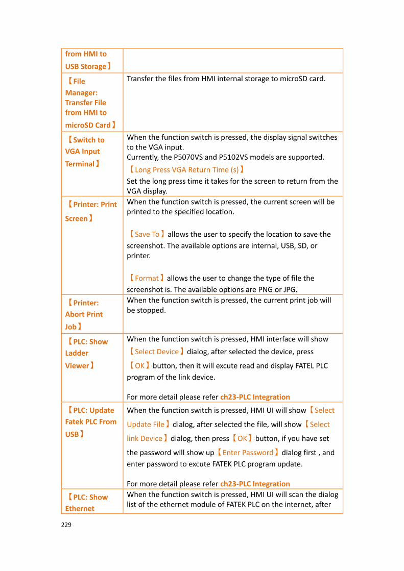
229
from HMI to
USB Storage】
【File
Manager: Transfer File from HMI to
microSD Card】
Transfer the files from HMI internal storage to microSD card.
【Switch to
VGA Input
Terminal】
When the function switch is pressed, the display signal switches to the VGA input. Currently, the P5070VS and P5102VS models are supported.
【Long Press VGA Return Time (s)】
Set the long press time it takes for the screen to return from the VGA display.
【Printer: Print
Screen】
When the function switch is pressed, the current screen will be printed to the specified location.
【Save To】allows the user to specify the location to save the
screenshot. The available options are internal, USB, SD, or printer.
【Format】allows the user to change the type of file the
screenshot is. The available options are PNG or JPG.
【Printer:
Abort Print
Job】
When the function switch is pressed, the current print job will be stopped.
【PLC: Show
Ladder
Viewer】
When the function switch is pressed, HMI interface will show
【Select Device】dialog, after selected the device, press
【OK】button, then it will excute read and display FATEL PLC
program of the link device. For more detail please refer ch23-PLC Integration
【PLC: Update
Fatek PLC From
USB】
When the function switch is pressed, HMI UI will show【Select
Update File】dialog, after selected the file, will show【Select
link Device】dialog, then press【OK】button, if you have set
the password will show up【Enter Password】dialog first , and
enter password to excute FATEK PLC program update. For more detail please refer ch23-PLC Integration
【PLC: Show
Ethernet
When the function switch is pressed, HMI UI will scan the dialog list of the ethernet module of FATEK PLC on the internet, after
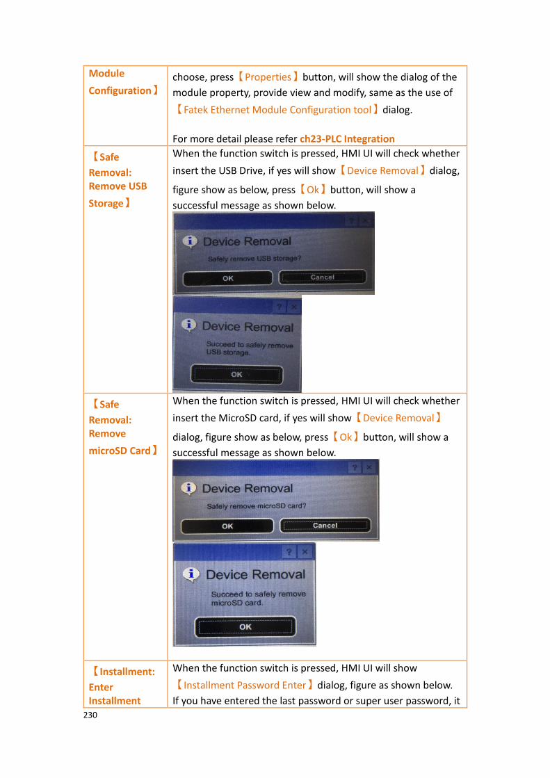
230
Module
Configuration】 choose, press【Properties】button, will show the dialog of the
module property, provide view and modify, same as the use of
【Fatek Ethernet Module Configuration tool】dialog.
For more detail please refer ch23-PLC Integration
【Safe
Removal: Remove USB
Storage】
When the function switch is pressed, HMI UI will check whether
insert the USB Drive, if yes will show【Device Removal】dialog,
figure show as below, press【Ok】button, will show a
successful message as shown below.
【Safe
Removal: Remove
microSD Card】
When the function switch is pressed, HMI UI will check whether
insert the MicroSD card, if yes will show【Device Removal】
dialog, figure show as below, press【Ok】button, will show a
successful message as shown below.
【Installment:
Enter Installment
When the function switch is pressed, HMI UI will show
【Installment Password Enter】dialog, figure as shown below.
If you have entered the last password or super user password, it
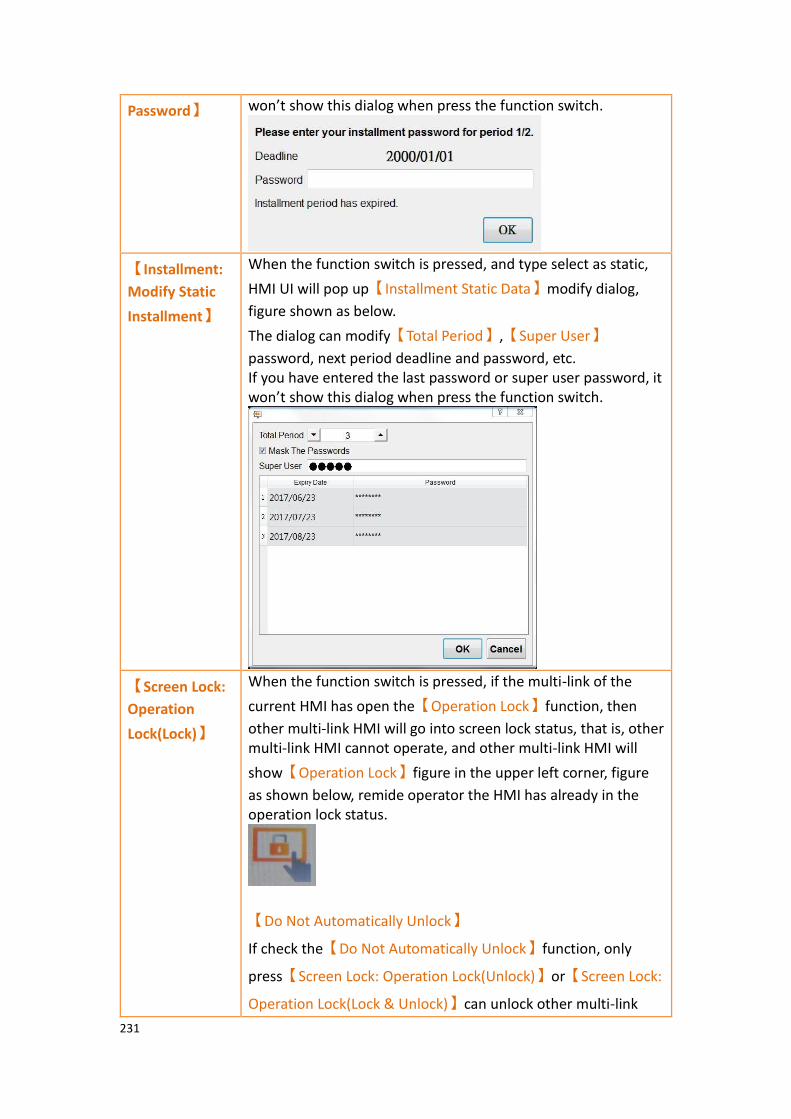
231
Password】 won’t show this dialog when press the function switch.
【Installment:
Modify Static
Installment】
When the function switch is pressed, and type select as static,
HMI UI will pop up【Installment Static Data】modify dialog,
figure shown as below.
The dialog can modify【Total Period】,【Super User】
password, next period deadline and password, etc. If you have entered the last password or super user password, it won’t show this dialog when press the function switch.
【Screen Lock:
Operation
Lock(Lock)】
When the function switch is pressed, if the multi-link of the
current HMI has open the【Operation Lock】function, then
other multi-link HMI will go into screen lock status, that is, other multi-link HMI cannot operate, and other multi-link HMI will
show【Operation Lock】figure in the upper left corner, figure
as shown below, remide operator the HMI has already in the operation lock status.
【Do Not Automatically Unlock】
If check the【Do Not Automatically Unlock】function, only
press【Screen Lock: Operation Lock(Unlock)】or【Screen Lock:
Operation Lock(Lock & Unlock)】can unlock other multi-link

232
HMI. For more detail please refer ch25-Multi-Link
【Screen Lock:
Operation
Lock(Unlock)】
When the function switch is pressed, if the multi-link of the
current HMI has open the【Operation Lock】function, then
other multi-link HMI will go into screen unlock status, and other
multi-link HMI will show【Operation Lock】figure in the upper
left corner will disappear. For more detail please refer ch25-Multi-Link
【Screen Lock:
Operation Lock(Lock &
Unlock)】
When the function switch is pressed, if the multi-link of the
current HMI has open the【Operation Lock】function, then
other multi-link HMI will go into lock or unlock screen status according to the status of the current HMI. For more detail please refer ch25-Multi-Link
【Update:
Project
Update】
When the function button is pressed it will display a dialog window for selecting the project update. You can select the .ufrp file stored in the HMI, SD card, or USB drive, that is, if the USB update file was created using the FvDesigner software.
【SMTP:
Modify Sender
Information】
Modify sender’s SMTP Setting, Sender Information, Contact List, Import and Export.
For more detail please refer ch4.3-【SMTP】
【SMTP:
Modify Contact
Lists】
Add or remove contacts, etc.
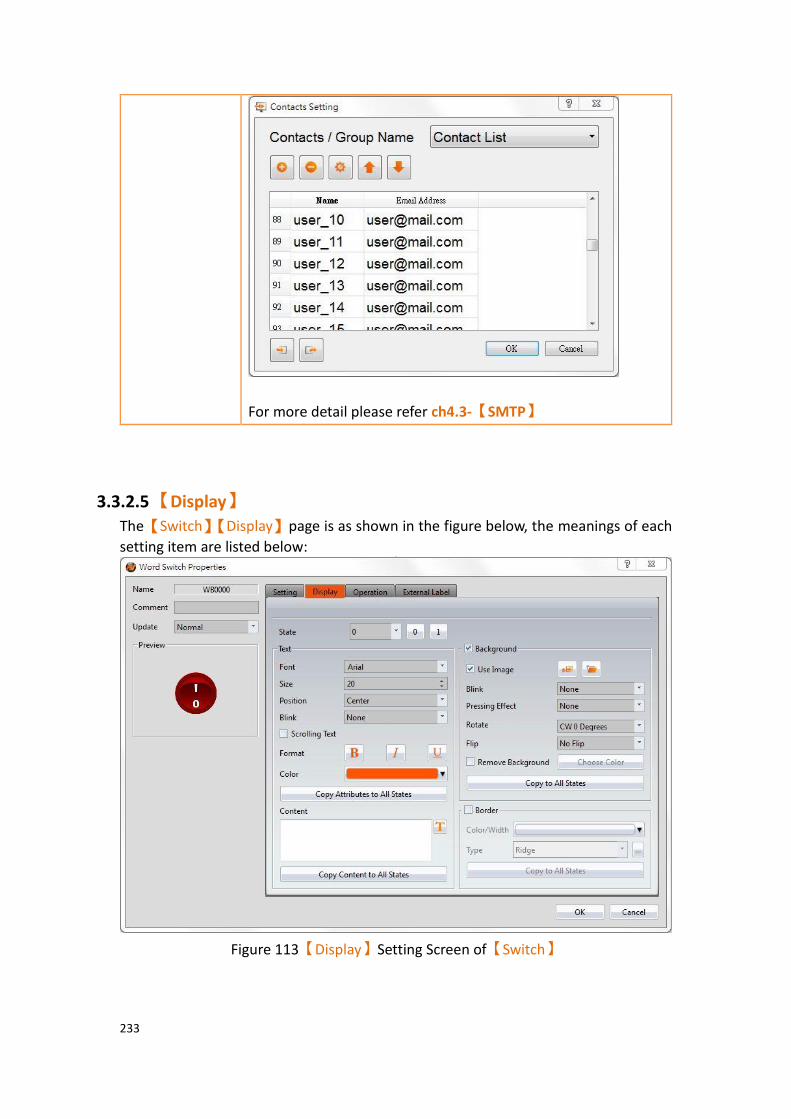
233
For more detail please refer ch4.3-【SMTP】
3.3.2.5 【Display】
The【Switch】【Display】page is as shown in the figure below, the meanings of each
setting item are listed below:
Figure 113【Display】Setting Screen of【Switch】

234
Table 64【Display】Setting Properties of【Switch】
Property Description
【Set All the States to
State 0】
If it’s【Change Screen Switch】, there will appear a
option as【Set All the States to State 0】, will set all the
switch as state 0.
【State】 Select the state needed to be edited. 0 and 1 buttons are provided to enable quick switching between states 0 and 1.
【Text】 【Font】
Set the font of the text displayed for the current editing state.
【Size】
Set the size of the text displayed for the current editing state.
【Position】
Set the position of the text displayed for the current editing state.
【Blink】
Set the blinking function for the text of the current editing state. There are four blinking speeds available to choose from: None, Slow, Medium and Fast.
【Scrolling Text】
Set the scrolling text function for the text of the current editing state; There are four scrolling speeds available to choose from slow to fast.
【Format】
Set the format of the text displayed for the current editing state, including Bold, Italics and Underline.
【Color】
Set the color of the text displayed for the current editing state.
【Copy Attributes to All States】
The text properties for the current editing state is applied to all states.

235
【Content】
Set the displayed text of the currently editing state; it can
be inputted directly or acquired from the【Text
Library】.
【Copy to All States】
Apply the settings of the text for the current editing state to all states.
【Background】 【Use Image】
Set whether to use an image for the displayed background of the current editing state. When this option
is checked, an【Image Selector】will appear asking the
user to select an image either from the【Image Library】
or from a file.
【Blink】
Set the blinking function for the background of the current editing state. There are four blinking speeds available to choose from: None, Slow, Medium and Fast.
【Pressing Effect】
Set the pressing effect of the current editing state. There are two effects available for selection: None and Highlight.
【Rotate】
Rotate the graph, includes CW 0 Degrees, CW 90 Degrees, CW 180 Degrees and CW 270 Degrees.
【Flip】
Flip the graph, includes No Flip, X-Axis and Y-Axis.
【Remove Background】
Choose the color by setting a transparent color.
【Color】
Set the displayed background color of the current editing
state. This setting item will appear if 【Use Image】
was not selected.
【Copy to All States】

236
Apply the settings of the background for the current editing state to all states.
【Border】 Set the border of the object, set the appearance after checked.
【Color/Width】
Set the color and width of the border.
【Type】
Set the type of the boder, click for more types.
【Copy to All States】
Apply the settings of the border for the currently editing state to all states.
3.3.2.6 【Operation】
The【Switch】【Operation】page is as shown in the figure below, the meanings of each
setting item are listed below:
Figure 114【Operation】Setting Screen of【Switch】

237
Table 65【Operation】Setting Properties of【Switch】
Property Description
【Visibility
Control】
Visibility control of the object. It can be controlled by a specific Bit or User Level.
【Enable by Bit】
Select to control visibility by a specific Bit.
【Address】
Set the address of the visibility control Bit.
【State】
Set the control bit as 1 or 0 to show object.
【Enabled by Word】
Check whether the visibility is controlled by word.
【Address】
Set the visibility control word address.
【Condition】
Set the condition of word control and when it is true then show up the object, when false not show the object. The condition include’ =’,’ !=’, ‘>’, ‘<’, ‘>=’, ‘<=’.
【Enabled by Security Manager】
Select if the visibility is to be controlled by the level of the user logged in.
【Lowest User Level】
Set the minimum level of the user logged in to display the object.
【Operation
Control】
Operation control of the object. It can be controlled by a specific Bit or User Level.
【Enable by Bit】
Select to control operation by a specific Bit.
【Address】
Set the address of the operation control Bit.
【State】
Set the control bit as 1 or 0 to operate object.

238
【Enabled by Word】
Check whether the operation is controlled by word.
【Address】
Set the operation control word address.
【Condition】
Set the condition of word control and when it is true then the object can be controlled, when false not the object can not be controlled. The condition include’ =’,’ !=’, ‘>’, ‘<’, ‘>=’, ‘<=’.
【Enabled by Security Manager】
Select if operation is to be controlled by the level of the user logged in.
【Lowest User Level】
Set the minimum level of the user logged in needed to operate the object.
【Show Disabled Sign】
If the object is not enabled, the object will have an indication that it is disabled.
【Operation Log】 Select to enable the【Operation Log】of the object.
It can also edit operation messages in which the message
can be inputted directly or acquired from the【Text
Library】.
【Advanced
Operation
Control】
【Hold Time】
Select to control the operation by hold time; hold time can be divided into two types:
➢ 【Press On】: Press directly and confirm the
execution of this operation according to the【Min
Hold Time】.
➢ 【Double Press】: Use two quick presses to confirm
the execution of this operation.

239
【Operation Confirm】
Select to display the confirmation window after the operation is executed.
【Max Waiting Time】
When the confirm window is displayed, the system will close the confirmation window and cancel the operation if the user did not respond within this time.
3.3.2.7 【External Lable】
The【Switch】【External Lable】page is as shown in the figure below, the meanings
of each setting item are listed below:
Figure 115【External Lable】Setting Screen of【Switch】
Table 66【Switch】【External Lable】setting properties
Option Description
【Enable External
Lable】
Checked, the bottom will appear the external lable settings of the object.
【Direction】 Set the display direction, there are horizontal and vertical two selections.
【Space】 Set the space between external lable and the object.

240
【Left/Top Lable】 Fill in the text to be displayed on the left / top lable of the
object, can be directly input t or selected from【Font
Library】.
【Right/Bottom
Lable】
Fill in the text to be displayed on the right / bottom lable of the object, can be directly input t or selected from
【Font Library】.
【Text】 【Font】
Set the font of text.
【Size】
Set the size of text, the default size is 20.
【Alignment】
Set the alignment of text.
【Color】
Set the color of text.
【Format】
Set the format of text, includes Bold, Italic and Underline.
【Word Spacing】
Set the word space of text.
【Margin】
Set the margin of text.
【Background】 Check whether to display background, set the color and opacity of background after checked.
【Color】
Set the background color of external lable.
【Opacity】
Set the opacity of external lable background, the greater the value the more the background opacity is.
【Border】 Check whether to display border.
【Color/Width】
Set the color and width of border.
【Type】

241
Set the type of border.
3.3.3 【Numeric Input/Display】
【Numeric Input/Display】can display the numeric value saved in specific addresses;
The【Numeric Input/Display】can also be clicked to enter specific numeric values to
the register address if the【Allow Input】setting is enabled.
3.3.3.1 【Setting】
The【Numeric Input/Display】【Setting】page is as shown in the figure below, the
meanings of each setting item are listed below:
Figure 116【Setting】Screen of【Numeric Input/Display】
Table 67【Setting】Properties of【Numeric Input/Display】
Property Description
【Preview】 Preview the appearance of this object.
【Name】 The default name of the object.
【Comment】 Set the comment of the object.
【Update】 Provide user can select a suitable speed to get the latest data under different situation, such as you would like to get the
242
latest data or adjust the object on the screen to display first, etc. Provide three modes:
【once】: update once only when switch to this page or use
the system tag【OP_UPDATE_SCREEN_OBJECTS】, update
once when trigger once a time, it will keep update if the monitor address is internal address.
【normal】: normal update speed.
【fast】: the fastest update speed.
【Display】 【Monitor Address】
Set the monitored address of Numeric Input/Display. The address can be from internal memory or a PLC register address.
【Data Type】
Set the data type of Numeric Input/Display. The available data types are: 16Bit-BCD, 16Bit-INT, 16Bit-UINT, 16Bit-HEX, 32Bit-BCD, 32Bit-INT, 32Bit-UINT, 32Bit-HEX, 32Bit-FLOAT. When 32Bit-FLOAT is selected, you can also choose a display option
for【Exponential Format】.
【Total Digits】
Set the total number of digits of Numeric Input/Display.
【Digit Places】
Set the decimal place of the Numeric Input/Display. If check
【Address】then you can set the source address of digital
places, and digital places can be dynamically control, data
type used by address is same as【Data Type】.
【Default Range】
Set the【Max】and【Min】display of the Numeric
Input/Display. The【Address】checkbox can be used to set
the source address for reading the maximum value or
minimum value by【Data Type】.
If this option is checked , the option will have a different
default range depending on the【Data Type】. For example,
type select as 16Bit-UINT, the【Max】is 65535,【Min】is 0
【Maximum Value】

243
Set the maximum value allowed for the numeric input / display to be displayed. If you check the address, the maximum value can be set to the value of the source address, allowing the maximum value to be dynamic.
【Minimum Value】
Set the minimum value allowed for the numeric input / display to be displayed. If you check the address, the minimum value can be set to the value of the source address, allowing the minimum value to be dynamic.
【Input】 【Allow Input】
Set whether to allow the input function for the Numeric Input/Display object. Related input setting items will appear if this option is selected.
【Source】
Select the【Keypad Screen】to pop-up when the Numeric
Input/Display is touched. The keyboard can be either a
【Pop-up Keypad】,【On-screen Keypad】, or【USB
Barcode Scanner】. The type of【Pop-up Keypad】can be
selected from the dropdown menu.
【USB Barcode Scanner】
When the source is selected as a USB barcode scanner, touching the input/display object changes the object color and is put on standby for the input of the USB barcode scanner. When the input is complete, the data is transferred directly to the specified address.

244
【Default Range】
Default Range of the Numeric Input/Display object,if this option is checked , the option will have a different default
range depending on the【Data Type】. For example, type
select as 16Bit-UINT, the【Max】is 65535,【Min】is 0 , if
don’t check this option, then can enter the【Max】and
【Min】of the Numeric Input/Display object.
【Max】
Set the maximum allowed input value for Numeric
Input/Display. The【Address】checkbox can be used to set
the source address for writing the maximum value by【Data
Type】.
【Min】
Set the minimum allowed input value for Numeric
Input/Display. The【Address】checkbox can be used to set
the source address for writing the minimum value by【Data
Type】.
【Write different Address】
Set to allow writing to a different address for the Numeric Input/Display object. Related settings will appear if this option is selected, allowing the setting of a target address for writing values. The source address for reading value and the target address for writing value will be different if this option is used.
【Notification】
Set to allow the notification function for the Numeric Input/Display object. Related settings will appear if this option is selected, allowing the setting of a register for notification.
【Post
Processing】
【Gain/Offset】
Set whether to allow post-processing functions for the Numeric Input/Display object. Related post processing settings will appear if this option is selected, allowing the setting of processing functions (add, subtract, multiply and divide) and constants. Formula is as follows: y=Ax+B, gain is A, offset for the B, y value is displayed for HMI, x is PLC value.

245
For example, gain A=5, offset B=2, when the PLC x=3, HMI value display is 17 (17=(5*3)+2).
Gain A Offset B PLC Value x HMI displayed value y
A=5 B=2 x=3 y = 17
In the numerical input/display object, enter 12 and the PLC value x will get 2 (x=(y-B)/A, 2=(12-2)/5).
Gain A Offset B PLC Value x HMI displayed value y
A=5 B=2 y = 12 x=2
The【Address】checkbox can be used to set the source
address for processing constant. The type of data used to read the address is fixed to 16Bit-INT.
【Max./Min.】
Sets the ratio of the read source address and the display. Can
be set by【Data Max.】,【Data Min.】,【Display Max.】and
【Display Min.】to determine the proportional relationship.
For example, read the PLC R100 address, and the maximum of the R100 is 100, minimum is 0, in the HMI wants to show the
maximum is 1000, minimum is 0. So the【Data Max.】
indicates the maximum value of the source address, can be
set to 100,【Data Min.】indicates the minimum valueof the
source address, can be set to 0,【Display Max.】indicates the
maximum value of the display, can be set to 1000,【Data
Min.】indicates the minimum value of the display, can be set
to 0, when PLC register R100=50, then HMI will display as 500.
If check the【Address】then can set the source address of
the【Data Max.】,【Data Min.】,【Display Max.】and
【Display Min.】, the data type of the read address is fixed to
16Bit-INT.

246
3.3.3.2 【Display】
The【Numeric Input/Display】【Display】page is as shown in the figure below, the
meanings of each setting item are listed below:
Figure 117【Display】Setting Screen of【Numeric Input/Display】
Table 68【Display】Setting Properties of【Numeric Input/Display】
Property Description
【Content】 【Numeric Display】
Set the display method for the numeric value of Numeric
Input/Display. Selecting【Zero Suppress】will not display
the zeros in front and selecting【Leading Zeroes】will
display the zeros in front.
【7-segment Display】
Set to allow the 7-segment display function for the Numeric Input/Display object. If this option is selected, related settings for the style of the 7-segment display will appear. These styles include outline, filled, and flat.
【Mask】

247
Set the text of the numerical input/display object displayed
as asterisks (#), can not use the【Mask】function if use the
【7-segment Display】.
【Font】
Set the font for the displayed text of Numeric Input/Display,
can not use the【Mask】function if use the【7-segment
Display】.
【Size】
Set the size for the displayed text of Numeric Input/Display,
can not use the【Mask】function if use the【7-segment
Display】.
【Position】
Set the position for the displayed text of Numeric
Input/Display, can not use the【Mask】function if use the
【7-segment Display】.
【Blink】
Set the blinking function for the text of Numeric Input/Display. There are four blinking speeds available to choose from: None, Slow, Medium and Fast, can not use the
【Mask】function if use the【7-segment Display】.
【Scrolling Text】
Set the scrolling text function for the text of Numeric Input/Display. There are four scrolling speeds available to choose from slow to fast.
【Format】
Set the format of the text displayed for the Numeric Input/Display, including Bold, Italics and Underline, can not
use the【Mask】function if use the【7-segment Display】.
【Color】
Set the color for the displayed text of Numeric Input/Display.
【Border】 【Type】
248
Set the border types for Numeric Input/Display.
【Color/Thickness】
Set the color and thickness for the displayed border of Numeric Input/Display.
【Background】 If not check the background, then the【Upper Limit
Numeric Color】and【Lower Limit Numeric Color】of the
【Numeric Input/Display】【Alarm】paging can not be set.
【Use Image】
Set to use an image for the background of the Numeric
Input/Display. When this option is checked, an【Image
Selector】will appear asking the user to select an image
either from the【Image Library】or from a file.
【Rotate】
Rotate the graph, includes CW 0 Degrees, CW 90 Degrees, CW 180 Degrees and CW 270 Degrees.
【Flip】
Flip the graph, includes No Flip, X-Axis and Y-Axis.
【Color】
Set the displayed background color of Numeric
Input/Display. This setting item will appear if 【Use
Image】 was not selected.
【Blink】
Set the blinking function for the background of the Numeric Input/Display. There are four blinking speeds available to choose from: None, Slow, Medium and Fast.
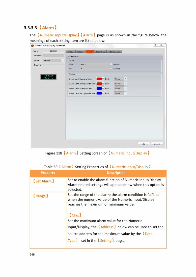
249
3.3.3.3 【Alarm】
The【Numeric Input/Display】【Alarm】page is as shown in the figure below, the
meanings of each setting item are listed below:
Figure 118【Alarm】Setting Screen of【Numeric Input/Display】
Table 69【Alarm】Setting Properties of【Numeric Input/Display】
Property Description
【Set Alarm】 Set to enable the alarm function of Numeric Input/Display. Alarm related settings will appear below when this option is selected.
【Range】 Set the range of the alarm; the alarm condition is fulfilled when the numeric value of the Numeric Input/Display reaches the maximum or minimum value.
【Max】
Set the maximum alarm value for the Numeric
Input/Display; the【Address】below can be used to set the
source address for the maximum value by the【Data
Type】 set in the【Setting】page.
250
【Min】
Set the minimum alarm value for the Numeric
Input/Display; the【Address】on the rear can be used to
set the source address for the minimum value by the【Data
Type】 set in the【Setting】page.
【Display】 Set the appearance of the Numeric Input/Display follows the change when the alarm conditions are fulfilled.
【Upper Limit Numeric Color】
Sets the color of the text for the Numeric Input/Display
when the set【Max】is exceeded. The【Blink】dropdown
menu can be used to set the blinking speed of the text. There are four blinking speeds available to choose from: None, Slow, Medium and Fast.
【Upper Limit Background Color】
Sets the color of the background for the Numeric
Input/Display when the set【Max】is exceeded. The
【Blink】dropdown menu can be used to set the blinking
speed of the background. There are four blinking speeds available to choose from: None, Slow, Medium and Fast.
【Lower Limit Numeric Color】
Sets the color of the text for the Numeric Input/Display
when the set【Min】is not reached. The【Blink】
dropdown menu can be used to set the blinking speed of the text. There are four blinking speeds available to choose from: None, Slow, Medium and Fast.
【Lower Limit Background Color】
Sets the color of the background for the Numeric
Input/Display when the set【Min】is not reached. The
【Blink】dropdown menu can be used to set the blinking
speed of the background. There are four blinking speeds available to choose from: None, Slow, Medium and Fast.
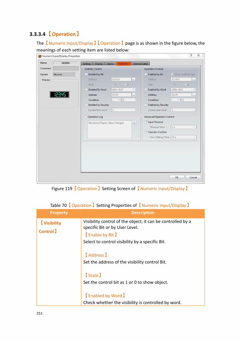
251
3.3.3.4 【Operation】
The【Numeric Input/Display】【Operation】page is as shown in the figure below, the
meanings of each setting item are listed below:
Figure 119【Operation】Setting Screen of【Numeric Input/Display】
Table 70【Operation】Setting Properties of【Numeric Input/Display】
Property Description
【Visibility
Control】
Visibility control of the object; it can be controlled by a specific Bit or by User Level.
【Enable by Bit】
Select to control visibility by a specific Bit.
【Address】
Set the address of the visibility control Bit.
【State】
Set the control bit as 1 or 0 to show object.
【Enabled by Word】
Check whether the visibility is controlled by word.

252
【Address】
Set the visibility control word address.
【Condition】
Set the condition of word control and when it is true then show up the object, when false not show the object. The condition include’ =’,’ !=’, ‘>’, ‘<’, ‘>=’, ‘<=’.
【Enabled by Security Manager】
Select if visibility is to be controlled by the level of the user logged in.
【Lowest User Level】
Sets the minimum level of the user logged in needed to display the object.
【Operation
Control】
Operation control of the object. It can be controlled by a specific Bit or User Level.
【Enable by Bit】
Select to control operation by a specific Bit.
【Address】
Set the address of the operation control Bit.
【State】
Set the control bit as 1 or 0 to operate object.
【Enabled by Word】
Check whether the operation is controlled by word.
【Address】
Set the operation control word address.
【Condition】
Set the condition of word control and when it is true then the object can be controlled, when false not the object can not be controlled. The condition include’ =’,’ !=’, ‘>’, ‘<’, ‘>=’, ‘<=’.
【Enabled by Security Manager】
Select if operation is to be controlled by the level of the user logged in.

253
【Lowest User Level】
Set the minimum level of the user logged in needed to operate the object.
【Show Disabled Sign】
If the object is not enabled, the object will have an indication that it is disabled.
【Operation Log】 Select to enable the【Operation Log】of the object.
It can also edit operation messages, in which the message
can be inputted directly or acquired from the【Text
Library】.
【Advanced
Operation
Control】
【Input Timeout】
Select if the【Pop-up Keypad】,【On-screen Keypad】or
【USB Barcode Scanner】is controlled by time.
【Timeout Time】
If the user did not use the【Keypad Screen】within this
time, the system will close the【Keypad Screen】and
cancel the operation.
【Operation Confirm】
Select to display a confirmation window after the operation is executed.
【Max Waiting Time】
The system will close the confirmation window and cancel the operation if the user did not acknowledge it within this time.

254
3.3.3.5 【External Lable】
The【Numeric Input/Display】【External Lable】page is as shown in the figure below,
the meanings of each setting item are listed below:
Figure 120【External Lable】Screen of【Numeric Input/Display】
Table 71【Text Input/Display】【External Lable】setting properties
Option Description
【Enable External
Lable】
Checked, the bottom will appear the external lable settings of the object.
【Direction】 Set the display direction, there are horizontal and vertical two selections.
【Space】 Set the space between external lable and the object.
【Left/Top Lable】 Fill in the text to be displayed on the left / top lable of the
object, can be directly input t or selected from【Font
Library】.
【Right/Bottom
Lable】
Fill in the text to be displayed on the right / bottom lable of the object, can be directly input t or selected from
【Font Library】.
【Text】 【Font】

255
Set the font of text.
【Size】
Set the size of text, the default size is 20.
【Alignment】
Set the alignment of text.
【Color】
Set the color of text.
【Format】
Set the format of text, includes Bold, Italic and Underline.
【Word Spacing】
Set the word space of text.
【Margin】
Set the margin of text.
【Background】 Check whether to display background, set the color and opacity of background after checked.
【Color】
Set the background color of external lable.
【Opacity】
Set the opacity of external lable background, the greater the value the more the background opacity is.
【Border】 Check whether to display border.
【Color/Width】
Set the color and width of border.
【Type】
Set the type of border.
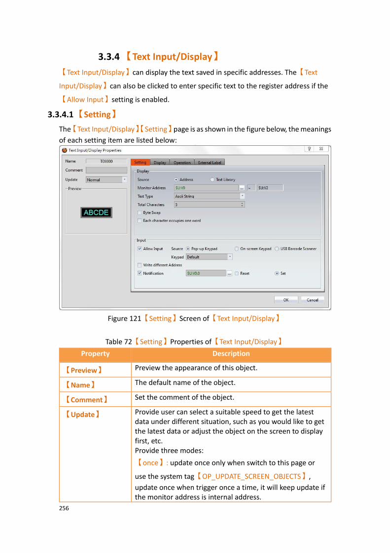
256
3.3.4 【Text Input/Display】
【Text Input/Display】can display the text saved in specific addresses. The【Text
Input/Display】can also be clicked to enter specific text to the register address if the
【Allow Input】setting is enabled.
3.3.4.1 【Setting】
The【Text Input/Display】【Setting】page is as shown in the figure below, the meanings
of each setting item are listed below:
Figure 121【Setting】Screen of【Text Input/Display】
Table 72【Setting】Properties of【Text Input/Display】
Property Description
【Preview】 Preview the appearance of this object.
【Name】 The default name of the object.
【Comment】 Set the comment of the object.
【Update】 Provide user can select a suitable speed to get the latest data under different situation, such as you would like to get the latest data or adjust the object on the screen to display first, etc. Provide three modes:
【once】: update once only when switch to this page or
use the system tag【OP_UPDATE_SCREEN_OBJECTS】,
update once when trigger once a time, it will keep update if the monitor address is internal address.

257
【normal】: normal update speed.
【fast】: the fastest update speed.
【General】 【Source】
The source of the text can be either an【Address】or from
the【Text Library】. If【Address】is selected, the
【Monitor Address】can be set below and directly
corresponds to the text to display. If【Text Library】is
selected, the【Monitor Address】corresponds to the entry
in the【Text Library】to read the text from.
【Monitor Address】
Set the monitored address of Text Input/Display; when this setting is changed, the final address below will change
according to the inputted【Monitor Address】and【Total
Characters】.
【Text Type】
Set the display type of text input/display, includes Ascii String, Unicode String(Simplified Chinese), Unicode String(Others), etc.
【Ascii String】
When select as【Ascii String】, the object will display the
Ascii string corresponding to【Monitor Address】,
because one register includes 2 Ascii, such as【Total
Characters】set as 5, it will take 3 registers.
【Unicode String(Simplified Chinese)】
When select as【Unicode String(Simplified Chinese)】, the
object will display the Unicode string corresponding to
【Monitor Address】, because one register includes 1
Unicode, such as【Total Characters】set as 5, it will take 5
registers.
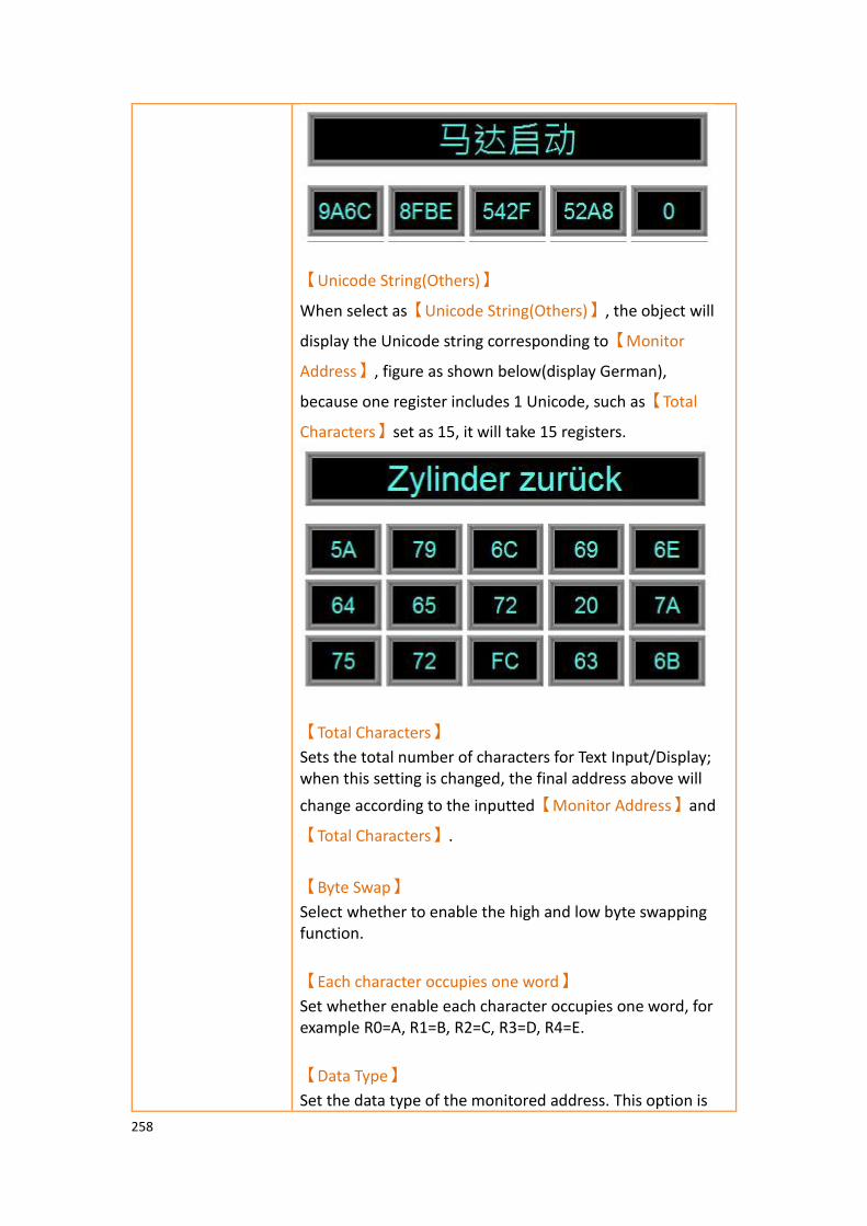
258
【Unicode String(Others)】
When select as【Unicode String(Others)】, the object will
display the Unicode string corresponding to【Monitor
Address】, figure as shown below(display German),
because one register includes 1 Unicode, such as【Total
Characters】set as 15, it will take 15 registers.
【Total Characters】
Sets the total number of characters for Text Input/Display; when this setting is changed, the final address above will
change according to the inputted【Monitor Address】and
【Total Characters】.
【Byte Swap】
Select whether to enable the high and low byte swapping function.
【Each character occupies one word】
Set whether enable each character occupies one word, for example R0=A, R1=B, R2=C, R3=D, R4=E.
【Data Type】
Set the data type of the monitored address. This option is

259
only enabled when【Text Library】is selected as the
【Source】.
【Start Row】
Set the starting row in the【Text Library】that the text is
obtained. For example, if the start row is set to 1 and the
【Monitor Address】contains the value 3, the display will
display the 4th entry in the【Text Library】. The【Start
Row】can also be obtained from a specified address. This
option is only enabled when【Text Library】is selected as
the【Source】.
【Input】 【Allow Input】
Set whether to allow the input function for the Text Input/Display object; related input settings will appear if this option is selected.
【Source】
Sets the type of【Keypad Screen】to pop-up when the Text
Input/Display is touched. The【Keypad Screen】can be
either a【Pop-up keypad】or【On-screen Keypad】.
The type【Pop-up keypad】can be selected from the
dropdown menu. You can also use your USB keyboard and a
【USB Barcode Scanner】 for input.
【USB Barcode Scanner】
When the USB barcode scanner is selected as the input source, the text input/display object will change color when touched and will wait for the input of the USB barcode reader. After the input is entered, the data will be transferred directly to the specified address.
When【Text Type】choose as【Unicode String(Simplified
Chinese)】, the input keypad can only use provide by
system, click【Text Input/Display】while executing, will
show up the pinyin keypad, figure shown as below.
Click the lower left corner【English/拼音(簡)】, can switch
to English or Pinyin. If the input keypad is in pinyin, you can choose the word

260
after enter pinyin.
【Write different Address】
Set to allow writing to a different address for the Text Input/Display object. Related settings will appear if this option is selected, allowing the setting of target address for writing text. The source address for reading text and the target address for writing text will be different if this option is used.
【Notification】
Set whether to allow the notification function for the Text Input/Display object. Related settings will appear if this option is selected, allowing the setting a register for notification.
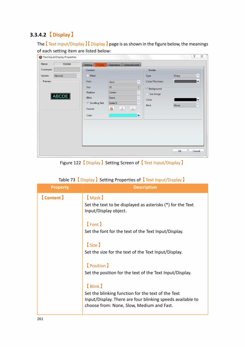
261
3.3.4.2 【Display】
The【Text Input/Display】【Display】page is as shown in the figure below, the meanings
of each setting item are listed below:
Figure 122【Display】Setting Screen of【Text Input/Display】
Table 73【Display】Setting Properties of【Text Input/Display】
Property Description
【Content】 【Mask】
Set the text to be displayed as asterisks (*) for the Text Input/Display object.
【Font】
Set the font for the text of the Text Input/Display.
【Size】
Set the size for the text of the Text Input/Display.
【Position】
Set the position for the text of the Text Input/Display.
【Blink】
Set the blinking function for the text of the Text Input/Display. There are four blinking speeds available to choose from: None, Slow, Medium and Fast.

262
【Scrolling Text】
Set the scrolling text function for the text of the Text Input/Display. There are four scrolling speeds available to choose from slow to fast.
【Format】
Set the format of the text for the Text Input/Display, including Bold, Italics and Underline.
【Color】
Set the color for the text of the Text Input/Display.
【Border】 【Type】
Set the border type for the Text Input/Display.
【Color/Thickness】
Set the color and thickness for the border of the Text Input/Display.
【Background】 【Use Image】
Set to use an image for the background of the Text
Input/Display. When this option is checked, an【Image
Selector】will appear asking the user to select an image
either from the【Image Library】or from a file.
【Rotate】
Rotate the graph, includes CW 0 Degrees, CW 90 Degrees, CW 180 Degrees and CW 270 Degrees.
【Flip】
Flip the graph, includes No Flip, X-Axis and Y-Axis.
【Color】
Set the background color of the Text Input/Display. This
setting item will appear if 【Use Image】 was not
selected.
【Blink】
Set the blinking function for the background of the Text Input/Display. There are four blinking speeds available to choose from: None, Slow, Medium and Fast.

263
3.3.4.3 【Operation】
The【Text Input/Display】【Operation】page is as shown in the figure below, the
meanings of each setting item are listed below:
Figure 123【Operation】Setting Screen of【Text Input/Display】
Table 74【Operation】Setting Properties of【Text Input/Display】
Property Description
【Visibility
Control】
Visibility control of the object. It can be controlled by a specific Bit or by User Level.
【Enable by Bit】
Select to control visibility by a specific Bit.
【Address】
Set the address of the visibility control Bit.
【State】
Set the control bit as 1 or 0 to show object.
【Enabled by Word】
Check whether the visibility is controlled by word.
【Address】
Set the visibility control word address.
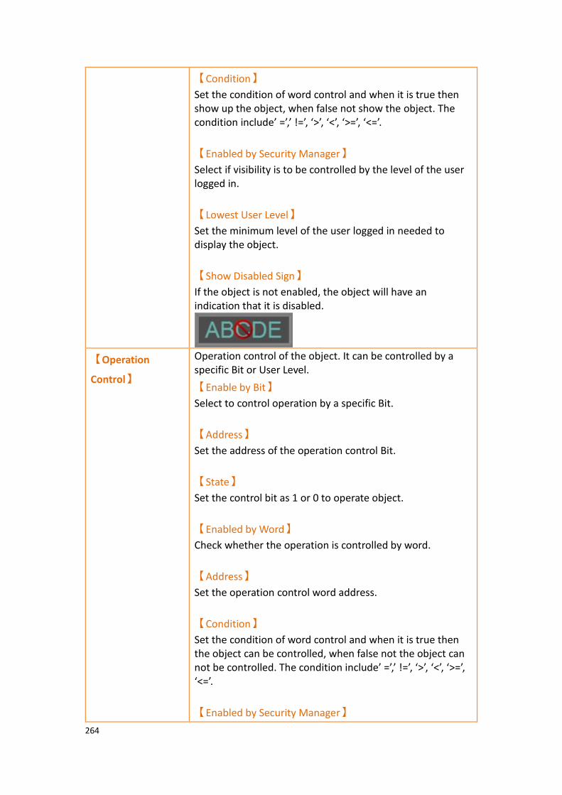
264
【Condition】
Set the condition of word control and when it is true then show up the object, when false not show the object. The condition include’ =’,’ !=’, ‘>’, ‘<’, ‘>=’, ‘<=’.
【Enabled by Security Manager】
Select if visibility is to be controlled by the level of the user logged in.
【Lowest User Level】
Set the minimum level of the user logged in needed to display the object.
【Show Disabled Sign】
If the object is not enabled, the object will have an indication that it is disabled.
【Operation
Control】
Operation control of the object. It can be controlled by a specific Bit or User Level.
【Enable by Bit】
Select to control operation by a specific Bit.
【Address】
Set the address of the operation control Bit.
【State】
Set the control bit as 1 or 0 to operate object.
【Enabled by Word】
Check whether the operation is controlled by word.
【Address】
Set the operation control word address.
【Condition】
Set the condition of word control and when it is true then the object can be controlled, when false not the object can not be controlled. The condition include’ =’,’ !=’, ‘>’, ‘<’, ‘>=’, ‘<=’.
【Enabled by Security Manager】

265
Select if operation is to be controlled by the level of the user logged in.
【Lowest User Level】
Set the minimum level of the user logged in need to operate the object.
【Show Disabled Sign】
Check if you want to display the forbidden symbol, it’s valid
when check【Enable by Bit】,【Enabled by Word】 or
【Enable by Security】.
【Operation Log】 Select to enable the【Operation Log】of the object.
It can also edit operation messages, in which the message can be inputted directly or acquired from the Text Library.
【Advanced
Operation
Control】
【Input Timeout】
Select if the【Pop-up Keypad】,【On-screen Keypad】or
【USB Barcode Scanner】is controlled by time.
【Timeout Time】
If the user did not operate the【Keypad Screen】within this
time, the system will close the【Keypad Screen】and
cancel this operation.
【Operation Confirm】
Select to display the confirmation window after the operation is executed.
【Max Waiting Time】
The system will close the confirmation window and cancel this operation if the user did not acknowledge it within this time.
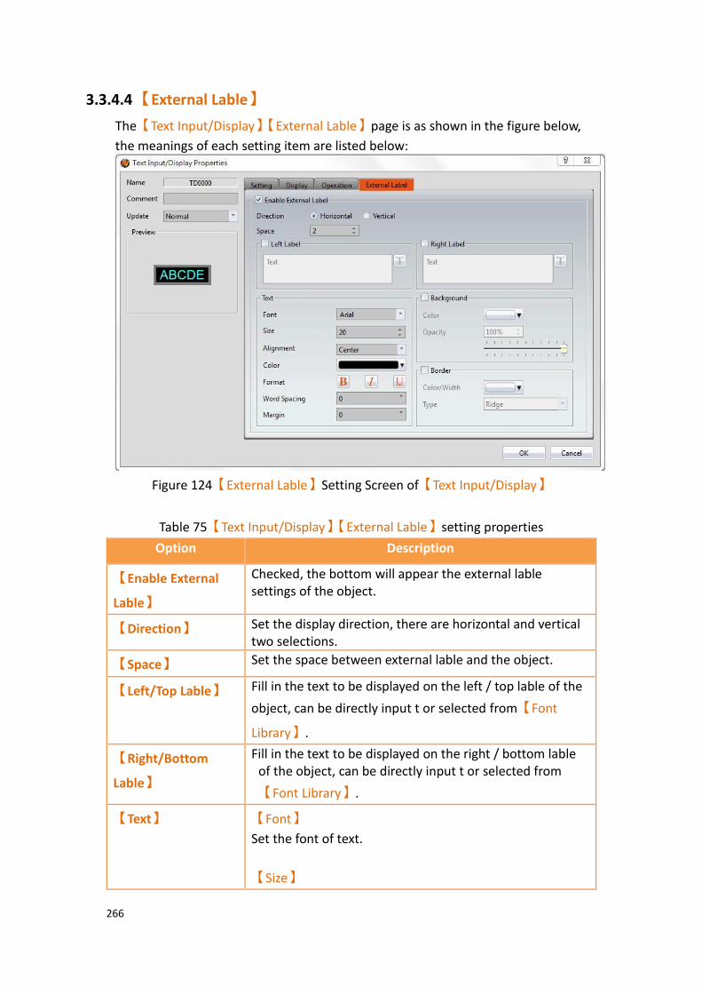
266
3.3.4.4 【External Lable】
The【Text Input/Display】【External Lable】page is as shown in the figure below,
the meanings of each setting item are listed below:
Figure 124【External Lable】Setting Screen of【Text Input/Display】
Table 75【Text Input/Display】【External Lable】setting properties
Option Description
【Enable External
Lable】
Checked, the bottom will appear the external lable settings of the object.
【Direction】 Set the display direction, there are horizontal and vertical two selections.
【Space】 Set the space between external lable and the object.
【Left/Top Lable】 Fill in the text to be displayed on the left / top lable of the
object, can be directly input t or selected from【Font
Library】.
【Right/Bottom
Lable】
Fill in the text to be displayed on the right / bottom lable of the object, can be directly input t or selected from
【Font Library】.
【Text】 【Font】
Set the font of text.
【Size】

267
Set the size of text, the default size is 20.
【Alignment】
Set the alignment of text.
【Color】
Set the color of text.
【Format】
Set the format of text, includes Bold, Italic and Underline.
【Word Spacing】
Set the word space of text.
【Margin】
Set the margin of text.
【Background】 Check whether to display background, set the color and opacity of background after checked.
【Color】
Set the background color of external lable.
【Opacity】
Set the opacity of external lable background, the greater the value the more the background opacity is.
【Border】 Check whether to display border.
【Color/Width】
Set the color and width of border.
【Type】
Set the type of border.

268
3.3.5 【Date/Time Display】
【Date/Time Display】can display the current date and time according to the format
set by the user.
3.3.5.1 【Setting】
The【Date/Time Display】【Setting】page is as shown in the figure below, the meanings
of each setting item are listed below:
Figure 125【Setting】Screen of【Date/Time Display】
Table 76【Setting】Properties of【Date/Time Display】
Property Description
【Preview】 Previews the appearance of this object.
【Name】 The default name of the object.
【Comment】 Set the comment of the object.
【Enable Date Display】 Set to enable date display; a date format selector will appear for the user to select the display format of the date if this option is selected.
【Enable Time Display】 Set to enable time display. A time format selector will appear for the user to select the display format of the time if this option is selected.
【Enable Day-of-week Display】 Set to enable day-of-the-week display; a day-

269
of-the-week format selector will appear for the user to select the display format of the day-of-the-week if this option is selected. This
option is not available if a【7-segment
Display】is used.
3.3.5.2 【Display】
【Date/Time Display】【Display】page is as shown in the figure below, the meanings
of each setting item are listed below:
Figure 126【Display】Setting Screen of【Date/Time Display】
Table 77【Display】Setting Properties of【Date/Time Display】
Property Description
【Content】 【7-segment Display】
Set to use the 7-segment display function for the Date/Time Display object. If this option is selected, related settings for setting of style of the 7-segment display will appear, including outlined, filled, flat. Note: while this option is selected, because it can only show part of text (0/O, 1, 2, 3, 4, 5/S, 6, 7, 8, 9/g, A, B, C, D, E, F, H, H, L, o, P, r, u, U, Y), the【Enable Day-of-week Display】function will be disabled.
【Font】
270
Set the font for the text of the Date/Time Display.
【Size】
Set the size for the text of the Date/Time Display.
【Position】
Set the position for the text of the Date/Time Display.
【Blink】
Set the blinking function for the text of the Date/Time Display. There are four blinking speeds available to choose from: None, Slow, Medium and Fast.
【Scrolling Text】
Set the scrolling text function for the text of the Date/Time Display. There are four scrolling speeds available to choose from slow to fast.
【Format】
Set the format of the text for the Date/Time Display, including Bold, Italics and Underline.
【Color】
Set the color for the text of Date/Time Display.
【Border】 【Type】
Set the border type for the Date/Time Display.
【Color/Thickness】
Set the color and thickness for the border of the Date/Time Display.
【Background】 【Use Image】
Set to use an image for the background of the Date/Time
Display. When this option is checked, an【Image Selector】
will appear asking the user to select an image either from
the【Image Library】or from a file.
【Rotate】
Rotate the graph, includes CW 0 Degrees, CW 90 Degrees, CW 180 Degrees and CW 270 Degrees.

271
【Flip】
Flip the graph, includes No Flip, X-Axis and Y-Axis.
【Color】
Set the background color of the Date/Time Display. This
setting item will appear if 【Use Image】 was not
selected.
【Blink】
Set the blinking function for the background of the Date/Time Display. There are four blinking speeds available to choose from: None, Slow, Medium and Fast.
3.3.5.3 【Operation】
The【Date/Time Display】【Operation】page is as shown in the figure below, the
meanings of each setting item are listed below:
Figure 127【Operation】Setting Screen of【Date/Time Display】
272
Table 78【Operation】Setting Properties of【Date/Time Display】
Property Description
【Visibility
Control】
Visibility control of the object. It can be controlled by a specific Bit or User Level.
【Enable by Bit】
Select to control visibility by a specific Bit.
【Address】
Set the address of the visibility control Bit.
【State】
Set the control bit as 1 or 0 to show object.
【Enabled by Word】
Check whether the visibility is controlled by word.
【Address】
Set the visibility control word address.
【Condition】
Set the condition of word control and when it is true then show up the object, when false not show the object. The condition include’ =’,’ !=’, ‘>’, ‘<’, ‘>=’, ‘<=’.
【Enabled by Security Manager】
Select if visibility is to be controlled by the level of the user logged in.
【Lowest User Level】
Set the minimum level of the user logged in needed to display the object.

273
3.3.6 【Window Screen Display】
【Window Screen Display】can display the【Window Screen】created in the
project, and supports using the numeric value of specific addresses to control the
【Window Screen】displayed by the Window Screen Display.
3.3.6.1 【Setting】
The【Window Screen Display】【Setting】page is as shown in the figure below, the
meanings of each setting item are listed below:
Figure 128【Setting】Screen of【Window Screen Display】
Table 79【Setting】Properties of【Window Screen Display】
Property Description
【Name】 The default name of the object.
【Comment】 Set the comment of the object.
【Select Screens by Address】 Set to select a screen by address.
The【Window Screen】displayed by Window
Screen Display will be determined by the
numeric value saved in【Window Selection
Address】if this setting is selected. If this
setting is not selected, the Window Screen Display will have a fixed display of the

274
【Window Screen】selected by【Window
Number】.
【Window Number】 Set the【Window Screen】displayed by the
Window Screen Display.
This setting will appear if【Select Screens by
Address】is not selected.
【Window Selection Address】 Set the【Window Selection Address】of the
Window Screen Display. When the HMI is operating, the Window Screen Display will read
the【Window Selection Address】according to
the【Data Type】Set, and display the
【Window Screen】with the number that
matches the numeric value read.
This setting will appear if【Select Screens by
Address】is selected.
【Data Type】 Set the Data Type of the【Window Selection
Address】.
【Auto adjust object size】 Set the size of【Window Screen Display】,
automatically adjust object size depending on the selected window screen.

275
3.3.6.2 【Operation】
The【Window Screen Display】【Operation】page is as shown in the figure below, the
meanings of each setting item are listed below:
Figure 129【Operation】Setting Screen of【Window Screen Display】
Table 80【Operation】Setting Properties of【Window Screen Display】
Property Description
【Visibility
Control】
Visibility control of the object. It can be controlled by a specific Bit or User Level.
【Enable by Bit】
Select to control visibility by a specific Bit.
【Address】
Set the address of the visibility control Bit.
【State】
Set the control bit as 1 or 0 to show object.
【Enabled by Word】
Check whether the visibility is controlled by word.
【Address】
Set the visibility control word address.
276
【Condition】
Set the condition of word control and when it is true then show up the object, when false not show the object. The condition include’ =’,’ !=’, ‘>’, ‘<’, ‘>=’, ‘<=’.
【Enabled by Security Manager】
Select if visibility is to be controlled by the level of the user logged in.
【Lowest User Level】
Set the minimum level of the user logged in needed to display the object.
3.3.7 【Meter】
【Meter】can read the value of specific registers and display this value by a pointer
indicator. Introduction to the property setting dialog are as follows:
3.3.7.1 【General】
The【Meter】【General】page is as shown in the figure below, the meanings of each
setting item are listed below:
Figure 130【General】Setting Screen of【Meter】
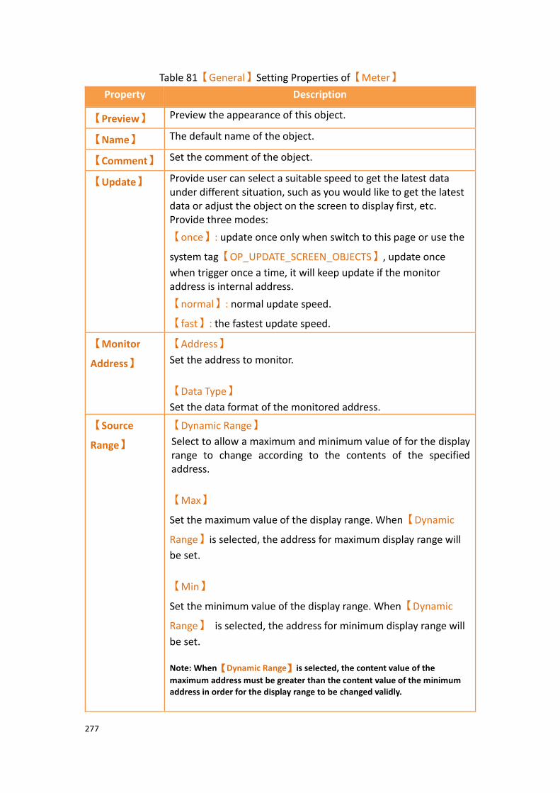
277
Table 81【General】Setting Properties of【Meter】
Property Description
【Preview】 Preview the appearance of this object.
【Name】 The default name of the object.
【Comment】 Set the comment of the object.
【Update】 Provide user can select a suitable speed to get the latest data under different situation, such as you would like to get the latest data or adjust the object on the screen to display first, etc. Provide three modes:
【once】: update once only when switch to this page or use the
system tag【OP_UPDATE_SCREEN_OBJECTS】, update once
when trigger once a time, it will keep update if the monitor address is internal address.
【normal】: normal update speed.
【fast】: the fastest update speed.
【Monitor
Address】
【Address】
Set the address to monitor.
【Data Type】
Set the data format of the monitored address.
【Source
Range】
【Dynamic Range】
Select to allow a maximum and minimum value of for the display range to change according to the contents of the specified address.
【Max】
Set the maximum value of the display range. When【Dynamic
Range】is selected, the address for maximum display range will
be set.
【Min】
Set the minimum value of the display range. When【Dynamic
Range】 is selected, the address for minimum display range will
be set. Note: When【Dynamic Range】is selected, the content value of the
maximum address must be greater than the content value of the minimum address in order for the display range to be changed validly.
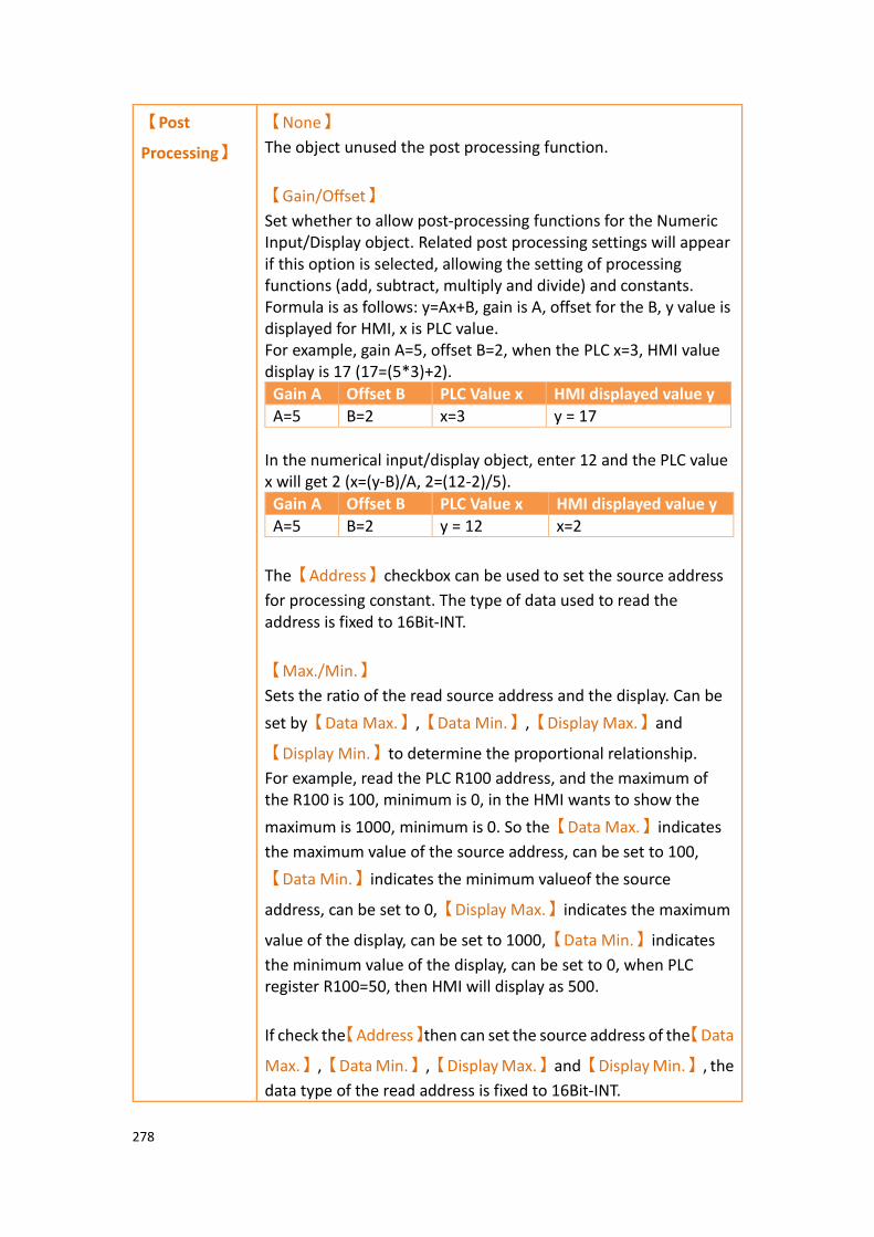
278
【Post
Processing】
【None】
The object unused the post processing function.
【Gain/Offset】
Set whether to allow post-processing functions for the Numeric Input/Display object. Related post processing settings will appear if this option is selected, allowing the setting of processing functions (add, subtract, multiply and divide) and constants. Formula is as follows: y=Ax+B, gain is A, offset for the B, y value is displayed for HMI, x is PLC value. For example, gain A=5, offset B=2, when the PLC x=3, HMI value display is 17 (17=(5*3)+2).
Gain A Offset B PLC Value x HMI displayed value y
A=5 B=2 x=3 y = 17
In the numerical input/display object, enter 12 and the PLC value x will get 2 (x=(y-B)/A, 2=(12-2)/5).
Gain A Offset B PLC Value x HMI displayed value y
A=5 B=2 y = 12 x=2
The【Address】checkbox can be used to set the source address
for processing constant. The type of data used to read the address is fixed to 16Bit-INT.
【Max./Min.】
Sets the ratio of the read source address and the display. Can be
set by【Data Max.】,【Data Min.】,【Display Max.】and
【Display Min.】to determine the proportional relationship.
For example, read the PLC R100 address, and the maximum of the R100 is 100, minimum is 0, in the HMI wants to show the
maximum is 1000, minimum is 0. So the【Data Max.】indicates
the maximum value of the source address, can be set to 100,
【Data Min.】indicates the minimum valueof the source
address, can be set to 0,【Display Max.】indicates the maximum
value of the display, can be set to 1000,【Data Min.】indicates
the minimum value of the display, can be set to 0, when PLC register R100=50, then HMI will display as 500.
If check the【Address】then can set the source address of the【Data
Max.】,【Data Min.】,【Display Max.】and【Display Min.】, the
data type of the read address is fixed to 16Bit-INT.
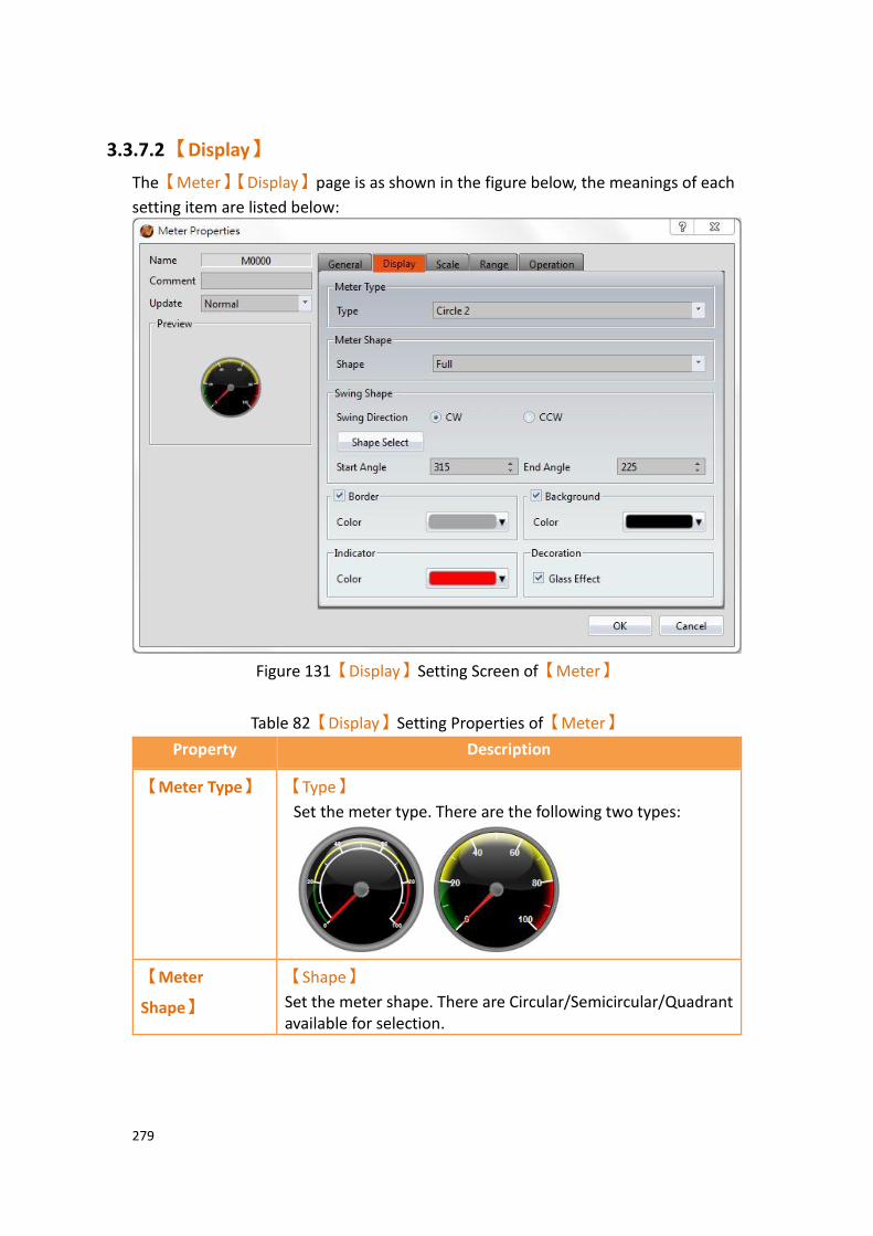
279
3.3.7.2 【Display】
The【Meter】【Display】page is as shown in the figure below, the meanings of each
setting item are listed below:
Figure 131【Display】Setting Screen of【Meter】
Table 82【Display】Setting Properties of【Meter】
Property Description
【Meter Type】 【Type】
Set the meter type. There are the following two types:
【Meter
Shape】
【Shape】
Set the meter shape. There are Circular/Semicircular/Quadrant available for selection.

280
【Swing Shape】 Set the swinging angle of the meter indicator.
【Shape Select】
Users can click this button to set common pointer swinging angles quickly.
【Swing Direction】
Set the swinging direction. There are two options:【CC】
(Clockwise) and【CCW】(Counter-Clockwise).
【Start Angle】
Set the start angle of the meter.
【End Angle】
Set the end angle of the meter.
【Border】 【Color】
Set the color of the border.
【Background】 【Color】
Set the background color and filling of the meter.
【Indicator】 【Color】
Set the color of the indicator.
【Decoration】 【Glass effect】
Set whether or not the “glass effect” is shown.

281
3.3.7.3 【Scale】
The【Meter】【Scale】page is as shown in the figure below, the meanings of each
setting item are listed below:
Figure 132【Scale】Setting Screen of【Meter】
Table 83【Scale】Setting Properties of【Meter】
Property Description
【Scale Frame】 【Color】
Set the color of the scale.
【Major Number】
Set the number of major ticks.
【Sub Number】
Set the number of minor ticks.
【Text】 【Style】
Set the style of the text, including radial and normal.
【Radial】
The text is angled such that it is perpendicular to the major ticks.
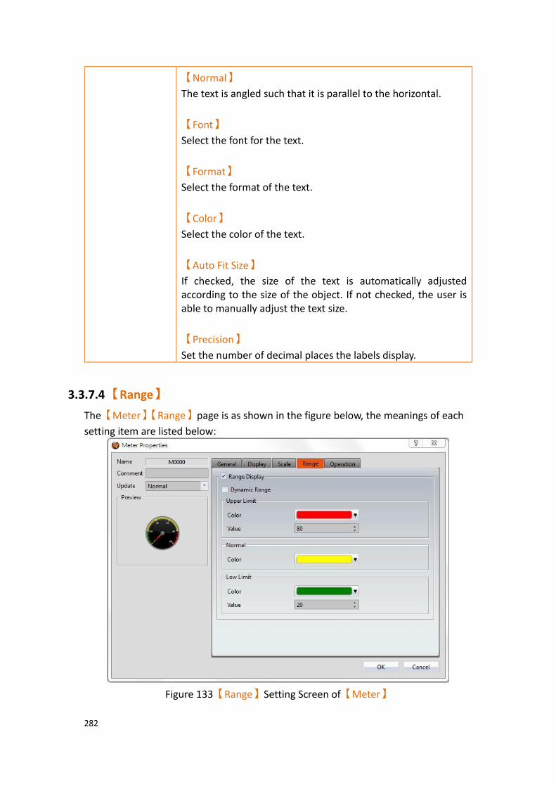
282
【Normal】
The text is angled such that it is parallel to the horizontal.
【Font】
Select the font for the text.
【Format】
Select the format of the text.
【Color】
Select the color of the text.
【Auto Fit Size】
If checked, the size of the text is automatically adjusted according to the size of the object. If not checked, the user is able to manually adjust the text size.
【Precision】
Set the number of decimal places the labels display.
3.3.7.4 【Range】
The【Meter】【Range】page is as shown in the figure below, the meanings of each
setting item are listed below:
Figure 133【Range】Setting Screen of【Meter】

283
Table 84【Range】Setting Properties of【Meter】
Property Description
【Scale Frame】 Select to display range marks on the meter.
【Dynamic Range】
Select to allow a maximum and minimum value of for the display range to change according to the contents of the specified address. Note: When【Dynamic Range】 is selected, the content value of the
maximum address must be greater than the content value of the minimum address in order for the range marks to be changed validly.
【Upper Limit】 【Color】
Set the color of the upper limit range.
【Value】
Set the value of the upper limit. When【Dynamic Range】is
selected, the address of the upper limit value will be set.
【Normal】 【Color】
Set the color of the normal range.
【Lower Limit】
【Color】
Set the color of the lower limit range.
【Value】
Set the value of the lower limit. When【Dynamic Range】is
selected, the address of the lower limit value will be set.

284
3.3.7.5 【Operation】
The【Meter】【Operation】page is as shown in the figure below, the meanings of
each setting item are listed below:
Figure 134【Operation】Setting Screen of【Meter】
Table 85【Operation】Setting Properties of【Meter】
Property Description
【Visibility
Control】
Visibility control of the object can be controlled by a specific Bit or User Level.
【Enable by Bit】
Select to control visibility by a specific Bit.
【Address】
Set the address of the visibility control Bit.
【State】
Set the control bit as 1 or 0 to show object.
【Enabled by Word】
Check whether the visibility is controlled by word.
【Address】
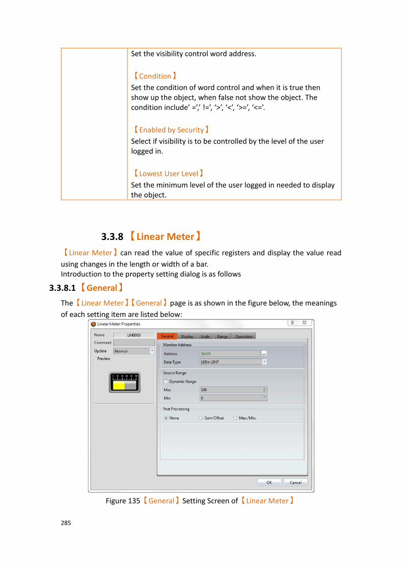
285
Set the visibility control word address.
【Condition】
Set the condition of word control and when it is true then show up the object, when false not show the object. The condition include’ =’,’ !=’, ‘>’, ‘<’, ‘>=’, ‘<=’.
【Enabled by Security】
Select if visibility is to be controlled by the level of the user logged in.
【Lowest User Level】
Set the minimum level of the user logged in needed to display the object.
3.3.8 【Linear Meter】
【Linear Meter】can read the value of specific registers and display the value read
using changes in the length or width of a bar. Introduction to the property setting dialog is as follows
3.3.8.1 【General】
The【Linear Meter】【General】page is as shown in the figure below, the meanings
of each setting item are listed below:
Figure 135【General】Setting Screen of【Linear Meter】
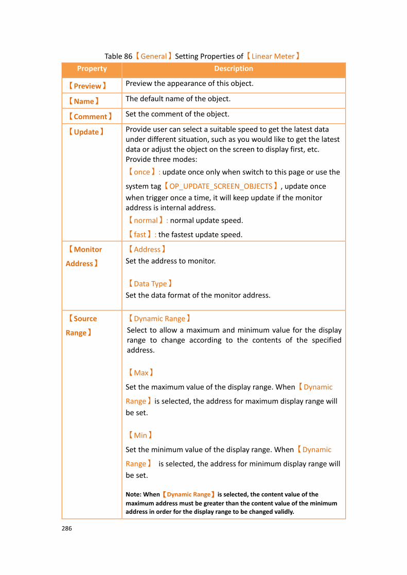
286
Table 86【General】Setting Properties of【Linear Meter】
Property Description
【Preview】 Preview the appearance of this object.
【Name】 The default name of the object.
【Comment】 Set the comment of the object.
【Update】 Provide user can select a suitable speed to get the latest data under different situation, such as you would like to get the latest data or adjust the object on the screen to display first, etc. Provide three modes:
【once】: update once only when switch to this page or use the
system tag【OP_UPDATE_SCREEN_OBJECTS】, update once
when trigger once a time, it will keep update if the monitor address is internal address.
【normal】: normal update speed.
【fast】: the fastest update speed.
【Monitor
Address】
【Address】
Set the address to monitor.
【Data Type】
Set the data format of the monitor address.
【Source
Range】
【Dynamic Range】
Select to allow a maximum and minimum value for the display range to change according to the contents of the specified address.
【Max】
Set the maximum value of the display range. When【Dynamic
Range】is selected, the address for maximum display range will
be set.
【Min】
Set the minimum value of the display range. When【Dynamic
Range】 is selected, the address for minimum display range will
be set. Note: When【Dynamic Range】is selected, the content value of the
maximum address must be greater than the content value of the minimum address in order for the display range to be changed validly.
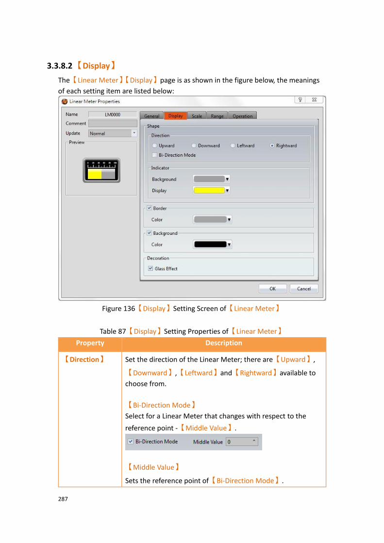
287
3.3.8.2 【Display】
The【Linear Meter】【Display】page is as shown in the figure below, the meanings
of each setting item are listed below:
Figure 136【Display】Setting Screen of【Linear Meter】
Table 87【Display】Setting Properties of【Linear Meter】
Property Description
【Direction】 Set the direction of the Linear Meter; there are【Upward】,
【Downward】,【Leftward】and【Rightward】available to
choose from.
【Bi-Direction Mode】
Select for a Linear Meter that changes with respect to the
reference point -【Middle Value】.
【Middle Value】
Sets the reference point of【Bi-Direction Mode】.
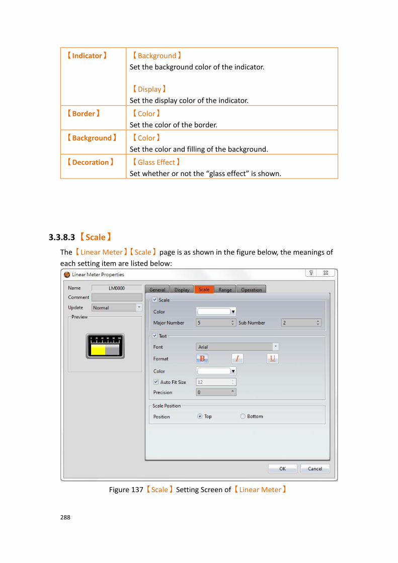
288
【Indicator】 【Background】
Set the background color of the indicator.
【Display】
Set the display color of the indicator.
【Border】 【Color】
Set the color of the border.
【Background】 【Color】
Set the color and filling of the background.
【Decoration】 【Glass Effect】
Set whether or not the “glass effect” is shown.
3.3.8.3 【Scale】
The【Linear Meter】【Scale】page is as shown in the figure below, the meanings of
each setting item are listed below:
Figure 137【Scale】Setting Screen of【Linear Meter】

289
Table 88【Scale】Setting Screen of【Linear Meter】
Property Description
【Scale Frame】 【Color】
Set the color of the scale.
【Major Number】
Set the number of major ticks.
【Sub Number】
Set the number of minor ticks.
【Text】 【Font】
Select the font for the text.
【Format】
Select the format of the text.
【Color】
Select the color of the text.
【Auto Fit Size】
If checked, the size of the text is automatically adjusted according to the size of the object. If not checked, the user is able to manually adjust the text size.
【Precision】
Set the number of decimal places the labels display.
【Scale
Position】
When the user set the direction of the Linear Meter to
【Upward】or【Downward】,【Left】or【Right】can be
selected for the scale position. When the direction of the
Linear Meter is 【Leftward】or【Rightward】,【Top】or
【Bottom】can be selected for the scale position.

290
3.3.8.4 【Range】
The【Linear Meter】【Range】page is as shown in the figure below, the meanings of
each setting item are listed below:
Figure 138【Range】Setting Screen of【Linear Meter】
Table 89【Range】Setting Properties of【Linear Meter】
Property Description
【Range
Display】
Select if the color for the indicator of the Linear Meter will be changed according to the contents of the monitored address.
【Dynamic Range】
Select to allow a maximum and minimum value for the display range to change according to the contents of the specified address. Note: When【Dynamic Range】is selected, the content value of the
upper limit address must be greater than the content value of the lower limit address in order for the color of the indicator to change accordingly.
【Upper Limit】 【Display】
Set the color of the upper limit range.
【Value】

291
Set the value of the upper limit. When【Dynamic Range】is
selected, the address of the upper limit value will be set.
【Lower Limit】 【Display】
Set the color of the lower limit range.
【Value】
Set the value of the lower limit. When【Dynamic Range】is
selected, the address of the lower limit value will be set.
3.3.8.5 【Operation】
The【Linear Meter】【Operation】page is as shown in the figure below, the
meanings of each setting item are listed below:
Figure 139【Operation】Setting Screen of【Linear Meter】

292
Table 90【Operation】Setting Properties of【Linear Meter】
Property Description
【Visibility
Control】
Visibility control of the object can be controlled by a specific Bit or User Level.
【Enable by Bit】
Select to control visibility by a specific Bit.
【Address】
Set the address of the visibility control Bit.
【State】
Set the control bit as 1 or 0 to show object.
【Enabled by Word】
Check whether the visibility is controlled by word.
【Address】
Set the visibility control word address.
【Condition】
Set the condition of word control and when it is true then show up the object, when false not show the object. The condition include’ =’,’ !=’, ‘>’, ‘<’, ‘>=’, ‘<=’.
【Enabled by Security】
Select if visibility is to be controlled by the level of the user logged in.
【Lowest User Level】
Set the minimum level of the user logged in needed to display the object.

293
3.3.9 【Data Block Graph】 【Data Block Graph】is an object used to display curves, in which the x value of the
curve uses continuous data values from a specified address as the source, and the y value is derived from the contents of the continuous data. Its main functions are as follows:
➢ Read the continuous data of a specified address directly. ➢ Pauses or starts updating the reading of the continuous data of a
specified address through the【Sub Switch】, and clearing the displayed
data. It can also temporarily preserve the old curve (persistence) for comparison purposes.
Introduction to the【Data Block Graph】property settings dialog box are as follows:
3.3.9.1 【General】
The【Data Block Graph】【General】page is as shown in the figure below, the
meanings of each setting item are listed below:
Figure 140【General】Setting Screen on【Data Block Graph】
Table 91【General】Setting Properties of【Data Block Graph】
Property Description
【Preview】 Preview the appearance of this object.
【Name】 The default name of the object.
【Comment】 Set the comment of the object.
294
【Basic】 【No. of Data per Curve】
Set the amount of data per curve, which is the number of dots per curve.
【Update Mode】
Set the update mode, includes【Period】and【Bit Trigger】.
【Period】
Set the curve to be updated at a period time when it is display, set the period time of each curves after the option was checked.
【Bit Trigger】
Set the curve to be updated by trigger a bit when it is display, set the address of trigger bit of each curves after the option was checked.
【Two Y Axes Mode】
Select to display two y axes on the graph.
【Global Display
Range】
Represents the range that can be displayed.
【Min】
Set the minimum Global Range value for the Y-axis.
【Max】
Set the maximum Global Range value for the Y-axis. Note: The【Global Display Range】represents the range that can be
displayed. If【Max】is 100 and【Min】is 0, data exceeding this range
will not be able to be displayed.
【Display Precision】
Set the number of decimal places the labels display.

295
3.3.9.2 【Curve】
The【Data Block Graph】【Curve】page is as shown in the figure below, the
meanings of each setting item are listed below:
Figure 141【Curve】Setting Screen on【Data Block Graph】
Table 92【Curve】Setting Properties of【Data Block Graph】
Property Description
【Curves】 【No. of Curves】
Set the number of curves. The maximum is 32.
【Visibility Mask】
Select to use a visibility mask to control the visibility of the each curve. The user should assign a 32bit UINT register as the mask such that the 0 bit controls the display of curve 0, the 1 but controls the display of curve 1, and so on.
【Display Range】
Set the display mode for the display range of the curve. It is one of the two following types:
➢ 【Global】
The display ranges of all the curves are identical to the

296
【Global Display Range】.
➢ 【Individual】
The display range of all the curves can be different from the
【Global Display Range】.
Explanation: When to set【Display Range】as【Individual】-When the value
ranges of the number of curves are different, for example when the value range of curve a is 0~10, and curve b is 0~1000, it can be discovered that the degree of changes for curve a will be difficult to observe if the two curves are placed in the same figure. This is when【Display Range】can be set as
【Individual】and the display range of each curve can be defined; the system
will automatically zoom the value of the curves according to the value in【Global Display Range】. Take this case for example,
If the value in【Global Display Range】is 0~100, when the value of curve a is
5, the system will zoom it to 50; and when the value of curve b is 500, the system will also zoom it into 50, and so on. The parameters for curve properties in the table are as follows:
【Y Start Address】
Set the starting address for the source of the Y value of the curve.
【Y Data Type】
Set the data type for the Y value of the curve. Explanation: The range of the curve reading address is determined by the【No. of Data per Curve】, 【Start Address】 and【Data Type】; users can
determine the range by looking at the following example.
➢ Example 1:
【No. of Data per Curve】= 3; Y-axis【Start Address】@0:R0; Y-axis【Data
Type】=16Bit-UINT
Dot X value Y value
0 0 @0:R0
1 1 @0:R1
2 2 @0:R2
➢ Example 2:
【No. of Data per Curve】= 3; Y-axis【Start Address】=$U:V0; Y Y-axis【Data
Type】=32Bit-UINT
Dot X value Y value
0 0 @0:R0@0:R1
1 1 @0:R2@0:R3
2 2 @0:R4~@0:R5
【Display Name】
The name of the curve to display on the graph.

297
【Y Max】
Set the maximum Individual Display Range value for the Y value of
the curve, if【Display Range】is【Individual】
【Y Min】
Set the minimum Individual Display Range value for the Y-axis, if
【Display Range】is【Individual】.
【Cursor Display】
Four options are available: None, Scale Data, Original Data, and
Both. For example, if the【Global Display Range】was set to
0~100, the【Display Range】was set to individual,【Y Max】is set
to 200 and【Y Min】is set to 0, when Y is 60, the cursor is set such
that the scaled value of 30 is displayed. If the【Cursor Display】is
set to orginal, the original value of 60 is displayed.
【Y Axis】
If【Two Y Axes Mode】is selected, the setting is used to decide
the curve’s reference y-axis.
【Line】
Select whether to display the curve line.
【Line Color】
Set the color of the curve.
【Line Type】
Set the line type of curve, including solid, dash, dot, dash dot, dash dot dot, etc.
【Line width】
Set the width of the curve.
【Symbol】
Select to display the curve symbols.
【Symbol Color】
Set the color of the symbols.

298
【Symbol Type】
Set the symbol type.
3.3.9.3 【Display】
The【Data Block Graph】【Display】page is as shown in the figure below, the
meanings of each setting item are listed below:
Figure 142【Display】Setting Screen of【Data Block Graph】
Table 93【Display】Setting Properties of【Data Block Graph】
Property Description
【Border】 Select to display the border.
【Color】
Set the color of the border.
【Type】
Set the border type.
【Background】 Select to display the background.
【Color】
Set the color of the background.
299
【Graph
Background】
Select to display the graph background.
【Color】
Set the color of the graph background.
【Cursor】 Select to display the cursor.
【Color】
Set the color of the cursor.
【Show Curve Value】
Select to display the cursor value.
【Show Curve Value】【Display】
Set the visibility of the cursor values. If【Always】is set,
the cursor values are always shown. If【Controlled by
Bit】is selected, the visibility of cursor values depends on
the specified bit.
【Show Name】
Select to display the cursor name.
【Display】【Show Name】
Set the visibility of the cursor name. If【Always】is set,
the cursor name is always shown. If【Controlled by Bit】
is selected, the visibility of the cursor name depends on the specified bit.
【Font】
Set the font and size of the cursor value.
【Background】
Set the background color of the cursor value.
【Text】
Set the text color of the cursor value.
【Opacity】
Set the background opacity of the cursor value.

300
3.3.9.4 【Axis】
The【Data Block Graph】【Axis】page is as shown in the figure below, the meanings
of each setting item are listed below:
Figure 143【Axis】Setting Screen of【Data Block Graph】
Table 94【Axis】Setting Properties of【Data Block Graph】
Property Description
【Common】 【Axis Color】
Set the color of the axis.
【X-axis】
【Division】
【Number of Major Division】
Set the number of major divisions for the X-axis.
【Number of Sub Division】
Set the number of sub divisions for the X-axis.
【Show Tick】
Select to display the ticks.
【Show Value】
Select to display the values on the X-axis.
【Value/Tick Color】

301
Set the colors of the values and ticks.
【Show Grid】
Select to display vertical gridlines and set the color of the gridlines.
【Y-axis】
【Division】
【Number of Major Division】
Set the number of major divisions for the Y-axis.
【Number of Sub Division】
Set the number of sub divisions for the Y-axis.
【Show Tick】
Select whether to display the tick on the Y-axis.
【Show Value】
Select to display the values on the Y-axis.
【Value/Tick Color】
Set the colors of the values and ticks.
【Show Grid】
Select to display horizontal gridlines and sets the color of the gridlines.
【Y-axis】
【Position】
【Position】
Set the Y-axis position.

302
3.3.9.5 【Advanced】
The【Data Block Graph】【Advanced】page is as shown in the figure below, the
meanings of each setting item are listed below:
Figure 144【Advanced】Setting Screen of【Data Block Graph】
Table 95【Advanced】Setting Properties of【Data Block Graph】
Property Description
【Advanced】 【Start/Stop State Address】
Set such that the【Data Block Graph】will start/stop at
the specified address. Only the display unit’s internal memory is supported. A value of 0 specifies the start state. A value of 1 specifies the stop state.
【The initial state is stopped】
Set the initial state of of the data to stop.
【Register Control】 【X Axis Scale】
X axis scale numbers can be specified by register, it will appear register setting below after checked, and will display the number of consecutive occupancy registers, this register is in 16 Bit-UINT format, table as below.
Word Description Data Type Min. Max.
0 Number of 16Bit-UINT 1 30
303
Major Division
1 Number of Sub Division
16Bit-UINT 1 30
【Y Axis Scale】
Y axis scale numbers can be specified by register, it will appear register setting below after checked, and will display the number of consecutive occupancy registers, this register is in 16 Bit-UINT format, table as below.
Word Description Data Type Min. Max.
0 Number of Major Division
16Bit-UINT 1 30
1 Number of Sub Division
16Bit-UINT 1 30
【X Axis Range】
X axis range can be specified by register, it will appear register setting below after checked, and will display the number of consecutive occupancy registers, table as below.
Word Description Data Type Min. Max.
0 & 1 Maximum of x axis.
32Bit-FLOAT
x x
2 & 3 Minimum of x axis.
32Bit-FLOAT
x x
4 The decimal point position of the X axis value
16Bit-UINT 0 5
Note: maximum value should bigger than minimum value.
【Y Axis Range】
Y axis range can be specified by register, it will appear register setting below after checked, and will display the number of consecutive occupancy registers, table as below.
Word Description Data Type Min. Max.
0 & 1 The maximum of the Y-axis on the left side of the graph
32Bit-FLOAT
x x
2 & 3 The minimum 32Bit- x x
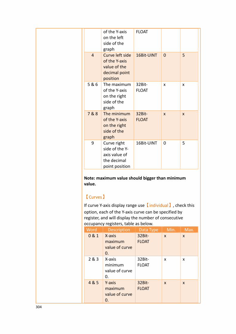
304
of the Y-axis on the left side of the graph
FLOAT
4 Curve left side of the Y-axis value of the decimal point position
16Bit-UINT 0 5
5 & 6 The maximum of the Y-axis on the right side of the graph
32Bit-FLOAT
x x
7 & 8 The minimum of the Y-axis on the right side of the graph
32Bit-FLOAT
x x
9 Curve right side of the Y-axis value of the decimal point position
16Bit-UINT 0 5
Note: maximum value should bigger than minimum value.
【Curves】
If curve Y-axis display range use【individual】, check this
option, each of the Y-axis curve can be specified by register, and will display the number of consecutive occupancy registers, table as below.
Word Description Data Type Min. Max.
0 & 1 X-axis maximum value of curve 0.
32Bit-FLOAT
x x
2 & 3 X-axis minimum value of curve 0.
32Bit-FLOAT
x x
4 & 5 Y-axis maximum value of curve 0.
32Bit-FLOAT
x x

305
6 & 7 Y-axis minimum value of curve 0.
32Bit-FLOAT
x x
8 & 9 X-axis maximum of curve 1.
32Bit-FLOAT
x x
10 & 11
X-axis minimum of curve 1.
32Bit-FLOAT
x x
12 & 13
Y-axis maximum value of curve 1.
32Bit-FLOAT
x x
14 & 15
Y-axis minimum value of curve 1.
32Bit-FLOAT
x x
… … 32Bit-FLOAT
x x
248 & 249
X-axis maximum of curve 31.
32Bit-FLOAT
x x
250 & 251
X-axis minimum of curve 31.
32Bit-FLOAT
x x
252 & 253
Y-axis maximum value of curve 31.
32Bit-FLOAT
x x
254 & 255
Y-axis minimum value of curve 31.
32Bit-FLOAT
x x
Note: maximum value should bigger than minimum value.
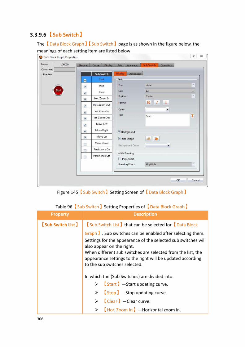
306
3.3.9.6 【Sub Switch】
The【Data Block Graph】【Sub Switch】page is as shown in the figure below, the
meanings of each setting item are listed below:
Figure 145【Sub Switch】Setting Screen of【Data Block Graph】
Table 96【Sub Switch】Setting Properties of【Data Block Graph】
Property Description
【Sub Switch List】 【Sub Switch List】that can be selected for【Data Block
Graph】. Sub switches can be enabled after selecting them.
Settings for the appearance of the selected sub switches will also appear on the right. When different sub switches are selected from the list, the appearance settings to the right will be updated according to the sub switches selected. In which the (Sub Switches) are divided into:
➢ 【Start】—Start updating curve.
➢ 【Stop】—Stop updating curve.
➢ 【Clear】—Clear curve.
➢ 【Hor. Zoom In】—Horizontal zoom in.

307
➢ 【Hor. Zoom Out】—Horizontal zoom out.
➢ 【Ver. Zoom In】—Vertical zoom in.
➢ 【Ver. Zoom Out】—Vertical zoom out.
➢ 【Move Left】—Move Left.
➢ 【Move Right】—Move Right.
➢ 【Move Up】—Move Up.
➢ 【Move Down】—Move Down.
➢ 【Persistence On】-Preserve old curves ON; used
for comparing curves. The color of old curves will be darker than the original ones.
➢ 【Persistence Off】-Preserve old curves OFF; clears
all old curves.
【Display】【Text】 【Font】
Set the text font of the sub switch currently selected.
【Size】
Set the text size of the sub switch currently selected.
【Position】
Set the text position of the sub switch currently selected.
【Format】
Set the text format of the sub switch currently selected, including Bold, Italics and Underline.
【Color】
Set the text color of the sub switch currently selected.
【Text】
Set the text of the sub switch currently selected.
【Display】
【Background】
Set the background of the sub switch currently selected. Check it to activate background settings, and the displayed background of the sub switch currently selected can be edited below. If this option is not checked, the background will be transparent.
【Use Image】
Set to use an image for the background of the sub switch currently selected. When this option is checked, image selection settings will appear asking the user to select an

308
image either from the【Image Library】or from a file.
【Background Color】
Set the background color of the sub switch currently
selected. This setting item will appear if 【Use Image】was
not selected.
【Display】【while
Pressing】
【Play Audio】
Select to play audio when the sub switch is pressed. An
【Audio Selector】will appear on the right when enabled.
The switch on the right of the【Audio Selector】can be
pressed to select an audio and the switch on the left of the
【Audio Selector】can be pressed to play the selected
audio.
【Pressing Effect】
Set the pressing effect of the sub switch currently selected.
There are two effects available for selection:【None】and
【Highlight】.
【Advanced】
【Operation
Control】
Operation control of sub switch, it can enabled by bit or security.
【Enable by Bit】
Check whether the sub switch operation is controlled by a bit
【Address】
Set the address of the sub switch operation control bit.
【State】
Set the control bit as 1 or 0 to operate object.
【Enabled by Word】
Check whether the operation is controlled by word.
【Address】
Set the operation control word address.
【Condition】
Set the condition of word control and when it is true then the object can be controlled, when false not the object can not be controlled. The condition include’ =’,’ !=’, ‘>’, ‘<’, ‘>=’,

309
‘<=’.
【Enable by Security】
Select the sub switch whether controlled by user level.
【Lowest User Level】
Set the lowest login level of the operational sub switch.
【Show Disabled Sign】
Check if you want to display the forbidden symbol, it’s valid
when check【Enable by Bit】,【Enabled by Word】or
【Enable by Security】.
【Hold Time】
Check whether the operation is controlled by hold time. Hold time can be divided into two kinds:
➢ 【Press On】: press directly, according to the【Min.
Hold Time】to confirm whether the operation is
executed.
➢ 【Double Press】: quickly double press to confirm
whether the operation is executed.
【Operator Confirm】
Check whether show comfirmation message window after checking the operation.
【Max. Waiting Time】
When the confirmation message window is displayed, If the user does not reply within this time, the system will close the confirmation message window and cancel this operation
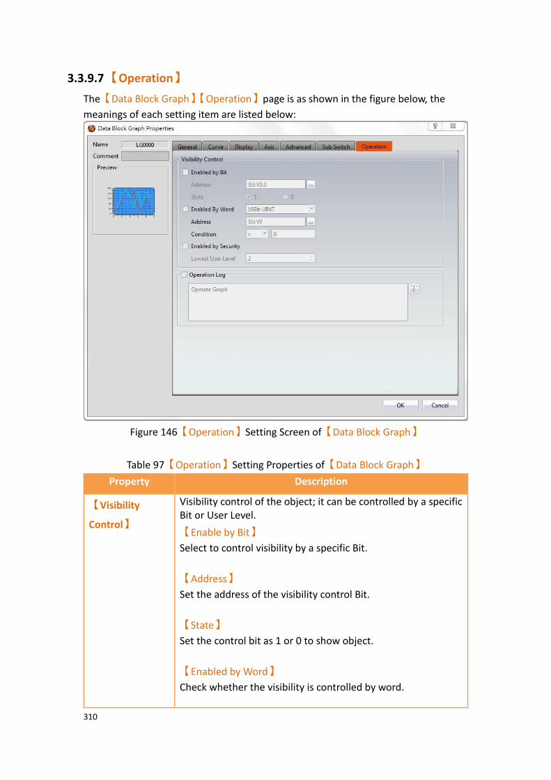
310
3.3.9.7 【Operation】
The【Data Block Graph】【Operation】page is as shown in the figure below, the
meanings of each setting item are listed below:
Figure 146【Operation】Setting Screen of【Data Block Graph】
Table 97【Operation】Setting Properties of【Data Block Graph】
Property Description
【Visibility
Control】
Visibility control of the object; it can be controlled by a specific Bit or User Level.
【Enable by Bit】
Select to control visibility by a specific Bit.
【Address】
Set the address of the visibility control Bit.
【State】
Set the control bit as 1 or 0 to show object.
【Enabled by Word】
Check whether the visibility is controlled by word.

311
【Address】
Set the visibility control word address.
【Condition】
Set the condition of word control and when it is true then show up the object, when false not show the object. The condition include’ =’,’ !=’, ‘>’, ‘<’, ‘>=’, ‘<=’.
【Enabled by Security Manager】
Select if visibility is to be controlled by the level of the user logged in.
【Lowest User Level】
Set the minimum level of the user logged in needed to display the object.
【Operation
Log】
Select to enable the【Operation Log】of the object.
It can also edit operation messages in which the message can
be inputted directly or acquired from the【Text Library】.

312
3.3.10 【Data Block XY Scatter】
【Data Block XY Scatter】 is an object used to display a curve, in which the sources
of both X/Y values are the continuous data contents of specified addresses. Its main functions are as follows:
➢ Read the continuous data of the specified addresses directly. ➢ Pauses or starts updating the reading of the continuous data of a
specified address through the【Sub Switch】and clearing the displayed
data. It can also temporarily preserve the old curve for comparison purposes.
Introduction to the property setting dialog box are as follows:
3.3.10.1 【General】
The【Data Block XY Scatter】【General】page is as shown in the figure below, the
meanings of each setting item are listed below:
Figure 147【General】 Setting Screen of 【Data Block XY Scatter】
Table 98【General】 Setting Properties of【Data Block XY Scatter】
Property Description
【Preview】 Preview the appearance of this object.
【Name】 The default name of the object.
【Comment】 Set the comment of the object.
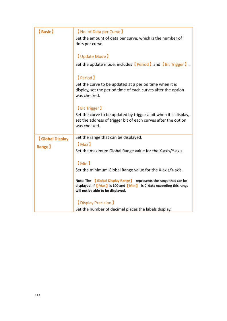
313
【Basic】 【No. of Data per Curve】
Set the amount of data per curve, which is the number of dots per curve.
【Update Mode】
Set the update mode, includes【Period】and【Bit Trigger】.
【Period】
Set the curve to be updated at a period time when it is display, set the period time of each curves after the option was checked.
【Bit Trigger】
Set the curve to be updated by trigger a bit when it is display, set the address of trigger bit of each curves after the option was checked.
【Global Display
Range】
Set the range that can be displayed.
【Max】
Set the maximum Global Range value for the X-axis/Y-axis.
【Min】
Set the minimum Global Range value for the X-axis/Y-axis. Note: The 【Global Display Range】 represents the range that can be
displayed. If【Max】is 100 and【Min】 is 0, data exceeding this range
will not be able to be displayed.
【Display Precision】
Set the number of decimal places the labels display.

314
3.3.10.2 【Curve】
The【Data Block XY Scatter】【Curve】page is as shown in the figure below, the
meanings of each setting item are listed below:
Figure 148【Curve】Setting Screen of 【Data Block XY Scatter】
Table 99【Curve】Setting Properties of 【Data Block XY Scatter】
Property Description
【Curves】 【No. of Curves】
Set the number of curves. The maximum is 32.
【Visibility Mask】
Select to use a visibility mask to control the visibility of the each curve. The user should assign a 32bit UINT register as the mask such that the 0 bit controls the display of curve 0, the 1 but controls the display of curve 1, and so on.
【Display Range】
Set the display mode for the display range of the curve. It is one of the two following types:
➢ 【Global】
The display ranges of all the curves are identical to the
【Global Display Range】.
315
➢ 【Individual】
The display range of all the curves can be different from the
【Global Display Range】.
Explanation: When to set【Display Range】as【Individual】-When the value
ranges of the number of curves are different, for example when the value range of curve a is 0~10, and curve b is 0~1000, it can be discovered that the degree of changes for curve a will be difficult to observe if the two curves are placed in the same figure. This is when【Display Range】can be set as
【Individual】and the display range of each curve can be defined; the system
will automatically zoom the value of the curves according to the value in【Global Display Range】. Take this case for example,
If the value in【Global Display Range】is 0~100, when the value of curve a is
5, the system will zoom it to 50; and when the value of curve b is 500, the system will also zoom it into 50, and so on.
The parameters for curve properties in the table are as follows:
【X/Y Start Address】
Set the starting address for the source of the X/Y value of the curve.
【XY Data Type】
Set the data type for the X/Y value of the curve. Explanation: The range of the curve reading address is determined by the【No. of Data per Curve】,【Start Address】and【Data Type】; users can
determine the range by looking at the following example.
➢ Example 1:
【No. of Data per Curve】= 3; Y-axis【Start Address】@0:R0; Y-axis【Data
Type】=16Bit-UINT
Dot X value Y value
0 0 @0:R0
1 1 @0:R1
2 2 @0:R2
➢ Example 2:
【No. of Data per Curve】= 3; Y-axis【Start Address】=$U:V0; Y Y-axis【Data
Type】=32Bit-UINT
Dot X value Y value
0 0 @0:R0@0:R1
1 1 @0:R2@0:R3
2 2 @0:R4~@0:R5
【X/Y Max】
Set the maximum Individual Display Range value for the Y value of
316
the curve, if【Display Range】is【Individual】
【X/Y Min】
Set the minimum Individual Display Range value for the Y-axis, if
【Display Range】is【Individual】.
【Display Name】
The name of the curve to display on the graph.
【Line】
Select to display the curve line.
【Line Color】
Set the color of the curve.
【Line Type】
Set the line type of curve, including solid, dash, dot, dash dot, dash dot dot, etc.
【Line width】
Set the width of the curve.
【Symbol】
Select to display the curve symbols.
【Symbol Color】
Set the color of the symbols.
【Symbol Type】
Set the symbol type.

317
3.3.10.3 【Display】
The【Data Block XY Scatter】【Display】page is as shown in the figure below, the
meanings of each setting item are listed below:
Figure 149【Display】Setting Screen of【Data Block XY Scatter】
Table 100【Display】Setting Properties of【Data Block XY Scatter】
Property Description
【Border】 Select to display the border.
【Color】
Set the color of the border.
【Type】
Set the border type.
【Background】 Set the visibility of the background.
【Color】
Set the color of the background.
【Graph
Background】
Select to enable a graph background.
【Color】
Set the color of the graph background.
【Cursor】 Set the visibility of the cursor.
【Color】
Set the color of the cursor.

318
【Show Curve Value】
Select the visibility of the cursor value.
【Show Curve Value】【Display】
Set the visibility of cursor values. If【Always】is set, the
cursor values are always shown. If【Controlled by Bit】is
selected, the visibility of cursor values depends on the specified bit.
【Show Name】
Select to display the cursor name.
【Show Name】【Display】
Set the visibility of the cursor name. If【Always】is set,
the cursor name is always shown. If【Controlled by Bit】
is selected, the visibility of the cursor name depends on the specified bit.
【Font】
Set the font type and size of cursor values.
【Background】
Set the background color of the cursor values.
【Text】
Set the text color of the cursor values.
【Opacity】
Set the background opacity of the cursor values.
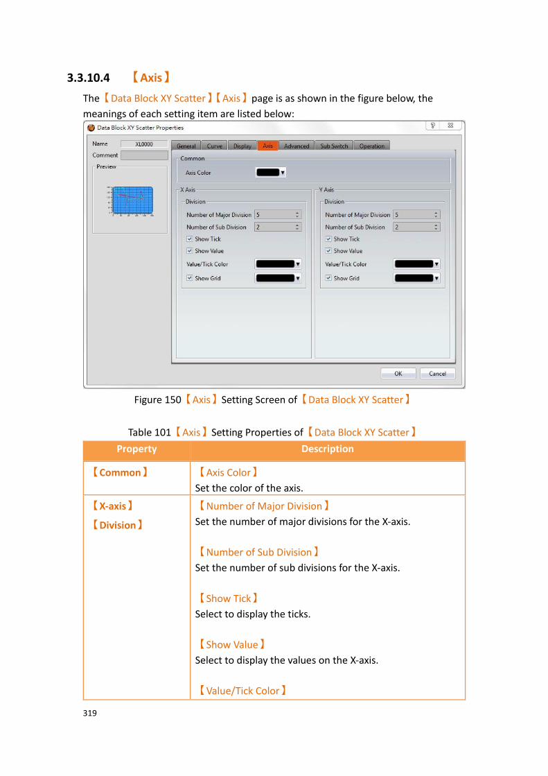
319
3.3.10.4 【Axis】
The【Data Block XY Scatter】【Axis】page is as shown in the figure below, the
meanings of each setting item are listed below:
Figure 150【Axis】Setting Screen of【Data Block XY Scatter】
Table 101【Axis】Setting Properties of【Data Block XY Scatter】
Property Description
【Common】 【Axis Color】
Set the color of the axis.
【X-axis】
【Division】
【Number of Major Division】
Set the number of major divisions for the X-axis.
【Number of Sub Division】
Set the number of sub divisions for the X-axis.
【Show Tick】
Select to display the ticks.
【Show Value】
Select to display the values on the X-axis.
【Value/Tick Color】

320
Set the color of the values and ticks.
【Show Grid】
Select to display vertical gridlines, and set the color of the gridlines.
【Y-axis】
【Division】
【Number of Major Division】
Set the number of major divisions for the Y-axis.
【Number of Sub Division】
Set the number of sub divisions for the Y-axis.
【Show Tick】
Select to display the ticks on the Y-axis.
【Show Value】
Select to display the values on the Y-axis.
【Value/Tick Color】
Set the color of the values and ticks.
【Show Grid】
Select to display horizontal gridlines, and set the color of the gridlines.

321
3.3.10.5 【Advanced】
The【Data Block XY Scatter】【Advanced】page is as shown in the figure below, the
meanings of each setting item are listed below:
Figure 151【Advanced】Setting Screen of【Data Block XY Scatter】
Table 102【Advanced】Setting Properties of【Data Block XY Scatter】
Property Description
【Advanced】 【Start/Stop State Address】
Set such that the【Data Block Graph】will start/stop at
the specified address. Only the display unit’s internal memory is supported. A value of 0 specifies the start state. A value of 1 specifies the stop state.
【The initial state is stopped】
Set the initial state of of the data to stop.
【Register Control】 【X Axis Scale】
X axis scale numbers can be specified by register, it will appear register setting below after checked, and will display the number of consecutive occupancy registers, this register is in 16 Bit-UINT format, table as below.

322
Word Description Data Type Min. Max.
0 Number of Major Division
16Bit-UINT 1 30
1 Number of Sub Division
16Bit-UINT 1 30
【Y Axis Scale】
Y axis scale numbers can be specified by register, it will appear register setting below after checked, and will display the number of consecutive occupancy registers, this register is in 16 Bit-UINT format, table as below.
Word Description Data Type Min. Max.
0 Number of Major Division
16Bit-UINT 1 30
1 Number of Sub Division
16Bit-UINT 1 30
【X Axis Range】
X axis range can be specified by register, it will appear register setting below after checked, and will display the number of consecutive occupancy registers, table as below.
Word Description Data Type Min. Max.
0 & 1 Maximum of x axis.
32Bit-FLOAT
x X
2 & 3 Minimum of x axis.
32Bit-FLOAT
x X
4 The decimal point position of the X axis value
16Bit-UINT 0 5
Note: maximum value should bigger than minimum value.
【Y Axis Range】
Y axis range can be specified by register, it will appear register setting below after checked, and will display the number of consecutive occupancy registers, table as below.
Word Description Data Type Min. Max.
0 & 1 The maximum of the Y-axis on the left side of the graph
32Bit-FLOAT
x x
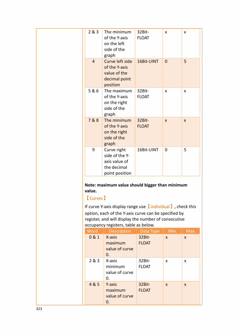
323
2 & 3 The minimum of the Y-axis on the left side of the graph
32Bit-FLOAT
x x
4 Curve left side of the Y-axis value of the decimal point position
16Bit-UINT 0 5
5 & 6 The maximum of the Y-axis on the right side of the graph
32Bit-FLOAT
x x
7 & 8 The minimum of the Y-axis on the right side of the graph
32Bit-FLOAT
x x
9 Curve right side of the Y-axis value of the decimal point position
16Bit-UINT 0 5
Note: maximum value should bigger than minimum value.
【Curves】
If curve Y-axis display range use【individual】, check this
option, each of the Y-axis curve can be specified by register, and will display the number of consecutive occupancy registers, table as below.
Word Description Data Type Min. Max.
0 & 1 X-axis maximum value of curve 0.
32Bit-FLOAT
x x
2 & 3 X-axis minimum value of curve 0.
32Bit-FLOAT
x x
4 & 5 Y-axis maximum value of curve 0.
32Bit-FLOAT
x x

324
6 & 7 Y-axis minimum value of curve 0.
32Bit-FLOAT
x x
8 & 9 X-axis maximum of curve 1.
32Bit-FLOAT
x x
10 & 11
X-axis minimum of curve 1.
32Bit-FLOAT
x x
12 & 13
Y-axis maximum value of curve 1.
32Bit-FLOAT
x x
14 & 15
Y-axis minimum value of curve 1.
32Bit-FLOAT
x x
… … 32Bit-FLOAT
x x
248 & 249
X-axis maximum of curve 31.
32Bit-FLOAT
x x
250 & 251
X-axis minimum of curve 31.
32Bit-FLOAT
x x
252 & 253
Y-axis maximum value of curve 31.
32Bit-FLOAT
x x
254 & 255
Y-axis minimum value of curve 31.
32Bit-FLOAT
x x
Note: maximum value should bigger than minimum value.

325
3.3.10.6 【Sub Switch】
The【Data Block XY Scatter】【Sub Switch】page is as shown in the figure below, the
meanings of each setting item are listed below:
Figure 152【Sub Switch】Setting Screen of【Data Block XY Scatter】
Table 103【Sub Switch】Setting Properties of【Data Block XY Scatter】
Property Description
【Sub Switch List】 【Sub Switch List】that can be selected for【Data Block XY
Scatter】. Sub switches can be enabled after selecting
them. Settings for the appearance of the selected sub switches will also appear on the right. When different sub switches are selected from the list, the appearance settings to the right will be updated according to the sub switches selected.
In which the【Sub Switches】are divided into:
➢ 【Start】—Start updating curve.
➢ 【Stop】—Stop updating curve.
➢ 【Clear】—Clear curve.
326
➢ 【Hor. Zoom In】—Horizontal zoom in.
➢ 【Hor. Zoom Out】—Horizontal zoom out.
➢ 【Ver. Zoom In】—Vertical zoom in.
➢ 【Ver. Zoom Out】—Vertical zoom out.
➢ 【Move Left】—Move Left.
➢ 【Move Right】—Move Right.
➢ 【Move Up】—Move Up.
➢ 【Persistence On】-Preserve old curves ON; used
for comparing curves. The color of old curves will be darker than the original ones.
➢ 【Persistence Off】-Preserve old curves OFF; clears
all old curves.
【Display】【Text】 【Font】
Set the text font of the sub switch currently selected.
【Size】
Set the text size of the sub switch currently selected.
【Position】
Set the text position of the sub switch currently selected.
【Format】
Set the text format of the sub switch currently selected, including Bold, Italics and Underline.
【Color】
Set the text color of the sub switch currently selected.
【Text】
Set the text of the sub switch currently selected.
【Display】
【Background】
Set the background of the sub switch currently selected. Check it to activate background settings, and the displayed background of the sub switch currently selected can be edited below. If this option is not checked, the background will be transparent.
【Use Image】
Set to use an image for the displayed background of the sub switch currently selected. When this option is checked, image selection settings will appear asking the user to select

327
an image either from the【Image Library】or from a file.
【Background Color】
Set the background color of the sub switch currently
selected. This setting will appear if 【Use Image】was not
selected.
【Display】【while
Pressing】
【Play Audio】
Select to play audio when the sub switch is pressed. An
【Audio Selector】will appear on the right when enabled.
The switch on the right of the【Audio Selector】can be
pressed to select an audio and the switch on the left of the
【Audio Selector】can be pressed to play the audio
selected.
【Pressing Effect】
Set the pressing effect of the sub switch currently selected.
There are two effects available for selection:【None】and
【Highlight】.
【Advanced】
【Operation
Control】
Operation control of sub switch, it can enabled by bit or security.
【Enable by Bit】
Check whether the sub switch operation is controlled by a bit
【Address】
Set the address of the sub switch operation control bit.
【State】
Set the control bit as 1 or 0 to operate object.
【Enabled by Word】
Check whether the operation is controlled by word.
【Address】
Set the operation control word address.
【Condition】
Set the condition of word control and when it is true then the object can be controlled, when false not the object can not be controlled. The condition include’ =’,’ !=’, ‘>’, ‘<’, ‘>=’,
328
‘<=’.
【Enable by Security】
Select the sub switch whether controlled by user level.
【Lowest User Level】
Set the lowest login level of the operational sub switch.
【Show Disabled Sign】
Check if you want to display the forbidden symbol, it’s valid
when check【Enable by Bit】,【Enabled by Word】or
【Enable by Security】.
【Hold Time】
Check whether the operation is controlled by hold time. Hold time can be divided into two kinds:
➢ 【Press On】: press directly, according to the【Min.
Hold Time】to confirm whether the operation is
executed.
➢ 【Double Press】: quickly double press to confirm
whether the operation is executed.
【Operator Confirm】
Check whether show comfirmation message window after checking the operation.
【Max. Waiting Time】
When the confirmation message window is displayed, If the user does not reply within this time, the system will close the confirmation message window and cancel this operation
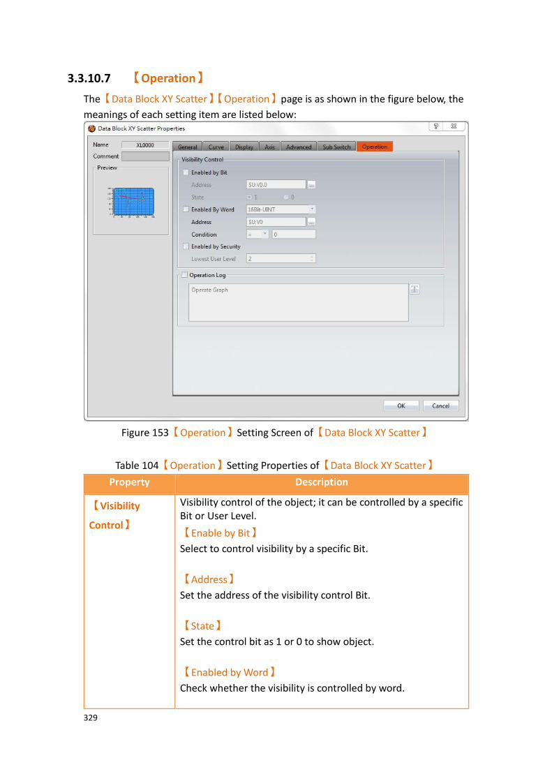
329
3.3.10.7 【Operation】
The【Data Block XY Scatter】【Operation】page is as shown in the figure below, the
meanings of each setting item are listed below:
Figure 153【Operation】Setting Screen of【Data Block XY Scatter】
Table 104【Operation】Setting Properties of【Data Block XY Scatter】
Property Description
【Visibility
Control】
Visibility control of the object; it can be controlled by a specific Bit or User Level.
【Enable by Bit】
Select to control visibility by a specific Bit.
【Address】
Set the address of the visibility control Bit.
【State】
Set the control bit as 1 or 0 to show object.
【Enabled by Word】
Check whether the visibility is controlled by word.

330
【Address】
Set the visibility control word address.
【Condition】
Set the condition of word control and when it is true then show up the object, when false not show the object. The condition include’ =’,’ !=’, ‘>’, ‘<’, ‘>=’, ‘<=’.
【Enabled by Security】
Select if visibility is to be controlled by the level of the user logged in.
【Lowest User Level】
Set the minimum level of the user logged in needed to display the object.
【Operation
Logger】
Select to enable the 【Operation Logger】of the object. It
can also edit operation messages in which the message can be
inputted directly or acquired from the【Text Library】.

331
3.3.11 【Step Switch】
【Step Switch】can write the numeric value corresponding to the set state into specific
registers. The state can be changed by pressing the Step Switch and the numeric value written into the register will also change accordingly.
3.3.11.1 【Setting】
The【Step Switch】【Setting】page is as shown in the figure below, the meanings of
each setting item are listed below:
Figure 154【Setting】Screen of【Step Switch】
Table 105【Setting】Properties of【Step Switch】
Property Description
【Preview】 Preview the appearance of this object.
【Name】 The default name of the object.
【Comment】 Set the comment of the object.
【Update】 Provide user can select a suitable speed to get the latest data under different situation, such as you would like to get the latest data or adjust the object on the screen to display first, etc. Provide three modes:
【once】: update once only when switch to
this page or use the system tag
【OP_UPDATE_SCREEN_OBJECTS】, update
332
once when trigger once a time, it will keep update if the monitor address is internal address.
【normal】: normal update speed.
【fast】: the fastest update speed.
【Execute while Releasing】 Select to execute the action set for the Step Switch while releasing. The action will be executing immediately when the Step Switch is pressed if this option is not selected.
【Play Audio while Pressing】 Select to play audio when the Step Switch is
pressed. An【Audio Selector】will appear on
the right when enabled. The switch on the
right of the【Audio Selector】can be pressed
to select an audio and the switch on the left
of the【Audio Selector】can be pressed to
play the audio selected.
【Write Address】 Set the operating address of the Step Switch.
【Data Type】 Set the Data Type of the Step Switch.
【Number of States】 Set the number of states of the Step Switch; the maximum number of states is 256.
【State Type】 Set the State Type of the Step Switch.
The【Written Value】cannot be edited and
numeric values identical to each state number
will be automatically filled out if【Value】is
selected. For example, the【Written Value】
will be 0 of the state is 0. Users can switch between states from the list on the left and customize the numeric value
corresponding to each state from【Written
Value】if【Custom】is selected.
【Written Value】 Sets the numeric value to write for each state when the Step Switch is pressed.
【Notification】 Set to allow the notification function for the Step Switch. Related settings will appear if this option is selected, allowing setting of bit and value for notification.
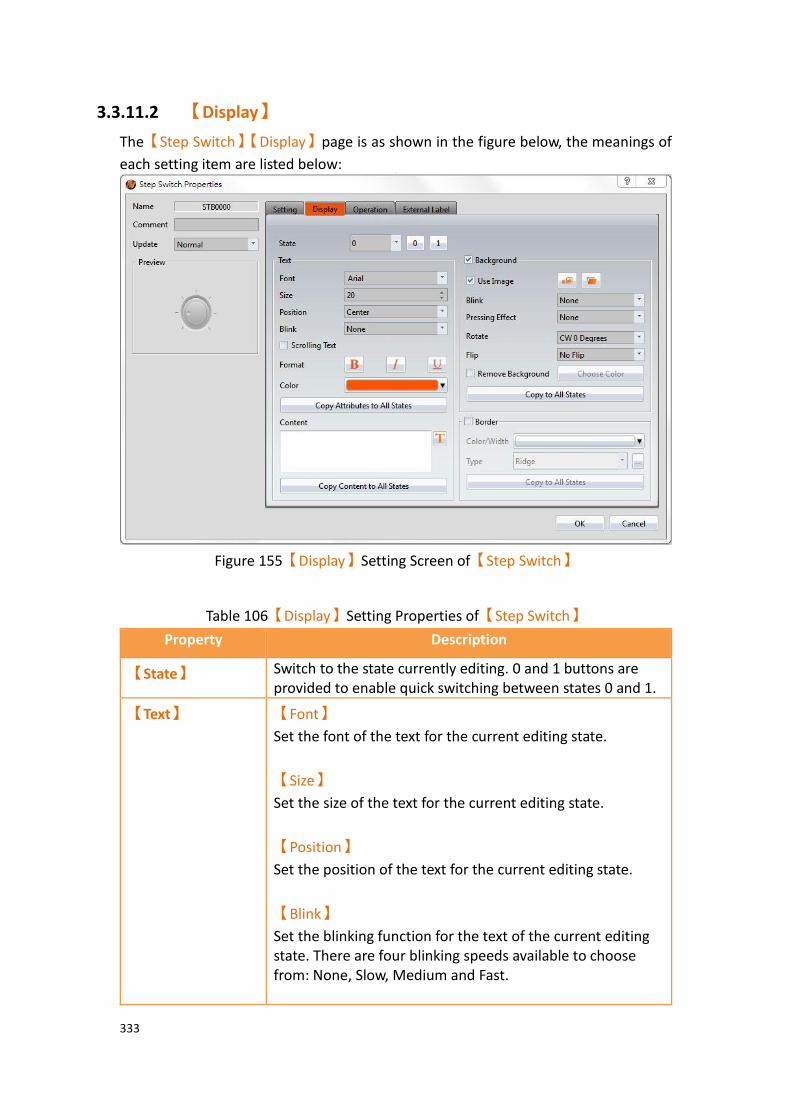
333
3.3.11.2 【Display】
The【Step Switch】【Display】page is as shown in the figure below, the meanings of
each setting item are listed below:
Figure 155【Display】Setting Screen of【Step Switch】
Table 106【Display】Setting Properties of【Step Switch】
Property Description
【State】 Switch to the state currently editing. 0 and 1 buttons are provided to enable quick switching between states 0 and 1.
【Text】 【Font】
Set the font of the text for the current editing state.
【Size】
Set the size of the text for the current editing state.
【Position】
Set the position of the text for the current editing state.
【Blink】
Set the blinking function for the text of the current editing state. There are four blinking speeds available to choose from: None, Slow, Medium and Fast.

334
【Scrolling Text】
Set the scrolling text function for the text of the current editing state. There are four scrolling speeds available to choose from slow to fast.
【Format】
Set the format of the text for the current editing state, including Bold, Italics and Underline.
【Color】
Set the color of the text for the current editing state.
【Copy Attributes to All States】
The text properties for the current editing state is applied to all states.
【Content】
Set the text of the current editing state. It can be inputted
directly or acquired from the【Text Library】.
【Copy Content to All States】
Apply the settings of the text for the current editing state to all states.
【Background】 【Use Image】
Set to use an image for the background of the current
editing state. When this option is checked, an【Image
Selector】will appear asking the user to select an image
either from the【Image Library】or from a file.
【Color】
Set the background color of the currently editing state. This
setting item will appear if【Use Image】was not selected.
【Blink】
Set the blinking function for the background of the current editing state. There are four blinking speeds available to choose from: None, Slow, Medium and Fast.
【Pressing Effect】
Set the pressing effect of the current editing state. There are two effects available for selection: None and Highlight.

335
【Rotate】
Rotate the graph, includes CW 0 Degrees, CW 90 Degrees, CW 180 Degrees and CW 270 Degrees.
【Flip】
Flip the graph, includes No Flip, X-Axis and Y-Axis.
【Remove Background】
Choose transparent color through【Choose Color】.
【Copy to All States】
Apply the settings of the background for the current editing state to all states.
【Border】 Set the object border.
【Color/Width】
Set the color and width of the border.
【Type】
Set the type of the border.
【Copy to All States】
Apply the settings of the border for the current editing state to all states.
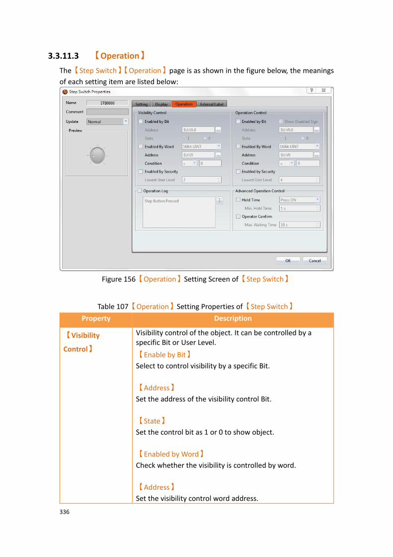
336
3.3.11.3 【Operation】
The【Step Switch】【Operation】page is as shown in the figure below, the meanings
of each setting item are listed below:
Figure 156【Operation】Setting Screen of【Step Switch】
Table 107【Operation】Setting Properties of【Step Switch】
Property Description
【Visibility
Control】
Visibility control of the object. It can be controlled by a specific Bit or User Level.
【Enable by Bit】
Select to control visibility by a specific Bit.
【Address】
Set the address of the visibility control Bit.
【State】
Set the control bit as 1 or 0 to show object.
【Enabled by Word】
Check whether the visibility is controlled by word.
【Address】
Set the visibility control word address.
337
【Condition】
Set the condition of word control and when it is true then show up the object, when false not show the object. The condition include’ =’,’ !=’, ‘>’, ‘<’, ‘>=’, ‘<=’.
【Enabled by Security Manager】
Select if the visibility is to be controlled by the level of the user logged in.
【Lowest User Level】
Set the minimum level of the user logged in needed to display the object.
【Show Disabled Sign】
If the object is not enabled, the object will have an indication that it is disabled.
【Operation
Control】
Operation control of the object; it can be controlled by a specific Bit or User Level.
【Enable by Bit】
Select to control operation by a specific Bit.
【Address】
Set the address of the operation control Bit.
【State】
Set the control bit as 1 or 0 to operate object.
【Enabled by Word】
Check whether the operation is controlled by word.
【Address】
Set the operation control word address.
【Condition】
Set the condition of word control and when it is true then the object can be controlled, when false not the object can not be controlled. The condition include’ =’,’ !=’, ‘>’, ‘<’, ‘>=’, ‘<=’.
【Enabled by Security Manager】

338
Select if the operation is to be controlled by the level of the user logged in.
【Lowest User Level】
Set the minimum level of the user logged in needed to operate the object.
【Show Disabled Sign】
Check if you want to display the forbidden symbol, it’s valid
when check【Enable by Bit】,【Enabled by Word】 or
【Enable by Security】.
【Operation Log】 Select to enable the【Operation Log】of the object.
It can also edit operation messages in which the message
can be inputted directly or acquired from the【Text
Library】.
【Advanced
Operation
Control】
【Hold Time】
Select if the operation is controlled by hold time. Hold time can be divided into two types:
➢ 【Press On】: Press directly and hold to confirm
the execution of this operation according to the
【Min Hold Time】.
➢ 【Double Press】: Use two quick presses to
confirm the execution of this operation.
【Operation Confirm】
Select to display a confirmation window after the operation is executed.
【Max Waiting Time】
When the confirmation window is displayed, the system will close the confirmation window and cancel this operation if the user does not acknowledge it within this time.

339
3.3.11.4 【External Lable】
The【Step Switch】【External Lable】page is as shown in the figure below, the
meanings of each setting item are listed below:
Figure 157【External Lable】Setting Screen of【Step Switch】
Table 108【Step Switch】【External Lable】setting properties
Option Description
【Enable External
Lable】
Checked, the bottom will appear the external lable settings of the object.
【Direction】 Set the display direction, there are horizontal and vertical two selections.
【Space】 Set the space between external lable and the object.
【Left/Top Lable】 Fill in the text to be displayed on the left / top lable of the
object, can be directly input t or selected from【Font
Library】.
【Right/Bottom
Lable】
Fill in the text to be displayed on the right / bottom lable of the object, can be directly input t or selected from
【Font Library】.
【Text】 【Font】
Set the font of text.

340
【Size】
Set the size of text, the default size is 20.
【Alignment】
Set the alignment of text.
【Color】
Set the color of text.
【Format】
Set the format of text, includes Bold, Italic and Underline.
【Word Spacing】
Set the word space of text.
【Margin】
Set the margin of text.
【Background】 Check whether to display background, set the color and opacity of background after checked.
【Color】
Set the background color of external lable.
【Opacity】
Set the opacity of external lable background, the greater the value the more the background opacity is.
【Border】 Check whether to display border.
【Color/Width】
Set the color and width of border.
【Type】
Set the type of border.
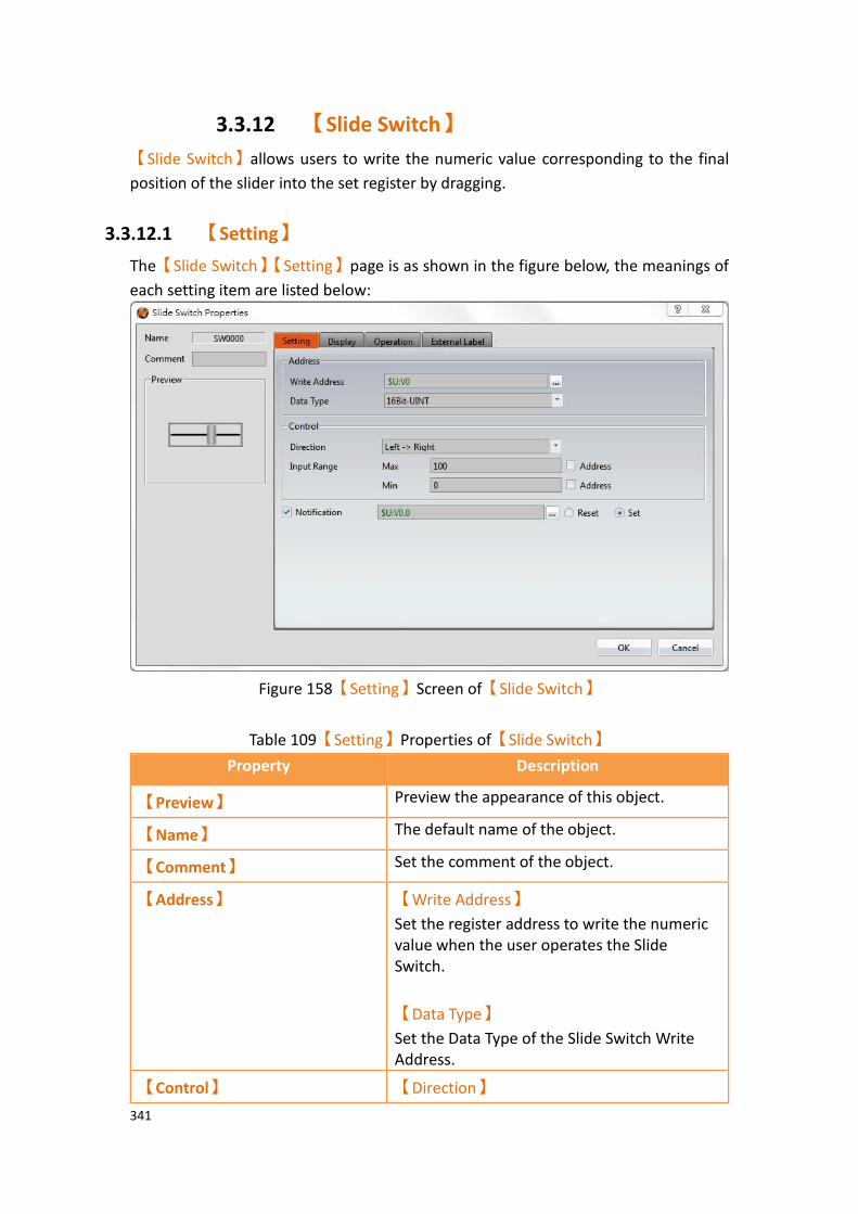
341
3.3.12 【Slide Switch】
【Slide Switch】allows users to write the numeric value corresponding to the final
position of the slider into the set register by dragging.
3.3.12.1 【Setting】
The【Slide Switch】【Setting】page is as shown in the figure below, the meanings of
each setting item are listed below:
Figure 158【Setting】Screen of【Slide Switch】
Table 109【Setting】Properties of【Slide Switch】
Property Description
【Preview】 Preview the appearance of this object.
【Name】 The default name of the object.
【Comment】 Set the comment of the object.
【Address】 【Write Address】
Set the register address to write the numeric value when the user operates the Slide Switch.
【Data Type】
Set the Data Type of the Slide Switch Write Address.
【Control】 【Direction】
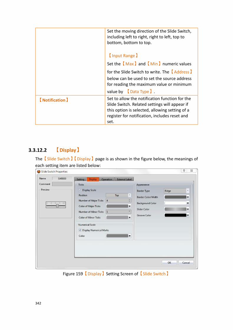
342
Set the moving direction of the Slide Switch, including left to right, right to left, top to bottom, bottom to top.
【Input Range】
Set the【Max】and【Min】numeric values
for the Slide Switch to write. The【Address】
below can be used to set the source address for reading the maximum value or minimum
value by 【Data Type】.
【Notification】 Set to allow the notification function for the Slide Switch. Related settings will appear if this option is selected, allowing setting of a register for notification, includes reset and set.
3.3.12.2 【Display】
The【Slide Switch】【Display】page is as shown in the figure below, the meanings of
each setting item are listed below:
Figure 159【Display】Setting Screen of【Slide Switch】

343
Table 110【Display】Setting Properties of【Slide Switch】
Property Description
【Ticks】 【Display Scale】
Set whether to display the scale of the Slide Switch.
【Position】
Set the position to display the scale for the Slide Switch.
【Number of Major Ticks】
Set the number of major ticks for the Slide Switch.
【Color of Major Ticks】
Set the color of the major ticks for the Slide Switch.
【Number of Minor Ticks】
Set the amount of minor ticks for the Slide Switch.
【Color of Minor Ticks】
Set the displayed color of the minor ticks for the Slide Switch.
【Numerical
Scale】
【Display Numerical Marks】
Set to display the numerical marks for the Slide Switch.
【Color】
Set the color for the numerical marks on the Slide Switch.
【Appearance】 【Border Type】
Set the border type of the Slide Switch.
【Border Color/Width】
Set the border color and border thickness of the Slide Switch.
【Background Color】
Set the background color of the Slide Switch.
【Slider Color】
Set the slider color of the Slide Switch.
【Groove Color】
Set the groove color of the Slide Switch.

344
3.3.12.3 【Operation】
The【Slide Switch】【Operation】page is as shown in the figure below, the meanings
of each setting item are listed below:
Figure 160【Operation】Setting Screen of【Slide Switch】
Table 111【Operation】Setting Properties of【Slide Switch】
Property Description
【Visibility
Control】
Visibility control of the object. It can be controlled by a specific Bit or User Level.
【Enable by Bit】
Select to control visibility by a specific Bit.
【Address】
Set the address of the visibility control Bit.
【State】
Set the control bit as 1 or 0 to show object.
【Enabled by Word】
Check whether the visibility is controlled by word.
【Address】
Set the visibility control word address.
345
【Condition】
Set the condition of word control and when it is true then show up the object, when false not show the object. The condition include’ =’,’ !=’, ‘>’, ‘<’, ‘>=’, ‘<=’.
【Enabled by Security Manager】
Select if visibility is to be controlled by the level of the user logged in.
【Lowest User Level】
Set the minimum level of the user logged in needed to display the object.
【Operation
Control】
Operation control of the object. It can be controlled by a specific Bit or User Level.
【Enable by Bit】
Select to control operation by a specific Bit.
【Address】
Set the address of the operation control Bit.
【State】
Set the control bit as 1 or 0 to operate object.
【Enabled by Word】
Check whether the operation is controlled by word.
【Address】
Set the operation control word address.
【Condition】
Set the condition of word control and when it is true then the object can be controlled, when false not the object can not be controlled. The condition include’ =’,’ !=’, ‘>’, ‘<’, ‘>=’, ‘<=’.
【Enabled by Security Manager】
Select if operation is to be controlled by the level of the user logged in.
【Lowest User Level】
Set the minimum level of the user logged in needed to
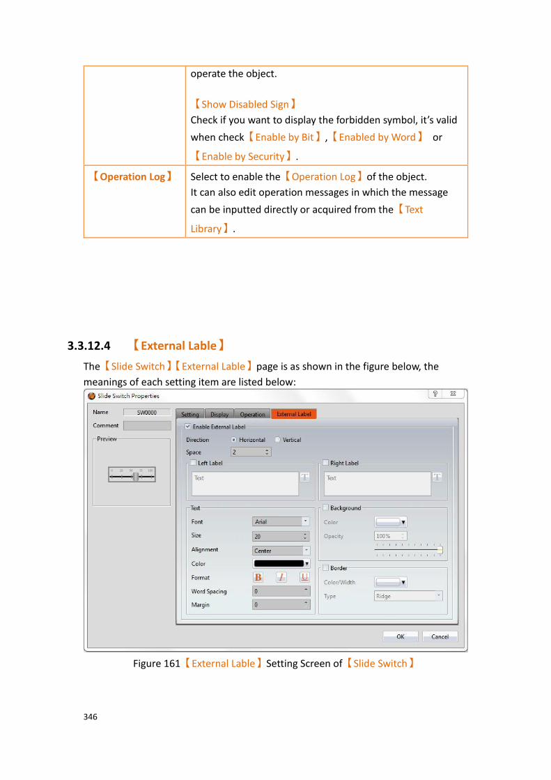
346
operate the object.
【Show Disabled Sign】
Check if you want to display the forbidden symbol, it’s valid
when check【Enable by Bit】,【Enabled by Word】 or
【Enable by Security】.
【Operation Log】 Select to enable the【Operation Log】of the object.
It can also edit operation messages in which the message
can be inputted directly or acquired from the【Text
Library】.
3.3.12.4 【External Lable】
The【Slide Switch】【External Lable】page is as shown in the figure below, the
meanings of each setting item are listed below:
Figure 161【External Lable】Setting Screen of【Slide Switch】
347
Table 112【Slide Switch】【External Lable】setting properties
Option Description
【Enable External
Lable】
Checked, the bottom will appear the external lable settings of the object.
【Direction】 Set the display direction, there are horizontal and vertical two selections.
【Space】 Set the space between external lable and the object.
【Left/Top Lable】 Fill in the text to be displayed on the left / top lable of the
object, can be directly input t or selected from【Font
Library】.
【Right/Bottom
Lable】
Fill in the text to be displayed on the right / bottom lable of the object, can be directly input t or selected from
【Font Library】.
【Text】 【Font】
Set the font of text.
【Size】
Set the size of text, the default size is 20.
【Alignment】
Set the alignment of text.
【Color】
Set the color of text.
【Format】
Set the format of text, includes Bold, Italic and Underline.
【Word Spacing】
Set the word space of text.
【Margin】
Set the margin of text.
【Background】 Check whether to display background, set the color and opacity of background after checked.
【Color】
Set the background color of external lable.

348
【Opacity】
Set the opacity of external lable background, the greater the value the more the background opacity is.
【Border】 Check whether to display border.
【Color/Width】
Set the color and width of border.
【Type】
Set the type of border.
3.3.13 【Selector List】
【Selector List】allows users to display multiple switches using a pull-down menu so
that related switches can be organized into a single list, making it convenient for the operators to select the switches needed.
3.3.13.1 【Setting】
The【Selector List】【Setting】page is as shown in the figure below, the meanings of
each setting item are listed below:
Figure 162【Setting】Screen of【Selector List】
349
Table 113【Setting】Properties of【Selector List】
Property Description
【Preview】 Preview the appearance of this object.
【Name】 The default name of the object.
【Comment】 Set the comment of the object.
【Switch Name】 Set the name of the switch currently selected. Users can change the currently
selected switch from the【Switch List】.
【Play Audio while Pressing】 Select to play audio when the Step Switch
is pressed. An【Audio Selector】will
appear on the right when enabled. The
switch on the right of the【Audio
Selector】can be pressed to select an
audio and the switch on the left of the
【Audio Selector】can be pressed to play
the audio selected.
【Execute when Item is Selected】 Select whether to enable the【Execute
when Item is Selected】function. When it
is enabled, the function of a switch will be executed immediately when the user selected a switch from the Selector List object. If it is not enabled, the function of the selected switch will only be executed
after the user pressed the【Execute】
button.
When the Switch using【Bit Momentary】
action of【Bit Switch】in the【Switch
List】, or the【Continuously Add】/
【Continuously Subtract】of【Add Data】
action /【Subtract Data】 action in the
【Word Switch】, 【Execute When this
Item is Selected】the option will not be
able to check.
【Bit Switch】 Change the currently editing switch type to
【Bit Switch】,for the related property
settings please refer to the description of the switch.

350
【Word Switch】 Change the currently editing switch type to
【Word Switch】,for the related property
settings please refer to the description of the switch..
【Change Screen】 Change the currently editing switch type to
【Change Screen】,for the related
property settings please refer to the description of the switch..
【Function Switch】 Change the currently editing switch type to
【Function Switch】,for the related
property settings please refer to the description of the switch..
【Notification】 Set whether to allow the notification function. Related setting items will appear if this option is selected, allowing setting of bit and value for notification.
【Switch List】 Display the switch list currently included in the Selector List item object.
【Add】
Increase the number of switches in the
【Switch List】; the type of switch to add
can be selected.
【Delete】
Delete the switch currently selected in the
【Switch List】.
【Up】
Move the order of the switch currently
selected in the【Switch List】up.
【Down】
Move the order of the switch currently
selected in the【Switch List】down.
Note: When all members of the selector list are【Word Switches】, the action set to【Write
Data】, and the【Data Types】are the same, if the address is changed through the list, the
constant change will show up in the monitoring object. If the address is changed through an outside
object, the item in the list will change accordingly. This does not apply if the【Data Type】is 32Bit-
Float.
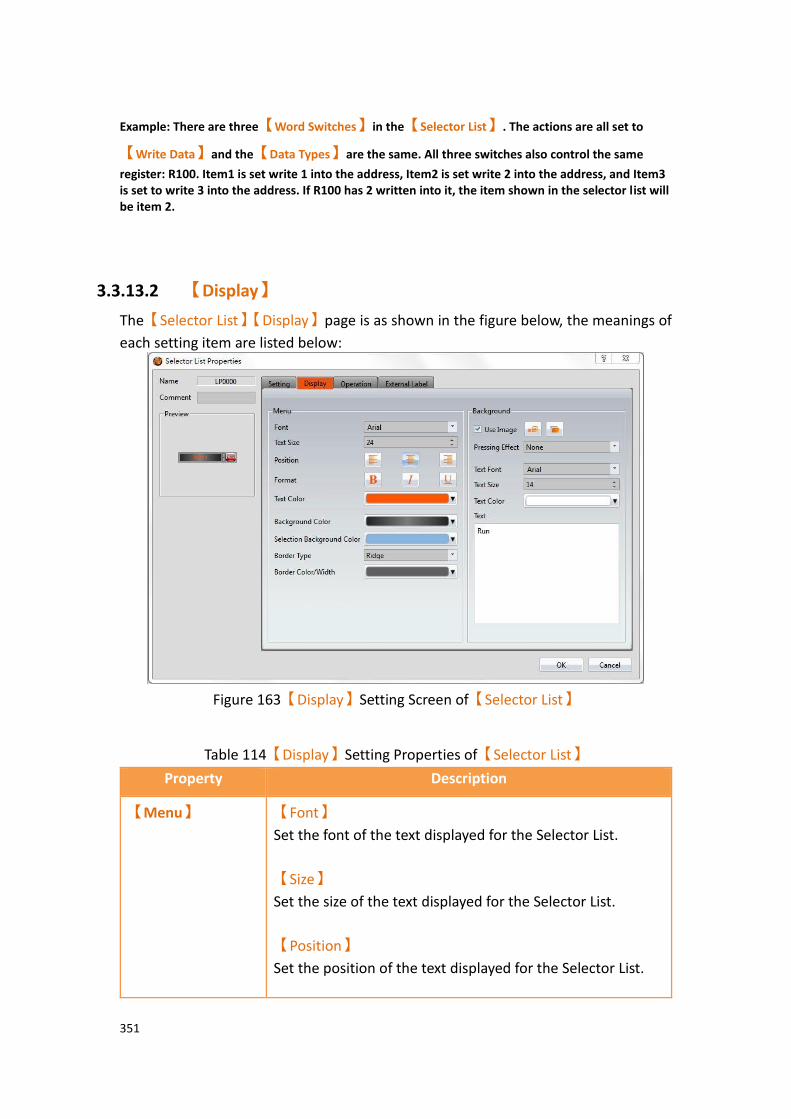
351
Example: There are three【Word Switches】in the【Selector List】. The actions are all set to
【Write Data】and the【Data Types】are the same. All three switches also control the same
register: R100. Item1 is set write 1 into the address, Item2 is set write 2 into the address, and Item3 is set to write 3 into the address. If R100 has 2 written into it, the item shown in the selector list will be item 2.
3.3.13.2 【Display】
The【Selector List】【Display】page is as shown in the figure below, the meanings of
each setting item are listed below:
Figure 163【Display】Setting Screen of【Selector List】
Table 114【Display】Setting Properties of【Selector List】
Property Description
【Menu】 【Font】
Set the font of the text displayed for the Selector List.
【Size】
Set the size of the text displayed for the Selector List.
【Position】
Set the position of the text displayed for the Selector List.

352
【Format】
Set the format of the text displayed for the Selector List, including Bold, Italics and Underline.
【Color】
Set the color of the text displayed for the Selector List.
【Background Color】
Set the displayed background color of the Selector List.
【Selection Background Color】
Set the displayed background color of the selected item in Selector List.
【Border Type】
Set the displayed border type of the Selector List.
【Border Color/Width】
Set the displayed border color and border thickness of the Selector List.
【Background】 【Use Image】
Set whether to use an image for the background of the
【Execute】button. When this option is checked, an【Image
Selector】will appear asking the user to select an image either
from the【Image Library】or from a file.
【Color】
Set the background color of the【Execute】button. This setting
item will appear if 【Use Image】 was not selected.
【Pressing Effect】
Set the pressing effect of the【Execute】button. There are
two effects available for selection: None and Highlight.
【Text Font】
Set the text font of the【Execute】button.
【Text Size】
Set the text size of the【Execute】button.
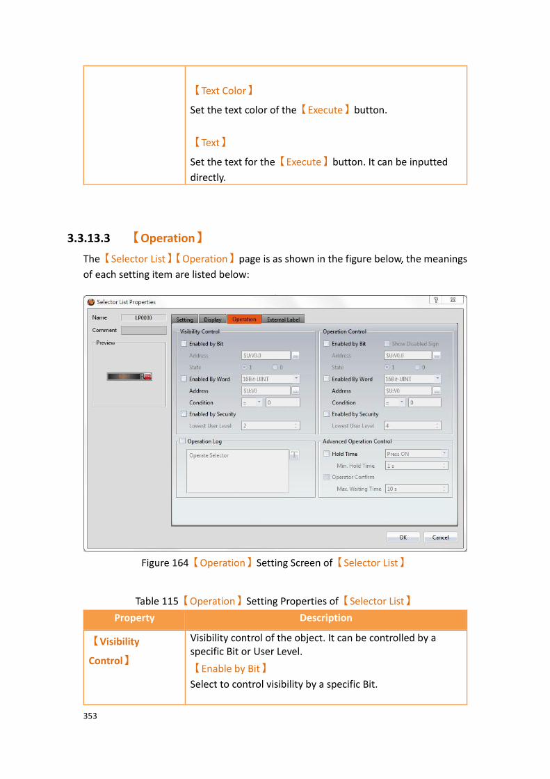
353
【Text Color】
Set the text color of the【Execute】button.
【Text】
Set the text for the【Execute】button. It can be inputted
directly.
3.3.13.3 【Operation】
The【Selector List】【Operation】page is as shown in the figure below, the meanings
of each setting item are listed below:
Figure 164【Operation】Setting Screen of【Selector List】
Table 115【Operation】Setting Properties of【Selector List】
Property Description
【Visibility
Control】
Visibility control of the object. It can be controlled by a specific Bit or User Level.
【Enable by Bit】
Select to control visibility by a specific Bit.
354
【Address】
Set the address of the visibility control Bit.
【State】
Set the control bit as 1 or 0 to show object.
【Enabled by Word】
Check whether the visibility is controlled by word.
【Address】
Set the visibility control word address.
【Condition】
Set the condition of word control and when it is true then show up the object, when false not show the object. The condition include’ =’,’ !=’, ‘>’, ‘<’, ‘>=’, ‘<=’.
【Enabled by Security Manager】
Select if visibility is to be controlled by the level of the user logged in.
【Lowest User Level】
Set the minimum level of the user logged in needed to display the object.
【Operation
Control】
Operation control of the object. It can be controlled by a specific Bit or User Level.
【Enable by Bit】
Select to control operation by a specific Bit.
【Address】
Set the address of the operation control Bit.
【State】
Set the control bit as 1 or 0 to operate object.
【Enabled by Word】
Check whether the operation is controlled by word.
【Address】
Set the operation control word address.
355
【Condition】
Set the condition of word control and when it is true then the object can be controlled, when false not the object can not be controlled. The condition include’ =’,’ !=’, ‘>’, ‘<’, ‘>=’, ‘<=’.
【Enabled by Security Manager】
Select if operation is to be controlled by the level of the user logged in.
【Lowest User Level】
Set the minimum level of the user logged in needed to operate the object.
【Show Disabled Sign】
Check if you want to display the forbidden symbol, it’s valid
when check【Enable by Bit】,【Enabled by Word】 or
【Enable by Security】.
【Operation Log】 Select to enable the【Operation Log】of the object.
It can also edit operation messages in which the message
can be inputted directly or acquired from the【Text
Library】.
【Advanced
Operation
Control】
【Hold Time】
Select to control the operation by hold time; hold time can be divided into two types:
➢ 【Press On】: Press directly and confirm the
execution of this operation according to the【Min
Hold Time】.
➢ 【Double Press】: Use two quick presses to confirm
the execution of this operation.
【Operation Confirm】
Select to display the confirmation window after the operation is executed.
【Max Waiting Time】
When the confirm window is displayed, the system will close the confirmation window and cancel the operation if the user did not respond within this time.
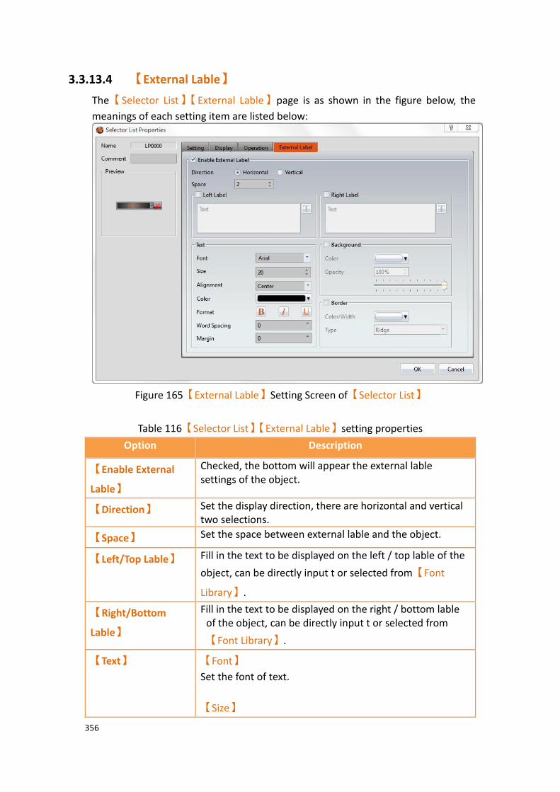
356
3.3.13.4 【External Lable】
The【Selector List】【External Lable】page is as shown in the figure below, the
meanings of each setting item are listed below:
Figure 165【External Lable】Setting Screen of【Selector List】
Table 116【Selector List】【External Lable】setting properties
Option Description
【Enable External
Lable】
Checked, the bottom will appear the external lable settings of the object.
【Direction】 Set the display direction, there are horizontal and vertical two selections.
【Space】 Set the space between external lable and the object.
【Left/Top Lable】 Fill in the text to be displayed on the left / top lable of the
object, can be directly input t or selected from【Font
Library】.
【Right/Bottom
Lable】
Fill in the text to be displayed on the right / bottom lable of the object, can be directly input t or selected from
【Font Library】.
【Text】 【Font】
Set the font of text.
【Size】

357
Set the size of text, the default size is 20.
【Alignment】
Set the alignment of text.
【Color】
Set the color of text.
【Format】
Set the format of text, includes Bold, Italic and Underline.
【Word Spacing】
Set the word space of text.
【Margin】
Set the margin of text.
【Background】 Check whether to display background, set the color and opacity of background after checked.
【Color】
Set the background color of external lable.
【Opacity】
Set the opacity of external lable background, the greater the value the more the background opacity is.
【Border】 Check whether to display border.
【Color/Width】
Set the color and width of border.
【Type】
Set the type of border.

358
3.3.14 【Radio Button】
【Radio Button】includes multiple buttons and status,in this group button, only one
of the state objects can be operated at a time, write the data to the corresponding value or corresponding bit of the PLC, and at the same time only one state will be on, for operator easy to use.
3.3.14.1 【Setting】
【Radio Button】【Setting】paging shown as below, each of the setting meaning as
follow:
Figure 166【Radio Button】【Setting】setting paging
Table 117【Radio Button】【Setting】setting properties
Property Description
【Preview】 Preview the appearance of this object.
【Name】 The default name of the object.
【Comment】 Set the comment of the object.
【Excute while
Releasing】
Select to execute the action set for the radio button while releasing. The action will be executed immediately when the switch is pressed if this option is not selected.

359
【Play Audio while
Pressing】
Select to play audio when the switch is pressed. An
【Audio Selector】will appear on the right when
enabled. The switch on the right of the【Audio
Selector】can be pressed to select an audio and the
switch on the left of the【Audio Selector】can be
pressed to play the selected audio.
【Address】 Set the operate address of the radio button.
【Data Type】 Set the data type of the radio button, including 16Bit-
BCD、16Bit-INT、16Bit-UINT、32Bit-BCD、32Bit-
INT、32Bit-UINT and 32Bit-FLOAT, etc.
【Total Buttons】 Set the numbers of total buttons.
【Direction】 Set the direction of the radio button, including right to left, left to right, top to bottom, bottom to top.
【Button Spacing】 Set button spacing of each button.
【Show Mark】 Set whether mark the radio button.
【Mark Backgroung Color】
Set the background color that the radio button mark to display.
【Mark Color】
Set the color that radio button mark to display.
【Value】 Set each button write the vaiue to the【Address】.
【Notification】 Set whether permit radio button to enable notification function. After enable, can set the notification address and the value that want to write in while excute the radio button
【數值列表】 Display Each button in the radio button group
corresponds to the value written to【Address】,
while【Total Buttons】increase or decrease,
【Value List】will also changed.
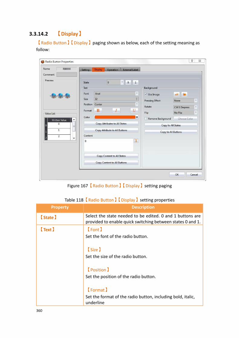
360
3.3.14.2 【Display】
【Radio Button】【Display】paging shown as below, each of the setting meaning as
follow:
Figure 167【Radio Button】【Display】setting paging
Table 118【Radio Button】【Display】setting properties
Property Description
【State】 Select the state needed to be edited. 0 and 1 buttons are provided to enable quick switching between states 0 and 1.
【Text】 【Font】
Set the font of the radio button.
【Size】
Set the size of the radio button.
【Position】
Set the position of the radio button.
【Format】
Set the format of the radio button, including bold, italic, underline

361
【Color】
Set the color of the radio button.
【Copy Attributes to All States】
Applies the text attribute setting of the current edit state to all states
【Copy Attributes to All Buttons】
Apply the text attribute settings for the current edit state to all buttons
【Content】
Set the text displayed of the current edit status, either
directly or by the【Text Library】.
【Copy Content to All States】
Applies the text settings of the current edit state to all states.
【Copy Content to All Buttons】
Applies the text settings of the current edit state to all buttons.
【Background】 【Use Image】
Sets whether or not to use the picture for the background displayed by the current edit status. After checked, will
appear【Image Selector】to provide user to select the
image from【Image Library】or from file.
【Color】
Set the background color of the current edit status. If
unchecked【Use Image】, this option will appear.
【Pressing Effect】
Set the pressing effect of the current edit status, there are two kinds of effects nine and highlight can choose.
【Rotate】
Rotate the graph, includes CW 0 Degrees, CW 90 Degrees, CW 180 Degrees and CW 270 Degrees.

362
【Flip】
Flip the graph, includes No Flip, X-Axis and Y-Axis.
【Remove Background】
Choose transparent color through【Choose Color】.
【Copy to All States】
Apply the background settings for the current edit state to all states.
【Copy to All Buttons】
Apply the background settings for the current edit status to all buttons.
3.3.14.3 【Operation】
The【Radio Button】【Operation】page is as shown in the figure below, the meanings
of each setting item are listed below:
Figure 168【Radio Button】【Operation】setting paging

363
Table 119【Radio Button】【Operation】setting properties
Property Description
【Visibility
Control】
Visibility control of the object. It can be controlled by a specific Bit or User Level.
【Enable by Bit】
Select to control visibility by a specific Bit.
【Address】
Set the address of the visibility control Bit.
【State】
Set the control bit as 1 or 0 to show object.
【Enabled by Word】
Check whether the visibility is controlled by word.
【Address】
Set the visibility control word address.
【Condition】
Set the condition of word control and when it is true then show up the object, when false not show the object. The condition include’ =’,’ !=’, ‘>’, ‘<’, ‘>=’, ‘<=’.
【Enabled by Security Manager】
Select if visibility is to be controlled by the level of the user logged in.
【Lowest User Level】
Set the minimum level of the user logged in needed to display the object.
【Operation
Control】
Operation control of the object. It can be controlled by a specific Bit or User Level.
【Enable by Bit】
Select to control operation by a specific Bit.
【Address】
Set the address of the operation control Bit.
【State】
Set the control bit as 1 or 0 to operate object.

364
【Enabled by Word】
Check whether the operation is controlled by word.
【Address】
Set the operation control word address.
【Condition】
Set the condition of word control and when it is true then the object can be controlled, when false not the object can not be controlled. The condition include’ =’,’ !=’, ‘>’, ‘<’, ‘>=’, ‘<=’.
【Enabled by Security Manager】
Select if operation is to be controlled by the level of the user logged in.
【Lowest User Level】
Set the minimum level of the user logged in needed to operate the object.
【Show Disabled Sign】
Check if you want to display the forbidden symbol, it’s valid
when check【Enable by Bit】,【Enabled by Word】 or
【Enable by Security】.
【Operation Log】 Select to enable the【Operation Log】of the object.
It can also edit operation messages in which the message
can be inputted directly or acquired from the【Text
Library】.
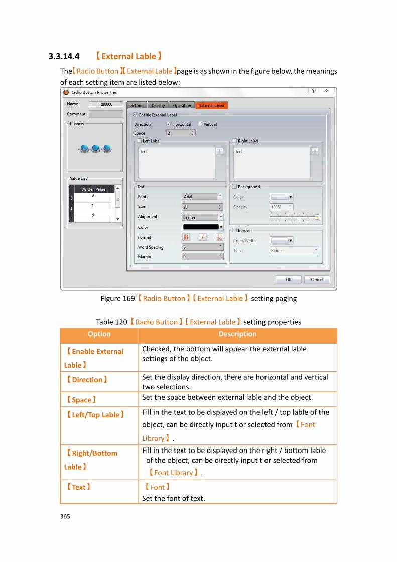
365
3.3.14.4 【External Lable】
The【Radio Button】【External Lable】page is as shown in the figure below, the meanings
of each setting item are listed below:
Figure 169【Radio Button】【External Lable】setting paging
Table 120【Radio Button】【External Lable】setting properties
Option Description
【Enable External
Lable】
Checked, the bottom will appear the external lable settings of the object.
【Direction】 Set the display direction, there are horizontal and vertical two selections.
【Space】 Set the space between external lable and the object.
【Left/Top Lable】 Fill in the text to be displayed on the left / top lable of the
object, can be directly input t or selected from【Font
Library】.
【Right/Bottom
Lable】
Fill in the text to be displayed on the right / bottom lable of the object, can be directly input t or selected from
【Font Library】.
【Text】 【Font】
Set the font of text.

366
【Size】
Set the size of text, the default size is 20.
【Alignment】
Set the alignment of text.
【Color】
Set the color of text.
【Format】
Set the format of text, includes Bold, Italic and Underline.
【Word Spacing】
Set the word space of text.
【Margin】
Set the margin of text.
【Background】 Check whether to display background, set the color and opacity of background after checked.
【Color】
Set the background color of external lable.
【Opacity】
Set the opacity of external lable background, the greater the value the more the background opacity is.
【Border】 Check whether to display border.
【Color/Width】
Set the color and width of border.
【Type】
Set the type of border.

367
3.3.15 【Input Display】
【Input Display】is used on a【Base Screen】/【Window Screen】/【Keypad
Screen】; it can display the numeric value or text currently entered with the keypad.
The【Input Display】property settings dialog is as shown in the figure below, the
meanings of each setting option are listed below:
Figure 170 Setting Dialog of【Input Display】
Table 121 Setting Properties of【Input Display】
Property Description
【Preview】 Preview the appearance of this object.
【Name】 The default name of the object.
【Comment】 Set the comment of the object.
【Content】 【7-segment Display】
Set to use the 7-segment display function for the Input Display object. If this option is selected, related setting items for setting of style of the 7-segment display will appear. Note: while this option is selected, it can only show part of text (0/O, 1, 2, 3, 4, 5/S, 6, 7, 8, 9/g, A, B, C, D, E, F, h, H, L, o, P, r, u, U, Y).
【Font】
Set the font for the text of Input Display.
【Size】

368
Set the size for the text of Input Display.
【Position】
Set the position for the text of Input/Display.
【Blink】
Set the blinking function for the text of the Input/Display. There are four blinking speeds available to choose from: None, Slow, Medium and Fast.
【Scrolling Text】
Set the scrolling text function for the text of the Input/Display. There are four scrolling speeds available to choose from slow to fast.
【Format】
Set the format of the text for the Input/Display, including Bold, Italics and Underline.
【Color】
Set the color for the text of the Input/Display.
【Border】 【Type】
Set the border types for Input Display.
【Color/Thickness】
Set the color and thickness for the border of the Input/Display.
【Background】 【Use Image】
Set to use an image for the background of the Input/Display.
When this option is checked, an【Image Selector】will
appear asking the user to select an image either from the
【Image Library】or from a file.
【Color】
Set the background color of the Input/Display. This setting
item will appear if【Use Image】was not selected.
【Blink】
Set the blinking function for the background of the Input/Display. There are four blinking speeds available to choose from: None, Slow, Medium and Fast.

369
3.3.16 【Key】
Key is used on a【Base Screen】/【Window Screen】/【Keypad Screen】. It can provide
the functions for the keypad needed for inputting numeric value or text. The 9
functions include【Text】,【ENT】,【CLR】,【BS】,【DEL】,【LEFT】,【RIGHT】,
【Caps Lock】and【CANCEL】.
3.3.16.1 【Setting】
The【Key】【Setting】 page is as shown in the figure below, the meanings of each
setting item are listed below:
Figure 171【Setting】Screen of【Key】
Table 122【Setting】Properties of【Key】
Property Description
【Preview】 Preview the appearance of this object.
【Name】 The default name of the object.
【Comment】 Set the comment of the object.
【Function】 Set the function type of the key.
【Play Audio while Pressing】
370
Select to play audio when the Key is pressed. An【Audio
Selector】will appear on the right when enabled. The switch
on the right of the【Audio Selector】can be pressed to select
an audio and the switch on the left of the【Audio Selector】
can be pressed to play the audio selected.
【Text】
Input text mode; the text inputted in【Input Text】will be
entered on the【Keypad Screen】after this key is pressed.
【ENT】
The numeric value or text entered on the【Keypad Screen】
will be submitted and the 【Keypad Screen】will be closed
after this key is pressed.
【CLR】
The numeric value or text entered on the 【Keypad Screen】
will be cleared after this key is pressed.
【BS】
A single numeric value or text prior to the position of the cursor will be deleted after this key is pressed.
【DEL】
A single numeric value or text after the position of the cursor will be deleted after this key is pressed.
【LEFT】
The cursor will move one space forward after the user presses this key.
【RIGHT】
The cursor will move one space backward after the user presses this key.
【Caps Lock】
The case mode of the text input will be changed after this key is pressed.

371
【CANCEL】
The【Keypad Screen】will be closed and input will be
cancelled after the user presses this key.
3.3.16.2 【Display】
The【Key】【Display】page is as shown in the figure below, the meanings of each setting
item are listed below:
Figure 172【Display】Setting Screen of【Key】
Table 123【Display】Setting Properties of【Key】
Property Description
【Text】 【Font】
Set the font of the text for the key.
【Size】
Set the size of the text for the key.
【Position】
Set the position of the text for the key.
372
【Blink】
Set the blinking function for the text of the key. There are four blinking speeds available to choose from: None, Slow, Medium and Fast.
【Scrolling Text】
Set the scrolling function for the text of the key. There are four scrolling speeds available to choose from slow to fast.
【Format】
Set the format of the text for the key, including Bold, Italics and Underline.
【Color】
Set the color of the text for the key.
【Content】
Set the text of the key; it can be inputted directly or
acquired from the【Text Library】.
【Background】 Background settings for the key. The background of the key can be edited below if the background setting is selected, otherwise the background will be transparent.
【Use Image】
Set to use an image for the background of the key. When
this option is checked, an【Image Selector】will appear
asking the user to select an image either from the【Image
Library】or from a file.
【Color】
Set the background color of the key. This setting item will
appear if【Use Image】was not selected.
【Blink】
Set the blinking function for the background of the key. There are four blinking speeds available to choose from: None, Slow, Medium and Fast.
【Pressing Effect】
Set the pressing effect of the key. There are two effects available for selection: None and Highlight.

373
3.3.16.3 【Operation】
The【Key】【Operation】page is as shown in the figure below, the meanings of each
setting item are listed below:
Figure 173【Operation】Setting Screen of【Key】
Table 124【Operation】Setting Properties of【Key】
Property Description
【Visibility
Control】
Visibility control of the object. It can be controlled by a specific Bit or User Level.
【Enable by Bit】
Select to control visibility by a specific Bit.
【Address】
Set the address of the visibility control Bit.
【State】
Set the control bit as 1 or 0 to show object.
【Enabled by Word】
Check whether the visibility is controlled by word.
【Address】

374
Set the visibility control word address.
【Condition】
Set the condition of word control and when it is true then show up the object, when false not show the object. The condition include’ =’,’ !=’, ‘>’, ‘<’, ‘>=’, ‘<=’.
【Enabled by Security Manager】
Select if visibility is to be controlled by the level of the user logged in.
【Lowest User Level】
Set the minimum level of the user logged in needed to display the object.
3.3.17 【Limit Value Display】
【Limit Value Display】is used on a【Base Screen】/【Window Screen】/【Keypad
Screen】, it can display the maximum or minimum input value allowed for the
current keypad.
The【Limit Value Display】settings page is as shown in the figure below, the meanings
of each setting item are listed below:
Figure 174 Setting Dialog of【Limit Value Display】
375
Table 125 Setting Properties of【Limit Value Display】
Property Description
【Preview】 Previews the appearance of this object.
【Name】 The default name of the object.
【Comment】 Set the comment of the object.
【Content】 【Limit Value Type】
Set to display【Max】or【Min】for Limit Value Display.
【7-segment Display】
Set to use the 7-segment display function for the Limit Value Display object. If this option is selected, related setting items for setting of style of the 7-segment display will appear, including outline, filled, flat. Note: When using the 7-segment display function, only part of the text (0 / O, 1, 2, 3, 4, 5 / S, 6, 7, 8, 9 / g, A, B, C, D, E , F, h, H, L, o, P, r, u, U, Y) can be displayed.
【Font】
Set the font of the text for the Limit Value Display.
【Size】
Set the size of the text for the Limit Value Display.
【Position】
Set the position of the text for the Limit Value Display.
【Blink】
Set the blinking function for the text of the Limit Value Display. There are four blinking speeds available to choose from: None, Slow, Medium and Fast.
【Scrolling Text】
Set the scrolling text function for the text of the Limit Value Display. There are four scrolling speeds available to choose from slow to fast.
【Format】
Set the format of the text for the Limit Value Display, including Bold, Italics and Underline.

376
【Color】
Set the color of the text for the Limit Value Display.
【Border】 Border settings for the Limit Value Display. The border of the Limit Value Display can be edited below if border setting is selected, otherwise the Limit Value Display will be displayed with no border.
【Type】
Set the border types for the Limit Value Display.
【Color/Thickness】
Set the color and thickness for the border of the Limit Value Display.
【Background】 Background settings for the Limit Value Display. The background of the Limit Value Display can be edited below if background setting is selected, otherwise the background will be transparent.
【Use Image】
Set to use an image for the background of Limit Value
Display. When this option is checked, an【Image Selector】
will appear asking the user to select an image either from
the【Image Library】or from a file.
【Color】
Set the background color of the Limit Value Display. This
setting item will appear if 【Use Image】 was not
selected.
【Blink】
Set the blinking function for the background of the Limit Value Display. There are four blinking speeds available to choose from: None, Slow, Medium and Fast.

377
3.3.18 【Animated Graphic】
【Animated Graphic】can control multiple states. The state, position and size displayed
by【Animated Graphic】can be changed by setting specific control addresses in order
to achieve effects such as moving objects, zooming in, zooming out etc.
3.3.18.1 【Setting】
The【Animated Graphic】【Setting】page is as shown in the figure below, the meanings
of each setting item are listed below:
Figure 175【Setting】Screen of【Animated Graphic】
Table 126【Setting】Properties of【Animated Graphic】
Property Description
【Preview】 Preview the appearance of this object.
【Name】 The default name of the object.
【Comment】 Set the comment of the object.
【Update】 Provide user can select a suitable speed to get the latest data under different situation, such as you would like to get the latest data or adjust the object on the screen to display first, etc. Provide three modes:
【once】: update once only when switch to this page or use

378
the system tag【OP_UPDATE_SCREEN_OBJECTS】, update
once when trigger once a time, it will keep update if the monitor address is internal address.
【normal】: normal update speed.
【fast】: the fastest update speed.
【Graphic】 【Number of States】
Set the number of states for the animated graphic.
【State Control】
Set the state changing method of the animated graphic;
【Automatic】mode means that the state of the animated
graphic will change regularly.
【Dynamic】mode indicates the state of the dynamic graphic,
which will change according to the value【State Control
Address】.
【Time Interval】
Set the state change time interval for the animated graphic.
【State Control Address】
Sets the time interval for the dynamic graphic state change, and change according to the register’s value.
【Movement】 【Type】
Set the position changing method of the animated graphic.
【Dynamic】mode means that the position of the animated
graphic will change according to the numeric value saved on
the【Position Control Address】.
【Still】mode means that the position of the animated
graphic will remain the same.
【Polyline】mode means that the position of the animated
graphic will change according to the planning path or position.
【Position Control Address】
Divided into X-axis and Y-axis control addresses. If the
【Type】is【Dynamic】, the user can move the animated
graphic by changing the numeric value saved in the X-axis and

379
Y-axis control address.
【Move Control】
Display when【Type】select as【Polyline】, main to set the
path or position under【Polyline】mode.
【Along Path】
The animated graph change the position according to the planning path.
【Along Position】
The animated graph change the position according to the planning position(point).
【Dynamically Change Position】
The animated graph change the position(point) according to
the【Position Control Address】value, if【Position Control
Address】=0 display point 1, 【Position Control Address】
=5 display point 6.
【Rate】
Animated graph moving speed, the unit is v/s.
【Edit Path】
Will show up this option when【Type】select as【Polyline】,
click to show the figure as below. Provide user to change the position by modify x-axis and y-axis or adjust the path by
【Insert】and【Remove】.

380
Except adjust the path by【Edit Path】also can directly edit
on the work space by dragging, table as follow:
- Add point : click the animated graph, move the mouse to the desired path and will show up a hand sign, click the left botton of the mouse and move to the desired new point.
- Adjust point : click the animated graph, move the mouse to the desired position and will show up a arrow sign, click the left botton of the mouse and move to the desired new point.
- Remove point : click the animated graph, move the mouse to the desired point and will show up a arrow sign, click the right botton of the mouse to remove the point.
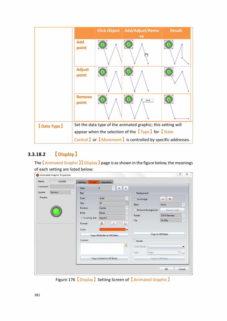
381
Click Object Add/Adjust/Remove
Result
Add point
Adjust point
Remove point
【Data Type】 Set the data type of the animated graphic; this setting will
appear when the selection of the【Type】for【State
Control】or【Movement】is controlled by specific addresses.
3.3.18.2 【Display】
The【Animated Graphic】【Display】page is as shown in the figure below, the meanings
of each setting are listed below:
Figure 176【Display】Setting Screen of【Animated Graphic】

382
Table 127【Display】Setting Properties of【Animated Graphic】
Property Description
【State】 Select the state needed to be edited. 0 and 1 buttons are provided to enable quick switching between states 0 and 1.
【Text】 【Font】
Set the font of the text for the current editing state.
【Size】
Set the size of the text for the current editing state.
【Position】
Set the position of the text for the current editing state.
【Blink】
Set the blinking function for the text of the current editing state. There are four blinking speeds available to choose from: None, Slow, Medium and Fast.
【Scrolling Text】
Set the scrolling text function for the text of the current editing state. There are four scrolling speeds available to choose from slow to fast.
【Format】
Set the format of the text for the current editing state, including Bold, Italics and Underline.
【Color】
Set the color of the text for the current editing state.
【Copy Attributes to All States】
The text properties for the current editing state is applied to all states.
【Content】
Set the text of the current editing state. It can be inputted
directly or acquired from the【Text Library】.
【Copy Contents to All States】
Apply the settings of the text for the current editing state to all states.

383
【Background】 Background settings for the current editing state. The displayed background of the animated graphic can be edited below if background setting is selected. Otherwise, the background of the currently editing state will be transparent.
【Use Image】
Set to use an image for the displayed background of the current editing state. When this option is checked, an
【Image Selector】will appear asking the user to select an
image either from the【Image Library】or from a file.
【Color】
Set the background color of the current editing state. This
setting item will appear if 【Use Image】 was not
selected.
【Blink】
Set the blinking function for the background of the current editing state. There are four blinking speeds available to choose from: None, Slow, Medium and Fast.
【Remove Background】
Choose transparent color through【Choose Color】.
【Rotate】
Rotate the graph, includes CW 0 Degrees, CW 90 Degrees, CW 180 Degrees and CW 270 Degrees.
【Flip】
Flip the graph, includes No Flip, X-Axis and Y-Axis.
【Copy to All States】
Apply the settings of the background for the current editing state to all states.
【Border】 Set the object border.
【Color/Width】
Set the color and width of the border.
【Type】

384
Set the type of the border.
【Copy to All States】
Apply the settings of the border for the current editing state to all states.
3.3.18.3 【Operation】
The【Animated Graphic】【Operation】page is as shown in the figure below, the
meanings of each setting item are listed below:
Figure 177【Operation】Setting Screen of【Animated Graphic】
Table 128【Operation】Setting Properties of【Animated Graphic】
Property Description
【Visibility
Control】
Visibility control of the object. It can be controlled by a specific Bit or User Level.
【Enable by Bit】
Select to control visibility by a specific Bit.
【Address】
Set the address of the visibility control Bit.
【State】
Set the control bit as 1 or 0 to show object.
385
【Enabled by Word】
Check whether the visibility is controlled by word.
【Address】
Set the visibility control word address.
【Condition】
Set the condition of word control and when it is true then show up the object, when false not show the object. The condition include’ =’,’ !=’, ‘>’, ‘<’, ‘>=’, ‘<=’.
【Enabled by Security Manager】
Select if visibility is to be controlled by the level of the user logged in.
【Lowest User Level】
Set the minimum level of the user logged in needed to display the object.
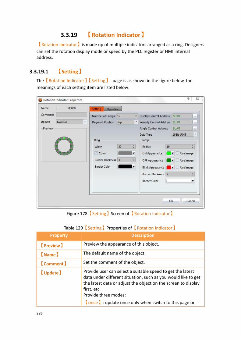
386
3.3.19 【Rotation Indicator】
【Rotation Indicator】is made up of multiple indicators arranged as a ring. Designers
can set the rotation display mode or speed by the PLC register or HMI internal address.
3.3.19.1 【Setting】
The【Rotation Indicator】【Setting】 page is as shown in the figure below, the
meanings of each setting item are listed below:
Figure 178【Setting】Screen of【Rotation Indicator】
Table 129【Setting】Properties of【Rotation Indicator】
Property Description
【Preview】 Preview the appearance of this object.
【Name】 The default name of the object.
【Comment】 Set the comment of the object.
【Update】 Provide user can select a suitable speed to get the latest data under different situation, such as you would like to get the latest data or adjust the object on the screen to display first, etc. Provide three modes:
【once】: update once only when switch to this page or
387
use the system tag【OP_UPDATE_SCREEN_OBJECTS】,
update once when trigger once a time, it will keep update if the monitor address is internal address.
【normal】: normal update speed.
【fast】: the fastest update speed.
【Number of
Lamps】
Set the number of indicators to display in the【Rotation
Indicator】object. There can be 8 to 40 indications in
multiples of 4.
【Degree-0
Position】
Set the zero degree position of【Rotation Indicator】which
is the starting position when rotating, including top, bottom, left, and right.
【Display Control
Address】
Set the display control address for the【Rotation
Indicator】object.
HMI will reads the【Display Control Address】. When the
range of read number is between 0 ~ 7, 【Rotation
Indicator】is displayed following the table below. If the
range of reading number is not 0 ~ 7, the【Rotation
Indicator】will retain the previous displayed mode.
Value Display mode
0 All indicators will display OFF state.
HMI does not read the value of 【Velocity
Control Address】 and 【Angle Control
Address】.
1 The【Rotation Indicator】displays the
indicator clockwise to the zero degree position, following the specified angle of
the【Angle Control Address】.
HMI does not read the value of 【Velocity
Control Address】.
2 The【Rotation Indicator】displays the
indicator counterclockwise to the zero degree position, following the specified
angle of the【Angle Control Address】.
HMI does not read the value of 【Velocity
Control Address】
388
3 The indicator light rotates clockwise, and its velocity of the rotation speed depends
on the value of the【Velocity Control
Address】.
HMI does not read the value of 【Angle
Control Address】.
4 The indicator light rotates counterclockwise, and its velocity of rotation speed depends on the value of
the【Velocity Control Address】.
HMI does not read the value of 【Angle
Control Address】.
5 The indicator display is set to the degree zero position.
HMI does not read the value of 【Velocity
Control Address】 or the【Angle Control
Address】.
6 All indicators will display the ON state.
HMI does not read the value of 【Velocity
Control Address】or the【Angle Control
Address】.
7 Flashes all indicators. The blinking rate changes according to the
value of the 【Velocity Control
Address】.
HMI does not read the value of 【Angle
Control Address】.
【Velocity Control
Address】
Sets the rotation speed or blinking rate for the【Rotation
Indicator】object.
If the value of 【Display Control Address】is 3 or 4, its
range is 0 ~ 1000 at a multiple of 10ms.
If the value of【Display Control Address】is 7, its range is 0
~ 100 at a multiple of 100ms.
【Angle Control
Address】
Sets the angle for the【Rotation Indicator】object.
Its range is 0 ~ 360. If the value is greater than 360,
【Rotation Indicator】will retain the previously displayed
mode.

389
【Data Type】 Set the data type of the【Rotation Indicator】.
【Ring】 【Width】
Sets the width of the ring for the【Rotation Indicator】.
【Color】
Sets the color of the ring for the 【Rotation Indicator】.
If the color setting is not checked, it will be displayed as transparent.
【Border Thickness】
Sets the border width of the ring for the【Rotation
Indicator】.
【Border Color】
Sets the border color of the ring for the【Rotation
Indicator】.
【Lamp】 【Radius】
Sets the radius of the indicator for the【Rotation
Indicator】.
【ON Appearance】
Sets the color or picture of the ON state for the 【Rotation
Indicator】.
If you check the “Use Image” option, the【Image Selector】
will appear for users to choose an image from the【Image
Library】or from a file.
【OFF Appearance】
Sets the color or picture of the OFF state for the【Rotation
Indicator】.
If you check the “Use Image” option, the【Image Selector】
will appear for users to choose an image from【Image
Library】 or from a file.
【Blink Appearance】

390
Sets the color or picture of the flashing state for the
【Rotation Indicator】. If you check the “Use Image”
option, the 【Image Selector】will appear for users to
choose an image from【Image Library】 or from a file.
【Border Thickness】
Sets the border width of the lamp for the【Rotation
Indicator】.
【Border Color】
Sets the border color of the lamp for the【Rotation
Indicator】.
3.3.19.2 【Operation】
The【Rotation Indicator】【Operation】page is as shown in the figure below, the
meanings of each setting item are listed below:
Figure 179【Operation】Screen of【Rotation Indicator】

391
Table 130【Operation】Properties of【Rotation Indicator】
Property Description
【Visibility
Control】
Visibility control of the object. It can be controlled by a specific Bit or User Level.
【Enable by Bit】
Select to control visibility by a specific Bit.
【Address】
Set the address of the visibility control Bit.
【State】
Set the control bit as 1 or 0 to show object.
【Enabled by Word】
Check whether the visibility is controlled by word.
【Address】
Set the visibility control word address.
【Condition】
Set the condition of word control and when it is true then show up the object, when false not show the object. The condition include’ =’,’ !=’, ‘>’, ‘<’, ‘>=’, ‘<=’.
【Enabled by Security Manager】
Select if visibility is to be controlled by the level of the user logged in.
【Lowest User Level】
Set the minimum level of the user logged in needed to display the object.

392
3.3.20 【Gif Display】
【Gif Display】can display .gif files as a dynamic image.
3.3.20.1 【Setting】
The【Gif Display】【Setting】 page is a shown in the figure below. Each option is
explained.
Figure 180 【Setting】Screen of【GIF Display】
Table 131【Setting】Properties of【GIF Display】
Property Description
【Preview】 Preview the appearance of this object.
【Name】 The default name of the object.
【Comment】 Set the comment of the object.
【Basic】 【Open FIle】
Select a GIF format image on the computer.

393
【Size】
Select the size of the GIF image.
【Original Size】
Set the image to be its original size. The image size cannot be changed in the work space. If this option is not changed, the size is adjustable.
【Fixed Ratio】
The image size can be adjusted but its original aspect ratio will be maintained.
【Animation】 【Enable by Bit】
Set whether the GIF image is dynamically controlled by this bit.
【DynamicSpeed】
Set whether the change speed of the GIF dynamic graph is controlled by the register
【Speed】
Adjust the playback speed of the GIF. When
【DynamicSpeed】is unchecked, you can set the constant
value of the change dpeed, when check【DynamicSpeed】,
you can set register in this field.
【Dynamic
Preview】
The GIF with the current settings applied is previewed here.
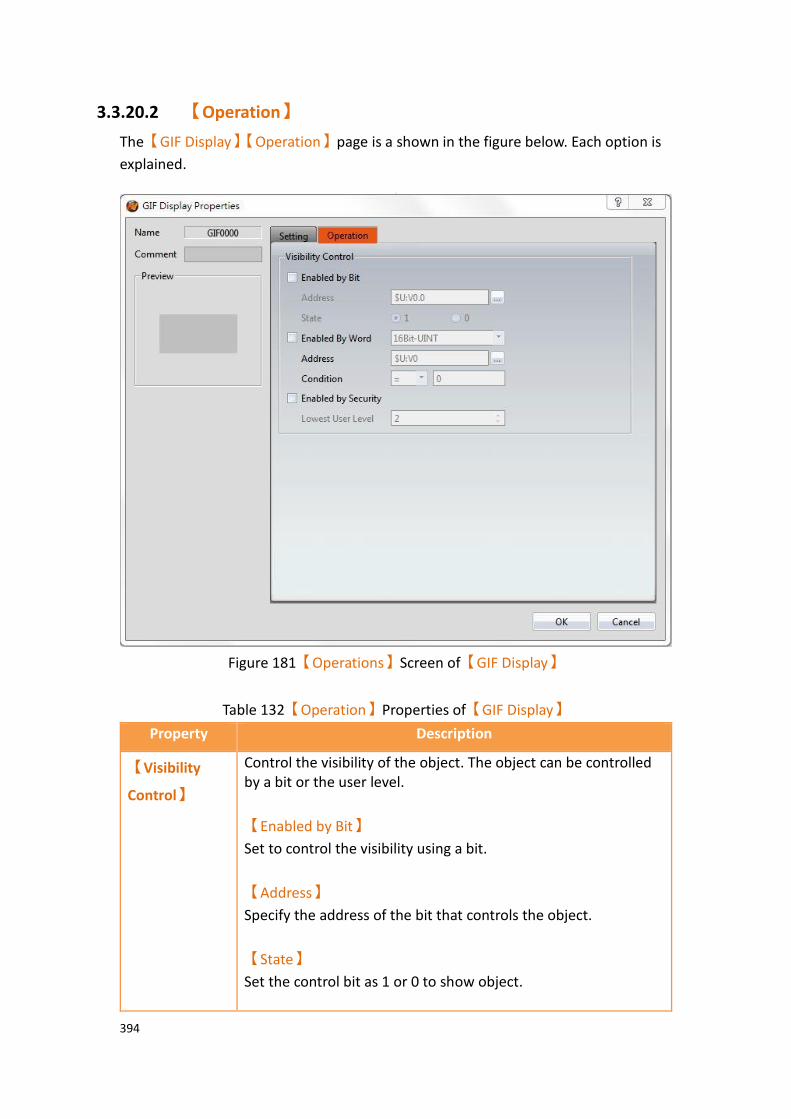
394
3.3.20.2 【Operation】
The【GIF Display】【Operation】page is a shown in the figure below. Each option is
explained.
Figure 181【Operations】Screen of【GIF Display】
Table 132【Operation】Properties of【GIF Display】
Property Description
【Visibility
Control】
Control the visibility of the object. The object can be controlled by a bit or the user level.
【Enabled by Bit】
Set to control the visibility using a bit.
【Address】
Specify the address of the bit that controls the object.
【State】
Set the control bit as 1 or 0 to show object.

395
【Enabled by Word】
Check whether the visibility is controlled by word.
【Address】
Set the visibility control word address.
【Condition】
Set the condition of word control and when it is true then show up the object, when false not show the object. The condition include’ =’,’ !=’, ‘>’, ‘<’, ‘>=’, ‘<=’.
【Enabled by Security】
Set to control the visibility using the user login level.
【Lowest User Level】
Select the minimum level of user logged in for the object to be visible.

396
3.3.21 【Historic Trend】 【Historic Trend】is a curve object used to read the data in the Recording Buffer of
the【Data Logger】, in which the X value is time and the Y value is the data captured
by the【Data Logger】. Its functions are as follows:
➢ View the data of the【Data Logger】.
➢ Pause or start updating the data of the【Data Logger】through the【Sub
Switch】, and clear the displayed data. It can also zoom or move the
figure.
3.3.21.1 【General】
【Historic Trend】【General】setting paging as shown below, the meaning of each
setting is as follows :
Figure 182【General】Setting Screen of【Historic Trend】
Table 133【General】Setting Properties of【Historic Trend】
Property Description
【Preview】 Preview the appearance of this object.
【Name】 The default name of the object.
【Comment】 Set the comment of the object.

397
【Basic】 【Data Log ID】
Select the ID of the Data Log to track.
【Source】
Select the【Historic Trend】source:【Data Log】or【File】.
【Data Log】
Use【Data Log】as the source of the data. Refer to Chapter 7
-Data Log.
【File】
Use an exported CSV or TXT file as the source of the data. When this option is selected, a register can be set. This register value corresponds to the position of the file in a path. For example, if the the register was R50, a 0 in R50 corresponds to the first file in the path, 1 corresponds to the second, and so on.
【Mode】
Select the【Historic Trend】display mode: 【Time Mode】
or【Index Mode】.
【Time Mode】
Set the X-axis of the【Historic Trend】as time.
【Index Mode】
Set the X-axis of the【Historic Trend】as a specified index.
【Two Y Axis Mode】
Check whether to display two Y-axes on the graph.
【Refresh data automatically】

398
When source choose as【file】will appear this option, check
this option, it will automatically refresh when new data comes.
【Global Display
Range】
Represents the range that can be displayed.
【Min】
Set the minimum Global Range value for the Y-axis.
【Max】
Set the maximum Global Range value for the Y-axis. Note: The【Global Display Range】represents the range that can be
displayed. If【Max】is 100 and【Min】is 0, data exceeding this range
will not be able to be displayed.
【Display Precision】
Set the number of decimal places represented for Y-axis values.
【X Axis (Index Points) Max】
If the【Index Mode】is set to【Index Mode】the maximum
X-axis index point can be selected.

399
3.3.21.2 【Curve】
【Historic Trend】【Curve】setting paging as shown below, the meaning of each
setting is as follows :
Figure 183【Curve】Setting Screen of【Historic Trend】
Table 134【Curve】Setting Properties of【Historic Trend】
Property Description
【Curve】 【No. of Curve】
Select the number of curves up to a maximum of 32.
【Visibility Mask】
Select whether to use visibility mask to control the visibility of the each curve. While selecting, use should assign the 32bit UINT register as the mask, in which the 0 bit control the display of the curve 0, and so on.
【Display Range】
Used to set the display mode for the display range of the curve. It is usually one of the two following types:
➢ 【Global】
The display ranges of all the curves are identical to
the【Global Display Range】.
400
➢ 【Individual】
The display range of all the curves can be different
from the【Global Display Range】.
Explanation: When to set【Display Range】as【Individual】- When
the value ranges of the number of curves are different, for example when the value range of curve a is 0~10, and curve b is 0~1000, it can be discovered that the degree of changes for curve a will be difficult to observe if the two curves are placed in the same figure. This is when
【Display Range】can be set as【Individual】and the display range of
each curve can be defined. The system will automatically zoom the
value of the curves according to the value in【Global Display Range】.
Take this case for example, if the value in【Global Display Range】is
0~100, when the value of curve a is 5, the system will zoom it to 50 and when the value of curve b is 500, the system will also zoom it into 50, and so on.
The curve property table is described below:
【Y Source】
Set the source for the Y value of the curve; the selection of
the source depends on the setting of the【Data Logger】.
【Display Name】
Set the name of the curve.
【Y Max】
Set the maximum Individual Display Range value for the Y
value of the curve, if【Display Range】is【Individual】.
【Y Min】
Set the minimum Individual Display Range value for the Y
value of the curve, if【Display Range】is【Individual】.
【Cursor Display】
Four options are available: None, Scale Data, Original Data,
and Both. For example, if the【Global Display Range】was
set to 0~100, the【Display Range】was set to individual,
【Y Max】is set to 200 and【Y Min】is set to 0, when Y is
60, the cursor is set such that the scaled value of 30 is
displayed. If the【Cursor Display】is set to orginal, the
original value of 60 is displayed.
401
【Y Axis】
If【Two Y Axes Mode】is selected, the setting is used to
decide the curve’s reference y-axis.
【Line Color】
Set the line color of the curve.
【Line Type】
Set the line type of curve.
【Line Width】
Set the curve width.
【Symbol】
Check whether to display curve’s symbol.
【Symbol Color】
Set the symbol color.
【Symbol Type】
Set the symbol type.
【Fill】
Check whether to fill up the curve.
【Fill Color】
Set the fill color.
3.3.21.3 【Display】

402
【Historic Trend】【Display】setting paging as shown below, the meaning of each
setting is as follows :
Figure 184【Display】Setting Screen of【Historic Trend】
Table 135【Display】Setting Properties of【Historic Trend】
Property Description
【Border】 Select to display the border.
【Color】
Set the color of the border.
【Type】
Set the border type.
【Background】 Select to display the background.
【Color】
Set the color of the background.
【Graph
Background】
Select to display the graph background.
【Color】
Set the color of the graph background.
【Cursor】 Select to display the cursor.
【Color】
Set the color of the cursor.
【Show Curve Value】

403
Select to display the cursor value.
【Show Curve Value】【Display】
Set the visibility of cursor values. If【Always】is set, the
cursor values are always shown. If【Controlled by Bit】is
selected, the visibility of cursor values depends on a specified bit.
【Show Name】
Select to display the cursor name.
【Show Name】【Display】
Set the visibility of the cursor name. If【Always】is set,
the cursor name is always shown. If【Controlled by Bit】
is selected, the visibility of the cursor name depends on the specified bit.
【Font】
Set the font and size of cursor values.
【Background】
Set the background color of the cursor values.
【Text】
Set the text color of the cursor values.
【Opacity】
Set the background opacity of the cursor values.

404
3.3.21.4 【Axis】
【Historic Trend】【Axis】setting paging as shown below, the meaning of each
setting is as follows :
Figure 185【Axis】Setting Screen of【Historic Trend】
Table 136【Axis】Setting Properties of【Historic Trend】
Property Description
【Common】 【Axis Color】
Set the color of the axis.
【Time Range】 Set the time range of the X-axis
【Day】
Set the number of days.
【Hour】
Set the number of hours.
【Min.】
Set the number of minutes.
【Sec.】
Set the number of seconds.
【X-axis (Time)】 【Number of Major Division】
Sets the number of major divisions on the X-axis.

405
【Number of Sub Division】
Sets the number of sub divisions on the X-axis.
【Show Tick】
Select to display the ticks.
【Show Date】
Select to display the date on the X-axis, and sets the display format of the date.
【Show Time】
Select to display the time on the X-axis, and sets the display format of the time.
【Value/Tick Color】
Set the colors of the time and ticks.
【Show Grid】
Select to display vertical gridlines, and sets the color of the gridlines.
【Y-axis】
【Division】
【Number of Major Division】
Set the number of major divisions on the Y-axis.
【Number of Sub Division】
Set the number of sub divisions on the Y-axis.
【Show Tick】
Select to display the ticks on the Y-axis.
【Show Value】
Select to display the values on the Y-axis.
【Value/Tick Color】
Set the colors of the values and ticks.
【Show Grid】
Select whether to display horizontal gridlines, and sets the color of the gridlines.
【Y-axis】
【Position】
【Position】
Set the Y-axis position:【Left】or【Right】
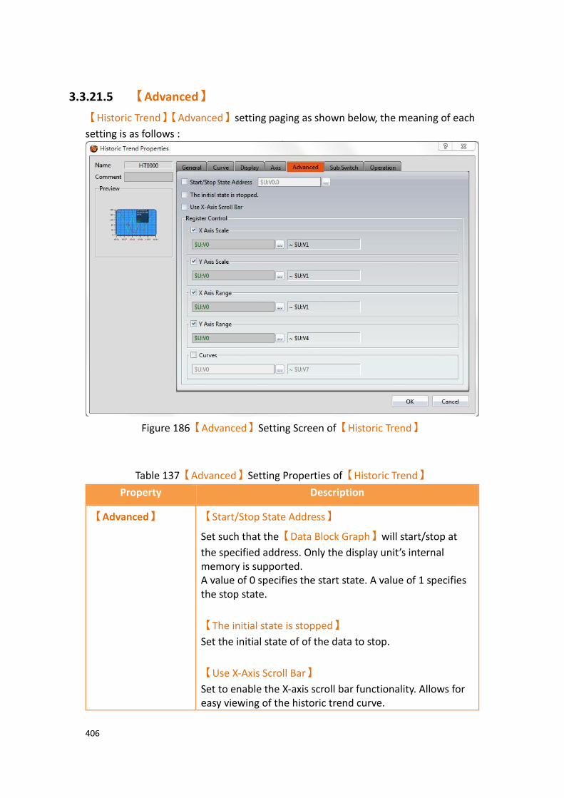
406
3.3.21.5 【Advanced】
【Historic Trend】【Advanced】setting paging as shown below, the meaning of each
setting is as follows :
Figure 186【Advanced】Setting Screen of【Historic Trend】
Table 137【Advanced】Setting Properties of【Historic Trend】
Property Description
【Advanced】 【Start/Stop State Address】
Set such that the【Data Block Graph】will start/stop at
the specified address. Only the display unit’s internal memory is supported. A value of 0 specifies the start state. A value of 1 specifies the stop state.
【The initial state is stopped】
Set the initial state of of the data to stop.
【Use X-Axis Scroll Bar】
Set to enable the X-axis scroll bar functionality. Allows for easy viewing of the historic trend curve.

407
【Register Control】 【X Axis Scale】
X axis scale numbers can be specified by register, it will appear register setting below after checked, and will display the number of consecutive occupancy registers, this register is in 16 Bit-UINT format, table as below.
Word Description Data Type Min. Max.
0 Number of Major Division
16Bit-UINT 1 30
1 Number of Sub Division
16Bit-UINT 1 30
【Y Axis Scale】
Y axis scale numbers can be specified by register, it will appear register setting below after checked, and will display the number of consecutive occupancy registers, this register is in 16 Bit-UINT format, table as below.
Word Description Data Type Min. Max.
0 Number of Major Division
16Bit-UINT 1 30
1 Number of Sub Division
16Bit-UINT 1 30
【X Axis Range】
X axis range can be specified by register, it will appear register setting below after checked, and will display the number of consecutive occupancy registers, table as below.
Word Description Data Type Min. Max.
0 & 1 Maximum of x axis.
32Bit-FLOAT
x x
2 & 3 Minimum of x axis.
32Bit-FLOAT
x x
4 The decimal point position of the X axis value
16Bit-UINT 0 5
Note: maximum value should bigger than minimum value.
【Y Axis Range】
Y axis range can be specified by register, it will appear register setting below after checked, and will display the number of consecutive occupancy registers, table as below.

408
Word Description Data Type Min. Max.
0 & 1 The maximum of the Y-axis on the left side of the graph
32Bit-FLOAT
x x
2 & 3 The minimum of the Y-axis on the left side of the graph
32Bit-FLOAT
x x
4 Curve left side of the Y-axis value of the decimal point position
16Bit-UINT 0 5
5 & 6 The maximum of the Y-axis on the right side of the graph
32Bit-FLOAT
x x
7 & 8 The minimum of the Y-axis on the right side of the graph
32Bit-FLOAT
x x
9 Curve right side of the Y-axis value of the decimal point position
16Bit-UINT 0 5
Note: maximum value should bigger than minimum value.
【Curves】
If curve Y-axis display range use【individual】, check this
option, each of the Y-axis curve can be specified by register, and will display the number of consecutive occupancy registers, table as below.
Word Description Data Type Min. Max.
0 & 1 X-axis maximum value of curve 0.
32Bit-FLOAT
x x
2 & 3 X-axis 32Bit- x x
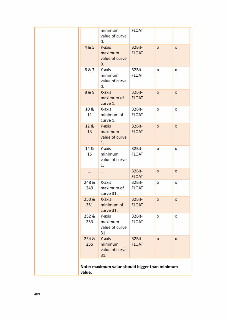
409
minimum value of curve 0.
FLOAT
4 & 5 Y-axis maximum value of curve 0.
32Bit-FLOAT
x x
6 & 7 Y-axis minimum value of curve 0.
32Bit-FLOAT
x x
8 & 9 X-axis maximum of curve 1.
32Bit-FLOAT
x x
10 & 11
X-axis minimum of curve 1.
32Bit-FLOAT
x x
12 & 13
Y-axis maximum value of curve 1.
32Bit-FLOAT
x x
14 & 15
Y-axis minimum value of curve 1.
32Bit-FLOAT
x x
… … 32Bit-FLOAT
x x
248 & 249
X-axis maximum of curve 31.
32Bit-FLOAT
x x
250 & 251
X-axis minimum of curve 31.
32Bit-FLOAT
x x
252 & 253
Y-axis maximum value of curve 31.
32Bit-FLOAT
x x
254 & 255
Y-axis minimum value of curve 31.
32Bit-FLOAT
x x
Note: maximum value should bigger than minimum value.
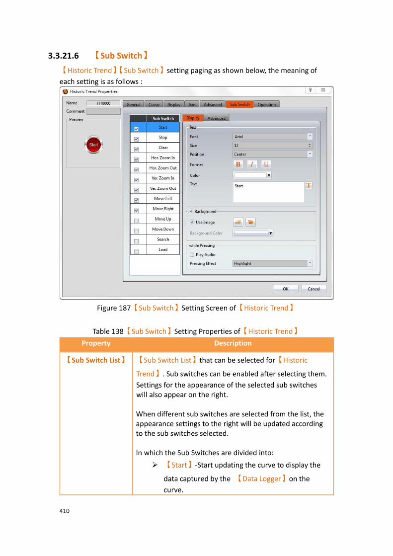
410
3.3.21.6 【Sub Switch】
【Historic Trend】【Sub Switch】setting paging as shown below, the meaning of
each setting is as follows :
Figure 187【Sub Switch】Setting Screen of【Historic Trend】
Table 138【Sub Switch】Setting Properties of【Historic Trend】
Property Description
【Sub Switch List】 【Sub Switch List】that can be selected for【Historic
Trend】. Sub switches can be enabled after selecting them.
Settings for the appearance of the selected sub switches will also appear on the right. When different sub switches are selected from the list, the appearance settings to the right will be updated according to the sub switches selected. In which the Sub Switches are divided into:
➢ 【Start】-Start updating the curve to display the
data captured by the 【Data Logger】on the
curve.
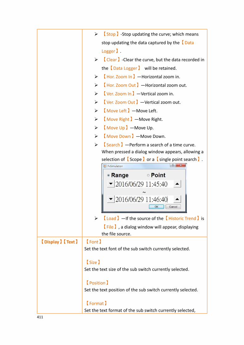
411
➢ 【Stop】-Stop updating the curve; which means
stop updating the data captured by the【Data
Logger】.
➢ 【Clear】-Clear the curve, but the data recorded in
the【Data Logger】 will be retained.
➢ 【Hor. Zoom In】—Horizontal zoom in.
➢ 【Hor. Zoom Out】—Horizontal zoom out.
➢ 【Ver. Zoom In】—Vertical zoom in.
➢ 【Ver. Zoom Out】—Vertical zoom out.
➢ 【Move Left】—Move Left.
➢ 【Move Right】—Move Right.
➢ 【Move Up】—Move Up.
➢ 【Move Down】—Move Down.
➢ 【Search】—Perform a search of a time curve.
When pressed a dialog window appears, allowing a
selection of【Scope】or a【single point search】.
➢ 【Load】—If the source of the【Historic Trend】is
【File】, a dialog window will appear, displaying
the file source.
【Display】【Text】 【Font】
Set the text font of the sub switch currently selected.
【Size】
Set the text size of the sub switch currently selected.
【Position】
Set the text position of the sub switch currently selected.
【Format】
Set the text format of the sub switch currently selected,
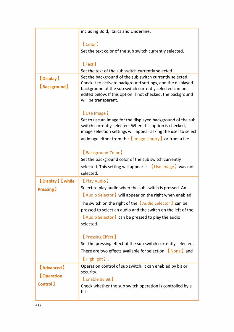
412
including Bold, Italics and Underline.
【Color】
Set the text color of the sub switch currently selected.
【Text】
Set the text of the sub switch currently selected.
【Display】
【Background】
Set the background of the sub switch currently selected. Check it to activate background settings, and the displayed background of the sub switch currently selected can be edited below. If this option is not checked, the background will be transparent.
【Use Image】
Set to use an image for the displayed background of the sub switch currently selected. When this option is checked, image selection settings will appear asking the user to select
an image either from the【Image Library】or from a file.
【Background Color】
Set the background color of the sub switch currently
selected. This setting will appear if 【Use Image】was not
selected.
【Display】【while
Pressing】
【Play Audio】
Select to play audio when the sub switch is pressed. An
【Audio Selector】will appear on the right when enabled.
The switch on the right of the【Audio Selector】can be
pressed to select an audio and the switch on the left of the
【Audio Selector】can be pressed to play the audio
selected.
【Pressing Effect】
Set the pressing effect of the sub switch currently selected.
There are two effects available for selection:【None】and
【Highlight】.
【Advanced】
【Operation
Control】
Operation control of sub switch, it can enabled by bit or security.
【Enable by Bit】
Check whether the sub switch operation is controlled by a bit
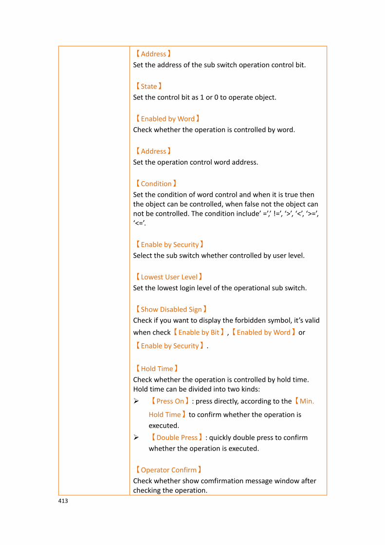
413
【Address】
Set the address of the sub switch operation control bit.
【State】
Set the control bit as 1 or 0 to operate object.
【Enabled by Word】
Check whether the operation is controlled by word.
【Address】
Set the operation control word address.
【Condition】
Set the condition of word control and when it is true then the object can be controlled, when false not the object can not be controlled. The condition include’ =’,’ !=’, ‘>’, ‘<’, ‘>=’, ‘<=’.
【Enable by Security】
Select the sub switch whether controlled by user level.
【Lowest User Level】
Set the lowest login level of the operational sub switch.
【Show Disabled Sign】
Check if you want to display the forbidden symbol, it’s valid
when check【Enable by Bit】,【Enabled by Word】or
【Enable by Security】.
【Hold Time】
Check whether the operation is controlled by hold time. Hold time can be divided into two kinds:
➢ 【Press On】: press directly, according to the【Min.
Hold Time】to confirm whether the operation is
executed.
➢ 【Double Press】: quickly double press to confirm
whether the operation is executed.
【Operator Confirm】
Check whether show comfirmation message window after checking the operation.

414
【Max. Waiting Time】
When the confirmation message window is displayed, If the user does not reply within this time, the system will close the confirmation message window and cancel this operation
3.3.21.7 【Operation】
【Historic Trend】【Operation】setting paging as shown below, the meaning of each
setting is as follows :
Figure 188【Operation】Setting Screen of【Historic Trend】
Table 139【Operation】Setting Properties of【Historic Trend】
Property Description
【Visibility
Control】
Visibility control of the object can be controlled by a specific Bit or User Level.
【Enable by Bit】
Select to control visibility by a specific Bit.

415
【Address】
Set the address of the visibility control Bit.
【State】
Set the control bit as 1 or 0 to show object.
【Enabled by Word】
Check whether the visibility is controlled by word.
【Address】
Set the visibility control word address.
【Condition】
Set the condition of word control and when it is true then show up the object, when false not show the object. The condition include’ =’,’ !=’, ‘>’, ‘<’, ‘>=’, ‘<=’.
【Enabled by Security Manager】
Select if visibility is to be controlled by the level of the user logged in.
【Lowest User Level】
Set the minimum level of the user logged in needed to display the object.
【Operation
Log】
Select to enable the【Operation Log】of the object.
It can also edit operation messages in which the message can
be inputted directly or acquired from the【Text Library】.

416
3.3.22 【Historic XY Scatter】
【Historic XY Scatter】 is a curve object used to read the【Recording Buffer】data
of the【Data Log】, in which the X/Y values are both data captured by the【Data
Log】. Its main functions are as follows:
➢ View the Recording Buffer data of the【Data Log】.
➢ Pause or start updating the data of the 【Data Log】through the【Sub
Switch】and clear the displayed data.
3.3.22.1 【General】
【Historic XY Scatter】【General】setting paging as shown below, the meaning of
each setting is as follows :
Figure 189【General】Setting Screen of【Historic XY Scatter】
Table 140【General】Setting Properties of【Historic XY Scatter】
Property Description
【Preview】 Preview the appearance of this object.
【Name】 The default name of the object.
【Comment】 Set the comment of the object.
【Basic】 【Data Log ID】

417
Set the ID of the Data Log group to display.
【Global Display
Range】
Set the range that can be displayed.
【Max】
Set the maximum Global Range value for the X-axis/Y-axis.
【Min】
Set the minimum Global Range value for the X-axis/Y-axis.
Note: The【Global Display Range】represents the range that can be
displayed. If【Max】is 100 and【Min】is 0, data exceeding this range
will not be able to be displayed.
【Display Precision】
Set the number of decimal places represented for X/Y-axis values.
3.3.22.2 【Curve】
【Historic XY Scatter】【Curve】setting paging as shown below, the meaning of each
setting is as follows :
Figure 190【Curve】Setting Screen of【Historic XY Scatter】

418
Table 141【Curve】 Setting Properties of【Historic XY Scatter】
Property Description
【Curve】 【No. of Curve】
Select the number of curves up to a maximum of 32.
【Visibility Mask】
Select whether to use visibility mask to control the visibility of the each curve. While selecting, use should assign the 32bit UINT register as the mask, in which the 0 bit control the display of the curve 0, and so on.
【Display Range】
Used to set the display mode for the display range of the curve. It is usually one of the two following types:
➢ 【Global】
The display ranges of all the curves are identical to
the【Global Display Range】.
➢ 【Individual】
The display range of all the curves can be different
from the【Global Display Range】.
Explanation: When to set【Display Range】as【Individual】-
Whenthe value ranges of the number of curves are different, for example when the value range of curve a is 0~10, and curve b is 0~1000, it can be discovered that the degree of changes for curve a will be difficult to observe if the two curves are placed in the same
figure. This is when【Display Range】can be set as【Individual】and
the display range of each curve can be defined. The system will automatically zoom the value of the curves according to the value in
【Global Display Range】. Take this case for example, if the value in
【Global Display Range】is 0~100, when the value of curve a is 5, the
system will zoom it to 50 and when the value of curve b is 500, the system will also zoom it into 50, and so on.
【X/Y Source】
Set the source for the X/Y valuesX/ of the curve; the selection of the source depends on the setting of the
【Data Logger】.
【Display Name】
Set the name of the curve.

419
【X/Y Max】
Set the maximum Individual Display Range value for the X/Y
value of the curve, if【Display Range】is【Individual】.
【X/Y Min】
Set the minimum Individual Display Range value for the Y
value of the curve, if【Display Range】is【Individual】.
【Line】
Set to show the curve.
【Line Color】
Set the line color of the curve.
【Line Type】
Set the line type of curve.
【Line Width】
Set the curve width.
【Symbol】
Select to display the curve symbols.
【Symbol Color】
Set the color of the symbols.
【Symbol Type】
Set the symbol type.
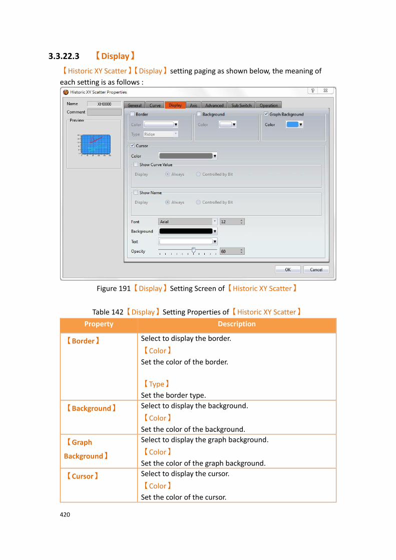
420
3.3.22.3 【Display】
【Historic XY Scatter】【Display】setting paging as shown below, the meaning of
each setting is as follows :
Figure 191【Display】Setting Screen of【Historic XY Scatter】
Table 142【Display】Setting Properties of【Historic XY Scatter】
Property Description
【Border】 Select to display the border.
【Color】
Set the color of the border.
【Type】
Set the border type.
【Background】 Select to display the background.
【Color】
Set the color of the background.
【Graph
Background】
Select to display the graph background.
【Color】
Set the color of the graph background.
【Cursor】 Select to display the cursor.
【Color】
Set the color of the cursor.
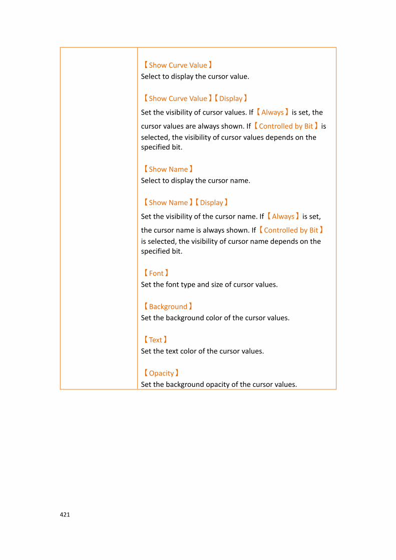
421
【Show Curve Value】
Select to display the cursor value.
【Show Curve Value】【Display】
Set the visibility of cursor values. If【Always】is set, the
cursor values are always shown. If【Controlled by Bit】is
selected, the visibility of cursor values depends on the specified bit.
【Show Name】
Select to display the cursor name.
【Show Name】【Display】
Set the visibility of the cursor name. If【Always】is set,
the cursor name is always shown. If【Controlled by Bit】
is selected, the visibility of cursor name depends on the specified bit.
【Font】
Set the font type and size of cursor values.
【Background】
Set the background color of the cursor values.
【Text】
Set the text color of the cursor values.
【Opacity】
Set the background opacity of the cursor values.

422
3.3.22.4 【Axis】
【Historic XY Scatter】【Axis】setting paging as shown below, the meaning of each
setting is as follows :
Figure 192【Axis】Setting Screen of【Historic XY Scatter】
Table 143【Axis】Setting Properties of【Historic XY Scatter】
Property Description
【Common】 【Axis Color】
Set the color of the axis.
【X-axis】
【Division】
【Number of Major Division】
Set the number of major divisions of the X-axis.
【Number of Sub Division】
Set the number of sub divisions of the X-axis.
【Show Tick】
Select to display the ticks on the X-axis.
【Show Value】
Select to display the values on the X-axis.
【Value/Tick Color】

423
Set the color of the values and ticks.
【Show Grid】
Select to display vertical gridlines and set the color of the gridlines.
【Y-axis】
【Division】
【Number of Major Division】
Set the number of major divisions of the Y-axis.
【Number of Sub Division】
Set the number of sub divisions of the Y-axis.
【Show Tick】
Select to display the ticks on the Y-axis.
【Show Value】
Select to display the values on the Y-axis.
【Value/Tick Color】
Set the color of the values and ticks.
【Show Grid】
Select to display horizontal gridlines, and set the color of the gridlines.

424
3.3.22.5 【Advanced】
【Historic XY Scatter】【Advanced】setting paging as shown below, the meaning of
each setting is as follows :
Figure 193【Advanced】Setting Screen of【Historic XY Scatter】
Table 144【Advanced】Setting Properties of【Historic XY Scatter】
Property Description
【Advanced】 【Start/Stop State Address】
Set such that the【Data Block Graph】will start/stop at
the specified address. Only the display unit’s internal memory is supported. A value of 0 specifies the start state. A value of 1 specifies the stop state.
【The initial state is stopped】
Set the initial state of of the data to stop.
【Register Control】 【X Axis Scale】
X axis scale numbers can be specified by register, it will appear register setting below after checked, and will display the number of consecutive occupancy registers, this register is in 16 Bit-UINT format, table as below.
Word Description Data Type Min. Max.
0 Number of 16Bit-UINT 1 30

425
Major Division
1 Number of Sub Division
16Bit-UINT 1 30
【Y Axis Scale】
Y axis scale numbers can be specified by register, it will appear register setting below after checked, and will display the number of consecutive occupancy registers, this register is in 16 Bit-UINT format, table as below.
Word Description Data Type Min. Max.
0 Number of Major Division
16Bit-UINT 1 30
1 Number of Sub Division
16Bit-UINT 1 30
【X Axis Range】
X axis range can be specified by register, it will appear register setting below after checked, and will display the number of consecutive occupancy registers, table as below.
Word Description Data Type Min. Max.
0 & 1 Maximum of x axis.
32Bit-FLOAT
x x
2 & 3 Minimum of x axis.
32Bit-FLOAT
x x
4 The decimal point position of the X axis value
16Bit-UINT 0 5
Note: maximum value should bigger than minimum value.
【Y Axis Range】
Y axis range can be specified by register, it will appear register setting below after checked, and will display the number of consecutive occupancy registers, table as below.
Word Description Data Type Min. Max.
0 & 1 The maximum of the Y-axis on the left side of the graph
32Bit-FLOAT
x x
2 & 3 The minimum 32Bit- x x

426
of the Y-axis on the left side of the graph
FLOAT
4 Curve left side of the Y-axis value of the decimal point position
16Bit-UINT 0 5
5 & 6 The maximum of the Y-axis on the right side of the graph
32Bit-FLOAT
x x
7 & 8 The minimum of the Y-axis on the right side of the graph
32Bit-FLOAT
x x
9 Curve right side of the Y-axis value of the decimal point position
16Bit-UINT 0 5
Note: maximum value should bigger than minimum value.
【Curves】
If curve Y-axis display range use【individual】, check this
option, each of the Y-axis curve can be specified by register, and will display the number of consecutive occupancy registers, table as below.
Word Description Data Type Min. Max.
0 & 1 X-axis maximum value of curve 0.
32Bit-FLOAT
x x
2 & 3 X-axis minimum value of curve 0.
32Bit-FLOAT
x x
4 & 5 Y-axis maximum value of curve 0.
32Bit-FLOAT
x x

427
6 & 7 Y-axis minimum value of curve 0.
32Bit-FLOAT
x x
8 & 9 X-axis maximum of curve 1.
32Bit-FLOAT
x x
10 & 11
X-axis minimum of curve 1.
32Bit-FLOAT
x x
12 & 13
Y-axis maximum value of curve 1.
32Bit-FLOAT
x x
14 & 15
Y-axis minimum value of curve 1.
32Bit-FLOAT
x x
… … 32Bit-FLOAT
x x
248 & 249
X-axis maximum of curve 31.
32Bit-FLOAT
x x
250 & 251
X-axis minimum of curve 31.
32Bit-FLOAT
x x
252 & 253
Y-axis maximum value of curve 31.
32Bit-FLOAT
x x
254 & 255
Y-axis minimum value of curve 31.
32Bit-FLOAT
x x
Note: maximum value should bigger than minimum value.
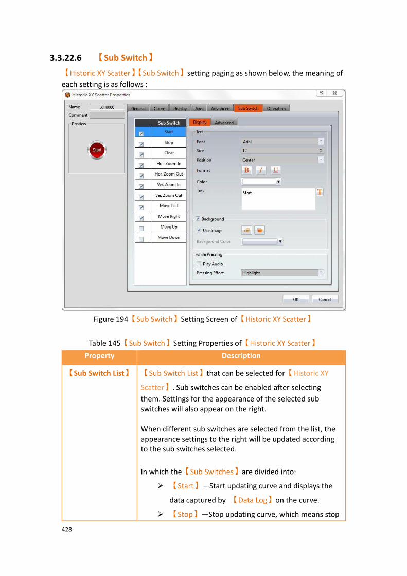
428
3.3.22.6 【Sub Switch】
【Historic XY Scatter】【Sub Switch】setting paging as shown below, the meaning of
each setting is as follows :
Figure 194【Sub Switch】Setting Screen of【Historic XY Scatter】
Table 145【Sub Switch】Setting Properties of【Historic XY Scatter】
Property Description
【Sub Switch List】 【Sub Switch List】that can be selected for【Historic XY
Scatter】. Sub switches can be enabled after selecting
them. Settings for the appearance of the selected sub switches will also appear on the right. When different sub switches are selected from the list, the appearance settings to the right will be updated according to the sub switches selected.
In which the【Sub Switches】are divided into:
➢ 【Start】—Start updating curve and displays the
data captured by 【Data Log】on the curve.
➢ 【Stop】—Stop updating curve, which means stop

429
updating the data captured by【Data Log】.
➢ 【Clear】—Clear the curve, but the data recorded
in 【Data Log】will be preserved.
➢ 【Hor. Zoom In】—Horizontal zoom in.
➢ 【Hor. Zoom Out】—Horizontal zoom out.
➢ 【Ver. Zoom In】—Vertical zoom in.
➢ 【Ver. Zoom Out】—Vertical zoom out.
➢ 【Move Left】—Move Left.
➢ 【Move Right】—Move Right.
➢ 【Move Up】—Move Up.
➢ 【Move Down】—Move Down.
【Display】【Text】 【Font】
Set the text font of the sub switch currently selected.
【Size】
Set the text size of the sub switch currently selected.
【Position】
Set the text position of the sub switch currently selected.
【Format】
Set the text format of the sub switch currently selected, including Bold, Italics and Underline.
【Color】
Set the text color of the sub switch currently selected.
【Text】
Set the text of the sub switch currently selected.
【Display】
【Background】
Set the background of the sub switch currently selected. Check it to activate background settings, and the displayed background of the sub switch currently selected can be edited below. If this option is not checked, the background will be transparent.
【Use Image】
Set to use an image for the displayed background of the sub switch currently selected. When this option is checked, an image selection setting item will appear asking the user to

430
select an image either from the【Image Library】or from a
file.
【Background Color】
Set the displayed background color of the sub switch
currently selected. This setting item will appear if 【Use
Image】was not selected.
【Display】【while
Pressing】
【Play Audio】
Select to play audio when the sub switch is pressed. An
【Audio Selector】will appear on the right when enabled.
The switch on the right of the【Audio Selector】can be
pressed to select an audio and the switch on the left of the
【Audio Selector】can be pressed to play the audio
selected.
【Pressing Effect】
Set the pressing effect of the sub switch currently selected.
There are two effects available for selection:【None】and
【Highlight】.
【Advanced】
【Operation
Control】
Operation control of sub switch, it can enabled by bit or security.
【Enable by Bit】
Check whether the sub switch operation is controlled by a bit
【Address】
Set the address of the sub switch operation control bit.
【State】
Set the control bit as 1 or 0 to operate object.
【Enabled by Word】
Check whether the operation is controlled by word.
【Address】
Set the operation control word address.
【Condition】
Set the condition of word control and when it is true then the object can be controlled, when false not the object can

431
not be controlled. The condition include’ =’,’ !=’, ‘>’, ‘<’, ‘>=’, ‘<=’.
【Enable by Security】
Select the sub switch whether controlled by user level.
【Lowest User Level】
Set the lowest login level of the operational sub switch.
【Show Disabled Sign】
Check if you want to display the forbidden symbol, it’s valid
when check【Enable by Bit】,【Enabled by Word】or
【Enable by Security】.
【Hold Time】
Check whether the operation is controlled by hold time. Hold time can be divided into two kinds:
➢ 【Press On】: press directly, according to the【Min.
Hold Time】to confirm whether the operation is
executed.
➢ 【Double Press】: quickly double press to confirm
whether the operation is executed.
【Operator Confirm】
Check whether show comfirmation message window after checking the operation.
【Max. Waiting Time】
When the confirmation message window is displayed, If the user does not reply within this time, the system will close the confirmation message window and cancel this operation

432
3.3.22.7 【Operation】
【Historic XY Scatter】【Operation】setting paging as shown below, the meaning of
each setting is as follows :
Figure 195【Operation】Setting Screen of【Historic XY Scatter】
Table 146【Operation】Setting Properties of【Historic XY Scatter】
Property Description
【Visibility
Control】
Visibility control of the object can be controlled by a specific Bit or User Level.
【Enable by Bit】
Select to control visibility by a specific Bit.
【Address】
Set the address of the visibility control Bit.
【State】
Set the control bit as 1 or 0 to show object.
【Enabled by Word】
Check whether the visibility is controlled by word.
433
【Address】
Set the visibility control word address.
【Condition】
Set the condition of word control and when it is true then show up the object, when false not show the object. The condition include’ =’,’ !=’, ‘>’, ‘<’, ‘>=’, ‘<=’.
【Enabled by Security】
Select if visibility is to be controlled by the level of the user logged in.
【Lowest User Level】
Set the minimum level of the user logged in needed to display the object.
【Operation
Log】
Select to enable the 【Operation Log】 of the object.
It can also edit operation messages in which the message can
be inputted directly or acquired from the【Text Library】.
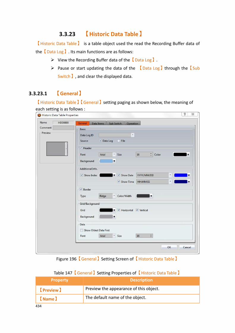
434
3.3.23 【Historic Data Table】
【Historic Data Table】 is a table object used the read the Recording Buffer data of
the【Data Log】. Its main functions are as follows:
➢ View the Recording Buffer data of the【Data Log】.
➢ Pause or start updating the data of the 【Data Log】through the【Sub
Switch】, and clear the displayed data.
3.3.23.1 【General】
【Historic Data Table】【General】setting paging as shown below, the meaning of
each setting is as follows :
Figure 196【General】Setting Screen of【Historic Data Table】
Table 147【General】Setting Properties of【Historic Data Table】
Property Description
【Preview】 Preview the appearance of this object.
【Name】 The default name of the object.
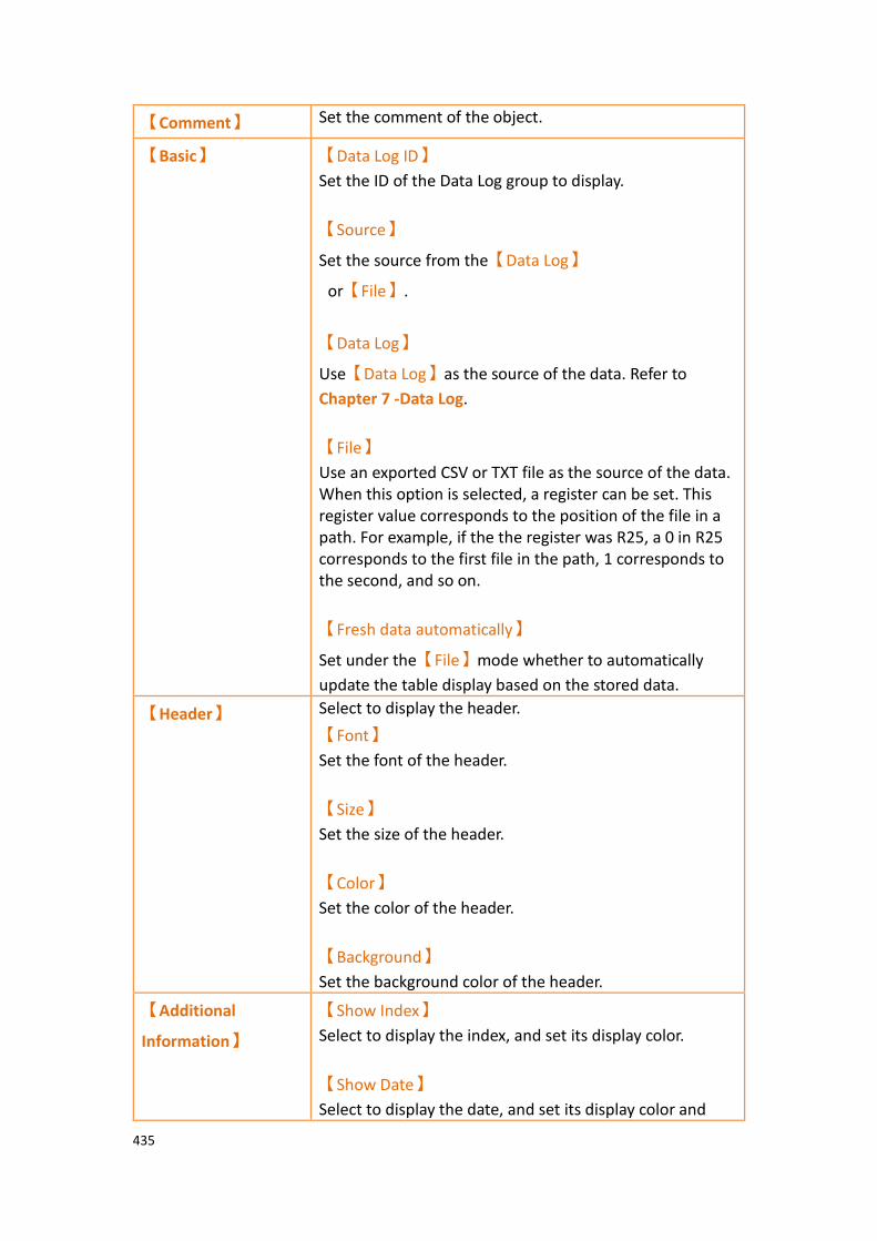
435
【Comment】 Set the comment of the object.
【Basic】 【Data Log ID】
Set the ID of the Data Log group to display.
【Source】
Set the source from the【Data Log】
or【File】.
【Data Log】
Use【Data Log】as the source of the data. Refer to
Chapter 7 -Data Log.
【File】
Use an exported CSV or TXT file as the source of the data. When this option is selected, a register can be set. This register value corresponds to the position of the file in a path. For example, if the the register was R25, a 0 in R25 corresponds to the first file in the path, 1 corresponds to the second, and so on.
【Fresh data automatically】
Set under the【File】mode whether to automatically
update the table display based on the stored data.
【Header】 Select to display the header.
【Font】
Set the font of the header.
【Size】
Set the size of the header.
【Color】
Set the color of the header.
【Background】
Set the background color of the header.
【Additional
Information】
【Show Index】
Select to display the index, and set its display color.
【Show Date】
Select to display the date, and set its display color and
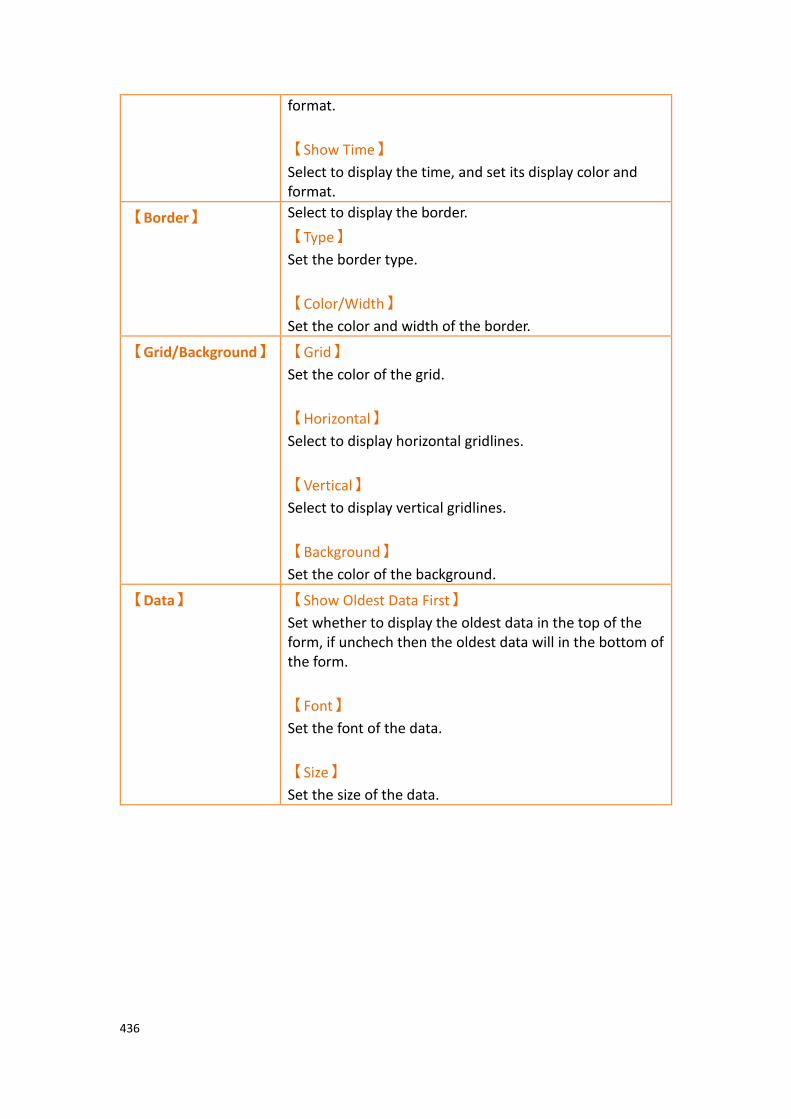
436
format.
【Show Time】
Select to display the time, and set its display color and format.
【Border】 Select to display the border.
【Type】
Set the border type.
【Color/Width】
Set the color and width of the border.
【Grid/Background】 【Grid】
Set the color of the grid.
【Horizontal】
Select to display horizontal gridlines.
【Vertical】
Select to display vertical gridlines.
【Background】
Set the color of the background.
【Data】 【Show Oldest Data First】
Set whether to display the oldest data in the top of the form, if unchech then the oldest data will in the bottom of the form.
【Font】
Set the font of the data.
【Size】
Set the size of the data.
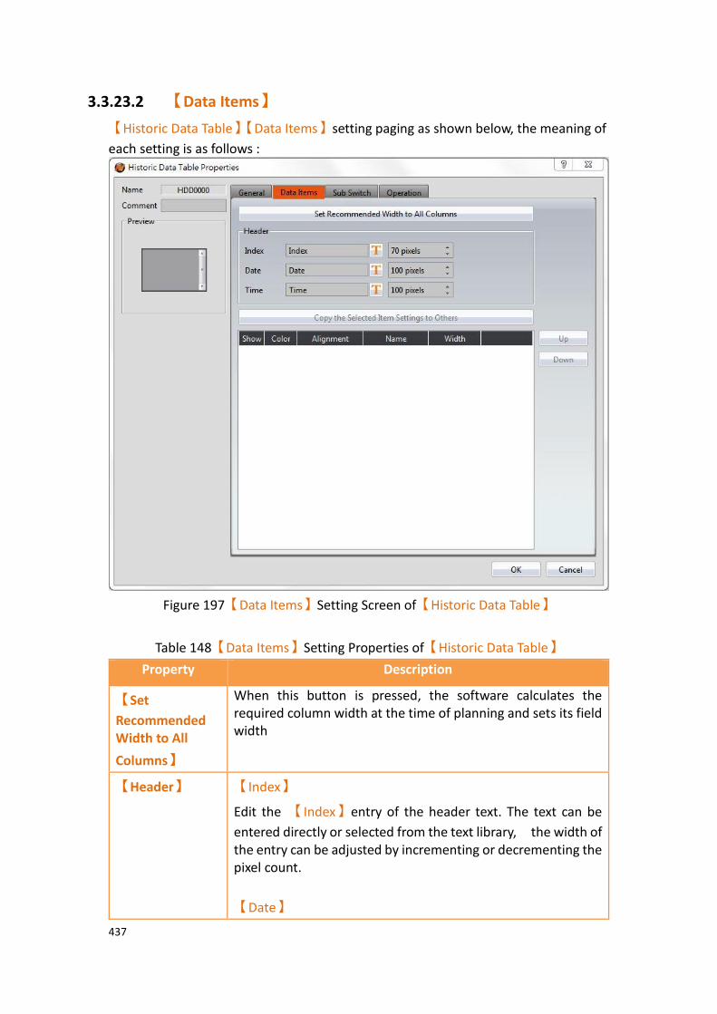
437
3.3.23.2 【Data Items】
【Historic Data Table】【Data Items】setting paging as shown below, the meaning of
each setting is as follows :
Figure 197【Data Items】Setting Screen of【Historic Data Table】
Table 148【Data Items】Setting Properties of【Historic Data Table】
Property Description
【Set
Recommended Width to All
Columns】
When this button is pressed, the software calculates the required column width at the time of planning and sets its field width
【Header】 【Index】
Edit the 【Index】entry of the header text. The text can be
entered directly or selected from the text library, the width of the entry can be adjusted by incrementing or decrementing the pixel count.
【Date】

438
Edit the 【Date】entry of the header text. The text can be
entered directly or selected from the text library, the width of the entry can be adjusted by incrementing or decrementing the pixel count.
【Time】
Edit the 【Time】entry of the header text. The text can be
entered directly or selected from the text library, the width of the entry can be adjusted by incrementing or decrementing the pixel count.
【Data Items】 【Copy the Selected Item Settings to Others】
This button will be enabled when an entire row is selected. Users can use this button to copy the settings of the selected item into other items. This simplifies the setting process for the user.
【Up】
This button will be enabled when an entire row is selected; users can use this button to change the order of the item.
【Down】
This button will be enabled when an entire row is selected; users can use this button to change the order of the item.
The items within the table are determined by the【Data
Log】, in which the item settings include:
➢ 【Display】
Set the visibility of this item.
➢ 【Customized】
The color of the item.
➢ 【Alignment】
The alignment of the item.
➢ 【Name】
This is used to view the names set by the【Data Log】
and cannot be set. Please go to the settings page of the
【Data Log】to change the name of the item.
【Width】
Column width setting.

439
3.3.23.3 【Sub Switch】
【Historic Data Table】【Sub Switch】setting paging as shown below, the meaning of
each setting is as follows :
Figure 198【Sub Switch】Setting Screen of【Historic Data Table】
Table 149【Sub Switch】Setting Properties of【Historic Data Table】
Property Description
【Sub Switch List】 【Sub Switch List】that can be selected for【Historic Data
Table】. Sub switches can be enabled after selecting them.
Settings for the appearance of the selected sub switches will also appear on the right. When different sub switches are selected from the list, the appearance settings to the right will be updated according to the sub switches selected.
In which the【Sub Switches】are divided into:
➢ 【Auto Scroll】- Auto Scroll ON/OFF; this is an

440
inverted switch. When new data is updated to the
【Historic Data Table】, if the Auto Scroll switch is
ON, the table will automatically scroll to the location of the newest data, otherwise the table will not scroll automatically.
➢ 【Save】- Save all data in 【Data Log】. The
saving method depends on the settings of 【Data
Log】.
➢ 【Load】- When【Source】is【File】, pressing
this button will display the following dialog window. To allow the operator to choose which
files in the【Historic Data Table】 to display.
These files can be from within the HMI, Micro SD card, or USB.
If import file format is not the same, the following dialog window will appear.
If file import is successful, the following dialog window will appear.
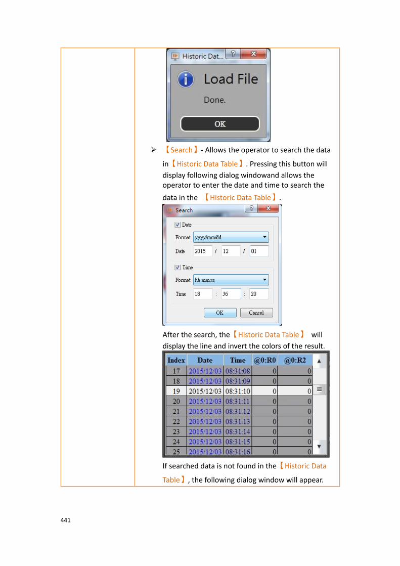
441
➢ 【Search】- Allows the operator to search the data
in【Historic Data Table】. Pressing this button will
display following dialog windowand allows the operator to enter the date and time to search the
data in the 【Historic Data Table】.
After the search, the【Historic Data Table】 will
display the line and invert the colors of the result.
If searched data is not found in the【Historic Data
Table】, the following dialog window will appear.
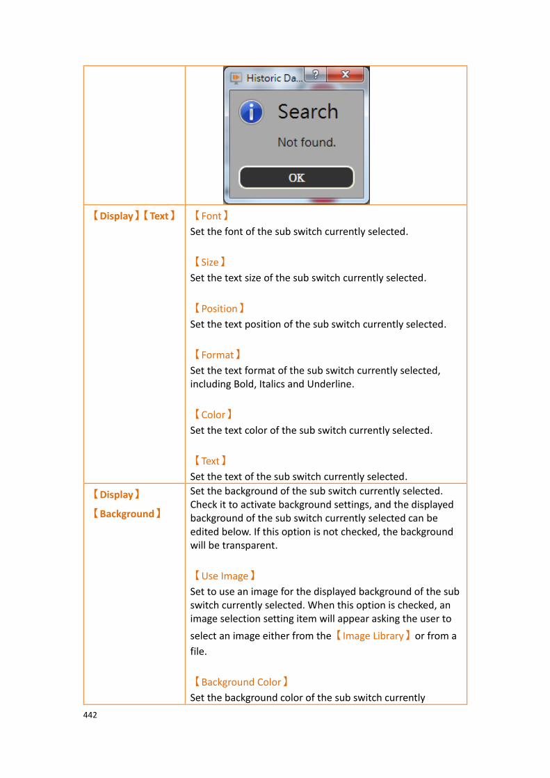
442
【Display】【Text】 【Font】
Set the font of the sub switch currently selected.
【Size】
Set the text size of the sub switch currently selected.
【Position】
Set the text position of the sub switch currently selected.
【Format】
Set the text format of the sub switch currently selected, including Bold, Italics and Underline.
【Color】
Set the text color of the sub switch currently selected.
【Text】
Set the text of the sub switch currently selected.
【Display】
【Background】
Set the background of the sub switch currently selected. Check it to activate background settings, and the displayed background of the sub switch currently selected can be edited below. If this option is not checked, the background will be transparent.
【Use Image】
Set to use an image for the displayed background of the sub switch currently selected. When this option is checked, an image selection setting item will appear asking the user to
select an image either from the【Image Library】or from a
file.
【Background Color】
Set the background color of the sub switch currently

443
selected. This setting will appear if 【Use Image】was not
selected.
【Display】【while
Pressing】
【Play Audio】
Select to play audio when the sub switch is pressed. An
【Audio Selector】will appear on the right when enabled.
The switch on the right of the【Audio Selector】can be
pressed to select an audio and the switch on the left of the
【Audio Selector】can be pressed to play the audio
selected.
【Pressing Effect】
Set the pressing effect of the sub switch currently selected.
There are two effects available for selection:【None】and
【Highlight】.
【Advanced】
【Operation
Control】
Operation control of sub switch, it can enabled by bit or security.
【Enable by Bit】
Check whether the sub switch operation is controlled by a bit
【Address】
Set the address of the sub switch operation control bit.
【State】
Set the control bit as 1 or 0 to operate object.
【Enabled by Word】
Check whether the operation is controlled by word.
【Address】
Set the operation control word address.
【Condition】
Set the condition of word control and when it is true then the object can be controlled, when false not the object can not be controlled. The condition include’ =’,’ !=’, ‘>’, ‘<’, ‘>=’, ‘<=’.
【Enable by Security】
Select the sub switch whether controlled by user level.
444
【Lowest User Level】
Set the lowest login level of the operational sub switch.
【Show Disabled Sign】
Check if you want to display the forbidden symbol, it’s valid
when check【Enable by Bit】,【Enabled by Word】or
【Enable by Security】.
【Hold Time】
Check whether the operation is controlled by hold time. Hold time can be divided into two kinds:
➢ 【Press On】: press directly, according to the【Min.
Hold Time】to confirm whether the operation is
executed.
➢ 【Double Press】: quickly double press to confirm
whether the operation is executed.
【Operator Confirm】
Check whether show comfirmation message window after checking the operation.
【Max. Waiting Time】
When the confirmation message window is displayed, If the user does not reply within this time, the system will close the confirmation message window and cancel this operation
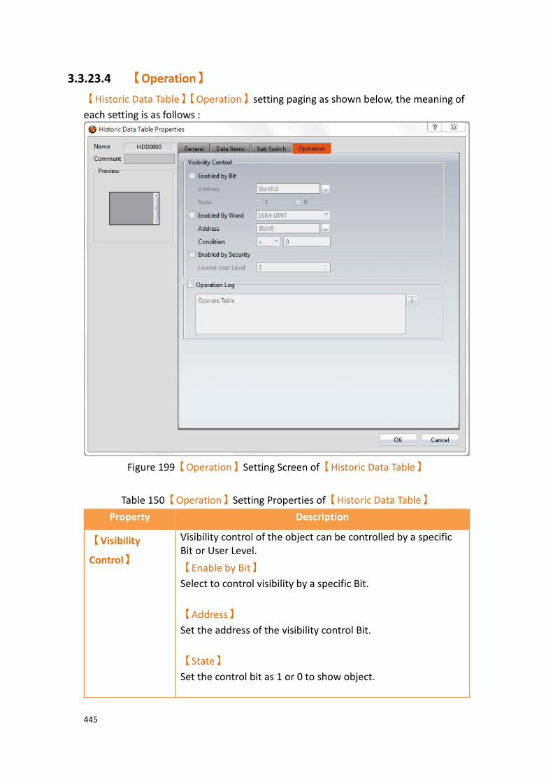
445
3.3.23.4 【Operation】
【Historic Data Table】【Operation】setting paging as shown below, the meaning of
each setting is as follows :
Figure 199【Operation】Setting Screen of【Historic Data Table】
Table 150【Operation】Setting Properties of【Historic Data Table】
Property Description
【Visibility
Control】
Visibility control of the object can be controlled by a specific Bit or User Level.
【Enable by Bit】
Select to control visibility by a specific Bit.
【Address】
Set the address of the visibility control Bit.
【State】
Set the control bit as 1 or 0 to show object.
446
【Enabled by Word】
Check whether the visibility is controlled by word.
【Address】
Set the visibility control word address.
【Condition】
Set the condition of word control and when it is true then show up the object, when false not show the object. The condition include’ =’,’ !=’, ‘>’, ‘<’, ‘>=’, ‘<=’.
【Enabled by Security】
Select if visibility is to be controlled by the level of the user logged in.
【Lowest User Level】
Set the minimum level of the user logged in needed to display the object.
【Operation
Log】
Select to enable the【Operation Log】of the object.
It can also edit operation messages in which the message can
be inputted directly or acquired from the【Text Library】.

447
3.3.24 【Historic Data Selector】
The【Historic Data Selector】allows a user to select and view a【Data Log】that was
exported into a CSV or TXT file. When the【Historic Data Selector】is accessed, a
dropdown menu gives the user the files to view. Clicking on one of the files allows the user to view it.
3.3.24.1 【Setting】
【Historic Data Selector】【Setting】setting paging as shown below, the meaning of
each setting is as follows :
Figure 200【General】Setting Screen of【Historic Data Selector】
Table 151【General】Setting Properties of【Historic Data Selector】
Property Description
【Preview】 Preview the appearance of this object.
【Name】 The default name of the object.
【Comment】 Set the comment of the object.
【Basic】 【Data Log ID】
Set the ID of the Data Log group to display.
【Address】Set a register as an address. This register value
corresponds to the position of the file in a path. For example, if the the register was R50, a 0 in R50 corresponds to the first file in the path, 1 corresponds to the second, and so on.

448
【Display Format】
Select how the data collection files are displayed when the Data
Selector is accessed. There are two options for【Display
Format】: 【Show File Name】and【Show Last Modified
DateTime】.
【Show Last Modified DateTime】
When the Data Selector is accessed, it will display the data collection date and time of the corresponding file.

449
【Show File Name】
When the Data Selector is accessed, it will display the file names.
3.3.24.2 【Display】
【Historic Data Selector】【Display】setting paging as shown below, the meaning of
each setting is as follows :
Figure 201【Display】Setting Screen of【Historic Data Selector】

450
Table 152【Display】Setting Properties of【Historic Data Selector】
Property Description
【Background】 【Selector Background】
Set the color of the background.
【List Background】
Set the color of the list background
【Border】 【Type】
Set the border type.
【Color】
Set the color of the border.
【Text】
【Font】
Set the font and size of cursor values.
【Size】
Set the size of the text.
【Color】
Set the color of the text.
【Type】
Set the format of the text.
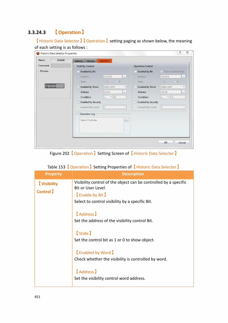
451
3.3.24.3 【Operation】
【Historic Data Selector】【Operation】setting paging as shown below, the meaning
of each setting is as follows :
Figure 202【Operation】Setting Screen of【Historic Data Selector】
Table 153【Operation】Setting Properties of【Historic Data Selector】
Property Description
【Visibility
Control】
Visibility control of the object can be controlled by a specific Bit or User Level.
【Enable by Bit】
Select to control visibility by a specific Bit.
【Address】
Set the address of the visibility control Bit.
【State】
Set the control bit as 1 or 0 to show object.
【Enabled by Word】
Check whether the visibility is controlled by word.
【Address】
Set the visibility control word address.
452
【Condition】
Set the condition of word control and when it is true then show up the object, when false not show the object. The condition include’ =’,’ !=’, ‘>’, ‘<’, ‘>=’, ‘<=’.
【Enabled by Security】
Select if visibility is to be controlled by the level of the user logged in.
【Lowest User Level】
Set the minimum level of the user logged in needed to display the object.
【Operation
Control】
Operation control of the object, which can be controlled by a specific bit or user level.
【Enable by Bit】
Select to control operation by a specific bit.
【Address】
Set the address of the operation control bit.
【State】
Set the control bit as 1 or 0 to operate object.
【Enabled by Word】
Check whether the operation is controlled by word.
【Address】
Set the operation control word address.
【Condition】
Set the condition of word control and when it is true then the object can be controlled, when false not the object can not be controlled. The condition include’ =’,’ !=’, ‘>’, ‘<’, ‘>=’, ‘<=’.
【Enabled by Security Manager】
Select if operation is to be controlled by the level of the user logged in.
【Lowest User Level】
Set the minimum level of the user logged in needed to operate the object.
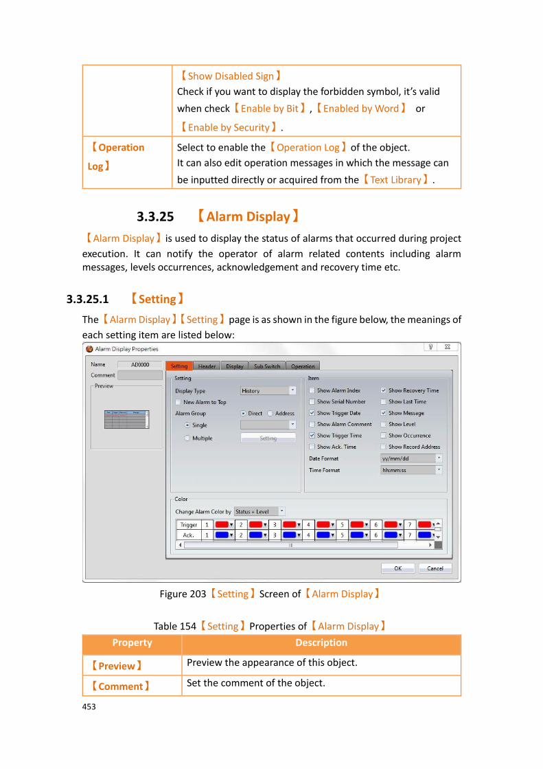
453
【Show Disabled Sign】
Check if you want to display the forbidden symbol, it’s valid
when check【Enable by Bit】,【Enabled by Word】 or
【Enable by Security】.
【Operation
Log】
Select to enable the【Operation Log】of the object.
It can also edit operation messages in which the message can
be inputted directly or acquired from the【Text Library】.
3.3.25 【Alarm Display】
【Alarm Display】is used to display the status of alarms that occurred during project
execution. It can notify the operator of alarm related contents including alarm messages, levels occurrences, acknowledgement and recovery time etc.
3.3.25.1 【Setting】
The【Alarm Display】【Setting】page is as shown in the figure below, the meanings of
each setting item are listed below:
Figure 203【Setting】Screen of【Alarm Display】
Table 154【Setting】Properties of【Alarm Display】
Property Description
【Preview】 Preview the appearance of this object.
【Comment】 Set the comment of the object.

454
【Name】 The default name of the object.
【Setting】 【Display Type】
Set the display type of the Alarm Display. When【History】
is selected, the Alarm Display will give a complete display of
alarm related messages. When【Log】is selected, the
Alarm Display will display the various changes of alarm state
entry by entry. When【Active】is selected, the Alarm
Display will only display alarms that have not yet recovered.
When【Load CSV File】is selected, the Alarm Display will
display the contents of the specified CSV file.
【New Alarm on Top】
Set to place new alarms on the top of the table. If not selected, new alarms will be added to the bottom of the table.
【Alarm Group】
Set the displayed Alarm Group of the Alarm Display. If the
【Direct】option is selected, the Alarm Display will only
display the alarm groups set below. If the【Address】
option is selected, the alarm group displayed by Alarm Display will be determined by the numeric value of the address set below.
【Single】
Set the alarm display only display a alarm group.
【Multiple】
Set the alarm display can display multiple groups, you can
select the group to be displayed at【Setting】, need to set
the alarm group in the alarm function, click to select, If you set 2 alarm groups,click on the settings will appear as shown below 2 alarm groups to choose from.

455
【Enable File Control】
If the【Display Type】is seleted as【Load CSV File】, this
option will be available. If selected, the file control can be done using a register. The value in the register corresponds to the file order inside the specified path. New CSV files are added to the top of the path, i.e position 0.
【Refresh Data Automatically】
Set under the【Load CSV file】mode whether to
automatically update the table display based on the stored data.
【Item】 Set the display contents of the Alarm Display.
【Show Alarm Index】
Set to allow Alarm Display to display the index of the Alarm.
【Show Serial Number】
Set to allow Alarm Display to display the alarm’s serial number. For all alarm groups, all automatically generated alarms have serial numbers that increment by 1 unless the serial number has been cleared.
456
【Show Trigger Date】
Set to allow Alarm Display to display the trigger date.
【Show Alarm Comment】
Set to allow Alarm Display to display the alarm comment.
【Show Trigger Time】
Set to allow Alarm Display to display the trigger time.
【Show Ack. Time】
Set to allow Alarm Display to display the alarm acknowledgement time.
【Show Recovery Time】
Set to allow Alarm Display to display the alarm recovery time.
【Show Last Time】
Set to allow Alarm Display to display the last alarm event, including trigger time, confirmation time, and recovery time.
【Show Message】
Set to allow Alarm Display to display the alarm message.
【Show Level】
Set to allow Alarm Display to display the alarm level.
【Show Record Address】
Set to allow Alarm Display to display the saved numeric value of the alarm record address.
【Show Occurrence】
Set to allow Alarm Display to display the alarm occurrences.
【Date Format】
This option will appear if【Show Trigger Date】is selected.
It can be used to select the display format of the date for the Alarm Display.
【Time Format】
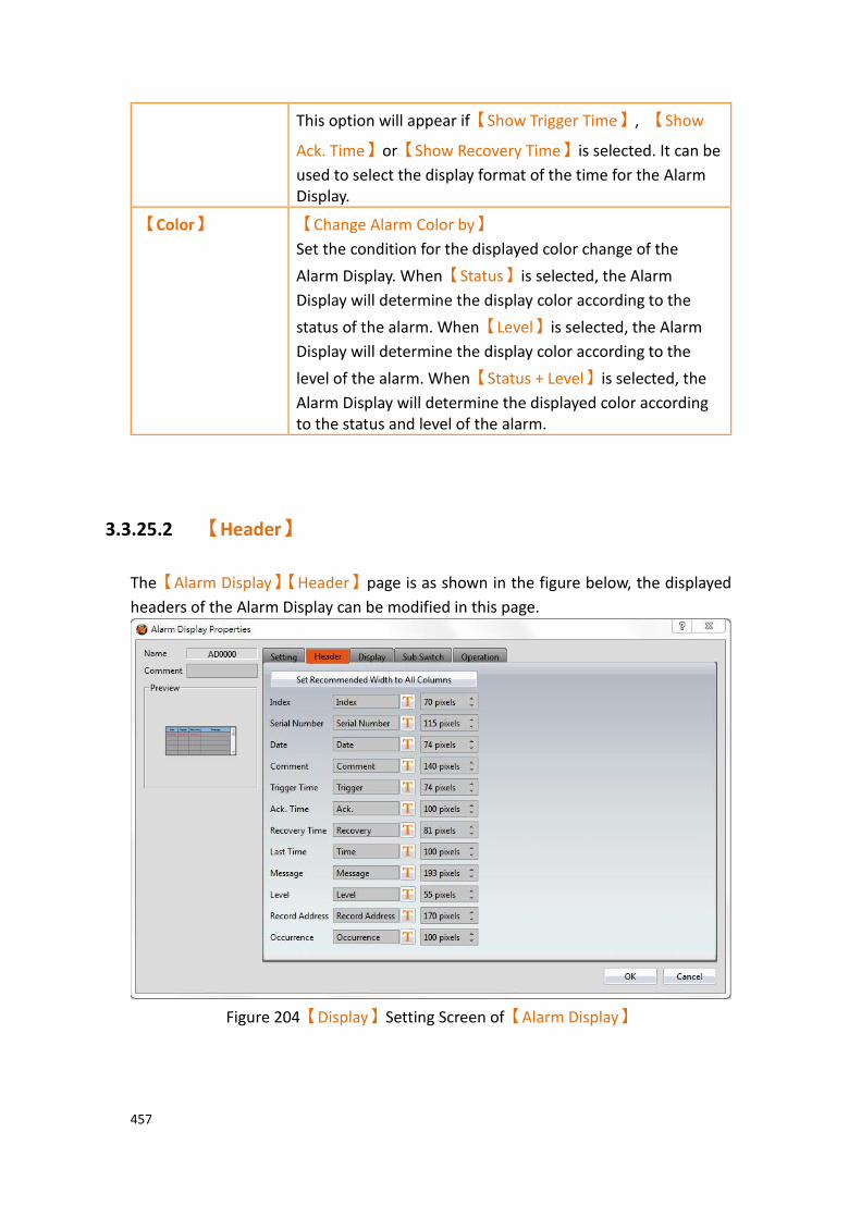
457
This option will appear if【Show Trigger Time】, 【Show
Ack. Time】or【Show Recovery Time】is selected. It can be
used to select the display format of the time for the Alarm Display.
【Color】 【Change Alarm Color by】
Set the condition for the displayed color change of the
Alarm Display. When【Status】is selected, the Alarm
Display will determine the display color according to the
status of the alarm. When【Level】is selected, the Alarm
Display will determine the display color according to the
level of the alarm. When【Status + Level】is selected, the
Alarm Display will determine the displayed color according to the status and level of the alarm.
3.3.25.2 【Header】
The【Alarm Display】【Header】page is as shown in the figure below, the displayed
headers of the Alarm Display can be modified in this page.
Figure 204【Display】Setting Screen of【Alarm Display】

458
Table 155【Header】Setting Properties of【Alarm Display】
Property Description
【Set
Recommended Width to All
Columns】
When this button is pressed, the software calculates the required column width at the time of planning and sets its field width
【Header】
Select the displayed text for the alarm display. The text can be entered directly or selected from the Text Library.
【Width】
Set the width of each column.
3.3.25.3 【Display】
The【Alarm Display】【Display】page is as shown in the figure below, the meanings of
each setting item are listed below:
Figure 205【Display】Setting Screen of【Alarm Display】
Table 156【Display】Setting Properties of【Alarm Display】
Property Description
【Text】 【Font for Alarm String from Direct Text】
The font of the alarm string can be set here.

459
【Size for Alarm String from Direct Text】
The size of the alarm string can be set here.
【Font for Alarm String from Text Library】
The font and size of the alarm string can be set here.
【Appearance】 【Row Height】
Set the row height of the Alarm Display.
【Background】
Set the background color of the Alarm Display.
【Show Border】
Set to display the border. When it is checked, the color, width and type of the border can be set.
【Type】
Set the border type of the Alarm Display.
【Border Color/Width】
Set the border color and thickness of the Alarm Display.
【Header】
Set the header appearance of the Alarm Display. It includes
【Text】to set the text color of the header and
【Background】to set the background color of the header.
【Grid】
Set to display the【Horizontal】and【Vertical】gridlines of
the Alarm Display; if display is selected, the color of the gridlines can be set.

460
3.3.25.4 【Sub Switch】
The【Alarm Display】【Sub Switch】page is as shown in the figure below, the meanings
of each setting item are listed below:
Figure 206【Sub Switch】Setting Screen of【Alarm Display】
Table 157【Sub Switch】Setting Properties of【Alarm Display】
Property Description
【Sub Switch
List】
【Sub Switch List】that can be selected for Alarm Display. Sub
switches can be enabled after selecting them. Settings for the appearance of the selected sub switches will also appear on the right. When different sub switches are selected from the list, the appearance settings to the right will be updated according to the sub switches selected.
“Sub Switches” that can be used by Alarm Display includes
【Acknowledge】,【Clear】,【Auto Scroll】and【Show Window】;
their functions are as follows:
【Acknowledge】
Change the status of the currently selected alarm to

461
acknowledge.
【Clear】
Clear all alarms displayed on Alarm Display.
【Auto Scroll】
Set to enable the auto scroll function. If enabled, when a new alarm occurs, the Alarm Display will automatically scroll to the position of the newest alarm.
【Show Window】
When this switch is pressed, the system will display the
【Window Screen】that corresponds to the currently
selected alarm in the【Alarm】setting.
【Filter】
Apply a filter to the alarm time display in order to find the alert message. Filter options include trigger time, confirmation time, recovery and last time.
【Load】
When the display time for the alarm display is set to【CSV
File】, pressing the sub-button loads the specified CSV file.
The operator can select where the CSV file should be imported from: HMI internal memory, Micro SD card, or USB.

462
【Display】
【Text】
【Font】
Set the text font of the sub switch currently selected.
【Size】
Set the text size of the sub switch currently selected.
【Position】
Set the text position of the sub switch currently selected.
【Format】
Set the text format of the sub switch currently selected, including Bold, Italics and Underline.
【Color】
Set the text color of the sub switch currently selected.
【Text】
Set the text of the sub switch currently selected.
【Display】
【Background】
Set the background of the sub switch currently selected. Check it to activate background settings, and the displayed background of the sub switch currently selected can be edited below. If this option is not checked, the background will be transparent.
【Use Image】
Set to use an image for the displayed background of the sub switch currently selected. When this option is checked, an image selection setting item will appear asking the user to
select an image either from the【Image Library】or from a
file.
【Background Color】
463
Set the background color of the sub switch currently selected.
This setting will appear if 【Use Image】was not selected.
【Display】
【while
Pressing】
【Play Audio】
Select to play audio when the sub switch is pressed. An
【Audio Selector】will appear on the right when enabled.
The switch on the right of the【Audio Selector】can be
pressed to select an audio and the switch on the left of the
【Audio Selector】can be pressed to play the audio selected.
【Pressing Effect】
Set the pressing effect of the sub switch currently selected.
There are two effects available for selection:【None】and
【Highlight】.
【Advanced】
【Operation
Control】
Operation control of sub switch, it can enabled by bit or security.
【Enable by Bit】
Check whether the sub switch operation is controlled by a bit
【Address】
Set the address of the sub switch operation control bit.
【State】
Set the control bit as 1 or 0 to operate object.
【Enabled by Word】
Check whether the operation is controlled by word.
【Address】
Set the operation control word address.
【Condition】
Set the condition of word control and when it is true then the object can be controlled, when false not the object can not be controlled. The condition include’ =’,’ !=’, ‘>’, ‘<’, ‘>=’, ‘<=’.
【Enable by Security】
Select the sub switch whether controlled by user level.
【Lowest User Level】
Set the lowest login level of the operational sub switch.
464
【Show Disabled Sign】
Check if you want to display the forbidden symbol, it’s valid
when check【Enable by Bit】,【Enabled by Word】or
【Enable by Security】.
【Hold Time】
Check whether the operation is controlled by hold time. Hold time can be divided into two kinds:
➢ 【Press On】: press directly, according to the【Min.
Hold Time】to confirm whether the operation is
executed.
➢ 【Double Press】: quickly double press to confirm
whether the operation is executed.
【Operator Confirm】
Check whether show comfirmation message window after checking the operation.
【Max. Waiting Time】
When the confirmation message window is displayed, If the user does not reply within this time, the system will close the confirmation message window and cancel this operation

465
3.3.25.5 【Operation】
The【Alarm Display】【Operation】page is as shown in the figure below, the meanings
of each setting item are listed below:
Figure 207【Operation】Setting Screen of【Alarm Display】
Table 158【Operation】Setting Properties of【Alarm Display】
Property Description
【Visibility
Control】
Visibility control of the object. It can be controlled by a specific Bit or User Level.
【Enable by Bit】
Select to control visibility by a specific Bit.
【Address】
Set the address of the visibility control Bit.
【State】
Set the control bit as 1 or 0 to show object.
【Enabled by Word】
Check whether the visibility is controlled by word.

466
【Address】
Set the visibility control word address.
【Condition】
Set the condition of word control and when it is true then show up the object, when false not show the object. The condition include’ =’,’ !=’, ‘>’, ‘<’, ‘>=’, ‘<=’.
【Enabled by Security Manager】
Select if visibility is to be controlled by the level of the user logged in.
【Lowest User Level】
Set the minimum level of the user logged in needed to display the object.
【Operation Log】 Select to enable the【Operation Log】of the object.
It can also edit operation messages in which the message can be inputted directly or acquired from the Text Library.
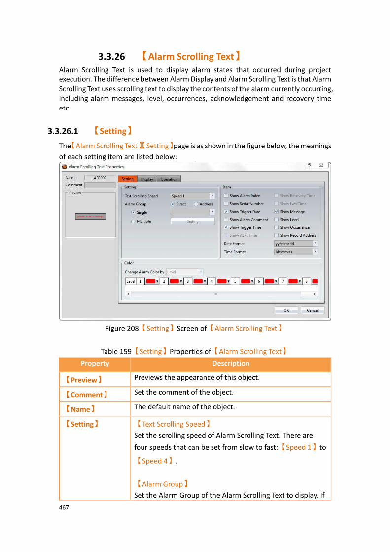
467
3.3.26 【Alarm Scrolling Text】 Alarm Scrolling Text is used to display alarm states that occurred during project execution. The difference between Alarm Display and Alarm Scrolling Text is that Alarm Scrolling Text uses scrolling text to display the contents of the alarm currently occurring, including alarm messages, level, occurrences, acknowledgement and recovery time etc.
3.3.26.1 【Setting】
The【Alarm Scrolling Text】【Setting】page is as shown in the figure below, the meanings
of each setting item are listed below:
Figure 208【Setting】Screen of【Alarm Scrolling Text】
Table 159【Setting】Properties of【Alarm Scrolling Text】
Property Description
【Preview】 Previews the appearance of this object.
【Comment】 Set the comment of the object.
【Name】 The default name of the object.
【Setting】 【Text Scrolling Speed】
Set the scrolling speed of Alarm Scrolling Text. There are
four speeds that can be set from slow to fast:【Speed 1】to
【Speed 4】.
【Alarm Group】
Set the Alarm Group of the Alarm Scrolling Text to display. If
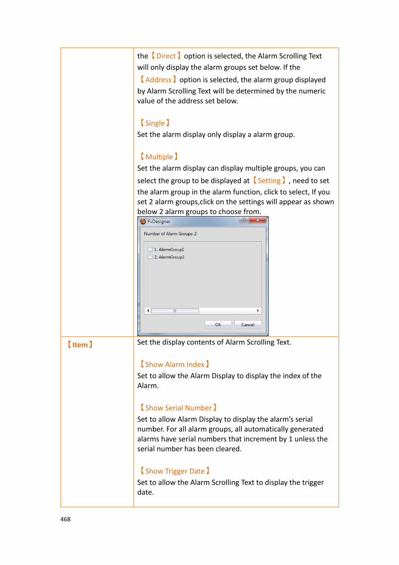
468
the【Direct】option is selected, the Alarm Scrolling Text
will only display the alarm groups set below. If the
【Address】option is selected, the alarm group displayed
by Alarm Scrolling Text will be determined by the numeric value of the address set below.
【Single】
Set the alarm display only display a alarm group.
【Multiple】
Set the alarm display can display multiple groups, you can
select the group to be displayed at【Setting】, need to set
the alarm group in the alarm function, click to select, If you set 2 alarm groups,click on the settings will appear as shown below 2 alarm groups to choose from.
【Item】 Set the display contents of Alarm Scrolling Text.
【Show Alarm Index】
Set to allow the Alarm Display to display the index of the Alarm.
【Show Serial Number】
Set to allow Alarm Display to display the alarm’s serial number. For all alarm groups, all automatically generated alarms have serial numbers that increment by 1 unless the serial number has been cleared.
【Show Trigger Date】
Set to allow the Alarm Scrolling Text to display the trigger date.

469
【Show Alarm Comment】
Set to allow the Alarm Scrolling Text to display the alarm comment.
【Show Trigger Time】
Set to allow the Alarm Scrolling Text to display the trigger time.
【Show Last Time】
Set to allow Alarm Display to display the last alarm event, including trigger time, confirmation time, and recovery time.
【Show Message】
Set to allow the Alarm Scrolling Text to display the alarm message.
【Show Level】
Set to allow the Alarm Scrolling Text to display the alarm level.
【Show Record Address】
Set to allow the Alarm Scrolling Text to display the saved numeric value of the alarm record address.
【Show Occurrence】
Set to allow the Alarm Scrolling Text to display the alarm occurrences.
【Date Format】
This option will appear if【Show Trigger Date】is selected.
It can be used to select the display format of the date for the Alarm Scrolling Text.
【Time Format】
This option will appear if【Show Trigger Time】is selected.
It can be used to select the display format of the time for the Alarm Scrolling Text.
【Color】 【Change Alarm Color by】
Set the condition for the displayed color change of the Alarm Scrolling Text. The Alarm Scrolling Text will determine the display color according to the level of the alarm.

470
3.3.26.2 【Display】
The【Alarm Scrolling Text】【Display】page is as shown in the figure below, the meanings
of each setting item are listed below:
Figure 209【Display】Setting Screen of【Alarm Scrolling Text】
Table 160【Display】Setting Properties of【Alarm Scrolling Text】
Property Description
【Text】 【Font for Alarm String from Direct Text】
The font of the alarm string can be set here.
【Size for Alarm String from Direct Text】
The size of the alarm string can be set here.
【Font for Alarm String from Text Library】
The font and size of the alarm string can be set here.
【Appearance】 【Background】
Set the background color of the Alarm Scrolling Text.
【Show Border】
Set to display the border. When it is checked, the color, width and type of the border can be set at the bottom.
【Type】
Set the border type of the Alarm Scrolling Text.

471
【Border Color/Width】
Set the border color and border thickness of the Alarm Scrolling Text.
3.3.26.3 【Operation】
The【Alarm Scrolling Text】【Operation】page is as shown in the figure below, the
meanings of each setting item are listed below:
Figure 210【Operation】Setting Screen of【Alarm Scrolling Text】
Table 161【Operation】Setting Properties of【Alarm Scrolling Text】
Property Description
【Visibility
Control】
Visibility control of the object. It can be controlled by a specific Bit or User Level.
【Enable by Bit】
Select to control visibility by a specific Bit.
【Address】
Set the address of the visibility control Bit.
【State】
Set the control bit as 1 or 0 to show object.
472
【Enabled by Word】
Check whether the visibility is controlled by word.
【Address】
Set the visibility control word address.
【Condition】
Set the condition of word control and when it is true then show up the object, when false not show the object. The condition include’ =’,’ !=’, ‘>’, ‘<’, ‘>=’, ‘<=’.
【Enabled by Security Manager】
Select if visibility is to be controlled by the level of the user logged in.
【Lowest User Level】
Set the minimum level of the user logged in needed to display the object.

473
3.3.27 【Alarm Data Selector】
The【Alarm Data Selector】allows a user to select and view an【Alarm】that was
exported into a CSV file. When the【Alarm Data Selector】is accessed, a dropdown
menu gives the user the files to view. Clicking on one of the files allows the user to view it.
3.3.27.1 【Setting】
【Alarm Data Selector】【Setting】setting paging as shown below, the meaning of
each setting is as follows :
Figure 211【General】Setting Screen of【Alarm Data Selector】
Table 162【General】Setting Properties of【Alarm Data Table】
Property Description
【Preview】 Preview the appearance of this object.
【Comment】 Set the comment of the object.
【Name】 The default name of the object.
【Basic】 【Alarm Group】
Set the ID of the alarm group to display
【Address】
Select the register to control the visibility of a file. This address corresponds to the file path of alarms. The value stored in the register corresponds to the file number in the path, with the

474
topmost file at position 0.
【Display Format】
Select how the alarm data files are displayed when the Alarm
Data Selector is accessed. There are two options for【Display
Format】: 【Show File Name】and【Show Last Modified
DateTime】.
【Show File Name】
When the Alarm Data Selector is accessed, it will display the file names.
【Show Last Modified DateTime】
When the Alarm Data Selector is accessed, it will display the data collection date and time of the corresponding file.
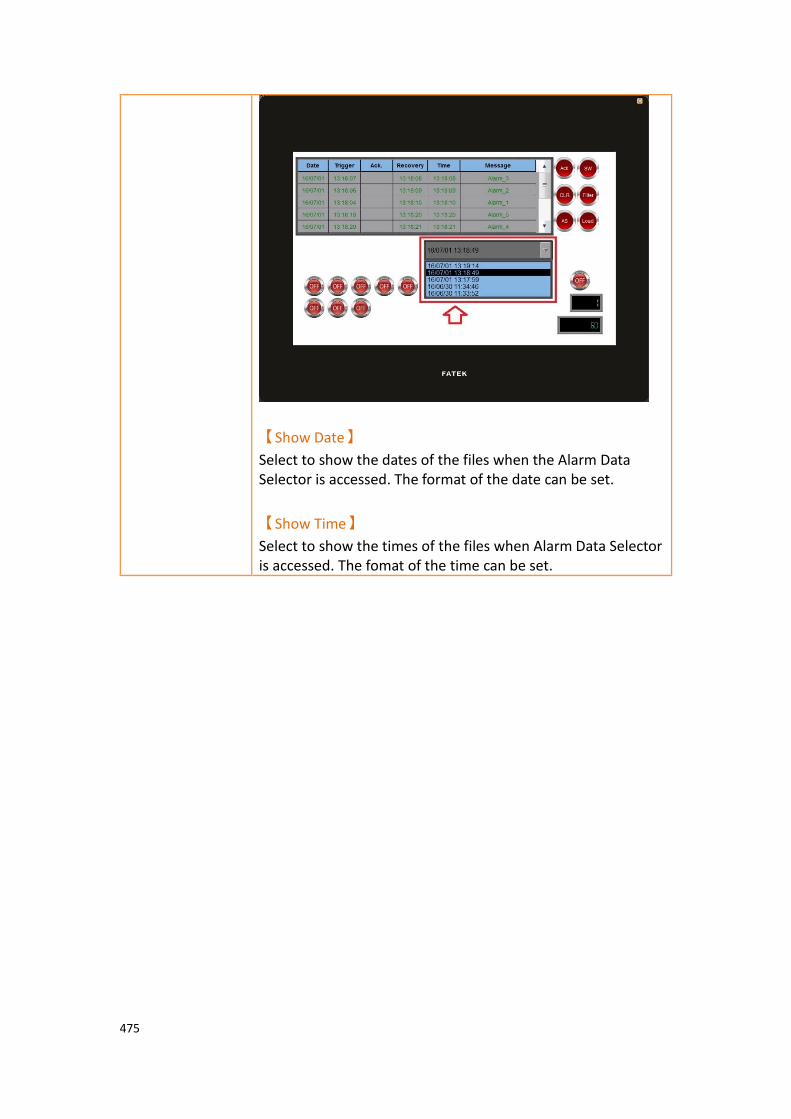
475
【Show Date】
Select to show the dates of the files when the Alarm Data Selector is accessed. The format of the date can be set.
【Show Time】
Select to show the times of the files when Alarm Data Selector is accessed. The fomat of the time can be set.

476
3.3.27.2 【Display】
【Alarm Data Selector】【Display】setting paging as shown below, the meaning of
each setting is as follows :
Figure 212【Display】Setting Screen of【Alarm Data Selector】
Table 163【Display】Setting Properties of【Alarm Data Table】
Property Description
【Background】 【Selector Background】
Set the color of the background.
【List Background】
Set the color of the list background
【Border】 【Type】
Set the border type.
【Color】
Set the color of the border.
【Text】
【Font】
Set the font and size of cursor values.
【Size】
Set the size of the text.
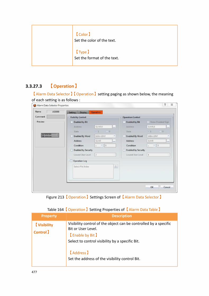
477
【Color】
Set the color of the text.
【Type】
Set the format of the text.
3.3.27.3 【Operation】
【Alarm Data Selector】【Operation】setting paging as shown below, the meaning
of each setting is as follows :
Figure 213【Operation】Settings Screen of【Alarm Data Selector】
Table 164【Operation】Setting Properties of【Alarm Data Table】
Property Description
【Visibility
Control】
Visibility control of the object can be controlled by a specific Bit or User Level.
【Enable by Bit】
Select to control visibility by a specific Bit.
【Address】
Set the address of the visibility control Bit.

478
【State】
Set the control bit as 1 or 0 to show object.
【Enabled by Word】
Check whether the visibility is controlled by word.
【Address】
Set the visibility control word address.
【Condition】
Set the condition of word control and when it is true then show up the object, when false not show the object. The condition include’ =’,’ !=’, ‘>’, ‘<’, ‘>=’, ‘<=’.
【Enabled by Security】
Select if visibility is to be controlled by the level of the user logged in.
【Lowest User Level】
Set the minimum level of the user logged in needed to display the object.
【Operation
Control】
Operation control of the object, which can be controlled by a specific bit or user level.
【Enable by Bit】
Select to control operation by a specific bit.
【Address】
Set the address of the operation control bit.
【State】
Set the control bit as 1 or 0 to operate object.
【Enabled by Word】
Check whether the operation is controlled by word.
【Address】
Set the operation control word address.
【Condition】
Set the condition of word control and when it is true then the object can be controlled, when false not the object can not be controlled. The condition include’ =’,’ !=’, ‘>’, ‘<’, ‘>=’, ‘<=’.

479
【Enabled by Security Manager】
Select if operation is to be controlled by the level of the user logged in.
【Lowest User Level】
Set the minimum level of the user logged in needed to operate the object.
【Show Disabled Sign】
Check if you want to display the forbidden symbol, it’s valid
when check【Enable by Bit】,【Enabled by Word】 or
【Enable by Security】.
【Operation
Log】
Select to enable the【Operation Log】of the object.
It can also edit operation messages in which the message can
be inputted directly or acquired from the【Text Library】.

480
3.3.28 【Recipe Selector】
【Recipe Selector】allows user to select a specific recipe in a recipe group during
execution. Please refer to Chapter 9–Recipefor functions related to recipes.
3.3.28.1 【General】
【Recipe Selector】【General】setting paging as shown below, the meaning of each
setting is as follows :
Figure 214【General】Setting Page of【Recipe Selector】
Table 165【General】Setting Properties of【Recipe Selector】
Property Description
【Comment】 Set the comment of the object.
【Name】 The default name of the object.
【Preview】 Preview the appearance of this object.
【Recipe Group】 If the user adds a new recipe group in the recipe setting function, the ID and name of the recipe group will be displayed here. The user must select a recipe group before
the【OK】button is pressed.
【Background】 【Selector Background】
Set the background color of the selector.
【List Background】
Set the background color of the drop-down list.

481
【Border】 【Type】
Set the border type.
【Color/Width】
Set the border color and width.
【Text】 【Font】
Set the text font.
【Size】
Set the text font size.
【Color】
Set the text color.
【Type】
Set the format of the text.
3.3.28.2 【Advanced】
【Recipe Selector】【Advanced】setting paging as shown below, the meaning
of each setting is as follows :
Figure 215【Advanced】Setting Page of【Recipe Selector】
482
Table 166【General】Setting Properties of【Recipe Selector】
Property Description
【Source】 Set the source of recipe selector.
【Recipe Name】
Default value, use the recipe name as the data of recipe selector.
【Recipe Parameter(ASCII Type)】
When there is an ASCII String type in the recipe parameter
【Sort】 Set whether the recipe selector data is sorted by text.
【No Sort】
Default value, The recipe selector data is not sorted and displayed in the original order.
【Ascending】
The recipe selector data is sorted in positive order.
【Descending】
The recipe selector data is sorted in reverse order.
【Use Filter】 Is to use the filter in dynamic mode, by specifying the
value or text of【Filter String Address】, filter the options
required in the recipe selector, for example, 【Filter String
Address】=50, and R50=A, then the recipe selector only
displays the recipe group name with the "A" text.
【Use Filter】
Set whether to enable filtering.
【Filter String Address】
Set the text address used for dynamic filtering, and the length of the text.

483
3.3.28.3 【Operation】
【Recipe Selector】【Operation】setting paging as shown below, the meaning of
each setting is as follows :
Figure 216【Operation】Setting Page of【Recipe Selector】
Table 167【Operation】Setting Properties of【Recipe Selector】
Property Description
【Visibility
Control】
Visibility control of the object. It can be controlled by a specific bit or user level.
【Enable by Bit】
Select to control visibility by a specific bit.
【Address】
Set the address of the visibility control bit.
【State】
Set the control bit as 1 or 0 to show object.
【Enabled by Word】
Check whether the visibility is controlled by word.
【Address】
Set the visibility control word address.
【Condition】
484
Set the condition of word control and when it is true then show up the object, when false not show the object. The condition include’ =’,’ !=’, ‘>’, ‘<’, ‘>=’, ‘<=’.
【Enabled by Security Manager】
Select if visibility is to be controlled by the level of the user logged in.
【Lowest User Level】
Set the minimum level of the user logged in needed to display the object.
【Operation
Log】
Select to enable the【Operation Logger】of the object. It can
also edit operation messages in which the message can be
inputted directly or acquired from the【Text Library】.
【Operation
Control】
Operation control of the object, which can be controlled by a specific bit or user level.
【Enable by Bit】
Select to control operation by a specific bit.
【Address】
Set the address of the operation control bit.
【State】
Set the control bit as 1 or 0 to operate object.
【Enabled by Word】
Check whether the operation is controlled by word.
【Address】
Set the operation control word address.
【Condition】
Set the condition of word control and when it is true then the object can be controlled, when false not the object can not be controlled. The condition include’ =’,’ !=’, ‘>’, ‘<’, ‘>=’, ‘<=’.
【Enabled by Security Manager】
Select if operation is to be controlled by the level of the user logged in.
【Lowest User Level】
Set the minimum level of the user logged in needed to operate

485
the object.
【Show Disabled Sign】
Check if you want to display the forbidden symbol, it’s valid
when check【Enable by Bit】,【Enabled by Word】 or
【Enable by Security】.
3.3.29 【Recipe Table】
【Recipe Table】is used to read recipe group data set in the【Recipe】function.
Users can also dynamically change the data in the recipe table during execution. Please refer to Chapter 9–Recipefor functions related to recipes. Recipe Table has the following functions:
➢ To view the complete data of recipe group select【Show All】or select
【Only Show Current Recipe】to show current recipe.
➢ Use the【Sub Switch】to load or save the recipe group file.
3.3.29.1 【General】
【Recipe Table】【General】setting paging as shown below, the meaning of each
setting is as follows :
Figure 217【General】Setting Page of【Recipe Table】

486
Table 168【General】Setting Properties of【Recipe Table】
Property Description
【Comment】 Set the comment of the object.
【Preview】 Preview the appearance of this object.
【Name】 The default name of the object.
【Basic】 【Recipe Group】
If the user adds a new recipe group in the recipe setting function, the ID and name of the recipe group will be displayed here. The user must select a recipe group
before the【OK】button is pressed.
【Table Type】
If【Only Show Current Recipe】is selected, the current
recipe will be displayed according to the【Control
Address of Recipe No.】 in the recipe setting. If【Show
All】is selected, all contents of the recipe group will be
displayed.
【Transpose】
Reverse the rows and columns. For example, row 1 in the original table becomes column 1 in the transposed table.
【Tap to Change Current Recipe】
Users can change the current recipe group by clicking on
during the execution period,【Control Address of Recipe
No.】will also change.
【Allow Input】
The user will be able to dynamically change the

487
parameters and the recipe names in the recipe table during execution if this option is selected.
【Input Method for Recipe name】
Select the input method for recipe name, inculde
【None】and【Pinyin(Simplified Chinese)】two ways.
【None】
If【Input Method for Recipe name】select as【None】
will show up the figure as below, provide user to modify or input recipe name through the following keypad.
【Pinyin(Simplified Chinese)】
If【Input Method for Recipe name】select as
【Pinyin(Simplified Chinese)】will show up the figure as
below, provide user to modify or input recipe name through the following keypad, switch to English or Pinyin.

488
【Header】 【Font Color】
Set the header font color.
【Background】
Set the header background color.
【Font for String from Direct Text】
Set the header font.
【Size】
Set the header font size.
【Font for String from the Text Library】
when the text is from library, can set the font and size.
【Border】 【Type】
Set the border type.
【Color/Width】
Set the border color and width.
【Grid/Background】 【Grid】
Set the line color of the grid.
【Horizontal】
Select to display the horizontal grid lines.
【Vertical】
Select to display the vertical grid lines.
【Background】
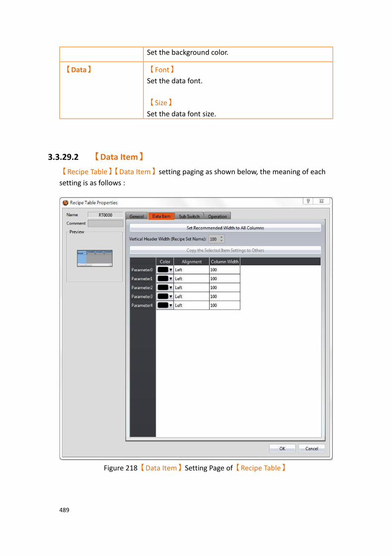
489
Set the background color.
【Data】 【Font】
Set the data font.
【Size】
Set the data font size.
3.3.29.2 【Data Item】
【Recipe Table】【Data Item】setting paging as shown below, the meaning of each
setting is as follows :
Figure 218【Data Item】Setting Page of【Recipe Table】
490
Table 169【Data Item】Setting Properties of【Recipe Table】
Property Description
【Set Recommended
Width to All Columns】
When this button is pressed, the software calculates the required column width at the time of planning and sets its field width.
【Vertical Header
Width】
Set the column width of【Recipe Table】header.
【Column Width】
Set the column width of【Recipe Table】field, in
addition to the left field, this【Transpose】option
needs to be checked.
【Copy the Selected Item
Settings to Others】
Select a parameter name from below, and then click this button to change the settings of other items to the same as the settings of the item selected.
【Color】 Set color of the parameter data.
【Alignment】 Determine the alignment of the parameter data.
【Column width】 Set the column width of recipe parameter.

491
3.3.29.3 【Sub Switch】
【Recipe Table】【Sub Switch】setting paging as shown below, the meaning of each
setting is as follows :
Figure 219【Sub Switch】Setting Page of【Recipe Table】
Table 170【Sub Switch】Setting Properties of【Recipe Table】
Property Description
【Sub Switch
List】
If the【Save】or【Load】button is selected from the table,
corresponding buttons will also appear at the top-right side of
the recipe table in the workspace after pressing the【OK】
button.
【Save】
If the user presses this button during execution, the current
parameter contents of the【Recipe Table】will be saved to the
recipe group file configured in the recipe setting.
492
【Load】
If the user presses this button during execution, the contents of the recipe group file configured in the recipe setting will be
loaded into the【Recipe Table】.
【Display】
【Text】
【Font】
Set the text font of the sub switch currently selected.
【Size】
Set the text size of the sub switch currently selected.
【Position】
Set the text position of the sub switch currently selected.
【Format】
Set the text format of the sub switch currently selected, including Bold, Italics and Underline.
【Color】
Set the text color of the sub switch currently selected.
【Text】
Set the text of the sub switch currently selected.
【Display】
【Background】
Set the background of the sub switch currently selected. Check it to activate background settings, and the displayed background of the sub switch currently selected can be edited below. If this option is not checked, the background will be transparent.
【Use Image】
Set to use an image for the displayed background of the sub switch currently selected. When this option is checked, an image selection setting item will appear asking the user to
select an image either from the【Image Library】or from a
file.
【Background Color】
Set the background color of the sub switch currently selected.
This setting will appear if 【Use Image】was not selected.
【Display】
【While
【Play Audio】
Select to play audio when the sub switch is pressed. An
493
Pressing】 【Audio Selector】will appear on the right when enabled. The
switch on the right of the【Audio Selector】can be pressed to
select an audio and the switch on the left of the【Audio
Selector】can be pressed to play the audio selected.
【Pressing Effect】
Set the pressing effect of the sub switch currently selected.
There are two effects available for selection:【None】and
【Highlight】.
【Advanced】
【Operation
Control】
Operation control of sub switch, it can enabled by bit or security.
【Enable by Bit】
Check whether the sub switch operation is controlled by a bit
【Address】
Set the address of the sub switch operation control bit.
【State】
Set the control bit as 1 or 0 to operate object.
【Enabled by Word】
Check whether the operation is controlled by word.
【Address】
Set the operation control word address.
【Condition】
Set the condition of word control and when it is true then the object can be controlled, when false not the object can not be controlled. The condition include’ =’,’ !=’, ‘>’, ‘<’, ‘>=’, ‘<=’.
【Enable by Security】
Select the sub switch whether controlled by user level.
【Lowest User Level】
Set the lowest login level of the operational sub switch.
【Show Disabled Sign】
Check if you want to display the forbidden symbol, it’s valid

494
when check【Enable by Bit】,【Enabled by Word】or
【Enable by Security】.
【Hold Time】
Check whether the operation is controlled by hold time. Hold time can be divided into two kinds:
➢ 【Press On】: press directly, according to the【Min. Hold
Time】to confirm whether the operation is executed.
➢ 【Double Press】: quickly double press to confirm
whether the operation is executed.
【Operator Confirm】
Check whether show comfirmation message window after checking the operation.
【Max. Waiting Time】
When the confirmation message window is displayed, If the user does not reply within this time, the system will close the confirmation message window and cancel this operation

495
3.3.29.4 【Operation】
【Recipe Table】【Operation】setting paging as shown below, the meaning of each
setting is as follows :
Figure 220【Operation】Setting Page of【Recipe Table】
Table 171【Operation】Setting Properties of【Recipe Table】
Property Description
【Visibility
Control】
Visibility control of the object. It can be controlled by a specific bit or user level.
【Enable by Bit】
Select to control visibility by a specific bit.
【Address】
Set the address of the visibility control bit.
【State】

496
Set the control bit as 1 or 0 to show object.
【Enabled by Word】
Check whether the visibility is controlled by word.
【Address】
Set the visibility control word address.
【Condition】
Set the condition of word control and when it is true then show up the object, when false not show the object. The condition include’ =’,’ !=’, ‘>’, ‘<’, ‘>=’, ‘<=’.
【Enable When Bit is】
Set whether to display the object when the control bit is 1 or 0.
【Enabled by Security Manager】
Select if visibility is to be controlled by the level of the user logged in.
【Lowest User Level】
Set the minimum level of the user logged in needed to display the object.
【Operation
Log】
Select to enable the【Operation Logger】of the object. It can
also edit operation messages in which the message can be
inputted directly or acquired from the【Text Library】.
【Operation
Control】
Operation control of the object, which can be controlled by a specific bit or user level.
【Enable by Bit】
Select to control operation by a specific bit.
【Address】
Set the address of the operation control bit.
【State】
Set the control bit as 1 or 0 to operate object.
【Enabled by Word】
Check whether the operation is controlled by word.
【Address】
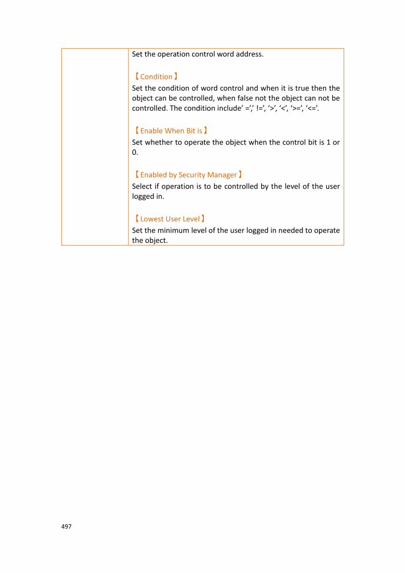
497
Set the operation control word address.
【Condition】
Set the condition of word control and when it is true then the object can be controlled, when false not the object can not be controlled. The condition include’ =’,’ !=’, ‘>’, ‘<’, ‘>=’, ‘<=’.
【Enable When Bit is】
Set whether to operate the object when the control bit is 1 or 0.
【Enabled by Security Manager】
Select if operation is to be controlled by the level of the user logged in.
【Lowest User Level】
Set the minimum level of the user logged in needed to operate the object.

498
3.3.30 【Operation Viewer】
【Operation Viewer】 is an object used to read the Recording Buffer data of the
【Operation Log】. Its main functions are as follows:
➢ View the Recording Buffer data of the【Operation Log】.
➢ Data filter function, which displays items that the user is only interested in.
➢ Pause or start updating the data of the Recording Buffer through the【Sub
Switch】, and clear or save the data in the Recording Buffer.
3.3.30.1 【General】
【Operation Viewer】【General】setting paging as shown below, the meaning of
each setting is as follows :
Figure 221【General】Setting Screen of【Operation Viewer】
Table 172【General】Setting Properties of【Operation Viewer】
Property Description
【Preview】 Preview the appearance of this object.
【Name】 The default name of the object.
【Comment】 Set the comment of the object.
【Header】 Select to display the header.

499
【Font】
Set the font of the header.
【Size】
Set the size of the header.
【Color】
Set the color of the header.
【Background】
Set the background color of the header.
【Border】 Select to display the border.
【Type】
Set the border type.
【Color/Width】
Set the color and width of the border.
【Grid/Background】 【Grid】
Set the color of the grid.
【Horizontal】
Select to display horizontal gridlines.
【Vertical】
Select to display vertical gridlines.
【Background】
Set the color of the background.
【Data】 【Show Oldest Data First】
Set whether to display the oldest data in the top of the form, if unchech then the oldest data will in the bottom of the form.
【Font for String from Direct Text】
The font of the string can be set here.
【Size】
Set the font size for the direct text.
【Font for String from Text Library】
The font and size of the string can be set here.

500
3.3.30.2 【Content】
【Operation Viewer】【Content】setting paging as shown below, the meaning of
each setting is as follows :
Figure 222【Content】Setting Screen of【Operation Viewer】
Table 173【Content】Setting Properties of【Operation Viewer】
Property Description
【Set Recommended
Width to All Columns】
When this button is pressed, the software calculates the required column width at the time of planning and sets its field width.
【Content】 Every Operation Log data entry includes information; users can choose to display the items they are interested in. The following are the descriptions of each item:
➢ 【Number】
Operation Log serial number.
➢ 【Date】
Operation Log date. Can select the format of the date

501
in the right.
➢ 【Time】
Operation Log time. Can select the format of the time in the right.
➢ 【User ID】
The current user name; when【Security Manager】->
【Mode】is【Level】, no information will be recorded
in this field.
When【Mode】is【User】, the current signer will
display, however, if the security level is forced to
change by address(【Security Level】address of
【Project Explorer】-> 【Unit Setting】-> 【Control
Address】), the user ID will be displayed as "?" Until
the next normal login, this field will show the current login.
➢ 【Level】
The level of the current user.
➢ 【Screen】
The screen the operating object is located.
➢ 【Part ID】
The ID of the operating object.
➢ 【Comment】
The comment of the operating object.
➢ 【Message】
The message of the operating object.
➢ 【Address】
The access address of the operating object.
➢ 【Previous Value】
The previous value of the access address content for the operating object.
➢ 【Changed Value】
The current value of the changed access address content for the operating object.
The setting of the items can be divided into:
➢ 【Display】
Set the visibility of this item.
➢ 【Text】

502
Set the display text for the header. The text can be entered directly or selected from the text library.
➢ 【Color】
The color of this item.
➢ 【Column Width】
The column width of this item.
➢ 【Alignment】
The alignment method of this item.
➢ 【Type】
This setting is only available for【Date】 and
【Time】. It sets the display format.
3.3.30.3 【Sub Switch】
【Operation Viewer】【Sub Switch】setting paging as shown below, the meaning of
each setting is as follows :
Figure 223【Sub Switch】Setting Screen of【Operation Viewer】

503
Table 174【Sub Switch】Setting Properties of【Operation Viewer】
Property Description
【Sub Switch List】 【Sub Switch List】that can be selected for【Operation
Viewer】. Sub switches can be enabled after selecting
them. Settings for the appearance of the selected sub switches will also appear on the right. When different sub switches are selected from the list, the setting contents of the appearance setting items to the right will be updated according to the sub switches selected.
In which the【Sub Switches】are divided into:
➢ 【Save】- Save the Recording Buffer data of the
【Operation Log】into a CSV file.
➢ 【Clear】- Clear the Recording Buffer data of the
【Operation Log】.
➢ 【Save & Clear】- Saves the Recording Buffer data
of the【Operation Log】into a CSV file and then
clears the data.
【Display】【Text】 【Font】
Set the text font of the sub switch currently selected.
【Size】
Set the text size of the sub switch currently selected.
【Position】
Set the text position of the sub switch currently selected.
【Format】
Set the text format of the sub switch currently selected, including Bold, Italics and Underline.
【Color】
Set the text color of the sub switch currently selected.
【Text】
Set the text of the sub switch currently selected, the text
can be entered directly or selected from the【Text
Library】.

504
【Display】
【Background】
Set the background of the sub switch currently selected. Check it to activate background settings, and the displayed background of the sub switch currently selected can be edited below. If this option is not checked, the background will be transparent.
【Use Image】
Set to use an image for the displayed background of the sub switch currently selected. When this option is checked, an image selection setting item will appear asking the user to
select an image either from the【Image Library】or from a
file.
【Background Color】
Set the background color of the sub switch currently
selected. This setting will appear if 【Use Image】was not
selected.
【Display】【while
Pressing】
【Play Audio】
Select to play audio when the sub switch is pressed. An
【Audio Selector】will appear on the right when enabled.
The switch on the right of the【Audio Selector】can be
pressed to select an audio and the switch on the left of the
【Audio Selector】can be pressed to play the audio
selected.
【Pressing Effect】
Set the pressing effect of the sub switch currently selected.
There are two effects available for selection:【None】and
【Highlight】.
【Advanced】
【Operation
Control】
Operation control of sub switch, it can enabled by bit or security.
【Enable by Bit】
Check whether the sub switch operation is controlled by a bit
【Address】
Set the address of the sub switch operation control bit.
【State】
Set the control bit as 1 or 0 to operate object.
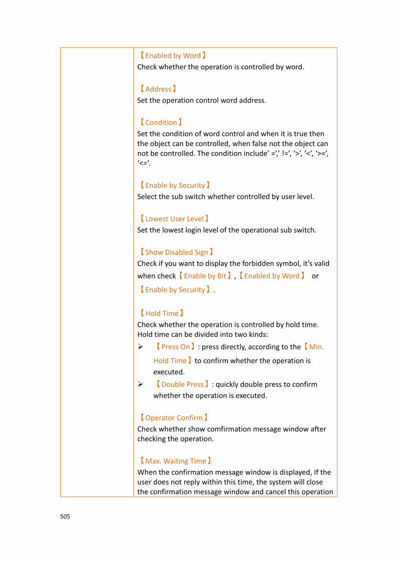
505
【Enabled by Word】
Check whether the operation is controlled by word.
【Address】
Set the operation control word address.
【Condition】
Set the condition of word control and when it is true then the object can be controlled, when false not the object can not be controlled. The condition include’ =’,’ !=’, ‘>’, ‘<’, ‘>=’, ‘<=’.
【Enable by Security】
Select the sub switch whether controlled by user level.
【Lowest User Level】
Set the lowest login level of the operational sub switch.
【Show Disabled Sign】
Check if you want to display the forbidden symbol, it’s valid
when check【Enable by Bit】,【Enabled by Word】 or
【Enable by Security】.
【Hold Time】
Check whether the operation is controlled by hold time. Hold time can be divided into two kinds:
➢ 【Press On】: press directly, according to the【Min.
Hold Time】to confirm whether the operation is
executed.
➢ 【Double Press】: quickly double press to confirm
whether the operation is executed.
【Operator Confirm】
Check whether show comfirmation message window after checking the operation.
【Max. Waiting Time】
When the confirmation message window is displayed, If the user does not reply within this time, the system will close the confirmation message window and cancel this operation

506
3.3.30.4 【Operation】
【Operation Viewer】【Operation】setting paging as shown below, the meaning of
each setting is as follows :
Figure 224【Operation】Setting Screen of【Operation Viewer】
Table 175【Operation】Setting Properties of【Operation Viewer】
Property Description
【Visibility
Control】
Visibility control of the object can be controlled by a specific Bit or User Level.
【Enable by Bit】
Select to control visibility by a specific Bit.
【Address】
Set the address of the visibility control Bit.
【State】
Set the control bit as 1 or 0 to show object.
【Enabled by Word】
Check whether the visibility is controlled by word.
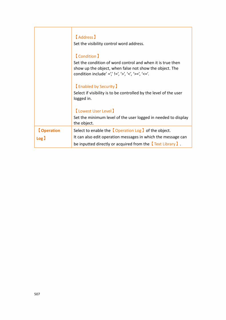
507
【Address】
Set the visibility control word address.
【Condition】
Set the condition of word control and when it is true then show up the object, when false not show the object. The condition include’ =’,’ !=’, ‘>’, ‘<’, ‘>=’, ‘<=’.
【Enabled by Security】
Select if visibility is to be controlled by the level of the user logged in.
【Lowest User Level】
Set the minimum level of the user logged in needed to display the object.
【Operation
Log】
Select to enable the【Operation Log】of the object.
It can also edit operation messages in which the message can
be inputted directly or acquired from the【Text Library】.

508
3.3.31 【Schedule Setting Table】
【Schedule Setting Table】is the object that used to read【Schedule】of
【Function】inside the【Project Exploer】, so need to plan the【Schedule】
function first. In addition to its main function can show the start time of the schedule, the end time, the start date, etc., allows designers to quickly design, but also provides HMI operation to dynamically change the start time and end time of each schedule
3.3.31.1 【General】
【Schedule Setting Table】【General】setting paging as shown below, the meaning
of each setting is as follows :
Figure 225【Schedule Setting Table】【General】setting paging
Table 176【Schedule Setting Table】【General】property setting
Property Description
【Preview】 Preview the appearance of this object.
【Name】 The default name of the object.

509
【Comment】 Set the comment of the object.
【General】 【Show Schedule】
click【Setting】on the right, able to select scheduled
schedule group number in the【Schedule】function.
【Row Height】
Set each of the row height in the table.
【Font】
Set the font of the text in the table.
【Text Size】
Set the text size in the table.
【Text Alignment】
Set the alignment of the text in the table, including left,
center, right and so on。
【Header】 【Text Color】
Set the text color of the header.
【Background Color】
Set the background color.
【Content】 【Text Color】
Set the text color of the content.
【Background Color】
Set the background color.
【Border】 【Type】
Set border type.
【Color/Width】
Set the color and width of the border.
【Grid】 【Horizontal】
Check whether you want to display the horizontal and set the horizontal color.
【Vertical】
Check whether you want to display the vertical and set the vertical color

510
3.3.31.2 【Header】
【Schedule Setting Table】【Header】setting paging as shown below, the meaning of
each setting is as follows :
Figure 226【Schedule Setting Table】【Header】setting paging
Table 177【Schedule Setting Table】【Header】property setting
Property Description
【Content】 Each of the schedule includes multiple information, the user can select the item using the checklist and can change the title display text on the right, the following is a description of each item:
➢ 【Group】
The group serial number of the schedule.
➢ 【Comment】
Comment of the schedule.
➢ 【Time Type】
The type of the schedule is a constant or an

511
address.
➢ 【Start Time】
Start time of the schedule.
➢ 【End Time】
End time of the schedule.
➢ 【Start Day】
Start day of the schedule.
➢ 【Set】
Press to modify the start and end times of each schedule.
3.3.31.3 【Operation】
【Schedule Setting Table】【Operation】setting paging as shown below, the
meaning of each setting is as follows :
Figure 227【Schedule Setting Table】【Operation】setting paging

512
Table 178 【Schedule Setting Table】【Operation】property setting
Property Description
【Visibility
Control】
Visibility control of the object. It can be controlled by a specific bit or user level.
【Enable by Bit】
Select to control visibility by a specific bit.
【Address】
Set the address of the visibility control bit.
【State】
Set the control bit as 1 or 0 to show object.
【Enabled by Word】
Check whether the visibility is controlled by word.
【Address】
Set the visibility control word address.
【Condition】
Set the condition of word control and when it is true then show up the object, when false not show the object. The condition include’ =’,’ !=’, ‘>’, ‘<’, ‘>=’, ‘<=’.
【Enabled by Security】
Select if visibility is to be controlled by the level of the user logged in.
【Lowest User Level】
Set the minimum level of the user logged in needed to display the object.
【Operation
Log】
Select to enable the【Operation Log】of the object. It can
also edit operation messages in which the message can be
inputted directly or acquired from the【Text Library】.
【Operation
Control】
Operation control of the object, which can be controlled by a specific bit or user level.
【Enable by Bit】
Select to control operation by a specific bit.
【Address】
Set the address of the operation control bit.
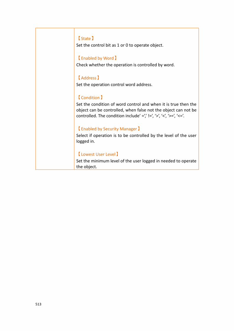
513
【State】
Set the control bit as 1 or 0 to operate object.
【Enabled by Word】
Check whether the operation is controlled by word.
【Address】
Set the operation control word address.
【Condition】
Set the condition of word control and when it is true then the object can be controlled, when false not the object can not be controlled. The condition include’ =’,’ !=’, ‘>’, ‘<’, ‘>=’, ‘<=’.
【Enabled by Security Manager】
Select if operation is to be controlled by the level of the user logged in.
【Lowest User Level】
Set the minimum level of the user logged in needed to operate the object.
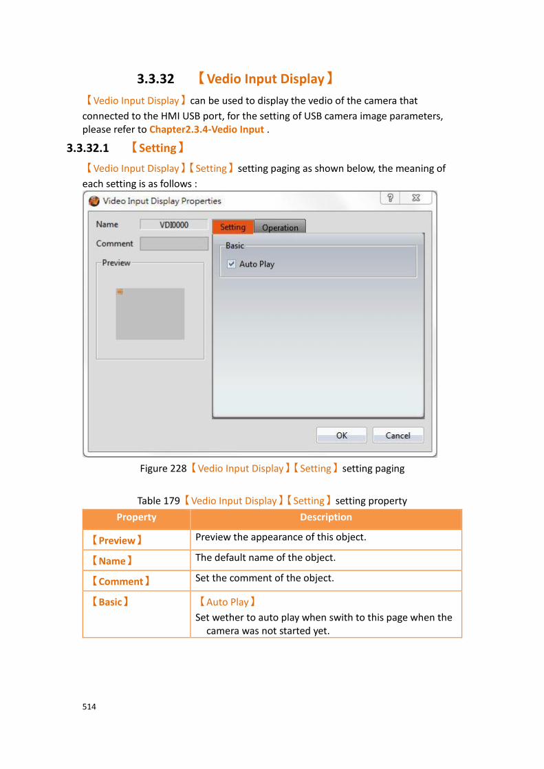
514
3.3.32 【Vedio Input Display】
【Vedio Input Display】can be used to display the vedio of the camera that
connected to the HMI USB port, for the setting of USB camera image parameters, please refer to Chapter2.3.4-Vedio Input .
3.3.32.1 【Setting】
【Vedio Input Display】【Setting】setting paging as shown below, the meaning of
each setting is as follows :
Figure 228【Vedio Input Display】【Setting】setting paging
Table 179【Vedio Input Display】【Setting】setting property
Property Description
【Preview】 Preview the appearance of this object.
【Name】 The default name of the object.
【Comment】 Set the comment of the object.
【Basic】 【Auto Play】
Set wether to auto play when swith to this page when the camera was not started yet.
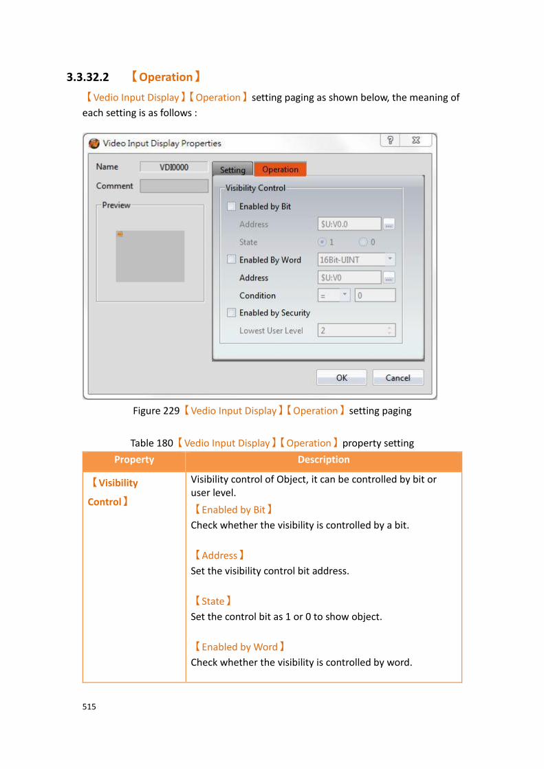
515
3.3.32.2 【Operation】
【Vedio Input Display】【Operation】setting paging as shown below, the meaning of
each setting is as follows :
Figure 229【Vedio Input Display】【Operation】setting paging
Table 180【Vedio Input Display】【Operation】property setting
Property Description
【Visibility
Control】
Visibility control of Object, it can be controlled by bit or user level.
【Enabled by Bit】
Check whether the visibility is controlled by a bit.
【Address】
Set the visibility control bit address.
【State】
Set the control bit as 1 or 0 to show object.
【Enabled by Word】
Check whether the visibility is controlled by word.

516
【Address】
Set the visibility control word address.
【Condition】
Set the condition of word control and when it is true then show up the object, when false not show the object. The condition include’ =’,’ !=’, ‘>’, ‘<’, ‘>=’, ‘<=’.
【Enabled by Security】
Select if visibility is to be controlled by the level of the user logged in.
【Lowest User Security】
Set the minimum level of the user logged in needed to display the object.

517
4. Servers
This chapter will introduce the various server functions provided by the HMI; users can use these server functions to achieve needs such as remote file access , send email and remote screen control.
4.1 【FTP Server】 FTP Server allows users to access files on the internal storage, SD card and USB storage device of the HMI. There are two ways to deploy the FTP server on the HMI. One is through the system settings of the HMI and the other is through the projects settings. Project settings will override system settings at project startup.
Figure 230 FTP Application Diagram
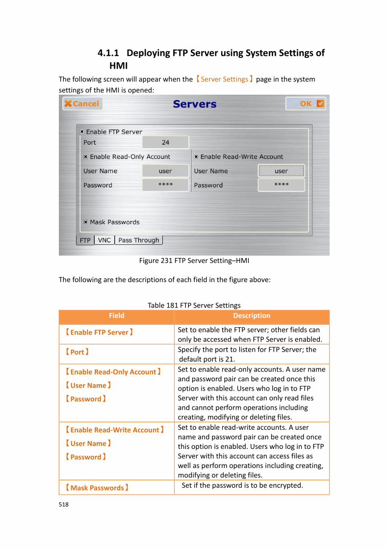
518
4.1.1 Deploying FTP Server using System Settings of HMI
The following screen will appear when the【Server Settings】page in the system
settings of the HMI is opened:
Figure 231 FTP Server Setting–HMI
The following are the descriptions of each field in the figure above:
Table 181 FTP Server Settings
Field Description
【Enable FTP Server】 Set to enable the FTP server; other fields can only be accessed when FTP Server is enabled.
【Port】 Specify the port to listen for FTP Server; the default port is 21.
【Enable Read-Only Account】
【User Name】
【Password】
Set to enable read-only accounts. A user name and password pair can be created once this option is enabled. Users who log in to FTP Server with this account can only read files and cannot perform operations including creating, modifying or deleting files.
【Enable Read-Write Account】
【User Name】
【Password】
Set to enable read-write accounts. A user name and password pair can be created once this option is enabled. Users who log in to FTP Server with this account can access files as well as perform operations including creating, modifying or deleting files.
【Mask Passwords】 Set if the password is to be encrypted.

519
4.1.2 Deploying FTP Server using Project Settings Click on【Server】in the【System】window of the【Project Explorer】to the left of
FvDesigner to enter the【Server】settings screen where the【FTP】tab page can be
used to setup FTP Server, as shown in the figure below:
Figure 232 FTP Server Setting–Project
The FTP settings of the project can be used to override HMI【System Setting】FTP
Server settings on the HMI when the project is loaded if【Overwrite FTP
Configuration on HMI】is checked. The other settings are identical to the setting
screen on the HMI; please refer to the explanations in Chapter 20.1.4【Servers】.
Note: if HMI has enable FTP sever, but the project setting doesn’t enable FTP server, then the FTP sever will be disable when download the project.

520
4.1.3 FTP Server Example We will use the following steps to illustrate how to use FTP Server:
1. Enter the system settings of the HMI during boot up and then open
【Server Settings】; setup FTP Server as shown in Figure 424.
2. Use Windows Explorer to open the address:ftp://user:password@HMI IP
Address to see the files on the HMI, as shown in the figure below:
Figure 233 Using FTP to view files stored in internal memory, SD, or USB

521
4.2 【VNC Server】 VNC Server allows users to remotely view and operate the HMI functions through an Internet connection so that users can check the data on the HMI or operate the HMI remotely. There are two ways to deploy the VNC server on the HMI. One is through the system settings of the HMI and the other is through the project settings. Project settings will have a higher priority if both settings are set.
Figure 234 VNC application illustration
4.2.1 Deploying VNC Server using System Settings of HMI
The following screen will appear when the【Server Settings】page in the system
settings interface of the HMI is opened:
Figure 235 VNC Server Setting-HMI
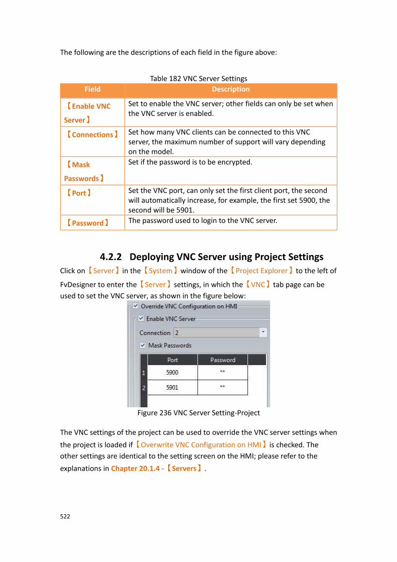
522
The following are the descriptions of each field in the figure above:
Table 182 VNC Server Settings
Field Description
【Enable VNC
Server】
Set to enable the VNC server; other fields can only be set when the VNC server is enabled.
【Connections】 Set how many VNC clients can be connected to this VNC server, the maximum number of support will vary depending on the model.
【Mask
Passwords】
Set if the password is to be encrypted.
【Port】 Set the VNC port, can only set the first client port, the second will automatically increase, for example, the first set 5900, the second will be 5901.
【Password】 The password used to login to the VNC server.
4.2.2 Deploying VNC Server using Project Settings Click on【Server】in the【System】window of the【Project Explorer】to the left of
FvDesigner to enter the【Server】settings, in which the【VNC】tab page can be
used to set the VNC server, as shown in the figure below:
Figure 236 VNC Server Setting-Project
The VNC settings of the project can be used to override the VNC server settings when
the project is loaded if【Overwrite VNC Configuration on HMI】is checked. The
other settings are identical to the setting screen on the HMI; please refer to the
explanations in Chapter 20.1.4 -【Servers】.
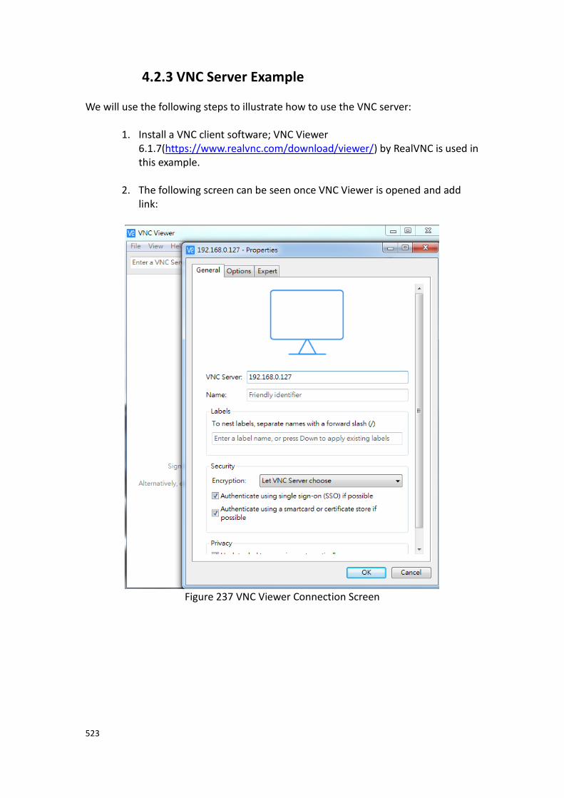
523
4.2.3 VNC Server Example We will use the following steps to illustrate how to use the VNC server:
1. Install a VNC client software; VNC Viewer 6.1.7(https://www.realvnc.com/download/viewer/) by RealVNC is used in this example.
2. The following screen can be seen once VNC Viewer is opened and add link:
Figure 237 VNC Viewer Connection Screen
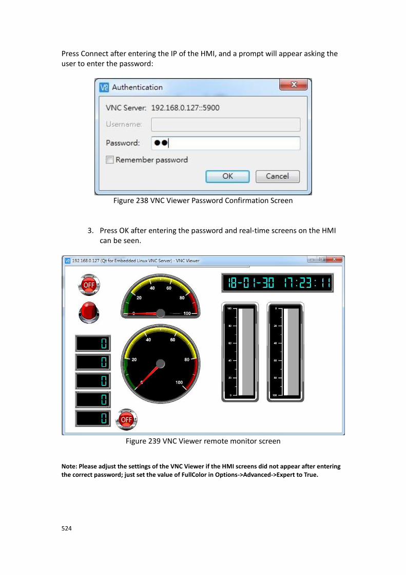
524
Press Connect after entering the IP of the HMI, and a prompt will appear asking the user to enter the password:
Figure 238 VNC Viewer Password Confirmation Screen
3. Press OK after entering the password and real-time screens on the HMI can be seen.
Figure 239 VNC Viewer remote monitor screen
Note: Please adjust the settings of the VNC Viewer if the HMI screens did not appear after entering the correct password; just set the value of FullColor in Options->Advanced->Expert to True.
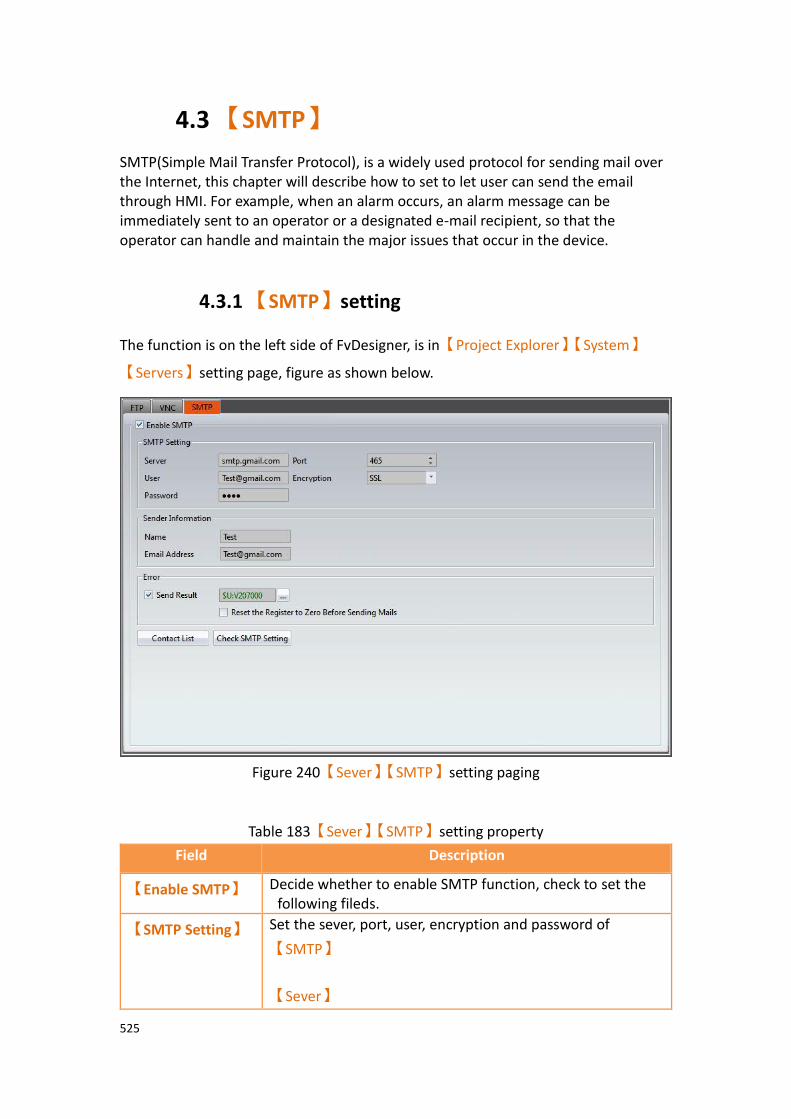
525
4.3 【SMTP】
SMTP(Simple Mail Transfer Protocol), is a widely used protocol for sending mail over the Internet, this chapter will describe how to set to let user can send the email through HMI. For example, when an alarm occurs, an alarm message can be immediately sent to an operator or a designated e-mail recipient, so that the operator can handle and maintain the major issues that occur in the device.
4.3.1 【SMTP】setting
The function is on the left side of FvDesigner, is in【Project Explorer】【System】
【Servers】setting page, figure as shown below.
Figure 240【Sever】【SMTP】setting paging
Table 183【Sever】【SMTP】setting property
Field Description
【Enable SMTP】 Decide whether to enable SMTP function, check to set the following fileds.
【SMTP Setting】 Set the sever, port, user, encryption and password of
【SMTP】
【Sever】

526
The sending email server, the following table shows common mail servers for reference , please refer to the various mail server announcements .
Email SMTP Sever Port Encryption
GMail smtp.gmail.com 465 SSL
Hotmail smtp.live.com 587 TLS
Yahoo smtp.mail.yahoo.com 465 SSL
AOL smtp.aol.com 587 TLS
QQ smtp.qq.com 465 SSL
【Port】
Each e-mail mail server has different connection ports. Please refer to the above table or check the mail server announcements.
【Encryption】
Each email mail server has different encryption ways. Please refer to the above table or check the mail server announcements.
【User】
Emal address of sender.
【Password】
Email password of sender.
【Sender
Information】
【Name】
Set the name of the sender.
【Email Address】
Set the sender’s email address to send the email.
【Error】 Set whether to display the result of sending email on the HMI or PLC register, error code show as below.
Error Code Meaning
0 Successfully send.
1 Failed to connect to sever.
2 Failed to log in
3 Failed to send email.
【Reset the Register to Zero Before Sending Mails】
Check whether to reset the register to 0 before sending mails.
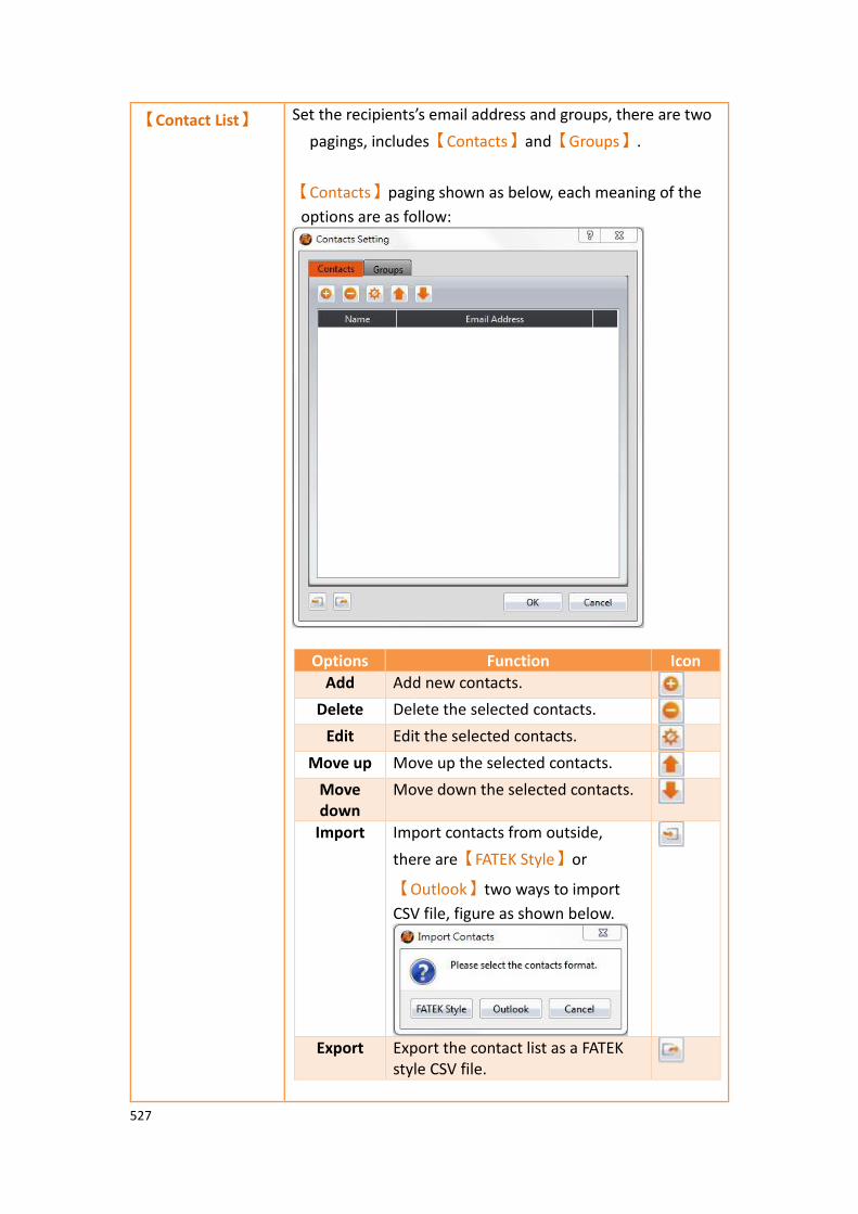
527
【Contact List】 Set the recipients’s email address and groups, there are two
pagings, includes【Contacts】and【Groups】.
【Contacts】paging shown as below, each meaning of the
options are as follow:
Options Function Icon
Add Add new contacts.
Delete Delete the selected contacts.
Edit Edit the selected contacts.
Move up Move up the selected contacts.
Move down
Move down the selected contacts.
Import Import contacts from outside,
there are【FATEK Style】or
【Outlook】two ways to import
CSV file, figure as shown below.
Export Export the contact list as a FATEK style CSV file.

528
The【Groups】tab page as shown below, the meaning of
each setting option is as follows:
Options Function Icon
Add Add Contact Group.
Delete Delete the selected contact group.
Edit Edit the selected contact group.
Copy Copy contact group.
Note : the SMTP function of sending email will only send to
the specified group. For example, group 1 has A recipient,
group 2 has B and C recipients, when sending email to
group 2, B and C will receive the same mail.
【Check SMTP
Setting】
Check whther SMTP is setting correct or not, press【Check
SMTP Setting】button, will show up the window and select
the group.

529
If success will show up the window below
And the group will receive a SMTP testing email from FvDesigner.
4.3.2 【SMTP】setting example
We will use the following steps to explain how to set the【SMTP】function and test
whether SMTP is correct, here we use gmail to explain, as for how to combine with alarms, when the alarm occurs, you can send emails to the configured recipients
through the【SMTP】function. For details, refer to Section 8.3 - Alarm Application
Example.
Step1 : Click【Servers】in the【System】window in【Project Explorer】on the left
of FvDesigner, enter the【Servers】setting page, switch to【SMTP】tab, and enable
【SMTP】, as shown below
Figure 241 SMTP setting window

530
Step 2 : According to the Gmail server, set the【Servers】as smtp.gmail.com, set the
【Port】as 465, set the【Encryption】as SSL, fill【User】in user’s e-mail address,
and set the sender’s email password in【Password】, fill the actual user name and
password of the【User】and【Password】, as shown below
Figure 242 SMTP sever setting window
Step 3 : fill up【Name】and【Email Address】of the sender information, fill up your
actual【User】and【Password】, as shown below.
Figure 243 SMTP sender information setting window

531
Step 4 : fill up【Contacts】and【Groups】, please fill in your actual recipient's
email, as shown below.
Figure 244 SMTP contacts setting window
Figure 245 SMTP group setting window

532
Step 5 : press【Check SMTP setting】, and select the group you want to test, it will
show up the following figure if successful transmit, the recipient’s email will receive a SMTP test email from FvDesigner, as shown below.
Figure 246 SMTP test successfully window
Figure 247 SMTP test letter send by FvDesigner
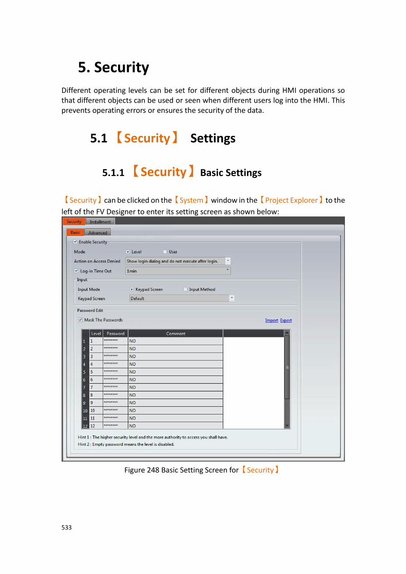
533
5. Security
Different operating levels can be set for different objects during HMI operations so that different objects can be used or seen when different users log into the HMI. This prevents operating errors or ensures the security of the data.
5.1 【Security】 Settings
5.1.1 【Security】Basic Settings
【Security】can be clicked on the【System】window in the【Project Explorer】to the
left of the FV Designer to enter its setting screen as shown below:
Figure 248 Basic Setting Screen for【Security】

534
Table 184 Basic Setting Properties of【Security】
Property Description
【Enable
Security】
Select to enable【Security】; this is the main switch of
【Security】.
【Mode】
The mode can be divided into the following two types:
➢ 【Level】
Only the password needs to be entered during login. Security levels range from 1~15. The higher security level allows more authority for the access.
➢ 【User】
The user name and password needs to be entered during login. Allows a maximum of 100 user accounts.
【Action on Access Denied】
When the【Lowest User Level】allowed by a certain object is
higher than the level where the user currently logged in,
【Security】will deny execution actions. This setting is used to
determine the behavior of【Security】after denying the
execution; it is divided into the following three types:
➢ 【None】
No response
➢ 【Show login dialog and do not execute after login】
Shows the password entry (or user name) login dialog, will not execute object’s action, such as the operation control of the button needs level 2, press the button will show login dialog, login password even or bigger than level 2, the current level will be changed, but the button will not do action, needs to press the button again to do the action.
➢ 【Show login dialog and execute after login】
Shows the password entry (or user name) login dialog, will execute object’s action, such as the operation control of the button needs level 2, press the button will show login dialog, login password even or bigger than level 2, the current level will be changed, and the button will do action.
➢ 【Show Denied Message】
Shows the default denial message of the system
535
【Log-in Timeout】
Set to make the HMI logout to the lowest user level when the HMI has not been operated for a certain amount of time.
【Input】 Keypad mode for entering password.
【Input Mode】
The keypad can be selescted as system’s built-in keypad, designer-defined keypad or Simplified Chinese Pinyin input method, etc.
【Keypad Screen】
When【Input Mode】select as【Keypad Screen】will show up
this option, can choose the keypad screen when you enter during login, it has system’s built-in keypad, designer-defined keypad.
【Input Method】
When【Input Mode】select as【Input Method】will show up
this option, can select Simplified Chinese Pinyin input method.
【Password
Edit】
【Mask Passwords】
Set encrypt passwords in the password form.
【Import】
Import CSV files with specific formats and updates it directly into the password from.
【Export】
Export the password form below into a CSV file with a specific format.
【New】
Adds a new user to the bottom of the table. The Level, Name, Password, and Comment can be set. This option is only available
when the【Mode】is set to【User】.
【Delete】
Delete the currently selected user. By default, the bottommost entry in the table is delete. This option is only available when the
【Mode】is set to【User】.
536
【Password Table】【Level】
Security level of a user. This option is only available when the
【Mode】is set to【User】. Levels 1 to 15 are available.
【Password Table】【Name】
Set the user name. This option is only available when the
【Mode】is set to【User】.
【Password Table】【Password】
Set the password. This option is only available when the【Mode】
is set to【User】.
【Password Table】【Comment】
Add a comment describing the level/user. Tip: Multiple users might need to be planned when the【Mode】is
【User】.【Export】can be used to generate a default CSV file for editing,
and then【Import】is used to update the project.

537
5.1.2 【Security】Advanced Settings
Enter basic settings of【Security】function, and click【Advanced】paging than go to
its setting page below:
Figure 249 Advanced Setting Screen for【Security】【Level】
Table 185 Advanced Setting Properties of【Security】
Property Description
【Advanced】 【Current User Name Address】
Set the display address of the current login user name, can set as HMI internal address or PLC register and will occupy 8 consecutive registers, for example, setting R100, will occupy R100~R107, it can be set when the mode choose as
【User】.
【Enable Register
Control】
Check whether to enable the advanced function of
【Security】.

538
【Basic】 【Customize Dialog】
You can select the password login dialog window that
designer defined, this option can only select 【Window
Screen】.
【Trigger Bit】
Set the trigger signal, when【Trigger Bit】turn OFF to ON
will excute once, 【Operation Address】setting mode.
【Operation Address】
Depending on the mode, different operating types are provided, where you can set the HMI internal address or PLC register.
【Level】mode provides the following 5 types of
operations.
Value of Operation Address
Operation Type
0 Log in
1 Log out
2 Passwoed modify. The password level that can be modified is only allowed to be lower or equal than the password level that is currently logged in.
3 A group of password levels is enabled. The password level that can be enabled is only allowed to be lower than the password level currently logged in.
4 A group of password levels is disabled. The password level that can be disabled is only allowed to be lower than the password level currently logged in.
Note: Need to check the【Enable Modify Accounts】 option, the
operation address in the value of 2,3,4 and other functions will take effect.
【User】mode provides the following 7 types of
operations.

539
Value of Operation Address
Operation Type
0 Log in
1 Log out
2 Passwoed modify. The password level that can be modified is only allowed to be lower than the password level currently logged in.
3 Add new users. The password level for new users is only allowed to be lower or equal than the password level currently logged in.
4 Delete users. The password level that removes the user is only allowed to be lower than the password level currently logged in.
5 Modify user level. Modifying a user's level is only allowed to be lower than the password level currently logged in, and the original level needs to lower than the current level.
6 Modify user level and password. The level of the user who can modify the user is allowed to be lower than the password level that is now logged in and the original level needs to lower than the current level.
Note: Need to check the【Enable Modify Accounts】option, the
operation address in the value of 2,3,4,5,6 and other functions will take effect.
【User ID】
User ID to sign in.
【Current Password】
Current level password, or password to login.
【Result Address】
When【Trigger Bit】turn OFF to ON, the system will excute

540
depending on different mode of【Operation Address】
settings, and the result will store in this address. The meaning of each code is as follows.
Value of Result Address
Result Code Description
0 No error.
1 There is no corresponding password in the password table.
2 There is no corresponding user in the password table.
3 Password level error.
4 There is no matching confirmation password.
5 Other levels have the same password (Level mode).
6 Other levels have the same password (User mode).
7 The password for the new password is empty.
8 Level has been enabled (Level mode).
9 Advanced account is disabled.
A The value of the operation address is not supported.
【Enable Modify
Accounts】
【Level】
Password level is enabled or disabled, the level to be set when modifying the user level.
【New Password】
Change the password to set the new password.
【Confirm Password】
Change Password In addition to setting a new password,
also set the confirmation password,and the new
password is the same as the confirmation password。
Under【Level】mode or【User】mode, the relevant parameters must be set before
the different operation types are triggered, as shown in the table below, for example,
to modify the password, first in the【Current Password】to enter the password to
change the level, 【New Password】and【Confirm Password】enter the password you
want to change, and let【Operation Address】equal to 3, then let【Trigger Bit】turn
OFF to ON, so that the correct implementation of advanced【Security】function of the
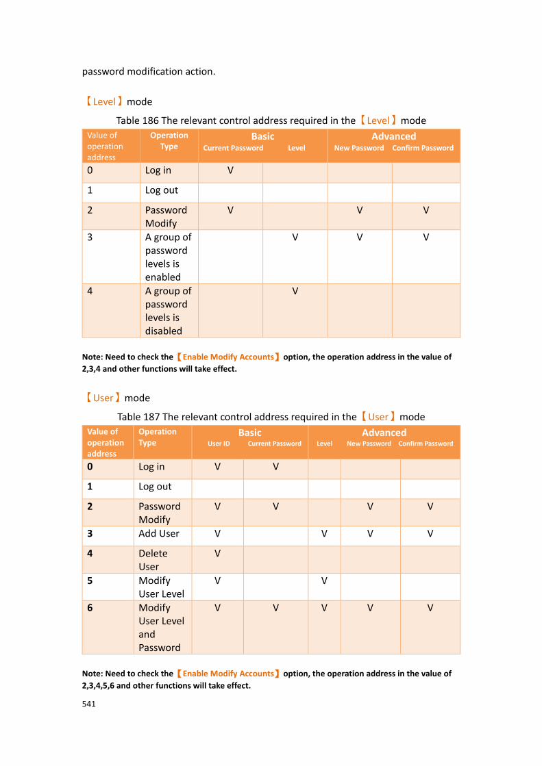
541
password modification action.
【Level】mode
Table 186 The relevant control address required in the【Level】mode
Value of operation address
Operation Type
Basic Current Password Level
Advanced New Password Confirm Password
0 Log in V
1 Log out
2 Password Modify
V V V
3 A group of password levels is enabled
V V V
4 A group of password levels is disabled
V
Note: Need to check the【Enable Modify Accounts】option, the operation address in the value of
2,3,4 and other functions will take effect.
【User】mode
Table 187 The relevant control address required in the【User】mode
Value of operation address
Operation Type
Basic User ID Current Password
Advanced Level New Password Confirm Password
0 Log in V V
1 Log out
2 Password Modify
V V V V
3 Add User V V V V
4 Delete User
V
5 Modify User Level
V V
6 Modify User Level and Password
V V V V V
Note: Need to check the【Enable Modify Accounts】option, the operation address in the value of
2,3,4,5,6 and other functions will take effect.

542
5.2 Security Settings of Objects The settings of【Security】were described above. Every object (except for drawing
objects) has security settings themselves that must also be set if security management is needed. The image below is the setting screen of an object; the security setting of objects can
be found in the【Operation】tab page as shown in the image frame below, in which
the green frame is the security control of visibility and the blue frame is the security control for operations. For example, the blue box in the figure below has the operation of the object set to a user level of 4. Therefore, the minimum level of user needed to operate the object is 4. Note: Objects will not have security control for operations if the object itself does not have operation functions, such as meters etc.
Figure 250 Security Settings for Objects

543
Table 188 Security Setting Properties of Objects
Property Description
【Visibility
Control】
Visibility control of the object can be controlled by a specific Bit or User Level.
【Enable by Bit】
Select to control visibility by a specific Bit.
【Address】
Set the address of the visibility control Bit.
【State】
Set the control bit as 1 or 0 to show object.
【Enabled by Word】
Check whether the visibility is controlled by word.
【Address】
Set the visibility control word address.
【Condition】
Set the condition of word control and when it is true then show up the object, when false not show the object. The condition include’ =’,’ !=’, ‘>’, ‘<’, ‘>=’, ‘<=’.
【Enabled by Security】
Select if visibility is to be controlled by the level of the user logged in.
【Lowest User Level】
Set the minimum level of the user logged in needed to display the object.
【Operation
Control】
Operation control of the object, which can be controlled by a specific bit or user level.
【Enable by Bit】
Select to control operation by a specific bit.
【Address】
Set the address of the operation control bit.
【State】
Set the control bit as 1 or 0 to operate object.
544
【Enabled by Word】
Check whether the operation is controlled by word.
【Address】
Set the operation control word address.
【Condition】
Set the condition of word control and when it is true then the object can be controlled, when false not the object can not be controlled. The condition include’ =’,’ !=’, ‘>’, ‘<’, ‘>=’, ‘<=’.
【Enabled by Security Manager】
Select if operation is to be controlled by the level of the user logged in.
【Lowest User Level】
Set the minimum level of the user logged in needed to operate the object.
【Show Disabled Sign】
Check if you want to display the forbidden symbol, it’s valid
when check【Enable by Bit】,【Enabled by Word】 or
【Enable by Security】.
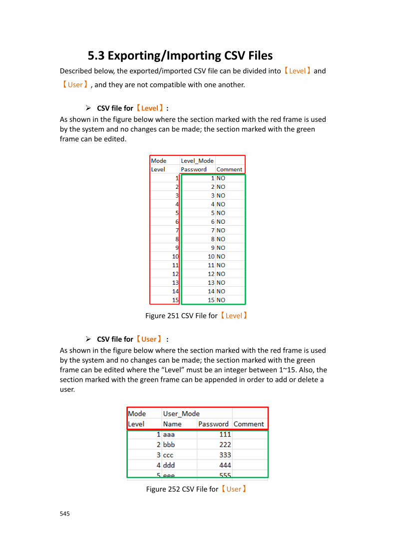
545
5.3 Exporting/Importing CSV Files Described below, the exported/imported CSV file can be divided into【Level】and
【User】, and they are not compatible with one another.
➢ CSV file for【Level】:
As shown in the figure below where the section marked with the red frame is used by the system and no changes can be made; the section marked with the green frame can be edited.
Figure 251 CSV File for【Level】
➢ CSV file for【User】 :
As shown in the figure below where the section marked with the red frame is used by the system and no changes can be made; the section marked with the green frame can be edited where the “Level” must be an integer between 1~15. Also, the section marked with the green frame can be appended in order to add or delete a user.
Figure 252 CSV File for【User】
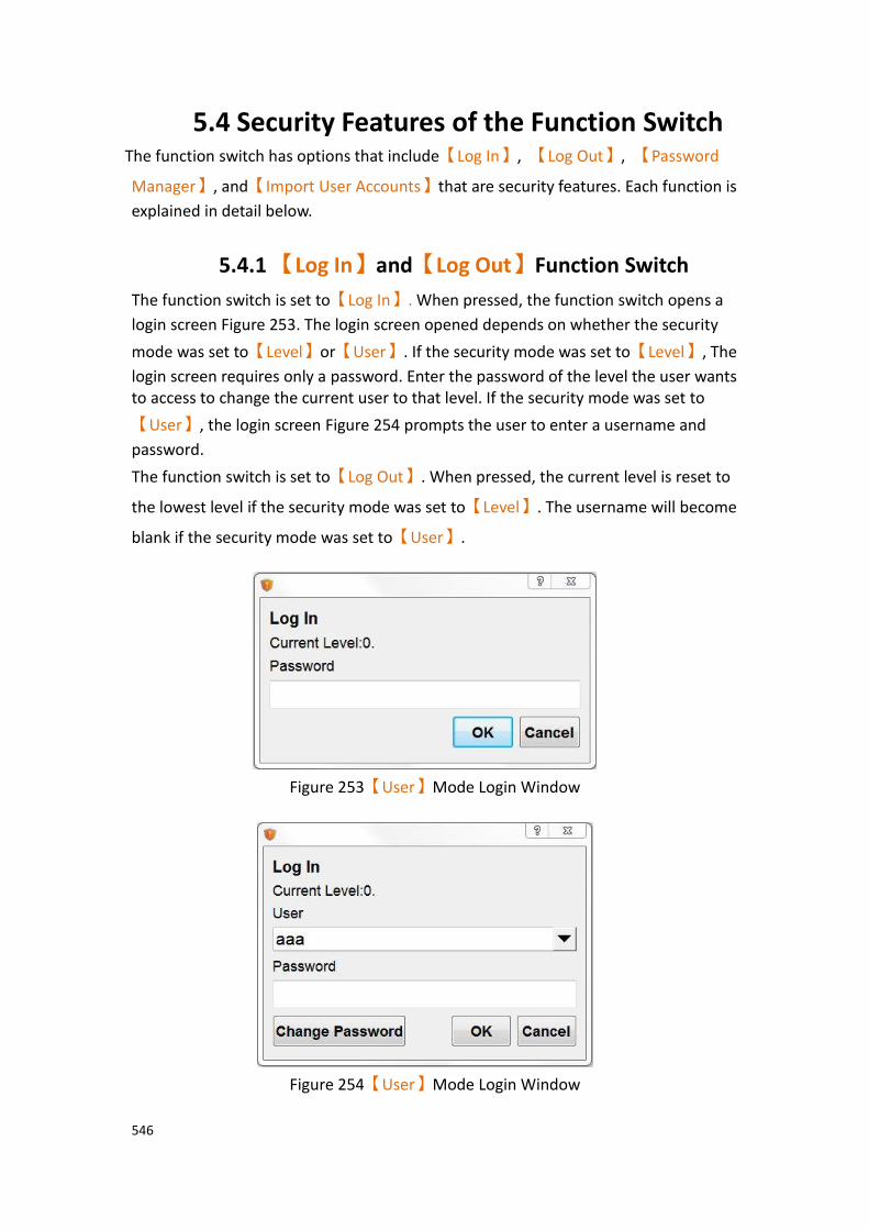
546
5.4 Security Features of the Function Switch The function switch has options that include【Log In】, 【Log Out】, 【Password
Manager】, and【Import User Accounts】that are security features. Each function is
explained in detail below.
5.4.1 【Log In】and【Log Out】Function Switch
The function switch is set to【Log In】. When pressed, the function switch opens a
login screen Figure 253. The login screen opened depends on whether the security
mode was set to【Level】or【User】. If the security mode was set to【Level】, The
login screen requires only a password. Enter the password of the level the user wants to access to change the current user to that level. If the security mode was set to
【User】, the login screen Figure 254 prompts the user to enter a username and
password.
The function switch is set to【Log Out】. When pressed, the current level is reset to
the lowest level if the security mode was set to【Level】. The username will become
blank if the security mode was set to【User】.
Figure 253【User】Mode Login Window
Figure 254【User】Mode Login Window

547
5.4.2 【Password Manager】Function Switch This function allows users to manage passwords that are at most associated with levels at or lower than the currently logged in level. If the security mode is set to
【Level】, as Figure 255, the【Password Manager】gives the user access to the
current level’s password as well as passwords for all lower levels. If the security mode
is set to【User】, as Figure 256, the【Password Manager】gives the user access to
all users at the current level or lower than the current level. The user can add or delete users, change the level, name, and password of other users. The level can only be changed to at most the current user’s level.
Figure 255【Level】Mode Password Manager Window
Figure 256【User】Mode Password Manager Window
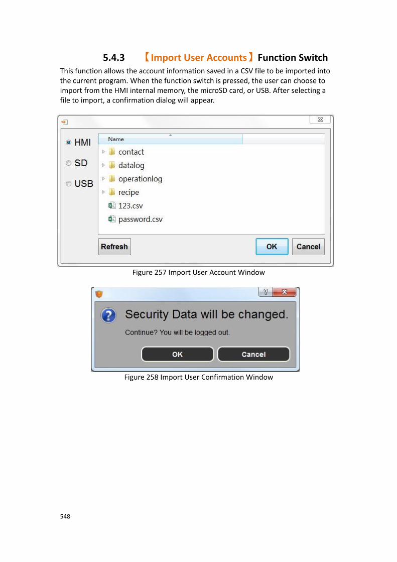
548
5.4.3 【Import User Accounts】Function Switch This function allows the account information saved in a CSV file to be imported into the current program. When the function switch is pressed, the user can choose to import from the HMI internal memory, the microSD card, or USB. After selecting a file to import, a confirmation dialog will appear.
Figure 257 Import User Account Window
Figure 258 Import User Confirmation Window
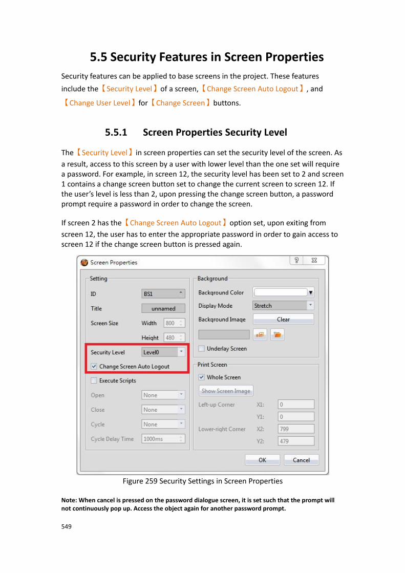
549
5.5 Security Features in Screen Properties
Security features can be applied to base screens in the project. These features
include the【Security Level】of a screen,【Change Screen Auto Logout】, and
【Change User Level】for【Change Screen】buttons.
5.5.1 Screen Properties Security Level
The【Security Level】in screen properties can set the security level of the screen. As
a result, access to this screen by a user with lower level than the one set will require a password. For example, in screen 12, the security level has been set to 2 and screen 1 contains a change screen button set to change the current screen to screen 12. If the user’s level is less than 2, upon pressing the change screen button, a password prompt require a password in order to change the screen.
If screen 2 has the【Change Screen Auto Logout】option set, upon exiting from
screen 12, the user has to enter the appropriate password in order to gain access to screen 12 if the change screen button is pressed again.
Figure 259 Security Settings in Screen Properties
Note: When cancel is pressed on the password dialogue screen, it is set such that the prompt will not continuously pop up. Access the object again for another password prompt.

550
5.5.2 Change Screen Button Change User Level
In the【Change Screen】button properties, there is an option to【Change User
Level】. For example, the【Change User Level】option is selected and the level is
set to 3. When the screen has switched to the selected screen, the user’s level is now 3.
Figure 260 Security Settings in Change Screen Button

551
5.6 Installment This function allows the user to a authorization time period. When this period ends, the HMI device will be locked. A window will appear on the HMI that does not let the HMI operate before the new authorization password is entered. Once the password is entered, the HMI device can be used. This function provides both static and dynamic modes.
Figure 261 Installment application illustration

552
5.6.1 Installment Basic Settings
To get to the【Installment】settings, open the Project Explorer, click on Security (In
the System section) and go to the second tab labeled Installment.
Figure 262【Installment Settings】
Table 189 Installment Attributes
Field Description
【Enable
Installment】
Check whether to enable【Installment】, it’s able to do the
advanced settings after enable this function.
【Types of Installment】:
【Static Installment】specifies the total number of expiration
periods during design the project, the date of each period, and the password.
【Dynamic Installment】allows the user to adjust the expiration
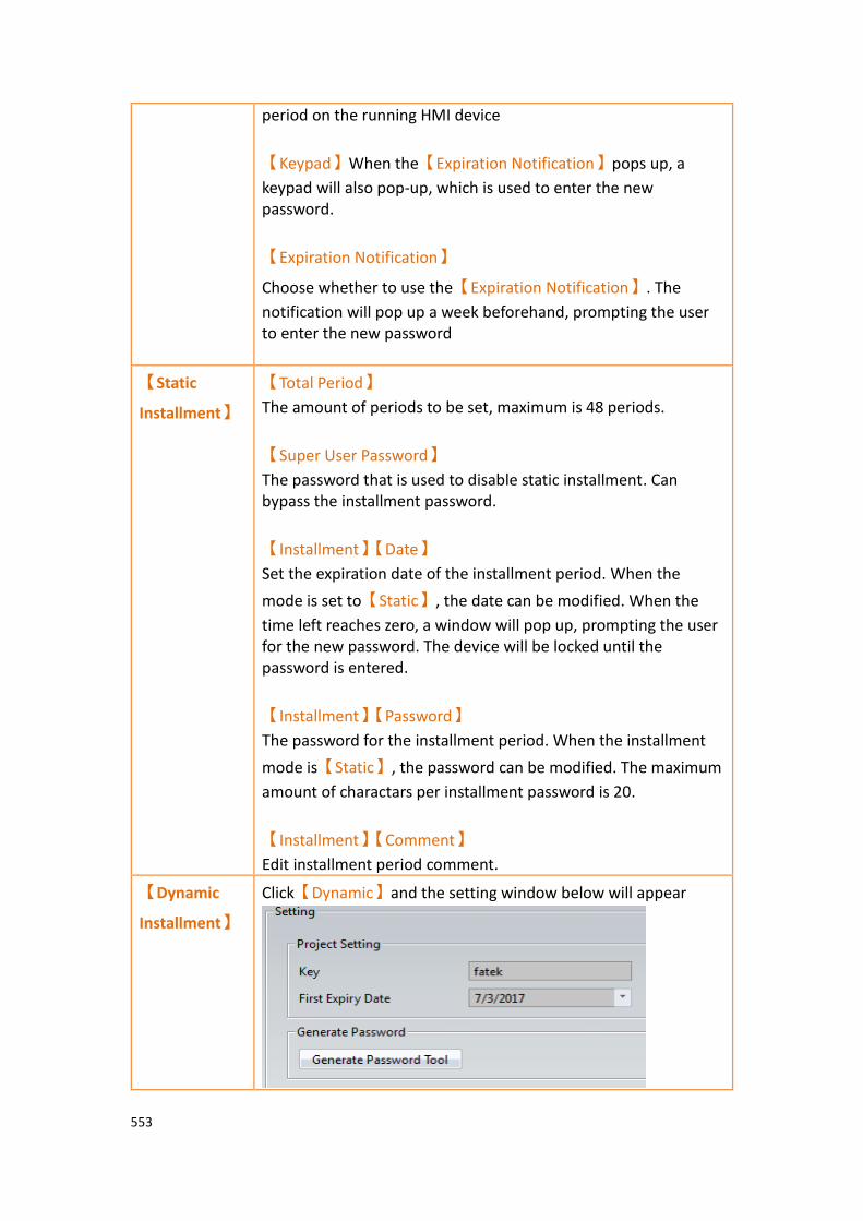
553
period on the running HMI device
【Keypad】When the【Expiration Notification】pops up, a
keypad will also pop-up, which is used to enter the new password.
【Expiration Notification】
Choose whether to use the【Expiration Notification】. The
notification will pop up a week beforehand, prompting the user to enter the new password
【Static
Installment】
【Total Period】
The amount of periods to be set, maximum is 48 periods.
【Super User Password】
The password that is used to disable static installment. Can bypass the installment password.
【Installment】【Date】
Set the expiration date of the installment period. When the
mode is set to【Static】, the date can be modified. When the
time left reaches zero, a window will pop up, prompting the user for the new password. The device will be locked until the password is entered.
【Installment】【Password】
The password for the installment period. When the installment
mode is【Static】, the password can be modified. The maximum
amount of charactars per installment password is 20.
【Installment】【Comment】
Edit installment period comment.
【Dynamic
Installment】
Click【Dynamic】and the setting window below will appear
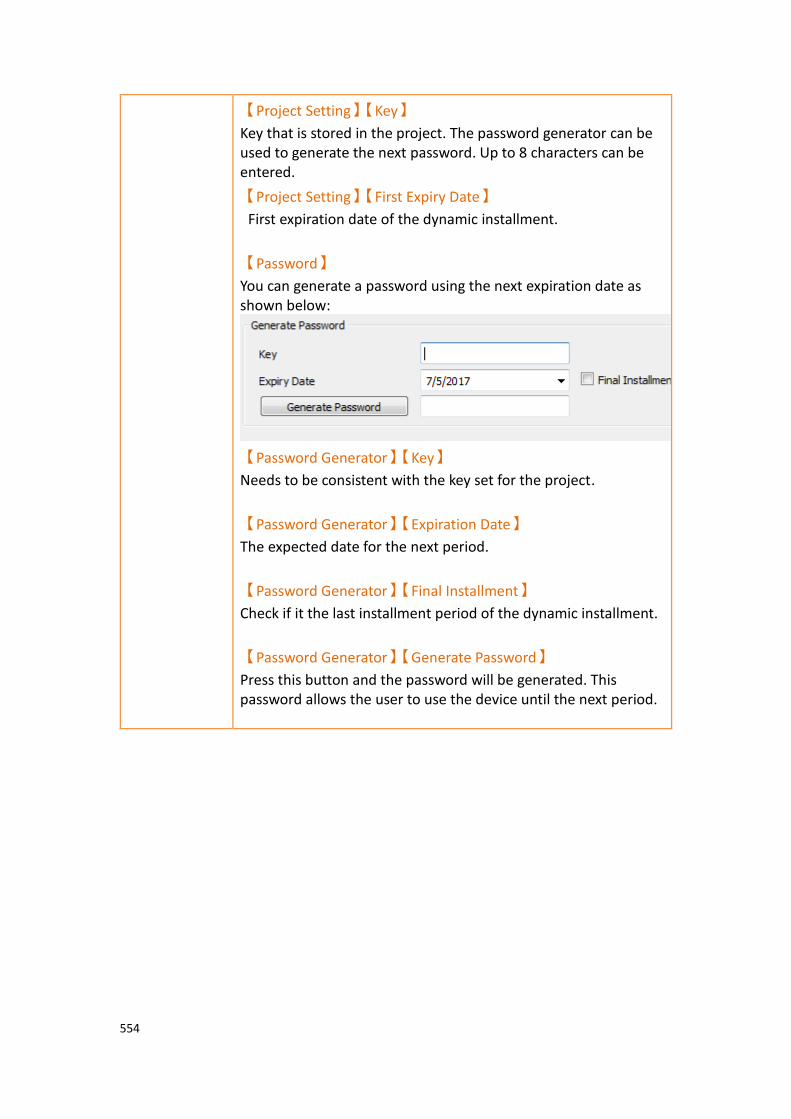
554
【Project Setting】【Key】
Key that is stored in the project. The password generator can be used to generate the next password. Up to 8 characters can be entered.
【Project Setting】【First Expiry Date】
First expiration date of the dynamic installment.
【Password】
You can generate a password using the next expiration date as shown below:
【Password Generator】【Key】
Needs to be consistent with the key set for the project.
【Password Generator】【Expiration Date】
The expected date for the next period.
【Password Generator】【Final Installment】
Check if it the last installment period of the dynamic installment.
【Password Generator】【Generate Password】
Press this button and the password will be generated. This password allows the user to use the device until the next period.
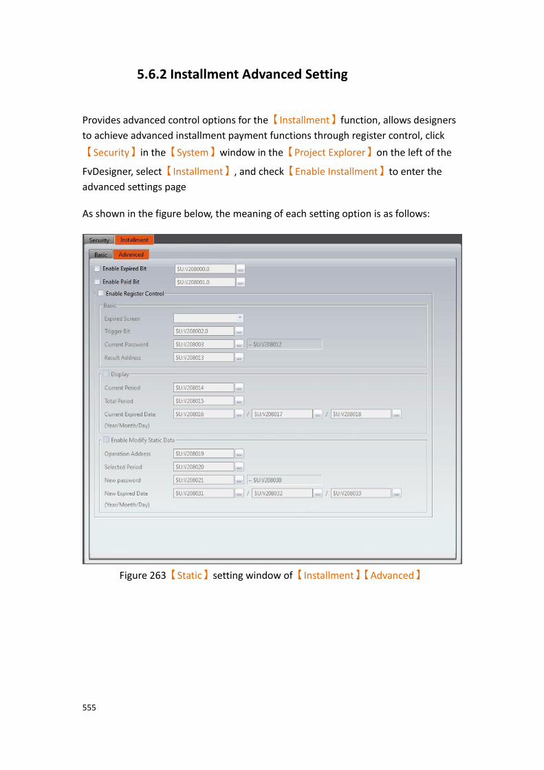
555
5.6.2 Installment Advanced Setting
Provides advanced control options for the【Installment】function, allows designers
to achieve advanced installment payment functions through register control, click
【Security】in the【System】window in the【Project Explorer】on the left of the
FvDesigner, select【Installment】, and check【Enable Installment】to enter the
advanced settings page As shown in the figure below, the meaning of each setting option is as follows:
Figure 263【Static】setting window of【Installment】【Advanced】

556
Figure 264【Dynamic】setting window of【Installment】【Advanced】
Table 190 【Installment】properties setting
Properties Description
【Advanced】 【Enable Expired Bit】
Check whether to send a bit signal when the installment expires, the bit signal can be internal address or PLC address.
【Enable Paid Bit】
Check whether to send a bit signal when the installment has been paid , the bit signal can be internal address or PLC address.
【Enable Register
Control】
Check【Installment】function has enable the register’s
advanced control.
【Basic】 【Expired Screen】
Select the custom login screen for which you want to enter the password.
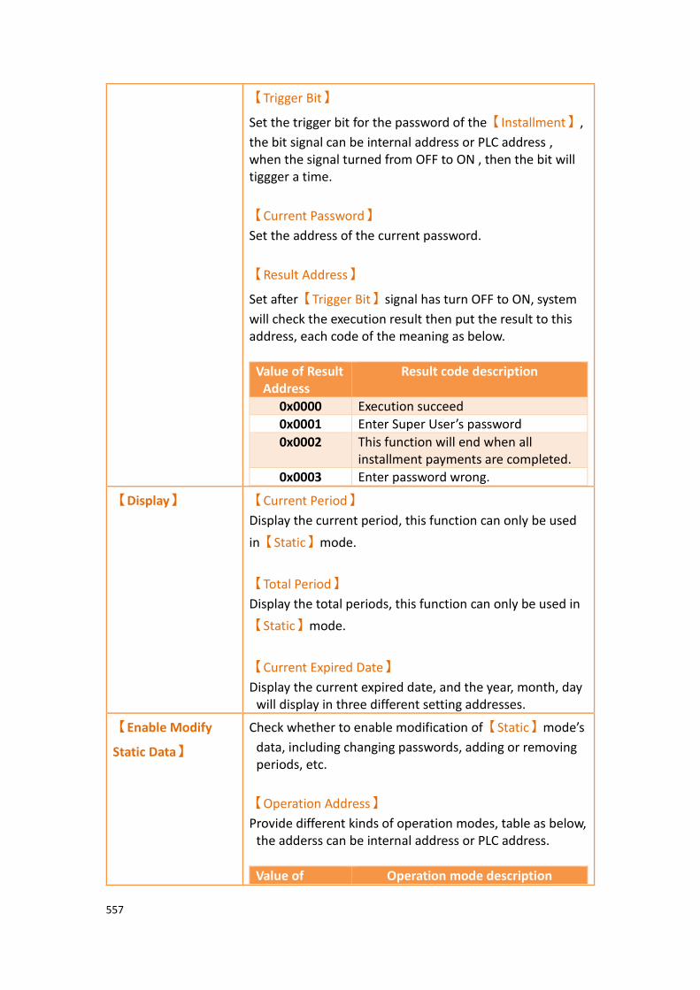
557
【Trigger Bit】
Set the trigger bit for the password of the【Installment】,
the bit signal can be internal address or PLC address , when the signal turned from OFF to ON , then the bit will tiggger a time.
【Current Password】
Set the address of the current password.
【Result Address】
Set after【Trigger Bit】signal has turn OFF to ON, system
will check the execution result then put the result to this address, each code of the meaning as below.
Value of Result Address
Result code description
0x0000 Execution succeed
0x0001 Enter Super User’s password
0x0002 This function will end when all installment payments are completed.
0x0003 Enter password wrong.
【Display】 【Current Period】
Display the current period, this function can only be used
in【Static】mode.
【Total Period】
Display the total periods, this function can only be used in
【Static】mode.
【Current Expired Date】
Display the current expired date, and the year, month, day will display in three different setting addresses.
【Enable Modify
Static Data】
Check whether to enable modification of【Static】mode’s
data, including changing passwords, adding or removing periods, etc.
【Operation Address】
Provide different kinds of operation modes, table as below, the adderss can be internal address or PLC address.
Value of Operation mode description

558
Operation Address
0x0000 Used in【Enable Register Control】
【Basic】function.
0x0001 Display the relevant information of this period, such as password and date, etc.
0x0002 Modify the relevant information of this period, such as modify password and date, etc.
0x0003 Add a new period.
0x0004 Remove the selected period.
【Selected Period】
Select the【Installment】period that would like to modify
or remove, when the value of the address is 0 will display
or modify the data of【Super User】.
【New Password】
Provide new password that midified, if the mode is
【Display the period revelant information】then the
address will display the password for this period.
【New Expired Date】
Provide new expired date that midified, if the mode is
【Display the period revelant information】then the
address will display the expiration date for this period.
If has checked【Enable Modify Static Data】then the
meaning of each code of【Result Address】are as follows
Value of Result Address
Result code description
0x0000 Execution succeed
0x0001 Enter Super User’s password
0x0002 This function will end when all installment payments are completed
0x0003 Enter password wrong
0x0004 Periods are incorrec
0x0005 This period has already entered the password
0x0006 New Expired Date is incorrect
0x0007 New Password is incorrect

559
0x0008 The value of【Operation Address】is
not supported, and the value of
【Operation Address】is incorrect.
Table 191【Operation Address】relevant control address required in【Static】mode
Value of operation address
Operation type Basic Advanced
Current password
Select period
New password
New expied date
0x0000 Used in【Enable
Register
Control】
【Basic】
function
V
0x0001 Display this period’s revelant information
0x0002 Modify this period’s revelant information
V V V
0x0003 Add a new period V V V
0x0004 Remove the selected periods
V
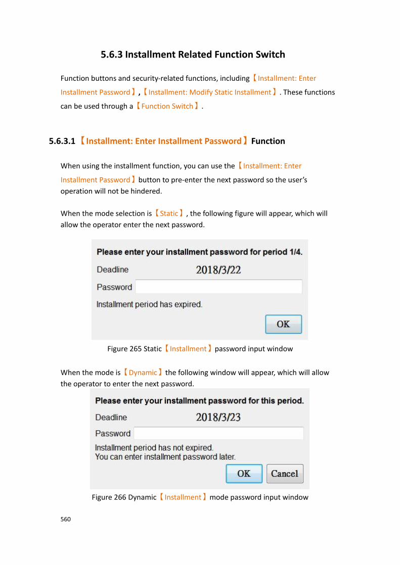
560
5.6.3 Installment Related Function Switch
Function buttons and security-related functions, including【Installment: Enter
Installment Password】,【Installment: Modify Static Installment】. These functions
can be used through a【Function Switch】.
5.6.3.1 【Installment: Enter Installment Password】Function
When using the installment function, you can use the【Installment: Enter
Installment Password】button to pre-enter the next password so the user’s
operation will not be hindered.
When the mode selection is【Static】, the following figure will appear, which will
allow the operator enter the next password.
Figure 265 Static【Installment】password input window
When the mode is【Dynamic】the following window will appear, which will allow
the operator to enter the next password.
Figure 266 Dynamic【Installment】mode password input window
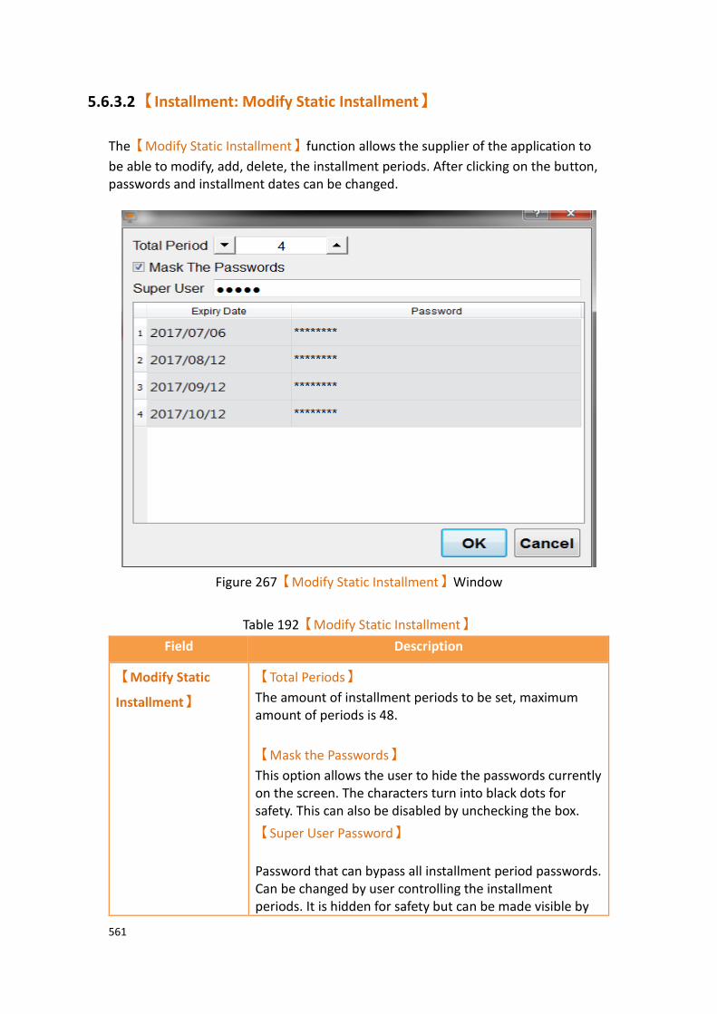
561
5.6.3.2 【Installment: Modify Static Installment】
The【Modify Static Installment】function allows the supplier of the application to
be able to modify, add, delete, the installment periods. After clicking on the button, passwords and installment dates can be changed.
Figure 267【Modify Static Installment】Window
Table 192【Modify Static Installment】
Field Description
【Modify Static
Installment】
【Total Periods】
The amount of installment periods to be set, maximum amount of periods is 48.
【Mask the Passwords】
This option allows the user to hide the passwords currently on the screen. The characters turn into black dots for safety. This can also be disabled by unchecking the box.
【Super User Password】
Password that can bypass all installment period passwords. Can be changed by user controlling the installment periods. It is hidden for safety but can be made visible by
562
unchecking the Mask the Passwords box.
【Expiry Date】
The user is able to adjust the【Expiry Date】. The
expiration date needs to be a later date than the previous installment period.
【Password】
The password that is set to let the user be able to operate the machine again. The maximum number of characters per password is 20.

563
6. System Message
【System Message】is located in【Project Explorer】under the【System】tab.
【System Messages】appear in a pop-up dialogue on the HMI whenever abnormal
behavior is encountered. The message the user is prompted with includes the
category of the message: 【GENERAL_MESSAGE_TYPE】,
【COMMUICATION_TYPE】,【SECURITY_MESSAGE_TYPE】,
【FILE_MANAGER_TYPE】,【STANDER_BUTTON_TYPE】,【DATA_LOG_TYPE】,
【ALARM_TYPE】,【RECIPE_TYPE】,【PRINTER_TYPE】,【OPERLOG_TYPE】,
【STATUS_BAR_TYPE】,【DEVICE_TYPE】,【SCHEDULE_TYPE】and
【SMTP_TYPE】. The user is allowed to customize the【System Messages】in order
to satisfy the project needs. Click【System Message】to access the following
settings:
6.1 【System Message】Settings 【System Message】is located in the project manager under the system tab. The
settings page is as follows:
Figure 268【System Message】Settings Screen
Table 193【System Message】Settings
Property Description
【Default Message
Language】
The HMI has a built in set of system messages. This option allows for the selection of the language the systems are displayed in. There are currently 3 language options: English, Traditional

564
Chinese, and Simplified Chinese.
Example: The 【 Default Message Language 】 is set to
Traditional Chinese. The system message dialog will appear as follows:
Example: The【Default Message Language】is set to English.
The system message dialog will appear as follows:
【Preset Font】 You can set the font of the system message.
【Enable Custom
System Message】
Check this option to enable the system messages to be edited. The designer can set the system messages in a way that aligns closer to the project needs.
【Current
Message】
Displays current system 【Message ID】 and 【Current
Wording】of the messages in the current【Default Message
Language】. If the【Default Message Language】is changed,
the【Current Wording】of the messages will reflect the
change.
【Category】
System messages are divided into the following categories:
【GENERAL_MESSAGE_TYPE】, 【COMMUICATION_TYPE】,
【SECURITY_MESSAGE_TYPE】,【FILE_MANAGER_TYPE】,
【 STANDER_BUTTON_TYPE 】 , 【 DATA_LOG_TYPE 】 ,
【ALARM_TYPE】 ,【RECIPE_TYPE】 ,【PRINTER_TYPE】 ,

565
【OPERLOG_TYPE】,【STATUS_BAR_TYPE】, 【DEVICE_TYPE】,
【SCHEDULE_TYPE】and【SMTP_TYPE】.
【Import】
Select a CSV or Excel file to import. The custom system messages contained in the imported file will replace the current custom system messages.
【Export】
The contents of the 【Current Messages】can be exported
into a CSV or Excel file. The exported file is as shown below. The red box is for system use only and the user cannot make changes there. The green box contains the custom messages and is fully editable.
The fields for the exported file are as follows.
【Message ID】
System Message ID, cannot be edited.
【Custom Text】
Contains the text that the message will show. Can be edited.

566
【From TextLib】
This value is 1 when the exported message’s source is the text library. The value is 0 when the the message was entered directly.
【TextLib Row】
This value is -1 when the exported message’s source is not from the text library. If the source was the text library, this number corresponds to the text’s position in the text library.
The fields for the【Current Message】table are as follows:
【Message ID】
Description for each system message. Cannot be edited.
【From Textlib】
True when the current message for the 【Message ID】is from
the text library. False when the current message is not from the text library (user entered text directly).
【Current Wording】
The text to be displayed when the system message appears. Click on the text to edit its contents.
【Copy to Text
Library】
Copy messages to the system’s text library. If the project requires multiple languages, this feature facilitates editing the messages.
【From Default Message (English)】
Copy the default system message text to the【Text Library】.
The text is copied to positions 60000~60398 in the【Text
Library】. The user can select which【Text Library】group to
copy the message to, allowing the messages to be copied into a language group.
After the text has been copied, the messages can be edited
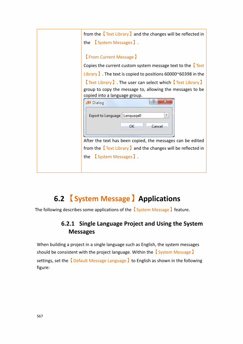
567
from the【Text Library】and the changes will be reflected in
the 【System Messages】.
【From Current Message】
Copies the current custom system message text to the【Text
Library】. The text is copied to positions 60000~60398 in the
【Text Library】. The user can select which【Text Library】
group to copy the message to, allowing the messages to be copied into a language group.
After the text has been copied, the messages can be edited
from the【Text Library】and the changes will be reflected in
the 【System Messages】.
6.2 【System Message】Applications The following describes some applications of the【System Message】feature.
6.2.1 Single Language Project and Using the System Messages
When building a project in a single language such as English, the system messages
should be consistent with the project language. Within the【System Message】
settings, set the【Default Message Language】to English as shown in the following
figure:

568
Figure 269 System Messages for Project Using a Single Language
As shown in the dialogue window below, the system message language is English.
Figure 270 Confirmation Window
6.2.2 Single Language Project and Using Custom System Messages
When building a project in a single language such as English, the system messages should be consistent with the projet languge. In addition, the wording of messages may have to be customized in order to meet the project needs. The following steps can be taken customize the system messages.
1. Open the【System Message】window and select a language in the【Default
Message Language】dropdown.
2. Check the【Enable Custom System Message】box.
3. Select type as【GENERAL_MESSAGE_TYPE】
4. Click the OPERATION_CONFIRM to edit and enter the custom message.

569
Figure 271 Customizing the System Message
The results of the customization can be seen in the confirmation window.
Figure 272 Modified Confirmation Window
6.2.3 Single Language Project and Using Only Custom System Messages
When building a project in a language that is currently not available in the system messages such as German (only English, Traditional Chinese, and Simplified Chinese is offered), the system messages should also be displayed in German. Therefore, all system messages have to be modified. The following steps can be taken to do so.
1. Open the【System Message】window and select English in the【Default
Message Language】dropdown.
2. Check the【Enable Custom System Message】box.
3. Press【Export】to export all the messages as CSV file, and change the【Custom
Text】filed’s system message to German in the CSV file.

570
4. Press【Import】to import the CSV file that just modified.
Figure 273 The【Default Message Language】is set to English
The results of the modification is shown in the figure below.
Figure 274 Modified Confirmation Window
6.2.4 Multiple Language Project and Using the Default System Messages
The project being built contains multiple languages in the text library. In this example, language 0 is Traditional Chinese , language 1 is Simplified Chinese, and language 2 is English. For each language, the system message language should be consistent. The following steps can be taken to do so.
1. Open the【System Message】window and select English in the【Default
Message Language】dropdown, and check the【Enable Custom System
Message】box.
2. Under【Copy to Text-Library】, click【From Default Language(繁體中文)】.
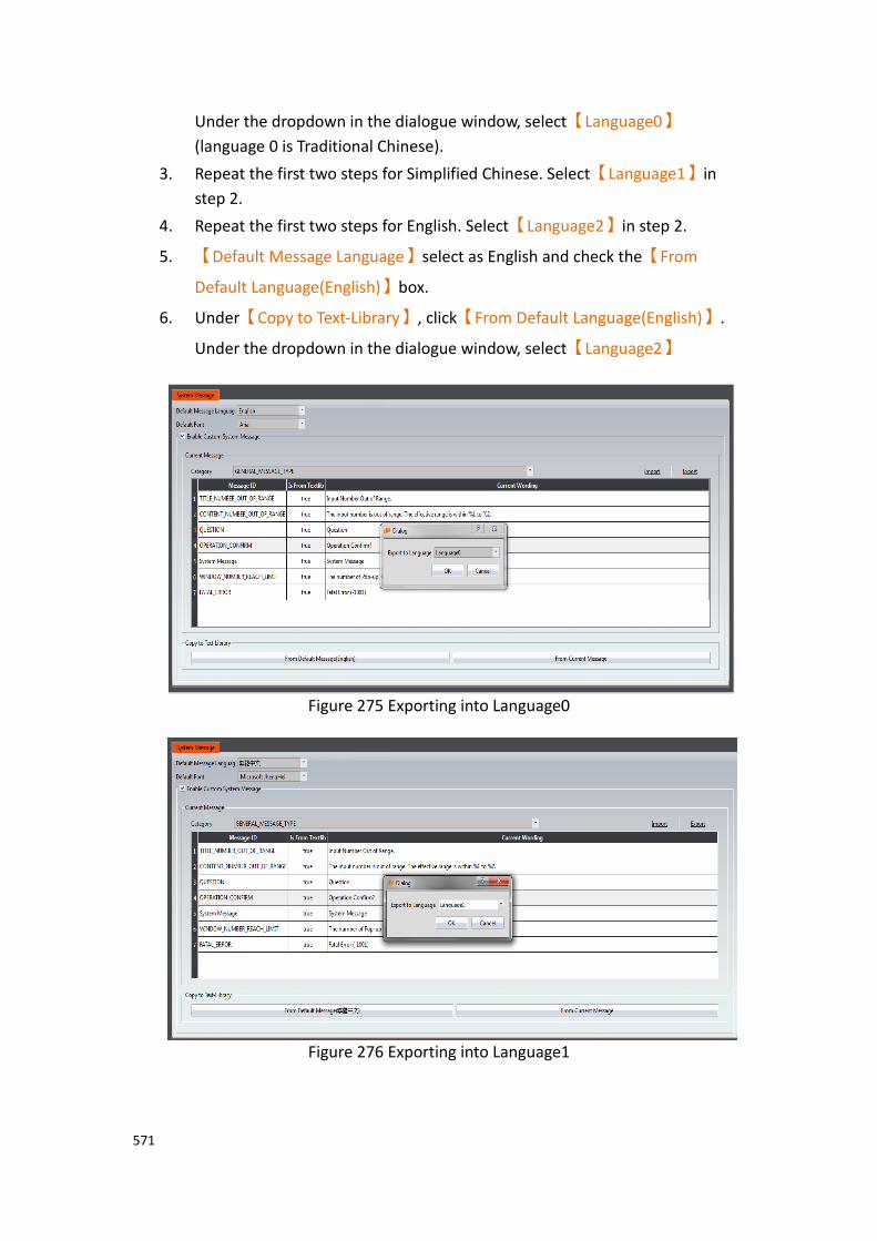
571
Under the dropdown in the dialogue window, select【Language0】
(language 0 is Traditional Chinese).
3. Repeat the first two steps for Simplified Chinese. Select【Language1】in
step 2.
4. Repeat the first two steps for English. Select【Language2】in step 2.
5. 【Default Message Language】select as English and check the【From
Default Language(English)】box.
6. Under【Copy to Text-Library】, click【From Default Language(English)】.
Under the dropdown in the dialogue window, select【Language2】
Figure 275 Exporting into Language0
Figure 276 Exporting into Language1

572
Figure 277 Export Confirmation Window
Figure 278 Exporting into Language2
Within the project, when using Traditional Chinese as the active language, the system messages will also be displayed in Traditional Chinese. The result is the same for
Simplified Chinese and English. See Chapter 14.4 -【Text Library】for more details.

573
Figure 279 Confirmation Windows for Each Language
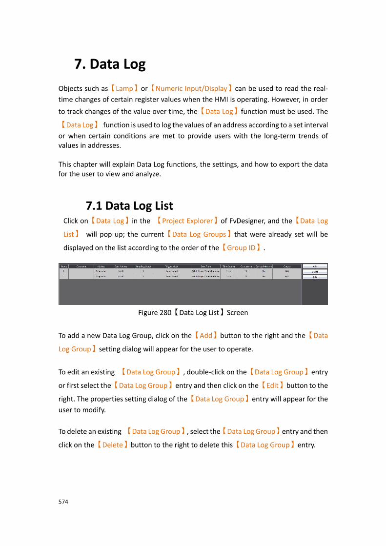
574
7. Data Log
Objects such as【Lamp】or【Numeric Input/Display】can be used to read the real-
time changes of certain register values when the HMI is operating. However, in order
to track changes of the value over time, the【Data Log】function must be used. The
【Data Log】 function is used to log the values of an address according to a set interval
or when certain conditions are met to provide users with the long-term trends of values in addresses. This chapter will explain Data Log functions, the settings, and how to export the data for the user to view and analyze.
7.1 Data Log List Click on【Data Log】in the 【Project Explorer】of FvDesigner, and the【Data Log
List】 will pop up; the current【Data Log Groups】that were already set will be
displayed on the list according to the order of the【Group ID】.
Figure 280【Data Log List】Screen
To add a new Data Log Group, click on the【Add】button to the right and the【Data
Log Group】setting dialog will appear for the user to operate.
To edit an existing 【Data Log Group】, double-click on the【Data Log Group】entry
or first select the【Data Log Group】entry and then click on the【Edit】button to the
right. The properties setting dialog of the【Data Log Group】entry will appear for the
user to modify.
To delete an existing 【Data Log Group】, select the【Data Log Group】entry and then
click on the【Delete】button to the right to delete this【Data Log Group】entry.
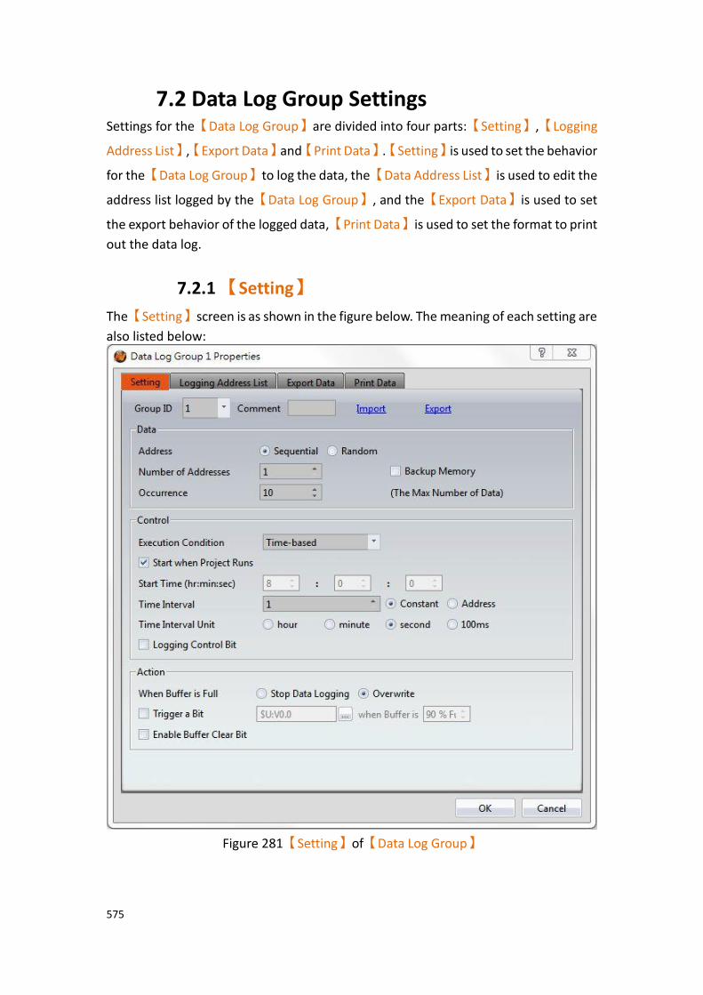
575
7.2 Data Log Group Settings Settings for the【Data Log Group】are divided into four parts:【Setting】,【Logging
Address List】,【Export Data】and【Print Data】.【Setting】is used to set the behavior
for the【Data Log Group】to log the data, the【Data Address List】is used to edit the
address list logged by the【Data Log Group】, and the【Export Data】is used to set
the export behavior of the logged data,【Print Data】is used to set the format to print
out the data log.
7.2.1 【Setting】
The【Setting】screen is as shown in the figure below. The meaning of each setting are
also listed below:
Figure 281【Setting】of【Data Log Group】

576
Table 194【Setting】Properties of【Data Log Group】
Property Description
【Group ID】 Set the Group ID of the【Data Log Group】.
【Comment】 Set a comment for the【Data Log Group】.
【Import】 A CSV , xlsx or xls file can be selected after clicking on this button. All the logged addresses included in the file will be
applied to the【Data Log Group】settings.
【Export】 The settings of the current【Data Log Group】can be
saved into a CSV , xlsx or xls file after clicking on this button.
【Data】 Set the data content logged by the【Data Log Group】.
【Address】
Set the type of the logged address to【Sequential】or
【Random】.【Sequential】means that the logged
addresses will be sequential; only the start address needs to be set and the other addresses will be filled out
automatically and cannot be changed. 【Random】
means that the addresses logged can be random addresses; All addresses can be set individually.
【Backup Memory】
Set to enable Backup Memory. Select to save the Data Log of the HMI into the backup memory of the HMI when the power of the HMI is interrupted in order to avoid loss of data.
【Number of Addresses】
Set the number of addresses for the【Data Log Group】to
log.
【Occurrence】
Set the number of times【Data Log Group】 logs data.
【Control】 Set the conditions for the【Data Log Group】to log data.
【Execution Condition】
Sets the condition to execute data logging.【Time-based】
means that the【Data Log Group】will log data according
577
to a set interval.【Triggered by Bit】 means that address
logging will be executed when the status changes of the
【Logging Control Bit】satisfy the conditions set in
【Trigger Condition】.
【Start when Project Runs】
Set to start logging data when the project runs. Can be set
if the【Execution Condition】is set as【Time-based】.
【Start Time】
The time for the【Data Log Group】to start logging data
can be set when the【Execution Condition】 is set as
【Time-based】 and【Start when Project Runs】is not
selected. The three time units that can be entered are hour, minute, and second.
【Time Interval】
The time interval between each time the【Data Log
Group】 logs data can be set if the【Execution
Condition】is set to【Time-based】. The time interval will
be a fixed value if【Constant】is selected. The time
interval will be determined by the value in the address set
if【Address】is selected; the data type of the address data
read is fixed as【32Bit-UINT】.
【Time Interval Unit】
The time unit of the【Time Interval】can be set if the
【Execution Condition】is set as【Time-based】.
The maximum value of the time interval is 1 day. The
maximum value that can be entered for the【Time
Interval】is 24 if the【Time Interval Unit】is set as
【Hour】. The maximum value that can be entered is 1440
if it is set as【Minute】. The maximum value that can be
entered is 86400 if the Time Interval Unit】is set as
【Second】. If the【Time Interval Unit】is set as
578
【100ms】, the maximum value that can be entered for
the【Time Interval】is fixed as 9.
【Logging Control Bit】
Controls the addresses that enables data logging executed
by the【Data Log Group】. If the【Execution Condition】
is set as【Time-based】, the【Time Interval】set had
been reached, and the status of the【Logging Control
Bit】is 0, data logging still will not be executed by the
【Data Log Group】. If【Execution Condition】is set as
【Triggered by Bit】, every time the value of the
【Logging Control Bit】satisfy the settings of the【Trigger
Condition】, data logging will be executed 1 time.
【Trigger Condition】
If【Execution Condition】is set as【Triggered by Bit】,
conditions for the【Data Log Group】to execute data
logging once can be set. There are three options: 【Bit
OFF -> ON】, 【Bit ON -> OFF】, and【Bit Change】.
【Reset Loggin Control Bit】
When the【Trigger Condition】of 【Bit OFF -> ON】or
【Bit ON -> OFF】is met, the bit will be automatically
reset.
【Action】 【When Buffer is Full】
Set the action to take when the【Data Log Group】has
completed the number of data loggings set in
【Occurrence】. If【Stop Data Logging】is selected, data
logging will be stopped; if【Overwrite】is selected, then
the【Data Log Group】will continue to log data and the
data previously saved will be overwritten as new data is logged.
【Trigger a Bit】
Set to trigger a specific bit when the data is full; the triggering address and the time to trigger the address can
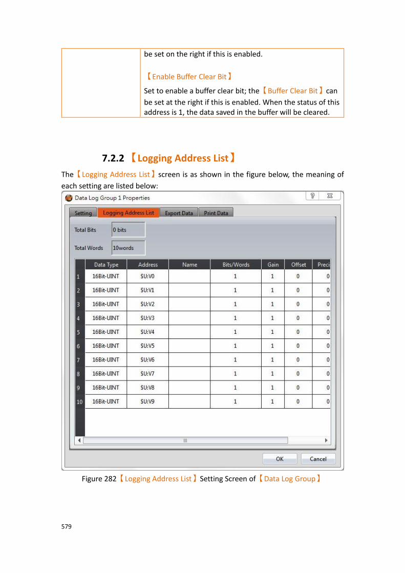
579
be set on the right if this is enabled.
【Enable Buffer Clear Bit】
Set to enable a buffer clear bit; the【Buffer Clear Bit】can
be set at the right if this is enabled. When the status of this address is 1, the data saved in the buffer will be cleared.
7.2.2 【Logging Address List】
The【Logging Address List】screen is as shown in the figure below, the meaning of
each setting are listed below:
Figure 282【Logging Address List】Setting Screen of【Data Log Group】

580
Table 195【Logging Address List】Setting Properties of【Data Log Group】
Property Description
【Total Length】 Display the total length of the data logged.
【Data Type】 Set the data type of the data logged. Only the first row can be modified if the logged address type is set as
【Sequential】.
【Address】 Set the address of the data logged. Only the first row can be modified if the logged address type is set as
【Sequential】.
【Name】 Set the address name of the data logged; the default name is the address is itself if no name is entered.
【Bits/Words】 Display the length of the data logged by【Data Type】.
【Words】can be modified if【Data Type】is set as【Ascii
String】.
【Gain】 The amount of【Gain】can be set.
Formula is as follows: y=Ax+B, gain is A, offset for the B, y value is displayed for HMI, x is PLC value.For example, gain A=5, offset B=2, when the PLC x=3, HMI value display is 17 (17=(5*3)+2).
Gain A Offset B PLC Value x HMI displayed value y
A=5 B=2 x=3 y = 17
【Offset】 Set the【Offset】value. See【Gain】for more details.
【Precision】 Set the amount of decimal places shown.
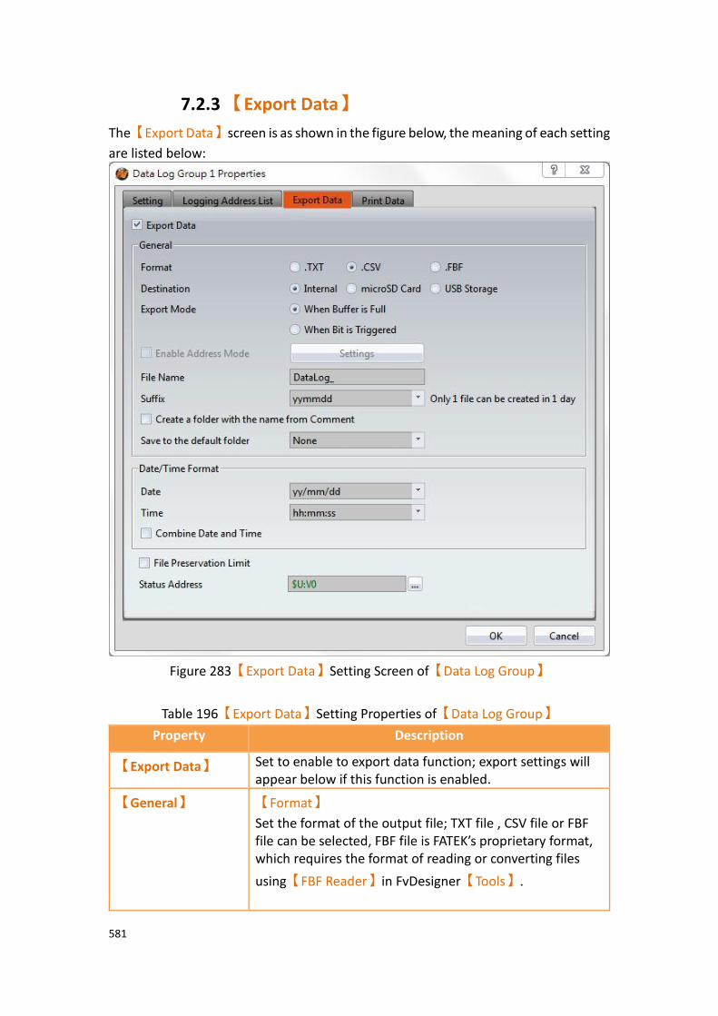
581
7.2.3 【Export Data】
The【Export Data】screen is as shown in the figure below, the meaning of each setting
are listed below:
Figure 283【Export Data】Setting Screen of【Data Log Group】
Table 196【Export Data】Setting Properties of【Data Log Group】
Property Description
【Export Data】 Set to enable to export data function; export settings will appear below if this function is enabled.
【General】 【Format】
Set the format of the output file; TXT file , CSV file or FBF file can be selected, FBF file is FATEK’s proprietary format, which requires the format of reading or converting files
using【FBF Reader】in FvDesigner【Tools】.
582
【Destination】
Set the destination of the output file; available selections include internal, microSD card or USB storage device. A FTP connection can be used to connect to the HMI to access the saved file if exporting into a file.
【Export Mode】
Set the time to export the file; the file will be automatically
exported when the【Data Log Group】has completed the
number of times set in【Occurrence】 if 【When Buffer
is Full】 is selected. The data will be exported when the
specified bit is triggered if【When Bit is Triggered】is
selected.
【Enable Address Mode】
After enabling, the exported file name, destination, suffix, export mode, data mode, date and time filtering, etc., will be controlled by the specific address. To be allowed to
enable this mode, you need to first enable【Export
Mode】and【When Bit is Triggered】.
【File Name】
Set the name of the exported file; the file name of the exported file will include the save date and time (such as: DataLog_140519_151735.txt).
【Suffix】
Set the name of the exported file, such as yymmdd_hh, the name of exported file only has a date and hours (Example: DataLog_140519_17.txt) This setting also provides regular export archive mode, If the suffix selected is "yymm", it would produce one file per month, If the suffix selected is "yymmdd", it would produce one file per day, If the suffix select "yymmdd_hh", it would produce one file per hour, If the suffix selected is " yymmdd_hhmm", it would produce one file per minute, If the suffix selected is " yymmdd_hhmmss", it would produce one file per second,
583
If the suffix to select "no", one file will includes all data.
【Create a folder with the name from comment】
If this option is checked, the name of the folder will be
name from【Setting】【Comment】, for example,
comment temperature, the original Group_1 folder will be changed to the temperature folder, which is originally datalog \ Group_1 will become datalog \ temperature.
【Save to the default folder】
There is none and folder created monthly two opitons, if choose none then will not create another folder, for example, datalog\Group_1\DataLog_170403. csv. if choose folder created monthly then will create another monthly folder each month, for example, datalog\Group_1\201704\DataLog_170403.csv.
【Date/Time
Format】
【Date】
Set the display format of the date when exporting files.
【Time】
Set the display format of the time when exporting files.
【Combine Date and Time】
If set, the date and time columns will be combined into a single column.
【File Preservation
Limit】
Check to set the number of days the exported file should be retained in memory. For example, if set to seven days, the HMI will use its internal calendar and files greater than seven days will be removed.
【Status Address】 Set the saving address of the error code.
Error Code Description
0 No Error
1 Read Error
2 Write Error
5 Open Error
100 Not enough storage space

584
【Settings】page as shown in the figure below, the options are as follows:
Figure 284【Data Log】【Export Data】【Settings】Properties Window
Table 197【Data Log】【Export Data】【Settings】Property Settings
Field Description
【Setting】 【File Name】
Use a defined address to set the name of the exported file. 5 characters is the default setting, maximum setting is 100 characters.
【Destination】
Use a defined address to set the destination of the output file. The destination values are shown in the following table,
Register Value Function
1 HMI
2 microSD Card

585
3 USB Storage Device
Other Values HMI
【Suffix】
Use a defined address to set the name of the exported file and the date/time format. The suffix values are shown in the following table,
Register Value Function
1 yymmdd
2 yymmdd_hh
3 yymmdd_hhmm
4 yymmdd_hhmmss
5 None
6 yymm
Other Values yymmdd_hhmmss
【Export Mode】
Use a defined address to set the export mode. The export mode values are shown in the following table,
Register Value Function
1 Overwrite Old Files
2 Continue to write on old file
Other Value Continue to write on old file
【Data Mode】
Use a defined address to set the data mode of the exported data. The data mode values are shown in the following table,
Register Value Function
1 Save all unsaved data and mark the exported data as saved.
2 Save all data and mark the exported data as saved
3 Saved all data for a specific time without marking the exported data as saved.
Other Values Save all data and mark the exported data as saved
【Date / Time
Filter】
【Start Date (Year/Month/Day)】
Use a defined address to set the date at which filtering starts.
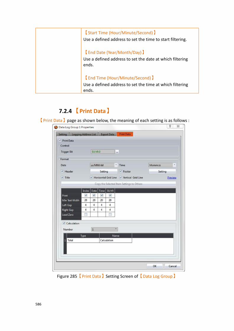
586
【Start Time (Hour/Minute/Second)】
Use a defined address to set the time to start filtering.
【End Date (Year/Month/Day)】
Use a defined address to set the date at which filtering ends.
【End Time (Hour/Minute/Second)】
Use a defined address to set the time at which filtering ends.
7.2.4 【Print Data】
【Print Data】page as shown below, the meaning of each setting is as follows :
Figure 285【Print Data】Setting Screen of【Data Log Group】
587
Table 198【Print Data】Setting Properties of【Data Log Group】
Properties Description
【Print Data】 Set whether to enable Print Data function, enable the function do the following settings.
【Control】 【Trigger Bit】
Set the trigger bit of print control.
【Format】 【Date】
Set the date print format.
【Time】
Set time print format.
【Header】
If checked, according to the setting, it will print header first then print the data log content. Press ‘’setting’’ button to set the header.
【Setting】
Header setting, please refer to 7.2.4.1-【Print Data】
Header and Footer【Setting】for more details.
【Footer】
If checked, according to the setting, it will print data log content first then print the footer. Press ‘’setting’’ button to set the footer.
【Setting】
Footer setting, please refer to 7.2.4.1-【Print Data】
Header and Footer【Setting】for more details.。
【Title】
Print the data log title.
【Horizontal Grid Line】
Print out with horizontal grid line.
【Vertical Grid Line】
Print out with vertical grid line.
【Preview】
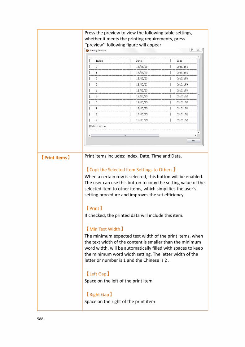
588
Press the preview to view the following table settings, whether it meets the printing requirements, press ‘’preview’’ following figure will appear
【Print Items】 Print items includes: Index, Date, Time and Data.
【Copt the Selected Item Settings to Others】
When a certain row is selected, this button will be enabled. The user can use this button to copy the setting value of the selected item to other items, which simplifies the user's setting procedure and improves the set efficiency.
【Print】
If checked, the printed data will include this item.
【Min Text Width】
The minimum expected text width of the print items, when the text width of the content is smaller than the minimum word width, will be automatically filled with spaces to keep the minimum word width setting. The letter width of the letter or number is 1 and the Chinese is 2 .
【Left Gap】
Space on the left of the print item
【Right Gap】
Space on the right of the print item
589
【Lead Zero】
For Data Log’s items that are not ‘’text’’ type, when the width of the printed content is less than the minimum width, it will automatically filled with ‘’0’’.
【Calculation】 After the actual data that collected, will calculate for data log items that are not "text" types, and the calculation results will be printed in sequence.
【Number】
Set the number of calculations. The following is the setting description of the calculation item
【Type】
Set the type of calculation, includes Total, Average, Maximum and Minimum.
【Name】
Calculate the customized name of the project, which will be printed with the calculation results.
7.2.4.1 【Print Data】Header and Footer【Setting】
For the header/footer, when click the【Setting】button, the following dialog box
appears. There are two modes:【Static】and【Dynamic】.
【Static】
Users can edit any text content as static header/footer content.
【Dynamic】
The user sets the variables and edits the pattern, and matches the keyword "%[number]" (eg: %1, %2, %3, etc.) to achieve the dynamic header/footer requirements, where the keyword will be replaced by the actual content of the variable.

590
【Dtat Log】【Print Data】【Header/Footer】as shown in the figure below, the meaning
of each setting option is as follows:
Figure 286【Print Data】【Header/Footer】Setting Screen of【Data Log Group】
(Static mode)

591
Figure 287【Print Data】【Header/Footer】Setting Screen of【Data Log Group】
(Dynamic mode)
Table 199【Export Data】Setting Properties of【Data Log Group】
Options Description
【Variable
Address】
【Refresh Mode】
The refresh mode for setting variable content can be divided into:
➢ 【Refresh Periodically】: refresh variable content
periodically, when select this mode please set the
【Time Interval】.
➢ 【Refreshed By Trigger Bit(0->1)】:when the bit
turn 0 to 1, refresh variable content.
➢ 【Refreshed By Trigger Bit (1->0)】:when the bit
turn 1 to 0, refresh variable content.

592
➢ 【Refreshed By Trigger Bit Changed】: when the
bit turn 1 to 0, refresh variable content.
【Trigger Bit】
Set the refresh variable content trigger address.
This setting only needs to set when【Refresh Mode】
is【Refreshed By Trigger Bit(0->1)】、【Refreshed By Trigger
Bit (1->0)】or【Refreshed By Trigger Bit Changed】.
【Reset Trigger Bit】
Whether to reset trigger bit after refreshing variables.
This setting only needs to set when【Refresh Mode】
is【Refreshed By Trigger Bit(0->1)】、【Refreshed By Trigger
Bit (1->0)】or【Refreshed By Trigger Bit Changed】.
【Number】
Set the number of variables.
【Variable】 【Data Type】
Set the data type of variable.
【Address】
Set the address of variable.
【Words】
The number of words required of data types to display
variables. If【Data Type】is【Ascii String】, then can set
the number of words to collect at the beginning of the address.
【Min Text Width】
Set the minimum text width of the variable content. When the word width of the content is smaller than the minimum word width, it will be automatically filled with spaces to keep the minimum word width setting.
【Precision】
Set the precision of the variable.
【Gain】
Set the gain of the variable.
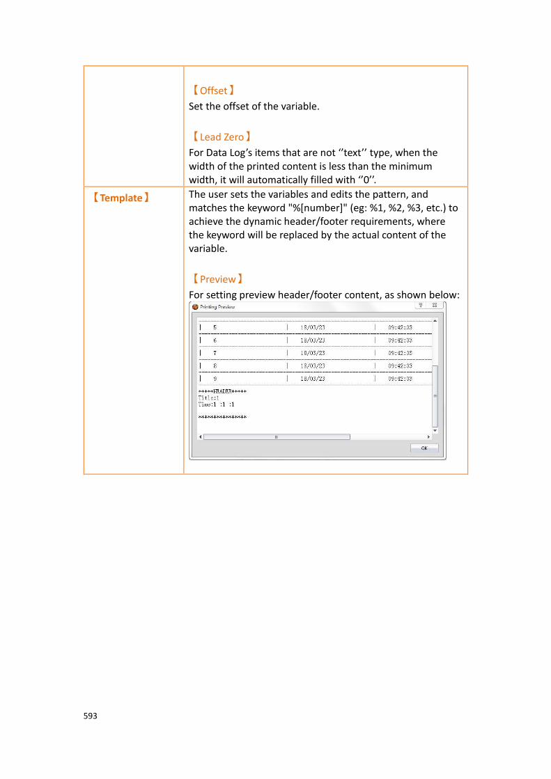
593
【Offset】
Set the offset of the variable.
【Lead Zero】
For Data Log’s items that are not ‘’text’’ type, when the width of the printed content is less than the minimum width, it will automatically filled with ‘’0’’.
【Template】 The user sets the variables and edits the pattern, and matches the keyword "%[number]" (eg: %1, %2, %3, etc.) to achieve the dynamic header/footer requirements, where the keyword will be replaced by the actual content of the variable.
【Preview】
For setting preview header/footer content, as shown below:

594
7.3 Data Log Related Objects This chapter will introduce objects related to【Data Log】.
➢ The【Historic Trend】is a curve object used to read the data recorded in
the recording buffer of the【Data Log】, in which the x value is time and
the y value is the data captured by the【Data Log】. For detailed
explanations, refer to chapter3.3.21-【Historic Trend】.
➢ The【Historic XY Scatter】is a curve object used to read the data recorded
in the recording buffer of the【Data Log】, in which both the X/Y values
are data captured by the【Data Log】. For detailed explanations, refer to
Chapter 3.3.22–【Historic XY Scatter】.
➢ The【Historic Data Table】is a table object used to read the data recorded
in the recording buffer of the【Data Log】. For detailed explanations, refer
to Chapter 3.3.23–【Historic Data Table】.
➢ The【Historic Data Selector】can select a【Data Log ID】or exported CSV
or TXT file. A dropdown menu object will allow users to view the data logs sorted by either filename or date last modified. For detailed explanations,
refer to Chapter 3.3.24-【Historic Data Selector】.
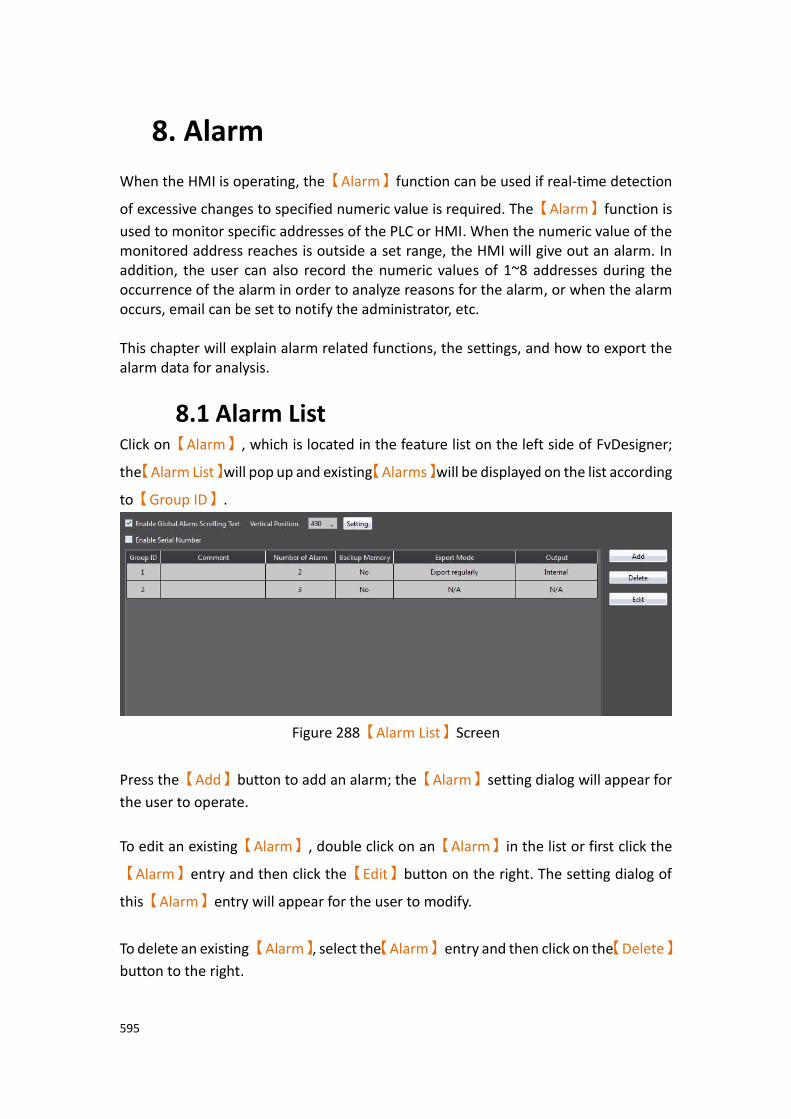
595
8. Alarm
When the HMI is operating, the【Alarm】function can be used if real-time detection
of excessive changes to specified numeric value is required. The【Alarm】function is
used to monitor specific addresses of the PLC or HMI. When the numeric value of the monitored address reaches is outside a set range, the HMI will give out an alarm. In addition, the user can also record the numeric values of 1~8 addresses during the occurrence of the alarm in order to analyze reasons for the alarm, or when the alarm occurs, email can be set to notify the administrator, etc. This chapter will explain alarm related functions, the settings, and how to export the alarm data for analysis.
8.1 Alarm List Click on【Alarm】, which is located in the feature list on the left side of FvDesigner;
the【Alarm List】will pop up and existing【Alarms】will be displayed on the list according
to【Group ID】.
Figure 288【Alarm List】Screen
Press the【Add】button to add an alarm; the【Alarm】setting dialog will appear for
the user to operate.
To edit an existing【Alarm】, double click on an【Alarm】in the list or first click the
【Alarm】entry and then click the【Edit】button on the right. The setting dialog of
this【Alarm】entry will appear for the user to modify.
To delete an existing 【Alarm】, select the【Alarm】 entry and then click on the【Delete】
button to the right.
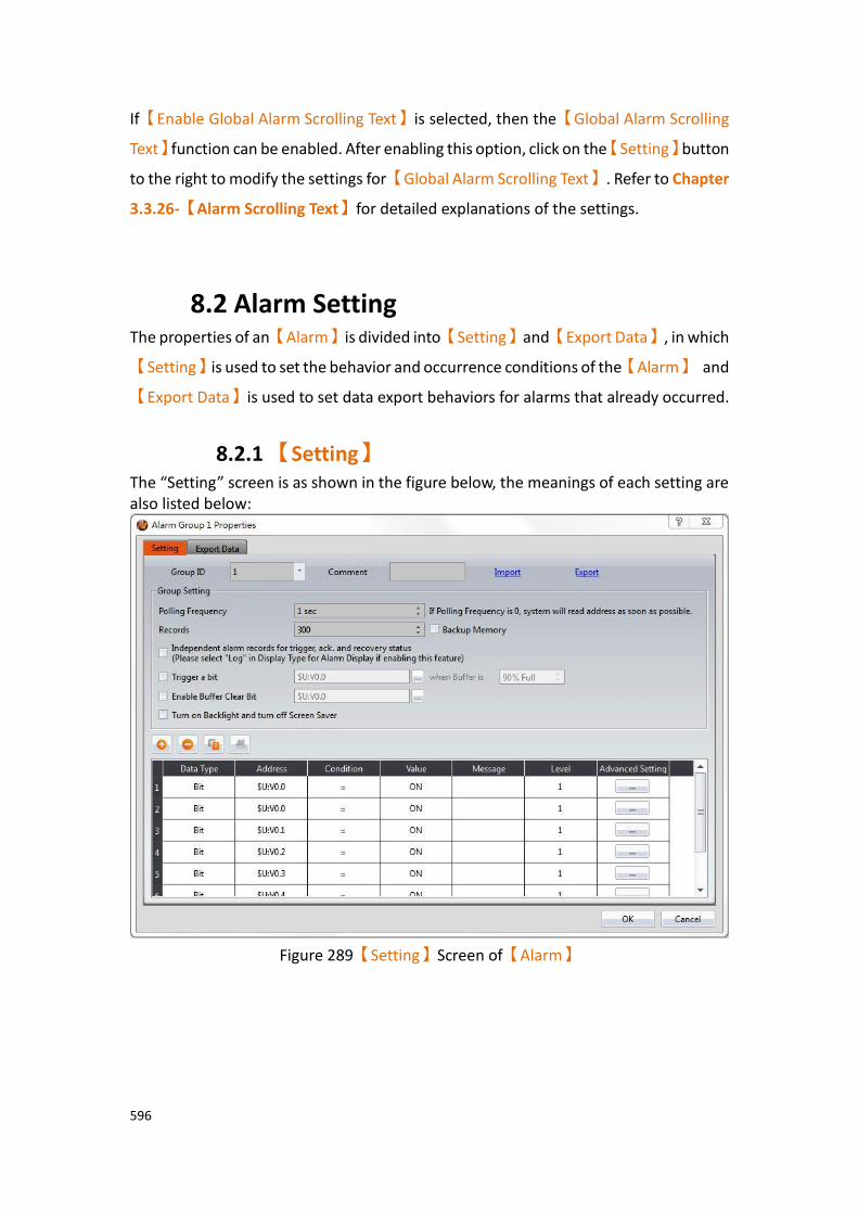
596
If【Enable Global Alarm Scrolling Text】is selected, then the【Global Alarm Scrolling
Text】function can be enabled. After enabling this option, click on the【Setting】button
to the right to modify the settings for【Global Alarm Scrolling Text】. Refer to Chapter
3.3.26-【Alarm Scrolling Text】for detailed explanations of the settings.
8.2 Alarm Setting The properties of an【Alarm】is divided into【Setting】and【Export Data】, in which
【Setting】is used to set the behavior and occurrence conditions of the【Alarm】 and
【Export Data】is used to set data export behaviors for alarms that already occurred.
8.2.1 【Setting】 The “Setting” screen is as shown in the figure below, the meanings of each setting are also listed below:
Figure 289【Setting】Screen of【Alarm】
597
Table 200【Setting】Properties of【Alarm】
Property Description
【Group ID】 Set the Group ID of the【Alarm】.
【Comment】 Set the comment of the【Alarm】.
【Import】 A CSV or Excel file file can be selected after clicking this
option. All of the【Alarm】contents of the file will be
applied to the current【Alarm】settings.
【Export】 The settings of the current【Alarm】can be saved into a
CSV or Excel file after clicking this option.
【Group Setting】 Set the group behavior of【Alarm】.
【Polling Frequency】
Sets the Polling Frequency of【Alarm】. When the Polling
Frequency is set to 0, the system will read the monitoring address as quickly as possible. If the Polling Frequency is set to a value greater than 0, the system will read the monitoring address according to the set time. This lowers the computing load of the system.
【Records】
Set the maximum number of alarms to save for the current
【Alarm】group.
【Backup Memory】
Set to enable Backup Memory. Select to save the Alarm data of the HMI into the backup memory of the HMI when the power to the HMI is interrupted in order to avoid data loss.
【Independent alarm records for trigger, ack., and
recovery status】
If checked, the trigger time, acknowledgement time, and recovery time will be recorded separately. If not checked, the trigger time, acknowledgement time, and recovery time will be recorded in the same column.
【Trigger a Bit】
Set the alarm to trigger a specified bit when the buffer is a specified percentage full.
598
【Enable Buffer Clear Bit】
Set whether to enable the function to clear the alarm buffer record.
【Turn on Backlight and Turn Off Screensaver】
Set whether the alarm turns off the screen saver and turns on the backlight when an alarm in the given group occurs.
【Add】 Adds an alarm entry to the bottom of the alarm table when this button is pressed. The alarm address will automatically increase. For example, if the bottommost entry in the alarm table has an address of M10, when the
【Add】button is pressed, the new alarm entry will have
an address of M11. When the【Data Type】is set to bit,
the address will increase bitwise.
【Delete】 The alarm data selected in the alarm table below will be deleted when this button is pressed.
【Copy】 The alarm data selected in the alarm table below will be copied when this button is pressed.
【Paste】 A new alarm data entry will be added and the alarm settings copied will be filled into this new alarm entry when this button is pressed.
【Alarm Table】 Set the occurrence condition of the【Alarm】.
【Data Type】
Set the data type for the monitoring address of the
【Alarm】.
【Address】
Set the monitoring address of the【Alarm】.
【Condition】
Set the condition to determine that an【Alarm】has
occurred. When【Data Type】is Bit, the【Condition】is
fixed to “Equal to” (=).
When【Data Type】is not Bit, the【Condition】can be set
as “Greater than” (>) “Greater than or equal to” (>=) “Equal to” (=)

599
“Less than” (<) “Less than or equal to” (<=) “Not equal to” (!=) “Range” (A~B)
【Value】
Set a value to determine if an【Alarm】has occurred. If
the【Condition】is set to “Range (A~B)”, the value must
be filled according to the (A~B) format. For example 0~100 means that the alarm range is for the value of the monitoring address to be greater than or equal to 0 and less than or equal to 100.
If the【Data Type】is set to Bit. The value will be either
ON or OFF.
For other【Data Types】the value is dependent on the set
type. For example, 16 bit INT can be from -32,768 to 32,767.
【Message】
Set the message to display when an【Alarm】has
occurred.
【Level】
Set the level (1~8) of this【Alarm】entry. This can be used
to distinguish between different levels of alarm.
【Advanced Setting】
When the【Advanced Setting】button is pressed, a pop
up dialog will appear for users to set the advanced settings
for【Alarm】.
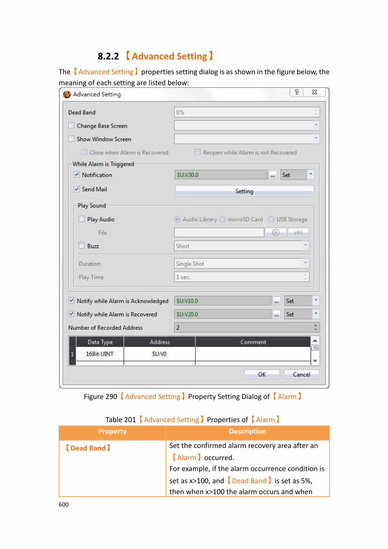
600
8.2.2 【Advanced Setting】
The【Advanced Setting】properties setting dialog is as shown in the figure below, the
meaning of each setting are listed below:
Figure 290【Advanced Setting】Property Setting Dialog of【Alarm】
Table 201【Advanced Setting】Properties of【Alarm】
Property Description
【Dead Band】 Set the confirmed alarm recovery area after an
【Alarm】occurred.
For example, if the alarm occurrence condition is
set as x>100, and【Dead Band】is set as 5%,
then when x>100 the alarm occurs and when
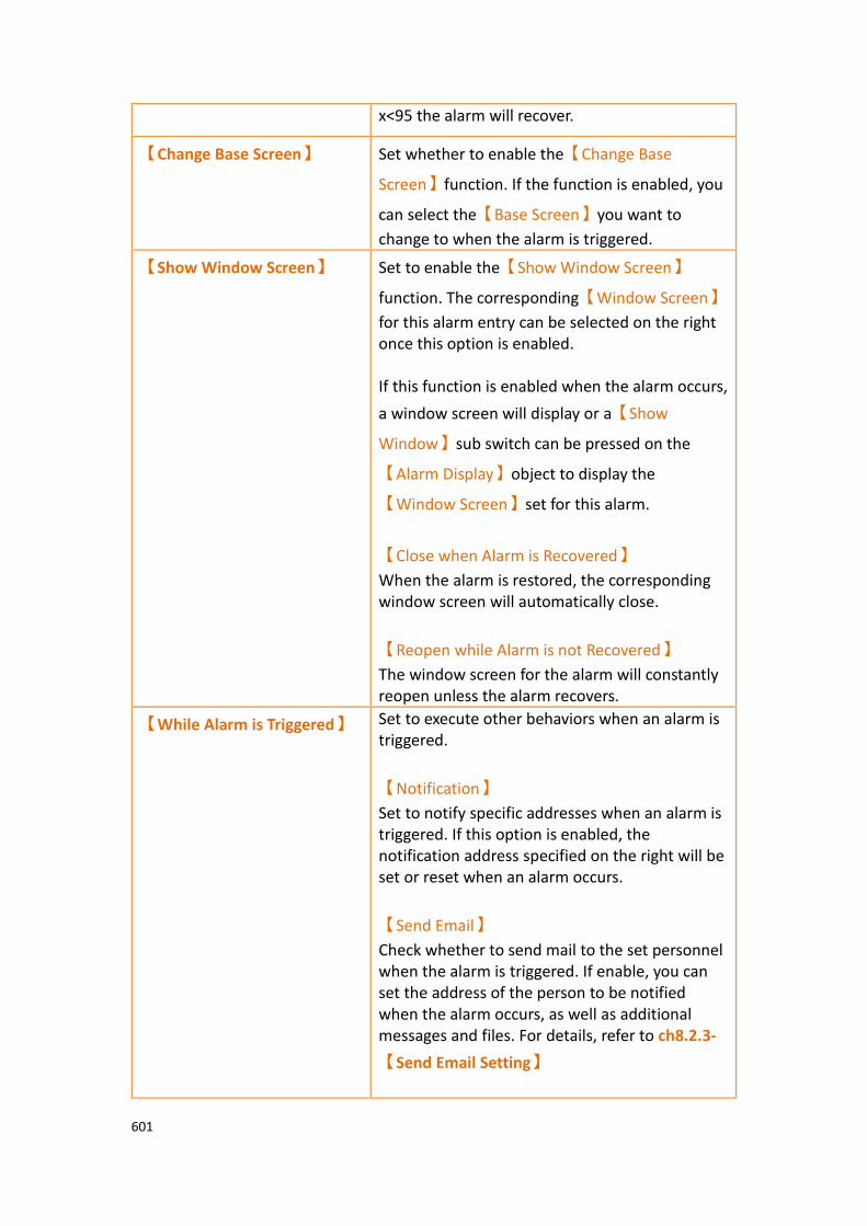
601
x<95 the alarm will recover.
【Change Base Screen】 Set whether to enable the【Change Base
Screen】function. If the function is enabled, you
can select the【Base Screen】you want to
change to when the alarm is triggered.
【Show Window Screen】 Set to enable the【Show Window Screen】
function. The corresponding【Window Screen】
for this alarm entry can be selected on the right once this option is enabled. If this function is enabled when the alarm occurs,
a window screen will display or a【Show
Window】sub switch can be pressed on the
【Alarm Display】object to display the
【Window Screen】set for this alarm.
【Close when Alarm is Recovered】
When the alarm is restored, the corresponding window screen will automatically close.
【Reopen while Alarm is not Recovered】
The window screen for the alarm will constantly reopen unless the alarm recovers.
【While Alarm is Triggered】 Set to execute other behaviors when an alarm is triggered.
【Notification】
Set to notify specific addresses when an alarm is triggered. If this option is enabled, the notification address specified on the right will be set or reset when an alarm occurs.
【Send Email】
Check whether to send mail to the set personnel when the alarm is triggered. If enable, you can set the address of the person to be notified when the alarm occurs, as well as additional messages and files. For details, refer to ch8.2.3-
【Send Email Setting】
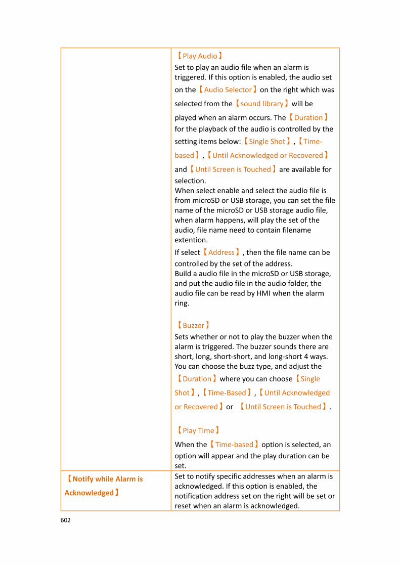
602
【Play Audio】
Set to play an audio file when an alarm is triggered. If this option is enabled, the audio set
on the【Audio Selector】on the right which was
selected from the【sound library】will be
played when an alarm occurs. The【Duration】
for the playback of the audio is controlled by the
setting items below:【Single Shot】,【Time-
based】,【Until Acknowledged or Recovered】
and【Until Screen is Touched】are available for
selection. When select enable and select the audio file is from microSD or USB storage, you can set the file name of the microSD or USB storage audio file, when alarm happens, will play the set of the audio, file name need to contain filename extention.
If select【Address】, then the file name can be
controlled by the set of the address. Build a audio file in the microSD or USB storage, and put the audio file in the audio folder, the audio file can be read by HMI when the alarm ring.
【Buzzer】
Sets whether or not to play the buzzer when the alarm is triggered. The buzzer sounds there are short, long, short-short, and long-short 4 ways. You can choose the buzz type, and adjust the
【Duration】where you can choose【Single
Shot】,【Time-Based】,【Until Acknowledged
or Recovered】or 【Until Screen is Touched】.
【Play Time】
When the【Time-based】option is selected, an
option will appear and the play duration can be set.
【Notify while Alarm is
Acknowledged】
Set to notify specific addresses when an alarm is acknowledged. If this option is enabled, the notification address set on the right will be set or reset when an alarm is acknowledged.

603
【Notify while Alarm is
Recovered】
Set to notify specific addresses when an alarm is recovered. If this option is enabled, the notification address set on the right will be set or reset when an alarm recovers.
【Number of Recorded
Address】
Set the number of address to read when an alarm is triggered; it can be set between 1~8. When the number set is changed, the number of rows in the address record table below will also change accordingly.
【Data Type】 Set the data type of the address to read when an alarm is triggered.
【Address】 Set the address to read when an alarm is triggered.
【Comment】 Set the comment of the address to read when an alarm is triggered. This comment can allow users to identify what the address represents.
8.2.3 【Send Email Setting】
The【Setting】dialog box for sending emails is shown in the figure below.
The meaning of each setting option is as follows:
Figure 291【Advanced Setting】【Send Email】Property Setting Dialog of【Alarm】
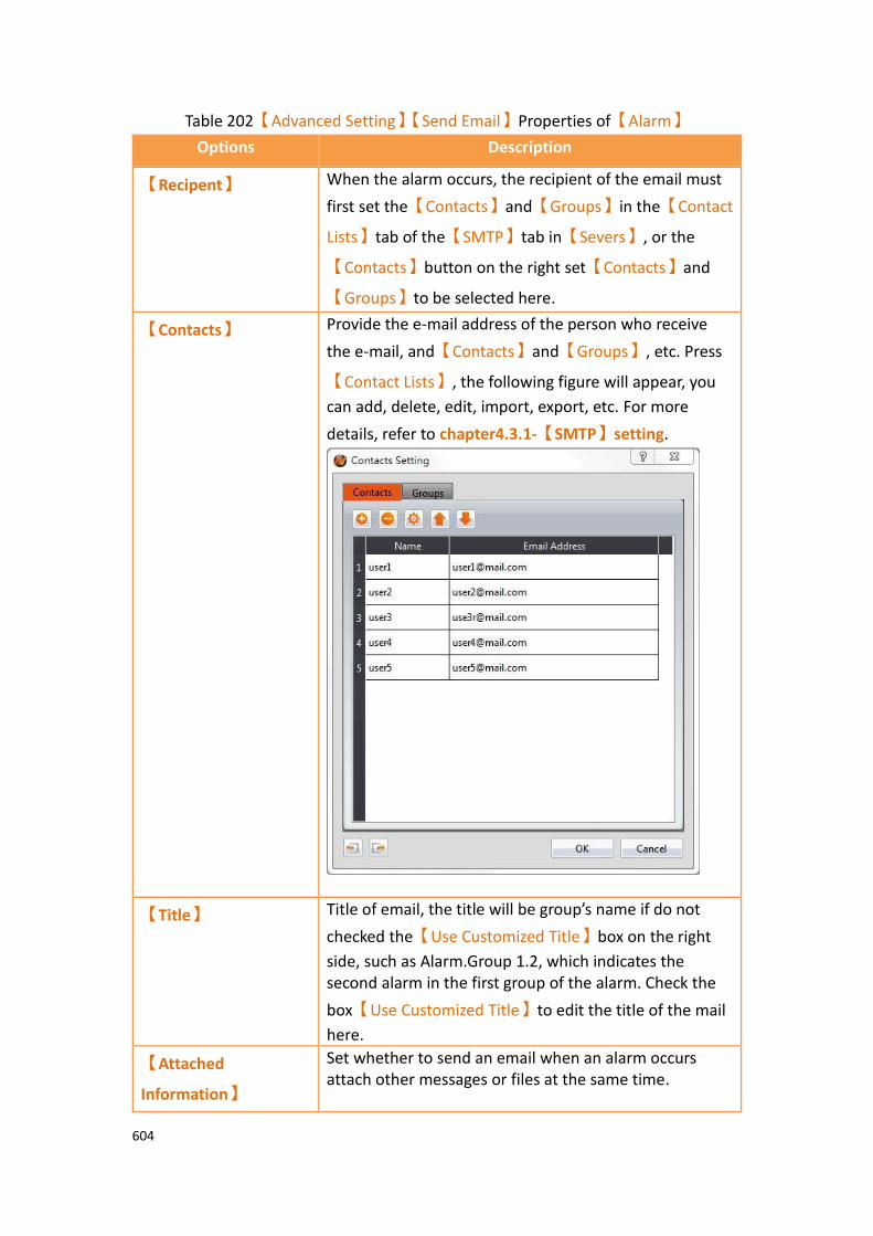
604
Table 202【Advanced Setting】【Send Email】Properties of【Alarm】
Options Description
【Recipent】 When the alarm occurs, the recipient of the email must
first set the【Contacts】and【Groups】in the【Contact
Lists】tab of the【SMTP】tab in【Severs】, or the
【Contacts】button on the right set【Contacts】and
【Groups】to be selected here.
【Contacts】 Provide the e-mail address of the person who receive
the e-mail, and【Contacts】and【Groups】, etc. Press
【Contact Lists】, the following figure will appear, you
can add, delete, edit, import, export, etc. For more
details, refer to chapter4.3.1-【SMTP】setting.
【Title】
Title of email, the title will be group’s name if do not
checked the【Use Customized Title】box on the right
side, such as Alarm.Group 1.2, which indicates the second alarm in the first group of the alarm. Check the
box【Use Customized Title】to edit the title of the mail
here.
【Attached
Information】
Set whether to send an email when an alarm occurs attach other messages or files at the same time.

605
【Attach Screenshot】
Check whether to attach HMI screenshot while sending email.
【Attach Image from Vedio Input】
Check whether to attach image from vedio input while sending email.
【Time】
Check whether to attach occurring time while sending email.
【Message】
Check whether to attach alarm message while sending email.
【Record Address】
Check whether to attach record address while sending email.
【Context】 Enter the context for sending email when the alarm occurs.

606
8.2.4 【Export】
The【Export】screen is as shown in the figure below, the meaning of each setting are
listed below:
Figure 292【Export】Setting Screen of【Alarm】
Table 203【Export】Setting Properties of【Alarm】
Property Description
【Export Data】 Set to enable the export function of the alarm data. Export setting items will appear below once this option is selected.
【General】 【Format】
Set the format of the export file; TXT file or CSV file can be selected.
【Destination】
Set the destination of the exported file: internal, microSD card or USB storage device can be selected. If exporting as a file, an FTP connection can be used with the HMI to read the saved file.

607
【Export Mode】
Set the time to export the file. If【Export Regularly】is
selected, the alarm occurrence data saved by【Alarm】
will be exported according to a set interval. If【Triggered
by Bit】is selected, the alarm occurrence data saved by
【Alarm】will be exported when the set bit is triggered.
【Time Interval】
Set the time interval between each export of the alarm
occurrence data saved by【Alarm】; the time interval can
be set on the right and the time step can be hours or
minutes. This setting item will appear when the【Export
Mode】is set as【Export Regularly】.
【Trigger Bit】
Set the control address to export the alarm occurrence
data saved by【Alarm】. This setting item will appear
when【Export Mode】is set as【Triggered by Bit】.
【File Name】
Set the name of the exported file; the file name of the exported file name will include the date and time the file was saved (for example: Alarm_140519_151735.txt).
【Suffix】
Set the name of the exported file, such as yymmdd_hh, the name of exported file only dates and hours (Example: DataLog_140519_17.txt) This setting also provides export archive mode, If the suffix selected is "yymm", it would produce one file per month, If the suffix selected is "yymmdd", it would produce one file per day, If the suffix select "yymmdd_hh", it would produce one file per hour, If the suffix selected is " yymmdd_hhmm", it would produce one file per minute, If the suffix selected is " yymmdd_hhmmss", it would produce one file per second, If the suffix to select "no", one file will includes all data.

608
【Create a folder with the name from comment】
If this option is checked, the name of the folder will be
name from【Setting】【Comment】, for example,
comment temperature, the original Group_1 folder will be changed to the temperature folder, which is originally datalog \ Group_1 will become datalog \ temperature.
【Save to the default folder】
There is none and folder created monthly two opitons, if choose none then will not create another folder, for example, datalog\Group_1\DataLog_170403. csv. if choose folder created monthly then will create another monthly folder each month, for example, datalog\Group_1\201704\DataLog_170403.csv.
【Date/Time
Format】
【Date】
Set the display format of the date when exporting file.
【Time】
Set the display format of the time when exporting file.
【Output Data】 【Output Data】allows you to choose which items to
export. You can select whether the export file will contain the alarm index, serial number, trigger date, alarm annotation, trigger time, confirmation time, recovery time, message, level, number of occurences, and record address.
【File Preservation
Limit】
Set the number of days a file is to be retained for. For example, if the limit is set to seven days, the HMI will check for files more than seven days old every morning and deletes those files if any are found.
【Status Address】 Set the save address for error codes. Error Code Description
0 No Error
1 Read Error
2 Write Error
5 Open Error
100 Not enough storage space

609
8.3 Alarm Application Example This section explains the application examples of the【Alarm】function and its setting
procedure.
8.3.1 Send Email when Alarm Occurs This chapter will explain when the alarm occurs, how to let user to send email through HMI, instantly send alarm messages to operators or set up e-mail recipients, and attach some informations to let operators get more messages, for the major problems happening on the equipment, it can be processed and maintained immediately. Setting steps as follow:
Step 1 : In order to send an email when an alarm occurs, set the【SMTP】function
first.
In the【System】window of the【Project Explorer】on the left of FvDesigner, click
【Servers】, enter the【Servers】setting page, switch to【SMTP】page, and enable
【SMTP】, figure as shown below.
Figure 293【SMTP】Setting window
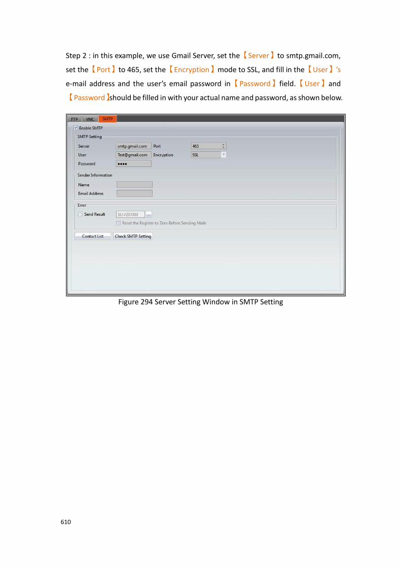
610
Step 2 : in this example, we use Gmail Server, set the【Server】to smtp.gmail.com,
set the【Port】to 465, set the【Encryption】mode to SSL, and fill in the【User】’s
e-mail address and the user’s email password in【Password】field.【User】and
【Password】should be filled in with your actual name and password, as shown below.
Figure 294 Server Setting Window in SMTP Setting

611
Step 3 : Fill in the【Name】and【Email Address】in the sender's properties. Please
fill in with your actual name and password, as shown below.
Figure 295 Sender Information setting in SMTP Setting

612
Step 4 : Fill in the【Contacts】and【Groups】. Please fill in with actual name and
password, as shown below.
Figure 296 SMTP contacts setting window
Figure 297 SMTP group setting window
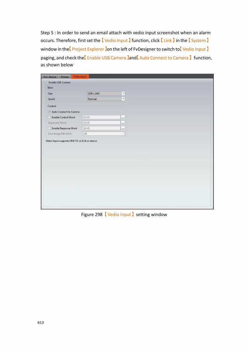
613
Step 5 : In order to send an email attach with vedio input screenshot when an alarm
occurs. Therefore, first set the【Vedio Input】function, click【Link】in the【System】
window in the【Project Explorer】on the left of FvDesigner to switch to【Vedio Input】
paging, and check the【Enable USB Camera】and【Auto Connect to Camera】 function,
as shown below
Figure 298【Vedio Input】setting window

614
Step 6 : Click the【Add】button to add an alarm group and edit the alarm message
and PLC address, as shown below.
Figure 299【Alarm】message editing
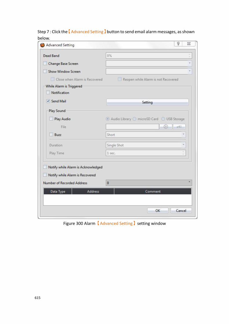
615
Step 7 : Click the【Advanced Setting】button to send email alarm messages, as shown
below.
Figure 300 Alarm【Advanced Setting】setting window
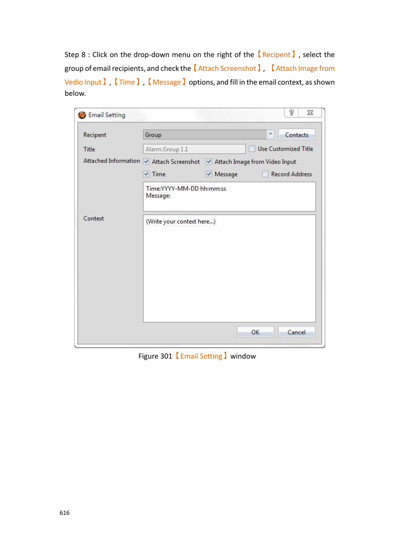
616
Step 8 : Click on the drop-down menu on the right of the【Recipent】, select the
group of email recipients, and check the【Attach Screenshot】, 【Attach Image from
Vedio Input】,【Time】,【Message】options, and fill in the email context, as shown
below.
Figure 301【Email Setting】window
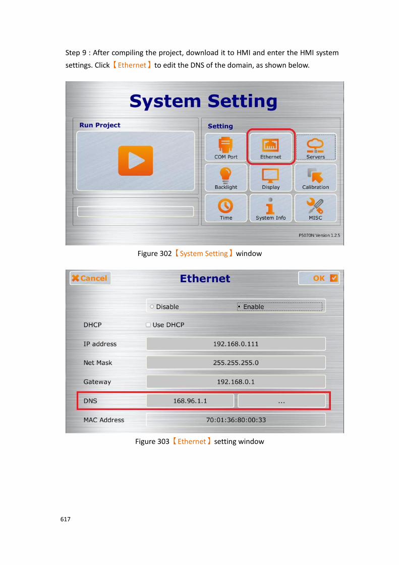
617
Step 9 : After compiling the project, download it to HMI and enter the HMI system
settings. Click【Ethernet】to edit the DNS of the domain, as shown below.
Figure 302【System Setting】window
Figure 303【Ethernet】setting window
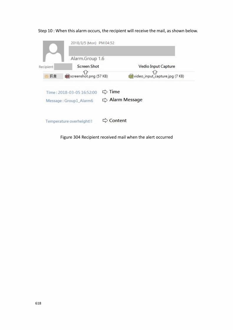
618
Step 10 : When this alarm occurs, the recipient will receive the mail, as shown below.
Figure 304 Recipient received mail when the alert occurred

619
8.4 Alarm Related Objects The following objects can be used if the user needs to view various alarm data records in real-time while the HMI is operating:
【Alarm Display】: Displays alarm related messages using a table. For more details,
refer to Chapter 3.3.25 -【Alarm Display】.
【Alarm Scrolling Text】: Displays alarm related messages using scrolling text. For
more details, refer to Chapter 3.3.26 -【Alarm Scrolling Text】.
【Alarm Data Selector】: Select an【Alarm ID】or exported CSV file. The【Alarm
Data Selector】allows users to a select an alarm from the dropdown and view it. The
files can be sorted by filename or date last modified. For more details, refer to
Chapter 3.3.27 -【Alarm Data Selector】.
【Global Alarm Scrolling Text】: Displays alarm related messages using scrolling text.
If this option is enabled, the【Global Alarm Scrolling Text】will be displayed at the
bottom of the screen when an alarm occurs, no matter what screen the HMI is currently displaying.

620
9. Recipe
In practical applications, settings with similar properties or behaviors but have different data contents for parameters are frequently used on equipment for manufacturing processes or actions; the collection of these parameter contents is called Recipe. Excellent recipe management helps increase engineering or production efficiencies.
9.1 Recipe Data Flow Before we start explaining the data flow of recipes on HMI, we must first understand what recipe group files, recipe groups and recipes are.
Recipe
For instance, if a machine is able to produce bread and cakes, and their ingredients are both flour, eggs, butter and chocolate, the ingredients can be viewed as the parameters of the machine. However, because the ratio of ingredients for making bread is different from making cakes, the ingredient ratios of the two can be made into two sets of parameters: one for making bread and one for making cakes. The two sets of parameters described above are two different recipes; and every recipe will have a unique number.
Recipe Group
A group of recipes that have the same parameters is called a Recipe Group; take the example above for instance, the two recipes (bread and cake) can form a Recipe Group. The recipe function allows users to edit multiple recipe groups, and every recipe group will have a unique Recipe Group ID. All the recipes in the recipe group will have a unique number starting from 0. (For example, the number of bread is 0 and the number of cake is 1)
Recipe Group File
There is the common format csv file which the user can use text editors on their own computers or the Recipe Editor in the recipe function to edit the csv file. A recipe group file saves all the data of a recipe group, including all the parameter names and parameter values in the recipe.
Recipe Data Flow
When projects are executing on the HMI, all of the parameter data are saved in the recipe group file first, and the user can use the function switch object to import the file into the HMI. Complete parameter contents can be seen if the project has the recipe table object. There is a buffer in the HMI used to save the data of the current recipe; which recipe to save in this buffer is determined by the Control Address of Recipe No., and the Control Address of Recipe No. is set in the recipe function. Please note that no matter what the Recipe No. currently is, once the import file function is used, the Recipe No. will be reset to 0.
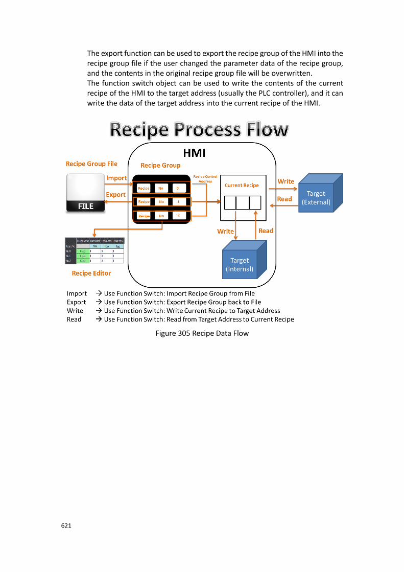
621
The export function can be used to export the recipe group of the HMI into the recipe group file if the user changed the parameter data of the recipe group, and the contents in the original recipe group file will be overwritten. The function switch object can be used to write the contents of the current recipe of the HMI to the target address (usually the PLC controller), and it can write the data of the target address into the current recipe of the HMI.
Figure 305 Recipe Data Flow
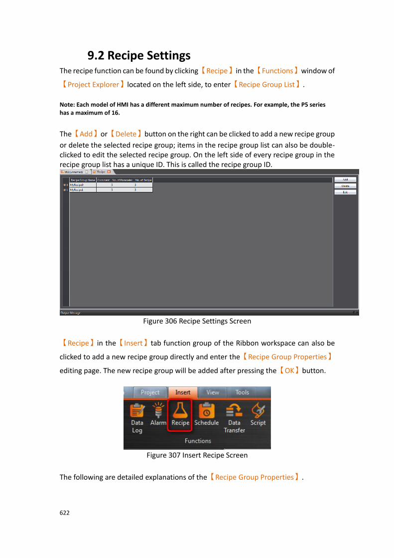
622
9.2 Recipe Settings The recipe function can be found by clicking【Recipe】in the【Functions】window of
【Project Explorer】located on the left side, to enter【Recipe Group List】.
Note: Each model of HMI has a different maximum number of recipes. For example, the P5 series has a maximum of 16.
The【Add】or【Delete】button on the right can be clicked to add a new recipe group
or delete the selected recipe group; items in the recipe group list can also be double-clicked to edit the selected recipe group. On the left side of every recipe group in the recipe group list has a unique ID. This is called the recipe group ID.
Figure 306 Recipe Settings Screen
【Recipe】in the【Insert】tab function group of the Ribbon workspace can also be
clicked to add a new recipe group directly and enter the【Recipe Group Properties】
editing page. The new recipe group will be added after pressing the【OK】button.
Figure 307 Insert Recipe Screen
The following are detailed explanations of the【Recipe Group Properties】.

623
9.2.1 【General】
Figure 308【General】Screen of【Recipe】
Table 204【General】Properties of【Recipe】
Property Description
【Basic】 【Group Name】
The name of the recipe group.
【Comment】
Comment describing this recipe group.
【Backup Memory】
Select to save the recipe data of the HMI into the backup memory of the HMI when the power to the HMI is interrupted in order to avoid loss of data.
【Recipe Name】 【Type】
Set the type of recipe name to Ascii or Unicode.
【Do Not Use Recipe Name】
Set if you do not want to use the recipe name.
624
【Use Recipe Name Address】
Check to specify the address and length of the recipe name, when the recipe group changes, this address will display the corresponding recipe name, or you can use this address to
modify the name of the current recipe group, when【Type】
is selected as【Ascii】, because a register contains 2 Ascii, for
example,【Length】is set to 5, so a total of 3 registers will be
occupied, and when【Type】is selected as【Unicode】, a register
will contain 1 Unicode, for example【Length】is set to 5, so a
total of 5 registers will be used.
【Parameter】
【Configuration】
【No. of Recipe Parameters】
Set the number of parameters for this recipe group.
【Current Recipe Start Address】
Every recipe group has a buffer memory space equal to the size of a recipe on the HMI, and the current recipe start address determines which address to start this buffer memory.
【Target Address Type】
a. 【Continuous】
The target address can only be set for the first parameter of in the table below. The addresses of the other parameters will be filled in consecutively in memory and the user cannot modify them.
b. 【Random】
The user can set the target address for every parameter, but the addresses must be unique.
The following are the explanations for parameter settings.
【Parameter Name】
The parameter name cannot be blank and each parameter should have a unique name. It can be entered directly or
selected by【Font】.
【Data Type】
Available selections include【16Bit-BCD】,【16Bit-INT】,
【16Bit-UINT】,【32Bit-BCD】,【32Bit-INT】,【32Bit-
UINT】,【32Bit-FLOAT】and【Ascii-String】.
【Current Recipe Address】
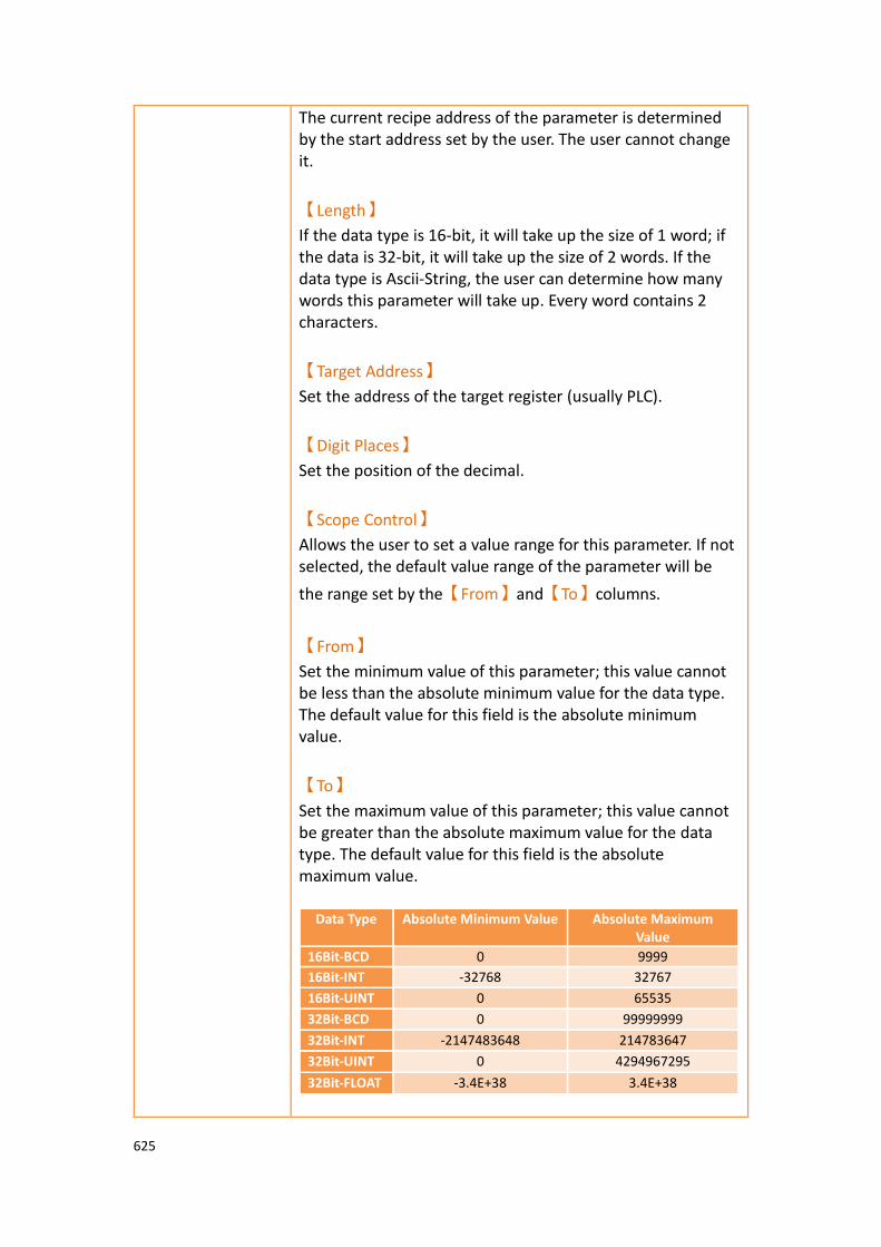
625
The current recipe address of the parameter is determined by the start address set by the user. The user cannot change it.
【Length】
If the data type is 16-bit, it will take up the size of 1 word; if the data is 32-bit, it will take up the size of 2 words. If the data type is Ascii-String, the user can determine how many words this parameter will take up. Every word contains 2 characters.
【Target Address】
Set the address of the target register (usually PLC).
【Digit Places】
Set the position of the decimal.
【Scope Control】
Allows the user to set a value range for this parameter. If not selected, the default value range of the parameter will be
the range set by the【From】and【To】columns.
【From】
Set the minimum value of this parameter; this value cannot be less than the absolute minimum value for the data type. The default value for this field is the absolute minimum value.
【To】
Set the maximum value of this parameter; this value cannot be greater than the absolute maximum value for the data type. The default value for this field is the absolute maximum value.
Data Type Absolute Minimum Value Absolute Maximum Value
16Bit-BCD 0 9999
16Bit-INT -32768 32767
16Bit-UINT 0 65535
32Bit-BCD 0 99999999
32Bit-INT -2147483648 214783647
32Bit-UINT 0 4294967295
32Bit-FLOAT -3.4E+38 3.4E+38

626
【Recipe Group
File】
【No. of Recipe】
Set the number of recipes for this recipe group. Note: The memory size of every recipe group cannot exceed 6291456 words, which means that (the total number of words for every
parameter) x (the number of recipes) ≦ 6291456. If the user is
uncertain whether the limit has been exceeded, the user can move the mouse cursor onto the text and a tooltip will tell the user how many words are currently used.
【Control Address of Recipe No.】
The register data of this address is a 16-bit positive integer, and it is used to represent the number of the current recipe. The used recipe in a recipe group during HMI execution is called current recipe. Note: The Control Address of Recipe No. cannot be the same as the Current Recipe Start Address.
【Power-On Reset Recipe No.】
If check the box, when HMI restarts will reset the【Control
Address of Recipe No.】to 0, that is, the group 0, the default
is checked; if you do not check this option, when HMI restarts
will not reset the【Control Address of Recipe No.】to 0, which
means that the recipe number has a power-off retention. In addition, the internal memory V of the HMI has no power-off
retention, so when the【Control Address of Recipe No.】is set
to the internal memory V of the HMI, even if it is not checked, it will not power-off retention.
【Open Recipe Editor】
The recipe editor will appear, allowing the user to add a new recipe group file when this button is pressed or edit a recipe group file saved on the PC storage. Note:
➢ The parameter name of the file must be the same as the parameter name in the recipe setting when modifying an existing file.
➢ When you use the function of simulation, the recipe group file will be put in the path: C:\Users\User Account\Documents\Fatek\FvDesigner\run\storage\internal\recipe

627
9.2.2 【Advanced】
Figure 309【Advanced】【Recipe】Settings
Table 205【Advanced】General Settings
Field Description
【Use Control Words】 Use the control word to control the recipes actions. Including; reading, or writing data from/to the PLC, editing, and other functions.
【Control Address】
Set the control address to a specific address that will trigger the function
# Controls the value of the
address (Hex)
Features
1 0010h The recipe data is transferred to the HMI
2 0011h MicroSD card recipe data is transferred to the HMI
3 0012h USB port recipe data is transferred to the HMI

628
4 0020h HMI recipe data is stored in the interface
5 0021h HMI recipe data is stored in the MicroSD card
6 0022h HMI recipe data is stored in a USB storage device
7 0040h The HMI recipe data is transferred to the target address (Usually the PLC address)
8 0080h The recipe data of the target address (Usually the PLC address) is transferred to the HMI
9 0100h Add a set of recipes to the specified recipe group, such as the current group 3 recipe. When this signal is triggered, a new set of recipes will be added and the new group will be group 3. The former group 3 will become group 4.
10 0101h Add a set of recipes under the specified recipe group, such as group 3. When the signal is triggered, a new set of recipes is added. In this case, the recipe group is 4.
11 0102h Copies a set of specified recipes on a specified recipe group, such as group 3. When the signal is triggered, the recipe of group 3 will be copied to a set of recipes and will become the new group 3. The former group 3 will become group 4.
12 0103h Copies a specific set of recipies under the recipie group, such as a recipe currently in group 3. When the signal is triggered, replicates group 3’s recipes with a set of recipes from group 4.
13 0104h Deletes the current recipe group

629
14 0200h Read the parameter data from the source address then write to the recipe group storage space, this function transfers the entire recipe group data.
15 0400h Write the parameter data of the recipe storage space to the source address, this function transfers the entire recipe group data.
【File Name】
Two types of file names,【Static】and【Dynamic】.
【Static】allows you to set the recipe below the checkbox.
【Dynamic】allows you to set the string length. The
maximum amount of characters is 16, the contents of the string affect the file name.
【Use Status Word】 Use the status word group to monitor the current state of the recipe processing, the use of the control group, and the use of the status word. This is used to determine whether the current recipe has been processed.
【Status Address】
Set the status address to the following to achieve the desired status message, as show in the table below.
# Value of the Status
Address (Hex)
Message
1 0000h Initialize
2 4000h Busy
3 8000h Success
4 0100h Recipe data transfer to HMI has failed.
5 0101h MicroSD card recipe data transfer to HMI has failed.
6 0102h USB recipe data transfer to HMI has failed
7 0200h HMI recipe data has failed to save
8 0201h HMI recipe data has failed to save to the MicroSD card
9 0202h HMI recipe data has failed to save to the USB storage device
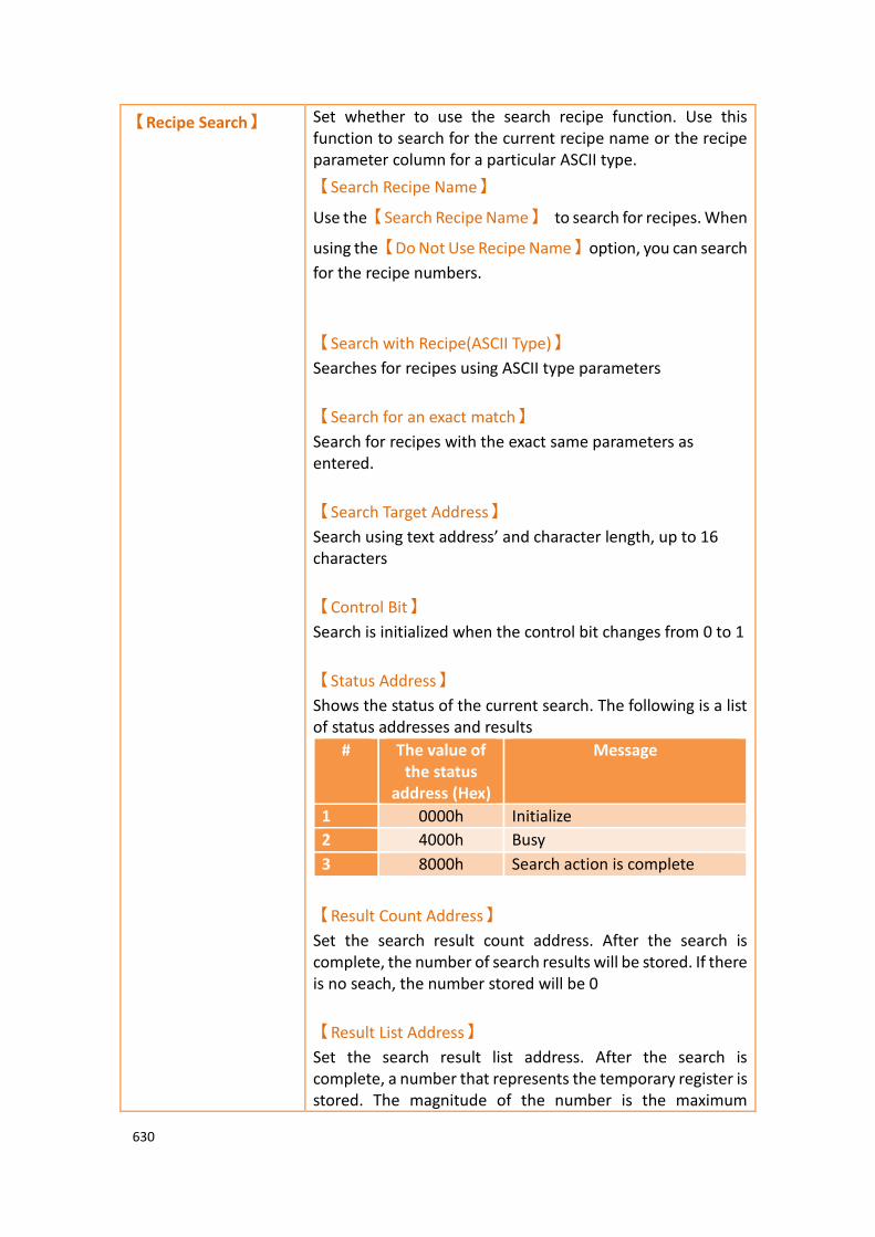
630
【Recipe Search】 Set whether to use the search recipe function. Use this function to search for the current recipe name or the recipe parameter column for a particular ASCII type.
【Search Recipe Name】
Use the【Search Recipe Name】 to search for recipes. When
using the【Do Not Use Recipe Name】option, you can search
for the recipe numbers.
【Search with Recipe(ASCII Type)】
Searches for recipes using ASCII type parameters
【Search for an exact match】
Search for recipes with the exact same parameters as entered.
【Search Target Address】
Search using text address’ and character length, up to 16 characters
【Control Bit】
Search is initialized when the control bit changes from 0 to 1
【Status Address】
Shows the status of the current search. The following is a list of status addresses and results
# The value of the status
address (Hex)
Message
1 0000h Initialize
2 4000h Busy
3 8000h Search action is complete
【Result Count Address】
Set the search result count address. After the search is complete, the number of search results will be stored. If there is no seach, the number stored will be 0
【Result List Address】
Set the search result list address. After the search is complete, a number that represents the temporary register is stored. The magnitude of the number is the maximum

631
number of searches and the maximum number of recipes that can be set.
【Support Recipe
Group Data From/To
Source Address】
Set whether to use the entire recipe group and source address to transfer data.
【Source Address】
Set the source address of the starting address. The software will automatically calculate the total number of addresses used and will prompt the user for the ending address.
【Include Recipe Name】
Set whether to include the recipe name when using the entire recipe group and the source address.
【Length】
Set the recipe name length. For example: each group of the recipe have 5 parameters, there are 6 groups of recipes. Setting as follows, check
【Include Recipe Name】.
The results are shown below

632
So the first group Recipe0 will occupy $U:300~$U:308, $U:300~$U:303 is the recipe name of the first group Recipe0, $U:304~$U:308 is the parameter of the first group, The second group Recipe1 will occupy $U:309~$U:317, $U:309~$U:312 is the recipe name of the second group Recipe1, $U:313~$U:317 is the parameter of the second group, and so on. For example: each group of the recipe have 5 parameters, there are 6 groups of recipes. Setting as follows, uncheck
【Include Recipe Name】.

633
The results are shown below
So the first group Recipe0 will occupy $U:300~$U:304 as parameter for the first group, the second group Recipe1 will occupy $U:305~$U:309 as parameter for the second group, and so on.

634
9.2.3 【Recipe File List】
Figure 310【Recipe File List】Screen of【Recipe】
Table 206【General】Properties of【Recipe】
Property Description
【Add】 Add an already existing recipe group file to the recipe file list.
【Delete】 Delete an item in the recipe file list.
【Clear All】 Delete all the items in the recipe file list.

635
9.3 【Recipe Editor】 This function allows the user to add a new recipe group file or edit an existing recipe group file.
The recipe editor can be opened from【Open Recipe Editor】in the【Recipe Group
Properties】setting.
Figure 311【Recipe Editor】Screen
Figure 312【Recipe Editor】Screen when recipe names are not used

636
Table 207【Recipe Editor】Functions
Property Description
【No. of
Recipe
Parameters】
The “No. of Recipe Parameters” cannot be set if the user is adding a recipe group file. The No. of Recipe Parameters can be set if the user is modifying an existing file.
【No. of
Recipe】
Determine how many recipes this recipe group file has. A number will be automatically generated on the left side of the recipe.
【Add to
Recipe File
List】
If checked, this file will be automatically added to the recipe file list after finishing editing.
【Open】 Open an existing file for editing.
【Save】 Save the currently edited recipe group contents into a recipe group file. The user can select to save it as a csv file.
【Save As】 Save the currently edited recipe group contents into a new file; the user can select to save it as a csv file.
【Exit】 Exit the recipe editor.
Note: Please note that when the user is editing the value of the parameters, this value cannot exceed the limit between the minimum and maximum value of this parameter, in which the data type of the parameter usually defines the maximum/minimum value. However, the value set for the【Scope
Control】will be referred to if the user selects【Scope Control】in parameter settings.
If this parameter is an Ascii String, the length of characters entered by the user cannot exceed the length configured for the parameter x2. If the parameter in the file opened by the user exceeded the restricted range, the background will be displayed in red.
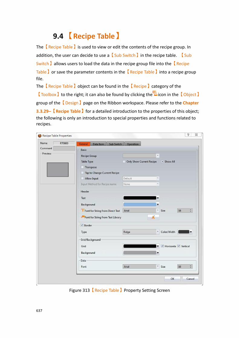
637
9.4 【Recipe Table】 The【Recipe Table】is used to view or edit the contents of the recipe group. In
addition, the user can decide to use a【Sub Switch】in the recipe table. 【Sub
Switch】allows users to load the data in the recipe group file into the【Recipe
Table】or save the parameter contents in the【Recipe Table】into a recipe group
file.
The【Recipe Table】object can be found in the【Recipe】category of the
【Toolbox】to the right; it can also be found by clicking the icon in the【Object】
group of the【Design】page on the Ribbon workspace. Please refer to the Chapter
3.3.29–【Recipe Table】for a detailed introduction to the properties of this object;
the following is only an introduction to special properties and functions related to recipes.
Figure 313【Recipe Table】Property Setting Screen

638
Table 208【Recipe Table】Functions
Property Description
【Recipe
Group】
The recipe group ID and recipe group name can be seen here if the user added a new recipe group in the recipe settings
function. The【OK】button can only be pressed after the user
has selected a recipe group.
【Table Type】 【Only Show Current Recipe】
Display the current recipe according to the Control Address of the Recipe No. in recipe settings. The default value for index is 0.
【Show All】
Show all contents of the recipe group.
【Transpose】 Reverse the rows and columns. For example, row 1 in the original table becomes column 1 in the transposed table.
【Tap to Change
Current Recipe】
When checked, you can click the recipe header or item to automatically switch the current recipe to the clicked recipe.
【Allow Input】 The user will be able to change the parameter contents in the recipe table during execution if this option is selected. If
【Function Switch】or【Sub Switch】in the Toolbox is also used,
the user can save the value contents of the recipe table into a recipe group file, or change the parameter of the controller.
【Sub Switch】 If the【Save】or【Load】button in the【Sub Switch】page is
selected, corresponding buttons will also appear on the top-
right of the recipe table editing section screen when the【OK】
button is pressed.
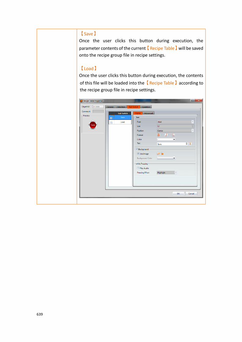
639
【Save】
Once the user clicks this button during execution, the
parameter contents of the current【Recipe Table】will be saved
onto the recipe group file in recipe settings.
【Load】
Once the user clicks this button during execution, the contents
of this file will be loaded into the【Recipe Table】according to
the recipe group file in recipe settings.

640
9.5 【Recipe Selector】 The【Recipe Selector】is used to select a current recipe. The operator can only see
the name of the recipe on the HMI and cannot know the contents of the recipe parameters. Therefore, the parameter data is confidential.
The【Recipe Selector】object can be found in the【Recipe】category of
【Toolbox】, it can also be found by clicking the icon in the【Object】group of
the【Design】page on the Ribbon workspace. Please refer to the Chapter3.3.28–
【Recipe Selector】for detailed introduction to the properties of this object; the
following is only introduction to special properties and functions related to recipes.
Figure 314【Recipe Selector】Property Setting Screen
Table 209【Recipe Selector】Functions
Property Description
【Recipe
Group】
The recipe group ID and recipe group name can be seen here if the user added a new recipe group in the recipe settings
function. The【OK】button can only be pressed after the user
has selected a recipe group.
【Background】 【Background Selector】
Set the background color.
【List Background】
Set the background color of the list.

641
9.6 【Function Switch】 There are a few functions in the【Function Switch】component related to recipes;
users can select these functions according to their needs. Please refer to the following table for detailed introductions to these functions.
The【Function Switch】object can be found in the【Lamp/Switch】category of the
【Toolbox】to the right. Please refer to the Chapter 0–
【Function Switch】for detailed introduction to the properties of this object. The
following is only introduction to special properties and functions related to recipes.
Figure 315【Function Switch】Property Setting Screen
Table 210【Function Switch】Recipe Functions
Property Description
【Function】 【Recipe: Import Recipe Group from File】
Import the contents of the recipe group file. If a recipe table exists, the user will be able to see complete recipe group contents. If the register addresses of some displayed objects are the same as the current recipe address in the recipe settings,
642
users will also be able to see the value changes of the displayed objects. A drop-down list will appear once this function is used; the user must decide which recipe group to use for this function switch. Note: The current recipe of this recipe group will be set to Recipe No. 0 when this function is used.
【Recipe: Export Recipe Group back to File】
Export the contents of the recipe group into a recipe group file. The user can choose to export a new file or overwrite the original recipe group file. A drop-down list will appear once this function is used; the user must decide which recipe group to use for this function switch.
【Recipe: Write Current Recipe to Target Address】
A drop-down list will appear once this function is used; the user must decide which recipe group to use for this function switch. The parameter value of the current recipe of the HMI will be written to the register of the target address according to the setting of this recipe group.
【Recipe: Read from Target Address to Current Recipe】
A drop-down list will appear once this function is used; the user must decide which recipe group to use for this function switch. The register contents of the target address will be read and the value will be written to the current recipe of the HMI according to the setting of this recipe group.
【Recipe: Add Default Recipe】
Add a set of recipes to or above the current recipe and switch the current recipe to the most recent recipe
【Recipe: Copy Current Recipe】
Copy the the current recipe and put it above or below the recipe you copied.
【Recipe: Delete Current Recipe】
Delete the current recipe and switch the deleted recipe group with the next recipe group.
【Recipe: Transfer Source Address to Recipe Group】
The source address parameter data is written to the recipe group. The source address can be set in the advanced tab of the
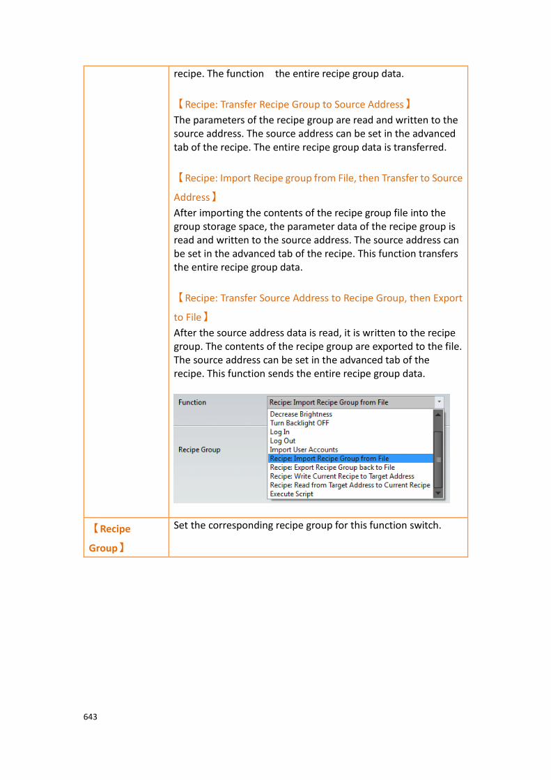
643
recipe. The function the entire recipe group data.
【Recipe: Transfer Recipe Group to Source Address】
The parameters of the recipe group are read and written to the source address. The source address can be set in the advanced tab of the recipe. The entire recipe group data is transferred.
【Recipe: Import Recipe group from File, then Transfer to Source
Address】
After importing the contents of the recipe group file into the group storage space, the parameter data of the recipe group is read and written to the source address. The source address can be set in the advanced tab of the recipe. This function transfers the entire recipe group data.
【Recipe: Transfer Source Address to Recipe Group, then Export
to File】
After the source address data is read, it is written to the recipe group. The contents of the recipe group are exported to the file. The source address can be set in the advanced tab of the recipe. This function sends the entire recipe group data.
【Recipe
Group】
Set the corresponding recipe group for this function switch.
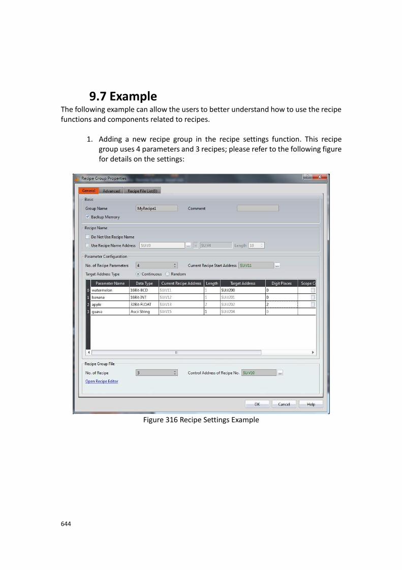
644
9.7 Example The following example can allow the users to better understand how to use the recipe functions and components related to recipes.
1. Adding a new recipe group in the recipe settings function. This recipe
group uses 4 parameters and 3 recipes; please refer to the following figure for details on the settings:
Figure 316 Recipe Settings Example

645
2. Press the【Open Recipe Editor】function and the【Recipe Editor】will appear
on the screen; the parameter contents inside will be the same as the recipe settings, including the maximum and minimum value that the user will be able to input. Refer to the following figure for editing contents, and remember to save the file when editing is completed; please remember to
check 【Add to Recipe File List】.
Figure 317【Recipe Editor】Example
3. Pull two【Recipe Table】from【Toolbox】to the editing section of the screen,
and select (ID 0) MyRecipe0 for【Recipe Group】. Please select【Only Show
Current Recipe】for one of the recipe tables and【Show All】and【Allow
Input】for the other recipe table.
4. Pull a【Recipe Selector】from【Toolbox】to the editing section of the screen,
and select (ID 0) MyRecipe0 for recipe group.
5. Pull four【Function Switch】from【Toolbox】to the editing section of the
screen, and select (ID 0) MyRecipe0 for recipe group. The functions of
these four switches are【Recipe: Import Recipe Group from File】, 【Recipe:
Export Recipe Group back to File】,【Recipe: Write Current Recipe to Target
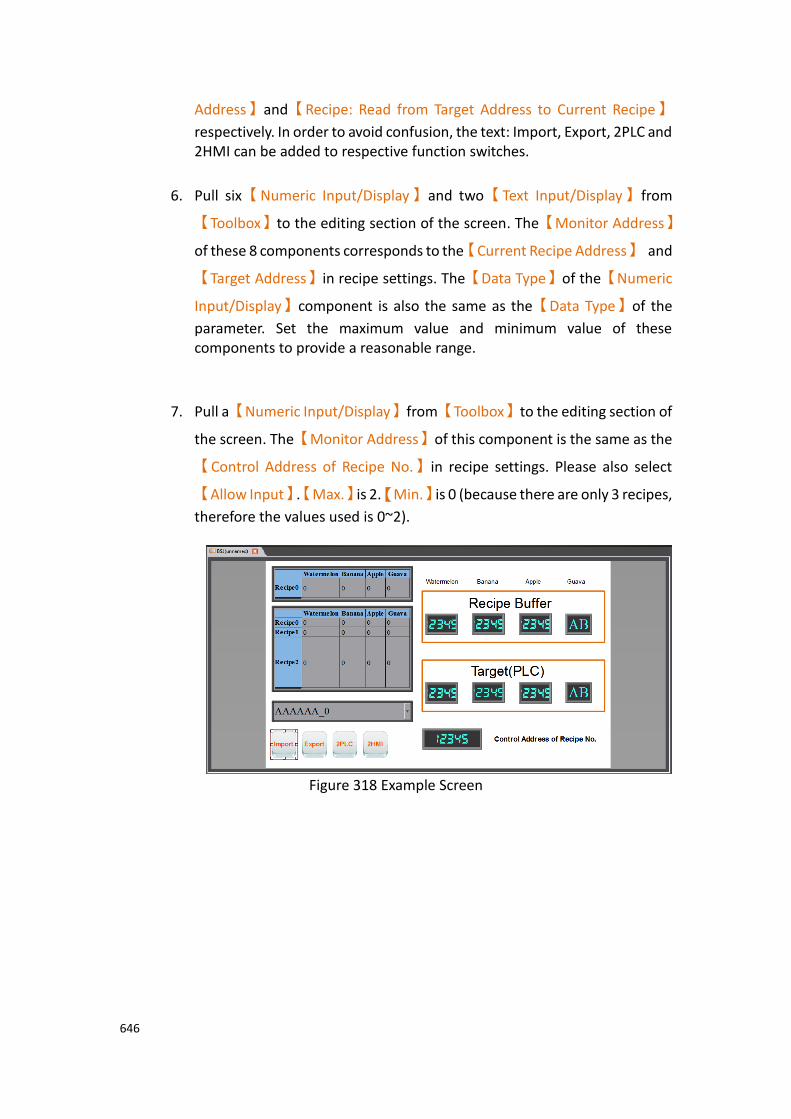
646
Address】and【Recipe: Read from Target Address to Current Recipe】
respectively. In order to avoid confusion, the text: Import, Export, 2PLC and 2HMI can be added to respective function switches.
6. Pull six【Numeric Input/Display】and two【Text Input/Display】from
【Toolbox】to the editing section of the screen. The【Monitor Address】
of these 8 components corresponds to the【Current Recipe Address】 and
【Target Address】in recipe settings. The【Data Type】of the【Numeric
Input/Display】component is also the same as the【Data Type】of the
parameter. Set the maximum value and minimum value of these components to provide a reasonable range.
7. Pull a【Numeric Input/Display】from【Toolbox】to the editing section of
the screen. The【Monitor Address】of this component is the same as the
【Control Address of Recipe No.】in recipe settings. Please also select
【Allow Input】.【Max.】is 2.【Min.】is 0 (because there are only 3 recipes,
therefore the values used is 0~2).
Figure 318 Example Screen
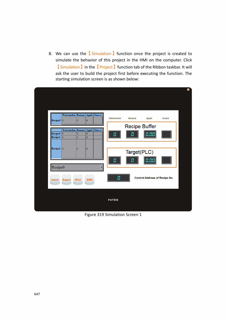
647
8. We can use the【Simulation】function once the project is created to
simulate the behavior of this project in the HMI on the computer. Click
【Simulation】in the【Project】function tab of the Ribbon taskbar. It will
ask the user to build the project first before executing the function. The starting simulation screen is as shown below:
Figure 319 Simulation Screen 1

648
9. Click the import function switch; this operation will read the contents of the recipe group file into the HMI, including the current recipe and recipe table. If the monitored addresses of the displayed objects are the same as the current recipe address of the recipe settings, the displayed numeric value or text will changes accordingly. The contents of the recipe selector will also change accordingly. The current recipe will be reset to Recipe No. 0 every time a file is imported, so the contents of the recipe selector will be the Blend1 with a number of 0. During this time the screen will be displayed as follows:
Figure 320 Simulation Screen 2

649
10. Change the numeric input of the Control Address of Recipe No. To 2 and the current recipe will change to Blend3.
Figure 321 Simulation Screen 3

650
11. Click on the 2PLC function switch; this operation will write the data contents of the current recipe into the register of the target address (usually the controller). It can be observed that the displayed objects in the target area are also the parameter data of Blend3 after clicking the switch.
Figure 322 Simulation Screen 4
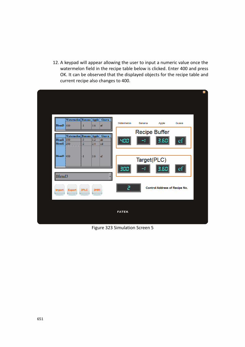
651
12. A keypad will appear allowing the user to input a numeric value once the watermelon field in the recipe table below is clicked. Enter 400 and press OK. It can be observed that the displayed objects for the recipe table and current recipe also changes to 400.
Figure 323 Simulation Screen 5
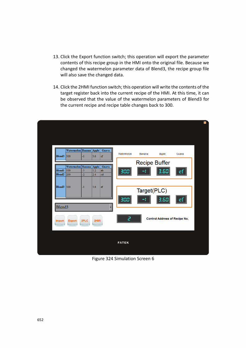
652
13. Click the Export function switch; this operation will export the parameter contents of this recipe group in the HMI onto the original file. Because we changed the watermelon parameter data of Blend3, the recipe group file will also save the changed data.
14. Click the 2HMI function switch; this operation will write the contents of the target register back into the current recipe of the HMI. At this time, it can be observed that the value of the watermelon parameters of Blend3 for the current recipe and recipe table changes back to 300.
Figure 324 Simulation Screen 6

653
15. Click the Import function switch and it can be observed that the watermelon parameter of Blend3 changes to 400 again. This is because we used the export function before, so the contents of the file have also been changed. However, because the file was imported again, the number of the current recipe was reset to Recipe No. 0, so the current recipe will show the data of Blend1.
Figure 325 Simulation Screen 7

654
10. Operation Log
Historic logs are frequently required for the parameters and controls of certain equipment in many applications in order to track phenomenon that users care about.
This is the function that the【Operation Log】provides. It can record the HMI operating
processes performed by the user into the memory and also save it as a CSV file so that the user can view it afterwards.
10.1 【Operation Log】Settings 【Operation Log】can be accessed from the【Function】window located in the【Project
Explorer】to the left of the FV Designer as shown below:
Figure 326 Setting Screen of【Operation Log】

655
Table 211 Setting Properties of【Operation Log】
Property Description
【Enable
Operation Log】
Check to enable the【Operation Log】; this is the master
switch of the【Operation Log】.
【Recording
Buffer (Backup
Memory)】
【Number of Records】
Set the number of logs that the recording buffer can record.
【When the Recording Buffer is Limited】
This can be divided into the following two behaviors:
➢ 【Stop Operation Log】
Stop logging immediately; any operations afterwards will no longer be recorded in the recording buffer. It can only start logging again once the recording buffer is cleared.
➢ 【First in First out】
Delete the oldest log and places the newest log information in the recording buffer.
【Action】 【Record When Project Starts】
Check to record data in the recording buffer when the project starts.
【Message】
Set the messages to record when【Record When Project Starts】
is selected.
【Record When Project Stops】
Check to record data in the recording buffer when the project ends.
【Message】
Set the messages to record when【Record When Project Stops】
is selected.
【Record When Security Level Changes】
Check whether the information is recorded in the recording buffer when the security level changes
【Message】
Set the messages to record when【Record When Security Level

656
Changes】is selected.
【Record Communication Status】
The communication status of the HMI will be recorded.
【Message】
Set the messages to record when【Record Communication
Status】is selected.
【Save CSV File】 Check to save the operation log recorded in the recording buffer into a CSV file.
【Destination】
Set the save location of the CSV file, including internal, microSD card, USB storage device.
【Save Mode】
This can be divided into the following two modes:
➢ 【Time】
Save into CSV files at fixed times, in which the time selections are as follows:
➢ 【Triggered by】
Use a certain triggering bit as the basis for saving the CSV files.
【Prefix of File Name】
Set a prefix for the CSV file name; the system will use this prefix with the date and time to form a unique file name when writing CSV files. The user can move the mouse cursor over the input field and the full name of the file will be displayed in the reminder immediately, as shown in the figure below:

657
【File Preservation Limit】
When enabled, it allows the user to set the number of days the exported files are preserved. For example, if set for 7 days, the HMI will check the date and will delete the files on the 7th day.
【CSV Content】 【Date】
Set the date format of the CSV content, in which the selections are as follows:
【Time】
Set the time format of the CSV content, in which the selections are as follows:

658
10.2 【Operation Log】Settings of Objects The descriptions above are for the function settings of the【Operation Log】, but every
object with operating behaviors has their own corresponding settings that must also be set completely in order to use the Operation Log. The following figure shows the setting screen of objects with operating behaviors; the
Operation Log setting of the objects can be found under the【Operation】tab, as shown
by the frame in the figure below.
Figure 327 Setting Screen of Objects with Operation Behaviors
Table 212 Object Setting Properties of【Operation Log】
Property Description
【Operation Log】 Select whether to enable the【Operation Log】of the
object. It can also edit operation messages where the message can
be inputted directly or acquired from the【Text Library】.
659
10.3 Introduction to the Operation Log CSV File
The CSV file contents of the Operating Log are as follows:
➢ 【Number】
Operation Log serial number
➢ 【Date】
Operation Log date
➢ 【Time】
Operation Log time
➢ 【User】
The user name at the time; no data will be recorded for this field when
【Security Manager】->【Mode】is set as【Level】.
➢ 【Level】
The user level at the time
➢ 【Screen】
The screen where the operation object is located
➢ 【Part ID】
The ID of the operation object
➢ 【Comment】
Comments of the operation object
➢ 【Message】
Operating message of the operation object
➢ 【Address】
Access address of the operation object
➢ 【Pre Value】
The pre value of the operation object’s access address content
➢ 【Changed Value】
The current value after the operation object’s access address content has changed
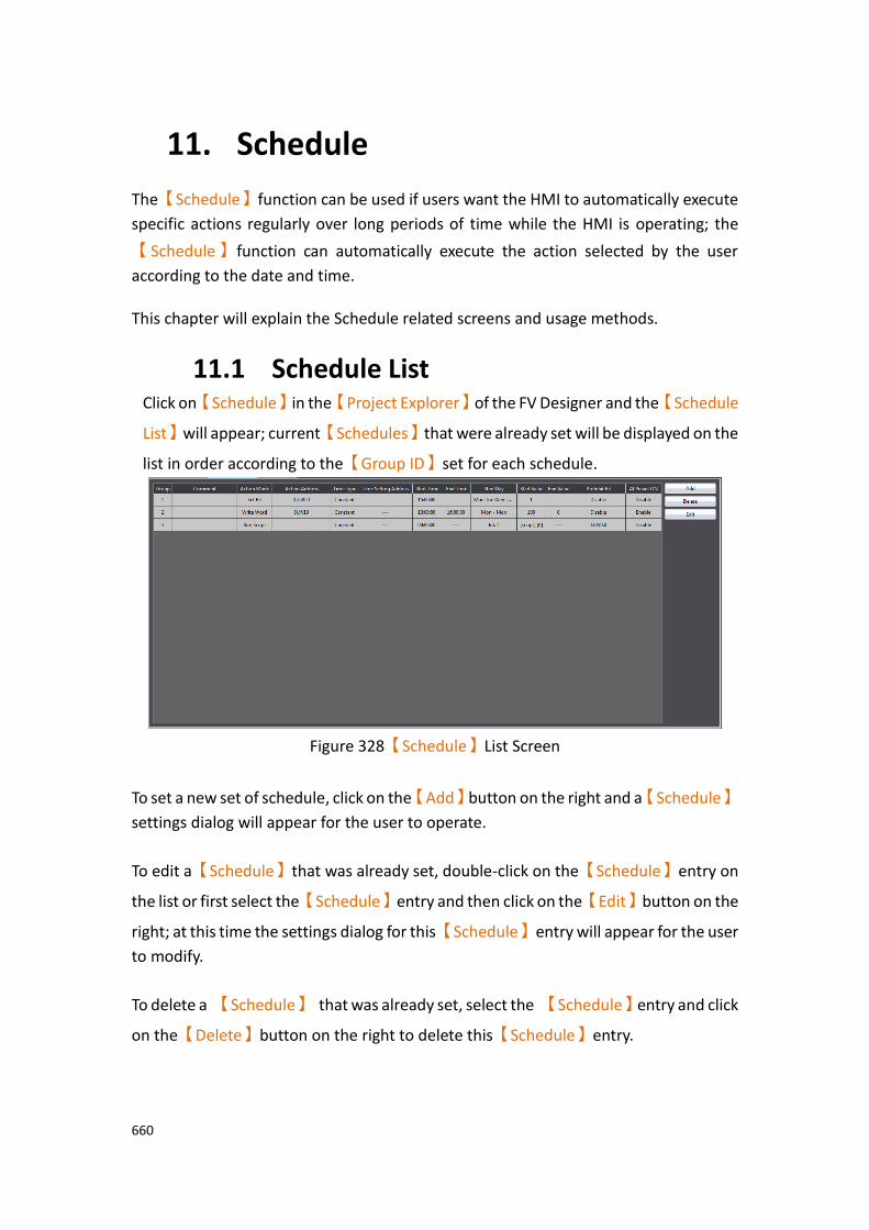
660
11. Schedule
The【Schedule】function can be used if users want the HMI to automatically execute
specific actions regularly over long periods of time while the HMI is operating; the
【Schedule】 function can automatically execute the action selected by the user
according to the date and time. This chapter will explain the Schedule related screens and usage methods.
11.1 Schedule List Click on【Schedule】in the【Project Explorer】of the FV Designer and the【Schedule
List】will appear; current【Schedules】that were already set will be displayed on the
list in order according to the【Group ID】set for each schedule.
Figure 328【Schedule】List Screen
To set a new set of schedule, click on the【Add】button on the right and a【Schedule】
settings dialog will appear for the user to operate.
To edit a【Schedule】that was already set, double-click on the【Schedule】entry on
the list or first select the【Schedule】entry and then click on the【Edit】button on the
right; at this time the settings dialog for this【Schedule】entry will appear for the user
to modify.
To delete a 【Schedule】 that was already set, select the 【Schedule】entry and click
on the【Delete】button on the right to delete this【Schedule】entry.

661
11.2 Schedule Settings The setting screen of the【Schedule】function is as shown in the figure below, the
meanings of each setting option are listed below:
Figure 329【Schedule】Setting Screen
Table 213【Schedule】Setting Properties
Property Description
【Group ID】 Set the Group ID of the【Schedule】.
【Comment】 Set the comments of the【Schedule】.
【Mode】 Set the execution action behavior of the【Schedule】.
【Action Mode】
Set the execution action mode of the【Schedule】.

662
1 【Set Bit】: If the【Action Mode】is set to this mode,
when the system time reaches the set 【Start
Time】, the HMI will automatically set the【Action
Address】as 1.
2 【Reset Bit】: If the【Action Mode】is set to this
mode, when the system time reaches the set【Start
Time】, the HMI will automatically set the【Action
Address】as 0.
3 【Write Word】: If the 【Action Mode】 is set to
this mode, when the system time reaches the set
【Start Time】, the HMI will automatically set the
【Action Address】to the【Start Value】.
4 【Run Script】: If the 【Action Mode】is set to this
mode, when the system time reaches the set 【Start
Time】, the HMI will automatically execute the【Start
Script】.
【Action Address】
Set the action address of the【Schedule】.
【Enable End Action】
Set to enable end action. The【End Value】,【End Script】
and【End Time】of the【Schedule】can be set when this
option is enabled; when the system time reaches the set
【End Time】, the HMI will automatically execute the end
action set.
【Power-ON Start/End Action】
Set to enable the Power-ON Start/End Action, This function
can only be enabled after selecting【Enable End Action】.
When Power-ON Start/End Action is enabled, if the HMI was turned on between the Start and End Time interval set in
the【Schedule】, the HMI will automatically execute the
Start action once.

663
When Power-ON Start/End Action is enabled, if the HMI was turned on outside the Start and End Time interval set in the
【Schedule】, the HMI will automatically execute the End
action once.
【Start Value】
Set the value to write into the【Action Address】when the
【Schedule】executes the Start Action. The【Start Value】
cannot be changed if the【Action Mode】is set as【Set
Bit】or【Reset Bit】.
【End Value】
Set the value to write in the【Action Address】when the
【Schedule】executes the end action. The【End Value】
cannot be changed when the 【Action Mode】is set as
【Set Bit】or【Reset Bit】.
【Type】
This setting item will appear when the 【Action Mode】is
set as【Write Word】; it allows the setting of the【Start
Value】and【End Value】type. The【Start Value】and
【End Value】are fixed values when the type is set as
【Constant】, and the【Start Value】and【End Value】will
be the saved value of the address set when the type is set as
【Address】.

664
【Data Type】
This setting item will appear when the【Action Mode】is
set as【Write Word】; it allows the setting of the data type
for the【Start Value】and【End Value】setting address.
【Start Script】
This setting item will appear when the【Action Mode】is
set as【Run Script】; it allows setting of a script for the HMI
to execute when the system time reaches the【Start
Time】that was set.
【End Script】
This setting item will appear when the 【Action Mode】is
set as【Run Script】; it allows setting of a script for the HMI
to execute when the system time reaches the【End Time】
that was set. Please note that this setting item cannot be
operated if【Enable End Action】was not selected.
【Enable Prohibit Action Bit】
The prohibit action bit can be set on the right when this function is enabled. If the prohibit action bit is enabled when the HMI is operating, if the value of the prohibit action bit is 1, the Start Action or End Action that was set will not be executed even if the system time as reached the
【Start Time】or【End Time】.
【Date/Time Set】 Set the date and time for the【Schedule】 to execute the
action.
【Type】
Set the type of the【Date/Time Set】; the date and time
will both have fixed values when the date/time set is set as
【Constant】,and the date and time for the【Schedule】to
execute actions will be dynamically determined by the
【Time Setting Address】that was set when the date/time
set is set as【Address】.

665
【Date Type】
The date type can be set when the【Type】is set as
【Constant】. Individual start day and end day can be set if
【Individual Day】is selected, and the start day can be set
as a specific date within a year if【Specific Day】is selected.
If neither【Individual Day】nor【Specific Day】was
selected, the start day can be set as a specific date within a week.
【Changeable with Schedule Setting Table】
After checking, you can dynamically change the start date, start time, and end time of the schedule on HMI.
【Start Month】
Set the month for the start month of the【Schedule】. This
setting item can only be set when the【Date Type】is set as
【Specific Day】.
【Start Day】
Set the date for the【Schedule】to start execution.
【End Day】
Set the date for the【Schedule】 to end execution. This
setting item can only be set when the【Date Type】is set as
【Individual Day】.
【Start Time】
Set the time for the【Schedule】to start execution.
【End Time】
Set the time for the【Schedule】to end execution.
【Time Setting Address】
The【Time Setting Address】can be set when the【Type】
is set as【Address】. Once the【Time Setting Address】is
set, it will use 11 continuous addresses starting from itself
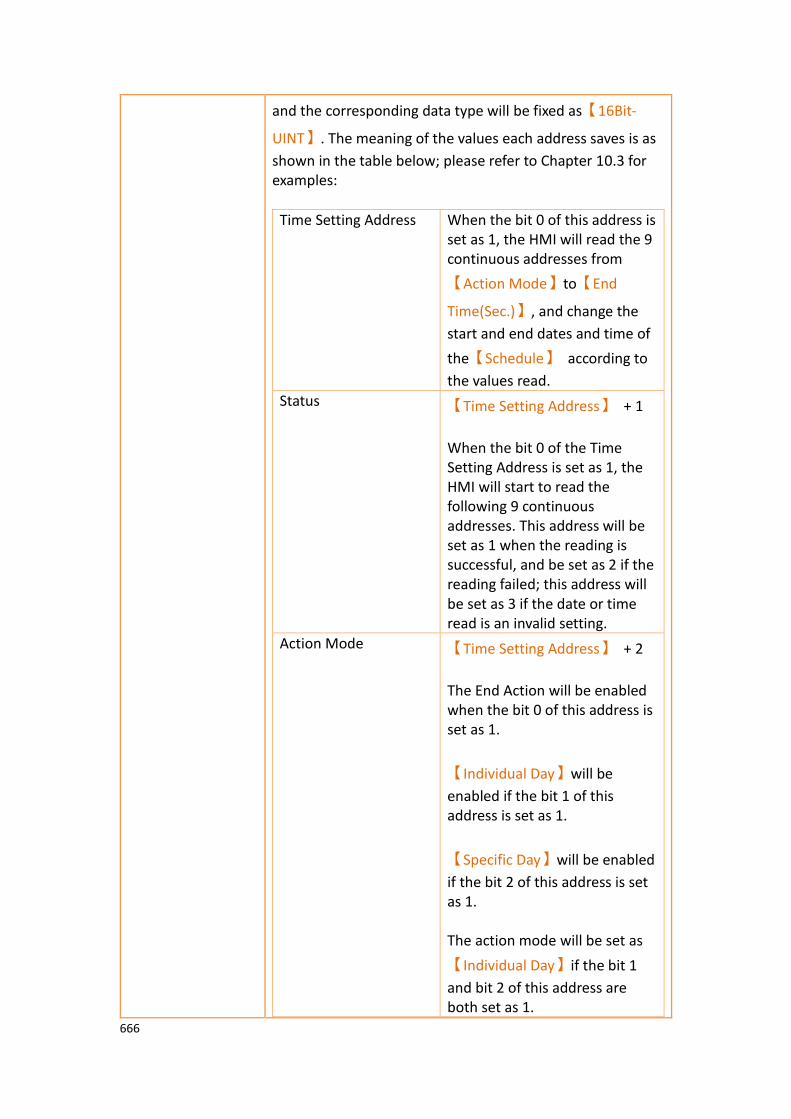
666
and the corresponding data type will be fixed as【16Bit-
UINT】. The meaning of the values each address saves is as
shown in the table below; please refer to Chapter 10.3 for examples:
Time Setting Address When the bit 0 of this address is set as 1, the HMI will read the 9 continuous addresses from
【Action Mode】to【End
Time(Sec.)】, and change the
start and end dates and time of
the【Schedule】 according to
the values read.
Status 【Time Setting Address】 + 1
When the bit 0 of the Time Setting Address is set as 1, the HMI will start to read the following 9 continuous addresses. This address will be set as 1 when the reading is successful, and be set as 2 if the reading failed; this address will be set as 3 if the date or time read is an invalid setting.
Action Mode 【Time Setting Address】 + 2
The End Action will be enabled when the bit 0 of this address is set as 1.
【Individual Day】will be
enabled if the bit 1 of this address is set as 1.
【Specific Day】will be enabled
if the bit 2 of this address is set as 1. The action mode will be set as
【Individual Day】if the bit 1
and bit 2 of this address are both set as 1.
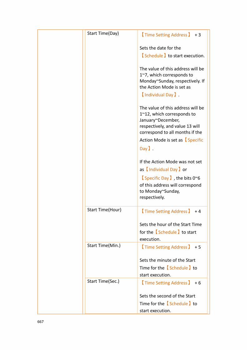
667
Start Time(Day) 【Time Setting Address】 + 3
Sets the date for the
【Schedule】to start execution.
The value of this address will be 1~7, which corresponds to Monday~Sunday, respectively. If the Action Mode is set as
【Individual Day】.
The value of this address will be 1~12, which corresponds to January~December, respectively, and value 13 will correspond to all months if the
Action Mode is set as【Specific
Day】.
If the Action Mode was not set
as【Individual Day】or
【Specific Day】, the bits 0~6
of this address will correspond to Monday~Sunday, respectively.
Start Time(Hour) 【Time Setting Address】 + 4
Sets the hour of the Start Time
for the【Schedule】to start
execution.
Start Time(Min.) 【Time Setting Address】 + 5
Sets the minute of the Start
Time for the【Schedule】to
start execution.
Start Time(Sec.) 【Time Setting Address】 + 6
Sets the second of the Start
Time for the【Schedule】to
start execution.

668
End Time(Day) 【Time Setting Address】 + 7
Sets the date for the
【Schedule】to end execution.
The value of this address will be 1~7, which corresponds to Monday~Sunday, respectively, if the Action Mode is set as
【Individual Day】.
The value of this address will be 1~31, which corresponds to the 1st~31st respectively, if the
Action Mode is set as【Specific
Day】.
End Time(Hour) 【Time Setting Address】 + 8
Sets the hour of the End Time
for the【Schedule】to end
execution.
End Time(Min.) 【Time Setting Address】 + 9
Sets the minute of the End Time
for the【Schedule】to end
execution.
End Time(Sec.) 【Time Setting Address】 + 10
Sets the second of the End Time
for the【Schedule】to end
execution.

669
11.3 Examples Example 1: Execute start action at fixed times weekly.
Address Value Function
【Time Setting
Address】
1 Start reading the【Time Setting
Address】, and changes the
【Schedule】settings according to
the value read.
【Time Setting
Address】+2
Bit 0: 0 Do not enable end action.
Bit 1: 0 Do not enable【Individual Day】.
Bit 2: 0 Do not enable【Specific Day】.
【Time Setting
Address】+3
Bit 0: 0 Set not to execute【Schedule】on
Monday.
Bit 1: 1 Set to execute【Schedule】on
Tuesday.
Bit 2: 0 Set not to execute【Schedule】on
Wednesday.
Bit 3: 1 Set to execute【Schedule】on
Thursday.
Bit 4: 1 Set to execute【Schedule】on
Friday.
Bit 5: 0 Set not to execute【Schedule】on
Saturday.
Bit 6: 0 Set not to execute【Schedule】on
Sunday.
【Time Setting
Address】+4
8 Set the hour of the Start Time for
the【Schedule】to start execution
as 8 A.M.
【Time Setting
Address】+5
30 Set the minute of the Start Time for
the【Schedule】to start execution
as 30 minutes.
【Time Setting
Address】+6
0 Set the second of the Start Time for
the【Schedule】to start execution
as 0 seconds.

670
Example 2: Individually setting the date and time to execute start action and end action weekly.
Address Value Function
【Time Setting
Address】
1 Start reading the【Time Setting
Address】, and changes the
【Schedule】settings according to
the value read.
【Time Setting
Address】+2
Bit 0: 1 Enable End Action.
Bit 1: 1 Enable【Individual Day】; The end
day and start day can be set individually.
Bit 2: 0 Do not enable【Specific Day】.
【Time Setting
Address】+3
1 Set the start day for the
【Schedule】to start execution as
Monday.
【Time Setting
Address】+4
8 Set the hour of the Start Time for
the 【Schedule】to start execution
as 8 A.M.
【Time Setting
Address】+5
30 Set the minute of the Start Time for
the 【Schedule】to start execution
as 30 minutes.
【Time Setting
Address】+6
0 Set the second of the Start Time for
the 【Schedule】to start execution
as 0 seconds.
【Time Setting
Address】+7
7 Set the end day for the
【Schedule】to end execution as
Sunday.
【Time Setting
Address】+8
17 Set the hour of the End Time for the
【Schedule】to end execution as 5
P.M.
【Time Setting
Address】+9
0 Set the minute of the End Time for
the【Schedule】to end execution
as 0 minutes.
【Time Setting
Address】+10
30 Set the second of the End Time for
the【Schedule】to end execution
as 30 seconds.
Example 3: Execute start action on specific day and time.

671
Address Value Function
【Time Setting
Address】
1 Start reading the【Time Setting
Address】, and changes the
【Schedule】settings according to
the value read.
【Time Setting
Address】+2
Bit 0: 0 Do not enable end action.
Bit 1: 0 Do not enable【Individual Day】.
Bit 2: 1 Enable【Specific Day】.
【Time Setting Address】+3 and
【Time Setting Address】+7 will
save the start month and start day settings respectively.
【Time Setting
Address】+3
6 Set the start month as June.
【Time Setting
Address】+4
0 Set the hour of the Start Time for
the【Schedule】to start execution
as 0 A.M.
【Time Setting
Address】+5
30 Set the minute of the Start Time for
the【Schedule】to start execution
as 30 minutes.
【Time Setting
Address】+6
0 Set the second of the Start Time for
the【Schedule】to start execution
as 0 seconds.
【Time Setting
Address】+7
30 Set the start day as the 30th.
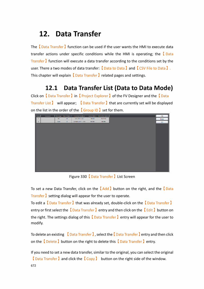
672
12. Data Transfer
The【Data Transfer】function can be used if the user wants the HMI to execute data
transfer actions under specific conditions while the HMI is operating; the【Data
Transfer】function will execute a data transfer according to the conditions set by the
user. There a two modes of data transfer:【Data to Data】and【CSV File to Data】.
This chapter will explain【Data Transfer】related pages and settings.
12.1 Data Transfer List (Data to Data Mode) Click on【Data Transfer】in【Project Explorer】of the FV Designer and the【Data
Transfer List】 will appear; 【Data Transfer】that are currently set will be displayed
on the list in the order of the【Group ID】set for them.
Figure 330【Data Transfer】List Screen
To set a new Data Transfer, click on the【Add】button on the right, and the【Data
Transfer】setting dialog will appear for the user to operate.
To edit a【Data Transfer】that was already set, double-click on the【Data Transfer】
entry or first select the【Data Transfer】entry and then click on the【Edit】button on
the right. The settings dialog of this【Data Transfer】entry will appear for the user to
modify.
To delete an existing 【Data Transfer】, select the【Data Transfer】entry and then click
on the【Delete】button on the right to delete this【Data Transfer】entry.
If you need to set a new data transfer, similar to the original, you can select the original
【Data Transfer】and click the【Copy】 button on the right side of the window.

673
12.2 Data Transfer Settings (Data to Data Mode)
The settings screen of the【Data Transfer】is as shown in the figure below and the
meanings of each setting are listed below:
Figure 331 Setting Dialog of【Data Transfer】
Table 214 Setting Properties of【Data Transfer】
Property Description
【Group ID】 Set the group ID of the【Data Transfer】.
【Comment】 Set the comment of the【Data Transfer】.
【Address】 Set the behavior of the【Data Transfer】.
【Data Type】
Set the data type of the【Data Transfer】.
【No. of Bits】
Set the number of bits per transfer; it can be set between1~65535 bits. The more number of bits per transfer, the longer it will take for the transfer to be completed.

674
Therefore, make sure that there is sufficient time for the data transfer to be completed every time it is executed.
【No. of Words】
Set the number of words per transfer; it can be set between 1~65535 words. The more number of words per transfer, the longer it will take for the transfer to be completed. Therefore, make sure there is sufficient time for data transfer to be completed every time it is executed.
【Execution Condition】
Set the condition to execute【Data Transfer】. The【Trigger
Bit】and【Trigger Condition】can be set below if the
execution condition is set as【Triggered by Bit】; The data
transfer will be executed when the status changes satisfy the
conditions set. The【Time Interval】can be set below if the
execution condition is set as【Time-based】; The HMI will
execute the data transfer according to the set time interval.
【Source Address】
Set the source address for executing the【Data Transfer】; The
HMI will read the No. of Bits or No. of Words set from the
source address and write them into the【Destination
Address】when the data transfer is executed.
【Destination Address】
Set the destination address for executing the【Data
Transfer】; The HMI will read the No. of Bits or No. of Words
set from the source address and write them into the
【Destination Address】when the data transfer is executed.
【Notification Bit】
Specify a bit to set or reset upon the completion of the data transfer. This bit can be used to trigger other functions to run on the transferred data.
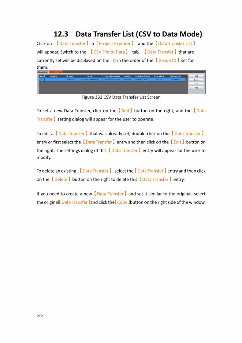
675
12.3 Data Transfer List (CSV to Data Mode) Click on 【Data Transfer】in【Project Explorer】 and the【Data Transfer List】
will appear. Switch to the 【CSV File to Data】 tab. 【Data Transfer】that are
currently set will be displayed on the list in the order of the【Group ID】set for
them.
Figure 332 CSV Data Transfer List Screen
To set a new Data Transfer, click on the【Add】button on the right, and the【Data
Transfer】setting dialog will appear for the user to operate.
To edit a【Data Transfer】that was already set, double-click on the【Data Transfer】
entry or first select the【Data Transfer】entry and then click on the【Edit】button on
the right. The settings dialog of this【Data Transfer】entry will appear for the user to
modify.
To delete an existing 【Data Transfer】, select the【Data Transfer】entry and then click
on the【Delete】button on the right to delete this【Data Transfer】entry.
If you need to create a new【Data Transfer】and set it similar to the original, select
the original【Data Transfer】and click the【Copy】button on the right side of the window.

676
12.4 Data Transfer Settings (CSV to Data Mode)
The【CSV to Data Transfer Mode】settings are below. The meanings of each setting
are listed below.
Figure 333【CSV to Data Transfer Mode】Settings Screen
Table 215【CSV to Data Transfer Mode】Setting Properties
Property Description
【Group ID】 Set the group ID of the【Data Transfer】.
【Comment】 Set the comment of the【Data Transfer】.
【CSV File Set the source of the【Data Transfer】.
677
Path】
【File Source】
Set the location of the CSV file source:【internal】, 【microSD
Card】, or 【USB Storage】.
【File Name】
Enter the file name of the CSV file. If【Dynamic Name】is
selected, the name of the file can be saved to a specified location. This allows the program to change CSV files by saving a new name into the specified location. The register address and length can be set.
【CSV File
Content】
【Delimiter】
Set the delimiter between entries.
【CSV Data】
Set the start and end positions in the CSV file. Enter a【From】
column and row and an【To】column row. The direction the
data is read can be changed by clicking the【Direction】icon.
【Address】 【Data Type】
Select the data type of the【CSV to Data File Transfer】.
【Trigger Bit】
Set the address of the bit that triggers the【CSV to Data File
Transfer】.
【Trigger Condition】
Select the type of bit change that provides the trigger: OFF to ON, ON to OFF, or both directions.
【Destination Address】
Set the target address of the【CSV to Data File Transfer】.
【Result State Address】
The【CSV to Data File Transfer】result status is stored in this
location.

678
Result Explanation
0 Transfer Success
1 Source file open file failed
2 There are too few entries in the source
3 The source is unrecognized
【Notification Bit】
Specify a bit to set or reset upon the completion of the【Data
Transfer】. This bit can be used to trigger other functions to run
on the transferred data.
679
13. Script
Script provides a simple language to allow users to write their own programs. Available statements include logical judgments, numerical computations, loop executions etc. Users can flexibly use the statements provided by the system to complete a complex task that cannot easily be accomplished with general objects. Existing scripts previously created could also be reused in different projects to save development time.
13.1 When to execute scripts Scripts can be set to be triggered and executed at the following different times: ⚫ Global
1. Project startup: Execute when the project starts. 2. Timer: After the script has finished executing, wait a fixed period of time
and then execute again. 3. Trigger by Bit: Execute the script when the status or changes of a specific
bit meet the conditions (Please refer to Table 232 Script Editor–Script
Properties Descriptions on the explanations for【Trigger】).
⚫ Screen 1. Screen open: Execute the script when a specific screen is opened. 2. Screen close: Execute the script when a specific screen is closed. 3. Screen cycle: Execute the script periodically when a specific screen is
displayed in the foreground. ⚫ Object
1. Bit Switch: Execute scripts when the actions meets the conditions. 2. Function Switch: Execute scripts when a switch is pressed.
⚫ Schedule 1. Execute scripts at the beginning or ending of a scheduled time.
680
13.2 Script Syntax 13.2.1 Registers
Scripts can use the following syntax to access HMI or external device registers:
Table 216 Script–Registers
Register Description
Internal Registers
Registers provided by the HMI; the access speed is generally faster than the external registers. 16Bits-UINT data type is used to access the value in the register when internal registers are used in a script; for example: $U:V2 Volatile register $U:NV2 Non-volatile register Internal registers can also be specified to access a specific bit directly; the following syntax will use Bit as the data type to access the value of the register: $U:V0.0 The 0 bit (lowest bit) of register $U:V0 $U:NV1.15 The 15 bit (highest bit) of register$U:NV1
External Registers
Registers of devices connected to the HMI; the access speed is generally slower compared to Internal registers. Therefore it is recommended to store temporary values during computation to internal registers when writing a script, and then write the final computed results into the external registers in order to get the best performance. The value will be accessed as Bit data type when the bit width of the external register is 1, otherwise it will be accessed as 16Bits-UINT. Using Fatek FBs PLC connection as an example (let’s assume that the name of the connecting PLC device is 0): @0:WY0 Allows accessing of the 16Bits-UINT value saved
in WY0 @0:Y0 Allows accessing of the Bit value saved inY0
Tag Tag provides the function to create aliases for registers, which
can be set in the【Tag Library】. Tags also have extra
advantages when used in scripts because the data types of the
tags in the【Tag Library】are specified. If the users want to use
data types other than 16Bits-UINT to access the value on the register, they can create a tag matching to the register they want to use and set the data type of the registers to the type they
want to use it as:
$T:FLOAT Allows accessing of $U:V500 to $U:V501 with 32Bits-FLOAT
$T:INT32 Allows accessing of $U:V400 to $U:V401 with 32Bits-INT
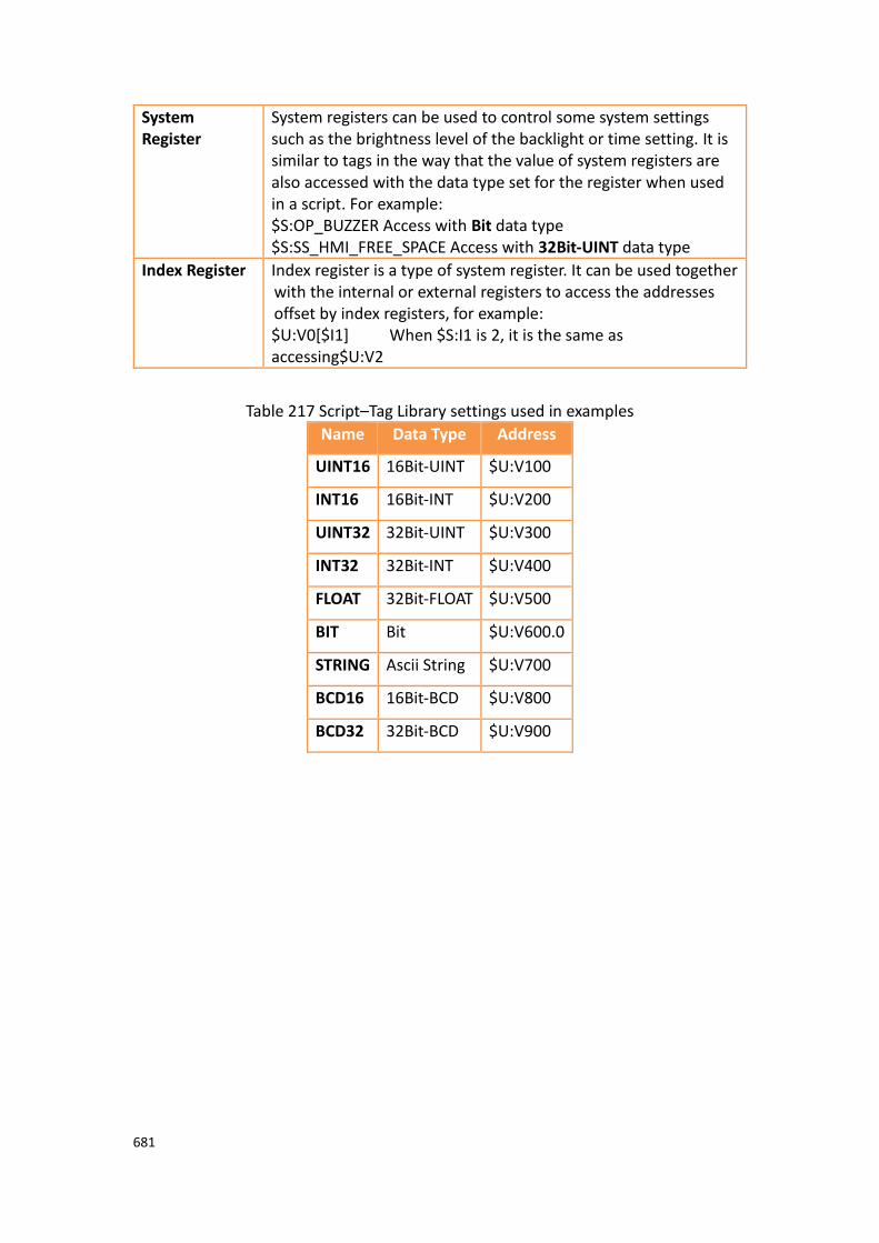
681
System Register
System registers can be used to control some system settings such as the brightness level of the backlight or time setting. It is similar to tags in the way that the value of system registers are also accessed with the data type set for the register when used in a script. For example: $S:OP_BUZZER Access with Bit data type $S:SS_HMI_FREE_SPACE Access with 32Bit-UINT data type
Index Register Index register is a type of system register. It can be used together with the internal or external registers to access the addresses offset by index registers, for example: $U:V0[$I1] When $S:I1 is 2, it is the same as accessing$U:V2
Table 217 Script–Tag Library settings used in examples
Name Data Type Address
UINT16 16Bit-UINT $U:V100
INT16 16Bit-INT $U:V200
UINT32 32Bit-UINT $U:V300
INT32 32Bit-INT $U:V400
FLOAT 32Bit-FLOAT $U:V500
BIT Bit $U:V600.0
STRING Ascii String $U:V700
BCD16 16Bit-BCD $U:V800
BCD32 32Bit-BCD $U:V900
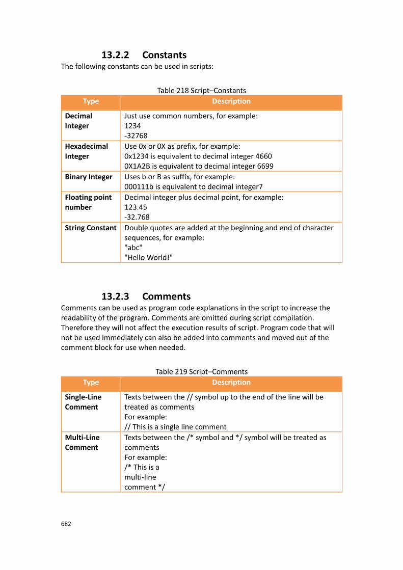
682
13.2.2 Constants The following constants can be used in scripts:
Table 218 Script–Constants
Type Description
Decimal Integer
Just use common numbers, for example: 1234 -32768
Hexadecimal Integer
Use 0x or 0X as prefix, for example: 0x1234 is equivalent to decimal integer 4660 0X1A2B is equivalent to decimal integer 6699
Binary Integer Uses b or B as suffix, for example: 000111b is equivalent to decimal integer7
Floating point number
Decimal integer plus decimal point, for example: 123.45 -32.768
String Constant Double quotes are added at the beginning and end of character sequences, for example: "abc" "Hello World!"
13.2.3 Comments Comments can be used as program code explanations in the script to increase the readability of the program. Comments are omitted during script compilation. Therefore they will not affect the execution results of script. Program code that will not be used immediately can also be added into comments and moved out of the comment block for use when needed.
Table 219 Script–Comments
Type Description
Single-Line Comment
Texts between the // symbol up to the end of the line will be treated as comments For example: // This is a single line comment
Multi-Line Comment
Texts between the /* symbol and */ symbol will be treated as comments For example: /* This is a multi-line comment */
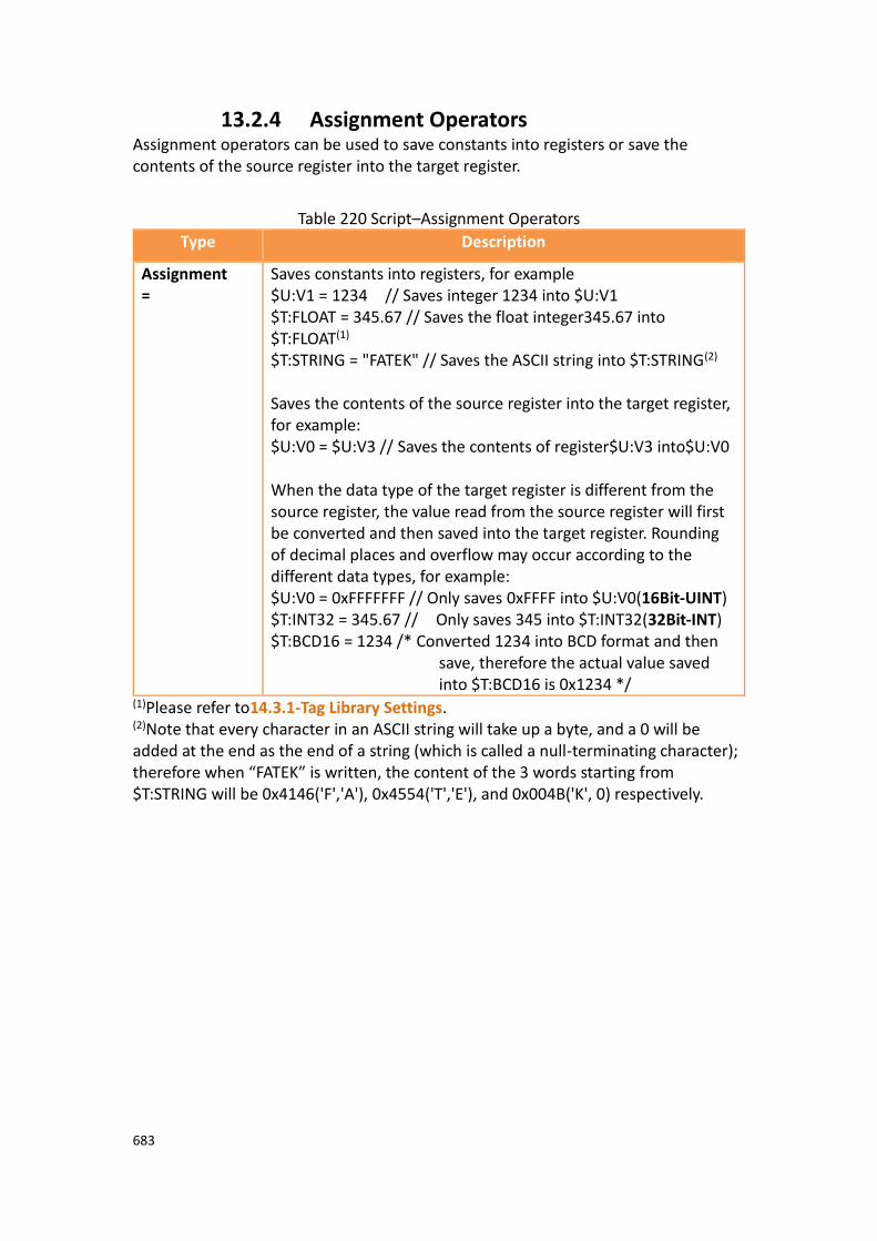
683
13.2.4 Assignment Operators Assignment operators can be used to save constants into registers or save the contents of the source register into the target register.
Table 220 Script–Assignment Operators
Type Description
Assignment =
Saves constants into registers, for example $U:V1 = 1234 // Saves integer 1234 into $U:V1 $T:FLOAT = 345.67 // Saves the float integer345.67 into $T:FLOAT(1) $T:STRING = "FATEK" // Saves the ASCII string into $T:STRING(2) Saves the contents of the source register into the target register, for example: $U:V0 = $U:V3 // Saves the contents of register$U:V3 into$U:V0 When the data type of the target register is different from the source register, the value read from the source register will first be converted and then saved into the target register. Rounding of decimal places and overflow may occur according to the different data types, for example: $U:V0 = 0xFFFFFFF // Only saves 0xFFFF into $U:V0(16Bit-UINT) $T:INT32 = 345.67 // Only saves 345 into $T:INT32(32Bit-INT) $T:BCD16 = 1234 /* Converted 1234 into BCD format and then
save, therefore the actual value saved into $T:BCD16 is 0x1234 */
(1)Please refer to14.3.1-Tag Library Settings. (2)Note that every character in an ASCII string will take up a byte, and a 0 will be added at the end as the end of a string (which is called a null-terminating character); therefore when “FATEK” is written, the content of the 3 words starting from $T:STRING will be 0x4146('F','A'), 0x4554('T','E'), and 0x004B('K', 0) respectively.

684
13.2.5 Unary Operators
Table 221 Script–Unary Operators
Type Description
Logic Not !
Determines the Boolean value of the operand and returns the reversed result; it will return 0 if the operand is a non-zero value and it will return 1 if the operand is 0; for example $U:V0.0 = !$U:V0.0 // reverse of bit $U:V0.0
Negative Sign -
Changes operand to positive or negative. If the operand is a positive value, it will return a negative value; if the operand is a negative value, it will return a positive value. For example: $T:INT16 = 123 $T:INT16 = -$T:INT16 // The value of $T:INT16 changed to -123
1's Complement ~
Returns 1's complement of the operand, for example: $U:V0 = 0x5a5a $U:V0 = ~$U:V0 // The value of $U:V0 changed to 0xa5a5
13.2.6 Binary Operators There are two types of Binary operators: Arithmetic Operators and Logical Operators
Table 222 Script–Arithmetic Operators
Type Example
Addition +
$U:V0 = 3 + 1 // Result is 4
Subtraction -
$U:V0 = 6 - 2 // Result is 4
Multiplication *
$U:V0 = 2 * 2 // Result is 4
Division /
$U:V0 = 8 / 2 // Result is 4
Modulus %
$U:V0 = 9 % 5 // Result is 4
Bitwise-and &
$U:V0 = 12 & 4 // Result is 4
Bitwise-or |
$U:V0 = 0 | 4 // Result is 4
Bitwise-xor ^
$U:V0 = 65531 ^ 65535 // Result is 4
Left shift <<
$U:V0 = 1 << 2 // Result is 4
Right shift >>
$U:V0 = 8 >> 1 // Result is 4

685
Table 223 Script–Logical Operators
Type Example
Logical and &&
$U:V0.0 = 1 && 1 // Result is 1
Logical or ||
$U:V0.0 = 0 || 1 // Result is 1
Equal ==
$U:V0.0 = 2 == 2 // Result is 1
Not equal !=
$U:V0.0 = 1 != 2 // Result is 1
Less than <
$U:V0.0 = 1 < 2 // Result is 1
Less than or equal <=
$U:V0.0 = 2 <= 2 // Result is 1
Greater than >
$U:V0.0 = 2 > 1 // Result is 1
Greater than or equal >=
$U:V0.0 = 2 >= 2 // Result is 1
When there are multiple operators for a statement, their precedence are as shown in the table below:
Table 224 Script–Operator precedence
0(Highest) ( ) Parenthesis
1 ! – ~ Reverse logic, negative sign, 1's complement
2 * / % Multiplication, division, modulus
3 + − Addition, subtraction
4 << >> Left shift, right shift
5
< <= Less than, less than or equal
> >= Greater than, greater than or equal

686
6 == != Equal, not equal
7 & Bitwise-and
8 ^ Bitwise-xor
9 | Bitwise-or
10 && Logical-and
11 || Logical-or
12(Lowest) = Assignment operator
13.2.7 Logical Statements Logical Statement can execute different statement blocks according to different conditions, allowing scripts to flexibly execute corresponding operations for different situations.
Table 225 Logical Statement Syntaxes
Type Description
if <condition> … End if
Executes the statement in the if block when if <condition> is true, for example: $U:V0 = 1 if $U:V0.0 $U:V3 = 2 // Will be executed endif if $U:V0 > 2 $U:V3 = 3 // Will not be executed Endif
if <condition> … else … End if
Execute the statement in the if block when the if <condition> is true, or else execute the statement in the else block if the if <condition> is false; for example: $U:V0 = 1 if $U:V0 > 2 $U:V3 = 2 // Will not be executed else
$U:V3 = 3 // Will be executed endif
if <condition> … Else if <condition1> … Else if <condition2>
When the if <condition> is true, execute the statement in the if block. Otherwise, determine the first else if <condition>; if the first else if <condition> is true, execute the statement in the else if block. If the first else if <condition> is still false, try the next else if
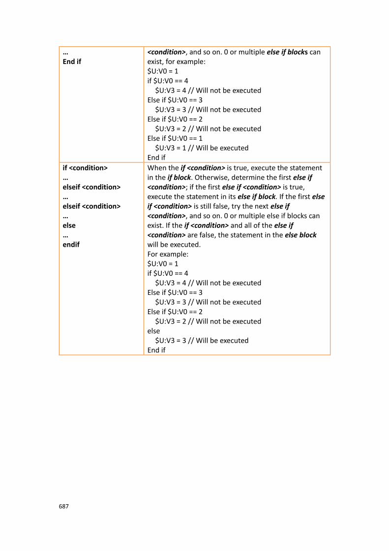
687
… End if
<condition>, and so on. 0 or multiple else if blocks can exist, for example: $U:V0 = 1 if $U:V0 == 4 $U:V3 = 4 // Will not be executed Else if $U:V0 == 3 $U:V3 = 3 // Will not be executed Else if $U:V0 == 2 $U:V3 = 2 // Will not be executed Else if $U:V0 == 1 $U:V3 = 1 // Will be executed End if
if <condition> … elseif <condition> … elseif <condition> … else … endif
When the if <condition> is true, execute the statement in the if block. Otherwise, determine the first else if <condition>; if the first else if <condition> is true, execute the statement in its else if block. If the first else if <condition> is still false, try the next else if <condition>, and so on. 0 or multiple else if blocks can exist. If the if <condition> and all of the else if <condition> are false, the statement in the else block will be executed. For example: $U:V0 = 1 if $U:V0 == 4 $U:V3 = 4 // Will not be executed Else if $U:V0 == 3 $U:V3 = 3 // Will not be executed Else if $U:V0 == 2 $U:V3 = 2 // Will not be executed else
$U:V3 = 3 // Will be executed End if
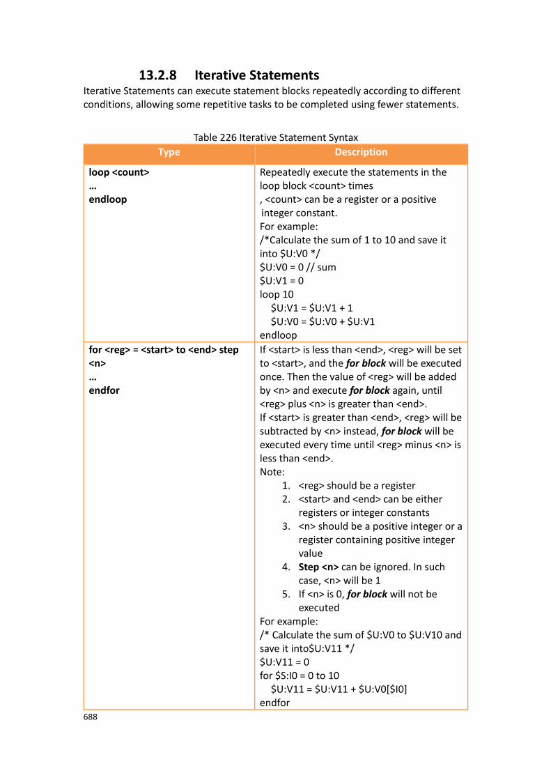
688
13.2.8 Iterative Statements Iterative Statements can execute statement blocks repeatedly according to different conditions, allowing some repetitive tasks to be completed using fewer statements.
Table 226 Iterative Statement Syntax
Type Description
loop <count> … endloop
Repeatedly execute the statements in the loop block <count> times , <count> can be a register or a positive integer constant. For example: /*Calculate the sum of 1 to 10 and save it into $U:V0 */ $U:V0 = 0 // sum $U:V1 = 0 loop 10 $U:V1 = $U:V1 + 1 $U:V0 = $U:V0 + $U:V1 endloop
for <reg> = <start> to <end> step <n> … endfor
If <start> is less than <end>, <reg> will be set to <start>, and the for block will be executed once. Then the value of <reg> will be added by <n> and execute for block again, until <reg> plus <n> is greater than <end>. If <start> is greater than <end>, <reg> will be subtracted by <n> instead, for block will be executed every time until <reg> minus <n> is less than <end>. Note:
1. <reg> should be a register 2. <start> and <end> can be either
registers or integer constants 3. <n> should be a positive integer or a
register containing positive integer value
4. Step <n> can be ignored. In such case, <n> will be 1
5. If <n> is 0, for block will not be executed
For example: /* Calculate the sum of $U:V0 to $U:V10 and save it into$U:V11 */ $U:V11 = 0 for $S:I0 = 0 to 10
$U:V11 = $U:V11 + $U:V0[$I0] endfor
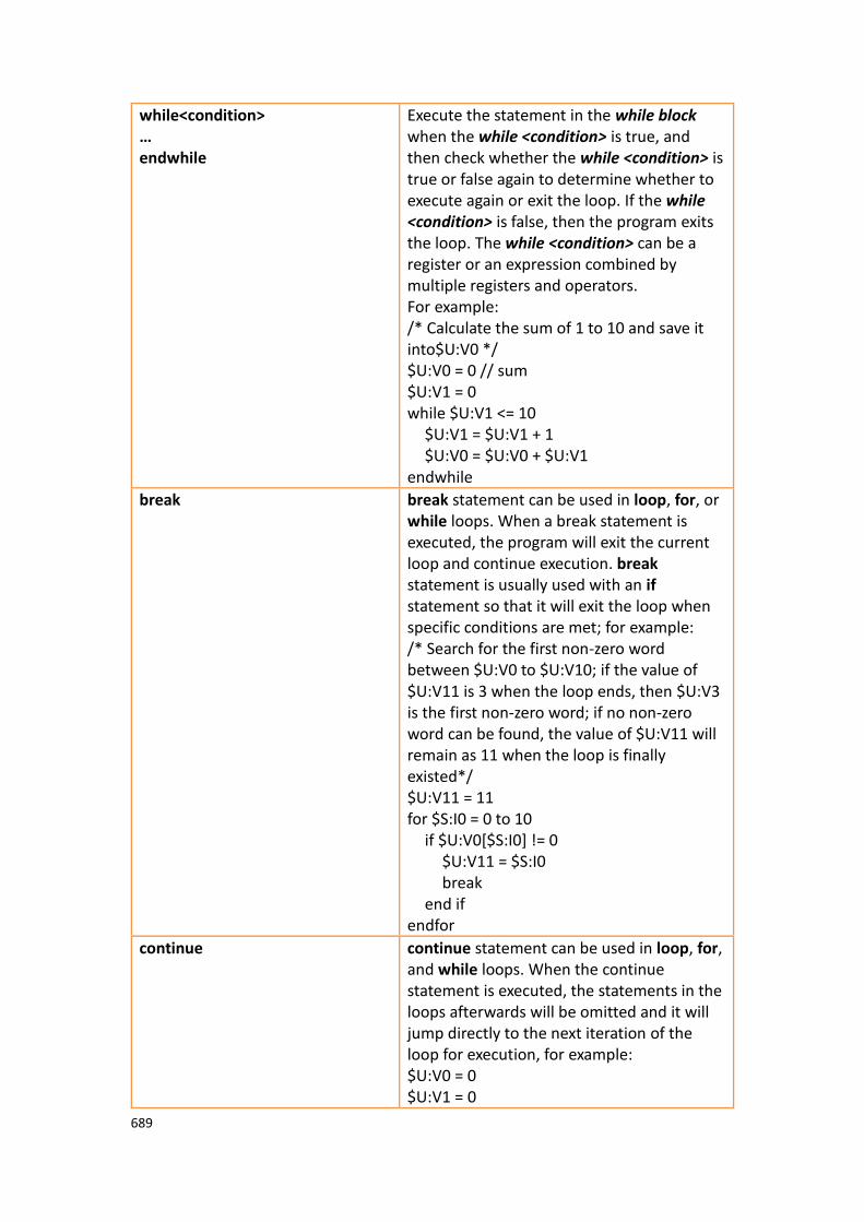
689
while<condition> … endwhile
Execute the statement in the while block when the while <condition> is true, and then check whether the while <condition> is true or false again to determine whether to execute again or exit the loop. If the while <condition> is false, then the program exits the loop. The while <condition> can be a register or an expression combined by multiple registers and operators. For example: /* Calculate the sum of 1 to 10 and save it into$U:V0 */ $U:V0 = 0 // sum $U:V1 = 0 while $U:V1 <= 10 $U:V1 = $U:V1 + 1 $U:V0 = $U:V0 + $U:V1 endwhile
break break statement can be used in loop, for, or while loops. When a break statement is executed, the program will exit the current loop and continue execution. break statement is usually used with an if statement so that it will exit the loop when specific conditions are met; for example: /* Search for the first non-zero word between $U:V0 to $U:V10; if the value of $U:V11 is 3 when the loop ends, then $U:V3 is the first non-zero word; if no non-zero word can be found, the value of $U:V11 will remain as 11 when the loop is finally existed*/ $U:V11 = 11 for $S:I0 = 0 to 10 if $U:V0[$S:I0] != 0 $U:V11 = $S:I0 break end if endfor
continue continue statement can be used in loop, for, and while loops. When the continue statement is executed, the statements in the loops afterwards will be omitted and it will jump directly to the next iteration of the loop for execution, for example: $U:V0 = 0 $U:V1 = 0

690
loop 10 $U:V0 = $U:V0 + 1 /* Will be executed 10
times */ if $U:V1 >= 5 continue end if $U:V1 = $U:V1 + 1 /* Will only be
executed the first 5 times*/
endloop
13.2.9 Built-in Functions The script statement collection provides many built-in functions; users can use these functions to execute numerical computations, string processing, file accessing and other more complicated operations. The built-in functions currently provided are shown in the table below. Refer to
【Built-in Function】in Chapter 13.3.2- Script Editor for details on using these built-
in functions.
Table 227 Script Built–in Functions
Type Function Description
Memory Operation memcmp Memory block comparison
memcpy Copy memory block
memsrch Search memory block
memset Memory block value
Trigonometry sin Sine
cos Cosine
tan Tangent
asin Arcsine
acos Arccosine
atan Arctangent
Numeric Computation abs Absolute value
max Maximum value
min Minimum value
arrmax Maximum value for array

691
arrmin Minimum value for array
arrsum Sum or array
arrxor And-Or array
arrswp Swap high and low byte of array
pow Power
sqrt Square root
log Natural logarithm
log10 Common logarithm
String Operations strcat Concatenate string
strncat Concatenate string (restrict length)
strcpy Copy string
strncpy Copy string (restrict length)
strcmp String comparison
strncmp String comparison (restrict length)
stricmp String comparison(case-insensitive)
strlen String length
strsrch Search string
num2str Numeric value to string
a2i String to integer
a2f String to floating point number
a2x String (hexadecimal) to integer
x2a Integer (hexadecimal) to string (ASCII)
x2xarr String (ASCII) to String
a2harr Convert the unicode of the string into consecutive integers
n2a Convert multiple consecutive integers to a string
a2n Convert continuous multiple strings to integers
File Operations
file_open Open file (Internal Storage)
file_read Read file (Internal Storage)
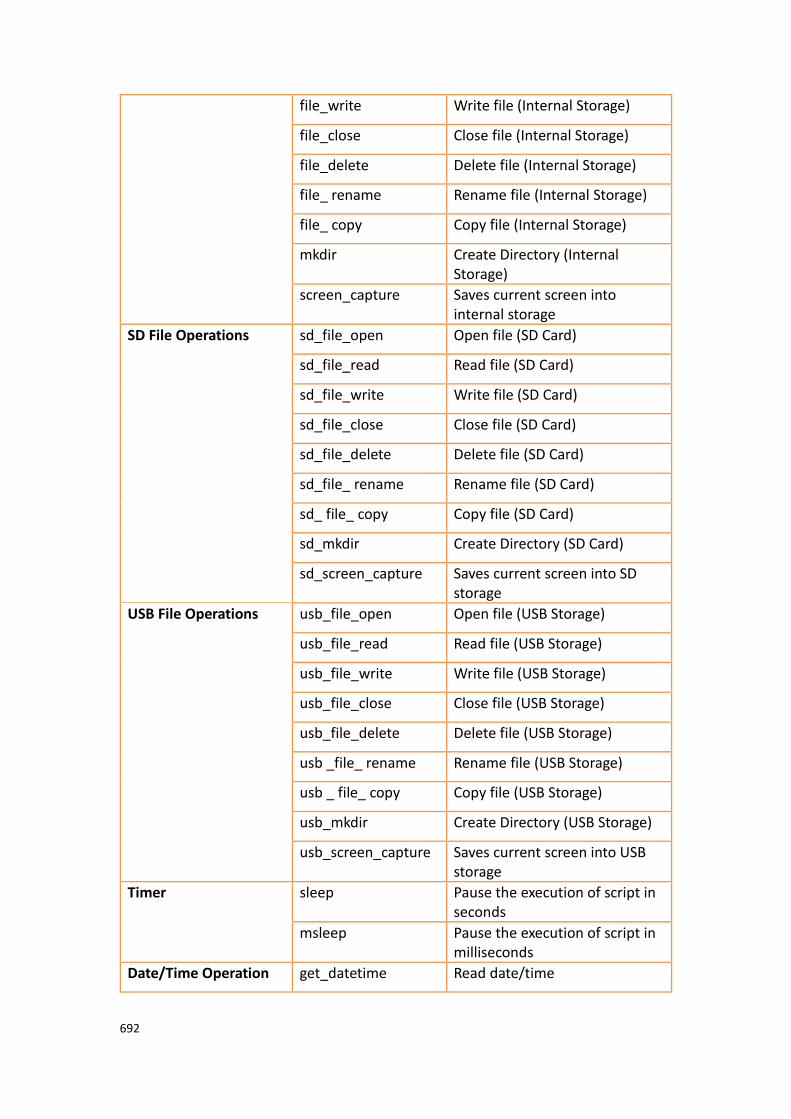
692
file_write Write file (Internal Storage)
file_close Close file (Internal Storage)
file_delete Delete file (Internal Storage)
file_ rename Rename file (Internal Storage)
file_ copy Copy file (Internal Storage)
mkdir Create Directory (Internal Storage)
screen_capture Saves current screen into internal storage
SD File Operations
sd_file_open Open file (SD Card)
sd_file_read Read file (SD Card)
sd_file_write Write file (SD Card)
sd_file_close Close file (SD Card)
sd_file_delete Delete file (SD Card)
sd_file_ rename Rename file (SD Card)
sd_ file_ copy Copy file (SD Card)
sd_mkdir Create Directory (SD Card)
sd_screen_capture Saves current screen into SD storage
USB File Operations usb_file_open Open file (USB Storage)
usb_file_read Read file (USB Storage)
usb_file_write Write file (USB Storage)
usb_file_close Close file (USB Storage)
usb_file_delete Delete file (USB Storage)
usb _file_ rename Rename file (USB Storage)
usb _ file_ copy Copy file (USB Storage)
usb_mkdir Create Directory (USB Storage)
usb_screen_capture Saves current screen into USB storage
Timer sleep Pause the execution of script in seconds
msleep Pause the execution of script in milliseconds
Date/Time Operation get_datetime Read date/time

693
set_datetime Set date/time
Print print_screen Prints current screen
Communication Io write and read Write continuous data to the specified device and read continuous data to the specified address
checksum Calculate the sum of the codes for consecutive addresses
Sound play_sound Play sound
play_sound 2 Play a sound file from an external storage device (microSD card or USB drive).
stop_sound Stop playing sound
beep Trigger the buzzer once
Draw change_bs Change the foreground screen (base screen)
popup_windows Pop-up the window screen
Note: Built-in functions may be added, removed or modified during software updates; please refer to the built-in functions and related documentation listed in FvDesigner if the functions listed in FvDesigner are different from the ones listed in this document.
13.2.10 Custom Functions Users can combine the frequently used statements into custom functions. Call the created custom function if these statements need to be used in different scripts. The use of custom functions allows the scripts to be simpler and saves the time to repeatedly write the same statement combinations.
Table 228 Script–Custom function-related statements
Related Statement Description
call <function> Calls the custom function named <function>, and will start executing from the first statement in the custom function; it will exit the custom function and return to the script to continue executing the next statement after the call statement once it has finished executing the last statement in the custom function. The example below is used to determine

694
whether it is working hours now, and will save the result into $U:V100; users can make it into a custom function called IsWorkHour if $S:TIME_LOCAL_HOUR >= 8 &&
$S:TIME_LOCAL_HOUR <= 17 $U:V100 = 1 else
$U:V100 = 0 endif Just call IsWorkHour and then check $U:V100 when used in a script; for example: /* Determines whether it is working hour to set the brightness level for the backlight of the HMI */ call IsWorkHour if $U:V100 $S:OP_BACKLIGHT_LEVEL = 80 else $S:OP_BACKLIGHT_LEVEL = 30 endif
ret ret statements can be used in custom functions so that it will exit the custom function and return to the script to continue executing the next statement after the call statement once it executes up to the ret statement; for example: /* If $U:V0.0 is 0, then this custom function will exit and return to the script to the line after the call statement; the if $U:V0.1 statement behind will not be executed */ if $U:V0.0 @PLC0:Y0 = 1 else ret endif if $U:V0.1 @PLC:Y1 = 1 Endif

695
13.3 Using Scripts In this section, we will introduce how to create and edit the scripts and its related attributes.
13.3.1 Script List Click on【Script】in【Functions】of the【Project Explorer】, which is located to
the left side of the FvDesigner, to enter the【Script List】.
Figure 334【Script List】
The following are the description of each column in the script list:
Table 229【Script List】- Descriptions
Field Description
【ID】 Every script must have a unique ID; the range of the ID is from 0 to 65534, so every project allows a maximum of 65535 scripts.
【Comment】 Descriptions that help understand the contents or usage of a script.
【Password】 Whether this script is protected by password or not.
【Trigger
Condition】
The conditions that the script will be triggered in the background; please refer to Chapter 13.1- When to execute scripts for detailed explanations.
【Run at
Startup】
Set to execute the script when the project starts.
【Valid】 Valid means that no errors were found when the script was compiled.
【Reference】 When a script is used in an object or function, pressing【Go
to】can jump to the location where this script is used
immediately.

696
The following are the descriptions of the buttons on the right side of the script list:
Table 230 Script List–Descriptions of the buttons on the right side
Button Description
【Add】 Opens the【Script Editor】and a new empty script to edit.
【Edit】 Opens the【Script Editor】and allows the script currently
selected in the Script List to be edited; double-clicking on the script of a Script List has the same effect as selecting the
script first and then pressing【Edit】.
【Duplicate】 Makes a duplicate of the currently selected script.
【Delete】 Deletes the currently selected script.
【Import】 Imports scripts.
【Export】 Exports the currently selected script.
【Custom
Functions】
Opens the【Script Editor】and displays the【Custom
Functions】for editing.
13.3.2 Script Editor
Figure 335 Script Editor Screen

697
The【Function】block to the left has three tab pages available for selection; Their
descriptions are as follows:
Table 231 Script Editor–Function Block Description
Tab Page Description
【Basic
Functions】
Provides a convenient interface for inputting various operators, logical statements and iterative statements; the following menu will appear when users click on the pull-down menu button:
Users can select the item to use and the contents of the【Basic
Function】tab page will be updated according to the selected
item.
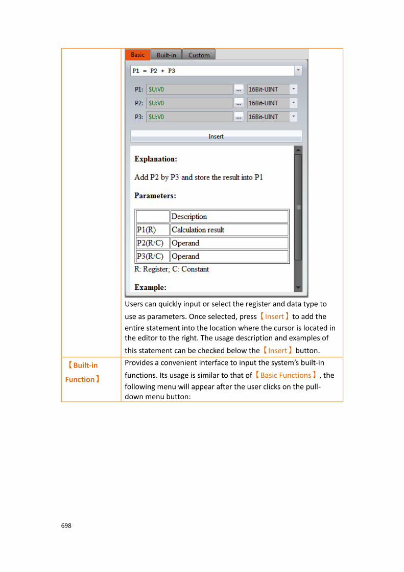
698
Users can quickly input or select the register and data type to
use as parameters. Once selected, press【Insert】to add the
entire statement into the location where the cursor is located in the editor to the right. The usage description and examples of
this statement can be checked below the【Insert】button.
【Built-in
Function】
Provides a convenient interface to input the system’s built-in
functions. Its usage is similar to that of【Basic Functions】, the
following menu will appear after the user clicks on the pull-down menu button:

699
Users can select the item to use from the menu and then the
contents of the【Built-in Function】tab page will be updated
according to the selected item.
Users can quickly input or select the registers and its data type
to use as parameters. Once selected, press【Insert】to add the
entire statement into the location where the cursor is located in the editor to the right. The usage description and examples of
this built-in function can be checked below the【Insert】button.

700
【Custom
Functions】
Provides users with list of custom functions.
【Call】
Inserts and calls the statement of the currently selected custom function at the location where the cursor is located in the editing section to the right.
【Create】
Creates a new custom functions; the following window will appear once this button is pressed, asking for the name of the custom function.
A new editor tab page will appear in the【Editor】section to the
right for editing the contents of the custom function after

701
entering a legal function name and pressing OK.
【Edit】
Opens a new editor tab page for editing the currently selected custom function. It has the same effect as double-clicking on the function name on the list.
【Delete】
Deletes the currently selected custom function.
【Import】
Import custom function. If it is protected by password, you have to input password before import.
【Export】
Export the selected function.
Descriptions of the top section of the【Editor】to the right are as follows:
Table 232 Script Editor–Script Properties Descriptions
Field Description
【Comment】 Used to input a comment for the script.
【ID】 Used to set the ID of the script.
【Protect by
Password】
To decide whether this script is protected by password or not.
【Trigger】 Selects when to trigger this script:
【None】
Do not select any triggering condition (but the script may still be executed when the project starts or triggered by other objects or functions).
【Timer】
Script will be triggered continuously but there will be a fixed delay time between the end of the first execution and the start of the next execution.
【When Bit Becomes 1】
Executes the script once when the 【Bit】changed from 0 to
1.
【While Bit is 1】

702
Executes the script continuously once the【Bit】is 1.
【When Bit becomes 0】
Executes the script once when the 【Bit】changed from 1 to
0.
【While Bit is 0】
Executes the script continuously once the【Bit】is 0.
【When Bit is Changed】
Executes the script once when the【Bit】changed from 0 to 1
or 1 to 0.
【Run when
Project Starts】
Set to execute the script once when the project first starts.
【Name】 The other fields above will disappear when editing a custom
function except【Protect by password】, only the name of
the custom function can be set.
The mid-bottom section of the【Editor】is divided into the statement editing section
and compilation message display section; Every time a change is made in the statement editing section it will make the script compile again immediately, and the compilation results will be displayed below. The user can fix statement errors according to the message content and line number displayed until it displays
【Compilation succeeded】.
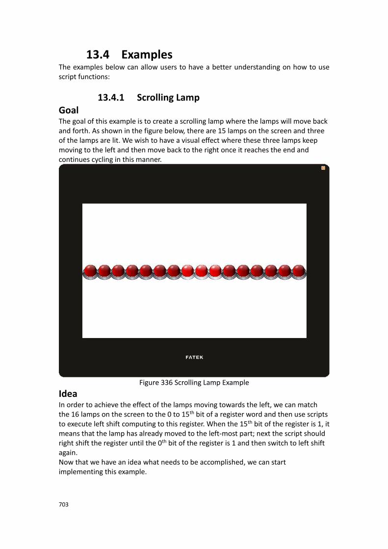
703
13.4 Examples The examples below can allow users to have a better understanding on how to use script functions:
13.4.1 Scrolling Lamp Goal The goal of this example is to create a scrolling lamp where the lamps will move back and forth. As shown in the figure below, there are 15 lamps on the screen and three of the lamps are lit. We wish to have a visual effect where these three lamps keep moving to the left and then move back to the right once it reaches the end and continues cycling in this manner.
Figure 336 Scrolling Lamp Example
Idea In order to achieve the effect of the lamps moving towards the left, we can match the 16 lamps on the screen to the 0 to 15th bit of a register word and then use scripts to execute left shift computing to this register. When the 15th bit of the register is 1, it means that the lamp has already moved to the left-most part; next the script should right shift the register until the 0th bit of the register is 1 and then switch to left shift again. Now that we have an idea what needs to be accomplished, we can start implementing this example.

704
1. First we will place 16 lamps on the screen, and set the monitor address of the right-most lamp to $U:V0.0 and the second one to $U:V0.1, and so on and so forth, until the address of all 16 lamps have been set.
Figure 337 Scrolling Lamp Example Screen Setting
2. Next we will add a script to control the movement of the lamps; first enter the
【Script List】and press 【Add】, input Move Lamp for the comment and then
input the following script contents and save:
3. Next is to add another script to initialize the value of the register; input Init Lamp
as the comment. the content is shown below:
/* When $U:V1 = 0, move left
When $U:V1 = 1, move right */
if !$U:V1
if !$U:V0.15 // Lamp not yet reached to the left-most position
$U:V0 = $U:V0 << 1 // Left shift the lamp
else
$U:V1 = 1 // Change the lamp movement to right shift
endif
else
if !$U:V0.0 // Lamp not yet reached the right-most position
$U:V0 = $U:V0 >> 1 // Right shift the lamp
else
$U:V1 = 0 // Change the lamp movement to left shift
endif
endif
$U:V0 = 7 // Light up the three right-most lamps initially
$U:V1 = 0 // Start moving the lamp to the left
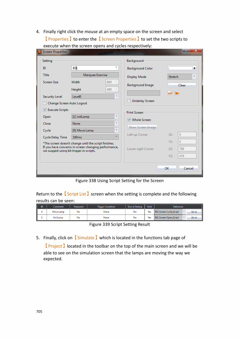
705
4. Finally right click the mouse at an empty space on the screen and select
【Properties】to enter the【Screen Properties】to set the two scripts to
execute when the screen opens and cycles respectively:
Figure 338 Using Script Setting for the Screen
Return to the【Script List】screen when the setting is complete and the following
results can be seen:
Figure 339 Script Setting Result
5. Finally, click on【Simulate】which is located in the functions tab page of
【Project】located in the toolbar on the top of the main screen and we will be
able to see on the simulation screen that the lamps are moving the way we expected.

706
13.4.2 Load Balance Goal The goal of this example is to find the machine with excessive usage rate among 4 units. In order to simplify the problem, let’s assume that the usage rate of every machine will be between 0% and 100%, and if the usage rate of a machine is 20% over the average usage rate of the 4 units, it will be determined as the overloaded machine. As shown in the example below, the average usage rate of the 4 machines is (39+78+100+13)/4 = 57.5% and according to our definition of an overloaded machine, units 2 and 3 are overloaded machines. We will display this result in the Text Display below.
Figure 340 Example–Load Balance
Implementation Steps 1. We will use 4【Text】objects, 4【Numeric Input/Display】objects, 4【Slide
Switch】objects and a【Text Input/Display】object to form the screen that we
want, in which the monitoring address of the 4【Numeric Input/Display】and
【Slide Switch】objects are set as $U:V0, $U:V1, $U:V2 and $U:V3 respectively.
Since we will be using strings in the script, we must first create Ascii String type
tags to correspond to the registers; the following figure shows the【Tag Library】
settings used in this example.

707
Figure 341 Tag Library Setting–Load Balance Example
Next we will set the monitoring address of the【Text Input/Display】object as
$T:message, then we have completed the screen settings. 2. Next is to add a script used to determine the load balance; the contents of the
script are as follows:
We will set the trigger time of this script as【Timer】and set the【Delay Time】as
1000 milliseconds, which means that it will check the load status approximately every second. The script settings is as shown in the figure below:
Figure 342 Script Setting–Load Balance Example
$U:V100 = arrsum($U:V0, 4) / 4 // Calculates $U:V0 to $U:V3 $U:V50 = 0 // 1 : Overloaded machines discovered 0: Not discovered $T:space = " " $T:overrun_devices = "" // Start searching for 4 word values from $U:V0 for $S:I0 = 0 to 3
if $U:V0[$I0] >= 20 + $U:V100 // Determine whether the usage rate is greater than average+20%
$U:V50 = 1 // Convert the overloaded machine number into text string num2str($T:device_number, $S:I0 + 1) strcat($T:overrun_devices, $T:device_number) strcat($T:overrun_devices, $T:space)
endif endfor if $U:V50 // Message to display when overloaded machine was discovered
$T:message = "Loading too high:" strcat($T:message, $T:overrun_devices)
else // Message to display when no overloaded machine was discovered
$T:message = "Loading is balanced now" endif

708
3. Finally, click on【Simulate】which is located in the functions tab page of
【Project】located in the toolbar on top of the main screen, and the following
screen can be seen. Move each slide switch to change the usage rate of each machine to see the corresponding changes in the message displayed below.
Figure 343 Simulation Result–Load Balance Example
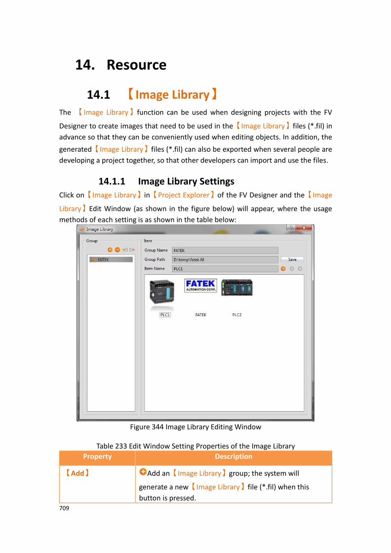
709
14. Resource
14.1 【Image Library】 The 【Image Library】function can be used when designing projects with the FV
Designer to create images that need to be used in the【Image Library】files (*.fil) in
advance so that they can be conveniently used when editing objects. In addition, the
generated【Image Library】files (*.fil) can also be exported when several people are
developing a project together, so that other developers can import and use the files.
14.1.1 Image Library Settings Click on【Image Library】in【Project Explorer】of the FV Designer and the【Image
Library】Edit Window (as shown in the figure below) will appear, where the usage
methods of each setting is as shown in the table below:
Figure 344 Image Library Editing Window
Table 233 Edit Window Setting Properties of the Image Library
Property Description
【Add】 Add an【Image Library】group; the system will
generate a new【Image Library】file (*.fil) when this
button is pressed.

710
【Remove】 Remove an【Image Library】group; this【Image
Library】will be removed from the image library when this
button is pressed, but the【Image Library】file (*.fil) will
not be deleted.
【Import】 Import a new【Image Library】file and generates a
corresponding【Image Library】group.
【Export】 Save the current 【Image Library】group into the
specified path as a new file.
【Group List】 Display the【Image Library】groups currently included in
the computer. When the mouse is clicked on a specific
【Image Library】group, the item list on the right will
display all image contents included in that【Image
Library】group.
【Group Name】 Set the name for the currently selected【Image Library】
group.
Note: This name is only the displayed name of the【Image
Library】group; it is not the file name of the【Image
Library】file.
【Group Path】 Display the file path of the currently selected【Image
Library】group.
【Item Name】 Edit the item name of the currently selected image.
【Save】 Save the contents of the edited【Image Library】group
into the corresponding【Image Library】file.
【Add Item】 Add an image into the active【Image Library】group.
【Edit Item】 Change the saved image of the currently selected item.
【Delete Item】 Delete the currently selected image.
【Item List】 Display all the image contents included in the currently
selected【Image Library】; the【Add Item】,【Edit
Item】and【Delete Item】buttons on the top-right can be
used to edit the selected【Image Library】group.

711
14.1.2 Image Library Usage Method The【Image Selector】must be used if the users want to use the image library they
created or the default image libraries provided by the FV Designer. This chapter will
introduce the【Image Selector】usage and how to select images saved in the【Image
Library】.
14.1.2.1 Image Selector
The【Image Selector】is as shown in the figure ( ); it allows users to select images.
When the images saved in the【 Image Library】need to be used, click on the
“ ”button to the left to select the image needed from the【Image Library】. If the
image needed is saved on the user’s computer, the “ ” button to the right can be pressed to select the image needed from the user’s computer.
14.1.2.2 Image Library Selection Window
The image selection window of the【Image Library】is as shown in the figure below.
Use the pull-down menu to select the【Image Library】group where the image that
the user wants to use is located, and then select the image needed from the【Item
List】below. The【Item List】will synchronize and update the display of images included
in the【Image Library】group when switched to another【Image Library】group.
Figure 345 Image Selection Window of Image Library

712
14.2 【Audio Library】 The【Audio Library】function can be used while designing projects with the FV Designer
to create the audio files that need to be used into the【Audio Library】files (*.fal) in
advance so that they can be conveniently used when editing objects. In addition, the
generated 【Audio Library】files (*.fal) can also be exported when several people are
developing a project together, so that other developers can import and use the files, too.
14.2.1 Audio Library Settings Click on【Audio Library】in【Project Explorer】of the FV Designer and the【Audio
Library】Edit Window (as shown in the figure below) will appear where the usage of
each setting is as shown in the table below:
Figure 346 Audio Library Edit Window
Table 234 Edit Window Setting Properties of Audio Library
Property Description
【Add】 Add an【Audio Library】group; the system will
generate a new【Audio Library】file (*.fal) when this
button is pressed.
【Remove】 Remove an【Audio Library】group; this 【Audio

713
Library】will be removed from the audio library when this
button is pressed, but the【Audio Library】file (*.fal) will
not be deleted.
【Import】 Import a new【Audio Library】file and generates a
corresponding【Audio Library】group.
【Export】 Save the current【Audio Library】 group into the
specified path as a new file.
【Group List】 Display the【Audio Library】groups currently included on
the computer. When a specific【Audio Library】group is
clicked, the item list on the right will display all audio
contents included in that【Audio Library】group.
【Group Name】 Set the name for the currently selected【Audio Library】
group.
Note: This name is only the displayed name of the【Audio
Library】group; it is not the file name of the【Audio
Library】file.
【Group Path】 Display the file path of the currently selected【Audio
Library】group.
【Item Name】 Edit the item name of the currently selected audio file.
【Play】 Play the currently selected audio file. This button will
change to the【Stop】function when the audio file starts
to play; It can stop playing the audio file that is currently playing.
【Save】 Save the contents of the edited【Audio Library】group
into the corresponding【Audio Library】file.
【Add Item】 Add an audio file into the active【Audio Library】group.
【Edit Item】 Change the currently selected audio.
【Delete Item】 Delete the audio file of the currently selected item.
【Item List】 Display all the audio contents included in the currently
selected【Audio Library】; the【Add Item】,【Edit
Item】and【Delete Item】buttons on the top-right can be
used to edit the selected【Audio Library】group.
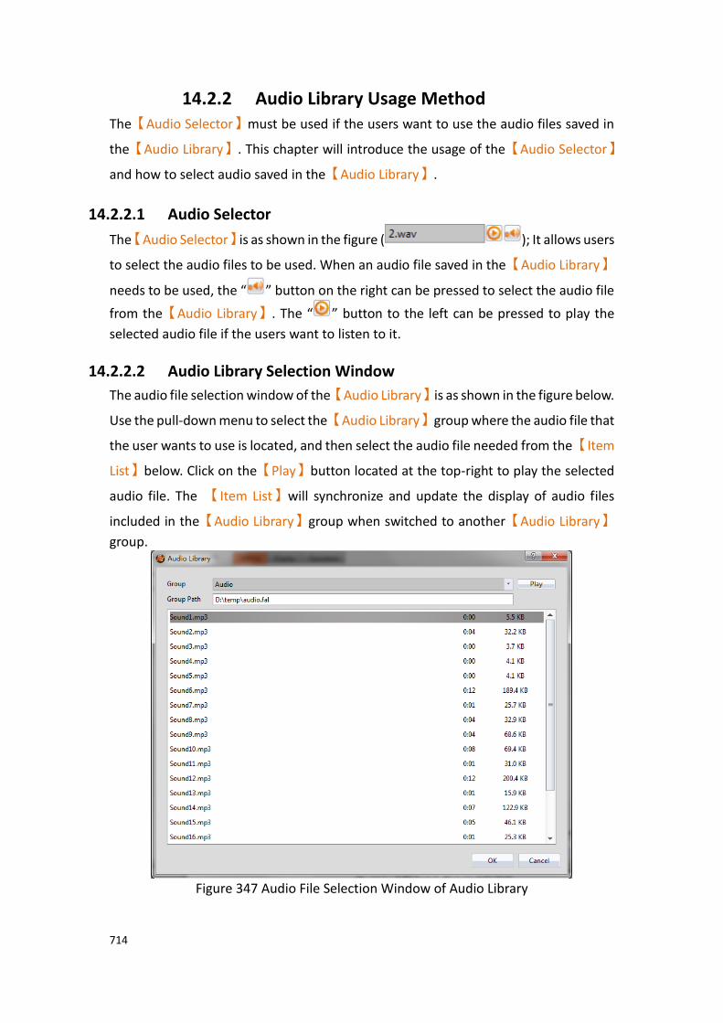
714
14.2.2 Audio Library Usage Method The【Audio Selector】must be used if the users want to use the audio files saved in
the【Audio Library】. This chapter will introduce the usage of the【Audio Selector】
and how to select audio saved in the【Audio Library】.
14.2.2.1 Audio Selector
The【Audio Selector】is as shown in the figure ( ); It allows users
to select the audio files to be used. When an audio file saved in the【Audio Library】
needs to be used, the “ ” button on the right can be pressed to select the audio file
from the【Audio Library】. The “ ” button to the left can be pressed to play the
selected audio file if the users want to listen to it.
14.2.2.2 Audio Library Selection Window
The audio file selection window of the【Audio Library】is as shown in the figure below.
Use the pull-down menu to select the【Audio Library】group where the audio file that
the user wants to use is located, and then select the audio file needed from the【Item
List】below. Click on the【Play】button located at the top-right to play the selected
audio file. The 【Item List】will synchronize and update the display of audio files
included in the【Audio Library】group when switched to another【Audio Library】
group.
Figure 347 Audio File Selection Window of Audio Library
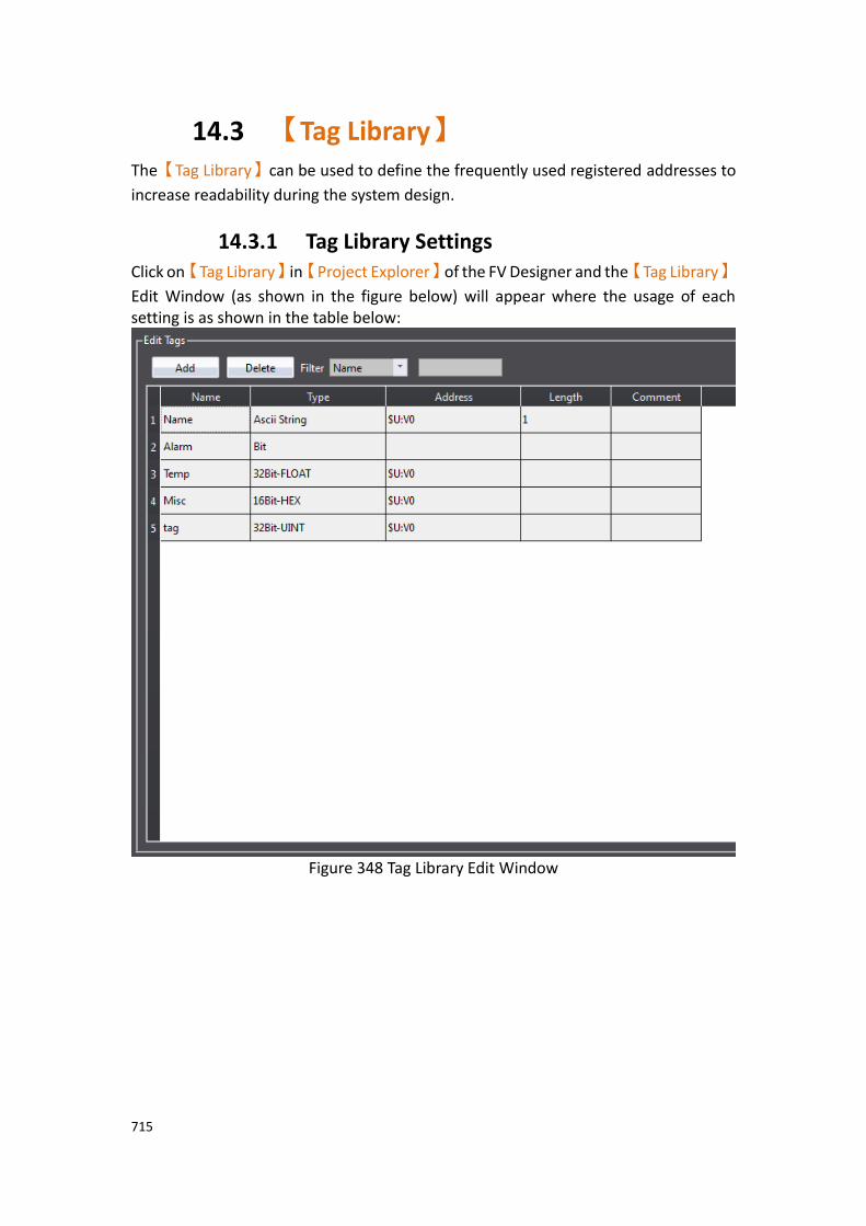
715
14.3 【Tag Library】 The【Tag Library】can be used to define the frequently used registered addresses to
increase readability during the system design.
14.3.1 Tag Library Settings Click on【Tag Library】in【Project Explorer】of the FV Designer and the【Tag Library】
Edit Window (as shown in the figure below) will appear where the usage of each setting is as shown in the table below:
Figure 348 Tag Library Edit Window
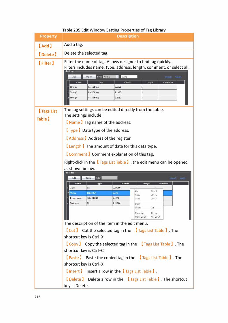
716
Table 235 Edit Window Setting Properties of Tag Library
Property Description
【Add】 Add a tag.
【Delete】 Delete the selected tag.
【Filter】 Filter the name of tag. Allows designer to find tag quickly. Filters includes name, type, address, length, comment, or select all.
【Tags List
Table】
The tag settings can be edited directly from the table. The settings include:
【Name】Tag name of the address.
【Type】Data type of the address.
【Address】Address of the register
【Length】The amount of data for this data type.
【Comment】Comment explanation of this tag.
Right-click in the【Tags List Table】, the edit menu can be opened
as shown below.
The description of the item in the edit menu.
【Cut】 Cut the selected tag in the 【Tags List Table】. The
shortcut key is Ctrl+X.
【Copy】 Copy the selected tag in the 【Tags List Table】. The
shortcut key is Ctrl+C.
【Paste】 Paste the copied tag in the 【Tags List Table】. The
shortcut key is Ctrl+X.
【Insert】 Insert a row in the【Tags List Table】.
【Delete】 Delete a row in the 【Tags List Table】. The shortcut
key is Delete.

717
【Move Up】 Move the selected row to up in the 【Tags List
Table】. The shortcut key is Alt+Up.
【Move Down】 Move the selected row to down in the 【Tags
List Table】. The shortcut key is Alt+Down.
【Import】 Import a 【Tag Library】CSV file and fills in the settings included in
this file into the 【Tag Library】of the currently editing project.
Four formats can be imported as CSV file (* .CSV), Excel file (* .xlsx, or * .xls), WinProladder file (* .pdw), as shown below. The WinProladder file is a Fatek PLC program, which supports importing the file directly without any conversion.
【Export】 Export the 【Tag Library】settings of the currently editing project
into a CSV file. Three formats can be exported as CSV file (* .CSV), Excel file (* .xlsx, or * .xls).

718
14.3.2 Tag Library Usage The【Address Selector】must be used to select the tag in order to use the【Tag Library】.
The 【Address Selector】is as shown in the figure below; the address tag can be entered
directly in the edit field of the【Address Selector】, or press the button to the right of
the selector to open the【Address Selector】dialog to select a tag.
Figure 349 Inputting Address Tag in【Address Selector】Edit Field
Figure 350 Selecting Address Tag in【Address Selector】Dialog

719
14.4 【Text Library】 If there is the need to switch displayed texts in real-time in order to achieve multi-
language functionality while designing a project using the FV Designer, the 【Text
Library】can be used to edit the text to display for different needs by creating a table.
This allows the project to switch between text groups currently displayed through the
【Control Address】while the HMI is operating.
14.4.1 Text Library Settings Click on the【Text Library】in【Project Explorer】of the FV Designer and the【Text
Library】Edit Window (as shown in the figure below) will appear where the usage of
each setting is as shown in the table below:
Figure 351 Text Library Edit Window
Table 236 Edit Window Setting Properties of Text Library
Property Description
【Number of Groups】 Set the number of groups for the【Text Library】.
【Initial Group】 Set the text group to display when the HMI starts operating.
【Control Address】 Set the control address of the【Text Library】. This
address is used to control the text group currently
displayed by the【Text Library】; the data type used is
fixed as【16Bit-UINT】. For example, when the value
of the【Control Address】is 0, the【Text Library】will
display the text in group 0.
【Filter】 Can select【Show Entire Table】and【Show All Text
Items】,【Show Entire Table】includes all contents,
【Show All Text Items】only shows text part.
【Default Font】 Set the default font of the currently selected group.
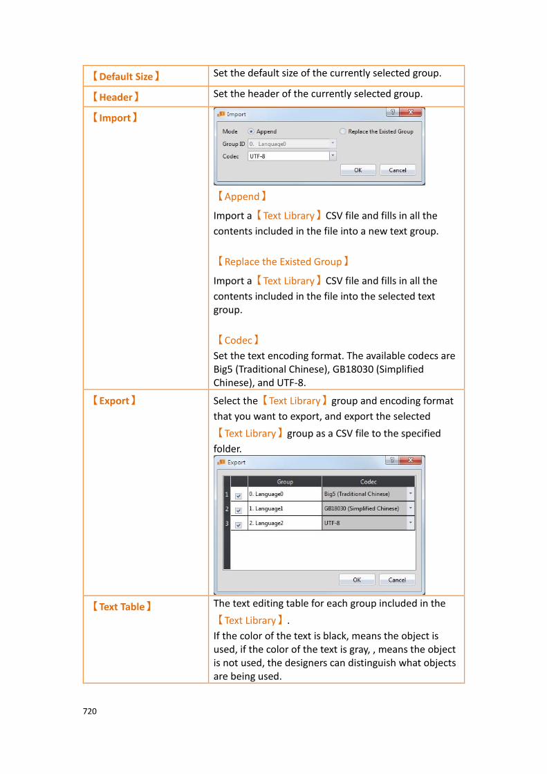
720
【Default Size】 Set the default size of the currently selected group.
【Header】 Set the header of the currently selected group.
【Import】
【Append】
Import a【Text Library】CSV file and fills in all the
contents included in the file into a new text group.
【Replace the Existed Group】
Import a【Text Library】CSV file and fills in all the
contents included in the file into the selected text group.
【Codec】
Set the text encoding format. The available codecs are Big5 (Traditional Chinese), GB18030 (Simplified Chinese), and UTF-8.
【Export】 Select the【Text Library】group and encoding format
that you want to export, and export the selected
【Text Library】group as a CSV file to the specified
folder.
【Text Table】 The text editing table for each group included in the
【Text Library】.
If the color of the text is black, means the object is used, if the color of the text is gray, , means the object is not used, the designers can distinguish what objects are being used.

721
14.4.2 Text Library Usage Method The【Text Selector】must be used if the users want to use the text contents saved in
the【Text Library】. The【Text Selector】is as shown in the figure below; it includes
two text selection modes: entering the text directly or selecting text from the【Text
Library】. Users can switch between the two modes by using the button to the right.
Figure 352 Text Selector
The default setting for the【Text Selector】is the direct text input mode; the users can
enter the text that they want to display in the editing section to the left of the【Text
Selector】directly. To select texts saved in the【Text Library】, the button to the right
must first be pressed to switch modes. At this time the left of the【Text Selector】will
change into a pull-down menu and this menu includes all text contents saved in the
【Text Library】for the users to choose from. If the contents currently included in the
menu is inadequate for use, the user can also select the first option【Add/Edit Text】
in the menu and edit the contents of the【Text Library】in the window as shown in
the figure below.

722
Figure 353 Add/Edit Text Window
If the displayed text is selected from【Text Library】, the dialog of setting the text font
and size for different languages will appear after pressing the button. The user
can set the font and size of the text displayed in each language. If【Default Font】or
【Default Size】is selected, the font or size of the displayed text will be the font or size
set in the【Text Library】.
Figure 354 Text Library Font Window
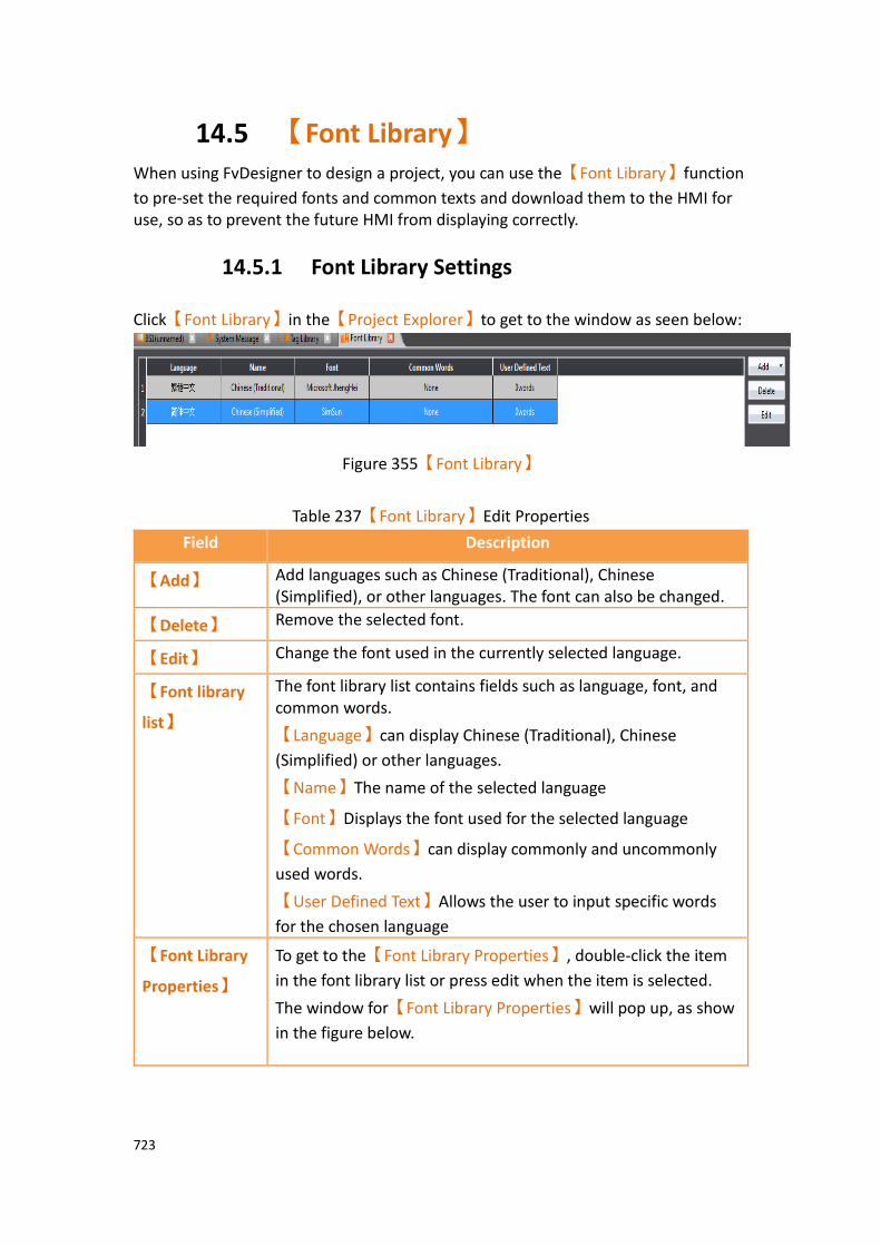
723
14.5 【Font Library】 When using FvDesigner to design a project, you can use the【Font Library】function
to pre-set the required fonts and common texts and download them to the HMI for use, so as to prevent the future HMI from displaying correctly.
14.5.1 Font Library Settings
Click【Font Library】in the【Project Explorer】to get to the window as seen below:
Figure 355【Font Library】
Table 237【Font Library】Edit Properties
Field Description
【Add】 Add languages such as Chinese (Traditional), Chinese (Simplified), or other languages. The font can also be changed.
【Delete】 Remove the selected font.
【Edit】 Change the font used in the currently selected language.
【Font library
list】
The font library list contains fields such as language, font, and common words.
【Language】can display Chinese (Traditional), Chinese
(Simplified) or other languages.
【Name】The name of the selected language
【Font】Displays the font used for the selected language
【Common Words】can display commonly and uncommonly
used words.
【User Defined Text】Allows the user to input specific words
for the chosen language
【Font Library
Properties】
To get to the【Font Library Properties】, double-click the item
in the font library list or press edit when the item is selected.
The window for【Font Library Properties】will pop up, as show
in the figure below.

724
【Language】You can choose Chinese (Traditional), Chinese
(Simplified), or other languages.
【Name】The name of the specific text setting.
【Font】The font used for the text setting.
【Common Words】You can choose between 3 options, none,
common words, and common words and uncommon words. Common words consists of about 4800 commonly used words and common words and uncommon words consists of about 11000 words.
【User Defined Text】The user can input custom words for the
specified language
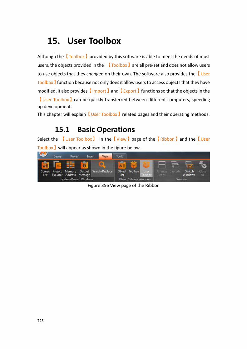
725
15. User Toolbox
Although the【Toolbox】provided by this software is able to meet the needs of most
users, the objects provided in the 【Toolbox】are all pre-set and does not allow users
to use objects that they changed on their own. The software also provides the【User
Toolbox】function because not only does it allow users to access objects that they have
modified, it also provides【Import】and【Export】functions so that the objects in the
【User Toolbox】can be quickly transferred between different computers, speeding
up development.
This chapter will explain【User Toolbox】related pages and their operating methods.
15.1 Basic Operations Select the 【User Toolbox】 in the【View】page of the【Ribbon】and the【User
Toolbox】will appear as shown in the figure below.
Figure 356 View page of the Ribbon
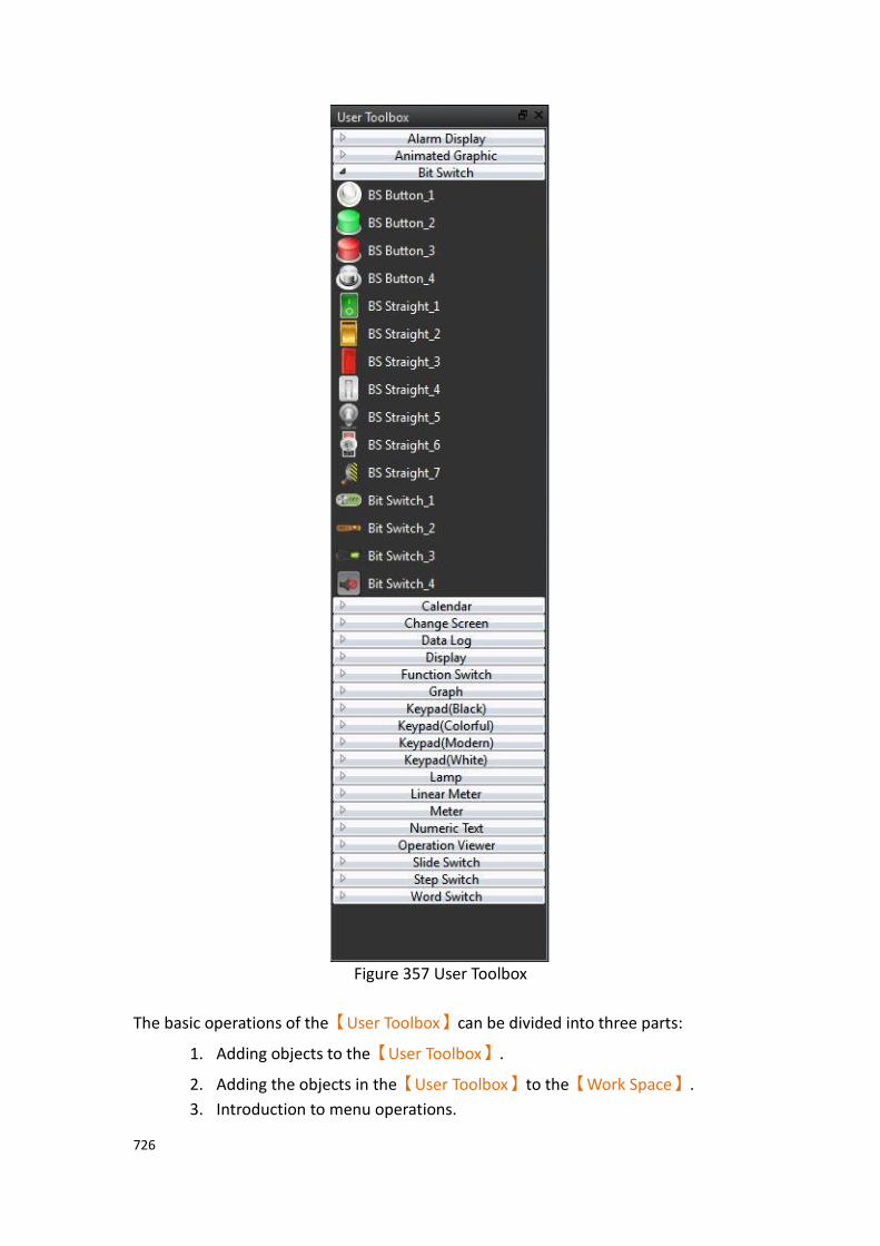
726
Figure 357 User Toolbox
The basic operations of the【User Toolbox】can be divided into three parts:
1. Adding objects to the【User Toolbox】.
2. Adding the objects in the【User Toolbox】to the【Work Space】.
3. Introduction to menu operations.

727
15.1.1 Adding objects to the User Toolbox Move the mouse cursor over the object in the【Work Space】to add to the【User
Toolbox】, then press the ctrl key and left mouse button to start dragging the object.
Drag the object into the【User Toolbox】and then release the left mouse button.
The object will be added to the【User Toolbox】according to the location where the
mouse button was released, figure as shown below.
Figure 358 add object to【User Toolbox】
The default name of the added object is “category_number”, as shown in the figure below.
Figure 359 User Toolbox–Default name
Ctrl+left mouse button

728
If the left mouse button was released in the【Work Space】, the object will be
added to the【Work Space】where the mouse button was released.
Note: The object names within the User Toolbox do not relate to the object names and comments in the work space.
15.1.2 Adding the objects in User Toolbox to the Work Space
Move the mouse cursor over the object in the【User Toolbox】to add to the【Work
Space】, then press and hold the left mouse button to start dragging the object.
Drag the object into the【Work Space】and then release the left mouse button at
the location to add the object. The object will be added to the【Work Space】at the
location where the mouse button was released, figure as shown below.
Figure 360 drag object from【User Toolbox】to【Work Space】
If the left mouse button was released in the【User Toolbox】, the object will be
moved to the location where the mouse button was released so that the user can
change the category the object belongs to and its location in the【User Toolbox】.
Note: If the text library, tag library or other settings are used by the objects in the User Toolbox, please remember to import the text library, tag library and other settings when adding the object in order to guarantee that the settings of the object during use are the same as the settings when it was added.
Left mouse button

729
15.1.3 Menu Introduction A【Menu】will appear when the right mouse button is pressed in the【User
Toolbox】. The options within the menu changes according to the location where the
right mouse button is pressed, as shown in the figure below. Options within the
【Menu】are as listed in the table below.
Figure 361 Menu–Mouse over category (Left); Mouse over object (Middle); Mouse
not over category or object (Right)
Table 238 Options within the menu
Option Description
【Expand All】 Expand all【Category】in the【User Toolbox】, allowing
users to see all【Object】.
【Collapse All】 Collapse all【Category】in the【User Toolbox】so that
users cannot see the【Object】, just the【Category】.
【Add Category】 Add a【Category】; the window below will appear.
【Delete Category】 Delete the selected【Category】along with all the
【Object】in the【Category】.
【Rename
Category】
Change the name of the selected【Category】; the
window below will appear.

730
【Move Up
Category】
Move the selected【Category】up a level.
【Move Down
Category】
Move the selected【Category】down a level.
【Delete Object】 Delete the selected【Object】.
【Rename Object】 Change the name of the selected【Object】; The window
below will appear.
【Add from
Template Library】
Add a new object from the built-in template library.
【Import】 Add the previously saved【User Toolbox】file (*.utf) into
the current【User Toolbox】.
【Export】 Save the current【User Toolbox】into a file (*.utf).
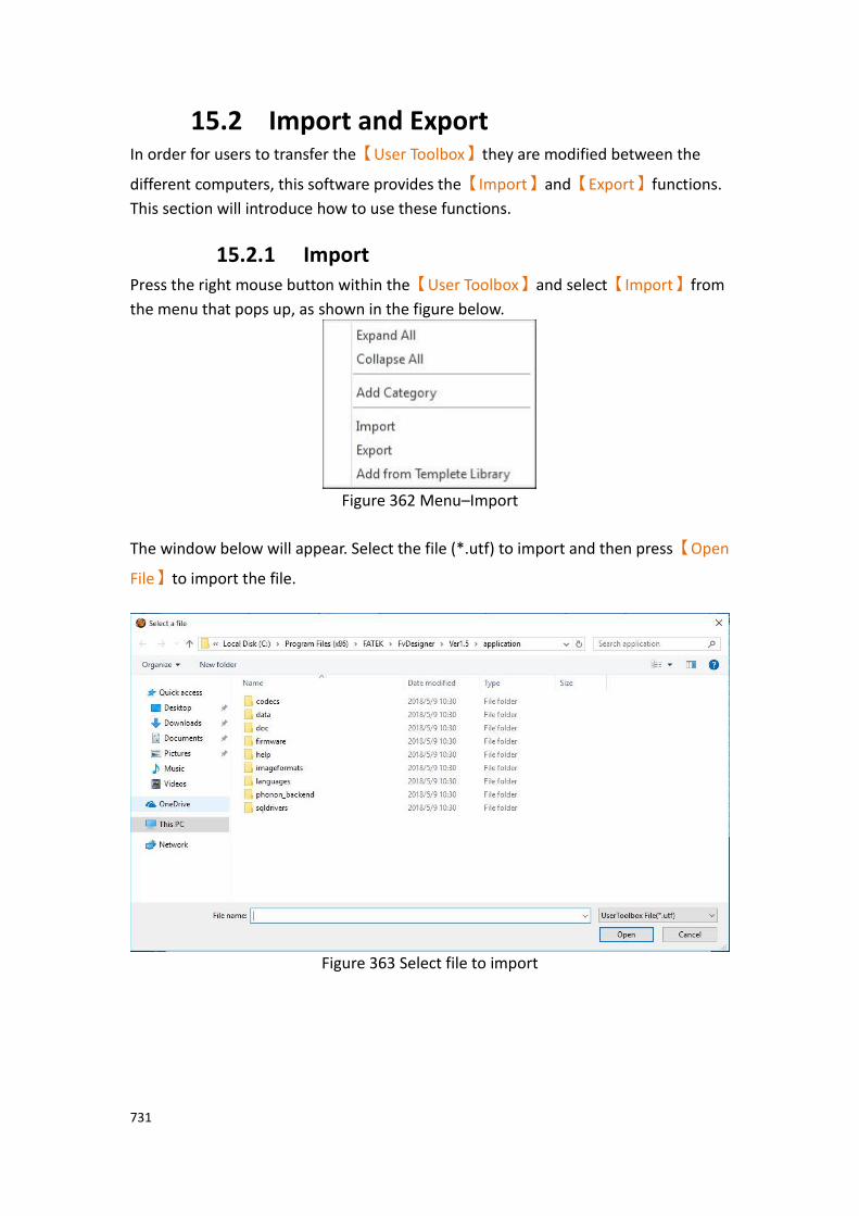
731
15.2 Import and Export In order for users to transfer the【User Toolbox】they are modified between the
different computers, this software provides the【Import】and【Export】functions.
This section will introduce how to use these functions.
15.2.1 Import Press the right mouse button within the【User Toolbox】and select【Import】from
the menu that pops up, as shown in the figure below.
Figure 362 Menu–Import
The window below will appear. Select the file (*.utf) to import and then press【Open
File】to import the file.
Figure 363 Select file to import
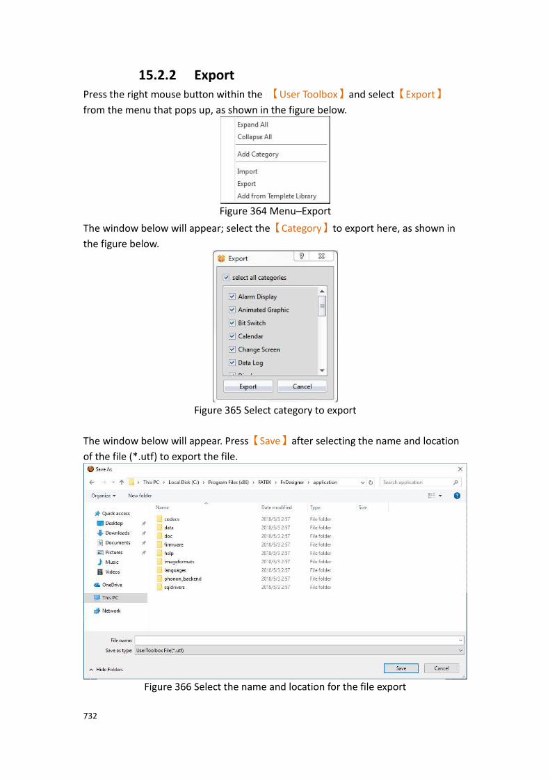
732
15.2.2 Export Press the right mouse button within the 【User Toolbox】and select【Export】
from the menu that pops up, as shown in the figure below.
Figure 364 Menu–Export
The window below will appear; select the【Category】to export here, as shown in
the figure below.
Figure 365 Select category to export
The window below will appear. Press【Save】after selecting the name and location
of the file (*.utf) to export the file.
Figure 366 Select the name and location for the file export
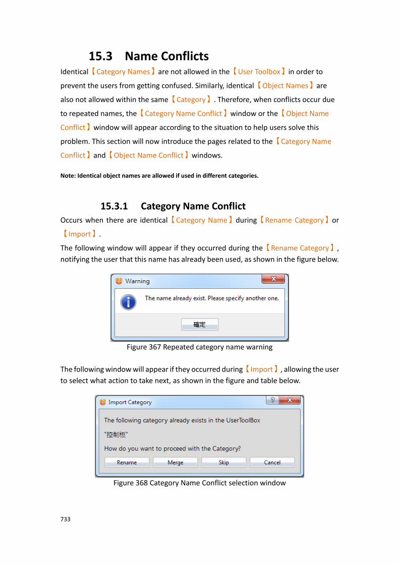
733
15.3 Name Conflicts Identical【Category Names】are not allowed in the【User Toolbox】in order to
prevent the users from getting confused. Similarly, identical【Object Names】are
also not allowed within the same【Category】. Therefore, when conflicts occur due
to repeated names, the【Category Name Conflict】window or the【Object Name
Conflict】window will appear according to the situation to help users solve this
problem. This section will now introduce the pages related to the【Category Name
Conflict】and【Object Name Conflict】windows.
Note: Identical object names are allowed if used in different categories.
15.3.1 Category Name Conflict Occurs when there are identical【Category Name】during【Rename Category】or
【Import】.
The following window will appear if they occurred during the【Rename Category】,
notifying the user that this name has already been used, as shown in the figure below.
Figure 367 Repeated category name warning
The following window will appear if they occurred during【Import】, allowing the user
to select what action to take next, as shown in the figure and table below.
Figure 368 Category Name Conflict selection window

734
Table 239 Category Name Conflict options
Option Description
【Rename】 Change the name of the category to import and then add
it to the【User Toolbox】.
【Merge】 Merge the category to import with the category within the
【User Toolbox】.
【Skip】 Skip and do not process this category import.
【Cancel】 Cancel this import.
15.3.2 Object Name Conflict Occurs when there are identical 【Object Name】 during the【Rename Object】or
【Import】.
The following window will appear if they occurred during【Rename Object】, reminding
the user that this name has already been used, as shown in the figure below.
Figure 369 Repeated object name warning
The following window will appear if they occurred during 【Import】, allowing the
user to select what action to take next, as shown in the figure and table below.
Figure 370 Object Name Conflict selection window

735
Table 240 Object Name Conflict options
Option Description
【Rename】 Change the name of the object to import and then add it
to the current【Category】.
【Replace】 Replace the object in the current【Category】with the
object to import.
【Skip】
Skip and do not process this object import.
【Cancel】 Cancel this import.
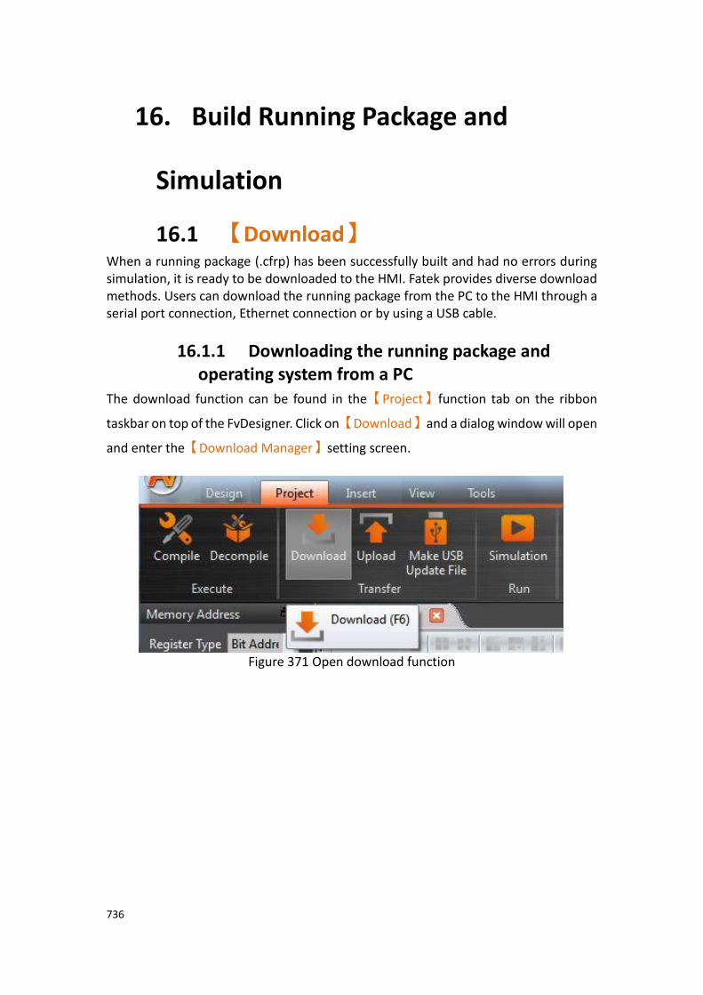
736
16. Build Running Package and
Simulation
16.1 【Download】 When a running package (.cfrp) has been successfully built and had no errors during simulation, it is ready to be downloaded to the HMI. Fatek provides diverse download methods. Users can download the running package from the PC to the HMI through a serial port connection, Ethernet connection or by using a USB cable.
16.1.1 Downloading the running package and operating system from a PC
The download function can be found in the【Project】function tab on the ribbon
taskbar on top of the FvDesigner. Click on【Download】and a dialog window will open
and enter the【Download Manager】setting screen.
Figure 371 Open download function

737
The following are detailed descriptions for the【Download Manager】.
Figure 372 Download Manager function interface
Table 241 Download Manager–related parameters
Property Description
【Connection
Setting】
【COM】
Select to perform download through the serial port; the port number used for downloading must also be specified when this option is selected.
【Ethernet】
Select to perform download through the Ethernet. The IP address of the target HMI must also be specified when this
option is selected. Press【Scan】on the right to acquire the
HMI IP addresses and device names currently online. Users can also manually enter the IP address of the target HMI to perform download. Note: The Scan button may have no effect under certain network environments (usually when the DHCP server cannot accurately configure the IP addresses). In this case, the command prompt can be opened to

738
execute the following commands in sequence to restore the function.
1. netsh winsock reset
2. netsh interface ipv4 reset
3. ipconfig /flushdns
Please re-start the computer when completed for the settings to take effect.
【USB】
Perform download through USB. The default path of USB Driver is under C:\Program Files\Fatek\FvDesigner\Ver1.5\usb driver
The USB drivers can be installed by clicking【Install USB
Driver】in the【Tools】tab.
【Data
Source】
【Running Package】
Downloads the executable running package if this option is
selected. Source package can be the【Current Project】or
【Select from file】 by the user.
【Operating System】
The HMI operating system will be downloaded once this option is selected.
The default path of【Operating System】is under
(Under 64-bit Windows) C:\Program Files (x86)\FATEK\FvDesigner\Ver1.5\application
\firmware\FvFirmwareC.frt 。
(Under 32-bit Windows) C:\Program Files\FATEK\FvDesigner\Ver1.5\application \firmware\FvFirmwareC.frt
739
【Delete on
Target】
This field determines whether to clear the existing data saved on the HMI:
【Select/Deselect All】
After checked, all the following options will be checked. If not checked, all items below will be unchecked.
【Backup Memory】
If this option is selected, the NV and XNV registers on the HMI will be cleared when the download process begins.
【Alarm】
If this option is selected, the existing alarm log on the HMI will be deleted when the download process begins. The HMI will clear all files under /internal/alarm/.
【Recipe】
If this option is selected, the existing recipe files on the HMI will be deleted when the download process begins. The HMI will clear all files under /internal/recipe/.
【Data Log】
If this option is selected, the existing data log on the HMI will be deleted when the download process begins. The HMI will clear all files under /internal/datalog/.
【Print】
If this option is selected, the screenshots saved in the HMI internal memory will be deleted when the download process begins. The HMI will clear all files under /internal/hardcopy/.
【Link】
If this option is selected, the program will start the deletion of the original link parameters and replace them with the new link parameters.
【Security Password】
If this option is selected, the password table on the HMI will be deleted when the download process begins. If this option is selected, the original password table will be retained.
【Operation Log】
If this option is selected, the existing operation log on the HMI

740
will be deleted when the download process begins. The HMI will clear all files under /internal/operationlog/.
【Data Transfer】
If this option is selected, the data transfer files on the HMI will be deleted when the download process begins. The HMI will clear all files under /internal/datatransfer/.
【Installment】
If this option is selected, the download process will delete the original installment information and the previously entered records.
【Schedule】
If this option is selected, the download process will delete the
original data that has been modified through the【Schedule】on
the HMI, so the schedule will based on the project; if not checked,
the original data that has been modified through the【Schedule】
on HMI will be retained.
【Others】
If this option is selected, all other files on the HMI will be deleted when the download process begins. The HMI will clear all files under /internal/ not including the options detailed above.
【Other
Settings】
【Reboot after Download】
Set to reboot HMI after downloading project is complete.
【Synchronize HMI with PC】
Set to synchronize the date and time of HMI with PC after downloading project is complete.
【User-Defined Startup Screen】
Allows designers to define their own HMI boot screen, such as the title of the company, etc., after the option is checked, you can choose a picture on the PC. After the project download is complete, the HMI boot screen will be changed. Fatek HMI factory boot screen, default location: (Under 64-bit Windows) C:\Program Files (x86)\FATEK\FvDesigner\Ver1.5\startup screen (Under 32-bit Windows) C:\Program Files\FATEK\FvDesigner\Ver1.5\startup screen
741
【Write System Setting】
Providing parameters that can be set to the HMI at the same time when the project downloads, can reduce the tedious setting work, especially when the same project is downloaded to multiple HMI, each of the HMI does not need to enter the system settings screen settings, after checked, select the *.fscfg file on the right, or press the Edit button on the right to edit the *.fscfg file. For details, refer to chapter16.1.2-Write System Setting .
【Status】 Displays the current download status and download progress.
【Start】
Press this switch to start downloading once setting configuration is complete.
【Close】
Press this switch to end downloading and close the download window.
Note: If the HMI has been updated to a new version of firmware or the program has update, the files associated with the old version of sotware cannot be used.

742
16.1.2 Write System Setting Providing parameters that can be set to the HMI at the same time when the project downloads, can reduce the tedious setting work, especially when the same project is downloaded to multiple HMI, each of the HMI does not need to enter the system settings screen settings, after checked, select the *.fscfg file on the right, or press the
Edit button on the right to edit the *.fscfg file. Pressing the【Edit】button on the right
will bring up the system setting configuration window as shown in the figure below. The meaning of each setting option is as follows:
16.1.2.1 【Basic】
【System Setting Configure】【Basic】setting paging as shown below, the meaning of
each setting is as follows :
Figure 373【System Setting Configure】【Basic】setting page
Table 242 【System Setting Configure】【Basic】properties setting
Properties Description
【Basic】 【Use password to protect this configuration files】
Check if you want to set a password to protect this configuration file. If you select it, you can set the password
on the right. When you press the【Edit】button on the
right again to edit the *.fscfg file, the following figure will appear, requiring a password to continue editing.

743
【Mask Passwords】
Mask the password of【Use password to protect this
configuration files】, default is checked .
【HMI Model】
Select the model you want to set.
16.1.2.2 【System】
【System Setting Configure】【System】setting paging as shown below, the meaning
of each setting is as follows :
Figure 374【System Setting Configure】【System】setting page
744
Table 243 【System Setting Configure】【System】properties setting
Properties Description
【System】 【Overwrite Device Name】
Check whether to overwrite the name of the HMI. After
checked, the name of the HMI can be edited under【Device
Name】.
【Overwrite Station Number】
Check whether to overwrite the station number of the HMI. After checked, the station number of the HMI can be edited
under【Station Number】.
【Overwrite System Password】
Check whether to overwrite the system password of the HMI. After checked, the system password of the HMI can be
edited under【Enable System Password】.
【Enable System Password】
Check whether to enable the system password of the HMI. After checked, the system password of the HMI can be edited on the right.
【Select Locked Options】
After checked【Enable System Password】, can check the
items to be locked in the system settings of the HMI at the
bottom, includes【Lock Ethernet】、【Lock Servers】、【Lock
Backlight】、【Lock Display】、【Lock Time】、【Lock System
Info】、【Lock MISC-Audio Buzzer】、【Lock MISC-Remote
Password】and【Lock MISC-Customer ID】.
【Mask Passwords】
Mask the password of【Use password to protect this
configuration files】, default is checked .

745
16.1.2.3 【Ethernet】
【System Setting Configure】【Ethernet】setting paging as shown below, the meaning
of each setting is as follows :
Figure 375【System Setting Configure】【Ethernet】setting page
Table 244 【System Setting Configure】【Ethernet】properties setting
Properties Description
【Ethernet】 【Overwrite Ethernet】
Check whether to overwrite the ethernet setting of the HMI. After checked, the ethernet setting of the HMI can be
edited under【Enable Ethernet】.
【Enable Ethernet】
Check whether to enable【Ethernet】on the HMI. After
checked, the ethernet IP address or【DHCP】of the HMI
can be edited under【Enable Ethernet】.
【Use DHCP】
Check whether to use【Use DHCP】, if【Use DHCP】is
checked, the four options of【IP Address】、【Net Mask】、
【Gateway】and【DNS】will be turned off and set by the
system.
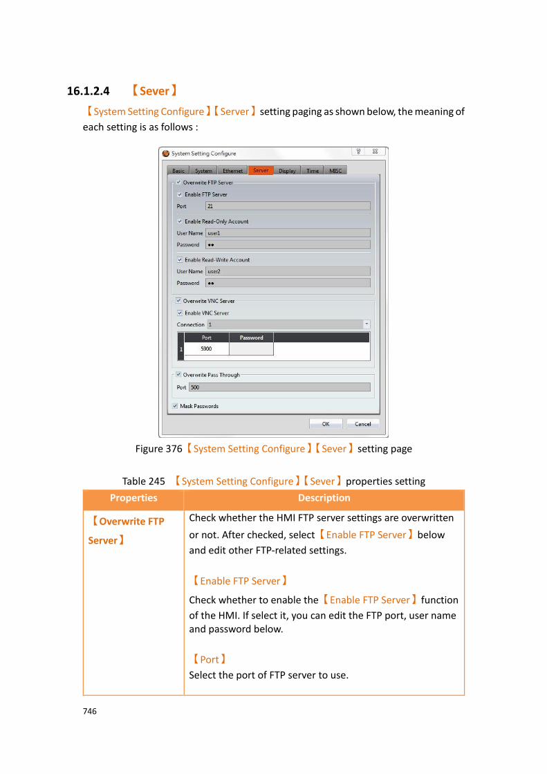
746
16.1.2.4 【Sever】
【System Setting Configure】【Server】setting paging as shown below, the meaning of
each setting is as follows :
Figure 376【System Setting Configure】【Sever】setting page
Table 245 【System Setting Configure】【Sever】properties setting
Properties Description
【Overwrite FTP
Server】
Check whether the HMI FTP server settings are overwritten
or not. After checked, select【Enable FTP Server】below
and edit other FTP-related settings.
【Enable FTP Server】
Check whether to enable the【Enable FTP Server】function
of the HMI. If select it, you can edit the FTP port, user name and password below.
【Port】
Select the port of FTP server to use.

747
【Enable Read-Only Account】
Check whether to enable read-only account. After checked,you can set the user’s name and password below.
【Enable Read-Write Account】
Check whether to enable read-write account. After checked,you can set the user’s name and password below.
【Overwrite VNC
Server】
Check whether the HMI VNC server settings are overwritten
or not. After checked, select【Enable VNC Server】below
and edit other VNC-related settings.
【Enable VNC Server】
Check whether to enable the【Enable VNC Server】
function of the HMI. If select it, you can edit the VNC port, and password below.
【Connection】
Set the number of VNC clients that can be connected to this VNC server at the same time. The maximum number of supported devices will vary depending on the model.
【Port】
To set the VNC connection port, you can only set the connection line for the first client. The second line will automatically increase. For example, the first setting is 5900, and the second line is 5901.
【Password】
Enter the password of VNC server.
【Overwrite Pass
Through】
Check whether to overwrite port of the pass through setting.
【Port】
Set the port the pass through.
【Mask
Passwords】
【Mask Passwords】
Mask the password of【FTP Server】and【VNC Server】
that user edited.
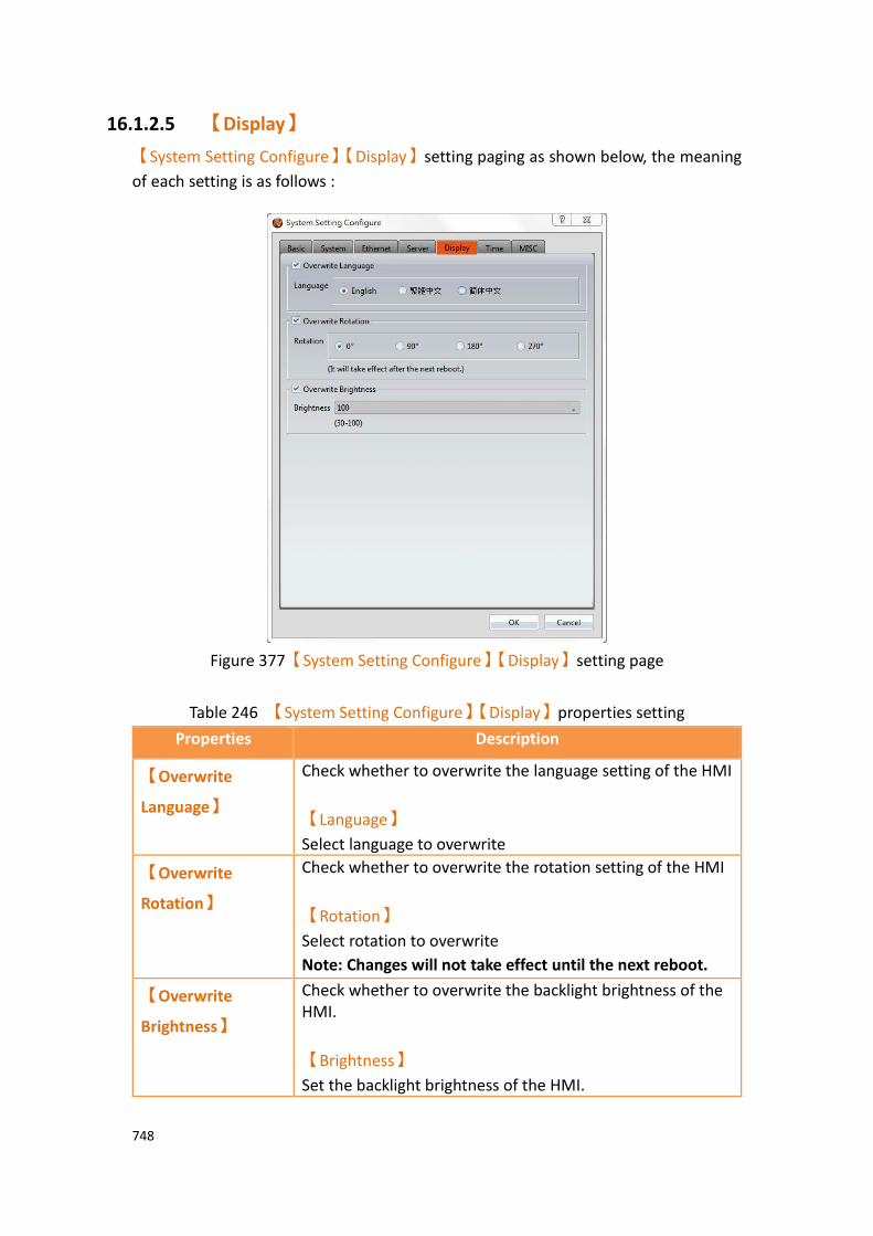
748
16.1.2.5 【Display】
【System Setting Configure】【Display】setting paging as shown below, the meaning
of each setting is as follows :
Figure 377【System Setting Configure】【Display】setting page
Table 246 【System Setting Configure】【Display】properties setting
Properties Description
【Overwrite
Language】
Check whether to overwrite the language setting of the HMI
【Language】
Select language to overwrite
【Overwrite
Rotation】
Check whether to overwrite the rotation setting of the HMI
【Rotation】
Select rotation to overwrite
Note: Changes will not take effect until the next reboot.
【Overwrite
Brightness】
Check whether to overwrite the backlight brightness of the HMI.
【Brightness】
Set the backlight brightness of the HMI.
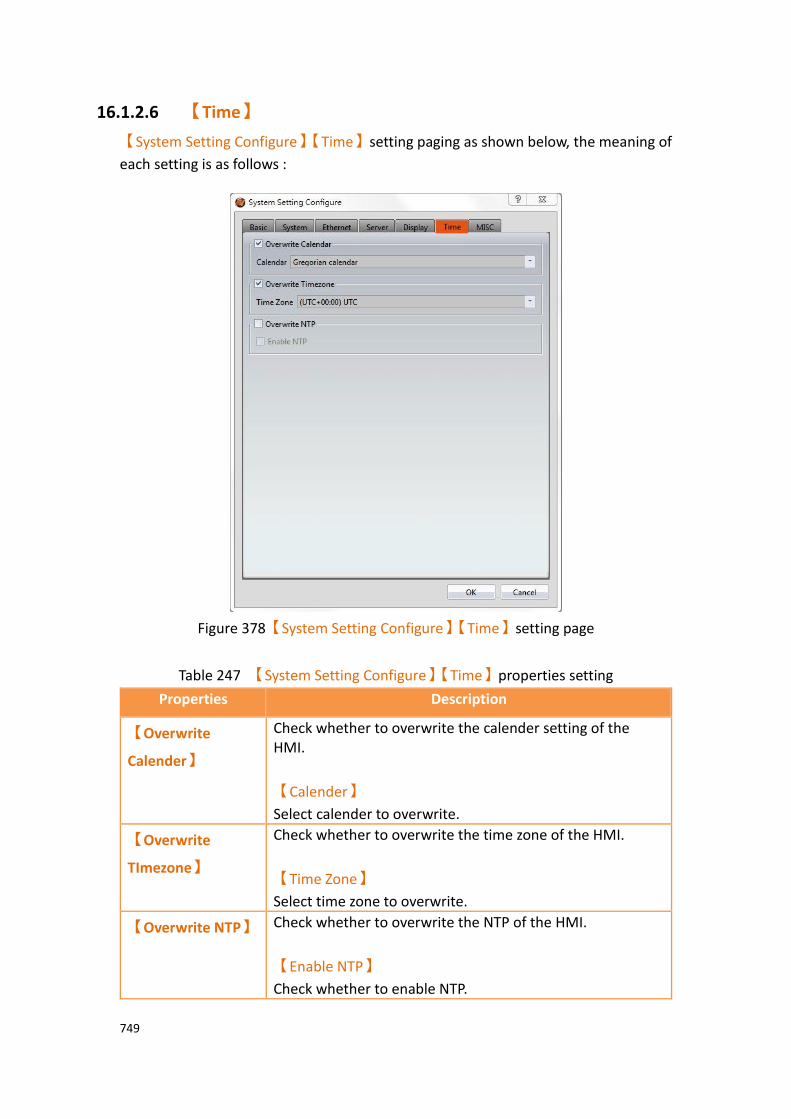
749
16.1.2.6 【Time】
【System Setting Configure】【Time】setting paging as shown below, the meaning of
each setting is as follows :
Figure 378【System Setting Configure】【Time】setting page
Table 247 【System Setting Configure】【Time】properties setting
Properties Description
【Overwrite
Calender】
Check whether to overwrite the calender setting of the HMI.
【Calender】
Select calender to overwrite.
【Overwrite
TImezone】
Check whether to overwrite the time zone of the HMI.
【Time Zone】
Select time zone to overwrite.
【Overwrite NTP】 Check whether to overwrite the NTP of the HMI.
【Enable NTP】
Check whether to enable NTP.

750
16.1.2.7 【MISC】
【System Setting Configure】【MISC】setting paging as shown below, the meaning of
each setting is as follows :
Figure 379【System Setting Configure】【MISC】setting page
Table 248 【System Setting Configure】【MISC】properties setting
Properties Description
【Overwrite
Buzzer】
Check whether to overwrite the buzzer setting of the HMI.
【Enable Buzzer】
Check whether to enable buzzer.
【Overwrite
Audio】
Check whether the audio setting of the HMI.
【Enable Audio】
Check whether to enable audio.
【Overwrite
Remote
Password】
Check whether to overwrite the remote password setting of the HMI.
【Enable Remote Password】
Check whether to enable remote password, set the password on the right.
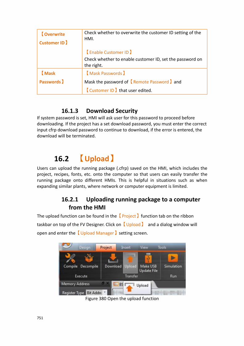
751
【Overwrite
Customer ID】
Check whether to overwrite the customer ID setting of the HMI.
【Enable Customer ID】
Check whether to enable customer ID, set the password on the right.
【Mask
Passwords】
【Mask Passwords】
Mask the password of【Remote Password】and
【Customer ID】that user edited.
16.1.3 Download Security If system password is set, HMI will ask user for this password to proceed before downloading. If the project has a set download password, you must enter the correct input cfrp download password to continue to download, if the error is entered, the download will be terminated.
16.2 【Upload】 Users can upload the running package (.cfrp) saved on the HMI, which includes the project, recipes, fonts, etc. onto the computer so that users can easily transfer the running package onto different HMIs. This is helpful in situations such as when expanding similar plants, where network or computer equipment is limited.
16.2.1 Uploading running package to a computer from the HMI
The upload function can be found in the【Project】function tab on the ribbon
taskbar on top of the FV Designer. Click on【Upload】 and a dialog window will
open and enter the【Upload Manager】setting screen.
Figure 380 Open the upload function

752
The following are detailed descriptions for the【Upload Manager】.
Figure 381 Upload Manager function interface
Table 249 Upload Manager-related parameters
Properties Description
【Running
Package
Path】
【Save To】
Specify the storage path after the running package is uploaded.
【Connection
Setting】
【COM】
Select to perform the upload through the serial port. The port number used for uploading must also be specified when this option is selected.
【Ethernet】
Select to perform the upload through the Ethernet. The IP address of the target HMI must also be specified when this option is
selected. Press【Scan】on the right to acquire the HMI IP
addresses and device names currently online. Users can also manually enter the IP address of the target HMI to perform the upload. Note: The Scan button may have no effect under certain network environments (usually when the DHCP server cannot accurately configure the IP addresses). In this case, the command window can be opened to execute the following commands in sequence to restore the function.
1. netsh winsock reset
2. netsh interface ipv4 reset
3. ipconfig /flushdns Please re-start the computer when completed for the settings to take effect.
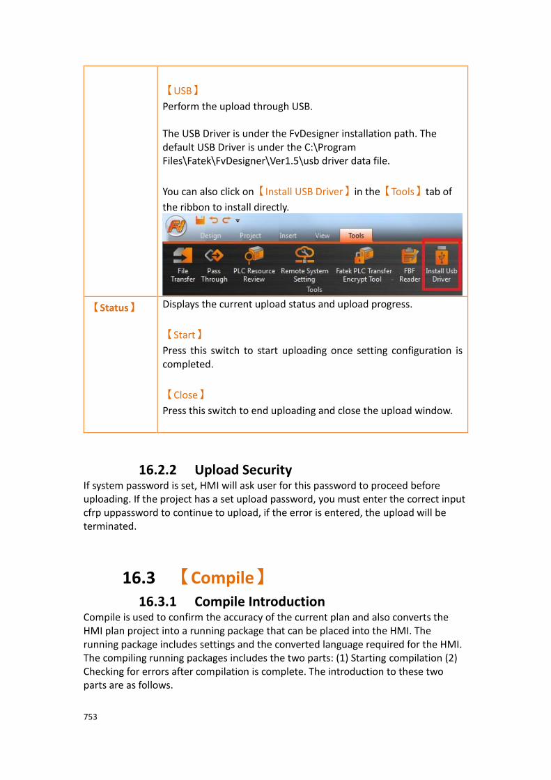
753
【USB】
Perform the upload through USB. The USB Driver is under the FvDesigner installation path. The default USB Driver is under the C:\Program Files\Fatek\FvDesigner\Ver1.5\usb driver data file.
You can also click on【Install USB Driver】in the【Tools】tab of
the ribbon to install directly.
【Status】 Displays the current upload status and upload progress.
【Start】
Press this switch to start uploading once setting configuration is completed.
【Close】
Press this switch to end uploading and close the upload window.
16.2.2 Upload Security If system password is set, HMI will ask user for this password to proceed before uploading. If the project has a set upload password, you must enter the correct input cfrp uppassword to continue to upload, if the error is entered, the upload will be terminated.
16.3 【Compile】 16.3.1 Compile Introduction
Compile is used to confirm the accuracy of the current plan and also converts the HMI plan project into a running package that can be placed into the HMI. The running package includes settings and the converted language required for the HMI. The compiling running packages includes the two parts: (1) Starting compilation (2) Checking for errors after compilation is complete. The introduction to these two parts are as follows.

754
16.3.2 Start compiling running packages To start compiling, press the【Compile】switch in the【Project】section of the HMI
toolbar.
Figure 382 Perform compile from the toolbar above
16.3.3 Ending compile and error check
When the compilation ends, the compile process will be displayed in the【 Output
Message】below, and a running package (with file extension cfrp, which is short for
Compress FATEK Running Package) to be used on the HMI will be generated. This
running package can be placed in the HMI for use.
Figure 383 Compilation process illustration
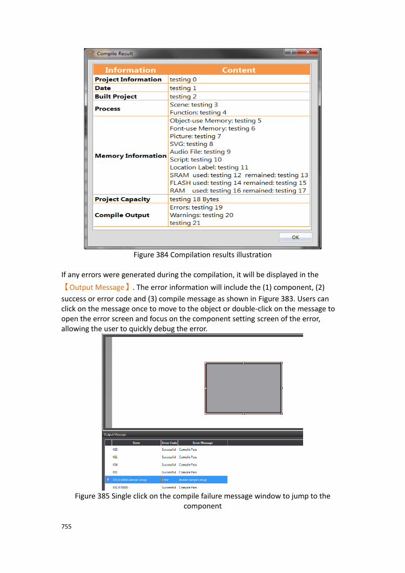
755
Figure 384 Compilation results illustration
If any errors were generated during the compilation, it will be displayed in the
【Output Message】. The error information will include the (1) component, (2)
success or error code and (3) compile message as shown in Figure 383. Users can click on the message once to move to the object or double-click on the message to open the error screen and focus on the component setting screen of the error, allowing the user to quickly debug the error.
Figure 385 Single click on the compile failure message window to jump to the
component

756
Figure 386 Double click on the compile failure message to open the screen setting
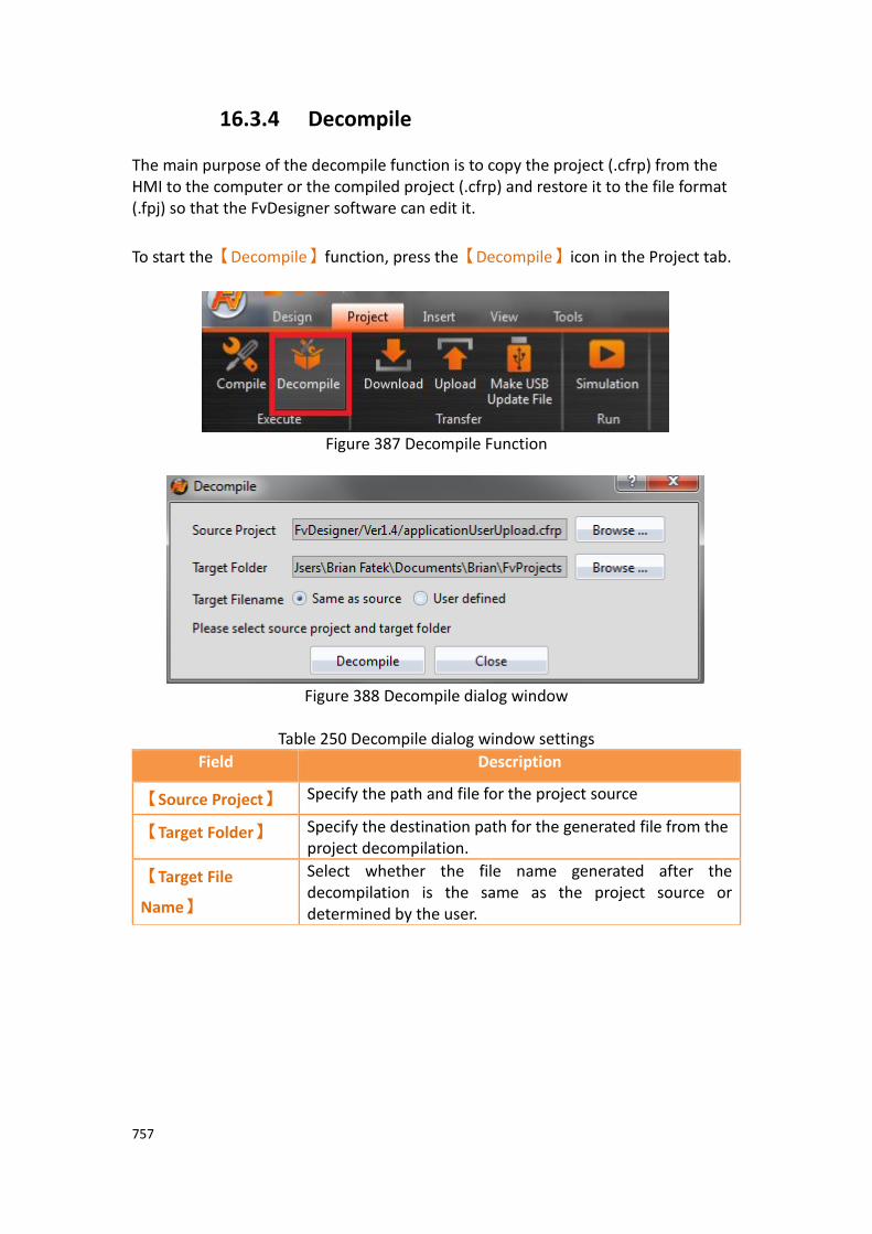
757
16.3.4 Decompile The main purpose of the decompile function is to copy the project (.cfrp) from the HMI to the computer or the compiled project (.cfrp) and restore it to the file format (.fpj) so that the FvDesigner software can edit it.
To start the【Decompile】function, press the【Decompile】icon in the Project tab.
Figure 387 Decompile Function
Figure 388 Decompile dialog window
Table 250 Decompile dialog window settings
Field Description
【Source Project】 Specify the path and file for the project source
【Target Folder】 Specify the destination path for the generated file from the project decompilation.
【Target File
Name】
Select whether the file name generated after the decompilation is the same as the project source or determined by the user.

758
16.4 【Simulation】 16.4.1 Simulation Introduction
【Simulation】is used to perform preliminary tests before downloading the running
package to the HMI in order to reduce the likelihood of finding errors after being downloaded into the HMI. Running simulations can verify the accuracy of the project plan. The simulation function can be run on the PC to simulate how the running
package will run on the HMI. Simulations provided by Fatek are divided into【Offline
Simulation】and【Online Simulation】. The simulation setting window can be used
to determine whether to start the Offline or Online Simulation.
Figure 389 Simulation setting window
16.4.2 Starting Simulation Users can start【Simulation】by opening the simulation setting window from
【Project】, and then selecting whether to perform【Offline Simulation】or
【Online Simulation】.
Figure 390 Starting simulation
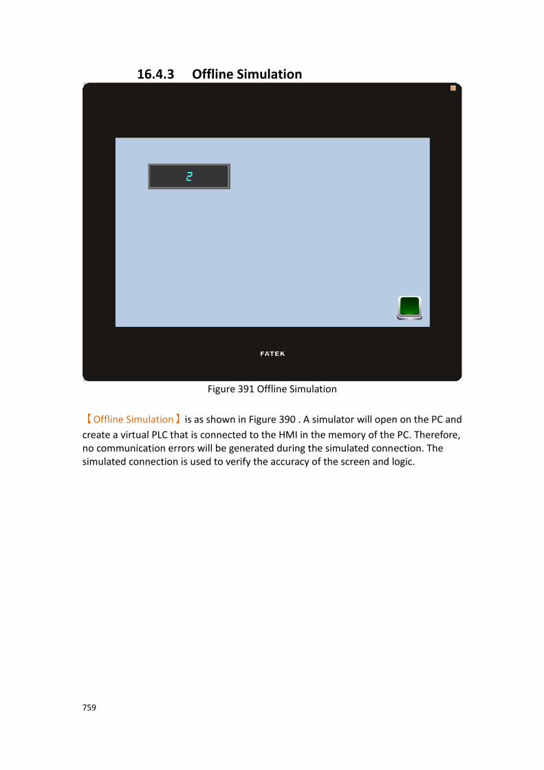
759
16.4.3 Offline Simulation
Figure 391 Offline Simulation
【Offline Simulation】is as shown in Figure 390 . A simulator will open on the PC and
create a virtual PLC that is connected to the HMI in the memory of the PC. Therefore, no communication errors will be generated during the simulated connection. The simulated connection is used to verify the accuracy of the screen and logic.
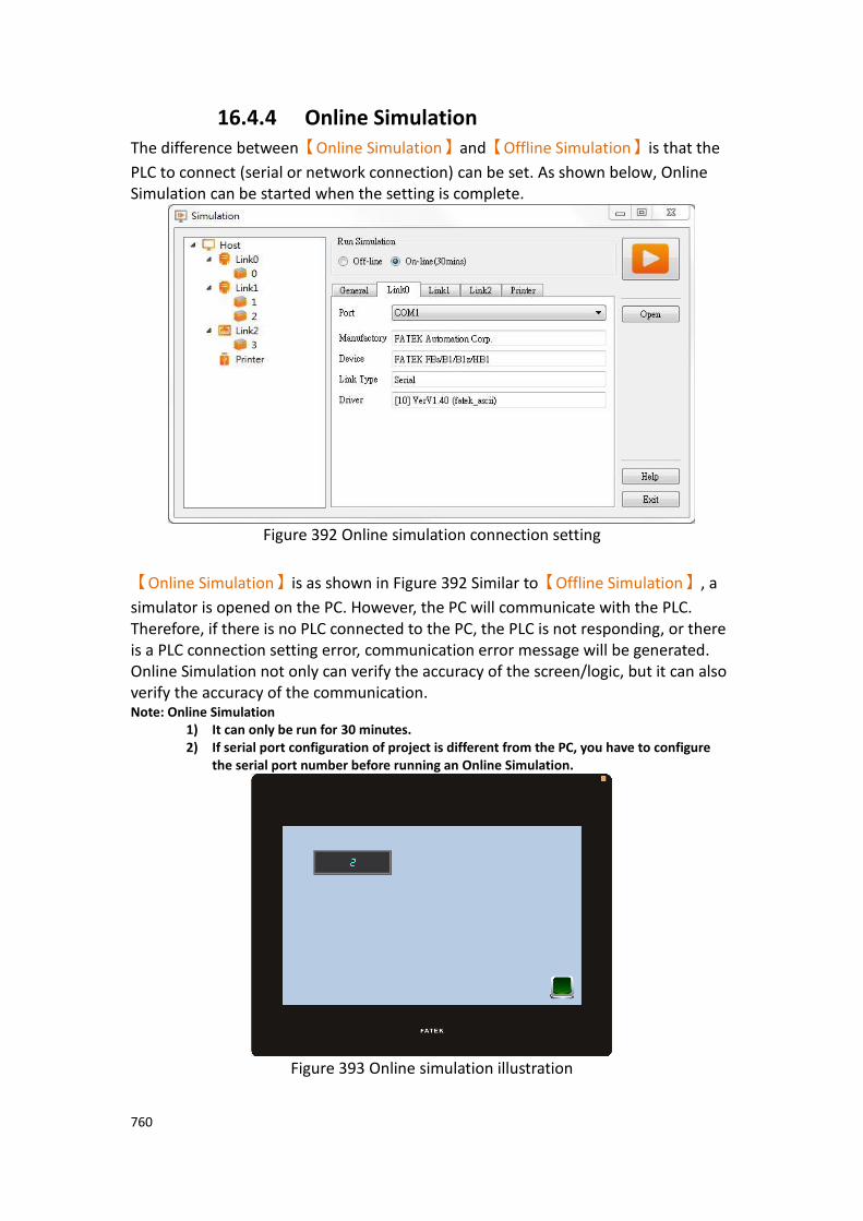
760
16.4.4 Online Simulation The difference between【Online Simulation】and【Offline Simulation】is that the
PLC to connect (serial or network connection) can be set. As shown below, Online Simulation can be started when the setting is complete.
Figure 392 Online simulation connection setting
【Online Simulation】is as shown in Figure 392 Similar to【Offline Simulation】, a
simulator is opened on the PC. However, the PC will communicate with the PLC. Therefore, if there is no PLC connected to the PC, the PLC is not responding, or there is a PLC connection setting error, communication error message will be generated. Online Simulation not only can verify the accuracy of the screen/logic, but it can also verify the accuracy of the communication. Note: Online Simulation
1) It can only be run for 30 minutes. 2) If serial port configuration of project is different from the PC, you have to configure
the serial port number before running an Online Simulation.
Figure 393 Online simulation illustration

761
17. Application Tool
17.1 【Pass Through】 Pass Through is communication between a PLC and PC through the HMI. Generally, when the PC wants to perform serial communications with the PLC, related application programs such as WinProLadder (Fatek PLC programming software), is
used on the PC and communicates directly with the PLC through the【Ethernet】or
the COM port/USB on the PC. However, under some circumstances, the PC cannot connect to the PLC directly or connection information with the PLC cannot be acquired
directly. The【Pass Through Function】is provided for such conditions so that the PC
can perform serial communications with the PLC indirectly, and also acquire the register data of the device. The communication mode is as shown in Figure 394 Pass Through architecture.
Figure 394 Pass Through architecture
17.1.1 Setting Pass Through To use pass through, users must first use the FvDesigner to connect to the HMI that
they want to pass through and switch it to【Pass Through Mode】. The goal of this
action is to tell the HMI to change its operating mode in preparation to be used for
【Pass Through】. After successfully setting the HMI to the pass through mode, the
HMI will be able to transfer all data coming from the specific port of the PC to the specified PLC.
After the setup, users can use the WinProLadder or other related applications to specify the same port to communicate with the HMI. Although the PC is not directly connected to the PLC, the HMI will transfer all data received from the specified port to the PLC. Therefore in terms of behavior, the result will be the same as connecting directly to the PLC. When the task is complete, FvDesigner can be used again to switch HMI back to the normal operation mode.
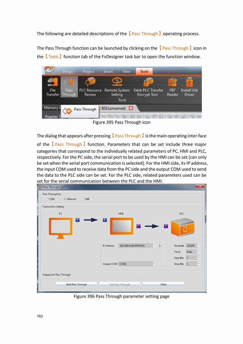
762
The following are detailed descriptions of the【Pass Through】operating process.
The Pass Through function can be launched by clicking on the【Pass Through】icon in
the【Tools】function tab of the FvDesigner task bar to open the function window.
Figure 395 Pass Through icon
The dialog that appears after pressing【Pass Through】is the main operating inter-face
of the【Pass Through】function. Parameters that can be set include three major
categories that correspond to the individually related parameters of PC, HMI and PLC, respectively. For the PC side, the serial port to be used by the HMI can be set (can only be set when the serial port communication is selected). For the HMI side, its IP address, the input COM used to receive data from the PC side and the output COM used to send the data to the PLC side can be set. For the PLC side, related parameters used can be set for the serial communication between the PLC and the HMI.
Figure 396 Pass Through parameter setting page
763
Detailed descriptions of each parameter are as follows:
Table 251 Pass Through related parameters
Property Description
【Pass Through
by】
【COM】
Use the serial port to communicate between the PC and the HMI.
【Ethernet】
Use Ethernet to communicate between the PC and the HMI.
【USB】
Use USB to communicate between the PC and the HMI.
【Connection
Setting】
【PC】
1. 【Output COM】: When【COM】or【USB】is
selected for【Pass Through by】, this field will be
enabled to specify the serial port to use for the PC
output. On the other hand when the 【Ethernet】is
selected, this field is disabled.
【HMI】
1. 【IP Address】: Specifies the IP address of the
target HMI to pass through; when the【Ethernet】
is selected for【Pass Through by】, all IP addresses
of HMIs in the local area network will automatically be scanned for the user to select the target HMI for
pass through. User can press the 【 】button
after this field to refresh IP address list or manually input an IP address.
2. 【Input COM】: When【COM】is selected for
【Pass Through by】, press the button【 】to get
all available serial ports on the target HMI. When
the【Ethernet】is selected for【Pass Through by】,
this field will be locked and unavailable for use.
3. 【Output COM】: Press the button【 】to get all
available serial ports on the target HMI; The scan results will be displayed in this pull-down menu.

764
【PLC】
1. 【Baud Rate】: This field can be used to set the baud
rate of the target device to pass through.
2. 【Stop Bits】: This field can be used to set the stop
bits of the target device to pass through.
3. 【Parity Check Bits】: This field can be used to set the
parity check bits of the target device to pass through.
4. 【Data Bits】: This field can be used to set the data
bits of the target device to pass through.
5. 【Flow Control】: This field can be used to set the
flow control of the target device to pass through.
【Start Pass Through】
After setting the【Connection Setting】related parameters,
press【Start Pass Through】to perform pass through.
【End Pass Through】
To end pass through, press 【End Pass Through】on the PC
or HMI.
【Close】
This function is the same as【End Pass Through】; It will also
close the dialog window after ending pass through.
17.1.2 Pass Through Example The following shows a simple example for performing pass through Ethernet using WinProLadder (Fatek PLC programming software).
As described in the previous section of this chapter, FvDesigner must be used to connect to the HMI to pass through in order to use the HMI. Its operating mode must
be switched to【Pass Through Mode】so that the HMI can transfer the data received
from the specified port to the specified Output COM. In order to achieve this goal, first
open the FvDesigner and click on the【Pass Through】function,

765
Figure 397 Pass Through parameter setting interface
then select the【Ethernet】as the connection method since the PC will not be
connected to the HMI through the serial port. The HMI【Output COM】must still be
set.
The user must first press the【 】after the【IP Address】field to get all HMI IP address
on the network those are available for pass through, or enter an IP manually. The user must know which serial port is used by the HMI to connect to the PLC, else the pass through function will not be able to operate.
Next, the user must set the related parameters of the serial port used with the PLC. Please note that if the parameters set here are not correct for this PLC, it is likely for unexpected communication failures to occur.
After setting all the parameters, press【Start Pass Through】to switch the target HMI
to pass through mode to facilitate the follow-up actions. If the HMI was successfully switched to pass through mode, the status of the operating inter-face will change as shown in the figure below. The status field will show that the HMI was successfully changed to pass through mode.
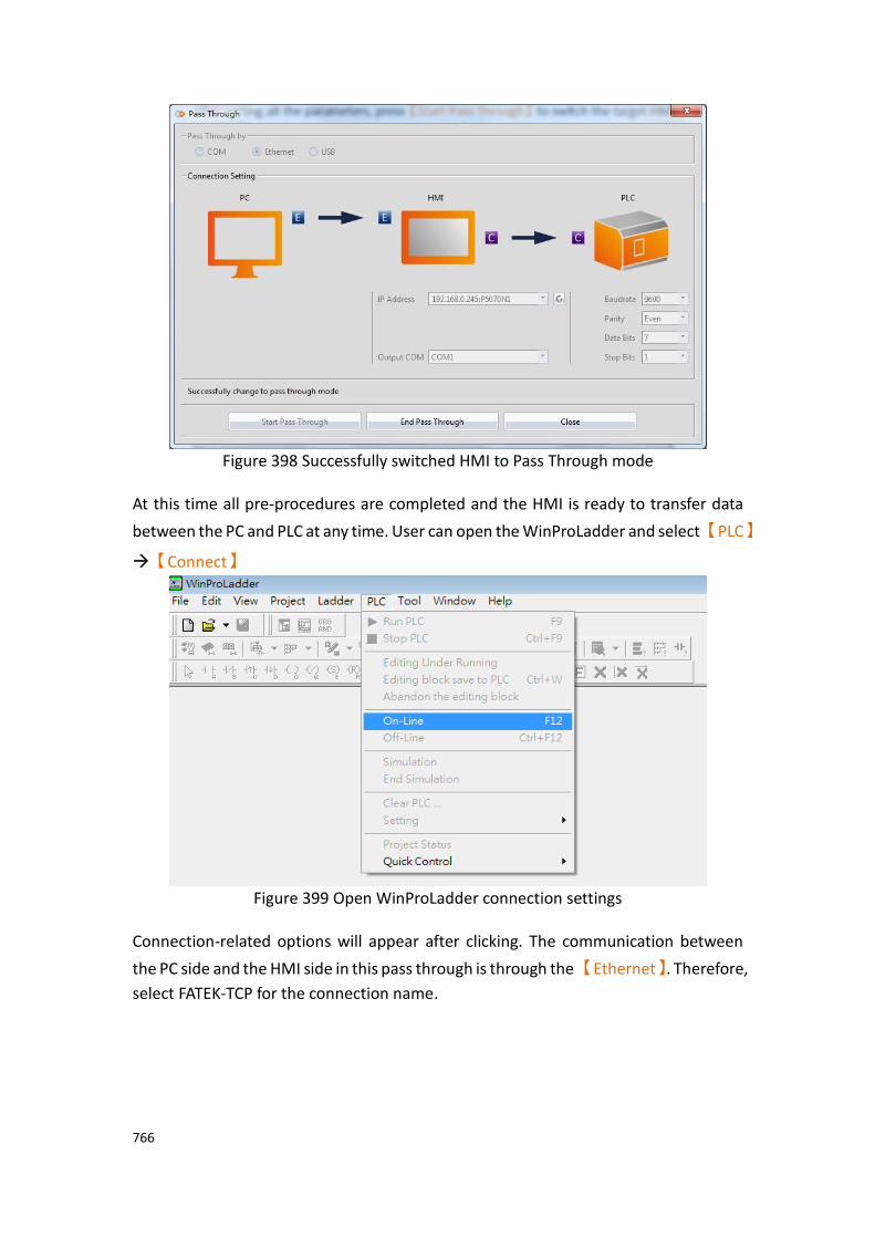
766
Figure 398 Successfully switched HMI to Pass Through mode
At this time all pre-procedures are completed and the HMI is ready to transfer data
between the PC and PLC at any time. User can open the WinProLadder and select【PLC】
→【Connect】
Figure 399 Open WinProLadder connection settings
Connection-related options will appear after clicking. The communication between
the PC side and the HMI side in this pass through is through the 【Ethernet】. Therefore,
select FATEK-TCP for the connection name.

767
Figure 400 Selecting the communication protocol
The TCP connection-related parameters can be set after pressing Edit, as shown in the figure below:
Figure 401 Setting the WinProLadder Ethernet communication parameters
Users need to specify IP address of the HMI, which is going to pass through to the PLC. After configuration is completed, the user can press the OK button to perform pass through.
Note: When using Pass Through function, if the PLC is Fatek HB1, and HMI communicates with the PLC via PLC Port, the baud rate needs to set at 115200 in WinProLadder. .
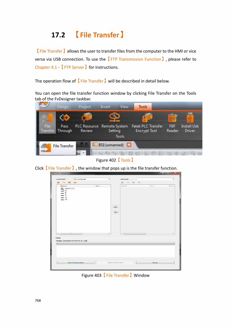
768
17.2 【File Transfer】
【File Transfer】allows the user to transfer files from the computer to the HMI or vice
versa via USB connection. To use the【FTP Transmission Function】, please refer to
Chapter 4.1 -【FTP Server】for instructions.
The operation flow of【File Transfer】will be described in detail below.
You can open the file transfer function window by clicking File Transfer on the Tools tab of the FvDesigner taskbar.
Figure 402【Tools】
Click【File Transfer】, the window that pops up is the file transfer function.
Figure 403【File Transfer】Window
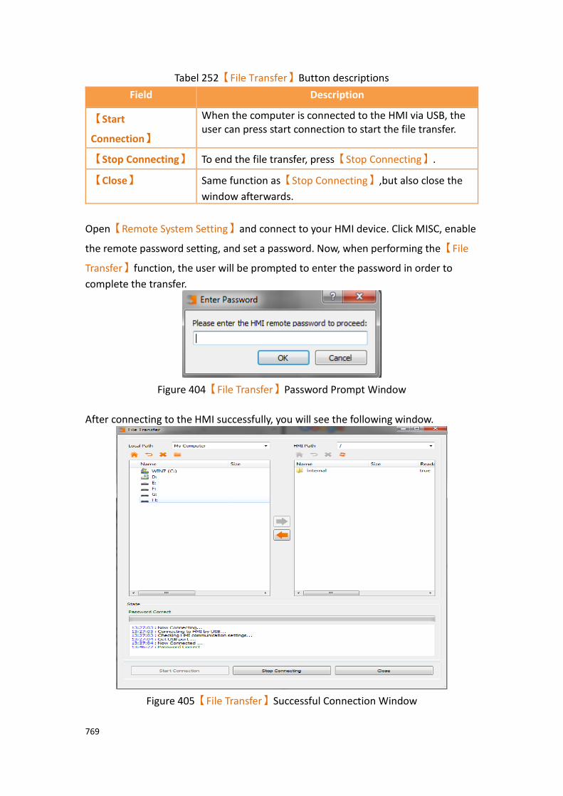
769
Tabel 252【File Transfer】Button descriptions
Field Description
【Start
Connection】
When the computer is connected to the HMI via USB, the user can press start connection to start the file transfer.
【Stop Connecting】 To end the file transfer, press【Stop Connecting】.
【Close】 Same function as【Stop Connecting】,but also close the
window afterwards.
Open【Remote System Setting】and connect to your HMI device. Click MISC, enable
the remote password setting, and set a password. Now, when performing the【File
Transfer】function, the user will be prompted to enter the password in order to
complete the transfer.
Figure 404【File Transfer】Password Prompt Window
After connecting to the HMI successfully, you will see the following window.
Figure 405【File Transfer】Successful Connection Window
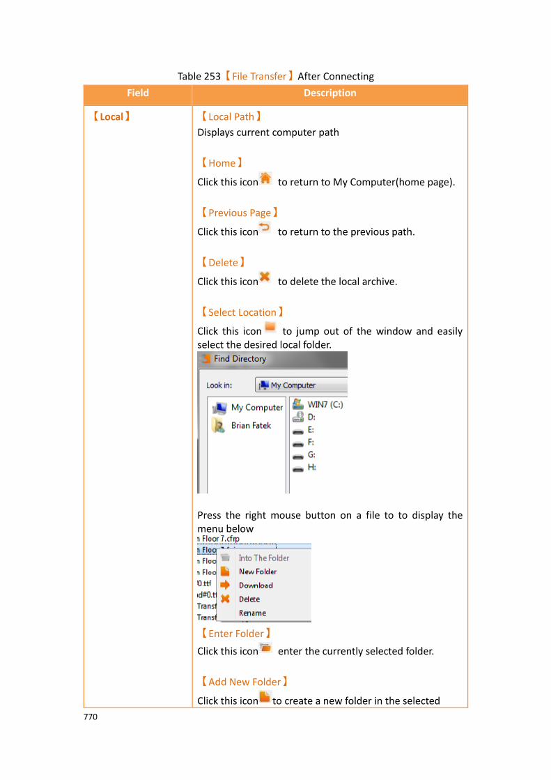
770
Table 253【File Transfer】After Connecting
Field Description
【Local】 【Local Path】
Displays current computer path
【Home】
Click this icon to return to My Computer(home page).
【Previous Page】
Click this icon to return to the previous path.
【Delete】
Click this icon to delete the local archive.
【Select Location】
Click this icon to jump out of the window and easily select the desired local folder.
Press the right mouse button on a file to to display the menu below
【Enter Folder】
Click this icon enter the currently selected folder.
【Add New Folder】
Click this icon to create a new folder in the selected
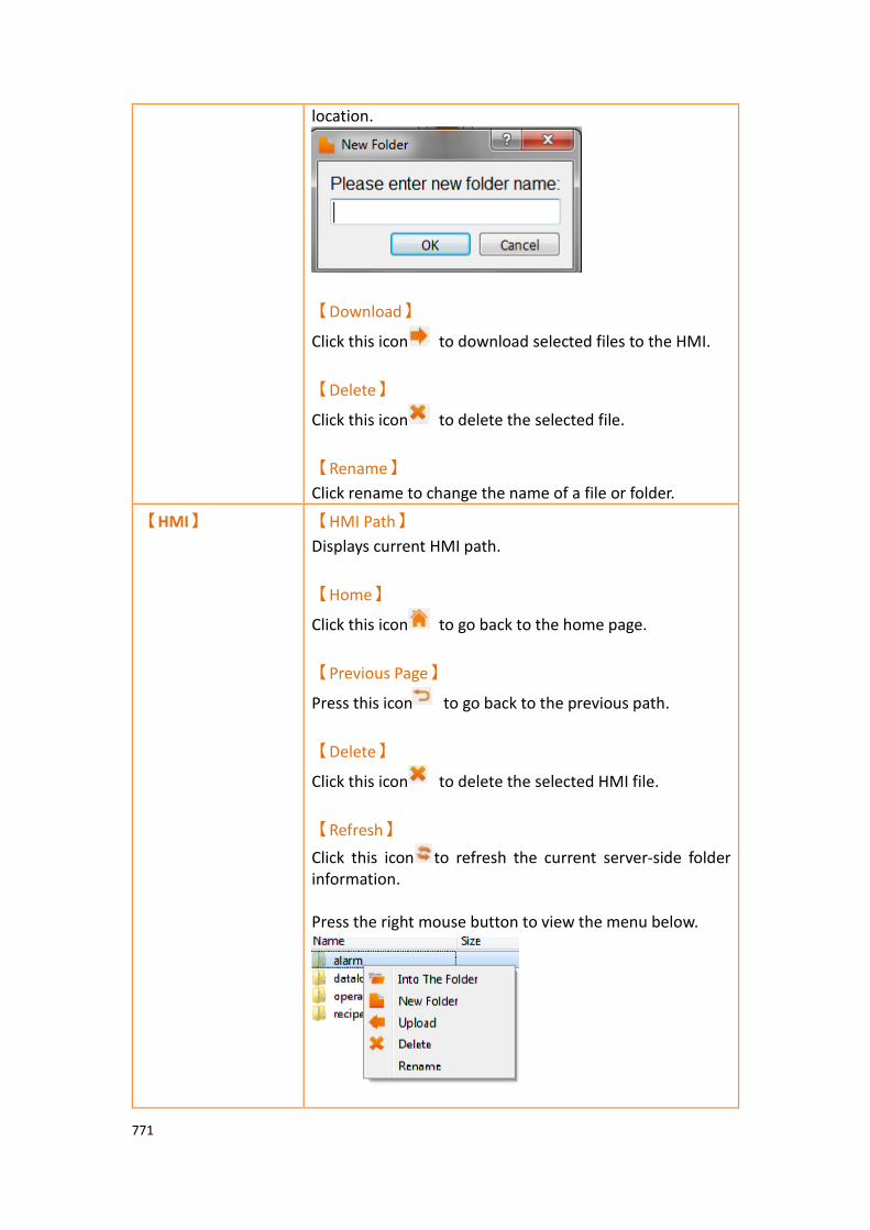
771
location.
【Download】
Click this icon to download selected files to the HMI.
【Delete】
Click this icon to delete the selected file.
【Rename】
Click rename to change the name of a file or folder.
【HMI】 【HMI Path】
Displays current HMI path.
【Home】
Click this icon to go back to the home page.
【Previous Page】
Press this icon to go back to the previous path.
【Delete】
Click this icon to delete the selected HMI file.
【Refresh】
Click this icon to refresh the current server-side folder information. Press the right mouse button to view the menu below.
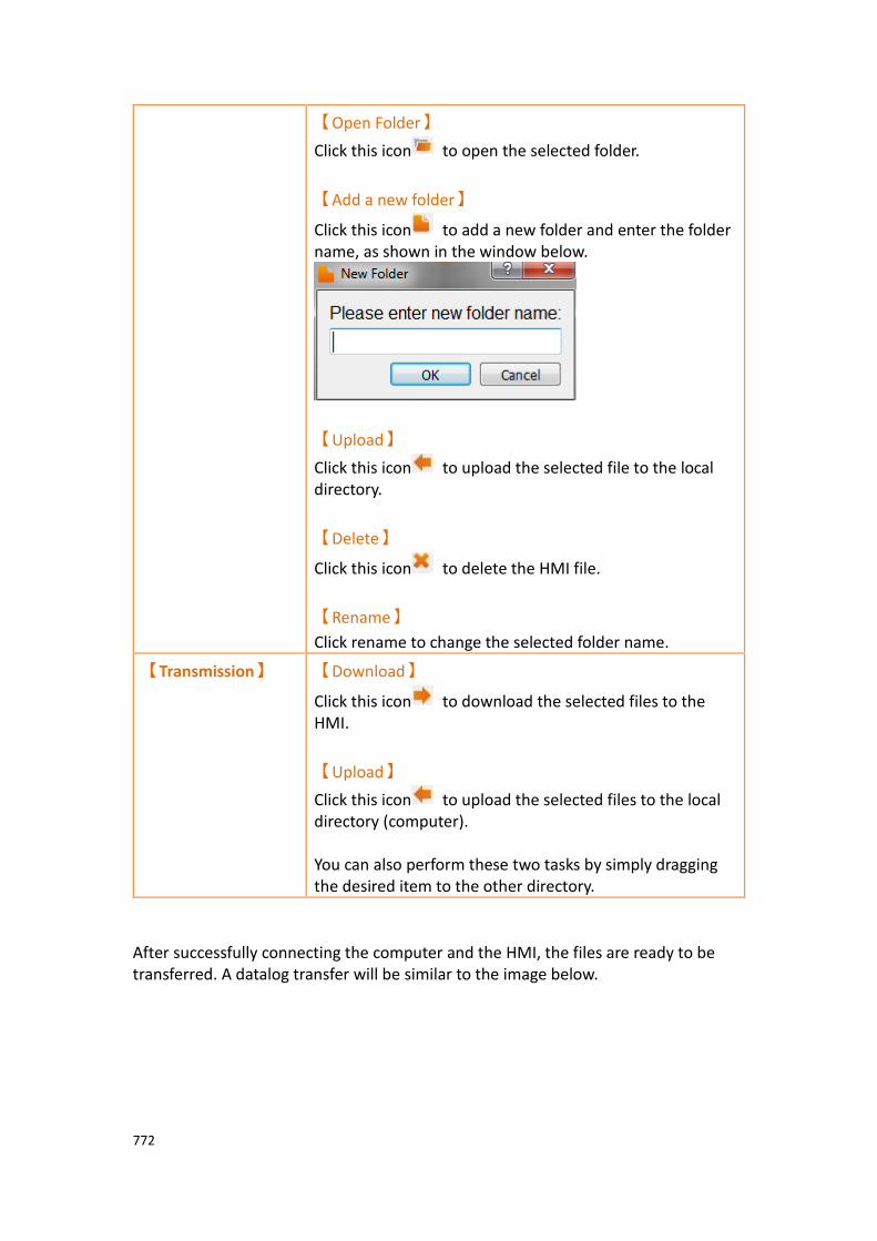
772
【Open Folder】
Click this icon to open the selected folder.
【Add a new folder】
Click this icon to add a new folder and enter the folder name, as shown in the window below.
【Upload】
Click this icon to upload the selected file to the local directory.
【Delete】
Click this icon to delete the HMI file.
【Rename】
Click rename to change the selected folder name.
【Transmission】 【Download】
Click this icon to download the selected files to the HMI.
【Upload】
Click this icon to upload the selected files to the local directory (computer). You can also perform these two tasks by simply dragging the desired item to the other directory.
After successfully connecting the computer and the HMI, the files are ready to be transferred. A datalog transfer will be similar to the image below.
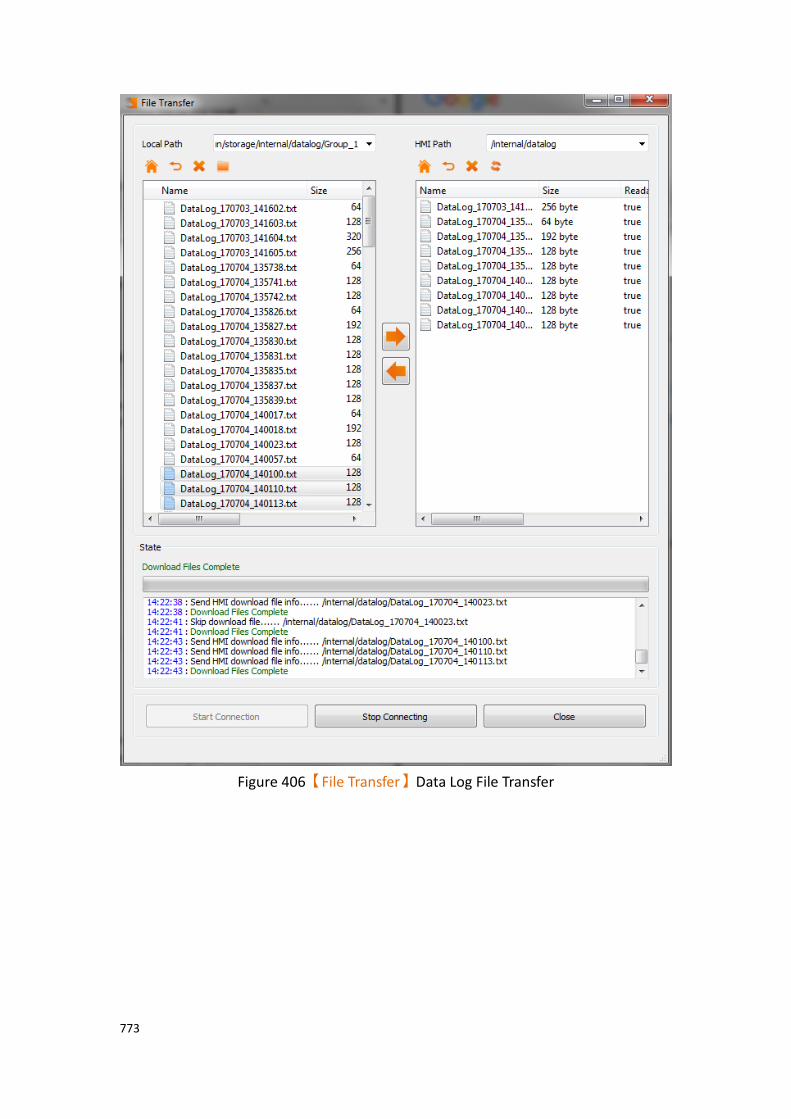
773
Figure 406【File Transfer】Data Log File Transfer
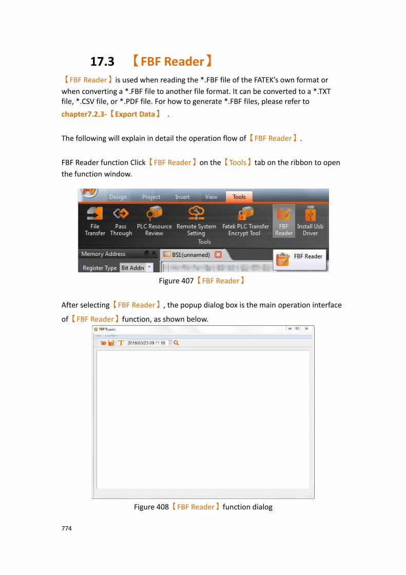
774
17.3 【FBF Reader】 【FBF Reader】is used when reading the *.FBF file of the FATEK’s own format or
when converting a *.FBF file to another file format. It can be converted to a *.TXT file, *.CSV file, or *.PDF file. For how to generate *.FBF files, please refer to
chapter7.2.3-【Export Data】 .
The following will explain in detail the operation flow of【FBF Reader】.
FBF Reader function Click【FBF Reader】on the【Tools】tab on the ribbon to open
the function window.
Figure 407【FBF Reader】
After selecting【FBF Reader】, the popup dialog box is the main operation interface
of【FBF Reader】function, as shown below.
Figure 408【FBF Reader】function dialog

775
Tabel 254【FBF Reader】menu descriptions
Properties Description
【File】 【Open】
Open FATEK’s own format *.FBF file.
【Save as】
After reading FATEK’s own format *.FBF file, save as *.TXT file, *.CSV file or *.PDF file, etc. Save as new file if choose to save as PDF, the following dialog will appear, you can set the font type, size and
format. Press the【Generate】button to convert the *.FBF
file to a PDF file.
【Quit】
Leave and close the FBF Reader.
【Function】 【Font Setting】
Adjust the font size to the display *.FBF file in FATEK’s own format.
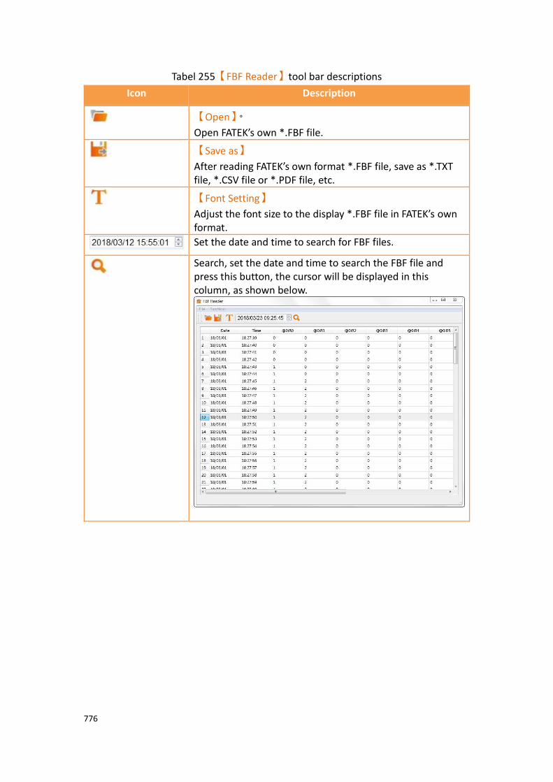
776
Tabel 255【FBF Reader】tool bar descriptions
Icon Description
【Open】。
Open FATEK’s own *.FBF file.
【Save as】
After reading FATEK’s own format *.FBF file, save as *.TXT file, *.CSV file or *.PDF file, etc.
【Font Setting】
Adjust the font size to the display *.FBF file in FATEK’s own format.
Set the date and time to search for FBF files.
Search, set the date and time to search the FBF file and press this button, the cursor will be displayed in this column, as shown below.
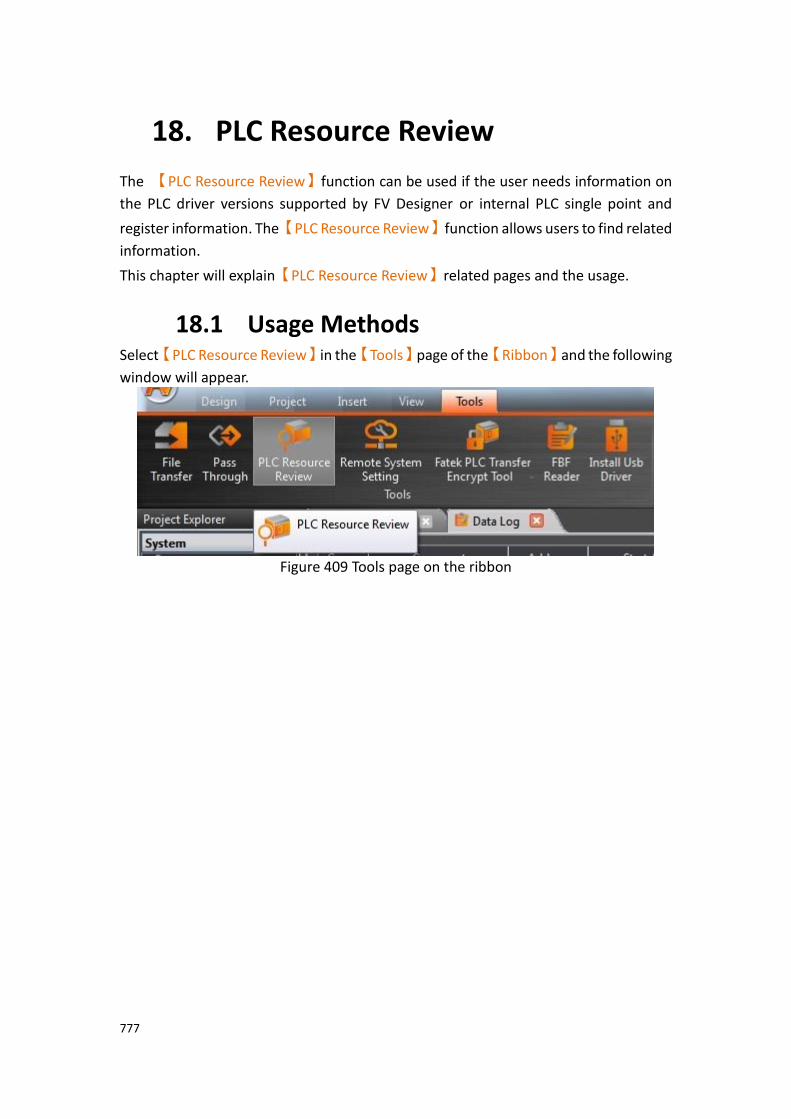
777
18. PLC Resource Review
The 【PLC Resource Review】function can be used if the user needs information on
the PLC driver versions supported by FV Designer or internal PLC single point and
register information. The【PLC Resource Review】function allows users to find related
information.
This chapter will explain【PLC Resource Review】related pages and the usage.
18.1 Usage Methods Select【PLC Resource Review】in the【Tools】page of the【Ribbon】and the following
window will appear.
Figure 409 Tools page on the ribbon
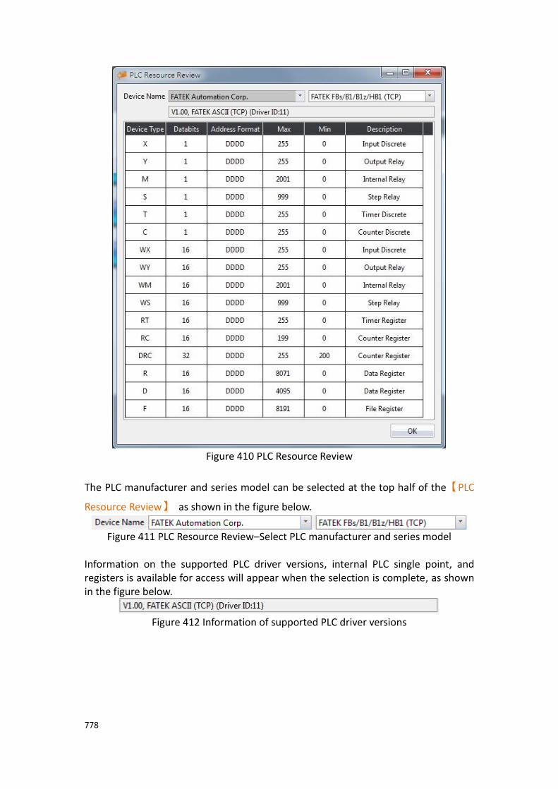
778
Figure 410 PLC Resource Review
The PLC manufacturer and series model can be selected at the top half of the【PLC
Resource Review】 as shown in the figure below.
Figure 411 PLC Resource Review–Select PLC manufacturer and series model
Information on the supported PLC driver versions, internal PLC single point, and registers is available for access will appear when the selection is complete, as shown in the figure below.
Figure 412 Information of supported PLC driver versions

779
Figure 413 Information on internal PLC single point and registers available for access
Introduction to the internal PLC single point and registers available for access is as shown in the table below.
Table 256 Introduction to internal single point and register information
Name Description
【Device Type】 Represent the code of the single point or register in the PLC.
【Data Bits】 Represent the number of bits occupied by the data of this
【Device Type】.
【Address
Format】
Represent the address format that must be used to access
this【Device Type】.
【Max】 Represent the maximum value of the address range
available for access for this【Device Type】.
【Min】 Represent the minimum value of the address range
available for access for this【Device Type】.
【Description】 Describe the function and usage of the【Device Type】.
780
19. Address Registers
The FV Designer has four types of internal address registers for use during designing, including Volatile Memory Registers $U:V, Non-volatile Memory Registers $U:NV, Non-real-time NV Memory $U:XNV and Non-real-time NV Memory $U:XNVA. Internal and external PLC address registers all support access using characters or bits, and also support index register function, making it flexible and convenient when planning register location configurations. In addition, special system tags are planned in some sections of the volatile registers and more may be added as functions are added. The function plans of each register are as shown in the chapters below:
19.1 Internal Address Register Range 【$U:V】 Volatile Memory Registers
The V memory will not be saved when the system power is cut; all the data on the V memory will be reset to 0 once power is reconnected.
【$U:NV】 Non-volatile Memory Registers
All of the data on the NV memory will be saved in time and will not be cleared when the system power is cut. The total size of the NV memory varies between series. For the P5 series, the total size is 120KB, in which the size that can be used as the internal register $U:NV can be configured according to the requirement plan of the user; the default is set to 2K. The rest of the memory capacity is used as the section for the data backup function.
【$U:XNV】 Non-real-time NV Memory Registers
The total capacity of XNV varies between series. For the P5 series, the capacity is 12MB; in which the size used as the internal registers $U:XNV is 1MB; the remaining 11MB memory capacity is used as the section for the data backup function. The data in the XNV memory are automatically backed up into a file every minute in order to prolong the lifespan of the flash memory; the data saved in the file will be read into the XNV memory every time the system boots up. Users can set the special system tag
【SS_FORCE_BACKUP_XNV】to back up the XNV memory into the file in
real-time in addition to the scheduled backup mechanism.
【$U:XNVA】 Non-real-time NV Memory Registers
The XNVA memory data is automatically backed up in the file every minute. When the system is turned on, the last stored data is read from the file in the XNVA memory. In addition to the regular backup mechanism, the user can also back up the XNVA memory in the file by setting a special system register

781
【SS_FORCE_BACKUP_XNV】. It can be used as the size of the internal
register $U:XNVA, which can be planned and configured according to user requirements. The default is 2K. The remaining capacity is used as backup data area.
Table 257 Internal Registers Address Range
Register Maximum Capacity
Address Range (Characters)
Format
Volatile Memory Registers
【$U:V】
512KB 0 ~ 262143 Character $U:Vaaaaaa Bit $U:Vaaaaaa.bb
Non-volatile Memory Registers
【$U:NV】
120KB (default 2KB)
0 ~ 61439 (default 0~2048)
Character $U:NVaaaaa Bit $U:NVaaaaa.bb
Non-real-time NV Memory Registers
【$U:XNV】
1MB 0 ~ 524287 Character $U:XNVaaaaaa Bit $U:XNVaaaaaa.bb
Non-real-time NV Memory Registers
【$U:XNVA】
120KB (default 2KB)
0 ~ 61439 (default 0~2048)
Character $U:XNVAaaaaa Bit $U:XNVAaaaaa.bb

782
19.2 Index Register Index Register is used to change address register in run-time. When operating on HMI, the address register configuration of object does not be changed, user could access register value of object according to different address conveniently. And it makes it easy and flexible to transfer data between different regions.
19.2.1 Usage The following example explains how to use Index Register.
Figure 414 Input Address Dialog-Device Register
Click the check box Index Register and select number 0. The device will use Index Register 0 for that address as the input address.
Figure 415 Input Address Dialog-Use Index Register 0

783
If user would like to setup Index Register to change its value. Index Register can be chosen in System Tags.
Figure 416 Input Address Dialog-System Tags-Index Register
Figure 417 Index Register Example
$U:V2000
Value of internal volatile-memory register V2000, example value: 1122. $U:V2001
Value of internal volatile-memory register V2001, example value: 3344. $U:V2002
Value of internal volatile-memory register V2002, example value: 5566. $U:V2000[$I0]
Value of internal volatile-memory register V(2000+value of index register 0)
$S:I0 Value of index register 0
By modifying the value of index register 0, the value of $U:V2000[$I0] also changes. Value of index register-0 is 0 $U:V2000[$I0] = $U:V2000
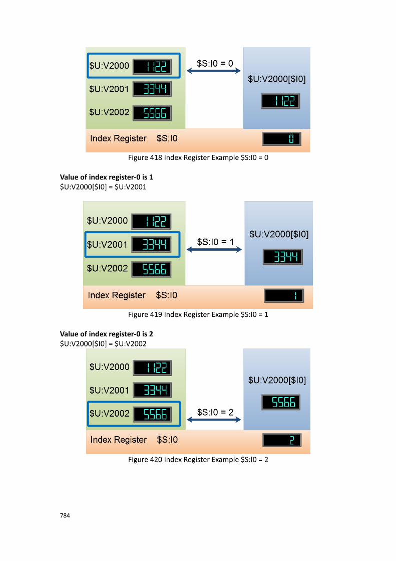
784
Figure 418 Index Register Example $S:I0 = 0
Value of index register-0 is 1 $U:V2000[$I0] = $U:V2001
Figure 419 Index Register Example $S:I0 = 1
Value of index register-0 is 2 $U:V2000[$I0] = $U:V2002
Figure 420 Index Register Example $S:I0 = 2
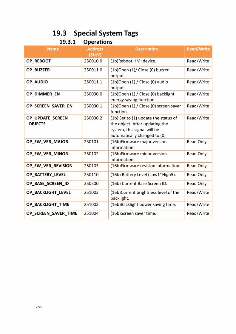
785
19.3 Special System Tags 19.3.1 Operations
Name Address ($U:V)
Description Read/Write
OP_REBOOT 250010.0 (1b)Reboot HMI device. Read/Write
OP_BUZZER 250011.0 (1b)Open (1)/ Close (0) buzzer output.
Read/Write
OP_AUDIO 250011.1 (1b)Open (1) / Close (0) audio output.
Read/Write
OP_DIMMER_EN 250030.0 (1b)Open (1) / Close (0) backlight energy-saving function.
Read/Write
OP_SCREEN_SAVER_EN 250030.1 (1b)Open (1) / Close (0) screen saver function.
Read/Write
OP_UPDATE_SCREEN _OBJECTS
250030.2 (1b) Set to (1) update the status of the object. After updating the system, this signal will be automatically changed to (0)
Read/Write
OP_FW_VER_MAJOR 250101 (16b)Firmware major version information.
Read Only
OP_FW_VER_MINOR 250102 (16b)Firmware minor version information.
Read Only
OP_FW_VER_REVISION 250103 (16b)Firmware revision information. Read Only
OP_BATTERY_LEVEL 250110 (16b) Battery Level (Low1~High5). Read Only
OP_BASE_SCREEN_ID 250500 (16b) Current Base Screen ID. Read Only
OP_BACKLIGHT_LEVEL 251002 (16b)Current brightness level of the backlight.
Read/Write
OP_BACKLIGHT_TIME 251003 (16b)Backlight power saving time. Read/Write
OP_SCREEN_SAVER_TIME 251004 (16b)Screen saver time. Read/Write
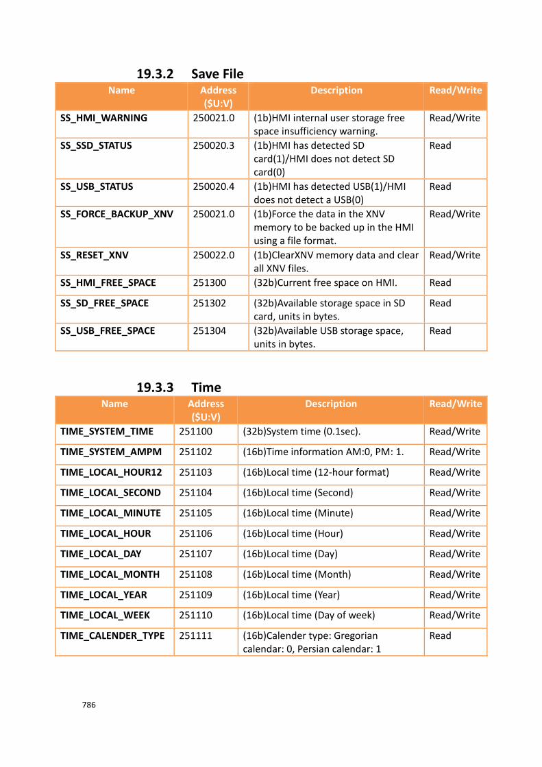
786
19.3.2 Save File Name Address
($U:V) Description Read/Write
SS_HMI_WARNING 250021.0 (1b)HMI internal user storage free space insufficiency warning.
Read/Write
SS_SSD_STATUS 250020.3 (1b)HMI has detected SD card(1)/HMI does not detect SD card(0)
Read
SS_USB_STATUS 250020.4 (1b)HMI has detected USB(1)/HMI does not detect a USB(0)
Read
SS_FORCE_BACKUP_XNV 250021.0 (1b)Force the data in the XNV memory to be backed up in the HMI using a file format.
Read/Write
SS_RESET_XNV 250022.0 (1b)ClearXNV memory data and clear all XNV files.
Read/Write
SS_HMI_FREE_SPACE 251300 (32b)Current free space on HMI. Read
SS_SD_FREE_SPACE 251302 (32b)Available storage space in SD card, units in bytes.
Read
SS_USB_FREE_SPACE 251304 (32b)Available USB storage space, units in bytes.
Read
19.3.3 Time Name Address
($U:V) Description Read/Write
TIME_SYSTEM_TIME 251100 (32b)System time (0.1sec). Read/Write
TIME_SYSTEM_AMPM 251102 (16b)Time information AM:0, PM: 1. Read/Write
TIME_LOCAL_HOUR12 251103 (16b)Local time (12-hour format) Read/Write
TIME_LOCAL_SECOND 251104 (16b)Local time (Second) Read/Write
TIME_LOCAL_MINUTE 251105 (16b)Local time (Minute) Read/Write
TIME_LOCAL_HOUR 251106 (16b)Local time (Hour) Read/Write
TIME_LOCAL_DAY 251107 (16b)Local time (Day) Read/Write
TIME_LOCAL_MONTH 251108 (16b)Local time (Month) Read/Write
TIME_LOCAL_YEAR 251109 (16b)Local time (Year) Read/Write
TIME_LOCAL_WEEK 251110 (16b)Local time (Day of week) Read/Write
TIME_CALENDER_TYPE 251111 (16b)Calender type: Gregorian calendar: 0, Persian calendar: 1
Read
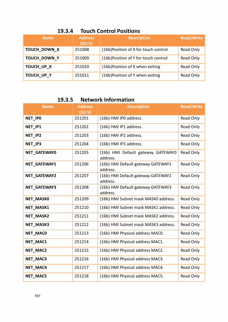
787
19.3.4 Touch Control Positions Name Address
($U:V) Description Read/Write
TOUCH_DOWN_X 251008 (16b)Position of X for touch control Read Only
TOUCH_DOWN_Y 251009 (16b)Position of Y for touch control Read Only
TOUCH_UP_X 251010 (16b)Position of X when exiting Read Only
TOUCH_UP_Y 251011 (16b)Position of Y when exiting Read Only
19.3.5 Network Information Name Address
($U:V) Description Read/Write
NET_IP0 251201 (16b) HMI IP0 address. Read Only
NET_IP1 251202 (16b) HMI IP1 address. Read Only
NET_IP2 251203 (16b) HMI IP2 address. Read Only
NET_IP3 251204 (16b) HMI IP3 address. Read Only
NET_GATEWAY0 251205 (16b) HMI Default gateway GATEWAY0 address.
Read Only
NET_GATEWAY1 251206 (16b) HMI Default gateway GATEWAY1 address.
Read Only
NET_GATEWAY2 251207 (16b) HMI Default gateway GATEWAY2 address.
Read Only
NET_GATEWAY3 251208 (16b) HMI Default gateway GATEWAY3 address.
Read Only
NET_MASK0 251209 (16b) HMI Subnet mask MASK0 address. Read Only
NET_MASK1 251210 (16b) HMI Subnet mask MASK1 address. Read Only
NET_MASK2 251211 (16b) HMI Subnet mask MASK2 address. Read Only
NET_MASK3 251212 (16b) HMI Subnet mask MASK3 address. Read Only
NET_MAC0 251213 (16b) HMI Physical address MAC0. Read Only
NET_MAC1 251214 (16b) HMI Physical address MAC1. Read Only
NET_MAC2 251215 (16b) HMI Physical address MAC2. Read Only
NET_MAC3 251216 (16b) HMI Physical address MAC3. Read Only
NET_MAC4 251217 (16b) HMI Physical address MAC4. Read Only
NET_MAC5 251218 (16b) HMI Physical address MAC5. Read Only

788
19.3.6 Index Registers (16Bit) Name Address
($U:V) Description Read/Write
I0 251400 (16b) Address index register 0 Read/Write
I1 251401 (16b) Address index register 1 Read/Write
I2 251402 (16b) Address index register 2 Read/Write
I3 251403 (16b) Address index register 3 Read/Write
I4 251404 (16b) Address index register 4 Read/Write
I5 251405 (16b) Address index register 5 Read/Write
I6 251406 (16b) Address index register 6 Read/Write
I7 251407 (16b) Address index register 7 Read/Write
I8 251408 (16b) Address index register 8 Read/Write
I9 251409 (16b) Address index register 9 Read/Write
I10 251410 (16b) Address index register 10 Read/Write
I11 251411 (16b) Address index register 11 Read/Write
I12 251412 (16b) Address index register 12 Read/Write
I13 251413 (16b) Address index register 13 Read/Write
I14 251414 (16b) Address index register 14 Read/Write
I15 251415 (16b) Address index register 15 Read/Write
I16 251416 (16b) Address index register 16 Read/Write
I17 251417 (16b) Address index register 17 Read/Write
I18 251418 (16b) Address index register 18 Read/Write
I19 251419 (16b) Address index register 19 Read/Write
I20 251420 (16b) Address index register 20 Read/Write
I21 251421 (16b) Address index register 21 Read/Write
I22 251422 (16b) Address index register 22 Read/Write
I23 251423 (16b) Address index register 23 Read/Write
I24 251424 (16b) Address index register 24 Read/Write
I25 251425 (16b) Address index register 25 Read/Write
I26 251426 (16b) Address index register 26 Read/Write
I27 251427 (16b) Address index register 27 Read/Write

789
I28 251428 (16b) Address index register 28 Read/Write
I29 251429 (16b) Address index register 29 Read/Write
I30 251430 (16b) Address index register 30 Read/Write
I31 251431 (16b) Address index register 31 Read/Write
I32 251432 (16b) Address index register 32 Read/Write
I33 251433 (16b) Address index register 33 Read/Write
I34 251434 (16b) Address index register 34 Read/Write
I35 251435 (16b) Address index register 35 Read/Write
I36 251436 (16b) Address index register 36 Read/Write
I37 251437 (16b) Address index register 37 Read/Write
I38 251438 (16b) Address index register 38 Read/Write
I39 251439 (16b) Address index register 39 Read/Write
I40 251440 (16b) Address index register 40 Read/Write
I41 251441 (16b) Address index register 41 Read/Write
I42 251442 (16b) Address index register 42 Read/Write
I43 251443 (16b) Address index register 43 Read/Write
I44 251444 (16b) Address index register 44 Read/Write
I45 251445 (16b) Address index register 45 Read/Write
I46 251446 (16b) Address index register 46 Read/Write
I47 251447 (16b) Address index register 47 Read/Write
I48 251448 (16b) Address index register 48 Read/Write
I49 251449 (16b) Address index register 49 Read/Write
I50 251450 (16b) Address index register 50 Read/Write
I51 251451 (16b) Address index register 51 Read/Write
I52 251452 (16b) Address index register 52 Read/Write
I53 251453 (16b) Address index register 53 Read/Write
I54 251454 (16b) Address index register 54 Read/Write
I55 251455 (16b) Address index register 55 Read/Write
I56 251456 (16b) Address index register 56 Read/Write
I57 251457 (16b) Address index register 57 Read/Write
I58 251458 (16b) Address index register 58 Read/Write
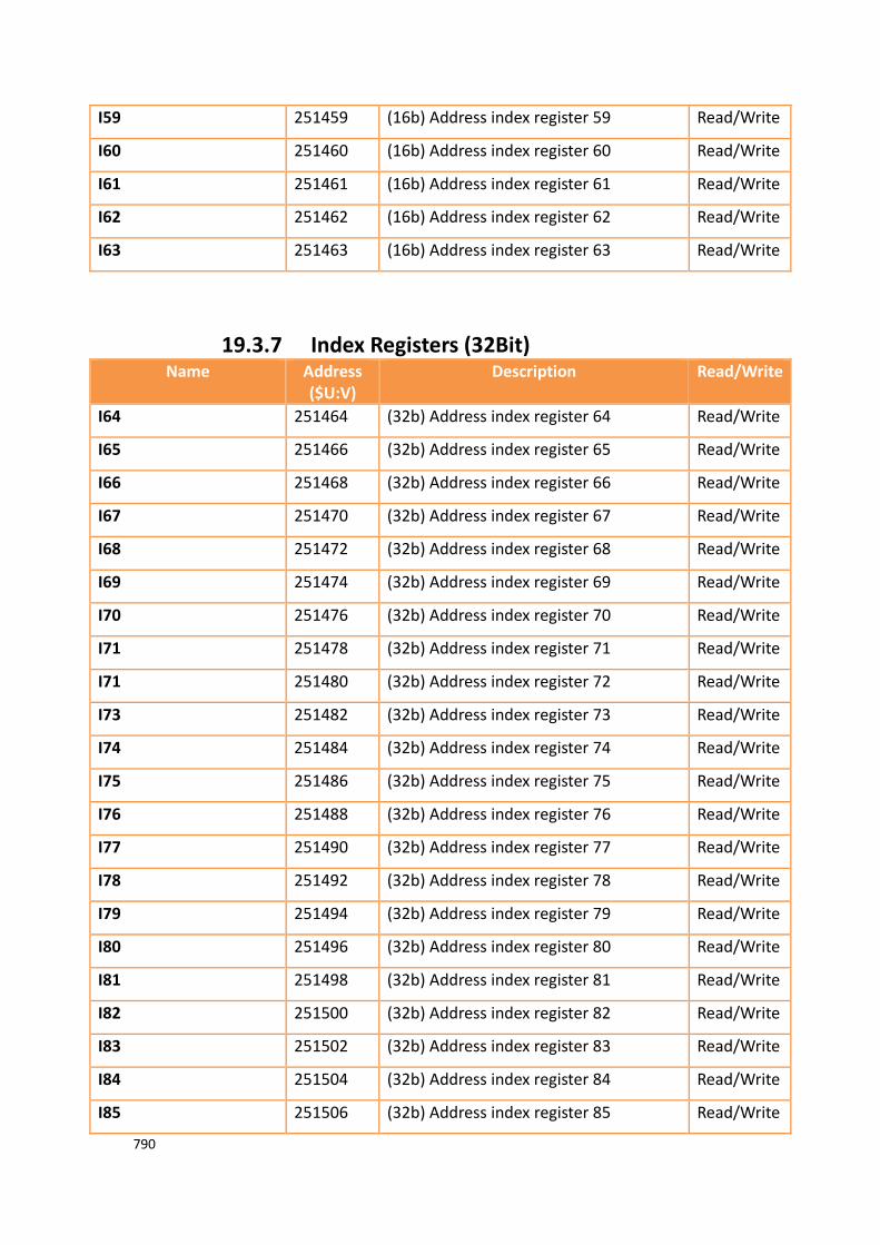
790
I59 251459 (16b) Address index register 59 Read/Write
I60 251460 (16b) Address index register 60 Read/Write
I61 251461 (16b) Address index register 61 Read/Write
I62 251462 (16b) Address index register 62 Read/Write
I63 251463 (16b) Address index register 63 Read/Write
19.3.7 Index Registers (32Bit) Name Address
($U:V) Description Read/Write
I64 251464 (32b) Address index register 64 Read/Write
I65 251466 (32b) Address index register 65 Read/Write
I66 251468 (32b) Address index register 66 Read/Write
I67 251470 (32b) Address index register 67 Read/Write
I68 251472 (32b) Address index register 68 Read/Write
I69 251474 (32b) Address index register 69 Read/Write
I70 251476 (32b) Address index register 70 Read/Write
I71 251478 (32b) Address index register 71 Read/Write
I71 251480 (32b) Address index register 72 Read/Write
I73 251482 (32b) Address index register 73 Read/Write
I74 251484 (32b) Address index register 74 Read/Write
I75 251486 (32b) Address index register 75 Read/Write
I76 251488 (32b) Address index register 76 Read/Write
I77 251490 (32b) Address index register 77 Read/Write
I78 251492 (32b) Address index register 78 Read/Write
I79 251494 (32b) Address index register 79 Read/Write
I80 251496 (32b) Address index register 80 Read/Write
I81 251498 (32b) Address index register 81 Read/Write
I82 251500 (32b) Address index register 82 Read/Write
I83 251502 (32b) Address index register 83 Read/Write
I84 251504 (32b) Address index register 84 Read/Write
I85 251506 (32b) Address index register 85 Read/Write

791
I86 251508 (32b) Address index register 86 Read/Write
I87 251510 (32b) Address index register 87 Read/Write
I88 251512 (32b) Address index register 88 Read/Write
I89 251514 (32b) Address index register 89 Read/Write
I90 251516 (32b) Address index register 90 Read/Write
I91 251518 (32b) Address index register 91 Read/Write
I92 251520 (32b) Address index register 92 Read/Write
I93 251522 (32b) Address index register 93 Read/Write
I94 251524 (32b) Address index register 94 Read/Write
I95 251526 (32b) Address index register 95 Read/Write
I96 251528 (32b) Address index register 96 Read/Write
I97 251530 (32b) Address index register 97 Read/Write
I98 251532 (32b) Address index register 98 Read/Write
I99 251534 (32b) Address index register 99 Read/Write
I100 251536 (32b) Address index register 100 Read/Write
I101 251538 (32b) Address index register 101 Read/Write
I102 251540 (32b) Address index register 102 Read/Write
I103 251542 (32b) Address index register 103 Read/Write
I104 251544 (32b) Address index register 104 Read/Write
I105 251546 (32b) Address index register 105 Read/Write
I106 251548 (32b) Address index register 106 Read/Write
I107 251550 (32b) Address index register 107 Read/Write
I108 251552 (32b) Address index register 108 Read/Write
I109 251554 (32b) Address index register 109 Read/Write
I110 251556 (32b) Address index register 110 Read/Write
I111 251558 (32b) Address index register 111 Read/Write
I112 251560 (32b) Address index register 112 Read/Write
I113 251562 (32b) Address index register 113 Read/Write
I114 251564 (32b) Address index register 114 Read/Write
I115 251566 (32b) Address index register 115 Read/Write
I116 251568 (32b) Address index register 116 Read/Write

792
I117 251570 (32b) Address index register 117 Read/Write
I118 251572 (32b) Address index register 118 Read/Write
I119 251574 (32b) Address index register 119 Read/Write
I120 251576 (32b) Address index register 120 Read/Write
I121 251578 (32b) Address index register 121 Read/Write
I122 251580 (32b) Address index register 122 Read/Write
I123 251582 (32b) Address index register 123 Read/Write
I124 251584 (32b) Address index register 124 Read/Write
I125 251586 (32b) Address index register 125 Read/Write
I126 251588 (32b) Address index register 126 Read/Write
I127 251590 (32b) Address index register 127 Read/Write
19.3.8 Communication Parameter Settings Name Address($U:V) Narrative Read/Write
LINK_COM1_BAUDRATE 251250 COM1’s transfer rates,
Transmission rate
Register Value
1200 0
2400 1
4800 2
9600 3
19200 4
38400 5
57600 6
115200 7
187500 8
921600 9
Read/Write
LINK_COM1_PARITY 251251 COM1’s check bits,
Check Register Value
None 0
Odd 1
Even 2
Read/Write
LINK_COM1_DATABITS 251252 COM1’s data bits,
Data Bits Register Value
5 5
6 6
7 7
8 8
Read/Write

793
LINK_COM1_STOPBITS 251253 COM1’s stop bits,
Stop Bits Register Value
1 0
1.5 1
2 2
Read/Write
LINK_COM1_TIMEOUT 251254 COM1’s time in milliseconds(ms). Read/Write
LINK_COM1_COMMAND _DELAY
251255 COM1’s command delay time in milliseconds(ms).
Read/Write
LINK_COM1_RETRY _COUNT
251256 COM1’s retry count. Read/Write
LINK_COM2_BAUDRATE 251257 COM2’s transfer rates,
Transmission rate
Register Value
1200 0
2400 1
4800 2
9600 3
19200 4
38400 5
57600 6
115200 7
187500 8
921600 9
Read/Write
LINK_COM2_PARITY 251258 COM2’s check bits,
Check Bits Register Value
None 0
Odd 1
Even 2
Read/Write
LINK_COM2_DATABITS 251259 COM2’s databits,
Data Bits Register Value
5 5
6 6
7 7
8 8
Read/Write
LINK_COM2_STOPBITS 251260 COM2’s stop bits,
Stop Bits Register Value
1 0
1.5 1
2 2
Read/Write
LINK_COM2_TIMEOUT 251261 COM2’s time in milliseconds(ms). Read/Write
LINK_COM2_COMMAND _DELAY
251262 COM2’s command delay time in milliseconds(ms).
Read/Write
LINK_COM2_RETRY _COUNT
251263 COM2’s retry count. Read/Write
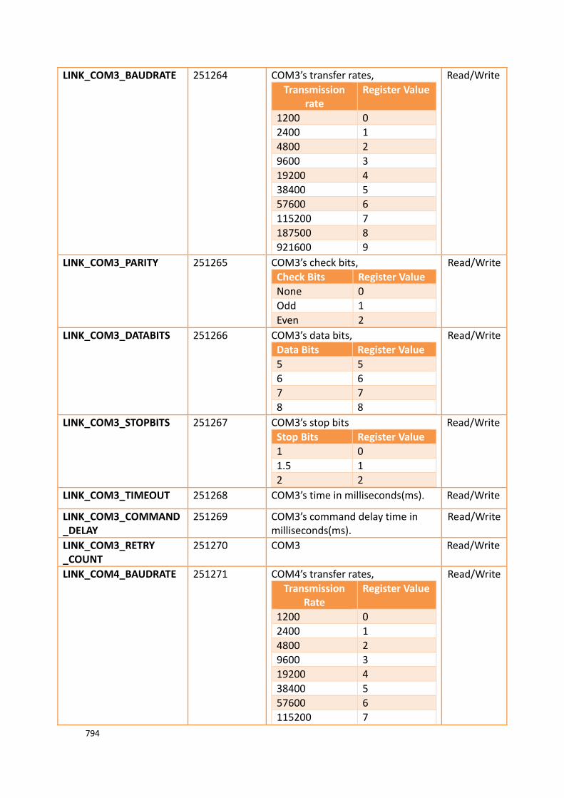
794
LINK_COM3_BAUDRATE 251264 COM3’s transfer rates,
Transmission rate
Register Value
1200 0
2400 1
4800 2
9600 3
19200 4
38400 5
57600 6
115200 7
187500 8
921600 9
Read/Write
LINK_COM3_PARITY 251265 COM3’s check bits,
Check Bits Register Value
None 0
Odd 1
Even 2
Read/Write
LINK_COM3_DATABITS 251266 COM3’s data bits,
Data Bits Register Value
5 5
6 6
7 7
8 8
Read/Write
LINK_COM3_STOPBITS 251267 COM3’s stop bits
Stop Bits Register Value
1 0
1.5 1
2 2
Read/Write
LINK_COM3_TIMEOUT 251268 COM3’s time in milliseconds(ms). Read/Write
LINK_COM3_COMMAND _DELAY
251269 COM3’s command delay time in milliseconds(ms).
Read/Write
LINK_COM3_RETRY _COUNT
251270 COM3 Read/Write
LINK_COM4_BAUDRATE 251271 COM4’s transfer rates,
Transmission Rate
Register Value
1200 0
2400 1
4800 2
9600 3
19200 4
38400 5
57600 6
115200 7
Read/Write
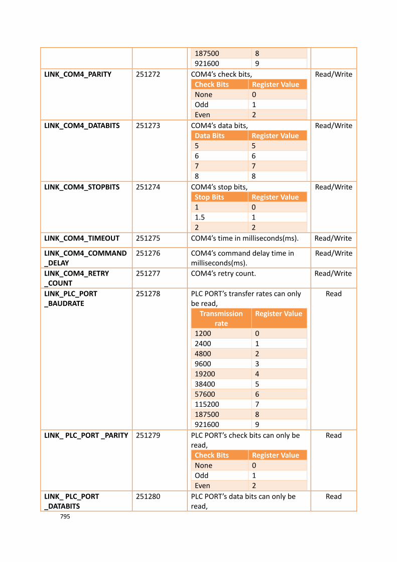
795
187500 8
921600 9
LINK_COM4_PARITY 251272 COM4’s check bits,
Check Bits Register Value
None 0
Odd 1
Even 2
Read/Write
LINK_COM4_DATABITS 251273 COM4’s data bits,
Data Bits Register Value
5 5
6 6
7 7
8 8
Read/Write
LINK_COM4_STOPBITS 251274 COM4’s stop bits,
Stop Bits Register Value
1 0
1.5 1
2 2
Read/Write
LINK_COM4_TIMEOUT 251275 COM4’s time in milliseconds(ms). Read/Write
LINK_COM4_COMMAND _DELAY
251276 COM4’s command delay time in milliseconds(ms).
Read/Write
LINK_COM4_RETRY _COUNT
251277 COM4’s retry count. Read/Write
LINK_PLC_PORT _BAUDRATE
251278 PLC PORT’s transfer rates can only be read,
Transmission rate
Register Value
1200 0
2400 1
4800 2
9600 3
19200 4
38400 5
57600 6
115200 7
187500 8
921600 9
Read
LINK_ PLC_PORT _PARITY 251279 PLC PORT’s check bits can only be read,
Check Bits Register Value
None 0
Odd 1
Even 2
Read
LINK_ PLC_PORT _DATABITS
251280 PLC PORT’s data bits can only be read,
Read

796
Data Bits Register Value
5 5
6 6
7 7
8 8
LINK_ PLC_PORT _STOPBITS
251281 PLC PORT’s stop bits can only be read,
Stop Bits Register Value
1 0
1.5 1
2 2
Read
LINK_ PLC_PORT _TIMEOUT
251282 PLC PORT’s time in milliseconds(ms) can only be read.
Read
LINK_ PLC_PORT _COMMAND_DELAY
251283 PLC PORT’s command delay time in milliseconds(ms) can only be read.
Read
LINK_ PLC_PORT _RETRY _COUNT
251284 PLC PORT’s retry count can only be read.
Read
19.3.9 VNC Information Name Address($U:V) Description Read/
Write
OP_VNC_CONNECT _STATUS0
250600.0 (1b) Bit ON when VNC client No.1 is connected to the VNC server, Bit OFF when it’s not connected.
Read
OP_VNC_CONNECT _STATUS1
250600.1 (1b) Bit ON when VNC client No.2 is connected to the VNC server, Bit OFF when it’s not connected.
Read
OP_VNC_CONNECT _STATUS2
250600.2 (1b) Bit ON when VNC client No.3 is connected to the VNC server, Bit OFF when it’s not connected.
Read
OP_VNC_CONNECT _STATUS3
250600.3 (1b) Bit ON when VNC client No.4 is connected to the VNC server, Bit OFF when it’s not connected.
Read
OP_VNC_CONNECT _STATUS4
250600.4 (1b) Bit ON when VNC client No.5 is connected to the VNC server, Bit OFF when it’s not connected.
Read
OP_VNC_CONNECT _STATUS5
250600.5 (1b) Bit ON when VNC client No.6 is connected to the VNC server, Bit OFF when it’s not connected.
Read
OP_VNC_CONNECT _STATUS6
250600.6 (1b) Bit ON when VNC client No.7 is connected to the VNC server, Bit OFF when it’s not connected.
Read
OP_VNC_CONNECT _STATUS7
250600.7 (1b) Bit ON when VNC client No.8 is connected to the VNC server, Bit OFF
Read

797
when it’s not connected.
OP_VNC_CONNECT _STATUS8
250600.8 (1b) Bit ON when VNC client No.9 is connected to the VNC server, Bit OFF when it’s not connected.
Read
OP_VNC_CONNECT _STATUS9
250600.9 (1b) Bit ON when VNC client No.10 is connected to the VNC server, Bit OFF when it’s not connected.
Read
OP_VNC_CONNECT _STATUS10
250600.10 (1b) Bit ON when VNC client No.11 is connected to the VNC server, Bit OFF when it’s not connected.
Read
OP_VNC_CONNECT _STATUS11
250600.11 (1b) Bit ON when VNC client No.12 is connected to the VNC server, Bit OFF when it’s not connected.
Read
OP_VNC_CONNECT _STATUS12
250600.12 (1b) Bit ON when VNC client No.13 is connected to the VNC server, Bit OFF when it’s not connected.
Read
OP_VNC_CONNECT _STATUS13
250600.13 (1b) Bit ON when VNC client No.14 is connected to the VNC server, Bit OFF when it’s not connected.
Read
OP_VNC_CONNECT _STATUS14
250600.14 (1b) Bit ON when VNC client No.15 is connected to the VNC server, Bit OFF when it’s not connected.
Read
OP_VNC_CONNECT _STATUS15
250600.15 (1b) Bit ON when VNC client No.16 is connected to the VNC server, Bit OFF when it’s not connected.
Read
OP_VNC_CONNECT _STATUS
250600 (16b) Status of VNC client connected to VNC sever.
Read
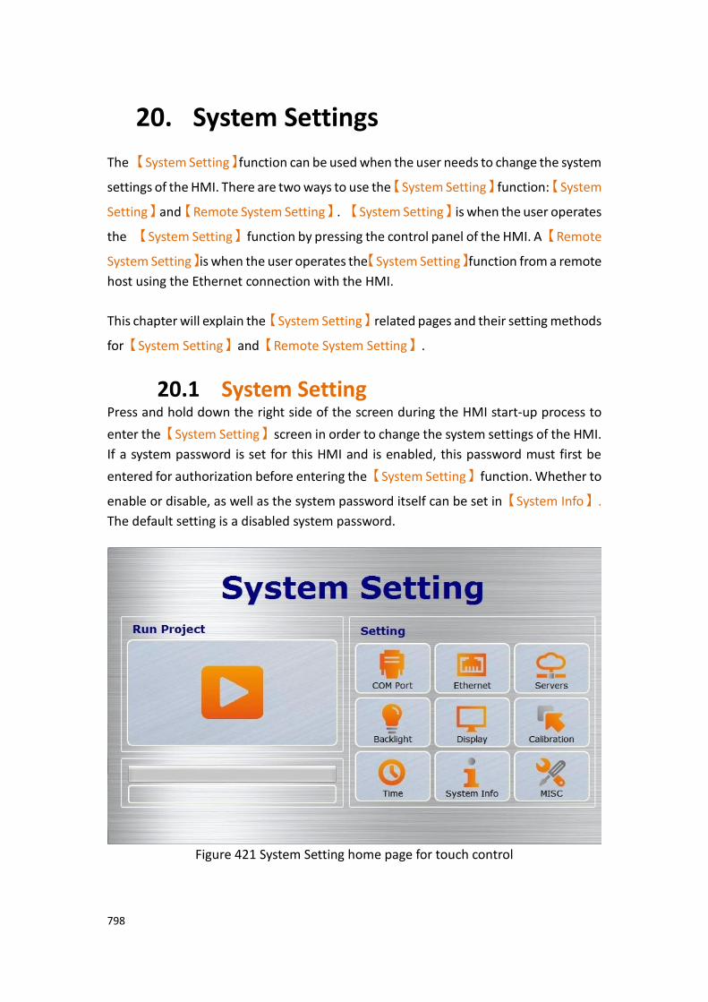
798
20. System Settings
The 【System Setting】function can be used when the user needs to change the system
settings of the HMI. There are two ways to use the【System Setting】function:【System
Setting】and【Remote System Setting】. 【System Setting】is when the user operates
the 【System Setting】function by pressing the control panel of the HMI. A【Remote
System Setting】is when the user operates the【System Setting】function from a remote
host using the Ethernet connection with the HMI.
This chapter will explain the【System Setting】related pages and their setting methods
for【System Setting】and【Remote System Setting】.
20.1 System Setting Press and hold down the right side of the screen during the HMI start-up process to
enter the【System Setting】screen in order to change the system settings of the HMI.
If a system password is set for this HMI and is enabled, this password must first be
entered for authorization before entering the【System Setting】function. Whether to
enable or disable, as well as the system password itself can be set in【System Info】.
The default setting is a disabled system password.
Figure 421 System Setting home page for touch control
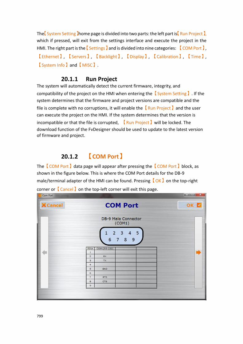
799
The【System Setting】home page is divided into two parts: the left part is【Run Project】,
which if pressed, will exit from the settings interface and execute the project in the
HMI. The right part is the【Settings】and is divided into nine categories: 【COM Port】,
【Ethernet】, 【Servers】, 【Backlight】, 【Display】, 【Calibration】, 【Time】,
【System Info】and【MISC】.
20.1.1 Run Project The system will automatically detect the current firmware, integrity, and
compatibility of the project on the HMI when entering the【System Setting】. If the
system determines that the firmware and project versions are compatible and the
file is complete with no corruptions, it will enable the【Run Project】and the user
can execute the project on the HMI. If the system determines that the version is
incompatible or that the file is corrupted, 【Run Project】will be locked. The
download function of the FvDesigner should be used to update to the latest version of firmware and project.
20.1.2 【COM Port】
The【COM Port】data page will appear after pressing the【COM Port】block, as
shown in the figure below. This is where the COM Port details for the DB-9
male/terminal adapter of the HMI can be found. Pressing【OK】on the top-right
corner or【Cancel】on the top-left corner will exit this page.
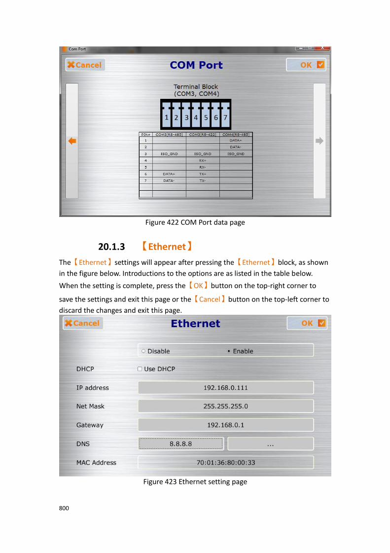
800
Figure 422 COM Port data page
20.1.3 【Ethernet】
The【Ethernet】settings will appear after pressing the【Ethernet】block, as shown
in the figure below. Introductions to the options are as listed in the table below.
When the setting is complete, press the【OK】button on the top-right corner to
save the settings and exit this page or the【Cancel】button on the top-left corner to
discard the changes and exit this page.
Figure 423 Ethernet setting page
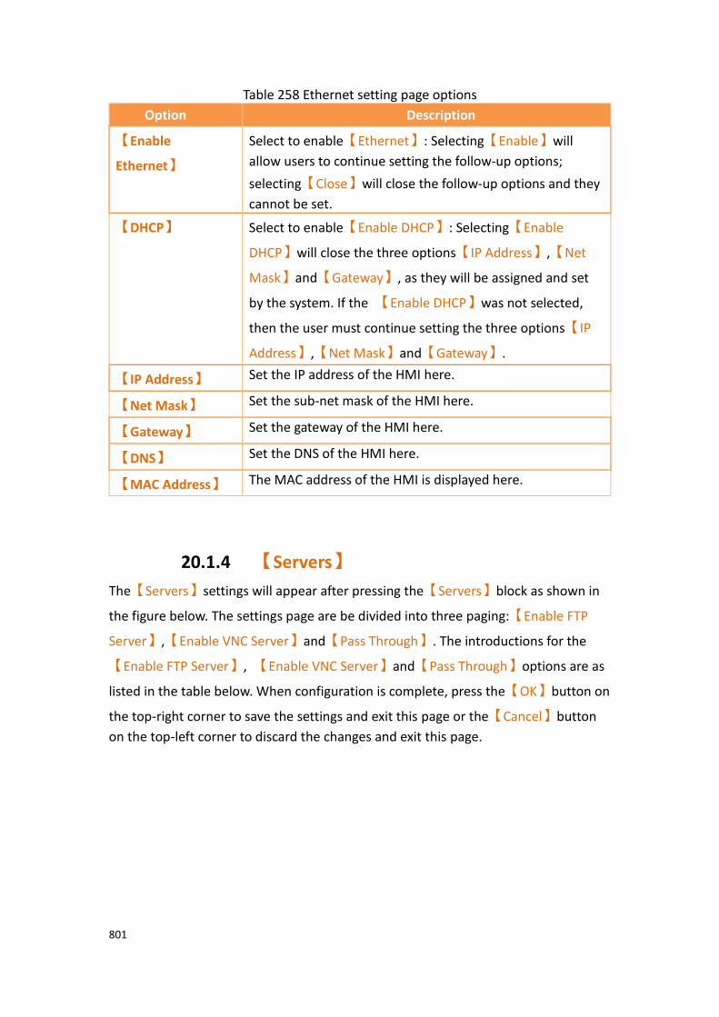
801
Table 258 Ethernet setting page options
Option Description
【Enable
Ethernet】
Select to enable【Ethernet】: Selecting【Enable】will
allow users to continue setting the follow-up options;
selecting【Close】will close the follow-up options and they
cannot be set.
【DHCP】 Select to enable【Enable DHCP】: Selecting【Enable
DHCP】will close the three options【IP Address】,【Net
Mask】and【Gateway】, as they will be assigned and set
by the system. If the 【Enable DHCP】was not selected,
then the user must continue setting the three options【IP
Address】,【Net Mask】and【Gateway】.
【IP Address】 Set the IP address of the HMI here.
【Net Mask】 Set the sub-net mask of the HMI here.
【Gateway】 Set the gateway of the HMI here.
【DNS】 Set the DNS of the HMI here.
【MAC Address】 The MAC address of the HMI is displayed here.
20.1.4 【Servers】
The【Servers】settings will appear after pressing the【Servers】block as shown in
the figure below. The settings page are be divided into three paging:【Enable FTP
Server】,【Enable VNC Server】and【Pass Through】. The introductions for the
【Enable FTP Server】, 【Enable VNC Server】and【Pass Through】options are as
listed in the table below. When configuration is complete, press the【OK】button on
the top-right corner to save the settings and exit this page or the【Cancel】button
on the top-left corner to discard the changes and exit this page.

802
Figure 424【Severs Setting】【FTP】paging
Figure 425【Severs Setting】【VNC】paging
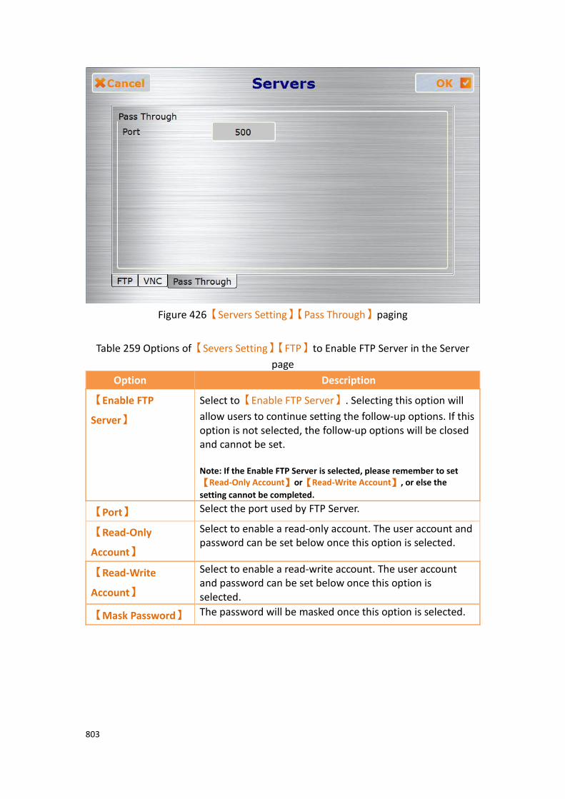
803
Figure 426【Servers Setting】【Pass Through】paging
Table 259 Options of【Severs Setting】【FTP】to Enable FTP Server in the Server
page
Option Description
【Enable FTP
Server】
Select to【Enable FTP Server】. Selecting this option will
allow users to continue setting the follow-up options. If this option is not selected, the follow-up options will be closed and cannot be set. Note: If the Enable FTP Server is selected, please remember to set【Read-Only Account】or【Read-Write Account】, or else the
setting cannot be completed.
【Port】 Select the port used by FTP Server.
【Read-Only
Account】
Select to enable a read-only account. The user account and password can be set below once this option is selected.
【Read-Write
Account】
Select to enable a read-write account. The user account and password can be set below once this option is selected.
【Mask Password】 The password will be masked once this option is selected.
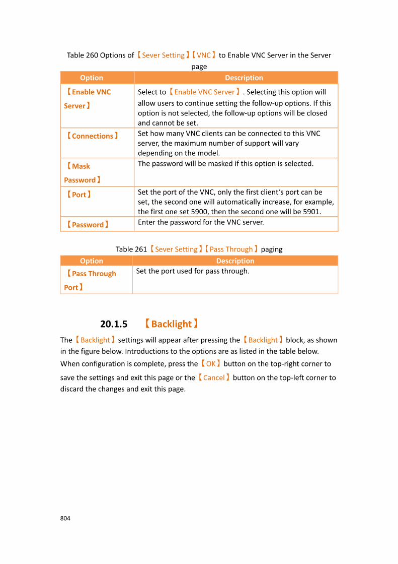
804
Table 260 Options of【Sever Setting】【VNC】to Enable VNC Server in the Server
page
Option Description
【Enable VNC
Server】
Select to【Enable VNC Server】. Selecting this option will
allow users to continue setting the follow-up options. If this option is not selected, the follow-up options will be closed and cannot be set.
【Connections】 Set how many VNC clients can be connected to this VNC server, the maximum number of support will vary depending on the model.
【Mask
Password】
The password will be masked if this option is selected.
【Port】 Set the port of the VNC, only the first client’s port can be set, the second one will automatically increase, for example, the first one set 5900, then the second one will be 5901.
【Password】 Enter the password for the VNC server.
Table 261【Sever Setting】【Pass Through】paging
Option Description
【Pass Through
Port】
Set the port used for pass through.
20.1.5 【Backlight】
The【Backlight】settings will appear after pressing the【Backlight】block, as shown
in the figure below. Introductions to the options are as listed in the table below.
When configuration is complete, press the【OK】button on the top-right corner to
save the settings and exit this page or the【Cancel】button on the top-left corner to
discard the changes and exit this page.

805
Figure 427 Backlight setting page
Table 262 Backlight setting page options
Option Description
【Backlight】 Select the backlight required. The available range is between 30 and 100. The default value is 90.
20.1.6 【Display】
The【Display】settings will appear after pressing the【Display】block, as shown in
the figure below. Introductions to the options are as listed in the table below. When
configuration is complete, press the【OK】button on the top-right corner to save
the settings and exit this page or the【Cancel】button on the top-left corner to
discard the changes and exit this page.
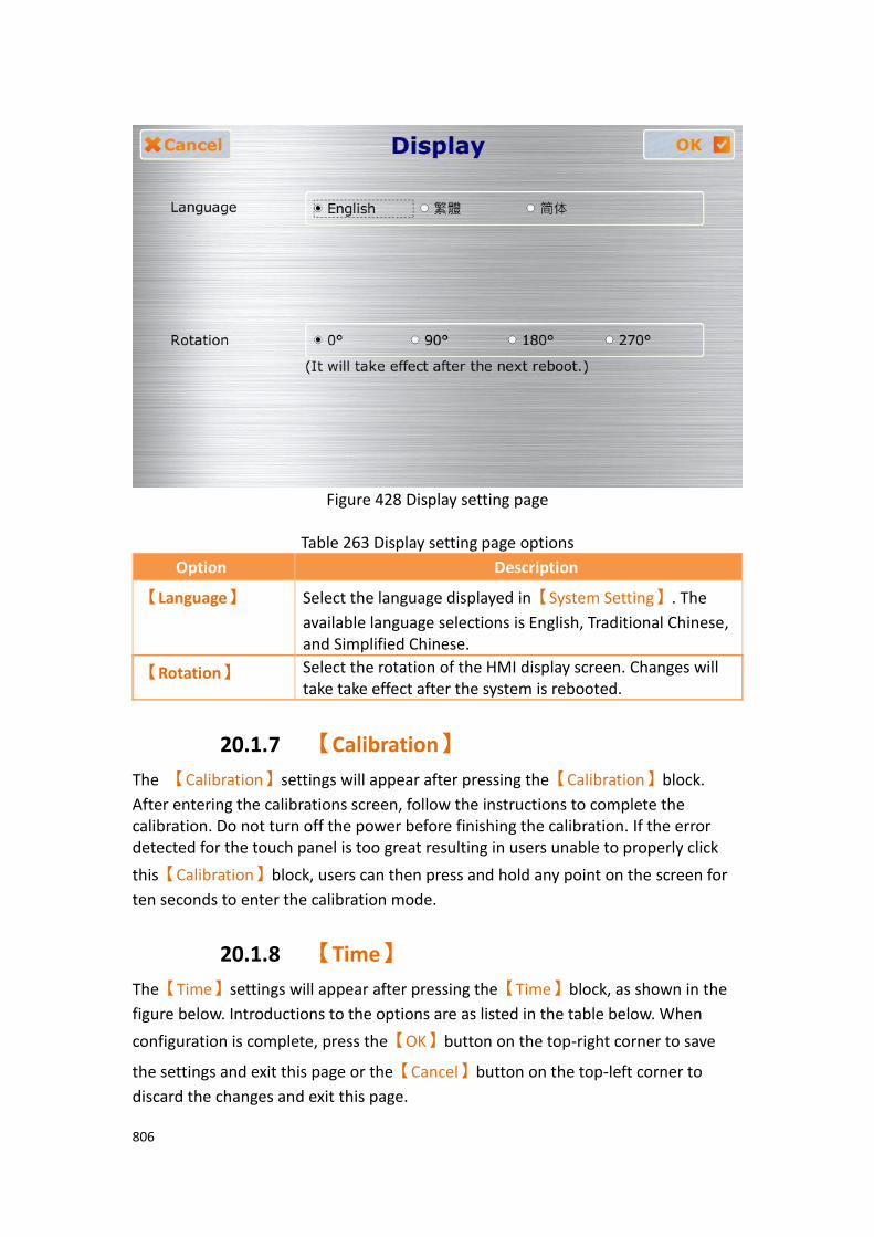
806
Figure 428 Display setting page
Table 263 Display setting page options
Option Description
【Language】 Select the language displayed in【System Setting】. The
available language selections is English, Traditional Chinese, and Simplified Chinese.
【Rotation】 Select the rotation of the HMI display screen. Changes will take take effect after the system is rebooted.
20.1.7 【Calibration】
The 【Calibration】settings will appear after pressing the【Calibration】block.
After entering the calibrations screen, follow the instructions to complete the calibration. Do not turn off the power before finishing the calibration. If the error detected for the touch panel is too great resulting in users unable to properly click
this【Calibration】block, users can then press and hold any point on the screen for
ten seconds to enter the calibration mode.
20.1.8 【Time】
The【Time】settings will appear after pressing the【Time】block, as shown in the
figure below. Introductions to the options are as listed in the table below. When
configuration is complete, press the【OK】button on the top-right corner to save
the settings and exit this page or the【Cancel】button on the top-left corner to
discard the changes and exit this page.
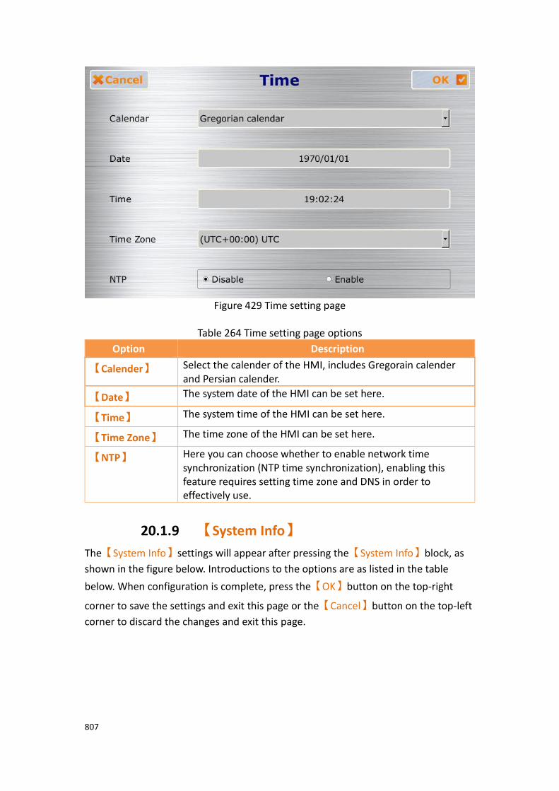
807
Figure 429 Time setting page
Table 264 Time setting page options
Option Description
【Calender】 Select the calender of the HMI, includes Gregorain calender and Persian calender.
【Date】 The system date of the HMI can be set here.
【Time】 The system time of the HMI can be set here.
【Time Zone】 The time zone of the HMI can be set here.
【NTP】 Here you can choose whether to enable network time synchronization (NTP time synchronization), enabling this feature requires setting time zone and DNS in order to effectively use.
20.1.9 【System Info】
The【System Info】settings will appear after pressing the【System Info】block, as
shown in the figure below. Introductions to the options are as listed in the table
below. When configuration is complete, press the【OK】button on the top-right
corner to save the settings and exit this page or the【Cancel】button on the top-left
corner to discard the changes and exit this page.

808
Figure 430 System Info setting page
Table 265 System Info setting page options
Option Description
【Device Name】 The device name of the HMI can be set here.
【Station
Number】
The station number of the HMI can be set here.
【System
Password】
Select to enable【System Password】here. If【System
Password】is enabled, the password must be set below. This
password must be entered in order to set the locked option
once【System Password】is enabled.
Select the locked option, select the options which need enter
【System Password】

809
【OS Version】 Information on the operating system version can be viewed here.
【Firmware
Version】
Information on the firmware version can be viewed here.
20.1.10 【MISC】
The【MISC】settings will appear after pressing the【MISC】block, as shown in the
figure below. Introductions to the options are as listed in the table below. When
configuration is complete, press the【OK】button on the top-right corner to save
the settings and exit this page or the【Cancel】button on the top-left corner to
discard the changes and exit this page.
Figure 431 MISC setting page
Table 266 MISC settings page options
Option Description
【Factory Reset】 The system setting of the HMI can be re-set to the factory settings here.
The following window will appear after this option is pressed, asking whether to continue.
Selecting【OK】will restore the HMI to factory settings and
810
selecting【Cancel】will cancel this operation.
【Buzzer】 This option enables the buzzer. Close will turn the buzzer off.
【Audio】 Audio can be played back if this option is enabled, otherwise it will be closed.
【Remote
Password】
Select to enable【Remote Password】here. If【Remote
Password】is enabled, the password must be set below. This
password must be entered in order to log in 【System
Setting】
【Customer ID】 To enable【Customer ID】,select enable【Customer ID】
and a window will pop up asking the user to create a
password for the【Customer ID】.
After the【Customer ID】is set, the next time the project is
booted with the ID set and enabled, it will first check the HMI
【Customer ID】to see if it matches with the project
【Customer ID】. If the two ID’s match, the project will
continue to boot. If the ID’s do not match, touch function, serial port, USB port, Ethernet port function will shut down and the HMI will stay on the boot screen. To use the HMI device again, the customer will have to reboot the HMI and
enter the correct【Customer ID】to be able to use the HMI
with the given program.
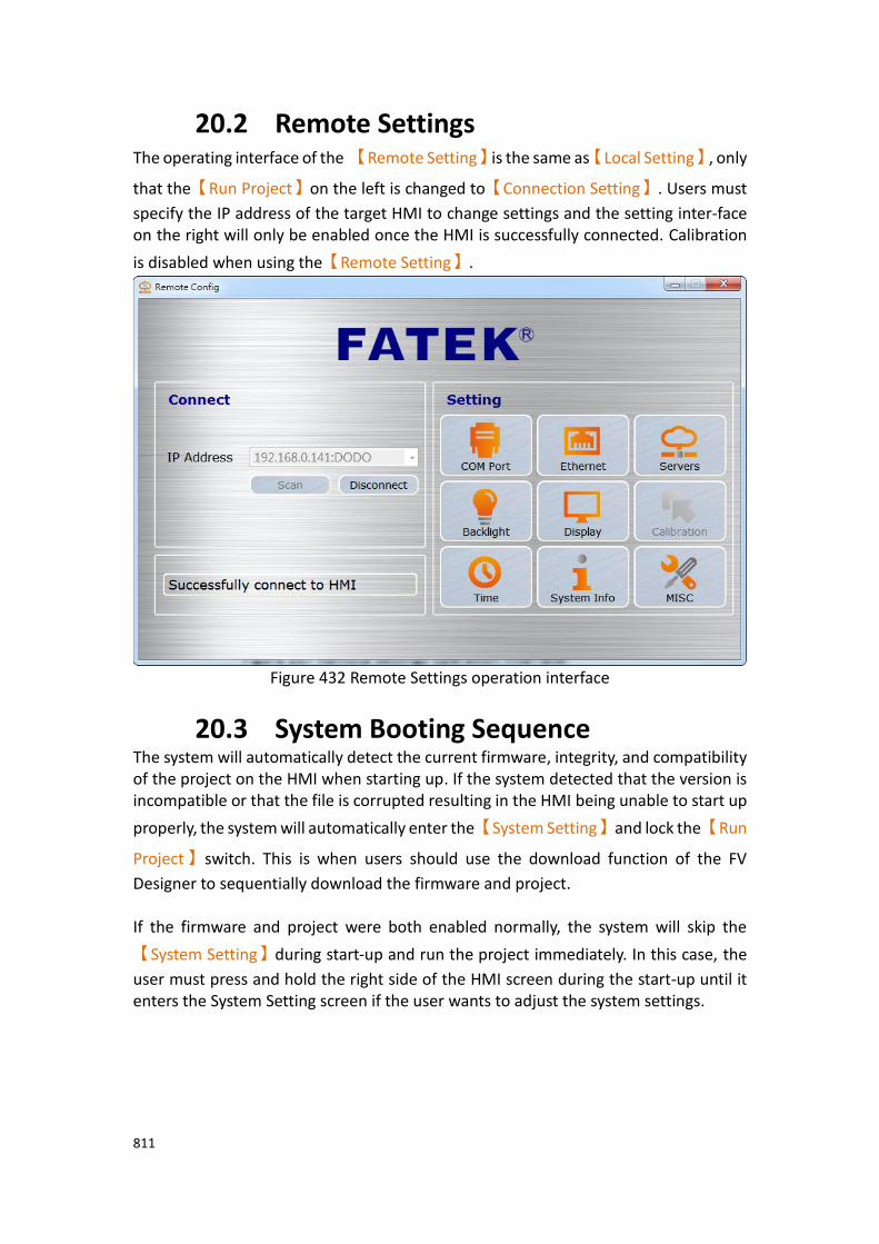
811
20.2 Remote Settings The operating interface of the 【Remote Setting】is the same as【Local Setting】, only
that the【Run Project】on the left is changed to【Connection Setting】. Users must
specify the IP address of the target HMI to change settings and the setting inter-face on the right will only be enabled once the HMI is successfully connected. Calibration
is disabled when using the【Remote Setting】.
Figure 432 Remote Settings operation interface
20.3 System Booting Sequence The system will automatically detect the current firmware, integrity, and compatibility of the project on the HMI when starting up. If the system detected that the version is incompatible or that the file is corrupted resulting in the HMI being unable to start up
properly, the system will automatically enter the【System Setting】and lock the【Run
Project】switch. This is when users should use the download function of the FV
Designer to sequentially download the firmware and project. If the firmware and project were both enabled normally, the system will skip the
【System Setting】during start-up and run the project immediately. In this case, the
user must press and hold the right side of the HMI screen during the start-up until it enters the System Setting screen if the user wants to adjust the system settings.
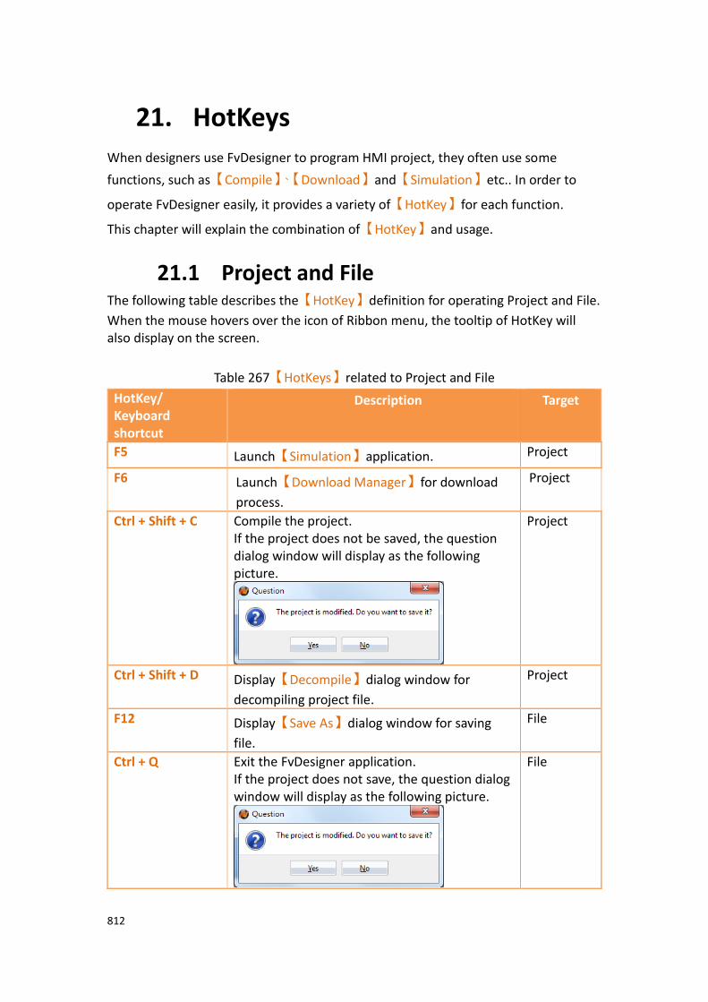
812
21. HotKeys
When designers use FvDesigner to program HMI project, they often use some
functions, such as【Compile】、【Download】and【Simulation】etc.. In order to
operate FvDesigner easily, it provides a variety of【HotKey】for each function.
This chapter will explain the combination of【HotKey】and usage.
21.1 Project and File The following table describes the【HotKey】definition for operating Project and File.
When the mouse hovers over the icon of Ribbon menu, the tooltip of HotKey will also display on the screen.
Table 267【HotKeys】related to Project and File
HotKey/ Keyboard shortcut
Description Target
F5 Launch【Simulation】application. Project
F6 Launch【Download Manager】for download
process.
Project
Ctrl + Shift + C Compile the project. If the project does not be saved, the question dialog window will display as the following picture.
Project
Ctrl + Shift + D Display【Decompile】dialog window for
decompiling project file.
Project
F12 Display【Save As】dialog window for saving
file.
File
Ctrl + Q Exit the FvDesigner application. If the project does not save, the question dialog window will display as the following picture.
File
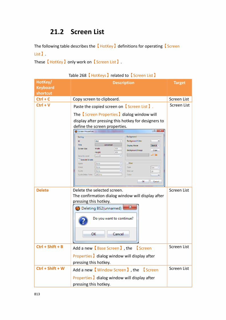
813
21.2 Screen List
The following table describes the【HotKey】definitions for operating【Screen
List】.
These【HotKey】only work on【Screen List】.
Table 268【HotKeys】related to【Screen List】
HotKey/ Keyboard shortcut
Description Target
Ctrl + C Copy screen to clipboard. Screen List
Ctrl + V Paste the copied screen on【Screen List】.
The【Screen Properties】dialog window will
display after pressing this hotkey for designers to define the screen properties.
Screen List
Delete Delete the selected screen. The confirmation dialog window will display after pressing this hotkey.
Screen List
Ctrl + Shift + B Add a new【Base Screen】, the 【Screen
Properties】dialog window will display after
pressing this hotkey.
Screen List
Ctrl + Shift + W Add a new【Window Screen】, the 【Screen
Properties】dialog window will display after
pressing this hotkey.
Screen List

814
Ctrl + Shift + K Add a new【Keypad Screen】, the 【Screen
Properties】dialog window will display after
pressing this hotkey.
Screen List
↑ Pressing the UP key can move the 【Current
Selection Box UP.
It will not display the screen on the 【Work
Space】of FvDesigner.
Screen List
↓ Pressing the Down key can move the 【Current
Selection Box】Down.
It will not display the screen on the 【Work
Space】of FvDesigner.
Screen List
Enter Pressing the Enter key can display the screen
which the 【Current selection box】selected.
Screen List
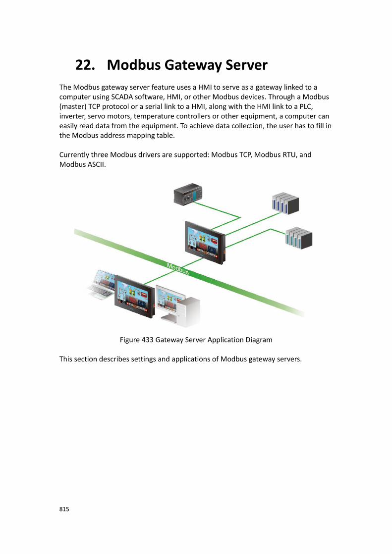
815
22. Modbus Gateway Server
The Modbus gateway server feature uses a HMI to serve as a gateway linked to a computer using SCADA software, HMI, or other Modbus devices. Through a Modbus (master) TCP protocol or a serial link to a HMI, along with the HMI link to a PLC, inverter, servo motors, temperature controllers or other equipment, a computer can easily read data from the equipment. To achieve data collection, the user has to fill in the Modbus address mapping table. Currently three Modbus drivers are supported: Modbus TCP, Modbus RTU, and Modbus ASCII.
Figure 433 Gateway Server Application Diagram
This section describes settings and applications of Modbus gateway servers.

816
22.1 Modbus Gateway Server Settings When the selected driver in the new link property settings is selected as Modbus
Slave (ASCII), Modbus Slave (RTU) or Modbus Server (TCP), under the【Interface
Settings】, a new options tab will be present. The options tab contains【Address
Mapping Table】settings, as shown in the figure below.
Figure 434【Address Mapping Table】Settings Screen

817
【Address Mapping Table】settings screen is in the below figure. Each setting is
detailed in the table.
Figure 435【Address Mapping Table】Settings Screen
Table 269【Address Mapping Table】Settings and Related Files and Shortcuts
Option Description
【Address
Mapping Table】
【Add】
Create a new row in the【Address Mapping Table】.
【Delete】
Remove the selected row from the【Address Mapping
Table】.
【Default】
Returns the【Address Mapping Table】to the preset rows
and configurations.
【Clear】

818
Deletes all entries from the【Address Mapping Table】.
【Modbus Type】
Currently supports four types: 0x, 1x, 3x, and 4x. 0x has read and write permissions for a bit. 1x is a read only bit. 3x is a read only word. 4x has read and write permissions for a word.
【Modbus Address】
Specify the return target address for a PLC or other Modbus devices.
【PLC Address】
Specified source address for PLC or other equipment.
【Length】
Set the length of the data.
【Update Frequency】
Set the transmission frequency speed. There are three settings: fast, normal, and low.
22.2 Modbus Gateway Server Applications In the following example, a HMI has a FATEK FBS PLC connected through the COM1 port and a Mistsubishi FX3U PLC connected through the COM3 port as shown in the figure below. On demand data can be uploaded via Ethernet to a computer and collected by SCADA (or modScan) software.
Figure 436 HMI Connection Page
The user wishes to monitor register R100 data and output point Y0 on the FATEK FBs PLC and D200 and Y1 on the Mistubishi FX3U. The FATEK PLC address should be uploaded to Modbus address 4x1 and 0x1 respectively. The Mistubishi FX3U address should be uploaded to Modbus addresses 4x2 and 0x2 respectively. The PC will then recieive the data via Ethernet.

819
Step 1: New Modbus Server (TCP) driver, set as shown in Figure 435.
Figure 437 New Modbus Server (TCP) Driver
Step 2: Click the【Address Mapping Table】settings.
Step 3: Set the【Address Mapping Table】in accordance to Figure 436.
The first row is the FATEK FBS PLC Y0 output. This is transferred to Modbus address 0x1. The second row is the Mistubishi FX3U PLC Y1 output. This is transferred to Modbus address 0x2. The third row is the FATEK FBS PLC R100 register. This is transferred to Modbus address 4x1. The fourth row is the Mistubishi FX3U PLC D200 register. This is transferred to Modbus address 4x2.
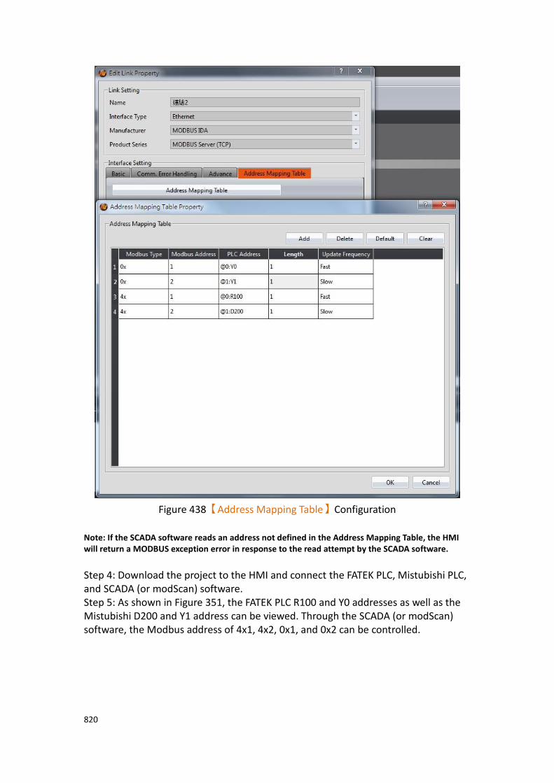
820
Figure 438【Address Mapping Table】Configuration
Note: If the SCADA software reads an address not defined in the Address Mapping Table, the HMI will return a MODBUS exception error in response to the read attempt by the SCADA software. Step 4: Download the project to the HMI and connect the FATEK PLC, Mistubishi PLC, and SCADA (or modScan) software. Step 5: As shown in Figure 351, the FATEK PLC R100 and Y0 addresses as well as the Mistubishi D200 and Y1 address can be viewed. Through the SCADA (or modScan) software, the Modbus address of 4x1, 4x2, 0x1, and 0x2 can be controlled.

821
Figure 439 Results of the Gateway Server

822
23. PLC Integration
【PLC Integration】provides designers or users in pratical applications of HMI and
PLC to achieve closer integration. For example, in practical applications users can show or view the current connection of WinProladder through HMI, no need to link PLC to PC to view Ladder diagram program of WinProladder, let users easy to use and debug.
Currently 【PLC Integration】includes【Show Ladder Viewer】,【Update FATEK
PLC Project From USB】,【Show Ethernet Module Configuration】
Figure 440 HMI show PLC Ladder Diagram Program illustration
23.1 Show Ladder Viewer This section will explain how to show Ladder Diagram Program of PLC (FATEK PLC) on HMI and show the interface of PLC Ladder Diagram Program which includes the meaning of options and settings. Note 1 : The 4.3-inch HMI does not support the display of the Ladder Viewer function, such as P5043S or P5043N. Note 2 : FATEK FBe PLC does not support
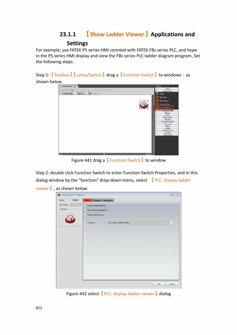
823
23.1.1 【Show Ladder Viewer】Applications and
Settings For example, use FATEK P5 series HMI connted with FATEK FBs series PLC, and hope in the P5 series HMI display and view the FBs series PLC ladder diagram program, Set the following steps:
Step 1:【Toolbox】【Lamp/Switch】drag a【Function Switch】to windows,as
shown below.
Figure 441 drag a【Function Switch】to window
Step 2: double click Function Switch to enter Function Switch Properties, and in this
dialog window by the "function" drop-down menu, select 【PLC: display ladder
viewer】, as shown below.
Figure 442 select【PLC: display ladder viewer】dialog

824
Step 3: set the connection of HMI and PLC, then compile and download to HMI,
through the connection, press the 【Function Switch】【PLC: display ladder
viewer】, will appear link device dialog, as show below, the device name is the name
of the device in the software link setting.
Figure 443 The menu dialog of the linked device
Note: in off-line simulation, press【Function Switch】will not appear link device dialog,
but will appear in HMI interface, microSD or USB storage devices, choose the PLC project(*.pdw) loading dialog window.
Step 4: choose the device, then it will load the PLC ladder diagram program, as shown below.
Figure 444 show PLC ladder diagram program

825
23.1.2 HMI display the interface of PLC ladder diagram program
The interface of the PLC ladder program is displayed on the HMI, as shown below. The meaning of each settings, as shown in the table below.
Figure 445 The interface of the PLC ladder diagram is displayed on the HMI
Table 270 shows the attributes of the PLC ladder diagram interface on the HMI
Property Description
【Display
Settings】 Press this icon , will display the settings dialog window, as shown below.

826
【Comment】 【Comment】
Click on the box that says “Comment” and the following dialog window will pop up, as show below.
【Comment Visible】
Set whether the comments in the ladder diagram are displayed.
【Section Comment Visible】
Set whether the program area comments in the ladder program is displayed. The current preset is disabled and cannot be checked.
【Network Comment Visible】
Set whether the network comment in the ladder program is displayed. The current preset is disabled and cannot be checked.
【Element Comment Visible】
Set whether the element comment in the ladder program is displayed.
【Language】 【Language】
Click on the language button and the following dialog window

827
will pop up on your screen, as shown below. In this window, you can select the language of your comments in the ladder program. Languages include English, Traditional Chinese, Simplified Chinese, Other Language, and so on.
【Block Open/
Close】
This option is mainly for the WinProLadder block close and block open function(Need to cooperate with Fun199). Click on the button and the following dialog window will pop up, the HMI will activity to search the ladder diagram that those networks are block closed then list it, operators can choose which networks are open or close(If the original close block has a set password, need to enter password to open the block password), press OK to see ladder diagram.
【Reload】 【Reload】
Reload the ladder program.
【Zoom in】
Press this icon , will zoom in on the HMI ladder diagram.
【Zoom out】
Press this icon , will zoom out on the HMI ladder diagram.
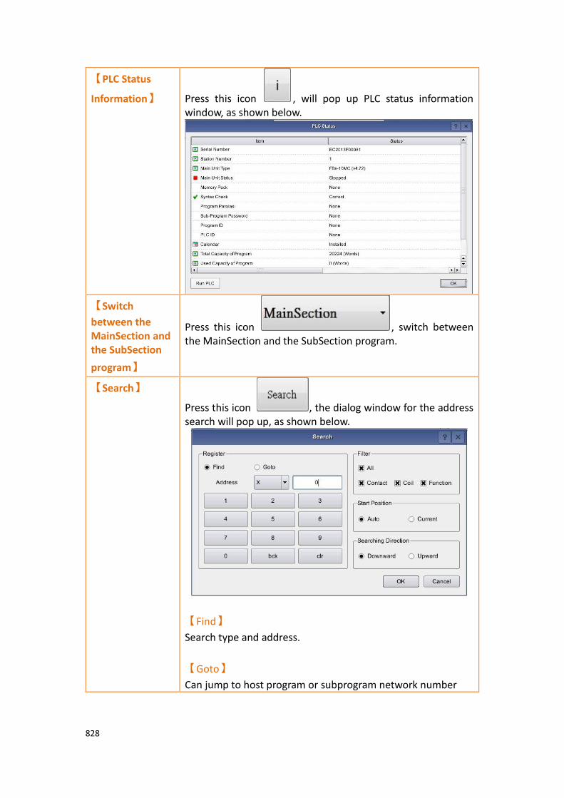
828
【PLC Status
Information】 Press this icon , will pop up PLC status information window, as shown below.
【Switch
between the MainSection and the SubSection
program】
Press this icon , switch between the MainSection and the SubSection program.
【Search】
Press this icon , the dialog window for the address search will pop up, as shown below.
【Find】
Search type and address.
【Goto】
Can jump to host program or subprogram network number
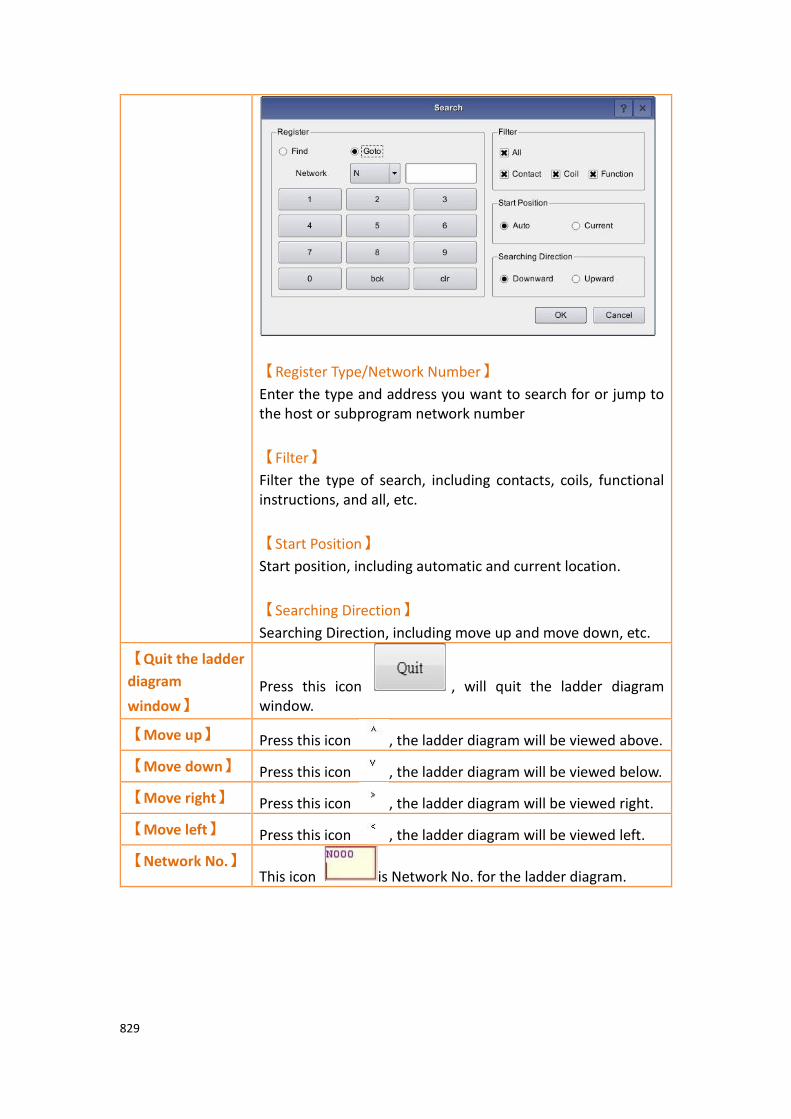
829
【Register Type/Network Number】
Enter the type and address you want to search for or jump to the host or subprogram network number
【Filter】
Filter the type of search, including contacts, coils, functional instructions, and all, etc.
【Start Position】
Start position, including automatic and current location.
【Searching Direction】
Searching Direction, including move up and move down, etc.
【Quit the ladder
diagram
window】 Press this icon , will quit the ladder diagram window.
【Move up】 Press this icon , the ladder diagram will be viewed above.
【Move down】 Press this icon , the ladder diagram will be viewed below.
【Move right】 Press this icon , the ladder diagram will be viewed right.
【Move left】 Press this icon , the ladder diagram will be viewed left.
【Network No.】 This icon is Network No. for the ladder diagram.

830
23.2 Update FATEK PLC Project From USB This section will explain how to update the linked FATEK PLC ladder program via the HMI USB storage device for easy user use. For example, use FATEK P5 series HMI connted with FATEK FBs series PLC, update ladder diagram program of FBs PLC through USB storage device of HMI, Set the following steps:
Step 1:【Toolbox】【Lamp/Switch】drag a【Function Switch】to windows,as
shown below.
Figure 446 drag a【Function Switch】to window
Step 2: double click Function Switch to enter Function Switch Properties, and in this
dialog window by the "function" drop-down menu, select 【PLC: Update FATEK PLC
Project From USB】, as shown below.
Figure 447 select【PLC: Update FATEK PLC Project From USB】dialog
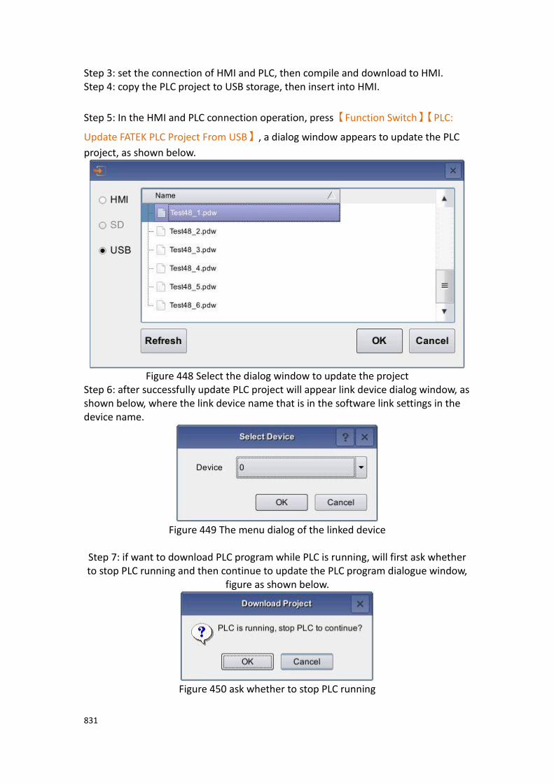
831
Step 3: set the connection of HMI and PLC, then compile and download to HMI. Step 4: copy the PLC project to USB storage, then insert into HMI.
Step 5: In the HMI and PLC connection operation, press【Function Switch】【PLC:
Update FATEK PLC Project From USB】, a dialog window appears to update the PLC
project, as shown below.
Figure 448 Select the dialog window to update the project
Step 6: after successfully update PLC project will appear link device dialog window, as shown below, where the link device name that is in the software link settings in the device name.
Figure 449 The menu dialog of the linked device
Step 7: if want to download PLC program while PLC is running, will first ask whether to stop PLC running and then continue to update the PLC program dialogue window,
figure as shown below.
Figure 450 ask whether to stop PLC running

832
Step 8: after updating PLC project, will appear
Figure 451 download success than ask whether start the PLC dialog window
Attention: under off-line simulation, press【Function Switch】, will not have any action
23.3 【Fatek PLC Transfer Encrypt Tool】 This chapter explains how to use the USB storage device of HMI to update the connected FATEK PLC ladder diagram program, how to protect the operation flow, and protect the designer's planned PLC ladder diagram program and intellectual property, etc. Use the USB storage device of HMI to update the connected FATEK PLC ladder diagram program divide it into 2 parts. The first part, if you do not need to protect the PLC project, you can directly copy the PLC project (*.pdw) planned by FATEK PLC software to the USB storage device, microSD card, or through FTP function transfer the PLC project to the HMI internal storage, and follow-up will be able to update the FATEK PLC project according to chapter 23.2-Update FATEK PLC Project From USB . In the second part, if the PLC project needs to be protected, it is necessary to follow the follow-up instructions to generate the designer's all transfer password or single pass password and conversion file, etc., so that the designer's planned PLC ladder diagram program can be protected. The following describes how to set and use transfer passwords, single passwords, and conversion files.
23.3.1 【Fatek PLC Transfer Project Generator】 This chapter will explain how to use the USB storage device HMI to update the connected FATEK PLC ladder diagram program, and the PLC project needs to be
protected. How to set the【Transfer Password】and convert the file, etc. This can be
achieved through the【Fatek PLC Transfer Encrypt Tool】provided by FvDesigner.
If only set【Transfer Password】, it’s available for unlimited downloads, in other
words, you can update the connected FATEK PLC ladder diagram program for an unlimited number of times.

833
【Fatek PLC Transfer Project Generator】can be found on the Tools tab on the
FvDesigner ribbon, after select the【Fatek PLC Transfer Encrypt Tool】drop-down
menu then click【Fatek PLC Transfer Project Generator】options to do the setting.
Figure 452【Fatek PLC Transfer Project Generator】option
The【Fatek PLC Transfer Project Generator】page is shown in the figure below. The
meaning of each setting option is as follows:
Figure 453【Fatek PLC Transfer Project Generator】setting
Table 271【Fatek PLC Transfer Project Generator】properties setting
Properties Description
【Generate
Project】
With this tool, you can convert the original FATEK PLC project (*.pdw) into an encrypted file *.tpdw and generate all the transfer passwords for the designer.
【Fatek PLC Project(.pdw)】
Set the path and file location of the original FATEK PLC project (*.pdw).
【.tpdw Output Path】
Set the path of *.tpdw to be generated. If it is not set, the default path is same as the original FATEK PLC project
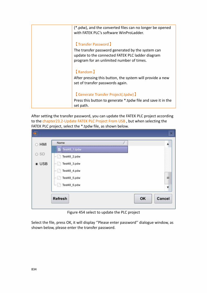
834
(*.pdw), and the converted files can no longer be opened with FATEK PLC’s software WinProLadder.
【Transfer Password】
The transfer password generated by the system can update to the connected FATEK PLC ladder diagram program for an unlimited number of times.
【Random】
After pressing this button, the system will provide a new set of transfer passwords again.
【Generate Transfer Project(.tpdw)】
Press this button to generate *.tpdw file and save it in the set path.
After setting the transfer password, you can update the FATEK PLC project according to the chapter23.2-Update FATEK PLC Project From USB , but when selecting the FATEK PLC project, select the *.tpdw file, as shown below.
Figure 454 select to update the PLC project
Select the file, press OK, it will display ‘’Please enter password’’ dialogue window, as shown below, please enter the transfer password.

835
Figure 455 select the transfer password
After entering the transfer password, press OK, the ‘’Select Device’’ dialog window will appear, as shown below.
Figure 456 select device
If the PLC wants to download the PLC program during operation, it will first ask whether to stop the PLC operation first, and then continue to update the dialogue window of the PLC program, as shown below.
Figure 457 ask whether to stop the running PLC
After finish updating the PLC project, there will be a dialogue window to start the PLC, as shown below.
Figure 458 download success and ask whether to start PLC immediately

836
23.3.2 【Single Pass Password Generator】
The chapter will explain how to set【Single Pass Password】,【Single Pass
Password】can only be used once. The user will generate a set of passwords from
the HMI due to the operation and provide it to the designer. The designer then
generates new password through the【Single Pass Password Generator】to enter to
the HMI to update the connected FATEK PLC Ladder Diagram program.
【Single Pass Password Generator】function can be selected in【Tools】function
tab on the FvDesigner ribbon, select【Fatek PLC Transfer Encrypt Tool】drop-down
menu, and click【Single Pass Password Generator】option to open function setting
window.
Figure 459【Single Pass Password Generator】option
The【Single Pass Password Generator】page is shown in the following figure. The
meaning of each setting option is as follows:
Figure 460【Single Pass Password Generator】setting window
Table 272【Single Pass Password Generator】properties setting
Properties Description
【Generate
Password】
Single pass password can be generated through this tool.
【Transfer Password】
Enter the original transfer password.
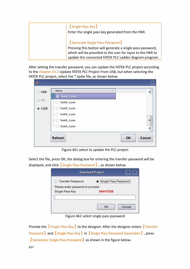
837
【Single Pass Key】
Enter the single pass key generated from the HMI.
【Generate Single Pass Password】
Pressing this button will generate a single pass password, which will be provided to the user for input to the HMI to update the connected FATEK PLC Ladder diagram program.
After setting the transfer password, you can update the FATEK PLC project according to the chapter 23.2-Update FATEK PLC Project From USB, but when selecting the FATEK PLC project, select the *.tpdw file, as shown below.
Figure 461 select to update the PLC project
Select the file, press OK, the dialog box for entering the transfer password will be
displayed, and click【Single Pass Password】, as shown below.
Figure 462 select single pass password
Provide the【Single Pass Key】to the designer. After the designer enters【Transfer
Password】and【Single Pass Key】in【Single Pass Password Generator】, press
【Generator Single Pass Password】as shown in the figure below.
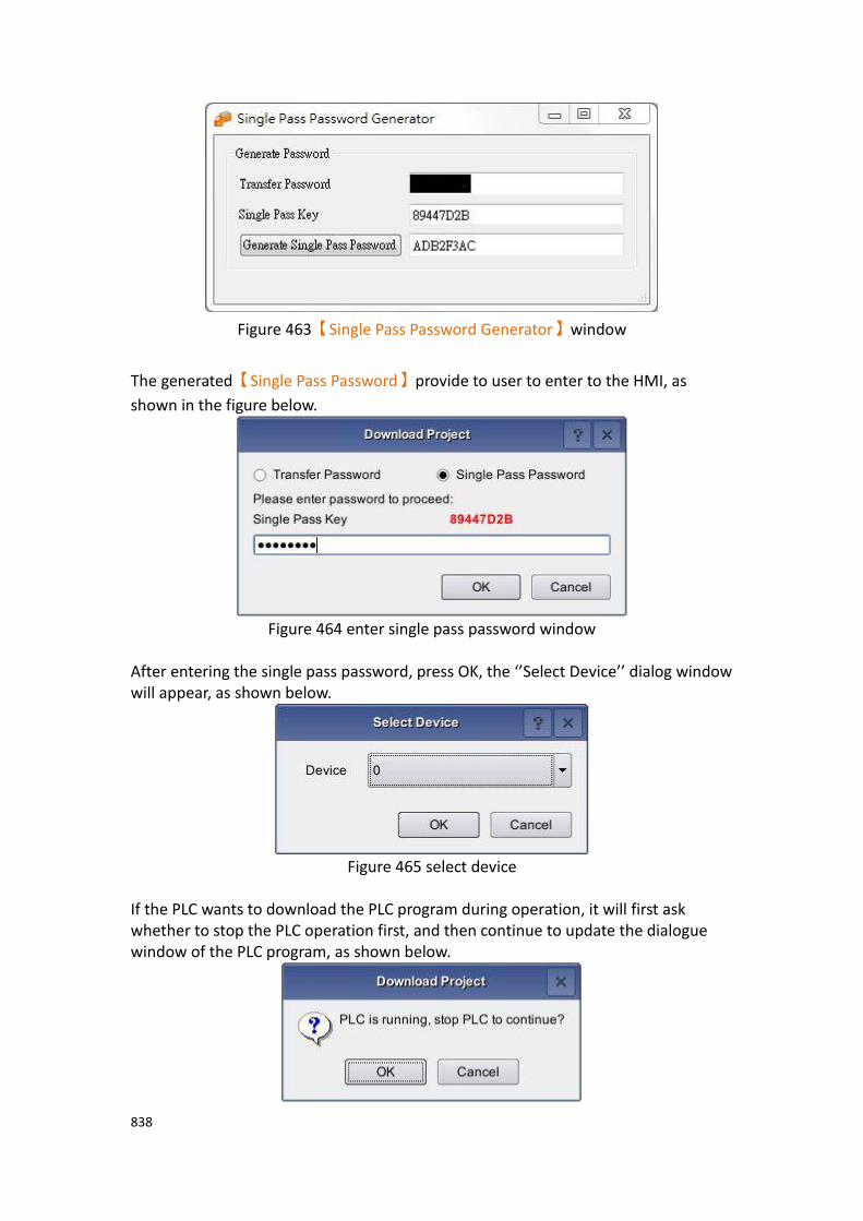
838
Figure 463【Single Pass Password Generator】window
The generated【Single Pass Password】provide to user to enter to the HMI, as
shown in the figure below.
Figure 464 enter single pass password window
After entering the single pass password, press OK, the ‘’Select Device’’ dialog window will appear, as shown below.
Figure 465 select device
If the PLC wants to download the PLC program during operation, it will first ask whether to stop the PLC operation first, and then continue to update the dialogue window of the PLC program, as shown below.
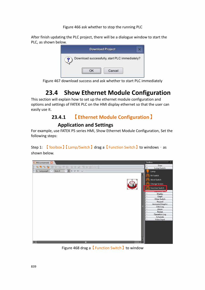
839
Figure 466 ask whether to stop the running PLC After finish updating the PLC project, there will be a dialogue window to start the PLC, as shown below.
Figure 467 download success and ask whether to start PLC immediately
23.4 Show Ethernet Module Configuration This section will explain how to set up the ethernet module configuration and options and settings of FATEK PLC on the HMI display ethernet so that the user can easily use it.
23.4.1 【Ethernet Module Configuration】
Application and Settings For example, use FATEK P5 series HMI, Show Ethernet Module Configuration, Set the following steps:
Step 1: 【Toolbox】【Lamp/Switch】drag a【Function Switch】to windows,as
shown below.
Figure 468 drag a【Function Switch】to window

840
Step 2: double click Function Switch to enter Function Switch Properties, and in this
dialog window by the "function" drop-down menu, select 【PLC: Show Ethernet
Module Configuration】, as shown below.
Figure 469 select【PLC: Show Ethernet Module Configuration】dialog
Step 3: set the connection of HMI and PLC, then compile and download to HMI.
Step 4: In the HMI and PLC connection operation, press【Function Switch】【PLC:
Show Ethernet Module Configuration】, a dialog window appears to update the PLC
project, as shown below.
Figure 470 dialog of FATEK PLC on ethernet

841
Note: after pressing the【Function Switch】, as a result of the search on the network FATEK PLC
network module will be delayed some time.
Table 273 properties of FATEK PLC ethernet configuration dialog
Options Description
【IP Address】 IP Address of ethernet configuration
【Ethernet
Address】
Ethernet Address of ethernet configuration
【Mode】 Mode of ethernet configuration
【Comment】 Annotations can be used to specify more detailed module information, up to 21 characters.
【Rescan】 Rescan ethernet configuration on line, the detected module will be displayed in the middle of the window.
【Properties】 Touch to display or set the module data, press this button to enter the module configuration window.
【Exit】 Exit the dialog of ethenet configuration.
23.4.2 General Settings of Ethernet Module General properties of ethernet module on HMI, as shown below.
Figure 471 General properties of ethernet module

842
Table 274 properties of ethernet module settings
Optios Description
【IP Assign Mode】 IP Assign Mode, including static and dynamic and acquisition by the registor of PLC
【IP Address】 IP Address of ethernet module.
【Subnet Mask】 Subnet Mask of ethernet module.
【GateWay】 GateWay of ethernet module.
【Host Name】 Host Name, can be used to identify different module.
【Comment】 Annotations can be used to specify more detailed module information, up to 21 characters.
【Remote Config
Enabled】
Check to allow Ether_Config settings to be made remotely via the Internet.
【Remote Web Access
Enabled】
Check to allow remote through the Internet for Web pages operation.
【Operation Mode】 Port1 is fixed to FATEK Server, Port2 can select the working mode according to the demand
23.4.3 Password Setting Page of Ethernet Module Display password setting page of ethernet module on HMI, as shown below. The meaning of each option is as follows, as shown in the following table, please refer to the PLC network Ethernet communication module operating instructions manual
Figure 472 password setting page of ethernet module
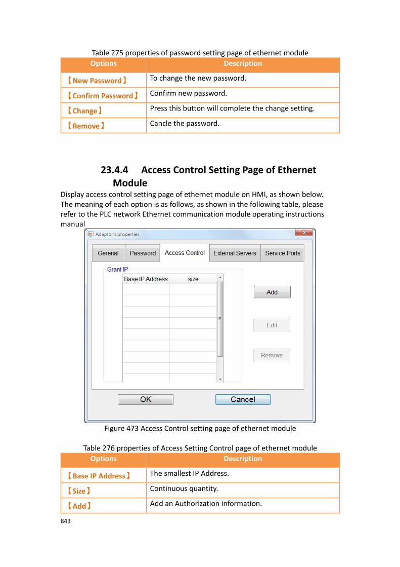
843
Table 275 properties of password setting page of ethernet module
Options Description
【New Password】 To change the new password.
【Confirm Password】 Confirm new password.
【Change】 Press this button will complete the change setting.
【Remove】 Cancle the password.
23.4.4 Access Control Setting Page of Ethernet Module
Display access control setting page of ethernet module on HMI, as shown below. The meaning of each option is as follows, as shown in the following table, please refer to the PLC network Ethernet communication module operating instructions manual
Figure 473 Access Control setting page of ethernet module
Table 276 properties of Access Setting Control page of ethernet module
Options Description
【Base IP Address】 The smallest IP Address.
【Size】 Continuous quantity.
【Add】 Add an Authorization information.
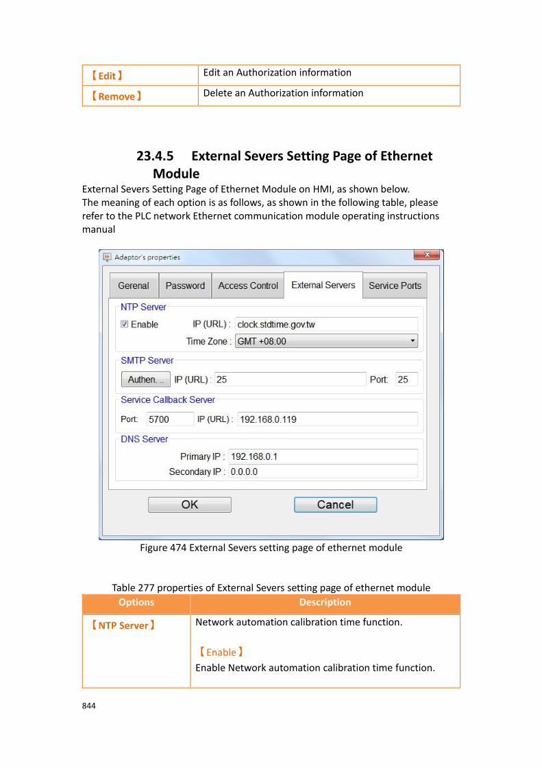
844
【Edit】 Edit an Authorization information
【Remove】 Delete an Authorization information
23.4.5 External Severs Setting Page of Ethernet Module
External Severs Setting Page of Ethernet Module on HMI, as shown below. The meaning of each option is as follows, as shown in the following table, please refer to the PLC network Ethernet communication module operating instructions manual
Figure 474 External Severs setting page of ethernet module
Table 277 properties of External Severs setting page of ethernet module
Options Description
【NTP Server】 Network automation calibration time function.
【Enable】
Enable Network automation calibration time function.

845
【IP(URL)】
URL of NTP Sever
【Time Zone】
Location of the Time Zone
【SMTP Server】 Function of sending Email
【IP(URL)】
URL of sending email sever.
【Service CallBack
Server】
Automatic maintenance callback function.
【Port】
Maintenance Center port number.
【IP(URL)】
Maintenance Center network address or domain name.
【DNS Server】 Domain name sever
【Primary IP】
Primary DNS Server.
【Secondary IP】
Secondary DNS Server.
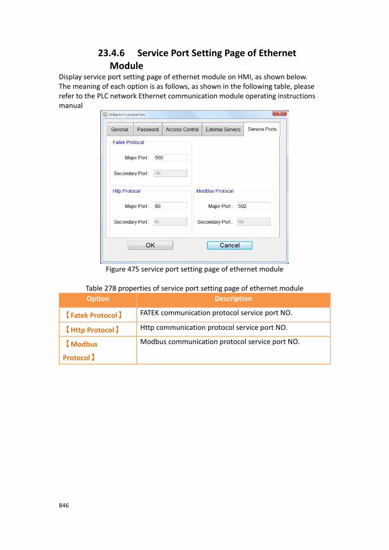
846
23.4.6 Service Port Setting Page of Ethernet Module
Display service port setting page of ethernet module on HMI, as shown below. The meaning of each option is as follows, as shown in the following table, please refer to the PLC network Ethernet communication module operating instructions manual
Figure 475 service port setting page of ethernet module
Table 278 properties of service port setting page of ethernet module
Option Description
【Fatek Protocol】 FATEK communication protocol service port NO.
【Http Protocol】 Http communication protocol service port NO.
【Modbus
Protocol】
Modbus communication protocol service port NO.

847
24. User-defined Protocal
【User-defined Protocol】function is the consulation mainly to provide the designer
to connect the device according they need, define your own communication code, then communicate with the device, read or write to the device, generally can be used in simple communication connections,or in the case of a driver that is not currently
supported in the software link. In addition, this【User-defined Protocol】function
provide designers simple interface definition, no need to write a huge program, making it easier for designers to use, to achieve the purpose of communication with its equipment.
Figure 476 user-defined protocol illustration
24.1 【User-defined Protocol】Interface
Description This section describes the interface of the【User-defined Protocol】function that
includes options and settings
【User-defined Protocol】function can add a link from【Project Explorer】【Link】,
choose【User-defined Protocol】at【Manufacturer】, and choose【User-defined
Protocol】at【Product Series】, as shown below.
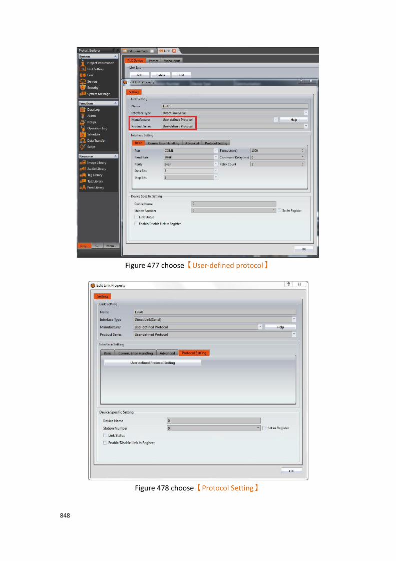
848
Figure 477 choose【User-defined protocol】
Figure 478 choose【Protocol Setting】

849
Then choose【User-defined Protocol Setting】, you can enter the instruction list set
by User-defined Protocol Setting, as shown below, which set the meaning of the options, as shown in the table below.
Figure 479【User-defined Protocol】instruction list
Table 279 properties of【User-defined Protocol】instruction list settings
Properties Description
【Add】 Add a communication instruction
【Edit】 Edit the communication instruction
【Duplicate】 Duplicate the communication instruction
【Delete】 Delete the communication instruction
【Import】 Import all the instructions from CSV file
【Export】 Export all the instructions to CSV file
【Browse】 Display all the instructions in HEX
【Enable】 You can select the enable instruction
【ID】 ID number of ID
【Mode】 Display instructions on read and write mode.
【Instruction】 Display the contents of instructions
【Send Data】 Display the instructions are read or write information
【Return Info.】 Display information such as the return data address.

850
24.1.1 Main Operation Interface of Protocol Setting Click 【Add】can add a new communication instruction, enter the main edit
interface of user-defined protocol, as shown below, each meaning of the setting, as the table shown below.
Figure 480【User-defined Protocol】main operation interface
Table 280 properties of【User-defined Protocol】main operation interface settings
Options Description
【Protocol Setting】 【Mode】
You can choose【Read】or【Write】two kinds of
modes
【Read】means to read instruction, 【Write】means
to write instruction
【Format】
You can choose【Hex】or【ASCII】two kinds of
formats
【Instrution Edit】
Edit the instruction you want to send, when the format is in HEX, can only enter 0-9/a-f/A-F, when you click on the other location in the screen will be automatically arranged into two numbers / letters for a group, and lowercase are converted into capital, If the format is ASCII, there is no such restriction.
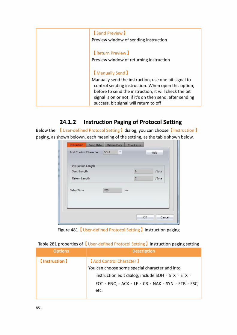
851
【Send Preview】
Preview window of sending instruction
【Return Preview】
Preview window of returning instruction
【Manually Send】
Manually send the instruction, use one bit signal to control sending instruction. When open this option, before to send the instruction, it will check the bit signal is on or not, if it’s on then send, after sending success, bit signal will return to off
24.1.2 Instruction Paging of Protocol Setting Below the 【User-defined Protocol Setting】dialog, you can choose【Instruction】
paging, as shown belown, each meaning of the setting, as the table shown below.
Figure 481【User-defined Protocol Setting】instruction paging
Table 281 properties of【User-defined Protocol Setting】instruction paging setting
Options Description
【Instruction】 【Add Control Character】
You can choose some special character add into
instruction edit dialog, include SOH、STX、ETX、
EOT、ENQ、ACK、LF、CR、NAK、SYN、ETB、ESC,
etc.
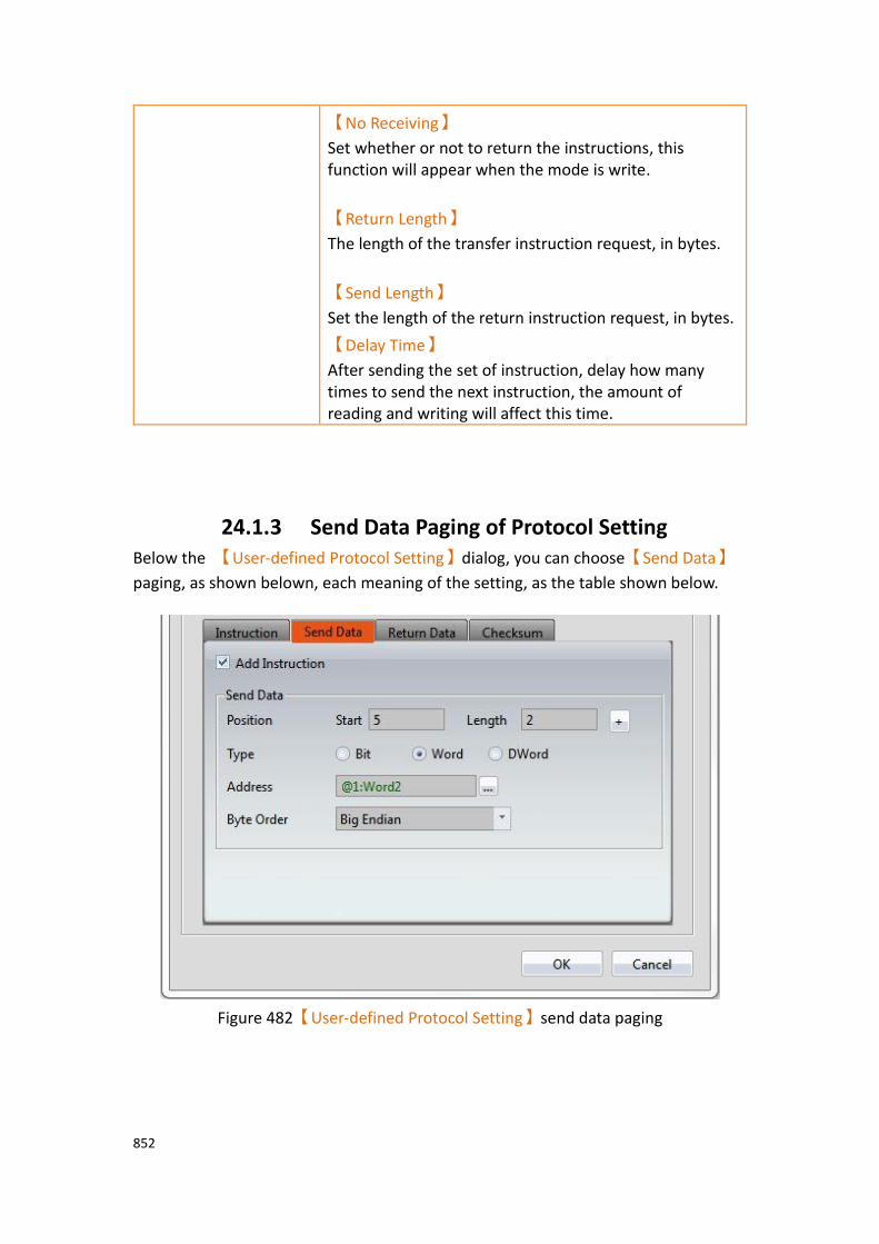
852
【No Receiving】
Set whether or not to return the instructions, this function will appear when the mode is write.
【Return Length】
The length of the transfer instruction request, in bytes.
【Send Length】
Set the length of the return instruction request, in bytes.
【Delay Time】
After sending the set of instruction, delay how many times to send the next instruction, the amount of reading and writing will affect this time.
24.1.3 Send Data Paging of Protocol Setting Below the 【User-defined Protocol Setting】dialog, you can choose【Send Data】
paging, as shown belown, each meaning of the setting, as the table shown below.
Figure 482【User-defined Protocol Setting】send data paging

853
Table 282 properties of【User-defined Protocol Setting】send data paging setting
Options Description
【Send Data】 【Position】
It can set the position of sending instruction through
【Start】and【Length】to set, for easy to use, you also
can set start position and length in【Send Preview】, then
press【+】button that besides the【Length】, will
automactically fill in【Start】and【Length】field.
Where the【Length】 is in byte.
When【Manually Send】isn’t select, it will send
instruction if the【Address】of the send data is changed.
【Type】
Set the type of write, include bit, word, double word
【Address】
The memory position represented by the instruction, for
example, when【Mode】choose in【Read】and it has
sending instruction, the address represent the storage address of sending data. Note : Addresses can only use the address provided by the user-defined protocol driver
【Byte Order】
Bit(Assume that the starting position is Bit0)
When 【Type】is【Word】or【DWord】, can choose
【Big Endian】or【Little Endian】to sort.
Difference shown as below

854
Word With 2 Bytes as a unit
Big Endian Little Endian
DWord With 4 Bytes as a unit
Big Endian Little Endian

855
24.1.4 Return Paging of Protocol Setting Below the 【User-defined Protocol Setting】dialog you can choose【Return Data】
paging, as shown belown, each meaning of the setting, as the table shown below.
Figure 483【User-defined Protocol Setting】returndata paging
Table 283 properties of【User-defined Protocol Setting】return data paging setting
Option Description
【Return Data】 【Position】
When【Mode】is【Read】or【Write】, and has return
instruction, you can set the location of the return data in
the return instruction through【Start】and【Length】,
for easy to use, you also can set start position and length
in【Send Preview】, then press【+】button that besides
the【Length】, will automactically fill in【Start】and
【Length】field.
Where the【Length】 is in byte.
When【Manually Send】isn’t select, as long as the return
data is displayed in the screen, the read instruction will be
sent continuously in accordance with【delay time】.
【Type】
Set the type of store, include bit, word, double word

856
【Address】
The address represent the storage address of return data. Note : Addresses can only use the address provided by the user-defined protocol driver
【Byte Order】
Method of sorting the【Send Data】or【Return Data】
When 【Type】is in【Bit】can choose the sort for【1
Byte for 1 Bit】or【1 Byte for 2 Bits】
Difference shown as below
Hex
1 Byte for 1 Bit 1 Byte for 2 Bits
Turn each byte to one bit Turn each byte to 2 bits
When 【Type】is【Word】or【DWord】, can choose
【Big Endian】or【Little Endian】to sort.
Difference shown as below
Word
Big Endian Little Endian
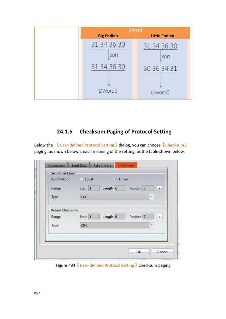
857
DWord
Big Endian Little Endian
24.1.5 Checksum Paging of Protocol Setting
Below the 【User-defined Protocol Setting】dialog, you can choose【Checksum】
paging, as shown belown, each meaning of the setting, as the table shown below.
Figure 484【User-defined Protocol Setting】checksum paging
858
Table 284 properties of【User-defined Protocol Setting】checksum paging setting
Option Description
【Checksum】 Provides an automatic calculation of the checksum.
【Send Checksum】 Under add method of 【Send Instruction】, provides
【Local】and【Driver】two methods.
【Local】
When choose【Local】, indicates that the checksum
needs to be entered manually in the 【Send
Instruction】, the following will have a 【Setting】
option to facilitate the use of designers to calculate.
【Setting】
It will appear 【Check Calculation】dialog after click
setting, as shown below
【Input Instruction】
Data of the【Instruction Edit】on the main operation
interface.
【Quick Add】
Click the botton then will copy the value form【Input

859
Instruction】to the【Instruction】field
【Instruction】
An instruction of using to calculate checksum
【Checksum】
The way to calculate checksum, includes none, CRC, SUM(BYTE), SUM(WORD), XOR, AND, OR, LRC, SUM Complement, SUM Radix-Minus-One Complement, etc.
【Calculate】
Calculate checksum,the results will display on
【Calculate Result】。
【Calculate Result】
Except LRC, other instructions converted to HEX format to be calculated.
【Composite Instruction】
Combine the calculation result and the origin
instruction, the value will show up in【Result】
【OK】
Store the value of【Result】to the data of the main
operation interface【Instruction Edit】
【Cancel】
Leave this dialog, it won’t change anything.
【Driver】
When choose【Driver】, indicates that the checksum
will automactically calculate and produce through the driver, the system will calculate checksum from
【Start】, bytes of【Length】checksum, and insert it
into【Position】,
as shown below.

860
【Range】
set the range of checksum calculation.
【Start】
Set the position where the checksum starts to calculate
【Length】
Set the length of the checksum calculation, in bytes
【Position】
Set the position where the checksum calculation result is inserted
【Automatically fill in】
For easy to use, you can also select the starting position
and length in the【Send Preview】window, when you
press the【+】button next to【Length】, you can fill in
the 【Start】 and 【Length】 fields automatically.
【Type】
Choose the type of checksum calculation, includes none, CRC, SUM(BYTE), SUM(WORD), XOR, AND, OR, LRC, SUM Complement, SUM Radix-Minus-One Complement, etc.
【Return Checksum】 When it has return instruction, you can set whether to verify the return data in the checksum.
【Range】
set the range of checksum calculation.
【Start】

861
Set the position where the checksum starts to calculate.
【Length】
Set the length of the checksum calculation, in bytes.
【Position】
Set the position where the checksum calculation result is inserted
【Automatically fill in】
For easy to use, you can also select the starting position
and length in the【Return Preview】window, when you
press the【+】button next to【Length】, you can fill in
the 【Start】 and 【Length】 fields automatically.
【Type】
Choose the type of checksum calculation, includes none, CRC, SUM(BYTE), SUM(WORD), XOR, AND, OR, LRC, SUM Complement, SUM Radix-Minus-One Complement, etc.
24.2 【User-defined Protocol】Application
examples
This section explains how to apply the【User-defined Protocol】 function,
communicate with the Modbus device, and read and write Modbus address data For example, HMI connected with FATEK FBs PLC through COM1, and connected with Modbus of station no.1 through COM4 of user-defined protocol, then read and write the data of 40001 address, as shown below, setting steps as follows.
Figure 485 HMI COM1 and COM4 connection page

862
Step 1: Build a new project and add link 0, choose Fatek FBs/B1/B1z/HB1 driver, Please refer to other relevant sections for this section.
Step 2: Add link 1, interface type select【direct link(serial)】, manufacturer select
【User-define Protocol】, product series select【User-define Protocol】, because
the example use COM4 to connect with Modbus, the port selection【COM4】,
【Baud Rate】,【None】,【Data Bits】,【Stop Bits】 and other communication
parameters need to set the same and Modbus devices, this example is 9600, None, 8,1, as shown below.
Figure 486 set User-define protocol communication format

863
Step 3: Switch to【Protocol Setting】paging, click【User-defined Protocol Setting】,
will appear【Instruction List】dialog, as shown below.
Figure 487【Instruction List】dialog
Step 4: Click【Add】, will appear【User-defined Protocol Setting】dialog, select
【Mode】as【Read】, select【Format】as【Hex】,as shown below.
Step 5: This example wants to read the Modbus device of station number 1, please enter 01 03 00 00 00 01 in the instruction edit field, as shown below, for more detail about Modbus please refer to the protocol information provided by the Modbus
Association. Enter 7 in【Return Length】field.

864
Figure 488【User-defined Protocol Setting】dialog
865
Step 6: Switch to【Checksum】paging, as shown below.
Figure 489【Checksum】paging dialog
866
Step 7: Click【Setting】button, will show up checksum calculation dialog, the data in
【Input Instruction】field will display the same as in【Instruction Edit】, click
【Quick Add】button will copy the field from【Input Instruction】to
【Instruction】, 【Checksum】select【CRC】, then press【Calculate】button, the
【Calculate Result】field will display 84 0A, press【Composite Instruction】button,
as shown below, for more detail about Modbus please refer to the protocol information provided by the Modbus Association.
Figure 490【Checksum Calculation】dialog

867
Step 8: Click【OK】button, will copy from【Composite Instruction】to【Instruction
Edit】, and fill 1 in the【Start】of【Return Checksum】, fill 5 in【Length】, select
crc in【Type】, as shown below.
Figure 491 composite result dialog

868
Step 9: Switch to【Return Data】paging, fill 4 in【Start Position】of【Return
Data】, fill 2 in【Length】,【Type】select【Word】, 【Address】set to
@1:Word0, 【Bite Order】set to Big Endian, as shown below.
Note: Addresses can only use the address provided by the user-defined protocol driver
Figure 492 return data dialog

869
Step 10: Planning a new【Numeric Input/Display】object, 【Monitor Adderss】set
as @1:Word0, as shown below,you can read the station number 1 Modbus device 40001 address value.
Figure 493 planning Numeric Input/Display object
The above is an example for reading, for writing the following steps,
Step 11: in【Instruction List】dialog, click【Add】, will appear【User-defined
Protocol Setting】dialog, 【Mode】selected as【Write】, 【Format】selected as
【HEX】, as shown below.

870
Step 12: This example wants to write the Modbus device of station number 1, please enter 01 06 00 00 in the instruction edit field, as shown below, for more detail about Modbus please refer to the protocol information provided by the Modbus
Association. Enter 8 in【Return Length】field.
Figure 494【User-defined Protocol Setting】dialog

871
Step 13: Switch to【Send Data】paging, fill 5 in【Start】of【Send Data】, fill 2 in
【Length】,【Type】select【Word】, 【Address】set to @1:Word2, 【Bite
Order】set to Big Endian, as shown below.
Note: Addresses can only use the address provided by the user-defined protocol driver
Figure 495 switch to【Data】paging dialog

872
Step 14: Switch to【Checksum】paging,【Send Checksum】【Add Method】choose
【Driver】, fill 1 in the【Start】, fll 6in【Length】, select crc in【Type】,
fill 1 in the【Start】of【Return Checksum】, fill 6in【Length】, select crc in
【Type】, as shown below.
Figure 496 switch to【Checksum】paging dialog

873
Step 15: Planning a new【Numeric Input/Display】object, 【Monitor Adderss】set
as @1:Word2, as shown below,you can write the station number 1 Modbus device 40001 address value.
Figure 497 planning Numeric Input/Display object

874
24.3 【User-defined Protocol】use Script
Application Example
This section explains how to use the【User-defined Protocol】function of the script,
communicate with the Modbus device, and read the data of Modbus address, for example, HMI connect with FATEK FBs PLC through COM1, then connect with Modbus device of station number 1 through COM4 by using user-defined protocol, read the data of address 40001 through the script, as shown below.
Figure 498 HMI COM1 and COM4 connection page
24.3.1 Communication Instructions in Script Use the function【User-defined Protocol】in script, will mainly use the【io write
and read】and【Checksum】instruction, as shown below, each meaning of the
setting as shown below, as the table below.
Figure 499 communication instruction in script
875
Table 285 properties of communication instruction in script settings
Options Io write and read insruction description
【P1】 The start address to send instruction.
【P2】 Send the length of the instruction.
【P3】 Device name.
【P4】 The start address to return instruction.
【P5】 Return the length of the instruction.
Options Checksum instrunction description
【P1】 Calculation method.
Value is Calculation method description
1 CRC
2 SUM(BYTE)
3 SUM (WORD)
4 XOR
5 AND
6 OR
7 LRC
8 SUM Complement
9 SUM Radix-Minus-One Complement
【P2】 Calculate start address.
【P3】 Calculate words.
【P4】 Result store start address, starting with 1 or 2 consecutive words, depending on the calculation method
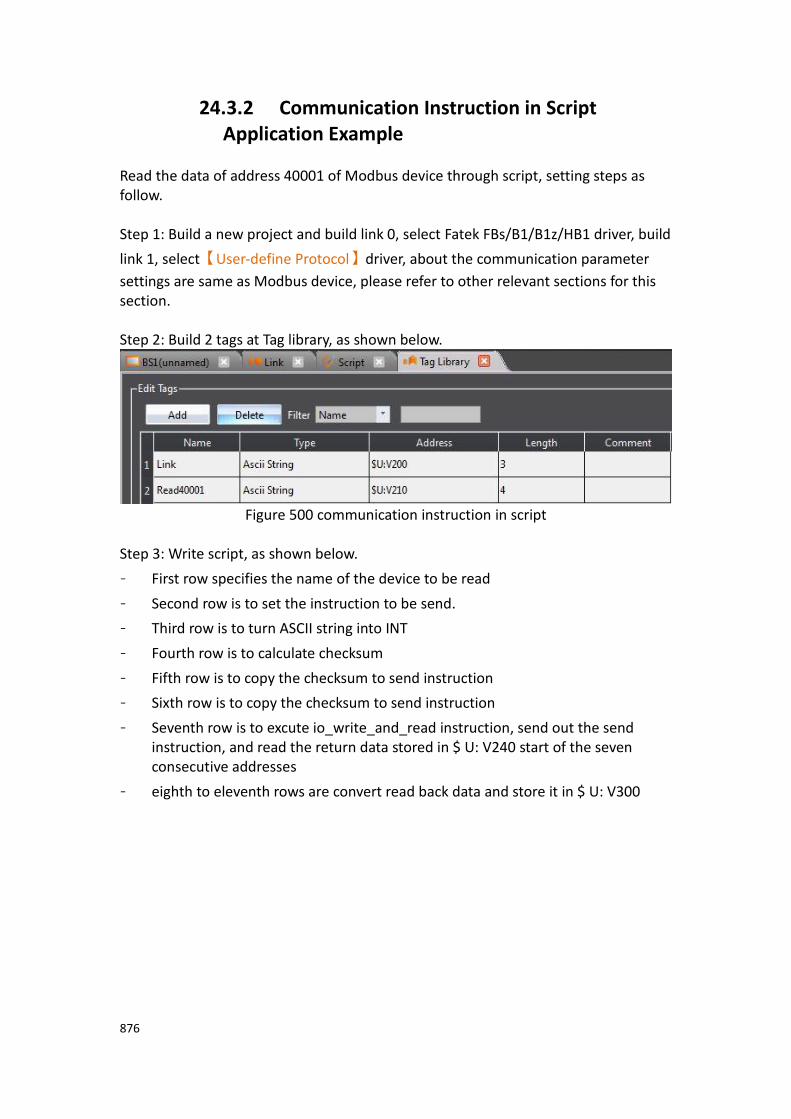
876
24.3.2 Communication Instruction in Script Application Example
Read the data of address 40001 of Modbus device through script, setting steps as follow. Step 1: Build a new project and build link 0, select Fatek FBs/B1/B1z/HB1 driver, build
link 1, select【User-define Protocol】driver, about the communication parameter
settings are same as Modbus device, please refer to other relevant sections for this section. Step 2: Build 2 tags at Tag library, as shown below.
Figure 500 communication instruction in script
Step 3: Write script, as shown below.
- First row specifies the name of the device to be read
- Second row is to set the instruction to be send.
- Third row is to turn ASCII string into INT
- Fourth row is to calculate checksum
- Fifth row is to copy the checksum to send instruction
- Sixth row is to copy the checksum to send instruction
- Seventh row is to excute io_write_and_read instruction, send out the send instruction, and read the return data stored in $ U: V240 start of the seven consecutive addresses
- eighth to eleventh rows are convert read back data and store it in $ U: V300

877
Figure 501 Read the 40001 address data script for the Modbus device
Step 4: Planning a new【Numeric Input/Display】object, 【Monitor Adderss】set
as $U:V300, as shown below, you can read the station number 1 Modbus device 40001 address value.
Figure 502 Planning a new【Numeric Input/Display】object
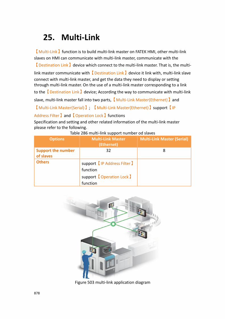
878
25. Multi-Link
【Multi-Link】function is to build multi-link master on FATEK HMI, other multi-link
slaves on HMI can communicate with multi-link master, communicate with the
【Destination Link】device which connect to the multi-link master. That is, the multi-
link master communicate with【Destination Link】device it link with, multi-link slave
connect with multi-link master, and get the data they need to display or setting through multi-link master. On the use of a multi-link master corresponding to a link
to the【Destination Link】device; According the way to communicate with multi-link
slave, multi-link master fall into two parts,【Multi-Link Master(Ethernet)】and
【Multi-Link Master(Serial)】; 【Multi-Link Master(Ethernet)】support【IP
Address Filter】and【Operation Lock】functions
Specification and setting and other related information of the multi-link master please refer to the following.
Table 286 multi-link support number od slaves
Options Multi-Link Master (Ethernet)
Multi-Link Master (Serial)
Support the number of slaves
32 8
Others support【IP Address Filter】
function
support【Operation Lock】
function
Figure 503 multi-link application diagram
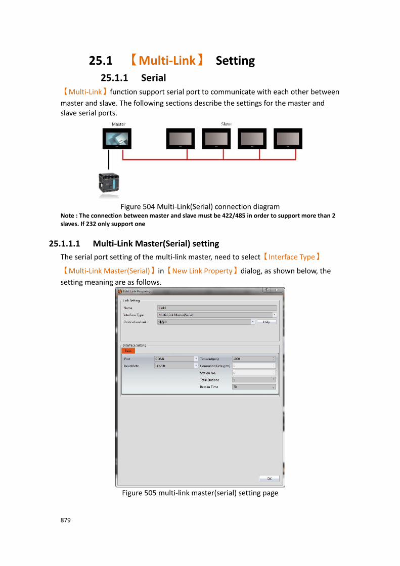
879
25.1 【Multi-Link】 Setting 25.1.1 Serial
【Multi-Link】function support serial port to communicate with each other between
master and slave. The following sections describe the settings for the master and slave serial ports.
Figure 504 Multi-Link(Serial) connection diagram
Note : The connection between master and slave must be 422/485 in order to support more than 2 slaves. If 232 only support one
25.1.1.1 Multi-Link Master(Serial) setting
The serial port setting of the multi-link master, need to select【Interface Type】
【Multi-Link Master(Serial)】in【New Link Property】dialog, as shown below, the
setting meaning are as follows.
Figure 505 multi-link master(serial) setting page
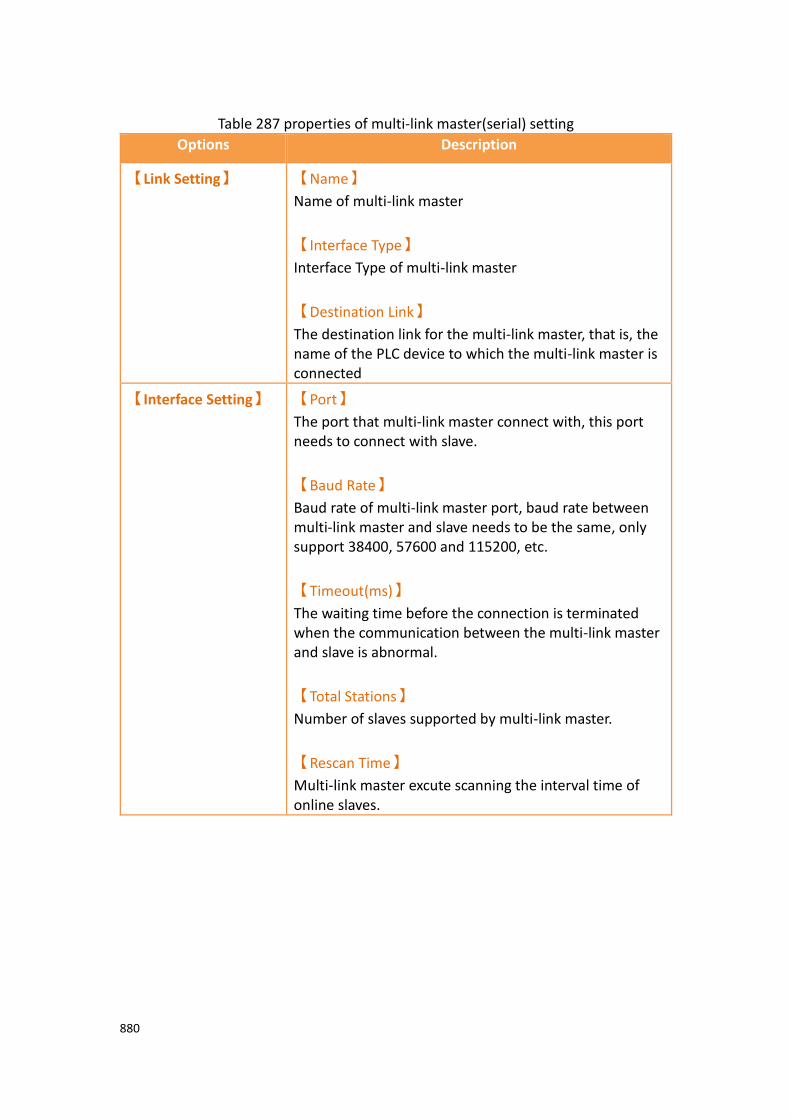
880
Table 287 properties of multi-link master(serial) setting
Options Description
【Link Setting】 【Name】
Name of multi-link master
【Interface Type】
Interface Type of multi-link master
【Destination Link】
The destination link for the multi-link master, that is, the name of the PLC device to which the multi-link master is connected
【Interface Setting】 【Port】
The port that multi-link master connect with, this port needs to connect with slave.
【Baud Rate】
Baud rate of multi-link master port, baud rate between multi-link master and slave needs to be the same, only support 38400, 57600 and 115200, etc.
【Timeout(ms)】
The waiting time before the connection is terminated when the communication between the multi-link master and slave is abnormal.
【Total Stations】
Number of slaves supported by multi-link master.
【Rescan Time】
Multi-link master excute scanning the interval time of online slaves.

881
25.1.1.2 Multi-Link Slave(Serial) Setting
The serial port setting of the multi-link slave, need to select【Interface Type】
【Multi-Link Slave(Serial)】in【New Link Property】dialog, as shown below, the
setting meaning are as follows.
Figure 506 multi-link slave(serial) setting page
Table 288 properties of multi-link slave(serial) setting
Options Description
【Link Setting】 【Name】
Name of multi-link slave
【Interface Type】
Interface Type of multi-link slave
【Destination Link Type】
The destination link type of multi-link slave

882
corresponding to the multi-link master
【Manufacturer】
The destination link manufacturer of multi-link slave corresponding to the multi-link master
【Product Series】
The destination link product series of multi-link slave corresponding to the multi-link master
【Interface Setting】 【Port】
The port that multi-link slave connect with, this port needs to connect with master.
【Baud Rate】
Baud rate of multi-link master port, baud rate between multi-link master and slave needs to be the same, only support 38400, 57600 and 115200, etc.
【Timeout(ms)】
When a communication error occurs, wait time before terminating the connection and generating an error
【Station No.】
Station No. of multi-link slave.

883
25.1.2 Ethernet 【Multi-Link】function support ethernet to communicate with each other between
master and slave. The following sections describe the settings for the master and slave ethernet.
25.1.2.1 Multi-Link Master(Ethernet) setting
The serial port setting of the multi-link master, need to select【Interface Type】
【Multi-Link Master(Ethernet)】in【New Link Property】dialog, as shown below,
the setting meaning are as follows.
Figure 507 multi-link master(ethernet) setting page

884
Table 289 properties of multi-link master(ethernet) setting
Options Description
【Link Setting】 【Name】
Name of multi-link master
【Interface Type】
Interface Type of multi-link master
【Destination Link】
The destination link for the multi-link master, that is, the name of the PLC device to which the multi-link master is connected
【Interface Setting】 【Port】
The port that multi-link master connect with, the port setting needs to be the same with the slave; default port is 8000
【IP filter】
When enable, the multi-link master will only allow the IP of the slaves that on the list to connect with the master
When enable, click【Setting】will appear dialog as
shown below, set the IP Address in【IP Filter】of the
slave that you want to connect with.
【Timeout(ms)】
The waiting time before the connection is terminated when the communication between the multi-link master and the slave is abnormal.

885
25.1.2.2 Multi-Link Slave(Ethernet) setting
The serial port setting of the multi-link slave, need to select【Interface Type】
【Multi-Link Slave(Ethernet)】in【New Link Property】dialog, as shown below, the
setting meaning are as follows.
Figure 508 multi-link slave(ethernet) setting page
Table 290 properties of multi-link slave(ethernet) setting
Options Description
【Link Setting】 【Name】
Name of multi-link slave.
【Interface Type】
Interface Type of multi-link slave.

886
【Destination Link Type】
The destination link type of multi-link slave corresponding to the multi-link master
【Manufacturer】
The destination link manufacturer of multi-link slave corresponding to the multi-link master
【Product series】
The destination link product series of multi-link slave corresponding to the multi-link master
【Interface Setting】 【IP Address】
IP Address of the slave that want to connect with the master.
【Port】
Multi-link slave connect to the ethernet port of the master
【Timeout(ms)】
When communication error occur, wait time before terminating and the connection and generating an error
【Device specific
setting】
The setting of this part needs to be the same with the device setting of the destination link of the multi-link master.
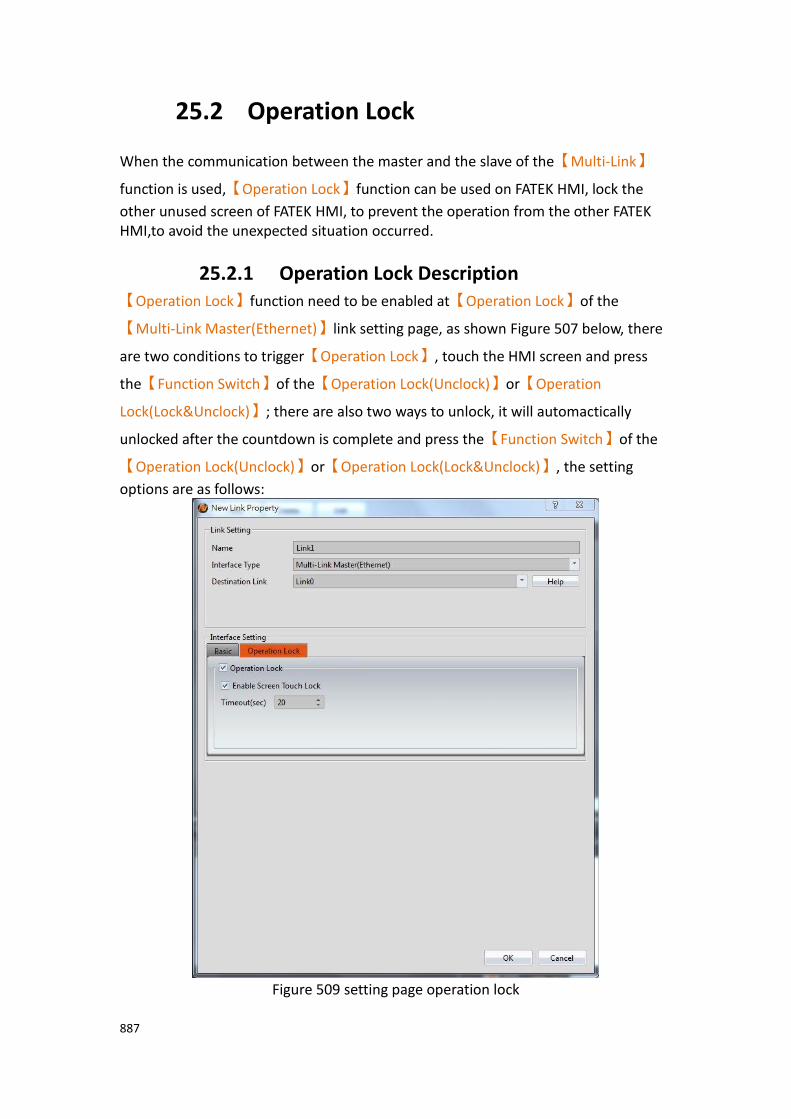
887
25.2 Operation Lock
When the communication between the master and the slave of the【Multi-Link】
function is used,【Operation Lock】function can be used on FATEK HMI, lock the
other unused screen of FATEK HMI, to prevent the operation from the other FATEK HMI,to avoid the unexpected situation occurred.
25.2.1 Operation Lock Description 【Operation Lock】function need to be enabled at【Operation Lock】of the
【Multi-Link Master(Ethernet)】link setting page, as shown Figure 507 below, there
are two conditions to trigger【Operation Lock】, touch the HMI screen and press
the【Function Switch】of the【Operation Lock(Unclock)】or【Operation
Lock(Lock&Unclock)】; there are also two ways to unlock, it will automactically
unlocked after the countdown is complete and press the【Function Switch】of the
【Operation Lock(Unclock)】or【Operation Lock(Lock&Unclock)】, the setting
options are as follows:
Figure 509 setting page operation lock

888
Table 291 properties of operation lock setting
Options Description
【Operation Lock】 【Enable Screen Touch Lock】
When enabled, touch the HMI screen to enable
【Operation Lock】, the other multi-link HMI will go into
the screen lock status.
【Timeout(sec)】
After HMI in screen lock status, if the enable【Operation
Lock】HMI doesn’t operate exceed the setting time,
then the other multi-link HMI in the screen lock status will automactically unlock the screen.
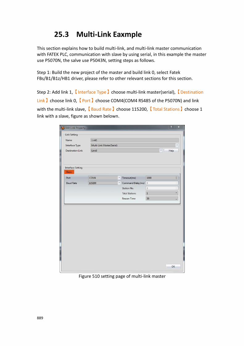
889
25.3 Multi-Link Eaxmple This section explains how to build multi-link, and multi-link master communication with FATEK PLC, communication with slave by using serial, in this example the master use P5070N, the salve use P5043N, setting steps as follows. Step 1: Build the new project of the master and build link 0, select Fatek FBs/B1/B1z/HB1 driver, please refer to other relevant sections for this section.
Step 2: Add link 1,【Interface Type】choose multi-link master(serial),【Destination
Link】choose link 0,【Port】choose COM4(COM4 RS485 of the P5070N) and link
with the multi-link slave,【Baud Rate】choose 115200,【Total Stations】choose 1
link with a slave, figure as shown belown.
Figure 510 setting page of multi-link master

890
Step 3: Planning 6【Numeric Input/Display】objects on the master screen,
【Monitor Address】set as @0:R0 ~ @0:R5.
Step 4: build a new project of the slave,【Interface Type】choose multi-link
slave(serial),【Destination Link Type】choose serial,【Port】choose COM3(COM3
RS485 of the P5043N) and link with the multi-link slave,【Baud Rate】choose
115200,【Total Stations】choose 1, figure as shown belown.
Figure 511 setting page of multi-link slave
Step 5: Planning 6【Numeric Input/Display】objects on the master screen,
【Monitor Address】set as @1:R0 ~ @1:R5.
Step 6: Download the project to master and slave HMI, and link with the FATEK PLC master and master COM4(RS485) and slave COM3(RS485), input the value in master and the slave will synchronize update, or input the value in slave and the master will synchronize update.

891
26. Search/Replace
The【Search/Replace】function is to provide designers with more efficient and
time-saving tools for planning projects. For example, when the designer is planning a project, it is uncertain whether those PLC addresses or internal addresses of the HMI are used , or on which items or functions to use, can search through the entire project, screen or function to search for the desired address, avoid using the same address and affect the function of the operation; Or in a project that has already been planned, it is hoped that the address of the modified part will have multiple consecutive addresses. At this time, you can also use this auxiliary function to modify batches at once, instead of spending a huge amount of time and effort, opening items one by one to make changes, etc.
26.1 The Use of Search/Replace This section explains how to use the【Search/Replace】feature and how to set the
window.【Search/Replace】function can click on the icon in the status bar on
any screen, or press the【Ctrl+F】key on the keyboard to open【Search/Replace】
function dialog window
Figure 512 status bar
The options for opening the【Search/Replace】function dialog window are shown in
the following figure. The meaning of each option is as follows:
Figure 513【Search/Replace】function window

892
Table 292【Search/Replace】function properties setting
Properties Descriptions
【Target】 To search for or replace the address or text used in the project.
【Address】
Choose to search or replace the address used in the project.
【Text】
Choose to search or replace text used in a project.
【Data Type】 The address to be searched for or replaced in the project
is【Bit】or【Word】, etc.
When the target is selected as【Address】this option
will be displayed.
【Range】 Select the range of addresses to search for or replace in the project.
When the target is selected as【Address】this option
will be displayed.
【Case Sensitive】 Select whether to search for or replace the text in the project is case-sensitive.
When the target is selected as【Text】this option will be
displayed.
【Whole Words
Only】
Select if you want to search or replace the text in the project if all text is the same.
When the target is selected as【Text】this option will be
displayed.
【Search for】 Fill in the address or text to be searched. When
【Range】is checked, you can set the start address and
end address. If there is an error in the search address or text, the following figure shows the designer.
893
【Replace with】 Fill in the address or text to be replaced. When
【Range】is checked, you can set the start address and
end address.
【Scope】 You can check the range you want to search for or
replace, including【Whole Project】,【Current
Screen】,【All Screens】,【Unit Setting】,【Links】,
【Servers】,【Security】,【Data Log】,【Alarm】,
【Recipe】,【Operation Log】,【Schedule】,【Data
Transfer】,【Script】,【Tag Library】and【Text
Library】, etc. When the target is selected as【Text】,
the【Script】option will not provide selection.
【Search】 Press to execute searching the address or text used in the project.
【Replace All】 Press to execute replacement address or text used in the project.
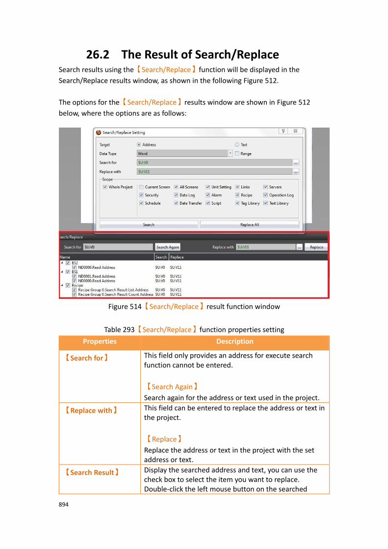
894
26.2 The Result of Search/Replace Search results using the【Search/Replace】function will be displayed in the
Search/Replace results window, as shown in the following Figure 512.
The options for the【Search/Replace】results window are shown in Figure 512
below, where the options are as follows:
Figure 514【Search/Replace】result function window
Table 293【Search/Replace】function properties setting
Properties Description
【Search for】 This field only provides an address for execute search function cannot be entered.
【Search Again】
Search again for the address or text used in the project.
【Replace with】 This field can be entered to replace the address or text in the project.
【Replace】
Replace the address or text in the project with the set address or text.
【Search Result】 Display the searched address and text, you can use the check box to select the item you want to replace. Double-click the left mouse button on the searched

895
object to display the screen where the object is located in the window area. At the same time, the object properties will be displayed for the designer to edit. The content will contain the following fields.
【Name】
Display the name of the searched object and the screen where the object is located.
【Search】
The searched address.
【Replace】
The replaced address.
In addition, on the【View】tab of the FvDesigner ribbon, click【Search/Replace】to
also enable or disable the【Search/Replace】result window.
Figure 515【Search/Replace】option in【View】

896
27. Communication Error Codes
The following table will detailed description the HMI and PLC or other devices occurred error when communicating, each meaning of the code:
Table 294 description of the communication error code
Error Code Description Remarks
0x00000001 Com Port Not Open
0x00001001 Dcc Illegal Parameters
0x00001002 Dcc Stop
0x00001003 Dcc Failed Set Read Back
0x00001004 Dcc Failed
0x00002000 DccErr Link Init
0x00002001 Dcc Link Pending
0x00002002 Dcc Screen Change
0x00003001 Multilink Timeout
0x00003002 Multilink Master and Slave use different PLC driver
0x10010001 ComPort Error
0x10010002 ComPort Open Fail
0x10010003 ComPort Send Fail
0x10010004 ComPort Receive Fail
0x10020001 Socket Null
0x10020002 Socket Connect Fail
0x10020003 Socket Invalid IP
0x10020004 Socket Send Fail
0x10020005 Socket Receive Fail
0x1002FFFF Socket Unknown
0x20010001 Protocol Invalid Head
0x20010002 Protocol Invalid End
0x20010003 Protocol Invalid Length
0x20010004 Protocol Invalid Data

897
0x20010005 Protocol Invalid Error Check
0x20010006 Protocol Invalid Parameter
0x20010007 Protocol Invalid Password
0x200A0000 Protocol Exception
0x200Axxxx When the first 4 error codes are 200A, it means that the HMI get error from PLC, and the last 4 error codes are from PLC. Please refer to different brand PLC's manual
0x400A0000 Command Timeout
0x400A0001 Command Send Failed
0x400A0002 Command Receive Failed
0x400B0001 Command Nack
0x400B0002 Command Unknown
0x400B0003 Command Not Support
0x400C0001 API Parameter Error
0x400CFFFF Internal Error
Related Documents