TEACHER'S EDITION Exploring Linear Relations GAIL F. BURRILL AND PATRICK HOPFENSPERGER DA . TA-DRIVEN MATHEMATICS D A L E S E Y M 0 U R P U B L I C A T I 0 N S®

Welcome message from author
This document is posted to help you gain knowledge. Please leave a comment to let me know what you think about it! Share it to your friends and learn new things together.
Transcript

TEACHER'S EDITION
Exploring Linear Relations
GAIL F. BURRILL AND PATRICK HOPFENSPERGER
DA .TA-DRIVEN MATHEMATICS
D A L E S E Y M 0 U R P U B L I C A T I 0 N S®


Exploring Linear Relations
TEACHER'S EDITION
DATA-DRIVEN MATHEMATICS
Gail F. Burrill and Patrick Hopfensperger
Dale Seymour Publications®
This material was produced as a part of the American Statistical Association's Project "A Data-Driven Curriculum Strand for High School" with funding through the National Science Foundation, Grant #MDR-9054648. Any opinions, findings, conclusions, or recommendations expressed in this publication are those of the authors and do not necessarily reflect the views of the National Science Foundation.
This book is published by Dale Seymour Publications®, an imprint of Addison Wesley Longman, Inc.
Copyright© 1998 by Dale Seymour Publications®. All rights reserved. Printed in the United States of America.
Limited reproduction permission: The publisher grants permission to individual teachers who have purchased this book to reproduce the Activity Sheets, the Quizzes, and the Tests as needed for use with their own students. Reproduction for an entire school or school district or for commercial use is prohibited.
Order number DS21162
ISBN 1-57232-211-X
1 2 3 4 5 6 7 8 9 10-ML-02 01 00 99 98 97
This Book ls Printed On Recycled Paper
DALE SEYMOUR PUBLICATIONS®
Managing Editor: Cathy Anderson
Senior Math Editor: Carol Zacny
Project Editor: Mary Myers
Production/Manufacturing Director: Janet Yearian
Senior Production Coordinator: Alan Noyes
Design Manager: Jeff Kelly
Designer: Christy Butterfield
Cover Design: Christy Butterfield

Authors
Gail F. Burrill National Center for Mathematics Sciences Education University of Wisconsin-Madison Madison, Wisconsin
Patrick Hopfensperger Homestead High School Mequon, Wisconsin
Data-Driven Mathematics Leadership Team
Miriam Clifford Nicolet High School Glendale, Wisconsin
James M. Landwehr Bell Laboratories Lucent Technologies Murray Hill, New Jersey
Consultants
Jack Burrill National Center for Mathematics Sciences Education University of Wisconsin: Madison Madison, Wisconsin
Vince O'Connor Milwaukee Public Schools Milwaukee, Wisconsin
Kenneth Sherrick Berlin High School Berlin, Connecticut
Gail F. Burrill National Center for Mathematics Sciences Education University of Wisconsin-Madison Madison, Wisconsin
Emily Errthum Homestead High School Mequon, Wisconsin
Maria Mastromatteo Brown Middle School Ravenna, Ohio
Richard Scheaffer University of Florida Gainesville, Florida
Henry Kranendonk Rufus King High School Milwaukee, Wisconsin
Jeffrey Witmer Oberlin College Oberlin, Ohio

Acknowledgments
The authors would like to thank the following people for their assistance during the preparation of this module:
The many teachers who reviewed drafts and participated in the fields tests of the manuscripts.
The members of the Data-Driven Mathematics leadership team, the consultants and writers.
Nancy Kinard, Ron Moreland, Peggy Layton, and Kay Williams for their advice and suggestions in the early stages of the writing.
Jack Price and Ann Watkins for their thoughtful and careful review of the early drafts.
Kathryn Rowe and Wayne Jones for their help in organizing the field test process and the Leadership Workshops.
Barbara Shannon for many hours of word processing and secretarial services.
Jean Moon for her advice on how to improve the field test process.
Beth and Bryan Cole for writing answers for the teachers edition.
The many students from Homestead High School and Whitnall High School who helped shape the ideas as they were being developed.

Tallle of Contents
Using This Module vii
Unit I: Linearity
Exploratory Lesson: How Do Events Change Over Time? 3
Lesson 1 : Rates of Change 7
Lesson 2: Equations of Lines 24
Lesson 3: Equivalent Forms of Equations 35
Assessment: Price Changes and Median Earnings 47
Lesson 4 (Optional): Buying Power 51
Unit II: Lines and Scatter Plots
Exploratory Lesson: Balloons and More Balloons 57
Lesson 5: Scatter Plots 61
Lesson 6: Graphs and Their Special Properties 70
Assessment: Vital Statistics 90
Lesson 7: Lines on Scatter Plots 93
Lesson 8: Technology and Measures of Error 108
Lesson 9: Lines, Lines, and More Lines 121
Lesson 10: A Measure of Association 137
Lesson 11: End-of-Module Project: The Domino Topple 154
Lesson 12 (Optional): Catapults and Candy 157
Teacher Resources
Quizzes 165
End-of-Module Test 172
Solutions to Quizzes and Test 176
Activity Sheets 182
Procedures for Using the Tl-83 Graphing Calculator 201
About Data-Driven Malllemalics
Historically, the purposes of secondary-school mathematics have been to provide students with opportunities to acquire the mathematical knowledge needed for daily life and effective citizenship, to prepare students for the workforce, and to prepare students for postsecondary education. In order to accomplish these purposes today, students must be able to analyze, interpret, and communicate information from data.
Data-Driven Mathematics is a series of modules meant to complement a mathematics curriculum in the process of reform. The modules offer materials that integrate data analysis with high-school mathematics courses. Using these materials helps teachers motivate, develop, and reinforce concepts taught in current texts. The materials incorporate the major concepts from data analysis to provide realistic situations for the development of mathematical knowledge and realistic opportunities for practice. The extensive use of real data provides opportunities for students to engage in meaningful mathematics. The use of real-world examples increases student motivation and provides opportunities to apply the mathematics taught in secondary school.
The project, funded by the National Science Foundation, included writing and field-testing the modules, and holding conferences for teachers to introduce them to the materials and to seek their input on the form and direction of the modules. The modules are the result of a collaboration between statisticians and teachers who have agreed on the statistical concepts most important for students to know and the relationship of these concepts to the secondary mathematics curriculum.
A diagram of the modules and possible relationships to the curriculum is on the back cover of each module.
vi ABOUT DATA-DRIVEN MATHEMATICS

Using This Module
Why the Content Is Important
Studying mathematics requires that students first understand both the use of symbols and the concept of variables. The study of relationships between variables and symbols often begins with linearity. Linear relationships between two variables can be explored through questions such as "How do changes in one variable relate to changes in a second variable?" and "Can a pattern be expressed using mathematical symbols?" The relationship between a constant rate of change and linear data provides the foundation for thinking about slope and linear equations.
In this module, students make and interpret scatter plots and plots over time, using various data such as car prices and median incomes of men and women. They investigate slope as a rate of change, summarize data by fitting a straight line, find the equation of that line, and use those results to make predictions. They explore which line is best, and in the process they are introduced to measures of error and correlation. The relationship between algebraic expressions and their real-world meanings is emphasized. Working from problems in real-world contexts, students solve equations in one variable, find equivalent forms of equations, and learn about linearity. In each situation, they investigate the data from three perspectives: numerical, graphical, and symbolic.
Emphasis is on student-constructed mathematics to quantify a situation and the use of the information to solve a problem. Many of the problems are open-ended; students have to make decisions about how to construct the data set as well as how to begin to analyze the data. Students learn to recognize the assumptions they make when extrapolating information from graphs or summarizing an entire data set with a line. Practice is provided for some basic concepts. Students learn that there are different ways to represent quantities, and one way might be better for a stated purpose than another. For example, the point-slope form of a linear equation is an efficient way to write the equation of a line given a point and the slope, whereas the slope-intercept form can be used to determine whether or not two lines are equivalent. Sometimes the intercepts are used in graphing a given line, whereas in other situations, the intercepts are not even meaningful. For numerical comparison, slopes can be expressed as decimals; however; when graphing, fractions are often more useful.
An equation in two variables can be derived from a graph. Solving an equation in one variable can then be framed in terms of the graphical application. Students are given data and then asked to find an appropriate line to represent the data. They are also given a line and asked to interpret it in terms of the data. They are introduced first to the pointslope form of a linear equation as a way to write an equation that summarizes the situation.
USING THIS MODULE vii

From a statistical perspective, students work with real-world data to find the answer to a question or the solution to a problem. As students encounter different situations involving data, they learn to think about the data, what the data mean, and how the data are related to the problem. Students learn to understand how two variables might be related, how to describe that relationship, and how to use the relationship to make generalizations or predictions. Students recognize the role of correlation as a way to measure the strength of a relationship between variables. They use the root mean squared error as a way to describe the variability involved in using a line to summarize the relationship. In particular, students gain understanding of how interpolation (reading between data points) is accomplished with some certainty in the reliability of the answer, but how extrapolation (reading beyond given data points) is based on strong and perhaps incorrect assumptions. Therefore, they learn to recognize the dangers of relying too heavily on this kind of reasomng.
Algebra: Students will be able to
• Find and interpret slope as a rate of change.
• Write the equation of a line from given information.
• Identify and interpret intercepts and zeros.
• Graph a linear equation.
• Identify equivalent equations.
• Solve an equation in one variable.
• Graph and interpret the line y = x.
Statistics: Students will be able to
• Make and interpret a scatter plot.
• Make and interpret plots over time.
• Find a median fit line.
• Find a measurement for error in a fit for paired data.
• Find a line that is the best fit for the data.
• Use the concept of residual to find prediction errors.
• Find and interpret an approximation for a correlation coefficient.
Instructional Model
Exploring Linear Relations (and all of the modules in Data-Driven Mathematics) emphasizes discourse and student involvement. Each lesson is designed around a problem or mathematical situation and begins with a series of introductory questions or scenarios that can prompt discussion and raise issues about that problem. These questions can involve students in thinking about the problem and help them understand why such a problem might be of interest to someone in the world outside the classroom. The questions can be used in whole-class discussion or in student groups. In some cases, the questions are appropriate to assign as homework with some family involvement.
viii USING THIS MODULE

These questions are followed by discussion issues that clarify the initial questions and begin to shape the direction of the lesson. Once the stage has been set for the problem, students begin to investigate the situation mathematically. As students work their way through the investigations, it is important that they have the opportunity to share their thinking with others and to discuss their solutions in small groups and with the entire class. Many of the exercises are designed for groups in which each member does one part of the problem and the results are compiled for final analysis and solution. Multiple solutions and solution strategies are also possible, and it is important for students to recognize these situations and to discuss the reasoning behind different approaches. This will provide each student with a wide variety of ways to build his or her own understanding of the mathematics.
In many cases, students are expected to construct their own understanding by thinking about the problem from several perspectives. They do need, however, validation of tJieir thinking and confirmation that they are on the right track, which is why discourse among students, and between students and teacher, is critical. In addition, an important part of the teacher's role is to help students link the ideas within an investigation and to provide an overview of the "big picture" of the mathematics within the investigation. To facilitate this, a review of the mathematics appears in the Summary following each investigation.
Each investigation ends with a practice section in which students can revisit ideas presented within the lesson. These exercises may be assigned as homework, given as group work during class, or omitted altogether if students are ready to move ahead.
Periodically, student assessments occur in the student book. These can be assigned as long-range take-home tasks, as group assessment activities, or as in-class work. The assessment pages provide a summary of the lessons up to that point and can serve as a way for students to demonstrate what they know and what they can do with the mathematics. Commenting on the strategies students use to solve a problem can encourage students to apply different strategies. Students also learn to recognize those strategies that enable them to find solutions efficiently.
Teaching Resources
At the back of this Teacher's Edition are the following:
• Quizzes for selected lessons and the End-of-Module Test
• Solution Key for quizzes and test
• Activity Sheets
•Procedures for Using the TI-83 Graphing Calculator
USING THIS MODULE be

Use of Teacher Resources
These items are referenced in the Materials section at the beginning of the lesson commentary.
LESSONS RESOURCE MATERIALS
Unit I: Linearity
Exploratory Lesson: How Do Events Change Over Time?
Lesson 1: Rates of Change • Activity Sheet 1 (Questions 2 and 18)
Lesson 2: Equations of Lines • Activity Sheet 2 (Questions 4 and 6)
• Lesson 2 Quiz
Lesson 3: Equivalent Forms of Equations • Lesson 3 Quiz
Assessment: Price Changes and Median Earnings
Lesson 4 (Optional): Buying Power • Activity Sheet 3 (Question 2)
Unit II: Lines and Scatter Plots
Exploratory Lesson: Balloons and More Balloons • Activity Sheet 4 (Question 4)
Lesson 5: Scatter Plots • Activity Sheets 5 and 6 (Question 3)
• Activity Sheet 7 (Question 5)
Lesson 6: Graphs and Their Special Properties • Activity Sheet 8 (Question 11)
Assessment: Vital Statistics
Lesson 7: Lines on Scatter Plots • Activity Sheet 9 (Questions 7 and 1 O)
• Activity Sheet 10 (Questions, 9, 13, 14, and 15)
• Activity Sheet 11 (Questions 19 and 22)
• Lesson 7 Quiz
Lesson 8: Technology and Measures of Error • Procedures for Using the Tl-83
Lesson 9: Lines, Lines, and More Lines • Activity Sheet 12 (Question 4)
• Activity Sheet 13 (Question 5)
• Activity Sheet 14 (Question 6)
• Lesson 9 Quiz
Lesson 10: A Measure of Association • Activity Sheet 15 (Question 3)
• Activity Sheet 16 (Question 7)
Lesson 11: End-of-Module Project, The Domino Topple • End-of-Module Test
Lesson 12 (Optional): Catapults and Candy
x USING THIS MODULE

Where to Use the Module in the Curriculum
This module is about graphing and working with linear equations. It can be used in a first-year algebra course in a variety of ways, most effectively when it is integrated during the first semester of the course.
The module can
• Replace the standard chapter on graphing linear equations in any traditional mathematics text.
• Be used after students have completed a section on solving equations in one variable to illustrate how to apply those concepts in realworld contexts and provide investigations into graphical representations of linear relationships.
• Be used as the second or third unit in a course, following Exploring Symbols: An Introduction to Expressions and Functions and possibly Mathematics in a World of Data from the Data-Driven Mathematics series.
• Be used as the introductory unit on slope, graphing, and equations in any mathematics course of study.
Selected lessons from this module can
• Provide real-world applications of graphing and solving equations.
• Be used in advanced courses to introduce students to curve fitting from data, using linear models in real-world contexts.
Prerequisites
Students should have experience in using variables to describe relationships, plotting points, simplifying simple expressions, and solving simple equations.
USING THIS MODULE xi

Pacing/Planning Guide
The table below provides a possible sequence and pacing of the lessons in this module.
LESSONS OBJECTIVE
Unit I: Linearity
Exploratory Lesson: How Do Events Experiment with an outcome Change over Time? that will change over time .
Lesson 1: Rates of Change Find and interpret slope as a rate of change; find the rate of change from data.
Lesson 2: Equations of Lines Write the equation of a line drawn through a set of points that appear to be linear.
Lesson 3: Equivalent Forms of Determine if two equations are equivalent Equations by using graphs, ordered pairs, and
equivalent forms.
Assessment: Price Changes Apply the concepts of slope and lines. and Median Earnings
Lesson 4 (Optional): Buying Power Solve problems by applying concepts of percentage, slope, and linearity; analyze data that do not have a constant rate of change.
Unit II: Lines and Scatter Plots
Exploratory Lesson: Balloons and Investigate the relationship between two More Balloons variables.
Lesson 5: Scatter Plots Read and interpret a scatter plot; summarize a linear relationship between two variables in a scatter plot by drawing a line.
Lesson 6: Graphs and Their Special Recognize different forms of equations that Properties represent a line, and relate these forms to the
graph; find and interpret x- and y-intercepts of an equation and its zero.
Assessment: Vital Statistics Use intercepts, rate of change, and lines to analyze a situation.
Lesson 7: Lines on Scatter Plots Find a "good" line for a scatter plot by consider-ing a measure of error.
Lesson 8: Technology and Measures Use technology to find a measure of error in of Error predicting by using an equation.
Lesson 9: Lines, Lines, and More Summarize data by drawing a median fit line; Lines solve a linear equation.
xii USING THIS MODULE
PACING
1/2 class period or homework
2-3 class periods
2 class periods
2 class periods
1 class period or homework
1 class period
1 class period
1 class period
4 class periods
1 class period or homework
3 class periods
1 class period
3 class periods

Lesson 10: A Measure of Determine the strength of a linear relationship by Association finding a measure of correlation; understand the
connection between correlation and cause/effect.
Lesson 11: End-of-Module Project, Explore the relationship between several variables. The Domino Topple
Lesson 12 (Optional): Catapults Collect and organize data; investigate the relation-and Candy ship between two variables; use slope and intercept
in meaningful contexts; write an equation that can be used to make predictions; design an experiment, and understand how the variables can change the results; prepare an argument based on data .
Technology
A scientific calculator is necessary for this module. A computer with spreadsheet software or a graphing calculator with list capabilities would be helpful but is not absolutely necessary. (A graphing calculator resource section, entitled Prodedures for Using the TI-83 Graphing Calculator, is included at the end of this module.) Exercises that might be more efficiently done with technology are indicated by [tech]. Access to these tools will facilitate working with the data and allow students to focus on finding the solutions rather than plotting the data. Entering the data on the spreadsheet before the lesson will enable students to focus on manipulating data rather than entering it.
A link connecting two graphing calculators will help groups share or download data. Data can be stored on a computer disk and accessed by linking to a calculator using a calculator software package.
Lesson 8 contains instructions for graphing with the spreadsheet for Microsoft Works. If you do not have Microsoft Works, adapt the first part of the lesson to your spreadsheet program, or omit the first part and do the second part of the lesson in which graphing calculators are used. It would be useful to have an overhead projection panel for a computer when demonstrating a spreadsheet, or likewise one for a graphing calculator.
An overhead projector will also be helpful. Overhead transparencies of particular data sets, graphs, or Activity Sheets can be useful during class discussion.
Grade Level/Course
The module is appropriate for students in an algebra course. The lessons can be used in conjunction with an integrated mathematics course or a mathematical topics course.
2 class periods
1 class period
1 class period
approximately 5 weeks total time
USING THIS MODULE xiii


UNITI
Linearity


EXPLORATORY LESSON
Ho~ Do Events Change Over Ti1ne? Materials: graph paper, paper, pencils or pens, rulers, stopwatch, basketball, basketball hoop Pacing: 1 /2 class period or homework
Overview
This lesson can be used as an exercise for the entire class, given as a homework assignment, or completed with data given by the teacher. The activity is designed to have students think about events that change over time, how they might be described, and how a graph would relate to the description. Instead of a basketball and hoop, you may want to use paper balls and a wastebasket or small foam balls and plastic hoops. Or, you could have several volunteers perform the experiment at home or in the gymnasium and bring their results to class the next day. Be sure to discuss the experiment before conducting it, noting the possible continued improvement in scores as the shooter practices, and the decrease in scores as he or she gets tired. An outlier in the data can occur when the ball hits the rim at an angle and rebounds at a significant distance from the basket, resulting in fewer baskets for that time interval.
Ask students to think of other changes over time that might be significant: population, height, weight, or incidence of a given disease. For class discussion, students might ask family members about price changes they notice or remember, and students can also look for changes in the prices of items they purchase.
HOW DO EVENTS CHANGE OVER TIME? 3

EXPLORATORY LESSON: HOW DO EVENTS CHANGE OVER TIME?
Solution Key
Data Collection and Analysis
•· a. Students could make arguments for either hypothesis. An argument for the first hypothesis may come from someone who shoots baskets regularly-it may take a while to get into a rhythm, and then the number of baskets will increase. An argument for the second hypothesis may come from someone who realizes that, in 4 minutes of continuous attempts, a person's arms are likely to become tired.
b. One possible hypothesis is a combination of the two suggested. As a person shoots, the score will improve with practice. But, as the person tires near the end of the 4 minutes, the score will decrease.
4 EXPLORATORY LESSON
STUDENT PAGE 3
EXPLORATORY LESSON
How Do Events Change Over Time?
How does the temperature in your state change from month to month?
From year to year?
Can you predict any patterns?
How does the cost of buying groceries change over time?
How does your height change from year to year?
A nalyzing trends in events that occur over time is very important for people in many occupations in govern
ment, business, and industry, and for people who study climate, the environment, or agriculture. In this unit, you will explore ways different events change over time and develop mathematics necessary to describe and analyze the changes.
EXPLORE
Practice Makes Perfect
Suppose you shoot a basketball for 4 minutes and record how many baskets you make in the first 30-second interval, in the second 30-second interval, and so forth, throughout the 4 minutes. Do you think that the number of baskets you make in each 30-second time interval will change over time?
Data Collection and Analysis
1. One hypothesis might be that as you continue to shoot baskets, you will improve your score with practice. Another
o :
Experiment with an outcome that will change over time.

EXPLORATORY LESSON: HOW DO EVENTS CHANGE OVER TIME?
z. a. A graph of the first hypothesis should rise from left to right, and the data points should not be connected. The graph does not have to have a constant rate of increase, nor any particular shape, as long as each successive point is higher than the previous one.
Baskets Made so~~~~~~~~~~~~~~
"' 4S l--+-+-+-l-+-+--1--1--11-1--+--1-l-+-1--I-~ ~ 40 ·-- - - 1--1--+-l-+-+--l-·l-l-l--+-+-l-+-I ~ 3Sl-~-+--+-l-+-+--l-+---f-+-+--t-l-+-1--I-~ CO 30 l--1--1--1-4--1_,_--l---+-.__.-1--l--l-lf-+-l---<--I
0 2S•--l-+--l-4-1-t---l---+-.__.-+--+--1-if-+--l.--l-l w 201--+-+--+-l-+-l--+-+-l-+-1-~--1--11-1--+-+-I E 1s1-~-+--+-1-+-+--1-·....._.f-+-+-+-l-+-+--l-+-I ~ 1Ql-~--l---<--.__.-+--1--l-IC-<.-+-+-'-'-+--l-"'-1
z 5 •-+-+--+--->-l_,__,__,_.__.__,__._-1-if-+--1--1-l
0'--'--'--'-.1......J'--'-_,___._L--1----'--'-..L..JL.-1..--"---'--'
0.0 o.s 1-0 1.S 2.0 2.S 3.0 3.S 4.0 4.S Time (minutes)
The graph for the second hypotheses should fall from left to right, and the data points should not be connected. The graph does not have to be linear or have any other particular shape as long as it is decreasing over the entire graph.
Baskets Made so~~~~~~~~~~~~~~
.l'I 4S QJ 40 1--+-+-+-l-+-+--l--l--ll--+-+--l-l-+-l--l-+-I ~ 3S l--+-+--l-l-+-+--1--l--ll--+-+--l-l-+-+--l-+-I "' 30 C-1.--1---<--'-'-+--1--l-f-+-I---+-........ _,__,_.._. 0 2S 1-1---1--~-1->-+--l--l-ll-l--~-+-....._.-+--l-+-I
w 201-1--+--l-l-+-+--l-.J..-f-+-l--l--l-+-1--l-+-I E 1Sl--+-+--l-l-+--!--l-+---f-+-+--l--l-+-1--l-+-I ~ 10 1--1--+-+-l-+-+--1-+---l-+-+--+-l-+-+--+-+-I z S1--+-+--+--l-l---+---l--+-l--<-+--l--l-lf-+--l---<--I
o~__.... ....... -'---''-'"_,__._....._.__........._ ........ '-'"__.__..,___, 0.0 o.s 1.0 1.s 2n 2~ 3n 3.5 ~o ~s
Time (minutes)
so "' 4S ~ 40 ~ 3S "' 30 0 2S
w 20 E 1s ~ 10 z s
b. If there is no connection, the points should appear to be random.
Baskets Made
, __ _
0 0.0 0.5 1.0 1.S 2.0 2.S 3.0 3.S 4.0 4.S
Time (minutes)
STUDENT PAGE 4
might be that as you continue to shoot, your score will become worse because you will grow tired.
a. Which of these two hypotheses do you think is more reasonable? Explain.
b. What is another possible hypothesis regarding your scores?
:&. A graph showing the time intervals and the number of baskets can help you see the relationship between the length of time and the number of baskets you make.
a. What will the graph look like if the first hypothesis is true? If the second is true?
b. What will the graph look like if there is no relationship between the length of time you shoot and the number of baskets you make?
~. Conduct the experiment, and plot the results on a grid like the one below. Plot the time in minutes along the horizontal, or x-axis (0.5, 1.0, 1.5, 2.0, 2.5, 3.0, 3.5, 4.0), and the number of baskets made along the vertical, or y-axis.
llallk- Made so~~-.--~~~~~~~~-.--~~~~~~
45 1--+----1--1--+--l----+---ll---·l---+--+--+--+--4---l~I---!
40 1--+--+---~-+-_,_-+---l>--+-+--+----1----1--1---+----+---I
~ 35 1----1--t---1----1-_,_-+---ll--+--l--l---l----l--~--l--+---I
1! ~ 30 1--+---+---~-+--+----+---ll---+--+---+--+--+--l--+---11---1
0 251--+---+--l--+--+----+---11~1--4--l---1--+--~--+---11---1 ii; ~ 20
z 151--·l---+--l---1---+--l·---11---1--~--1---'---1--~--+---I~
10 1---+-+--l--+--l----+---ll~l---+--l--l---l--1"--+---I~
Time (minutes)
a, What conclusion can you make about the relationship between time and the number of baskets you made?
b. Do you think everyone in the class will have the same conclusion? Why or why not?
3. The shapes of students' graphs will depend on the data they collect.
a. Students should justify their conclusions, using the graph of their data.
b. It is likely that the conclusions will vary because each student's data will be different. There is no reason to expect that everyone's data will have the same pattern.
HOW DO EVENTS CHANGE OVER TIME? S

EXPLORATORY LESSON: HOW DO EVENTS CHANGE OVER TIME?
4. a. The responses will depend on the actual data compared. Students may discuss differences in the shapes of the graphs, the magnitudes of the values, or other variations among the graphs.
b. Avoid spending too much time on this question, as there is no right solution, but encourage students to be creative in their approaches.
There are a number of ways the scores could be combined. For example, the sum of the scores or the mean of the scores could be used. In these cases, each score contributes to the combined score. The median score for each time period could also be used. In this case, the individual scores would not necessarily contribute to the combined scores, other than to define the middle value. Using the median would tend to "even out" variation in the scores.
The overall conclusion will depend upon the combined data.
6 EXPLORATORY LESSON
STUDENT PAGE 5
4. Collect and analyze the results gathered by several other students.
a. How are the results alike? How are they different? How does your conclusion compare with those of your classmates?
b. Determine a way to make a graph of the combined scores of the students in your group. Describe how you decided to use this method. How does each individual's score contribute to the overall results shown in the graph of the combined scores? What overall conclusion about time and scores can you make?

LESSON 1
Rates of Change Materials: graph paper, pencils or pens, rulers, Activity Sheet 1 Technology: calculators (optional)
Pacing: 2-3 class periods
Overview
This lesson introduces students to rate of change by analyzing prices that change over time and relating the rate of change to a graph. The initial questions can be used to start class discussion by having students think about rate of change. Varying the horizontal and vertical scales can make the same rate of change appear different; thus, mathematics is useful to quantify the rate of change in a way that can be accepted by everyone. Students investigate what happens to a graph generated by a constant rate of change and, conversely, learn that the rate of change for every two pairs of points on the graph of a line is the same. Students also investigate zero, positive, and negative rates of change in real-world contexts by thinking about the context and looking for patterns in a table of values. They study graphs of quantities, such as gasoline prices that change over time, and use rates of change to compare linear and nonlinear relationships.
Teaching Notes
It is important to allow students to explore the concept of rate of change in a variety of contexts before they are formally introduced to slope. Emphasize the concept of slope rather than the mechanics of its calculation. Stress the fact that for the slope ratio, the numerator is the change in the coordinates on the vertical axis, whereas the denominator is the change in the coordinates on the horizontal axis. Students should think of a negative change as a decrease in a quantity over an interval, using the negative in a way that makes sense for the data. The real-world contexts provide a way for students to understand equivalent ratios and negative rational numbers. Students
should be encouraged to continually refer to the contextual situation for help in making sensible interpretations.
Students should be able to find the rate of change given at least two points on a graph. Be sure they sketch the points each time, using an appropriate scale. Students should recognize the relationships between the rate of change, a table of values that reflects the same rate of change, and the graph. Displaying student graphs, side by side, on the overhead projector or bulletin board can help students recognize the impact of scale on visualization; often the various graphs are correct but look very different because of the scales used.
Follow-Up
Students can discuss graphs from newspapers and magazines in pairs, in small groups, or with the entire class. Have them consider the rate of change in each of the graphs (whether or not it is constant, positive, or negative) and interpret the rate of change in context.
Students might consider rate of change in relation to the concept of slope. For example, how can rate of change be used to describe the slope of a hill, of a roof, or of a line? You might also ask them to describe situations in which the slope would be positive and others in which it would be negative.
RATES OF CHANGE 7

LESSON 1: RATES OF CHANGE
Solution Key
Discussion and Practice
1. a. $41,350 - $23,000 = $18,350
b. $18,350 7 11 = $1668.18, or about $1668 per year
c. $23,000 + $1668 = $24,668
z. a. Students should answer on Activity Sheet 1.
Year Cost of Mercedes 1980 $23,000 1981 24,668 1982 26,336 1983 28,004 1984 29,672 1985 31,340 1986 33,008 1987 34,676 1988 36,344 1989 38,012 1990 39,680 1991 41,348 1992 43,016 1993 44,684 1994 46,352 1995 48,020
Cost of a New
5oooo Mercedes 300 D over Time 45000 1-+--+-+-+-+-+-1-l--+-l-+--+-,__.--+-+-1---< 400001--+---+-+-+-+-+-1-l--+-<-+--+-+-+-+-1-1 350001--+---+-+-+-+-+-1-l---0--1-+--+-+-+-+-+-1-1
3 30000 1-+--+-+-+-+-.,,_.-l--+-<-+--+-+-+-+-+-1---< "' 25000 l--+---+-.,__.-+-+-1-l--+-!-!---+--t-+-+-+-1-t ·2! 20000 l--+---+-+-+-+-+-1-l--+-<-+--+-+-+-+-+-1-< "- 1 5000 1-+---+-;-+-+-+-1--+--!-!-+--+-+-+-+-+-1-t
10000 1-1---+-+-+-+-+-1--+--+-1-+--+-+-+-+-+-1-t 5000 ....... _,_+-+_,_+-l__,__,._,.-+-,._._,_.,.....__,
o ~_,_~-+-~~-~-+-~-+-~~
·n·~·~·~·~·~·oo·~·~·%
Year
b. The pattern is a straight line.
8 LESSON 1
STUDENT PAGE 6
• LESSON 1
Rates ol Change
Are prices really going up?
Do all prices rise by the same amount?
If your salary rises at the same rate as the price of a car, can you buy the same model again next year?
o:
Find and interpret slope as a rate of
change. Find the rate of change from data.
Often measurements change over time. For example, each year young children grow taller; the population increases
or decreases; some salaries increase, and some salaries decrease; some prices rise, and some prices fall. It is important to understand change, not only to see what happened in the past but also to look for possible trends and patterns in the future. How much should you expect to pay for a car? How much can you afford to buy with a given salary? The problems in this unit will use mathematics to answer these questions.
INVESTIGATE
New Car Prices and Requirements
In 1980, a brand-new Mercedes with a 300-diesel engine cost $23,000. The price went up each year, so that in 1991, the price for the same car was $41,350. How did the price change over time? Is there a way to describe this change per year?
Dhcmssion and Practice
1. The prices of the Mercedes in 1980 and 1991 are plotted on the next page.
a. What is the change in price from 1980 to 1991?
b. If the price changes by the same amount each year, about how much is the change in price per year?
c. Using your estimate, what was the price of the Mercedes in 1981?
LESSON 1: RATES OF CHANGE
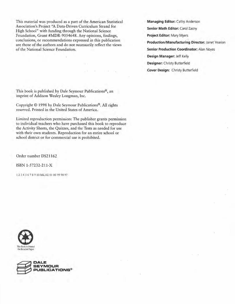
3. a. $26,901 -$16,141 = $10,760, and 1985 -1981=4. So, $10,760 .;.. 4 = $2690.
Cost of a New
50000 ,....-,--.----.C-o,rv, e_tte-.-.o-ve,r, T--.im----.e --,---.--.
450001--1--t-t--+--+--l-+-+--l--t-t--+--+-t 40000 1--1-1-~-+--+-+-+-l--l-l-t--+--+-t
350001----1--+--+---+--+--+-+-t-1--+--+--+--+---1 ~ 30000 l-i--+--+--+--+--+-+-t-1--+--+--+--+---1 el 25000 1---<-+---+--+--+--+--~t-1-+--+--+--+---1 ;t: 2 0000 l--l--t-t--+--+-+-+-+--l-1-t--+--+-t
15000 1--1--t--¥--+--t--l- +-+--l-l-t--+--t---I 10000 1--1-1-t--+--+-+-+-+--l-l-t--+--+-t
50000------0--+--+---+---+----+-+-t-1--+--+--+--+-<
'78 '80 '82 '84 .'86 '88 '90 ·9; Year
b. The price increase per year was greater for the Corvette than for the Mercedes. This could be explained a number of different ways. For example, the Corvette might have been dramatically redesigned during the time period, resulting in a sharp price increase in one year whereas the price of the Mercedes rose just a bit each year. The price increases for both cars could have been similar from 1981 to 1985, but since the data for the Mercedes extended over a longer period of time, the average for that car fell. The demand for American, smaller, or sportier cars might have increased, so the makers of the Corvette were able to raise prices faster than the makers of the Mercedes.
c. The price change of the Corvette was not constant. Possible explanations could include that when the increase per year from 1981 to 1985 ($2690) is compared to either the increase per year from 1981to1991 ($1726.90, or about $1727) or to the increase per year from 1985 to 1991 ($1084.83, or about $1085), they are different. This indicates the price increase was not constant. Another way to show that
STUDENT PAGE 7
-... ... ...
50000 ~~Co~n-of_a~N-•~w_M~•-reed_ .. --,-:s_oo~D-°"-.-er~T_lme~--
45000 l-<-+--+--+--l--+--+---+-----+--~-1-t-,___.
40000 t-t-+-+-+--t--+--+--t--t---+--l-l---'1F--J
35000 t-t-+-+--l--l--+--+--t--t---+--1-1-1-l
;;;; 30000
j 25000 t-+-+-+--+--+--+--l--t---1--1-1-l--l--t
20000 l-+--l-+--+--+--+--t--t---+--1-1-1--l--t
15000 l-+--+--+---+---- t--i- --+---+--t---+-t-t-1-1
10000 l-+--+--+--+---t---<- --+---+--+-+-t-1-1-------<
5000 l-+--+--+---+----+----+---+-----+-_.--1---1---1--1--1 O'--"-.._...._.....__.___.__.__.___,______.______.____,.__,__, '78 '79 '80 '81 '82 '83 '84 '85 '86 '87 '88 '89 '90 '91 '92
Year
Source: Kelly Bfue Book, 1994
2. Assume that the change in price per year is represented by the constant amount found in the table below.
Year Cost of Year Cost of Year Cost of Mercedes Mercedes Mercedes
1980 $23,000 1986 1991
1981 24,668 1987 1992
1982 26,336 1988 1993
1983 1989 1994
1984 1990 1995
1985
a. Use Activity Sheet 1 to complete the table and plot the points (year, cost) on the grid.
b. Describe the pattern of the points you see in the graph.
3, In 1985, a new Chevrolet Corvette sold for approximately $26,901; whereas in 1981, a new Corvette sold for $16,141.
a, Plot the two ordered pairs for the year and cost of the Corvettes. Using only your graph, estimate the change in price per year .
b. How does your estimate for the change in price per year of the Corvette compare with that of the Mercedes?
c. In 1991, a Corvette cost about $33,410. Plot this new point on your graph. Is the change in price the same, or
the price increase was not constant is to try to draw a single line through all three points. Since this is not possible, the increase is not constant.
Cost of a New
50000,........,---..----.c_o,rv~e_tt-.-e~o-v,er-,-T~im----.e ....,.......,......., 45000 1--J--t-t--+--+-+-+-l--l-+-t--+--t---I 400001--1--+--+---+--+--+-+-t-1--+----+---t--+---1 35000 t-1--+--+---+--+--+-+-t-1--+-+---t--+---1
~ 30000 l--l--t-t--+--+-+-+-1--l-l-t--+---+---I el 2 5000 +--l-l-t--+--+-+-+-l--l-l-t--+---+---1 ~ 20000 1--1--t-t--+--+-+-+-l-l-+-t--+--+-1
15000t-t-t--'!'---t--t--+-+-t-1-t---+---t--t-I 10000 t-1-t--+---+--+--+-+-t-1-t---+---t--+-t
5000t-1-+--+--+---+----+--•-t-1-+--+--+--t-t O'-'-'--'---'-....._...._.._._._.,_.__._.......__.
'78 '80 '82 '84 '86 '88 '90 '92 Year
RATES OF CHANGE 9

LESSON 1: RATES OF CHANGE
4. a. $11,873 - $4906 = $6967, and $6967 7 16 = $435.4375, or about $435 per year
Cost of a New
16000 Murtang over Time
15000 14000 13000 12000 u
11000 5 10000
"' u &
9000 8000 7000 6000 5000 -4000 3000 2000
'74 '78 '82 '86 '90 '94 Year
From 1975 to 1991, the price of a Mustang rose by about $435 per year.
b. $14,658 - $3694::: $10,964 7
16 === $685.25, or about $685 per year
From 1975 to 1991, the price of a Celica rose by about $685 per year.
Cost of a New
16000 Murtang over Time
15000 14000 13000
.I'
I 12000 11000
v ,>"
5 10000 / /
./ / Q) 9000 u ' C
8000 "-
7000 6000 5000
'/
.f" ~
V; - v
4000 " 3000
2000 '74 '78 '82 '86 '90 '94
10 LESSON 1
Year a Mustang o Celica
STUDENT PAGE 8
-... ... ...
constant, from 1981to1991? Explain how you found your answer.
Another way to describe the change in price per year is to calculate the rate of change in the price. Look at the following table of car prices.
New Car PrlOH
Year
1975
1991
Honda Civic
$2,799
$9,405
Source: Kelley Blue Book, 1994
Chevrolet Camaro
$4,739
$13,454
Toyota Celica
$3,694
$14,658
BMW
$10,605
$35,600
This is how to find the rate of change in price for a BMW. 35,600 - 10,605 24995
1991-1975 - 16-
= 1562
The change in price for a BMW is about $1562 per year.
4. Use the table above.
Chevrolet Corvette
$9,424
$33,410
a, Plot the points (year, price) for the Ford Mustang. Draw a line through the points, and estimate the rate of change in price per year .
b, On the same grid, plot the prices for the Toyota Celica. Draw a second line, and estimate the rate of change in price per year for the Toyota.
c. How do the two lines compare? How is the difference in the rates of change in prices reflected in the two graphs?
d. Look at all the data in the table. Do all of the cars have approximately the same rate of change in price over the time shown? Explain your conclusions.
s. Consider a set of data with a zero rate of change.
a. What do you think a zero rate of change means?
b. Sketch the graph of the cost of a new car for which the change in price over time is zero. Describe your graph.
6. According to the Recording Industry Association of America, there were approximately 53 million CDs (compact discs) sold in 1986. Each year thereafter, 58.5 million more CDs were sold than in the year before.
Mercury Cougar
$6,121
$16, 114
Ford Mustang
$4,906
$11,873
e. The line for the Celica is steeper than the line for the Mustang, so the price of the Celica rose more per year than that of the Mustang. In 1975, the Celica was cheaper than the Mustang, but by 1991, the Celica was more expensive. For this to happen, the price of the Celica must have risen more rapidly.
factors-competition, new designs, demand, tariffs for foreign cars, and so on-so it is logical that the rates of change would be different.
d. No, the prices do not appear to have risen at the same rate over the time period . The rates of change in price depend on many
One strategy is to list the cars in ascending order of price in both 1975 and 1991:
1975: Civic, Celica, Camara, Mustang, Cougar, Corvette, BMW 1991 : Civic, Mustang, Camara, Celica, Cougar, Corvette, BMW

LESSON 1: RATES OF CHANGE
(4d) Notice that the order is different. This means that the prices must not have risen at the same rate, because if they had, the order would be the same for each year. Other explanations could be based on graphs, on actual calculations, or on other justifications.
s. a. A zero rate of change means that the price did not change at all over time but remained the same each year.
b. The line is horizontal.
50000 Cost of a New Car over Time 45000 ,,_,_--t-+-+-+-+-t-+-+-1-+--+-t-t--+-1 40000 t-t---t-+-+-+-+-t-+-~-l-+-1-l-+-+-1 35000 1-1--1--1-+-+--l-l-+-+-l-l--l-l-l--l-l
§ 30000 '-l--l-t-+-+--l-+-+--1-1-+--i-t-l-~ "' 2 5000 t-+-+--l-+-+--1-1-1-+-l-l--l-t-+-+-I -~ 20000 '-l--l-t-+-+--l-+-+--1-1-+-+-l-+~ (L 1 5000 l-l--+--l-+-+--1-1-1-+-l-l--l-t-+-l-l
1 0000 t.=l==l=l=l==l=l==Fr-l==l=lo=l==l=l=+=1 5000 1-1--+-+-+-+-+--+--+-+-1---+-+-l-l--+-I o~~~~~-'-~__.__._~~
'75 '77 '79 '81 '83 '85 '87 '89 '91 Year
6. a. In order to make the graph, you assume that the rate of change in CD sales is constant or the same over the years.
~ 500 .Q 450 ~ 400 :;- 350 a 300 ~ 250 8 200 0 150 Q; 100 1l 50 ~ 0
'84
Number of CDs Sold /
v v
/ /
/
/
I/ '86 '88 '90 '92 '94 '96 '98
Year
b. There are two ways to make the prediction: Either read the value from the graph, or compute the value (462.5 million) using the increase per year and the 1986 value given. In either case, the prediction should be about 460 million CDs.
c. If the increase was more than 58.5 million per year, the line would be steeper.
STUDENT PAGE 9
m -. a. On grid paper, plot the data representing the number of
CDs sold over time, and draw a line to summarize the relationship. What assumption did you make in order to draw your line?
b. Using your graph, predict the number of CDs sold in 1993. Explain how you made your prediction.
c. Suppose the number of CDs sold per year increased by more than 58.5 million. What would your new line look like?
The scale used for a graph affects how you visualize the magnitude of a rate of change.
7. One newspaper reported that in 1988, 2.7 million cars were imported from Japan to the United States; whereas in 1992, 1.8 million cars were imported from Japan. A second newspaper reported that in 1988, 2.7 million cars were imported from Japan to the United States, and in 1990, 2.25 million cars were imported from Japan. Each newspaper article included a graph of a straight line representing the number of cars imported from Japan over the years, as shown here.
4.0 Cars tmoorted lrom Japan
[\.. ~ 35
" ~ 3.0 E '\. € 2.5 ' 0 ' f 2.0 - - '\. a 1.5
'\. i 1.0 '\ z 0.5
'\. 0 1970 1975 1980 1985 1990 1995 2000
Year
Can lmpo.rU.d from Japan ~ 3.0 0 r--....,..._ i 2.5 i--+--+--+-',._,__r--..._,_ ..... --+---1-i--+--+--+----+-1
e 20 1--t-,-~--l--t.:=.+<::""""1-l-t--!---l--l--I 0 ...... I'-. f 1.5 r-r--t--r---1--r--t--J~!'o<:',r......._--t--J-~
0 10 1--+--+--+---+----+--+---l-I--+--..,...__,__. w ' r--... ~ 0~5 z 0 '---'---'-~-'---'---'---'-'--"----'--~-'---'
1986 1988 1990 1992 1994 1996 1998 Year
RATES OF CHANGE 11

LESSON 1: RATES OF CHANGE
7. a. 1.8 - 2.7 = -o.9 7 4 = -0.225 and 2.25 - 2.7 = -o.45 7 2 =-0.225
The rate of change was -o.22s million cars.
You would expect the lines to have the same steepness. They do not because in the first graph, the xaxis represents 30 years whereas in the second graph, the x-axis represents 10 years. But the length in both cases is the same. The scale on they-axes in both graphs is the same, so the change per year appears different because of the different scales on the x-axes.
b. There was a decrease of about 225,000 foreign cars imported each year.
c. The articles do not appear to have contradicted each other. Both reported the same number of imports in 1988. The three points appear to fall in a straight line, but even if they were not in a line, the articles still would not have contradicted each other because there was no claim of a constant change.
3.5
Cars Imported from .Japan
3.0 >---+--+~-------!
- ......... :;_~ ~r,J--+----+-+---1 -~ 2.5 -··r2. ~ ....... £ 2.0 1---1---r-\!::-1-'·,-'-."'+'---= .... ~ ..... " '"1' .,.. ......... -~
~ 1,5 !---l--+--t---+----1--t--t-- I
E ~ 1.0
0,5 l--+---+---1----1--1---f--I
o,__~~---~-~~~
'86 '88 '90 Year
'92 '94
d. Students should agree with this statement. Either the actual numbers should be compared or two graphs with the same scale should be used. Graphs with different scales might be used to compare change if the x- and y-axes are reduced or enlarged by the same amount.
1Z LESSON 1
STUDENT PAGE 10
8. a.
200
180
160 ... 3140
'§ 120 u
100
80
60 '88
I . .
-... ... ... ...
a. What is the rate of change in the number of cars imported from 1988 to 1992 as quoted in each newspaper? Explain the difference between the two graphs shown.
b. What can you conclude about the number of cars imported from Japan to the United States?
c. Plot the points (year, number of imports) on the same set of axes for both sets of data from the news articles . What conclusion can you now make? Do the articles contradict each other? Why or why not?
d. "To compare two rates of change, you either have to use mathematics or be very careful about your graph." What does this statement mean?
8. In 1991, the cost of a CD component with remote control was $139. In 1989, the same component cost $159.
a. On graph paper, plot the points representing the cost of the CD component each year .
b. What is the change in price per year? What does it tell . you?
c. What might explain the fact that the price of the CD player has decreased?
d. Name at least two other items whose prices have decreased over the past several years.
9. Describe, in words, the rate of change shown in each of the next two graphs.
a. Cookie Dou~b Sale•
~ 4 i~t-+-+-.....--+~-"'l"-dl--f-t-+-+-+-1 i 3f-t-+-+--l-+--l--..,-f-...__""l-<d--f---+~I ........ _ ~-21--l~+-+-+-+--l--l--+-+-l-~..:o--I
1 2 3 4 5 6 7 8 9 10 11 12 Month
CD Componen1: Prices
'89 '90 Year
'91 '92

LESSON 1: RATES OF CHANGE
b. $139-$159=-$20and -$20 + 2 = -$10
The price decreased $10 per year.
c. There are a number of possible explanations, including these: The price of the parts needed to make the component decreased, the price needed to cover research and development decreased, or the competition increased, thus encouraging the manufacturer to reduce the price.
d. There are many possibilities, particularly products involving technology, such as computers, CD players, answering machines, and VCRs.
9. a. The sales of cookie dough decreased steadily from one month to the next over the year.
$1. 7 - $5.9 = -$4.2, and -$4.2 + 12 = -$0.35
The rate of change is approximately -$0.35 million, or a decrease of about $350,000 per month.
b. The number of cellular phones increased by about the same amount every year from 1989 to 1993.
10 - 3 = 7, and 7 + 4 = 1.75, or about 2
The rate of change is an increase of about 2 million phones per year.
10. a. The graph shows that there was an average of about 10,430 vehicle miles in 1974.
10,430 - 10,270 = 160 and 160 + 4 = 40
This means there was an increase of 40 miles per year from 1970 to 1974.
STUDENT PAGE 11
b. lO .--.--..--C~ell_ular--r~Ph-o~n_e --.-Sura_-T~--...---,,,.......,
.., / ~ 81-1-0--+--+--·t--•-+-/ +v,,_,__, _ _,
l 7 >-•-o--+--.i--t--+-+-v,._._--+-~-• ~ A § 6 1- 1-1--1--l--+-·l+'l'-+-+--t--I
~
"' :2 -,;; u
/
)/ 3 1-.i-+-+v......____.._--+--+--+_._____.._
2.__..__ ........ ..__.._..__.___.___.___.__~ 1988 1989 1990 1991 1992 1993
Year
Source: Cellular Telecommunications Industry Association, 1992
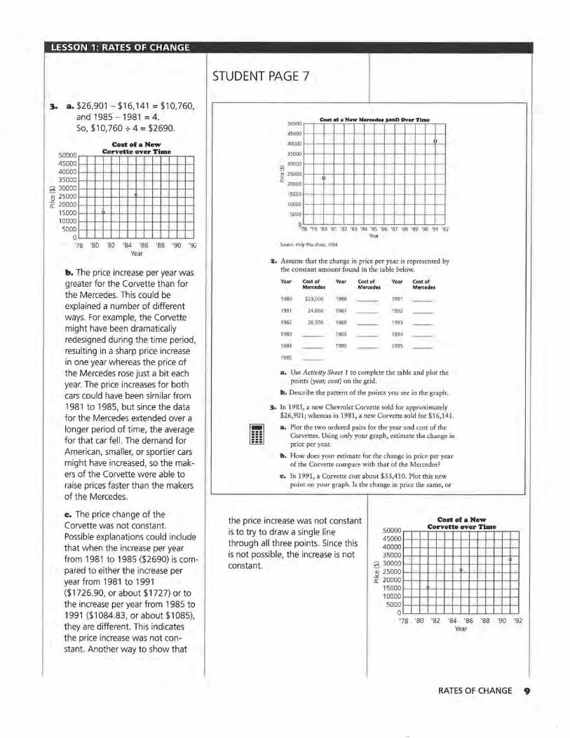
:lO. According to the 1993 Council on Environmental Quality, people drove a yearly average of 10,270 vehicle miles in 1970. The data for the estimated average number of vehicle miles per year, driven through 1994 are graphed below.
11310 ..---.----,----,----,---V.--.-ehi--.-ele_ MU-r-e-r• _Drl..,.v_e..,.n -=-pa...,r _l'i...,ear___,.........,.--.--,...--,
11230 1--1--+--+--+--+-"i- +-+-+-+--l---+--+--+--<:>--+--f 11150 ,_,__,__,__.,_,,__.,__,__,_ _____ -0--+---1-
11070 l-t--+-+-i--t---t-+-+-+--1--+---+--D-_,___-+--+-- •
10990 1-l--l--+--+--+-·l-+-+--1--1-l- Cl--,l-l--+--l--I
~ 10910 l-l-l--+--+---1--1----1---+-+-+--a----l--+-- 1---+--+--1
~ 10830 l-<l--11---1-1-l••-ll-l-l-l-t, _ , ____ _,__I
~ 10750 t-l--t--+--+---l-+-+-+--CJ-+--1-----l--+--t---+--+--I
gi 10670 - l--li--11-1-1--l--l-11:>-+--·l-+-·l--l--t--l- -:;; gi 10590 1-+--+-+--t--+-+--O---!--t---t---+--+--+--+--+--t--<
<l'. 10510 l--t-+--t-·t--·l-O--l--<--t---1---1-_,___-+--+--+--t--I
10430 l--l--+-+-+-<:>--+-+--t--l---+--+--t--+--t---1--1--f
10350 l-+--+-+-O-+-+-+--t--l--l--+--t--t--1---1--1-
10270 1-+--+--<>---t-+-+--<--<--t---t---t--+--+--+--+--+--•
10190 .__..__..__.._.._.._.._..__.___.___.___,__,__,_-+--+--+-_, 1966 1970 1974 1978 1982 1986 1990 1994 1998
Year
Source: data from 1993 Council on Environmental Quality
RATES OF CHANGE J.3
LESSON 1: RATES OF CHANGE
xo. b. There was an average of about 11,230 vehicle miles in 1994 and 10,990 in 1988.
11,230 - 10,990 = 240, and 240 + 6 = 40
The rate of change is 40 miles per year.
c. Since the graph appears to be linear, the value for 1993 will be halfway between the values for 1992 and 1994. The value for 1992 is 11, 150, and the value for 1994 is 11,230.
11,230 - 11, 150 = 80, and 80 + 2 = 40 and 11 '150 + 40 = 11, 190
The value for 1993 is 11, 190.
This value could also be found by simply adding the 40 miles per year found in b to the 1992 value of 11, 150, or 11, 190. Either way, this is not exactly the value given in the council's report, but it is close.
u. a. 38 - 68 = -30, and 1984 - 1980 = 4
-30 + 4 = -7 .5, for a rate of change of -7.s.
Therefore, from 1980 to 1984, the rate of change in the amount of lead in the air was -7,5 million metric tons per year, or the amount of lead in the air decreased by about 7 .5 million metric tons per year.
b. 7 - 38 = -31, and 1986 - 1984 = 2 -31+2 =-15.5
The rate of change of the amount of lead in the air from 1984 to 1986 was about -15.5 million metric tons per year.
I4 LESSON 1
STUDENT PAGE 12
a. Find the average number of vehicle miles driven in 1974. What was the rate of change from 1970 to 1974?
b. What was the rate of change in the average number of vehicle miles driven tram 1988 to 1994? How did you find your answer?
c. According to the report of the council, the average number of vehicle miles driven in 1993 was 11,090 miles. How does this value compare with the data shown in the graph? How did you find your estimate?
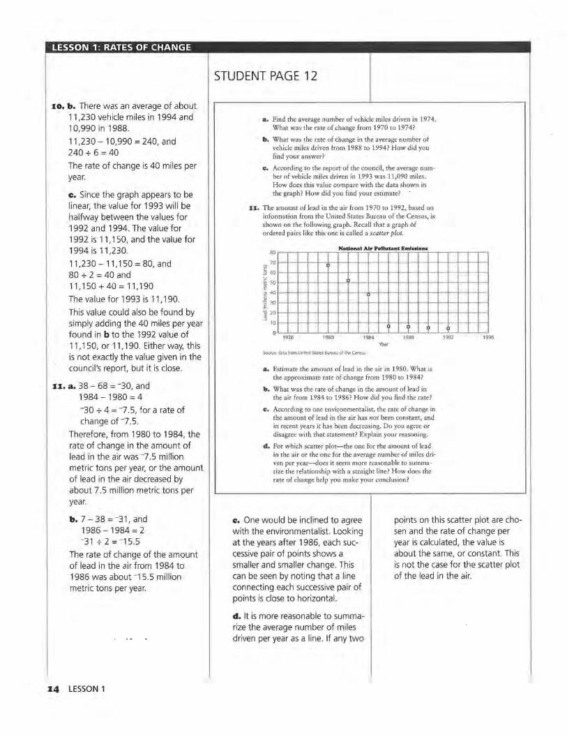
11. The amount of lead in the air from 1970 to 1992, based on information from the United States Bureau of the Census, is shown on the following graph. Recall that a graph of ordered pairs like this one is called a scatter plot.
80 National Air Pollutant Eml1don•
70
"' I
B 60 u ·~ 50 E ~ 40 0
]_ 30
'C 20 ~
10 ' ) 0
1976 1980 1984 1988 Year
Source: data from United States Bureau of the Census
a. Estimate the amount of lead in the air in 1980. What is the approximate rate of change from 1980 to 1984?
b. What was the rate of change in the amount of lead in the air from 1984 to 1986? How did you find the rate?
c. According to one environmentalist, the rate of change in the amount of lead in the air has not been constant, and in recent years it has been decreasing. Do you agree or disagree with that statement? Explain your reasoning.
d. For which scatter plot-the one for the amount of lead in the air or the one for the average number of miles driven per year-does it seem more reasonable to summarize the relationship with a straight line? How does the rate of change help you make your conclusion?
' 1992 1996
c. One would be inclined to agree with the environmentalist. Looking at the years after 1986, each successive pair of points shows a smaller and smaller change. This can be seen by noting that a line connecting each successive pair of points is close to horizontal.
points on this scatter plot are chosen and the rate of change per year is calculated, the value is about the same, or constant. This is not the case for the scatter plot of the lead in the air.
d. It is more reasonable to summarize the average number of miles driven per year as a line. If any two

LESSON 1: RATES OF CHANGE
Students having difficulty should be encouraged to try drawing a single straight line on each graph to summarize the relationship, so that they can see the difficulty with the scatter plot of the lead in the air. Once they are convinced, they should be encouraged to explore the rate of change between pairs of points on each scatter plot and to see the relationship between a constant rate of change and a straight line.
Practice and Applications
n. a. (1991, 139) and (1989, 159)
b. Yes, -~o = -10, which is the same value.
Students might think of this either as beginning from 1989 at 159 and going right to 1991, then down (negative) to 139; or as going from 1991 at 139 left (negative) to 1989 and up to 159. In other words, the rate of change of -10 can be expressed as "Two years ago, it was 10 units larger," or "In two years, the value has decreased by 10."
STUDENT PAGE 13
SUMMARY
When the rate of change is constant for equal time intervals, the graph of the relationship is a straight line. The rate of change is sometimes called the slope of the line. You can find the slope by finding the ratio of the change in they-values of two representative data points and the corresponding change in the x-values of the same data points.
If (x,. y 1) and (x 2, y2 ) are two data points on a line, then the slope of
the line is
Change iny = t.y ~ y2-y1
Change in x t. x x2 - x1
(Note: A is a symbol used in mathematics and science to represent a change. For example, Ay means a change in the y-values.)
• The rate of change can be determined by any two points on the line.
• The rate of change can be positive, negative, or zero.
• If the rate of change is negative, they-values decrease as the x-values increase. If the rate of change is positive, the y-values increase as the x-values increase; if the rate of change is zero, the y-values remain the same as the x-values increase.
• You can find the rate of change by reading a graph, by looking at the data in a table, or by finding the slope.
• For a straight line, the rate of change will be the same, or constant, between any pair of points on that line.
Practice and Applications
1z. Jose finds the slope by using two data points as follows:
139 -159 -20
1991 -1989 2
a. What ordered pairs (x, y) did he use?
b. Sue finds the slope by reversing the order of the same data points. Is the slope the same?
159-139 1989- 1991
RATES OF CHANGE IS
LESSON 1: RATES OF CHANGE
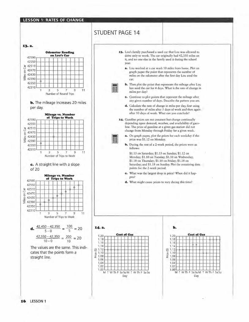
Odometer Reading on Lou's Car
42590~..---.--.-~--.--..--.-~~~
425501--+--+-+--+--l--l---+-+--t---ll--I
~ 425101---+-+--l--+-+--ll--t---+--+--l--t
~ 424701~~--+--l--+-+--ll--t---+--+--l--t 0 ~ 424301--~--+--l--+-+--ll--t---+--+--l--t
~ 42390 l--+-+-+--+--l--l---+-+--1-1--1
423501--+-+--+--+--l--l---+-+---!-l--I 42310._...__.___.__.__,___.__.____.__.___..___.
3 5 7 9 11 Number of Round Trips
b. The mileage increases 20 miles per day.
42590
42550
~ 42510
~ 42470
Mileage vs. Number of Trips to Work
0 ~ 42430
~ 42390
42350
42310
1)
3 5 7 9 Number of Trips to Work
c. A straight line w ith a slope of 20
11
Mileage vs. Number
4259o.--..---.-of-.--T..-n_·p~•---.to_"1~o_r~k~-~
425501--+-+--+--+--t--t---+-+--t---<:)--I
~ 425101--+-+--t--+-+--ll--t--O-+--t--t
~ 424701--+--+--t--+-+--i:l--t--+-+--t--t 0 ~ 424301--+--+--t--O--+--ll--l--+-+--t--1
~ 423901--r-1;1-+-+--t--t--t---t---+--+--I
423501---t---t--t---t---+--+--+-+--+--<f--< 42310~-t-~~~~~~~.,_~~~
3 5 7 9 11 Number of Trips to Work
d 42.450 - 42,350 = 100 = 20 • 5 - 0 5
42,550-42,350 = 200 = 20 10-0 10
The values are the same. This indicates that the points form a straight line.
16 LESSON 1
STUDENT PAGE 14
14. a.
~ liliJ
-... ... ... ...
13. Lou's family purchased a used car that Lou was allowed to drive only to work. The car originally had 42,350 miles on it, and no one else in the family used it during the school year.
a. Lou worked at a car wash 10 miles from home. Plot on graph paper the point that represents the number of miles on the odometer after the first day Lou used the car.
b. Then plot the point that represents the mileage after Lou has used the car for 4 days. What is the rate of change in miles per day?
c. Continue to plot points that represent the mileage after a~y given number of days. Describe the pattern you see.
d. Calculate the rate of change in miles per day, first using the number of miles after 5 days of work and then again after 10 days of work. What can you conclude?
14. Gasoline prices are not constant but change continually depending upon demand, weather, and availability of gasoline. The price of gasoline at a given gas station did not change from Monday through Friday for a given week.
a. On graph paper, plot the prices for each weekday if the price was $1.12 on Monday .
b. During the rest of a 2-week period, the prices were as follows:
$1.15 on Saturday; $1.15 on Sunday; $1.12 on Monday; $1.10 on Tuesday; $1.10 on Wednesday; $1.18 on Thursday; $1.18 on Friday; $1.18 on Saturday; and $1.18 on Sunday. Plot the remaining data points for the 2-week period.
c. What was the largest drop in price? When did it happen?
d. What might cause prices to vary during this time?
b.
1.20 .--.-.--.-eo..--st.,.....of,......,G,.......a_• -.-..--,..---,.--. 1 .18 l-t-+-+-l--+-+-~1-1--1--1--1-1
1. 16 ~l-l-+-+-+-+--+-+--+-+-t--11-1 1 .14 1--1-+-+-t--+-+-t--1-+-+-+-~
1.20 ,......, ..... -..-c..-o_s.-t,oi,....,G_a~•-..-,--.--r-1 1 .18 l-l-+-+-1---1--+-+--+-+-b--<>-<-O 1 .16 l-l-+-t--+-+-+-l--l-+-1--1--1--1 1 . 14 l-l-+-t--+--t-+--1--1-+--t--t--l--I
;;;;; 1.12 ~~•>-<-0-+-+--1--+-+-+-+-~
j ~ :~~ l-t-+-+-+--+--+-+-+-+--t--11-1-t 1.06 l-l--+-l--+-+-+-l-l-+-1--1--l-l 1 .04 1--t-+-+--+-+-t--1-1--+-!--l--l-l 1 .02 1-t-+-t--+--t-+---+-+-t--+--1--1 1.00 ..__.___._._ ....................................... ~..__,..__.__,
MT WTh F SaSuM T WTh F SaSu Day
;;;> 1 . 12 ol-<~~-0-<>-1---1--6-+-+-+-t--11--I
j ~ : 6~ 1-1-t-t--+-t--+--+--t--t-t--il-f-t 1. 06 l-l-+-+-1--1--1-+--+-+-l--'l--l-I 1 . 04 1-1--+-t--+--t-+--1--1-+-+--t--+-I 1 .02 t-t-+-t--t--t--+--+--t-+--t--1-1-t 1.00 ......... _.__.__.__,__..__L......O___._..__,__.__,
M T W Th F Sa Su M T W Th F Sa Su Day

LESSON 1: RATES OF CHANGE
c. The largest drop in price was $.03 and occurred between Sunday and Monday.
d. The prices seem to rise for the weekend. This could indicate that more people travel during the weekend, so prices were increased. In particular, in the second week, prices rose on Thursday, which could indicate the start of a long weekend when many people take car trips. If dealers had deliveries of gasoline at the end of the week, prices could be adjusted for the weekends.
15. Students should react just as they might if they read the graph in a newspaper, making only general comments. These data were taken right after the Gulf War and the Kuwait invasion, which seemed likely to have a direct impact on gas prices because Kuwait was a major supplier of oil used as a source of gasoline.
a. The scale used on this graph makes the changes appear very small. Also, the meaning of the horizontal lines is unclear, and the gas pump makes the graph difficult to read. It is also worth noting that the horizontal axis does not contain the two weekend days: September 29 and 30 are missing; October 6, 7, 13, 14, and so forth are also missing. This could make the appearan~e of change deceptive.
b. It appears there was no more than a $.03 change in price per week and no more than a $.02 price change per day. The average change in price appears to be quite small, either per day or per week. Basically, the headline matches the graph because the average change is small. However, you could argue that the headline is misleading
STUDENT PAGE 15
15. The average daily price for gasoline at suburban New York City gas stations during the fall of 1990 is shown by the following graph.
150•~------•--1--1--1--1--1--1--1-~--+--+---l---~--+--t----+----+---l--l
{ l .
4otttttt!::E±±±±±ii11l=I=t:IJ:] C! ~ 130 t--t--t---t--·t---t---t---+--+--+--+--+--t--t--t--t--t--t--+--+--+---I--"
'> o~~~~~~~~~~~~~~~~__,__.__.__.__.__.__.
26 27 28 1 2 3 4 5 8 9 10 11 12 15 16 17 18 19 22 23 24 25 26 Sept. Oct.
Source: data from The Milwaukee Journal, October 27, 1990
a. Describe how the graph was drawn.
b. What is your impression of the rate of change in the average price of gasoline per week and per day? Do you think the title of the graph is accurate? Why or why not?
16. For some data, the slope or rate of change is constant; for other relationships, the slope varies. How will graphs with these two types of slopes look? Draw an example of each.
since the graph shows a steady (but slow) increase in prices.
Students could make arguments for or against the headline. It is important that they justify their arguments with details from the data.
RATES OF CHANGE 17

LESSON 1: RATES OF CHANGE
:16. If the rate of change is constant, the data points will fall in a straight line. If the rate of change varies, it will be impossible to draw one straight line through all of the data points.
Constant Rate of Change
Nonconstant Rate of Change
:17. a. The percentage of youths who choose to play casual sports games is about 40% at age 10, and then it increases to nearly 45% at age 11; it decreases fairly steadily until
I8 LESSON 1
STUDENT PAGE 16
17, Describe the rate of change in each of the two graphs below.
a.
ChanglllJI lntenm oi Young People
c. -~ .& 80% ) m-~
u ro ·a. "O ! - • ,.,o
ro~ v j •1 ... ' ~~ 60% ~_g J ~ .,~ I/ g.~ 40% .. ~ VI - ~ "!(. .·· ·._ °'" j • ·- ~' §~ / ..
' ~ -?. 20% .I ...
~lfil .. [~
0 10 11 12 13 14 15 16 17 18
Age
i---__ - -Source: Youth Sports Institute, Michigan State University
b.
Boomboom ))))))))))))) Put and ProJoctod Number oi 18 and 19 ye1>r oldo In USA
9.0 ,
I'-. I
"' ~,/ 80
•'\..,_ / _......_
" "' v 0 § 7.0
6.0
s.o, o?
'80 '82 '84 '86 '88 '90 •92 '94 '96 '98 '00 '01 '04 '06 '08 '10 Year ---~
Source: data from USA TODAY, April 19, 1995
age 16, when it is around 22 %, 1987. The number rose slightly and then it increases to over 35% until 1989, and then fell continu-at age 17; by age 18 it decreases ously until it reached a low of to about 28%. about 6.9 million in 1992. Since
The percentage of youths who then, the number has risen to
date is nearly 0 at age 10 and about 7 .1 million for 1995. The
increases at nearly a constant rate number of 18- and 19-year old
to over 80% by age 17; it then teenagers is projected to grow
decreases slightly to around 76% steadily at about the same rate it
at age 18. decreased until there are about 9.3 million in 2010. A slight decrease is
b. There were about 8.8 million projected for 2002 to 2003, but 18- and 19-year old teenagers in the trend continues upward after the United States in 1980. There that. was a stead y decrease until about
LESSON 1: RATES OF CHANGE
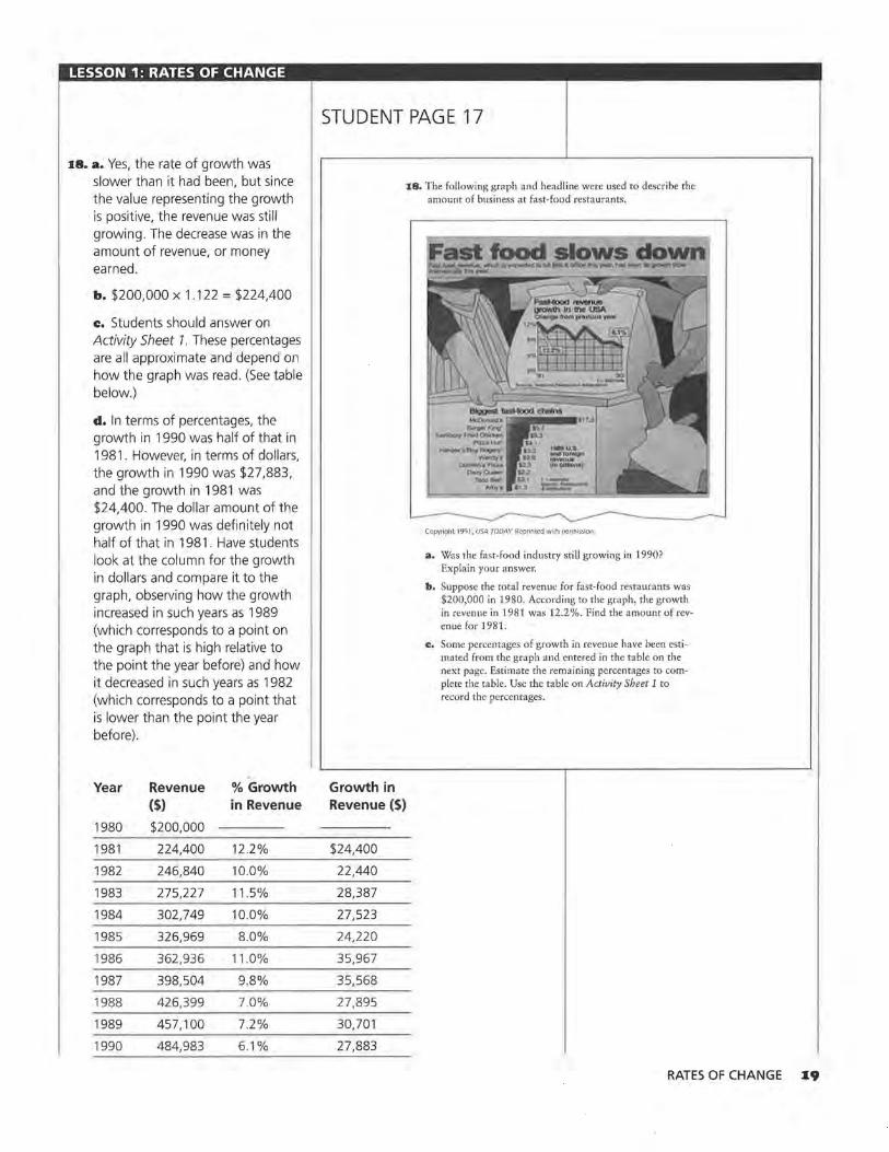
18. a. Yes, the rate of growth was slower than it had been, but since the value representing the growth is positive, the revenue was still growing. The decrease was in the amount of revenue, or money earned.
b. $200,000 x 1.122 = $224,400
c. Students should answer on Activity Sheet 1. These percentages are all approximate and depend on how the graph was read . (See table below.)
d. In terms of percentages, the growth in 1990 was half of that in 1981. However, in terms of dollars, the growth in 1990 was $27,883, and the growth in 1981 was $24,400. The dollar amount of the growth in 1990 was definitely not half of that in 1981 . Have students look at the column for the growth in dollars and compare it to the graph, observing how the growth increased in such years as 1989 (which corresponds to a point on the graph that is high relative to the point the year before) and how it decreased in such years as 1982 (which corresponds to a point that is lower than the point the year before).
Year Revenue % Growth ($) in Revenue
1980 $200,000
1981 224,400 12.2%
1982 246,840 10.0%
1983 275,227 11 .5%
1984 302,749 10.0%
1985 326,969 8.0%
1986 362,936 11.0%
1987 398,504 9.8%
1988 426,399 7.0%
1989 457, 100 7.2%
1990 484,983 6.1%
STUDENT PAGE 17
Growth in Revenue($)
$24,400
22,440
28,387
27,523
24,220
35,967
35,568
27,895
30,701
27,883
18. Tbe following graph and headline were used to describe the amount of business at fast-food restaurants.
Copyright 1991, USA TODAY. Reprinted with permission
a. Was tbe fast-food industry still growing in 1990? Explain your answer.
b. Suppose the total revenue for fast-food restaurants was $200,000 in 1980. According to the graph, the growth in revenue in 1981was12.2%. Find the amount of revenue for 1981.
c:. Some percentages of growth in revenue have been estimated from the graph and entered in the table on the next page. Estimate the remaining percentages to complete the table. Use the table on Activity Sheet 1 to record the percentages .
RATES OF CHANGE •9
LESSON 1: RATES OF CHANGE
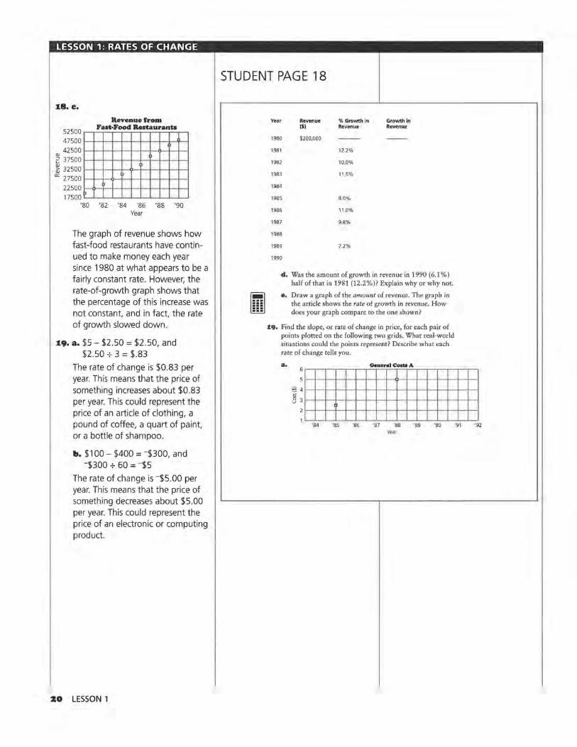
:t8. e.
<11
Revenue from
52500 __ F_a_n-_ F_OOd __ R_e_sta_ur_a_n_ts_~
4 7 500 l--+--+--+--t--1--1--1--1--1--'l'-l 42500 1--+--+--+--t--l--l--l--t)--l--l--I
~ 37500 ·-------1-1--1-1---1 ~ 32 500 l-+--+--l--1--1)--1--1--1--1--1--1 "' 2 7500 l--+--l--11----1--1--1--1--l--l--l--I
225001--o-+--1--1--1--1--1--1--1--1--1 17500'---.._.._.__.__.__._._._._....._.
'80 '82 '84 '86 '88 '90 Year
The graph of revenue shows how fast-food restaurants have continued to make money each year since 1980 at what appears to be a fairly constant rate. However, the rate-of-growth graph shows that the percentage of this increase was not constant, and in fact, the rate of growth slowed down.
:.19. a. $5 - $2.50 = $2.50, and $2.50 + 3 = $.83
The rate of change is $0.83 per year. This means that the price of something increases about $0.83 per year. This could represent the price of an article of clothing, a pound of coffee, a quart of paint, or a bottle of shampoo.
b. $100 - $400 = -$300, and -$300 + 60 = -$5
The rate of change is -$5 .00 per year. This means that the price of something decreases about $5.00 per year. This could represent the price of an electronic or computing product.
20 LESSON 1
STUDENT PAGE 18
; . . .
Year Revenue % Growth in Growth In ($) Revenue Revenue
1980 $200,000
1981 12.2%
1982 10.0%
1983 115%
1984
1985 8.0%
1986 11.0%
1987 9.8%
1988
1989 7.2%
1990
d. Was the amount of growth in revenue in 1990 (6.1 %) half of that in 1981 (12.2%)? Explain why or why not.
e. Draw a graph of the amount of revenue. The graph in the article shows the rate of growth in revenue. How does your graph compare to the one shown?
19. Find the slope, or rate of change in price, for each pair of points plotted on the following two grids. What real-world situations could the points represent? Describe what each rate of change tells you.
·s4 '85 ·05 ·01 ·00 '89 ·go •91 •92 Year

LESSON 1: RATES OF CHANGE
20. Students' graphs should include the following components: rapid accumulation of teeth, slight loss in early elementary school, all teeth
-
by about age 20, constant number of teeth through middle age, and gradual loss of teeth in old age.
Teeth in Humans
- ~ f r---(\
0 10 20 30 40 50 60 70 80 90 100 Age
21. a. The rate of change per year in the data for the number of refugees is not constant.
The rate of change per year in the data for the percentage of working women is constant. The rate of change per year in the number of football games is not constant.
Some students may compute the rate of change per year using the first two entries and then using the first and last entry. Other students may compute a rate of change and then use it to generate other values and compare these to the ones in the table. Still other students may compute the differences in the entries for each consecutive set of ordered pairs and determine whether or not the differences are the same.
b. The graph of the data for working women will be a straight line because the rate of change is constant. The graphs of the data from the other two tables will not be straight lines because the rates of change vary.
STUDENT PAGE 19
~s~l1J I Iliff I 111 I 1920 1930 1940 1950 1960 1970 1980 1990 2000
Year
~ zo. Draw a graph that reflects the change in the number of liiiJ teeth a person has over his or her lifetime. Explain why your graph looks the way it does.
z1. Study the following tables.
Year Number of Year % of Working Refugees in United Married Woman with States (millions) Children Under Age 6
1980 B 1965 23%
1981 10 1970 30%
1990 16 1975 37%
1992 18 1990 59%
Year Number of College Football Games Cable Cast
19B7 56
19B8 62
1989 98
1990 192
Sources: Worldwatch Institute, United Nations High Commission for Refugees; USA Today, September 2, 1993; and Federal Communications Commission Interim Report, 1992
a. Does the rate of change appear to be constant for each table?
b. Which, if any, of the graphs for the data sets in the tables above do you think will be straight lines? How did you decide on your answer?
RATES OF CHANGE 21
LESSON 1: RATES OF CHANGE
22. There is no one correct answer. The purpose of the question is to have students verbalize different rates of change and to recognize the kinds of situations in which studying rate of change can be useful. It is important that students justify their choices with both outside information and the information represented in the graph. Some (but not all) possible justifications follow:
Graph a could be for dress shoes. Over the past 10 years, the population has, in general, become more casually dressed, and thus the demand for dress shoes has decreased. It decreased slowly at first and then quite rapidly. Recently, the decrease has slowed down, and the demand appears to be leveling out.
Graph b could be for tennis shoes. Over the past 10 years, there has been a steady increase in the sales of tennis shoes. People seem to be walking and exercising more, and this might mean that they buy more tennis shoes. Graph b also could be for boots. Over the past 10 years there has been a slow but steady increase in the popularity of western and of hiking attire. This trend contributes to the steady increase in the sale of boots.
Graph c could represent tennis shoes. Overall, there has been an increase in sales over the last ten years. At first there was a sharp increase as people bought all the different kinds of newly available athletic shoes. For a while the demand leveled out, but then newer types of "gimmick" shoes have caused a rapid increase in sales.
ZZ LESSON 1
STUDENT PAGE 20
:&:&. The following graphs show the sales of three types of shoes-tennis shoes, boots, and dress shoes--<Jver the past 10 years. Match each graph with a shoe type. Explain your choices.
b.
/ :&3. Describe each of the following:
a. a line with positive slope.
b. a line with negative slope.
c. a line with zero slope.
:14. Ask an adult to approximate how much an item such as a candy bar or a loaf of bread cost at least 10 years ago, then find how much the same item costs today. On graph paper, plot the data, calculate the slope, and predict how much you think the item will cost in the year 2000. How reliable do you think your prediction is?
:zs. Challenge Inflation is the increase each year in the cost of goods and services. Suppose the rate of inflation has averaged approximately 3% per year. Calculate how much a 1991 Corvette would cost if its price had increased by the average rate of inflation each year since 197 5, when it cost $9424. Record the data in a table.
a. Make a scatter plot of these points.
b. How does the 1991 "rate of inflation" price compare with the actual price in Question 3 on pages 7-8? Why do you think the prices are different?
c. Is the rate of change in the price of an item due to inflation constant? How did you decide?
(.
2~. a. A line with a positive slope rises from left to right.
b. A line with negative slope falls from left to right.
c. A line with zero slope is horizontal.
24. Project The results and graph will depend on the information students collect. It is important that students consider the reliability of their predictions. Encourage students to consider recession, inflation, and other economic factors. This question helps assess whether or not students understand what the meaning of a constant rate of change is in a particular context.

LESSON 1: RATES OF CHANGE
zs. a. Challenge The data for the scatter plot are made going from an initial price of $9424 and a rate of change of 3% each year, ending at approximately $1499 based on the price of $33,408 given for 1991.
40000
32000
5 24000
~ ;t 16000
8000
0
Cost of Corvette
,,, "" l..o'
\,.ct"
Consta 11 Rate ,,-"'
.P ""' ~ .......
,.I - ..... ..... ,.., ~· Inflation Rate ( %
'74 '78 '82 '86 '90 '94 '98 Year
b. The 1991 rate of inflation price ($15, 123) is lower than the actual price ($33,408). One explanation might be that the percentage used for inflation was an average, and the actual percentage of inflation might have been very high in some years. Also, change in price may be affected by factors other than inflation, such as redesigned cars and increased demand that can drive up the prices.
c. The rate of change in the price due to inflation alone is not constant. It is difficult to tell from a graph, because the points look as if they form a straight line. If more points are generated and plotted, a curve begins to appear. You might have students investigate what will happen if the rate of inflation is 5% .
A table of values can help students see more clearly what happens per year. If the initial price in 1975 is the same for both a constant rate of change of $1499 and a 3 % inflation rate of change in price, students will see that the inflation data are not constant.
Year
1975
1976
1977
1978
1979
1980
1981
1982
1983
1984
1985
1986
1987
1988
1989
1990
1991
Price with 3% Rate of Inflation Change
$9,424
9,707
9,998
10,298
10,607
10,925
11 ,253
11 ,590
11,938
12,296
12,665
13,045
13,436
13,839
14,255
14,682
15, 123
Amount of Change
$283
291
300
309
318
328
337
348
358
369
380
391
403
416
427
441
Price with Constant Rate of Change
$9,424
10,923
12,422
13,921
15,420
16,919
18,418
19,917
21,416
22,915
24,414
25,913
27,412
28,911
30,410
31 ,909
33,408
Amount of Change
$1,499
1,499
1,499
1,499
1,499
1,499
1,499
1,499
1,499
1,499
1,499
1,499
1,499
1,499
1,499
1,499
RATES OF CHANGE Z3

LESSON 2
Equations of Lines Materials: graph paper, pencils or pens, rulers, toothpicks
(optional), Activity Sheet 2, Lesson 2 Quiz Technology: calculators, graphing calculators (optional)
Pacing: 2 class periods
Overview
In this lesson, students work with ordered pairs of data that seem to have a linear relationship or a rate of change that is approximately constant. They draw a line to summarize the relationship between year and the price of a new car and learn to write the equation of that line using the point-slope form of the equation for a line. They investigate how the equation is related to the graph and how they can use either the graph or the equation to make predictions.
Teaching Notes
The prices for new cars are given, beginning with 1971. As students inspect the data, they should think about appropriate scales for the graphs. Students should recognize that they are working in a region on the grid far to the right of the origin. An appropriate range of values for years might be 1970 < T < 2000, while an appropriate range of the new car prices is $0 < P < $50,000. You might ask students when the first car was invented (by Oliver Evans in Philadelphia in 1804, although it wasn't until Henry Ford in 1909 presented the Model T that cars started to sell) or where the Ford Mustang fits into the time frame (early 1960s). This motivates the need for a restricted domain (T) and range (P).
Students should recognize the importance of stating clearly what each variable in the equation represents and how using different variables may obtain the same solution for the problem. For example, T can
Z4 LESSON 2
represent the year or it can be the elapsed time from some starting year. The symbol for slope is not necessarily designated as m, nor is they-intercept always b. Rather, students are encouraged to let the context help define the letters used and to interpret values from the equation itself rather than from strict adherence to the customary meanings of certain letters.
Students should think about data in tables, in graphs, and as summarized by equations. Ask students to look at the table to decide if a set of points seems to be linear, and then to look at the graph. Most should find the graph more helpful. If the differences between x-values are constant, resulting in a constant increase in y-values, the relationship is linear. Before they draw a line, ask students to predict what a new car in the year 1980 might have cost so that they can see that the line helps them predict. Without the line, they would have to choose an arbitrary value between the two known values. The line provides a summary of the relationship, which can be used for any point in the domain (time). Why are equations for lines needed? Generalizing and finding an equation or rule will help students compare different situations. Show them the separate graphs for Question 10 on an overhead, and point out how, without mathematics, it is difficult to make comparisons or to communicate the relationships. It is even difficult wheri all of the graphs are on the same axes. An equation is also useful for predicting results that are not known, although students should be careful not to extrapolate too far into the future by making predictions that are too dependent on the continuation of conditions that might change.

The rule for the equation of a line is generated by thinking about how to describe, in general, a prediction for some future price given a starting price and the rate of change. This leads to the point-slope form of the equation of a line, y = y1+ m(x - x 1),
or, y - y1 = m(x - x 1). The point-slope form of an equation of a line is a powerful way to think about defining a response, or y as a function of a known xvalue, or x1 and a change determined by the rate of change for the situation. The point-slope form also lends itself to calculating the differences in y-values, or residuals, as the differences in the vertical distances between points. This form occurs often in calculus books and is commonly used in science classes. In many of the situations presented here and often in other real-world contexts, they-intercept does not exist.
It is important to note that the exercises in this lesson have been selected so that students do not have to make many choices about how to write an equation of a line. The notions of equivalent lines and how to find a "good" line are treated in later lessons. The activities in this lesson are focused on understanding what the equation of a line is and how the rate of change helps determine the equation.
Technology
Students should do most of the graphing in this lesson by hand. It is important that they recognize how a constant rate of change will generate a straight line, and one of the best ways to help students do this is to have them graph some of the relationships by hand. They should use a calculator to do tedious calculations. In this lesson, avoid fitting a line to the data by using a graphing calculator or computer. However, students can use a graphing calculator to make a scatter plot and then lay a toothpick on the screen to represent a line. Students can use the cursor to find two points that lie under the toothpick, use the coordinates of those points to find the rate of change, and write the appropriate equation. Instead of the toothpick, students can use the Draw Line command in the Draw menu to draw in a line they think suitable and again use the cursor to estimate points on the line. For the most part, however, students are given the lines on the scatter plots and are asked occasionally to make graphs of their own data. They will have many
more opportunities to graph lines and write equations as the module progresses.
Follow-Up
The table iri Question 1 can be updated with the most recent prices of cars. You can find the prices in a recent Kelley Blue Book which can be found in most city libraries, or by consulting a dealer of new or used cars. Answers to Questions 1-5 as well as questions in later lessons will be affected by changes in data.
Occasionally, articles from newspapers or car magazines can add interest to this lesson. The firearm data can be updated by checking the latest Statistical Abstract of the United States.
Students can check with a car dealer for the most recent price of one of the cars studied in the lesson and decide how well the line and equation they found in their work predicts the price of that car. They should be ready to explain what might cause any significant difference between the actual price and the predicted price.
EQUATIONS OF LINES ZS

LESSON 2: EQUATIONS OF LINES
Solution Key
Discussion and Practice Note that there is no 1983 Corvette price because no new model was made that year. There was a large increase in price by 1985.
1. a. Students may predict a line. They should note that the graph would show a pattern of increasing prices, except for price drops in 1983 and in 1993. They might discuss what could cause a decrease: no change in model, lack of customers, and so on.
b. Student responses will vary.
z• LESSON 2
STUDENT PAGE 21
LESSON 2
Equations of Lines
How do you think the prices of new cars have actually changed over the years?
What will the graph look like if you include the prices from several years?
Do you think the rate of change has actually been constant?
I n Lesson 1, you investigated lines using only two data points. In doing so, you had to assume that the line drawn
through the two points represented all of the data. If you have more data points, you can study the scatter plot for any overall pattern and determine if most of the points lie near one straight line.
INVESTIGATE
Buying a Honda Civic
The list prices for several types of cars are shown in the table on the next page.
Discussion and Practice
i:. Look at the prices for the Honda Civic.
a. What pattern do you think a scatter plot of the prices for a new Honda Civic for the given years will show?
b. The following scatter plot shows the prices of the Honda Civic. How does the pattern you see reflect your guess?
· = Write the equation of a line drawn through a set
of points that appear to be linear.

LESSON 2: EQUATIONS OF LINES
z. a. Two points determine a line.
b. This is probably not the best idea because 1993 seems to differ from the previous trend. If it is used as an endpoint, the line will fall below most of the points.
c. This is probably a good idea, but it may be difficult. By drawing the line through as many points as possible, she knows her line accurately reflects as many points as possible.
STUDENT PAGE 22
~
i
New Car Uat Prloe•
Honda Chevrolet Toyota Ford Mercury
Year Civic Camaro Celica Mustang Cougar*
1971 $1,395 $3,790 $2,847 $3,783 $4,069
1973 2, 150 3,829 3, 159 3,723 4,045
1975 2,799 4,739 3,694 4,906 6, 121
1977 2,849 5,423 5,252 4,814 6,225
1979 3,649 6,021 6,904 5,339 6,423
1981 5,199 8,142 7,974 7,581 8,762
1983 4,899 9,862 8,824 8,466 10,725
1985 6,479 10,273 9,549 8,441 11,825
1987 7,968 11,674 12,608 9,948 14,062
1989 9,140 13, 199 13,528 11,145 15,903
1991 9,405 13,454 14,658 12,321 16,890
1993 8,730 16,385 15,983 12,847 17,833
1995 10,130 17,536 19,410 17,550 18,960
Source: Kelley Blue Book, 1996 •Prices are for VS or V6 depending on model made lhat year.
11000 Prtce11 of New Honda ClvlOI
10000
9000
8000
7000
6000
5000
4000
3000
2000
1000
filti~-~~~~~~titi~-~ti~~
Year
Source: Kelly Blue Book, 1996
:&. Suppose you draw a line representing che pattern you see in the plotted data.
a. How many points are necessary to determine a line?
b. Basham drew his line through the point for 1971 and the point for 1993. Do you think his technique was a good one? Explain why or why not.
c. Audrey drew her line so that it went through as many points as possible. What do you think about her method compared with Bashom's method?
Chevrolet
BMW Corvette
$5,845 $6,327
8,230 7,007
10,605 9,424
14,840 11 ,508
20,185 12,550
24,605 16,141
24,760 NIA
25,360 26,901
29,220 28,874
37,325 32,445
35,600 33,410
38,355 36,230
39,775 37,955
EQUATIONS OF LINES Z7

LESSON 2: EQUATIONS OF LINES
STUDENT PAGE 23
3. a. Yes. It looks like the point (1985, $6500), labeled C, may be on the line.
b. Using the line, the price is about $8000. Using the graphed data point, the actual price is about $9100. The difference is about $1100.
c. $8000 - $4500 = $3500, and $3500 ..;. 9 = $388.88, or $389. The rate of change of the Honda Civic is about $389 per year, using the line.
4. a. Students should answer on Activity Sheet 2. If the increase is $389 per year, then the increase over 2 years would be 2 x $389, or $778. The line shows a price of about $5500 in 1982, and the 1980 price is $4500, so the increase is about $1100 which is greater than $778.
b. See table below. The x stands for the year in question.
c. $4500 + $389(1994 - 1980) = $9946
d. The increase in cost is the product of the rate of change per year and the number of years since the initial cost.
Cost Calculations
Cost in 1980 = $4, 500 + $389( 0)
Cost in 1983 = 4,500 + 389(3)
Cost in 1979 = 4,500 + 389(-1)
Cost in 1988 = 4,500 + 389(8)
Cost in General = 4,500 + 389(x - 1980)
Z8 LESSON 2
When the points show a pattern similar to the one above, they are approximately linear over the time interval given. A line can be drawn close to the points summarizing the relationship uf Lhe unlereJ pairs uf JaLa.
3, The following scatter plot shows a line drawn to approximate the pattern in the prices of the Honda Civic over time. The ordered pairs (1980, $4500) and (1989, $8000) are labeled A and B, respectively.
11000 ~~~~~~P-•l~ .. -•~ol_N~•-w~l-lon~d_l•~Cl_\11~••~~~~~~ /
10000 1-1--1--1--1--1--1--1---+-1-t-t-t-t-t-t-/ - •v-"'"-
9000 1-1--1--1--1-1--1--1--t·-l--t-f--t--t---'I ......... >'-±--+---<
8000 1-1-1-1-1-1-1-1--t·-l-t-t--+--<~J:./f-l--t--t-1 7000 ,_,__,__,_,_,__,__,___,_,___,_,..._,,,Va_a .... (_1m~~· saooo~_J,. _,
~ 6000 1-1-1-1-1-1-1-·1--t··-l•--l·--f.Yt;i'-i/-t-l-l-l-l-I
~ 5000 1- - -1-J--1--.,'":":'-:::!".:'""':"c~:--J"'""./-O---t--1--t--t--t--t-I A (1'l80, $•1'l0t !LJ'
4000 1-1-1-1-1-1-1-1-1v·- /JH--t--t--t--t--t-t-t-I
3000 l-l--l--l--l--l--l-..,_/ 1,,__l-t-l--l--l---<-t-t'--i-I
2000 1-1-1-l-l-l--'~/-+--t--l--t--f--t--t--+--+--+--t-I 1000 l---<t-t--+-tl7·- v - - ·-1-t-t-t--t--t-t-!-
'63 '65 '67 '69 '71 '73 '75 '77 '79 '81 '83 '85 '87 '89 '91 '93 '95 '97 Year
a. Are any of the actual data points on the line? If so, which ordered pairs do the points represent?
b. Using the line, estimate the price of a Honda in 1989. What is the difference between the estimated price and the actual price?
e. Using only points that lie on the line, estimate the annual rate of change in the price of a Honda.
4, In 1980, a new Honda cost about $4500. Two years later, the price of a new Honda was about $778 more than it was in 1980.
a. Using the graph from Question 3, find the cost of the Honda in 1982. How does this value compare with an increase of $778?
b. Complete the table at the top of the next page using Activity Sheet 2. Use your completed table to help you write a general rule or equation for the cost. Be sure to indicate what the variables in your equation represent'.
Dollar Amount
= $4500
= 5667
= 4111
= 7612
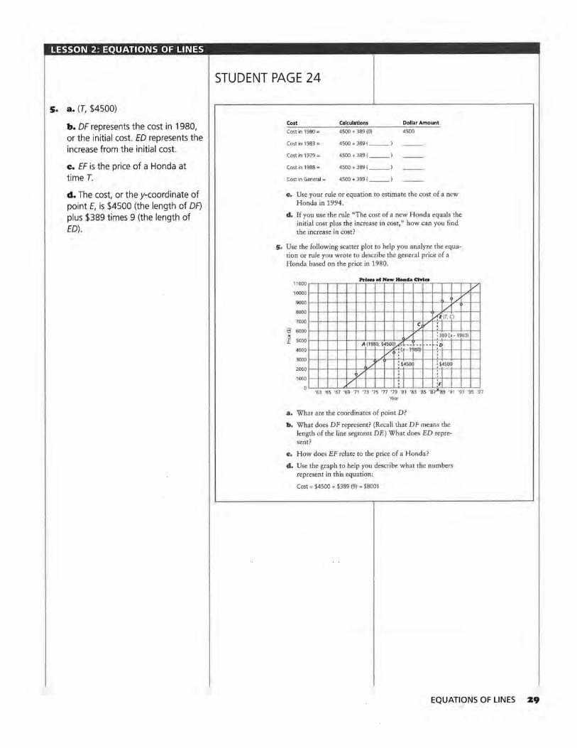
LESSON 2: EQUATIONS OF LINES
5. a. (T, $4500)
b. OF represents the cost in 1980, or the initial cost. ED represents the increase from the initial cost.
c. EF is the price of a Honda at time T.
d. The cost, or they-coordinate of point E, is $4500 (the length of OF) plus $389 times 9 (the length of ED) .
STUDENT PAGE 24
Cost Calculations Dollar Amount
Cost in 1980 = 4500 + 389 (O) 4500
Cost in 1983 = 4500+389( __ )
Cost in 1979 = 4500 + 389 ( --)
Cost in 1988 = 4500+389( __ )
Cost in General= 4500+389( __ )
c, Use your rule or equation to estimate the cost of a new Honda in 1994.
d, If you use the rule "The cost of a new Honda equals the initial cost plus the increase in cost," how can you find the increase in cost?
5, Use the following scatter plot to help you analyze the equation or rule you wrote to describe the general price of a Honda based on the price in 1980.
Prton DI New Honda CIYln 11000
10000
9000 /
8000 0£ (T.C)
7000
;a 6000
~ 5000 : 389 (x-1 980) /
4000
3000 : 14500 : S4500
2000
1000 v 'F
Year
a. What are the coordinates of point D?
b, What does DF represent? (Recall that DF means the length of the line segment DF.) What does ED represent?
c, How does EF relate to the price of a Honda?
d, Use the graph to help you describe what the numbers represent in this equation:
Cost= $4500 + $389 (9) = $8001
v
EQUATIONS OF LINES Z9
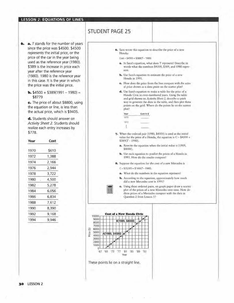
LESSON 2: EQUATIONS OF LINES
•· a. T stands for the number of years since the price was $4500. $4500 represents the initial price, or the price of the car in the year being used as the reference year (1980). $389 is the increase in price each year after the reference year (1980). 1980 is the reference year in this case. It is the year in which the price was the initial price.
b. $4500 + $389(1991 - 1980) = $8779
c. The price of about $8800, using the equation or line, is less than the actual price, which is $9405.
d. Students should answer on Activity Sheet 2. Students should realize each entry increases by $778.
Year Cost
1970 $610
1972 1,388
1974 2, 166
1976 2,944
1978 3,722
1980 4,500
1982 5,278
1984 6,056
1986 6,834
1988 7,612
1990 8,390
1992 9,168
1994 9,946
30 LESSON 2
STUDENT PAGE 25
m . .
6. Sara wrote this equation to describe the price of a new Honda:
Cost = $4500 + $389(T- 1980)
a. In Sara's equation, what does T represent? Describe in words what the numbers $4500, $389, and 1980 represent.
b. Use Sara's equation to estimate the price of a new Honda in 1991.
c. How does the price from the line compare with the actual price shown as a data point on the scatter plot?
d. Use Sara's equation to make a table for the price of a Honda Civic in even-numbered years. Using the table and grid shown on Activity Sheet 2, describe a quick way to generate the data in the table, and then plot these points on the grid. Where do the points lie on the scatter plot?
Year Cost in $
1970
1972
7, When the ordered pair (1980, $4500) is used as the initial value for the price of a Honda, the equation is C = $4500 + $389(T-1980).
a. Rewrite the equation when the initial value is (1989, $8000).
b. Use each equation to predict the prices of a Honda in 1995. How do the results compare?
8. Suppose the equation for the cost of a new Mercedes is
C = $23,000 + $1668(T - 1980).
a. What do the numbers in the equation represent?
b. According to the equation, approximately how much did a new Mercedes cost in 1991?
c. Using these ordered pairs, on graph paper draw a scatter plot of the prices of a new Mercedes over time. How do these prices of a Mercedes compare with the data in Question 2 from Lesson 1?
Cost of a New Honda Civic 1 0000~~~~~~~~~~~~,.~,...-.
9000l--i-+-+--t-•8~1{1L9~8-9•$~8LO~OO~»+-'~IK-..-+-1
80001--if-t-+-+--+-"f-'-~~~""+~-£F-+--+-I
70001--ir-+-t--t--+--t-+--t-ir--t~-..'l--t--+--+-I
§ 6000~f--4-+-+-~--1--+--~,., ..... .._+--1-11-4--I ~ 5000,__.,,....,.1 ='°"'0,.....,,5""""',.,,._+-<,.,...,_,_-t-_~_,___,_,
;t 4000 1--iA-'1(+9_8,....:.,' "-4.,..5_00,..;ll""llr''-+-+---+-+--~-+-I 3000r--1r--t---+-t--.i:.~,..---+-t-,-+-+-t---1r-+-t 2000 1--1r-+-t-IK-o-'•'+--t-+--t-ir--t-+-t--t--+-1 1000 1--if-t#-;:;lf'-t--t--t-+--t-ir-+-t---t--t--+-I o~~~~~~~~~~~~~
'67 '69 '73 '77 '81 '85 '89 '93 Year
These points lie on a straight line.

LESSON 2: EQUATIONS OF LINES
7. a. C = $8000 + $389(T - 1989)
b. $4500 + $389( 1995 - 1980) = $10,335; $8000 + $389 (1995 - 1989) = $10,334
The results are very close. The difference is due to the rounding done in working with the original slope. If the slope of 389 is replaced with 3500 -9-, both equations will give a price of $10,333.33333.
Rounding errors can be very significant in some problems. If students round a rate of change to the nearest tenth, they are dropping values of 0.01 . If these values are multiplied by a year, 1990 for example, this could result in a 19.90 difference. In the price of a car, it is insignificant. In the price of a hamburger, it is important. Students should be alert to this potential problem and think about rounded values as a possible explanation for solutions that are not reasonable. A general rule is to retain all of the digits from any computation for as long as possible and then to round the final answer. Using a calculator aids in following this rule .
8. a. The car cost $23,000 in 1980, and the increase in price was about $1668 per year.
b. $23,000 + $1668(1991 -1980) = $41,348
c.
50000 45000 40000 35000
§ 30000 ~ 25000 a: 20000
15000 10000 5000
/ 0 '67
Cost ol a New Mercedes
/
/
v /
v / ,,.
/
'71 '7S '79 '83 '87 '91 '95 Year
Students might read values from the graph and compare these prices with those predicted by the equation (or with the data in the table) .
STUDENT PAGE 26
SUMMARY
Points that form a straight line can be represented by a linear equation.
• To summarize linear patterns, you can draw a straight line approximating the pattern shown in the scatter plot of the data.
• The relationship shown by the line can be written as a rule or equation.
• To write the equation of the line determine an initial value (t, c) and a rate of change.
• An equation of the form C = c + r (T - t) can be used to represent the relationship between cost and time in which Tis any year in general, tis a specific year, C is the cost in general, and c is the cost in the specific year.
• In general, if the ordered pair (x1, y1) is the initial value, and m is the rate of change or slope, then the equation of the line is y = y1 + m(x - x1).
• The equation of the line can be used co generate any point on the line. Every point on the graph of the line satisfies the equation.
Practice and Application•
9. The following scatter plot shows the actual prices of a new Ford Mustang for every other year from 1971 to 1993. Look carefully at the line drawn on the scatter plot.
14000
12000
10000
§ 8000
~ 6000
4000
2000
Prices of New Ford Nu- np
'69 '71 '73 '75 '77 '79 '81 '83 '85 '87 '89 '91 '93 '95 '97 Year (19 ••• )
Source: Kelly Blue Book, 1996
Practice and Applications
9. a. Another possible point is (1974, $4500). $10,500 - $4500 = $6000, and $6000 + 14 = $428.57, or about $429. The rate of change is about $429 per year. This means that each year, the price of a Mustang increases by about $429.
b. One possible equation is C = $10,500 + $429 (T - 1988).
EQUATIONS OF LINES 31

LESSON 2: EQUATIONS OF LINES
9. c. Another point is (1994, $13,000) . $10,500 + $429 (1994 - 1988) = $13,074. Yes,
the equation is correct. This is close to the value $13,000 estimated from the line.
d. $10,500 + $429(1992 - 1988) = $12,216. This seems to be very close.
e. $10,500 + $429(1995-1988) = $13,503. The equation predicts a price that is about $4000 less than the actual price of about $17,550 in the table. 1995 is an outlier. The rate of change was not constant.
10. Each student should select one of the cars and carry out the analysis, sketching a line that seems to reflect the pattern of points. Group members can then compare their work for all of the cars. Encourage students to consoli date their scatter plots onto one grid to really see how the graphs compare, as well as use the numerical values they find for rates of change. They will find that the only sensible way to compare the equations is by using the same initial year for all equations. This will allow them to compare all of the car prices for a given year and then see how the rate of change will affect the trend .
Student responses will differ, depending on how they drew their lines and how they selected their points. It is difficult to compare scatter plots with different scales and without lines or equations. Make students aware of this, and also remind them to look at different scatter plots to decide which one seems to have the most constant rate of change and so is most linear. Have them compare the numerical values for rates of change as a way to judge the relative changes in prices for the cars and look at the relationships of the lines to each other.
32 LESSON 2
STUDENT PAGE 27
a.
§ QJ u ·:: "-
18000
15000
12000
9000
6000
a. Find the point (1988, $10,500). Find another point on the line, and calculate the rate of change in price for a new Mustang. What does this tell you about the price of a new Mustang over the years?
b. Use the ordered pairs to write an equation for the line.
c. Find a third point on the line. Substitute the ordered pair into your equation. Is your equation a true statement?
d. Use your equation to predict the price of a new Mustang in 1992. How close to the actual price do you think your prediction will be?
e. What price does your equation predict for the cost of a new Mustang in 1995? What is the difference between the prediction and the actual cost of a Mustang in 1995? What might explain the difference?
10. Have each group member choose one of the following from the table at the beginning of this lesson on page 22: Camara, Celica, Cougar, BMW, or Corvette. Plot the points for the years and the prices since 1971, and draw a line to summarize the relationship if it seems appropriate. Compare the scatter plots of all of the cars and use them to
answer the following questions. Be sure to choose the same scale for all of the graphs so you can compare the scatter plots easily.
a. Estimate the rate of change in the price of the car you selected, and explain what it means.
b. Compare your graph with the others in your group. For which car does a constant rate of change seem most appropriate? How does your graph differ from the others?
c. Do any cars have a rate of change in price that does not seem very constant? Explain how you decided on your answer.
d. Which car's cost has the greatest rate of change? How does its graph differ from the others?
e. Write an equation for each line using the year 1975 as the starting year. What observations can you make?
Cost of a New 18000
Cost of a New Toyota Celica Chevrolet Camaro
1sooOt-t-t--+--t-T-11-+-+-+--t-+--r71v /
120001-1-+-+--l-~-f---1-+-!--h""l-f---1 § / ~ 90001-1-+-t--l--t-f---1V-,/fl/-t-~--t-t-I
,, I/
V' / "- v
60001-1-+-+--l-~~f---1-+-+--l-+-f---1 /
30001-t-+'/-Jl'.'~+-+-t-+-t--t--+--+--l-I v' v
3000 ,,'"
0/ '69 '73 '77 '81 '85 '89 '93
Year
The rate of change is about $590 per year.
'69 '73 '77 '81 '85 '89 '93 Year
The rate of change is about $610 per year.

LESSON 2: EQUATIONS OF LINES
boa) Cost of a New
Mercury Coupr
§ QI u
· ;:: c..
18000
15000
12000
9000
6000
3000
0
/ , I/ I
I/ /t
/ /
v v
.t ,, ,...__ ,....'.l,l
I/ I/ '69 '73 '77 '81 '85 '89 '93
Year
The rate of change is about $675 per year.
45000 Cost of a New BMW
' 37500
I
v
30000
~ 22500 &. •v
/
I/
15000
7500
0
/
J
)
/
'69 '73 '77 '81 '85 '89 '93 Year
The rate of change is about $1630 per year.
45000
37500
30000
~ 22500 ~
15000
7500
0
/
/
Cost of a New Chevrolet Corvette
/
/
/ /
v )
v /
'69 '73 '77 '81 '85 '89 '93 Year
The rate of change is about $1600 per year.
STUDENT PAGE 28
:u:. Sales for Outlook Graphics, a company that sells baseball cards, were worth $7.7 million in 1986 and $65 million in 1992. The change in price of baseball cards was relatively constant.
a. Write an equation to describe the sales for the company over the years.
b, What do your variables represent?
Cl, Use your equation to predict the sales of the baseball cards in 1995.
I2. The cost of a share of stock in Outlook Graphics in September 1991 was $11.75. At the end of January 1992, it was $22.00.
a, The price of a share rose at about the same rate each month. Write an equation that describes the cost of the stock over the months. What do your variables represent?
b, Describe the slope, or rate of change, in terms of price and time.
Cl, Predict the cost of a share of stock in 1994. What assumptions did you make?
I~. The following table gives the number of firearm homicide victims in the United States, according to the Federal Bureau of Investigation.
Firearm Homicide Vlctlm1
Year 1988 1989 1990 1991 1992
Number of Victims 10,900 12,000 13,000 14,200 15,400
Source: Statistfcal Abstract of the United States, 1995
a. Plot the points and draw a line that you think will summarize the relationship between time and the number of homicide victims.
b, Write an equation describing this relationship.
c:, How many firearm homicide victims would you expect in 1993?
EQUATIONS OF LINES 33

LESSON 2: EQUATIONS OF LINES
(1oa)
50000 New Car Costs
45000
40000 /
35000 I// / ,
30000 I/ v vv
/ J eJ 25000
"' Cl..
20000 ,
f// v l/f/ ~ -- '~
15000
/ ""'C..-1/1.o'
10000 v ~~ !<"
/ f/. ~ 5000
0 J.~
'69 '73 '77 '81 '85 '89 '93
• Camara o Celica oCougar o BMW • Corvette
Year
b. A constant rate of change appears to be most appropriate for the Camara or the Toyota Celica. The graphs appear to be the most linear. You might point out that the Celica started out with a lower price than the Camara but has a greater rate of change, so somewhere around 1985, the price of a new Celica exceeded the price of a new Camara, although the prices and lines are actually quite close.
c. The rate of change does not appear to be very constant for the Cougar. The points seem to vary widely around the line. At some points the rate of change is zero; at others there is a large rate of change.
d. The BMW has the greatest rate of change. Its line is the steepest.
e. A possible equation is given for each car.
Camara: P = $4500 + $590(T - 1975)
Celica: P= $4300 + $610(T-1975)
34 LESSON 2
Cougar: P = $5250 + $675(T - 1975)
BMW: P= $10,800 + $1630(T-1975)
Corvette: P= $9125 + $1600(T-1975)
The BMW and the Corvette could be approximated by lines that are almost parallel because they have almost the same rate of change. The same thing is true of the Camara and the Celica, although the Celica was priced lower in 1975. Students might also notice the similarity of the lines representing the costs for the Camara and the Celica .
11. a. S = $7.7 + $9.55(T - 1986), or S = $65 + $9.55(T - 1992)
b. Sis the total sales in millions and Tis the year in question.
c. $7.7 + $9.55(1995 -1986) = $93.65. The equation predicts 1995 sales of $93.65 million .
12. a. C = $11 . 75 + $2.56(M). C is the cost in the month that is M months since September 1991.
b. The price goes up an average of $2.56 per month.
c. $11.75+$2.56(3x12)= $103 . 91 . The equation predicts a cost of $103.91 in September 1994 (three years from the starting date).
Student responses will vary depending on the month in 1994 for which they compute the price. The costs should range from $83 .43 to $111.59.
These answers assume that the price of shares continues to rise at the same rate each month and that the company does not merge, dissolve, or change otherwise by 1994.
13. a. 20000 18000
§ 16000 fj 14000 5 12000 0 10000 ] 8000 E 6000 ~ 4000
2000 0
Firearm Homicide Victims
-----_,.....
'87 '88 '89 '90 '91 '92 '93 '94 Year
b. V = 10,900 + 1050(T - 1988). V is the number of victims, and Tis the year in question.
c. 10,900 + 1050 (1993 - 1988) = 16, 150. You could expect about 16, 150 victims in 1993.

LESSON 3
Equivalent For1ns of Equations Materials: graph paper, rulers, pens or pencils, Lesson 3 Quiz
Technology: calculators, graphing calculators (optional)
Pacing: 2 class periods
Overview
The focus Of this lesson is to help students recognize equivalent linear equations. They have written equations for data sets, using ordered pairs and rate of change. Now they investigate what happens if different points are used to write the equation. How do they know if the equations are describing the same relationship? Students investigate this question using graphs, sets of ordered pairs, and equivalent forms of the equations.
Teaching Notes
A major recurring theme in the module is to investigate a real-world problem using data, graphs, and symbols and to think about what information each process will provide. The problem in this lesson is about baseball and televised baseball games. It is particularly interesting to think about the data in terms of the baseball strike of 1994-1995 and to question students about how the data they are investigating might have had an impact on the decisions made about the strike. Do the data provide owners with enough evidence to back up their case? The players'· case?
In question 3, students are asked to think about how to determine whether or not two equations represent the same line. This can provide a rich discussion that may make questions 4-9 unnecessary or simply useful for review. Encourage students to share their thoughts:
If the graphs are the same, does that mean the equations are equivalent? Equivalent equations are usually thought of as equations that produce the same y-value for any given x-value. If the sets of ordered pairs generated seem to be identical, are the equations equivalent? If the graphs are the same, it seems reasonable to assume the equations are equivalent.
However, even if the ordered pairs seem to be identical, the evidence for equivalent equations is incomplete. Locally over a small region, many functions produce nearly the same sets of ordered pairs. A linear function and an absolute value function can generate identical ordered pairs over a certain domain. To use ordered pairs to determine whether or not equations are equivalent, students must either list all possible the ordered pairs (which is impossible); know from some characteristic, such as rate of change, that the equations represent straight lines and can be verified using any two points; or find other support for their argument. Students may feel that if two equations share the same ordered pair, the equations are equivalent. In addition to the exercises, another example might be necessary to demonstrate that this does not always work; indeed, any time a pattern is determined by just two elements, there is a danger of coming to the wrong conclusion because of too little evidence. If two equations share one point, that point might be the point of intersection. However, if students recognize that the rate of change for each equation is identical and that the equations share a point, then they can be certain that the equations define the same line and are equivalent. When the rates of change for two
EQUIVALENT FORMS OF EQUATIONS 3S

equations are different, the equations could never produce the same line or be equivalent. This kind of reasoning may emerge from class discussion or may have to be elicited by questioning the class.
Because it is impossible to list exhaustively all ordered pairs and because graphing, although suggestive, cannot conclusively determine whether or not two equations are equivalent, another method is necessary. By using the distributive property and combining like terms, students can write the point-slope form of an equation of a line in the slope-intercept form, even when the intercept does not make sense in terms of the context. The slope-intercept form involves the same two constants and can easily be used to judge whether or not two equations are equivalent.
Technology
Technology can be of great help in this lesson. Students should not have to graph each equation by hand. They might use any graphing utility that will allow them to plot the data and to graph the equation. Equations of the form y = mx + b can be used with most graphing calculators. Using a table feature of a calculator, students should also be able to generate ordered pairs determined by an equation. They can evaluate an equation for a set of given values by a variety of methods, including using the y = menu and evaluating they variable at the given x; finding the value of y for an x entered through the calculate menu; tracing on the graph; or using an input from the home screen. By using technology, students will focus on what it means to identify equivalent ordered pairs and how this relates to producing equivalent equations.
When graphed, equivalent equations will appear as a single line. Students can determine which graph they are inspecting by looking at the upper right corner of the calculator for the rule that is being displayed. If using the down or up arrow key identifies a different equation but the graph remains unchanged (remember to look beyond just one viewing window), the equations are equivalent.
~6 LESSON 3
Exercises for which a graphing calculator or some other graphing utility is recommended are marked
with -• •• ••• ••• ••• •••
Follow· Up
Students might check on the effects of the 1994-1995 strike on baseball and televised games. The data might be available from a major league office or contained in a sports almanac.
LESSON 3: EQUIVALENT FORMS OF EQUATIONS
STUDENT PAGE 29
LESSON 3
Equivalent Forms of Equations
In 1992, approximately 92.1 million households had television sets. During that year, major league baseball club owners decided to find out how many of these people were watching televised major league games. Were TV baseball ratings declining?
What kind of audience is predicted for the future, and what does this mean to baseball club owners and to the television networks?
B aseball club owners wanted to predict the trend in the number of people watching baseball games on TV. The
number of viewers affects the ratings; the ratings affect how much television networks are willing to spend to purchase the rights to televise the baseball games.
INVESTIGATE
Watching Baseball on TV
The table that follows on the next page displays information from the Federal Communications Commission interim report. The report shows the average TV ratings of nationally televised regular season major league baseball games since 1980. Suppose the data are linear; a line has been drawn to summarize the pattern. If two of the owners used different sets of points on that line to find its equation, would the equation be the same? Stated another way, does every line have only one equation?
o :
Determine if two equations are equivalent
by using graphs, ordered pairs, and equivalent forms.
EQUIVALENT FORMS OF EQUATIONS 37
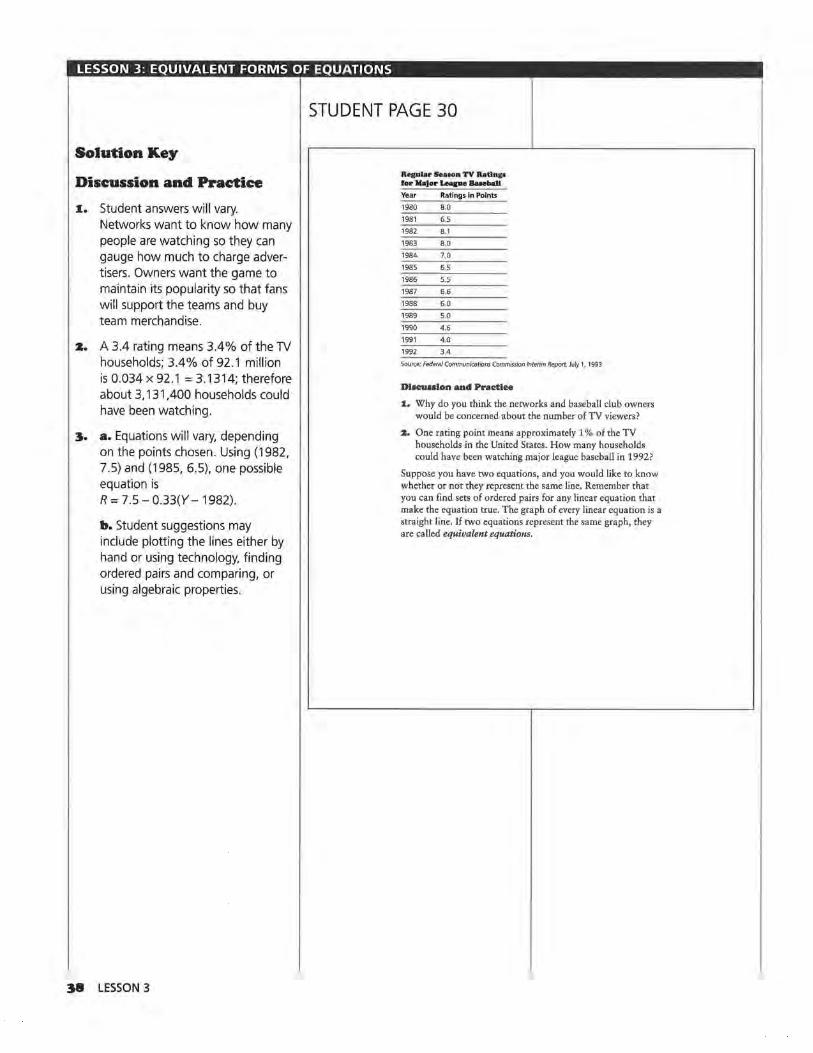
LESSON 3: EQUIVALENT FORMS OF EQUATIONS
STUDENT PAGE 30
Solution Key
Discussion and Practice
1. Student answers will vary. Networks want to know how many people are watching so they can gauge how much to charge advertisers. Owners want the game to maintain its popularity so that fans will support the teams and buy team merchandise.
2. A 3.4 rating means 3.4% of the TV households; 3.4% of 92.1 million is 0.034 x 92.1 = 3.1314; therefore about 3, 131.400 households could have been watching.
3. a. Equations will vary, depending on the points chosen. Using (1982, 7.5) and (1985, 6.5), one possible equation is R = 7.5 - 0.33(Y- 1982).
b. Student suggestions may include plotting the lines either by hand or using technology, finding ordered pairs and comparing, or using algebraic properties.
38 LESSON 3
Retular S.•oon TV R•linp lor Major Leque Baeeball
Year Ratings in Points
1980 8.0
1981 6.5
1982 8.1
1983 8.0
1984 7.0
1985 6.5
1986 5.5
1987 6.6
1988 6.0
1989 5.0
1990 4.6
1991 4.0
1992 3.4
Source: Federal Communications Commission Interim Report, July 1, 1993
Discussion and Practice
1. Why do you think the networks and baseball club owners would be concerned about the number of TV viewers?
:z. One rating point means approximately 1 % of the TV households in the United States. How many households could have been watching major league baseball in 1992?
Suppose you have two equations, and you would like to know whether or not they represent the same line. Remember that you can find sets of ordered pairs for any linear equation that make the equation true. The graph of every linear equation is a straight line. If two equations represent the same graph, they are called equivalent equations.

LESSON 3: EQUIVALENT FORMS OF EQUATIONS
4. a. For the first equation, the rate of change is 2, and the point
~ liliJ
(4, 20) is on the line.
20 = 20 + 2(4 - 4) = 20 + 2(0) = 20
For the second equation, the rate of change is 2, and the point (8, 28) is on the line.
28 = 28 + 2(8 - 8) = 28 + 2(0) = 28
b. The lines are on top of each other, so the equations seem to be equivalent. (Encourage students to use a graphing utility to make their graphs.)
I v
I I
I C :o 20 + 2(X- 4) and
I c = 28 + 2(X - 8)
I v
32
30
28
26
24
22
20
18
16
14
12
I v
100 2 6 10 14 18 22
5. a. For both equations, c = 32
~ lillJ
if x = 10. Students may assume this means the equations are equivalent. Remind students that two equations that share a common point may be intersecting. In this case however, both equations have the same rate of change (2) and a common point that together make the equations equivalent.
b. Encourage students to use the table feature of a graphing calculator to find the ordered pairs. The table produces the same values for both equations, c = 20 + 2(x - 4) and c = 28 + 2(x- 8).
STUDENT PAGE 31
3, A scatter plot of baseball TV ratings with a line used to summarize the data, is shown here.
TV Ratlnp of Major League Baseball Game• 85 ~~~"-~----~~--~~--~-~----~ 801--+-+-D~...__.__.,,_,,___,__+--+-+--+--+--+--+--+--l-->--+--+---l--I
"-7.5 l-+-+-+-+-"+l........,""-...l---l-+-+-+--!--+--+---1--1--+---l--+--l---<f--<
7 . 01-+-+-+-+--!---f".<-O....,r-....--+--+-+--+---1-1---1-+-+--f--!--+---I-~
65 1-+-+-+-·a --1---1---1-;,,o..-1---¥-1---1-1--1 .. -.,__,__.,__-1-_,_-+-~
~ 60 1--+-+--+-+--+--+--+--+-"----l'.-+-~l--l-l--t--+--l-+--+--+--+--I "" ~551-+-+-+-+--!---l---l--+--~-~°""f---1-1---1-·l-+-+-~--+---I-~
~50 1-1--1-+-+-+--+--1-+--+--+-+"'--'l:C-~---l--+--l-l--I-~-
"' 4.5 1---1-+--1--1--1--1---1-->---1--1-->----1~r-'<-t--•--1--+--1---1---<--1
'!'-.. 4.0 l-+-+-+-+--!--+---l--+--+-+--+---l-t------1;1----"~""-+-+--+--11---1-
3.5 l-+-+-+--1-~--+---l--l--+-l·--t---l-l---l---i"<--l---!--+---I-~
"'-....... 30~~~~~~~~~~~~~-~~~~~~~~-
1978 1980 1982 1984 1986 1988 1990 1992 Year
Source: Federal Communications Commission Report, July 1, 1993
a. Find two points on the line, determine the rate of change, and write an equation for the line.
b. Compare your equation to the ones found by your classmates. Describe how you could determine whether or not all of the equations represent the line shown in the scatter plot.
4, Consider these two equations: c = 20 + 2(x - 4 ), and c = 28 + 2(x-8).
a. For each equation, find the rate of change or slope and a point (x, c) on the line determined by that equation.
b. Graph each equation. How do graphs help you determine whether or not two equations are equivalent?
5, Let x = 10. Find c for the equations c = 20 + 2(x - 4) and c = 28 + 2(x - 8).
a. Are the two equations equivalent? Justify your response.
b. Generate tables of ordered pairs (x, c) that satisfy both equations, beginning with x = 0. Compare the two tables. What conclusion can you make?
1994 1996 1998
c = 20 + 2(10 - 4) x c = 20 + 2(6) = 20 + 12 0 12
= 32 14
c = 28 + 2(10 - 8) 2 16
= 28 + 2(2) 3 18 =28 +4
4 20 = 32
5 22
6 24
EQUIVALENT FORMS OF EQUATIONS 39

LESSON 3: EQUIVALENT FORMS OF EQUATIONS
STUDENT PAGE 32
s.
••
~ lillJ
c. If the rates of change are identical for the equations, only one point needs to be verified in the equations to determine whether or not they are equivalent. But if the rates of change are not the same, the equations are not equivalent. If you cannot immediately tell about the rate of change, you need further information about the ordered pairs and the situation before you can conclusively indicate that the two equations are equivalent.
Encourage students to investigate this question using a graphing calculator.
a. For the first equation, c = 28 if x = 7.
c = 18 + 2(7 - 2) = 18 + 2(5) =18+10 = 28
For the second equation,
c = 28 if x = 7.
c = 12 + 4(7- 3) = 12 + 4(4) =12+16 = 28
You can conclude only that the two lines have a point in common. In this case, some students may recognize that the rates of change are different (2 and 4), so the equations do not represent the same line and thus are not equivalent.
b. On a graph, the lines intersect at (7, 28).
Since the ordered pairs in the table are different, or since the lines do not coincide, the equations are not equivalent.
40 LESSON 3
~ . .
x c C= 18 + 2(x- 2)
0 14
16
2 18
3 20
4 22
5 24
6 26
7 28
c. How many identical ordered pairs do you need before you can determine whether or not the equations are equivalent?
6. Consider c = 18 + 2(x - 2) and c = 12 + 4(x - 3).
a. Let x = 7 for both equations, and find c. Are the two equations equivalent? Justify your response.
b. Make tables of ordered pairs and graph these two equations to determine whether or not the equations are equivalent .
c. How do ordered pairs help determine whether or not two equations are equivalent?
To determine if two equations represent the same line and the same set of ordered pairs, you can rewrite each equation in a different form using algebraic properties. Distribute and combine like terms in each equation, and then compare the forms. If the forms for the equations are identical, the equations represent the same line. Rewriting the equations is an efficient way to determine whether or not two equations are equivalent.
Are c = 20 + 2(x + -4) and c = 28 + 2(x + -8) equivalent equations?
c = 20 + 2(x + -4) c = 28 + 2(x + -8)
c = 20 + 2x + -8 Distribute, c = 28 + 2x + -16
c = 12 + 2x Combine like terms. c = 12 + 2x
7. Do the two equations above represent the same line? Why or why not?
8. Using the Distributive Property, rewrite each of the following so that the expression is in the form a + bx for some numbers a and b. Combine like terms where possible.
a. 2(x + 5)
b. 3(x-4)
c. 10 + S(x-9)
d. -4 + 2(x + 3)
9. Consider these two equations: r = 26 + -12(x - 2) and r = 70 + -12(x - 10).
a. Can you find an equivalent form for each equation? Do the two equations represent the same line?
c c. If the ordered pairs are the same C= 12 + for two different equations of lines 4(x- 3) and if the rates of change are iden-
0 tical, then the equations are equiv-a lent.
4
8
12
16
20
24
28

LESSON 3: EQUIVALENT FORMS OF EQUATIONS
7. Yes. Some students may need to create a table or graph or generate two ordered pairs; some may realize that since the equations can be rewritten in the same form, they are equivalent.
8. a.10+2x
b. -12 + 3x
c. -35 + 5x
d.2+2x
9. a. For the first equation, r = 50 - 12x. r = 26 + -12(x - 2) = 26 - 12x + 24 = 50- 12x
For the second equation, r = 190 - 12x. r = 70 + -12(x - 10)
= 70 - 12x + 120 = 190 - 12x
No, they do not represent the same line. They have the same rate of change but do not share any points. The equations represent parallel lines.
b. Rewriting equations in equivalent forms is a relatively easy and efficient way to determine whether or not the equations are equivalent. Finding all possible ordered pairs is an infinite process that cannot be completed; graphs can indicate that equations seem to be equivalent, but slight shifts in scale or variation in values may not be seen on a graph.
IO. The students' equations may vary slightly, depending on the values they computed for the slope. The equations should be fairly close to y = 661.56 - 0.33x.
STUDENT PAGE 33
b. Why do you think using equivalent forms is a useful way to determine whether or not two equations are equivalent?
10. Use the equation of the line you found for the baseball ratings in Question 3 on page 31. Rewrite your equation in the form y = a + bx, in which a and b are numbers, x represents time, and y represents rating points. Compare your results with the results of your classmates.
11. As the baseball club owners and TV networks analyzed the situation in 1993, they looked at other information about baseball and television viewing. In particular, they looked at the numbers of local telecasts and national telecasts of regular season baseball games as shown in the following table.
T.clovhed h 1cba1J GAme.1
Year National Local Telecasts Telecasts
1982 63 1954
1983 63 2217
1984 52 2623
1985 51 2356
1986 68 2473
1987 48 2568
1988 48 2661
1989 46 2714
1990 16 2849
1991 16 2917
1992 16 2922
Source: data from USA Today. July 23, 1993
EQUIVALENT FORMS OF EQUATIONS 41

LESSON 3: EQUIVALENT FORMS OF EQUATIONS
STUDENT PAGE 34
1.1.. a. There are significantly more local telecasts than national telecasts. The number of local telecasts is increasing, whereas the number of national telecasts is decreasing. The data for the local telecasts show a more distinctive linear pattern than the data for the national telecasts. Local telecasts appear to be increasing at a constant rate of change, whereas the number of national telecasts do not.
b. It makes sense to use a line for the local telecasts because the points fall close to a line. It does not make sense to use a line for the national telecasts because there is very little change for a few years, and then a dramatic change, then very little change again.
c. The ratings have dropped, and there are fewer nationally telecast games.
4Z LESSON 3
a. Look at the graphs of the data in the following two scatter plots. What are some significant differences between the scatter plots of the two sets of data?
70 N• Uonal B....,.dcuu of Motor Lupe Beaeb.U Game•
65 1--+-+-+-+-+--t--t-+-+-+-+--1--1---+-4 I
60 >--+-+-+-+-+-+-+-+-+--1--1--1--1--1-~
551--+-+-+-+--t-+-+-+-+-+-+--l---+---+-4
~ 50 1)
I
~45 >--+--t-+-+-+-+-+-+-+-~--1--1--1-~-~
~ 40 1----+-+-+-+-+-+--l--l--l--l--1--1--1-4-4
~ 35 1----·l--·l--t--t--l--l-+-+--+--l-+--l--+--+-4 E ~ 301--+-+-+-+--t--t--l-+--l--l--l--1--1--1-4
25 1----+-+-+-+-+-+-+-+-+--t---t---1--1--1-4
20 1--+-+-+-+--t--t-+-+--1--1--1--1--1--+-4
15 1--+-+-+-+--t--t-+-+-+--l-...,,._-'t-4---+-4
10 ~~+-+-+-~~~~~~~~~~~
1980 1982 1984 1986 1988 1990 1992 1994 Year
Source: data from USA Today, July 23, 1993
3000 .--r-Loca-.--1 Te..-'-".,...•-rta.,...· ot_.....Ma~IT-or_Lot....-'ap"r--e Beae-,--..,.be_u..,.c;_...,.-.-•~
2900 l-l-+-+-+-+-+-+-+--1--1-+--'l'--'l'--+-I
2800 1-1-+-+--+-·l-+-+-+--l--l--l-+--l--l--I
2700 1-1-+-+-+-+-·t--+-+-+-"t-+--t--t--+-----l
lli 2600 -lf--f--1--1--f--l-+--,+--+-+-+-+-+--l-l
~ 2500 l-+--+-+-+-+-+-*-+--1--1--1-+--l--l--I ~ I
0 2400 •-+-t--+--+-+-~-+-+-+-+-+---<--1-_,__,
~ 2300 l--l-+--+-+-i-+-+-+-+-+-+-+--1--1--1
~2200 1--1-+-+-T--+-+-+-+--l--l-+--l-+--l--I
2100 l-+--+--+--+-+-+-+-+-+-+-+--<--1--t--I
2000 1--1-1-,+-) --t---t--t--t--t--+-t--+--+--+--+--t
1900 l--l-l-+--+-+-+-+-+--l--l--l--1--1--1--1
1800 L..-J-J-J-.L-.L-.L-.L-.L-.L-.J-.J--'--'--'--'
1980 1982 1984 1986 1988 1990 1992 1994 Year
Source: data from USA Today, July 23, 1993

LESSON 3: EQUIVALENT FORMS OF EQUATIONS
IZ. a. From the data, there were 2623. This is many more than would be expected, given the values of surrounding years.
b. Equations will vary slightly, depending on the points students choose. One possibility is T = 2150 + 83(Y - 1982). Tis the number of local telecasts, and Y is the year in question . There are about 83 more local telecasts each year than in the previous one.
c. In most cases, the equations should be nearly equivalent, with some differences due to the points chosen. Students may produce equations of the form y = a + bx to compare.
d. For the equation given in b, y = -162,356 + 83x. The equation predicts 3146 local telecasts in 1994. Students should all get about the same value.
STUDENT PAGE 35
b. Explain whether or not it makes sense to draw a line to summarize either relationship.
c. What connections might there be between these data and the data on TV viewing ratings at the beginning of this lesson on page 30?
1:1. A line summarizing the data for the number of local telecasts is shown on the following scatter plot.
3000 ~~Loca~-'l_,Ti,.:.•l...;,ee_,.;;UU..:..:.;.....;,of;_,M...;,•.;,:l;..;or'-'League=;:;c:_~Bue"'. :..:.b811~;,..G;_am,;;....H~~ I./
2900 1---1--1--1---1--1--1-1--.1--1--1--1-v - Jf'_,,,-1-1
2800 l--l----1--1---1--1--1-1---l----l--ll-..<./ ~.J--l--l--I
2700 1- -1--f--1--1--l--1--11--l---/+..,.-'-1-+-+--l--I
1'! 2600 1--1--+--l--+----+-l--ll-/-4..«-1--1-1---l---l--l--I
~ 2500 l---l----l----1--1--l--l-l--1 ,, .... <-.1-----1--1-1-11--1--+---1 ~ I / 0 2400 l--!---1--1--1--+/1_,,'"-ll--l---l-.+--+-+-4-l--l
~ 2300 1--l--f--l--1-~-l--ll--l----l-~--l--l--+-l---I E / ~ 2200 1--1--1--1-,..,,- -l--l--ll---l----l--l--l---l--+-l---I
,..v 2100 l--l---hoo!..1-----1--l--l--ll---l----1--1--l---l--+-l-I
2000 1--b.«-/ •-ll-l---+--1--1--+-l·-l-ll--1---1--1--1
1900 l--l--f--1---1--l--l-11--+-+--+--l--l--+-l---I
1WOL---'--'--'--'------'-_J.--11---l----1--L---'--'---L--'-' 1980 1982 1984 1986 1988 1990 1992 1994
Year
a. Using the line, how many local telecasts were there in 1984? How would you describe the data point for that year?
b. Write an equation for the line. What do your variables represent? Describe the rate of change in the number of local telecasts over time.
c. Compare your equation with the equation of a classmate. Are the two equations equivalent? How can you decide?
d. Write your equation in the form y = a + bx. Use your equation to predict the number of local telecasts in 1994. Compare your prediction with those of your classmates.
EQUIVALENT FORMS OF EQUATIONS 43

LESSON 3: EQUIVALENT FORMS OF EQUATIONS
I3. a. Similarities: 1980 is the initial value in both graphs. The points are in the same position relative to one another. Differences: The points in the second graph are translated to the left in contrast to the first graph. The x-axis is labeled from 0 to 12 rather than from 1980 to 1994.
b. Equations will vary slightly, based on the points students choose. One equation is y = 2150 + 83(x - O) in which y is the number of local telecasts and x is the number of years since 1982.
c. y = 21 50 + 83x
d. Answers will depend on the students' equations. In both instances, the rate of change of 83 remains constant.
I4. Advice will vary. Students should use the facts presented to make a meaningful argument. Those interested in the effects of the strike of 1994-1995 might want to investigate the data since then, to determine whether the pattern of declining numbers of viewers was reversed.
44 LESSON 3
STUDENT PAGE 36
:t~. The following is a different scatter plot of the number of local telecasts.
Loeal Telecallta of Ma)or IA•sue BuebaU Gameo 3000 l/ 2900 v 2800
/ 2700 -
iii 2600 /
~ 2500 / ~ I/ 0 2400
V" ~ 2300 E v ~ 2200 v
2100
2000
1900
1800 0 2 4 6 8 10 12
Yeur
a. How is this scatter plot like the scatter plot in Question 12 on page 35? How are the two scatter plots different?
b. Write the equation of the line shown in this scatter plot. What do your variables represent?
c. Write your equation in the form y =a+ bx.
d. How is this equation like the one you wrote before? How are they different?
:14. You have looked at several different data sets about television and major league baseball. What advice would you have given to the owners and networks in 1993, based on the analysis you have done in this lesson?
SUMMARY
Two equations are equivalent if they
• Have exactly the same graph.
• Generate the same set of ordered pairs given equal slopes.
• Can be rewritten in exactly the same form.
If two equations have the same slope and share a common point, they are equivalent. An equation of the form

LESSON 3: EQUIVALENT FORMS OF EQUATIONS
Practice and Applications
xs. a. Bob: y = 18 + 0.5(x - 2) = 18 + 0.5x- 1 = 17 + 0.5x
Suzie: y = 20 + 0.5(x- 6) =20+0.5x-3 =17+0.5x
Tom:y= 22 + 0.5(x-10) = 22 + 0.5x- 5 = 17 + 0.5x
Lee: y = 16 + 0.5(x - 1)
= 16 + 0.5x-0.5
= 15.5 + 0.5x
Lashanda: y = 19 + S(x - 3) =19+5x-15 =4 + Sx
Pat: y = 34 + 2x
Sol: y = 2x- 34 = -34 + 2x
Bob, Tom, and Suzie have equations equivalent toy= 17 + 0.5x.
b. Bob's, Tom's, and Suzie's equations determine the same straight line because the equations are equivalent. Students may reach this conclusion also by making graphs or by comparing tables of ordered pairs.
X6. a. ($365 - $46) + 10 = $31.9, so, F = $46 + $31.9(Y- 1980). The slope is 31.9 and indicates that each year, $31.9 million more in fees is paid.
b. F = $46 + $31.9(13)
= $46 + $414. 7
= $460.7
The fees in 1993 would be about $460.7 million.
c. $460,700,000 + $60,000 = 7678.33, or about 7679. (Note that the value is rounded up.)
They would need 7679 commercials to cover the fees.
STUDENT PAGE 37
y = a + m(x - c) for some numbers a, m, and c and variables (x, y) can be rewritten as y = d + mx, in which d = a - me, by distributing and combining like terms. In both forms, m represents the rate of change or slope.
Practice and Applications
15. Recall the conditions under which two or more equations are equivalent.
a. Which of the following equations are equivalent?
Bob:y= 18 + O S(x-2)
Tom: y= 22 + O.S(x-10)
Lashanda: y = 19 + S(x- 3)
Sol: y= 2x-34
Suzie: y = 20 + 0 5(x - 6)
lee: y = 16 + O.S(x-1)
Pat:y= 34+ 2x
b. Which of these equations determine the same straight line? How did you decide?
16. The annual fees paid by TV networks to televise major league baseball were $46 million in 1980 and $365 million in 1990. Assume the rate of change has been relatively constant over the years.
a. Write an equation that describes the relationship between the annual fees and time. What is the slope of your equation, and what does it tell you about the fees?
b. Use your equation to estimate the annual fees in 1993.
c. In 1993, the cost of a 30-second commercial during the telecast of a regular National Baseball League game was $60,000. How many 30-second commercials would the network show to cover the cost of their fees?
17. Kuong says the line determined by y = 10 + 3(x - 2) contains the point (10, 2) and has a slope of 3. Is he correct? Why or why not?
18. If two lines have the same slope, what do you know about the lines?
19. If the two equations y =a + bx and y = c + dx represent the same line, what can you say about the numbers a, b, c, and d? Give an example to justify your answer.
20. The growth and projected growth of the population in the industrialized nations of the world, according to the United
x7. He is incorrect. The slope and point can be read directly from the equation. The point is (2, 1 O) not (10, 2).
Substituting (10, 2) into the equation results in 2 = 10 + 3(10 - 2) ?
= 10 + 24? :;t: 34.
xs. The lines are either parallel or the same line.
x9. a = c and b = d. Students' examples will vary.
EQUIVALENT FORMS OF EQUATIONS 45

LESSON 3: EQUIVALENT FORMS OF EQUATIONS
zo. a. Answers will vary. Industrial countries include the United States, Canada, Russia, England, Germany, and Japan.
b. Equations will vary slightly. One possible equation is y = -195 + 0.1x.
y=-195 + 0.1(1990) = -195 + 199 =4
This equation predicts a population of 4 billion in 1990, which is very close to the actual value of 4.086 billion .
c. y = -195 + 0.1 (2020) = -195 + 202 =7
According to the equation from b, the population in 2020 will be about 7 billion. It is likely that the United Nations' estimate of 8.2 billion indicates a more complex model than a line-probably a curve moving upward. As the world's population increases, greater numbers of people reproduce at a greater rate, a trend that suggests a nonlinear model.
d. Student answers will vary. Some may think the models seem to work pretty well for known data, so they will continue to work. Others may be skeptical about predicting human behavior.
z1. Project Examples will vary based on what students find. One example may be stock prices, which tend to fluctuate, whereas another may be daily temperatures. Many other examples such as population growth, growth in the marriage rate, and growth in the number of automobile accidents are not linear.
46 LESSON 3
STUDENT PAGE 38
Nations Population Fund, is shown on the following scatter plot. A line has been drawn to summarize the data.
B,0 Orowth of 111.dunrlalhed Nation•
I 7.5
7.0 v 6.5 I
6.0
""' s.s c I ~ s.o e / 6 4.s
~ 4.0 ,
c. 7 ~ 3.5
I 30
2 5 .Ai
'V 2.0 ,/ 1 5
1 0 J
1940 1960 1980 2000 2020 2040 Year
Source: data from United Nations; Population Reference Bureau
a. Name some countries that you think would be included as industrialized nations.
b. Write an equation you could use to make projections about the population. Use this equation to estimate the population in industrialized nations in 1990. The actual population according to the United Nations was 4.086 billion. What is the difference between your estimate and the actual population?
c. Predict the population for the year 2020, using the line shown. The projected population according to the United Nations is 8.2 billion. What might explain the difference between the two projections?
d. In general, how reliable do you think these projections will be? Give a reason for your answer.
:&1. Not all scatter plots of data over time will show a linear pattern. Look through newspapers or magazines to find at least two examples in which data graphed over time are not linear. Provide descriptions along with your examples.
ASSESSMENT
Price Changes and Median Earnings Materials: graph paper, rulers, pencils or pens
Technology: the same used for previous lessons
Pacing: 1 class period (if done in class)
Overview
Students analyze how men's income has changed over the years and then compare this with how women's income has changed. You will be able to determine whether or not students can graph data, draw a summary line, and write the equation of that line. Students should be able to find and interpret slope as rate of change and compare two different rates of change. They should also be able to predict an outcome, using a table, a line, or an equation.
Teaching Notes
The assessment can be given in class, given as a takehome assignment, or assigned to pairs. If working in pairs, one student analyzes the men's salaries, the other the women's salaries, and then they share their work to make conclusions. Be sure student work includes both graphs and equations. Frequently, students tend not to use mathematics to make their cases but simply argue commonly held opinions: "Men earn more than women." Encourage students to quantify their statements and to refer to their graphs as they build arguments for Question 4.
If students use a graphing calculator to do their scatter plots they should either use the link to a computer and provide a hard copy of the plots, or make a rough sketch of the plots to accompany their work. They should also include an explanation of how they approached the problems and the work they did, rather than just reporting the final numerical results. Check to see how students made their predictions: Did they use the lines they drew or the equations they
wrote? Either strategy is acceptable, and both should be given full credit. All students should be able to answer the questions to some degree; scoring should be based on the completeness of their responses and how well they organize and interpret the data.
This data set provides an excellent example of the way different lines of reasoning can lead to different conclusions about the same information. If the data are analyzed using scatter plots and lines, it seems as if men are earning more than women and that the gap is increasing. If the data are analyzed using percentages, however, the difference appears to be decreasing, leading to the inference that women's earnings are catching up to men's. This dichotomy can stimulate class discussion as well as make the point that percentage is dependent on the base used. A 50% gain from 2 to 3 is quite different from a 50% gain from 2000 to 3000.
· Follow-Up
In some classes, it might be appropriate to discuss why there is such a difference in incomes. Answers may include these: Men and women do different kinds of jobs; more women have low-paying jobs; women started in the workforce later, so it will take them longer to catch up in income; and many women work only part-time, so they are not included in the data.
Early each spring, additional data are usually released comparing men's and women's income. Students might be asked to watch for this information and to compare it with the conclusions they made based on the data in this self-test.
PRICE CHANGES AND MEDIAN EARNINGS 47

ASSESSMENT: PRICE CHANGES AND MEDIAN EARNINGS
Solution Key
Project
1. These answers will depend on the students' experiences and memories . They may know of some products that have decreased in price as well as many that have increased.
z. Student responses will vary. Some examples in which the rate of change is not constant might be the increase in the population of a city, the inflation rate studied in Lesson 1, and the speed of a car. Students should provide appropriate sketches for each situation .
Assessment
1. Men consistently earn more than women. The differences in the salaries appear to be increasing if actual salaries are compared.
z. 38000 36000 32000
IA 28000 -;;; 24000 E 20000 8 16000 E 12000
8000 4000
0 '67
Median Earnings ol Full·Time Male Workers
.... ....
"" "' '"" .
Hf
'71 '75 '79 '83 '87 '91 '95 Year
a. Equations will vary, depending on students' lines. A possible equation is y = $20,000 + 917(x - 1980).
b. The median income for men increased by about $900 per year.
c. y = $20,000 + 917(13), and $20,000 + $11,921 = $31,921
The equation predicts $31,921, which appears to be a little high.
d. The prediction is $321 more than the actual income of $31 ,600.
48 ASSESSMENT
STUDENT PAGE 39
ASSESSMENT
Price Changes and Median Earnings
Protect: Price Changes
I. Choose five things you have purchased several times over the past four years. Make a graph for each item showing the year and prices.
Apply the concepts of slope and lines.
a. Estimate the rate of change in price for each item.
b. Compare the changes in price over time.
:z. Think of several situations in which data change, but the rate of change is not constant. Describe and sketch a graph for each example.
Assessment: Median Earnings for Men and Women
The median earnings of year-cound, full-time workers age 25 years and older for men and women are given in the following table.
Median Earnings
Year Men Women Year Men Women
1970 $9,521 $5,616 1981 $21,689 $13,259
1971 10.038 5,872 1982 22,857 14.477
1972 11,148 6,331 1983 23,891 15,292
1973 12,088 6,791 1984 25,497 16,169
1974 12,786 7,370 1985 26,365 17,124
1975 13,821 8,117 1986 27,335 17,675
1976 14,732 8,728 1987 28,313 18,531
1977 15,726 9,257 1988 28,180 18,509
1978 16,882 10, 121 1989 29,556 19,752
1979 18,711 11,071 1990 29,987 20,556
1980 20,297 12,156 1991 30,874 21,272
1992 31,408 22,141
Source: U. S. Census Bureau, 1995.
I. Study the table above, Compare the earnings of men with those of women over time.
Median Earnings ol Full·Time
38000 Male and Female Workers
36000r-t-+--+-t-+-+--+-t-+-+--+-l-+-I 32000r-t-+--+-t-+-+--+-t-+-+
IA 280001-1-1-+-t-+-l-+-t-+~~f-+--l -;;; 240001-1-1-+-t-t-t-+-·"""'::+--Hn..-1 E 20000H-l-+-H-l:<-F-H-l-::~F+-I 8 16000H-l-+-:k'9"'-t---1-ii:..+~-1--1f-+~ E 12000H~'f""-1H-:~Ft~·
8000 rt-+.:~~+H-t-+-t-++-l 40001--±'*1"+-t-+-++-t-+-f--j-,f-+--j
O'-'--'--'-......... _.__._.._,__.__......L-L~ '67 '71 '75 '79 '83 '87 '91 '95
Year
a. The line for the women is below the line for the men, which indicates that the earnings for women were continually less than those for men.
Although the lines are almost parallel, the rate of change for the women, about $857, appears to be slightly less than the rate of change for the men at $917. It appears as if the gap between the incomes is widening .
b. One possible equation is y = $4000 + 857(x - 1971 ). This equation predicts an income of $22,854 for women in 1993.
c. The prediction is $432 more than the actual income of $22,422.
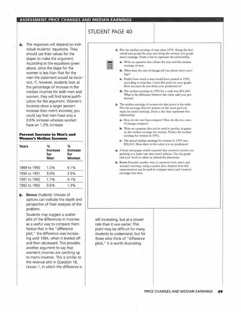
ASSESSMENT: PRICE CHANGES AND MEDIAN EARNINGS
The responses will depend on individual students' equations. They should use their values for the slopes to make the argument. According to the equations given above, since the slope for the women is less than that for the men the statement would be incorrect. If, however, students look at the percentage of increase in the median incomes for both men and women, they will find some justification for the argument. Women's incomes show a larger percent increase than men's incomes; you could say that men have only a 0.6% increase whereas women have an 1.3% increase.
Percent Increase in Men's and Women's Median Incomes
Years % % Increase Increase for for Men Women
1989 to 1990 1.5% 4.1%
1990 to 1991 3.0% 3.5%
1991to1992 1.7% 4.1%
1992 to 1993 0.6% 1.3%
s. Bonus Students' choices of options can indicate the depth and perspective of their analyses of the problem.
Students may suggest a scatter plot of the differences in incomes as a useful way to compare them . Notice that in the "difference plot," the difference was increasing until 1984, when it leveled off and then decreased. This provides another argument to say that women's incomes are catching up to men's incomes. This is similar to the revenue plot in Question 18, Lesson 1, in which the difference is
STUDENT PAGE 40
I . .
2. Plot the median earnings of men since 1970. Along the horizontal axis graph the year, and along the vertical axis graph men's earnings. Draw a line to represent the relationship.
a, Write an equation that relates the year and the median earnings of men .
b, What does the rate of change tell you about men's earnings?
c. Predict how much a man would have earned in 1993, according to your line. Circle this point on your graph. How accurate do you think your prediction is?
d. The median earnings in 1993 for a male was $31,600. What is the difference between this value and your prediction?
3. The median earnings of women are also given in the table. Plot the earnings data for women on the same grid you made for men's earnings. Draw a line that represents this relationship.
a. How do the two lines compare? How do the two rates of change compare?
b. Write an equation that can be used to predict, in general, the median earnings for women. Predict the median earnings for women in 1993.
c. The actual median earnings for women in 1993 was $22,422. How close to this value is your prediction?
4. A local newspaper article reported that women's salaries are growing at a faster rate than men's salaries. Use the graph and your work to refute or defend the statement.
s. Bonus Describe another way to represent both men's and women's earnings, using a scatter plot. Explain how this representation can be used to compare men's and women's earnings over time.
still increasing, but at a slower rate than it was earlier. This point may be difficult for many students to understand, but for those who think of "difference plots," it is worth illustrating.
PRICE CHANGES AND MEDIAN EARNINGS 49

ASSESSMENT: PRICE CHANGES AND MEDIAN EARNINGS
Differences in Men's and Women's Median Incomes
Year Difference
1970 $3,905
1971 4, 166
1972 4,817
1973 5,297
1974 5,416
1975 5,704
1976 6,004
1977 6,469
1978 6,761
1979 7,640
1980 8, 141
1981 $8,430
1982 8,380
1983 8,599
1984 9,328
1985 9,241
1986 9,660
1987 9,782
1988 9,671
1989 9,804
1990 9,431
1991 9,602
1992 9,267
1993 9, 178
Difference in Men's Earnings
10000 and Women's Earnings
E 9500 l-+--l-l-+--+-<1-+-+-<~....,v-. ,__,
8 9000 l-+--l-l-+--+-<1-+--+---!--+--+-t-l-I
E 8500 1-1--1-l-l--l-i-,i,.,,.l'-!-l--l-l-+-I ~ 8000 l-+--1-1-+--+-<._,,_,__,__,-l--+-+_,_,
E 7500 g 7000 l-+--l-l-+--1-'1-+--1--1--+--+-+-l-l
> 6500 l-+--l-l-+--<>-1-+--l--l--+--+-t-l-l
~ 6000 l-l--l-i-l-<.+--ol-!--1-1-1--1--f-+-I E 5500 1-1--1-1-n,Qrt-t-+--1-1---t-+-+-+-l-8 5000 l-+--l-l-l--1-1-+--l--l--+-+---+--I
E 4500 ,__.__.._._..._,_,__.___,__,,__,__,_.__,_. ~ 4000 ,_....,Q__,_l-+--+--1--+--+-<--+--+-+---+--I
~ 3 500 l-l--l-l-l--1--1-1--l-lf-1--1-1-1-3000 '--'--'-L-I..-'-'--'--'--'"-'--'--'--'--'
'67 '71 '75 '79 '83 '87 '91 '95 Year
SO ASSESSMENT
Students might also graph the ordered pairs (men's income, women's income). The rate of change for a line in that scatter plot would be about $917 + $857 = 1.07001 ... , indicating that men earn $1.07 for every $1.00 earned by women. A careful inspection of this scatter plot will reveal that the data points are really not linear but curved. Students might recognize that this means the rate of change is not constant, which agrees with the analysis from the "difference plot."
30000
- 25000 ~
E 20000 8 E 15000 -"' c E 10000
~ 5000
0
Median Incomes :1970-1993
.:; D
"I>-D .
J ,1.,.
0 10000 20000 30000 4000 Men's Income($)

LESSON 4 (OPTIONAL)
Buying Po"'"er Materials: graph paper, rulers, pencils or pens, Activity Sheet 3
Technology: calculators, graphing calculators
Pacing: 1 class period
Overview
This is an optional lesson that makes connections among the data sets used throughout the first three lessons and introduces data that are not linear. Students relate median income data to car prices and to the cost of groceries by focusing on "buying power," the percentage of income used to purchase an item. Although the rate of change in the income is relatively constant, the rate of change in buying power is not, and students investigate the scatter plot (year, buying power) and its characteristics as a contrast to the study of linearity.
Teaching Notes
Students might work in groups in which everyone works on Question 1. Then one pair does Question 2, analyzing the buying power of men; another pair does Question 4 analyzing the buying power for women; and the group shares the results to answer Questions 4b and 4c.
Follow-Up
If students are interested in these data, they might also be interested in analyzing data on the purchasing power of the dollar or consumer price indexes, both found in any volume of the Statistical Abstract of the United States.
BUYING POWER SI

LESSON 4 (OPTIONAL): BUYING POWER
STUDENT PAGE 41
Solution Key
Discussion and Practice
1. a. $5199 + $21,689 = 0.2397 . .. ; about 24% of a man's income would have been spent to buy a Honda Civic in 1981.
l!!1 liliJ
b. $9405 + $30,874 = 0.3046 ... ; it would have taken about 30% of a man's 1991 income to buy a Honda Civic. It would have taken a greater percentage of income to buy a Civic in 1991 than it did in 1981.
c. Men's buying power has decreased by about 6%.
z. a. Students should answer a and b on Activity Sheet 3. See completed table and graph below.
LESSON 4 (OPTIONAL)
Buying Power
Has the change in what you can buy with the money you earn been constant?
"Buying power" refers to the percentage of income needed to purchase an item. What would a graph of your buying power look like?
U. nless earnings and the cost of living change at exactly the same rate, buying power will vary. By analyzing data, you
can determine how much buying power has increased or decreased over time.
INVESTIGATE
Earnings, New Cars, and Groceries
Using the median earnings data for men, how much of his salary did a man spend to buy a new Honda Civic in 1981? How much did he spend in 1991 to make the same purchase? What has happened to his "buying power" in the past 11 years? How are these two sets of data related: median earnings of men and women, and new car prices over time?
Discussion and Practice
1. Use the car prices data at the beginning of Lesson 2 on page 22 and the earnings data at the beginning of the Assessment on page 39 to answer the questions.
a. In 1981, the median earnings for a man was $21,689, and a new Honda Civic cost $5199. What percentage of a man's income would be spent to buy a Honda?
b. Find the percentage of a man's income spent to buy a new Honda in 1991. How do the two percentages for 1981 and 1991 compare?
. : Solve problems by
applying the concepts of percentages, slope, and linearity. Analyze data
that do not have a constant rate of change.
Grocery Cost and Percentage of Men's Median Income b.
Year
1981
1982
1983
1984
1985
1986
1987
Weekly Cost of Groceries ($)
$59.00
61.00
56.00
45.00
45.00
44.50
47.00
% of Yearly Income
14.1%
13.9
12.2
9.2
8.9
8.5
8.6
Year
1988
1989
1990
1991
1992
1993
Weekly Cost of Groceries ($)
$47.00
51.50
49.50
51.00
55.00
50.00
Source: The Milwaukee Journal Consumer Analysis, 1981-1993.
SZ LESSON 4 (OPTIONAL)
% of Yearly Income
8.7%
9.1
8.6
8.6
9.1
8.2
Percent of Men's Income lS.--.~-U~•-ed,_,t~o~B_uy-r-G~r_oc.--.e_ri~e-• .,..-,......... 14 1-< ........... -+---+--+--+--+-+-t--1--t--t--t-4
13 1-1---l--+--+--+--+-+-+-t--1--l--+--+-~
;g 12 1--1--t----+--+--+--+-+-t----1--t---+-+-4 s 11 1---1--t--+---+--+--+--+-+-t----1--t---+-l-4 c ~ 101-1---l--+--+--+--+-+-+-t--1--l--+--+-~ 8:. 9 1--1--t--+--¥-_,,,,_ .... ____ .._. ......... __,__.,._4
8 1-1---l--+--+--+--+-+-+-t--1--l--+-+-~
7 1--1--t--t---+--t--+--+-+-t----1--t---+-+-4 5 .......... __._.__._ __ -+-~~~__._.__._~ '80 '82 '84 '86 '88 '90 '92 '94
Year

LESSON 4 (OPTIONAL): BUYING POWER
z. c. You had to assume the yearly grocery bill was 52 times the weekly bill.
~ lilil
~ lillJ
d. The buying power decreased sharply from 1982 to 1984. Since that time, it has remained close to constant. The rate of change is not constant over the whole period .
e. If you used a straight line to summarize the relationship, you would not have a very good model. You could use a straight line to describe the buying power since 1984, but to describe the entire trend, a straight line would indicate too high a percentage for the middle years and too low a percentage for the early and later years. A curve would make a much better model because the rate of change is not constant.
3. a. A man's buying power relative to the cost of a Honda Civic changed by 6% . It cost about 6% more of men's income in 1991 to buy a Civic than it did in 1981 . Relative to groceries, a man's buying power changed by 5.5% (14.1 - 8.6 = 5.5), but the change was in the opposite direction. It cost 5.5% less of his income to buy groceries in 1991 than it did in 1981.
b. The scatter plot would start in the lower left part of the grid and increase with a positive rate of change that may or may not be constant.
4. a. See table at the right and graph on the next page.
STUDENT PAGE 42
c. With respect to buying a new Honda, how has men's buying power changed?
z. The table shows the average weekly cost of groceries for a family of four in the Milwaukee, Wisconsin, area .
Grocery Cort and Pereentage of Men'& Median lneome
Vear Weekly Cost % Income Year Weekly Cost % Income
-... .. ., ... ...
m . .
m . .
of Groceries for Year of Groceries for Year
1981 $59 00 1988 $47.00
1982 61 .00 1989 51 so 1983 56.00 1990 49.50
1984 45 .00 1991 Sl .00
198S 45.00 1992 55 00
1986 44.50 1993 so 00
1987 47,00
Source: The Mifwaukee Journal Consumer Analysis, 1981-1993
a. Using Activity Sheet 3, complete column 3 in the table to calculate men's buying power for a year's worth of groceries, based on men's median earnings (page 39) .
b. On Activity Sheet 3, graph the year and the percent of income used to buy groceries.
c. What assumption did you make to complete the table?
d. How has the buying power related to groceries changed since 1981? Is the rate of change constant?
e. What happens if you use a straight line to show the relationship between time and buying power for groceries?
3. Refer to the car prices data in Lesson 2, page 22.
a. Compare the change in a man's buying power for a new Honda Civic with the change in a man's buying power for groceries from 1981 to 1991.
b. Describe what the graph over time of a man's buying power in purchasing a new Honda might look like.
4. Use the cost per week of groceries from the table above.
a. Make a table and a graph of women's buying power .
b. How does women's buying power in purchasing gro· ccries compare with that of men?
c. If women earn the median women's income, what do the results from a and b mean to families headed by women?
Grocery Cost and Percentage of Women's Median Income
Year Weekly Cost % of Year Weekly Cost of Groceries Yearly of Groceries ($) Income ($)
1981 $59.00 23.1% 1988 $47.00
1982 61 .00 21.9 1989 51.50
1983 56.00 19.0 1990 49 .50
1984 45 .00 14.5 1991 51 .00
1985 45.00 13.7 1992 55.00
1986 44.50 13.1 1993 50.00
1987 47.00 13.2
Source: The Milwaukee Journal Consumer Analysis, 1981-1993.
% of Yearly Income
13.2%
13.6
12.5
12.5
12.9
12.2
BUYING POWER 53

LESSON 4 (OPTIONAL): BUYING POWER
(4a) Percent of Women's Income
U11ed to Buy Groceries 28 ~~~~~~~~~~~~
26 1--+-+-+--+-+-11-t--+-t--t-+-+-+~
-24 1--+-+-+--+-+-11-t--+-t--t-+-+-+~
~22 ,_._,__,__,_~,_...__.__,_..._._.__,_~
~ 20 1--+-+-+--+-+-11-t--+-t--t-+-+-+~ ~ 18 '-'"__,__,__,_~ .......... _.__,_..._._.__,_~ ~ 16 1-~-+-+--+-+-11-t--+-t--t-+-+-+~
14 1-->-~_,__,,_.._,,_.._.__,_..._+--+--+-~
12 1--+-+-+--+-+-11-t--+-t-+-~-+~
10~~~~~~_._~~~~~
'80 '82 '84 '86 '88 '90 '92 '94 Year
b. It took more of a woman's income to buy groceries than it did of a man's. Notice that the plots reflect the "parallelism" that was apparent in the (year, income) scatter plots.
Percent oi Incomes Used to Buy Groceries
30~~~~~~~~~~~~
20 ~1-t-_.__,_..._f---t--+----+--+--i-11-+-< QI
E 8 1 5 1-1~-l--J.--1-!-!·-+-+--+-+-l~---l
.E: '#.
1 0 1-11-t--+-t--t-!-!-+-+--+-+-l~---l
o ...._..__.__._~~~~~~~.__._~
'80 '82 '84 '86 '88 '90 '92 '94 Year
o % Income Women • % Income Men
c. In the households headed by women, more of the income is spent for groceries. This means that there will be a smaller percentage of income available for other needs.
54 LESSON 4 (OPTIONAL)

UNIT II
Lines and Scatter Plots


EXPLORATORY LESSON
Balloons and More Balloons Materials: graph paper, pencils or pehs, rulers, string, scissors,
meter stick or tape measure, straws, stopwatch or a watch that
can time to the nearest tenth of a second, 4 or 5 balloons for
each group, Activity Sheet 4 Technology: graphing utility (optional), link and overhead pro
jector (optional)
Note: You might use a calculator program as a stopwatch.
Pacing: 1 class period
Overview
In Unit II, students investigate a linear relation in scatter plots where the horizontal axis is not time. In this experiment, a measurement for balloon size is graphed along the horizontal axis, and time is graphed along the vertical axis in the scatter plot. If the experiment is done rather carefully, the results will show a pattern that is somewhat linear, although with much more variability than in previous examples. Students can draw a line to summarize the relationship and use it to make predictions, but they should give some consideration to the variation. The problem of fitting a line to data that are scattered is explored in the remaining lessons of this unit.
Teaching Notes
Give each group 4 or 5 balloons that have somewhat the same shape, and tell students that they can use some or all of the materials to design and conduct their experiment. Ask students to think first about the variables and the best way to design an experiment to account for them. Let students design and conduct their own experiment and then have each group share their design and the results. Expect differing results because of the various ways the experiment is designed and conducted. Advise each group to have at
least 7 or 8 data points before beginning to analyze any patterns.
Some groups will use the tape measure to find the circumference of the balloon at its widest part. Other groups may measure the length of the balloon, and still other groups may collect both dimensions and then devise some way to combine these two into a single measurement. Sometimes groups will use the meter stick and place two rulers or straws perpendicular to the ends or sides of the balloon and then read the measurement on the meter stick between the "markers" to approximate the diameter of the balloon.
Groups will also vary the way in which they release the balloons. Some groups will mark a place on the wall, drop each balloon from that place, and measure the length of time the balloon stays in the air; other groups will blow up the balloon, let it fly, and measure the length of time the balloon stays in the air. Still other groups may blow up balloons of different sizes, tie off the ends, drop each size several times, and time how long each size stays in the air. An efficient way to carry out the experiment is to thread a string through a straw from one end of the room to another (with some slack), blow up a balloon to the desired size, slide it onto the straw at one end of the string, let the balloon go, and time how long it takes to deflate. This method controls the flight path of the balloon after it is released.
BALLOONS AND MORE BALLOONS S7

Students can conduct the experiment in class, then analyze their results individually for homework if you would like to use the activity for assessment. Be sure students include a complete description of the experiment and the results.
For an additional experiment that generates a linear pattern, refer to Lesson 12 (Optional) Catapults and Candy found at the end of this unit.
Follow-Up
Discuss how changing the design of the experiment might affect the results. Ask students to consider what they might do differently if they were to repeat the experiment. Point out that students are not predicting how something will change over time, but rather predicting how something will change with a variation in size. Also note that the data are more scattered than students have seen in previous lessons.
58 EXPLORATORY LESSON

EXPLORATORY LESSON: BALLOONS AND MORE BALLOONS
Solution Key
Data Collection and Analysis
I. a. Most students will hypothesize that the larger the balloon, the longer it will stay in the air.
b. Students may suggest different variables: the number of times a given balloon is blown up (the rubber stretches and therefore snaps back more slowly); different ways in which various people hold a balloon or record time; the height at which a balloon is held; the direction at which the end of the balloon is pointed (up, down, or sideways); 'and the shape of the balloon that is being used (long, round).
c:. Student descriptions will vary. Some suggestions are given in the Teaching Notes for this lesson.
z. Student results will vary. Students should record their data and make a scatter plot on Activity Sheet 4.
3. a. Student responses will depend on their data.
STUDENT PAGE 45
EXPLORATORY LESSON
Balloons and More Balloons
Will a balloon that is blown up with lots of air stay in the air longer than a blown-up balloon that is smaller?
T o answer the question, you are going to do an experiment. Collect the materials from your teacher, then work in
small groups to design an experiment to collect data that might help you answer the question.
EXPLORE
Balloons and More Balloons
Materials 4 or 5 balloons, string, scissors, a tape measure or meterstick, straws, stopwatch
Data Collection and Analylli•
1. Plan the experiment.
a. What is your hypothesis for the outcome of this experiment?
b. What are the variables in your experiment?
c. Describe in detail how you plan to conduct your experiment.
2. Conduct the experiment you designed, and record your data on Activity Sheet 4.
3, Make at least one scatter plot of the data collected by your group.
a. Which variables in your experiment might have affected the results? Explain.
Investigate the relationship between
two variables.
BALLOONS AND MORE BALLOONS S9

EXPLORATORY LESSON: BALLOONS AND MORE BALLOONS
3. b. Outliers may occur when the balloon hits something in its path or when it bounces around on the floor before coming to rest.
c. Students should include a scatter plot and a line. They should find the equation of the line and discuss what the rate of change is and what it represents.
4. Student responses will depend on their data.
60 EXPLORATORY LESSON
STUDENT 46
b. Pue there any outliers in your data? If yes, why do you think the outlier(s) occurred?
c. Using what you learned in Unit I, summarize your results.
4o Predict the length of time a balloon with a circumference of 22 centimeters will stay in the air. Based on the data you have gathered and the analysis, how reliable do you think your prediction will be? Explain.

LESSON 5
Scatter Plots Materials: graph paper, pencils or pens, rulers, Activity Sheets 5-7
Technology: graphing utility (optional), link (optional) Pacing: 1 class period
Overview
Until this unit, all of the plots have been with time on the horizontal axis and equations created to describe relationships over time. The lessons in this unit offer opportunities for students to work with scatter plots in a general way. In this lesson, students study growth charts used by physicians to record babies' heights and weights. On these growth charts, the horizontal axis is age and the vertical axis has two different scales, one for height and one for weight. Students use height and weight data to make scatter plots of just height and weight and then look for a relationship. The height and weight data are not clearly linear, but the relationship is strong enough to be summarized by a line and its equation. Students are informally introduced to the concept of function as they think about weight as a function of height.
Teaching Notes
You might want to bring to class samples of growth charts used by physicians at nearby clinics or growth records from your own family. You might ask students to share with the class any records they have. With these types of materials, students have the opportunity to discuss whether the rate of growth over someone's lifetime is constant. Students will discover a fairly linear relationship exists for young children; then as they get older, different growth spurts occur for different children, with a very large spurt usually somewhere from ages 12 to 15. After that, there is a small amount of growth for mc:1ny, then zero growth, and finally as people become older, they decrease in size, and their growth rate is nega-
tive. Students might graph this progression for you to see how well they understand a graphic representation of the situation.
Emphasize interpreting the slope in the given context. Students are accustomed to thinking about slope as a change in price over time, but in this lesson they begin to think about slope in the context of other variables, such as height and weight. Students will benefit from practice verbalizing what the slope represents using the units for these variables, particularly when the units are awkward. Some ratios seem to make less sense to students than others: -0.01 kilograms per centimeter can be described as a loss of l kilogram for every 100 centimeters. Using equivalent representations for fractions, decimals, and percentages can help students with their interpretations.
You may consider the use of the end-of-lesson practice problems and even Question 5 optional if students seem to understand how to think about lines in a scatter plot. In Question 7, students collect their own data. This activity can be a good long-range project, assigned at the beginning of the unit and due in 3 or 4 days. You will be able to evaluate students' exact understanding of concepts as they apply the techniques they have learned to analyze the different data they encounter. Also encourage students to share their results with the class or display their work on bulletin boards for others to peruse on their own.
Technology
If possible, students should make their plots using a graphing utility, downloading data sets into calculators or computers so they do not have to enter them
SCATIER PLOTS •I

by hand. If students are organized in groups, one person can be responsible for the technology. Prior to class, list on the board data needed for the day. Each technology person can then download those sets from the disk before class begins, and then use the link to transmit the data to the others in the group.
Follow-Up
Some students might be interested in how their own baby records compare with those in the lesson. An extension project might be to address the question: Are children in the middle school getting larger? Students could dedde what data might help answer the question, explore the sources, and use the information gathered to answer the question.
6Z LESSON 5
LESSON 5: SCATTER PLOTS
Solution Key
Discussion and Practice
I. a. 45 .--.--.--.--Sor-prbl-.-o~·~rH-.-e~ich,_.,t__,--,--,--., 40 +--+--t-t-1--1--1--t-lt-lt-lt-l~>-l--i
-;;;- 35 t-i-i--t--+-+-T-~-'r--t--t--+-+-+-t
J! 30 1-i-i-{>--'9-+-+-+-+--t--t--+-+-+-I u § 25+--0-'l-+-+-+-+-+-+-+--t--1--1--+-l E 209--t--+-+-+-+-+--+--+-+-+-+-+-+- I ·~ 15 1-1-1-+-+-+-+-+-+-+--+--+-+-+-l I 10 t-i-i--t---t--+-+-+--t--t--t--t--+-+-t
5 1-1-1-+--+-+-+-+-+--+--+--+-+-+-l
00 6 12 18 24 30 36 42 Age (months)
Sarah's Height 45 .--.--.--.--.-.-~~~--.-..-..--,--.,
40 +--t-t-1--1--1--1--it-lt-ll--i--i--i--i--t -;;;- 35 l-l--l-+-+-+-+-+--{>--4--l'--'l--'f--+-l 1! 301-1-i--t--'9-+-+-+-+--t--+--+-+-+-t u § 25 1-1-1>-4-+-+-+-+-+-+--+--+--+-+-l E 20 t-i-i--t---t--+-+-+--t--t--t--t--+-+- I ~ 1 5 1- t--t--i-+--i- +-+-+-+--+--t--+-+-l I 1 0 l-l--l-+-+-+-+-+-+-+--1--1--1--+-l
5 +--1-1-1-1--1--il--il--il--il--i--i--i--i--t 0 '--'--'--'--"'---'---'--'--'--'--'--'--'--'--'
0 6 12 18 24 30 36 42 Age (months)
Tim's Height 45~~~~~~~~~~~~~~~
40t-t--t-l-l-l-l-l-l-l--it-ll--ll--i--i -;;;- 35 1--1-i-+-+-+-+--J.-~-Y--+--+--+-+-l
1! 30 1-i-f-1.-+-+-+--+--+--t--+-t--+-+-t u § 25 1-1.--+--+--+-+-+-+-+--+--+--+-+-+-l E 200-+-+-+-+--1--1--1--1--+-+-+-+-+--i -~ 1 5 1-i-i-+-+-+-+-+--t--+--t--+-+-+-t I 10 l-l-l-l-l--1--1--t-l-t-lt-ll--i--i- I
5 1-i-f-+-+-+-+--+--t--t--t--+-+-+-t 0'--'--'--'--'--'--....._. ........................... ._.._.._,__,
0 6 12 18 24 30 36 42 Age (months)
STUDENT PAGE 47
LESSON 5
Scatter Plots
When you were born, you were probably weighed and had your height measured. Why would doctors care about babies' heights, weights, and growth rates?
Is there some regularity in the growth rate of children?
Do babies' heights and weights also follow a growth pattern?
I n Unit I, you studied scatter plots of data over time by investigating rates of change and whether or not the data
were linear. For solving problems in which time is not a variable, but the data are still ordered pairs, scatter plots of the data can provide useful information. In some scatter plots, two or more points can appear with the same x-value and points can even be repeated or plotted on top of each other.
INVESTIGATE
Baby Records
Parents and doctors keep records of a child's immunizations and height and weight, usually from the child's birth through high-school admission. The immunization records are required in many states for entrance into elementary school. Patterns in height and weight changes can be used as health indicators.
DlscuHlon and P.ra.,tlce
1. Sophia, Sarah, and Tim all belong to the same family. The three tables on the next page show the record of each child's growth.
o:
Read and interpret a scatter plot. Summarize
a linear relationship between two variables
in a scatter plot by drawing a line.
SCATIER PLOTS 63

LESSON 5: SCATTER PLOTS
1. b. There is not a substantial difference between the heights of the girls and Tim . There is never more than an inch difference between Tim and one of his sisters.
c. Both girls seemed to grow in spurts and then level off for a while. Tim's growth was more constant.
d. About 35 inches
e. Student responses will vary, but the following sample is provided .
80 Tim's Liletime Growth In Height
~ 70 i 60 ~ 50 =40 .:§, 30 ·a; 20 I 10
I
/
I/ v
0 0 10 20 30 40 50 60 70 80
Age (years)
64 LESSON 5
STUDENT PAGE 48
Height and Weight Sophia Sarah
Age Height Weight Height Weight
Birth 21.5 in . 9lb10oz 22.5 in. a lb 2 oz
3 mo 26.5 12 lb 24-25 131b4oz
6mo 27 18 lb 10oz 25 5 141b4oz
9 mo 29.5 21 lb 28 5 181b9oz
12 mo 30 23 lb 30 5 21 lb
15mo 33 25 lb 31 22 lb 2 oz
18mo 34.5 26 lb 8 oz 32.5 23lb10oz
21 mo 35 271b10oz 33 24 lb 2 oz
24mo 35 5 28 lb 14 02 35 241b 15oz
27 mo 37 29 lb 35.5 25 lb. 3 oz
30mo 37.5 29 lb 5 oz 36 26 lb 9 oz
33 mo 38 30 lb 2 oz 36.5 27lb14oz
36mo 39.5 31 lb 37 5 29 lb
a. Have each member of your group choose one of the children and, plot the data (age, height) for the first 36 months of that child's life.
b. Is there a difference between Tim's height and the heights of his sisters? lf so, how can you tell?
c. Describe how each child's height changed over time.
d, What do you think the typical height for a child in this family will be at age 2 years?
e. Sketch a graph that you think will show Tim's height over his lifetime.
Doctors actually use a very complicated chart with the three variables of age, weight, and height to show a child's growth. The vertical scale on this chart shows both weight and height while the horizontal scale shows time, or age. As a result there is (time, height) and (time, weight) on the same plot. The upper band on the chart shows a typical interval for a child's height at a given age; the lower band shows a typical interval for a child's weight at a given age. The curves inside the bands indicate the median height and weight for a child at a given age. From the growth chart, you can find the median heights and weights for given ages and intervals that suggest typical variability.
Tim
Height Weight
21 in . 7 lb 8 OL
24 5 141b4oz
28 18 lb
28.5 19 lb
31 191b12oz
32 21lb7oz
33 23 lb
34 24 lb
35 26 lb
36 28 lb
37 29 lb
38 291b10oz
39 30 lb 5 oz
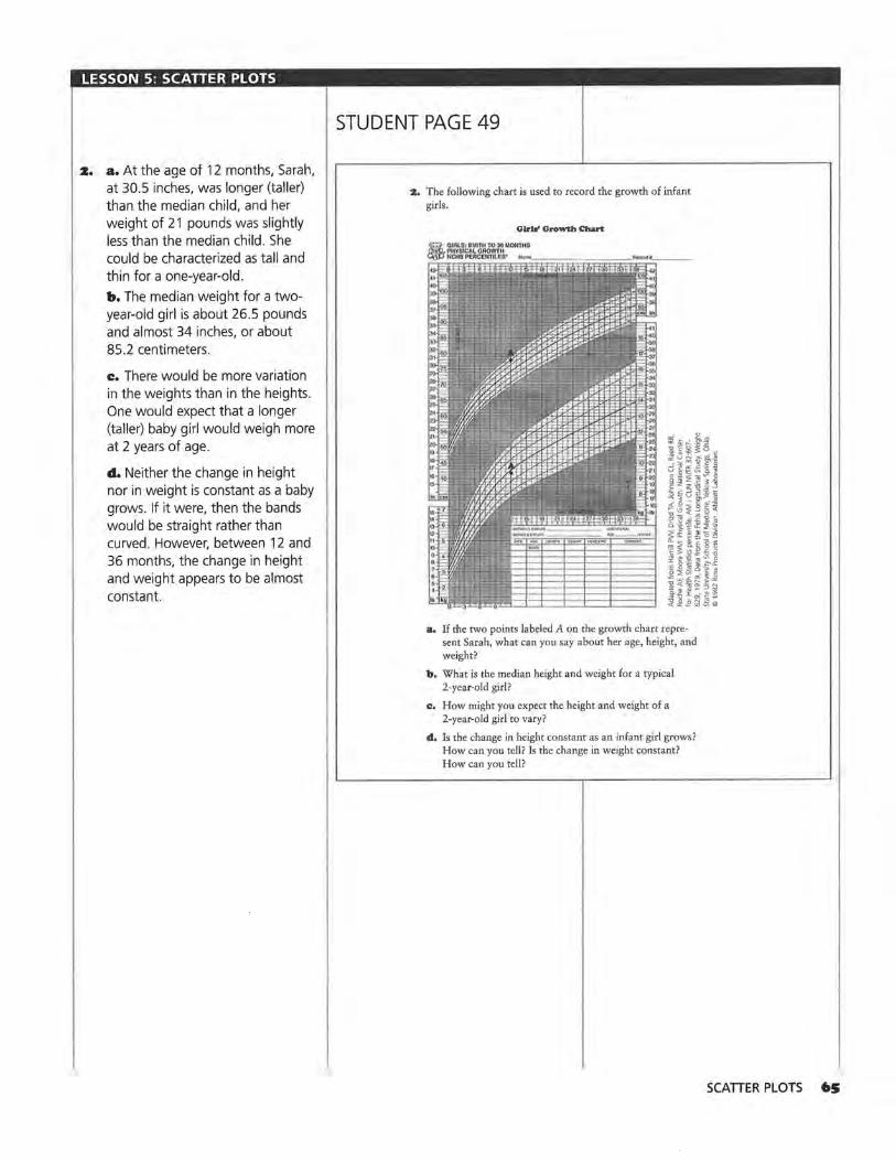
LESSON 5: SCATTER PLOTS
2. a. At the age of 12 months, Sarah, at 30.5 inches, was longer (taller) than the median child, and her weight of 21 pounds was slightly less than the median child . She could be characterized as tall and thin for a one-year-old.
b. The median weight for a twoyear-old girl is about 26 .5 pounds and almost 34 inches, or about 85.2 centimeters.
c. There would be more variation in the weights than in the heights. One would expect that a longer (taller) baby girl would weigh more at 2 years of age.
d. Neither the change in height nor in weight is constant as a baby grows. If it were, then the bands would be straight rather than curved . However, between 12 and 36 months, the change in height and weight appears to be almost constant.
STUDENT PAGE 49
:z. The following chart is used to record the growth of infant girls.
Girl•' Growth Chart
a. If the two points labeled A on the growth chart represent Sarah, what can you say about her age, height, and weight?
b. What is the median height and weight for a typical 2-year-old girl?
c. How might you expect the height and weight of a 2-year-old girl to vary?
d. Is the change in height constant as an infant girl grows? How can you tell? Is the change in weight constant? How can you tell?
SCATTER PLOTS 65

LESSON 5: SCATTER PLOTS
z. e. Sophia was very tall for her age. In fact, she was above the 95th percentile according to the growth chart, or taller than 95% of girls that age . Sophia weighed more than the median for her age, but her weight was not extraordinary; thus her mother was justified if she was referring to height but not if she was referring to weight.
3. a. Students should use Activity Sheet 5 or 6 on which to answer. At birth, boys and girls are about the same size. But within the first three months, the boys grow slightly more quickly, tend to be slightly longer, and weigh slightly more throughout the time represented . The variation in the growth rates of boys and girls seems to be about the same.
b. Check students' graphs on the growth charts and their descriptions of each child 's growth.
66 LESSON 5
STUDENT PAGE 50
e. Sophia was 34.5 inches tall and weighed 26 pounds 8 ounces at 18 months. Was her mother justified in claiming that she was very large for her age? Why or why not?
3. The following chart is used to record the growth of infant boys.
Boys' Growth Chart
a. How does the growth chart for infant girls compare with that for infant boys?
b. Have each member of your group now plot either Sarah's, Sophia's, or Tim's growth data on the appropri· ate growth charts shown on Activity Sheet 5 or 6. Describe the growth of the child you chose.

LESSON 5: SCATTER PLOTS
~ 4. a. l!llJ 45
Sophia's Height and Weight
40 -;;;- 35 -0 ./ § 30 g_ 25 i 20 -~ 15 s 10
5 0
45 40
-;;;- 35
D
v ,,.
/ (
,..v
0 6 12 18 24 30 36 42 Height (inches)
Sarah's Height and Weight
-0 § 30 ./
g_ 25
i 20 ~ 15 s 10
.... "" -!T
I>'
L<>; ,, 5 0
0 6 12 18 24 30 36 42 Height (inches)
45 40
-;;;- 35
Tim's Height and Weight
-0 § 30
./ ~V'" g_ 25
i 20 -~ 15 s 10
5 0
L"' , ./"
./
0 6 12 18 24 30 36 42 Height (inches)
b. Sophia: A possible equation is W = 28 + 1.17(H - 36). Sophia gained about 1.17 pounds for every inch she grew.
Sarah : A possible equation is W = 15 + 1.33(H - 27). Sarah gained about 1.33 pounds for every inch she grew.
Tim: A possible equation is W = 13 + 1.3(H - 27). Tim gained about 1.13 pounds for every inch he grew.
c. All of the children gained about the same rate of weight compared to their height. For each additional inch of height, each child gained from 1 to 1 1/2 pounds.
STUDENT PAGE 51
4. You just investigated the relationship between time and height and also between time and weight. N ow consider the relationship between height and weight .
a. Plot the data (height, weight) for the child you chose in Question 3 and draw a line to describe the relationship between the child's height and weight.
b. Write the equation of your line. What does the slope mean?
c. Compare your scatter plot and equation with the scatter plots and equations for the two other children by looking at the slopes and the overall patterns. Describe what you see.
d. Give two ways in which the growth patterns of the children were alike. Give two ways in which the growth patterns were different.
Whenever you make a scatter plot, you must first decide which variable to assign to the horizontal axis. Sometimes, the variable on the horizontal axis is the independent, or explanatory, variable; and the variable on the vertical axis is the dependent, or response, variable. In other words, given an ordered pair, the first variable (on the horizontal axis) can be used to predict or determine the second variable (on the vertical axis) . In the scatter plots over time (year, price ) from Unit I, the price of a car, for example, is determined by year, or the price is a function of time. In other cases, there is no clear explanatory (independent) and response (dependent) relationship; and therefore it is not important which variable is assigned to either the horizontal axis or to the vertical axis.
The heights and weights of a sample of high school football players are shown in the table on the next page. The relationship between the heights and weights of the football players can be analyzed.
d. All of the children grew at about the same rate: all of the children grew a substantial amount during the first few months, and then their growth slowed. Tim's growth appears to be the most linear. All of the actual data points varied from one child to the next, but the lines of data are very similar for all three children.
SCATTER PLOTS 67
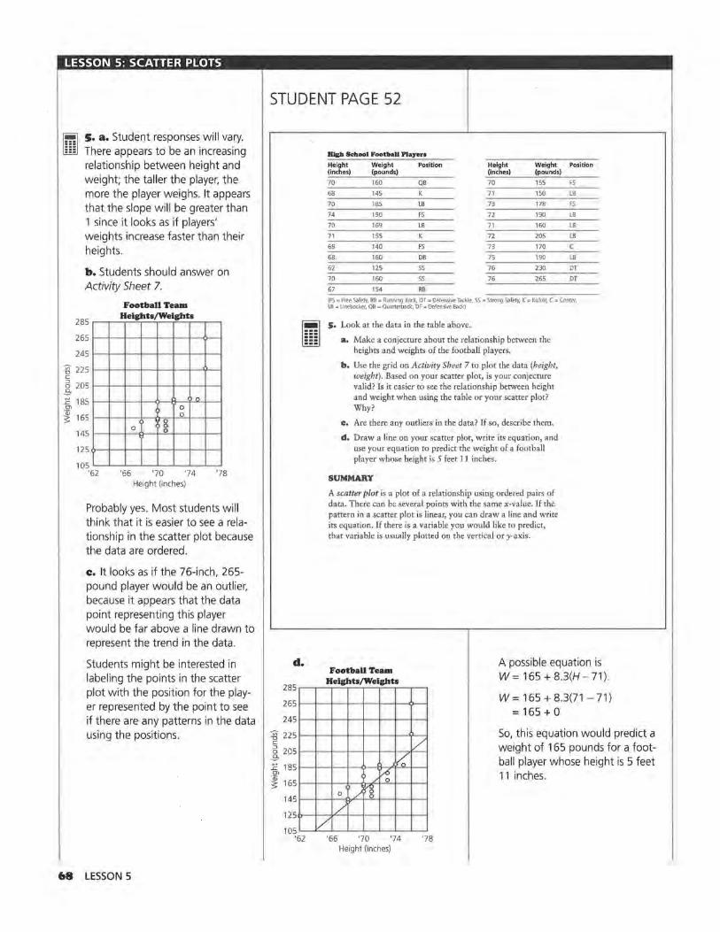
LESSON 5: SCATTER PLOTS
~ l!nJ
s. a. Student responses will vary. There appears to be an increasing relationship between height and weight; the taller the player, the more the player weighs. It appears that the slope will be greater than 1 since it looks as if players' weights increase faster than their heights.
b. Students should answer on Activity Sheet 7.
285
265
245
Football Team Heights/Weights
'.\g 225 c: 5 205
-9-1: 185 n
0\ 0 C) 0
8 ~ 165
145
125
105 '62 '66
0 0
'70 '74 '78 Height (inches)
Probably yes. Most students will think that it is easier to see a relationship in the scatter plot because the data are ordered.
c. It looks as if the 76-inch, 265-pound player would be an outlier, because it appears that the data point representing this player would be far above a line drawn to represent the trend in the data.
Students might be interested in labeling the points in the scatter plot with the position for the player represented by the point to see if there are any patterns in the data using the positions.
WI LESSON 5
STUDENT PAGE 52
lllcb Sc:llool Footboll Players
Height Weight Position Height Weight Position (inches) (pounds) (lnche>) (pounds)
70 160 QB 70 155 FS
68 145 71 150 LB
70 185 LB 73 178 FS
74 190 FS 72 190 LB
70 169 LB 71 160 LB
71 155 K 72 205 LB
68 140 FS 73 170 c 68 160 DB 75 190 LB
62 125 SS 76 230 DT
70 160 SS 76 265 DT
67 154 RB
(FS =Free Safety, RB z:: Running Back, DT = Derensive Tackle, SS=- Strong Safety, K -= Kicker, C =Center, LB = Linebacker, QB = Quarterback, DF = Defensive Back)
~ lilil
d.
s. Look at the data in the table above.
a. Make a conjecture about the relationship between the heights and weights of the football players.
b. Use the grid on Activity Sheet 7 to plot the data (height, weight). Based on your scatter plot, is your conjecture valid? Is it easier to see the relationship between height and weight when using the table or your scatter plot? Why?
c. Are there any outliers in the data? If so, describe them.
d. Draw a line on your scatter plot, write its equation, and use your equation to predict the weight of a football player whose height is 5 feet 11 inches.
SUMMARY
A scatter plot is a plot of a relationship using ordered pairs of data. There can be several points with the same x-value. If the pattern in a scatter plot is linear, you can draw a line and write its equation. If there is a variable you would like to predict, that variable is usually plotted on the vertical or y-axis.
Football Team A possible equation is W= 165 + 8.3(H- 71). Heights/Weights
285.----.---,~-.---,.-~,.----.---,,....-~
2651---+---1~-+--+~+--+---<>-4
2451---+---1~-+--+~+--+---1f--4
'.\g 2251---+---1~-+--+~+--+-__.,l--4
~ 2051~-t----i~-t--+~+--t-__,.,~,/"'__, -9- /0 E 1851---+----i~-f--O---i......,,..._~i--~
C'l :> /~ ~ 1651----+---t~-r--o-x-'t-'"--i---ti--;
0 /rg 1451----+---t~oQ.'-+~t---i---ti--;
125f>--+--¥/"--t-t---+----+--+----l
105~~V~-~~~~~~ '62 '66 '70 '74 '78
Height (inches)
W= 165 + 8.3(71 - 71) = 165 + 0
So, this equation would predict a weight of 165 pounds for a football player whose height is 5 feet 11 inches.

LESSON 5: SCATTER PLOTS
Practice and Applications
6. a. 110 105
~100 ,-
Heart Rates and Ages
:::l .S 95 E 90
~ 85 ~ 80
a
~ ' -a
"' ~ 75 a P"
-c • . . . . 70 . 65
0 8 16 24 32 40 48 56
c Ages 5-20 •Ages 20-50
Age (years)
Until about the age of 20, the number of heartbeats per minute decreases in a nearly linear pattern. After age 20, the number of heartbeats seems to stabilize.
b. There is the most variability in the 5 to 20 age group. This is clear from the scatter plot because the y-values for the 5 to 20 age group range from about 70 to 105; theyvalues for the 21 to 50 age group are between 70 and 75.
~. Pulse rate seems to stabil ize at about the age of 20. This can be seen from the scatter plot because after that age the best line through the data is nearly horizontal.
7. These answers depend on student data. Encourage students to look for linear relationships and explain any that are expected or unexpected . Suggestions for collecting data might be (hours watching television, hours doing homework), (number of vowels in words, number "of letters in words), (hours talking on phone, hours doing homework), or (number of points scored by each player in a basketball game, number of attempts by each player). Have students share their data and scatter plots with the class.
STUDENT PAGE 53
Practice and Applications
6. A group of high school students collected data on the effect of age on a person's heart rate. Following are two tables: The first shows the data collected from people ages 5 to 20; the second shows data collected from people ages 21 to 50.
Aa:• and Heart Rate•
Aa;H Sto :r.o Al•• ZJ: to SO
Age Beats Per Age Beats Per Age Beats Per Minute Minute Minute
s 104 15 74 21 72
6 100 16 75 21 70
92 16 76 24 72
90 16 79 27 70
88 17 74 32 72
87 17 77 32 71
84 18 72 34 72
10 83 18 78 35 73
11 86 19 71 39 74
12 81 19 75 40 72
13 80 20 69 42 72
14 76 20 70 43 72
50 71
so 73
a. Using the same grid, make a scatter plot of (age, beats per minute) for each set of data. Use one symbol or color for the data in the 5 to 20 age group and a different symbol or color for the data in the 21 to 50 age group. Describe any trends you observe.
b. For which age group does there seem to be the most variability? How can you tell from the scatter plot?
c. At what age does a person's pulse rate seem to stabilize? How can you tell this from the scatter plot?
7, Think of a situation in which the data are ordered pairs. Collect at least 15 ordered pairs and make a scatter plot of your data. Using your scatter plot, what observations can you make about the situation or relationship in the data you collected?
SCATIER PLOTS 69

LESSON 6
Graphs and Their Special Properties Materials: graph paper, pencils or pens, rulers, Activity Sheet 8 Technology: graphing calculators (optional)
Pacing: 4 class periods
Overview
In earlier lessons, students began with a set of data, plotted the data, then fit a line, and interpreted the line in terms of the data. In this lesson, students study different forms of a linear equation, the slope and intercepts, and their relationship to the equation and to the graph of the line. Students learn to think about different scales for the horizontal and vertical axes and how these can affect the perception of a relationship. Students investigate the x- and y-intercepts and how these can be interpreted for different data sets. They learn that a zero of an equation is the value of x that makes y = 0 and how the zero is related to the xintercept of the graph. In addition, they experiment with finding the right viewing window to draw a given line by thinking about the ordered pairs or the intercepts that make sense for the line used to summarize the data. Students consider the line y = x as a measure of equality and investigate whether there is any difference in men's and women's television viewing preferences.
Teaching Notes
Students should recognize that in mathematics they are given choices about equivalent forms of expressions: For example, a ratio can be written as a fraction, decimal, or percent. One of the objectives of this lesson is to help students begin to see that they can make choices about the forms they use. Should an equation of a line be written in the general form, the
70 LESSON 6
point-slope form, the slope-intercept form, or even in factored form? They should recognize that these are equivalent forms for the equation of a line, and each form is useful in a particular situation. If you are given a point and the slope, the point-slope form is a logical choice to write as the equation. Students may need to refer back to Lesson 3 in which they used ordered pairs, graphs, and algebraic properties to demonstrate equivalency of equations.
Should you graph a given line using the slope and intercept, the slope and a point, or the two intercepts? In each case, the situation itself usually makes one of the choices reasonable. If the line has x- and y-intercepts of 1000 and 20, respectively, it is easier to use these points rather than to try to mark off a slope of 0.02 from an intercept of 1000 to graph the line. Depending on the choices made for the ranges on the scales in the viewing window, the graph of a line may or may not appear in the window and it may or may not convey any meaning. Question 23 is a good exercise for those students who might be having difficulty understanding how to make a quick and accurate sketch of the graph by reading information from an equation.
Be sure students recognize the connections between the words, the numerical, the graphical, and the symbolic representations of intercepts and slope. The y-intercept is the coordinate where a line crosses the y-axis, such as in (0, 5). It can be found on the graph of the line by looking at where the line intersects the y-axis. In the equation y = 5 + 3x, the y-intercept is

the constant term 5 (let x = 0). Also, students are asked to find and describe the intercepts and to use zero as a way to talk about the x-intercept.
The identity line y = x is used to show where two sets of values would be identical, and thus, to observe quickly on the scatter plot, data items that are greater or smaller than others. The notion of prediction is not involved in this application of the identity line.
You may choose to omit some of the questions and problems if you feel your students understand the concepts. You might also want to select from the practice problems those problems you feel will meet the particular needs of your students.
Technology
Students should be able to graph lines on calculators or graphing utilties and find the intercepts and the slope from the graphs they generate by using the cursor and arrow keys. They often have trouble finding the appropriate window and may need practice on finding one.
Follow· Up
Students can collect their own data: used cars from classified ads or temperatures from almanacs. Ask them to analyze the relationships, identify the slope and intercepts of any possible linear relation, and explain what these mean.
GRAPHS AND THEIR SPECIAL PROPERTIES 7I

LESSON 6: GRAPHS AND THEIR SPECIAL PROPERTIES
Solution Key
Discussion and Prac:tic:e
I. a. Scatter Plot A reveals more information about the relationship between year and price of a Ford Mustang because the points are dispersed enough to show a trend. It is more difficult to see the relationship or trend in Scatter Plot B because of the horizontal scale being used.
7Z LESSON 6
STUDENT PAGE 54
LESSON 6
Graphs and Their Special Properties
Will every line cross an axis?
What do you know about a line when you know its rate of change?
What do you know about a linear equation when you know its rate of change?
. : Recognize different
forms of equations that represent a line and relate these forms to the graph. Find and interpret x- and y-
intercepts of an equation and the zeros of an
expression.
T o summarize linear data, lines can be drawn in plots over time and in scatter plots. Sometimes it is difficult to tell,
however, what a graph represents; two graphs can represent the same information and yet look totally different because of differences in the scales along the axes. Two equations can represent the same line but look different because they are written in different forms. What impressions can you get by looking at different representations, either in graphs or in equations? Are there any key features or common characteristics that are important?
INVESTIGATE
Cost of a Mustang
Sometimes the scales on the axes show only the part of a grid where the data are given or where the data would make sense.
Discussion and Practice.
1. The following two scatter plots show the prices of a new Mustang taken from the data at the beginning of Lesson 2.
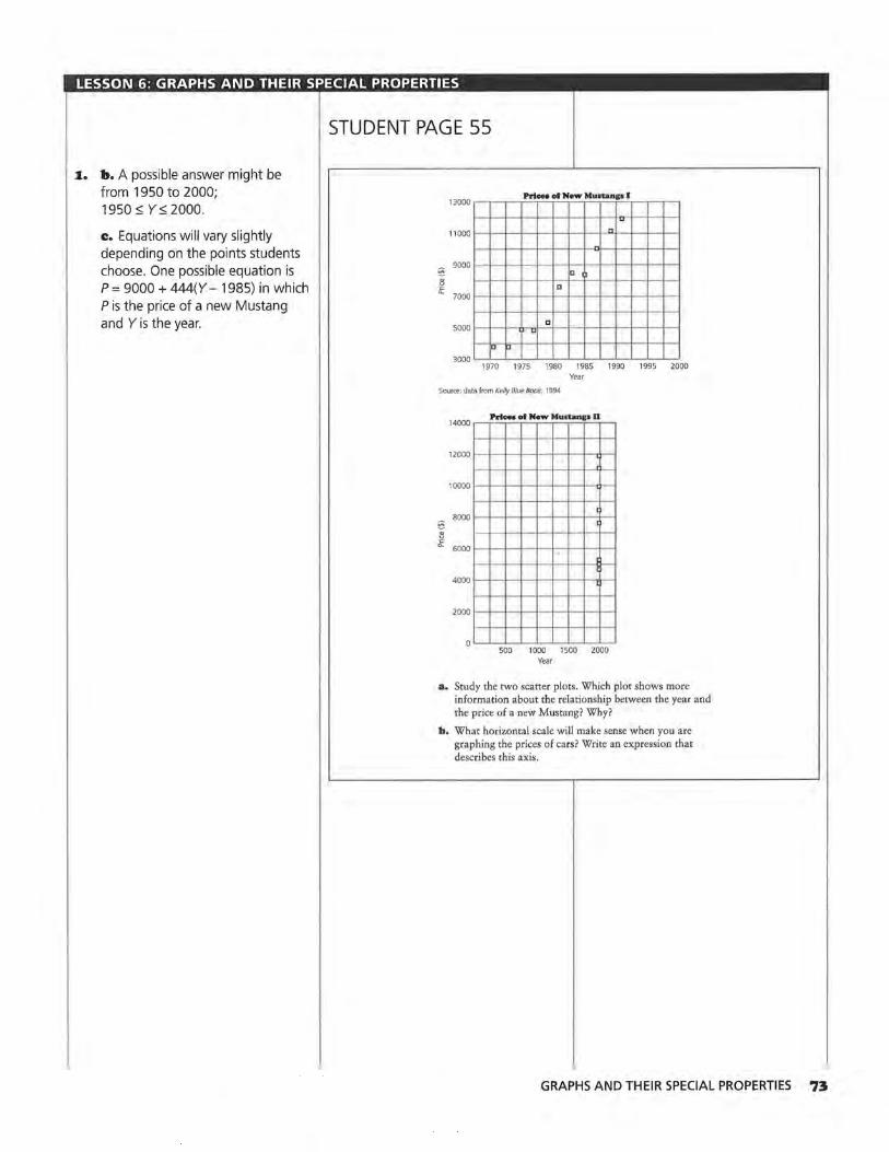
LESSON 6: GRAPHS AND THEIR SPECIAL PROPERTIES
I. b. A possible answer might be from 1950 to 2000; 1950 ~ y~ 2000.
c. Equations will vary slightly depending on the points students choose. One possible equation is P = 9000 + 444(Y- 1985) in which Pis the price of a new Mustang and Y is the year.
STUDENT PAGE 55
13000 Prloeo of New Mustanp I
,w 11 000 "
9000 - D
~ D 7000
5000 ~
D
u u 3000
1970 1975 1980 1985 1990 1995 2000 Year
Source: data from Kelly Blue Book, 1994
14000 ..--..-Prl~ce-•...,of_N_ew..---,M-urtan-.--'ip~ll.---.
12000 l---l-+--+--1--1--f.--t-.\-j
10000 t--i-+--+--t--1--f.--t-ti--t
I 8000
~ I
i!i ~ 6000
4000 I
2000
500 1000 1500 2000 Year
a. Study the two scatter plots. Which plot shows more information about the relationship between the year and the price of a new Mustang? Why?
b. What norizontal scale will make sense when you are graphing the prices of cars? Write an expression that describes this axis.
GRAPHS AND THEIR SPECIAL PROPERTIES 73

LESSON 6: GRAPHS AND THEIR SPECIAL PROPERTIES
I. d. Student responses will vary slightly because they cannot read the exact year. (1971, 3000) or (1972, 3000) are acceptable. This means that in 1971 or 1972, the price of a new Mustang was $3000.
z. The point is (1971 , 3000) or (1972, 3000). This seems a little low judging by the data point above it, but it is generally reasonable.
74 LESSON 6
STUDENT PAGE 56
c. A line has been drawn through the data in the following scatter plot. Write an equation of the line, relating price and year.
13000 Prices ol New Munanp m
v
11000 J7
_v 9000
/ - ry' ~ l.r' 7000
/ 5000 / Cl
/
3000 ID/. O
1970 1975 1980 1985 1990 1995 2000 Year
d. What is the ordered pair at C? What does this ordered pair represent?
Sometimes the points at which lines cross the x- and y-axes make sense for the data, and sometimes they do not.
z. Does the point at which the line crosses the horizontal axis in the preceding scatter plot make sense for the data? Why or why not?
:J, Look at the next two scatter plots. Estimate the ordered pair where the line crosses the horizontal axis in each scatter plot. Describe what the ordered pairs would represent in each case. Does the ordered pair seem reasonable for each situation? Explain.

LESSON 6: GRAPHS AND THEIR SPECIAL PROPERTIES
STUDENT PAGE 57
3. a. The point is (1965, 0). This means that in 1965, the price of a new Mustang was $0. This is not reasonable because new cars were and are never free.
b. The point is (1990.5, 0). This means that at some time in 1991, there were no shipments of LP records. This is not reasonable, because in 1991, there were still a few new LPs shipped, though not very many.
a.
b.
14000
12000
10000
8000 -1l ~
6000
4000
2000
250
"O 225
~ 200 ~ (£, 175
~ 150
0 125 ~ ~ 100 :g
75 ll
50 § z 25
Prlee• of New Muslanp IV
I
/ r
I
/c fU
I
I I
1940 1950 1960 1970 1980 1990 2000 Year
Loq Pla)'lns (LP) Reeord1 Sblgped
\.
1982 1984 1986 1988 1990 1992 1994 1996 Year
GRAPHS AND THEIR SPECIAL PROPERTIES 75

LESSON 6: GRAPHS AND THEIR SPECIAL PROPERTIES
4. a. A horizontal or vertical line will have only one intercept. All other lines will have two.
b. Because that is the point at which the equation "equals" zero. They-value is zero at that point, and many equations are written in the form y =.
e. Probably they-intercept is not called a zero, because it does not make the value of the equation equal to zero.
5. a. By looking at the points at which the line crosses each of the axes.
~ lIBJ
b. Look for an ordered pair in the form (0, ?) to find they-intercept and one in the form (?, O) to find the zero.
•· In the following two problems, students might use graphing calculators to find a table of values and use the table to read off their answers. Be sure they associate the table values with the particular points on the plot.
a. A five-year-old car would cost $8500.
b. When A= 0, P = $11,000. This represents the price of a new car.
e. When P = 0, A= 22. This represents the age at which the car would have a value of $0.
7• LESSON 6
STUDENT PAGE 58
The scales and the relationship of the data to the axes are very important for interpreting the data. The range of values for x and y determines the part of the coordinate plane needed to plot the data. It can be called a viewing rectangle or window for the coordinate plane. For any ordered pair (x, y), the x-value is usually graphed along the horizontal axis (the horizontal coordinate), and the y-value is usually graphed along the vertical axis (the vertical coordinate).
4, There are two points that a line may or may not have-the points where the line crosses the axes. The x-intercept, the coordinate where a line crosses the x-axis, is often referred to as a zero. The y-intercept is the coordinate of the point where a line crosses the y-axis.
a. Will a straight line always have x- and y-intercepts? Explain your answer.
b. Why do you think the x-intercept of an equation is called a zero?
ci. Does it make sense to call the y-intercept a zero? Why or why not?
Suppose you are given an equation and asked to find the y-intercept and the x-intercept, or the zero. Just as you have used tables, graphs, and equations to tell whether or not two equations represent the same line, you can also use these same tables, graphs, and equations to identify the intercepts.
5, Consider the graph of a linear equation.
a. How can you find the zero and y-intercept of a linear equation from its graph?
b. How can you find the zero and y-intercept of a linear equation by studying a set of ordered pairs that satisfy the equation?
6. Consider the equation P = 10,000 - SOO(A - 2) where A represents the age of a used car and P represents the price.
a. How much will a 5-year-old car cost?
b. If A = 0, find P. What does the point (0, P) represent when describing used cars?
ci. If P = 0, find A. What does the point (A, 0) represent when describing used cars?

LESSON 6: GRAPHS AND THEIR SPECIAL PROPERTIES
~ lillJ
7. a. Student choices of windows will vary but should include a scale on the y-axis from $1000 to about $11,000 or $12,000. Choices for the scale on the x-axis will depend on students' experiences with the length of time cars maintain monetary value.
The particular points that students choose to use when drawing the line are not important. Students will probably use (2, 10000) with a rate of change of -soo to generate some points that will give them an appropriate range for each axis. If students have a graphing calculator, they might generate a table of values beginning with A (or x for the calculator) equal to 2, and use the values they generate to set the viewing window.
3 ~
'<:: "-
12000 11000 10000 '\
9000 8000 7000 6000 5000 4000 3000 2000 1000
0 0
Used Car Prices
1'\ I"-
4
'\ i'\
I"-'\
i'\ I"-
'\ '\
8 12 16 20 24 Age (years)
b. The slope is -soo. This means that the value of the car drops $500 every year.
STUDENT PAGE 59
~ liliJ
7, Use the equation for (age, price) from Question 6 above.
a. What are some values for A and P that will make sense in the problem? Use those values to select a viewing window, and sketch a graph of the line.
b. What is the slope of the line, and what does it represent?
c. Find the zero from the graph, and compare it to the zero you found in Question 6. Use the point and the slope to write the equation of the line.
d, Find the y-intercept and compare it to the y-intercept you found in Question 6. Use that point and the slope, to write another equation of the line.
e. Prove that the equations from Question 6 and c and d of this problem are all equivalent.
Consider the following graph of a line showing three labeled points and a slope m.
y
"' (O. y,)
Any specific point (x2, y2) on the line can be used, along with the rate of change, m, to write the equation of the line:
y=y2 +m(x-x2 )
For example, this general equation can be used to describe the following situation: Suppose a 3-year-old car is worth $10,000. If the rate of change in price is a decrease of $650 per year, using (3, 10,000), then the equation of the line is
y = $10,000 + - 6SO(x - 3) as shown in the following graph.
GRAPHS AND THEIR SPECIAL PROPERTIES 77
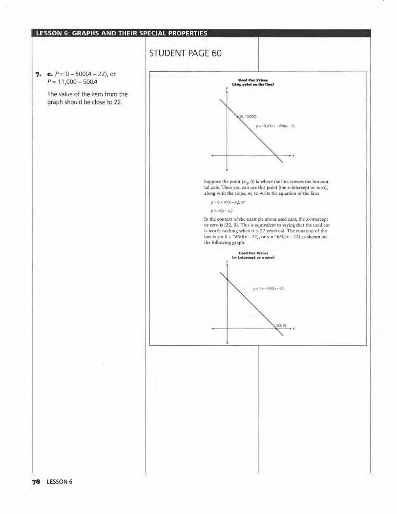
LESSON 6: GRAPHS AND THEIR SPECIAL PROPERTIES
7. c. P = 0 - SOO(A - 22), or P = 11,000 - SOOA
The value of the zero from the graph should be close to 22.
78 LESSON 6
STUDENT PAGE 60
y
UoedCarPriee• (An)I point on tlle 11.,.)
13. 10.000)
Y= 10,000 +-650(x-3)
Suppose the point (x3, 0) is where the line crosses the horizontal axis. Then you can use this point (the x-intercept or zero), along with the slope, m, to write the equation of the line:
y= O + m(x-x3), or
y= m(x-x3)
In the context of the example about used cars, the x-intercept or zero is (22, 0). This is equivalent to saying that the used car is worth nothing when it is 22 years old. The equation of the line is y = 0 + -6SO(x - 22), or y = -6SO(x - 22) as shown on the following graph.
y
Uaed Car Price• (#·Intercept or • zno)
y= O +-650(x-22)

LESSON 6: GRAPHS AND THEIR SPECIAL PROPERTIES
7. d. The value of they-intercept should be close to 11,000.
P = 11,000 - 500(A- O), or P = 11,000 - 500A
e. By using algebraic properties, the equations are all equivalent to p = 11,000 - 500A.
STUDENT PAGE 61
Suppose the point (0, y1) is where the line crosses the vertical axis. Then you could use this point (they-intercept) to write the equation of the line:
r=r, +m(x-0), orr=r, +mx In the context of the used car example, they-intercept is (0, 11,950). This is equivalent to saying that when a car is brand new (zero years old), it is worth $11,950. The equation of the line is y = 11,950 + -650(x- 0), or y = 11,950 + -650x as shown on the graph below.
y
UMd Car Prices U.· intercept)
(0. 11,950)
Y= 11,950 +-650x
GRAPHS AND THEIR SPECIAL PROPERTIES 79
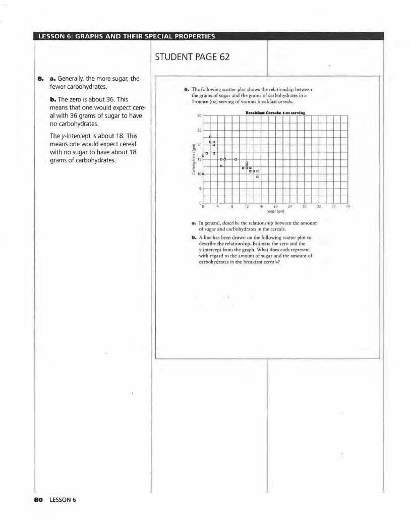
LESSON 6: GRAPHS AND THEIR SPECIAL PROPERTIES
8. a. Generally, the more sugar, the fewer carbohydrates.
b. The zero is about 36. This means that one would expect cereal with 36 grams of sugar to have no carbohydrates.
They-intercept is about 18. This means one would expect cereal with no sugar to have about 18 grams of carbohydrates.
80 LESSON 6
STUDENT PAGE 62
8. The following scatter plot shows the relationship between the grams of sugar and the grams of carbohydrates in a 1-ounce (oz) serving of various breakfast cereals.
2s1--t-+----t--r-~-+~~1--t--1---t--+--t---+~1~1--t--1----t--1
E20t-+o1 ~-t--r-t--t-~---ii--t---+---+--+--t---+-t---i1~t----t---+---t----t El ~ u u
~ 15 ~~ -o-O--l-CH--t--l--+~l--+-+-+---t--1--1--+~~+-+--t
i " - "'u Ci C u 100--+--t---t--l--t---il--t-+--+---+---t--l--+~l--+-+---+---+---t---i
c
12 16 20 Sugar (gm)
24 20
a. In general, describe the relationship between the amount of sugar and carbohydrates in the cereals.
b. A line has been drawn on the following scatter plot to describe the relationship. Estimate the zero and the y-intercept from the graph. What does each represent with regard to the amount of sugar and the amount of carbohydrates in the breakfast cereals?
)2 )6 40

LESSON 6: GRAPHS AND THEIR SPECIAL PROPERTIES
8. c. The equation should be close to y = 18 - O.Sx.
d. The value of the zero will depend on the equation students use. For example, when y = 18 - O.Sx, find the zero, or the value of x where y = 0.
0 = 18- O.Sx O.Sx = 18
For this equation, the zero is 36.
STUDENT PAGE 63
E 20 I) a
~ r~r?t-..,..1~1r--1--+--t--+--t--t---1~1---t---1--1--1--r-t--tr--t--1 ~ 1s 1--+-t-......_-o-()'-.,.H> ·+--t--+--t--t---1~1---t---1--t--t--t--t--t!--t--f ~ " "'~ ~ .... C t-ca.. u 10(>-+--l--+--t--t--ji-=-f-='!>-<d--l--+-+--j~f---f-+--l--+--t--t
a -...._
r-............._ s 1~;--r---i--r-i---t--,i---r--t-~--r----t---"t-<dl"--...~i---r-;--r--r--1
l---t--t--i--l--l"-t.........,1---+·~f---t--+-+--+--t---f~~ ....... -+--I·~~ oL-.l_-'--'--'--'---'---'L--.1..-..L...L....L-'---'---'~'--.L-..i...::::..i.......L_;
0 4 8 12 16 20 24 28 32 Sugar(gm)
c. Write the equation of the line.
d. Use your equation to find the zero. How does this value compare with the estimate you made in b? How does the zero relate to the data?
9. What is the relationship between the television viewing habits of men and of women? Do they watch the same programs? The chart on the next page shows the percentage of men and women who watched the top 30 TV programs during the 1992--1993 television season according to Nielsen Media Research.
36 40
GRAPHS AND THEIR SPECIAL PROPERTIES 8I

LESSON 6: GRAPHS AND THEIR SPECIAL PROPERTIES
9. a. Since there is a tie at 12, there is no 13. There is a three-way tie at 16, so there is no 17 or 18. This process ensures that the number of shows is the same as the number of rankings.
b. The outlier is NFL Monday Night Football. It has a much higher male rating than the female rating would predict, and this makes sense because, in general, watching football games is more popular with men. Students might also suggest 60 Minutes as an outlier because it is far from the relationship shown by the data and by the line; in fact, this program is one of the few in which the percentage of men and women watching is about the same.
c. Ranges will vary slightly. One possibility is from 6 to 18 for both axes or 6 ~ W~ 18 and 6 ~ M~ 18.
d. They-intercept is 1. This means that when no women are watching, 1 % of men will be watching. This seems reasonable.
The zero is -2. This means that when no men are watching, -2 % of women will be watching. This is not reasonable because -2 % has no meaning in this context.
This indicates that a reasonable maximum for the horizontal axis would be any number greater than zero. Because the values are percentages of people and, in this case, it is impossible to have the percentage greater than 100, the horizontal and vertical axes should both be defined as 0 ~ W ~ 100, so that Wis either the percentage of men or the percentage of women who watch television shows.
82 LESSON 6
STUDENT PAGE 64
Televldon Vlewtng Habib
Rank Program %Women % Men
60Minutes 16,5 161
Roseanne 1~.J lOG
Home Improvement 141 12 o 4 Murphy Brown 14 7 96
Murder She Wrote 16.0 10.1
Coach 13 1 10.7
7 NFL Monday Night Football 7,6 15 3
8 CBS Sunday Night Movie 14,3 8.4
9 Cheers 11 ,6 10.4
10 Full House 10.7 6.4
11 Northern Exposure 11 .8 9.0
12 Rescue 911 11 .7 9.2
12 20120 11 .6 9.0
14 CBS Tuesday Night Movie 11 ,8 8,3
15 Love and War 11 .9 7.7
16 Prince of Bel-Air 9.5 6.6
16 Hangin' with Mr. Cooper 99 61
16 Jackie Thomas Show 10 5 78
19 Evening Shades 12.4 8,2
20 Hearts Afire 12.1 7.7
20 Unsolved Mysteries 11 .2 88
22 Primetime Live 107 9.1
23 NBC Monday Night Movie 11 .2 6.4
24 Dr. Quinn, Medicine Woman 12.3 8.0
25 Seinfeld 9.9 87
26 Blossom 87 56
26 4BHours 10 2 8.4
28 ABC Sunday Night Movie 10 2 8.2
29 Matlock 11 6 7.8
30 Simpsons 63 72
30 Wings 95 8 1
Source: data from The World Almanac and Book of Facts, 1994
a. Why do you think there were no TV programs that ranked 13th, 17th, and 18th on the chart?
b. With the exception of at least one program, the pattern of the data appears to be linear as shown on the follow-ing scatter plot. Name the program(s), and tell why you think it is an outlier(s).

LESSON 6: GRAPHS AND THEIR SPECIAL PROPERTIES
2 J.O. a. M = 1 + 3 (W - 0)
2 b. M = 7 + 3 (W - 9)
2 c. M= 1 + 3(W - O)
2 M= 1 + 3 W
M= 7 + ~ (W - 9)
2 M=7+ 3 W-6
M= 1 + ~ W
The equations are equivalent because they can be written in the same form. Students might also use the table of values, if Mis the same, or the graphs to determine that the equations are equivalent.
d. Students might predict between 7% and 8% of men would watch.
J.J.. Students answer on Activity Sheet 8.
18 Viewers o1 Top 30 TV Programs
/ 16
14
12
~ 10
c 8 "' 2 6
4
2
0
-2
I/
tJ
y /
I/
I/ y=x/ /,. D D
/c ,oq _ D Q
u >"
D --u
-2 0 2 4 6 8 1 0 12 14 16 18
~ liliJ
Women(%)
a. A point on the line would mean the same percentage of women and men watched the show.
A point above the line would mean a higher percentage of men than women watched the show.
A point below the line would mean a higher percentage of women
than men watched the show.
STUDENT PAGE 65
m . . .
Viewer• ol Top ~o TV ProP'am1 18
16 •-•--1--+---'--0,___,__,__,__,o -
14 1~1-·1--1--+--+-+-l---lf---f--l
12 ~ 1~1--+--1--+--i--+-1--'~"-l/ 10 1--•--1--+---+--+--•,_._,_o~AJ'.rn---1
c ,J:l:jv nc ~ s l---+-~---l---+--!:--4~P-l"--l---I # l-+--1--1--l-'""1",~..-'D~l---+--1--1
//' u 4·~f--.J---!.4--+---+--~-+---1~•----1
/
-2'-----'----'---'-----'---'--'---'~L--'--~ -2 0 2 4 6 8 10 12 14 16 18
%Women
c. Write a description in words or symbols of the range of values that make sense for the scale on each axis.
d. What is they-intercept and the zero or x-intercept of the line? Do these both make sense in terms of the data? Explain.
10. Refer to the table Television Viewing Habits.
a. Find the rate of charige, and use point A to write an equation of the line relating the percentage of men to the percentage of women who watched the top 30 TV programs.
b. Use point B and your rate of change to write an equation of the line.
c. Show that the two equations are equivalent.
d. If you knew that approximately 10% of the women watched a given TV program, about how many men would you predict watched the same program?
11. Draw the line y = x on Activity Sheet 8.
a. Suppose a data point lies on this line. What does this data point represent? What does a data point above the line represent? What does a data point below the line represent?
b. What does this line tell you about the percentage of men and the percentage of women who watched the TV programs?
b. The line indicates that for any point on this line (or close to the line), the percentage of men and women who watched that TV program are nearly the same.
GRAPHS AND THEIR SPECIAL PROPERTIES 83
LESSON 6: GRAPHS AND THEIR SPECIAL PROPERTIES
II. c. The line y = x or (M = W) shows only how the percentage of men watchers compares to the percentage of women watchers. The line M = 1 + ~ W represents the relationship between the percentage of men and percentage of women from the data. Using this equation, if you know the percentage of women watchers, then you can predict the percentage of men watchers because you have a rule governing the relationship.
IZ. a. y = y1 + mx
y= m(x-x3)
Y=Y2 + m(x-x2) Alternative variables may be used as follows: y = b + mx; y = m(xa); and y = q + m(x - p). Herem is the slope, b is they-intercept, a is the zero (or x-intercept), and the point (p, q) is somewhere on the line.
b. They= m(x - a) form, where a is the zero when using 0 as the starting point.
I3. a. It can be read from the form of the equation.
Or, if the point is used in the equation the result is true.
y = 15 - 5(x - 4) 15 ~ 15 - 5(4 - 4) 15=15-0 15=15-V
b. No. Once the equations are simplified, they must be exactly the same to be equivalent. Some students may observe that one slope is -5 and the other slope is 10, so the equations could not possibly be equivalent and represent the same lines.
y= 10(x-4) = 10x-40 = -40 + 1 Ox, which is not equiva
lent toy= 35 - 5x.
84 LESSON 6
STUDENT PAGE 66
c:. Suppose you used the line y = x to predict the TV viewing habits of men and women. How is this different from using the equation in Question 10?
1:&. Recall that the form of an equation can help you find the y-intercept and zero.
a. Write the three general forms you can use to write a linear equation.
b. Which of the forms use the zero as the starting point?
1:J, Consider y = 15 - 5(x - 4).
a, Suppose (4, 15) is a point on the line. How can you verify this by using the equation?
b. If you use the Distributive Property and combine terms, then you can write the following equation:
Y= 15-5(x-4)
y= 15-5x+20
Y-J5-5x
Is y = 35 - 5x equivalent toy= 10(x - 4)? Why or why not?
c:. What is the slope of y = 35 - 5x? They-intercept? How can you find them from this equation?
d. Given the equation y = 20 + 3x, what is they-intercept?
The Distributive Property allows you to distribute a common multiplier to a sum or to write a sum as a product of a common factor and an expression. If the slope is a common factor of both terms, you can distribute the slope from the sum.
y=35+-5x
y = -5(-7) +-5(x)
y = -5(-7 + x)
y=-5(x+-7)
So, x = 7 is the zero of the equation.
14. Think about the zero of a linear equation.
a. When x = 7, what is the value of yin the equation y = -5(x + -m
b. Why is x = 7 called the zero?
c. The slope is -5. Because -5 is the coefficient of x (or the multiplier of x), students can read it from the equation.
They-intercept is 35. Some students will read it from the equation (the constant term), although others will let x = 0 and solve.
d. They-intercept is 20.
I4. a. y = -5(x + -7) = -5(7 + -7) = -5(Q) =0
b. It is the value of x that makes y = 0. Note: this assumes the equation is solved for y.

LESSON 6: GRAPHS AND THEIR SPECIAL PROPERTIES
I4. c. No. x = 2 does not make the equation equal to 0, only the value within the parentheses will equal 0. Making the term S(x - 2) equal to 0 is not sufficient because of the constant term 10. Therefore, when x = 2, y = 10.
IS. a. The zero for both is 4. y=6(x-4) y=6(4-x) 0 = 6x - 24 0 = 6(4 - x)
6x = 24 0 = 24 - 6x X=4 6x= 24
X=4
b. They have opposite slopes, 6 and -6. They intersect at (4, O).
y = 6(x - 4) y = 6(4 - x) = 6x- 24 = -6x + 24
c. The statement is true only for X=4. 6(x - 4) = 6(4 - x) 6x - 24 = 24 - 6x 12x = 48 X=4
I6. The methods for finding the values will differ. Some students may use the graphs to make estimates, whereas others may substitute 0 for either x or y. Still, others may be able to read the zero and the intercept from the form of the equation. Encourage students to discuss how they found the answers.
a. The zero= 5; they-intercept= -so. The zero can be read by noting the form of the equation; the y-intercept can be found by substituting 0 for x and solving.
b. The zero = 50; they-intercept= 1000. The zero can be found by substituting 0 for y and solving for x; they-intercept can be read by noting the form of the equation.
c. The zero = 8; they-intercept = 48. The zero can be found by substituting 0 for y and solving for x;
STUDENT PAGE 67
c. Jenny thinks the zero for y = 10 + S(x - 2) is x = 2. Is she right? Why or why not?
15. Find the zeros of each of the following.
a. y=6(x-4)andy=6(4-x)
b. Compare the lines represented by the equations in a.
c. Is 6(x -4) = 6(4- x) true or false? Verify your answer.
16. For each of the following equations, identify the zeros and they-intercepts. Indicate how you found your answer.
a. y = 10(x - 5)
b. y = 1000 + -20x
c. y=6(8-x)
d. y = 100x
SUMMARY
To understand the relationship between a line and its graph, it is helpful to consider several characteristics.
• To make a scatter plot from the data, choose appropriate scales including maximum and minimum values for both axes.
• To make a graph from an equation, choose an appropriate viewing window.
• To choose an .appropriate window, inspect the equation for a reasonable starting point and ending point, or generate a set of ordered pairs that satisfies the equation.
Sometimes, two special points can be useful.
• For they-intercept at (0, y), you can find the coordinates of this point by doing the following: substituting 0 for x in the equation; reading the point where the graph crosses the yaxis; or writing the equation in the form y = y1 + mx and recognizing that y1 is the y-intercept.
• For the x-intercept at (x, 0), you can find the coordinates of this point by doing the following: substituting 0 for y in the equation; reading the point where the graph crosses the x- axis; or writing the equation as a product in factored form and finding the value for x that makes the factor 0.
they-intercept can be found by substituting 0 for x and solving.
d. The zero = O; they-intercept = 0. The zero can be found by substituting 0 for y and solving for x; the y-intercept can be found by substituting 0 for x and solving. If students have difficulty with this, encourage them to plot ordered pairs and sketch the line.
GRAPHS AND THEIR SPECIAL PROPERTIES 85

LESSON 6: GRAPHS AND THEIR SPECIAL PROPERTIES
Practice and Applications -4 1
I7. a. The zero= 3, or -13; the y-intercept = 20.
b. The zero= 1990; they-intercept= 19,900.
c. The zero= -15; they-intercept= 3.
d. The zero = 6; they-intercept= -30.
e. Although student responses will differ, be sure that in each case they suggest a viewing window that would contain the graph. One suggestion might be for students to use the zeros and y-intercepts to obtain the maximum and minimum values for each axis. Another suggestion is to generate a set of ordered pairs and use these to define the maximum and minimum values.
IS. a. 1 O(x - 3)
b. 5(3 + x)
c. 20(5 + x)
86 LESSON 6
STUDENT PAGE 68
• Sometimes the intercepts make sense for the data; often they do not. For a given slope m, understanding the relation between the starting point used to write the equation and the form of the equation can be useful. lf m is the slope:
If (x,. y1) is any point on the line, then y = y1 + m(x- x1 ).
If (0, y2) is the y·intercept, then y = y2 + mx.
If (x3, O) is the 2ero, theny= m(x-x3 ).
Practice and Applications
1.7. Find the zero and they-intercept for each of the equations.
a. y = 20 + 15x
b. n = 200 - 10(x - 1970)
o. a = 6 + 0.2(x - 15)
d. t= 5(x-6)
e. What viewing window or set of scales for the axes would make sense for each of the equations above?
J.8. Use the Distributive Property to rewrite each of the expressions as a product with a common factor.
a. lOx-30
b. 15 + 5x
o. 100 + 20x
1.9. The following table shows the cost of used 14-ton Chevrolet pickup trucks as a function of age.
U- Chevrolet Pickup Truelu
Year Age (years) Price ($)
1974 20 2,500
1976 18 2,200
1980 14 3,650
1981 13 2,000
1983 11 5,388
1986 6,900
1988 9,995
1989 9,300
1992 17,595
1992 17,500
1993 23,000
Source: The Milwaukee Journal, December 12, 1993

LESSON 6: GRAPHS AND THEIR SPECIAL PROPERTIES
19. a. The lines will vary greatly because the data are not very linear.
24000 22000 20000 18000 16000
§ 14000 e:: 12000 ~ 10000
8000 6000 4000 2000
0
•
f\.
Cost of Used Chevrolet Pickup Trucks
I\
'\
0 '\
·"\ I'\
I\: "\
0 4 8 12 16 20 24 Age (years)
One possible equation is y = 6000 - 1170(x - 10).
b. For the line from a, y = 17, 700 - 1170x; y 1 or $17, 700 represents the price of a new pickup truck; m is the slope, in this case -$1170, which represents the amount that the price drops (changes) each year.
c. For the line, about 15. This is the predicted age at which the pickup truck will have no value. However, the data show that the line is not a very accurate predictor because 18- and 20-year-old pickup trucks have values in the data.
20. There will be variation in the students' ranges, so check for reasonableness. One possibility is given for each situation.
a. The x-axis should range from 0 to the maximum number of attempts by a single person. The y-axis should range from 0 to the maximum number of free throws made by a single person. The y-intercept represents the number of free throws made if none are attempted. The zero represents the number of free-throw attempts before a basket is made. A typical window might be 0 :o;;x:::; 35; 0 :=;;y:::; 35.
STUDENT PAGE 69
a. Make a scatter plot (age, price) of the data. Draw a line that you think best represents the relationship in the data, and write the equation of that line.
b. Locate the point at which the line you drew intersects the vertical axis or y-axis. Write the equation in the form y = y1 + mx. What do y1 and m represent in the context of the data?
o. Estimate the point at which the line intersects the horizontal or x-axis. What does this point mean in the context of the data?
zo. Write a description of appropriate scales for the axes or viewing window for each of the following situations. In each case, describe what they-intercept and the zero would tell you about the data.
a, The number of free throws attempted and the number of free throws made by a basketball player
b. The cost of a camera over time
o. The percentage of rainy days and the percentage of sunny days for cities in the United States
d. The fats and calories in fast foods
z1. Describe a real-world situation and an appropriate viewing window for each of the equations.
a, n = 30 + S(x - 1970)
b. t = 120 - O.Sx
b. The x-axis should show slightly more than the years of interest. The y-axis should cover the range of prices. They-intercept represents the price of the camera in the year 0. The zero represents the year when the camera cost is $0.
A typical window might be 1950:::; x:::; 2000; $5 :::; y:::; $2000 if a very good camera is considered.
c. Both axes should range from 0% to 100%. They-intercept represents the percentage of sunny days in a city, with no rainy days.
The zero represents the percentage of rainy days in a city, with no sunny days.
d. The x-axis should range from 0 to the maximum amount of fat. The y-axis should range from 0 to the maximum number of calories. They-intercept represents the number of calories in a fac;t food item with no fat. The zero represents the amount of fat in a fast food with no calories. A typical window might be 0:::; x:::; 40; 0:::; y:::; 1000.
GRAPHS AND THEIR SPECIAL PROPERTIES 87
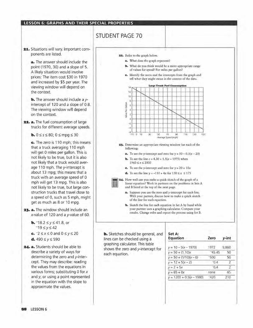
LESSON 6: GRAPHS AND THEIR SPECIAL PROPERTIES
21. Situations will vary. Important components are listed.
a. The answer should include the point (1970, 30) and a slope of 5. A likely situation would involve prices: The item cost $30 in 1970 and increased by $5 per year. The viewing window will depend on the context.
b. The answer should include a yintercept of 120 and a slope of 0.8. The viewing window will depend on the context.
22. a. The fuel consumption of large trucks for different average speeds.
b. 0 ::; s ::; 80; 0 ::; mpg ::; 30
c. The zero is 110 mph; this means that a truck averaging 110 mph will get 0 miles per gallon. This is not likely to be true, but it is also not likely that a truck would average 110 mph. They-intercept is about 13 mpg; this means that a truck with an average speed of 0 mph will get 13 mpg. This is also not likely to be true, but large construction trucks that travel close to a speed of 0, such as 5 mph, might get as much as 8 or 10 mpg.
23. a. The window should include an x-value of 120 and a y-value of 60.
b. -18.2::; y::; 41.8, or -19 ::;y::; 42
c. -2 ::; x::; 0 and 0 ::; y::; 20
d. 490 ::; y::; 590
24. a. Students should be able to describe a variety of ways for determining the zero and y-intercept. They may describe: reading the values from the equations in various forms; substituting 0 for x and y; or using a point represented in the equation with the slope to approximate the values.
88 LESSON 6
STUDENT PAGE 70
zz. Refer to the graph below.
a. What does the graph represent?
b. What do you think would be a more appropriate range of values for speed? For miles per gallon?
c. Identify the zeros and the intercepts from the graph and tell what they might mean in the context of the data.
c
14 .......
12 '
Large Truck Fuel Con.inmptlo_n
I'--. 10 --1--1-...--11----<t-->--l-+--·>--·+--•-+-+-•l-I
8 - -1--i--i---'1~
~ 6 1-f-+-+-+-+-•-~+-+-+--t-+--+--+--+--I
"' ~ 41-•-------·- ·---........ ---1--1-~--+--+--l--l ] 21- •-i--+-+-+-+-+-+-+-...... -~
-2 ·- -1--1-i-i~
-4 1- 1-1--1--<--!--I
~ .__..__..__..__..__..__..__..__.._..__.__.__.__.__._~
-10 0 10 Average Speed (mph)
z3. Determine an appropriate viewing window for each of the following:
a. To see they-intercept and zero for y = 50 - 0.5(x - 20)
b. To see the line c = 4.30 + 1.5(x -1975) when 1960 s x s 2000
c. To see they-intercept and zero for y = 20 + 10x
d. To see the line y = -110 + 4x for 150 s x s 175
m :&4. How well can you make a quick sketch of the graph of a linear equation? Work in partners on the problems in Sets A and B listed at the top of the next page.
a. Suppose you use the zero and y-intercept for each line. With your partner, discuss how to make a quick sketch of the line for each equation.
b. Sketch the line for each equation in Set A by hand while your partner uses a graphing calculator. Compare your results. Change roles and repeat the process using Set B.
b. Sketches should be general, and Set A: lines can be checked using a Equation
graphing calculator. This table y= 10- 5(x-1970) shows the zero and y-intercept for
each equation. y= 50 + (1.10)x
y = 50 + (1/10)(x- O)
y = 12 + 5(x - 2)
y= 2 + 5x
y= 65 +Ox y= 1200 + 0.5(x-1980)
Zero y-int
1972 9,860
-45,45 50
-500 50
-o.4 2 -o.4 2
none 65 -420 210
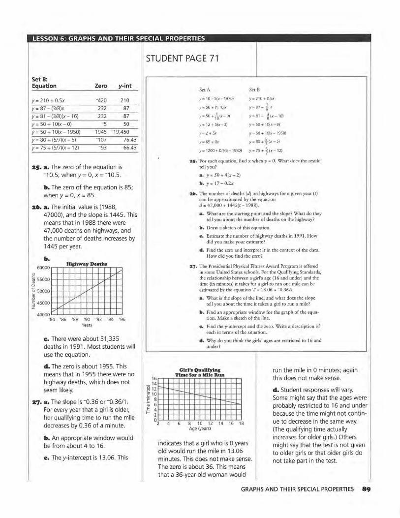
LESSON 6: GRAPHS AND THEIR SPECIAL PROPERTIES
Set B: Equation Zero y-int
y= 210 + 0.5x -420 210
y = 87 - (3/8)x 232 87
y = 81 - (3/8)(x - 1 6) 232 87
y = 50 + 1 O(x - O) -5 50
y= 50 + lO(x-1950) 1945 -19,450
y = 80 + (5!7)(x - 5) -107 76.43
y= 75 + (5!7)(x-12) -93 66.43
zs. a. The zero of the equation is -10.5; when y = O, x = -10.5.
b. The zero of the equation is 85; when y = 0, x = 85.
ztt. a. The initial value is (1988, 47000), and the slope is 1445. This means that in 1988 there were 47,000 deaths on highways, and the number of deaths increases by 1445 per year.
"' .r:
b. 60000
Highw ay Deaths /
v 1il 55000
/ Q)
0
0 50000 Q; /
_,..v
.c / .......... ~ 45000
z /
40000 '84 '86 '88 '90 '92 '94 '96
Years
c. There were about 51,335 deaths in 1991. Most students will use the equation.
d. The zero is about 1955. This means that in 1955 there were no highway deaths, which does not seem likely.
z7. a. The slope is -o.36 or -o.36/1. For every year that a girl is older, her qualifying time to run the mile decreases by 0.36 of a minute.
b. An appropriate window would be from about 4 to 16.
c. They-intercept is 13.06. This
STUDENT PAGE 71
Set A Set B
y= 10- 5(x-1970) y= 210 + 0.5x
y = 50 + (1. 1 O)x y = 87 - ~ x
r= 50 +ra(x-o) r= 81- t'x-16)
Y= 12+5(x-2) y=50+ lO(x-0)
y= 2 + 5x y= 50 + lO(x-1950)
y = 65 + Ox y = 80 + t (x - 5)
y= 1200 + 0,5(x-1980) y= 75 + J(x-12)
25. For each equation, find x when y = 0. What does the result tell you?
a. y = 50 + 4(x - 2)
b. y = 17 - 0.2x
26. The number of deaths (d) on highways for a given year (t) can be approximated by the equation d = 47,000 + 1445(t-1988).
a. What are the starting point and the slope? What do they tell you about the number of deaths on the highway?
b, Draw a sketch of this equation.
e. Estimate the number of highway deaths in 1991. How did you make your estimate?
d. Find the zero and interpret it in the context of the data. How did you find the zero?
27. The Presidential Physical Fitness Award Program is offered in some United States schools. For the Qualifying Standards, the relationship between a girl's age (16 and under) and the time (in minutes) it takes for a girl to run one mile can be estimated by the equation T = 13.06 + -o.36A.
a. What is the slope of the line, and what does the slope tell you about the time it takes a girl to run a mile?
b. Find an appropriate window for the graph of the equation. Make a sketch of the line.
e. Find the y-intercept and the zero. Write a description of each in terms of the situation.
d. Why do you think the girls' ages are restricted to 16 and under?
Girl's Qualifying Time for a Mile Run
16~~~~~~~~~~~~~
run the mile in 0 minutes; again this does not make sense.
~ 14 1--l-l--l--l-l--4-l--l--l-~-1--1--1-1'-"I
~ 12 1---=F"+-"=+-+--+-+-i-+-++-+-f-+-+-4 ~ 1 0 1-1-~-++ ...... -i::~~-l..d-+-++-+-f-+-+-4 . E s 1-1-1--t-+-t-1-1--1..._-1-,_-=1=o1--J:,..1-1--+-1 -; 6 l-l-l--t-+-l--l--1--1--1-1-1-- 1---l ...... -i:~::i-i E 4 ,_._..__,__,__....._._,__._.._1-1-__.__,_.,__,__. i= 2 ,_,_..__,__,__ ......... _.__._.._i-l---l--1-..._.--<
02 4 6 8 10 12 14 16 18 Age (years)
indicates that a girl who is 0 years old would run the mile in 13.06 minutes. This does not make sense. The zero is about 36. This means that a 36-year-old woman would
d. Student responses will vary. Some might say that the ages were probably restricted to 16 and under because the time might not continue to decrease in the same way. (The qualifying time actually increases for older girls.) Others might say that the test is not given to older girls or that older girls do not take part in the test.
GRAPHS AND THEIR SPECIAL PROPERTIES 89

ASSESSMENT
Vital Statistics Materials: graph paper, pencils or pens, rulers Technology: the same technology used during previous lessons
Pacing: 1 class period or homework
Overview
This assessment enables you to evaluate students' understanding of Lessons 5 and 6 in Unit II. Students should demonstrate the ability to read and interpret a scatter plot. Given a set of data, they should be able to plot the data, find and write the equation of a line for the scatter plot, and interpret the slope and intercepts. Given an equation of a line, they should also be able to find and interpret the slope and intercepts.
Teaching Notes
Students might inquire about the 2 on the scatter plot; this represents a coordinate that is the same for two countries-Germany and the Netherlands.
Students must understand either the graph or the form of the equation to respond to the questions as well as understand the data and the scatter plot to interpret the values they find. Observe the way in which students answer Question 3b. Some students may graph the equation and use the graph to find their answers, whereas others may use algebraic representations to find their answers. If possible, show both approaches to the solutions or any other strategies students offer, noting the advantages and disadvantages of each strategy. Students who use the graph of the line may have estimates, particularly for the slope, that will be difficult to obtain from points on the graph. Students who use the equation might make an error that would be difficult to find without seeing the graph.
90 ASSESSMENT
Follow-Up
The life expectancies of men and women and for different ethnic groups can be found in an almanac or the Statistical Abstract. Students might find it interesting to investigate scatter plots of these data, looking for patterns, trends, and relationships.

ASSESSMENT: VITAL STATISTICS
Solution Key
~ tmJ
~ liliJ
80 -;;;- 75 :;; ~ 70 ~ 65 c tl 60 2i. 55
..::I so ~ 45
40
I. a. Japan had 8 marriages for every 1000 persons and 5 divorces for every 1000 married women .
b. By reading the graph, the United States had the largest rate for both marriages and divorces at 15 marriages for every 1000 persons and 21 divorces for every 1000 married women.
c. Italy had the lowest divorce rate at 2 for 1000 married women .
d. Denmark and the United Kingdom had the same divorce rate at 13 for every 1000 married women; the United Kingdom had 10 marriages for every 1000 persons while Denmark had only 9 marriages for every 1000 persons.
z. a. In 1991, Ethiopia had the highest infant mortality rate at 193 deaths for every 1000 births. Life expectancy is an average of the ages at death . If infant mortal ity is high, then there are a large number of deaths at very young ages which would lower the life expectancy.
b. We Expectancy vs. Infant Mortality Rate by Counta-y
Mo
01'.,
""-,_ 0, " "r-<t
........ 'br--...
' 350 40 80 120 160 200 240
Infant Mortality Rate (per 1000 births)
STUDENT PAGE 72
ASSESSMENT
Vital Statistics
. : Use intercepts, rate of change, and lines to analyze a situation.
1. The 1990 marriage and divorce rates by country are shown in the following scatter plot. Refer to the scatter plot to answer each question.
Cio r-+-+-+--+--t--l--t--t--+--t--1--11--t-·l-+~-nit+~d-S~ta_te~s~l--I ~ ~ .,, ·~ 16 1--+-+--t---t--t--t---t--t--+--t--1--11--t-+-+--t--i--t--t---t
~ l--+--+-+--+--IDoM1arld--t--l--t--t--+--t---l--ll--l--+--+-+--l ~ 12 1--~s_w0~_en+-1--t--l--t--t-u_n+it~--tK1_ng~d-om-l--+--+--+-+~l--1~1--1
Canada
Marriage Rate (per 1,000 persons)
Source: data from American Almanac, 1994-1995
a. In 1990, what was the marriage and divorce rate in Japan? Explain what the values indicate.
b. Which country had the greatest marriage rate and the greatest divorce rate? How can you tell?
c. Which country had the fewest divorces?
d. In 1990, how did the marriage and divorce rates in Denmark compare with those in the United Kingdom? -. .. ...
---· ... 2. The following table shows the life expectancy at birth (in
years), daily calorie supply for adults, and the infant mortality rate (per 1000 births) for selected countries in 1991. (Infant mortality is the number of deaths for children less than one year old, exclusive of fetal deaths.)
The equations will vary slightly, based on the lines students draw . One possible equation is L = 60 -0.17(M - 100). In this equation, the slope is -0.17. The slope indicates life expectancy will decrease by 0.17 years if infant mortality increases by one more death per 1000 births. Stated another way, life expectancy will decrease by nearly 2 years (10 x 0.17 or 1.7) for every 10 more deaths for every 1000 births.
VITAL STATISTICS 9I

ASSESSMENT: VITAL STATISTICS
z. c. The zero of the equation in b is about 453. This can be found by transforming the equation to the form y = m(x - a), by substituting 0 for L and solving, or by careful inspection of a larger graph.
They-intercept for the equation L = 77- 0.17M in bis 77. This can be found by transforming the equation to the form y = b + mx, by substituting 0 for Mand solving, or by careful inspection of the graph.
d. The zero means that if infant mortality reaches 453 deaths for every 1000 persons, the life expectancy would be zero. Theyintercept means that if infant mortality were reduced to 0, life expectancy would be 77 years. These both indicate that the linear model is not very reliable beyond the data given (8 ::; M::; 200).
3. a. The zero of the equation is 3563. This means that if there are no deaths per 1000 births, each infant would require 3563 calories per day.
They-intercept is 285. This means that if an infant has 0 calories per day, there will be 285 deaths for every 1000 births. (This does not make sense; if an infant has 0 calories per day; the infant will die. This means that the line and equation representing the relationship are not appropriate for a small number of calories.)
The slope is -o.08 or ,-go, which means that for every 100 calorie increase per day, there are 8 fewer infant deaths. (This is an example where the ratio form for the slope makes the interpretation easier and more sensible.)
9Z ASSESSMENT
STUDENT PAGE 73
1991 Ule Ellpeetancleo, Dally Calorieo, and Infant Mortallty by Country
Country Life Daily Calorie Infant Expectancy Supply Mortality (per (years) (for adults) 1000 births)
Ethiopia 48 1,667 193
Zaire 52 1,991 150
Argentina 71 3, 113 34
Bolivia 60 1,916 115
Mexico 70 3,052 45
United States 76 3,671 11
China 70 2,639 33
Indonesia 62 2,750 78
United Kingdom 76 3,149 10
Hungary 71 3,644 19
Switzerland 78 3,562 8
Libya 63 3,324 88
Source: data from The Universal Almanac, 1994.
a. In 1991, which country had the highest infant mortality rate? Explain how you think the mortality rate affects life expectancy.
b. Plot the data (infant mortality, life expectancy). Then draw a line on your scatter plot to summarize the data, and write its equation. What does the slope of your line tell you about the data?
c. Find the zero and they-intercept. Explain how you found each.
d. What do the zero and they-intercept represent in terms of the data?
~. Suppose the equation y = 285 + -o.08x summarizes the relationship (calories, infant mortality rate) as shown in the table above.
a. Find each of the following: the zero, the slope, and the y-intercept, and then indicate what each represents in terms of the data.
b. Describe how you found your answers for a.
b. Students can estimate the values from their graph, using the zoom feature on the calculators, if necessary. Others may substitute 0 for the x-value, find the corresponding y, and vice versa.
The various methods available are described in Question 1 c. You should notice which students are
using which strategies so that you can encourage them to use a variety of strategies. If students know many strategies, they can use the one most appropriate to each problem.
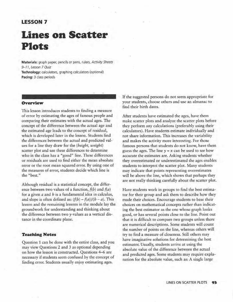
LESSON 7
Lines on Scatter Plots Materials: graph paper, pencils or pens, rulers, Activity Sheets
9-11, Lesson 7 Quiz Technology: calculators, graphing calculators (optional)
Pacing: 3 class periods
Overview
This lesson introduces students to finding a measure of error by estimating the ages of famous people and comparing their estimates with the actual ages. The concept of the difference between the actual age and the estimated age leads to the concept of residual, which is developed later in the lesson. Students find the differences between the actual and predicted values for a line they draw for the (height, weight) scatter plot and use these differences to determine who in the class has a "good" line. These differences or residuals are used to find either the mean absolute error or the root mean squared error. By using one of the measures of error, students decide which line is the "best."
Although residual is a statistical concept, the difference between two values of a function, f(b) and f(a) for a given a and b is a fundamental idea in calculus, and slope is often defined as: (f(b) - f(a))l(b - a). This lesson and the remaining lessons in the module lay the groundwork for understanding and thinking about the difference between two y-values as a vertical distance in the coordinate plane.
Teaching Notes
Question 1 can be done with the entire class, and you may view Questions 2 and 3 as optional depending on how the lesson is constructed. Questions 4-6 are necessary if students seem confused by the concept of finding error. Students usually enjoy estimating ages.
If the suggested persons do not seem appropriate for your students, choose others and use an almanac to find their birth dates.
After students have estimated the ages, have them make scatter plots and analyze the scatter plots before they perform any calculations (preferably using their calculators). Have students estimate individually and not share information. This increases the variability and makes the activity more interesting. For those famous persons that students do not know, have them guess the ages. The line y = x can be used to see how accurate the estimates are. Asking students whether they overestimated or underestimated the ages enables students to interpret the scatter plot. Many students may indicate that points representing overestimates will be above the line, which shows that perhaps they are not really thinking carefully about the scatter plot.
Have students work in groups to find the best estimator for their group and ask them to describe how they made their choices. Encourage students to base their choices on mathematical concepts rather than indicating the best estimator as the one whose graph looks good, or has several points close to the line. Point out that it is difficult to compare two groups unless there are numerical descriptions. Some students will count the number of points on the line, whereas others will try to find a measure of closeness. Still others may have imaginative solutions for determining the best estimator. Usually, students arrive at using the absolute value of the difference between the actual and predicted ages. Some students may require explanation for the absolute value, such as: A single large
LINES ON SCATIER PLOTS 93

outlier above the line can cancel out a series of data points below the line, making it appear that the total difference is 0.
Students may find the mean absolute difference, the total difference, or the median. (A calculator can be very helpful here.) A careful analysis of the ways in which outliers affect error might suggest to some students that the sum of the squared differences will actually meet most of the objections raised about other measures of error. (The squaring magnifies the outliers.) Students should come to some agreement, but they should avoid making an issue about using any given procedure.
In the next activity students draw their own lines for a set of paired data, not a y = x line, and use the same procedure to find the differences between the actual values and the values predicted by the line. Graphically, they are still reading the vertical difference between the predicted point and the actual point. Numerically, students must use their equations to make predictions. This can be done by hand, which becomes very tedious, or by using the LIST function from a graphing calculator. Students find the sum of the residuals from their particular lines and use these to decide who has a good line.
Students can choose either the root mean squared error or the mean absolute error. For many students, the mean absolute error is intuitive, easy to find, and seems reasonable. Actually, the process of finding the absolute value, while simple, does not lend itself as well to analysis as the root mean squared error. (This is analogous to finding the standard deviation for single variable data rather than the mean absolute deviation.) If, however, the process becomes too complicated to find the root mean squared error, encourage students to use the mean absolute error in order to help them make sense of their work.
Technology
Initially, students can use technology to plot their points in the age activity and to do any number crunching. They should, however, draw the (height, weight) line on their own although they can do so using the draw command on calculators as discussed
94 LESSON 7
earlier. The point of this lesson is to have a variety of line, some good and some not good so that students can see how a measure of error can be used to help them organize their thinking.
Follow· Up
The Decisions Through Data video series includes a lesson on the manatees discussed in the exercises. It would make a good resource for the problem. The video was edited by David Moore and is available in Hour Three: Units 11-14: Data Analysis for Two Variables, Lexington, Mass: Consortium for Mathematics and Its Applications (COMAP). You can contact COMAP by mail, fax, telephone; or the internet at
CO MAP Suite 210 57 Bedford St. Lexington, MA 02173
1-800-77COMAP (tele) 1-617-863-1202 (fax) [email protected] (internet)
Avoid spending too much time on these activities because the next lesson introduces technology for performing the calculations.

LESSON 7: LINES ON SCATTER PLOTS
Solution Key
Discussion and Practice
1. Student estimates will vary. It is important that each student record an estimate for each person. See Teaching Notes for this lesson.
Scatter plots will vary greatly. The following are the birthdays for the persons listed.
Nancy Reagan 1924
Mister Rogers 1926
Sandra Day O'Connor 1930
Chelsea Clinton 1980
Eddie Murphy 1961
Tom Brokaw 1940
Roseanne 1952
Ringo Starr 1940
Frank Sinatra 1915
Oprah Winfrey 1954
Jon Bon Jovi 1962
Garth Brooks 1962
Jane Fonda 1937
Source: The World Almanac and Book of Facts, 1994.
STUDENT PAGE 74
LESSON 7
Lines on Scatter Plots
How do you know if the line relating the percentage of sugar to the amount of carbohydrates in cereals, or the line relating the cost of a car to its age, is a goodline7
If you can draw several different lines to summarize the data, how do you know if one line is better than another?
. : Find a good line for a
scatter plot by considering a measure
of error.
I n earlier lessons, you investigated drawing a line to summarize a relationship between two variables. You
learned to write an equation or rule for the line you drew and learned how to tell if different algebraic representations of your line were equivalent. Also, you studied some special characteristics of a line and that line's equation. Questions still remain, however. How good is your line? How well does it fit the data? The activities in this lesson will help you to answer these questions.
INVESTIGATE
Ages ol the Rich and Famous
In 1997, Walt Disney World celebrated its 25th anniversary. Often people a.re surprised when they learn the ages of famous people or of things that are in the news or are part of their daily lives. This lesson will give you an opportunity to find out how well you can estimate the ages of some famous people.
Discussion and Practice
1. Here is a list of famous people. Make a table and estimate how old you think each person is. Then your teacher will give you the ages of these famous people.
LINES ON SCATIER PLOTS 9S

LESSON 7: LINES ON SCATTER PLOTS
STUDENT PAGE 75
z. a. Student responses will vary. Most will indicate that someone is a good estimator if most of that person's estimates are close to the actual ages. Encourage students to try to find a mathematical way to define close. Again, see the Teaching Notes for this lesson.
~ b. Ages of Famous People l!liJ 80r-r--r-T--,-r-;r-r-r-r-,_..;:.r-r-r71 701--1--11--1--t-!--!--+-+-f--f--t:::*"°/"~v--I
~ 601--t--lt--1~1--r....,..-':'.-t-:-f-::;>l"~~~-+-+-t ~50 1--1--11--1--1-+~Yo.,-=~:,_..../~'-l--1--1-~ ro 40 1--1--11--l--t-t-7".,_-+-t--t--t--t--l-I ::J _.,..-
~ 30 1--1--1~/~,,..-:;;:.¢"'-t-i·-+-t-:-l--t--t--l--t--I
20 .... 10 /
10 20 30 40 50 60 70 80 Estimated (years)
If an estimate is correct, the point will have the same x- and y-values. The equation of the line representing accurate estimates is y = x.
c. If a point is above the line, then a student has estimated that the famous person is younger than the person actually is.
d. This will depend on students' scatter plots. Students should use the concept of points above and below the line to determine whether they are overestimators or underestimators.
3. Answers will vary. Have students explain how they determined the best estimator. The rest of the lesson develops a formal way to judge. If the method described emerges from the discussion and student work, omit Questions 4-6.
96 LESSON 7
; . . .
Ageo of Famouo People
E5'imated Age Actual Age (years) (years)
Nancy Reagan
Mister Rogers
Sandra Day O'Connor
Macaulay Culkin
Eddie Murphy
Tom Brokaw
Roseanne
Ringo Starr
Frank Sinatra
Oprah Winfrey
Jon Bon Jovi
Garth Brooks
Jane Fonda
z. How well were you able to estimate the ages of these people? To help answer this question, make a scatter plot with your estimates of the ages on the horizontal axis and the actual ages on the vertical axis, (estimated age, actual age).
a. How do you think you should decide if someone is a good estimator of the ages of these famous people?
b. Where will a point lie if your estimate is correct? Draw a line on your scatter plot representing estimates that are 100% accurate. Write the equation of the line .
c:. What does it mean if a point is above this line?
d. In general, are you an overestimator or an underestimator? How can you tell?
3. Look at the scatter plots of other students. Decide who among you is the best estimator, and give a reason why. Be prepared to explain your choice to the class.

LESSON 7: LINES ON SCATTER PLOTS
STUDENT PAGE 76
4. a. Leah estimated a person was 45 years old, and the person was actually 41 years old .
b. The vertical distance represents how many years off she was in her estimate.
c. (70, 62). Leah's worst estimate was when she guessed someone was about 70 years old, and the person was actually 62 years old. This point can be found from the graph by looking for the point farthest above or below the line.
d. The error for point B is about 4 years. This can be found by looking at the vertical distance from 8 to the line. The error for point A appears to be close to the error for point B; however the errors are in different directions.
s. a. Students might need to review what the symbol I, represents.
80 ~ 70 !il 60 %- 50 ~ 40
~ ~~ 10
_,....
Ages of Famous People
! '7 .:::::::::· ~!'I
./ _, A·
~ _,
20 30 40 50 60 70 80 Estimated (years)
b. Leah must have assigned a positive value to the error for a point below the line and a negative value to the error for a point above the line. Then, when she added the values, some of the errors canceled out each other, leaving a total error of about 14.
4. Following is a scatter plot of Leah's estimates and the actual ages for another group of famous people.
ao ~~~~~As-"--.es_~~Fam~o-u~1P_·~~p-l~o~~~~~~
75t--t--+--t--+--t--+--t--+--+-+--t·--l--,,l"--t B /
70 !--+--·l-+--+--t--+--+--+--+-l r/ 651--t--t--t---t--t--t--t--+-+-t.,.,...A'--f~t--1
17 ) 60 t--1~+--t--+-~--+--+--+--+/'-s--t--1~t---1
SS t--t--+--t--+--t--t--t--t-/-.ro0~0-!'-+--t--t--I
~so V rn45 t--.f--.f---l--!-4--+--Y--l--+-+-4--l~l--I
~40 1--t--1--t--t-~/l'~l/'.-+~A +-+-+--t-~--t--I 35 !--.f--1--t-~,--,!/ ,~ .. -~-+--+--+-+--4--1~·1--1
30 1--l--+-4-C~-1--1--1--l--+-+--l---l--'l--I
25 v 20 v 15 /'
10 1/ 10 15 20 25 30 35 40 45 so 55 60 65 70 75 80
Leah's Estimate
a, What does A represent?
b. What does the vertical distance from A to the line represent?
c. Name the ordered pair that represents the person for whom Leah had the worst estimate. How can you find that ordered pair using the graph?
d. Suppose the difference between Leah's estimate and the actual age is called her "error" in estimating. What was Leah's error for the person represented by B? Describe how to find this error using her scatter plot. What is the difference between the error for B and the error for A?
5, Leah decided to find out how far off all of her estimates were, or to find her total error. She claimed that overall her total error was only 14 years, and she wrote L errors= 14 (L means "sum").
a. Find all of the differences between her estimated ages and the actual ages, and record them in a table.
b. What do you think Leah did to find L errors= 14?
LINES ON SCATTER PLOTS 97

LESSON 7: LINES ON SCATTER PLOTS
STUDENT PAGE 77
s. c. This method is not really appropriate because when the errors cancel out each other, you can get a very small value for L. error and yet be very far ott with individual values.
6. a. Answers will vary, based on students' scatter plots.
b. The average value gives some indication of how accurate the estimates were in general.
c. The answer depends on the class data.
98 LESSON 7
c, Do you think her method was a good one? Why or why not?
6, Use your estimates of "gr. and the srntter plot you made in Question 2.
a. How far off was each of your estimates? What is the sum of your errors?
IJ, On average, how far off were you for each estimate? What does this tell you about your ability to estimate ages of this group of famous people?
c. If you define the " best" estimator as the person with the least error, who is the best estimator in your class?
In an earlier lesson, you investigated the relationship between the heights and weights of football players. Do you think the same relationship exists for students who are not football players? The following data show the heights and weights of 25 high school seniors, both male and female. A scatter plot of the data is shown on the next page.
llJllh School Senlora' Hel!lhto/Wel&hh Males' Females' Height Weight Height Weight (inches) (pounds) (Inches) (pounds)
72..5 195 66 132
70 5 137 63 97
72 156 61 145
70 145 61 108
71 175 64 106
70 165 66.5 125
73 195 64_5 140
76 155 69 120
67 143 68 130
76 5 155 61 105
76 192 69 140
69 149 62 110
71 225

LESSON 7: LINES ON SCATTER PLOTS
STUDENT PAGE 78
7. a. There appears to be a linear relationship, but there is a lot of variation in the data. It is difficult to tell how much variation there is without some mathematical measure, which motivates the primary objective of this lesson.
b. Students should answer on Activity Sheet 9.
230 Heighb and Weighu of Seniors
220f-+-+-+-+-+-+-+-+-+-+-~+-+-+-+-t~ 210 >-+-+--+-t--+--t-t--i-+-t-i-+-t-+--+-i-+-< 200>-+-+-·f-l--+-+-+-+-+-+-+-+-+-+--+-i--t-I
v;-190>-+-+--+--+-+-+-+-+-+-+-+-+-+-+-..-.'-l-I D 180 >-+-+--+--+-+-+-+-+-+-+-+-+-+-+--+-i--t-I
§ 170f-+~-+-~-+-i-+-+-+-+-+-+-+-+-+-t--+-I g_160f-~-+-+-+-+-i-+-+-i-!--+-+-+-+-+-t--+-I :::-150f-+-+-+-+-+-+-+-+-+-+-+-+-+-+-+-t~ -§.140 f-+-+-+-+..i--+-f-+-....... -=-+-+-+-+-+-t~ ·w 1301-t--+-+-+-+-+-<·--+-+-+-+-t-+--+-i--t-I s 120•-t--+-of-lo-+-+-+~-._.--l-+-t-+--+-i-i-f
110,_...-0-+->-+-+-+-+-+-+-l-+-t-+--+-i-i-f 100 f-+-+-Y-~-+-+-+-+-+-+-+-+-+-+-+-t~ 90 f-+-+-+-+-+-i-t·-+-+-+-+-+-+-+-+-t--+-I 80L--'--'--'--L-'--..__._._.._._._.._._.__._.'-'--'
~ lillJ
60 62 64 66 68 70 72 74 76 78
• Female •Male
Height (inches)
Almost all of the females are shorter than almost all of the males. There appears to be slightly less variation among the females than among the males.
c. Because the populations (male/female) are different, the lines will probably differ. There seems to be more variation in these data than for the football players, but that may be due to scale factors. Again, point out that some measure of variation is useful in thinking about how well a line summarizes a relationship.
230 Heights and Weights of Seniors
220 210 200
Vi' 190 D 180 § 170 g_ 160
:::- 150 -§, 140 ·w 130 s 120
110 100 90
v
.....
I ; '/
I/ • ;
. v
:..-;
v
""' 0
.
8060 62 64 66 68 70 72 74 76 78
• Female •Male
Height (inches)
m . .
230 Senion' Hcltif>tf/WOliltU
220
210
200 O•
190
180
~ 170
6 160 .& .:::: 150
f 140 0
130 0
120
110 ~
100
90
8060 62 64 66 68 70 72 74 Height (inches)
7, Refer to the scatter plot above.
a. Describe the pattern you see in the seniors' heights and weights.
b. Use Activity Sheet 9 to star the points representing the heights and weights of females. What observations can you make?
e. Draw a line on the scatter plot that you think will summarize or fit the data for all students, male and female . Find the equation of your line.
d. How does your equation for the heights and weights of a sample of seniors compare with the equation relating the heights and weights of football players in Lesson 5, Question 5?
8. Look at the line you drew in Question 7. Working with your partner, decide who has the "better" line. How did you decide?
9. Which line is the best for predicting a given height? One way to find out is to test your line using the data points you know. A line has been drawn on the scatter plot that follows. The point ( 68, 140) is on the line.
0
76 78 80
One possible equation is W= 160 + 5.6(H- 72).
d. There will be variation in these answers depending on students' answers for c and Question Sd in Lesson 5. For the answers given here, the slopes of the lines are quite different. The football players gain more weight per inch in height than seniors who are not football players. Students may also use individual points to make comparisons.
8. Students may use some sort of I, errors method or another method. Have them think about the procedures they used in estimating the ages to see if that procedure might be useful here. Encourage students to share their methods.
LINES ON SCATTER PLOTS 99

LESSON 7: LINES ON SCATTER PLOTS
STUDENT PAGE 79
9. a. Students should answer a and b on Activity Sheet 10.
b. Heights and Weights of Seniors
230 ~--r"'.-.--.-~~.....,;;.,.....,.....,...~~--.-.,.....,
220 1-4-1-"-11-1--+-i-1--l--t-1-1--+-i-1--t--t--"I 210 1-t-+--l-lt-+-+-t-t-+--l-lr-t--+-t-t---i---r-i 200 1-t-+--l-lt-+-+-t-t-+--l-lr-t--+-t-t---i--"'1"1
v;-190 1-4--1--1-11-1-+-i-1---l-+-11-1-'-1--i-1-v--J."9-I ~ 180 1-t-+--l-lf-+-+-t-t-+--l-lt-+-+-tn-+--t-I § 170 1-+-+--l-l-l--+--1-+-+--l-l-+v>l"-+-+-+--l-I ~160 1-4-1-"-l-l--+-t-+-t-+:.!,.<J--+-i-t---T:-t-I ::::1sO t-t--+--+-1-+-+--+-+--t>-~/-+-1-t-t--l-lr-t-~ "5i140 1-+-+-~~-+-~v'°"'"f-\,'"n. -l--t-i-1--t--t-I ·w 130 1-+-+--1-1-1-~r-+-+--t-t-+-+--t-t-+--l-I S 120 1-+-+-+-+~vF--+-0-+--1-+-+-+-+-+-t-r-t-i-
110 '-*-+:~:+-~i-t-t-+-lt-+-t-'f-t-t-"'t-1t-r-1 1~g rv-:H:~~-+i-t-r-+-t-+-t-i-t-+-+-t-+~
8060 62 64 66 68 70 72 74 76 78
• Female •Male
Height (inches)
c. 10 pounds
IO. a. The answer depends on lines drawn by students. Some predictions may be close.
b. It should be a student whose prediction of weight for a height of 72 inches is either above or below the line by the least amount or is the shortest vertical distance.
II. a. For a height of 76 inches, the line predicts a weight of 192 pounds, which is an actual data point.
b. The line appears to underestimate weights in general because there are more points above the line than below, and the points above the line seem to be a greater distance from the line. Again, without some numerical measure, it is difficult to make a decision. Students might try to find a numerical way to justify their answers.
IOO LESSON 7
230 ---~--.---,~--=Seni;:=o:;:rc.:.•'-r":..:";::;'ll::.:hU;;;;;:;-/We"'-T'ljlhi:a::;. ,-.----,--r---,---.---,,-,
220 L-l-4-_J__--l---l---l---1-l---1--+-+--+--l--~--l-11--l---1--t-~
210 200 ,_,_ -t--l--l----1--l--1--1---1--+-+--l---l--t-t-?tl~/ -t·-;
o ~v 190
1so l--l--+--l---l--i---l--ll-l--+-+--t--+-+/--7"[,,/'--l_t--t--t--t-~ ~ 170
~ 160 L-l--l-_J__-l---l---l---l-l---l--+~__,.'«--J/"' l--l--+--t--t-0-+-+-+-t t1so l---1--+--1--~-+-l---l-1--QY'"l--t--t--t--t---t--ii--t--t--t-~
~ 140 1---l---1--1--1-<~--f.-l' "-->~l,./--o--1-~0~~-+--r-t----t--ir-1- •-•-l-l--l-_J__--l---l--9~~~V__,1>---1--+--l---l--r-l--+--ll--l---l--t-~ 130 /v
0 120 ,_,_ -l---1--,.;<0.+---1--1---Q--1-t--i--l--t--t--t--t-t-~
~v 110 1-.l.--O--k.4---l--i--1-l-+-+--t--l--t--l----t-t---t--t--t-~
I/" 100 L-~--J./ ~l~1---1--1--1--1--1---1-11--1--1---1--1--r-t--+--t-t
9o l-~--1--~-1---+--4--11--1-+-+--+--t--r-t--1-t-t-;--t-~
s~Lo_J__J62__JL_6L4__L_J66-1--6L8--'--170-'---7L2-'---'-74-'1-7L6-'-__.7s-'"'-:'80 Height (inches)
a. Mark this point on the scatter plot on Activity Sheet 10.
b. Look at the table of data to find the weight of the senior who is 68 inches tall. Use Activity Sheet 10 to mark the point on the plot.
c. What is the difference between the weight that is predicted by the line drawn on the scatter plot and the actual weight from the data in the table?
10. Refer to Question 7 and Activity Sheet 9.
a. How well did your line predict the weight for a height of 72 inches?
b. Who in your group was the best predictor of weight for a height of 72 inches?
11. Refer to the scatter plot (height, weight) shown above with Question 9.
a. For which height(s) does the line predict the actual weight(s)?
b. Overall, does the line overestimate the weight or underestimate the weight? How can you tell?

LESSON 7: LINES ON SCATTER PLOTS
STUDENT PAGE 80
II. c. For the actual weight of 225 pounds for a height of 71 inches, the predicted weight will be the furthest off. This can be seen from the graph because the distance from this point to the line is the greatest.
d. Draw the vertical distance from (62, 110) to the line.
I:&. a. Approximate lengths are
AB= 8 CD= 25 ff= 15 GH = 36
Each represents the error for a particular point.
b. 6.7 is the slope of the line. (68, 140) is a point on the line.
c. The equation predicts that a senior who is 66 inches tall would weigh 126.6 pounds. The actual 66-inch senior weighed 132 pounds. The difference (132 -126.6) is 5.4 pounds.
d.AB = 9.5 CD= 23.45 ff= 14.9 GH = 38.6
o. For which point will the weight that is predicted from the line be farthest from the actual weight? How can you use the scatter plot to decide?
d. Find the point (62, 110). Describe how you can show on the scatter plot the difference between the actual and predicted weight.
1:1. Consider the line segments shown on the scatter plot below.
230 Senior•' Holghts{Welgh"
220
210
200 0 H/
190 /"'
180 v ~ 170
/ v 5 160 .& _/ E G t 150
/ ? ' iii D :;: 140
/ 0
130 ....... ·<>
120 5"
110 ;v 100 ,... A 90
80 60 62 64 66 68 70 72 74
Height (inches)
a. Using the scatter plot, estimate the length of each segment: AB, CD, EF, and GH. What does each length represent?
b. Suppose the equation of the line shown in the scatter plot is W = 140 + 6.7(H - 68).What do the numbers in the equation represent in terms of the data?
o. Use this equation to predict the weight of a senior who is 66 inches tall. How much does this senior actually weigh? How close is the weight of this senior predicted by the equation to this senior's actual weight?
d. Use the data in the table to find the coordinates of A, D, F, and G. Then use the equation to determine the length
76
0
./
78 80
LINES ON SCATTER PLOTS 101

LESSON 7: LINES ON SCATTER PLOTS
STUDENT PAGE 81
I3. Students should use Activity Sheet 10. Students can use a graphing calculator to find these predictions by graphing the line and using the CALC menu, by storing the equation in Y1, and finding Y1 (Xi) on the home screen for a particular x. They might also use the LIST feature and define the list to be the predicted values. This strategy will be explored in the next lesson. At this point, students should probably see how the individual values are generated to enable them to think about what the values represent and how the result is shown on the scatter plot.
I02
a. A possible table of values follows.
Height Actual Predicted Weight Weight
72.5 195 170.15 70.5 137 156.75 72 156 166.8 70 145 153.4 71 175 160.1 70 165 153.4 73 195 173.5 76 155 193.6 67 143 133.3 76.5 155 196.95 76 192 193.6 69 149 146.7
LESSON 7
m . .
Difference
24.85 -19.75 -10.8
-8.4
14.9
11.6 21.5
-33_5
9.7 -41.95
-1.6
2.3
of the segments AB, CD, EF, and GH, as shown in the scatter plot.
:l:J, Recall that you can generate a table of values for any equation.
a. Use the equation for the line you drew in Question 7 to predict the weight for each height. Record your data in the table on Activity Sheet 10 .
b. Find Y; - y, the difference between any given actual and predicted weight. What does a negative difference in weight represent?
c. How are the predicted weights shown on the scatter plot? Give two examples.
:14. Use the table on Activity Sheet 10.
a. Find a method to determine the average error in your predictions of weight. Be prepared to explain your method.
b, Compare your error with the errors of your classmates. Who has the least error and thus, the best line?
:IS. To find an average error, you need to find the difference between the actual weight and the predicted weight. These differences are called residuals.
a. Does it make sense to add the differences, or residuals, to find an average error? Why or why not?
b. If Yi is any actual value and y is any predicted value for a given height, what does L(Y; - y) represent?
c. Recall the interval regarding the median height on the infant growth charts in Lesson 5, Questions 2 and 3. Using Activity Sheet 10, sketch on the scatter plot a band that you think shows the typical error in using your line to predict weight.
There are two ways to avoid the problem of negative residuals canceling positive residuals. Use the absolute value of each residual or use the square of each residual before adding them. Squaring is more typical, but taking the absolute value may seem more logical. You can estimate your error in making a prediction by finding an "average" error:
Height Actual Predicted Difference Weight Weight
66 132 126.6 5.4 63 97 106.5 -9.5
61 145 93.1 51.9 61 108 93.1 14.9 64 106 113.2 -7.2
66.5 125 129.95 -4_95
64.5 140 116.55 23.45 69 120 146.7 -26.7
68 130 140 -10
61 105 93.1 11.9 69 140 146.7 -6.7
71 225 160.1 64.9

LESSON 7: LINES ON SCATTER PLOTS
STUDENT PAGE 82
I3. b. A negative difference means the prediction was too high.
c. The predicted weights are points on the line. Students can mark any two points.
230 Heights and Weights of Seniors
220 210 200
Vi' 190 ""Cl 180 § 170 g_ 160 ::; 150 -§, 140 "ijj 130 3:: 120
110 100 90
..... ._ t;;o.<'.
v
,,, v
/•
"i I
' v /
/
v B . .
I 8060 62 64 66 68 70 72 74 76 78
Height (inches) • Female •Male
I4. Students should answer on Activity Sheet 10. Recall that tables will depend on the students' equations for the lines they drew. Students may enjoy comparing their predictions to see how far off they are from given data points.
a. There are many possibilities. Some students may add, using both positive and negative changes, and then divide by the number of points. Others may use absolute values. As students discuss their methods, relate these to the procedures discussed in the activity for estimating ages.
b. The answers depend on students' work and the criteria they established. The differences are the length of the vertical segments from each point to the line.
IS. a. Some students may be concerned about some residuals that will cancel out each other due to positive and negative values. Avoid making an issue of the vocabulary and allow students to use a reasonable and efficient method to communicate their ideas.
• Find the differences between your estimate and the actual value.
• Square or take the absolute values of the differences.
• Find the sum of the squared or absolute differences.
• Find the average by dividing the sum by the number of differences you have.
• If you use the squared differences, divide to find the average and then take the square root of the average.
If you square the differences, the final result is called the root mean squared error. If you take the absolute value of the differences, the result is called the mean absolute error.
16. Calculate the root mean squared error or the mean absolute error for your line in Question 7. What does this value tell you?
You may recall the standard deviation or mean absolute deviation from earlier work. The root mean squared error is a measure of variability similar to standard deviation. The mean absolute error for a line is similar to the mean absolute deviation for a data set.
SUMMARY
• If there is a linear pattern in a set of data, you can summarize the relationship by drawing a line.
• You can determine how well a line fits a set of data by looking at the differences between the actual points and the predicted points on the graph.
• The difference between a predicted y-value and an actual y-value is called a residual. This difference is represented on tlie graph by the line segment that is the vertical distance from the point to the line.
• The overall error in predicted values can be measured by calculating the mean absolute error (the average of the absolute values of the differences or residuals) or the root mean squared error (the square root of the average of the squared differences or residuals).
b. It represents the sum of the residuals (the sum of the vertical distances).
230 Heights and Weights of Seniors
c. Students should answer on Activity Sheet 10. Students' bands will vary. It may be interesting to discuss whether all points should be included in the band. One possible set of bands is shown.
220 210 200
Vi' 190 ""Cl 180 § 170 y
g_ 160 /
::; 150 ,,.- v
,,.- ./ -§, 140 ~ ..... ,,.-
~ 130 v 120 110 ,.. !./ /
v 100 / 90 80
60 62 64
• Female 0 Male
v• / /
v ,,.-
I/
66 68 70 72 Height (inches)
/ ,,.-
v ,,.-/
•/
I/ ,,..
74 76 78
LINES ON SCAlTER PLOTS I03
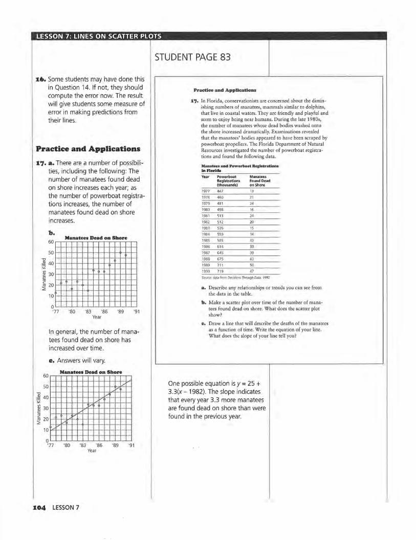
LESSON 7: LINES ON SCATTER PLOTS
u,. Some students may have done this in Question 14. If not, they should compute the error now. The result will give students some measure of error in making predictions from their lines.
Practice and Applications
1.7. a. There are a number of possibilities, including the following: The number of manatees found dead on shore increases each year; as the number of powerboat registrations increases, the number of manatees found dead on shore increases.
"'O
b. Manatees Dead on Shore
60~~~~~~~~~~~~~
50 ~~·-+-1--1--1--!-·l-l--+-+-O--+--~
"'O ,i1i 40 ........ -+--+--+--+--+-+-........ -+--+--+--+--+-t '2 ~ 30 ~1-t-+-t--l-+-+-t-t--+-+-t--+-+-i .l!l "' ~ 20 1-lF-+--+--+--<>-~-+-l--l-+--+--+--+--+-t ~
60
50
10t--ir--+-t--t--t--+-+-t--t-+---+-+--t--+-t
o~~~~~~~~~~~~~
'77 '80 '83 '86 '89 '91 Year
In general, the number of manatees found dead on shore has increased over time.
c. Answers will vary.
Manatees Dead on Shore
I/ v
,i1i 40 '2 /
v
"' ~ 30
~ 20 ~
10 ~ ....
0 '77
" /
'80
1.04 LESSON 7
~
~
'83 '86 '89 '91 Year
STUDENT PAGE 83
Practice and Applications
17, In Florida, conservationists are concerned about the diminishing numbers of manatees, mammals similar to dolphins, that live in coastal waters. They are friendly and playful and seem to enjoy being near humans. During the late 1980s, the number of manatees whose dead bodies washed onto the shore increased dramatically. Examinations revealed that the manatees' bodies appeared to have been scraped by powerboat propellers. The Florida Department of Natural Resources investigated the number of powerboat registrations and found the following data.
Mon111tco• •n.d Powoi"bo•t Roglatrat1on1 in Florida
Year Powerboat Manatees Registrations Found Dead (thousands) on Shore
1977 447 13
1978 460 21
1979 481 24
1980 498 16
1981 513 24
1982 512 20
1983 526 15
1984 559 34
1985 585 33
1986 614 l3
1987 645 39
1988 675 43
1989 711 50
1990 719 47
Source: data from Decisions Through Data, 1992
a. Describe any relationships or trends you can see from the data in the table.
b. Make a scatter plot over time of the number of manatees found dead on shore. What does the scatter plot show?
e. Draw a line that will describe the deaths of the manatees as a function of time. Write the equation of your line. What does the slope of your line tell you?
One possible equation is y = 25 + 3.3(x - 1982). The slope indicates that every year 3.3 more manatees are found dead on shore than were found in the previous year.

LESSON 7: LINES ON SCATTER PLOTS
STUDENT PAGE 84
IS. a. About 29 manatees were found dead. Students can use the 1983 and 1984 data in the table to estimate. There appears to be a linear trend in the plot.
b. From the scatter plot, you can see a relationship between the increase in registrations and the increase in manatee deaths. With the scatter plot over time, you can observe only the increase in deaths.
c. About 27 manatees. Students should be able to estimate, using a point that is close to the linear pattern.
x9. Students answer on Activity Sheet 11.
"CJ ,!1! Q Vl
"' !!! "' c "' ~
60
50
40
30
20
10
Number of Powerboat Registrations/Manatees
Dead on Shore
v / _ _,,_
>---[/.
,,, /
, . ., . v
IL /
./
400 450 500 550 600 650 700 750 800 Registrations (thousands)
a. Equations will vary slightly. One possible equation is K = 20 + 0.13(R - 500). The slope indicates that for every 100 thousand increase in powerboat registrations, there will be 13 more manatees found dead on shore. The decimal form of the slope (0.13) is not as meaningful as the fraction: 13/100.
b. The equation predicts about 26.5 manatees found dead on the shore if there are 550 thousand powerboats registered.
18. The Florida conservationists observed that there seems to be a relationship between the number of powerboat registrations and the number of manatee deaths.
a. Using the data in the table, estimate the number of manatees found dead on shore as related to 550 thousand powerboat registrations.
b. Look at the following scatter plot to see if there really are any patterns as the conservationists claim. Compare the inferences you can make from the scatter plot over time in Question 17 with the inferences from the following scatter plot.
Number of Powe.r Boal: R~gll'lr•tlonr/
60 M &1n.ai tct11 Dead on Sboro
50 t--+--+--t--t----+-+--<t--t-~--t--1---t--t-0-t--+--+-~ Cl
-0
~ 40 l
Cl
~ u Cl Cl
fij 30 ::;;
a a 20
c 10
400 450 500 550 600 650 700 750 800 Registrations (thousands)
Source: data from Decisions Through Data, 1992
c. Use this scatter plot to estimate the number of manatees found dead on shore if there are 550 thousand powerboat registrations. How did you make your estimate?
19. Using Activity Sheet 11, draw on the scatter plot a line that you think summarizes the relationship between the number of manatee deaths and the number of powerboat registrations.
a. Write the equation of your line. What is the slope of your line, and what does it tell you about manatee deaths?
b. Using the equation of your line, predict the number of manatees found dead on the shore if there are 550 thousand powerboat registrations.
LINES ON SCATTER PLOTS IOS

LESSON 7: LINES ON SCATTER PLOTS
STUDENT PAGE 85
19. e. Students will most likely choose the equation because there is no further estimation required by the time the equation is written. Students should explain their preferences.
d. For the equation K = 20 + 0.13(R - 500), when there are 0 powerboat registrations, there will be -45 manatees found dead on shore. When there are 346 thousand powerboats registered, there will be 0 manatees found dead on shore. They-intercept is -45, and the zero is 346.
zo. Answers depend on students' lines. Students may compare by the root mean squared error or the mean absolute error.
z1. a. A is (526, 1 5). It represents the data point of 526 thousand registrations and 15 manatees found dead on shore. Bis (725, 50). It represents the prediction point on the line of 725 thousand registrations and 50 manatees found dead on shore.
b. He would predict too many for point A, because point A is below the line.
e. Tua forgot to look at the vertical scale, which would have reminded her that 1 square represents 5 deaths; therefore, she should have multiplied the number of squares by 5.
106 LESSON 7
c. Which is the easiest to use to make a prediction: the table, the plot, the line, or the equation? Explain.
d. Find the y-intercept and the zero of your line. Use each in a sentence to describe the relationship between the number of powerboat registrations and the number of manatees found dead on shore.
20. Compare your line with the lines of others in your class. Who seems to have the best line? How did you decide?
21.. Tua's line is shown on the following scatter plot.
l'lumbcr ol Power Bollt Reaknatlo1 .. / Manateeto Dead on Shon
60 ...-.,....--r--.--r--r---r---r--.--.-~~----,----,.--,---.,....-,-,
50 1-+--+---+-----+---+---+--+--+--+-t--+--t--+~· B
,...-t A
~ ~ ~ ~ - ~ - ~ a Registrations (thousands)
a. What are the coordinates of A and B? Tell what each pair of coordinates represents.
b. If Tua uses her line to predict the number of manatees found dead on shore, would she predict too many or too few deaths for A? How can you tell?
c. When she made her predictions, Tua estimated her error by just counting the number of squares in the grid to represent the distance from a data point to her line. For example, she determined that A is about 2 squares away from the line so she concluded that her prediction was off by about 2 deaths. What would you tell Tua about her method?

LESSON 7: LINES ON SCATTER PLOTS
zz. a. Students should answer on Activity Sheet 11.
Number of Predicted Number Powerboat of Manatees Registrations Found Dead (thousands) on Shore
447
460
481
498
513
512
526
559
585
614
645
675
711
719
13.11
14.8
17.53
19.74
21 .69
21.56
23.38
27 .67
31.05
34.82
38.85
42.75
47.43
48.47
b. Most students will use the equation, such as K = 20 + 0.13(R -500) from 3a, to make predictions, whereas others may use their graph.
c. The answer depends on student data. Some may compare selected values or begin to look at differences or average differences.
d. For the preceding data, the root mean squared error is 4.2 . A predicted number of dead manatees would typically be within 4 of the actual number found dead.
e. The answer depends on students' lines and errors.
STUDENT PAGE 86
:&:&. Use the table, similar to the one below, on Activity Sheet 11.
a. Predict the number of manatees found dead on shore for the given number of powerboat registrations. Record your predictions in the table on Activity Sheet 11.
Powerboat Registrations (thousands)
447
460
481
498
513
512
526
559
585
614
645
675
711
719
Predicted Number of Manatees Found Dead on Shore
b. How did you make your predictions?
c. Who seems to have the best predictions in your group? How can you tell?
d. Calculate the root mean squared error or the mean absolute error for your predictions. What does the error indicate about your line?
e. Compare your error with the errors of your classmates. .Who has the least error?
:&3. Write a letter to the Florida Department of Natural Resources outlining the problem involving powerboats and their negative effect on manatees as you have identified it. Provide statistical evidence to support your conclusion, and make some suggestions for resolving the issue.
:14. Consider the perpendicular distance from a data point in a scatter plot to the line you have drawn to represent the relationship in the data. Do you think it would be useful to use this distance to measure a best line? Why or why not?
Z3• When evaluating students' letters, take into consideration students' abilities to make convincing arguments using the information they have discovered. A student may make an argument that his or her line is a good predictor because it has a small error and then make an argument using the slope of the line. Students should use their graphs and their data to prepare a convincing argument.
z4. Challenge The perpendicular distance is difficult to find. While the vertical distance measures the difference between the actual value and the predicted value, the perpendicular distance has no such contextual basis. (It will, however, produce the same best line-a good geometry problem!
LINES ON SCATIER PLOTS 107

LESSON 8
Technology and Measures of Error Materials: graph paper, pencils or pens, rulers
Technology: graphing calculators or computers with a spread
sheet software, overhead projection panel (optional)
Pacing: 1 class period
Overview
The focus of this lesson is to have students use technology that minimizes error in the line for the data. Step-by-step instructions provide students with help in using either a spreadsheet software such as Microsoft Works or a TI-83 graphing calculator to find the error for a given linear equation for the data. Most spreadsheet software programs will generate the new error for an equation fairly automatically as the equation is changed. Some graphing calculators require that a new equation be entered and the error recalculated each time; others now work like spreadsheet. In either situation, the work is still much easier when technology is used.
Teaching Notes
Work through one of the examples with the class. The instructions given are for Microsoft Works, but they should be fairly similar for any spreadsheet program. If students have used a spreadsheet software previously, they will be comfortable with the process. If not, let students experiment with the procedure until they understand how to make it work. If necessary, you might have someone with knowledge of the software help students become more comfortable in working with it.
The graphing calculator is easy to use. Some calculators will not process a change in the equation without
108 LESSON 8
repeating the commands to find the predicted values and then the differences between the actual and predicted values. The predicted values can be found by using the LIST function and storing the equation in Yl, or by using the equation from the home screen and defining the list from that perspective.
You can modify the instructions in the student book to fit other spreadsheet software or graphing calculators.
Be sure students understand how to use the technology; without which the steps can become overpowering and students may not understand the purpose of the exercises that follow.

LESSON 8: TECHNOLOGY AND MEASURES OF ERROR
STUDENT PAGE 87
LESSON 8
Technology and Measures of Error
Finding residuals by hand is tedious and time consuming. How can you find them without so much work?
T echnology makes doing many calculations that are difficult or time consuming to do by hand easier. It is impor
tant, however, that you take time to understand the concepts involved.
INVESTIGATE
Using a Spreadsheet or Graphing Calculator
Refer to the data regarding the height and weight of seniors in Lesson 7, page 77. You can find the root mean squared error for the line w = 170 + 7(h - 72), using either a spreadsheet software like Microsoft Works or a 11-8.3 graphing calculator.
If you are using Microsoft Works, open up the application to a new spreadsheet.
• In the first row, Al through El, enter the headings as follows:
A1 81 C1 D1 E1 Height Weight Predicted Difference Difference
Weight Squared
• Then enter the values for the height in column A (beginning in cell A2) and the corresponding values for weight in Column B (beginning with cell B2).
• In cell C2, enter your prediction equation, using A2 in place of h, with an equals sign (=)in front of the formula, =170+7*(A2-72).
• In cell D2, enter the formula =B2-C2.
Use technology to find a measure of error in predicting by using
an equation.
TECHNOLOGY AND MEASURES OF ERROR I09

LESSON 8: TECHNOLOGY AND MEASURES OF ERROR
110 LESSON 8
STUDENT PAGE 88
• In cell E2, enter the formula =(02)A2.
To label the results for the final computations:
• In 027, enter Sum diff squared.
• In 028, enter Sum diff squared/n. (n is the number of data points)
• Jn 029, enter Root mean squared error.
To enter the formulas for the final computations:
• In E27, enter =Sum(E2: [location of last value in column E]). In this example, there are 25 data points, so the entry in E27 is =Sum(E2:E26). (Recall that cell El does not contain a data point.)
• In cell E28, enter =E27/25.
• In cell E29, enter =sqrt(E28).

LESSON 8: TECHNOLOGY AND MEASURES OF ERROR
STUDENT PAGE 89
A B c D
1. Height Weight Pr'edlcted Difference Difference Weight Squared
2. 72,5 195 =170+7*(A2-72) =B2-C2 =(D2)'2
3. 70.5 137
4. 72 156
5, 70 145
6. 71 175
7, 70 165
73 195
9. 76 155
10, 67 143
11 . 76 5 155
12, 76 192
13. 69 149
14. 71 225
15. 66 132
16. 63 97
17. 61 145
18. 61 108
19. 64 106
20. 66.5 125
21 64.5 140
22 69 120
23. 68 130
24. 61 105
25. 69 140
26. 62 110
27. Sum diff squared =Sum(E2:E26)
28. Sum diff squared/n = E27/25
29 Root mean squared error =sqrt(E28)
The spreadsheet software will perform all of the operations for you, but you have to set it up. To make the formulas work in each of the columns C, D, and E, you must highlight each column individually. For example, highlight cell C2 and drag the highlight to the last data line. Under the Edit menu select Fill Down. This command will use the formula =170+7*(A2-72) in cell C2 to predict the weight for each height in cells A2 to A26 and store each result in cells C2 to C26, respectively. Repeat this process for columns D and E. The result in cell E29 will be the root mean squared error. Your final spreadsheet should look like the following one.
TECHNOLOGY AND MEASURES OF ERROR III

LESSON 8: TECHNOLOGY AND MEASURES OF ERROR
Solution Key
Discussion and Practice
I. a. On the spreadsheet, entry C3 shows that the predicted weight for a person 70.5 inches tall is 159.5 pounds.
b. The -43 in 09 means that the actual weight of a person 76 inches tall was 43 pounds less than the predicted weight of 198 pounds.
c. The entries in column C represent they-values (weights) predicted from the line for the x-values (heights) in column A. The entries in column D represent the vertical distances between the actual y-values (weights) and the predicted yvalues (predicted weights) for the heights given in column A.
II2 LESSON 8
STUDENT PAGE 90
A c D
1. Height Weight Predicted Difference Difference Weight Squared
2. 72 5 195 173.S 21.5 462,25
3. 70.S 137 159,5 -22.S 506.25
4. 72 156 170 -14 196
5. 70 145 156 -11 121
6. 71 175 163 12 144
7. 70 165 156 9 81
8 73 195 177 18 324
9. 76 155 198 -43 1,849
10_ 67 143 135 8 64
11 76.5 155 201 5 -46.5 2, 162 25
12 76 192 198 -6 36
13 69 149 149 0 0
14. 71 225 163 62 3,844
15. 66 132 128 •I 16
16, 63 97 107 -10 100
17. 61 145 93 52 2,704
18. 61 108 93 15 225
19. 64 106 114 -8 64
20. 66,5 125 131.S -6 5 42.2 5
21 . 64 5 140 117.5 22.S 506.25
22. 69 120 149 -29 841
23. 68 130 142 -12 144
24. 61 105 93 12 144
25 69 140 149 -9 81
26 62 110 100 10 100
27 Sum diff squared 14,757.25
28 Sum diff sQuared/n 590.29
29. Root mean squared error 24 295884425
To find the mean absolute error, in cell El enter Absolute Difference, in E2 enter the formula, "'abs(D2), in D27 enter Sum absol cliff, and in D28 enter Mean absol error. You can delete the entries in D29 or in E29. The mean absolute error will appear in cell E28 when you use the same process you used to find the root mean squared error.
Discussion and Practice
•· Look at the preceding spreadsheet or the spreadsheet you generated.
a. What does the entry in cell C3 represent?

LESSON 8: TECHNOLOGY AND MEASURES OF ERROR
z. a. 24.296, or 24.3
b. 230 220 210 200
v;- 190 -g 180
~ 1~8 :::- 150 -§, 140 ·o; 130 ~ 120
110 100 90 80
v v
,,
v ,,. ,,
,. v . ,,. [/
.....
"' ,,. v ,,. ,, ,, ,.
v v ,,. . ....
60 62 64 66 68 70 72 74 76 78 80 Height (inches)
w = 170 + 7(h - 72) w = -334 + 7h + 24 w = -334 + 7h - 24
c. The root mean squared error gives a range for each prediction . This means the predicted weight for a height of 70.5 inches would be 159.5 ± 24.3 or between 183.8 and 135.2.
3. a. Students should experiment to discover that changing different parts of the equation affects the error.
b. Students should experiment to find a small error. As students make discoveries, they should share them to help facilitate the process. Encourage students to think about what the changes are doing to their line: A change in the slope changes the steepness of the line, while a change in the point shifts the line vertically. It should take only a few guesses before students have found an equation that gives a small error.
c. The error gives the typical difference between the actual weight and the weight predicted by the line for a given height.
d. The smaller Lhe error, the better prediction the line gives.
STUDENT PAGE 91
b. What does the entry in cell 09 represent?
c. Refer to the original scatter plot of the data in Lesson 7, Question 7, on page 78. What do the entries in columns C and D of the spreadsheet represent on the scatter plot?
2. Look at the spreadsheet on the previous page.
a. What is the root mean squared error for the equation w = 170 + 7(h - 72)?
b. Add the root mean squared error tow= 170 + 7(h - 72). Then subtract the root mean squared error from the same equation. Use these two new equations to draw two lines on your scatter plot of the data (Activity Sheet 9).
c. What can the root mean squared error tell you about the predicted weight for a height of 70.5 inches?
When using a spreadsheet software, you can change the equation in your spreadsheet by entering a new slope and a new point into the equation in cell C2. Press return, then highlight C2 down to the last row in the C column in which you have data. Use the Fill Down command under Edit menu, and the recalculated results should appear on your spreadsheet. (Note: You may want to print your results each time to keep a record of your changes.)
~. Continue working with your spreadsheet.
a. Try a new equation in your spreadsheet to see how that affects the error.
b. Keep changing your equation to find as small a root mean squared error as you can.
c. What does the error you found in b tell you?
d. Why do you want as small an error as possible?
When using a TI-83 graphing calculator, press STAT, select l:Edit, press ENTER. Key in the heights in the List 1 column and the weights in the List 2 column. Press Y=, and at Yl=, key in 170+7(X-72) as shown on the calculator screens at the top of the next page.
TECHNOLOGY AND MEASURES OF ERROR 113

LESSON 8: TECHNOLOGY AND MEASURES OF ERROR
114 LESSON 8
STUDENT PAGE 92
LI ll l.J li!iDI PLOT2 PLOT> ·- 195 1¥111170 + 7(x - 72) 70.S 137 IY2 = 72 156 \Y3 = 70 145 \Y4 = 71 175 \YS = 70 165 IY6 = 73 195 IY7 =
lJ (•J = 72.5
The equation stored in Y1= will use the heights in List 1 for the x:values to generate the predicted weights. You can store the predicted weights in List 3 by following these steps.
• Press STAT, 1, to return to the Lists. Move the cursor to the top of the List 3 column. Press ALPHA".
• Press VARS,Y-VARS, !:Function, 1:Yl (2nd L1) ALPHA" ENTER.
L1 L2 Ill L1 L2 ... . , 72.5 195 72.5 195 173 5 70.5 137 70.5 137 159.5 72 156 72 156 170 70 145 70 145 156 71 175 71 175 163 70 165 70 165 156 73 195 73 195 177
1.3 = "Y1(l1) " 1.3~ · v1(1.1) "
The values in the List 3 column should be the weights predicted by using the equation stored in Y1=.
You can use List 4 in which to store the difference between each predicted weight and the actual weight by following these steps.
• Move the cursor to the top of the List 4 column. Press ENTER.
• At the bottom of the screen, at L4= (the location of the cursor) press ALPHA" 2nd L2-2nd L3 ALPHA" ENTER as shown on the following calculator screens.

LESSON 8: TECHNOLOGY AND MEASURES OF ERROR
STUDENT PAGE 93
l2 L3 l4
195 173.5 21 .5 137 159.5 -22.5 156 170 -14 145 156 -11 175 163 12 165 156 9 195 177 18
IA a 'L2 - Ll'
To find the absolute value or the squared difference, define List Sas either LS= "abs L4" or LS= "L42 " as shown on the following calculator screens. The absolute value of the differences are shown in the left screen. The squared differences are shown in the right screen.
Ll l4 Ls L3 L4 Ls
173.5 21 ,5 ml 173 5 21 .5 llm!D 159,5 -22.5 22.5 159 5 -22 5 506.25 170 -14 14 170 -14 196 156 -11 11 156 -11 121 163 12 12 163 12 144 156 9 9 156 9 81 177 18 18 177 18 324
Ls [!) a i 1.5 L5 (I) - 462.25
To find the mean absolute difference, press 2nd, QUIT. Then press 2nd LIST MATH 3:mean. At mean (, the location of the cursor, press 2nd LS ) (to specify the list you would like to use), and then press ENTER. The result will be the mean of the values in List S or the mean absolute difference as shown in the following calculator screens.
mean(LS)
I 18 54
TECHNOLOGY AND MEASURES OF ERROR

LESSON 8: TECHNOLOGY AND MEASURES OF ERROR
4. a. The entry 156 is the predicted weight for the height of 70 inches in L 1 (4).
b. The entry 14 is the differe~ce between the actual weight of 156 pounds and the predicted weight of 170 pounds for the person who is 72 inches tall.
c. The entries in L3 are the weights predicted by the line for the given heights. L4 represents the vertical distance from the data point to the line in each case, or the difference between the actual weight and the predicted weight for a given height.
II6 LESSON 8
STUDENT PAGE 94
If you choose to use the squared difference, press 2nd .../ 2nd LIST MATH. Select 3:mean(. Press ENTER. Press 2nd LS ) ENTER. The result will be the mean of the squared differences in List 5, or the root mean squared error as shown on the following calculator screens.
mean{LS) NAMES OPS mmJ3 1: min( 24 29588443 2: max( Iii mean( 4: median( 5:sum( 6: prod( 7tstdDev(
4, Refer to the calculator screens shown below.
a. What does the entry in L3(4) represent?
b. What does the entry in L4(3) represent?
L3 L4 LS L3 L4 LS
173.5 21 ,5 21 .5 173 ,5 21.5 21 .5 159.5 22.5 22.5 159.5 22.5 22.5 170 -14 14 170 .. 14 .. -11 11 156 -11 11 163 12 12 163 12 12 156 9 9 156 9 9 177 18 18 177 18 18
l.3(4)=156 L< (3)=-14
c. Refer to the original scatter plot of the data, repeated on the next page. What do the entries in Lists L3 and L4 represent on the scatter plot?

LESSON 8: TECHNOLOGY AND MEASURES OF ERROR
4. d. The root mean squared error is 24.3. This means that the weight would probably be within 24.3 pounds above or below the predicted weight. The predicted weight for a height of 70.5 inches is 159.5 pounds. Therefore the weight would probably be between 183.8 pounds and 135.2 pounds.
5. a. Students should experiment to discover that changing different parts of the equation affects the error.
b. Students should experiment to find a small error. Have students share their discoveries to help facilitate the process. Encourage students to think about what the changes do to their line: A change in the slope changes the steepness of the line, while a change in· the point shifts the line vertically. It usually does not take many guesses before students have found an equation that gives a small error.
c. The error gives the average difference between the actual weight and the weight predicted by the line for a given height.
d. The smaller the error, the better prediction the line gives.
STUDENT PAGE 95
230~~~~~~~-Senl~o-r_•'~"-~lllh~· ·-u~rw.~~~l~_•b~~~~~~~~ )
220 1~-1--+--+--+--+--+--+--~-+--t--+--+--+·~·t--i--+--+--+--I--+
210 1--•--+---+--+--+--t--i--+--+--+---+----1-1--+---+---+--+---+--r -.
200 1--+---+---+--t--+--t--i--~-+--+---+----l-+~+---+---+--Y/--t--t--
190 1--i--+---l---+--t--+--+--t--+--+--+---l-0-i--t--l-'>"TV"--+~1-1--1 //
180 l~i--+---t---+--+--l--+--t--+--+--+---l-~i..-r-+''-l---+--+~1-1~
~ 170 ~ // ~ 160 +~+---+---+--+--+--t--i--+--+--•y..-___,...._.~,__+---+--~-0-+--1--+--E 1so 1~-1--+--+--+--+--+--+--t--o..,,....--+---1-1---1---1----1---+--1--+--1 "' _./ ~ 140 l~i--+---t---+-<l-+--l--+-y..--f.''"-4· -~~0-+--t--l--t--+-+--+---t---!l--I
130 +--+---+---+--+--+--¥-,...._-0--+--+--+--t-l--+---+---+--+--+--t--• /Vo
120 1--•-+--+-4,,.----!.-<-ll--t·~·l--;<>--+-+--+--+--t--i--+--+--+--t~+
110 ~,1--0--~'r--+--l--+--~-+--t--i·--+---l---ll--l--·l--+---l---+--I
/ v 100 1--•---, .....,---+--t----ll--t--i-;--+-~---+--+--+--+---+--t--+----ll--t
90 1~+--·l--~------~-+--+---+--+--+--t-+--+---+---+--+--+--t--!
80 .__..___.___,__.__.__.__._~~~---+----1-~..___.___,_-'--'--'-~ 60 62 64 66 68 70 72 74
Height (inches)
d. What is the root mean squared error for the equation w = 170 + 7(h - 72)? What does this tell you about your predicted weight for a height of 70.5 inches?
5. To find the error for a new equation, enter the new equation in Yl. Look at the graph. The new predicted values will be in L3. The difference between the observed and predicted values will be in L4. Press 2nd ENTER and ENTER again to replay the mean error.
a. Try a new equation, and see how that affects the error.
b. Keep changing your equation to find a smaller error.
c. What does the error you found in b tell you?
d. Why do you want the smallest error possible?
SUMMARY
Spreadsheet software or a graphing calculator can be used to quickly find a measure of error for a prediction equation.
• Once you have the equation of the line, you can generate predicted y-values.
• The root mean squared error will give you an "average" interval above and below a prcd iatcd y-va luc.
76 78 80
TECHNOLOGY AND MEASURES OF ERROR II7

LESSON 8: TECHNOLOGY AND MEASURES OF ERROR
Practice and Applications
~ 6.a. llliJ 230
220 210 200
Vi' 190 ~ 180 ::J 170 g_ 160 ::- 150 -§, 140 'Qi 130 s 120
110 100 90 80
,_..
~
,.,. ....
~
1~
60 62 64 66 68 70 72 74 76 78 80 Height (inches)
The pattern of the points appears close to linear; therefore a line is appropriate. Equations will vary slightly. One possible equation is W = 145 + 5(H - 64). Encourage students to write the height in inches rather than in feet and inches.
b. For the equation given, the root mean squared error is 1.19. This means that typically you would expect a predicted weight for a given height fo be within 1.19 of the actual weight, or the actual weight plus or minus 1.19 pounds.
J:I8 LESSON 8
STUDENT PAGE 96
• With spreadsheet software, you can change one of the values in the equation and fill down. The resulting new error appears automatically. This feature lets you easily experiment with different equations to find one that reduces the error.
• With a TI-83 graphing calculator, you have to change the equation in Yl= each time and recalculate the error from the lists generated by that equation.
Practice and Applications
6. The following table shows the recommended weight for females and males as a function of height for ages 19 through 34.
Recommended Weight lor FemaJu and Male•, Ages 19-34
Height Weight (feet and (pounds) inches) Female
5'0" 97
5' 1" 101
5'2" 104
5•3• 107
5'4" 111
5·5· 114
5'6" 118
5'7" 121
5'8" 125
5'9" 129
5'10" 132
5'11" 136
6'0" 140
6' 1" 144
6'2· 148
6'3" 152
6'4" 156
6'5" 160
6'6° 164
Weight (pounds) Male
128
132
137
141
146
150
155
160
164
169
174
179
184
189
195
200
205
211
216
Source: data from Nutrition and Your Health: Dietary Guidelines for Americans
a. Plot the suggested weight for males as a function of height (height, weight), and determine whether a line would be appropriate to describe the relationship. If so, draw the line and find its equation.

LESSON 8: TECHNOLOGY AND MEASURES OF ERROR
•· c. Using the equation W = 14S + S(H - 64), you would expect the guidelines to predict 1 OS pounds± 1.19, or between 103.81 pounds and 106.19 pounds.
d. 230.--r-.-r-r-.-r-r-.-r-r-.-r-r-.-..-.-.--.--.~,.-, 2201-+++-HH-+++-t-J-t-t--t-t-H~!l"'l 2101-++-t-l-++-HH--t-+-HH--t-:J,,§"~ 2001-t-++-t-t-HH-t-t-++-t-:;J,~H-t-l-I
'Ul" 1901-1--+-t-+-+-t-+-+-t-+-t-::1""6"'1'-+-l-++-l~I ~1801-\--HH-+-t-+t-+-:;J,;;IPf-+--l-l--Hl-\-+-t § 170 .g. 1601-t-++-t-t~M'-t-t-++-t-t-HH-t-H - 1501-++-t~~-HH--t-+-HH-++-l-t+-l
~ 140t~efljj:jj:ttt~ttjjttjjj ~130 ~ 120 1-t-+-+-HH-+-t--t-t-t-1-t-+-+-HH-+-t
110 1-+-Hl-l-+-1--+-+-+-+-t-+-t-f-l--Hf-l-+-I 100t-t--Ht-t-+-l-t--t-+-t-t-t---t-t-t--Ht-t--t-I
901-+-Hl-l-+-l--+-+-t-+-t-+-t-f-l--Ht-t-+-I so~~~~~~~~~~~~~~
60 62 64 66 68 70 72 74 76 78 80 Height (inches)
W = 14S + SH - 320 W = -17s + 1.19 + SH W = - 17s - 1.19 + SH
The first three points lie outside the band, which may be difficult for students graphing by hand . This indicates that these points are outside of the typical variation of the data from the line. Because the points are close together, it may indicate that a different line may be a better overall predictor.
~ 7.a. lillJ Fast-Food Calories and Fat
1000 900 800 700
I() 600 .§ 500 ;;; u 400
300 200 100
c ~v
~ ...........
<
,.v /
,,_r p V
/
00 10 20 30 40 50 60 Fat
Equations will vary. One possible equation is C = 400 + 12.S(F - 16).
STUDENT PAGE 97
-... ... ...
b. Use spreadsheet software or a graphing calculator to find the root mean squared error for your equation. What does the root mean squared error indicate about any prediction you make using your equation?
c. If someone is 4 feet 8 inches tall, what suggested weight would you expect to appear in the Dietary Guidelines?
d. Add the root mean squared error to your equation, and graph the new equation on your scatter plot. Subtract the root mean squared error from the original equation, and graph that equation on your scatter plot. How many points lie outside this band? What does this indicate?
7. What is the relationship between calories and the amount of fat in foods from fast-food restaurants? The following table shows the number of calories and grams of fat in food items offered at several fast-food restaurants.
Restaurant Food Item Fat calories (grams)
McDonald's Mclean Deluxe without cheese 10 320
Quarter Pounder with cheese 28 510
Chick en Salad 45 162
Burger King BK Broiler (no sauce) 8 267
Chunky Chicken Salad 172
Whopper with cheese 44 706
Pizza Hut Cheese pizza (two slices) 18 492
Pan Supreme Pizza 30 589
Taco Bell Bean Burrito (no cheese) 14 447
Chicken Burrito (no cheese) 12 334
Taco Salad (with shell) 61 905
Nachos-Bell Grande 35 649
Copyright 1992, USA TODAY. Reprinted with permission
a. Plot the calories as a function of the grams of fat (fat, calories), and draw a line that seems to represent the relationship. Find the equation of your line.
b. Find they-intercept and zero of your line, and indicate how to interpret each in the context of fat and calories.
c. Use spreadsheet software or a graphing calculator to find the mean absolute error.
b. For C = 400 + 12.S(F- 16), the y-intercept is 200. This means that if a fast-food item has 0 grams of fat, it would have 200 calories.
The zero is -16. This means that if a fast-food item has - 15 grams of fat, it would have 0 calories-an impossible situation.
c. For the equation in b, the mean absolute error is S4.2.
TECHNOLOGY AND MEASURES OF ERROR 119

LESSON 8: TECHNOLOGY AND MEASURES OF ERROR
7. d. Students can compare their answers to c to find the "best" line.
e. Students should include information about the slope and intercepts and the accuracy of the line based on the error.
8. Students' descriptions should clearly state the steps used to determine the error and should use an example as an illustration, explaining how the steps apply to the specific example.
J.20 LESSON 8
STUDENT PAGE 98
d. Compare your line with the lines of your classmates, and determine who has the best line.
e. Write a paragraph summarizing what your equation means and what the error indicates about using your equation to predict values.
8. Describe how you can determine a measure of error for a prediction equation. Give an example, and explain how it works.

LESSON 9
Lines, Lines, and More Lines Materials: graph paper, pencils or pens, rulers, Activity Sheets
12-14, Lesson 9 Quiz
Technology: graphing calculators (optional)
Pacing: 3 class periods
Overview
In this lesson, students learn to make a median fit line for a set of data as a standard process for finding a line that fits a set of data. Students discover that the median fit line is not sensitive to extreme values, or outliers. They also learn how to find the value that might have yielded a given outcome by solving an equation or reversing the process they use to find such an outcome. This lesson provides students with practice in finding a median fit line in a variety of contexts.
Teaching Notes
The initial example of finding a median fit line can be done as a demonstration for the entire class. Students can then find a median fit line of their own, using the head circumference/height data. You can use an overhead transparency of the data with a median fit line drawn on the scatter plot to check students' work. If the scatter plots are nearly the same size, students can place the transparency on .their scatter plots to see how close their median fit lines are when compared with the line on the transparency. Be sure students use two points on the median fit line they have drawn, not two data points, to find the equation.
The median fit line will not necessarily produce the smallest error, using either the mean absolute error or root mean squared error. The procedure does not have characteristics that will minimize the differences. The procedure will, however, produce a line that is
not dependent on outliers and one that will give a relatively small error.
Students may have trouble solving the equation for an x-value given they-value, or they may have enough experience from earlier work for this procedure to make sense. Provide students with several ways to think about their solutions, and stress the fact that they should be sure the numbers make sense in the context before they agree with the answer.
In practice, statisticians find an x-value for a given yvalue by graphing ordered pairs in reverse order (y, x) and finding the line that seems to describe that relationship. In order to provide students with practice in solving equations and then thinking about their solutions, the questions are written using the (x, y) format. The alternate approach might be interesting to students and might reveal the emphasis that statisticians place on thinking about which variable they use as the response variable. Students may be surprised to discover that the median point in a region of (x, y) points will not necessarily be the same as the median point in the corresponding (y, x) region.
Students may not need to answer all of the questions in order to understand the concept of a median fit line. At this stage, students can safely use the median fit line as a standard procedure to find a relatively good line to summarize the data. The least squares linear regression line uses another procedure for finding the equation of a line that will fit the data according to a set of criteria. The least squares line is a function of the mean and is sensitive to outliers. As students learn about the least squares regression line,
LINES, LINES, AND MORE LINES ~:U

they will learn what it represents and what characteristics it will possess in another module in this series.
Technology
Students should make their median fit lines by hand for at least the first two examples. After they understand the procedure, they might use the formula generated by their calculators. Encourage interested students to write a program to find the root mean squared error. Have them share their procedures with the class.
Follow-Up
Students may be familiar with some of the techniques for curve fitting that will occur in other classes. You might want to encourage them to find data in newspapers or in special-interest magazines and try to model the relationship by finding the median fit line. They might also use the data they collected in Lesson 7 to find a median fit line as a way to summarize the relationship.
XZZ LESSON 9

LESSON 9: LINES, LINES, AND MORE LINES
STUDENT PAGE 99
LESSON 9
Lines, Lines, and More Lines
Do you have to draw several lines and test each one for error?
How can you draw a fairly good line to begin with?
If you look at some of the possible lines summarizing the relationship of the data, how can you be sure that the lines are fairly similar?
T here are many possible lines that can be used to describe a set of data. There are some common techniques that are
used to draw different lines. One typical line for a set of data is called a median fit line. The technique used to draw the median fit line is based on ordering the data points and counting to find median points that represent the data in different sections of the scatter plot.
INVESTIGATE
Seniors' Hel&bta and Welgltta
Consider the seniors' height/weight data once more as reproduced on the following page.
Summarize data by drawing a median fit
line. Solve a linear equation.
LINES, LINES, AND MORE LINES IZ3
LESSON 9: LINES, LINES, AND MORE LINES
STUDENT PAGE 100
~Z4 LESSON 9
~or•' Rolll'>U/Wolshts Males' Females' Height Weight Height Weight (inches) (pounds) (Inches) (pounds)
72,5 195 66 132
70,5 137 63 97
72 156 61 145
70 145 61 108
71 175 64 106
70 165 66.5 125
73 195 64 5 140
76 155 69 120
67 143 68 130
76,5 155 61 105
76 192 69 140
69 149 62 110
71 225
Recall that you only need two points to draw a line, but sometimes it is important to use a third point as a "checkpoint." To help you find these three points, draw vertical lines perpendicular to the horizontal axis separating the data points into three regions of the scatter plot. (The vertical lines you draw should not contain any data points.) Each of the three regions should contain, as nearly as possible, an equal number of points. In this example there are 25 points, as shown in the following scatter plot, and because 25 + 3 = 8 with a remainder of 1, put 8 points in the first region, 9 in the middle, and 8 in the third.

LESSON 9: LINES, LINES, AND MORE LINES
STUDENT PAGE 101
230
220
210
200 0
190
180
~ 170 c % 160
~ 150
~ 140 I
130 0
120
110
100
90
8060 62 64 66 68 70 72 74
Height (inches)
You can determine a representative, or median, point for each region by finding a median value for the height, the x-value, and a median value for the weight, the y-value.
One way to find these median points is to look at the scatter plot. For this example, in the first region (to the left), the median height will be halfway between the fourth and fifth horizontal coordinates, or at 62.5. (Notice that there are 4 points to the left of 62.5 and 4 points to the right of 62.5.) The median weight will be halfway between the fourth and fifth vertical coordinates, or at 109. (Notice that there are 4 points above 109 and 4 points below 109.) Thus, the median point for the first region has coordinates (62.5, 109), as shown in the next scatter plot. (Notice that in this example, for the first region, the median point is not one of the data points.)
0
76 78 80
LINES, LINES, AND MORE LINES 1ZS
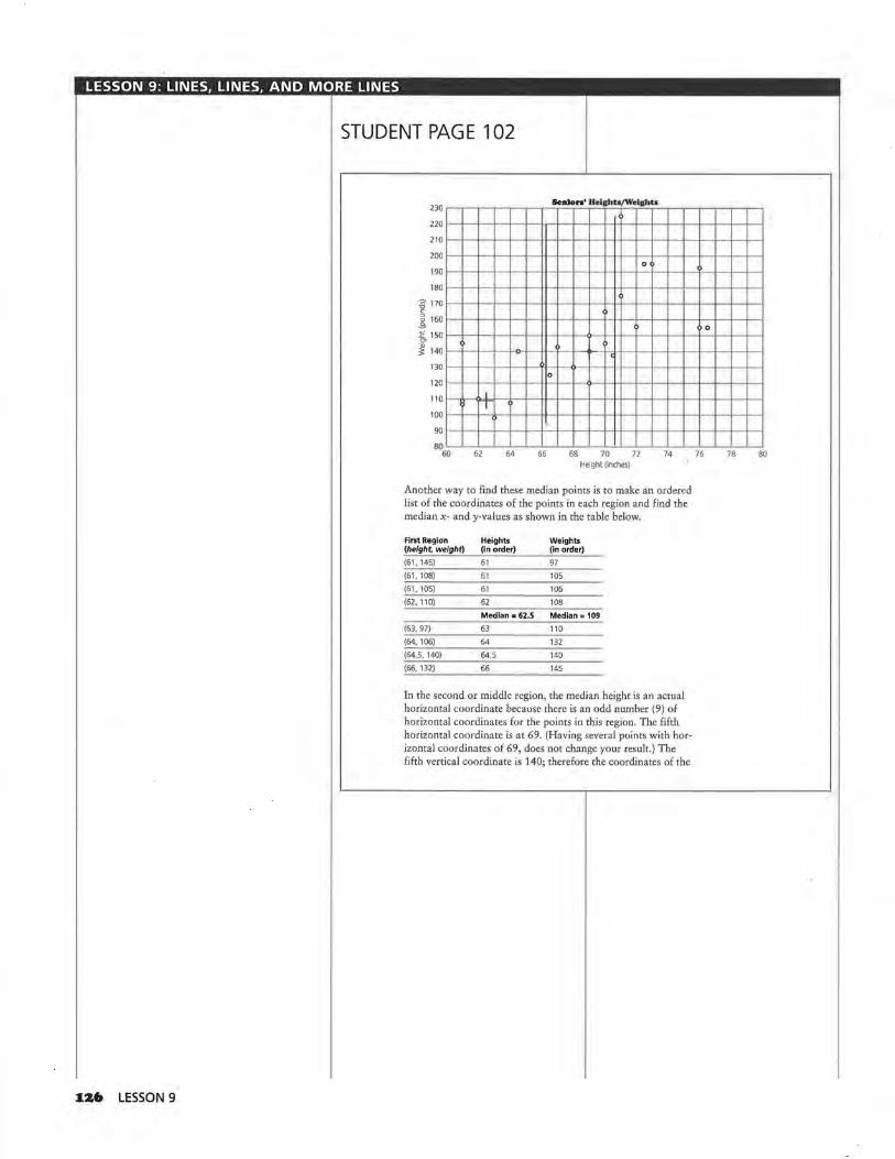
LESSON 9: LINES, LINES, AND MORE LINES
STUDENT PAGE 102
~Z6 LESSON 9
230 ~~~~~~~~~Senl~_oTr_•_' ~H_cl;&h'--D/'HoT-~c~l&ht'--.•~~~~~~~~---,
2201~-+--•~+-~--~~h-+----+--l~+--1-+---l~+--+--4~+--+--4~+--I
21o t-+--r~+-4---+~tt--t---+~t---t-·1+--1+-+----+---11--+----+---1~+---1
200 t-+--t~+-4---+~tt--t---+~+-+--·l+--ll--+----+---ll--+---+---l~+--I 0
190 1---1--•~+-~---+~H--l--+~+--l-·l+--l+-+----+--l+-+----+--l~+--1
180t~+--t~t-4---+---l +-+-~---+--lt-l+---t---l+-~---+---l~+---t---I___,
Another way to find these median points is to make an ordered list of the coordinates of the points in each region and find the median x- and y-values as shown in the table below.
First Region Heights Weights (height, weight) (In order) (in order)
(61, 145) 61 97
(61, 108) 61 105 (61, 105) 61 106
(62, 110) 62 108
Median = 62.5 Median= 109
(63, 97) 63 110
(64, 106) 64 132 (64 5, 140) 64.5 140 (66, 132) 66 145
In the second or middle region, the median height is an actual horizontal coordinate because there is an odd number (9) of horizontal coordinates for the points in this region. The fifth horizontal coordinate is at 69. (Having several points with horizontal coordinates of 69, does not change your result.) The fifth vertical coordinate is 140; therefore the coordinates of the

LESSON 9: LINES, LINES, AND MORE LINES
Solution Key
Discussion and Practice I. a. There are 9 points: (66.5, 125),
(67, 143), (68, 130), (69, 120), (69, 140), (69, 149), (70, 165), (70, 145), (70.5, 137).
Ordered Heights Ordered Weights
66.5
67
68
69
69
69
70
70
70.5
120
125
130
137
140 Median
143
145
149
165
b. There are 8 points: (71, 175), (72.5, 195), (72, 156), (73, 195), (76, 155), (76.5, 155), (76, 192), (71, 225).
Ordered Heights Ordered Weights
71 155
71 155
72 156
72 .5 175
72.75 183.5 Median
73
76
76
76.5
192
195
195
225
c. Mark off 9 points in the left and right regions and 8 points in the middle region.
STUDENT PAGE 103
representative or median point for the second region is (69, 140).
The median point for the third, or right, region is found in the same way as the point for the first, or left, region.
Dlseusdon and Practice
J:, Refer to the table of Seniors' Heights and Weights.
a. Make an ordered list of the coordinates of the data points in the middle region, and verify that the median height is 69 inches and the median weight is 140 pounds.
b. What are the coordinates of the median point in the right region?
c. How would you separate the data points into three regions if there are 26 points altogether?
You can use the median points in the left and right regions of the scatter plot to determine the slope of the median fit line. Place your ruler on the two median points, and while keeping it parallel to the line between them, slide your ruler 1 of the vertical distance toward the median point in the middle region. Now draw this line on your scatter plot, as shown on the next page. (Even though you are approximating t of the distance, your line will still be fairly accurate.)
LINES, LINES, AND MORE LINES 1Z7

LESSON 9: LINES, LINES, AND MORE LINES
STUDENT PAGE 104
2. a. Student responses will vary. One equation might be W = 180 + 7.6(H- 73).
b. The slope is 7.6; this means that for every additional inch in height there are 7.6 additional pounds.
c. The predicted weight is about 188 pounds.
d. They-intercept is -375_ This means that a person who is 0 inches tall will weigh -375 pounds. This does not make sense. First of all, you cannot have a person 0 inches tall, and secondly, there cannot be a negative weight.
3. a. For the preceding equation, the mean absolute error is 19.5, and the root mean squared error is 25 .6. These values might be less than those found earlier. The median fit line does not guarantee the smallest error; however, it does provide a procedure that you can use to find a line that will give a relatively small error and one that is not sensitive to outliers.
I28 LESSON 9
230 Senior•' llelgl1t1/W• l&l>U
220
"lU
200 /,, 0
190
180
~ 170
1-1 v v
! 160 v E 150 "' ,..v ~ 140
v ' 130 v 0 120 ,,v 110 I
100 [)'
v 90
80 60 61 64 66 68 70 72 74
Height (inches)
The line you have drawn is called a median fit line, or a median-median line, and can be used to summarize the relationship between the heights and weights of the 25 seniors. To find the equation of the median fit line, use any two points on the line.
:&. Consider the preceding scatter plot.
a. Find an equation for the median fit line shown in the preceding scatter plot.
b. What is the rate of change, or slope of the line, and what does it tell you?
c. Use the equation of your line to predict the weight of a person who is 74 inches (6 feet, 2 inches) tall .
d. What is the y-intercept of the line? What does the y-intercept mean in terms of the data? Docs this make sense?
3, Refer to the median fit line of the preceding scatter plot.
a. Earlier you found the root mean squared error or the mean absolute error for a line. Find either of these values for the median fit line. How does the error for the
v
0
76 78 80

LESSON 9: LINES, LINES, AND MORE LINES
STUDENT PAGE 105
3. b. The predicted weight is about 142 pounds. If you use the mean absolute error, the prediction typically could be off by about 20 pounds, or range from 122 pounds to 162 pounds. If you use the root mean squared error, the prediction typically could be off by about 26 pounds, or range from 116 pounds to 168 pounds.
4. a. The points (54, 182), (56, 162.5), (56.5, 163), and (58.5, 153) appear to be outliers because they look as if they would be at a greater distance than any other data points from any line drawn to summarize the relationship. Students may include other points as well.
b. Students should answer on Activity Sheet 12.
190,_,....,....,,.......,.....,-.,-~~~~,....,....,....,,.......,...,
186H-+-lH-+-l-l-+-+-+-+-+-l-H-+-lH--l--I ~ 182H-+-t-l-+-t-+-+-+-+-+-++-H-+-t-+-+-t E 178H-+-l-l--+-1-+-+-+-+-~-l-H-+-l-l---l--I ~ 174H-+-t-+-+-t-+-+-+-+-+-++-t-r+-t-+-+-t ~ 170H-+-l-+-+-1-1-+-i,-+-+-r-l-H-+-l-l---H . ~166>-+--+-<-+-......... -t-....... -1-._..-+-,_,_-+-<-+--l-l w 162H-+-l-+--!-t-+-+-+-+-f-4--f-H-+-l-l--H I 158~~+-l-~-1-1-1-+-+-+-+-+-l-H-+-lH--l--I
1541-++-H--HH-+-l-l--+-l-l-+-++-H-+-i 150L...L.-'-L-.L"""'--Jl...J...J...J-L..L....l-1-.L..J......L..L-.L...<...J
50 51 52 53 54 55 56 57 58 59 60 Head Circumference (cm)
c. Students should answer on Activity Sheet 12.
190,....,..~,.-,-~.-.-~~~~~~,....,..~
1861-++-H--HH-+-l-+-+-+-+-+-++-H-+-i ~ 1821-++-H--HH-+-l-l-+-l-l-+-++-H-+-l E 1781-+--+->-+--+-<-+--+-<-t-..--1-.._.__._._._..._ ~1741-++-H--HH-+-l-l-+-l-l-t--l--l-H-+~ 1701-+--+--+---+--<-+--+-l....O-+-O-l-+-+-+--+-4-.~ 1661-++-H--HH-+-l-+-+-1-+-+-+-l-H-+w 1621-+-l-H--HH--l-l-l-·,_.-f-+-+-l--+-+
I 1581-+-l-l-+-HH-+-l-l-+-l-l-+-+-l-H-+-1541-+-l-H-+-lH-+-l-l-+-l-+-+-+-l-H-+-150._._....._ ......................... _,_,_._..__._._...__.._._ .......... .......,
so 51 52 53 54 55 56 57 58 59 60 Head Circumference (cm)
median fit line compare with the error for the line you drew by eye at the beginning of Lesson 8.
b. Find the weight of a person who is 68 inches tall. What does the error indicate about your prediction?
4. Following is a scatter plot showing (in centimeters) both the circumference of the head and the height of some highschool freshmen.
190 Rolatloaohlp Between Road Cinumlerenff and llolaht
186
182
178
E 174 ~ :c 170 en ~ 166
162
158
154
150 SP 51 52 53 54 55 56 57
Head Circumference (cm)
a. Identify any of the points that look as though they might be outliers. Why do you think these points might be outliers?
b. The class found that two of the class members had converted inches to centimeters incorrectly when they were measuring their height. The correct points should be (58.5, 172) and (54, 164). Using Activity Sheet 12, adjust the scatter plot accordingly .
c. The measurements for the rest of the class are shown in the table below. Add these points also to the scatter plot on Activity Sheet 12.
Fre1hmea'1 Head/Retcbt Meanarementti
58 59
Head Circum. Height (centimeters) (centimeters)
Head Circum. (centimeters)
Height (centimeters)
54 160 54.S 164
55 166 53 156
59 178 53.5 158 5
60
LINES, LINES, AND MORE LINES I29
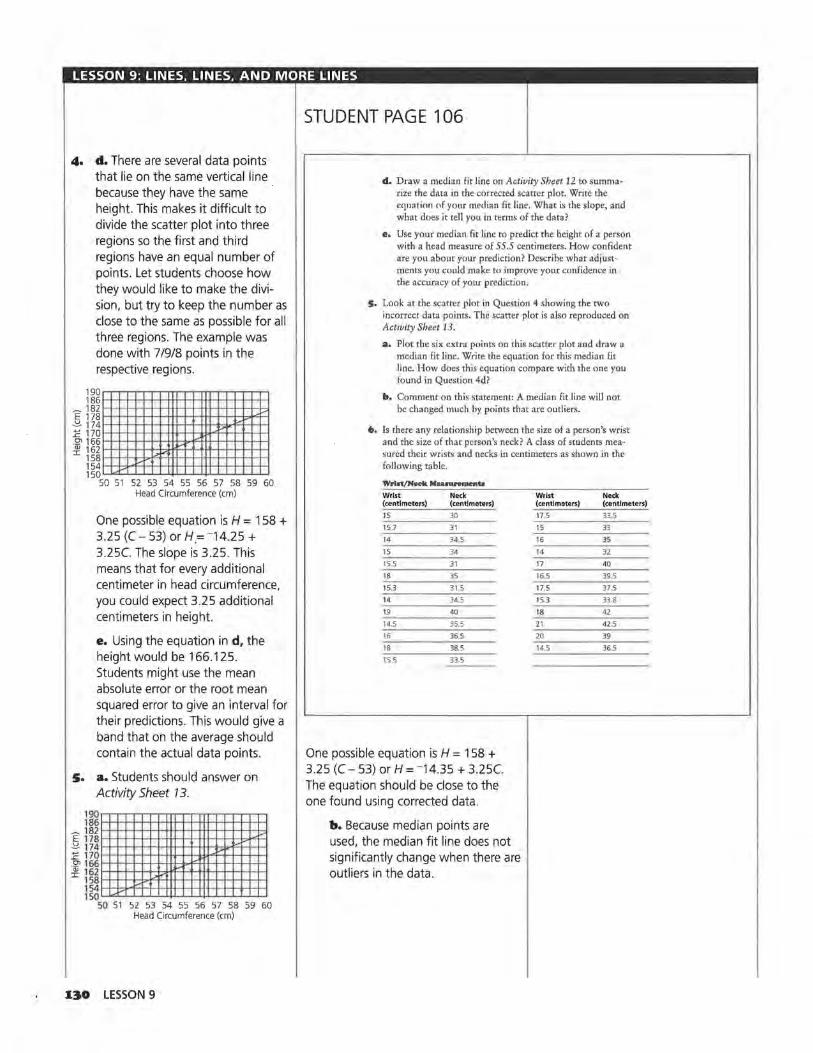
LESSON 9: LINES, LINES, AND MORE LINES
4. d. There are several data points that lie on the same vertical line because they have the same height. This makes it difficult to divide the scatter plot into three regions so the first and third regions have an equal number of points. Let students choose how they would like to make the division, but try to keep the number as close to the same as possible for all three regions. The example was done with 71918 points in the respective regions.
190.-r..,-,r'""'T'""T'""'1"""T""TTT"""T""..-r....-...-r-.---.-r-.-. 1861-1--HH-+-l-l-+++-+-+-+f-l--+-+-+-+-+-+-4
_ 1821-t--t-11-1-~-1-t-+++-+-t-tr~t-+-+-1-+-+-=1
E 1781--t-+-t-t-++-H-t+t-+-t+t-t-+-t---b+"l-i ~1741-1--HH-+-l-l-+++-+-++H-hl.<'i"'-l-I-~ E 1701-l--HH--l-l-t-~-l--l-l!l>r"'f+-l--'l-++-1 .~1661-1--HH-+-l-l-~1~¥'+H-t-t--l--l-I-~ w 1621-1--HH--l-l-b~:ct-~-+tt-l-l--l--'l-l-+-1 I 158 1-1--HH--!>-fq...++f-l-f-+H-t-t--l--t-t-~
154 1-1--bl."'f't-t+-1-t+-+-t-+l-l-+-rf-t-t-l-I 150'--"::1...J'-'--'-'-'-.J..µ-'-.1..-J.~J....L....L..J....L...L..J
50 51 52 53 54 55 56 57 58 59 60 Head Circumference (cm)
One possible equation is H = 158 + 3.25 (C - 53) or H.= -14.25 + 3.25C. The slope is 3.25. This means that for every additional centimeter in head circumference, you could expect 3.25 additional centimeters in height.
e. Using the equation in d, the height would be 166.125. Students might use the mean absolute error or the root mean squared error to give an interval for their predictions. This would give a band that on the average should contain the actual data points.
s. a. Students should answer on Activity Sheet 13. 190~~~~~~~~~~~~ 1861-+-t-t-+-t-+-t-t+t-+-+-t+ll-l--t-t-+-~
- 1821-1--H-l-+-l-+-~+-+-+-+H-l-l-+-H-4~~ E 1781-++-+-+-l-l--H-H-+-+-l+IH-+-l-b+-4--l ~1741-1--H-t-+-t-+-tt+-+-+-+tt-<t-.P~~=+-t-t~
E 170ri=f::1~+=!=t=lft::I:J4:!1=~~+:i=!=+::J:~ -~ 1661-
w 1~i-i:1=t=1~~~~ITT:l~~~ I 1581-1541-1-.....,,,.-"'f'-l-l-+-l-H-i-+-!+ll-l--l-1-l-+-!-I 15QL.l.<"--L...L..J-l....."-'-11-'-1-'-4.J.....1....L_L.JL....J.....~
so 51 52 53 54 55 56 57 58 59 60 Head Circumference (cm)
130 LESSON 9
STUDENT PAGE 106
d. Draw a median fit line on Activity Sheet 12 to summarize the data in the corrected scatter plot. Write the eqnation of your median fit line. What is the slope, and what does it tell you in terms of the data?
e. Use your median fit line to predict the height of a person with a head measure of 55 .5 centimeters. How confident are you about your prediction? Describe what adjustments you could make to improve your confidence in the accuracy of your prediction.
s. Look at the scatter plot in Question 4 showing the two incorrect data points. The scatter plot is also reproduced on Activity Sheet 13.
a. Plot the six extra points on this scatter plot and draw a median fit line. Write the equation for this median fit line. How does this equation compare with the one you found in Question 4d?
b. Comment on this statement: A median fit line will not be changed much by points that are outliers.
6. Is there any relationship between the size of a person's wrist and the size of that person's neck? A class of students measured their wrists and necks in centimeters as shown in the following table.
Wrlot/Neok Mea.IUJ'emenh
Wrist Neck (centimeters) (centimeters)
15 30
15.7 31
14 34 5
15 34
15,5 31
18 35
15.3 31 5
14 34 5
19 40
14.5 35,5
16 36 5
18 38.5
15.5 33.5
One possible equation is H = 158 + 3.25 (C - 53) or H = -14.35 + 3.25C. The equation should be close to the one found using corrected data.
b. Because median points are used, the median fit line does not significantly change when there are outliers in the data.
Wrist Neck (centimeters) (centimeters)
17.5 33.5
15 33
16 35 14 32
17 40
16.5 39.5
17.5 37.5
15,3 33.8
18 42
21 42 5
20 39
14,5 36.5

LESSON 9: LINES, LINES, AND MORE LINES
6. a. Using centimeters will make many of the values whole numbers or decimals that are easily graphed. If you measure in inches, almost all measurements will cluster around the same few values.
b. Students should answer on Activity Sheet 74. This example was done with 8/9/8 points in the respective regions.
44
- 42 E
.-'!- 40 ~ ~ 38 <lJ 'E 36 ::J
-~ 34 u -D 32 <lJ
z 30
28
~ lffiJ
, , /
I,
I/
I/ I/
--~ >- 2 / I .
I/ I / I
13 14 15 16 17 18 19 20 21 22 Wrist Circumference (cm)
A possible equation is N = 37 + 1.5(W- 17). The rate of change is 1.5; this means an increase in wrist size of 1 centimeter would predict an increase in neck size of 1.5 centimeters.
c. N = 37 + 1.5(17 - 17)
The neck size would be 37 centimeters.
d. For the equation given in b, the mean absolute error is 1.996 and the root mean squared error is 2.47. The line is within about 2 centimeters of the actual measurement. There is a considerable variability in the predictor, but it is fairly reliable.
STUDENT PAGE 107
I . .
a. Why do you think the measurements are in centimeters and not in a larger unit of measure?
b. The data are shown on the following scatter plot and also on Activity Sheet 14. Using the activity sheet, draw a median fit line on the scatter plot of the data. Write the equation of the median fit line. Describe the rate of change, and indicate what this tells you in the context of the data.
42 f---l-+-~--t--t--+--lf--l--+--+---t--..O.-+-+--lf--l--+--f--f--I
40 1---l-+--+----+--+--+--lf--l---1-~--1--1--1--6---1--t---l----l-~l--I
138 1---1-+--f--t--t--+--lf--l--+--+---t--r-+-+~lf--1---l--l---+--I ~ ~
~ 36 1---1--1--f---+--t---l---l~l---1--1--l--l---l----1---11--1---l--l--I-~
e 0 ~ 34 1---l-~--+---t--+---<i~u-+----+--+-+--lf--1---1--1--f--I--+-+~·~ z
32 1---1--1----f-.:O.--t---l---l·~l---1--1--l--l--1--~-~-+--l----l---l--I 0
301~-l--l--+--~--t---<i--l~l---t--1--l--l--+--+~lf--1---l--1--1--1
ZB '--"---'--'--'-_.L---'---1~._-'-__.._-'-_,__..___._--1'--'---'-----'--'--'
l2 13 14 15 16 17 18 19 Wrist Circumference (cm)
e. Predict the neck size of a person who has a 17-centimeter wrist measurement.
d. Find either the mean absolute error or root mean squared error for the median fit line you drew. What does this tell you about your prediction? How well do you think the line summarizes the data?
Sometimes you want to know what wrist size would predict a given neck size. To find out, you can use the graph of your line on the scatter plot, a table of values, or the equation of your line.
20 21 22
LINES, LINES, AND MORE LINES I3I

LESSON 9: LINES, LINES, AND MORE LINES
STUDENT PAGE 108
7. Note that students are only asked to describe methods. Numerical values are provided for reference.
a. You could look at the table of values for a neck size close to 35 . There are two of them, 16 and 18. From this you could estimate about 17 inches, but this is not based on the overall trend.
b. From the graph, locate 35 on the y-axis and move right to the line. Then go down to the scale on the x-axis to read the wrist size of about 16 inches.
8. A wrist size of 17 .2 centimeters would predict a neck size of 37 centimeters.
132 LESSON 9
7, Suppose the equation relating the wrist/neck data is N = 33 + 1.5(W - 14.5). What wrist size would predict a neck size of 35 centimeters?
a. Explain how you can use a table of values to find the solution.
b. Explain how the graph will help you find the solution.
Suppose you use algebraic properties to find the wrist size that would predict a neck size of 35 centimeters. You can rewrite the equation in an equivalent form and solve.
If the predicted neck size is 35, let N = 35 in the following equation:
N = 33 + 1.5(W-14,5)
35 = 33 + 1.5(W-14.5)
Distribute 1.5 and combine like terms.
35 = 33 + 1.5(W-14.5)
= 33 + 1.SW-1 ,5(14 5)
= 33 + 1.5W-21.75
= 11 ,25 + 1,5W
Since 35 = 11.25 + 1.5W, you must find a quantity that when added to 11.25 is 35.
35 = 11.25 + ?
Thus 23.75 has to equal 1.5W because
23.75 = 11.5 + 23 .75
So: 1.5W = 23.75
W= 23.75 + 1.5
W= 15.83
Therefore, a person with a wrist size of about 16 centimeters would have a neck size of 35 centimeters.
8. Using the equation in Question 7, what wrist size would predict a neck size of 3 7 centimeters?
SUMMARY
The median fit line for data points is one way to find a good line to represent the data.

LESSON 9: LINES, LINES, AND MORE LINES
Practice and Applications
~ liliJ
9. a. Answers will depend on class data. The relationship should approximate the line h =a. The slope is 1; for each inch increase in height, arm span is 1 inch longer. Students enjoy thinking of those who fit the equation nearly exactly as being squares and like to identify students who are squares as opposed to those who are rectangles. You might ask students to identify the "squares" on their scatter plots. Be sure students measure arm span from the back of the person.
b. The arm span is about 63 inches.
IO. a. y = 172x - 32 14 = 172x-32 46 = 172x
x = 46/172, or about 0.27
b. y = 172x - 32 y = 172(22) - 32 y= 3784- 32 y = 3752
c. y = 172x - 32 0 = 172x-32
32 = 172x x = 32/172 or about 0.19
d.y= 172x-32 y = 172(0) - 32 y=-32
II. a. 15 = 4 + 3(x - 8) 15 = 4 + 3x- 24 15 = -20 + 3x 3x= 35 x = 35/3, or about 11.67
b. 8 = 14 + -3(x- 2)
8 = 14- 3x + 6 8 = 20- 3x
3x,... 12
X=4
STUDENT PAGE 109
-... ... ...
• You can find the median fit line by separating the data points into three regions and finding the median point that represents the data points in each region.
• The median fit line is not sensitive to outliers because the median of a data set is not affected by extreme values.
• The median fit line can be used to. predict y from x, to interpolate or read between the known data points, to extrapolate or read beyond the known data points (recognizing the assumptions made in using the value), or to act as a summary equation for the data.
• You can predict outcomes by using the graph of the median fit line, by inspecting sets of ordered pairs generated by the equation of the median fit line, or by substituting a known value into the equation and solving for the unknown value.
Practice and Applications
9. Measure the arm span (in inches) and the height of each member of your class. (Arm span is the distance from the fingertip of your left hand to the fingertip of your right hand when your arms are outstretched parallel to the floor.)
a. Plot the data (height, arm span), and draw a line. Find an equation to describe the relationship.
b. Use your equation to predict the arm span of someone who is 63 inches tall.
i:o. Suppose y = 172x - 32. Find each of the following.
a. x, when y is 14
c. x, when y is 0
b. y, when x is 22
d. y, when x is 0
i:i:. Find the value for x in each equation.
a. 15 = 4 + 3 (x - 8) b. 8 = 14 + -3(x - 2)
c. 750 = 182 + 7x d. 330 = -120 - 7x
c. 750 = 182 + 7x 568 = 7x x = 81.14 ... , or about 81.14
d. 330 = -120 - 7x 450 = -1x x = -64.2857 ... , or about-64.29
LINES, LINES, AND MORE LINES I33
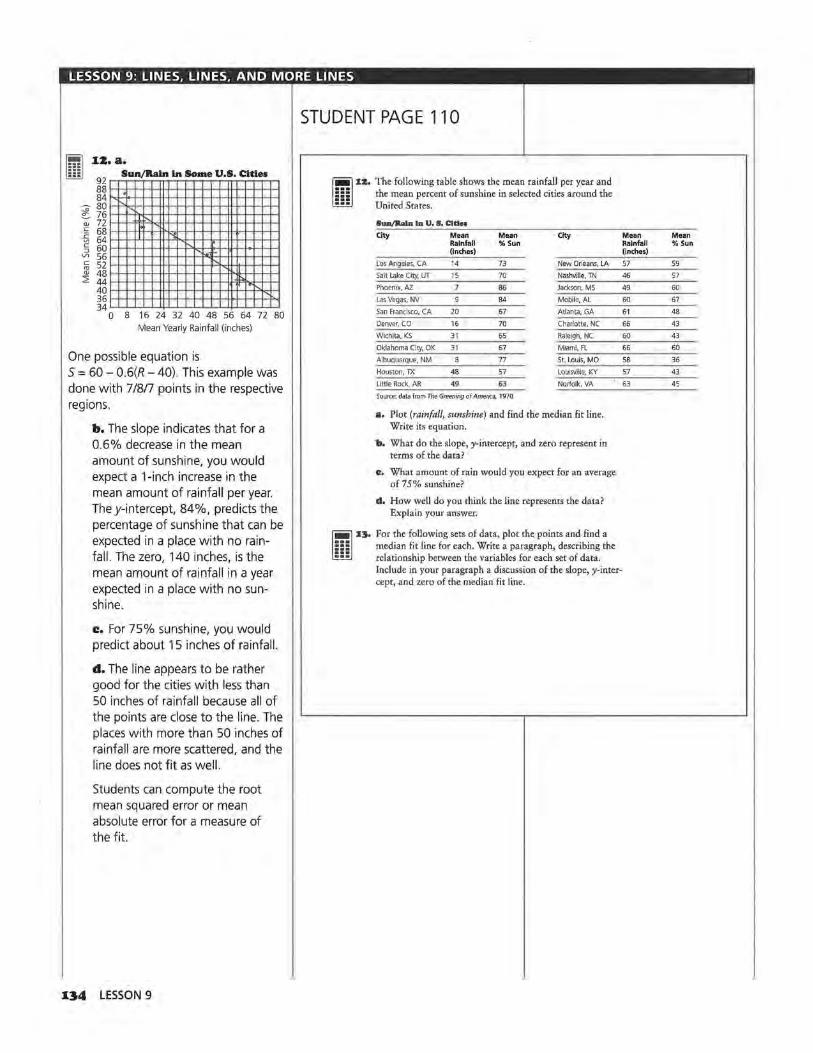
LESSON 9: LINES, LINES, AND MORE LINES
~ lillJ
IZ. a.
92 Sun/Rain in Some U.S. Cities
88 84 .
;-00
80 76
QJ 72
r-.. "
~ 68 "' 64 § 60 Vl 56 c 52 ~ 48
:::;? 44 40 36 34
"' I· ' I 'l
"-"·-·
"-
... ,_ '- . ,,
0 8 16 24 32 40 48 56 64 72 80 Mean Yearly Rainfall (inches)
One possible equation is S = 60 - 0.6(R - 40). This example was done with 7/8/7 points in the respective regions.
b. The slope indicates that for a 0.6% decrease in the mean amount of sunshine, you would expect a 1-inch increase in the mean amount of rainfall per year. They-intercept, 84%, predicts the percentage of sunshine that can be expected in a place with no rainfall. The zero, 140 inches, is the mean amount of rainfall in a year expected in a place with no sunshine.
c. For 75% sunshine, you would predict about 15 inches of rainfall.
d. The line appears to be rather good for the cities with less than 50 inches of rainfall because all of the points are close to the line. The places with more than 50 inches of rainfall are more scattered, and the line does not fit as well.
Students can compute the root mean squared error or mean absolute error for a measure of the fit.
134 LESSON 9
STUDENT PAGE 110
- %:&. The following table shows the mean rainfall per year and 5 5 5 the mean percent of sunshine in selected cities around the ::: United States.
-... ... ... ...
lun/RalD Inv. s. Cities
City Mean Mean City Rainfall % Sun (inches)
Los Angeles, CA 14 73 New Orleans, LA
Salt Lake City, UT 15 70 Nashville, TN
Phoenix, Al 7 86 Jackson, MS
Las Vegas, NV 84 Mobile, AL
San Francisco, CA 20 67 Atlanta, GA
Denver, CO 16 70 Charlotte, NC
Wichita, KS 31 65 Raleigh, NC
Oklahoma City, OK 31 67 Miami, FL
Albuquerque, NM 77 St. Louis, MO
Houston, TX 48 57 Louisville, KY
Little Rock, AR 49 63 Norfolk, VA
Source: data from The Greening of America, 1970
a. Plot (rainfall, sunshine) and find the median fit line. Write its equation.
b. What do the slope, y-intercept, and zero represent in terms of the data?
e. What amount of rain would you expect for an average of 75% sunshine?
d. How well do you think the line represents the data? Explain your answer.
I:J. For the following sets of data, plot the points and find a median fit line for each. Write a paragraph, describing the relationship between the variables for each set of data . Include in your paragraph a discussion of the slope, y-intercept, and zero of the median fit line.
Mean Mean Rainfall % Sun (inches)
57 59
46 57
49 60
60 67
61 48
66 43
60 43
66 60
58 36
57 43
63 45

LESSON 9: LINES, LINES, AND MORE LINES
~ 13.a. llliJ Price ol Used
15000 Ford Mustangs in X993
12000
r--.H-!"-3 9000
Q) u
t-... ·c 6000 "-
' "-I 3000
0 r "" 0 2 4 6 8 10 12 14
Age (years)
One possible equation is P = 10,500 -807(A - 1 ).
The slope is about -807°, they-intercept is about 11,307, and the zero is about 14. Student discussion should include interpretation of the slope (t.he price falls $807 every year); they-intercept (a new Mustang costs $11,307); and the zero (a 14-year-old Mustang has no value). Students might also find a measure of error to determine how well the line seems to fit the data. The mean absolute error is $5311, and the root mean squared error is $6582. The points that are quite far from the line cause the root mean squared error to be somewhat larger.
80
]' 76 u c
';:; 72 ..c O"l ·a; 68 I
64
b. Men's Shoe Sius/Helgbb
~
~ ......
~ ,....
v -i..-
,....
6 7 8 9 10 11 12 13 14 Shoe Size
One possible equation is y = 75 + 1.5(x- 13.5). This example was done with 5/6/5 points in the respective regions.
The slope is about 1.5, they-intercept is about 55.75, the zero is about -37 .17. Student discussion should include interpretation of the slope (with an increase of one shoe size there will be an increase in
STUDENT PAGE 111
a. Tlie prices of used Ford Mustangs are shown in the following table.
Prloe• ol Used Ford Munanp from Clauilled Ada In I993
Year Age Price
1980 14 $900
1980 14 575
1983 11 1,950
1985 9 2,695
1986 8 1,795
1986 8 1,695
1986 8 2,500
1987 7 7,495
1988 6 4,300
1988 6 6,800
1988 6 8,495
1990 7,295
1990 11,995
1993 8,493
1994 12,799
b. The following table, which has been used by the Federal Bureau of Investigation in shoe print studies, shows the heights and the shoe sizes of males.
MailG Hfilgl1t • nd Sh.on Siu
Height Shoe Size Height Shoe Size (inches) (Inches)
65 6 70 11
66 6.5 72 11
68 7 72 10.5
67 7.5 73 11-5
68 8 73 12
68 8.5 75 12.5
69 g 77 13
70 9.5 79 14
Source: Footwear Impression Evidence, 1990
~ x4. Collect a data set with at least 15 pairs of data that you
think may have a linear relationship, and then plot the data. Using what you learned in this unit, answer each of the following questions.
a. Draw a line to summarize the relationship, and explain how it can be used to predict values,
height of 1.5 inches); they-intercept (a person with shoe size 0 is 55.75 inches tall); and the zero (a person 0 inches tall would wear shoe size -37). Note that the zero and y-intercept do not have real meaning in this context. Students might find a measure of error to determine how well the line seems to fit the data.
The root mean squared error is 1.06, while the mean absolute error is 0.73. On the average, an
estimated height based on shoe size will have an error of about 1 inch.
LINES, LINES, AND MORE LINES 135

LESSON 9: LINES, LINES, AND MORE LINES
~ liliJ
I4. These answers will depend on the data students collect.
I3• LESSON 9
STUDENT PAGE 112
b. Do you think your hypothesis about a linear relationship is correct? Why or why not?
c. How reliable do you think a prediction based on your line will be? Explain your answer.
d. Find an equation for the line you drew. Write two questions that could be answered by using your equation.
LESSON 10
A Measure ol Association Materials:: graph paper, pencils or pens, rulers, Activity Sheets 15-16 Technology: graphing calculators (optional)
Pacing: 2 class periods
Overview
This lesson introduces finding a measure of correlation between two sets of data by using a simplified method to approximate the correlation coefficient. It is important for students to recognize that this number is a measure of the strength of the relationship between two variables and not a measure of how good a linear model is for the data. Students explore positive, negative, and zero correlation in a variety of contexts. They also investigate situations where correlation might be confused with cause and effect in order to unde.rstand the relationships within a situation.
Teaching Notes
The activities are intended merely to give students some understanding of correlation using a method of approximation. Students should not formalize the concept of correlation at this stage but keep the concept at an intuitive level. Some students may confuse correlation with slope, but remind them that slope can be of any magnitude while the correlation coefficient is from -1 to 1. A data set that is not linear can have a very high correlation while a data set that has another pattern, for example, a quadratic curve, can have zero correlation. The first step in thinking about correlation is to inspect a scatter plot of the data to determine whether it is even reasonable to fit a straight line. Correlation can indicate which of two data sets seems to have the stronger measure of association between the two variables; it can help quantify
the strength of that association. Correlation does not justify that a line you drew is the line of "best" fit. For further information about correlation, see Exploring Least Squares Regression, another module in the Data-Driven Mathematics series.
Correlation is easily misinterpreted. Negative correlation is often treated the same as zero correlation. For both negative and positive correlation, there is a definite pattern: For negative correlation, as one variable increases, the other decreases; and for positive correlation, as one variable increases, the other increases also. Zero correlation indicates that there is no pattern: Some small values are paired with large values, and some small values are paired with small values.
Correlation is also often confused with cause and effect. When two variables are correlated, the relationship can be due to some other factor: one of the variables might cause the other variable, or the relationship between the two could be coincidental. A classic case of the cause-and-effect confusion occurred many years ago: The relationsb.ip between the number of storks and the number of newborn babies in Sweden showed a high correlation. Therefore, it was thought that storks caused an increase in the number of babies. However, in fact, as more babies were born and the population increased, more houses were built and therefore more chimneys were present-and storks lived in chimneys. The media often report a causal relationship at schools (high rates of violence correlate with increased stress) when, in fact, both variables are connected by another factor such as an increase in population.
A MEASURE OF ASSOCIATION 137

Technology
Students can make the scatter plots usip.g technology but should do the counting by hand to estimate the correlation coefficient.
Follow-Up
Students might check newspapers and magazine articles for instances in which correlation is used. Often the term association is used or it is said that one factor causes another. Ask students to think about other factors that might be involved in such cases.
138 LESSON 10

LESSON 10: A MEASURE OF ASSOCIATION
STUDENT PAGE 113
A Measure of Association
LESSON 10
"Grades are correlated with homework!" "The use of Vitamin E is correlated with a decrease in strokes." "There is a correlation between exercise and human longevity."
What do these statements mean?
What does it mean when two variables are correlated?
T he scales on the axes can distort your perception of the pattern in a scatter plot. Scatter Plots A, B, and C show
the same data graphed on grids with different scales. Which of the scatter plots looks most linear? Although it is important to look at the scatter plot to see if the data seem linear, a numerical measure can help you make a judgment about the relationship between the variables that is not dependent on the scales used in the scatter plot.
60 Sea-Plot A
55
50
45 D
40 D
35 D
30
25 D
20 ~-'-~--'~~-'-~--'~~-'--'
-10 0 10 20 30 40 50 60 70 80 90 Data Set 1
. : Determine the strength
of a linear relationship by finding a measure of
correlation. Understand the connection between
correlation and cause/effect.
A MEASURE OF ASSOCIATION I39

LESSON 10: A MEASURE OF ASSOCIATION
STUDENT PAGE 114
:140 LESSON 10
100
90
80
70
N 60
3i 50 ~ D 40
30 Cl
20
10
0 -4 4
55
50
45 N
~ 40
~ 35 D
30
25
20 -4 0 4
Soatter Plot B
Cl
12 Data Set 1
Scatter Plot c
Cl
12 Data Set 1
Cl
16 20 24
Cl
16 20 24
Correlation measures the strength of a linear relationship. If the data points form a pattern that looks very much like a straight line, the correlation is called strong. If the data points are scattered or form a circle or large oval, the correlation is called weak.
What is the strength of the association or correlation between height and weight? Should you use a line to predict the weight of a person if given a height?
INVESTIGATE
Correlation Between Height and Weight
In Lesson 9, you fit a line to the data by separating a scatter plot into three regions. To estimate the value of the correlation coefficient, you also begin by separating the scatter plot into

LESSON 10: A MEASURE OF ASSOCIATION
STUDENT PAGE 115
regions. This time, however, you will separate the scatter plot into nine regions, like a tick-tack-toe grid.
First, count the number of data points (N) and divide N by 4 (because you are interested in the 4 corner regions). Recall that there were 25 people in the (height, weight) scatter plot, so in this example, 25 + 4 = 6.25. Disregard the decimal part (0.25) of the number and use the integer part, called I. In this example I = 6. (This function I is called the greatest integer function and can be written as [6.25] = 6.)
Count 6 or fewer points from the top of the scatter plot and draw a horizontal line as shown here. (If there arc "ties," or two points with the same y-coordinate, count fewer than the value of I.)
230 Senloro' HeJabts/Wdahb
220
210
200 0
190
180
:(! 170
! 160
.i= 150
f 140 0
130 0
120
110
100
90
80 60 62 64 66 68 70 72 74
Height (inches)
0
76 78 80
A MEASURE OF ASSOCIATION I4I

LESSON 10: A MEASURE OF ASSOCIATION
STUDENT PAGE 116
J.4Z LESSON 10
Now count 6 or fewer points from the bottom of the scatter plot and draw another horizontal line as shown in the following scatter plot.
230 .---,.--,--,---,.--,--,--Se=rnl~oTr~•~' ~H~elgh:;::,;~qTfW_;,:,::'d~llh"'°'hl:.._~-,--.--,----.---,.---,
220 f--+--+-l---+--+-l---+--+-l---+--+-l---l--+--ll---l--l---1'--+--I
2101~-+--+-l---+--+-l---+--+-l---+--+-l---l--+---ll~+---+--l-+--I
2001~-+--+-l--+---+-l---+--+-l---+--~~,l---+--+---ll--+---+--l-+--I 0 '
1901~-+--+~l---+--+-l---+--+-l---+--+-l---+---f---ll---'F--~--l-+--I
180 1---1--+-l--~--+-l---+--+-l---l--+--ll---l--+---ll--+---+--l-+--I
~ 11o t--+---+-l--+--e-1---1--1--1---1--1.--11---1--+---11--+---+--1-+--1 ], 160 1-:::j::=l::::::::j:::::j::=:j::::::::j:::::j::=:j:::::::l==:f::=l:::::::,l==::j:::::::j:::::::l===l=
0=l:=-l--l--.j
-§. 150 1---1--+-l---l--+-l---+--+~•>--+--+-l---+--+--l---+--+---lr-+--I
~ 140 1---+--+-1--~-o•+---l-~)--ll--~-+-~0-~-+-l--+--+-l--+--+---'f.--1 130 1~-+--+-l--~--+--'~-+--O-l---+--+-l---!--f---ll--+--l---11--+--I
0
120l-==l==F=l=='i-F=9=9==F=9==11==1=9==F=l=='i-F=9=-+--+-~
110'- ~ '
100 1----t---+---,l~-+--+-l---+--+-l---+--+-l---+--f---ll--+--+--l-+--I
901~-t--+-i---t--+-i---t--+-t--~--+-t---+---+---;1-,l---l--l---+---I
8060'---'--6~2-'--~64'---'--6L6--1-6L8_L_~70--'--7L2--L-7L4--1'--7~6-'--~78--'--'8Q
Height (inches)
Count 6 or fewer points from the left and 6 or fewer points from the right, and draw two vertical lines. Any line you draw should not pass through a data point. Now you have a ticktack-toe grid on your scatter plot as shown on the next page.
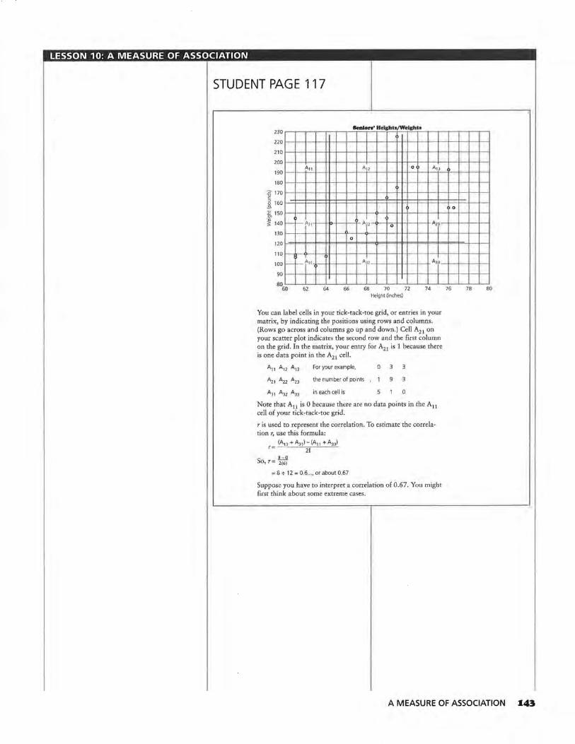
LESSON 10: A MEASURE OF ASSOCIATION
STUDENT PAGE 117
230 r-"'T'""""T~.-.----,-~.-lenl=r==oTr~•~· rH~•lll.:;=h="T/'#~•rlli~h,u-=--,---,---,~-,--.---,,.......,
220 1--+--+~+--H-+~+-+--+~+-+--l-+-l--+--l-~l--+--+~l--+--I
210 1--+--+~l---H-l-~l--+--+~l--+--l-+-l--+--+~l--+--+~l--+--I
2001~-1--1-~!---H-l-~!---l--l-~!---l--+-l-!---l--l-~!---l--l-~!---l--l
190 l~-l--tA~1 ~1l---H-+~l--+--A+12'--l--+--l-+-l--o+--l--A~1~3 --l'---f--+--l~I 1801~+--+~+--H-+~+-+--+~l--+--1--1-1--+--+~l--+--+~1---1--
62 74
You can label cells in your tick-tack-toe grid, or entries in your matrix, by indicating the positions using rows and columns. (Rows go across and columns go up and down.) Cell A21 on your scatter plot indicates the second row and the first column on the grid. In the matrix, your entry for A21 is 1 because there is one data point in the A21 cell.
A11 A12 A13
A21 Azz A,,
A31 A32 A33
For your example,
the number of points
in each cell is
0
9 3
0
Note that A11 is 0 because there are no data points in the A11 cell of your tick-tack-toe grid.
r is used to represent the correlation. To estimate the correlation r, use this formula:
(A13 + A31 ) - (A11 + A33) r= 21
So, r= ~(6~ = 8 + 12 = 0.6 •.• , or about 0.67
Suppose you have to interpret a correlation of 0.67. You might first think about some extreme cases.
76 78 80
A MEASURE OF ASSOCIATION I43

LESSON 10: A MEASURE OF ASSOCIATION
Solution Key
Discussion and Practice 1. a.
~ ~
"' > :!..,
100
90
80
70
60
50
40
30
20
10
0 0
D
Correlation ol :IO Points D
D
D
D
D
D
D
D
D
2 4 6 8 10 x-values
In this example, I= 5.
... 100
Correlation ol :IO Points
VI QI :;)
'iii > :!..,
z.
90
80
70 D
60 D
50 D
40
30
20
10
0 0
D
D
0
D
2 4
A13 = A31 = 5
A11= A33 = 0
6 x-values
D
D
L
8 10
c. r = [(5 + 5) - (0 + O)) + 10 = 1
d. No, the calculation would be r = [(8 + 8) - (O + O)) + 16 = 1.
a. True. It is clear that if the points are in a line with a positive slope, all the points will be in A31 , A22 ,
and A13 . This means the numerator will be A31 + A13 - 0 which will be 21 or 2 times the number of points in the corners. Thus r will be 1.
It. True, the argument is the same as in a.
144 LESSON 10
STUDENT PAGE 118
:J.
Di•eusslon and Practice
1. Suppose you are given 20 points that form a straight line with a positive slope.
a. Make a sketch of what the scatter plot might look like. What is I?
b. How many points will lie in A 13 ? In A 11 ? In A31 ? In A 33?
ci. Findr.
d. Will r change if you are given 32 points to determine the line instead of 20?
:&. Jo-Jo plotted points for three straight lines and found the correlation for each. The conclusions he drew are shown here. Decide whether or not he was correct in each case, and explain why you agree or disagree with him.
a. If the points are in a straight line with a positive slope, then r = 1.00.
b. If there are no points in cells A11 and A33, then r = 1.00.
Cl. If the points are in a straight line with a negative slope, then r = -i.oo .
d. If the total number of points in A11 and A33 is the same as the total number of points in A13 and A31, the correlation is 0.1.
3. Estimate the correlation for each of the following two scatter plots. Use Activity Sheet 15 for your work.
a. Scatter Plot A 200~~~--.--.-~~-.-~~-.-~~-.-~~-.-~~-.--.---.--.--
180 1--~--+--l--+--+--l__,l---l--l----+--l--+--+--l--ll-t.--1--!--+--r-t--
1 60 1---l----+--t--+--+--l--ll---l--l----+--l--+--~--l--l~bc-~0 -+--l--ll--l-1401---1----+--1--1--+--1--'f--+--+----+--+--1--+--1--1f--+-=0+--1--1--1--
0 N 1201---l----+--t--+--+--l-f--·l---l----+--f--l-~+~--ll---f-+--+--f---f--~ Q "' 0
~ 100
o 80 l---l- -+--+--1-0-+--l-f--1-0"--t---1--J·o•-+--l---+--l-f--+--l----+--+---I
601--~--l-~--+--+--ot--:l:--1--l----+--l--f---1---1--11--t-+--+--f---t--I
40 f--+--t--+--t--+--+--t-t--+--t--+--+--+-t--l-f--1-1--·I--+-~ 0
20f--+--l----+--+--..l---+--l-l--·l--t--+---l--!---+--l-f--+--t--+--t---I
O'--"---'--'--'---'---L---'~'--"--'---'--'---'---L---'-'--..___.___,__.__, 0 2 4 6 8 10 12 14 16 18 20 22 24 26 28 30 32 34 36 38 40 42
Data Set 1
c. True, because when A11 + A33 is subtracted from 0, the numerator is negative. The rest is similar to a.
SClatter Plot A 200,...,.-,--,--,....,-,-,--,--,--,,.-,.........,.....,...,.,-,--.....,... ......... ~ 180 H--H--l-l+-+-+-l--l--H-t-+-+·l+r-l--l--H-+-1
N 1~g l::j::t$=!!1:$1:$1:1$:Et:;l:!$:t=i:=l=l:t:l ~ 120 1-
d. No, in this case r will be 0 because 0 - 0 = 0 + 21, or 0.
Students should answer on Activity Sheet 15.
a. Scatter plot A: r = [(5 + 4) -(O + O)) + 10 = 0.9
Vl 100 l--l--H--l-l+-+-+-l--l--H--1-+-+iHl--l--H--1--1 ~ 80 H--H-n.H--Hl.l.1 "H-t-1H-+tl-f--H-HH
~ 60 f-'ttj;;;j;j;l;:t;-tt;tti:tti;~!;;ttl~ 40 I= 201-++-1-+id--l--l--l--l--H-t-+-++!-l--l--H-+-1 00 4 8 12 16 20 24 28 32 36 40
Data Set 1

LESSON 10: A MEASURE OF ASSOCIATION
STUDENT PAGE 119
3. b. Scatter plot B: r:::: [(1 + 2) - (1 + 2)]+10::::0
Scatter Plot B 10~~~~~~~-.-.,-,--.--,-..--.--.--r-o
651-+-+--l-H-+-+--+-l-+-+-ll-lf-l--+-+-l-+-+-t 60 1-+-+--1-11-+-l--t-l-+-+-ll-lf-l--+-+-l-+-+-t 551-+-~·l-IH-~-l-+-+-H~-l-+-l-+-1-1-1-~
50 1-:J:~t=lt:l=l~t:J:=!=l!=t::t=lt=t:l=I~ <:t 45 i= ~ 40 1-+-+--1-11-+-l--t-l-~-+-ll-lf-l--+-+-l-+-+-t ~ 351-+-+--l-IH--l-~l-+-1-11-lf-l--l-+-l-+-+-t ~ 301-+-+--l-ll"+-l--+-l-+-1-11-lf-l--l-+-l-+-+-t a 25 ,_,..,.._ ......... ,.....-+-..._,>-+-+-•t-t-+--+-+-t-+--+-<
20 ....... -+--l-tt-+-+-+--t-+-t-lt-l--+""+-+-t-+--+-< 15 •-+-t--+-H-+-+-+--t-+-t-l>-t-t--+-+-<-+--+-< 10 •-+-t--+-H-+-+-+--t-+-t-tt-l-t--+-+-<-+--+-<
5 1-t-+-+-tt--t-t-+-t-t-t-tt-J:-t--+-+-1-1--t-t O'-"-+-..._~-+-_,_~-+-~-'--+-~_,_~
0 4 8 12 16 20 24 28 32 36 Data Set 3
4. a. For a set of points with a negative correlation, the line of fit would have a negative slope. There would be more total points in cells A 11 and A33 than in A 13 and A31 .
b. The following is one possible set. Students should understand that data with a negative value of r will tend to go from upper left to lower right.
70 Negative Correlation of zo Points
65 1-+-+--t-111-+-+-+-lf-l--+-H+-t--l-f-t-t-+-I 601-+-t-+-111-+-+-+-lf-l--+-H+-t--l-f-t-t-+-I 55 1-+~t-l:H-+-!f-l--l-t-+i+-+-I-+-+-!-+~ 501-+-+--l-H-+-+--l-1-+-+-+til-+-+-+-1-+-+-1
~ 45 1-+-+--l-ll-l--+-+-!-7+-+-+til-+-+-+-1-+-+-1 w 40 1-1-+--t+H-+c-+-+-l-+-+-++lf-l--+-+-l-+-+-I il 35 l=t:=t=:t=111=!=::j:::p:j::::j:~t:t:l=l==l==~=l==l=I ~ 30 1-+-l-+-llF+-+-+-lf-l--+-H+-t--l-f-t-l-+-I
251-+.+-+-111-+-+-+-i.-!--+-H+- r+-1-t-+-+-1 201-1--1-1-11-l-l-!-+-l-++i-l-l""l-l-++-1-4 15 1-+-l-·l-IH-+-!-+~-l-++l-'t-l-l-+-I~ 10 1-1--1-+-llH·-l-+-l-l--l-+-+l-t--l-f-t~'l-+-I 5 1-1--1-+-111-+-+-+-1-+-+--1-+!-t-+=-!-t-+-+-1 0o 4 8 12 16 20 24 28 32 36
x-values
r = [(O + O) - (3 + 4)] + 1 o = -o.7
c. A set of data with a negative correlation falls from left to right. A set of data with a positive corre.lation rises from left to right.
b. 70 scatter Plot B
0
65
60
55 0
50 ' 45
0
40
35
30 0
25 0
20 0
0
15
10
O '--><--'--'-~~'--~~-+--'----'~.__..._.....__,___.~.__..._-+-~
0 2 4 6 8 10 12 14 16 18 20 22 24 26 28 30 32 34 36 38 Data Set 3
4. Consider a set of points with a negative correlation.
a. If a set of points has a negative correlation, describe a possible line of fit for those points. How would a negative correlation affect the numbers in the cells of the matrix?
b. Give a set of points with a negative correlation and estimate r.
c. Describe the difference between positive correlation and negative correlation.
• A correlation close to 1 indicates a strong positive relationship between the variables. The data points show a pattern close to a straight line with a positive slope.
• A correlation close to -1 indicates a strong negative relationship between the variables. The data points show a pattern close to a straight line with a negative slope.
• If the correlation is close to 0, there is no relationship between the variables. The data points show a circular pattern or a pattern that is not linear.
A MEASURE OF ASSOCIATION I4S

LESSON 10: A MEASURE OF ASSOCIATION
lm1 5. a. The following table contains . all of the whole-number possibili-ties for the rectangle . Students may use rational numbers also.
Length Width Area
24 24
2 23 46
3 22 66
4 21 84
5 20 100
6 19 114
7 18 126
8 17 136
9 16 144
10 15 150
11 14 154
12 13 156
13 12 156
14 11 154
15 10 150
16 9 144
17 8 136
18 7 126
19 6 114
20 5 100
21 4 84
22 3 66
23 2 46
24 24
b. P = 2(5 + 20) = 50, thus the perimeter is 50 as required.
146 LESSON 10
STUDENT PAGE 120
c. 28 26 24 '-22 20 18
.<::: 16 -t) 14 ~ 12
10 8 6 4 2 0
0
s. Refer to the table below.
a. Find at least 18 sets of possible values for the length, width, and area of a rectangle with a perimeter of 50 feet. Then add your values co the table started below.
Rectangle wltb P = so feet
Length Width Area (feet) (feet) (square feet)
s 20 100
b. Explain why 5 and 20 are possible values.
c. Plot each of the following sets of ordered pairs: (length, width) and (length, area). Then estimate the correlation. If the data appear linear with a correlation close to 1, draw a line that fits the data and write its equation.
d. What conclusion can you make about correlation based on your findings in c?
6. Refer to the scatter plots at the beginning of this lesson. The approximate corr~lation for Scatter Plot A is 0.25.
a. What do you think the correlation will be for Scatter Plots B and C? Explain your answer.
b. The following scatter plot is the inverse of Scatter Plot C. The inverse is formed by reversing the x- and y-values in each of the ordered pairs so that (10, 22), for example, has been plotted (22, 10). What is the estimated correlation coefficient for the data in this inverse scatter plot?
24 Scatter Plot C, lnTene
201--+--l--l---l--+---l-<>--l
16 1--+--+--+--a,....._-+--+~1
~ 12 a ~ si--+--1--1---1--,,r---l---t o a
4 1--t0,.-f.~ID-l---l--l--I II
-4ao 25 30 35 40 45 50 55 Data Set 2
LenctJts and Widths for P = so The correlation is -1; the equation is W = 25 - L.
'
' ' '
" " '
';<.,.
" '1-.
4 8 12 16 20 24 Length
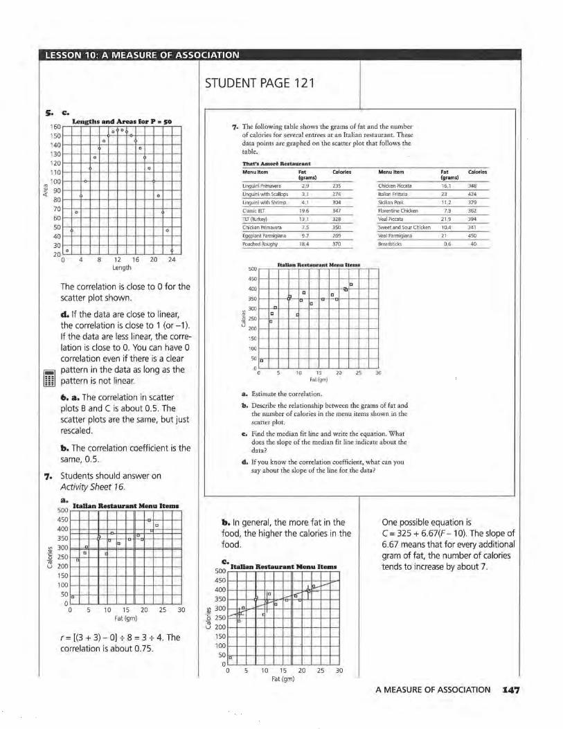
LESSON 10: A MEASURE OF ASSOCIATION
s. c.
"' ~ <(
160 150 140 130 120 110 100 90 80 70 60 50 40 30 20
0
0
Length• and Areas l!or P = so
0
0
0
4 8
0 0
0
0
0
0
12 16 20 24 Length
The correlation is close to 0 for the scatter plot shown.
~ llliJ
d. If the data are close to linear, the correlation is close to 1 (or -1 ). If the data are less linear, the correlation is close to 0. You can have 0 correlation even if there is a clear pattern in the data as long as the pattern is not linear.
6. a. The correlation in scatter plots B and C is about 0.5. The scatter plots are the same, but just rescaled.
b. The correlation coefficient is the same, 0.5.
7. Students should answer on Activity Sheet 16.
V> Q)
"8 ;;; u
a. 500
Italian Restaurant Menu Items
450 400 350 300 250 200 150 100
D 50 0
0
n
c <
5
-[]
-1a [] - -
c
10 15 20 25 30 Fat (gm)
r = [(3 + 3) - O] + 8 = 3 + 4. The correlation is about 0.75.
STUDENT PAGE 121
V> Q)
"i:'. 0 ;;; u
7. The following table shows the grams of fat and the number of calories for several entrees at an Italian restaurant. These data points are graphed on the scatter plot that follows the table.
That'• Amori Restaurant
Menu Item Fat Calories (grams)
linguini Primavera 2,9 235
linguini with Scallops 3.1 276
linguini with Shrimp 41 304
Classic BLT 19.6 347
TLT (Turkey) 13.1 328
Chicken Primavera 7.5 350
Eggplant Parmigiana 9.7 269
Poached Roughy 18.4 370
Jtad.a.o. B.e.tt.u r ant Me_n.u l t em.1 500
450
400
350
~ 300 -" 0 250
~ 200
150
100
50 "
0 0
n
" "
" u "
c
10 15 Fat(gm)
a. Estimate the correlation.
" "
20 25
Menu Item
Chicken Piccata
Italian Frittata
Sicilian Pork
Florentine Chicken
Veal Piccata
Sweet and Sour Chicken
Veal Parmigiana
Breadsticks
30
b. Describe the relationship between the grams of fat and the number of calories in the menu items shown in the scatter plot.
c:. Find the median fit line and write the equation. What does the slope of the median fit line indicate about the data?
d. If you know the correlation coefficient, what can you say about the slope of the line for the data?
Fat calories (grams)
161 348
23 424
11 .2 379
7.9 362
21 .9 394
10.4 341
21 450
06 40
One possible equation is b. In general, the more fat in the food, the higher the calories in the food.
c. 500
Italian Restaurant Menu Items
C = 325 + 6.67(F - 10). The slope of 6.67 means that for every additional gram of fat, the number of calories tends to increase by about 7.
450 1 lci..--400 ., D
~ -6'" 350 300 n ~ ria , __
j:l: c 250 []
200 150 100 50~1D_,__,.__,__.--",___.__.,__,_--+--+--l-~I
o~~~~~~~~~~~~~
0 5 10 15 20 25 30 Fat (gm)
A MEASURE OF ASSOCIATION I47

LESSON 10: A MEASURE OF ASSOCIATION
STUDENT PAGE 122
7. d. The slope of a line and the correlation coefficient can be the same only if all of the data are in a line and the slope of that line is either 1 or -1. Otherwise, the slope and the correlation coefficient will have the same sign, but no other connection.
8. a. The association has to do with age. Young people have small feet and can read little if any, but then children grow, go to school, and learn to read. Once they reach a certain age, their reading ability and shoe size should not be related at all, but since the relationship is strong in the early years, there is a correlation.
b. This is close to true. Students who do homework spend more time on school work and learn by doing their homework. These factors contribute to their doing well in school. It is not clear whether just doing homework without thinking would improve school performance.
c. The statement that the more education you have, the better job you can get and the more money you can make, appears to be true. In this case, there seems to be a direct correlation.
d. This is most likely because the players who make a lot of points play longer than other players and are more likely to be aggressive players. For this reason, these players also make more fouls. However, it is possible to make a lot of points and not make a lot of fouls. Both could be a function of the time played.
I48 LESSON 10
Correlation is often confused with cause and effect. A strong correlation between two variables does not necessarily mean that in the relationship one variable caused the other one to change. The changes in the variables could have been caused by some other factor or the correlation could be coincidence.
8. There is a strong correlation in each of the following. Discuss what you think might cause the association, and discuss whether the statement inc makes sense. Is there a third factor in statements c and d that could have caused both variables to change?
a. Small children have small feet and cannot read well. As they grow older, the size of their feet and their reading abilities increase, so there is a strong correlation between foot size and reading ability. Therefore, big feet cause people to read well.
b. Students who do homework learn what they are supposed to learn for a class. There is a strong correlation between the amount of homework students do and the grades they get in a class. Therefore, doing homework causes students to get good grades.
c:. "Get a good education and you'll get a good job . ... a CNI study of U.S. Census data suggests that there is a direct correlation between education and income levels. The suburbs with the wealthiest population and the highest property values are also the ones with the highest percentage of college graduates .... the community that has the most adults without a high school diploma is West Milwaukee ... ranks dead last in median household income and median home value." Source: Tri City Hub, October 21, 1993.
Does having an education cause you to have a higher income?
d. In a certain game, there was a high positive correlation between the number of field goals basketball players made and the number of fouls they made. Therefore, if you would like to make a lot of points, you should make a lot of fouls.
SUMMARY
Correlation is a measure of the strength of the linear association between two variables.

LESSON 10: A MEASURE OF ASSOCIATION
Practice and Applications
9. a. positive correlation
Amount ol Pay
~ ., 0 ""<' "' ::;;;:
0 ~ c 0
0 :::;:
0
0
0
Hours Worked
b. negative correlation
Amount Saved
0
0
fa 0 ""Cl ., > "' 0 Vl
;\;' c 0 ~
0
0
Money Spent
c. zero correlation
Amount Saved
0
0
§ ""Cl ., 0 > "' Vl
t: ::>
0 0 0 E <(
()
0
Hours Worked
STUDENT PAGE 123
., E ;::
• Correlation is always between 1 and -1: -1 ~ r ~ 1.
• If the pattern in a scatter plot is close to a straight line, the correlation will be strong, and the absolute value of r will be close to 1.
• If the pattern in a scatter plot is scattered and not a straight line, or if the pattern is not linear, the correlation is weak and the value of r is close to 0.
• The scales used in a scatter plot do not affect the correlation.
• Correlation is only a measure of linear association. It will not tell you about any other relationship that may exist between the variables.
• For a perfect positive correlation of 1 or a perfect negative correlation of-1, if you know one variable, you can exactly predict the value of the other.
• A strong correlation between two variables does not necessarily indicate that there is a cause-and-effect relationship between the variables. There are often other variables that are involved in the association.
Practice and Applications
9, Sketch a scatter plot that you think reflects each of the following statements. Indicate either a positive, negative, or zero correlation for each.
a. The more hours you work, the more money you make.
b. The more money you spend, the less you save.
c. Some people work long hours and save a lot of money; some people work long hours and do not save a lot of money.
d, The faster you drive, the less time it takes to arrive at your destination.
e. The older you get, the less sleep you need.
I!. The more hours you spend exercising, the more calories you burn.
g, Some people study for many hours and get good grades; some people study very little and get good grades. Some people study many hours and get poor grades.
d. negative correlation e. negative correlation
Driving Time Amount ol Sleep
0 0
0
0 0
0 0
0
0 0 0
0
0
0
Miles per Hour Age (years
A MEASURE OF ASSOCIATION I49

LESSON 10: A MEASURE OF ASSOCIATION
9. I. positive correlation
Calories Burned
0
0
0
0
0
Hours of Exercise
g. no correlation
IO. a.
90 80 70 60
~ 50 .§l 40
30 20 10 0
0
Study Time/Grades
0 0
0
0
0 0
Hours of Study
Reading Scores/ Per Pupil Spending
0 0
0
Q
0
0
2200 2400 2600 2800 3000 3200 3400 3600 Spending ($ per pupil)
r = [(O + O) - (3 + 1 )] + 8 = -o.5
ISO LESSON 10
STUDENT PAGE 124
-... ... ...
10. The following data show the amount spent per pupil and the reading scores of seventh graders in each middle school.
Mllwiuiltee Middle 9'>11<><>1 Pa r Pupil Spending • nd Roodlnfl Scorn
Middle School Spending Reading (per pupil) Scores
Fulton $3,408 16
Robinson 3.306 36
Wright 3.274 46
Kosciuszko 3.049 33
Parkman 3.006 13
Edison 2.975 27
Roosevelt 2,970 54
Walker 2,787 35 Muir 2.783 30
Bell 2.710 34
Sholes 2,649 29
Burroughs 2,642 32
Webster 2,637 46
Audubon 2,609 52
Steuben 2,548 55
Fritsche 2,525 41
Morse 2,374 81
Source: data from Milwaukee Journal, May 25, 1992,
a. Plot the reading scores as a function of per-pupil spending (spending, reading scores), and find the correlation.
b. According to the Milwaukee Journal, " ... the correlation isn't always there." What do you think this statement means?
11. ls there any association between the various statistics collected about baseball players and teams? If a team has a high number of hits, will it have a high number of runs batted in? Following are data for the 1993 American League Championship Season. Divide the following pairs of variables among your group members: (at bats, runs batted in), (hits, runs batted in), (hits, home runs), (hits, batting averages), (at bats, home runs), and (home runs, runs batted in).
b. The correlation is not very strong, but the correlation is opposite to that which might be expected. One would think that if there were a correlation, more money would improve test scores. This correlation indicates more money decreases test scores.
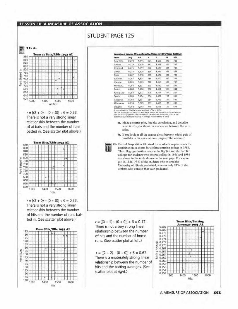
LESSON 10: A MEASURE OF ASSOCIATION
[ill] 11. a. ••• Team at Bab /RBis 1993 AL
880 860 840 820
lo
_i:::: 800 ""CJ 780 ~ 760 "' 740 0
lo • Vl
§ 720 er: 700
680 660 640 620
. 5300 5400 5500 5600
At Bats
r = [(2 + 0) - (0 + O)] + 6 = 0.33. There is not a very strong linear relationship between the. number of at bats and the number of runs batted in. (See scatter plot above.)
Team Hits/RBis 199!. AL 880 ~~~~~~~~~~~~~~
860 1-1-+-l--~-+-+-+--ll-+-l---,t--t-+-+--I
840>---1--1--1--!--+--l--+--f-~-+-l-<~-l--I
8201-1-+-l--+--+-+-+--ll-l-+-l--+-+-+--I c 800 1--1-1-r-+-+--l--+--+-+-+-~1-1-+-1
::;; 780~1=-1=-lo=l-=1=-=l<=l=.!='1='4<=1=11=-1=-lo=t ~ 7601--1-1-+-+-+--l--+--+-+-+-l-ll-l-+-I "' ' "'7401--1--1--1---+-+--l---+-• .,_-+-+-l-ll--!-l--I § 720 1-->--1--!---+-+--l---t--f--t-+-l-ll--!-l--I er: 700 1--1-1-f--+-+--l--+--+-+-+-I- ~ ->--
6801-->-1--1---+---1oH>--+--f--t-+-1-<>--1-1--1 6601--1-1-+-+-1--l--+-+--+-+-l---ll-l-+-I 640l=l:=l==l==l=<~~::jo::::J=l=l==l=:t=F=l 620~1--!~~~~ ....... ...._~+-~1--!~~
1300 1400 1500 1600 Hits
r = [(2 + 0) - (O + O)] + 6 = 0.33. There is not a very strong linear relationship between the number of hits and the number of runs batted in. (See scatter plot above.)
185 180 175 170 165 160
Team Hits/HRs 1993 AL
"' ' .
:e 155 .
' :::J er: 150 E 14.5 i! 140
135 130 125 120 115 110
1300 1400 1500 Hits
1600
STUDENT PAGE 125
American Leape Champlondtlp Seasons 1993 Team Ratlnp
Team Avg AB R H HR RBI
New York 0.279 5,615 821 1,568 178 793
Toronto 0.279 5,579 847 1,556 159 796
Cleveland 0 275 5,619 790 1,547 141 747
Detroit 0.275 5,620 899 1,546 178 853
Texas 0-267 5,510 835 1,472 181 780
Baltimore 0 267 5,508 788 1,470 157 744
Chicago 0 265 5,483 776 1,454 182 731
Minnesota 0264 5,601 693 1,480 121 642
Boston 0.264 5,496 686 1,451 114 644
Kansas City 0,263 5,522 675 1,455 125 641
Seattle 0 260 5,494 734 1,429 161 681
California 0.260 5,391 684 1,399 114 644
Milwaukee 0.258 5,525 733 1,426 125 688
Oakland 0 254 5,543 715 1,408 158 679
Source: data from World Almanac and Book of Facts, 1994. (H =hit: batter gets on base; R =run: player scores; RBI= runs batted in: other runners scored on player's hil; HR= home run: batter scores on own hit; AB= at bat: batter has opportunity to bat; Avg= average: hits divided by at bats)
a. Make a scatter plot, find the correlation, and describe what it tells you about the association between the variables.
b. If you look at all the scatter plots, between which pair of variables is the association strongest? The weakest?
~ :IZ. Federal Proposition 48 raised the academic requirements for l!iiJ participation in sports for athletes entering college in 1986.
The college graduation rates in the Big Ten and the Pac Ten colleges for students who entered college in 1985 and 1986 are shown in the table shown on the next page. For example, in 1986, 78% of the students who entered the University of Illinois graduated, whereas only 74% of the athletes who entered that year graduated.
Team Hits/Batting r = [(O + 1) - (O + O)] + 6 = 0.17. There is not a very strong linear relationship between the number of hits and the number of home runs. (See scatter plot at left.)
0.282 ~~-.-A:-,-:v...,er_ag-r-es..-1,..99-.-3-,-AL'T"""........,~...., 0.280 1-1-++·l-t-t-+++-"1-t-+-+-...... 0.278 l-lf.--1-+-+--+-+--+-~f.-I-~"'-· ·~f.--1-1 0.276 - l--l-+-H-l--1-+-H-1--1-.J-IH 0.27 4 l-l-J.-+--+-+-1-1-+-+--+-+-+-l-J.~
r = [(2 + 2)- (O + O)] + 6 = 0.67. There is a moderately strong linear relationship between the number of hits and the batting averages. (See scatter plot at right.)
gj, 0. 27 2 1-1-+-+-+--+-+--+-+-lf.-l-+-l--+--l-t ~ 0.270 l-l-l--+-l--l-+--+-+-lf.-l-+-1--1--1-I ~ 0.268 H-+-l--1--1--1-f.-I-,+-l-·1-1--l-+-I 01 0. 2 66 +-1-+-+-+--+-+--+k>-+--+-+--·l-+-l-+-I ·il o. 2 64 +-1-+-+-+-+--+--._lo-lf.--1-~-+--+--+-1 ~ 0.262 H-f.-l--1--1--1-+-l--l-+-~-+-++-l
0.260 t-tE::SS::E::E1t=l::E=E 0.258 I= 0.256 +-l-+-+-+-+-1-1-+--+-+--+-+-l-+-l 0.254 H-!--l-+~o-1-1-l--l--l-·1-1-1-!--l 0, 2 52 '-'--'--'--'--'-'-'--'--'--'---'-'--'--'--'
1300 1400 1 500 1600 Hits
A MEASURE OF ASSOCIATION 151
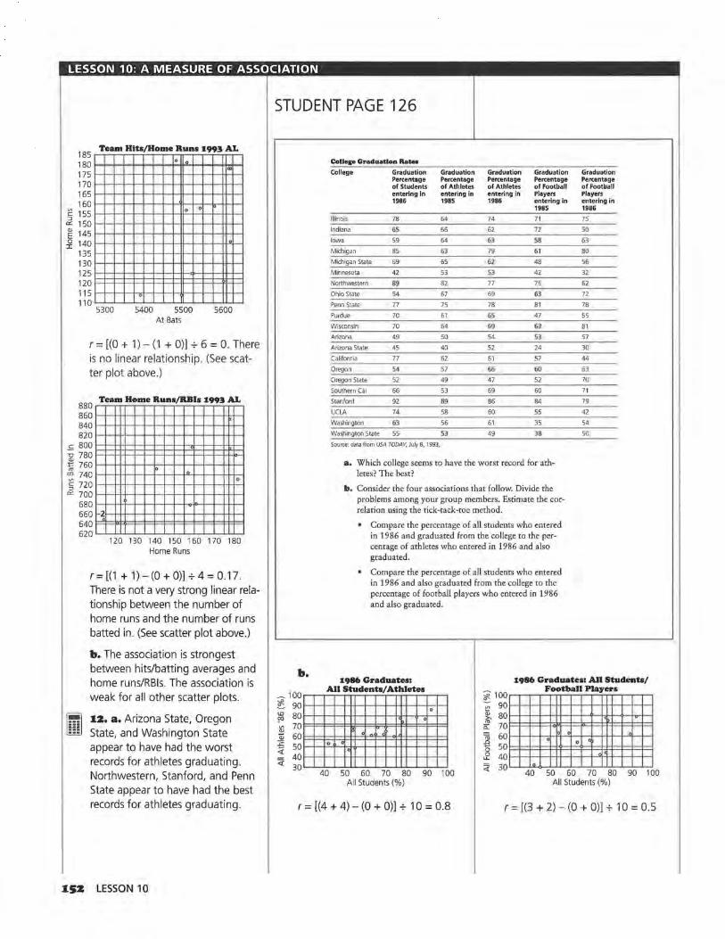
LESSON 10: A MEASURE OF ASSOCIATION
185 Team Hits/Home Runs 1993 AL
180 175 170 165 160
. . I"'
:e 155 0 0
:::J er: 150 ~ 145 :i! 140
-'= -c:>
"' to "' C'.l
"' c:: :::J er:
135 130 125 120 115 110
. 5300 5400 5500 5600
At Bats
r = [(O + 1)- (1 + 0)) + 6 = 0. There is no linear relationship. (See scatter plot above.)
880 860 840 820 800 780 760 740 720 700 680 660 640 620
Team Home Runs/RBis 1993 AL
~2
lo . .
120 130 140 150 160 170 180 Home Runs
r=[(1 +1)-(0+0))+4=0.17. There is not a very strong linear relationship between the number of home runs and the number of runs batted in. (See scatter plot above.)
b. The association is strongest between hits/batting averages and home runs/RBis. The association is weak for all other scatter plots.
~ liliJ
12. a. Arizona State, Oregon State, and Washington State appear to have had the worst records for athletes graduating. Northwestern, Stanford, and Penn State appear to have had the best records for athletes graduating.
ISZ LESSON 10
STUDENT PAGE 126
b.
-100 ~ 90 w 80 ()()
~ 70 60
:;:: 50 4: <{
40 30
CoUege Graduation Rate•
College Graduation Graduation Graduation Graduation Graduation Percentage Percentage Percentage Percentage Percentage of Students of Athletes of Athletes of Football of Football entering in entering in entering in Players Players 1986 1985 1986 entering in entering in
1985 1986
lillnols 78 64 74 71 7S
Indiana 65 66 62 72 so Iowa S9 64 63 58 63
Michigan 8S 63 79 61 80
Michigan State 69 65 62 48 56
Minnesota 42 53 53 42 32
Northwestern 89 82 77 75 62
Ohio State 54 67 69 63 72
Penn State 77 75 78 81 78
Purdue 70 61 GS 47 SS
Wisconsin 70 64 69 63 81
Arizona 49 50 54 53 57
Arizona State 45 40 S2 24 30
California 77 62 61 57 44
Oregon 54 57 66 60 63
Oregon State 52 49 47 S2 70
Southern Cal 66 53 69 60 71
Stanford 92 69 86 84 79
UClA 74 58 60 SS 42
Washington 53 56 61 35 54
Washington State 55 53 49 38 50
Source: data from USA TODAY, July 8, 1993,
a. Which college seems to have the worst record for ath-letes? The best?
b. Consider the four associations that follow. Divide the problems among your group members. Estim.ate the cor-relation using the tick-tack-toe method. . Compare the percentage of all students who entered
in 1986 and graduated from the college to the per-centage of athletes who entered in 1986 and also graduated. . Compare the percentage of all students who entered in 1986 and also graduated from the college to the percentage of football players who entered in 1986 and also graduated.
1986 Graduates1 All Students/ Athletes
1986 Graduates1 All Students/
. ' •
40 50 60 70 80 90 100 All Students (%)
Football Players '.j: 100~~~~~~~~~~~~~ -; 90•---<l--l--+--+-l+-1--1--1--+-........ -+--+--+--I
~ 80•---<l--l--+--+-H--1--1----1'--hH--O--h>-I--< ~ 70 l::::ll::::l::::t::::t~:::l:::::IB::::l:=l=j!::j::=l=::l=::!=I
'iii 60 • • 0 ' ~ 50 0 40 ' u..
<{ 30 '" 40 50 60 70 80 90 100 All Students (%)
r = [(4 + 4) - (O + 0)) + 10 = 0.8 r = [(3 + 2) - (O + 0)) + 10 = 0.5

LESSON 10: A MEASURE OF ASSOCIATION
b:&b) Football Players 'SS/ Football Players '86
~100~~~~~~~~~~~~~ ;;;- 90 '-'--+-+--1--1-~-+--+-+-+-+--< ....... --+--< ~ 80 '-'..._.__.._,__,_~----+-+-<-< .............. --< ~ ~ 70 ~ 60 '-'..._.__,__,__,_~-l-'-+-+-+-i-lr--+--+--<
ro SO~l=l=!::!:l:=l::f:t::::t=:±=:t:t:t:!:11=l=!:=I ~ 40 " ~ 3D'-''-'30"""""-4~0_._~S~0~6~0__,_~7~0~~80~_.90
Football Players '85 (%)
r = [(3 + 2) - (0 + O)] + 10 = 0.5
Athletes'8S/Students'86 100~~~~~~~~~~~~~
9Q l-l-O.-l--U-l-_,_~--+-·1--'-'-"'-+-I
~ 801=J=t=F=tt=l==l:o"3=:1=;1=!::j:=f;=F=I ~ 70 1-<--0.-1---1•-1--lo-.,._-+-..._.__.__.-+-l c olo po
~ 60 1::::1::::1=±:iM'~"!::t::~~:±=:t=t=11=1=!:=1 .3 so V1
40 1-1--+-+-U1 ><1--"_,_~ _ _,_.,___ ......... '-'-+--< 3 o '-'~4~0__.__s~o_._~6~0~7~0__.__8~0~~90__.__.100
Athletes '85
r = [(2 + 3) - (O + O)] + 10 = 0.5
c. In general, the percentage of graduating athletes is correlated with the percentage of all students who graduate. The strongest correlation is between all students and all athletes who entered in 1986. Students should make claims that are supported by the scatter plots. Students may include the line y = x in the plots and make claims about things other than just correlation. Be sure students are not equating correlation and slope.
I3. a. For Woman B, the ratio of waist to hip is 32 to 39, or 0.82. For Woman A, the ratio is 26 to 36, or 0.72. The ratios indicate that the risk of death is greater for Woman B.
b. Risk of Death in Females
0
0
0
0
0
Waist to Hip Ratio (hundredths)
STUDENT PAGE 127
• Compare the percentage of football players who entered in 1985 and also graduated to the percentage of football players who entered in 1986 and also graduated.
• Compare the percentage of athletes who entered in 1985 and graduated to the percentage of all students who entered in 1986 and graduated.
c, What conclusions can you draw about the associations between the percentages of graduating athletes? Use your work from b to support your claims.
13, An article in the Milwaukee Journal in January 1993 reported the following:
Battle of bulge: Waist-hip ratio is predictor of death, study says
In a study of 41,837 lowa women ages 55 to 69, researchers at the University of Minnesota found that there was a strong correlation between the waist-hip ratio and the risk of death. The bigger the waist in comparison to the hips, the higher the risk of death regardless of weight. A 15% increase in waist-hip ratio increased the risk of death by 60%.
The article continued by stating that for women, the ratio should be less than 0.8 and for men, it should be less than 0.95.
a. According to the article, who would be expected to have a greater risk of death: woman A, who has a waist measurement of 26 inches and a hip measurement of 36 inches; or woman B, who has a waist measurement of 32 inches and a hip measurement of 39 inches?
b. Make a sketch of a scatter plot that might show the research data.
c. How do you think the 15% increase in waist-hip ratio, that increased the risk of death by 60%, would be reflected in the scatter plot?
d. Based on the information in the article, which of the following do you think would be the most likely correlation for the data: -o.9, -o.6, -0.2, 0, 0.2, 0.6, or 0.9? Tell why you selected the value you did.
e. Comment on the cause-and-effect relationship implied in the newspaper article.
c. It would be shown by the slope of the data points. Here, the slope is 4.
d. 0.6 or 0.9. The researchers claim there is strong correlation indicating a number close to 1, so 0.2 can be eliminated. Because an increase in the ratio means an increase in the risk, the correlation will be positive.
e. The article implies there is a direct relationship. A typical question would be the factor of overall weight, but the article states that the relationship remains regardless of weight. There could still be other contributing factors, such as genetics, which could affect the waist-hip ratio and the risk of death.
A MEASURE OF ASSOCIATION I53

LESSON 11
End·ol·Module Project: The Do1nino Topple Materials: graph paper, pencils or pens, rulers, a box of domi
noes, meterstick, stopwatch for each group, End-of-Module
Test Technology: graphing calculators (optional)
Pacing: 1 class period
Overview
In this experiment, students set up a continuous string of dominoes and use a stopwatch to determine how long it will take for the dominoes to fall. Students recognize that the distance between the dominoes will have an impact on the length of time, as will a variety of other factors. Students will incorporate these factors into the design of their experiment. This experiment offers students the opportunity to investigate the rate of change in the length of time it takes for a given number of dominoes to fall: Will the time be constant as the number of dominoes increases or will the time it takes for the dominoes to fall increase or decrease as the number of dominoes increases?
Teaching Notes
This experiment has been adapted from work done by Jere Confrey at Cornell University. Students will find that a variety of factors has an impact on the experiment. Encourage them to find some way to control the experiment as much as possible (for instance, have the same person topple the dominoes). Initially, many students will use one set of dominoes, around 10 or 20, and on the basis of the time it takes them to fall, extrapolate to the time for 1,382,101 dominoes to fall. Be sure they recognize two things: Using one data point is not very conclusive; a different number of
IS4 LESSON 11
dominoes may or may not fall the same way. Does the rate of change remain constant as more and more dominoes fall? Using more dominoes in multiples of 5 or 10 dominoes and investigating what happens will give students a better understanding of the relationship between the number of dominoes and the length of time it takes the dominoes to fall.
As suggested by the student lesson opener, it is often the case that not all of the dominoes in the string fall with one push. According to the 1993 Guinness Book of Records, Klaus Friedrich in Furth, Germany, toppled 281,581 out of 320,236 dominoes within 12 minutes 57.3 seconds. It took him 31 days to set up the dominoes, working 10 hours a day.
You might want half of the class to work on the domino experiment while the other half works on the gummy candy launch experiment. Different groups can share their results through group reports and presentations.
Follow-Up
Have students vary the distance between the dominoes and verify their answers to Question 4.

LESSON 11 : END-OF-MODULE PROJECT, THE DOMINO TOPPLE
Solution Key
Data Collection and Analysis
1.. Variables suggested by students might include the distance between the dominoes, the material from which the dominoes are made, the surface on which they are placed, and the force used to knock over the first domino.
STUDENT PAGE 128
LESSON 11
End-ol·Module Project: The Domino Topple
On January 2, 1988, thirty university students from Europe set up a continuous string of 1,500,000 dominoes. How long do you think it would take to set up that many dominoes?
Of that number, the students were able to topple (knock over) 1,382, 101 dominoes with one push, setting a new world record according to the 1994 Guinness Book of Records. How long would it take you to topple a continuous string of 1,382, 101 dominoes?
Explore the relationship between several
variables.
S uppose you would like to be able to predict with some certainty how long it will take a string of dominoes to fall
over. Think about the rate of change and whether it will remain constant as the number of dominoes increases. Will the dominoes start falling faster or slower as more and more dominoes fall? Use what you have learned in this unit to help you find a solution.
INVESTIGATE
The Domino Topple
Devise a domino experiment of your own. Work with at least one other student. Be as complete as possible in your work.
Data Collection and Analysis
1. Define the variables in your problem. The only rule is that when a domino falls, it can knock over only one other domino.
END-OF-MODULE PROJECT: THE DOMINO TOPPLE I.SS

LESSON 11: END-OF-MODULE PROJECT, THE DOMINO TOPPLE
z. Students might control the vari-. ables by having one person knock over the dominoes each time, by using the same surface, and by fixing an arbitrary distance between the dominoes. Students will design a variety of different ways to collect data. Be sure they move beyond using only a fixed number of dominoes. Also have students consider whether the rate of change will be constant as the number of dominoes increases. They should eventually decide to set up a few dominoes and measure the length of time it takes them to fall. They can then repeat the process for a different number of dominoes.
3. Students should find a linear relationship that can be described with a straight line. They may plot points, find the correlation to see if a line is appropriate, draw a line of fit (possibly a median fit line), predict the length of time to topple 1,382, 101 dominoes, and find the error in the prediction given by the line.
4. Comments will vary, based on students' original variables. If the distance between the dominoes is shortened, the dominoes will fall faster and the rate of change will increase causing the slope of the line to become steeper than the slope of the original line. If the distance is lengthened, the rate of change will decrease, and the slope will be less steep causing the line to lie below the original line. This provides an opportunity for students to think about the concepts of acceleration and deceleration in a meaningful context and to reflect on how these will affect the linear relationship between the number of dominoes and time.
IS6 LESSON 11
STUDENT PAGE 129
2. Decide how you can best control these variables. Design an experiment using a box of dominoes, a meterstick, and a stopwatch.
3, Describe how you designed your exp.eriment, what data you collected, and how you used the data to decide on your solution. You should have scatter plots and data tables showing how you reached your solution.
4, How will your solution change if
a. You change the distance between the dominoes?
b. You change any of your other variables?

LESSON 12 (OPTIONAL)
Catapults and Candy Materials: at least one gummy candy, 9 tiles or small blocks, 2
ice cream sticks, 2 elastic bands, meterstick, metric tape mea
sure, pencils or pens, graph paper, rulers for each group
Technology: graphing calculators (optional)
Pacing: 1 class period
Overvie~
The following activity has been modified from an activity by George Cobb at Mount Holyoke College in South Hadley, Massachusetts. Students explore what happens when an object is propelled from a launching pad as the launchpad height is changed. They look for a relationship between the height of the launchpad and flight distance and write a mathematical formula for the relationship they identify. In the activity, students use most of the ideas they studied in this module: making scatter plots, identifying slope, finding equations of lines, and graphing linear equations.
Teaching Notes
This experiment can be done at any time during the last part of the module but works well at the end of the module. Some students might do the domino topple experiment in Lesson 11 while others build the launchers for this experiment. Students should work in pairs or groups of three for this activity.
Students make a launchpad similar to the one shown. From this pad, students launch a piece of gummy candy forward. The question of interest is this: Is there a relationship between the height of the launch end of the pad and the distance the candy travels?
The experiment is an example of an experimental design problem and illustrates how important it is to
think about variables that might affect outcomes. It works best if students are given the freedom to explore by trial-and-error and later discuss with the entire class what happened in each instance. If the activity is presented according to a prescribed design, students will never realize why certain procedures are necessary. They should learn to recognize variability due to the design factors and think of some ways they might be able to control the situation.
Follow-Up
Other questions students might investigate include: Is taking the mean of the three trials the best way to get a value for a given height? What would happen to the model if the three values were plotted? Would the median give a better fit? How can you tell which one would be better: a line depending on the median or one depending on the mean? If you repeated the experiment would you get similar results? How do the results from others in class compare to those you obtained? What might account for any differences?
A suggestion for extension is to have each group investigate a variable and see how that affects the outcome. Variables include: the angle between the two ice cream sticks as a function of the thickness of the pencil; the length of the ice cream sticks; the amount of force on the launcher; the location of the candy on the launcher; the weight of the candy; and other suggested variables.
CATAPULTS AND CANDY 157

One way to assess what students learned from the experiment is to ask the following:
1. Summarize your experiment and the results.
2. For the data you collected, what is the rate of change in the distance for a given change in height? How can you find this from the graph? From the equation?
3. Is your model a good model to describe the relationship between height and distance? Explain why or why not.
4. What did you learn from this problem about designing an experiment?
158 LESSON 12 (OPTIONAL)
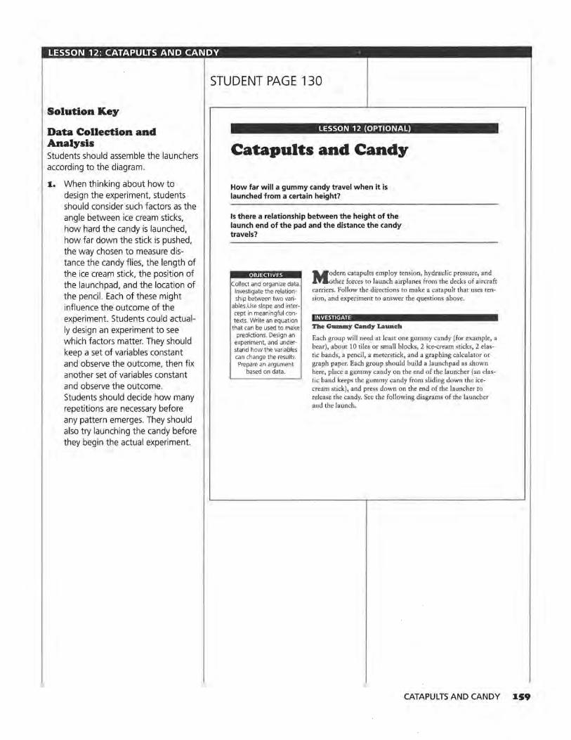
LESSON 12: CATAPULTS AND CANDY ·
Solution Key
Data Collection and Analysis Students should assemble the launchers according to the diagram.
I. When thinking about how to design the experiment, students should consider such factors as the angle between ice cream sticks, how hard the candy is launched, how far down the stick is pushed, the way chosen to measure distance the candy flies, the length of the ice cream stick, the position of the launchpad, and the location of the pencil. Each of these might influence the outcome of the experiment. Students could actually design an experiment to see which factors matter. They should keep a set of variables constant and observe the outcome, then fix another set of variables constant and observe the outcome. Students should decide how many repetitions are necessary before any pattern emerges. They should also try launching the candy before they begin the actual experiment.
STUDENT PAGE 130
LESSON 12 (OPTIONAL)
Catapults and Candy
How far will a gummy candy travel when it is launched from a certain height?
Is there a relationship between the height of the launch end of the pad and the distance the candy travels?
. : Collect and organize data.
Investigate the relationship between two vari
ables .Use slope and intercept in meaningful contexts. Write an equation
that can be used to make predictions. Design an
experiment, and understand how the variables can change the results. Prepare an argument
based on data.
Modern catapults employ tension, hydraulic pressure, and other forces to launch airplanes from the decks of aircraft
carriers. Follow the directions to make a catapult that uses tension, and experiment to answer the questions above.
INVESTIGATE
The Gummy Candy Lawteh
Each group will need at least one gummy candy (for example, a bear), about 10 tiles or small blocks, 2 ice-cream sticks, 2 elastic bands, a pencil, a meterstick, and a graphing calculator or graph paper. Each group should build a launchpad as shown here, place a gummy candy on the end of the launcher (an elastic band keeps the gummy candy from sliding down the icecream stick), and press down on the end of the launcher to release the candy. Sec the following diagrams of the launcher and the launch.
CATAPULTS AND CANDY IS9

LESSON 12: CATAPULTS AND CANDY
STUDENT PAGE 131
z. The sample data came from 25 trials with only one trial run. There was considerable variability; some of it was due to the way the candy skipped after it landed. Students can produce their own data for distance only and apply single-variable analysis techniques, using scatter plots and values to describe how far a candy would travel if it were launched from a launchpad at ground zero.
Distance (in centimeters): 26.75, 22 .25, 30.75, 9.00, 6.50, 37.00, 22.00, 24.00, 12.25, 23 .25, 10.25, 10.00, 24.25, 23.00, 11.25, 16.50, 15.75, 18.25, 13.25, 6.75, 11.25, 26.25, 25.50, 4.25, 12.50.
a. The mean is 18.03 centimeters.
b. The range is 37 - 4.25 = 32.75 centimeters and the median is 16.5 centimeters. (The standard deviation is 8.65 and the interquartile range is from 10.75 to 24.5.)
:J. Students should try a few launches and then do the actual experiment. To control the variability, the following data were collected from three trials at a given height. The scatter plot is (height, average distance of the three trials from that height) . Those students who use only one trial per height will probably have very little pattern in their results unless they find some other way to control the situation. Allowing students to resolve the problem, however, will have more benefits than instructing them in any particular process.
1•0 LESSON 12 (OPTIONAL)
Launcher
Laun ah
tiles or blocks
Data Collection and Analysis
1. Work with at least one partner. Define the variables in your experiment and decide how you can control them.
::t. Conduct an experiment to answer these questions:
a. On average, how far will a gummy candy travel from a given height?
b. How much variability is there in a given launch?
3. What is the relationship between the height of the launchpad and the distance the candy travels? Write an equation to describe the relationship. Explain your equation in terms of the data.
4. Use your answers to Question 3.
a. If the height is 7 tiles, predict how far the candy will travel.
b. If the height is 10 tiles, what is the expected distance the candy will travel?
e. At what height should the launchpad be for the candy to travel 40 centimeters?

LESSON 12: CATAPULTS AND CANDY
(3)
Height (number of tiles)
O tiles
1 tile
2 tiles
3 tiles
4 tiles
6 tiles
8 tiles
65
60
55
50
'"" 45 OJ
-5 40
2. 35 OJ u c 30 tl i5 25 c lll 20
::2: 15
10
5
/
00
Distance Average (in cm) Distance
(in cm)
9.75
19.25
18.5 15.8
16.5
19.25
16.75 17.5
18.5
6.25
11.75 12.2
27.5
22.25
10.5 20.1
19.75
24.5
11 .25 18.5
33.75
40.5
20.5 31.6
65.5
24.25
59.25 49.7
Gu.mmy Candy Launch
/ /
./
/ /.1
/ v _,
/v
)
2 4 6 8 10 Height of Launchpad (number of tiles)
STUDENT PAGE 132
5. Examine your predictions.
a. For how many values did your equation predict a greater distance than the experimental average distance? For which height was the prediction from the equation the worst?
b. How confident are you in your equation? Explain.
Some students may try to make predictions using only the scatter plot. Students can write the equation of the line using any two points that lie on the line. (5, 30) and (2.5, 20) are two points that seem to be approximately on the line shown. For an increase of 2.5 tiles there is a 1 a-centimeter increase in the distance the candy travels. The point slope form of the equation of a line is d=20+4(h-2.5).
4. a. d = 20 + 4(7 - 2.5)
The candy may travel a distance of 38 centimeters according to the line for the sample data .
b. d = 4(1 O) + 10
The expected distance of travel is 50 centimeters according to the line for the sample data.
Note that the equation seems to predict a shorter distance than you
CATAPULTS AND CANDY 161

LESSON 12: CATAPULTS AND CANDY
(4b) might suspect from the line. This makes it seem unlikely that the relationship is really linear.
As students continue to investigate the relationship, they should recognize that their model is limited. What would this equation predict as the number of tiles continues to increase? If the height gets too high, the gummy candy will travel straight down and the distance will be very short or 0. When will that happen? Will the gummy candy ever travel backward? Over what xvalues (h-values) will the equation for the data be accurate? An important point for students to recognize is that many models are good for only limited x-values.
c. h = 7.5, or 7.5 tiles
5. a. Four points are below the line. The prediction was the worst for 4 tiles and for 8 tiles, but off by 7.4 centimeters.
b. Students can determine how good the model is by using the data they have and finding the error in using their equation to predict for these values. For a height of 6 tiles, the linear equation predicts a distance of about 34 centimeters. The actual distance is 31 .6 centimeters-an error of 2.4 centimeters. A linear equation that predicts values with a very small sum of errors should give relatively good predictions.
The linear model seems to underestimate the small values and the large values and overestimate those in between. This is a good indication that a linear model is probably not the best model.
16Z LESSON 12 (OPTIONAL)

Teacher Resources

LESSON 2 QUIZ
Equations of Lines
NAME
In 1986, the number of CDs sold was 53 million, whereas in 1990, the number of CDs sold was 287 million.
I. Graph the ordered pairs of data for CD sales.
500 450
"'400 ~ 350 1300 ~ 250 Vl
Q; 200 -E 150 ~ 100
50 0
CD Sales
)
1985 1986 1987 1988 1989 1990 1991 Year
z. Find the rate of change in CD sales and explain what the rate of change means in the context of the data.
3. Write an equation of the line determined by the data points (year, sales).
4. What assumptions did you make when you wrote your equation? How valid do you think your assumptions are?
s. Predict how many CDs were sold in 1993 and explain how you made your prediction.
6. In what year would the predicted number of CD sales be 369 million? Explain how you determined your answer.
7. Bonus In 1986, 125 million LPs were sold, whereas in 1990, 12 million LPs were sold. In what year does the number of CDs sold exceed the number of LPs sold? Explain how you found your answer.
TEACHER RESOURCES I6S
<i'. @i Vl c 0 ..,, .~ :0 :::> a_
:s 0 E ~
V1 QJ
c;; Cl @ ....., ..c Ol
-~ 0 u
LESSON 3 QUIZ
Equivalent Forms ol Equations
NAME
1. A long-distance telephone company advertised the following rates: Five minutes for just $.85 and ten minutes for just $1.10. Write the ordered pairs (minutes, cost) for the data.
a. Assume that the rate of change for the cost of a long-distance call over time is constant. Write a linear equation to describe the cost of a long-distance call in terms of time.
b. Explain the rate of change in the cost of a long-distance call over time in the context of the data.
c. Use your equation to find the cost of a 20-minute longdistance call.
z. The number of calories burned while in-line skating depends on skating speed. The following table shows the number of calories burned by a 140-pound skater at various speeds. Graph the ordered pairs (speed, calories) and draw a line to represent the relationship.
Calories Burned By a 140-pound In-line Skater
Speed 8 mph 9 mph 10 mph 11 mph 12 mph 13 mph
Calories 5.1 6.7 8.3 9.9 11.4 13.0
Source: Rollerblade, P.O. Box 59224, Dept. P., Minneapolis, Minn., 55459
a. Find a linear equation for your line.
b. Explain the rate of change in the context of the data.
c. Use your equation to determine the number of calories burned by a 140-pound skater who skates at 6 mph.
166 LESSON 3 QUIZ
14 mph 15 mph
14.6 16.1
<{
@) V\ c 0 ·.;:::;
-~ JS :J
CL
:; 0 E ~
V)
Q)
Iii 0 @ +-' ..c 0\
-~ 0 u
3. a. Chan's equation for the number of calories burned by an in-line skater is c = 13 + 1.6(s - 13 ). Is his equation equivalent to yours? Explain how you can tell.
b. Tarita's equation for the number of calories burned by an in-line skater is c = 5.1+ 1.575(s - 8). Is her equation equivalent to Chan's equation? Explain why or why not.
4. The graphs of the ordered pairs listed below in Set A and in Set Bare straight lines. Are the equations for each of the lines equivalent? Justify your answer.
Set A Set B
x y x y
15 94 48 31
18 11 54 35
21 13 60 39
24 15 66 43 --t---
27 17 78 51
30 19 84 55
s. Which of the following equations are equivalent? Justify your answer.
a. y = -3x + 90
b. y = 39 + l.S(x - 29)
c. y = 12 + -3(x - 26)
TEACHER RESOURCES 167
..., ..c 01 -~ D.. 0 u

LESSON 7 QUIZ
Lines on Scatter Plots
NAME
According to a report by The Journal of Blacks in Higher Education, the 1995 median earnings for college graduates in randomly selected states were as follows.
1:995 Median Earnings of Black and White College Graduates in Selected States
State Black White State Black Graduates Graduates Graduates
California $35,033 $47,096 Missouri $28,660
Colorado 32,684 37,438 New Jersey 33,299
Connecticut 34,214 50,222 Ohio 29,969
Delaware 29,290 41,546 Oklahoma 25,601
Georgia 27,682 42,498 Rhode Island 28,984
Florida 27,166 39,495 South Carolina 23,211
Idaho 23,762 34,128 Tennessee 25,729
Iowa 27,869 32,917 Texas 28,850
Kansas 27,796 36,290 Vermont 26,079
Maine 30,645 33,096 Virginia 28,860
Maryland 32,756 43,555 Washington, DC 32,654
Massachusetts 32,923 41,211 West Virginia 25,559
Mississippi 21,540 34,439 Wyoming 34,529
Source: USA TODAY, May 9, 1995.
This scatter plot shows a line representing the relationship of the data.
3 54000
.~ 50000 c ~ 46000
~ 42000
~ 38000 l1'
1.9 34000
11 30000
Median Annual Earnings for College Graduates According
to Race in Selec:ted States
~
-.D
- .0 -...--D tr"', - ......... ......
D .-r1" :_..-JD u
-- er) ' u D
s 20000 24000 28000 32000 36000 40000 Black Graduates' Earnings ($)
168 LESSON 7 QUIZ
White Graduates
$36,862
49,298
39,460
35, 189
38,662
36,457
38,568
41,512
32,050
40,441
42,300
33,517
32, 111
<{
~ c 0 ·.;:::;
-~ 15 ::J
Cl..
:; 0 E ~ Vl QJ
"iii 0 @ +-' ..c
°' -~ 0.. 0 u

I. a. There are three data points in the upper right corner of the scatter plot. Which states are represented by these points? Do these states appear to have anything in common? Explain.
b. Which state does the data point farthest from the line represent? How will this data point affect the error in any prediction made from the line?
c. Draw the line y = x on the scatter plot. What does this line represent in the context of the data?
d. According to the data, in which states do black graduates earn on average more than white graduates?
z. a. What is the rate of change for the line on the scatter plot, and what does the rate of change represent?
b. Write an equation of the line shown on the scatter plot.
c. What is the y-intercept and what does it represent in terms of the data?
3. a. Use your equation from Question 2b to predict the earnings of a white college graduate if a black college graduate earns $31,000.
b. Show on the scatter plot the difference between the actual and predicted earnings for a white college graduate in Colorado if you know the earnings of a black graduate in Colorado. What is the difference between the predicted and actual earnings of a white college graduate in Colorado?
TEACHER RESOURCES I69
<! @i "' c 0 ·.;:::;
"' .!d JS :J ti.
:; 0 E ijj' V\
<IJ ro 0 @ +-' .r: C'>
-~ 0 u
LESSON 9 QUIZ
Lines, Lines, and More Lines
NAME
According to Consumer Reports, 1991, the following data show the amount of fat and the number of calories in popular fast-food breakfasts.
Breakfast Fat (in grams)
Hardee's Pancakes, Two Bacon Strips 9
McDonald's Pancakes with Sausage Patty 21
Burger King French Toast Sticks 32
Burger King Bagel with Egg and Cheese 18
McDonald's Egg McMuffin 13
McDonald's Sausage McMuffin with Egg 27
Burger King Croissan'wich with Egg and Cheese 20
Hardee's Sausage and Egg Biscuit 31
McDonald's Biscuit with Sausage and Egg 36
Burger King Croissan'wich with Sausage, Egg, and Cheese 40
Hardee's Bacon Biscuit 21
Hardee's Sausage Biscuit 28
McDonald's Biscuit with Sausage 29
McDonald's Sausage, Potatoes, and Biscuit 46
Hardee's Big Country Breakfast with Sausage, Potatoes, and Biscuit 57
Burger King Sausage, Potatoes, and Croissant 53
McDonald's Apple Bran Muffin 0
Burger King Apple Cinnamon Danish 13
McDonald's Apple Danish 18
Hardee's Cinnamon 'n' Raisin Biscuit 17
Source: Consumer Reports, September, 1991 .
170 LESSON 9 QUIZ
Calories
470
543
622
407
390
440
315
490
520
534
360
440
440
710
850
768
190
390
390
320
-ci (].)
~ (].) V1
!:':! ~ ..c
°' ·;::
<{
@i V1 c 0
·.;:::; re
.!:! :c
::::i CL
OJ 0 E >. (].)
V1 (].)
(ii 0 @ +-' ..c
°' -~ 0. 0 u

Following is a scatter plot of the ordered pairs (fat, calories) from the table of fast-food breakfasts.
"' "' ·c:
900 Calories in Fairt·Food Breakfasts
.2 600 l-+---1-11--1--1-+-t--¥-+-l-l-+---l-I~
"' u 0 500 1-+---1-11--1--1-+-h.1-'iL_,._l-+---l-I~
:;; 'E 400 ~ ::> z
1 00 L....L....L...Jc....L....J....J.-'-.L-L-'-L....L....L...J'-..J
0 8 16 24 32 40 48 56 Amount of Fat (grams)
I. There appears to be a cluster of data points in the center of the scatter plot. Which breakfasts do these data points represent? Do these breakfasts have anything in common? Explain.
z. Use the scatter plot to find a median fit line for the data.
a. Write an equation of the median fit line.
b. What is the slope, y-intercept, and zero of your median fit line, and what does each represent in terms of the data?
c:. How would your median fit line change if the McDonald's Apple Bran Muffin is replaced by an English muffin with 0 grams of fat and only 40 calories?
3. a. Predict how many calories are in a fast-food breakfast with 44 grams of fat. Explain how you found your answer.
b. What is the difference between the actual number of calories and your prediction for the number of calories in McDonald's pancakes with sausage patty?
c:. Predict how many grams of fat are in a fast-food breakfast with 550 calories. Explain how you found your answer.
4. a. Describe how you can use a table, a line, and an equation to help you make a prediction. Give at least one advantage and one disadvantage of each.
TEACHER RESOURCES
<l: ® Vl c: 0 ·.;:::;
-~ ::0 ::l "-::; 0 E ><lJ Vl
_5!! m 0 @ .... .r: Cl
-~ 0 u
END-OF-MODULE TEST
Exploring Linear Relations
NAME
Part I
I. The average price of a new car in 1985 was $11,450. In 1994, the average price of a new car was $20,021. The rate of change in price per year was relatively constant.
a. Find the rate of change in the price of a new car per year.
b. Make a graph that shows the price of a new car over time.
c. Write an equation that shows the relationship between new car price and time.
d. Predict the average price of a new car in 1996. Describe how you made your prediction.
z. Four students described the relationship between the price of the same item over time by writing the following equations:
d P = $124 + -4(T- 1980)
z) P = $84 + -4(T - 1990)
3) P = $8;044 - 4(T- 0)
4) P = :-4(-$2011 + T)
a. Decide whether the equations represent the same line and indicate how you decided.
b. Describe what you can tell about each line by looking at the values in eac? equation.
Part II
3. According to Anger Kills by Dr. Redford Williams at Duke University Medical Center, hostile people have an increased risk of heart disease and death by heart attack. Recent research shows that the same is true for cities--cities with higher hostility levels have higher death rates. The following
I72 END-OF-MODULE TEST
<(
@ Vl c 0
·.;:::;
-~ ::0
::::J c... ._ ::::J 0 E ~ VI QJ (ij 0 @ ...£ 01 ·~ a. 0 u

scatter plot shows research data for selected cities in the United States.
14 Hostility Levels and Death Rates
' ' 13 12
(lJ 11 ~ 10 ..c 9 -:ll 8 0 7
6 5 4
,_
,_
Philadelphia 0 ,_
I I I I I I I develand
D ·I+' 1 01 I I etroit New York City
-pepv~r ~ I I I n Chica.go . : : .J" Minnea 1>olis Des Moines - -
I Seattle Honolulu
2.9 3.0 3.1 3.2 3.3 3.4 3.5 3.6 3.7 Hostility1 Level
1 Adjusted for race, education, age, income, and gender.
Source: USA TODAY, May 31, 1994.
a. In 1994, did Chicago or Des Moines have a higher death rate? How do you know?
b. Can you say that hostility level is correlated with death rates? Explain why or why not.
c. Do you think a high hostility level will cause an increase in death rates for a given city? Why or why not?
4. a. Draw a line on the following scatter plot that you think fits the data and write its equation.
14 Hostility Levels and Death Rates
13 12
(lJ 11 ~ 10 ..c 9 -:ll 8 0 7
6 5 4
I
"
Q u " -
u
2.9 3.0 3.1 3.2 3.3 3.4 3.5 3.6 3.7 Hostility Level
b. Find the y-intercept and the zero. What do they indicate about the data?
c. Predict the death rate for a city with a hostility level of 3.0. Explain how you made your prediction.
d. Suppose you know that there is a negative correlation between hostility levels and death rates. Describe the scatter plot and a line representing the relationship of the data.
TEACHER RESOURCES I73

Part ill
In 1991, Consumer Reports rated AM-FM tape players accord-ing to price, tape performance, features, convenience, and AM-FM radio performance. The following table shows these ratings.
AM-FM Tape Player Rating Price($) AM-FM Tape Player
Panasonic RQ-S55V 90 $194 Aiwa Radical HS-RD7 A
Aiwa HS-T90 85 210 Magnavox AW6508/17
Aiwa HS-TSO, A Best Buy 84 64 GE 3-5474A
Sony WM-AF605 84 159 Sharp JC528
Sony WM F2085 83 86 Sanyo MGR200
Panasonic RQ-Vl80 81 65 Sears LXl21193
Sanyo MGR600 81 73 Sony WM-AF54
Aiwa HSt220 86 49 GE 3-5477A
Realistic SCP39 83 105 Emerson AC2106
Sony WM-F2015 81 33
Source: Consumer Reports, October, 1991 .
The following scatter plot shows the relationship between the price of a tape player and its rating.
AM·FM Tape Players 92 .--.--~~~~~~~~~~
90 t-t-t-t-t-t-t-f-Clj--1--1--1--1
O> ·§ 86 t-i--i:>--t-t-t-t-t-1-0 -+--+--+--i
~ 84 t-t-t-O--t-t-t-~=H--+--+--+--+--i ~ 82 >--+--+--~o-+-o-+--+--+--+--+--+--+-~ 80 1--H~Ho--Hcr-o-1--1--1--1--1--1--1--1-~
C1J 0- - 0 -
~ 78 t-HJ-l-Clt-t-t-t-l--ll--ll--ll--lf---I ~
75 1--1--t-t-t-t-t-f---ll--il--il--il--i
74 1--t-0-t-t-t-t-t-t-l--il--il--il--i )
72 ~~~~~'--''--''--''--''--''--''--'
0 50 100 150 200 250 300
Price ($)
174 END-OF-MODULE TEST
Rating Price($)
80 89
80 56
79 30
79 61
78 39
80 35
78 69
74 40
73 24
<(
@ Vl c 0 ·.;:::;
"' ·'=' :0 :J c... ~
:J 0 E &J' VI Q)
ro 0 @ +-' ..c 01
·~ ~ 0 u

s. Tom's linear equation describing the relationship between price (P) and tape player rating (T) is T= 0.02P + 80.
a. Graph Tom's line on the scatter plot shown.
b. What is the slope of Tom's line and what does it tell you about the relationship between tape player rating and price?
e. Suppose Tom predicts the tape player rating for an Aiwa Best Buy. How close is his prediction to the actual rating?
d. For how many tape players would Tom predict a rating lower than the actual rating? How did you find your answer?
•· Sabrina's equation for the relationship is T = 82 + 0.05(P - 100).
a. For a tape player with a rating of 90, what price does Sabrina's equation predict?
b. Is Sabrina's equation equivalent to Tom's equation? Why or why not?
e. Who has the better prediction for the rating of the Sony WM-AF605?
d. Sabrina's equation has a root mean square error of 2.8. Whose equation do you think is a better predictor, and why?
TEACHER RESOURCES I7S
<(
~ c 0
:~ J5 ::J "-:; 0 E ~ QI
<ti 0 @ ~ ..c O>
-~ 0 v

LESSON 2 QUIZ: SOLUTION KEY
Equations ol Lines
In this quiz, students apply what they have learned about finding the rate of change, writing an equation for a line, and making predictions based on the data.
J.. SOO ~~~....,....;:C:.;::D;....;:S;.::a;;;;:le;.:;.1~~~~
450 ~--t---+-1-1--t---t--+--t----;
~ 400 ~--t--l--+-1-1-l--l---t----; ~ 350 l---i---+----+----+-+-.._.--+-__ ...__.
]. 300 1-t--t--l--+-1-1--t--l--!--t----;
=§ 250 1-1-J---l--l-+-1-1-l---t--I-~ Vl ti; 200 ~--t---t--+-1-1--t---t--+--t----;
~ 1501-1-J---l--l-+-l-l-l--l---t----;
~ 1001-1-l--l--l-+-l-l-l--l--l-4---l
50 ~-¥--l--+-1-1--t--l--+--t-t
0.__,-'--'--'--'-'-'-'--'--'-..___, 1985 1986 1987 1988 1989 1990 1991
Year
2. The rate of change is 58.5. This means each year, about 59 million more CDs are sold.
3. One possible equation is n = 287 + 58.5(y - 1990).
4. The assumption is that the sales of CDs have been constant since 1986. This probably is not entirely valid, since sales usually vary from year to year. However, the equation does give a general idea about the nature of the increase in CD sales.
5. About 462.5 million CDs were sold in 1993 according to the equation. Students may estimate from the graph or let y = 1993 in the equation and solve for n.
J.76 LESSON 2 QUIZ: SOLUTION KEY
6. The predicted sales were about 369 million in early 1991. Students may estimate by using the graph or let n = 369 in the equation and solve for y.
7. Bonus The number of CDs sold exceeded the number of LPs sold in late 1986. Students may draw both lines on the graph and estimate where the lines intersect, or they may use the equations and solve for the year:
CDs n = 287 + 58.5(y - 1990) LPs n = 12 - 28.25(y - 1990) The value of y that satisfies both equations is 1986.83 (where the graphs of the two lines intersect). The year is late 1986 or just before 1987.

LESSON 3 QUIZ: SOLUTION KEY
Equivalent Form of Equations
•· The points are (5, $.85) and (10, $1.10).
(1.10 - o,85) a. y = 1.10 + (lO _ 5) (x - 10)
(0.25) y = 1.1 + (5) (x -10)
y = 1.1 + 0.05(x -10)
b. For each additional one minute in the length of a long-distance call, the cost increases $0.05.
c. y = 1.1 + 0.05(20 - 10) y=l.1+0.5 y = 1.60
The cost of a 20-minute long-distance call is $1.60.
z. a. Calories Burned
18 ~.....,;..:Whil-=.:-e ~•n..;..·l~ln"""e'""S..;..ka~tin-.-:g;-.~
-~ 14 f-+-l-+-f.-1-+-f.-l-+-f.-l-+-f.-1-1 0
~ 12f-+-l-+-f.-1-+-f.-l-+-f.-l-+-f.-l-I 0 ~ 101-1-_,_.._..._,_...._,__,__,_._,__._.__._. .0 E ~ 81-1--+-......... -+-_,__.._,__._._,__._.__._.
4L-L-'-J-l.-'-..L-1-'-.J....J.-'--L-1-'--' 8 9 10 11 12 13 14 15
Speed (mph)
The points chosen are (8, 5) and (13, 13).
(13-5) c = 5 + (l3 _ S) (s - 8)
c = 5 + 1.6(s - 8)
b. For every 1 mph increase in speed, there is a corresponding 1.6 increase in the number of calories burned.
c. 1. 8 calories
3. a. The equations are equivalent. c = 13 + 1.6(s-13) can be rewritten as c = -7.8 + 1.6s. The other equation c = 5 + 1.6(s - 8) can be rewritten as c = 1.6s - 7.8.
b. Tarita's equation is not equivalent to Chan's equation because when rewritten, her equation is c = -7,5 + 1.575s.
4. The graphs of the two sets of points are the same line with the equation y = -1 + ; x.
Students may discuss the rate of change and note that it is the same for the twci sets, but this could mean the lines are parallel. Students may graph the ordered pairs or they may write the equation for each set and discover that the equations are equivalent.
s. Equations a and c are equivalent; equation b has a different rate of change. Students might rewrite the equations to show equivalent equations or graph each. Be sure students discuss why the graphs are the same if that is the method they use .
TEACHER RESOURCES X77
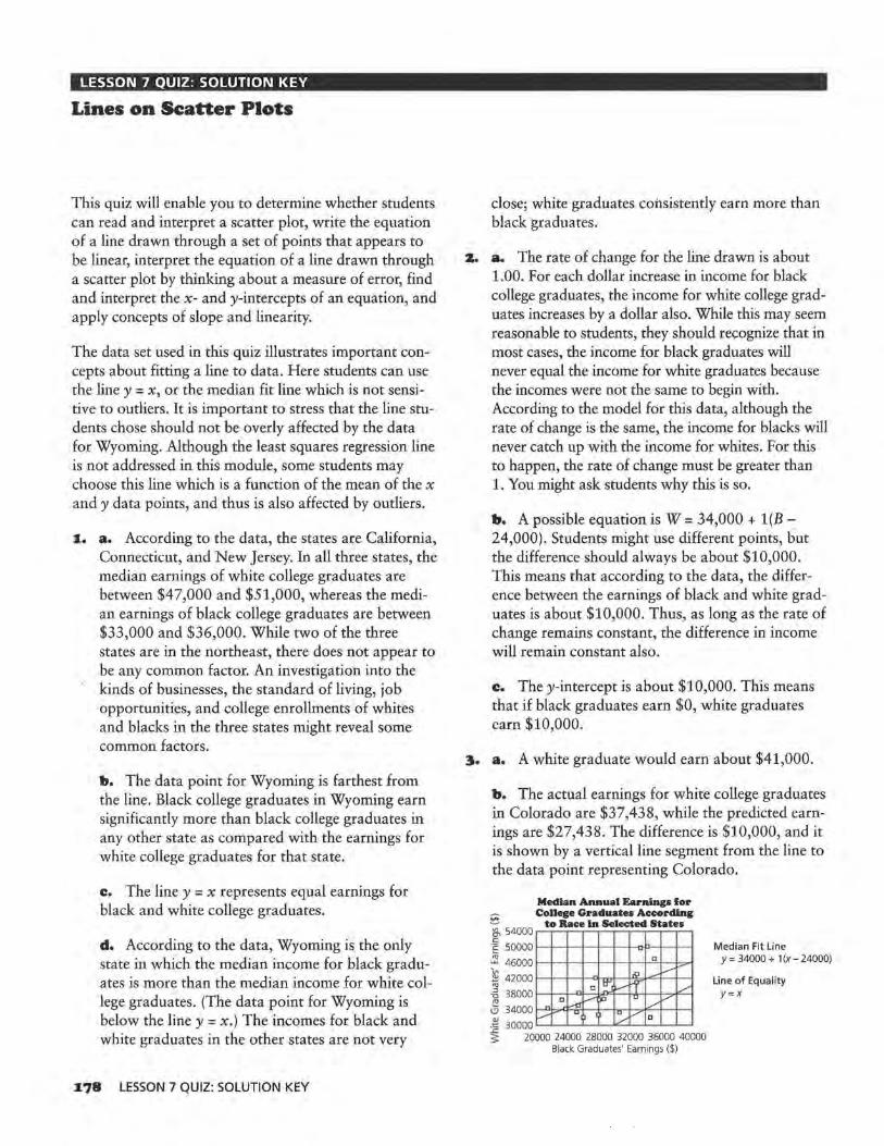
LESSON 7 QUIZ: SOLUTION KEY
Lines on Scatter Plots
This quiz will enable you to determine whether students can read and interpret a scatter plot, write the equation of a line drawn through a set of points that appears to be linear, interpret the equation of a line drawn through a scatter plot by thinking about a measure of error, find and interpret the x- and y-intercepts of an equation, and apply concepts of slope and linearity.
The data set used in this quiz illustrates important concepts about fitting a line to data. Here students can use the line y = x, or the median fit line which is not sensitive to outliers. It is important to stress that the line students chose should not be overly affected by the data for Wyoming. Although the least squares regression line is not addressed in this module, some students may choose this line which is a function of the mean of the x and y data points, and thus is also affected by outliers.
1. a. According to the data, the states are California, Connecticut, and New Jersey. In all three states, the median earnings of white college graduates are between $47,000 and $51,000, whereas the median earnings of black college graduates are between $33,000 and $36,000. While two of the three states are in the northeast, there does not appear to be any common factor. An investigation into the kinds of businesses, the standard of living, job opportunities, and college enrollments of whites and blacks in the three states might reveal some common factors.
b. The data point for Wyoming is farthest from the line. Black college graduates in Wyoming earn significantly more than black college graduates in any other state as compared with the earnings for white college graduates for that state.
c. The line y = x represents equal earnings for black and white college graduates.
d. According to the data, Wyoming is the only state in which the median income for black graduates is more than the median income for white college graduates. (The data point for Wyoming is below the line y = x.) The incomes for black and white graduates in the other states are not very
178 LESSON 7 QUIZ: SOLUTION KEY
close; white graduates consistently earn more than black graduates.
z. a. The rate of change for the line drawn is about 1.00. For each dollar increase in income for black college graduates, the income for white college graduates increases by a dollar also. While this may seem reasonable to students, they should recognize that in most cases, the income for black graduates will never equal the income for white graduates because the incomes were not the same to begin with. According to the model for this data, although the rate of change is the same, the income for blacks will never catch up with the income for whites. For this to happen, the rate of change must be greater than 1. You might ask students why this is so.
b. A possible equation is W = 34,000 + l(B -24,000). Students might use different points, but the difference should always be about $10,000. This means that according to the data, the difference between the earnings of black and white graduates is about $10,000. Thus, as long as the rate of change remains constant, the difference in income will remain constant also.
c. They-intercept is about $10,000. This means that if black graduates earn $0, white graduates earn $10,000.
3. a. A white graduate would earn about $41,000.
b. The actual earnings for white college graduates in Colorado are $37,438, while the predicted earnings are $27,438. The difference is $10,000, and it is shown by a vertical line segment from the line to the data point representing Colorado.
~ 54000 c ·c: 50000
~ 46000
~ 42000 "' -5 38000
3j 34000
Median Annual Earnings for College Graduates According
to Race ln Selected States
c
l.9 ~-- c trl v Ir I/
c _,....,, u / - ~ ./ u
~ 300~~000 24000 28000 32000 36000 40000
v 1u./ V e
Black Graduates' Earnings ($)
Median Fit Line y = 34000 + 1 (x - 24000)
Line of Equality Y=X

LESSON 9 QUIZ: SOLUTION KEY
Lines, Lines, and More Lines
The quiz will assess whether students are able to draw and interpret a median fit line and solve an equation.
1. Students may notice the cluster of data points representing three breakfasts with the same number of calories and almost the same amount of fat: the McDonald's Sausage McMuffin with Egg, the McDonald's Biscuit with Sausage, and the Hardee's Sausage Biscuit. All of the breakfasts with 26 to 42 grams of fat, except the Burger King French Toast Sticks, include sausage; only one breakfast which includes sausage, McDonald's pancakes with sausage, has fewer than 26 grams of fat. For breakfasts with 26 to 42 grams of fat, the number of calories is from 440 to 620.
2. 900
Calories in Fast-Food Breakfasu
800
700 ~ 0 600
'° u 0 500 a; ~ 400 ::J z
300
200
100
~I/
v
1 /l
)'
v 0
/
0 8 16 24 32 40 48 56 Amount of Fat (grams)
a. A possible equation for the median fit line is C = 250 + lO(F-4), or C= 210 + lOF.
b. The slope is about 10. This means that for each 1 gram increase in fat, the number of calories increases by 10.
They-intercept is about 210. This means that if a breakfast contains 0 grams of fat, the number of calories it contains is about 210. This is reasonable because there are other contributors to calories besides fat.
The zero is about -21. This means lhal if a breakfast has 0 calories, the breakfast has -21 grams of fat. This has no meaning in the context of the data.
c. Because the median fit line is not affected by outliers, it would not change at all.
3. a. Using the median fit line in Question 2, there would be 650 calories in the breakfast. Students could use the graph of the line or its equation to make their predictions.
b. The line predicts 420 calories. The actual number of calories is 543, so the line predicts 123 too few calories.
c. According to the line, a breakfast with 550 calories would have 34 grams of fat.
4. To use a table to make a prediction, look for the two closest entries and estimate the middle in some way; this is interpolation. An advantage is that it is easy to find the average of two values; a disadvantage is that using just two values to define the entire relationship is not very reliable. This is because one of the two values might be an extreme or have a large variability compared with the rest of the data.
To use a line to make a prediction, look for the point on the line that has the given coordinate. An advantage is that the line gives a good summary of all the points, and it is easy to see the relationship between the value you are looking for and the rest of the data. A disadvantage is that it is difficult to find an exact answer without estimating (unless you have a graphing utility that lets you zoom in on the point).
To use an equation to make a prediction, substitute the value you are given into the equation and solve for the other variable. An advantage is that equation solving can easily he done using a calculator; the equation uses all of the data and it will give you the exact solution. A disadvantage is that it might take more time to solve an equation, and you do not see the spread or variability of data so you have no sense about how much "error" there might be in your prediction.
TEACHER RESOURCES 179

END-OF-MODULE TEST: SOLUTION KEY
Exploring Linear Relations
Part I
The test assesses the objectives for each lesson in the module. Students will show what they know about the aspects of linearity-from rate of change to lines as models for the relationship between two variables. Students can use a variety of strategies to answer many of the questions. If students use the same strategy for each problem, they may be missing the insights of looking at problems graphically, numerically, and algebraically.
. ($20,021 - $11,450) J.. a. The rate of change 1s 9 =
$952.33 per year.
b. 30000
Hew Car Prices
25000 ,,
/ 3 v
v ·~ 20000 Q._
15000
10000 '82
/ v
I/ l..a'
'84 '88 '92 '96 '00 Year
c. P = 11,450 + 952(T - 1985), or P = -1,878,270 + 952T
d. The average price in 1996 for a new car is $21,922.
z. a. The equations are all equivalent. Students can justify their responses with graphs, finding equivalent forms of the equations, or by using some reasoning about the points. Students must use more than one point in their argument, however.
b. J.) The rate of change is a decrease of $4 per year, and the item cost $124 in 1980.
z) The rate of change is a decrease of $4 per year, and the item cost $84 in 1990.
J.80 END-OF-MODULE TEST: SOLUTION KEY
Part IT
3) The rate of change is -$4, and the item cost $8,044 in the year 0 which has no meaning in this context.
4) The rate of change is -$4, and in the year 2011, the item will cost $0. This too has no meaning in this context.
3. a. Chicago with a death rate more than 9 is higher on the scatter plot, whereas Des Moines has a death rate a little higher than 8.
b. Students may take different approaches to this problem. Those who base their answers on the graph, describing it as linear with "good" correlation, should not be given as much credit as students who find a numerical approximation for the correlation. Students should realize that after working through this module, numerical and graphical arguments together make the strongest case. The data do look linear, and the estimated correlation coefficient is 0.75. This is a fairly high correlation.
c. Students may take either side of the issue as long as they justify their arguments. It is not likely that having a high level of hostility causes a higher death rate. There are probably underlying causes for both. For example, poor education and lack of jobs along with inadequate housing and health care could cause hostility among people and also increase the risk of illness. Students might reason that anger and stress raise blood pressure so there is a greater chance of a stroke. Therefore, hostility does cause a higher death rate. Students may also mention that the way the hostility level was calculated might have been very subjective, and thus is not as objective as the way death rate is calculated.

4. A possible line is D = -20.5 + 9.1H.
14
13
12
11
~ 10 "' "" ~ 9 "' C!S 8
7
6
5
4
Hostility Level/Death Rates
/ /
/ a /
/
/ / ~
uv ,.-,/
/
I/ a
2B 3n 32 3A 3~ 3.8 Hostility Level
b. Using the equation given, they-intercept is about -20.5, and the zero is about 2.25. Theyintercept indicates that if a city has a 0 level of hostility, the death rate is -20.5, which does not make sense in this context. The zero indicates that if the death rate is 0, the hostility level is 2.26, which again does not make much sense in this context.
c. A predicted death rate is 6.8.
d. If the correlation is negative, the line would go from the top left to the bottom right of the grid. The slope of the equation would be negative, and the y-intercept would be positive.
Part III
s. a.
"'
92 90 88
·.S 86 (;!_ 84
~ 82 "' 0:: 80 QJ
& 78
76 74 72
0
AM·FM Tape Players
a_ -~
-a a_ 1--' -
P- -Ii
a a
~ 100 1~ MO 2~ 300 Price($)
b. The slope is 0.02. This means that for every $100 increase in price, the tape player rating increases by 2.
c. The predicted rating is 81.28 and the actual rating is 84. Tom would be off by 2.72.
d. Tom's equation would predict lower ratings for eight of the tape players. One way to find the number of tape players is to see how many data points are above the line. Students might also find the predicted values using the equation and compare them with the actual values.
6. a. Solve 90 = 82 + 0.0S(P - 100) for P = $260.
b. The two equations are not equivalent. Sabrina's equation has a slope of 0.05, whereas Tom's equation has a slope of 0.02. These equations could not represent the same line. Students might also graph the two equations and show that the lines are different, or generate tables of values and show that the lines contain different points.
"'
92 90 88
§ 86 il_ 84
~ 82 "' 0:: 80 QJ
& 78
76 74 72
/
AM·FM Tape Players Sabrina/"'
v I/
v "---,. - Tom a I}-". -c---
~ ""'l' va
)
~ 100 1~ 200 2~ ~o
Price($)
Tom's equation: T = 80 + 0.02 P Sabrina's equation: T = 82 + O.OS(P- 100)
c. They are both close. Tom's equation predicts 83.18, off by -o.82. Sabrina's equation predicts 84.95. The actual tape player rating is 84, so Tom is closer.
d. In general Sabrina is closer. Students may estimate the error or they may calculate it for both. For Sabrina, the mean absolute error is 2.16 and the root mean squared error is 2.8. For Tom, the mean absolute error is 2.45 and the root mean squared error is 3.30.
TEACHER RESOURCES I8I
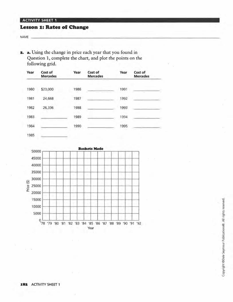
ACTIVITY SHEET 1
Lesson 1: Rates ol Change
NAME
2. a. Using the change in price each year that you found in Question 1, complete the chart, and plot the points on the following grid.
Year Cost of Year Cost of Year Cost of Mercedes Mercedes Mercedes
1980 $23,000 1986 1991
1981 24,668 1987 1992
1982 26,336 1988 1993
1983 1989 1994
1984 1990 1995
1985
50000 Baskets Made
45000
40000
35000
~ 30000 ~
QJ 25000 · ~ 0...
20000
15000
10000
5000
o ~~~~~~~~~~~~~~~~~~~~
'78 '79 '80 '81 '82 '83 '84 '85 '86 '87 '88 '89 '90 '91 '92 Year
182 ACTIVITY SHEET 1
<(
@i V\ c 0 -~
-~ 1'i ::i "-:; 0 E ~ V\
J!!
"' 0 @ .... ..c Ol
-~ 0 u
ACTIVITY SHEET 1 (CONT.)
Lesson I: Rates ol Change
NAME
I8. c. Estimate the percentages for the growth in revenue of the fast-food industry, and complete the table.
Year Revenue % Growth Growth in ($) in Revenue Revenue($)
1980 $200,000
1981 12.2%
1982 10.0%
1983 11.5%
1984
1985 8.0%
1986 11.0%
1987 9.8%
1988
1989 7.2%
1990
ACTIVITY SHEET 1 I83
<(
@ "' c 0
·.;::;
"' .!::! JS :J a_
::; 0 E ~
V1 QJ
<ti 0 @ +-' .L: en
·~ 0 u

ACTIVITY SHEET 2
Lesson 2: Equations ol Lines
NAME
4. b. Complete the following table to find a general rule for the cost of a new Honda Civic.
Cost Rule Dollar Amount
Cost in 1980 = 4500 + 389 ( = Cost in 1983 = 4500 + 389 ( =
Cost in 1979 = 4500 + 389 ( =
Cost in 1988 = 4500 + 389 ( =
Cost in General = 4500 + 389 ( =
6. d. Using the equation C = $4500 + $389(T- 1980), estimate the cost of a Honda Civic in the even-numbered years. Complete the table, and plot the points on the following grid.
Year Cost($) Year Cost($)
1970 1984
1972 1986
1974 1988
1976 1990
1978 1992
1980 1994
1982
10000 Prices ol New Honda Civics
9000 f-l-~-+-+-+-+-f-l--~-+-+-+--+---1
8000 1-t-~-+-+-+-+-t-t-~-+-+-+--t-t 7000 f-l-~-+-+-+-+-t-t--J-t-+-+-+--+---1
§ 6000 t-t-~-+-+-+--l-t-t--l-l-+-+-+--t-t ~ 5000 f-l-~-+-+-+-+-t-t--J-t-+-+-+--t-t
·c 4000 t-t-~-+-+-+-+-t-t--J-t-+-+-+--t-t c.. 3000 f-l-~-+-+-+-+-t-t--J-t-+-+-+--t-t
2000 1-+---t-t-+-+-+-->-+-+---t-+-+-+-+-__,__. 1000 •--+-~-+-+-+--l-t-t--l-l-+-+-+--t-t
o ~~-+-~~~~-+-~~
'63 '67 '71 '75 '79 '83 '87 '91 '95 Year
184 ACTIVITY SHEET 2
<(
® Vl c 0 -~
.!:! JS :J c.. ~
:J 0 E ~
V'l Q)
ro 0 @ +-' ..c 01 ·c ~ 0 u

ACTIVITY SHEET 3
Lesson 4 (Optional): Buying Power
NAME
z. a. The table shows the average weekly cost of groceries for a family of four in Wisconsin. Use the data for men's median income and complete the table to calculate men's buying power for a year's worth of groceries.
Weekly Grocery Cost
Year Weekly % Income Year Cost of for Year Groceries
1981 $59.00 1988
1982 61 .00 1989
1983 56.00 1990
1984 45.00 1991
1985 45 .00 1992
1986 44.50 1993
1987 47.00
Source: The Milwaukee Journal Consumer Analysis, 1981-1993 .
Weekly Cost of Groceries
$47.00
51.50
49.50
51.00
55.00
50.00
% Income for Year
z. b. On the following grid, plot the year and the percentage of income used to buy groceries.
Percenta1es of Men's Income Used to Buy Groceries
~ 15 ~~~~~~~~~~~~~ ~ 14 1-1--1--t--+-t-l--l-+-l--+-t---t--il-+-l--l-t E 13 1-1--1--t-+-+-1--t-+-1--+-+--t--it--t--+--1-t 8 12 1-1--1--1-+-t-1--t-+-1--+-t---t--it--t--l-+-l c
.:::: 11 l-+-l--t--+-t-1--1-+-l--+-t---t--it--t--l-+-l ~ 10 1-1--1--t--+-t-l--l-+-l--+-t---t--il-+-l-+-l ~ 9 1-1--1--t--+-t-l--l-+-l--+-t---t--it--t--l-+-l 1:: 8 1--+--f---t-+-+-+--+-.-.--f-_,__.,f--+-t--f--j
~ 7 1-1--1--t--+-t-l--l-+-l--+-t---t--il-l--l-+-l ~ 6 .__._~~~~~~~~~.__._~~
'76 '78 '80 '82 '84 '86 '88 '90 '92
Year
ACTIVITY SHEET 3 J.85
<(
@i Vl c 0
·.,=;
"' .~ ::0 :::J
Cl..
:::J 0 E >.
Clo: <lJ Iii 0 @ ..., .r: Cl -~ 0. 0 u

ACTIVITY SHEET 4
Exploratory Lesson: How Can Two Variables Be Related?
NAME
z. Record the data from your balloon experiment in the following table.
J.86 ACTIVITY SHEET 4
<! ® "' c 0 ·.;:::;
-~ JS :::J
c... ::; 0 E ~ VI Q)
ro 0 @ ..., ..c O"I
·~ 0 u
ACTIVITY SHEET 5
Lesson s: Scatter Plots
NAME
3. b. Plot the growth data for either Sarah or Sophia on the following growth chart, and describe the growth of the girl you chose.
GIRLS: BIRTH TO 36 MONTHS '" PHYSICAL GROWTH
NCHS PERCENTILES• Name _____________ ,Record # ____ _
42 - 8 12- - 15 - 18 - 21 - 24 - 27 - 30 - 33 - 36- 42 41 105 -· -· . 105 41 4~ 40 39-
i()o~ 100 39 ,. -3: 1-
,_ 38 37 95 --.__ ~ 95
36 - - - ~ cm in
ro ·- - -35 - H -. -:;; ·1 -- . 34 ,, -
85 , - 18 .....
33 . , ~ -39 - ,_ 1
,_ -32 i-+ '/ , 38 ~
~ - - 17 31 ~ '
-, 37 ~ -, -- --3: . ~· - ,_ 36
29 ' 75 - -- - - 16 35
28 701-34 ,, - ~ .:;.,..!§... ,, - 33 27 -"'- - -- ..,. ,_
' - 32 26 ]"[ -·- ·~ ,_. -- - 14 -31 -- . fj '-J - -25 ·- .~
30 - ·--24 :00: ·- 13 29 23 ·.t: - 28 22 'L ·- - 27
. 55 '- 12 26 21 '. ~ - .. - - 25 20 ··•
:§Q_ '7 - - - - - 11 19 - - - 7 - 24
18 - - ._. 1- c.,.. ~ 23 ..±§.
, 10- 22
17 ~'-I- ~ , -- -21
16 - 40 I - 9 20 15
. , "
, -' '
-19 ---- 18
In cm '- " , , 17 -- , , , - / ... ,5
7 ~
15 cg '-lb 14 -,_._ 15-- 18 - 21+ 1·24-l--l-27H 30-l--+33-l--+36- -13 - '-6
MOTHER'S STATURE GESTATIONAL
12 FATHER'S STATURE AGE WEEKS
11 .: 5 DATE AGE LENGTH WEIGHT HEADCIAC. COMMENT
10 -.
-·~ ,, BIRTH
9 .: ~ ~ ,_ ~ -9.: t -~ --·-
7 3 6- /, - -
5 2 4
-·- -+ lb kg -t-B 1-w..9
ACTIVITY SHEET 5 I87
<i: @i Vl c 0 . ..,, "' -~
15 :J
c... ::; 0 E » QJ Vl QJ
<ii 0 @ ...., ..c en ·~ 0 u

ACTIVITY SHEET 6
Lesson s: Scatter Plots
NAM E
31. b. Plot the growth data for Tim on the following growth chart, and describe Tim's growth.
BOYS: BIRTH TO 36 MONTHS ,. PHYS!Cl\L GROWTH
NCHS PERCENTILES* Name
-·-
-
- _ g
·-.___
·-
Record -#
40 100 39
38 95 cm in
32 14 -31
30
13 29 28
10_'- ], fl -']_ : - a!RTll ·- ~ r.Jli:: ~ . ... ._ -l-l-+-l----l-..::.C..C;.;._,~---l-----1----l------------.I 9-4 . . .... ;i.....-.t---1-t-~-_ ,,_~ ---1·- --i-:i::t::tt_J_ _ _j 8- - (/ -.,= --·-,... .... ----i----.__---1--------1
7- - r.1 • -,:,_:t •• :1::t::t::t4::PL-L-_j_ __ _J, __ _J_ ___ J_ _____ _J
d ;.l • 1- ·~ 6- - -·- t-i-'-1-1-< >-+-i-
5-~ - :· - 2
4- ,_ .r'.'":" tt:fc .. - i-1--'··-1---1---~---.__--~---1--------1 lb -[kg~ H-+-' ~- :----- .~1-·.·---1---~---.__--1-----1--------1
188 ACTIVITY SHEET 6
<!: @
V1 c 0
-~
"' .>! :n :J a..
~ 0 E 6;' Vl
_.<!!
"' 0 @ ..., ..c 01
·~ Q_
0 u
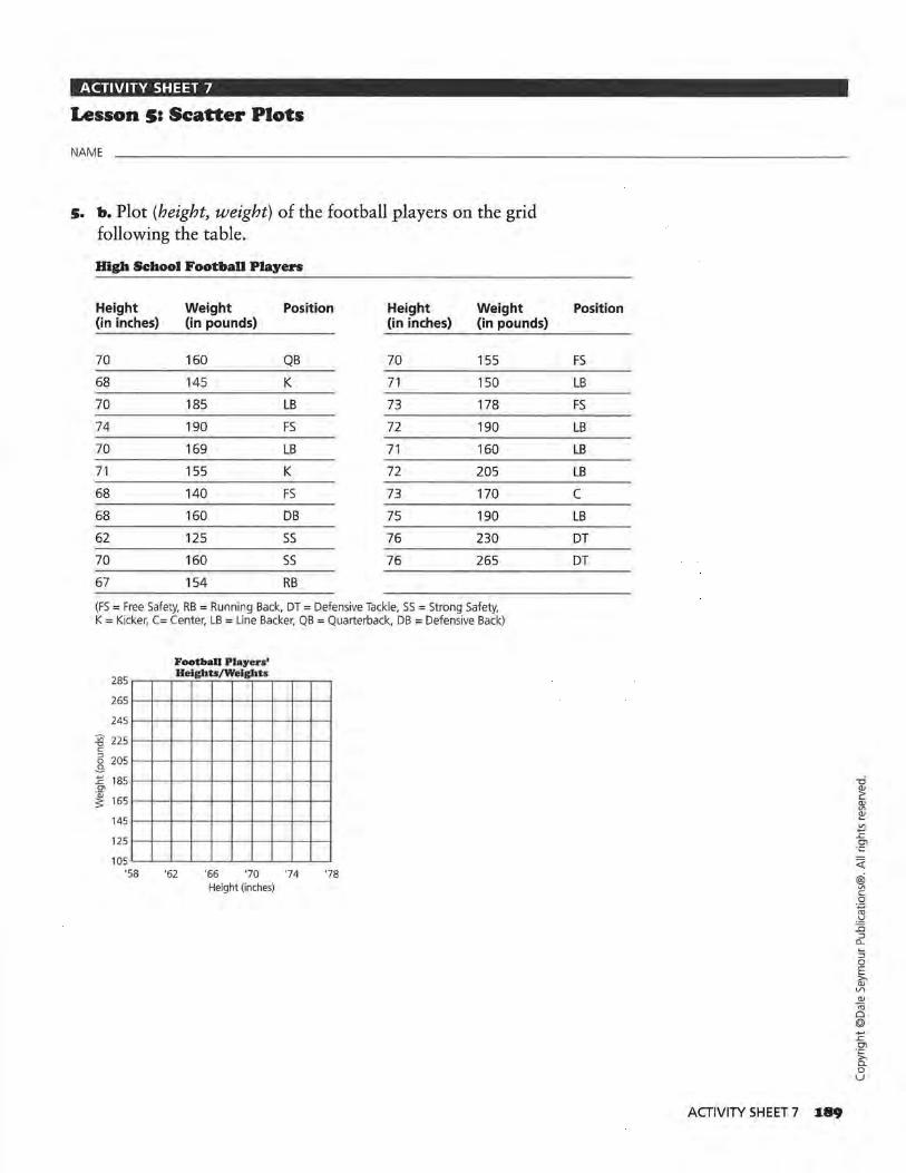
ACTIVITY SHEET 7
Lesson s: Scatter Plots
NAME
5. b. Plot (height, weight) of the football players on the grid following the table.
High School Football Players
Height Weight Position Height Weight (in inches) (in pounds) (in inches) (in pounds)
70 160 QB 70 155
68 145 K 71 150
70 185 LB 73 178
74 190 FS 72 190
70 169 LB 71 160
71 155 K 72 205
68 140 FS 73 170
68 160 DB 75 190
62 125 SS 76 230
70 160 SS 76 265
67 154 RB
(FS = Free Safety, RB = Running Back, DT = Defensive Tackle, SS = Strong Safety, K = Kicker, C= Center, LB = Line Backer, QB = Quarterback, DB = Defensive Back)
Football Player•'
285 .--...-.....-"-..el~gh_h.--fW,--,..-e-'lgh'-T-ts-.---.----.----.
265 l--f--1--+--+--+---+-f-f-i--l
245 l--f--l--+--+--+---+-f-1--1----1
'.§' 225 l--f--l--+--+--+---+-f-1--1----1 c 5 205 1-+----t---+---+---+---+---+-t---t--t -9' ~ 1851-+----t-----t---+---+---+---+-t---t--t c:n
~ 165 >--+---+----t--+---+---+---+-+---t--t
145 l--+---t-----t--+---+--+---<-1--t--t
125 l--+---t-----t--+--+---+---+-1--t--t
105 "---"--..L--'--'---'--'-----'-"--..__.
'58 '62 '66 '70 '74 '78 Height (inches)
Position
FS
LB FS
LB LB
LB
c LB
DT DT
ACTIVITY SHEET 7 I89
<(
® Vl c:: 0
·.;:::;
-~ ::0 ::::l
CL
::; 0 E ~ VI Q)
-ro 0 @ -..c::
°' -~ 0 u

ACTIVITY SHEET 8
Lesson 6: Graphs and Their Special Properties
NAME
II. Draw the line y = x on the graph below.
18 Viewers of Top 30 TV Programs
16
14
12
~ 10
~ 8 QJ
~ 6
4
2
0
-2
D
J
A
D D
8 fl'.1 D
n ~ I'
0 ~~ u
-2 0 2 4 6 8 10 12 14 16 18 Women(%)
Television Viewing Habits
Rank Program
60 Minutes
2 Roseanne
3 Home Improvement
4 Murphy Brown
5 Murder She Wrote
6 Coach
7 NFL Monday Night Football
8 CBS Sunday Night Movie
9 Cheers
10 Full House
11 Northern Exposure
12 Rescue 911
12 20120
14 CBS Tuesday Night Movie
15 Love and War
% Women
16.5
15.3
14.1
14.7
16.0
13.1
7.6
14.3
11.6
10.7
11 .8
11.7
11.6
11.8
11.9
Source: The World Almanac and Book of Facts, 1994.
I90 ACTIVITY SHEET 8
% Rank Men
16.1 16
10.6 16
12.0 16
9.6 19
10.1 20
10.7 20
15.3 22
8.4 23
10.4 24
6.4 25
9.0 26
9.2 26
9.0 28
8.3 29
7.7 30
30
Program % % Women Men
Prince of Bel Air 9.5 6.6
Hangin' With Mr. Cooper 9.9 6.1
Jackie Thomas Show 10.5 7.8
Evening Shade 12.4 8.2
Hearts Afire 12.1 7.7
Unsolved Mysteries 11.2 8.8
Primetime Live 10.7 9.1
NBC Monday Night Movie 11.2 6.4
Dr. Quinn Medicine Woman 12.3 8.0
Seinfeld 9.9 8.7 -0 Q)
~
Blossom 8.7 5.6 Q) Vl
~
48 Hours 10.2 8.4 Vl ..., .c Ol
ABC Sunday Night Movie 10.2 8.2 ·;::
<(
Matlock 11.6 7.8 @i Vl
Simpsons 6.3 7.2 c 0 ·.;::; re
Wings 9.5 8.1 .'=! :0 :J
c... :; 0 E >-Q) \/)
Q)
ro 0 @ ..., .c Ol ·~ c. 0 u

ACTIVITY SHEET 9
Lesson 7: Lines on Scatter Plots
NAME
7. b-d. On the following scatter plot, put a star on each point representing female heights/weights. Draw a line on the scatter plot that you think will summarize or "fit" the data for all students, male and female. Find the equation of your line.
230
220
210
200
190
180
i9 170 c 6 160
-3-1: 150 Cl
~ 140
130
120
110
100
90
80 60
()
62
--'
()
0
64 66
Seniors' Heights/Weights
Cl
0 C)
)
C)
()
() C)
0
0
68 70 72 74 Height (inches)
0
c) o
76 78 80
ACTIVITY SHEET 9 I9I
<(
@i Vl c 0 ·.;:::;
-~ ::c :::J a... ::; 0 E 6i'
V"I QJ
-ro Cl @ +"' ..c O"l ·;:::
f:i: 0 u

ACTIVITY SHEET 10
Lesson 7: Lines on Scatter Plots
NAME
9. a-e. Graph the point (68, 140) on the following scatter plot. Louk at the table in the student book to find the weight of the senior who is 68 inches tall. Graph this point on the scatter plot also. What is the difference between the weight predicted by the line and the actual weight?
230
220
210
200
190
180
'.§' 170 c 6 160 .S E 150 Ol
~ 140
130
120
110
100
90
80 60
0 ~
/ /
/o
/ 0
62 64
J.9Z ACTIVITY SHEET 10
Seniors' Heights/Weights
)
0 )
/ /
() ,.v C) /
/
,.V 0
I) / Ve)
/ 0
' / Vo
66 68 70 72 74 Height (inches)
./
j~
00
76 78 80
<(
® Vl c 0
·.;::;
-~ :c ::i "-:; 0 E ~ Vl Cl)
Iii 0 @ ...., ..c O"l -~ a. 0 u

ACTIVITY SHEET 10 (CONT.)
Lesson 7: Lines on Scatter Plots
NAME
1.3. a-b. Use the equation for the line you drew in Question 7 to predict the weight for each height. Complete the following table.
High School Seniors' Heights/Weights
Males Actual Predicted Females Height Weight Weight Difference Height (in inches) (in pounds) (in inches)
72 .5 195 66
70.5 137 63
72 156 61
70 145 61
71 175 64
70 165 66.5
73 195 64.5
76 155 69
67 143 68
76.5 155 61
76 192 69
69 149 62
71 225
Actual Weight (in pounds)
132
97
145
108
106
125
140
120
130
105
140
110
Predicted Weight Difference
ACTIVITY SHEET 10 l.93
<(
@i "' c 0 ·.;::;
-~ :;:; ::::l a... ::; 0 E ~ VI QJ
-;;; Cl @ +-' ..c
°' -~ 0 u
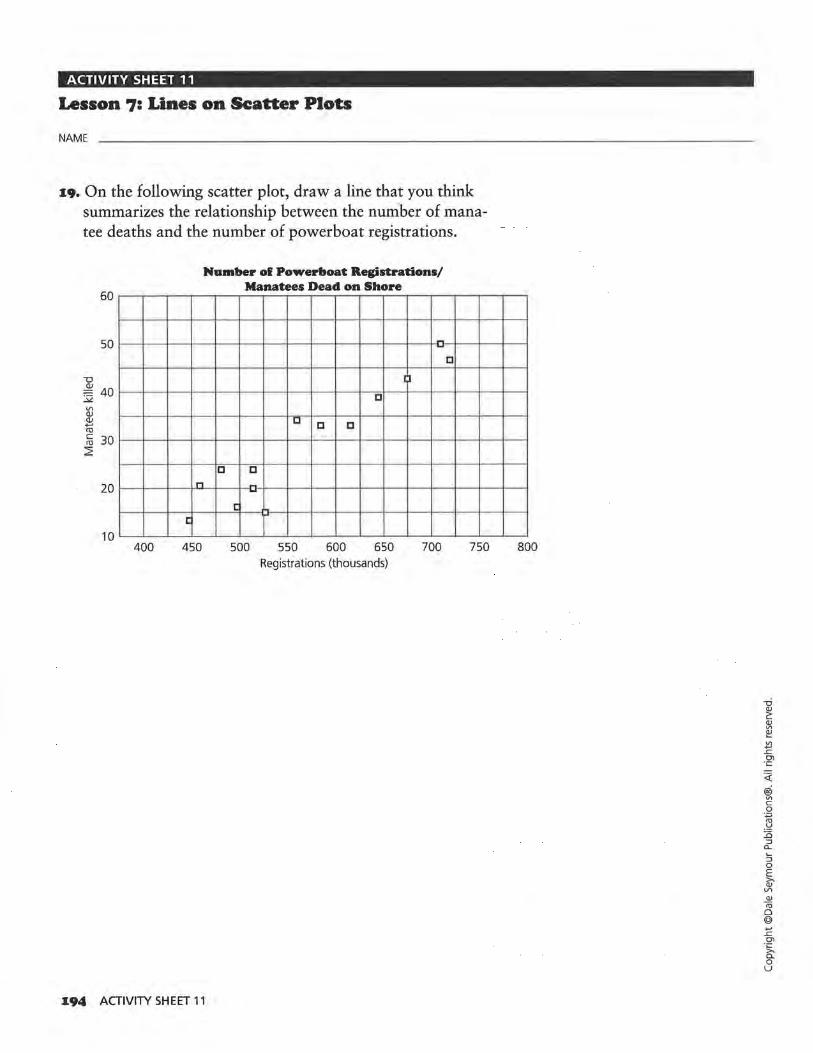
ACTIVITY SHEET 11
Lesson 7: Lines on Scatter Plots
NAME
19. On the following scatter plot, draw a line that you think summarizes the relationship between the number of manatee deaths and the number of powerboat registrations.
60
50
20
10 400
Number ol Powerboat Registrations/ Manatees Dead on Shore
a
I l
a
D a a
a a n -
c :: c
450 500 550 600 650 700 Registrations (thousands)
194 ACTIVITY SHEET 11
a
750 800
<{
® .,, c 0 ·.;::;
-~ :0
:::> CL
::; 0 E ~ l/)
Q)
<ii 0 @ +-' ..c Cl
·~ 0 u
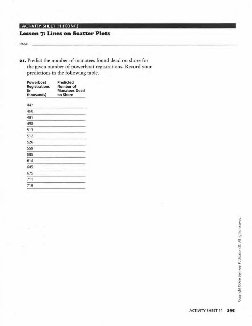
ACTIVITY SHEET 11 (CONT.)
Lesson 7: Lines on Scatter Plots
NAME
21:. Predict the number of manatees found dead on shore for the given number of powerboat registrations. Record your predictions in the following table.
Powerboat Registrations (in thousands)
447
460
481
498
513
512
526
559
585
614
645
675
711
719
Predicted Number of Manatees Dead on Shore
ACTIVITY SHEET 11 1:95
~ @ vi c: 0
:~ :0 :::l a.. :; 0 E ~ QJ n; 0 @ +-' .r:. 0\ -~ 0 u

ACTIVITY SHEET 12
Lesson 9: Lines, Lines, and More lines
NAME
4. b-d. Correct the following scatter plot by using the points (58.5, 172) and (54, 164). Plot the remaining data shown in the table. Draw a median fit line, and write an equation for your line.
Freslunen's Head/Height Measurements
Head Circum. Height Head Circum. (in (in (in centimeters) centimeters) centimeters)
54 160 54.5
55 166 53
59 178 53.5
Height (in centimeters)
164
156
158.5
190
186
182
178
Relationship Between Head Circumference and Height
E" 174 ~ 1: 170 Ol
i 166
162
158
154
150 50 51
196 ACTIVITY SHEET 12
I)
u
52 53
') 0
I ')
0
C) I) C)
0
c4 55 56 57 58 Head Circumference (cm)
59 60
<(
@i Vl c 0
·.p
.~ :0 :::J
Cl..
:::J 0 E it' Vl Q)
Iii 0 @ .... ..c.
°' ·~ 0 u

ACTIVITY SHEET 13
Lesson 9: Lines, Lines, and More Lines
NAME
s. a. The following scatter plot does not show the corrected data for the head circumference and heights of two students. Plot on this scatter plot the data in the table, draw a median fit line, and find its equation. Compare the equation of your line with the equation of the line on Activity Sheet 12.
Freshmen's Head/Height Measurements
Head Circum. Height Head Circum. (in (in (in centimeters) centimeters) centimeters)
54 160 54.5
55 166 53
59 178 53 .5
Height (in centimeters)
164
156
158.5
190
186
182
178
Relationship Between Head Circumference and Height
E' 174 ~
.!: 170 O'I
~ 166
162
158
154
150 50 51
0
I}
52 53
0 I)
C) I)
C) >
I) 0 •'I C)
C)
54 55 56 57 58 Head Circumference (cm)
59 60
ACTIVITY SHEET 13 197
<l: ® ~ 0
:~ ::0 ::l a.. :; 0 E ~ <11 <ii Cl @ .... ..c O>
·~ 0 u

ACTIVITY SHEET 14
Lesson 9: Lines, Lines, and More Lines
NAME
6. b. Draw a median fit line on the following scatter plot, and write the equation for the line.
44
42
40
]. 38 <lJ u c l!! <lJ -E ;:J
. ~ u ~ u <lJ z
36
34
32
30
28 12 13
198 ACTIVITY SHEET 14
C)
C)
0
14
Wrist/Neck Measurements
I)
I)
C)
C)
v C) C)
0 ) --
15 16 17 18 19 Wrist Circumference (cm)
0
20 21 22
<(
® V1 c 0 ·.;:::;
-~ Li ::i c... :; 0 E >Q) VI Q)
(ij 0 @ +-' .<: Ol
·~ c.. 0 u
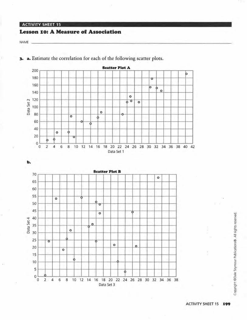
ACTIVITY SHEET 15
Lesson 10: A Measure ol Association
NAME
~. a. Estimate the correlation for each of the following scatter plots.
200 Scatter Plot A
p 180 u
160 K> )
140 0
0 N 120 -QJ
C) 0 0 Vl 100 cu -cu 0 80
0 -0 -
()
60 -- C)
40 0 0
20 u ) 0
0 0 2 4 6 8 10 12 14 16 18 20 22 24 26 28 30 32 34 36 38 40 42
Data Set 1
b.
Scatter Plot B 70
0
65
60
55 0 IJ
50 Cl
u
45 0 Cl
"<:!" 40 -QJ Vl 35 cu
0 D -cu
0 30 0
25 0 u 0
20 0 0
0
15 ')
10
5 C)
0 ()
0 2 4 6 8 10 12 14 16 18 20 22 24 26 28 30 32 34 36 38 Data Set 3
ACTIVITY SHEET 15 1.99
<(
@ Vl c 0 ·.,::;
"' ·'=' J5 :J a_ ~
:J 0 E ~
V1 QJ
tU 0 @ +-' ..c Ol ·~ a. 0 u

ACTIVITY SHEET 16
Lesson 10: A Measure ol Association
NAME
7. Estimate the correlation, find a median fit line, and write the equation of the median fit line for the following scatter plot.
That's Amore Restaurant Menu Items
Menu Item Fat Calories Menu Item (in grams}
Linguini Primavera 2.9 235 Chicken Piccata
Linguini with Scallops 3.1 276 Italian Frittata
Linguini with Shrimp 4.1 304 Sicilian Pork
Classic B.L.T. 19.6 347 Florentine Chicken
T.L.T. (Turkey) 13.1 328 Veal Piccata
Chicken Primavera 7.5 350 Sweet and Sour Chicken
Eggplant Parmigiana 9.7 269 Veal Parmigiana
Poached Roughy 18.4 370 Breadsticks
Italian Restaurant Menu Items
"' QJ
"§ <O u
500
450
400
350
300
250
200
150
100
50 c 0
0
J
" c c
5
c -c "LI
c -ICJ .... ....
c
c:
10 15 20 25 30 Fat (gm)
200 ACTIVITY SHEET 16
Fat (in grams}
16.1
23.0
11.2
7.9
21.9
10.4
21 .0
0.6
Calories
348
424
379
362
394
341
450
40
<(
@i V\ c 0
:~ :0 :::l
a_
::; 0 E ~ VI Q)
'° Cl @ +-' ..c O'l
-~ 0 u

Data-Driven Mathematics Procedures for Using the TI·83
I. Clear menus
ENTER will execute any command or selection. Before beginning a new problem, previous instructions or data should be cleared. Press ENTER after each step below.
1. To clear the function menu, Y=, place the curser any place in each expression, CLEAR
2. To clear the list menu, 2nd MEM ClrAllLists
3. To clear the draw menu, 2nd Draw ClrDraw
4. To turn off any statistics plots, 2nd STATPLOT Plots Off
5. To remove user created lists from the Editor, STAT SetUpEditor
II. Basic information
1. A rule is active if there is a dark rectangle over the option. See Figure l.
IBID Plot2 Plot3 \Y1l!l170 + 7(X-72) \Y2 = - .35X - 22 \Y3 = \Y4 = \Ys = \Y6 = \Y7 =
FIGURE 1
On the screen above, Y1 and Plott are active; Y2 is not. You may toggle Y1 or Y2 from active to inactive by putting the cursor over the = and pressing ENTER. Arrow up to Plot1 and press ENTER to turn it off; arrow right to Plot2 and press ENTER to turn it on, etc.
2. The Home Screen (Figure 2) is available when the blinking cursor is on the left as in the diagram below. There may be other writing on the screen. To get to the Home Screen type 2nd QUIT. You may also clear the screen completely by typing CLEAR.
7~X
7 Y1
11 •
FIGURE 2
3. The variable x is accessed by the X, T, e, n key.
4. Replay option: 2nd ENTER allows you to back up to an earlier command. Repeated use of 2nd ENTER continues to replay earlier commands.
5. Under MATH, the MATH menu has options for fractions to decimals and decimals to fractions, for taking nth roots and for other mathematical operations. NUM contains the absolute value function as well as other numerical operations (Figure 3) .
MATH HLIMI CPX PRB II abs( 2: round( 3: iPart( 4 : fPart( 5: int( 6: min( 7.J,max(
FIGURE 3
Ill. The STAT Menus
1. There are three basic menus under the STAT key: EDIT, CALC and TESTS. Data are entered and modified in the EDIT mode; all numerical calculations are made in the CALC mode; statistical tests are run in the TEST mode.
2. Lists and Data Entry Data is entered and stored in Lists (Figure 4). Data will remain in a list until the list is cleared. Data can be cleared using CLEAR Li or (List name), or by placing the cursor over the List heading and selecting CLEAR ENTER. To enter data, select STAT EDIT and with the arrow keys move the cursor to the list you want to use.
PROCEDURES FOR USING THE Tl-83 Z01
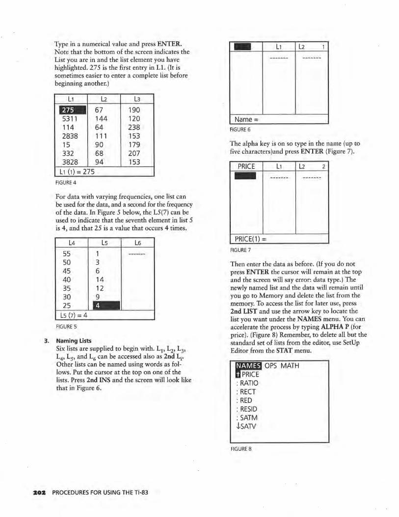
Type in a numerical value and press ENTER. Note that the bottom of the screen indicates the List you are in and the list element you have highlighted. 275 is the first entry in Ll. (It is sometimes easier to enter a complete list before beginning another.)
L1 L2 L3 - 67 190 5311 144 120 114 64 238 2838 111 153 15 90 179 332 68 207 3828 94 153
L1 (1) = 275 FIGURE 4
For data with varying frequencies, one list can be used for the data, and a second for the frequency of the data. In Figure 5 below, the L5(7) can be used to indicate that the seventh element in list 5 is 4, and that 25 is a value that occurs 4 times.
L4 Ls L6 55 1 50 3 45 6 40 14 35 12 30 9 25
Ls (7) = 4 FIGURES
3. Naming Lists Six lists are supplied to begin with. L1, L2, 1 3,
L4, L5, and L6 can be accessed also as 2nd Li. Other lists can be named using words as follows. Put the cursor at the top on one of the lists. Press 2nd INS and the screen will look like that in Figure 6.
202 PROCEDURES FOR USING THE Tl-83
- L1 L2 1 ------- -------
Name= FIGURE 6
The alpha key is on so type in the name (up to five characters)and press ENTER (Figure 7).
PRICE L1 L2 2 - ------- --~--- -
PRICE(1) = FIGURE 7
Then enter the data as before. (If you do not press ENTER the cursor will remain at the top and the screen will say error: data type.) The newly named list and the data will remain until you go to Memory and delete the list from the memory. To access the list for later use, press 2nd LIST and use the arrow key to locate the list you want under the NAMES menu. You can accelerate the process by typing ALPHA P (for price). (Figure 8) Remember, to delete all but the standard set of lists from the editor, use SetUp Editor from the STAT menu.
m:m:mB OPS MATH llPRICT : RATIO : RECT : RED : RESID : SATM -!-SATV
FIGURE 8

4. Graphing Statistical Data
General Comments • Any graphing uses the GRAPH key.
• Any function entered in Yl will be graphed if it is active. The graph will be visible only if a suitable viewing window is selected.
• The appropriate x and y scale can be selected in WINDOW. Be sure to select a scale that is suitable to the range of the variables.
Statistical Graphs To make a statistical plot, select 2nd Y= for the STAT PLOT option. It is possible to make three plots concurrently if the viewing windows are identical. In Figure 9, Plots 2 and 3 are off, Plot 1 is a scatterplot of the data (Costs, Seats), Plot 2 of (L3,L4 ), and Plot 3 is a boxplot of the data in L3.
r·a,.1., Plot1.. .0n l::::: COST SEATS D
2: Plot2 ... Off l::::: L3 L4 +
3: Plot3 ... 0ff H:Il-1 L3
4.J, PlotsOff
FIGURE 9
Activate one of the plots by selecting that plot and pressing ENTER.
Choose ON, then use the arrow keys to select the type of plot (scatter, line, histogram, box plot with outliers, box plot, or Normal probability plot). (In a line plot, the points are connected by segments in the order in which they are entered. It is best used with data over time.) Choose the lists you wish to use for the plot. In the window below, a scatter plot has been selected with the x-coordinate data from COSTS, and they-coordinate data from SEATS. (Figure 10) (When pasting in list names, 2nd LIST, press ENTER to activate the name and ENTER again to locate the name in that position.)
mmlJ Plot2 Plot3 DmC>tt Type:•~ Jlni
HJ+. H:Il-1 k:::::: Xlist: 00STS Ylist: SEATS Mark:r! + •
FIGURE 10
For a histogram or box plot you will need to select the list containing the data and indicate whether you used another list for the frequency or are using 1 for the frequency of each value. The x scale selected under WINDOW determines the width of the bars in the histogram. It is important to specify a scale that makes sense with the data being plotted.
5. Statistical Calculations One variable calculations such as mean, median, maximum value of the List, standard deviation, and quartiles can be found by selecting STAT CALC 1-Var Stats followed by the list in which you are interested. Use the arrow to continue reading the statistics. (Figures 11, 12, 13)
EDIT l.El!i TESTS 111-Var Stats 2: 2-Var Stats 3: Med-Med 4: LinReg(ax + b) 5: QuadReg 6: CubicReg 7.tQuartReg
FIGURE 11
1-Var Stats L1•
FIGURE 12
PROCEDURES FOR USING THE Tl-83 20~

1-Var Stats x = 1556.20833 LX = 37349 LX2 = 135261515 Sx = 1831.353621 O'X = 1792.79449 tn = 24
• FIGURE 13
Calculations of numerical statistics for bivariate data can be made by selecting two variable statistics. Specific lists must be selected after choosing the 2-Var Stats option. (Figure 14)
2-Var Stats L 1, L 2.
FIGURE 14
Individual statistics for one or two data sets can be obtained by selecting VARS Statistics, but you must first have calculated either 1-Var or 2-Var Statistics. (Figure 15)
~L EQ TEST PTS
2: x 3: Sx 4: crx 5: y 6: Sy 7tcry
FIGURE 15
6. Fitting Lines and Drawing their graphs ·calculations for fitting lines can be made by selecting the appropriate model under STAT CALC: Med-Med gives the median fit regression; LinReg the least squares linear regression
Z04 PROCEDURES FOR USING THE Tl-83
and so on. (Note the only difference between LinReg (ax+b) and LinReg (a+bx) is the assignment of the letters a and b.) Be sure to specify the appropriate lists for x and y. (Figure 16)
Med-Med LCal, LFA CALI
FIGURE 16
To graph a regression line 0
on a scatter plot, follow the steps below:
• •
•
Enter your data into the Lists .
Select an appropriate viewing window and set up the plot of the data as above.
Select a regression line followed by the lists for x and y, VARS Y-VARS Function (Figure 17, 18) and the Yi you want to use for the equation, followed by ENTER.
VARS iTAfJ!!U.1 II Function .. . 2: Parametric. .. 3: Polar ... 4: On/Off ...
FIGURE 17
Med-Med _CAL, LFA CAL, Y1
FIGURE 18
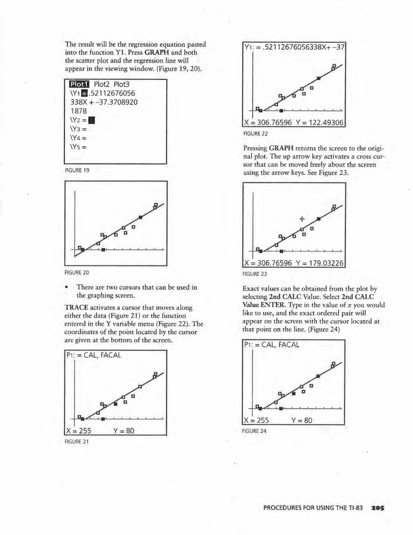
The result will be the regression equation pasted into the function Y1. Press GRAPH and both the scatter plot and the regression line will appear in the viewing window. (Figure 19, 20).
mmJ Plot2 Plot3 \Y1 l!l .52112676056 338X + -37 .3708920 1878
\Y2 =• \Y3 = \Y4 = \Ys =
FIGURE 19
FIGURE 20
• There are two cursors that can be used in the graphing screen.
TRACE activates a cursor that moves along either the data (Figure 21) or the function entered in the Y variable menu (Figure 22). The coordinates of the point located by the cursor are given at the bottom of the screen.
P1: = CAL, FACAL
x = 255 Y=80 FIGURE 21
Y1: = .52112676056338X+-37
x = 306.76596 y = 122.49306
FIGURE 22
Pressing GRAPH returns the screen to the original plot. The up arrow key activates a cross cursor that can be moved freely about the screen using the arrow keys. See Figure 23.
x = 306.76596 y = 179.03226
FIGURE 23
Exact values can be obtained from the plot by selecting 2nd CALC Value. Select 2nd CALC Value ENTER. Type in the value of x you would like to use, and the exact ordered pair will appear on the screen with the cursor located at that point on the line. (Figure 24)
P1: = CAL, FACAL
X= 255 Y=80 FIGURE 24
PROCEDURES FOR USING THE Tl-83 205

IV. Evaluating an expression:
To·evaluate y = .225x-15.6 for x = 17, 20 and 24 you can:
1. Type the expression in Yl, return to the home screen, 17 STO X,T,E>,n ENTER, VARS Y1=1VARS Function Yl ENTER ENTER. (Figure 25)
17 ~x 17
Y1 -11.75833333
• FIGURE 25
Repeat'the process for x = 20 and 24.
2. Type 172 - 4 for x = 17, ENTER (Figure 26) Then use 2nd ENTRY to return to the arithmetic line. Use the arrows to return to the value 17 and type over to enter 20.
.225*17-15.6 -11.775
.225*21- 15.6
FIGURE 26
You can also find the value of x by using the table command. Select 2nd ThlSet (Figure 27). (Yl must be turned on.) Let TBIMin = 17, and the increment A Thl = 1.
Z06 PROCEDURES FOR USING THE Tl-83
TABLE SETUP TblMin = 17 LiTbl =I
lndpnt: f!!lm Ask Depend: f!!lm Ask
FIGURE 27
'Select 2nd TABLE and the x and y-values generated by the equation in Yl will be displayed. (Figure 28)
x Y1 - -11 . 76 18 -11 .53 19 -11 .31 20 -11 .08 21 -10.86 22 -10.63 23 -10.41
x = 17
FIGURE 28
V. Operating with Lists
1. A list can be treated as a function and defined by placing the cursor on the label above the list entries. List 2 can be defined as L1 + 5. (Figure 29)
L1 DJ L3
275 ------- 190 5311 120 114 238 2838 153 15 179 332 207 3828 153
L2=L1+5
FIGURE 29
Pressing ENTER will fill List 2 with the values defined by L1+5. (Figure 30)

L1 L2 L3
275 - 190 5311 5316 120 114 119 238 2838 2843 153 15 20 179 332 337 207 3828 3833 153
L2(1) = 280 FIGURE 30
2. List entries can be cleared by putting the cursor on the heading above the list, and selecting CLEAR and ENTER.
3. A list can be generated by an equation from Y = over a domain specified by the values in Li by putting the cursor on the heading above the list entries. Select VARS Y-VARS Function Yl ENTER ( Ll) ENTER. (Figure 31)
L1 L2 Ill 120 12 --·----110 14 110 12 110 11 100 ? 100 6 120 9
L3=Y1(L1)
FIGURE 31
4. The rule for generating a list can be attached to the list and retrieved by using quotation marks (ALPHA+) around the rule (Figure 32). Any change in the rule (Yl in the illustration) will result in a change in the values for Ll. To delete the rule, put the cursor on the heading at the top of the list, press ENTER, and then use the delete key. (Because L1 is defined in terms of CAL, if you delete CAL without deleting the rule for L1 you will cause an error.)
CAL FA CAL ID 5
255 80 -------305 120 410 180 510 250 320 90 370 125 500 235
L1 = "Y1(LCAL)"
FIGURE 32
VI. Using the DRAW Command
To draw line segments, start from the graph of a plot, press 2ND DRAW and select Line(. (Figure 33)
!1]M\fM POINTS STO 1: ClrDraw fl Line( 3: Horizontal 4: Vertical 5: Tangent( 6: DrawF 7-1-Shade(
FIGURE 33
This will activate a cursor that can be used to mark the beginning and ending of a line segment. Move the cursor to the beginning point and press ENTER; use the cursor to mark the end of the segment, and press ENTER again. To draw a second segment, repeat the process. (Figure 34)
x = 171.95745 y = 49.354839 FIGURE 34
PROCEDURES FOR USING THE Tl-83 Z07

VII. Random Numbers
To generate random numbers, press MATH and PRB. This will give you access to a random number function, rand, that will generate random numbers between 0 and 1 or randlnt( that will generate random numbers from a beginning integer to an ending integer for a specified set of numbers. (Figure 35) In Figure 36, five random numbers from 1 to 6 were generated.
MATH NUM CPX mmJ II rand 2: nPr 3: nCr 4: ! 5: randlnt( 6: randNorm( 7: randBin(
FIGURE 35
randlnt(1, 6, 5,) (2 4 2 5 3)
FIGURE 36
Pressing ENTER will generate a second set of random numbers.
Z08 PROCEDURES FOR USING THE Tl-83


90000
I 9 781572 322110
ISBN 1-57232-211-X 21162
Related Documents


![Exploring Statistical Language Models for Recommender Systems [RecSys '15 DS Slides]](https://static.cupdf.com/doc/110x72/58a839aa1a28ab30658b4d6b/exploring-statistical-language-models-for-recommender-systems-recsys-15-58ac54b99147a.jpg)