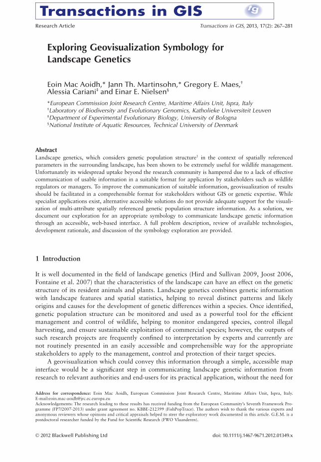
Exploring Geovisualization Symbology for Landscape Genetics Eoin Mac Aoidh,* Jann Th. Martinsohn,* Gregory E. Maes, † Alessia Cariani ‡ and Einar E. Nielsen § *European Commission Joint Research Centre, Maritime Affairs Unit, Ispra, Italy † Laboratory of Biodiversity and Evolutionary Genomics, Katholieke Universiteit Leuven ‡ Department of Experimental Evolutionary Biology, University of Bologna § National Institute of Aquatic Resources, Technical University of Denmark Abstract Landscape genetics, which considers genetic population structure 1 in the context of spatially referenced parameters in the surrounding landscape, has been shown to be extremely useful for wildlife management. Unfortunately its widespread uptake beyond the research community is hampered due to a lack of effective communication of usable information in a suitable format for application by stakeholders such as wildlife regulators or managers. To improve the communication of suitable information, geovisualization of results should be facilitated in a comprehensible format for stakeholders without GIS or genetic expertise. While specialist applications exist, alternative accessible solutions do not provide adequate support for the visuali- zation of multi-attribute spatially referenced genetic population structure information. As a solution, we document our exploration for an appropriate symbology to communicate landscape genetic information through an accessible, web-based interface. A full problem description, review of available technologies, development rationale, and discussion of the symbology exploration are provided. 1 Introduction It is well documented in the field of landscape genetics (Hird and Sullivan 2009, Joost 2006, Fontaine et al. 2007) that the characteristics of the landscape can have an effect on the genetic structure of its resident animals and plants. Landscape genetics combines genetic information with landscape features and spatial statistics, helping to reveal distinct patterns and likely origins and causes for the development of genetic differences within a species. Once identified, genetic population structure can be monitored and used as a powerful tool for the efficient management and control of wildlife, helping to monitor endangered species, control illegal harvesting, and ensure sustainable exploitation of commercial species; however, the outputs of such research projects are frequently confined to interpretation by experts and currently are not routinely presented in an easily accessible and comprehensible way for the appropriate stakeholders to apply to the management, control and protection of their target species. A geovisualization which could convey this information through a simple, accessible map interface would be a significant step in communicating landscape genetic information from research to relevant authorities and end-users for its practical application, without the need for Address for correspondence: Eoin Mac Aoidh, European Commission Joint Research Centre, Maritime Affairs Unit, Ispra, Italy. E-mail:[email protected] Acknowledgements: The research leading to these results has received funding from the European Community’s Seventh Framework Pro- gramme (FP7/2007-2013) under grant agreement no. KBBE-212399 (FishPopTrace). The authors wish to thank the various experts and anonymous reviewers whose opinions and critical appraisals helped to steer the exploratory work documented in this article. G.E.M. is a postdoctoral researcher funded by the Fund for Scientific Research (FWO Vlaanderen). Research Article Transactions in GIS, 2013, 17(2): 267–281 © 2012 Blackwell Publishing Ltd doi: 10.1111/j.1467-9671.2012.01349.x

Welcome message from author
This document is posted to help you gain knowledge. Please leave a comment to let me know what you think about it! Share it to your friends and learn new things together.
Transcript
Exploring Geovisualization Symbology forLandscape Genetics
Eoin Mac Aoidh,* Jann Th. Martinsohn,* Gregory E. Maes,†
Alessia Cariani‡ and Einar E. Nielsen§
*European Commission Joint Research Centre, Maritime Affairs Unit, Ispra, Italy†Laboratory of Biodiversity and Evolutionary Genomics, Katholieke Universiteit Leuven‡Department of Experimental Evolutionary Biology, University of Bologna§National Institute of Aquatic Resources, Technical University of Denmark
AbstractLandscape genetics, which considers genetic population structure1 in the context of spatially referencedparameters in the surrounding landscape, has been shown to be extremely useful for wildlife management.Unfortunately its widespread uptake beyond the research community is hampered due to a lack of effectivecommunication of usable information in a suitable format for application by stakeholders such as wildliferegulators or managers. To improve the communication of suitable information, geovisualization of resultsshould be facilitated in a comprehensible format for stakeholders without GIS or genetic expertise. Whilespecialist applications exist, alternative accessible solutions do not provide adequate support for the visuali-zation of multi-attribute spatially referenced genetic population structure information. As a solution, wedocument our exploration for an appropriate symbology to communicate landscape genetic informationthrough an accessible, web-based interface. A full problem description, review of available technologies,development rationale, and discussion of the symbology exploration are provided.
1 Introduction
It is well documented in the field of landscape genetics (Hird and Sullivan 2009, Joost 2006,Fontaine et al. 2007) that the characteristics of the landscape can have an effect on the geneticstructure of its resident animals and plants. Landscape genetics combines genetic informationwith landscape features and spatial statistics, helping to reveal distinct patterns and likelyorigins and causes for the development of genetic differences within a species. Once identified,genetic population structure can be monitored and used as a powerful tool for the efficientmanagement and control of wildlife, helping to monitor endangered species, control illegalharvesting, and ensure sustainable exploitation of commercial species; however, the outputs ofsuch research projects are frequently confined to interpretation by experts and currently arenot routinely presented in an easily accessible and comprehensible way for the appropriatestakeholders to apply to the management, control and protection of their target species.
A geovisualization which could convey this information through a simple, accessible mapinterface would be a significant step in communicating landscape genetic information fromresearch to relevant authorities and end-users for its practical application, without the need for
Address for correspondence: Eoin Mac Aoidh, European Commission Joint Research Centre, Maritime Affairs Unit, Ispra, Italy.E-mail:[email protected]: The research leading to these results has received funding from the European Community’s Seventh Framework Pro-gramme (FP7/2007-2013) under grant agreement no. KBBE-212399 (FishPopTrace). The authors wish to thank the various experts andanonymous reviewers whose opinions and critical appraisals helped to steer the exploratory work documented in this article. G.E.M. is apostdoctoral researcher funded by the Fund for Scientific Research (FWO Vlaanderen).
bs_bs_banner
Research Article Transactions in GIS, 2013, 17(2): 267–281
© 2012 Blackwell Publishing Ltd doi: 10.1111/j.1467-9671.2012.01349.x

expert intervention (Waples et al. 2008). We consider the web-based domain as accessible forour purposes, as no specialist experience or software downloads are required. Users need onlyvisit the website for full access to a typical online map browser. The research presented in thisarticle employs Open Layers (http://openlayers.org/) as a test bed, and uses empirical geneticdata from the marine environment as a case study for the exploration of a suitable geovisuali-zation symbology. The application of landscape genetics in the marine environment is referredto as seascape genetics.
It is becoming increasingly clear in the field of seascape genetics that ocean currents, gyres,geographic distance, changes in salinity levels, depth, temperature, food sources, etc. can leadto the formation of genetically distinct marine fish populations (Fontaine et al. 2007, Hansenand Hemmer-Hansen, 2007). Meanwhile, global consumption of fish and fish products is con-stantly rising, leaving many of the commercially exploited fish stocks in an unsustainable state.Effective measures to control illegal fishing, with an annual value of 10-20 billion euros(Agnew et al. 2009), and to improve sustainability, can be supported by seascape geneticsthrough the identification of genetically and geographically distinct populations of a species(Waples and Gaggiotti 2006).
Identification of distinct populations is performed by analyzing an array of specimens of asingle species sampled across a defined geographic area to generate a baseline map of geneticpopulation structure for the species. We wish to provide an accessible visualization of thispopulation structure information in relation to environmental parameters such as currents,salinity gradients, etc. In this way the relevant material is readily accessible to the relevantstakeholders. Thus it can be applied for example, by control and enforcement authorities, fortasks such as the probable origin assignment of fish of unknown or questionable origin(Nielsen et al. 2001), in a fisheries management context, or to develop informed fisheries poli-cies which take this emergent scientific information on population structure and its environ-mental influences into account. To facilitate the development of such a geovisualizationservice, this article considers the development of an appropriate symbology, describing theessential components of genetic population structures and their interconnected relationshipswithin a given landscape, which can be delivered in a web-based map interface. The case studydata and accompanying web-based map interface for the testing of the proposed symbologyare provided through the authors’ participation in the FishPopTrace consortium (http://fishpoptrace.jrc.ec.europa.eu/).
The consortium produced data by performing genetic analysis on over 7,500 specimens offour commercially important species; cod, hake, herring, and sole, sampled from the Mediter-ranean into the Atlantic, North Sea, Baltic Sea, and Barents Sea for the purpose of revealingthe genetic population structure of these species for fisheries management applications. In theexploration of a visualization solution, we have taken care to remain independent of bothapplication domain and technology platform. The solution we propose is designed to supportthe visualization of landscape genetic information for any species, in any environment, usingany web-based mapping platform. The remainder of this article is structured as follows:Section 2 provides a background to the symbology exploration documented in Section 3,which also provides a contextual case study. Section 4 discusses and appraises the symbologiesexplored. Section 5 provides conclusions.
2 Background
In the context of a marine environment case study, our primary objective is to provide anaccessible geovisualization tool for communication with, and for use by non-scientific stake-
268 E Mac Aoidh, J Th Martinsohn, G E Maes, A Cariani and E E Nielsen
© 2012 Blackwell Publishing Ltd Transactions in GIS, 2013, 17(2)
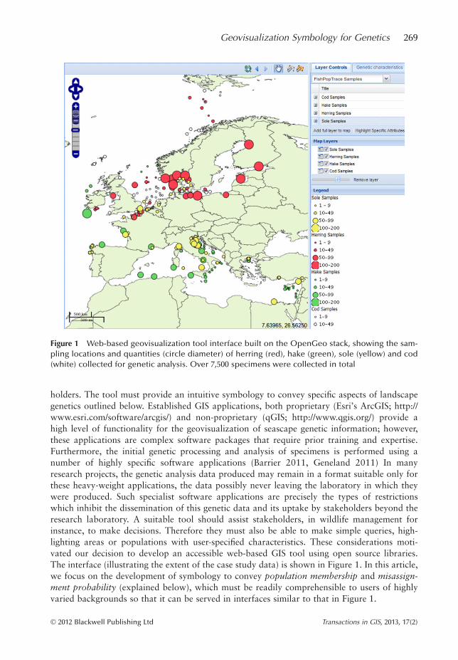
holders. The tool must provide an intuitive symbology to convey specific aspects of landscapegenetics outlined below. Established GIS applications, both proprietary (Esri’s ArcGIS; http://www.esri.com/software/arcgis/) and non-proprietary (qGIS; http://www.qgis.org/) provide ahigh level of functionality for the geovisualization of seascape genetic information; however,these applications are complex software packages that require prior training and expertise.Furthermore, the initial genetic processing and analysis of specimens is performed using anumber of highly specific software applications (Barrier 2011, Geneland 2011) In manyresearch projects, the genetic analysis data produced may remain in a format suitable only forthese heavy-weight applications, the data possibly never leaving the laboratory in which theywere produced. Such specialist software applications are precisely the types of restrictionswhich inhibit the dissemination of this genetic data and its uptake by stakeholders beyond theresearch laboratory. A suitable tool should assist stakeholders, in wildlife management forinstance, to make decisions. Therefore they must also be able to make simple queries, high-lighting areas or populations with user-specified characteristics. These considerations moti-vated our decision to develop an accessible web-based GIS tool using open source libraries.The interface (illustrating the extent of the case study data) is shown in Figure 1. In this article,we focus on the development of symbology to convey population membership and misassign-ment probability (explained below), which must be readily comprehensible to users of highlyvaried backgrounds so that it can be served in interfaces similar to that in Figure 1.
Figure 1 Web-based geovisualization tool interface built on the OpenGeo stack, showing the sam-pling locations and quantities (circle diameter) of herring (red), hake (green), sole (yellow) and cod(white) collected for genetic analysis. Over 7,500 specimens were collected in total
Geovisualization Symbology for Genetics 269
© 2012 Blackwell Publishing Ltd Transactions in GIS, 2013, 17(2)

Both environmental (including topographical) and genetic data are processed in seascapegenetic analyses and visualizations. The former include critical aspects such as the location andshape of land barriers, ocean temperature values, ocean currents, salinity, chlorophyll concen-tration, depth, etc. For example, ocean currents carry eggs or larvae from distant populations,while reefs or land barriers create obstacles separating populations from each other. These aretypical data handled by established thematic map cartographic techniques (Slocum et al.2004). The latter, population genetic data, when viewed in the context of the seascape, havethe potential to reveal the relationship between genetic population structure and the surround-ing environment. For example, a current system separating two populations of the samespecies may cause the development of increasing genetic diversity between the two populationsover time.
The genetic markers employed by the FishPopTrace consortium to reveal the populationstructure of the target fish species are Single Nucleotide Polymorphisms (SNPs).2 In this articlewe refer to populations as groups of interbreeding individuals that exist together in time andspace. These individuals therefore share a common gene-pool and are subject to the same evo-lutionary forces. In order to reveal distinct populations of fish, multiple SNPs were genotypedand analyzed with population genetics statistical software tools such as Geneland (http://www2.imm.dtu.dk/~gigu/Geneland/), which cluster the analyzed specimens according to theirgenetic similarity in relation to the location at which they were sampled. The identification ofsuch population clusters, probably representing distinct biological populations, describes col-lections of individuals of a particular species which form an interbreeding group. These bio-logically distinct populations can be taken into account for stock management (Waples et al.2008).
The representation of specimens sampled at specific locations, their composition in termsof distinct genetic population clusters, inter-cluster relationships, and their relationship withthe seascape is our primary concern. The other significant aspect we wish to visualize is themisassignment probability associated with the defined population clusters. That is: given aspecimen sampled at a specific location which, following analysis, is assigned to cluster A,what is the probability that it was incorrectly assigned to cluster A from cluster B, likewiseclusters C and D? The proportion of individuals misassigned to a population cluster gives anindication of the reliability of the assignment of a specimen to a population. For example, thisis important in a case where a deliberately falsified declaration of catch origin is suspected.Although we refer to marine fish, the same principle of genetic origin assignment is applicableto any of the animal or plant domains, be they terrestrial, fluvial, etc.
There are many documented ways to represent multiple variables on a single map asdescribed for instance in Slocum et al. (2004) and Kraak and Ormeling (1996). However, asuitable representation technique which would adequately and intuitively correlate geneticdata with its environment in an accessible web-based interface has not been identified in any ofthe previously documented approaches.
The most frequently used technique for connecting genetic information with its geographi-cal context is the representation of allele frequencies (occurrences of specific markers in thegenome) in specimens sampled at various locations using geolocated pie charts (Hird and Sul-livan 2009, Joost 2006, Fontaine et al. 2007). An application employing precisely such a tech-nique is PhyloGeoViz (Tsai 2010). The pie charts are placed in Google Earth (http://www.earth.google.com/) allowing the user to browse the map and compare the geneticcharacteristics of samples at various locations. Pie charts have long been associated with ugly,cumbersome visualizations, as evidenced in Tufte’s (1983) seminal work on information visu-alization. The information they represent can usually be represented in a more informative
270 E Mac Aoidh, J Th Martinsohn, G E Maes, A Cariani and E E Nielsen
© 2012 Blackwell Publishing Ltd Transactions in GIS, 2013, 17(2)
manner by another technique. The number of variables represented in pie charts is limited topie radius, slice size, and colour. Since we intend to visualize more parameters than can beshown on a pie chart (for example by including the misassignment probability to other popu-lations, and an indication of the population whereto misassignment occurred), alternative visu-alization means must be explored.
A number of systems developed for phylogeography (Tsai 2010, Scotch et al. 2010, Kiddand Liu 2008) show the geographic distribution and extent of specific genetic characteristics,providing spatiotemporal phylogenetic tree analytic tools, rather than pointing to possiblerelationships between genetic diversity and the landscape, which are of concern to us. Existingphylogeography systems, such as GeoPhyloBuilder (Kidd and Liu 2008) are developed asplugins for ArcGIS. This software and analysis is beyond the scope of our target audience anddoes not place sufficient emphasis on links with environmental characteristics.
A popular technique is the placing of miniaturized graphs (produced according to estab-lished multivariate statistical visualization techniques for genetic data such as Principal Com-ponent Analysis, Isolation By Distance, etc.) on a map according to the location to which theycorrespond. This approach is akin to the conventional statistical visualizations, oftenemployed in the field of genetics being ‘pinned’ to a map in order to correlate the genetic sta-tistics with their geographical extent. Such graph-based approaches can be highly useful in aninteractive, linked environment as described in Andrienko et al. (2002) and MacEachren andKraak (1997), where geographic location is interactively linked with a selected statistical plot(or other information). However, caution must be exercised to avoid over-complication and tolimit the occlusion of critical environmental and topographical information by superimposedcharts and graphs. Popular statistical graph visualization techniques for multivariate dataapplicable to this approach include, but are not limited to: Andrews plots, parallel coordinateplots, glyph plots, star plots and RadVIZ plots, all of which are reviewed by Brunsdon et al.(1998).
Two plot techniques of note, of which we consider modifications in this article, are thestar plot and related RadVIZ technique (Novakova and Stepankova 2006), which are analysedin detail (along with other radial information visualization techniques) in Draper et al. (2009).Both techniques give equal representation to each variable with no theoretical limit on thenumber of variables that can be represented. In the case of the star plot, each variable isassigned an ‘arm’ or axis radiating from a centroid, spaced at equal intervals to form a starshape. The value of each variable is placed along its axis at the appropriate distance defined byits value. A line connects each adjacent arm at the value on each axis. The resulting graph is ina star shape, with a greater number of variables adding greater complexity to the graph. Theordering and variation of star plot axes (Klippel et al. 2009a), and the fill colour of the plot(Klippel et al. 2009b), have been considered as critical criteria in their visual interpretation andare taken into account in our symbology exploration. These criteria are also applicable to thesimilar RadVIZ method, which arranges the axes in a circle and pulls the centroid in the direc-tion of the higher value variables.
3 Case Study: Symbology Development
A major constraint of seascape genetics is the relative inaccessibility of the sea. The quantityand distribution of locations sampled for genetic baseline creation represent only a tiny frac-tion of the entire ocean coverage. Consequently, despite the novel insight genetic analysis pro-vides into the distribution of fish populations in our oceans, it is strongly constrained to the
Geovisualization Symbology for Genetics 271
© 2012 Blackwell Publishing Ltd Transactions in GIS, 2013, 17(2)
areas in which sampling and analysis have been performed. Sampling locations were carefullychosen to maximize coverage. It was not possible to conduct sampling on a regular grid cover-ing the entire study area due to the inaccessibility of the environment, time, and financial con-straints, amongst others. Figure 1 shows the areas sampled as part of the FishPopTraceproject. Over 7,500 samples of the target species were collected. The granularity of the sam-pling locations employed was influenced by a number of factors. In some areas, a high concen-tration of sampling was conducted where n samples were taken at a series of x closely spacedlocations, while in other locations, up to nx samples were logged as originating at a singlelocation. Temporal genetic data exists for a selection of sampling locations for certain speciesranging back over the last two decades. Despite these specific constraints of the case studydata, the proposed symbology is kept generic to remain applicable to genetic data from anydomain. The symbology is applied to our empirical case study data to provide a proof ofconcept.
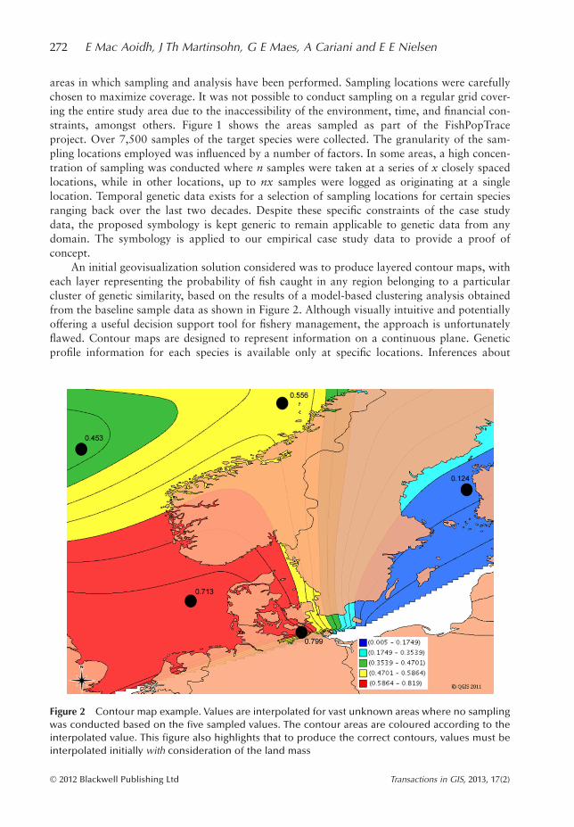
An initial geovisualization solution considered was to produce layered contour maps, witheach layer representing the probability of fish caught in any region belonging to a particularcluster of genetic similarity, based on the results of a model-based clustering analysis obtainedfrom the baseline sample data as shown in Figure 2. Although visually intuitive and potentiallyoffering a useful decision support tool for fishery management, the approach is unfortunatelyflawed. Contour maps are designed to represent information on a continuous plane. Geneticprofile information for each species is available only at specific locations. Inferences about
Figure 2 Contour map example. Values are interpolated for vast unknown areas where no samplingwas conducted based on the five sampled values. The contour areas are coloured according to theinterpolated value. This figure also highlights that to produce the correct contours, values must beinterpolated initially with consideration of the land mass
272 E Mac Aoidh, J Th Martinsohn, G E Maes, A Cariani and E E Nielsen
© 2012 Blackwell Publishing Ltd Transactions in GIS, 2013, 17(2)
genetic characteristics in unsampled waters may have a very low certainty. Thus a contourmap would give a misleading impression to the viewer and would be of little value fordecision-making or fishery control and enforcement purposes. The same could be said of othermap types which also require continuous or quasi-continuous distributions of significantvolumes of data to generate meaningful representations of the data at hand. In additioncomplex interpolation of values around landmasses would be required, as highlighted inFigure 2, as the probability of a fish originating on land is 0. Nonetheless, contour maps areuseful tools in the initial scientific exploration of genetic clusters and are provided as valuableoutput tools for geneticists in specialist software applications such as Geneland. In these spe-cialist applications, they are intended for information exploration purposes by expert users,rather than as a generic communication tool for non-experts as they require careful interpreta-tion. Other genetic software packages such as Barrier can be employed to cluster individualspecimens and subsequently employ a Voronoi tessellation to extrapolate the geographicboundaries of the cluster. As with Geneland, the output is intended for a scientific audienceand requires the use of specialist software. Another type of geovisualization considered wasthat of OD maps (Wood et al. 2010), which could be used to represent genetic flow from onecluster to another. Although the visualizations produced are highly informative for expertusers, they are unfortunately highly specialised, requiring some previous knowledge or experi-ence for correct interpretation, thus they are not suitable for communication with the diverseaudience we have in mind. Considering the unsuitability of the aforementioned map types andsoftware packages for the geovisualization objectives expressed, we now look at some poten-tial real-world tasks before documenting our exploration of a suitable symbology.
Consider a geneticist who wishes to communicate his or her research, highlighting therelationship between ocean temperature or salinity concentration and their role in the forma-tion of genetically discrete fish populations. This might be used for instance as a valuablemeans to communicate scientific advice to fishery policy makers in a bid to keep fishing quotasat a sustainable level. Secondly, consider a fisheries control and enforcement authority wishingto monitor suspicious fishing activities, to visualize the location at which a series of randomlysampled specimens with specific genetic characteristics are likely to have originated, and towhere their potential misassignment could occur. A third scenario could involve a commercialfishery manager, wanting to visualize and monitor the genetic population structure of his orher fish stocks. Use of this tool could assess the diversity of the gene pool of the stock, ensur-ing the sustainability of the fishery while allowing for the provision of healthy fish products tothe consumer with improved transparency in food safety and traceability.
In such real-world scenarios, the primary measure to be visualized is population member-ship. Values are calculated by grouping fish into statistically significant population clusters,based on the genetic profile of each individual, with no prior information about the location atwhich the specimen was sampled. By mapping the proportion of each cluster’s characteristicspresent at each sampling location, it is possible to illustrate the mix of genetic components ofeach cluster present at each sampling location. Such a mapping is often carried out in the land-scape genetics and phylogeography domains using geolocated pie charts (Joost 2006, Tsai2010, Fontaine et al. 2007). Pie charts introduce unnecessary and distracting detail for thetype of data we wish to display; moreover, the number of variables they can represent isrestricted to slice size and colour to show the ratio of certain parameters and pie radius toshow the quantity of another parameter. In order for small slices to be legible, the pies must beof not inconsiderable size, as such, they may occlude other important layers in the map. Wewish to provide a symbology that is easier on the eye than a series of pie charts and that can bereduced in size while conserving its legibility, allowing its unimposing overlay with topo-
Geovisualization Symbology for Genetics 273
© 2012 Blackwell Publishing Ltd Transactions in GIS, 2013, 17(2)

graphic or environmental information, yet with the capability to represent more variables thanpie charts can offer. Thus we propose a solution which generates a fill colour for a simplified,yet equally expressive map symbol.
3.1 Colour Generation
The fill colour for the symbol is produced by mixing the proportion of colour correspondingto each of the genetic clusters present at a given location. For example, if the genetic clusteringsoftware identifies fish from a sampling location as being composed of 70% of cluster A and30% of cluster B, the colour representing the location is a mix of 70% one colour and 30% ofanother. The CMYK colour model is employed, which allows the colours cyan, magenta andyellow to be assigned to one cluster each. These colours can be mixed in any proportion toproduce a unique colour, expressing a unique genetic composition (as illustrated in the Venn-diagram in the legend of Figure 3). The colours black and white can also be employed to rep-resent additional fourth and fifth clusters, however their addition must be considered carefully,as the mixes they produce are less identifiable when more than one of cyan, magenta or yelloware involved in the mix. For this reason, black and white are typically employed to representoutlier clusters, which are genetically speaking, substantially distant from the other clusters,i.e. which have little or no mixing with clusters represented by a mix of two or more of thecore colours (cyan, magenta and yellow). Mixing of white or black with one of the corecolours remains easy to identify. The percentage of each colour/cluster is used to calculate thehexadecimal number representing the colour mix, which is then used to fill the symbol. Anexample of the colours generated using this technique is shown in Figure 3. The exact percent-ages in the mix are not critical to the interpretation of the image. The map should communi-
Figure 3 Colour blending technique showing the genetic mix of four clusters at each of the sam-pling locations in the Mediterranean. Clusters of genetically similar or identical individuals are rep-resented by shades of cyan, magenta, yellow and black, with white (unmixed) representing a fifthgenetically vastly independent cluster. The data underlying this map is hypothetical
274 E Mac Aoidh, J Th Martinsohn, G E Maes, A Cariani and E E Nielsen
© 2012 Blackwell Publishing Ltd Transactions in GIS, 2013, 17(2)

cate that there is a recognizable difference from population to population, and give anindication of which populations are mixing to produce the final colours representing popula-tion structure. Nevertheless, the exact ratios of colour contributions, as has previously beenshown using pie charts (Hird and Sullivan 2009, Joost 2006), is considered as additional infor-mation which can be provided on demand.
A perceived weakness of this solution is the constraint imposed by the CMYK colourmodel. The identification of more than four or five genetically unique clusters exhausts allavailable colours in the model. The introduction of more clusters/colours to the mix wouldproduce colours that are no longer unique. However, despite this theoretical limitation, themixing of the principal genetic clusters of four major commercial species (cod, hake, herring,and sole) in both Atlantic and Mediterranean waters have been represented without compro-mise, showing the applicability of this approach to real-world scenarios. All clustering resultsidentified between one and five optimal clusters including outliers.
Furthermore, in the context of a control and enforcement scenario, a high degree of cer-tainty for origin assignment is required for prosecution purposes. More than four or five dis-crete clusters would dilute the certainty of assignment to a single cluster, making the tool lesseffective. Thus this theoretical limit is not regarded as a problem in the context of our objec-tives; on the contrary, it helps to impose a useful limit to the complexity of the visualizationsproduced. For example, while it might be useful to define four or five population groups of aspecies based on minor genetic differences at the scale of a small bay or fjord where intensesampling has been performed, these differences would be better generalized and merged toform four or five larger, yet significantly discrete groups (rather than showing hundreds ofclusters with minute differences), when viewed in the context of a much larger region such asthe Atlantic Ocean.
3.2 Symbol Creation
Figure 3 shows the generated colours displayed as small point symbolizers representing eachsampling location. The size of the symbolizers is not crucial to their interpretation. Further-more, any small degree of overlap between symbols will not cause problems in their interpre-tation. In contrast, the placement of pie charts on a map necessitates a sufficiently large icon toallow for the identification of small slices and requires specific placement considerations torepresent location accurately, yet prevent occlusion of other pie charts (potential covering ofslices of one pie by another) and of underlying topographic or environmental information,both of which are crucial for map interpretation. The use of blended colour in the symbolsleaves their size and shape open to modification, for a reduction in size to allow for the visu-alization of large quantities of pin-point symbols, or for the use of their size parameter to illus-trate quantity (as shown in Figure 1). Furthermore, their outline shape can be manipulated torepresent other variables, which cannot be shown by the established pie chart solution. In linewith our objectives, and of immediate concern to our stakeholders is the concept of misassign-ment (due for instance to adult migration, larval dispersal, mixed samples or deliberately falsi-fied origin reporting). An effective way to represent this information in static maps for reportsand sscientific papers is the use of labelled arrows to illustrate a subset of specific relations or aselection of generalized relations. However it is not feasible to show all possible relations atonce, due to the occluding mesh of arrows which would be imposed on the map. Ideally, eachsampling location should have multiple arrows, radiating towards each cluster region, indicat-ing the probabilities of misassignment to that particular cluster.
Geovisualization Symbology for Genetics 275
© 2012 Blackwell Publishing Ltd Transactions in GIS, 2013, 17(2)
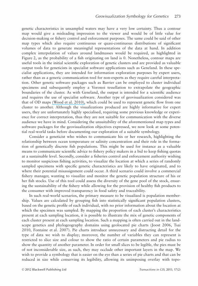
A solution which combines the genetic cluster assignment score (represented by colourvalue) in an abstract shape representing the direction, misassignment probability and relativedistance to cluster regions into a single object type would be a more elegant and possibly morecomprehensible solution with respect to a two tier approach, requiring both symbols andarrows. Such a solution could reduce cognitive load for the viewer and also reduce the compu-tational load, resulting in quicker map-rendering time as the symbols to be rendered arereduced to a single, all inclusive, point-based layer. Here we document our symbology explora-tion, inspired by modifications of the star-plot and RadVIZ techniques, as we seek a new sym-bology to better illustrate the inter-cluster misassignment relationships. We take advantage ofthe freedom granted to icon shape and size using the described colour blending technique in abid to eliminate the need for a mesh of arrows by incorporating this information into thesymbol.
The foundation of the symbol structure we explore involves a series of axes radiating froma centroid. However, in contrast to the RadVIZ and star plot techniques, the axes are notevenly distributed around the centroid. They are angled differently in each symbol, dependingon its location. The axes point towards the cluster regions whose misassignment probabilitythey represent, thereby illustrating directionality of misassignment (this cannot be done with apie chart, as the axes, which denote the size of the slices, cannot be rotated without changingthe value of the segments). The vertex plotted on each axis represents the probability of misas-signment occurring to the region to which the axis points (values ranging from 0 to 100). Ahigher probability of misassignment places the vertex further along the axis, while a low prob-ability will place the vertex closer to the centroid. The vertices on each axis are connected bystraight lines, any protruding parts of the axes are trimmed and the resulting polygon is filledby the colour generated according to cluster proportions. The centroid of the resulting polygonshape is used to place the shape at the sampling location to which it corresponds. Four suchsymbols are shown in Figure 4a. The shortcomings of these symbols are that they are difficultto compare with one another as their shapes are not uniform, scale on the axes is difficult todiscern and, significantly, the size of the area filled by the generated colour in each symbol
Figure 4A/B Examples of the initial symbology explored are shown in (A). The same data was usedto generate the second symbology shown in (B). Symbols are coloured according to cluster propor-tion values in (A) and (B)
276 E Mac Aoidh, J Th Martinsohn, G E Maes, A Cariani and E E Nielsen
© 2012 Blackwell Publishing Ltd Transactions in GIS, 2013, 17(2)
varies. The fill area of each symbol is defined by the rotation of the axes. This is misleading tothe viewer as symbols with a smaller area appear less significant, which should not be the case.
These weaknesses were improved by the alteration of the initial round symbol used inFigure 3, which effectively displays the cluster membership value-based colour with a uni-formly sized area in each symbol. The circles form the basis for the symbology shown inFigure 4b. They are modified to include axes radiating from the centre, pointing towards eachof the cluster regions as before. In order to improve scale readability, each of the axes extends10 units outside the perimeter of the circle. The misassignment probability for a given clusteris plotted along the axis between the perimeter of the circle and the end of the axis. Based onempirical evidence, misassignment probability values are typically in the range 0-20. Thus inFigure 4b, the axes of 10 units are scaled from 0 to 20. The values represented on the axes ofthe symbols lie between three and 15. In the case where a higher misassignment value exists,the axes could be re-scaled automatically by the symbol generation algorithm. The perimeterof the circle is then stretched to meet the vertex on each axis and the resulting shape is filledwith the appropriate colour as shown in Figure 4b. This retains a uniformly sized area filledwith colour, unaffected by axis rotation. Although the symbols in Figure 4b improve on thosein Figure 4a, we were concerned that they could cause confusion in certain cases and could bedifficult to interpret correctly. These concerns are elaborated on in Section 4.
Driven by these concerns, we pursued a third alternative, taking the static maps we hadpreviously produced for reports and papers as inspiration. These maps consisted of smallgeolocated pie charts, later substituted by point symbolizers filled with blended colours (asdescribed in Section 3.1), and connected by labelled arrows to show the value and direction ofmisassignment. In these maps however, rather than showing the full set of arrows and values,only a specific subset is shown to highlight a particular scenario. As the current implementa-tion is proposed for an interactive environment, we take advantage of the interactive visualiza-tion principles given in Andrienko et al. (2002) and MacEachren and Kraak (1997).Specifically, when the user selects a given location on the map, the misassignment propertiesfor that location can be highlighted. Furthermore, additional associated interactive graphs andlocation specific information can be highlighted in complementary non-spatial displays outsideof the map window. This helps to communicate the relationships of non-spatial attributesbetween the mapped locations. Thus the third symbology we propose is that of point symbol-izers filled with blended colours, connected by lines representing misassignment, where thethickness of the line represents the value of misassignment. Lines are styled such that they arenot shown where the misassignment value is below a user-accessible default threshold, andthat each location would radiate a number of misassignment lines connecting the selected loca-tion with other locations by probability of misassignment. The misassignment properties ofonly one location (that selected) will be shown at any one time. This leaves the underlying mapuncluttered as the full mesh of misassignment lines is not shown, however the solution isrestricted to visualizing the misassignment properties of only one location at a time.
4 Discussion
The development of the colouring and shape concepts explored have not yet gone through aformal evaluation. They were discussed and considered in a number of consultations withgeneticists, GIS, and visualization experts. Those involved, other than geneticists, expressedconcern at the loss of accuracy in the colour blending concept and at the restriction imposedby the CMYK model. The geneticists, on the other hand, who produced the data, were satis-
Geovisualization Symbology for Genetics 277
© 2012 Blackwell Publishing Ltd Transactions in GIS, 2013, 17(2)
fied that the blended colours did not result in a significant loss of accuracy over pie charts inconveying the main message of the map to the target audience. As expressed earlier, while it isacknowledged that the CMYK model imposes a potential restriction, it has not been an issuein the representation of any empirical data produced by the case study. Colour blending wasfavoured as being easier to interpret than geolocated pie charts. As the objective of the visuali-zation is to convey the general differences, rather than precise ratios in population structurefrom location to location, should more than more than five clusters need to be represented atany one location, it would be preferable to disregard the smaller ratios, blending only thecolours representing the main contributing clusters.
As regards the shape of the symbols, the experts consulted agreed that the second set ofshapes in Figure 4b were an improvement on those in Figure 4a; however, concerns stillremained whether these symbols would be easily interpreted in all cases. The primary concernvoiced was with the changing angles of the axes. Angles in other radial symbologies (Draperet al. 2009) are typically associated with the value of a parameter (for example in pie charts),while in this case, the angles do not convey a specific meaning. They are a by-product of thegeographical direction of the other locations to which they point. This is likely to cause someconfusion in interpretation. The angles are likely to be included by the viewer in the cognitiveprocessing and comparison of symbols, yet any two symbols will only have similar angleswhen misassignment occurs in the same relative directions for each symbol. Furthermore, theexact location to which the axis of misassignment should point would be both difficult todefine and difficult to interpret as it refers to a number of distinct points, rather than a singlepoint. In addition, when the number of sampling locations are scaled up from the initialsubset, two further complications are envisaged. Instances of co-linearly oriented samples arelikely to occur, in which case it would be unclear to which location the axis of a symbol wouldrefer. Locations which are geographically close together could also cause problems with inter-pretation due to overlapping axes.
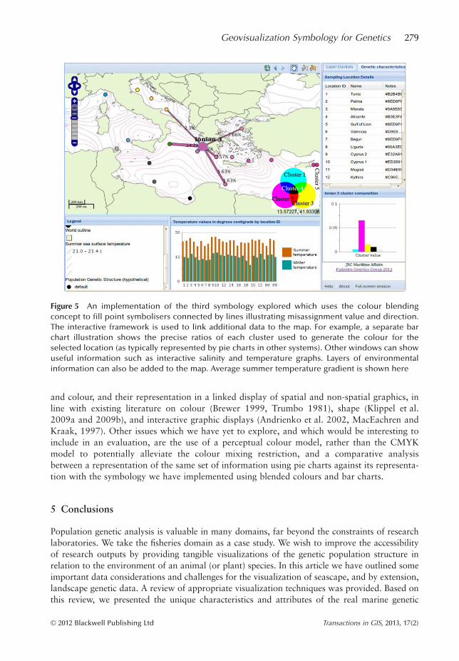
With these considerations in mind, the third symbology, although it reverts to the methodsused in static, paper-based maps, provides a suitable compromise as it eliminates the confusioncaused by the changing axis angles. We have provided an initial implementation of this sym-bology using a subset of locations in an interactive web-based platform, shown in Figure 5,also available online at: http://fishreg.jrc.ec.europa.eu/web/fisheries-genetics/geovisualization.
The interactive platform allows for the illustration of the misassignment properties of onelocation at a time, while providing interlinked visualizations of associated non-spatial propertiesoutside of the map area. The small, yet legible symbols, allow the map to remain uncluttered forthe visualization of environmental and topographical data such as water temperature, salinityvalues and bathymetry data, which are crucial for the communication of seascape and landscapegenetic information to a diverse audience. This web-based environment also allows us to providedrop-down menus for attribute-based query construction, making the isolation of values for com-parison accessible. For example, if a user wished to view the correlation between hake sampleswith high cluster 3 values and low temperature values, the user could create two layers by speci-fying the appropriate parameters: the first layer showing all samples which contribute to cluster 3by greater than 60% where species is ‘hake’, and the second layer depicting a contoured transpar-ency of sea surface temperature values between 20 and 25 degrees Celsius. By adding these twotransparent layers to the map, the user can explore the relationship between these aspects.
A full evaluation of the implemented symbology is yet to be carried out. Preliminaryimplementation and appraisals have been restricted to a subset of hypothetical data as weawait the release of publishing rights on the full genetic dataset. The impending full evaluationwill seek user representation by diverse groups of stakeholders, considering symbology shape
278 E Mac Aoidh, J Th Martinsohn, G E Maes, A Cariani and E E Nielsen
© 2012 Blackwell Publishing Ltd Transactions in GIS, 2013, 17(2)
and colour, and their representation in a linked display of spatial and non-spatial graphics, inline with existing literature on colour (Brewer 1999, Trumbo 1981), shape (Klippel et al.2009a and 2009b), and interactive graphic displays (Andrienko et al. 2002, MacEachren andKraak, 1997). Other issues which we have yet to explore, and which would be interesting toinclude in an evaluation, are the use of a perceptual colour model, rather than the CMYKmodel to potentially alleviate the colour mixing restriction, and a comparative analysisbetween a representation of the same set of information using pie charts against its representa-tion with the symbology we have implemented using blended colours and bar charts.
5 Conclusions
Population genetic analysis is valuable in many domains, far beyond the constraints of researchlaboratories. We take the fisheries domain as a case study. We wish to improve the accessibilityof research outputs by providing tangible visualizations of the genetic population structure inrelation to the environment of an animal (or plant) species. In this article we have outlined someimportant data considerations and challenges for the visualization of seascape, and by extension,landscape genetic data. A review of appropriate visualization techniques was provided. Based onthis review, we presented the unique characteristics and attributes of the real marine genetic
Figure 5 An implementation of the third symbology explored which uses the colour blendingconcept to fill point symbolisers connected by lines illustrating misassignment value and direction.The interactive framework is used to link additional data to the map. For example, a separate barchart illustration shows the precise ratios of each cluster used to generate the colour for theselected location (as typically represented by pie charts in other systems). Other windows can showuseful information such as interactive salinity and temperature graphs. Layers of environmentalinformation can also be added to the map. Average summer temperature gradient is shown here
Geovisualization Symbology for Genetics 279
© 2012 Blackwell Publishing Ltd Transactions in GIS, 2013, 17(2)
dataset collected and analyzed as part of the FishPopTrace project. With these considerationsand the objectives of our geovisualization users in mind, we described our exploration of a suit-able symbology for the geovisualization of genetic data in a meaningful way, such that it can beconsidered in tandem with aspects of the seascape. The symbology sought should be easier tounderstand at a glance than pie charts, should allow for the representation of additional vari-ables, beyond the capability of pie charts and alleviate the occluding clutter imposed by the meshof lines required to illustrate misassignment values and directionality.
We proposed a colour blending technique based on the association of each category ofinformation with a single colour of the CMYK model to generalize the information repre-sented by pie charts. This technique eliminates the need for a round shape, offering anotherdimension for variable representation, however it limits the number of categories representedto a maximum of five, which may be problematic in other domains, but does not appear to besignificant for the communication of population genetic structure.
We presented the development of a symbology to incorporate the information often repre-sented by pie charts and misassignment probability arrows. Although the symbology explored,based on the rotation of axes radiating from a central point to represent misassignment direc-tionality and value, may both alleviate map clutter, and improve on map rendering overhead,the initial appraisal highlighted their weaknesses in the representation of particular scenariosand symbol comparability. Both of these issues have the potential to cause greater confusionfor the map viewer than the complexity of the geovisualization they are intended to alleviate.For this reason, a hybrid symbology using blended colours in simple point symbolizers con-nected by labelled lines representing misassignment directionality and value (line thickness)was implemented as a compromise.
While acknowledging the need for a full evaluation, we are confident that colour blendingimproves on the visualization afforded by pie charts. Symbols can be made smaller whileretaining meaning, or can be altered in shape to illustrate additional parameters. The explora-tion of alternatively shaped symbols to reduce cognitive load and free up map space did notyield an appropriate symbology to combine all aspects. Nevertheless, this exploratory work isa significant step towards easing the communication gap between scientific research and stake-holder application in the fisheries sector. When made accessible, this scientific information ishighly valuable in contributing to informed fisheries policy development, fishery management,and could be routinely applied in control and enforcement, to tackle the illegal fishing tradewhich has an estimated annual value of 10-20 billion euro (Agnew et al. 2009). Such informa-tion could be put to similar use in any animal or plant domain, adding to the tool set for themanagement of wildlife, the control of illegal activity and allowing for verifiable traceability offood produce back to its geographic origin.
Notes
1 Genetic population structure refers to the study of the frequency and interaction of alleles and genesto define distinct populations (Hartl and Clark 2007). Landscape genetics considers population genet-ics in the context of the landscape surrounding the populations, which may influence the developmentof genetically diverse populations. These landscape aspects include terrain elevation, soil content, veg-etation type, local temperature variations, etc.
2 SNPs are variable nucleotide sites in the genome where individuals of a species can carry differentnucleotide variants (A, C, G or T). SNPs are increasingly employed as the genetic marker of choice forstudies of population structure, including fishery conservation and management applications, due tofavorable analytical characteristics as compared with other techniques (Waples and Gaggiotti 2006).
280 E Mac Aoidh, J Th Martinsohn, G E Maes, A Cariani and E E Nielsen
© 2012 Blackwell Publishing Ltd Transactions in GIS, 2013, 17(2)
References
Agnew D J, Pearce J, Pramod G, Peatman T, Watson R, Beddington J R, and Pitcher T J 2009 Estimating theworldwide extent of illegal fishing. PLoS ONE 4(2): e4570
Andrienko N, Andrienko G, Voss H, Bernardo F, Hipolito J, and Kretchmer U 2002 Testing the usability ofinteractive maps in CommonGIS. Cartography and Geographic Information Science 29: 325–43
Brewer C A 1999 Color use guidelines for data representation. In Proceedings of the Section on StatisticalGraphics, American Statistical Association Joint Statistical Meetings, Baltimore, Maryland: 55–60
Brunsdon C, Fotheringham A S, and Charlton M E 1998 An investigation of methods for visualising highly mul-tivariate datasets in case studies of visualization in the social sciences. In Unwin D and Fisher P (eds) JointInformation Systems Committee Report. Swindon, UK, Economic and Social Research Council TechnicalReport Series 43: 55–80
Draper G M, Livnat Y, and Riesenfeld R F 2009 A survey of radial methods for information visualization. IEEETransactions on Visualization and Computer Graphics 15: 759–76
Fontaine M, Baird S, Piry S, Ray N, Tolley K A, Duke S, Birkun A, Ferreira M, Jauniaux T, Llavona Á, ÖztürkB, Öztürk A A, Ridoux V, Rogan E, Sequeira M, Siebert U, Vikingsson G A, Bouquegneau J-M, andMichaux J R 2007 Rise of oceanographic barriers in continuous populations of a Cetacean: The geneticstructure of harbor porpoises in Old World waters. BMC Biology 5: 30
Hansen M M and Hemmer-Hansen J 2007 Landscape genetics goes to sea. Journal of Biology 6: 3Hartl D and Clark A 2007 Principles of Population Genetics (Fourth Edition). Sunderland, MA, Sinauer Asso-
ciatesHird S and Sullivan J 2009 Assessment of gene flow across a hybrid zone in red-tailed chipmunks. Molecular
Ecology 18: 3097–109Joost S 2006 The Geographical Dimension of Genetic Diversity: A GIScience Contribution for the Conservation
of Animal Genetic Resources. Unpublished Ph.D. Dissertation, Ecole Polytechnique Federale de LausanneKidd D and Liu X 2008 GEOPHYLOBUILDER 1.0: An ArcGIS extension for creating ‘Geophylogenies’.
Molecular Ecology Resources 8: 88–91Klippel A, Hardisty F, Li R, and Weaver C 2009a Star plots: How shape characteristics influence classification
tasks. Cartography and Geographic Information Science 36: 149–63Klippel A, Hardisty F, Li R, and Weaver C 2009b Color enhanced star plot glyphs: Can salient shape character-
istics be overcome? Cartographica 44: 217–31Kraak M J and Ormeling F J 1996 Cartography: Visualization of Spatial Data. London, Addison Wesley
LongmanMacEachren A M and Kraak M J 1997 Exploratory cartographic visualization: Advancing the agenda. Comput-
ers and GeoSciences 23: 335–43Nielsen E E, Hansen M M, Schmidt C, Meldrup D, and Gronkjaer P 2001 Fisheries: Population of origin of
Atlantic cod. Nature 413: 272Novakova L and Stepankova O 2006 Multidimensional clusters in RadViz. In Proceedings of the Sixth WSEAS
International Conference on Simulation, Modelling and Optimization, Lisbon, PortugalScotch M, Mei C, Brandt C, Sarkar I N, and Cheungtitle K 2010 At the intersection of public-health informatics
and bioinformatics. Epidemiology 21: 764–68Slocum T, McMaster R, Kessler F, and Howard H 2004 Thematic Cartography and Geographic Visualization.
Upper Saddle Creek, NJ, Prentice HallTrumbo B E 1981 A theory for coloring bivariate statistical maps. The American Statistician 35: 220–26Tsai Y 2010 PhyloGeoViz: A web-based program that visualizes genetic data on maps. Molecular Ecology
Resources 11: 557–61Tufte E R 1983 The Visual Display of Quantitative Information. Cheshire, CT, Graphic PressWaples R S and Gaggiotti O 2006 What is a population? An empirical evaluation of some genetic methods for
identifying the number of gene pools and their degree of connectivity. Molecular Ecology 15: 1419–39Waples R S, Punt A E, and Cope J M 2008 Integrating genetic data into management of marine resources: How
can we do it better? Fish and Fisheries 9: 423–49Wood J, Dykes J, and Slingsby A 2010 Visualization of origins, destinations and flows with OD maps. The Car-
tographic Journal 47: 117–29
Geovisualization Symbology for Genetics 281
© 2012 Blackwell Publishing Ltd Transactions in GIS, 2013, 17(2)
Related Documents