Exploring Connectivity in Air Transport as an Equity Factor Frederico Ferreira Valente Nunes Thesis to obtain the Master of Science Degree in Civil Engineering Thesis supervised by Prof. Maria do Rosário Maurício Ribeiro Macário Examination Committee Chairperson: Prof. João Torres de Quinhones Levy Supervisor: Prof. Maria do Rosário Maurício Ribeiro Macário Member of the Committee: Doutor Vasco Domingos Moreira Lopes Miranda dos Reis September 2015

Welcome message from author
This document is posted to help you gain knowledge. Please leave a comment to let me know what you think about it! Share it to your friends and learn new things together.
Transcript
Exploring Connectivity in Air Transport as an Equity Factor
Frederico Ferreira Valente Nunes
Thesis to obtain the Master of Science Degree in
Civil Engineering
Thesis supervised by
Prof. Maria do Rosário Maurício Ribeiro Macário
Examination Committee
Chairperson: Prof. João Torres de Quinhones Levy
Supervisor: Prof. Maria do Rosário Maurício Ribeiro Macário
Member of the Committee: Doutor Vasco Domingos Moreira Lopes Miranda dos Reis
September 2015

Exploring Connectivity in Air Transport as an Equity Factor| Frederico Valente Nunes |
II

Exploring Connectivity in Air Transport as an Equity Factor| Frederico Valente Nunes |
III
And our people shall leave to find a new India,
One that does not exist yet,
On boats built from the same material dreams are made of.
Fernando Pessoa, in Renascença Portuguesa
E a nossa grande raça partirá em busca de uma Índia nova,
Que não existe no espaço,
Em naus que são construídas daquilo de que os sonhos são feitos.
Fernando Pessoa, in Renascença Portuguesa

Exploring Connectivity in Air Transport as an Equity Factor| Frederico Valente Nunes |
IV
Exploring Connectivity in Air Transport as an Equity Factor| Frederico Valente Nunes | Abstract (and key-words)
I
Abstract (and key-words)
In this Master Dissertation we analysed the equity in air transportation in the European Union (EU)
regarding routes and ticket prices. This study aimed to analyse whether the European Union policies in
this field of transportation are considering the equity as a factor, whether they ensure the main purposes
of the EU and whether they are improving the cohesion between countries. For this, three different
indicators were created in order to evaluate equity in air transportation in the EU: Availability, the
existence of routes between countries; Affordability, if the prices take into account the purchasing power
of each country; and Business Convenience, to evaluate the cost of travelling by air on business in
Europe. After this analysis, the same procedures were applied to two Federative Nations, the United
States of America and Brazil, in order to analyse the differences and similarities and to develop
recommendations focused on improving EU political measures.
Key-words: equity; air transportation; European Union; transport policies; equity indicators.
Resumo (e palavras-chave)
Nesta tese de mestrado foi analisada a equidade no transporte aéreo dentro da União Europeia (UE),
no que se refere a rotas e preços de viagem. Estes dados tiveram como objetivo servir de base à análise
das políticas europeias e entender se a equidade é um fator chave no desenho destas políticas, se
estão a ser cumpridos os propósitos iniciais da União e se estas políticas permitem uma maior coesão
no espaço europeu. Para isso foram criados três indicadores com o objetivo de avaliar a equidade no
transporte aéreo na EU: Availability (Disponibilidade), se existem rotas entre os estados membros;
Affordability (Esforço Económico), se os preços têm em conta o poder de compra de cada país; e
Business Convenience (Facilidade de Negócio), por forma a avaliar o custo de viajar de avião para
realizar negócios na Europa. Posteriormente a mesma análise foi realizada para duas federações, os
Estado Unidos da América e o Brasil, com o objetivo de descobrir semelhanças e diferenças por forma
a desenvolver recomendações focadas em melhorar as políticas europeias.
Palavras-chave: equidade; transporte aéreo; União Europeia; políticas de transporte; indicadores de
equidade.

Exploring Connectivity in Air Transport as an Equity Factor| Frederico Valente Nunes | Abstract (and key-words)
II

Exploring Connectivity in Air Transport as an Equity Factor| Frederico Valente Nunes | Acknowledgements
III
Acknowledgements
This work is based on a bigger project than me or you, the reader. In fact it is based on
something that has begun many decades ago, when people of Europe, tired of war, had the idea of
building a common ground for improvement and friendship. Therefore my deepest gratitude to everyone
who worked and works to create, build and improve the European Union.
In a more personal level I have to thank all those who, with their friendship, helped me to reach
this point where I am about to get my Master Degree: my parents, who told me what hard work and
persistence are, in order to accomplish my dreams; my grandmother who told me how to be kind, how
to respect the others and how to be the best person possible; my brothers and other family for being
always present and to give me a good and safe environment to build my life; to all my friends that
fortunately I was able to find and accompanied me since childhood, that everyday give me reasons to
smile, laugh and love them; a special thanks to Joana Barbosa, Inês Marques, Patrícia Cabral, João
Paiva and Jorge Miguel for all their support during the writing of this dissertation, for the company and
for all their suggestions that have certainly improved this project.
An even more special thanks to my supervisor, Professor Maria Rosário Macário for all the
dedication and support, the wise words and the suggestions that made this dissertation possible; for her
advice that made my journey in Civil Engineering to reach this point in spite of my passion for
transportation and transportation policies.
Finally my gratitude to two of my schools, Escola Salesiana de Manique and Instituto Superior
Técnico, where I studied from my 10th anniversary until the 23rd, that gave me the hard and soft skills to
be what I am today and to become what I will be tomorrow.

Exploring Connectivity in Air Transport as an Equity Factor| Frederico Valente Nunes | Acknowledgements
IV
Exploring Connectivity in Air Transport as an Equity Factor| Frederico Valente Nunes | List of Abbreviations
V
List of Abbreviations
EAS – Essential Air Service PPP – Purchasing Power Parity
EC – European Council PSO – Public Service Obligations
EP – European Parliament TEA-21 – Transportation Equity Act for the 21st Century
EU – European Union UNSD – United Nations Statistic Division
FAA – Federal Aviation Administration USA – United States of America
GDP – Gross Domestic Product
Countries abbreviations according to Interinstitutional Style Guide (underlined the short name):
AT – Republic of Austria IE – Ireland
BE – Kingdom of Belgium IT – Italian Republic (Italy)
BG – Republic of Bulgaria LT – Republic of Lithuania
CY – Republic of Cyprus LU – Grand Duchy of Luxemburg
CZ – Czech Republic LV – Republic of Latvia
DE – Federal Republic of Germany MT – Republic of Malta
DK – Kingdom of Denmark NL – Kingdom of the Netherlands
EE – Republic of Estonia PL – Republic of Poland
EL – Hellenic Republic (Greece) PT – Portuguese Republic (Portugal)
ES – Kingdom of Spain RO - Romania
FI – Republic of Finland SE – Kingdom of Sweden
FR – French Republic (France) SI – Republic of Slovenia
HR – Republic of Croatia SK – Slovak Republic (Slovakia)
HU – Hungary UK – United Kingdom of Great Britain and
Northern Ireland
States, from United States of America, abbreviations:
AL – Alabama MT – Montana
AK – Alaska NE – Nebraska
AZ – Arizona NV – Nevada
AR – Arkansas NH – New Hampshire
CA – California NJ – New Jersey
CO – Colorado NM – New Mexico
CT – Connecticut NY – New York
DE – Delaware NC – North Carolina
DC – District of Columbia ND – North Dakota
FL – Florida OH – Ohio
GA – Georgia OK – Oklahoma
HI – Hawaii OR – Oregon
Exploring Connectivity in Air Transport as an Equity Factor| Frederico Valente Nunes | List of Abbreviations
VI
ID – Idaho PA – Pennsylvania
IL – Illinois RI – Road Island
IN – Indiana SC – South Carolina
IA – Iowa SD – South Dakota
KS – Kansas TN – Tennessee
KY – Kentucky TX – Texas
LA – Louisiana UT – Utah
ME – Maine VT – Vermont
MD – Maryland VA – Virginia
MA – Massachusetts WA – Washington
MI – Michigan WV – West Virginia
MN – Minnesota WI – Wisconsin
MS – Mississippi WY – Wyoming
MO – Missouri
States, from Federative Republic of Brazil, abbreviations:
AC – Acre PB – Paraíba
AL – Alagoas PR – Paraná
AP – Amapá PE – Pernambuco
AM – Amazonas PI – Piauí
BA – Bahia RJ – Rio de Janeiro
CE – Ceará RN – Rio Grande do Norte
DF – Distrito Federal RS – Rio Grande do Sul
ES – Espírito Santo RO – Rondônia
GO – Goiás RR – Roraima
MA – Maranhão SC – Santa Catarina
MT – Mato Grosso SP – São Paulo
MS – Mato Grosso do Sul SE – Sergipe
MG – Minas Gerais TO - Tocantins
PA – Pará

Exploring Connectivity in Air Transport as an Equity Factor| Frederico Valente Nunes | Index
VII
Index
1. Introduction and Objectives ............................................................................................................. 1
2. Literature Review ............................................................................................................................. 5
2.1. Equity ....................................................................................................................................... 5
2.1.1. Introduction ...................................................................................................................... 5
2.1.2. Existing Equity Indicators in Transport ............................................................................ 7
2.3.1 Transport Equity in today’s society .................................................................................. 9
2.2. Connectivity ........................................................................................................................... 13
2.2.1. Networks ........................................................................................................................ 13
2.2.2. Measuring connectivity in worldwide air transportation ................................................. 14
2.2.3. The Existing Air Transport Network ............................................................................... 15
3. Methodology .................................................................................................................................. 19
3.1. Construction of Indicators for Air Transportation ................................................................... 19
3.2. Study restrictions and data organisation ............................................................................... 20
3.3. Study of the outcomes ........................................................................................................... 24
4. Case of Study – European Union .................................................................................................. 29
4.1. Availability .............................................................................................................................. 30
4.2. Affordability ............................................................................................................................ 38
4.3. Business Convenience .......................................................................................................... 41
5. Brazil and USA – Comparative Analysis ....................................................................................... 45
5.1. Brazil ...................................................................................................................................... 45
5.1.1. Availability ...................................................................................................................... 46
5.1.2. Affordability .................................................................................................................... 51
5.1.3. Business Convenience .................................................................................................. 54
5.2. USA ....................................................................................................................................... 57
5.2.1. Availability ...................................................................................................................... 59
5.2.2. Affordability .................................................................................................................... 66
5.2.3. Business Convenience .................................................................................................. 70
6. Conclusion: Global analysis and Suggestions .............................................................................. 75
6.1. Global analysis ...................................................................................................................... 75
6.2. Policy Suggestions ................................................................................................................ 77
6.3. Case Study Evaluation .......................................................................................................... 80
6.4. Concluding Remarks ............................................................................................................. 80
6.5. Further Research ................................................................................................................... 82
References ............................................................................................................................................ 83
Annex ..................................................................................................................................................... 89
Annex 1 - Public Holidays in the EU countries, the USA and Brazil ................................................. 89
Annex 2 - Airports to consider in the case study “European Union” ................................................. 91

Exploring Connectivity in Air Transport as an Equity Factor| Frederico Valente Nunes | Index
VIII
Annex 3 – Airport Destinations in the EU ........................................................................................ 101
Annex 4 – Distance between European Capitals ............................................................................ 103
Annex 5 – GDP of each European Country .................................................................................... 105
Annex 6 – Airports to consider in the case study “Brazil” ................................................................ 107
Annex 7 – Airport Destinations in Brazil .......................................................................................... 111
Annex 8 – Distance between Brazilian states Capitals ................................................................... 113
Annex 9 – GDP of each Brazilian state ........................................................................................... 115
Annex 10 – Airports to consider in the case study “United States of America” ............................... 117
Annex 11 – Airport Destinations in the USA .................................................................................... 127
Annex 12 – Distance between the capitals of the states of the USA .............................................. 135
Annex 13 – GDP of each USA state ............................................................................................... 139
Annex 14 – Airport Websites ........................................................................................................... 141
Table Index
Table 1 - Some indicators of European Union, Brazil and United States of America ............................. 2
Table 2 - Principles of Equity, Fairness and Justice and Potential Transport Applications at the local
levels (Hay & Trinder, 1991) .................................................................................................................... 6
Table 3 - Equity and Transport (Banister) ............................................................................................... 7
Table 4 - Standardized scores to interpolate index scores: (Voorhees, 2009) ....................................... 9
Table 5 - Matrix to analyse Availability .................................................................................................. 21
Table 6 - Organisation of the information regarding the distance between capitals ............................. 21
Table 7 - Hubs chosen as representative of UE, USA and Brazil ......................................................... 22
Table 8 - Organisation of the information regarding the calculus of the Affordability indicator ............. 23
Table 9 - Organisation of information regarding the calculus of the Business Convenience indicator . 23
Table 10 – Indicators for the case study ............................................................................................... 24
Table 11 - Organisation of the top best and worst results for each indicator ........................................ 27
Table 12 – Order of the Classification of the Regions ........................................................................... 27
Table 13 - List of European Airports with at least 20% of the country’s passengers ............................ 29
Table 14 - Outcome of Availability Indicator for EU .............................................................................. 30
Table 15 – Top countries with more connectivity and less connectivity from their main airports to the
rest of European countries .................................................................................................................... 32
Table 16 - Descending order of the connectivity of the European Regions according to indicator (1) . 32
Table 17 - Significant Correlation Factors for Percentage of connections from the main airport to each
one of the other countries, for the EU ................................................................................................... 34
Table 18 – Top countries with more connectivity and less connectivity to each country main airport, in
the EU .................................................................................................................................................... 35
Table 19 - Descending order of the connectivity of the European Regions according to indicator (2) . 35
Table 20 - Significant Correlation Factors for the Percentage of connections to each country main
airport, for the EU .................................................................................................................................. 37
Table 21 - Outcome of Affordability Indicator for EU ............................................................................. 38
Exploring Connectivity in Air Transport as an Equity Factor| Frederico Valente Nunes | Index
IX
Table 22 – Top countries with more and less affordability in the European Union ............................... 39
Table 23 - Descending order of the Affordability of the European Regions .......................................... 39
Table 24 - Outcome of the Affordability Indicator for EU taking just into account the minimum prices 40
Table 25 - Business relative cost outcome, for the EU ......................................................................... 41
Table 26 – Top countries with the best and the worst Business Convenience, in the EU .................... 42
Table 27 - Descending order of the Business Convenience of the European Regions ........................ 42
Table 28 - Significant Correlation Factors for the Business Convenience in the EU ............................ 44
Table 29 - List of Brazil airports with at least 20% of the state’s passengers ....................................... 45
Table 30 - Outcome of Availability Indicator for Brazil .......................................................................... 46
Table 31 – Top countries with more connectivity and less connectivity from their main airport to the
rest of the states, in Brazil ..................................................................................................................... 48
Table 32 - Descending order of the connectivity of the Brazil Regions according to indicator (1) ........ 48
Table 33 - Significant Correlation Factors for Percentage of connections from the main airport to each
one of the other states, for Brazil .......................................................................................................... 48
Table 34 - Descending order of the connectivity of Brazil Regions according to indicator (2) .............. 49
Table 35 – Top states with more connectivity and less connectivity to main airports of the rest of Brazil
states ..................................................................................................................................................... 50
Table 36 - Significant Correlation Factors for the Percentage of connections to each state main airport,
for Brazil................................................................................................................................................. 51
Table 37 - Outcome of Affordability Indicator for Brazil ......................................................................... 52
Table 38 – Top states with more and less Affordability in Brazil ........................................................... 52
Table 39 - Descending order of the Affordability of Brazil Regions ...................................................... 52
Table 40 - Significant Correlation Factors for the Affordability in Brazil ................................................ 53
Table 41 - Business relative cost outcome for Brazil ............................................................................ 54
Table 42 – Top states with best and worst Business Convenience, in Brazil ....................................... 55
Table 43 - Descending order of the Business Convenience of Brazil Regions ..................................... 55
Table 44 - Significant Correlation Factors for the Business Convenience in Brazil .............................. 56
Table 45 - List of USA airports with at least 20% of the state’s passengers ......................................... 57
Table 46 - Outcome of Availability Indicator for the USA ...................................................................... 59
Table 47 – Top countries with more connectivity and less connectivity from main airports to the rest of
the states, in the USA ............................................................................................................................ 62
Table 48 - Descending order of the connectivity of the USA Regions according to indicator (1) ......... 62
Table 49 - Significant Correlation Factors for Percentage of connections from the main airport to each
one of the other states, for the USA ...................................................................................................... 63
Table 50 – Top states with more connectivity and less connectivity to main airports of the rest of USA
states ..................................................................................................................................................... 64
Table 51 - Descending order of the connectivity of the USA Regions according to indicator (2) ......... 64
Table 52 - Significant Correlation Factors for the Percentage of connections from the main airport to
each one of the other states, for the USA ............................................................................................. 66
Table 53 - Outcome of Affordability Indicator for the USA .................................................................... 67
Exploring Connectivity in Air Transport as an Equity Factor| Frederico Valente Nunes | Index
X
Table 54 – Top states with more and less Affordability in the USA ...................................................... 68
Table 55 - Descending order of the Affordability of the USA Regions .................................................. 68
Table 56 - Significant Correlation Factors for Affordability indicator ..................................................... 70
Table 57 - Business relative cost outcome for USA .............................................................................. 71
Table 58 – Top states with more and less business convenience, in the USA..................................... 72
Table 59 - Descending order of the business convenience, in the USA ............................................... 72
Table 60 - Significant Correlation Factors for the Business Convenience in the USA.......................... 73
Table 61 - Outcomes of the correlation study for the EU, the USA and BR ......................................... 75
Image Index
Figure 1 - Counties containing airports subsidised by Essential Air Service (excluding Alaska and
Hawaii) (SOURCE: Wikipedia) .............................................................................................................. 12
Figure 2 – Portugal continental distribution of public transportation (Adapted from the SOURCE:
IMT/SIGESCC 2012) ............................................................................................................................. 12
Figure 3 - Different possible results of the Pearson Correlation Coefficient. (Source:
StatisticsHowTo.com) ............................................................................................................................ 25
Figure 4 - Spearman correlation factor vs. Pearson correlation. (Source: StatisticsHowTo.com) ........ 26
Figure 5 - Outcome of Availability Indicator for the EU (Percentage of connections from the main
airport to each one of the other countries (1) on the right and Percentage of connections to each
country main airport (2) on the left). Green means better connections and Red worse connections. .. 30
Figure 6 - Geographical division of Europe according to the United Nations Statistic Division ............ 31
Figure 7 - Relation between the Percentage of connections from the main airport to each one of the
other countries and the countries percentage in EU GDP .................................................................... 33
Figure 8 - Relation between the Percentage of connections from the main airport to each one of the
other countries and the Resident population in each country, in the EU .............................................. 33
Figure 9 - Relation between the Percentage of connections from the main airport to each one of the
other countries and the balance of travel and tourism as a percentage of the country’s GDP, in the EU
............................................................................................................................................................... 33
Figure 10 - Relation between the Compensation of employees per capita and the Balance of travel
and tourism as a Percentage of GDP, in the EU ................................................................................... 34
Figure 11 - Relation between the Percentage of connections from the main airport to each one of the
other countries (1) and Percentage of connections to each country main airport (2) and the countries
percentage on EU GDP ......................................................................................................................... 36
Figure 12 -- Relation between the Percentage of connections from the main airport to each one of the
other countries (1) and Percentage of connections to each country main airport (2) and the Resident
Population, in the EU ............................................................................................................................. 36
Figure 13- Relation between the Percentage of connections to each country main airport (2) and the
foreign residents, in the EU ................................................................................................................... 36

Exploring Connectivity in Air Transport as an Equity Factor| Frederico Valente Nunes | Index
XI
Figure 14 - Relation between the percentage of connections to each country main airport (2) and the
country’s area, in the EU ....................................................................................................................... 37
Figure 15 - Outcome of Affordability Indicator for the EU. Green means more Affordable (negative
result) than red (positive result). ............................................................................................................ 38
Figure 16 -Outcome of Affordability Indicator for the EU taking just into account the minimum prices.
Green means more Affordable (negative result) than red (positive result). .......................................... 40
Figure 17 - Outcome of the Business Convenience indicator for the EU. Green means better Business
cost (negative result) and red worse (positive result). ........................................................................... 41
Figure 18 - Relation between the Business Convenience and the contribution to the EU GDP ........... 43
Figure 19 - Relation between the Business Convenience and the GDP per capita, in the EU ............. 43
Figure 20 - Relation between the Business Convenience and the compensation of employees per
capita, in the EU .................................................................................................................................... 43
Figure 21 - Relation between the Business Convenience and the resident population, in the EU ....... 43
Figure 22 - Relation between the Business Convenience and the foreign resident population, in the EU
............................................................................................................................................................... 44
Figure 23 - Outcome of Avaiability Indicator for Brazil (Percentage of connections from the main
airport to each one of the other states (1) on the right and Percentage of connections to each state
main airport (2) on the left). Green means better connections and Red worse connections. ............... 46
Figure 24 - Geographical division of Brazil according to the law since 1969 (Source: Instituto Brasileiro
de Geografia e Estatística) .................................................................................................................... 47
Figure 25- Relation between the Percentage of connections from the main airport to each one of the
other states and the states percentage in Brazilian GDP ..................................................................... 49
Figure 26 - Relation between the Percentage of connections from the main airport to each one of the
other states and the Inequality of Income distribution, in Brazil ............................................................ 49
Figure 27 - Relation between the Percentage of connections from the main airport to each one of the
other states (1) and Percentage of connections to each state main airport (2) and the states
percentage on Brazilian GDP ................................................................................................................ 50
Figure 28 - Relation between the Percentage of connections to each state main airport (2) and the
states percentage on Brazilian GDP ..................................................................................................... 51
Figure 29 - Outcome of Affordability Indicator for Brazil. Green means more Affordable (negative
result) than red (positive result). ............................................................................................................ 51
Figure 30 – Relation between the Affordability and GDP per capita, in Brazil ...................................... 53
Figure 31 -Outcome of the Business Convenience indicator for Brazil. Green means better Business
cost (negative result) and red worse (positive result). ........................................................................... 54
Figure 32 - Relation between the Business Convenience and the contribution of the states to the
Brazilian GDP ........................................................................................................................................ 55
Figure 33 - Relation between the Business Convenience and the states GDP per capita, in Brazil .... 56
Figure 34 - Outcome of Avaiability Indicator for the USA (Percentage of connections from the main
airport to each one of the other states (1) on top and Percentage of connections to each state main
airport (2) down). Green means better connections and Red worse connections. ............................... 59
Exploring Connectivity in Air Transport as an Equity Factor| Frederico Valente Nunes | Index
XII
Figure 35 - Geographical division of the USA according to the United States Census Bureau (Source:
www.census.gov) .................................................................................................................................. 61
Figure 36 - Relation between the Percentage of connections from the main airport to each one of the
other states and the states percentage in USA GDP ........................................................................... 63
Figure 37 - Relation between the Percentage of connections from the main airport to each one of the
other countries and the Resident Population, in the USA ..................................................................... 63
Figure 38 - Relation between the Percentage of connections from the main airport to each one of the
other states and the foreign-born Population (%), in the USA .............................................................. 63
Figure 39 - Relation between the Percentage of connections from the main airport to each one of the
states (1) and Percentage of connections to each state main airport (2) and the states percentage on
USA GDP............................................................................................................................................... 65
Figure 40 - Relation between the Percentage of connections from the main airport to each one of the
other states (1) and Percentage of connections to each state main airport (2) and the states resident
population, in the USA ........................................................................................................................... 65
Figure 41 - Relation between the Percentage of connections from the main airport to each one of the
other states (1) and Percentage of connections to each state main airport (2) and the states foreign-
born residents (%), in the USA .............................................................................................................. 66
Figure 42 - Outcome of Affordability Indicator for the USA. Green means more Affordable (negative
result) than red (positive result) ............................................................................................................. 67
Figure 43 - Relation between the Affordability and the states contribution for the USA GDP .............. 69
Figure 44 - Relation between the Affordability and the compensation of employees per capita, in the
USA ....................................................................................................................................................... 69
Figure 45 - Relation between the Affordability and the Foreign-born Population, in the USA .............. 69
Figure 46 - Relation between the Affordability and the GDP per capita, in the USA ............................ 70
Figure 47 - Outcome of the Business Convenience indicator for the USA. Green means better
Business cost (negative result) and red worse (positive result). ........................................................... 71
Figure 48 - Relation between the Business Convenience and the contribution of each state to the USA
GDP ....................................................................................................................................................... 73
Figure 49 - Relation between the Business Convenience and the Inequality of income distribution, in
the USA ................................................................................................................................................. 73
Figure 50 - Relation between the Business Convenience and the Resident Population, in the USA... 73
Figure 51- Trans-European Transport Network (Source: European Comission) .................................. 78

Exploring Connectivity in Air Transport as an Equity Factor| Frederico Valente Nunes | Index
XIII

Exploring Connectivity in Air Transport as an Equity Factor| Frederico Valente Nunes | Index
XIV

Exploring Connectivity in Air Transport as an Equity Factor| Frederico Valente Nunes | Introduction and Objectives
1
1. Introduction and Objectives
The European Union (EU) was established, as we know it nowadays, in 1992/3 with the
Maastricht Treaty. Besides giving the community its actual name, this treaty has defined the three pillars
in which Europe would be organised: the European Community, the Common Foreign and Security
Policy and the Justice and Home Affairs.
In what concerns the European Community pillar, the power resides in the European
Commission (EC), the European Parliament (EP) and the European Court of Justice. The power to make
and approve laws that are implemented in all member states is a responsibility of the EC and the EP.
Later, in 2007, the Lisbon Treaty was signed. In the Consolidated Version of The Treaty on the
Functioning of the EU, published in the Official Journal of the EU in 26.10.2012, it is written in the
Preamble that it is “Determined to lay the foundations of an even closer union among the people of
Europe, (…) intending to confirm the solidarity which binds Europe (…)” showing the importance of
solidarity among member states. It is also possible to see the importance of equity as we read the treaty.
In the context of increasing European cohesion, transportation has been one of the subjects in
which new policies have appeared due to the great impact of the decisions in this area to several of the
EU objectives. In the Consolidated Treaties Charter of Fundamental Rights, ten articles are dedicated
exclusively to this subject (in Title VI-Transport) and other four precisely in the Title XVIII-Economic,
Social and Territorial Cohesion.
It is in this context that this dissertation appears. Due to the fact that the economic core of the
EU is situated in Central Europe, linking London, Berlin, Paris and Milan some peripheral countries face
real challenges in competing against markets closer to this core. Therefore, the question that is
presented is “Is there a real equity, due to the geographical position of each country inside the European
Union?”.
The only way to bring peripheral countries closer to this core is by investing EU subsidies in
transport infrastructures and having common and integrated transport policies. Nevertheless, in spite of
existing a closer look and analysis to the situation of each country in Europe, the ideology in which
Europe is built is based on the free private initiative and therefore the action of the EU and of the Country
Governments is mostly based on incentives to increase the cohesion in Europe and not on taking the
place of private initiative.
The European Union is aware of the need to bring together the different countries and to
decrease the distance between them by investing on transportation. The greatest example is the Trans-
European Transport Network which supports the completion of 30 priority projects with high European
added values, as well as projects of common interest and traffic management systems which will play a
key role in facilitating the mobility of goods and passengers within the EU (Trans-European Transport
Network, 2015).
Bearing in mind this policy (but not exclusively), we can see that there is a major concern about
connecting countries by corridors, whether railways, roads, inland waterways or maritime waterways.
Exploring Connectivity in Air Transport as an Equity Factor| Frederico Valente Nunes | Introduction and Objectives
2
Keeping this in mind, it is easy to understand that the connections will improve between countries next
to each other, but what about countries that belong to the EU but are not close to each other? The
answer has to rely on air transportation if we want to achieve fast and safe connections.
When we look to the EC proposals for Air Transportation, four things pop-up: single market,
making easier cross-border investments; external aviation, providing a more coordinated aviation policy
with other countries outside the EU; Single European Sky, decreasing airspace congestion; and SESAR,
technology that makes the Single European Sky possible.
This way we can conclude that some important connection issues have been left out of the
discussion: the direct connection by air between distant countries in the EU. This dissertation appears
exactly at this point, willing to analyse whether there are reasons to take action also in this “battle front”.
Whereas this problem appears, several objectives of this work must be pointed-out: firstly there
is a need to analyse the offer of air passenger transportation between member states and evaluate if
the route offered accomplishes the desires of EU policies. Secondly, it is necessary to see if the ticket
prices are adequate to the cost of living of each country enabling a normal citizen to make these flights.
This analysis will be done by creating different indicators that will provide the necessary information to
evaluate the actual situation.
With these outcomes, by comparing and relating with other social, financial and economic
indicators, it will be possible to argue about the current EU policy in what concerns air passenger
transportation (supply, demand and costs), to compare with the policies carried out by other Federative
Nations and finally to find ways of action and improvement in EU policies to improve cohesion in this
field.
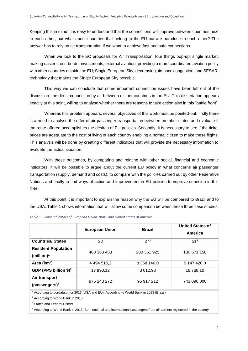
At this point it is important to explain the reason why the EU will be compared to Brazil and to
the USA. Table 1 shows information that will allow some comparison between these three case studies.
Table 1 - Some indicators of European Union, Brazil and United States of America
European Union Brazil
United States of
America
Countries/ States 28 273 513
Resident Population
(million)1 408 368 483 200 361 925 180 671 158
Area (km2) 4 494 515,2 8 358 140,0 9 147 420,0
GDP (PPS billion $)2 17 990,12 3 012,93 16 768,10
Air transport
(passengers)4 975 243 272 95 917 212 743 096 000
1 According to pordata.pt for 2013 (USA and EU); According to World Bank in 2013 (Brazil)
2 According to World Bank in 2013
3 States and Federal District
4 According to World Bank in 2013. Both national and international passengers from air carriers registered in the country
Exploring Connectivity in Air Transport as an Equity Factor| Frederico Valente Nunes | Introduction and Objectives
3
Although neither one of them is a total match, there are several similarities between the EU and
these two Federative Nations. Firstly, the EU and Brazil have almost the same amount of countries (in
the case of the EU) or states (in the case of Brazil). This means that the organisation of the territory is
similar if we compare it with the organisation and assumptions of this study. Secondly, the area of the
EU and Brazil is similar if we take into account that almost 61% of Brazil territory is Amazon Rainforest
(belonging to Amazonia Legal), which means that there is little necessity of regular high capacity air
flights in this area and therefore a similar demand-area comparing to the EU.
Then, the necessity of comparing the USA to the EU comes first because there is not a bigger
federalist nation in the developed world with such similar regime and policy. Also, the joint GDP of EU
is very similar to the USA, forming the two bigger economies in the world with about 45,98% of World’s
GDP in 2013. Likewise, EU and USA airlines together have 56,83% of the world’s passengers carried
by air in 2013, being the two prime sources of air passengers carried. Finally they are the third and
fourth biggest nations in what concerns population, only overcome by China and India, in first and
second place, respectively.
Therefore, with these two case-studies it will be possible to make some comparisons between
results, but also to find some ideas concerning policies already taken by these countries.
In order to accomplish this work firstly there will be a debate on the definition and types of Equity,
definition and approaches to Connectivity and the existing transport indicators (related with air
transportation or with international trips). Then, after defining the methodology that will guide the
analysis, the European Union case study will be approached, and conclusions will be reached. Finally,
following the same methodology, the situation in Brazil and the United States of America will be analysed
and the results will be compared with the EU. In conclusion, and based on the comparison made before,
between the EU, the USA and Brazil, some policies suggestions will be made, in order to increase equity
and improve the results of the created indicators.
In what concerns Methodology, first will be presented the construction of the indicators, the
sources of the input information and the explanation about the why and how they were created. Secondly
will be explained the way the information was gathered and organized and how the indicators were
calculated in order to allow future researchers to repeat this study for different countries and reasons.
Finally we will explain the way the information was analysed.

Exploring Connectivity in Air Transport as an Equity Factor| Frederico Valente Nunes | Introduction and Objectives
4
Exploring Connectivity in Air Transport as an Equity Factor| Frederico Valente Nunes | Literature Review
5
2. Literature Review
2.1. Equity
2.1.1. Introduction
Equity refers to the distribution of benefits and costs and whether that distribution is considered
fair and appropriate (Litman, 2014). Transport planning decisions have an important impact on citizen’s
life and therefore equity is a major aspect that always has to be taken into account in societies that tend
to be fair and try to decrease the gap between different groups while maintaining a capitalism system.
Nevertheless in transportation the idea behind equity is not just to make the distribution of
benefits and costs but also to give equal possibilities to everyone at the same time that we provide what
each community needs.
However, even if everyone agrees that equity is a necessary aspect in daily-life decisions, not
everyone agrees about the way equity should be seen and, therefore, three types of equity have been
defined, according to David Banister in “Equity and Acceptability Question in Internalising the Social
Costs of Transport” and according to Professor José Manuel Viegas and Professor Rosário Macário.
Horizontal Equity (also called fairness and equalitarianism) concerns the distribution of impacts
between individuals and groups considered equal in ability and need (Litman, 2014). From this point of
view equal individuals and groups should be given equal opportunities, which means that public policies
should avoid favouring one individual or group over the others. However, as Ellickson (1977) says,
“likeness” is a matter of degree, and to make policies according to this type of equity is always a
dangerous way.
Vertical Equity with Regard to Income and Social Class, is concerned with the distribution of
impacts between individuals and groups that differ in abilities and needs, in this case, by income or
social class, for example (Litman, 2014). This way, policies would be equitable if they tend to favour the
ones that society sees somehow as a disadvantage, as low income families or low social class groups.
This type of equity is used to support policies for investments in affordable modes, discounts and special
services trying this way to reduce the external costs for this groups.
Finally, Longitudinal Equity with Regard to Mobility Need and Ability, concerns the distribution
of impacts between individuals and groups that differ in mobility ability and need, and therefore the
degree to which the transportation system meets the needs of travellers with mobility impairments
(Litman, 2014). In what concerns the mobility ability, this work will not focus on this subject due to the
fact that there is already an European legislation that tries exactly to reduce the barriers to this kind of
people.
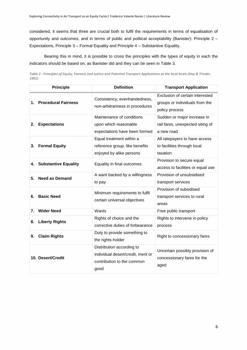
Hay and Trinder (1991) defined what they believed were the Ten Principles of Equity, Fairness
and Justice in Transport Policy, as we can see in Table 2. Although all ten principles should be
Exploring Connectivity in Air Transport as an Equity Factor| Frederico Valente Nunes | Literature Review
6
considered, it seems that three are crucial both to fulfil the requirements in terms of equalisation of
opportunity and outcomes, and in terms of public and political acceptability (Banister): Principle 2 –
Expectations, Principle 3 – Formal Equality and Principle 4 – Substantive Equality.
Bearing this in mind, it is possible to cross the principles with the types of equity in each the
indicators should be based on, as Banister did and they can be seen in Table 3.
Table 2 - Principles of Equity, Fairness and Justice and Potential Transport Applications at the local levels (Hay & Trinder, 1991)
Principle Definition Transport Application
1. Procedural Fairness Consistency, evenhandedness,
non-arbitrariness in procedures
Exclusion of certain interested
groups or individuals from the
policy process
2. Expectations
Maintenance of conditions
upon which reasonable
expectations have been formed
Sudden or major increase in
rail fares, unexpected siting of
a new road
3. Formal Equity
Equal treatment within a
reference group, like benefits
enjoyed by alike persons
All ratepayers to have access
to facilities through local
taxation
4. Substantive Equality Equality in final outcomes Provision to secure equal
access to facilities or equal use
5. Need as Demand A want backed by a willingness
to pay
Provision of unsubsidised
transport services
6. Basic Need Minimum requirements to fulfil
certain universal objectives
Provision of subsidised
transport services to rural
areas
7. Wider Need Wants Free public transport
8. Liberty Rights Rights of choice and the
corrective duties of forbearance
Rights to intervene in policy
process
9. Claim Rights Duty to provide something to
the rights-holder Right to concessionary fares
10. Desert/Credit
Distribution according to
individual desert/credit, merit or
contribution to the common
good
Uncertain possibly provision of
concessionary fares for the
aged
Exploring Connectivity in Air Transport as an Equity Factor| Frederico Valente Nunes | Literature Review
7
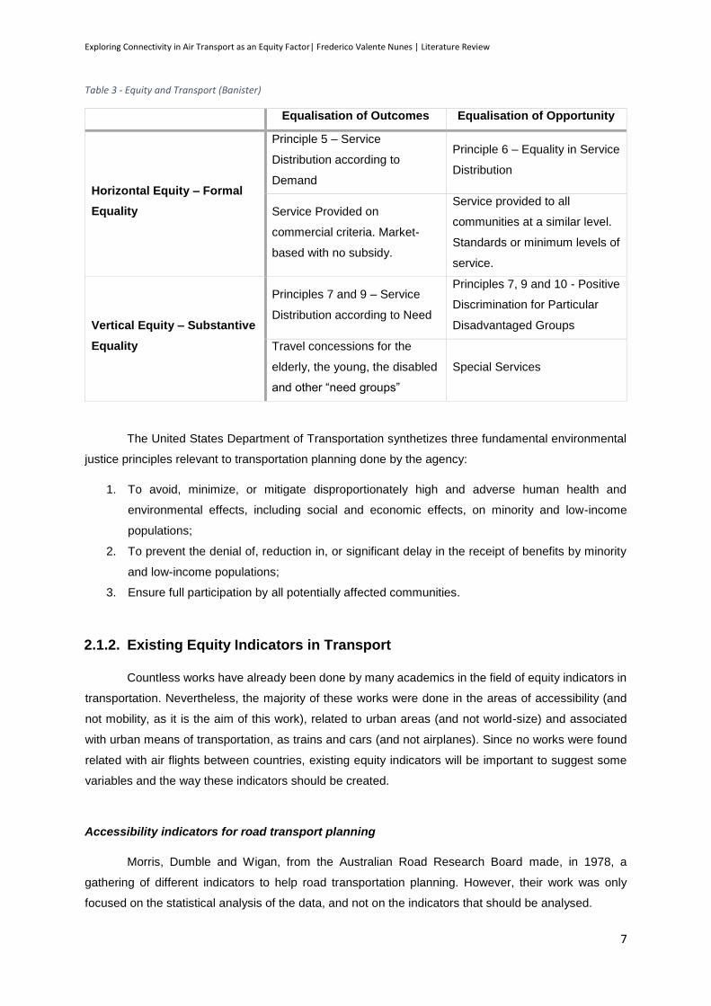
Table 3 - Equity and Transport (Banister)
Equalisation of Outcomes Equalisation of Opportunity
Horizontal Equity – Formal
Equality
Principle 5 – Service
Distribution according to
Demand
Principle 6 – Equality in Service
Distribution
Service Provided on
commercial criteria. Market-
based with no subsidy.
Service provided to all
communities at a similar level.
Standards or minimum levels of
service.
Vertical Equity – Substantive
Equality
Principles 7 and 9 – Service
Distribution according to Need
Principles 7, 9 and 10 - Positive
Discrimination for Particular
Disadvantaged Groups
Travel concessions for the
elderly, the young, the disabled
and other “need groups”
Special Services
The United States Department of Transportation synthetizes three fundamental environmental
justice principles relevant to transportation planning done by the agency:
1. To avoid, minimize, or mitigate disproportionately high and adverse human health and
environmental effects, including social and economic effects, on minority and low-income
populations;
2. To prevent the denial of, reduction in, or significant delay in the receipt of benefits by minority
and low-income populations;
3. Ensure full participation by all potentially affected communities.
2.1.2. Existing Equity Indicators in Transport
Countless works have already been done by many academics in the field of equity indicators in
transportation. Nevertheless, the majority of these works were done in the areas of accessibility (and
not mobility, as it is the aim of this work), related to urban areas (and not world-size) and associated
with urban means of transportation, as trains and cars (and not airplanes). Since no works were found
related with air flights between countries, existing equity indicators will be important to suggest some
variables and the way these indicators should be created.
Accessibility indicators for road transport planning
Morris, Dumble and Wigan, from the Australian Road Research Board made, in 1978, a
gathering of different indicators to help road transportation planning. However, their work was only
focused on the statistical analysis of the data, and not on the indicators that should be analysed.
Exploring Connectivity in Air Transport as an Equity Factor| Frederico Valente Nunes | Literature Review
8
There are two ideas that can be taken from their work:
1. There are two types of analysis of accessibility: Relative Accessibility, where only the distance
is taken into account, and Integral Accessibility, where cost, time and other indicators are also analysed;
2. How should the relation between two separate points be analysed: by taking only into account
the distance, bearing in mind that “the farther it is, the less demand there is” (decay factor), considering
that the demand varies with the capacity of the network, or a composed analysis between the distance
and the supply/demand?
The Chicago Region Expansion
Nathalie P. Voorhees (2009), from the University of Illinois in Chicago, did an equity analysis of
the expansion of the Red Line of Chicago Metro that connects the whole region. In her study three areas
were chosen for analysis: Transportation Equity, Environmental Social Justice and Livable Community
Potential. In what concerns Transportation Equity, five aspects were taken into account: Transit
dependence measured by disabled population, by households with no cars, by elderly population and
by high school students and inadequate access measured by excessive travelling time to work. In the
Livable Community Potential the economic health measured by unemployed population was taken into
account, business health measured by extensive business vacancy and the economic stability
measured by estimated high cost loans. Other criteria were also studied but there is no relation with this
work.
The Equity Index makes use of standardized scores as a means of comparing conditions across
a regional geography. Standardized scores allow for comparison across regions by looking at the range
or distribution of values, and then comparing individual values and their distance from significant values.
Standardized score values represent how many standard deviations from the significant value the value
is for a particular area, and is calculated as the z-score statistic for each geographic area unit (Voorhees,
2009).
The standard score is given by Equation 1:
𝑧 =𝑥 − 𝜇
𝜎 (1)
where:
𝑥 is a raw score to be standardized;
𝜇 s the value of the population;
𝜎 is the standard deviation of the population.
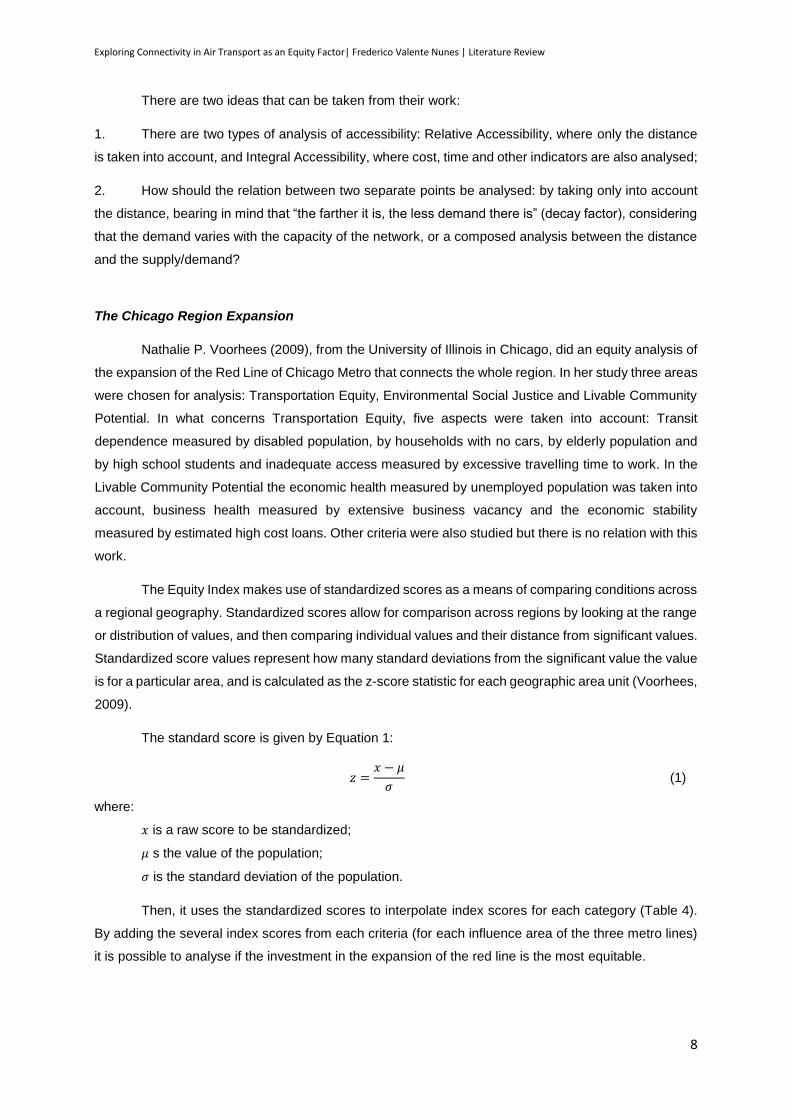
Then, it uses the standardized scores to interpolate index scores for each category (Table 4).
By adding the several index scores from each criteria (for each influence area of the three metro lines)
it is possible to analyse if the investment in the expansion of the red line is the most equitable.
Exploring Connectivity in Air Transport as an Equity Factor| Frederico Valente Nunes | Literature Review
9
Table 4 - Standardized scores to interpolate index scores (Voorhees, 2009)
Z-score Index Score
> 1,5 2
1,5 to 0,5 1
0,5 to -0,5 0
-0,5 to -1,5 -1
< -1,5 -2
2.3.1 Transport Equity in today’s society
In the last century governments from developed countries realized that one of the new century
challenges is not to ensure the strength of the borders but to improve the connection and cohesion
inside them. This way, all across the globe several countries have taken actions to improve this cohesion
by investing in transportation infrastructures or by improving legislation on transportation.
This reality is obviously greater in countries of large dimensions, like the United States of
America, for example, but also in small countries, like Portugal. The reasons for these transversal
concerns are due to different realities: if big countries or communities (like the EU) tend to invest to
promote the cohesion and to improve the public opinion on a determinate subject, other tend to invest
to decrease asymmetries between different parts of the country or to overcome natural barriers as the
sea, in the case of countries with islands, or as detached territories.
Transportation Equity Act for the 21st Century
One of the greatest examples in this field is the Transportation Equity Act for the 21st Century
(TEA-21), a United States public law enacted in June 9, 1998, which authorized federal surface
transportation programs for highways, highway safety and traffic between 1998 and 2003. This act
presents “new initiatives to meet the challenges of improving safety as traffic continues to increase at
record levels, protecting and enhancing communities and the natural environment while providing
transportation, and advancing America’s economic growth and competitiveness domestically and
internationally through efficient and flexible transportation.” (TEA-21 - Transportation Equity Act for the
21st Century, Moving Americans into the 21st Century, 2015).
According to this Act, seven planning factors are required to be included in regional
transportation plans for funds to be requested:
i. Support the economic vitality of the metropolitan planning area, especially by enabling global
competitiveness, productivity and efficiency;
ii. Increase the safety and security for the transportation system for motorized and non-motorized
users;
iii. Increase the accessibility and mobility options available for people and for freight;
Exploring Connectivity in Air Transport as an Equity Factor| Frederico Valente Nunes | Literature Review
10
iv. Protect and enhance the environment, promote energy conservation, improve quality of life, and
promote consistency between transportation improvement and state and local planned growth and
economic development patterns
v. Enhance the integration of connectivity of the transportation system, across and between modes,
for people and freight;
vi. Promote efficient system management and operation;
vii. Emphasize the efficient preservation of existing transportation system.
As it is possible to observe, the aim of this equity act covers a lot more areas than the study
proposed, but it shows without a doubt that several areas of equity are priorities in the transportation
future plans. Although air transportation is not taken under consideration in this law (it is only applicable
to surface transportation systems), the seven factors could also be applied to this mean of
transportation.
For this study, at least two of these factors are addressed: support the economic vitality of all
European Union countries, by improving competitiveness, productivity and efficiency and increase the
accessibility and mobility options available for people and for freight.
Public Service Obligations (PSO) in Air Transportation
Public Service Obligations in Air Transportation is the name given to the obligation given by a
Government to an airline to serve a specific route with specific rules with several possible objectives
determined by law.
In the EU, PSO are established according to European Regulation nº 1008/2008 of the
European Parliament and of the Council of 24 September 2008 on common rules for the operation of
air services in the Community taking “(11) into account the special characteristics and constraints of the
outermost regions, in particular their remoteness, insularity and small size, the need to properly link
them with the central regions of the Community”.
Under Chapter III – Access to Routes, Article 16 of the mentioned law, it is stated that “A Member
State, following consultations (…), may impose a public service obligation in respect of scheduled air
services between an airport in the Community and an airport serving a peripheral or development region
in its territory or on a thin route to any airport on its territory any such route being considered as vital for
the economic and social development of the region which the airport serves. That obligation shall be
imposed only to the extent necessary to ensure on that route the minimum provision of scheduled air
services satisfying fixed standards of continuity, regularity, pricing or minimum capacity, which air
carriers would not assume if they were solely considering their commercial interest.”. According to this,
“if no airline is willing to provide a service under the conditions imposed, the government may restrict
access to the route to a single carrier and award financial compensation to the carrier in return for
compliance with the PSO” (Williams, 2010).
Nevertheless this is not just a situation verified on the EU, having Canada and the USA, for
instance, similar laws. This need urges in countries where remote regions are separated from the
Exploring Connectivity in Air Transport as an Equity Factor| Frederico Valente Nunes | Literature Review
11
mainland due to natural barriers impassable by other fast means of transportation (like an island,
separated from the mainland by water) or due to high costs of construction of surface routes allied with
few users that make those routes unbearable to build. For instance, in “2006, rural Canada covered
99,8% of the nation’s territory and accounted for 24% of its population” (Metrass-Mendes, de Neufville,
& Costa, 2010).
Some cases in the EU and the USA will be adressed further in this work, but for now, a
framework of the actual situation is needed.
Regarding the authority to administer air transportation PSO, government departments are
responsible in Czech Republic, Finland, Greece, Ireland, Portugal and Sweden, while in France,
Germany, Italy and Spain, this authority is in the hands of regional responsibles. In the UK a mixed
situation can be found, where Scottish Government is responsible only for administering the routes
operated from Glasgow, regional authorities are responsible for services in Orkney, Shetland and
Western Isles, and Wish Assembly Government is the responsible in the case of Wales.
Concerning the number of PSO routes (in December 2014), Norway (although not in the EU, it
belongs to the European Economic Area) is the leader with 51 routes, followed by France with 42 and
Greece, Portugal, United Kingdom and Italy with between 30 and 20 routes each. The country with the
fewer PSO routes are Finland and Ireland with only 3. Nevertheless there are 18 countries in the Union
with no PSO routes. The share of domestic seats that are offered under the PSO regime is higher in
Portugal (40%) and Ireland (23%), followed by France and Norway with around 10% (Lian, 2010).
The average distance of the PSO routes varies from 600km in France and 200km in Norway
and the seating capacity average varies between 110-70 seats in Portugal and France, 50-35 seats in
Spain, Sweden and Germany and 15-10 seats in Scotland. In Norway, although the average consists
of 37 seats, there are aircrafts with a minimum of 15 seats.
Finally, concerning the average subsidy level per passenger, Germany is around 120 €, followed
by Norway, Sweden and Scotland with around 60 €, while France and Portugal are near 20 €.
The next two topics will show two different PSO, one in Portugal and the other in the USA.
Essential Air service and Alternative Essential Air Service
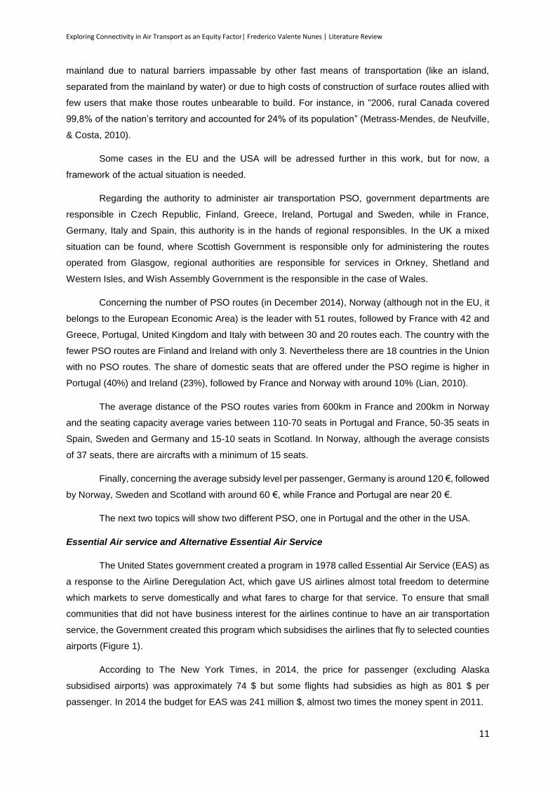
The United States government created a program in 1978 called Essential Air Service (EAS) as
a response to the Airline Deregulation Act, which gave US airlines almost total freedom to determine
which markets to serve domestically and what fares to charge for that service. To ensure that small
communities that did not have business interest for the airlines continue to have an air transportation
service, the Government created this program which subsidises the airlines that fly to selected counties
airports (Figure 1).
According to The New York Times, in 2014, the price for passenger (excluding Alaska
subsidised airports) was approximately 74 $ but some flights had subsidies as high as 801 $ per
passenger. In 2014 the budget for EAS was 241 million $, almost two times the money spent in 2011.

Exploring Connectivity in Air Transport as an Equity Factor| Frederico Valente Nunes | Literature Review
12
On the other hand, the Alternative Essential Air Service intends to subsidise not the airlines but
directly the municipality or the airport authority, what allows the community to recruit air service that is
not supported by EAS, as less-than-daily services, flights to differing destinations depending on the time
of the year or week, or air taxi service.
Strategic Plan for Transportation and Infrastructure 2014-2020
The Portuguese Strategic Plan for Transportation and
Infrastructure 2014-2020 brings two different contributions for this
subject: first it enhances the New Juridical Regime for Public
Transport Services where the Principle of equity in access to
transportation is addressed to and second it brings to discussion the
intercontinental air transportation.
The New Juridical Regime for Public Transportation Services
shows the political concerns about the distribution of the public
transportation in the different regions of Portugal. As it is possible to
see in Figure 2, the distribution of public transportation is not
homogeneous and there is the necessity of providing an efficient and
needed service to all citizens.
On the other hand, it also addresses the issue of the
intercontinental air transportation: in Portugal mainland there are few
frequent air-highway (Lisbon-Oporto, Lisbon-Faro and Oporto-Faro),
which does not ensure the cohesion of the territory. For this purpose
the Portuguese Government has launched an international tender in
the Official Journal of the European Union (European Comission, 2014) for the public service obligations
regarding scheduled air services between Bragança, Vila Real, Viseu, Cascais and Portimão. This
service, which is represented in Figure 2, is sponsored by the Government and entered into force of the
public service obligations on 1st July 2015.
Existing Air-highways
New Air-highway
Oporto
Bragança
Vila Real
Viseu
Lisbon
Faro Portimão
Cascais
Figure 2 – Portugal continental distribution of public transportation (Adapted from the SOURCE: IMT/SIGESCC 2012)
Figure 1 - Counties containing airports subsidised by Essential Air Service (excluding Alaska and Hawaii) (SOURCE: Wikipedia)
Exploring Connectivity in Air Transport as an Equity Factor| Frederico Valente Nunes | Literature Review
13
2.2. Connectivity
According to the Business Dictionary, Connectivity is the “measure of the extent to which the
components (nodes) of a network are connected to one another, and the ease (speed) with which they
can ‘converse’”. From this definition is easy to understand that connectivity has a direct connection with
the concept “network”.
2.2.1. Networks
Defining a network is not easy, mostly because there are many elements involved and even
more relations between them. In a simplified way we can say that a network is a series of points or
nodes (elements) interconnected by paths (relations).
Studies, like the one by R. Guimerà, S. Mossa, A. Turtschi and L. A. N. Amaral (2005) found
that the worldwide air transportation networks is a scale-free small-world network. A scale-free network
is characterized by a vertex connectivity distribution that decays as a power law. These emerge in the
context of a growing network in which new vertices connect preferentially to the more highly connected
vertices in the network. Nevertheless scale-free networks have to be small-world networks because (i)
they have clustering coefficients much larger than random networks and (ii) their diameter increases
logarithmically with the number of vertices n. (Amaral, Scala, Barthélémy, & Stanley, 2000).
The case of the worldwide air transportation network is consistent with a small-world network in
which the number of nonstop connections from a given city and the number of shortest paths going
through a given city have distributions that are scale-free. In the air transportation network, the average
shortest path length d is the average minimum number of flights that one needs to take to get from any
city to any other city in the world. Guimerà et all. found that “for the 719 cities in the Asia and Middle
East network, d=3,5 and that the average shortest path length between networks is only approximately
one step greater, d=4,4. Actually, most pairs of cities (56%) are connected by four steps or less” and
that “d grows logarithmically with the number S of cities in the network, d ≈ log S. This behaviour is
consistent with both random graphs and small-world networks but not with low-dimensional networks,
for which d grows more rapidly with S.” (Guimera, Mossa, Turtschi, & Amaral, 2005).
What is interesting to realize in almost all networks that exist in the world, from the worldwide
air transportation network, to the World Wide Web network (www.), even to networks in biology, is that
all them then to be ruled by the same mathematical principles. The study of some networks can, thereby
help to understand other networks and to organized human-networks in a proper way.
Albert-Laszlo Barabasi and Reka Albert reported in 1999 in Emergence of Scaling in Random
Networks that complex networks large-scale properties have a high degree of self-organization, showing
that (i) networks expand continuously by the addition of new vertices and (ii) new vertices attach
preferentially to sites that are already well connected. Besides this, they shown that “independently of
Exploring Connectivity in Air Transport as an Equity Factor| Frederico Valente Nunes | Literature Review
14
the system and the identity of its constituents, the probability P(k) that a vertex in the network interacts
with k other vertices decays as a power law, following 𝑃(𝑘)~𝑘−𝛾”.
2.2.2. Measuring connectivity in worldwide air transportation
The necessity of measuring connectivity is obvious: first of all this indicators can act as a
performance indicator to networks, airports and regions, what supports the creation of new policies;
secondly, the creation of such indicators can assess the impact of various measures to maintain or
enhance network performance; and finally together with ticket price it is an important variable in route
choice of passengers (Burghouwt & Redondi, Connectivity in air transport networks: models, measures
and applications, 2009).
In previous literature is difficult to find any comprehensive attempt to measure air transport
connectivity between countries using rigorous network analysis methods. The very first study about this
problematic was done by Jean-François Arvis and Ben Shepherd for The World Bank. Nevertheless,
we can find important contributions previous to this study.
First Pearce (2007) defined connectivity as summarizing the scope of access between an
individual airport or country and the global air transport network. Bearing this in mind the indicator that
he created combined information on the number of destinations served, the frequency of service, the
number of seats per flight, and the size of the destination airport. Using this indicator to measure the
connectivity of 47 countries he found a relation between connectivity and labour productivity and
competitiveness of the travel and tourism sector.
Focusing in transport, but not necessarily in air transport, UNCTAD – United Nations
Conference for Trade and Development - is developing a Linear Shipping Connectivity Index. They
define connectivity in terms of access to regular and frequent transport services, then use factor analysis
to bring together data on capacity and utilization in the liner shipping sector (UNCTAD, 2007).
According to Jean-François Arvis and Ben Shepherd (2011), essentially we can say that there
are four groups of connectivity measures applied so far to transport and economic problems:
Intuitive metrics, simply counting the number of connections by node, often referred as degree
centrality;
Concentration indicators, which makes use of more information from the matrix, and uses
concentration indices such as the Herfindhal or Theil indices of the floes to and from a node in the
network;
Clustering techniques, which is essentially a topological concept in which the clustering coefficient
of a node i is an intuitive measure of how well connected the nodes in the neighbourhood of i are;
Centrality indices (closeness centrality or PageRank), which measures the importance of a node in
relation to all the other nodes in the network (the more important a destination is for its neighbours,
the more central it is).
Exploring Connectivity in Air Transport as an Equity Factor| Frederico Valente Nunes | Literature Review
15
In the case of Jean-François Arvis and Ben Shepherd (2011) they were “interested in using
connectivity as a policy tool, rather than simply a mean of describing network properties, as in the applied
mathematics literature and they focus on the country as a the level of analysis. Therefore they created
a model to evaluate the connectivity of each country based on a generic bi-proportional gravity model:
𝑋𝑖𝑗 = 𝐴𝑖𝐵𝑗𝐾𝑖𝑗 (2)
where 𝐴𝑖 is the repulsive potential of node i, 𝐵𝑗 is the attractive potential of node j, 𝐾𝑖𝑗 is the bilateral
impedance which is exogenous and decreasing in the cost and distance and 𝑋𝑖𝑗 is “pushed” from i and
“pulled” to j (Arvis & Shepherd, 2011). Using this indicator they were able to rank countries according to
their connectivity: United States of America was on the 1st position with a connectivity of 22,78%,
followed by European Union (making the average of the countries in the Union and excluding them from
the ranking) in the 4th position with 21,07% of connectivity and Brazil with 2,67% of connectivity at the
96th place (excluding the European Countries from the ranking and adding the country “European
Union”). They also found that in 80% of times airports can be reached from any other node in three
steps or less and almost 100% of times can be reached in four steps or less.
Some other have intended to analyse the situation inside their own countries. For example
Ganesh Bagler (2008) analysed the domestic air transportation network in India, where we found that
from approximately 228 airports, only 7% of them were connected with direct flights and that 99% could
be reached in three or less steps.
Stefano Paleari, Renato Redondi and Paolo Maligheti (2010) made a comparative analysis of
the networks in China, Europa and United States of America. Together these networks account for
51,1% of all seats offered worldwide. They found that in Europe and China, connection distances are
concentrated around 1 000 – 1 200 km while in the USA they are concentrated between 1 000 – 1 200
km and around 4 500 km. The average shortest path ranges from 2,34 in China, to 2,80 in the European
Union and 3,38 in the United States of America (Paleari, Redondi, & Malighetti, 2010).
2.2.3. The Existing Air Transport Network
Before 1987 the aviation market in Europe was regulated, what means that the routes were the
result of Bilateral Air Service Agreements between countries where airlines (normally owned by national
governments) would fly according to strict rules. This meant that most part of routes were only operated
by one or two designated flag carriers who were constrained in terms of capacity and pricing (Lieshout,
Malighetti, Redondi, & Burghouwt, 2015).
After this period, European aviation market was gradually deregulated in three steeps, or
packages, in 1987,1990 and 1992 (Button, Haynes, & Stough, 1998). When the same happened in
United States of America in 1978, “airlines took advantage of the possibilities of the liberalised market
and reorganised their networks, most part by making their network point-to-point into hub-and-spoke
network. Direct flights from medium airports to other medium airports were increasingly replaced by
indirect flights via a central airport or hub” (Burghouwt & Wit, 2005). Hub-and-spoke networks allow the
Exploring Connectivity in Air Transport as an Equity Factor| Frederico Valente Nunes | Literature Review
16
hub-airline to maximize the number of connected city pairs given a certain number of flights by means
of spatial and temporal concentration of the network (Burghouwt G. , 2007). In this new organization of
networks that grown, spatial concentration and temporal concentration were the two main features
(Reynolds-Feighan, 2001). The spatial configuration can be defined as the level of concentration of an
airline network around one or a few central hub airports. Temporal configuration regards the organisation
of the airline flight schedule at an airline’s station resulting in a given number and quality of indirect
connections offered through that airline’s station.
Is important to say that for an accurate study, an indirect flight should have some defined
characteristics, like the time between flights, due to the fact that even if two flights can make a 2 steps
journey, if the time between them is too long, passengers will not have any interest in that connection.
Therefore airlines should organized their schedule in a wave-system structure. According to Bootsma
(1997) a connection wave is “a complex of incoming and outgoing flights, structured such that all
incoming flights connect to all outgoing flights”. A wave-system structure consists therefore in a number
of waves, the timing of the waves and the structure of the individual waves (Burghouwt & Wit, 2005).
This way, three elements determine the structure of a connection wave: (i) the minimum connecting time
for continental and intercontinental flights, (ii) the maximum connecting times and (iii) the maximum
number of flights that can be scheduled per time period.
As it was already said, the attractiveness of an indirect connection depends on several aspects,
as for example (Veldhuis, 1997):
Waiting time at the hub: atractivity declines when waiting time increases;
Routing factor: the in-flight time. Some indirect connections are not attractive for the average air
traveller because the detour factor is too large;
Perception: passengers perceive transfer time as being longer than in-flight time;
Fares: lower fares may compensate for longer transfer and in-flight times;
Flights of a certain airline may be attractive because the air traveller participates in the loyalty
programme of the airline and;
Amenities of the hub-airport involved in the transfer.
One of the consequences of the deregulation of Europe’s airline industry has been the need to
provide subsidies to ensure the continuation of air services to remote communities, previously cross-
subsidised by profits from busier routes of the same airline (Smyth, Christodoulou, Dennis, AL-Azzawi,
& Campbell, 2012). Public Service Obligations in Air Transportation, as it is called, was already
addressed in the previous charter.
But what is the importance of having a dynamic and more competitive air transportation market?
Various studies have shown a correlation between the provision of connectivity through transport
networks and economic growth. Interurban and international connections enable the development of
new production processes and, being able to national or international trade, regions and/or countries
will benefit from the increase specialisation in production of goods and services (Eddington, 2006).

Exploring Connectivity in Air Transport as an Equity Factor| Frederico Valente Nunes | Literature Review
17
Almost two-thirds of United Kingdom companies have reported that passenger services are
either vital or very important for sales and marketing, being air services particularly important for the
country’s trade with the fastest-growing regions of the world economy, Furthermore, 55% of the United
Kingdom’s exports by value of manufactured goods to countries outside the EU are transported by air
and more than 60% of imports of machinery, mechanical appliances and electric equipment from outside
the European Union are carried by air. The importance in the tourism sector is even more evident with
more than 75% of international visitors coming to the United Kingdom arriving by plane, a number that
grows to 87% in the Scottish case (Strategic Research Department, 2007). All these numbers lead to
tourism spending by visitors who came by air to reach 1,1% of the United Kingdom GDP and creating
170 000 jobs across all country. This example from UK can be extrapolated and shows the economic
and social importance of air transport market.
Austin Smyth et all. shown in Is air transport a necessity for social inclusion and economic
development? (2012) the importance of Public Service Obligations in the most various fields of public
life. Nevertheless, PSO are not the only way to improve connectivity (and equity as we already saw). It
were created several incentives to encourage the launch of new air routes however, public funding is
not the sole source of financial support, although regulation increasingly restricts the opportunity for
employing such supports. Other incentives may come in the shape of Route Development Fund, Tax
holidays and discounts, Revenue guarantees or Community Ticket Trusts.
One of the most used methods in United Kingdom is the Route Development Funds (RDF).
These are intended to benefit the overall economic development of the region but are not “intended to
replace the role of the airport and airlines in developing their business but rather to act as a catalyst for
promoting links either not under immediate consideration or ones thought to have marginal business
case in the short term” (Smyth, Christodoulou, Dennis, AL-Azzawi, & Campbell, 2012). These
mechanism intends to allocate funds to routs that are likely to become commercially viable after the first
three years giving this way a help in by creating demand by decreasing fairs. One of the benefits of this
mechanism is that contributes to raise profits of the airports and regions concerned, it encourages
airports to be more dynamic in their marketing and generally attract interest from airlines. Nevertheless,
there is no guarantee that routes which receive RDF funds will ultimately prove to be financially viable
in the longer term (UK Civil Aviation Authority, 2005). The Scottish Government has focussed on the
new services which have an average frequency of at least five return trips per week, operates on an all
year round basis and which would not go ahead without RDF investments.
By analysing the results over the years in Scotland Austin Smyth et all. found that the number
of passengers has grown from 286 000 in 2003/04 to 1,9 million in 2007/08. But what about the economic
impacts? The analysis shown that the RDF services returns a positive net present value and benefit-to-
cost ration greater than 1,0 suggesting the RDF programme has been successful in improving travel
conditions for business and leisure passengers. Of the 52 services with RDF funds, only 2 services
produced negative returns. In the case of financial impact, only taking in account revenues of tourism
sector, this funds produced a profit of more £19,9 million in 2008 when compared with before the
implementation of the RDF funds. Concerning business expenditure the study found a positive impact

Exploring Connectivity in Air Transport as an Equity Factor| Frederico Valente Nunes | Literature Review
18
of more than £7,8 million in 2008. Thirdly, the social impacts were also massive: with the allocation of
this founds the journey times decreases on average 62% when compared with surface journeys and
also 24% shorter in distance travelled what leads to the reduction of the perception of the remoteness
of parts of Scotland. Finally, it is true that the allocation of this founds created more environmental
impacts by increasing the level of air pollution and emissions. As studies shown that the CO2 emissions
from RDF services were just under 4,02m tonnes over a 10-year appraisal period what gives to the UK
Government costs of carbon to these emissions values at £69m (2002 prices). However, is important to
remember that while there is an increase of emissions because of the increase in air flights, there is also
a reduction due to the decrease in other transports modes. After considering all these aspects, Austin
Smyth et all. considered that the application of funds in the way of RDF brings long term positive impacts
to the economic, financial, social and environmental life in Scotland.
The results presented by Austin Smyth et all. show what Jean-François Arvis and Ben Shepherd
(2011) found: that the connectivity of a country (according to their indicator) is “strongly correlated with
the degree of liberalization in air services markets, which suggests that policy can play an important role
in shaping connectivity”. They also found that “better connected countries tend to be more specialized
in trade in machinery parts and components, which is consistent with their being more deeply integrated
into international production networks, which rely heavily on air transport”.
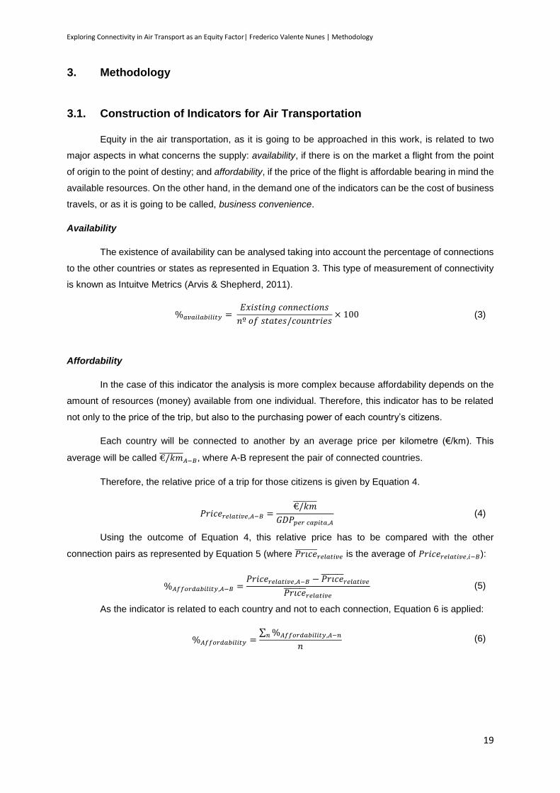
Exploring Connectivity in Air Transport as an Equity Factor| Frederico Valente Nunes | Methodology
19
3. Methodology
3.1. Construction of Indicators for Air Transportation
Equity in the air transportation, as it is going to be approached in this work, is related to two
major aspects in what concerns the supply: availability, if there is on the market a flight from the point
of origin to the point of destiny; and affordability, if the price of the flight is affordable bearing in mind the
available resources. On the other hand, in the demand one of the indicators can be the cost of business
travels, or as it is going to be called, business convenience.
Availability
The existence of availability can be analysed taking into account the percentage of connections
to the other countries or states as represented in Equation 3. This type of measurement of connectivity
is known as Intuitve Metrics (Arvis & Shepherd, 2011).
%𝑎𝑣𝑎𝑖𝑙𝑎𝑏𝑖𝑙𝑖𝑡𝑦 = 𝐸𝑥𝑖𝑠𝑡𝑖𝑛𝑔 𝑐𝑜𝑛𝑛𝑒𝑐𝑡𝑖𝑜𝑛𝑠
𝑛º 𝑜𝑓 𝑠𝑡𝑎𝑡𝑒𝑠/𝑐𝑜𝑢𝑛𝑡𝑟𝑖𝑒𝑠× 100 (3)
Affordability
In the case of this indicator the analysis is more complex because affordability depends on the
amount of resources (money) available from one individual. Therefore, this indicator has to be related
not only to the price of the trip, but also to the purchasing power of each country’s citizens.
Each country will be connected to another by an average price per kilometre (€/km). This
average will be called €/𝑘𝑚̅̅ ̅̅ ̅̅ ̅̅𝐴−𝐵, where A-B represent the pair of connected countries.
Therefore, the relative price of a trip for those citizens is given by Equation 4.
𝑃𝑟𝑖𝑐𝑒𝑟𝑒𝑙𝑎𝑡𝑖𝑣𝑒,𝐴−𝐵 =€/𝑘𝑚̅̅ ̅̅ ̅̅ ̅̅
𝐺𝐷𝑃𝑝𝑒𝑟 𝑐𝑎𝑝𝑖𝑡𝑎,𝐴
(4)
Using the outcome of Equation 4, this relative price has to be compared with the other
connection pairs as represented by Equation 5 (where 𝑃𝑟𝑖𝑐𝑒̅̅ ̅̅ ̅̅ ̅𝑟𝑒𝑙𝑎𝑡𝑖𝑣𝑒 is the average of 𝑃𝑟𝑖𝑐𝑒𝑟𝑒𝑙𝑎𝑡𝑖𝑣𝑒,𝑖−𝐵):
%𝐴𝑓𝑓𝑜𝑟𝑑𝑎𝑏𝑖𝑙𝑖𝑡𝑦,𝐴−𝐵 =𝑃𝑟𝑖𝑐𝑒𝑟𝑒𝑙𝑎𝑡𝑖𝑣𝑒,𝐴−𝐵 − 𝑃𝑟𝑖𝑐𝑒̅̅ ̅̅ ̅̅ ̅
𝑟𝑒𝑙𝑎𝑡𝑖𝑣𝑒
𝑃𝑟𝑖𝑐𝑒̅̅ ̅̅ ̅̅ ̅𝑟𝑒𝑙𝑎𝑡𝑖𝑣𝑒
(5)
As the indicator is related to each country and not to each connection, Equation 6 is applied:
%𝐴𝑓𝑓𝑜𝑟𝑑𝑎𝑏𝑖𝑙𝑖𝑡𝑦 =∑ %𝐴𝑓𝑓𝑜𝑟𝑑𝑎𝑏𝑖𝑙𝑖𝑡𝑦,𝐴−𝑛𝑛
𝑛 (6)

Exploring Connectivity in Air Transport as an Equity Factor| Frederico Valente Nunes | Methodology
20
Business Convenience
In a single market like the one in the European Union it is common for business men to travel
around the countries to trade. Therefore, each country has a cost to make business in the European
Union that depends of the attractiveness of the other countries, of the distance to that country and of
the frequency of flights (less frequency means more wasted time and larger costs). Due to the fact that
was not possible to get access to a database with the information regarding the frequency of the flights,
it was used as measure the number of airlines that operate in each route (information from
openflights.org), what is not the best variable, but gives an idea of each route frequency, as represented
by Equation 7.
𝐵𝑢𝑠𝑖𝑛𝑒𝑠𝑠𝑟𝑒𝑙𝑎𝑡𝑖𝑣𝑒 𝑐𝑜𝑠𝑡,𝑖 = ∑𝐺𝐷𝑃𝑖
∑ 𝐺𝐷𝑃× 𝐷𝑖−𝑛 ×
1
𝐴𝑖−𝑛
(7)
where,
𝑖 is the country under analysis,
𝐺𝐷𝑃𝑖 is the GDP of the country i using PPP rates,
∑ 𝐺𝐷𝑃 is the total GDP of all European Union also using PPP rates,
𝐷𝑖−𝑛 is the distance of the country i to the country n,
𝐴𝑖−𝑛 number of airlines operating in the route from i to n.
For the 𝐴𝑖−𝑛 variable, it was taken as sample the airlines that operate between two
representative airports from different countries/states. In the case of a country or state having more than
one representative airport, it was considerer the airport with more airlines operating in that route. In the
case of two countries/states not having a diret route connecting them, 𝐴𝑖−𝑛 becomes 0,5 instead of 0,
what means that is considered that the relative cost is two times higher than having at least one airline
operating in that route.
3.2. Study restrictions and data organisation
In order to make this work humanly possible, it was necessary to reduce the sample of airports
and airlines in this study.
The Federal Aviation Administration (FAA) of the United States classify as a Large Hub all
airports that have more than 1% of the country passengers. Nevertheless, in Europe the number of
Airports is lower and the definition from the FAA would not be a benefit. This way, in this work it is going
to be considered as representative of a country’s connections the sample of all airports that have at
least 20% of the country’s passengers. This rate is also going to be used in the USA case study, even
with the existing FAA rates. In the case of Brazil airports, once there is no correct information about the
airports which are under Municipal authority, the sample will only take into account airports belonging
to Infraero, DAESP (Airports Department of the State of São Paulo) and private ones.
Having these airports as a representative sample (Annex 2, 6 and 10) of the country’s
connections, this is the moment to proceed to the evaluation of the indicators.
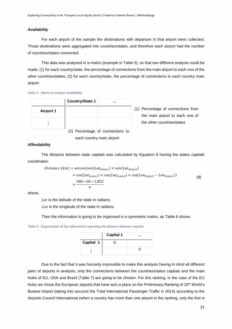
Exploring Connectivity in Air Transport as an Equity Factor| Frederico Valente Nunes | Methodology
21
Availability
For each airport of the sample the destinations with departure in that airport were collected.
Those destinations were aggregated into countries/states, and therefore each airport had the number
of countries/states connected.
This data was analysed in a matrix (example in Table 5), so that two different analysis could be
made: (1) for each country/state, the percentage of connections from the main airport to each one of the
other countries/states; (2) for each country/state, the percentage of connections to each country main
airport.
Table 5 - Matrix to analyse Availability
Country/State 1 …
Airport 1 (1) Percentage of connections from
the main airport to each one of
the other countries/states …
(2) Percentage of connections to
each country main airport
Affordability
The distance between state capitals was calculated by Equation 8 having the states capitals
coordinates:
𝐷𝑖𝑠𝑡𝑎𝑛𝑐𝑒 (𝑘𝑚) = arccos (𝑠𝑒𝑛(𝐿𝑎𝑡𝑆𝑡𝑎𝑡𝑒1) × 𝑠𝑒𝑛(𝐿𝑎𝑡𝑆𝑡𝑎𝑡𝑒2)
+ cos(𝐿𝑎𝑡𝑆𝑡𝑎𝑡𝑒1) × cos (𝐿𝑎𝑡𝑆𝑡𝑎𝑡𝑒2) × cos (𝐿𝑜𝑛𝑆𝑡𝑎𝑡𝑒2 − 𝐿𝑜𝑛𝑆𝑡𝑎𝑡𝑒1))
×180 ∗ 60 ∗ 1,852
𝜋
(8)
where,
𝐿𝑎𝑡 is the latitude of the state in radians;
𝐿𝑜𝑛 is the longitude of the state in radians.
Then the information is going to be organised in a symmetric matrix, as Table 6 shows.
Table 6 - Organisation of the information regarding the distance between capitals
Capital 1 …
Capital 1 0
… 0
Due to the fact that it was humanly impossible to make this analysis having in mind all different
pairs of airports in analysis, only the connections between the countries/states capitals and the main
Hubs of EU, USA and Brazil (Table 7) are going to be chosen. For this ranking, in the case of the EU
Hubs we chose the European airports that have won a place on the Preliminary Ranking of 20th World’s
Busiest Airport (taking into account the Total International Passenger Traffic in 2014) according to the
Airports Council International (when a country has more than one airport in the ranking, only the first is

Exploring Connectivity in Air Transport as an Equity Factor| Frederico Valente Nunes | Methodology
22
taken into account). In the case of USA Hubs, we chose the six busiest airports according to the
Preliminary FAA data for 2013 (taking into account the total number of passengers) and for Brazil the
six busiest airports according to Infraero (once again, when a state has more than one airport in the
ranking, just the first is taken into account).
Table 7 - Hubs chosen as representative of UE, USA and Brazil
European Union United States of America Brazil
London Heathrow Airport UK Hartsfield-Jackson Atlanta
International Airport GA Guarulhos International
Airport SP
Charles de Gaulle Airport FR Los Angeles International Airport
CA Brasília International Airport
DF
Amsterdam Airport Schiphol
NL Chicago O'Hare International Airport
IL Galeão International Airport
RJ
Frankfurt Airport DE Dallas/Fort Worth International Airport
TX Tancredo Neves International Airport
MG
Adolfo Suarez Madrid - Barajas Airport
ES Denver International Airport
CO Dep. Luís Eduardo Magalhães International Airport
BA
Leonardo da Vinci - Fiumicino Airport
IT John F. Kennedy International Airport
NY Salgado Filho International Airport
RS
The problem begins when trying to establish a medium price per kilometre between State
capitals and the selected Hubs. In fact the prices vary according to different things, such as:
the distance between the date of the flight and the date of purchase (the prices get expensive as
the date comes closer);
the week day of the flight (weekdays are cheaper than weekend days and Friday is more expensive
than the other days of the week);
the proximity to national holidays (prices are more expensive on national holidays or next to them);
the time of the year of the flight (prices are more expensive in the summer);
etc.;
Due to the fact that there is not a statistic data base to provide this type of data, certain
parameters had to be established for getting this information. This information will be searched taking
advantage of a single travelling research engine (skyscanner.pt) to be sure that the parameters of the
price do not change according to the website.
First of all, as it was said, the prices vary according to the temporal distance between the date
of purchasing and the date of the flight. Consequently, a date has to be chosen that is distant enough
from today, so that the demand may be so low that the prices had not been compromised yet.
Secondly, we chose three days of the week for the analysis, Monday, Wednesday and Friday,
so that it is possible to see the cheapest and the most expensive flight for each route.
To make sure that the data had not been compromised we also chose these three days of the
week bearing in mind that they could not be public holidays in neither one of the countries in analysis
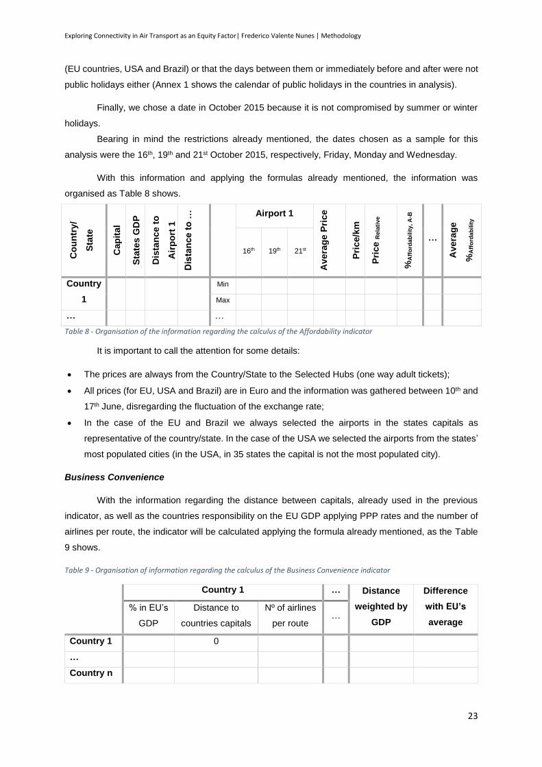
Exploring Connectivity in Air Transport as an Equity Factor| Frederico Valente Nunes | Methodology
23
(EU countries, USA and Brazil) or that the days between them or immediately before and after were not
public holidays either (Annex 1 shows the calendar of public holidays in the countries in analysis).
Finally, we chose a date in October 2015 because it is not compromised by summer or winter
holidays.
Bearing in mind the restrictions already mentioned, the dates chosen as a sample for this
analysis were the 16th, 19th and 21st October 2015, respectively, Friday, Monday and Wednesday.
With this information and applying the formulas already mentioned, the information was
organised as Table 8 shows.
Co
un
try/
Sta
te
Cap
ital
Sta
tes G
DP
Dis
tan
ce
to
Air
po
rt 1
Dis
tan
ce
to
… Airport 1
Avera
ge P
rice
Pri
ce/k
m
Pri
ce R
ela
tive
%A
ffo
rda
bil
ity
, A
-B
…
Avera
ge
%A
ffo
rda
bil
ity
16th 19th 21st
Country
1
Min
Max
… …
Table 8 - Organisation of the information regarding the calculus of the Affordability indicator
It is important to call the attention for some details:
The prices are always from the Country/State to the Selected Hubs (one way adult tickets);
All prices (for EU, USA and Brazil) are in Euro and the information was gathered between 10th and
17th June, disregarding the fluctuation of the exchange rate;
In the case of the EU and Brazil we always selected the airports in the states capitals as
representative of the country/state. In the case of the USA we selected the airports from the states’
most populated cities (in the USA, in 35 states the capital is not the most populated city).
Business Convenience
With the information regarding the distance between capitals, already used in the previous
indicator, as well as the countries responsibility on the EU GDP applying PPP rates and the number of
airlines per route, the indicator will be calculated applying the formula already mentioned, as the Table
9 shows.
Table 9 - Organisation of information regarding the calculus of the Business Convenience indicator
Country 1 … Distance
weighted by
GDP
Difference
with EU’s
average
% in EU’s
GDP
Distance to
countries capitals
Nº of airlines
per route …
Country 1 0
…
Country n
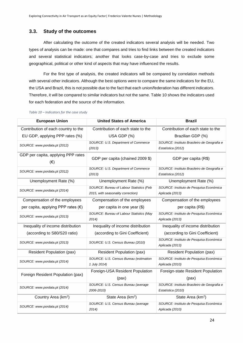
Exploring Connectivity in Air Transport as an Equity Factor| Frederico Valente Nunes | Methodology
24
3.3. Study of the outcomes
After calculating the outcome of the created indicators several analysis will be needed. Two
types of analysis can be made: one that compares and tries to find links between the created indicators
and several statistical indicators; another that looks case-by-case and tries to exclude some
geographical, political or other kind of aspects that may have influenced the results.
For the first type of analysis, the created indicators will be compared by correlation methods
with several other indicators. Although the best options were to compare the same indicators for the EU,
the USA and Brazil, this is not possible due to the fact that each union/federation has different indicators.
Therefore, it will be compared to similar indicators but not the same. Table 10 shows the indicators used
for each federation and the source of the information.
Table 10 – Indicators for the case study
European Union United States of America Brazil
Contribution of each country to the
EU GDP, applying PPP rates (%)
Contribution of each state to the
USA GDP (%)
Contribution of each state to the
Brazilian GDP (%)
SOURCE: www.pordata.pt (2012) SOURCE: U.S. Department of Commerce
(2013)
SOURCE: Instituto Brasileiro de Geografia e
Estatística (2012)
GDP per capita, applying PPP rates
(€) GDP per capita (chained 2009 $) GDP per capita (R$)
SOURCE: www.pordata.pt (2012) SOURCE: U.S. Department of Commerce
(2013)
SOURCE: Instituto Brasileiro de Geografia e
Estatística (2012)
Unemployment Rate (%) Unemployment Rate (%) Unemployment Rate (%)
SOURCE: www.pordata.pt (2014) SOURCE: Bureau of Labour Statistics (Feb
2015, with seasonality correction)
SOURCE: Instituto de Pesquisa Económica
Aplicada (2013)
Compensation of the employees
per capita, applying PPP rates (€)
Compensation of the employees
per capita in one year ($)
Compensation of the employees
per capita (R$)
SOURCE: www.pordata.pt (2013) SOURCE: Bureau of Labour Statistics (May
2014)
SOURCE: Instituto de Pesquisa Económica
Aplicada (2013)
Inequality of income distribution
(according to S80/S20 ratio)
Inequality of income distribution
(according to Gini Coefficient)
Inequality of income distribution
(according to Gini Coefficient)
SOURCE: www.pordata.pt (2013) SOURCE: U.S. Census Bureau (2010) SOURCE: Instituto de Pesquisa Económica
Aplicada (2013)
Resident Population (pax) Resident Population (pax) Resident Population (pax)
SOURCE: www.pordata.pt (2014) SOURCE: U.S. Census Bureau (estimation
1 July 2014)
SOURCE: Instituto de Pesquisa Económica
Aplicada (2010)
Foreign Resident Population (pax) Foreign-USA Resident Population
(pax)
Foreign-state Resident Population
(pax)
SOURCE: www.pordata.pt (2014) SOURCE: U.S. Census Bureau (average
2006-2010)
SOURCE: Instituto Brasileiro de Geografia e
Estatística (2010)
Country Area (km2) State Area (km2) State Area (km2)
SOURCE: www.pordata.pt (2014) SOURCE: U.S. Census Bureau (average
2014)
SOURCE: Instituto de Pesquisa Económica
Aplicada (2010)
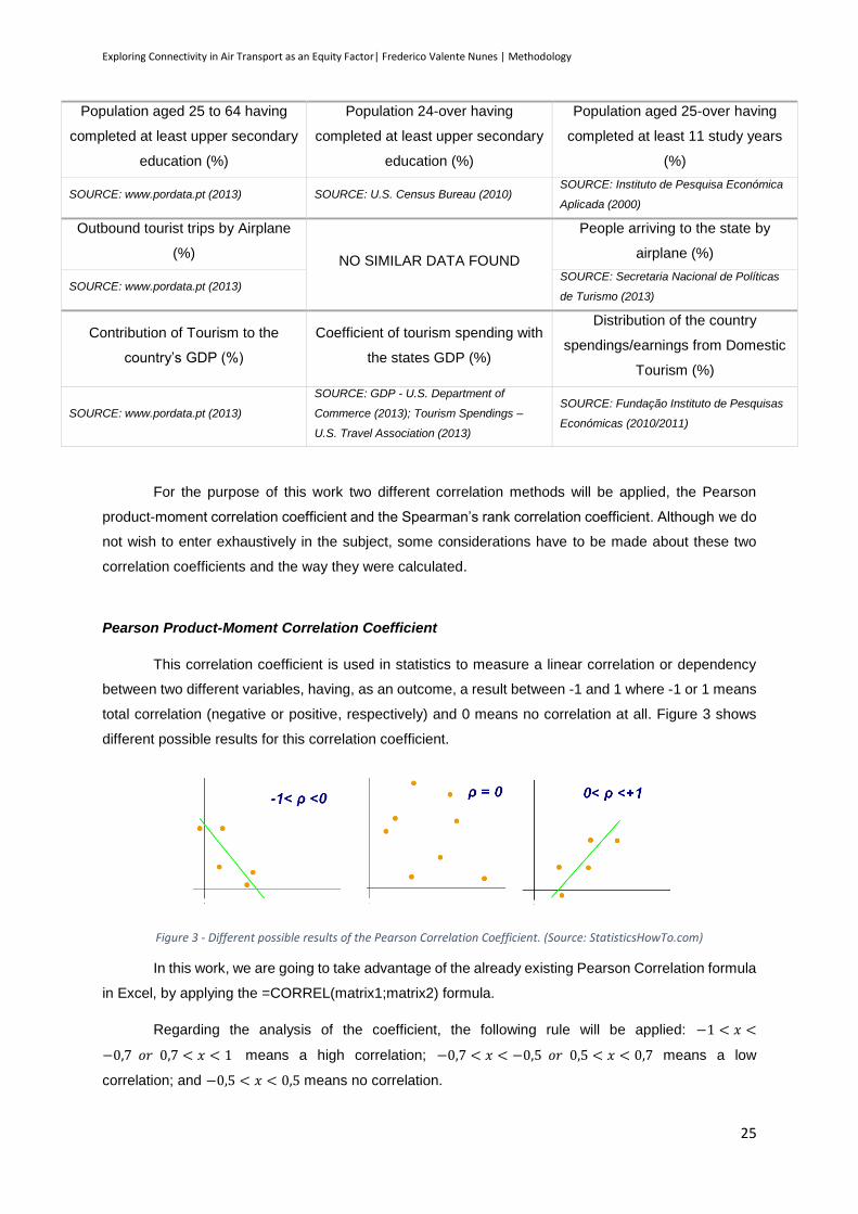
Exploring Connectivity in Air Transport as an Equity Factor| Frederico Valente Nunes | Methodology
25
Population aged 25 to 64 having
completed at least upper secondary
education (%)
Population 24-over having
completed at least upper secondary
education (%)
Population aged 25-over having
completed at least 11 study years
(%)
SOURCE: www.pordata.pt (2013) SOURCE: U.S. Census Bureau (2010) SOURCE: Instituto de Pesquisa Económica
Aplicada (2000)
Outbound tourist trips by Airplane
(%) NO SIMILAR DATA FOUND
People arriving to the state by
airplane (%)
SOURCE: www.pordata.pt (2013) SOURCE: Secretaria Nacional de Políticas
de Turismo (2013)
Contribution of Tourism to the
country’s GDP (%)
Coefficient of tourism spending with
the states GDP (%)
Distribution of the country
spendings/earnings from Domestic
Tourism (%)
SOURCE: www.pordata.pt (2013)
SOURCE: GDP - U.S. Department of
Commerce (2013); Tourism Spendings –
U.S. Travel Association (2013)
SOURCE: Fundação Instituto de Pesquisas
Económicas (2010/2011)
For the purpose of this work two different correlation methods will be applied, the Pearson
product-moment correlation coefficient and the Spearman’s rank correlation coefficient. Although we do
not wish to enter exhaustively in the subject, some considerations have to be made about these two
correlation coefficients and the way they were calculated.
Pearson Product-Moment Correlation Coefficient
This correlation coefficient is used in statistics to measure a linear correlation or dependency
between two different variables, having, as an outcome, a result between -1 and 1 where -1 or 1 means
total correlation (negative or positive, respectively) and 0 means no correlation at all. Figure 3 shows
different possible results for this correlation coefficient.
Figure 3 - Different possible results of the Pearson Correlation Coefficient. (Source: StatisticsHowTo.com)
In this work, we are going to take advantage of the already existing Pearson Correlation formula
in Excel, by applying the =CORREL(matrix1;matrix2) formula.
Regarding the analysis of the coefficient, the following rule will be applied: −1 < 𝑥 <
−0,7 𝑜𝑟 0,7 < 𝑥 < 1 means a high correlation; −0,7 < 𝑥 < −0,5 𝑜𝑟 0,5 < 𝑥 < 0,7 means a low
correlation; and −0,5 < 𝑥 < 0,5 means no correlation.
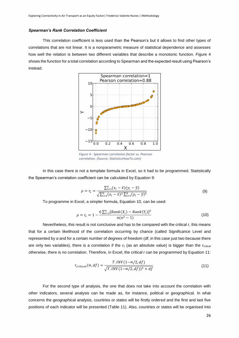
Exploring Connectivity in Air Transport as an Equity Factor| Frederico Valente Nunes | Methodology
26
Spearman’s Rank Correlation Coefficient
This correlation coefficient is less used than the Pearson’s but it allows to find other types of
correlations that are not linear. It is a nonparametric measure of statistical dependence and assesses
how well the relation is between two different variables that describe a monotonic function. Figure 4
shows the function for a total correlation according to Spearman and the expected result using Pearson’s
instead.
In this case there is not a template formula in Excel, so it had to be programmed. Statistically
the Spearman’s correlation coefficient can be calculated by Equation 9:
𝜌 = 𝑟𝑠 =∑ (𝑥𝑖 − �̅�𝑛
𝑖=1 )(𝑦𝑖 − �̅�)
√∑ (𝑥𝑖 − �̅�)2𝑛𝑖=1 ∑ (𝑦𝑖 − �̅�)2𝑛
𝑖=1
(9)
To programme in Excel, a simpler formula, Equation 10, can be used:
𝜌 = 𝑟𝑠 = 1 −6 ∑ [𝑅𝑎𝑛𝑘(𝑋𝑖) − 𝑅𝑎𝑛𝑘(𝑌𝑖)]2𝑛
𝑖=1
𝑛(𝑛2 − 1) (10)
Nevertheless, this result is not conclusive and has to be compared with the critical r, this means
that for a certain likelihood of the correlation occurring by chance (called Significance Level and
represented by α and for a certain number of degrees of freedom (df, in this case just two because there
are only two variables), there is a correlation if the rs (as an absolute value) is bigger than the rcritical
otherwise, there is no correlation. Therefore, in Excel, the critical r can be programmed by Equation 11:
𝑟𝑐𝑟𝑖𝑡𝑖𝑐𝑎𝑙(∝, 𝑑𝑓) =𝑇. 𝐼𝑁𝑉(1−∝/2, 𝑑𝑓)
√𝑇. 𝐼𝑁𝑉(1−∝/2, 𝑑𝑓))2 + 𝑑𝑓 (11)
For the second type of analysis, the one that does not take into account the correlation with
other indicators, several analysis can be made as, for instance, political or geographical. In what
concerns the geographical analysis, countries or states will be firstly ordered and the first and last five
positions of each indicator will be presented (Table 11). Also, countries or states will be organised into
Figure 4 - Spearman correlation factor vs. Pearson correlation. (Source: StatisticsHowTo.com)

Exploring Connectivity in Air Transport as an Equity Factor| Frederico Valente Nunes | Methodology
27
groups taking into account their geographical position and the order of their positions will be presented
for each indicator (Table 12).
Table 11 - Organisation of the top best and worst results for each indicator
Best results for indicator n Worst results for indicator n
Country/State Indicator Result Country/State Indicator Result
… … … …
Table 12 – Order of the Classification of the Regions
Descending order for indicator n
Region Classification
… …
For this classification, the countries will be ordered ascending for each indicator and a number
will be given according to the position on that list. Then for each region the number assigned to each
country will be added and the result divided by the number of countries of that region, resulting in a
classification for that indicator. Every time two or more countries have the same result for the indicator
a medium result will be given.
Finally it is important to make just a small note. In this study a composite indicator will not be
created, once it is thought that it would not contribute to the outcomes of the study. A composite indicator
is an indicator that gathers the information from several other indicators and gives a different weight to
each one of those. In this case we are not looking to create an indicator to statistically measure the
Equity in Transportation and to follow the improvement of the situation in the following years. The idea
is to create indicators to evaluate the current situation with different approaches (regarding tourism and
business) and with the outcomes of those indicators to find new ideas to contribute to the EU policies.

Exploring Connectivity in Air Transport as an Equity Factor| Frederico Valente Nunes | Methodology
28

Exploring Connectivity in Air Transport as an Equity Factor| Frederico Valente Nunes | Case of Study – European Union
29
4. Case of Study – European Union
Applying the principle that is representative for the study of the airports that have at least 20%
of the countries’ air passengers, we can see in Table 13 the airports that will be used for the study. In
Annex 2, all Europe’s International Airports and their share of the country’s passengers are represented,
which served as basis for the production of the next table.
Table 13 - List of European Airports with at least 20% of the country’s passengers
Country City Airport Passengers Country
Passengers %
AT Vienna Vienna International Airport 21 999 820 26 334 634 83,54%
BE Brussels Brussels Airport 19 133 222
26 861 760 71,23%
Brussels Brussels South Charleroi Airport 6 786 979 25,27%
BG Sofia Sofia Airport 3 504 326
7 357 179 47,63%
Burgas Burgas Airport 2 461 648 33,46%
HR
Dubrovnik Dubrovnik Airport 1 502 165
6 304 089
23,83%
Split Split Airport 1 558 812 24,73%
Zagreb Zagreb Airport 2 285 992 36,26%
CY Larnaca Larnaca International Airport 5 636 426
7 423 373 75,93%
Paphos Paphos International Airport 1 786 947 24,07%
CZ Prague Václav Havel Airport Prague 10 974 196 11 955 089 91,80%
DK Copenhagen Copenhagen Airport 12 016 000 14 371 000 83,61%
EE Tallin Tallinn Airport 1 958 801 1 972 491 99,31%
FI Helsinki Helsinki Airport 15 279 043 18 373 279 83,16%
FR Paris Charles de Gaulle Airport 62 052 917 170 210 331 36,46%
DE Frankfurt Frankfurt Airport 58 036 948 208 778 086 27,80%
EL Athens Athens International Airport 12 459 801 38 604 975 32,28%
HU Budapest Budapest Ferenc Liszt International Airport 8 520 880 8 726 209 97,65%
IE Dublin Dublin Airport 18 431 625 23 960 055 76,93%
IT Rome Leonardo da Vinci - Fiumicino Airport 36 166 345 146 500 760 24,69%
LV Riga Riga International Airport 4 814 073 4 814 073 100,00%
LT Kaunas Kaunas Airport 830 268
3 621 490 22,93%
Vilnius Vilnius Airport 2 661 869 73,50%
LU Luxembourg Luxembourg Findel Airport 2 197 331 2 197 331 100,00%
MT Valletta Malta International Airport 4 052 000 4 052 000 100,00%
NL Amsterdam Amsterdam Airport Schiphol 52 527 699 58 079 961 90,44%
PL Warsaw Warsaw Chopin Airport 10 683 000 25 171 000 42,44%
PT Lisbon Lisbon Portela Airport 16 024 955 32 053 949 49,99%
RO Bucharest Henri Coanda International Airport 7 643 467 10 781 863 70,89%
SK Bratislava Bratislava Airport 1 373 078 1 635 058 83,98%
SI Ljubljana Ljubljana Joze Pucnik Airport 1 321 100 1 357 363 97,33%
ES Madrid Adolfo Suarez Madrid - Barajas Airport 39 729 027 186 688 195 21,28%
SE Stockholm Stockholm Arlanda Airport 20 681 554 34 519 764 59,91%
UK London London Heathrow Airport 72 367 054 231 469 055 31,26%
Sources in Annex 1.

Exploring Connectivity in Air Transport as an Equity Factor| Frederico Valente Nunes | Case of Study – European Union
30
4.1. Availability
After processing the data found, it was possible to produce Annex 3, where all country
destinations for each one of the airports sample are shown. In Figure 5 and Table 14 the final numbers
are shown.
Table 14 - Outcome of Availability Indicator for EU
Co
un
try
Percentage of connections to each country main airport
(2)
Airports
Percentage of connections from the
main airport to each one of the other countries (1)
AT 96,30 Vienna International Airport 85,19 BE 96,30 Brussels and Brussels South Charleroi Airports 92,59 BG 62,96 Sofia Airport and Burgas Airport 74,07 HR 59,26 Dubrovnik, Split and Zagreb Airports 66,67 CY 55,56 Larnaca and Paphos International Airports 59,26 CZ 92,59 Václav Havel Airport Prague 96,30 DK 85,19 Copenhagen Airport 81,48 EE 51,85 Tallinn Airport 44,44 FI 81,48 Helsinki Airport 62,96 FR 100,00 Charles de Gaulle Airport 92,59 DE 96,30 Frankfurt Airport 96,30 EL 81,48 Athens International Airport 62,96 HU 85,19 Budapest Ferenc Liszt International Airport 77,78 IE 81,48 Dublin Airport 100,00 IT 96,30 Leonardo da Vinci - Fiumicino Airport 92,59 LV 70,37 Riga International Airport 70,37
Figure 5 - Outcome of Availability Indicator for the EU (Percentage of connections from the main airport to each one of the other countries (1) on the right and Percentage of connections to each country main airport (2) on the left). Green means better connections and Red worse connections.
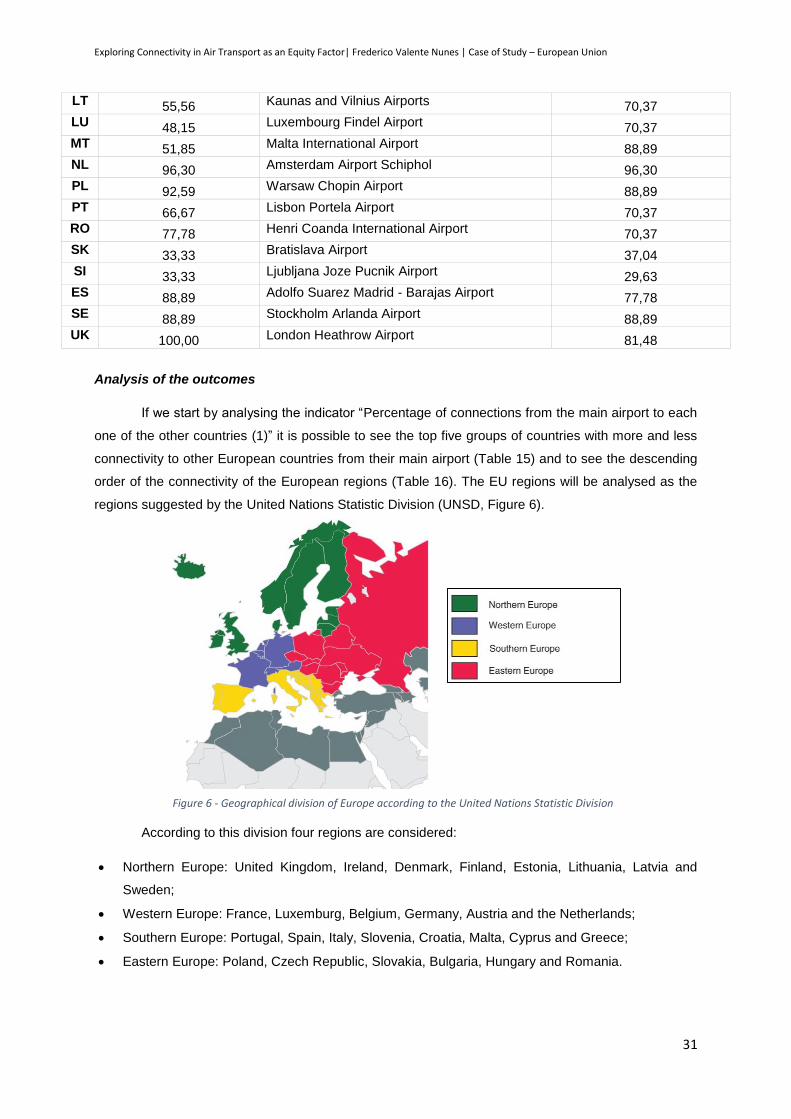
Exploring Connectivity in Air Transport as an Equity Factor| Frederico Valente Nunes | Case of Study – European Union
31
LT 55,56 Kaunas and Vilnius Airports 70,37 LU 48,15 Luxembourg Findel Airport 70,37 MT 51,85 Malta International Airport 88,89 NL 96,30 Amsterdam Airport Schiphol 96,30 PL 92,59 Warsaw Chopin Airport 88,89 PT 66,67 Lisbon Portela Airport 70,37 RO 77,78 Henri Coanda International Airport 70,37 SK 33,33 Bratislava Airport 37,04 SI 33,33 Ljubljana Joze Pucnik Airport 29,63 ES 88,89 Adolfo Suarez Madrid - Barajas Airport 77,78 SE 88,89 Stockholm Arlanda Airport 88,89 UK 100,00 London Heathrow Airport 81,48
Analysis of the outcomes
If we start by analysing the indicator “Percentage of connections from the main airport to each
one of the other countries (1)” it is possible to see the top five groups of countries with more and less
connectivity to other European countries from their main airport (Table 15) and to see the descending
order of the connectivity of the European regions (Table 16). The EU regions will be analysed as the
regions suggested by the United Nations Statistic Division (UNSD, Figure 6).
According to this division four regions are considered:
Northern Europe: United Kingdom, Ireland, Denmark, Finland, Estonia, Lithuania, Latvia and
Sweden;
Western Europe: France, Luxemburg, Belgium, Germany, Austria and the Netherlands;
Southern Europe: Portugal, Spain, Italy, Slovenia, Croatia, Malta, Cyprus and Greece;
Eastern Europe: Poland, Czech Republic, Slovakia, Bulgaria, Hungary and Romania.
Figure 6 - Geographical division of Europe according to the United Nations Statistic Division
Exploring Connectivity in Air Transport as an Equity Factor| Frederico Valente Nunes | Case of Study – European Union
32
Table 15 – Top countries with more connectivity and less connectivity from their main airports to the rest of European countries
More Connectivity on indicator (1) Less Connectivity on indicator (1)
Country Indicator (1) result Country Indicator (1) result
Ireland 100% Slovenia 29,63%
Netherlands
Germany
Czech Republic
96,30% Slovakia 37,04%
Italy
France
Belgium
92,59% Estonia 44,44%
Sweden
Poland
Malta
88,89% Cyprus 59,26%
Austria 85,19% Greece
Finland 62,96%
Table 16 - Descending order of the connectivity of the European Regions according to indicator (1)
Descending order of the connectivity according to indicator (1)
Regions Classification
Western Europe 21
Northern Europe
Eastern Europe 14
Southern Europe 11
* A higher classification means more connectivity and therefore it is more benefitial
Looking to Table 15 it is possible to see that the majority of countries with more connectivity are
Western Europe countries (five), followed by Northern Europe (four). On the other hand the majority of
the countries with less connectivity are in Southern Europe (four). This is again the outcome from Table
16 when it is seen that the southern countries are less connected to the EU countries than the western
countries. Looking to Figure 5 it is also easy to see that Western European countries clearly have more
connections than the rest of Europe, and that these connections tend to decrease when it is a peripheral
country. It is also possible to see that Slovakia has always a low number of connections: this is the result
of the proximity of the capital, Bratislava, from the Austrian capital, Wien, what makes most citizens
travel from Wien instead of Bratislava. The same happens in Slovenia, where Zagreb, the Croatian
capital, is too near the border and therefore Slovenian citizens prefer to travel from Zagreb than from
Ljubljana.
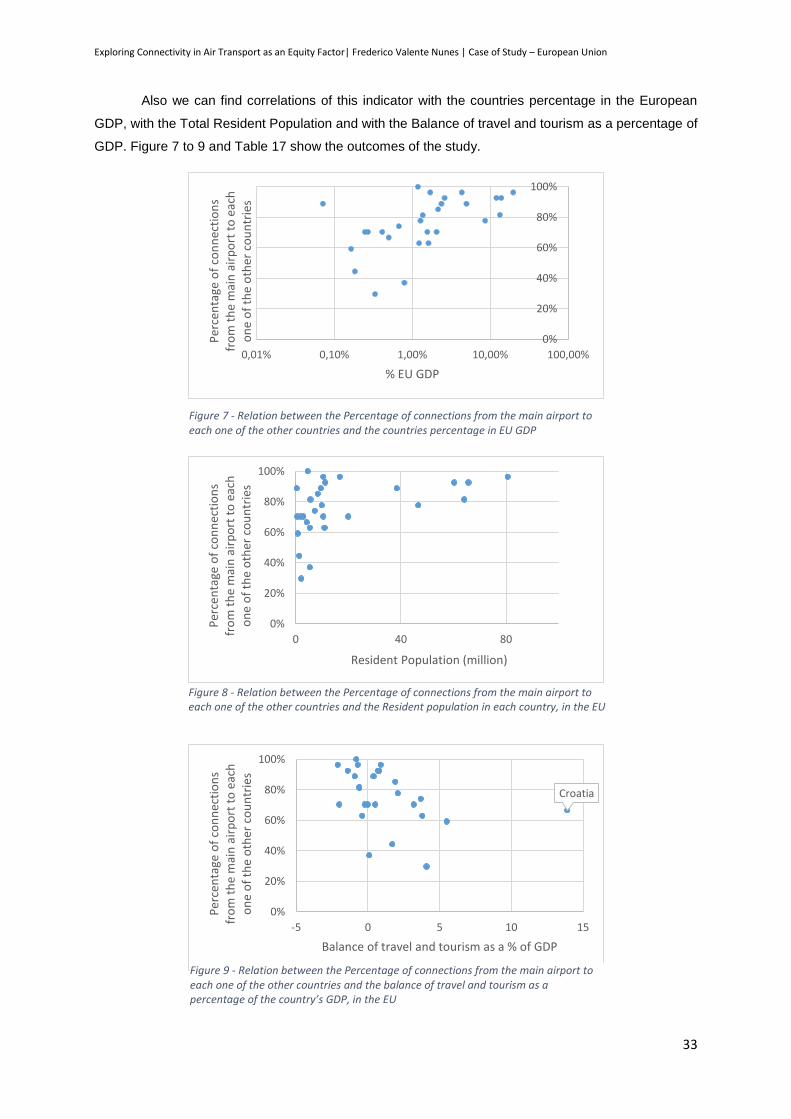
Exploring Connectivity in Air Transport as an Equity Factor| Frederico Valente Nunes | Case of Study – European Union
33
Also we can find correlations of this indicator with the countries percentage in the European
GDP, with the Total Resident Population and with the Balance of travel and tourism as a percentage of
GDP. Figure 7 to 9 and Table 17 show the outcomes of the study.
0%
20%
40%
60%
80%
100%
0,01% 0,10% 1,00% 10,00% 100,00%
Per
cen
tage
of
con
nec
tio
ns
fro
m t
he
mai
n a
irp
ort
to
eac
h
on
e o
f th
e o
ther
co
un
trie
s
% EU GDP
Figure 7 - Relation between the Percentage of connections from the main airport to each one of the other countries and the countries percentage in EU GDP
0%
20%
40%
60%
80%
100%
0 40 80
Per
cen
tage
of
con
nec
tio
ns
fro
m t
he
mai
n a
irp
ort
to
eac
h
on
e o
f th
e o
ther
co
un
trie
s
Resident Population (million)
Figure 8 - Relation between the Percentage of connections from the main airport to each one of the other countries and the Resident population in each country, in the EU
Croatia
0%
20%
40%
60%
80%
100%
-5 0 5 10 15
Per
cen
tage
of
con
nec
tio
ns
fro
m t
he
mai
n a
irp
ort
to
eac
h
on
e o
f th
e o
ther
co
un
trie
s
Balance of travel and tourism as a % of GDP
Figure 9 - Relation between the Percentage of connections from the main airport to each one of the other countries and the balance of travel and tourism as a percentage of the country’s GDP, in the EU

Exploring Connectivity in Air Transport as an Equity Factor| Frederico Valente Nunes | Case of Study – European Union
34
Table 17 - Significant Correlation Factors for Percentage of connections from the main airport to each one of the other countries, for the EU
Percentage of connections from the main airport to each
one of the other countries (1)
% EU GDP Resident
Population
Balance of travel and
tourism as a % of GDP
Pearson Correlation ρ Not significant Not significant Not significant
Spearman’s
Correlation
rs 0,618 0,537 -0,676
rcritical 0,515 0,515 0,534
In what concerns the relation between the first indicator and the percentage of the countries
contribution to the EU GDP, it is possible to see clearly that there is a relation between the two variables.
Although this relation can only be seen when the horizontal axis is on logarithmic scale, it is possible to
see that normally a low contribution to EU GDP is correlated with a low percentage of connection to the
major European Airports of each country. Nevertheless this relation is only valid for countries with a
contribution of less than 1% to EU GDP, which means 10 countries.
Also, high levels of resident population tend to correspond to high levels of connectivity, with
countries with more than 20 million inhabitants with at least 77% of connectivity. Nevertheless, the
countries in this case are only six (France, Germany, Italy, Poland, Spain and the United Kingdom)
which does not permit to conclude that there is such a strong correlation (the Spearman’s coefficient is
too close to the critical value).
Finally we can see that there is a really strong correlation between this type of connectivity and
the balance of travel in each country GDP. We can see that countries where tourism has a positive
contribution (foreign people spend more money in the country than the resident people overseas) have
less connectivity. Nevertheless, this result can be explained, as the Figure shows, by the relation of the
Compensation of employees and the Balance of travelling: citizens of countries where the compensation
is higher tend to spend more money aboard, making a deficit in the country’s balance (the Spearman’s
correlation coefficient for this case is -0,76 and the rcritical is 0,53).
Croatia
Luxemburg
0
5
10
15
20
25
30
35
40
-5 0 5 10 15Co
mp
ensa
tio
n o
f em
plo
yees
p
er c
apit
a (t
ho
usa
nd
PP
S)
Balance of travel and tourism as a % of GDP
Figure 10 - Relation between the Compensation of employees per capita and the Balance of travel and tourism as a Percentage of GDP, in the EU
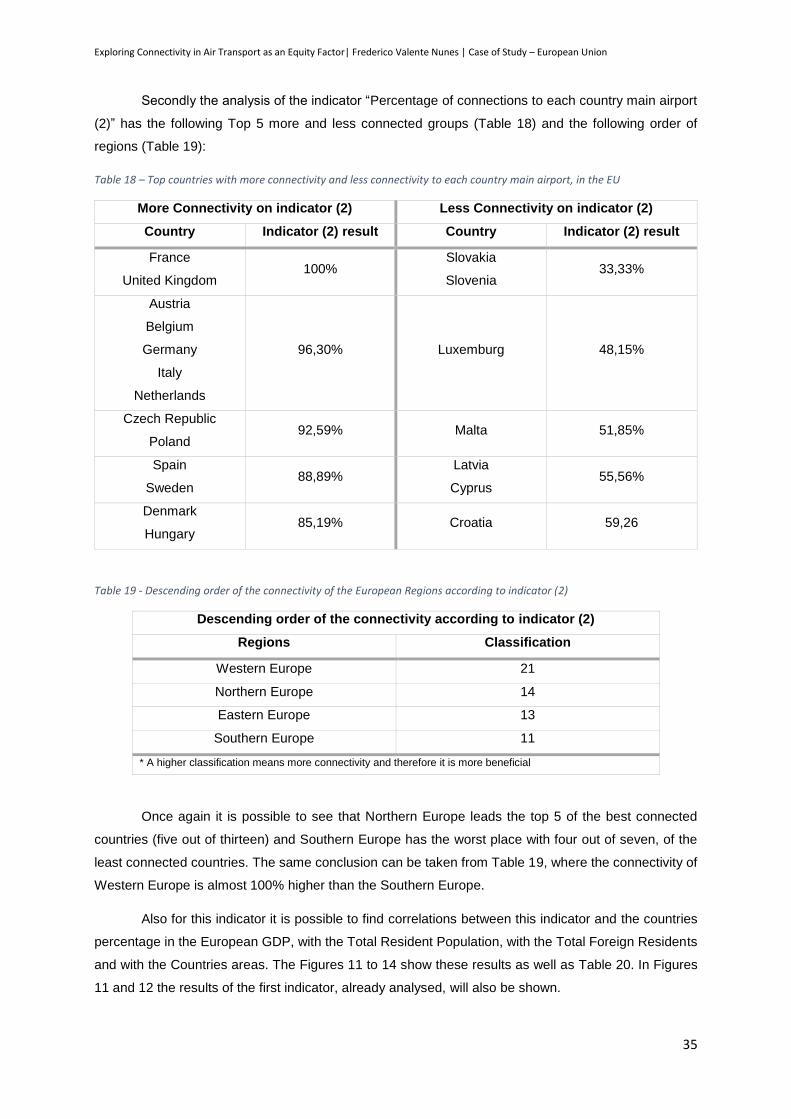
Exploring Connectivity in Air Transport as an Equity Factor| Frederico Valente Nunes | Case of Study – European Union
35
Secondly the analysis of the indicator “Percentage of connections to each country main airport
(2)” has the following Top 5 more and less connected groups (Table 18) and the following order of
regions (Table 19):
Table 18 – Top countries with more connectivity and less connectivity to each country main airport, in the EU
More Connectivity on indicator (2) Less Connectivity on indicator (2)
Country Indicator (2) result Country Indicator (2) result
France
United Kingdom 100%
Slovakia
Slovenia 33,33%
Austria
Belgium
Germany
Italy
Netherlands
96,30% Luxemburg 48,15%
Czech Republic
Poland 92,59% Malta 51,85%
Spain
Sweden 88,89%
Latvia
Cyprus 55,56%
Denmark
Hungary 85,19% Croatia 59,26
Table 19 - Descending order of the connectivity of the European Regions according to indicator (2)
Descending order of the connectivity according to indicator (2)
Regions Classification
Western Europe 21
Northern Europe 14
Eastern Europe 13
Southern Europe 11
* A higher classification means more connectivity and therefore it is more beneficial
Once again it is possible to see that Northern Europe leads the top 5 of the best connected
countries (five out of thirteen) and Southern Europe has the worst place with four out of seven, of the
least connected countries. The same conclusion can be taken from Table 19, where the connectivity of
Western Europe is almost 100% higher than the Southern Europe.
Also for this indicator it is possible to find correlations between this indicator and the countries
percentage in the European GDP, with the Total Resident Population, with the Total Foreign Residents
and with the Countries areas. The Figures 11 to 14 show these results as well as Table 20. In Figures
11 and 12 the results of the first indicator, already analysed, will also be shown.

Exploring Connectivity in Air Transport as an Equity Factor| Frederico Valente Nunes | Case of Study – European Union
36
Germany
0%
20%
40%
60%
80%
100%
-100% -50% 0% 50% 100% 150%
%
% EU GDP
Percentage of connections from the main airport to each oneof the other countries (1)
Percentage of connections to each country main airport (2)
Linear (Percentage of connections to each country mainairport (2))
Figure 11 - Relation between the Percentage of connections from the main airport to each one of the other countries (1) and Percentage of connections to each country main airport (2) and the countries percentage on EU GDP
Germany
20%
40%
60%
80%
100%
3 4 5 6 7 8
%
Resident Population (million)
Percentage of connections from the main airport to each oneof the other countries (1)
Percentage of connections to each country main airport (2)
Linear (Percentage of connections to each country mainairport (2))
Figure 12 -- Relation between the Percentage of connections from the main airport to each one of the other countries (1) and Percentage of connections to each country main airport (2) and the Resident Population, in the EU
Germany
20%
40%
60%
80%
100%
0 2 4 6 8
Per
cen
tage
of
con
nec
tio
ns
to
each
co
un
try
mai
n a
irp
ort
Foreign Residents (million)
Figure 13- Relation between the Percentage of connections to each country main airport (2) and the foreign residents, in the EU
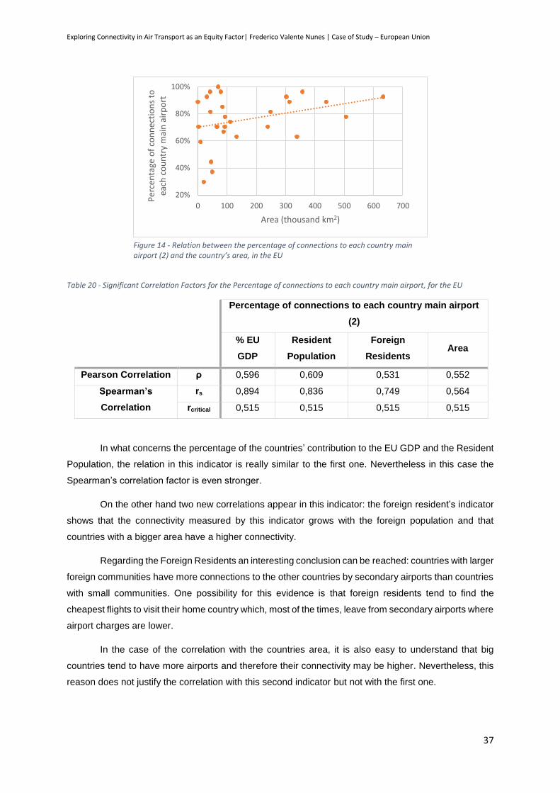
Exploring Connectivity in Air Transport as an Equity Factor| Frederico Valente Nunes | Case of Study – European Union
37
Table 20 - Significant Correlation Factors for the Percentage of connections to each country main airport, for the EU
Percentage of connections to each country main airport
(2)
% EU
GDP
Resident
Population
Foreign
Residents Area
Pearson Correlation ρ 0,596 0,609 0,531 0,552
Spearman’s
Correlation
rs 0,894 0,836 0,749 0,564
rcritical 0,515 0,515 0,515 0,515
In what concerns the percentage of the countries’ contribution to the EU GDP and the Resident
Population, the relation in this indicator is really similar to the first one. Nevertheless in this case the
Spearman’s correlation factor is even stronger.
On the other hand two new correlations appear in this indicator: the foreign resident’s indicator
shows that the connectivity measured by this indicator grows with the foreign population and that
countries with a bigger area have a higher connectivity.
Regarding the Foreign Residents an interesting conclusion can be reached: countries with larger
foreign communities have more connections to the other countries by secondary airports than countries
with small communities. One possibility for this evidence is that foreign residents tend to find the
cheapest flights to visit their home country which, most of the times, leave from secondary airports where
airport charges are lower.
In the case of the correlation with the countries area, it is also easy to understand that big
countries tend to have more airports and therefore their connectivity may be higher. Nevertheless, this
reason does not justify the correlation with this second indicator but not with the first one.
20%
40%
60%
80%
100%
0 100 200 300 400 500 600 700
Per
cen
tage
of
con
nec
tio
ns
to
each
co
un
try
mai
n a
irp
ort
Area (thousand km2)
Figure 14 - Relation between the percentage of connections to each country main airport (2) and the country’s area, in the EU
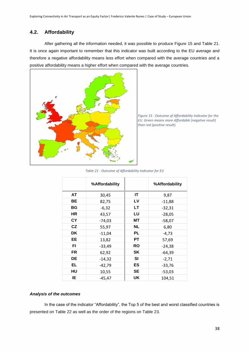
Exploring Connectivity in Air Transport as an Equity Factor| Frederico Valente Nunes | Case of Study – European Union
38
4.2. Affordability
After gathering all the information needed, it was possible to produce Figure 15 and Table 21.
It is once again important to remember that this indicator was built according to the EU average and
therefore a negative affordability means less effort when compared with the average countries and a
positive affordability means a higher effort when compared with the average countries.
Table 21 - Outcome of Affordability Indicator for EU
%Affordability
%Affordability
AT 30,45 IT 9,87
BE 82,75 LV -11,88
BG -6,32 LT -32,31
HR 43,57 LU -28,05
CY -74,03 MT -58,07
CZ 55,97 NL 6,80
DK -11,04 PL -4,73
EE 13,82 PT 57,69
FI -33,49 RO -24,38
FR 62,92 SK -64,39
DE -14,32 SI -2,71
EL -42,79 ES -33,76
HU 10,55 SE -53,03
IE -45,47 UK 104,51
Analysis of the outcomes
In the case of the indicator “Affordability”, the Top 5 of the best and worst classified countries is
presented on Table 22 as well as the order of the regions on Table 23.
Figure 15 - Outcome of Affordability Indicator for the EU. Green means more Affordable (negative result) than red (positive result).

Exploring Connectivity in Air Transport as an Equity Factor| Frederico Valente Nunes | Case of Study – European Union
39
Table 22 – Top countries with more and less affordability in the European Union
Higher Affordability Lower Affordability
Country Indicator result Country Indicator result
Cyprus -74,03% United Kingdom 104,51%
Slovakia -64,39% Belgium 82,75%
Malta -58,07% France 62,92%
Sweden -53,03% Portugal 57,69%
Ireland -45,47% Czech Republic 55,97%
Table 23 - Descending order of the Affordability of the European Regions
Descending order of the Affordability
Regions Classification
Northern Europe
South Europe 13
Eastern Europe 15
Western Europe 19
* A lower classification means smaller effort to the citizens therefore it is more beneficial
It is also important to remember that this outcome takes into account the maximum and minimum
prices for each connections (we will see in a while the consequence of this type of analysis). The analysis
of this table shows some interesting results. First of all it is interesting to see that Western Europe is the
region where more effort is put on citizens to travel, according to money available. This is the result of
two different things: first of all the distances between capitals in this part of Europe are quite smaller
than in the rest of Europe what reduces the variable costs but maintains the fixed costs, making the cost
per kilometer higher than in the other regions; secondly, because of the smaller distances in this region,
the train is fairly competitive in time and cost when compared with the plane, which means that a higher
effort does not mean less possibility to travel in this region, just the opposite.
It is also interesting to see that there is no correlation between any of the indicators chosen and
the results of this indicator. This shows that the prices are made according to different criteria that
depend of many variables. Nevertheless, it also shows that the prices are not made having in mind the
affordability of the citizens.
Another thing that was possible to see while gathering the data was that the countries with the
biggest hubs in Europe also had higher maximum prices than the other countries. The reason was easy
to find out: there are many airlines coming from faraway Europe that make two stops along the way (for
example Tokyo-Amsterdam-London); this makes the trip Amsterdam-London more expensive than in a
single flight from Amsterdam-London. Therefore it is interesting to see the results if we only take into
account the minimum average price, as Figure 16 and Table 24 shows.
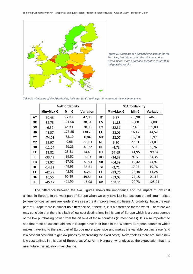
Exploring Connectivity in Air Transport as an Equity Factor| Frederico Valente Nunes | Case of Study – European Union
40
Table 24 - Outcome of the Affordability Indicator for EU taking just into account the minimum prices
%Affordability %Affordability
Min+Max € Min € Variation Min+Max € Min € Variation
AT 30,45 77,51 47,06 IT 9,87 -36,98 -46,85
BE 82,75 121,06 38,31 LV -11,88 -9,08 2,80
BG -6,32 64,64 70,96 LT -32,31 7,49 39,80
HR 43,57 173,85 130,28 LU -28,05 16,47 44,52
CY -74,03 -73,19 0,84 MT -58,07 -52,10 5,97
CZ 55,97 -0,66 -56,63 NL 6,80 27,81 21,01
DK -11,04 -59,26 -48,22 PL -4,73 5,03 9,76
EE 13,82 28,31 14,49 PT 57,69 -41,95 -99,64
FI -33,49 -39,52 -6,03 RO -24,38 9,97 34,35
FR 62,92 -27,01 -89,93 SK -64,39 -19,42 44,97
DE -14,32 -49,93 -35,61 SI -2,71 17,05 19,76
EL -42,79 -42,53 0,26 ES -33,76 -22,48 11,28
HU 10,55 60,39 49,84 SE -53,03 -74,15 -21,12
IE -45,47 -61,55 -16,08 UK 104,51 -20,73 -125,24
The difference between the two Figures shows the importance and the impact of low cost
airlines in Europe. In the west part of Europe when we only take just into account the minimum prices
(where low cost airlines are leaders) we see a great improvement in citizens Affordability, but in the east
part of Europe there is almost no difference or, if there is, it is a difference for the worst. Therefore we
may conclude that there is a lack of low cost destinations in this part of Europe which is a consequence
of the low purchasing power from the citizens of those countries (in most cases). It is also important to
see that most of low cost airlines in Europe have their hubs in the Western European countries which
makes travelling to the east part of Europe more expensive and makes the variable cost increase (and
low cost airlines tend to get low prices by decreasing the fixed costs). Nevertheless there are some new
low cost airlines in this part of Europe, as Wizz Air in Hungary, what gives us the expectation that in a
near future this situation may change.
Figure 16 -Outcome of Affordability Indicator for the EU taking just into account the minimum prices. Green means more Affordable (negative result) than red (positive result).

Exploring Connectivity in Air Transport as an Equity Factor| Frederico Valente Nunes | Case of Study – European Union
41
4.3. Business Convenience
The distance between European capitals was calculated with the coordinates and applying
Equation 7 (results in Annex 4), the information about the GDP of each country in 2012 was taken from
official records on PortData.pt (Annex 5) and the information regarding the number of airlines from
openflights.org.
Applying the formula for this indicator, Table 25 and Figure 17 show the outcomes for this
indicator.
Table 25 - Business relative cost outcome, for the EU
Business
relative cost Difference with the EU average
Business
relative cost Difference with the EU average
AT 345 -72,56% IT 772 -38,65%
BE 465 -63,06% LV 1631 29,57%
BG 1358 7,90% LT 1961 55,80%
HR 1186 -5,79% LU 925 -26,52%
CY 3191 153,51% MT 1744 38,56%
CZ 537 -57,33% NL 453 -63,98%
DK 619 -50,86% PL 1024 -18,64%
EE 2838 125,40% PT 1320 4,84%
FI 1276 1,33% RO 1292 2,66%
FR 480 -61,90% SK 1902 51,09%
DE 521 -58,64% SI 1287 2,21%
EL 3706 194,39% ES 949 -24,60%
HU 922 -26,76% SE 1111 -11,73%
IE 1038 -17,52% UK 394 -68,74%
Average 1259
Figure 17 - Outcome of the Business Convenience indicator for the EU. Green means better Business cost (negative result) and red worse (positive result).

Exploring Connectivity in Air Transport as an Equity Factor| Frederico Valente Nunes | Case of Study – European Union
42
Analysis of the outcomes
In the case of the indicator “Business Convenience”, the Top 5 of the best and worst classified
countries is presented on Table 26 as well as the order of the regions on Table 27.
Table 26 – Top countries with the best and the worst Business Convenience, in the EU
Best Business Convenience Worst Business Convenience
Country Indicator result Country Indicator result
Austria -72,56% Greece 194,39%
United Kingdom -68,74% Cyprus 153,51%
Netherlands -63,98% Estonia 125,40%
Belgium -63,06% Lithuania 55,80%
France -61,90% Slovakia 51,09%
Table 27 - Descending order of the Business Convenience of the European Regions
Descending order of the Business Convenience
Regions Classification
Western Europe 5
Northern Europe
Eastern Europe 16
Southern Europe 19
* A lower classification means a smaller distance to make business and therefore it is more beneficial
The analysis of this table shows results that were probably already expected: all the countries
with the best business convenience are Western Europe countries (except UK) and the five worst
business convenience countries are in Southern or Eastern Europe. These results would be already
expected due to the fact that the countries with a bigger GDP and the European larger hubs are in
Western Europe. What is interesting to see is that due to the fact that in Eastern Europe the distance
between countries is smaller the business convenience would be reasonably decent if the number of
airlines were not taken into account. Nevertheless the most important thing to take from this indicator is
that Southern Europe has almost four times worst business convenience than Western Europe.
In the case of Portugal, Spain, Malta and Cyprus the situation is even more worrying because
the countries in the eastern part of Europe have the possibility of making deals with other countries
which despite not being in the European Union, they are near. In the case of Malta and Cyprus, even if
they have close neighbours, being an island gives them higher transportation costs, and in the case of
Portugal and south and western Spain the problem is more noticeable because there are not too close
neighbours or if there are, there is the Mediterranean Sea to cross.
Also the analysis of this indicator shows correlations with three indicators: GDP per capita,
contribution of the countries to the EU GDP, compensation of the employees per capita (taking into
account PPP rates), resident population and foreign residents, as the Figures 18 to 22 and Table 28
show.
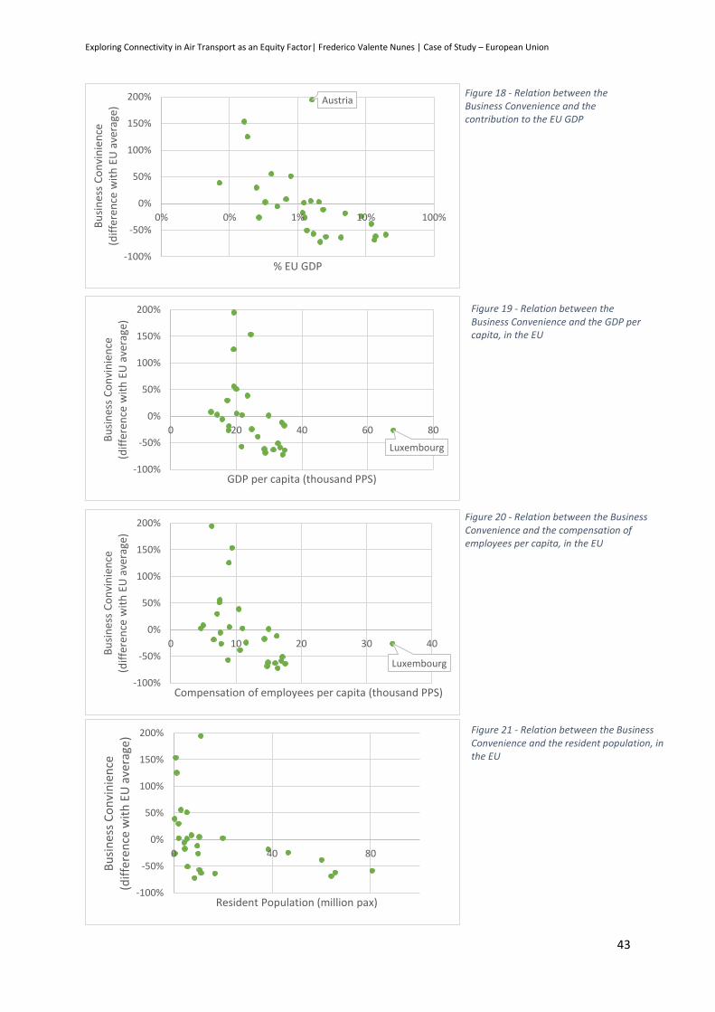
Exploring Connectivity in Air Transport as an Equity Factor| Frederico Valente Nunes | Case of Study – European Union
43
Figure 20 - Relation between the Business Convenience and the compensation of employees per capita, in the EU
Figure 18 - Relation between the Business Convenience and the contribution to the EU GDP
Austria
-100%
-50%
0%
50%
100%
150%
200%
0% 0% 1% 10% 100%
Bu
sin
ess
Co
nvi
nie
nce
(d
iffe
ren
ce w
ith
EU
ave
rage
)
% EU GDP
Luxembourg
-100%
-50%
0%
50%
100%
150%
200%
0 20 40 60 80
Bu
sin
ess
Co
nvi
nie
nce
(d
iffe
ren
ce w
ith
EU
ave
rage
)
GDP per capita (thousand PPS)
Figure 19 - Relation between the Business Convenience and the GDP per capita, in the EU
Luxembourg
-100%
-50%
0%
50%
100%
150%
200%
0 10 20 30 40
Bu
sin
ess
Co
nvi
nie
nce
(d
iffe
ren
ce w
ith
EU
ave
rage
)
Compensation of employees per capita (thousand PPS)
-100%
-50%
0%
50%
100%
150%
200%
0 40 80
Bu
sin
ess
Co
nvi
nie
nce
(d
iffe
ren
ce w
ith
EU
ave
rage
)
Resident Population (million pax)
Figure 21 - Relation between the Business Convenience and the resident population, in the EU
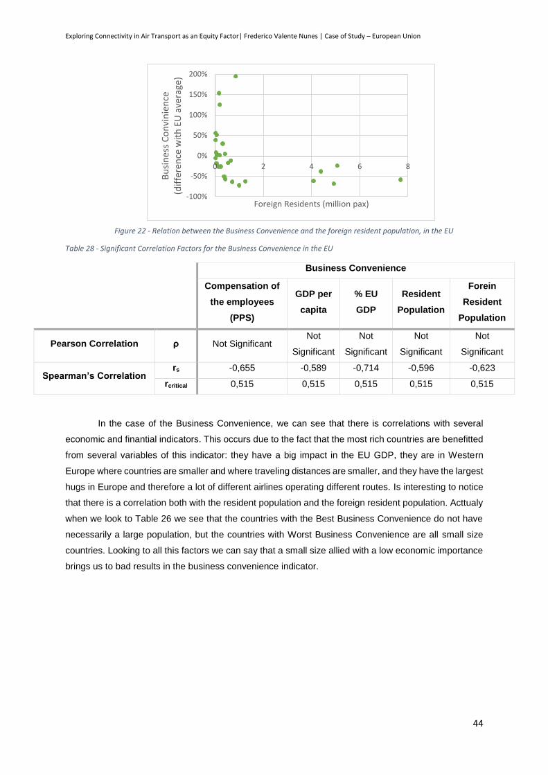
Exploring Connectivity in Air Transport as an Equity Factor| Frederico Valente Nunes | Case of Study – European Union
44
Table 28 - Significant Correlation Factors for the Business Convenience in the EU
Business Convenience
Compensation of
the employees
(PPS)
GDP per
capita
% EU
GDP
Resident
Population
Forein
Resident
Population
Pearson Correlation ρ Not Significant Not
Significant
Not
Significant
Not
Significant
Not
Significant
Spearman’s Correlation rs -0,655 -0,589 -0,714 -0,596 -0,623
rcritical 0,515 0,515 0,515 0,515 0,515
In the case of the Business Convenience, we can see that there is correlations with several
economic and finantial indicators. This occurs due to the fact that the most rich countries are benefitted
from several variables of this indicator: they have a big impact in the EU GDP, they are in Western
Europe where countries are smaller and where traveling distances are smaller, and they have the largest
hugs in Europe and therefore a lot of different airlines operating different routes. Is interesting to notice
that there is a correlation both with the resident population and the foreign resident population. Acttualy
when we look to Table 26 we see that the countries with the Best Business Convenience do not have
necessarily a large population, but the countries with Worst Business Convenience are all small size
countries. Looking to all this factors we can say that a small size allied with a low economic importance
brings us to bad results in the business convenience indicator.
-100%
-50%
0%
50%
100%
150%
200%
0 2 4 6 8B
usi
nes
s C
on
vin
ien
ce
(dif
fere
nce
wit
h E
U a
vera
ge)
Foreign Residents (million pax)
Figure 22 - Relation between the Business Convenience and the foreign resident population, in the EU

Exploring Connectivity in Air Transport as an Equity Factor| Frederico Valente Nunes | Brazil and USA – Comparative Analysis
45
5. Brazil and USA – Comparative Analysis
5.1. Brazil
Applying the principles that are representative for the study of the airports that have at least
20% of the countries air passengers, as it was done in the EU case, we can see in Table 29 the airports
that will be used for the study. In Annex 6, we give all Brazilian Airports and their share of the country’s
passengers, which served as basis for the production of the next table.
Table 29 - List of Brazil airports with at least 20% of the state’s passengers
State City Airport Passengers State
Passengers %
AC Rio Branco Plácido de Castro - Rio Branco International Airport
378 130 448 346 84,34%
AL Maceió Zumbi dos Palmares International Airport 1 893 488 1 893 488 100,00%
AP Macapá Macapá International Airport 624 716 624 716 100,00%
AM Manaus Eduardo Gomes International Airport 3 077 077 3 204 892 96,01%
BA Salvador Dep. Luís Eduardo Magalhães International Airport
8 589 663 9 092 948 94,47%
CE Fortaleza Pinto Martins International Airport 5 952 535 6 340 525 93,88%
DF Brasília Brasília International Airport 16 610 000 16 610 000 100,00%
ES Vitória Eurico de Aguiar Sallles Airport 3 450 695 3 450 695 100,00%
GO Goiânia Saint Genoveva Airport 3 000 592 3 000 592 100,00%
MA São Luis Marechal Cunha Machado International Airport
1 740 656 2 078 939 83,73%
MT Cuiabá Marechal Rondon International Airport 2 995 676 2 995 676 100,00%
MS Campo Grande Campo Grande International Airport 1 496 288 1 591 157 94,04%
MG Confins Tancredo Neves International Airport 10 002 477 12 707 484 78,71%
PA Belém Val de Cans International Airport 3 473 945 4 791 817 72,50%
PB João Pessoa Presidente Castro Pinto International Airport 1 210 870 1 354 636 89,39%
PR São José dos Pinhais
Afonso Pena International Airport 6 740 024 10 264 276 65,66%
PE Recife Guararapes International Airport 6 817 790 7 397 924 92,16%
PI Teresinha Senador Petrônio Portella Airport 1 091 173 1 092 254 99,90%
RJ
Rio de Janeiro Galeão International Airport 17 109 590 26 922 394
63,55%
Rio de Janeiro Santos Dumont Airport 9 102 187 33,81%
RN Natal Augusto Severo International Airport 2 375 771 2 375 771 100,00%
RS Porto Alegre Salgado Filho International Airport 7 993 164 8 033 158 99,50%
RO Porto Velho Governador Jorge Teixeira International Airport
905 103 905 103 100,00%
RR Boa Vista Boa Vista International Airport 350 195 350 195 100,00%
SC Florianópolis Hercílio Luz International Airport 3 872 637
5 657 828 68,45%
Navegantes Navegantes International Airport 1 202 625 21,26%
SP
São Paulo Congonhas Airport 17 119 530 66 200 985
25,86%
São Paulo Guarulhos International Airport 36 678 452 55,40%
SE Aracaju Santa Maria International Airport 1 343 899 1 343 899 100,00%
TO Palmas Palmas Airport 778 245 778 245 100,00%
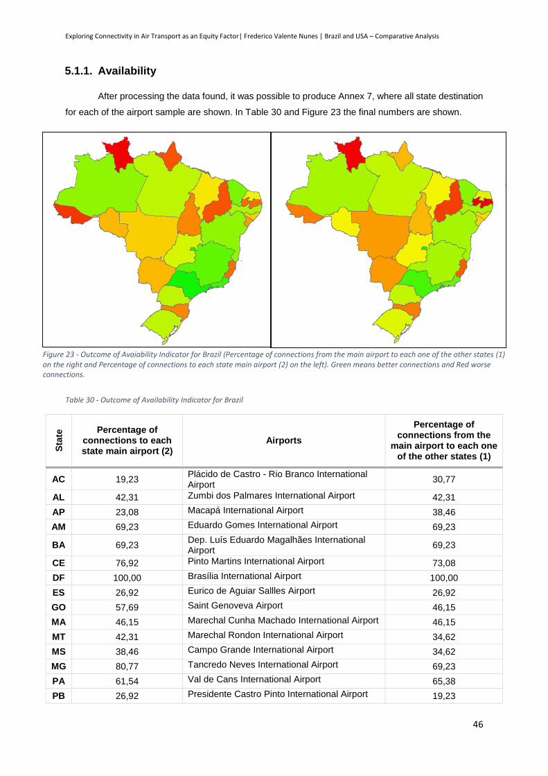
Exploring Connectivity in Air Transport as an Equity Factor| Frederico Valente Nunes | Brazil and USA – Comparative Analysis
46
5.1.1. Availability
After processing the data found, it was possible to produce Annex 7, where all state destination
for each of the airport sample are shown. In Table 30 and Figure 23 the final numbers are shown.
Table 30 - Outcome of Availability Indicator for Brazil
Sta
te Percentage of
connections to each state main airport (2)
Airports
Percentage of connections from the
main airport to each one of the other states (1)
AC 19,23 Plácido de Castro - Rio Branco International Airport
30,77
AL 42,31 Zumbi dos Palmares International Airport 42,31
AP 23,08 Macapá International Airport 38,46
AM 69,23 Eduardo Gomes International Airport 69,23
BA 69,23 Dep. Luís Eduardo Magalhães International Airport
69,23
CE 76,92 Pinto Martins International Airport 73,08
DF 100,00 Brasília International Airport 100,00
ES 26,92 Eurico de Aguiar Sallles Airport 26,92
GO 57,69 Saint Genoveva Airport 46,15
MA 46,15 Marechal Cunha Machado International Airport 46,15
MT 42,31 Marechal Rondon International Airport 34,62
MS 38,46 Campo Grande International Airport 34,62
MG 80,77 Tancredo Neves International Airport 69,23
PA 61,54 Val de Cans International Airport 65,38
PB 26,92 Presidente Castro Pinto International Airport 19,23
Figure 23 - Outcome of Avaiability Indicator for Brazil (Percentage of connections from the main airport to each one of the other states (1) on the right and Percentage of connections to each state main airport (2) on the left). Green means better connections and Red worse connections.

Exploring Connectivity in Air Transport as an Equity Factor| Frederico Valente Nunes | Brazil and USA – Comparative Analysis
47
PR 61,54 Afonso Pena International Airport 65,38
PE 65,38 Guararapes International Airport 69,23
PI 23,08 Senador Petrônio Portella Airport 23,08
RJ 88,46 Galeão and Santos Dumont Airports 84,62
RN 50,00 Augusto Severo International Airport 50,00
RS 61,54 Salgado Filho International Airport 50,00
RO 38,46 Governador Jorge Teixeira International Airport
46,15
RR 7,69 Boa Vista International Airport 19,23
SC 30,77 Hercílio Luz and Navegantes International Airports
30,77
SP 100,00 Congonhas and Guarulhos Airports 88,46
SE 34,62 Santa Maria International Airport 42,31
TO 30,77 Palmas Airport 38,46
Analysis of the outcomes
If we start by analysing the indicator “Percentage of connections from the main airport to each
one of the other states (1)” it is possible to see the top five groups of states with more and less
connections from their main airport to each one of the other states (Table 31) and to see the descending
order of the connectivity of the Brazil regions (Table 32). Brazil regions will be analysed as legally
established since 1969 (Figure 24).
According to this division five regions are considered:
North Region: Tocantins, Pará, Amapá, Roraima, Amazonas, Rondônia and Acre;
Northeast Region: Maranhão, Piauí, Bahia, Sergipe, Alagoas, Pernambuco, Paraíba, Ceará and
Rio Grande do Norte;
Central-West Region: Mato Grosso, Goiás, Distrito Federal and Mato Grosso do Sul;
Southeast Region: São Paulo, Rio de Janeiro, Espírito Santo and Minas Gerais;
South Region: Rio Grande do Sul, Santa Catarina and Paraná.
Figure 24 - Geographical division of Brazil according to the law since 1969 (Source: Instituto Brasileiro de Geografia e Estatística)
North Region
Northeast Region
Central-West Region
Southeast Region
South Region
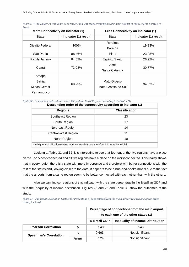
Exploring Connectivity in Air Transport as an Equity Factor| Frederico Valente Nunes | Brazil and USA – Comparative Analysis
48
Table 31 – Top countries with more connectivity and less connectivity from their main airport to the rest of the states, in Brazil
More Connectivity on indicator (1) Less Connectivity on indicator (1)
State Indicator (1) result State Indicator (1) result
Distrito Federal 100% Roraima
Paraíba 19,23%
São Paulo 88,46% Piauí 23,08%
Rio de Janeiro 84,62% Espírito Santo 26,92%
Ceará 73,08% Acre
Santa Catarina 30,77%
Amapá
Bahia
Minas Gerais
Pernambuco
69,23% Mato Grosso
Mato Grosso do Sul 34,62%
Table 32 - Descending order of the connectivity of the Brazil Regions according to indicator (1)
Descending order of the connectivity according to indicator (1)
Regions Classification
Southeast Region 23
South Region 17
Northeast Region 14
Central-West Region 11
North Region 10
* A higher classification means more connectivity and therefore it is more beneficial
Looking at Table 31 and 32, it is interesting to see that four out of the five regions have a place
on the Top 5 best connected and all five regions have a place on the worst connected. This reality shows
that in every region there is a state with more importance and therefore with better connections with the
rest of the states and, looking closer to the data, it appears to be a hub-and-spoke model due to the fact
that the airports from a same region seem to be better connected with each other than with the others.
Also we can find correlations of this indicator with the state percentage in the Brazilian GDP and
with the Inequality of income distribution. Figures 25 and 26 and Table 33 show the outcomes of the
study.
Table 33 - Significant Correlation Factors for Percentage of connections from the main airport to each one of the other states, for Brazil
Percentage of connections from the main airport
to each one of the other states (1)
% Brazil GDP Inequality of Income Distribution
Pearson Correlation ρ 0,548 0,548
Spearman’s Correlation rs 0,663 Not significant
rcritical 0,524 Not significant
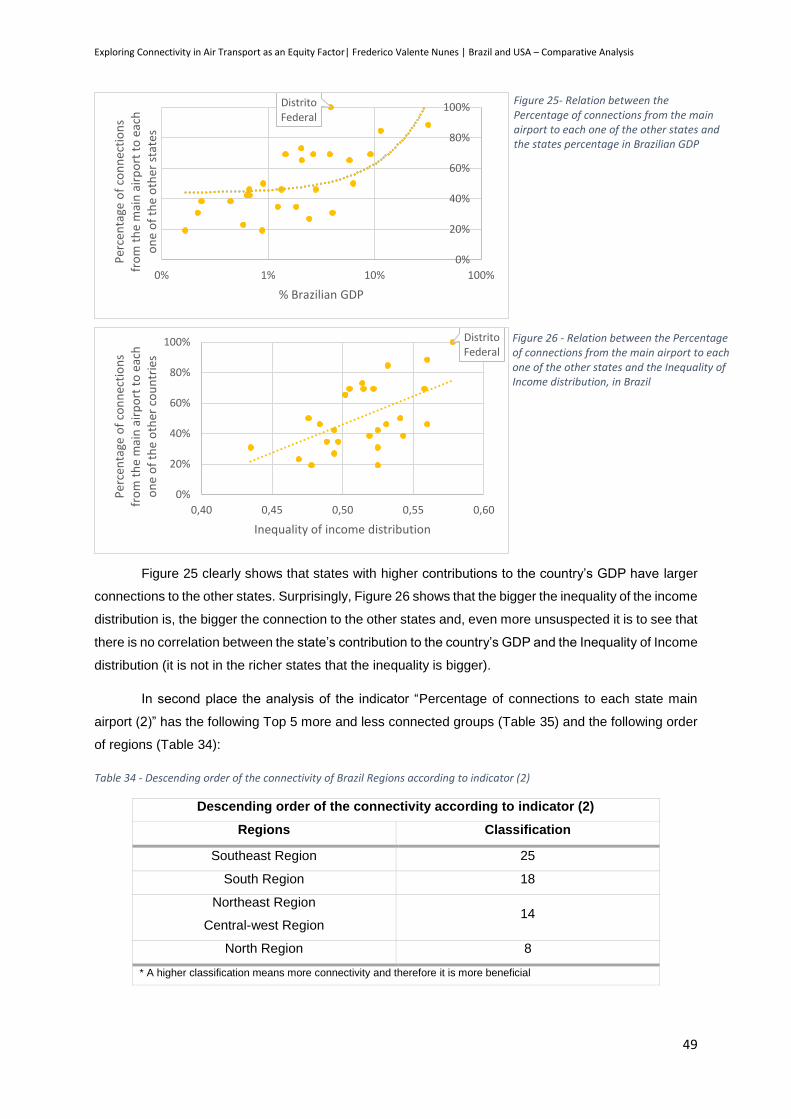
Exploring Connectivity in Air Transport as an Equity Factor| Frederico Valente Nunes | Brazil and USA – Comparative Analysis
49
Figure 25 clearly shows that states with higher contributions to the country’s GDP have larger
connections to the other states. Surprisingly, Figure 26 shows that the bigger the inequality of the income
distribution is, the bigger the connection to the other states and, even more unsuspected it is to see that
there is no correlation between the state’s contribution to the country’s GDP and the Inequality of Income
distribution (it is not in the richer states that the inequality is bigger).
In second place the analysis of the indicator “Percentage of connections to each state main
airport (2)” has the following Top 5 more and less connected groups (Table 35) and the following order
of regions (Table 34):
Table 34 - Descending order of the connectivity of Brazil Regions according to indicator (2)
Descending order of the connectivity according to indicator (2)
Regions Classification
Southeast Region 25
South Region 18
Northeast Region
Central-west Region 14
North Region 8
* A higher classification means more connectivity and therefore it is more beneficial
Distrito Federal
0%
20%
40%
60%
80%
100%
0% 1% 10% 100%
Per
cen
tage
of
con
nec
tio
ns
fro
m t
he
mai
n a
irp
ort
to
eac
h
on
e o
f th
e o
ther
sta
tes
% Brazilian GDP
Figure 25- Relation between the Percentage of connections from the main airport to each one of the other states and the states percentage in Brazilian GDP
Distrito Federal
0%
20%
40%
60%
80%
100%
0,40 0,45 0,50 0,55 0,60
Per
cen
tage
of
con
nec
tio
ns
fro
m t
he
mai
n a
irp
ort
to
eac
h
on
e o
f th
e o
ther
co
un
trie
s
Inequality of income distribution
Figure 26 - Relation between the Percentage of connections from the main airport to each one of the other states and the Inequality of Income distribution, in Brazil
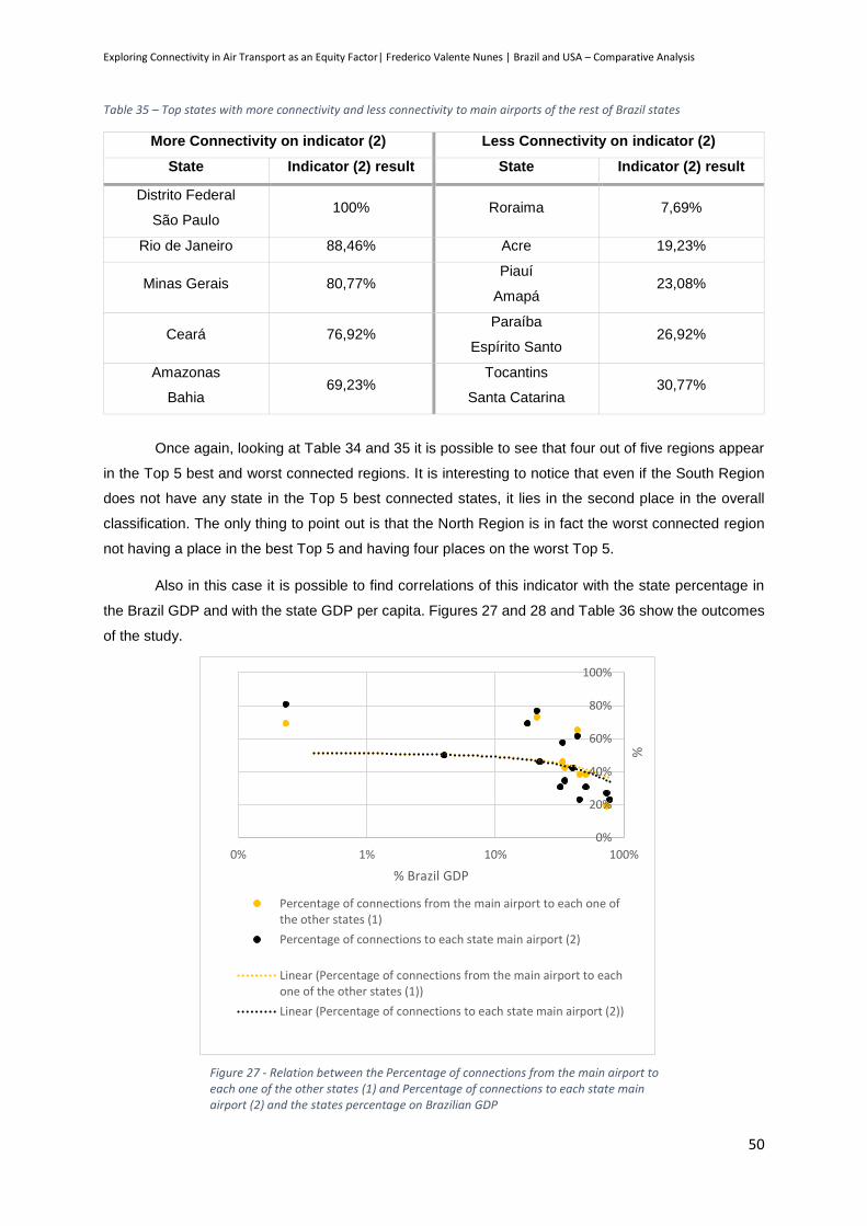
Exploring Connectivity in Air Transport as an Equity Factor| Frederico Valente Nunes | Brazil and USA – Comparative Analysis
50
Table 35 – Top states with more connectivity and less connectivity to main airports of the rest of Brazil states
More Connectivity on indicator (2) Less Connectivity on indicator (2)
State Indicator (2) result State Indicator (2) result
Distrito Federal
São Paulo 100% Roraima 7,69%
Rio de Janeiro 88,46% Acre 19,23%
Minas Gerais 80,77% Piauí
Amapá 23,08%
Ceará 76,92% Paraíba
Espírito Santo 26,92%
Amazonas
Bahia 69,23%
Tocantins
Santa Catarina 30,77%
Once again, looking at Table 34 and 35 it is possible to see that four out of five regions appear
in the Top 5 best and worst connected regions. It is interesting to notice that even if the South Region
does not have any state in the Top 5 best connected states, it lies in the second place in the overall
classification. The only thing to point out is that the North Region is in fact the worst connected region
not having a place in the best Top 5 and having four places on the worst Top 5.
Also in this case it is possible to find correlations of this indicator with the state percentage in
the Brazil GDP and with the state GDP per capita. Figures 27 and 28 and Table 36 show the outcomes
of the study.
0%
20%
40%
60%
80%
100%
0% 1% 10% 100%
%
% Brazil GDP
Percentage of connections from the main airport to each one ofthe other states (1)
Percentage of connections to each state main airport (2)
Linear (Percentage of connections from the main airport to eachone of the other states (1))
Linear (Percentage of connections to each state main airport (2))
Figure 27 - Relation between the Percentage of connections from the main airport to each one of the other states (1) and Percentage of connections to each state main airport (2) and the states percentage on Brazilian GDP

Exploring Connectivity in Air Transport as an Equity Factor| Frederico Valente Nunes | Brazil and USA – Comparative Analysis
51
Table 36 - Significant Correlation Factors for the Percentage of connections to each state main airport, for Brazil
Percentage of connections to each state
main airport (2)
% Brazil GDP GDP per capita
Pearson Correlation ρ 0,626 0,506
Spearman’s Correlation rs 0,789 Not significant
rcritical 0,524 Not significant
Regarding the relation with the state’s contribution to the country’s GDP, the correlation is similar
to the first indicator and shows that the bigger the importance of the state, the greater the connection to
the other states. In the case of the GDP per capita, the correlation is being pulled out by the result of
the Distrito Federal: if we look to the figure we will see that there is no special correlation between the
data.
5.1.2. Affordability
After gathering all the information
needed, it was possible to produce Figure
29 and Table 37. It is once again important
to remember that this indicator was built
according to the Brazil average and
therefore a negative affordability means less
effort when compared with the average
states and a positive affordability means a
greater effort when compared with the
average states.
Distrito Federal
0%
20%
40%
60%
80%
100%
0 10 20 30 40 50 60 70
Per
cen
tage
of
con
nec
tio
ns
to
each
sta
te m
ain
air
po
rt (
2)
GDP per capita (x103 R$)
Figure 28 - Relation between the Percentage of connections to each state main airport (2) and the states percentage on Brazilian GDP
Figure 29 - Outcome of Affordability Indicator for Brazil. Green means more Affordable (negative result) than red (positive result).
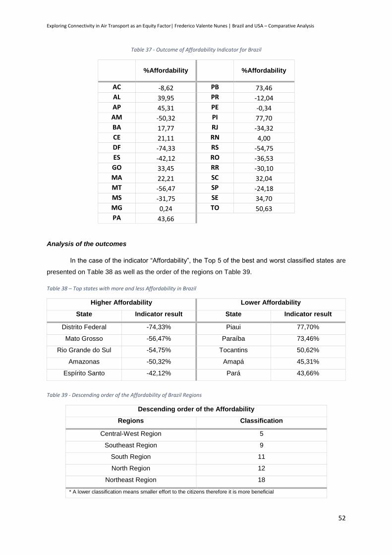
Exploring Connectivity in Air Transport as an Equity Factor| Frederico Valente Nunes | Brazil and USA – Comparative Analysis
52
Table 37 - Outcome of Affordability Indicator for Brazil
%Affordability
%Affordability
AC -8,62 PB 73,46 AL 39,95 PR -12,04 AP 45,31 PE -0,34 AM -50,32 PI 77,70 BA 17,77 RJ -34,32 CE 21,11 RN 4,00 DF -74,33 RS -54,75 ES -42,12 RO -36,53 GO 33,45 RR -30,10 MA 22,21 SC 32,04 MT -56,47 SP -24,18 MS -31,75 SE 34,70 MG 0,24 TO 50,63 PA 43,66
Analysis of the outcomes
In the case of the indicator “Affordability”, the Top 5 of the best and worst classified states are
presented on Table 38 as well as the order of the regions on Table 39.
Table 38 – Top states with more and less Affordability in Brazil
Higher Affordability Lower Affordability
State Indicator result State Indicator result
Distrito Federal -74,33% Piaui 77,70%
Mato Grosso -56,47% Paraíba 73,46%
Rio Grande do Sul -54,75% Tocantins 50,62%
Amazonas -50,32% Amapá 45,31%
Espírito Santo -42,12% Pará 43,66%
Table 39 - Descending order of the Affordability of Brazil Regions
Descending order of the Affordability
Regions Classification
Central-West Region 5
Southeast Region 9
South Region 11
North Region 12
Northeast Region 18
* A lower classification means smaller effort to the citizens therefore it is more beneficial
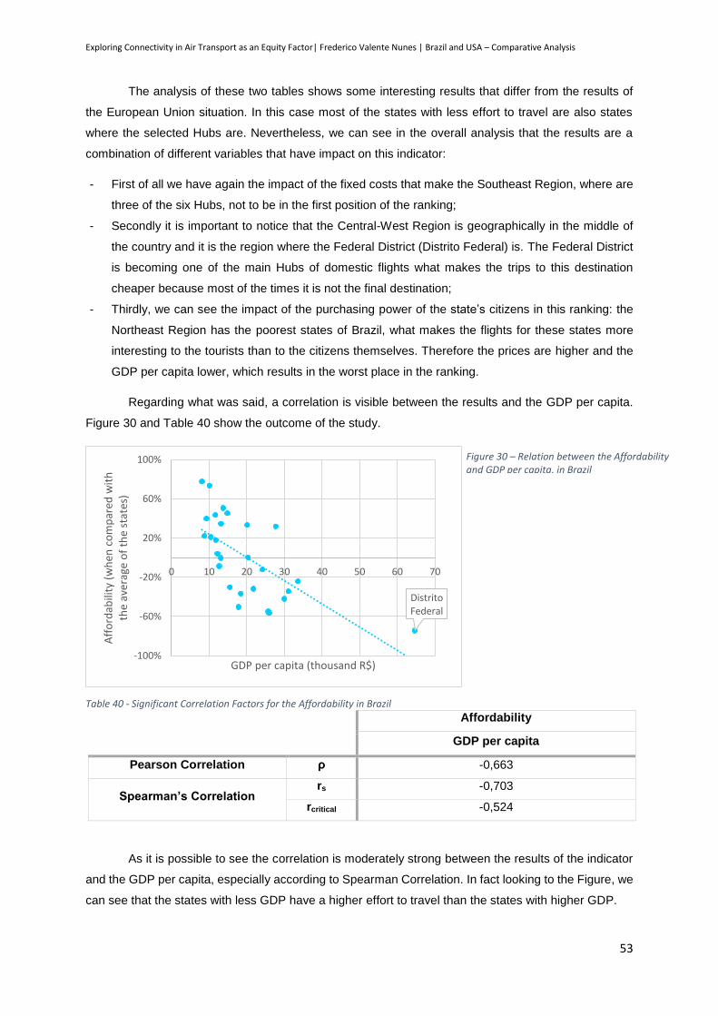
Exploring Connectivity in Air Transport as an Equity Factor| Frederico Valente Nunes | Brazil and USA – Comparative Analysis
53
The analysis of these two tables shows some interesting results that differ from the results of
the European Union situation. In this case most of the states with less effort to travel are also states
where the selected Hubs are. Nevertheless, we can see in the overall analysis that the results are a
combination of different variables that have impact on this indicator:
- First of all we have again the impact of the fixed costs that make the Southeast Region, where are
three of the six Hubs, not to be in the first position of the ranking;
- Secondly it is important to notice that the Central-West Region is geographically in the middle of
the country and it is the region where the Federal District (Distrito Federal) is. The Federal District
is becoming one of the main Hubs of domestic flights what makes the trips to this destination
cheaper because most of the times it is not the final destination;
- Thirdly, we can see the impact of the purchasing power of the state’s citizens in this ranking: the
Northeast Region has the poorest states of Brazil, what makes the flights for these states more
interesting to the tourists than to the citizens themselves. Therefore the prices are higher and the
GDP per capita lower, which results in the worst place in the ranking.
Regarding what was said, a correlation is visible between the results and the GDP per capita.
Figure 30 and Table 40 show the outcome of the study.
Table 40 - Significant Correlation Factors for the Affordability in Brazil
Affordability
GDP per capita
Pearson Correlation ρ -0,663
Spearman’s Correlation rs -0,703
rcritical -0,524
As it is possible to see the correlation is moderately strong between the results of the indicator
and the GDP per capita, especially according to Spearman Correlation. In fact looking to the Figure, we
can see that the states with less GDP have a higher effort to travel than the states with higher GDP.
Distrito Federal
-100%
-60%
-20%
20%
60%
100%
0 10 20 30 40 50 60 70
Aff
ord
abili
ty (
wh
en c
om
par
ed w
ith
th
e av
erag
e o
f th
e st
ates
)
GDP per capita (thousand R$)
Figure 30 – Relation between the Affordability and GDP per capita, in Brazil
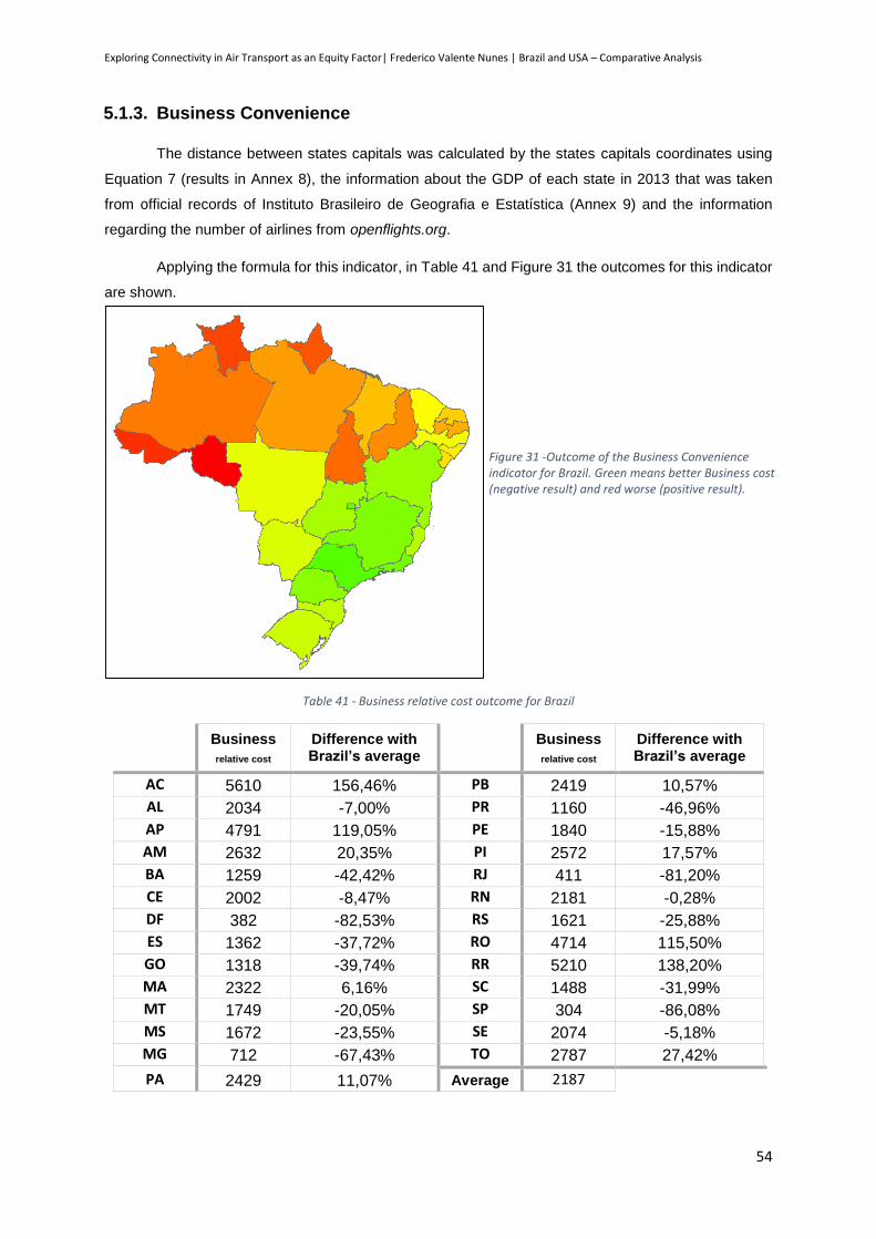
Exploring Connectivity in Air Transport as an Equity Factor| Frederico Valente Nunes | Brazil and USA – Comparative Analysis
54
5.1.3. Business Convenience
The distance between states capitals was calculated by the states capitals coordinates using
Equation 7 (results in Annex 8), the information about the GDP of each state in 2013 that was taken
from official records of Instituto Brasileiro de Geografia e Estatística (Annex 9) and the information
regarding the number of airlines from openflights.org.
Applying the formula for this indicator, in Table 41 and Figure 31 the outcomes for this indicator
are shown.
Table 41 - Business relative cost outcome for Brazil
Business
relative cost Difference with Brazil’s average
Business
relative cost Difference with Brazil’s average
AC 5610 156,46% PB 2419 10,57%
AL 2034 -7,00% PR 1160 -46,96%
AP 4791 119,05% PE 1840 -15,88%
AM 2632 20,35% PI 2572 17,57%
BA 1259 -42,42% RJ 411 -81,20%
CE 2002 -8,47% RN 2181 -0,28%
DF 382 -82,53% RS 1621 -25,88%
ES 1362 -37,72% RO 4714 115,50%
GO 1318 -39,74% RR 5210 138,20%
MA 2322 6,16% SC 1488 -31,99%
MT 1749 -20,05% SP 304 -86,08%
MS 1672 -23,55% SE 2074 -5,18%
MG 712 -67,43% TO 2787 27,42%
PA 2429 11,07% Average 2187
Figure 31 -Outcome of the Business Convenience indicator for Brazil. Green means better Business cost (negative result) and red worse (positive result).
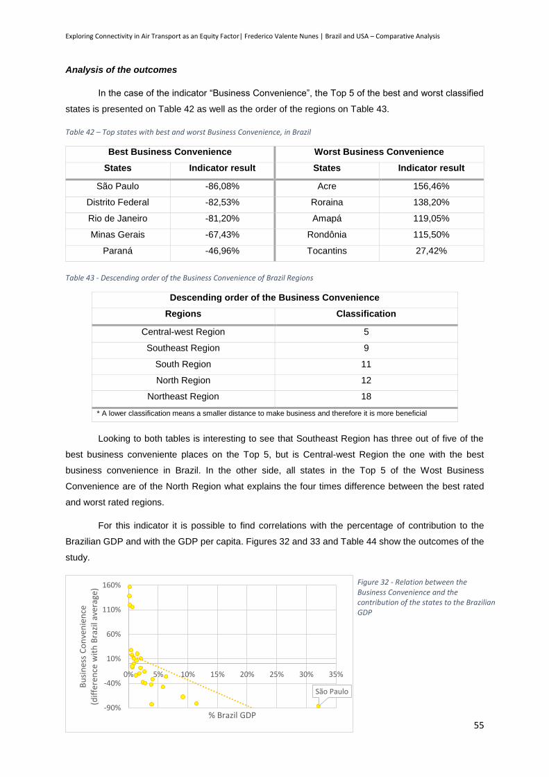
Exploring Connectivity in Air Transport as an Equity Factor| Frederico Valente Nunes | Brazil and USA – Comparative Analysis
55
Analysis of the outcomes
In the case of the indicator “Business Convenience”, the Top 5 of the best and worst classified
states is presented on Table 42 as well as the order of the regions on Table 43.
Table 42 – Top states with best and worst Business Convenience, in Brazil
Best Business Convenience Worst Business Convenience
States Indicator result States Indicator result
São Paulo -86,08% Acre 156,46%
Distrito Federal -82,53% Roraina 138,20%
Rio de Janeiro -81,20% Amapá 119,05%
Minas Gerais -67,43% Rondônia 115,50%
Paraná -46,96% Tocantins 27,42%
Table 43 - Descending order of the Business Convenience of Brazil Regions
Descending order of the Business Convenience
Regions Classification
Central-west Region 5
Southeast Region 9
South Region 11
North Region 12
Northeast Region 18
* A lower classification means a smaller distance to make business and therefore it is more beneficial
Looking to both tables is interesting to see that Southeast Region has three out of five of the
best business conveniente places on the Top 5, but is Central-west Region the one with the best
business convenience in Brazil. In the other side, all states in the Top 5 of the Wost Business
Convenience are of the North Region what explains the four times difference between the best rated
and worst rated regions.
For this indicator it is possible to find correlations with the percentage of contribution to the
Brazilian GDP and with the GDP per capita. Figures 32 and 33 and Table 44 show the outcomes of the
study.
São Paulo
-90%
-40%
10%
60%
110%
160%
0% 5% 10% 15% 20% 25% 30% 35%
Bu
sin
ess
Co
nve
nie
nce
(d
iffe
ren
ce w
ith
Bra
zil a
vera
ge)
% Brazil GDP
Figure 32 - Relation between the Business Convenience and the contribution of the states to the Brazilian GDP

Exploring Connectivity in Air Transport as an Equity Factor| Frederico Valente Nunes | Brazil and USA – Comparative Analysis
56
Table 44 - Significant Correlation Factors for the Business Convenience in Brazil
Business Convenience
% Brazil GDP GDP per capita
Pearson Correlation ρ -0,555 Not significant
Spearman’s
Correlation
rs -0,898 -0,604
rcritical 0,524 0,524
The results from this indicator show that the higher the percentage of the state’s contribution to
the country’s GDP and the higher the GDP per capita, the better the Business Convenience is. The
reason for this result is that, in a country with such different contributions to the GDP (it spans from
0,17% in Roraima to 32,08% in São Paulo), distance tends not to have so much effect on the indicator
and the contribution makes the biggest difference. Also with more money, cames more business trips
what in Brazil has a big impact in domestic flights, increasing connections in the most rich states.
Distrito Federal-90%
-40%
10%
60%
110%
160%
0 10 20 30 40 50 60 70
Bu
sin
ess
Co
nve
nie
nce
(d
iffe
ren
ce w
ith
Bra
zil a
vera
ge)
GDP per capita (thousand R$)
Figure 33 - Relation between the Business Convenience and the states GDP per capita, in Brazil

Exploring Connectivity in Air Transport as an Equity Factor| Frederico Valente Nunes | Brazil and USA – Comparative Analysis
57
5.2. USA
Applying the principle that a representative airport is the ones with at least 20% of the countries
air passengers, we can see in Table 45 the airports that will be used for the study. In Annex 10, all
American International Airports are given and their share of the country’s passengers, which served as
basis for the production of the next table.
Table 45 - List of USA airports with at least 20% of the state’s passengers
State City Airport Passengers State
Passengers %
AL Birmingham
Birmingham–Shuttlesworth International Airport
1 335 215 2 334 798
57,19%
Huntsville Huntsville International Airport 505 541 21,65%
AK Anchorage Ted Stevens Anchorage International Airport 2 325 030 3 967 193 58,61%
AZ Phoenix Phoenix Sky Harbor International Airport 19 525 829 22 256 307 87,73%
AR Fayetteville Northwest Arkansas Regional Airport 558 218
1 729 450 32,28%
Little Rock Bill and Hillary Clinton National Airport 1 055 608 61,04%
CA Los Angeles Los Angeles International Airport 32 427 115
89 040 919 36,42%
San Francisco San Francisco International Airport 21 706 567 24,38%
CO Denver Denver International Airport 25 497 348 26 926 648 94,69%
CT Hartford Bradley International Airport 2 681 718 2 719 152 98,62%
DE Wilmington Wilmington-Philadelphia Regional Airport 52 456 52 475 99,96%
DC NO AIRPORTS 0,00%
FL Miami Miami International Airport 16 194 277
76 313 877 21,22%
Orlando Orlando International Airport 17 614 745 23,08%
GA Atlanta Hartsfield-Jackson Atlanta International Airport
45 308 685 45 780 671 98,97%
HI Honolulu Honolulu International Airport 9 466 995 15 865 694 59,67%
ID Boise Boise Airport 1 313 741 1 627 792 80,71%
IL Chicago Chicago O'Hare International Airport 32 278 906
43 095 921 74,90%
Chicago Chicago Midway International Airport 9 919 985 23,02%
IN Indianapolis Indianapolis International Airport 3 535 579 4 321 229 81,82%
IA Des Moines Des Moines International Airport 1 079 189 1 210 987 89,12%
KS Manhattan Manhattan Regional Airport 65 683
163 761 40,11%
Wichita Wichita Dwight D. Eisenhower National Airport
73 622 44,96%
KY Covington
Cincinnati/Northern Kentucky International Airport
2 776 377 5 092 212
54,52%
Louisville Louisville International Airport 1 669 470 32,78%
LA New Orleans Louis Armstrong New Orleans International Airport
4 577 498 5 856 865 78,16%
ME Bangor Bangor International Airport 265 245
1 140 417 23,26%
Portland Portland International Jetport 837 335 73,42%
MD Baltimore Baltimore/Washington International Thurgood Marshall Airport
11 134 130 11 153 338 99,83%
MA Boston Gen. Edward Lawrence Logan International Airport
14 721 693 15 073 021 97,67%
MI Detroit Detroit Metropolitan Wayne County Airport 15 683 787 18 025 847 87,01%
MN Minneapolis Minneapolis–St. Paul International Airport 16 282 038 16 629 377 97,91%
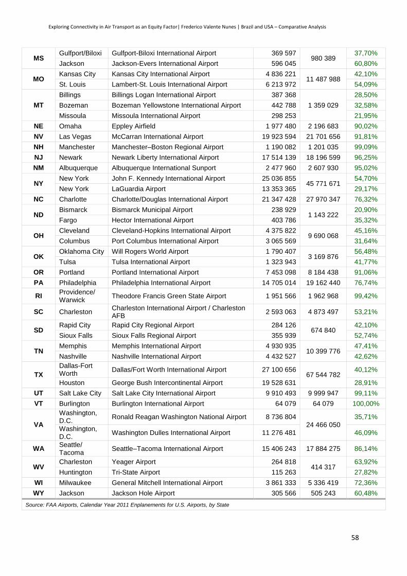
Exploring Connectivity in Air Transport as an Equity Factor| Frederico Valente Nunes | Brazil and USA – Comparative Analysis
58
MS Gulfport/Biloxi Gulfport-Biloxi International Airport 369 597
980 389 37,70%
Jackson Jackson-Evers International Airport 596 045 60,80%
MO Kansas City Kansas City International Airport 4 836 221
11 487 988 42,10%
St. Louis Lambert-St. Louis International Airport 6 213 972 54,09%
MT
Billings Billings Logan International Airport 387 368
1 359 029
28,50%
Bozeman Bozeman Yellowstone International Airport 442 788 32,58%
Missoula Missoula International Airport 298 253 21,95%
NE Omaha Eppley Airfield 1 977 480 2 196 683 90,02%
NV Las Vegas McCarran International Airport 19 923 594 21 701 656 91,81%
NH Manchester Manchester–Boston Regional Airport 1 190 082 1 201 035 99,09%
NJ Newark Newark Liberty International Airport 17 514 139 18 196 599 96,25%
NM Albuquerque Albuquerque International Sunport 2 477 960 2 607 930 95,02%
NY New York John F. Kennedy International Airport 25 036 855
45 771 671 54,70%
New York LaGuardia Airport 13 353 365 29,17%
NC Charlotte Charlotte/Douglas International Airport 21 347 428 27 970 347 76,32%
ND Bismarck Bismarck Municipal Airport 238 929
1 143 222 20,90%
Fargo Hector International Airport 403 786 35,32%
OH Cleveland Cleveland-Hopkins International Airport 4 375 822
9 690 068 45,16%
Columbus Port Columbus International Airport 3 065 569 31,64%
OK Oklahoma City Will Rogers World Airport 1 790 407
3 169 876 56,48%
Tulsa Tulsa International Airport 1 323 943 41,77%
OR Portland Portland International Airport 7 453 098 8 184 438 91,06%
PA Philadelphia Philadelphia International Airport 14 705 014 19 162 440 76,74%
RI Providence/ Warwick
Theodore Francis Green State Airport 1 951 566 1 962 968 99,42%
SC Charleston Charleston International Airport / Charleston AFB
2 593 063 4 873 497 53,21%
SD Rapid City Rapid City Regional Airport 284 126
674 840 42,10%
Sioux Falls Sioux Falls Regional Airport 355 939 52,74%
TN Memphis Memphis International Airport 4 930 935
10 399 776 47,41%
Nashville Nashville International Airport 4 432 527 42,62%
TX
Dallas-Fort Worth
Dallas/Fort Worth International Airport 27 100 656 67 544 782
40,12%
Houston George Bush Intercontinental Airport 19 528 631 28,91%
UT Salt Lake City Salt Lake City International Airport 9 910 493 9 999 947 99,11%
VT Burlington Burlington International Airport 64 079 64 079 100,00%
VA
Washington, D.C.
Ronald Reagan Washington National Airport 8 736 804 24 466 050
35,71%
Washington, D.C.
Washington Dulles International Airport 11 276 481 46,09%
WA Seattle/ Tacoma
Seattle–Tacoma International Airport 15 406 243 17 884 275 86,14%
WV Charleston Yeager Airport 264 818
414 317 63,92%
Huntington Tri-State Airport 115 263 27,82%
WI Milwaukee General Mitchell International Airport 3 861 333 5 336 419 72,36%
WY Jackson Jackson Hole Airport 305 566 505 243 60,48%
Source: FAA Airports, Calendar Year 2011 Enplanements for U.S. Airports, by State

Exploring Connectivity in Air Transport as an Equity Factor| Frederico Valente Nunes | Brazil and USA – Comparative Analysis
59
5.2.1. Availability
After processing the data found, it was possible to produce Annex 11, where all state destination
for each of the airport sample are shown. In Table 46 and Figure 34 the final numbers are shown.
Table 46 - Outcome of Availability Indicator for the USA
Sta
te Percentage of
connections to each state main airport (2)
Airports
Percentage of connections from the
main airport to each one of the other states (1)
AL 28,57 Birmingham-Shuttlesworh and Huntsville International Airports
22,45
AK 24,49 Ted Stevens Anchorage International Airport 24,49
AZ 77,55 Phoenix Sky Harbor International Airport 65,31
AR 28,57 Northwest Arkansas and Bill and Hillary Clinton Airports
30,61
CA 77,55 Los Angeles and San Francisco International Airports
79,59
CO 83,67 Denver International Airport 81,63
CT 30,61 Bradley International Airport 26,53
DE 0,00 Wilmington-Philadelphia Regional Airport 10,20
DC 0,00 NO AIRPORT 0,00
FL 81,63 Miami and Orlando International Airports 63,27
Figure 34 - Outcome of Avaiability Indicator for the USA (Percentage of connections from the main airport to each one of the other states (1) on top and Percentage of connections to each state main airport (2) down). Green means better connections and Red worse connections.
Alaska
Hawaii
Alaska
Hawaii

Exploring Connectivity in Air Transport as an Equity Factor| Frederico Valente Nunes | Brazil and USA – Comparative Analysis
60
GA 91,84 Hartsfield-Jackson Atlanta International Airport 83,67
HI 28,57 Honolulu International Airport 28,57
ID 18,37 Boise Airport (Boise Air Terminal) (Gowen Field)
18,37
IL 95,92 Chicago O'Hare and Chicago Midway International Airports
95,92
IN 46,94 Indianapolis International Airport 36,73
IA 28,57 Des Moines International Airport 28,57
KS 20,41 Manhattan and Wichita Dwight Airports 18,37
KY 51,02 Cincinnati/Northern Kentucky and Louisville International Airports
51,02
LA 44,90 Louis Armstrong New Orleans International Airport
48,98
ME 18,37 Bangor and Portland International Airports 22,45
MD 73,47 Baltimore/Washington International Thurgood Marshall Airport
69,39
MA 51,02 Gen. Edward Lawrence Logan International Airport
61,22
MI 79,59 Detroit Metropolitan Wayne County Airport 87,76
MN 83,67 Minneapolis–St. Paul International Airport (Wold–Chamberlain Field)
83,67
MS 14,29 Gulfport-Biloxi and Jackson-Evers International Airports
16,33
MO 57,14 Kansas City and Lambert-St. Louis International Airports
65,31
MT 18,37 Billings Logan, Bozeman Yellowstone and Missoula International Airports
26,53
NE 32,65 Eppley Airfield 32,65
NV 81,63 McCarran International Airport 85,71
NH 26,53 Manchester–Boston Regional Airport 26,53
NJ 69,39 Newark Liberty International Airport 69,39
NM 30,61 Albuquerque International Sunport 30,61
NY 79,59 John F. Kennedy and La Guardia Airports 73,47
NC 75,51 Charlotte/Douglas International Airport 69,39
ND 12,24 Bismarck and Hector Airports 12,24
OH 55,10 Cleveland-Hopkins and Port Columbus International Airports
60,42
OK 33,33 Will Rogers World and Tulsa Airports 32,65
OR 48,98 Portland International Airport 44,90
PA 67,35 Philadelphia International Airport 69,39
RI 26,53 Theodore Francis Green State Airport 32,65
SC 32,65 Charleston International Airport / Charleston AFB
22,45
SD 16,33 Rapid City and Sioux Falls Airports 18,37
TN 55,10 Memphis and Nashville Airports 69,39
TX 85,71 Dallas/Fort Worth and George Bush International Airports
81,63
UT 67,35 Salt Lake City International Airport 67,35
VT 16,33 Burlington International Airport 18,37
VA 77,55 Ronald Reagan Washington and Washington Dulles International Airports
77,55
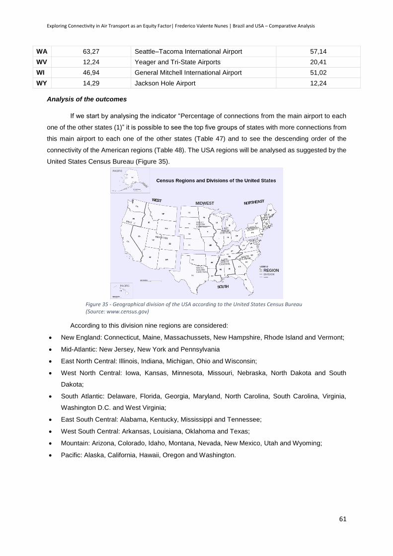
Exploring Connectivity in Air Transport as an Equity Factor| Frederico Valente Nunes | Brazil and USA – Comparative Analysis
61
WA 63,27 Seattle–Tacoma International Airport 57,14
WV 12,24 Yeager and Tri-State Airports 20,41
WI 46,94 General Mitchell International Airport 51,02
WY 14,29 Jackson Hole Airport 12,24
Analysis of the outcomes
If we start by analysing the indicator “Percentage of connections from the main airport to each
one of the other states (1)” it is possible to see the top five groups of states with more connections from
this main airport to each one of the other states (Table 47) and to see the descending order of the
connectivity of the American regions (Table 48). The USA regions will be analysed as suggested by the
United States Census Bureau (Figure 35).
According to this division nine regions are considered:
New England: Connecticut, Maine, Massachussets, New Hampshire, Rhode Island and Vermont;
Mid-Atlantic: New Jersey, New York and Pennsylvania
East North Central: Illinois, Indiana, Michigan, Ohio and Wisconsin;
West North Central: Iowa, Kansas, Minnesota, Missouri, Nebraska, North Dakota and South
Dakota;
South Atlantic: Delaware, Florida, Georgia, Maryland, North Carolina, South Carolina, Virginia,
Washington D.C. and West Virginia;
East South Central: Alabama, Kentucky, Mississippi and Tennessee;
West South Central: Arkansas, Louisiana, Oklahoma and Texas;
Mountain: Arizona, Colorado, Idaho, Montana, Nevada, New Mexico, Utah and Wyoming;
Pacific: Alaska, California, Hawaii, Oregon and Washington.
Figure 35 - Geographical division of the USA according to the United States Census Bureau (Source: www.census.gov)
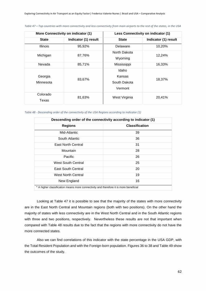
Exploring Connectivity in Air Transport as an Equity Factor| Frederico Valente Nunes | Brazil and USA – Comparative Analysis
62
Table 47 – Top countries with more connectivity and less connectivity from main airports to the rest of the states, in the USA
More Connectivity on indicator (1) Less Connectivity on indicator (1)
State Indicator (1) result State Indicator (1) result
Illinois 95,92% Delaware 10,20%
Michigan 87,76% North Dakota
Wyoming 12,24%
Nevada 85,71% Mississippi 16,33%
Georgia
Minnesota 83,67%
Idaho
Kansas
South Dakota
Vermont
18,37%
Colorado
Texas 81,63% West Virginia 20,41%
Table 48 - Descending order of the connectivity of the USA Regions according to indicator (1)
Descending order of the connectivity according to indicator (1)
Regions Classification
Mid-Atlantic 39
South Atlantic 36
East North Central 31
Mountain 28
Pacific 26
West South Central 25
East South Central 20
West North Central 19
New England 16
* A higher classification means more connectivity and therefore it is more beneficial
Looking at Table 47 it is possible to see that the majority of the states with more connectivity
are in the East North Central and Mountain regions (both with two positions). On the other hand the
majority of states with less connectivity are in the West North Central and in the South Atlantic regions
with three and two positions, respectively. Nevertheless these results are not that important when
compared with Table 48 results due to the fact that the regions with more connectivity do not have the
more connected states.
Also we can find correlations of this indicator with the state percentage in the USA GDP, with
the Total Resident Population and with the Foreign-born population. Figures 36 to 38 and Table 49 show
the outcomes of the study.
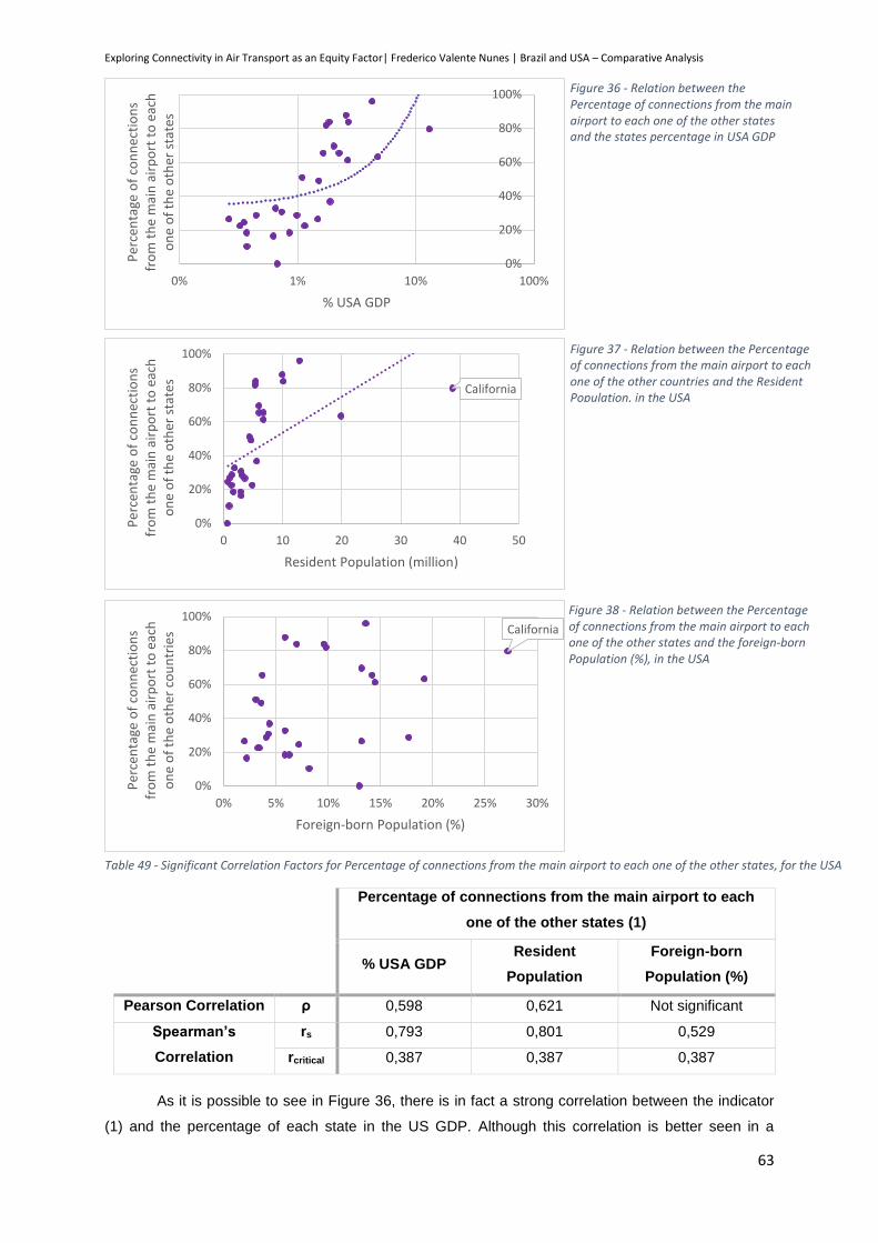
Exploring Connectivity in Air Transport as an Equity Factor| Frederico Valente Nunes | Brazil and USA – Comparative Analysis
63
Table 49 - Significant Correlation Factors for Percentage of connections from the main airport to each one of the other states, for the USA
Percentage of connections from the main airport to each
one of the other states (1)
% USA GDP Resident
Population
Foreign-born
Population (%)
Pearson Correlation ρ 0,598 0,621 Not significant
Spearman’s
Correlation
rs 0,793 0,801 0,529
rcritical 0,387 0,387 0,387
As it is possible to see in Figure 36, there is in fact a strong correlation between the indicator
(1) and the percentage of each state in the US GDP. Although this correlation is better seen in a
0%
20%
40%
60%
80%
100%
0% 1% 10% 100%
Per
cen
tage
of
con
nec
tio
ns
fro
m t
he
mai
n a
irp
ort
to
eac
h
on
e o
f th
e o
ther
sta
tes
% USA GDP
Figure 36 - Relation between the Percentage of connections from the main airport to each one of the other states and the states percentage in USA GDP
California
0%
20%
40%
60%
80%
100%
0 10 20 30 40 50
Per
cen
tage
of
con
nec
tio
ns
fro
m t
he
mai
n a
irp
ort
to
eac
h
on
e o
f th
e o
ther
sta
tes
Resident Population (million)
Figure 37 - Relation between the Percentage of connections from the main airport to each one of the other countries and the Resident Population, in the USA
California
0%
20%
40%
60%
80%
100%
0% 5% 10% 15% 20% 25% 30%
Per
cen
tage
of
con
nec
tio
ns
fro
m t
he
mai
n a
irp
ort
to
eac
h
on
e o
f th
e o
ther
co
un
trie
s
Foreign-born Population (%)
Figure 38 - Relation between the Percentage of connections from the main airport to each one of the other states and the foreign-born Population (%), in the USA
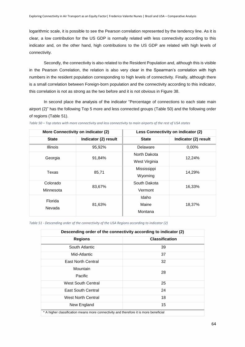
Exploring Connectivity in Air Transport as an Equity Factor| Frederico Valente Nunes | Brazil and USA – Comparative Analysis
64
logarithmic scale, it is possible to see the Pearson correlation represented by the tendency line. As it is
clear, a low contribution for the US GDP is normally related with less connectivity according to this
indicator and, on the other hand, high contributions to the US GDP are related with high levels of
connectivity.
Secondly, the connectivity is also related to the Resident Population and, although this is visible
in the Pearson Correlation, the relation is also very clear in the Spearman’s correlation with high
numbers in the resident population corresponding to high levels of connectivity. Finally, although there
is a small correlation between Foreign-born population and the connectivity according to this indicator,
this correlation is not as strong as the two before and it is not obvious in Figure 38.
In second place the analysis of the indicator “Percentage of connections to each state main
airport (2)” has the following Top 5 more and less connected groups (Table 50) and the following order
of regions (Table 51).
Table 50 – Top states with more connectivity and less connectivity to main airports of the rest of USA states
More Connectivity on indicator (2) Less Connectivity on indicator (2)
State Indicator (2) result State Indicator (2) result
Illinois 95,92% Delaware 0,00%
Georgia 91,84% North Dakota
West Virginia 12,24%
Texas 85,71 Mississippi
Wyoming 14,29%
Colorado
Minnesota 83,67%
South Dakota
Vermont 16,33%
Florida
Nevada 81,63%
Idaho
Maine
Montana
18,37%
Table 51 - Descending order of the connectivity of the USA Regions according to indicator (2)
Descending order of the connectivity according to indicator (2)
Regions Classification
South Atlantic 39
Mid-Atlantic 37
East North Central 32
Mountain
Pacific 28
West South Central 25
East South Central 24
West North Central 18
New England 15
* A higher classification means more connectivity and therefore it is more beneficial

Exploring Connectivity in Air Transport as an Equity Factor| Frederico Valente Nunes | Brazil and USA – Comparative Analysis
65
While looking at Table 50 and 51 it is possible to see that there are two regions with states in
opposite situations: the South Atlantic and the Mountain regions both have two positions on the Top 5
of the best connected but also have two and three, respectively, on the Top 5 of the less connected.
Also it is possible to see that the New England region is worse connected than the other regions.
Also in this case it is possible to find correlations of this indicator with the state percentage in
the USA GDP, with the Total Resident Population and with the Foreign-born population. Figures 39 to
41 and Table 52 show the outcomes of the study.
0%
20%
40%
60%
80%
100%
10% 100%
%
% USA GDP
Percentage of connections from the main airport to each one of the otherstates (1)
Percentage of connections to each state main airport (2)
Linear (Percentage of connections from the main airport to each one ofthe other states (1))
Linear (Percentage of connections to each state main airport (2))
Figure 39 - Relation between the Percentage of connections from the main airport to each one of the states (1) and Percentage of connections to each state main airport (2) and the states percentage on USA GDP
Figure 40 - Relation between the Percentage of connections from the main airport to each one of the other states (1) and Percentage of connections to each state main airport (2) and the states resident population, in the USA
0,00%
20,00%
40,00%
60,00%
80,00%
100,00%
120,00%
140,00%
0 10 20 30 40 50
%
Resident Population (million)
Percentage of connections from the main airport to each one of the otherstates (1)
Percentage of connections to each state main airport (2)
Linear (Percentage of connections from the main airport to each one ofthe other states (1))
Linear (Percentage of connections to each state main airport (2))
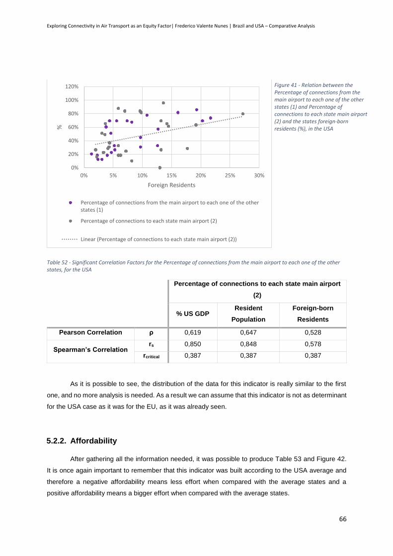
Exploring Connectivity in Air Transport as an Equity Factor| Frederico Valente Nunes | Brazil and USA – Comparative Analysis
66
Table 52 - Significant Correlation Factors for the Percentage of connections from the main airport to each one of the other states, for the USA
Percentage of connections to each state main airport
(2)
% US GDP Resident
Population
Foreign-born
Residents
Pearson Correlation ρ 0,619 0,647 0,528
Spearman’s Correlation rs 0,850 0,848 0,578
rcritical 0,387 0,387 0,387
As it is possible to see, the distribution of the data for this indicator is really similar to the first
one, and no more analysis is needed. As a result we can assume that this indicator is not as determinant
for the USA case as it was for the EU, as it was already seen.
5.2.2. Affordability
After gathering all the information needed, it was possible to produce Table 53 and Figure 42.
It is once again important to remember that this indicator was built according to the USA average and
therefore a negative affordability means less effort when compared with the average states and a
positive affordability means a bigger effort when compared with the average states.
0%
20%
40%
60%
80%
100%
120%
0% 5% 10% 15% 20% 25% 30%
%
Foreign Residents
Percentage of connections from the main airport to each one of the otherstates (1)
Percentage of connections to each state main airport (2)
Linear (Percentage of connections to each state main airport (2))
Figure 41 - Relation between the Percentage of connections from the main airport to each one of the other states (1) and Percentage of connections to each state main airport (2) and the states foreign-born residents (%), in the USA
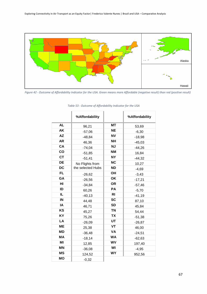
Exploring Connectivity in Air Transport as an Equity Factor| Frederico Valente Nunes | Brazil and USA – Comparative Analysis
67
Table 53 - Outcome of Affordability Indicator for the USA
%Affordability
%Affordability
AL 96,21 MT 53,69 AK -57,06 NE -6,30 AZ -48,84 NV -18,98 AR 46,36 NH -45,03 CA -74,04 NJ -44,26 CO -51,85 NM 16,84 CT -51,41 NY -44,32 DE No Flights from
the selected Hubs
NC 10,27 DC ND -4,69 FL -26,62 OH -3,43 GA -26,56 OK -17,21 HI -34,84 OR -57,46 ID 60,26 PA -5,70 IL -40,13 RI -41,19 IN 44,48 SC 87,10 IA 46,71 SD 45,84 KS 45,27 TN 54,44 KY 75,26 TX -51,38 LA -26,09 UT -26,87 ME 25,38 VT 46,00 MD -36,48 VA -24,51 MA -18,14 WA -62,63 MI 12,85 WV 197,40 MN -36,08 WI -4,95 MS 124,52 WY 952,56 MO -0,32
Figure 42 - Outcome of Affordability Indicator for the USA. Green means more Affordable (negative result) than red (positive result)
Alaska
Hawaii

Exploring Connectivity in Air Transport as an Equity Factor| Frederico Valente Nunes | Brazil and USA – Comparative Analysis
68
Analysis of the outcomes
In the case of the indicator “Affordability”, the Top 5 of the best and worst classified states is
presented on Table 54 as well as the order of the regions on Table 55.
Table 54 – Top states with more and less Affordability in the USA
Higher Affordability Lower Affordability
State Indicator result State Indicator result
California -74,04% Wyoming 952,56%
Washington -62,63% West Virginia 197,40%
Oregon -57,46% Mississippi 124,52%
Alaska -57,06% Alabama 96,21%
Colorado -51,85% South Carolina 87,10%
Table 55 - Descending order of the Affordability of the USA Regions
Descending order of the Affordability
Regions Classification
Pacific 3
Mid-Atlantic 11
New England 18
South Atlantic 21
West South Central 22
East North Central
Mountain 29
West North Central 30
East South Central 47
* A lower classification means smaller effort to the citizens therefore it is more beneficial
First of all it is important to underline two aspects: firstly District Columbia and Delaware do not
have results for this analysis – the District of Columbia does not have airports and the Delaware main
Airport does not have flights to the selected Hubs; secondly, Wyoming only has connections to one of
the selected Hubs (Denver International Airport, Colorado) which is only at eight-hour-drive distance
from the Wyoming main airport, therefore, the result is not representative for the analysis.
Regarding Table 54 and 55, we can notice that the regions with less effort are the ones next to
the Pacific and the Atlantic, having the first four places in the Regions Top. It is also possible to see that
(excluding Wyoming) all bottom five states are in the East South Central and South Atlantic Regions.
The reason why the South Atlantic Region is not in the bottom of the regions ranking is because it has
other States that even if they are not on the Top Higher Affordability they have fairly good affordability.

Exploring Connectivity in Air Transport as an Equity Factor| Frederico Valente Nunes | Brazil and USA – Comparative Analysis
69
When we look to the results of the correlation with the selected indicators, a relation is visible
between the results and the contribution to the USA GDP, with the compensation of employees, with
the Foreign Born Population and with the GDP per capita. Figures 43 to 46 and Table 56 show the
outcome of the study.
California
West Virginia
-100%
-50%
0%
50%
100%
150%
200%
0% 2% 4% 6% 8% 10% 12% 14%
Aff
ord
abili
ty (
com
par
ed w
ith
th
e U
SA
Ave
rage
)
% USA GDP
District of Columbia
West Virginia
-100%
-50%
0%
50%
100%
150%
200%
30 40 50 60 70 80
Aff
ord
abili
ty (
com
par
ed w
ith
th
e U
SA
Ave
rage
)
Compensation of employees per capita (thousand PPS)
California
West Virginia
-100%
-50%
0%
50%
100%
150%
200%
0% 5% 10% 15% 20% 25% 30%
Aff
ord
abili
ty (
com
par
ed w
ith
th
e U
SA
Ave
rage
)
Foreign-born Population (%)
Figure 43 - Relation between the Affordability and the states contribution for the USA GDP
Figure 44 - Relation between the Affordability and the compensation of employees per capita, in the USA
Figure 45 - Relation between the Affordability and the Foreign-born Population, in the USA
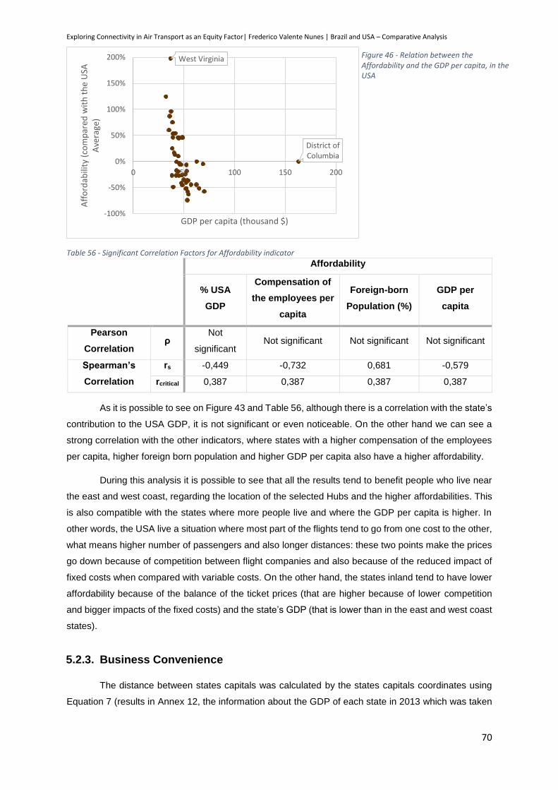
Exploring Connectivity in Air Transport as an Equity Factor| Frederico Valente Nunes | Brazil and USA – Comparative Analysis
70
Table 56 - Significant Correlation Factors for Affordability indicator
Affordability
% USA
GDP
Compensation of
the employees per
capita
Foreign-born
Population (%)
GDP per
capita
Pearson
Correlation ρ
Not
significant Not significant Not significant Not significant
Spearman’s
Correlation
rs -0,449 -0,732 0,681 -0,579
rcritical 0,387 0,387 0,387 0,387
As it is possible to see on Figure 43 and Table 56, although there is a correlation with the state’s
contribution to the USA GDP, it is not significant or even noticeable. On the other hand we can see a
strong correlation with the other indicators, where states with a higher compensation of the employees
per capita, higher foreign born population and higher GDP per capita also have a higher affordability.
During this analysis it is possible to see that all the results tend to benefit people who live near
the east and west coast, regarding the location of the selected Hubs and the higher affordabilities. This
is also compatible with the states where more people live and where the GDP per capita is higher. In
other words, the USA live a situation where most part of the flights tend to go from one cost to the other,
what means higher number of passengers and also longer distances: these two points make the prices
go down because of competition between flight companies and also because of the reduced impact of
fixed costs when compared with variable costs. On the other hand, the states inland tend to have lower
affordability because of the balance of the ticket prices (that are higher because of lower competition
and bigger impacts of the fixed costs) and the state’s GDP (that is lower than in the east and west coast
states).
5.2.3. Business Convenience
The distance between states capitals was calculated by the states capitals coordinates using
Equation 7 (results in Annex 12, the information about the GDP of each state in 2013 which was taken
District of Columbia
West Virginia
-100%
-50%
0%
50%
100%
150%
200%
0 50 100 150 200
Aff
ord
abili
ty (
com
par
ed w
ith
th
e U
SA
Ave
rage
)
GDP per capita (thousand $)
Figure 46 - Relation between the Affordability and the GDP per capita, in the USA

Exploring Connectivity in Air Transport as an Equity Factor| Frederico Valente Nunes | Brazil and USA – Comparative Analysis
71
from official records of the U.S. Department of Commerce (Annex 13) and the information regarding the
number of airlines from openflights.org. Applying the formula for this indicator, on Table 57 and Figure
47 the outcomes for this indicator are shown.
Table 57 - Business relative cost outcome for USA
Business
relative cost Difference with
the USA average
Business
relative cost Difference with
the USA average
AL 2400 15,28% MT 4180 100,79%
AK 6473 210,98% NE 2053 -1,38%
AZ 1123 -46,03% NV 1390 -33,24%
AR 1609 -22,69% NH 3436 65,05%
CA 1065 -48,82% NJ 1101 -47,11%
CO 962 -66,75% NM 2536 21,84%
CT 1887 -9,37% NY 723 -65,28%
DE 3170 52,30% NC 915 -56,05%
DC No Airports ND 3145 51,10%
FL 841 -59,59% OH 1068 -48,67%
GA 305 -85,37% OK 1929 -7,33%
HI 8649 315,50% OR 2719 30,60%
ID 4268 105,03% PA 819 -60,65%
IL 377 -81,87% RI 3351 60,97%
IN 1074 -48,40% SC 2448 17,58%
IA 2143 2,97% SD 2971 42,73%
KS 2303 10,66% TN 1031 -50,47%
KY 1371 -34,12% TX 636 -69,46%
LA 1120 -46,18% UT 1684 -19,09%
ME 4052 94,66% VT 3595 72,70%
MD 1022 -50,91% VA 803 -61,40%
MA 1063 -48,91% WA 2100 0,87%
MI 784 -62,32% WV 2818 35,36%
MN 751 -63,94% WI 1099 -47,18%
MS 2745 31,88% WY 3498 68,03%
MO 743 -64,32% Average 2082
Figure 47 - Outcome of the Business Convenience indicator for the USA. Green means better Business cost (negative result) and red worse (positive result).
Alaska
Hawaii

Exploring Connectivity in Air Transport as an Equity Factor| Frederico Valente Nunes | Brazil and USA – Comparative Analysis
72
Analysis of the outcomes
In the case of the indicator “Business Convenience”, the Top 5 of the best and worst classified
states is presented on Table 58 as well as the order of the regions on Table 59.
Table 58 – Top states with more and less business convenience, in the USA
Best Business Convenience Worst Business Convenience
States Indicator result States Indicator result
Georgia -85,37% Hawaii 315,50%
Illinois -81,87% Alaska 210,98%
Texas -69,46% Idaho 105,03%
Colorado -66,75% Montana 100,79%
New York -65,28% Maine 94,66%
Table 59 - Descending order of the business convenience, in the USA
Descending order of the Business Convenience
Regions Classification
Mid-Atlantic 10
South Atlantic 13
East North Central 17
West South Central 23
East South Central 29
Mountain 31
West North Central 32
Pacific 37
New England 44
* A lower classification means a smaller distance to make business and therefore it is more beneficial
As it is possible to see on Table 58 and corroborated by Table 59, the states with higher
business cost are in the New England and in the Pacific Region and the ones with lower business cost
are in the Mid-Atlantic and South Atlantic regions. In fact, the business cost for the New England region
is more than four times higher than the Mid-Atlantic region, and even if we take into account that the
New England is a small region and that Pacific region has Alaska and Hawaii that do not share their
borders with other states, the West North Central region also has more than three times the business
cost than the Mid Atlantic region. Nevertheless is important to say that these differences are smaller
than the one analysed in EU and Brazil cases.
For this indicator it is possible to find correlations with the contribution to the USA GDP, with the
Inequality of income distribution and with the resident population. Figures 48 to 50 and Table 60 show
the outcomes of the study.

Exploring Connectivity in Air Transport as an Equity Factor| Frederico Valente Nunes | Brazil and USA – Comparative Analysis
73
Table 60 - Significant Correlation Factors for the Business Convenience in the USA
Business Convenience
% USA GDP Inequality of
Income Distribution
Resident
Population
Pearson Correlation ρ Not Significant Not Significant Not Significant
Spearman’s
Correlation
rs -0,881 -0,498 -0,860
rcritical 0,387 0,387 0,387
Figure 48 - Relation between the Business Convenience and the contribution of each state to the USA GDP
-100%
-50%
0%
50%
100%
150%
200%
250%
300%
0% 1% 10% 100%Bu
sin
ess
Co
nve
nie
nce
(d
iffe
ren
ce w
ith
USA
ave
rage
)
% USA GDP
-100%
-50%
0%
50%
100%
150%
200%
250%
300%
0,40 0,42 0,44 0,46 0,48 0,50 0,52 0,54Bu
sin
ess
Co
nve
nie
nce
(d
iffe
ren
ce w
ith
USA
ave
rage
)
Inequality of income distribution
Figure 49 - Relation between the Business Convenience and the Inequality of income distribution, in the USA
-100%
-50%
0%
50%
100%
150%
200%
250%
300%
0 10 20 30 40Bu
sin
ess
Co
nve
nie
nce
(d
iffe
ren
ce w
ith
USA
ave
rage
)
Resident Population (million pax)
Figure 50 - Relation between the Business Convenience and the Resident Population, in the USA

Exploring Connectivity in Air Transport as an Equity Factor| Frederico Valente Nunes | Brazil and USA – Comparative Analysis
74
The analysis of Table 60, shows a clear correlation between this indicator and the contribution
to the USA GDP and the resident population. Nevertheless we can see that the states with higher
contribution to the USA GDP are also the ones with the larger population (correlation of 0,975). Once
again we can see the importance of the economic factors in this indicator.
What is strange to see is that the business convenience improves for states with more inequality
in income distribution. One possible explanation is that in states with higher contributions to the USA
GDP there is a large upper-high class society what makes the gap between poor and rich to get bigger
and therefore this correlation with the inequality in income distribution. Nevertheless it would be
expected this to happen in Brazil and not in the USA, and therefore we could not find a reasonably
explanation for this correlation.

Exploring Connectivity in Air Transport as an Equity Factor| Frederico Valente Nunes | Conclusion: Global analysis and Suggestions
75
6. Conclusion: Global analysis and Suggestions
After the hard analysis of the results of the study, it is important to consolidate the outcomes
and to face the real challenges that these outcomes present. Therefore, a Global Analysis will be made
and some Policy Suggestions will be shared.
6.1. Global analysis
Table 61 shows the outcomes of the correlation study for the EU, the USA and Brazil.
As it was stated in the beginning of this work, the idea was to compare the situation in the EU,
the USA and Brazil in order to find similarities and differences and to search for policy approaches that
can be applied in the EU in order to increase the cohesion of the European territory. Therefore, it is
important to analyse these similarities and results for each one of the indicators.
Availability
When we look to the first indicator that gives us the percentage of connections from the main
airport to each one of the other states/countries it is clear to see that this percentage gets higher when
the country has a higher GDP and a large population. Also, we can see that this percentage is not really
positively influenced by tourism, which (in the case of the EU) means that countries from Northern and
Western Europe which have a lower impact of Tourism on the GDP have higher connectivity.
• EU, USA, BR: ↑ % GDP
• EU, USA: ↑Resident Population
• EU: ↓ % Tourism GDP
• BR: ↑ Gini Coeficient
Improvement in Percentage of connections from the main airport
to each one of the other countries/states(1)
• EU, USA, BR: ↑ % GDP
• EU, USA: ↑Resident Population
• EU, USA: ↑Foreign-born Population
• EU: ↑ Area
• BR: ↑ GDP per capita
Improvement in Percentage of connections to each country/state
main airport (2)
•BR, USA: ↑ GDP per capita
•USA: ↑ % GDP
•USA: ↑ Compensation of employees
•USA: ↑ Foreign-born Population
Improvement in Affordability
• EU, USA, BR: ↑ % GDP
• EU, BR: ↑ GDP per capita
• EU, USA: ↑ Resident Population
• EU: ↑ Compensation of the employees
• USA: ↑ Inequality in income distribution
• EU: ↑ Foreign Resident Population
Improvement in Business Convenience
Table 61 - Outcomes of the correlation study for the EU, the USA and BR
Exploring Connectivity in Air Transport as an Equity Factor| Frederico Valente Nunes | Conclusion: Global analysis and Suggestions
76
We also see that in Brazil the connectivity tends to increase with the inequality of income
distribution. This is not something we can compare with the developed countries situation due to the
fact that Brazil has a large low social class that can not afford to travel by airplane (it uses the bus), and
therefore the airplane passengers (and the connectivity) increase with the increase of a powerful upper
class.
From these outcomes we can say that:
Population and GDP have a positive impact on the connectivity;
Tourism is not necessarily a way to increase connectivity; business and wealth have a greater
impact on it.
When we look to the second part of the indicator that shows the connections to each
country/state main airport, two different correlations appear and we can see that this indicator increases
with a larger foreign born population and larger countries/states areas. This correlation is even stronger
in Europe where we can see that the difference between the minimum and maximum flight prices vary
a lot more than in the USA, for example. Therefore we can assume two things: that in Europe the flight
prices tend to vary more due to low cost airlines (in the EU the cost per kilometre decreases 52% if we
take only into account the minimum prices, while in Brazil decreases 30% and in the USA decreases
19%); and low cost airlines tend to use secondary airports what increases the country connectivity
globally, instead of the connectivity through the main airports.
From these outcomes we can say that:
Low cost airlines have a great importance in the connectivity of a country;
When the country/state area increases, there are more secondary airports and therefore more
possibilities of connections with reduced prices to other countries.
Affordability
First of all it is interesting to see that there is no correlation between the flight prices and the
GDP or the GDP per capita in Europe, which does not happen in Brazil and the USA. This obviously
means that there is not the concern from the airlines to make prices affordable for citizens who pretend
to travel or it can mean that the airlines already make the prices as low as possible even if we are talking
about a rich or a poor country.
Nevertheless, due to the fact that airlines have a profit margin, they could make some
adjustments bearing in mind that they should reduce it (and consequently reduce the prices) creating
some relation with the countries purchasing power.
That way, it is possible to say that:
Higher GDP, GDP per capita and Compensation of employees make it more affordable for citizens
to travel and therefore, prices should be established according to people’s purchasing power.
Exploring Connectivity in Air Transport as an Equity Factor| Frederico Valente Nunes | Conclusion: Global analysis and Suggestions
77
Business Convenience
The result of the Top 5 regions shows two completely different situations. In the EU the
geographical centre of the union has lower business costs because the most important markets are
located there. In the USA there is not a single economic center, because in both coasts there is important
markets; therefore the geographical center of the country should be also the one with the best business
convenience due to the proximity to both coasts. Nevertheless we see the importance of the number of
airlines operating in that states what brings a mix of colors in the USA map of Business Convenience.
This brings a new look to what really means pheripherality and what the consequences of it are.
In the case of this indicator the correlations were really different between the studied cases, but
in all three or at least two out of three we can see important correlations with economic indicators
(contribution to the countries/union GDP and GDP per capita) and with the resident population. Once
again we can say that economic factors have special importance in this matters.
Looking to the outcomes of this indicator it is possible to say that:
The business cost of travelling is greatly influenced by many indicators but the most important is to
see the relation between these indicators and GDP per capita and GDP. Therefore the only way to
make business travel more affordable is through a more equitable economic and financial
distribution between all countries.
6.2. Policy Suggestions
First of all, as we have already seen, most of the asymmetries that we face can and would be
solved if the territory was homogenous, this means, if the impact of each territory in the economy of the
European Union was the same, if each country had the same population, and so on. Nevertheless we
know that if in some cases nothing can be done (it is impossible to fit the population of Germany in the
island of Malta), other things can be improved with other types of policies that can make a difference in
a far future. Anyway, this future is too far away or probably will never be reached which means that in
both cases policies must be addressed to improve citizens “travelling life”.
Even if some myths were destroyed, as Portugal being “on the edge” of Europe it could be a
reason for remoteness per se (just by comparing the situation in Europe to the situation in the USA or
even Brazil, where Florida, Washington and Porto Alegre, for example, are not, in terms of air
transportion, considered remote destinations), some other “myths” are real, as being far from mainland
to be a disadvantage, as we saw with Hawaii, Alaska, Malta or Cyprus.
At this point it is important to remember that this study intends to give some ideas as to how the
European Union authorities should deal with this situation and improve the cohesion inside Europe. In
some way the idea is to extrapolate the Public Service Obligations in Air Transportation from countries
to the Union, and to give that responsibility to the European authorities as PSO is a responsibility of the
national governments. In fact this is not a new idea, as we have already seen, as the USA have already
done the Essential Air Service and the Alternative Essential Air Service. Nevertheless, it is important to

Exploring Connectivity in Air Transport as an Equity Factor| Frederico Valente Nunes | Conclusion: Global analysis and Suggestions
78
reinforce that the main idea is to evaluate the situation in Europe, as we have done so far, and to shed
some light on some policies that can be addressed.
Another thing that is important to remember is that the European Authorities have limited power
inside the EU to establish new strategies to fix the problems that were found. Therefore some of the
suggestions could be halted until the powers of the European Parliament or the European Commission
are reinforced. As an example, we can say that tax benefits or airport tax benefits could be an idea, but
it would have a difficult application due to the fact that the European authorities can not collect taxes.
Trans-European Transport Network + Air Transportation
The current construction of the Trans-European Transport Network (Figure 51) assures the
connection of main cities, ports and logistics and economic points of interest by train, road and sea
transportation. This idea is accurate if we take into account only the connection between neighbouring
member states or between regions of Europe where countries are small enough to bring several of them
together by this means of transportation.
Nevertheless, it is equally important to ensure that the connection of the most peripheral
countries (such as Portugal, Spain, Italy, Malta, Greece, Cyprus, Bulgaria, Romania, Estonia, Latvia,
Lithuania, Finland, Sweden, the United Kingdom and Ireland) is made without the need of travelling to
central Europe. Therefore some political decisions should be made to ensure that these connections
are taken into account, in particular, through air transportation.
Geographical parameters in the distribution of Community Assistance
Figure 51- Trans-European Transport Network (Source: European Comission)
Exploring Connectivity in Air Transport as an Equity Factor| Frederico Valente Nunes | Conclusion: Global analysis and Suggestions
79
The distribution of community money support should take into account that the geographical
position of each European country has an impact on their economy. This impact can be measured by
two different ways:
the proximity to the economic core of Europe;
and the position as an intermediary country in the economic route of peripheral countries.
The first point is somehow already taken into account in the contributions to the EU budget. For
those who do not know, the EU budget receives contributions from Traditional Own Resources (which
consists of duties that are charged on imports of products coming from a non-EU state – 12%), resources
based on Value Added Tax (a uniform percentage rate that is applied to each member state’s
harmonized VAT taxes – 11%) and resources based on Gross National Income (as a uniform rate
applied to the GNI of each Member state – 76%). This way “revenue flows into the budget in a way
which is roughly proportionate to the economic prosperity of the Member States” (European Comission,
2010).
For the second point however, some member states are being favoured and there is no
redistribution procedures for this situation. For example, when a truck departures from Lisbon to
Germany to make some business, there are some costs associated with the payment of roadways in
countries like Spain and France. Therefore these two countries are being beneficiated with their
geographical position at the expense of a peripheral country, Portugal. The same can be applied in the
opposite way, when Spain brings cargo to go overseas in Sines Port, in Portugal. Similar examples
could be applied in air transportation.
Therefore, it would be interesting to think of a mechanism that would improve equality, by
decreasing the benefits and losses of the member states because of their geographical position.
Public Service Obligation in Air Transportation by the EU and/or Route Development Funds
The same way as countries have public service obligations to increase cohesion inside their
territories, due to different possible reasons, the EU should have the same.
Normally, a Public Service Obligation appears when there is no interest from private companies
to provide a service because there is no interesting revenue from this service. Nevertheless, this
ideology should be improved and changed from “no service” to “no quality service” (being quality the
price, the quality of the service or the frequency of the service).
In Portugal, the national government has created rules that established the maximum value a
flight from Portugal mainland to Madeira or Azores can cost (134 € and 119 €, respectively). This way,
Portugal ensured that national citizens from these islands can connect with the mainland ensuring
national cohesion. A similar strategy could be created in the EU, with EC establising a maximum price
per route that nationals from each country could pay to travel. This would be a great way not only to
improve cohesion in Europe but also to adress some of the questions that were analysed in this study:

Exploring Connectivity in Air Transport as an Equity Factor| Frederico Valente Nunes | Conclusion: Global analysis and Suggestions
80
The Affordability indicator would improve due to the fact that ticket prices would decrease for some
selected countries with less GDP and far from inland;
By establishing the necessary routes to improve the availability of flights and by subsidising these
routes, the availability indicator would improve;
Business Convenience, would improve due to the fact that the number of routes and airlines
operating on them would improve and more flights and passengers would mean also improvements
on the GDP.
Nevertheless is important to say that is not indented to transfer the air transportation business
risk from the hands of the private airlines and putted in the hands of the European Authorities. What is
suggested is a careful analysis to find possible situations where the creation of Route Development
Funds would be necessarily to create demand, and therefore in a short period of time give the business
risk back to private airlines, and in possible situations where the demand will never be enough and there
is actually the need of increasing cohesion and connectivity between EU territories by subsidising these
routes
6.3. Case Study Evaluation
After finalising this case study it is important to evaluate and find possibilities of improvement.
During the elaboration of this study, the gathering of information was a difficult task, due to the fact that
most of the time the information was not easily available or the source was not official. Therefore this
work could be improved by the use of more accurate information if it was available.
Also, the information used is always changing and there is the possibility that some of the
information is not accurate during the time of the reading of this work. Therefore in this work we tried to
give all the information needed to repeat the analysis in the future if someone desires to see the evolution
of the situation. Nevertheless it is important to ensure that everything possible was done to guarantee
the trust in the data and in the results of the study.
In the case of the Affordability indicator, it would be interesting to analyse the results for all pairs
of countries in the EU because the price connections between smaller countries would increase due to
the decrease of the low cost flights between these destinations and consequently the affordability
indicator would become worse. Nevertheless it was impossible to make this kind of analysis due to the
huge amount of information that would be needed and, once again, cannot be found easily.
Probably it would be possible to create other indicators to analyse the same as it was proposed
in this work, but the reality is that the information needed to evaluate each one of the suggested
indicators is massive and to create and evaluate more indicators would make this project endless.
Nevertheless, we encourage other people to create and evaluate new indicators and try to find new
correlations of the current situation with other economical, financial and social indicators.
6.4. Concluding Remarks
Exploring Connectivity in Air Transport as an Equity Factor| Frederico Valente Nunes | Conclusion: Global analysis and Suggestions
81
Equity is often related to solidarity being therefore a major aspect of European Union ideology.
Nevertheless we face a situation nowadays where equity is not addressed when analysing and
considering different projects. In fact only Germany considers equity between regions in their projects
but not in every aspect of the word or even in all fields of application.
The European Comission has created a work team to address this problem and to increase the
awareness of the subject, hoping with this to create new studies that may in the future become the new
European rules that will try to improve the equity between member states.
Nevertheless, as we saw, if equity in transportation is a non-subject most of the times in the EU,
equity in air transportation is even more neglected. When the EC presents the Trans-European
Transport Network, almost no words are related with Air transportation or in increasing connectivity
between countries far from each other and far from Western Europe. Therefore I would say that there is
great opportunity for future works in this area.
As we have seen many of the problems that we face nowadays in the European Union in the
field of equity in air transportation (as it is addressed in this study) can and would be majorly corrected
just by decreasing the asymmetries between European countries in what concerns economical matters.
Nevertheless other problems would not be solved, as the importance of the population for this subject.
Several outcomes were taken from this study and it is based on them that the policy suggestions
were made. First of all, it is important to understand that being on the periphery of Europe is not per se
a disadvantage in what concerns connectivity. As it was seen in Brazil and the United States of America,
if a peripheral country/state has economical importance its connection will be assured.
Secondly it is of the utter importance to underline the significance of low cost airlines in the EU.
They ensure a better, more frequent and more affordable connection between European countries
consequently ensuring the cohesion between member states.
Thirdly, although tourism can improve the economy of a country, it is not that important in what
concerns improving their equity in transportation. Tourism in Southern European countries tend to be
majorly seasonal which does not contribute to a long standing equity in air transportation.
Finally, we see that nowadays there are already some programmes that try to correct these
assymetries between states. In fact an implementation in the EU of a service similar to PSO would
improve several of the indicators of this study. These Public Service Obligations should be presented in
two ways: one which ensures the connection between member states that nowadays are not connected
and in which the connections would greatly improve the cohesion in the EU territory and also expand
national economies; and another where it establishes maximum prices that would be subsidised by the
European Union in order to increase cohesion, namely with island-member-states (Cyprus and Malta,
for example) and with more peripheral countries (Portugal, Greece, Estonia, Latvia and others).
Exploring Connectivity in Air Transport as an Equity Factor| Frederico Valente Nunes | Conclusion: Global analysis and Suggestions
82
As it is obvious, this study does not intend to make any extrapolation between the relation of
each country with the EU and the relation of each country with the rest of the world. Each country should
take advantage of their geographical, cultural, political and economical situation to improve their
connection with all the other countries of the World, not forgetting that these connections with other parts
of the world can, and will, improve their connection inside the EU.
6.5. Further Research
In the end of this study it is easy to say that a lot more work can be done on this subject. First
of all because, as we saw, the question of equity in transportation is not well studied yet and when
applied to air transportation between countries was in fact never addressed.
Projects submitted to the European Commission for approval and allocation of EU funds, are
submitted to a series of evaluation according to certain parameters. Nevertheless, improvements in the
equity between member states or between regions are not, for now, subject to evaluation. Nevertheless
the EU has given the first steps by creating a work team (TEACOST) to get awareness on this subject
with the objective of increasing the number of studies in the area and, in the future, creating parameters
that may give Equity the right importance. Therefore, the creation of new indicators and the analysis of
the impact of projects in decreasing asymmetries in the field of transportation is a new and unexplored
field for studies.
Also, in the author’s opinion, there is a lot more space for analysis for an indicator like
Affordability. First, because in this study we did not study all the pairs of connections inside the European
Union and also because by collecting information about the prices it would be possible to understand a
lot about their dynamic. Also, by changing the construction of the indicator, it may be possible to get
new approaches to the problem and therefore to find new possibilities of improvement.
Besides giving importance to equity in the evaluation of new projects, it is also important to think
where the EU authorities may have to intervene to create good conditions for the private initiatives to
exist and to increase the connection between European countries. If it is true that National Governments
have the right to create Public Service Obligations, there is no reason for the EU not to have the right of
using the same strategy in a trans-national situation.
Consequently, there is a lot of space for improvement of public strategies in this field and the
idea of European Public Service Obligation should be considered. A study like this may identify possible
routes and possible criteria to the application of such services. A study like this could lead to a change
in some policies in the EU and hopefully a more connected Europe.

Exploring Connectivity in Air Transport as an Equity Factor| Frederico Valente Nunes | References
83
References
(2014, January 10). Retrieved from International Civil Aviation Organization: http://www.icao.int/
(2015, January 5). Retrieved from AENA: http://www.aena.es/csee/Satellite/HomeAena
(2015, January 5). Retrieved from Assaeroporti, Associazione Italiana Gestori Aeroporti:
http://www.assaeroporti.com/
(2015, January 5). Retrieved from AZWorldAirports:
http://www.azworldairports.com/cfm/homepage.cfm
(2015, January 5). Retrieved from Central Statistics Office, Ireland: http://www.cso.ie/en/index.html
(2015, January 5). Retrieved from Danmarks Statistik: http://www.dst.dk/en.aspx
(2015, January 5). Retrieved from EUROCONTROL: https://www.eurocontrol.int/
(2015, January 5). Retrieved from Hungarian Central Statistical Office: https://www.ksh.hu/?lang=en
(2015, January 5). Retrieved from Swedavia, Swedish Airports: http://www.swedavia.com/
(2015, March 20). Retrieved from United States Census Bureau: www.census.gov
(2015, January 5). Retrieved from Urzad Lotnictwa Cywilnego: http://www.ulc.gov.pl/en
(2015, January 2). Retrieved from US Department of Transportation Environmental Justice:
http://www.dotcr.ost.dot.gov/asp/ej.asp
Air Transport. (2015, January 5). Retrieved from Department of Civil Aviation, Republic of Cyprus:
http://www.mcw.gov.cy/mcw/dca/dca.nsf/DMLindex_en/DMLindex_en?OpenDocument
Air Transport Statistics. (2015, January 5). Retrieved from DLR, Intitute of Air Transport and Airport
Research: http://www.dlr.de/fw/en/
Airports Council International. (2015). Preliminary World Airport Traffic and Rankings for 2014.
Amaral, L., Scala, A., Barthélémy, M., & Stanley, H. (2000, July 13). Classes of small-world networks.
PNAS, 97, 11149-11152.
Arvis, J.-F., & Shepherd, B. (2011). The Air Connectivity Index - Measuring Integration in the Global Air
Transport Network. The World Bank, International Trade Department. The World Bank.
Aviation. (2015, 1 5). Retrieved from Statistics Netherlands: http://www.cbs.nl/en-
GB/menu/home/default.htm
Aviation. (2015, January 5). Retrieved from Statistics Austria, The Information Manager:
http://www.statistik.at/web_en/statistics/index.html
Aviation Statistics. (2015, January 5). Retrieved from Croatian Bureau of Statistics:
http://www.dzs.hr/default_e.htm
Exploring Connectivity in Air Transport as an Equity Factor| Frederico Valente Nunes | References
84
Bagler, G. (2008, January 2008). Analysis of the airport network of India as a complex weighted
network. ELSEVIER, pp. 2972-2980.
Banister, D. (n.d.). Internalising the Social Costs of Transport, Chapter 6 - Equity and Acceptability
Question in Internalising the Social Costs of Transport.
Barabási, A.-L., & Albert, R. (1999, October 15). Emergence of Scaling in Random Networks. 286, 509-
512. Retrieved from www.sciencemag.org
Barnier, M. (2011). As Regiões Ultraperiféricas Europeias no Mercado Único: A projecção da UE no
mundo. Comissão Europeia.
Bootsma, P. (1997). Airline Flight Schedule Development; Analysis and Design Tools for European
Hinterland Hubs. Utrecht.
Braathen, S. (2011). Air Transport Services in Remote Regions. Norway: OECD - International
Transport Forum.
Burghouwt, G. (2007). Airline network development in Europe and its implications for airport
planning. Ashgate.
Burghouwt, G., & Redondi, R. (2009). Connectivity in air transport networks: models, measures and
applications. Bergamo: Universita degli studi di Bergamo.
Burghouwt, G., & Wit, J. (2005). Temporal configurations of European airline networks. (ELSEVIER,
Ed.) Journal of Air Transport Management, 11, pp. 185-198.
Business Dictionary. (2015, August 26). Retrieved from Business Dictionary:
http://www.businessdictionary.com/definition/connectivity.html
Button, K., Haynes, K., & Stough, R. (1998). Flying into the Future. Air Transport Policy in the European
Union.
Code Plex. (2015, June 18). Map Gallery Code Plex - Europe Map. Retrieved from
http://mapgallery.codeplex.com/
Coelho, A. A. (2012). Um Estudo Geográfico do Transporte Aéreo no Brasil. Universidade Federal de
Santa Catarina, Centro de Filosofia e Ciências Humanas, Florianópolis.
Consolidated Treaties Charter of Fundamental Roghts. (2010, 3).
Consolidated Version of The Treaty on the functioning of the EU. (2012, 10 26). Official Jornal of the
European Union.
Departamento Aéreo do Estado de São Paulo. (2015, March 3). Retrieved from
http://www.daesp.sp.gov.br/estatistica-consulta/
DIEESE - Departamento Intersindical de Estatística e Estudos Socioeconómicos. (2015). Preço da
Cesta Básicas.
Exploring Connectivity in Air Transport as an Equity Factor| Frederico Valente Nunes | References
85
Eddington, R. (2006). The Eddington Transport Study: the case for action: Sir Rod Eddington's advice
to Government. London: Transport for London, Her Majesty's Stationery Office.
Ellickson, R. C. (1977). Suburban Growth Controls: An Economic and Legal Analysis. The Yale Law
Jornal 86(2), 385-511.
Estatística, I. B. (2013). Contas Regionais do Brasil 2012 - PIB per capita.
European Comission. (2010). The European Union budget at a glance. Brussels.
European Comission. (2014, December 24). Commission communication pursuant to Article 16(4) of
Regulation (EC) No 1008/2008 of the European Parliament and of the Council on common
rules for the operation of air services in the Community. Official Jornal of the European
Union, p. C465/27.
European Union. (2014, May 10). Retrieved from http://europa.eu/
European Union Law. (2014, May 10). Retrieved from http://eur-lex.europa.eu/
FAA Airports. (2012). Calendar Year 2011 Enplanements for U.S. Airports, by State.
Finance Twitter. (2015, June 2). Retrieved from http://www.financetwitter.com/
Français, U. d. (2013). Résultats d'activité des aéroports Français, Statistiques de trafic. Paris.
Guimera, R., Mossa, S., Turtschi, A., & Amaral, L. (2005, April 5). The worldwide air transportation
network: Anomalous centrality, community structure, and cities' global roles. (K. W.
Wachter, Ed.) PNAS, 102, 7794-7799.
Hay, A., & Trinder, E. (1991). Concepts of Equity, Fairness and Justice Expressed by Local Transport
Policy Makers. In Environment and Planning (pp. 453-465).
INFRAERO. (2013). Anuário Estatístico Operacional. Brasília.
Instituto Brasileiro de Geografia e Estatística. (2013). Contas Regionais do Brasil 2002-2012 - PIB.
Kneib, E. C. (n.d.). As diferentes Escakas de Análise Espacial de um Índice de Acessibilidade.
Lian, J. (2010). The economic impact of air transport in remote regions, In Williams G and S. Brathen
(Eds): Air Transport Provision in Remote Regions. UK: Ashgate Publishing.
Lieshout, R., Malighetti, P., Redondi, R., & Burghouwt, G. (2015). The competitive landscape of Air
Transport in Europe. Journal of Transport Geography.
Litman, T. (2014). Evaluating Transportation Equity - Guidance For Incorporating Distributional
Impacts in Transport Planning. Victoria Transport Policy Institute. Retrieved 11 14, 2014,
from http://www.vtpi.org/equity.pdf
Low Cost Airlines Graveyard - about fake or sponsored low cost airlines. (2015, March 7). Retrieved
from European Travel Network: http://www.etn.nl
Exploring Connectivity in Air Transport as an Equity Factor| Frederico Valente Nunes | References
86
Metrass-Mendes, A., de Neufville, R., & Costa, A. (2010). Air Transport Policy for small communities:
Lessons from the U.S. experience. Proceedings from the 14th ATRS Conferance. Oporto.
Ministério da Economia. (2014). Plano Estratégico de Transportes e Infraestruturas 2014-2020.
Secretaria de Estado dos Transportes e Comunicações.
Ministérios das Finanças e da Economia. (2015, March 27). Portaria 95-A/2015, de 27 de Março.
Diário da República.
Ministry of Infrastructure, Transport and Networks. (2015, January 5). Retrieved from Greek Travel
Pages: http://www.gtp.gr/TDirectoryDetails.asp?ID=12330
Morris, J. M., Dumble, P. L., & Wigan, M. R. (1979, November 6). Accessibility Indicators For
Transport Planning. («, Ed.) Transpn Res., 13A, pp. 91-109.
Open Flights. (2015, September 1). Route Database. Retrieved from Open Flights: openflights.org
Paleari, S., Redondi, R., & Malighetti, P. (2010). A comparative study of airport connectivity in China,
Europe and US: Which network provides the best service to passengers? Transportation
Research Part E, 198-210.
Pearce, B. (2007). Investing in Air Transport Connectivity to Boost National Productivity and Economic
Growth. Davos: World Economic Forum: The Travel and Toursim Competitiveness Report
2007: Furthering the Process of Economic Development.
Portugal, A. A. (2013). Relatório de Gestão e Contas. Lisboa.
Regulation nº 1008/2008 of the European Parliament and of the Council of 24 September 2008 on
common rules for the operation of air services in the Community. (2008). Official Journal of
the European Union.
República Portuguesa. (2015, March 24). Decreto-lei 41/2015, de 24 de Março. Diário da República.
Reynolds-Feighan, A. (2001). Traffic distribution in low-cost and full-service carrier networks. Journal
of Air Transport Mnagement 7, 265-275.
Rodrigue, J.-P., Comtois, C., & Slack, B. (n.d.). The Geography of Transport Systems. Retrieved 11 14,
2014, from People.Hofstra Edu: http://www.people.hofstra.edu/geotrans/index.html
Smyth, A., Christodoulou, G., Dennis, N., AL-Azzawi, M., & Campbell, J. (2012). Is air transport a
necessity for social inlusion and economic development? Journal of Air Transport
Management 22, pp. 53-59.
Strategic Research Department. (2007). Tourim in Scotland. Edinburgh: VisitScotland.
TEA-21 - Transportation Equity Act for the 21st Century, Moving Americans into the 21st Century.
(2015, April 2). Retrieved from http://fhwa.dot.gov/tea21/sumover.htm
Trans-European Transport Network. (2015, February 25). Retrieved from European Comission:
Mobility and Transport: http://ec.europa.eu/transport/infrastructure/tentec/tentec-
portal/site/index_en.htm

Exploring Connectivity in Air Transport as an Equity Factor| Frederico Valente Nunes | References
87
U.S. Department of Commerce. (2015, March 12). Retrieved from Bureau of Economic Analysis:
www.bea.goz
UK Airport Statistics: 2013 - anual. (2015, January 5). Retrieved from Civil Aviation Authority:
http://www.caa.co.uk/homepage.aspx
UK Civil Aviation Authority. (2005). CAP 754 UK Regional Air Services. London: CAA.
UNCTAD. (2007). Transport Newsletter No. 36. Geneva: UNCTAD.
Union, P. O. (2011). Interinstitutional Style Guide. Brussels. Retrieved from
http://publications.europa.eu/code/en/en-000100.htm
USP - Universidade de São Paulo. (2015, June 19). NEREUS. Retrieved from
http://www.usp.br/nereus/?dados=brasil
Vasigh, B., Fleming, K., & Tacker, T. (2008). Introduction to Air Transport Economis: From Theory to
Applications. Ashgate.
Veldhuis, J. (1997). The competitive position of airline networks. Journal of Air Transport
Management, 181-188.
Voorhees, N. P. (2009). Transit Equity Maters: An Equity Index and Regional Analysis of the Red Line
and Two Other Proposed CTA Transit Extensions. Coolege of Urban Planning and Public
Affairs, Center for the Neighborhood and Community Improvement. United States of
America: University of Illinois and Chicago.
Williams, G. (2010). European Experience of Public Service Obligations. In Williams G. and S. Brathen
(Eds): Air Transport Provision in Remote Regions. UK: Ashgate Publishing.

Exploring Connectivity in Air Transport as an Equity Factor| Frederico Valente Nunes | References
88

Exploring Connectivity in Air Transport as an Equity Factor| Frederico Valente Nunes | Annex
89
Annex
Annex 1 - Public Holidays in the EU countries, the USA and Brazil
October 2015
1 2 3 4 5 6 7 8 9 10 11 12 13 14 15 16 17 18 19 20 21 22 23 24 25 26 27 28 29 30 31
AT BE BG HR CY CZ DK EE FI FR DE EL HU IE IT LV LT LU MT NL PL PT RO SK SI ES SE UK
USA BR
Weekend Public Holidays

Exploring Connectivity in Air Transport as an Equity Factor| Frederico Valente Nunes | Annex
90

Exploring Connectivity in Air Transport as an Equity Factor| Frederico Valente Nunes | Annex
91
Annex 2 - Airports to consider in the case study “European Union”
Country City Airport Passengers Country
Passengers %
Austria[1]
Vienna Vienna International Airport 21 999 820
26 334 634
83,54%
Graz Graz Airport 881 565 3,35%
Klagenfurt Klagenfurt Airport 259 336 0,98%
Innsbruck Innsbruck Airport 981 118 3,73%
Salzburg Salzburg Airport 1 662 834 6,31%
Linz Linz Airport 549 961 2,09%
Belgium[2]
Brussels Brussels Airport 19 133 222
26 861 760
71,23%
Antwerp Antwerp Airport 137 015 0,51%
West Flanders Ostend-Bruges International Airport 247 669 0,92%
Liège Liège Airport 309 206 1,15%
Ostend-Bruges Ostend-Bruges International Airport 247 669 0,92%
Brussels Brussels South Charleroi Airport 6 786 979 25,27%
Bulgaria[3]
Sofia Sofia Airport 3 504 326
7 357 179
47,63%
Burgas Burgas Airport 2 461 648 33,46%
Plovivo Plovdiv Airport 87 526 1,19%
Varna Varna Airport 1 303 679 17,72%
Croatia[4]
Dubrovnik Dubrovnik Airport 1 502 165
6 304 089
23,83%
Brac Bol Airport 9 433 0,15%
Osijek Osijek Airport 3 404 0,05%
Pula Pula Airport 351 196 5,57%
Rijeka Rijeka Airport 139 296 2,21%
Split Split Airport 1 558 812 24,73%
Zadar Zadar Airport 453 791 7,20%
Zagreb Zagreb Airport 2 285 992 36,26%
Cyprus[5] Larnaca Larnaca International Airport 5 636 426
7 423 373 75,93%
Paphos Paphos International Airport 1 786 947 24,07%
Czech Republic[6]
Brno Brno - Turany Airport 463 023
11 955 089
3,87%
Karlovy Vary Karlovy Vary Airport 104 469 0,87%
Ostrava Leos Janacek Ostrava Airport 288 393 2,41%
Pardubice Pardubice Airport 125 008 1,05%
Prague Václav Havel Airport Prague 10 974 196 91,80%
Denmark[7]
Aalborg Aalborg Airport 708 000
14 371 000
4,93%
Aarhus Aarhus Airport 231 000 1,61%
Billund Billund Airport 1 416 000 9,85%
Copenhagen Copenhagen Airport 12 016 000 83,61%
Estonia[8] Tartu Tartu Airport 13 690
1 972 491 0,69%
Tallin Tallinn Airport 1 958 801 99,31%
Finland[9]
Kittila Kittila Airport 214 493
18 373 279
1,17%
Kuopio Kuopio Airport 253 612 1,38%
Kuusamo Kuusamo Airport 82 497 0,45%
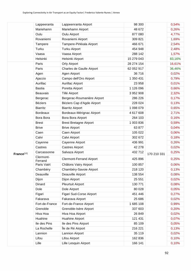
Exploring Connectivity in Air Transport as an Equity Factor| Frederico Valente Nunes | Annex
92
Lappeeranta Lappeenranta Airport 98 300 0,54%
Mariehamn Mariehamn Airport 48 672 0,26%
Oulu Oulu Airport 877 080 4,77%
Rovaniemi Rovaniemi Airport 309 821 1,69%
Tampere Tampere-Pirkkala Airport 466 671 2,54%
Turku Turku Airport 454 948 2,48%
Vaasa Vaasa Airport 288 142 1,57%
Helsinki Helsinki Airport 15 279 043 83,16%
France[10]
Paris Orly Airport 28 274 154
170 210 331
16,61%
Paris Charles de Gaulle Airport 62 052 917 36,46%
Agen Agen Airport 36 716 0,02%
Ajaccio Campo dell'Oro Airport 1 350 431 0,79%
Aurillac Aurillac Airport 23 958 0,01%
Bastia Poretta Airport 1 126 096 0,66%
Beauvais Tillé Airport 3 952 908 2,32%
Bergerac Bergerac-Roumanière Airport 286 226 0,17%
Béziers Béziers Cap d'Agde Airport 228 024 0,13%
Biarritz Biarritz Airport 1 098 079 0,65%
Bordeaux Bordeaux-Mérignac Airport 4 617 608 2,71%
Bora Bora Bora Bora Airport 264 103 0,16%
Brest Brest Bretagne Airport 1 003 836 0,59%
Brive Brive Airport 63 877 0,04%
Caen Caen Airport 105 022 0,06%
Calvi Calvi Airport 302 672 0,18%
Cayenne Cayenne Airport 436 991 0,26%
Castres Castres Airport 42 278 0,02%
Carcassonne Salvaza Airport 432 712 0,25%
Clermont-Ferrand
Clermont-Ferrand Airport 425 896 0,25%
Paris Vatrt Châlons Vatry Airport 100 857 0,06%
Chambéry Chambéry-Savoie Airport 218 120 0,13%
Deauville Deauville Airport 138 554 0,08%
Dijon Dijon Airport 25 551 0,02%
Dinard Pleurtuit Airport 130 771 0,08%
Dole Dole Airport 80 028 0,05%
Figari Figari Sud-Corse Airport 451 446 0,27%
Fakarava Fakarava Airport 25 686 0,02%
Fort-de-France Fort-de-France Airport 1 685 108 0,99%
Grenoble Grenoble-Isère Airport 337 603 0,20%
Hiva Hoa Hiva Hoa Airport 26 849 0,02%
Huahine Huahine Airport 121 431 0,07%
Ile des Pins Ile des Pins Airport 85 109 0,05%
La Rochelle Île de Ré Airport 216 221 0,13%
Lannion Lannion Airport 35 119 0,02%
Lifou Lifou Airport 162 836 0,10%
Lille Lille Lesquin Airport 166 141 0,10%
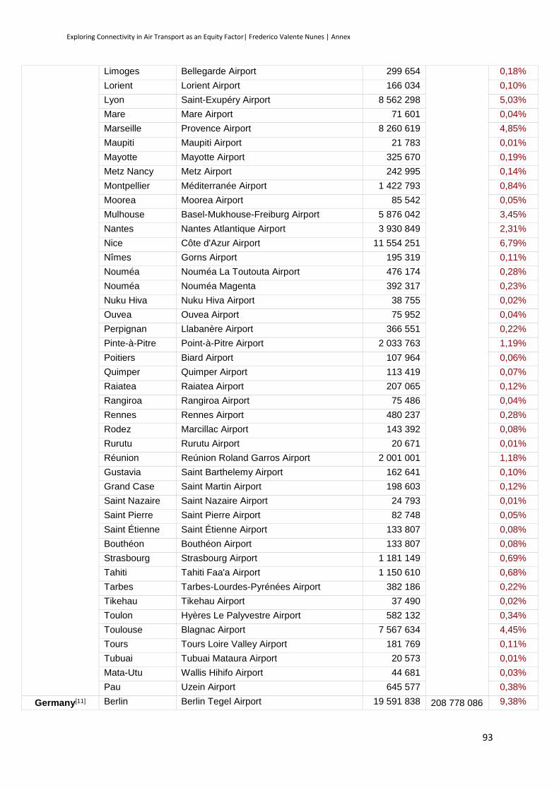
Exploring Connectivity in Air Transport as an Equity Factor| Frederico Valente Nunes | Annex
93
Limoges Bellegarde Airport 299 654 0,18%
Lorient Lorient Airport 166 034 0,10%
Lyon Saint-Exupéry Airport 8 562 298 5,03%
Mare Mare Airport 71 601 0,04%
Marseille Provence Airport 8 260 619 4,85%
Maupiti Maupiti Airport 21 783 0,01%
Mayotte Mayotte Airport 325 670 0,19%
Metz Nancy Metz Airport 242 995 0,14%
Montpellier Méditerranée Airport 1 422 793 0,84%
Moorea Moorea Airport 85 542 0,05%
Mulhouse Basel-Mukhouse-Freiburg Airport 5 876 042 3,45%
Nantes Nantes Atlantique Airport 3 930 849 2,31%
Nice Côte d'Azur Airport 11 554 251 6,79%
Nîmes Gorns Airport 195 319 0,11%
Nouméa Nouméa La Toutouta Airport 476 174 0,28%
Nouméa Nouméa Magenta 392 317 0,23%
Nuku Hiva Nuku Hiva Airport 38 755 0,02%
Ouvea Ouvea Airport 75 952 0,04%
Perpignan Llabanère Airport 366 551 0,22%
Pinte-à-Pitre Point-à-Pitre Airport 2 033 763 1,19%
Poitiers Biard Airport 107 964 0,06%
Quimper Quimper Airport 113 419 0,07%
Raiatea Raiatea Airport 207 065 0,12%
Rangiroa Rangiroa Airport 75 486 0,04%
Rennes Rennes Airport 480 237 0,28%
Rodez Marcillac Airport 143 392 0,08%
Rurutu Rurutu Airport 20 671 0,01%
Réunion Reúnion Roland Garros Airport 2 001 001 1,18%
Gustavia Saint Barthelemy Airport 162 641 0,10%
Grand Case Saint Martin Airport 198 603 0,12%
Saint Nazaire Saint Nazaire Airport 24 793 0,01%
Saint Pierre Saint Pierre Airport 82 748 0,05%
Saint Étienne Saint Étienne Airport 133 807 0,08%
Bouthéon Bouthéon Airport 133 807 0,08%
Strasbourg Strasbourg Airport 1 181 149 0,69%
Tahiti Tahiti Faa'a Airport 1 150 610 0,68%
Tarbes Tarbes-Lourdes-Pyrénées Airport 382 186 0,22%
Tikehau Tikehau Airport 37 490 0,02%
Toulon Hyères Le Palyvestre Airport 582 132 0,34%
Toulouse Blagnac Airport 7 567 634 4,45%
Tours Tours Loire Valley Airport 181 769 0,11%
Tubuai Tubuai Mataura Airport 20 573 0,01%
Mata-Utu Wallis Hihifo Airport 44 681 0,03%
Pau Uzein Airport 645 577 0,38%
Germany[11] Berlin Berlin Tegel Airport 19 591 838 208 778 086 9,38%

Exploring Connectivity in Air Transport as an Equity Factor| Frederico Valente Nunes | Annex
94
Belin Berlin Schonefeld Airport 6 727 306 3,22%
Baden Baden Airpark 1 059 227 0,51%
Freiburg Basel-Mukhouse-Freiburg Airport 5 876 042 2,81%
Bremen Bremen Airport 2 612 627 1,25%
Cologne Cologne/Bonn Airport 9 077 346 4,35%
Dresden Dresden Airport 1 754 139 0,84%
Dortmund Dortmund Airport 1 924 386 0,92%
Dusseldorf Dusseldorf Airport 21 228 226 10,17%
Erfurt Erfurt Airport 214 948 0,10%
Frankfurt Frankfurt Airport 58 036 948 27,80%
Hahn Frankfurt-Hahn Airport 2 667 402 1,28%
Friedrichshafen Friedrichshafen Airport 536 029 0,26%
Hamburg Hamburg Airport 13 502 553 6,47%
Hanover Langenhagen Airport 5 234 909 2,51%
Leipzig Leipzig/Halle Airport 2 234 231 1,07%
Munich Munich Airport 38 672 644 18,52%
Munster Munster Osnabruck Airport 853 904 0,41%
Nuremberg Nuremberg Airport 3 309 629 1,59%
Paderborn Paderborn Airport 794 889 0,38%
Rostock Rostock Airport 177 464 0,09%
Saarbrucken Saarbrucken Airport 405 265 0,19%
Stuttgart Stuttgart Airport 9 577 551 4,59%
Zweibrucken Zweibrucken Airport 220 740 0,11%
Weeze Weeze Airport 2 487 843 1,19%
Greece[12]
Athens Athens International Airport 12 459 801
38 604 975
32,28%
Araxos Araxos Airport 139 689 0,36%
Astypalaia Astypalaia Airport 11 940 0,03%
Alexandroupolis Alexandroupolis Airport 316 365 0,82%
Chania Chania International Airport 2 078 857 5,38%
Chios Chios International Airport 173 540 0,45%
Corfu Ioannis Kapodistrias Airport 2 106 827 5,46%
Cephalonia Cephalonia Airport 430 362 1,11%
Ikaria Ikaria Airport 36 162 0,09%
Heraklion Heraklion International Airport 5 778 764 14,97%
Kalamata Kalamata International Airport 136 992 0,35%
Karpathos Karpathos Island National Airport 168 190 0,44%
Kithira Kithira Airport 33 183 0,09%
Kalymnos Kalymnos Airport 20 677 0,05%
Kavala Kavala International Airport 209 400 0,54%
Kastellorizo Kastellorizo Airport 7 946 0,02%
Kozani Kozani Airport 3 504 0,01%
Kasos Kasos Airport 3 265 0,01%
Kastoria Kastoria Airport 5 115 0,01%
Kos Kos Island International Airport 2 028 618 5,25%
Milos Milos Airport 30 744 0,08%
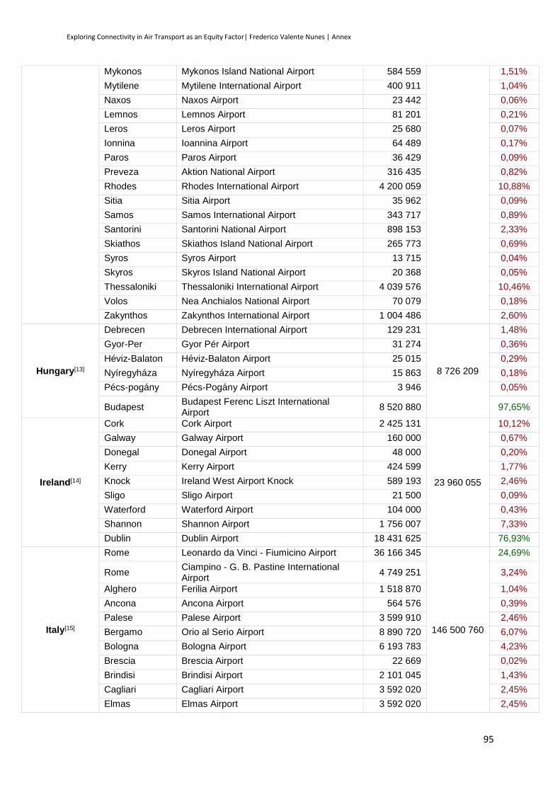
Exploring Connectivity in Air Transport as an Equity Factor| Frederico Valente Nunes | Annex
95
Mykonos Mykonos Island National Airport 584 559 1,51%
Mytilene Mytilene International Airport 400 911 1,04%
Naxos Naxos Airport 23 442 0,06%
Lemnos Lemnos Airport 81 201 0,21%
Leros Leros Airport 25 680 0,07%
Ionnina Ioannina Airport 64 489 0,17%
Paros Paros Airport 36 429 0,09%
Preveza Aktion National Airport 316 435 0,82%
Rhodes Rhodes International Airport 4 200 059 10,88%
Sitia Sitia Airport 35 962 0,09%
Samos Samos International Airport 343 717 0,89%
Santorini Santorini National Airport 898 153 2,33%
Skiathos Skiathos Island National Airport 265 773 0,69%
Syros Syros Airport 13 715 0,04%
Skyros Skyros Island National Airport 20 368 0,05%
Thessaloniki Thessaloniki International Airport 4 039 576 10,46%
Volos Nea Anchialos National Airport 70 079 0,18%
Zakynthos Zakynthos International Airport 1 004 486 2,60%
Hungary[13]
Debrecen Debrecen International Airport 129 231
8 726 209
1,48%
Gyor-Per Gyor Pér Airport 31 274 0,36%
Héviz-Balaton Héviz-Balaton Airport 25 015 0,29%
Nyíregyháza Nyíregyháza Airport 15 863 0,18%
Pécs-pogány Pécs-Pogány Airport 3 946 0,05%
Budapest Budapest Ferenc Liszt International Airport
8 520 880 97,65%
Ireland[14]
Cork Cork Airport 2 425 131
23 960 055
10,12%
Galway Galway Airport 160 000 0,67%
Donegal Donegal Airport 48 000 0,20%
Kerry Kerry Airport 424 599 1,77%
Knock Ireland West Airport Knock 589 193 2,46%
Sligo Sligo Airport 21 500 0,09%
Waterford Waterford Airport 104 000 0,43%
Shannon Shannon Airport 1 756 007 7,33%
Dublin Dublin Airport 18 431 625 76,93%
Italy[15]
Rome Leonardo da Vinci - Fiumicino Airport 36 166 345
146 500 760
24,69%
Rome Ciampino - G. B. Pastine International Airport
4 749 251 3,24%
Alghero Ferilia Airport 1 518 870 1,04%
Ancona Ancona Airport 564 576 0,39%
Palese Palese Airport 3 599 910 2,46%
Bergamo Orio al Serio Airport 8 890 720 6,07%
Bologna Bologna Airport 6 193 783 4,23%
Brescia Brescia Airport 22 669 0,02%
Brindisi Brindisi Airport 2 101 045 1,43%
Cagliari Cagliari Airport 3 592 020 2,45%
Elmas Elmas Airport 3 592 020 2,45%
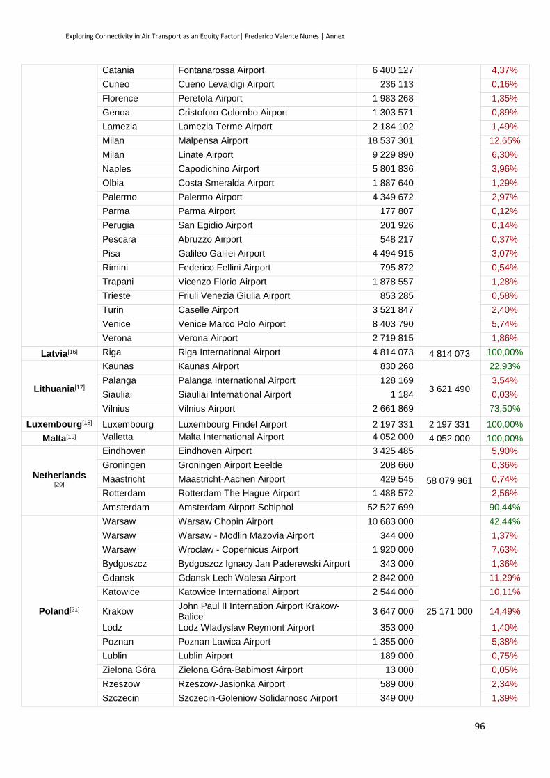
Exploring Connectivity in Air Transport as an Equity Factor| Frederico Valente Nunes | Annex
96
Catania Fontanarossa Airport 6 400 127 4,37%
Cuneo Cueno Levaldigi Airport 236 113 0,16%
Florence Peretola Airport 1 983 268 1,35%
Genoa Cristoforo Colombo Airport 1 303 571 0,89%
Lamezia Lamezia Terme Airport 2 184 102 1,49%
Milan Malpensa Airport 18 537 301 12,65%
Milan Linate Airport 9 229 890 6,30%
Naples Capodichino Airport 5 801 836 3,96%
Olbia Costa Smeralda Airport 1 887 640 1,29%
Palermo Palermo Airport 4 349 672 2,97%
Parma Parma Airport 177 807 0,12%
Perugia San Egidio Airport 201 926 0,14%
Pescara Abruzzo Airport 548 217 0,37%
Pisa Galileo Galilei Airport 4 494 915 3,07%
Rimini Federico Fellini Airport 795 872 0,54%
Trapani Vicenzo Florio Airport 1 878 557 1,28%
Trieste Friuli Venezia Giulia Airport 853 285 0,58%
Turin Caselle Airport 3 521 847 2,40%
Venice Venice Marco Polo Airport 8 403 790 5,74%
Verona Verona Airport 2 719 815 1,86%
Latvia[16] Riga Riga International Airport 4 814 073 4 814 073 100,00%
Lithuania[17]
Kaunas Kaunas Airport 830 268
3 621 490
22,93%
Palanga Palanga International Airport 128 169 3,54%
Siauliai Siauliai International Airport 1 184 0,03%
Vilnius Vilnius Airport 2 661 869 73,50%
Luxembourg[18] Luxembourg Luxembourg Findel Airport 2 197 331 2 197 331 100,00%
Malta[19] Valletta Malta International Airport 4 052 000 4 052 000 100,00%
Netherlands [20]
Eindhoven Eindhoven Airport 3 425 485
58 079 961
5,90%
Groningen Groningen Airport Eeelde 208 660 0,36%
Maastricht Maastricht-Aachen Airport 429 545 0,74%
Rotterdam Rotterdam The Hague Airport 1 488 572 2,56%
Amsterdam Amsterdam Airport Schiphol 52 527 699 90,44%
Poland[21]
Warsaw Warsaw Chopin Airport 10 683 000
25 171 000
42,44%
Warsaw Warsaw - Modlin Mazovia Airport 344 000 1,37%
Warsaw Wroclaw - Copernicus Airport 1 920 000 7,63%
Bydgoszcz Bydgoszcz Ignacy Jan Paderewski Airport 343 000 1,36%
Gdansk Gdansk Lech Walesa Airport 2 842 000 11,29%
Katowice Katowice International Airport 2 544 000 10,11%
Krakow John Paul II Internation Airport Krakow-Balice
3 647 000 14,49%
Lodz Lodz Wladyslaw Reymont Airport 353 000 1,40%
Poznan Poznan Lawica Airport 1 355 000 5,38%
Lublin Lublin Airport 189 000 0,75%
Zielona Góra Zielona Góra-Babimost Airport 13 000 0,05%
Rzeszow Rzeszow-Jasionka Airport 589 000 2,34%
Szczecin Szczecin-Goleniow Solidarnosc Airport 349 000 1,39%
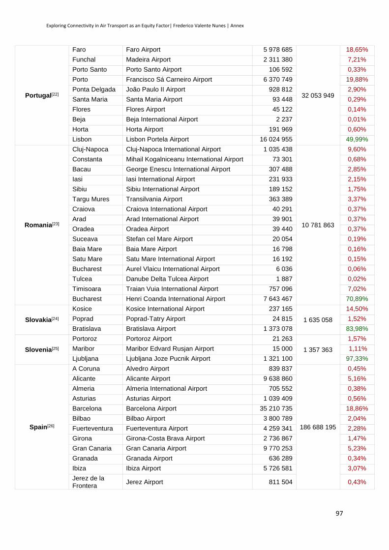
Exploring Connectivity in Air Transport as an Equity Factor| Frederico Valente Nunes | Annex
97
Portugal[22]
Faro Faro Airport 5 978 685
32 053 949
18,65%
Funchal Madeira Airport 2 311 380 7,21%
Porto Santo Porto Santo Airport 106 592 0,33%
Porto Francisco Sá Carneiro Airport 6 370 749 19,88%
Ponta Delgada João Paulo II Airport 928 812 2,90%
Santa Maria Santa Maria Airport 93 448 0,29%
Flores Flores Airport 45 122 0,14%
Beja Beja International Airport 2 237 0,01%
Horta Horta Airport 191 969 0,60%
Lisbon Lisbon Portela Airport 16 024 955 49,99%
Romania[23]
Cluj-Napoca Cluj-Napoca International Airport 1 035 438
10 781 863
9,60%
Constanta Mihail Kogalniceanu International Airport 73 301 0,68%
Bacau George Enescu International Airport 307 488 2,85%
Iasi Iasi International Airport 231 933 2,15%
Sibiu Sibiu International Airport 189 152 1,75%
Targu Mures Transilvania Airport 363 389 3,37%
Craiova Craiova International Airport 40 291 0,37%
Arad Arad International Airport 39 901 0,37%
Oradea Oradea Airport 39 440 0,37%
Suceava Stefan cel Mare Airport 20 054 0,19%
Baia Mare Baia Mare Airport 16 798 0,16%
Satu Mare Satu Mare International Airport 16 192 0,15%
Bucharest Aurel Vlaicu International Airport 6 036 0,06%
Tulcea Danube Delta Tulcea Airport 1 887 0,02%
Timisoara Traian Vuia International Airport 757 096 7,02%
Bucharest Henri Coanda International Airport 7 643 467 70,89%
Slovakia[24]
Kosice Kosice International Airport 237 165
1 635 058
14,50%
Poprad Poprad-Tatry Airport 24 815 1,52%
Bratislava Bratislava Airport 1 373 078 83,98%
Slovenia[25]
Portoroz Portoroz Airport 21 263
1 357 363
1,57%
Maribor Maribor Edvard Rusjan Airport 15 000 1,11%
Ljubljana Ljubljana Joze Pucnik Airport 1 321 100 97,33%
Spain[26]
A Coruna Alvedro Airport 839 837
186 688 195
0,45%
Alicante Alicante Airport 9 638 860 5,16%
Almeria Almeria International Airport 705 552 0,38%
Asturias Asturias Airport 1 039 409 0,56%
Barcelona Barcelona Airport 35 210 735 18,86%
Bilbao Bilbao Airport 3 800 789 2,04%
Fuerteventura Fuerteventura Airport 4 259 341 2,28%
Girona Girona-Costa Brava Airport 2 736 867 1,47%
Gran Canaria Gran Canaria Airport 9 770 253 5,23%
Granada Granada Airport 636 289 0,34%
Ibiza Ibiza Airport 5 726 581 3,07%
Jerez de la Frontera
Jerez Airport 811 504 0,43%
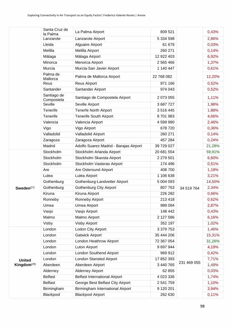
Exploring Connectivity in Air Transport as an Equity Factor| Frederico Valente Nunes | Annex
98
Santa Cruz de la Palma
La Palma Airport 809 521 0,43%
Lanzarote Lanzarote Airport 5 334 598 2,86%
Lleida Alguaire Airport 61 679 0,03%
Melilla Melilla Airport 260 271 0,14%
Málaga Málaga Airport 12 922 403 6,92%
Minorca Menorca Airport 2 565 466 1,37%
Murcia Murcia-San Javier Airport 1 140 447 0,61%
Palma de Mallorca
Palma de Mallorca Airport 22 768 082 12,20%
Reus Reus Airport 971 166 0,52%
Santander Santander Airport 974 043 0,52%
Santiago de Compostela
Santiago de Compostela Airport 2 073 055 1,11%
Seville Seville Airport 3 687 727 1,98%
Tenerife Tenerfe North Airport 3 516 445 1,88%
Tenerife Tenerife South Airport 8 701 983 4,66%
Valencia Valencia Airport 4 599 990 2,46%
Vigo Vigo Airport 678 720 0,36%
Valladolid Valladolid Airport 260 271 0,14%
Zaragoza Zaragoza Airport 457 284 0,24%
Madrid Adolfo Suarez Madrid - Barajas Airport 39 729 027 21,28%
Sweden[27]
Stockholm Stockholm Arlanda Airport 20 681 554
34 519 764
59,91%
Stockholm Stockholm Skavsta Airport 2 279 501 6,60%
Stockholm Stockholm Vasteras Airport 174 496 0,51%
Are Are Ostersund Airport 408 700 1,18%
Lulea Lulea Airport 1 106 638 3,21%
Gothenburg Gothenburg-Landvetter Airport 5 004 093 14,50%
Gothenburg Gothenburg City Airport 807 763 2,34%
Kiruna Kiruna Airport 226 282 0,66%
Ronneby Ronneby Airport 213 418 0,62%
Umea Umea Airport 989 094 2,87%
Vaxjo Vaxjo Airport 148 442 0,43%
Malmo Malmo Airport 2 127 586 6,16%
Visby Visby Airport 352 197 1,02%
United Kingdom[28]
London Lodon City Airport 3 379 753
231 469 055
1,46%
London Gatwick Airport 35 444 206 15,31%
London London Heathrow Airport 72 367 054 31,26%
London Luton Airport 9 697 944 4,19%
London London Southend Airport 969 912 0,42%
London London Stansted Airport 17 852 393 7,71%
Aberdeen Aberdeen Airport 3 440 765 1,49%
Alderney Alderney Airport 62 855 0,03%
Belfast Belfast International Airport 4 023 336 1,74%
Belfast George Best Belfast City Airport 2 541 759 1,10%
Birmingham Birmingham International Airport 9 120 201 3,94%
Blackpool Blackpool Airport 262 630 0,11%
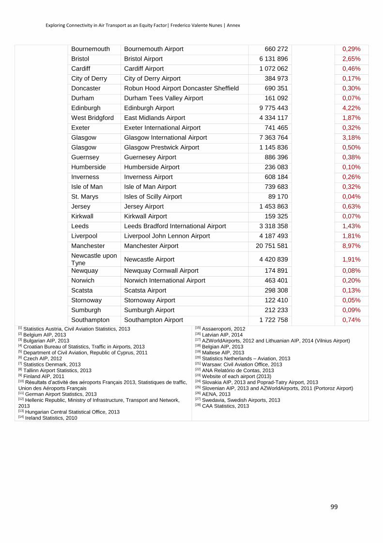
Exploring Connectivity in Air Transport as an Equity Factor| Frederico Valente Nunes | Annex
99
Bournemouth Bournemouth Airport 660 272 0,29%
Bristol Bristol Airport 6 131 896 2,65%
Cardiff Cardiff Airport 1 072 062 0,46%
City of Derry City of Derry Airport 384 973 0,17%
Doncaster Robun Hood Airport Doncaster Sheffield 690 351 0,30%
Durham Durham Tees Valley Airport 161 092 0,07%
Edinburgh Edinburgh Airport 9 775 443 4,22%
West Bridgford East Midlands Airport 4 334 117 1,87%
Exeter Exeter International Airport 741 465 0,32%
Glasgow Glasgow International Airport 7 363 764 3,18%
Glasgow Glasgow Prestwick Airport 1 145 836 0,50%
Guernsey Guernesey Airport 886 396 0,38%
Humberside Humberside Airport 236 083 0,10%
Inverness Inverness Airport 608 184 0,26%
Isle of Man Isle of Man Airport 739 683 0,32%
St. Marys Isles of Scilly Airport 89 170 0,04%
Jersey Jersey Airport 1 453 863 0,63%
Kirkwall Kirkwall Airport 159 325 0,07%
Leeds Leeds Bradford International Airport 3 318 358 1,43%
Liverpool Liverpool John Lennon Airport 4 187 493 1,81%
Manchester Manchester Airport 20 751 581 8,97%
Newcastle upon Tyne
Newcastle Airport 4 420 839 1,91%
Newquay Newquay Cornwall Airport 174 891 0,08%
Norwich Norwich International Airport 463 401 0,20%
Scatsta Scatsta Airport 298 308 0,13%
Stornoway Stornoway Airport 122 410 0,05%
Sumburgh Sumburgh Airport 212 233 0,09%
Southampton Southampton Airport 1 722 758 0,74% [1] Statistics Austria, Civil Aviation Statistics, 2013 [2] Belgium AIP, 2013 [3] Bulgarian AIP, 2013 [4] Croatian Bureau of Statistics, Traffic in Airports, 2013 [5] Department of Civil Aviation, Republic of Cyprus, 2011 [6] Czech AIP, 2012 [7] Statistics Denmark, 2013 [8] Tallinn Airport Statistics, 2013 [9] Finland AIP, 2011 [10] Résultats d’activité des aéroports Français 2013, Statistiques de traffic, Union des Aéroports Français [11] German Airport Statistics, 2013 [12] Hellenic Republic, Ministry of Infrastructure, Transport and Network, 2013 [13] Hungarian Central Statistical Office, 2013 [14] Ireland Statistics, 2010
[15] Assaeroporti, 2012 [16] Latvian AIP, 2014 [17] AZWorldAirports, 2012 and Lithuanian AIP, 2014 (Vilnius Airport) [18] Belgian AIP, 2013 [19] Maltese AIP, 2013 [20] Statistics Netherlands – Aviation, 2013 [21] Warsaw: Civil Aviation Office, 2013 [22] ANA Relatório de Contas, 2013 [23] Website of each airport (2013) [24] Slovakia AIP, 2013 and Poprad-Tatry Airport, 2013 [25] Slovenian AIP, 2013 and AZWorldAirports, 2011 (Portoroz Airport) [26] AENA, 2013 [27] Swedavia, Swedish Airports, 2013 [28] CAA Statistics, 2013

Exploring Connectivity in Air Transport as an Equity Factor| Frederico Valente Nunes | Annex
100

Exploring Connectivity in Air Transport as an Equity Factor| Frederico Valente Nunes | Annex
101
Annex 3 – Airport Destinations in the EU
AT
BE
BG
HR
CY
CZ
DK
EE
FI
FR
DE
EL
HU
IE
IT
LV
LT
AT Vienna International Airport 1 1 1 1 1 0 0 1 1 1 1 1 1 1 1 1
BE Brussels and Charleroi Airports 1 1 1 0 1 1 1 1 1 1 1 1 1 1 1 1
BG Sofia Airport and Burgas Airport 1 1 0 1 1 1 0 1 1 1 1 1 1 1 1 0
HR Dubrovnik, Split and Zagreb Airports 1 1 0 0 1 1 0 1 1 1 1 1 1 1 0 0
CY Larnaca and Paphos International Airports 1 1 1 0 0 0 0 0 1 1 1 1 0 1 1 1
CZ Václav Havel Airport Prague 1 1 1 1 1 1 1 1 1 1 1 1 1 1 1 1
DK Copenhagen Airport 1 1 0 1 0 1 1 1 1 1 1 1 1 1 1 1
EE Tallinn Airport 0 1 0 0 0 0 1 1 1 1 0 0 0 1 1 1
FI Helsinki Airport 1 1 0 0 0 1 1 1 1 1 0 1 0 1 1 1
FR Charles de Gaulle Airport 1 1 1 1 1 1 1 1 1 1 1 1 1 1 1 1
DE Frankfurt Airport 1 1 1 1 1 1 1 1 1 1 1 1 1 1 1 1
EL Athens International Airport 1 1 1 0 1 1 1 0 0 1 1 1 0 1 0 0
HU Budapest Ferenc Liszt International Airport 1 1 0 1 1 1 1 0 1 1 1 1 1 1 1 0
IE Dublin Airport 1 1 1 1 1 1 1 1 1 1 1 1 1 1 1 1
IT Leonardo da Vinci - Fiumicino Airport 1 1 1 1 1 1 1 1 1 1 1 1 1 1 1 1
LV Riga International Airport 1 1 0 0 0 1 1 1 1 1 1 0 1 1 1 1
LT Kaunas and Vilnius Airports 1 1 0 0 1 1 1 1 1 1 1 1 0 1 1 1
LU Luxembourg Findel Airport 1 0 1 1 0 1 0 0 1 1 1 1 1 1 1 0 0
MT Malta International Airport 1 1 1 1 1 1 1 0 1 1 1 1 1 1 1 1 0
NL Amsterdam Airport Schiphol 1 1 1 1 1 1 1 1 1 1 1 1 1 1 1 1 1
PL Warsaw Chopin Airport 1 1 1 1 0 1 1 1 1 1 1 1 1 1 1 1 1
PT Lisbon Portela Airport 1 1 0 1 0 1 1 1 1 1 1 0 1 1 1 0 0
RO Henri Coanda International Airport 1 1 1 0 1 1 1 0 0 1 1 1 1 1 1 1 0
SK Bratislava Airport 1 1 1 0 0 1 0 0 0 1 0 1 0 1 1 0 0
SI Ljubljana Joze Pucnik Airport 1 1 0 0 0 1 1 0 0 1 1 0 0 0 0 0 0
ES Adolfo Suarez Madrid - Barajas Airport 1 1 1 0 0 1 1 0 1 1 1 1 1 1 1 0 0
SE Stockholm Arlanda Airport 1 1 0 1 1 1 1 1 1 1 1 1 1 1 1 1 1
UK London Heathrow Airport 1 1 1 1 1 1 1 0 1 1 1 1 1 1 1 0 0
Percentage of connections to each country main airport 9
6,3
0
96
,30
62
,96
59
,26
55
,56
92
,59
85
,19
51
,85
81
,48
10
0,0
0
96
,30
81
,48
85
,19
81
,48
96
,30
70
,37
55
,56
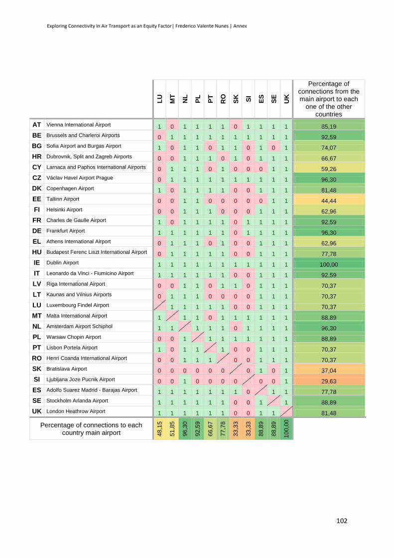
Exploring Connectivity in Air Transport as an Equity Factor| Frederico Valente Nunes | Annex
102
LU
MT
NL
PL
PT
RO
SK
SI
ES
SE
UK
Percentage of connections from the main airport to each
one of the other countries
AT Vienna International Airport 1 0 1 1 1 1 0 1 1 1 1 85,19
BE Brussels and Charleroi Airports 0 1 1 1 1 1 1 1 1 1 1 92,59
BG Sofia Airport and Burgas Airport 1 0 1 1 0 1 1 0 1 0 1 74,07
HR Dubrovnik, Split and Zagreb Airports 0 0 1 1 1 0 1 0 1 1 1 66,67
CY Larnaca and Paphos International Airports 0 1 1 1 0 1 0 0 0 1 1 59,26
CZ Václav Havel Airport Prague 0 1 1 1 1 1 1 1 1 1 1 96,30
DK Copenhagen Airport 1 0 1 1 1 1 0 0 1 1 1 81,48
EE Tallinn Airport 0 0 1 1 0 0 0 0 0 1 1 44,44
FI Helsinki Airport 0 0 1 1 1 0 0 0 1 1 1 62,96
FR Charles de Gaulle Airport 1 0 1 1 1 1 0 1 1 1 1 92,59
DE Frankfurt Airport 1 1 1 1 1 1 0 1 1 1 1 96,30
EL Athens International Airport 0 1 1 1 0 1 0 0 1 1 1 62,96
HU Budapest Ferenc Liszt International Airport 0 1 1 1 1 1 0 0 1 1 1 77,78
IE Dublin Airport 1 1 1 1 1 1 1 1 1 1 1 100,00
IT Leonardo da Vinci - Fiumicino Airport 1 1 1 1 1 1 0 0 1 1 1 92,59
LV Riga International Airport 0 0 1 1 0 1 1 0 1 1 1 70,37
LT Kaunas and Vilnius Airports 0 1 1 1 0 0 0 0 1 1 1 70,37
LU Luxembourg Findel Airport 1 1 1 1 1 0 0 1 1 1 70,37
MT Malta International Airport 1 1 1 0 1 1 1 1 1 1 88,89
NL Amsterdam Airport Schiphol 1 1 1 1 1 0 1 1 1 1 96,30
PL Warsaw Chopin Airport 0 0 1 1 1 1 1 1 1 1 88,89
PT Lisbon Portela Airport 1 0 1 1 1 0 0 1 1 1 70,37
RO Henri Coanda International Airport 0 0 1 1 1 0 0 1 1 1 70,37
SK Bratislava Airport 0 0 0 0 0 0 0 1 0 1 37,04
SI Ljubljana Joze Pucnik Airport 0 0 1 0 0 0 0 0 0 1 29,63
ES Adolfo Suarez Madrid - Barajas Airport 1 1 1 1 1 1 1 0 1 1 77,78
SE Stockholm Arlanda Airport 1 1 1 1 1 1 0 0 1 1 88,89
UK London Heathrow Airport 1 1 1 1 1 1 0 0 1 1 81,48
Percentage of connections to each country main airport 4
8,1
5
51
,85
96
,30
92
,59
66
,67
77
,78
33
,33
33
,33
88
,89
88
,89
10
0,0
0
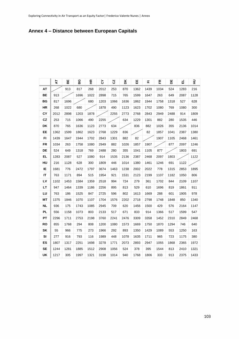
Exploring Connectivity in Air Transport as an Equity Factor| Frederico Valente Nunes | Annex
103
Annex 4 – Distance between European Capitals
AT
BE
BG
HR
CY
CZ
DK
EE
FI
FR
DE
EL
HU
AT 913 817 268 2012 253 870 1362 1439 1034 524 1283 216
BE 913 1696 1022 2898 715 765 1599 1647 263 649 2087 1128
BG 817 1696 680 1203 1066 1636 1862 1944 1758 1318 527 628
HR 268 1022 680 1878 490 1123 1623 1702 1080 769 1080 300
CY 2012 2898 1203 1878 2255 2773 2768 2843 2949 2488 914 1809
CZ 253 715 1066 490 2255 634 1229 1301 882 280 1535 446
DK 870 765 1636 1123 2773 634 836 882 1026 355 2136 1014
EE 1362 1599 1862 1623 2768 1229 836 82 1857 1041 2387 1380
FI 1439 1647 1944 1702 2843 1301 882 82 1907 1105 2468 1461
FR 1034 263 1758 1080 2949 882 1026 1857 1907 877 2097 1246
DE 524 649 1318 769 2488 280 355 1041 1105 877 1803 691
EL 1283 2087 527 1080 914 1535 2136 2387 2468 2097 1803 1122
HU 216 1128 628 300 1809 446 1014 1380 1461 1246 691 1122
IE 1681 776 2472 1797 3674 1463 1238 2002 2022 778 1315 2853 1895
IT 763 1171 894 515 1954 921 1531 2123 2199 1107 1182 1050 806
LV 1102 1453 1584 1359 2518 994 724 279 361 1702 844 2109 1107
LT 947 1464 1339 1186 2256 895 813 529 610 1696 819 1861 911
LU 763 186 1525 847 2725 596 802 1613 1669 288 601 1905 978
MT 1375 1846 1070 1107 1704 1576 2202 2718 2798 1748 1848 850 1340
NL 936 175 1743 1085 2945 709 620 1456 1500 429 576 2164 1147
PL 556 1158 1073 803 2133 517 671 833 914 1366 517 1599 547
PT 2296 1711 2753 2198 3760 2241 2476 3309 3358 1452 2310 2849 2468
RO 855 1768 294 808 1200 1080 1573 1669 1750 1870 1294 746 640
SK 55 966 775 273 1966 292 893 1350 1429 1089 553 1250 163
SI 277 916 793 116 1989 448 1078 1635 1711 965 723 1175 380
ES 1807 1317 2251 1698 3278 1771 2073 2893 2947 1055 1868 2365 1972
SE 1244 1281 1885 1512 2908 1056 524 378 395 1544 813 2410 1321
UK 1217 305 1997 1321 3198 1014 940 1768 1806 333 913 2375 1433

Exploring Connectivity in Air Transport as an Equity Factor| Frederico Valente Nunes | Annex
104
IE
IT
LV
LT
LU
MT
NL
PL
PT
RO
SK
SI
ES
SE
UK
AT 1681 763 1102 947 763 1375 936 556 2296 855 55 277 1807 1244 1217
BE 776 1171 1453 1464 186 1846 175 1158 1711 1768 966 916 1317 1281 305
BG 2472 894 1584 1339 1525 1070 1743 1073 2753 294 775 793 2251 1885 1997
HR 1797 515 1359 1186 847 1107 1085 803 2198 808 273 116 1698 1512 1321
CY 3674 1954 2518 2256 2725 1704 2945 2133 3760 1200 1966 1989 3278 2908 3198
CZ 1463 921 994 895 596 1576 709 517 2241 1080 292 448 1771 1056 1014
DK 1238 1531 724 813 802 2202 620 671 2476 1573 893 1078 2073 524 940
EE 2002 2123 279 529 1613 2718 1456 833 3309 1669 1350 1635 2893 378 1768
FI 2022 2199 361 610 1669 2798 1500 914 3358 1750 1429 1711 2947 395 1806
FR 778 1107 1702 1696 288 1748 429 1366 1452 1870 1089 965 1055 1544 333
DE 1315 1182 844 819 601 1848 576 517 2310 1294 553 723 1868 813 913
EL 2853 1050 2109 1861 1905 850 2164 1599 2849 746 1250 1175 2365 2410 2375
HU 1895 806 1107 911 978 1340 1147 547 2468 640 163 380 1972 1321 1433
IE 1885 1952 2047 952 2521 755 1825 1640 2536 1732 1690 1454 1628 478
IT 1885 1865 1700 987 689 1296 1314 1862 1136 781 488 1361 1977 1420
LV 1952 1865 262 1440 2446 1330 561 3149 1398 1087 1378 2712 443 1660
LT 2047 1700 262 1417 2245 1366 393 3118 1140 921 1223 2660 677 1705
LU 952 987 1440 1417 1666 320 1080 1710 1612 817 738 1279 1325 474
MT 2521 689 2446 2245 1666 1980 1886 2106 1365 1376 1128 1660 2619 2075
NL 755 1296 1330 1366 320 1980 1093 1862 1787 985 989 1483 1126 340
PL 1825 1314 561 393 1080 1886 1093 2757 944 533 833 2288 812 1430
PT 1640 1862 3149 3118 1710 2106 1862 2757 2973 2346 2094 504 2988 1593
RO 2536 1136 1398 1140 1612 1365 1787 944 2973 803 924 2469 1744 2072
SK 1732 781 1087 921 817 1376 985 533 2346 803 303 1855 1248 1270
SI 1690 488 1378 1223 738 1128 989 833 2094 924 303 1596 1497 1212
ES 1454 1361 2712 2660 1279 1660 1483 2288 504 2469 1855 1596 2595 1270
SE 1628 1977 443 677 1325 2619 1126 812 2988 1744 1248 1497 2595 1420
UK 478 1420 1660 1705 474 2075 340 1430 1593 2072 1270 1212 1270 1420
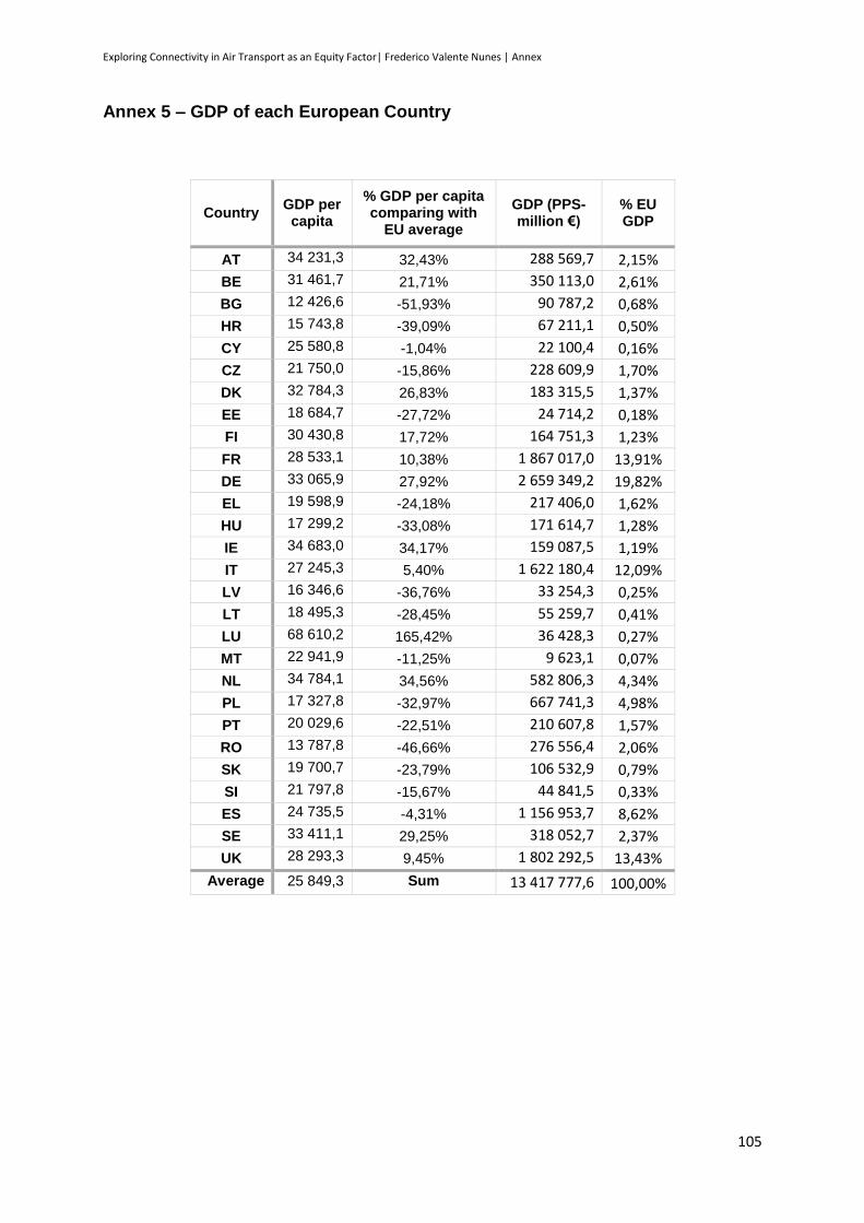
Exploring Connectivity in Air Transport as an Equity Factor| Frederico Valente Nunes | Annex
105
Annex 5 – GDP of each European Country
Country GDP per capita
% GDP per capita comparing with
EU average
GDP (PPS-million €)
% EU GDP
AT 34 231,3 32,43% 288 569,7 2,15%
BE 31 461,7 21,71% 350 113,0 2,61%
BG 12 426,6 -51,93% 90 787,2 0,68%
HR 15 743,8 -39,09% 67 211,1 0,50%
CY 25 580,8 -1,04% 22 100,4 0,16%
CZ 21 750,0 -15,86% 228 609,9 1,70%
DK 32 784,3 26,83% 183 315,5 1,37%
EE 18 684,7 -27,72% 24 714,2 0,18%
FI 30 430,8 17,72% 164 751,3 1,23%
FR 28 533,1 10,38% 1 867 017,0 13,91%
DE 33 065,9 27,92% 2 659 349,2 19,82%
EL 19 598,9 -24,18% 217 406,0 1,62%
HU 17 299,2 -33,08% 171 614,7 1,28%
IE 34 683,0 34,17% 159 087,5 1,19%
IT 27 245,3 5,40% 1 622 180,4 12,09%
LV 16 346,6 -36,76% 33 254,3 0,25%
LT 18 495,3 -28,45% 55 259,7 0,41%
LU 68 610,2 165,42% 36 428,3 0,27%
MT 22 941,9 -11,25% 9 623,1 0,07%
NL 34 784,1 34,56% 582 806,3 4,34%
PL 17 327,8 -32,97% 667 741,3 4,98%
PT 20 029,6 -22,51% 210 607,8 1,57%
RO 13 787,8 -46,66% 276 556,4 2,06%
SK 19 700,7 -23,79% 106 532,9 0,79%
SI 21 797,8 -15,67% 44 841,5 0,33%
ES 24 735,5 -4,31% 1 156 953,7 8,62%
SE 33 411,1 29,25% 318 052,7 2,37%
UK 28 293,3 9,45% 1 802 292,5 13,43%
Average 25 849,3 Sum 13 417 777,6 100,00%

Exploring Connectivity in Air Transport as an Equity Factor| Frederico Valente Nunes | Annex
106
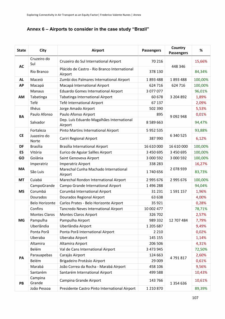
Exploring Connectivity in Air Transport as an Equity Factor| Frederico Valente Nunes | Annex
107
Annex 6 – Airports to consider in the case study “Brazil”
State City Airport Passengers Country
Passengers %
AC
Cruzeiro do Sul
Cruzeiro do Sul International Airport 70 216 448 346
15,66%
Rio Branco Plácido de Castro - Rio Branco International Airport
378 130 84,34%
AL Maceió Zumbi dos Palmares International Airport 1 893 488 1 893 488 100,00%
AP Macapá Macapá International Airport 624 716 624 716 100,00%
AM
Manaus Eduardo Gomes International Airport 3 077 077
3 204 892
96,01%
Tabatinga Tabatinga International Airport 60 678 1,89%
Tefé Tefé International Airport 67 137 2,09%
BA
Ilhéus Jorge Amado Airport 502 390
9 092 948
5,53%
Paulo Afonso Paulo Afonso Airport 895 0,01%
Salvador Dep. Luís Eduardo Magalhães International Airport
8 589 663 94,47%
CE Fortaleza Pinto Martins International Airport 5 952 535
6 340 525 93,88%
Juazeiro do Norte
Cariri Regional Airport 387 990 6,12%
DF Brasília Brasília International Airport 16 610 000 16 610 000 100,00%
ES Vitória Eurico de Aguiar Sallles Airport 3 450 695 3 450 695 100,00%
GO Goiânia Saint Genoveva Airport 3 000 592 3 000 592 100,00%
MA Imperatriz Imperatriz Airport 338 283
2 078 939 16,27%
São Luis Marechal Cunha Machado International Airport
1 740 656 83,73%
MT Cuiabá Marechal Rondon International Airport 2 995 676 2 995 676 100,00%
MS
CampoGrande Campo Grande International Airport 1 496 288
1 591 157
94,04%
Corumbá Corumbá International Airport 31 231 1,96%
Dourados Dourados Regional Airport 63 638 4,00%
MG
Belo Horizonte Carlos Prates - Belo Horizonte Airport 35 921
12 707 484
0,28%
Confins Tancredo Neves International Airport 10 002 477 78,71%
Montes Claros Montes Claros Airport 326 702 2,57%
Pampulha Pampulha Airport 989 332 7,79%
Uberlândia Uberlândia Airport 1 205 687 9,49%
Ponta Porã Ponta Porã International Airport 2 210 0,02%
Uberaba Uberaba Airport 145 155 1,14%
PA
Altamira Altamira Airport 206 506
4 791 817
4,31%
Belém Val de Cans International Airport 3 473 945 72,50%
Parauapebas Carajás Airport 124 663 2,60%
Belém Brigadeiro Protásio Airport 29 009 0,61%
Marabá João Correa da Rocha - Marabá Airport 458 106 9,56%
Santarém Santarém International Airport 499 588 10,43%
PB
Campina Grande
Campina Grande Airport 143 766 1 354 636
10,61%
João Pessoa Presidente Castro Pinto International Airport 1 210 870 89,39%
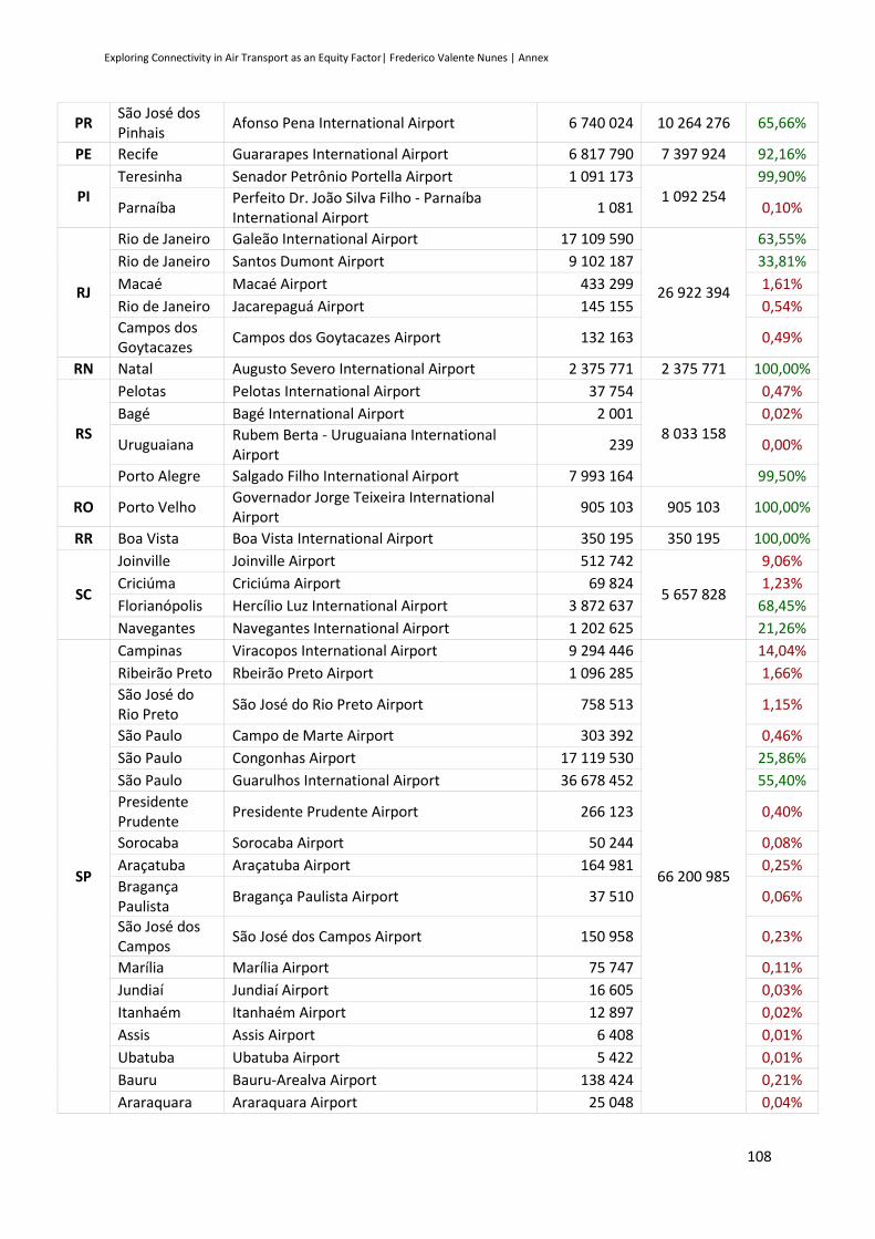
Exploring Connectivity in Air Transport as an Equity Factor| Frederico Valente Nunes | Annex
108
PR São José dos Pinhais
Afonso Pena International Airport 6 740 024 10 264 276 65,66%
PE Recife Guararapes International Airport 6 817 790 7 397 924 92,16%
PI Teresinha Senador Petrônio Portella Airport 1 091 173
1 092 254 99,90%
Parnaíba Perfeito Dr. João Silva Filho - Parnaíba International Airport
1 081 0,10%
RJ
Rio de Janeiro Galeão International Airport 17 109 590
26 922 394
63,55%
Rio de Janeiro Santos Dumont Airport 9 102 187 33,81%
Macaé Macaé Airport 433 299 1,61%
Rio de Janeiro Jacarepaguá Airport 145 155 0,54%
Campos dos Goytacazes
Campos dos Goytacazes Airport 132 163 0,49%
RN Natal Augusto Severo International Airport 2 375 771 2 375 771 100,00%
RS
Pelotas Pelotas International Airport 37 754
8 033 158
0,47%
Bagé Bagé International Airport 2 001 0,02%
Uruguaiana Rubem Berta - Uruguaiana International Airport
239 0,00%
Porto Alegre Salgado Filho International Airport 7 993 164 99,50%
RO Porto Velho Governador Jorge Teixeira International Airport
905 103 905 103 100,00%
RR Boa Vista Boa Vista International Airport 350 195 350 195 100,00%
SC
Joinville Joinville Airport 512 742
5 657 828
9,06%
Criciúma Criciúma Airport 69 824 1,23%
Florianópolis Hercílio Luz International Airport 3 872 637 68,45%
Navegantes Navegantes International Airport 1 202 625 21,26%
SP
Campinas Viracopos International Airport 9 294 446
66 200 985
14,04%
Ribeirão Preto Rbeirão Preto Airport 1 096 285 1,66%
São José do Rio Preto
São José do Rio Preto Airport 758 513 1,15%
São Paulo Campo de Marte Airport 303 392 0,46%
São Paulo Congonhas Airport 17 119 530 25,86%
São Paulo Guarulhos International Airport 36 678 452 55,40%
Presidente Prudente
Presidente Prudente Airport 266 123 0,40%
Sorocaba Sorocaba Airport 50 244 0,08%
Araçatuba Araçatuba Airport 164 981 0,25%
Bragança Paulista
Bragança Paulista Airport 37 510 0,06%
São José dos Campos
São José dos Campos Airport 150 958 0,23%
Marília Marília Airport 75 747 0,11%
Jundiaí Jundiaí Airport 16 605 0,03%
Itanhaém Itanhaém Airport 12 897 0,02%
Assis Assis Airport 6 408 0,01%
Ubatuba Ubatuba Airport 5 422 0,01%
Bauru Bauru-Arealva Airport 138 424 0,21%
Araraquara Araraquara Airport 25 048 0,04%

Exploring Connectivity in Air Transport as an Equity Factor| Frederico Valente Nunes | Annex
109
SE Aracaju Santa Maria International Airport 1 343 899 1 343 899 100,00%
TO Palmas Palmas Airport 778 245 778 245 100,00%

Exploring Connectivity in Air Transport as an Equity Factor| Frederico Valente Nunes | Annex
110
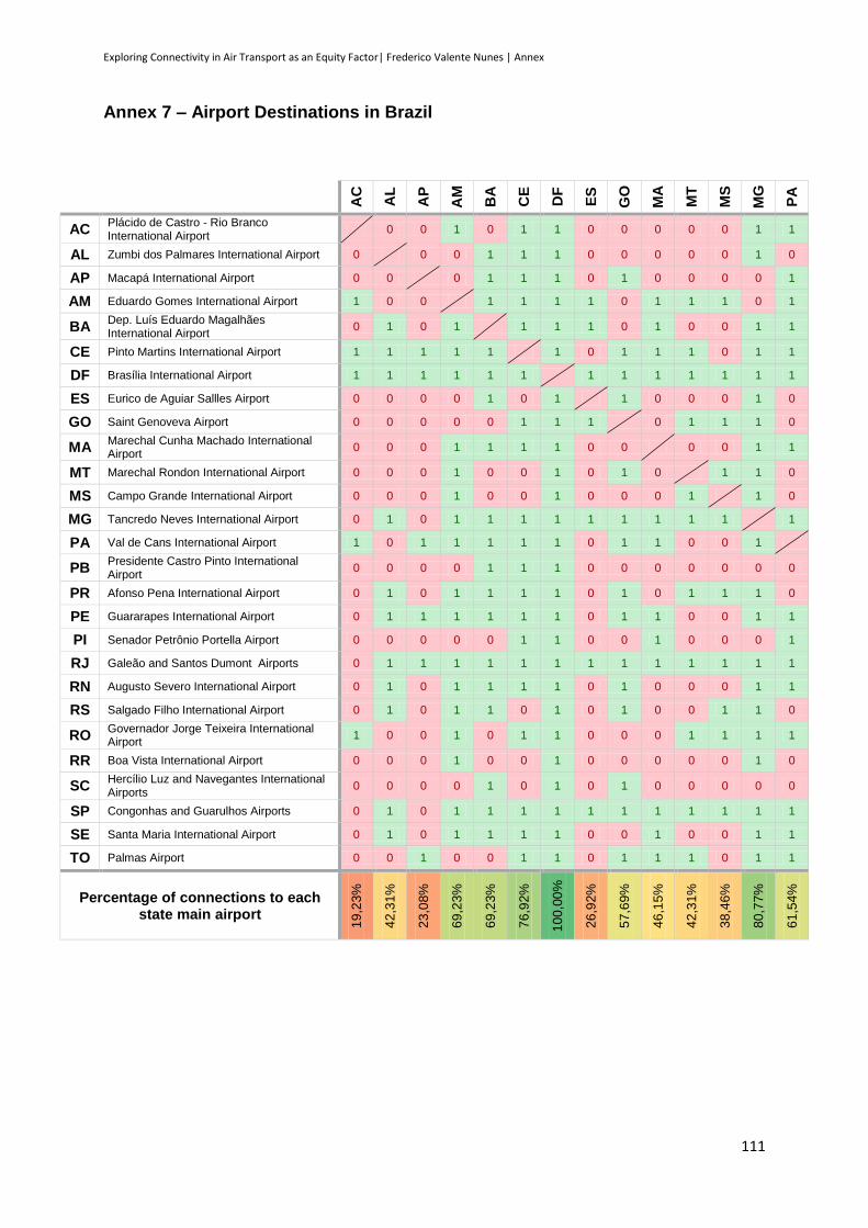
Exploring Connectivity in Air Transport as an Equity Factor| Frederico Valente Nunes | Annex
111
Annex 7 – Airport Destinations in Brazil
AC
AL
AP
AM
BA
CE
DF
ES
GO
MA
MT
MS
MG
PA
AC Plácido de Castro - Rio Branco International Airport
0 0 1 0 1 1 0 0 0 0 0 1 1
AL Zumbi dos Palmares International Airport 0 0 0 1 1 1 0 0 0 0 0 1 0
AP Macapá International Airport 0 0 0 1 1 1 0 1 0 0 0 0 1
AM Eduardo Gomes International Airport 1 0 0 1 1 1 1 0 1 1 1 0 1
BA Dep. Luís Eduardo Magalhães International Airport
0 1 0 1 1 1 1 0 1 0 0 1 1
CE Pinto Martins International Airport 1 1 1 1 1 1 0 1 1 1 0 1 1
DF Brasília International Airport 1 1 1 1 1 1 1 1 1 1 1 1 1
ES Eurico de Aguiar Sallles Airport 0 0 0 0 1 0 1 1 0 0 0 1 0
GO Saint Genoveva Airport 0 0 0 0 0 1 1 1 0 1 1 1 0
MA Marechal Cunha Machado International Airport
0 0 0 1 1 1 1 0 0 0 0 1 1
MT Marechal Rondon International Airport 0 0 0 1 0 0 1 0 1 0 1 1 0
MS Campo Grande International Airport 0 0 0 1 0 0 1 0 0 0 1 1 0
MG Tancredo Neves International Airport 0 1 0 1 1 1 1 1 1 1 1 1 1
PA Val de Cans International Airport 1 0 1 1 1 1 1 0 1 1 0 0 1
PB Presidente Castro Pinto International Airport
0 0 0 0 1 1 1 0 0 0 0 0 0 0
PR Afonso Pena International Airport 0 1 0 1 1 1 1 0 1 0 1 1 1 0
PE Guararapes International Airport 0 1 1 1 1 1 1 0 1 1 0 0 1 1
PI Senador Petrônio Portella Airport 0 0 0 0 0 1 1 0 0 1 0 0 0 1
RJ Galeão and Santos Dumont Airports 0 1 1 1 1 1 1 1 1 1 1 1 1 1
RN Augusto Severo International Airport 0 1 0 1 1 1 1 0 1 0 0 0 1 1
RS Salgado Filho International Airport 0 1 0 1 1 0 1 0 1 0 0 1 1 0
RO Governador Jorge Teixeira International Airport
1 0 0 1 0 1 1 0 0 0 1 1 1 1
RR Boa Vista International Airport 0 0 0 1 0 0 1 0 0 0 0 0 1 0
SC Hercílio Luz and Navegantes International Airports
0 0 0 0 1 0 1 0 1 0 0 0 0 0
SP Congonhas and Guarulhos Airports 0 1 0 1 1 1 1 1 1 1 1 1 1 1
SE Santa Maria International Airport 0 1 0 1 1 1 1 0 0 1 0 0 1 1
TO Palmas Airport 0 0 1 0 0 1 1 0 1 1 1 0 1 1
Percentage of connections to each state main airport
19
,23%
42
,31%
23
,08%
69
,23%
69
,23%
76
,92%
10
0,0
0%
26
,92%
57
,69%
46
,15%
42
,31%
38
,46%
80
,77%
61
,54%
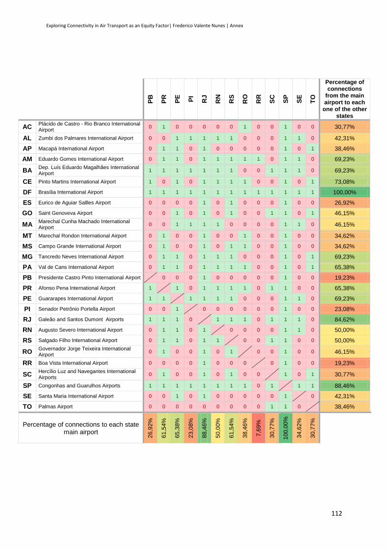
Exploring Connectivity in Air Transport as an Equity Factor| Frederico Valente Nunes | Annex
112
PB
PR
PE
PI
RJ
RN
RS
RO
RR
SC
SP
SE
TO
Percentage of connections
from the main airport to each
one of the other states
AC Plácido de Castro - Rio Branco International Airport
0 1 0 0 0 0 0 1 0 0 1 0 0 30,77%
AL Zumbi dos Palmares International Airport 0 0 1 1 1 1 1 0 0 0 1 1 0 42,31%
AP Macapá International Airport 0 1 1 0 1 0 0 0 0 0 1 0 1 38,46%
AM Eduardo Gomes International Airport 0 1 1 0 1 1 1 1 1 0 1 1 0 69,23%
BA Dep. Luís Eduardo Magalhães International Airport
1 1 1 1 1 1 1 0 0 1 1 1 0 69,23%
CE Pinto Martins International Airport 1 0 1 0 1 1 1 1 0 0 1 0 1 73,08%
DF Brasília International Airport 1 1 1 1 1 1 1 1 1 1 1 1 1 100,00%
ES Eurico de Aguiar Sallles Airport 0 0 0 0 1 0 1 0 0 0 1 0 0 26,92%
GO Saint Genoveva Airport 0 0 1 0 1 0 1 0 0 1 1 0 1 46,15%
MA Marechal Cunha Machado International Airport
0 0 1 1 1 1 0 0 0 0 1 1 0 46,15%
MT Marechal Rondon International Airport 0 1 0 0 1 0 0 1 0 0 1 0 0 34,62%
MS Campo Grande International Airport 0 1 0 0 1 0 1 1 0 0 1 0 0 34,62%
MG Tancredo Neves International Airport 0 1 1 0 1 1 1 0 0 0 1 0 1 69,23%
PA Val de Cans International Airport 0 1 1 0 1 1 1 1 0 0 1 0 1 65,38%
PB Presidente Castro Pinto International Airport 0 0 0 1 0 0 0 0 0 1 0 0 19,23%
PR Afonso Pena International Airport 1 1 0 1 1 1 1 0 1 1 0 0 65,38%
PE Guararapes International Airport 1 1 1 1 1 1 0 0 0 1 1 0 69,23%
PI Senador Petrônio Portella Airport 0 0 1 0 0 0 0 0 0 1 0 0 23,08%
RJ Galeão and Santos Dumont Airports 1 1 1 0 1 1 1 0 1 1 1 0 84,62%
RN Augusto Severo International Airport 0 1 1 0 1 0 0 0 0 1 1 0 50,00%
RS Salgado Filho International Airport 0 1 1 0 1 1 0 0 1 1 0 0 50,00%
RO Governador Jorge Teixeira International Airport
0 1 0 0 1 0 1 0 0 1 0 0 46,15%
RR Boa Vista International Airport 0 0 0 0 1 0 0 0 0 1 0 0 19,23%
SC Hercílio Luz and Navegantes International Airports
0 1 0 0 1 0 1 0 0 1 0 1 30,77%
SP Congonhas and Guarulhos Airports 1 1 1 1 1 1 1 1 0 1 1 1 88,46%
SE Santa Maria International Airport 0 0 1 0 1 0 0 0 0 0 1 0 42,31%
TO Palmas Airport 0 0 0 0 0 0 0 0 0 1 1 0 38,46%
Percentage of connections to each state main airport
26
,92%
61
,54%
65
,38%
23
,08%
88
,46%
50
,00%
61
,54%
38
,46%
7,6
9%
30
,77%
10
0,0
0%
34
,62%
30
,77%

Exploring Connectivity in Air Transport as an Equity Factor| Frederico Valente Nunes | Annex
113
Annex 8 – Distance between Brazilian states Capitals
AC
AL
AP
AM
BA
CE
DF
ES
GO
MA
MT
MS
MG
PA
AC 3538 2009 964 3272 3257 2379 3308 2285 2649 1595 2061 2940 2225
AL 3538 2005 2777 476 730 1482 1282 1655 1234 2302 2353 1432 1680
AP 2009 2005 1051 1995 1450 1785 2538 1858 801 1815 2300 2330 325
AM 964 2777 1051 2605 2383 1937 2864 1912 1745 1453 2013 2547 1291
BA 3272 476 1995 2605 1028 1056 839 1224 1323 1915 1906 957 1687
CE 3257 730 1450 2383 1028 1686 1855 1853 653 2329 2547 1883 1134
DF 2379 1482 1785 1937 1056 1686 942 175 1525 879 881 610 1595
ES 3308 1282 2538 2864 839 1855 942 1023 2023 1745 1490 382 2276
GO 2285 1655 1858 1912 1224 1853 175 1023 1661 740 706 659 1692
MA 2649 1234 801 1745 1323 653 1525 2023 1661 1943 2284 1921 482
MT 1595 2302 1815 1453 1915 2329 879 1745 740 1943 560 1368 1778
MS 2061 2353 2300 2013 1906 2547 881 1490 706 2284 560 1117 2213
MG 2940 1432 2330 2547 957 1883 610 382 659 1921 1368 1117 2099
PA 2225 1680 325 1291 1687 1134 1595 2276 1692 482 1778 2213 2099
PB 3719 340 2039 2903 814 619 1786 1618 1961 1239 2575 2665 1771 1715
PR 2841 2260 2828 2734 1785 2671 1080 1076 974 2600 1303 781 828 2665
PE 3629 202 2002 2833 675 629 1654 1484 1828 1209 2453 2530 1632 1677
PI 2771 930 1075 1921 994 496 1312 1713 1466 329 1862 2132 1641 750
RJ 3170 1672 2679 2849 1210 2190 929 413 937 2267 1576 1212 352 2451
RN 3602 434 1872 2764 876 435 1773 1706 1948 1071 2524 2654 1822 1551
RS 3092 2776 3333 3132 2303 3214 1619 1536 1499 3142 1679 1119 1350 3188
RO 473 3091 1720 762 2809 2856 1906 2836 1814 2274 1138 1634 2470 1887
RR 915 2856 1111 79,1 2684 2457 2009 2939 1981 1817 1505 2064 2618 1360
SC 3060 2402 3074 2982 1931 2858 1313 1161 1217 2822 1544 1007 982 2905
SP 2915 1928 2656 2689 1454 2369 871 742 812 2349 1326 894 498 2463
SE 3401 201 1962 2673 277 815 1288 1102 1461 1226 2122 2155 1234 1642
TO 2169 1380 1167 1510 1113 1297 625 1414 727 960 1033 1325 1169 970

Exploring Connectivity in Air Transport as an Equity Factor| Frederico Valente Nunes | Annex
114
PB
PR
PE
PI
RJ
RN
RS
RO
RR
SC
SP
SE
TO
AC 3719 2841 3629 2771 3170 3602 3092 473 915 3060 2915 3401 2169
AL 340 2260 202 930 1672 434 2776 3091 2856 2402 1928 201 1380
AP 2039 2828 2002 1075 2679 1872 3333 1720 1111 3074 2656 1962 1167
AM 2903 2734 2833 1921 2849 2764 3132 762 79,1 2982 2689 2673 1510
BA 814 1785 675 994 1210 876 2303 2809 2684 1931 1454 277 1113
CE 619 2671 629 496 2190 435 3214 2856 2457 2858 2369 815 1297
DF 1786 1080 1654 1312 929 1773 1619 1906 2009 1313 871 1288 625
ES 1618 1076 1484 1713 413 1706 1536 2836 2939 1161 742 1102 1414
GO 1961 974 1828 1466 937 1948 1499 1814 1981 1217 812 1461 727
MA 1239 2600 1209 329 2267 1071 3142 2274 1817 2822 2349 1226 960
MT 2575 1303 2453 1862 1576 2524 1679 1138 1505 1544 1326 2122 1033
MS 2665 781 2530 2132 1212 2654 1119 1634 2064 1007 894 2155 1325
MG 1771 828 1632 1641 352 1822 1350 2470 2618 982 498 1234 1169
PA 1715 2665 1677 750 2451 1551 3188 1887 1360 2905 2463 1642 970
PB 2598 139 988 2010 190 3115 3286 2980 2742 2267 537 1603
PR 2598 2459 2363 676 2645 547 2413 2792 251 339 2062 1697
PE 139 2459 934 1874 254 2977 3191 2910 2604 2129 398 1495
PI 988 2363 934 1980 844 2909 2363 1997 2574 2092 903 832
RJ 2010 676 1874 1980 2085 1124 2707 2918 748 357 1483 1515
RN 190 2645 254 844 2085 3173 3179 2840 2802 2321 604 1524
RS 3115 547 2977 2909 1124 3173 2706 3183 376 852 2580 2226
RO 3286 2413 3191 2363 2707 3179 2706 751 2641 2464 2947 1714
RR 2980 2792 2910 1997 2918 2840 3183 751 3039 2753 2752 1588
SC 2742 251 2604 2574 748 2802 376 2641 3039 489 2208 1935
SP 2267 339 2129 2092 357 2321 852 2464 2753 489 1731 1496
SE 537 2062 398 903 1483 604 2580 2947 2752 2208 1731 1233
TO 1603 1697 1495 832 1515 1524 2226 1714 1588 1935 1496 1233

Exploring Connectivity in Air Transport as an Equity Factor| Frederico Valente Nunes | Annex
115
Annex 9 – GDP of each Brazilian state
State GDP per
capita (R$)
% GDP per capita comparing with
Brazilian average
GDP (million R$)
% Brazil GDP
AC 12 690 -35,04% 9 629 0,22%
AL 9 333 -52,22% 29 545 0,67%
AP 14 914 -23,65% 10 420 0,24%
AM 17 855 -8,60% 64 120 1,46%
BA 11 832 -39,43% 167 727 3,82%
CE 10 473 -46,39% 90 132 2,05%
DF 64 653 230,97% 171 236 3,90%
ES 29 996 53,55% 107 329 2,44%
GO 20 134 3,07% 123 926 2,82%
MA 8 760 -55,16% 58 820 1,34%
MT 25 945 32,82% 80 830 1,84%
MS 21 744 11,31% 54 471 1,24%
MG 20 324 4,04% 403 551 9,19%
PA 11 678 -40,22% 91 009 2,07%
PB 10 151 -48,04% 38 731 0,88%
PR 24 194 23,85% 255 927 5,83%
PE 13 138 -32,75% 117 340 2,67%
PI 8 137 -58,35% 25 721 0,59%
RJ 31 064 59,02% 504 221 11,48%
RN 12 249 -37,30% 39 544 0,90%
RS 25 779 31,97% 277 658 6,32%
RO 18 466 -5,47% 29 362 0,67%
RR 15 577 -20,26% 7 314 0,17%
SC 27 771 42,16% 177 276 4,04%
SP 33 624 72,12% 1 408 904 32,08%
SE 13 180 -32,53% 27 823 0,63%
TO 13 775 -29,48% 19 530 0,44%
Average 19 534,7 Sum 4 392 096 100,00%

Exploring Connectivity in Air Transport as an Equity Factor| Frederico Valente Nunes | Annex
116

Exploring Connectivity in Air Transport as an Equity Factor| Frederico Valente Nunes | Annex
117
Annex 10 – Airports to consider in the case study “United States of America”
State City Airport Passengers Country
Passengers %
AL
Birmingham Birmingham–Shuttlesworth International Airport
1 335 215
2 334 798
57,19%
Dothan Dothan Regional Airport 48 423 2,07%
Huntsville Huntsville International Airport 505 541 21,65%
Mobile Mobile Regional Airport 287 661 12,32%
Montgomery Montgomery Regional Airport 157 958 6,77%
AK
Anchorage Ted Stevens Anchorage International Airport 2 325 030
3 967 193
58,61%
Aniak Aniak Airport 14 334 0,36%
Barrow Wiley Post–Will Rogers Memorial Airport 51 568 1,30%
Bethel Bethel Airport 152 084 3,83%
Cordova Merle K. (Mudhole) Smith Airport 15 772 0,40%
Deadhors Deadhorse Airport 48 588 1,22%
Dillingham Dillingham Airport 26 632 0,67%
Fairbanks Fairbanks International Airport 457 372 11,53%
Galena Edward G. Pitka Sr. Airport 14 141 0,36%
Gustavus Gustavus Airport 14 141 0,36%
Haines Haines Airport 10 106 0,25%
Homer Homer Airport 37 705 0,95%
Hoonah Hoonah Airport 10 468 0,26%
Juneau Juneau International Airport 321 573 8,11%
Kenai Kenai Municipal Airport 99 821 2,52%
Ketchikan Ketchikan International Airport 109 433 2,76%
King Salmon King Salmon Airport 3 545 0,09%
Kodiak Kodiak Airport 7 993 0,20%
Kotzebue Ralph Wien Memorial Airport 61 274 1,54%
Nome Nome Airport 5 802 0,15%
Petersburg Petersburg James A. Johnson Airport 20 046 0,51%
Sitka Sitka Rocky Gutierrez Airport 67 989 1,71%
St. Mary's St. Mary's Airport 13 949 0,35%
Unalakleet Unalakleet Airport 14 011 0,35%
Unalaska Unalaska Airport 28 556 0,72%
Valdez Valdez Airport 13 318 0,34%
Wrangell Wrangell Airport 11 807 0,30%
Yakutat Yakutat Airport 10 135 0,26%
AZ
Bullhead City Laughlin/Bullhead International Airport 109 647
22 256 307
0,49%
Flagstaff Flagstaff Pulliam Airport 58 323 0,26%
Grand Canyon Grand Canyon National Park Airport 126 364 0,57%
Mesa Phoenix–Mesa Gateway Airport 725 048 3,26%
Page Page Municipal Airport 2 526 0,01%
Peach Springs Grand Canyon West Airport 59 846 0,27%
Phoenix Phoenix Sky Harbor International Airport 19 525 829 87,73%
Tucson Tucson International Airport 1 570 329 7,06%
Exploring Connectivity in Air Transport as an Equity Factor| Frederico Valente Nunes | Annex
118
Yuma Yuma International Airport / MCAS Yuma 78 395 0,35%
AR
Fayetteville Northwest Arkansas Regional Airport 558 218
1 729 450
32,28%
Fort Smith Fort Smith Regional Airport 82 742 4,78%
Little Rock Bill and Hillary Clinton National Airport 1 055 608 61,04%
Texarkana Texarkana Regional Airport 32 882 1,90%
CA
Arcata Arcata Airport 56 682
89 040 919
0,06%
Bakersfield Meadows Field 143 175 0,16%
Burbank Bob Hope Airport 1 919 005 2,16%
Carlsbad McClellan–Palomar Airport 52 561 0,06%
Chico Chico Municipal Airport 16 835 0,02%
Crescent City Del Norte County Airport 12 136 0,01%
Fresno Fresno Yosemite International Airport 684 849 0,77%
Long Beach Long Beach Airport 1 438 948 1,62%
Los Angeles Los Angeles International Airport 32 427 115 36,42%
Mammoth Lakes
Mammoth Yosemite Airport 3 097 0%
Modesto Modesto City–County Airport 1 131 0%
Monterey Monterey Regional Airport 205 838 0,23%
Oakland Oakland International Airport 4 771 830 5,36%
Ontario Ontario International Airport 1 970 538 2,21%
Palm Springs Palm Springs International Airport 876 428 0,98%
Redding Redding Municipal Airport 24 875 0,03%
Sacramento Sacramento International Airport 4 255 145 4,78%
San Diego San Diego International Airport 8 876 777 9,97%
San Francisco San Francisco International Airport 21 706 567 24,38%
San Jose Norman Y. Mineta San José International Airport
4 317 896 4,85%
San Luis Obispo
San Luis Obispo County Regional Airport 135 844 0,15%
Santa Ana John Wayne Airport – Orange County 4 542 376 5,10%
Santa Barbara Santa Barbara Municipal Airport 365 036 0,41%
Santa Maria Santa Maria Public Airport 51 395 0,06%
Santa Rosa Charles M. Schulz–Sonoma County Airport 113 083 0,13%
Stockton Stockton Metropolitan Airport 71 757 0,08%
CO
Aspen Aspen-Pitkin County Airport 208 682
26 926 648
0,78%
Colorado Springs
City of Colorado Springs Municipal Airport 658 318 2,44%
Denver Denver International Airport 25 497 348 94,69%
Durango Durango-La Plata County Airport 192 797 0,72%
Eagle Eagle County Regional Airport 168 535 0,63%
Grand Junction
Grand Junction Regional Airport 21 127 0,08%
Gunnison Gunnison-Crested Butte Regional Airport 3 078 0,01%
Hayden Yampa Valley Airport 92 184 0,34%
Montrose Montrose Regional Airport 84 579 0,31%
CT Hartford Bradley International Airport 2 681 718
2 719 152 98,62%
New Haven Tweed New Haven Regional Airport 37 434 1,38%
DE Wilmington Wilmington-Philadelphia Regional Airport 52 456 52 475 99,96%
Exploring Connectivity in Air Transport as an Equity Factor| Frederico Valente Nunes | Annex
119
Georgetown Sussex County Airport 19 0,04%
DC NO AIRPORTS 0%
FL
Daytona Beach
Daytona Beach International Airport 627 917
76 313 877
0,82%
Fort Lauderdale
Fort Lauderdale–Hollywood International Airport
11 079 402 14,52%
Fort Myers Southwest Florida International Airport 7 205 205 9,44%
Gainesville Gainesville Regional Airport 41 352 0,05%
Jacksonville Jacksonville International Airport 2 549 712 3,34%
Key West Key West International Airport 403 021 0,53%
Melbourne Melbourne International Airport 211 702 0,28%
Miami Miami International Airport 16 194 277 21,22%
Orlando Orlando International Airport 17 614 745 23,08%
Orlando Orlando Sanford International Airport 805 661 1,06%
Panama City Beach
Northwest Florida Beaches International Airport
391 893 0,51%
Pensacola Pensacola International Airport 744 259 0,98%
Punta Gorda Punta Gorda Airport 171 121 0,22%
Sarasota/ Bradenton
Sarasota–Bradenton International Airport 595 423 0,78%
St. Augustine Northeast Florida Regional Airport 18 255 0,02%
St. Petersburg St. Petersburg International Airport 814 595 1,07%
Tallahassee Tallahassee Regional Airport 336 129 0,44%
Tampa Tampa International Airport 13 306 354 17,44%
Valparaiso Northwest Florida Regional Airport 353 953 0,46%
West Palm Beach
Palm Beach International Airport 2 848 901 3,73%
GA
Albany Southwest Georgia Regional Airport 31 276
45 780 671
0,07%
Atlanta Hartsfield-Jackson Atlanta International Airport
45 308 685 98,97%
Augusta Augusta Regional Airport 261 079 0,57%
Brunswick Brunswick Golden Isles Airport 3 245 0,01%
Columbus Columbus Metropolitan Airport 59 675 0,13%
Savannah Savannah/Hilton Head International Airport 79 897 0,17%
Valdosta Valdosta Regional Airport 36 814 0,08%
HI
Hilo Hilo International Airport 640 411
15 865 694
4,04%
Honolulu Honolulu International Airport 9 466 995 59,67%
Kahului Kahului Airport 2 955 304 18,63%
Kailua/Kona Kona International Airport at Keahole 1 376 641 8,68%
Kaunakakai Molokai Airport 63 879 0,40%
Lanai City Lanai Airport 47 323 0,30%
Lihue Lihue Airport 1 315 141 8,29%
ID
Boise Boise Airport 1 313 741
1 627 792
80,71%
Hailey Friedman Memorial Airport 52 393 3,22%
Idaho Falls Idaho Falls Regional Airport 147 073 9,04%
Lewiston Lewiston-Nez Perce County Airport 62 209 3,82%
Pocatello Pocatello Regional Airport 23 775 1,46%
Twin Falls Magic Valley Regional Airport 28 601 1,76%
Exploring Connectivity in Air Transport as an Equity Factor| Frederico Valente Nunes | Annex
120
IL
Belleville MidAmerica St. Louis Airport 13 542
43 095 921
0,03%
Bloomington/ Normal
Central Illinois Regional Airport at Bloomington-Normal
211 957 0,49%
Champaign/ Urbana
University of Illinois - Willard Airport 84 853 0,20%
Chicago Chicago O'Hare International Airport 32 278 906 74,90%
Chicago Chicago Midway International Airport 9 919 985 23,02%
Marion Williamson County Regional Airport 11 241 0,03%
Moline Quad City International Airport 384 198 0,89%
Peoria General Downing - Peoria International Airport
491 0%
Quincy Quincy Regional Airport 10 679 0,02%
Rockford Chicago Rockford International Airport 109 384 0,25%
Springfield Abraham Lincoln Capital Airport 70 685 0,16%
IN
Evansville Evansville Regional Airport 161 279
4 321 229
3,73%
Fort Wayne Fort Wayne International Airport 294 968 6,83%
Indianapolis Indianapolis International Airport 3 535 579 81,82%
South Bend South Bend International Airport 329 403 7,62%
IA
Cedar Rapids The Eastern Iowa Airport 52 036
1 210 987
4,30%
Des Moines Des Moines International Airport 1 079 189 89,12%
Dubuque Dubuque Regional Airport 33 465 2,76%
Sioux City Sioux Gateway Airport 25 313 2,09%
Waterloo Waterloo Regional Airport 20 984 1,73%
KS
Garden City Garden City Regional Airport 24 456
163 761
14,93%
Manhattan Manhattan Regional Airport 65 683 40,11%
Wichita Wichita Dwight D. Eisenhower National Airport
73 622 44,96%
KY
Covington Cincinnati/Northern Kentucky International Airport
2 776 377
5 092 212
54,52%
Lexington Blue Grass Airport 604 091 11,86%
Louisville Louisville International Airport 1 669 470 32,78%
Owensboro Owensboro-Daviess County Regional Airport 21 751 0,43%
Paducah Barkley Regional Airport 20 523 0,40%
LA
Alexandria Alexandria International Airport 183 899
5 856 865
3,14%
Baton Rouge Baton Rouge Metropolitan Airport 401 035 6,85%
Lafayette Lafayette Regional Airport 233 498 3,99%
Lake Charles Lake Charles Regional Airport 65 281 1,11%
Monroe Monroe Regional Airport 115 757 1,98%
New Orleans Louis Armstrong New Orleans International Airport
4 577 498 78,16%
Shreveport Shreveport Regional Airport 279 897 4,78%
ME
Bangor Bangor International Airport 265 245
1 140 417
23,26%
Bar Harbor Hancock County-Bar Harbor Airport 10 625 0,93%
Portland Portland International Jetport 837 335 73,42%
Presque Isle Northern Maine Regional Airport at Presque Isle
11 488 1,01%
Rockland Knox County Regional Airport 15 724 1,38%
MD Baltimore Baltimore/Washington International Thurgood Marshall Airport
11 134 130 11 153 338 99,83%
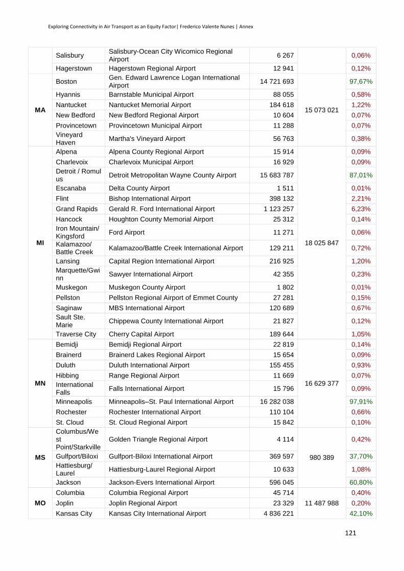
Exploring Connectivity in Air Transport as an Equity Factor| Frederico Valente Nunes | Annex
121
Salisbury Salisbury-Ocean City Wicomico Regional Airport
6 267 0,06%
Hagerstown Hagerstown Regional Airport 12 941 0,12%
MA
Boston Gen. Edward Lawrence Logan International Airport
14 721 693
15 073 021
97,67%
Hyannis Barnstable Municipal Airport 88 055 0,58%
Nantucket Nantucket Memorial Airport 184 618 1,22%
New Bedford New Bedford Regional Airport 10 604 0,07%
Provincetown Provincetown Municipal Airport 11 288 0,07%
Vineyard Haven
Martha's Vineyard Airport 56 763 0,38%
MI
Alpena Alpena County Regional Airport 15 914
18 025 847
0,09%
Charlevoix Charlevoix Municipal Airport 16 929 0,09%
Detroit / Romulus
Detroit Metropolitan Wayne County Airport 15 683 787 87,01%
Escanaba Delta County Airport 1 511 0,01%
Flint Bishop International Airport 398 132 2,21%
Grand Rapids Gerald R. Ford International Airport 1 123 257 6,23%
Hancock Houghton County Memorial Airport 25 312 0,14%
Iron Mountain/ Kingsford
Ford Airport 11 271 0,06%
Kalamazoo/ Battle Creek
Kalamazoo/Battle Creek International Airport 129 211 0,72%
Lansing Capital Region International Airport 216 925 1,20%
Marquette/Gwinn
Sawyer International Airport 42 355 0,23%
Muskegon Muskegon County Airport 1 802 0,01%
Pellston Pellston Regional Airport of Emmet County 27 281 0,15%
Saginaw MBS International Airport 120 689 0,67%
Sault Ste. Marie
Chippewa County International Airport 21 827 0,12%
Traverse City Cherry Capital Airport 189 644 1,05%
MN
Bemidji Bemidji Regional Airport 22 819
16 629 377
0,14%
Brainerd Brainerd Lakes Regional Airport 15 654 0,09%
Duluth Duluth International Airport 155 455 0,93%
Hibbing Range Regional Airport 11 669 0,07%
International Falls
Falls International Airport 15 796 0,09%
Minneapolis Minneapolis–St. Paul International Airport 16 282 038 97,91%
Rochester Rochester International Airport 110 104 0,66%
St. Cloud St. Cloud Regional Airport 15 842 0,10%
MS
Columbus/West Point/Starkville
Golden Triangle Regional Airport 4 114
980 389
0,42%
Gulfport/Biloxi Gulfport-Biloxi International Airport 369 597 37,70%
Hattiesburg/ Laurel
Hattiesburg-Laurel Regional Airport 10 633 1,08%
Jackson Jackson-Evers International Airport 596 045 60,80%
MO
Columbia Columbia Regional Airport 45 714
11 487 988
0,40%
Joplin Joplin Regional Airport 23 329 0,20%
Kansas City Kansas City International Airport 4 836 221 42,10%
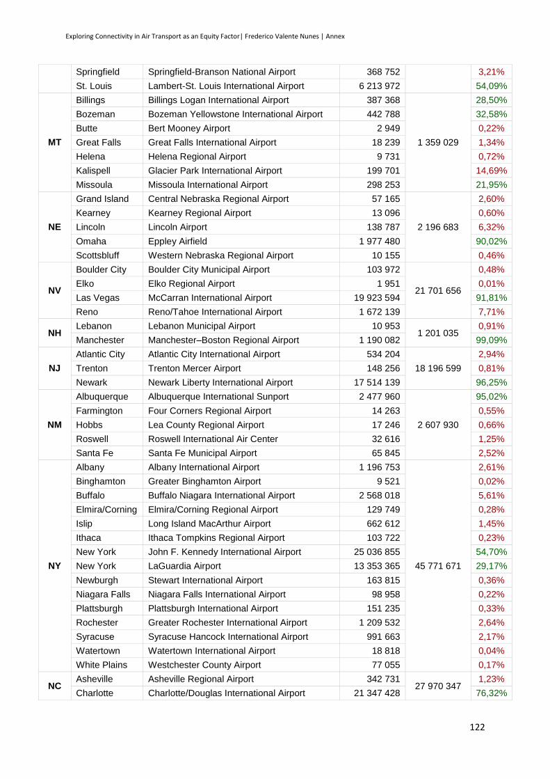
Exploring Connectivity in Air Transport as an Equity Factor| Frederico Valente Nunes | Annex
122
Springfield Springfield-Branson National Airport 368 752 3,21%
St. Louis Lambert-St. Louis International Airport 6 213 972 54,09%
MT
Billings Billings Logan International Airport 387 368
1 359 029
28,50%
Bozeman Bozeman Yellowstone International Airport 442 788 32,58%
Butte Bert Mooney Airport 2 949 0,22%
Great Falls Great Falls International Airport 18 239 1,34%
Helena Helena Regional Airport 9 731 0,72%
Kalispell Glacier Park International Airport 199 701 14,69%
Missoula Missoula International Airport 298 253 21,95%
NE
Grand Island Central Nebraska Regional Airport 57 165
2 196 683
2,60%
Kearney Kearney Regional Airport 13 096 0,60%
Lincoln Lincoln Airport 138 787 6,32%
Omaha Eppley Airfield 1 977 480 90,02%
Scottsbluff Western Nebraska Regional Airport 10 155 0,46%
NV
Boulder City Boulder City Municipal Airport 103 972
21 701 656
0,48%
Elko Elko Regional Airport 1 951 0,01%
Las Vegas McCarran International Airport 19 923 594 91,81%
Reno Reno/Tahoe International Airport 1 672 139 7,71%
NH Lebanon Lebanon Municipal Airport 10 953
1 201 035 0,91%
Manchester Manchester–Boston Regional Airport 1 190 082 99,09%
NJ
Atlantic City Atlantic City International Airport 534 204
18 196 599
2,94%
Trenton Trenton Mercer Airport 148 256 0,81%
Newark Newark Liberty International Airport 17 514 139 96,25%
NM
Albuquerque Albuquerque International Sunport 2 477 960
2 607 930
95,02%
Farmington Four Corners Regional Airport 14 263 0,55%
Hobbs Lea County Regional Airport 17 246 0,66%
Roswell Roswell International Air Center 32 616 1,25%
Santa Fe Santa Fe Municipal Airport 65 845 2,52%
NY
Albany Albany International Airport 1 196 753
45 771 671
2,61%
Binghamton Greater Binghamton Airport 9 521 0,02%
Buffalo Buffalo Niagara International Airport 2 568 018 5,61%
Elmira/Corning Elmira/Corning Regional Airport 129 749 0,28%
Islip Long Island MacArthur Airport 662 612 1,45%
Ithaca Ithaca Tompkins Regional Airport 103 722 0,23%
New York John F. Kennedy International Airport 25 036 855 54,70%
New York LaGuardia Airport 13 353 365 29,17%
Newburgh Stewart International Airport 163 815 0,36%
Niagara Falls Niagara Falls International Airport 98 958 0,22%
Plattsburgh Plattsburgh International Airport 151 235 0,33%
Rochester Greater Rochester International Airport 1 209 532 2,64%
Syracuse Syracuse Hancock International Airport 991 663 2,17%
Watertown Watertown International Airport 18 818 0,04%
White Plains Westchester County Airport 77 055 0,17%
NC Asheville Asheville Regional Airport 342 731
27 970 347 1,23%
Charlotte Charlotte/Douglas International Airport 21 347 428 76,32%
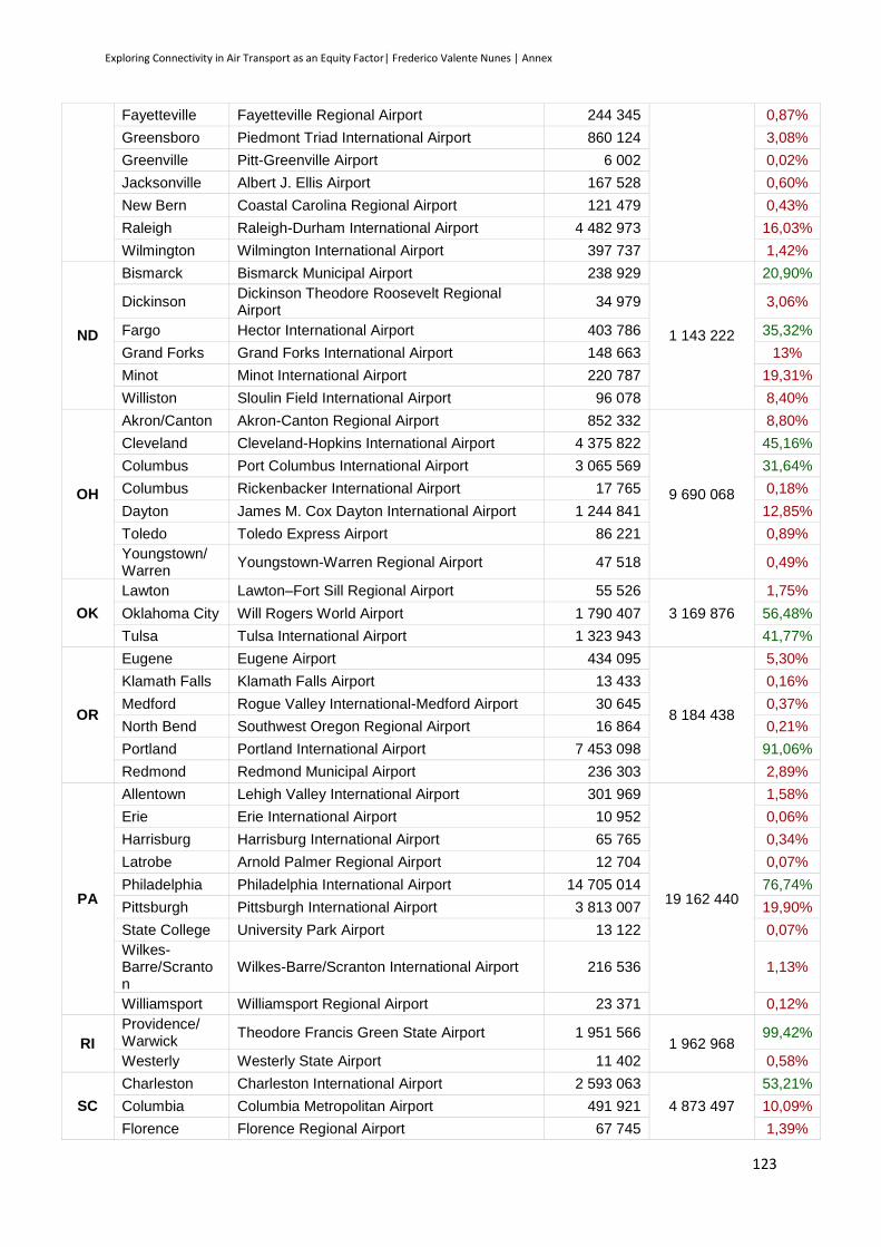
Exploring Connectivity in Air Transport as an Equity Factor| Frederico Valente Nunes | Annex
123
Fayetteville Fayetteville Regional Airport 244 345 0,87%
Greensboro Piedmont Triad International Airport 860 124 3,08%
Greenville Pitt-Greenville Airport 6 002 0,02%
Jacksonville Albert J. Ellis Airport 167 528 0,60%
New Bern Coastal Carolina Regional Airport 121 479 0,43%
Raleigh Raleigh-Durham International Airport 4 482 973 16,03%
Wilmington Wilmington International Airport 397 737 1,42%
ND
Bismarck Bismarck Municipal Airport 238 929
1 143 222
20,90%
Dickinson Dickinson Theodore Roosevelt Regional Airport
34 979 3,06%
Fargo Hector International Airport 403 786 35,32%
Grand Forks Grand Forks International Airport 148 663 13%
Minot Minot International Airport 220 787 19,31%
Williston Sloulin Field International Airport 96 078 8,40%
OH
Akron/Canton Akron-Canton Regional Airport 852 332
9 690 068
8,80%
Cleveland Cleveland-Hopkins International Airport 4 375 822 45,16%
Columbus Port Columbus International Airport 3 065 569 31,64%
Columbus Rickenbacker International Airport 17 765 0,18%
Dayton James M. Cox Dayton International Airport 1 244 841 12,85%
Toledo Toledo Express Airport 86 221 0,89%
Youngstown/ Warren
Youngstown-Warren Regional Airport 47 518 0,49%
OK
Lawton Lawton–Fort Sill Regional Airport 55 526
3 169 876
1,75%
Oklahoma City Will Rogers World Airport 1 790 407 56,48%
Tulsa Tulsa International Airport 1 323 943 41,77%
OR
Eugene Eugene Airport 434 095
8 184 438
5,30%
Klamath Falls Klamath Falls Airport 13 433 0,16%
Medford Rogue Valley International-Medford Airport 30 645 0,37%
North Bend Southwest Oregon Regional Airport 16 864 0,21%
Portland Portland International Airport 7 453 098 91,06%
Redmond Redmond Municipal Airport 236 303 2,89%
PA
Allentown Lehigh Valley International Airport 301 969
19 162 440
1,58%
Erie Erie International Airport 10 952 0,06%
Harrisburg Harrisburg International Airport 65 765 0,34%
Latrobe Arnold Palmer Regional Airport 12 704 0,07%
Philadelphia Philadelphia International Airport 14 705 014 76,74%
Pittsburgh Pittsburgh International Airport 3 813 007 19,90%
State College University Park Airport 13 122 0,07%
Wilkes-Barre/Scranton
Wilkes-Barre/Scranton International Airport 216 536 1,13%
Williamsport Williamsport Regional Airport 23 371 0,12%
RI
Providence/ Warwick
Theodore Francis Green State Airport 1 951 566 1 962 968
99,42%
Westerly Westerly State Airport 11 402 0,58%
SC
Charleston Charleston International Airport 2 593 063
4 873 497
53,21%
Columbia Columbia Metropolitan Airport 491 921 10,09%
Florence Florence Regional Airport 67 745 1,39%
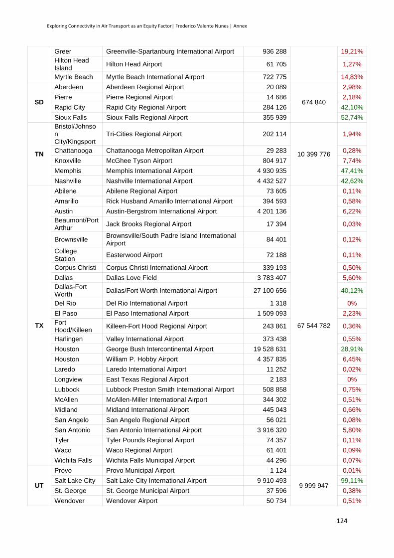
Exploring Connectivity in Air Transport as an Equity Factor| Frederico Valente Nunes | Annex
124
Greer Greenville-Spartanburg International Airport 936 288 19,21%
Hilton Head Island
Hilton Head Airport 61 705 1,27%
Myrtle Beach Myrtle Beach International Airport 722 775 14,83%
SD
Aberdeen Aberdeen Regional Airport 20 089
674 840
2,98%
Pierre Pierre Regional Airport 14 686 2,18%
Rapid City Rapid City Regional Airport 284 126 42,10%
Sioux Falls Sioux Falls Regional Airport 355 939 52,74%
TN
Bristol/Johnson City/Kingsport
Tri-Cities Regional Airport 202 114
10 399 776
1,94%
Chattanooga Chattanooga Metropolitan Airport 29 283 0,28%
Knoxville McGhee Tyson Airport 804 917 7,74%
Memphis Memphis International Airport 4 930 935 47,41%
Nashville Nashville International Airport 4 432 527 42,62%
TX
Abilene Abilene Regional Airport 73 605
67 544 782
0,11%
Amarillo Rick Husband Amarillo International Airport 394 593 0,58%
Austin Austin-Bergstrom International Airport 4 201 136 6,22%
Beaumont/Port Arthur
Jack Brooks Regional Airport 17 394 0,03%
Brownsville Brownsville/South Padre Island International Airport
84 401 0,12%
College Station
Easterwood Airport 72 188 0,11%
Corpus Christi Corpus Christi International Airport 339 193 0,50%
Dallas Dallas Love Field 3 783 407 5,60%
Dallas-Fort Worth
Dallas/Fort Worth International Airport 27 100 656 40,12%
Del Rio Del Rio International Airport 1 318 0%
El Paso El Paso International Airport 1 509 093 2,23%
Fort Hood/Killeen
Killeen-Fort Hood Regional Airport 243 861 0,36%
Harlingen Valley International Airport 373 438 0,55%
Houston George Bush Intercontinental Airport 19 528 631 28,91%
Houston William P. Hobby Airport 4 357 835 6,45%
Laredo Laredo International Airport 11 252 0,02%
Longview East Texas Regional Airport 2 183 0%
Lubbock Lubbock Preston Smith International Airport 508 858 0,75%
McAllen McAllen-Miller International Airport 344 302 0,51%
Midland Midland International Airport 445 043 0,66%
San Angelo San Angelo Regional Airport 56 021 0,08%
San Antonio San Antonio International Airport 3 916 320 5,80%
Tyler Tyler Pounds Regional Airport 74 357 0,11%
Waco Waco Regional Airport 61 401 0,09%
Wichita Falls Wichita Falls Municipal Airport 44 296 0,07%
UT
Provo Provo Municipal Airport 1 124
9 999 947
0,01%
Salt Lake City Salt Lake City International Airport 9 910 493 99,11%
St. George St. George Municipal Airport 37 596 0,38%
Wendover Wendover Airport 50 734 0,51%

Exploring Connectivity in Air Transport as an Equity Factor| Frederico Valente Nunes | Annex
125
VT Burlington Burlington International Airport 64 079 64 079 100%
VA
Charlottesville Charlottesville–Albemarle Airport 197 776
24 466 050
0,81%
Lynchburg Lynchburg Regional Airport 93 772 0,38%
Newport News Newport News/Williamsburg International Airport
519 906 2,13%
Norfolk Norfolk International Airport 1 663 294 6,80%
Richmond Richmond International Airport 1 651 131 6,75%
Roanoke Roanoke Regional Airport 316 478 1,29%
Staunton/ Waynesboro/ Harrisonburg
Shenandoah Valley Regional Airport 10 408 0,04%
Washington, D.C.
Ronald Reagan Washington National Airport 8 736 804 35,71%
Washington, D.C.
Washington Dulles International Airport 11 276 481 46,09%
WA
Bellingham Bellingham International Airport 398 368
17 884 275
2,23%
Friday Harbor Friday Harbor Airport 12 381 0,07%
Pasco Tri-Cities Airport 312 915 1,75%
Port Angeles William R. Fairchild International Airport 10 616 0,06%
Pullman/Mosco
Pullman/Moscow Regional Airport 35 248 0,20%
Seattle King County International Airport 33 656 0,19%
Seattle/Tacoma
Seattle–Tacoma International Airport 15 406 243 86,14%
Spokane Spokane International Airport 1 545 115 8,64%
Walla Walla Walla Walla Regional Airport 29 064 0,16%
Wenatchee Pangborn Memorial Airport 46 837 0,26%
Yakima Yakima Air Terminal 53 832 0,30%
WV
Charleston Yeager Airport 264 818
414 317
63,92%
Clarksburg North Central West Virginia Airport 10 694 2,58%
Huntington Tri-State Airport 115 263 27,82%
Lewisburg Greenbrier Valley Airport 12 293 2,97%
Morgantown Morgantown Municipal Airport 11 249 2,72%
WI
Appleton Outagamie County Regional Airport 25 934
5 336 419
0,49%
Eau Claire Chippewa Valley Regional Airport 18 762 0,35%
Green Bay Austin Straubel International Airport 410 348 7,69%
La Crosse La Crosse Regional Airport 111 462 2,09%
Madison Dane County Regional Airport 728 075 13,64%
Milwaukee General Mitchell International Airport 3 861 333 72,36%
Wausau Central Wisconsin Airport 154 312 2,89%
Rhinelander Rhinelander-Oneida County Airport 26 193 0,49%
WY
Casper Casper/Natrona County International Airport 74 167
505 243
14,68%
Cheyenne Cheyenne Regional Airport 16 697 3,30%
Cody Yellowstone Regional Airport 25 863 5,12%
Gillette Gillette-Campbell County Airport 28 232 5,59%
Jackson Jackson Hole Airport 305 566 60,48%
Laramie Laramie Regional Airport 10 371 2,05%
Riverton Riverton Regional Airport 17 035 3,37%

Exploring Connectivity in Air Transport as an Equity Factor| Frederico Valente Nunes | Annex
126
Rock Springs Rock Springs – Sweetwater County Airport 25 541 5,06%
Sheridan Sheridan County Airport 1 771 0,35%
Source: FAA Airports, Calendar Year 2011 Enplanements for U.S. Airports, by State
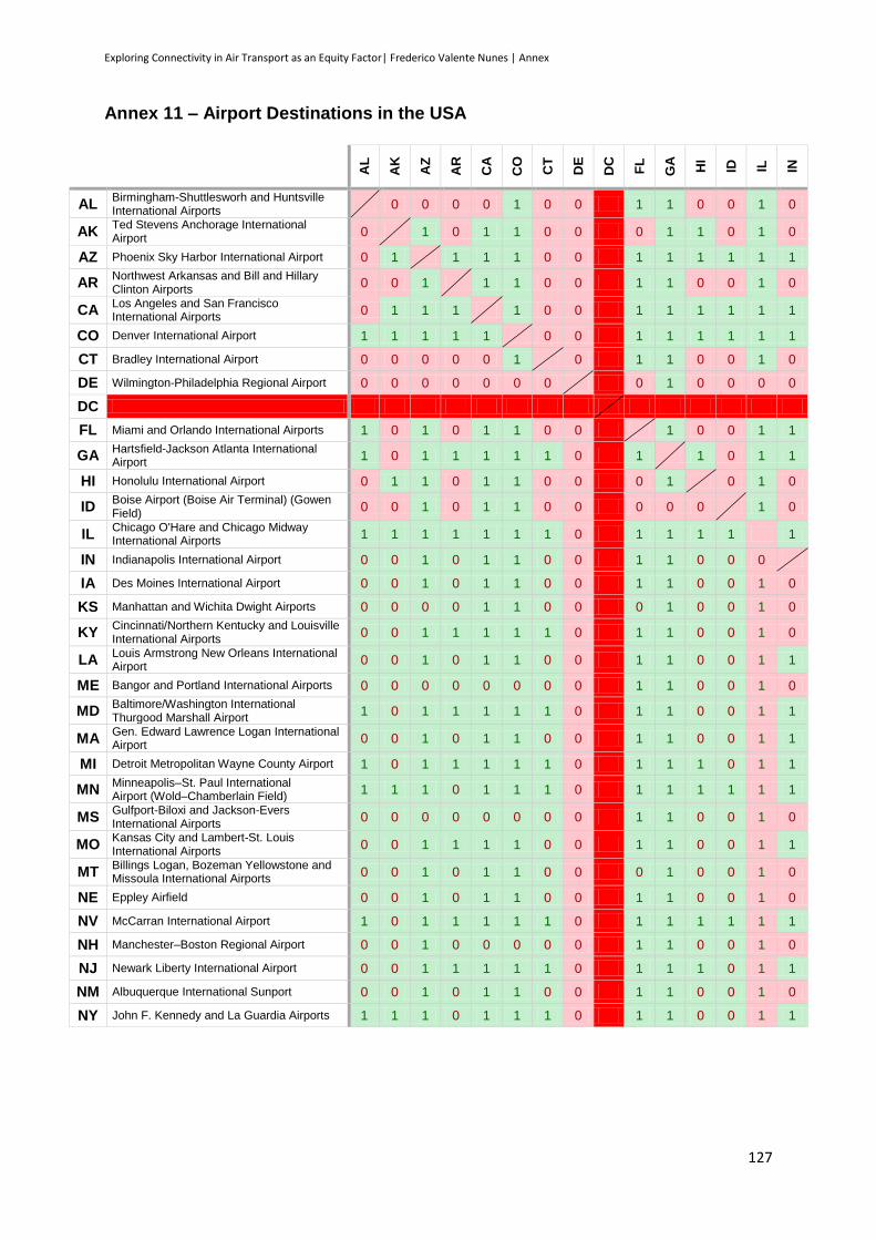
Exploring Connectivity in Air Transport as an Equity Factor| Frederico Valente Nunes | Annex
127
Annex 11 – Airport Destinations in the USA
AL
AK
AZ
AR
CA
CO
CT
DE
DC
FL
GA
HI
ID
IL
IN
AL Birmingham-Shuttlesworh and Huntsville International Airports
0 0 0 0 1 0 0 1 1 0 0 1 0
AK Ted Stevens Anchorage International Airport
0 1 0 1 1 0 0 0 1 1 0 1 0
AZ Phoenix Sky Harbor International Airport 0 1 1 1 1 0 0 1 1 1 1 1 1
AR Northwest Arkansas and Bill and Hillary Clinton Airports
0 0 1 1 1 0 0 1 1 0 0 1 0
CA Los Angeles and San Francisco International Airports
0 1 1 1 1 0 0 1 1 1 1 1 1
CO Denver International Airport 1 1 1 1 1 0 0 1 1 1 1 1 1
CT Bradley International Airport 0 0 0 0 0 1 0 1 1 0 0 1 0
DE Wilmington-Philadelphia Regional Airport 0 0 0 0 0 0 0 0 1 0 0 0 0
DC
FL Miami and Orlando International Airports 1 0 1 0 1 1 0 0 1 0 0 1 1
GA Hartsfield-Jackson Atlanta International Airport
1 0 1 1 1 1 1 0 1 1 0 1 1
HI Honolulu International Airport 0 1 1 0 1 1 0 0 0 1 0 1 0
ID Boise Airport (Boise Air Terminal) (Gowen Field)
0 0 1 0 1 1 0 0 0 0 0 1 0
IL Chicago O'Hare and Chicago Midway International Airports
1 1 1 1 1 1 1 0 1 1 1 1 1
IN Indianapolis International Airport 0 0 1 0 1 1 0 0 1 1 0 0 0
IA Des Moines International Airport 0 0 1 0 1 1 0 0 1 1 0 0 1 0
KS Manhattan and Wichita Dwight Airports 0 0 0 0 1 1 0 0 0 1 0 0 1 0
KY Cincinnati/Northern Kentucky and Louisville International Airports
0 0 1 1 1 1 1 0 1 1 0 0 1 0
LA Louis Armstrong New Orleans International Airport
0 0 1 0 1 1 0 0 1 1 0 0 1 1
ME Bangor and Portland International Airports 0 0 0 0 0 0 0 0 1 1 0 0 1 0
MD Baltimore/Washington International Thurgood Marshall Airport
1 0 1 1 1 1 1 0 1 1 0 0 1 1
MA Gen. Edward Lawrence Logan International Airport
0 0 1 0 1 1 0 0 1 1 0 0 1 1
MI Detroit Metropolitan Wayne County Airport 1 0 1 1 1 1 1 0 1 1 1 0 1 1
MN Minneapolis–St. Paul International Airport (Wold–Chamberlain Field)
1 1 1 0 1 1 1 0 1 1 1 1 1 1
MS Gulfport-Biloxi and Jackson-Evers International Airports
0 0 0 0 0 0 0 0 1 1 0 0 1 0
MO Kansas City and Lambert-St. Louis International Airports
0 0 1 1 1 1 0 0 1 1 0 0 1 1
MT Billings Logan, Bozeman Yellowstone and Missoula International Airports
0 0 1 0 1 1 0 0 0 1 0 0 1 0
NE Eppley Airfield 0 0 1 0 1 1 0 0 1 1 0 0 1 0
NV McCarran International Airport 1 0 1 1 1 1 1 0 1 1 1 1 1 1
NH Manchester–Boston Regional Airport 0 0 1 0 0 0 0 0 1 1 0 0 1 0
NJ Newark Liberty International Airport 0 0 1 1 1 1 1 0 1 1 1 0 1 1
NM Albuquerque International Sunport 0 0 1 0 1 1 0 0 1 1 0 0 1 0
NY John F. Kennedy and La Guardia Airports 1 1 1 0 1 1 1 0 1 1 0 0 1 1
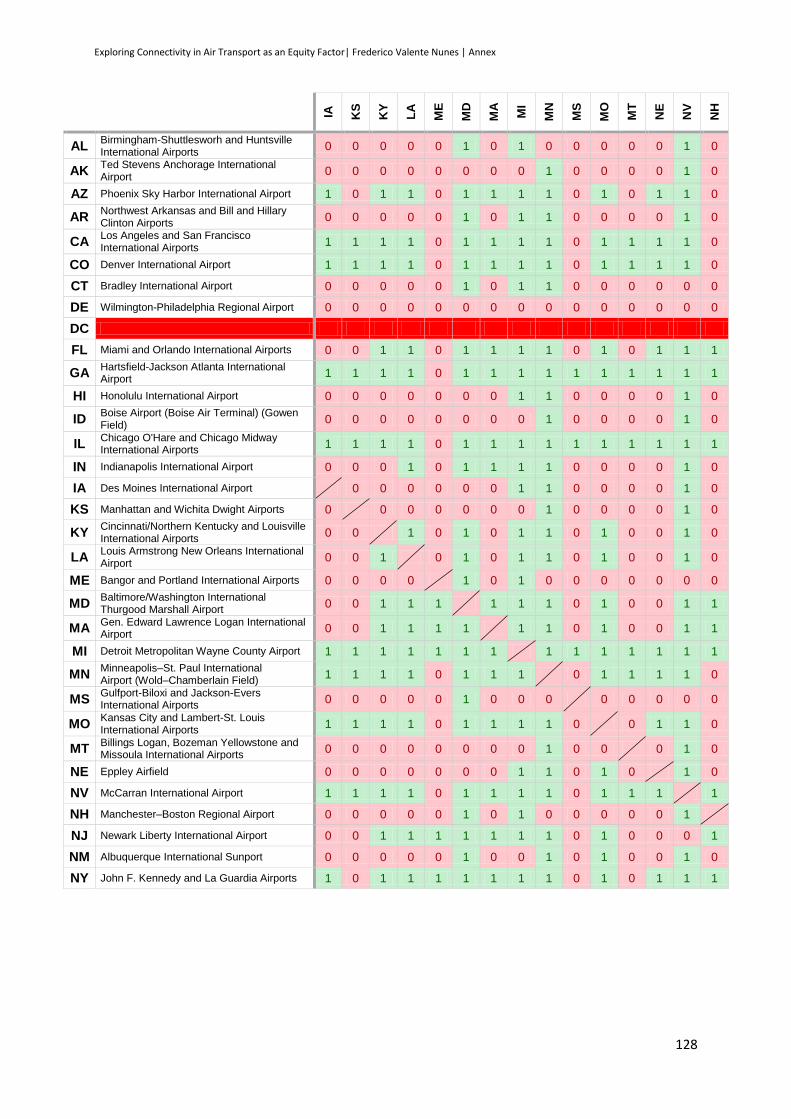
Exploring Connectivity in Air Transport as an Equity Factor| Frederico Valente Nunes | Annex
128
IA
KS
KY
LA
ME
MD
MA
MI
MN
MS
MO
MT
NE
NV
NH
AL Birmingham-Shuttlesworh and Huntsville International Airports
0 0 0 0 0 1 0 1 0 0 0 0 0 1 0
AK Ted Stevens Anchorage International Airport
0 0 0 0 0 0 0 0 1 0 0 0 0 1 0
AZ Phoenix Sky Harbor International Airport 1 0 1 1 0 1 1 1 1 0 1 0 1 1 0
AR Northwest Arkansas and Bill and Hillary Clinton Airports
0 0 0 0 0 1 0 1 1 0 0 0 0 1 0
CA Los Angeles and San Francisco International Airports
1 1 1 1 0 1 1 1 1 0 1 1 1 1 0
CO Denver International Airport 1 1 1 1 0 1 1 1 1 0 1 1 1 1 0
CT Bradley International Airport 0 0 0 0 0 1 0 1 1 0 0 0 0 0 0
DE Wilmington-Philadelphia Regional Airport 0 0 0 0 0 0 0 0 0 0 0 0 0 0 0
DC
FL Miami and Orlando International Airports 0 0 1 1 0 1 1 1 1 0 1 0 1 1 1
GA Hartsfield-Jackson Atlanta International Airport
1 1 1 1 0 1 1 1 1 1 1 1 1 1 1
HI Honolulu International Airport 0 0 0 0 0 0 0 1 1 0 0 0 0 1 0
ID Boise Airport (Boise Air Terminal) (Gowen Field)
0 0 0 0 0 0 0 0 1 0 0 0 0 1 0
IL Chicago O'Hare and Chicago Midway International Airports
1 1 1 1 0 1 1 1 1 1 1 1 1 1 1
IN Indianapolis International Airport 0 0 0 1 0 1 1 1 1 0 0 0 0 1 0
IA Des Moines International Airport 0 0 0 0 0 0 1 1 0 0 0 0 1 0
KS Manhattan and Wichita Dwight Airports 0 0 0 0 0 0 0 1 0 0 0 0 1 0
KY Cincinnati/Northern Kentucky and Louisville International Airports
0 0 1 0 1 0 1 1 0 1 0 0 1 0
LA Louis Armstrong New Orleans International Airport
0 0 1 0 1 0 1 1 0 1 0 0 1 0
ME Bangor and Portland International Airports 0 0 0 0 1 0 1 0 0 0 0 0 0 0
MD Baltimore/Washington International Thurgood Marshall Airport
0 0 1 1 1 1 1 1 0 1 0 0 1 1
MA Gen. Edward Lawrence Logan International Airport
0 0 1 1 1 1 1 1 0 1 0 0 1 1
MI Detroit Metropolitan Wayne County Airport 1 1 1 1 1 1 1 1 1 1 1 1 1 1
MN Minneapolis–St. Paul International Airport (Wold–Chamberlain Field)
1 1 1 1 0 1 1 1 0 1 1 1 1 0
MS Gulfport-Biloxi and Jackson-Evers International Airports
0 0 0 0 0 1 0 0 0 0 0 0 0 0
MO Kansas City and Lambert-St. Louis International Airports
1 1 1 1 0 1 1 1 1 0 0 1 1 0
MT Billings Logan, Bozeman Yellowstone and Missoula International Airports
0 0 0 0 0 0 0 0 1 0 0 0 1 0
NE Eppley Airfield 0 0 0 0 0 0 0 1 1 0 1 0 1 0
NV McCarran International Airport 1 1 1 1 0 1 1 1 1 0 1 1 1 1
NH Manchester–Boston Regional Airport 0 0 0 0 0 1 0 1 0 0 0 0 0 1
NJ Newark Liberty International Airport 0 0 1 1 1 1 1 1 1 0 1 0 0 0 1
NM Albuquerque International Sunport 0 0 0 0 0 1 0 0 1 0 1 0 0 1 0
NY John F. Kennedy and La Guardia Airports 1 0 1 1 1 1 1 1 1 0 1 0 1 1 1
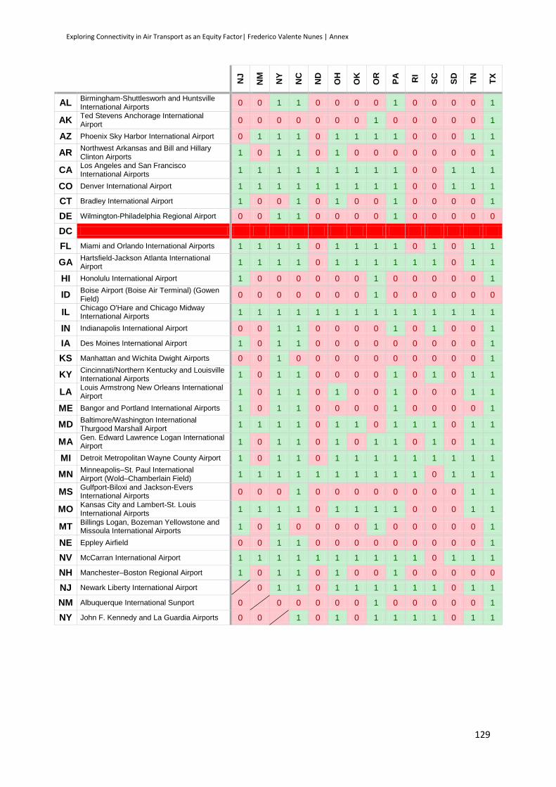
Exploring Connectivity in Air Transport as an Equity Factor| Frederico Valente Nunes | Annex
129
NJ
NM
NY
NC
ND
OH
OK
OR
PA
RI
SC
SD
TN
TX
AL Birmingham-Shuttlesworh and Huntsville International Airports
0 0 1 1 0 0 0 0 1 0 0 0 0 1
AK Ted Stevens Anchorage International Airport
0 0 0 0 0 0 0 1 0 0 0 0 0 1
AZ Phoenix Sky Harbor International Airport 0 1 1 1 0 1 1 1 1 0 0 0 1 1
AR Northwest Arkansas and Bill and Hillary Clinton Airports
1 0 1 1 0 1 0 0 0 0 0 0 0 1
CA Los Angeles and San Francisco International Airports
1 1 1 1 1 1 1 1 1 0 0 1 1 1
CO Denver International Airport 1 1 1 1 1 1 1 1 1 0 0 1 1 1
CT Bradley International Airport 1 0 0 1 0 1 0 0 1 0 0 0 0 1
DE Wilmington-Philadelphia Regional Airport 0 0 1 1 0 0 0 0 1 0 0 0 0 0
DC
FL Miami and Orlando International Airports 1 1 1 1 0 1 1 1 1 0 1 0 1 1
GA Hartsfield-Jackson Atlanta International Airport
1 1 1 1 0 1 1 1 1 1 1 0 1 1
HI Honolulu International Airport 1 0 0 0 0 0 0 1 0 0 0 0 0 1
ID Boise Airport (Boise Air Terminal) (Gowen Field)
0 0 0 0 0 0 0 1 0 0 0 0 0 0
IL Chicago O'Hare and Chicago Midway International Airports
1 1 1 1 1 1 1 1 1 1 1 1 1 1
IN Indianapolis International Airport 0 0 1 1 0 0 0 0 1 0 1 0 0 1
IA Des Moines International Airport 1 0 1 1 0 0 0 0 0 0 0 0 0 1
KS Manhattan and Wichita Dwight Airports 0 0 1 0 0 0 0 0 0 0 0 0 0 1
KY Cincinnati/Northern Kentucky and Louisville International Airports
1 0 1 1 0 0 0 0 1 0 1 0 1 1
LA Louis Armstrong New Orleans International Airport
1 0 1 1 0 1 0 0 1 0 0 0 1 1
ME Bangor and Portland International Airports 1 0 1 1 0 0 0 0 1 0 0 0 0 1
MD Baltimore/Washington International Thurgood Marshall Airport
1 1 1 1 0 1 1 0 1 1 1 0 1 1
MA Gen. Edward Lawrence Logan International Airport
1 0 1 1 0 1 0 1 1 0 1 0 1 1
MI Detroit Metropolitan Wayne County Airport 1 0 1 1 0 1 1 1 1 1 1 1 1 1
MN Minneapolis–St. Paul International Airport (Wold–Chamberlain Field)
1 1 1 1 1 1 1 1 1 1 0 1 1 1
MS Gulfport-Biloxi and Jackson-Evers International Airports
0 0 0 1 0 0 0 0 0 0 0 0 1 1
MO Kansas City and Lambert-St. Louis International Airports
1 1 1 1 0 1 1 1 1 0 0 0 1 1
MT Billings Logan, Bozeman Yellowstone and Missoula International Airports
1 0 1 0 0 0 0 1 0 0 0 0 0 1
NE Eppley Airfield 0 0 1 1 0 0 0 0 0 0 0 0 0 1
NV McCarran International Airport 1 1 1 1 1 1 1 1 1 1 0 1 1 1
NH Manchester–Boston Regional Airport 1 0 1 1 0 1 0 0 1 0 0 0 0 0
NJ Newark Liberty International Airport 0 1 1 0 1 1 1 1 1 1 0 1 1
NM Albuquerque International Sunport 0 0 0 0 0 0 1 0 0 0 0 0 1
NY John F. Kennedy and La Guardia Airports 0 0 1 0 1 0 1 1 1 1 0 1 1

Exploring Connectivity in Air Transport as an Equity Factor| Frederico Valente Nunes | Annex
130
UT
VT
VA
WA
WV
WI
WY
Percentage of connections from the main airport to each
one of the other states
AL Birmingham-Shuttlesworh and Huntsville International Airports
0 0 0 0 0 0 0 22,45%
AK Ted Stevens Anchorage International Airport
1 0 0 1 0 0 0 24,49%
AZ Phoenix Sky Harbor International Airport 1 0 0 1 0 1 0 65,31%
AR Northwest Arkansas and Bill and Hillary Clinton Airports
0 0 0 0 0 0 0 30,61%
CA Los Angeles and San Francisco International Airports
1 0 1 1 0 1 1 79,59%
CO Denver International Airport 1 0 1 1 0 1 1 81,63%
CT Bradley International Airport 0 0 1 0 0 0 0 26,53%
DE Wilmington-Philadelphia Regional Airport 0 0 1 0 0 0 0 10,20%
DC 0,00%
FL Miami and Orlando International Airports 1 0 1 1 0 0 0 63,27%
GA Hartsfield-Jackson Atlanta International Airport
1 0 1 1 1 1 0 83,67%
HI Honolulu International Airport 1 0 0 1 0 0 0 28,57%
ID Boise Airport (Boise Air Terminal) (Gowen Field)
1 0 0 1 0 0 0 18,37%
IL Chicago O'Hare and Chicago Midway International Airports
1 1 1 1 1 1 1 95,92%
IN Indianapolis International Airport 1 0 0 0 0 1 0 36,73%
IA Des Moines International Airport 0 0 1 0 0 0 0 28,57%
KS Manhattan and Wichita Dwight Airports 0 0 1 0 0 0 0 18,37%
KY Cincinnati/Northern Kentucky and Louisville International Airports
1 0 1 1 0 1 0 51,02%
LA Louis Armstrong New Orleans International Airport
1 0 1 1 0 1 0 48,98%
ME Bangor and Portland International Airports 0 0 1 0 0 0 0 22,45%
MD Baltimore/Washington International Thurgood Marshall Airport
1 0 1 1 0 1 0 69,39%
MA Gen. Edward Lawrence Logan International Airport
1 1 1 1 0 1 0 61,22%
MI Detroit Metropolitan Wayne County Airport 1 1 1 1 1 1 0 87,76%
MN Minneapolis–St. Paul International Airport (Wold–Chamberlain Field)
1 0 1 1 0 1 1 83,67%
MS Gulfport-Biloxi and Jackson-Evers International Airports
0 0 1 0 0 0 0 16,33%
MO Kansas City and Lambert-St. Louis International Airports
1 0 1 1 0 1 0 65,31%
MT Billings Logan, Bozeman Yellowstone and Missoula International Airports
1 0 0 1 0 0 0 26,53%
NE Eppley Airfield 1 0 1 1 0 0 0 32,65%
NV McCarran International Airport 1 0 1 1 0 1 1 85,71%
NH Manchester–Boston Regional Airport 0 0 1 0 0 0 0 26,53%
NJ Newark Liberty International Airport 1 1 1 1 0 1 0 69,39%
NM Albuquerque International Sunport 1 0 1 1 0 0 0 30,61%
NY John F. Kennedy and La Guardia Airports 1 1 1 1 1 1 0 73,47%

Exploring Connectivity in Air Transport as an Equity Factor| Frederico Valente Nunes | Annex
131
AL
AK
AZ
AR
CA
CO
CT
DE
DC
FL
GA
HI
ID
IL
IN
NC Charlotte/Douglas International Airport 1 0 1 1 1 1 1 0 1 1 0 0 1 1
ND Bismarck and Hector Airports 0 0 0 0 1 1 0 0 0 0 0 0 1 0
OH Cleveland-Hopkins and Port Columbus International Airports
0 0 1 0 1 1 1 0 1 1 0 0 1 1
OK Will Rogers World and Tulsa Airports 0 0 1 0 1 1 0 0 1 1 0 0 1 0
OR Portland International Airport 0 1 1 0 1 1 0 0 0 1 1 1 1 0
PA Philadelphia International Airport 1 1 1 0 1 1 1 0 1 1 0 0 1 1
RI Theodore Francis Green State Airport 0 0 1 0 0 0 0 0 1 1 0 0 1 0
SC Charleston International Airport / Charleston AFB
0 0 0 0 0 0 0 0 1 1 0 0 1 0
SD Rapid City and Sioux Falls Airports 0 0 1 0 0 1 0 0 1 1 0 0 1 0
TN Memphis and Nashville Airports 1 0 1 1 1 1 1 0 1 1 0 0 1 1
TX Dallas/Fort Worth and George Bush International Airports
1 1 1 1 1 1 1 0 1 1 1 0 1 1
UT Salt Lake City International Airport 0 1 1 0 1 1 0 0 1 1 1 1 1 1
VT Burlington International Airport 0 0 0 0 0 0 0 0 1 0 0 0 1 0
VA Ronald Reagan Washington and Washington Dulles International Airports
1 0 1 0 1 1 1 0 1 1 0 0 1 1
WA Seattle–Tacoma International Airport 0 1 1 0 1 1 0 0 1 1 1 1 1 0
WV Yeager and Tri-State Airports 0 0 0 0 0 0 0 0 1 1 0 0 1 0
WI General Mitchell International Airport 0 0 1 0 1 1 0 0 1 1 0 0 1 1
WY Jackson Hole Airport 0 0 0 0 1 1 0 0 0 0 0 0 1 0
Percentage of connections to each state main airport
28
,57%
24
,49%
77
,55%
28
,57%
77
,55%
83
,67%
30
,61%
0,0
0%
0,0
0%
81
,63%
91
,84%
28
,57%
18
,37%
95
,92%
46
,94%
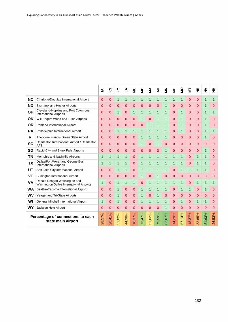
Exploring Connectivity in Air Transport as an Equity Factor| Frederico Valente Nunes | Annex
132
IA
KS
KY
LA
ME
MD
MA
MI
MN
MS
MO
MT
NE
NV
NH
NC Charlotte/Douglas International Airport 0 0 1 1 1 1 1 1 1 1 1 0 0 1 1
ND Bismarck and Hector Airports 0 0 0 0 0 0 0 0 1 0 0 0 0 1 0
OH Cleveland-Hopkins and Port Columbus International Airports
0 0 1 0 1 1 1 1 1 0 1 0 0 1 1
OK Will Rogers World and Tulsa Airports 0 0 0 0 0 1 0 1 1 0 1 0 0 1 0
OR Portland International Airport 0 0 0 0 0 0 1 1 1 0 1 0 0 1 0
PA Philadelphia International Airport 0 0 1 1 1 1 1 1 1 0 1 0 0 1 1
RI Theodore Francis Green State Airport 0 0 0 0 0 1 1 1 1 0 0 0 0 1 0
SC Charleston International Airport / Charleston AFB
0 0 0 0 0 1 0 1 0 0 0 0 0 0 0
SD Rapid City and Sioux Falls Airports 0 0 0 0 0 0 0 0 1 0 0 0 0 1 0
TN Memphis and Nashville Airports 1 1 1 1 0 1 1 1 1 1 1 0 1 1 0
TX Dallas/Fort Worth and George Bush International Airports
1 1 1 1 0 1 1 1 1 1 1 0 1 1 0
UT Salt Lake City International Airport 0 0 1 1 0 1 1 1 1 0 1 1 1 1 0
VT Burlington International Airport 0 0 0 0 0 1 0 1 0 0 0 0 0 0 0
VA Ronald Reagan Washington and Washington Dulles International Airports
1 0 1 1 1 0 1 1 1 1 1 0 1 1 1
WA Seattle–Tacoma International Airport 0 0 1 0 0 1 1 1 1 0 1 1 0 1 0
WV Yeager and Tri-State Airports 0 0 1 0 0 1 0 1 0 0 0 0 0 0 0
WI General Mitchell International Airport 1 0 1 0 0 1 1 1 1 0 1 0 1 1 0
WY Jackson Hole Airport 0 0 0 0 0 0 0 0 1 0 0 0 0 0 0
Percentage of connections to each state main airport
28
,57%
20
,41%
51
,02%
44
,90%
18
,37%
73
,47%
51
,02%
79
,59%
83
,67%
14
,29%
57
,14%
18
,37%
32
,65%
81
,63%
26
,53%
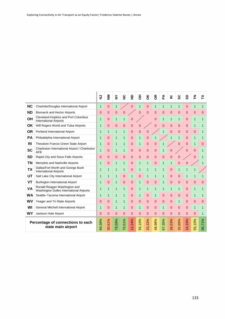
Exploring Connectivity in Air Transport as an Equity Factor| Frederico Valente Nunes | Annex
133
NJ
NM
NY
NC
ND
OH
OK
OR
PA
RI
SC
SD
TN
TX
NC Charlotte/Douglas International Airport 1 0 1 0 1 0 1 1 1 1 0 1 1
ND Bismarck and Hector Airports 0 0 0 0 0 0 0 0 0 0 0 0 0
OH Cleveland-Hopkins and Port Columbus International Airports
1 0 1 1 0 0 1 1 1 0 1 1
OK Will Rogers World and Tulsa Airports 1 0 0 0 0 0 0 0 0 0 0 1 1
OR Portland International Airport 1 1 1 1 0 0 0 1 0 0 0 0 1
PA Philadelphia International Airport 1 0 1 1 0 1 0 1 1 1 0 1 1
RI Theodore Francis Green State Airport 1 0 1 1 0 1 0 0 1 0 0 1 0
SC Charleston International Airport / Charleston AFB
1 0 1 1 0 0 0 0 1 0 0 0 1
SD Rapid City and Sioux Falls Airports 0 0 0 0 0 0 0 0 0 0 0 0 1
TN Memphis and Nashville Airports 1 0 1 1 0 1 1 0 1 1 0 0 1
TX Dallas/Fort Worth and George Bush International Airports
1 1 1 1 0 1 1 1 1 0 1 1 1
UT Salt Lake City International Airport 1 1 1 0 1 0 1 1 1 0 0 1 1 1
VT Burlington International Airport 1 0 1 0 0 1 0 0 1 0 0 0 0 0
VA Ronald Reagan Washington and Washington Dulles International Airports
1 1 1 1 0 1 1 1 1 1 1 0 1 1
WA Seattle–Tacoma International Airport 1 1 1 1 0 1 0 1 0 0 0 0 1 1
WV Yeager and Tri-State Airports 0 0 1 1 0 0 0 0 0 0 1 0 0 0
WI General Mitchell International Airport 1 0 1 1 0 1 0 0 1 0 0 0 1 1
WY Jackson Hole Airport 0 0 0 0 0 0 0 0 0 0 0 0 0 1
Percentage of connections to each state main airport
69
,39%
30
,61%
79
,59%
75
,51%
12
,24%
55
,10%
33
,33%
48
,98%
67
,35%
26
,53%
32
,65%
16
,33%
55
,10%
85
,71%

Exploring Connectivity in Air Transport as an Equity Factor| Frederico Valente Nunes | Annex
134
UT
VT
VA
WA
WV
WI
WY
Percentage of connections from the main airport to each
one of the other states
NC Charlotte/Douglas International Airport 0 0 1 1 1 1 0 69,39%
ND Bismarck and Hector Airports 1 0 0 0 0 0 0 12,24%
OH Cleveland-Hopkins and Port Columbus International Airports
0 1 1 1 0 1 0 60,42%
OK Will Rogers World and Tulsa Airports 1 0 1 0 0 0 0 32,65%
OR Portland International Airport 1 0 1 1 0 0 0 44,90%
PA Philadelphia International Airport 1 1 1 1 0 1 0 69,39%
RI Theodore Francis Green State Airport 0 0 1 0 0 0 0 32,65%
SC Charleston International Airport / Charleston AFB
0 0 1 0 0 0 0 22,45%
SD Rapid City and Sioux Falls Airports 1 0 0 0 0 0 0 18,37%
TN Memphis and Nashville Airports 1 0 1 1 0 1 0 69,39%
TX Dallas/Fort Worth and George Bush International Airports
1 0 1 1 0 1 1 81,63%
UT Salt Lake City International Airport 0 1 1 0 0 1 67,35%
VT Burlington International Airport 0 1 0 0 0 0 18,37%
VA Ronald Reagan Washington and Washington Dulles International Airports
1 1 1 1 1 0 77,55%
WA Seattle–Tacoma International Airport 1 0 1 0 1 0 57,14%
WV Yeager and Tri-State Airports 0 0 1 0 0 0 20,41%
WI General Mitchell International Airport 0 0 1 1 0 0 51,02%
WY Jackson Hole Airport 1 0 0 0 0 0 12,24%
Percentage of connections to each state main airport
67
,35%
16
,33%
77
,55%
63
,27%
12
,24%
46
,94%
14
,29%
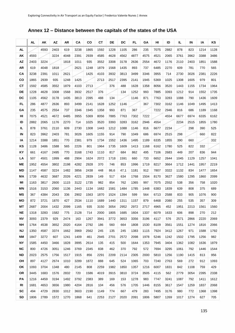
Exploring Connectivity in Air Transport as an Equity Factor| Frederico Valente Nunes | Annex
135
Annex 12 – Distance between the capitals of the states of the USA
AL AK AZ AR CA CO CT DE DC FL GA HI ID IL IN IA KS
AL 4593 2403 619 3238 1865 1592 1228 1105 286 235 7075 2882 878 823 1214 1128
AK 4593 3224 4048 2391 2939 4585 4628 4562 4877 4575 4521 2065 3761 3962 3388 3486
AZ 2403 3224 1818 1011 935 3552 3308 3178 2636 2554 4672 1176 2110 2403 1851 1588
AR 619 4048 1818 2621 1248 1879 1568 1435 893 737 6485 2270 609 781 770 565
CA 3238 2391 1011 2621 1425 4103 3932 3813 3499 3346 3955 714 2730 3026 2381 2226
CO 1865 2939 935 1248 1425 2713 2517 2395 2141 1945 5369 1025 1308 1605 979 801
CT 1592 4585 3552 1879 4103 2713 376 488 1628 1358 8056 3520 1443 1155 1734 1964
DE 1228 4628 3308 1568 3932 2517 376 134 1252 993 7885 3393 1212 914 1552 1735
DC 1105 4562 3178 1435 3813 2395 488 134 1146 871 7763 3283 1088 790 1436 1609
FL 286 4877 2636 893 3499 2141 1628 1252 1146 367 7302 3162 1146 1049 1495 1413
GA 235 4575 2554 737 3346 1945 1358 993 871 367 7222 2946 816 686 1189 1168
HI 7075 4521 4672 6485 3955 5369 8056 7885 7763 7302 7222 4554 6677 6974 6335 6162
ID 2882 2065 1176 2270 714 1025 3520 3393 3283 3162 2946 4554 2234 2515 1855 1780
IL 878 3761 2110 609 2730 1308 1443 1212 1088 1146 816 6677 2234 298 390 525
IN 823 3962 2403 781 3026 1605 1155 914 790 1049 686 6974 2515 298 660 822
IA 1214 3388 1851 770 2381 979 1734 1552 1436 1495 1189 6335 1855 390 660 332
KS 1128 3486 1588 565 2226 801 1964 1735 1609 1413 1168 6162 1780 525 822 332
KY 661 4167 2495 770 3168 1743 1110 817 684 862 495 7106 2683 449 207 836 944
LA 507 4501 1999 488 2904 1624 2072 1718 1591 660 733 6652 2644 1045 1129 1257 1041
ME 1952 4554 3802 2198 4282 2928 370 746 853 1996 1719 8217 3664 1712 1441 1957 2219
MD 1147 4587 3224 1482 3856 2438 448 86,6 47,1 1181 912 7807 3322 1132 834 1477 1654
MA 1739 4632 3687 2026 4221 2839 149 517 634 1768 1504 8170 3627 1580 1295 1860 2099
MI 1163 3817 2600 1115 3122 1735 982 854 762 1365 997 7075 2552 538 356 758 1020
MN 1516 3153 2060 1136 2443 1134 1682 1581 1484 1785 1448 6383 1839 639 808 375 689
MS 367 4384 2043 336 2902 1563 1870 1524 1394 599 564 6713 2588 833 905 1076 900
MO 872 3721 1870 427 2534 1110 1689 1440 1311 1157 879 6468 2080 255 535 357 309
MT 2687 2004 1432 2099 1165 935 3150 3054 2952 2972 2717 4965 452 1951 2213 1561 1560
NE 1318 3283 1582 775 2128 714 2000 1805 1685 1604 1337 6079 1633 606 898 270 212
NV 3093 2379 929 2474 163 1267 3941 3772 3653 3356 3196 4117 576 2571 2866 2220 2069
NH 1764 4538 3652 2020 4164 2792 186 560 664 1808 1530 8109 3561 1551 1274 1816 2066
NJ 1350 4587 3374 1662 3969 2562 245 135 245 1383 1115 7924 3412 1267 971 1588 1792
NM 1847 3272 607 1241 1409 461 2945 2701 2572 2098 1978 5246 1242 1502 1795 1256 982
NY 1585 4450 3466 1828 3995 2614 135 415 500 1644 1353 7945 3404 1362 1082 1636 1879
NC 800 4726 3051 1246 3769 2345 838 462 370 792 572 7694 3295 1061 792 1446 1544
ND 2023 2575 1756 1517 1915 856 2291 2209 2114 2305 2000 5810 1256 1190 1415 813 956
OH 897 4127 2674 1010 3289 1872 888 645 524 1065 703 7240 2763 569 272 912 1093
OK 1093 3704 1348 480 2145 808 2259 1982 1850 1357 1216 6007 1831 842 1108 759 429
OR 3445 1683 1576 2832 720 1586 4019 3915 3810 3724 3505 4115 562 2779 3054 2395 2338
PA 1216 4459 3194 1492 3792 2383 389 169 153 1278 983 7747 3241 1087 792 1411 1612
RI 1681 4653 3656 1980 4204 2816 104 456 576 1705 1446 8155 3617 1547 1259 1837 2068
SC 494 4729 2830 1012 3603 2190 1149 774 667 479 283 7495 3176 980 772 1368 1398
SD 1806 2789 1572 1270 1868 641 2253 2127 2020 2091 1806 5807 1269 1017 1274 627 705

Exploring Connectivity in Air Transport as an Equity Factor| Frederico Valente Nunes | Annex
136
KY LA ME MD MA MI MN MS MO MT NE NV NH NJ NM NY NC
AL 661 507 1952 1147 1739 1163 1516 367 872 2687 1318 3093 1764 1350 1847 1585 800
AK 4167 4501 4554 4587 4632 3817 3153 4384 3721 2004 3283 2379 4538 4587 3272 4450 4726
AZ 2495 1999 3802 3224 3687 2600 2060 2043 1870 1432 1582 929 3652 3374 607 3466 3051
AR 770 488 2198 1482 2026 1115 1136 336 427 2099 775 2474 2020 1662 1241 1828 1246
CA 3168 2904 4282 3856 4221 3122 2443 2902 2534 1165 2128 163 4164 3969 1409 3995 3769
CO 1743 1624 2928 2438 2839 1735 1134 1563 1110 935 714 1267 2792 2562 461 2614 2345
CT 1110 2072 370 448 149 982 1682 1870 1689 3150 2000 3941 186 245 2945 135 838
DE 817 1718 746 86,6 517 854 1581 1524 1440 3054 1805 3772 560 135 2701 415 462
DC 684 1591 853 47,1 634 762 1484 1394 1311 2952 1685 3653 664 245 2572 500 370
FL 862 660 1996 1181 1768 1365 1785 599 1157 2972 1604 3356 1808 1383 2098 1644 792
GA 495 733 1719 912 1504 997 1448 564 879 2717 1337 3196 1530 1115 1978 1353 572
HI 7106 6652 8217 7807 8170 7075 6383 6713 6468 4965 6079 4117 8109 7924 5246 7945 7694
ID 2683 2644 3664 3322 3627 2552 1839 2588 2080 452 1633 576 3561 3412 1242 3404 3295
IL 449 1045 1712 1132 1580 538 639 833 255 1951 606 2571 1551 1267 1502 1362 1061
IN 207 1129 1441 834 1295 356 808 905 535 2213 898 2866 1274 971 1795 1082 792
IA 836 1257 1957 1477 1860 758 375 1076 357 1561 270 2220 1816 1588 1256 1636 1446
KS 944 1041 2219 1654 2099 1020 689 900 309 1560 212 2069 2066 1792 982 1879 1544
KY 1034 1430 731 1256 505 1013 814 638 2397 1053 3010 1251 898 1891 1059 612
LA 1034 2423 1635 2221 1484 1619 224 907 2524 1253 2770 2236 1834 1495 2051 1305
ME 1430 2423 816 242 1202 1839 2216 1965 3268 2226 4119 189 613 3199 373 1208
MD 731 1635 816 593 794 1519 1439 1357 2989 1728 3695 628 204 2618 469 398
MA 1256 2221 242 593 1104 1788 2019 1829 3247 2128 4058 102 389 3081 225 977
MI 505 1484 1202 794 1104 727 1261 791 2202 1027 2960 1058 861 1997 879 920
MN 1013 1619 1839 1519 1788 727 1427 712 1476 544 2281 1726 1585 1498 1565 1584
MS 814 224 2216 1439 2019 1261 1427 720 2431 1108 2760 2030 1635 1499 1843 1131
MO 638 907 1965 1357 1829 791 712 720 1838 458 2378 1803 1504 1263 1613 1235
MT 2397 2524 3268 2989 3247 2202 1476 2431 1838 1380 1022 3177 3061 1297 3028 3004
NE 1053 1253 2226 1728 2128 1027 544 1108 458 1380 1968 2085 1848 991 1904 1663
NV 3010 2770 4119 3695 4058 2960 2281 2760 2378 1022 1968 4001 3808 1276 3833 3613
NH 1251 2236 189 628 102 1058 1726 2030 1803 3177 2085 4001 426 3047 192 1021
NJ 898 1834 613 204 389 861 1585 1635 1504 3061 1848 3808 426 2766 283 596
NM 1891 1495 3199 2618 3081 1997 1498 1499 1263 1297 991 1276 3047 2766 2860 2456
NY 1059 2051 373 469 225 879 1565 1843 1613 3028 1904 3833 192 283 2860 867
NC 612 1305 1208 398 977 920 1584 1131 1235 3004 1663 3613 1021 596 2456 867
ND 1613 1997 2412 2149 2388 1355 630 1847 1152 859 744 1755 2318 2209 1311 2169 2203
OH 256 1290 1189 567 1031 332 994 1070 805 2443 1161 3128 1015 700 2067 823 599
OK 1166 816 2547 1896 2401 1377 1117 764 587 1714 597 2000 2381 2060 762 2190 1703
OR 3228 3202 4135 3848 4117 3065 2342 3149 2636 869 2184 696 4046 3926 1769 3897 3840
PA 725 1687 737 148 538 694 1421 1482 1325 2896 1670 3631 550 180 2587 370 518
RI 1211 2165 309 534 66,5 1083 1778 1965 1793 3243 2103 4041 154 331 3049 215 914
SC 565 1001 1518 702 1291 1012 1578 844 1096 2923 1549 3450 1330 905 2249 1166 319
SD 1459 1743 2415 2059 2363 1282 577 1604 935 939 496 1705 2302 2143 1078 2139 2065

Exploring Connectivity in Air Transport as an Equity Factor| Frederico Valente Nunes | Annex
137
ND OH OK OR PA RI SC SD TN TX UT VT VA WA WV WI WY
AL 2023 897 1093 3445 1216 1681 494 1806 425 1112 2457 1778 986 3487 787 1221 1910
AK 2575 4127 3704 1683 4459 4653 4729 2789 4230 4177 2522 4396 4650 1476 4340 3511 2823
AZ 1756 2674 1348 1576 3194 3656 2830 1572 2318 1397 803 3579 3143 1756 2778 2235 1062
AR 1517 1010 480 2832 1492 1980 1012 1270 527 707 1838 1990 1368 2883 1035 961 1302
CA 1915 3289 2145 720 3792 4204 3603 1868 3057 2351 855 4063 3815 950 3439 2727 1448
CO 856 1872 808 1586 2383 2816 2190 641 1640 1237 596 2705 2392 1653 2016 1350 157
CT 2291 888 2259 4019 389 104 1149 2253 1366 2574 3249 278 624 3960 851 1376 2661
DE 2209 645 1982 3915 169 456 774 2127 1044 2247 3080 618 248 3879 537 1237 2484
DC 2114 524 1850 3810 153 576 667 2020 910 2115 2962 703 156 3779 404 1134 2366
FL 2305 1065 1357 3724 1278 1705 479 2091 677 1293 2731 1845 1004 3770 909 1474 2191
GA 2000 703 1216 3505 983 1446 283 1806 345 1315 2541 1547 752 3531 567 1122 1972
HI 5810 7240 6007 4115 7747 8155 7495 5807 6966 6026 4809 8002 7757 4239 7382 6680 5402
ID 1256 2763 1831 562 3241 3617 3176 1269 2625 2198 477 3450 3307 646 2936 2159 974
IL 1190 569 842 2779 1087 1547 980 1017 474 1284 1883 1492 1085 2778 710 366 1288
IN 1415 272 1108 3054 792 1259 772 1274 404 1487 2176 1226 794 3043 421 455 1581
IA 813 912 759 2395 1411 1837 1368 627 844 1308 1528 1733 1453 2389 1082 385 933
KS 956 1093 429 2338 1612 2068 1398 705 847 991 1391 1997 1595 2366 1220 691 808
KY 1613 256 1166 3228 725 1211 565 1459 282 1471 2326 1227 653 3225 282 662 1733
LA 1997 1290 816 3202 1687 2165 1001 1743 752 634 2187 2236 1482 3276 1235 1411 1707
ME 2412 1189 2547 4135 737 309 1518 2415 1699 2901 3433 223 993 4056 1190 1578 2859
MD 2149 567 1896 3848 148 534 702 2059 957 2161 3004 672 181 3816 451 1171 2408
MA 2388 1031 2401 4117 538 66,5 1291 2363 1514 2722 3367 245 765 4051 999 1495 2782
MI 1355 332 1377 3065 694 1083 1012 1282 754 1812 2267 979 834 3026 546 396 1679
MN 630 994 1117 2342 1421 1778 1578 577 1110 1677 1597 1620 1539 2299 1199 361 1040
MS 1847 1070 764 3149 1482 1965 844 1604 531 751 2145 2024 1295 3208 1025 1199 1628
MO 1152 805 587 2636 1325 1793 1096 935 546 1051 1700 1746 1291 2654 917 552 1113
MT 859 2443 1714 869 2896 3243 2923 939 2381 2173 629 3059 2993 830 2631 1819 823
NE 744 1161 597 2184 1670 2103 1549 496 1002 1172 1278 2003 1691 2197 1315 653 683
NV 1755 3128 2000 696 3631 4041 3450 1705 2903 2230 693 3900 3656 912 3280 2565 1287
NH 2318 1015 2381 4046 550 154 1330 2302 1517 2721 3312 144 805 3976 1005 1444 2731
NJ 2209 700 2060 3926 180 331 905 2143 1142 2349 3115 484 380 3882 627 1253 2521
NM 1311 2067 762 1769 2587 3049 2249 1078 1724 970 765 2976 2541 1888 2173 1641 617
NY 2169 823 2190 3897 370 215 1166 2139 1327 2530 3141 203 650 3835 818 1270 2557
NC 2203 599 1703 3840 518 914 319 2065 733 1878 2932 1071 217 3834 386 1223 2341
ND 1620 1288 1728 2048 2384 2166 274 1655 1853 1115 2201 2168 1673 1820 987 707
OH 1620 1371 3294 520 991 683 1506 539 1716 2437 980 550 3272 216 633 1842
OK 1288 1371 2391 1884 2362 1487 1016 971 576 1382 2330 1803 2461 1446 1096 892
OR 1728 3294 2391 3759 4112 3732 1789 3181 2737 1019 3927 3843 235 3475 2678 1535
PA 2048 520 1884 3759 488 802 1973 977 2185 2938 568 308 3720 461 1083 2344
RI 2384 991 2362 4112 488 1229 2351 1465 2674 3349 287 703 4050 949 1476 2762
SC 2166 683 1487 3732 802 1229 1995 552 1596 2785 1368 526 3745 486 1228 2206
SD 274 1506 1016 1789 1973 2351 1995 1463 1580 1026 2197 2056 1769 1692 890 511
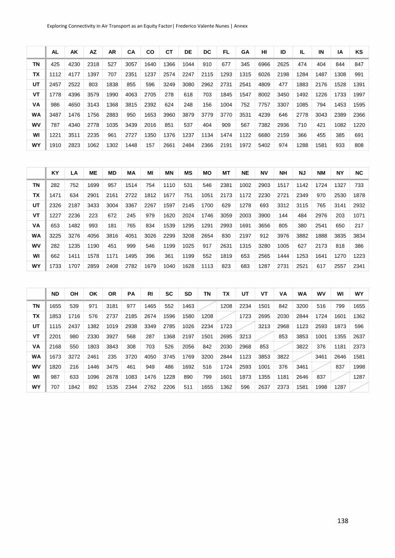
Exploring Connectivity in Air Transport as an Equity Factor| Frederico Valente Nunes | Annex
138
AL AK AZ AR CA CO CT DE DC FL GA HI ID IL IN IA KS
TN 425 4230 2318 527 3057 1640 1366 1044 910 677 345 6966 2625 474 404 844 847
TX 1112 4177 1397 707 2351 1237 2574 2247 2115 1293 1315 6026 2198 1284 1487 1308 991
UT 2457 2522 803 1838 855 596 3249 3080 2962 2731 2541 4809 477 1883 2176 1528 1391
VT 1778 4396 3579 1990 4063 2705 278 618 703 1845 1547 8002 3450 1492 1226 1733 1997
VA 986 4650 3143 1368 3815 2392 624 248 156 1004 752 7757 3307 1085 794 1453 1595
WA 3487 1476 1756 2883 950 1653 3960 3879 3779 3770 3531 4239 646 2778 3043 2389 2366
WV 787 4340 2778 1035 3439 2016 851 537 404 909 567 7382 2936 710 421 1082 1220
WI 1221 3511 2235 961 2727 1350 1376 1237 1134 1474 1122 6680 2159 366 455 385 691
WY 1910 2823 1062 1302 1448 157 2661 2484 2366 2191 1972 5402 974 1288 1581 933 808
KY LA ME MD MA MI MN MS MO MT NE NV NH NJ NM NY NC
TN 282 752 1699 957 1514 754 1110 531 546 2381 1002 2903 1517 1142 1724 1327 733
TX 1471 634 2901 2161 2722 1812 1677 751 1051 2173 1172 2230 2721 2349 970 2530 1878
UT 2326 2187 3433 3004 3367 2267 1597 2145 1700 629 1278 693 3312 3115 765 3141 2932
VT 1227 2236 223 672 245 979 1620 2024 1746 3059 2003 3900 144 484 2976 203 1071
VA 653 1482 993 181 765 834 1539 1295 1291 2993 1691 3656 805 380 2541 650 217
WA 3225 3276 4056 3816 4051 3026 2299 3208 2654 830 2197 912 3976 3882 1888 3835 3834
WV 282 1235 1190 451 999 546 1199 1025 917 2631 1315 3280 1005 627 2173 818 386
WI 662 1411 1578 1171 1495 396 361 1199 552 1819 653 2565 1444 1253 1641 1270 1223
WY 1733 1707 2859 2408 2782 1679 1040 1628 1113 823 683 1287 2731 2521 617 2557 2341
ND OH OK OR PA RI SC SD TN TX UT VT VA WA WV WI WY
TN 1655 539 971 3181 977 1465 552 1463 1208 2234 1501 842 3200 516 799 1655
TX 1853 1716 576 2737 2185 2674 1596 1580 1208 1723 2695 2030 2844 1724 1601 1362
UT 1115 2437 1382 1019 2938 3349 2785 1026 2234 1723 3213 2968 1123 2593 1873 596
VT 2201 980 2330 3927 568 287 1368 2197 1501 2695 3213 853 3853 1001 1355 2637
VA 2168 550 1803 3843 308 703 526 2056 842 2030 2968 853 3822 376 1181 2373
WA 1673 3272 2461 235 3720 4050 3745 1769 3200 2844 1123 3853 3822 3461 2646 1581
WV 1820 216 1446 3475 461 949 486 1692 516 1724 2593 1001 376 3461 837 1998
WI 987 633 1096 2678 1083 1476 1228 890 799 1601 1873 1355 1181 2646 837 1287
WY 707 1842 892 1535 2344 2762 2206 511 1655 1362 596 2637 2373 1581 1998 1287
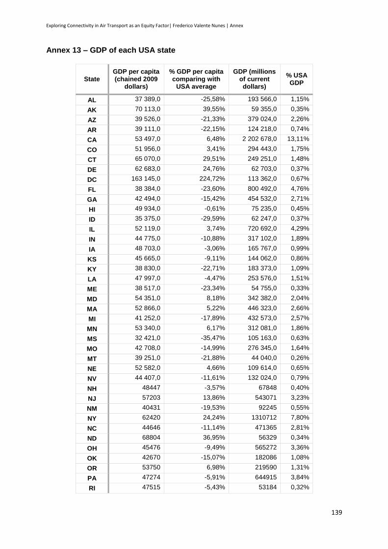
Exploring Connectivity in Air Transport as an Equity Factor| Frederico Valente Nunes | Annex
139
Annex 13 – GDP of each USA state
State GDP per capita (chained 2009
dollars)
% GDP per capita comparing with
USA average
GDP (millions of current dollars)
% USA GDP
AL 37 389,0 -25,58% 193 566,0 1,15%
AK 70 113,0 39,55% 59 355,0 0,35%
AZ 39 526,0 -21,33% 379 024,0 2,26%
AR 39 111,0 -22,15% 124 218,0 0,74%
CA 53 497,0 6,48% 2 202 678,0 13,11%
CO 51 956,0 3,41% 294 443,0 1,75%
CT 65 070,0 29,51% 249 251,0 1,48%
DE 62 683,0 24,76% 62 703,0 0,37%
DC 163 145,0 224,72% 113 362,0 0,67%
FL 38 384,0 -23,60% 800 492,0 4,76%
GA 42 494,0 -15,42% 454 532,0 2,71%
HI 49 934,0 -0,61% 75 235,0 0,45%
ID 35 375,0 -29,59% 62 247,0 0,37%
IL 52 119,0 3,74% 720 692,0 4,29%
IN 44 775,0 -10,88% 317 102,0 1,89%
IA 48 703,0 -3,06% 165 767,0 0,99%
KS 45 665,0 -9,11% 144 062,0 0,86%
KY 38 830,0 -22,71% 183 373,0 1,09%
LA 47 997,0 -4,47% 253 576,0 1,51%
ME 38 517,0 -23,34% 54 755,0 0,33%
MD 54 351,0 8,18% 342 382,0 2,04%
MA 52 866,0 5,22% 446 323,0 2,66%
MI 41 252,0 -17,89% 432 573,0 2,57%
MN 53 340,0 6,17% 312 081,0 1,86%
MS 32 421,0 -35,47% 105 163,0 0,63%
MO 42 708,0 -14,99% 276 345,0 1,64%
MT 39 251,0 -21,88% 44 040,0 0,26%
NE 52 582,0 4,66% 109 614,0 0,65%
NV 44 407,0 -11,61% 132 024,0 0,79%
NH 48447 -3,57% 67848 0,40%
NJ 57203 13,86% 543071 3,23%
NM 40431 -19,53% 92245 0,55%
NY 62420 24,24% 1310712 7,80%
NC 44646 -11,14% 471365 2,81%
ND 68804 36,95% 56329 0,34%
OH 45476 -9,49% 565272 3,36%
OK 42670 -15,07% 182086 1,08%
OR 53750 6,98% 219590 1,31%
PA 47274 -5,91% 644915 3,84%
RI 47515 -5,43% 53184 0,32%

Exploring Connectivity in Air Transport as an Equity Factor| Frederico Valente Nunes | Annex
140
SC 36059 -28,23% 183561 1,09%
SD 48696 -3,08% 46732 0,28%
TN 41503 -17,39% 287633 1,71%
TX 52465 4,43% 1532623 9,12%
UT 45165 -10,10% 141240 0,84%
VT 44241 -11,94% 29509 0,18%
VA 51623 2,75% 452585 2,69%
WA 54654 8,78% 408049 2,43%
WV 36963 -26,43% 73970 0,44%
WI 45993 -8,46% 282486 1,68%
WY 67857 35,06% 45432 0,27%
Average 50 241,5 Total 16 801 415,0
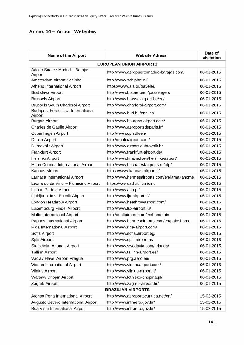
Exploring Connectivity in Air Transport as an Equity Factor| Frederico Valente Nunes | Annex
141
Annex 14 – Airport Websites
Name of the Airport Website Adress Date of
visitation
EUROPEAN UNION AIRPORTS
Adolfo Suarez Madrid – Barajas Airport
http://www.aeropuertomadrid-barajas.com/ 06-01-2015
Amsterdam Airport Schiphol http://www.schiphol.nl/ 06-01-2015
Athens International Airport https://www.aia.gr/traveler/ 06-01-2015
Bratislava Airport http://www.bts.aero/en/passengers 06-01-2015
Brussels Airport http://www.brusselairport.be/en/ 06-01-2015
Brussels South Charleroi Airport http://www.charleroi-airport.com/ 06-01-2015
Budapest Ferec Liszt International Airport
http://www.bud.hu/english 06-01-2015
Burgas Airport http://www.bourgas-airport.com/ 06-01-2015
Charles de Gaulle Airport http://www.aeroportsdeparis.fr/ 06-01-2015
Copenhagen Airport http://www.cph.dk/en/ 06-01-2015
Dublin Airport http://dublinairport.com/ 06-01-2015
Dubrovnik Airport http://www.airport-dubrovnik.hr 06-01-2015
Frankfurt Airport http://www.frankfurt-airport.de/ 06-01-2015
Helsinki Airport http://www.finavia.fi/en/helsinki-airport/ 06-01-2015
Henri Coanda International Airport http://www.bucharestairports.ro/otp/ 06-01-2015
Kaunas Airport https://www.kaunas-airport.lt/ 06-01-2015
Larnaca International Airport http://www.hermesairports.com/en/larnakahome 06-01-2015
Leonardo da Vinci – Fiumicino Airport https://www.adr.it/fiumicino 06-01-2015
Lisbon Portela Airport http://www.ana.pt/ 06-01-2015
Ljubljana Joze Pucnik Airport http://www.lju-airport.si/ 06-01-2015
London Heathrow Airport http://www.heathrowairport.com/ 06-01-2015
Luxembourg Findel Airport http://www.lux-airport.lu/ 06-01-2015
Malta International Airport http://maltairport.com/en/home.htm 06-01-2015
Paphos International Airport http://www.hermesairports.com/en/pafoshome 06-01-2015
Riga International Airport http://www.riga-airport.com/ 06-01-2015
Sofia Airport http://www.sofia.airport.bg/ 06-01-2015
Split Airport http://www.split-airport.hr/ 06-01-2015
Stockholm Arlanda Airport http://www.swedavia.com/arlanda/ 06-01-2015
Tallinn Airport http://www.tallinn-airport.ee/ 06-01-2015
Václav Havel Airport Prague http://www.prg.aero/en/ 06-01-2015
Vienna International Airport http://www.viennaairport.com/ 06-01-2015
Vilnius Airport http://www.vilnius-airport.lt/ 06-01-2015
Warsaw Chopin Airport http://www.lotnisko-chopina.pl/ 06-01-2015
Zagreb Airport http://www.zagreb-airport.hr/ 06-01-2015
BRAZILIAN AIRPORTS
Afonso Pena International Airport http://www.aeroportocuritiba.net/en/ 15-02-2015
Augusto Severo International Airport http://www.infraero.gov.br/ 15-02-2015
Boa Vista International Airport http://www.infraero.gov.br/ 15-02-2015
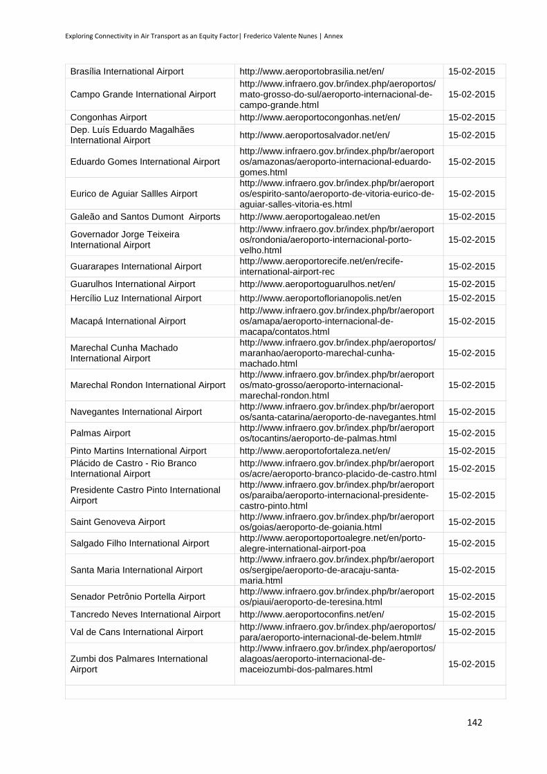
Exploring Connectivity in Air Transport as an Equity Factor| Frederico Valente Nunes | Annex
142
Brasília International Airport http://www.aeroportobrasilia.net/en/ 15-02-2015
Campo Grande International Airport http://www.infraero.gov.br/index.php/aeroportos/mato-grosso-do-sul/aeroporto-internacional-de-campo-grande.html
15-02-2015
Congonhas Airport http://www.aeroportocongonhas.net/en/ 15-02-2015
Dep. Luís Eduardo Magalhães International Airport
http://www.aeroportosalvador.net/en/ 15-02-2015
Eduardo Gomes International Airport http://www.infraero.gov.br/index.php/br/aeroportos/amazonas/aeroporto-internacional-eduardo-gomes.html
15-02-2015
Eurico de Aguiar Sallles Airport http://www.infraero.gov.br/index.php/br/aeroportos/espirito-santo/aeroporto-de-vitoria-eurico-de-aguiar-salles-vitoria-es.html
15-02-2015
Galeão and Santos Dumont Airports http://www.aeroportogaleao.net/en 15-02-2015
Governador Jorge Teixeira International Airport
http://www.infraero.gov.br/index.php/br/aeroportos/rondonia/aeroporto-internacional-porto-velho.html
15-02-2015
Guararapes International Airport http://www.aeroportorecife.net/en/recife-international-airport-rec
15-02-2015
Guarulhos International Airport http://www.aeroportoguarulhos.net/en/ 15-02-2015
Hercílio Luz International Airport http://www.aeroportoflorianopolis.net/en 15-02-2015
Macapá International Airport http://www.infraero.gov.br/index.php/br/aeroportos/amapa/aeroporto-internacional-de-macapa/contatos.html
15-02-2015
Marechal Cunha Machado International Airport
http://www.infraero.gov.br/index.php/aeroportos/maranhao/aeroporto-marechal-cunha-machado.html
15-02-2015
Marechal Rondon International Airport http://www.infraero.gov.br/index.php/br/aeroportos/mato-grosso/aeroporto-internacional-marechal-rondon.html
15-02-2015
Navegantes International Airport http://www.infraero.gov.br/index.php/br/aeroportos/santa-catarina/aeroporto-de-navegantes.html
15-02-2015
Palmas Airport http://www.infraero.gov.br/index.php/br/aeroportos/tocantins/aeroporto-de-palmas.html
15-02-2015
Pinto Martins International Airport http://www.aeroportofortaleza.net/en/ 15-02-2015
Plácido de Castro - Rio Branco International Airport
http://www.infraero.gov.br/index.php/br/aeroportos/acre/aeroporto-branco-placido-de-castro.html
15-02-2015
Presidente Castro Pinto International Airport
http://www.infraero.gov.br/index.php/br/aeroportos/paraiba/aeroporto-internacional-presidente-castro-pinto.html
15-02-2015
Saint Genoveva Airport http://www.infraero.gov.br/index.php/br/aeroportos/goias/aeroporto-de-goiania.html
15-02-2015
Salgado Filho International Airport http://www.aeroportoportoalegre.net/en/porto-alegre-international-airport-poa
15-02-2015
Santa Maria International Airport http://www.infraero.gov.br/index.php/br/aeroportos/sergipe/aeroporto-de-aracaju-santa-maria.html
15-02-2015
Senador Petrônio Portella Airport http://www.infraero.gov.br/index.php/br/aeroportos/piaui/aeroporto-de-teresina.html
15-02-2015
Tancredo Neves International Airport http://www.aeroportoconfins.net/en/ 15-02-2015
Val de Cans International Airport http://www.infraero.gov.br/index.php/aeroportos/para/aeroporto-internacional-de-belem.html#
15-02-2015
Zumbi dos Palmares International Airport
http://www.infraero.gov.br/index.php/aeroportos/alagoas/aeroporto-internacional-de-maceiozumbi-dos-palmares.html
15-02-2015
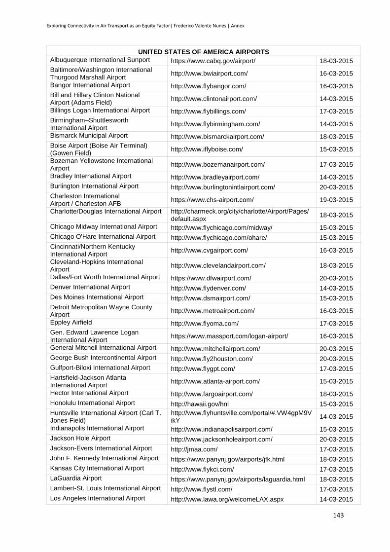
Exploring Connectivity in Air Transport as an Equity Factor| Frederico Valente Nunes | Annex
143
UNITED STATES OF AMERICA AIRPORTS
Albuquerque International Sunport https://www.cabq.gov/airport/ 18-03-2015
Baltimore/Washington International Thurgood Marshall Airport
http://www.bwiairport.com/ 16-03-2015
Bangor International Airport http://www.flybangor.com/ 16-03-2015
Bill and Hillary Clinton National Airport (Adams Field)
http://www.clintonairport.com/ 14-03-2015
Billings Logan International Airport http://www.flybillings.com/ 17-03-2015
Birmingham–Shuttlesworth International Airport
http://www.flybirmingham.com/ 14-03-2015
Bismarck Municipal Airport http://www.bismarckairport.com/ 18-03-2015
Boise Airport (Boise Air Terminal) (Gowen Field)
http://www.iflyboise.com/ 15-03-2015
Bozeman Yellowstone International Airport
http://www.bozemanairport.com/ 17-03-2015
Bradley International Airport http://www.bradleyairport.com/ 14-03-2015
Burlington International Airport http://www.burlingtonintlairport.com/ 20-03-2015
Charleston International Airport / Charleston AFB
https://www.chs-airport.com/ 19-03-2015
Charlotte/Douglas International Airport http://charmeck.org/city/charlotte/Airport/Pages/default.aspx
18-03-2015
Chicago Midway International Airport http://www.flychicago.com/midway/ 15-03-2015
Chicago O'Hare International Airport http://www.flychicago.com/ohare/ 15-03-2015
Cincinnati/Northern Kentucky International Airport
http://www.cvgairport.com/ 16-03-2015
Cleveland-Hopkins International Airport
http://www.clevelandairport.com/ 18-03-2015
Dallas/Fort Worth International Airport https://www.dfwairport.com/ 20-03-2015
Denver International Airport http://www.flydenver.com/ 14-03-2015
Des Moines International Airport http://www.dsmairport.com/ 15-03-2015
Detroit Metropolitan Wayne County Airport
http://www.metroairport.com/ 16-03-2015
Eppley Airfield http://www.flyoma.com/ 17-03-2015
Gen. Edward Lawrence Logan International Airport
https://www.massport.com/logan-airport/ 16-03-2015
General Mitchell International Airport http://www.mitchellairport.com/ 20-03-2015
George Bush Intercontinental Airport http://www.fly2houston.com/ 20-03-2015
Gulfport-Biloxi International Airport http://www.flygpt.com/ 17-03-2015
Hartsfield-Jackson Atlanta International Airport
http://www.atlanta-airport.com/ 15-03-2015
Hector International Airport http://www.fargoairport.com/ 18-03-2015
Honolulu International Airport http://hawaii.gov/hnl 15-03-2015
Huntsville International Airport (Carl T. Jones Field)
http://www.flyhuntsville.com/portal/#.VW4gpM9VikY
14-03-2015
Indianapolis International Airport http://www.indianapolisairport.com/ 15-03-2015
Jackson Hole Airport http://www.jacksonholeairport.com/ 20-03-2015
Jackson-Evers International Airport http://jmaa.com/ 17-03-2015
John F. Kennedy International Airport https://www.panynj.gov/airports/jfk.html 18-03-2015
Kansas City International Airport http://www.flykci.com/ 17-03-2015
LaGuardia Airport https://www.panynj.gov/airports/laguardia.html 18-03-2015
Lambert-St. Louis International Airport http://www.flystl.com/ 17-03-2015
Los Angeles International Airport http://www.lawa.org/welcomeLAX.aspx 14-03-2015
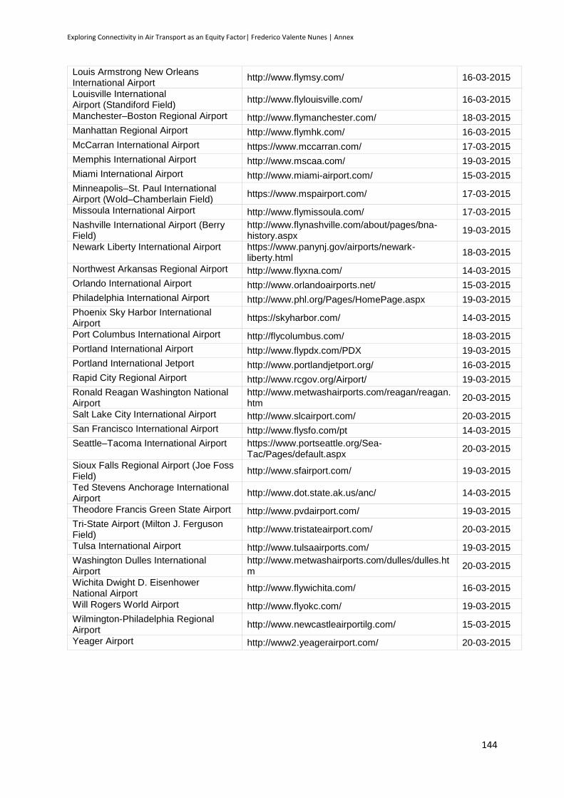
Exploring Connectivity in Air Transport as an Equity Factor| Frederico Valente Nunes | Annex
144
Louis Armstrong New Orleans International Airport
http://www.flymsy.com/ 16-03-2015
Louisville International Airport (Standiford Field)
http://www.flylouisville.com/ 16-03-2015
Manchester–Boston Regional Airport http://www.flymanchester.com/ 18-03-2015
Manhattan Regional Airport http://www.flymhk.com/ 16-03-2015
McCarran International Airport https://www.mccarran.com/ 17-03-2015
Memphis International Airport http://www.mscaa.com/ 19-03-2015
Miami International Airport http://www.miami-airport.com/ 15-03-2015
Minneapolis–St. Paul International Airport (Wold–Chamberlain Field)
https://www.mspairport.com/ 17-03-2015
Missoula International Airport http://www.flymissoula.com/ 17-03-2015
Nashville International Airport (Berry Field)
http://www.flynashville.com/about/pages/bna-history.aspx
19-03-2015
Newark Liberty International Airport https://www.panynj.gov/airports/newark-liberty.html
18-03-2015
Northwest Arkansas Regional Airport http://www.flyxna.com/ 14-03-2015
Orlando International Airport http://www.orlandoairports.net/ 15-03-2015
Philadelphia International Airport http://www.phl.org/Pages/HomePage.aspx 19-03-2015
Phoenix Sky Harbor International Airport
https://skyharbor.com/ 14-03-2015
Port Columbus International Airport http://flycolumbus.com/ 18-03-2015
Portland International Airport http://www.flypdx.com/PDX 19-03-2015
Portland International Jetport http://www.portlandjetport.org/ 16-03-2015
Rapid City Regional Airport http://www.rcgov.org/Airport/ 19-03-2015
Ronald Reagan Washington National Airport
http://www.metwashairports.com/reagan/reagan.htm
20-03-2015
Salt Lake City International Airport http://www.slcairport.com/ 20-03-2015
San Francisco International Airport http://www.flysfo.com/pt 14-03-2015
Seattle–Tacoma International Airport https://www.portseattle.org/Sea-Tac/Pages/default.aspx
20-03-2015
Sioux Falls Regional Airport (Joe Foss Field)
http://www.sfairport.com/ 19-03-2015
Ted Stevens Anchorage International Airport
http://www.dot.state.ak.us/anc/ 14-03-2015
Theodore Francis Green State Airport http://www.pvdairport.com/ 19-03-2015
Tri-State Airport (Milton J. Ferguson Field)
http://www.tristateairport.com/ 20-03-2015
Tulsa International Airport http://www.tulsaairports.com/ 19-03-2015
Washington Dulles International Airport
http://www.metwashairports.com/dulles/dulles.htm
20-03-2015
Wichita Dwight D. Eisenhower National Airport
http://www.flywichita.com/ 16-03-2015
Will Rogers World Airport http://www.flyokc.com/ 19-03-2015
Wilmington-Philadelphia Regional Airport
http://www.newcastleairportilg.com/ 15-03-2015
Yeager Airport http://www2.yeagerairport.com/ 20-03-2015

Exploring Connectivity in Air Transport as an Equity Factor| Frederico Valente Nunes | Annex
145
Related Documents