Stat 501 Experimental Statistics I

Experimental Statistics I. We use data to answer research questions What evidence does data provide? How do I make sense of these numbers without.
Dec 22, 2015
Welcome message from author
This document is posted to help you gain knowledge. Please leave a comment to let me know what you think about it! Share it to your friends and learn new things together.
Transcript
Stat 501Experimental Statistics I
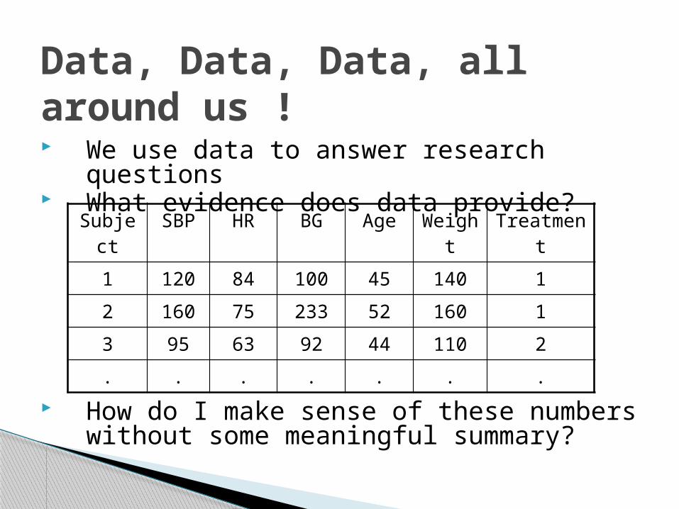
Data, Data, Data, all around us !
We use data to answer research questions What evidence does data provide?
How do I make sense of these numbers without some meaningful summary?
Subject SBP HR BG Age Weight Treatment
1 120 84 100 45 140 1
2 160 75 233 52 160 1
3 95 63 92 44 110 2
. . . . . . .
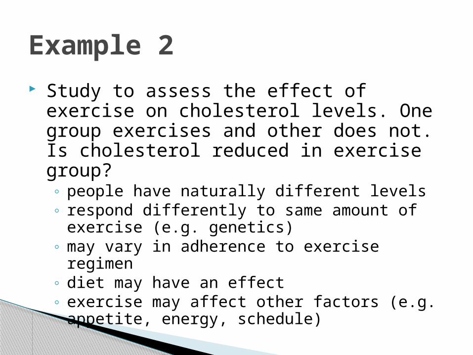
Example 2
Study to assess the effect of exercise on cholesterol levels. One group exercises and other does not. Is cholesterol reduced in exercise group?◦ people have naturally different levels◦ respond differently to same amount of exercise (e.g.
genetics)◦ may vary in adherence to exercise regimen◦ diet may have an effect◦ exercise may affect other factors (e.g. appetite,
energy, schedule)

What is statistics?
Recognize the randomness: the variability in data. …“the science of understanding data and making
decisions in face of variability”
Three steps to the process of statistics: Design the study Analyze the collected Data Discover what data is telling you…
Section 1.2Displaying Distributions with Graphs
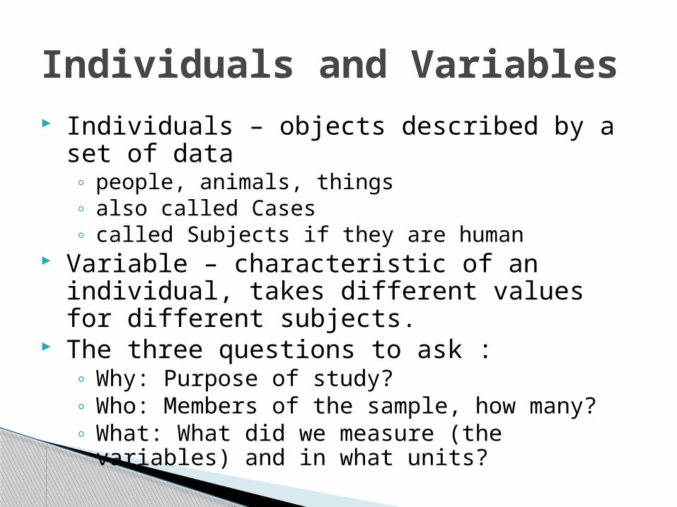
Individuals and Variables Individuals – objects described by a set of data
◦ people, animals, things◦ also called Cases◦ called Subjects if they are human
Variable – characteristic of an individual, takes different values for different subjects.
The three questions to ask : ◦ Why: Purpose of study?◦ Who: Members of the sample, how many?◦ What: What did we measure (the variables) and in
what units?

7
Key Characteristics of a Data Set
Every data set is accompanied by important background information. In a statistical study, always ask the following questions:
Who? What cases do the data describe? How many cases does a data set have?
What? How many variables does the data set have? How are these variables defined? What are the units of measurement for each variable?
Why? What purpose do the data have? Do the data contain the information needed to answer the questions of interest?
8
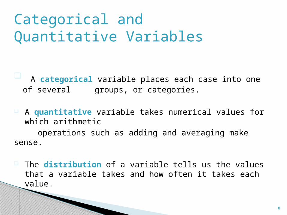
Categorical and Quantitative Variables
A categorical variable places each case into one of several groups, or categories.
A quantitative variable takes numerical values for which arithmetic
operations such as adding and averaging make sense.
The distribution of a variable tells us the values that a variable takes and how often it takes each value.
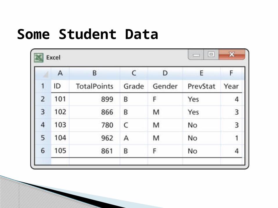
Some Student Data
Distribution of a Variable
10
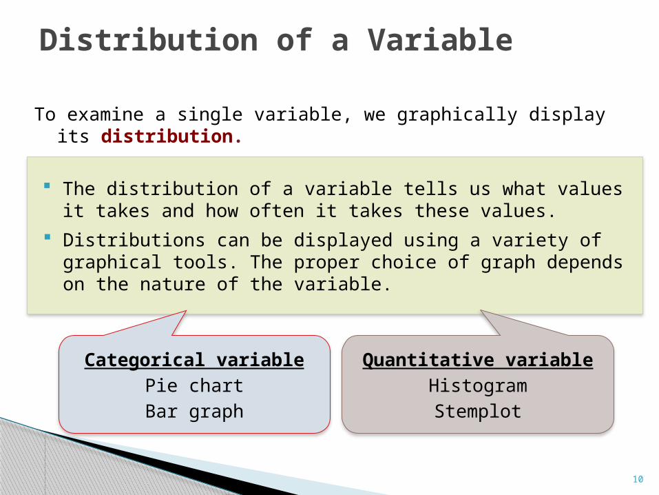
To examine a single variable, we graphically display its distribution.
The distribution of a variable tells us what values it takes and how often it takes these values.
Distributions can be displayed using a variety of graphical tools. The proper choice of graph depends on the nature of the variable.
Categorical variable
Pie chart
Bar graph
Quantitative variable
Histogram
Stemplot
Categorical Variables
11
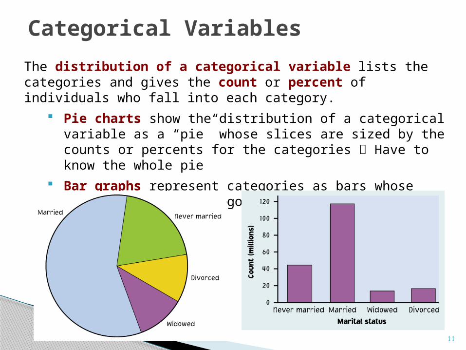
The distribution of a categorical variable lists the categories and gives the count or percent of individuals who fall into each category.
Pie charts show the distribution of a categorical variable as a “pie” whose slices are sized by the counts or percents for the categories Have to know the whole pie
Bar graphs represent categories as bars whose heights show the category counts or percents more flexible
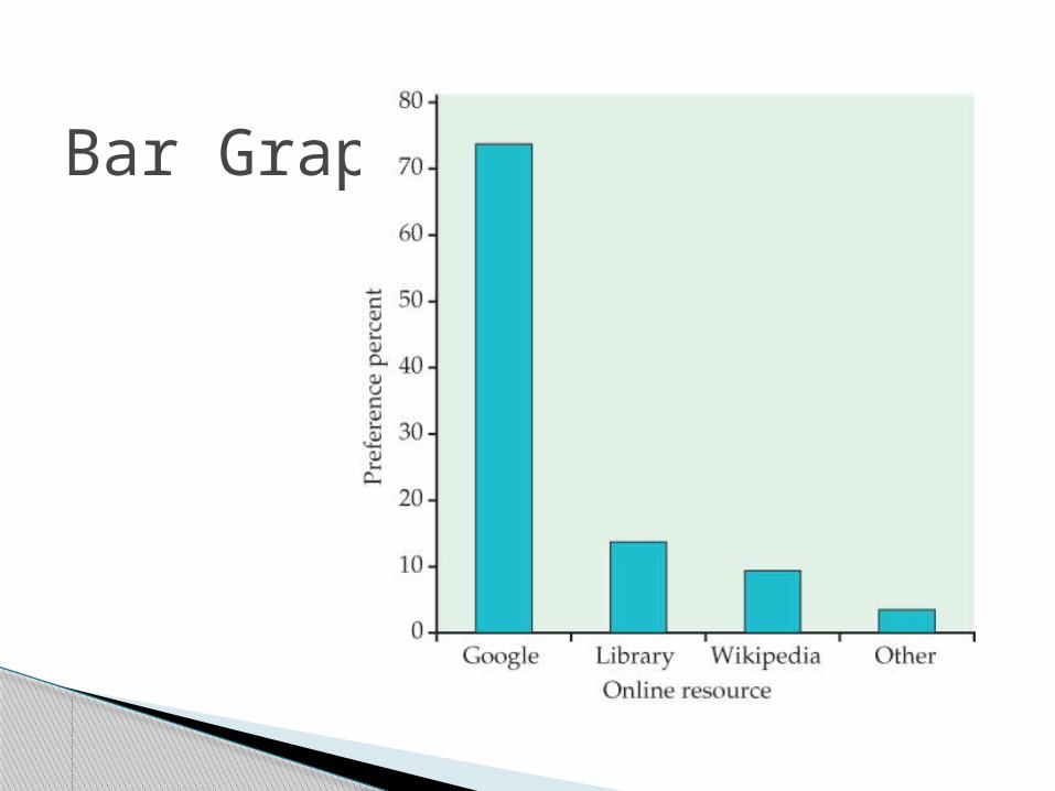
Bar Graph

Pie Chart

Quantitative Variables
14
The distribution of a quantitative variable tells us what values the variable takes on and how often it takes those values.
Histograms show the distribution of a quantitative variable by using bars. The height of a bar represents the number of individuals whose values fall within the corresponding class.
Stemplots separate each observation into a stem and a leaf that are then plotted to display the distribution while maintaining the original values of the variable.
Time plots plot each observation against the time at which it was measured.

15
To construct a stemplot:
Separate each observation into a stem (first part of the number) and a leaf (the remaining part of the number).
Write the stems in a vertical column; draw a vertical line to the right of the stems.
Write each leaf in the row to the right of its stem; order leaves if desired.
Stemplots

16
Stemplots
17
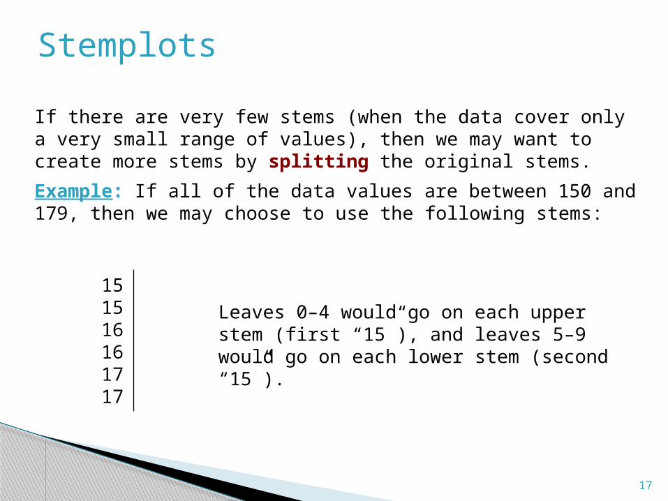
If there are very few stems (when the data cover only a very small range of values), then we may want to create more stems by splitting the original stems.
Example: If all of the data values are between 150 and 179, then we may choose to use the following stems:
151516161717
Leaves 0–4 would go on each upper stem (first “15”), and leaves 5–9 would go on each lower stem (second “15”).
Stemplots

Example:
Numbers of home runs that Hank Aaron hit in each of his 23 years in the Major Leagues:
13 27 26 44 30 39 40 3445 44 24 32 44 39 29 44
38 47 34 40 20 12 10

Step 1: Identify all the stems◦ 1 2 3 4
Step 2: Write the stems in increasing order (usually from top to bottom)
123 4

Step 3: Draw a line next to the stem and write the leaves against the stem
1 3 2 0 2 7 6 4 9 0 3 0 9 4 2 9 8 4 4 4 0 5 4 4 4 7 0

Step 4: Rewrite the stemplot rearranging the leaves in ascending order (this can be done simultaneously with step 3):
1 0 2 3 2 0 4 6 7 9 3 0 2 4 4 8 9 9 4 0 0 4 4 4 4 5 7
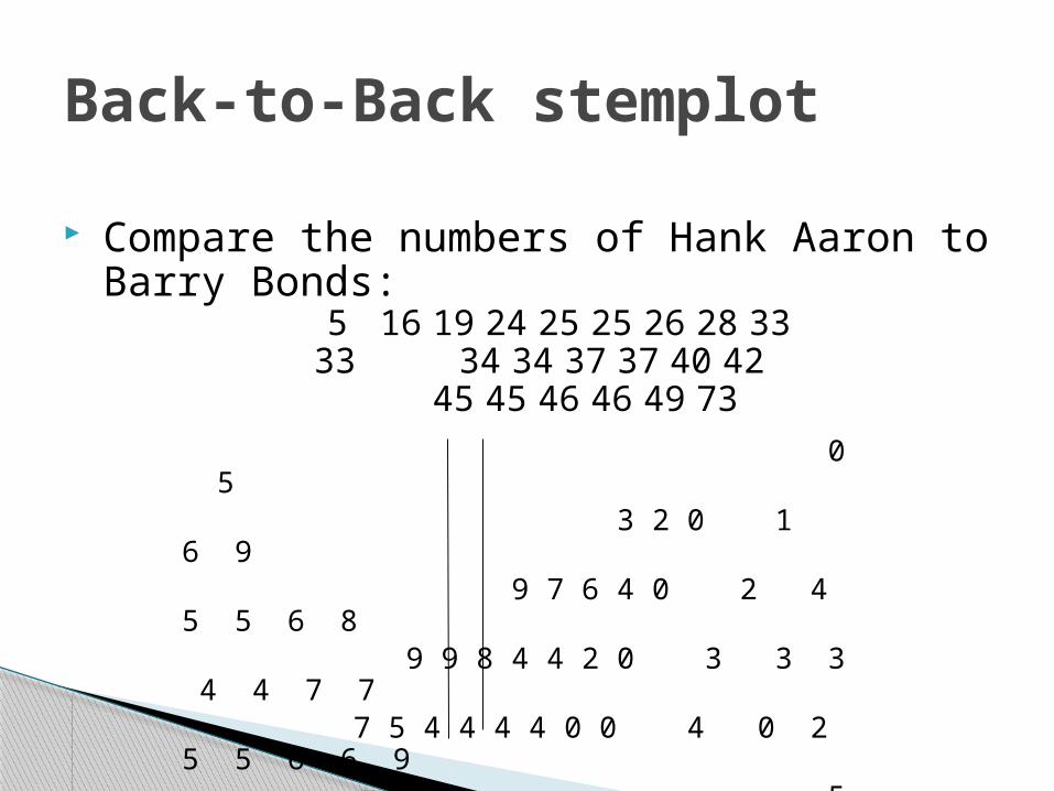
Compare the numbers of Hank Aaron to Barry Bonds:5 16 19 24 25 25 26 28 33
33 34 34 37 37 40 4245 45 46 46 49 73
Back-to-Back stemplot
0 5 3 2 0 1 6 9 9 7 6 4 0 2 4 5 5 6 8 9 9 8 4 4 2 0 3 3 3 4 4 7 7 7 5 4 4 4 4 0 0 4 0 2 5 5 6 6 9 5 6 7 3
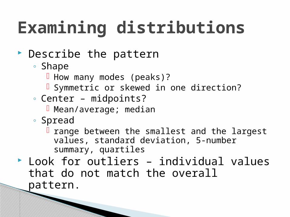
Examining distributions Describe the pattern
◦ Shape How many modes (peaks)? Symmetric or skewed in one direction?
◦ Center – midpoints? Mean/average; median
◦ Spread range between the smallest and the largest values,
standard deviation, 5-number summary, quartiles Look for outliers – individual values that do not
match the overall pattern.
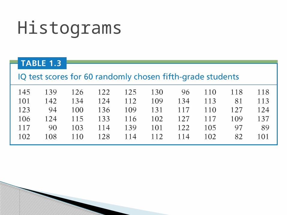
Histograms
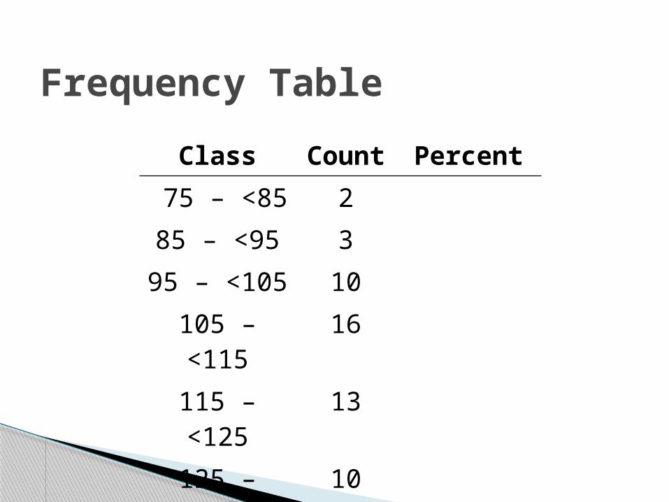
Frequency Table
Class Count Percent
75 – <85 2
85 – <95 3
95 – <105 10
105 – <115 16
115 – <125 13
125 – <135 10
135 – <145 5
145 – <155 1
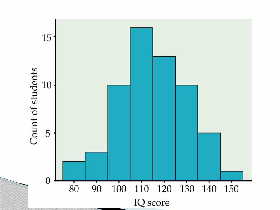
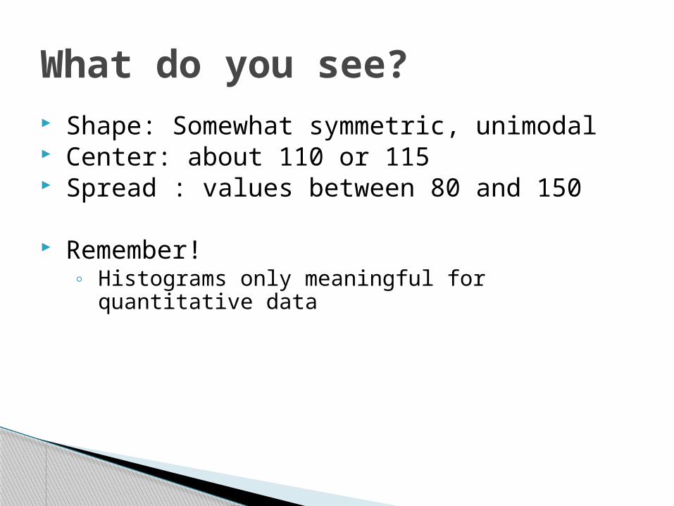
What do you see? Shape: Somewhat symmetric, unimodal Center: about 110 or 115 Spread : values between 80 and 150
Remember! ◦ Histograms only meaningful for quantitative data
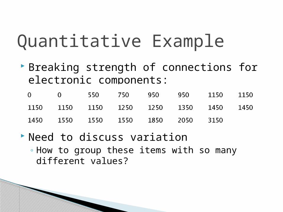
Quantitative Example Breaking strength of connections for electronic
components:
Need to discuss variation◦How to group these items with so many different values?

Dealing with outliers
Outliers
Check for recording errors Violation of experimental conditions Discard it only if there is a valid practical or
statistical reason, not blindly!
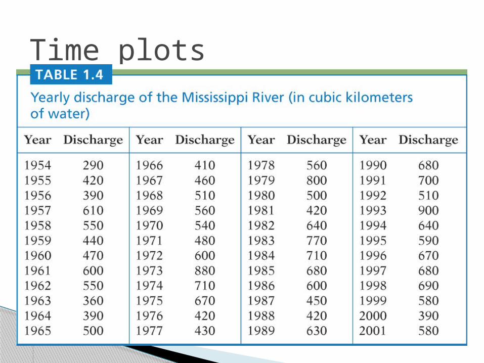
Time plots

Time plots
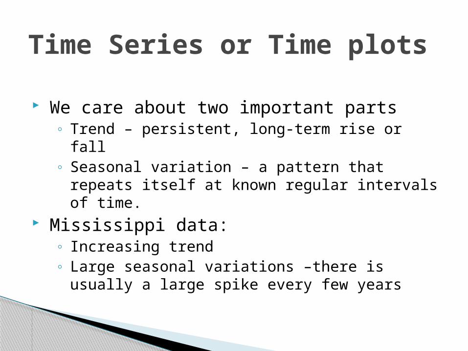
Time Series or Time plots
We care about two important parts◦ Trend – persistent, long-term rise or fall◦ Seasonal variation – a pattern that repeats itself at
known regular intervals of time. Mississippi data:
◦ Increasing trend◦ Large seasonal variations –there is usually a large spike
every few years
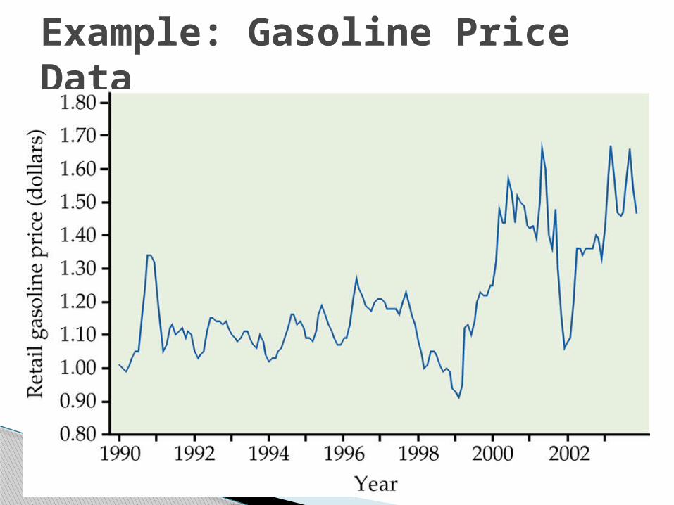
Example: Gasoline Price Data

Summary Categorical and Quantitative variables Graphical tools for categorical variables
◦ Bar Chart◦ Pie Chart
Graphical tools for quantitative variables◦ Stem and leaf plot◦ Histogram◦ Maybe timeplot if appropriate
Distributions◦ Describe: Shape, center, spread◦ Watch for patterns and/or deviations from patterns.
Related Documents


