OCR Media Studies – AS Level Unit G321: Foundation Portfolio in Media Evaluation Name: Candidate Number: Center Name: St. Paul’s Catholic College Center Number: Set Brief - Print Music Magazine – Production Preliminary Task, Log Book and Evaluation

Welcome message from author
This document is posted to help you gain knowledge. Please leave a comment to let me know what you think about it! Share it to your friends and learn new things together.
Transcript

OCR Media Studies – AS Level
Unit G321: Foundation Portfolio in Media
Evaluation
Name:Candidate Number:Center Name: St. Paul’s Catholic CollegeCenter Number:
Set Brief - Print
Music Magazine – Production
Preliminary Task, Log Book and Evaluation
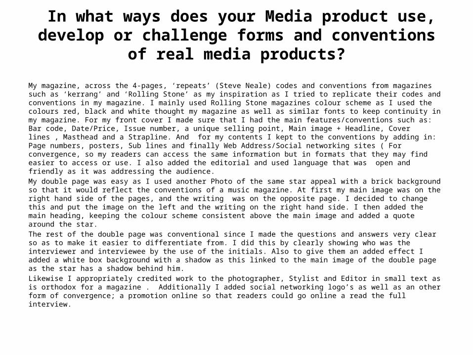
In what ways does your Media product use, develop or challenge forms and conventions of real media products?
My magazine, across the 4-pages, ‘repeats’ (Steve Neale) codes and conventions from magazines such as ‘kerrang’ and ‘Rolling Stone’ as my inspiration as I tried to replicate their codes and conventions in my magazine. I mainly used Rolling Stone magazines colour scheme as I used the colours red, black and white thought my magazine as well as similar fonts to keep continuity in my magazine. For my front cover I made sure that I had the main features/conventions such as: Bar code, Date/Price, Issue number, a unique selling point, Main image + Headline, Cover lines , Masthead and a Strapline. And for my contents I kept to the conventions by adding in: Page numbers, posters, Sub lines and finally Web Address/Social networking sites ( For convergence, so my readers can access the same information but in formats that they may find easier to access or use. I also added the editorial and used language that was open and friendly as it was addressing the audience.My double page was easy as I used another Photo of the same star appeal with a brick background so that it would reflect the conventions of a music magazine. At first my main image was on the right hand side of the pages, and the writing was on the opposite page. I decided to change this and put the image on the left and the writing on the right hand side. I then added the main heading, keeping the colour scheme consistent above the main image and added a quote around the star.The rest of the double page was conventional since I made the questions and answers very clear so as to make it easier to differentiate from. I did this by clearly showing who was the interviewer and interviewee by the use of the initials. Also to give them an added effect I added a white box background with a shadow as this linked to the main image of the double page as the star has a shadow behind him.Likewise I appropriately credited work to the photographer, Stylist and Editor in small text as is orthodox for a magazine . Additionally I added social networking logo’s as well as an other form of convergence; a promotion online so that readers could go online a read the full interview.
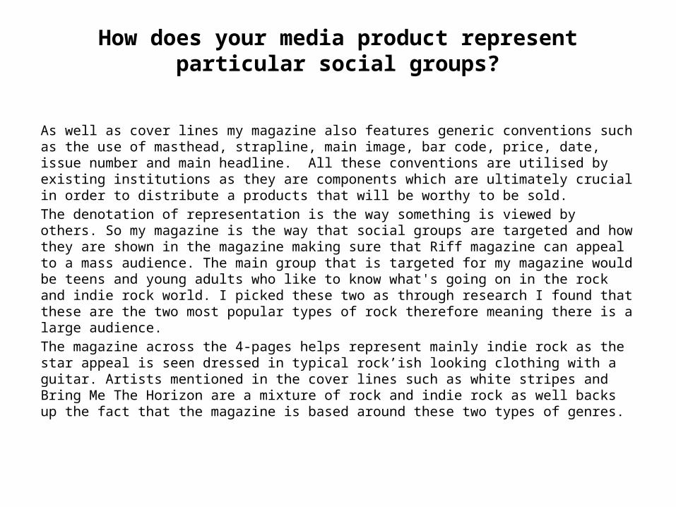
How does your media product represent particular social groups?
As well as cover lines my magazine also features generic conventions such as the use of masthead, strapline, main image, bar code, price, date, issue number and main headline. All these conventions are utilised by existing institutions as they are components which are ultimately crucial in order to distribute a products that will be worthy to be sold.The denotation of representation is the way something is viewed by others. So my magazine is the way that social groups are targeted and how they are shown in the magazine making sure that Riff magazine can appeal to a mass audience. The main group that is targeted for my magazine would be teens and young adults who like to know what's going on in the rock and indie rock world. I picked these two as through research I found that these are the two most popular types of rock therefore meaning there is a large audience.The magazine across the 4-pages helps represent mainly indie rock as the star appeal is seen dressed in typical rock’ish looking clothing with a guitar. Artists mentioned in the cover lines such as white stripes and Bring Me The Horizon are a mixture of rock and indie rock as well backs up the fact that the magazine is based around these two types of genres.
What kind of media institution (Publisher) might distribute your media product and why?
From the official Bauer website: “Our business is built on influential media brands with millions of personal relationships with engaged readers and listeners. Our strategy is to connect audiences with excellent content through our broad multi-touch point brand platforms, wherever and whenever and however they want”
From the research that was completed pre-production, I would envisage that Bauer Media group may publish ‘Riff’ because they are excellent in creating ‘personal relationships’ (Katz) with their readers and I really believe that my magazine does this well especially with my editorial as it uses informal language to make a bond with the readers and make them feel welcome. Also my magazine has a lot of synergy and cross-media convergence which will allow the readers to access the content in many different ways since I have social networking sites in association with my magazine.
who would be the audience for your media product and why?
According to Hartley’s seven subjectivities, the target audience for my magazine would be for the age range of 16 to 25. According to Maslow’s hierarchy of needs, ‘social climbers’ would make up a large amount of the readership since they would try and seek as much information as possible so they were ‘informed’ and ‘educated’(Katz) on everything that was new. Also the working proletariat class (Karl Marx) would really be targeted since they would be able to afford the magazine as well as appreciate the ‘diversion’ (Katz) it offers from day to day life.

How did you attract/address your audience?
In order to attract the intended target audience I decided to have a few Unique Selling Points. I also used language such as ‘Exclusive’ and ‘Free’ as this will help attract the audience since they are words that are very direct therefore attracting an audience and making readers feel they are getting something of value. The inclusion of codes & conventions such as having an editorial in the contents page helped to appeal to the target audience because, with the direct address in the letter, it will make the readers feel important and part of ‘Riff’. This could make readers want to the next issues because it makes them feel a part of a community.
what have you learnt about technologies from the process of constructing this product?
• The software used to construct the media product entitled ‘Riff’ was Adobe Photoshop CS4. I used this because it had a lot of tools which allowed me to alter the colour, saturation and contrast of my images. Also it gave me the ability to use fonts of my choice and to place them in different ways to suit my preference. I had minimum knowledge of Photoshop before I started this project however I have now learnt how to appropriately make use of layers. Photoshop was really helpful because using the eye tool I could try different pictures with the same layout and see how even the final product would look easily while being able to change it back to normal very quickly. This was especially useful because I had made a lot of changes to pictures. To give my product to look original I decided to us www.dafont.com and downloaded some fonts to use in my magazine because it allowed me to use a varity of fonts and this was conventional and this repetition (Steve Neale). In order for this product to look fit for purpose and appeal to the target audience, I decided to brighten all the images by adjusting the hue and saturation. It also give the pictures a really good finish I used the rubber tool to cover over any ‘imperfections’ such as spots and cuts.
• In conclusion, I have learnt to effectively alter images so that they are conventional as well as learning the art of making the text fit around the images while at the same time being clear.
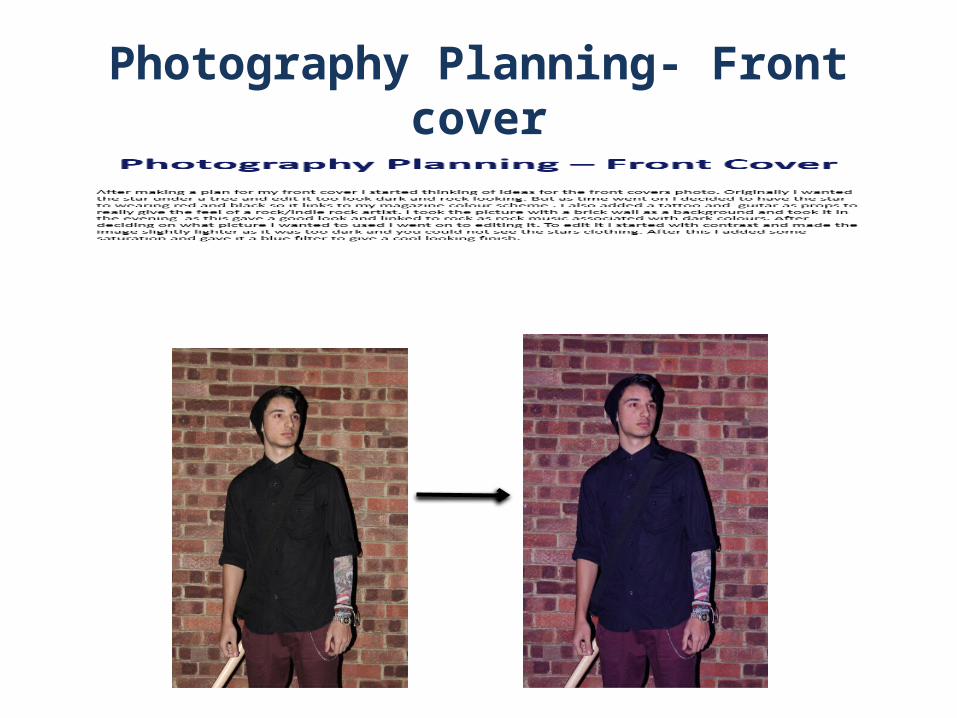
Photography Planning- Front cover


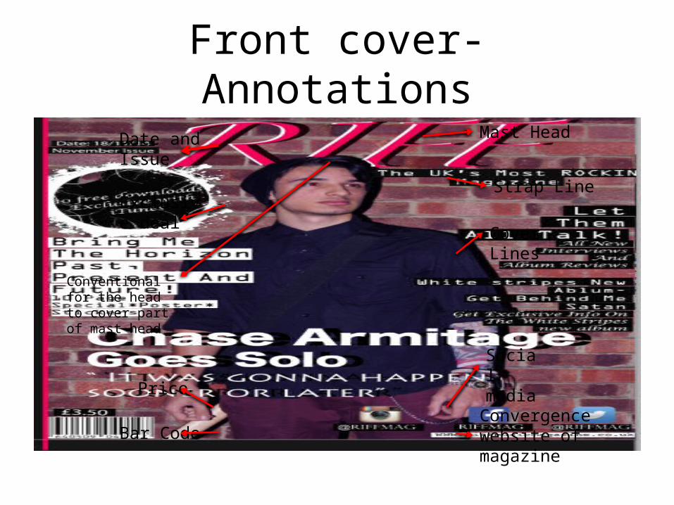
Front cover- AnnotationsMast Head
Strap Line
Cover Lines
Social media
Date and Issue
Exclusive deal
Price
Bar CodeConvergence website of magazine
Conventional for the head to cover part of mast head

Contents Page- Annotations
Date and Issue
Page Number
Social Media
Sections
Editorial
Images
Editor information

Double Page- AnnotationsIntro to artist
Main image
Mast head repeat
Credit to editor, photographer and stylist
Convergence website of magazine
Page number
Related Documents