(MY FRONT COVER) (ASGEIR – IN THE SILENCE) This was only a test shot at first as I was just experimenting with lighting and different poses I could get my artist to do to see which ones worked. After editing the image and seeing if I liked it, I decided to use it in the final design of my digipak because I liked how close up it was and also felt that it looked really professional and like a real product that could be found in a shop like Asda or an online shop like Play.com or Amazon.

Evaluation Question One; front cover of digipak.
Aug 10, 2015
Welcome message from author
This document is posted to help you gain knowledge. Please leave a comment to let me know what you think about it! Share it to your friends and learn new things together.
Transcript

(MY FRONT COVER) (ASGEIR – IN THE SILENCE)
This was only a test shot at first as I was just experimenting with lighting and different poses I could get my artist to do to see which ones worked. After editing the image and seeing if I liked it, I decided to use it in the final design of my digipak because I liked how close up it was and also felt that it looked really professional and like a real product that could be found in a shop like Asda or an online shop like Play.com or Amazon.

Artist name
Artist appearance
Dramatic lighting
As you can see from the labelled images above, I have used Asgeir’s album ‘In The Silence’ as inspiration quite a lot for my front cover. I have tried to replicate the lighting he has used on his album, although I think that his looks a lot more manipulated than mine does as his front cover has a blue tint to it. I tried to keep mine as natural-looking as I possibly could, which is why I experimented with the lighting so that I got it as close to what I wanted, so I only had to alter the levels on Photoshop. I have also just noticed that his front cover doesn’t contain only one image but 2; a close up of his face and another shot that seems to be a medium close up placed in the forehead of the artist. I don’t think this would have worked on my product because it doesn’t really fit in well with the conventions of an indie-pop artist’s product. Differently to Asgeir’s album, though, I decided not to place the artist’s name across her face because I feel like this looks a little bit unorganised and unprofessional (although it may work for some genres, for example M.I.A.’s albums are very crowded in their design but this works because of the mix of genres she is categorized into – she is electronic, dance, Bhangra fusion and gaana along with many more)

Artist name
Artist appearance
Dramatic lighting
However, on the front cover of my product, I have followed conventions because I have included the parts that are necessary for an album; the name of the album, the artist’s appearance and, although not always, the name of the artist. ‘In The Silence’ doesn’t include the name of the album, which could suggest that he feels that he is well enough known to be able to sell an album with just his name, similarly to what Beyoncé did back in December 2013. I consciously made the decision to add the name of my artist’s album because I felt this was appropriate asit is going to be the artist’s debut album, so needs to be added so that consumersof the product know what it is called. This will make it sell more because it allowspeople to talk about it.

This is Lana Del Rey’s album, which is done in the opposite way to which Asgeir’s album, as it contains the album name but not the artist’s name, suggesting again that she is very popular in the music industry. I think this works really well for Lana because she is quite a mysterious artist and reflects this in the style of her music and the products she creates.

On the previous slide are some front covers of existing albums that illustrate the point I made two slides back; how most CD’s contain the artist’s name and album name but this doesn’t always happen. Another CD that I took inspiration from was this one by Katy Perry, entitled ‘Prism’.
I thought that my product looked quite good with just the image and the text on it, but decided to place a border around it to give it a slight frame. I used a screen shot of a clip from my video that I did of a pan of the sky as a border because I feel that this illustrates the artist as calm and also demonstrates continuity between the digipak and the music video. Differently to Katy Perry, I didn’t add two borders (a thin one around the image, and then a wider one around this) as I thought that my front cover looked really effective with just the one. I also placed the text on my front cover in similar places to how Perry has placed hers as I think the eye is drawn straight to the album name at the bottom of the cover, which is what I am trying to promote. I used more of a basic font for my artist’s name than Perry has on her album cover as I want the attention to be focused on the album name, but still want her name to be noticed – this is the reason I placed her name at the top of the front cover in capital letters; it is easy to read but isn’t a distraction.
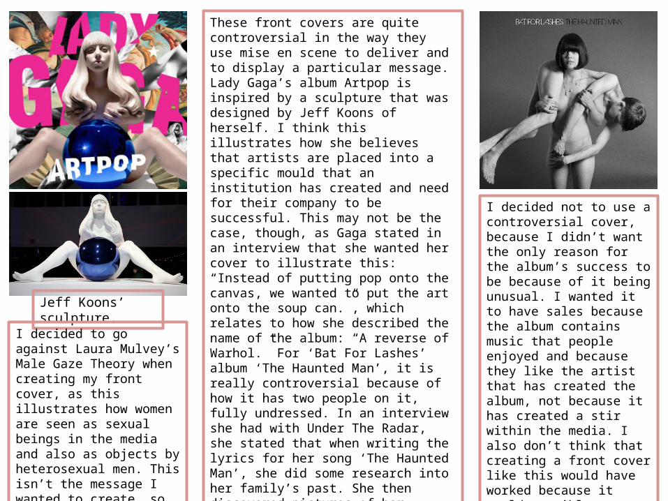
These front covers are quite controversial in the way they use mise en scene to deliver and to display a particular message. Lady Gaga’s album Artpop is inspired by a sculpture that was designed by Jeff Koons of herself. I think this illustrates how she believes that artists are placed into a specific mould that an institution has created and need for their company to be successful. This may not be the case, though, as Gaga stated in an interview that she wanted her cover to illustrate this: “Instead of putting pop onto the canvas, we wanted to put the art onto the soup can.”, which relates to how she described the name of the album: “A reverse of Warhol.” For ‘Bat For Lashes’ album ‘The Haunted Man’, it is really controversial because of how it has two people on it, fully undressed. In an interview she had with Under The Radar, she stated that when writing the lyrics for her song ‘The Haunted Man’, she did some research into her family’s past. She then discovered pictures of her great-great grandmother, who wore things like high necks and in her generation they weren’t allowed to show their wrists or ankles. I think this is the reason that she has chosen to do the front cover that she has, as it challenges this representation of how her great-great grandmother was seen. This album cover would also be very likely to create a discussion with its release as it contains something that could be seen as almost explicit.
Jeff Koons’ sculpture.
I decided not to use a controversial cover, because I didn’t want the only reason for the album’s success to be because of it being unusual. I wanted it to have sales because the album contains music that people enjoyed and because they like the artist that has created the album, not because it has created a stir within the media. I also don’t think that creating a front cover like this would have worked because it would possibly portray the artist in a way that I don’t want her to be shown. I also don’t think it would be suitable, as the artist I have used is 17 years old.
I decided to go against Laura Mulvey’s Male Gaze Theory when creating my front cover, as this illustrates how women are seen as sexual beings in the media and also as objects by heterosexual men. This isn’t the message I wanted to create, so ensured the artist on my front cover was clothed and looked confident doing so.

I purposefully used really harsh lighting on my front cover to illustrate a split personality of the artist. I did this because I think it illustrates the meaning of the music video I have created: the dark side of her face that is covered in a shadow represents the side that wants to fit in and be popular; it is difficult to see her face but you can still tell it’s there, and the lighter side portrays the side that is actually her being herself, and not trying to fill a mould that has been created by the society in which we live in. I also filled the whole frame in terms of cinematography because I think this shows how the artist is confident in herself; this represents the message of the video and also the message I want to create for the whole digipak. This will also make herself as an individual more memorable because her whole face is visible and will therefore be more likely to stick in the audience’s mind and will remember her easier if they have a face to put to the music.
Actual personality‘popular’ side
Related Documents