Evaluation 1. In what ways does your media product use and develop forms and conventions of real media products?

Welcome message from author
This document is posted to help you gain knowledge. Please leave a comment to let me know what you think about it! Share it to your friends and learn new things together.
Transcript

Evaluation
1. In what ways does your media product use and develop forms and conventions of real media products?

Front cover
• Skyline
• Masthead
I used my front cover image to partly cover my masthead. I only partly covered it as it is the first issue of my magazine so people would not be familiar with the name or layout of my magazine and would therefore need to be viewable. Once magazine had become more known by my audience I could do something more like billboard as they have most of their masthead covered by their front cover image. I found that red was a popular colour for mastheads in music magazines and my audience research told me that most of my audiences favourite colour was red so I used red in my masthead.
My skyline features an article within my magazine. I did this because most magazines have a cover line within their skyline. Some skylines have some sort of special content or an exclusive article featured in their skyline, however I wanted my main cover line of Engine Vein as a cover line rather than in a skyline.

Front Cover
• Cover Lines My cover lines are similar to the ones in billboard as they fit around the image but still slightly cover it. They also look similar to it because there are more cover lines on the right than the left. The people om the front cover are also doing the same kind of pose and I didn’t notice this when I was taking and selecting the images so it was not intentional.However my front cover is also very different from the billboard one as it is a totally different colour scheme with totally different cover lines. Billboard does not have a banner or skyline and just seems to be a really simple layout. I think this is because billboard is well known and they don’t have to sell the magazine with the front cover. They don’t have to advertise all of their contents on the front cover because I'm sure that many people probably buy it just because it is Billboard.

Front Cover
• Barcode
I put my barcode in the bottom right hand corner of the front cover like most magazines do. The only other place I found it to be common was the bottom left hand side. I decided to go for the right hand side because that is where it fit best for my front cover. I put the price and the issue number next to the barcode along with the issue date as many magazines do the same and also because I think it would look a little out of place anywhere else.
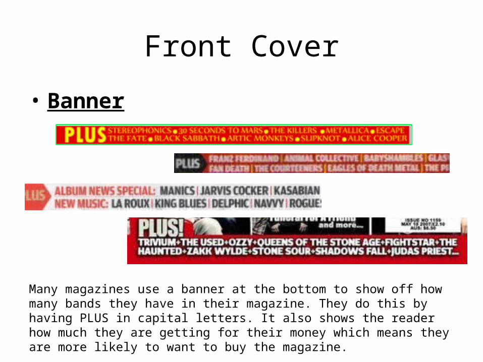
Front Cover
• Banner
Many magazines use a banner at the bottom to show off how many bands they have in their magazine. They do this by having PLUS in capital letters. It also shows the reader how much they are getting for their money which means they are more likely to want to buy the magazine.

Contents Page

Contents Page• My contents page relates to real contents pages in many ways for
example it includes the masthead at the top of the page and the word contents underneath it.
• My contents page is also similar to others because of the layout. The layout is three columns and involves images towards the top right hand corner.
• The numbers on my contents page are in a larger font and different colour to the writing.
• The writing is then split up into the main article to attract the reader in a bold font and a little bit underneath to explain the article in a smaller font. I did this to make my contents page look real. I think it is done in real magazines to make it easier for the reader to find what they want.

Double Page Spread

Double Page Spread• Article
My article follows the conventions of a real music magazine because the stand first in a different font and size to introduce the article. I then have three columns of text that I
wrote from my interview with quotes in a larger font to break the text up so it doesn’t look like too much for my reader to read. I have also put a few quotes in a different colour with in the text as well to catch the readers attention.

Double Page Spread
• ImageMy image for the double page spread fits the entire page and has a person that takes up one whole side of the double page. The mise en scene of my image conveys a rock attitude because of the pose as he stood with his shoulders relaxed and his head tilted slightly upwards whilst looking into the camera and giving direct address. He is also wearing a t-shirt that is merch from a rock band.
Related Documents

![Question two for evaluation of coursework. [autosaved]](https://static.cupdf.com/doc/110x72/54905601b479594c358b4a16/question-two-for-evaluation-of-coursework-autosaved-5584a96243aeb.jpg)