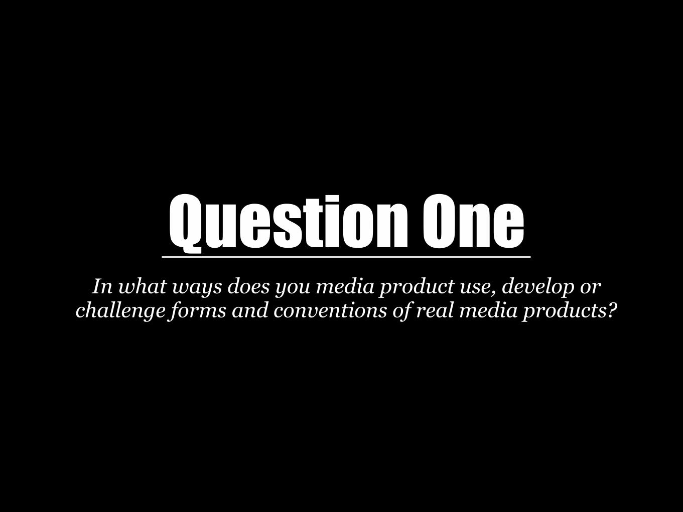
Question One In what ways does you media product use, develop or challenge forms and conventions of real media products?

Welcome message from author
This document is posted to help you gain knowledge. Please leave a comment to let me know what you think about it! Share it to your friends and learn new things together.
Transcript
Question OneIn what ways does you media product use, develop or
challenge forms and conventions of real media products?
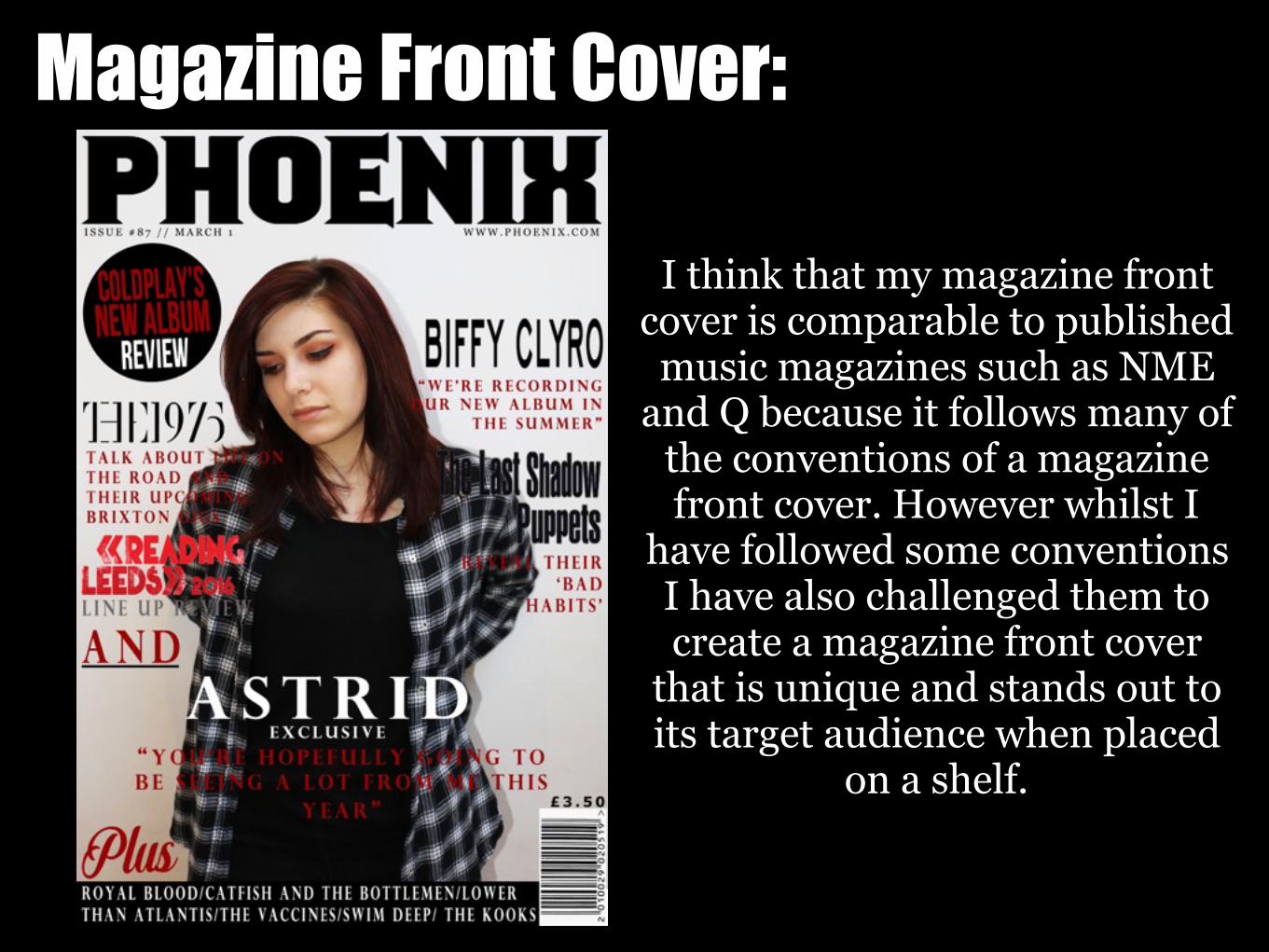
Magazine Front Cover:
I think that my magazine front cover is comparable to published
music magazines such as NME and Q because it follows many of
the conventions of a magazine front cover. However whilst I
have followed some conventions I have also challenged them to create a magazine front cover
that is unique and stands out to its target audience when placed
on a shelf.
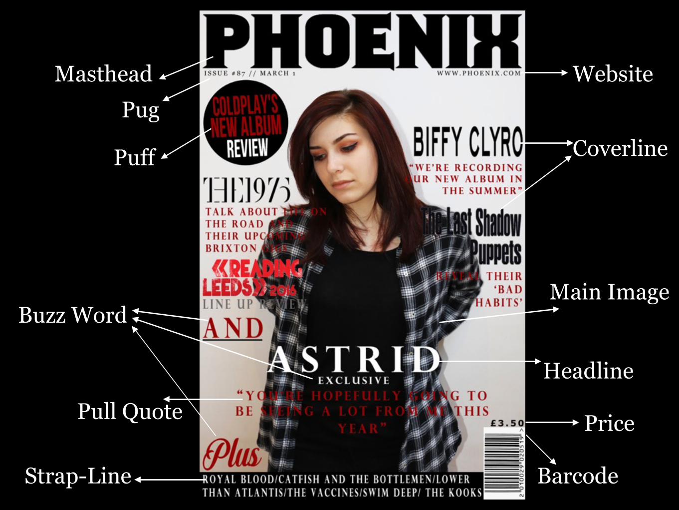
Masthead
Puff
BarcodeStrap-Line
Main Image
Headline
Pug
Pull Quote
Website
Price
Buzz Word
Coverline
Phoenix & NME Comparison:
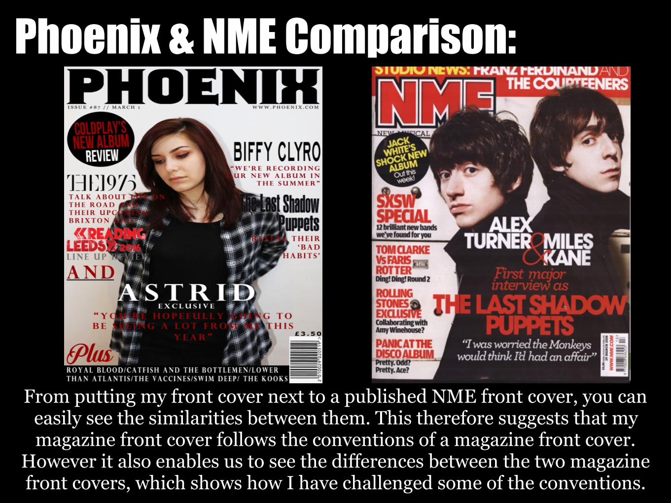
From putting my front cover next to a published NME front cover, you can easily see the similarities between them. This therefore suggests that my magazine front cover follows the conventions of a magazine front cover.
However it also enables us to see the differences between the two magazine front covers, which shows how I have challenged some of the conventions.
Main Image:The main image on my magazine front cover reflects the models unique style and
personality because of mise en scene. The main image denotes the model wearing a black t-shirt with a black and white flannel, she also has heavy eye-makeup which
compliments her hair colour. The clothing that the model is wearing is inspired by the culture that has been created by the indie rock genre, this therefore allows the model to be more subjective to an indie rock star image. The shot is a mid-shot which allows the model to seen from the waist up; this is commonly done for main images on magazine
front covers because it doesn't give the model to much height and therefore doesn't make them appear intimidating.
I also used a white backdrop when taking my photographs so that the magazine front cover background was white; this is commonly used for main images on magazine front covers because it enables the model/models to stand out and be the main focus of the cover. This shows that I have followed some of the conventions of a main image for a
magazine front cover.
However unlike most magazine front covers, the model in my main image isn't looking directly into the camera, instead she looking down. This therefore challenges the
conventions because the model isn't directly looking at the audience. I believe that this adds to the indie rock star image because she doesn't want to follow the conventions
and has a more carefree attitude.
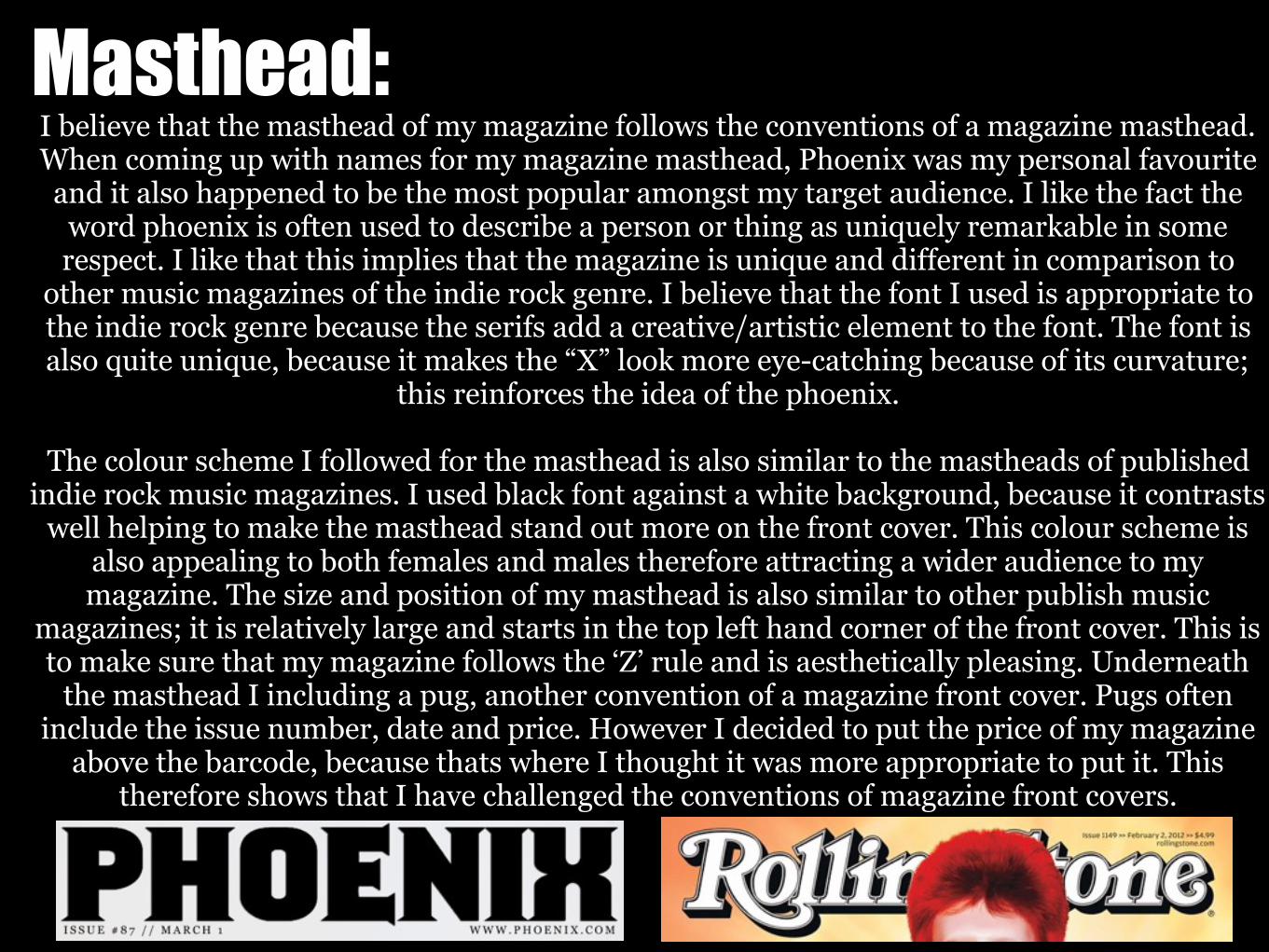
Masthead:I believe that the masthead of my magazine follows the conventions of a magazine masthead. When coming up with names for my magazine masthead, Phoenix was my personal favourite and it also happened to be the most popular amongst my target audience. I like the fact the
word phoenix is often used to describe a person or thing as uniquely remarkable in some respect. I like that this implies that the magazine is unique and different in comparison to
other music magazines of the indie rock genre. I believe that the font I used is appropriate to the indie rock genre because the serifs add a creative/artistic element to the font. The font is also quite unique, because it makes the “X” look more eye-catching because of its curvature;
this reinforces the idea of the phoenix.
The colour scheme I followed for the masthead is also similar to the mastheads of published indie rock music magazines. I used black font against a white background, because it contrasts
well helping to make the masthead stand out more on the front cover. This colour scheme is also appealing to both females and males therefore attracting a wider audience to my magazine. The size and position of my masthead is also similar to other publish music
magazines; it is relatively large and starts in the top left hand corner of the front cover. This is to make sure that my magazine follows the ‘Z’ rule and is aesthetically pleasing. Underneath
the masthead I including a pug, another convention of a magazine front cover. Pugs often include the issue number, date and price. However I decided to put the price of my magazine
above the barcode, because thats where I thought it was more appropriate to put it. This therefore shows that I have challenged the conventions of magazine front covers.
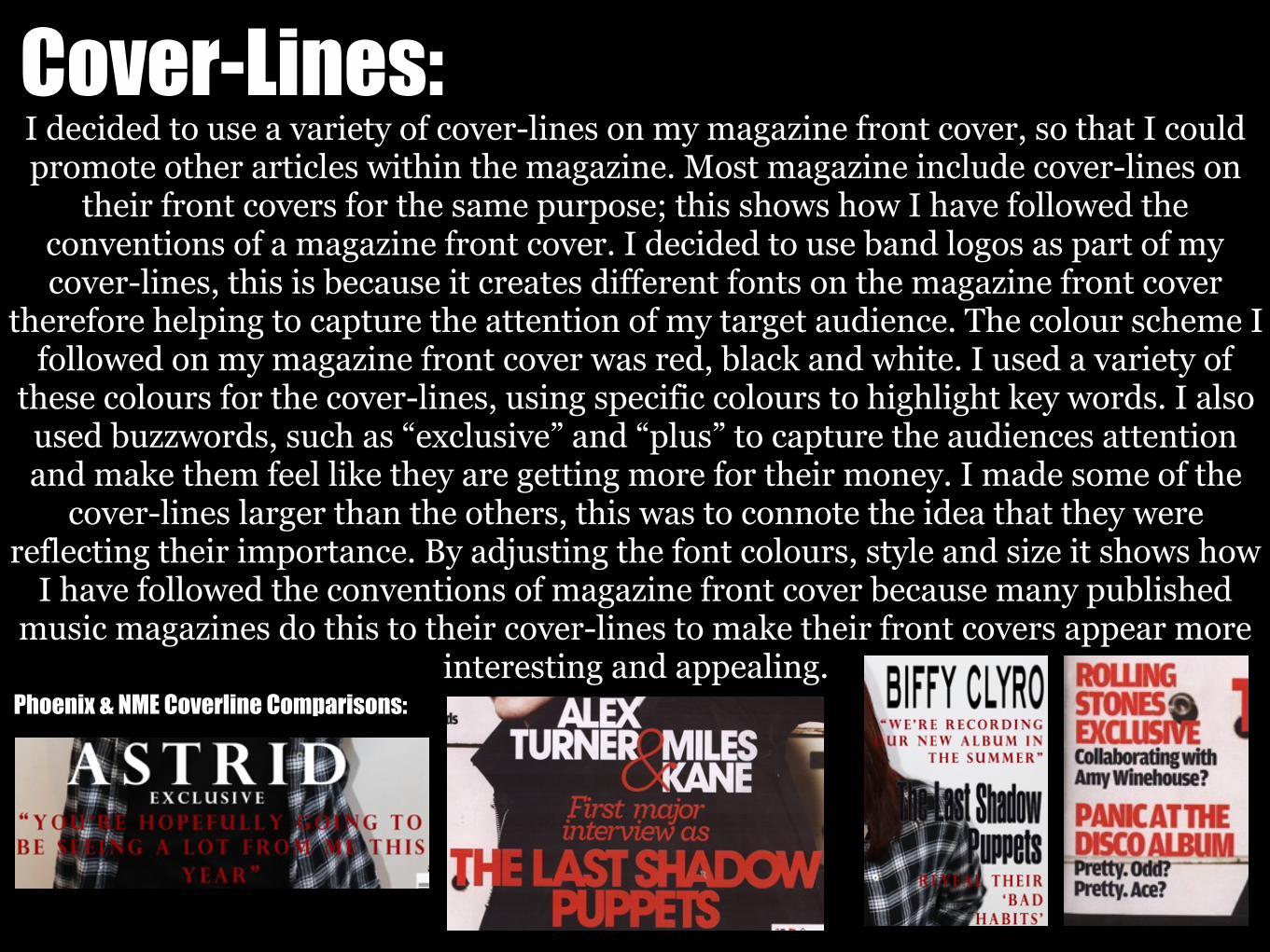
Cover-Lines:I decided to use a variety of cover-lines on my magazine front cover, so that I could promote other articles within the magazine. Most magazine include cover-lines on
their front covers for the same purpose; this shows how I have followed the conventions of a magazine front cover. I decided to use band logos as part of my cover-lines, this is because it creates different fonts on the magazine front cover
therefore helping to capture the attention of my target audience. The colour scheme I followed on my magazine front cover was red, black and white. I used a variety of
these colours for the cover-lines, using specific colours to highlight key words. I also used buzzwords, such as “exclusive” and “plus” to capture the audiences attention and make them feel like they are getting more for their money. I made some of the
cover-lines larger than the others, this was to connote the idea that they were reflecting their importance. By adjusting the font colours, style and size it shows how
I have followed the conventions of magazine front cover because many published music magazines do this to their cover-lines to make their front covers appear more
interesting and appealing. Phoenix & NME Coverline Comparisons:
Challenging Conventions :I believe that my magazine front cover follows most of the conventions of a
published magazine. However there are some conventions that I decided to change to suit the layout/style of my magazine front cover or not include because I didn't think that they were necessary to make my magazine front cover look professional
and aesthetically pleasing. Here are some of the other conventions that I challenged that I have not yet mentioned. Some music magazine front covers include an additional small image on them, to give their audience an insight to the other articles included in the magazine. I decided to include this convention of my
magazine front cover because I believe that it can make it look messy and crowed, as well as the fact I think that the contents page can be used to display more images. Another convention that I decided not to follow was including a skyline/strap-line along the top of my magazine. I didn't think this feature was necessary because I had already included a strap-line along the bottom of my magazine and thought
that it would make the magazine front cover appear to crowed if both were included and look unappealing. I don't think that the absence of an additional image and a skyline has an impact on the overall layout of my magazine front cover because it
follows enough of the conventions to be successful.
Magazine Contents Page:
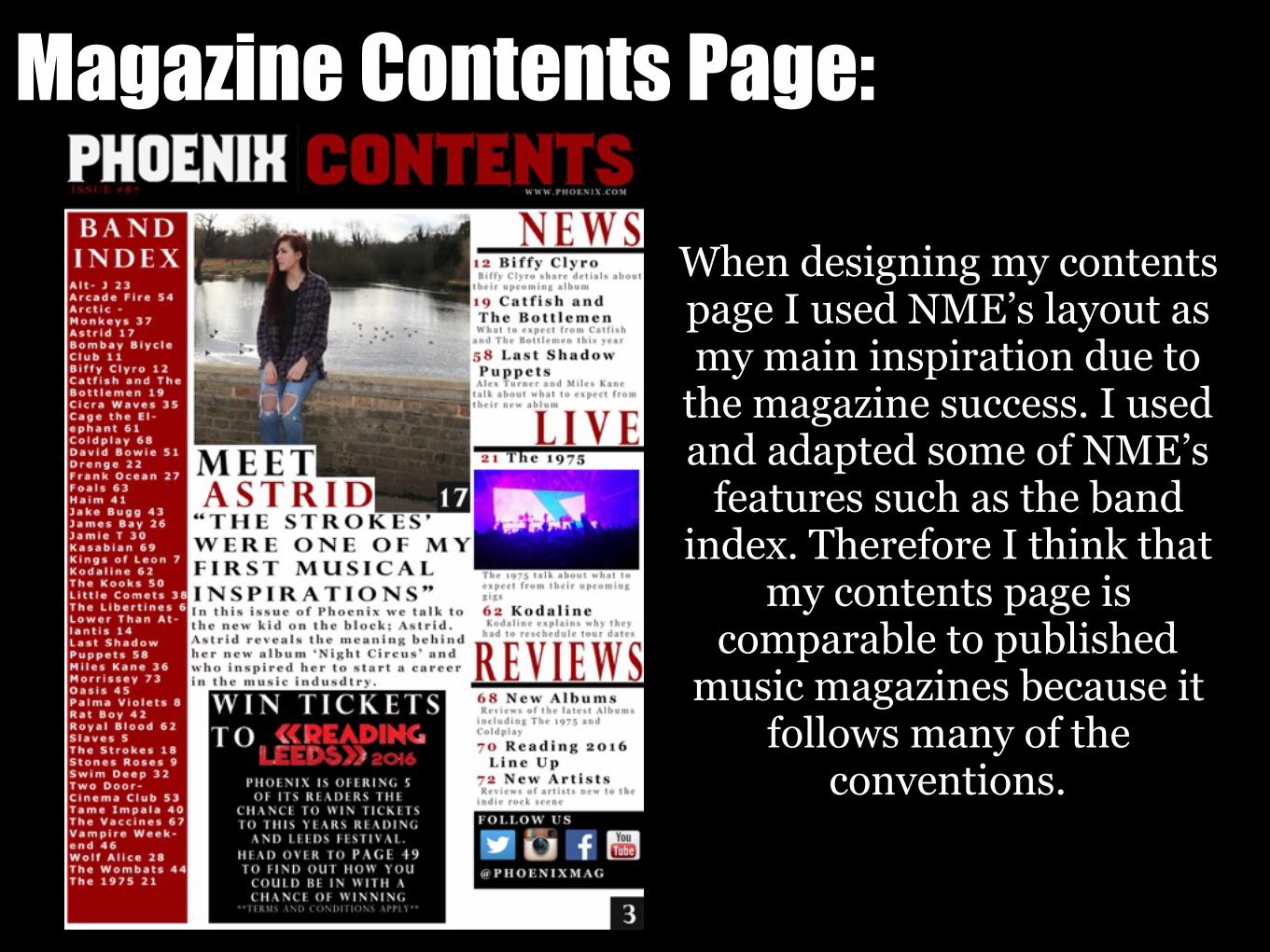
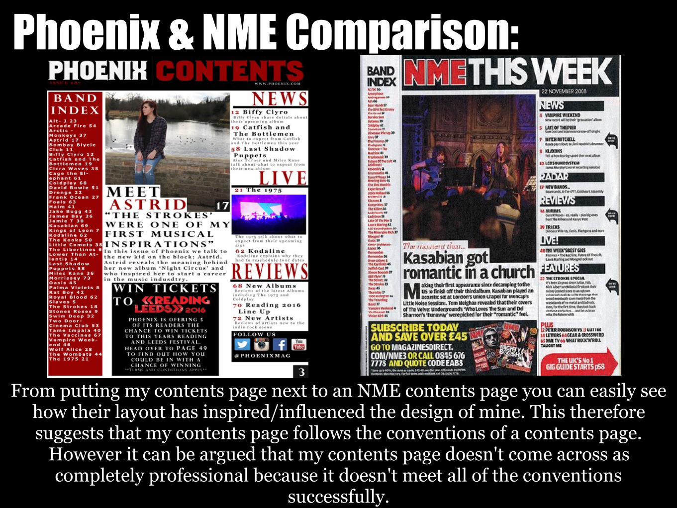
When designing my contents page I used NME’s layout as my main inspiration due to
the magazine success. I used and adapted some of NME’s
features such as the band index. Therefore I think that
my contents page is comparable to published
music magazines because it follows many of the
conventions.
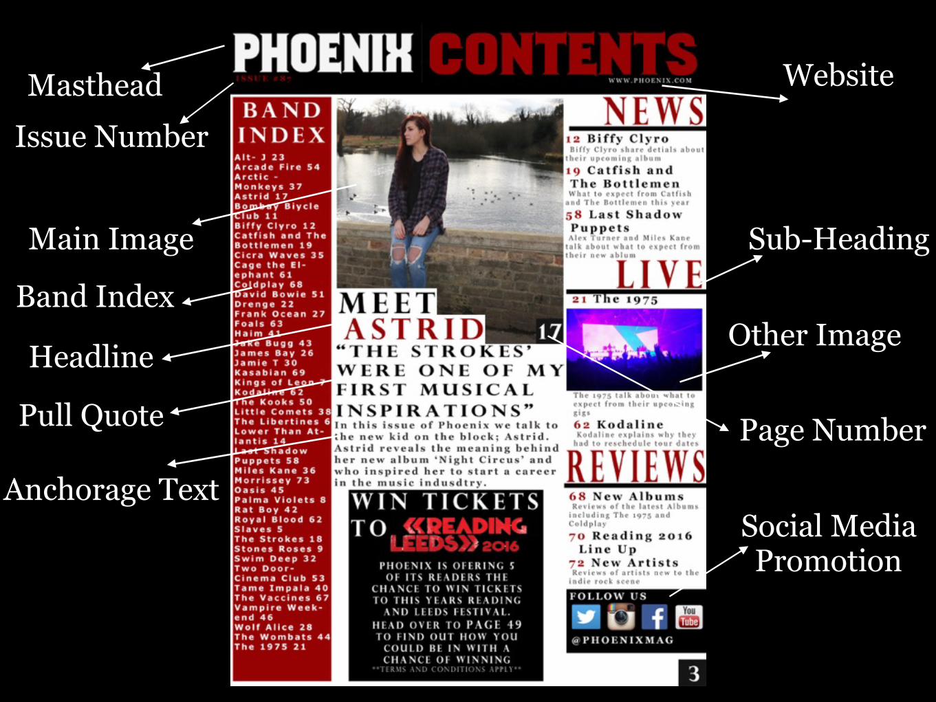
Masthead
Other Image
Website
Issue Number
Sub-HeadingMain Image
Band Index
Headline
Page Number
Anchorage TextSocial Media Promotion
Pull Quote
Phoenix & NME Comparison:
From putting my contents page next to an NME contents page you can easily see how their layout has inspired/influenced the design of mine. This therefore suggests that my contents page follows the conventions of a contents page.
However it can be argued that my contents page doesn't come across as completely professional because it doesn't meet all of the conventions
successfully.
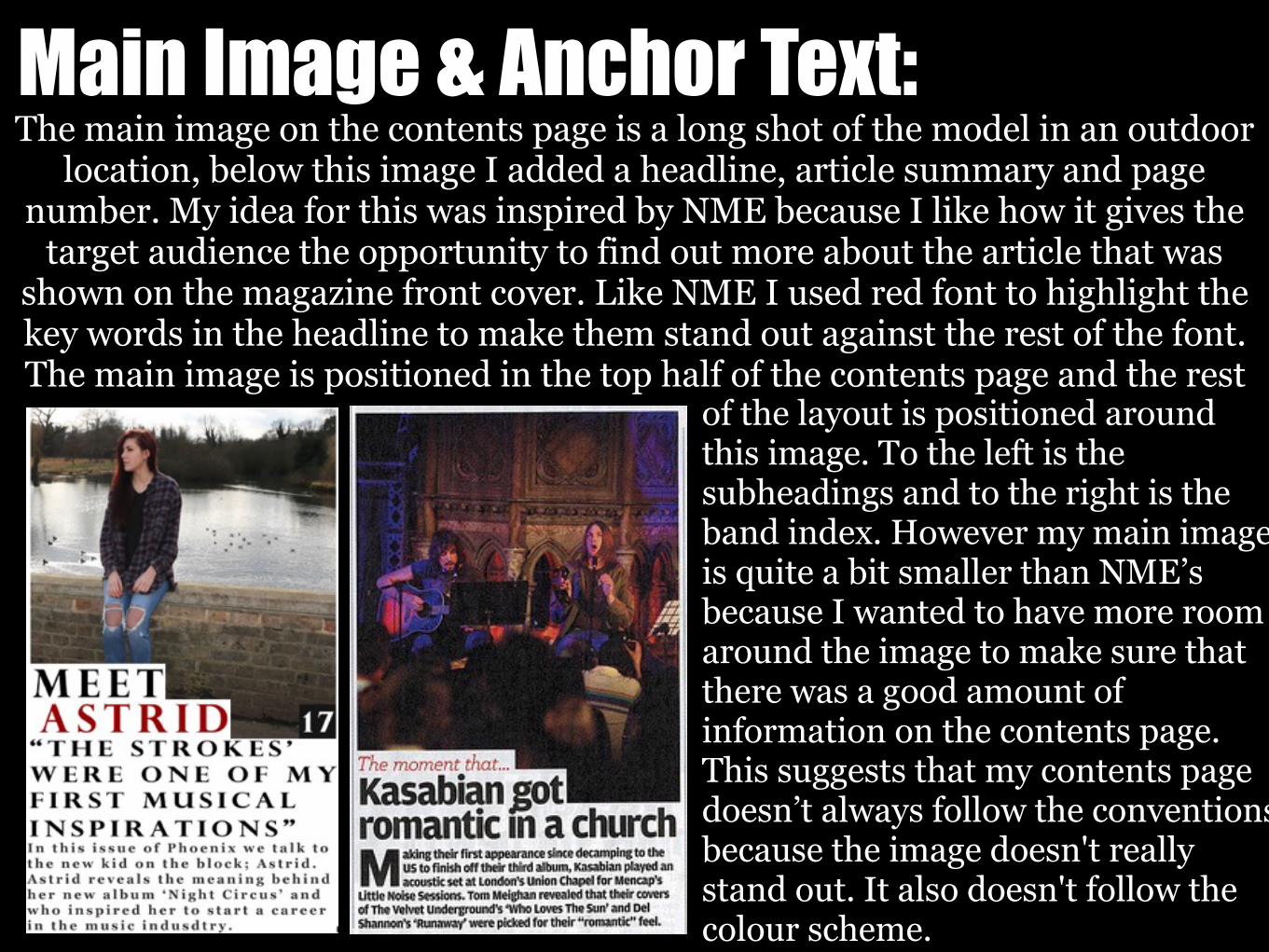
Main Image & Anchor Text:The main image on the contents page is a long shot of the model in an outdoor
location, below this image I added a headline, article summary and page number. My idea for this was inspired by NME because I like how it gives the
target audience the opportunity to find out more about the article that was shown on the magazine front cover. Like NME I used red font to highlight the key words in the headline to make them stand out against the rest of the font. The main image is positioned in the top half of the contents page and the rest
of the layout is positioned around this image. To the left is the subheadings and to the right is the band index. However my main image is quite a bit smaller than NME’s because I wanted to have more room around the image to make sure that there was a good amount of information on the contents page. This suggests that my contents page doesn’t always follow the conventions because the image doesn't really stand out. It also doesn't follow the colour scheme.
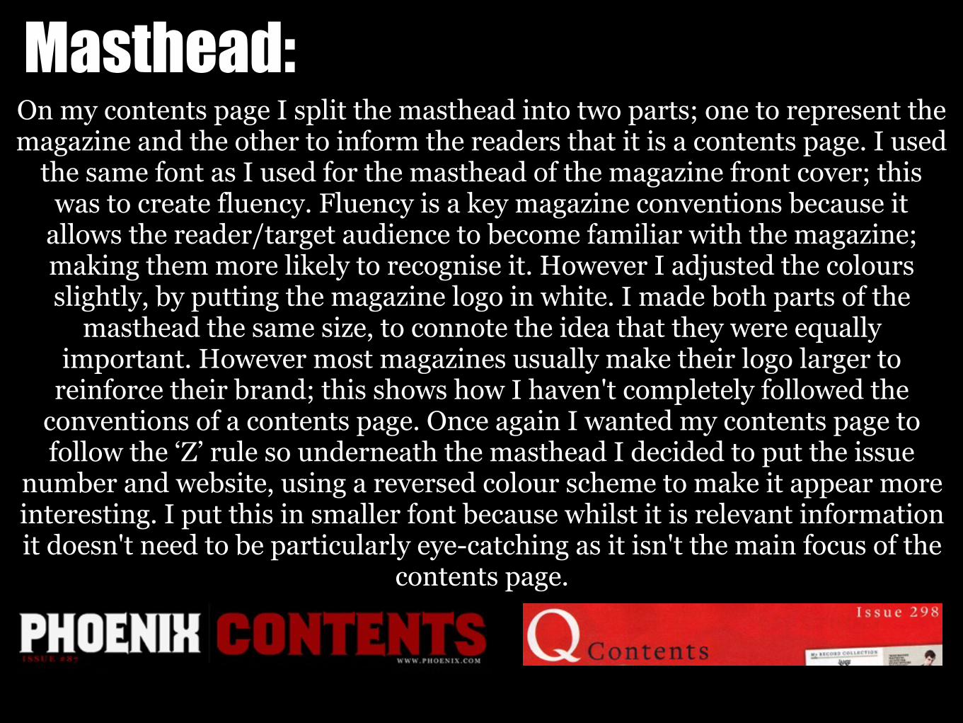
Masthead:On my contents page I split the masthead into two parts; one to represent the magazine and the other to inform the readers that it is a contents page. I used
the same font as I used for the masthead of the magazine front cover; this was to create fluency. Fluency is a key magazine conventions because it
allows the reader/target audience to become familiar with the magazine; making them more likely to recognise it. However I adjusted the colours slightly, by putting the magazine logo in white. I made both parts of the
masthead the same size, to connote the idea that they were equally important. However most magazines usually make their logo larger to
reinforce their brand; this shows how I haven't completely followed the conventions of a contents page. Once again I wanted my contents page to follow the ‘Z’ rule so underneath the masthead I decided to put the issue
number and website, using a reversed colour scheme to make it appear more interesting. I put this in smaller font because whilst it is relevant information it doesn't need to be particularly eye-catching as it isn't the main focus of the
contents page.
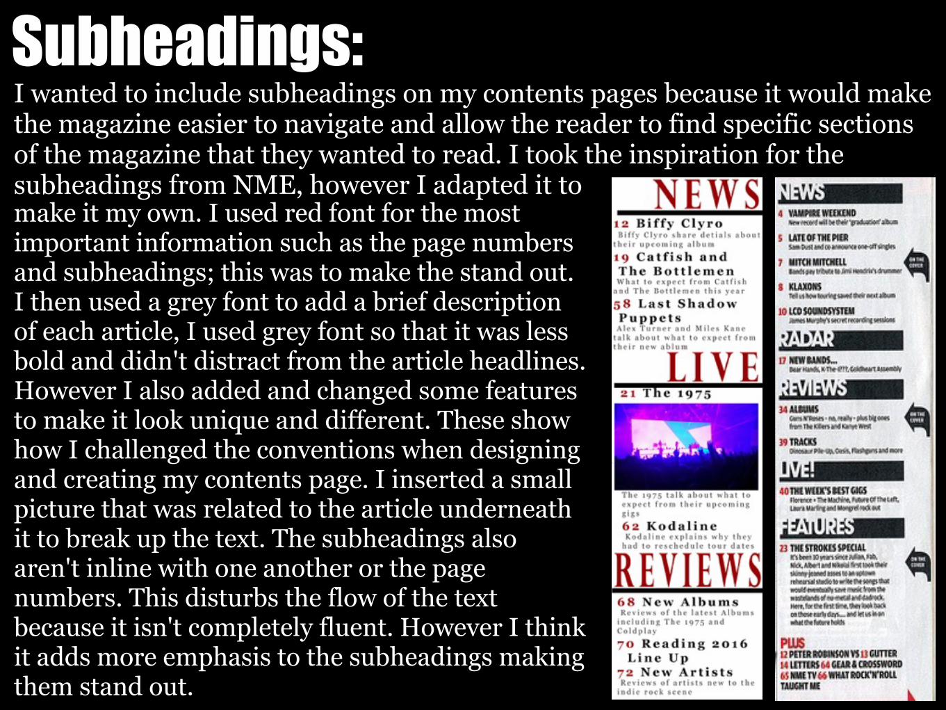
Subheadings:I wanted to include subheadings on my contents pages because it would make the magazine easier to navigate and allow the reader to find specific sections of the magazine that they wanted to read. I took the inspiration for the subheadings from NME, however I adapted it to make it my own. I used red font for the most important information such as the page numbers and subheadings; this was to make the stand out. I then used a grey font to add a brief description of each article, I used grey font so that it was less bold and didn't distract from the article headlines. However I also added and changed some features to make it look unique and different. These show how I challenged the conventions when designing and creating my contents page. I inserted a small picture that was related to the article underneath it to break up the text. The subheadings also aren't inline with one another or the page numbers. This disturbs the flow of the text because it isn't completely fluent. However I think it adds more emphasis to the subheadings making them stand out.
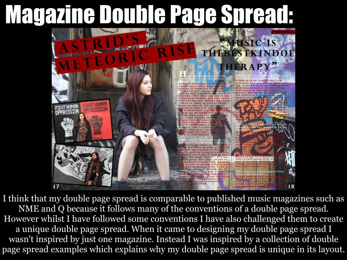
Magazine Double Page Spread:
I think that my double page spread is comparable to published music magazines such as NME and Q because it follows many of the conventions of a double page spread.
However whilst I have followed some conventions I have also challenged them to create a unique double page spread. When it came to designing my double page spread I
wasn't inspired by just one magazine. Instead I was inspired by a collection of double page spread examples which explains why my double page spread is unique in its layout.
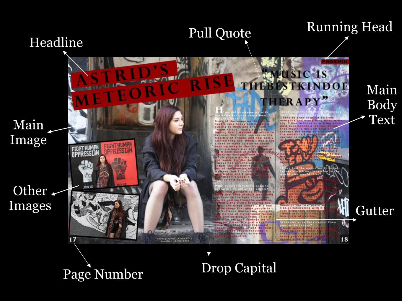
Main Image
HeadlinePull Quote
Main Body Text
Gutter
Running Head
Other Images
Page Number Drop Capital
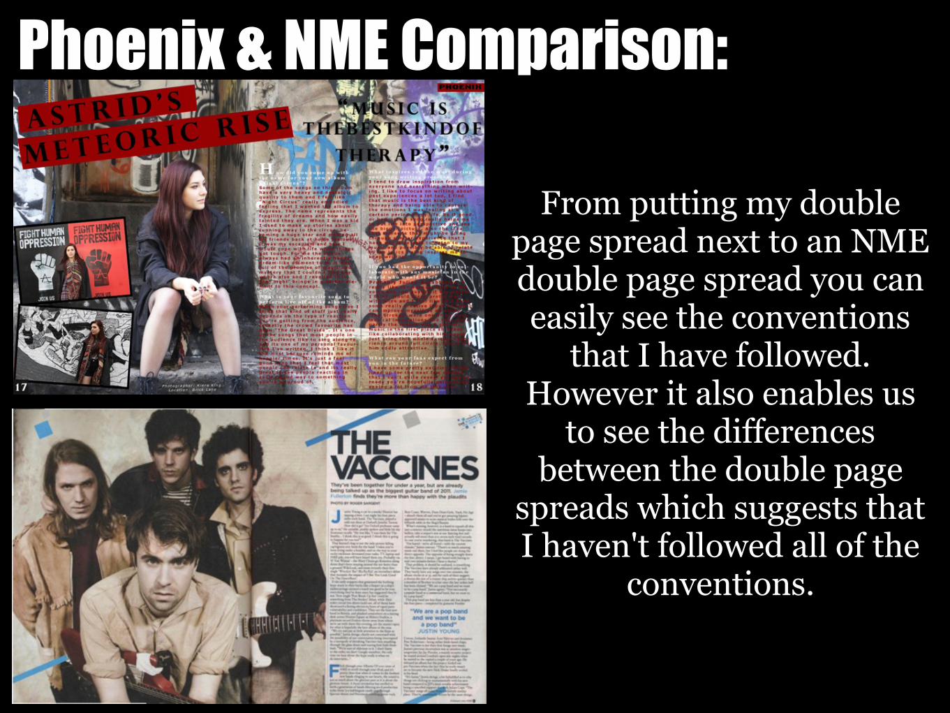
Phoenix & NME Comparison:
From putting my double page spread next to an NME double page spread you can easily see the conventions
that I have followed. However it also enables us
to see the differences between the double page
spreads which suggests that I haven't followed all of the
conventions.
Images:The main image that I used for my double page spread was taken in the Brick
Lane area. I positioned the model to make it appear that she was looking at the main body text. However usually in the main image on a double page spread
the model is shown looking directly into the camera to make it appear that they are looking at the audience; this shows how I have challenged the conventions. The main image on a double page spread also usually doesn't take up the whole background/spread; this is so the background doesn't distract from the article.
However I didn't follow this convention because I thought that it would ruin the fluency across the page.
I also used 2 smaller images on the page, to make a more equal balance of text and images. These images also include graffiti backgrounds which helps to
create fluency between them. It is sometimes uncommon for music magazine to include more than one image on a double page spread; this shows how I
have come up with unique ideas for my magazine.
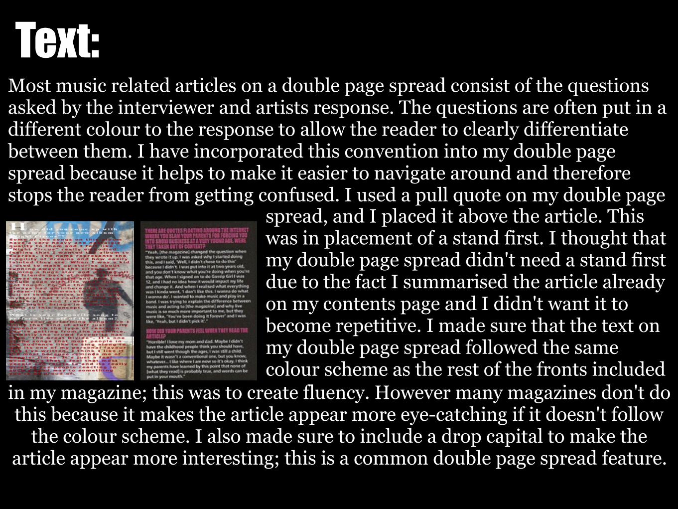
Text:Most music related articles on a double page spread consist of the questions asked by the interviewer and artists response. The questions are often put in a different colour to the response to allow the reader to clearly differentiate between them. I have incorporated this convention into my double page spread because it helps to make it easier to navigate around and therefore stops the reader from getting confused. I used a pull quote on my double page
spread, and I placed it above the article. This was in placement of a stand first. I thought that my double page spread didn't need a stand first due to the fact I summarised the article already on my contents page and I didn't want it to become repetitive. I made sure that the text on my double page spread followed the same colour scheme as the rest of the fronts included
in my magazine; this was to create fluency. However many magazines don't do this because it makes the article appear more eye-catching if it doesn't follow
the colour scheme. I also made sure to include a drop capital to make the article appear more interesting; this is a common double page spread feature.
Conclusion:From analysing and comparing the similarities and differences between my indie rock music magazine and a published music
magazine, I believe that I have successfully followed the conventions therefore creating a magazine that does resemble a real media product. Overall I believe that my magazine presents
fluency as the house style remains the same throughout the magazine. My magazine has a consistent theme and the colour
scheme is followed throughout. Magazines present fluency because it makes them aesthetically pleasing, easy to read as well as
professional. However there are elements of my magazine that does challenge the conventions; this was done to make my magazine unique and stand out in comparison to other music magazine
therefore giving it a unique selling point.
Related Documents